Introduction
Global macro analysis of the USD/JPY pair involves the analysis of endogenous factors that impact both the USD and the JPY; and exogenous analysis for the USD/JPY pair.
In the endogenous analysis, we’ll focus on domestic macroeconomic factors that drive the domestic growth in the US and Japan. The exogenous analysis will involve the analysis of global macroeconomic factors that define the dynamics of the USD/JPY pair.
Ranking Scale
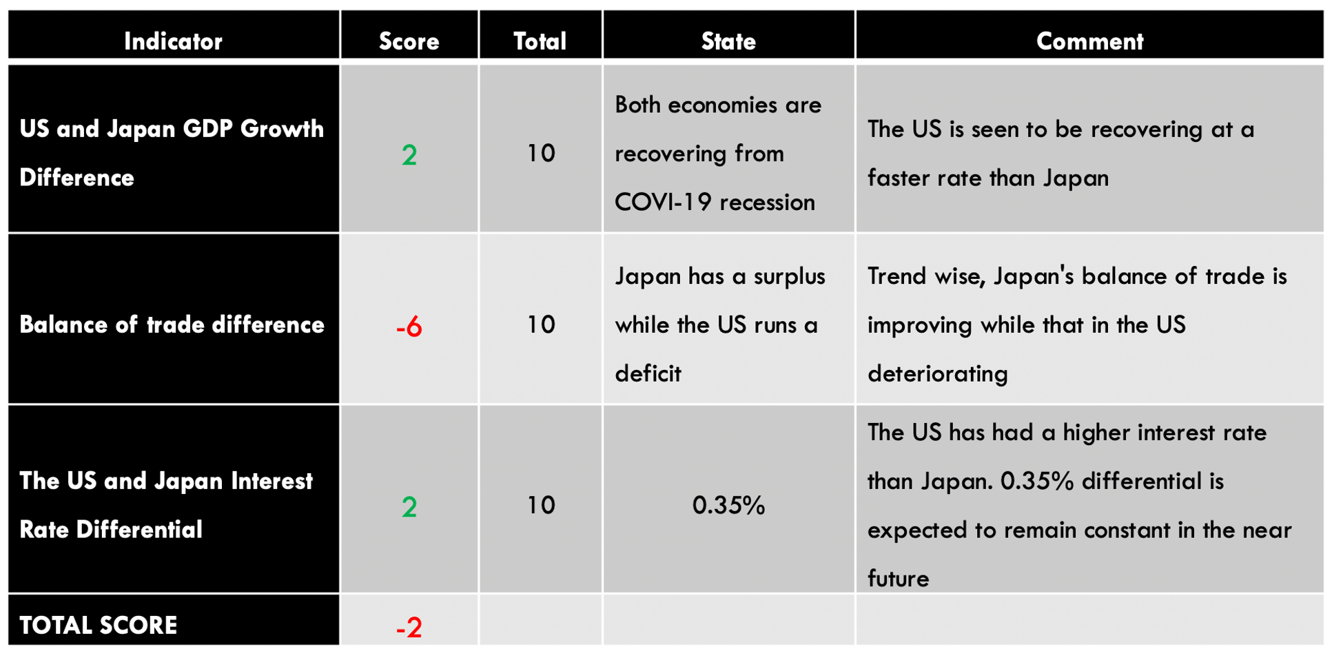
We will rank both the endogenous and the exogenous factors on a sliding scale of -10 to +10. Whenever the ranking is negative, it means that the macroeconomic indicator led to the depreciation of the currency. A positive ranking means that the indicator had an inflationary impact.

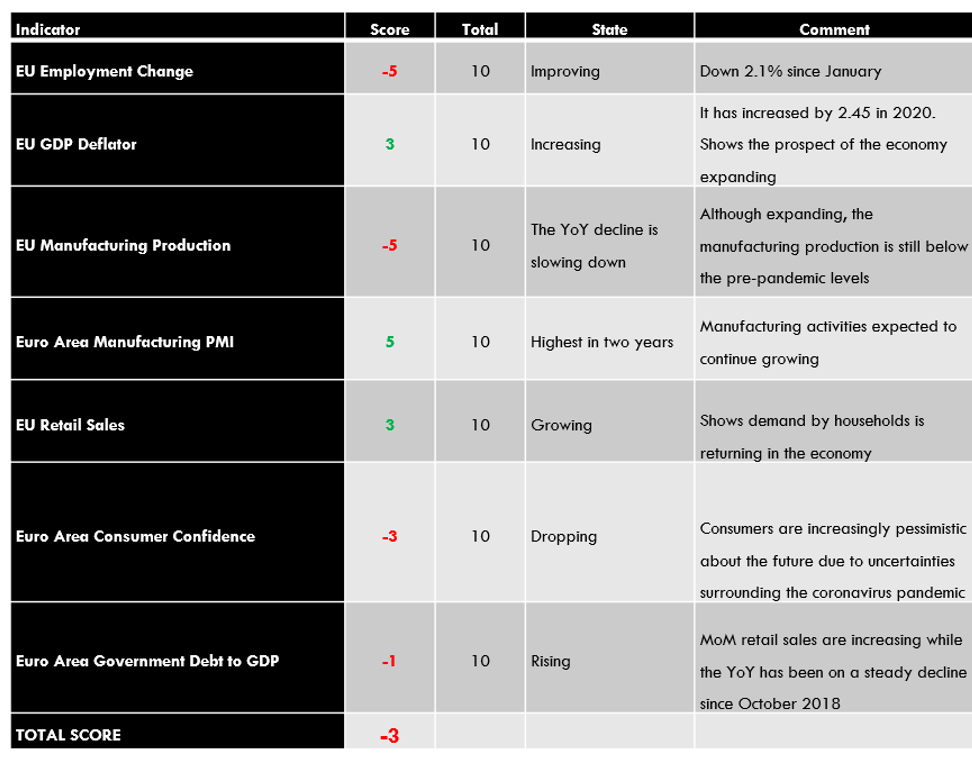
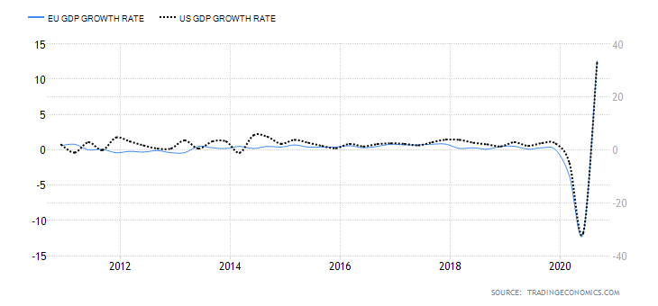
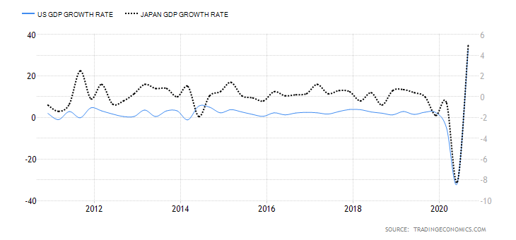
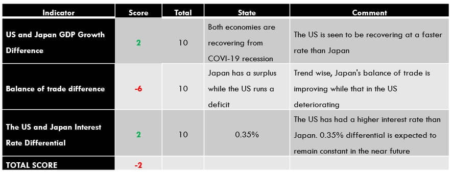
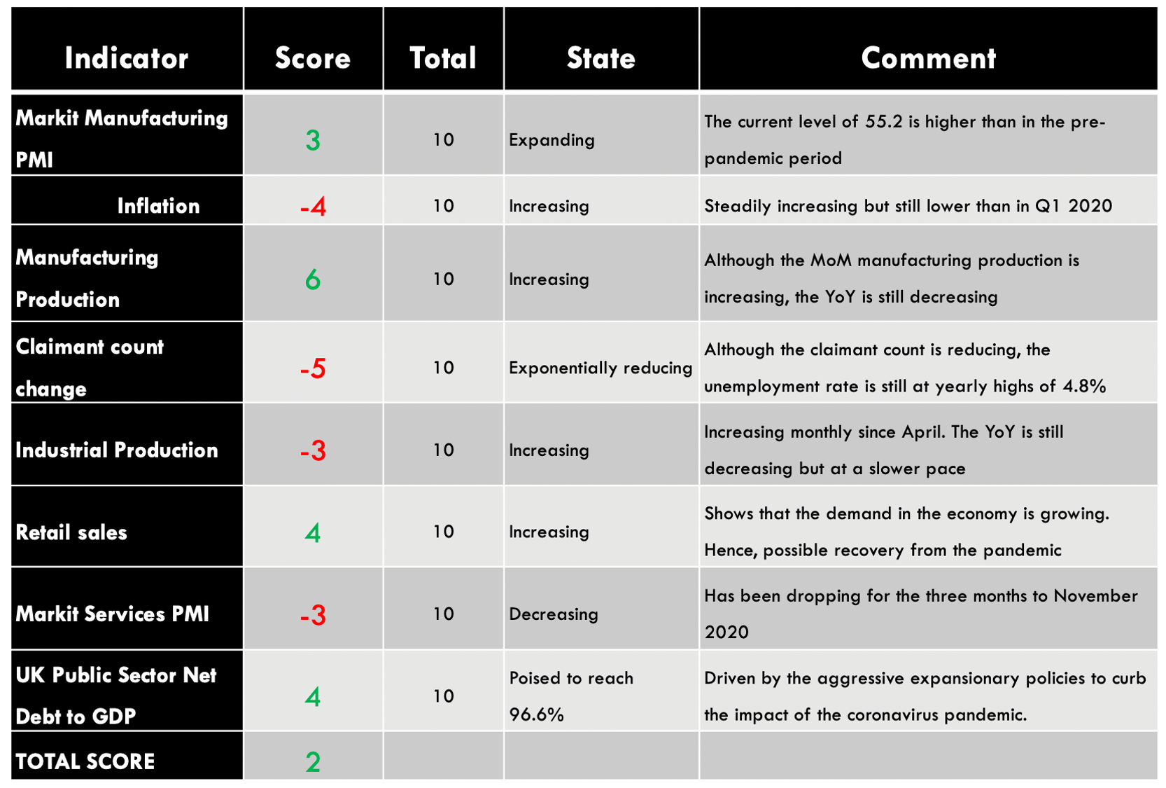
USD Endogenous Analysis – Summary
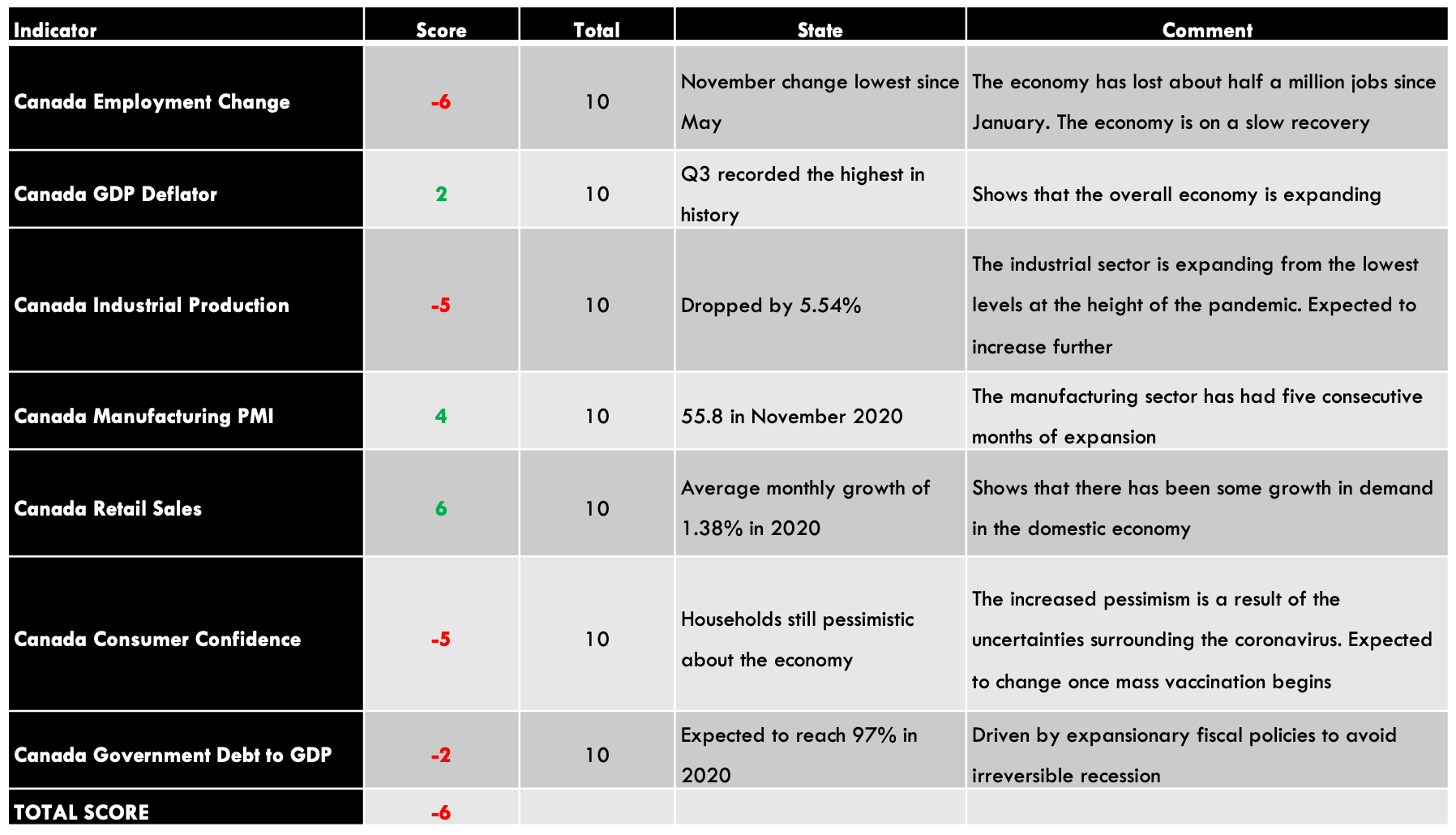
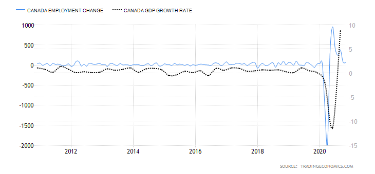
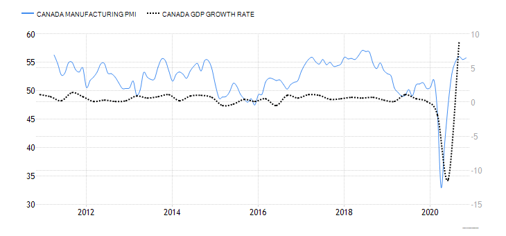
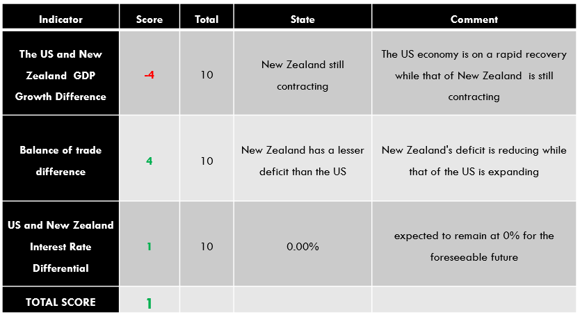
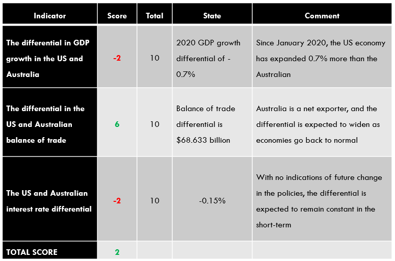
A score of -19.1 implies a clear deflationary effect on the US Dollar. This means that USD has lost its value since the beginning of 2020, according to these indicators.
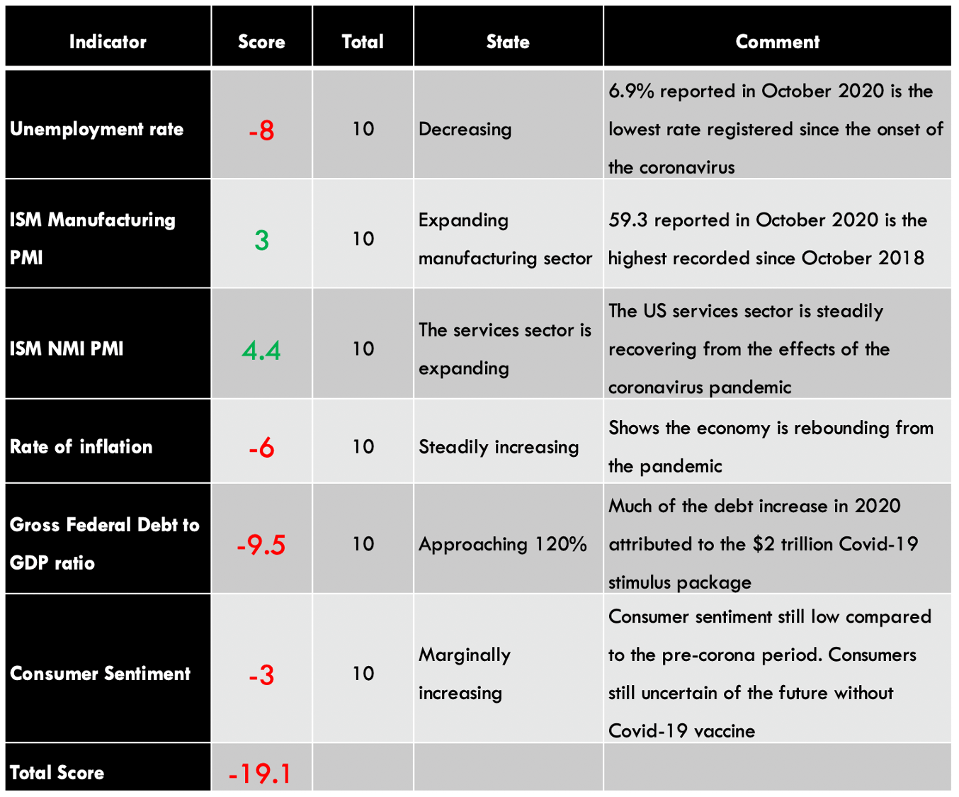
You can find the complete USD Endogenous Analysis here.
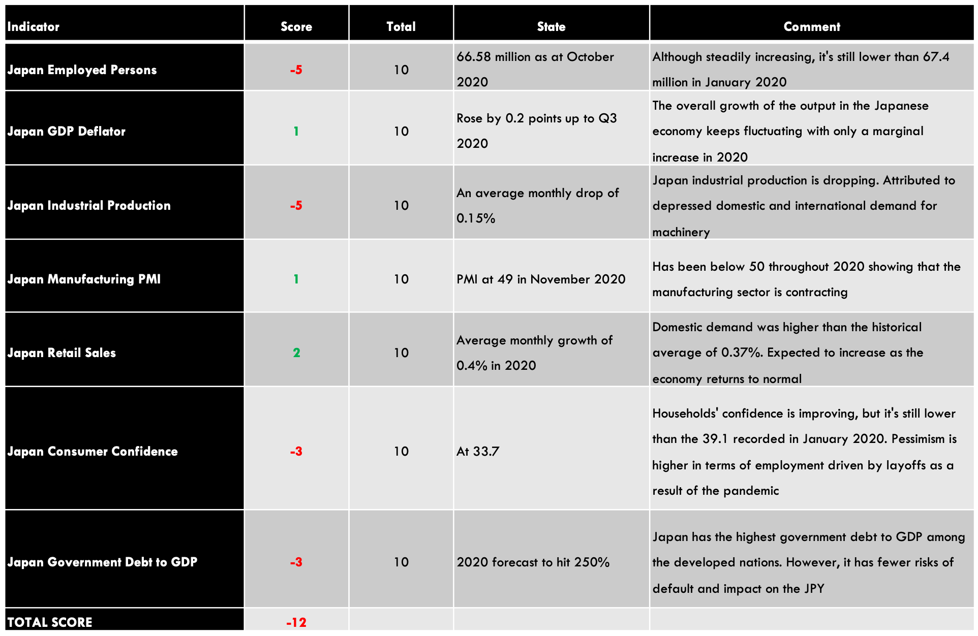
JPY Endogenous Analysis – Summary
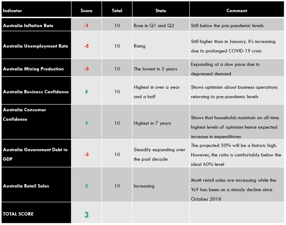
The endogenous analysis for the Japanese economy resulted in an overall inflationary score of 3. Based on this analysis, we can expect that the JPY had appreciated marginally in 2020.
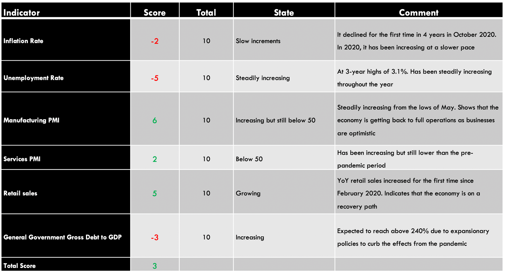
The inflation rate in Japan is measured by the consumer price index (CPI). The CPI weights various consumer expenditures depending on their level of importance. Food is weighted at 25%, Housing 21%, transport and communication 14%, recreation 11.5%, energy and water 7%, medical care 4.3%, and clothing 4%.
A higher rate of inflation is necessary for economic growth. It also forestalls a possible interest rate hike, which is accompanied by currency appreciation.
In October 2020, the MoM inflation rate in Japan decreased by 0.1% constant change since August. The YoY inflation rate decline by 0.4%, the first decline in about four years.
Based on our correlation analysis, we assign Japan’s inflation rate, a deflationary score of -2.
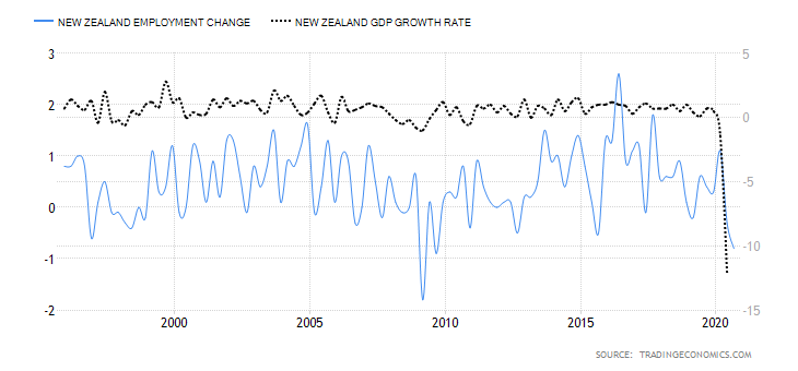
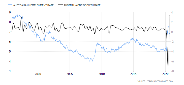
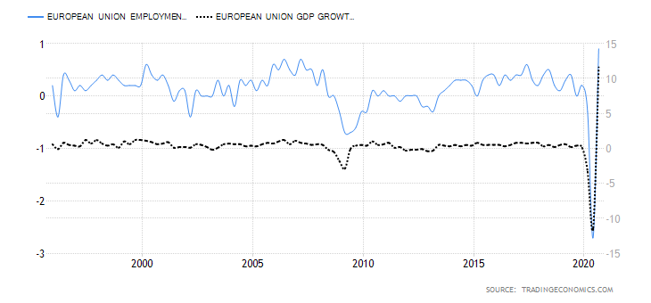
The unemployment rate measures the number of Japanese citizens eligible for employment who are currently seeking gainful employment opportunities.
An increasing rate of unemployment means that more jobs are lost in the economy faster than new jobs are being created. That’s an indicator that the economy is contracting.
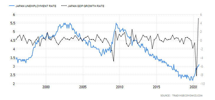
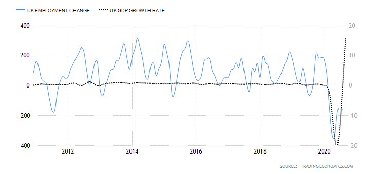
In October 2020, Japan’s unemployment rate increased to 3.1%, representing 21.4 million people, the highest recorded since May 2017.
Due to the high correlation between the unemployment rate and GDP, we assign it a score of -5.
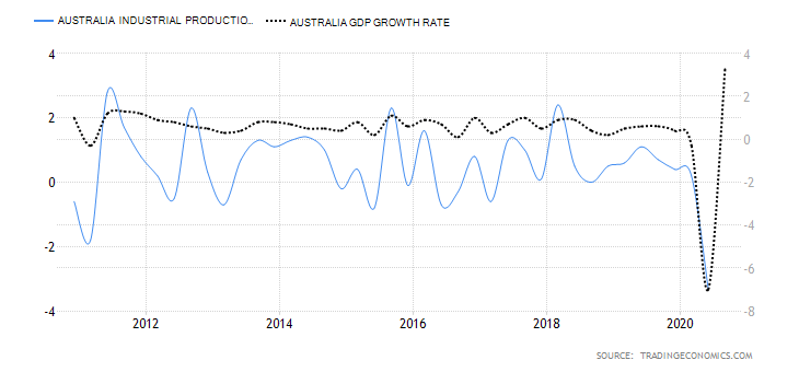
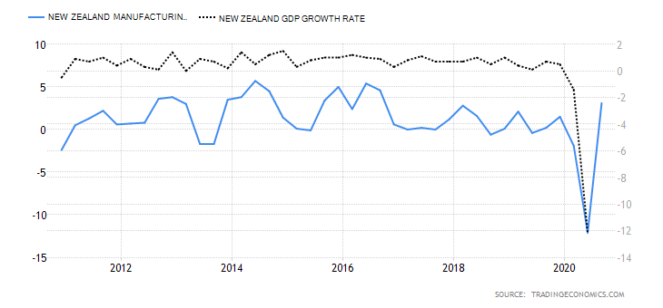
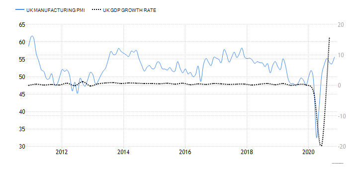
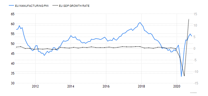
The Japan manufacturing PMI is also known as the Jibun Bank Japan Manufacturing PMI. The PMI is compiled through a series of monthly questionnaires surveying about 400 manufacturers. The manufacturers are segregated depending on their industry’s contribution to GDP, and their responses aggregated into a diffusion index. When the index is above 50, it means that the manufacturing activity increased while a below 50 reading implies a slow-down in the manufacturing sector.
Japan is a highly industrialized economy, and its manufacturing activities have a high correlation with its GDP growth rate.
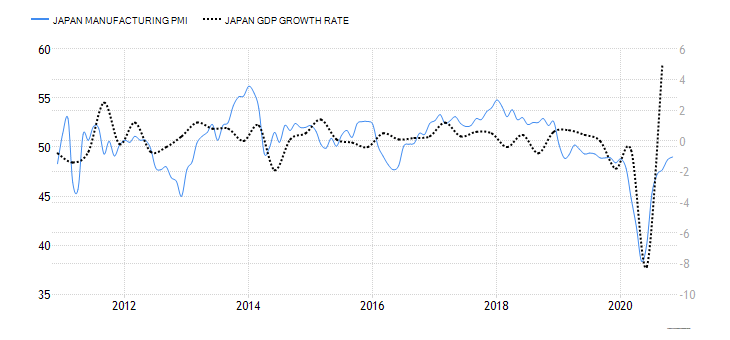
In November 2020, the Japan Manufacturing PMI was 49, inching closer to the highest recorded 49.3 in January. Since the manufacturing PMI has been steadily increasing from the lows of 38.4 in May, we assign it an inflationary score of 6.
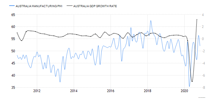
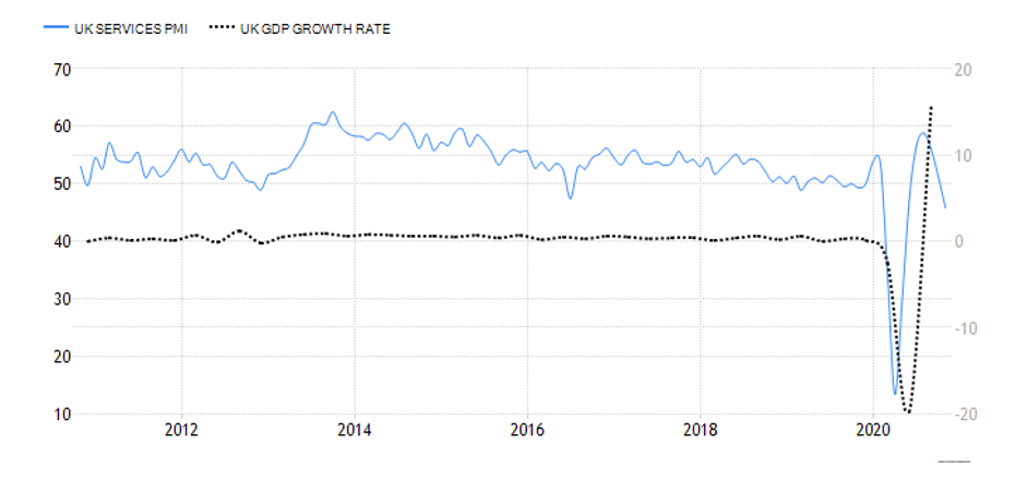
This PMI is also known as Jibun Bank Japan Services PMI. It is a survey of over 400 services companies operating in the Japanese services industry. A Survey of the purchasing managers is used to track industry changes in employment, inventories, sales, and prices. Sectors covered by the survey include transport and communication, personal services, financial services, hotel industry, and IT. The responses are weighted based on the sector’s size and aggregated into an index from 0 to 100.
When the index is above 50, it signals that there is an expansion in the services industry, while below 50 shows contraction.

In November 2020, the Japan services PMI dropped to 46.7 from 47.7 in October. Although the index is above the lows of 21.5 recorded at the height of the coronavirus pandemic, it is still lower than the levels observed in the pre-pandemic period.
Based on our correlation analysis, we assign Japan services PMI an inflationary score of 2.
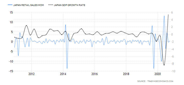
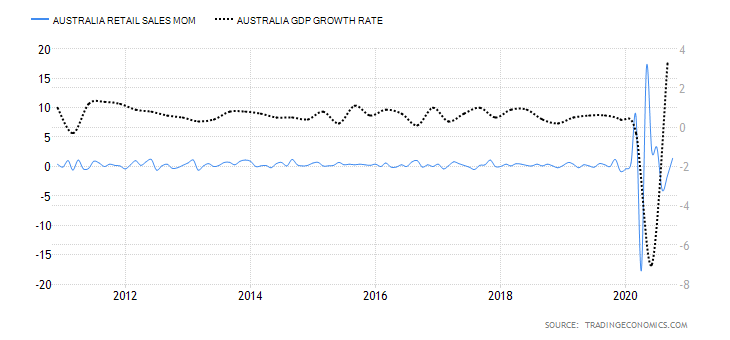
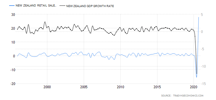
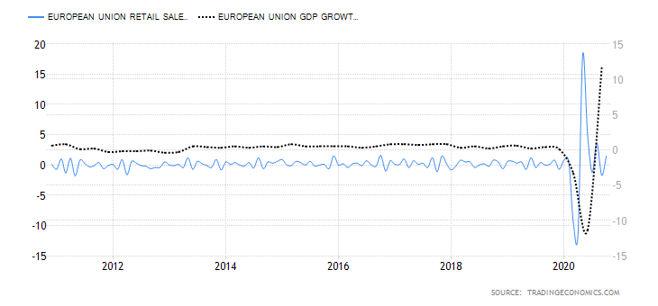
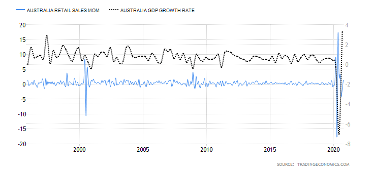
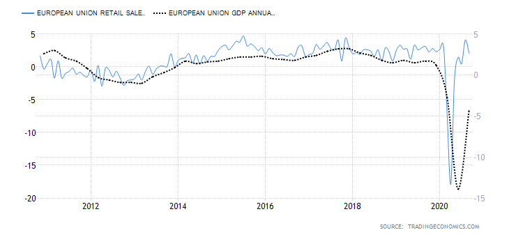
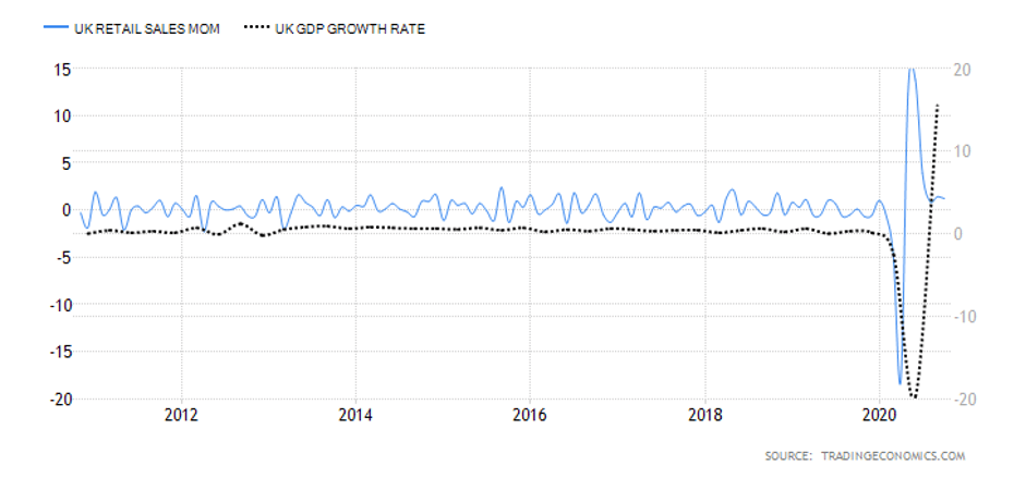
The monthly retail sales measure the change in the value of goods consumed directly by households. In any economy, the growth in GDP is primarily driven by the demand by households. Thus, retail sales can be considered a significant indicator of economic growth.

In October 2020, the MoM retail sales in Japan increased by 0.4%, while YoY retail sales increased by 6.4%. The increase in October is the first time the YoY retail sales have increased since February. This shows demand in the Japanese economy is growing after the easing restrictions implemented in the wake of the pandemic.
Due to its high correlation with the GDP, we assign Japan retail sales an inflationary score of 5.
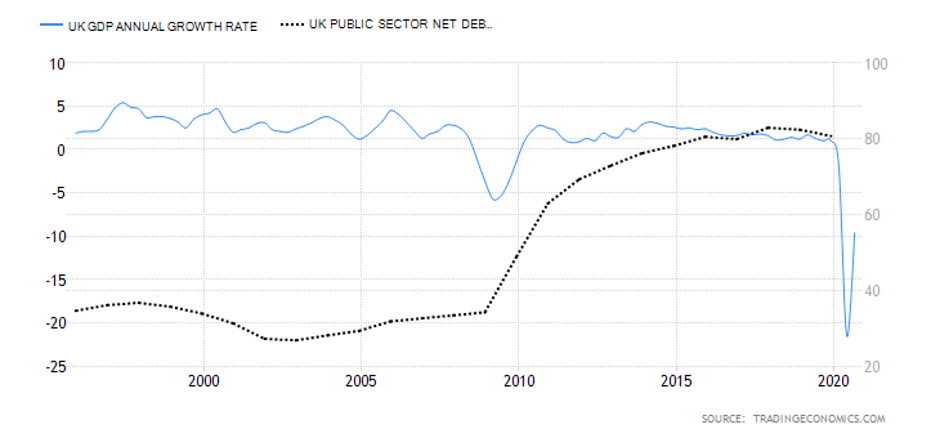
- Japan General Government Gross Debt to GDP
This is the ratio between the amount of debt, both domestic and foreign, that the Japanese government has accumulated to national GDP. Typically, lenders use this ratio to determine if a country’s economy is overly leveraged and if the government might default in the future.
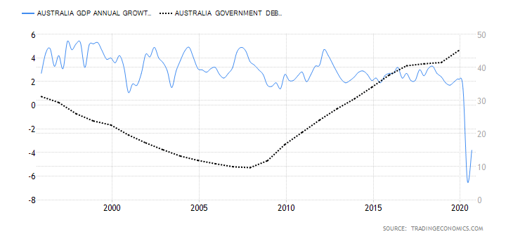
Note that Japan has the largest national debt to GDP in the world. However, although it is heavily indebted, unlike many other countries, Japanese debt is denominated in Yen. More so, foreigners only hold about 6.5% of the total debt. That is why Japan can continue to accumulate such massive debts without any fears of hyperinflation or default risks. But that doesn’t mean that the debt isn’t weighing down on the economy.
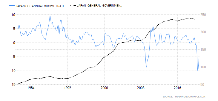
In 2019, the Japan national debt to GDP was 238%, an increase from 236.6% in 2018. In 2020, it is projected to exceed 240% due to the measures implemented to fight the pandemic. Based on our correlation analysis, we assign it a deflationary score of -3.
Please check our next article to find the Exogenous analysis of both USD and JPY currencies. We have also come to a conclusion on whether you should expect a bullish or bearish trend in this pair.