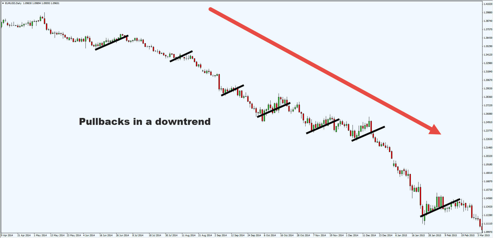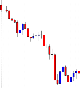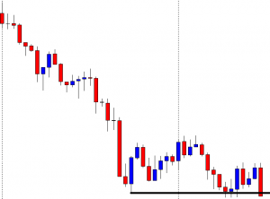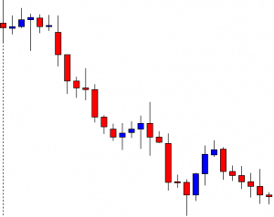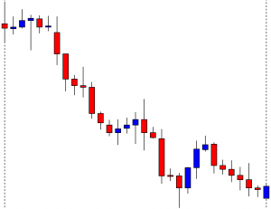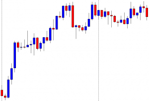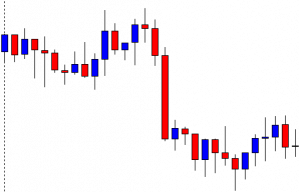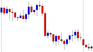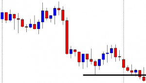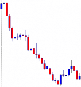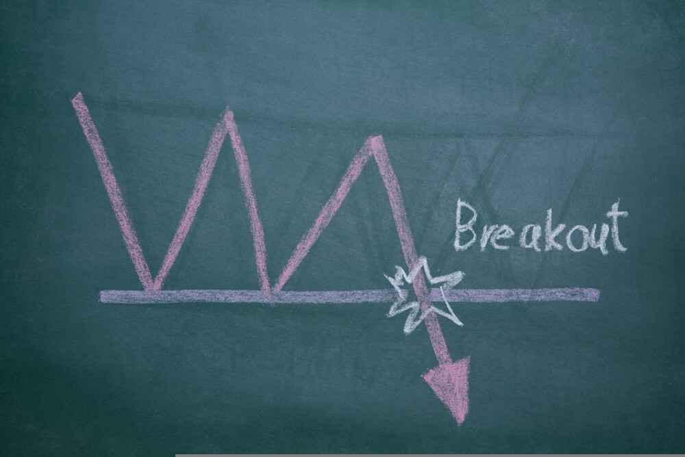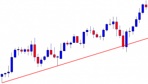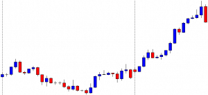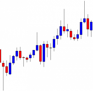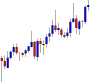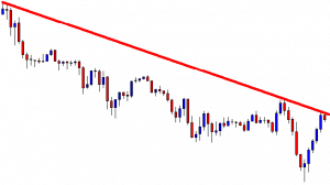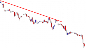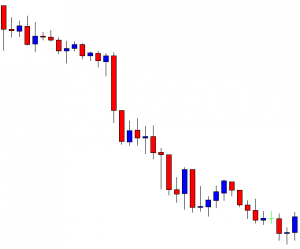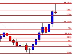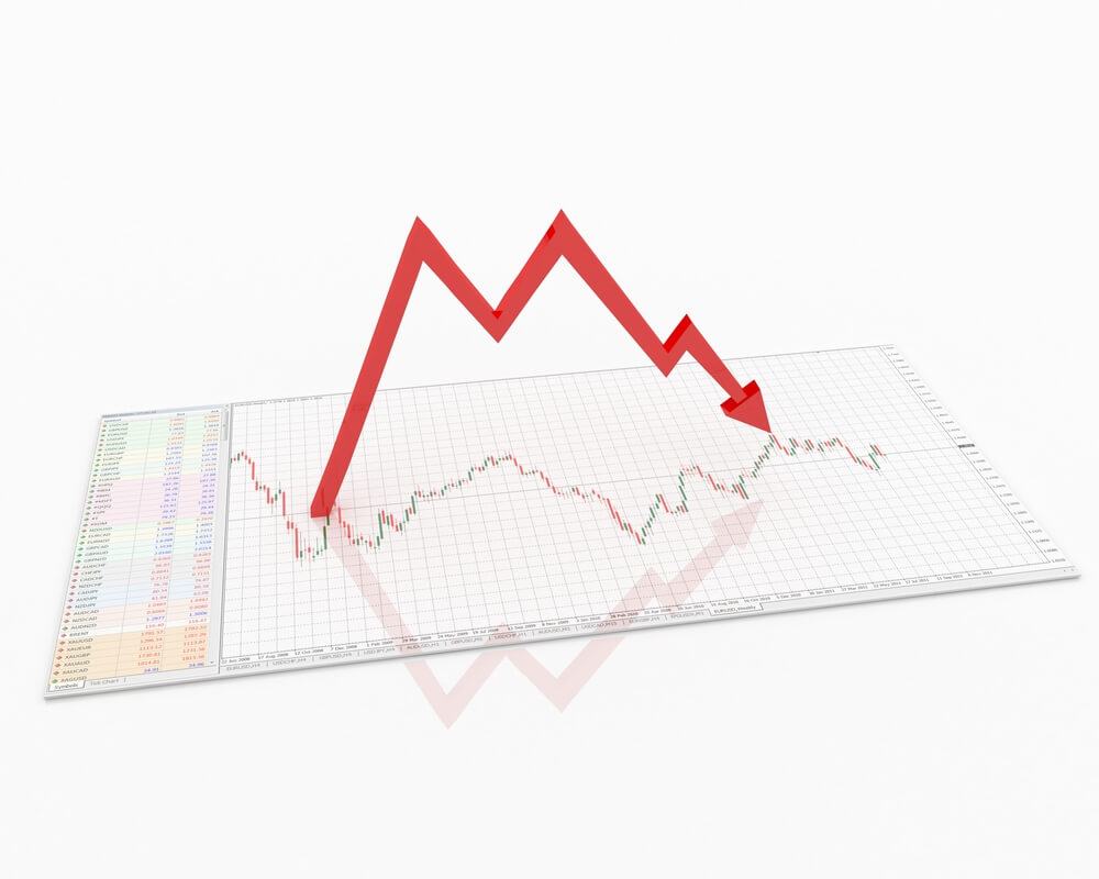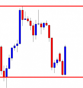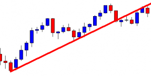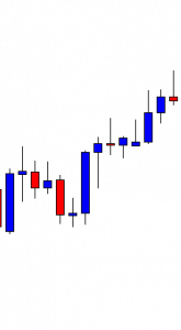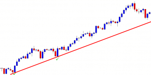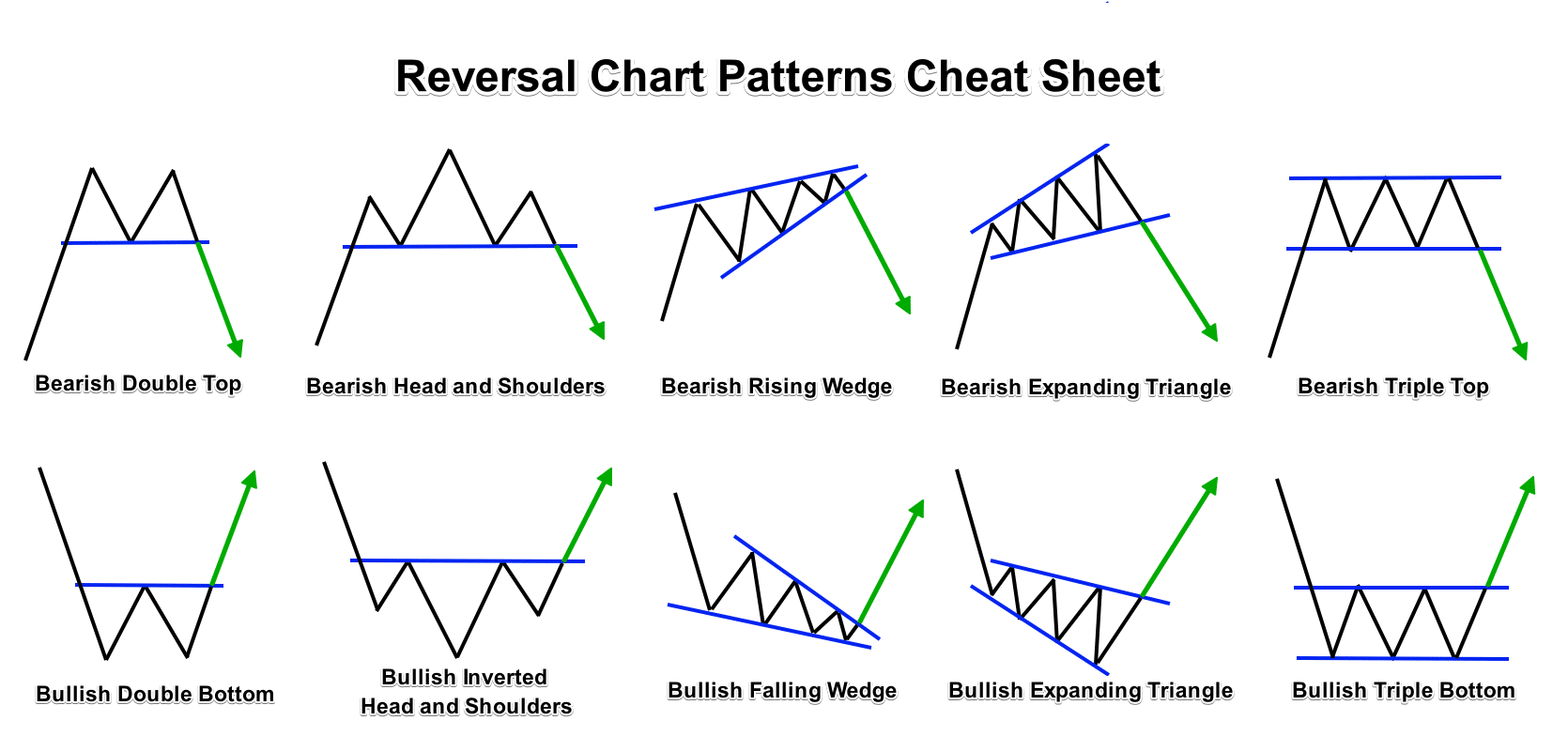
Chartist analysis in forex consists of identifying figures on the price chart, these are usually repeated historically so you can practice in their identification, also they are usually formed in different financial instruments and periods of time, and through them, it is possible to predict with some reliability where the next price movement will follow. It is perhaps the most classic form of analysis in Forex and surely one of the most effective, so your knowledge is always very advisable.
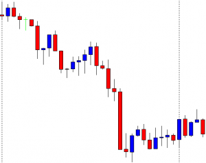
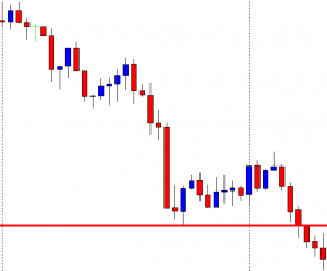
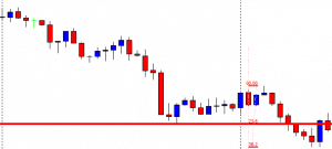
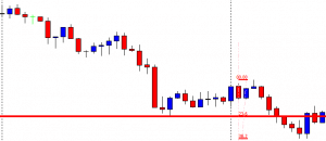
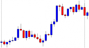
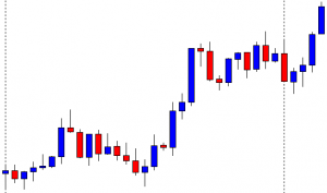
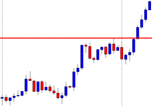
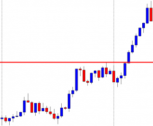
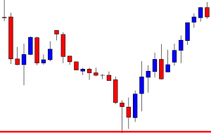
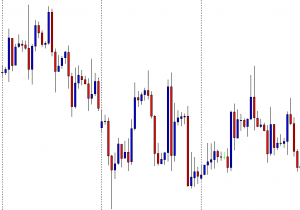
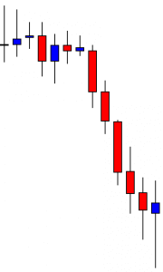
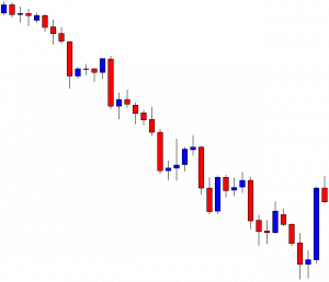
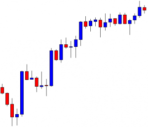
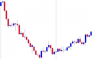
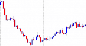
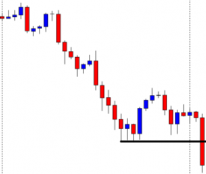
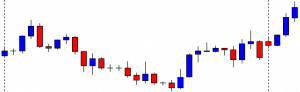
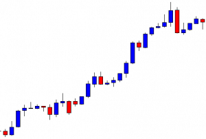
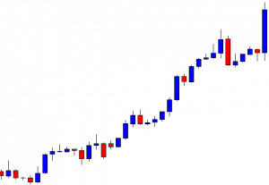
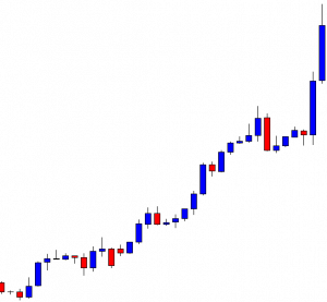
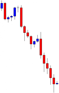
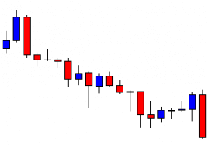
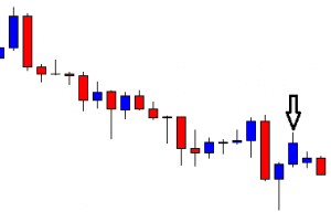
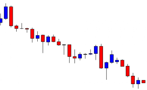
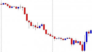
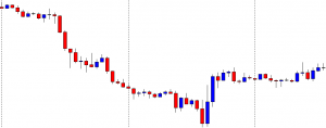
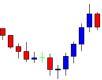
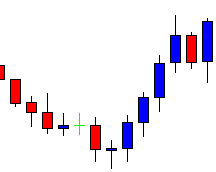
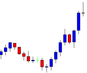
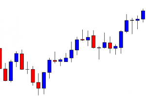
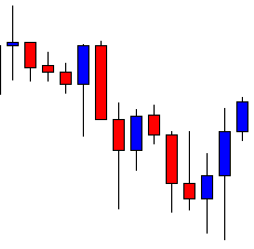
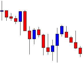
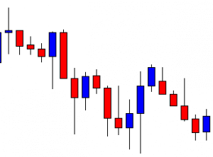
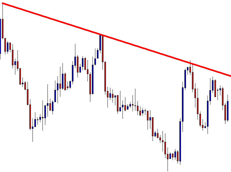
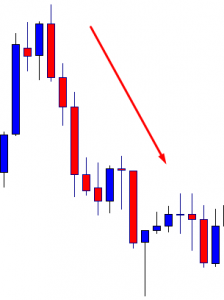
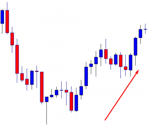
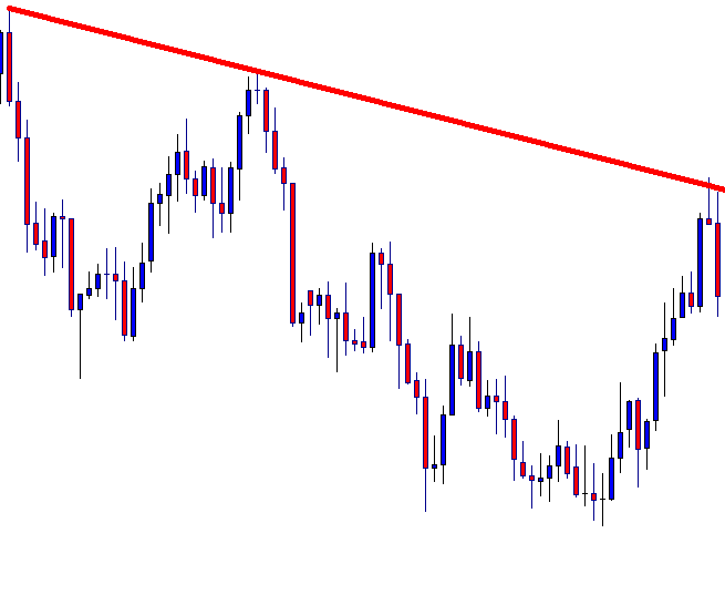
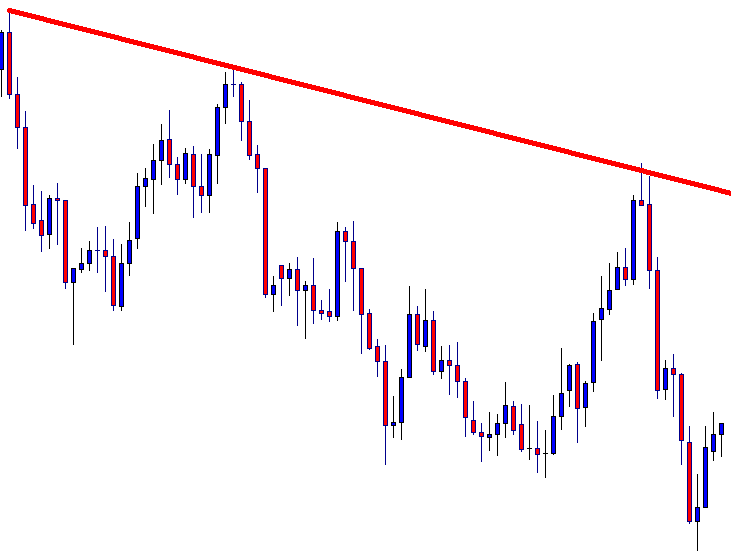
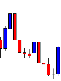
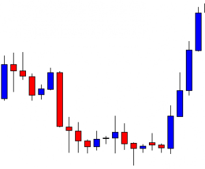
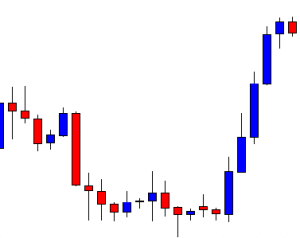
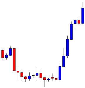
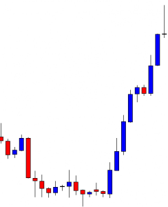
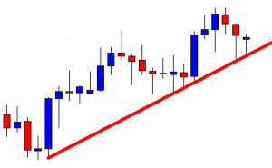
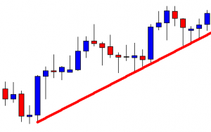
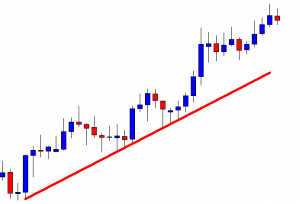
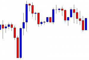
Chartist figures are formed because the market makes oscillations and leaves a “trail” which helps to detect these figures. There are chartist figures that allow confirming the changes of trend, to identify opportunities to enter the market as well as to set objectives in the prices. Chartist figures are more effective in operating in high temporality, although in short periods they usually appear more frequently, also the failures are very recurrent.
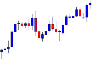
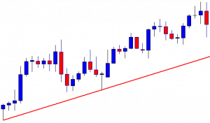
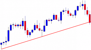
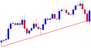
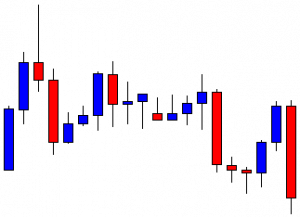
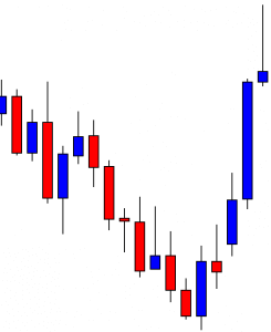
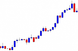
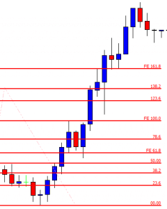
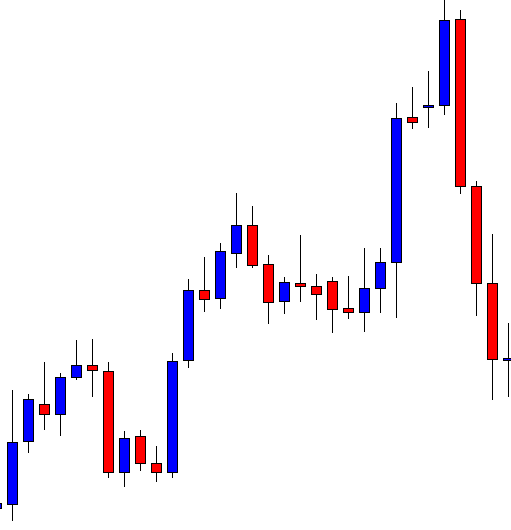
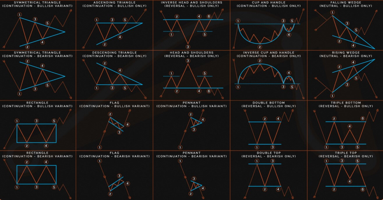
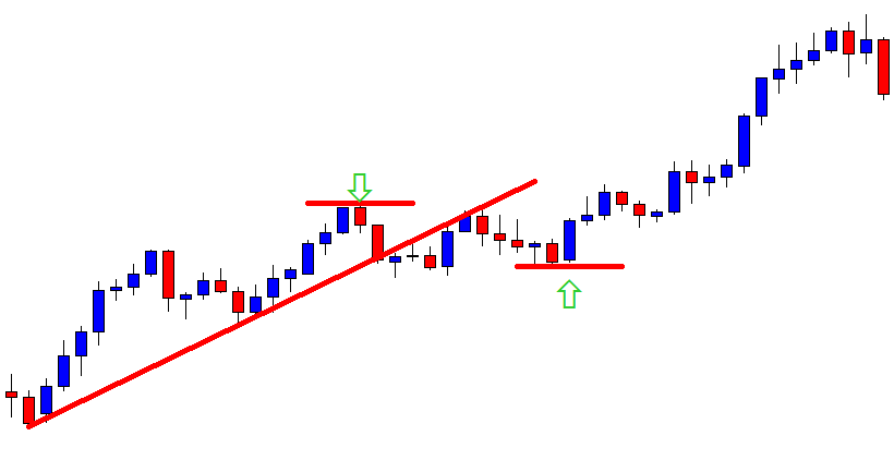
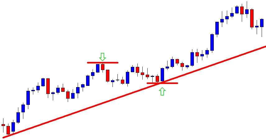
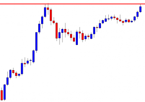
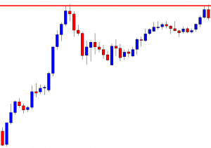
Price Pattern in Forex Technical Analysis
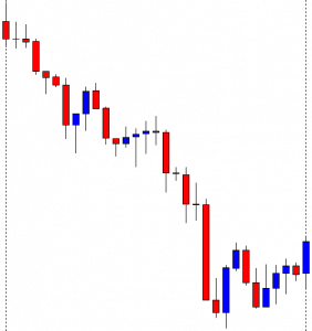
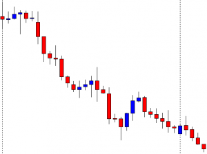
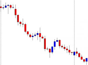
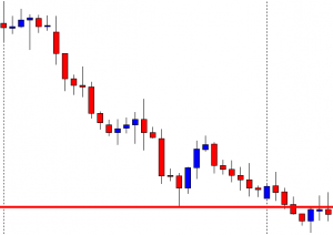
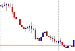
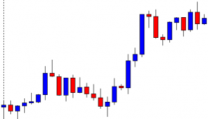
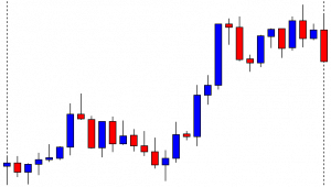
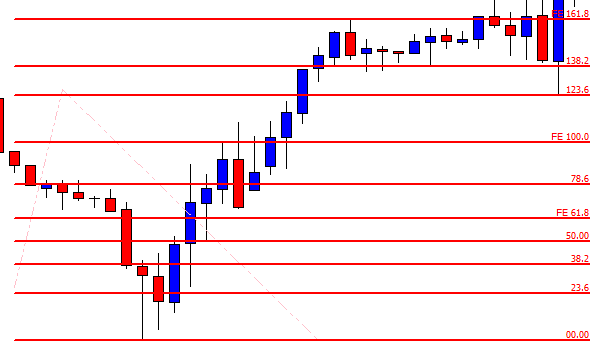
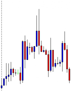
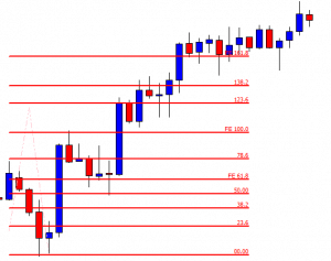
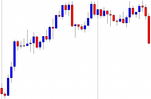
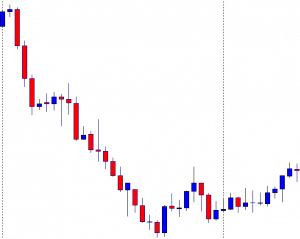
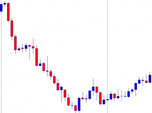
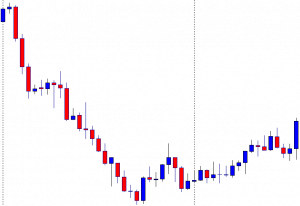
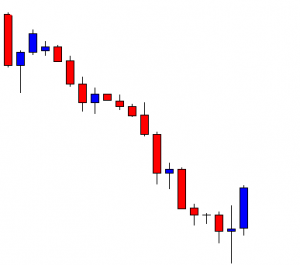
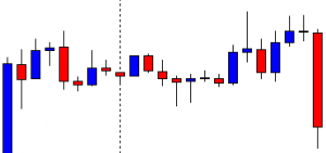
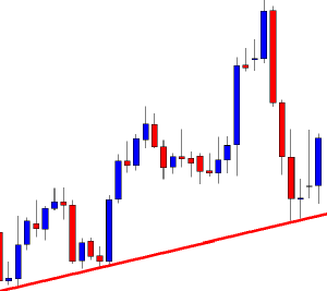
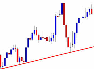
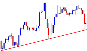
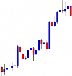
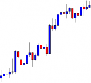
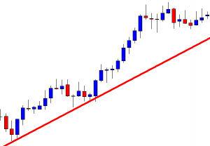
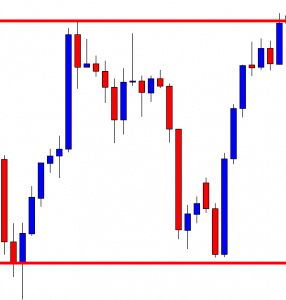
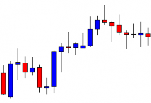
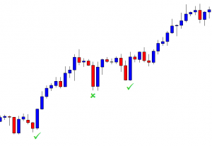
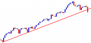
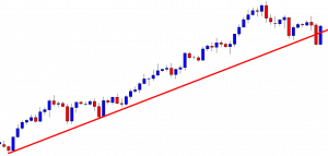
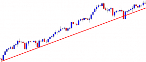
The analysis of price movements originated exactly when the price chart appeared. The first graphs were drawn on millimeter paper, and it was then that the first analysts noticed that there were some areas on the graph where the price made similar oscillations at different intervals of time. Traders called them price patterns because the first patterns looked similar to geometric objects, such as a triangle, a square, or a diamond. With the appearance of computer screens and the analysis of longer time periods, new patterns began to appear. Traders use chart patterns to identify trading signals, or signs of future price movements, to enter to trade at the right place.
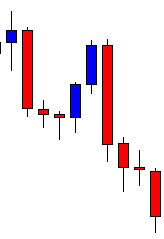
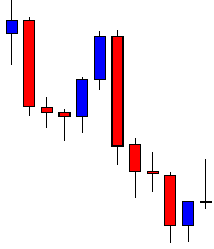
Chart Patterns You Should Know
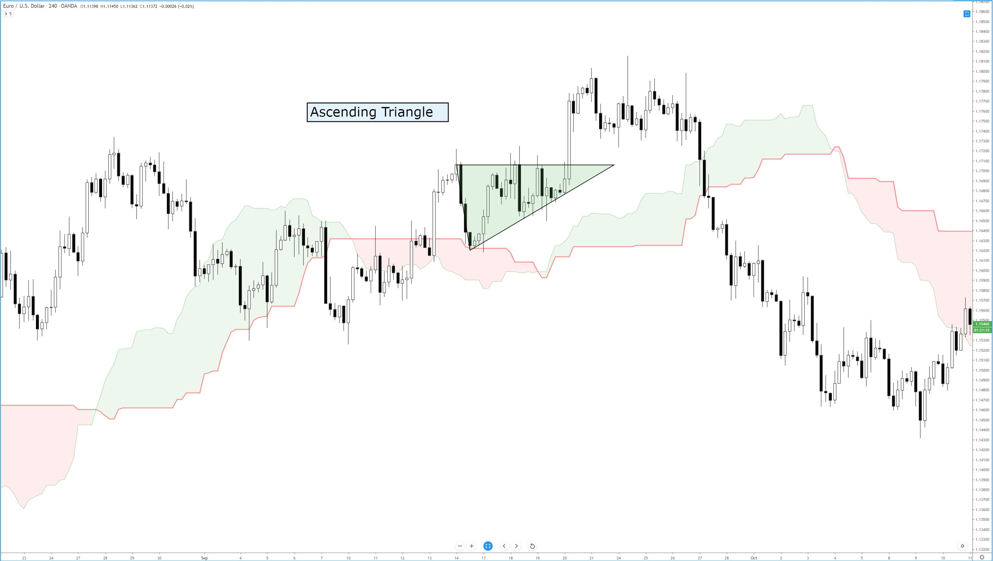
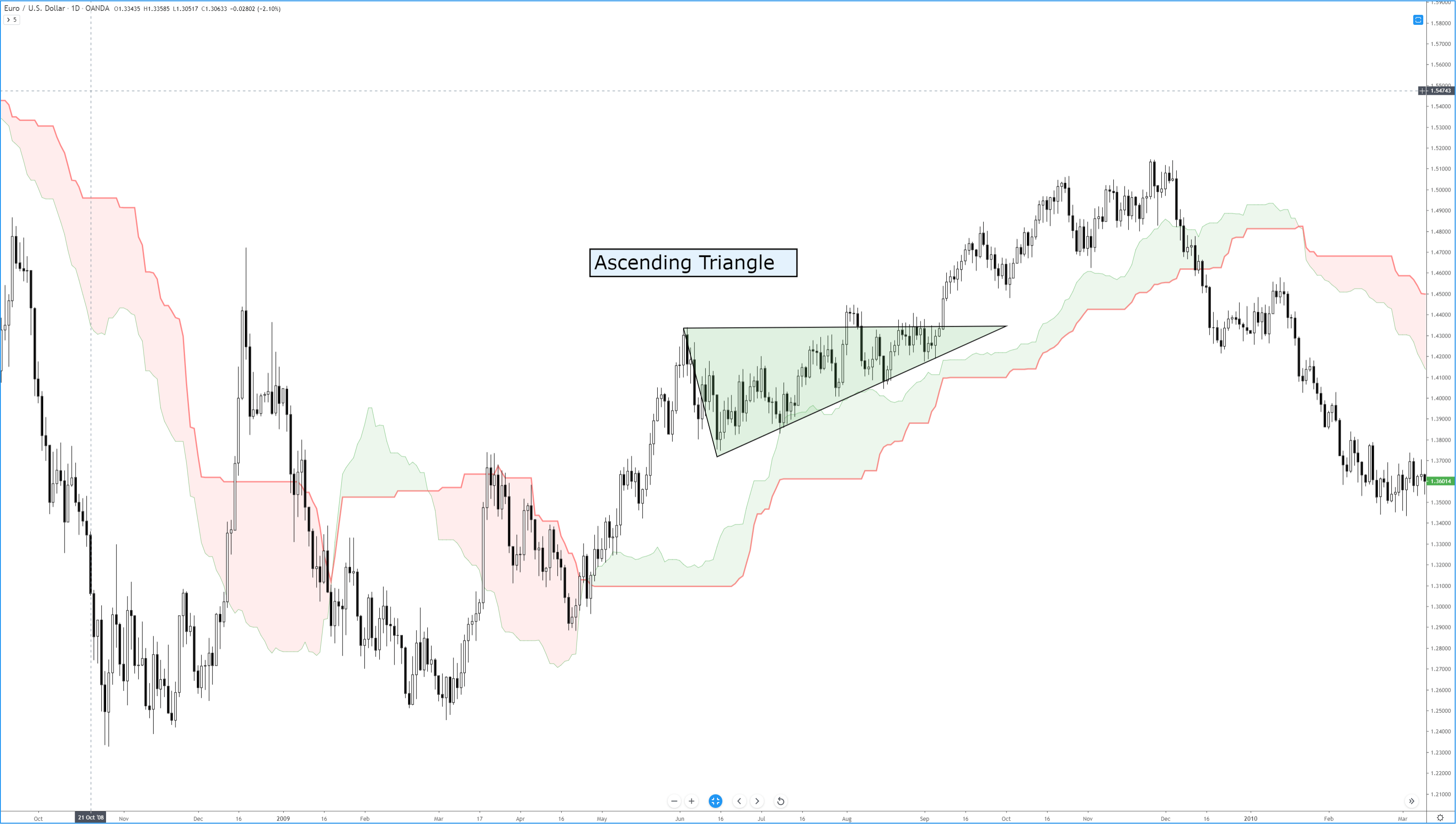
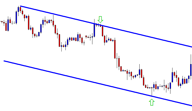
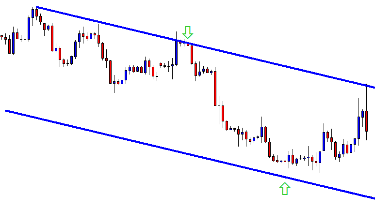
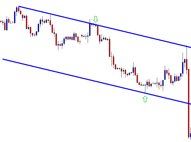
“Triangle”
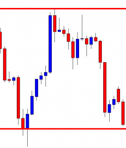
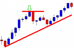
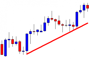
There are several different types of triangles, however, all are based on the same principle. In classical technical analysis, the triangle is classified as a continuation pattern of the trend. This means that the trend that has been on the market before the formation of the triangle may continue after its formation is completed.
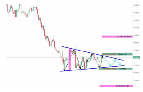
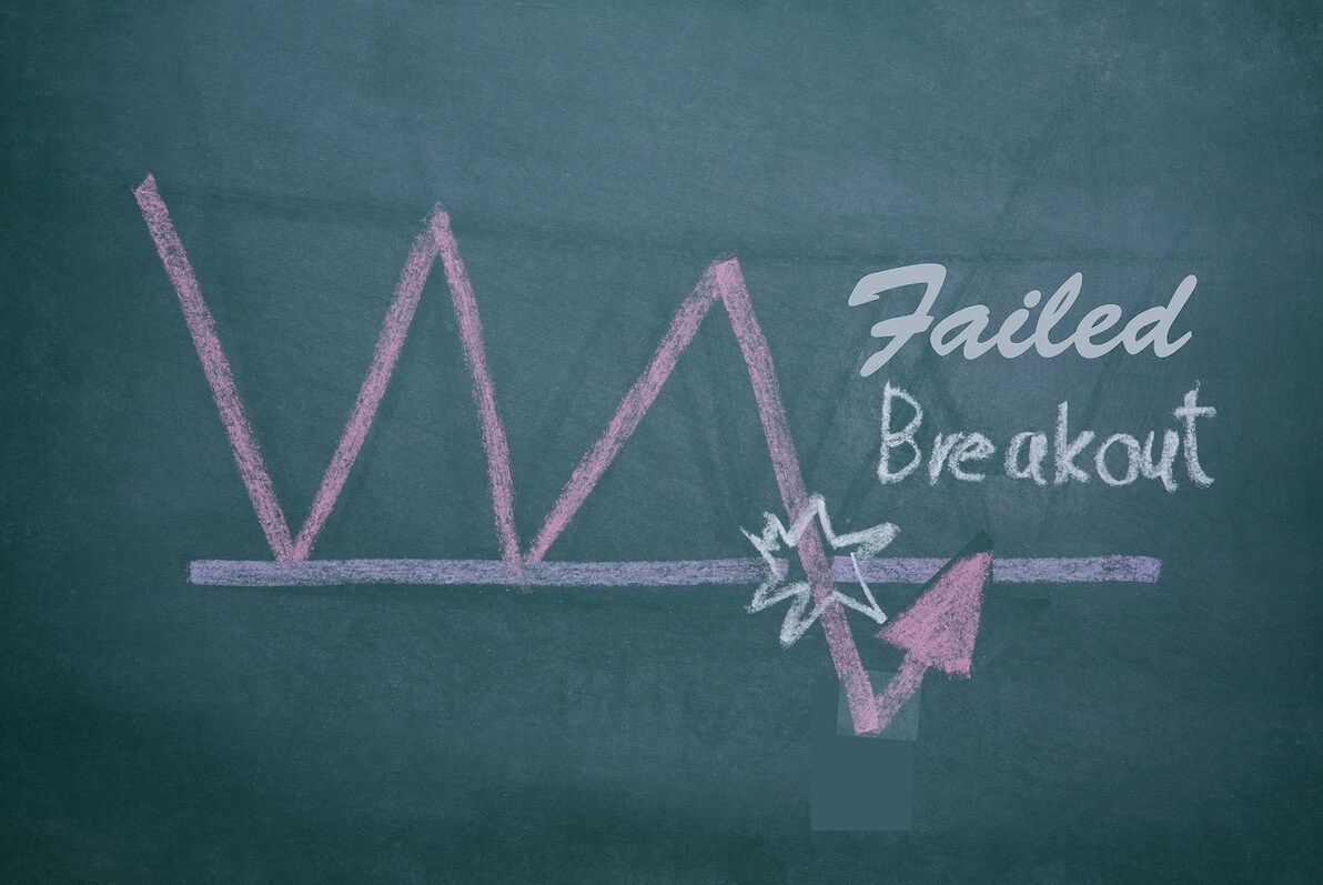
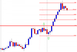
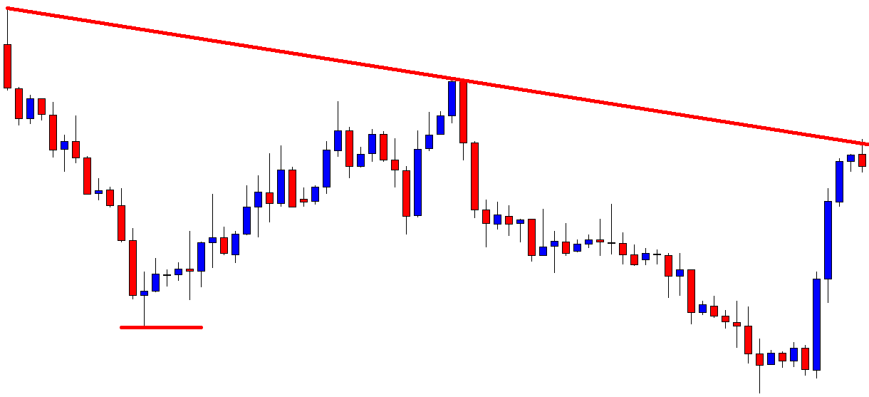
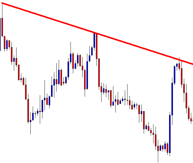
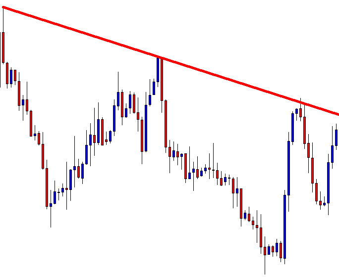
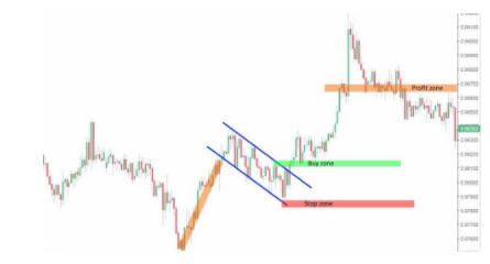
Technically, a triangle is a lateral channel of narrowing that usually emerges at the end of the trend. Basically, the triangle is resolved when the range of price fluctuation decreases to the limit, an impulse arises and the price penetrates one of the limits of the figure, moves away from the rupture. I suggest analyzing the break scenarios both upward and downward in the given example. Although the triangle is the continuation figure, it is no more than a probability, and therefore it is worth considering an alternative scenario.
When trading with a triangle pattern, it makes some sense to open a buying position when the price, having passed the resistance line of the pattern, has reached and exceeded the local highs, marked before the break of the resistance line (buy zone). Expected earnings must be set when the price passes a distance less than or equal to the amplitude of the first wave of the figure (profit zone buy). In this case, a stop loss can be placed at the local minimum level that preceded the breakpoint of the resistance line (stop zone buy).
A sales position can be opened when the price has penetrated the figure support line, reached, or pressed through the local minimum level that preceded the breakpoint of the support line (sell zone). Expected earnings should be set when the price has passed a distance less than or equal to the amplitude of the first wave of the figure (profit zone sell). A stop-loss, in this case, must be placed at the level of the local maximum that preceded the breakpoint of the support line (stop zone sell).
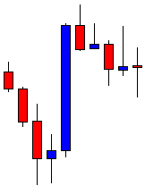
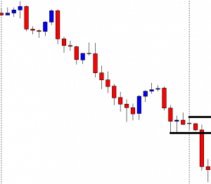
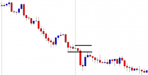
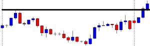
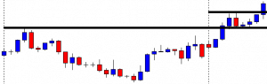
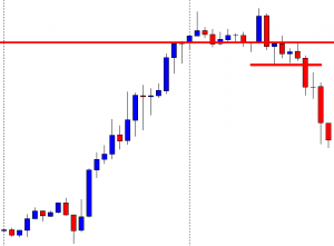
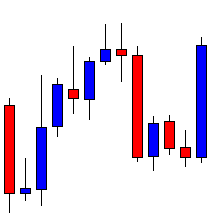
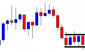
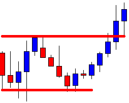
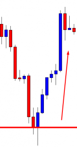
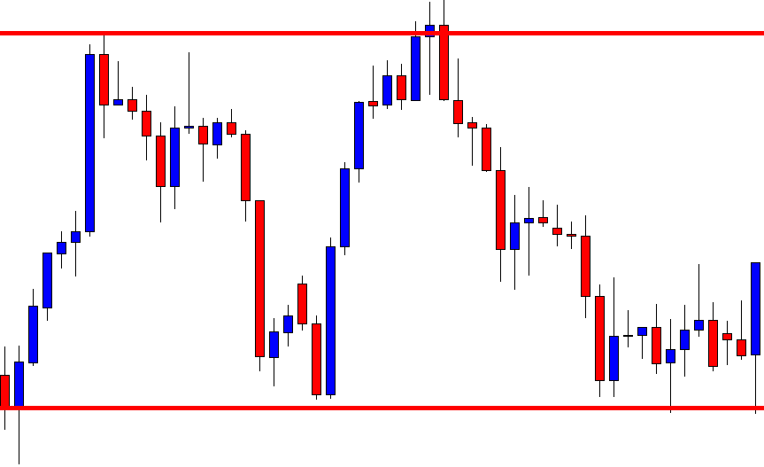
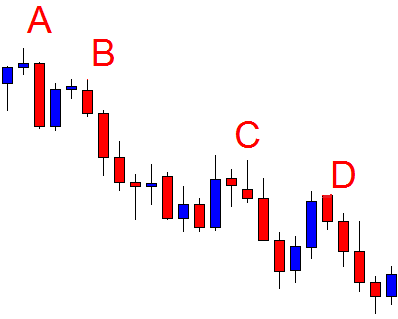
“Double Top”
This pattern is classified as the simplest, so the probability of its effective implementation is somewhat lower than that of other patterns. In classical technical analysis, the double vertex is classified as a trend change pattern. This means that the trend that has been on the market before the formation of the pattern may change after its formation is completed.
The figure represents two consecutive maxima, whose peaks are at approximately the same level. The pattern can be straight and inclined, in the latter case you should carefully examine the bases of the upper parts which should be parallel to the maxima.
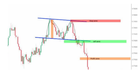
In classical analysis, a double vertex works only if the trend is reversed and the price decreases, if the price reaches the third maximum, the formation becomes the triple vertex pattern.
A sales position can be opened when the price has penetrated the figure support line, reached, or pressed through the local minimum level that preceded the breakpoint of the support line (sell zone). Expected winnings must be set when the price has passed a distance less than or equal to the height of any vertex of the figure (profit zone).
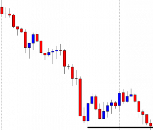
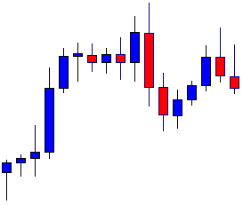
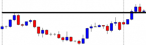
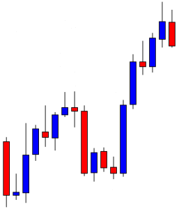
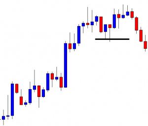
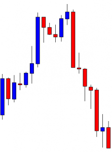
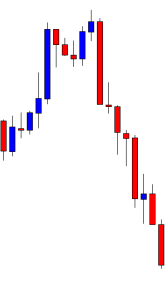
“Head & Shoulders”
The figure represents three consecutive maxima, whose maxima are at different levels: central must be above the other two, and the first and third, in turn, must be about one height. However, there are some pattern modifications when the shoulders are at different levels. In this pattern, we must ensure that the central maximum is higher than both shoulders. Another key feature for identifying the pattern is a clear trend line, which precedes the pattern’s appearance.
The pattern can be straight and inclined, in the latter case, you should be careful to check if the bases of the upper parts are parallel to their maxima. The minimums between these maxima are connected by a trend line called the neck.
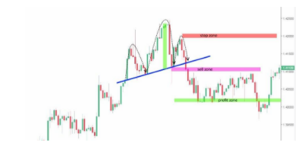
A selling position can be opened when the price has penetrated the neckline of the figure, reached, or pressed through the local minimum level that preceded the breakpoint of the neckline (sell zone). Expected earnings should be set when the price has passed a distance less than or equal to the height of the central vertex (head) of the figure (profit zone). A stop-loss, in this case, must be placed at the level of the local maximum that preceded the point of break of the neckline or at the level of the vertex of the second shoulder (stop zone).
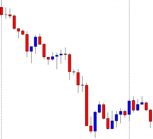
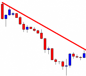
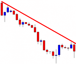
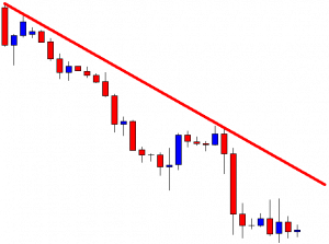
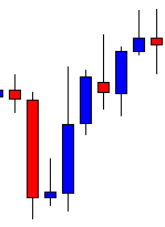
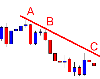
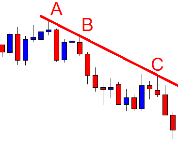
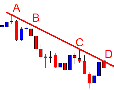
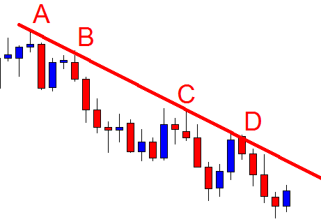
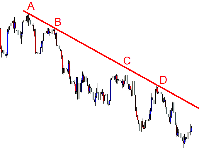
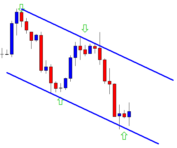
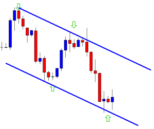
“Wedge”
In classical technical analysis, the wedge is classified as a continuation pattern of the trend.
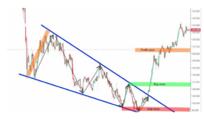
Technically, the wedge, like the triangle is a lateral channel constriction, but another difference between the wedge and the triangle is its size. The wedge is usually much larger than the triangle and sometimes takes months and sometimes years to form. Therefore, in classical wedge analysis, it is usually implemented in the opposite direction to the formation of the pattern itself, in other words, the trend changes. A purchase position can be opened when the price has penetrated the resistance line of the figure, reached, or pressed through the local maximum level that preceded the breakpoint of the resistance line (buy zone).
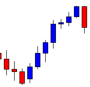
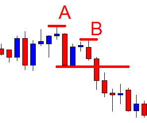
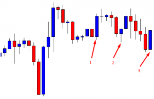
“Flag”
This price pattern is classified as the simplest, therefore its efficiency depends on numerous factors. In classical technical analysis, the flag is classified as a continuation pattern of the trend.
The pattern indicates a corrective retreat, following the strong directed movement that often looks like a channel, tilted against the prevailing trend. In classic technical analysis, the flag pattern works only if the trend continues its direction. A purchase position can be opened when the price has penetrated the resistance line of the figure, reached, or pressed through the local maximum level that preceded the breakpoint of the resistance line (buy zone). The angle formed between the predominant trend and the flag channel should not be greater than 90 degrees. The flagship channel itself should not revert in price more than half of the previous trend.
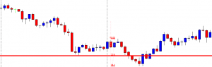
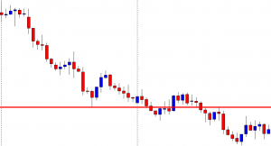
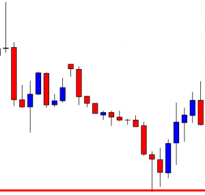
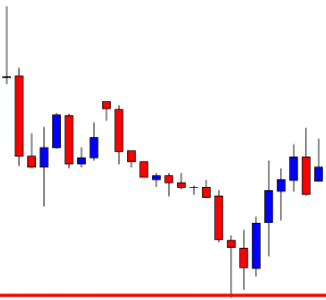
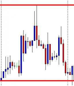
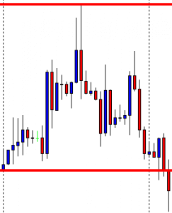
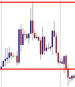
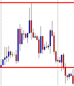
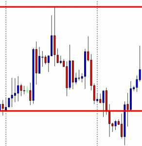
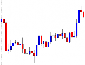
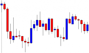
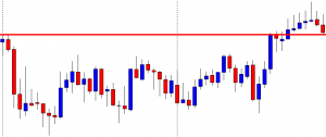
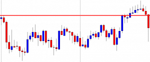
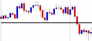
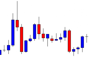
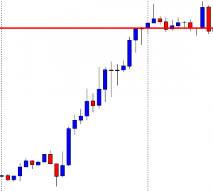
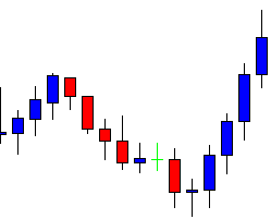
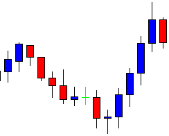
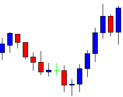
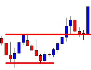
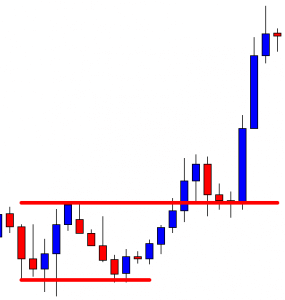
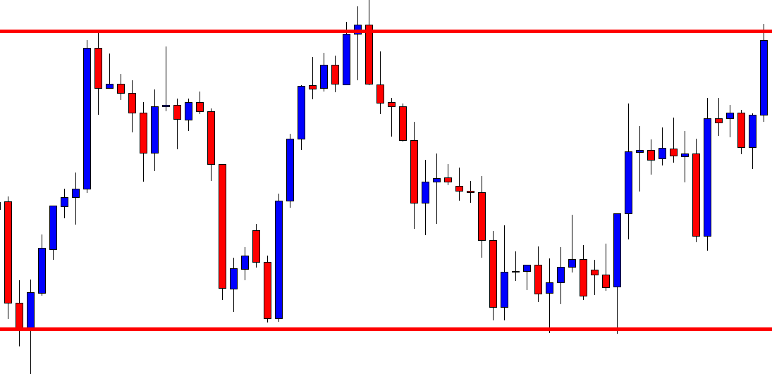
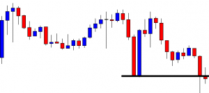
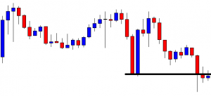
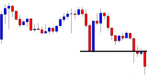
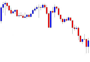
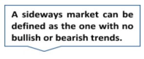 From time to time, we will not be able to see any definitive upward or downward movement and the prices may not get to make your take profit targets, making traders insecure about the overall market direction.
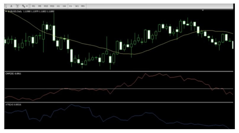
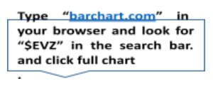 Even though we can determine market volume with the help of ATR, ADX, and Bollinger Bands, among other tools, the $EVZ volatility index has proved to be extremely useful and easy to use. When you open the full chart, you will be able to see a number under the heading “Euro FX VIX.”
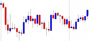
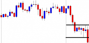
  There are a few ways to deal with unfavorable markets.
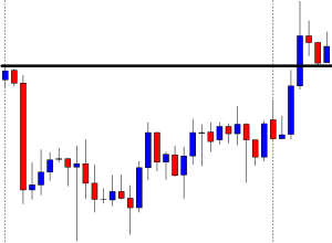
  Still, low volume/volatility is a normal part of market oscillations, as these constantly fluctuate. Even if you are getting a lot of losing trades, do not get discouraged. Your time will come.
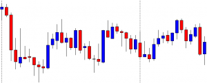
 You should not trade at this time because the price direction guesswork is extremely hard to get right and you can easily lose a lot of money. If you aren’t getting any signals, there is no reason for you to push it. Just stay put.
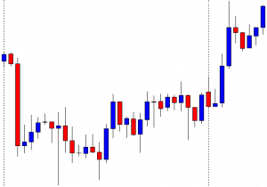
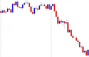
 We cannot scale out when the market is unresponsive. Therefore, we should in such cases take the entire trade-off at the first
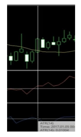
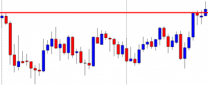
  We usually cannot have a standard 2% risk on trades encumbered by sideways market movement. Reduce your risk to 1%, for example, if you see that the $EVZ index is reaching incredible lows, like in 2019.
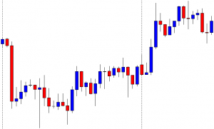
  If you are not prepared mentally or emotionally, your account will suffer no matter the conditions. If you start panicking the first moment you spot any sideways market movement, the likelihood of you making a good decision will start to decrease exponentially.
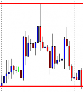
 Looking for an ideal trading scenario to start trading is as futile as is failing to recognize the potential of dead markets. When we are faced with the saturation of sideways market movements, we should perceive the market as our fertile land. It is those moments that give us perfect room for improving our systems. Reflect on your past trades and decisions, and see what you can do better. Focus your attention on your trading and test, test, test. If you find a strategy that is working well in these conditions, this is your plan B, switch to it.
 Unfavorable market conditions affect us all. Do not think that experts are making a ton of money under any circumstances. You may have even had plans to leave your current job and turn to trading only, but now is not the time. Make no rash decisions, keep all of your sources of income active, and just wait for everything to go back to normal. Even when it does, you may still need a few months or years for everything to work out as you planned.
 Well, no matter how well-developed your system is, most volume indicators cannot record the first big move as quickly as it occurs. So, now that you know that it isn’t your fault, do not give in to any doubts or regrets and just move on.