Categories
Forex Chart Basics

Naked Trading? It’s Not What You Think!

If you choose to trade while naked, that’s entirely your business. Don’t let us stop you! What we’ll be talking about today, however, is a different form of naked trading – naked chart trading. When carrying out technical analysis, it is possible to make key decisions using what is referred to as a “naked” chart, but should you?

Look at the chart below:

Now, compare it with this one:

What is the main difference? – The second chart is “indicatorless“ or, in other words, indicators are not used here to analyze the trade. 

There are usually no moving averages, no ATR, no volume, or any other additional piece of information that we would normally use in technical analysis.

This, what we see in the second chart, is what we call a naked chart.

Markets: What can we trade with naked charts?

Naked chart trading or naked chart reading can be used in any trading market that involves charts (e.g. ETFs, stocks, forex, among others). 

Purpose: Why do traders use naked charts?

Naked charts are used to have a simplified and clearer view of what is happening in the market. When a chart is decluttered, traders can escape information overload and focus on what really matters – the price

Technical traders vs. naked traders: What is the difference?

Technical traders primarily rely on technical tools to obtain information from the chart. Owing to the indicators they use, these traders can see whether a certain trade would be a good opportunity to take. Naked traders, on the other hand, focus on the candles that tell them what is happening right now. They are only interested in price action signals, which is why we call this type of trading price action trading as well.

Use: How do we use naked charts?

  • To identify the market

Naked charts help traders grasp the momentum or what is going on with the price at a specific moment. Traders, thus, first need to understand the overall market direction with the help of the highs and lows. Based on this information, traders can discover important facts concerning the trade:

  • bullish trends
  • bearish trends
  • emerging trends
  • ranges between highs and lows

Support and resistance traders often rely on swings, differentiating between four different types – higher highs, higher lows, lower highs, and lower lows. These allow them to determine which of the following scenarios is currently taking place:

  • uptrend – a series of higher highs followed by higher lows
  • downtrend – a series of lower lows followed by lower highs
  • consolidation – a lack of a specific pattern 

To see how the market is moving, we can apply a simple chart analysis, without having to rely on any indicators. That is why it is easy to determine whether a market is trending. Also, when we see a bullish trend with a continuation of higher highs and lows, we know that this is a signal to buy. Bearish trends, however, will create a series of lower highs and lower lows, signaling a sell.

When a price gets trapped between two levels, both highs and lows will keep happening at the same levels. Without any specific boundaries, traders can face difficulties understanding price action. That is why neutral markets require special attention and more caution.

  • To spot reversals 

People who trade reversals often use horizontal levels, trend lines, pivot points, and Fibonacci levels. Support and resistance levels are believed to be particularly suitable for revealing the key points of reversals:

  • When the price keeps moving along major support levels which then turn around.
  • When the price retraces along with the previous support level, making it the new resistance to get reversed.

Uptrends and support and resistance levels are important areas in naked charts because those are the places where we are likely to see turning points.

  • To identify trade signals

We can identify buy and sell signals in naked charts by determining the candlestick reversal pattern. The most common signal to sell is a bearish rejection candle.

Time frames: Do time frames affect trading with naked charts?

Instead of using a daily chart, traders can actually switch to lower time frames to see what is happening with the structure more closely. Some traders ever resort to using multiple time frames to make a better decision. To generate a better approach, you can ask yourself a question such as the one below:

Is a more bullish trend indicating a greater chance of a resistance fail?

Exits: Can we get a sign to exit a trade in naked chart trading?

After the price breaks out, trades pile into the trade, often wondering if it is overbought or oversold. This question is, in fact, not important for naked chart reading because it allows traders can rely on the resistance sitting above the current run in the price. 

Resistance, or support, levels will not tell us if the price will fail to continue running, but traders should remain vigilant once the price reaches this level. Here, you should actually be attentive to what the price is doing. These are important areas because you can see from the price action what it is about to do.

Being alert and practicing the ability to read the forming structure can give you a profit exit long before everyone else rushes to the exits.

Different charts: What are their advantages and disadvantages?

Fuzzy logic: Application in trading

Traders are essentially people who are prone to making subjective evaluations. We often encumber our decision-making with notions such as intuition and emotions that obstruct clear thinking. Unfortunately, technical trading cannot sustain vague structures, so some traders need a definite yes or no to interpret signals and have a clear vision of our next step. 

The black-or-white approach will alleviate many of the challenges we face in trading because it is the gray area that makes trading susceptible to mistakes. What this means is that traders need to learn how to approach messages whose interpretation may vary. 

No indicator is 100% accurate, but we all know that, for example, the RSI below 30 is a sell and above 70 is a buy. A lot of false signals occur if we blindly follow this crisp logic. However, by combining other information about the market we could decide to open smaller or bigger positions. Our brains are used to fuzzy thinking, we feel how much we need to push the brake and how much to step on the gas, and accidents happen. Takes a lot of time to master and safeguard our portfolio.

Conclusion: Naked charts or technical analysis

Traders who are apt at interpreting naked charts are also at a significant advantage because they can understand what is happening in the market without needing to rely on any particular indicator. With the rise of automated trading (expert advisors), there seems to be a greater need for ready-made solutions, and learning how to read charts tends to be a factor that makes many people give up early. However, we must understand that the basics of interpreting any chart are also the essential items of knowledge every trader should acquire, regardless of the market or strategy he/she chooses. In the end, whether you decide to use specific tools or opt for naked chart trading, make sure that you know everything there is about your preferred style of trading to eliminate mistakes, prevent losses, and make good decisions, as these will inevitably determine how successful your trading is no matter the approach.

Categories
Forex Chart Basics

Pivot Points in Forex Trading: What You Need to Know NOW

When you study Forex trading you may have discovered the term, pivot points. This is a collection of supports and resistors that are previously calculated to give you ideas about where to buy and sell a couple of currencies. Pivot points are not just used in Forex and in fact, have a history in futures exchanges in the United States. This brings us to the days of voice trading and before computers existed.

Unlike many other indicators you might find, pivot points are, because of their nature, predictable. Essentially, what you’re doing is seeing where the overall pivot in the market can be, and then the next three levels of support and the three levels of resistance. This indicator is quite powerful, but the same as other indicators, it must be confirmed either by the action of prices or other factors such as the previous support level.

The analysis of pivot points focuses on the relationship between the maximum point, the minimum, and the starting prices between each day of operation. In other words, the prices of the previous day are used to calculate the pivot point of the current day. The pivot point, the central axis of the indicator, is considered as “fair value” for the market. Remember, if the price is rising and is returned, it is said to have resisted. Alternatively, if the price is falling and is returned, it is said to have found support. This indicator will show what is the “fair value” of the market, and three potential areas in both directions, which are called support one, support two, support three and also resistance one, resistance two, and resistance three to make the role of guidelines.

The Calculations

The turning point of the day is exactly equal to the maximum price of the previous session plus the minimum price of the previous session and the price of the previous session’s departure. The division of these three numbers by three gives you the pivot point. Once you know the turning point then you can extrapolate the resistors and supports. S1, S2, S3, R1, R2, and R3.

Pivot point of the current session = High (previous session) + Low (previous) + Close (previous)

The other pivot points can be calculated as follows:

  • Resistance 1 = (2 x pivot point) – Minimum (previous session)
  • Support nº 1 = (2 x pivot point) – Maximum (previous session)
  • Resistance nº 2 = (pivot point – support 1) + Resistance 1
  • Support nº 2 = Pivot point -(Resistance 1 – Support 1)
  • Resistance nº 3 = (Pivot point – Support 2)+Resistance 3
  • Support nº 3 = Pivot point – (Resistance 2 – Support 2)

Statistical Probabilities

One of the main reasons why traders use pivot points is that they work statistically. For example, the EUR/USD pair has given results below support 1 almost 44% of the time. The maximum of the day has been over Resistance 1 almost 42% of the time, while the minimum has been under Support 2 17% of the time. Continuing with this, resistance 2 has been exceeded by day maxima only 17% of the time, while minima and maxima exceeding or being below support 3 and resistance 3 only occurs 3% of the time. Because of this, you may perceive how likely it is that the price will go to any of those areas. Think of it as a Gauss bell, and the standard deviation equations you learned in school. When you are beyond two standard deviations it is very rare to stay there, you can think about our three and support 3 in the same way.

Think about it this way; if the resistance level 1 is only exceeded 42% of the time, in this way that means that if you are on the market for a short term, the odds are in your favor if you put the loss cut over the resistance 1. Obviously, there are many possible combinations here. Luckily, most trading platforms now include pivot points, so you won’t need to know how to calculate them.

An Example in Action

Have a look at any graph of the AUD/USD pair with an hourly timeframe that has the pivot point indicator built-in. At this point, I would like to point out that not all Metatrader platforms come with it, but there are free downloads available online on a multitude of schemes. In this particular situation, the pivot point of the previous day is the yellow line while the support levels are blue and the resistance levels are red. As you look at this chart, notice that the market started the day at a point much lower than the pivot. The central pivot line, the yellow one, should be considered as a potential “fair value” for the market. Instead of starting there, we started at $1, and we started seeing support. You can clearly see that initially, we moved towards the pivot point but then you overcame it. You’ll notice we stopped at Resistance 1, which is where we closed the day.

You can see the importance of those levels in this table because even when they are surpassed the next level will begin to show its influence. What I have not pointed out in this graph is that the central pivot is at the level of 0.73, an area that has been in support and resistance more than once. It is therefore not a great surprise to see that the market suddenly closed at that level and did not deviate from it. If you decided to stay in the market above $1 you would probably have made a profit near the pivot point. Beyond that, if we deviate outward as it happened, then I could well see the area below the pivot point to put a stop loss. While it is not itself a trading system, the pivot points are based on statistical probability, something on which much quantitative trading is based. Keep in mind that many machines sell and buy currencies today, so those ratios and formulas can be relevant. Then using pivot points and Forex trading you add some quantitative trading to your strategy.

Pivot points are typically used for short-term trading, however, there are pivot points that are used in monthly installments in the same way. When calculating these, simply replace the maximum, the minimum, closing values of the previous sessions with one of the previous month. It works the same way, any time frame.

Categories
Forex Chart Basics

The Ultimate Guide To Correlations: From Basics to Opinions

Individuals eager to enter the world of trading usually feel perplexed when they start analyzing the charts, not fully understanding the movement of prices and what causes it. After a while, they typically start making connections between different factors in the market, beginning to grasp this association. Correlations, the implication that connections can be drawn between the behaviors of two distinct things, are one of the inherent parts of different trading markets. Nowadays we can see how various events affect the changes we see in a specific market and how different markets can impact one another, providing proof for the existence of both inter- and intra-connectedness in terms of market cause-and-effect relation. We can now see and understand how correlations work and the way they cause things to move. Often we find how pulling one string affects other parts of the web, which is why it is necessary to see the extent of this impact and whether it can have practical applications for traders. Today we are reviewing different types of correlations, finding real-life market implications, and evaluating their effectiveness.

Correlation Degrees

Correlations can either be positive or negative and together these two polarities form a spectrum consisting of several different degrees of correlation. As can be seen from the table below, both positive and negative correlation can be either perfect, high, or low. With the positive (left) side, we understand that two things are moving exactly the same, unlike for the negative (right side of the table). With similar indices, we can often detect a positive correlation, such as the case of the SPX and the SPY (ETF) which, due to their similarity, do not only have a positive correlation but a number of correlations as well. On the other hand, examples such as the correlation between DIA (diamonds) and DOG (inverse ETF) reflect a negative correlation owing to the fact that they move exactly opposite to each other. Therefore, we can conclude that a positive correlation is the one where two things are moving together, while the negative one implies that two items are moving in the opposite directions, as portrayed in the graphs below.

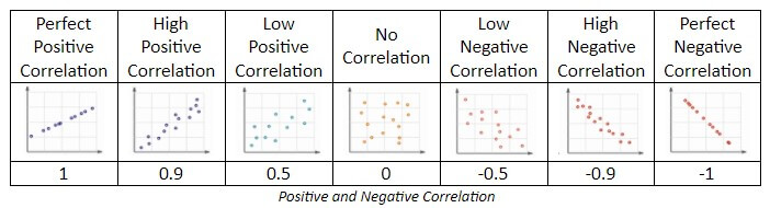
Many traders assume that, since there are two extreme points at both ends of the spectrum, the middle stands for a perfect balance between the two. However, as correlations simply work differently, the mid-point actually signals something completely different. For example, in the stock market, there is a number called beta, which essentially stands for a measure of volatility. In this respect, the S&P 500 is esteemed 1, so if anything is considered to be 2, it would signify a two times higher degree of volatility in comparison to the afore-mentioned index. Hence, if anything was measured to be 0.5, it would imply that it is half as volatile as the S&P 500. In the early 2000s, Netflix had a negative beta and, as it went down each time the S&P 500 went up and vice versa, it was impossible to measure volatility in relation to this index because Netflix never followed what the other was doing. In statistics, there is a term called R-value which reveals how things are correlated and, going back to the previous table, we can see that there are two perfect correlations on each side, positive and negative, but the middle, however, shows no correlation. This further means that there is no perfect balance in between the two extremes, yet that there is a void where no correlation exists just like the previous example involving Netflix shows. 

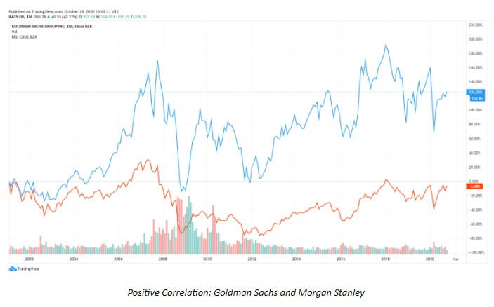
In terms of positive correlations, we can find many examples of stocks correlating with the S&P500. One example where there is an indication of a similar movement is displayed below. Although the correlation between Goldman Sachs and Morgan Stanley (both of which are in the same line of business – brokers, trading, and asset management, among others) is not a perfect one, we can definitely find proof of it being a positive correlation despite the existing differences. Although these differences are obvious, we see that these two similar companies also have a tendency to move in a similar fashion.

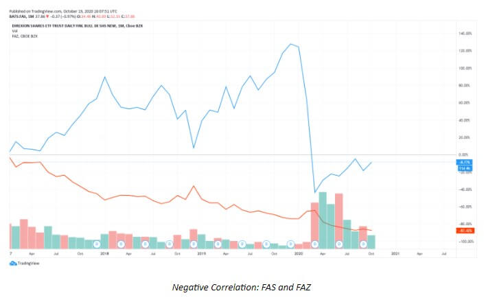
Although most stocks are said to have a positive correlation with the S&P 500, there is still evidence of some with a negative correlation. The example below shows exactly that type of correlation, where we can see how FAS and FAZ are inversely or negatively correlated. The chart below is very close to a perfect negative correlation where the movements go in almost entirely opposite directions. Where we see the FAS going up, the FAZ is going down and vice versa. This almost perfect opposite behavior is completely understandable since FAS stands for a financial ETFx3 to the upside, whereas FAZ represents a financial ETFx3 to the downside (Direxion Financials).

Major Correlation Causes

Many sources claim that correlation does not equal causation, implying that things that are correlated need not be the cause of each other’s existence, yet there is proof that certain factors lead to specific occurrences in different markets. We recognize three of such determining factors where correlation is quite vivid and, consequently, undeniable: 1) market correlations, which is the most prominent in the currency market; 2) commodity correlations due to which specific commodities affect certain currencies; and, 3) currency correlations where one currency is likely to go down because the other one goes up for example.

Market Correlations

Whenever the topic of market correlations comes up, it is necessary to bring up the measure between risk and reward as well. Today we understand how some assets are considered to be very safe, while others are seen as risky. These projections stem from the analysis of volatility and risk of loss, so we can call an asset risky whenever it is likely to lead to a loss. Those assets which are perceived as safe always entail some form of security, e.g. government bonds that are both paid and guaranteed by the US government and that come with a 3—10% return on a 30-year bond. With such assets, people feel certain that the money in which they have invested is guaranteed and they typically leave a sense of stability overall (as in the example of the US government, which is unlikely to run out of business, that poses as a sign of security for the bonds). Stocks, on the other hand, can easily increase by 30—40% and drop the same percentage immediately afterward, which is why they are considered to be riskier assets. 

In the world of bonds and stocks, people have always used the ability to allocate their funds from one to the other. As bonds come with a greater percentage return whenever things are going well and a significantly lower percentage return when things are not so well, people turn to them whenever the circumstances seem to be unsafe. Therefore, each time people see that the economy is booming, they will invest in stocks and not in bonds, which eventually leads to an increase in stock prices and a decrease in bond prices. However, the moment people feel concerned due to some external factors or events, they will immediately sell their risky assets and allocate their money to safe assets. People will then be piling money in bank deposits, bonds, or utility stocks, which are considered to be less risky, and this is the one reason why assets’ value increases. These surges and reductions in prices almost always stem from people’s decision where to invest their money, which is noticeable in the currency market as well.

When the COVID-19 pandemic started, the US and world economies shut down and we have witnessed major GDP drops across the globe. It is interesting to note how the JPY, the official currency of Japan, skyrocketed by 11.6% in just 4 weeks. To make a comparison, forex traders are more than satisfied with a half a pip growth in one week, so this sudden change had a message to convey. The only cause of such a rise was people looking to buy the currency in question, which seemed like a wise decision in times of crisis and unpredictability. This was an example of a risk-off move where people are eager to buy safe investments for the sake of exiting the riskier assets. Such conversions always affect currency prices, so if people are willing to buy US government bonds as a safe investment, the money will flow into the US and the USD as well. Aside from the US government bonds, ranked the first owing to the US economy is the largest one in the world, China’s and Japan’s bonds are also considered to be the safest assets and respectively hold the second and the third place in terms of their economies. People will always look to invest in these countries’ assets because they are believed to be the least likely to collapse, making people’s investments as secure as possible. Australia, for example, may not be able to pay off all the bonds due to a lack of money or wealth, which is what people may feel worried about when choosing where to invest their money.

Risk On/Risk Off

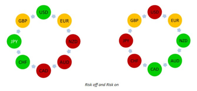
From the perspective of history, the JPY, the USD, and the CHF have traditionally been viewed as currencies of safety, while the NZD, the AUD, and the CAD are considered to be risky currencies. The shapes below explain how the purchase of currencies works in different situations. A typical risk-off move occurs when people look to buy stability and sell what is risky. Whenever people are buying stocks, economies are growing, and there seems to be less worry about risk overall, we are seeing a risk-on move where growth currencies boom. They are called growth currencies because their economies are much smaller, so they can achieve much higher growth rates during times of prosperity. During these times, currencies such as the USD, the JPY, and the CHF, which are representative of their strong economies, would normally not do so well. The EUR and the GBP are usually always somewhere in the middle, more or less unaffected by the same factors as other currencies.

These moves and changes in currency preferences, however, need not always play out as we expect them to. Theory and real-life applications often differ in the world of trading, so traders need to have in mind that textbooks should only serve as guidance rather than absolute truth. The same discrepancy can be seen in any other line of business, where people often claim to not have been prepared for everything they encountered until they started building a business. Any resource we get hold of is meant to tell us how things are supposed to unravel, yet these prescribed scenarios should never be seen as carved in stone. For example, whenever there is panic in the market, the EUR is always found in the middle and the CHF is always perceived as a currency of strength. However, when the Eurozone was on the verge of collapse in 2012/2013, these two currencies were found in a completely different set-up.

The Eurozone attempted to take countries of different economies, currencies, and histories and blend them into one. Before any of these changes, the event of one currency dropping in value was able to affect that country alone, which allowed them to export their goods and services more easily due to them being cheaper and thus more appealing to other countries. When different European countries agreed to come together in 1998, many were doing exceptionally well, pouring money into the Eurozone. When Greece and other countries showed less preparedness to provide the same, the member countries with stronger economies began to complain, not wishing to keep funding the underperforming economies. At that time, the Eurozone did not have a functioning measure that would tackle these issues, so many people started to raise questions regarding the future of the EUR, which consequently became the riskiest currency. Then this worry affected the financial markets and the EUR lost its previous status.

The CHF, the usual currency of safety, which is also located right in the middle of the Eurozone, made people feel worried about what would happen to Switzerland and its official currency despite its long-held favorable status. The unsettled issues and rising concern made the currency fall from grace, leaving a need to allocate large sums of money in some other direction. Unexpectedly and suddenly, people showed interest in New Zealand and the NZD became the currency of favor for a while. As the Eurozone was affected by its internal troubles, people desired to look outside the continent and this is an excellent example of how external factors play a big part in how events play out. Therefore, stories, news, and history in the making are going to affect currencies and make them move outside their usual patterns. Today we see the USD as the currency of stability and safety, but this may too change because of the risk-on and risk-off moves people make. This is an extremely important correlation and traders should always acknowledge its impact. In addition, it is vital to remember that the decision on which currencies to pair in the event of equity markets going down is easy to make when there is knowledge on which currencies act as the currencies of safety.

Commodity Correlations

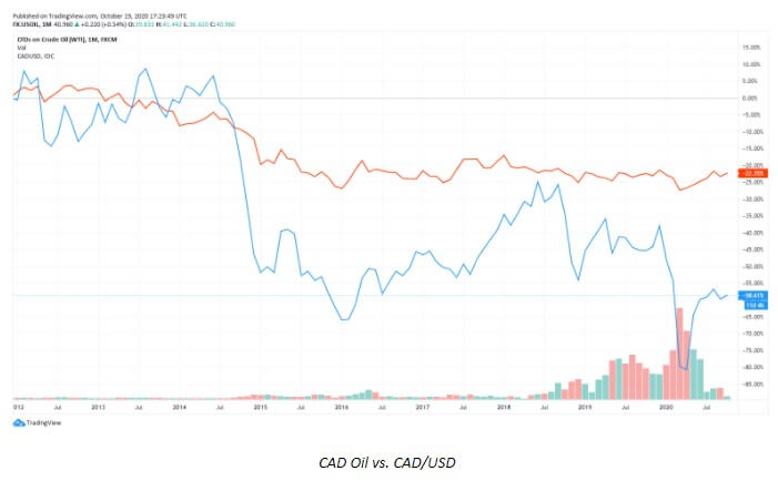
Canada is an excellent example of a resource risk economy, which further entails that a great proportion of its economy is dependent on its resources. Due to this reason, the price of resources is an extremely important factor for this country. Oil, in which Canada is abundant, is known to have affected their economy through history. For example, in 2005 when the price of oil shifted to $150/barrel only to go back down and up again impacted Canada to a great extent. Such price alterations meant that the country had to close down oil production and put a lot of people out of work, which increased unemployment levels, decreased taxes the government could collect, and ultimately made their bonds a lot riskier. This story exemplifies how relevant these commodity correlations are, as commodity prices inevitably influence people’s buying preferences and the entire strength of an economy. It is, however, interesting to note that, while there always seem to be high correlations between the CAD and the price of oil, between 1986 and 1991, the price of oil increased while the CAD remained unchanged, which only points to a conclusion that these correlations are not always present.

Some other correlations are vivid in the gold market, especially in connection with the three currencies that are highly correlated with the price of gold: the CHF, the AUD, and the NZD. Today, the CHF is the only remaining currency still pegged to the gold standard, which means that any desire of the Swiss government to increase wealth needs to be carried out through the acquirement of more gold. Whenever a country buys great quantities of gold, whose price increases around the same period of time, the country in question immediately becomes that much richer and is much more likely to be able to pay up on its bonds. This has a direct impact on the way the currency and the country are perceived by people, who are then increasingly more likely to see them as stable and safe and are, thus, more willing to purchase their bonds. Alike the CHF that is backed up by gold, Australia is also closely connected to gold due to its mining. Furthermore, the NZD which is tightly connected to the AUD is then also likely to be impacted by any changes occurring with the price of gold and the AUD. Therefore, should the AUD go up as a result of the changes in the price of gold, the odds of the NZD changing are higher and vice versa. The AUD, the NZD, and the CHF all have a positive correlation with the price of gold, which further entails that they will typically rise when the price of gold does as well.

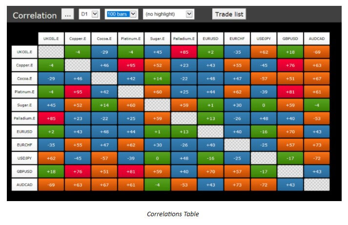
We can find these correlations with other currencies as well, for example, the South African rand and the Swedish krona have both demonstrated high correlations with the price of gold although we typically do not trade them. The USD also shows proof of such correlation with gold, although a negative one, which signifies that the price of the USD will generally fall whenever the price of gold rises. Moreover, whenever we consider the prices of oil and gold, we are able to develop an insight into what is happening with the CAD, the AUD, and the CHF. Some websites even offer tables with information on different correlations, so as the table below suggests, copper is mildly correlated with the EUR.

Currency Correlations

When we discussed another type of correlation above, we explained how the AUD is highly positively correlated to the NZD because of the close proximity, which also means that the two will be each other’s greatest trading partners. Another example of geographic closeness is that of Canada and the United States of America, and such ties will always imply that whatever happens to one country is probably going to affect the other one as well. With Australia and New Zealand, it is interesting that their common trading partner apart from one another is China, which is a very big part of their GDP and export. Again, if anything occurs in China that should impact its economy, both Australia and New Zealand will feel the reverberation of these events. 

As the Eurozone is a very peculiar unit, when the coronavirus took over the world by storm, the entire union took on a meticulous plan on how to tackle the challenge. There were signs of problems in Italy and Spain early on, yet the effort to shut everything down and make everyone comply with the rules led to lasting changes for the better. Unlike the US, they crushed their economy right on the start only to come out later on even stronger. With the United States, the economy was always semi-closed, so the number of people affected by the virus kept rising while no effective change was recorded. Since the Eurozone’s economy improved after they had it closed off, this also helped the neighboring countries and their currencies – the CHF and the GBP, which are all going to be positively correlated, moving together in the same direction. 

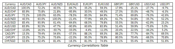
Examples of such currency correlations are numerous, so for example the EUR and the USD have often shown signs of negative correlations, meaning that when one goes down, the other one will go up and vice versa. Traders can find information on these currency correlations on different websites and even check for various time frames to draw more advanced conclusions (see the table below). Nevertheless, apart from such correlations calculators, it is important to mention how certain experts loudly criticize the general approach of different educational sources to currency correlations due to the difficulty and impracticality of their application in real trading. 

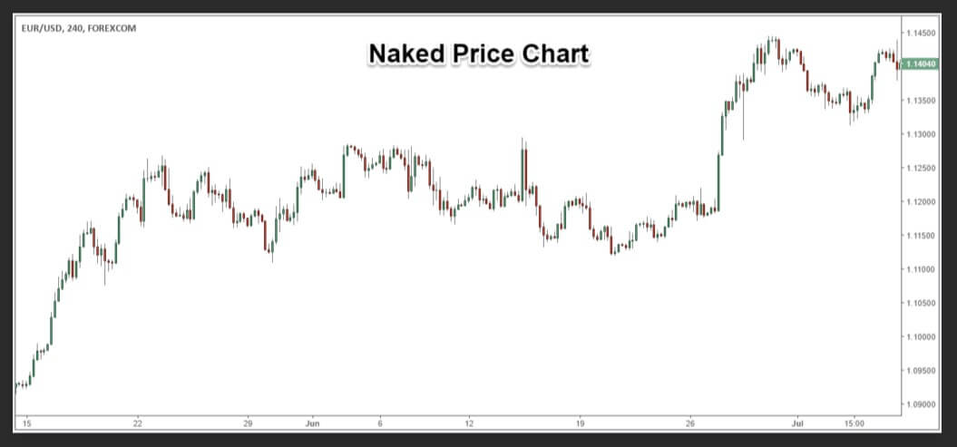
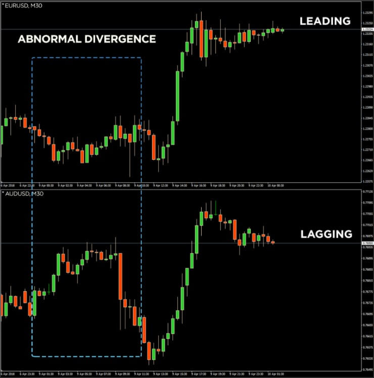
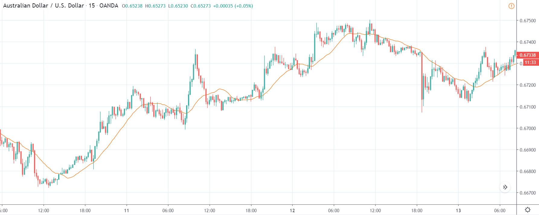
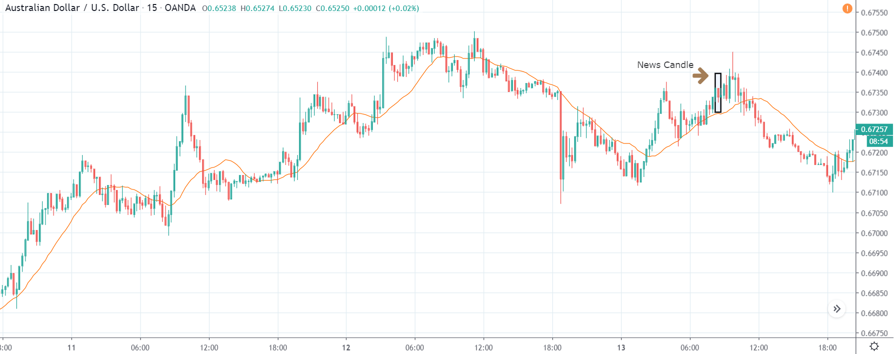
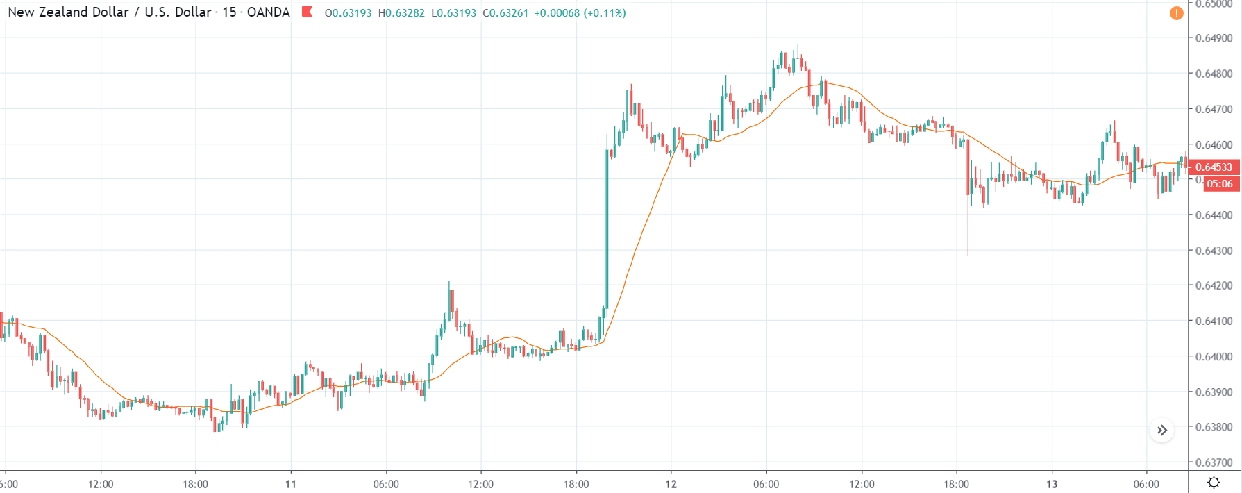
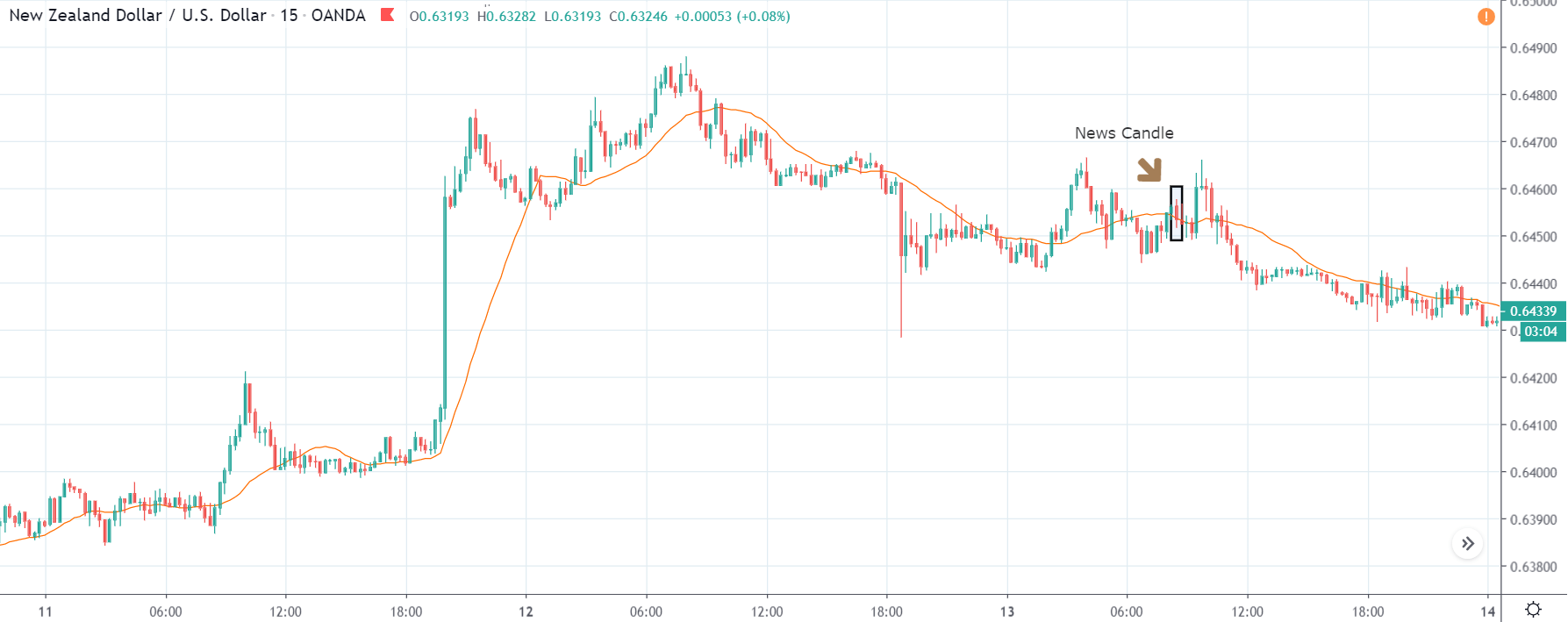
While many assume that a currency that is currently strong will be equally strong against many other currencies and not just one, some forex experts claim that such knowledge is impossible to use in everyday trading. These individuals also find it hard to believe that several currencies moving in the same direction can be taken as a predicament of some future movement. They claim how traders are keen to receive a signal that would warn them about some market changes but how these signals are unlikely to be found in currency correlations themselves. Therefore, whenever traders find two currencies moving together in a correlating fashion in the chart, they are prone to assuming that they will also change direction at the same time due to this inter-connectedness. However, since they are moving exactly the same, the chances of traders receiving the early entry signal they may be eager to get are probably very slim. What is more, this group of experts insists that there are no two charts that show true correlations, which is why they are inviting all traders to compare any two charts they believe are correlating and assess them candle by candle. They argue that all traders will be able to see a different picture details as well as understand that the two currencies are not truly correlating once they start considering all (ponder on the following two images). 

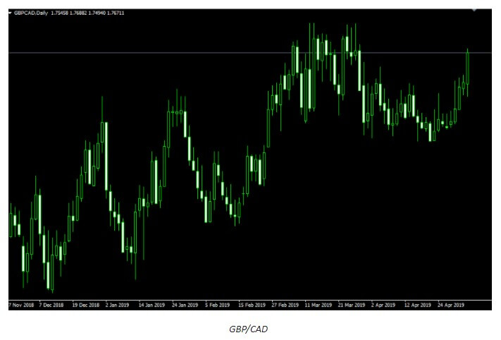
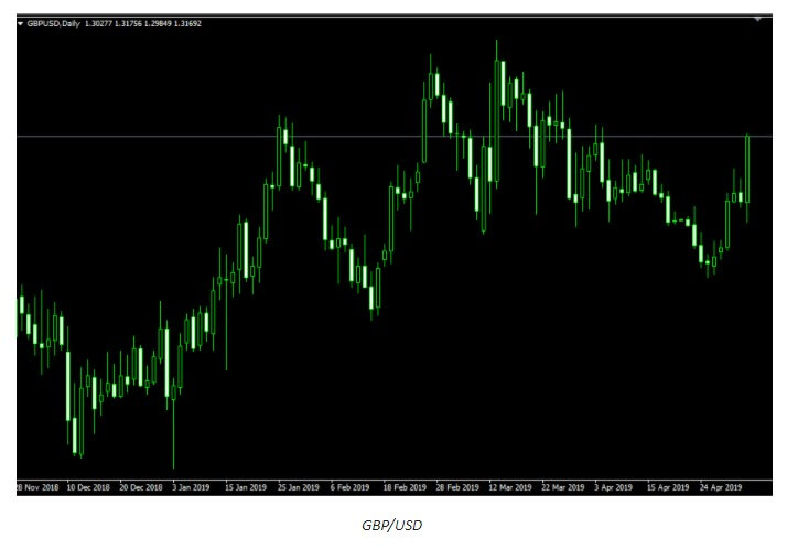
It is paramount that traders understand that many a time what they see in a chart is not an indication of any correlation but a special circumstance where one strong currency is leading the pair. What often happens is that one currency has greater importance than the other one in terms of how this currency controls whether the pair moves up or down. The examples above show how the GBP just mattered more and, whenever this happens in real trading, you will see two charts that look very similar and think that currencies may correlate as a result. Out of the eight major currencies, the EUR and the JPY are the easiest to spot whenever they are in such a position of power. These circumstances cause many charts involving the two currencies to look the same, but it does not mean that they are correlating. What traders can do in such situations is check another related chart; so, if the EUR/AUD and the EUR/NZD pairs appear to be the same, traders should look up the AUD/NZD chart. It is, therefore, crucial that we look into matters more deeply and analytically so as to prevent ourselves from taking currency correlations literally.

While some forex expert traders claim that currency correlation is a phenomenon that simply does not exist, they admit to pairs being able to run together. What they do contribute to this statement is that pairs, however, need not run together at all times. If currencies could be controlled, everyone would have been using this information by now and, since we have no tangible proof of currency correlations, the best approach to take is to work on individual trading systems that are sure to bring traders the signals and trades that can weather through any market despite the natural market oscillations and changes. 

Conclusion

The excitement over correlation varies from trader to trader although it is impossible to deny how different external factors have a tendency to impact various markets. What traders need not focus on is any specific currency; however, the knowledge on risk-on and risk-off moves are rather important because they determine various market movements. If you are eager to get a good trade, simply consider the risk you are leveraging and understand how specific correlations with related markets can assist your trading. Nevertheless, besides connecting these dots, the only thing you can truly feel you can trust and the only thing you can test both backward and forward is your own system. Traders often exhaust themselves looking for information outside their systems, when in fact it is the algorithm and individual set of values and skills that will determine one’s success. Anything else has a much higher chance of sabotaging your efforts and your system, taking you away from something that can work well. Therefore, if your system is telling you to make a specific move and enter a trade, do not go against it just because of the idea that some presupposed correlation is going to lead to a better or worse scenario. Rely on the entire knowledge of markets and the histories of countries and currencies but always trust your system on how to manage your trades and all market ebbs and flows.

Categories
Forex Basics

How Too Much Information Can Destroy Your Trades

It may seem a strange question, but people have asked this before: “Will too much information ruin your trades?” While it might be somewhat unlikely, the truth is that too much information can complicate your trades, and even end in losses. From my experience, there is a possibility of having an information overload. This is also known as “analysis paralysis.” In other words, you have too much information that prevents you from making a clear and precise decision.

Even though it may look a little strange, the fact is that too much information can overwhelm the trader, making him afraid to open a position. The idea of putting up a trade is too stressful, but when you have conflicting information, it can make things a little difficult. As the main rule, I tend to say that when there is too much conflicting information, it is better to stay out of the market. I like to be safe enough when I put money on the market, but I also recognise that my security in a trade does not necessarily mean it will work. There is one thing you should remember when you place a trade: it is important to pay attention to crucial information, not to all information.

Pay Attention to What Matters

One of the main problems for traders is that they can be influenced by any news, tweet, or rumor they might hear. Unfortunately, reporters and people on social media commenting on politics or economics generally have very little knowledge or are not experts on how markets move. The truth is that reporters are just that: reporters. Your job is to give the best possible information, not so much give their opinions. Economic ads are important and should be read and analyzed by traders. I simply question whether reading an analysis of the economic ads counts as reading the news, and I don’t think it does.

The trend is also something important to which you should pay attention, you must accept and learn that the fact of if a currency pair has a rising trend, it has it for a reason. It doesn’t matter how “right or wrong” news is, because price action is what makes you money. If you buy during an upward trend and the market continues to grow, you are making money. Fighting the collective wisdom of the markets will lead you to lose a significant amount of money. Too much trading information.

It is also important to read economic ads along with trend analysis, not as an individual story. Economic advertisements may vary in their importance and you should think about the general trend of economic advertisements for a particular currency. For example, if America’s economic announcements have been strong over the past few months then it makes sense that the US dollar is going to strengthen. A particular ad rarely makes a difference in the trend.

Everyone Has an Agenda

When you inquire about available information, you should keep in mind that everyone has an agenda. Your broker, for example, wants you to imagine that there is a huge amount of money waiting for you every moment of the day (which might be true). Because of this, the brokers publish news that they expect them to take to action. Why is this? Because they make money with a difference, and they make money when you lose in a trade. Don’t let broker news be the only information responsible for your trading decisions, as there is a lot of information.

The forums are also a place where I have seen much destruction done to the accounts of retail traders. Unfortunately, in the beginning, when you start trading one of the first things that notice is that there are a couple of forums that many people visit. A little common sense can vanish when it comes to the conversations you have in those forums, and they should not be seen as more than just entertainment and nothing else. If the old adage that 90% of traders lose money, in the long run, is true, then that means 90% of traders in the forum are losing money. If that is the case, why bother to listen to their opinions?

Conclusion

I cannot stress enough that you need to be very cautious about the information you take into account before making a trade. For example, I’m a technical trader. It’s because of this that I rarely pay attention to news or economic ads, and I just follow what prices do because, in the end, that’s what matters to me. Even if you are a trader who relies on fundamentals must be careful to read other people’s analyses and be sure to do your own research without relying on outside opinions. You should also look at economic data such as GDP, interest rate decisions, employment, and the like.

What you won’t find particularly useful will be the opinions of other people. It doesn’t mean they can’t be correct, but the reality is that when you put in a trade, you and only you may be responsible for it. The universe is full of people who are not able to accept responsibility for their own decisions, and in the commercial vortex that can ruin it. However, we must also think about the fact that optimizing the process not only simplifies the process, it also keeps it connected to what interests it.

Decide what is truly crucial in your trades and focus on it. Understand the fact that you will have occasional losses but in the end, you must earn more than you lose. Unfortunately, if you have too much information affect your trading decisions you could start to go in and out and make bad decisions based on concern. Even worse, it could move quickly between the sale and the purchase. Most of the time this type of event causes you to incur losses. Much more important is not to let other people dictate how to trade with your account, as they have nothing to lose with their trades.

Categories
Chart Patterns

Forex Chart Patterns Might Be an Illusion

If you are new to forex trading, chart patterns are likely to attract your attention quickly because the trader community is full of praises for this kind of trading. They will certainly seem appealing due to habits developed from a young age when our parents used different shapes and forms to keep us entertained and amused. Nowadays, the entire toy industry and children based video games are based on shapes and forms used to provide preschool education to toddlers and children. Our brains are naturally wired to see patterns in every abstract form, be it star constellations or forex charts. We give meaning to randomness. Therefore, who could blame you for jumping on the chart pattern bandwagon once you enter the world of forex trading?

Indeed, some pattern names will easily trigger childhood memories that instantly attract you to explore more about pattern trading: triangle, wedge, rectangle, flag, and pennant. Some of them are appealing enough, such as head-n-shoulders or cup-n-handle. It just sounds like fun and games, and why not have some of it while trading. To make things more serious, most traders will tell you that it works and they will provide you with an abundance of examples. But the question is: have you learned to lose fun games when you were a kid?

The question is posed because there is not much information available on when chart patterns are not working. In reality, chart patterns supporters will show you examples when chart patterns have already worked but will rarely share the failed stories on using patterns that have completely misled them. The first instance would obviously create an image of a prominent trader, while the latter would discredit them and portray them as a showoff. Therefore, psychology plays a significant role in chart pattern trading as the availability of successful examples plays hand in hand with the trader’s inclination and ability to boost self-confidence. Reliance on the limited information that is available to the narrow circle of traders and a strong belief in skills that provide an advantage over the competition will eventually lead to overconfidence. Such a mindset represents a perfect stage for doubtless use of chart patterns as successful examples visible only in the aftermath is seen as an actual confirmation of self-confidence and perceived ingenuity. This fact is your first red flag when considering chart patterns as your go-to strategy in forex trading. 

It is also important to keep in mind that the overwhelming majority of traders are impressed by chart patterns, which is why new traders are attracted to this kind of trading. It is a classic example of social learning theory that can be summarized as the acquisition of new behaviors by noticing and imitating the behavior of others in the group. That same theory is proven in social experiments in which a random person not aware of the experiment is acting the same way as the group participating in the experiment, without even knowing the reasons for such behavior and regardless of how ridiculous that behavior may be. Simply put, chart patterns should not be utilized without any doubts just because the overwhelming majority is doing so, according to the contrarian traders’ opinion. This resonates as the second red flag especially if you put in the perspective that the majority of traders are on the losing end of the forex market. 

As a beginner, it is not easy to spot a forming shape when looking at charts. In fact, you have to draw it yourself and there are no clear instructions on how to do it. Line drawing can cause a lot of frustration, consume much of the precious time, and requires plenty of creativity. You are bound to make mistakes, redraw numerous lines and shapes and it still does not guarantee success. A good example that demonstrates drawing patterns is a matter of frustration rather than efficiency is drawing trend lines. As you may know already, traders analyze charts in numerous different manners and therefore see trend lines arising at different points. Therefore, your decision on breakouts and entry points will differ from other traders and chances are that the same is applicable to drawing chart patterns. There is simply no consistency in drawing patterns. When the first red flag is added to the equation, the fact that chart patterns work perfectly for others makes us question our own abilities and we quickly start blaming ourselves when the drawn patterns are not giving results.

Finally, it is not shapes and forms that move the prices but the big banks reacting to the retail traders. None of them are putting effort into creating triangles and wedges on the charts. On the contrary, they are bound to form eventually as a natural process of market movements. Their natural formation is not a clear indicator that prices are going to take a direction predicted by the pattern, despite the time amount invested in identifying the pattern. The reality is that the prices still have even odds of going one way or another, and there are more systematic ways to connect the dots that give us a higher chance of success than chart patterns.

Forex trading is not universal science and many different strategies and approaches could be used – and even developed – by traders. Those who develop unique trading systems based on evidence that demonstrate consistent results are more likely to achieve success, simply because they start to trust the process over time. In the process of building their exclusive trading system, traders develop a greater understanding of arising issues and use distinctive rationale thus dealing with market obscurities more effectively. Such traders do not waste time identifying and drawing shapes nor do they adjust their skills and knowledge to the chart pattern system that has not been empirically proven.

Although chart patterns are not supported by practical evidence that would confirm their (in)famous reputation, the red flags pointed out in this article represent just one school of thought. There is no need to change the system heavily relying on chart patterns that yield profits, as it certainly is a powerful tool for those traders who found the winning formula. Such traders may have a strong argument on using chart patterns; however, they cannot draw the lines and shapes for all the traders who just can’t get it right. And it is no surprise overwhelming majority struggles with chart patterns since there is more evidence available on why chart patterns do not work in practice. Once caught in its web, it is difficult for traders to break away from the habit of identifying shapes on the chart. Moreover, they tend to modify their systems and overthink when they spot a shape on the horizon. In an effort to avoid this trap, any trader should eventually pose the same question when getting lost with chart patterns: would I rather trust my own work and judgment or follow the signs along the way?

Categories
Beginners Forex Education Forex Chart Basics

The Importance of Not Mixing Up Your Time Frames

Having the ability to look at multiple different timeframes at the same time is a blessing, but it can unfortunately also be a curse. Have you ever been analyzing the markets and found the perfect trade setup but then after the 30 minutes to an hour that you have just spent, you look up and notice that you are on the 4-hour timeframe rather than the 15-minute chart, all that work you have just done is wasted.

The majority of the time, when a strategy is created, it has been created to work with a specific timeframe, as soon as you turn onto a higher or lower timeframe, the strategy no longer functions in its optimum form. Accidently changing to a different time frame is an incredibly easy thing to do, in fact, when you open up a new chart it is often loaded on the 1-hour timeframe, so unless you remember to change it, it will remain on that while you perform the analysis for your strategy.

Different timeframes can also have an effect on your mentality and your confidence in the markets, now that may sound strange but it is true. You have a great trade setup, all the indicators on your current timeframe indicate that the markets will go up, but now you have seen people online stating how their analysis shows that the markets will go down, but they are on a higher timeframe to you, this can hit your confidence and make you second guess your own strategy and analysis, but it shouldn’t.

You need to remember that they are using a different time frame which has nothing to do with your strategy, yes the 4-hour chart may ultimately go down, but the 15-minute chart that you are using for a shorter-term trade may well still go up, you need to ignore the indications on the other charts (unless it is part of your strategy to look at them also) and concentrate on the one that you know and understand.

If we were to break down trading into just two different categories, short term trading, and long term trading. The short term traders do not have the time to analyze hundreds of factors, they use the smaller 1 minute, 5 minute or 15-minute timeframes, they look for very specific things and put in trades with the expectation to get out quickly. Long term traders use the larger timeframes, from an hour up, they have the time to analyze the markets at a much deeper level and take their time with each trade. Using a timeframe above or below what your strategy demands will cause issues and increase the chance of losses.

It is even worse for those that are kind of in the middle if you use the 30-minute timeframe, for example, the 15 minute and 1-hour time frames could counter your 30-minute analysis, but concentrating on what you know and not taking that into account can be beneficial, having a look at multiple different ones that don’t relate to our strategy can cast doubt into your mind and knock your confidence on both that trade and your overall strategy.

Let’s imagine that you have a trade on the 1-hour timeframe, it is an uptrend which is what you want, the markets look like they could be turning on the 1-hour chart, but when you look at the 4-hour chart, it makes it clear that it should continue. Bearing in mind that your strategy and trade was based on the 1-hour chart, should you get out of the trade or hold it for the 4 hours? You need to close it, your analysis was for the 1-hour chart, no matter what the 4-hour chat states, you should not take it into account as you did not when first analyzing the trade.

There are a few ways to help avoid using the wrong time frame by accident, we would suggest having a tick chart for each of your trades, at the very top you can out to check that you are on the timeframe, you would be surprised how many times we have started to analyze for 10 or 20 minutes before realizing we are on the wrong time frame. In order to avoid having others cloud your judgment, try not to look online or ask others for input while analyzing and putting on trades, this helps you to concentrate on your trading and it does not let others influence you or damage your confidence.

Having said all that, looking at multiple timeframes can help your trading, it can give you a lot more confirmations for the trade, however, it needs to be based on your strategy, stick to the way it works, if you use one or two, stick to those ones, don’t venture out onto timeframes which are not relevant to your current trading strategy.

Categories
Forex Course

119. Learning To Trade The Wedge Chart Pattern

Introduction

The Wedge is a technical chart pattern that is commonly used by the traders, market technicians and chartists to find the upcoming market trend. This pattern is always formed at the bottom/top of the trend, indicating a potential change in the market’s direction. In short, the Wedge is a trend reversal pattern. One key benefit of the Wedge pattern is they it is comparatively easy to identify on the price charts. This pattern is traded by most of the technical traders as it provides precise entries and exits.

There are two types of Wedge patterns – The Rising Wedge & the Falling Wedge.

The Rising Wedge

The Rising Wedge is a bearish reversal pattern, and it appears in an uptrend. This pattern seems to look wide at the bottom and contracts as the price move higher. To form a Rising Wedge pattern, two higher highs must touch the upper line; likewise, two reaction lows to the lower line. The point at which the upper and lower lines merge indicates the completion of the pattern.

The Falling Wedge

This pattern is just opposite to the Rising Wedge pattern. It appears in an ongoing downtrend, and it is a bullish reversal pattern. The appearance of these patterns is an indication for us to go long. This pattern begins wide at the top and contracts as the price moves lower. To form this pattern, the two lower lows must react with the support line, and the two higher lows must react with the resistance line. When both the lines converge, we can say that the pattern is complete.

Trading The Wedge Chart Pattern

The Rising Wedge 

The below chart represents the formation of a Rising Wedge chart pattern on the GBP/CAD Forex pair.

There are two ways to trade the Rising Wedge pattern. We can go short when the price hits the upper resistance line, and if the price breaks the below line, holding our positions for longer targets is a wise thing to do. The second and the conventional way is to wait for the price action to break below the support line and take the sell position only after the confirmation.

In the example below, we took sell entry when the price action broke the support line. Place the stop-loss just above the recent high and ride the markets for deeper targets. We had booked our profits when the price action started to struggle as it is an indication of a market reversal soon.

The Falling Wedge Pattern

The image chart represents the formation of the Falling Wedge pattern in the GBP/NZD Forex pair. We can see that both the parties were fighting in a downtrend and when the market prints a Falling Wedge pattern, it is an indication for us to go long.

At the beginning of March, the price broke above the Falling Wedge pattern, and we end up entering for a buy. The stop-loss was placed just below the support line, and the take profit was at the major resistance area.

That’s about Raising & Falling Wedge pattern and how to trade them. If you have any questions, please let us know in the comments below. Also, to learn advanced trading strategies related to this pattern, you can follow this link. Cheers.

[wp_quiz id=”74092″]
Categories
Forex Fundamental Analysis

What Is ‘Inflation Rate’ & Why Is It One Of The Most Important Fundamental Indicators?

Introduction

Based on the current inflation rate and future monetary policies, we can effectively gauge the current economic situation of a country. Using the Inflation rate data, we can also get an insight into the current currency’s value and in which direction the economy is heading towards. Hence we must look at this key indicator in its depth to solidify our fundamental analysis.

What is Inflation?

In Economics, Inflation is the increase in the prices of goods & services, and the resultant fall in the purchasing power of a currency. What this means, in general, is that when a country experiences Inflation, the prices of the most commonly used goods & services by the citizens of a country increase. Because of this, the average person has to spend more money to buy the same amount of goods which cost less in the previous period.

For instance, if John went to a grocery store to purchase his monthly groceries, and it cost him 100$ in 2018. Next year, i.e., in 2019, John goes to the same store to buy the same set of goods, and it had cost him 105$. Now John either has to remove some items or pay more to make the same purchase. Here John has experienced Inflation of 5%.

What is Inflation Rate?

The percentage increase in the price of goods & services over a period (usually monthly or yearly) is called the Inflation Rate. In our previous example of John, we see we have an inflation rate of 5%.

Inflation Rate is compounding in nature, i.e., it is always calculated with reference to the most recent statistic and not any particular base year or a base inflation rate. For example, if John were to buy the same goods in 2020, if it costs him 110$, then John has experienced 4.54% of Inflation and not 10% inflation.

Why is Inflation Rate important?

Inflation, in general, when kept in check, is good for an economy as it fuels growth. The increase in the prices of common goods and services means people have to compete and work better to earn more to meet their needs. But as in any case, excess or high Inflation can be crippling for an economy.

Because the citizens of the country get poorer when the purchasing power of the currency falls due to a high increase in prices, inflation Rates can be used to gauge the current financial health of an economy and what the citizens of a country are currently experiencing.

How does Inflation Occur?

A general view in the economic sector is that steady Inflation occurs when the money supply in the country outpaces economic growth. It means more currency is being circulated into the economy than its equivalent activity (revenue-generating practices). Inflation occurs mainly due to the rise in prices. But in brief, Inflation can occur due to the following situations:

Demand-Supply Gap: When the demand for a particular good is higher than the supply or production of the same, then there is a natural surge in the price of that good.

Increased Money Supply: When more money is in circulation in the economy, it means an individual has more disposable cash. This increases consumer spending due to a positive future sentiment resulting in increased demand, which ultimately increases the price of goods.

Cost-Push Effect: When the cost of inputs to the process of manufacturing good increases, it coherently increases the overall cost of the finished good. This results in a higher selling price of goods, which ultimately results in Inflation.

Built-In: Built-in inflation happens when there is a sort of feedback loop in the prices of goods and incomes of people. As people demand higher wages to meet the needs, it results in higher prices of goods and services to fund their demand and vice-versa. This adaptive price and wage adjustment automatically feed off each other and result in an increase in prices.

How is Inflation measured?

Based on different sectors, the costs of different sets of goods & services are used to calculate different inflation indexes. However, there are some most commonly used inflation indices in the market, like the Consumer Price Index (CPI) and Producer Price Index (PPI) in the United States.

Consumer Price Index (CPI): The Bureau of Labor Statistics (BLS) surveys the prices of 80,000 consumer items to create the Index and publishes it on a monthly basis. It is a measure of an aggregate price level of most commonly purchased goods and services like food, shelter, clothing, and transportation fares. Service fees like water and sewer service, sales taxes by the urban population, which represent 87% of the US population, are weighted into the percentage, based on their importance in terms of need.

Changes in CPI are used to ascertain the retail-price changes associated with the Cost of Living, and hence it is used widely to assess Inflation in the USA. In this Index, there are many subcategories wherein certain goods are either included or excluded to give a more accurate picture of Inflation in absolute or relative terms. For example, Core CPI strips away food, gas, and oil prices from the equation whose prices are volatile in nature.

Producer Price Index (PPI): It measures the average change in the selling prices received by domestic producers for their output over a period of time (usually monthly). Unlike CPI, which measures retail prices from the viewpoint of end customers who purchase the items, PPI measures the prices at which goods and services are sold to outlets from the manufacturer. PPI measures the first commercial transaction, and hence it does not include the various taxes and service costs that are associated and built into the CPI.

PPI vs. CPI

PPI measures the change in average prices that an initial-producer or manufacturer receives whilst CPI estimates the change in average prices that an end-consumer pays out. The prices received by the producers differ from the prices paid by the end-consumers, on the basis of a variety of factors like taxes, trade, transport cost, and distribution margin, etc.

Sources of Inflation Indexes

The US Bureau of Labor Statistics releases all the above-mentioned indexes here:

Consumer Price Index | Producer Price Index 

Inflation Rates of some of the major economies can be found below.

United Kingdom | Australia | United States | Switzerland | Euro Area | Canada | Japan 

How ”Inflation Rate” News Release Affects The Price Charts?

In this section of the article, we shall find out how the Inflation rate news announcement will impact the US Dollar and notice the change in volatility after the news is released. As discussed above, CPI is a well-known indicator of Inflation as it measures the change in the price of goods and services consumed by households. Therefore, the data which we should be paying attention to is the CPI values and analyze its numbers. We can see that the Inflation Rate does have a high impact on the currency of the respective country.

Below, we can see the month-on-month numbers of CPI, which is released by the US Bureau of Labor Statistics. The data shows that the CPI was increased by 0.1% compared to the previous month, which is exactly what the analysts forecasted.

Now, let’s see how this news release made an impact on the Forex price charts.

USD/JPY | Before The Announcement - (Feb 13th, 2020)

On the chart, we have plotted a 20 ”period” Moving Average to give us a clear direction of the market. From the above chart, it is clear that the US Dollar is in a strong downtrend, which is also evident from the fact that the price remains below the ”Moving Average” throughout. Just before the news announcement, we see a ranging action, which means the market is in a confused state.

Now we have two options with us, one, to ”long” in the market if there is a sudden large movement on the upside and, two, to take advantage of the volatility in either direction by trading in ”options.” We recommend to go with the first option only if you have a large risk appetite, else choose the second option by not having any directional bias. Let us see which of the above options will be suitable after the news announcement is made.

USD/JPY | After The Announcement - (Feb 13th, 2020)

After the CPI numbers are announced, we see that the price does not go up by a lot, and it creates a spike on the top and falls below the moving average. It is very apparent that the news did not create the expected volatility in the above currency pair. From the trading point of view, in the two options discussed above, the first one is completely ruled out as the market did not show a strong bullish sign, and if we had gone with the second option, we would land in no-loss/no-profit situation.

The reason for extremely low volatility after the news announcement can be explained by the fact that the CPI numbers were merely increased by 0.1%. Since an increase in CPI is positive for the US Dollar, the market does not fall much and continues to hover around the same price.

AUD/USD | Before The Announcement - (Feb 13th, 2020)

AUD/USD | After The Announcement - (Feb 13th, 2020)

The above charts represent the currency pair of AUD/USD. Here since the US dollar is on the right side, we should see a red candle after the news release since the CPI data was good for the US dollar. By looking at the reaction of the market, we can say that the volatility did increase after the news announcement, which means AUD/USD proved to be better compared to USD/JPY.

A mere rise in the CPI number was good enough for the currency pair to turn into a downtrend from an uptrend. One can also see that the price goes below the moving average indicator. This means that the Australian Dollar is a very weak pair compared to the US dollar, the reason why the US dollar became so strong after the news release. Hence one can take a ”short” trade in the currency pair after the price breaks the MA line.

NZD/USD | Before The Announcement - (Feb 13th, 2020)

NZD/USD | After The Announcement - (Feb 13th, 2020)

The above charts represent the currency pair of NZD/USD. It shows similar characteristics as that of the AUD/USD pair before and after the news announcement. The CPI data caused the US dollar to strengthen against the New Zealand dollar, where the volatility change can be seen when the market turns into a downtrend.

The CPI data did have a positive impact on the currency pair, but the pair did not collapse. This means the data may not be very positive against the New Zealand dollar, where the price just remains on the MA line after news release and does point to a clear downtrend. Hence, all traders who went ”short” in this pair should look to take profits early in such market conditions as the market can reverse anytime.

That’s about Inflation Rates and its impact on some of the major Forex currency pairs. If you have any queries, please let us know in the comments below. Cheers.