Categories
Forex Technical Analysis

Can Trend Lines Alone Be Used to Make Trade Decisions?

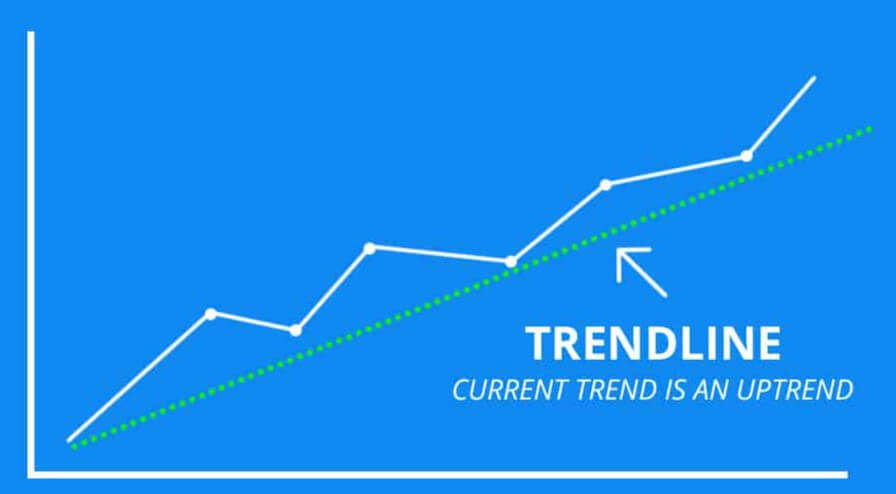
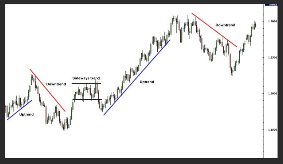
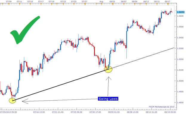
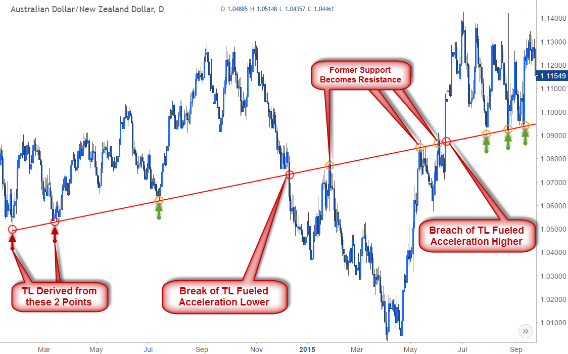
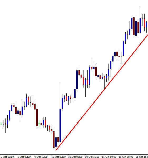
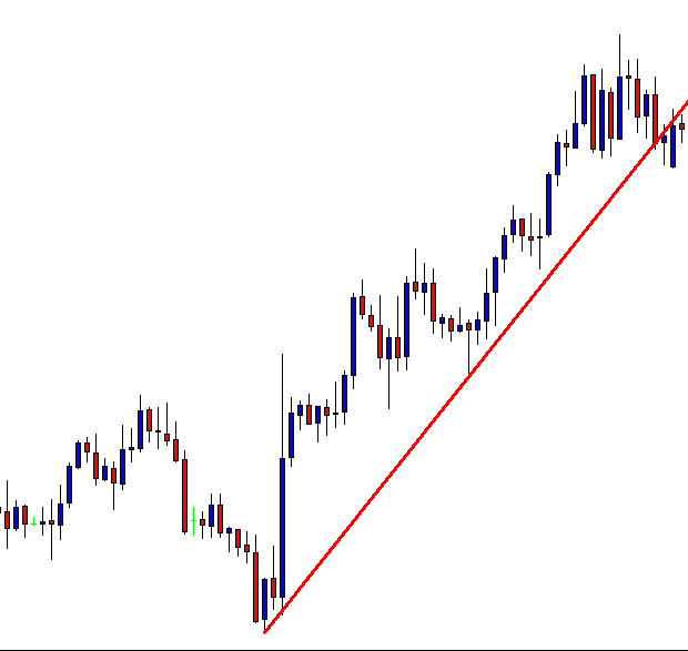
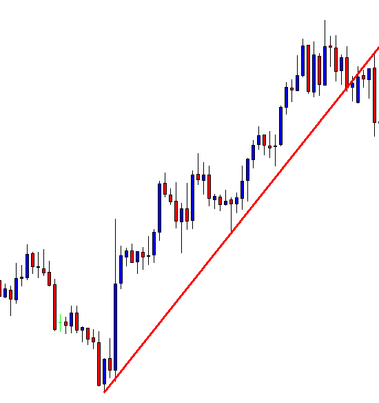
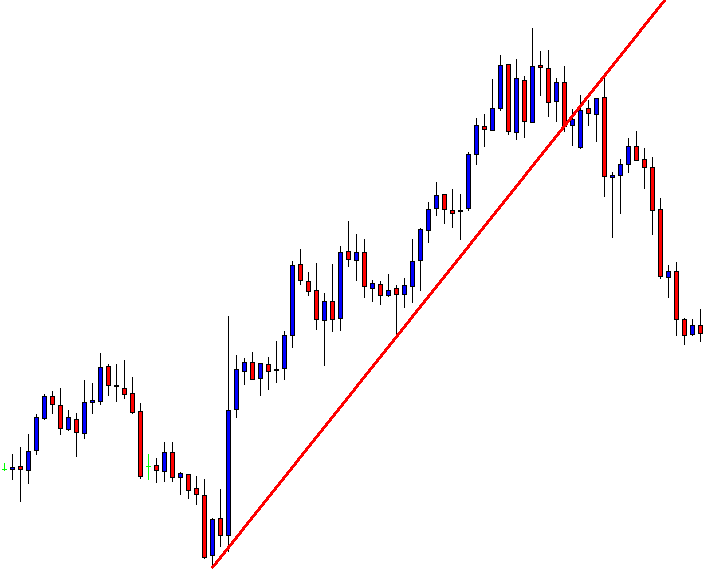
Trend lines are simply lines that are drawn on a chart that when analyzed will give you as a trader an idea of the possible directions of the markets. A trend line is generally drawn over a pivot high and under pivot lows in order to show h prevailing direction of the markets. They are a visual representation of the support and resistance levels for the timeframe that you are looking at, they can show the direction and the speed of the price, and can also be used to help in the aid of working out various different patterns within a chart.

That’s what trend lines are, but what exactly do they show us? Trend lines are one of the most widely used and important tools that many traders use, especially for those into technical analysis. Instead of looking at past results and patterns, people who use trend lines are looking for the current trends in the markets. They will help a technical analyst to determine the current direction of the markets, as well as how quickly the rice is moving in that direction. Many traders believe that the trend is your friend and will trade in the same direction, so they use the trend as an indicator as to which direction to trade in.

Trendlines are pretty easy to use, even for those that are just starting out with trading. They can be drawn onto a chart in a simple way using open, close, high, and low markets. Some traders also like to use more than one trendline, they connect the highs to create an upper line and the lows in order to create a lower line. This will then create a channel that will offer the trader a view of the support and resistance levels. This can then be used to look for breakouts, a situation where the price breaks above or below the upper or lower lines, and this for some is the best opportunity to put on a trade.

There are some limitations to trendlines. The main limitation is that they need to be readjusted as more price data comes in. Keeping the same line when the markets have changed will make the indication that they are providing completely irrelevant to the current situation. So you will need to adjust it each time the prices change. There is also no set place to attach the points to, different traders will use different data points, meaning that each person’s trend lines will be slightly different from each other, which can, in turn, give a completely or slightly altered image of what the markets are doing. If you create a trendline during a period of low volume, as soon as the volume increases it can easily break through the lines, so trend lines are more reliable during times of at reduced average volume.

There are ways to get around the fact that they need to be constantly adjusted. There are some indicators and expert advisors that can help to draw on the lines automatically, these can also then be used to update the lines without any input from yourself. The downside to this is that it will be doing it automatically, so you won’t have much control over where the lines are being drawn. You’ll need to work out whether you want to put the work in and do it manually and accurately to your own likes, or to allow it to happen automatically but understand that the ones may not be in the exact places that you prefer.

So the question now is whether or not you could use trend lines by themselves in order to trade. The answer is both yes and no. Not the most helpful I am sure that you agree. Trend lines offer us a lot of information and can be enough for some people and for certain more simply trading strategies. Using the trendline will give you an indication of the direction that the markets are going, and many traders will only trade in the same direction as the trend. So the indicator does give you an idea of the direction to the trend, but the problem is that it does not give much more information than when used by itself.

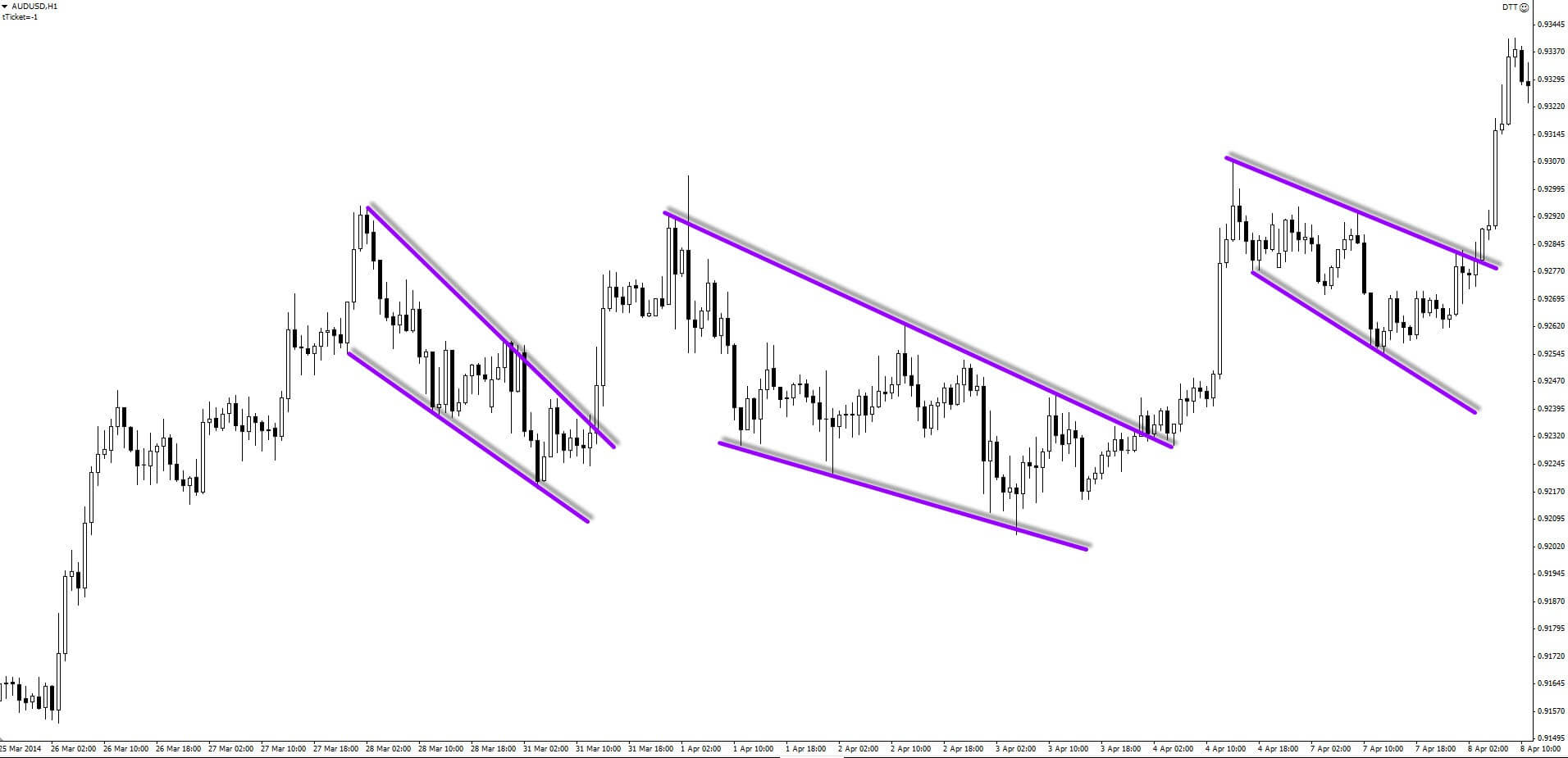
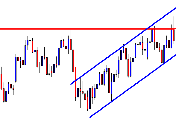
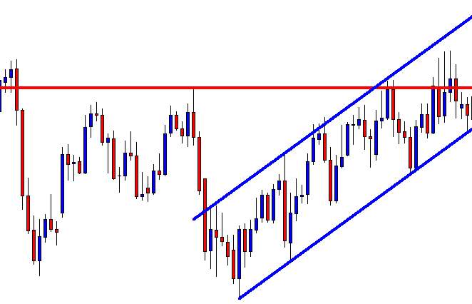
You can also use two trend lines, an upper and a lower. This can give you slightly more information. Having both the upper and lower trendlines will create a channel that the price is moving along, and you can use this channel to work out a little more information. If the channel is narrowing or widening will give you a little idea of what the markets are about to do. You can also use those trend lines to look for breakouts. The price should be moving between the channels. Once it breaks out from either the lower or the upper line, then this could indicate that a breakout is about to happen, something that a lot of traders like to trade.

Ultimately, the trend lines are very simple to use but they offer limited information. So you can use them alone in order to analyse the markets and to trade. There may well be some people who are successful at trading this way. Having said that, a lot of traders like to use trend lines along with a number of other indicators, and the trend lines are exactly that, an indicator. They do not give you exact trades to enter, they do not provide you with a whole host of information, just a simple high and low channel. So many traders like to use trendlines along with a number of other indicators which will allow them to better analyse the markets and to work out what may be happening next.

The answer to our question is yes, you can use trendlines alone to trade, but you will be provided with very limited information. Using only trendlines will work with a few basic strategies, but if you want to use a more advanced strategy then you will need to use more than just trend lines to do your analysis.

Categories
Forex Basic Strategies

Successfully Scalp Forex Pairs with these Two Tools

Introduction

Scalping is a short term trading style, and it is quite popular among professional Forex traders. This type of trading is more concise than day trading, which involves traders placing buy/sell orders throughout the trading day. But Scalping is different. Scalpers believe that making money from the small price action moves is easier than waiting for the considerable moves.

For scalping, our focus should be mostly on technical analysis rather than fundamentals.  By using technical analysis, traders use historical price information to predict the future price movement. To be successful in scalping, traders must have live feeds, direct access to the broker, and have the stamina & patience to sit in front of the computer and place as many trades as possible in smaller time frames to make money.

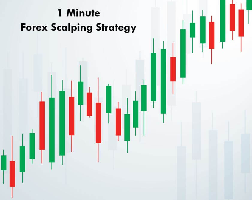
Scalping typically requires smaller timeframes such as a 5-minute, 15-minute, or even 1-minute charts. Some traders also use the tick chart or 30-seconds chart to scalp the Forex market. However, it requires an advanced skill set to be successful at this because the lower the timeframe is, the faster it moves. In this article, Let’s learn how to scalp the 1-minute Forex charts using Pin bars and Trend lines.

Pin Bars

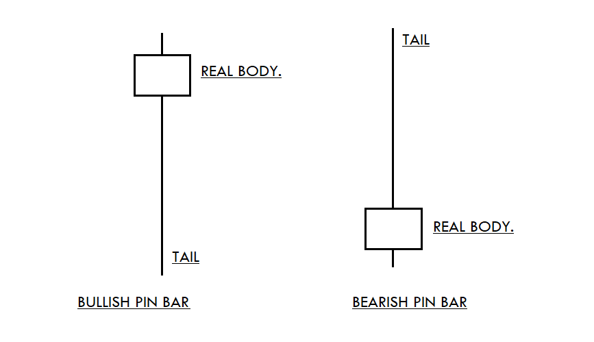
Pin Bar is a candlestick pattern that consists of only one candle, which represents a sharp reversal. There are two types of Pin Bar.

  1. The Bullish Pin Bar’s closing price is higher than the candle’s opening price, and the candle’s wick must be two to three times longer than the real body.
  2. The Bearish Pin Bar’s closing price is lower than the candle’s opening price, and the tail of the candle must be two to three times longer than the real body.

Trend Lines

Trend lines act as an essential tool for analysts while performing technical analysis. These lines are a visual representation of support and resistance levels in any trading timeframe. Traders apply these trend lines on the price charts to get a clear picture of the ongoing trend to make an accurate trading decision. Also, the trend lines on the highs and lows of the price chart create a channel.

Trading Strategy – Pin Bars + Trendlines

The one-minute trading timeframe volatiles a lot, and this small timeframe never moves in a single trend. We will always see the transitions from buy trend to sell and sell trend to buy in less than a couple of minutes. This is the essence of trading the lower timeframes. Therefore, before trading the one-minute timeframe, it is advisable to let go of all of your rigid trading beliefs.

Most of the scalpers fall into their ego and deny to close their losing positions. If you fall into this trap, then scalping is not for you. You must have a strong mindset and follow the rules like world-class traders to scalp the Forex market successfully.

Buy Examples

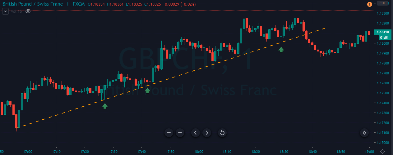
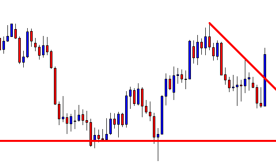
As you can see in the below image of the GBP/CHF Forex pair, the price was in an uptrend. Whenever the price approached the trend line, buyers immediately came back and printed a Pin bar candle, which is an indication to go long.

In this example, the market gives us three buying opportunities, and all the three trades performed well. When you take an entry at the pin bar formation, and the very next candle goes against you and closes below the pin bar, it is an indication for you to close your positions and wait for the next signal. On a one-minute time frame, always go for 2-3 pip stop loss and 6-7 pip targets only.

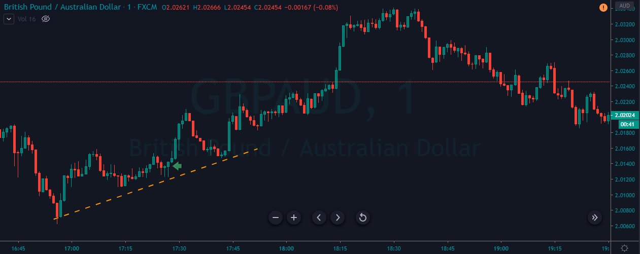
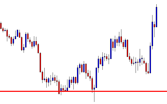
Below is another buying example in the GBP/AUD Forex pair. Here, the market gave us only one trading opportunity. As the price chart implies, the buyers were in complete control, and the price action is moving calmly. This means that there is a very less chance of spikes or fake outs. It is always advisable to find the less volatile currencies and try not to scalp the opening hours of the market.

Sell Examples

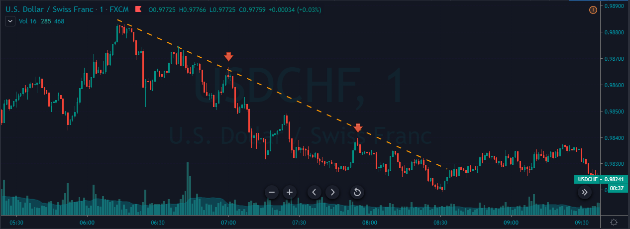
In the below USD/CHF 1-minute Forex chart, the overall trend was down. We can see the price printing the pin bars twice in a downtrend, which indicates us to go short. There are various ways to close your positions. We can choose any significant support/resistance area to book profit or close our positions when the price action starts to lose its momentum.

Some scalpers prefer to ride longer moves based on the market circumstances, while some like to close their positions after making 5 to 6 pips. So exiting completely depends on your trading style.

Below is another selling example of this strategy in the USD/CHF Forex pair. When price approached the trend line in a downtrend, we can see the market printing Pin Bars. This shows that the price action is ready to print brand new lower lows. Activate your trade when the market gives both the signals. In healthy market conditions, expect brand new lower lows or higher highs, and please avoid trading choppy market conditions.

Conclusion

Scalping proved to be a great way to make profits in a very short time. Make sure to understand that it requires a lot of hard work, patience, and dedication to master trading the lower timeframes. The more the trades you get into, the more the amount of money you will make. Scalping can be very difficult in the beginning, but with some practice and a right strategy, you will get the hang of it.

It is hard to scalp the 1-minute chart by using price action alone. Most of the highly successful scalpers use some indicators and candlestick patterns to confirm the market trend. Using the pin bars and trend lines on the 1-minute chart will help you filter out the bad trading signals, and this will drastically enhance the odds of your trades. Cheers!

Categories
Forex Videos

How To Make Easy Profits Trading Forex Using Bollinger Bands & Trend Lines!

Forex Tips For Beginners – Stacking The Odds In Your Favour!

Thank you for joining this Forex academy educational video.

In this session, we will be looking at how to tilt the odds in your favour by showing you some cool tips to keep you out of trouble and tilt the odds in your favour of making successful trades.

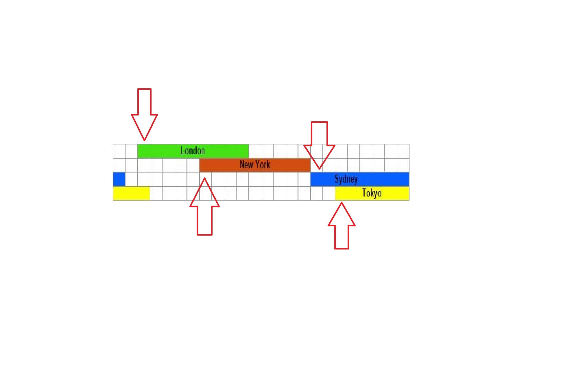
The forex market runs 24-hours a day, 5 days a week, but typically, the busiest times, where you might expect a spike in volatility and larger price movements, is during the first hour of the beginning of a particular regional session. So, for example, at around 7:30-8:30 AM GMT, the European and UK session starts, and the FX market will usually become more active as more cash volume flows into the market. The same applies to the US session and then the Asia session as led by Sydney and followed by Japan.
Often trends will finish in one region and turn in the direction as the new region opens. This is down to differences of opinion, economic data releases, sentiment, and profit-taking as one region retires for the night. Wait until such times as the new trading session is well underway and until you can identify a potential trend.

Become a master of Bollinger bands. This technical analysis tool was invented by John Bollinger in the 1980s.

It is a chart tool that calculates two standard deviations on either side of the exchange rate, but it’s used in many different asset classes such as stocks and shares because of its success and the fact that it is highly regarded by the trading community.

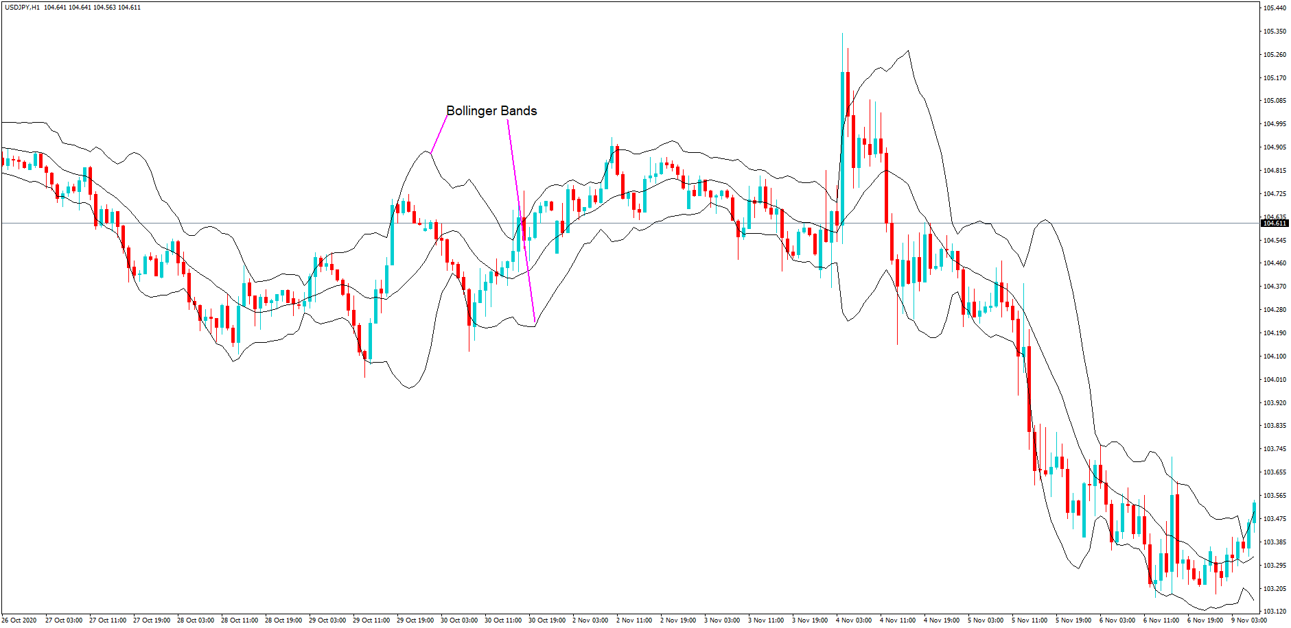
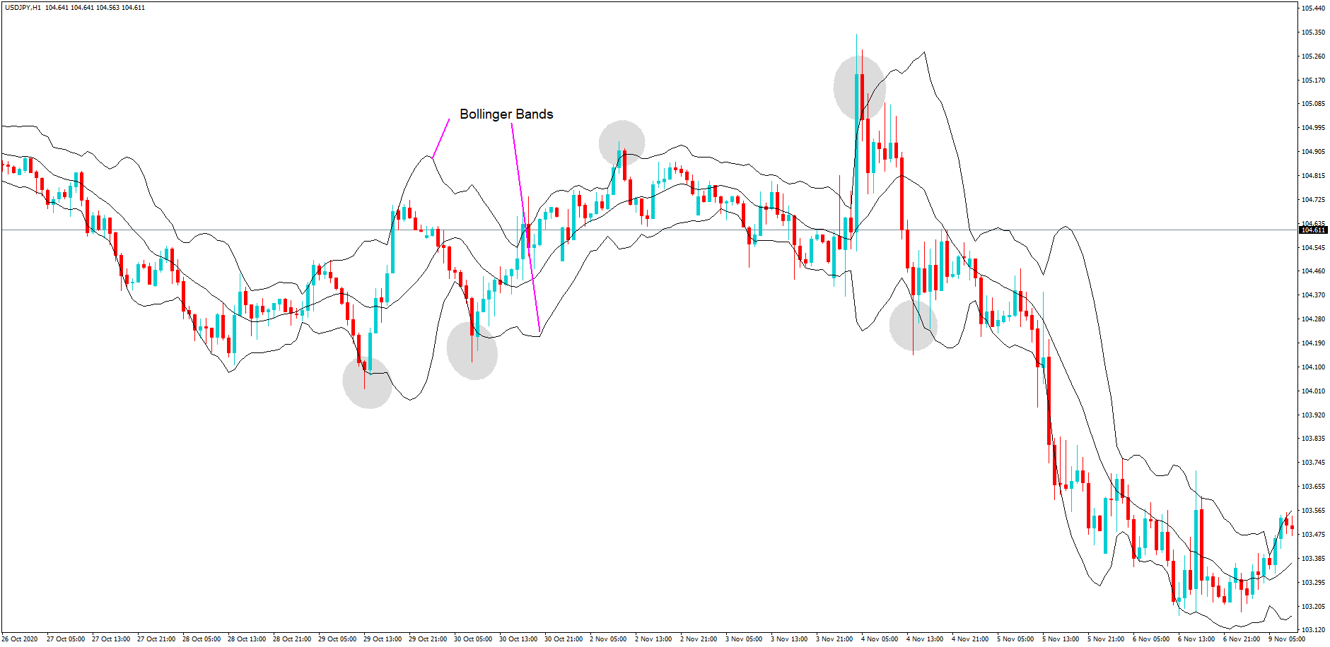
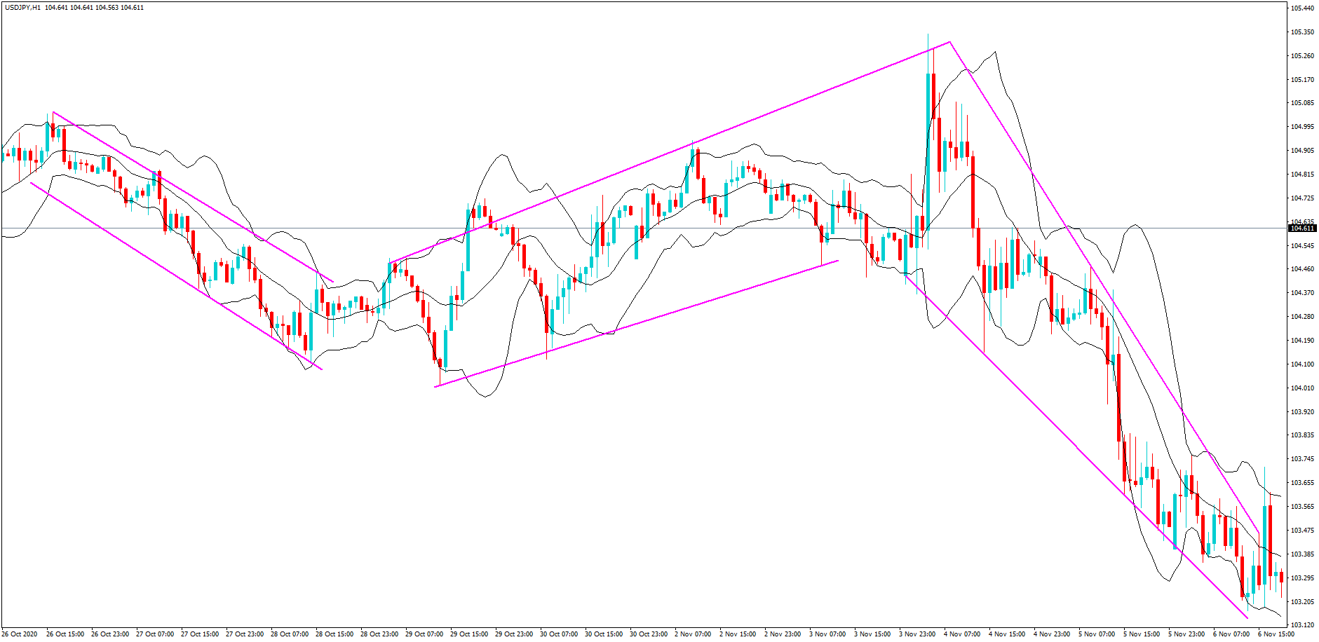
One of the key components that traders look for when trading Bollinger bands is that 95% of trading activity will remain within the bands. And shown here on this one hour chart of the USDJPY pair where we have highlighted a few examples of what has happened when the price has a move outside of the bands, traders push the pair back inside, and this often results in a price action reversal.

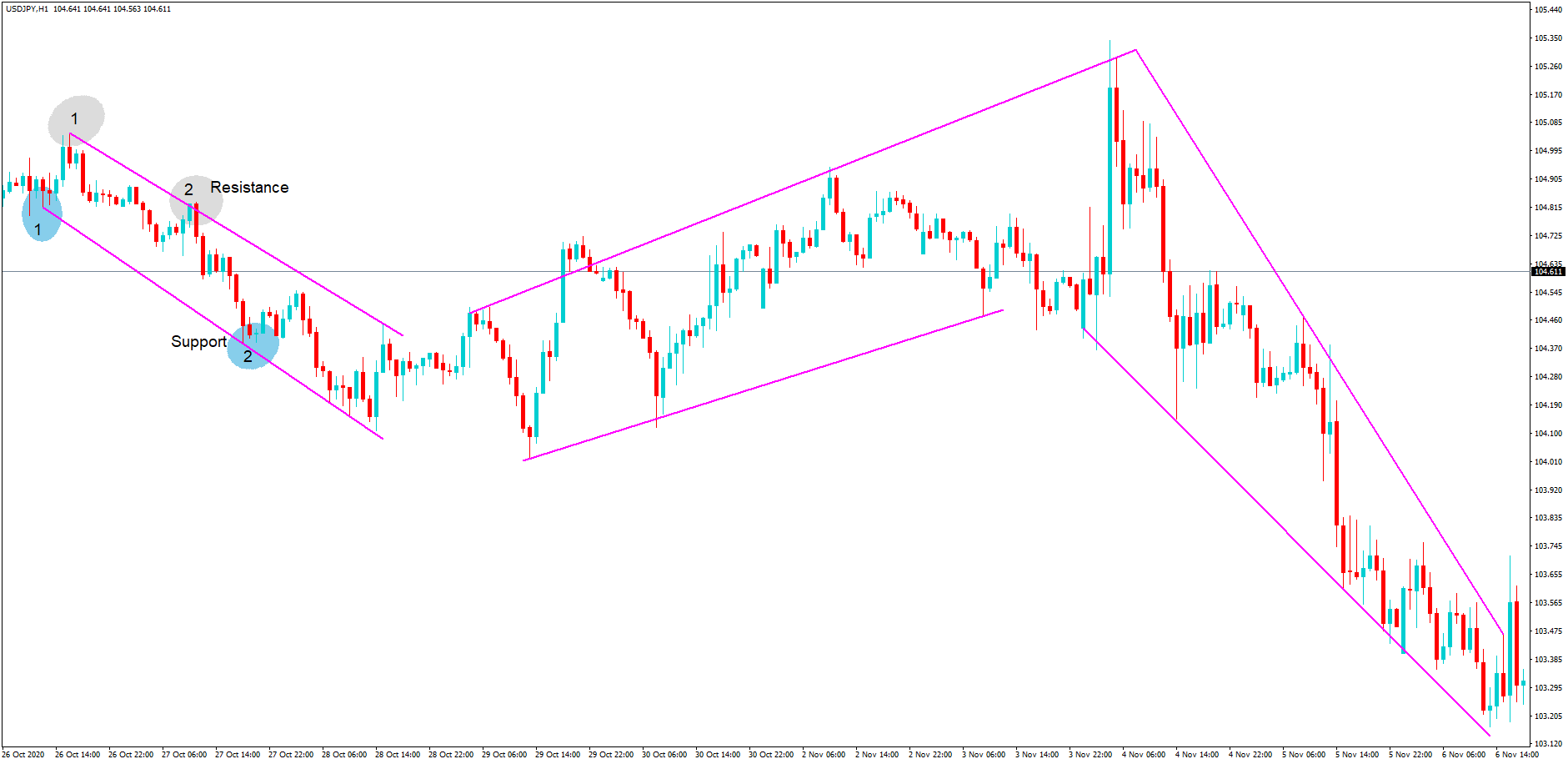
Another major tool traders use are trendlines. A trendline is typically manually drawn onto a chart to identify price action direction. Again, using the 1-hour chart of the USDJPY pair, we have drawn in some trendlines.
An area of support and resistance, which forms the basis of a trend, is officially recognised when price action has reverted to either the support or resistance trendline on a minimum of two occasions. Here on the left side of the chart, this is clearly the case.
Three distinct trends become apparent using this technical analysis feature.

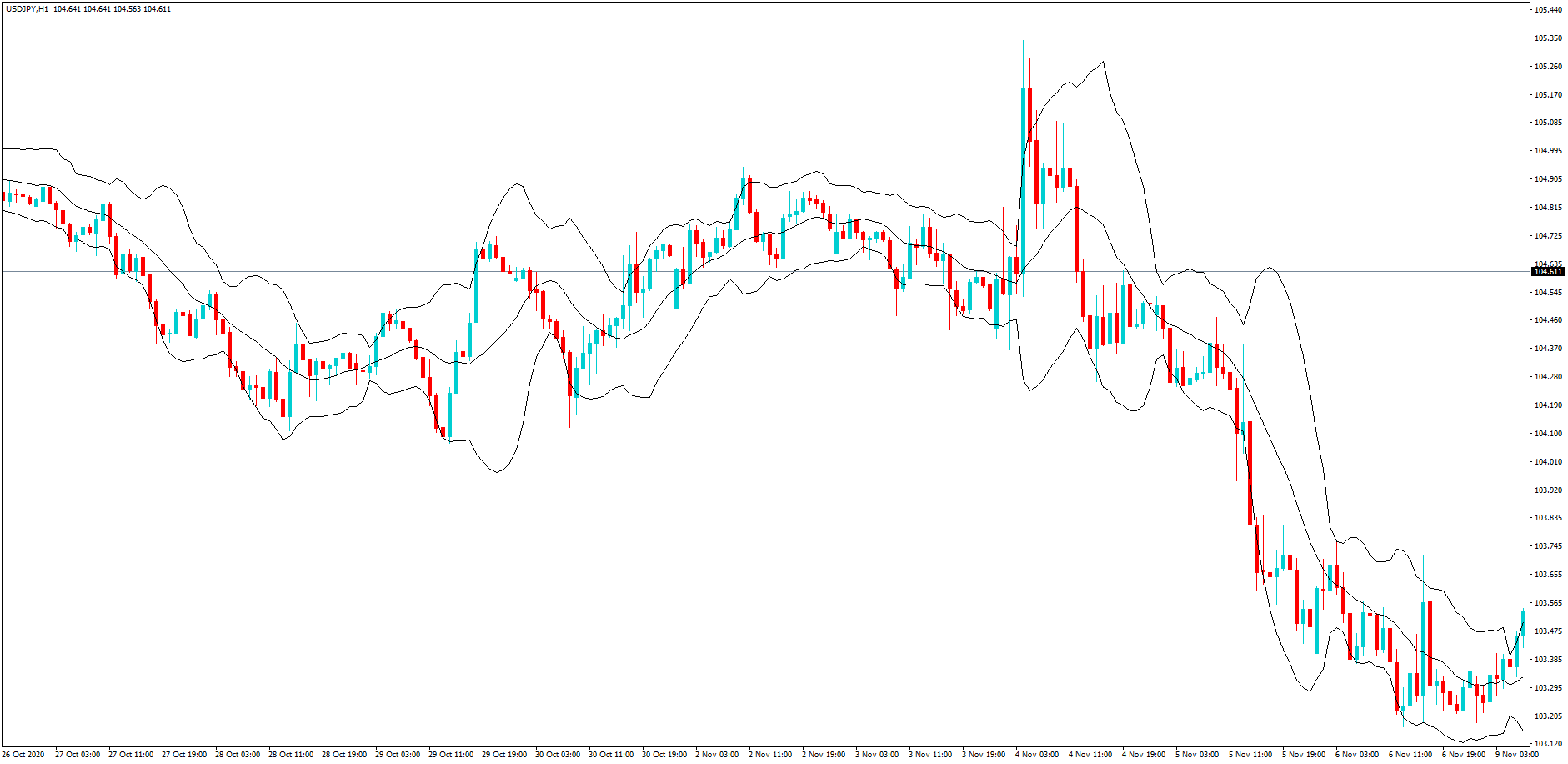
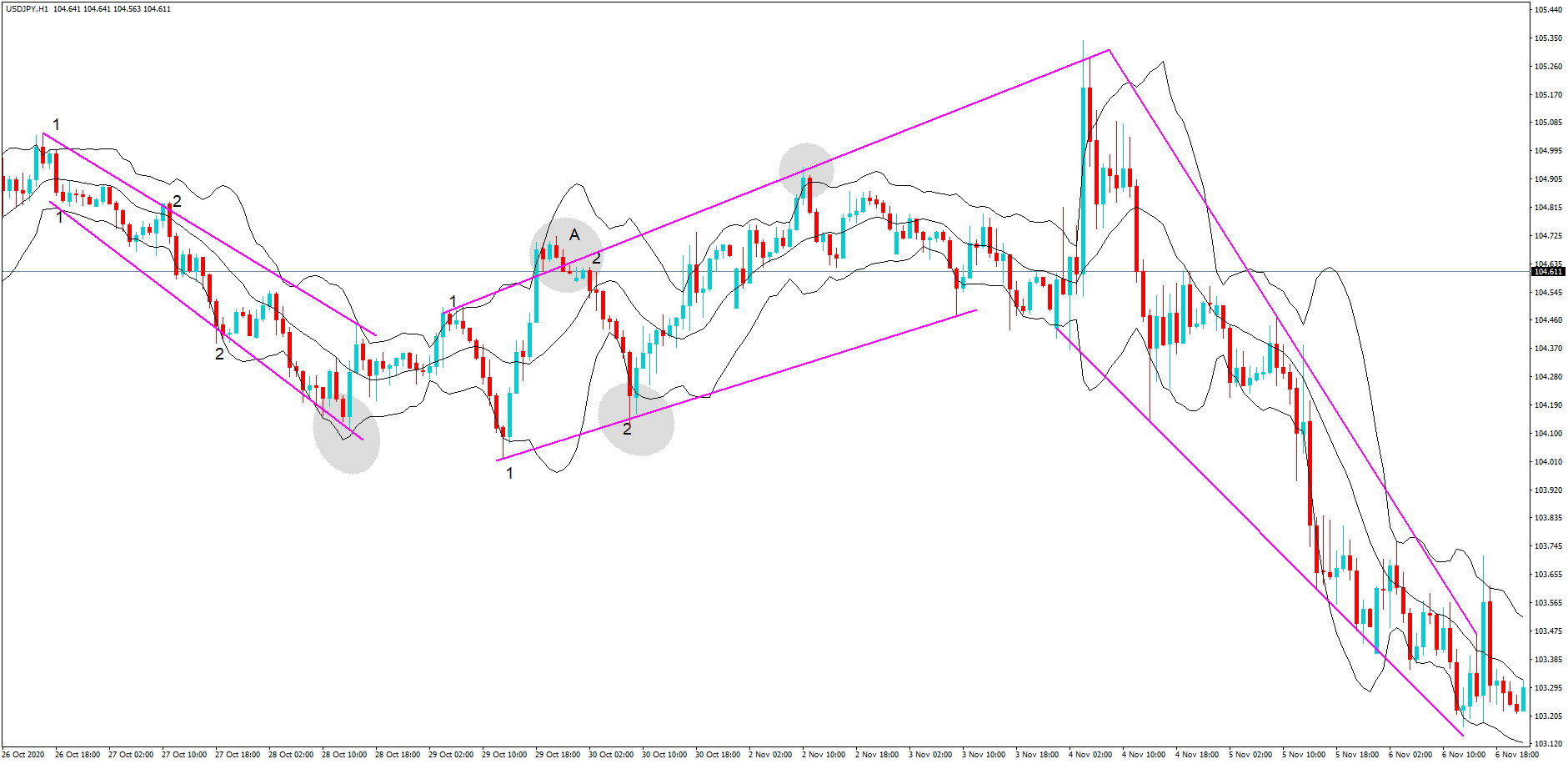
In this diagram, we have overlaid the Bollinger bands with our trendlines. Again, this is the same USDJPY pair and 1-hour time frame.

Now we can wait until a trend has been confirmed, where price action has hit either the support or resistance line on two occasions, and then we can also wait for the price action to breach the Bollinger band to increase our odds of the price action being driven back into the bands.

At position A, we have a confirmed downtrend, but where price action does not breach the Bollinger, yet it still moves higher.
At position B, we have a change in trend direction as confirmed here on the chart, but where the resistance line breach and also the breach of the Bollinger band cannot be considered as a confirmation of a reversal until such time as price action has fallen underneath the resistance line, which it clearly does. This is the time to short the pair. And, at the bottom of this move, we have a breach of the Bollinger band and where price action finds support before moving higher, which is the time to cut the short position and buy the pair.

In conclusion, use the trendlines and Bollinger bands together in this fashion to increase your odds of a successful winning trade.

Categories
Forex Technical Analysis

Why Trend Lines Are Not Trendy for Swing Traders

Twitter accounts and websites offering educational material on trading currencies appear to have little awareness about the role they play in traders’ development. While eagerly sharing captivating content, giving comments, and advice on various forex-related questions, these sources successfully lure beginners into the community. By not addressing real, state-of-the-matter problems and challenges such complete novices are soon to encounter, not only do the information providers falsely glorify the effectiveness of poor-performing tools but they thus also deny their responsibility for generating an apparent high rate of failure.

Considering how the recommendation is nowadays seen as one of the strongest marketing means that can practically charm any individual into believing in an asset’s quality, there is little doubt over what excessive and, more importantly, unfounded praise can do in a community of individuals eager for learning and exchanging experiences. The same can be said for the extensively lauded trend lines, a charting tool drawn over highs and lows that traders use to detect the prevailing direction of a price. Regardless of its vast application in trading and the presupposed analytic value, trend lines may not be the salvation traders seek and thus need to be further assessed so as to gather additional evidence of their effectiveness.

The first time beginners encounter trend lines, they have already gone through blogs and videos discussing the topic. They may have also consulted traders coming from other markets, e.g. the stock market, or have previous experience in trading various equities themselves. When they start applying the tool in their own charts, they hope to estimate how the price is going to react, whether it will break out of the trend line or bounce off of it. What traders find particularly appealing is the ease and convenience that come with drawing the lines. Nonetheless, some professional traders strongly object to the level of effectiveness of trend lines in charts, claiming that finding proof of their usefulness is harder than what one may expect. These traders go as far as to say that it may be quite difficult to find areas in the chart where trend lines fulfill the purpose of predicting where the price is going to go owing to the fact that they essentially lack any predictive value.

The situation becomes more alarming once we take into consideration the fact that traders do not base their judgment on analysis, but often post information about how the price bounced off or broke through on social media sites once a trend is already over. Some experts even believe that people behind websites and twitter accounts win every time, hinting at the belief that success has little to do with their knowledge about trend lines.

Forex traders need to know which direction the price will take beforehand, but the assumption that trend lines function as a safe method of trading may be fundamentally flawed. People love trends and what they also find particularly interesting is the ability to offer their own opinions and views regarding the future outcome. Based on such an approach where subjectivity plays the central role, we may freely put forward the idea that trend line-based predictions then uncannily resemble the world of sports betting. Interestingly enough, trends are also used by professional sports betters, but only sparingly. Whenever we do notice a trend, we know that there is a certain likelihood of it leading to a specific outcome, but are we truly ready to accept this level of randomness when investing our precious money and time?

Roulette wheel boards in casinos, for example, show approximately 15 numbers that last appeared (see picture on the left), based on which people make specific decisions concerning their next step. Casino goers typically assume that a specific number or color is due and that they are in fact following a trend, which cannot be any farther from the truth. In a world somewhat similar to casinos, markets, or important market players will never take any action in order to intentionally lose money. Hence, they will strive to make every single trader believe that randomness is not randomness at all, playing with your lack of knowledge and analytical skills. More often than not, what traders assume to be a trend proves not to be a trend at all, and they cannot thus serve as a direct confirmation of what will eventually happen with the price.

Even if we take a look at some definitions of the word, we would know that trend generally indicates a development or change, not a final destination. We then need not rely on trends to tell us whether we are seeing an uptrend or a downtrend, we can just look at the chart to gather data and draw conclusions. Instead of having a predictive quality to them, trend lines, in fact, rather reflect a statistical anomaly or a deviation. It is truly remarkable how we can choose to draw a trend line basically on any random chart, anywhere, and anytime. Nonetheless, what is peculiar is that there are as many places where we can draw these lines as there are places where we simply cannot.

Any chart has a trend happening somewhere, but seeing areas with highs and lows you can connect with a straight line is not an analytical advantage but a game of flipping a coin. If you can draw a connection between a coin landing on a particular side and a price breaking the trend line, then you certainly know how we are playing with a 50—50 proposition or even far less. Trend traders are often amazed at the predictions given on Twitter, but as we said before, the way someone looks smart is not equal to the level of luck you will have using the tool they advertise. As the price will inevitably have to go one way or the other, moving up or down, they will only later reveal the results they accredit to the trend line, which will push you to believe in trend lines’ ability to help you reach your goals faster.

What do you want a trend line to show you? As traders typically look for signs whether the price would break out or bounce off, we can expect to see three different scenarios: a) breaking out, passing the trend line, and starting a new trend; b) bouncing off of a trend line and continuing on the trend they are on; or, c) false breakouts and false reversals that appear to be similar to the previous two. In the end, we are not really looking at an actual trend, but a statistical anomaly because trend lines have little to do with the question of whether prices move up or down. The only ones possessing this kind of information always turn out to be the big banks and institutions, which are constantly on the lookout for market activity. They eagerly look for the areas in the chart where the majority of retail traders are going on any currency pair only to take the price the opposite way and earn a profit. If you are already participating in the market, your success will undoubtedly and indisputably depend on your ability to get off the big banks’ radar, which means evading the places where the greatest number of individuals are trading.

This further implies that tools such as support and resistance lines often prove to be completely useless since, unlike trend lines, they do reflect some consistency due to which every trader can have access to the exact same information, immediately sparking the big banks’ interest. Traders assume than these major players pay attention to diagonal support and resistance when they in fact only wait for the majority of traders to move into one direction so that they can redirect the price. Whatever you expect a trend line to show will not eventually provide you with enough security and keep you away from the areas in the chart which can get you to lose a lot of money.

Despite the fact that some people claim to know everything about trend lines, if you ever try to find a specific standard for drawing them correctly, you will discover a great degree of inconsistency. If you take a look at the image below, you will see the extent of discrepancies between the rebound and break out points. Whereas support and resistance lines have very defined areas where people are trading, trend lines significantly differ from one trader to another. So, how can we draw them then? Do we focus on the highs and the lows or do we see them as noise and disregard them as a result? Are we to connect any two points or several ones? How many points make a single line then? Should we connect the bodies or concern ourselves with the opens and closes?

As you can see, every combination is a possibility, but we still wonder at what point a trend line stops serving us. When is it no longer legitimate and should we still keep it or erase it from the chart after the price has gone some other way? Because of the existence of countless possibilities, people can have different views on where entry and exit points are on a particular trend line. With zero consistency across charts, we can safely assume that trend lines are essentially whatever traders desire them to be.

Examples of Different Approaches to Drawing Trend Lines

Since we cannot firmly state that any line can determine whether a price is going to move up or down, we should truly aim to follow the advice of the best traders out there and move on to tools that can actually grant us success. What many traders may think here is that they could use trend lines together with RSI, stochastics, or Fibonacci. However, instead of using two low-level tools, which are not only useless but dangerously overrated as well, you can give yourself the opportunity to search and test out thousands of other more modern tools created solely for the purpose of trading in the spot forex market. From its conception in 1996, this market has witnessed a turnover of approximately 10 thousand indicators and tools we can use in everyday trading as well as an incredibly high rate of failure at the same time.

Expert traders claim to have tested more than one thousand indicators only to find what serves them best, which is a clear indication of the fact that a popular tool is not always a good tool. Therefore, if you search hard and test vigorously, you can confidently expect to find some excellent tools that you will be able to use for good. Then, once you have discovered a few of such tools which prove to give great results, you may start to combine them, creating a stable system with an incomparably higher chance of predicting whether the price is going to go up or down. What we are seeing here still involves a portion of randomness, but we are also including the momentum which your set of tools will be able to recognize. It is precisely due to the mathematics within your toolbox that you will have the chance to trade on an above-average level. Your tools will predict if the momentum in the market is real and which way it is most likely to take the price, based on which you can stop making completely random predictions and starting earning a real profit.

Whichever tools you end up using, you should never lose focus over the importance of entering and exiting a trade on time, which trend lines fail to do over and over again. If you want to become a successful trader, do not fear the evident stigma of being different in the market. We have already seen in some other markets how news events and lack of independence play out, and the best way to avoid the staggeringly high failure rate is to build yourself as an independent trader. Use your analytical mind to assess whatever information you come across because writing and recording are always profitable, both to their creators and to the big banks eventually. Following trends is essential, but the fact that this tool has that word as part of its name has no relevance and certainly no power to provide you with the information you need. Whenever you encounter vagueness, start asking yourself whether it is testable, logical, and profitable.

With so many outdated tools, traders are not only entering trades when trends are already over, but they are entering trades that will get them right under the big banks’ radar. If you are still convinced that trend lines are your perfect companion, can you answer the question of whether you experienced a situation where a price did not align with your trend line? If the answer is yes, then you should know that the reason behind such a phenomenon is the fact that diagonal support or resistance simply does not exist, further supporting the claim that trend lines are not to be used in charts to predict the behavior of the price. Strive to construct an algorithm that will consistently and transparently send signals that will lead to successful trades, thus steadily building your trading account.

Categories
Forex Chart Basics

How to Establish a Trading Strategy Using Trend Lines and Channels

Introduction

On financial markets, the price moves basically in three types of trends identified as bullish, bearish, and sideways. Both trend lines as channels allow the “trend following” investor to recognize if the market’s direction changed or if the price action accelerated.

In this educational article, we’ll review how trend lines and channels can help establish a trading strategy.

Trend Lines and Trend Channels

In a price chart, the trend can be described as a price variation across time in a specific and identifiable direction. A trend is said to be bullish when the price creates a succession of higher peaks and higher valleys. On the contrary, in a bear trend, the price action tends to create a sequence of lower peaks and lower valleys. If the market runs in a consolidation stage, developing an overlapped structure, the price moves in a sideways or lateral trend.

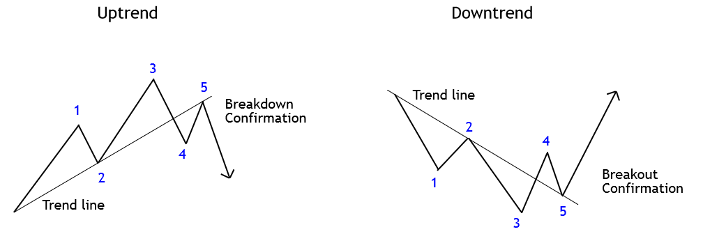
When the price action develops an uptrend, the chart analyst projects the trend line connecting the lower highs sequence. In a bearish trend, it is customary that the projection links the lower highs sequence. The following figure illustrates how to trace a trend line. 

In the above figure, the 1-2-3 sequence represents the movement developed by the price action in an uptrend (left) and downtrend (right). When price breaks below (or above) of the trend line, as shown in (4), the price action reveals the potential change in the primary trend. The confirmation of this change comes determined by the retracement that experiences the price, which here tests the trend line and continues in the new trend’s direction, making a higher high.

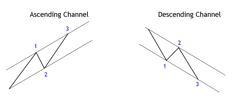
Trend channels could be considered as a dynamic price range that follows the rhythm of a trend; this technical formation could be bullish or bearish. To draw a trend channel, it’s necessary three points, in an uptrend, two lows and one peak. The channel baseline is the trend line that connects the origin of the movement with the second low. The upper line will be the projection of the baseline traced from the peak between two lows as exposes the following figure.

In an uptrend, the breakout after the second low completion (see figure 01) provides a confirmation signal of the bullish trend continuation. This entry setup for the third movement has its potential target located at the upper line of the channel, acting as a dynamic resistance.

Phi-Channels

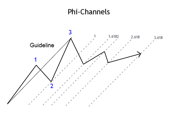
Phi-channels is a different type of channel and varies from the trend channel. The main difference with trend channels is that on Phi-channels, the guideline connects the extremes from the origin of the movement with the top of the move identified as 3. Then, parallel lines are projected, creating the channel, using point 2 to trace the channel’s parallel line, as shown in the next figure. 

The resulting projection provides potential turning points, which could offer entry setups combined with other technical tools.

Conclusions

In this educational article, we have seen the use of trend lines and channels that can help establish a trading strategy based on tracking the trend.

In general, the use of trend lines and channels is aimed at seeking to take advantage of the continuity of the trend over the turn of the market’s direction. In this sense, it is convenient to recall the Dow Theory principle, which states that a trend will remain in effect until there is confirmation of its change.

In this context, the use of Phi-channels provides potential areas where the price could react to continue the course of the primary trend, although its use should be supported with other analysis tools.

In the next article, we will look at how to apply the analysis tools to create trading signals.

Suggested Readings

  • Fischer, R., Fischer J.; Candlesticks, Fibonacci, and Chart Patterns Trading Tools; John Wiley & Sons; 1st Edition (2003).
Categories
Forex Course

119. Learning To Trade The Wedge Chart Pattern

Introduction

The Wedge is a technical chart pattern that is commonly used by the traders, market technicians and chartists to find the upcoming market trend. This pattern is always formed at the bottom/top of the trend, indicating a potential change in the market’s direction. In short, the Wedge is a trend reversal pattern. One key benefit of the Wedge pattern is they it is comparatively easy to identify on the price charts. This pattern is traded by most of the technical traders as it provides precise entries and exits.

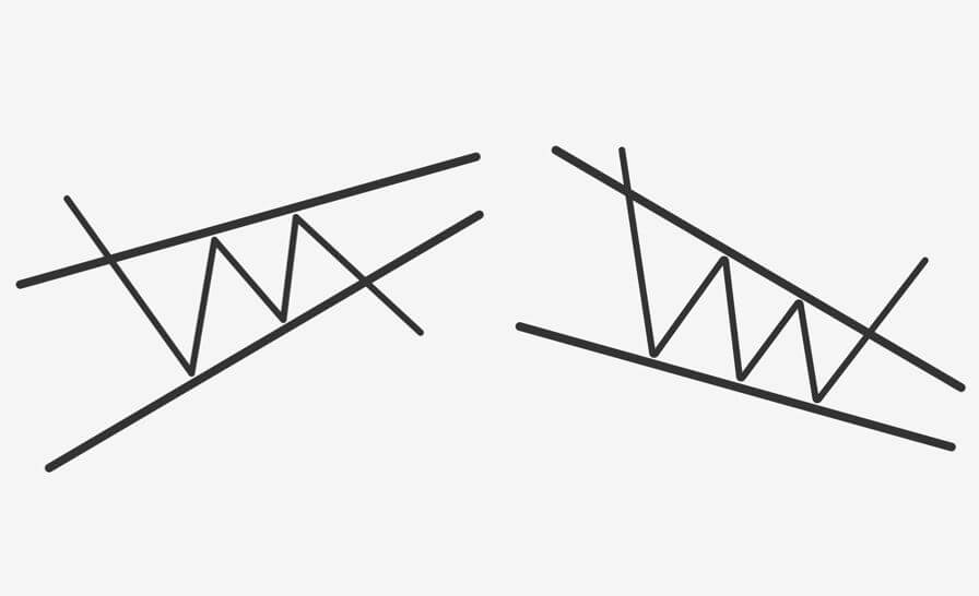
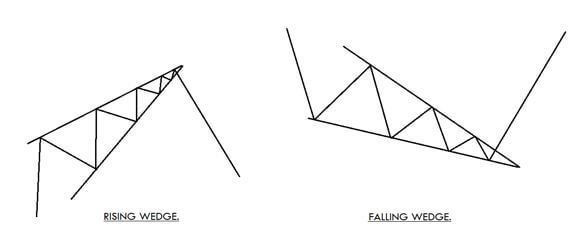
There are two types of Wedge patterns – The Rising Wedge & the Falling Wedge.

The Rising Wedge

The Rising Wedge is a bearish reversal pattern, and it appears in an uptrend. This pattern seems to look wide at the bottom and contracts as the price move higher. To form a Rising Wedge pattern, two higher highs must touch the upper line; likewise, two reaction lows to the lower line. The point at which the upper and lower lines merge indicates the completion of the pattern.

The Falling Wedge

This pattern is just opposite to the Rising Wedge pattern. It appears in an ongoing downtrend, and it is a bullish reversal pattern. The appearance of these patterns is an indication for us to go long. This pattern begins wide at the top and contracts as the price moves lower. To form this pattern, the two lower lows must react with the support line, and the two higher lows must react with the resistance line. When both the lines converge, we can say that the pattern is complete.

Trading The Wedge Chart Pattern

The Rising Wedge 

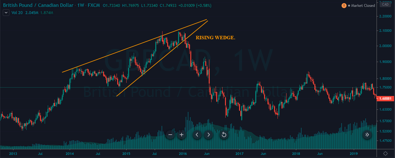
The below chart represents the formation of a Rising Wedge chart pattern on the GBP/CAD Forex pair.

There are two ways to trade the Rising Wedge pattern. We can go short when the price hits the upper resistance line, and if the price breaks the below line, holding our positions for longer targets is a wise thing to do. The second and the conventional way is to wait for the price action to break below the support line and take the sell position only after the confirmation.

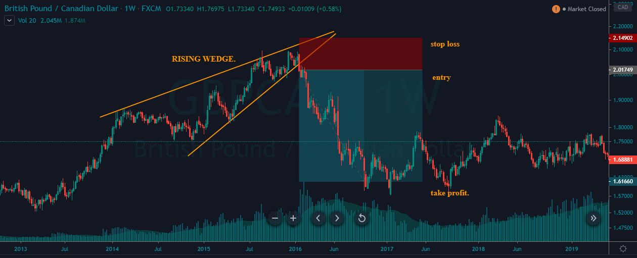
In the example below, we took sell entry when the price action broke the support line. Place the stop-loss just above the recent high and ride the markets for deeper targets. We had booked our profits when the price action started to struggle as it is an indication of a market reversal soon.

The Falling Wedge Pattern

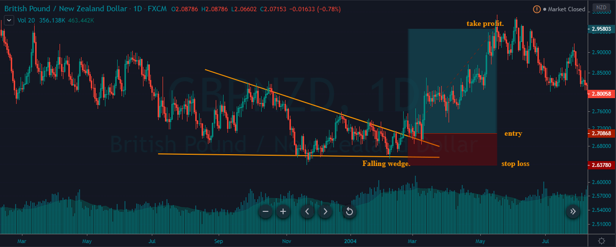
The image chart represents the formation of the Falling Wedge pattern in the GBP/NZD Forex pair. We can see that both the parties were fighting in a downtrend and when the market prints a Falling Wedge pattern, it is an indication for us to go long.

At the beginning of March, the price broke above the Falling Wedge pattern, and we end up entering for a buy. The stop-loss was placed just below the support line, and the take profit was at the major resistance area.

That’s about Raising & Falling Wedge pattern and how to trade them. If you have any questions, please let us know in the comments below. Also, to learn advanced trading strategies related to this pattern, you can follow this link. Cheers.

[wp_quiz id=”74092″]
Categories
Forex Course

111. Trading Forex Market Using Elliot Wave Theory

Introduction

In all the previous lessons, we understood the terminology and interpretation of the popular Elliot Wave theory. Now we are well-versed with the subject to apply it to the forex market.

The Elliot Wave Theory is a wide concept and can be traded in several different ways. In this lesson, we shall analyze the forex currency pairs using Elliot wave concepts by combining it with some price action.

The best way to trade the Elliot waves

We know that according to the Elliot wave theory, there are two types of waves. There is an impulsive wave pattern made of 5 waves, and a corrective wave made of 3 waves. The impulsive wave is towards the trend, while the corrective wave is basically a pullback for the overall trend.

As a trader, we need to look for trades that payout well along with less risk. So, it is not ideal to trade all the impulsive waves and corrective waves.

Trade setup 1

The setup is to trade the impulsive waves. In the 5-wave impulsive pattern, three waves are along with the trend and two against it. Out of those three impulse waves, the ideal wave to catch is Wave 2. This is because, the Wave 2 is usually the strongest out of the three impulse waves, which significantly reduces the risk on the trade.

Trade Example

After the market makes the first wave, the price starts to pullback. But while the market is retracing, we won’t know where the market will hold and complete its second wave. So, we make use of other tools to determine where the market will resume its trend.

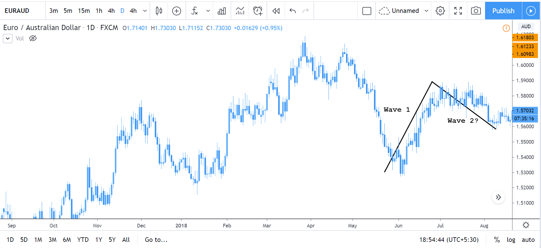
Consider the below price chart. As represented, the market made its first wave. Then, wave 2 began, where the market started to retrace. But, note that, at this point in point, we cannot confirm the end of wave 2. So, to determine the completion of wave 2, we shall be applying the Fibonacci retracement.

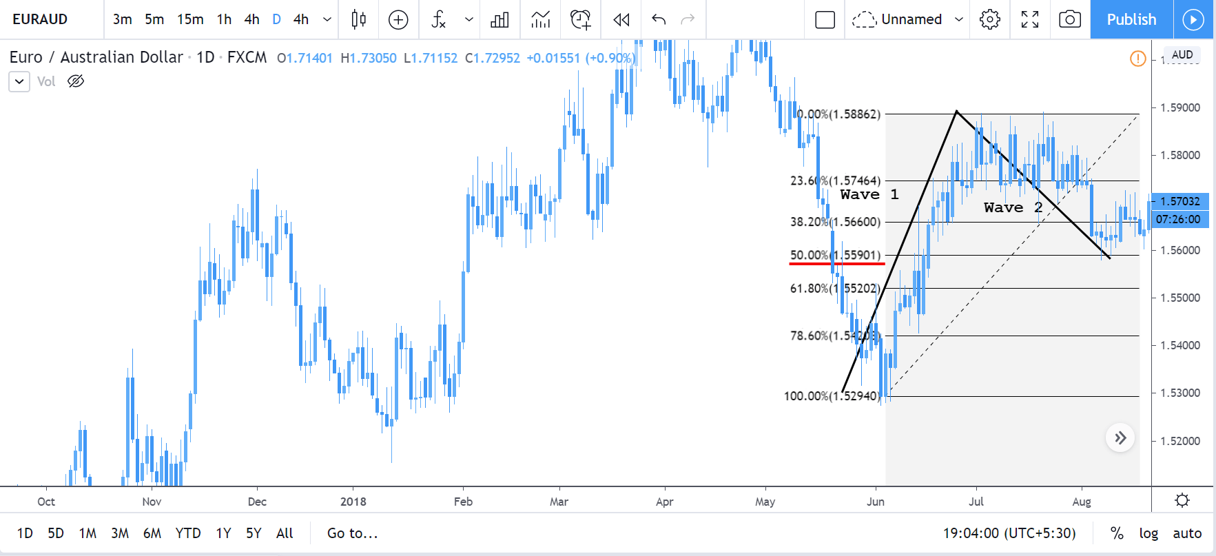
In the below chart, the fib retracement has been applied. We can see that the market began to hold at the 50% level. This hence confirms that wave-2 leg has come to an end. Thus, we can prepare to go long in anticipation of wave 3.

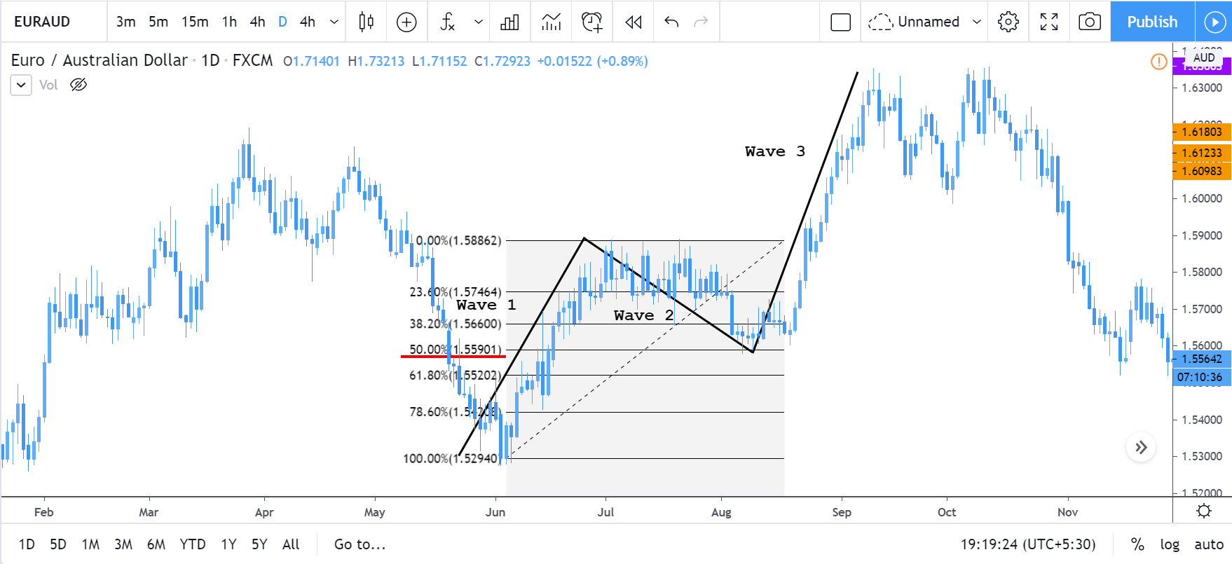
In the following chart, we can clearly see that the market held at the 50% fib level and ended up making a higher high, i.e., wave 3.

Trade setup 2

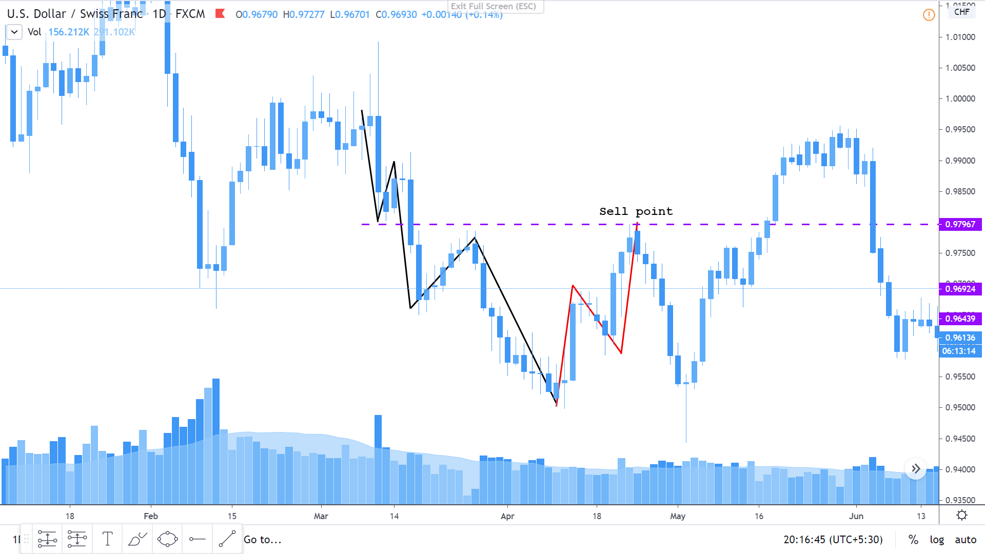
This is the type of setup where we consider the complete 5-3 wave pattern. In the below chart, the 5-wave impulsive pattern is represented with the black trend lines, while the 3-wave corrective pattern is represented by the red trend lines. Since in an Elliot wave pattern, the high of the third corrective wave must be below low of the first wave in the impulsive wave pattern, we can trigger the sell at the area shown in the chart.

This hence concludes our discussion on the Elliot Wave theory. In the next lesson, we’ll summarize this topic for your better understanding and then pick another interesting course.

[wp_quiz id=”72249″]
Categories
Forex Basic Strategies

Is Drawing One Trendline Enough?

The Trendline is an excellent trading tool that the price action traders love using on their charts. Drawing trendline as accurate as it can get and adjustment with spikes are two factors that traders are to look after before using trendline. Another factor trendline traders often need to do is drawing multiple trendlines on the same chart. In this lesson, we are going to demonstrate an example of that.

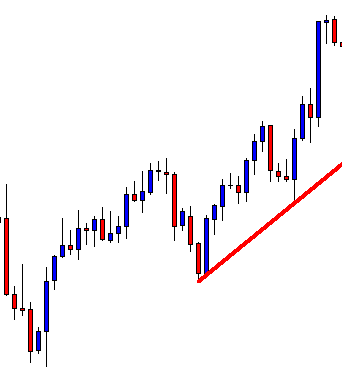
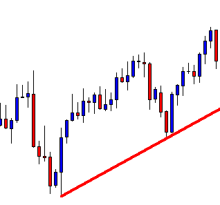
The chart shows that the price after finding its support at the trendline heads towards the North and makes a new highest high. Thus, this is a valid trendline. Ideally, the buyers are to wait for the price to come back to the trendline again and to produce a bullish reversal candle to go long on the pair. Let us proceed to find out what happens next.

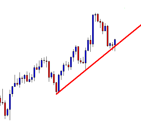
The price does not come at the trendline. It finds its support well above the trendline and heads towards the North again. This is annoying, is not it? Do not get annoyed. Concentrate on the chart. Do you see anything interesting? Have a look at the next chart.

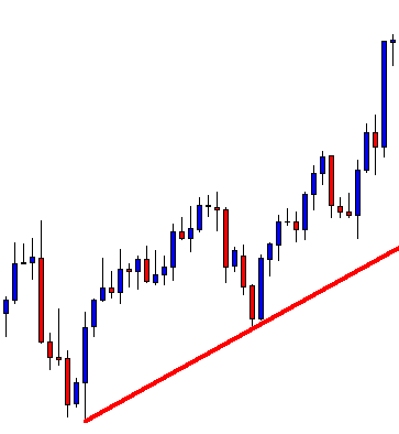
We can draw another trendline on the same chart since the price has a bounce and makes a new highest high. Traders are to wait again for the price to come back at the trendline and to produce a bullish reversal candle to offer them a long entry.

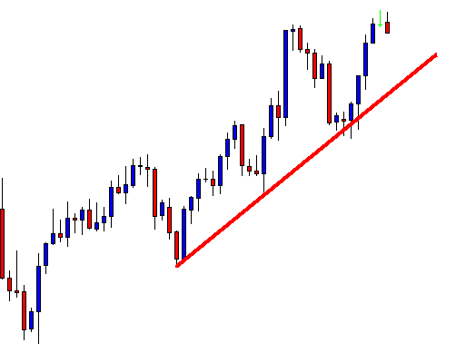
Wow, this time, the price comes at the trendline and produces a bullish reversal candle. Traders have been waiting for such price action. By flipping over to the next chart and an upside breakout, traders may grab some green pips.

The chart shows that the price comes back near the trendline’s support again, then heads towards the North. It consolidates hard on the minor charts, as it seems. The point here is that the price does not come at the first drawn trendline or produces a bullish reversal candle. It comes at the second drawn line, and this time, it creates the bullish reversal candle right at the trendline’s support. It heads towards the North and may have offered entry as well.

The Bottom Line

In most cases, the price does not come at the first drawn trendline. It has the tendency to come at the second drawn trendline more. It is often seen that the price obeys the third drawn trendline as well. Thus, if we are to trade on the trendline, we may keep an eye on the chart to draw a trendline as many times as we need to.

Categories
Forex Price Action

Equidistant Channel Trading: What Else to Consider?

Equidistant Channel is a very reliable trading tool for the price action traders. In an ascending Equidistant Channel, the buyers wait for the price to come at the support level and to get a bullish reversal candle to go long. It is vice versa, in the case of a descending channel. However, some other equations are to be taken care of by the traders when trading with an Equidistant Channel. In today’s lesson, this is what we are going to demonstrate. Let us get started.

The chart above shows that the price is caught within an ascending Equidistant Channel. Look at the last bearish wave. After a rejection, the price heads towards the support. As a trader, we shall wait for a bullish reversal candle to go long here. Let us proceed to find out what happens next.

Wow! The price action traders always dream of this. This is one good bullish reversal candle. A bullish engulfing candle right at the channel’s support, the buyers, shall jump into the pair to start buying. However, we must set stop loss, take profit. Stop Loss level looks very evident here, which will be below the signal candle (Bullish Engulfing Candle here). What is about the Take Profit level? Where shall we set it? Typically, we set it at the upper band of the channel since the price usually goes towards the resistance of the channel after having a bounce at the support level.

Look at the chart. At the last wave, the price produced a bearish engulfing candle right at a strong horizontal resistance (arrowed). It had a rejection at this level earlier, as well. Thus, this is a level, which must be counted at the time of setting Take Profit level.

Despite having an engulfing daily candle, the price does not head towards the North with a good buying pressure. Anyway, it heads towards the upside. Look at the rejection. This means setting our take profit at the horizontal resistance would give us 1:1 risk and reward ratio here. This is not bad. However, if we make a target to go all the way towards the upper band, it may get us a loss instead.

Let us see how the price action acts afterward.

We would not make a loss here, but see how the price action has been. It gets choppy. It may still offer more long entries since the support is held by the price. However, we know what else is to look for, a breakout at a significant level of horizontal resistance.

Key Points to Remember in Equidistant Channel trading:

  1. A significant level of horizontal support/resistance is to be broken.
  2. If there is no horizontal support/resistance, an anti-trend line is to be broken.
  3. The signal candle is to be a strong trend reversal candle.
  4. In the case of having horizontal support/resistance in the middle of a channel, at least the Risk-Reward ratio is to be 1:1.
Categories
Forex Price Action

Retracement, Consolidation, Breakout, and Price-Action Trading

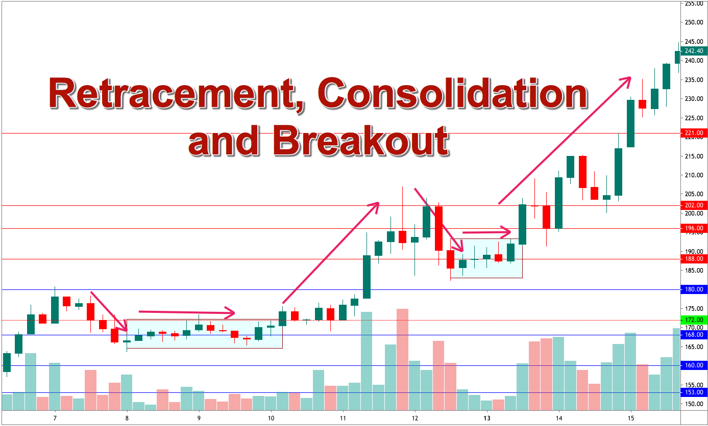
In the financial market, there is a saying, “Trend is your friend.” When the price makes a strong move towards a direction breaching a significant level of support/resistance, traders start looking for opportunities to take entries. The word ‘opportunity’ signifies a lot. After making a strong move, the price usually makes a correction/consolidation. At the correction/consolidation, the price finds a level of support/resistance. This is what gives a good risk-reward ratio to traders. In the end, it brings more winning trades, as well. In this lesson, we are going to demonstrate how a retracement gives us an entry.

The price produces a Double Bottom and breaches the neckline level. The buyers are to look for opportunities to go long on the chart. Look at the last two bearish candles. The price seems to have started having a correction. The last candle closes within the support. We might as well get a buying opportunity here. A bullish reversal candle at this level shall attract the buyers to go long. Let us see what happens next.

A bullish engulfing candle is produced here, which is considered the most powerful reversal candle. We have been eyeing to buy. Make a decision. What shall you do? Are you going to click the “Buy” button? Hang on. You must consider an equation before going long here. Look at the chart below.

The bullish reversal candle is produced at a level of support where the price had its last bounce. This is consolidation where the price is caught in a range. Thus, until the price makes a breakout at the resistance, we must not buy. Let us look at the chart below to find out what happens next.

The price comes out from the consolidation zone by making a downside breakout. It seems that the price is going to have a long retracement. Honestly, it appears that the buyers may not get the opportunities to go long. The price has been heading towards the South by making an ABC pattern, and the bullish trend is about to collapse. A down-trending Trend Line works as a resistance as well. Then, this is what happens.

We have a massive bullish engulfing candle at the level where the price has had several bounces. This is the candle, you may click the “Buy” button, right after it closes. A question shall be raised here that we do not take the long entry at the first bullish engulfing candle, but we do it now. What is the reason behind that? Before answering the question, look at the chart below.

The signal candle this time makes a breakout at the down-trending Trend line. This means along with a strong bullish reversal candle, we get a breakout as well. This is what makes the price action traders click the “Buy’ button this time. Let us have a look at the chart how it looks after clicking the “Buy” button.

It looks good. The price heads towards the North with good buying pressure. This is what we love to see. However, this does not come as easy as it sounds. The first bullish engulfing candle does not offer us entry, but this one does. The reason is it makes a breakout. We need to have a lot of practice, study, and research to be well acquainted with consolidation, correction, reversal, and breakout. Stay tuned to get more lessons on these topics.


Categories
Forex Price Action

A Breakout-caused by a Gap – Anything to Offer to the Price Action Trader?

In today’s lesson, we are going to demonstrate an example of a breakout created by a gap or price adjustment. Usually, we get a gap at the start of a new week. Extremely high impact news events make charts have a gap too. Price action traders do not like the gap. Gap usually provides fewer clues which lead the market to be in a range. However, it sometimes may create opportunities by making a breakout. Today we are going to see how a gap makes a breakout at the support of an up-trending trend line and offers us an entry. Let us have a look at the chart below.

A strong uptrend is pushing the price towards the North. In this chart, traders shall look for opportunities to go long. Along with horizontal support, we shall draw an up-trending trend line here.

The buyers shall be more confident now. On the other hand, the sellers are to wait to get a downside breakout. In this case, the trendline has been a vital element. Thus, a trendline breakout may attract sellers to look for short opportunities. Have a look at how the breakout takes place here.

The breakout should have been done with a good-looking bearish candle. We do not see any here, but the price stays below the trendline. There has been an adjustment or price gap which has made the breakout. The question is do we consider it as a breakout?

The first sign of a downside breakout is the price goes past a support level. We have that here. Do you see that the price starts having an upward correction after the breakout? It closes within the flipped support of the trendline. This is the confirmation of a breakout. This means we have a confirmed breakout here which is done by a gap meaning the gap creates an opportunity here.  Everything looks good so far. The price action traders are to wait for the final signal to go short. Can you guess how it may look like? Close your eyes for twenty seconds and think about the signal candle that you may want to have here. Open your eyes and have a look at the chart below.

See how strong the last candle looks. This is the signal candle that the price action traders always dream of. A short entry may be triggered right after the last candle closes.

Let’s now have a look at how the chart looks like after triggering the entry.

Looks good right. It does, but there has been an instantaneous upward correction. That may have created some butterflies in the sellers’ stomach. The price is held way above the signal candle’s resistance and in the end, the price heads towards the South with good selling pressure. The bottom line of the story “A breakout which is created by a gap helps the price action traders grab some green pips”.


Categories
Forex Candlesticks

Ideas that can be Blended with Candlestick to Trigger Entries-Part 1

Candlesticks are considered one of the strongest components to take an entry. However, this is not the only thing that a trader shall consider before taking an entry. An Engulfing Candle or a Pin Bar is a strong reversal candle. If the price is down-trending and we get a bullish engulfing candle, we may want to go long on the pair. No doubt, a bullish engulfing candle is a strong reversal candle, but there are other factors we must consider before taking an entry.

Let us find more about it from the charts below.

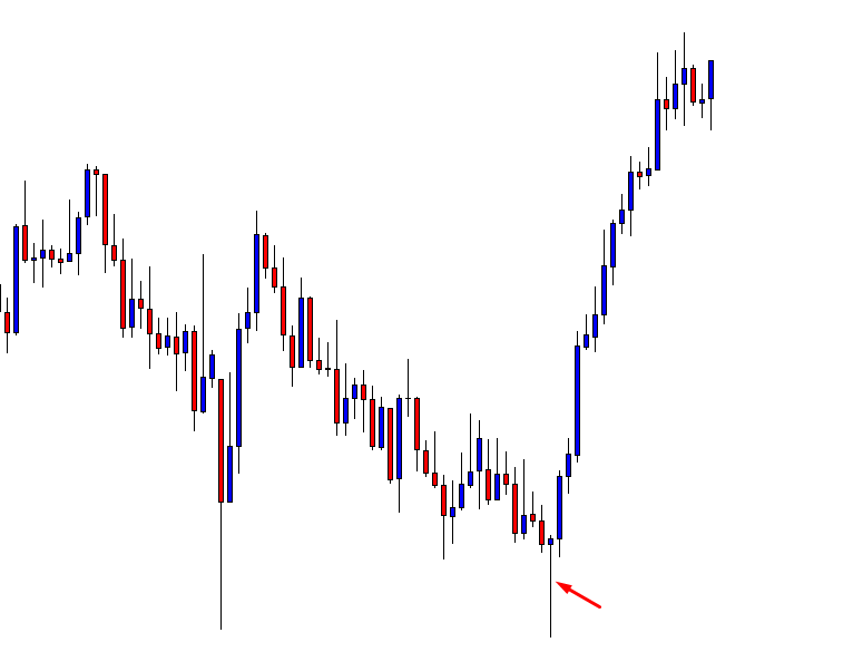
I have chosen a chart which was down-trending and produced a Bullish Pin Bar. The price then changed its direction and headed toward the North. Let us have a look at the chart.

The arrowed candle is one good-looking bullish Pin Bar. A Pin Bar like this attracts the buyers to go long. We see the consequence; the price headed towards the North with good buying pressure. Does this mean whenever we see a Bullish Pin Bar, we go long or vice versa? The answer is no. We must consider other factors such as Support/Resistance zone, Double Top/Bottom, Neckline Breakout, Trend Line breakout, Breakout Candle.

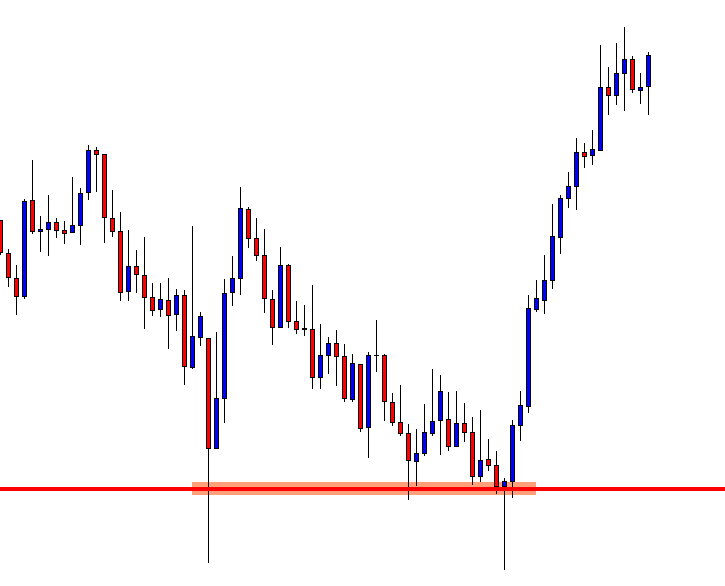
Let us have a look at the chart again.

See where the Pin Bar was formed. It was formed right at a zone where the price had several bounces. Ideally, this is a level where the sellers want to come out with their profit. Thus, a strong bullish reversal candle such as a Bullish Pin Bar shall attract the buyers to concentrate on the chart to go long. Now that we have found a strong support level what else to look for?

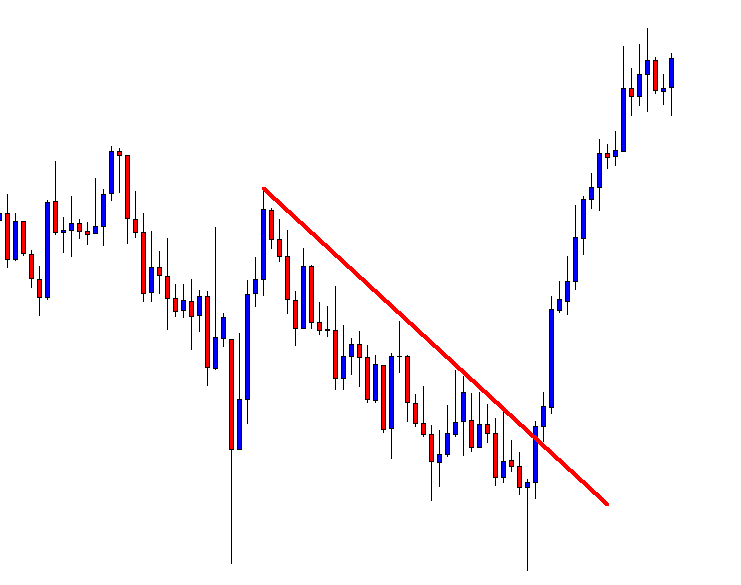
The price was down-trending by following a Trend Line. Can you spot that?

Have a look at this.

A down-trending Trend Line can be drawn. Buyers must wait for a breakout there. See the breakout candle. That was a strong bullish candle which was followed by another one. Moreover, the price came back and touched the Trend line after the breakout. Many buyers may have taken their entry there. This is not a bad idea. You may want to go long right after the second candle closes.

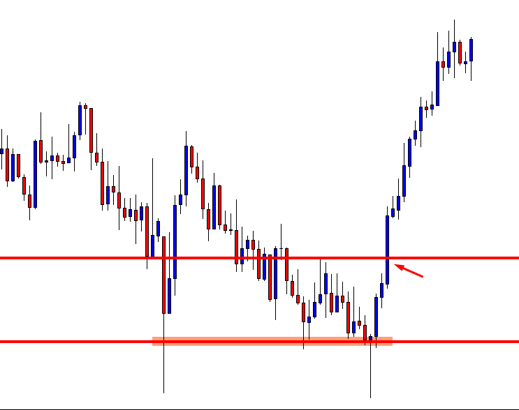
However, some buyers may want to go long at the neckline breakout. Have a look at the chart below.

To be very safe, some traders love to set a pending buy order and go long above the neckline level. It is a safer option for sure, but it has some disadvantages as well. We will talk about this later. Meanwhile, concentrate on what we have learned from this article.

  1. Candlestick or Candlestick pattern is to be formed at a value area.
  2. The existent trend is to be collapsed.
  3. Double Bottom or Double Top is to be evident.
  4. Breakout Candle is to be a strong commanding candle.


Categories
Forex Basics

Everything you should master to Detect Trends, and more!

Introduction

In chapter 1, we’ve set the foundations of market classification, what a trend is about, and the dissection of a trend in its several phases. Then we talked about its two dissimilar wave parts: an impulsive wave, followed by a corrective wave.  We dealt with support, resistance, and breakouts. Finally, we talked about channel contractions.

In this second chapter, we’ll learn the methods available in the early discovery of trends: Trendlines, moving averages, and Bollinger band channels.

Trendlines

A trendline is a line drawn touching two or more lows or highs of a bar or candlestick chart. The convention is to draw the line touching the lows if it’s an uptrend and the tops on a downtrend. Sometimes both are drawn to form a channel where the majority of prices fit.
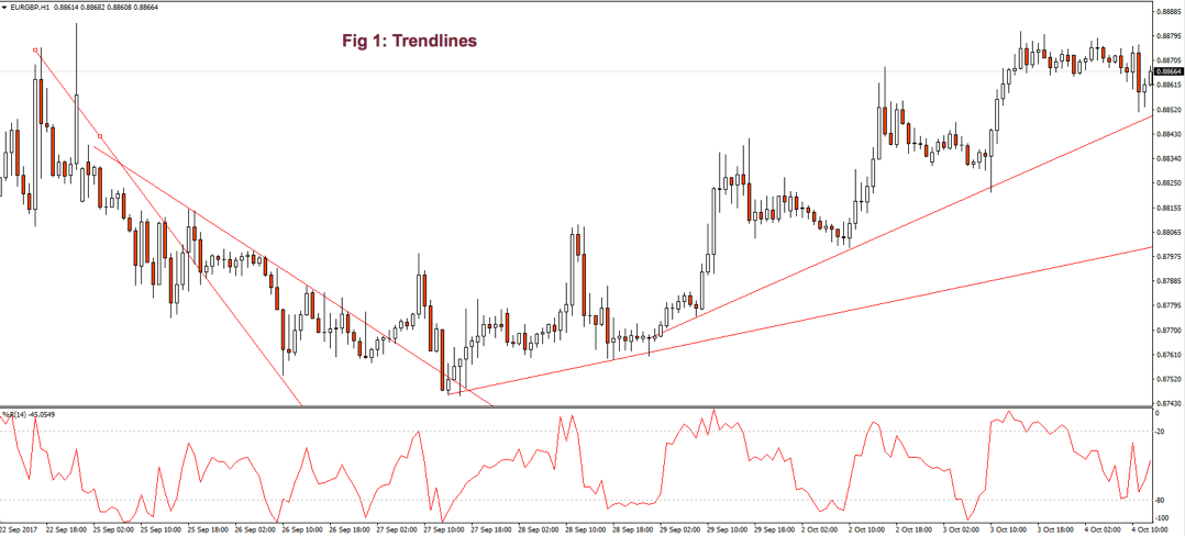
As we see in Fig. 1 the trendline tends to draw resistance levels or supports where the price finds it difficult to cross, bouncing from there, although not always this happens. In Fig. 1 the first trendline has been crossed over by the price, and during the following bars, the slope of the downtrend diminished.  We saw, then, that the first trendline switched its role and now is acting as price support.

When the second trendline was crossed over by the price, a bottom has been created, and a new uptrend started. After a while trending up, we might note that we needed a second trend line to more accurately follow the new bottoms because the uptrend has sped up, and the first trendline is no longer able to track them.

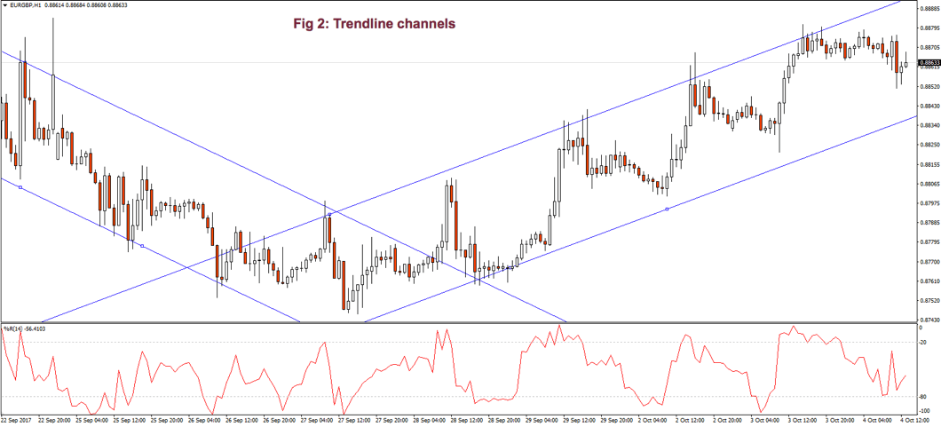
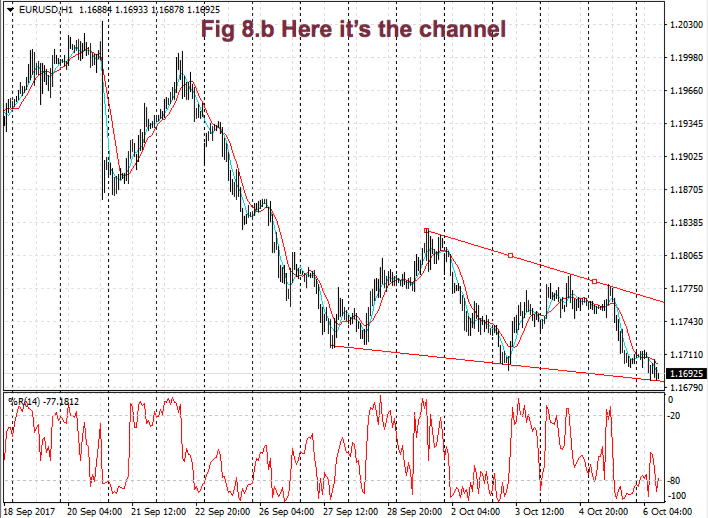
Fig. 2 shows two channels made of trendlines, one descending and the other ascending. The trendline allows us to watch the volatility of the trend and the potential profit within the channel. The trend, as is depicted, has been drawn after it has been developing for a long lapse. Therefore, it’s drawn after the fact.  If we look at the descending channel, we observe that during the middle of the trend, the upper trendline doesn’t touch the price highs. So, this channel would look different at that stage of the chart.
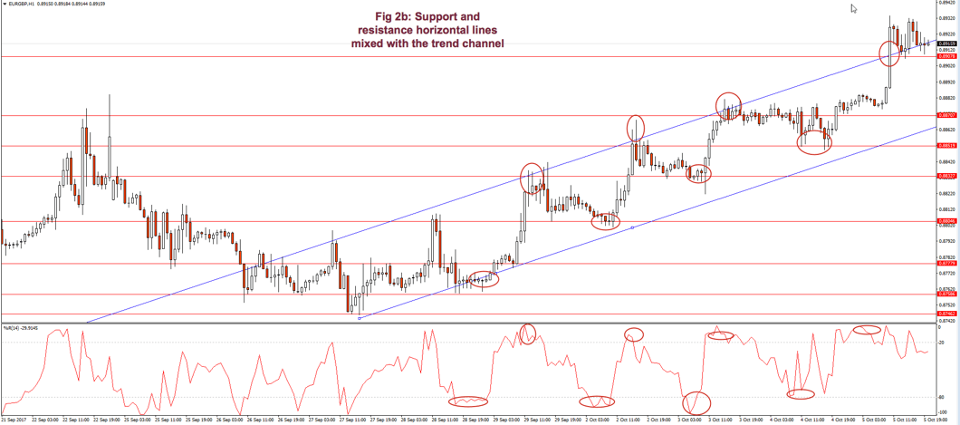
I find more reliable the use of horizontal lines at support and resistance levels and breakouts/breakdowns at the end of a corrective wave. But, if we get a well-behaved trend, such as the second leg in fig 2, a channel might help us assess the channel profitability and assign better targets to our trades. If we use horizontal trendlines together with the trend channel (see Fig 2.b) it’s possible to better visualize profitable entry points and its targets, and, then, compute its reward to risk ratio.  The use of the Williams %R indicator (bottom graph) confirms entry and exit points.

Fig. 2b graph’s horizontal red lines show how resistance becomes the support in the next leg of a trend.

As a summary:

  • A trendline points at the direction of the trend and acts as a support or as a resistance, depending on the price trend direction.
  • If a second trendline is needed, we should pay attention if it shows acceleration or deceleration of the price movement.
  • If the price crosses over or crosses under the trendline, it may show a bottom or a top, and a trend change.
  • A trendline channel helps us assess the potential profitability and assign proper targets to our next trade.

Moving Averages (MA)

Note: At the end of this document, an Appendix discusses some basic statistical definitions, that may help with the formulas presented in this section, although reading it isn’t needed to understand this section.

Some centuries back, Karl Friedrich Gauss demonstrated that an average is the best estimator of random series.

Moving averages are used to smooth the price action. It acts as a low-pass filter, removing most of the fast changes in price, considered as noise. How smooth this pass filter behaves, is defined by its period. A moving average of 3 periods smoothens just three periods, while a 200-period moving average smoothens over the last 200 price values.

Usually, a Moving Average is calculated using the close of every bar, but there can be any other of the price points of a bar, or a weighted average of all price points.

Moving averages are computationally friendly. Thus, it’s easier to build a computerized algorithm using moving average crossovers than using trendlines.

Most Popular types of moving averages

Simple Moving Average(SMA):

The simple moving average is computed as the sum of all prices on the period and divided by the period.

The main issue with the SMA is its sudden change in value if a significant price movement is dropped off, especially if a short period has been chosen.

Average-modified method (AvgOff)

To avoid the drop-off problem of the SMA, the computation of an avgOff MA is made using and average-modified method:

Weighted moving average

The weighted moving average adds a different weight to every price point in the period of calculation before performing the summation. If all weights are 1, then we get the Simple Moving Average.

Since we divide by the sum of weights, they don’t need to add up to 1.

A usual form of weight distribution is such that recent prices receive more weight than former prices, so price importance is reduced as it becomes old.

w1 < w2 < w3… < wn

Weights may take any form, most popular being Triangular and exponential weighting.

To implement triangular weighting on a window of n periods, the weights increase linearly from 1 the central element (n/2), then decrease to the last element n.

Exponential weighting is an easy implementation:

EMAt = EMAt-1 + a x (pt Et-1)

Where a, the smoothing constant, is in the interval 0< a < 1

The smoothing property comes at a price:  MA’s lags price, the longer the period, the higher the lag of the average. The use of weighting factors helps reducing it. That’s the reason traders prefer exponential and weighted moving averages: Reducing the lag of the average is thought to improve the edge of entries and exits.
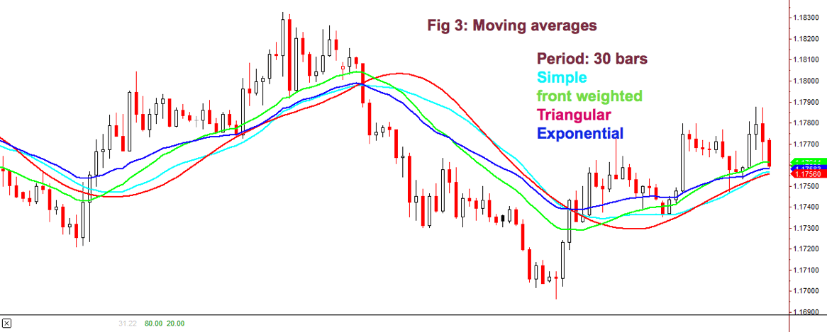
Fig 3 shows how the different flavors of a 30-period MA behave on a chart. We may observe that the front-weighted MA is the one with a slope very close to prices, Exponential MA is faster following price, but Triangular MA is the one with less fake price crosses, along with simple MA: The catch is: We need to test which fits better in our strategy. The experience tells that, sometimes, the simpler, the better.

Detecting the trend using a moving average is simple. We select the average period to be about half the period of the market cycle. Usually, a 30 day/bar MA is adequate for short-term swings.

One method to decide the trend direction is to consider it a bull leg if the bar close is above the moving average; and a bear leg if the close is below the average.

Another method is to watch the slope of the moving average as if it were a trendline. If it bends up, then it’s a bull trend, and if it turns down, it’s a bear trend.

A third method is to use two moving averages:   Fast-Slow (Fast -> smaller period).

In this case, there are two variations:

  1. Moving average crossovers
  2. All the averages are pointing in the same direction.

As with the case of a single MA, a price retracement that touches the slower average is an opportunity to add to the position.

For example, using a 30-10 MA crossover: If the fast MA crosses over the slow MA, we consider it bullish; if it crosses under, bearish.

Using the method of both MA’s pointing in the same direction, we avoid false signals when the fast MA crosses the slow one, but the slow MA keeps pointing up.

When using MA crossovers, we are forbidden to take short trades if the fast MA is above the slow MA, but we’re allowed to add to the position at price pullbacks. Likewise, we’re not allowed to trade on the buy side if the fast MA is below the slow MA.

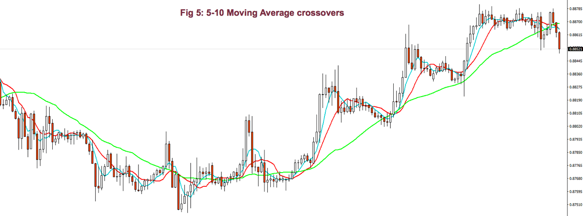
Using smaller periods, for instance, 5-10 MA, it’s possible to enter and exit the impulsive legs of a trend.  Then, the 10-30MA crossovers are used to allow just one type of trade, depending on the trend direction, and the 5-10 MA crossover is actually used as signal entry and exit (if we don’t use targets). In bull trends, for example, we may enter with the 5MA crossing over the 10MA, and we exit when it crosses under.
Bollinger Band Channel

We already touched channels that were made of two trendlines. There is another computationally friendly channel type that allows early trend detection and trading.

One of my favorite channel types is using Bollinger Bands as a framework to guide me.

A Bollinger Band is a volatility channel and was developed by John Bollinger, which popularized the 20-period, 2 standard deviations (SD) band.
This standard Bollinger band has a centerline that is a simple moving average of the 20-period MA. Then an upper band is drawn that is 2 standard deviations from the mean and a lower band that’s 2 standard deviations below it.

I tend to use two or three 30-period Bollinger bands. The first band is one SD wide, and the second one is two SD apart from the mean. A third band using 3 standard deviations might be, also, useful.

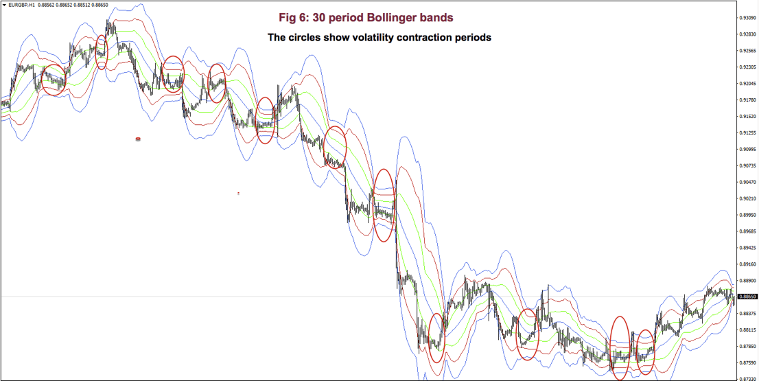
Fig 6 shows a very contracted chart with 3 Bollinger bands to show how it looks and distinguishing periods of low volatility.

During bull trends, the price moves above the mean of the Bollinger band.  During bear markets, the price is below the average line of the bands.

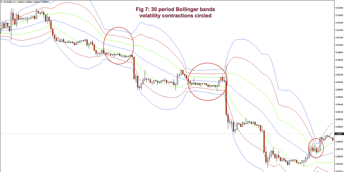
On impulsive legs of a trend, the price goes above 1-SD (or below on downtrends), and it continues moving until it crosses the 2-SD line, sometimes it even crosses the third 3-SD line. Price beyond 2 SDs is a clear sign of overbought or oversold. On corrective legs, the price goes back to the mean. During those phases volatility contracts, and is an excellent place to enter at breakouts or breakdowns of the trading range.

Below Fig. 7 shows an amplified segment of Fig 6, with volatility contractions circled. We may observe, also, how price moves to the mean, after crossing the 2 and 3 std lines.
 

Grading your performance

According to Dr. Alexander Elder, the market is testing us every day. Only most traders don’t bother looking at their grades.

Channels help us grade the quality of our trades. To do it, you may use two trendlines or some other measure of the channel. If you don’t see one, expand the view of the chart.
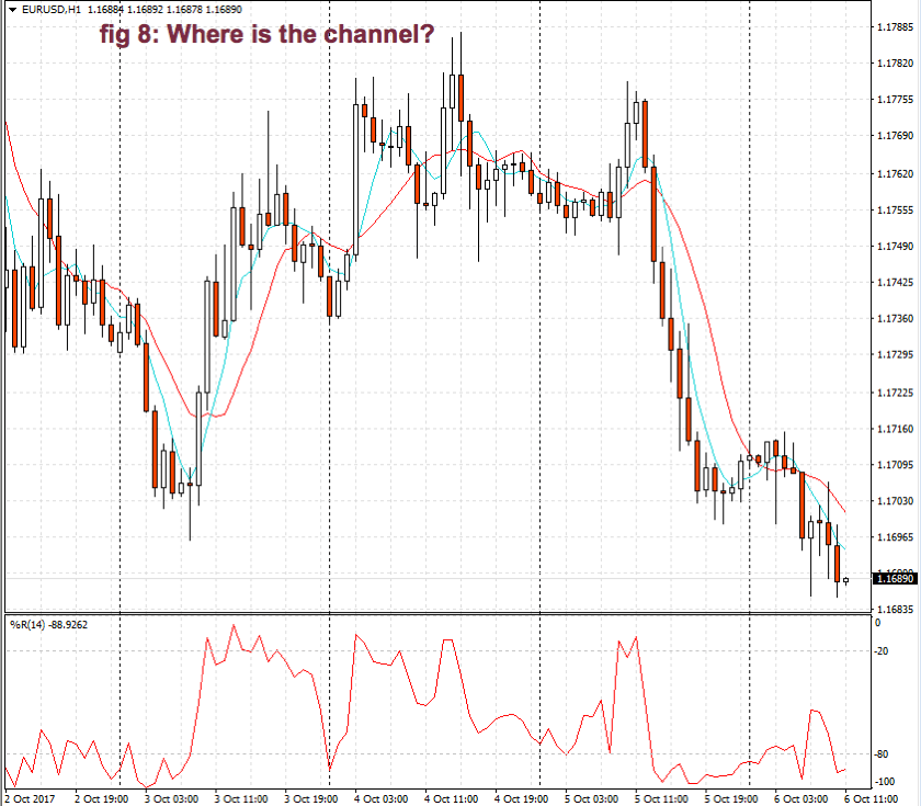
When entering a trade, we should measure the height of the channel from the bottom to its top.  Let’s say it’s 100 pips.  Suppose you buy at ¾ of the upper bound and sell 10 pips later. If you take 10 pips out of 100 pips, your trade quality is 10/100 or 1/10. How does this qualify?
According to Elder’s classification, any trade that takes 30% or more of a channel is credited with an A. If you make between 20 and 30%, your grade will be B. Between 10 and 20% you’re given a C and a D if you make less than 10%.  So, in this case, your grade is C.

Good traders record their performance. Dr. Elder recommends adding a column for the height of the channel and another column for the percentage your trade took out of the channel.

Monitor your trades to see if your performance improves or deteriorated.  Check if it’s steady or erratic.  The information, together with the autopsy of your past trades, helps you spot where are your failures: Entries too late? Are you exiting too soon? Too much time on a losing or an underperforming trade?  A trade against the prevailing trend?


The next chapter will be dedicated to chart patterns.


Appendix: Statistics Overview

Statistics is a branch of mathematics that gives us information about a data set. Usually, the data set cannot be described by an analytical equation because they come from unpredictable or random events. As traders, we need basic knowledge, at least, of statistics for our job.
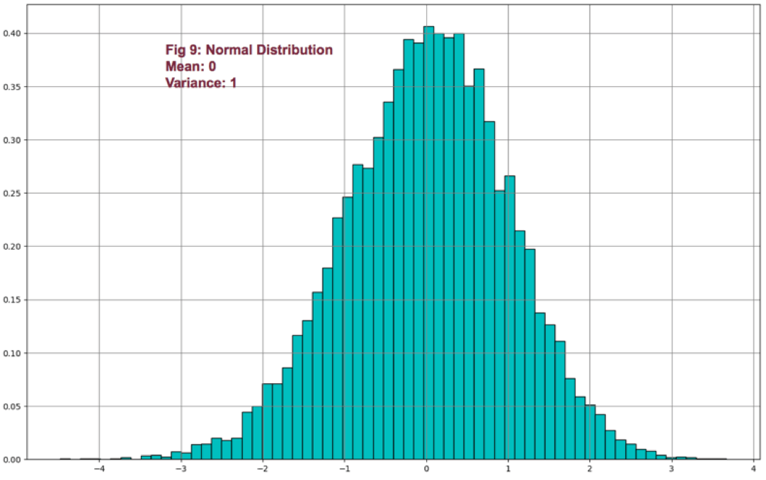
We can express statistical data numerically and graphically. Abraham de Moivre, back in the XVII century, observed that as the number of events (coin flips) increased, the shape of the binomial distribution approached a very smooth curve. De Moivre thought that if he could find the mathematical formula for this curve, he could solve problems such as the probability of 60 or more heads out of 100 coin flips. This he did, and the curve is called Normal distribution.

This distribution plays a significant role because of the fact that many natural events follow normal distribution shapes.  One of the first applications of this distribution was the error analysis of measurements made in astronomical observations, errors due to imperfect measuring instruments.

The same distribution was also discovered by Laplace in 1778 when he derived the central limit theorem. Laplace showed the central limit theorem holds even when the distribution is not normal and that the larger the sample, the closer its mean would be to the normal distribution.

It was Kark Friedrich Gauss, who derived the actual mathematical formula for the normal distribution. Therefore, now, Normal distribution is also named as Gaussian distribution.

Although prices don’t follow a normal distribution, it’s is used in finance to extract information from prices and trading statistics.

There are two main measures we use routinely: The center of our observations and the variability of the points in our data set from that mean.

There’s one main way to compute the center of a set: the mean. But it’s handy to know also the median if the distribution isn’t symmetrical.

Mean: It’s the average of a set of data. It’s computed adding all the elements of a set and divide by the number of elements:

Mean = Sum(p1-Pn)/n

Median: The median is the value located in the middle of a set after the set has been placed in ascending order. If the set has a symmetrical distribution, the median and the mean are the same or very close to it.

The variability of a data set may be calculated using different methods. Two main ways are used in financial markets:

Range: The easiest way to measure the variability. The range is the difference between the highest and lowest data of a set. On financial data, usually, a variant of the range is calculated: Average true range, which gives the average range over a time interval of the movement of prices.

Sample Variance(Var): Variance is a measure of the mean distance of the data points around its mean. It’s computed by first subtracting the average from all points: (xi-mean) and squaring this value. Then added together and dividing by n-1.

Var = 𝝈2 =∑ (x-mean)2 / (n-1),

whereis the symbol for the sum of all members of the set
By squaring (xi-mean), it takes out the negative sign from points smaller than the mean, so all errors add-up. The division by n-1 instead of n helps us not to be too much optimistic about the error. This measure increments the error measure on small samples, but as the samples increase, its result is closer and closer to a division by n.
If we take the square root of the variance, we obtain the standard deviation (𝝈 – sigma).

 Volatility: Volatility over a time period of a price series is computed by taking the annualized standard deviation of the logarithm of price returns multiplied by the square root of time expressed in days.

𝝈T = 𝝈annually √T


References:

New Systems and Methods 5th edition, Perry Kaufman

Trading with the Odds, Cynthia Kase

Come into my Trading Room, Alexander Elder

History of the Gaussian distribution http://onlinestatbook.com/2/normal_distribution/history_normal.html

https://en.wikipedia.org/wiki/Volatility_(finance)

Further readings:

Profitable Trading – Chapter 1: Market Anatomy

Profitable Trading Chapter III: Chart patterns

Profitable Trading – Computerised Studies I: DMI and ADX

Profitable Trading – Computerized Studies II: MACD

https://www.forex.academy/profitable-trading-computerized-studies-iii-psar/

Profitable Trading (VII) – Computerized Studies: Bands & Envelopes

Profitable Trading VIII – Computerized Studies V: Oscillators