Categories
Forex Indicators

The Application of the Moving Average on Indicators

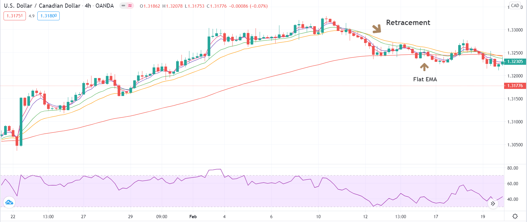
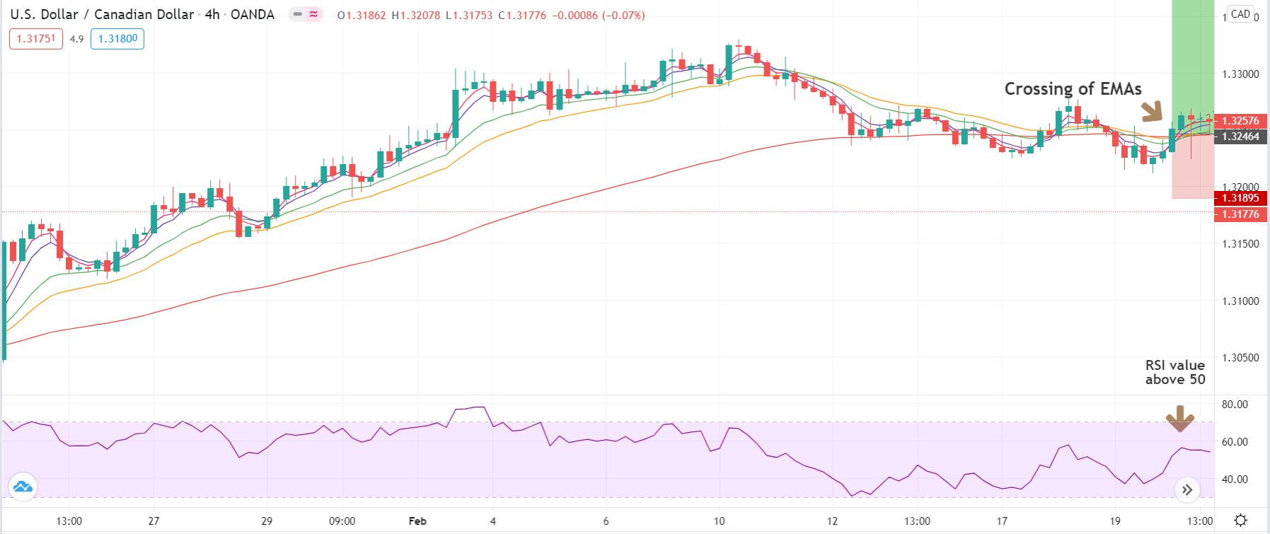
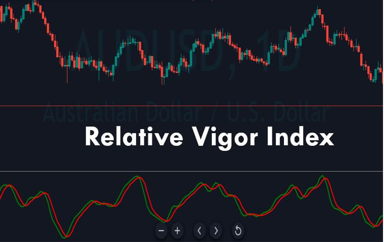
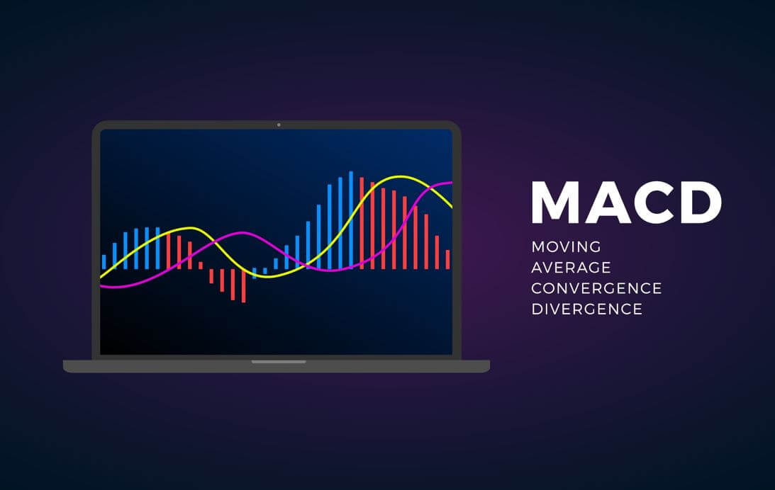
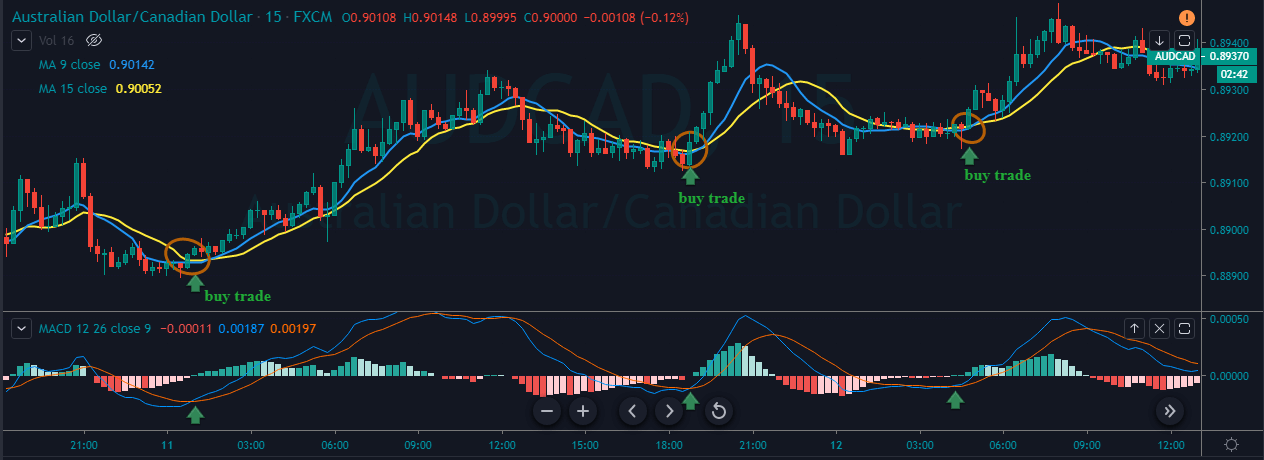
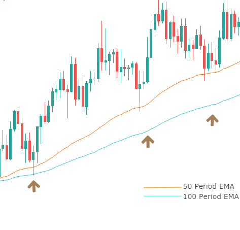
Traders worldwide have shown interest in the Moving Average Convergence/Divergence indicator that we all know as MACD. Praised as a two-line indicator that has generated quite a few pips to many content creators, MACD can certainly point us toward the direction of discovering other amazing tools that we can incorporate into our trading systems. Since traders are constantly in search of the best components to help build their own algorithms, they inevitably come across a number of low-performing indicators from which their trades can hardly benefit. As a result, these traders immediately cast off the tools that they believe cannot make it to their favorites’ list, which may not be the approach that you will always want to take. Today, we are going to see how adding a moving average on various MT4 indicators can not only improve a tool’s performance but also prove to be the right move towards lucrative trades. 

Many beginners fail to acknowledge the importance of adjusting settings and learning about the ways to make some changes to the existing indicators in order to gain more profit. While MACD indicators’ fame grew due to the diversity of its functions, few actually know how using the moving average on other indicators can truly generate new and unexpected possibilities in many cases. If you are keen on growing a unique system and testing different options, then the use of moving averages can really become one of your favored solutions down the line. By adding a moving average on some of the less efficient indicators, you can have an entirely different experience with tools that you once defined as utterly futile for trading. Naturally, in some cases this approach will not seem to be applicable or useful; however, by incorporating moving averages in your system, you are introducing an additional layer of protection, as all traders look forward to finding indicators to prevent them from making bad decisions while trading in the forex market.

Today’s selection of indicators is meant to serve as a lesson on how you can improve some of the tools which overall do not provide desired results, rather than tell you which tools you should use in your everyday trading. You can later go back to the indicators you saved on a flash after you had stopped using them, as we will show you how some of the indicators that are already built on MT4 miraculously change after the moving average has been added. You can also open the MT4 while you are reading this article and make the same adjustments as we do while you are reading. Be prepared to take notes on some specific settings as well as remember a few key pieces of advice you should follow when you are attempting to carry out this process yourself. 

Accumulation

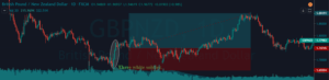
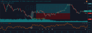
Accumulation is one of the indicators that are generally considered as bad in the forex trading community, especially due to the fact that traders cannot make any adjustments that could improve its performance. As you can see from the first image below, Accumulation is essentially a one-line indicator, which barely appears to be able to give any relevant information. However, once we apply the moving average, although you cannot expect drastic changes, the overall performance of this tool immediately improves.

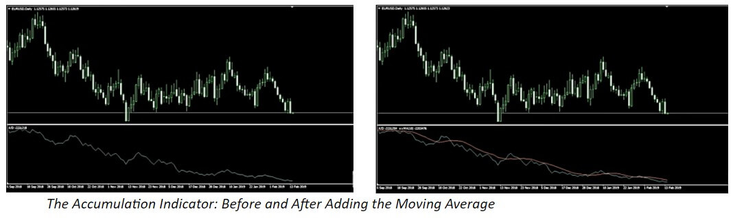
In order to make the most of this, you will need to follow a few rules. Firstly, you should not alter the moving average of oscillators, yet expand the Trend tab in your Navigator window inside Indicators. Once you find the moving average there, you will need to drag it down to the indicator window you wish to apply it on. Then, a new window will pop out where you will be able to make further adjustments. What we did is we left the period where it was (10) and changed the settings from Close to First Indicator’s Data. If you, however, decide to apply the changes at Close, you will not see the line in the same place as in the right picture above, it will simply be applied to the price chart. Therefore, the two essential steps to take are to drag the moving average down and apply it to First Indicator’s Data.

The results these steps can deliver are much better than what you can hope to achieve without. The moving average is mostly going to tell you where the trend is, and after we applied this to Accumulation, we discovered five to six entry signals just by glancing over the chart. A better indicator would naturally offer more quality entry signals and, consequently, serve you better. However, the idea behind this is to change a one-line indicator to a two-line-cross one, which is believed to be one of the best confirmation indicators you can use. Even though these changes prevented you from quite a few problematic points, Accumulation is still not recommended to be used for everyday trading purposes. Some professional traders even claim to have tested this tool and every possible variation only to discover that it is not a viable, long-term option for them.

i-BandsPrice

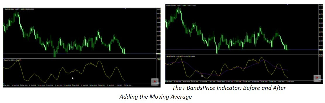
Similar to the Accumulation indicator, i-BandsPrice is also a single line that does not perform very well in general. You can change this tool into a zero-cross indicator by following the steps we previously described. Although it does not truly get to zero, you can still see some benefits from these changes. What you should first do is alter the period and see the results this solution provides. Naturally, you will not go after every opportunity in the chart because you will want to avoid reversal trading. Nonetheless, what you do gain from making these adjustments, in this case, is the ability to discover when you can enter a trade. As with any other zero-cross indicator, i-BandsPrice can now also tell you to start trading when the indicator crosses over the zero line towards the negative or the positive.

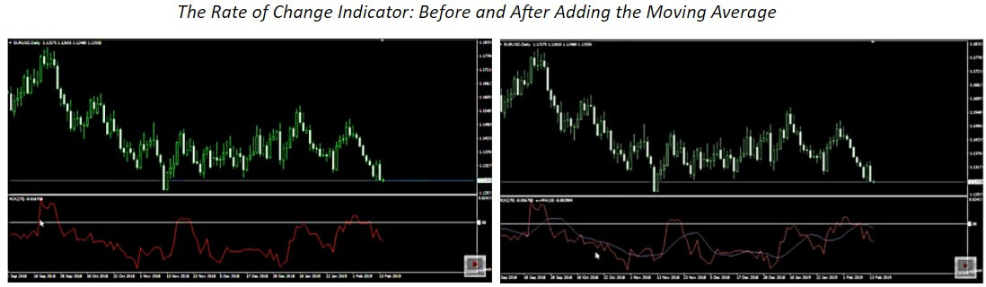
Rate of Change (ROC)

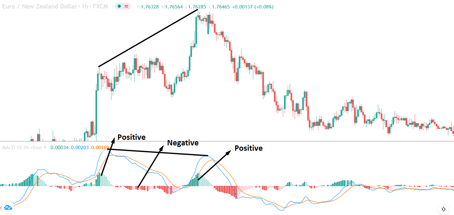
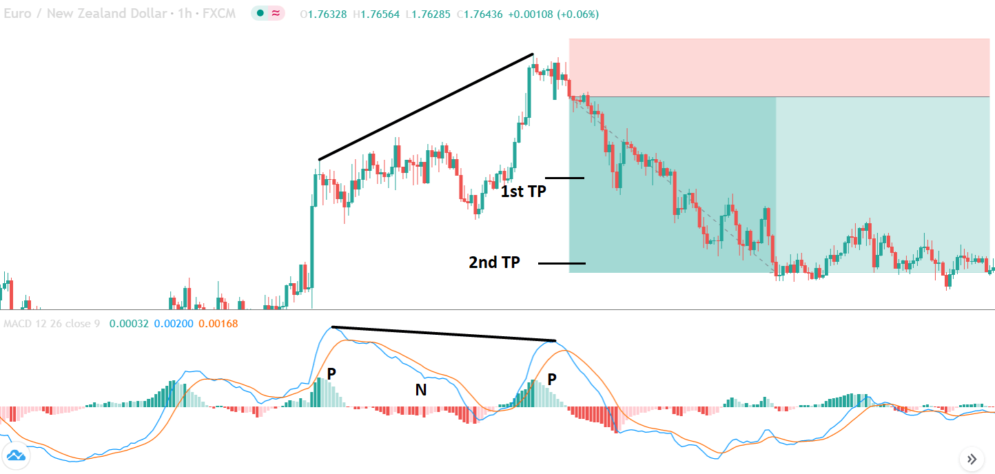
In order to see more benefits from using the Rate of Change indicator, we first moved the period to 70. Then we added the zero line because it will tell us to go long if the line crosses the zero upward and vice versa. However, to make the most of it, you will need to add the moving average and look for the places when the lines are already both below zero: when the indicator crosses down again, you will have the opportunity to enter a continuation trade, which some experts see as their most lucrative trades. As ROC is one of the lower options on the performance spectrum, you will not be able to get many good trades despite the changes. Nevertheless, you can alter the period, moving it from 8 to 10 as we did, and see how it begins to resemble the MACD indicator is thought to successfully provide the greatest number of signals to enter continuation trades. Therefore, if you happen to come across a zero-line-cross indicator that seems to have a lot of potential, you can actually grant yourself more lucrative opportunities just by adding the moving average.

Average Directional Movement Index (ADX)

ADX can serve as an example of how you can apply the moving average to a volume indicator. Whenever the line goes above, trend traders receive the signal that they have enough volume to enter the trade. Likewise, whenever the line plunges, it is a signal to stay out of the market. In the example below, we kept the period of 14 and added another line (like we did before) at level 25. ADX has proved to be performing better once the changes have been applied, although it has also proved to give a lot of false signals as well. Another reason why professional traders typically dislike this tool is that it often lags. However, despite the opportunity to test how this tool performs after adding the moving average, we still have some other better options we can use to trade in this market. 

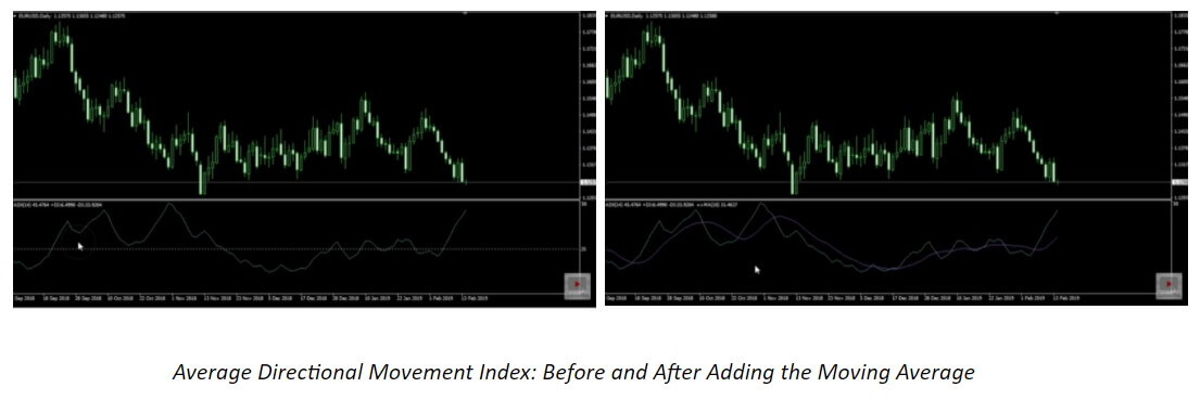
Once you remove the additional line and add the moving average, you will naturally not bring about some unforeseen, alchemical-like change, but you will be able to improve almost any volume or volatility indicator. Drag the moving average down as you did before and change the option from Close to First Indicator’s Data (we kept the period at 10), and you will see how fruitful the results your volume/volatility indicator gives are. If you kept the line we had before, you would have potentially taken a great number of losses because ADX would need too much time to go below. This way, however, you are improving the overall condition because the moving average always adjusts to the volume indicator. Therefore, you could get a signal to take a break at some point in the chart and another one to resume after a while, which is by far better than what the original, unchanged version of this indicator can provide.

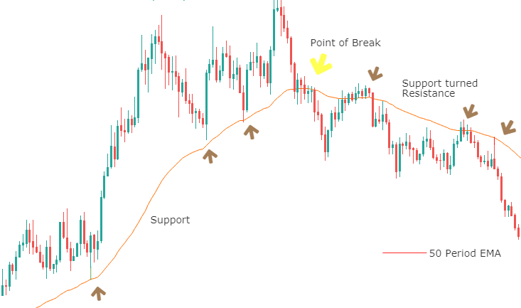
As a forex trader, you will naturally be experiencing passing moments of consolidation and stagnation after trading for a period of time. You will then want your indicator to let you know when and how to avoid these troublesome points in the chart. Since the moving average can limit the negative effect a poorly performing tool can have on your trade and expand its functions in terms of quality, you can immediately start testing the indicators you discovered before but for which you could not find the right use. Now the indicators which could not help you seem to have a newfound potential to help you trade more successfully. What is more, the moving average can be applied in such a vast number of cases that it immediately increases the opportunity to win. You only need to take time to test and find a way to use a specific indicator after the changes have been made. Some indicators can only be improved to a certain degree with the MA, yet some others can truly illustrate a distinct difference in your trading.

Many traders are having a hard time finding the right exit indicator, for example. However, an exit indicator that a professional trader would find to be really good is typically a two-line-cross indicator. Luckily, with the help of the moving average, any one-line oscillator can become a two-line-cross indicator and, therefore, also an exit indicator that you can discover to be a really good solution for you. Improvement sometimes implies tweaking the settings, whereas it may also entail adding the moving average so as to give the tools that have not worked well in the past the chance to make a positive difference. The moving average can be applied to almost anything, as we said before, so it does bring a new sense of hope to traders who have had difficulty finding the right elements to complete their technical toolbox. This knowledge simply opens up a number of tremendous possibilities, as a single oscillator changed to a two-line-cross indicator is the proof that tools that were not very useful can be adjusted so that traders can actually make use of them. Whatsmore, indicators with two lines have first and second indicator data. In this case, you can apply MAs to both and have a kind of momentum gauge in an already established trend, for example, on line cross.

Go to your list of indicators that you considered as poor samples and start testing this solution to find out just how much the moving average can improve your trading. At least then you will know that you can write off a tool for good without having to go through periods of hesitation or doubt. Luckily, sometimes the improvement comes just after adding this second line, so you will never again need to question a decision you made with regard to indicators. According to professional traders, some of their most lucrative deals stemmed from continuation trades which these changes made possible. Hence, just by making these adjustments, you can turn a below-average indicator is a tool that is similar to MACD and experience numerous benefits long term. There are many variations and improved versions of MACD, RSI, and others, with a different type of calculations. Playing with MAs on these tools is a definitive winning combo. All you have to do is try it out.

Categories
Forex Course Forex Daily Topic

150. The Easiest Way To Measure Market Volatility

Introduction

Measuring volatility enables traders to accurately identifying the significant trading opportunities in the currency pairs. An increase in the volatility of a currency pair occurs due to any of the major changes in the economy of that country. Market volatility measures the overall price fluctuations over a specific period, and this information is used to identify the potential breakouts.

In the Forex market, the higher the volatility, the riskier is the currency pair to trade. A higher volatility means that the asset value can be spread out over a larger range of values. A lower volatility means that an asset does not fluctuate dramatically and tends to be more steady. A few indicators help us in measuring the volatility of the currency. Using these indicators will show us the accurate representation of the market’s volatility when looking for trading opportunities.

Bollinger Bands

We have discussed a lot about Bollinger Bands in our previous course lessons. This indicator is specially designed to measure the volatility of an asset. In this case, any currency pair in the Forex market. This indicator consists of two lines (bands) plotted above and below the middle line, a moving average. The volatility representation is based on the standard deviation, which changes as an asset’s volatility increases and decreases. Both these bands contract and expand according to market volatility. When the bands’ contract, it tells us that the volatility is low, and when the bands widen, it represents an increase in volatility.

Moving Average

Moving Average is the most common indicator used by traders across the globe. It measures the average amount of market movement over a specific period. If we set the moving average to 30 periods, it shows us the last 30 days’ average movement. In short, any Moving average tells us the average price movement over a specific period. If the MA line is above the actual price, that implies the market is in a downtrend and vice versa.

Average True Range (ATR)

The ATR (Average True Range) is another reliable indicator used to measure market volatility. This indicator takes the currency price range, which is the distance between the high and low in the time frame, and then plots that measurement as a moving average.

If we set the ATR to 40 range, it will tell us the average trading range of the last 40 days. The lower the ATR reading means, the volatility is falling, and we can expect fewer trades. On the other hand, the higher the volatility means the ATR reading is rising. It is an indication that the volatility is on the rise, and by using any directional indicator, we can gauge the potential trading opportunities.

These are the three best tools you need in your arsenal to measure the market’s volatility accurately. Make sure to take the below quiz before you go. Cheers!

[wp_quiz id=”92111″]
Categories
Forex Basic Strategies

Filtering The Most Profitable Trading Signals Using The ‘Zig-Zag’ Forex Trading Strategy

Introduction

In today’s article, we discuss a strategy that is based on the unfamous zig-zag indicator. The zig-zag indicator serves to shows changes and continuation in trends that occur in price movements. Usually, this indicator is used by traders to look for reversal points in the market. But in today’s strategy, we will use the zig-zag indicator to trade the continuation of a trend. However, if we think a little deep, this type of trading is also a form of ‘reversal trading’ where we will be finding the reversal points in a smaller trend within the larger trend.

At first glance, the indicator appears very simple but is not easy to understand by novice traders. The trading strategy that uses this indicator is not special because it uses this indicator, but since we are imparting various other concepts of technical analysis such as chart patterns, trend lines, and price action. But using this indicator alone too can generate good trading signals provided the trader is having good skill of this indicator properly.

Time Frame

The ‘zig-zag’ strategy can only be applied to the ‘Daily’ time frame. Hence, this strategy is not for intraday and short-term traders. We need to have a longer time horizon to trade using this strategy.

Indicators

We use two technical indicators in this strategy

  • Simple Moving Average (20-period)
  • Zig-Zag (default setting)

Currency Pairs

We can apply the following strategy on both minor and major currency pairs. Liquidity and volatility will not be a major issue here as we are trading on higher time frames.

Strategy Concept

We are basically using the zig-zag indicator to identify classic chart patterns of technical analysis and trade them. The indicator is very effective in reducing the noise by helping the technical trader in viewing the larger picture and general market direction. Here, we look for appropriate chart patterns and associated price action indications within the context of a trend.

When these patterns are formed just anywhere on the chart, they do not hold much value as there is no logic to that. Once we identify a trend using the simple moving average (SMA), we wait for trend continuation signs provided to us by the zig-zag indicator and the chart pattern. The formation of the chart pattern is the first sign of trend continuation. Once price action develops and the market moves in the direction of the major trend, we look for ‘entry’ signals and then only enter into a trade.

One of the astounding features of this strategy is it’s risk-to-reward (RR) ratio. Trades executed this strategy have high risk-to-reward (RR) because we are trading with the major trend and the need for a smaller stop-loss. Not only is ‘RR’ of trades high, but also the probability of winning is much higher in this strategy due to stricter rules and time given for a trade setup to be formed. Now that we got a gist of the strategy, let us find out the actions required to execute the strategy.

Trade Setup

In order to execute the strategy, we have considered the ‘Daily’ chart of the USD/JPY currency pair, where we will be illustrating a ‘short’ trade. Here are the steps to execute the strategy.

Step 1: Firstly, we have to identify the trend of the market on the ‘Daily’ chart. This can easily be done with the help of the simple moving average (SMA) indicator. If the price stays below the SMA for a long period of time, we say that the market is in a downtrend. And if it remains above the SMA for a sufficient period of time, we say that the market is in an uptrend. It is worthwhile to note that zig-zag is not being used for establishing the trend.

The below image shows that the market is in a strong downtrend in the case of USD/JPY.

Step 2: After identifying the trend of the market, we wait for the market to form a ‘head and shoulders’ pattern in a down-trending market and an ‘inverse head and shoulders’ pattern in an up-trending market. Here’s where the application of the zig-zag indicator comes into the picture. The chart pattern should essentially be indicated by the zig-zag pattern—the lines of indicator show the ‘real’ formation of the pattern in the market. In addition to this, we plot a trendline that connects the ‘lows’ (head and shoulders) or ‘highs’ (inverse head and shoulders) of the pattern as indicated by the indicator. This completes the execution of 80% of the strategy’s rules.

Step 3: We enter the market for a ‘buy’ or ‘sell’ after the price breaks the trendline and ‘tests’ it on the other side. In simple words, in a ‘head and shoulders’ pattern, we enter for a ‘sell’ when price breaks the ‘support’ trendline and re-tests after making a ‘lower low.’ While in an ‘inverse head and shoulders pattern,’ we enter for a ‘buy’ when price breaks the ‘resistance’ trendline and re-tests after making a ‘higher high.’

The below image shows how a ‘short’ entry is taken.

Step 4: Now, let us determine the stop-loss and take-profit levels for the strategy. When ‘short,’ we place a stop-loss above the right shoulder of the ‘head-and-shoulder’ pattern. Similarly, when ‘long, stop-loss is placed below the right shoulder of the ‘inverse head-and-shoulder’ pattern. Take-profit will be set at the ‘lower low ‘of the major downtrend and at the ‘higher high’ of the major uptrend. The risk-to-reward (RR) of trades executed using this strategy will be at least 1:1.5.

The below image shows the result of sample trade executed using the zig-zag strategy.

Strategy Roundup

Even though the above strategy takes a lot of time to present a potential trade, the risk-to-reward and probability of winning of these trades are worth waiting for. There are many applications of the zig-zag indicators. Traders make use of other technical indicators like the Stochastic Oscillator and Relative Strength Index (RSI) together with the zig-zag indicator to locate the overbought and oversold conditions of the market.

Categories
Forex Basic Strategies

Generating Profitable Forex Signals Using The ‘Indicator-Price Action’ Combo Strategy

Introduction

Few strategies discussed previously focussed on chart patterns and indicators. Now let us a strategy that is based on two of the most powerful indicators in technical analysis. We already know how to trade using these indicators separately. But using any technical indicator in isolation will not generate a great amount of profit.

Therefore, it becomes necessary to combine at least two indicators and use them in conjunction to produce signals. In today’s article, we not only combine two indicators but also provide a price action edge to it that will make this one of the best strategies of all time. This particular strategy gives traders an insight into both volatility and momentum in the forex market.

The two indicators we will using are Bollinger Band (BB) and MACD. Using the two indicators together can assist traders in taking high probability trades as they gauge the direction and strength of the existing trend, along with volatility. Let us find out the specifications of the strategy and how we imbibe concepts of price action here.

Time Frame

The strategy is designed for trading on longer-term price charts such as the 4 hours and ‘Daily.’ This means the strategy is suitable for the swing to long-term traders.

Indicators

As mentioned earlier, we use Bollinger Band and MACD indicators in the strategy with their default settings.

Currency Pairs

We can apply this strategy to both major and minor currency pairs. However, pairs that are not volatile should be avoided.

Strategy Concept

In this strategy, we first identify the trend of the market and see if the price is moving in a channel or not. When looking for a ‘long’ setup, the price must move in a channel below the median line of the Bollinger band. The lesser time price spends above the median line of the Bollinger band better for the strategy.

The reason behind why we chose to have the price below the Bollinger band is to verify that the price is moving into an ‘oversold’ zone. When price moves into the zone of ‘overbought’ or ‘oversold,’ it means a reversal is nearing in the market. Similarly, in a ‘short’ setup, the price should initially move in an upward channel above the median line of the Bollinger band. This indicates that the price is approaching an ‘overbought’ area.

The MACD indicator shows when a true reversal is taking place in the market. The histogram tells about the momentum and strength of the reversal. Depending on the level of the bars, we ascertain the strength of the reversal. Not only is the strength of the reversal important, but also the ’highs’ and ‘lows’ it makes. Once price crosses previous highs and lows, we enter the market at an appropriate ‘test.’ Let us understand in detail about the execution of the strategy.

Trade Setup

In order to execute the strategy, we have considered the 4-hour chart of the GBP/JPY pair, where we will be illustrating a ‘long’ trade. Here are steps to execute the strategy.

Step 1: Firstly, we have to identify the trend of the market. In a ‘long’ trade setup, we need to look for series of ‘lower lows’ and ‘lower highs’ below the median line of the Bollinger band, and in a ‘short’ trade setup, we need to look for series of ‘higher highs’ and ‘higher lows’ above the median line of Bollinger band. When this is confined in the channel, the trend becomes very clear, and reversal can easily be identified.

Step 2: We say that an upward reversal has taken place when we notice a bullish crossover in MACD along with a positive histogram. While in an uptrend, we say that a reversal has occurred when we notice a bearish crossover in MACD along with a negative histogram. Once reversal becomes eminent in the market, it is necessary to confirm that the reversal is ‘true,’ and thus, we could take a trade in the direction of the reversal.

The below image shows a downtrend reversal, as indicated by MACD.

Step 3: In this step, we should make sure that the price makes a ‘high’ that is above the previous ‘lower high,’ in an upward reversal. While in a downward reversal (reversal of an uptrend), the price should make a ‘low’ that is lower than the previous ‘higher low.’ When all these conditions are fulfilled, we can say that the reversal is real, and now we will look to trade the reversal.

We enter the market for a ‘buy’ or ‘sell’ when price ‘tests’ the median line of the Bollinger band after the reversal and stays above (‘buy’) or below (‘sell’).

Step 4: Finally, after entering the trade, we need to define appropriate levels of stop-loss and ‘take-profit’ for the trade. The rules of stop-loss are pretty simple, where it will be placed below the lowest point of the downtrend in a ‘long’ position and above the highest point of the uptrend in a ‘short’ position. ‘Take-profit’ will be set such that the risk-to-reward (RR) of the trade is at least 1:1.5. Once the price starts moving in our favor, we will put our stop-loss to break-even and extend our take-profit level.

Strategy Roundup

The combination of the Bollinger band and MACD is not suitable for novice traders. Since it involves complex rules and indicators, we need prior experience of using the indicators and charts before we can apply the strategy successfully. Traders should pay attention to every rule of the strategy to gain the maximum out of it. As there many rules and conditions, there is a tendency among traders to skip some rules, but it is not advisable.

Categories
Forex Basic Strategies

The Amazing Combination of ‘EMA & RSI’ While Trading The Forex Market

Introduction

Previously, we discussed several trading strategies that involved a combination of different indicators, but the number did not exceed two or three. In today’s article, we present a trading system that is based on five different Exponential Moving Averages, combined with the Relative Strength Index (RSI). This strategy will make a lot of sense to traders who are at an intermediate level of trading. It is totally mechanical in nature and requires a thorough understanding of technical indicators of MT4 or MT5.

Time Frame

The strategy can almost be used on any time frame, but a larger one is preferred, 1 hour or higher. This means the strategy is not suitable for trading during the day.

Indicators

As said, we will use five different Exponential Moving Averages and one Relative Strength Index (RSI). This is the reason we need to be well versed in the technical indicators.

Currency Pairs

This strategy can be used with any currency pair. Also, with few commodities as well. Liquidity will not be an issue here since we are trading on the higher time frames.

Strategy Concept

Firstly, we use 80-period EMA to identify the major trend of the market. If the price is above 80 EMA, we say that the market is in a bull market, while if it is below the 80 EMA, the market is in a bear market. Secondly, we use the 21-period and 13-period EMA to point out the current trend direction, meaning, the current minor trend within the major trend. If the EMA with a shorter period is above the one with the longer period, we have a minor bull trend, and vice versa.

Third, we use the other two EMAs with even shorter ‘periods’ in conjunction with the Relative Strength Index (RSI) to generate entry signals. These are the 3-period EMA and 5-period EMA. The crossing of these two EMAs supported by the appropriate value of RSI, tells us whether to go long or short in the currency pair.

However, a more conservative approach would be by ignoring the entry signals, which are in the opposite direction of the major trend. Therefore a ‘long’ entry signal would be generated when the 3-period EMA penetrates the 5-period EMA from below and starts moving higher. Also, the 80-period EMA must be below the price action discussed above, and RSI must have a value exceeding 50. We execute the trade once the signal bar closes beyond the 5-period EMA.

Conversely, a ‘short’ entry will be taken when the 3-period EMA penetrates the 5-period EMA from above and continues lower. This must be coupled with an RSI value below 50, and 80-period EMA be above the price action.

Trade Setup

In order to explain the strategy, we have considered the 4-hour chart of USD/CAD, where we will be applying the rules of the strategy to execute a ‘long’ trade.

Step 1

Since this a trend-based strategy, the first step is to identify the major direction of the market using the 80-period EMA. It is important that the price remains above the EMA for at least four consecutive higher highs and higher lows before we can call it an uptrend. Likewise, the price should be below the 80-period EMA for a minimum of 4 lower lows and lower highs.

The below image shows a clear uptrend visible on USD/CAD on the 4-hour chart.

Step 2

Once we have identified the trend, we need to wait for a price retracement that could give us an opportunity to enter the market and ride the trend. We need to evaluate if this a true retracement or the start of a reversal. In this step, we should wait until the price develops a ‘range’ or the 80-period EMA becomes flat. This partially confirms that the retracement is real, and the price could be making a new ‘high’ or ‘low.’

In the example we have taken, we can see how the price starts to move in a ‘range’ along with the flattening of the EMA. Next, let us discuss the ‘entry’ part of the strategy.

Step 3

We shall enter the market for a ‘buy’ when all the smaller EMAs cross the 80-period from below. The 3-period EMA should penetrate the 5-period EMA and start moving forward to generate a reliable ‘buy’ signal. Along with this, at the entry bar, the RSI should be above the 50 levels, and both the 3 and 5 periods EMA should cross the 13-21 EMA channel. Once all of these conditions are fulfilled, we can take a risk-free entry into the market. The same rules apply while taking a ‘short’ trade but in reverse.

The below image clearly shows the ‘entry’ where all the conditions mentioned above are met.

Step 4

Once we have entered the trade, we need to determine the stop-loss and take-profit levels. For this strategy, the take-profit and stop-loss are placed in such a way that the resultant risk-to-reward of the trade is 2.5. The RR is derived mathematically, where we have taken into consideration the possibility of a new ‘high’ or ‘low’ as we are trading in a strong trending environment.

Accordingly, we have set the take-profit and stop-loss in our example, as shown below.

Strategy Roundup

Combining two or more technical indicators has always proven profitable for traders. The above-discussed strategy considers the trend of the market, momentum, strength of the retracement, and shift of ‘highs’ and ‘lows,’ which makes it an amazing strategy to be used while trading part-time or full-time. Since there are many rules and requirements for the strategy, the probability of occurrence of trade-setup is less, but once formed, it can provide amazing results.

Categories
Forex Education Forex Indicators Forex System Design

Designing a Trading Strategy – Part 3

Introduction

In our previous article, we presented the first component of a trading strategy, which corresponds to the market entry and exit rules. Likewise, we exposed the case of a basic trading system based on the crossing of two moving averages.

In this educational article, we will present the filters and how they can help the trader refine a trading strategy.

Setting Additional Filters in Trading Strategy

Signals originated in a trading strategy can use filters to improve the entry or exit signals that the system generates. The purpose of incorporating filters is to improve both the accuracy and reliability of the strategy. 

A filter can be an indicator’s level or additional instructions to the initial entry, or exit rules. Some examples of filters can be:

  1. Avoid buy entries if the reading of the 60-period RSI oscillator is less than 49. 
  2. Allow Buy entries if the price closes above the high of the previous day or allow sell-short signals if the price closes below the last day’s low.

Also, rules can be established to control the strategy’s risk, and preserve the trading account’s capital. In this context, two elements that can help to manage the risk are:

  1. Initial stop-loss, which can be a fixed amount of pips or depending on some previous periods’ volatility. In turn, this rule can be fixed or dynamic, its level moving as the trade progresses through time.
  2. limiting the number of simultaneously opened trades. This rule can be useful, mainly when the market moves in a sideways path.

Measuring the Risk of Strategy

The risk of trading strategy corresponds to the amount of capital that the investor risks with the expectation of a possible return on the financial market by applying a set of rules with positive expectations.

One way to measure the risk of trading strategy is through the maximum drawdown, which corresponds to the maximum drop in equity from the peak of the equity value to the subsequent equity low.

The developer can obtain this measure as well as other strategy performance indicators by running a historical simulation.

Incorporating Additional Rules into Trading Strategy

The following example corresponds to the addition of rules to the trading strategy formulated and developed in the previous article, based on  moving averages crossovers with 5 and 55 periods. 

Before incorporating additional rules and evaluating their subsequent impact on the trading strategy, we will display the results of a historical simulation, developed using the EURUSD pair in its hourly timeframe. Likewise, the size of each trade position corresponded to 0.1 lot in a $10,000 account.

The following figure illustrates the strategy’s performance in its initial condition, which executed 652 trades providing a drawdown level of 22.66% and a net profit of -$716.93.

The additional proposed filter rules are as follows:

  • The strategy must have an initial stop loss of 30 pips. This stop will limit the possible maximum amount of loss per trade.
extern double SL_Pips = 30;
  • We propose using a Break-Even rule to ensure the opened trades’ profits, which will be used when the price advances 40 pips. Likewise, the strategy will apply a Trailing Stop of 40 pips of advance and a 3-pips step
extern double BreakEven_Pips = 40;
extern double Trail_Pips = 40;
extern double Trail_Step = 3;

The function that computes the Trailing Stop is as follows:

void TrailingStopTrail(int type, double TS, double step, bool aboveBE, double 
aboveBEval) //set Stop Loss to "TS" if price is going your way with "step"
  {
   int total = OrdersTotal();
   TS = NormalizeDouble(TS, Digits());
   step = NormalizeDouble(step, Digits());
   for(int i = total-1; i >= 0; i--)
     {
      while(IsTradeContextBusy()) Sleep(100);
      if(!OrderSelect(i, SELECT_BY_POS, MODE_TRADES)) continue;
      if(OrderMagicNumber() != MagicNumber || OrderSymbol() != 
Symbol() || OrderType() != type) continue;
	  RefreshRates();
      if(type == OP_BUY && (!aboveBE || Bid > OrderOpenPrice() + TS + aboveBEval)
 && (NormalizeDouble(OrderStopLoss(), Digits()) <= 0 ||
 Bid > OrderStopLoss() + TS + step))
         myOrderModify(OrderTicket(), Bid - TS, 0);
      else if(type == OP_SELL && (!aboveBE || Ask < OrderOpenPrice()
 - TS - aboveBEval) && (NormalizeDouble(OrderStopLoss(), Digits()) <= 0 ||
 Ask < OrderStopLoss() - TS - step))
         myOrderModify(OrderTicket(), Ask + TS, 0);
     }
  }
  • Also, the strategy must allow a maximum limit of one trade at a time.
extern int MaxOpenTrades = 1;

In this context, the code that will determined the limit reached will be as follows:

   //test maximum trades
   if((type % 2 == 0 && long_trades >= MaxLongTrades)
   || (type % 2 == 1 && short_trades >= MaxShortTrades)
   || (long_trades + short_trades >= MaxOpenTrades)
   || (type > 1 && type % 2 == 0 && long_pending >= MaxLongPendingOrders)
   || (type > 1 && type % 2 == 1 && short_pending >= MaxShortPendingOrders)
   || (type > 1 && long_pending + short_pending >= MaxPendingOrders)
   )
     {
      myAlert("print", "Order"+ordername_+" not sent, maximum reached");
      return(-1);
     }
  • The trading strategy must preserve the account equity using a position size that should be proportional to 1 lot per $100,000 of equity.
extern double MM_PositionSizing = 100000;
double MM_Size() //position sizing
  {
   double MaxLot = MarketInfo(Symbol(), MODE_MAXLOT);
   double MinLot = MarketInfo(Symbol(), MODE_MINLOT);
   double lots = AccountBalance() / MM_PositionSizing;
   if(lots > MaxLot) lots = MaxLot;
   if(lots < MinLot) lots = MinLot;
   return(lots);
  }

Now, the entry rules with the Stop-Loss rule will be as follows:

   //Open Buy Order, instant signal is tested first
   if(Cross(0, iMA(NULL, PERIOD_CURRENT, Period1, 0, MODE_LWMA, PRICE_CLOSE, 0) >
 iMA(NULL, PERIOD_CURRENT, Period2, 0, MODE_SMA, PRICE_CLOSE, 0)) 
//Moving Average crosses above Moving Average
   )
     {
      RefreshRates();
      price = Ask;
      SL = SL_Pips * myPoint; //Stop Loss = value in points (relative to price)   
      if(IsTradeAllowed())
        {
         ticket = myOrderSend(OP_BUY, price, MM_Size(), "");
         if(ticket <= 0) return;
        }
      else //not autotrading => only send alert
         myAlert("order", "");
      myOrderModifyRel(ticket, SL, 0);
     }
   
   //Open Sell Order, instant signal is tested first
   if(Cross(1, iMA(NULL, PERIOD_CURRENT, Period1, 0, MODE_LWMA, PRICE_CLOSE, 0) <
 iMA(NULL, PERIOD_CURRENT, Period2, 0, MODE_SMA, PRICE_CLOSE, 0))
 //Moving Average crosses below Moving Average
   )
     {
      RefreshRates();
      price = Bid;
      SL = SL_Pips * myPoint; //Stop Loss = value in points (relative to price)   
      if(IsTradeAllowed())
        {
         ticket = myOrderSend(OP_SELL, price, MM_Size(), "");
         if(ticket <= 0) return;
        }
      else //not autotrading => only send alert
         myAlert("order", "");
      myOrderModifyRel(ticket, SL, 0);
     }
  }

Finally, the position’s closing code including the trailing stop will be as follows:

  {
   int ticket = -1;
   double price;   
   double SL;
   
   TrailingStopTrail(OP_BUY, Trail_Pips * myPoint, Trail_Step * myPoint, false,
 0); //Trailing Stop = trail
   TrailingStopTrail(OP_SELL, Trail_Pips * myPoint, Trail_Step * myPoint, false,
 0); //Trailing Stop = trail
   
   //Close Long Positions
   if(iMA(NULL, PERIOD_CURRENT, Period1, 0, MODE_LWMA, PRICE_CLOSE, 0) <
 iMA(NULL, PERIOD_CURRENT, Period2, 0, MODE_SMA, PRICE_CLOSE, 0)
 //Moving Average < Moving Average
   )
     {   
      if(IsTradeAllowed())
         myOrderClose(OP_BUY, 100, "");
      else //not autotrading => only send alert
         myAlert("order", "");
     }
   
   //Close Short Positions
   if(iMA(NULL, PERIOD_CURRENT, Period1, 0, MODE_LWMA, PRICE_CLOSE, 0) >
 iMA(NULL, PERIOD_CURRENT, Period2, 0, MODE_SMA, PRICE_CLOSE, 0)
 //Moving Average > Moving Average
   )
     {   
      if(IsTradeAllowed())
         myOrderClose(OP_SELL, 100, "");
      else //not autotrading => only send alert
         myAlert("order", "");
     }

The historical simulation with the inclusion of the additional rules to the trading strategy  is illustrated in the next figure and reveals a reduction in the Drawdown from 22.66% to 10.49%. Likewise, we distinguish a variation in the Total Net Profit from -$716.93 to -$413.76.

Although the trading strategy continues having a negative expectation, This exercise shows the importance of including additional rules to improve the trading strategy’s performance.

Conclusions

This educational article presented how the inclussion of filters into a trading strategy can improve the performance of two key indicators such as the Drawdown and the Total Net Profit.

On the other hand, we did not consider the parameters optimization during this step. Optimization will be discussed in a future article.

In the next educational article, we will extend the concepts of Profits Management and Position Sizing.

Suggested Readings

  • Jaekle, U., Tomasini, E.; Trading Systems: A New Approach to System Development and Portfolio Optimisation; Harriman House Ltd.; 1st Edition (2009).
  • Pardo, R.; The Evaluation and Optimization of Trading Strategies; John Wiley & Sons; 2nd Edition (2008).
Categories
Forex Basic Strategies

Learning The ‘Intraday Strategy’ To Trade The Forex Market

Introduction

In today’s article, we present to you a fairly simple but reliable trading strategy that can be used by all types of traders, irrespective of their style. It is believed that when markets are strongly trending in one direction, it gets impossible to catch the stalling point. It is only difficult to catch the ‘top’ or ‘bottom’ of the market, but it also carries a huge amount of risk. We are going to discuss a trading strategy that is contrary to this common belief. We shall try to catch the highest or the lowest point in the market by using some of the most powerful technical indicators and techniques.

Time Frame

The strategy can be used on the 5 minutes, 15 minutes, and 1-hour time frame chart. An intraday trader would apply the strategy on the 5 or 15 minutes chart, whereas a positional trader would open the 1-hour chart.

Indicators

We use the following indicators in the strategy:

  • 5-period Exponential Moving Average (EMA)
  • 10-period Exponential Moving Average (EMA)
  • 14-period Relative Strength Index (RSI)
  • Slow Stochastic Oscillator
  • K and D period – 3

Currency Pairs

This strategy can only be applied on major currency pairs of the forex market. Some of the preferred pairs include EUR/USD, GBP/JPY, GBP/USD, USD/CAD, USD/JPY, EUR/GBP, etc.

Strategy Concept

The rules of the strategy are quite simple and straightforward. We enter the market for a ‘long’ when the 5-period EMA crosses above the 10-period EMA after a prolonged downtrend. But this isn’t enough. Along with this, the RSI should be above the level of 50, and Stochastic slow and fast lines should move in the same direction (upward). Here we need to make sure that the Stochastic does not enter the overbought zone. Similarly, if the 5-period EMA crosses below the 10-period EMA after a prolonged uptrend, we prepare to enter ‘short.’ In this case, the RSI should be below the level of 50, and Stochastic lines should be moving downwards.

We exit the trade when 5-period EMA crosses beyond the 10-period EMA, where this is confirmed by the close of a candle beyond the latter. Another way to exit the trade is when the RSI drops below the 50 level. The several conditions which must be fulfilled in order to execute a trade make the strategy a good filter for trade entries. However, the two EMAs have a drawback as they can get choppy and generate false signals. We can avoid this by carefully monitoring the movement of EMA lines along with the other indicators. When the strategy is executed by following every rule of the strategy, wrong ‘trades’ can be eliminated to a great extent.

Trade Setup

In order to explain the strategy, we have considered the 5 minutes chart of EUR/USD, where we will be illustrating a ‘long’ trade. Here are the steps to execute the strategy.

Step 1: The first step is to identify the trend of the market and plot all the indicators on the chart, as mentioned in the above section. An easier way to identify the trend is by looking at the price concerning 5 and 10 period EMA. If the 5-period EMA is above the 10-period EMA, we say that the market is an uptrend. Whereas, if the 5-period EMA is below the 10-period EMA, the market is said to be in a downtrend.

In the example considered, it clear from the below image that the market is in an uptrend, and at the end, the trend seems to be weakening.

Step 2: This is the most critical step where we combine all the rules of the strategy. Once the trend has been identified, we should wait for a crossover of the 5-period EMA below the 10-period EMA, during the reversal of an uptrend. We say that the market has made a ‘top’ when both RSI and Stochastic lines start moving lower after the crossover. We should make sure that RSI does not move into the oversold zone. In order to catch the reversal of a downtrend, we should see a crossover of the 5-period above the 10-period EMA. At the crossover, the RSI and Stochastic lines should head upwards but so much that they move into the overbought zone.

The below image shows the crossover of both the EMAs that is accompanied by a ‘moving down’ RSI and Stochastic.

Step 3: Let us discuss the ‘entry’ of the strategy. We enter the market after a confirmation candle in the direction of the reversal. That means we enter ‘short’ after the close a bearish candle below both the EMAs. Similarly, we go ‘long’ after the appearance of a bullish candle, where the price closes above both the EMAs.

We can see in the below image that we are entering the market for a ‘sell’ right after at the close of the price below the 10-period EMA.

Step 4: In this step, we determine the stop-loss and take-profit for the strategy. The stop-loss is pretty straight forward where we place it just above the ‘highest’ or ‘lowest’ point. We take our profit and exit the position based on the signal provided by RSI. There two ways to exit the strategy. The first signal provided by the market to exit is when the crossover of the EMAs takes place. The second way to exit is when the RSI starts moving higher and crosses above the level of 50.

In the case of EUR/USD, as shown below, we take our profits when both the indicators indicated a reversal of the trend.

Final Words

The strategy actually generates various entry signals, and each of them can at least result in a profit for scalpers, by running very tight stops and keeping risk low. Thus, the strategy makes a reliable reversal trading system which relatively accurately pinpoints reversal points at the end of a trend and, more importantly, the ability to provide high risk-to-reward (RR) trades.

Categories
Forex Basic Strategies

Combining Moving Averages with Parabolic SAR To Generate Accurate Trading Signals

Introduction

Trend trading is a great way to earn money from the forex market. Any retail trading strategy based on a trend continuation pattern works well when it moves within a trend.  Therefore, in this trading strategy, we will take trades from minor corrections using the parabolic SAR towards the trend.

Furthermore, we will use a 100-period exponential moving average to determine the trend. If the price is trading above the 100 exponential moving average, we will consider the trend as an uptrend. If the price is trading below the 100-period exponential moving average, it will consider it a downtrend. We will follow a simple logic by considering buying trades when the market moves up and considering sell trades when the market is moving to drown.

However, there are no specific rules about the period of your moving average. Some traders are comfortable with 100 EMA, while some traders are compatible with 20 EMA or SMA. Therefore, if you’re trading in a lower timeframe, you can use any moving average from 20 to 100 periods. However, we will focus on 100 EMA as it provides good profitability based on swing trading ideas.

Why Should We Use Parabolic SAR?

Parabolic SAR is a forex trading indicator that stands for “stand and reverses.” This trading indicator was devised by J Welles, represented by some dots below and above the candlestick. In an uptrend, dots remain below the price and indicates a bullish pressure once the price is rejected from these dots. Similarly, in a downtrend, the dots form above the price, and the price starts to move once it gets rejected from the parabolic SAR.

In the image below, we can see a clear chart of the candlestick pattern.

Let’s plot the parabolic SAR in the price chart and see how it looks like.

It is visible that in an uptrend, Parabolic SAR is below the price, and in a downtrend, the parabolic SAR is above the price. This is why the parabolic SAR is considered as a stop and reverse indicator.

Furthermore, the parabolic SAR has a built-in stop-loss function. Once the price moves up or down with a new candle, the parabolic SAR changes with the price. Therefore, you can move your stop loss once the price creates a new higher or lower low. Furthermore, you can edit the primary parameter of Parabolic SAR from the indicator’s setting, but in this trading strategy, we will use the default format.

Moving Average with Parabolic SAR

If we use a 100-period exponential moving average, we can catch the major trend direction from the minor correction. The forex market Moves Like a zigzag. Therefore, there is a minor correction in a major bullish trend and minor bullish correction in a major downtrend. If we know the major trend, we can quickly enter the trade from a correction to get the maximum reward from the minimum risk.

In the forex market, parabolic SAR usually provides trading signals earlier than expected, which might create a negative impact on your trading result. Overall, any trend following indicator does not provide a good result when the price moves within a range. In most of the cases, markets follow the trend of about 35% of the time. Therefore, it is essential to filter out the conditions where the market is moving within a range.

We can eliminate the unexpected market behavior by using the 100 moving average as it will provide a more significant trend that will prevent over-trading. In the image below, we can see how the parabolic SAR provides false trading signals when the market moves within a range.

In the ranging market, it would be difficult to make a profit using this trading strategy. Therefore, it is better to use the 100 moving average to get the overall direction of the trend.

Moving Average With Parabolic SAR Trading Rules

Every trading strategy has its unique rules. In the moving average with the Parabolic SAR trading strategy, our main aim is to follow the trend towards the direction of 100 EMA.

Overall, we will follow simple rules as Complex trading rules make it challenging to implement it on the chart. You can make good profits with a simple trading strategy if you can utilize it well with appropriate trade management and money management rules.

Timeframe

The moving average with the Parabolic SAR trading strategy works well in all timeframes from 5 minutes to weekly charts. The longer timeframe will provide better trading results. However, it is better to stick to the 1 hour to daily chart as it can cover fresh moves driven by banks and financial institutes.

Currency Pair

There is no obligation to use a currency pair. However, it is better to use a currency pair that does not remain within a range for a long time like EURCHF. Therefore, all major and minor pairs are good to go with this trading strategy.

Buy Entry (Inverse for Sell Entry)

  • Identify the price above the 100 periods moving average. If the price is choppy at the 100 EMA, Ignore the price chart, and move to another market.
  • Identify the parabolic SAR to point dots below the candlestick, which will be a buy signal (above the candlestick is a sell signal).
  • Later on, place a buy stop order above the candlestick high.
  • Put your stop loss below the printed dot with some buffer.

Example of Parabolic SAR Strategy

At the image below and see how parabolic SAR provided a buy trade setup.

  • Notice that the price is moving in a range at the 100 EMA area with a violation. The blue horizontal line represents the support and resistance level, where the price is consolidating. In this consolidation, we will not take any trade.
  • If you look at the price structure, you can see the price is moving within a range from their resistance to support. On the price move above the 100 exponential moving average, you should put a pending order above the range, projecting that it will break out from the resistance level and create an impulsive bullish pressure.

Stop Loss and Take Profit Set

When you put the pending order above the resistance level, you should put a stop loss below red dots that have appeared below the candlestick. While setting the stop-loss, make sure to use some buffer of 10 to 15 pips.

Later on, hold the price until it points red dots above the price. The red dot above the price will indicate that sellers are entering the market, and there is a possibility to create a new lower low. Furthermore, while sitting the stop loss and take profit, you should follow the basic rules of price action, including the breakout and pullback.

Summary

Let’s summarize the moving average with the Parabolic SAR trading strategy:

  • You should look for a fresh trending movement above or below 100 exponential moving average.
  • Parabolic dots below the price will provide buy-entry, and parabolic dots above the price will indicate sell-entry.
  • You should avoid ranging markets where the price might violate parabolic dots.

Moreover, trade management and good trading psychology are mandatory for every trading strategy. You cannot make a decent profit until you know how to minimize the risk to get the maximum benefit from trade.

Categories
Forex Basic Strategies

Divergence Trading – MACD Regular Divergence Forex Strategy

Introduction

MACD regular divergence is a trading strategy that considers the relationship between Moving Average Convergence Divergence and the price.

MACD, a technical indicator, invented by Gerald Appel in 1979. It is very famous among professional and institutional traders; therefore, it can provide a reliable trading opportunity. On the other hand, divergence is a significant concept in trading that happens between the price and oscillator.

In most of the cases, oscillators like MACD or RSI move with the price. However, there is some condition where MACD does not follow the same direction of the price and creates divergence.

What is the MACD Divergence Strategy?

MACD is a Momentum based indicator that shows the correlation between two moving averages. Traders use this indicator in stocks, bonds, and forex trading as a trend continuation and reversal indicator. If you want to become a successful forex trader, MACD would be the best indicator to follow.

If you use a momentum-based strategy, MACD is the best available technical indicator for you. If you trade using the MACD divergence strategy, it will show you the proper entry and exit points.

There are several types of divergence, but in most cases, investors use the following types of divergences:

Hidden Divergence

It happens when the MACD histogram creates divergence with the price. It indicates a minor market reversal and significant trend continuation.

Regular Divergence

It happens when MACD EMA moves to the opposite direction of the price. Regular divergence from a significant support or resistance level indicates a potential market reversal.

In the example below, we can see a naked chart with a MACD indicator.

If you look at the image, you can see several lower lows, and higher highs in the price and MACD EMA also followed the same direction. However, there is some point where the price and MACD did not follow the same direction as indicated in the image below.

This is how divergence forms in the price. It indicates a potential market reversal if it happens from significant support or resistance levels.

Bullish MACD Regular Divergence Trading Strategy

Bullish MACD regular divergence happens when the price of a currency pair moves to the opposite direction of the MACD histogram from a significant support level. Therefore, bullish MACD divergence strategy is considered as the positive divergence signal.

Timeframe

In this trading strategy, there is no specification of the timeframe. However, this trading strategy works well in H1 and H4 timeframe.

Currency Pair

The MACD divergence trading strategy works well in most major and minor currency pairs, including EURUSD, GBPUSD, USDJPY, and AUDUSD.

Location of the Divergence

It is essential to identify the location of the price. In this bullish divergence trading strategy, the price should form the divergence in a critical support level. Any divergence from a random place rather than a vital level would not provide good profitability. Before moving to the entry point, we should find Negative Positive and Negative (NPN) MACD histogram to form.

Entry

After forming the divergence, we should wait for a bearish reversal candlestick to enter the trade. Make sure to enter the trade as soon as the candle closes.

Stop Loss and Take Profit

In the bullish divergence trading strategy, stop loss would be below the reversal candlestick candle with 10-15 pips buffer.

The first take profit level would be based on 1:1 risk: reward, where you should close 50% of the trade and move the stop loss at breakeven. Later on, the 2nd take profit level would be based on near term event level from where the market is expected to show some correction.

However, as part of the trade management, you can extend the take profit level based on the market momentum. If the price shows an impulsive bullish pressure near the resistance level, it may break the level by creating a new high. In that case, you can extend the take profit level if your trade management system allows.

Bearish MACD Regular Divergence Trading Strategy

Bearish MACD regular divergence happens when the price of a currency pair moves to the opposite direction of the MACD histogram from a prominent resistance level. It is also considered as a negative divergence signal.

Timeframe

Similar to the bullish divergence, this trading strategy works well in H1 and H4 timeframe. You can use this trading strategy in all timeframes, but the higher timeframe provides a reliable result. On the other hand, traders often find it challenging to observe the price in daily and weekly timeframes. Therefore, H1 and H4 are ideal for swing traders.

Currency Pair

The bearish MACD divergence trading strategy works well in most major and minor currency pairs, including EURUSD, GBPUSD, USDJPY, and AUDUSD.

Location of the Divergence

It is essential to identify the location of the price. In this bearish regular divergence trading strategy, the divergence should format a significant resistance level. Any divergence from a random place would not provide good profitability.

Before moving to the entry point, we should find Positive Negative Positive (PNP) MACD histogram to form.

Entry

After forming the divergence, we should wait for a bullish reversal candlestick to enter the trade. Make sure to enter the trade as soon as the candle closes.

Stop Loss and Take Profit

In the bullish divergence trading strategy, stop loss would be above the reversal candlestick candle with 10-15 pips buffer.

The first take profit level would be based on 1:1 risk: reward, where you should close 50% of the trade and move the stop loss at breakeven. Later on, the 2nd take profit level would be based on the near term event level.

Summary

Let’s summaries the MACD regular divergence trading strategy:

  • Find the divergence based on NPN and PNP from a significant level.
  • Enter the trade after a reversal candlestick formation.
  • Stop-loss should be below or above the reversal candlestick with 10 to 15 pips buffer.
  • The first take profit would be based on 1:1 risk: reward ratio, and the second take profit would be based on the price action on the next event level.

There are more ways to use divergence as a trading strategy. Besides the divergence formation, you should focus on how the price is approaching a critical level. Any weakness at a significant level would indicate the first impression of market reversal. Later on, the divergence would indicate the final try of the opposite party. Happy Trading!

Categories
Forex Basic Strategies

Trading The Most Simple Yet Profitable ‘MACD Combo Strategy’!

Introduction

Theoretically, trend trading is easy. All we need to do is keep buying as long as we see the price rising and keep selling as long as we see the price breaking lower. In practice, it is far more difficult to do it. When looking for such opportunities, many questions arise in our minds, such as:

  • What is the direction of the market?
  • After spotting the trend, how long is the retracement going to last?
  • When is the trend going to end?

The greatest fear for traders is getting into a trend too late. That is, when the trend is coming to an end. Despite these difficulties yet, trend trading is considered to be the least risky and most popular styles of trading. When a trend develops, it can last for hours, days, and even months, depending on the time-frame.

Time Frame

The MACD Combo strategy works well on the 1-hour time frame. After gaining enough experience on the 1-hour time frame, we can also try the strategy on lower time frames.

Indicators

In this strategy, we will be using the following indicators

  1. 50 SMA
  2. 100 SMA
  3. MACD with default settings

Currency Pairs

This strategy applies only to major currency pairs. Some of the preferred pairs are EUR/USD, USD.JPY, GBP/USD, GBP/JPY, and few others. We need to make sure that whichever currency pair we are selecting, it should be fairly liquid.

Strategy Concept

The strategy we have developed answers all of the above questions. It also gives us clear entry and exit signals. This strategy is called the MACD combo. We use two forms of moving averages for the strategy: the 50 simple moving average (SMA) and the 100 SMA. The 50 and 100 input of SMA is suitable for trading on the 1-hour time frame chart. The input will change depending on the time-frame we choose to trade.

The 50 SMA provides a signal for entering a trade, while 100 SMA ensures that we are working in a clear trending market. The main idea of the strategy is that we buy or sell only when the prices cross the moving average in the direction of the trend. The basic concept of the strategy may appear similar to the “momo” strategy but is far more patient and uses longer-term moving averages on hourly charts to capture larger profits.

When this strategy is used on the daily (D) time frame wit the same indicator settings, it gives a larger risk to reward. Hence, this strategy is appropriate for long-term investors and swing traders.

Trade Setup

In order to explain the strategy, we have considered the chart of GBP/USD, where we will be using the strategy on the 1-hour time frame. Here are the steps to execute the MACD combo strategy.

Step 1

The first step of the strategy is to determine the market direction. This means we need to establish the trend of the market. As this is a trend trading strategy, the market must trend in a single direction before we can apply it. In an uptrend, the price should adequately trade above the 50 SMA and 100 SMA for a long period of time. Similarly, for a downtrend, the price should trade below both the SMAs.

In the below image, we see that the market is in a strong uptrend. Hence, we will look for ‘buy’ opportunities.

Step 2

The next step is to wait for a price retracement or a ‘pullback’ to join the trend at this discounted price. We say that the pullback is valid if the price crosses the closest SMA and stays below that SMA at least for a period of4-5 candles. But we need to make sure that the price does not cross below the next SMA. If that happens, the trend gets invalidated, and it may signal a reversal of the trend.

The below image shows that the pullback has crossed the first SMA (50 Period) and has stayed there for more than 5 hours.

Step 3

In this step, we will use the MACD indicator to enter the market. In case of an uptrend, we enter the market for a ‘buy’ as soon as the MACD indicator turns positive. Similarly, in a downtrend, we enter the market for a ‘sell’ when the MACD indicator turns negative. A conservative trader may enter the market after it moves above the SMA.

We can see in the below image that we are going ‘long’ soon after the MACD shows up a green bar. This is an aggressive form of ‘entry’ which requires experience to be able to spot them.

Step 4

In this step, we determine the stop-loss and take-profit for the strategy. Stop-loss is placed below the swing ‘low’ in case of a ‘long’ trade and above the swing’ high’ in case of a ‘short’ trade. Since we are trading with the trend, we will take our profits at the new ‘higher high‘ or ‘lower low’ depending on the momentum of the market. This is the reason behind high risk to reward of trades done using this strategy.

In this case, the risk to reward of the trade is 1:2, which is above the normal range.

Strategy Roundup

Traders implementing the MACD combo strategy should make sure that they only apply the strategy on currency pairs that are typically trending. Also, it is smart to check the crossover’s strength below or above the first moving average. We can also make use of the ADX indicator to check the momentum of the pullback. It is important to check the momentum of the trend and the pullback when trend trading.

Categories
Forex Basic Strategies

Trading The ‘Trend Bouncer Strategy’ Using Appropriate Risk Management Techniques

Introduction

The activation of a trend can be from a political decision or an improvement in the GDP of the economy. Some other reasons include the central bank policy announcement and the discovery of new resources. Trends move like waves causing long to short term price movement in both the directions of the market.

In an uptrend, we observe that, at a certain point in time, price pullback, or retrace before continuing with the upward movement. Similarly, in a downtrend, prices retrace upward against the downward movement before continuing their way down again. This ebb-and-flow movement can be frustrating for many new traders because they are not familiar with such market moves and often get stopped out before the market starts to move in their direction later.

Experienced trend traders usually wait for a retracement before taking a trade in the direction of the major trend. This is how the trend bouncer strategy was introduced. The Bollinger band indicator provides an effective way of identifying the up and down movement of a trend.

Since this is a trend trading strategy, we will have more than one profit target. We have two specific profit levels for this strategy.

Time Frame

The trend bouncer strategy works well with the 1-hour and 4-hour time frame chart. This means each candle on the chart represents 1 hour and 4 hours of price movement, respectively.

Indicators

We will use two Bollinger bands with the following settings.

  1. Moving average 12, deviation 2
  2. Moving average 12, deviation 4

One should have a clear understanding of the Bollinger band indicator before using it for this strategy. Refer to our articles on Bollinger bands for an explanation of the indicator.

Currency Pairs

The strategy is suitable for trading in all currency pairs listed on the broker’s platform, including major, minor, and few exotic pairs. However, it is better to trade in highly liquid currency pairs.

Strategy Concept

With the Bollinger band indicator’s help, we can objectively identify the ebb-and-flow movement of a trend. When the price hits the upper band of the first Bollinger band (MA 12, Dev 2), it indicates an upward movement. In this scenario, we prepare to go long in the currency pair. As prices retrace back to the centerline of the Bollinger band (MA 12), a significant retracement has occurred, and it is time to enter for a ‘long.’

Similarly, when prices hit the lower band of the Bollinger Band (MA 12, Dev 2), it indicates a momentum to the downside, and we prepare to go ‘short’ in the currency pair. As prices retrace back to the centerline of the Bollinger band (MA 12), and it is time to enter for a ‘short.’ We will exit our ‘trade’ in two places, which we explain in the coming section of the article.

Trade Setup

In order to illustrate the strategy, we have taken the example of the USD/JPY currency pair on the 4-hour time frame, where we will find a ‘long’ opportunity in the market using the strategy. Here are the steps of the trend bouncer strategy in forex.

Step 1

Firstly, open the chart of a currency pair and plot two Bollinger bands. The moving average of the first Bollinger band is 12, with a standard deviation of 2. Moving average of the second Bollinger band is also 12 but should have a standard deviation of 4. Since it is a trend trading strategy, it is best to use the strategy on the pullback of a new trend. However, it can also be used on a reversal, but the reversal should be confirmed before applying the strategy.

In this example, we see that the market has shown signs of reversal, which could extend on the upside.

Step 2

The next step is to wait for the price to hit the upper band of the first Bollinger band, in case of an uptrend. Similarly, the price should hit the lower band when trading the pullback of a downtrend. This gives us the confirmation that a trend has been established. Now, we need to wait for a retracement of this move before we can enter the trend.

In the below image, we can see that the price exactly touches the upper band of the first Bollinger band (MA 12, Dev 2), and now we will wait for a pullback to join the trend.

Step 3

The next step is to wait for the retracement to touch the Bollinger band’s centerline. The intersection of the price and the centerline is the entry signal for the strategy. An important point to make a note here is that the pullback shouldn’t come in a single candle. This means the pullback should come in multiple candles. The longer it takes, the weaker the pullback. In such cases, the is a higher chance that the trend will continue.

In our example, we are entering for a ‘long’ as soon as the price touches the Bollinger band’s centerline. We also see that the pullback has come in 6 candles, which is desired.  

Step 4

As mentioned earlier, the strategy has two ‘take-profit‘ points. The ‘take-profit’ points are set based on the risk to reward ratio. The first one is at 1:1 RR, and the second one is at 1:2. The reason for the two ‘take-profit’ points is that since we are trading with the trend, the market has the potential to make new ‘highs’ and ‘lows.’

Strategy Roundup

Understanding the trending nature of the market helps us to identify the direction and timing of our entries. The best part of this strategy is that we bank profits in various stages. With a momentum indicator like the Bollinger band, we greatly increase the odds of being profitable in the long run.

Categories
Forex Course

140. Market Environment – Summary

Introduction

In a few of the past course lessons, we have discussed some of the most crucial topics related to the Forex market environment. Starting from the ‘state of the market,’ we have understood what trending and ranging markets are. We also have differentiated the concepts of retracements and reversals, which are vital for identifying accurate entries and exits.

One of the most valuable things we have comprehended is to identify ways for spotting potential market reversals. Finally, we understood how professional traders read different market environments and states. The fundamental purpose of this summary article is this – There is a possibility of you understanding these concepts better once you finish all the course lessons in this section.

Hence, this article will focus on summarizing everything we have learned till now regarding the Market Environment.

The Market States

We have discussed the different ways in which the market moves. Essentially, the price action of a particular asset class moves in three different ways.

Trend | Range | Channel

With clear examples, we have discussed how this movement happens and what we should understand when the price moves in a particular direction. More info related to this can be found here.

Trading the Forex market when it is trending!

In this chapter, we have taken you through the concept of trending market. Uptrend and downtrend concepts have been clearly explained. We also have used Indicators like ADX and Moving Averages to trade the trending market accurately. Please go through this to recall those strategies.

What should we do when the market is ranging? 

We have comprehended the various ways of identifying the ranging market. We also used the Support/Resistance strategy & ADX indicator to trade ranges effectively. Once you try trading a ranging market by yourself, the way you read this article will change, and it will all start making sense. Hence, going through it once again now is important.

Retracements & Reversals

In the next couple of articles, we have drawn down clear differences between Retracements and Reversals. Here, we understood what we must do in the situation of a reversal or a retracement. Then, we have moved on to learn how to trade a reversal in the most effective way possible. In this lesson, we have taken the help of Fibonacci Levels to identify potential market reversals and trade them accordingly.

Finally, we ended this course by understanding how most of the professional Forex traders read and trade different market states. We consider this one of the most useful and valuable articles in this course as we have shared some of the most simple yet effective trading techniques. We also used accurate risk management techniques to protect your capital while trading the market using these techniques. You can go through them again here.

We hope these techniques helped you in becoming a better trader. In our upcoming course lessons, we will be understanding Breakouts, Fakeouts, and everything related to these topics. Cheers!

Categories
Forex Basic Strategies

Trading The Forex Market Using The ‘Bladerunner Strategy’

Introduction

Moving averages are an important piece in analyzing the charts. Some traders simply use to determine the direction of the market, while others have solid trading strategies. The Bladerunner strategy is a powerful trading strategy based on the 20-period Exponential Moving Average (EMA). The best part about the strategy is that it can be applied to any time frame and currency pair. This strategy is given the term “Bladerunner” because the 20-period EMA cuts the price action like a blade.

What is the Bladerunner Forex Trading Strategy?

A market trading above the 20-period EMA indicates a bullish bias, while a bearish bias if it is trading below the 20-period EMA. If the price retests the EMA, traders look to long or short.

If the price is trading above the EMA, one can prepare to buy the currency pair once the drops and tests the EMA line and bounces back up. That said, if the market breaks below the 20-EMA, it can be comprehended as the market has switched directions – uptrend to a downtrend. Thus, traders can look for shorting opportunities.

On the flip side, if the price action is evidently below the EMA, traders may consider short selling the pair after the price retraces up to the EMA. However, if the market manages to break through the 20-EMA, it signifies that the buyers have taken charge of the market, and a potential reversal could happen. Thus, traders can catch the new trend after a proper test to the EMA line.

Criteria to trade the Bladerunner Strategy

Before taking an entry using the Bladerunner strategy, two criteria must be satisfied:

  1. Before entering based on the strategy, the price must breakout from a range or should already be in a strong trend.
  2. After the first criterion is satisfied, the price must successfully retest the 20-EMA. If the market is trading above the EMA, the test should be such that the price drops to the EMA, touches it, and reverses in the predominant trend. Finally, if the candle closes above the EMA, it is an indication that the uptrend is still active and intact. A similar concept applies to a downtrend as well.

These two points are vital to consider before attempting to trigger the order. Besides, traders who require more confirmation may trade those setups where the price bouncing off from the EMA is also a strong Support and Resistance level or a pivot point.

Trading the Bladerunner Forex Trading Strategy

The Bladerunner strategy can be traded in several ways, given the concept applied remains the same. Novice traders enter solely based on the EMA, while more professional traders combine this idea with their analysis and then execute their trade. Here are a couple of Bladerunner strategies designed for traders of all suites.

Buy Example

Below is the price chart of GBP/NZD on the Daily time frame with the 20-period EMA applied to it.

Reading the chart from left-most, it is observed that the market has been moving sideways in a range. During mid-May, the market finally broke above the top of the range. Also, the breakout happened such that the price was well above the 20-period EMA.

At the beginning of June, the market pulled back down to the EMA and left two tails at the bottom. This is an indication that the market is preparing to go north. Thus, a trader can go long as the holds for a couple of candles above the EMA.

Placements

Stop loss

The stop-loss must be placed few pips below the top of the range such that it is below the EMA as well.

Take Profit

There is no fixed take profit point for this strategy. However, the trade can be closed when the price drops below the 20-period EMA.

Sell Example

Below is the price chart of EUR/USD on the 4H time frame. Initially, the market was ranging, but later it was pushed down by the sellers. After the breakout, the price retraced and tested the EMA as well as the S&R. When the sellers pushed the market down yet again, it is an indication that the downtrend is going to continue.  Thus, one can prepare to go short at these levels.

Placements

Stop loss

The stop loss can be placed safely above the Support and Resistance and the bottom of the range.

Take Profit

Since there is no reference to the left, there is no fixed take profit. However, traders must liquidate their positions once the market crosses above the 20-period EMA.

Bonus Example

Consider the below price chart of AUD/USD on the Daily timeframe. We see that the overall trend of the market is down. The level 0.68745 represents the most recent Support and Resistance area.

To trade this market, we wait for the price to retrace up to the S&R level (grey ray) before entering the trade. Below is the same chart of AUD/USD on the 4H time frame. The pullback for the massive downtrend began in September. Observe that the price action of the retracement is above the 20-period EMA.

Once the price approaches the Daily S&R, it begins to consolidate, yet above the EMA. Later, as the market slows down, the price aggressively drops below the 20-period EMA. The price then retests the EMA, tries to go above it, but gets drawn down by a bearish candle. Thus, when another bearish candle appears, one can short sell the pair.

Placements

Stop loss

Since the market took a turnaround at the S&R level, the stop loss can be placed right above this level. Besides, one should ensure that the stop loss is above the EMA.

Take Profit

This strategy is basically a trend pullback trade that incorporates the Bladerunner strategy. Thus, the take profit can be placed at the recent lows.

The Bladerunner is a great strategy and helpful to several traders because it blends with any other strategy. Do try this strategy by combining it with your primary strategy and level up your trading skill. Cheers!

Categories
Forex Basic Strategies

Trading The Rapid Fire Strategy – A Reliable Scalping Technique

Introduction

In recent times, the scalping style of trading has gained a lot of attraction from all types of traders. These strategies are characterized by high-volume trading, which is designed to enter the market frequently to make just a few pips.

Most scalping strategies are built using indicators that can make it extremely tough for beginners who are new to the markets. This is one of the reasons why scalping is not recommended for new traders. Whichever scalping strategy we use, we need to make sure that the broker’s platform allows us to employ the strategy on the lowest time frames.

The two scalping techniques we will be discussing are – Rapid-fire and Piranha. These strategies are developed on the 1 minute and 5 minutes time frame charts, respectively. These two time-frames provide ample opportunities to enter in and out of the market several times a day.

Although scalping can be exciting, it can lead to fatigue and loss of concentration due to constant monitoring of the markets. Therefore, besides just knowing about the strategy, one should meditate and learn to be away from the markets when not required. Overtrading does not profit all the time.

The rapid-fire strategy has two basic requirements:

Highly liquid currency pair | Lower timeframe

This criterion led to the development of the strategy on the 1-minute time frame chart using the EUR/USD currency pair. With this strategy, one can find around 30 to 40 trading opportunities every day.

Time Frame

The rapid-fire strategy works well with the 1 minute and even 2 minutes time frame charts, where each candlestick represents one minute of price movement.

Indicators

We use two indicators for the rapid-fire strategy with the following settings.

  1. Parabolic SAR – Step size 0.02 | Maximum 0.2
  2. A simple moving average (SMA) with period 50 and apply to close.

Currency Pairs

The strategy is designed specifically for most liquid currency pairs as EUR/USD, GBP/USD, USD/JPY, and a few others. However, the EUR/USD pair is the most preferred pair for the strategy.

Strategy Concept

The rapid-fire is basically a trend trading strategy. So, we will be applying the strategy on the pullback of a major trend. The strategy combines two trend indicators, SMA 60 and Parabolic SAR, with the appropriate setting. The SMA is used to identify the major trend of the market. This means we look to buy the currency pair when the price is above the SMA, and similarly, we look to short the pair when the below the SMA.

The Parabolic SAR is used to give the exact entry signal after identifying the market direction and pattern. Once we identify the direction, when the price moves above or below the parabolic SAR, we take a trade based on the current position of the price. Let us understand this in detail.

Trade Setup

In order to explain the step by step procedure of the strategy, we have considered the EUR/USD currency pair where we will be applying the strategy on the 1-minute time frame chart. It is advised not to switch to a time frame any lower than 1 minute as it is very hectic.

Step 1

Since it is a trend trading strategy, the first step is to identify the major trend of the market and wait for a retracement. If the retracement comes close to the SMA, it is the ideal case of a pullback. The longer the price remains above or below the SMA, the stronger is the trend.

In our example, we see the market is in an uptrend, as shown in the below image, where the price is well above the SMA for a long time.

Step 2

We can see that there are two dotted lines of the parabolic SAR, an upper one, and another is the lower. The next and most crucial step of the strategy is looking for the entry signal. In case of an uptrend, when the price retracement comes in from the highest point, the price is below the parabolic SAR, which means the price is still in its retracement frame. When the price goes above the upper dotted line of the parabolic SAR, it signals a continuation of the trend, and we enter right at the close of the candle above the SAR.

In the below image, we can see how the price crosses the parabolic SAR and signals an upward price movement.

Step 3

This is the final step of the strategy, where we determine our take-profit and stop-loss levels for the strategy. The stop loss is placed below the previous ‘low,’ or in some cases below the second previous low if the previous low is too close. In case of a downtrend, it is above the previous ‘high.’ As the stop loss is not too big, the risk to reward ratio is more than 1 for this strategy. The take-profit is set at 15-20 pips above or below the entry price, depending on ‘long’ or ‘short’ position.

In our case, the risk to reward of the trade was 1.5, where the market moves further above the take-profit point. Since we are trading with the trend, the trade has the potential to move much further, and thus, one can use trailing stop loss to maximize the gains.

Strategy Roundup

The rapid-fire strategy could also give another entry signal during the course of current trade. It is common to encounter consecutive trade signals one after the other, simply because of the low time frame being used. However, it requires a lot of practice before one can spot them. One should know how to manage the trades, especially when the setups come in fast and furious. The rapid-fire strategy works best in trading markets, which requires quick thinking and swift reactions.

Categories
Forex Basic Strategies Forex Daily Topic

Stop Hunting – The Strategy That Is Used By Most Of The Investment Banks

Introduction

Currently, there is a strategy that is followed by most investment banks around the world, and that is known as Stop Hunting. It attempts to force some market participants out of their positions by driving an asset’s price to a level where many retail traders set their stop-loss orders. The triggering of many stop losses at once generally leads to high volatility, and this can present opportunities to some smart traders who seek to trade in such an environment.

The fact that the price of a currency pair can experience sharp moves when many stop losses are triggered is exactly why many traders engage in stop hunting. Traders who are aware of this fact and have observed this phenomenon of the market try to make of this opportunity by being patient and conservative. The strategy we will be discussing today takes advantage of this sudden rise in volatility due to what is known as ‘stop-hunting.’

Timeframe

The beauty of this strategy is that it can be employed on all timeframes. However, it is not recommended in extremely small timeframes as there is a lot of noise in those timeframes, which may lead to confusion and misunderstanding. Hence, if one wants to profit greatly from this strategy, he/she should trade in 15 minutes or a higher time frame.

Indicators

We will be using just one technical indicator, and that is ‘Simple Moving Average (SMA)’ with 5 or 10 as it’s period. No other indicators are used in this strategy.

Currency Pairs

The strategy is suitable for trading in all currency pairs, including major, minor, and some exotic pairs. However, illiquid currency pairs should be avoided as the price action patterns are not reliable in these pairs.

Strategy Concept

In this strategy, we will be using the concept of previous highs and lows instead of support and resistance to act as our reference points. This is easy to understand and easier to spot in a chart. We will then anticipate these highs and lows as our support and resistance areas, which could break out of. Lows on a price chart are points where the price found support and started to go up.

In other words, this is a price point where there were ready sellers. When price revisits that area, sell orders get triggered, and the price starts to fall. However, during a breakout scenario, the momentum of the price is so much that it breaks the previous high and continues moving south. The Opposite is true for the breakdown of previous lows.

At times it is seen that even when the previous high or low is broken, the price doesn’t always continue in the direction of the breakout or breakdown. The price immediately retreats and bounces off the high or low. We will call these scenarios as fake-out or ‘stop-loss hunt.’ When price retraces back immediately, there is a high chance that it will continue in the same direction, at least until the latest hurdle. Let us explore the steps of the strategy.

Trade Setup

To explain this strategy, we will consider the EUR/USD currency pair and find a trade that fulfills all the criteria of the strategy. In this example, we will be analyzing the 1-hour time frame chart and look for appropriate price action patterns in the pair.

Step 1

The first step of the strategy is to look for highs and lows from where the market has traveled a fair amount of distance. Spotting for such areas in the direction of the major trend is preferred as the risk is lower in such trade setups. For instance, look for buying opportunities at lows of an uptrend and selling opportunities at the highs of a downtrend. This step is very important from a risk aversion point of view. Thus, one should give a lot of importance to this step of the strategy.

Step 2

The next step is to look for a fake-out price action pattern at the low, marked in the previous step. This is the first confirmation that buyers or sellers have come back into the market, and the banks have cleared out all the strategies that were placed below the low and above the high.

The below image shows how the price goes slightly below the previous low clearing all the stops of retail traders, and the last candle closes with a great amount of bullishness.

Step 3

In this step, we see where we take an entry in the market. We take an entry right after the price starts moving higher or lower and closes above or below the simple moving average (SMA), respectively. Conservative traders can wait for the price to retrace to the SMA and then take an entry while aggressive traders can enter right at the close of the candle.

The arrow mark in the below image shows that the entry is made at the close of the second bullish candle after the fake-out.

Step 4

We have one take-profit and one stop-loss point for this strategy where we take profit at the high or low as we had marked in the first step of the strategy while stop loss is placed below or above the low and high, respectively. If one is trading in the direction of the major trend, he/she can take profits at new highs or lows. However, one needs to be conservative while taking counter-trend trades.

Strategy Roundup

Stop-loss hunts are becoming as common as breakouts. By including this strategy in our trading arsenal, we will have something that we could use when we notice such patterns in the market where other traders are looking for breakouts. In this strategy, we have put a significant amount of stress on price action, which makes this strategy very reliable and consistent. One can use trailing stop-loss to protect their profit even when the target isn’t reached. All the best!

Categories
Forex Course

84. RVI (Relative Vigor Index) & Related Trading Strategies

Introduction

The Relative Vigor Index is one of the most popular indicators in the technical trading community. ‘John Ehlers’ developed this indicator, and it belongs to the oscillator family. The RVI is typically used to determine the strength of a trend in any given instrument. In a rising market, we generally expect the closing price to be higher than the opening price. Likewise, in a downtrend, we expect the closing price of any instrument to be lower than the opening price.

By comparing the opening price to its closing price, the RVI tries to gauge whether the trend is bullish or bearish. This predictive ability of the indicator makes it a leading indicator in the market. RVI consists of two lines, which are Green and Red in color. The Greenline is the standard moving average line, and the Redline is a 4-period volume weighted moving average. The Red is a trigger line as it provides the trading signal when it crosses above or below the Greenline.

Below how the price chart looks when the Relative Vigor Index is plotted on it.

Trading Strategies Using The RVI Indicator

A low value of the RVI indicates an oversold market, and when the RVI crosses above the signal line, it indicates a buying opportunity. Conversely, a high value indicates an overbought market, and the RVI crossing below the signal line indicates a selling opportunity.

Overbought and Oversold Crossovers

This is one of the basic and quite popular strategies using the RVI indicator. The trading opportunities that are generated in this strategy works well in all types of market conditions. The idea is to go long when the crossover happens at the oversold area and go short when the crossover happens at the overbought area. We must exit our positions when the indicator triggers an opposite signal.

As you can see in the below chart, we have generated a couple of trading opportunities in the USD/CAD Forex pair using the RVI indicator. We must follow all the rules of the strategy to generate an accurate trading signal. Place the stop-loss just below the closing of the recent candle and book the profit when the market gives an opposite signal.

Pairing RVI with RSI Indicator

In this strategy, we have paired the RVI indicator with the RSI indicator to identify accurate trading signals. Both of these indicators belong to the oscillator family, and when combined, they add great value. RSI indicator has only one line, which oscillates between the 70 to 30 levels. When it goes below the 30-level, it means that the market is oversold and above the 70 level means that the market is overbought.

Buy Example

The idea is to go long when both the indicators give a crossover at the oversold area.

The below charts represent a buy signal generated by both of these indicators in the CAD/JPY Forex pair. When both of these indicators line up in one direction, that trade has a very high probability of performing in the anticipated direction, and we must look for deeper targets. In this kind of situation, we can even risk a bigger amount.

Sell Example

The idea is to go short when both the indicators give a crossover at the overbought area.

In the below chart, NZD/USD was in a downtrend. During the pullback, both the indicators aligned in one direction giving us a selling signal. Expect deeper targets and make sure to exit the position when any of the indicators gives an opposite signal at the oversold area.

That’s about the RVI and the trading strategies using this indicator. Try these strategies in a demo account to master them and only then use them in the live market. Cheers.

[wp_quiz id=”67178″]
Categories
Forex Course

82. Using The MACD Indicator To Identify Potential Trading Signals

Introduction

The MACD indicator was developed by Gerald Appel in the late 1970s. It stands for Moving Average Convergence and Divergence. MACD is quite popular, and it can be considered as one of the safest and most effective momentum indicators in the market. As the name suggests, this indicator is all about the convergence and divergence of the two moving averages. When the moving average moves away from each other, the convergence occurs. Likewise, the divergence occurs when the moving average of the indicator moves towards each other.

MACD fluctuates above and below the zero lines, unlike the RSI indicator that we discussed yesterday. Also, since MACD is an unbound indicator, it is not useful to find out the overbought and oversold market conditions. Instead, traders can look for the signal line crossovers, centerline crossovers, and divergence to trade the market.

The image below represents the MACD indicator on the GBP/USD Forex chart.

How To Trade Using The MACD Indicator?

Signal Line Crossovers

The signal line crossover is one of the most popular trading strategies designed around the MACD indicator. A bullish crossover occurs when the indicator prints a crossover below the zero-line.  Contrarily, A bearish crossover occurs when the MACD prints a crossover above the zero-line.

If you are trading the lower timeframe, these crossovers last for a few hours. But if you are trading the higher timeframe, these crossovers can last a few days or even weeks. In the below chart, we can see a buy and sell signal generated by using the MACD indicator. In simple words, crossover below the zero-line indicates a buying trade, and the crossover above the zero-line indicates a selling trade.

Trade The Zero Line By Following The Trend

When the MACD line goes above the zero-line, it means that the trend of the instrument is gaining strength. When this happens, any buying anticipation will be a good idea. Conversely, when the indicator goes below the zero-line, it indicates a strong downtrend, and going short in the market is a good idea at that point.

If we plan to go long, it is advisable to trade with the trend. In a buy trend, if the MACD line indicates a selling signal, try to ignore that signal and wait for the buy signal. The same applies to the sell-side as well. If we find any breakout or breakdown supporting the MACD signal, that increases the probability of our trade performing in our desired direction.

The below image represents a sell signal by using the MACD indicator. In a downtrend, when the price action broke the major resistance line, we can see a crossover on the MACD indicator below the zero-line. This clearly indicates the gained momentum by the sellers,, and going short from here will be a good idea. Make sure to book the profit when the MACD indicator gives the crossover to the buying side.

MACD Indicator + Double Moving Average

We have learned what Moving Averages are and how to use them on the price charts. In this strategy, we are pairing the MACD indicator with 9-period and 15-period moving averages to identify potential trading signals.

The strategy is to go long when the MACD gives a crossover below the zero-line and the moving averages crossover below the price action. Conversely, go short when the MACD indicator gives the crossover above the zero-line and the moving averages crossover above the price action. It is advisable to use this strategy in healthy market conditions, and the lower period averages work fine for intraday trading only.

As you can see in the below chart, the market was in an uptrend. Using this strategy, we have identified three buying opportunities. All of these three trading opportunities have gives us 70+ pip profit in just two days. As we know that the moving averages act as dynamic support and resistance to price action, it is safe to put the stops just below the moving average indicator and exit our position when any of the indicators give an opposite signal.

That’s about the MACD indicator and how to trade the Forex market using this indicator. If you have any questions, let us know in the comments below. Stay tuned to learn about many more technical indicators in the upcoming sections.

[wp_quiz id=”66874″]
Categories
Forex Course

77. Moving Averages – Detailed Summary

Introduction

In the past few course articles, we have learned a lot about Moving Averages, their purpose, and various applications of this trading tool. So we just wanted to summarize everything we have discussed until now related to Moving Averages. This article will act as a quick guide for you to recall and remember the concepts better.

What Is A Moving Average?

A moving average is a tool that is used by the traders to identify the direction of the trend. It smoothens the price fluctuations by eliminating the temporary noise in the market. This will eventually help us in identifying the actual trend of the market. There are two types of moving averages, and both of them have different purposes. They are Simple Moving Average and Exponential Moving Average. There are different athematic calculations behind these averages, and we don’t have to know about them in detail. However, if you are interested in knowing, you can find the formula behind the averages here.

The length plays a significant role in the usage of a Moving Average. Lenght is nothing but the predetermined period of the moving average. Smaller MAs always reacts swiftly to the price movements where are longer MAs respond slowly to the price. For example, a 10-period MA always reacts quickly compared to a 20 or 30 period moving average.

SMA vs. EMA

Both SMA and EMA have their own applications to them. They can also be combined to produce more reliable trading signals. But those are sophisticated strategies that are used by some of the experienced traders. The basic approach is that the SMA should be used to protect yourself from the fake-outs that are produced by the market. We might miss out on the opportunity of being a part of the early trend, but we will be safe.

Contrarily, Exponential Moving Average quickly predicts the trend and help us in being a part of the early trend. However, it carries the risk of not identifying the fake-outs. Hence one must use these MAs depending on the market situations. We have also discussed the ways through which we can identify the market trend and taking trades using moving averages.

Applying the Moving Average Indicator On The Price Charts

With the advent of technology, most of the Forex charting platforms these days provide advanced MA indicators. MT4 has all of the moving average indicators by default. However, if you want to download a customized MT4 indicator, you can download it here. If you are a TradingView user, you can plot different period MAs on the price charts just by accessing the toolbar and choosing the MA indicator. You can change the period setting before plotting the MA on the charts.

Conclusion

Moving Average is one of the most basic technical tools but is sturdy. The usefulness of this indicator is increased when we use different period moving averages on the same chart. Also, this indicator can be combined with various other technical indicators to improve the reliability of our signals. If you have been following our strategy series, you would have seen us combining moving averages with other technical tools to filter out fake trading signals. That’s about the basics of moving averages and their applications. In the upcoming lessons, we will be learning about various indicators and their use cases. So stay tuned! Cheers.

Categories
Forex Course

76. Using Moving Average As Dynamic Support & Resistance

Introduction

In the previous article, we saw how moving averages could be used to find potential trade setups that are essentially based on trend reversal. The next fascinating use of the moving average is that they act as crucial Support and Resistance levels. We know the importance of Support and Resistance levels in technical analysis, and we learned how many indicators can be paired with these levels to generate potential trades.

But in the case of moving averages, this indicator itself acts as a potential support and resistance areas. We need to remember that these levels keep changing as and when the market changes its direction. That is why these levels are known as dynamic support and resistance levels. In this article, let’s understand this concept clearly.

In the below chart, we can see that the market repeatedly takes support at 50-Period EMA and then continues its uptrend.

From the above chart, we can also notice that the price at times is going below the EMA before bouncing off. Also, some times, the price is not precisely touching the EMA. In some cases, it is also possible that the market can just crash downwards without respecting our EMA line.

To overcome this problem, we should plot more than one EMA on the chart and then buy or sell once the price is in the middle of the two moving averages. We can also refer to this as the ‘trading zone.’ Let us see how the above chart will look after plotting another EMA on it.

After plotting 100-period EMA on the chart, we can see the price entering the areas between two MAs before going up and does not even touch the second MA. This means moving averages should never be used as single line support and resistance levels; rather, it is a ‘zone’ from where the market has a high chance of reacting.

When we use the concept of ‘zones,’ we get a clear idea of where to put the ‘stop-loss’ and ‘target.’ For example, the ‘stop-loss’ can be placed below the second MA, and ‘target’ could be the new higher high. When we have such a wide area for our ‘stop-loss,’ there is less chance of us getting stopped out before the trade performs in our favor.

Role Reversal of moving averages as Support and Resistance

Now that we know how moving averages act as support and resistance levels, we need to check if follows all the rules of S&R. One of the most significant rules of S&R is support turning Resistance and vice versa. We shall see if MAs follow that.

Below is a chart that shows how the moving average turns into Resistance after it was previously behaving as support. The yellow-colored arrow marks the point where the price broke through and crashed. Later, it started acting as a dynamic resistance level.

Conclusion

Using moving averages as support and resistance levels can be highly profitable when done with proper trade management. Intraday traders mostly use this technique as they fear of getting stopped out due to spikes. The best part of this application of the moving average is that they’re dynamic, which means we just need to plot them and leave it on the chart. We don’t have to keep looking back to spot support and resistance levels. In the next article, we will summarize all that we have learned about the moving averages. Cheers.

[wp_quiz id=”65911″]
Categories
Forex Course

75. Using Moving Average Crossovers To Take Trades

Introduction

In the previous article, we learned how to use the moving average for determining the direction trend. The Moving Average lines not only helps us in identifying the direction of the market but also tells us when a trend is about to end and potentially reverse. In today’s lesson, we will see how the moving averages can be used to enter trades at the reversal of a trend.

The principle of the strategy is to discover the crossover of the two moving averages on the chart. When the moving averages crossover, it is a sign of market reversal halting the existing trend. So at this point, we need to find a suitable ‘entry.’

Moving Average Crossover Strategy

Let us consider an example to explain the above-discussed strategy. Below, we have a daily chart of USD/CHF on which we have plotted the two moving averages (10-Period & 20-period). We can see the market being in a strong downtrend, and it is also confirmed by the two moving averages, where the ‘faster’ MA is below the ‘slower’ MA.

The next step is to find the overlap of ‘faster’ MA with the ‘slower’ MA from above, which is also known as the crossover of MAs. Once the crossover happens, there is a higher chance of the trend reversing. The below chart shows precisely how the crossover takes place, which means the trend can potentially reverse anytime now.

But, we shouldn’t be directly going long soon after the crossover. We need to confirm the trend reversal. A ‘higher low’ after the crossover validates the trend reversal, and this could be the perfect setup for going ‘long’ in this currency pair.

The below chart shows the ‘higher low,’ which is formed exactly after the crossover. Therefore, we now have confirmation from the market, so we can take some risk-free positions.

As we can see, in the below chart, the trade goes in our favor and hits our initial target. However, aggressive traders can aim for a higher ‘take-profit‘ as the new uptrend can reverse the entire downtrend, which is seen on the left-hand side. The reversal is also confirmed by moving averages where the ‘faster’ MA is above the ‘slower’ MA. The stop-loss for this trade is placed below the identified ‘higher low’ with a take-profit at a new high or significant S&R area.

Conclusion

The crossover strategy works beautifully in both volatile and trending markets, but they do not work that well in ranging markets. This is because the crossover takes place multiple times in the ranging market, and this leads to confusion about the market direction. To find high probability trades, one can also combine the strategy with other technical indicators to get additional confirmation of the trend reversal. In the next article, we shall see how moving averages can act as key support and resistance levels.

[wp_quiz id=”65842″]
Categories
Forex Course

72. Understanding Exponential Moving Average

Introduction

In the previous course lesson, we understood the first type of Moving Average, which is SMA. We also saw how spikes could distort the SMA. The solution to this distortion is the Exponential Moving Average (EMA); so, let’s discuss this type of MA in our lesson today.

The EMA gives more weightage to the recent change in prices and does not give much importance to previous data. Learning how to calculate and plot EMA on the chart will provide us with a clear understanding of which Moving Average should be used at different times of the market.

We shall take an example to explain the definition of EMA. This example will also show how the EMA overcomes a significant limitation of the SMA. In the below figure, we have plotted a 10-period SMA on the daily chart of a currency pair. Here we have chosen the USD/CHF currency pair as an example.

Since we are calculating the 10 ‘period’ SMA, we need first to note down the closing prices of the last ten periods days. The prices are as follows:

0.97806,0.97986,0.97528,0.97336,0.97536,0.97461,0.97536,0.97829,0.98156,0.97636.

The next step is to add the above-given numbers together and then divide the result by 10. This equals to 9.76804 / 10 = 0.97680. Therefore, the SMA for the last 10 days is 0.97680. The end of the orange SMA line in the above chart points exactly to the price 0.97860.

Now let us consider a case where, on the sixth day, dollar drops drastically due to a news event that was bad for the US economy. If the sixth candle drops to a price around 0.97000 (closing of all other remaining the same) due to the news release, the new SMA will now be calculated as follows:

(0.97806 + 0.97986 + 0.97528 + 0.97336 + 0.97536 + 0.97000 + 0.97536 + 0.97829 + 
0.98156 + 0.97636) / 10 = 0.97654

The resultant SMA is lower than the SMA we had obtained in the previous step. This means when the price dropped on Day 6, it created a notion that the trend is going to reverse, but in reality, it was just a one-time event that was caused by news. We need a mechanism that will filter out these spikes so that we don’t get the wrong idea. This is where EMA comes to our help.

Taking the above example, EMA gives more stress on the recent price movements, such as the closing prices of the last four candles. This means the spike that happened on the sixth day will be of less value and wouldn’t have much effect on the moving average. It is always a smart and better idea to focus on what traders are doing recently rather than what happened long ago. Always remember that the past data is of less significance to us.

The below chart shows the difference between the two moving averages when they are plotted simultaneously.

Notice that the purple line (10-period EMA) appears to be closer to the candles than the orange line (10-period SMA). This means the EMA is more accurate in representing the recent price action, and now we know why. So, the bottom line is to pay attention to the last few candles rather than candles of last week or last month.

Conclusion

That’s about the two types moving averages with their own advantages. The EMA is a better option to use when you are swing trading as it gives precise analysis than SMA due to the reasons mentioned above. EMA, too cannot be used standalone and should be paired with a trading strategy. In the next article, we will discuss the pros and cons of using SMA and EMA.

[wp_quiz id=”65573″]
Categories
Forex Course

71. Basics Of Simple Moving Average

Introduction

In the previous lesson, we understood the definition of Moving Average, their importance, and the significance of ‘length’ in MAs. We also learned the correct way of choosing the ‘length’ while using Moving Averages. In the upcoming articles, we shall see and understand the different types of moving averages. Let’s start off by learning the first type – Simple Moving Average (SMA).

Simple Moving Average

The SMA is a very simple Moving Average that is calculated by the summation of the last ‘n’ period’s closing prices and then by ‘n.’

Let us understand the above formula with an example.

When we plot 10 ‘period’ SMA on a 1-hour chart, we add the closing prices of the last 10 hours, and then divide it by 10. Similarly to plot a 5 ‘period’ SMA on a 4-hour chart, we need to add the closing prices of the candles in the last 20 hours and then divide that number by 5. These calculations are coded and embedded in the form of indicators. These indicators will be available in almost all of the trading platforms. All we need to do is to pick the indicator from the tools bar and plot them on the charts by selecting the appropriate period and timeframe.

In the below chart, we have potted three different SMAs on the chart. This chart represents the 1-hour time frame of a currency pair. As we see, longer the period of SMA, more it lags behind the price. This explains the reason why the 60 ‘period’ SMA is farther away from the 30 ‘period’ SMA; because the 60-period SMA adds up the last 60 periods and divides it by 60 as mentioned above.

When the period of an SMA is large, it reacts slowly to the price movement. Essential, SMA shows the overall sentiment of the market at any given point in time. However, SMA should always be used to find the direction of the market in the near future but not take trades based on this information alone.

Instead of looking at the current price of the market, we need to have a broader view and predict the direction of the future price movement. Using SMA, we can say if the market is in an uptrend, downtrend, or if it is moving sideways.

One major drawback of SMAs is that they are vulnerable to spikes. So, during the calculations, the prices of the currency pair, which is of no significance (high or low of spike), will be added up and shown by the SMA line. The reason behind less significance to the prices of spikes is because they give false signals, and we might think a new trend is developing, but in reality, it is just a failure of the price.

The below figure shows how the SMA would be when there are too many spikes in the chart. As we can see, the 10 ‘period’ SMA is not uniform and is not able to show the direction of the market in the occurrence of spikes.

Conclusion

The SMA should be plotted to know the market trend when it is not clear. It can also be used to forecast the price movement in the near future. It is very important to combine this indicator with a trading strategy as it can never produce the results when used standalone. In the next lesson, we shall introduce another type of moving average and see how it can solve the issues we face with SMA.

[wp_quiz id=”65345″]
Categories
Forex Course

70 – Introduction To Moving Averages

Introduction

After understanding various applications of the Fibonacci indicator, it’s time to learn about the next best indicator in technical analysis – Moving Average. MA is one of the most popular indicators in the technical trading community. This indicator, just like the Fibonacci Indicator, has a lot of applications and is commonly used by traders for different reasons.

A moving average smoothens the price movements and its fluctuations by eliminating the ‘noise’ in the market. By doing this, MAs shows us the actual underlying trend. A moving average is computed by taking the average closing price of a currency for the last ‘X’ number of candles. There are many moving averages depending on the number of periods (candles) considered.

Below is how a 5-Period Moving Average looks on the price chart.

One of the primary applications of the Moving Average indicator is to predict future price movements with high accuracy. As we can see in the above chart, the slope of the line determines the potential direction of the market. In this case, it is a clear uptrend.

Every Moving Average has its own level of smoothness. This essentially means how quickly the MA line reacts to the change in price. To make a Moving Average smoother, we can easily do so by choosing the average closing prices of many candles. In simpler words, higher the number of periods chosen, smoother is the Moving Average.

Selecting the appropriate ‘Length’ (Period) of a Moving Average

The ‘length’ of the Moving Average affects how this indicator would look on the chart. When we choose an MA with a shorter length, only a few data points will be included in the calculation of that MA. This results in the line overlapping with almost every candlestick.

The below chart gives a clear idea of a small ‘length’ Moving Average.

The advantage of a smaller length moving average is that every price will have an influence on the line. However, when a moving average of small ‘length’ is chosen, it reduces the usefulness of it, and one might not get an insight into the overall trend.

The longer the length of the moving average, the more data points it ll have. This means every single price movement will not have a significant effect on the MA line. The below chart gives a clear idea of a long ‘length’ moving average.

On the flip side, if too many data points are included, large and vital price fluctuations will never be considered making the MA too smooth. Hence we won’t be able to detect any kind of trend.

Both situations of choosing ‘lengths’ can make it difficult for users to predict the direction of the market in the near future. For this reason, it is crucial to choose the optimal ‘length’ of the Moving Average, and that should be based on our trading time frame and not any random number.

Conclusion

Moving Averages generate important trading signals and especially when two MAs are paired with each other. They give both trend continuation and reversal signals with risk-free trade entries. A simple way of reading the MA line is as follows – A rising MA indicates that the underlying currency pair is in an uptrend. Likewise, a declining MA means that the currency pair is in a downtrend.

In the next article, we will be learning two critical types of moving averages – Simple Moving Average and Exponential Moving Average, along with their applications on the charts. Stay Tuned!

[wp_quiz id=”65304″]
Categories
Forex Basic Strategies

Trading The ‘Symmetrical Triangle’ Chart Pattern Using SMA

Introduction

A Symmetrical Triangle is one of the most reliable chart patterns in the market. This pattern is characterized by converging two trend lines, which are drawn by connecting a series of peaks and troughs. The Symmetrical Triangle pattern is made up of price fluctuations where each swings high and swing low makes lower highs and higher lows. Essentially, the coiling movement of price action creates the structure of a Symmetrical Triangle. When the triangle is forming on the price chart, it indicates that neither the sellers nor the buyers are pushing the price far enough to create a clear uptrend or downtrend.

This pattern is also known as the ‘coil’ because, most of the time, it forms in a continuation phase. Symmetrical Triangle pattern consists of at least two lower highs and two lower lows. So when these points are connected, the lines converge, and the Symmetrical Triangle takes shape. A part of the trading community believes that if this pattern is formed in an uptrend, the price will break upward. Likewise, if the pattern forms in a downtrend, the price action will break downward. However, these are just assumptions and are not entirely true.

The reason for the formation of the Symmetrical Triangle on the price chart is because of the lack of volume and price movement in any underlying currency pair. This eventually results in the formation of a coiling pattern. Hence it is merely impossible to find out which side of the pattern will breakout.  The only way to trade this pattern is to let the breakout happen on any of the sides and take the trade only after confirmations.

Symmetrical Triangle Chart Pattern – Trading Strategies

Conventional Way – Buy Example

Step 1 - Identifying The Pattern

We can see the formation of a Symmetrical Triangle pattern in the below GBP/NZD Forex pair. We can observe the market coiling and not moving in any certain direction, which eventually resulted in this pattern.

Step 2 - Entry, Stop-Loss & Take-Profit

In the below chart, we had taken the entry when the price action broke the upper trend line. This pattern is pretty reliable but needs a lot of patience as the only way to trade is by stalking the charts. We can notice the market blasting to the north immediately after the breakout of the upper trend line. The stop-loss is placed just below the lower trend line, and the take-profit is placed at the higher timeframe’s resistance area.

Conventional Way – Sell Example

Step 1 - Identifying The Pattern

The formation of the Symmetrical Triangle pattern can be seen in the below AUD/JPY Forex pair. The market was in an overall downtrend, but from 28th – 30th January, it turned into a consolidation phase, which resulted in the formation of this pattern.

Step 2 - Entry, Stop-Loss & Take-Profit

However, on 30th Jan, the lower trend line was broken, indicating a sell signal in the AUD/JPY Forex pair. The entry can be right after the breakage of the lower trend line if you are an aggressive trader. But for conservative traders, it is recommended to watch for the bearish confirmation candles and then take the trade.

Here, we have gone for two targets. The first one was at the recent low, and the second target was a bit deeper, which is at the higher timeframe’s support area. If you are an intraday trader, then the TP1 is a good location for you to close your position. But if you are a swing trader, TP2 is the best match. Most of the time, the breakout trades do perform, and that is the reason for us to use the recent higher low as an appropriate stop-loss placement.

Symmetrical triangle + Simple Moving Average

In this strategy, we have paired the Symmetrical Triangle pattern with Simple Moving Average to identify accurate trading signals. SMA is a technical indicator used by almost every technical trader to identify the market trend. A smaller period average reacts more to the price action, whereas the larger period tends to respond less. If the SMA is below the price action, it means that the trend is up, and if it is above the price action, it indicates a bearish trend.

Step 1 - Identifying The Pattern & Plotting SMA On To The Price Chart

We can observe the formation of a Symmetrical triangle pattern on the EUR/NZD Forex chart.

Step 2 - Knowing What Not To Do

One of the most common ways of trading the Symmetrical Triangle and SMA is to let the price action go above or below the MA line to take an entry. But that approach is riskier, and let’s see why. In the below image, we have marked two circles where the MA generates both buy & sell signal. It is clear that the selling signal failed to perform, and the price action goes above the SMA. When the price broke the SMA, some traders might have taken buy entries, but that’s an immature way to trade this pattern. The reason for the formation of the Symmetrical Triangle is due to the lack of volume or price movement. So there is no way to know which side of this pattern will break.

Step 3 - Entry, Stop-Loss & Take-Profit

The correct way to trade the Symmetrical Triangle pattern is to use both of the trading tools in conjunction with each other. When the SMA goes below the price action, it confirms that the prices are more likely to break upside. When strong buyers break the Symmetrical Triangle with strong power, it’s a clear indication for us to go long. So we have entered the market right after the price broke above the upper trend line of the pattern.

If you are a confirmation trader, we recommend you wait for the price action to hold above the Symmetrical Triangle to take a ‘buy’ entry. For this particular strategy, we placed the stop-loss below the SMA, and take-profit was at the higher timeframe’s resistance area. After our entry, we can see the buyers blasting to the north, and we end up milking 100+ pips in this Forex pair.

Conclusion

The Symmetrical Triangle pattern is widely used among traders. The difficult part of trading this pattern is predicting the direction of the breakout. All we can do is to watch the charts until the breakout happens and anticipate the trade. The traditional way to book the profit is at the beginning of the triangle itself. However, we can use some other approaches such as higher timeframe’s S&R areas, supply-demand zones, or exiting the position when the market turns into a consolidation phase.

We hope you had a good read. Let us know if you have any questions in the comments below, and we would love to answer them. Happy Trading.

Categories
Forex Basic Strategies

Trading The ‘Three White Soldiers’ Candlestick Pattern (With RSI & EMA)

Introduction

The Three White Soldiers is a bullish candlestick pattern. This pattern is highly reliable and quite potent when it is found at a significant support area in a downtrend, which indicates sharp price reversals from a bear market to a bull market.

  1. Three White Soldiers pattern consists of three consecutive bullish candles; typically, this pattern should be traded when found at the end of a downtrend.
  2. Each candle should open and close higher than the previous candle.
  3. The candles must have small or no wicks. Because that indicates, the buyers managed to close the price of the currency pair at the high of a candle. If the third candle is smaller than the preceding two candles, it indicates that the buyers do not have much strength, and the market can easily print a new lower low.

Candles get printed on every trading chart in all the timeframe. But only the candlestick patterns in the right context of the market will be rewarded. The Three White Soldiers pattern that we are going to discuss is one of the most credible and reliable patterns we have come across. Trading legend Gregory L. Morris, in his book ‘Candlestick Charting Explained,’ said that the Three White Soldiers is extremely rewarding if traded correctly and it should never be ignored.

Trading Strategies

Three White Soldiers + RSI indicator

In this strategy, we have paired the Three White Soldiers pattern with the RSI indicator to identify good trading signals. RSI is a well-known oscillator, and it stands for the Relative Strength Index. The RSI indicator has a reading from 0 to 100. When the indicator line goes above the 70, it indicates the overbought conditions. When the indicator lines go below the 30 levels, it means the market is in an oversold condition.

Step 1 – First of all, find the Three White Soldiers pattern in a downtrend.

Step 2 – When market prints the Three White Soldiers, our next step is to check the RSI indicator. If the RSI indicator is at the oversold area and gives a sharp reversal, it means that both of the trading tools support the buying entry in any underlying currency pair.

In the example below, GBPNZD was in an overall downtrend. At first, market prints the Three White Soldiers pattern, and the RSI was at the oversold area. This condition indicates a potential trend reversal. We can see that the pattern candles are quite strong, and the RSI indicator also supported our strategy. This aspect creates an illusion for novice traders to take the trade immediately. However, it is not a good way to enter the trade. We suggest you always wait for 2-3 candles to confirm the stability of the pattern.

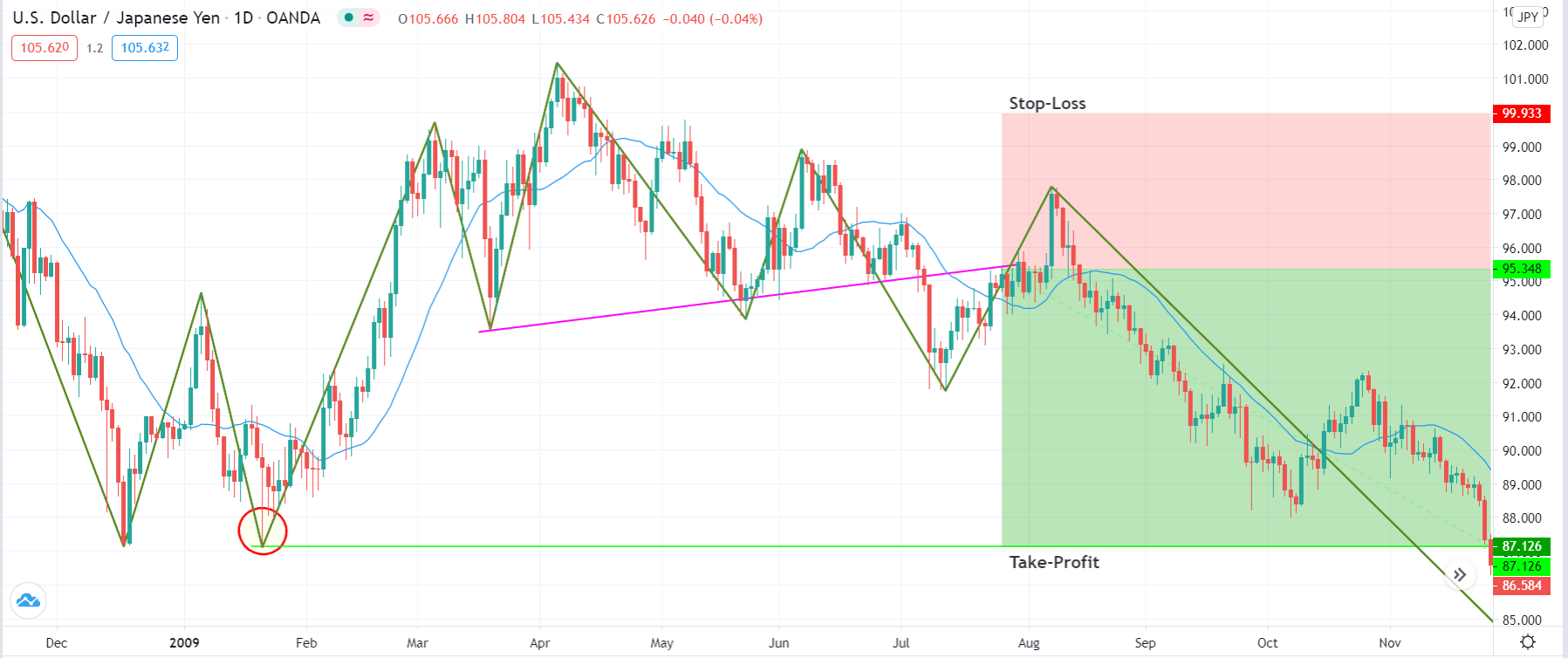
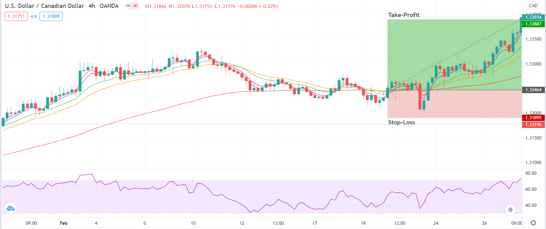
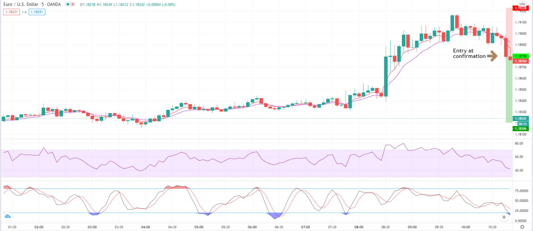
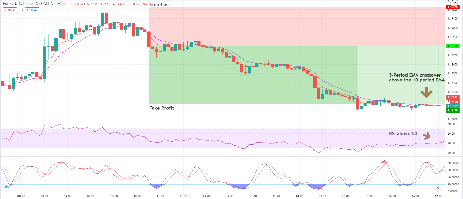
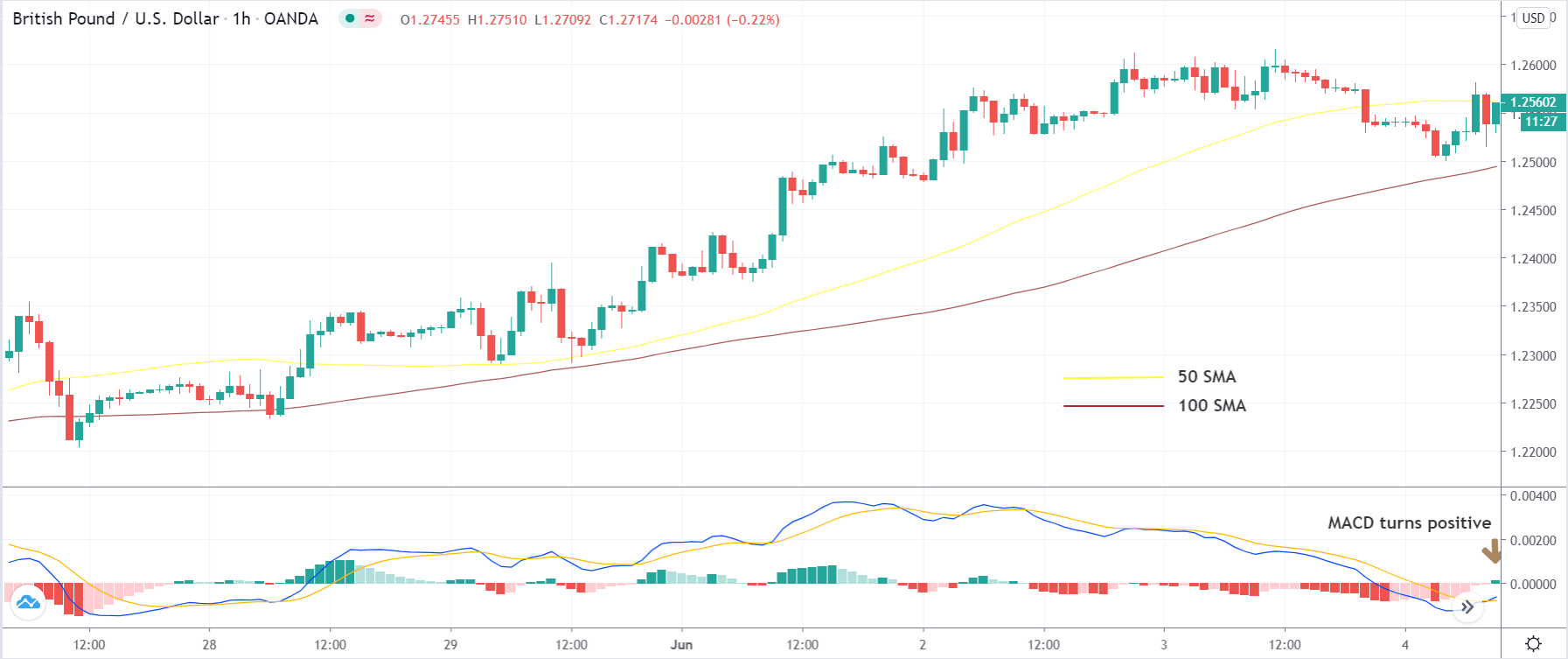
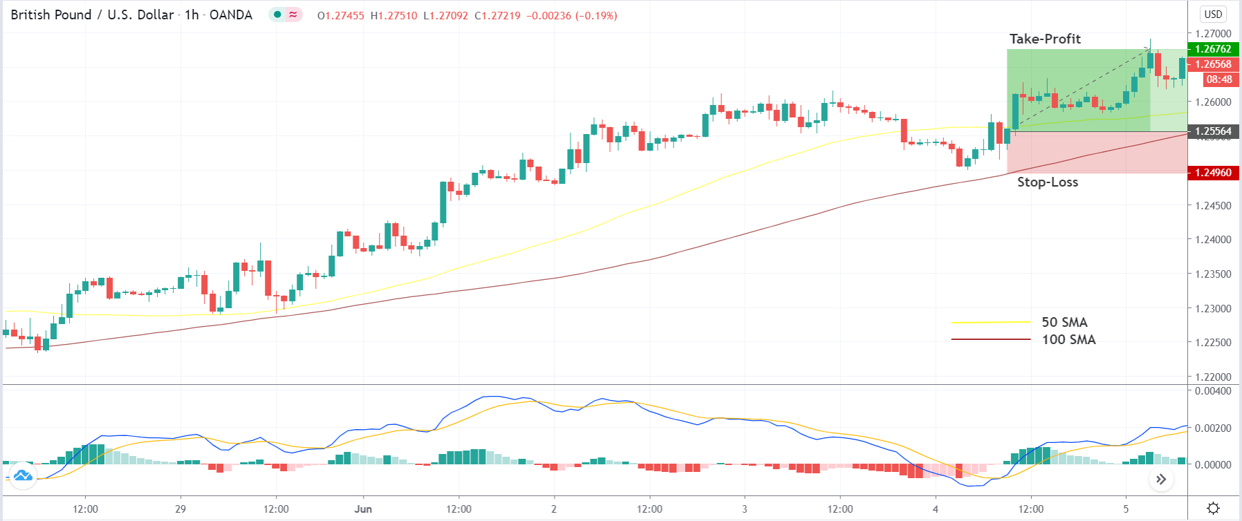
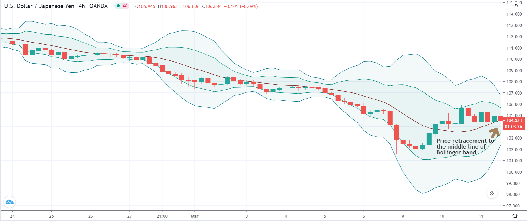
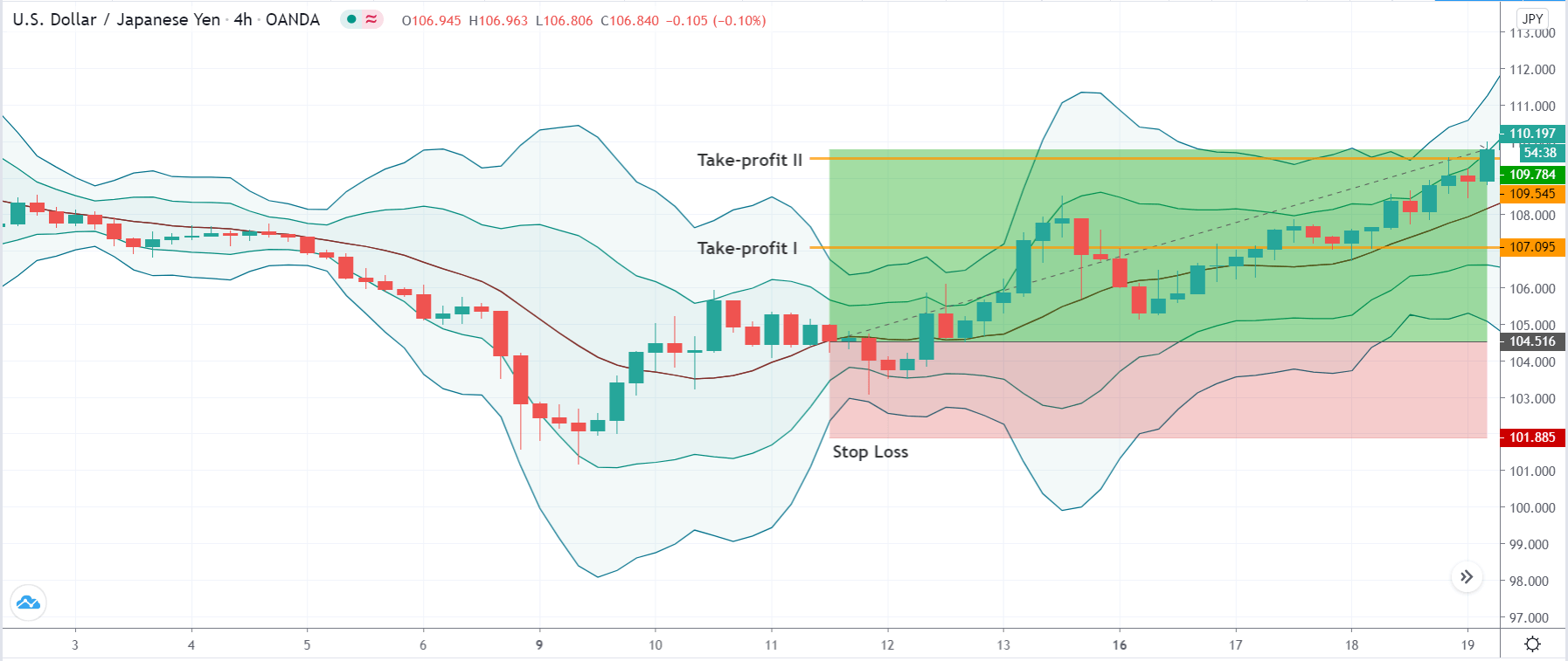
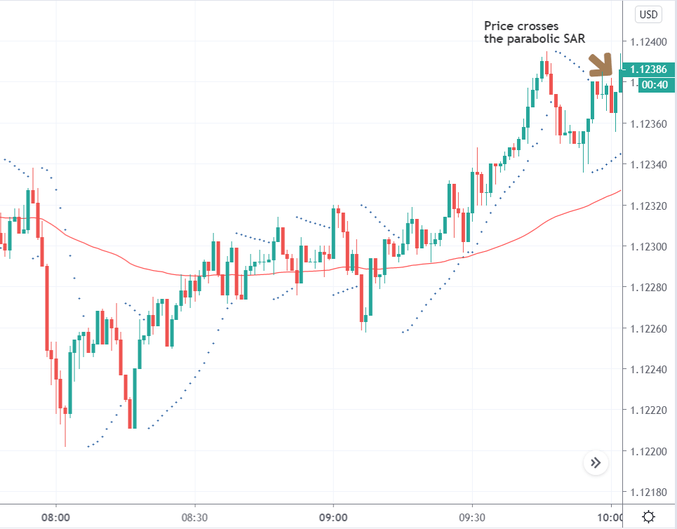
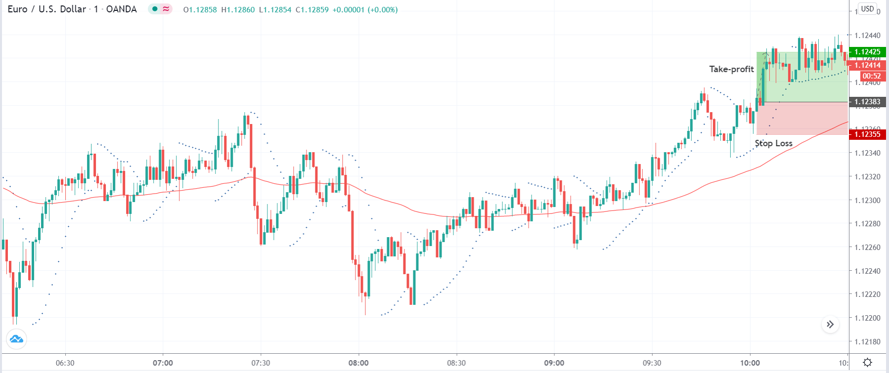
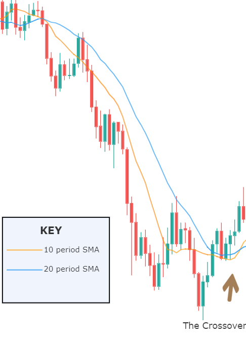
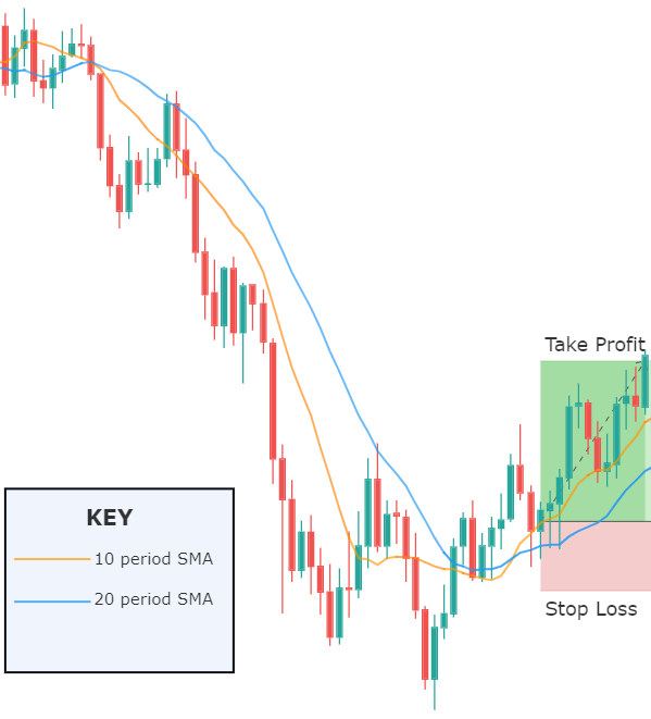
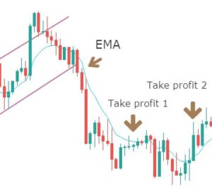
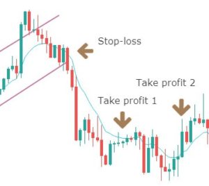
Step 3 – Step Loss & Take Profit

In this example, we have put the stop loss just below the low of the first candle of three green candles. When two leading trading tools indicate the same signal, always use smaller stops so that you can maximize your profits.

For this strategy, there are several ways to book the profit. We can close our position at a significant resistance area or when the RSI indicator reaches the overbought area. If your plan is to ride the longer moves, we suggest you closing your position when the market prints the Three Black Crows patterns. This pattern is the complete opposite of the Three White Soldiers pattern.

The example below belongs to the daily chart. Keep in mind that stronger the support/resistance area on the higher timeframe, more chances the market has to respect that area. In our example, the last time price respects the resistance line, so we decided to close our full position at a resistance area. Overall it was 1500+ pip move on the daily chart. These kinds of higher timeframe trades are suitable only for big investors.

Three White Soldiers + EMA

In this strategy, we have paired the Three White Soldiers pattern with the EMA to filter out the bad trading signals. EMA stands for Exponential Moving Average. The EMA is used to highlight the current trend and to spot the trend reversals. Trading signals can also be generated when the EMAs are read correctly. Generally, when the EMA goes above the price action, it indicates a sell signal, and when it goes below the price action, it indicates a buying signal.

Step 1 – Of course, the first step here is to identify the Three White Soldiers pattern on the charts.

Step 2 – When market prints, the Three White Soldiers, and EMA go below the price action, it indicates the buying signal.

In the below EURAUD weekly Forex chart, when the market prints the Three White Soldiers pattern, EMA was also below the price action. This indicates a potential price reversal of this currency pair. Even when both the pattern and EMA indicates the signal, we decided to wait for 3 to 4 candles to confirm the strength of the pattern. We can see that the market holds there for a couple of candles, which is a clear cut sign to go long on this pair.

Initially, the market goes higher for some candles, but it didn’t reach our major target. Our position goes into the loss a couple of times. Do not panic and lose trust in your strategy because the price didn’t hit the stop loss yet. Trading is a game of patience and only close your position when the market hit the stop loss or take profit. In this case, waiting patiently led to fruitful results as our trade hits the take profit.

Step 3 – Stop Loss & Take Profit

In the above chart, we have placed the stop loss above the exponential moving average because it works as a dynamic support/resistance to price action. We closed our full position when EMA goes above the price action.

Conclusion

Most of the times, Three White Soldiers pattern appears at the end of a downtrend. Sometimes it also prints after a lengthy consolidation phase. Although it is not a strong bullish sign if you want to trade the consolidation phase, always pair this pattern with other technical tools to filter out the negative signals. The volume is the most critical thing to enhance the reliability of the pattern when the market is in a consolidation phase.

Categories
Forex Basic Strategies

Trading Price Channels Like A Professional Forex Trader

Introduction

One of the most important characteristics of price in the Forex market is that it moves in the form of channels 20-25% of the time. So it is crucial to learn how to trade the market when it is in this state. The price channel strategy that we are going to discuss is intuitive and most straightforward. In this article, we will see how to implement this strategy and take profitable trades while reducing risk at the same time. Let’s get right into it.

What is the price channel pattern?

Before exploring the strategy, we need to know what a price channel means and the different types of channels. The price channel represents two trend lines drawn above (channel resistance) and below (channel support) the price. The price moves within these two trend lines.

The width of the channel should be big enough if you want to trade inside it. In this case, a simple trade would be to buy at channel support and sell at the channel resistance level.

However, the most significant opportunity is to trade the channel breakout.

We can distinguish the channel into two types:

  • Upward price channel
  • Downward price channel

An upward price channel occurs when price makes higher highs and higher lows. More the number of touches the price makes to channel’s support and resistance, stronger is the channel.

A downward price channel occurs when the price makes a series of lower lows and lower highs. The trend line should be able to connect to these points; only then we can call it a channel.

This represents the consolidation or ranging zone. Here the market bounces on and off between the two support and resistance lines.

If you understand the psychology and reason behind the formation of a price channel, it can save you a lot of losing trades. The reason why channel breakout is so significant is that many traders trade inside the channel. They place their stop loss above or below the price channel pattern.

As more and more traders start placing their stops, they will eventually be targeted by smart money. One needs to remember that a price channel won’t last forever. Breakout in any form is inevitable.

So, now, let’s see what the price channel strategy is and how to trade it effectively. This strategy is independent of technical indicators and does not make use of it (except for taking profits). Hence, there is no prior knowledge of technical indicators is required.

Price channel strategy

Recognize the early signs of a price channel breakout, as this will help you make better decisions. This strategy is based on such breakout signs, so knowing about them in advance is an advantage.

Here are the various steps involved in the strategy. We will be taking the example of a sell trade.

Step 1: Draw an upward channel

The upward channel should be constructed in such a way that it should connect at least two higher highs and higher lows. You can also make use of the price channel tool, which is provided by most trading platforms to connect the highs and lows.

Before the breakout, we need to make sure of an important rule, which brings us to the next step.

Step 2: For an upward channel, look for a false breakout above the channel resistance.  

In the case of an upward channel, the first warning would be the price failing at the resistance and giving a false indication that the price has broken above resistance.

Only this strategy makes use of this powerful price reading technique. It is in this unique style that we have developed this strategy. The failed attempt at the top is a sign of ‘stop-loss hunt’ by large players, which is confirmed when the price comes back to the channel support.

Note – The more times a ‘swing high‘ tries to get violated and fails, the stronger will be the breakdown.

Step 3: Wait for the breakdown and confirmation

A mistake that most traders do is that they don’t wait for a confirmation signal after the breakdown happens. For this strategy, the confirmation is to wait for the breakdown candle to close below the channel support. Before this, wait for the breakdown and then look for confirmation.

The closing of the candle should be like one in the below figure.

So, don’t just sell after the support is broken. Instead, see that the breakdown candle closes below the price channel. This is an effortless way to avoid false breakdown signals.

Note – If the breakdown candle is decisive, it’s good, but not mandatory.

Then what is the exact point of entry? This brings us to the fourth step of the strategy.

Step 4: Sell right at the closing candle

The entry technique of the strategy is quite simple. A sell order can be executed at the breakdown candle closing price.

Now you can be confident in taking the trade, as you have done everything right until now. The next logical thing to do is to determine where to take profits and place the protective stops.

Step 5: Take 50% profit at consolidation near EMA and rest 50% after price crosses above the EMA. The stop loss has to be placed above the channel support.           

We will be taking profits based on EMA plotted on our chart. Our first potential take profit zone is when the price starts to consolidate near the EMA and touches the line multiple times, as this means that the trend might be coming to an end.

The second potential take profit zone is when the price crosses above the EMA, signaling a reversal of the current trend.

Next, we need to establish our stop-loss.

The stop-loss is placed right above the price channel support, which was broken. Stop-loss can also be extended up to price channel resistance to give more room for the price.

Finally, the trade would look something like in the below figure. This trade will result in a risk to reward ratio of 1:1 minimum. However, if you are patient enough to wait for the trend to continue, the RRR can be increased.

Note – The above trade is an example of a sell trade. The same rules apply for a ‘buy trade,’ but in reverse, as this time, you will be using a downward price channel.

Bottom Line

The price channel strategy can be used in any kind of market. It can also be incorporated into your current strategy to bring a new dimension to price action trading. If you are good at spotting price patterns and money management, this strategy can make huge profits. Happy Trading!

Categories
Forex Indicators

The Truth About Moving Averages

Moving Averages

Of all the technical indicators that exist, moving averages are probably the most well known. Moving averages are also one of the only technical indicators ever used by market news broadcasters. Moving averages are generally one of the first types of indicators that new analysts and traders will learn about because they simple to calculate and simple to interpret. But are moving averages useful for trading? Are they appropriate for trading?

Dangers of Moving Averages

I want to preface any further commentary on moving averages by saying I am strictly opposed to their use. Outside of any singular purpose for their use, I will never advocate for their use of an analytical tool or a trading tool. The reasons for this opinion are my own trading experience, and the experience of teaching students – who have all (myself included) fell into the old trap of moving average crossover systems and the lies that are sold about their usefulness and profitability. That is not to say they are not helpful, useful, or profitable – but the temptation to believe in their positive expectancy and profitability is often too hard to avoid.


Moving Averages: A simple visual representation of data

20-period Simple Moving Average

The orange line on the chart above is a moving average — specifically, a Simple Moving Average (SMA). A Simple Moving Average is a line that is plotted, showing the average close of a defined number of periods. On the chart above, it is a 10-period moving average. Meaning it is taking the last ten candlestick closes, adding them up, dividing that number by ten, and then displaying it as a line. But a Simple Moving Average is just one type of average. There is an enormous amount of various moving averages, each with their specific calculations. The chart below shows only some of those different moving averages, all with a 10-period average.

Various moving averages

From the image above, you can probably say that, depending on the moving average used, some averages are more responsive to price changes than others. Some move a lot; some move just a little. There is a myriad of different reasons why one moving average would be used over another, and there are specific moving averages that to be used only with particular trading systems and methods. Now, after I’ve bashed moving averages, I think it’s essential that I do show some examples of moving averages positively. The first would be using a long period moving average on a higher time frame. For example, a standard method of determining whether a stock is bullish or bearish is to use a 200-period on a daily chart. If a stock is trading above the 200-day average, it is considered bullish; if it is trading below, it is bearish.

200-day Moving Average of S&P500

Another example of a trading system using moving averages effectively would be Goichi Hosada’s Ichimoku Kinko Hyo system. This system will be discussed in much greater detail in another article, but the Ichimoku system is based almost entirely on moving averages. There is a significant difference between Western moving averages and Japanese moving averages. The Tenkan-Sen and Kijun-Sen in the Ichimoku system are calculated using the mid-point of the default periods. The utilization of the mid-point is particular not to just the Ichimoku system but is indicative of a large amount of Japanese analysis, which focuses on ‘balance’ and ‘equilibrium.’ So while I do rail against the use of Western moving averages, the use of the Ichimoku system’s moving averages is undoubtedly a significant exception due to it being a full trading system and one of the few trading systems that are a proven and profitable system.

Ichimoku Kinko Hyo
Categories
Forex Basic Strategies

Moving Average Strategies: Three Simple Moving Averages Part 2

In the article “Moving Average Strategies: Three Simple Moving Averages Part 1”, we have come to know how three simple moving averages on a chart help us detect a trend. In this article, we will demonstrate how and where to take entries with the help of ‘Three SMAs”.

A Moving Average is an indicator that shows trends as well as it acts as support/resistance. In a buying market, it acts as support whereas it serves as a resistance in a selling market. Let us have a look at how it works as resistance and offers us entries in a selling market.

We have inserted “Three SMAs” with the value of 200, 100 and 50 on this chart. The chart shows that the price has been down-trending nicely as far as “Three SMAs” rules are concerned. Please notice that every time the price goes back to the 50- Period Simple Moving Average, it comes down. However, in some cases, the price makes a bit bigger move than the others. We need to understand which one is to make a bigger move and offers us an entry. Can you spot out the differences?

Have a look at the same chart below.

Look at the arrowed candle. The price comes down with a better pace and travels more after those marked candles. There are several reasons for this.

  1. The price goes back to the 50- Period Simple Moving Average; touches (or very adjacent to it).
  2. The bearish reversal candles are engulfing candle.

In some cases, the price starts down-trending without touching the 50-Period Simple Moving Average, it does not travel a good distance towards the downside. It rather goes back again; touches it and then makes a bigger move.

At the very left, the first arrowed candle, the bearish engulfing candle does not touch the Moving Average, but one of the bullish candles has had rejection at the 50-Period Simple Moving Average, thus this is an entry. However, see the very next candle comes out as a corrective candle. This means the sellers are not that sanguine since the bearish reversal candle is not produced right at the 50-Period Simple Moving Average.

With the second and third arrowed candles, they are produced right at the 50-Period Simple Moving Average and both of them are bearish engulfing candles. Those two are perfect entries as far as ‘Three SMAs’ is concerned.

At the very right, the last arrowed candle is very adjacent to the 50-Period Simple Moving Average and produces a bearish engulfing candle.  Most likely, the price would head towards the South again. However, “Three SMAs” does not recommend that we shall take an entry here.

We will learn more strategies with Moving Average in our fore coming articles. Keep in touch.


Categories
Forex Basic Strategies

Moving Average Strategies: Three Simple Moving Averages Part 1

Moving Average (MA) is the most widely used indicator which has long been used by the traders in the financial markets. It is a trend detecting indicator. Since detecting trends is one of the most important key components of trading, visual representation of a trend by Moving Average makes it be a favorite indicator among the financial traders.

There are multiple Moving Average strategies used by traders. In this lesson, we are going to learn a strategy called “Three SMAs”. It is a strategy with three Simple Moving Averages; these are Simple Moving Average 200, Simple Moving Average 100 and Simple Moving Average 50.

Let us now have a look at how a chart looks like with “Three SMAs”.

This is how the charts look like most of the time. The red one is 200-period Simple Moving Average, the yellow one is the 100-period SMA and the blue one is  50-period SMA. It is better to use different colors so that we can identify them easily.

In the chart above, we see that the price gets caught in between those Moving Averages to start with. The price comes further down, but the 50-SMA stays between the100-SMA and the 200-SMA. What does “Three SMAs” suggest to us here? It suggests that the price does not have a solid trend.

In the naked eyes, the price action suggests that the asset is down-trending. However, by having “Three SMAs”, we can identify solid down-trend has not been established yet. This is why many price action traders use “Three SMA’s” to be sanguine about the trend. Ideally, this is not a chart that we should look for entries.

The question is how a trading chart should look like with “Three SMAs” to look for entries. Let us have a look at the chart below.

The difference is very evident here. See how they have been lined up. Moving Average 200 stays on the top; Moving Average 100 stays in between; Moving Average 50 stays at the bottom. This is an ideal chart with “Three SAM’s” to look for short entries.

In the case of price is up-trending, this is how it looks like.

In a buying market, they are to be lined up just another way round than the selling market. Look at the chart above. The Moving Average 200 stays at the bottom, Moving Average 100 stays in between and Moving Average 50 stays at the top. In this chart, we shall look for long entries.

“Three SMAs” indicators work wonderfully well with intraday trading. In this lesson, we have used a 15-minute chart and three SMAs with periods of 50,100 and 200. If we want to use other charts such as H1 or H4, we have to change the values. However, the best combination for “Three SMAs” is Moving Averages of 50,100 and 200 on the 15M chart.

We now understand how “Three SMA’s” may help us understand the trend.  Thus, “Three SMA’s” may be integrated with any other strategies for taking entries. Moreover, only “Three SMAs” itself offers us entries as well. In our next article, we will demonstrate how entries are to be taken based on “Three SMAs”.  Stay tuned.

Categories
Forex Trading Strategies

SMA Crossover Strategy with a twist

Introduction

Some centuries back, Karl Friedrich Gauss showed that an average is the best predictor of stochastic series.

Moving averages are employed to grade the price.movements. It acts as a low-pass filter, taking out the fast changes in price, regarded as market noise. The period of the moving average controls how smooth is this low pass filter. A  three-period MA levels the action of three periods, while a 200-period MA produces a single value of the last 200 price values.

Usually, it is determined using the close value of the bar, but there can be made also of the open, high or low of the of bars, or a weighted average of all price points.

Simple Moving Average(SMA):

This average is computed as the sum of all prices on the period and divided by the period.

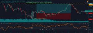
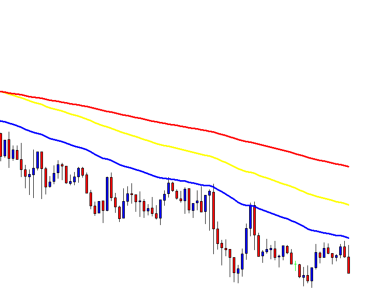
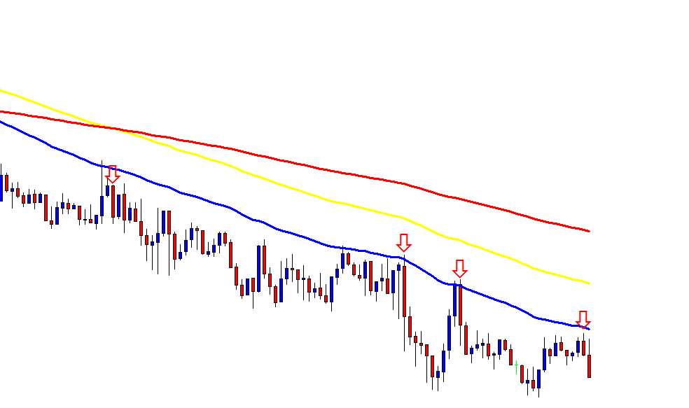
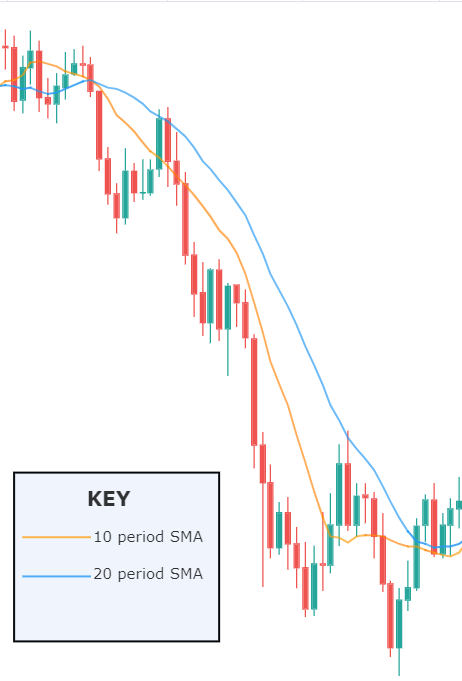
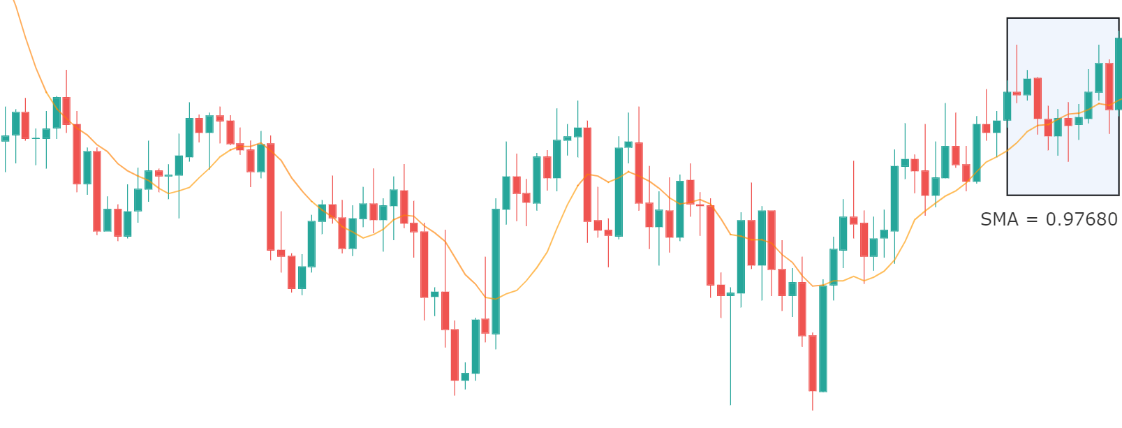
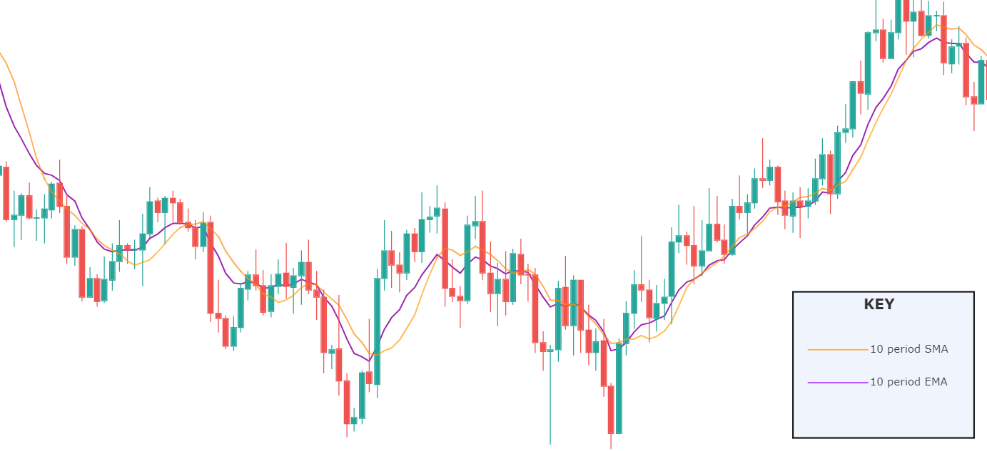
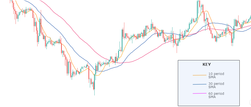
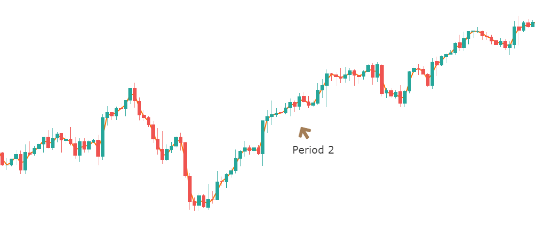
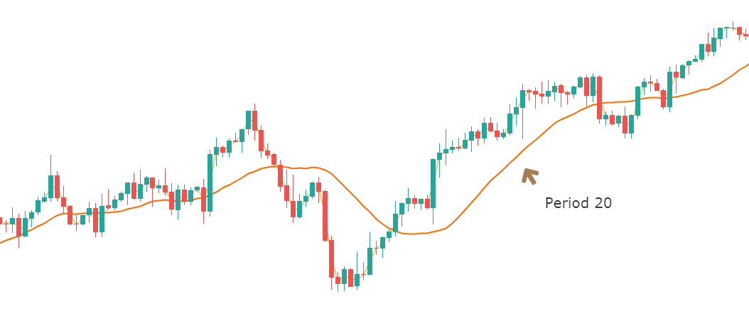
The main drawback of the SMA is its abrupt change in value if a significant price move is cut off, particularly if a short period has been chosen.

Averages with different periods result in different measures that can be thought of as a fair price during that period. Thus, if we observe two averages, a long-term and a short-term MA, and the short-term average moves above the long-term average, we might conclude that the new opinion about the price is changing, so it’s a good time to buy.  The converse holds if a short-term average falls below the longer-term one.

The Parameter Space

Let’s analyse the parameter space of a moving average crossover strategy. This strategy has only two parameters: The fast-MA period, and the Slow-MA period.

We use a simulator on a EUR-USD 15-min chart over a historical record of nearly 14 years and computed the returns using a constant one-lot trade, and the result is shown in the figure below. We go long when the fast MA crosses over the slow MA and price is above the fast MA. The opposite holds for short positions.

We observe that the map is somewhat un-smooth, with its better performers at about 60-70 periods for the slow MA and less than five periods for the fast MA.

The other fact is that only 48 out of 304 simulations deliver positive results, this shows us that the strategy is questionable without other parameters that might improve its performance.

Testing  the popular 5-10 Periods SMA

I have seen some people boosting a system that goes long when the 5-period MA crosses over the 10-period MA,  and short on opposite crosses, but as far as I had seen when I tested it, this strategy loses 32,000 Eur at the end of 14 years ( below its equity curve)

The use of trail-stops and targets can make this strategy positive, but the equity curve is hopelessly untradeable:

So what may help to improve this strategy?

Well, I thought about two ways. The first one is to move the slow MA period to about 70.

Well, that is a good improvement, although we have losing periods, it, definitely, is much better to use a longer-period parameter on the slow average.

What happens, if we add the condition that the slow MA should be pointing UP and prices above the slow MA?


When applying these rules, we observe that the better-performing slow-MA period moves around 80 bars, and the fast MA period stays at less than 5. Another point we observe is that the slow MA surface is smoother around 80 periods. This is a sign that we’ve found a right place for our parameters. Finally, in this simulation, 500 out of 735 simulations are in positive territory. That shows us that we have found a more robust strategy because 80% of the parameter values deliver positive outcomes.

So, that will be the basis of our moving average crossover strategy.

The Rules of the strategy:

Periods: Slow MA: 75, fast SMA: 3

Initial Stop-loss: 0.18%. This mean, we cut our losses if it crosses 0.18% away from our entry price.

Trailing stop-loss: 0.38%. We let the trade room to catch the trend.

For long entries:

1.- We define a bull market when the Fast SMA crosses over the Slow SMA

2.- We allow long positions only when the slow SMA points upward, meaning its current value is higher than its previous one.

3.- We buy when the price closes above the Slow SMA.

For short entries:

1.- We define a bear market when the Fast SMA crosses under the Slow SMA

2.- We allow short positions only when the slow SMA points downward, meaning its current value is smaller than its previous one.

3.- We sell short when the price closes below the Slow SMA.

The equity curve is much better, although it shows the typical equity curve of a trend-following system.

The Total Trade Analysis shows why. The system’s percent winners are 27.33%, and the reward-to-risk ratio is 3.5 (Avg Win/Avg Loss ratio). That tells the system is robust, by priming profitability over the frequency of winners.

Main metrics of the Donchian System, on the EUR-USD:

It’s not usual but, from time to time we may expect a streak of up to 20 losing trades, therefore we need to apply proper money management.

As an example, let’s say, you don’t like to have a drawdown higher than 25% of your running capital, then you need to divide that figure by 20, and that must be your maximum risk for a single trade, therefore, in this case this is 1.25% of the current capital allocated for this strategy.

How to trade this strategy on your JAFX MetaTrader 4:

Adding a moving average to a naked candlestick chart is simple:

A popup window appears after clicking “Moving Average”:

There you are able to set the period and MA method, Price to apply. We change just the period, and select the “Weighted Close (HLCC/4)” We may, also change the color of the Slower MA to a different color, so every MA has different colors.

© Forex.Academy

Categories
Forex Basics

Everything you should master to Detect Trends, and more!

Introduction

In chapter 1, we’ve set the foundations of market classification, what a trend is about, and the dissection of a trend in its several phases. Then we talked about its two dissimilar wave parts: an impulsive wave, followed by a corrective wave.  We dealt with support, resistance, and breakouts. Finally, we talked about channel contractions.

In this second chapter, we’ll learn the methods available in the early discovery of trends: Trendlines, moving averages, and Bollinger band channels.

Trendlines

A trendline is a line drawn touching two or more lows or highs of a bar or candlestick chart. The convention is to draw the line touching the lows if it’s an uptrend and the tops on a downtrend. Sometimes both are drawn to form a channel where the majority of prices fit.

As we see in Fig. 1 the trendline tends to draw resistance levels or supports where the price finds it difficult to cross, bouncing from there, although not always this happens. In Fig. 1 the first trendline has been crossed over by the price, and during the following bars, the slope of the downtrend diminished.  We saw, then, that the first trendline switched its role and now is acting as price support.

When the second trendline was crossed over by the price, a bottom has been created, and a new uptrend started. After a while trending up, we might note that we needed a second trend line to more accurately follow the new bottoms because the uptrend has sped up, and the first trendline is no longer able to track them.

Fig. 2 shows two channels made of trendlines, one descending and the other ascending. The trendline allows us to watch the volatility of the trend and the potential profit within the channel. The trend, as is depicted, has been drawn after it has been developing for a long lapse. Therefore, it’s drawn after the fact.  If we look at the descending channel, we observe that during the middle of the trend, the upper trendline doesn’t touch the price highs. So, this channel would look different at that stage of the chart.

I find more reliable the use of horizontal lines at support and resistance levels and breakouts/breakdowns at the end of a corrective wave. But, if we get a well-behaved trend, such as the second leg in fig 2, a channel might help us assess the channel profitability and assign better targets to our trades. If we use horizontal trendlines together with the trend channel (see Fig 2.b) it’s possible to better visualize profitable entry points and its targets, and, then, compute its reward to risk ratio.  The use of the Williams %R indicator (bottom graph) confirms entry and exit points.

Fig. 2b graph’s horizontal red lines show how resistance becomes the support in the next leg of a trend.

As a summary:

  • A trendline points at the direction of the trend and acts as a support or as a resistance, depending on the price trend direction.
  • If a second trendline is needed, we should pay attention if it shows acceleration or deceleration of the price movement.
  • If the price crosses over or crosses under the trendline, it may show a bottom or a top, and a trend change.
  • A trendline channel helps us assess the potential profitability and assign proper targets to our next trade.

Moving Averages (MA)

Note: At the end of this document, an Appendix discusses some basic statistical definitions, that may help with the formulas presented in this section, although reading it isn’t needed to understand this section.

Some centuries back, Karl Friedrich Gauss demonstrated that an average is the best estimator of random series.

Moving averages are used to smooth the price action. It acts as a low-pass filter, removing most of the fast changes in price, considered as noise. How smooth this pass filter behaves, is defined by its period. A moving average of 3 periods smoothens just three periods, while a 200-period moving average smoothens over the last 200 price values.

Usually, a Moving Average is calculated using the close of every bar, but there can be any other of the price points of a bar, or a weighted average of all price points.

Moving averages are computationally friendly. Thus, it’s easier to build a computerized algorithm using moving average crossovers than using trendlines.

Most Popular types of moving averages

Simple Moving Average(SMA):

The simple moving average is computed as the sum of all prices on the period and divided by the period.

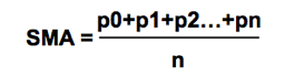
The main issue with the SMA is its sudden change in value if a significant price movement is dropped off, especially if a short period has been chosen.

Average-modified method (AvgOff)

To avoid the drop-off problem of the SMA, the computation of an avgOff MA is made using and average-modified method:

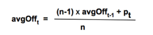
Weighted moving average

The weighted moving average adds a different weight to every price point in the period of calculation before performing the summation. If all weights are 1, then we get the Simple Moving Average.

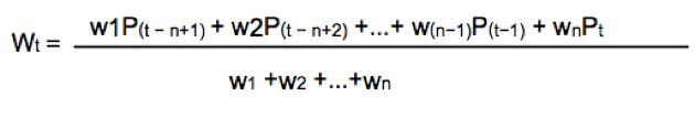
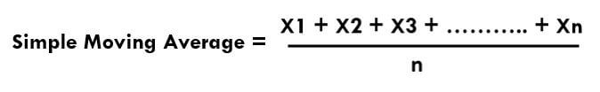
Since we divide by the sum of weights, they don’t need to add up to 1.

A usual form of weight distribution is such that recent prices receive more weight than former prices, so price importance is reduced as it becomes old.

w1 < w2 < w3… < wn

Weights may take any form, most popular being Triangular and exponential weighting.

To implement triangular weighting on a window of n periods, the weights increase linearly from 1 the central element (n/2), then decrease to the last element n.

Exponential weighting is an easy implementation:

EMAt = EMAt-1 + a x (pt Et-1)

Where a, the smoothing constant, is in the interval 0< a < 1

The smoothing property comes at a price:  MA’s lags price, the longer the period, the higher the lag of the average. The use of weighting factors helps reducing it. That’s the reason traders prefer exponential and weighted moving averages: Reducing the lag of the average is thought to improve the edge of entries and exits.

Fig 3 shows how the different flavors of a 30-period MA behave on a chart. We may observe that the front-weighted MA is the one with a slope very close to prices, Exponential MA is faster following price, but Triangular MA is the one with less fake price crosses, along with simple MA: The catch is: We need to test which fits better in our strategy. The experience tells that, sometimes, the simpler, the better.

Detecting the trend using a moving average is simple. We select the average period to be about half the period of the market cycle. Usually, a 30 day/bar MA is adequate for short-term swings.

One method to decide the trend direction is to consider it a bull leg if the bar close is above the moving average; and a bear leg if the close is below the average.

Another method is to watch the slope of the moving average as if it were a trendline. If it bends up, then it’s a bull trend, and if it turns down, it’s a bear trend.

A third method is to use two moving averages:   Fast-Slow (Fast -> smaller period).

In this case, there are two variations:

  1. Moving average crossovers
  2. All the averages are pointing in the same direction.

As with the case of a single MA, a price retracement that touches the slower average is an opportunity to add to the position.

For example, using a 30-10 MA crossover: If the fast MA crosses over the slow MA, we consider it bullish; if it crosses under, bearish.

Using the method of both MA’s pointing in the same direction, we avoid false signals when the fast MA crosses the slow one, but the slow MA keeps pointing up.

When using MA crossovers, we are forbidden to take short trades if the fast MA is above the slow MA, but we’re allowed to add to the position at price pullbacks. Likewise, we’re not allowed to trade on the buy side if the fast MA is below the slow MA.

Using smaller periods, for instance, 5-10 MA, it’s possible to enter and exit the impulsive legs of a trend.  Then, the 10-30MA crossovers are used to allow just one type of trade, depending on the trend direction, and the 5-10 MA crossover is actually used as signal entry and exit (if we don’t use targets). In bull trends, for example, we may enter with the 5MA crossing over the 10MA, and we exit when it crosses under.

Bollinger Band Channel

We already touched channels that were made of two trendlines. There is another computationally friendly channel type that allows early trend detection and trading.

One of my favorite channel types is using Bollinger Bands as a framework to guide me.

A Bollinger Band is a volatility channel and was developed by John Bollinger, which popularized the 20-period, 2 standard deviations (SD) band.

This standard Bollinger band has a centerline that is a simple moving average of the 20-period MA. Then an upper band is drawn that is 2 standard deviations from the mean and a lower band that’s 2 standard deviations below it.

I tend to use two or three 30-period Bollinger bands. The first band is one SD wide, and the second one is two SD apart from the mean. A third band using 3 standard deviations might be, also, useful.

Fig 6 shows a very contracted chart with 3 Bollinger bands to show how it looks and distinguishing periods of low volatility.

During bull trends, the price moves above the mean of the Bollinger band.  During bear markets, the price is below the average line of the bands.

On impulsive legs of a trend, the price goes above 1-SD (or below on downtrends), and it continues moving until it crosses the 2-SD line, sometimes it even crosses the third 3-SD line. Price beyond 2 SDs is a clear sign of overbought or oversold. On corrective legs, the price goes back to the mean. During those phases volatility contracts, and is an excellent place to enter at breakouts or breakdowns of the trading range.

Below Fig. 7 shows an amplified segment of Fig 6, with volatility contractions circled. We may observe, also, how price moves to the mean, after crossing the 2 and 3 std lines.


Grading your performance

According to Dr. Alexander Elder, the market is testing us every day. Only most traders don’t bother looking at their grades.

Channels help us grade the quality of our trades. To do it, you may use two trendlines or some other measure of the channel. If you don’t see one, expand the view of the chart.

When entering a trade, we should measure the height of the channel from the bottom to its top.  Let’s say it’s 100 pips.  Suppose you buy at ¾ of the upper bound and sell 10 pips later. If you take 10 pips out of 100 pips, your trade quality is 10/100 or 1/10. How does this qualify?

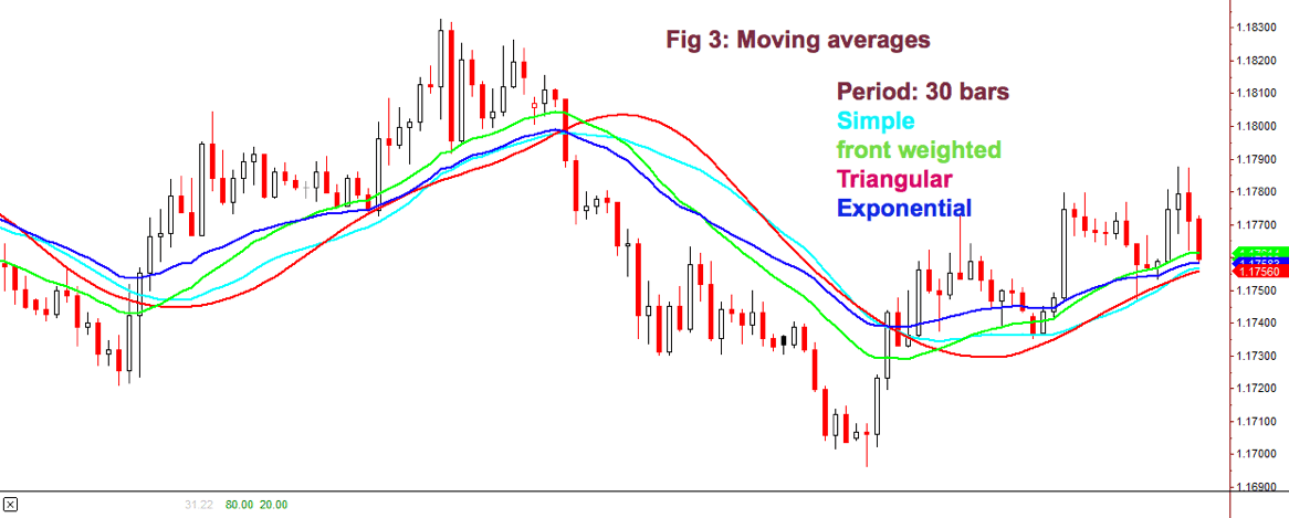
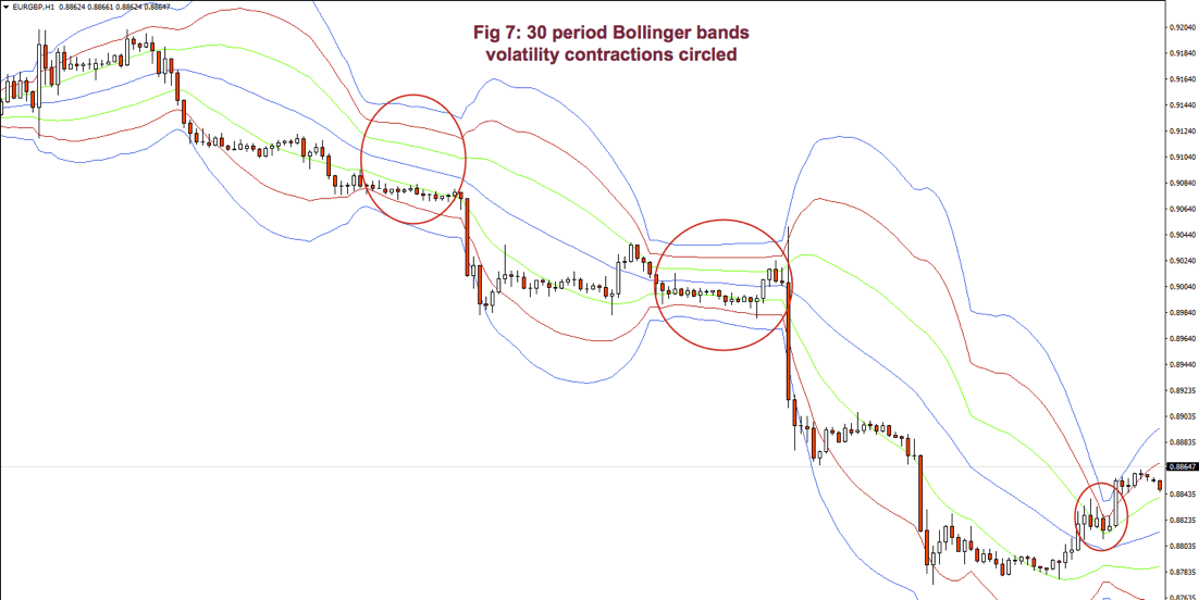
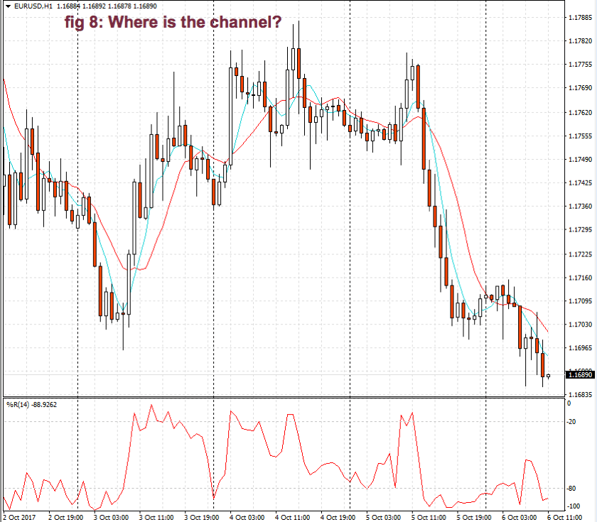
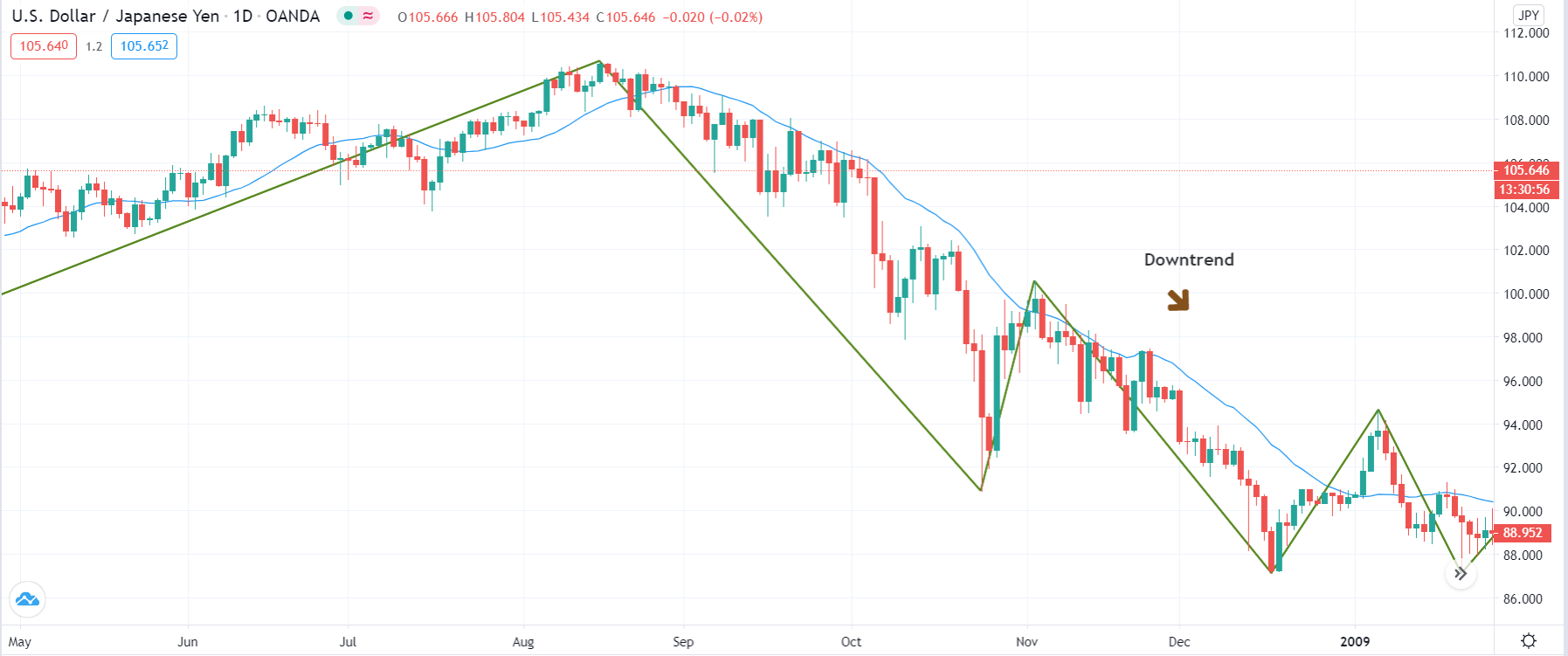
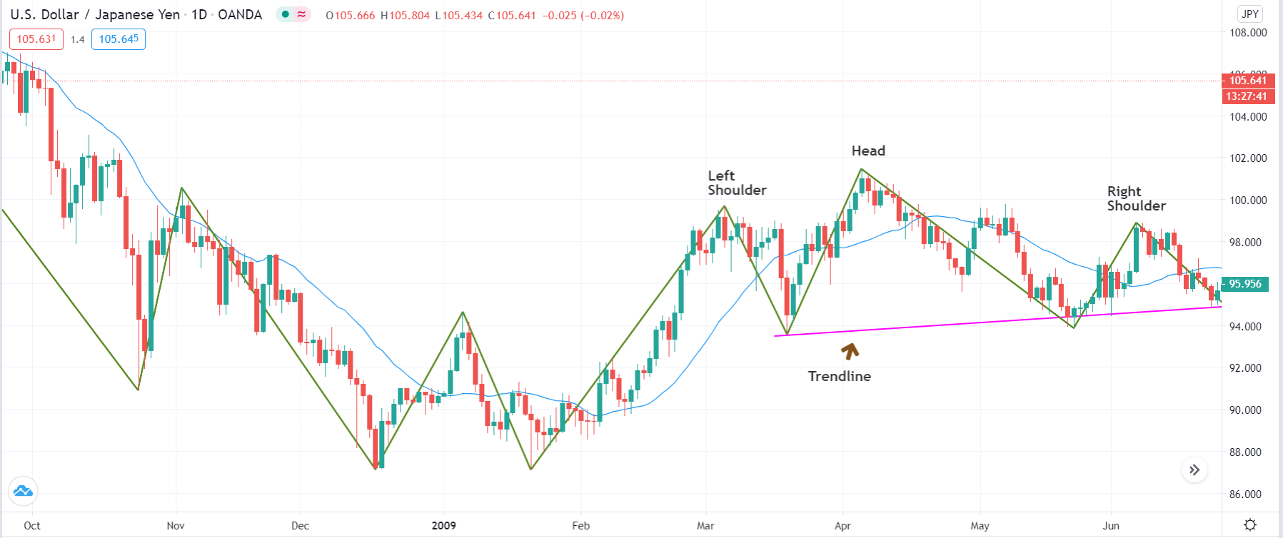
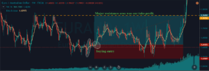
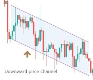
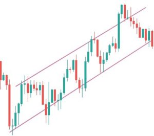
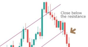
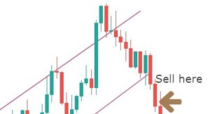
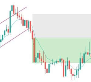
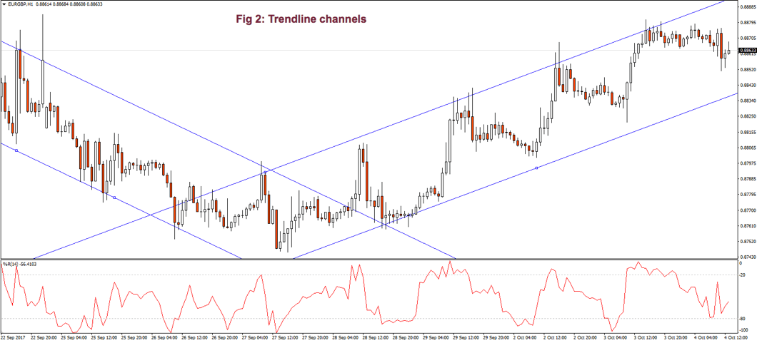
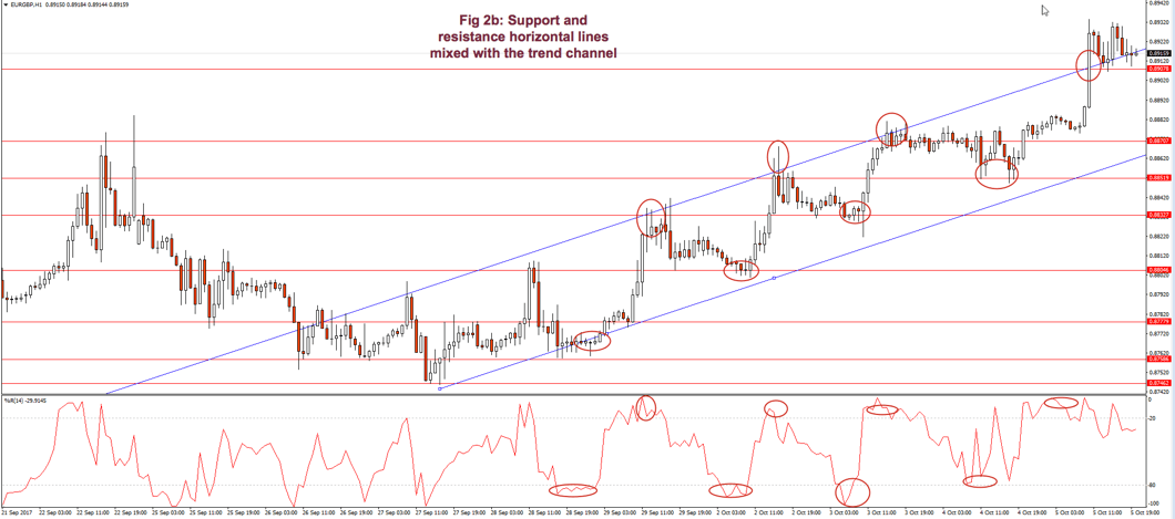
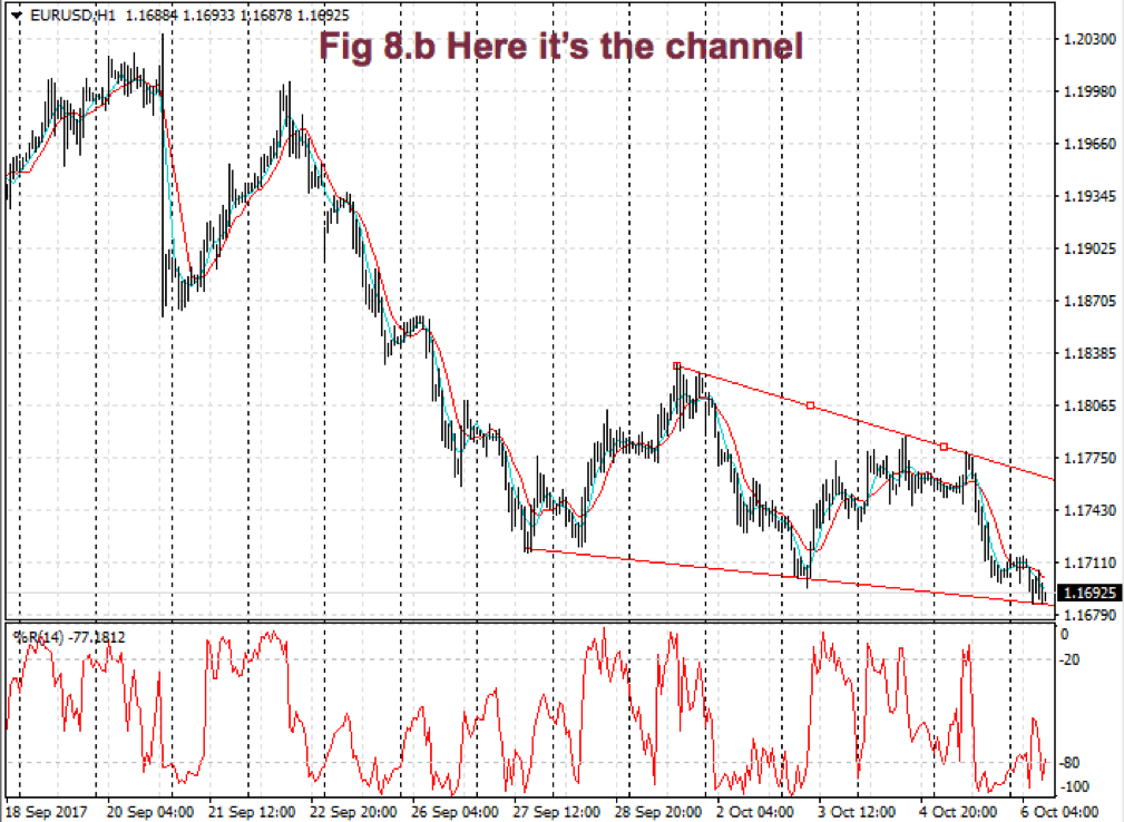
According to Elder’s classification, any trade that takes 30% or more of a channel is credited with an A. If you make between 20 and 30%, your grade will be B. Between 10 and 20% you’re given a C and a D if you make less than 10%.  So, in this case, your grade is C.

Good traders record their performance. Dr. Elder recommends adding a column for the height of the channel and another column for the percentage your trade took out of the channel.

Monitor your trades to see if your performance improves or deteriorated.  Check if it’s steady or erratic.  The information, together with the autopsy of your past trades, helps you spot where are your failures: Entries too late? Are you exiting too soon? Too much time on a losing or an underperforming trade?  A trade against the prevailing trend?


The next chapter will be dedicated to chart patterns.


Appendix: Statistics Overview

Statistics is a branch of mathematics that gives us information about a data set. Usually, the data set cannot be described by an analytical equation because they come from unpredictable or random events. As traders, we need basic knowledge, at least, of statistics for our job.

We can express statistical data numerically and graphically. Abraham de Moivre, back in the XVII century, observed that as the number of events (coin flips) increased, the shape of the binomial distribution approached a very smooth curve. De Moivre thought that if he could find the mathematical formula for this curve, he could solve problems such as the probability of 60 or more heads out of 100 coin flips. This he did, and the curve is called Normal distribution.

This distribution plays a significant role because of the fact that many natural events follow normal distribution shapes.  One of the first applications of this distribution was the error analysis of measurements made in astronomical observations, errors due to imperfect measuring instruments.

The same distribution was also discovered by Laplace in 1778 when he derived the central limit theorem. Laplace showed the central limit theorem holds even when the distribution is not normal and that the larger the sample, the closer its mean would be to the normal distribution.

It was Kark Friedrich Gauss, who derived the actual mathematical formula for the normal distribution. Therefore, now, Normal distribution is also named as Gaussian distribution.

Although prices don’t follow a normal distribution, it’s is used in finance to extract information from prices and trading statistics.

There are two main measures we use routinely: The center of our observations and the variability of the points in our data set from that mean.

There’s one main way to compute the center of a set: the mean. But it’s handy to know also the median if the distribution isn’t symmetrical.

Mean: It’s the average of a set of data. It’s computed adding all the elements of a set and divide by the number of elements:

Mean = Sum(p1-Pn)/n

Median: The median is the value located in the middle of a set after the set has been placed in ascending order. If the set has a symmetrical distribution, the median and the mean are the same or very close to it.

The variability of a data set may be calculated using different methods. Two main ways are used in financial markets:

Range: The easiest way to measure the variability. The range is the difference between the highest and lowest data of a set. On financial data, usually, a variant of the range is calculated: Average true range, which gives the average range over a time interval of the movement of prices.

Sample Variance(Var): Variance is a measure of the mean distance of the data points around its mean. It’s computed by first subtracting the average from all points: (xi-mean) and squaring this value. Then added together and dividing by n-1.

Var = 𝝈2 =∑ (x-mean)2 / (n-1),

whereis the symbol for the sum of all members of the set

By squaring (xi-mean), it takes out the negative sign from points smaller than the mean, so all errors add-up. The division by n-1 instead of n helps us not to be too much optimistic about the error. This measure increments the error measure on small samples, but as the samples increase, its result is closer and closer to a division by n.

If we take the square root of the variance, we obtain the standard deviation (𝝈 – sigma).

 Volatility: Volatility over a time period of a price series is computed by taking the annualized standard deviation of the logarithm of price returns multiplied by the square root of time expressed in days.

𝝈T = 𝝈annually √T


References:

New Systems and Methods 5th edition, Perry Kaufman

Trading with the Odds, Cynthia Kase

Come into my Trading Room, Alexander Elder

History of the Gaussian distribution http://onlinestatbook.com/2/normal_distribution/history_normal.html

https://en.wikipedia.org/wiki/Volatility_(finance)

Further readings:

Profitable Trading – Chapter 1: Market Anatomy

Profitable Trading Chapter III: Chart patterns

Profitable Trading – Computerised Studies I: DMI and ADX

Profitable Trading – Computerized Studies II: MACD

https://www.forex.academy/profitable-trading-computerized-studies-iii-psar/

Profitable Trading (VII) – Computerized Studies: Bands & Envelopes

Profitable Trading VIII – Computerized Studies V: Oscillators