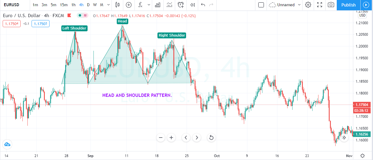
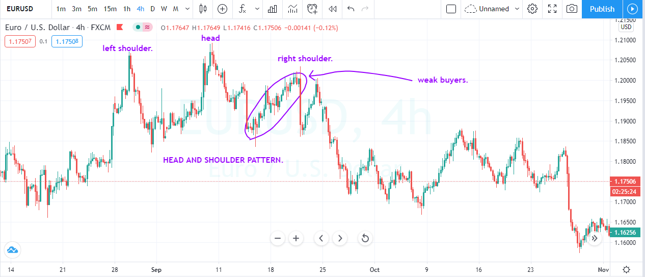
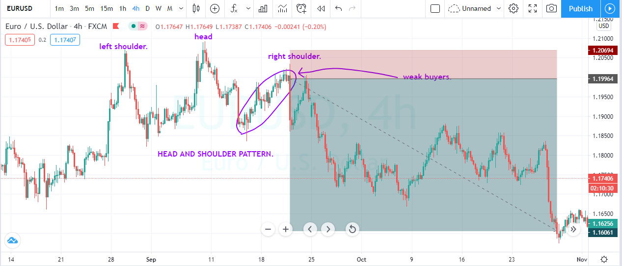
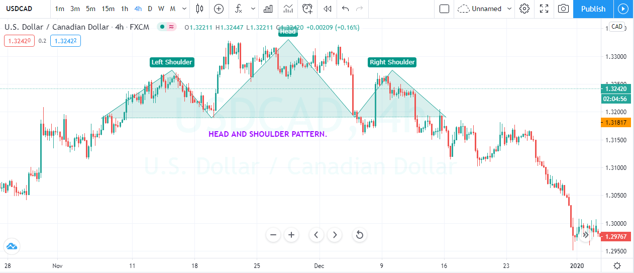
Categories
Forex Basic Strategies

WHAT TECHNICAL TOOLS I CAN USE TO MEASURE THE MOMENTUM.

Introduction

One of the major goal of every trader is to measure the momentum of the asset they are trading; momentum can confirm that whether the security is about to reverse or the trend is strong enough to print brand new higher high. Simply momentum indicators are the tools utilized by the traders to get a better understanding of the speed of the price action changes its direction. Most of the technical indicators used to measure the momentum are bound between the two technical levels. This is important because when the asset goes above the centerline, it is an indication that the momentum of the underlying security is increasing. So when the price action reaches the overbought and oversold conditions, it suggests that the asset momentum is weakening and would signal a reversal in a trend. Some of the major tools to measure the momentum are Stochastic, RSI, ROC, and MACD.

ADVANTAGES OF THE MOMENTUM INDICATOR.

Momentum indicator shows the strength of the trend regarding less the direction of the up and down moves. Momentum indicators are specifically useful to find out where the market can potentially reverse its direction. In this case, the divergence and the overbought and oversold signals are quite useful. So to identify the direction of the trend, it is advisable to pair them with the Moving average, trend lines, or any other directional indicator to identify the trend of the underlying asset.

MOVING AVERAGE CONVERGENCE AND DIVERGENCE {MACD}

MACD is a trend-following momentum indicator developed by the Gerald Appel in the late seventies, which used to measure the momentum of the security. The indicator shows the relationship between the two moving average of the asset price. The MACD is calculated by subtracting the 26 period EMA from the 12 periods EMA. The result of this calculation provides the MACD line, and then the nine-day EMA of the MACD called the signal line is transposed over the MACD line. This gives us the buy and sell signal depending on where the MACD crosses the signal line.

STOCHASTIC OSCILLATOR.

Stochastic is a momentum indicator developed by George Lane in the late 1950s. The stochastic doesn’t follow the price or volume; instead, it follows the speed and momentum of the market. This indicator is the leading indicator when it comes to measuring the momentum because the indicator changes its direction before the price action changes its direction.  The indicator measures the closing price of the asset to a range of its historical prices over a predefined period. Stochastic is a range bounded indicator which used to generate the overbought and oversold trading signals using the 0 to 100 levels. Values of 80 considered to be overbought, and the values of 20 considered to be overbought. When values reach these levels, it’s an indication of weakening momentum, and the reversals are very likely to happen.

RELATIVE STRENGTH INDEX.

RSI is a momentum indicator developed by the J. Welles. Wilder. It used to measure the magnitude of the recent price changes to evaluate the overbought and oversold conditions. Just like the stochastic RSI is a range bounded indicator, which oscillates between the 0 to 100 level. According to the Wilder, the RSI considers to be overbought when above the 70 and it is oversold when it reaches the 30 level. When prices reach the 70 level, it means the buying momentum is dying and now can expect the reversal or the correction in the trend. Conversely, when the price action reaches the 30 level, it means the selling momentum is dying, and now the reversal or the correction is required to print brand new lower low.

RATE OF CHANGE {ROC}

ROC or Rate of Change is the speed at which the variable changes over a specific period. The ROC is often illustrated by the Greek letter Delta, and it is often used to measure the momentum of the asset. Graphically the indicator represented by the slope of the line, and it is expressed as a ratio between changes in one variable relative to the correspondence change in another. An asset with a higher momentum has a positive ROC outperforms the markets, and the negative ROC is likely to decline in momentum, which is an indication to take sell.

FINAL WORDS.

Momentum indicators are the major tools for traders to analyze the market. Still, these indicators are rarely used in isolation, and most of the traders use them in conjunction with the other technical analysis tools that reveal the direction of the trend. Once the direction of the indicator has been determined, then the momentum indicators are helpful to gauge the momentum of the price action to identify the major trading opportunities.


Categories
Uncategorised

5 Technical Indicator To Built A Trading Tool Kit.

Introduction

Technical analysis is a major part of the trading without it most of the traders cannot think to trade the market, there are different types of indicators available in the market, but most of the indicators exist for one sole purpose, and that is to provide the trading signals. Some of the indicators are the leading one in the industry, and some are the lagging indicators; some provide the divergence; some gauge the momentum of the trend while other indicators follow the trend and provide the buy and sell signals. In this article, we will share with you the five most important technical trading indicators to add to your trading toolkit. You don’t need to use all of them; instead, pick the few of them that suits your trading style.

TRADING INDICATORS.

  1. MACD – MACD stands for Moving Average Convergence and Divergence is a trend following indicator developed by Gerald Appel in the late seventies. MACD Is one of the simplest and most effective trading indicators. The MACD indicator is calculated by subtracting the 26-period exponential moving averages from the 12 period EMA. The result of this calculation is the MACD line. A nine-period EMA is then plotted on top of the MACD line, which gives the buy and sells signals. Traders buy the security when the MACD line crosses above its signal line and take sell when it closes below the signal line. The indicator also fluctuates above and below the zero line which indicates the buying and selling market. Traders can also look for the divergence, overbought and oversold level, and rapid rises and falls.


  1. S.I. –RSI Stands for Relative strength index is a momentum indicator developed by the J. Welles Wilder. The indicator measures the speed and change of price movements, and as a result, it provides us overbought and oversold trading opportunities. The RSI Indicator has three major uses, the indicator moves between the zero to hundred level, and these levels helps to gauge the momentum and the strength of the trend. When the indicator moves above the 70 level, it is considered as an overbought level and soon expects the reversal. When it moves below the 30 level, it is considered an oversold level and expects a buy-side reversal. Some aggressive traders try to buy and sell the security when the prices approach these levels, and some conservative traders wait for the price action and indicator to show some signs of reversal, then they take the trade. The divergence is the second use of the indicator; divergence is when the price action is moving in one direction, and the indicator is moving in another direction; it is also a sign of the trend reversal. The third use is the indicator also provides the support and resistance level. In an uptrend, the security often holds above the 30 level, and most of the time, it reaches the 70 level, and in a downtrend, the security holds below the 70 level, and it often reaches the 30 level.


  1. STOCHASTIC –Stochastic is a momentum indicator developed by George C. Lane in the late 1950s. Most of the traders think the stochastic is follows the price or volume, but it’s not true according to the Lane the indicator follows the speed or momentum of the price. As a rule, the momentum of the price action changes its direction before the trend changes direction, which makes the MACD as a leading indicator in the industry. The indicator is plotted between the 0 to 100 level, and it oscillates the 20 to 80 level. When the price action goes above the 80 level, it is an indication to go short, and when it goes to the level, it’s a sign to go long. In short, values above 80 considered overbought and values below 20 considered oversold. The bullish and bearish divergence is also useful to foreshadow the upcoming reversals.
  2. AROON INDICATORAroon is a technical indicator developed by the Tushar Chande in 1995. The indicator uses to identify the trend changes in an asset as well as the strength of the ongoing trend. The indicator also helps the traders to identify whether the market is trending or range-bound by using its two components, which are Aroon Up and Aroon Down. When the Aroon up crosses above the Aroon down, it is a sign of the possible trend change. When the Aroon up hits the 100 level, and Aroon down goes near to zero level it is a sign of the uptrend in progress. Conversely, If the Aroon down crosses above Aroon up and stays near 100, this is an indication of the downtrend.
  3. KST INDICATOR – When It comes to day trading, the K.S.T. indicator is one of the best, which you can use to make quick bucks from the market. K.S.T. stands for Know Sure Thing is a momentum indicator developed by the Martin Pring. The indicator was first described in the 1992 magazine “Summed Rate of Change.” The indicator is used in the same way as the rest of the momentum indicator is in play. K.S.T. indicator moves above and below the zero level. The trading signal generated when the indicator crosses above and below the signal line. Traders look for the divergence, crossover, and both the lines above and below the zero level to trade the signals. When the indicator goes above the zero level it’s a sign of buying momentum, and when it goes below the zero level, the momentum is in the favors of the sellers. A positive reading indicates the trend is up, and the negative readings indicate the trend is down.

CONCLUSION.

The goal of every trader is to identify the trading signals and use it to trade the short or long term trends. There are hundreds of trading indicators available in the market, and the above five are the most popular A.K.A. celebrity indicators, which widely used by every type of traders in the market. Use these indicators in your everyday trading to trade the high probability trading opportunities.


Categories
Uncategorised

How to Take Profits when Trading.

Introduction

When you start in the trading game, you often heard people tell you to let your winners run and cut your losses immediately. Well, this piece of wisdom is true, but most of the traders failed to do so, and they end up in the losing side in the trading. As per the Wall Street report, nearly 95% of the traders in the market always end up in losing side; this is because they have a habit of booking their profits too early.

First of all, you must accept this fact that the market is random and it can do anything at any given situation, and the trading is a game of probabilities, there is no guarantee that your trade will end up in the winning side. If you genuinely desire to be in the top 5% of the traders, you must have big winners, and the smaller loses. This sound so simple, but in reality, it is so difficult. Remember when you are wrong in the market, you are not only in the losing trade, but you also have to pay commissions. So to be a winner in the game you must develop a healthy and abundant mindset which let you hold your trades for the more extended targets. Most of the traders end up closing their trade for no reason, and this is the number one mistake they made in their trading. From now on, you must promise yourself that you will only close your trade when the market gives you the valid reason to close it and if your purely closing the trade to book the profits, then simply you are missing tons of money in the market. In this article, we will share with you some tips and tricks on how to book your profits.

PROFIT TAKING STRATEGIES.

TREND LINES.

Every trader in the world desire to catch the trend, because that’s where the real money is. A strong trending condition helps you to reap the profits without much headache of the volatility effectively. So there are two ways to trade the trend, the first one is to by using any trading strategy enter in the direction of the trend and the second way is to let the price action pullback little bit and take the counter-trend trade to the most recent support and resistance area. In this way, by following the trend, you can catch the major moves, and by following the counter-trend, you can easily capture the minor moves also.

So by using any trading strategy you can enter in a trade, let’s say in trending conditions you use the trend line to take the buy entry, and when the price action breaks the trend line, it is an indication to close your trade.

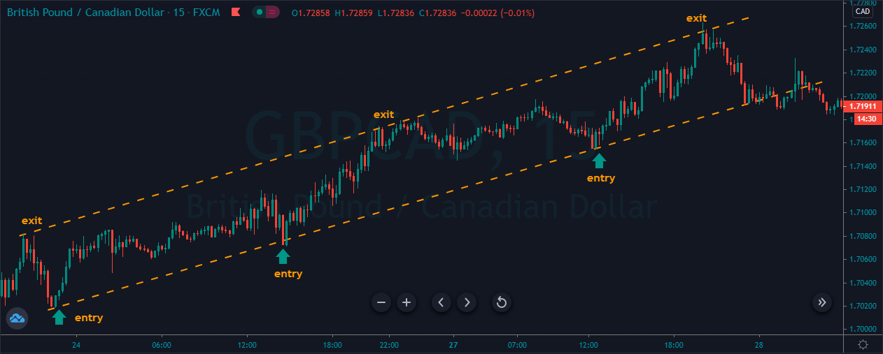
The image below represents a couple of buying trades which we took when the prices hit the trend line, and the take profit was purely based on the trend line also. When the trend line failed to hold the price action, it means now the sellers are not strong enough and we can expect the reversal from here. What you need to do is to look for the break and closing below the trend line to close your buying trade.

CHANNEL PROFIT TAKING STRATEGY.

Here we are using the price channel to take an entry and exit in a trade. A price channel when the market is about to finish its trend, and in the channel, both of the parties hold equal power. So we are not going to take the buy-sell entry when the price action hits the channel. It’s a simple approach to trade the market. Instead, follow the market trend and only place the trade with the trend. For example, if the price action prints the buying trend channel then we only going to look for the buy trades and when the price action hits the upper line of the channel it is a sign to close our position.

The image below represents the buying entries and exits in the GBPCAD forex pair. As you can we first draw the price channel and every time prices hit the lower channel, it is a sign to go long, and every time when it hits the upper channel, it is a sign to book the profit. This is one of the easiest and simplest trading approach and keeps in mind the most straightforward approaches works best in the industry.

DIVERGENCE PROFIT TAKING STRATEGY.

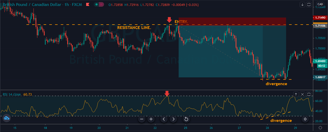
Divergence trading is a quite popular and easy way to make entry and exit in a trade. Most of the oscillator shows the divergence on the price action, which is a sign to take trade or exit in a trade. Here we are going to use the divergence to close our trade. Divergence is when the price action going in one direction and the indicator goes in another direction. When they both move in the opposite direction, it means that the indicator does not agree with the price of an asset or we can say the prices are overextended and the correction is mandatory.

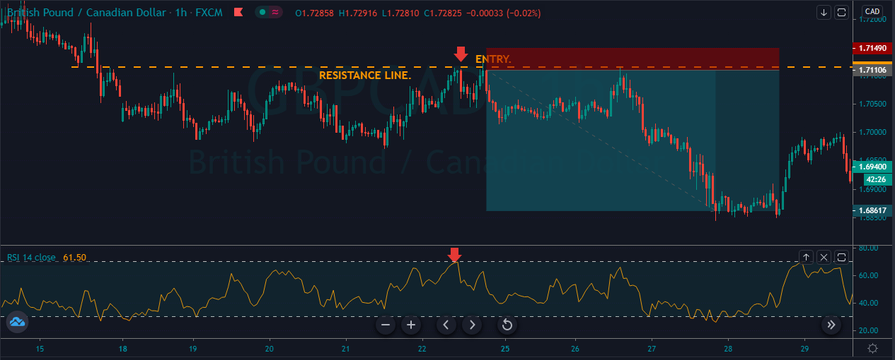
In this strategy, we are going to use the RSI indicator to identify the divergence on the price action.

RSI stands for RELATIVE STRENGTH INDEX, and it is an oscillator which moves above and below the 30 to 70 level. When the indicator goes to the 70 level, it means the market is overbought and soon expect the downside reversal. When the indicator approaches the 30 level, it means the market is oversold and expect the buy side reversal.

As you can see the image below it represents our selling entry in the GBPCAD forex pair. The price action kept testing the resistance level, and when the RSI approached the overbought area, it was a sign to go short. Soon after our entry, we witness the brand new lower low.

As you can see in the below image when the price action prints the brand new lower low, it started holding sideways for a couple of candles also at that time RSI indicator signals the buy trade but price action wasn’t moving upward. This was the sign that the indicator knew the price is overextended, and from here, the correction is mandatory. So when we got the divergence, we choose to close our whole selling trade. By using the divergence, you can accurately predict the market reversal; also, you can milk the market to the bottom level or the peak point. Divergence is the easiest most straightforward and most effective way to understand what is going on behind the scene in the market.

CONCLUSION.

Taking profit is the major component of trading; even the new traders always dying to book the profits. In contrast, the professionals always desire to hold their positions for the more extended targets. Your profit taking habits will determine how much amount of money you are going to make or not going to make. Impulsive behaviours often lead to failure in trading, so study yourself find out what triggers you to close the trades and always control yourself to hold for the more extended targets.


Categories
Forex Basics

CADPLN Asset Analysis

Introduction

In the CADPLN currency pair, CAD is the major currency Canada and PLN is the currency of Poland. In this exotic currency pair, CAD is the base currency, and PLN is the quote currency.

Understanding CADPLN

This pair’s price determines the value of PLN, which is equivalent to one CAD. We can quote it as 1 CAD per X numbers of PLN. For example, if the CADPLN pair’s value is at 2.7983; therefore, we need almost 2.7983 PLN to buy one CAD.

CADPLN Specification

Spread

Spread is a trading cost, which is simply the difference between the Bid price and the Ask price. The broker controls the value of Spread; therefore, traders don’t have to do anything with this. This value depends on the execution model used for the trade.

Spread on ECN: 13 pips

Spread on STP: 18 pips

Fees

The trading fees that forex brokers take are similar to the stock market. It is automatically deducted from traders’ account. Note that, the fees has no impact on STP account.

Slippage

In the case of high volatility, it creates a difference between the execution level and the price open level, which is known as Spread. The main reason to occur slippage is the market volatility and the broker’s execution speed.

Trading Range in CADPLN

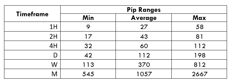
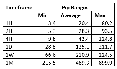
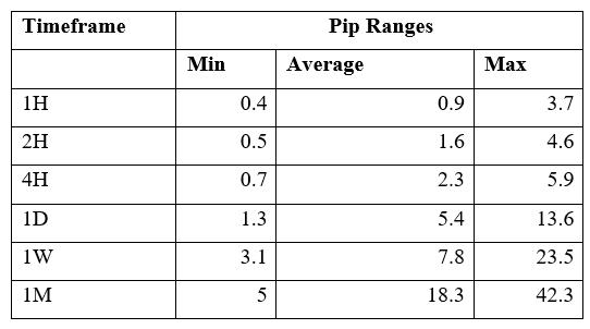
The trading range is the representation of the minimum, average, and the maximum volatility of this pair on the 1H, 4H, 1D, 1W, and 1M timeframe. Using these values, we can assess our profit/loss margin of trade. Hence, this proves to be a helpful risk management tool for all types of traders.

Procedure to assess Pip Ranges
  1. Add the ATR indicator to your chart
  2. Set the period to 1
  3. Add a 200-period SMA to this indicator
  4. Shrink the chart so you can assess a large time period
  5. Select your desired timeframe
  6. Measure the floor level and set this value as the min
  7. Measure the level of the 200-period SMA and set this as the average
  8. Measure the peak levels and set this as Max.
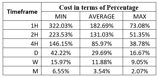
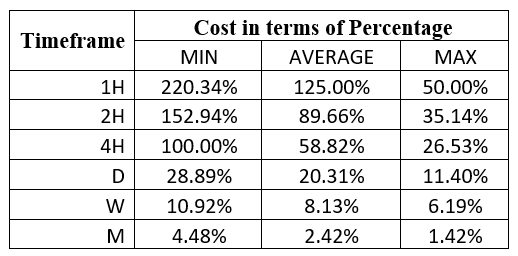
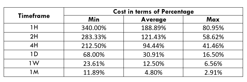
CADPLN Cost as a Percent of the Trading Range

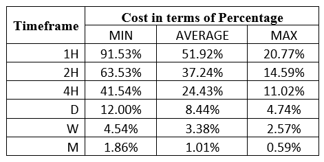
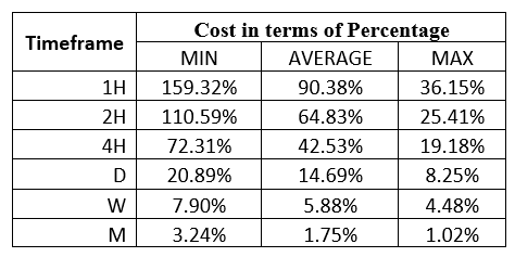
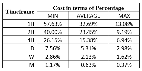
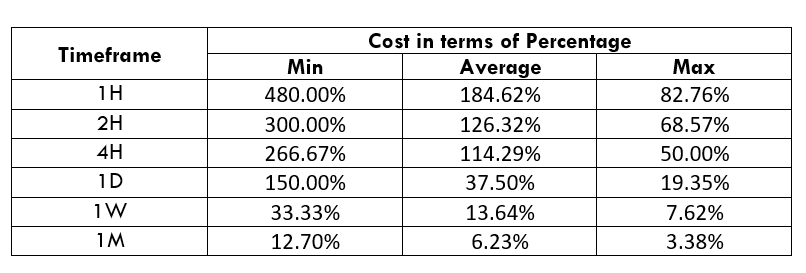
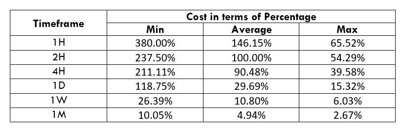
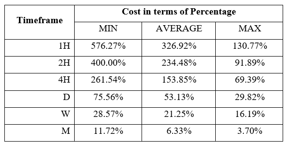
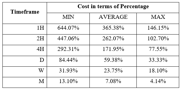
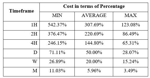
As per the volatility values of the above mentioned table, we can see that the cost changes with the change in volatility of the market. Later on, we have got the ratio between total cost and the volatility and converted into percentages.

ECN Model Account 

Spread = 13 | Slippage = 5 | Trading fee = 8

Total cost = Spread + Slippage + Trading Fee

= 13 + 5 + 8

Total cost = 26

STP Model Account

Spread = 13 | Slippage = 5 | Trading fee = 0

Total cost = Spread + Slippage + Trading Fee

= 13 + 5 + 0

Total cost = 18

The Ideal way to trade the CADPLN

The CADPLN is an exotic currency pair that has enough liquidity and volatility in the price. As a result, a trader may find it easier to trade this currency pair.

Wee can see that the percentage values did not move above 288%. It is an indication that the cost of trading in the lower timeframe is higher, and in a higher timeframe, it is lower.

Moreover, with the increase of trading cost, volatility is another risk that a trader may face.

Therefore, the best time to trade in this pair is when the volatility remains at the average value. If the volatility decreases, trading will be ineffective. On the other hand, if the volatility increases, there is a possibility of an unwanted stop loss hit. Therefore, sticking to the average value is suitable for this pair.

Furthermore, another way to reduce the cost is to place a pending order as ‘limit’ and ‘stop’ instead of ‘market.’ In that case, there will be no slippage in the calculation of the total costs. Therefore, the total cost will be reduced by five pips.


Limit Model Account

Spread = 13 | Slippage = 0 | Trading fee = 0

Total cost = Spread + Slippage + Trading Fee

= 13 + 0 + 0

Total cost = 13

Categories
Forex Basic Strategies

3 Tips How To Trade Ascending Tops.

Introduction

The ascending top is a technical chart pattern, where each peak in price is higher than the previous peak in price was. The ascending tops are such a predictable pattern because of its amount and time price action required to complete the formation of the pattern, which increases the reliability of the pattern. Ascending tops is a bullish chart pattern. Trading is all about the matter of probability. If you see the price action continuously printing the new highs and higher lows in an uptrend, then expect the Ascending top pattern on price chart.


3 Tips for How to Trade the Ascending Tops Chart Pattern.

TIP 1 HOW TO ENTER THE TRADE.

First of all, find out the trending conditions and look for two minimum ascending tops and two higher lows. Once the price action prints the second top, wait for the price action to reach the major support level, here you can use the other technical tools to identify the trading signals. Don’t use some of the difficult tools to identify the trade, instead choose the simple technical tools. Some traders here like to use the Gann Square or, Gartley patterns or Elliott waves by using these tools you are making it hard for you to trade the market. So here look for the simple tools such as trend lines support and resistance levels.

TIP 2 HOW TO PLACE YOUR STOP LOSS ORDERS.

The problem with the traders is they never choose to believe that trading is the game of probabilities and always trade the market without the stop loss. No matter how good the setup is, no matter how reliable the trading opportunity is, always go with the stop loss. For this pattern, the best place to put the stop loss is below the higher low created after the second top.

TIP 3 WHEN TO BOOK A PROFIT.

The problem with the traders is that they exit their trade very early because of fear or panic, or the voice inside keeps telling them their trade is not going to perform. So by having a lot of self, negative talks traders end up making little money in the market. It doesn’t matter how good your technical analysis skills are if, at the end of the day, you end up making little or no money in the market. No one call you Pro Analyzer or a Trader, you are a wannabe.

So how long do we stay in a trade?

There is one simple rule you can use, and that is to stay in a trade anticipating a price move at least the same size as the prior impulsive move was.


Trading Example By Using the Ascending Tops.

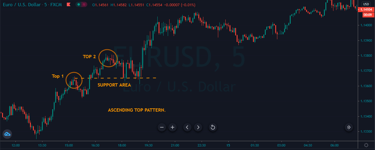
The image below represents the ascending top pattern in the EURUSD forex chart.


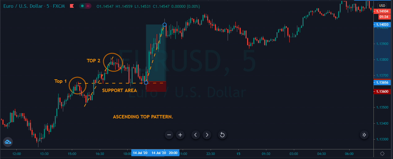
As you can in the image below, it represents our entry, exit, and stops loss in this forex pair. The EURUSD was in an overall uptrend, so in a trending market, we expected the ascending top pattern. When the price action printed the first top, we choose to wait for the second top, and when the second top printed, the price action immediately goes down for a correction to the most recent support area. The price action held at the support area for the couple of candles, which is a sign to go long. As we explain above, the stops below the support were good enough and the two dotted lines on a price chart indicating the size of the impulsive leg, so we choose to close our trade based on the size of the previous impulsive move.

ANOTHER EXAMPLE.

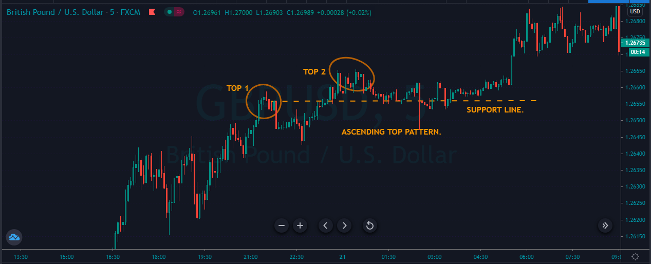
The image below represents the ascending top pattern in the GBPUSD forex pair.

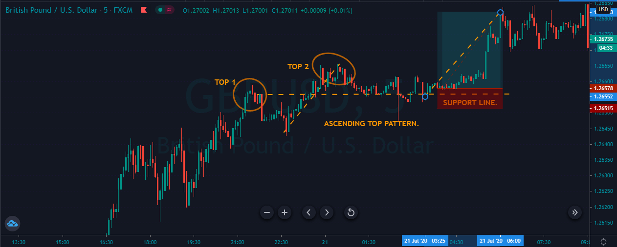
As you can see, the image below represents the strong uptrend in the GBPUSD forex pair, so when the price action printed the first and second top, it pulled back to the most recent support area. The sellers during the pullback phase weren’t strong enough, so we didn’t expect any breakout of the most recent support area, instead of when buyers respond strongly from the support area, we choose to go long in this one. The take profit was similar to the previous move, and the stop was just below our entry.

Conclusion.

In both of the above examples, have you noticed that the buying trend in both of the examples was super strong. This is the one essential component or the foundation of the ascending top pattern. You will always going to witness this pattern in the strong trending market in any underlying asset. Try not to trade it in the channel conditions or ranges because we choose to go for the smaller stops in trending conditions. If you put the smaller stops in ranging or in the channel market, you will end up losing in your trades because of the higher volatility. By following the below-mentioned steps, you can confirm the ascending top pattern on the price chart.

  1. In an uptrend, find the two tops where the second one is higher than the first top.
  2. Wait for the correction after the second top.
  3. The correction must be choppy if the down movies aggressive then stay away from the market.
  4. After you confirm the pattern wait for the price action to test the support area.
  5. Here you can look for any bullish candle pattern to enhance the probability of the setup.
  6. Take buy entry.
  7. Put the stops below the support area.
  8. Take profit must be the same the size of the previous impulsive move.
  9. If you desired the deeper target, then simply hold your position, and after the third top, expect the price to move the same as the size of the previous leg.
  10. In some cases, you will get the deeper targets, and in some, you don’t. To have bigger gains, choose the setup very carefully, the super-strong trending market is always appreciated to trade ascending top pattern.
Categories
Uncategorised

RELATIVE STRENGTH INDEX VS STOCHASTIC INDICATOR.

Introduction

Relative strength index and the stochastic oscillator both are momentum oscillator which is used to forecast the upcoming price movements. Both of these indicators have different objectives, theories, and methods to trade. RSI and Stochastic are the celebrity indicators in the industry which widely used by the all type of traders in stock and Forex market.

RELATIVE STRENGTH INDEX.{ RSI }

Developed by the J Welles Wilder, the Relative Strength Index is a momentum indicator that measures the speed and the change of the price movements of the underlying trend. Wilder featured this indicator in his book “New Concepts in Technical Trading Systems”. In his book, he also featured the Parabolic SAR, ATR and ADX indicator. RSI is a prevalent momentum indicator that featured in the number of books, articles and magazines over the years. Andrew Cardwell introduced the positive and negative reversals for the RSI indicator, and Constance Brown featured the concept of Bull and Bear market range for RSI in his book Technical Analysis for the Trading Professionals. RSI is an oscillator, and it consists of a single line which oscillates between the 0 to 100 levels. Wilder explains when the indicator goes near the 70 level, it indicates the overbought conditions and expects downside reversal. If the price holds at the 70 level for a more extended period, then it means the uptrend is super strong.

Conversely, when the indicator goes below the 30 level, it indicates the oversold market conditions and soon expects the buy side reversal and if the price action holds near the oversold level than simply means the sellers are desperate to move the price action down. RSI divergence is also a quite popular way to understand the upcoming market trend. Divergence is when the RSI indicator moves to one direction and price action move other direction, divergence shows the market is overextended and expect the reversal.

BULLISH DIVERGENCE.

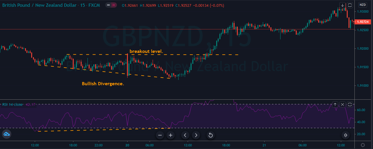
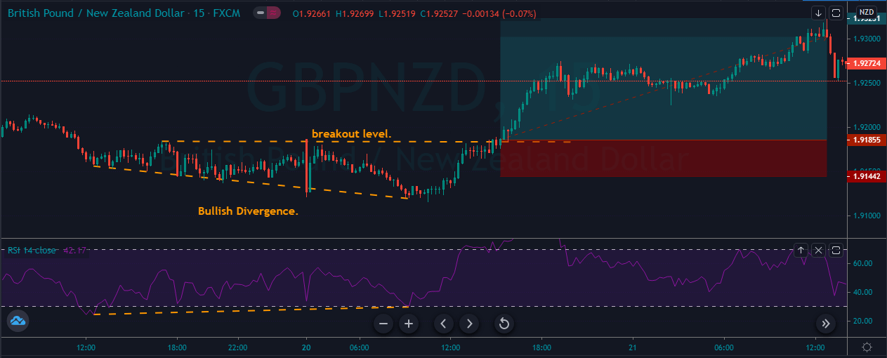
A bullish divergence occurs when the price action prints the brand new lower low but indicator prints the higher low that matches correspondingly lower low in the price. This indicates the rising bullish momentum and any long trade from the break of the significant resistance area will be a good idea.

The image below represents the bullish divergence in the GBPNZD forex pair.

In the image below, the price action was printing the lower low, but the indicator failed to do so; instead, it starts moving to the upward direction which means the indicator didn’t like he selling anymore and now its buyers turn to lead the market. When the price action breaks the most recent resistance area, we choose to go long in this one.

BEARISH DIVERGENCE.

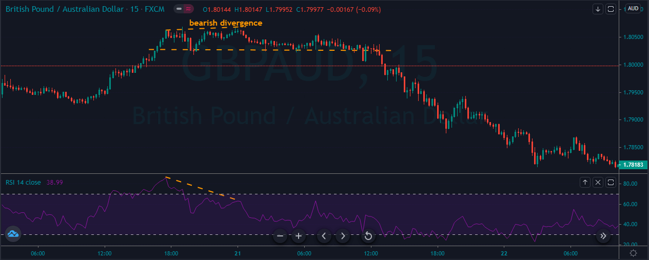
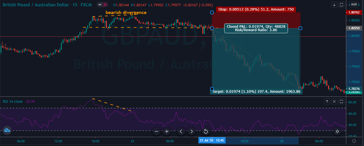
A bearish divergence occurs when the price action prints the brand new higher high but indicator prints the higher low that matches the correspondingly higher high in the price. This indicates the risking bearish momentum and any short trade from the break for the significant support area will be a good idea.

The image below represents the bearish divergence in the GBPAUD forex pair.

As you can see in the image below the prices was in an overall uptrend, and when the price action prints the bearish divergence, it means the market hit the top level, and now all we need to do is to prepare for reversals. As the price action breaks below the support area, we took sell entry for the brand new lower low.

RSI SWING REJECTIONS.

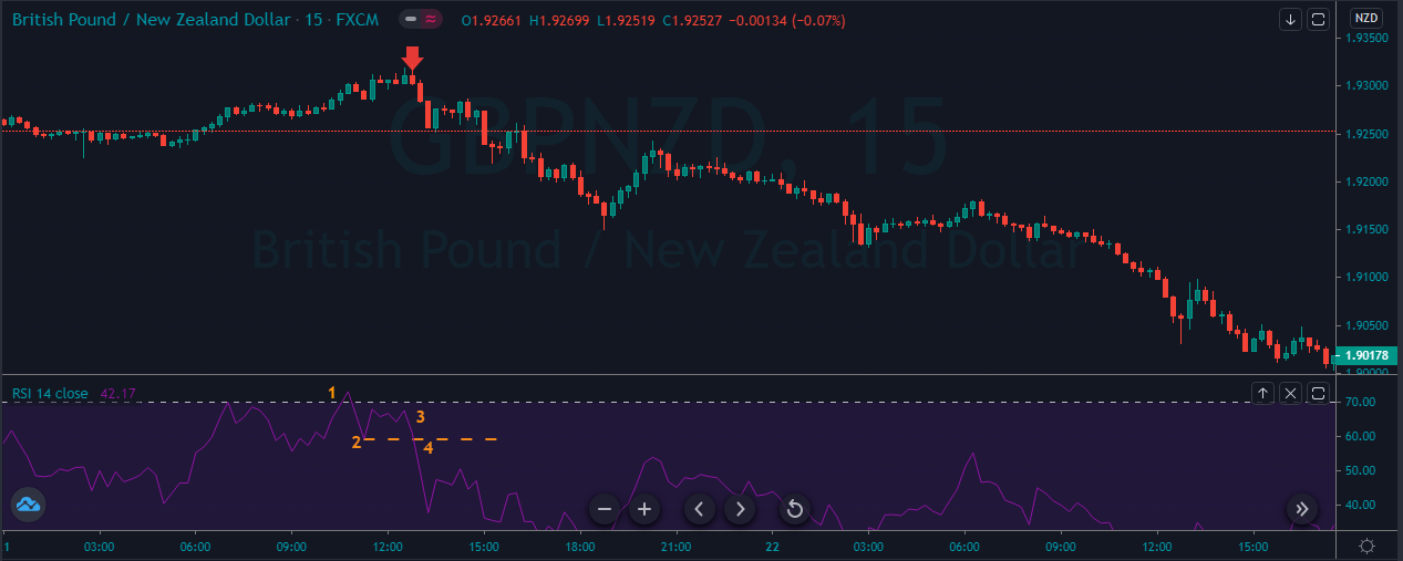
Another new RSI trading strategy which is not a quite popular but very effective way to trade the market. This strategy is known as swing rejection, and it has four parts:

BUY TRADE.
  1. Make sure RSI is in overbought territory.
  2. RSI reverse below the 70 level.
  3. RSI forms another high without crossing back into the overbought territory.
  4. RSI breaks its most recent low.

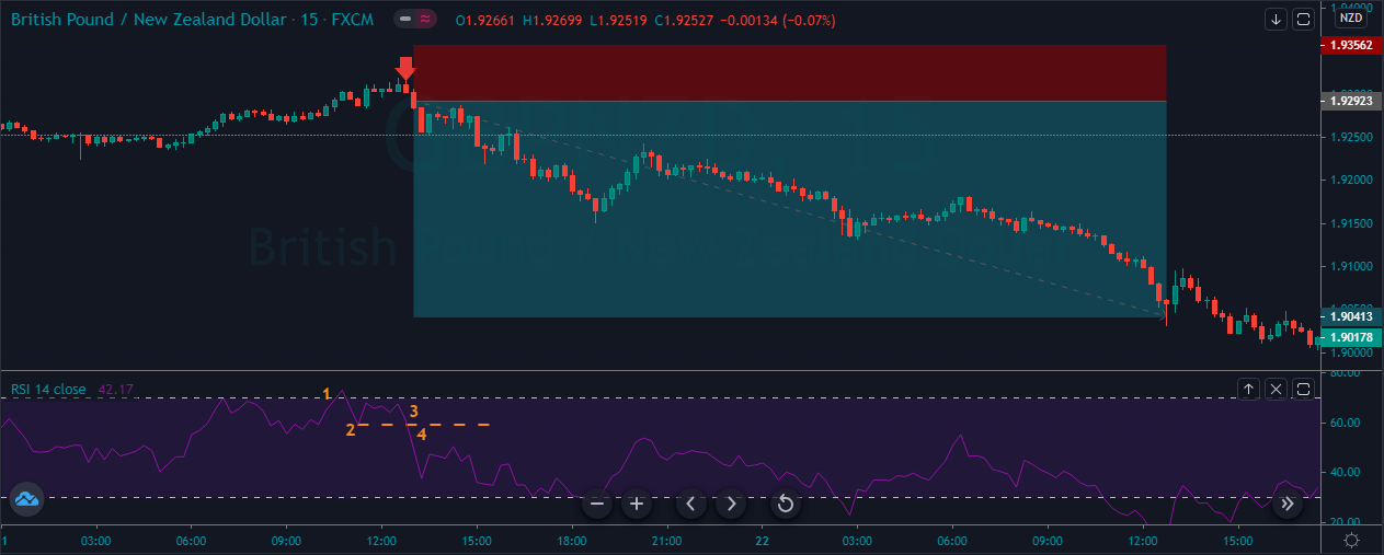
The image below represents the selling trade in the GBPNZD forex pair.

As you can see the image below represents our entry, exit and stop loss in this forex pair. So overall the pair was in a downtrend and during the pullback phase when the indicator reached the overbought area it’s a sign to go short, but we wait for the further signals and when the price action confirms all the four points we choose to go short. After the selling trade price action took a little bit of time to drop, and it printed the brand new lower low.

SELL TRADE.
  1. Make sure RSI is in oversold territory.
  2. RSI reverse below the 30 level.
  3. RSI forms another low without crossing back into the oversold territory.
  4. RSI breaks its most recent high.

The image below represents the buying entry in the GBPNZD forex pair.

The image below represents the entry, exit and stop loss in the GBPNZD forex pair. As you can see, the pair was in a pullback phase, when the indicator fulfilled all four points. At point 1, the indicator represents the oversold market, at point 2, it represents some buyers try to take the price high, but at point 3 sellers came back. They tried to print the new lower low but failed, and immediately strong buyers smack back up, and they printed a brand new higher high.

STOCHASTIC OSCILLATOR.

Stochastic is a momentum indicator developed by George Lane in the late 1950s. Stochastic is a celebrity or even the favoured indicator because it is easy to understand, and it also has a higher accuracy to identify the potential trading signals. The indicator measured the relationship between a security closing price and its price range over the predetermined period of time. According to the Lane, Stochastic doesn’t follow the price, or it doesn’t follow the volume or anything instead the indicator follows the speed and the momentum of the price to shows what’s going on in the market. The indicator changes its momentum before the price action, which makes it the leading indicator in the industry. The bullish and bearish divergences are very useful when it comes to trading the upcoming potential reversals. The Stochastic is a range bound indicator scaled between the 0 to 100 level, and the 80 and 20 are the traditional levels which used by the traders to identify the potential trading opportunities when the indicator reaches the 80 level it indicates the overbought market conditions and expects a reversal, and when it reaches the 20 level it is a sign of the oversold conditions and any reversal will be good to go long. In short at overbought conditions, we take to sell, and in oversold conditions, we choose to sell. The indicator consists of two lines: one reflecting the actual value of the indicator and the other one reflecting its three day simple moving average. The intersection of these two lines is considered to be a signal of the upcoming price reversal, as it indicates a large shift in the momentum. Keep in mind that the stochastic can stay at the oversold and overbought conditions for long enough time, so don’t a stochastic sheep who just blindly hit the buy and sell when price action approaches these levels. Instead, use other indicator with the stochastic to filter out the bad trading opportunities.

PAIRING THE STOCHASTIC WITH THE RSI INDICATOR.

FOR BUY.
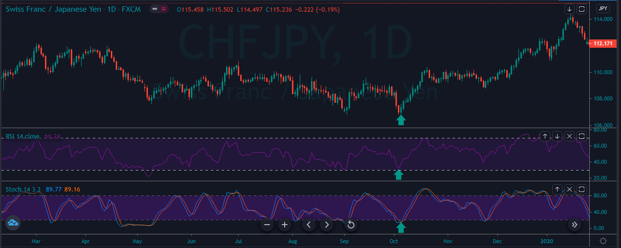
  1. Look for the trending market.
  2. Check both of the indicators if they both are saying the market is preparing to go long then take buy entry.
  3. Put the stop loss just below the entry.
  4. Go for the brand new higher high.


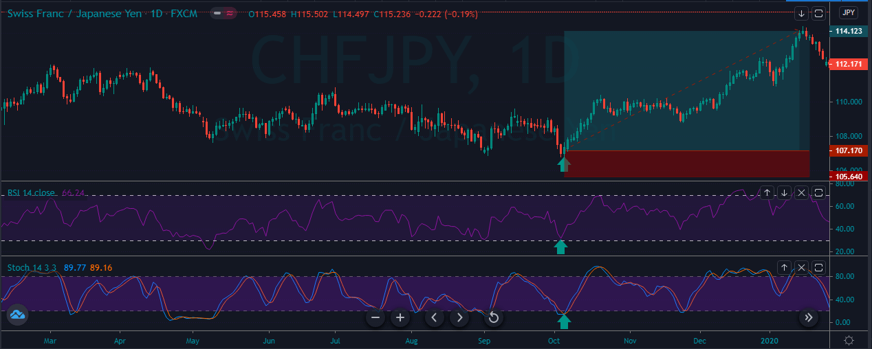
The image below represents the buying entry in the CHFJPY forex pair.

The image below represents the entry, exit and stop loss in the CHFJPY forex pair. As you can when the prices were turned sideways and when both of the indicators reached the oversold area and gave the sharp reversal, it means that the buyers are now back into the show and brand new higher high has very likely chance to happen.

FOR SELL.
  1. Look for the downtrend.
  2. Check both of the indicators if they both are saying the market is preparing to go short then take sell entry.
  3. Put the stops above the entry.
  4. Go for the brand new lower low.

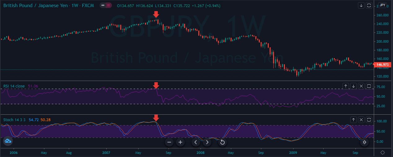
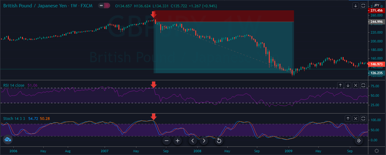
As you can see in the image below the pair represents the selling trade in the GBPJPY forex pair.

The image below represents the entry, exit and stop loss in the GBPJPY forex pair. On the weekly chart, the price action was in an uptrend, and when both of the oscillators reached the overbought area and the price action prints the strong red candle, it is a sign for us to expect the brand new lower low. As we took the sell entry price action immediately dropped, and we witnessed the drop of 12000+ pips within just nine months.

STOCHASTIC SWING REJECTIONS.

BUY TRADE.
  1. Make sure Stochastic is in overbought territory.
  2. Stochastic reverse below the 80 level.
  3. Stochastic forms another high without crossing back into the overbought territory.
  4. Stochastic breaks its most recent low.

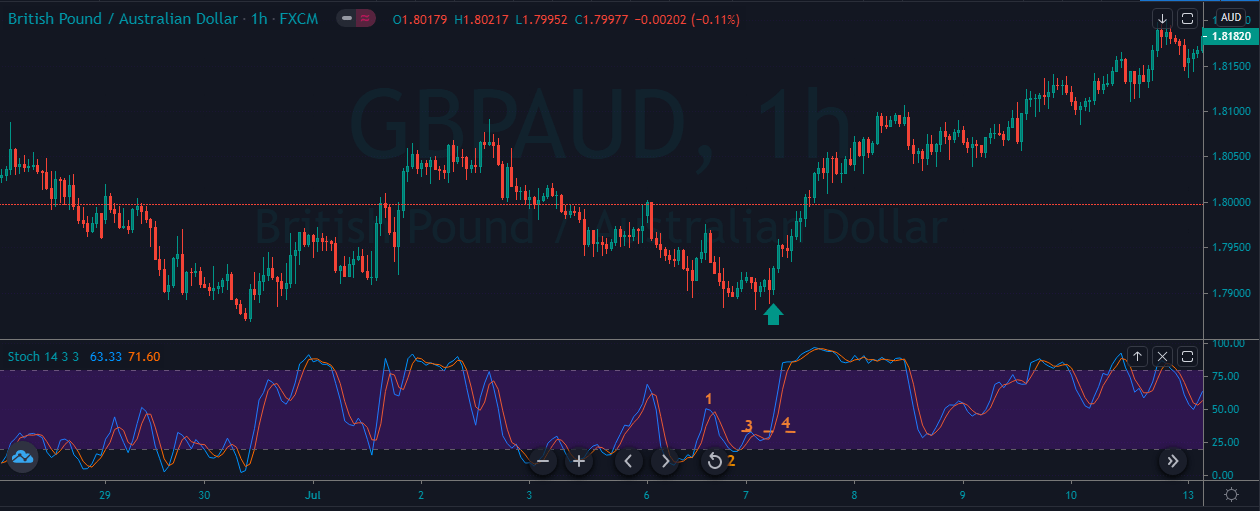
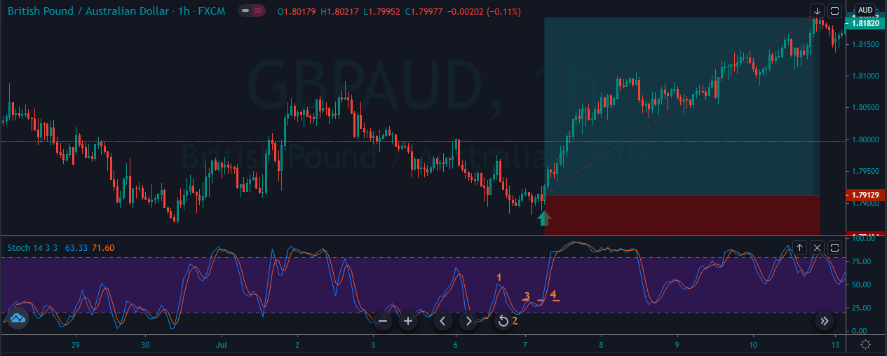
The image below represents the buying entry in the GBPAUD forex pair.

The image below represents the entry, exit and stop loss in the GBPAUD forex pair. As you can see, the sellers having a lot of struggle to go down and also at the same time, price approached the oversold area. So when all the 4 point instruction was followed the stochastic oscillator, we choose to go long in this pair, the stops was just below the entry, and for the take profit, we choose the brand new higher high.

SELL TRADE.

  1. Make sure Stochastic is in oversold territory.
  2. Stochastic reverse below the 20 level.
  3. Stochastic forms another low without crossing back into the oversold territory.
  4. Stochastic breaks its most recent high.

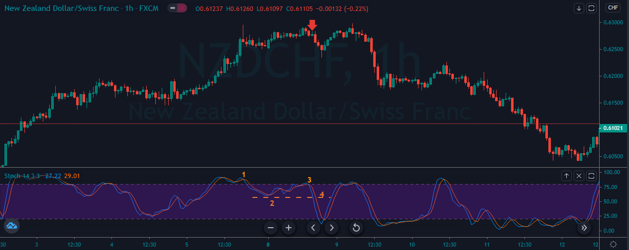
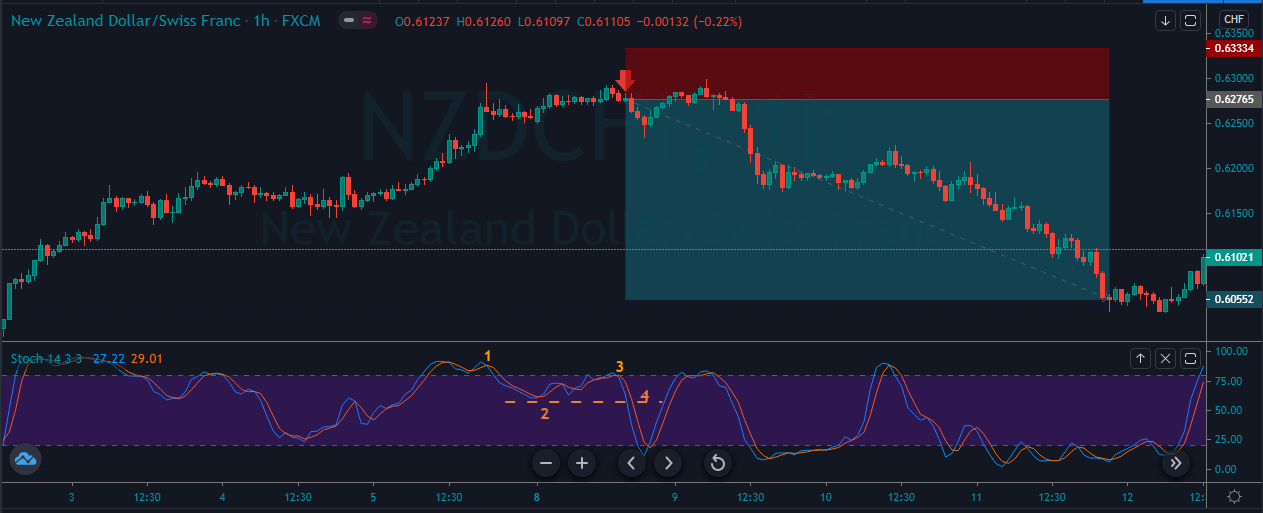
The image below represents the selling entry in the NZDCHF forex pair.

As you can see in the image below, it represents our entry, exit and stops loss in the NZDCHF forex pair. As you can see the pair was in an overall uptrend and the stochastic at overbought area means the reversal is about to happen. Still, we wait for the precision entry only when the indicator followed all the four steps of our strategy. This strategy is the new one in the market, and it often gives the excellent risk to reward ratio trades, and simply expect the fewer trades in the market. Whenever you find all the four points in the market, it’s a sign for you to go big in your trades and always expect the brand new higher high or lower low.

BOTTOM LINE.

Both of the indicators are the celebrity in the industry; both of them worked at different market conditions. RSI is designed to measure the speed of the price movements, and the stochastic oscillator works well in the choppy markets. The RSI consists of one single line which oscillates between the 70 to 30 level, and the stochastic oscillator consists of two lines which move between the 80 and 20 level. Overall, the RSI indicator is useful to trade the trends, whereas to trade the ranges and channels always go for the stochastic oscillator.

Categories
Uncategorised

Simple RSI Trading Strategies.

Introduction

The RSI stands for the Relative Strength Index, and it is one of the most popular indicators in the market. The RSI indicator was developed by J Welles Wilder, and he explained this indicator in his book New Concepts in Technical Trading Systems in June of 1978. The RSI is a momentum indicator that measures the speed and the change of the price movements. The RSI measures how well the underlying asset is performing against itself by comparing the asset strength of the up days versus the down days. The RSI has a range between 0 to 100, and the reading above 70 indicates the overbought conditions, and the readings below 30 indicate the oversold conditions. The RSI indicator is featured in the number of articles, books, and interviews over the year. The RSI signals can be generated by the overbought and oversold conditions, bullish and bearish divergence, centerline crossovers and failure swings. By default, the RSI used the 14-period averages, but this can be lowered to increase the sensitivity of the asset. You can set the parameters according to the asset volatility; the higher the volatility, use the higher average and lower the volatility, use the lower average. The overbought signal at 70 and oversold signals at 30 are also the traditional levels; traders can adjust these setups to better fit the security or analytical requirements. Using the 80 and 20 levels automatically reduces the numbers of overbought and oversold readings.

DEFINING THE CURRENT TREND

RSI indicator provides so many advantages to the traders, which makes it the celebrity indicator. Most of the traders think RSI only provides the buy and sell signals, but it’s not true, the RSI also provides the ability to gauge the primary direction of the trend. So, first of all, we must define the range where the RSI can track the bull and bear markets. For the bull market, we suggest you look out for the 66.66 readings, and the bear market uses the 33.33 readings. I know this is slightly different from the traditional levels of 80/20 and 70/30. These readings of 66.66 and 33.33 provided by John Hayden in his book, titled “RSI: THE COMPLETE GUIDE.” According to the author, he suggests that these numbers measure the true bull and bear trends, not by default readings.

4 Simple RSI Trading Strategies

  1. RSI SWING REJECTION.

This trading approach is a very new RSI trading strategy, this one is not very popular among the traders, but it works very well on all the timeframes and in all types of market conditions. This Technique is called the RSI swing rejection.

FOR BUY

  1. RSI approached the oversold territory.
  2. RSI crosses above the 30 level.
  3. RSI prints another dip without going below into the oversold territory.
  4. RSI breaks its most recent high.

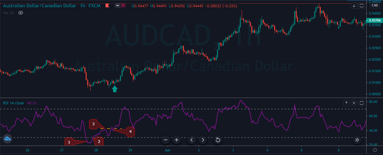
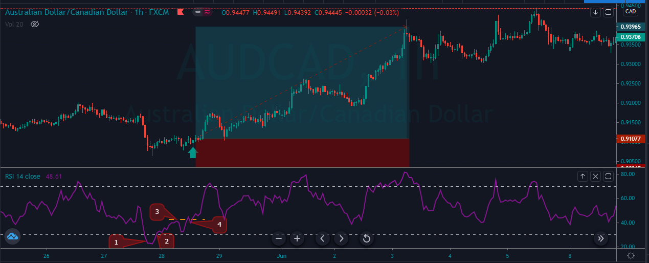
The image below represents the buying trade in the AUDCAD forex pair.


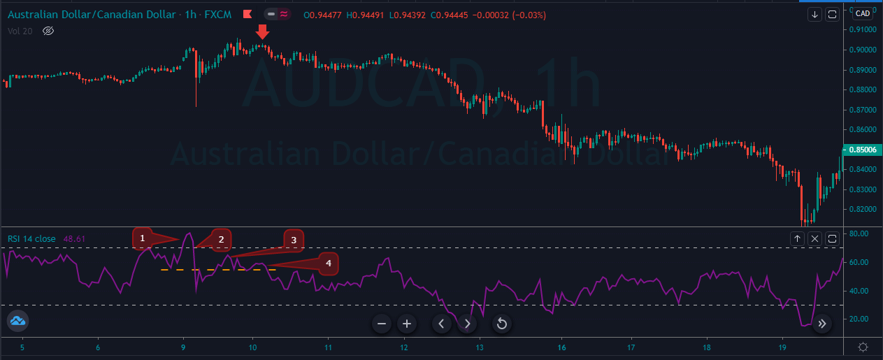
As you can see in the below image point, one shows the price action approached the oversold territory, which means the sellers are exhausted in this pair and soon expect the reversal. So point 2 represents the price action reversed from the oversold territory and the third point showing the sellers tried again but the immediate push from the buyers { point 4 } not accepting the sellers and are ready to go long from here. After our entry price action without any struggle goes higher, and it prints the brand new higher high.

FOR SELL

  1. RSI approached the overbought territory.
  2. RSI crosses below the 70 level.
  3. RSI tries to print another top, but it failed, and it stays below the overbought territory.
  4. RSI breaks its recent low.

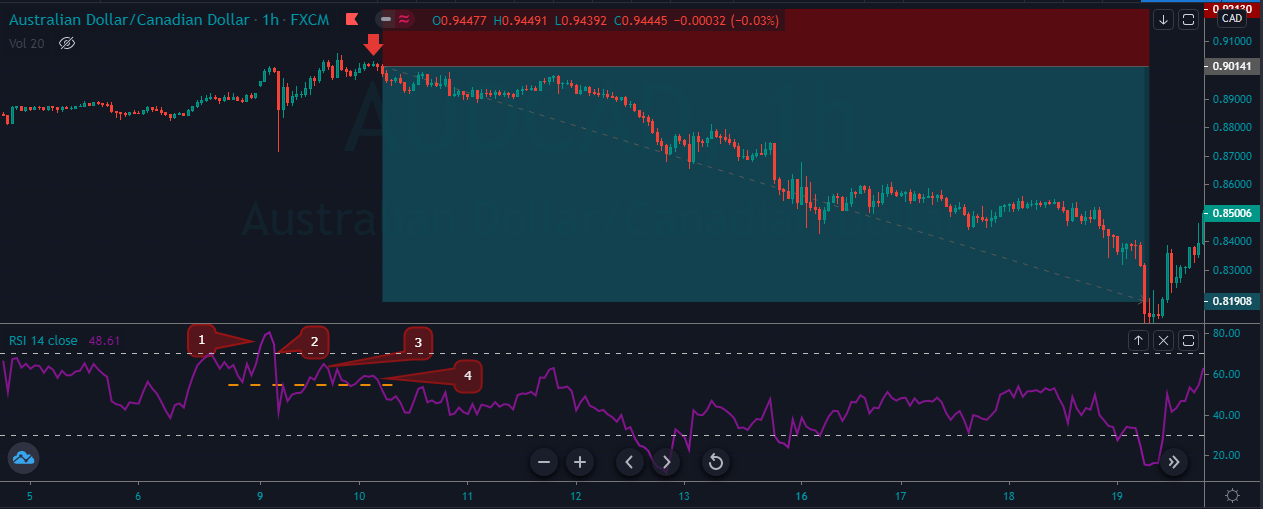
The image below represents the selling entry in the AUDCAD forex pair.

As you can see that the point 1 shows the buyers are now weakening and the strong push {point 2} represents how aggressively sellers came into the show and tries to print the brand new higher high, but they failed, and the buyers again try to dominate the game, but they also failed to reach the overbought levels, and the strong buyers at point 4 finally came aggressively, and they printed the brand new lower low. In this pair, we go for the smaller stops, and the take profit was down to the higher timeframe support area.


RSI SUPPORT AND RESISTANCE

The RSI indicator also represents the actual support and resistance levels on the indicator, and these lines come in the form of horizontal zones or as a sloping trend line. Most of the traders do not know this, but they can apply the trend lines on the indicator just the way they apply on the price chart.

BUY ENTRY

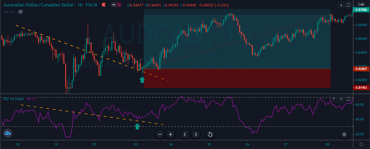
The image below represents the buying trade in the AUDCAD forex pair.

The image below the RSI indicator was holding above the trend line, which is an indication for us to go long in this currency. We took buy entry when RSI almost approached the oversold area, with smaller stops, and we choose to exit at the most recent higher high.

SELL ENTRY

The image below represents the selling trade in the AUDCAD forex pair.

The image below shows the selling entry in this forex pair. You can see that the RSI indicator was respecting the trend line, and the price action was printing the brand new higher highs, so when the indicator approached the oversold area, it gave the breakout below the trend line. It was a sign of buyers weakening, and the sellers took control of the show. After entry, price action goes smoothly down and then a correction for sometimes and followed by the brand new lower low.

  1. RSI DOUBLE BOTTOM

BUY ENTRY

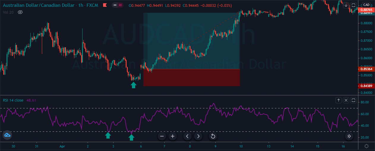
The image below represents the Double bottom pattern on the price chart.

The image below represents the double bottom pattern on the AUDCAD forex chart. The double bottom pattern represents the sellers tried twice to print the low, but both of the time, they failed to do so. The aggressive buyers were sits at the oversold areas to eat all the sell orders to print the new higher high. After the double bottom, we took buy entry, and price action smoothly goes north, and it prints the brand new higher high.

  1. RSI + MACD

In this strategy, we pair the RSI indicator with the MACD indicator to identify the trading signals. MACD is one of the simplest and most effective momentum indicators. The MACD fluctuates above and below the zero line, and it gives the trend line crossovers, centerline crossovers, and divergence to trade reliable opportunities. In this strategy, we paired the indicator with the RSI indicator to identify the significant trading opportunities.

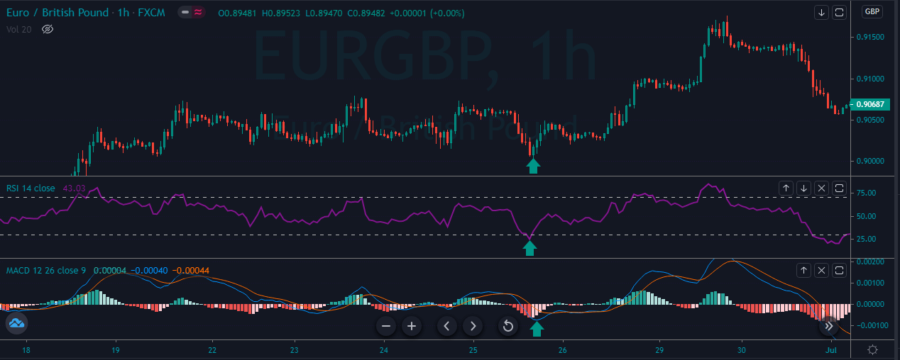
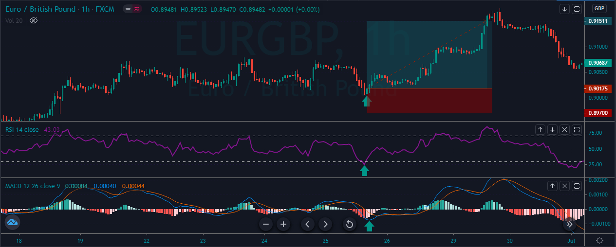
The image below represents the buying opportunity in the EURGBP forex pair.


As you can see in the below image, when both of the indicators approached the oversold area, it’ a sign to go long in this forex pair. After our entry price action smoothly goes up, and it prints the brand new higher high. By pairing the one indicator with the other, we can easily filter out the low probability trades in the market.

CONCLUSION

True reversal signals are hard to identify on the price chart, but you can somehow got an idea of the reversals by checking the divergence on the chart. The RSI indicator displays the momentum so the asset can stay at an overbought and oversold area for quite a long time. So it is advisable to use the indicator in the oscillating market where the asset keeps alternating between the bullish and bearish movements. The traditional levels of 70 and 20 work very well in the market you can use them also you can use the John Hayden 66.66 and 33.33 levels to gauge the momentum better. Stop-loss is always recommended when using the RSI, and you can pair it with the other technical tools, or you can use the indicator as it is. The above we explain the four trading strategies which are mentioned below:

  1. RSI SWING REJECTION.
  2. RSI SUPPORT AND RESISTANCE.
  3. RSI DOUBLE BOTTOM.
  4. RSI + MACD.

These four are the best trading approaches we have ever discovered by using the RSI indicator.

Categories
Forex Basic Strategies

Bollinger Bands – Top 5 Trading Strategies.

Introduction

A Bollinger band is a technical indicator used to find the trading opportunities, and it traces the market volatility. The indicator is developed by John Bollinger, and the bands are placed above and below the moving average. The volatility is purely based on the standard deviation, which changes as volatility increases and decreases. The bands of the indicator widen when the volatility increases, and it contracts in the less volatile market. Most of the traders used the 20-period moving averages for the default settings you can use them, or you can adjust them according to your trading style. Most of the traders think that the Bollinger bands only measure the market volatility, but it is not true, the indicator also provides a lot of useful information such as:

  1. Trend continuation and reversal.
  2. Possible tops and bottoms.
  3. Period of the upcoming volatility breakouts.
  4. The breakout trades above and below the bands.
  5. Buy and sell trades when price action hits the upper and lower band.
  6. It also identifies the market consolidation.

Before diving into the trading strategies, we want you to read the below-mentioned facts about the Bollinger Bands.

  1. John Bollinger CFA/CMT is the creator of the Bollinger Bands.
  2. The indicator consists of three lines where price fluctuated around.
  3. The indicator is the excellent tool to understand how widely stock swings from peaks to valleys.
  4. Do not spend your time to test the random configurations; instead, go with the default settings.
  5. In order to make money ride the Bollinger bands, go long when prices approach the lower band, and go short when price action approaches higher band.
  6. If you desire better signals, then find out the trending markets and wait for the pullback near to the centerline, this honestly is the most profitable approach to print cash.
  7. Filter out the low profile trading signals by pairing the indicator with the other technical tools.
  8. Bollinger bands perform very well in ranging conditions, look for buy when the price hits the lower band, and look to short the currency when prices hit the upper band.
  9. A single candle outside the band does not mean that the breakout occurred; most of the time, price action immediately came back to wait for the hold outside the band.
  10. The indicator works in all the type of markets either it is equity market, forex market, futures, or options.
  11. The best book on the indicator is written by the John Bollinger “Bollinger on Bollinger Bands.”
  12. The bands work very well on all the timeframes; even this indicator is one of the favorite indicators of the scalpers.

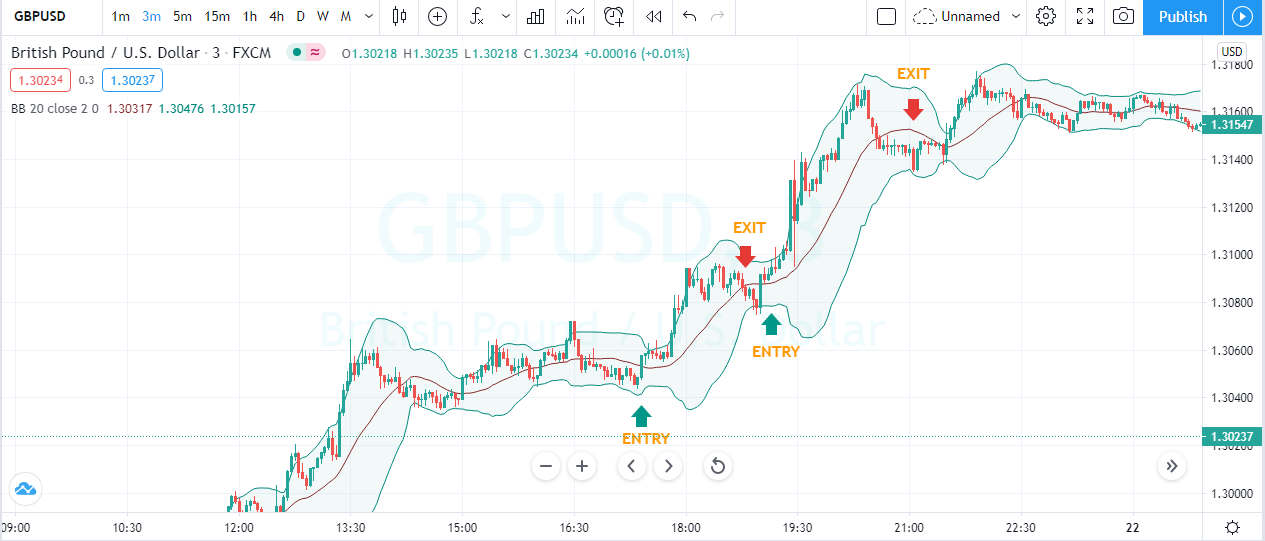
BOLLINGER BANDS TRADING STRATEGIES:

DOUBLE TOP.

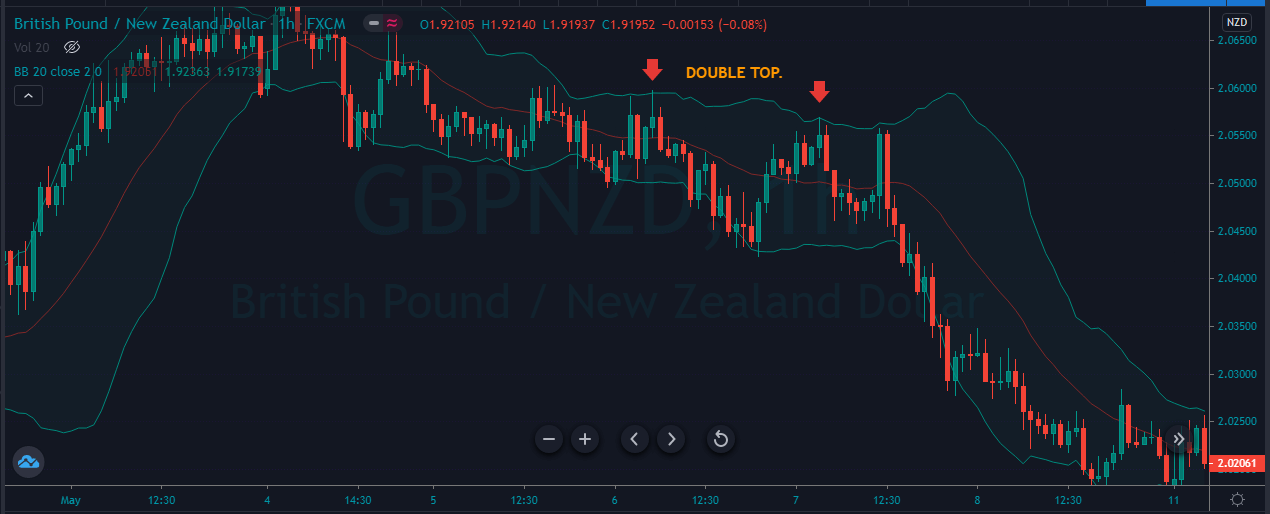
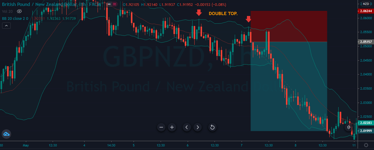
The image below represents the double top on the GBPNZD forex pair.

As you can see in the image below, the pair represents the entry, exit, and stop-loss in the GBPNZD forex pair. The trade below represents the double top pattern by using the Bollinger bands. The double top is simply a trading pattern where the buyers try twice to break the major level, and the failed to do so; as a result, we got the reversal. In the image below, the pair was in a strong uptrend both of the time buyers tried hard to break the Bollinger bands dynamic resistance level, but they were unable to break the level. When the price action respects the second top, it was a sign for us to go short in this pair. The stops were just above the entry, and for taking profit, we choose the brand new lower low.

REVERSAL STRATEGY.

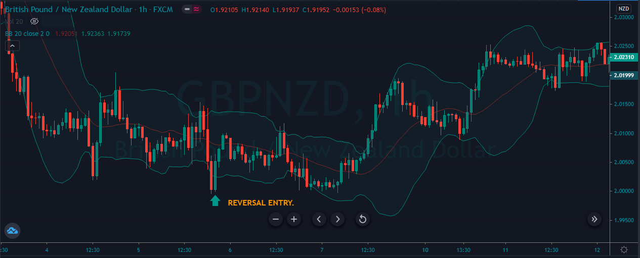
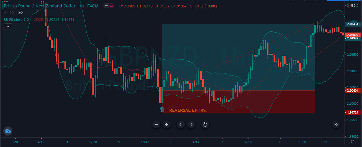
The image below represents the reversal pattern on the Bollinger bands forex pair.

As you can see in the image below, it represents the entry, exit, and stop-loss in this forex pair. The reversal pattern is when the price action breaks below the Bollinger bands and then immediately came back. Some traders called it railroad pattern or fakers or even spikes; no matter what you called it in the end, the pattern represents the upcoming reversal. When the price action prints the pattern, we immediately took the buy entry for the brand new higher high.

BUYING AT THE LOWER BAND.

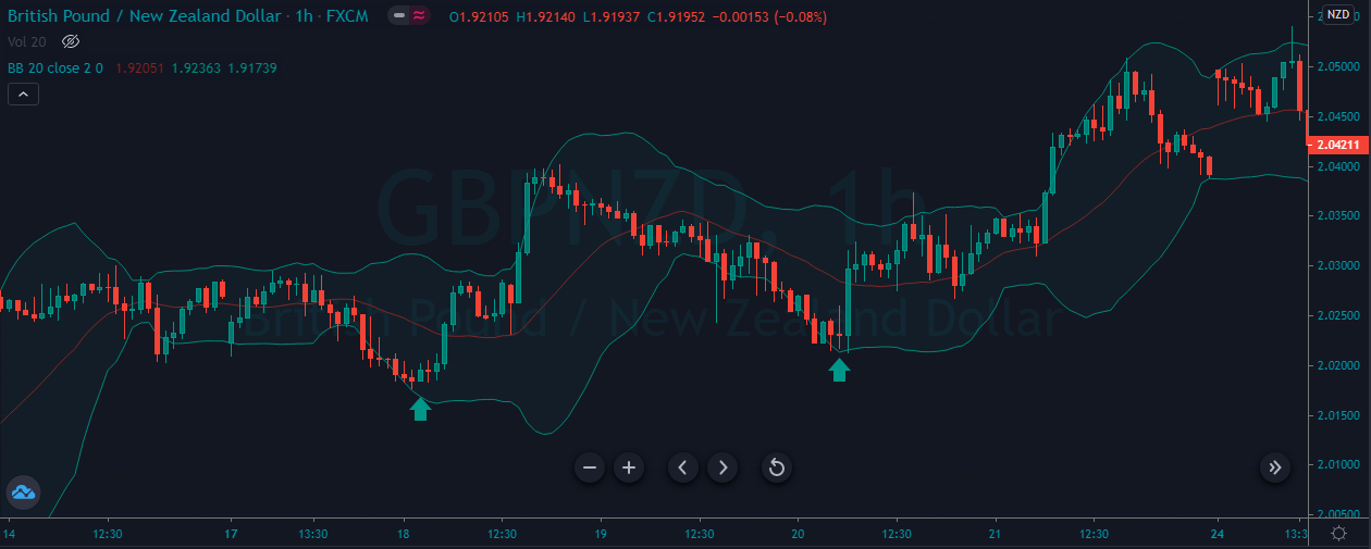
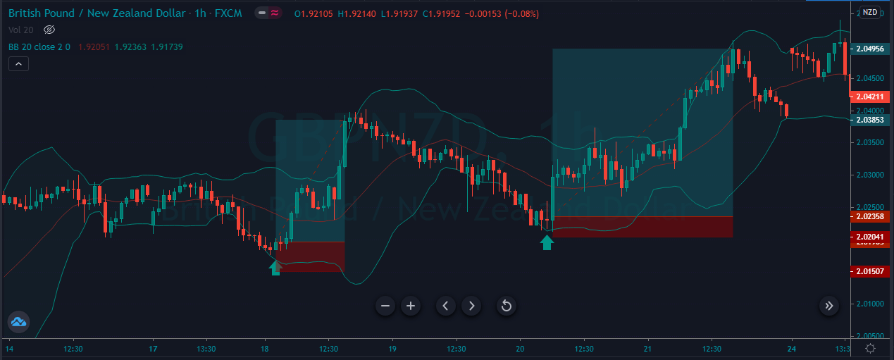
The image below represents the two buying trades in the GBPNZD forex pair.

As you can see in the image below, it represents the entry, exit, and stop-loss in the GBPNZD forex pair. This is one of the simplest and most effective trading strategies used by intraday traders. As you can in this one, we choose to trade the lower band because we choose to follow the trend of the market. In a trending conditions market often goes into one side for an extended period of time, even on the face of the opposite party. So whenever you choose to trade the Bollinger upper and lower bands, then look at the market flow first, and only place the trade in the direction of the market flow. In the below image, we took two buying trades in an uptrend; both prints the brand new higher high, and stops were just below the entry.

TRADING THE RANGE AGGRESSIVELY.

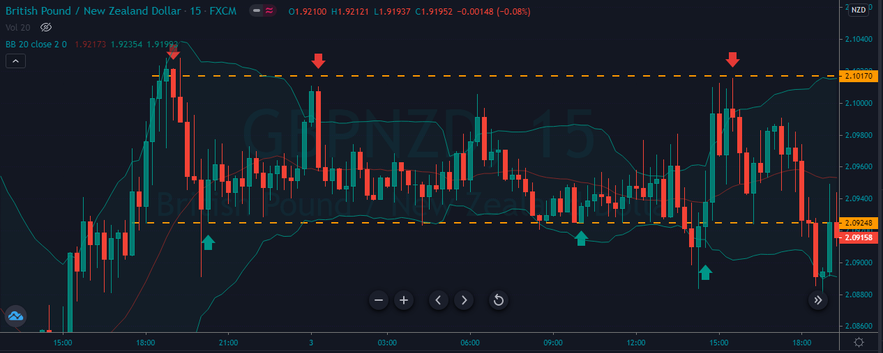
This approach works very well for the aggressive traders only because here, we choose to go long and short when the price action hits the lower and upper band as well as the support and resistance level. As you can see, we took three aggressive buys and three sell trades. You can trade the ranges in this way and always go with 1:1 R: R trades.

TRADING BELOW THE MIDDLE BAND.

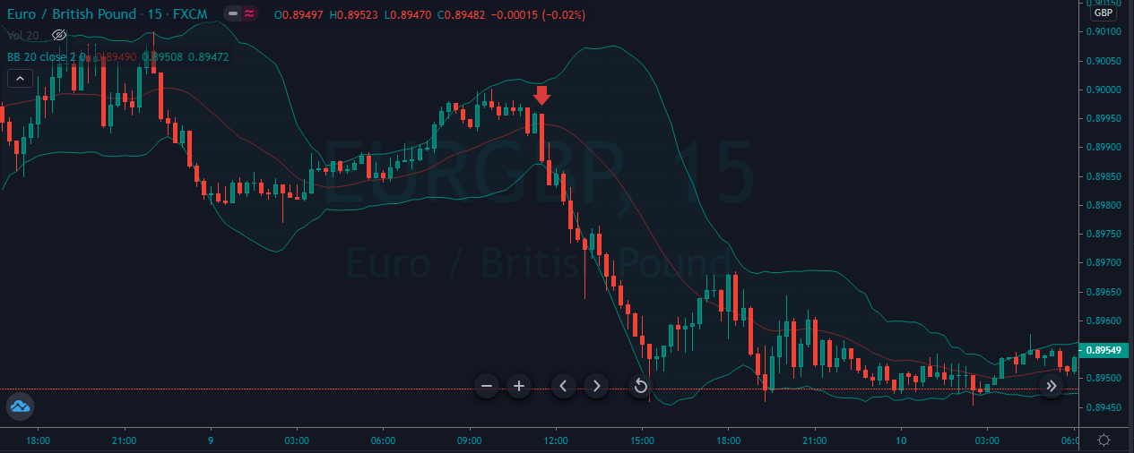
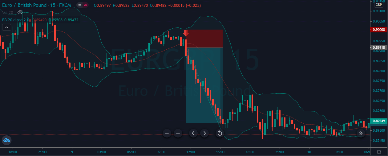
The image below represents the selling trade in the EURGBP forex pair.

As you can see in the image below, it represents our entry, exit, and profit in this forex pair. This strategy is all about the trending market, where we activate the trade when price action goes below the middle band. In the trend conditions, the middle band acts as a breakout level to trade the market. When the price action gives reversal at the upper band, it is a sign of price action to resume the downtrend, and when it breaks below the middle band, it is a sign of sellers gained enough momentum, and expect the new lower low. In the image below, when the price action hits the upper band, and the sellers break below the centerline, we decided to go short for a brand new lower low.

CONCLUSION.

Bollinger bands are a wonderful trading indicator it provides reliable trading opportunities in the market. Bollinger bands are the only indicator in the market which provides the opportunity to trade every kind of market; it doesn’t matter if the market is trending or in a range or the trend is about to finish. We can use this indicator to trade every market situation. In the article, we provide the five different trading ways to trade the Bollinger bands, you can apply all of these trading strategies, or you can choose to trade the only one or two above strategies. The choice is yours; we suggest you master the one trading strategy first then choose the second one to trade. In this way, you can quickly learn all these strategies without any confusion.


Categories
Forex Basic Strategies

Forex Weekly Trading Strategy.

Introduction

Trading the forex market is a challenging thing for some traders, but it’s quite an easy game for other traders. The only difference between the successful and unsuccessful trader is the mindset and the ability to wait for the correct setup to pull the trigger. Most of the lower timeframe traders often miss these qualities; on the other hand, the higher timeframe trader possesses these qualities to trade the market successfully. In this trading strategy, we will share some tips and tricks to trade the higher timeframes successfully.

What is the Timeframe in Forex Trading?

Time frame means the unit of time that the price chart which you are viewing based on. The weekly timeframe of Japanese candlestick represents the one week, and the 5-minute chart of the Japanese candlestick represents the 5 minute time. The smaller the timeframes, the more candlestick chart prints, and the higher the timeframe, the lesser the candles you will see.

The weekly timeframe has so many trading advantages as compared to the lower timeframes. The higher timeframes move slowly, so there is no chance of any noise on the higher timeframe. Most of the technical indicators work very well on the higher timeframes because you are not going to see any fake or odd signals on a higher timeframe. On the lower timeframe, you are not going to have much countertrend trades, but on the weekly chart, you can easily find the countertrend trades. Weekly trading always produces better results because to trade the market successfully; you need trend or momentum. When you use the trending market with the momentum indicator, then you automatically end up at the top in your trading game. Another major problem we have with intraday trading is the Algorithms, which also known as high-frequency trading, where the robots or the trading systems placed hundreds of trades in a single day, which added considerable danger to the retail trading. These trading systems jamming price action higher and lower, and they creating the hell amount of volatility which prints the fake outs, spikes triggered the stop losses. Higher timeframes are far from these kinds of behaviors, which often provide an excellent risk to reward ratio trades.

Weekly charts move very less, so it is advisable to follow the risk management rules we explained below.

  1. Weekly timeframe provides fewer opportunities, so it doesn’t mean you use the higher-margin to trade it. A smaller number of lot sizes do the same work when you let the price action travel further.
  2. Be selective in position sizing, and always go for the good trades, ignore the bad or low profile trades.
  3. Always try to trade your edge only, focus on the moving average to successfully trade the weekly charts.
  4. Respect the power of the opportunity cost. The capital you set aside to trade the weekly chart can last for several months. So patience and having full faith in your analysis is the key to trade the weekly chart.

TRADING STRATEGIES BY USING THE WEEKLY CHART.

WEEKLY CHART SUPPORT AND RESISTANCE TRADING.

BUYING TRADE.

This one is the simplest yet most important trading strategy investor’s use. The idea is just finding out the trending market and take buy entries when price action approached the support level. Conversely, the idea is the same for the sell-side; look at the selling market on a weekly chart and take sell trades every time price action hits the resistance area.

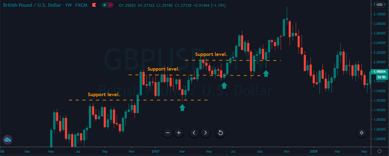
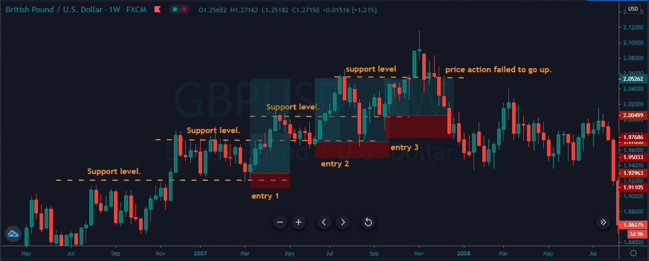
The image below represents a couple of buying trades in the GBPUSD forex pair.

The image below represents a couple of selling trades in the GBPUSD forex chart. As you can see in an uptrend, whenever the price action approached the support area, we took buy entry, so price action thrice gave us the buying trades, and whenever we got the opportunity, we choose to scale our trade. So when the fourth time price gave another opportunity, we took the buy entry, but prices failed to hold at the support area, so we end up closing all the three buying trades. Weekly charts often took a couple of months, even years to perform. So most of the investors expect three to four trades on the weekly chart in a year.

SELL TRADE.

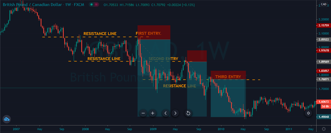
The image below represents a couple of selling trades in the GBPCAD forex pair.

The image below represents a couple of selling trades in the forex pair. As you can see, the pair was in a strong downtrend, and at every pullback, we choose to go short in the market. After the first trade price action printed the brand new lower low, then it pulled back again to the most recent resistance area. The price action respects the resistance area by printing the one red candle, and it was the clue for us to go short again. For the third time, prices again go to the most recent resistance area and the same story again, major level reject the price action and third time we end up taking a selling trade. On the weekly or even daily and monthly charts, do not expect the price action to stay at the major levels for a more extended time period. This is something not possible; most of the time, prices spent one to two weeks at the major level, and then it starts moving again.


TRADING THE ENGULFING PATTERN ON THE WEEKLY CHART.

BULLISH ENGLUFING

A bullish engulfing is a reversal pattern that forms when the larger green candle follows the small red candle. The body of the red candle completely engulfs the previous day candle. This pattern indicates the market hits bottom, and now the buyers are going for the brand new higher high.

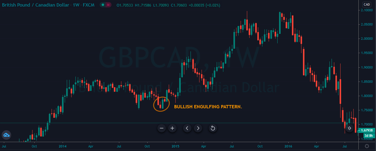
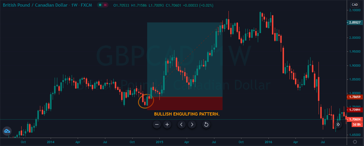
The image below represents the bullish engulfing pattern in the GBPCAD forex pair.

As you can see in the image below, the pair was in a strong uptrend, and during the pullback, it prints the bullish engulfing pattern, which was a sign for us to go long in this pair. As we took the buy entry, the price action goes up; it holds at the major resistance level and then blasts to the north. On the weekly chart, this trade ends up milking 200 pips within just four months. The higher timeframes perform very well for those traders or investors who have enough patience to hold their trades for a longer period.

BEARISH ENGULFING.

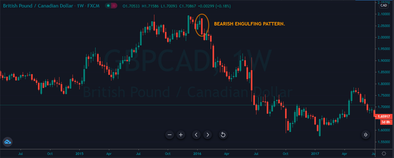
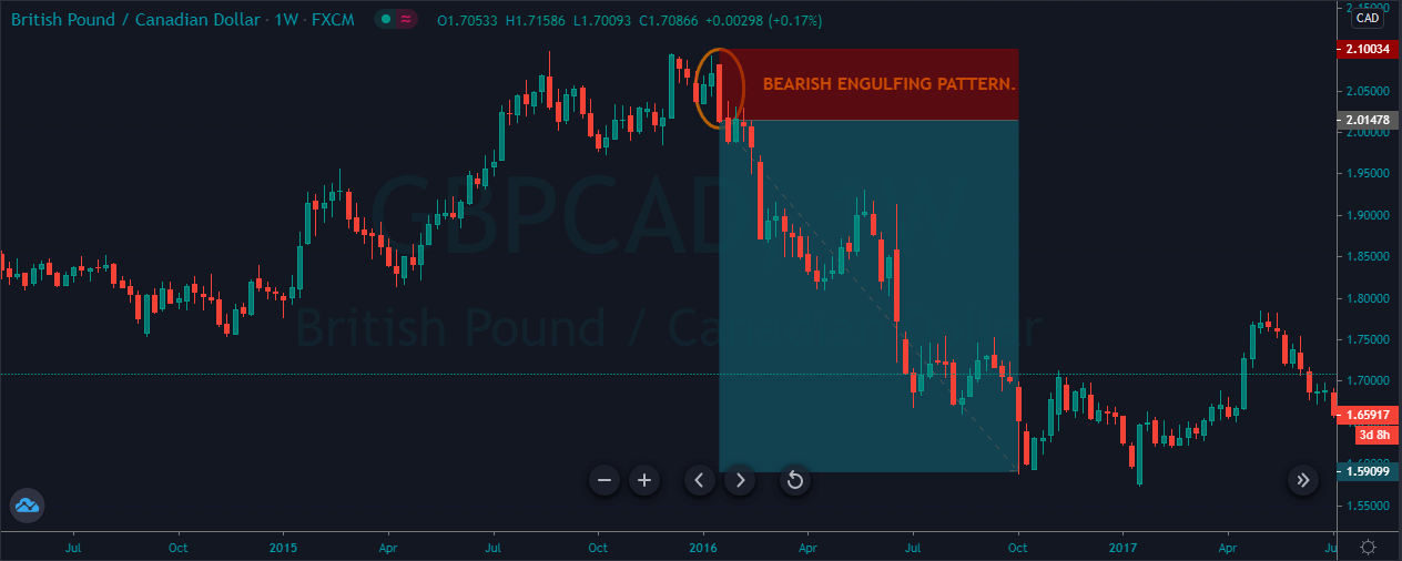
A bearish engulfing is a reversal pattern that forms when the larger red candle follows the small green candle. The body of the green candle completely engulfs the previous day candle. This pattern indicates the market hits the top, and now the sellers are going for the brand new lower low.

The image below represents the bearish engulfing pattern on the GBPCAD forex pair.

As you can see, the GBPCAD pair represents the bearish engulfing pattern on the weekly chart. In a strong uptrend, when we got the bearish engulfing pattern, the price action immediately blasts to the north, and it prints the brand new lower low. This trade ends up generating nearly four thousand pips within just four months. Imagine if you took this trade with a higher lot size, you could very easily make a six-figure income from one single trade. The higher timeframes provide less but accurate trading signals, so whenever you find the trade go big.

CONCLUSION.

Weekly charts are specially designed for investors who are not interested in sitting in front of the computer; instead, they desire to invest the cash for the longer term. Most of the investors inject large sums on money on the higher timeframes, making the market move. Overall, trading the higher timeframe is a lot safer than, the lower timeframes. Here you are not going to get any unnecessary spike of fake outs. Simply follow the rules of your strategy and trade the market. It is advisable not to use the technical indicators to trade the weekly chart because most of the indicators are the laggard indicators, so you will end up taking trades very late. Trend line trading, support and resistance trading, and candlestick pattern trading is best for the weekly charts.

Categories
Forex Basic Strategies

Best Moving Average For Day Trading.

Introduction

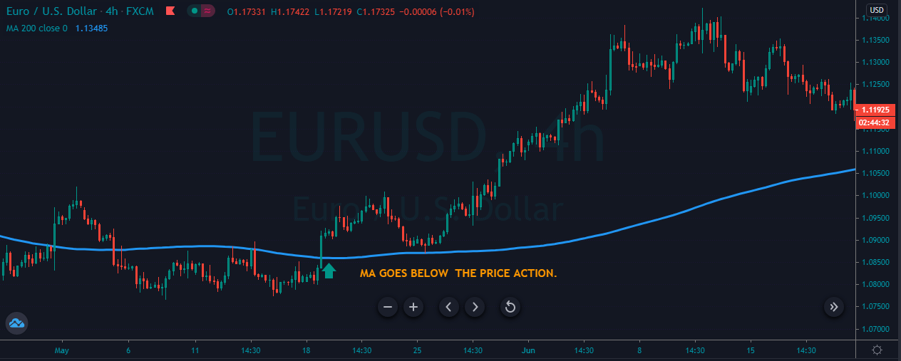
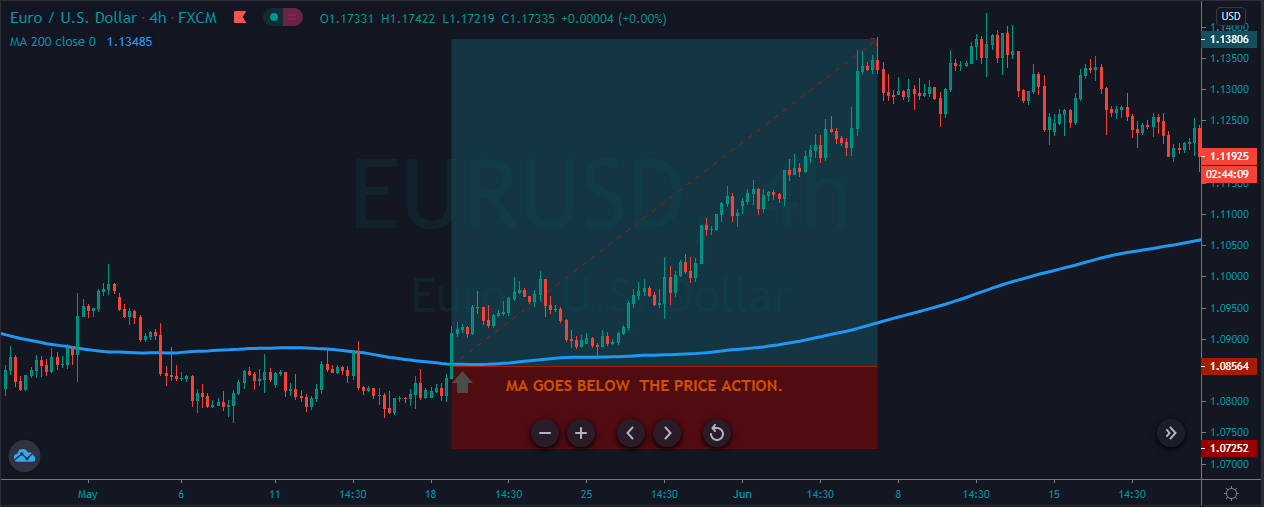
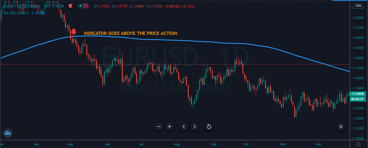
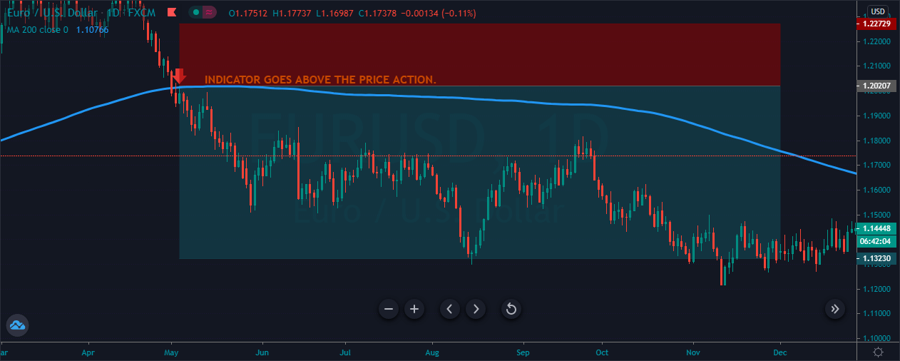
Moving Average is the most common indicator used by the traders in the industry. The Moving average is quite popular among the traders because the indicator itself serves the foundation for a couple of other indicators, such as MACD and Bollinger bands. Day Trading is a fast game; most of the intraday traders and scalpers trade the markets couple of times a day. As a trader, you need to understand very clearly and precisely which way the indicator is moving. So here the moving average plays an important role for the traders, first of all, it is a simple indicator, if it is below the price, then the trend is up, and if the MA is above the price, then the trend is down. This thing makes it easier for traders to identify the market trend, and without any wasting time on additional analysis, traders can make quick decisions to trade the market. In intraday trading, having the ability to make quick decisions without performing any additional manual calculations can make a huge difference in your trading.

Moving Average Settings.

Choosing the right moving averages for day trading is the real key to trade the market effectively. The right average adds reliability to your analysis, whereas the wrong or any randomly chooses average can easily let you stay away from the profitable trading opportunities. The smaller averages work best for the intraday trading and. In contrast, for the bigger timeframe traders, smaller averages are useless; conversely, for the lower timeframe traders, the bigger averages are useless. To trade the market professionally, it is advisable to use the ten-period averages for the intraday trading. Most intraday traders use to trade the market breakouts to make some quick bucks, so the ten periods give enough room to the market to trend.

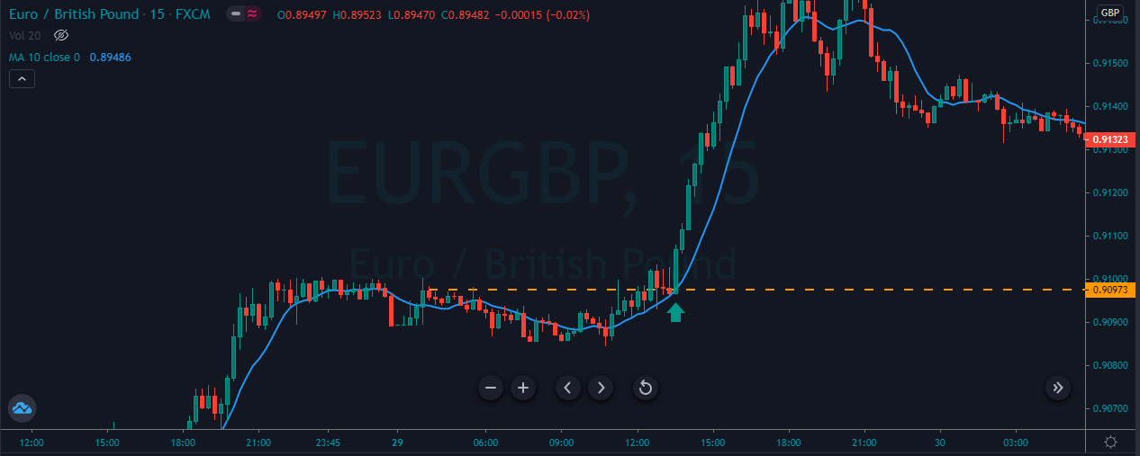
Example of using the ten period Average for trading the breakout.

So for intraday trading, always use this indicator on the 15 minutes and below charts. Below are the buy and sell example; you can use this same way to trade the markets.

FOR BUY.
  1. Find out the trending market.
  2. Look for a breakout above the most recent higher high.
  3. MA must be below the price action.
  4. Price action must hold above the breakout.
  5. Go long.
  6. Put the stop loss below the Moving Average.
  7. Go for brand new higher high.
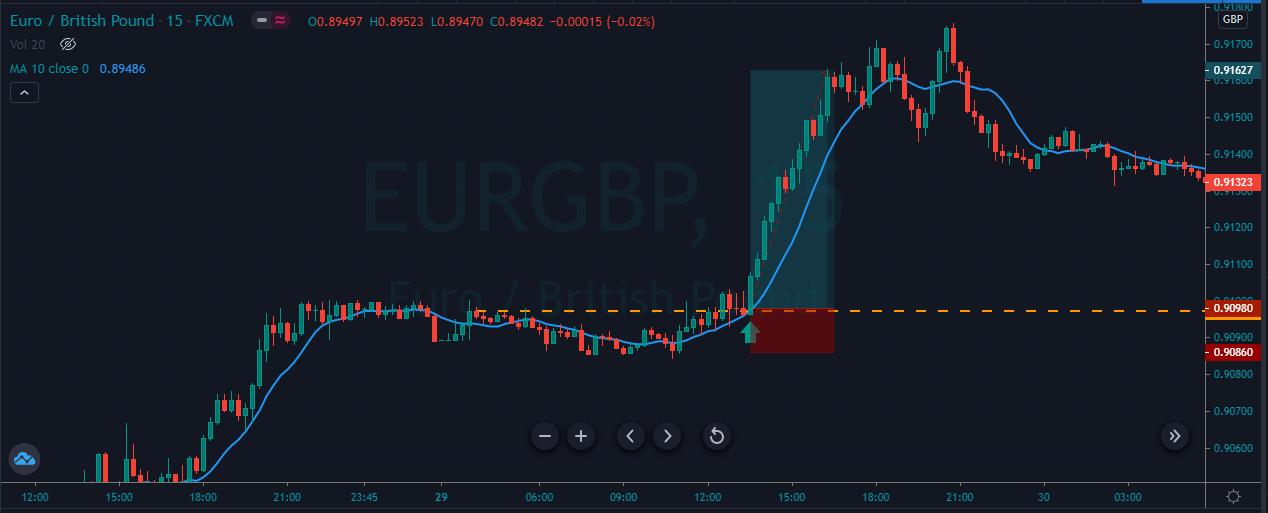
The image below represents the buying trend in the EURGBP 
forex pair.

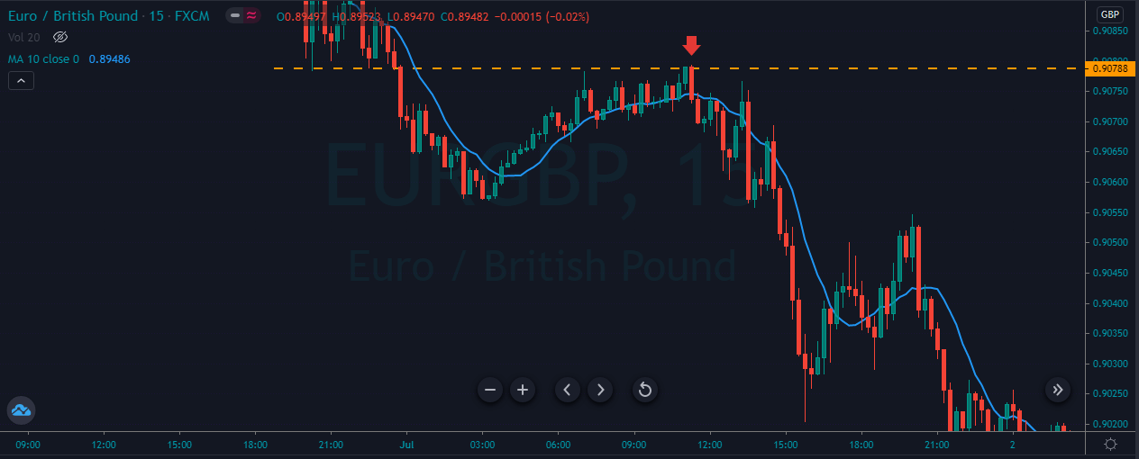
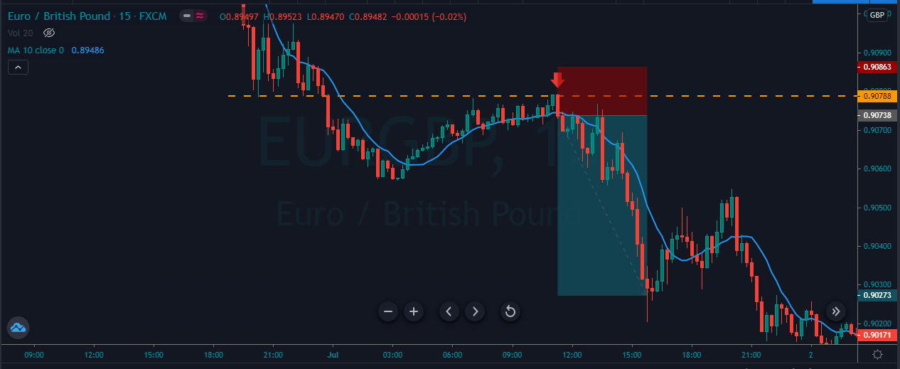
The image below represents the entry, exit, and stop-loss in this forex pair. As you can see, the pair was in a strong buying trend, and it gives the small pullback and price action breaks above the most recent higher high. When it breaks the higher high, it holds there for a couple of candles, which confirms the breakout, and the MA below the price action indicates the buying momentum. So we took the entry above the breakout was good enough, and we choose to go for the brand new higher high.

FOR SELL.
  1. Find out the trending market.
  2. Look for a breakout below the most recent lower low.
  3. MA must be above the price action.
  4. Price action must hold below the breakout.
  5. Go short.
  6. Put the stop loss above the Moving Average.
  7. Go for a brand new lower low.
The image below represents the downtrend in the EURGBP 
forex pair.

The image below represents the entry, exit, and stop-loss in this forex pair. You can see when the price action breaks below the most recent lower low; after that, it gravitates towards the resistance line, and the hold below the resistance line confirms the selling entry. The price action dropped hard after our entry, and the smaller stop loss above the entry was kind enough to ride the move.

Trading the Five-period Moving Averages using the Support and Resistance levels.

So in this strategy, we are using the five-period averages for purely intraday trading. Do not use it on the higher time frame; only trade this average on five and 3-minute charts.

FOR BUY.
  1. Look for the trending market.
  2. Wait for the price action to pull back to the nearest support area.
  3. The moving average must be below the price.
  4. Let the price to test the support area.
  5. Hit buy.
  6. You can exit your trades on the most recent higher high, or you can go for the brand new higher high.
  7. Use five pip stop loss.
The image below represents the buying trend in the EURUSD 
forex pair.

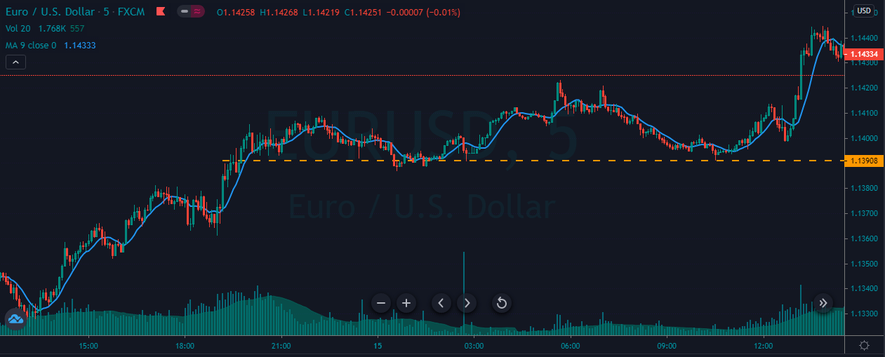
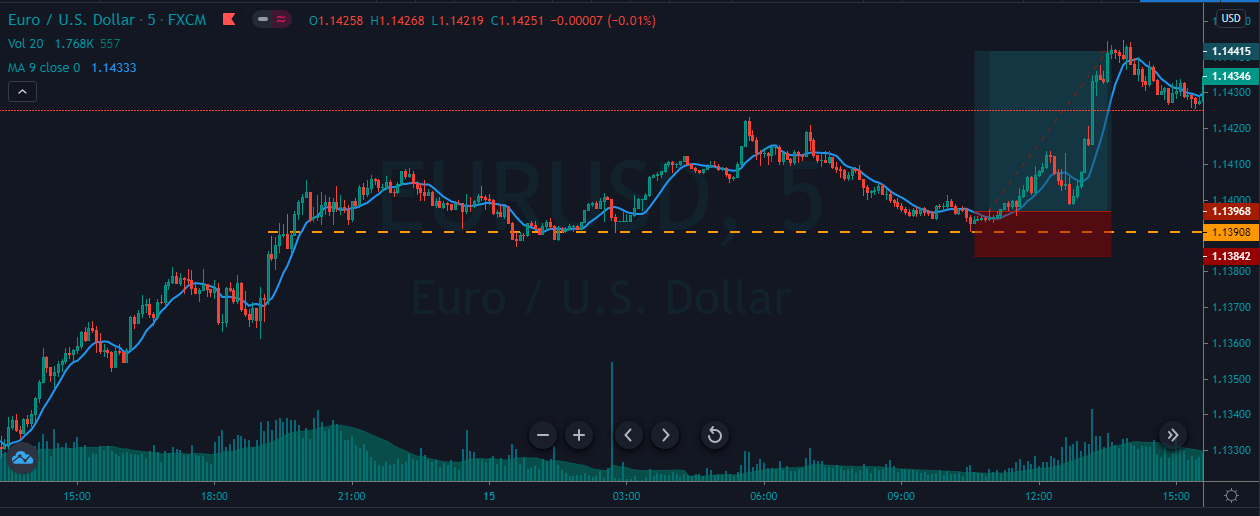
As you can see, the image below represents the entry, exit, and stop-loss in the EURUSD forex pair. The pair was in a strong uptrend, and during the pullback, it holds above the support area. Whenever the prices tried to go below the support area, it failed to do it, which shows the buyers are maintaining the ground, and sooner, we will witness the brand new higher high.

FOR SELL.
  1. Look for the trending market.
  2. Wait for the price action to pull back to the nearest resistance area.
  3. The moving average must be above the price.
  4. Let the price to test the resistance area.
  5. Hit sell.
  6. You can exit your trades on the most recent lower low, or you can go for the brand new lower low.
  7. Use five pip stop loss.
The image below represents the selling market in the GBPNZD 
forex pair.

The image below represents the entry, exit, and stop-loss in the GBPNZD forex pair. The pair was in an overall downtrend, and during the pullback phase, it holds below the significant resistance level, and when the moving average goes below the price action, it was a sign to go short. Soon after our entry, price smoothly dropped downside, and it prints the brand new lower low.

TRADING THE CHANNELS BY USING THE 15 PERIOD MOVING AVERAGE.

Channel trading is when price action has a hard time to print higher high, or the price action is about to end its trend. In his strategy, we will show you how to trade the 15-period averages to book intraday profits.

FOR BUY.

  1. Look for price channel on any trading asset.
  2. Moving Average must be below the price action.
  3. Go long when the price action approach to the lower channel line.
  4. Avoid trading short trades.
  5. Scale in the next opportunities.
  6. Exit your position when price action breaks the Channel.
  7. Put the stops below the Moving Average.

The image below represents a couple of buying trades in a buying channel, as you can see in a channel we only choose to trade the buying opportunities, and we ignored all the selling trades, this is because we were looking for the good reliable trades and the selling trades wasn’t good enough to take. So whenever the price action hits the lower Channel and the MA is below the price action, it is a sign for us to scale in each position.

FOR SELL.
  1. Look for price channel on any trading asset.
  2. Moving Average must be above the price action.
  3. Go short when price action approach to the upper channel line.
  4. Avoid trading long trades.
  5. Scale in the next opportunities.
  6. Exit your position when price action breaks the Channel.
  7. Put the stops above the Moving Average.

The image below represents a couple of selling trades in the GBPNZD forex pair. The selling channel is an indication of a choppy trend, and also it is an indication of sooner the trend might reverse. So whenever the Channel and the price action gave us the trading opportunity, we choose to go short and at every opportunity we choose to scale.

CONCLUSION.

Moving average is an extremely popular indicator in the industry; without this indicator, trading wasn’t secure. There are infinite numbers of averages exists and use them according to your trading approach. Intraday traders should go for lower averages, whereas the higher timeframe traders should go for the higher averages. Do not think the Moving Average as a holy grail in the market; instead, it depends on you how you use this indicator and manage the risk effectively to make cash from the market. Keep the things simple and do not add too many MA on one price chart, it will create confusion, and even it required additional analysis to scan the asset. So for intraday trading, keep your strategies very simple and to the point. As an intraday trader, we suggest you do not expect home runs as it is nearly impossible for the price actions to give more significant moves, so avoid the habit of trying to make million dollars in just one trade. Trading is an everyday process; stay consistent in your approach, go for the smaller targets, and smaller stops to make a good amount of cash in the longer run. Stay disciplined, stay persistent, control your mindset, follow the rules, do not fall into the emotions, focus on the process, or fall in love with the process, and you will end up making a handsome amount of profit from the market. SIMPLICITY IS THE KEY. Hope you like the article, have a good day. God bless you.

Categories
Forex Assets

CAD/JMD Asset Analysis

Introduction

CAD/JMD is an exotic currency pair. CAD is the Canadian Dollar, and JMD is the Jamaican Dollar. The CAD is the base currency in this pair while the JMD is the quote currency; meaning that the exchange rate of the CAD/JMD pair is the quantity of JMD that can be bought by 1 CAD. If the exchange rate for the pair is 105.68, it means that 1 CAD buys 105.68 JMD.

CAD/JMD Specification

Spread

In forex trading, the spread represents the difference in the value at which you can buy a currency pair and that at which you can sell. The spread varies with different currency pairs.

The spread for the CAD/JMD pair is:

ECN: 2.4 pips | STP: 7.4 pips

Fees

When trading forex with an ECN account, the broker charges a commission for every trade. With STP accounts, no fees are charged on trades.

Slippage

In times of market volatility or if the execution of trade is not instant, there will be a discrepancy between the price at which you initiate a trade and the price it executed. This discrepancy is called slippage.

Trading Range in the CAD/JMD Pair

Since the price of a currency pair constantly changes, knowing by how much the price changes across different timeframes can help forex traders better understand volatility. This knowledge is vital, especially when estimating potential loses or gains. If, for example, the CAD/JMD pair has a volatility of 20 pips during the 4-hour timeframe, it means that trading the pair has a potential profit or loss of $189.2

Below is a table showing the trading range for the CAD/JMD pair.

The Procedure to assess Pip Ranges

  1. Add the ATR indicator to your chart
  2. Set the period to 1
  3. Add a 200-period SMA to this indicator
  4. Shrink the chart so you can determine a larger period
  5. Select your desired timeframe
  6. Measure the floor level and set this value as the min
  7. Measure the level of the 200-period SMA and set this as the average
  8. Measure the peak levels and set this as Max.

CAD/JMD Cost as a Percentage of the Trading Range

Trading any currency pair comes at a cost. These costs vary across different timeframes and volatility. Expressing them as a percentage of the trading range will help to inform the trading decision for the pair.

Below are analyses of the trading costs for the CAD/JMD pair across different timeframes.

ECN Model Account

Spread = 2.4 | Slippage = 2 | Trading fee = 1

Total cost = 5.4

STP Model Account

Spread = 7.4 | Slippage = 2 | Trading fee = 0

Total cost = 9.4

The Ideal Timeframe to Trade CAD/JMD

From the above cost analyses, we observe that lower timeframes and low volatility correspond to higher trading costs with the CAD/JMD pair. For both the ECN and the STP accounts, the highest costs are when volatility is the lowest at 3.4 pips. The lowest cost is when volatility is the highest at 899.9 pips.

The long-term trader enjoys lower trading costs that intraday traders. However, across all timeframes, trading when volatility is average lowers the cost and the risks associated with high volatility. Furthermore, traders can lower their costs by employing the use of forex limit orders as opposed to market orders. Limit orders eliminate the cost of slippage. Here are the trading costs when limit orders are used.

ECN Account Using Limit Model Account

Total cost = Slippage + Spread + Trading fee

= 0 + 2.4 + 1 = 3.4

We can notice a significant reduction in the trading costs of the CAD/JMD pair. The highest cost has reduced from 91.53% to 57.63% of the trading range.


Categories
Forex Basic Strategies

MACD and Stochastic Double Cross Strategy.

Introduction

Most of the trader always desire to trade with the multiple indicators on the price chart. Multiple indicators provide more information, and it also enhances your results dramatically. The major problem with the traders is they don’t know which two indicators they need to pair to improve their game. For solving this problem, we write this article. In this article, we paired the Stochastic with the MACD indicator; this team worked well because the stochastic is comparing the asset closing price to its price range over a certain period of time, and the MACD is the formation of the two moving averages diverging from and converging with each other. This dynamic combination is a highly effective way to deal with the markets.

STOCHASTIC.

Developed by George C. Lane in the 1950s, the stochastic is a momentum indicator that shows the location of the close relative to the high low range over a set number of periods. The stochastic doesn’t follow the price or volume or anything like that instead, it follows the speed and momentum of the price, which makes it the leading indicator in the market. The bullish and bearish divergence on the stochastic indicator is the major signal identified by the Lane on the indicator. The indicator consists of two lines; the first one is K% and D%. K% is the main line of the indicator, which indicates the number of time periods, and D% is the moving average of the K%.

  1. The stochastic is a range-bound indicator which oscillates between the 0 to 100 level.
  2. The 80 and 20 are the major level which considered to be overbought and oversold levels.
  3. When the K% drops below 20, the asset is considered to be oversold, and it signals the buying reversal.
  4. When the indicator reaches the 80 level, it is a sign of asset. It is considered to be overbought and expects the downside reversal.

MACD.

The MACD stands for the Moving Average Convergence and Divergence. Developed by Gerald Appel, it is one of the simplest and most effective momentum trading tools. The MACD turns the two moving averages into a momentum oscillator by subtracting a longer period average to the shorter one. As a result, the MACD is a trend-following and a momentum indicator. If a trader needs to determine the strength of the trend or the direction of the asset, for that overlying the moving average line onto the MACD histogram is very useful.

  1. Look for the divergence, or a crossover of the centerline of the indicator is an essential trading signal.
  2. The bullish and bearish crossovers at the 80 and 20 levels are another major trading signal of the MACD.

CROSSOVER STRATEGY.

BULLISH CROSSOVER.
  1. Look for an uptrend.
  2. Let the price action pull back.
  3. Wait for both of the indicators to reach an oversold area.
  4. Look for a crossover at an oversold area.
  5. Hit the buy.
  6. Place the stops just below the entry.
  7. If the trend is healthy, then go for brand new higher high, if not then exit at most recent higher high.
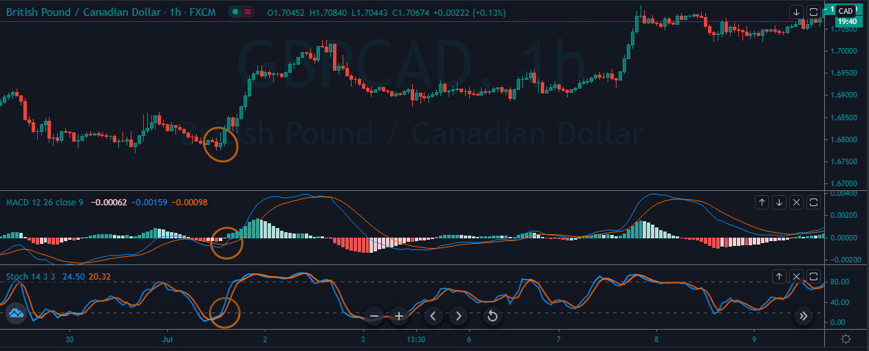
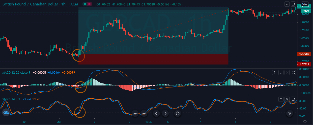
The image below represents the buying entry in the GBPCAD 
forex pair.

As you can see in the image below, it represents the entry, exit, and take profit in the GBPCAD forex pair. The price action was in a correction phase, and the strong reversal at the oversold area was a sign to go long in this forex pair. After our entry price action blasts to the north, and we witnessed the brand new higher high. This one is the most basic and simplest trading strategy, which works very well in all the type of trading conditions. Both of the indicators filter out all the bad trading signals, and they only give the signals which have a very high probability to perform.

BEARISH CROSSOVER.
  1. Look for a downtrend.
  2. Let the price action to pull back.
  3. Wait for both of the indicators to reach the overbought area.
  4. Look for a crossover at the overbought area.
  5. Hit the sell.
  6. Place the stops just above the entry.
  7. If the trend is healthy, then go for brand new lower low, if not then exit at a most recent lower low.
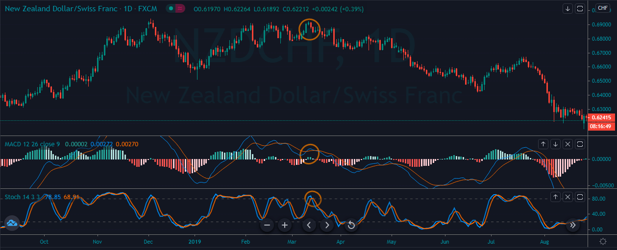
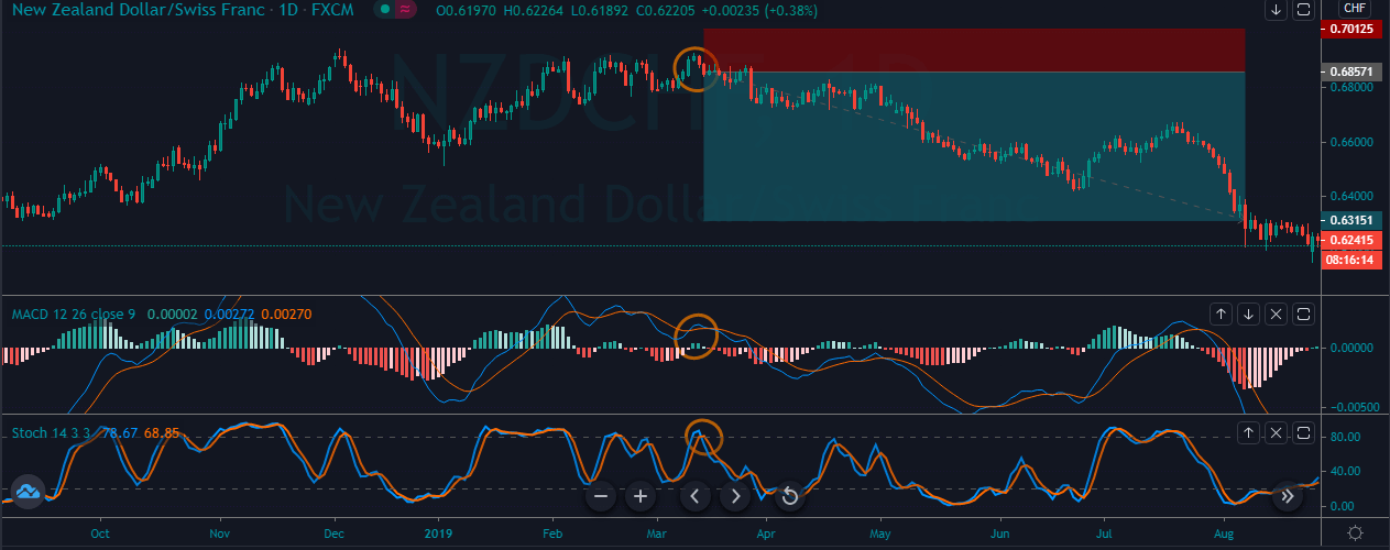
As you can see in the image below, it represents the selling 
signal in the NZDCHF forex pair.

The image below represents the entry, exit, and take profit in the NZDCHF forex pair. Overall the currency was in an uptrend, and after the most recent correction, price action struggled to print the new higher high. At the same time, both of the indicators indicating the crossover signal at the overbought area, which is a sign to go short. As we took sell entry, prices go sideways for a little time, and then it goes down and prints the brand new higher high.

CENTRE LINE CROSSOVER.

FOR BUY.
  1. Look for a healthy uptrend.
  2. Let both of the indicators to go above the centerline.
  3. Go long.
  4. Put the stops below the entry.
  5. Go for brand new higher high.
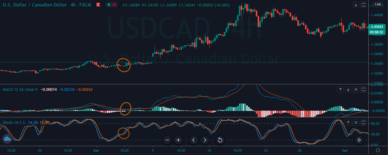
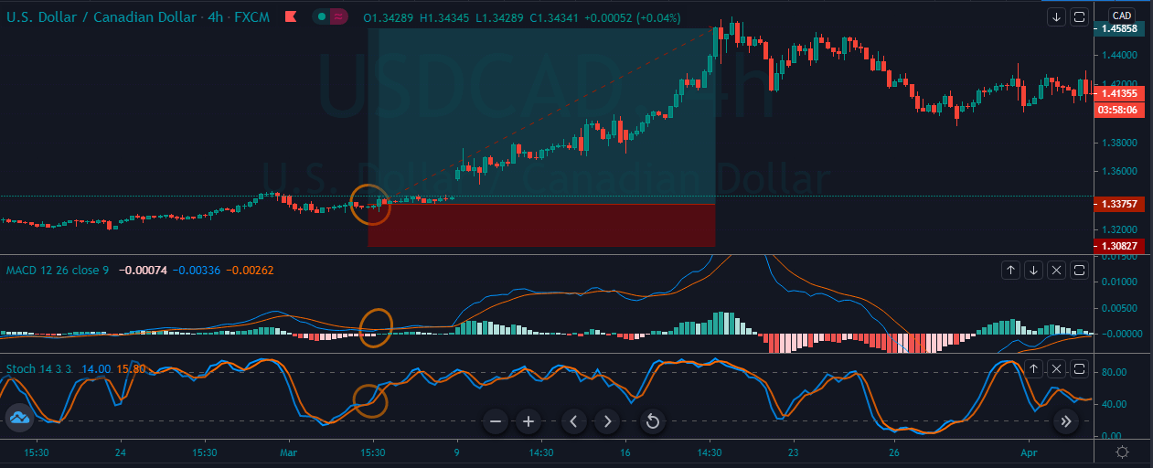
The image below represents the buying signal in the USDCAD 
forex pair.

The image below represents the entry, exit, and stop-loss in the forex pair. As you can see, the trend was not strong enough, and when the MACD indicator gave reversal at the oversold area at that stage, stochastic was also approached the middle of the trend, which means that the market started gaining the momentum. Soon the probability of the brand new higher high is very high. After our entry price action smoothly goes higher, and it printed the brand new higher high.

FOR SELL.
  1. Look for a healthy downtrend.
  2. Let both of the indicators to go below the centerline.
  3. Go short.
  4. Put the stops above the entry.
  5. Go for a brand new lower low.
The image below represents the selling trade-in the GBPNZD 
forex pair.

The image below represents the entry, exit, and stop-loss in the GBPNZD forex pair. The pair was in an overall downtrend, and the price action was held at the resistance area. When the MACD indicator gave reversal below the zero line at that stage, the crossover happened on the stochastic oscillator, which was an indication to go short.

CONCLUSION.

This strategy works very well on all the trading timeframes and in all the types of markets. Keep in mind that both of these indicators are momentum indicators, so always use them in trending conditions only. Do not apply this indicator in the consolidation phase. Both of the indicators allow the traders to change the intervals, which is useful to find the optimal and consistent entries. This way, the indicators are helpful for day traders, swing traders, and investors. Both of the indicators enhanced the probabilities of your trades, separately both of the indicators work on different premises; if you ever desired to use only one indicator, then the MACD is a reliable option.

Categories
Forex Basic Strategies

Strategies Using The 200 Day Simple Moving Average.

Introduction

The moving average is one of the most popular and widely used indicator in the industry. There are different types of moving averages that exist based on the calculation and the duration. Here we will discuss one of the most popular moving averages, which is a 200-day moving average.

A 200-day moving average is a significant tool for the traders and market analysts for determining overall long term market trend. The indicator appears as a line on the price chart, you can change it to even dotted line, and it meanders above and below the price action. The indicator also serves as dynamic support and resistance to the price action. When the 200 SMA is above the price, it indicates as a resistance line to the price, and when it goes below the price action, it acts as a support level to the price action.

The SMA takes the average price movement over a given number of periods which used to smooth the price action of an underlying asset. Instead of tracking the highs and lows of every candlestick, this way moving average simply calculates its value based on the closing price. So visually, this provides the trader with a straightforward view of where the price action has been and where it likely to headed in the short term. There are an infinite number of averages exists; you can change the settings of the moving average. If you desire to measure the price movements over a shorter duration, then simply use the shorter average and if you desire to measure the price movements over a more extended period of time simply use the longer average.  In this article, we will discuss some tips and tricks and strategies to use the 200-period simple moving averages.

TRADING STRATEGIES BY USING THE 200 PERIOD SMA.

SIMPLE SMA STRATEGY.

This is one of the most straightforward 200 period SMA strategy that widely used by the traders. Most of the traders think to make money from the market they must follow the complicated strategies because making money from the market is super hard. This is not true; you can make money by using simple trading strategies.

FOR BUY.
  1. Look for an uptrend.
  2. When the SMA goes below the price action take buy.
  3. Stops below the entry.
  4. Go for the brand new higher high.


The below image represents the Buying trade in the EURUSD pair.

The image below represents the entry, exit and take profit in this forex pair. As you can see when the SMA goes below the price action, it means now the trend is up or the buyers started gaining momentum, and any buy entry from here will be a good idea. As we took the buy entry price action smoothly goes to the north, and the stops were just below the entry.

FOR SELL.
  1. Look for a downtrend.
  2. When the SMA goes above the price action take sell.
  3. Stops above the entry.
  4. Go for the brand new lower low.

The image below represents the selling trade in the EURUSD forex pair.

As you can, the below image represents our entry, exit and take profit in this forex pair. So when the SM goes below the price action, it was a clue to go short for the brand new lower low. Soon after our entry price goes down and it prints the brand new lower low. This one is the basic 200-period strategy, but it is super effective on all the trading timeframes.

BREAKOUT TRADING.

In a trending market, when the price action breaks the major level and holds above the significant level that’s something is breakout trading. Breakout trading is a leading way to trade the market, and by using this method, you will always anticipate the market ahead of the time.

FOR BUY.
  1. Look for the buying market.
  2. If the SMA is below the price, it means the trend is up.
  3. Wait for the price action to pullback.
  4. Let the price action to break the most recent higher high.
  5. Take buy entry.
  6. Put the stops below the entry.

The image below represents the buying trade in the EURUSD forex pair.

The image below represents the entry, exit and stop loss in the EURUSD forex pair. The pair was in an overall uptrend, and it took a couple of days to pull back and when we got enough pullback, the price action break above the most recent higher high which is a sign to go long. As we took the buy entry, the price action smoothly goes north, and it prints the brand new higher high. So this trade belongs to the daily chart, so in this, we end up making nearly 300+ pips.

FOR SELL.
  1. Look for the selling market.
  2. If the SMA is above the price, it means the trend is down.
  3. Wait for the price to pullback.
  4. Let the price action to break below the most recent lower low.
  5. Take the sell entry.
  6. Put the stops above the entry.

The image below represents the downtrend in the EURCHF forex pair.

As you can see in the image below, the pair was in an overall downtrend, and when it breaks the most recent lower low, it was a sign for us to go short in this one. As we took the sell entry, it prints the brand new lower low, and the stops were just above our entry point.

TRENDLINE TRADING.

FOR BUY.
  1. Look for the buying market.
  2. If the SMA is below the price, it means the trend is up.
  3. Wait for the price action to pull back to the support area.
  4. Draw down trend line.
  5. Wait for the price action to break the trend line.
  6. Take buy entry.
  7. Go for brand new higher high.
  8. Put the stops below the support area.

The image below represents the uptrend in the CADJPY forex pair.

As you can see in the image below, it represents the buying trade in the CADJPY forex pair. So at first, the price action was in a downtrend, and when the SMA goes below the price, it was the first sign of an uptrend. When the price action holds at the support area, and the SMA was below the price, these are clues to soon prepare for the buying trade. So when the price action breaks the trend line, we choose to go long in that one. As we took the buy entry, the prices blast to the north, and it prints the brand new higher high.

FOR SELL.
  1. Look for the selling market.
  2. If the SMA is above the price, it means the trend is down.
  3. Wait for the price action to pull back to the resistance area.
  4. Draw the uptrend line.
  5. Wait for the price action to break below the trend line.
  6. Take sell entry.
  7. Go for a brand new lower low.
  8. Put the stops below the resistance area.

The image below represents the selling trade in the GBPJPY forex pair.

As you can see the image below represents the selling trade in the GBPJPY daily chart. So when the price action breaks the most recent lower high, it started holding below that level which means buyers are trying very hard, but they failed to take the prices higher. Furthermore, sellers took advantage of the significant resistance level and also they broke the trend line, which was a sure sign for the brand new lower low after our entry price action dropped 2400+ pips within just two months of period.

CONCLUSION.

The 200 days SMA represented as a line on the price chart, which represents the average price over the last 40 weeks. SMA helps the traders to find the trend of the market, and it also acts as dynamic support and resistance to the price action. There are infinite numbers of averages, and the traders use the average according to their trading style, but the 200 period is the most common and widely used average by the investors, traders and market technicians.

There are two basic rules of the SMA.

  1. When the price is above the SMA, You should go long.
  2. When the price is below the SMA, You should go short.

There are two groups of SMA signals.

  1. BREAKOUT TRADING.
  2. TRENDLINE BREAKOUT.
Categories
Forex Assets

CAD/BBD Asset Analysis

Introduction

The CAD/BBD is an exotic currency cross. CAD is the Canadian Dollar, and the BBD is the Barbadian Dollar – the official currency of Barbados. Here, the CAD is the base currency, and the BBD is the quote currency. Thus, the exchange rate of the CAD/BBD pair is the amount of BBD that can be bought using 1 CAD. For example, if the exchange rate for the pair is 1.4961, it means that 1 CAD buys 1.4961 BBD.

CAD/BBD Specification

Spread

One of the costs of trading forex is the spread. It is deducted by the forex broker and is calculated as the difference between the ‘bid’ and ‘ask’ price. The spread varies depending on the type of trade executed. Here are the spread charges for ECN and STP brokers for CAD/BBD pair.

ECN: 12 pips | STP: 17 pips

Slippage

In forex, slippage occurs when a trader opens a trade, but that trade is executed at a higher price. The slippage is influenced by market volatility and the speed at which the forex broker executes your trade.

Trading Range in the CAD/BBD Pair

In forex, the trading range shows how a given currency pair fluctuates over time. It shows the minimum, average, and the maximum volatility of pair across different timeframes. The analysis of the trading range can help us the profitability of trade over different timeframes.

The trading range for the CAD/BBD pair is shown below.

The Procedure to assess Pip Ranges

  1. Add the ATR indicator to your chart
  2. Set the period to 1
  3. Add a 200-period SMA to this indicator
  4. Shrink the chart so you can determine a larger period
  5. Select your desired timeframe
  6. Measure the floor level and set this value as the min
  7. Measure the level of the 200-period SMA and set this as the average
  8. Measure the peak levels and set this as Max.

CAD/BBD Cost as a Percentage of the Trading Range

Here, we will take the total costs in both the ECN and STP accounts as a ratio of the above volatility and express it as a percentage. This analysis will help us understand the trading costs associated with the CAD/BBD pair across different timeframes; which can be useful to determine which risk management technique is optimal.

ECN Model Account

Spread = 12 | Slippage = 2 | Trading fee = 1

Total cost = 15

STP Model Account

Spread = 17 | Slippage = 2 | Trading fee = 0

Total cost = 19

The Ideal Timeframe to Trade CAD/BBD

From the above analyses, we can see that the trading cost for the CAD/BBD pair is highest at the 1-hour timeframe. The highest trading cost for both the ECN and the STP accounts coincide with a period of lowest volatility of just 0.04 pips. The shorter timeframes have relatively higher trading costs that the longer timeframes. Therefore, longer-term traders tend to enjoy lesser costs.

We can also notice that the overall trading costs reduce as the volatility of the CAD/BBD pair increases from minimum to maximum. Therefore, opening trades when the volatility is above the average can help shorter-term traders reduce their trading costs. More so, intraday traders also significantly lower these costs by adopting the use of forex limit orders over the market orders. The limit order types remove the costs associated with slippage. Below is a demonstration with the ECN account.

ECN Account Using Limit Model Account

Total cost = Slippage + Spread + Trading fee

= 0 + 12 + 1 = 13

Removing the slippage costs reduces the trading costs significantly for the CAD/BBD pair. For example, the highest trading cost has reduced from 322.03% to 220.34% of the trading range.


Categories
Forex Basic Strategies

Inflation Expectations

Introduction

Inflation is one of the most tracked economic indicators by policymakers, economists, consumers, businesses and analysts. The effects of inflation are felt throughout the economy – no exceptions. Inflation expectations can help every player in the economy better to prepare themselves in anticipation of future inflation levels. Therefore, we must understand the how the anticipation of the inflation rate impacts the economy.

Understanding Inflation Expectations

Inflation is the increase in the general prices of goods and services that are produced within an economy, over a specific period. This increase in the prices of goods and services tends to erode the purchasing power of a currency. Therefore, assuming there is no increase in wages, consumers can only be able to purchase a lesser quantity of goods and services. There are several causes of inflation, but the primary cause occurs when more money is supplied in the economy relative to the wealth.

Inflation rate: is the percentage increase in the prices for a basket of goods and services over a specific period. It is used to compare inflation over different periods.

Inflation expectation is the opinion about the future rate of inflation. This opinion is derived from different players in different sectors of the economy to guarantee the validity and ensure it the data is comprehensively representative. These players include investors, central bankers, and consumers. Their inflation expectation is based on a variety of economic activities they intend to undertake.

How to Calculate Inflation Expectations

These are the two main methods of calculating inflation expectations.

Market Survey

The central banks conduct surveys to determine inflation expectations. Households, businesses and economic experts are polled to ascertain if their welfare has improved and what they anticipate. The questioned asked mostly includes household finances, inflation, investment activities, changes in the ease of doing business and inflation. The polled panel is nationally representative

Market-based Method

In this method, the expected inflation can be determined by the understanding of the price differential between government bonds and the Treasury Inflated Protected Securities (TIPS). The Treasury Inflated Protected Securities tends to increase the amount of the bonds in tandem with inflation.

In this case, the pricing difference = yield of a government bond – Yield of the TIPS

Let’s look at an example;

Suppose the yield of a 10-year bond is 5%, and the yield of a 10-year TIPS is 3%, the market pricing is 5% – 3% = 2%

The 2% can be said to be average annual expected inflation over the next ten years.

How can inflation Expectations be used for analysis?

The data on inflation expectations can be used by a variety of players in the economy. The inflation expectations data is the primary leading indicator of the rate of inflation in an economy.

Source: St. Louis FRED

Here are some of the ways different market participants can use the inflation expectations data.

Investment decision making: Businesses use the expected inflation data to make business decisions about future productions. They can choose to make changes on their product quality or quantity depending on the inflation outlook.

With expected inflations data, businesses can also make adjustments regarding factors of production. If the higher inflation rate is expected, businesses could opt into paying upfront for production inputs of their businesses. This upfront payment enables them to hedge against a future increase in the cost of businesses, thus protecting their bottom line. Furthermore, businesses can use this data during negotiating for employee contracts and wages.

Household decision making: Inflation expectations plays a vital role in households’ budgeting process. The data enables them to make rational decisions regarding expenditure, savings and investments. If they anticipate higher inflation, households can decide to put more funds into the purchase of essential products and cut back on savings and investments, since higher inflation erodes the value of money.

With lower inflation expectations, households might elect to increase their savings and investment activities since the potential increase in purchasing power will leave them with more disposable income.

Central banks and governments: One of the core mandates of the central banks is to ensure that the rate of inflations is kept below the targeted rate. Using the inflation expectations data, the central banks and governments can make informed policy decisions. These decisions are whether to implement expansionary or contractionary policies.

When the rate of inflation is expected to drop and result in deflation, central banks and the government will adopt expansionary monetary and fiscal policies. These policies include lowering interest rates to pump more money into the economy. Dramatically falling in the rates of inflation can be bad for the economy, as the reduced prices encourage complacency in the economy and could result in stagnation.

Conversely, expectations of higher rates of inflation will compel central banks and governments to adopt contractionary monetary and fiscal policies to avoid an overheating economy. Such policies will include increasing interest rates to make the cost of money more expensive and encourage investments and savings.

Impact on Currency

Since inflation expectations inform the decision of the central banks, it plays a vital role in the forex market.

When inflation expectations hint to lower rates of inflation, the outlook is negative for a country’s currency. The expansionary policies that ensue results in depreciation of the currency since the rate of return of investments will be less lucrative. The low-interest rates also make foreign bonds and treasury bills more attractive compared to local bonds; which results in a net outflow of investments.

Conversely, expectations of higher rates of inflation are positive for a country’s currency. The central banks will adopt contractionary policies like raising the interest rates, which makes an investment into the country more lucrative; increasing the demand for local currency hence appreciation.

Sources of Data

In the US, the inflation expectations data are released monthly on the last Friday of the month. The University of Michigan collates the data.

A comprehensive and historical breakdown of the US inflation expectations data can be accessed at St. Louis FRED here and here.

Statistics on global inflation expectations can be accessed at Trading Economics.

Categories
Forex Assets

JPYINR Asset Analysis


Introduction

JPYINR is a currency pair where JPY is the currency of Japan. On the other hand, the Indian Rupee (INR) is the currency of India. It is an exotic currency pair where the JPY is the first currency, and the INR is the second currency

Understanding JPYINR

In this currency pair, we can determine the value of INR, which is equivalent to one JPY. It is quoted as 1 JPY per X INR. For example, if the value of JPYINR is at 2.4458, then about 2.4 INR is required to purchase one JPY.

JPYINR Specification

Spread

The subtraction of Bid price and the Ask price is the spread. It is a charge that the broker takes from a trader when they open a trade. Therefore, the spread is controlled by the broker. This value changes with the execution model used for executing the trades.

Spread on ECN: 12 pips

Spread on STP: 17 pips

Fees

Fees is the charge that broker takes from traders. Fees in the currency market works almost the same of other financial market. Note that, STP accounts does not have any fee, but a few pips is applicable on ECN accounts.

Slippage

Slippage is the difference between the execution price and the entry market price. Slippage occurs due to the market volatility and the broker’s execution.

Trading Range in JPYINR

The trading range is the representation of the minimum, average, and the maximum volatility of this pair on the 1H, 4H, 1D, 1W, and 1M timeframe. Using these values, we can assess our profit/loss margin of trade. Hence, this proves to be a helpful risk management tool for all types of traders.

Procedure to assess Pip Ranges

  1. Add the ATR indicator to your chart
  2. Set the period to 1
  3. Add a 200-period SMA to this indicator
  4. Shrink the chart so you can assess a large time period
  5. Select your desired timeframe
  6. Measure the floor level and set this value as the min
  7. Measure the level of the 200-period SMA and set this as the average
  8. Measure the peak levels and set this as Max.


JPYINR Cost as a Percent of the Trading Range

With the volatility values from the above table, we can determine the chance of cost with the change of volatility. We have got the ratio between the total cost and the volatility values and converted into percentages.

ECN Model Account 

Spread = 12 | Slippage = 5 | Trading fee = 8

Total cost = Spread + Slippage + Trading Fee

= 12 + 5 + 8

Total cost = 25

STP Model Account

Spread = 12 | Slippage = 5 | Trading fee = 0

Total cost = Spread + Slippage + Trading Fee

= 12 + 5 + 0

Total cost = 17 

The Ideal way to trade the JPYINR

As per the above data, we can say that the JPYINR is very liquid and volatile currency pair. Hence, it is very easy to trade in this exotic-cross currency.

If we look at the timeframe, we can see that the volatility in the lower timeframe is higher compared to the higher timeframe. However, in the higher timeframe it is often hard for traders to trade as it requires a lot of trading equity. Based on the structure, we can say that it is better to follow the average cost of this currency pair

Another way to reduce the cost is to place orders as ‘limit’ and ‘stop’ instead of ‘market.’ In that case, there will be no cost for slippage on the total cost calculation. Therfore, the total cost will reduce by three pips.

Limit Model Account

Spread = 12 | Slippage = 0 | Trading fee = 0

Total cost = Spread + Slippage + Trading Fee

= 12 + 0 + 0

Total cost = 12

Categories
Forex Basic Strategies

The Dual Candlestick Pattern Strategy

Introduction

Previously, we discussed a strategy that was based on a single candlestick pattern that uses the concept of ‘rejection’ in the market. However, the pattern may not provide a great amount of success as does not take into consideration the various factors of the market such as trend, momentum, volume etc. In today’s article, we try to formulate a strategy that addresses some of the issues and increase the probability of success. To increase the probability of successful trades, we combine two candlestick patterns and a technical indicator to find trades.

The first candlestick pattern we will watch for is the ‘Rising Wedge Pattern’ that occurs in an uptrend. The same pattern, when observed in a downtrend, is called a ‘Falling Wedge Pattern.’ The second candlestick pattern that is of importance to us is the ‘Descending Triangle’ pattern which essentially confirms the commencement of a new trend in the market. Let us look into the specifications of the strategy.

Time Frame

The strategy is specially designed for trading on very short-term price charts such as the 5 minutes or 1 minute. That means this is a hardcore intraday trading strategy.

Indicators

We make use of just one technical indicator in the strategy, and that is the 20-period Exponential Moving Average (EMA).

Currency Pairs

As we are trading extremely on small time-frames, the strategy can be traded on major currency pairs only. Few preferred ones are EUR/USD, GBP/USD, USD/CAD, GBP/JPY, EUR/CAD, EUR/JPY, NZD/USD, and EUR/GBP.

Strategy Concept

The ‘Dual Candlestick Pattern’ strategy is a simple yet powerful strategy that can be used very often in the market. The strategy revolved around the concept of ‘momentum’, which is extremely crucial in the market. When we gauge the momentum of the market, we get an understanding of the shift in market sentiment. Nothing can be as superior as this when it comes to analysing the market sentiment. The first candlestick pattern gives us an indication that the market is losing the momentum of its current trend and that it could reverse any moment. The price action suggests that the market is unable to move higher, and the price is getting more and more expensive for buyers to take the market higher. Once this becomes evident after a reversal, the second candlestick pattern confirms that the reversal is ‘real’ and there could be further ‘legs’ in the trend.

Since we are waiting for many events to occur in the market, we will end up entering late, i.e. when the majority of the move has happened. Due to this, the risk-to-reward of trades executed using this strategy will not exceed more than 1:1. Even though the probability of occurrences of trades is less, they have a greater degree of accuracy.

Trade Setup

In order to execute the strategy, we have considered the 1-minute chart of CAD/JPY where we will be illustrating a ‘short’ trade. Here are the steps to execute the strategy.

Step 1: Firstly, we spot the ‘rising wedge’ pattern in the market where the pattern must be formed above the exponential moving average. What this indicates is that the market has moved into an intermediary uptrend but might be weakening due to the loss in momentum. Our job is to take a trade in the direction of the reversal. Similarly, when a ‘falling wedge’ pattern is formed in the market, it indicates that the sellers are losing momentum and buyers will take over the market. This pattern has to form below the EMA for an upward reversal.

Step 2: Next, we wait for the market to turn on the other side and reverse in direction. After the reversal takes place, the price should form a ‘descending triangle’ pattern below the EMA. The ‘descending triangle’ pattern confirms two things. First, the market has put a ‘lower high’ and ‘lower low’ which are the essentials of a trend and second, the buyers are not strong enough to take the price higher. In a downtrend, the market should form an ‘ascending triangle’ pattern above the EMA that would confirm the reversal. Here the pattern signifies that the market has put a ‘higher high’ and ‘higher low’ along with the inability of the sellers to take the price lower.

Now, let us see the rules for ‘entering’ a trade.

Step 3: In a ‘short’ trade setup, we enter the market when price breaks the ‘support’ line that was created by the ‘descending triangle’ pattern. In simple words, we ‘short’ the currency pair right when the price starts moving below the previous ‘low’ and creates a situation of breakdown. This type of ‘entry’ is shown in below image where we enter right at the break of the ‘support.’ In a ‘long’ trade setup, things are reversed. This means we enter the market when price breaks above the resistance of ‘ascending triangle’ pattern and starts moving higher than the previous ‘high.’

Step 4: Once entered, it is important to determine the stop-loss and take-profit levels for the trade. In a ‘long’ trade, stop-Loss will be set above the first ‘lower high’ that was laid in by the market after reversal. Whereas, in a ‘short’ trade, the stop-loss will be placed below the first ‘higher low’ that was laid in by the market after reversal. Depending on the number of pips of the stop-loss, take-profit will be set by an equal number of pips. This is done to ensure that the risk-to-reward of the trade is at least 1:1. But since we are trading against the trend, we will move our stop-loss to breakeven as soon price moves 80% of the take-profit

Strategy Roundup

The two patterns needed for the strategy might appear several times in the market but are observed separately. It is difficult to spot both the patterns together, which reduces the frequency of trades. One way to increase the frequency of trades is by watching for these patterns during the market opening, as volatility is high. But the focus here should be on taking successful and high probability trades.


Categories
Forex Basic Strategies

Current Economic Conditions

Introduction

One of the primary indicators of a country’s GDP is how the economy is performing presently. The current economic conditions are the best indicators of business and economic cycles in the economy. They can tell us whether the economy is going through expansions or contractions. Thus, the current economic conditions are the best indicators for establishing recessions or recoveries, and can also be used to forewarn about potential overheating of the economy.

Understanding Current Economic Conditions

The current state of the economy is a culmination of several macroeconomic and microeconomic factors. Previous economic trends, government and central banks’ policies influence the current economic conditions. Therefore, the current economic conditions can be said to be a gauge of the effectiveness of previous fiscal and monetary policies.

In the US, for example, the Federal Reserve published the current economic conditions in The Beige Book. The Beige Book published the current economic conditions of the 12 Federal Reserve Districts. Below are the components used to determine the current economic conditions.

Employment and wages: The current economic conditions assess the overall levels of employment and changes in wages. Here, the changes are assessed based on industry. It covers the number of people who were laid off, new hires and job vacancies.
Prices: The prices of goods and services produced within the economy are monitored for inflation. The levels of inflation can be used to assess the living standards and the changes in the cost of doing business.
Manufacturing: The changes in the levels of manufacturing shows the growth of the output and potential changes in employment levels.
Consumer spending: This shows the changes in the welfare of households. Consumer spending correlates to living conditions and could be used as an indicator of future economic expansion or contraction due to changes in aggregate demand.

Banking and financial services: This section shows the changes in the issuing of new loans and the rate of defaults. The changes in the number of loans issued correspond to the changes in economic activities. The changes in commercial and industrial loans indicate whether businesses are investing and expanding. The repayment schedules indicate the financial health of businesses. Credit standards, delinquency rates and deposits are also included in this category.

Real estate and construction: This category shows the changes in the construction of new residential and commercial buildings. It further shows the sale of new houses. The occupancy levels and the changes in rental rates are also included here.

Services: This section reports the changes in the demand for professional services such as the demand for payroll services, accountancy and deal advisory services. It also shows the changes in the activities in the services sector as a whole.

Agriculture, energy and natural resources: this section reports the changes in the agricultural conditions. It shows the changes in crop production, the market prices for the harvest, cost of farm inputs, storage costs, and any subsidies received in the agricultural sector. This section also shows the changes in the mining sector.

How can current economic conditions be used for analysis?

By businesses: The current economic conditions show the trends in demand. Businesses can use the data contained in this report to either scale up their production to match rising demand or lower production in case of shrinking demand. Furthermore, producers get to see the regions where their products are performing well and where the sale is dismal. This data can help them make informed decisions for targeted advertising to improve sales or to exit a particular market segment if the costs outweigh potential profits.

By governments and central banks: The data on the employment situation, consumer spending, inflation and agriculture are useful for the government and central banks to make informed policy decisions. The current economic situation effectively shows if the economy is contracting, stagnating, expanding or overheating. Therefore, this data is crucial in informing the type of policy that will be implemented by the central banks and the government. The policies can be expansionary, contractionary or stay the course, accordingly. Furthermore, the current economic conditions can be used as a scorecard to assess whether previous fiscal and monetary policies brought about the intended changes within the economy. If not, then the government and central banks will know how to tweak the policies to achieve the desired results in the economy.

Impact on Currency

When it comes to fundamental economic indicators, forex traders pay the most attention to how the data will affect future monetary policies by central banks.

Source: St. Louis FRED

If the current economic conditions data indicate that the economy is in a recession, forex traders can then anticipate lower GDP levels, and adopt a bearish stance on the currency. Furthermore, they can also anticipate that expansionary monetary policies will be put in place to spur economic growth. Lowering the interest rates as an expansionary policy is negative for a country’s currency. Although the cost of money will be cheaper, investments will also have lower returns relative to other countries. As a result, the currency depreciates.

Conversely, if the current economic data indicates that the economy is expanding, reaching peak levels, forex traders can anticipate higher levels of GDP; thus, adopting a bullish stance on the currency. For the authorities, monitoring the current economic conditions helps determine if the economic expansion is too rapid, resulting in overheating. To prevent the overheating, central banks and governments will implement contractionary monetary and fiscal policies. These policies are meant to ensure sustainable growth in the economy by making the cost of borrowing higher to discourage excessive borrowing. However, the rate of return on investments and government bonds increases. This increase leads to increased demand for investments in the country and consequently, the appreciation of the currency.

Sources of data

In the US, The Beige Book is published by the US Federal Reserve Board. This report is released eight times a year, two weeks before each Federal Open Market Committee meeting since it is used to guide their decision of short-term interest rates.

In the Euro Area, the current economic conditions are published by the Economic Research Institute ZEW.

Categories
Forex Assets

JPYKES Asset Analysis

Introduction


In the JPYKES currency pair, JPY is considered as the currency of Japan. On the other hand, KES is the currency of Kenya. It is an exotic currency pair where the JPY is the first currency, and the KES is the second currency.

Understanding JPYKES

The JPYKES represents how much KES is required to have one JPY. It is quoted as 1 JPY per X KES. For example, if the value of this currency pair is at 1.0286, then about 1.0286 KES is required to purchase one JPY.

JPYKES Specification

Spread

Spread comes from the difference between the Ask price and the Bid price that a broker takes as a charge. The brokers control this value; therefore, traders don’t have to do anything with this. This value depends in the execution model used for executing the trades.

Spread on ECN: 19 pips

Spread on STP: 24 pips

Fees

Every broker takes fees from trading in any currency pair, which is similar to the stock market. However, there is no fee on STP accounts, but a few pips on ECN accounts.

Slippage

Slippage is the difference between the open price of the trade and the actual execution level. The main reason for slippage is the market volatility and the broker’s execution speed.

Trading Range in JPYKES

The trading range is the representation of the minimum, average, and the maximum volatility of this pair on the 1H, 4H, 1D, 1W, and 1M timeframe. Using these values, we can assess our profit/loss margin of trade. Hence, this proves to be a helpful risk management tool for all types of traders.

Procedure to assess Pip Ranges

  1. Add the ATR indicator to your chart
  2. Set the period to 1
  3. Add a 200-period SMA to this indicator
  4. Shrink the chart so you can assess a large time period
  5. Select your desired timeframe
  6. Measure the floor level and set this value as the min
  7. Measure the level of the 200-period SMA and set this as the average
  8. Measure the peak levels and set this as Max.

JPYKES Cost as a Percent of the Trading Range

With the volatility values from the above table, we can determine the chance of cost with the change of volatility. All got the ratio between total cost and volatility values and converted into percentages.

ECN Model Account 

Spread = 19 | Slippage = 5 | Trading fee = 8

Total cost = Spread + Slippage + Trading Fee

= 19 + 5 + 8

Total cost = 32

STP Model Account

Spread = 19 | Slippage = 5 | Trading fee = 0

Total cost = Spread + Slippage + Trading Fee

= 19 + 5 + 0

Total cost = 24 

The Ideal way to trade the JPYKES

The JPYKES is a currency pair that has sufficient volatility and liquidity. Therefore, it is simpler to trade this currency pair.

The percentage values are above 500% in a lower timeframe. This means that the costs are low regardless of the timeframe and volatility you trade.

Digging it a little deeper, the cost increases when the volatility decreases, and the cost decrease when the volatility increases. In a lower timeframe, this pair is very volatile at above 600%; therefore, traders should be cautious to trade it.

However, the best time to trade in this pair is when the volatility remains at the average value. In that case, this pair can provide a decent profit with balanced volatility and cost.

Furthermore, traders can quickly minimize their costs by using orders as ‘limit’ and ‘stop’ instead of ‘market.’ By using these orders, the slippage will not be considered in the calculation of total costs. Therefore, the total cost will reduce by five pips.

Limit Model Account

Spread = 19 | Slippage = 0 | Trading fee = 0

Total cost = Spread + Slippage + Trading Fee

= 19 + 0 + 0

Total cost = 19

Categories
Forex Assets

CAD/BRL Asset Analysis

Introduction

CAD/BRL is an exotic currency pair. CAD is the Canadian Dollar, and the BRL is Brazilian Real– the official currency of Brazil. For this pair, the CAD is the base currency and BRL the quote currency. Therefore, the exchange rate for the CAD/BRL pair represents the amount of BRL that can be bought by 1 CAD. Let’s say the exchange rate for the pair is 4.1564; this means that 1 CAD buys 4.1564 BRL.

CAD/BRL Specification

Spread

When trading a currency pair, the spread is the difference in the price at which you can buy the pair and that which you can sell. Forex brokers earn their revenues using spread from traders.

The spread for the CAD/BRL pair is:

ECN: 31 pips | STP: 36 pips

Fees

Another way for forex brokers to earn revenues is by charging a commission for every trade made. The fee charged depends on the broker. STP accounts usually do not have a trading fee charged.

Slippage

When initiating a trade, you instruct your broker to execute the trade at a particular price. Slippage in forex is the difference between the price you instruct the broker and the price the broker executes your trade. The primary causes of slippage are prevailing volatility and your broker’s efficiency.

Trading Range in the CAD/BRL Pair

In forex, the price of currency constantly fluctuates across different timeframes. Trading range in forex helps to analyze the market volatility for a currency pair across different timeframes. The volatility for a currency pair can help a trader estimate the amount of profit or loss that is to be expected when trading in different timeframes.

Let’s say, for example, that for the 4-hour timeframe, the volatility of CAD/BRL pair is 10 pips. A trader can expect to either gain or lose $24 by trading a standard lot of the CAD/BRL pair.

The table below shows the trading range for CAD/BRL.

The Procedure to assess Pip Ranges

  1. Add the ATR indicator to your chart
  2. Set the period to 1
  3. Add a 200-period SMA to this indicator
  4. Shrink the chart so you can determine a larger period
  5. Select your desired timeframe
  6. Measure the floor level and set this value as the min
  7. Measure the level of the 200-period SMA and set this as the average
  8. Measure the peak levels and set this as Max.


CAD/BRL Cost as a percentage of the Trading Range

Expressing trading costs as a percentage of the trading range can help traders determine the difference in the trading costs across various timeframes. It is worth noting that these costs are calculated as Percentage of pips in the different timeframes.

Total cost = Slippage + Spread + Trading Fee

The tables below show the percentage costs to be expected when trading the CAD/BRL pair.

ECN Model Account

Spread = 31 | Slippage = 2 | Trading fee = 1

Total cost = 34

STP Model Account

Spread = 36 | Slippage = 2 | Trading fee = 0

Total cost = 38

The Ideal Timeframe to Trade CAD/BRL

From the above cost analysis, we can observe that shorter timeframes when volatility is lower, have higher trading costs. The highest trading costs for both the ECN and the STP accounts are during the 1-hour timeframe, which coincides with the least volatility of 0.4 pips. The least trading costs for either account is at the 1-month timeframe coinciding with the highest volatility of 42.3 pips.

You can also notice that the trading costs reduce as the volatility increases across timeframes. For shorter-term traders, opening CAD/BRL trades when volatility is above average can help reduce trading costs.

Another method which forex traders can implement to reduce trading costs is by using limit orders instead of forex market orders. Forex limit orders eliminate the costs associated with slippage. Here’s how it works.

ECN Account Using Limit Model Account

Total cost = Slippage + Spread + Trading fee

= 0 + 31 + 1 = 32

You can notice that trading costs have marginally reduced. The highest trading cost has reduced from 576.27% to 542.37%.


Categories
Forex Basic Strategies

15 Minute Forex Scalping Strategy Using The Donchian Channel Indicator

Introduction

Scalping is a trading strategy designed to profit from small market changes. The Scalpers took a couple of trades in any trading session, and the goal of every scalper is to seize gains when they appear on a price chart because the aim is to have a few small wins rather than one large one. Scalping is one of the most challenging style of trading to master because it requires unbelievable discipline and focus.

A scalper must follow the rules of their trading strategy like a religion because one large loss can easily wipe out dozens of successful trades. One of the most critical aspects of scalping is liquidity because we would not scalp any instrument that is not liquid enough and ensuring liquidity also ensures that we are getting the best price while entering and exiting in a trade. In this article, we will show you how to scalp the 15-minute trading timeframe by using the Donchian Channels Indicator.

Working Of A Donchian Channel

Donchian channel consists of three lines, which are generated by the moving average calculations that comprise an indicator formed by the upper and the lower band, also the median band. The celebrity trader Richard Donchian developed the indicator in the mid-twentieth century so that he can identify the trend of the market. The area between the upper and lower band represents the Donchian channel. The indicator identifies the bullish and bearish extremes areas, which are followed by the reversals or breakouts in price action.

15-Min Trading Strategy

The scalping strategies are only created to trade the lower timeframes, such as 1, 3, 5, 15-minute timeframes; do not apply any of these strategies on any higher timeframes; otherwise, you will face some trouble in your trading.

As you can see in the below image of the USDJPY forex pair, overall, the instrument is in a strong uptrend, and when the price action hits the lower band of Donchian channel it indicates the buy trade, and when it hits the upper Donchian channel, it means to go for a short trade.

In the below image the price action gives us three buying and three selling trade, most of the time the buying trades perform bit longer than the selling trades, it is because the flow of the market was up, but for the scalpers, the flow doesn’t matter, all the scalpers want is to in and out from the market. Close your position when the price action hits the opposite channel, and when you take the entry, if the price action goes a bit against you { for, e.g., 4 to 5 }, then close your position immediately and wait for the new signal.

The below image represents a couple of buying and selling trades in a downtrend. The goal of every scalper is to, first of all, check the trend of the market, and expect more trades by following the trend and simply expect less counter-trend trades. You can see that the below image of the GBPNZD forex pair shows us the nine selling and six buying trades. Most of the selling and buying trades worked very well, and each trade generates a significant amount of money for us. The whole goal is to activate the position when the price action hits the Donchian channel and close your position when the price action goes a bit against us.

Range Trading

If you trade the trending market, then expect the more trend-following trades, and if you scalp the ranges and channels, then you can expect both the buying and selling trades because in ranges and channels both of the parties hold the equal powers this is the reason ranges and channels are favorite for the scalpers. The image below shows the 15-minute chart of the NZDJPY, forex pair, which shows the ranging market, and in range price action gives the five selling and four buying trades. In the ranging market, we suggest you go for the 1:1 RR trades because the price action more often spikes in ranges.

Scalping Trading By Following The Market Trend

Buy Trade

The scalping is all about having a strong and aggressive mind to face the rollercoaster ride in the market, and some of the conservative and confirmation traders want to scalp the market, but they little hesitate to react on every signal, so if you are a conservative or confirmation scalper then here is good news. We specially created a strategy that suits your trading personality. In this strategy, you will find fewer trades, but the trades will be accurate. Apply this strategy only on the fifteen-minute timeframe and avoid trading the ranges and channel markets because both situations have higher chances of fake outs. First of all, on a lower timeframe, find out the clear uptrend in any instrument, and when the price action hits the lower Donchian channel go long and hold your position till the price action hits the opposite channel. Do not go for selling trades in the buying market simply wait for the next buying trade. In the below image, by following the trend of the market, we only got the five buying trades in the EURAUD forex pair. Each of our trade travels a significant amount of time; then the price action generates the next trade. By following this strategy, you will face less mess and good trades in the market.

Sell Trade

The image below represents the six selling trades in the GBPUSD forex pair, you can see that the downtrend was quite smooth, and after activating our every trade, the price action immediately goes into our favor. In the strong trending market, you can go for the smaller stop loss and book profit when the price action gives the buying signal.

Conclusion

Scalping is not easy, but it is a quick way to make some money from the market. As a scalper does not expect a continuous win, most of the scalpers face the ups and downs in their trading journey. Every trading day awaits a couple of buy and sell trades, do not judge yourself or your strategy according to every single trade, instead of at the end of the day find out how many wins and losses you have. If the end of you have more wins than the losses, then it means you have a successful trading day. Scalping works very well on the lower timeframe and the strategies we show in this article created, especially for the 15-minute trading timeframe.

Categories
Forex Course

151. Summary Trading Breakouts and Fake Outs.

Introduction

In the past few articles, we have discussed a lot of things related to trading breakouts and fakeout. The purpose of this article is to summarize the fundamentals of these concepts and understand what we have discussed until now.

Breakout trading is one of the most popular and straightforward approach to trade the market. Most of the technical indicators lagged in the market, but the breakout trading is a way to finish this lag between the entry and the trading signal. By trading the breakout, the goal of the trader is to enter the market right when the breakout happened and holds the trade for the brand new higher high or lower low.

Volatility plays a significant role in the breakout trading to ride the longer moves, in the stock market you can use the volume indicator to find out the market volatility, but in forex trading, there is no way to see the volume visually. To overcome this issue, there are various indicators in the market used by the traders to gauge the market volatility of any underlying asset. Using these below indicators, you can measure the volatility.

  1. Bollinger Bands.
  2. Moving Average.
  3. Average True Range {ATR}.

There are usually two types of breakouts which are very popular among traders.

  1. Continuation.
  2. Reversal.

Continuation – Continuation is a type of pattern trading where the traders look for a trending market. When the price action pulls back enough and break the most recent higher high in an uptrend, it means the breakout happens, and any long trade will be highly appreciated.

Reversals – Reversal trading is also an effective way to trade the top and bottom of the market. In reversal trading, traders often look for the most recent higher low to break in an uptrend to take the selling trade. Conversely, the break of the most recent lower high is a signal to go long in an underlying asset. Breakout is the only way to catch the top and bottom in the market.

Fakeouts

A fakeout is a term used in a technical analysis which used to refer to a situation where the trader enters into a trade, but the signal never developed and the market immediately reverse against the trader. These are the most frustrating situations for the traders to deal with. Every newbie to the professionals face these kinds of situations in their trading, and it can cause a considerable amount of losses to the trader.

Most of the traders often wonder why these things happened with them. The primary causes behind these problems are the traders sometimes didn’t scan the market very well, or they didn’t focus on all the market variables. For example, sometimes news did this kind of unnecessary movements, so before entering in the trade always check is there any news coming up in the upcoming hours, if yes then ignore the trade and look for another opportunity.

Another thing does not add many indicators to your price chart, this thing will confuse you, and you will end up entering a trade way earlier. Make your charts clean and straightforward, and always use only one type of strategy to trade the market. The best way to avoid fakeouts is to fade the breakout. Fading the breakout means to wait for the price action to hold above or below the significant level then only activate the trade, do not make the mistake of entering in a trade when the price action breaks the major level, always wait for the confirmation first to avoid the unnecessary losses.

Categories
Forex Basic Strategies

8 THINGS SUCCESSFUL FOREX TRADERS WON’T SAY.

Introduction

Forex trading is nowadays gaining more and more popularity because youth are attracted to this new hot trend. Newbies believe forex is an easy game, but they don’t know fully about this game. It’s hard to distinguish myth from reality, but below are the eight things which successful traders won’t say.

  1. A SUCCESSFUL TRADER NEVER SAY “I’m SELF TAUGHT.”

Most of the newbie believe that all they need is to buy the $99 forex robot to make a gazillion of dollars from the market. They think that by using the one robot or by taking one trading course they can easily make hell amount of money. On the other hand, a successful trader won’t tell you that he makes all his money by just completing one trading course. There are so many different aspects of trading where the traders need to improve. Successful traders tried so many different courses they hundreds of books on mindset, emotional intelligence, market psychology, spirituality to understand themselves and the forex game completely. They knew they have to acquire the whole knowledge from all the sources to become a successful trader in the long run. They knew the path to become the successful trader is often rocky and filled with ups and downs and for them, learning from their own mistakes and the mistakes of other traders is very crucial.

  1. A SUCCESSFUL TRADER WILL NEVER SAY ‘I NEVER LOSE.’

You will never hear from the successful trader that they never lose. It is something which is not possible. Some traders even failed two to three times before timing the trade successfully. If any trader is showing you his or her one or two-month results then simply that’s not a success. Success is always measured in the long run. If you are a consistently winning trader from the last 2 to 3 three years then only you are a successful trader. The successful trader holds the ability to embrace the market ups and downs, and they can adjust themselves and their strategies according to the market. To become a successful trader you should accept that wins and losses are the part of the game, they knew that they are going to lose in some trades and they are going to win in some trades. Their whole focus is when they lose they should lose a very little amount, and when they win, they should win big.

  1. A SUCCESSFUL TRADER WILL NEVER SAY ‘I AM 90% ACCURATE.’

If any trader is saying to you that they win ten out of 9 trades then merely they are lying. It is not possible to have a 90% win rate in the long run. Yes, in the short term you can have a 90% win rate, but for the long run, it’s not possible. Highly successful traders maintain a 70% win rate and with 70% per cent win rate they make a lot of money in the market. A successful trader never expects each trade to be a home run; instead, they focus on the accurate risk-reward ratios to take the trade. Home run is something never matter for them. The never put pressure on themselves to succeed 100%, because they knew the more they want something they less likely they are going to get it. Having a 90% accuracy is not the goal, or we can have a consistent win is not the goal. Instead, they take a couple of trades, and they stopped out two, three times before catching the home run.


  1. A SUCCESSFUL TRADER NEVER SAY ‘YOU SHOULD TRADE every day.’

Novice traders always in a hurry to take trades, whereas successful traders trade the market significantly less. They knew that they are not going to get the setups every single day. They knew the market needs time to print the setups. The successful trader has patience; making irrational choices increase the chance of committing the mistakes. Don’t forget that sometimes taking a break from the market is more important than making bad choices. During the news time or political events where newbie traders’ eyes full of greed to take advantage of the market volatility, whereas the professional at that time only watches the markets, they are not interested in trading the hot events. They knew during the hot events price action moves vaguely, and none of the edges works, so they choose to stay away from the market because it is not only beneficial for the bank balance, but it is also helpful for the mental health.

  1. 5. A SUCCESSFUL TRADER WILL NEVER SAY RISK MANAGEMENT IS NOT IMPORTANT.

    Newbie always believes that the risk management strategies are not necessary. Most of the time, they just took the trades without putting the stop loss and started taking irrational trades. Successful traders knew it’s not possible to win in each trade, so before taking the trade, they already clear about the stop loss and take profit area and if price action approach to the stop loss they then are happy to close their trade. They knew that booking loss is a healthy habit, and fear of not booking the loss is a sure way to blow the trading account. So if you are even a world’s leading trader, you’ll never be being able to avoid risks. Successful trader knew we couldn’t predict the market, but they knew they could decide how much money they want to risk in each trade. Without a risk management strategy, traders fall into the emotions, and they started taking the trades vaguely.

  2. A SUCCESSFUL TRADER WILL NEVER SAY ‘MY STRATEGY IS PROFITABLE IN ALL MARKET SITUATIONS’.

If anyone says my strategy is profitable in all the market conditions, then only that guy is lying, or he is trying to sell you his courses to make some money. None of the trading strategies works all the time; even big players strategy failed in the market. It takes a lot of practice and hours of trails and mistakes to establish a successful forex strategy and that strategy also fails from time to time. Everything in this universe is changing and moving; nothing is static. Even every year, new players coming to the market and their trading style affecting the market. When it comes to stock or forex market, there is no strategy which that can be successful in all the market conditions. If there were all the traders’ will be billionaires. Some trading strategies worked in one market conditions and failed in other situations. So you must know ahead of time which strategy works at which market condition and adjust your trading accordingly. When it comes to trading, knowing when to stop trading the market is an essential key to success.

  1. 7. A SUCCESSFUL TRADER NEVER WILL NEVER SAY ‘I KNOW EVERYTHING THERE IS TO KNOW ABOUT FOREX.’

Human beings are so small when it comes to infinity. Life is eternal; it is a long journey which never going to end. There is no way you know everything about the forex market. The world is rapidly changing every day. Things are moving, evolving different economic factors affecting the markets every day. If you start studying everything about the market, it will be going to take so many years. Trading is a journey where you learn new things every day, which helps your consciousness to grow and evolve and create new things. Trading allows you to increase your mindset, your understanding about everything; it helps you to develop into your spiritual journey. So you can’t learn everything within a few months or in a few years. Things take time and never underestimate the importance of lifelong learning. So don’t fall into the illusion that you know everything about the market to know. Every day make some mistakes learn from them, make some changes in your trading strategy according to the market conditions to become a successful trader in the long run.

  1. A SUCCESSFUL FOREX TRADER WON’T SAYS ‘FOREX TRADING IS EXCITING.

You will never hear from the successful traders that forex trading is exciting. When it comes to forex newbie traders’ started thinking about the fancy gadgets, advanced trading platforms, but in reality, all you need is a laptop, internet connection to get started. Trading isn’t exciting here you need to regulate your emotions, stay patience and scan the market very deeply to understand what’s going on. This game isn’t exciting, infect it is a boring game where traders wait all the time for the perfect setups.

CONCLUSION.

Forex trading is gaining popularity nowadays, and so many traders are coming into the game to make quick bucks. Making quick bucks isn’t easy; it’s a hard, lonely road where traders hours and hours practising the game then only they become successful. In the end, becoming a successful trader is lucrative, you will grow spiritually, your mindset will grow, and your consciousness evolves. It is a beautiful journey which I believe everyone should follow. You will encounter so many new experiences every day; you will become peaceful, your mind achieves the new level of growth. You will develop patience also you will learn hardcore lessons of life. Follow the steps above to reach the new heights in your growth. Make a change, grow, make money, help the society, and evolve into the new levels of consciousness.

Categories
Forex Basic Strategies

FOUR SIMPLE AND PROFITABLE FOREX SCALPING STRATEGIES

Introduction

Forex scalping is the riskiest trading strategy trader use. It is a strategy where traders are looking to make short term profits throughout the trading session. Most of the day traders and the long term traders always avoid the scalping because they believe that the fast-paced nature of it can quickly become gambling. It doesn’t mean that scalping is not possible; some so many successful scalpers made millions of dollars from the market. In short, scalpers took numerous small trades throughout the day to make small profits usually 10 or 20 pips from one single trade. For successfully scalping the market you need the below necessities:

  1. THE RIGHT MINDSET.
  2. A SUPER FAST BROKER.
  3. A SUPER FAST PLATFORM.
  4. MARKET VOLATILITY.
  5. The Right Mindset As a scalper, your goal is to take a lot of trades every single day, and most of the time scalpers deal with the stressful environment, and they have to be much disciplined. If you are not able to cope with the stress, then you should shift your focus from scalping to day or swing trading. Scalpers make quick decisions of entry and exit, and if you caught into the emotions or you misinterpreted the direction, then you can quickly lose money. So the first thing is the right mindset which must be free from the emotions, doubt and negativity.


  1. A SUPER FAST BROKER In scalping every little pip count, so you must choose the excellent broker who can execute your trades as fast as they can. Always look for STP, ECN and DMA type of brokers who gave them greater access to the market because big brokers most of the time provide the as close to the actual forex prices. Before opening an account with any broker always choose to check the reviews of the broker and find out the broker allow the scalping or not.
  2. A SUPER FAST PLATFORMYour trading platform should be able to place the order as the exact price you choose or at least get as close as possible to them.
  1. MARKET VOLATILITY Scalpers thrive on the market volatility and if any of the currency isn’t volatile enough then it is not possible to scalp it, so always choose the pair which is volatile enough and place a couple of trades throughout the day. If the market is not volatile, then you can skip the scalping, or you may try a different trading approach. When specific markets overlap, that’s the excellent time to find volatility such as a London opening or US opening. Some traders scalp the market before the significant news events and other scalp it directly during the news.

SCALPING STRATEGIES.

Some scalpers use the price action for scalping the market, and some use the indicators. Ideally, whatever the strategy you use, you must always look for confluence. Confluence is when the two things line up in one direction and giving the buy or sell opportunity. By using the two signals, you can very likely to get the results in your favour and in this way you can filter out the low probability trades.

  1. USING THE DOUBLE MOVING AVERAGE TO TRADE THE MARKET.

The very first strategy is to pair the two moving averages to trade the crossovers. If the crossover happened below the price, it means merely buy, and when the crossover occurred above the price action, it indicates the selling.

The image below is the representation of the selling trade in the GBPAUD forex pair. As you can see, when the price action pulled back enough, we witnessed the moving average crossover, which was a sign to go short. The activation of the trade was with the smaller stop loss, and the aim was to let the prices shows us brand new lower low.

  1. USING VOLUME AND TREND LINE TO TRADE THE BREAKOUT.

Volume is a wonderful tool to find out the story behind the price action. Rising volume is an indication of rising momentum, so when the price action breaks the major zone with rising volume, it is an indication to take a trade. Conversely for the sell-side when volume rises and price breakdown it means to get ready to go for short selling.

The image below is the indication of the buying entry in the GBPAUD forex pair. Price action was holding below the significant level; this is because buyers were not strong enough to challenge the resistance level. The breakout with the rising volume was a sign of buyers got enough power to go for brand new higher high. At the breakout of the major level, we choose to go long with the stops just below the entry.

  1. PAIRING THE TREND LINE WITH THE STOCHASTIC OSCIALLTOR.

Stochastic is a wonderful tool to trade the overbought and oversold market conditions. In an uptrend place the trend line below the price action and let the prices break the trend line to the downside and look for a stochastic reversal at the oversold area to go short. For sell-side place, the trend line above the price action and wait for the prices to break above the trend line and reversal on the stochastic at the overbought area is an indication to go long.

The image below is the indication of the buying trade in the GBPAUD forex pair. The pair was overall in an uptrend during the pullback phase price action was continuously respecting the trend line. At the breakout of the trend line, the stochastic oscillator gave crossover at the oversold area, which was a clear indication of buyers gaining the strength. The entry was at the breakout of the significant level with the stops just below the trade.

  1. USING THE BOLLINGER BAND TO SCALP THE MARKET.

Bollinger Bands is a wonderful tool to scalp the market successfully. You can use the Bollinger bands in so many different ways, you can take buy and sell trades when the price action hit the lower and upper band, or you can use it to take the buy trade in the uptrend and sell trade in a downtrend. Another way traders use this indicator is they look for the breakout above the centerline to ride the trend. For scalping don’t use the complicated techniques, we are in the game for small moves only. So for buy when price action hit the lower band and go for sell when price action hit the upper band and if the trend is healthy, then try only to take the trade with the trend.

The image below represents a couple of buying and selling trades on EURGBP forex pair. In this one, we purely trade the buy and sell opportunities based on the bands of the indicators. This method of trading is beneficial in scalping, but your mindset and emotions must be entirely in control to trade this method and don’t force the market to give you trade and don’t make rational decisions.

CENTERLINE BREAKOUT.

We are using the centerline breakout method to trade the market. This method purely works in strong trending conditions only. On this three minute chart, when the prices go above the main level we choose to go long, and when the prices go below the centre line, it was an exit for us. In this way, we took two trades, and both of them end up in good profit.

CONCLUSION.

Scalping is a game of the brave-hearted alphas that have fucking full control on themselves. By placing a couple of trades in a day and over time, these small gains generate large profits. Make sure you are fully ready to scalp the show. Your mindset must be ready, don’t fall into the trap of emotions, go hard and must have a fast broker and lightning-fast platform. Don’t use the new strategy every day to scalp the market; in this way, you are not going to make any serious money. The successful trader always repeats the same kind of setups every day to make the big kill at the end of the year.

Categories
Forex Basic Strategies

5 STEPS FOR DAY TRADING THE RECTANGLE FORMATION.

Introduction

The rectangle is a classical horizontal chart pattern which appears in an up and downtrend. The tops and bottoms of the pattern are parallel to one another; also, the high and lows are horizontal. There are two ways to trade the pattern you can buy at the support and sell at the resistance, or you can wait for the breakout to happen to take a trade.

HOW TO DRAW THE BULLISH RECTANGLE PATTERN.

  1. First of all the market should be in a strong uptrend, because big money is only going to make in a trending market.
  2. We need the two equal lows and highs to draws the horizontal lines that should contain the price action.

The image above represents the Rectangle Chart Pattern.

THE PSYCHOLOGY BEHIND THE RECTANGLE CHART PATTERN.

In an uptrend, before the rectangle pattern market is under the control of the buyers and at the significant level buyers stopped buying and price action started turning sideways. In the consolidation market, you will witness the equal amount of highs and low which is a sign that no one is in control and you wait for the breakout to happen at either direction to take the trade. If the price action breaks to the upside, then it means the buyers are back into the game, and you can go for the brand new higher high, and if the breakout happens to the downside, it merely means you are going to get a reversal trade.

5 STEPS FOR TRADING THE PATTERN.

  1. BEFORE THE PATTERN FORMATION RECOGNIZE THE PRIOR TREND.

Just because you can spot the pattern in the market, it doesn’t mean immediately trade it. Remember, we need the right context, and everything needs to line up before trading the formation. If the market is in an uptrend, then your goal is to go long in the market and if the market is in a downtrend, then only go for sell-side rectangle pattern. Identifying the trend is probably the most significant ingredient that can determine the success of the pattern.

The image below represents the downtrend in the AUDNZD forex pair.

  1. IDENTIFYING THE PATTERN.

The next step for you is to identify the rectangle price formation to make cash from the market. Look for the trending market and wait for the price action to hold at the significant support or resistance (according to the trend) for some time. When the price action prints the smaller range on your trading timeframe then you can draw the rectangle pattern on the price chart.

The image below represents the rectangle chart pattern.

  1. WAIT FOR THE FALSE BREAKOUT.

We are here to trade the pattern as a continuation of the trend but sometime in the market rectangle pattern also act as a reversal pattern. Here in this strategy, we used the unique trading technique to trade the formation successfully; in this way, you can easily avoid the low probability trades.
Generally, for the buy order, we need the price action to break the resistance area of the pattern to trade the market. Before entering a trade waits for the price action to break below the support area and let the prices came back immediately. In short, we are looking for the fake-out before entering a trade.

But why is false breakout important?

Typically some newbie traders or impatient traders enter the market even before the proper formation because the greed to make tons of money is very high. So when these newbie traders enter a trade, they put the stops just below the entry and when the market print the fake-out, they immediately stopped out which fulfil the orders of the more prominent players. Secondly, it traps some sellers who take the support level breakout trades. Both of these actions fuel the upside momentum when the breakout happens.

In the image below the more substantial buyers goes up but immediately sellers eat everything and close inside the pattern. This was a confirmation sign that the sellers are there and soon we can expect the brand new lower low.

  1. BUY AT THE CLOSING CANDLE THAT GENERATES THE RECTANGLE BREAKOUT.

When the price action confirms the above rule, the next step is to enter a trade. Wait for the price to break above the rectangle formation to take the trade. Some traders wait for the prices to hold above the pattern to take the trade, but we here aren’t going to follow the rule because the fake-out already confirm the pattern. So when the prices close above the rectangle, it means bulls are in control, and you can go long, and in a downtrend when the prices close below the pattern, it means bears are in control.

The image below represents our entry in the AUDNZD pair. When the prices closed below the pattern, it was a sign of sellers dominated the game. We took the entry at the closing and chose to go for the brand new lower low.

  1. TAKE PROFIT AND STOP LOSS ORDER.

According to the textbooks, you can measure the distance between the two parallel lines and add that to the breakout to obtain your profit targets. You can follow this way, or you can close your trade according to the market situations. If you are a conservative trader, then you can put the stops below the rectangle pattern, or if you are an aggressive trader, then the stops must be just below the resistance line. We advise you to put the stops just above the closing of the most recent candle because fake out already confirms the pattern.

The image below represents our exit and stop loss in this trade. The fake-out confirms the pattern that’s why we choose to go with the smaller stop loss. The price action was started struggling around 1.300 area, so we choose to close the trade early.

CONCLUSION.

The rectangle pattern is a very popular pattern among the traders; this is because this pattern is straightforward to spot and simple to trade. This pattern is a real-time tool whereas most of the indicators lagged. You are only going to get this pattern in the trending market conditions and make sure the ongoing trend should not be volatile enough.

Categories
Forex Basic Strategies

5 STEPS TO TARADE TEH COUNTER TRENDS SUCCESSFULLY.

Introduction

Traders believe that counter-trend moves are hard to trade or even impossible to trade. It is possible to trade the counter-trend moves, but it is not easy to time the counter-trend markets. If you are not focused then the false trading signals, and overall frustrations will blow your trading account. First of all, avoid trading the counter-trend moves in the volatile markets and secondly avoid counter-trend moves when the new sessions begin. During the opening of the session, volatility is very high because the professional traders are busy in building orders. In this article, we will show you to easily trade the counter-trend moves successfully to make consistent money from the market.

5 STEPS FOR TRADING THE COUNTER TREND MOVES.

STEP 1. ALWAYS LOOK FOR REVERSAL CANDLESTICK PATTERN TO IDENTIFY THE COUNTER TREND.

First of all look for an uptrend, if the uptrend is not healthy enough then that’s a good sign. Draw the trend line by matching the two to three higher lows. While the asset is trending, you should constantly watch for the reversal pattern. This first step is the hardest one to trade the counter trend moves because some traders have a hard time to identify the candlestick patterns. When you identify the reversal pattern, it means merely the overall trend is ready to take the breath for a short time.


STEP 2.THE CONFIRMATION.

When the price action prints the reversal pattern at that stage, you must confirm the pattern. The confirmation can come in two ways. The first way is after the pattern; you can go to the lower timeframe to check if the price action is holding near to the pattern. Another way is after the pattern wait for the price action to hold below the pattern to confirm the trade.

STEP 3. TRADE THE COUNTER TREND.

When you identify the reversal pattern, the next step is to activate your trade. If the original trend is bullish, then the counter move will be bearish, so you should open a short position. If the original trend is bearish, then the counter-trend move should be bullish. These means you should open a long position.

STEP 4. COUNTER TREND STOP LOSS.

It is advisable always to use a stop-loss order to trade the market. If you are in the habit of not putting the stop loss, then you are going to face some serious issues in the future.

BULLISH TREND – The stop loss is necessary, and you must put it above the reversal pattern.

BEARISH TREND -The stop loss order must be below the reversal pattern.

STEP 5.HOW TO BOOK PROFITS TRADING THE COUNTER TREND.

Now that we confirmed how to enter in a counter-trend trades and where to put the stop loss, the next step is to know where you should book your profits. The rule is simple for booking profits; You should hold your trade until the price action touches the major support or resistance level, you can use any indicator to close your trade or look for the reversal candlestick pattern.

COUNTER TREND TRADING STRATEGY.

TRADING THE COUNTER TRENDS BY USING THE ENGULFING PATTERN.

The image below represents the uptrend in an AUDCAD forex pair.  You can notice that the uptrend is not strong enough, and both of the parties were holding equal power which makes us more comfortable to take the counter-trend trade.

The image below represents our entry, exit and stop loss in the counter-trend. We are using the bearish engulfing pattern to trade the market. Bearish engulfing is a reversal pattern which appears at the top of the uptrend. It is a two candle of pattern; the first pattern is red in green in color which indicates buyers are strong and the second candle is red which completely engulfs the first candle, the pattern shows the buyers are not stronger enough in the moment, and sellers overtake the buyers. We activate the selling trade when market prints the engulfing pattern at the major support area and for booking profit we choose the most recent lower high.


TRADING THE COUNTER TREND BY USING THE SHOOTING STAR PATTERN.

The image below represents the uptrend in the GBPCAD forex pair.

The below represents our entry, exit and stop-loss order. Overall the market was in an uptrend, and after some aggressive moves, buyers started struggling to go higher and end up printing the shooting star trading pattern. A shooting star is a reversal pattern that consists of long upper shadow and a small real body near the low of the candle. The pattern indicates at the opening of the day buyers came strongly, but the aggressive sellers smacked down and closed the prices at the opening of the day. We activate the selling position at the closing of the pattern with smaller stops and take profit goes to the most recent support area. These are the two above methods we use the trade the counter trend markets. If you found a reversal candle in the strong trending market, never use that candle alone to trade the market for a single candle, it is hard to reverse the market. Always let the original trend to slow down then only go for the counter-trend trades.

CONCLUSION.

The market moves in a cycle; you will witness the counter-trend moves and impulsive legs also. After the long move, the ongoing trend needs rest, so as a result, we witness the pullback. These pullback moves which we are interested in trading, and these moves are known as the correction moves. In volatile conditions, it’s hard to trade these counter moves so always look for the dying trend to trade the markets. To trade the moves successfully follow the above five steps, find a reversal candles after a significant move, confirm the pattern, take the trade, put the stops above or below the trade (according to the market conditions and close your trade when prices approach the trend line.

Categories
Forex Basic Strategies

HOW TO TRADE THE CUP AND HANDLE PATTERN.

Introduction

The chart pattern is the most common way to trade the markets. Patterns are when the price action resembles a common shape like Rectangle, Triangle, Cup and Handle, Head and shoulder etc. These are the visual pattern that provides an excellent risk to reward ratio trades. Here in this article, we will explain to you the cup and handle chart pattern formation. The Cup and Handle is one of the classical pattern used by the traders. The pattern occurs on all the trading timeframes, and it indicates the reversal and continuation signals. On higher timeframes pattern even take two to three months to print the complete formation. This pattern occurs at the end of the downtrend, where the market first is in a downtrend, and then we witnessed the price action challenged the most recent lower low. By printing this movement, we witnessed the ‘U’ type or ‘CUP’ shape on the chart.

Furthermore, when the prices challenged the most recent lower high, then you will witness the handle portion of the pattern. Make sure the handle formation should be smaller than the cup, and it should not drop to the lower half of the cup. Wait for the price action to complete the handle formation to trade the pattern. If the pattern forms in a downtrend then simply it is an indication of reversal and if you witness it in an uptrend, then it means it’s a sign to trade with the trend.

TRADING THE PATTERN ON THE HIGHER TIMEFRAME.

Cup and Handle pattern provides really good trades on the higher timeframe. This pattern holds the ability to reverse the trend entirely, so whenever you recognize this pattern on the higher timeframe, hold it for a couple of months to milk the trend completely. First of all, look for the downtrend and wait for the pattern to form fully. The handle portion of the pattern forms in the shape of the descending channel or a triangle, and even sometimes it goes sideways. Wait for the price action to break above the cup and handle portion to take the buy trades.

The image below represents the Cup and Handle Pattern on the EURCAD pattern.

The daily chart of the EURCAD indicates the buying trade in the currency as you can see that the currency was in a downtrend and the break of the handle portion above the cup was an indication to go long. On this daily chart our activation was around 1.3767, and with 150+ pips stop loss we choose to go for brand new higher high. Overall it was a really big trade which we hold for nearly six months end up making 2100+ pips.

TRADING THE PATTERN WITH THE TREND.

Cup and handle pattern also provide the intraday or lower timeframes trades. On the lower trades, find out the uptrend, wait for the price action to pull back enough. After the pullback, if the price action prints the cup and handle formation, then take long trade only after the breakout. The stop-loss order must be below the handle portion and go for the brand new higher high.

The image below represents the Cup and Handle formation in the NZDCHF forex pair.

The image below represents the selling entry in the NZDCHF forex pair. The currency was in a downtrend, and during the pullback phase prices goes higher and end up printing the cup and handle pattern. In the above trade, we choose to take the entry after the handle breakout, but here we decide to go before the breakout of the handle portion. This is because the cup formation was so strong, which confirms the pattern ahead of time. With the smaller stops, we activate the trade around 0.6058 with a take profit of 0.5953.

PAIRING THE PATTERN WITH THE STOCHASTIC OSCILLATOR.

In this strategy, we paired the Cup and Handle with the Stochastic Oscillator to trade the market. Most of the traders believe that they should trade the pattern alone to make some money. It is possible to trade the pattern alone, but if you pair it with any oscillator, you can easily time the market.

  1. On the lower timeframe, find an uptrend and wait for the prices to pullback.
  2. Look for the cup and handle formation.
  3. During the handle, phase check what the stochastic is saying if it is at the oversold area then go long and go for brand new higher high, and if the stochastic is at the overbought area, then it means buyers are exhausted now and expect the one leg down first. Wait for the stochastic to reach the oversold are to take an entry.
  4. By using the Stochastic, we are timing the market to the point, so using the more significant stops makes no sense at all. Put the stops just below the handle portion and ride for the brand new higher high.

The image below indicates the cup and handle pattern in the EURUSD daily chart.

In the image below the pair was in an uptrend, and during the pullback phase, we witnessed the cup and handle formation. During the handle phase, when stochastic approached the oversold area, it means the sellers who are going down are exhausted, and sooner we are going to witness the uptrend. The stochastic oscillator is very useful to time the market when it helps to activate the trade even before the formation of the pattern. As a result, we can quickly get a better risk to reward ratios.

CONCLUSION.

The cup portion represents the price action found the bottom zone and the prices have very low chances to go down. The brake out of the handle portion means the sellers are no more in the market, and bulls are ready to lead the game. If the pattern came in an uptrend, it means it’s a continuation pattern, and now the market has very high chances to print the brand new higher high. To improve the timing of your trade, you can use the stochastic indicator, or if you are a professional, then there is no need to use any indicator. Cup and Handle is a reliable pattern which performs most of the time; most of the professionals market technicians use these patterns to cash out the money from the market.

Categories
Forex Basic Strategies

THE CORRECT WAY TO USE THE TRAILING STOP LOSS WHILE DAY TRADING.

Introduction

A trailing stop order is used to reduce the risk in the trade. In other words, this tactic is used to lock the profit as the trade moves in the direction of the trader. If the intraday traders aim for the more prominent targets, then only use this tactic and if the goal is to book the profits every day, then do not use this technique.

EXPLAINING THE TRAILING STOP LOSS ORDER.

Trailing stop loss controls the risk of a trade. It is the way that trader used to get out of the trade if the market moves against them.

For, E.g., You bought ten lots of AUDJPY at 110 market prices and placed a stop loss at 109.70, which is 30 pips below your entry. Price action moves 40 pip in your favour, and then it started dropping, and in the end, the market fell back to the 109.70 is where you set your stop-loss order. Now the price action triggers your stop loss, and you are out from the market with a loss. This is how the simple stop-loss order worked.

On the other hand, if you used the trailing stop loss, then the stop-loss order can be moved as the price moves to reduce the risk in the trade. With the trailing stop loss, the trader moves the stop loss above the 109.70 area, which reduces the risk in the trade. If the market moved 70 to 80 pips in your favour, then the trader can even move the stop loss above the 110 area, then the trader even makes a profit if the trade hits the stop loss.

Assume you take a short position in the CADJPY forex pair at 88 and place the stop-loss order at 88.20 which is twenty pips above the entry. Price action dropped to 87. 40 and you are in 60 pips profit. Now you can opt to trail your stop loss, and you moved it to 88 levels. If the price action came back to the 88 levels now your trailing stop loss order will going to hit, and you end up in 20 pips profits. Keep in mind in selling trade the stop loss order should be moved down not up.

There are multiple trading platforms which provide the automatic trailing stop loss facility, and you can even set the trailing stop loss manually also.

PRICE BASED TRAILING STOP LOSS.

Price based trailing stop loss is one of the best and hassle-free way to reduce the risk. Because here you only need to set the stop-loss order after the entry and the rest of the work will be done by your trading platform automatically. A trailing stop loss will automatically move the stop loss of your trade. All you need to do is to set the number of pips you want your stop loss to move according to the market movement. If you put 30 pip stop loss, then it will remain away 30 pips from the market price.
Assume you bought NZDJPY at 132.20 and you set the stop loss at 132 which is 20 pip away from your trade. So if the NZDJPY price rises from the 132.20 to 132.40, then your stop loss will automatically move to 132.20, and if the price goes to the 133.20, then the stop loss will move to 133 levels. If the price of the NZDJPY start dropping then your stop-loss order is not going to drop down, instead it will stay at 133 levels. In this way, you are not going to end up in loss; instead, the stop loss will liquidate your position in 80 pip profit at 133 levels.

On the other hand, if the trader activates the short position in CHFJPY at 145.80 and set the stops at 146, then they are risking 20 pips in per lot. If the price declines to 145.50, then the trailing stop loss will be at the 145.70, locking in a profit for a trader. Furthermore, if the price of the forex pair moves to the 142, then the stop loss will automatically move to the 143.20. Once the trailing stop loss drops, it never goes back up. So if the price of the security starts rising, then the trailing stop loss will close the position at the 143.20 level. You can close your trades even manually by choosing the take profit according to the markets. This is the automatic version of the trailing stop loss which is available at the most trading platforms and at the time of activating your trades don’t forget to set your stop loss from manual to trailing.

MANUALLY USING THE TRAILING STOPLOSS.

The experienced traders commonly use the manual stop-loss order because it provides the flexibility to move the stops freely. Instead of using the trailing stop loss, in this case, they use the standard stop-loss order to trade the market. The most common way traders use the manual stop loss is they wait for the price action to pull back to the significant level and when the prices have risen enough, they move the stops below the pullback.

For example, a trader bought GBPJPY at 132.20 and prices action pulled back to 131.70 and started its uptrend again; in this case, the manual stop loss must be around the 131.65 level.

Some breakout traders also use the manual stops to trade the market. The breakout traders mostly move the stops just below the breakout line. This is because if the price action came inside the breakout, then it simply means Prices used the breakout line as a fake-out to bring some more orders to the table.

INDICATOR BASED TRAILING STOP LOSS METHOD.

Some of the indicators also designed specifically for the trailing stop loss. Here you also need to move the stop-loss order manually to trade the market. Most of the trailing stop loss indicators are based on the Average True Range (ATR), which measures how much the prices of an asset moved in a particular time period.  If any currency moves 15 pips every 10 minutes, then the ATR will show the readings of 15, and if any asset moves 25 pips every 10 minutes, then the ATR readings will be 25. Assume you buy an AUDJPY at 88.40 and using the stop loss of 25 pips at 88.15. So when the price action moves to your favour, you should trail your stop loss 25 pips behind the highest price achieved since entry. If the prices moved to 88.90, then stops should be moved to 88.65. Continue to do this until the price action hits the stop loss order and close the trade.

The ATR trailing stops is another tool which can be used to trail the stop loss on the price chart.
The image below represents the indicator. Keep in mind this indicator is not useful to take an entry; instead, it is only helpful to close your trade. If you took a buying trade, then you must hold a trade until the price action moves above the dots and for the sell-side only closes the trade when prices break above the dots. Using this indicator to enter a trade is quite useful but using it to staying in trade is beneficial.
Moving Average, Chandelier exits, Parabolic SAR stop loss indicators are the other tools which traders can use to trade the markets well.

PROS AND CONS OF TRAILING STOP LOSS ORDERS.

Trailing stop loss is very useful to trade the strong trending markets. In the strong markets prices most often moved in one direction continuously, and much of that trend will be captured for profits. In other words, allowing the trades to run in strong conditions until they hit the trailing stop loss can result in significant gains. Trailing stops is also beneficial when the half or more than the half of the trade moves into your favour and reverses and end up hitting your stops. In these cases, you will go to end up in profits always, or it prevents the winning trades turning into losers.

The major problem with the trailing stop loss is it is hard to use in the channel conditions, high volatile market and during the major news events. When the trend is about to end or in a highly volatile market, we often witness the price action continuously reversing and hitting the trailing stop loss. In this case, most of the time traders end up by making a small amount of money only. During the news events prices sometimes smack back very hard, and then it again moves back to its original side. So here trailing stops almost failed to perform. The quick advice is to avoid using the trailing stop loss in the volatile or in a dying market, and during the extreme news, events don’t trade the market at all.

CONCLUSION.

In the world of trading, there is no perfect solution at all for the problem mentioned above. The real traders adjust themselves and their trading strategies according to the market circumstances. Change, evolve, adjust is the real key to everything, mould or bend yourself according to the situations to make the cash from the game. It is advisable to use the stop loss indicators first on the demo, and then only applied them to the live, because sometimes these indicators didn’t perform well in the market. We advised you to use the manual stop loss method to move the stop loss, if you solely depend on the indicator or automatic stop loss then the indicator may get you out from the market too early or too late on some occasions.

Categories
Forex Basic Strategies

PSYCHOLOGY BEHIND THE HEAD AND SHOULDER PATTERN.

Introduction

Ask any professional trader, what is your secret to making money from the market?

The answer will be they trade the chart patterns to make money consistently.

Chart patterns? Another common answer.

Most of the traders also use the chart patterns, but still, they failed to make money from the market, but these professionals are also making money by using the patterns. Professional and common trader both use the chart patterns to trade the markets but why one is more successful and other even losing the money. What do you think about what will be the reason?

The answer is simple, professionals use the chart pattern, but they use them differently. The common trader just looking for the formation and they take an entry, but this is only the half the picture. On the other hand, professionals never trust on the formation alone; instead, they focus on the psychology behind the candle to successful time the pattern even before the complete formation of the pattern. Before diving deep into the pattern, let me explain the Psychology behind the Hand and Shoulder.

PSYCHOLOGY BEHIND THE HEAD AND SHOULDER PATTERN.

Head and shoulder is a reversal pattern. It appears at the top of the trend, and it indicates the uptrend is over and sooner the market is ready for the brand new downtrend.

LEFT SHOULDER.

When the uptrend is completely visible to everyone, then it merely means there is an excessive amount of supply in the market, which leads to the pullback phase. If the pullback phase ends up near the most recent higher high, then it simply means buyers are no longer dominated, and sellers are stepping into the game. This is the first sign recognized by the professionals, and they started preparing to take sell trades sooner.

THE HEAD.

After the left shoulder is completed, buyers entered into the game again; they took the prices high again. The sellers, who short sell the market, buy back again, and both of the buyers and sellers printed the brand new higher high. When the prices print the head phase, it means the buyers are completed exhausted, and the sellers again gain the upper hand. This leads to the second low if the Head and Shoulder pattern.

RIGHT SHOULDER.

At this stage of the market, professionals knew the buyers are exhausted and sooner we are going to witness the new downtrend. On the other hand, the common traders still believe that the market is in an uptrend because visually market is giving the illusion of buying trend. So some of the traders who are caught in the illusion retook the buy trade and expecting the brand new higher high because every time price action pulled back it prints the brand new higher high the professional traders looking to take the sell entry near the top of the head. In the end, price action prints the right shoulder, professionals are in profit, and newbie traders are at breakeven with the hopes of the market will go up from the support area. Price action tests the support level but the support failed to hold it, and we witness the brand new lower low. The professional traders enjoying the profits because they didn’t trust the visuals of the patterns, whereas the newbie traders end up in losing side just because of the visual representations makes them blind.

HOW TO TRADE THIS PATTERN.

The one way which is most common among the traders is to let the pattern to form completely then only they execute the trade. You can follow that way, but if you want to level up your game then explain the things deeply and take the trades even before the formation of the pattern. This way, you will get an excellent risk-reward ratio trades, and you will end up making handsome money. Below we shared the two different way to trade the Head and Shoulder pattern. The first one is to trade before the formation and the second way is to let the pattern to form fully to trade it.

FIRST EXAMPLE.

The image below represents the head and shoulder pattern.

As you can see, the head and shoulder pattern in the image below. The buyers printed the head pattern quiet strongly and check the right shoulder {circled} leg. The right side buyers were super weak, which was a first clue of soon we can expect the right shoulder. Always compare the head’s left leg with the left leg of the right shoulder, and If the buyers were weak, then it’s a sign to take the trade.

The image below is the entry, exit and stop loss in the EURUSD pair. Here we used the weak left shoulder buyers to take an entry. We used the second supply zone to activate the trade with the stops just above the entry and take profit below the trade.

SECOND EXAMPLE.

The image below represents the Head and Shoulder Pattern.

The image below represents the buying entry, stop loss and take profit in the USDCAD forex pair. When the market printed the complete pattern, we choose to take the selling trade. You can see that it was a straightforward textbook style pattern where everything was perfect. A complete pattern gave the ideal entry and take profit.

CONCLUSION.

Everything requires the mastery and mastery needs doing the same thing over and over again. The more you practice these patterns on demo and rehearsing them in your mind, the more comfortable you are going to recognize them on the price chart. If you are not a super professional in the game, then try not to use the first trading example in the live market because it requires a lot of focus and you need to believe on your intuition to make a trading decision. When you developed enough neurological networks in your brain, and you are able to spot the pattern within a second, then only trade them. Otherwise, stick to the second method and trade it for a couple of months, then only graduate to the higher levels. In the end, pattern trading is a super easy to make money from the market but don’t get up caught up only in the pattern design, instead, extract the pattern go deeper into it then only make any decision.


Categories
Forex Basic Strategies

TRADING THE REVERSALS USING THE BEARISH REVERSAL CANDLESTICK PATTERNS AND RSI INDICATOR.

Introduction

There are so many different trading tools that exist in the market, and most of the tools are connected, for example, price action directly connected with the candlestick patterns and trading indicators. On the other hand, traders use the trend lines, price channels, patterns in conjunction with the indicators to filter out the bad trades. When you use something alone, things will be hard for you, but if you use all of these tools according to the time or the market circumstances, then one can easily win in the market. In this article, we will show you how to use the different candlestick patterns in conjunction with the RSI indicator to benefit the different market situations.

BEARISH ENGULFING PATTERN.

Bearish engulfing is a reversal pattern which appears at the end of the uptrend. The pattern consists of two candles, Green and Red. The first candle is green in colour, which indicates the buyers are in control and the second red candle completely engulfs the first candle, which shows that the sellers overtake the buyers.

EVENING STAR.

The evening star is a three candle pattern that appears at the top of an uptrend, indicating that the buyers’ domination is about to end. The first candle is green in colour indicating buyers are in control and the second candle which is a Doji opened gap up indicting the fight between both the parties and the third candle is red indicating sellers stepping in. They are ready for the brand new lower low.

SHOOTING STAR.

A shooting star is a bearish candlestick pattern appears after an uptrend. The pattern consists of a long upper shadow and a small real body near the end of the day. The candlestick pattern indicates that the price tried to rise significantly during the trading hours, and then the sellers took over and pushed the price back towards the opening price.

HANGING MAN.

The hanging man represents the potential reversal in an uptrend. The candlestick consists of a small real body with little or no upper shadow and a long lower shadow. The candle indicates the demand has pushed the price higher, but in front of the stronger sellers, the buyers only able to pushes the price near to the opening price of the candle.

RSI.

RSI stands for Relative Strength Index. The indicator is displayed as an oscillator that has readings of 0 to 100. The indicator is developed by the J. Welles Wilder, and he introduced it in his book 1978 book “New Concepts in Technical Trading Systems.” The value above the 70 is an indication of the overbought security and the value below the 30 is an indication of the oversold conditions.

TRADING STRATEGIES.

RSI AND BEARISH ENGULFING PATTERN.

The image below represents the uptrend and Bearish engulfing pattern in the AUCAD forex pair.

The image below represents our entry, take profit and stop loss in the AUDCAD forex currency. The pair was in an uptrend, and at first, it failed to go above the resistance line, and when the second time buyers tried, we witnessed the bearish engulfing pattern, where the strong sellers completely engulf the first red candle. The bearish engulfing pattern on price chart backed the resistance line, and the RSI reversal at the overbought area was a signal to go short. The three signals aligning in one direction gave us the confidence to go for smaller stop loss and booking profit we choose the higher timeframe main level.

EVENING STAR AND RSI.

The image below represents the downtrend and the Evening star pattern.

The image below represents the entry, exit and stop loss in the AUDCAD forex pair. The market was in an uptrend and the evening star pattern indicates the buyers are no more in the game also the RSI already gave the reversal at the overbought area, so going short was a good idea. This trade was taken on the 240 chart, and after the pattern, formation prices turned sideways for a couple of days where most of the traders choose to exit there trade, but in trading, patience is the real key. Embrace the risk, have faith in your analysis, hold your trades and aim for the bigger targets.

SHOOTING STAR AND RSI.

The image below represents the uptrend and the shooting star pattern on the Daily chart.

The image below represents the entry, exit and stop loss in the AUDCAD forex pair. The currency on the daily chart was in a strong uptrend, and the appearance of the shooting star pattern at the top of the trend was a sign of upcoming reversal. We took the selling trade when the pattern was confirmed by the RSI reversal at the 70 level.

RSI AND HANGING MAN.

The image below represents the Hanging Man pattern in the GBPCHF forex pair.

The image below represents the selling trade-in the GBPCHF forex pair. As you can see the market was in a strong buying trend, the one strong green candle is enough to create panic among the chasers, but on the other hand anticipators by pairing the hanging man pattern with the indicator, end up making money. Don’t fall into these type of traps set by the bigger players. Follow your trading strategy very well; If the market is giving you the signal, go for it without any doubt. Your goal is to bet on your edge every time and when you go in negatives close your trade as fast as you can and when it performs go for the bigger targets.

CONCLUSION.

In this article, we shared the four reversal trading patterns with you, the very first one is a bearish engulfing pattern, evening star, shooting star and hanging man. All of these indicators are well proven in the markets; first, master them on demo and use them for trading the live markets. In the markets you will face every type of situations, some time you will find easy trades like the second one we shared above, and some time you will find a hard time just like the forth strategy, don’t go in a panic instead always try to bend yourself according to the situations to stay longer in the game.

Categories
Forex Fundamental Analysis

GBP/CAD Global Macro Analysis – Part 3

GBP/CAD Exogenous Analysis

The UK and Canada Current Account Differential

The current account differential between the UK and Canada can determine if the GBP/CAD pair is bullish or bearish. If the differential is positive, it means that the UK has a higher current account balance than Canada. This would imply that the GBP is in higher demand in the forex market than the CAD; hence, it is a bullish trend for the pair. Conversely, if the current account differential is negative, it means that the UK has a lesser current balance than Canada. It would imply that the GBP has a lower demand than the CAD in the forex market; hence, a bearish trend for the pair.

In Q3 of 2020, the UK had a current account deficit of $20.97 billion while Canada had a $5.83 billion deficit. Thus, the current account differential is -$15.14 billion. We assign a score of -2.

The interest rate differential between the UK and Canada

The interest rate differential is the difference between the Bank of England’s interest rate and that by the Bank of Canada. In the forex market, carry traders use the interest rate differential to decide whether to buy or short a currency pair. When the interest rate differential is positive, traders will earn the differential by going long. If the differential is negative, traders can earn the differential by shorting the currency pair.

Therefore, if the GBP/CAD pair’s interest rate differential is positive, the pair is bound to adopt a bullish trend. Conversely, if negative, the pair is bound to be bearish.

In 2020, the interest rate in the UK dropped from 0.75% to 0.1%. In Canada, the BOC cut interest rates from 1.75% to 0.25%. Therefore, the interest rate differential is -0.15%. The interest rate differential between the UK and Canada has a score of -1.

The differential in GDP growth rate between the UK and Canada

This differential measures the changes in the growth rate between the two economies. It is a preferred method of comparison since economies are of different sizes. Naturally, the economy with a higher GDP growth rate will have its currency appreciate more. Therefore, if the GDP growth rate differential is positive, it means that the GBP/CAD pair is bullish. If negative, then the pair is bearish.

During the first three quarters of 2020, the UK economy has contracted by 5.8%, while the Canadian economy has contracted by 3.3%. This makes the GDP growth rate differential -2.5%. Hence, a score of -1.

Conclusion

Indicator Score Total State Comment
The UK and Canada Current Account Differential -2 10 A differential of – $15.14 The UK has a higher deficit than Canada
The interest rate differential between the UK and Canada -1 10 -0.15% Expected to remain at -0.15% until either economy have recovered
The differential in GDP growth rate between the UK and Canada -1 10 3.30% The Canadian economy contracted at a slower pace than the UK economy
TOTAL SCORE -4

The cumulative score for the exogenous factors is -4. This means that we can expect the GBP/CAD pair to trade in a downtrend in the short term.

However, technical analysis shows the pair adopting a bullish trend with the weekly chart trading above the 200-period MA. More so, the pair is seen bouncing off the lower Bollinger band. Keep an eye on the near-term changes in the exogenous factors.

Categories
Forex Fundamental Analysis

GBP/CAD Global Macro Analysis – Part 1 & 2

Introduction

This analysis will evaluate the endogenous factors that affect the domestic economy in both the UK and Canada. We’ll also cover exogenous factors that influence the price of the GBP/CAD pair.

Ranking Scale

After analysis, we will rank both the exogenous and the endogenous factors on a scale from -10 to +10.

Endogenous factors will be ranked after a correlation analysis with the GDP growth rate. If negative, it means that either the GBP or the CAD have depreciated. If positive, it means that the domestic currency has appreciated.

The exogenous factors are ranked based on their correlation with the GBP/CAD pair’s exchange rate. When negative, it means that the price will drop. The price will be expected to increase if the exogenous analysis is positive.

Summary – GBP Endogenous Analysis

-15 score on Pound’s Endogenous Analysis indicates that this currency has depreciated since the beginning of 2020.
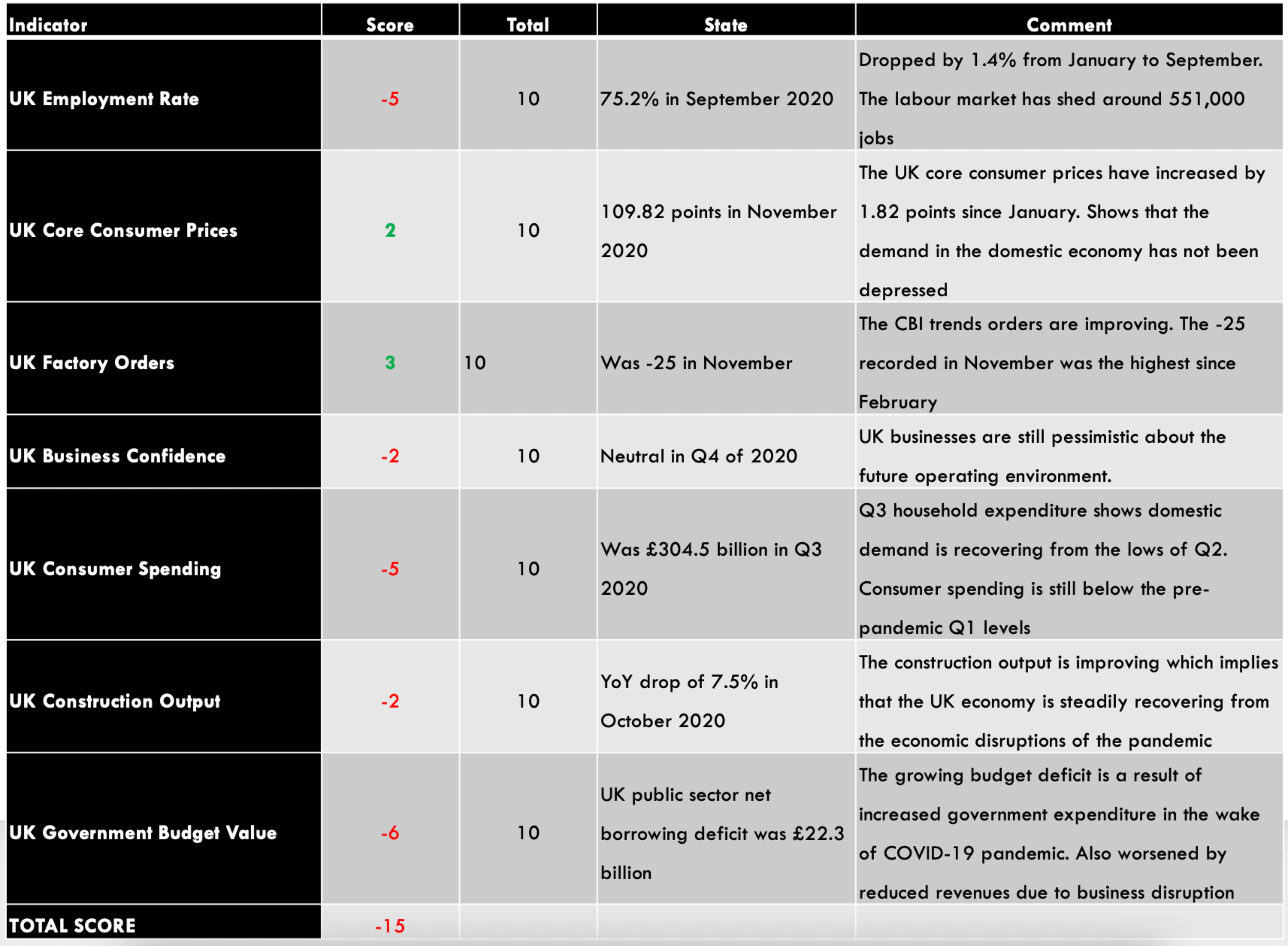
Summary – CAD Endogenous Analysis

  • Canada Employment Rate

The Canadian employment rate measures the percentage of the labor force that is employed during a particular period. The developments in the labor market are a leading indicator of overall economic growth. When the economy is expanding, there are more job openings, hence a higher employment rate. Conversely, when the economy is going through a recession, businesses close down, leading to a dropping employment rate.
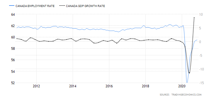
In November 2020, the employment rate in Canada rose to 59.5% from 59.4% in October. Although the employment rate has been steadily increasing from the lows of 52.1% in April, it is still lower than in January. Canada’s employment rate has a score of -6.

  • Canada Core Consumer Prices

This index measures the overall change in Canada’s inflation rate based on a survey of price changes for a basket of consumer goods. The rate of inflation gauges the increase in economic activity. Typically, when demand is depressed in an economy, prices drop, resulting in lower inflation. Conversely, when demand increases, prices tend to increase, resulting in a higher rate of inflation.
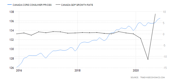
In November 2020, Canada’s core consumer prices rose to 136.6 points from 136.3 in October. Between January and November, the index has increased by 2 points. It has a score of 3.

  • Canada Manufacturing Production

This index measures the YoY change in the value of the output from the Canadian manufacturing sector. Canadian manufacturing is a significant contributor to the labor market and economic growth. In the age of the coronavirus disruption, changes in manufacturing production show how faster the economy is bouncing back.

In September 2020, the YoY manufacturing production in Canada dropped by 4.24%. This is an improvement compared to the 5.34% drop recorded in August. Canadian manufacturing production has a score of -2.

  • Canada Business Confidence

The Ivey Purchasing Managers Index (PMI) measures monthly business confidence in Canada. In the survey, private and public companies rate whether the current business activity is higher or lower than the previous month. The index survey aspects including inventories, purchases, deliveries from suppliers, output prices, and employment.

When the index is over 50, it means that purchases have increased from the preceding month. Reading of below 50 shows a decrease in purchases.
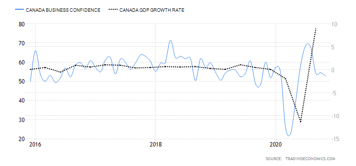
In November 2020, Canadian business confidence dropped to 52.7 from 54.5 in October. This was the lowest reading since May, when the economy began rebounding from the shocks of  COVID-19. Consequently, Canada’s business confidence has a score of 1.

  • Canada Consumer Spending

This measures the final market value of all household expenditures on goods and services. It also includes expenditure by non-profit organizations that serve households in Canada but excludes purchases of homes. Consumer spending plays a critical role in economic growth.
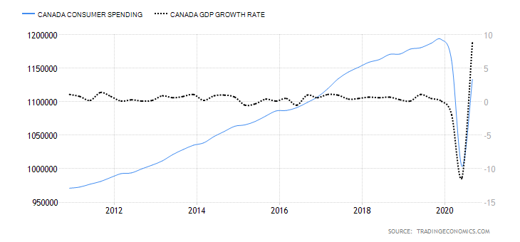
In Q3 of 2020, consumer spending in Canada rose to CAD 1.13 trillion from CAD 1 trillion in Q2. However, it is still lower than consumer spending recorded in Q1. Thus, Canada’s consumer spending has a score of -4.

  • Canada New Housing Price Index

The Canadian NHPI measures the changes in the selling price of newly built residential houses. The price measured is that paid by the home buyers to the contractors. Note that the price comparison is strictly between houses of the same specification. The NHPI shows the construction sector’s growth trends; hence, it corresponds to changes in the labor market and GDP growth.
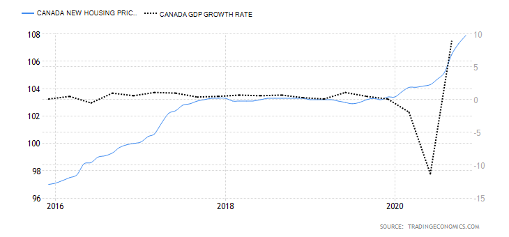
In November 2020, the Canadian NHPI rose to 107.9 from 107.3 in October. Thus, we assign a score of 3.

  • Canada Government Budget Value

This indicator tracks the changes in the difference between the Canadian government revenues and expenditures. It shows whether the government is running a surplus or a deficit. It also breaks down the changes in the receipts by the government. This helps to show how the overall economy is fairing.
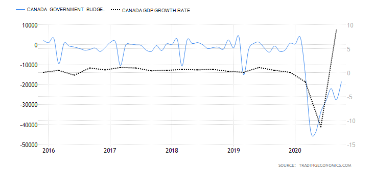
In October 2020, the Canadian government budget had a deficit of CAD 18.51 billion compared to CAD 27.59 billion in September. Throughout the year, the budget deficits have been due to the economic shocks brought on by the coronavirus pandemic. The Canadian government had to ramp up expenditure through its Economic Response Plan, while revenues dropped in the same period. We assign it a score of -5.

Conclusion

Indicator Score Total State Comment
Canada Employment Rate -6 10 59.5% in November 2020 The employment rate is steadily increasing. It is, however, still below January levels
Canada Core Consumer Prices 3 10 136.6 points in November 2020 Since January, it has increased by 2 points. That shows demand in the economy has kept prices higher
Canada Manufacturing Production -2 10 YoY dropped by 4.24% in September 2020 A slight increase from -5.34% recorded in August. This shows that the manufacturing production is returning to the pre-pandemic levels
Canada Business Confidence 1 10 52.7 in November November level was the lowest since the economy began to recover in May. It’s expected to improve as mass vaccinations against COVID-19 rolls out
Canada Consumer Spending -4 10 Was CAD 1.13 trillion Q3 2020 Recovered from CAD 1 trillion in Q2 but still lower than Q1. This shows that demand is increasing in the economy
Canada New Housing Price Index 3 10 November NHPI was 107.9 It has been increasing, which shows that output in the construction industry is improving
Canada Government Budget Value -5 10 a budget deficit of CAD 18.51 billion in October The deficit widened in 2020, driven by unprecedented fiscal policies to curb recessionary pressure from the pandemic
TOTAL SCORE -10

A score of -10 indicates that the CAD has depreciated since the beginning of the year 2020.

In the next article, you can find the exogenous analysis of GBP/CAD where we have forecasted this pair’s future price movements. Cheers.

GBP/CAD Exogenous Analysis

  • The UK and Canada Current Account Differential

The current account differential between the UK and Canada can determine if the GBP/CAD pair is bullish or bearish. If the differential is positive, it means that the UK has a higher current account balance than Canada. This would imply that the GBP is in higher demand in the forex market than the CAD; hence, it is a bullish trend for the pair. Conversely, if the current account differential is negative, it means that the UK has a lesser current balance than Canada. It would imply that the GBP has a lower demand than the CAD in the forex market; hence, a bearish trend for the pair.
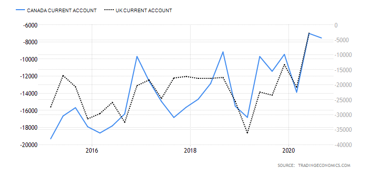
In Q3 of 2020, the UK had a current account deficit of $20.97 billion while Canada had a $5.83 billion deficit. Thus, the current account differential is -$15.14 billion. We assign a score of -2.

The interest rate differential is the difference between the Bank of England’s interest rate and that by the Bank of Canada. In the forex market, carry traders use the interest rate differential to decide whether to buy or short a currency pair. When the interest rate differential is positive, traders will earn the differential by going long. If the differential is negative, traders can earn the differential by shorting the currency pair.

Therefore, if the GBP/CAD pair’s interest rate differential is positive, the pair is bound to adopt a bullish trend. Conversely, if negative, the pair is bound to be bearish.
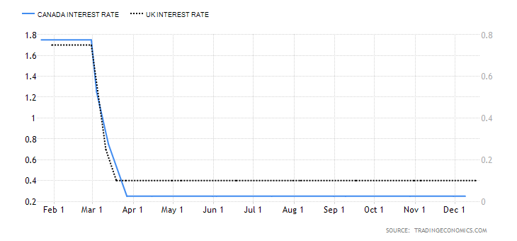
In 2020, the interest rate in the UK dropped from 0.75% to 0.1%. In Canada, the BOC cut the interest rate from 1.75% to 0.25%. Therefore, the interest rate differential is -0.15%. The interest rate differential between the UK and Canada has a score of -1.

  • The differential in GDP growth rate between the UK and Canada

This differential measures the changes in the growth rate between the two economies. It is a preferred method of comparison since economies are of different sizes. Naturally, the economy with a higher GDP growth rate will have its currency appreciate more. Therefore, if the GDP growth rate differential is positive, it means that the GBP/CAD pair is bullish. If negative, then the pair is bearish.

During the first three quarters of 2020, the UK economy has contracted by 5.8%, while the Canadian economy has contracted by 3.3%. This makes the GDP growth rate differential -2.5%. Hence, a score of -1.

Conclusion

Indicator Score Total State Comment
The UK and Canada Current Account Differential -2 10 A differential of – $15.14 The UK has a higher deficit than Canada
The interest rate differential between the UK and Canada -1 10 -0.15% Expected to remain at -0.15% until either economy have recovered
The differential in GDP growth rate between the UK and Canada -1 10 3.30% The Canadian economy contracted at a slower pace than the UK economy
TOTAL SCORE -4


The cumulative score for the exogenous factors is -4. This means that we can expect the GBP/CAD pair to trade in a downtrend in the short term. However, technical analysis shows the pair adopting a bullish trend with the weekly chart trading above the 200-period MA. More so, the pair is seen bouncing off the lower Bollinger band.
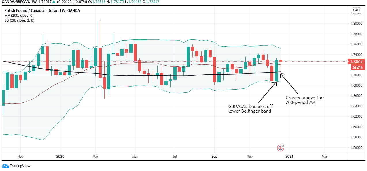
Keep an eye on the near-term changes in the exogenous factors.

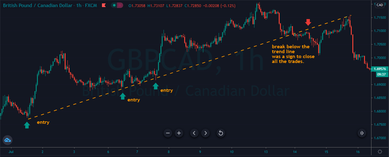
 

Categories
Forex Daily Topic Forex Fundamental Analysis

GBP/AUD Global Macro Analysis – Part 3

GBP/AUD Exogenous Analysis

  1. The UK and Australia Current Account Differential

In this case, the current account differential is derived by subtracting Australia’s current account balance from that of the UK. The current account shows the net value of a country’s exports. Remember that the value of a currency is determined by its demand. Theoretically, the country’s domestic currency with a higher current account balance will have a higher demand. Therefore, its value will be higher in the forex market than in currencies with lower current account balances.

In this case, if the current account differential is positive, it means that the GBP is in higher demand than the AUD, hence a bullish trend for the GBP/AUD pair. Conversely, if the differential is negative, the GBP/AUD pair will have a bearish trend.

Australia had a $7.5 billion current account surplus in Q3 2020, while the UK had a $20.97 billion deficit. The current account differential is -$28.47 billion. Consequently, the current account differential between the UK and Australia has a score of -4.

  1. The interest rate differential between the UK and Australia

This interest rate differential is the difference between the interest rate in the UK and Australia. Typically, investors prefer to buy currencies with a higher interest rate. Therefore, if the interest rate differential for the GBP/AUD pair is positive, it means that the UK offers higher interest rates than Australia. Traders would then sell AUD and buy the GBP, which implies that the GBP/AUD pair will have a bullish trend. Conversely, if the interest rate differential is negative, Australia offers a higher interest rate. Thus, traders would sell the GBP and buy the AUD, which will force the GBP/AUD pair into a downtrend.

In 2020, the Reserve Bank of Australia cut interest rates from 0.75% to 0.25% and finally to 0.1% in December. The BOE cut interest rates from 0.75% to 0.1%. As of December 2020, the interest rate differential for the GBP/AUD pair is 0%. Thus, we assign a score of -1.

  1. The differential in GDP growth rate between the UK and Australia

The differential in GDP growth rate measures the difference in domestic economic growth in the UK and Australia. It is expected that the domestic currency of the country whose GDP is expanding at a faster pace will appreciate faster. Therefore, if the GDP growth differential between the UK and Australia is positive, we should expect a bullish trend for the GBP/AUD pair. Conversely, we should expect a downtrend in the pair if the differential is negative.

The Australian economy has contracted by 4% in the first three quarters of 2020, while the UK has contracted by 5.8%. Thus, the GDP growth rate differential is -1.8%. Hence, the score of -3.

Conclusion

Indicator Score Total State Comment
The UK and Australia Current Account Differential -4 10 A differential of – $28.47 Australia has a current account surplus while the UK is running a deficit. The differential is expected to increase as COVID-19 restrictions ease
The interest rate differential between the UK and Australia -1 10 0.00% Neither the RBA nor the BOE intends to change the interest rate policy in the near term. The differential of 0% is expected to persist in the near term
The differential in GDP growth rate between the UK and Australia -3 10 -1.80% The Australian economy contracted slower than the UK’s
TOTAL SCORE -8

Since the cumulative exogenous score for the GBP/AUD pair is -8, we can expect the pair to continue a bearish trend.

According to the above picture’s technical analysis, this pair is trading below the 200-period MA and attempting to breach the lower Bollinger band, supporting our fundamental analysis. Cheers.

Categories
Forex Daily Topic Forex Fundamental Analysis

GBP/AUD Global Macro Analysis – Part 1 & 2

Introduction

This analysis will look into endogenous factors that influence economic growth both in the UK and Australia. We will also analyze the exogenous factors that impact the exchange rate of the GBP/AUD pair.

Ranking Scale

We will conduct correlation analysis, which we will use to rank the endogenous and exogenous factors on a scale of -10 to 10.

In ranking the endogenous factors, we will conduct a correlation analysis against the GDP growth rate. If the score is negative, the endogenous factor has resulted in depreciation of either the GBP of the AUD. Conversely, if the score is positive, then the factor has resulted in an appreciation of the local currency.

When the exogenous analysis is negative, the factor has resulted in a decline of the GBP/AUD exchange rate. If the score is positive, then the factor has led to an increase in the exchange rate.

Summary – GBP Endogenous Analysis

-15 score indicates that the Pound has depreciated since the starting of 2020.

Summary – AUD Endogenous Analysis

A score of -8 indicates that the Australian dollar has depreciated as well since the beginning of 2020.

Indicator Score Total State Comment
Australia Employment Rate -3 10 61.2% in October The employment rate hit 20-year lows during the pandemic. It’s expected to continue recovery as the economy recovers
Australia Core Consumer Prices 2 10 117.49 in Q3 2020 The inflation rate still lower than Q1, but the demand is increasing in the economy
Australia Manufacturing Production -3 10 Q3 projected to drop by 3.5% Q2 dropped by 6.2%. Production expected to improve in Q3 as business operation resume some normalcy
Australia Business Confidence 6 10 NAB business confidence was 12 in November It’s the highest level since April 2018. This shows that businesses are highly optimistic about their future operations
Australia Consumer Spending -3 10 Was 253.648 billion AUD in Q3 2020 Q3 levels still lower than Q1 domestic expenditure. Expected to increase further when the economy recovers to pre-pandemic levels
Australia Construction Output -3 10 Q3 output dropped by 2.6% Q3 drop caused by a reduction in residential and non-residential construction, engineering, and building works
Australia Government Budget Value -4 10 a budget deficit of 10.974 billion AUD in October The government budget deficit is improving. This shows that the revenue stream is improving as businesses resume operations
TOTAL SCORE -8
  1. Australia Employment Rate

This indicator shows the number of working-age Australians who are employed during a particular period. As an indicator of growth in the labor market, the employment rate shows if the economy is adding or shedding jobs. Thus, it is used to show periods of economic growth and contractions.

The Australian labor market has been recovering from the coronavirus pandemic shocks when the employment rate hit a 20-year low of 58.2%. In October 2020, Australia had an employment rate of 61.2%, up from 60.4% in September. However, it is still lower than January’s 62.6%. Australia’s employment rate has a score of -3.

  1. Australia Trimmed Mean Consumer Prices

This indicator is also called core consumer prices. It measures the price changes of goods and services that are frequently purchased by Australian households. The computation of the trimmed mean consumer prices excludes goods and services whose prices are volatile.

In Q3 2020, the core consumer prices in Australia rose to 117.49 from 117.04 in Q2. Q3 levels are also higher than the 117.17 points recorded in Q1. This shows that the economy is recovering since an increase in prices implies an increase in domestic demand for goods and services. We assign a score of 2.

  1. Australia Manufacturing Production

This indicator shows the YoY change in the value of output from the manufacturing sector. The Australian economy is heavily dependent on industrial production; hence, manufacturing production changes provides invaluable insights into the domestic economic growth. It also shows how the economy is recovering from the impact of COVID-19.

In Q2 2020, the YoY manufacturing production in Australia dropped by 6.2%, compared to 2.7% growth in Q1. Q3 YoY manufacturing production is expected to drop by 3.5%. Consequently, Australian manufacturing production has a score of -3.

  1. Australia Business Confidence

Business confidence in Australia is measured by conducting a monthly survey of about 600 businesses. They include small, medium, and large companies operating in non-agricultural sectors. The survey gauges the businesses’ expectations in terms of profitability, trading volume, and employees. The index is derived by considering the percentage of respondents who have good and very good expectations and those who have a bad and very bad outlook.

In November 2020, the NAB business confidence increased to 12 from 3 in October, which has been the highest since April 2018. Australia’s business confidence has a score of 6.

  1. Australia Consumer Spending

The indicator records the quarterly change in the value of goods and services consumed by domestic households. It includes expenditure by non-profit organizations that provide goods and services to Australian households and the value of backyard productions.

In Q3 of 2020, consumer spending in Australia rose to AUD 253.648 billion from AUD 235.131 billion in Q2. Although it’s lower than Q1 expenditure, domestic demand in the economy is rebounding from the slump of COVID-19. Consequently, Australian consumer spending has a score of -3.

  1. Australia Construction Output

This indicator shows the quarterly change in the value of construction work in Australia. The total value involves both private and public sector building and engineering work.

In the third quarter of 2020, Australia’s construction output dropped by 2.6% from a 0.5% growth in Q2. This drop was caused by output drop in residential and non-residential construction, engineering, and building works. Thus, we assign a score of -3.

  1. Australia Government Budget Value

The government budget value measures whether the Australian government has a budget surplus or deficit. A budget surplus implies that the government’s expenditure is less than its revenue. Similarly, a budget deficit means that the government spends more than it collects in terms of revenue.

In October 2020, Australia had a budget deficit of AUD 10.974 billion, up from a deficit of 33.613 billion in September. We assign a score of -4.

In the next article, you can find the Exogenous analysis of the GBP/AUD currency pair and also our forecast on its price movement in the near future. Cheers.

Categories
Forex Fundamental Analysis

GBP/NZD Global Macro Analysis – Part 3

GBP/NZD Exogenous Analysis

  1. The UK and New Zealand Current Account Differential

The current account differential between the UK and NZ is the value of the subtraction of the NZ current account balance and the UK’s current account. For the GBP/NZD pair, if the current account differential is positive, it means that the UK has a higher current account balance than NZ. Thus, the price of the GBP/NZD pair will increase. Conversely, if the differential is negative, NZ has a higher current account balance than the UK. Theoretically, this means that traders would be bullish on the NZD; hence, the GBP/NZD pair price would drop.

In Q3 2020, NZ had a current account deficit of $2.48 billion while the UK a deficit of $20.97 billion. This means that the current account differential is -$18.49 billion. Thus, we assign a score of -5.

  1. The interest rate differential between the UK and New Zealand

The interest rate differential for the GBP/NZD pair is the difference between the UK and NZ’s interest rate. Carry traders and investors would direct their money to the currency, which offers higher interest rates. Therefore, if the interest rate differential for the GBP/NZD pair is positive, it means that the UK offers a higher interest rate than NZ. Hence, traders will be bullish on the GBP/NZD pair. Conversely, if the interest rate differential is negative, it means that NZ has a higher interest rate than the UK. This means that traders would be bearish on the GBP/NZD pair.

In 2020, the Reserve Bank of New Zealand cut its official cash rate from 1% to 0.1%, while the BOE cut the interest rate from 0.75% to 0.1%. In this case, the interest rate differential is 0%. Thus, we assign a score of 0.

  1. The differential in GDP growth rate between the UK and New Zealand

This differential shows which economy is expanding faster between the NZ economy and the UK economy. Comparing domestic economies using their GDP growth rates is more effective than using absolute GDP figures since they vary in size.

If the GDP growth rate differential is negative, the NZ economy is growing faster than the UK economy. This would result in a bearish trend for the GBP/NZD pair. Conversely, the pair will have a bullish trend if the differential is positive since it would mean that the UK economy is expanding more than the NZ economy.

The first three quarters of 2020 saw the NZ economy expand by 0.4% and the UK contract by 5.8%. In this case, the GDP growth rate differential is -6.2%. Hence, the score of -4.

Conclusion

Indicator Score Total State Comment
The UK and New Zealand Current Account Differential -5 10 A differential of – $18.49 NZ has a lower current account deficit than the UK.
The interest rate differential between the UK and New Zealand 0 10 0.00% The 0% interest rate differential is expected to persist in the short-term. That’s because neither the RBNZ and the BOE have scheduled changes in the monetary policy
The differential in GDP growth rate between the UK and New Zealand -4 10 -6.20% New Zealand’s economy expanded by 0.4% in the first three quarters of 2020, while the UK contracted by 5.8%
TOTAL SCORE -9

GBP/NZD exogenous factors have a cumulative score of -9. It means we should expect a continued downtrend in the pair for the short term.

In the above image, we can see that this pair’s weekly chart trading below the 200-period MA for the first time since August 2019. Cheers.

Categories
Forex Fundamental Analysis

GBP/NZD Global Macro Analysis – Part 1 & 2

Introduction

In this analysis, we will analyze endogenous factors that influence both the UK and New Zealand economies. The analysis will also include exogenous factors that impact the exchange rate between the GBP and the NZD.

Ranking Scale

We’ll rank the endogenous and exogenous factors on a scale from -10 to +10.

The score of the endogenous factors will be determined from correlation analysis between the GDP growth rate. If the score is negative, the endogenous factor had a devaluing effect on the domestic currency. Conversely, if the score is positive, the factor led to the appreciation of the domestic currency.

Similarly, we’ll do a correlation analysis between the exogenous factors and the GBP/NZD exchange rate. If the correlation is negative, the factor results in a drop in the exchange rate. If positive, then the exogenous factor increases the exchange rate.

Summary – GBP Endogenous Analysis

-15 score on Pound’s Endogenous Analysis indicates that this currency has depreciated since the beginning of 2020.

Summary – NZD Endogenous Analysis

A positive 5 indicates that the New Zealand dollar has appreciated since the beginning of this year.

Indicator Score Total State Comment
New Zealand Employment Rate -7 10 66.4% in Q3 2020 The NZ labor market is yet to recover from the economic disruptions of the pandemic
New Zealand Core Consumer Prices 1 10 1054 points in Q3 2020 From Q1 to Q3, inflation has increased by 1 point
New Zealand Industrial Production 5 10 A 3.1% increase in Q3 The NZ industrial sector is rebounding from a 12.1% drop in Q2.
New Zealand Business Confidence 7 10 Was 9.4 in November November showed the first positive reading in ANZ business confidence since August 2018
New Zealand Consumer Spending 5 10 Q3 spending was 41.335 billion NZD. Q3 consumer spending was the highest recorded in 2020. This shows that the domestic demand has recovered beyond the pre-pandemic period
New Zealand Construction Output -4 10 Q2 output dropped by 24.2% The worst decline in construction output in about 18 years. It’s bound to increase as COVID-19 restrictions ease
New Zealand Government Budget Value -2 10 2020 projected deficit of 4.5 billion NZD This would be a drop from a surplus of 7.5 billion NZD in 2019. Attributed to the increase in government spending during the pandemic
TOTAL SCORE 5
  1. New Zealand Employment Rate

The employment rate shows the growth in New Zealand’s labor market. The change in the labor market shows how the economy is performing – especially in the coronavirus pandemic. The labor market shows if the economy is churning out new jobs or if jobs are lost. Thus, the growth of the labor market is a leading indicator of economic growth.

In Q3 2020, New Zealand’s employment rate dropped to 66.4% from 67.1% in Q2 and 67.7% in Q1. This shows that the labor market is yet to recover from the economic shocks of the pandemic. The New Zealand employment rate has a score of -7.

  1. New Zealand Core Consumer Prices

This indicator samples the price changes in a basket of the most commonly purchased goods and services by households. The price changes represent the rate of inflation in the overall economy. Note that the computation of the core consumer prices excludes goods and services whose prices tend to be volatile. It helps avoid seasonal distortions in the index.

In Q3 of 2020, the core consumer prices in New Zealand rose to 1054 points from 1048 in Q2. The index had only increased by 1 point in 2020. Thus, we assign a score of 1.

  1. New Zealand Industrial Production

Industrial production in New Zealand refers to the YoY change in total manufacturing sales. It measures the YoY change in sales volume in the manufacturing sector. A survey of 13 industries across the manufacturing sector is surveyed to derive the YoY manufacturing sales data for the whole sector. Some of these industries include; petroleum and coal products, metal products, machinery, equipment and furniture, and food and beverage. Naturally, expansion in industrial production corresponds to the expansion of the economy.

New Zealand manufacturing sales rose by 3.1% in Q3 2020 from a drop of 12.1%. This is the largest YoY increase in manufacturing sales in three years. It shows that the economy is rebounding. We assign a score of 5.

  1. New Zealand Business Confidence

NZ business confidence is a survey of about 700 businesses. They are polled to establish their expectations about the future business operating environment and economic growth in general. Some aspects surveyed include; activity outlook, employment prospects, capacity utilization, and investment decisions.

In December 2020, the NZ ANZ business confidence rose to 9.4 from -6.9 in November. This shows an increased optimism in NZ businesses since it is the first positive reading since August 2018. Thus, we assign a score of 7.

  1. New Zealand Consumer Spending

This measures the value of the quarterly consumer expenditure in NZ. Changes in consumer expenditure go hand in hand with domestic demand changes in the economy, which drive GDP growth.

In Q3 2020, the NZ consumer spending increased to NZD 41.335 billion from NZD 35.197 billion in Q2. More so, the Q3 consumer spending is more than the NZD 40.04 billion recorded in Q1. Consequently, the NZ consumer spending has a score of 5.

  1. New Zealand Construction Output

This indicator shows the overall change in the value of all construction work done by contractors in NZ. It compares the YoY quarterly change, which helps to show if the economy is expanding or contracting.

In Q2 2020, the NZ construction output dropped by 24.2% compared to the 4.1% drop in Q2. This is the worst drop in over 18 years. Thus, we assign a score of -4.

  1. New Zealand Government Budget Value

This is the difference between the revenues that the NZ government collects and the amount it spends. Deficits arise if the revenues are less than expenditures, while surplus occurs when the revenues exceed expenditure.

In 2019, the NZ government had a budget surplus of NZD 7.5 billion. In 2020, it was projected that the budget would hit a deficit of NZD 4.5 billion. This is due to increased government expenditure to alleviate the pandemic’s economic shocks while revenues have been depressed due to nationwide shutdowns. Thus, we assign a score of -2.

For the exogenous analysis of both of these currencies, you can check our very next article. In case of any queries, let us know in the comments below. Cheers.

Categories
Forex Course

209. Inter Market Analysis At A Glance

Introduction

Internet analysis is referred to as a method leveraged to analyze markets by assessing the correlation between various categories of assets. This means that the ups and downs happening in one market may or may not impact the other markets. Therefore, a thorough study of their relationships is beneficial to the trader.

Understanding The Basics Of Intermarket Analysis

It works with multiple financial markets and asset classes related to each other to identify strengths or weaknesses. Rather than assessing the asset classes or financial markets individually, Inter-market analysis evaluates different correlated asset classes or financial markets like bonds, stocks, commodities, and currencies. Such analysis expands on looking at each market or asset individually while comparing them with each other.

Correlation Of Intermarket Analysis

Performing an Intermarket analysis is simple as you would need access to only data. And there is no dearth of data in today’s time; you can find them broadly and access them for free. Charting programs and spreadsheets are other things that you need for this analysis. Here you will compare one variable with another in a different data set.

In this analysis, a positive correlation can move up to +10, signifying a positive and ideal correlation between two data sets. Additionally, in a negative or inverse correlation, the value can go as down as -1.0. When the reading comes close to the zero lines, it will reflect that there lacks a discernible correlation among the two samples.

An ideal correlation between two variables for an extended time period is very uncommon. However, analysts generally agree that reading maintained below the -0.7 level or above +0.7 level is quite prominent. This level depicts around a 70% correlation. Moreover, when the correlation changes from positive to negative, it indicates an unstable relationship, which is not ideal for trading.

Please take the quiz below to know if you have got the concepts right. Cheers!

[wp_quiz id=”102178″]
Categories
Forex Course

208. Using Yuppy (EUR/JPY) As A Leading Indicator For Stocks!

Introduction

EUR/JPY is among the most popular pairs in the international foreign exchange market. In fact, it indicated approximately 3% of the overall daily transaction. Moreover, it is indicated as the seventh-highest traded currency pairs in the forex market. Both traders and investors can leverage the potentials of the EUR/JPY currency pair as they both carry a high degree of volatility.

Best Time To Trade in EUR/JPY

Although you can trade EUR/JPY at any time of the day, to leverage the most benefit, you must trade when the pair is most volatile. Between 7:30 and 15:30 is the time when the currency pair trade is the busiest.

Factors Impacting EUR/JPY Rate

When it comes to making the most lucrative trade with this pair, it is important to understand what influences its rate.

Prominence Of EUR

Like many modern currencies, the prominent factors that impact the Euro price flow are financial, political, and economic. For instance, many trade decisions regarding the Euro are backed by the European Central Bank’s monthly reports.

These reports can influence the fluctuations in the Euro’s rates, and traders and investors promptly leverage the details as quickly as they are released to determine the flow of the Euro rates.

In economic terms, news releases focusing on employment can also play an important role in the fluctuations of euro rates. These details are easily accessible and offer vital insights into the economic condition of the Euro and the movement of Euro prices.

The Prominence of JPY

Japan’s economy has more factors that play an important role in determining the flow of currency. The basic health of the economy will play a significant role in involving a high rate of export and import trading. One uncommon factor that impacts the flow of the country’s currency is situations such as a natural disaster.

The Right Way To Trade EUR/JPY

In terms of speculative trading, CFDs provide traders and investors with easy access to a plethora of markets. They like to transact with CFDs as derivatives trading implies that buying the actual currency is unnecessary. When trading, investors and traders like to harness technical analysis and assess the EUR/JPY chart. This is done to determine the relationship of the pairing and forecast the highs and lows of the markets.

[wp_quiz id=”102014″]
Categories
Forex Fundamental Analysis

GBP/CHF Global Macro Analysis – Part 3

GBP/CHF Exogenous Analysis

  1. The UK and Switzerland Current Account Differential

A country’s current account shows the sum of its net exports, net secondary income, and net primary income. In this case, the current account differential is the difference between the UK’s current account balance and Switzerland.

In international trade, when a country has a current account surplus, it means the value of its exports is higher than imports. Thus, its domestic currency is in higher demand in the forex market. Therefore, if the current account differential is positive, it implies that the UK has a higher current account than Switzerland. We can then expect that the price of the GBP/CHF pair will increase. Conversely, a negative differential would mean that Switzerland has a higher current account than the UK. In this case, the price of the GBP/CHF pair is expected to drop.

Switzerland had a current account surplus of $10.11 billion in the third quarter of 2020, while the UK had a $20.97 billion deficit. The current account differential is -$31.08 billion. Hence a score of -7.

  1. The interest rate differential between the UK and Switzerland

Interest rate differential is the swiss interest rate subtracted from the interest rate in the UK. Forex carry traders use a pair’s interest rate differential to establish whether to buy or short the pair. For GBP/CHF, if the interest rate differential is positive, it means that the UK’s interest rate is higher than in Switzerland. This makes traders and investors go long on the pair; hence, a bullish trend.

Conversely, if the interest rate differential is negative, it means that Switzerland’s interest rate is higher than in the UK. Thus, forex traders will short the GBP/CHF pair; hence, a bearish trend.

The Swiss National Bank has maintained the interest rate at -0.75%, while the UK’s interest rate is 0.1%. Therefore, the GBP/CHF interest rate differential is 0.85%. It has a score of 3.

  1. The differential in GDP growth rate between the UK and Switzerland

GDP growth rate differential is the difference between the economic growth in the UK and Switzerland. A negative differential means that the UK’s economy is expanding faster than that of Switzerland. Consequently, the GBP/CHF pair will adopt a bullish trend. Conversely, if the GDP growth rate differential is negative, the swiss economy is growing faster than that of the UK. Hence, the GBP/CHF pair will adopt a bearish trend.

The UK economy has contracted by 5.8% in the first three quarters of 2020, while the swiss economy has contracted by 1.5%. That means the GDP growth rate differential is -4.3%. We assign a score of -3.

Conclusion

Indicator Score Total State Comment
The UK and Switzerland Current Account Differential -7 10 A differential of – $31.08 Switzerland has a $10.11 billion current account surplus, while the UK has a deficit of $20.97 billion
The interest rate differential between the UK and Switzerland 3 10 0.85% The differential is expected to remain at 0.85% all through 2021
The differential in GDP growth rate between the UK and Switzerland -3 10 -4.30% Switzerland’s economy contracted by 1.5% in the first three quarters of 2020 while the UK by 5.8%
TOTAL SCORE -7

The exogenous analysis of the GBP/CHF pair has a cumulative score of -7. Thus, we can expect a short-term downtrend in the pair.

In technical analysis, GBP/CHF’s weekly price is seen bouncing off from the upper Bollinger band.

We hope you find this analysis informative. Let us know if you have any questions in the comments below. Cheers.

Categories
Forex Fundamental Analysis

GBP/CHF Global Macro Analysis – Part 1 & 2

Introduction

The global macro analysis of the GBP/CHF currency pair will involve analysing endogenous and exogenous factors. Endogenous factors drive the domestic GDP growth in the UK and Switzerland. Exogenous factors influence the exchange rate for the currency pair.
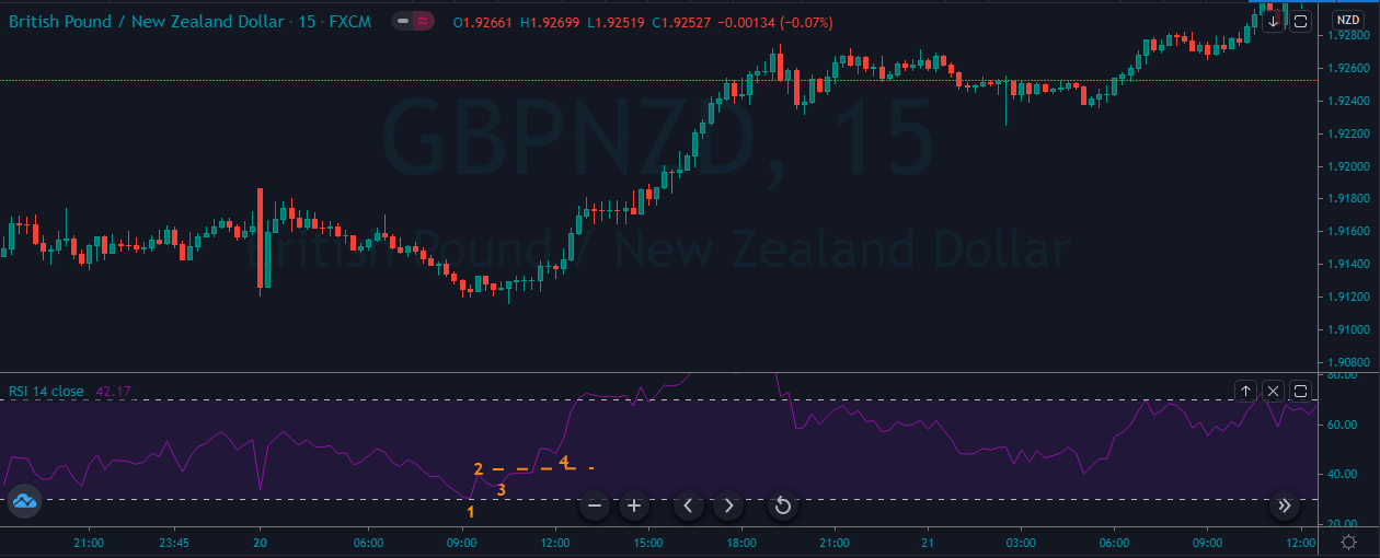
Ranking Scale

The analysis will rank the endogenous and exogenous factors on a scale from -10 to +10. The score for endogenous factors will be determined from a correlation analysis with the domestic GDP growth rate. If the score is negative, it means that the endogenous factor has led to the domestic currency depreciation. If positive, it has caused the appreciation of the domestic currency.

The exogenous analysis score is from a correlation analysis with the exchange rate for the GBP/CHF pair. When the score is negative, traders can expect the bearish trend for the pair. If positive, then the pair is expected to have a bullish trend.

Summary – GBP Endogenous Analysis

A -15 score implies that GBP has depreciated since the beginning of 2020.

Summary – CHF Endogenous Analysis

A score of 3 implies that CHF has partially appreciated since the beginning of this year.

Indicator Score Total State Comment
Switzerland Employment Rate -3 10 79.7% in Q3 2020 Slightly below the 80.4% recorded in Q1.
Switzerland Core Consumer Prices 4 10 100.82 points in November Inflation, as measured by the core consumer prices, rose by 0.28 points from January to November
Switzerland Manufacturing Production -2 10 4.7% decrease in Q3 2020 The YoY swiss manufacturing production is recovering
Switzerland Business Confidence 3 10 103.5 in November Swiss KOF Economic Barometer dropped in October and November. The majority of the consecutive drop was driven by private consumption
Switzerland Consumer Spending 5 10 Q3 spending was 91.929 billion CHF Q3 had the highest consumer spending compared to Q1 and Q2.
Switzerland Construction Output -2 10 A 0.4% drop in Q3 2020 Q3 output recovered from the 5% drop in Q2 but is still lower than the 3.1% growth in Q1
Switzerland Government Budget Value -2 10 An expected deficit of 2.2 billion CHF in 2020 Switzerland had a surplus of 8.1 billion CHF in 2019. The projected deficit is on account of aggressive government stimulus program and decreases in revenue due to COVID-19
TOTAL SCORE 3
  1. Switzerland Employment Rate

The Swiss employment rate measures the quarterly change in the percentage of the labour force that is employed. Changes in the number of people employed in the economy are a leading indicator of economic growth. When the economy is expanding, businesses create more job opportunities; hence, higher employment rate. Conversely, a shrinking economy leads to job cuts, which result in a lower employment rate.

In 2020 Q3, the Switzerland employment rate rose to 79.7% from the 6-year lows of 79.1%. Although the Q3 employment rate is lower than the 80.4% recorded in Q1, it shows that the Swiss economy is recovering from the economic shocks of COBID-19. The swiss employment rate scores -3.

  1. Switzerland Core Consumer Prices

Core consumer prices measure the rate of inflation by monitoring the price changes of only a select basket of goods and services. Consumer products with volatile prices are excluded. The rate of inflation is a leading indicator of economic growth. That’s because when inflation rises, it means domestic demand is on the rise, too, hence a higher GDP growth rate. Similarly, a decrease in the inflation rate means domestic demand is depressed, which may be followed by a contracting economy.

In November 2020, the swiss core consumer prices dropped to 100.82 points from 100.89 points in October. However, it is still higher than 100.54 points recorded in January. It has a score of 4.

  1. Switzerland Manufacturing Production

This measures the YoY change in the value of output from the swiss manufacturing sector. This sector plays a significant role in the Swiss economy. Therefore, growth in manufacturing production is accompanied by growth in the labour market and, consequently, the domestic economy’s expansion.

In Q3 of 2020, the YoY swiss manufacturing production dropped by 4.7%. That’s an improvement from the 9.6% drop in Q2. We assign a score of -2.

  1. Switzerland Business Confidence

The KOF Swiss Economic Institute compiles this index. It measures company managers’ optimism based on their perspective of the economy and the growth prospects of their businesses. The business that is surveyed are drawn from multiple sectors in the economy and contains 219 different variables.

In November 2020, the Swiss KOF Economic Barometer dropped to 103.5 from 106.3 in October. This marks the send consecutive month of a drop in the swiss business confidence. Notably, the drop in the index is primarily driven by the manufacturing sector and private consumption. Swiss business confidence has a score of 3.

  1. Switzerland Consumer Spending

This is the value of the total consumption by Swiss households. Domestic consumption is a primary driver of GDP growth. More so, it also an indicator of the performance in the labour market. With a higher rate of employment, disposable income increases, which increases consumer spending.

Swiss consumer spending increased to CHF 91.929 billion in the third quarter of 2020, which is the highest recorded compared to CHF 89.79 billion in Q1 and CHF 82.03 billion in Q2. It has a score of 5.

  1. Switzerland Construction Output

This indicator measures the percentage change in the value paid for construction work in Switzerland. The construction work includes building and engineering works done by public and private companies. Typically, when construction work increases, it is expected to be accompanied by an increase in the employment rate and economic growth.

In the third quarter of 2020, the YoY swiss construction output dropped by 0.4%. That is an improvement compared to the 5% drop in Q2 but still less than the 3.1% growth recorded in Q1. It has a score of -2.

  1. Switzerland General Government Budget Value

This represents the difference between the revenues received by the Swiss government and its expenditures. Government expenditure includes all transfer payments and purchases of goods and services. The general government budget value shows if the Swiss government has a surplus or a deficit. Too much deficit means that the economy is probably not responding to expansionary fiscal policies.

In 2019, the Swiss government had a budget surplus of CHF 8.097 billion. In 2020, the general government budget was expected to hit a deficit of CHF 2.2 billion. This deficit is primarily driven by a significant drop in revenue collection due to COVID-19. It has a score of -2.

In the very next article, you can find the Exogenous analysis of the GBP/CHF currency pair, so make sure to check that out. Cheers.

Categories
Forex Course

207. The Affects Of Stock Market On The Foreign Exchange Market

Introduction

The impact of the stock market on the flow of the forex market is quite significant. In fact, the foreign exchange market reflects the performance of the stock market. For instance, when the US stock market with Dow Jones, or NASDAQ, S&P 500 on the upward showing gains, the similar is likely to happen to the USD pairs in the foreign exchange market.

Rising Stock Market’s Impact

When the stock market is booming, investors from around the world will run to invest their money in the rising stocks of the nation as they are looking to obtain higher returns on the investment. With more investors demanding the currency, its value will increase significantly.

This is because if the investors want to put the money on, say, the US market, they have to convert their local currency into the US dollar. This significantly raises the demand for the dollar, hence makes the forex market perform better.

Falling Stock Market’s Impact

If the stock market is performing badly, the investors are likely to take their money out. This means that the investors will convert the currency back into the domestic ones or invest in some other country or asset. Subsequently, this will decrease the value of the concerned currency. This is something that all economies do in terms of investments.

Decision Making Based On Stock Market’s Performance 

Foreign exchange traders can leverage this information to assess the situation and predict the market. If you assess the stock of a particular currency and witness that they are moving up, then evaluate it against the currency, you will be able to make a prediction.

An increasing stock market will be influencing a boost in the value of the currency of the country. So you can base your trading decision on the same. At the same time, when the stock market is performing inadequately, you can sell the currency of that country. This is because the value of the currency will be falling in the market.

This correlation between the stock market and the foreign market can alter based on the global financial marketplace condition. The financial landscape is interconnected to different elements. Policies of central banks, political events, changes in the environment, everything affects how the trades are performed worldwide. The reason why stock influence forex is because stock includes companies that drive the economy of the country.

We hope you find this course article informative. Please let us know if you have any questions in the comments below. Cheers.

[wp_quiz id=”101824″]
Categories
Forex Fundamental Analysis

GBP/JPY Global Macro Analysis – Part 3

GBP/JPY Exogenous Analysis

  • The United Kingdom and Japan Current Account Differential

The current account data is the most comprehensive measure of a country’s participation in international trade. It is the sum of net exports, net factor income, and net transfer payments. Remember that in the forex market, the value of a country’s fluctuates depending on its demand. Therefore, when a country has a current surplus account, it means that the demand for its currency is higher, and vice versa.

In this case, the current account differential is the difference between the UK and Japan’s current account balance. If the current account differential is positive, it means that the GBP will appreciate more than JPY hence a bullish GBP/JPY. Conversely, if the current account differential is negative, JPY will appreciate faster than the GBP hence a bearish trend for GBP/JPY.

In Q3 2020, Japan had a current account surplus of $15.4 billion while the UK had a $20.97 billion deficit. Thus, the current account differential between GBP and JPY is – $36.37 billion. Thus, the UK and Japan current account differential have a score of -3.

In the forex market, the interest rate is one of the most closely monitored economic indicators. Suffice to say, traders and investors monitor every other domestic economic indicator to predict the interest rate policy changes. The interest rate differential for the GBP/JPY pair is the difference between the UK’s interest rate and that in Japan.

If the differential is positive, traders and investors can receive better returns by selling the JPY and buying the GBP, hence, bullish GBP/JPY. Conversely, if the interest rate differential is negative, currency traders would prefer to sell the GBP and buy JPY hence, the bearish GBP/JPY pair.

In 2020, the BOE cut interest rates from 0.75% to 0.1%, while the BOJ has maintained an interest rate of -0.1%. Therefore, the GBP/JPY interest rate differential is 0.2%. It has a score of 4.

  • The differential in GDP growth rate between the UK and Japan

The GDP growth rate differential measures the difference between the UK and Japan’s average annual growth rate. This is an effective way of comparing two economies since all economies vary in size and composition.

When the GDP growth rate differential is positive, it means that the UK economy has expanded more than Japan. Hence, the GBP/JPY will be bullish. Conversely, if the differential is negative, Japan’s economy has expanded faster than the UK’s. Hence, the GBP/JPY pair will be bearish.

In the first three quarters of 2020, the UK economy has contracted by 5.8% while Japan contracted by 3.5%. The GDP growth rate differential is -2.3%. Thus, we assign a score of -3.

Conclusion

Indicator Score Total State Comment
The UK and Japan Current Account Differential -3 10 A differential of – $36.37 The UK has a current account deficit of $20.97 billion, while Japan has a surplus of $15.4 billion. This is expected to continue to widen as both economies recover from the pandemic
The interest rate differential between the UK and Japan 4 10 0.20% Both the BOJ and the BOE have no plans to change their monetary policies in the foreseeable future. This means the differential will remain at 0.2% in the short-term
The differential in GDP growth rate between the UK and Japan -3 10 -2.30% The UK economy contracted more than the Japanese economy. As economic recovery progresses, this differential could change
TOTAL SCORE -2

The cumulative score for the exogenous factors is -2. That means that the GBP/JPY pair is set on a bearish trend in the short-term.

Technical analysis of the pair shows the weekly chart attempting to break below the middle Bollinger band.

Categories
Forex Fundamental Analysis

GBP/JPY Global Macro Analysis – Part 2

JPY Endogenous Analysis

Summary

An overall score of -13 implies that this currency (JPY) has depreciated since the beginning of this year.

Indicator Score Total State Comment
Japan Employment Rate -4 10 60.4% in October 2020 The Japanese labor market has shed about 820,000 jobs between January and October 2020
Japan Core Consumer Prices -1 10 101.2 points in November 2020 The index has dropped marginally by 0.8 points in the first 11 months
Japan Manufacturing Production 2 10 3.1% drop in October The decrease in YoY manufacturing production is slowing down
Japan  Business Confidence -2 10 Q4 reading was -10 Businesses are growing increasingly optimistic
Japan Consumer Spending -2 10 Was ¥280.8 trillion in Q3 2020 The increase in Q3 expenditure by households shows that the economy is steadily recovering
Japan Construction Industry Activity -2 10 YoY drop of 6.9% in July 2020 The July drop was the second-worst recorded in over ten years
Japan Government Budget Value -4 10 the budget deficit of ¥308414 in Q2 2020 This is the worst deficit in 20 years. It’s expected to improve as the economy goes back to normal
TOTAL SCORE -13
  • Japan Employment Rate

This indicator shows the number of Japanese nationals employed as a percentage of the entire Japanese working-age population. With this indicator, we can track the Japanese economy’s performance since employment corresponds to the expansion and contraction of the economy.

In October 2020, the Japan employment rate rose to 60.4% from 60.3% in September. Although Japan’s employment rate is higher than in January, the labor market has lost about 820,000 jobs since January. We assign a score of -4.

  • Japan Core Consumer Prices

Core consumer prices measure the inflation rate in Japan based on a select basket of goods. The core consumer prices do not include goods and services with volatile prices. Typically, when inflation rises, it implies that the economy is expanding and the labor market is growing. Conversely, when the index drops, it means that the labor market is shrinking.

In November 2020, Japan Core Consumer Prices dropped to 101.2 points from 101.3 in October. Since January, the index has shed 0.8 points. Thus, it scores a -1.

  • Japan Manufacturing Production

This indicator measures the percentage change in the value of the output in the manufacturing sector. Since the Japanese economy is highly reliant on the manufacturing sector, changes in this indicator can be considered a leading indicator of economic growth.

In October 2020, the YoY manufacturing production in Japan decreased by 3.1% compared to the 9% decrease recorded in September. The October decrease is the slowest since February.  We assign a score of 2.

  • Japan Business Confidence

In Japan, the business confidence index results from a survey of about 1100 large manufacturers with a capital of at least ¥1 billion. The survey evaluates the current industry trends, business conditions within the company and the industry, and expectations for the next quarter and year. The sentiment in Japanese businesses is ranked with an index of a scale from -100 to +100. The negative index shows pessimism, while a positive index shows optimism.

In Q4 of 2020, the Bank of Japan’s Tankan business sentiment index increased to -10 from -27 in Q3. This improvement shows that the economy is potentially recovering from the impact of the COVID-19 pandemic. However, it is still lower than the -8 registered in Q1. Thus, we assign a score of -2.

  • Japan Consumer Spending

It tracks the quarterly value of expenditure by households. In Japan, the consumption expenditure accounts for both the supply-side and demand-side. The supply-side from the survey of family income, while the demand-side is from the expenditure survey. The weighted average of both these estimates represents the final consumption expenditure.

In Q3 2020, the consumer spending in Japan rose to ¥280.8 trillion from ¥268.2 trillion in Q2. However, it is still lower than the consumer spending recorded in Q1. Japan consumer spending scores -4.

  • Japan Construction Industry Activity

This index tracks the YoY changes in the construction industry in Japan. It shows the changes in companies’ monetary value of construction work and billed to the clients. Note that in Japan, the construction industry accounts for about 6% of the total industrial activity. Thus, the construction output index can be a leading indicator of the entire industrial activity. More so, since it is a tertiary industry, it can signal longer-term changes in the GDP.

In July 2020, Japan’s YoY construction output dropped by 6.9%. This drop is the second-worst in over ten years. The worst was recorded in June at -7.9%. The Japan construction industry activity scores -2.

  • Japan Government Budget Value

In Japan, the government budget value evaluates the difference between government revenues and expenditure. This is meant to determine whether there is a government budget surplus or deficit. A budget surplus arises when revenues exceed the expenditure, while a deficit occurs when government expenditure is more than revenues.

In Q2 of 2020, Japan has a government budget deficit of ¥308414. This is the worst deficit recorded in over two decades. Thus, the Japan Government Budget Value has a score of -4.

In the upcoming article, you can find the Exogenous analysis of the GBP/JPY currency pair where we have forecasted its price movements. All the best.

Categories
Forex Fundamental Analysis

GBP/JPY Global Macro Analysis – Part 1

Introduction

The GBP/JPY pair’s global macro analysis interrogates the endogenous factors that drive the GDP growth in the UK and Japan. The analysis will also cover exogenous factors that affect the exchange rate between the GBP and the JPY.

Ranking Scale

The analysis will use a sliding scale from -10 to +10 to rank the endogenous and exogenous factors’ impact. Endogenous factors impact the value of the domestic currency. Thus, when it is negative, it means that the domestic currency has depreciated. When positive, it means that the domestic currency has increased in value during the period under review. The ranking of the endogenous factors is based on correlation analysis with the domestic GDP.

On the other hand, a positive ranking for the exogenous factors means that the GBP/JPY pair’s price will increase. Conversely, when negative, it means that the price of the pair will drop. This ranking is derived from correlation analysis between the exogenous factors and the GBP/JPY exchange rate fluctuation.

GBP Endogenous Analysis – Summary

A score of -15 implies that GBP has depreciated since the beginning of this year.

Indicator Score Total State Comment
UK Employment Rate -5 10 75.2% in September 2020 Dropped by 1.4% from January to September. The labor market has shed around 551,000 jobs
UK Core Consumer Prices 2 10 109.82 points in November 2020 The UK core consumer prices have increased by 1.82 points since January. Shows that the demand in the domestic economy has not been depressed
UK Factory Orders 3 10 Was -25 in November The CBI trends orders are improving. The -25 recorded in November was the highest since February
UK Business Confidence -2 10 Neutral in Q4 of 2020 UK businesses are still pessimistic about the future operating environment.
UK Consumer Spending -5 10 Was £304.5 billion in Q3 2020 Q3 household expenditure shows domestic demand is recovering from the lows of Q2. Consumer spending is still below the pre-pandemic Q1 levels
UK Construction Output -2 10 YoY drop of 7.5% in October 2020 The construction output is improving, which implies that the UK economy is steadily recovering from the economic disruptions of the pandemic
UK Government Budget Value -6 10 UK public sector net borrowing deficit was £22.3 billion The growing budget deficit is a result of increased government expenditure in the wake of COVID-19 pandemic. Also worsened by reduced revenues due to business disruption
TOTAL SCORE -15
  • United Kingdom Employment Rate

The employment rate shows the percentage of the UK labor market that is actively and gainfully employed. It is a comprehensive representation of the growth in the labor market. Note that the changes in the employment rate measure the changes in the economic activities of a country.

In September 2020, the UK employment rate dropped to 75.2% from 75.3% in August. From January to September 2020, the employment rate has dropped by 1.4%, equivalent to about 551,000 job loss. The UK employment rate scores -5.

  • United Kingdom Core Consumer Prices

This index measures the change in the rate of inflation in the UK by tracking price changes of specific consumer products. The index calculation excludes items whose prices tend to be highly volatile, such as fuel and energy.

In November 2020, the core consumer prices in the UK dropped to 109.82 from 109.9 in October. The index has increased by 1.82 points since January. The UK core consumer prices score 2.

  • United Kingdom Factory Orders

In the UK, the CBI Industrial Trends Orders tracks orders from about 500 companies in 38 sectors of the manufacturing industry. The survey’s components include domestic goods orders, exports, inventory, output prices, and expectations of future investments and output levels. The surveyed manufacturers respond whether the current conditions are normal, above, or below normal. This is used as a leading indicator of industrial production.

In December 2020, the UK CBI trends orders were -25, 15 points up from -40 in November. This is the highest level since February 2020 but still lower than -18 in January. We assign a score of 3.

  • United Kingdom Business Confidence

This index gauges the optimism of businesses operating in the UK. A survey is conducted on 400 small, medium, and large companies to determine their optimism. The survey covers exports, output levels and prices, capacity, order books, inventory, competitiveness in the domestic market,  innovation, and training. The business sentiment is then ranked from -100 to +100, with 0 showing neutrality.

In the fourth quarter of 2020, the UK business confidence was neutral at 0, a slight change from -1 in Q3. It is, however, still below the 23 recorded in Q1. We assign a score of -2.

  • United Kingdom Consumer Spending

Expenditure by households contributes to a significant proportion of the domestic GDP. In the UK, this index tracks quarterly changes in the amount of money spent by households and Non-profit institutions serving households (NPISH). Note that when the economy is performing well, consumer spending is high. Conversely, a poorly performing economy corresponds to low consumer spending.

In Q3 2020, consumer spending in the UK rose to £304.5 billion from £258.3 billion in Q2. However, the Q3 expenditure is still lower than Q1. The UK consumer spending scores -5.

  • United Kingdom Construction Output

This economic indicator tracks the yearly change in the value of work done in the construction sector. The amount of money charged by construction companies in the UK is based on a sample of 8000 companies that employ over 100 employees. Note that in the UK, the construction sector contributes about 6.4% of the GDP.

In October 2020, the UK’s YoY construction output dropped by 7.5%, up for the 10% drop recorded in September. This marks the smallest decrease in the UK’s construction output since the pre-pandemic period. We assign a score of -2.

  • United Kingdom Government Budget Value

This indicator tracks the changes between the government’s revenues and expenditure. When the revenue exceeds the expenditure, it is a surplus and indicates that the economy is expanding. When the deficit is increasing, it means that the government is spending much more than it receives. This poses a threat of overburdening the economy with future debt repayment obligations.

In October 2020, the UK public sector net borrowing deficit was £22.3 billion. This is an improvement from the deficit of £28.6 billion in September. In January 2020, the UK had a surplus of £9.6 billion. Thus, we assign a score of -6.

In the next article, we have discussed the endogenous analysis of JPY currency to see how it has performed in the year’s due course. Make sure to check that out. Cheers.

Categories
Forex Course

206. The Correlation Between The Stock and Forex Markets

Introduction

The stock market encompasses individual stocks that create an index or a sector. An active under trader must define an approach to the equity as it differs depending on what she or he trades. When purchasing individual shares of an enterprise, some factors such as voting rights, dividend date, earnings per share, earnings releases, etc., play an important role.

The Relationship Between Forex and Stocks

The primary principles theory behind this is when there is an increase in the equity market rise. The demand for that particular currency also rises, resulting in more fund inflow from international investors. Additionally, it generates higher demand for the specific currency, leading it to rally instead of other foreign currencies.

On the other hand, when a local stock market does not perform well, this confidence lowers, resulting in investors to take their funds and put them somewhere safer and more lucrative.

Currency Correlation

Correlation is referred to as the measurement of the degree to which prices of two things have moved in a similar direction at the same time. For instance, if A and B prices always move up and down in sync, they have a correlation coefficient of 1, which implies an ideal positive correlation.

Contrarily if the value of these things moves simultaneously in the opposite direction, then their correlation coefficient is -1, which signifies a negative correlation.

Example – Correlation between Stock & Forex Markets

If the USA stock market performs well, international investors will sell their local currency to purchase USD-denominated stocks. When the demand for the dollar rises, it experiences an increase in value. In the Foreign exchange market, USD pairs will move in favor of the dollar ( i.e., The EURUSD falling, the USDCAD rising); hence a strong US stock market will favor the value of the US Dollar.

On the other hand, if the USA’s stock market is not performing well, investors will sell their USD-denominated shares and buy stocks or ETFs in places where they can generate more yield. This shows that the economy in the USA is performing badly. Since the demand for the dollar is less, it adversely affects the value of the US dollar.

Possibility Of Negative Correlation

There is also a possibility that the currency market will rise in answer to a volatile stock market. This may happen due to tons of other factors that contribute to currency performance. We will discuss more related to this topic in the upcoming course lessons.

Don’t forget to take the quiz below before you go. Cheers.

[wp_quiz id=”100352″]
Categories
Forex Fundamental Analysis

EUR/CHF Global Macro Analysis – Part 3

EUR/CHF Exogenous Analysis

  • The EU and Switzerland Current Account to GDP differential

The ratio of the current account to GDP helps us determine the level of a country’s participation in the international market. When a country has net exports, it means that it will have a current account surplus; and, the larger the surplus, the higher the current account to GDP ratio. Conversely, a country with higher imports than exports; it means it has a current account deficit, and its current account to GDP ratio will be lower.

The domestic currency will be in higher demand in the forex market when a country is a net exporter.

In 2020, the Swiss Current Account to GDP is projected to reach 7.5% and that of the EU 3.4%. Thus, the current account to GDP differential between the EU and Switzerland is -4.1%. That means we should expect that the CHF will be in higher demand than the EUR. Thus, we assign a score of -5.

The interest rate differential for the EUR/CHF pair determines which of these currencies is preferable to investors and carry traders in the forex market. When the interest rate differential is positive, it means that investors will earn more by buying the EUR. Similarly, carry traders will be bullish on the EUR/CHF pair, thus driving the exchange rate higher. A negative interest rate differential implies that the Swiss Franc will be preferable to investors, while carry traders will be bearish on the pair.

The Swiss National Bank has maintained the interest rate at -0.75% throughout 2020, and the ECB interest rate has been at 0%. The interest rate differential for the EUR/CHF pair is 0.75%. We assign a score of 2.

  • The EU and Switzerland GDP Growth Rate differential

The GDP growth differential is the difference between the rate at which the EU and the Swiss economy are growing. This will help us identify which economy is growing faster. A positive GDP growth differential between the EU and Switzerland will result in a higher exchange rate for the EUR/CHF pair. A negative one will lead to a drop in the exchange rate for the pair.

In the first three quarters of 2020, the EU economy has contracted by 2.9% while the Swiss economy contracted by 1.5%. The GDP growth rate differential is -1.4%. We assign a score of -3.

Conclusion

The exogenous factors between the EUR/CHF pair have a score of -6; which implies that the pair can be expected to be on a downtrend in the short term.

As you can see above, the Technical analysis shows that the weekly chart for the EUR/CHF pair has failed to breach the upper Bollinger band successfully and has bounced off of it supporting our fundamental analysis. All the best.

Categories
Forex Fundamental Analysis

EUR/CHF Global Macro Analysis – Part 1 & 2

Introduction

In conducting the global macro analysis of the EUR/CHF pair, we’ll focus on endogenous economic factors that contribute to the growth of GDP in the EU and Switzerland. Exogenous factors that influence the exchange rate of the EUR/CHF in the forex market will also be analysed.

Ranking Scale

A sliding scale of -10 to +10 will be used to rank the impact of endogenous and exogenous factors.
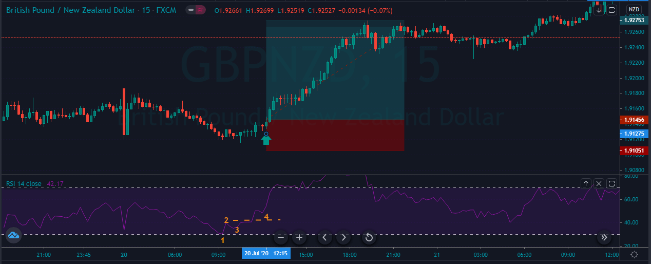
The ranking of the endogenous factors will be based on their correlation analysis with the GDP growth rate. A negative score implies that they resulted in the contraction of the economy hence depreciating the domestic currency. A positive score implies that they led in economic expansion hence appreciation of the domestic currency.

The exogenous factors are ranked based on their correlation with the EUR/CHF exchange rate. A positive score means that the pair lead to an increase in the exchange rate, while a negative ranking means that the exchange rate has decreased.

EUR Endogenous Analysis – Summary

The EUR’s endogenous analysis has a score of -3. This implies that the Euro had marginally depreciated in 2020.

CHF Endogenous Analysis – Summary

The change in the level of employment covers the quarterly developments in the labour market in Switzerland. The statistic includes the changes in both fulltime and parttime employment. Typically, changes in employment is a result of changes in business activities.

In Q3 of 2020, 5.08 million people were employed in Switzerland compared to 5.02 million in Q2. The employment level is still below the 5.11 million registered in Q1. We assign a score of -4.

  • Switzerland GDP Deflator

Switzerland GDP deflator is used to calculate the change in real GDP in terms of prices of all goods and services produced within the country. This is a comprehensive measure of inflation compared to measures like CPI and PPI, which only focus on a small portion of the economy.

In Q3 2020, Switzerland GDP deflator rose to 98.8 from 98 in Q2.  Up to Q3, the GDP deflator has increased by 0.8 points. The increase in inflation can be taken as an indicator that the economy is bouncing back from the economic shocks of the coronavirus pandemic. We assign a score of 3.

  • Switzerland Industrial Production

This indicator shows the changes in output for firms operating in the manufacturing, mining, quarrying, and electricity production. Although Switzerland is not heavily dependent on industrial production, it is still an integral part of the economy.

In Q3 2020, the industrial production in Switzerland increased by 5% from a drop of 9% in Q2. The YoY industrial production for Q3 was down 5.1%. For the first three quarters of 2020, the industrial production is down 3.8%. We assign a score of -3.

  • Switzerland Manufacturing PMI

This is an indicator of the economic health of the Swiss manufacturing sector. The purchasing managers are surveyed based in a questionnaire which covers the output in the sector, suppliers’ deliveries, inventories, new orders, prices, and employment. A PMI of above 50 shows that the Swiss manufacturing sector is expanding, while below 50 shows that the sector is contracting.

In November 2020, Switzerland manufacturing PMI rose to 55.2 from 52.3 in October. This is the highest reading since December 2018 and the fourth consecutive month of expansion since July. We assign a score of 7.

  • Switzerland Retail Sales

The retail sales measure the consumption of final goods and services by households in Switzerland. The expenditure by households drives the aggregate demand in the economy, which results in the changes in GDP.

In October 2020, Switzerland retail sales increased by 3.2% from a drop of 3.2% in September. YoY retail sales increased by 3.1% in October from 0.4% in September. Up to October 2020, the average retail sales has increased by 0.84%. We assign a score of 1.

  • Switzerland Consumer Confidence

About 1000 Swiss households are surveyed in January, April, July and October. They are evaluated based on their opinions about the economy, job security, financial status, inflation, and purchases. Consumer confidence tends to be higher when the economy is expanding and low during recessions.

In Q4 2020, the Swiss consumer confidence dropped to -12.8 from 12 in Q3. Although it is higher than it was in Q2 at the height of the pandemic, it is still lower than in Q1. The expectations on households’ financial situation also dropped to -6.6 from -4.2 in Q2. Households were increasingly pessimistic about the labour market and their job security. this can be attributed to the uncertainties that surround the ongoing coronavirus pandemic. We assign a score of -2.

  • Switzerland Government Gross Debt to GDP

This is the total amount that the Swiss government owes to both domestic and international lenders is expressed as a percentage of the GDP. It helps us to understand and evaluate the size of the debt relative to the size of the economy. At below 60%, the government is seen as being able to service its debt obligations and have room to acquire more debt without straining the economy.

In 2019, the Switzerland government gross debt to GDP was 41% same as in 2018. In 2020, it is expected to range between 49% and 51% due to aggressive expenditure to alleviate the shocks of coronavirus pandemic. We assign a score of -1.

In the very next article, you can find the exogenous analysis of the EUR/CHF Forex pair. Please check that and let us know if you have any questions below. Cheers.

Categories
Forex Course

205. How Global Equity Markets Affect The Forex Market?

Introduction

The equity market is also referred to as the stock or share markets. This is an extensive marketplace where traders and investors purchase and sell shares of the publicly listed organizations. The company’s share, stock, or equity is an important financial instrument that denotes the company’s ownership. Contrary to the market, when you buy a share in the stock market, you own a percentage of the company’s overall shares.

Global equity markets have a direct impact on the Forex market. A stable equity market reflects a good currency. Generally, when the country’s equity market is performing well, it attracts higher foreign investors. Therefore, it increases the demand for the local currency, resulting in a boost in a positive trade balance as well as currency appreciation.
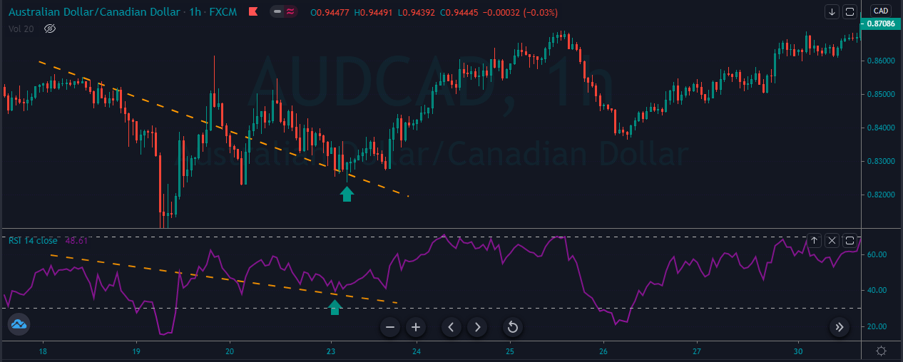
Contrarily, when the equity market is not performing well, the investors begin to pull out their money and invest in safer securities. This results in a decrease in the demand for a particular currency.

Impact Of Global Equity Markets On The Forex Market

Forex and equity markets trades center on the currency exchanges of various countries. In case there is a rise in the equity market, more international investors will want to put their money in that particular stock.

However, to do the same, they need to transfer their local currency to the currency of a particular country. This increases the currency demand for the nation. So when there is a huge demand for the currency, its value naturally increases in the market.

Example Of How The Equity Markets Impact Forex Market

If you are looking to invest in the UK’s stock market and your local currency is US dollars. So you need first to change the USD to GBP. This way, you are selling the US dollar while purchasing the GBP.
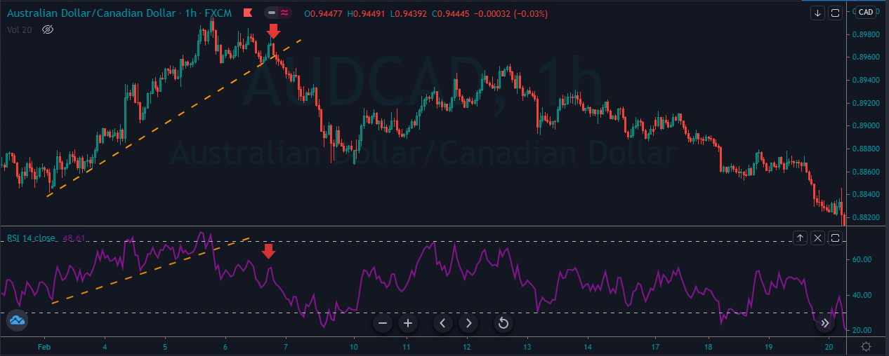
When more people sell the USD to buy GBP, it increases the demand for pounds, thereby boosting the value of the GBP. Additionally, it also contributes to a positive trade balance. On the other hand, since more US dollars are being sold, it increases the supply of USD, which results in a fall in the value of the dollar.

So when the demand for the currency rises, its value appreciates. This makes the forex market more bullish. Similarly, if the currency demand falls, its value will also fall. It will make the forex market more bearish.
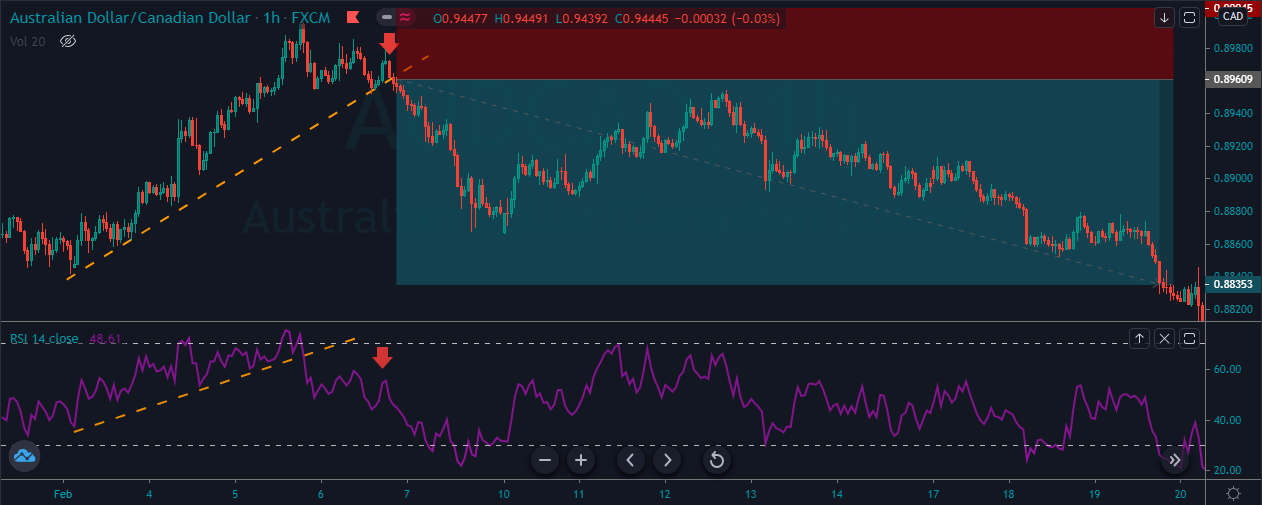
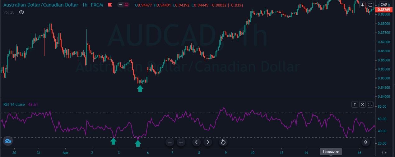
We hope you got the gist of what we are talking about. In the upcoming course lessons, we will be learning more about various equity markets and how their movement can be used to predict the Forex price charts. Cheers.

[wp_quiz id=”101514″]
Categories
Forex Basic Strategies

Two Ways To Trade The ‘Descending Top’ Chart Pattern Like A Pro

Introduction

The Descending Top is a technical chart pattern that frequently appears on the Forex price charts. Each peak of the price in this pattern is lower than its previous peak. The descending top chart pattern’s appearance indicates a downtrend in the market, and we must only look for sell trades at that point.
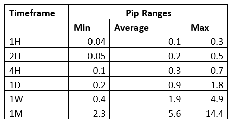
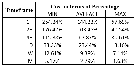
This pattern can be recognized when the first peak is lower than the second peak and the second peak is lower than the third peak. For instance, if the first peak is at 88.00, and the price drops down to 83.00, then the second peak at 85.00, and drop to 80.00, and if the next peak is below 85.00, we can see the descending top pattern forming on the chart, and we should then looks out for selling trade in an underlying asset.

If the next peak is higher than the previous peak, instead of being lower, the pattern gets invalidated, and the market goes up, or it will consolidate. We will often witness the descending top pattern on lower timeframes, and we should not be expecting this pattern to form on the higher timeframes. The reason is that in a higher timeframe, the pullback is very less, and even the trend soon comes to an end.

To identify the pattern, we must spot two tops on the price chart, which are descending, and then we must draw a line to connect these tops.

Descending Tops – Trading Strategies

Now that we know what a descending top pattern is, we will see how to combine it with other technical tools to trade this pattern.

Channel Trading

The first step is to identify the descending top pattern on the price chart. After that, identify the bottom between the two tops and draw a horizontal support line. Then wait for the break below the support line to enter a trade. Place the stop loss below the second top of the pattern and ride the trade. As we know, we cannot stay in a trade forever. We have to close our trade at some point. To close the trade, wait for the price to break the channel.

Example 1

As you can see in the image below, we have identified the descending top pattern in the EUR/USD 5 minute chart.

As you can see, when price action printed the pattern, we started preparing to take sell trades, and when the price broke below the most recent support area, it was a sure sign for us to go short. As we took the sell trade, the price immediately came back to retest the support area. Here, we choose to scale our trade at the support line and go for the brand new lower low.

Initially, our trade goes to a 1.1255 area, and we were looking for more profit in the trade. The trade failed to print the lower low furthermore, and it broke above the channel at around 1.274. Here, we choose to close our trade as that was a sign of the trend getting reversed. The Forex market is all about probabilities. We cannot expect the price to do what we want it to do. Instead, follow the rules of the game. When the market gives less profit, accept it, and don’t try to break the rules.

Descending Top Breakout Trading Strategy

As we know, the descending top is a pattern that gives the selling trades. But in this strategy, we will show you how to use it to take the buy trades. To enter a buying trade, we should wait for the price action to break above the descending top trend line. Your stop-loss order must be placed below the last bottom of the chart. Stay in the trade as long as price action prints the brand new higher high and exit your whole position when the prices break below the upper trend line.

The image below represents the descending top pattern on the price chart, and also it represents our entry, exit, and stop-loss in this pair. As you can see, when the price action prints the descending top pattern, it immediately goes down, and it prints the lower low.

In this one, we were looking for the breakout above the descending top chart pattern, and when the breakout happened, we were all set to take the buy trade. After our buy entry, price action prints a brand new higher high aggressively. When it gave the reversal signal, we choose to close our whole position, and the stops below the entry should be good enough.

Strategy Roundup

The descending top is a chart pattern that gave us potential selling trades. Trading this pattern is quite reliable, and when it gives the trading opportunity, we must trust it and go big. To identify this pattern, we must spot a price top, followed by a lower top. Take an entry below the most recent higher low and go for the brand new lower low and place the stop loss just above the entry. If you desire a safe trade, choose to place the stop loss above the first top.

We hope you find this educational article informative.  Let us know if you have any questions in the comments below. Cheers!

Categories
Forex Course

204. The Impact Of ‘Fixed Income Securities’ On The Forex Price Charts

Introduction

Fixed income securities are investments that offer returns in terms of fixed periodic interest payments and the return of principal at the end of the security period. Contrary to variable income securities, in which the payments vary depending on the underlying measure, the payment obtained in fixed income securities are recognized in advance.

What are the Types of Fixed Income Securities?

Following are the types of fixed income securities:

Bonds: They are among the common forms of fixed income securities issued by organizations to fund the daily operations to make sure smoother and efficient production. Granted that fixed-income bonds act as a liability for the missing company, it must be redeemed as soon as the company makes sufficient revenue.

Debt Mutual Funds: These funds leverage the collected corpus for investments in different variations of fixed income securities like commercial papers, government bonds, corporate bonds, money market instruments, etc. The main benefit of these investments is that you get higher returns in comparison to the convention.

Exchange-Traded Funds: Exchange-traded funds primarily function by investing in different types of debt securities present in the market. This produces regular as well as fixed returns. This way, they offer assured stability as returns are offered periodically at a particular rate of interest. These are popular among risk-averse investors who look for stability over market advantage.

Money Markets Instruments: Certain types of money market instruments like treasury bills, commercial papers, certificates of deposits, etc., are provided as investment opportunities at a fixed interest rate and therefore are categories under the fixed income securities. Moreover, these instruments are provided for a short duration where the maturity period stands less than a year.

The Effect of Fixed Income Securities on the Movement of Currency

Understanding the relationship between fixed-income securities and currency movement is quite straightforward. Economies that provide higher rates of returns on fixed income securities are likely to attract more investments.

This makes the currency more attractive than economies that provide lower returns on the fixed income market. To determine the yields derived by the securities, you can check the official government website of a specific country.

[wp_quiz id=”97508″]