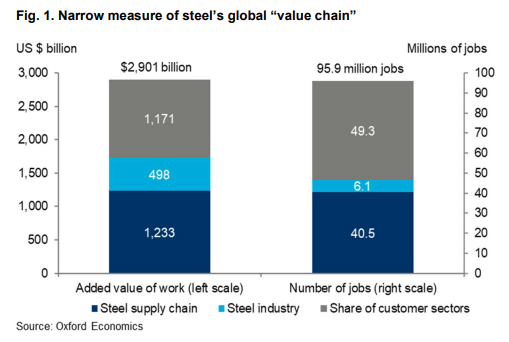
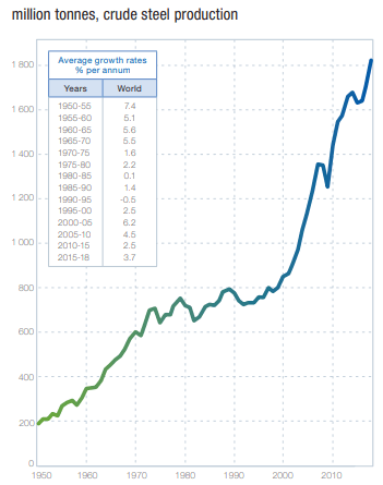
Introduction
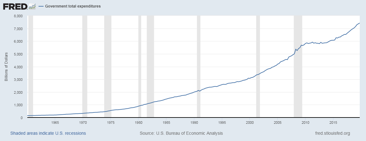
Capital Flow is a useful indicator to assess the relative strength of economies and sectors within an economy. Capital always tends to flow towards growing, improving, and strengthening regions, be it industries, economies, or even currencies. Tracking the flow of Capital can help us understand the expanding areas within a nation and also throughout the world. It also gives us an insight over which sectors are contracting or experiencing a slowdown. Hence, understanding Capital Flow is crucial for investors and traders to make critical investment decisions.
What is Capital Flows?
Capital Flow refers to the money movement within an economy amongst different classes or economies in the broader sense. Capital movement from one sector to another can be for various purposes like an investment, trade, or business operations. On a small scale, individual investors can direct their savings and investment capital into securities such as mutual funds, bonds, or stocks, etc.
On the medium scale, It can include money flow within corporations in the form of investment funds, capital spending on business operations, and R&D. For example, Big tech Giants like Apple or Microsoft can direct their funds on expanding their production sites in other countries. In this case, Capital flows out of the country, or they may choose to invest in Research and Development Sector to develop new products and services, where Capital flows into that division, which is usually headquartered in the native country, in this case, the United States.
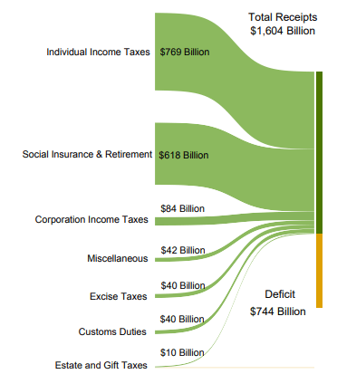
On the larger scale, Capital Flows are directed by Government from their federal tax receipts to many outlets like public spending programs, regulatory operations, foreign trades, currencies, and foreign investments, etc. On what aspects the Government decides to direct the flow of Capital can imply many things like development, employment, inflation, foreign goods, imports, etc.
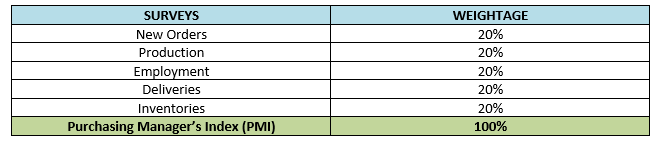
As the entire world runs on money, directing the flow of money is essential. An excess of influx or deficit of money flow can be detrimental for any sector. Hence, the Government segregates Capital Flows into different types for studying, regulating, and policy-making purposes. The following are the Capital Flow types:
Asset-class movements: It refers to the changes of Capital between liquid currency, stocks, bonds and other financial instruments like real estate, metals (ex. Gold, Iron, etc.)
Venture Capital: It refers to the shift in trends of capital movements directing towards startup businesses. Which sector new startup businesses are seeing capital inflow and which are not is tracked through Venture Capital statistics.
Mutual Funds Flow: It tracks the overall addition or withdrawal from the underlying classes of its funds, which can be bonds, stocks, banks, or other mutual funds. Inflow and outflow from one segment to others can imply many things for investors. In general, the influx of Capital Flow into a sector is positive, while outflow is depreciating for that segment class.
Capital Spending Budgets: It refers to the Capital movements for the corporate institutions and is used to monitor growth and expansionary plans of the corporate based on their budget allocation patterns.
Federal Budgets: This is the critical component amongst Capital Flows as it has a long-term impact on the economy and can either attract or drive-off foreign investors. It refers to the budget plans allocated for public spending, running economic operations and regulations, etc.
How can the Capital Flows numbers be used for analysis?
Money accompanies the growth period. Money always follows where there is growth or improvement. In the financial markets, this is called “hot money,” which refers to the funds from investors throughout the world. Whenever a stock market performs good, or an industrial sector improves or comes up with an innovation, it is followed by an increase in the inflow of Capital.
The capital flow can assess the relative strength of capital markets into and out of the markets or the liquidity of that stock market. As the United States is the world’s largest economy and accordingly, it is having the top two stock exchanges, i.e., the New York Stock Exchange (NYSE) and Nasdaq (NASDAQ) beating all the global stock exchanges.
At the corporate level, the flow of Capital helps investors assess the current financial stature of the company and their probable future plans. For example, Investments into expansionary plans are likely to generate more revenue in the future.
The Government’s Federal Budget can be used to analyze how much growth can be expected based on the current public spending and what portion goes into servicing debts. For instance, Higher budget allocation for public spending is indicative of an effort to stimulate the economy in a positive direction. Similarly, interest rates, bond yields can all determine Capital flow in and out of the economy.
Impact on Currency
When Capital flows into the country, the currency appreciates and vice-versa. For example, when the USA regularly imports foreign goods resulting in dollars going out of the country, this results in excess of U.S. dollars in the global economy due to which the value depreciates. On the other hand, if the USA continuously exports its goods, for this other countries send dollars into the USA, creating a deficit in the rest of the world. Accordingly, the demand for dollar increases and currency appreciates.
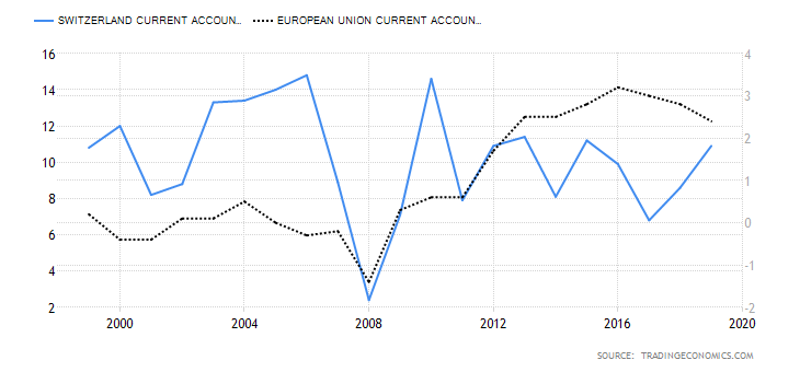
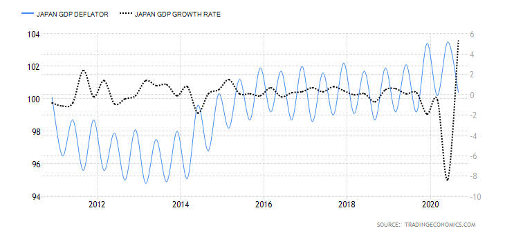
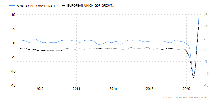
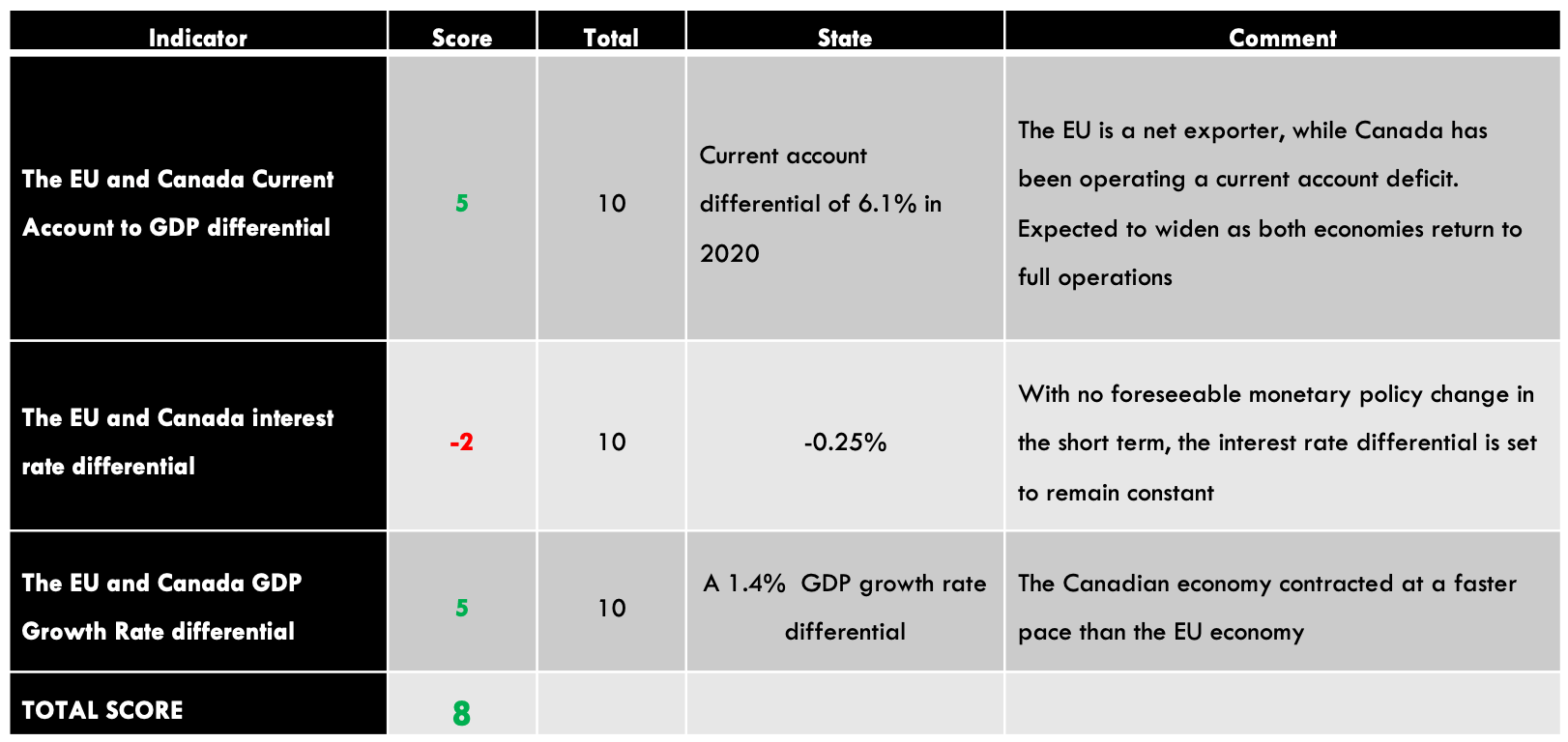
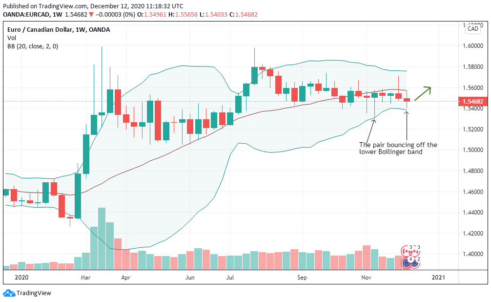
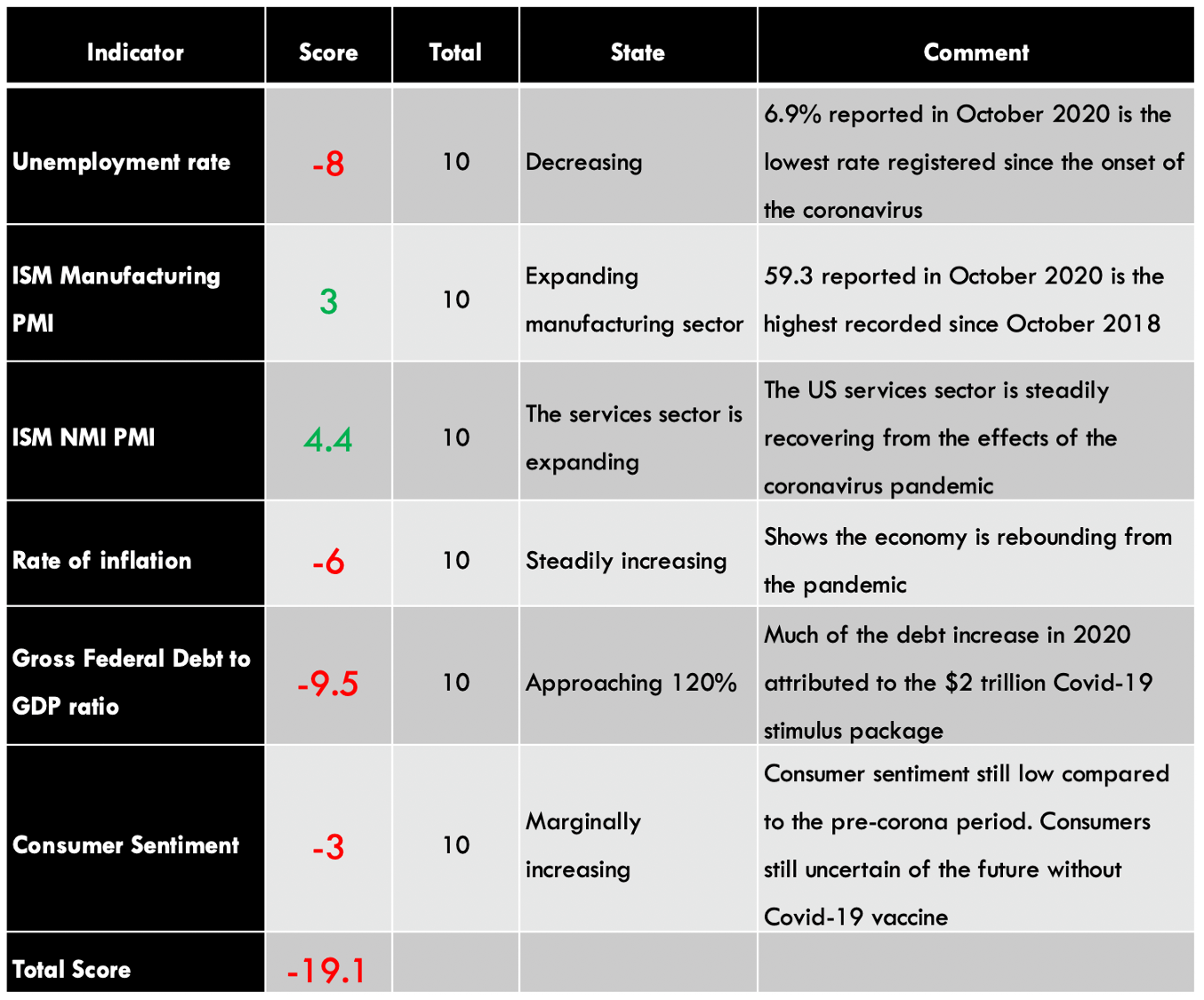
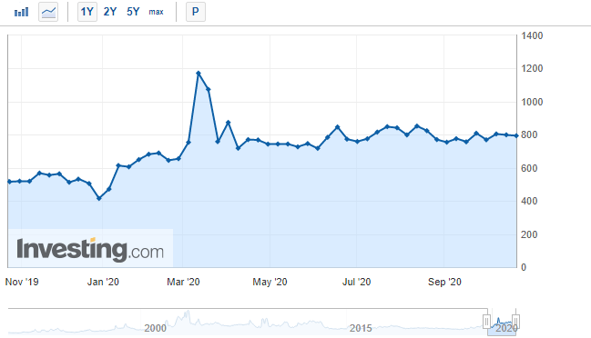
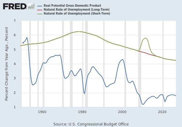
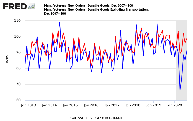
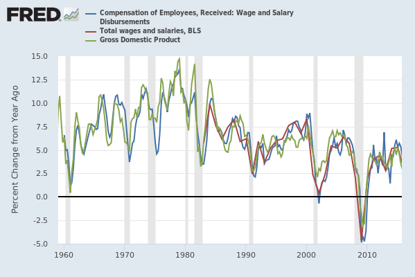
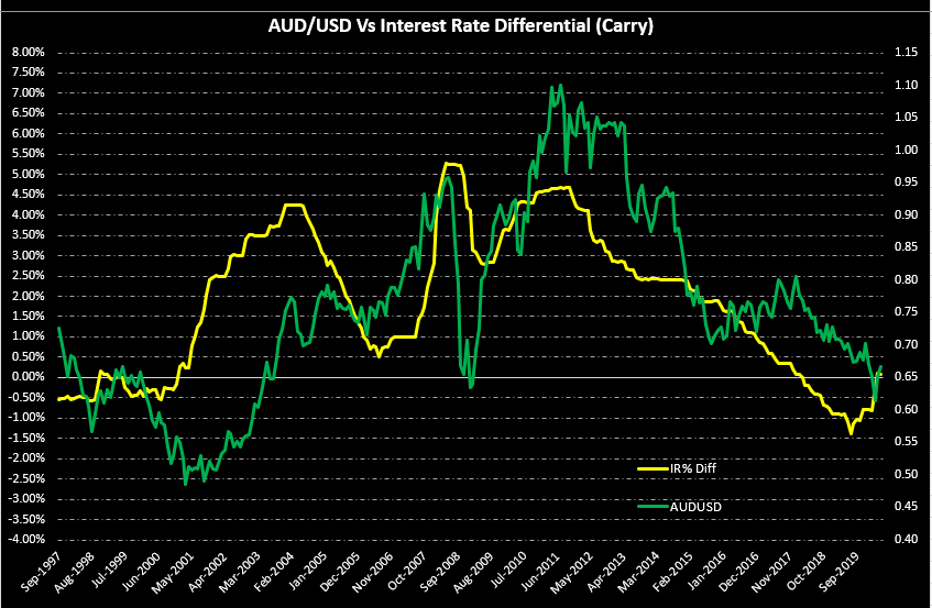
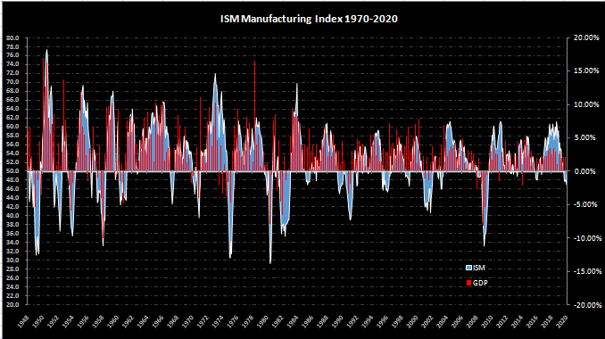
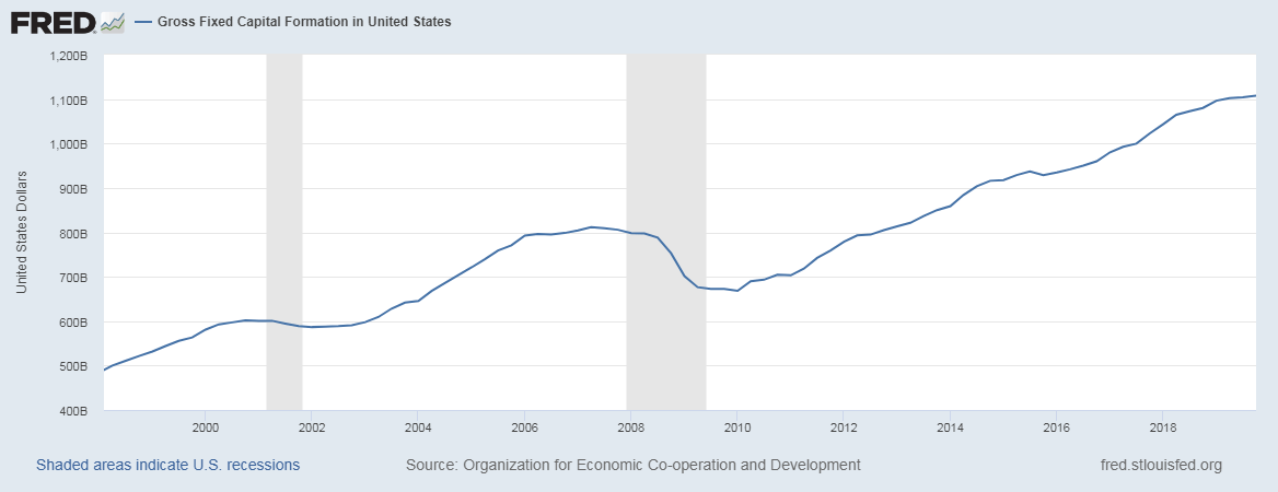
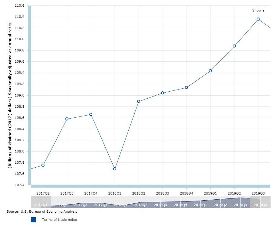
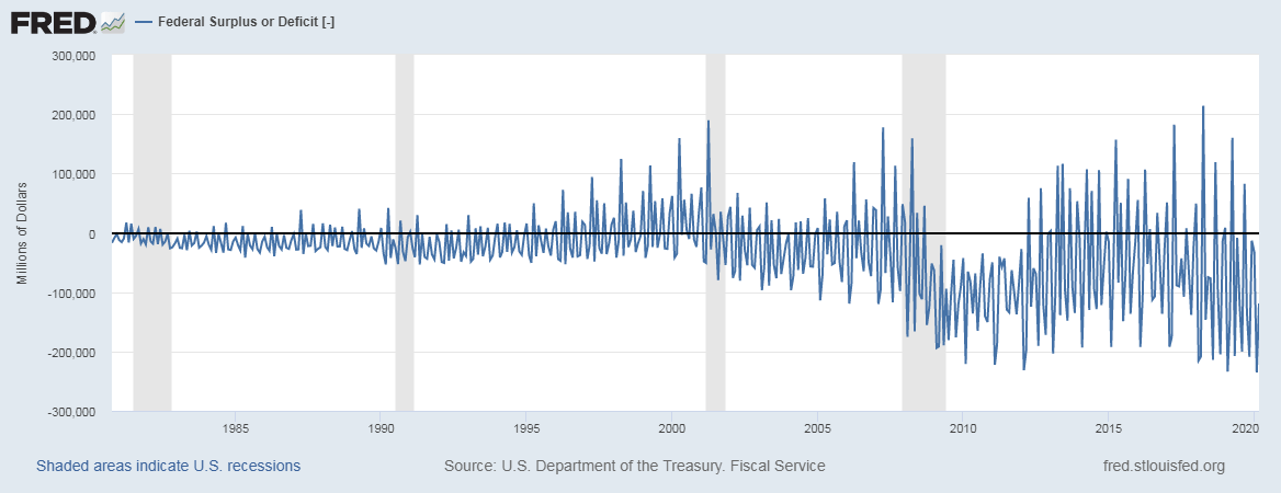
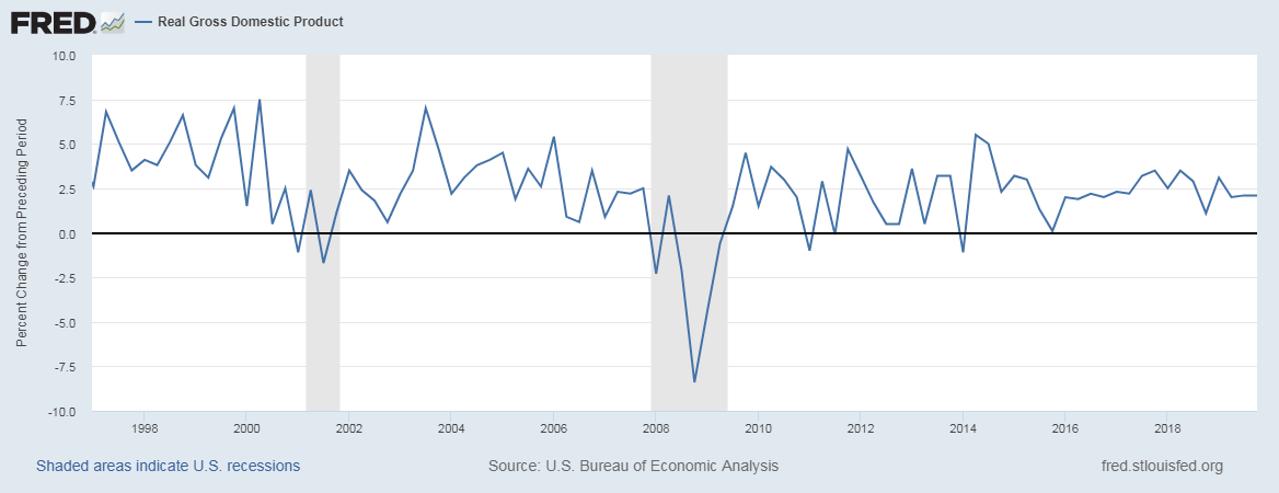
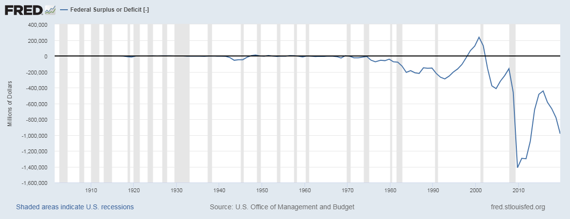
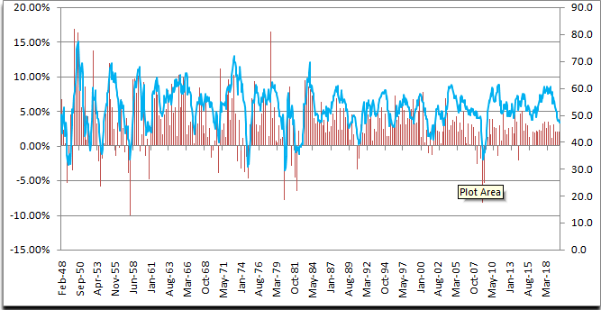
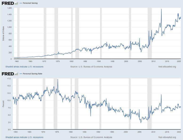
Generally, High yield rates (ex: Treasury Bonds), bank interest rates deposits relative to other economies attract Capital into the economy. When markets experience a slowdown or heading for a crash, it is amplified by the outflow of cash as it propels the de-liquefication and further drives down the confidence of people. Hence, healthy Capital inflow is essential to maintain the economy and for the currency to hold its value against other currencies. The same is illustrated in the below plot:
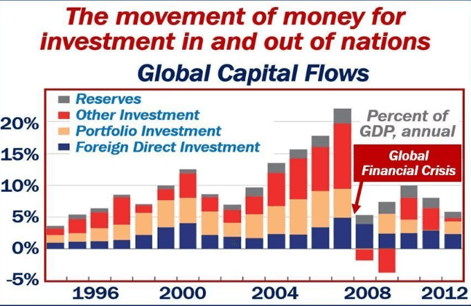
(Chart Credits – Market Business News)
Economic Reports
Capital Flow is a broad metric with several components, as discussed. The corporate balance sheets and press releases can be used to understand the Capital Flow within corporate sectors, which they usually release quarterly, or annually on their own official websites. The Federal Reserve System releases of the United States releases its Federal Budget and its recent revisions on its official website. There are many online platforms to track the status of the global stock exchanges themselves to observe the Capital Flow.
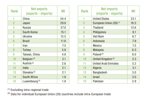
Sources of Capital Flows
Fed Balance Sheet Data & Information can be accessed here.
Information on major indices can be found here.
Capital Flow metrics with illustrative graphs for analysis can be found here.
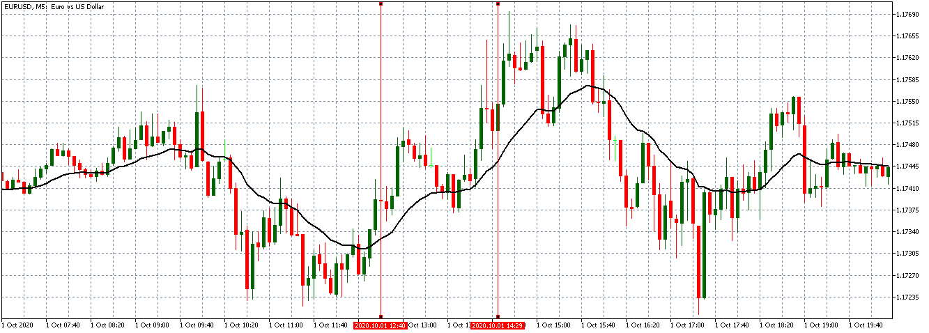
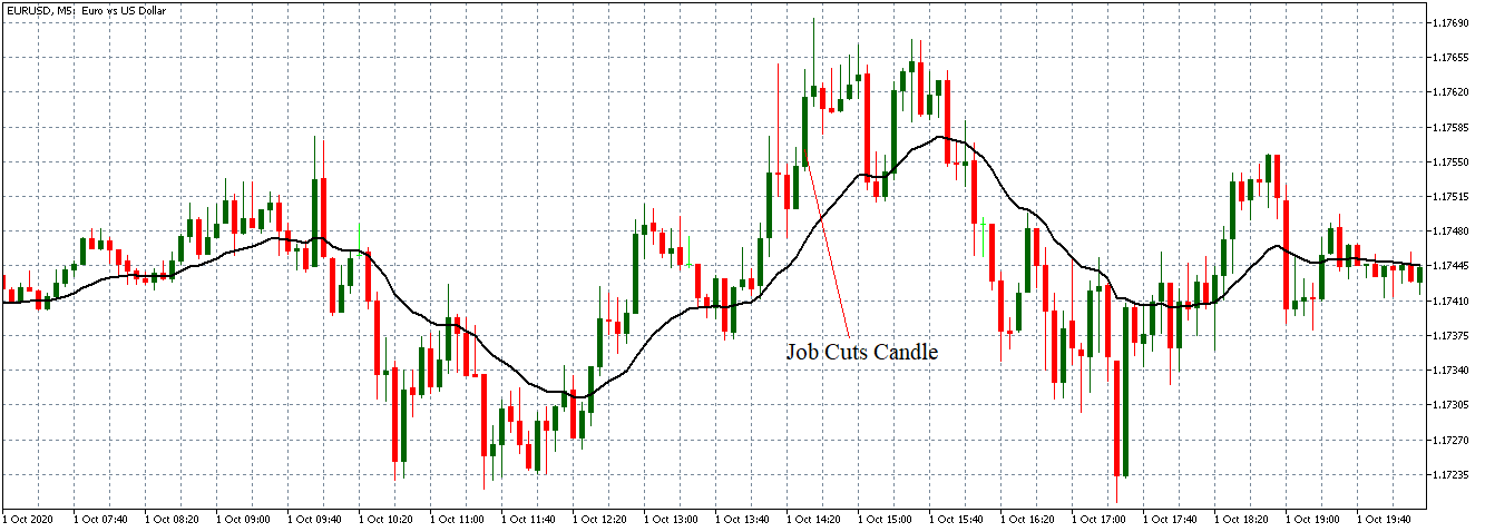
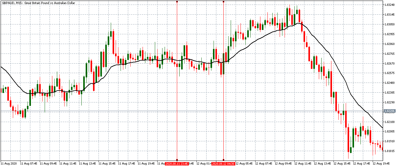
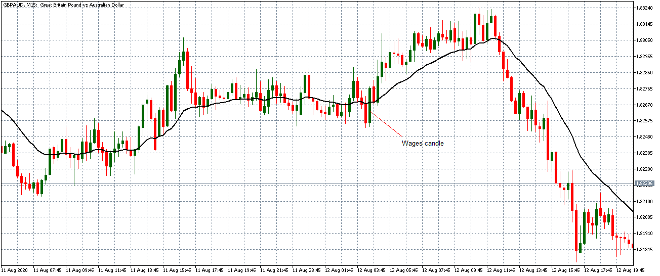
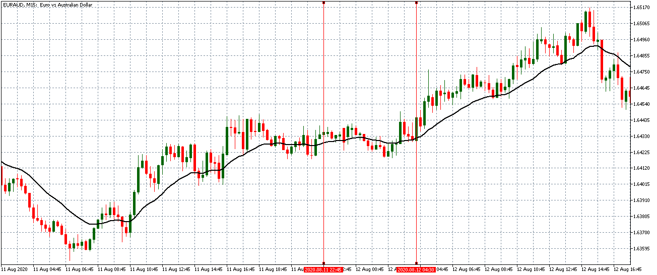
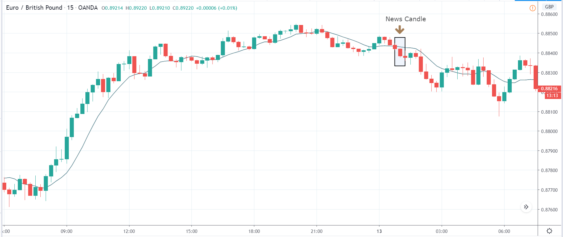
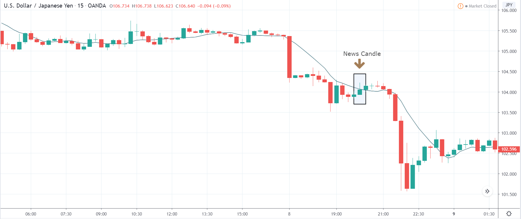
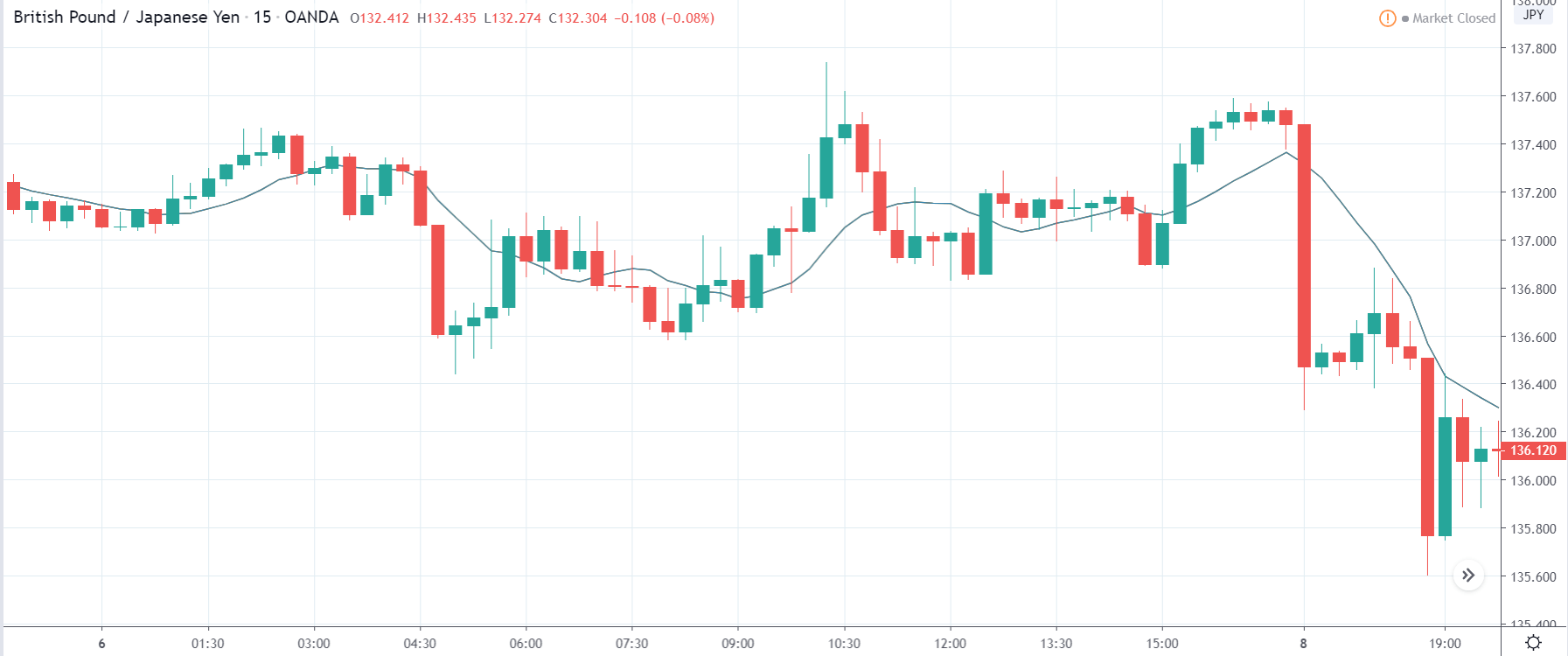
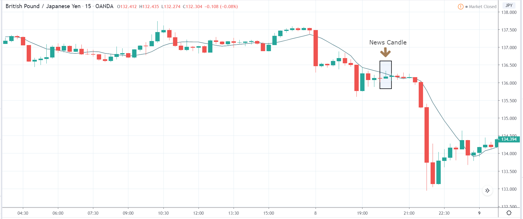
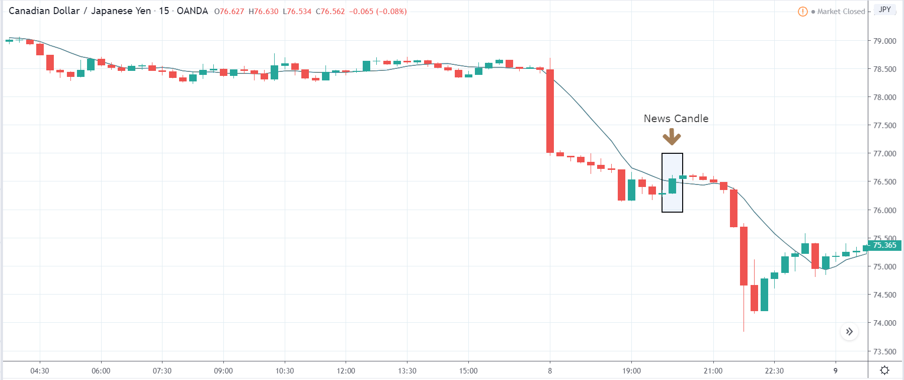
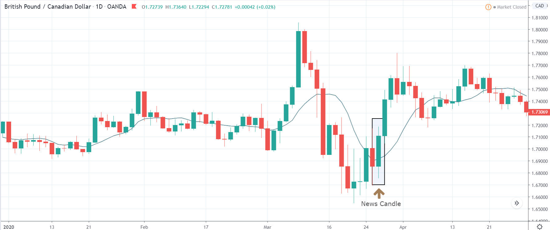
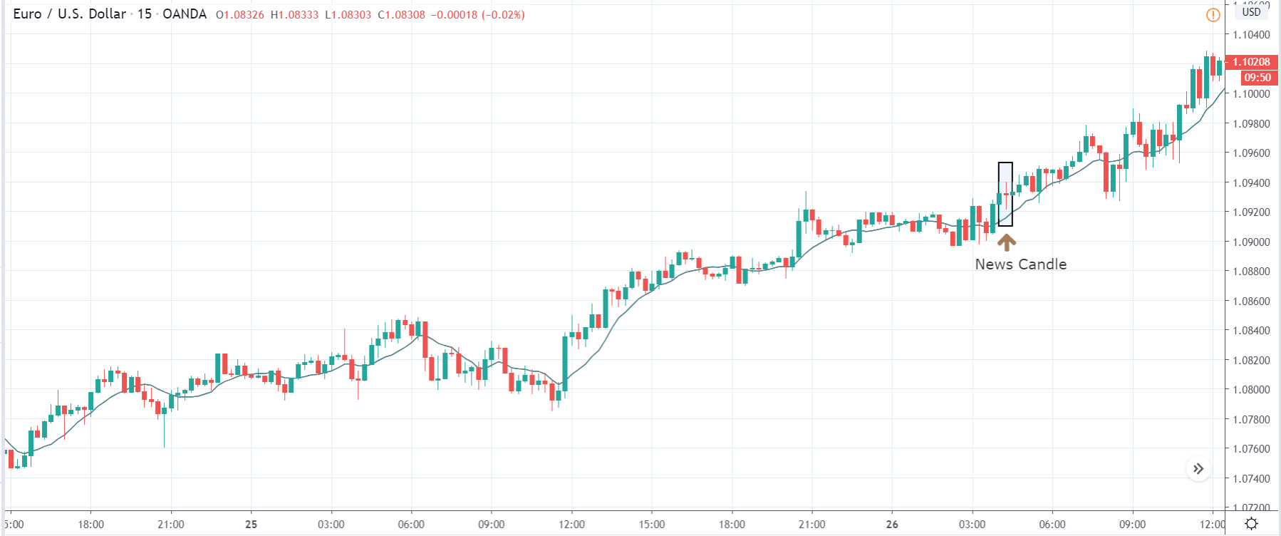
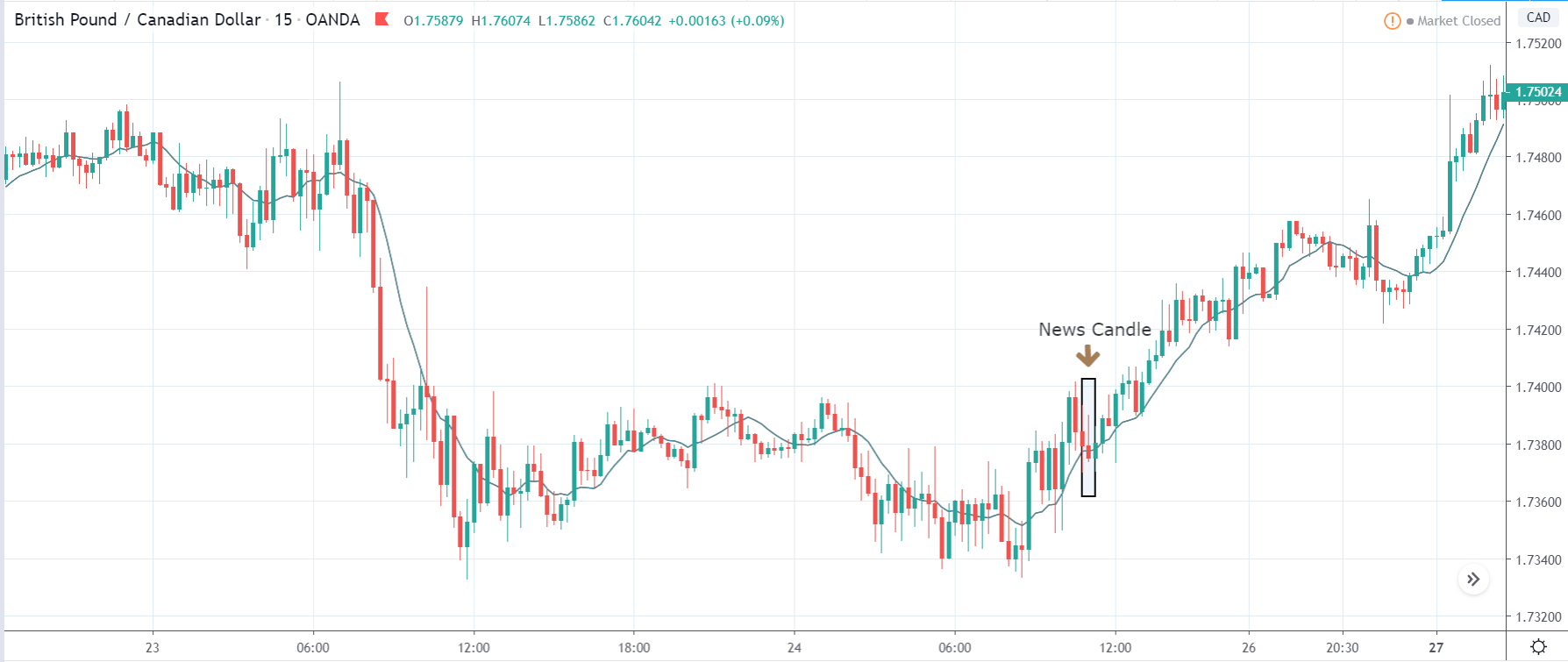
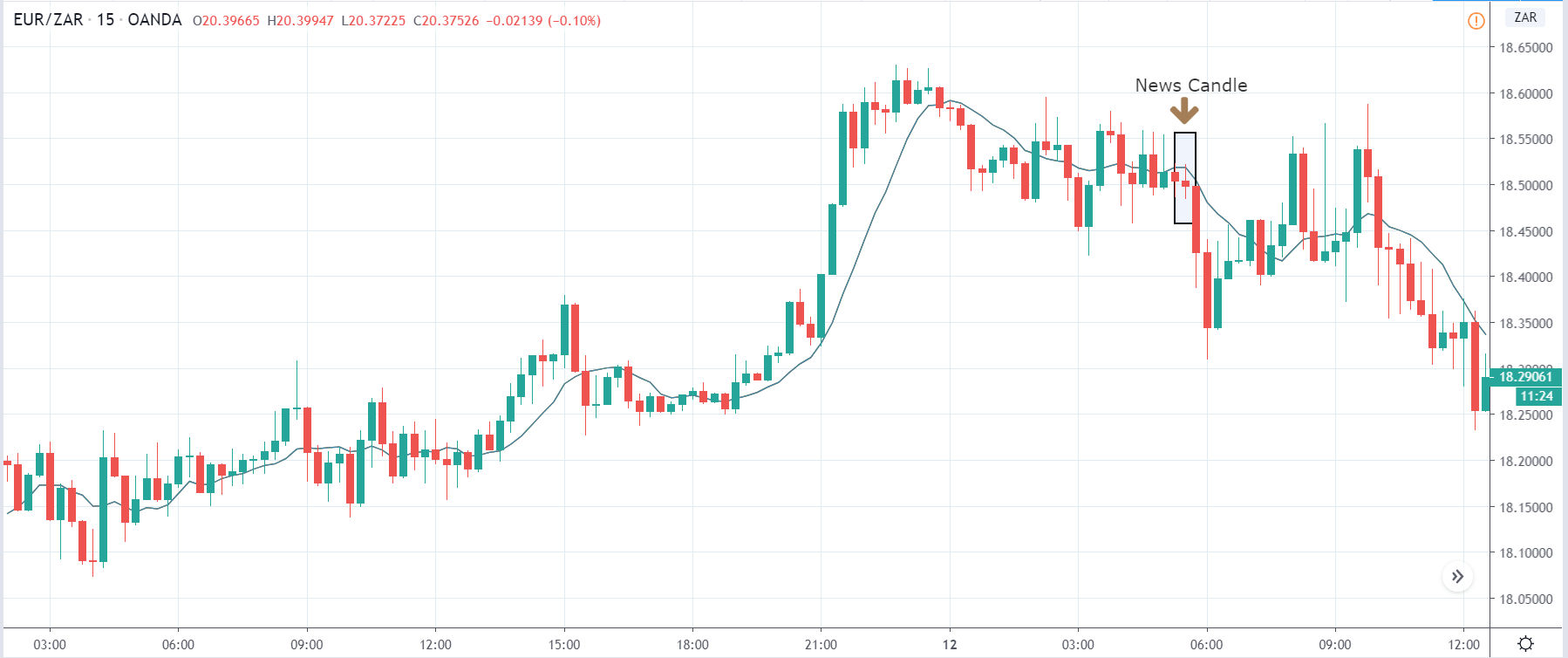
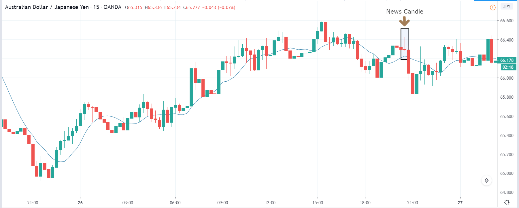
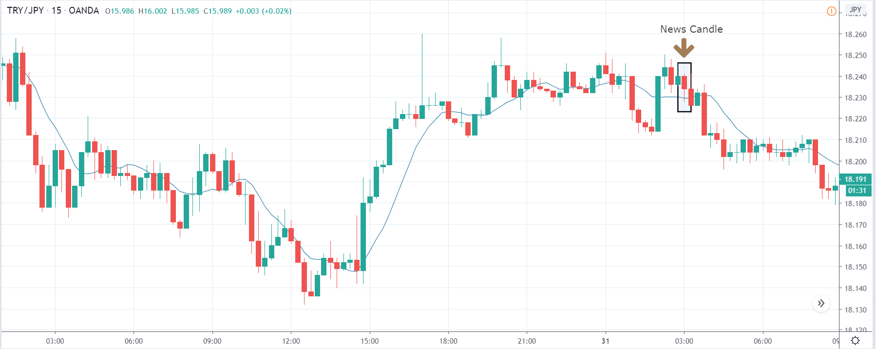
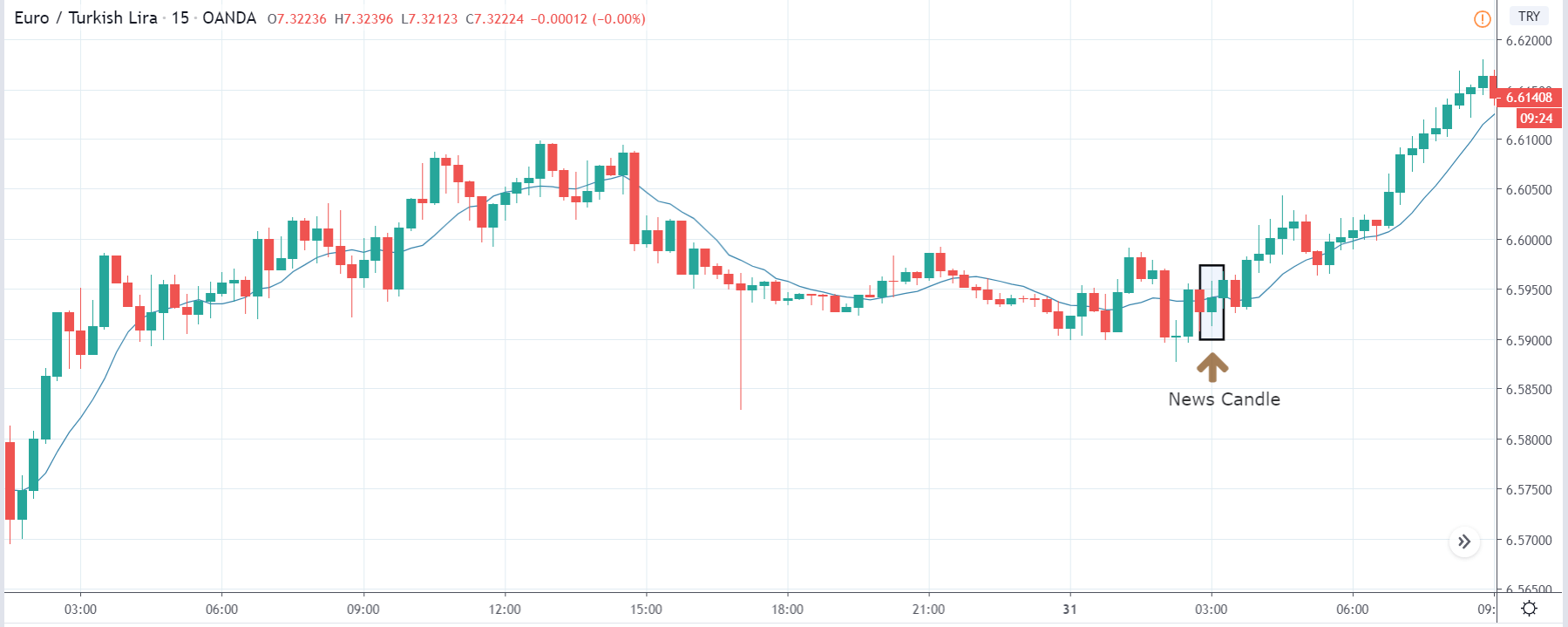
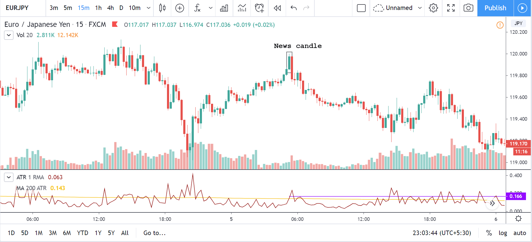
Impact of the ‘Capital Flows’ news release on the price chart
Now that we have understood the importance and significance of Capital Flows in a country, we shall study the impact of the same on the value of a currency. Capital Flows does not only mean the movement of funds across countries, but it is also measured in terms of investment in asset-classes, venture capital, federal budget, mutual funds, and government spending.
Capital Flows have quite an impact on the economy, if not a major effect. The revenue of the local Exchange Market, money supply and liquidity are some of the parameters which fall prey to any disturbances in the Capital Flows. Traders and Investors keep a watch on the Capital Flows data and monitor the trend of Flows. They will be interested in investing in the country only if they feel that there is growth potential looking at the monthly data.

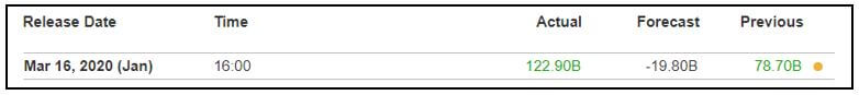
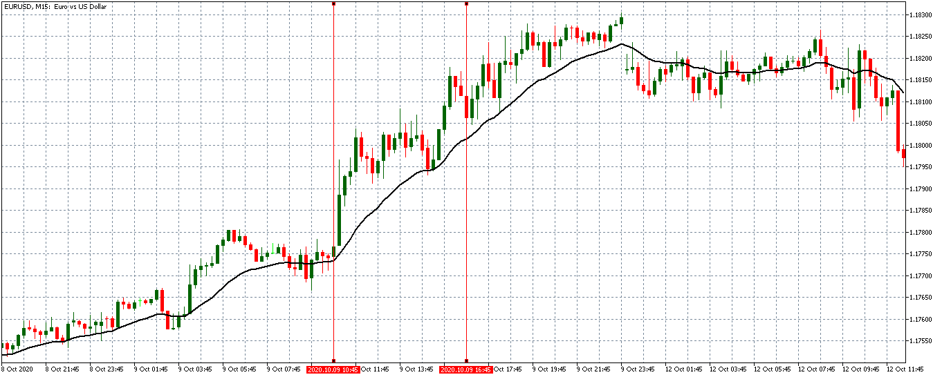
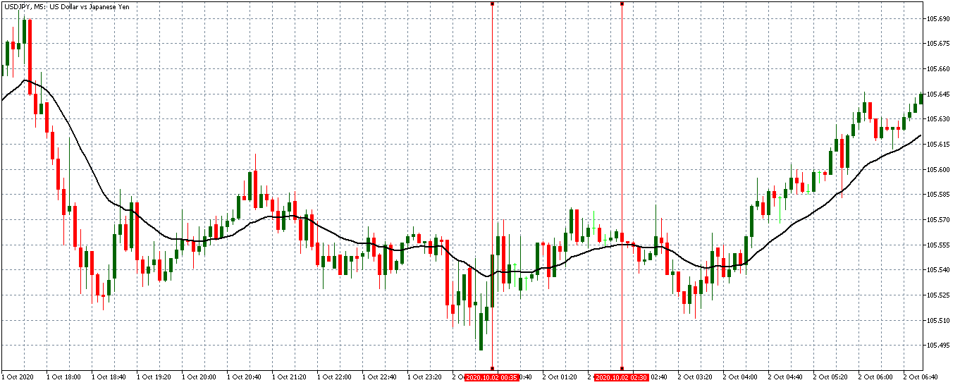
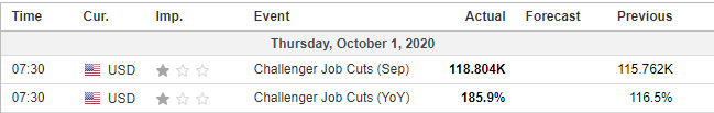
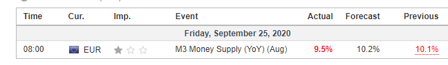
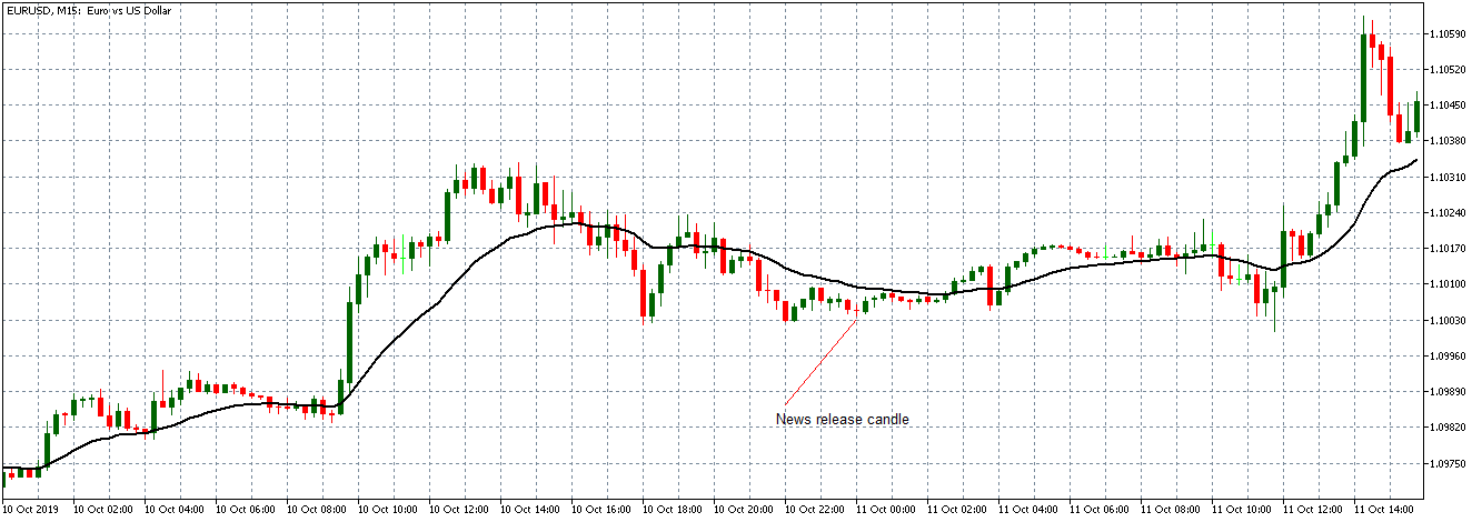
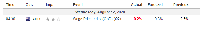
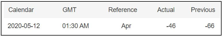
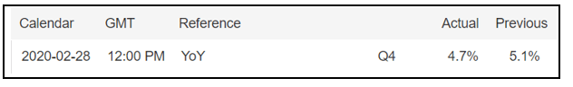
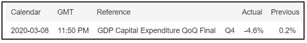
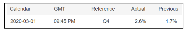
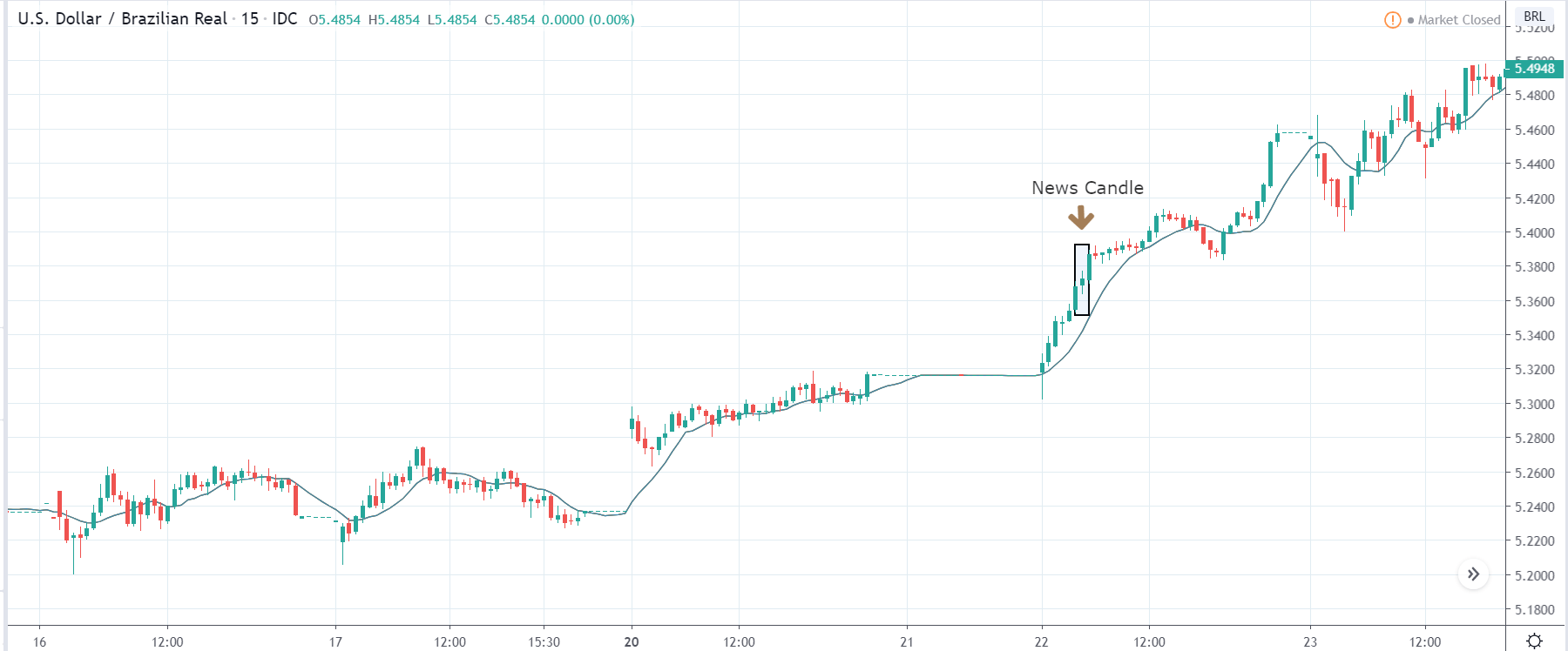
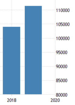
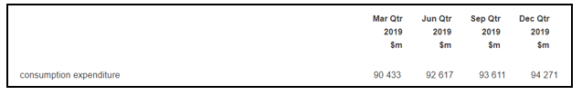
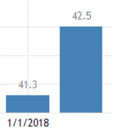
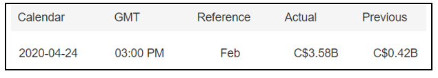
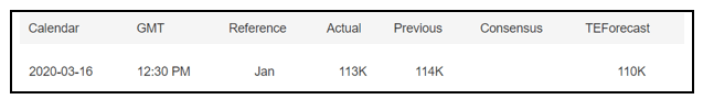
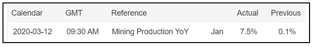
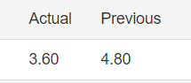
In this section, we will be looking at the Capital Flows data of the U.S. collected in the Month of February and analyzed the impact on various currency pairs. This data is collected and published by the Department of Commerce’s Bureau of Economic Analysis. A higher than expected reading should be taken to be positive for the currency while lower than expected data is considered to be negative.
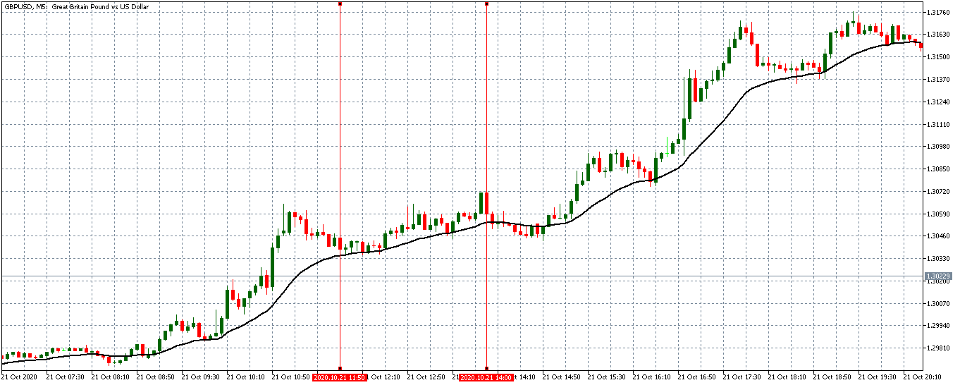
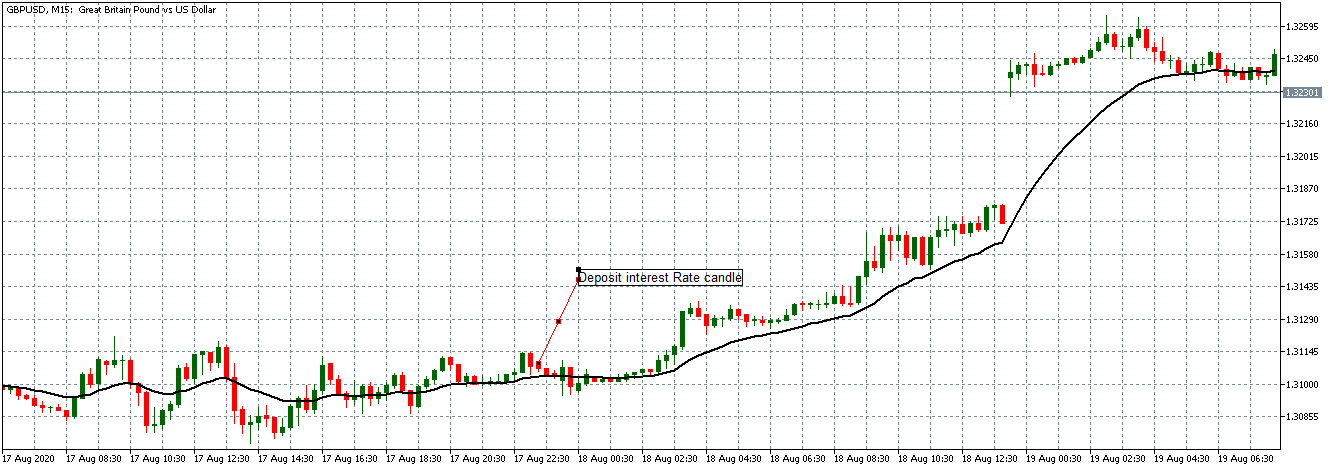
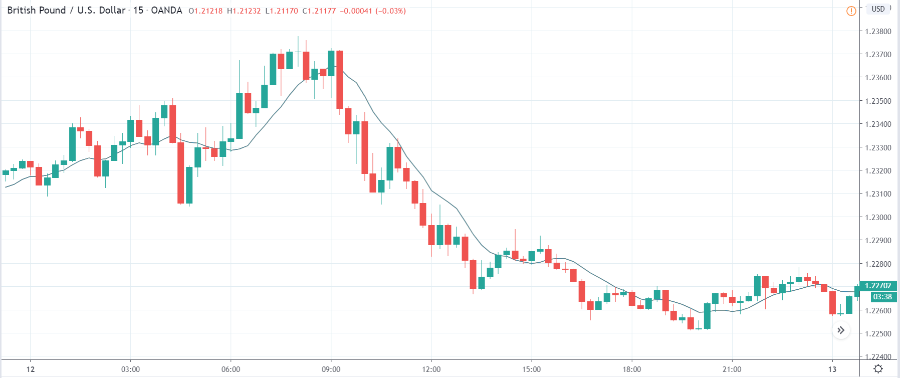
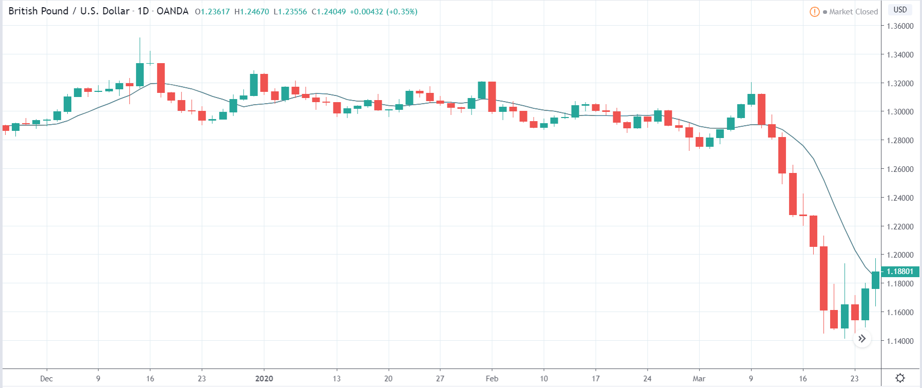
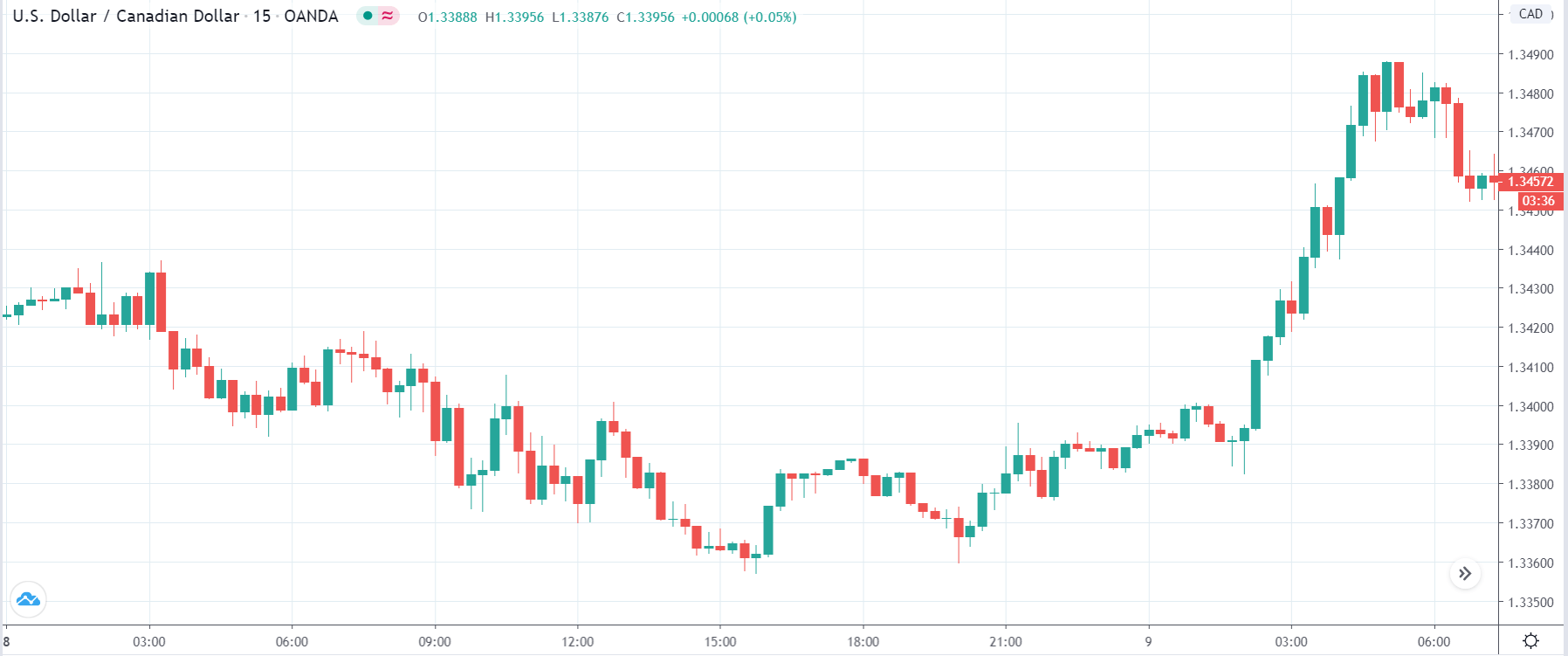
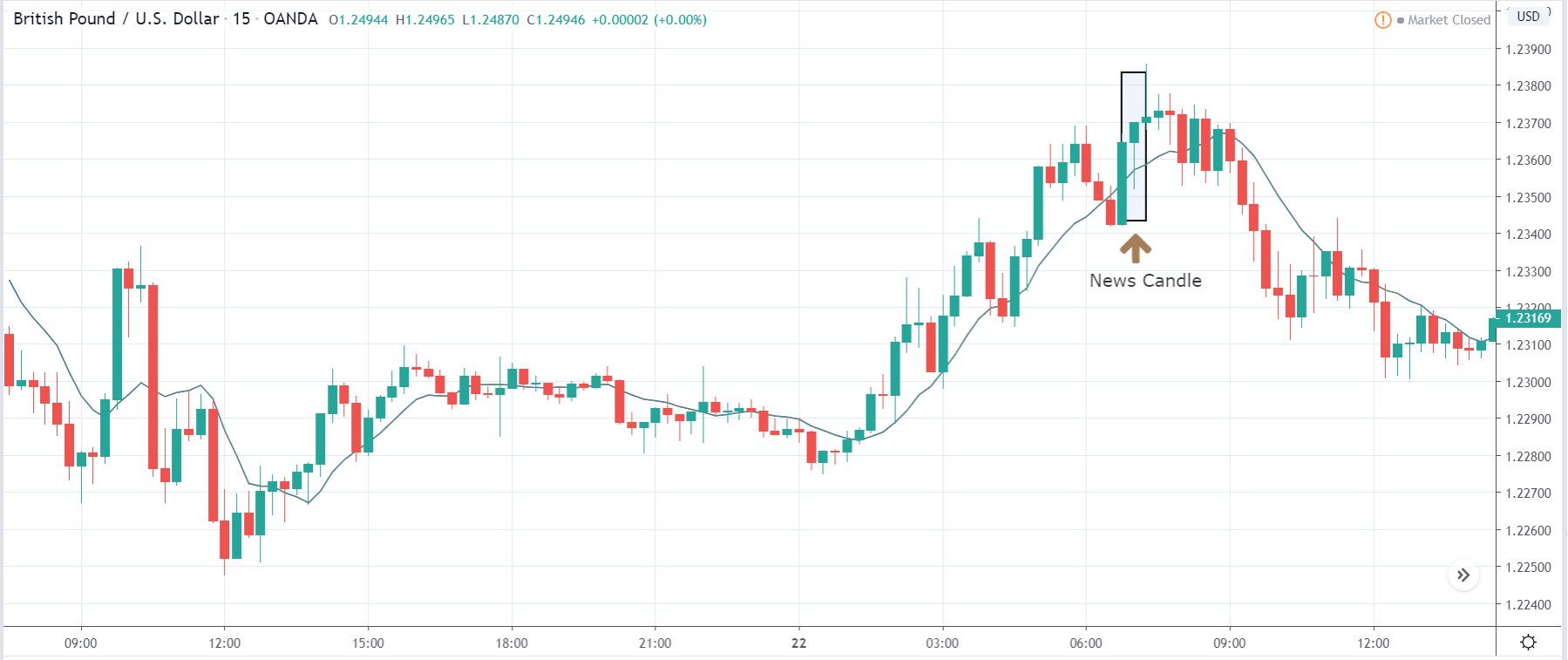
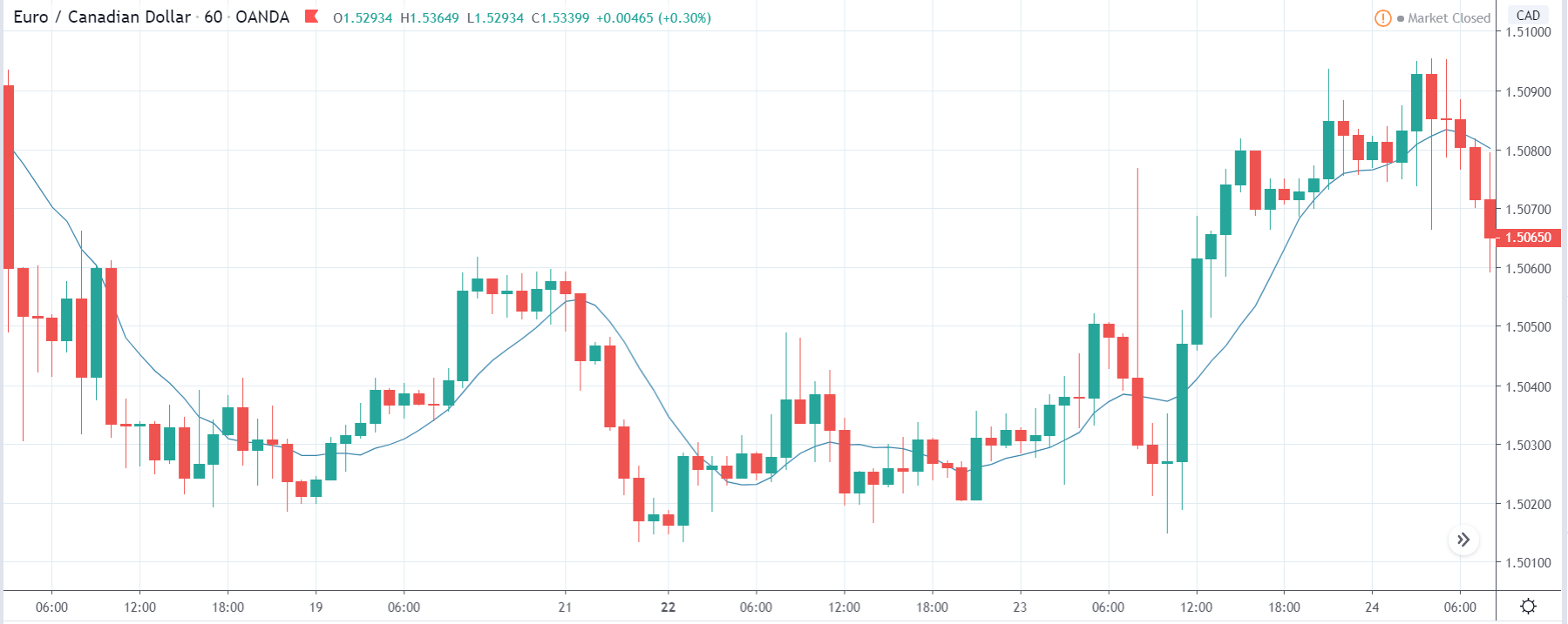
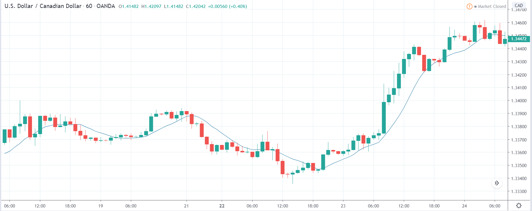
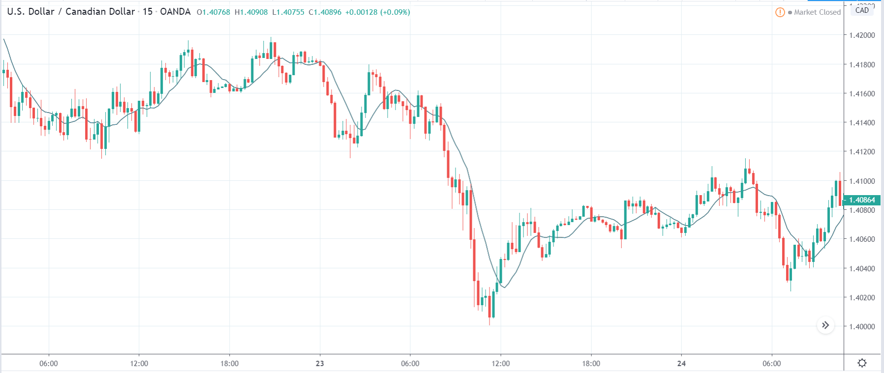
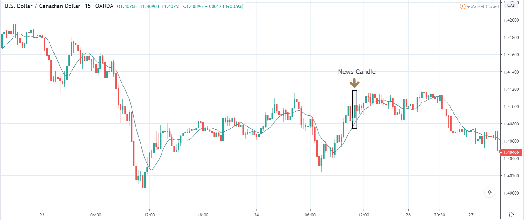
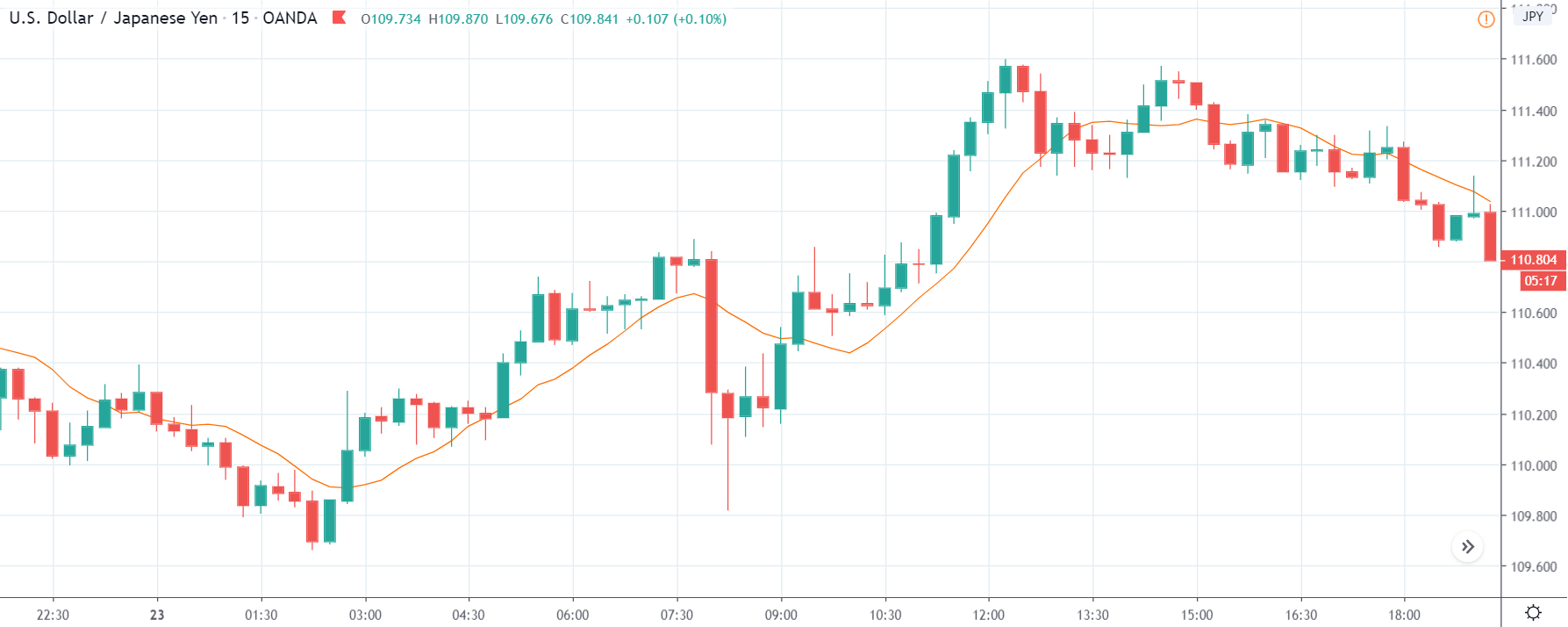
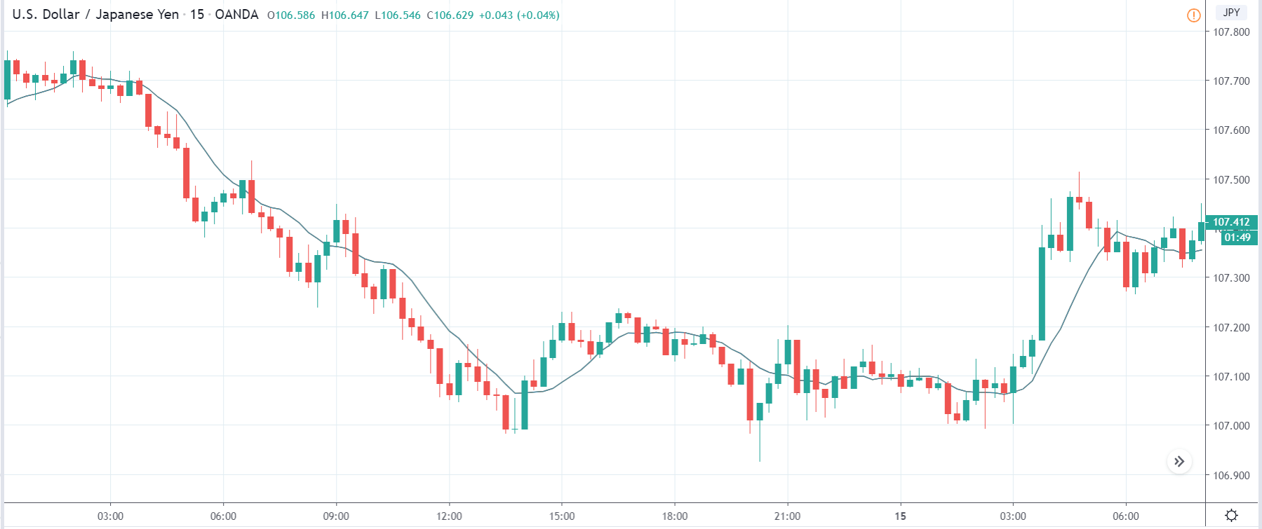
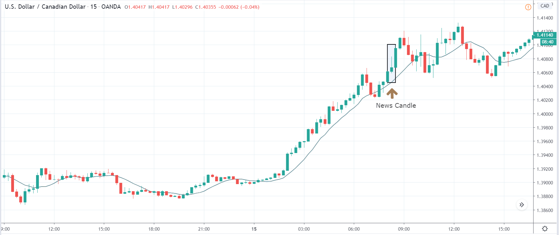
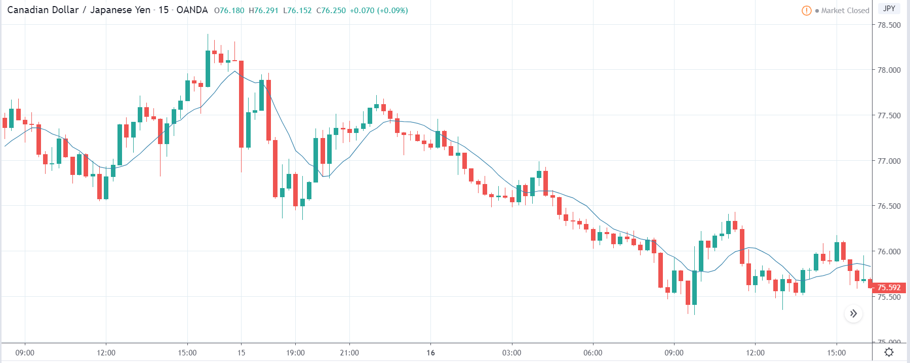
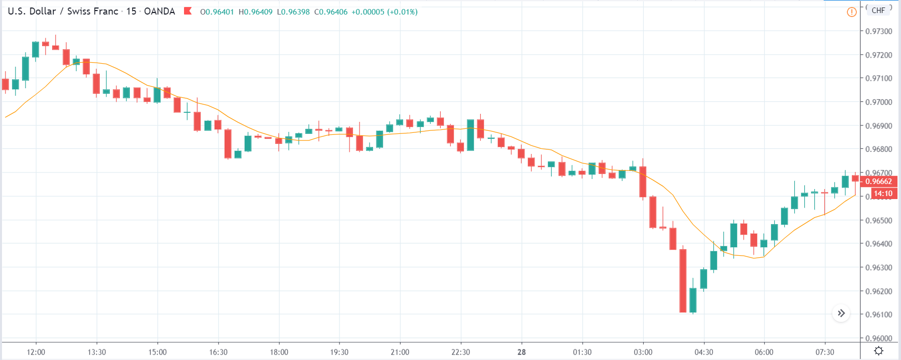
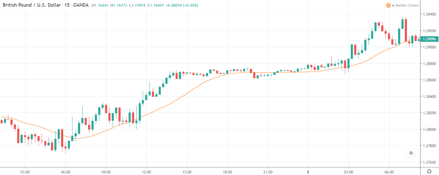
USD/CAD | Before The Announcement
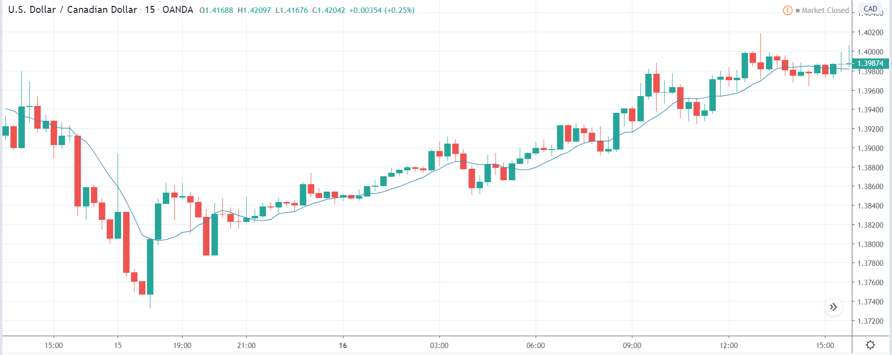
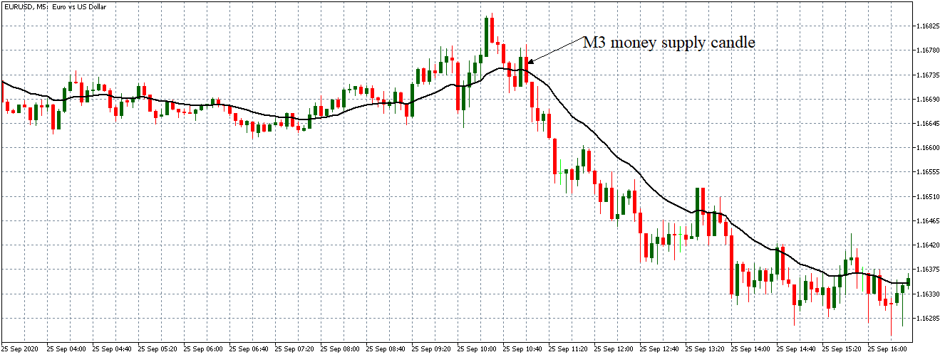
Let us first analyze the USD/CAD currency pair. The above image shows the characteristics of the chart before the announcement was made, and we see that the pair in a strong uptrend moving aggressively higher. The uptrend could be due to another fundamental reason which we are not sure about. Thus, we should not be taking ‘short’ trades based on the forecasted data as we don’t see any signs of reversal on the chart.
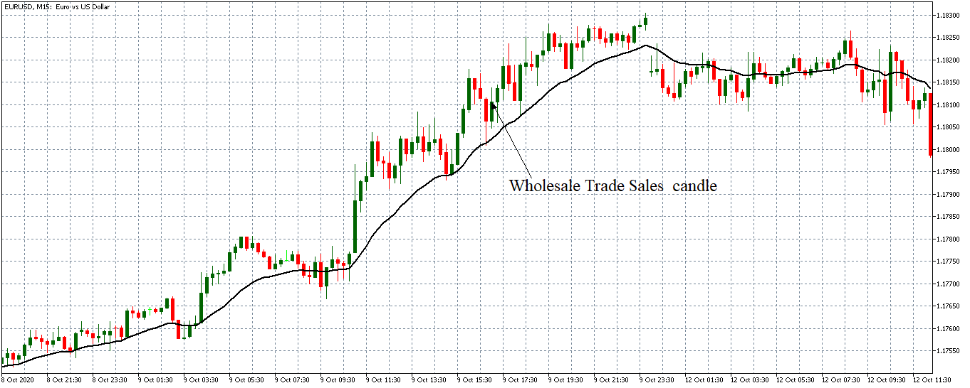
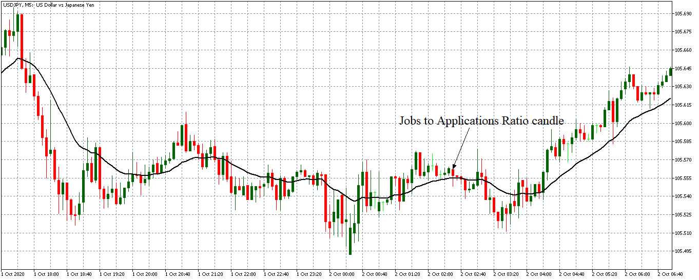
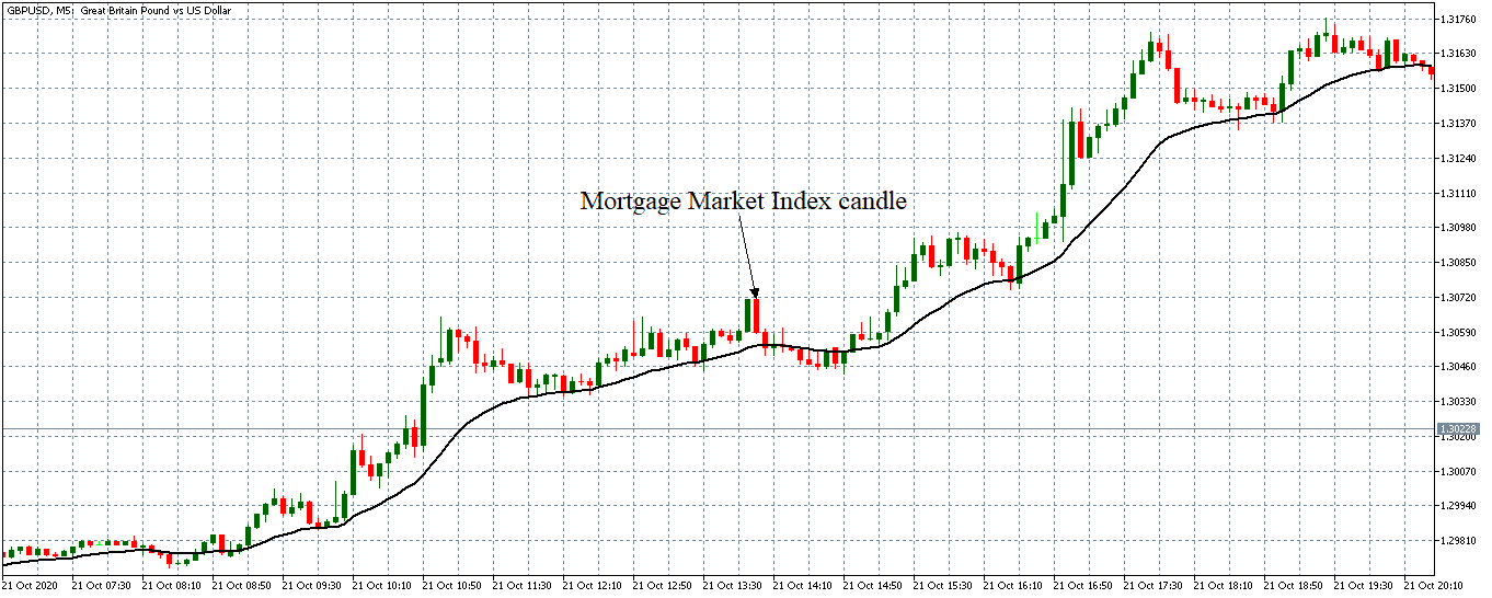
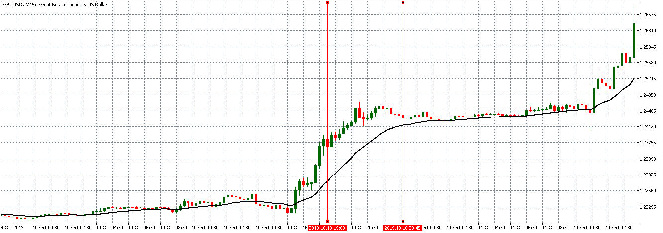
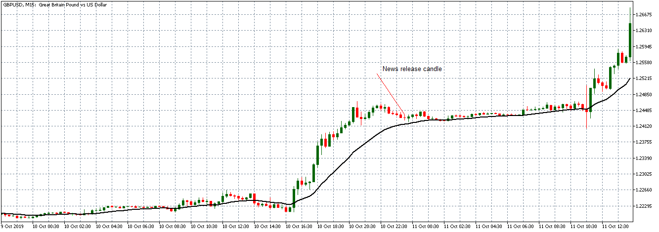
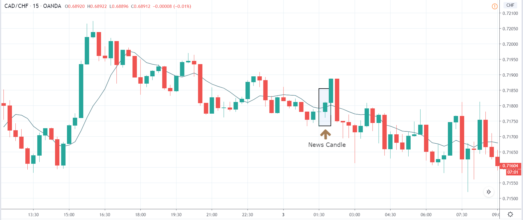
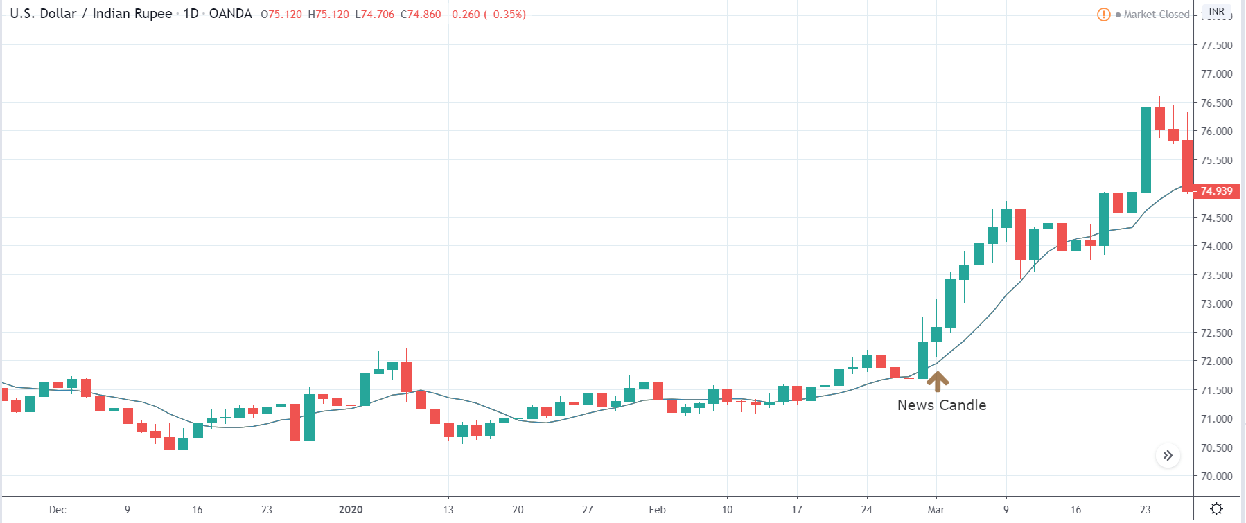
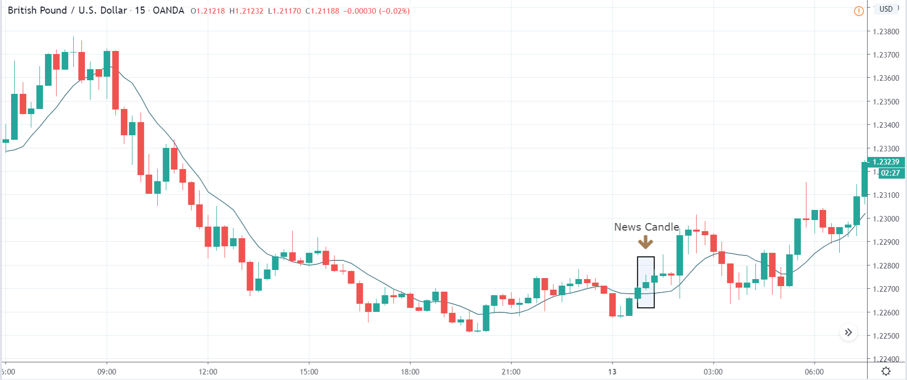
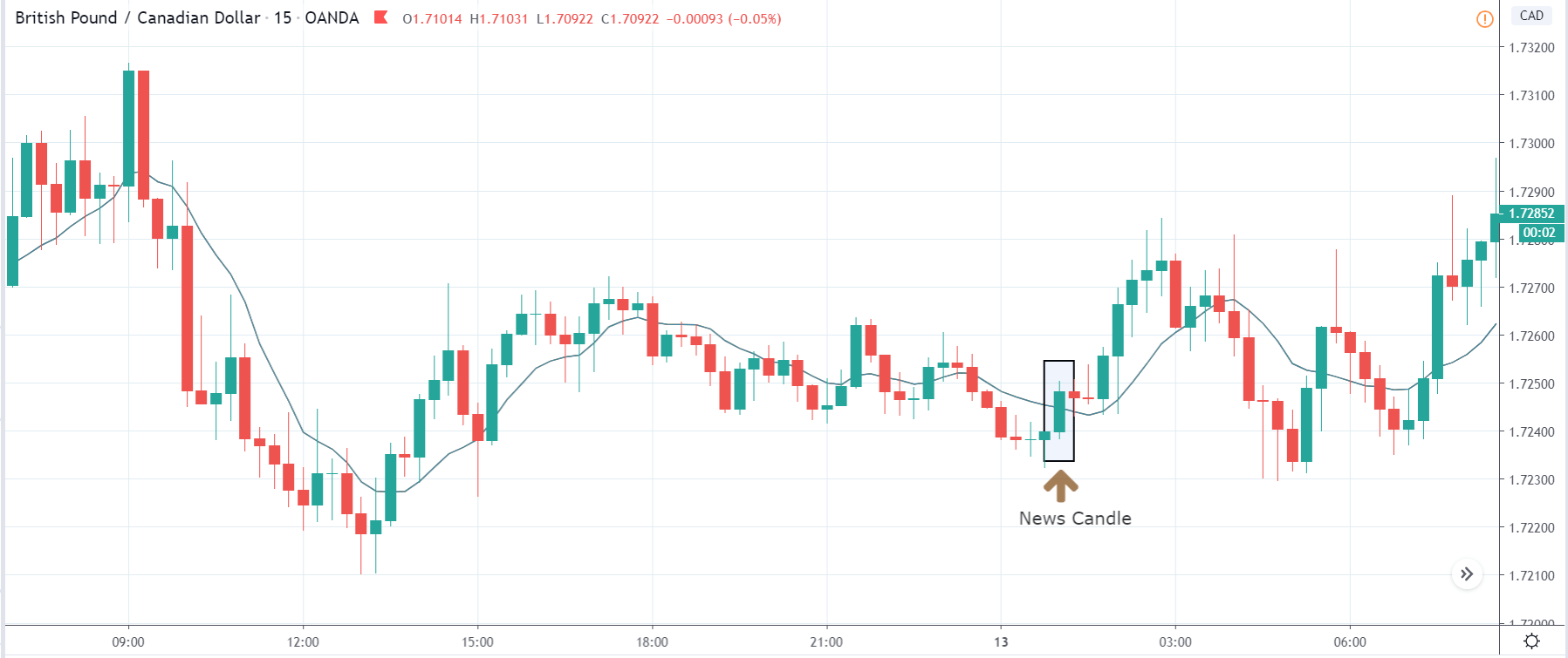
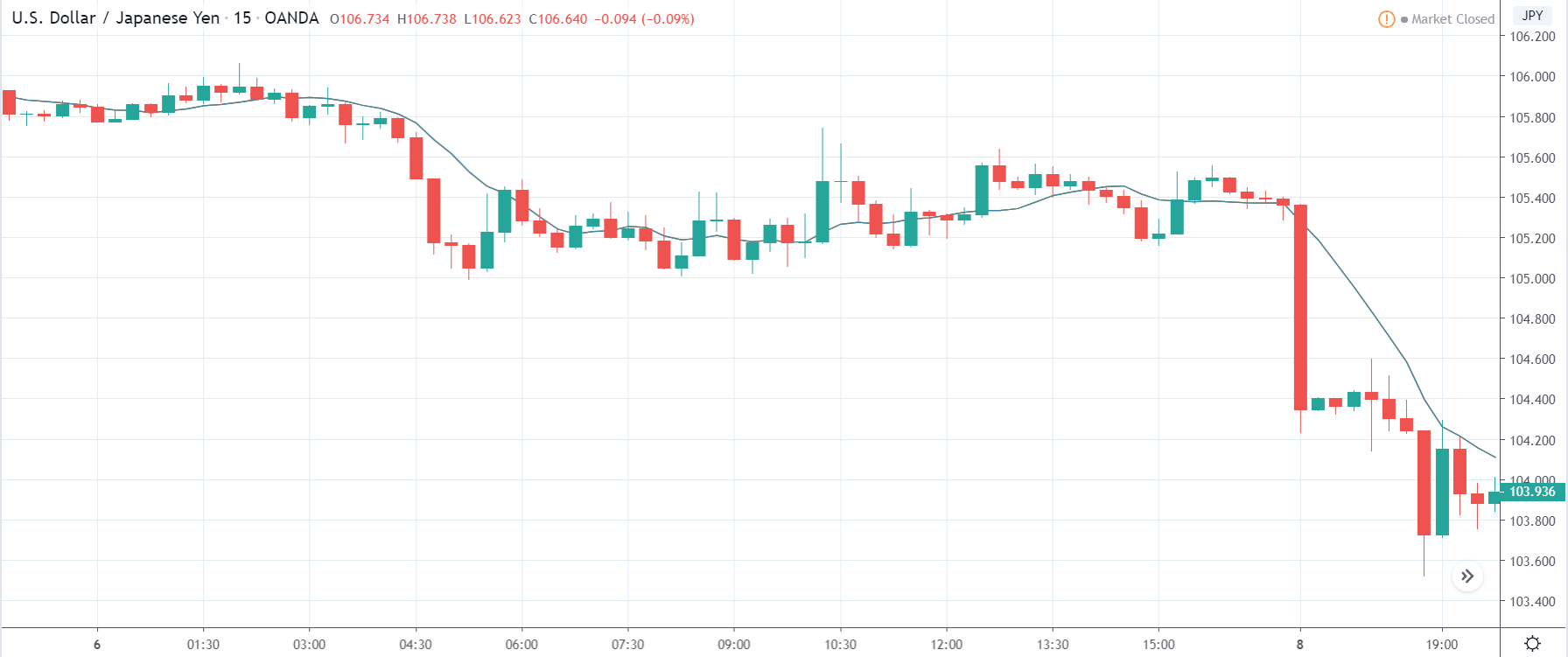
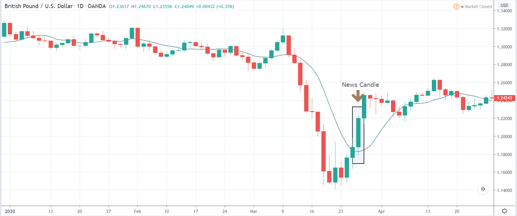
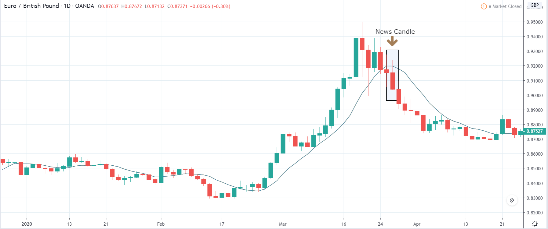
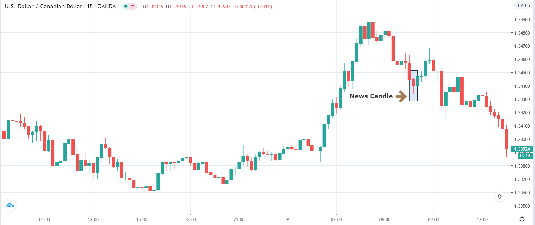
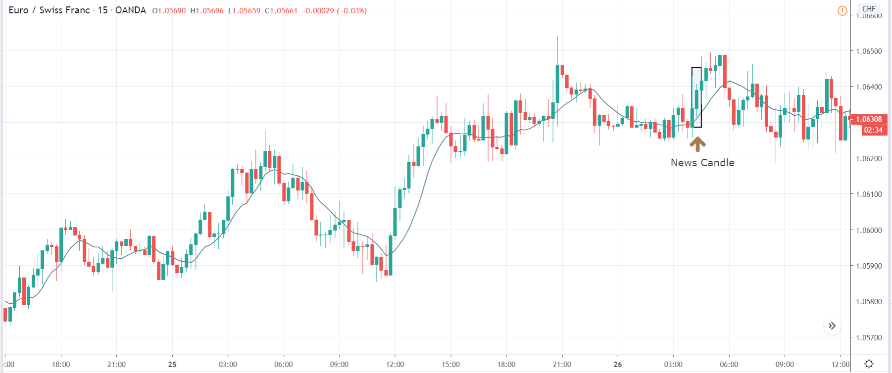
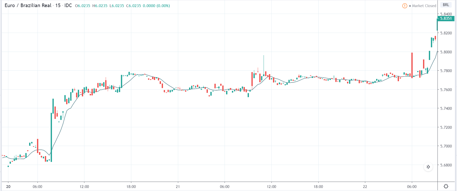
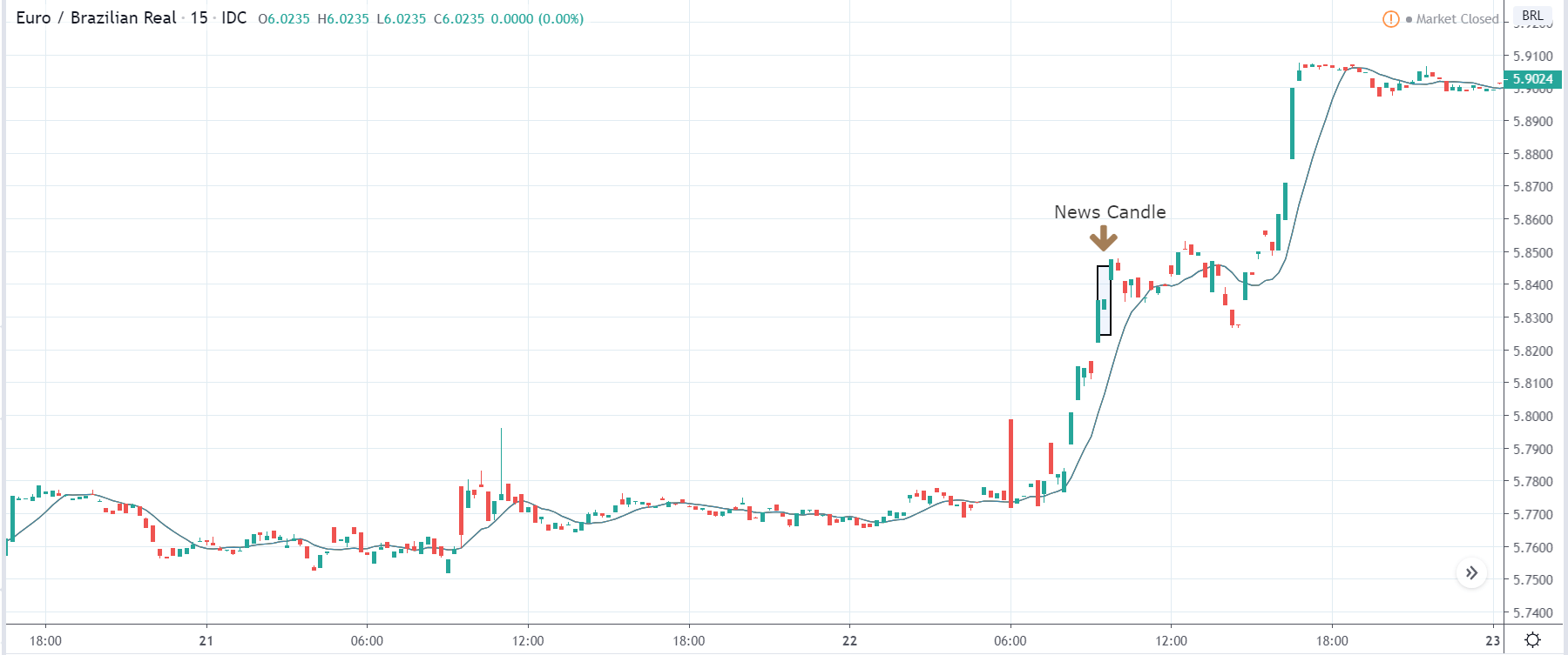
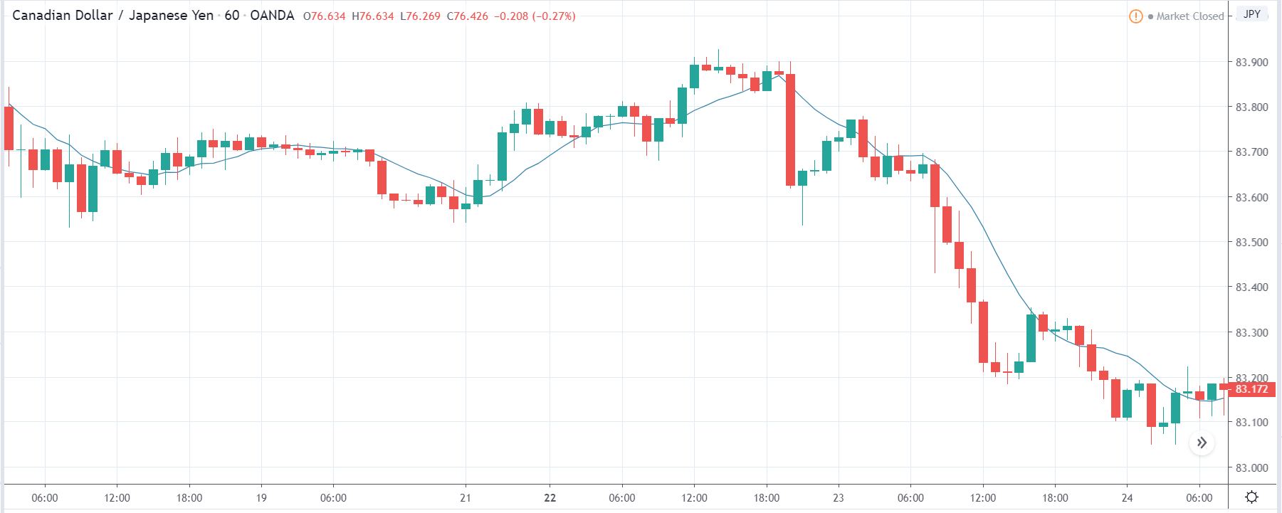
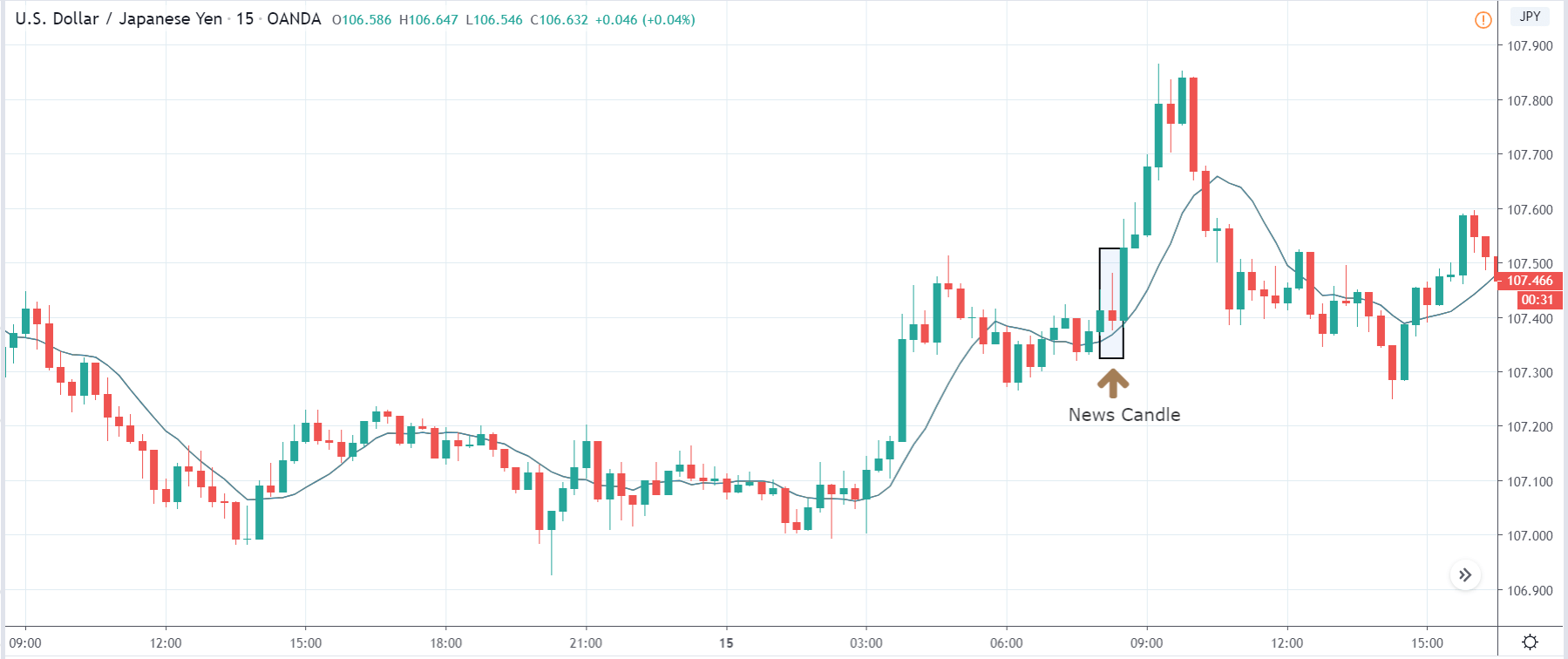
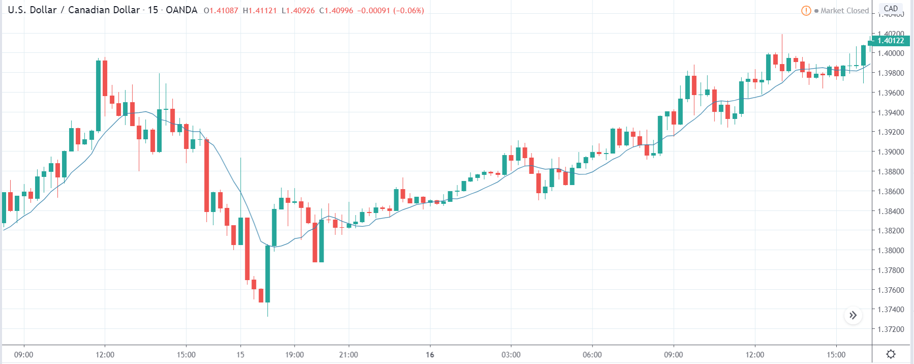
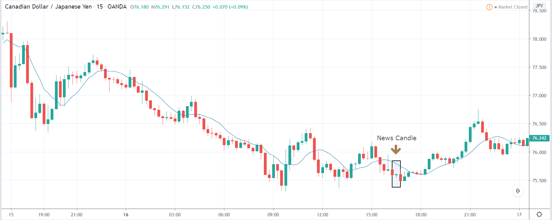
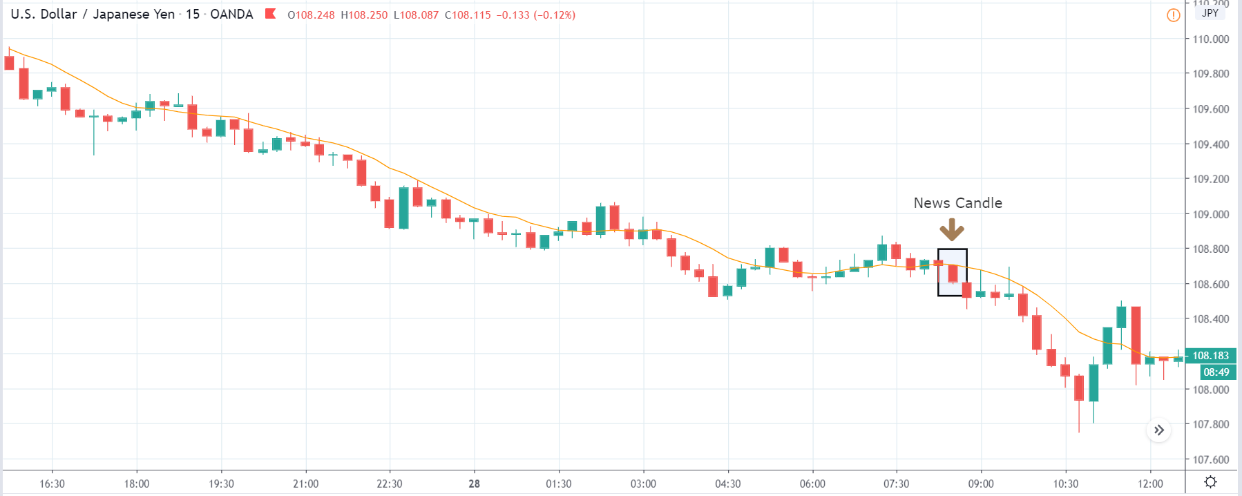
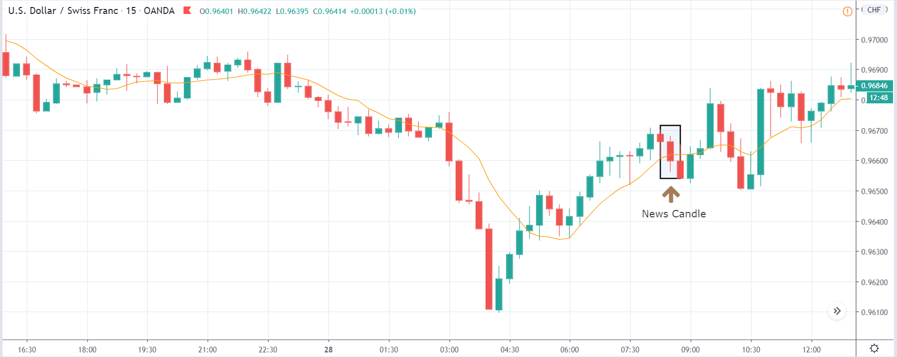
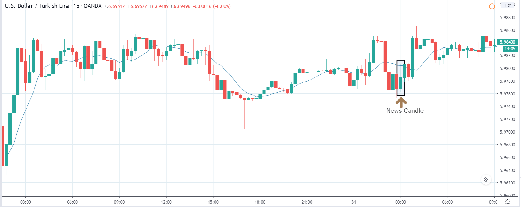
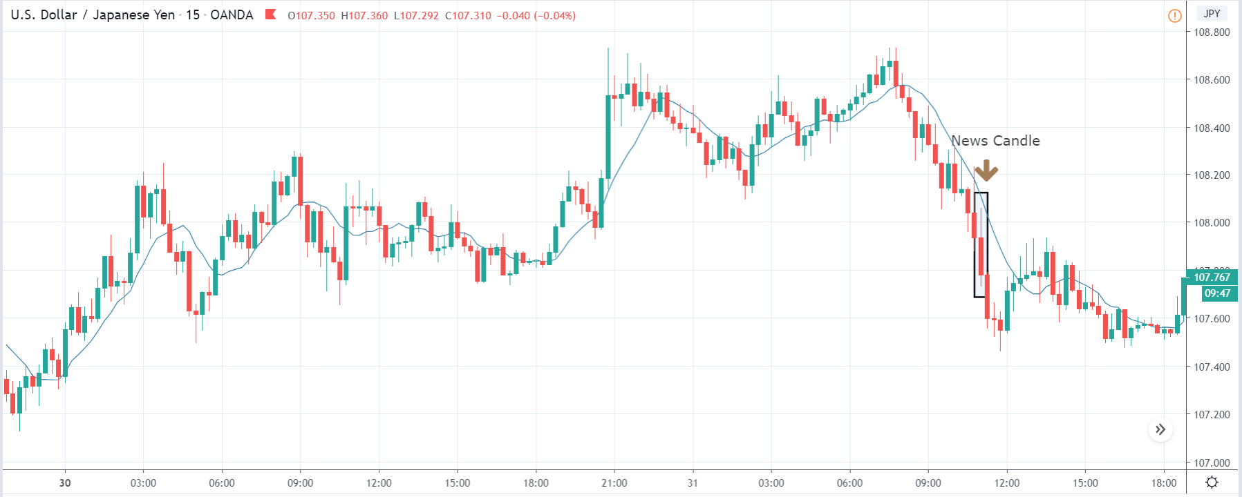
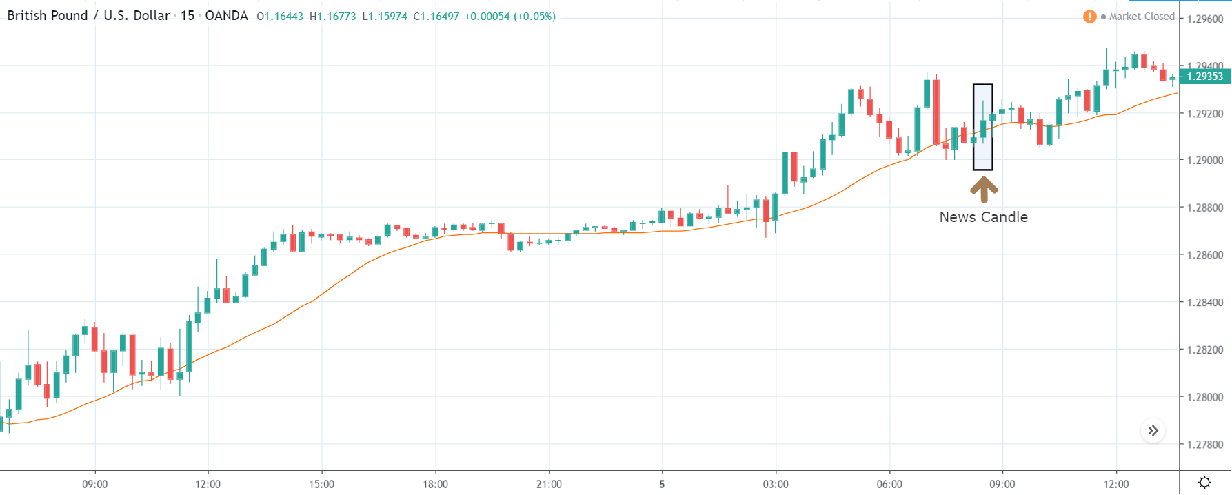
USD/CAD | After The Announcement
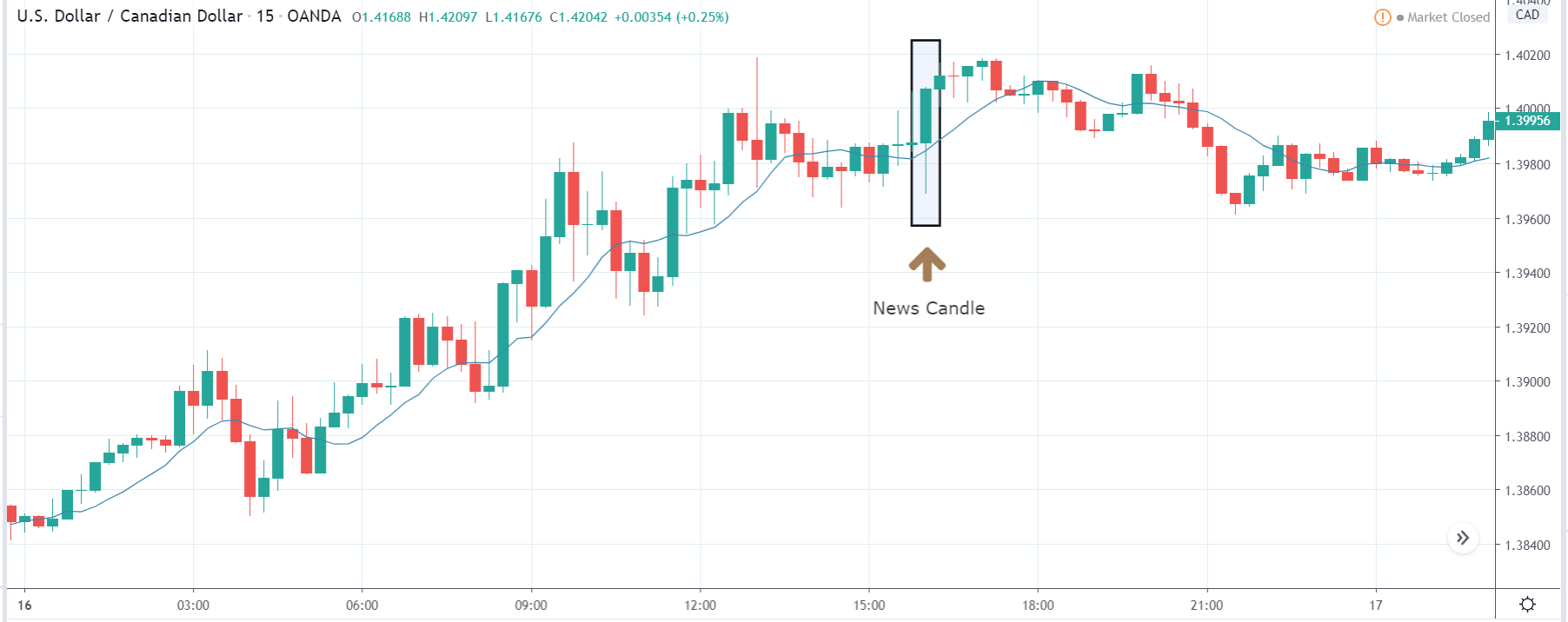
After the Capital flows data is published, we witness a large amount of volatility in the market, and finally, the price closed as a bullish candle. Due to the increased volatility, the price initially went lower, but later, when traders apprehended the numbers, they bought U.S. dollars aggressively, and the ‘news candle’ closed with great strength. This reaction was because the Capital Flows data was largely above expectations and much higher than last time. However, one should not chase the market and enter for ‘buy’ but instead wait for a retracement to join the trend.
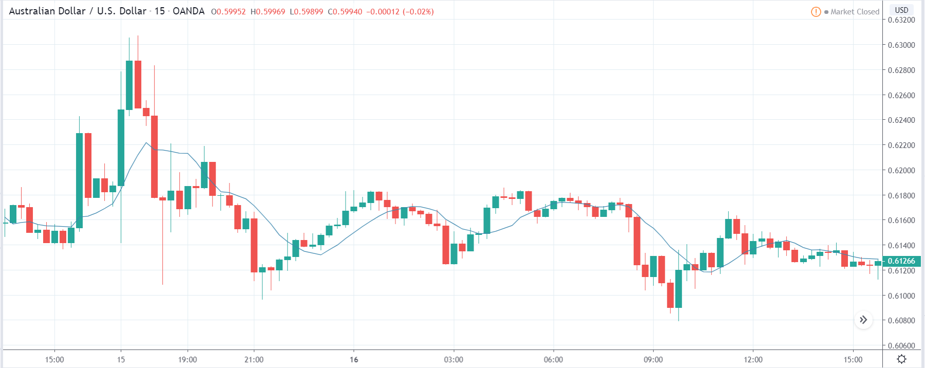
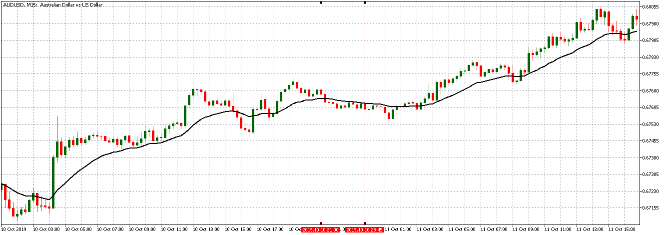
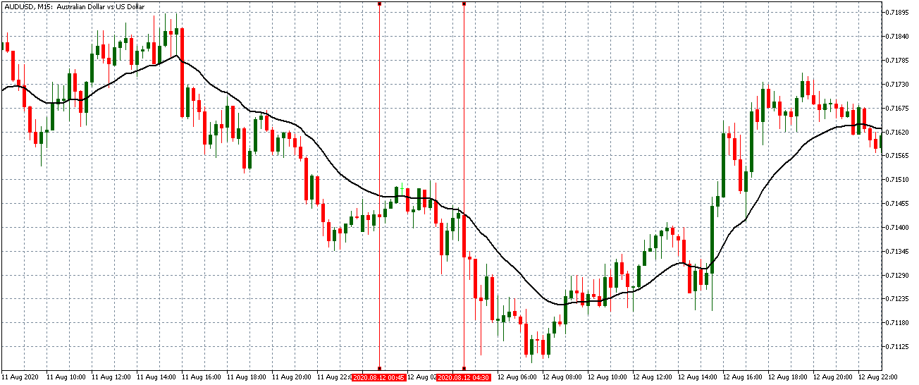
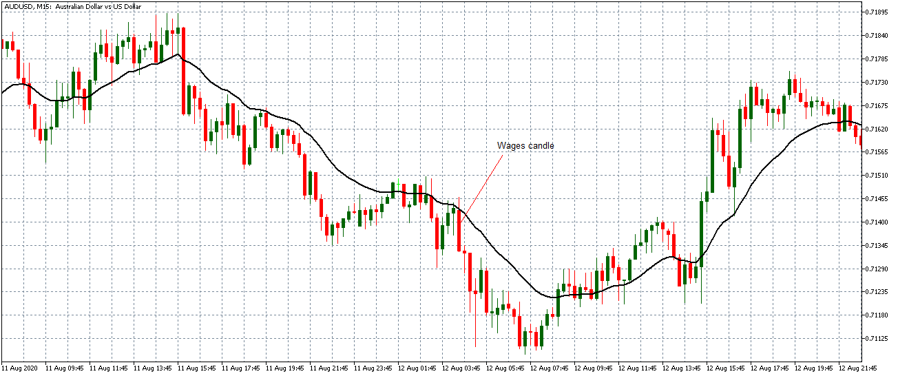
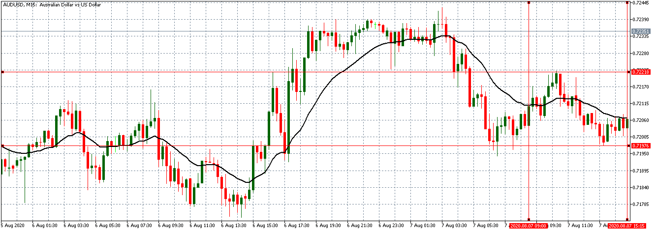
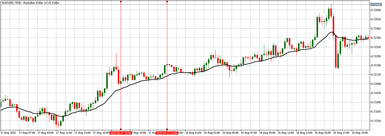
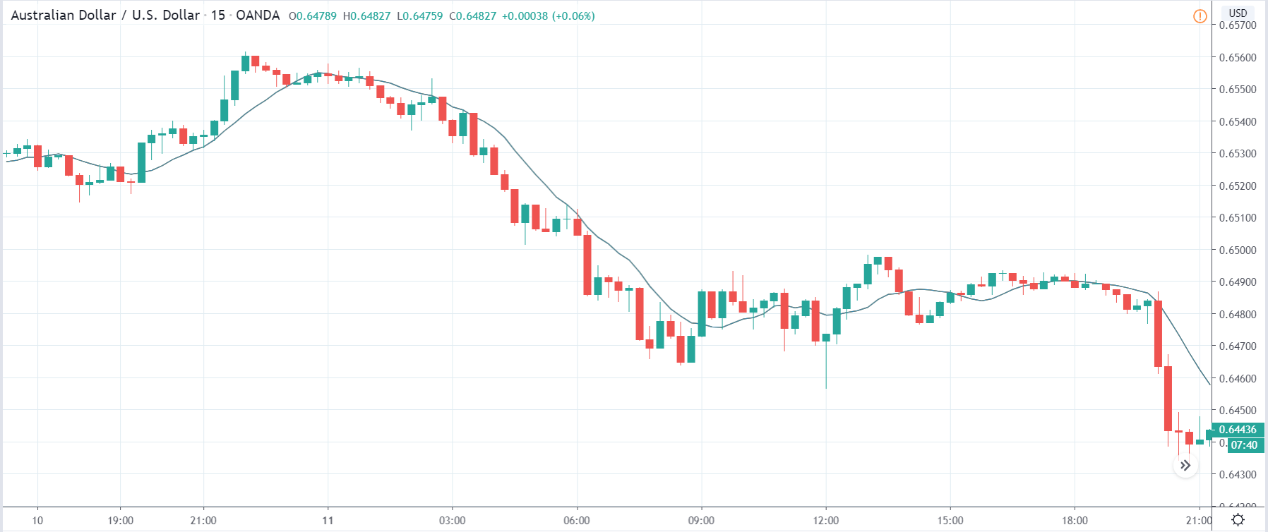
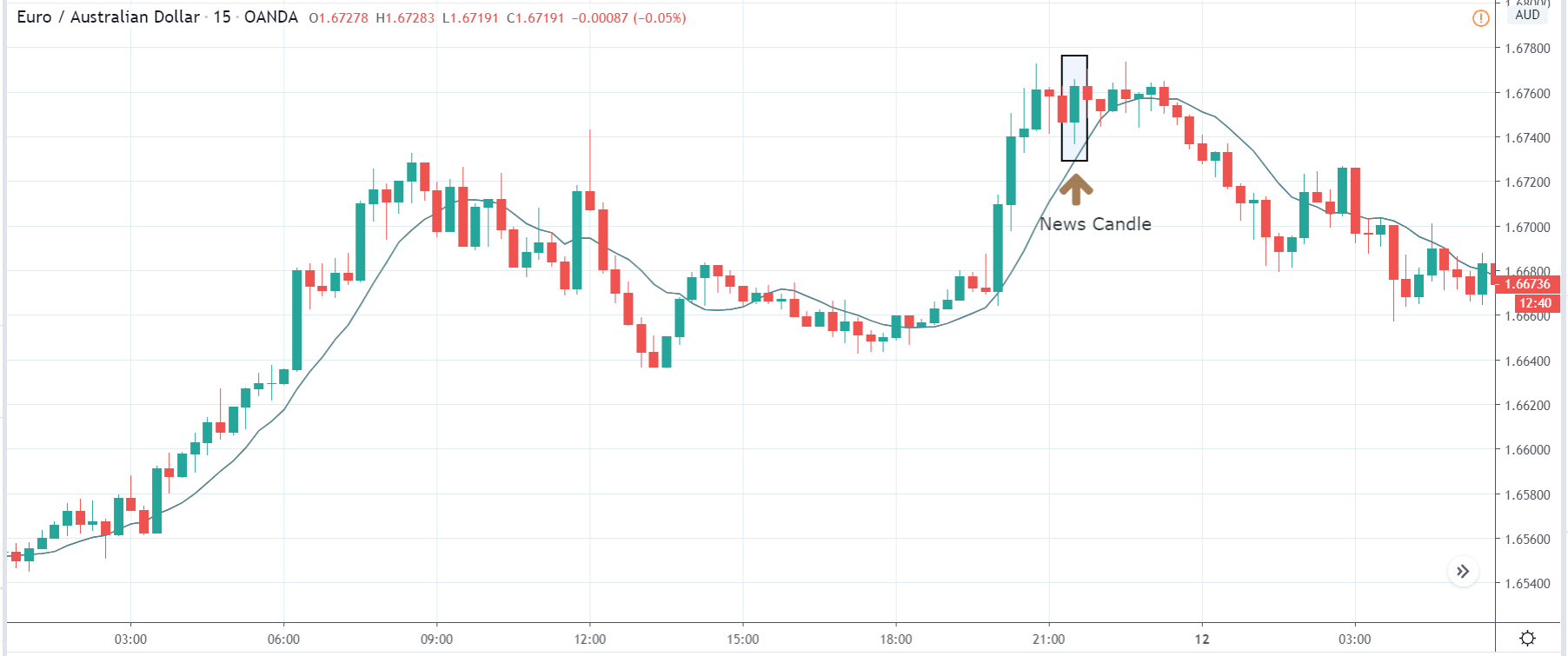
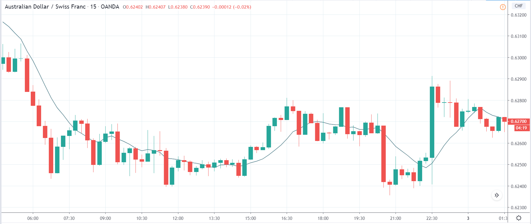
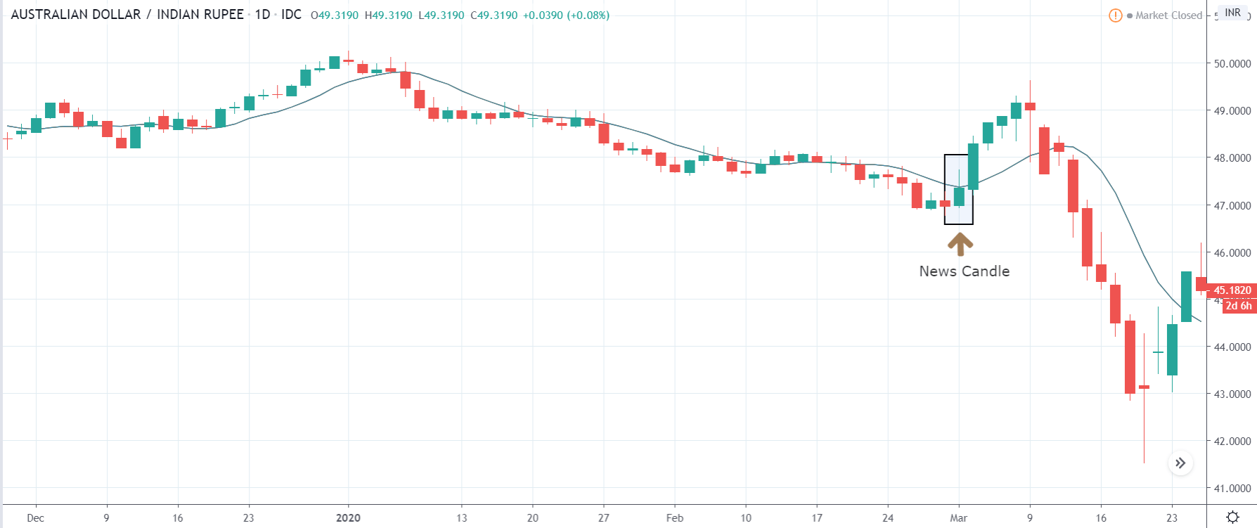
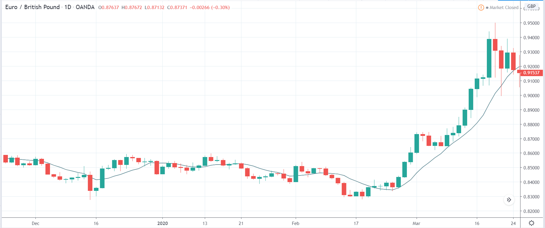
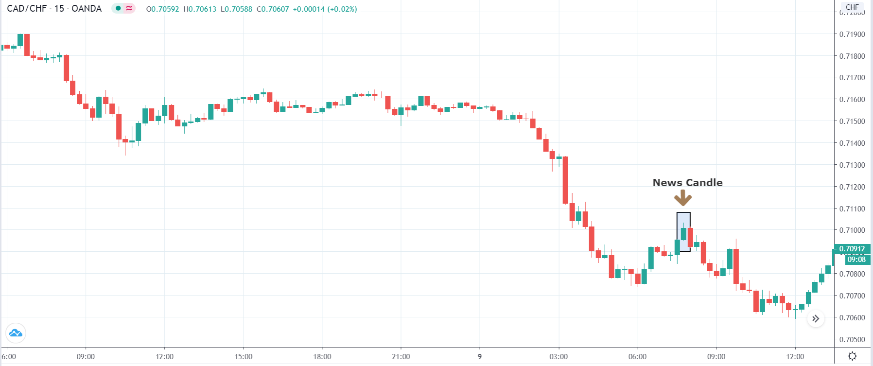
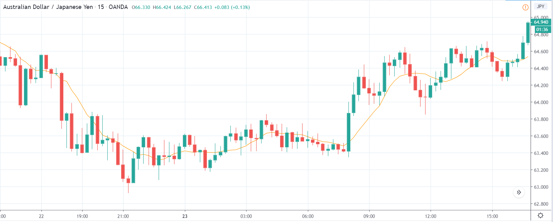
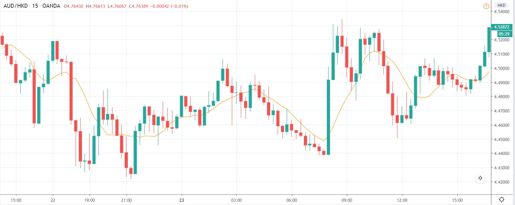
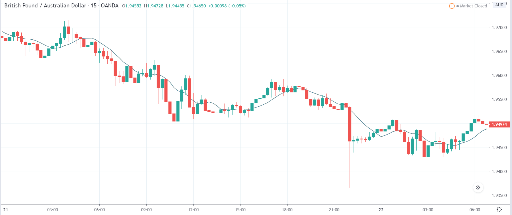
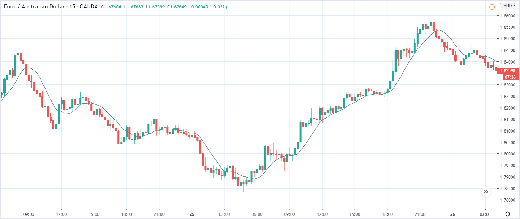
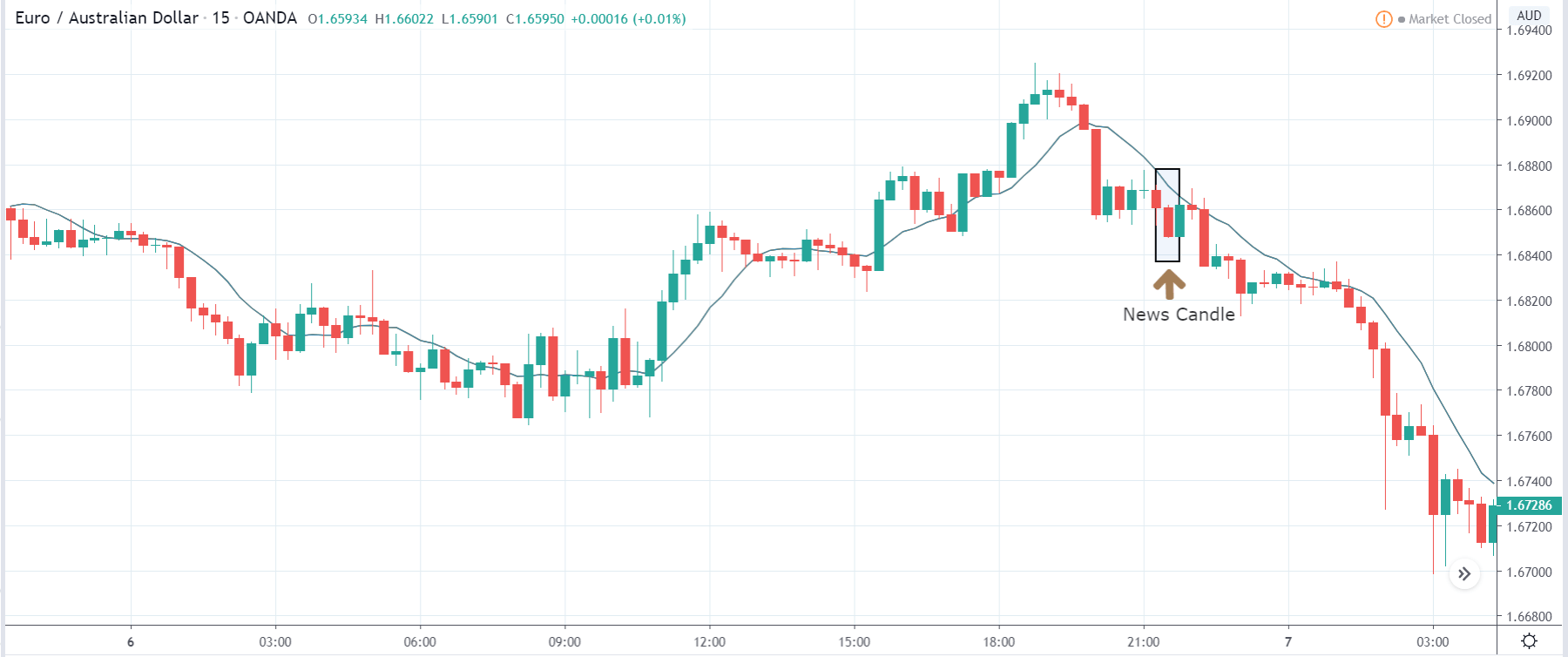
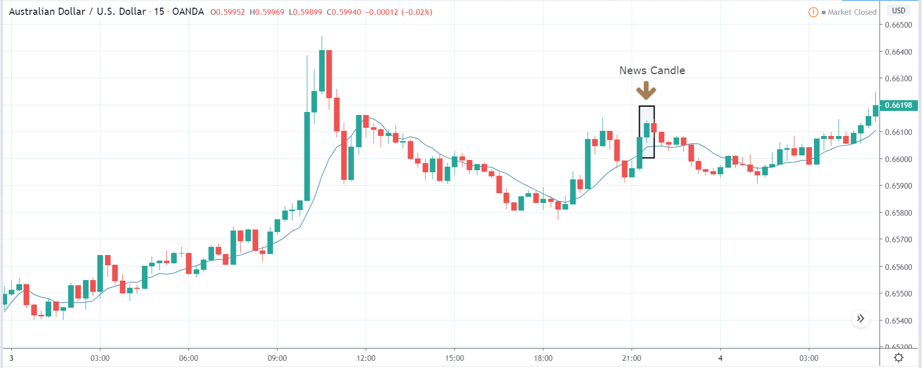
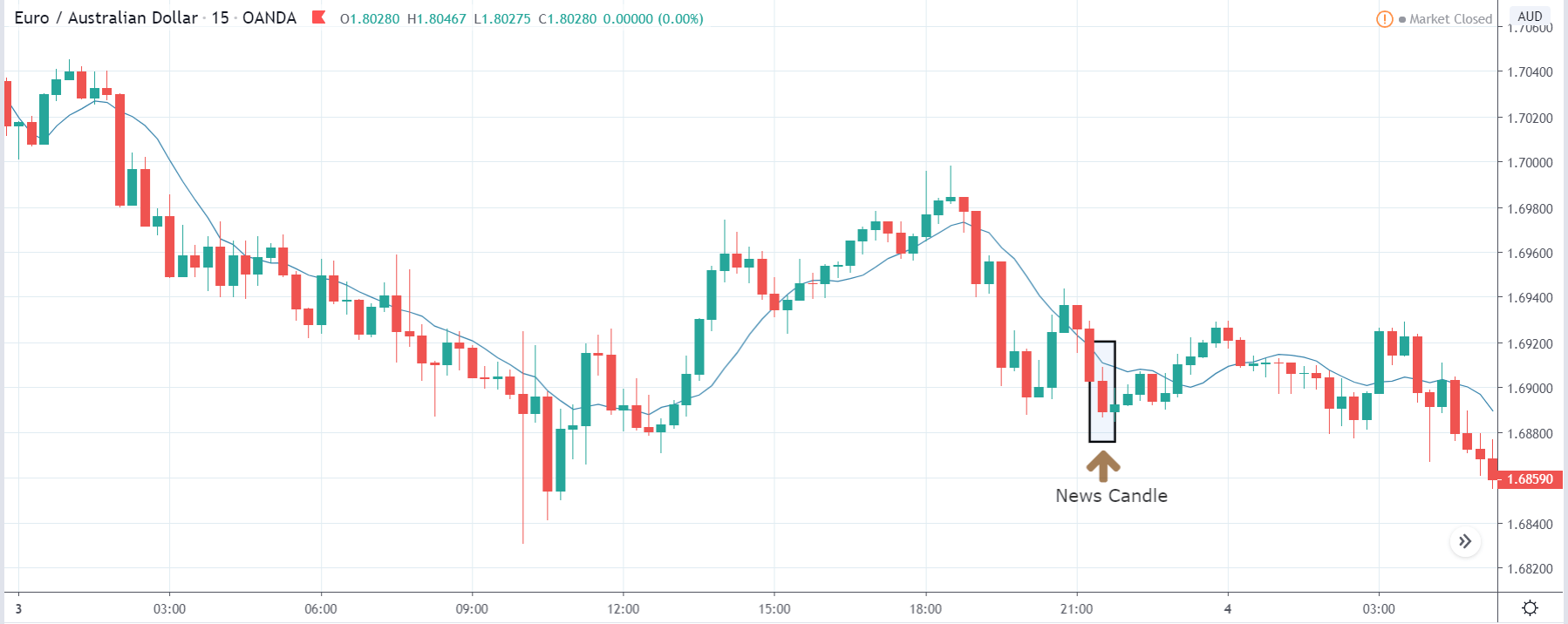
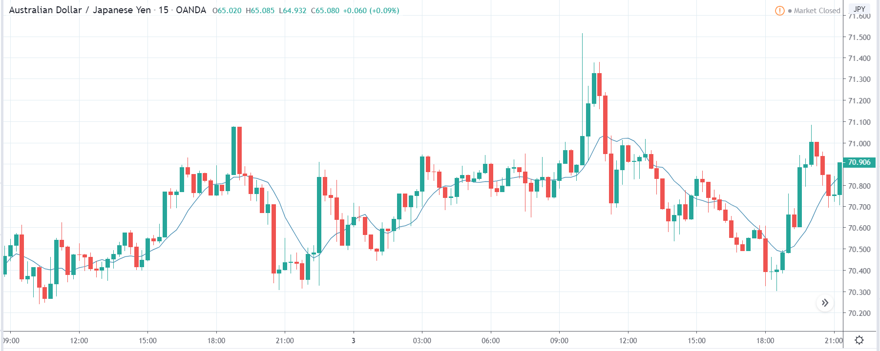
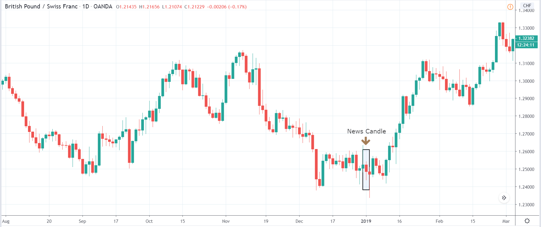
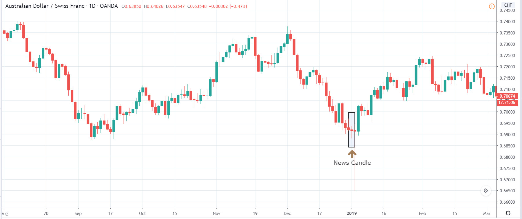
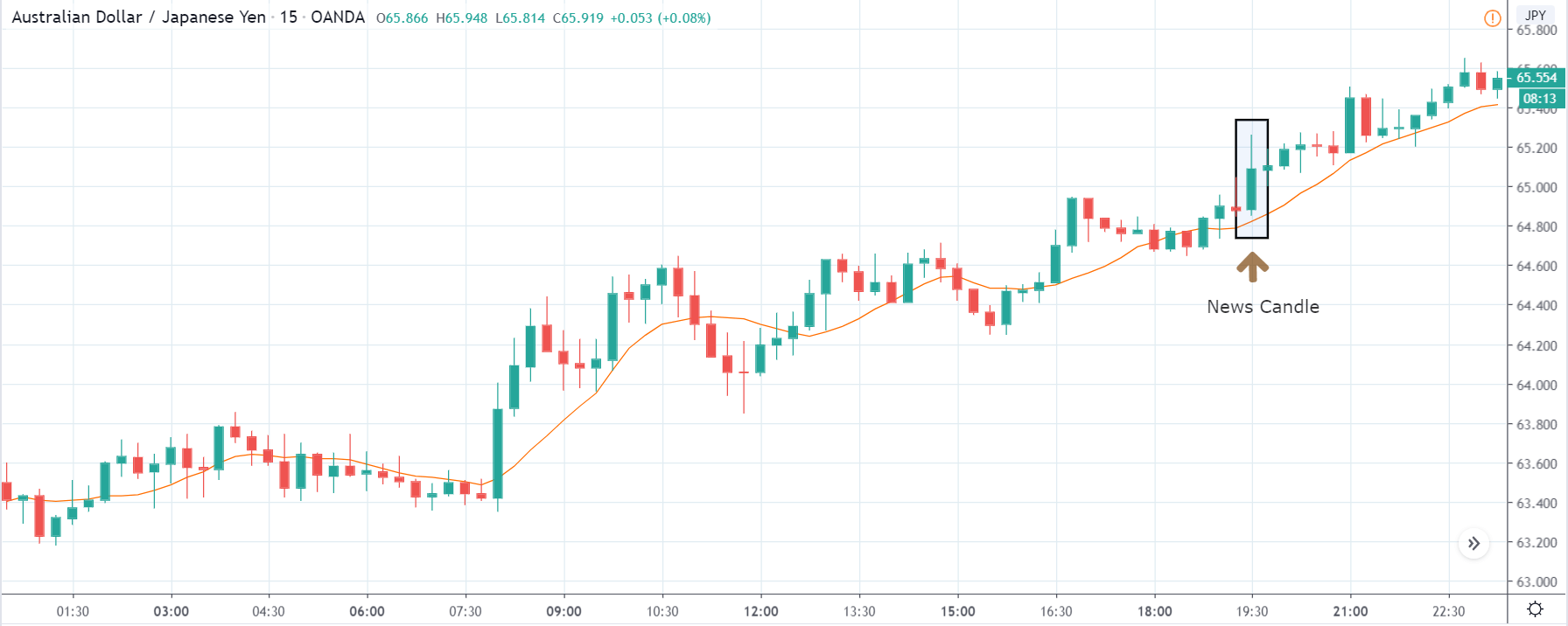
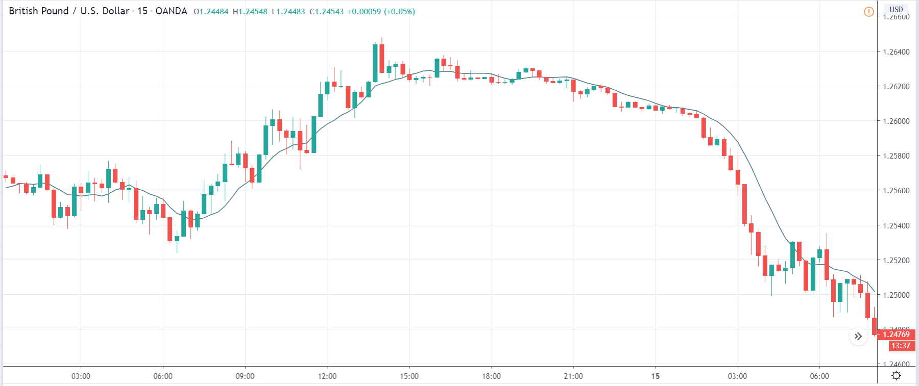
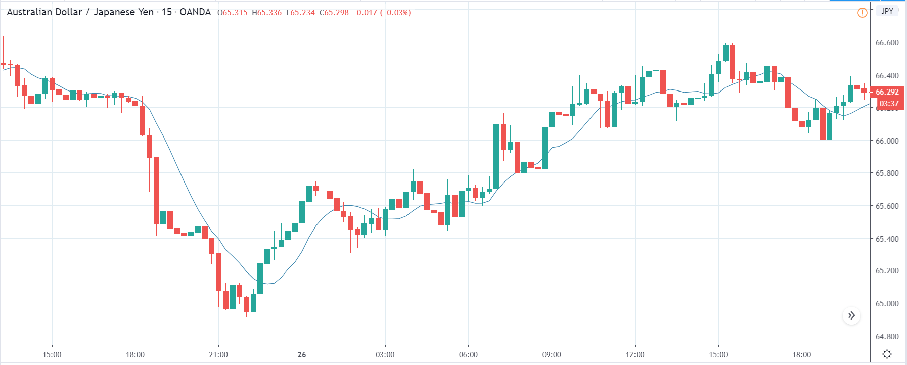
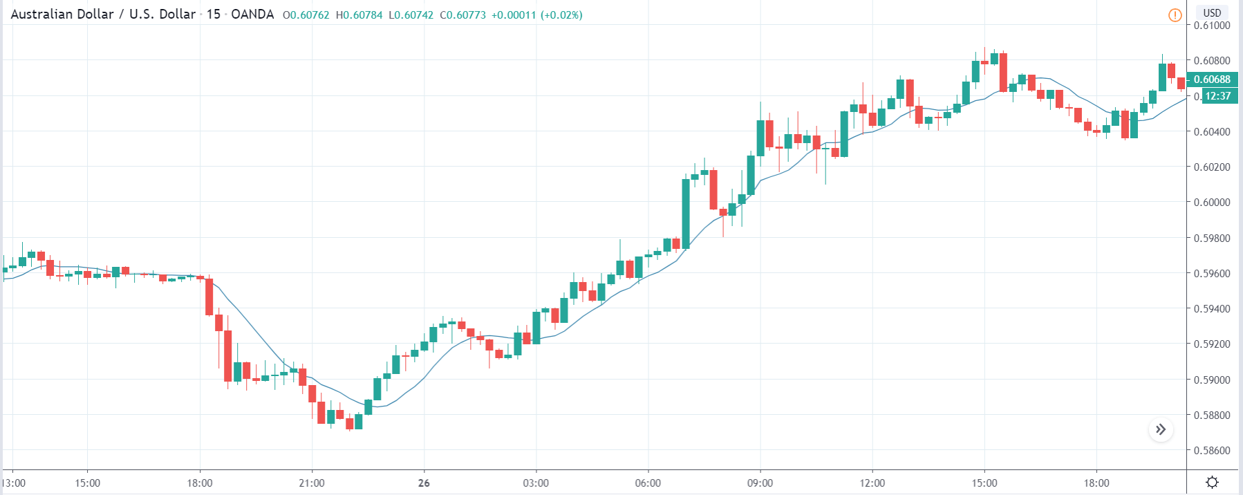
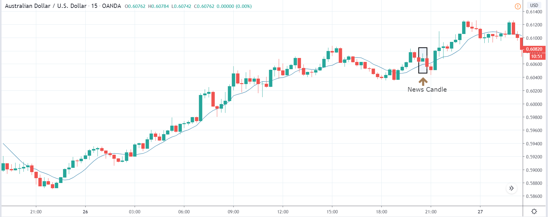
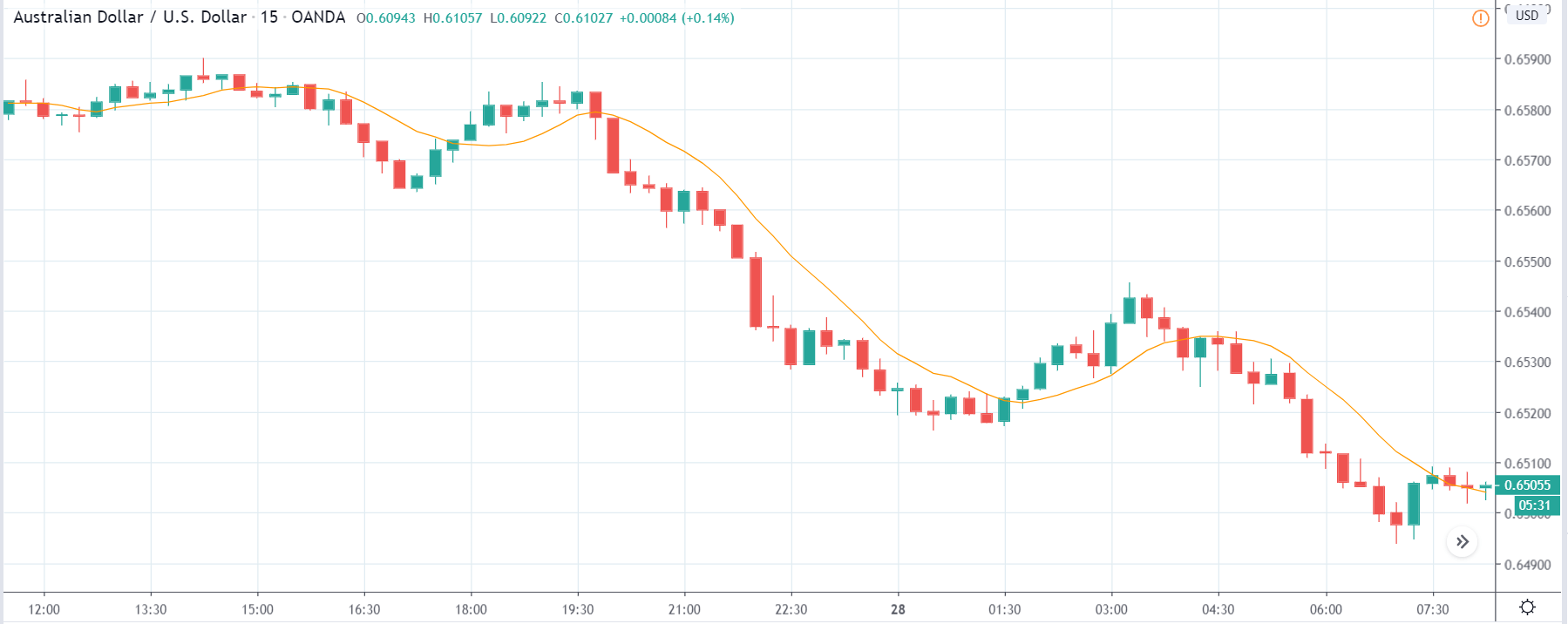
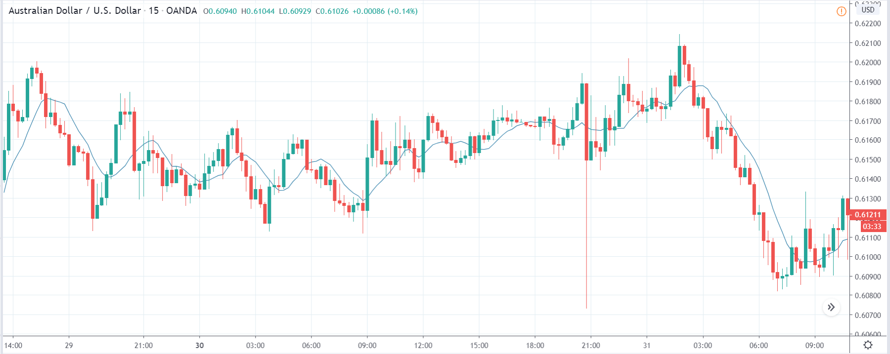
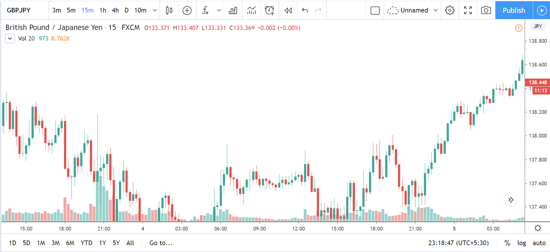
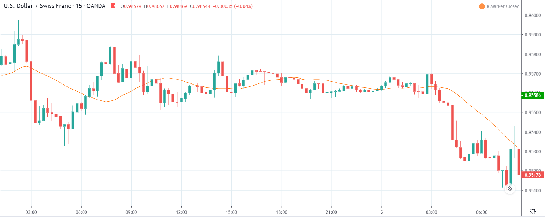
AUD/USD | Before The Announcement
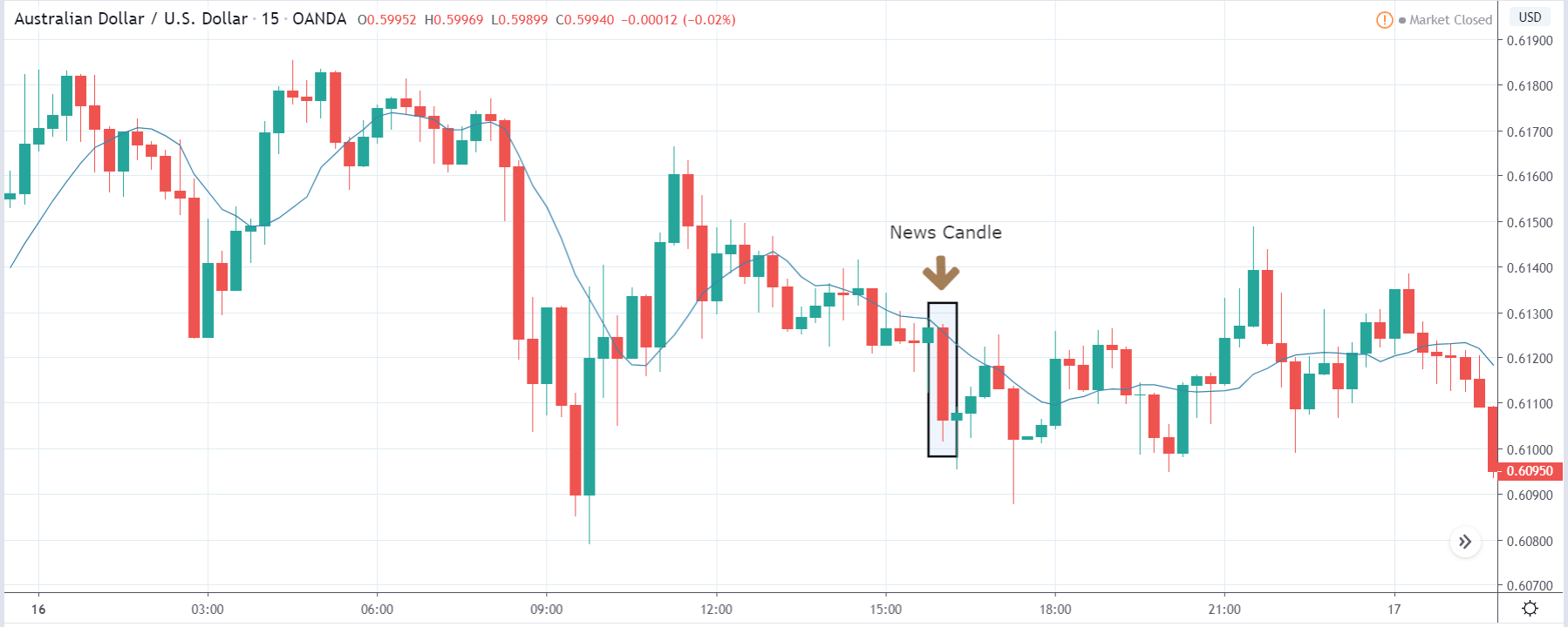
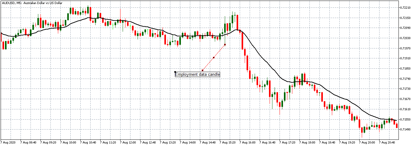
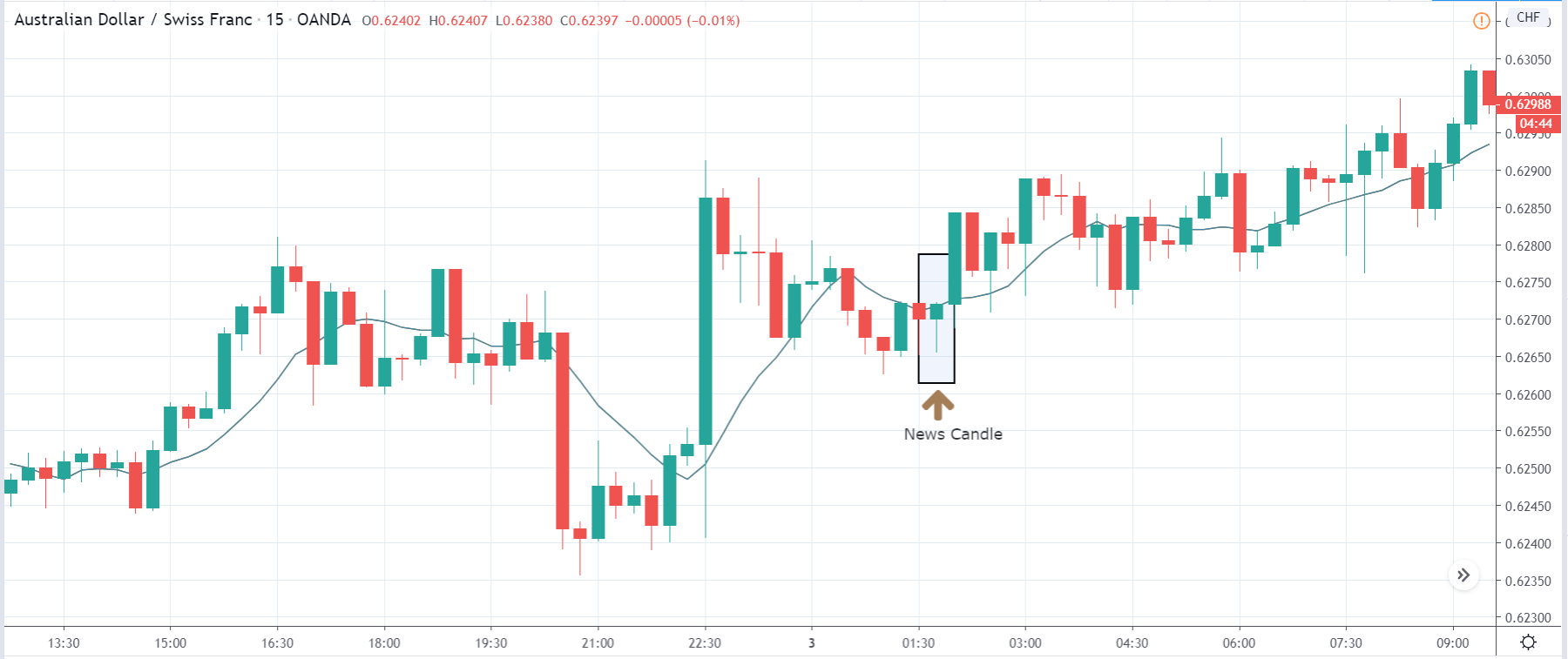
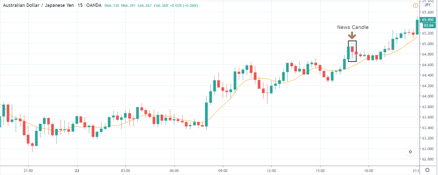
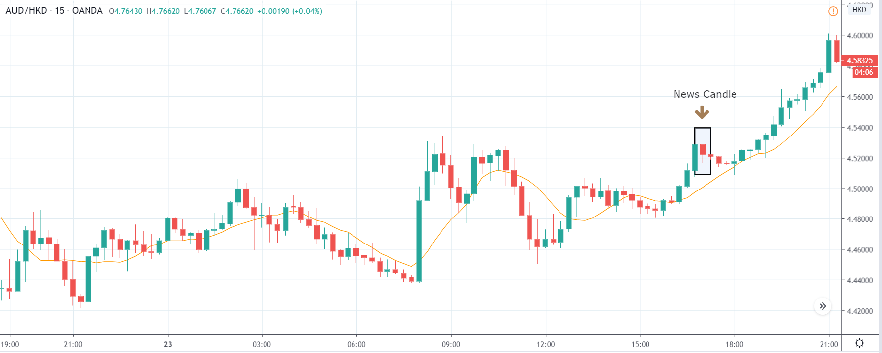
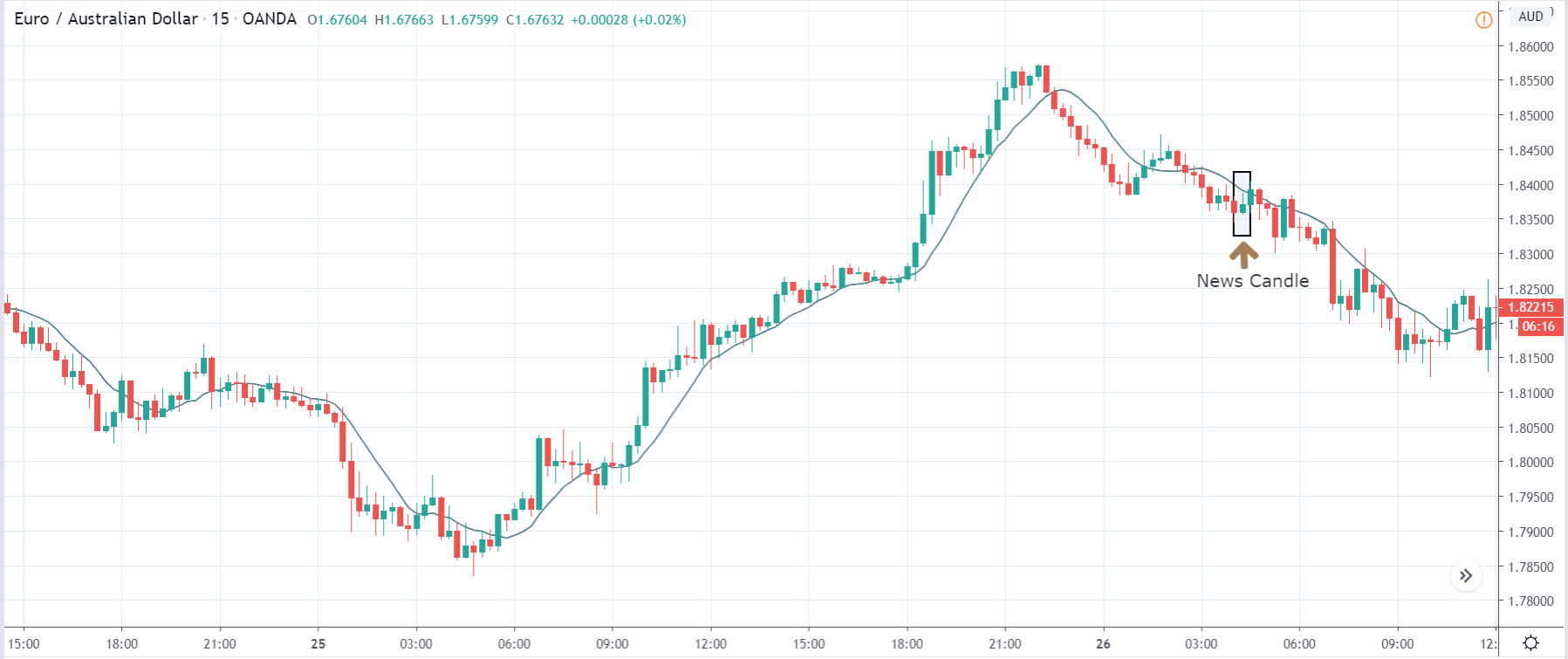
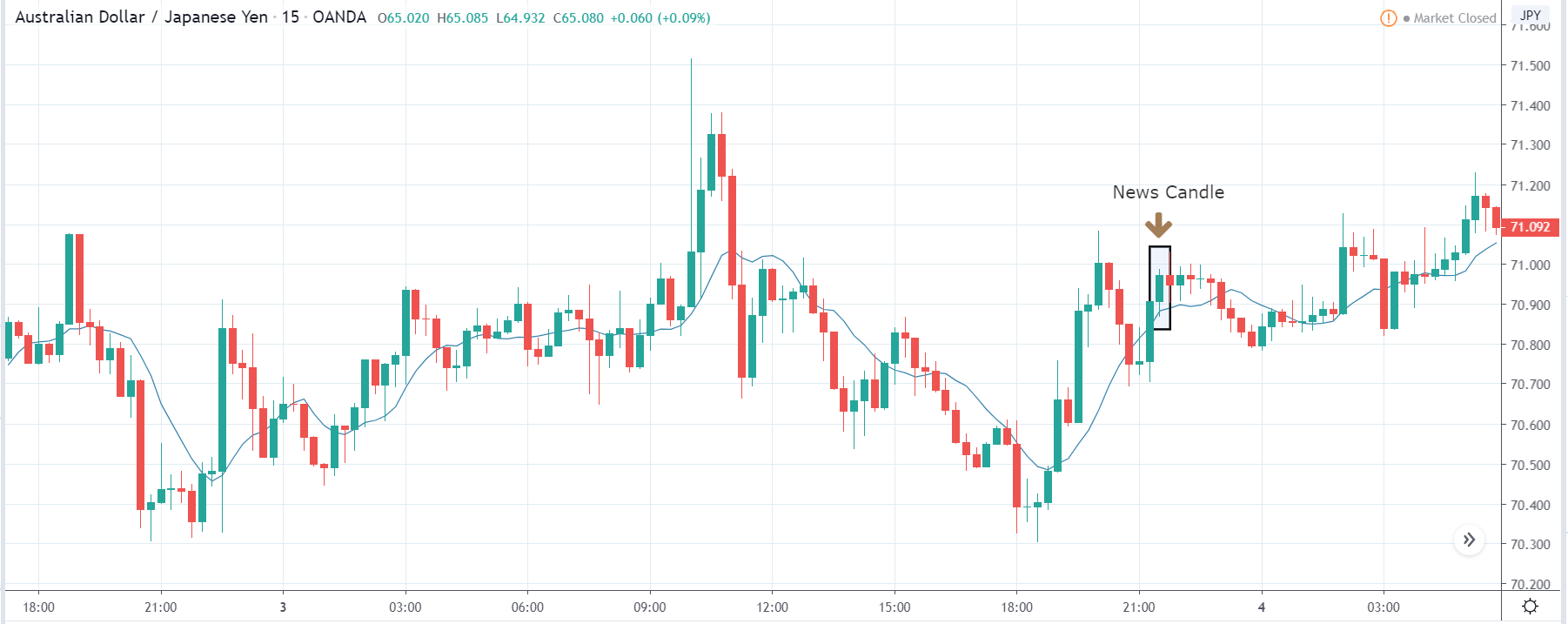
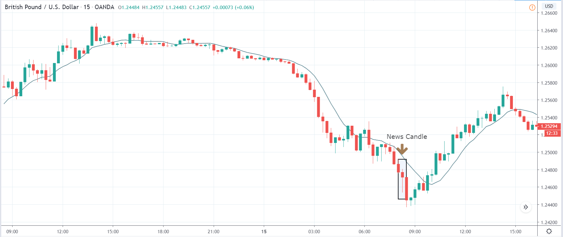
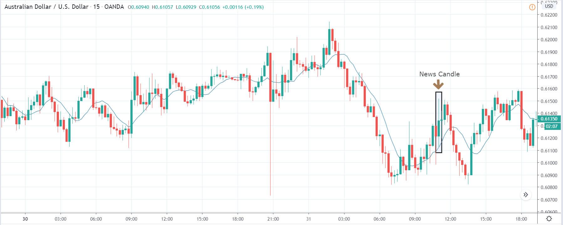
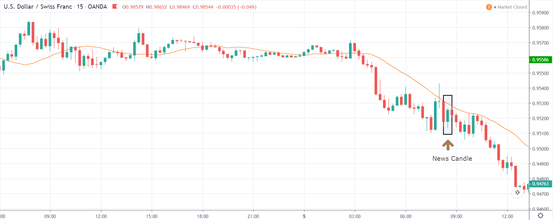
AUD/USD | After The Announcement
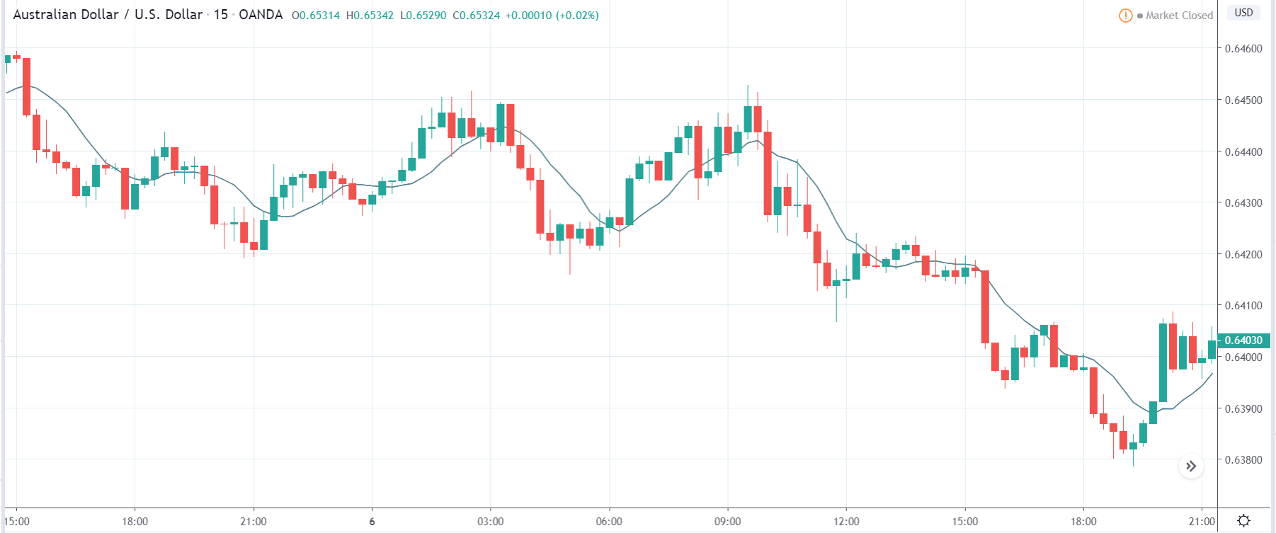
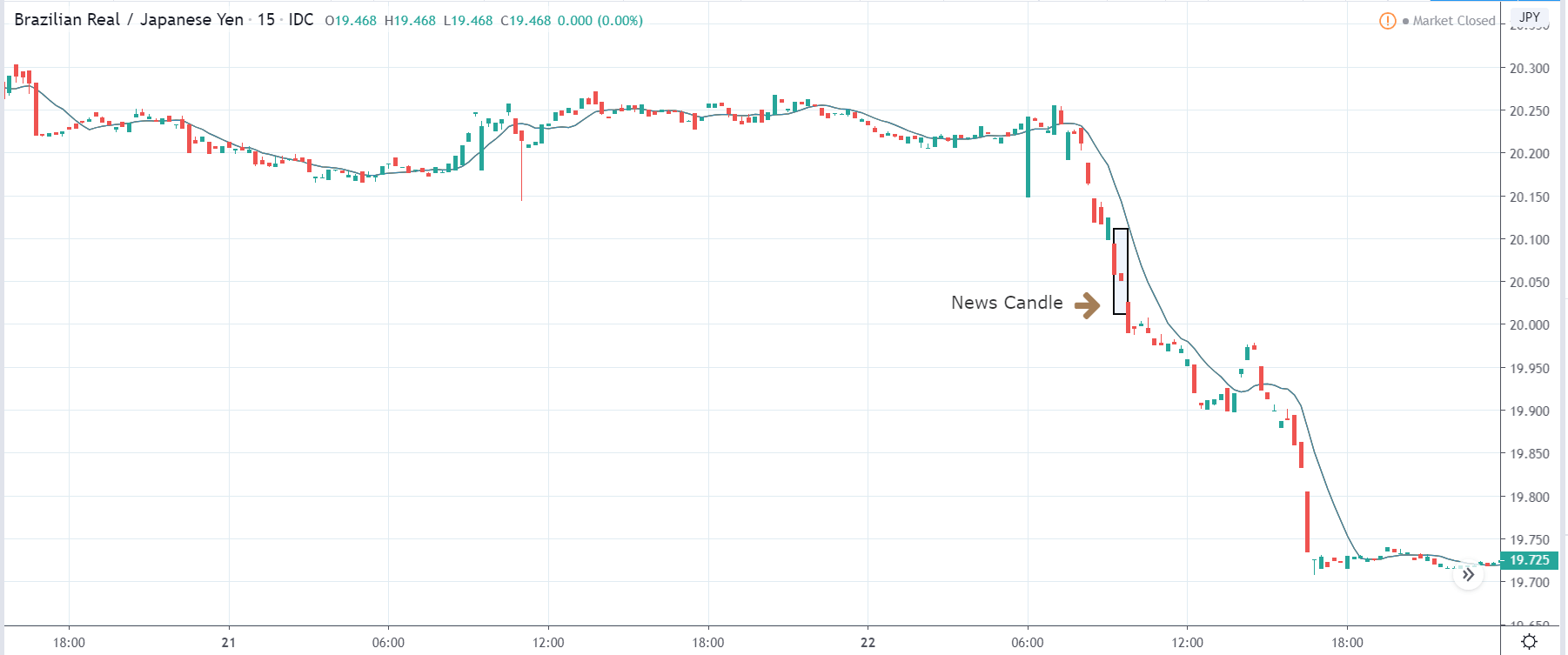
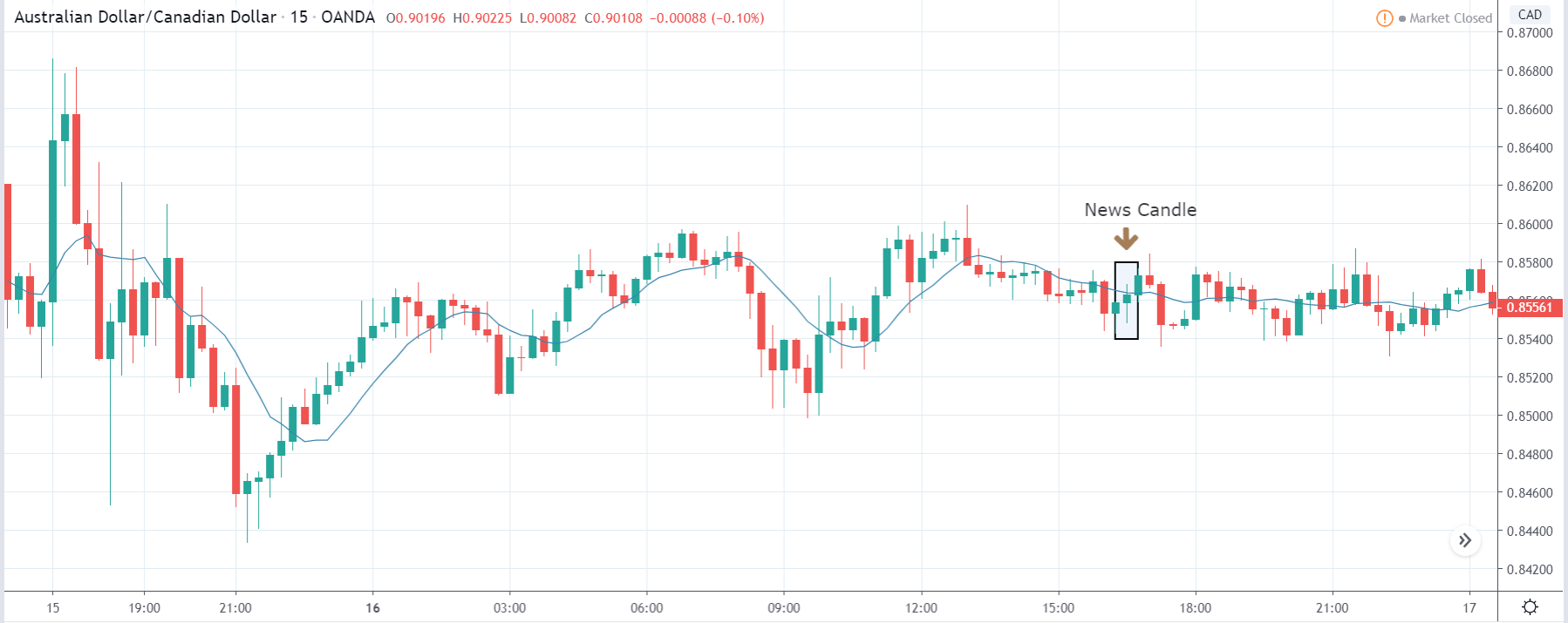
These are the images of the AUD/USD currency pair, where the first image shows the state of the chart before the announcement is made. In the first image, we see that the price is mostly moving in a ‘range,’ and there is a fair amount of volatility on both sides. Just before the news release, the price is a little above the ‘support’ area, and one can expect some green candles from this point.
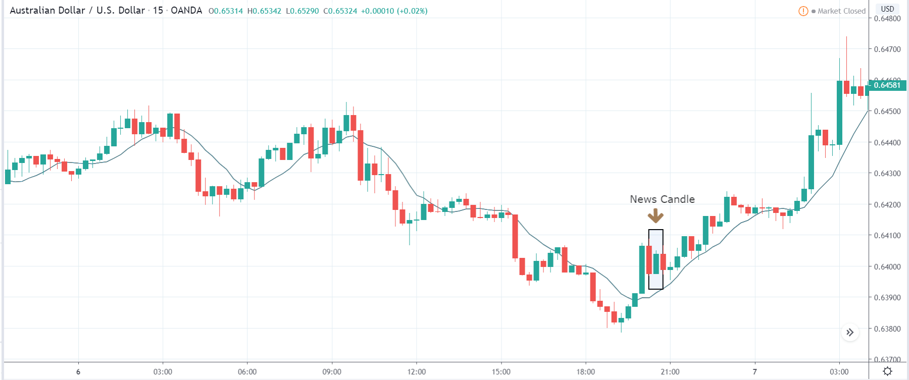
This means one should be cautious before taking any ‘sell’ trade from here. After the news announcement, the price sharply drops lower, and we see a rise in the volatility to the downside. Traders again bought U.S. dollars in this pair, and the price closed as a strong bearish candle exactly at the ‘support.’ One could use the supply point of the ‘news candle’ and then take a ‘short’ trade with a stop loss above the recent high.
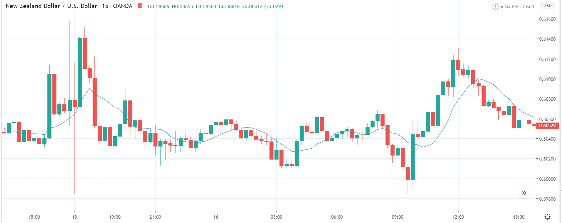
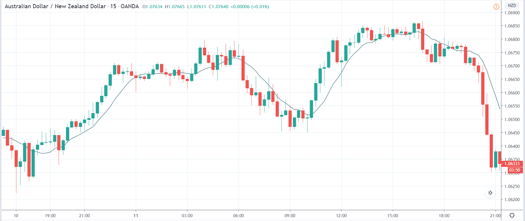
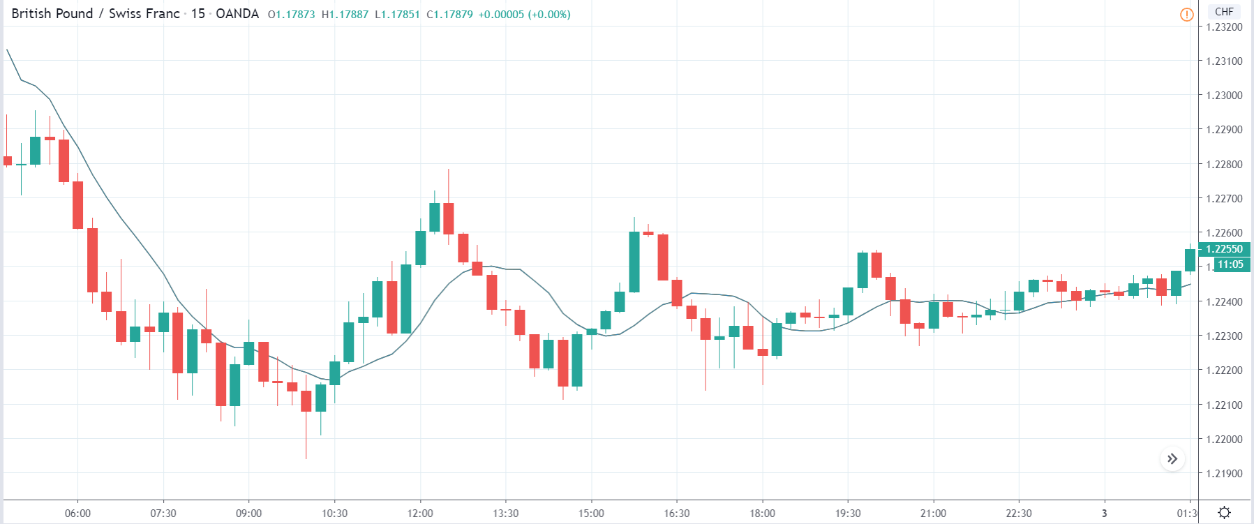
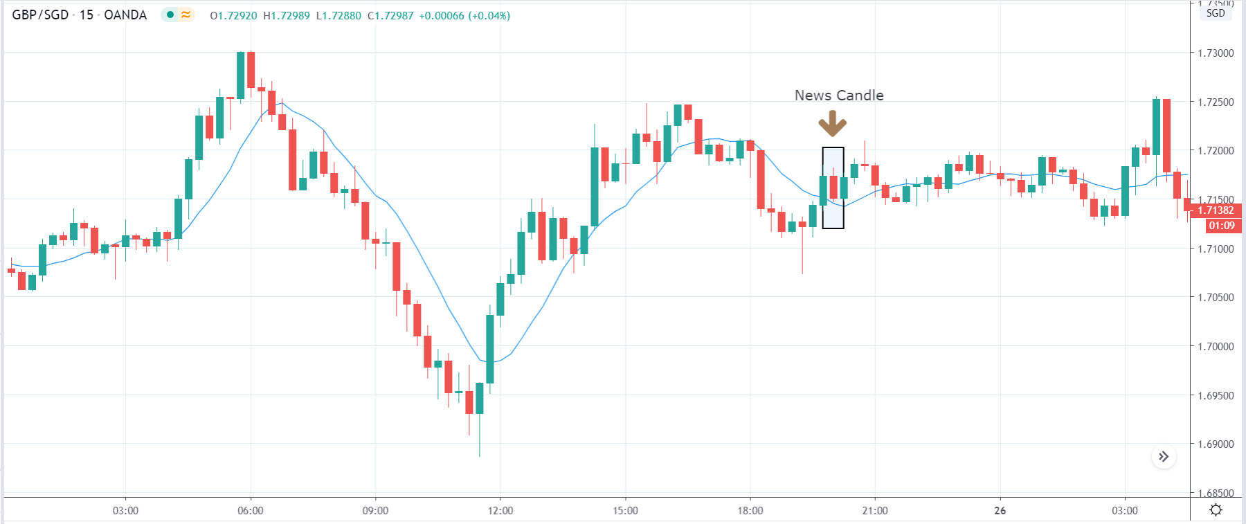
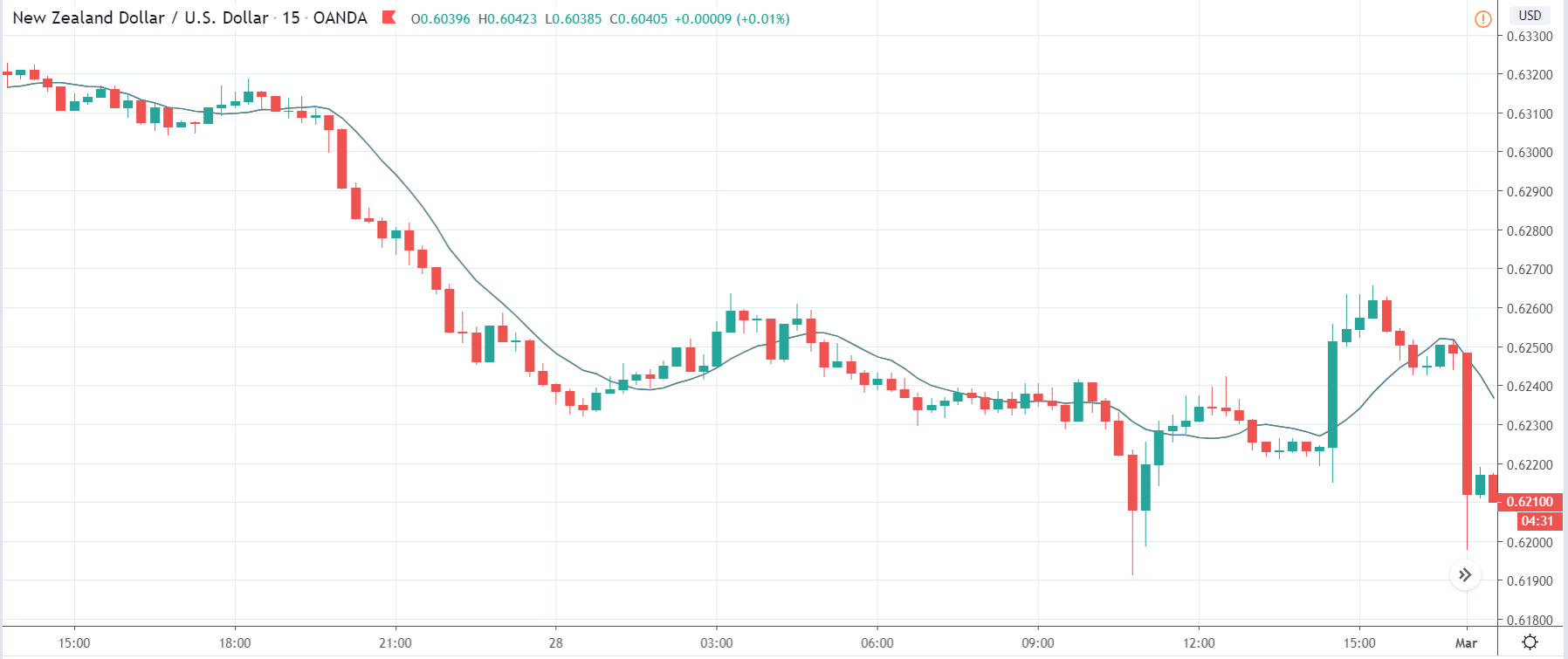
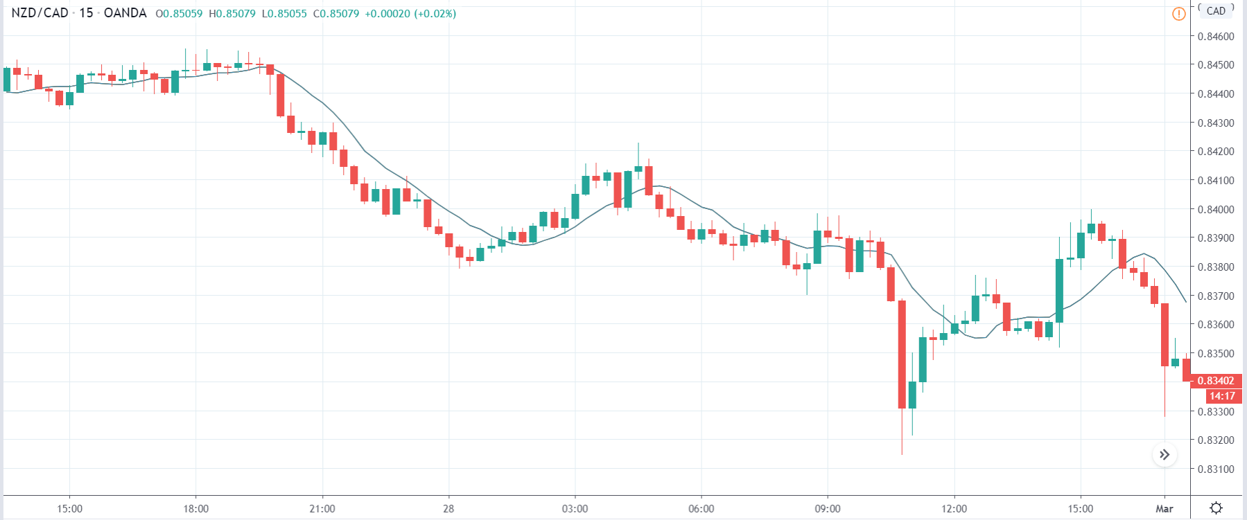
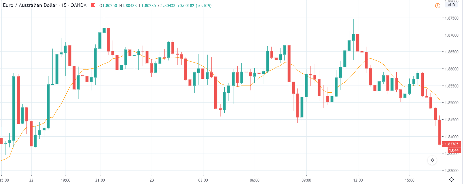
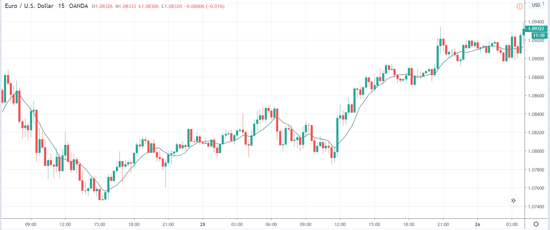
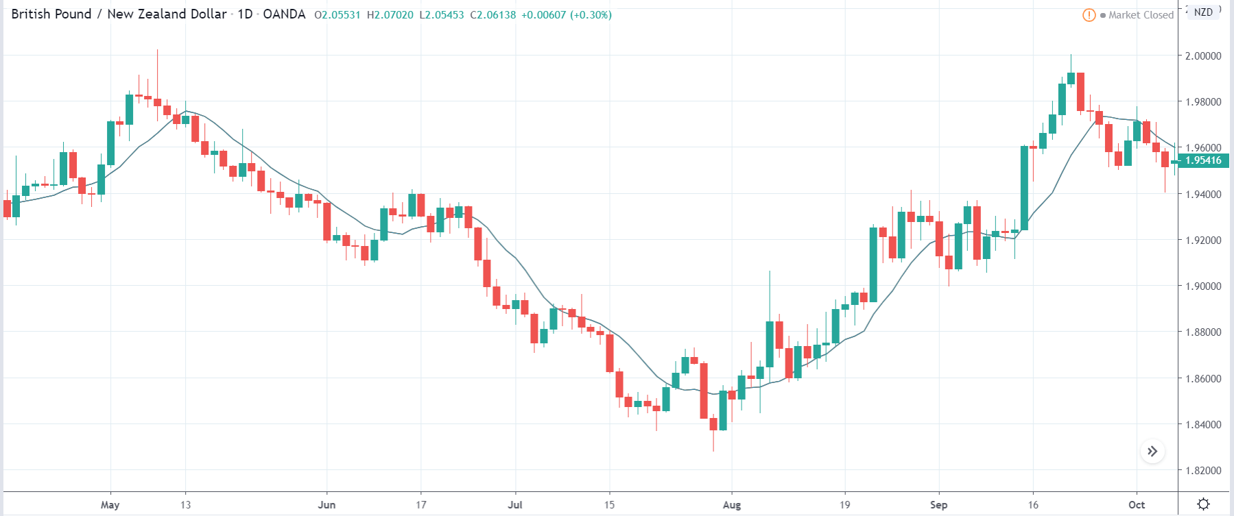
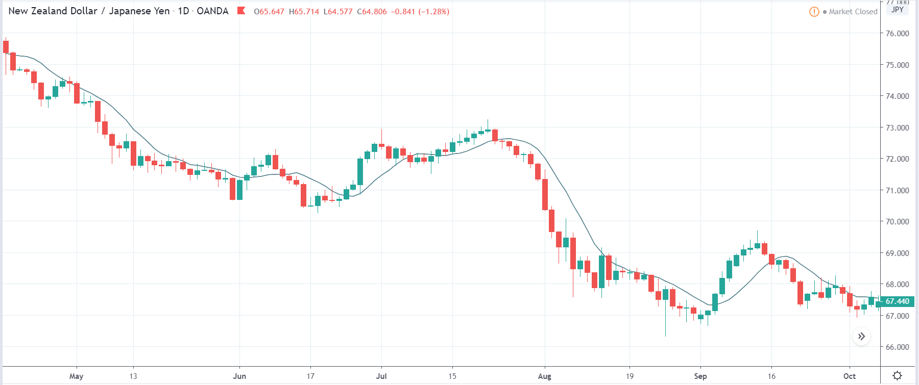
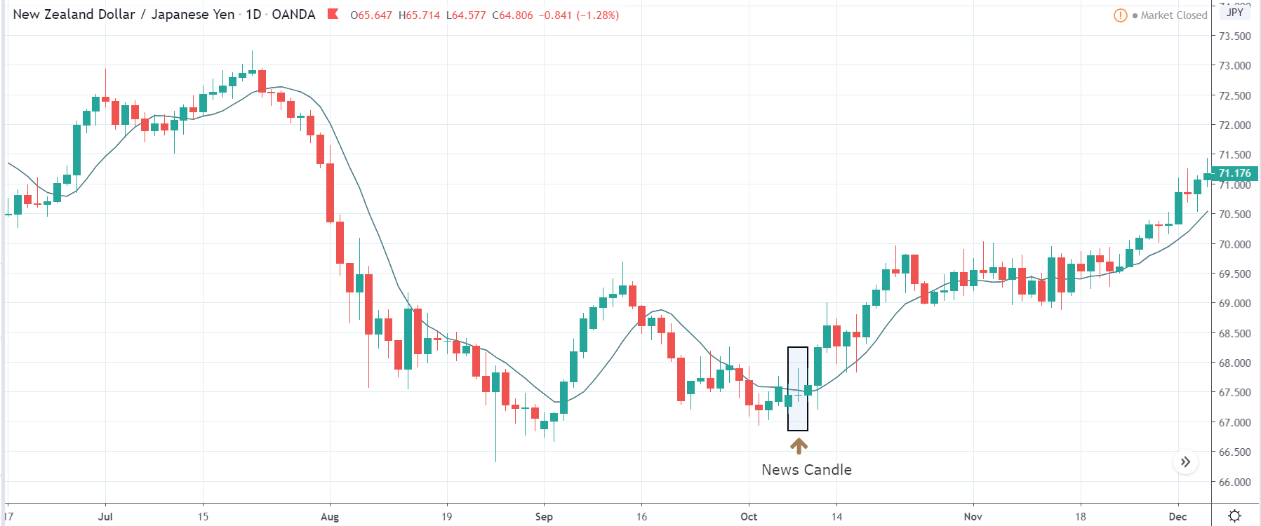
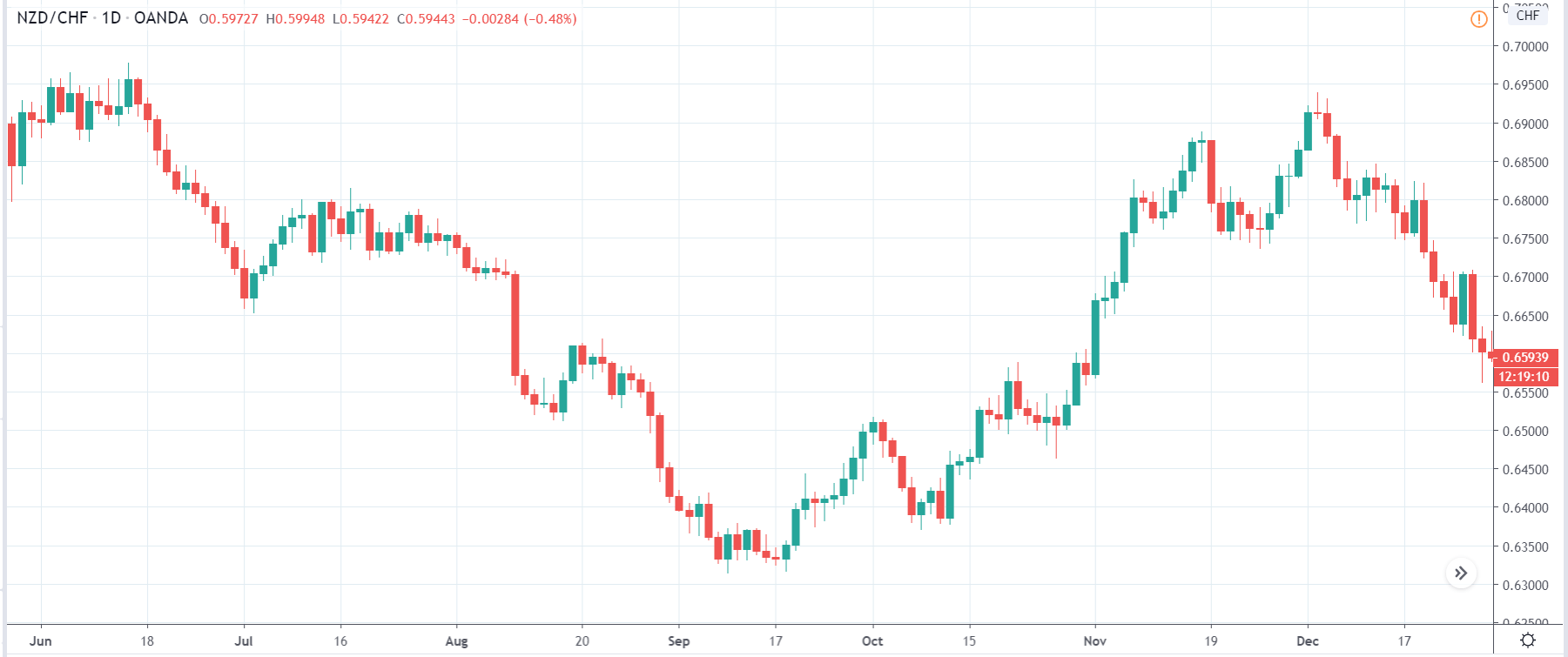
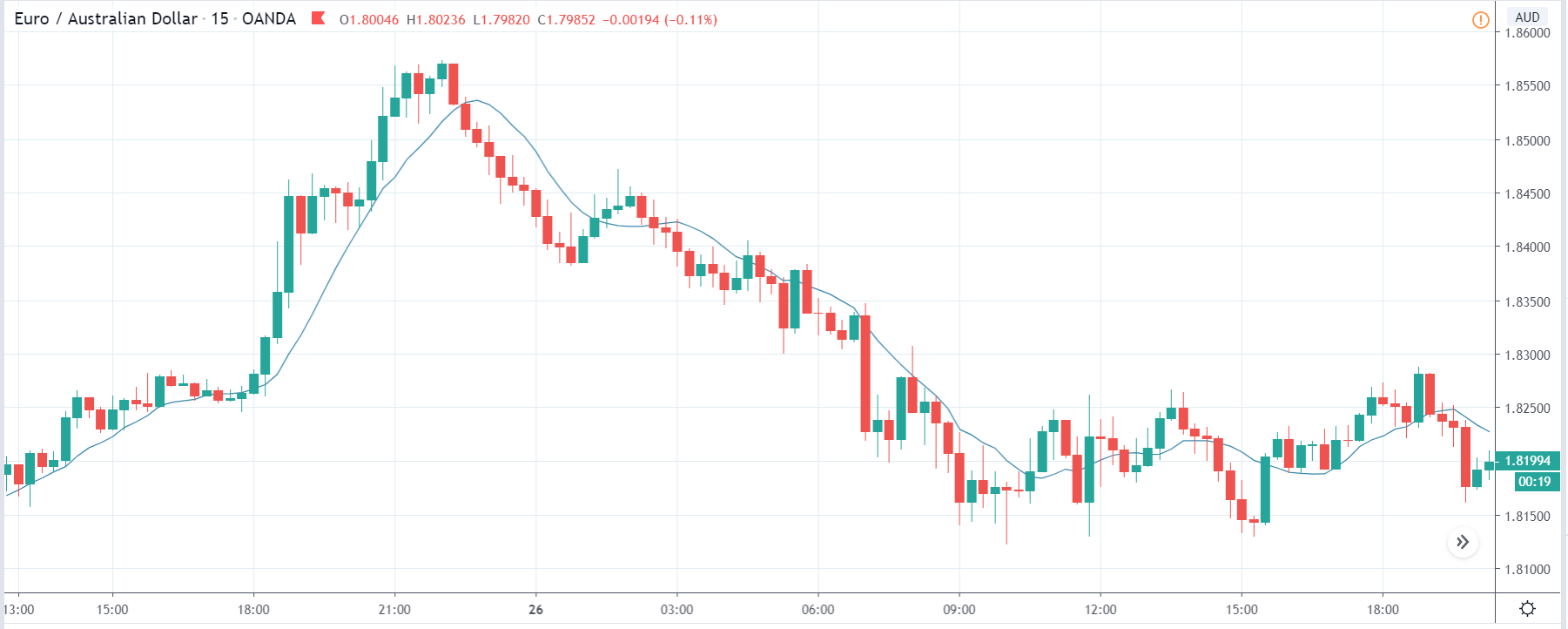
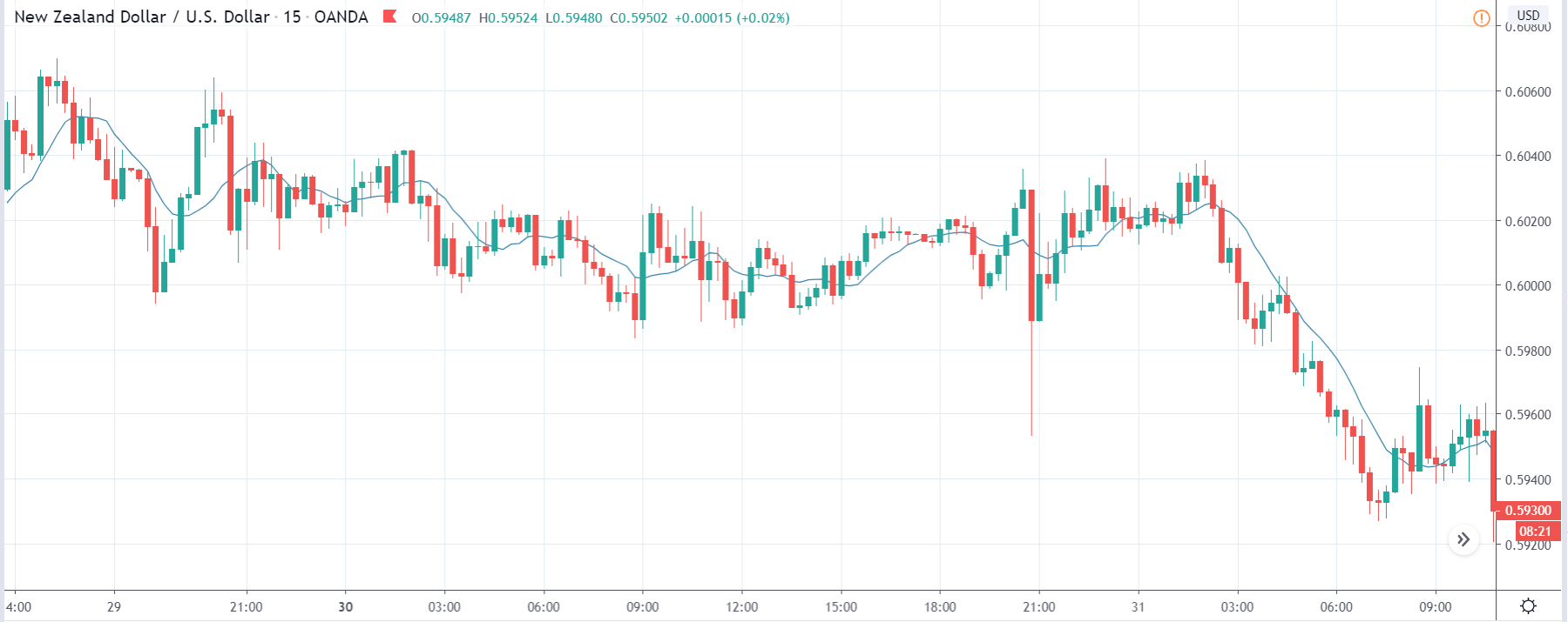
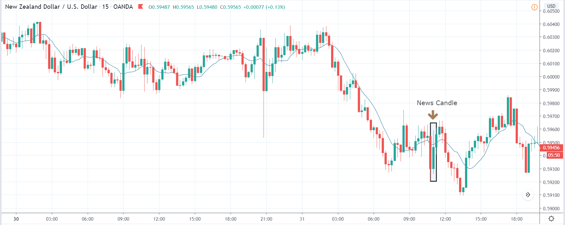
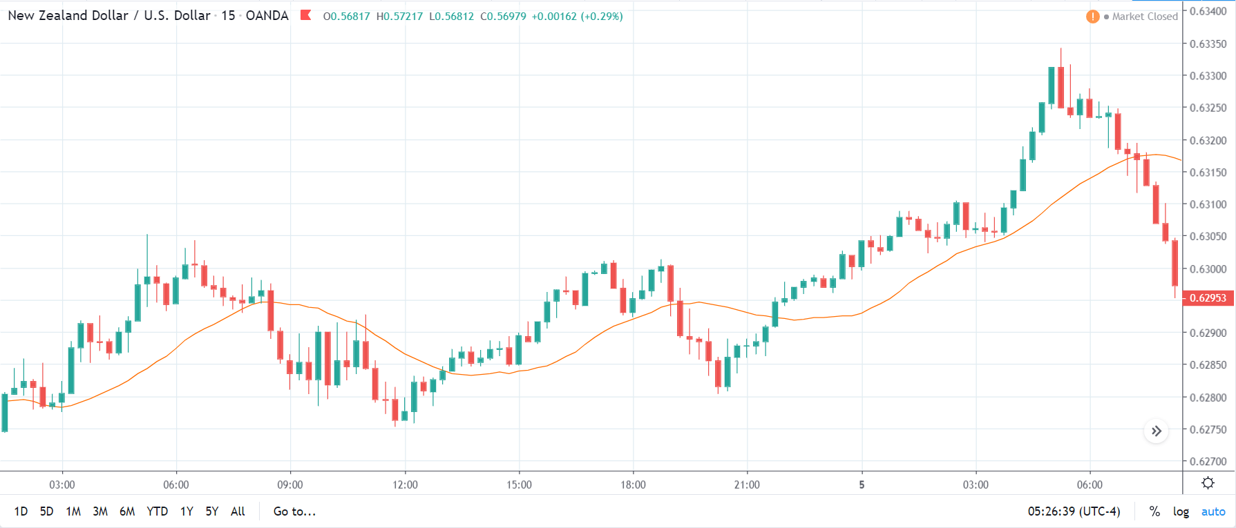
NZD/USD | Before The Announcement
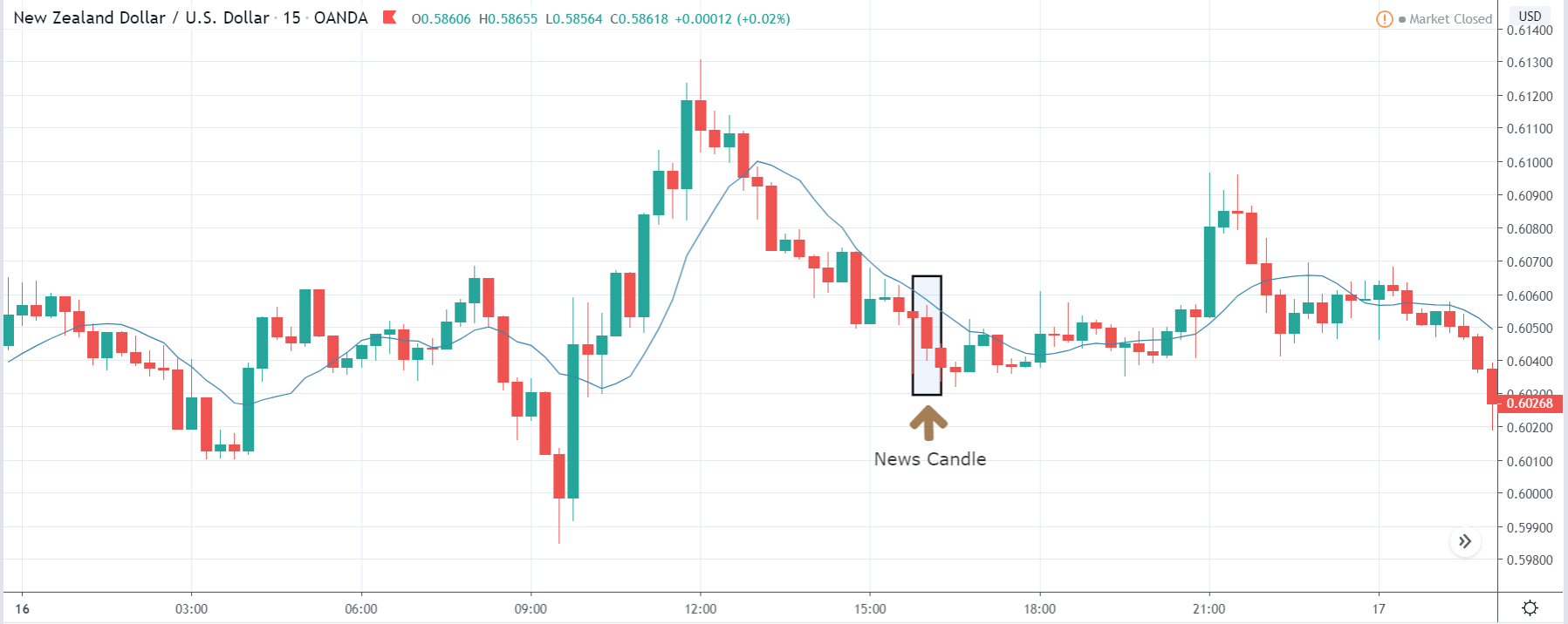
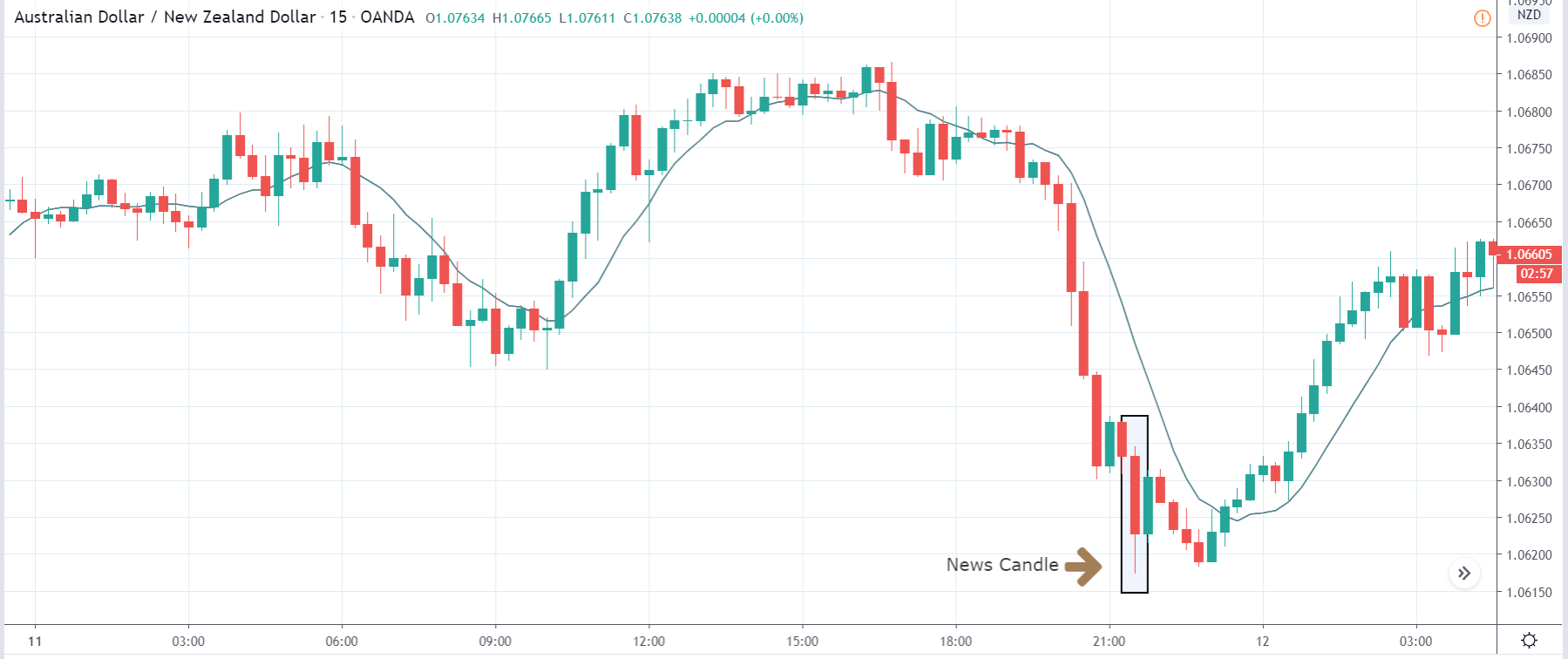
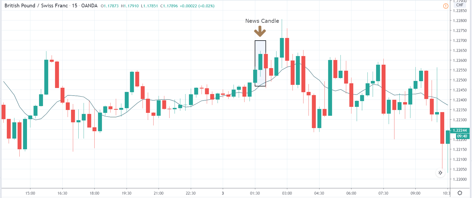
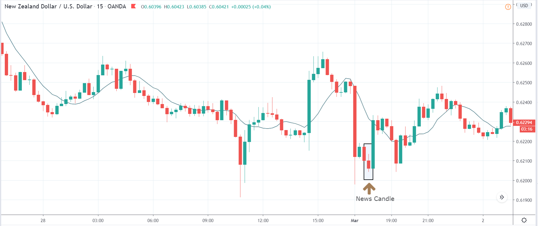
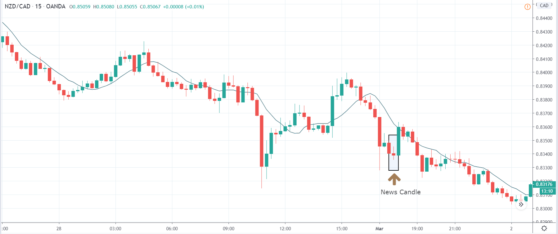
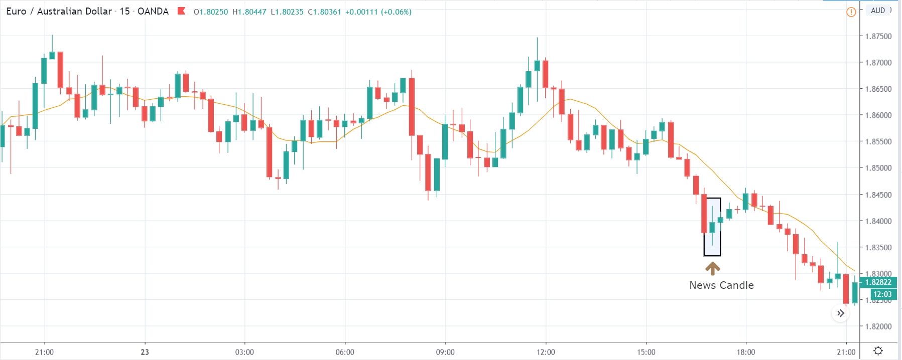
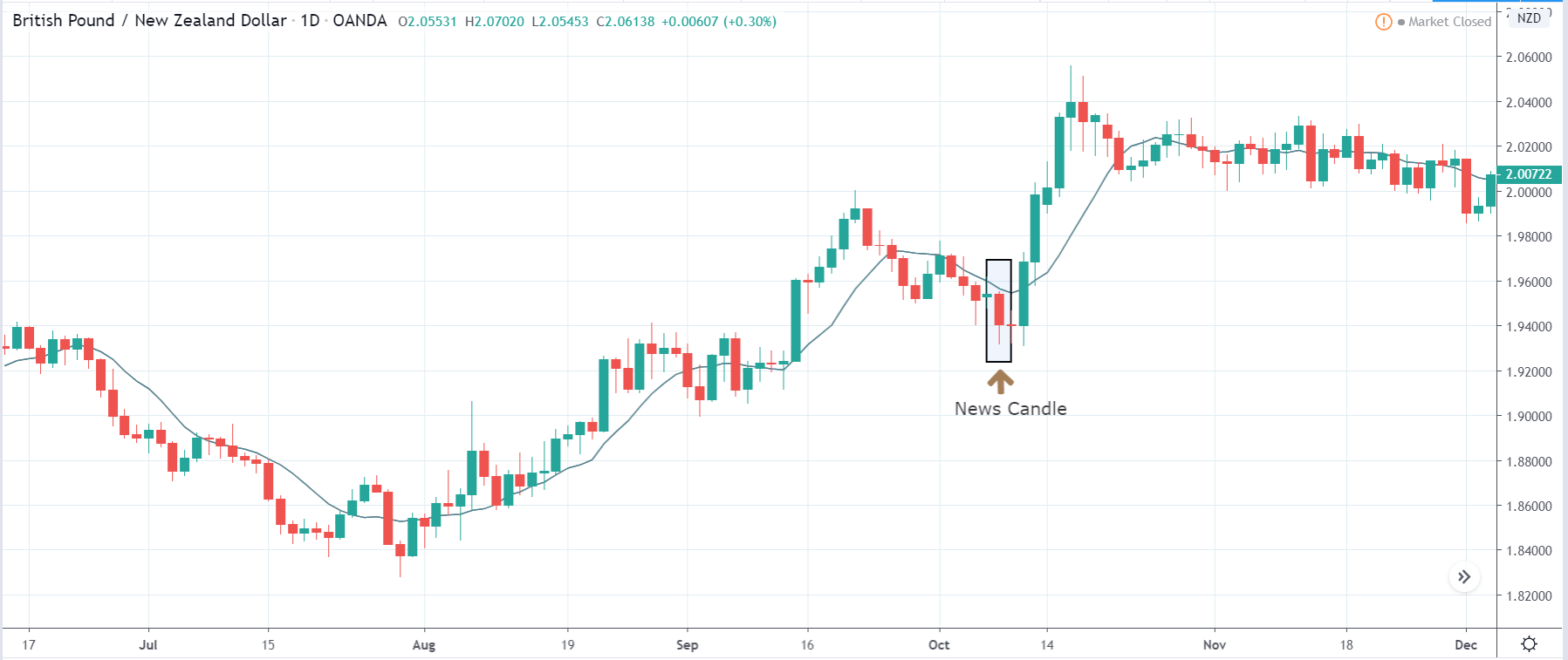
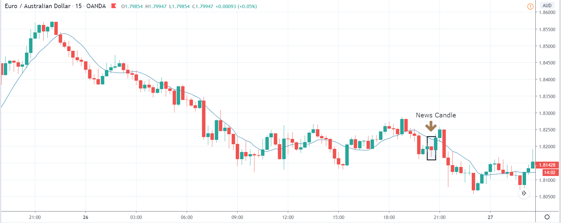
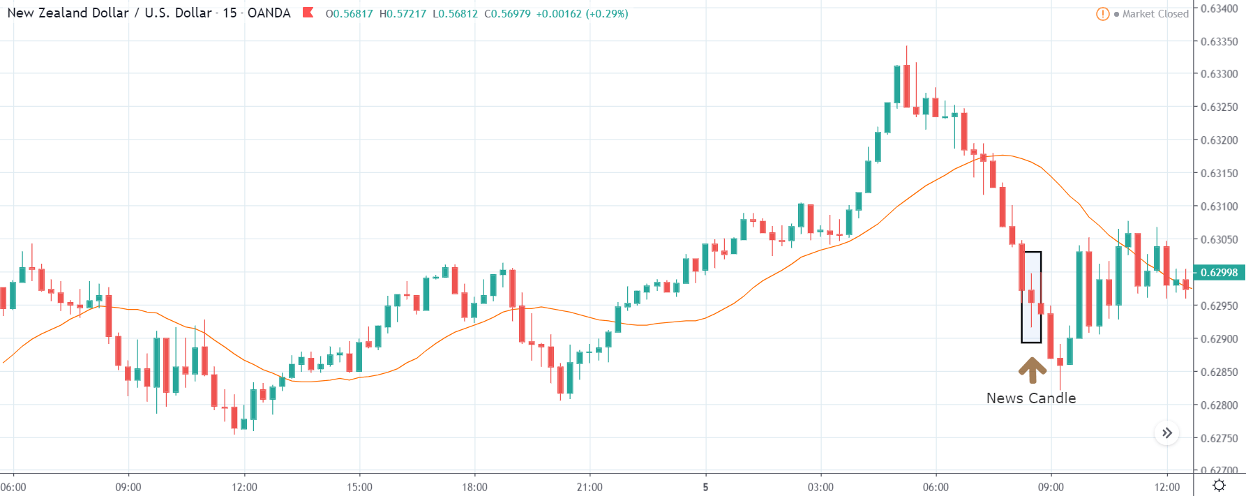
NZD/USD | After The Announcement
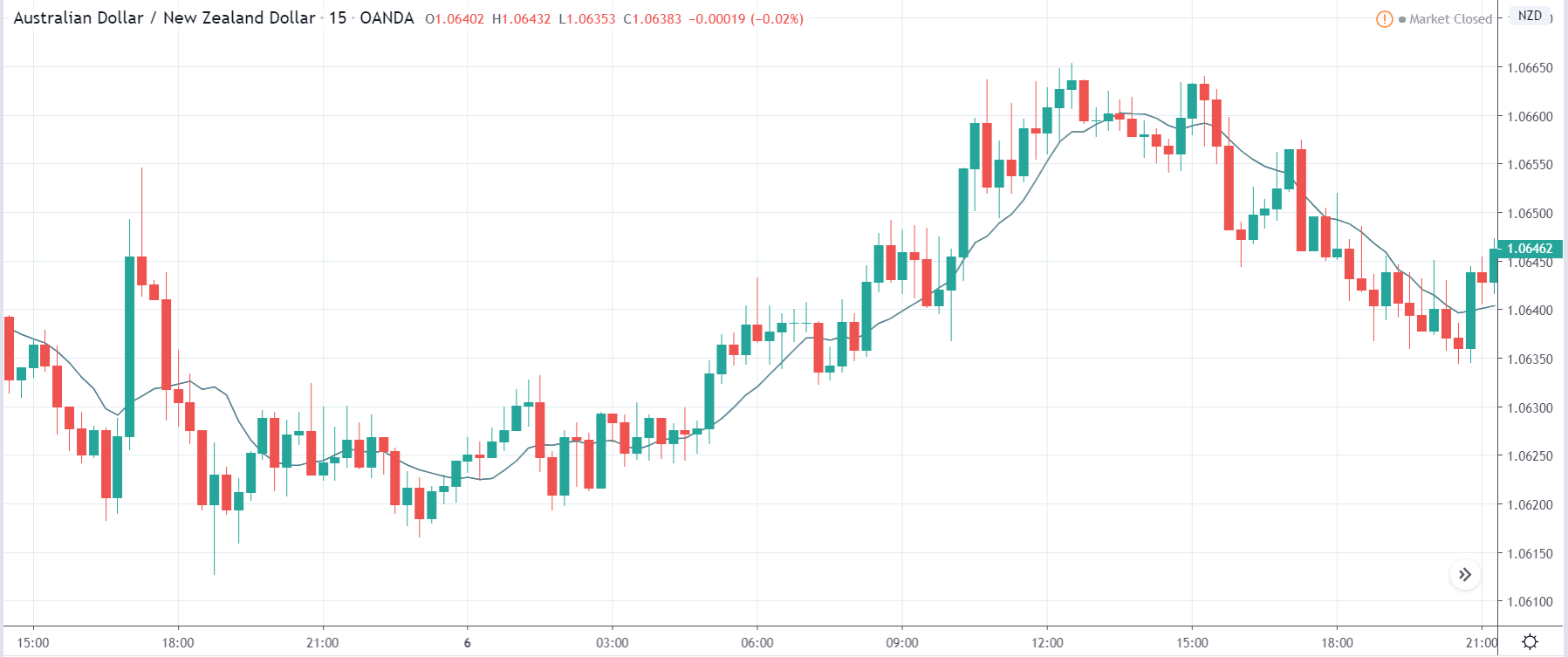
Next, we discuss the NZD/USD currency pair where before the announcement is made, the market is range-bound, and currently, the price is in the middle of the range. Aggressive traders who wish to ‘buy’ the currency pair based on the forecasted data can do so, but they do should be willing to close their positions after the release if there is a huge difference in the actual data.
But as the volatility is high to the downside, it is advised to wait for the news outcome and then trade based on the market reaction. After the news release, traders sell the currency pair owing to wonderful Capital Flows data for the U.S. economy, and here too, the price closes as a bearish candle. Now we are sure that the weakness could be increasing in the pair, and one can take a risk-free ‘short’ trade with a stop-loss above the ‘resistance’ of the range.
That’s about Capital Flows and the impact of its new release on the Foreign Exchange price charts. Let us know if you have any questions in the comments below. Cheers.


