Categories
Forex Technical Analysis

The Link Between Interest Rates and Forex Trading

Although there are many elements that influence the appreciation of a currency, one of the most important factors to consider is a country’s interest rates. In fact, assuming everything else stays the same, forex traders need to focus on interest rates more than anything else. In this article, we will explore what interest rates mean and how they impact the value of a country’s currency.

What to Look For

If we have a stable economic and geopolitical situation around the world, the foreign exchange market will favor a currency that is seeing an increase in the interest rate and more increases in the future. Even so, the interest rate is not the only factor affecting a currency. Other factors, such as war, geopolitical concerns, inflation, correlation with other markets, and many other things can be relevant.

When the interest rate is higher, it tends to attract a lot of foreign capital. The explanation is because money always wants to go to the place where it is “best treated.” For example, if you manage a large investment fund, you will look for greater returns for your clients. If country A pays 5% in bonus while other country B pays 2% in the same type of bonus, country A is the favorite with respect to where to invest. With the intention of buying that bond or investing in that financial asset, you need to buy in that country’s currency. (Some countries will take bonds or another currency like the American dollar, but we won’t talk about that in this article)

A Case Study

Let’s say you manage a large fund outside the UK. You have the instruction to put the money somewhere, and the most natural place you can put it is to go where we can find the largest growth. Generally speaking, central banks will realize an increase in interest rates if the economy is performing well. It’s a matter of time, but sometimes you might decide to enter a stock market, where you would have to shop in the local currency. The reason for having higher interest rates is that they are worried that the economy will overheat but at the same time there is a proclivity of financial assets to go up in that situation. Looking elsewhere in the world, you make the decision that Germany is the country where you plan to invest as many of the German multinationals are enjoying a big increase in exports. To buy stocks in the DAX you will need to buy euros.

Interest rates on Forex. In this scenario, you will need to purchase the EUR/GBP pair. If the European Union has a strong economy it will not only seek to buy shares in that market, it will also seek to buy bonds. Again, you will have to buy them in Euros. In that scenario, it is the natural flow of money to go after the highest yield. You could be in a situation where the UK has an interest rate of 1%. while Europe has an interest rate of 2.25%, for example.

But, a while later the situation in the world changes dramatically. We’re on the verge of a global recession, and you need to do something with your money. This was the situation during the financial crisis, which began in a way that most people would see as counter-intuitive. When the bubble burst, the initial movement was that the other currencies won. However, the US dollar began to win rapidly over time after the initial shock. The reason for this is that there are few places in the world that can absorb the kind of transactions that the treasure market can in the United States.

In that scenario, we had an exodus of capital from countries around the world in the treasure market, which brought up the value of the dollar. This was counter-intuitive because interest rates were being lowered quickly, but frankly, people were looking to keep their money in a safe place. It didn’t matter that possibly the money was going from New Zealand which had a 6% rate at the time to the United States which was lowering its interest rates. At the time, it wasn’t about getting some kind of return, it was about protecting the briefcases.

When things began to calm down, money managers began to buy other currencies such as the New Zealand dollar, the Australian dollar, and even emerging-market currencies such as the Turkish lira or the South African rand. Emerging market currencies were particularly attractive because some of the interest rates in those countries, despite being historically low for those areas, were still five or six times higher than those in developed countries. Once people thought it was safe to invest again, this was the first place that a lot of money went.

Interest rates are the main factor affecting the value of currencies. But much of it has to do with what traders think on a political and economic level. The general rule is that when people feel comfortable, they buy assets with a higher return, including currencies that have a higher return. When they are not comfortable, currencies with a lower interest rate such as the Japanese yen or the Swiss franc have historically performed better, alongside the dollar. Be sure to first understand the market risk, so you can follow interest rates in both directions.

Categories
Beginners Forex Education Forex Basic Strategies

Apply These 5 Secret Techniques To Improve Your Forex Trading

There are so many ways to fail with forex trading but so many ways to improve on. Each trader is unique in how he is playing the long forex game, however, common techniques are applied in various forms that make a huge difference to the trader’s psychology and other trading aspects. Such techniques are not always on the scene, frankly, we think most of the good stuff is not in plain sight. This article will try to provide techniques everybody can apply but a few know about. 

#1 Use Personality Tests

You will certainly find trading techniques not applicable to you or your lifestyle. Every trader has inherited advantages and disadvantages related to forex trading. Now, it is very rare to connect your results from popular personality tests with forex trading. Did you know you can use these tests to see where you will be great and where you will fail in trading, regardless of the strategy you choose? This is a secret only experts talk about or prop firms when registering new members. It may be a good idea for you to research this topic, however, we will give you some examples. Personality tests are there to help you, so you should answer them honestly, they are just describing your personality after all. We will use 16 personality types created by Isabel Myers and Katharine Briggs. 

  • If you are an extrovert, you are likely happy to start trading right away, opportunities are never missed, you like to take action. All this eagerness, on the other side, is dangerous. Overtrading is a common mistake with these traders, they also get emotional quickly. They should work on rules that will prevent them from overtrading, such as going to the gym, reading sessions, or similar, just away from their trading platform.
  • Introverts are great strategists, planners, strategy engineers. On the downside, they miss opportunities because of too much information. Another drawback of such traders is their hesitation to talk about their trading that could produce a great idea. 
  • Your lifestyle is how you look at the world and this also defines how you look at fore trading. If you are perceptive, for example, you do not like plans, rigid constructs that tell you what to do exactly. Even though such traders are curious and open-minded, they may lack conviction or confidence. Accepting a decision system solves this, provided a trader follows it to the letter even though he dislikes it in the beginning. More on the personality test is found in our dedicated article.

#2 Achieve Consistency With Indicators

Indicators are a way to go for beginners especially. If your trading is already advanced and consistent you do not have to mess with indicators. Beginner traders need guidance, and indicators are tools just made for that. However, consistency could not be achieved just by plugging random indicators, you will need a system. Indicators are great decision-makers, but you need specialized ones. To be precise, each indicator has its role, what they measure, how they serve best. You will rarely find a good indicator that is universal if that is even possible. Use specialized ones and arrange them to have a system you can follow, do not rely on your instincts, at least not until you build experience. 

Your instincts and your psychology do not do well when you start losing. Each time you experience a loss from a gut feel trade, there will be self-doubt. Continue to do so and you might quit trading altogether. By using an indicator system, and following it, you create a foundation where you can relax. On a proven system you know you have a winning formula, drawdown will not shake you as much. Many adverse factors on your consistency will be eliminated this way, forget all the videos about trading that do not implement indicators. Find special Moving Averages for trends, volume indicators for gauging market conditions, and even use indicators for money management. To some, this might not be any secret technique, yet you will be amazed how many beginners do not know the true value of trading systems. 

#3 Custom Formulas

Did you know you can use a formula to make your index or a currency basket? Tradingview is a popular platform that allows you to do this. Indicators for MT4 that represent a currency basket, for example, are very rare, but in TradingView, you can make your own by typing one in the symbol box. Currency strength meters are not quite good replicas because you cannot see price action and you cannot factor in or out assets you want. This is still possible for free on the mentioned platform. You can use this formula for the Euro against the other 6 majors: 

(EURUSD+EURJPY/100+EURAUD+EURCAD+EURNZD+EURCHF+EURGBP)/7

You can also use inversion (1/X) which is needed for correct chart presentation, such as for the USD basket:

(USDJPY/100+USDCAD+1/EURUSD+1/GBPUSD+1/AUDUSD+1/NZDUSD+USDCHF)/7

On a basket chart, you can analyze, draw lines, put indicators like on any other. This is a secret technique currency basket traders adore, however even if you do not follow that strategy you can use it for a scoring system. If a single currency is trending up then you know to avoid selling it and mark it +1 point if you are looking to buy. This is just one secret from using custom formulas, we leave the rest for you to find out or create one of your own.

#4 Have a Schedule

Did you know trading is not only reading about strategies and ways to win trades? Professional traders have their routines and do not deviate from them. The reason for this trading technique is that it fosters their pros and encloses their drawbacks. It is what makes them have their trading “mojo”. We have mentioned indicators but professionals retain the edge with a routine, especially if they do not have a strict technical trading system. 

Take any trading book and you will see a lot of charts and setups, however, rarely about what really makes a professional trader. If you want to use a daily, weekly, or even monthly time frame, your trading schedule is much easier. Lower time frames require your presence but without a schedule, you can mess up your trading big time. If you find yourself looking at the charts for fun, to see what is going on in the middle of the night or similar, this is a sign you need to work on your schedule. FOMO is an unreasonable fear, there is always another opportunity with trading, chasing them is actually bad. 

Daily timeframe trading requires very little screen time. Basically, just 30 minutes to check if you want to trade and the news. Each period is one day so you only need to take a look once the candle closes. Set and forget for the next 24 hrs, easy. Lower time frames, on the other hand, require a plan in line with the sessions and the strategy. Execute this plan to the letter and then close the charts, do something else. You will be glad you did.

#5 Using Volume and Volatility

Did you know the trend following strategies are the most successful compared to everything else? Try to develop one with this special ingredient. So, if you are not totally new to trading then you have heard about volatility and volume. But have you noticed very few traders use these measurements? Too bad for them but now you know the secret of trend riding. To connect the two, trends rely on energy that pushes them further, and that energy is measured with volume/volatility indicators. This is a secret once again because rising volume or volatility alignment with the trend start makes such a big impact on trading. Whatsmore, such indicators are not common, which makes them even more special. Incorporate one as a rule for your trading, there are some to be found on the MetaQuotes portal for MT4 or ForexFactory

Categories
Forex Indicators

The Application of the Moving Average on Indicators

Traders worldwide have shown interest in the Moving Average Convergence/Divergence indicator that we all know as MACD. Praised as a two-line indicator that has generated quite a few pips to many content creators, MACD can certainly point us toward the direction of discovering other amazing tools that we can incorporate into our trading systems. Since traders are constantly in search of the best components to help build their own algorithms, they inevitably come across a number of low-performing indicators from which their trades can hardly benefit. As a result, these traders immediately cast off the tools that they believe cannot make it to their favorites’ list, which may not be the approach that you will always want to take. Today, we are going to see how adding a moving average on various MT4 indicators can not only improve a tool’s performance but also prove to be the right move towards lucrative trades. 

Many beginners fail to acknowledge the importance of adjusting settings and learning about the ways to make some changes to the existing indicators in order to gain more profit. While MACD indicators’ fame grew due to the diversity of its functions, few actually know how using the moving average on other indicators can truly generate new and unexpected possibilities in many cases. If you are keen on growing a unique system and testing different options, then the use of moving averages can really become one of your favored solutions down the line. By adding a moving average on some of the less efficient indicators, you can have an entirely different experience with tools that you once defined as utterly futile for trading. Naturally, in some cases this approach will not seem to be applicable or useful; however, by incorporating moving averages in your system, you are introducing an additional layer of protection, as all traders look forward to finding indicators to prevent them from making bad decisions while trading in the forex market.

Today’s selection of indicators is meant to serve as a lesson on how you can improve some of the tools which overall do not provide desired results, rather than tell you which tools you should use in your everyday trading. You can later go back to the indicators you saved on a flash after you had stopped using them, as we will show you how some of the indicators that are already built on MT4 miraculously change after the moving average has been added. You can also open the MT4 while you are reading this article and make the same adjustments as we do while you are reading. Be prepared to take notes on some specific settings as well as remember a few key pieces of advice you should follow when you are attempting to carry out this process yourself. 

Accumulation

Accumulation is one of the indicators that are generally considered as bad in the forex trading community, especially due to the fact that traders cannot make any adjustments that could improve its performance. As you can see from the first image below, Accumulation is essentially a one-line indicator, which barely appears to be able to give any relevant information. However, once we apply the moving average, although you cannot expect drastic changes, the overall performance of this tool immediately improves.

In order to make the most of this, you will need to follow a few rules. Firstly, you should not alter the moving average of oscillators, yet expand the Trend tab in your Navigator window inside Indicators. Once you find the moving average there, you will need to drag it down to the indicator window you wish to apply it on. Then, a new window will pop out where you will be able to make further adjustments. What we did is we left the period where it was (10) and changed the settings from Close to First Indicator’s Data. If you, however, decide to apply the changes at Close, you will not see the line in the same place as in the right picture above, it will simply be applied to the price chart. Therefore, the two essential steps to take are to drag the moving average down and apply it to First Indicator’s Data.

The results these steps can deliver are much better than what you can hope to achieve without. The moving average is mostly going to tell you where the trend is, and after we applied this to Accumulation, we discovered five to six entry signals just by glancing over the chart. A better indicator would naturally offer more quality entry signals and, consequently, serve you better. However, the idea behind this is to change a one-line indicator to a two-line-cross one, which is believed to be one of the best confirmation indicators you can use. Even though these changes prevented you from quite a few problematic points, Accumulation is still not recommended to be used for everyday trading purposes. Some professional traders even claim to have tested this tool and every possible variation only to discover that it is not a viable, long-term option for them.

i-BandsPrice

Similar to the Accumulation indicator, i-BandsPrice is also a single line that does not perform very well in general. You can change this tool into a zero-cross indicator by following the steps we previously described. Although it does not truly get to zero, you can still see some benefits from these changes. What you should first do is alter the period and see the results this solution provides. Naturally, you will not go after every opportunity in the chart because you will want to avoid reversal trading. Nonetheless, what you do gain from making these adjustments, in this case, is the ability to discover when you can enter a trade. As with any other zero-cross indicator, i-BandsPrice can now also tell you to start trading when the indicator crosses over the zero line towards the negative or the positive.

Rate of Change (ROC)

In order to see more benefits from using the Rate of Change indicator, we first moved the period to 70. Then we added the zero line because it will tell us to go long if the line crosses the zero upward and vice versa. However, to make the most of it, you will need to add the moving average and look for the places when the lines are already both below zero: when the indicator crosses down again, you will have the opportunity to enter a continuation trade, which some experts see as their most lucrative trades. As ROC is one of the lower options on the performance spectrum, you will not be able to get many good trades despite the changes. Nevertheless, you can alter the period, moving it from 8 to 10 as we did, and see how it begins to resemble the MACD indicator is thought to successfully provide the greatest number of signals to enter continuation trades. Therefore, if you happen to come across a zero-line-cross indicator that seems to have a lot of potential, you can actually grant yourself more lucrative opportunities just by adding the moving average.

Average Directional Movement Index (ADX)

ADX can serve as an example of how you can apply the moving average to a volume indicator. Whenever the line goes above, trend traders receive the signal that they have enough volume to enter the trade. Likewise, whenever the line plunges, it is a signal to stay out of the market. In the example below, we kept the period of 14 and added another line (like we did before) at level 25. ADX has proved to be performing better once the changes have been applied, although it has also proved to give a lot of false signals as well. Another reason why professional traders typically dislike this tool is that it often lags. However, despite the opportunity to test how this tool performs after adding the moving average, we still have some other better options we can use to trade in this market. 

Once you remove the additional line and add the moving average, you will naturally not bring about some unforeseen, alchemical-like change, but you will be able to improve almost any volume or volatility indicator. Drag the moving average down as you did before and change the option from Close to First Indicator’s Data (we kept the period at 10), and you will see how fruitful the results your volume/volatility indicator gives are. If you kept the line we had before, you would have potentially taken a great number of losses because ADX would need too much time to go below. This way, however, you are improving the overall condition because the moving average always adjusts to the volume indicator. Therefore, you could get a signal to take a break at some point in the chart and another one to resume after a while, which is by far better than what the original, unchanged version of this indicator can provide.

As a forex trader, you will naturally be experiencing passing moments of consolidation and stagnation after trading for a period of time. You will then want your indicator to let you know when and how to avoid these troublesome points in the chart. Since the moving average can limit the negative effect a poorly performing tool can have on your trade and expand its functions in terms of quality, you can immediately start testing the indicators you discovered before but for which you could not find the right use. Now the indicators which could not help you seem to have a newfound potential to help you trade more successfully. What is more, the moving average can be applied in such a vast number of cases that it immediately increases the opportunity to win. You only need to take time to test and find a way to use a specific indicator after the changes have been made. Some indicators can only be improved to a certain degree with the MA, yet some others can truly illustrate a distinct difference in your trading.

Many traders are having a hard time finding the right exit indicator, for example. However, an exit indicator that a professional trader would find to be really good is typically a two-line-cross indicator. Luckily, with the help of the moving average, any one-line oscillator can become a two-line-cross indicator and, therefore, also an exit indicator that you can discover to be a really good solution for you. Improvement sometimes implies tweaking the settings, whereas it may also entail adding the moving average so as to give the tools that have not worked well in the past the chance to make a positive difference. The moving average can be applied to almost anything, as we said before, so it does bring a new sense of hope to traders who have had difficulty finding the right elements to complete their technical toolbox. This knowledge simply opens up a number of tremendous possibilities, as a single oscillator changed to a two-line-cross indicator is the proof that tools that were not very useful can be adjusted so that traders can actually make use of them. Whatsmore, indicators with two lines have first and second indicator data. In this case, you can apply MAs to both and have a kind of momentum gauge in an already established trend, for example, on line cross.

Go to your list of indicators that you considered as poor samples and start testing this solution to find out just how much the moving average can improve your trading. At least then you will know that you can write off a tool for good without having to go through periods of hesitation or doubt. Luckily, sometimes the improvement comes just after adding this second line, so you will never again need to question a decision you made with regard to indicators. According to professional traders, some of their most lucrative deals stemmed from continuation trades which these changes made possible. Hence, just by making these adjustments, you can turn a below-average indicator is a tool that is similar to MACD and experience numerous benefits long term. There are many variations and improved versions of MACD, RSI, and others, with a different type of calculations. Playing with MAs on these tools is a definitive winning combo. All you have to do is try it out.

Categories
Beginners Forex Education Forex Basics

Myfxbook: The Definitive Guide

What is Myfxbook? How do I create an account? What can I find on this platform? What should I do if I want to be a provider of trading signals? In this guide, you will find everything relative to how to handle Myfxbook, a platform that has given a turn to social trading.

More than 100 online Forex brokers offer the services of the Myfxbook platform. It is a tool that has gone beyond social trading to become a provider of services related to the world of world-class short-term financial investments.

But what is the novelty of this platform? Until now, social trading communities had simply been confined to a particular broker. Thanks to Myfxbook, the community is growing. It is a multi-broker platform, with which signal services, Experts Advisors, programmers, PAMM accounts, copy trading, and more.

This feature, together with the number of parallel services it offers and the reliability it provides to copy traders, has made Myfxbook one of the reference trading pages. Through these paragraphs, you will discover how this platform works and what it can do for you.

What is Myfxbook?

This website was born as a trading account analysis system, a community created for traders in which transparency in the operation of those service providers took precedence. In turn, making the learning process easier for other less-experienced traders. Myfxbook is one of the first websites dedicated to social trading.

As we can see, everyone wins: expert traders can make profits by being followed (in the form of commissions) and novice traders can develop their knowledge thanks to the monitoring of other traders. A collaborative project where ideas are shared.

The main difference between Myfxbook and other platforms, also dedicated to social trading, is its ability to work with different intermediaries and the security it brings by showing real and verified results.

Myfxbook puts at your disposal the following benefits:

-Analyze your trading systems automatically and in one place, without the need for manual calculations.

-You can observe (and copy) other traders to discover how they do their trading and, in this way, develop your skills.

-You can share your system and your results to find customers and become a fund manager.

-Likewise, you will also have access to the audited results of other traders in cases where you need to hire some social trading service (copy trader, signal system, PAMM accounts, etc.).

-You will have the possibility to buy and sell trading systems.

-You will be part of a community, Myfxbook is a great social network dedicated to trading.

-You’ll access a wealth of news and market information services to make trading decisions.

How Do I Access Myfxbook?

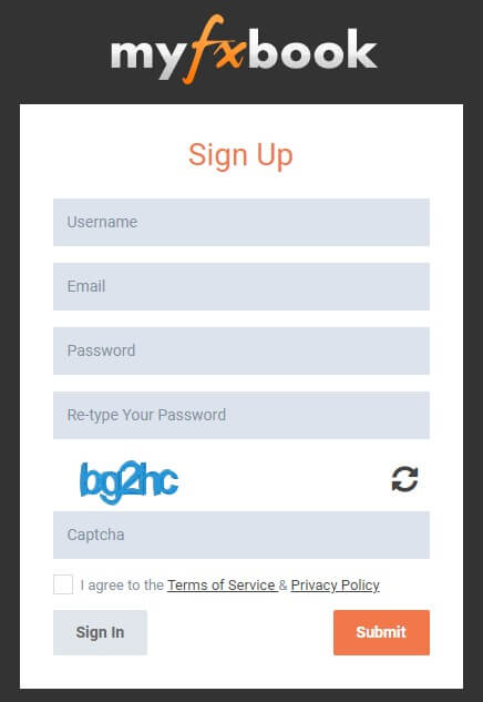
The first step is to register in Myfxbook (in myfxbook.com), this page is available in Spanish. To be able to use the platform you need to have a trading account with one of the more than 100 brokers that are compatible with its use and allow you to participate in its program. The trading platforms supported are:

The process is very easy, what you should do is fill out the form that you will find on the left side of the home screen, after accessing the page (myfxbook.com). You must define:

  • Your username
  • A password
  • Provide an email address

They’ll send you an email from which you must confirm the newly created account and you can now access Myfxbook by logging in (i.e., entering your username and password).

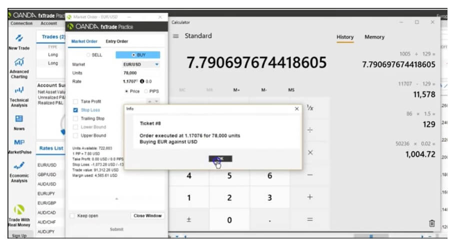
After this first step, the next step is to connect your trading account with Myfxbook. This option is available in the “Portfolio” menu, by pressing the “Add Account” button. You can also do this task in “Settings” in the user menu (where your username appears).

With MetaTrader, you can link your account through Publisher or by downloading an Expert Advisor (EA) specially designed for this purpose. After that, you will have to install the app, after it is downloaded. It will ask you to select a specific account from the chosen platform (it is advisable to select an account that already has a history).

The following steps are done from the trading platform itself, we can anticipate that, in MetaTrader 4, these tasks are performed from the “Options” command, within the “Tools” menu.

In the “Activity” menu of Myfxbook (top of the screen), you will be notified that your trading account has been linked to your Myfxbook account.

Once your trading account is linked to the platform, in the “Portfolio” menu you can get a view of your trading statistics and associated account information. This will be of great use to carry out a thorough analysis of your profitability, your percentage of winning trades, drawdown, and other variables that you will have to take care of as a trader. Especially if you have multiple accounts, so you can monitor your entire operation.

Prepare Your Profile

On the right side of the screen, at the top, at the aforementioned user menu, you have everything to leave your profile ready in this new social network of which you are already part.

Your profile is your cover letter to other traders and will be essential if you intend to initiate or participate in any conversation, debate, ask questions, or market any social trading service.

To fill your profile you must select the “Edit Profile” submenu or enter “Settings” and select the “Profile” tab (both options are located within your user menu at the top right of the screen, where your name appears).

What Can You Find in Myfxbook?

It is necessary to say that some of these services are available without the need to create an account in Myfxbook, that is, without the need for previous registration on the page. However, once created, you will have full access to all the utilities that this platform has. As we have seen, the process of creating an account is simple and fast: it is worth taking this step. Among the menus of Myfxbook, you will find all this amount of tools that we show you below, menu to menu.

This first menu is related to the latest market news, very useful to keep you up to date. The menu is composed of:

News: access to the latest news related to the Forex market.

Economic Calendar: economic publications that move currencies.

Recent Posts: Last threads in the Myfxbook forum.

Forex Calculators: In this command, you have available a series of calculators designed to make your trading easier (for example, pips calculator, margin calculator, Fibonacci, etc.).

Portfolio: From this menu, you can link your accounts and access their statistics. In short, you can analyze your trading to improve it.

Then we’ll see how we can perform this data public so that other traders can assess if it is advisable to contract some product or service that is intended to offer.

Autotrade: The Autotrade menu is the corresponding menu for replicating operations. When a trader is a signal provider and carries out a trade, Myfxbook sends a signal to all those trading accounts that follow it (that is, the accounts of its customers). In this way, the same position as the aforementioned supplier is opened or closed.

The menu consists of a submenu with the frequently asked questions of this service (FAQs), the help submenu, and a simulator that we can test the strategy of any provider before making the decision to follow it.

Soon we will see the requirements to be able to be a signal provider in Myfxbook.

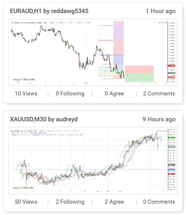
Charts: Charts are one of the tools that Myfxbook provides to members of its community. Any user can create an analysis and post it so that other traders can view and comment on it. It is possible to see the most followed, the most recent, or the most commented charts (among others). Everything depends on the specific option you choose in the submenu.

You also have the opportunity to create your own analyses and share them in this social network, in this way analysis is shared and learned through shared opinions. It will also help you boost your personal brand as a trader.

Markets: In this section, we will find several sub-menus with information about the Forex market useful for making trading decisions:

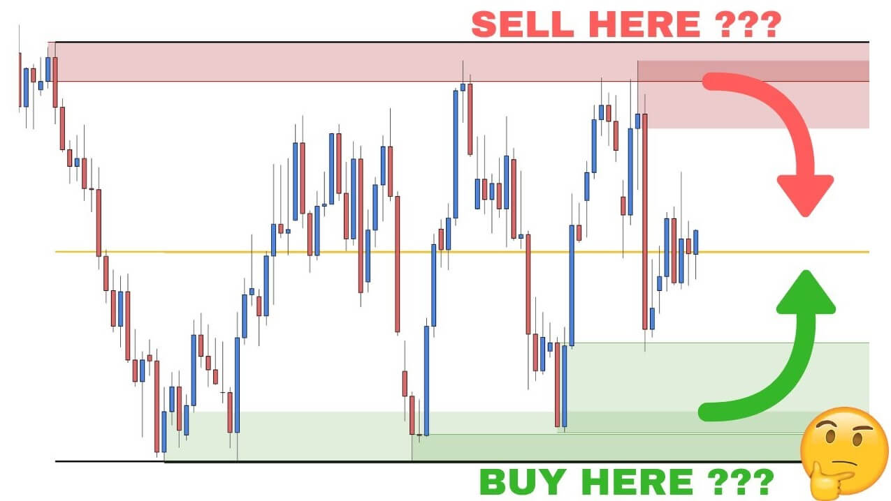
Technical Analysis Patterns: shows the different Japanese candle patterns that follow each other in major currency pairs. The temporality in which they appear and the implications they have (bullish or bearish) can be defined. You can also comment (and see the corresponding comments).

Volatility: you can visualize the volatility, in pips, of the main currency pairs (in several seasons).

Heat Map: Do you want to know which are the hottest currencies? Here you are indicated the strongest and weakest in different time periods.

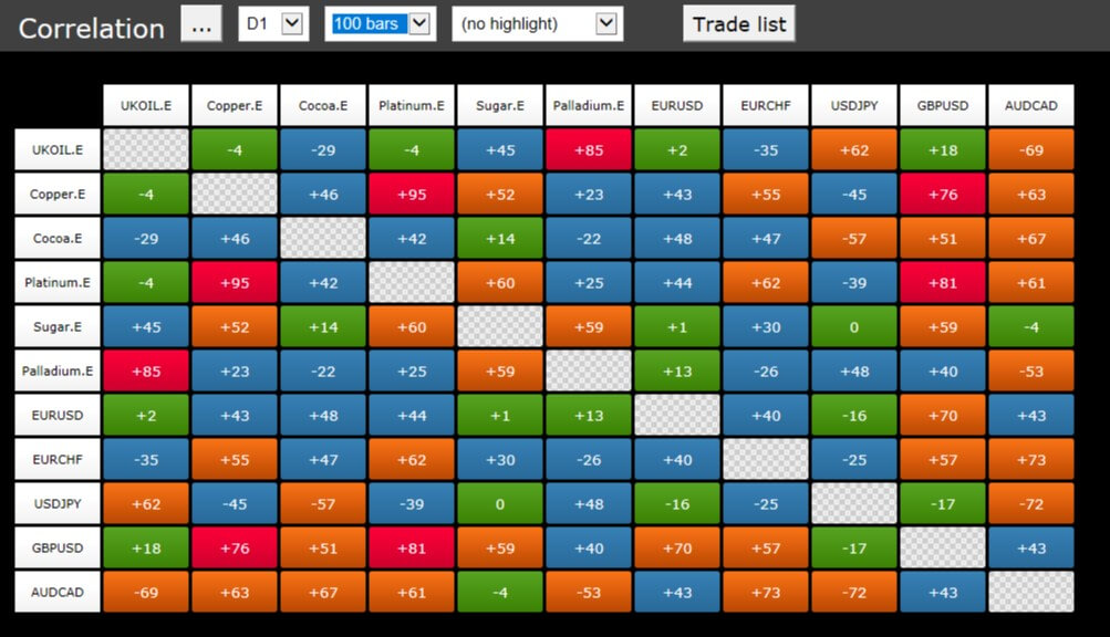
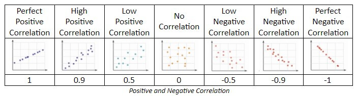
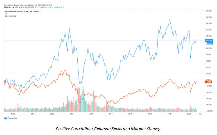
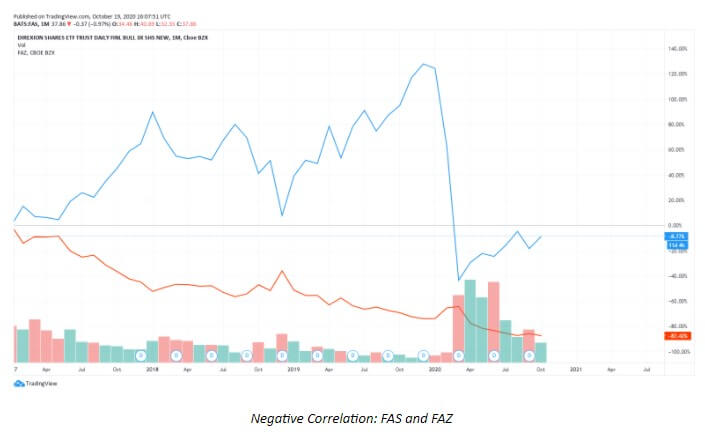
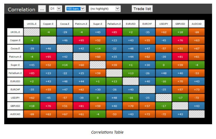
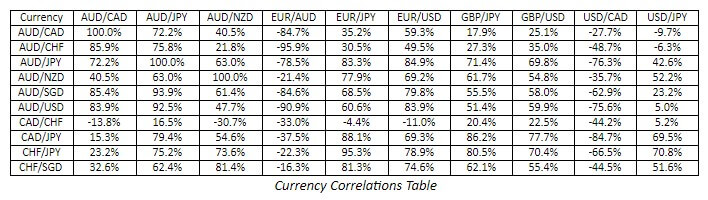
Correlation: The relationship between currency pairs is important to avoid overexposure to the risk of a particular currency pair. There are also trading strategies based on correlation. In this command, you can have it under control.

COT (Traders’ Commitments) Data: data obtained from Commodity Futures Trading and in which you can read the positions of the participants of the forex futures market, to get an idea of what they think.

Liquidity: You can look at the estimates of trading activity in the market in this subsection.

Systems: This menu is only visible to all users who have created an account in Myfxbook. In it, you will have the opportunity to visualize the different trading systems and strategies of those users who have made this information public, in order to be followed. Through the statistics provided by the platform (and that we have already seen in a previous image).

Also, you have the option to follow any of them that you find interesting, by clicking on the button “Autotrade”. You can have direct access to the most popular ones by selecting the corresponding submenu. You can also compare different trading systems.

Remember that one of the advantages that Myfxbook provides is the transparency and reliability in the statistics of the different historical data, the accounts are audited at the time they are linked to this platform.

Community: This is a communication space, where you will be able to ask, share, debate, and learn about any topic of trading in the Forex market.

Beyond the general forum, this section is composed of several sub-menus, in which you can see conversations regarding:

  • New traders
  • Experienced traders
  • Investment systems
  • Strategies
  • Programmers
  • Suggestion box
  • Contests
  • Technical patterns
  • A feeling of community

Any user can open a new discussion thread. Being proactive in this aspect improves our visibility within the platform and, therefore, we will be more transparent and reliable traders. In addition, it is a good meeting point to share ideas and market products and/or services related to currency trading.

Comments: In this section, you can access, in addition to participating directly, various comments, reviews, ratings, etc. about:

  • Brokers
  • Automatic systems
  • Signal providers
  • VPS services
  • Programming services of EAs
  • PAMM services
  • Reimbursement programs
  • Trading platforms

As we can see, once again, Myfxbook stands out for the transparency it offers. On this occasion, the users of the platform are the judges of any service offered. There is nothing like seeing the ratings and reviews to check the reliability of any product or service.

Competitive examinations: As its name suggests, this menu will help us to be aware of the different trading contests organized by different sponsors. We will be able to see, also, the contests that at that time may be active.

If we access the menu, we will have the relevant data to decide whether or not we are interested in participating in a trading contest. Data such as:

  • Sponsor
  • Number of competitors
  • Whether it’s a demo or real
  • Awards
  • Winners (if the contest is over)
  • Start and end dates of the competition
  • Statistical analysis of the operations carried out

Without a doubt, it is another advantage of Myfxbook: to have under control the trading contests and all the information about them.

Brokers: This section is a comparative table of the different online financial intermediaries trading in the currency market. From it, we can see, compare, analyze, and decide which broker is the most interesting for our operation, depending on our trading style and our preferences. We will be able to undertake a follow-up of the spreads they offer, swap commissions, as well as other costs and promotions they can offer us.

Hiring a broker adapted to your needs is essential to develop a good trade. Through this menu you can see all the information of interest in this sense: one more reason to have Myfxbook among your favorite trading pages.

How Can I Become a Trading Service Provider in Myfxbook?

As mentioned above, Myfxbook gives you the opportunity to promote yourself as a trader, offer a range of services, and develop all your skills in the currency market. However, to market any social trading service you need to make public the statistics of at least one of the accounts you have linked to this platform.

Myfxbook stands out for offering a real, verified, and transparent information of the different traders, so, to have the opportunity to be a top trader, you must make a good operation and this contributes to the professionalization and regulation of this professional activity.

To make your trading account data public, simply click on the “Invitations” tab (in the “Settings” or “Portfolio” menu) and mark all options as public.

Trading providers earn a 0.5 pip commission on each account subscribed for each winning trade. If you are content to be a successful trader, you must first learn and take experience in the markets. In this respect, Myfxbook will also be of great help to you thanks to the information and possibility of communication it offers.

To access the Autotrade service and to be a signal provider, the following requirements must be met:

-Only real accounts with MetaTrader 4, verified and connected to Myfxbook, are accepted.

-The account must credit a minimum balance of USD 1,000.

-You must have a history of at least three months and at least 100 operations.

-The historical drawdown must be less than 50%.

-The historical return should be greater than 10% and greater than the historical drawdown.

-You must have earned an average of 3 pips per operation.

-As for the duration of operations, the average will be more than 5 minutes.

-The system should not use any martingale technique.

In other words, it is necessary to demonstrate some value in trading in order to be a provider of social trading services. It is another feature that defines Myfxbook as a secure and reliable platform.

The Reality of Myfxbook

The reality of this platform is that you will find many martingale systems and hidden scams. Most of them may look very promising but then they have a big fall and they get out of the way. In the end, most are hidden under a username.

So, all that being said, in my case I take advantage of this tool to get statistics from my accounts and little else. You can access profitable systems and they can give you an idea of how they work if you’re smart looking at some of their statistics, but remember that it’s a mine of martingale and grid systems, which we already know ends up blowing up accounts. So far all this guidance on this well-known tool within currency trading and trading systems, forex brokers.

Categories
Forex Chart Basics

If EUR/USD Buying is High, Does That Affect the Fluctuation/Swing in the Chart?

The EUR-USD cross is an intriguing one. With a total of 9.6 million traders in the world, approximately 37% of all volume at the global level is held by this currency pair alone. In fact, not only are the EUR and the USD two of the most traded currencies individually but they also comprise the most liquid pair.

Traders from all corners of the planet seem to love the EUR-USD because of tighter spreads and less slippage, but this currency pair is, at the same time, the Holy Grail for major players in the market.

There are no Coincidences

Forex is dominated by the Interbank Market, which is used by various financial institutions to trade currencies between themselves. Interestingly enough, 50% of this Interbank Market is controlled by the largest banks.

Out of approximately 25 000 banking institutions existing in the world, Deutsche Bank, Citi, JP Morgan Chase, and HSBC are some of the most prominent. And, you should know that their interest lies where yours does as well – profit.

How come?

Well, big banks love to manipulate the prices. Have you ever noticed how the price suddenly changed when everyone was certain that it would keep on going in the same direction? There’s the catch.

Big banks focus on the concentration of activity and they step in right where most traders are to take the cream off. To be specific, it is not just where traders are in the chart at that moment but where most of them are headed. 

How the Big Banks Interfere

It is unfortunate what sentiment can do. Many traders keep using the same tools and indicators and they, logically, end up losing. We may not know the extent of tools the big banks use to maintain control and insight, but the same information is accessible to everyone through IG Client Sentiment Indicator or FXCM SSI

While the big banks have the power to detect market activity, they cannot see your specific order. They can, however, discover if the majority of orders were long or short, based on which they can manipulate the price.

So, the more the orders push the market in a specific direction, the more likely are the banks to interfere and turn everything around.

USD is a Magnet

The choice of currencies can have an equally strong influence on the trade as well. As the USD is always in demand, it is more likely to be always on the big banks’ radar. Any news events concerning the currency will also stir up the market and set the ground for major turbulence.

The USD is, in fact, so prone to react to any news that any tweets of the previous US president, Donald Trump, caused a commotion in the market. Major US economic reports (GDP, employment, producer and consumer price index, retail sales, and trade deficit reports) are also perfect opportunities for the big banks to take their share of traders’ money.

The EUR is specific because the number of reports concerning the currency is higher due to the number of Eurozone member states. Although related economic reports (especially those of France and Germany) are valuable for traders, EUR pairs seem to do well even when they do come out. 

Since any currency combination is determined by both currencies, the EUR-USD (as the most traded and liquid pair) is that more monitored by the big banks.

The big banks’ involvement can be seen in other crosses involving this pair. For example, the EUR-USD pair has historically exhibited a high correlation with the S&P500 as they both involve the US economy. Interestingly enough, these major banking institutions have no significant dominance over precious metals, which typically dictate what will happen with the pair.

Manipulation at its Best

The number of individual orders, as we can see, does not have the power to drive the market. Individual requests cannot affect market movement per se. The only power that can create an imbalance between buying and selling orders is the big banks. 

Anyone trading the EUR-USD can see these sudden changes in prices, which leave behind many unfilled orders on the supply or the demand level. The big banks will use any opportunity to cause such friction to have their orders filled after the price returns to the zone.

These are the reasons why some forex professionals advise beginners to start trading some other currency pairs that are less susceptible to such interferences.

Indicators’ Predicting Power

Many traders use the sentiment to predict future activity in the market, which is a highly volatile and unpredictable tool. While we cannot control the big bank’s involvement, we can limit their impact by not focusing on the number of orders in the market and avoiding circumstances that these major players deem inviting. 

Any indicator is a result-oriented tool that has no power in predicting the future. News will come out and changes will occur in the world, but our task as traders is to adopt the skills that can raise us above the level of sentiment and provide us with stability.

Instead of focusing on the quantity of orders, supply levels, rather strive to determine the overall market direction and evade the banks’ radar as successfully as possible.

Own your Share of Responsibility

It is important to understand also that if big banks ever disappeared, the nature of this market would change entirely. Maybe the volume could change or forex might start to resemble the stock market. That is why it is important to shift the focus from losses and adopt an opportunistic and proactive mindset. How can you take advantage of the big banks’ existence?

The best solution to this challenge is building your own strategy and learning to trust that system. It should help you avoid the patterns the majority of traders keep repeating. This is a classic contrarian trader view of forex.

Trading currencies requires each trader to let go of the herd mentality. You need to become as independent as possible, especially when it comes to heavily monitored and liquid pairs such as EUR-USD. Your best bet is to invest in learning about trading psychology and letting go of the belief that individuals can impact the market.

Knowledge is Power

If you are still unconvinced that sentiment is not your point of reference, at least aim to use credible sources. 

Twitter, for example, offers an excellent pool of information – you can explore updates about IG Client Sentiment Index on DailyFXTeam, learn about more SSI currency pairs on FXCM_MarketData, or discover some invaluable educational materials on www.forex.academy, and build your unique way of trading. 

Finally remember that it is your skillset and toolbox that will allow you to trade the EUR-USD currency pair successfully – not the news, not the orders, and certainly not the sentiment. Use the traders’ sentiment only to see if there is enough “profit space” for you to take that contrarian trade direction. If 90% of traders are long on EUR-USD, it is hardly going to get higher, do not go into the wall. As the flow in the market is directly managed by external factors, you will primarily benefit from having a system in place that will guide you through any potential volatility caused by news events and the big banks. 


Categories
Forex Market

Is Market Analysis a Must for Trading?

Imagine that you are a doctor and a patient visits you. Instead of conducting a full check-up, you just put the person on the table and start operating. This doesn’t sound good, does it?

      …well, neither does trading without any analysis.

The thing is…we may choose between thousands of different ways to start trading, but there are always a few crucial points to consider. We have all heard stories about people who approach trading as if it were gambling. They rely on emotions, luck, and intuition to determine the future of their finances. However, although this method is wrong and dangerous, what do you believe is the missing component?

If you just took a coin and chose the head as a sign to go long and the tail to go short, you would have a 50-50% chance of succeeding, right? Well, it depends. With knowledge of the market and indicators, a developed toolbox, and proper analysis, this ratio would immediately change.

We need to have a clear idea of where we are going to set our take profit and stop loss and what our risk-to-reward ratio is going to be. These points cannot be determined randomly. We need money management to know how to manage any trade, from entry to exit. 

Many professional traders will condemn any vague, unclear approach because, as traders, we can have a much greater chance of winning with the precision and clarity that come with knowledge, analysis, and money management. 

No matter which strategy you apply in trading, money management should come first. Calculate your risk properly and do not let the trade run loose.

Traders may prefer lower or higher time frames, trying to make the most out of the chart analysis. Technical traders are going to rely on different tools to gather information about the market. However, to know whether you should enter a trade or not, you can do the naked chart reading as well and still know exactly what you should do to succeed.

Naked chart traders do not use algorithms but focus on what candlesticks are telling them about current market activity. Although these traders do not use any indicators in this case, they still need a developed skill set to generate wins and limit losses. 

As naked-chart strategy requires traders to interpret price action signals, they need to determine the overall market direction and read various patterns. Indicators may not be relevant in this trading approach, but managing one’s emotions and attitude is as important as in any other trading style.

Some aspects of trading are universal. Whether you are a technical trader or a naked-chart one, you will need to learn to analyze the market and yourself.

We know how the trading world offers abundant possibilities. Needless to say, trading comes with its own set of risks. That is why some affluent people are keen on seeking advice from experienced traders to ensure a good return. Nowadays, we are also seeing a rise in automated trading (i.e. expert advisors or trading robots) that aims to alleviate the entire trading conundrum and achieve profit without breaking a sweat.

With this approach, traders are free of having to manage each step of the trade themselves. They, however, need to invest in this ready-made system and, preferably, consult with a trading manager as well. 

Now, regardless of any easing that comes with purchasing EAs, people still need to understand the strategy that their robot is using. These traders may not be complete or independent, but they must analyze how the EA they chose works.

You may not care about who is running the state or which report is coming out next, but you still have the task of realizing how you are going to manage a new trade. How do you know that something is a signal or not? How are you going to tell if you are in an uptrend or downtrend? Which strategy brings you the best results? The questions may go on and on, and you are the only one who can answer them.

Based on everything we said above, there is no trading without some form of analysis.

To earn a profit, you need to know the key points in your trading, including your maximum risk and potential reward. What is more, earning a sustainable income should also push you towards understanding what triggers you to behave irrationally. For example, your leverage may be too high or too low, but without assessing the whys, you cannot progress any further. Any algorithm you develop can also help your trades run smoothly and prevent future losses.

Some professional technical traders will say how trading is based on three key concepts – money management, trading psychology, and technical analysis.

Now, even if you are not a really big fan of indicators or prefer a different approach, you need to build experience, as it will help you eliminate future mistakes and manage your emotions better. Yet, to get to the point of having a comprehensive perspective of your personality and the market, you still have to carry out thorough testing. 

You need to see in advance if your chosen strategy is going to yield results. And, even if it does, you might react differently once you start investing real money. Try to obtain a 360 vision of everything – the market, your involvement, and any tools you may be using.

This is why, whichever time frame or strategy you are using, you need to backtest, forward test, and real-life test your system. 

Imagine a situation where you finally started making money, but you suddenly, out the blue, take a few really bad losses with the price hitting your stop loss. 

What do you do? 

You must assess what went wrong – was it emotions, technical analysis, or something else. How can you improve your trading without recording what you were doing? The only thing that matters at the end of the day is the bottom line. Compare your total wins and losses and see if there are any loose ends. 

Trading is more about protecting your account from losses than about sole winning.

You can always use a demo account to see how your approach is working out for you. Any trader with experience will advise you to take notes on every trade you take, including all entry and exit points, indicator settings, and other key information concerning the trade.

Personality tests are also an invaluable tool for traders to get the gist of some negative beliefs that are deeply rooted in your subconscious. You do want to know if there is a part of you that is blocking your prosperity and growth. Finally, understand that whichever approach you take, trading is all about analysis, of yourself and what you do.

You are free to make your own selection of your trading style or even entrust a trading robot with your finances, but do not for one second believe in easy money with no involvement on your side.

Your trading is like a flower bud – you need to devote time, effort, and energy to see it grow, and bloom. Sometimes, you will use less water and more fertilizer to accommodate the changing seasons, but you will always be present, monitoring the development from the seed to the full-blossom stage. If you wanted to take yourself to the next level, you might consider attending a florist competition. That is when you would further build your skills and might even learn how to cut and decorate flowers. 

Still, the one thing that connects all the different stages of this process is analysis. Some people are blessed with a green thumb, so they know intuitively what to do to help the flower grow. However, to be an expert, everyone needs to include a detailed assessment of factors affecting their success in their chosen field.

Categories
Forex Fundamental Analysis Forex Technical Analysis

Fundamental Analysis Vs Technical Analysis: Know the Differences!

Traders make decisions about when and what to trade based on several different factors. Fundamental and technical analysis are two different methods that one can use to predict what will happen with any given instrument by looking at different types of data. As a forex trader, you’ll need to understand the differences between these key schools of thought so that you can make more informed trading decisions. Both fundamental and technical analysis can give you an edge in the markets, but you’ll need to decide which one sounds the most appealing or consider using both methods. 

Fundamental Analysis

Fundamental analysis aims to measure the intrinsic value of a stock by looking at several different factors about the company. This method considers earnings, outgoing costs, assets, liabilities, the overall business model, the status of those in charge, and many other things about a company in order to get the best idea of where prices will go. Some of these things can be measured in simple numerical terms, while others can’t.

For example, you’ll find statistics and numbers when it comes to things like earning reports but evaluating the company’s business model is more of a personal interpretation. Real-time events can also affect the company evaluation. If a scandal goes down involving a certain company, for example, you can expect its revenue to fall. All of these things are taken into consideration when one measures the intrinsic value of a company through fundamental analysis. 

Technical Analysis

Technical analysts exclusively consider a stock’s price and volume, with no need to calculate extra factors. Traders using this method look at charts in order to identify the history of patterns and trends for an idea of what they will do in the future. Some examples of the most popular forms of technical analysis include simple moving averages, support & resistance, trend lines, and other indicators. There are three main types of technical analysis – bar, candlestick, and line charts. Each of these is created using the same price data but will display the data in different ways. This school of thought believes in the idea that charts are great for predicting the past. 

The Bottom Line

While fundamental and technical analysis both aim to predict where a stock’s price will go, each school of thought uses very different methods to come up with its prediction. Fundamental analysts aim to measure the intrinsic value of a company by taking several factors into account, including hard numbers and some personal interpretation. Technical analysts study charts from the past with the stock’s volume and price being the only information considered. While technical analysts look at more complex information about companies that affect a stock’s price in the present and future, technical analysts study charts from the past to get an idea of where the price will go in the future. Both methods have been proven to be effective, so one would need to personally decide which to use.

Categories
Forex Fundamental Analysis

EUR/GBP Global Macro Analysis – Part 2

GBP Endogenous Analysis – Summary

The GBP endogenous analysis has a score of -9. We can therefore understand that the GBP has depreciated in 2020.

  • United Kingdom Employment Change

The UK unemployment change measures the changes in the number of people who are above 16 years and employed. This data is a 3-month moving average of the change in employment, which measures a general trend in the labor industry changes, which typically corresponds to fluctuations in the economy.

In the three months to September 2020, the number of employed people in the UK dropped by 164,000. The YoY employment change shows a drop of 247,000 jobs, which is the worst in ten years. Based on correlation analysis, we assign a score of -7.

  • United Kingdom GDP Deflator

The UK GDP deflator is used as a measure of the comprehensive change in inflation. It filters out any nominal price changes in the entirety of the goods and services produced within the UK.

In Q3 of 2020, the UK GDP deflator dropped to 109.12 from 111.9 in Q2 – the highest ever recorded in UK history. The UK GDP deflator has increased by 6.41in 2020. We, therefore, assign a score of 4 based on its correlation with the GDP growth.

  • United Kingdom Industrial Production

This indicator tracks the changes in all the firms operating under the industrial sector in the UK. The manufacturing sector accounts for about 70% of the total industrial output. The major components of the manufacturing sector are food, tobacco, and drinks, which account for 11%. The manufacture of transport equipment and basic metals account for 17%, pharmaceuticals and non-metallic 6% each. Quarrying and mining activities account for 12% of the industrial production, with 10% for oil and gas extraction.

In September 2020, MoM industrial production in the UK rose by 0.5 while YoY dropped by 6.3%. Despite the growth and recovery of industrial activity from the coronavirus pandemic, the output is still 5.6% lower than the pre-pandemic levels. Thus, we assign a score of -3 based on correlation with GDP growth.

  • United Kingdom Manufacturing PMI

This index is a result of a survey of about 600 companies in the industrial sector. It is a composite of new orders, which accounts for 30%, output 25%, employment 20%, deliveries from suppliers 15%, and inventory 10%. When the index is above 50, it shows that the manufacturing sector is expanding. Below 50, the manufacturing sector is expected to contract, which impacts the GDP output.

In November 2020, the UK manufacturing PMI was 55.6 – the highest recorded in three years. This was mainly driven by increased inventories and increased new orders as a result of Brexit. We assign a score of 3 based on correlation with the GDP growth rate.

  • United Kingdom Consumer Spending

Consumer spending in the UK shows the amount of money that households spent on the purchase of goods and services in the retail sector. Note that expenditure by households is among the primary drivers of GDP growth.

In Q3 of 2020, the UK consumer spending rose to £304.5 billion from £258.32 billion in Q2. This increase is attributed to the restriction imposed at the onset of the coronavirus outbreak, resulting in the economic slowdown. It is, however, still lower than the pre-pandemic levels. Thus, we assign a score of -5 based on correlation with the GDP growth rate.

  • United Kingdom Consumer Confidence

In the UK, GfK surveys about 2000 households to establish their opinions about the past and future economic conditions, their financial situation, and prospects of saving. The survey period covers about 12 months into the future, which makes it a leading indicator of consumer spending, and by extension, the overall economy.

In November 2020, the UK consumer confidence dropped to -33 edging closer to yearly lows of -34 registered at the height of the pandemic. We assign a score of -5 based on its correlation with the GDP growth rate.

  • United Kingdom Public Sector Net Debt to GDP

This ratio tracks the indebtedness of the UK economy. Based on the economy out, both domestic and foreign investors use the ratio to determine whether the UK can be able to service its debt obligations in the future comfortably.

In the financial year 2018 – 2019, the UK’s public sector net debt to GDP was 80.8%, down from 82.4%. In 2020, it is expected to hit 100% with a longer-term average of 91%. We assign a score of 4 since the increased net pubic debt managed to avoid a deeper recession in 2020.

In the next article, we have performed the Exogenous analysis of the EUR/GBP pair and concluded what trend to expect in this currency pair in the near future. Cheers.

Categories
Forex Market

Guidance for Trading Forex During Times of Crisis

People generally go about their daily routine without fail, but things change during times of crisis. For example, if the weatherman predicts tornados or even snow in some states, people suddenly go into panic mode and rush out to buy milk, bread, and toilet paper until grocery store shelves are empty. Whenever someone perceives a potential crisis on the horizon, their everyday thought process changes and they begin to go into survival mode.

In some cases, this is for the better, although people often overreact when it comes to small-scale events. Fortunately, we don’t have to deal with crisis mode too often and many of us forget about the frustrations of the last crisis shortly after it’s over. 

In the past, humans went into crisis mode a lot more often and for different reasons, like predators, hunting dangerous wild animals, or because of an incoming attack from a rival tribe. In today’s modern world, most of what we would consider a crisis revolves around the weather, economic, political, and health-related issues. A great example would be the Coronavirus Pandemic, which has inspired a lot of fear, along with hoarding, distrust of the government and in a vaccine, lockdowns, quarantine, and other problems. It would have been nearly impossible to predict what was to come just a few months before the virus began to spread. 

It could be argued that things could have been done to slow down the coronavirus pandemic and to stop it from reaching other countries. Many people believe that the government did not take the virus seriously enough in the beginning, which caused slower and less abrasive actions than what was necessary to stop it. This isn’t that surprising, considering that the modern world has not dealt with such a large pandemic in quite some time. Some scientists and institutions did promote research that suggested this type of thing was possible, but many of us simply weren’t prepared to deal with this crisis. 

Crisis and the Financial Markets

We mentioned how humans operate in two modes: regular everyday life, and crisis mode. It works the same way with the financial markets, as people tend to panic and act differently whenever they perceive a crisis. Since buyers and sellers drive the market, this can cause a lot of issues within the market itself. 

One of the most important things you can do as a trader is to learn to identify whether a potential “crisis” will be small-scale or if it is a world crisis. For example, traders all over the world obviously aren’t going to be worried about a tornado warning in your home state, while a world war would affect things on a global scale. The Cuban Missile Crisis of 1962 and the recent Coronavirus Pandemic are two more examples of world crises that had a large-scale effect on the market. Once you’ve identified which category a crisis falls into, you will need to apply different trading rules depending on what you expect to see with the market.

There are two rules that can be used to help you accurately identify whether a crisis should be considered normal or a world crisis:

  1. Consistent movement in the markets with unnaturally high volatility; declining stock markets; and ranges lasting for some time over their long-term averages are signs of a real-world crisis 
  2. Emotional reactions from traders that result in crashing stock markets are a sign of a real-world crisis that shouldn’t be taken likely

In order to check for the first rule, you can apply the average true range indicator over the long term in order to compare the results to recent daily ranges for the forex, stock, and commodity markets. 

The Bottom Line

Although we don’t have to worry about large-scale crisis too often in the modern world, things can happen quickly and catch us off guard, sending us into full-scale panic mode. As a trader, it’s important to be able to identify just how big of a deal any new crisis might be and whether it is a normal crisis or something that will affect the entire world. This can change the way the market behaves and you’ll need to be prepared and on top of your game to keep up. Remember, even if you believe that a crisis will be widespread, it’s important not to panic and to continue trading with a level head. Always stay up to date on the news and pay attention to what other savvy traders are saying to get a sense of what your peers expect.

Categories
Forex Indicators

The Williams %R Indicator: Winning Custom Interpretation Twists

There are special ways we can take signals out of an indicator, ways not described by default. In many cases we find an indicator that is not very good for its role in our system, we have better-performing ones. We try different settings to improve it and this may take a lot of time when we backtest, especially if there are many settings. 

Now, if you are a veteran in technical analysis, you probably have tested many indicators and know about adding Moving Averages on top of indicator data. If not, we have done an article about this customization that could generate very accurate signals out of simple, mediocre indicators we have scratched as bad on our top list before. Whatsmore, even indicators that have a different role by default can be converted to other roles just by adding MAs. 

The Williams %R is a reversal type indicator, an oscillator with overbought and oversold signals. In theory, it does not fit into the trend following method of trading and we might just skip it because our system is designed and needs trend confirmations. When we discuss exit indicators, the reversal type indicators fit very well into this exit signal role. Yet Williams %R is probably not good enough even as an exit indicator for your trend following system. Thorough analysts do not move on until they exhaust all possibilities out of an indicator, be it by adding MA if possible, changing settings, or interpreting signals for other, unorthodox uses. In this article, we will tackle how a mediocre indicator in all categories can become our top indicator just by having a different view of its signals. 

Very few reversal indicators can be made a good trend indicator. They are simply not made for that role. Williams %R is a rare diamond by accident that can be made useful. Williams %R is not in the Bill Williams indicator family where you can find Awesome, Alligator, Fractals, MFI, and others, which are generally not great for trend following algorithms according to professional prop traders. Williams %R is made by Larry Willaims and it is already integrated into the MT4 platform so you do not need to look for it. The settings by default are not optimal if you want to trade it using our algorithm structure but you can try and test different settings, every system is unique. As our traders say, typically they do not test indicators with lower period settings than by default. It is usually done with defaults or a bit longer to smooth the indicator, but Williams %R is another exception.

According to our tests and testimonies from professional technical traders, the daily timeframe is the best choice for many reasons, not only performance-wise. However, Willimas %R seems to be better at lower frames than the daily. This does not mean that if you trade on a daily only Williams %R is not useful. You will need to test. Lower timeframes, even 4 hour is good enough just do not go lower than 15 minutes. Williams %R is a confirmation indicator with the way we use it, but it is not great for continuation trades. The way we use it is completely the opposite of what it is made for. Let’s get into more detail.

In the picture below we have already included Williams %R with a modified period setting to 8, the Kijun-Sen from the Ichimoku indicator on default settings as our baseline and we are on the 4-hour timeframe. Williams %R has another interesting fact – it has a scale from 0 level and below. The area from 0 to -20 is regarded as the overbought area and the area from -80 to -100 is the oversold area. It is rare to see indicators with these values but do not be confused, if you want to add the “zero” line to experiment just add a horizontal at -50. Similarly to the popular RSI indicator, Williams %R generates a signal once the oscillator line crosses the overbought and oversold levels into the middle range. 

When applied on the BTC/EUR chart above we see a lot of signals that didn’t end well, most likely in a loss when interpreted in a classic way. On certain occasions, the signals were very good, as the bullish trend on the left side of the picture. False signals frequency is hard to eliminate here, even if we add the volume filter. Simply, Williams %R has a choppy behavior by default so we need something to counter this issue.

When we observe how and when trends start, it is noticeable every trend starts when the line enters either the oversold or overbought area of the indicator. In the picture below we have marked all entries allowed by the baseline. Out of 6, only one was a losing trade, and that one was a small loss compared to the trends captured. This way gives out interesting and consistent results, even though the indicator was never designed for it. For those not familiar with the baseline element in our analysis, only when the price crosses and closes above or below it we look at the Williams %R for a trade entry signal. If you go to lower timeframes such as H1, 30M, and 15M, this way continues to give you good signals. Beginner traders that like trading on lower timeframes deviate from our algorithm principles, however, Williams %R is a good to go indicator which will likely outperform their current confirmation indicators. When the market is ranging, this indicator will rarely give you a signal, often the line will stay in the normal range, making it a great loss eliminator. When you par it up with the volume filter, you can scratch almost every fake signal in a ranging market

To conclude, we flip the original signal interpretation. A classic way of trading this indicator is going long when the Williams %R line exits the oversold range into the normal -20 to -80 area and going short when the line exits the overbought, upper area. Now we flip this into going long when the line enters the oversold and overbought areas. This is similar to the CCI, and some momentum oscillators, but Willimas %R does the job better according to our testing. As for exit signals and continuations, it does not prove to be as efficient, however, we encourage you to test this out. Finds like this are not so rare if you try to research and test every interesting indicator. When you see it is very bad at its first intention, a small twist in settings, Moving Average addon, or another signal interpretation can flip it into a top indicator. Adding Moving Averages on this indicator is possible which brings a whole new area for interpretations across different roles. Note you need to select Apply to “First Indicator Data” first so the MA is on top of the indicator window.  

Categories
Forex Education

The Do’s and Don’ts of Testing Multiple Algorithms

Is it possible to use different algorithms to trade in the spot forex market? This is one of the rarely thought of questions we are going to explore today. However, before proceeding any further, it is important to clarify why we use algorithms in the first place – we generally develop these systems through combining various indicators, money management, and trading psychology so as to be able to determine the most suitable moment to enter or exit a trade is.

Algorithms are thus complex combinations of various tools and information that need to endure rigorous testing processes (namely backtesting and forward testing) in order for traders to feel confident to use them in trading real money and a variety of market cycles. While some experts opt for employing the one best algorithm they have managed to set up, it is quite interesting to discover whether it would be possible or even necessary to make use of several different algorithms for the purpose of handling the natural forex market fluctuations and achieving the highest degree of satisfaction as a trader.

First of all, we should all understand that improvement or working on perfecting one’s algorithms should be made a priority due to the necessity to always increase the ability to extract greater benefits from trading currencies. What is more, we cannot but confirm that designing a better functioning algorithm is not only plausible but also performed regularly by a number of professional traders. We may one day find out how the algorithm we have been using does not respond well to specific market conditions, so the only way to tackle this challenge is to see how we can adjust our system and enhance our trading as a result.

Another important conclusion we need to reflect on concerns the systems we do have – if you are certain that you have something of value that you can truly use in trading, do not feel discouraged having a sense that you can do better. The key idea is to keep going and that improvement should go hand in hand with trading, as the two are complementary processes. Conversely, what you should strive to do is simply employ the strategies and indicators you have selected as the best-performing trading tools. You should feel relieved knowing that even when you take losses, your system will eventually weather through and give you positive results in the end. 

Many traders are excellent at following advice on how to test their confirmation indicators, as the first step in trading, which is followed by backtesting the entire system so as to finally reach the stage when one algorithm that is most likely to produce the best results is selected. Nonetheless, what often happens is for traders to realize that they have come across several well-functioning algorithms, causing confusion and doubt. In these cases, the algorithm which is the second in line is often quite close to the top-performing one in terms of the results it gives, which naturally awakens temptation in traders. Moreover, not only do they feel that the bigger is always better but they also feel that drawn to make use of the algorithm which is so close to the very top.

If you have two great algorithms in hand, which have exhibited similar quality during the testing phase, you are advised to use both of them by experts. The key condition here is to make certain that you have ensured proper assessment to form your judgment on correctness. While traders are not discouraged or dissuaded from employing the two best algorithms that they have accurately set up and tested, professionals insist that the two are used in two separate accounts and that they keep using the same algorithm for a specific currency pair in order to properly track the results. Therefore, if there are 28 currency pairs you can trade, do not use a single account employing one algorithm on EUR/CHF and the other on AUD/CAD just because you feel that they perform better with these pairs, as emotions have proved to get in the way of rational thinking and measurement. 

Once you do get into real trading and you experience real emotions, you may discover that one of the two systems simply outperforms the other. As this allows you to develop an extremely important insight into your algorithms, you do need to address them separately so as to make proper measurement and comparison possible. What is also important is that you allow them to go through the entire course any system would need to endure to be accurately assessed. This further implies that you would need to wait for a span of one or two years before you could draw any real conclusions. Only then will you be able to tell whether there is a definite winner when experts encourage traders to confidently shift all their trading onto that winning algorithm.

Once the winner emerges, traders are advised to move all the money from the second-best account into the best-performing one. At this point, we are no longer making assessments because this act is a matter of common sense that stems from obtaining organic results from real trading. Even if the difference seems minute, e.g. the first-placed algorithm gives you a 16% return where the other one is 3% behind year after year, you should understand that such discrepancy stands for the real money you could have put in your pocket. Furthermore, if you are unable to let go of one algorithm/account, you are in fact giving away the profit you deserve by clinging to having two systems for some unfounded sense of security. 

If you have experienced a situation like this in the past, you probably already know that human nature can be quite tricky. We may easily give in to the fear of making a wrong decision by allowing the doubt to creep in and delve inside our minds and hearts. Traders may for example think that the second system might become better with time, but this is most definitely a highly improbable scenario, and every attempt to avoid making the “difficult decision” only prolongs one’s torment and implies that more money is wasted instead of accumulated. 

In conclusion, traders are always encouraged to use two algorithms as long as they use it in order to define what suits them best. The selection of the best algorithm both takes time and requires some conscious, emotion-free assessment. Therefore, matters of feelings and convenience should be left aside as they cannot help anyone get the results they are looking for. You truly need to ensure clear measurement so as to allow for accuracy to occur, as without accuracy you will never actually fully understand your trading or manage to get the most out of it. Relying on multiple algorithms is then acceptable for as long as they serve the higher purpose – improving one’s trading overall. Use your systems in two separate accounts and wait for them to run their natural course to be confident about making the final decision to continue using only one of them.

While diversification is always seen as a positive action in trading, using two (or more) systems endlessly means that a trader is not fully aware of his/her priorities. You can employ diversification tactics in terms of spreading out onto different markets in the future, but in cases such as this one, making a definite winner is a matter of utter importance for the reasons we have listed above. Hence, if you have several algorithms that you know can be profitable, simply run them and measure your results accordingly. Although this process may test your patience and require you to make a final decision, you can rest assured that such discrimination will only help you reap the greatest benefits from trading in the forex market and allow you to secure only the most lucrative deals in the future.

Categories
Forex Technical Analysis

Why Is Everyone Talking About Renko Charts?

Is the Renko chart a revolution in forex trading? A game-changer? Or is it a dead-end that’s going to cost you time and money? Read this to find out!

A Jenga Tower Made of Renga

Renko charts, conceived and designed in Japan, are a potentially revolutionary trading tool and everyone’s talking about them. The basic concept is relatively simple but the ripple effects are not and they could have a huge impact on how you trade. So what is a Renko chart anyway?

In the simplest possible terms, a Renko chart is composed of bricks (rather than candles) that are called renga – after the Japanese word for “brick”. Each brick represents a given price movement – in forex trading, this is expressed by a pip value that you determine when creating the chart. The bricks form when the price moves enough in one direction to cover the pip value. That sounds simple enough, doesn’t it?  

The first knock-on effect of forming a chart this way is that it knocks out the timeframe. That’s not to say there isn’t a time component to a Renko chart – the time axis is still along X but the way bricks form is not the same way candles form in a traditional chart. We’re used to a candle forming once a set amount of time has passed, regardless of how much the price has moved during that time but on a Renko chart, this approach is turned on its head. The renga bricks form only when the price has moved sufficiently in one direction – which, if the price is moving sideways enough to stay within the pip value you selected for the chart, could take quite some time. Purely theoretically, the brick could take indefinitely long to form if the price stays level (of course, that’s never going to actually happen but isn’t there something a bit unsettling about the idea that it could?). Conversely, when the price moves sharply, a long line of renga bricks might form in a very short time. But, because there is no timeframe, looking back at a run of bricks, you won’t have any indication of how quickly events unfolded.

So if a Renko chart is such an inversion of the usual rules for the way your chart forms over time, how will it affect your trading? Well, that’s what we’re here to find out.

How to Navigate a Renko Chart

Charts, just like the maps used by seafarers of ye olde times, are your guide to sailing the waves of the market, and, just like the maps of yore, they will adapt and new innovations will appear over time. Renko is just such an innovation and knowing what it can do for your ability to navigate through choppy seas is vital. In fact, it is important to know what it is, what it does, and how it works, even if you don’t end up using it. This is down to the simple fact that, if you want to improve and grow as a trader, you need to understand the tools that are out there and how they can potentially improve your trading.

First of all, the rules underpinning a Renko chart are so different it almost calls out for you to forget everything you’ve ever learned about reading a chart. But at the same time, when you start out playing around with a Renko chart, it will feel like everything’s dumbed down and simplified. The fact that the bricks form at the pip value you set, will make everything look almost laughably simple – and that might not be a bad thing.

So your first task is to set the pip value. The lower pip values will, of course, make the bricks form more quickly as the price moves small amounts in any given direction. This means the chart will unfold with greater speed, which may make it seem daunting to anyone used to trading on the longer timeframes. And, indeed, the smaller pip values are used by traders who are using the Ranko chart for scalping. Traders who are accustomed to longer timeframes will want to slow the chart down by selecting larger pip values. Traders who use the daily chart might struggle with Renko and decide that ultimately this isn’t the tool for them. More on that later.

When you just begin playing around with a Renko chart, it’s probably worth your while setting the pip value quite low (say 10 pips, for example) because this will give you a chart that unfolds relatively quickly, which makes it easier to manipulate and test in a shorter time than a chart you set to, say, 50 pips. The 50 pip Renko chart will take too long to develop new bricks (unless you’re using it on a super-volatile currency), which will slow down your testing protocol.

The first thing you’ll notice with the Renko chart is that all of the bricks are the same length – that’s because you are the one who sets the pip value they represent. The second thing you’ll notice is that there are bricks of two different colours – one represents the price going long and the other represents the price going short. Depending on your platform, you’ll likely be able to go into the settings and change the colours if the default ones don’t suit you.

Renko and Reversals

You will immediately have noticed that no two bricks on the chart are next to one another. They always form at the corners. This has important implications for the way Renko charts record a change in the price direction and you will want to make sure you have your head wrapped around this properly so that it doesn’t trip you up.

For the direction in which the bricks appear to change, there has to be a significant change in the price direction. How does that work? Well, let’s say you’re looking at a Renko chart set to ten pips and the price of a currency drops thirty pips. That will form three bricks in the downward direction – that is, three bricks showing that the price is going short. But, from here, the price can drop a further nine pips before it forms a new renga brick in that direction. And if the price movement starts going long, it can make up those nine pips but it still won’t have formed a new brick. In fact, it can go long for another 19 pips (taking it all the way back to the start of the last brick that formed on your screen) and it still won’t form a new brick showing the upward movement. In fact, from our imagined point of nine pips below the latest downward brick, the price would have to go long for 29 pips before you’ll get a newly-formed brick in the other direction.

This feature of the Renko chart is really important to understand and to bear in mind when designing strategies that rely on using Renko. When the price changes direction – or reverses, you could say – it doesn’t just need to go back X pips, it needs to go back in the other direction 2X pips for it to show on the chart. This will, of course, impact how you determine your entry and exit points when actually entering a trade.

The Pros and Cons of Renko

While you’re sitting there, trying to get your head around this whole new approach to following price movements, it is also worth going over some of the pros and cons of using a Renko chart in your trading. We say “some of” because a lot of this is going to depend on the kind of trader you are and how you have set up your whole approach to trading. Renko is, after all, just one of the tools available to you and though it may seem revolutionary and even though everyone is talking about it, ultimately that doesn’t mean it will end up being something you use. This is worth bearing in mind when you look over some of the advantages it offers and some of the disadvantages inherent to using it.

The first pro is kind of a big one. It will be immediately obvious to you the moment you open up a Renko chart on your platform. This thing is easy to read! It cuts out all of the noise of a traditional chart and boils it down to its bare essentials. There are lots of people out there – and if you are one of them, there’s no shame in that – who even get distracted by the noise of traditional charts. Sometimes this can follow you for several years into your trading career. The fact is that noise can be a distraction and can muddle your decision-making particularly at the most critical junctures: choosing entry and exit points. Renko is basically designed with that fact in mind as a tool deliberately made to reduce noise down to a minimum. It does this by filtering out all price movements that are smaller than the pip value you selected for the bricks. There’s no way around it, this is a big deal. It enables traders to more clearly identify trends in price movements. One of the holy grails of forex trading. It makes it so that all you really have to keep an eye on is how the line of bricks is shaping up and which brick is coming next.

Now, while being able to more easily identify trends certainly looks like a huge pro for Renko, it does come with a proviso. Which is that with great simplicity comes great responsibility. In order to truly take advantage of the trends that show up in your Renko chart, you will have to formulate a strict set of rules for entries and exits and you will have to stick to them. And that’s where some of the cons start to wriggle out of the woodwork.

By taking away the noise, Renko charts also wipe out something that might be quite useful, they erase a lot of the detail. That can end up having a couple of effects that could seriously impact your trading. The first of these is that it can conceal sharp movements in the price that fall within the pip values of a brick. This can lead to sending you mixed up signals for trade entries and can also result in the whipsaw effect – where the price reaches the point at which a new brick is formed but then slips back the other way immediately.

To protect yourself from these effects, you’ll probably design a rule that means you enter the trade only once a trend is a couple of Renko bricks deep – that is, once two or more bricks show the price heading in one direction. The first side-effect of this is that it will eat into the profit you can take away from that trade (because you’ve already had to wait for two or more bricks to form before entering). The second side-effect is knowing where to set your exit.

Most people will probably see a trend until the bricks change color and direction. That’s not necessarily a bad way to do it but – If you remember that it takes a price reversal equal to two bricks worth of pips before you see a change on your Renko chart – you’ll realize that this will also cut into your earnings from a trade. In short, even if everything goes according to plan, you’re losing two bricks-worth from your entry and two bricks-worth from your exit. That can still result in a profitable trade if the trend runs far enough but it’s also worth remembering that things don’t always go according to plan.

If you open up a Renko chart for any currency pair, you’re sure to see these nice, runs of bricks going up and down across your screen. And, sure enough, Renko charts do identify some pretty nice trends from time to time. But, you will also see these places on the Renko chart where the bricks zig-zag, changing to one color and then quickly changing back. If you apply the rules we just discussed, waiting for two bricks to enter and a change back to the exit, then these areas of flux are going to seriously ruin your day.  

As well as cutting down on the detail of traditional charts, Renko also cuts down on the flexibility available to you. By setting the pip value that determines brick sizes on your chart, you are marrying your trading system to the volatility of the market at the moment you do that. As the volatility changes both in the market and across currency pairs, you’re going to want to adjust your Renko chart. Of course, switching the pip value is easy enough but the knock-on effects can be disastrous. As the volatility of a currency pair changes from day to day, you might find that the bricks on your chart are forming too quickly or too slowly but if you adjust the pip values, you are impacting the consistency of your system. Not to mention the fact that by increasing the brick size you are also losing more detail as far as the price movement is concerned. The alternative is to stick to one value and, ultimately, become a slave to it as volatility changes gear.

Finally, as far as the cons are concerned, there is the fact that Renko charts are only suitable for certain kinds of trading. They are more appropriate for traders who are looking to catch trends and who trade on shorter timeframes. Traders who are chasing reversals or those who prefer to trade on the daily chart are basically left out in the cold. Reversal traders will simply dump Renko as soon as they see it, simply because of the way Renko charts display changes in price direction. Daily chart traders, on the other hand, will feel they have to stay chained to their trading platform in fear of missing price movements on the Renko chart. With Renko charts, they simply cannot trade by logging in for half an hour each day and going over the day’s progress, because all they will see is the number of trades they have missed. In short, if you are a daily chart trader and you want to use Renko charts, you are probably going to have to completely change the way you trade.

Land of Opportunity

Just as a blank space on an old sailing map can represent both opportunity and peril to a seasoned mariner, so Renko charts can be both of those things to a trader looking for new territory to explore. Although there may be clear cons to the way Renko works with your current trading set-up, that doesn’t mean it is not a land of opportunity if you are willing to change up and develop new ways of doing things.

For example, the current set of indicators you rely on in your trading system will work completely differently on a Renko chart. Chances are, in fact, that they will probably turn out to not be applicable or will not work very well (if at all) with a Renko chart. However, there are literally thousands of indicators out there that might turn out to work even better. This is because of the hugely different way a Renko chart operates compared to traditional charts, resulting in the data it provides to an indicator being significantly different as well. This opens up so many possibilities – there are in actual fact an endless number of combinations that could turn out to be incredibly successful if you are willing to put the work in and try them out.

The only way to truly explore the potential of Renko is to devote the time and effort it takes to do some serious testing. Obviously, plenty of traders who have spent years on developing and fine-tuning a system that works for them (and, hopefully, works in an objective sense), will be unwilling to chop and change at this stage. On the other hand, of course, there is a huge cohort of traders out there who are still searching for a system that suits them and that works. Traders such as those will likely relish the opportunity to explore some uncharted waters and go in search of the undiscovered country.

For those willing to put in the time and leg-work it will take to work this out properly, Renko charts could be a source of both adventure and success – as long as this exploration is undertaken in a level-headed way. Be aware of the downsides, make sure you know the potential pitfalls, keep your head screwed on properly but, by all means, go and take Renko charts for a spin and see if they suit your trading style.

Categories
Forex Indicators

SSL Indicator Methods that You Can Put to Use Today

As any forex trader worth their salt knows, there are a bewildering number of indicators out there to choose from – which is why you need a quick and handy overview to give you the lowdown.

Introducing the SSL Channel Chart Alert Indicator

Popularly known as the SSL, the Semaphore Signal Level Channel Chart Alert (can you see why everyone knows it by a shorter name?) is an indicator that combines moving averages to provide you with a clear visual signal for dynamics in price movement. In short, it seeks to show you when trends in the price emerge.

It does this by showing you two different-coloured lines that appear on your chart and track price movements. We say they appear on your chart because in most iterations this indicator is overlaid onto your chart, though there are off-chart versions available too. This is really down to your own preferences as a trader – would you rather your chart be clean and simple and have your indicators appearing separately in another window or do you like everything to be displayed in one place, making it easier to cross-reference? There is another thing to factor in here, which is whether you can find a good off-chart SSL. It has been primarily designed as an overlay indicator so if you do opt for an off-chart version, it goes without saying that you should make sure that it works as advertised.

When the two lines intersect, the indicator is signaling that the price movement is changing direction or is about to change direction (from long to short or from short to long). When setting up the SSL on your platform, you will have an opportunity to choose the colour of the two lines – make sure you select colours that make sense to you and don’t clash with anything else you have set up on your chart. Having a cluttered chart can be distracting enough without also having to squint to see colours that are too similar to one another or that clash in some other way.

Another thing to bear in mind when setting up the SSL is that it will have some alerts built-in – it is, after all, called the SSL Channel Chart Alert. Now, it depends a little on how you like to trade but our recommendation is that you turn these alerts off – especially until you have a good sense of how the indicator works and what you want to use it for. There is another reason why switching the alerts off is probably a good idea. And that’s the fact that the indicator might give you false signals as the price teeters back and forth before a candle closes. This would probably result in you getting alerts popping up before you can really use them and also could be confusing and even misleading. Plenty of technical traders who make heavy use of indicators will advise that you wait until a candle has closed before taking a reading or signal from your indicator and this applies just as much to the SSL as to other indicators.

Quick and Simple SSL Strategy

Ok, so the SSL is doing its darndest to show you trends in the price movement but when it gets down to it, how do you actually use it?

Well, first things first, as with any indicator you are considering using as part of your trading system, you are going to want to run this one through a pretty robust testing regimen that includes both backtesting and forward testing through a demo account. And what you will discover when you run the SSL through testing is that here and there it picks out some pretty juicy price trends. Remember, when the two lines intersect, the SSL is telling you that the price movement is changing direction and you can use this as an entry signal if you are confident that this change of direction – or reversal, for want of a better term – is likely to develop into a trend.

But – there’s always a but isn’t there – the other thing you will notice is that the SSL will also lead you down some blind alleys that would result in losses if you traded on them. You’ll notice this particularly when the market is ranging or going sideways, where the SSL will pick out changes in direction that don’t develop into trends.

Now, there’s a chance that in your testing process you will find that these losses are outweighed by the gains made when the SSL does successfully pick out a trend. Nevertheless, you will still want to minimise those losses and the way to do that is to pair the SSL with a second indicator that will help you to eliminate at least some of those losses without also holding you back from getting in on the gains.

The best way to do this is to pair the SSL with a volume or volatility indicator and some strategies will also suggest using a momentum indicator. Examples of indicators the SSL is commonly paired with include the ATR, Force Index, Volume Oscillator, and the Stochastic. Whichever one you go for, the outcome you are looking for is for this second indicator to tell you whether a change in the price direction flagged by the SSL has the strength to turn into a price trend. All of these approaches have their various merits and choosing between them will depend on the indicators you are comfortable with and other aspects of your trading system.

So, how might a typical trade with the SSL look? Well, you will be on the lookout for the two SSL lines to converge and intersect, this will give you your initial signal that the price movement is changing direction and that a trend could emerge. At this crossover point you will want to check what your confirmation indicator is telling you – if, for example, there is an insufficient volume in the market at that point, you should hold back and avoid entering a trade. If, conversely, the volume is there to indicate there would be the strength behind the move, this is an entry signal. You may want to hold back until an extra bar completes before you enter a trade as this will additionally protect you against the price dithering or backtracking. Pairing the SSL with a good second indicator to filter out price movements that lack strength could halve the losses it would otherwise generate.

The SSL and Exit Signals

One other rather neat feature of the SSL is that it provides both entry and exit signals. As described above, you would enter a trade when the SSL lines cross over (assuming your other indicators confirm the trade signal) and that will hopefully take you into a nice price trend. Just as with the trade entry signal, the SSL lines will then again converge and intersect. As we know, this indicated that the price movement is about to change direction – if you are in a trade, this neatly provides you with an exit signal. 

In a sense, if you do end up using the SSL, it kind of ties you into using it both to enter and exit trades. But this doesn’t have to be a bad thing at all. As you will see if you run it through your testing ground, the SSL has the potential to take you into some nice trends and, assuming you are sticking to the system as you design it, you should be able to ride those to grab gains that outweigh the smaller losses that it will also throw up from time to time.

Key Takeaways

The SSL can be used as a combined entry and exit indicator that will lead you to trends in price movements and, if properly paired with a secondary confirmation indicator, can help you to take advantage of those trends. When the market is not trending, the SSL will definitely throw out false signals that could lead you to losses but these can be mitigated by using it in conjunction with a good volume or volatility indicator.

Even if you don’t end up using it as part of your system, the SSL is a great little learning tool. Just taking it for a test-run and seeing which other indicators it pairs well with can help you to develop as a trader. What’s more, it is a useful asset to have around and once you start tweaking it, adjusting the settings, and playing around with combinations of secondary indicators, you might find that this is an indicator that has some real value to it.


Categories
Forex Indicators

A Detailed Look at the CCI Indicator, Warts and All

Some market indicators are single-purpose juggernauts that resemble something designed in a Soviet tractor factory to inflexibly do one job and one job only and others look on the surface like sleek, adaptable, multi-function jet fighters that can serve a number of purposes and be used across different markets. But does that make them better? Or even good? Is it good as a confirmation or trade exit indicator? Read on to find out.

What is the CCI?

It’ll take you no time at all to figure out that the Commodity Channel Index – popularly known as the CCI – was originally developed for commodity trading. It was developed back in the 1980s, at a time when spot forex trading wasn’t even a thing, to help commodities traders identify changes in long-term market trends. However, as anyone and everyone in the social media forex sphere (and beyond) will tell you, it isn’t used just for trading in commodities and forex traders regularly make use of its adaptability to hammer it into several different roles. 

Indeed, one of the praise-worthy things about the CCI is how it can be adapted to perform various tasks and how you can use it in different ways. This is partly a result of how it was designed. In short, the CCI takes the current price of a stock or currency and compares it to an average price for that stock or currency over a period that you can adjust. This means that what it’s ultimately telling you is how much from the mean the price is deviating at the moment. Coupled with lines offset at deviations of +100, +200, +300 and -100, -200 and -300 and with the fact that it is used across different timeframes and scooping up different periods to generate the average (typically 14, 20, 30, or 50), which means it can suit numerous different applications.

Common CCI Strategies

If you go online and search CCI strategies or how to use the CCI you will easily find a plethora of different approaches. There are probably about five or six main ways The CCI gets packaged but of those, there are three dominant categories that will crop up again and again – which is why these three merit a closer look.

Before we get started, however, it is worth pointing out a few basics. As mentioned, the CCI is pretty flexible – meaning that adjusting its settings allows you to use it in different ways and with different outcomes. One aspect of this is that the strategies below often rely on the CCI to be set up differently and to be used in different approaches to trading, including different timeframes and trading styles.

A crucial setting of the CCI that you need to adapt to the way you are using the CCI is the period it covers. It is important here that you are aware of the trade-off you are making when adjusting the indicator’s period. The CCI uses the period to generate the average price from which the actual price of the currency is deviating. It is fundamental to how the CCI works. A short period (for example, 14 or 20 – both of which are common CCI defaults) will give you more signals and they will appear earlier in the price movement but they will contain more inaccuracies. And inaccuracies here could spell more failed signals so that’s something to really watch out for.

Increasing the time period the CCI scoops up to generate its average price will result in more accurate signals but the downside is that they will often appear late when the price movement is already well underway. So while this might mean you are getting more reliable trade signals, you are not necessarily getting them on time to make the most of your trades. It’s a trade-off you will need to play around with to get the hang of it but it is also something that affects how you will end up using the CCI in your trading. 

Another thing to bear in mind is that CCI trading signals usually come in the form of it crossing the +100 line into “overbought” territory or the -100 line into “oversold” territory. In forex trading, currencies can’t be overbought or oversold in the same way as commodities but these signals nonetheless remain the crux of using the CCI to trade forex. It is worth remembering that some strategies will rely on an even more cautious approach where the trade signal is defined as the CCI crossing the +200 or -200 line and that some traders also use a zero-line cross strategy.

By covering some of the more popular strategies here it is not our intention to recommend any of them – they are here to give you a basic overview of how the CCI is commonly used and what it can potentially do. It should go without saying that you are not advised to start using the CCI – or any other indicator, for that matter – without first taking it through a rigorous testing phase (including both back and forward testing) where you will check and double-check both that it works as you need it to and that it suits your own personal trading style.

The Zero-Line Cross

In most cases, the zero-line cross strategy with the CCI is used on short or very short timeframes to catch price movements that develop into small mini-trends. This approach gives better results during those times when the market is particularly active and are also better at catching trends on short timeframes than they are on longer timeframes.

A popular version of this approach would be to combine two CCI indicators operating on different periods (for example, 20 and 50) with an exponential moving average on a short timeframe – say, the one-minute chart. An entry signal would then be generated when the 50 period CCI crosses the zero-line and is confirmed by the shorter-period CCI and the moving average. If the price movement is long and the 50 CCI crosses the zero-line, the confirmation should come in the form of the 20 CCI line remaining below the zero-line and the price is above the moving average. If either one of these confirmations fails to occur, the trade signal is false and you should not enter the trade.

This same set-up will also generate a handy exit signal. If you entered a long trade, like in the above example, and you are still in the trade when the indicators line up again to give you a short trade signal, this is your cue to close the trade. The kicker is that this will sometimes happen before your trade has had a chance to become a winner. To mitigate against this, you should be particularly careful about the market conditions when entering into short-term trades. It will take a great deal of backtesting and time spent on your demo account before you be comfortable about when this approach is likely to reliably and consistently give you winners.

Reversal Hunting with the CCI

Another popular trading strategy that is advertised for the CCI across online trading guides is its use in reversal trading. Reversal trading is an inherently risky business and should not be entered into lightly. Whether the CCI is the right tool for this approach or not is something that is hotly debated and only those who have thoroughly tested a reversal strategy to the point at which they are happy with its results should attempt it. That said, there are a huge number of reversal strategies out there relying on the CCI so it is worth looking at what a typical one might involve, even just for completeness sake.

In most of these strategies, you are waiting for the CCI line to cross the +100 line or the -100 line and then cross back. As you can already guess, this will throw up a lot of failed trades so most strategies seek to limit those by adding in more lines for the CCI to cross. If you do this your trade signal will be generated when the CCI crosses one of these outlying lines (say the +250, for a short trade) and then drops back down to cross the +100 line as well. Reverse this for a long trade, where the line crosses the -250 line, crosses back, and then also crosses the -100 line. Adding in that extra line will, of course, drastically reduce the number of trade signals you get out of this thing but the hope is that it will also drastically cut down the number of false reversals it leads you into. Combine this approach with a filter indicator, such as a good volume indicator to further reduce the number of false signals.

Whether an approach such as this is viable is something you will have to figure out yourself through a robust testing regimen, which will also give you an opportunity to try out tweaks to the approach, such as the distance between the overbought and oversold lines or the period of the CCI.

Breakouts with the CCI

Of the three most common uses for the CCI, hunting down breakouts from low or high bases is probably the most workable. The neat thing about this approach is that it works on a greater variety of timeframes, making it more appealing to a broader range of traders. The crux of the strategy is to wait until the market enters a high or low base (i.e. it goes sideways and forms a base after a strong movement upwards or downwards). Here the hope is that a signal from the CCI will confirm that the price is about to break out of the base and continue its previous movement. 

As with most other strategies using the CCI, this one also relies on the overbought and oversold lines at +100 and -100 but here the market conditions and how the price has been moving before the signal are critical. To enter a trade using this strategy, wait until the price forms a base after a strong movement in one direction or the other. In this example, let’s assume the market has gone to a high base after it has trended upwards for a while. If that’s the case, you are looking for the CCI to cross the +100 overbought line – and that’s your trade entry signal. To catch low bases, you are simply looking for the mirror image of this to occur, where the CCI crosses the -100 line after a low base has formed. Again, this is your signal that a breakdown from here is likely. 

As with anything in forex trading, there are a couple of problems with this approach. The first of these is that you are relying on the market to provide you with the right conditions for entry and that might leave you hanging around and waiting for quite a while. This is because in a market where there isn’t a clear trend, you will still get these signals but they will burn you if you use them outside of the price movement pattern described above. This makes the CCI a potentially useful indicator to have as a backup. You can use your usual setup to trade in more varied market conditions and then only pull the CCI out for those occasions when you feel you can really put it to work. Getting this right will, of course, take a lot of testing and long sessions in a demo account, making sure that this approach fits with the system you have in place and with the way you like to trade. 

The second serious problem is that even if you wait until the ideal conditions are in place, the CCI will still throw up false signals that will lead you into losing trades. You can mitigate this somewhat by waiting for it to cross the +200 or -200 line (depending on whether you’re looking at a high or low base). But this is a trade-off where what you gain in risk reduction, you lose in responsiveness. So, if you’re waiting for it to cut across an overbought or oversold line that’s further out, you might miss trades that would have been winners and you also might enter winning trades later, which could cut into your profits.

A third problem with using the CCI in this way is that it will cause you serious angst once you are already in a trade. Let’s say you followed all the rules, waited for a high base to form, waited for the CCI to give you your trade entry signal, and pulled the trigger on that trade. Now you’re in it, wondering how long you should stay in to maximise gains. Well, this is where the CCI can easily trip you up by tumbling in the other direction and crashing through that oversold line. This will look like a pretty hefty exit signal and many traders would take that as a sign that it’s time to bug out. But even if you do get out when it looks like the CCI is telling you, you could easily end up watching the price simply carry on in the same direction it was already going as though the CCI wasn’t even there. Well, that’s not a happy sight for any trader, you feel like you’re watching money you could have made simply sailing away. The trouble is these exit signals are often false. The upshot is that if you used the CCI to get you into a trade from a high or low base breakout, you shouldn’t also use it as an exit indicator. It simply won’t give you reliable enough signals for that.

Troublesome Hurdles or Insurmountable Problems?

So as you can see from these preferred strategies for using the CCI in forex trading there are different things you can use it for. It’s clearly easy enough to adapt to a variety of trading strategies and the sheer volume of suggested strategies out there on the forex internet tells you that this thing is popular. But, here’s the catch, just because something is flexible and popular doesn’t automatically mean it’s any good.

The first red flag that should pop up in your head when you look at the CCI is that it was designed well over a decade before the spot trading of forex was even a thing. Now, on its own, that doesn’t necessarily have to translate into a major problem for the indicator itself. You might even wonder whether the fact that it was designed so long ago doesn’t lend it a certain kind of venerability. Like, if it was designed so long ago and is still used today, doesn’t that mean it has survived the test of time? Well, let’s put it like this, how many items of technology do you use on a regular basis that are from the 1980s? Are you still using an 80s cell phone? Are you watching shows on an 80s TV? You might still have an 80s car in the garage and you might even love it but you know that it is by now a classic car and that if you really needed a car to do a job – because ultimately that’s what you need from an indicator – you’re going to want something more up to date. At the end of the day, the age of this thing should at the very least make you think, “Hey, I wonder if there are more recent, better indicators out there that are designed for what I need?” And, of course, there are.

That’s another thing about the CCI – not only was it designed in the early nineteen eighties but it was also designed with commodity trading in mind. At its most basic level, measures whether a security is overbought or oversold and that alone should make you think twice. Because, while it’s important to know if stocks or commodities are overbought and oversold since they have intrinsic value, this isn’t particularly useful for forex. That isn’t to say that there are no limits on the price of a currency, that the price can go as high or low as it wants with nothing holding it back. If the price movement in either direction is drastic enough, then a government or national financial institution is going to step in and try to rein it in. But that isn’t the same kind of thing as the limits of supply and demand that perform the role of, let’s say, natural checks and balances in the equity and commodity worlds. Moreover, that intervention might take a long time to get agreed upon and could come many thousands of pips down the line and even when it comes, it will bear no relationship to the overbought and oversold lines on your indicator. 

Now, these are pretty fundamental problems with the CCI but if its age and the fact that the way it functions is basically completely divorced from the way forex markets work aren’t enough to give you pause, there’s another thing for you to think about.

Circular Popularity

Reading all of this, you might be wondering, if it’s old and designed for different markets, why in the world would the CCI continue to be popular. There are a couple of main reasons for this. The first is that it is pretty popular in commodity trading where it is used pretty commonly and is more suited to doing a good job. What then happens is that traders who come over to forex trading from commodities are familiar with it and want to go on using it. So they try to make it work by bashing what is basically a square peg into a round hole. But they don’t just stop there, in addition to carrying on trying to use it for forex trading, they also make tutorials about it for youtube and sing its praises on forex social media.

The second reason it’s popular is simply because it’s popular. The forex internet can sometimes become its own little group-think bubble. Not only do people happily regurgitate what they’ve heard without actually giving it a try but they also often tell each other what they want to hear. Now, the first part of this is a big enough problem on its own because when lots of people – even people with a certain standing in the community, for want of a better term – talk about a thing as though its good they can amplify it to the point where the voices of those people who’ve tried it and might have something critical to say get drowned out.

Add to that the fact that there are people out there trying to get likes and views and follows and that they can do this by telling you what you want to hear and you’ve got a much more serious problem on your hands. There are no magic bullets in forex trading and no one indicator can solve all of your problems but if you put out a video or blog saying, “Hey, this indicator is a magic bullet that solves all your problems” then people are going to tune in. And not just that but you’re going to get way more viewers or readers than the guy saying, “you know what, this indicator doesn’t work too well”.

Lastly, this vicious popularity circle gets compounded by the fact that people are not too willing, generally speaking, to own up to their own mistakes and failings. So even in the comments under a blog piece or video or social media post you won’t get too many people saying, “Hey, I tried this and it didn’t work at all for me, in fact, I lost money using it.” This is pretty understandable since most forex traders are more likely to assume they were doing something wrong with the tool they were using than that the tool itself was the problem. That and no one likes shouting from the hilltops about something that went wrong – we’d all much rather boast about the things that went right.

But it goes further than that even because sometimes you will see people skating over the losses the CCI generates even in the videos and posts they put out to sing its praises. Sometimes you can see these on the very chart they’ve pulled up to show you how well it works but they’ll just mention them in passing or not mention them at all. Now, this is kind of cherry-picking is downright misleading – especially for people who are new to trading and who might not spot those losses because they’re working so hard to understand the wins properly. As disingenuous as this is, it still contributes to an indicator’s popularity because it gets people talking about it.

Okay, so it’s popular but not necessarily because it’s genuinely good – you’ve got that by now. But, in this case, popularity is a problem all on its own. You see when an indicator is as popular as the CCI (or a few others out there that also seem to draw a crowd even though they aren’t very useful) then people coming into trading see it and get it into their heads that this is all there is out there. If you’re just starting out as a forex trader and you see thousands of people out there talking about the CCI, you’re going to start to think that there aren’t other indicators that can fill this role. But nothing could be further from the truth.

So What Now?

First thing’s first. There is no harm in trying to understand how the CCI works and how you might use it in its optimal role. By trying it out harmlessly and at no risk to yourself or others in a backtesting/forward testing trial, you can view the whole process as an incredibly useful learning experience. Not only will you see what it can and can’t do but you will also learn something more about your own trading habits and the system you use will naturally evolve as you become more experienced.

That said, by testing this thing thoroughly, you will also be able to evaluate whether it can be put to use in some limited scenarios and in specific market conditions – such as, for breakouts from high and low bases as described above. Ultimately, however, the best thing to do would be to take the contents of this piece and use them as a springboard from which you can embark on a search for newer, better indicators. Rest assured, there are indicators out there that perform similar roles to the CCI but are specifically designed for forex trading and for integration with the kinds of platforms forex traders use.

All you need to do is get out there, search around, and do your own research and testing. After all, why would you use an old jack of all trades indicator designed for the commodities markets at a time when personal computers were barely a thing when you could instead find more modern, better tools out there for free on the internet. You will have to put in the work, of course, but the rewards are out there for the taking. 

Categories
Forex Technical Analysis

Burning the Japanese Candlestick at Both Ends?

Japanese candlestick patterns are a popular forex trading tool but are they really useful or can they be more of a burden than an asset? Read on to hear both sides of the story and get insights you won’t find elsewhere.

Storytelling Candlesticks?

The first thing to say here is that this is a look at how forex traders use candlestick patterns as a technical tool and not about the use of Japanese candlesticks as an alternative to bar charts. Compared with the more traditional bar charts – that were used more heavily in the past – Japanese candlestick charts have only a slight advantage. Overall, both types display the exact same information, with the candlesticks perhaps making it a little easier to identify patterns and some people will also tell you that they are just easier to read and neater.

The other thing to remember about candlestick charts (though this does also apply to bar charts) is that – unlike, say, a line chart – Japanese candlesticks are telling you a story about how the price moved over a given time period. Let’s say you are trading using the one-day chart. Well, with a candlestick chart, for any given day you will know where the price was when trading opened, where the price peaked, where it bottomed out, and where it closed – all just by looking at a single candle for a second or two! All on its own, that’s magic. But the real story behind Japanese candlesticks isn’t about how they display price movements. It’s a little more involved than that.

History Lesson?

Japanese candlesticks go back a long way. Now, it is really not very interesting to most traders to read long histories of where their trading tools come from – most people just want to know how they work or if they even work at all. That’s pretty easy to understand and, in most cases, the history of an indicator or any other tool isn’t particularly fascinating and is generally pretty irrelevant. With Japanese candlesticks, it is actually pretty useful to know where the technique originates from, so as to better understand the role it plays today.

So, the story behind Japanese candlesticks is that they were originally developed in Japan a couple of hundred years ago to help traders track the price of rice on their own internal markets. They were popularised in the rest of the world in the early 90s when a guy called Steve Nison who wrote a hefty book about them and how recognizing patterns in the candlesticks can be used to analyze patterns in the prices of equity, commodities, and forex. The key part of the book’s success back when it was originally published is that it detailed how these patterns can help traders to discern, if not always predict, possible future price movements. 

Supply and Demand

Some traders say that being able to use candlesticks to predict what’s coming down the road in terms of price movements is more of an art than a science. That may or may not be true but, if it is, it is definitely an art that you can learn. As we said before, each candlestick on your chart is telling you a story but put together they are telling you a larger piece of that story. Learning to recognize these patterns and being able to understand the story your candlesticks are telling you is where the art comes in. But one thing is for certain, the main characters in the story are always supply and demand. The story arc is always about the balance between sellers and buyers.

When it comes to trading, it is easy to forget the fundamentals that underpin how the market works. We all get lost in indicators, tools, charts, news events, and a plethora of other distractions and we just forget that the fundamental elements that drive price in one direction or the other is the balance between buyers and sellers. In short, supply and demand. Now, of course, there are a million factors that drive supply and demand – some big news story, government intervention in the market, the machinations of big players, and so on – but these factors are all expressed by how they affect the relationship between buyers and sellers. Say the UK government decides to curb government borrowing and the Bank of England decides to do nothing in response – well, this might undermine confidence in GBP and the price drops relative to the dollar and the euro. That’s all very well but the real driving force bringing the price down is that people who were worried about the breaking news and decided to sell their GBP outnumbered people who were looking to buy GBP at that time. Sellers outnumbered buyers and the price dropped. 

All the other indicators we use ultimately derive all of their data from this one simple fact. From whether there were more buyers or more sellers over a given period. Now, the beauty of Japanese candlesticks is that they give you a much more stripped-down view of the true nature of things. The stories they tell have all the noise stripped away and just show you the relationship between buyers and sellers.

The best way to show you how they do that is to take a look at a couple of examples. Now, this is nowhere near being an exhaustive list of Japanese candlestick patterns – there are literally hundreds of these things out there and very few people know more than a few. This is more of an opportunity to give you a sense of how they work so, before you take these and start applying them to your trading, be aware that any real use of these patterns will require your own research and testing (as well as making sure you use them in conjunction with other indicators as part of a broader trading system that includes risk analysis and money management). You just don’t get anything handed to you in this game, you have to put the work in.

Another thing to bear in mind is that these patterns work better on the longer timeframes. On shorter timeframes like the one-minute chart, you will still have these patterns emerging but their accuracy will be so low as to make them unusable. This is because the price is shifting around so fast it generates a lot of noise and makes the patterns unreliable. At the longer timeframes, the patterns will make more sense but the trade-off is that they will also be less timely, which will delay your entry and exit signals. This is a trade-off between accuracy and timeliness that you’re making with every indicator out there so you have to be aware of it and compensate for it with the way you manage your trades.

Examples – The Hammer

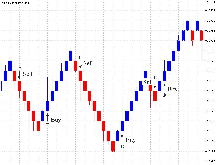
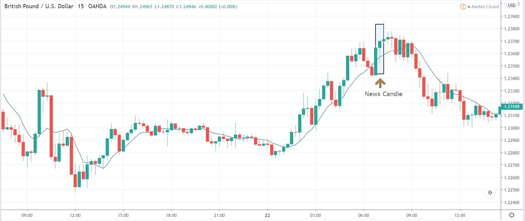
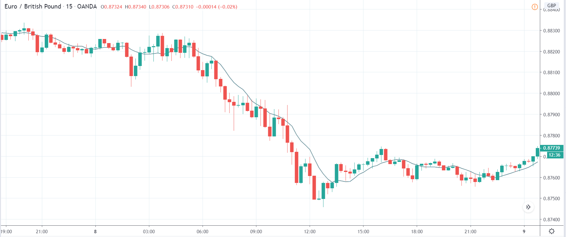
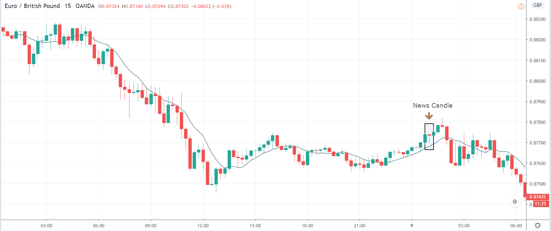
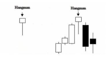
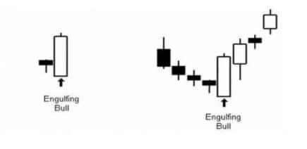
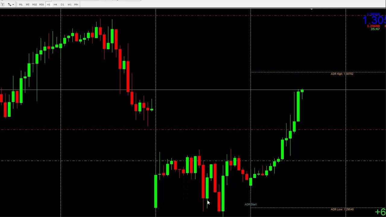
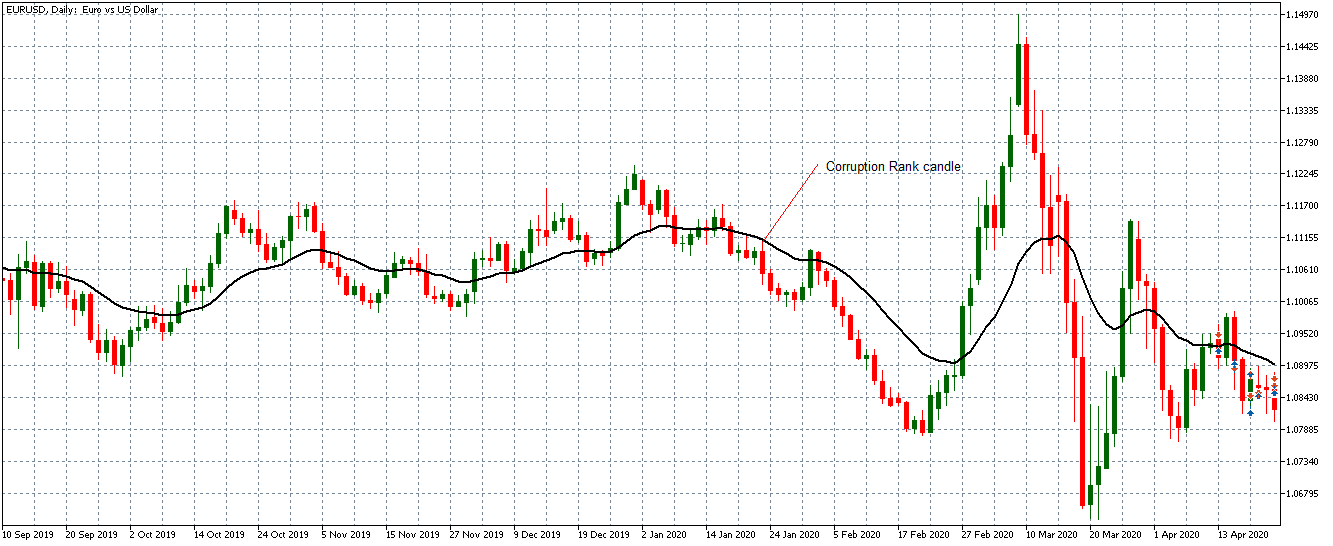
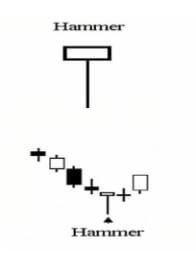
A hammer is a candlestick with a short body, a long lower shadow, and a small or no upper shadow. The story the candlestick is telling you is that the price dropped after opening but rallied during the time period and ended up close to the opening price (sometimes over and sometimes under).

Typically, you’ll see hammers close to the bottom of a clear downward price movement and they indicate that sellers predominated but that, eventually, enough buyers came into the market to sway the price the other way. Of course, you might also see hammers when the market is ranging or moving sideways where they are more likely to deceive you about where the price is going to go. After a strong short trend, however, they often signal a change in the price direction.

As with all of these patterns, they are a signal – there is no guarantee about the direction of the price after a given candlestick pattern. You might see a hammer come in and think it represents a reversal but the price can easily just turn around and burn you afterward. Smart traders who suspect that a downward trend has concluded once they see a hammer will wait for one or even two confirmation candles to form before pulling the trigger on a trade.

Examples – The Shooting Star

Just as a hammer signals a possible change of direction in the price movement after a downward trend, so its mirror image, the shooting star, signals a possible change of direction when it appears at the peak of an upward trend.

Since it is fully a mirror image of the hammer, the shooting star has a long upper shadow, it is also possible to glean a sense of the strength of the turnaround from the length of this shadow – a short shadow likely signals a dampened change of direction while a long upper shadow (sometimes many times longer than the body) is a sign of a more bearish pullback. The best examples of a shooting star will form above the previous candle – that is, its open, lows and close should all be above the shadow of the previous candle.

It is important to be aware that a shooting star pattern and an inverted hammer pattern both look exactly the same but that they differ in one crucial detail. A shooting star will appear at the top of an upward trend and signals a coming downturn, while an inverted hammer will appear at the bottom of a downward trend and, much like its sibling, the hammer signals a change of direction for the price movement. 

Examples – The Doji Star

A doji star or just plain ol’ doji is a candlestick that forms when the open and close price is so close that the candle looks like a cross. The name doji comes from the Japanese word for error or mistake, which is apt given what this candlestick is signaling. There are several types of doji but they are all telling you more or less the same thing – the price has reached a balance point and there is no strong trend in either direction.

You’ll see them in all sorts of contexts, so no matter what the market is doing at any given time, you could have a doji forming. That said, they are still giving traders a signal to be aware of and think about. Though they often crop up when the price is moving sideways – that is not the doji you are looking for. They are much more useful to you when they form after a strong move in either direction. Dojis represent indecision at the best of times but after a healthy trend, they are telling you that equilibrium is being reached between buyers and sellers and that could be a sign that the trend is losing strength. 

Of course, a doji doesn’t always mean there is going to be a turning point and you should watch out for those moments when a trend wavers a bit for a time and then simply carries on going because that could easily kick up a doji. 

Examples – The Hanging Man

The hanging man or hangman is, in many ways, a similar candlestick pattern to a shooting star – in the sense that it represents a possible reversal of sentiment at the top of an upward price movement. Don’t be fooled, however, because there are differences.

A typical hanging man will look much like a hammer or an inverted shooting star – with a relatively small real body, a long lower shadow, and little or no upper shadow. The longer the lower shadow, the stronger the candlestick is as a signal. But the context is important because, unlike a hammer, a hanging man appears at the peak of an upward trend. Also important is the story the candlestick is telling us. From the shape of the candle, we can tell that buyers managed to rein in a sell-off that occurred between the open and close. Though you could read this to mean that the buying sentiment prevailed in the end, most traders will see this deep sell-off as a sign that the trend is losing strength.

There are many traders out there who think of the hanging man as being more useful for short-term changes in direction and that, as such, it should be used more as an exit signal than as an entry into a short trade. In that sense, it could be a useful addition to your toolkit as a way of maximizing wins by preventing the price from dropping through your stops.

Examples – The Bullish Engulfment

The bullish engulfing pattern or engulfing bull is a Japanese candlestick formation made up of two candles rather than one. It forms when a smaller bearish candle is followed immediately by a larger bullish candle whose body is bigger than the real body of the smaller candle. You don’t need to worry too much about the shadows of the smaller candle – the main aspect is the second candle’s large body being bigger than that of its little predecessor. The story that this tells us of the first candle representing a slowing downward price movement, the price opening lower still on the second candle but then closing near the period’s highs (which is why the second engulfing bull candle will often have small upper and lower shadows). This is important, especially for the upper shadow because it then indicates that the price was still heading upwards when the candle closed.

Since the bullish engulfment is telling you that buyers clearly won out during the second candle’s formation, it is usually taken to mean that the downward sentiment is losing strength and that a reversal could be imminent. This is why it is important for the open price of the second candle to be lower than the close of the first – this means that the downward trend continued but was eventually reversed by bulls winning out over bears.

The Other Side of Japanese Candlesticks

Understanding the patterns of Japanese candlesticks and using that knowledge to assist your trading (in conjunction with other indicators and tools) is hugely popular in forex. But although it is true to say that it is popular, that doesn’t mean that there are not those out there who think that Japanese candlesticks are either ineffective to the point of being meaningless or that they could actually be hurting your trading.

Supply and Demand?

The first of these criticisms of candlestick patterns as a tool in trading goes to the very heart of the power of what Japanese candlesticks are all about and it goes a little like this: Japanese candlesticks were originally developed and also later adapted as a tool for trading commodities (rice, in the original iteration) and stocks – both of which conform to the rules of supply and demand much more closely than forex. And there are elements of truth to that criticism. In forex trading, demand is certainly a factor but the supply side of the equation works rather differently than in commodities and stocks because the supply of a currency isn’t as limited – in theory, it is completely unlimited.

However, though there is some truth in there, that doesn’t mean that the story Japanese candlesticks tell traders about the relationship between sellers and buyers during a given time period is completely invalidated. Forex is still subject to the principle that price increases when buyers outnumber sellers and decreases when the reverse is true. But, and here’s the clincher, while it doesn’t invalidate the candlesticks approach, it is still something to bear in mind. You will see times when a candlestick pattern that unfolds just perfectly on your screen still doesn’t go on to give you the price movement you were expecting.

Well, as a trader, what does that tell you and where does that leave you? Ultimately, if you’re a smart trader, it leaves you pretty much where you started. It means that you cannot rely solely on following Japanese candlestick patterns without combining them with a well-worked out trading system that includes other indicators and a host of highly honed risk and money management techniques that you have adapted over time to suit your trading style.

The Big Players

Another – and very closely related – criticism of Japanese candlesticks comes from those that see the actions of big, powerful market players lurking behind every price move and directing the ups and downs of the market in the short term but also, and especially, in the longer term. That may initially sound like conspiracy theory hogwash to some readers but there is more to it than that. In forex, just as in most markets (but perhaps, at the end of the day, more so in forex), there certainly are huge and powerful financial institutions, funds, and so forth that influence the prices on forex markets. Traders need to be aware of that and the fact that this undermines to some extent the purity of a simple supply and demand equation.

There’s another side to this to also be aware of. Japanese candlesticks have become so popular now among retail forex traders that their huge popularity is also one of the main things that hold them back. They are so widespread now as a technique that they have been analyzed to death by the big players in the market and the algorithms and software they use that their reliability has been seriously degraded. The big players will happily use software that recognizes a pattern in the blink of an eye – a million times faster than any human trader would – and uses this advanced knowledge to analyze how the vast majority of traders will react to the emergence of this pattern relying on popular patterns. This essentially traps you – the slow human – in a computer-laid trap where you following the received wisdom in responding to a given pattern will be your ultimate undoing. 

Pattern Blindness

A third major criticism of using Japanese candlesticks – and perhaps the most valid – is based on how our brains work. Humans evolved over millions of years to be able to pick out patterns. Back when we were hunter-gatherers, this helped us to survive, to spot the tiger among the bushes, to find food, and generally to get by. Over time we became masters at it – second to none. But the thing is, being able to see patterns in the modern world isn’t quite the question of life or death that it once was. In fact, it’s of limited application. And then, along comes forex trading and Japanese candlesticks and suddenly we’re back in our element again. So, sure, our innate ability to spot patterns comes in handy sometimes but there’s also a downside.

The drawback of being such fine-tuned pattern identifiers is that we also tend to see them even when we shouldn’t. Sometimes that might mean seeing the savior of your choice in a piece of toast or getting creeped out by random shapes in the dark, but at other times it could be seeing an inverse hammer or a bullish engulfment on a chart. But there’s another couple of elements to the pattern recognition that could also really get in your way when using Japanese candlesticks in trading.

One of these is that you start looking at charts and seeing the candlestick patterns on it but because you’ve become so convinced by all of the hype around Japanese candlesticks, you start only seeing the wins and allowing your eyes to simply skate over the losses. This happens partly because Japanese candlesticks are so popular and so talked about on the forex internet and people become kind of indoctrinated to seeing their successes. You spend so much time watching videos or reading blogs that tell you over and again that these things work that it gradually becomes harder and harder for you to see the times when they don’t.

This generates a kind of belief because, well, wouldn’t it be great if this worked as advertised? You could just look at a chart, see a pattern emerging and you’d know what the market was going to do next – just in time to enter a trade and make a handy little profit from what you know. Once that sense of belief and hope is ingrained, you lose your objectivity and your ability to see things for what they are. And once you’re in that territory, you forget that belief and hope cannot replace a well-tested and well-thought-through strategy. Moreover, once you’ve gone deep enough and trained your brain to see these patterns, you can become blind to all of the other approaches to forex trading there are out there. 

A final piece of the pattern-seeing puzzle is that when you’ve trained your brain to pick out patterns of Japanese candlesticks, it becomes very difficult to untrain your brain again. Even if you stop using them actively as a tool, you’re still going to be seeing them everywhere while you’re trading. In a sense, using this approach to trading lures your brain into a trap from which it can become difficult to escape. Even when you think you’re free because you’ve stopped using candlestick patterns, you go on seeing them and they introduce doubt at a subconscious level, affecting your trading decisions.

Testing Yourself and Your System

Ultimately, whether there is any value to scanning the charts for patterns of Japanese candlesticks is something you will have to decide for yourself. The one thing that’s for sure is that you can’t fully trust your own brain to be objective about it. The only way to be truly and, above all, objectively sure whether any given approach or tool is valid and performs the way you need it to is to test it.

Believing and hoping that something is going to work – even believing other people’s judgment about it – leads to all kinds of problems. Not least of which is the fact that when it almost inevitably fails to work in the long term, the first person you’re going to blame is yourself because your instinct will tell you that you must be doing something wrong: “How can all these people be having success with this tool but it isn’t working for me – there must be something I’m not doing right”. The only way to combat that doubt is to make sure the tools and approaches you’re using have been tested by you and that you are comfortable with how they work.

Now, that doesn’t mean backtesting an approach once on a single currency pair and then clunking it into your system right away. No, if you want to test to remove the fallibility of your subjective and imperfect human brain, you have to put the work in. That means backtesting each tool you plan to use, comparing them with one another, and testing them in conjunction with each other. Then, when you feel like you’ve backtested thoroughly enough, it’s time to take your tools and your trading system out on the road – but in a demo account. Because forward testing is just as important as backtesting and can be even better at highlighting the weaknesses in a tool or indicator.

All of this is just as true with Japanese candlesticks as it is with any other tool that you’re thinking of using. The advantage of backtesting Japanese candlestick patterns, however, is that any individual pattern actually doesn’t crop up all that often. Not only does this make it quicker to backtest them but also you can backtest a whole slew of patterns all at once, just by picking them out of a chart going back a significant amount of time. Conversely, however, they will take longer to forward test than signals that crop up with greater frequency.

At the end of the day, it’s important to have a good overview of how a particular trading tool works but you should take nobody’s word for anything. Believe neither the proponents of a tool nor the detractors – ultimately, be careful about how much you believe your own subjective thought processes – because nobody is going to tell you as much info as you can learn by putting a tool through a robust testing regimen.

Categories
Beginners Forex Education Forex Market

Which Factors Truly Impact the Forex Market?

To be a successful forex trader, you need to understand what affects the value of a currency and what can cause it to change. The following factors have a direct effect on the value of currency for a country:

  • Inflation Rates
  • Interest Rates
  • Capital Flow Balance
  • Government Debt
  • Trade Terms
  • Political Factors
  • Employment Data

If you understand each of the above factors, then you’ll be able to make better predictions about the market. We will explain each factor in more detail below.

Inflation Rates

Inflation refers to the general increase in prices over time and fall in the value of purchasing money. One of the main driving factors behind a currency’s exchange rate is its country’s inflation rate. Japan, Germany, and Switzerland are a few examples of countries with low inflation rates.

-Countries with higher inflation will see decreases in the value of their currency compared to the currency it is being traded against.

-Countries with lower inflation typically see an increase in their purchasing power compared to other currencies.

Interest Rates

Interest rates tie in with inflation and forex rates. Increased interest rates raise the value of a country’s currency because they attract more foreign capital. Investors gravitate towards economies with higher interest rates because they will increase the value of their returns. This creates more of a demand for the currency and increases the exchange rate.

Capital Flow Balance

This revolves around several different factors:

  • Exports
  • Imports
  • Debt
  • Retail Sales
Government Spending

If a country has a deficit, it means that they are spending more on imports than they are making with exports. This causes depreciation in value for that country’s currency. The capital flow balance is simply the ration of imports vs exports in a country. China would be a prime example of a country with a higher export rate, which makes its currency more attractive to forex traders.

Government Debt
This involves all public or national debt that a country’s government owes. Countries that are in debt are more likely to experience inflation. If investors know that government debt is predicted, they will sell their bonds, which results in a decrease in that currency’s value. An investor might look at the government’s overall debt over a few years to decide if it is worth investing in that currency.

Trade Terms

Terms of trade are the ratio of export prices vs import prices. If the number of exports is greater, then the value of the currency increases because there is a higher demand for that country’s currency. If there are more imports than exports, the opposite occurs.

Political Factors

Investors prefer stable countries and those countries pull investors away from countries that experience more uncertainty. Being a more politically stable country results in an appreciation of the currency’s value while being less stable results in depreciation. Elections, financial crisis, policy changes regarding money, and wars have a direct effect on the currency’s overall value.

Employment Data

Employment rates can give investors an overall idea of how the economy for a given country is performing. High unemployment rates signifies that the economy is not doing well or growing with the population. This would lead to depreciation in the currency’s value as investors pull away from investing in that country.

Conclusion

Several different aspects of a country’s economy can influence the value of their currency. Investors are generally looking to invest in politically stable countries with high employment rates and less government debt. Higher interest rates and low inflation rates are other ideal conditions. It is important for forex traders to understand what drives a currency’s price so that they can make more accurate predictions about the market.

Categories
Forex Market

Not Having This Information About Correlations Will Keep You From Growing

I don’t know if you’ve ever heard of the correlation, but just in case I’ve been working on this article. Have you ever thought that all operations appear to be positive or negative at once? This is because you are possibly unknowingly doubling, tripling, or simply pushing your account to the limit without knowing it.

Understanding the Currency Correlation

Speaking of correlation what we tend to think is when and how prices fluctuate. And more specifically how prices move in relation to each other. This is the main idea of correlation. How does the EUR/USD move with respect to GBP/USD?

Types of Correlations

Currency pairs can be correlated both positively and negatively, let me explain what I mean. A pair of splits can be correlated in a positive aspect if its values move at the same time and in the same sense. For example, you can see this in the GBPUSD and EURUSD pairs, this is because when the GBPUSD is quoted then the EURUSD is also quoted.

The correlation is negative if there are two or more currency pairs operating in opposite directions at the same time, i.e., simultaneously. You can also see this in the case of the USDCHF and the EURUSD, because when the first pair is negotiated, then the second one falls, and the same happens on the contrary.

Correlations Are Not Constant

It’s important to know that correlation can change, because of global economic sentiment and factors, their dynamism, or any market event. This means that the correlations we find in the market, it is not important how strong, may not align with the long-term correlation between two currency pairs. The changes present in the correlations are usually based on antagonistic monetary policies, also the sensitivity of commodity prices to a currency pair…etc.

Forex Strategies and Correlation

The effect of the correlations is vital and significant in the market, therefore as a trader, you should take into account your operation based on it. I explain to you, in periods of high market uncertainty, strategies are usually used that rebalance your portfolio by replacing a few assets that become positively correlated with other assets that have a negative correlation with each other.

When this happens, the asset price movements are mutually canceled and your account risk is reduced. However, their returns are also reduced. A simple way to look at it is to take a stock that would gain value as the price of value dropped.

Important Aspects of Correlation and Forex Trading

With correlation, you can assess the risk to which your trading account is exposed. In the event that you have purchased several currency pairs that have a strong positive correlation, then you will be facing a greater directional risk.

Through correlation, you can also cover or diversify your own exposure to the foreign exchange market, plus if you have a directional bias with respect to a particular currency, then you can diversify the risk if you start using two pairs that are positively correlated. Although I don’t recommend this because if you lose the correlation you can mess it up.

Commodities, Foreign Exchange and Correlation

Commodities also correlate with currencies. You may already know this but:

-There is a positive correlation between oil and the Canadian dollar (I hope you haven’t forgotten what that means) as Canada is a major oil-producing country.

-The Australian dollar and gold are positively correlated by Australia’s imports of this precious metal.

However, gold and the US dollar have a negative correlation. Since when the USD loses value in the classic periods of inflation then investors look for an alternative reserve currency and the most traded is gold, as it acts as a safe haven value.

These examples also give you a look at how correlations are given on different assets in the market.

How Correlation Coefficients are Calculated

Correlations between currency pairs are always inaccurate and are often constantly changing. Because they depend on prices, the correlation in the foreign exchange market also depends on the economy, the monetary policy of the central bank, and the political and social conditions that correspond to each nation. But the correlations can be quantified and done through a scale that varies from +1 to -1:

0 or close to zero means no correlation. This means that two pairs that do not have a correlation will not have similar behavior and their behavior will be independent of the other.

+1 or a close value means that two currency pairs will move in the same direction.

-1 or close, negative correlation. These currency pairs will move to the opposite side 100 percent of the time.

Forex Correlation Calculator

There is a formula for calculating this:

ρxy = cov(X,Y) / σxσy

But don’t worry, I’ll leave you three portals where you can consult it:

Mataf

An overview of currency seasonality: https://www.mataf.net/es/forex/tools/correlation

Myfxbook

A very complete correlation table: https://www.myfxbook.com/es/forex-market/correlation

Investing

Here you can see the correlation of one currency to the other assets: https://es.investing.com/tools/correlation-calculator

How to Read the Table

I recommend consulting the correlation in forex in extended periods of time, because in 5 min for example is not the most appropriate unless you are going to exploit a specific strategy. A good idea is to view it in a daily time frame. If the correlation is very close to +1 or -1 between two pairs you see, consider it or try to avoid it if you are operating in those pairs.

Risk of Correlation in the Forex Market

Socio-political problems cause currency pair correlations to undergo sudden changes. The devaluation of oil and commodity prices has also made the previously weaker correlations stronger in certain currency pairs involving commodity currencies.

Sudden changes in correlations can usually present significant risks in the foreign exchange market and that this has affected the traders who based their trading systems on this. If they exploit this type of inefficiencies it is basic to have concrete points where to leave the position or undo it.

Importance of Correlation for Traders

For you as a trader, studying the asset correlation closely gives you a broader knowledge of the market, since you can understand the allocation of assets that seek to relate those that have a negative or low correlation and thus could reduce the volatility of your trade.

In addition, if you are a beginner trader, you will be able to establish greater control of your operation and your account will not be so exposed. Here you can have an important added value.

Correlation and Cointegration

Many times people confuse cointegration with correlation, which we were explaining earlier. With cointegration, you can identify the degree to which two currency pairs are sensitive to a particular exact price during a specific period. Cointegration goes one step beyond correlation and measures the distance between the ratio of two or more active persons and the time that they are maintained.

Cointegration as well as correlation must also be calculated. It is easy also, the greater the degree of cointegration between two currency pairs, then the probability of maintaining a constant distance grows. Being objective, identifying, and calculating the correlation is easier.

Pros and Cons of Using Correlation

Some positive and negative aspects of using correlation by trading in the currency market:

Pros

– Easy visualization and calculation of the correlation using a scale -1 and 1.

– Capacity in ample spaces of time to be able to diversify the risk.

Cons

– In the correlation you can see the strength of a relationship, however, you will not be able to obtain information about whether the relationship is cause-effect.

– The correlation cannot predict the future behavior of the market.

[Extra] How to Trade with Currency Correlations

To the point, Ruben. I know how it goes, but how can I do it if I’m starting my operation? Well, a very simple way is for you to diversify by currency. For example, if you are thinking of trading in the currency market do not trade for example EUR/USD, EUR/CAD, EUR/AUD.

In the previous case, you will be very exposed to the euro (EUR). It is better to diversify more or better, for example, EUR/USD, GBP/USD, and EUR/GBP. We now have 2 EUR, 2 GBP, and 2 USD. We have a portfolio composed of different currencies although a priori EUR/USD and GBP/USD may be correlated.

It’s a very simple and basic way to start applying it now.

Categories
Forex Market

The (Far Too Often) Understated Importance of Volume in Forex Trading

Then we will answer the following questions: Why is the volume of transactions in the stock market so important? What are the basic concepts of volume analysis? What exactly is volume analysis? What is behind this analysis? Why do professional operators pay so much attention to the volume of trading and what is the benefit of their analysis?

The Path to Volume Analysis

The first steps of newcomers to the stock market usually consist of: opening a demo account, or with real money, on a broker and downloading a platform like Metatrader. A posteriori begins the great experience of using the strategies and the search for the Holy Grail.

Beginners often fail because they trust the advertising promises of brokers, as they expect to make big profits and quickly. Of course, these expectations are disappointing for most beginners. Efforts to recover increasing losses by increasing positions will only result in a complete sweep of your accounts.

Therefore, many newcomers leave trading without money and frustrated soon after starting their trading careers. After all, only the youngest, most motivated, and persistent traders try to find a sensible way to succeed on the stock exchange, which often leads to volume analysis.

What makes the volume indicator different?

The relationship between supply (in red) and demand (in blue) is the basis of trading. The intersection of both curves shows a fair price. The absolute majority of technical analysis indicators (moving averages, MACD, stochastics, RSI, Bollinger bands, and many more) are calculated on the basis of historical prices.

The volume indicator, on the other hand, works differently: the special feature of the volume is that it leaves the price out of the calculation. The volumes do not pass through formulas but are delivered directly: in tics (each tic corresponds to an executed operation), in absolute terms (a series of executed operations), or in money (sum of the costs of executed operations).

The first type of volume, the volume in tic is mainly known by Metatrader users. Volumes in absolute and financial terms are real volumes of transactions provided by official markets in real-time.

In principle, this volume in tics could already be used for the analysis of transactions, since both tics and actual volumes show market activity. However, the use of real volumes offers a more precise analysis, especially if we examine the volume and break it down into groups of purchase and sale prices. Only the movements of the progressive volumes provide this “X-ray view”.

Indicators of Progressive Volume

Thanks to the growing computing capacity available on the market and accessible to the general public, everyone is able to perform professional volume analysis using specialised platforms.

  • Analysis of the volume and interaction of supply and demand.
  • Demand and supply continue to play a very important role in volume analysis.
  • Developing strong trading ideas.

Analysis of the volume of negotiation provides the most likely answers to the following questions:

  • Why did the price increase (decrease) and the volume increase (decrease)?
  • How much did the volume increase (decrease) while the price went up (decrease)?
  • Why did you increase the volume while the price didn’t move?
  • How has the delta changed (the difference between buying and selling)?
  • How did the price behave when there was an abnormal volume?
  • What happened after that abnormal volume happened?

Therefore, each trader can form his own opinion on the change that is taking place between supply and demand by analysing the correlations between volume and price. Therefore, it is able to understand in real-time the dynamics between buyers and sellers directly from the graph.

In this way, solid trading ideas are developed. If, for example, the price slowly increases to the level of resistance, as the volume drops, the force of purchases is exhausted. There is a demand deficit which creates a sales signal, as the current price is likely to be higher than the fair price.

On the contrary, if the price falls slowly to the support level with a decreasing volume, the sales pressure disappears, which means that there is a supply deficit and therefore a clear signal of purchase since the current price is probably lower than the right price. But it is also possible that the price will refuse to go up despite a large volume of purchases. This means that, if there is a large company that sells assets using limited sales orders, on this occasion we have before us a clear signal of sale.

This is where we come to the issue of market rationality. Proponents of this theory believe that the current price is always fair and that the market automatically takes into account all the factors that may influence the price. However, market prices are formed in people’s minds, and people make mistakes.

Therefore, when you study the charts of prices and volumes you will find that the price at the ends is far from always fair. Unusual volume spikes in the market are often accompanied by media activities. At such times, the current price is likely to deviate from fair value. For example, Bitcoin reached a peak of purchases in December 2017 when prices were quoted at $20,000, and in late June 2019 when prices hovered around $13,000.

Advantages of Volume Analysis

Volume analysis does not require consideration of key factors, expert forecasts, and other additional sources. All the necessary information: time, price, and volume, is already included. This is the great advantage of volume analysis: from it, we can draw conclusions about the forces of supply and demand while providing us with all the necessary information in an appropriate way for analysis. It is not important what are the reasons for the buyers and sellers are: if they come from an intersection of moving averages, a deficit in demand in the area of oversold, a tweet from Donald Trump, or an unexpected accident.

If a graphics reader correctly interprets the interaction of price and volume on time, it will acquire the ability to trade online with stronger traders and make mistakes less frequently. The major experts will have already carried out their fundamental analysis and conducted their negotiation in the market (which can be followed in their volume chart) which will reveal their true intentions. Let’s see how the following example shows using the price and volume chart.

Example:

We mentioned above the high point of the purchase of Bitcoin at the end of June 2019. To analyze the volume of trading during this period, we must look at the footprint of the Bitmex markets over a period of 1 day.

The peak of purchases on June 26, which, as we all remember, was accompanied by an avalanche of positive news in the major media, shows a particularly high buying activity when the level of $12,500 was reached. The question then is: if these green groups show real buying power, why did the price of Bitcoin fall so low over the next few days?

On July 10, the level of 12,500 was tested. In fact, there are green “buying groups” (traces of activation of loss limits), but the main body of the sail is made up of red groups, which illustrate the pressure of sellers.

After comparing these facts in the price and volume charts, it seems that the market is not interested in moving forward so then we should expect a downward movement. Traders could then benefit from a good entry point with the help of Smart DOM or Smart Tape data.

Conclusion

Analyzing graphs based on price, volume and the changing relationship between supply and demand is a good way to interpret market sentiment. Without volume in the graph, it is impossible to analyse supply and demand.

A price chart without volume is like a bike without wheels: you can’t move forward. And this is what we have made absolutely clear in this article: only with volume analysis is it possible to have long-term success in trading!

Categories
Forex Fundamental Analysis

US 10-Year TIPS Auction – Everything About This Macro Economic Indicator

Introduction

For any long-term investment, taking the future rate of inflation into account is paramount. The reason for this is because inflation eats into the expected returns. Thus, if you could find a way to insulate your investments from this, you most definitely will. The goal of any inflation-protected investment is to ensure that you are cushioned from the reduction in the purchasing power.

Understanding the US 10-Year TIPS Auction

TIPS refers to Treasury Inflation-Protected Securities. As the name suggests, these are US government-issued securities meant to provide investors with protection against the effects of inflation.

US 10-Year TIPS are Inflation-Protected treasury bonds issued by the US Department of the Treasury. The principal on these bonds is meant to finance spending activities by the US government and is redeemable after ten years.

TIPS auction refers to the sale of the inflation-protected treasury bonds by the US Department of Treasury. Originally, the 10-Year US TIPS are auctioned twice a year – in January and July. The reopening auctions are done in March, May, September, and November. Thus, these auctions are scheduled every two months.

Discount rate: The percentage difference between the price at which the TIPS is bought at auction and the one at which it can be redeemed.

Maturity: For the US Treasury Inflation-Protected Securities, the maturity period refers to the maximum time an investor can hold the bonds before redemption. These bonds are usually issued with a maturity period of 5, 10, and 30 years from the auction date. Usually, the minimum duration of ownership is 45 days. Therefore, one can choose to sell their TIPS before maturity or hold them until maturity.

How to Buy TIPS

TIPS can only be bought in electronic form. The minimum amount of TIPS one can purchase is $100 and increments of $100 after that. The maximum amount that a bidder can purchase in a single auction is $5 million. During the auction, the interest rate on the TIPS is determined by the competitive buyers.

The competitive bidders usually specify the yield that they are willing to accept. The competitive bidders for TIPS are large buyers such as brokerage firms, investment firms, and banks. The competitive bidders set the yield for the TIPS, which requires one to have an in-depth knowledge of the money markets. Competitive bidders are required to submit the number of TIPS they intend to buy and the return on investment they seek. This return is the discount rate.

Not all competitive bids are accepted at the auction. When the competitive bid is equal to the high yield, less than the full amount wanted by an investor might be accepted. The bid might be entirely rejected if it is higher than the yield accepted during the auction. The non-competitive bidders are regarded as “takers” of the yield set by the winning competitive bidders.

Once the bidding process is over, the treasury distributes the issuance. Let’s say, for example, that in an auction, the US Department of Treasury is auctioning $20 billion worth of TIPS. If the non-competitive bids are worth $5 billion, they are all accepted. The remaining $15 billion is then distributed among the competitive bidders. The lower competitive bids are filled first until the $15 billion is exhausted.

Using the US 10-Year TIPS Auction for Analysis

Since the TIPS’s primary goal is to safeguard against the effects of inflation, the interest rate paid on them can be used as an indicator of possible inflation rates in the future.

Before we explain how the US 10-year TIPS auctions can be used for analysis, here are two things you need to keep in mind.

  • TIPS’s interest rate is paid semi-annually at a fixed rate, which is usually based on the adjusted principal.
  • Whenever inflation rises, the interest rate rises, and when there is deflation, the interest rate drops.

Once TIPS have been auctioned and traded in the secondary market, when inflation in the economy rises, the principal on TIPS increases as well. Thus, the interest rate payable on these TIPS increases as well. During the TIPS’ subsequent issues, the interest rate payable will reflect the prevailing rate of inflation. Furthermore, the discount rate set at the auctions can be used to gauge the level of confidence that investors have in the US economy. The lower discount rate shows that the current investment atmosphere in the economy is risky; hence, investors are willing to take lower returns than risk losing their principal in other markets.

On the other hand, when investors can get better returns in other markets within the economy, they would demand a higher discount rate. Furthermore, when there is deflation in the economy, the principal on the TIPS falls along with the interest rates payable.

Impact on Currency

Theoretically, the auction of the US 10-year TIPS can impact the currency in two ways. By showing the confidence level in the economy and by showing the prevailing rates of inflation.

When the interest rate payable on the TIPS increases, it shows that the levels are increasing. This increase shows that the economy is growing, which is good for the currency. Furthermore, the higher discount rate at auctions implies that investors can get better rates elsewhere in the economy.

Conversely, the currency will depreciate relative to others when TIPS’s interest rate decreases, which implies that there is deflation in the economy. This instance can also play out if discount rates at the auction are at historical lows. It shows that the economy is performing poorly and that investors may not get better returns elsewhere.

Sources of Data

US Department of Treasury is responsible for the auction of the US 10-year TIPS. The data of the latest TIPS auction can be accessed from Treasury Direct. Treasury Direct also publishes data on the upcoming TIPS auction, which can be accessed here.

St. Louis FRED publishes an in-depth series of the US 10-year TIPS.

Source: St. Louis FRED

How US 10-Year TIPS Auction Affects the Forex Price Charts

The most recent auction of the US 10-year TIPS was on September 17, 2020, at 1.00 PM EST. The data on the auction can be accessed at Investing.com. The US 10-Year TIPS auction is expected to have a low impact on the USD, as shown by the screengrab below.

During the recent auction, the rate for the 10-year TIPS was -0.996% compared to -0.930% on the July auction.

Let’s see what impact this release had on the USD.

EUR/USD: Before US 10-Year TIPS Auction on September 17, 2020, 
Just Before 1.00 PM EST  

Before the auction, the EUR/USD pair went from trading in a steady uptrend to a subdued uptrend. The 20-period MA can be seen going from a steep rise to almost flattening as the candles formed just above it.

EUR/USD: After US 10-Year TIPS Auction on September 17, 2020, at 1.00 PM EST

Immediately after the release of the auction data, the pair formed a 5-minute “Doji” candle. Subsequently, the EUR/USD pair continued to trade in the subdued uptrend with candles forming just above an almost flattened 20-period MA.

Bottom Line

From these analyses, we can establish that the US 10-year tips auction has no significant impact on the forex price charts. The reason for this could be because most forex traders do not keep an eye on bond auctions but instead focus on more mainstream indicators like the CPI and GDP.

Categories
Forex Market

When Does Latency Become an Issue in Forex Trading?

It is important that before we ask that question, that we understand what latency actually is. You may have heard the term if you have ever played a video game online and if you have most likely experienced the consequences of it. Latency is simply defined as the delay or the lapse in time between a request and a response. When does this lapse become an issue in Forex and how can you overcome it? Read on to find out.

If we go back to the video game idea, when you press button A, the latency is how long it then takes for the action to be performed by the character. In a trading sense, the latency is the amount of time that it takes for your action to be executed and to interact with the markets. Latency will affect your ability to read the markets, the ability to act on any changes and actions, and pretty much everything else that you do.

The issue of latency has become more and more relevant as technology progresses. You will often now see brokers advertising their latency and execution times, especially if they are pretty low. #For the normal user, this means very little to him, but for those looking to get the most out of their trading and to squeeze every single penny out of their accounts then it can be relevant. Now that technology is far better, the need or want for better latency and execution ties is also greater.

Latency is prevalent in everything that you do when it comes to trading, especially when using a trading terminal such as MetaTrader 4 (there are many others available too). Each and every aspect of your trading is influenced by the latency.

The magical flow of market data being streamed to your trading terminal is affected by latency. The market starts out at a marketplace or exchange, it is then passed on to the trader who is then able to look at the data within the trading platform of their choice. The speed that this data is transferred between the exchange and the users terminal is often measured in milliseconds. Latencies can be found within these streams, latencies can take place at the exchange or market-based servicers, the broker that you are using can cause additional latencies, your own internet connection can of course create latencies and is one of the larger reasons for having them, and your computer hardware and software can also cause latencies within your trading operations.

One of the more common problems when it comes to latency with the market data is known as data lag, This is where there are problems or inefficiencies with the data stream, many of these issues are completely out of yours as a traders control, such as problems with the hardware at the exchanged, in addition to bottlenecks with the internet connections which can happen without any sort of warning and won’t be recognised by the trade or those monitoring the services for a period of time.

There can also be some issues when it comes to order routing and execution, these are also the areas where latency can have the biggest effect and can potentially be the difference between a profitable or losing trade. Being able to rely on consistent order filing and low slippage on those order fills is vital for a profitable trading experience and this all relies on the data actually arriving at the market ahead of the competition.

The general route of an order and the execution goes along the lines of the order being entered by a trader remotely on an online trading platform, the order is then received by the broker, the order is then relayed by the broker to an exchange or market. The order is then placed in a queue at the exchange or market. That is generally how it goes, however during each of the four states mentioned above, there’s a chance that latency can cause some issues with this process including some delays. The problem with latency in this situation is that any sort of delay can mean that the order will be filled, but it will be filled at a price other than what it was executed at, so it could give you a much worse opening price than originally planned.

So latency can have an effect on your trading. It can be the difference between making a profitable trade or having a loss. There are, however, some things that you are able to do that can help you to manage the latency that you receive. Of course, some of it is completely out of your control, with very little you can do, but there are some things that can be done to help. For larger more institutional firms, there is something known as DMA which stands for Direct Market Access, this enables them to simply bypass a number of different stages of order executing. For a DMA order, there is simply the order being placed by the trader via a connection to an exchange or market, the order is then placed in a queue ready for execution at the market or exchange. So you can already see that half the stages are gone and so there is much less room for any latency to creep in and cause issues.

The problem is that this is not really relevant for retail traders as DMA services are quite limited. As technology is progressing through, more and more brokers are looking to bring this sort of service to retail traders, claiming to offer direct access to the markets, but until it is properly available for retail traders, there are a few things that you could do to try and help your own latency issues. Some of these things include ensuring that you have up to date computer hardware that can easily handle the running of the required software, regularly perform internet connectivity tests and ping servers to ensure that your internet is remaining stable, you should also evaluate your trading platform on a regular basis, to ensure that there are no lag issues in the updating of the charts or any other features.

Latency can be a real issue when it comes to trading and it is something that you want to ensure that you do everything that you can to keep low. It can be the difference between a profit and a loss, so do what you can to reduce it. Check your hardware, your software, and your internet, if your broker constantly has slippage and latency issues then you could potentially start looking for one that offers slightly better latency to the markets. Just be sure that you regularly monitor what latency and lag you are getting so you can be on top of your game and to ensure that you are getting the most out of your trade executions.

Categories
Forex Fundamental Analysis

The Impact Of ‘Machinery Orders’ Fundamental Indicator News Release On The Forex Market

Introduction

Industrial and manufacturing productions are one of the pillars of any economy. Whenever policies are implemented, governments tend to focus on ways to improve or increase production in the country. The main significance of manufacturing and industrial production is that they create employment opportunities in the local economy and ensure value addition to domestic products, making them competitive in the international markets. Furthermore, they contribute majorly towards technological advancements, which is why data on machinery orders is vital.

Understanding Machinery Orders

As an economic indicator, machinery orders measures the change in the total value of new orders placed with machine manufacturers, excluding ships and utilities.

The data on machinery orders are categorized into orders by; the private sector, the manufacturing sector, governments, overseas orders, and orders made through agencies. All these orders exclude volatile orders from power companies and those of ships.

Source: Cabinet Office, Government of Japan

The machinery orders by electric companies and that of ships are considered too volatile. This volatility is thanks to the fact that ships and the machinery used by electric companies are extremely expensive. Furthermore, these orders usually are placed once over long periods. Therefore, including these orders might unfairly distort the value of the machinery orders data.

To get a clear picture of what machinery, in this case, means, here are some of the components that are included in the machinery orders data. They are metal cutting machines, rolling machines, boilers, power units, electronic and communication equipment, motor vehicles, and aircraft.

Machinery orders from the government are categorized into; transport, communication, ministry of defence, and national and local government orders.

In the industrial sector, machinery orders are categorized by the manufacturing and nonmanufacturing sectors. The nonmanufacturing orders include agriculture, forestry, fishing, construction, electric supply, real estate, finance and insurance, and transportation. Some of the categories of orders in the manufacturing sector include; food and beverages, textile, chemical and chemical production, electrical and telecommunication machinery, and shipbuilding.

Using Machinery Orders for Analysis

By now, you already understand that machinery orders data encompass every aspect of the economy. It ranges from domestic government orders, agriculture, manufacturing and production, services delivery, and even foreign orders. As a result, the monthly machinery orders data can offer a treasure of information not only about the domestic economy but also foreign economies as well.

Source: Cabinet Office, Government of Japan

When companies invest in new machinery, it is considered a capital investment. Capital expenditure is usually considered whenever there is an anticipation of increased demands and services provided by the company. In this case, companies must scale up their operations to increase supply to match the increased demand. In the general economy, an increase in aggregate demand can result from increased money supply in the economy. Thus, it can be taken as a sign that unemployment levels in the economy have reduced or that households are receiving higher wages. Both of these factors can be attributed to an expanding economy.

Note that machinery, in this case, means heavy-duty machinery. Typically, these types of machinery take long in the production and assembly lines. At times, orders have to be placed weeks or months in advance. Therefore, the machinery delivered now may have possibly taken months in the assembly line. When the machinery orders increase, we can deduce that these machinery producers and assembly plants have to employ more labor.

Consequently, an increase in machinery orders means that unemployment levels will reduce. In turn, households’ welfare will improve, and aggregate demand for consumer products will rise. In the end, discretionary consumer industries will also flourish. A decrease in the machinery orders will tend to have the opposite effect.

Suffice to say, the machinery in question here are not cheap. Most companies finance their capital expenditure using lines of credit. Therefore, an increase in machinery orders could imply the availability of cheap credit in the economy. Access to cheap financing by companies and households stimulates the economy by increasing consumption and investments. As a result, the increased aggregate demand leads to an increase in the GDP and expansion of the economy.

Machinery orders data can also be used as an indicator of the economic cycles and to predict upcoming recessions and economic recoveries. When firms anticipate that the economy will go through a rough patch and demand will fall, they cut back on production. Scaling down operations means that they won’t be ordering any more machinery to be used in the production. Conversely, when companies are optimistic that the economy will rebound from recession or a depression, they will order more machinery to scale up their production in anticipation of the increased demand. Furthermore, when the economy is going through an expansion, the aggregate demand tends to increase rapidly. This rapid increase forces companies to increase their machinery orders to enable them to keep up with the demand.

Impact on Currency

The machinery orders data is vital in showing the current and anticipated state of the economy. For the domestic currency, this information is crucial.

The currency will appreciate when the machinery orders increase. Machinery orders are seen as a leading indicator of industrial and manufacturing production. Therefore, when the orders increase, the economy can anticipate an increase in industrial production. And along with it, a decrease in the level of unemployment. Generally, the increase in machinery orders means that the economy is expanding.

Conversely, when machinery orders are on a continuous decline, it means that businesses expect a more challenging operating environment. They will scale down their operations in anticipation of a decline in the demand for their goods and services. In this scenario, higher levels of unemployment should be expected in the economy. Since the economy is contracting, the domestic currency can be expected to depreciate relative to others.

Sources of Data

In this analysis, we will focus on Japan since one of the world’s leading producers of heavy machinery. The Cabinet Office, Government of Japan, releases the monthly machinery orders data in Japan. Trading Economics publishes in-depth and historical data of the Japanese machinery orders.

How Machinery Orders Data Release Affects The Forex Price Charts

The Cabinet Office, Government of Japan, published the latest machinery orders data on October 12, 2020, at 8.50 AM JST. The release can be accessed at Investing.com. The release of this data is expected to have a low impact on the JPY.

In August 2020, the monthly core machinery orders in Japan increased by 0.2% compared to the 6.3% increase in July 2020. During the same period, the YoY core machinery orders were -15.2% compared to -16.2% in the previous reading. Both the MoM and YoY data were better than analysts’ expectations.

Let’s see how this release impacted the AUD/JPY forex charts.

AUD/JPY: Before the Machinery Orders Data Release on October 12, 2020, 
just before 8.50 AM JST

Before the release of Japan’s machinery orders data, the AUD/JPY pair was trading in a steady downtrend. The 20-period MA was falling with candles forming below it. Fifteen minutes before the news release, the pair formed three bullish 5-minute candles showing that the JPY was weakening against the AUD.

AUD/JPY: After the Machinery Orders Data Release on October 12, 2020, 
at 8.50 AM JST

As expected, the pair AUD/JPY pair formed a long 5-minute bearish candle. Subsequently, the pair traded in a renewed downtrend as the 20-period MA steeply fell with candles forming further below it.

Bottom Line

Although the machinery orders data is a low-impact economic indicator, its release had a significant impact on the forex price action. This is because better than expected data shows that the Japanese economy might be bouncing back from the coronavirus-induced recession.

Categories
Forex Indicators

Parabolic Sar Need Not be Complicated – Read these Best Practices Today!

In forex trading, some indicators are a case study in making sure you’re using the right tool for the right job and what can go wrong when you take something at face value without doing your own research.

The Parabolic SAR is a great example of an indicator that absolutely crushes some traders – particularly beginners and traders who aren’t properly testing their tools. Like a lot of forex trading tools out there, the SAR is advertised as being good at one thing but it turns out that this superficial understanding of it leads you down a dead-end and can cause your portfolio serious harm if you use it wrong. And, just like a lot of other indicators out there, there may well be legitimate and effective uses for it that lurk beneath the surface but that you will never discover if you just use it out of the box, without taking the time to examine it properly.

This is precisely why the parabolic SAR merits a closer look. That means both that we’re going to talk about it here but also that you should put in the work and properly test how it can fit in with your trading setup.

What is it and Why is it?

There’s a recurring theme in the forex world and the world of trading in any kind of securities more broadly and that’s that the people who dream up and develop indicators and tools are just downright bad at naming them. So many times you’ll come across a tool or method or indicator and you’ll think it’s good at doing one thing because of what it’s called but, on further examination, you’ll realize that it’s actually no good at that thing and you end up using it for something completely different – sometimes you’ll straight up use it for the opposite of its intended application.

That’s kind of the case with the parabolic SAR, which is an acronym of Stop and Reverse. The indicator was the brainchild of pretty much the daddy of a whole host of technical trading indicators – you may have run into him before but if you haven’t, his name will still crop up often enough that you’ll end up remembering it anyway: Welles Wilder Junior. He came up with some of the most-used indicators out there, the Relative Strength Index (RSI), the Average True Range (ATR), the Average Directional Index, and, among them, the Parabolic SAR.

Now, it’s true that he came up with a lot of these indicators to assist equities traders rather than forex traders – they were mostly developed in the 1970s and 80s, well before spot forex trading was even a thing – but the fact that they are still so familiar to us today speaks to the fact that there is often still some value in them. And there is potentially some value in the parabolic SAR, it’s just that it may not be in using it as it was originally intended.

Wilder developed the SAR because he was looking for a way to measure an asset’s momentum in such a way that it would be possible to calculate the point at which it becomes more likely than not that the momentum would switch direction. The idea he had was that a strong movement in the momentum takes on the shape of part of a parabolic curve. A parabolic curve looks a little like a graph of exponential growth and traces a gentle arc from the near horizontal to the near-vertical. In the SAR, the momentum doesn’t always follow through the whole curve and might only mark out a section of it – nonetheless, that’s where the first part of its name comes from.

Wilder also noticed that when the price catches up to the curve mapped out by the momentum, the odds that it would change direction became higher than the chance of it continuing in the same direction. This meeting point of the momentum arc and the price is then the stop point and a reversal here becomes likely – hence stop and reverse.

Reversal Hunting

There’s one great thing about the Parabolic SAR that’s immediately obvious to everyone who comes across this thing and that draws traders into actually using it and that is that it’s almost ridiculously easy to read.

Now, to the more seasoned traders out there that might seem like a bit of a nonsensical thing to say, they would immediately see that as a red flag and be like, “well, you know what, just because something is easy to read doesn’t automatically mean that it’ll actually work the way it’s intended”. And they’d be right of course but once you’ve been trading a while it becomes kind of difficult to take yourself back in time and put yourself in the mindset of someone who’s just starting out.

Traders who have never seen anything like the SAR before will be immediately impressed with how clear and simple it is and how straightforward the signals it sends you are. And that’s its initial appeal – it looks like it does exactly what it was advertised to do and there’s zero input required from you the trader. You just plug it in and it’s ready to go.

On the surface of it, the SAR was developed as a reversal indicator that tracks momentum and then tells you, “hey, momentum has bumped up against price here, there’s a reversal unfolding”. And if you don’t look at it in any greater depth than that, this superficial approach to it is going to lead you down a blind alley where you could find yourself embroiled in some very serious losses.

The first thing to point out here is that reversal trading is a very dangerous, high-risk business and if you’re not 100% sure of what you’re doing, it is very hard to be in the small, elite club of traders that can make it reliably and sustainably work for them. If you are new to trading or even if you have a couple of years of experience under your belt and you decide to go hunting reversals using the parabolic SAR, you are doubly in trouble. Not only will you almost certainly run into big losses running reversal trading without an array of measures and systems (such as risk assessment, money management, and a thoroughly tested and evaluated toolkit of indicators and strategies) designed to cut back on bad trades, you will also be applying the wrong tool to the wrong job.

Reversal trading is not for the faint-hearted and it most definitely is not for beginner traders. But more than that, the parabolic SAR just isn’t a good indicator for the job. It will, almost without fail, call out reversals that are immediately followed by retracements – go test it out, it’s almost uncanny.

Alternative Uses

So if it sucks at doing what its name says it’s good at, what is the SAR actually good for? Well, those of you who have by now become accustomed to taking indicators for a spin around the testing range will be familiar with this one phenomenon that crops up all the time.

What happens, even with quite experienced traders, is that you’ll take a tool or an indicator and start backtesting it, and when you see it takes you into a trade, you’ll measure out how much of a win that trade would have been. So, if you see it take you into a trade that runs for, say 600 pips, you’ll say to yourself, “awesome, this thing is great, I just took home 600 pips!” Well, no, no you didn’t. If you were really making that trade in real-time, there’s no way that you would have taken all 600 pips of that run. Your trade entry and exit just cannot be that perfect in the real world. If you’re lucky, you might have grabbed half of it and taken a 300 pip win but more likely you’ll only have been able to realize something like a third of the whole movement and taken 200 pips.

Now, of course, the reverse is also true and you might have seen that move switchback early on just far enough to blow out your stops so you would have to count it as a loss. One would hope that you have the right money management approach to cut down on that loss by ensuring that you are going into the trade with the right stake that allows you to set your stops at a point that allows a bit of leeway in the price movement. The other thing that you can do here to maximize your win is to apply the right technical trading tools to ensure that you can reap as much of the reward as possible.

This is where the SAR comes in. Not, probably, as your primary entry indicator but more as a secondary, confirmation indicator that helps you to see out a trade to the maximum possible point. In short, you can use it as a trailing stop.

On your chart, the SAR will appear as a series of dots above and below the price that appears as lines – those are the sections of the parabolic curve that we talked about before. When the lines of dots cross the price line, they will flip across to the other side. In reversal trading, this is supposed to be a signal that a reversal is happening but – as we saw – that’s not the best way to use these things.

Context

It’s important to know when to use the SAR because, like a lot of other indicators, it only works in certain market conditions. The main thing to remember is to absolutely never use the SAR when the market is choppy. If you see that the market is ranging or heading sideways or even if there’s a weak trend then you are not going to want to use SAR because it will throw up lots of little false signals that will make it impossible for you to make any money out of the trades it leads you into.

So, the best way to approach the SAR is to use it once you have already identified a strong trend in the market and in conjunction with a primary indicator (or set of indicators) that will lead you into a trade. Under these conditions, the SAW can really shine.

When your system identifies a trade entry on a strong trend and you make the decision to pull the trigger, you can use the SAR as a continuation indicator to lead you down the movement to the point at which you can exit and still walk away with as many pips as possible.

To get accustomed to how this might actually function out in the real world, you will have to put in the work and try this thing out on your historical charts and through a demo account – making sure you combine it carefully with the tools you already use.

Round-Up

In short, the main things to take away from the SAR are that you should never ever use it in either of the following scenarios: a) as any kind of reversal indicator – it does not do this job well and it will lose you money; b) in any way shape or form if the market is not in a clear, strong trend – if there is any fuzziness to the market or even a weak, watered-down trend, don’t use the SAR.

But in its capacity as a secondary or confirmation indicator that you use as a trailing stop or continuation indicator that leads you through a trade you are entering (when the market is already in a strong trend), it has the potential to help maximize your wins.

Finally, make sure you test it for yourself and that it works in the system you have set up to suit your trading needs and preferences. If it doesn’t fit into this, never fear, there are plenty of other trend indicators out there that will do a similar or better job and all you have to do is get out there and find them.


Categories
Forex Chart Basics

The Ultimate Guide To Correlations: From Basics to Opinions

Individuals eager to enter the world of trading usually feel perplexed when they start analyzing the charts, not fully understanding the movement of prices and what causes it. After a while, they typically start making connections between different factors in the market, beginning to grasp this association. Correlations, the implication that connections can be drawn between the behaviors of two distinct things, are one of the inherent parts of different trading markets. Nowadays we can see how various events affect the changes we see in a specific market and how different markets can impact one another, providing proof for the existence of both inter- and intra-connectedness in terms of market cause-and-effect relation. We can now see and understand how correlations work and the way they cause things to move. Often we find how pulling one string affects other parts of the web, which is why it is necessary to see the extent of this impact and whether it can have practical applications for traders. Today we are reviewing different types of correlations, finding real-life market implications, and evaluating their effectiveness.

Correlation Degrees

Correlations can either be positive or negative and together these two polarities form a spectrum consisting of several different degrees of correlation. As can be seen from the table below, both positive and negative correlation can be either perfect, high, or low. With the positive (left) side, we understand that two things are moving exactly the same, unlike for the negative (right side of the table). With similar indices, we can often detect a positive correlation, such as the case of the SPX and the SPY (ETF) which, due to their similarity, do not only have a positive correlation but a number of correlations as well. On the other hand, examples such as the correlation between DIA (diamonds) and DOG (inverse ETF) reflect a negative correlation owing to the fact that they move exactly opposite to each other. Therefore, we can conclude that a positive correlation is the one where two things are moving together, while the negative one implies that two items are moving in the opposite directions, as portrayed in the graphs below.

Many traders assume that, since there are two extreme points at both ends of the spectrum, the middle stands for a perfect balance between the two. However, as correlations simply work differently, the mid-point actually signals something completely different. For example, in the stock market, there is a number called beta, which essentially stands for a measure of volatility. In this respect, the S&P 500 is esteemed 1, so if anything is considered to be 2, it would signify a two times higher degree of volatility in comparison to the afore-mentioned index. Hence, if anything was measured to be 0.5, it would imply that it is half as volatile as the S&P 500. In the early 2000s, Netflix had a negative beta and, as it went down each time the S&P 500 went up and vice versa, it was impossible to measure volatility in relation to this index because Netflix never followed what the other was doing. In statistics, there is a term called R-value which reveals how things are correlated and, going back to the previous table, we can see that there are two perfect correlations on each side, positive and negative, but the middle, however, shows no correlation. This further means that there is no perfect balance in between the two extremes, yet that there is a void where no correlation exists just like the previous example involving Netflix shows. 

In terms of positive correlations, we can find many examples of stocks correlating with the S&P500. One example where there is an indication of a similar movement is displayed below. Although the correlation between Goldman Sachs and Morgan Stanley (both of which are in the same line of business – brokers, trading, and asset management, among others) is not a perfect one, we can definitely find proof of it being a positive correlation despite the existing differences. Although these differences are obvious, we see that these two similar companies also have a tendency to move in a similar fashion.

Although most stocks are said to have a positive correlation with the S&P 500, there is still evidence of some with a negative correlation. The example below shows exactly that type of correlation, where we can see how FAS and FAZ are inversely or negatively correlated. The chart below is very close to a perfect negative correlation where the movements go in almost entirely opposite directions. Where we see the FAS going up, the FAZ is going down and vice versa. This almost perfect opposite behavior is completely understandable since FAS stands for a financial ETFx3 to the upside, whereas FAZ represents a financial ETFx3 to the downside (Direxion Financials).

Major Correlation Causes

Many sources claim that correlation does not equal causation, implying that things that are correlated need not be the cause of each other’s existence, yet there is proof that certain factors lead to specific occurrences in different markets. We recognize three of such determining factors where correlation is quite vivid and, consequently, undeniable: 1) market correlations, which is the most prominent in the currency market; 2) commodity correlations due to which specific commodities affect certain currencies; and, 3) currency correlations where one currency is likely to go down because the other one goes up for example.

Market Correlations

Whenever the topic of market correlations comes up, it is necessary to bring up the measure between risk and reward as well. Today we understand how some assets are considered to be very safe, while others are seen as risky. These projections stem from the analysis of volatility and risk of loss, so we can call an asset risky whenever it is likely to lead to a loss. Those assets which are perceived as safe always entail some form of security, e.g. government bonds that are both paid and guaranteed by the US government and that come with a 3—10% return on a 30-year bond. With such assets, people feel certain that the money in which they have invested is guaranteed and they typically leave a sense of stability overall (as in the example of the US government, which is unlikely to run out of business, that poses as a sign of security for the bonds). Stocks, on the other hand, can easily increase by 30—40% and drop the same percentage immediately afterward, which is why they are considered to be riskier assets. 

In the world of bonds and stocks, people have always used the ability to allocate their funds from one to the other. As bonds come with a greater percentage return whenever things are going well and a significantly lower percentage return when things are not so well, people turn to them whenever the circumstances seem to be unsafe. Therefore, each time people see that the economy is booming, they will invest in stocks and not in bonds, which eventually leads to an increase in stock prices and a decrease in bond prices. However, the moment people feel concerned due to some external factors or events, they will immediately sell their risky assets and allocate their money to safe assets. People will then be piling money in bank deposits, bonds, or utility stocks, which are considered to be less risky, and this is the one reason why assets’ value increases. These surges and reductions in prices almost always stem from people’s decision where to invest their money, which is noticeable in the currency market as well.

When the COVID-19 pandemic started, the US and world economies shut down and we have witnessed major GDP drops across the globe. It is interesting to note how the JPY, the official currency of Japan, skyrocketed by 11.6% in just 4 weeks. To make a comparison, forex traders are more than satisfied with a half a pip growth in one week, so this sudden change had a message to convey. The only cause of such a rise was people looking to buy the currency in question, which seemed like a wise decision in times of crisis and unpredictability. This was an example of a risk-off move where people are eager to buy safe investments for the sake of exiting the riskier assets. Such conversions always affect currency prices, so if people are willing to buy US government bonds as a safe investment, the money will flow into the US and the USD as well. Aside from the US government bonds, ranked the first owing to the US economy is the largest one in the world, China’s and Japan’s bonds are also considered to be the safest assets and respectively hold the second and the third place in terms of their economies. People will always look to invest in these countries’ assets because they are believed to be the least likely to collapse, making people’s investments as secure as possible. Australia, for example, may not be able to pay off all the bonds due to a lack of money or wealth, which is what people may feel worried about when choosing where to invest their money.

Risk On/Risk Off

From the perspective of history, the JPY, the USD, and the CHF have traditionally been viewed as currencies of safety, while the NZD, the AUD, and the CAD are considered to be risky currencies. The shapes below explain how the purchase of currencies works in different situations. A typical risk-off move occurs when people look to buy stability and sell what is risky. Whenever people are buying stocks, economies are growing, and there seems to be less worry about risk overall, we are seeing a risk-on move where growth currencies boom. They are called growth currencies because their economies are much smaller, so they can achieve much higher growth rates during times of prosperity. During these times, currencies such as the USD, the JPY, and the CHF, which are representative of their strong economies, would normally not do so well. The EUR and the GBP are usually always somewhere in the middle, more or less unaffected by the same factors as other currencies.

These moves and changes in currency preferences, however, need not always play out as we expect them to. Theory and real-life applications often differ in the world of trading, so traders need to have in mind that textbooks should only serve as guidance rather than absolute truth. The same discrepancy can be seen in any other line of business, where people often claim to not have been prepared for everything they encountered until they started building a business. Any resource we get hold of is meant to tell us how things are supposed to unravel, yet these prescribed scenarios should never be seen as carved in stone. For example, whenever there is panic in the market, the EUR is always found in the middle and the CHF is always perceived as a currency of strength. However, when the Eurozone was on the verge of collapse in 2012/2013, these two currencies were found in a completely different set-up.

The Eurozone attempted to take countries of different economies, currencies, and histories and blend them into one. Before any of these changes, the event of one currency dropping in value was able to affect that country alone, which allowed them to export their goods and services more easily due to them being cheaper and thus more appealing to other countries. When different European countries agreed to come together in 1998, many were doing exceptionally well, pouring money into the Eurozone. When Greece and other countries showed less preparedness to provide the same, the member countries with stronger economies began to complain, not wishing to keep funding the underperforming economies. At that time, the Eurozone did not have a functioning measure that would tackle these issues, so many people started to raise questions regarding the future of the EUR, which consequently became the riskiest currency. Then this worry affected the financial markets and the EUR lost its previous status.

The CHF, the usual currency of safety, which is also located right in the middle of the Eurozone, made people feel worried about what would happen to Switzerland and its official currency despite its long-held favorable status. The unsettled issues and rising concern made the currency fall from grace, leaving a need to allocate large sums of money in some other direction. Unexpectedly and suddenly, people showed interest in New Zealand and the NZD became the currency of favor for a while. As the Eurozone was affected by its internal troubles, people desired to look outside the continent and this is an excellent example of how external factors play a big part in how events play out. Therefore, stories, news, and history in the making are going to affect currencies and make them move outside their usual patterns. Today we see the USD as the currency of stability and safety, but this may too change because of the risk-on and risk-off moves people make. This is an extremely important correlation and traders should always acknowledge its impact. In addition, it is vital to remember that the decision on which currencies to pair in the event of equity markets going down is easy to make when there is knowledge on which currencies act as the currencies of safety.

Commodity Correlations

Canada is an excellent example of a resource risk economy, which further entails that a great proportion of its economy is dependent on its resources. Due to this reason, the price of resources is an extremely important factor for this country. Oil, in which Canada is abundant, is known to have affected their economy through history. For example, in 2005 when the price of oil shifted to $150/barrel only to go back down and up again impacted Canada to a great extent. Such price alterations meant that the country had to close down oil production and put a lot of people out of work, which increased unemployment levels, decreased taxes the government could collect, and ultimately made their bonds a lot riskier. This story exemplifies how relevant these commodity correlations are, as commodity prices inevitably influence people’s buying preferences and the entire strength of an economy. It is, however, interesting to note that, while there always seem to be high correlations between the CAD and the price of oil, between 1986 and 1991, the price of oil increased while the CAD remained unchanged, which only points to a conclusion that these correlations are not always present.

Some other correlations are vivid in the gold market, especially in connection with the three currencies that are highly correlated with the price of gold: the CHF, the AUD, and the NZD. Today, the CHF is the only remaining currency still pegged to the gold standard, which means that any desire of the Swiss government to increase wealth needs to be carried out through the acquirement of more gold. Whenever a country buys great quantities of gold, whose price increases around the same period of time, the country in question immediately becomes that much richer and is much more likely to be able to pay up on its bonds. This has a direct impact on the way the currency and the country are perceived by people, who are then increasingly more likely to see them as stable and safe and are, thus, more willing to purchase their bonds. Alike the CHF that is backed up by gold, Australia is also closely connected to gold due to its mining. Furthermore, the NZD which is tightly connected to the AUD is then also likely to be impacted by any changes occurring with the price of gold and the AUD. Therefore, should the AUD go up as a result of the changes in the price of gold, the odds of the NZD changing are higher and vice versa. The AUD, the NZD, and the CHF all have a positive correlation with the price of gold, which further entails that they will typically rise when the price of gold does as well.

We can find these correlations with other currencies as well, for example, the South African rand and the Swedish krona have both demonstrated high correlations with the price of gold although we typically do not trade them. The USD also shows proof of such correlation with gold, although a negative one, which signifies that the price of the USD will generally fall whenever the price of gold rises. Moreover, whenever we consider the prices of oil and gold, we are able to develop an insight into what is happening with the CAD, the AUD, and the CHF. Some websites even offer tables with information on different correlations, so as the table below suggests, copper is mildly correlated with the EUR.

Currency Correlations

When we discussed another type of correlation above, we explained how the AUD is highly positively correlated to the NZD because of the close proximity, which also means that the two will be each other’s greatest trading partners. Another example of geographic closeness is that of Canada and the United States of America, and such ties will always imply that whatever happens to one country is probably going to affect the other one as well. With Australia and New Zealand, it is interesting that their common trading partner apart from one another is China, which is a very big part of their GDP and export. Again, if anything occurs in China that should impact its economy, both Australia and New Zealand will feel the reverberation of these events. 

As the Eurozone is a very peculiar unit, when the coronavirus took over the world by storm, the entire union took on a meticulous plan on how to tackle the challenge. There were signs of problems in Italy and Spain early on, yet the effort to shut everything down and make everyone comply with the rules led to lasting changes for the better. Unlike the US, they crushed their economy right on the start only to come out later on even stronger. With the United States, the economy was always semi-closed, so the number of people affected by the virus kept rising while no effective change was recorded. Since the Eurozone’s economy improved after they had it closed off, this also helped the neighboring countries and their currencies – the CHF and the GBP, which are all going to be positively correlated, moving together in the same direction. 

Examples of such currency correlations are numerous, so for example the EUR and the USD have often shown signs of negative correlations, meaning that when one goes down, the other one will go up and vice versa. Traders can find information on these currency correlations on different websites and even check for various time frames to draw more advanced conclusions (see the table below). Nevertheless, apart from such correlations calculators, it is important to mention how certain experts loudly criticize the general approach of different educational sources to currency correlations due to the difficulty and impracticality of their application in real trading. 

While many assume that a currency that is currently strong will be equally strong against many other currencies and not just one, some forex experts claim that such knowledge is impossible to use in everyday trading. These individuals also find it hard to believe that several currencies moving in the same direction can be taken as a predicament of some future movement. They claim how traders are keen to receive a signal that would warn them about some market changes but how these signals are unlikely to be found in currency correlations themselves. Therefore, whenever traders find two currencies moving together in a correlating fashion in the chart, they are prone to assuming that they will also change direction at the same time due to this inter-connectedness. However, since they are moving exactly the same, the chances of traders receiving the early entry signal they may be eager to get are probably very slim. What is more, this group of experts insists that there are no two charts that show true correlations, which is why they are inviting all traders to compare any two charts they believe are correlating and assess them candle by candle. They argue that all traders will be able to see a different picture details as well as understand that the two currencies are not truly correlating once they start considering all (ponder on the following two images). 

It is paramount that traders understand that many a time what they see in a chart is not an indication of any correlation but a special circumstance where one strong currency is leading the pair. What often happens is that one currency has greater importance than the other one in terms of how this currency controls whether the pair moves up or down. The examples above show how the GBP just mattered more and, whenever this happens in real trading, you will see two charts that look very similar and think that currencies may correlate as a result. Out of the eight major currencies, the EUR and the JPY are the easiest to spot whenever they are in such a position of power. These circumstances cause many charts involving the two currencies to look the same, but it does not mean that they are correlating. What traders can do in such situations is check another related chart; so, if the EUR/AUD and the EUR/NZD pairs appear to be the same, traders should look up the AUD/NZD chart. It is, therefore, crucial that we look into matters more deeply and analytically so as to prevent ourselves from taking currency correlations literally.

While some forex expert traders claim that currency correlation is a phenomenon that simply does not exist, they admit to pairs being able to run together. What they do contribute to this statement is that pairs, however, need not run together at all times. If currencies could be controlled, everyone would have been using this information by now and, since we have no tangible proof of currency correlations, the best approach to take is to work on individual trading systems that are sure to bring traders the signals and trades that can weather through any market despite the natural market oscillations and changes. 

Conclusion

The excitement over correlation varies from trader to trader although it is impossible to deny how different external factors have a tendency to impact various markets. What traders need not focus on is any specific currency; however, the knowledge on risk-on and risk-off moves are rather important because they determine various market movements. If you are eager to get a good trade, simply consider the risk you are leveraging and understand how specific correlations with related markets can assist your trading. Nevertheless, besides connecting these dots, the only thing you can truly feel you can trust and the only thing you can test both backward and forward is your own system. Traders often exhaust themselves looking for information outside their systems, when in fact it is the algorithm and individual set of values and skills that will determine one’s success. Anything else has a much higher chance of sabotaging your efforts and your system, taking you away from something that can work well. Therefore, if your system is telling you to make a specific move and enter a trade, do not go against it just because of the idea that some presupposed correlation is going to lead to a better or worse scenario. Rely on the entire knowledge of markets and the histories of countries and currencies but always trust your system on how to manage your trades and all market ebbs and flows.

Categories
Forex Chart Basics

What Are Forex Price Gaps?

Price gaps are not something that many traders want to see, they do not happen every single day but they are a pretty easy concept to understand. A price gap is simply an empty area on the charts, thymus the name of a gap. They take place when the opening price of a candlestick is not the same as the price of the previous closing candlestick. They aren’t as common on the forex markets as they are on the stock markets, but they do still happen, mainly due to the reason that the forex markets close over the weekends but is still active of operations by international banks, having said that, they can happen in the middle of the trading day when volatility is really hitting the high levels.

Gaps in the markets are something that every single trader will experience at some point in their trading career. As we mentioned they occur when the opening price of a candle differs from the closing one prior to it. Over the weekends, when the price moves up or down but our retail clients to do an update over the weekend, so when they open once again on Sunday evening (UK time) then the opening candlestick will differ to the one that closed on Friday evening, this is especially prevalent when there has been a significant even in the world or news over the weekend.

We mentioned that they can also happen in the middle of the trading day and not just at the weekends, this can happen when a significant news event takes place which brings in a lot of interest from traders, this large spike can widen the bid and the ask spread wide enough for there to be a gap on the next opening of a trade. Price gaps can give you a good idea as to what the market sentiment is from other traders, if the markets gap uup, then it can be an indication that people do not want to sell and when it gaps down it will show that traders do not want to buy, they can be used as an additional indicator to how the markets may behave.

There is also something known as trading the gaps, this is where people take advantage of these little gaps in order to make a little profit. Gap trading is considered to be easy, reliable, and pretty profitable by a number of traders, or very risky by others.

So let’s take a quick look at what the different gaps are, there are four main ones that we will be looking at now.

The Breakaway Gap:

The breakaway gap occurs when a price action comes to an end and when a new trend begins. This type of gap indicates that the price has broken out and then starts moving up or down leaving a gap. This sort of movement is often caused by a news event or breaking news, hence the name breakout gap. This process often causes a new trend and is then considered as not very trade-friendly. 

The Runaway Gap:

The runaway gap is a formation that can form within a trend and they often indicate that the trend is continuing in the same direction. Runaway gaps are considered to be quite tradable and are one of the safest ways to trade with gaps due to the fact that the gap is simply indicating that the trend is most likely going to continue in the same direction. They can often combine trading with runaway gaps with other price action tools to help with even safer trading conditions.

The Exhaustion Gap:

These sorts of gaps are very common on the stock markets, but they can also occur on the forex markets too, they just occur a lot less often. These sorts of gaps often form towards the ends of a previous trend and can help to indicate the final moment before the price begins to reverse. This means that you are able to trade these gaps, however, you should only do so after you have already identified them and you start trading with the new trend once it has been formed.

The Common Gap:

The common gap as it sounds is one of the most common types of gaps that you will find and is also often the most tradable type of gap and due to this is the most widely used style of the gap that is traded. These sorts of apps often appear late Sunday evening and early Monday mornings shortly after the markets have just opened and are appropriate for short term trading as they tend to be filled within a few price bars. It Is best to look for these sorts of gaps at midnight when the markets open, they can also occur after a holiday or when a major news event has been announced.

You may have come across something called filling the gap, this is basically when the price moves back to the initial level before a full gap appears  The price will always fill the ap at some point or another, the question that we need to work out is just how long it will take to do it. When the gap is filled within the same trading day it is known as fading, but this does not happen every single time with gaps. You also need to calculate just how many pips it will take to fill the gap, as it may not actually be feasible for trading if it is too large or too small, but the fact that the markets will always fill the gap at some point is what makes it so tempting and interesting for traders. It is not really that hard to work out that if the markets gap downwards then it will need to move back up in order to fill that gap, the problem with trading, especially when the markets have just opened up is that the spreads can make it not so profitable, so unless you get in and out at the right place with the right spreads, it may end up costing you even when the gap does fill.

There are of course risks when trading the gaps, so we need to work out how it is that we can minimise those risks. The primary thing to do is to simply have some sort of knowledge on trading and understanding the fundamentals behind how the markets move and how and why the gaps have been formed. A few other things that you can do are to always watch and keep up to date with a real-world event that could be affecting the markets, using an economic calendar, use a broker that has lower spreads, preferably an ECN broker which offer straight-through processing, always use a stop-loss. This should be pretty obvious but a lot of people trading the gaps forget it, and it can of course continue the wrong way before closing the gap, so be sure to add in a stop loss in order to protect your account.

So the main thing that you need to think about is whether or not you want to trade the gaps, it is not the most common thing for people to be trading. Make sure that you read up on it. If you are planning on it then make sure that you learn about the different gaps and how to trade them, ensure that you are up to date on world events, and learn the basics of both fundamental and technical trading and analysis. Use proper risk management and then practice with lower best, you may not get gaps on a demo account so may need to practice on a live one, but do so using small trade sizes in order to mitigate a bit of the risk involved.

Categories
Forex Videos

Forex & The Recent Market Drivers – What You Need To Know Trading The Next Few Weeks!

Recent market drivers


Thank you for joining this forex academy educational video. In this session, we will be taking a snapshot of the recent market drivers, which might explain the moves in bitcoin, the Dow Jones, and a couple of major currency pairs.

Festival we have the dollar index charts also known as the DXY, and where the dollar is measured against a basket of 6 major currencies, including the yen, the pound, the Australian dollar, the New Zealand dollar, the Swiss franc, the euro, and the Canadian dollar, and where the dollar index reached and high of 103.00 at position A, during the middle of March when Europe was in the grip of the pandemic and where the United States was not yet at its peak. We then see a low at position B, of 92.00, and where there is the dollar strength subsequently began to return, and now we can have a look at the possible reasons why.

Firstly we should take a look at the Dow Jones industrial average index whereby around the middle of February this year, Dow Jones hit an all-time record at 29,500 points, before crashing all the way down to 18,400 as the pandemic started to grip the United States. Although circumstances remain bad with the United States economy, the Dow Jones has rallied all the way up to a recent high above 29,000, almost approaching the previous record high, but where the fundamental economics do not match the previous rise from February. This may well have been a tipping point for traders who were already expecting a reversal in price action, and potentially we and see profit-taking at these levels.

Now let’s take a look at the GBPUSD pair, AKA Cable. In December, when Britain voted to leave the European Union, the pair was on a high at 1,3350 at position A. Still, when the pandemic hit, Cable went down to just above 1.1400, again we have seen an incredible rally all the way back up to a high at position B of 1.3380. And then a pull lower to the current level of 1.2950 at the time of writing. The shift higher can only be attributed to dollar weakness because the United Kingdom is still suffering from the pandemic’s fallout and where no agreement has yet been reached regarding a future trading relationship with Europe. The pair will likely find further weakness the closer the UK gets to a no-deal arrangement with Europe.


If we now turn our attention to the EURUSD pair, we can see that at position A, at the height of the pandemic in Europe, the currency pair was trading at 1.0600, before moving to a recent high of 1.1936, before falling lower to its current level at 1.1760 at the time of writing.
The sharp reversal in the Cable’s high at 1.3380 and EURUSD pair at 1.1936 can be attributed to the DXY reversing from its fall and bouncing off from its low of 92.00
The reversal of the DXY from 92.00 to its current level of 93.50 at the time of writing can be attributed to the reversal in the Dow Jones from an almost double top formation of a previous record-breaking high. The economic fundamentals are not working as in a normal stable market.

Let’s take a look at the bitcoin to the US dollar, which is currently trading at 10,230 but found resistance at 12,000 recently, and whereby this is no coincidence that this price rejection coincided with the DXY bouncing off of the key 92.00 level.

While some analysts will argue that the markets that we have looked at today are not correlated, either positively or negatively, the numbers and charts speak for themselves.
When trading, always try and factor in as many assets as possible to try and established which might be affecting the other and how that might, in turn, might affect the asset that you are trading.


Categories
Forex Technical Analysis

Statistical Concepts for Traders: Probability Distribution

Understanding statistics is one of the fundamental skills required for quantitative analysis. Today’s article discusses two basic concepts: Distribution and probability. The two concepts are closely related. The concept of probability provides support for mathematical calculations and distributions help us visualize what is happening with the data.

Frequency Distribution and Histograms

Let’s start with the simplest part: A distribution is simply a way to describe the pattern of the data.

A simple example: we think of the daily performance of a stock exchange or the results of a backtest. These returns are our sample data.

To have a clearer view of these yields or returns we can classify them in intervals with an identical size and also count the number of observations of each interval. If we represent these results in a graph we will get what in statistics is called a frequency histogram. Histograms allow us to have an overview of how returns have been distributed.

In addition, from this frequency distribution, we will be able to know its measures of the central trend of our sample.

– The value at the center of our histogram indicates the arithmetic mean of the data (the mean yield).

– The median part of the distribution in two leaving the same amount of values aside.

We can also see how variable the results have been (dispersion measures). Volatility of returns is measured with standard deviation or standard deviation. Finally, we can also see the shape of the distribution: if it is a symmetrical distribution, if it has “fatter tails” (read more extreme results) than it should, etc.

Let’s analyze these features in detail:

  • Characteristics of a distribution
  • Statistical asymmetry

A very important aspect is the symmetry of the distribution. “If a distribution is symmetrical, there are the same number of values on the right as on the left of the mean, hence the same number of deviations with a positive sign as with a negative sign.

We say there is positive asymmetry (or right) if the “tail” to the right of the mean is longer than the left, that is if there are values more separated from the mean to the right. We will say that there is negative (or left) asymmetry if the “tail” to the left of the mean is longer than the one to the right, that is, if there are more separate values from the mean to the left. (Wikipedia)

When we talk about trading systems, a system can have a negative or positive asymmetry according to its characteristics. For me, the most obvious example is when we analyze the distribution between the results of a trend system compared to the results of a reverse-to-mean system. In the first case, our sample would have a positive symmetry (when it succeeds it gains a lot and returns move away from the average mean value when it misses little and the values to the left of the mean are not far from it). In the second case, it would be the other way around.

Tannosis

Tannosis is a statistical measure that determines the degree of concentration of the values of a distribution around its mean. The tannosis coefficient indicates whether the distribution has “heavy” tails, that is, whether or not the extreme values concentrate a high frequency. The coefficient measures the “degree of pointing or flattening of the tails” with respect to the normal distribution. So if we take the normal distribution as a reference, a distribution can be leptocúrtica, platicúrtica, or mesocúrtica.

Probability Distribution

So far we have simply been analyzing our sample data (in the example, the results of operations) using descriptive statistics. However, when working with data we look for more than just describing it. We’re looking to predict how that dataset will behave in the future. For this, we use probability theory and inferential statistics. From the results of a sample, we seek to draw conclusions for the total population.

Formal Definition: What is a Probability Distribution

If we go to Wikipedia, we can learn that:

In probability and statistical theory, the probability distribution of a random variable is a function that assigns to each event defined on the variable the probability that such an event will occur. The probability distribution is defined over the set of all events and each of the events is the range of values of the random variable. It can also be said to have a close relationship with frequency distributions. In fact, a probability distribution can be understood as a theoretical frequency, as it describes how results are expected to vary.

The probability distribution is completely specified by the distribution function, whose value in each real x is the probability that the random variable call is less than or equal to x. (Source: Wikipedia)

How can we interpret this on a practical level? If the returns in our sample match the normal distribution, then the mean and standard deviation is all we need to calculate probabilities about profitability and risk. A little further down in the article, we explain this in more detail.

Normal Distribution and Probability Models

There are numerous types of variable distribution. In this article, we will only talk about the normal distribution, which is the most known type of distribution and on which most probability models are based. Only 2 parameters are needed to describe it: the arithmetic mean (which defines the central value) and the standard deviation (which describes the width of the bell).

In order to model the risk, it is only necessary to know the mean and the standard deviation. This is because the probability distribution assigns a probability to each possible outcome of an experiment. The probability function mentioned earlier in the Wikipedia extract is a mathematical concept that allows us to use the area below the curve to represent the probability space.

We can intuitively understand that those values that are more distant from the average are repeated less often, while those values closer to the average are much more frequent. In this way, probability intervals can be defined within which we can find the profitability of the total sample. This type of analysis uses the VaR (Value at Risk) model to assess the probability of an investment’s risk.

Volatility, which in this case is measured by the value of the standard deviation, is a measure of uncertainty (risk). This uncertainty is directly related to the probability of obtaining a return equal to the expected return (the average).

For the same expected yield, the curve flattens when volatility is greater while it becomes thinner and higher when volatility decreases. An asset whose profitability has a higher standard deviation is considered more volatile, and therefore riskier than an asset with lower volatility.

Other Notes

When we talk about the distribution of the entire population, the properties (mean, standard deviation, etc.) are parameters. When we talk about the distribution of the sample, the properties are statistics.

Why use statistical distributions to measure risk, if in the end, the results do not conform to a distribution model? Because you’re working with models. Having a theoretical framework in which to base a quantitative investment strategy adds solidity to the whole.

Categories
Cryptocurrencies Forex Fundamental Analysis

How Fundamental Factors Influence the Price of Cryptocurrencies

Investors believe in positive news and ignore the prohibitions of China and South Korea. On the eve of Segwit2x bitcoin for several days, it strengthened by more than 1000 US dollars and broke the level of 7000 dollars. Some believe that the exchange rate of bitcoin and cryptocurrencies is growing thanks to speculative capital, on the contrary others believe in the future of blockchain. A number of countries are on the road to progress, and some countries, on the contrary, impose limitations, trying to take cryptocurrencies under fiscal control. Traders ignore limitations, preferring to react to positive news. How fundamental factors influence cryptocurrencies and why legislative restrictions are ineffective.

What’s a Cryptocurrency Afraid Of?

Before a new bitcoin fork, there are still 2 weeks left, but cryptocurrency already puts new records on growth speed and historic highs. In recent days alone BTC has appreciated by more than 20%, rising from the level of 5700 to the level of 7200, in a year the cryptocurrency has grown almost 900% and clearly will not stop there. So far, analysts’ most optimistic forecasts regarding the bitcoin rate are around US$10,000 by the end of the year. According to the website of Coin Market Cup, the capitalization of bitcoin passed the level of 120 billion US dollars and represent more than 60% of the total capitalization of all cryptocurrencies. Still, a month ago, all capitalization accounted for about 130 billion and the share of bitcoin in it was about 47%.

For some prudent investors, such a rapid growth of bitcoin causes some concerns.

BTC speculative growth is too fast compared to other cryptocurrencies and may persist after fork (demand grows only because there is the possibility of obtaining coins after Segwit2x). Some analysts compare the situation of the cryptocurrency market with the situation of 2000 (“Bubble point”). Volatility of 400-500 US dollars in a day is too much. With such a sharp increase you can expect a no less sharp setback.

There are increasing restrictions on transactions and mining by several countries. Fears related to the reduction of bitcoin after fork are in vain. After the appearance of ВСН in August the bitcoin exchange rate instead went up. A similar situation with Bitcoin Gold. Only on fork eve was there a slight setback, and then again growth.

Fears in vain in relation to the “Dotcom Bubble”. Supporters of cryptocurrency believe that behind blockchain technology, in the future, it has as an argument the interest of corporations in technology. The capitalization of cryptocurrencies is 200 billion US dollars, the capitalization of NASDAQ companies at the time of the collapse of March 10, 2000 was trillions, so it is inappropriate to establish an analogy between cryptocurrencies and NASDAQ. The biggest problem with restrictions by other countries is that they can become an obstacle for bitcoin and cryptocurrencies.

How bitcoin responds to state restrictions and whether we should worry about them.

On September 4, 2017, in the media it was reported that China had banned ICO (initial offer of cryptocurrency), leaving the possibility for individuals to continue any operation with the cryptocurrency. A year ago, China accounted for about 85% of all bitcoin transactions, but after a series of restrictive measures, its volume dropped to less than 15%. Traders to China’s decision reacted with indolence, quotes fell temporarily from the 4800 level to the 4200 level and close to reaching the August lows.

The most influential traders reacted to the interruption of the trading of Chinese cryptocurrency ВТСС on September 14-15. This, obviously, we can see in the graph. A similar situation occurred on July 25, when one of the world’s largest stock exchanges ВТС stopped working. Then bitcoin lost about 20% of its value. This indicates that traders react more to practical problems with trading and trading than to any restrictions.

With the tightening of the policy of the Chinese authorities, the volume of bitcoin trading moved to Japan and South Korea. South Korea assumed about 30% of the cryptocurrency trading volume, ranking third in this indicator. By the end of September, traders were expecting the next blow, the ICO ban in South Korea. Although the country remains loyal to bitcoin, a ban is imposed on the emergence of new cryptocurrencies, as well as on all types of loans in digital currencies. The decision of South Korea on September 29 was almost ignored by traders, the low bitcoin of 4% compared to the subsequent growth is not serious.

Where the most active traders saw the news that Japan would legalize the cryptocurrency exchange and show loyalty to control over cryptocurrency trading. In April, Japan became the first country to equate bitcoin with fiduciary money. Last week bitcoin grows exclusively pending the November fork.

It is not far behind the countries of Asia and Russia. On October 24, Vladimir Putin ordered the government and the Central Bank to establish the requirements for the organization of cryptocurrency mining, and in the future to organize the registration of mining subjects. Previously, the Central Bank had already considered the possibility of taking control of the issuance and circulation of cryptocurrency in the country. The cryptocurrency exchange rate did not react to this message.

The desire of some countries to limit cryptocurrencies (and bitcoin, which has some degree of status as a means of payment) is understandable:

-The trading volume of cryptocurrencies and mining volumes are growing every day. And this is a good sector for taxes. And if income from trading on the stock exchange or Forex is taxed, why not tax income from trading in cryptocurrencies and mining?

-The virtue of cryptocurrency is anonymity. Countries that restrict the volume of cryptocurrency trading argue that they are preventing the country from withdrawing money by circumventing regulators and can serve as a means for money laundering.

-A country’s currency is an instrument for regulating the economy. And even the trading volume of the foreign currency is under the control of the regulator. The uncontrolled circulation of cryptocurrencies can be a threat to the economic integrity of the country.

Many countries still do not know how to interpret the concept of cryptocurrency from a financial point of view. The views of the authorities were as follows:

Cryptocurrencies are completely prohibited in Iceland, Vietnam, Bolivia, Ecuador, Bangladesh, Lebanon, Thailand (between countries it is easy to establish a parallel in terms of economic development). In Finland and Belgium, bitcoin is considered a valuable asset, exempt from VAT.

The United States

Here, cryptocurrency is a full-fledged financial instrument (commodity) subject to tax law. Already more than a year there is talk of the creation of the first ETF fund of cryptocurrency, but so far there is no permission from regulators.

Canada

Canada is completely open to bitcoin. Taxation is applied depending on how bitcoin is used: for resale or as an investment.

  1. Opinions are divided here. Germany with respect to bitcoin is loyal, admitting it as a “personal monetary fund”. In France, on the contrary, bitcoin is criticized for its anonymity. In 2015, the EU court abolished VAT on bitcoin transactions, calling it a kind of traditional currency.

In Cyprus, cryptocurrency status has not yet been determined, and in Bulgaria cryptocurrency is subject to taxation.

Russia

Cryptocurrency in this country is prohibited as a payment system, but mining is thriving, especially in regions with low electricity prices.

Most developed countries have not yet decided on bitcoin status and are looking for the possibility of its legitimization. They have already accepted the inevitability of cryptocurrency and allow operations on their territory. Amazon promised to start accepting bitcoins in October, at the moment does not accept bitcoins Aliexpress, but this problem is already beginning to be solved thanks to the help of intermediary services that accept cryptocurrencies and pay goods in real currency.

And now I’ll come back to the subject of fear of bitcoin and other cryptocurrencies, and what else they react to. It is easy to notice that traders ignore almost completely (or react in the short term) the decisions of countries, and vice versa, the price of cryptocurrencies grows at the time of reporting on new forks or agreements. Why traders ignore the prohibitions, it is easy to understand:

Regulators have almost no tools to limit cryptocurrency completely. Cloud services are on servers in different countries. It is almost impossible to ban mining or introduce a tax.

Cryptocurrency emission occurs in the global system. The lack of a single issuer (with the exception of private houses that create a cryptocurrency for personal purposes) does not permit the application of measures in relation to private natural persons.

While there is no unity between countries, the prohibition of cryptocurrency in one country automatically means the growth of its trading volume in another.

It is smarter to adapt to progressive technologies than to try to limit them.

The main key factors affecting cryptocurrency quotes are:

  • Innovations that make mining more profitable and simplistic.
  • Problems with cryptocurrency bags.

Bitcoin and ether in some cases have an inverse correlation with respect to other alts. Interest on a single alt may be the cause of the outflow of bitcoin money and vice versa, at the time of fundamental events (e.g., forks), the growth of bitcoin price is provided by the outflow of capital from other alts. The interest of traders with the project itself, which provides cryptocurrency. If the project is promising, then investors will react accordingly.

In the forums, you can find the opinion that volatility is related to algorithmic trading. It should be noted that analysts and themselves sometimes cannot accurately explain the reasons for the volatility of cryptocurrency, indicating a large speculative component and enormous popularity. In part, these are signs of a bubble, but maybe behind the cryptocurrency is really the future? And those who risk now, in the future will receive a huge benefit. In the near future, even bitcoin will not receive universal recognition, but within 5-10 years everything can change drastically.

While there are no serious fundamental factors that could deploy bitcoin in the opposite direction with a drop horizon of 25% or more. Traders prefer to hear positive news that can affect the reduction of commissions, the speed of transactions, the simplification of mining, and ignore all kinds of statements. That is probably the main difference between cryptocurrency and ordinary currencies, which are linked to speeches by representatives of the Fed, ECB, etc.

Categories
Forex Technical Analysis

How to Trade with the “Evening Star” Pattern

I always describe markets as a battlefield… And the evening star candle pattern (also called evening star or evening star) is absolutely related to a battle.

On the battlefield, preparation is key. The story begins in feudal Japan about 450 years ago. One of Japan’s three great generals, Oda Nobunaga, is attempting to wrest control of the fertile rice lands from his enemy. A strong local defensive position and 3 rivers stand in your way. If Nobunaga wants to win, his army must cross the rivers. Once they do, the battle will be on their side. But if your army can’t cross the rivers, it’ll be a bad sign. The army finally manages to cross the 3 rivers and wins the battle. He gets control of new land and more rice, Japan’s strong currency at the time. His legend grows. Well, let us move on to this day…

The Battlefield of the Stock Market

The scene: A stock trader looking at his screens, looking for the perfect time to close a long position. Will the stock price continue to rise? Or will there be a bearish turn? If the bulls finally win the battle, the trader has the option to hold the position for more winnings, like Nobunaga winning the battle in ancient Japan. But if the bass players win, then it’s time to close the position and leave. A sign appears on the chart opposite the trader: the evening star candle pattern of three rivers. The trader knows that the chances of overcoming resistance are slim. Goal met. It’s time to step out of position. The merchant places a sales order. Moments pass. The order is executed and the merchant leans back, grateful for having studied the patterns. Does it seem too dramatic?

In my opinion, learning patterns are a key basis for learning to operate. The names of Japanese candle patterns hint at emotional confusion and refer many times to legends. It makes them more attractive to learn. But they go beyond names and stories. As a trader, learning these patterns will teach you about the psychology of the market. The battle between bulls and bears is psychological. Arm yourself well and you can be victorious. But not understanding the patterns could mean the end of your career as a trader or investor.

What is the Evening Star Candle Pattern?

An evening star candle is a turning pattern. This means that the momentum of a recent trend is slowing down. The evening star candle pattern is a bearish reversal. The upward momentum, controlled by the bullies, begins to lose strength. The star is a period of equilibrium between bullish and bearish with little price movement. Then the momentum changes and the bearings take over.

The first candle has a long body and is bullish: the price closes at a higher price than opened. In this case, in the pattern of stars of the night, there will be a gap until the second candle. This is the star.

The star signals a slowdown in momentum. It has a short body (called spinning top) or none (called Doji). It can be green or red. The most important thing we have to understand is that there is a balance between buyers and sellers.

The third sail is bearish: the opening price is higher than the closing price. The ideal evening star opens from the star to the third candle. The third candle ends abruptly in the body of the first candle.

Note: In the case of the evening star pattern, you should pay more attention to the candle body than to the shade. Shadows are the lines that extend above and below the body of the candle. They represent the trading range of that period. The candle body means the prices between opening and closing. A higher closed green candle that was opened. A red candle closed below the level it opened.

Knowing the Morning Star Pattern

The so-called morning star pattern is precisely the opposite of the evening star candle pattern. We’re talking about a reversal pattern that indicates the shift from a bearish to a bullish trend. As we have seen with the pattern of the evening star, we must detail the existence of three candles with the central sail with a long shadow down that has been bought by the bullies. The third candle is the confirmation candle of the upward turning pattern. Do you want to see the morning star pattern along with a higher volume? It is also a more convincing pattern if it occurs around a support level.

How does the Evening Star Pattern Work?

As I said earlier, the evening star candle pattern is an indication of a trend change. The evening star pattern acts as a visual guide to what happens in investor sentiment. The evening star candle day is the day of indecision between the bulls and the bears. If the third day is a low gap, it may be a good indication to sell a long position. Or you might want to cut short to take advantage of the downward movement.

Benefits of the Evening Star Candle Pattern

All star patterns (yes, there are others, including the morning star pattern) are spin patterns. All represent a deadlock between sellers and buyers. The benefit for you as a trader is that they are predictable. A warning before we look at an example from real life: this is not an exact science. It’s based on experience and study, but that doesn’t mean it always happens. You need to study!

One more caveat: When you look at graphs over different periods of time, you may not see the same pattern.

I used a 1-minute candle in the chart example below. When I looked at the 2-minute candle for the same chart, the pattern was different. It was a bearish wraparound pattern, another spin pattern. It confirmed what I was seeing on the 1-minute candle chart.
What we need to learn from using different periods of candles: perspective can make a big difference in action charts.

Example of Evening Star Pattern

The classic evening star candle pattern has a space between the first and second candle bodies. An ideal night star would also open between the second and third sail bodies. Steve Nison, the creator of the book “Japanese Candlestick Charting Techniques”, clarifies this point in his book. Nison brought Japanese candle graphics to the West. The book is a classic and it is well worth spending time with it if you want to better understand candle graphics.

Three White Soldiers and Black Crows

Three white or green soldiers is a bullish sail pattern. It is used as an indication of a reversal after a bearish trend on a chart. The figure of the three soldiers is a long-bodied candle attainment green or white. They open inside the body of the previous candle and close above the closure of the previous candles. There are usually no long shadows on the sails. The opposite of this pattern of candles is the three black crows. They indicate a reversal of an upward trend.

Three “Inside Up and Down”

Three “Inside Up and Down” is another turn pattern. We might be seeing the reversal of an uptrend or bearish trend. This pattern requires three candles to appear in a specific sequence. In an upward trend turning downwards will be a long green or white candle, then there will be a short red or black candle that closes and opens within the same body of the first candle. The third candle shall be a black or red candle that closes below the closure of the previous candle. In a bearish trend chart that is reversed upwards, the sails will be the opposite.

Importance of Action Indicators

Many traders use technical indicators along with patterns. Combined they can provide powerful information to set up your trading plan. One of the most popular indicators together with the evening or evening star candle is the relative force index (RSI). The RSI indicator measures the momentum to determine if a stock is overbought or oversold. Overbought or oversold conditions, measured by the RSI, indicate a likely turn. There are two reasons to use the RSI with the evening star pattern. Initially to see the daily levels of the RSI indicator in an overbought condition. Then, once you change the timeframe (step #4 below), use RSI to confirm the reversal.

The Evening Star Candle Pattern in 7 Steps

Let’s put this in perspective. If you spend time looking for evening star candle patterns to operate, you might be waiting until it runs. It’s a pattern that doesn’t always sweat. It is very positive to be able to recognize it and even have a plan prepared for those occasions when you see it.

#1 Set the correct chart timeframe: Setting the right timeframe depends largely on your trading strategy. You can (and should) change the deadlines I give you to adapt them to your strategy. You should practice paper trading to prove your thesis. For the sake of understanding the technical analysis of evening stars, imagine you are looking at a longer-term graph. Let’s think we’re talking about a one-year chart with a day candles. You are starting with the longer-term chart to get a general idea of the price action.

#2 Know the opening, maximum, minimum, and closing prices: If you look at a chart with day candles, you’re essentially doing this. You are looking at the daily opening and closing prices (the body of the candle) and the maximum and minimum prices (the shadows or wicks).

#3 Wait until the daily RSI exceeds 70: Many operators consider that a crossing of the RSI above 70 is a clear sign of over-purchase. It is a common strategy used by currency traders.

#4 Reduce the time frame: Once the overbought condition has been identified, with the RSI indicator having a value greater than 70, long-term chart, it’s time to zoom in. A common timeframe for this is the five-minute candle chart. Many traders like it because it is neither too fast nor too slow.

I want to reiterate the difference in graphics when I look at different time frames. While degrading the time frame to the five-minute graph is one way to play this, it’s not an exact science. Remember, RSI is calculated using a certain number of periods; 14 is the most common.

#5 Short sale: Short selling is the option to borrow to sell assets. You can borrow at a very high price and wait for the price to go down. Assuming the price drops, you buy shares at a lower price to return the shares to the broker. This is how some traders approach a market with a bearish trend or a stock with a bearish trend.

Warning: I do not recommend opening shorts for novice traders. It is a risky and difficult strategy. He could get caught in a short lock. That said, let’s look at how the evening star pattern can indicate a bearish reversal and a potential short play. Watch the stock price action you want to sell short. Depending on the time period you are using, watch for actions to rise and the star to appear. But don’t come in when you see the star.

Wait.

Why?

Because first, he wants to confirm the turn. Again, opening shorts is a very risky strategy. You need access to shares for short. All brokers do not have to have the shares to borrow them. You should make sure you have the knowledge action you are performing. Have a plan. Therefore, you should make sure you can find actions short. Then wait until the third candle confirms the pattern. Then the question is to sell and wait for the price to go down.

What can we do if the price reversal does not work as we expect? Follow my rule number one and cut the losses quickly. When you cut short, you lose money if the stock price goes up above the entry price. That’s because he pays more for the actions needed to close his position.

#6 Put a Stop Loss: A stop loss is your preset exit price if the operation goes wrong. You can set electronically established loss limits, but I’m not a big fan of doing this. I put a mental stop. If the price moves too fast, you can go long to your stop loss. This is called sliding. If you use a mental stop-loss, you can customize it. You can find the best price available to buy stocks and close your position. If you are in a short position, the stop-loss must be higher than the entry price. Assuming that everything is correct, at what point do you close the position? Many traders claim that it is convenient to wait until the RSI indicator drops to a level below 30. I would prefer you to have a clear negotiation plan and stick to it. That may or may not involve further use of RSI.

Now is the time to…

#7 (hopefully) Take advantage of your winnings! If your operation went well, enjoy the reward. Set your target before trading. I often aim at 10%, 20%, or 30%. Those trades add up. Remember, my results are unusual. Trading is risky. Keep in mind that you may lose money. Do your own research and never risk more than you can afford to lose.

Conclusion

The evening star pattern indicates a shift from bullish to bearish. Traders who detect this pattern can use it to determine when it is time to exit long positions or enter short trades.

Categories
Forex Videos

How to read a volatile chart! EURUSD Price Analysis…

How to read a volatile chart: EURUSD Price Analysis for 13th August 2020

Thank you for joining this forex academy educational video. In this session, we will look at one of the most frustrating things that a trader will find and about a complete turn in price action, which does not necessarily go with technical analysis.


This is a one-hour chart of the euro US dollar pair, and I’m interested in the period between the 12th and 13th of August.
We can see that at position A, on the 11th August, the price action high, is at the same level as on the 10th of August, suggesting a price action double top reversal formation, and indeed the market reacts accordingly, and price action begins to fade back to position B, which breaches the previous lows going all the way back to the beginning of August, suggesting that the bears were in control of the pair, and price action might continue lower into the high 1.16’s
However, frustratingly for those sellers, the price could not be maintained in the downward direction and then completely reverses, retesting the high at position ‘A’ and finally breaching it to the upside, and where now we might expect a retest of the 1.19 level.


So, what is going on here where our chart suggests the bears are in control, and then all of a sudden, during the Asian session on the 12th of August, things just completely reverse, and the pair is driven higher?
One of the main factors to consider during the current economic crisis throughout the world caused by the global covid pandemic is the continuous change in sentiment for one country against the next, which at the moment is causing such a volatility and where the market can turn for no apparent reason with regards to technical analysis.


This pair was simply unable to bridge the 1.1700 key level, and this became a significant turning point. Key level trading such as round numbers can often reverse an exchange rate in its tracks, and that is what happened on this occasion. However, we must also take into account market sentiments, and a critical component of this reversal was the continuing spat between the democrats and republicans of the United States Congress who have so far not been able to come to a solution with regard to the continuation of the covid relief fund, which expired the previous Friday, leaving millions of Americans wondering how they are going to cope financially without the support that they had been relying on in the last few months.
Until such time as the Americans have got their act together and implement extra financial relief, we can expect more market volatility and a weakening United States dollar. Watch out for key number reversals and spikes in price action, where technical analysis must be used in combination of market sentiment while keeping fundamentals in the background and remembering that these are not the key market drivers during the continuing crisis. Keep informed with up-to-date news, especially pertaining to the United States covid relief status. And Keep stops tight.

Categories
Forex Risk Management

Where Do Forex Trading Risks Actually Come From?

Have you ever wondered where trading risks are actually rooted? What causes risk, and even more importantly, what is causing losses? Spend a few minutes learning more about where the main risks of Forex trading actually come from.

Error in analysis and prognosis. Any publication of statistical information, the publication of the results of the Fed meeting, and meetings of other central banks have their effects. What we’d better find out is whether the trader correctly assessed the importance of this or that news item. And the forecasts, made by the majority, were justified? Traders should consider these and other factors in the forecast. And there can often be mistakes. Traders often ignore or lose something important, which can result in an incorrect forecast.

Force majeure. It can come in many ways: human disaster, unexpected political decision, terrorist misfortune, the discovery of new mineral deposits, release to the market of a new product that has not been previously announced, sudden bankruptcy. Force majeure often has both long-term and immediate consequences. Examples of long-term force majeure include the collapse of “dotcom” and the mortgage crisis in the United States, which has become a global crisis. It should be noted that there are investors who managed to make a profit from the crisis. (I recommend watching the American film “The Big Short”, which describes this situation quite well).

Human factor. Incorrect interpretation of patterns, signs due to fatigue, lack of attention, stress, etc.

Another classification is the simplified division of the causes of trading risks into forecasting errors in technical, fundamental, and human analysis. I have already commented on the main reasons for the main risks in the section “Force Majeure”, and I will dwell on more details on the risks resulting from errors in technical analysis.

  1. High volatility at the time of opening the transaction. The greater the volatility, the greater the breadth of price changes and, therefore, the more and faster you can gain from it. It seems reasonable, but the risk lies in assessing this volatility because if the price going to your detriment, you can lose even more than you earn. The data of the indicators are relative, as well as the data of the volatility calculators.

TIP: Identify volatility visually. The price range is often identified as the distance between opposite fractal ends or candle accumulation. For starters, you can trade on the history. At first, it will be difficult for beginner traders (know from experience). Second tip: greater volatility, different from the daily average, is observed at the time of the appearance of fundamental factors. Just don’t open any transaction at this time.

  1. Level of trading. The trading strategy of trading by levels individually: someone opens positions expecting a level rebound, someone tries at breakup. For someone that’s a loss limiter. There is the so-called zone of turbulence around fractal levels in short-term time frames, where the price moves in different directions with a narrow amplitude. Predicting price movements in this area is inefficient.

TIP: Use the levels only as a guide. Open transactions out of levels and try to avoid staging at levels of resistance and stop support, as it can be used by large traders (market makers, which will be discussed below). If the transaction is already open in the direction of levels, then it is better to leave before reaching the level. Otherwise, there could be a rebound with the possible slip, which will worsen performance. Basically, the analysis is reduced to determine whether the break/rebound of a level is true (the trend) or false (the correction). Does it make any sense to risk it?

  1. Opening of transactions in overbought and oversold areas. This is the risk of opening a position at the end of a final trend. A classic mistake is trying to enter when the trend is already underway. At the peak of growth, large traders abandon trading, reaping some less intelligent traders.

It seems reasonable to employ RSI or stochastic, but they are not efficient at minimizing risks. They are often lagging behind, they invest in extreme price zones, and so on. So even if you use the indicators to determine the zones, you can still make a mistake.

TIP: You can identify signs of trend depletion as follows. The amplitudes in the three fractal sections are compared side by side in the time frame M1 (the exhaustion of the trend is clear there before). If the amplitude is shrinking (the amplitude of each subsequent fractal is shrinking), this suggests that the trend is exhausting.

And the wisest and simplest advice is to know how to get into an operation right at the beginning of the trend, not to imitate most. Be careful when interpreting the signals of the indicators, there are no perfect and impeccable indicators.

  1. Opening of transactions where there is no clear trend. There are situations where a trader makes a correction or a local price change for a new trend, which often occurs on the flat. It is difficult, especially when inexperienced to identify the flat end, as it often does not have a clear beginning or end.

TIP: I suggest again to use the comparison of price amplitude within the flat trend. If in the short term, there is a price movement whose amplitude deviates sharply from the average value, you should be alert. Do not enter an operation immediately, the first price change could be a correction. Analyze multiple time periods at a time: the signal period is М1-М5, confirming longer periods.

  1. Incorrect indicator parameters. This will result in an incorrect interpretation of the signals.

Council. Before starting to use an indicator with adjusted parameters in trading on a real account, try the system (tester МТ4, FxBlue). More detailed information about testing and optimization strategies in this summary.

  1. Application of pending orders. Outstanding orders are used in trading strategies based on the opening of transactions when the price exceeds the consolidation area. Orders are placed in opposite directions, betting that one of them will work. The risk arises from the fact that outstanding orders are set on the basis of intuition, rather than actual price movements. The distance is calculated, for example, in percentages of the average value of the price movement in the consolidation area. There is always the risk that the price will be positioned outside the area, order, and go in the opposite direction.

TIP: To reduce risk, avoid using pending orders.

  1. Abrupt reduction of contributions when a long position is opened. There are many examples of when the price fluctuated by 500-1000 points in just a few minutes. Of course, hardly anyone could react, make a decision, and make a compromise.

TIP: Always use stop loss.

  1. Market makers. A particular trader is just a token of a bigger game. Market makers are big players, and they can influence price through their huge capitals. They can create a necessary repository of information by manipulating media, forums, and other resources through forecasting, analysis, and information.

But this is not his only means. They could see levels where purchase and sale orders are concentrated, that is, stop losses and pending orders established in advance. As practice shows, most traders set stop loss in the area of the local ends, being tied to strong or rounded levels of support/resistance. Pending commands can be configured the same way. The market makers oppose the majority, bring the price to the levels at which orders accumulate, and therefore, even if we are forward-thinking, most traders are activated to stop.

For example. Market makers will always want to sell a currency at the best price. You see multiple stop loss higher than the current rates (green horizontal line at the bottom of the screen), which are basically the orders requested. On the other hand, market makers see many orders pending in the same price area, which does not allow the price to rise (volume equilibrium).

The price is pushed with small orders to the necessary level, after which it satisfies your sales volumes through purchase requests (stop loss). Given the number of short requests, it is unlikely that the price will go further.

TIP: There is no point in fighting with market makers. Therefore, you should learn to identify potential areas of command concentration and try to avoid them. It should also bear in mind that indicators cannot anticipate the possible actions of market makers. Therefore, it makes sense to rely less on indicators and pay more attention to levels, patterns, and exchange of information (trading volumes, order table). You can suggest any other risk of technical analysis, write in the comments. Let’s look for more ways to minimize and optimize trading risks together.

With regard to reducing the risks of erroneous forecasts based on fundamental analysis, there are few recommendations:

-Do not blindly trust everything that is reported in the media and be especially careful with “expert” forecasts. Check the official data reported by news agencies and official resources.

-Use complementary analytical tools: economic calendar, action analyzers.

-Evaluate dynamics statistics, comparing them with analysts’ expectations and previous reports.

-And lastly, prepare to react instantly to a force majeure.

Categories
Forex Economic Indicators

Why is the Interest Rate Important in the Forex Market?

The factor that has the greatest influence on the Forex foreign exchange market is the changes in interest rates made by any of the 8 major central banks worldwide. These variations usually respond indirectly to other economic indicators released through the month and have the power to move the market significantly immediately, and with great force. Because surprise changes in interest rates usually have the greatest impact on this market, understanding how to predict and react to these volatile movements can lead to faster responses and higher levels of profit.

Fundamentals of Interest Rates

Interest rates are crucial for traders trading on the Forex market (especially for day traders) for one simple reason: the higher the rate of return, the higher the interest earned on the currency in which it has been invested and the higher the profit.

Of course, the greatest risk to this strategy (known as carry trading) is fluctuations in the price of currencies, which can dramatically counteract any profit derived from the interests of the currencies in which it has been invested and cause losses in positions. It is worth noting that while the investor will always want to buy the currencies with the highest interest rate (buying them with the lowest interest rate currencies), it is not always a smart decision. If trading on the Forex market were so simple, anyone with this knowledge could earn money on a constant basis, which is not the case.

This does not mean that investing in currencies to get money with interest rates is too complex for the average investor; what we want to imply is that it is a form of investment that must be made with care, especially considering that it is based on fundamental economic news that does not always produce the expected result.

How are Interest Rates Calculated?

Each board of directors of central banks controls their country’s monetary policy and the short-term interest rate at which banks have the opportunity to borrow money from other banking institutions. Typically, central banks raise interest rates in order to curb inflation or reduce them to stimulate borrowing of money and inject more capital into the economy. The latter is because in periods when interest rates are low, companies and individuals are more inclined to borrow money from banks as they have to pay less each month to repay the debt.

Generally, the investor can have a general idea about what the bank will decide, by analysing the most relevant economic indicators, such as:

  • Consumer Price Index (CPI).
  • Employment levels.
  • Housing market.
  • Level of consumer expenditure
  • Subprime mortgage market (subprime market).
  • Forecast of central bank interest rates

Based on the data from the indicators mentioned above, a trader can obtain an estimate for a possible change in the interest rate of a central bank such as the FED (Federal Reserve). Usually, if these indicators show better results, this means that the country’s economy is on the right track and therefore it is necessary to either raise interest rates or keep them the same. In the same way, a significant drop in these indicators can mean that it is necessary to lower interest rates to stimulate money lending (indebtedness).

Apart from economic indicators, it is possible to predict a decision concerning interest rates by:

  • Analysis of predictions.
  • Monitoring and analysis of economic announcements by central banks and/or other high-ranking authorities and agencies related to the country’s economy.

Major Economic Announcements

Important announcements by central bank bosses usually play a vital role in interest rate changes but are usually overlooked in response to economic indicators. Of course, this does not mean that they should be ignored. Each time the board of directors of one of the top 8 central banks makes a scheduled public statement, it usually gives an idea of how the bank views the inflation situation in the country.

In July 2008, the Chairman of the Federal Reserve, Mr. Bernanke testified on monetary policy before the House Committee. In a normal session, Bernanke reads a prepared statement about the value of the US dollar and answers questions from committee members. This meeting was no exception. In his statement and responses, Bernanke flatly stated that the dollar was good for the time being and that the government was determined to stabilize it even though fears of a recession were influencing all other markets.

The 10 am session was closely followed by traders, and because it was positive, a significant increase in interest rates by the Federal Reserve was anticipated, which led to a sharp rise in the short-term dollar in preparation for the next US interest rate decision.

This caused a fall of 44 pips in the EUR/USD in the time of 1 hour (that is to say, the dollar rose with respect to the euro). If a trader had opened a short position in the EUR/USD with a volume of 1 standard lot (100,000 base currency units), it would have made a profit of $440 for that movement in the market.

Analysis of Predictions

The second way to predict decisions regarding interest rates is through the analysis of predictions. Because changes in interest rates are usually well anticipated, banks, brokers, and professional traders usually have a consensus about the estimate of the possible change in the interest rate before the announcement occurs. And it is for this reason that it is recommended that the trader analyze 4 or 5 of these forecasts (which must be numerically close) and average them in order to obtain a more accurate prediction.

What to do when there is a surprise change in an interest rate?

No matter how good a trader is as a researcher or how many numbers he has analyzed before the announcement of a decision related to a country’s interest rates, central banks can make surprise decisions and bring down all predictions with a rise or fall in the interest rate.

When this happens, the trader must know in which direction the market will move. If there is an increase in the interest rate, the currency will appreciate, which means that investors will start buying it. If the central bank lowers the interest rate, traders will probably start selling the currency and buying currencies with higher interest rates. Once the trader has determined the most likely address, he must do the following:

Act quickly! In these periods, when a surprise occurs, the market moves very quickly, as the vast majority of traders try to buy or sell (depending on whether there was an increase or reduction in the interest rate) as soon as possible to overtake other market participants, which can generate a profit means if done correctly.

Be very careful about a possible reversal movement of the high volatility trend. The perception of the trader tends to dominate the market shortly after the announcement on the interest rate is released, however, over time the logic comes back into play and impose itself, which can cause the trend to move back in the same direction as it did before the announcement, especially if there are other fundamental factors involved that move the price of the currency in that direction. It should be remembered that the exchange rate of currencies is not determined solely by interest rates; there are also other key factors that are of the utmost importance in the long term.

Real-Life Examples

In July 2008, the Bank of New Zealand had an interest rate of 8.25%, one of the highest in the world. The NZD/USD exchange rate remained on the rise for a period of several months because NZD was a currency that investors were buying in large quantities because of the high rates of return it offered compared to other currencies with lower interest rates.

In July, against all odds, the board of directors of the Bank of New Zealand lowered the interest rate to 8% during its monthly meeting. While this 0.25% cut may seem small, Forex traders took it as a sign that there was fear in the central bank of a possible increase in inflation, and immediately began to withdraw their funds, or sold the currency (NZD) and bought others – even if these other currencies had lower interest rates.

In this case, the price of NZD/USD fell from 0.7497 to 0.7414, a total of 83 pips, in the course of 5 to 10 minutes. A trader who had sold only one lot of this currency pair would have made a net profit of $833 in just a few minutes.

However, not long after this fall, NZD/USD began to regain lost ground and continued the previous general trend, which was bullish. The reason the price did not continue to fall was that despite the cut in the interest rate, the NZD still had a higher interest rate (8%) than most other currencies.

As a separate note, it is important to carefully read and analyze press releases in which the central bank has announced a change in interest rates (after determining if there has been a surprise change), as they help to understand the bank’s view of future interest rate decisions. The information in these advertisements usually induces a new trend in the currency after the short-term effects occur.

Conclusion

The monitoring of news and the analysis of the shares of the central banks should be a high priority for any trader operating in the Forex market. This is because the decisions of central banks directly affect the monetary policies of countries, so they tend to cause strong movements in the foreign exchange market, mainly in the exchange rates of the currency pairs that include these currencies. As the market moves, traders have the ability to maximize their profits, not only through the interest earned through carry trading, but also through strong price fluctuations in the market.

Careful research and analysis can help the trader avoid unexpected changes in interest rates and react appropriately to them when they inevitably occur.

Categories
Forex Psychology

How to Avoid Analysis Paralysis

Analysis paralysis is a common anxiety experienced by many forex traders. Traders need to act quickly, but those suffering from this condition tend to over-analyze data, which can result in missed opportunities. In some cases, traders don’t even manage to enter trades because they are too overwhelmed by data and put off the decision for far too long. Having too many indicators on your chart contributes to this problem because they can give off too many signals, which results in a ton of information. Traders then prolong their decision because of the overwhelming amount of information and uncertainty about which signals should be trusted. At this point, the trader either spends too much time analyzing that data, to the point that they enter the trade past a favorable point, or they don’t enter a position at all because it is so late. This problem leads many traders to give up on Forex trading for good. 

If you’re suffering from this problem and looking to overcome it, we can help. First, you’ll need to understand that this problem is likely to be caused by information overload and can affect anyone. We always want to make the best decision and the thought of having more choices seems appealing since more choices should mean better decisions. This isn’t exactly the case, however. Limiting the number of indicators one uses can make it easier to analyze the data and make a quicker decision. Think quantity over quality here. Some professionals even recommend naked trading at first, which means trading without indicators. 

Another thing to remember is that every trading decision shouldn’t (or can’t) be perfect. If you spend too much time looking at data and never make a trade, then you won’t ever make a profit. Try giving yourself a time limit to help yourself make a faster decision. Also, remember that not deciding is a decision itself. If you don’t enter the position, you’ve chosen not to make a trade. This might indicate that you aren’t confident enough in the position you were about to enter. Perhaps this is a sign that you need to do more research or tweak your trading plan so that you will feel more reassured. 

Having a trading plan will help you to see your goals and what you need to be looking for more quickly. It can also help you to filter out which indicators you actually need to de-clutter your charts. Knowing what you’re looking for will help you avoid falling victim to the dreaded analysis paralysis that affects so many traders. A simpler plan can also help with this, as having fewer components to analyze will lead to faster decisions. 

Analysis paralysis has involvement with trading psychology. Emotions affect the way that we make trading decisions, and analysis paralysis certainly branches from anxiety. This is a real problem that stops traders from making decisions in time, or altogether. However, we have hopefully outlined some helpful points that can help traders to overcome this problem. You’ll need to come up with a good, simplified trading plan that you’re confident in first. Then, try to limit the number of indicators you’re using on your charts so that you don’t have as much information to analyze. Remember that trading is risky and decisions can’t be perfect. Educating yourself and following these steps will set you up with the best chance of success and should help avoid the anxiety associated with analysis paralysis.

Categories
Forex Basics

Bill Williams – Psychological Analyst, Author, and Trader

Bill Williams is well-known in the forex industry because of his input from an educated psychological standpoint and because he has created multiple trading indicators. Here are a few facts about him.

  • Bill Williams has received a bachelor’s degree in Engineering Physics and a doctorate in Psychology. This helped him to gain a better understanding of trading psychology.
  • The influential author gained recognition with the publication of his book series Trading Chaos, which tackles psychological aspects related to trading and what affects the market.
  • Bill Williams has created more than 6 trading indicators for MT4, including the Alligator Indicator, Gator Oscillator, Awesome Oscillator, Accelerator Oscillator, Fractals Indicator, and Market Facilitation Index. 

The Trading Chaos series of books detail the chaos theory, the first version of which aims to make unpredictable aspects more understandable and to improve one’s ability to make financial decisions. The second edition looks at the way Chaos Theory and psychology effect on the markets. Together, the books help readers to gain a better understanding of the market. Think of the books as a practical guide that explains how seemingly random market events are actually caused by certain factors and that can be used to help one make more accurate and profitable investment decisions. You can purchase the books on Amazon for around $50 and options include the hardcover book or Kindle version. Google Play Books, Barnes & Noble, and other retailers also sell the Trading Chaos books. 

In addition to publishing the Trading Chaos books, Bill Williams has also created several different trading indicators, including:

  • Alligator Indicator: This is the most popular indicator that Bill Williams has released. It consists of three balance lines which are moving averages of varying lengths. 
  • Gator Oscillator: Using the balance lines from the Alligator Indicator, the Gator Oscillator calculates two values of both positive and negative and plots them beneath the main price chart as a dual histogram. 
  • Awesome Oscillator: This indicator compares a short-term moving average with a long-term moving average to determine whether the market is bullish or bearish.
  • Accelerator Oscillator: This indicator uses values from the Awesome Oscillator minus a 5-period moving average. It is intended to give early warnings for predicted changes in market momentum. 
  • Fractals Indicator: This indicator is intended to help traders understand market behavior. 
  • Market Facilitation Index: Measures price changes per tick and plots the values on a histogram below the main price chart. 

As you can see, some of these indicators work alone while others are best used in combination with each other. While these indicators have been created by an educated man, you’ll want to make sure that they will work well with your trading strategy before deciding to use one. 

Bill Williams has contributed a great deal to the forex world as both an author and indicator creator with a strong background in psychology and trading experience. His book series is definitely worth reading if you’re interested in trading psychology or market behavior. One of the above indicators created by Bill could also help you to make more informed trading decisions if they work with your strategy. Of all the contributions to forex knowledge, Bill Williams is definitely a noteworthy contributor.

Categories
Forex Fundamental Analysis

Fundamental Analysis for Beginners

Fundamental analysts believe that economic, social, and political events influence the forex market. Unlike technical analysis, which involves looking at past data on charts, fundamental analysis focuses on news headlines, economic data reports, and other qualifying factors to predict price movements in the market. This is mostly relevant to stocks but can be used with other instruments. Here are some things that fundamental analysts look at:

  • Economic calendars
  • News headlines
  • Unemployment records
  • Interest rates
  • Revenues, earnings, future growth, equity return on stocks
  • The Overall state of the economy
  • Supply & demand

As you can see, fundamental analysis is based on facts about a company or the economy. These different statistics can give one an idea of how the market is going to perform and whether to invest in a particular stock. The above examples can affect the economy for a country in different ways, for example, supply & demand can tell us whether the country has more imports or exports. Having more imports is not a good sign, as that means the country could go into debt. 

This data is usually used to determine a stock value so that one can determine if it is overvalued. Analysts that look at these factors often publish this data for their followers as this gives one an idea of whether the stock has a higher chance of rising in value or falling in price. Where technical analysts study past price data, fundamental analysis is more focused on how current or future events and economic data will influence prices. 

It’s important to know that fundamental analysis measures things in two different ways:

-Quantitative measurements can be measured or written in accurate numerical terms.

-Qualitative measurements are based more on characters, such as the size of a company or quantity.

Quantitative fundamentals are simply numbers and revolve around financial statements, revenue, profit, and other factors that can be expressed in accurate number readings. Qualitative measurements are more subjective. These could include brand-name recognition, the performance of a company’s executives, and other factors that cannot be measured as accurately. Most analysts take both types into consideration, rather than only focusing on one because both can tell us important information. 

When considering a company, fundamentalists consider their business model, competitive advantages, management principles, and important figures, and their policies. All of these factors can influence the company’s chances of success and the price of their stocks. 

If you’re interested in making decisions based on fundamentals, you’ll need to understand all of the driving factors that affect the economy and what influences decisions for companies. Be sure to do further research online to get into more detailed information about the things that fundamental analysts consider so that you can determine what you need to know before investing in an asset.

Categories
Forex Technical Analysis

Intro to Technical Analysis for Forex Trading

Technical Analysis involves studying the historical price action to determine current trading conditions and potential price movements in the forex market. Traders that use this approach are known as technical analysts or chartists and believe that everything you need to know can be found in the charts, so they spend a lot of time poring over charts looking for data. Technical analysts look at indicators, technical studies, and other tools for patterns that have formed in the past with the idea that history tends to repeat itself. Here are a few more facts:

  • Traders look for major support and resistance levels that have occurred in the past so that they can base their trades around that historical price level. 
  • Technical analysts make decisions that are based more on probability than predictions. 
  • The process of technical analysis bases decisions on what will possibly occur based on past patterns, but nothing is ever certain in the forex market. 
  • Technical analysts are often referred to as chartists because many of them spend a great deal of time studying charts each day. 
  • Technical analysis can help you determine when and where to enter the market, along with when to get out. 
  • Many other traders look at fundamental analysis, which places a great deal of importance on economic headlines and news reports.

It’s important to remember that technical analysis is subjective, meaning that one can interpret data in different ways. Those that want to practice this need to understand Bollinger Bands, Fibonacci, and other terms that relate to these studies. You’ll obviously need some experience studying and interpreting charts before you’ll be able to practice technical analysis effectively. 

Technical analysts also place a great deal of importance on trading indicators. While these tools can be effective, traders should know that many indicators don’t work correctly and can cause you to lose your money, especially if they are offered by an individual or a company for a price. Always be sure to conduct research before purchasing any indicator and it’s a good idea to test these before using them on your live account. You’ll also want to avoid cluttering your charts with too many indicators – instead, focus on finding a couple of really good indicators or trade without them.  

The theory is based on the fact that although the market is chaotic, it is not completely random. Even though nobody can know for sure what is going to happen next, mathematical chaos theory has proven that identifiable patterns tend to repeat despite the chaos associated with the market. While nothing is guaranteed, the technical analysis method has been proven to increase one’s probability of making favorable trading moves. If you want to practice this method, be sure that you can read charts and understand advanced concepts related to technical analysis. 

Categories
Forex Fundamental Analysis

Sentiment as the Key Factor In Decision-Making

Have you ever asked yourself what key factor has the power to substantially and irrevocably impact the trade of currencies? Many have tried to reach this answer and, at the same time, many have failed, dragging the weight of financial losses and blown accounts along. What makes a trader successful in the end? Are we to focus on the factors obstructing traders’ passages to growth or the ones facilitating the prospects of earning a profit? We now have access to countless sources offering volumes of educational material, but we still hurdle the same barriers that prevent us from becoming better traders. We have long learned about indicators, charts, and strategies, among other fundamental concepts introduced at the very beginning of our forex trading careers.

Unfortunately, most traders fail to grasp the one idea that has sparked so much controversy within the forex community by now that the focus on the results is often blurred and compromised by the traders’ specific sets of beliefs regarding what is right. The spot forex market enjoys a continuing influx of traders from a number of different markets, boldly attempting to tap into their previously acquired experience and knowledge and apply them onto the world of trading currencies. Combined with the less experienced traders’ rite of passage and poor choice of information sources, the overall failure rate is rather ominous. However, it appears that most losses increasingly deal with the topic of sentiment, which entails a wider set of believers and facts every trader must absolutely strive to understand. Due to the above-mentioned state of the market, it is high time that the debate over sentiment and its impact on traders’ success was dealt with once and for all.

Unlike any other market, the spot forex market is severely monitored and controlled by the big banks, such as Deutsche Bank, JP Morgan Chase, and HSBC, whose power to affect the market can turn a seemingly ideal plan into a bloodbath unless you understand how to approach this issue. While the big banks have the power to detect market activity, they cannot see your specific order. However, should you take the most popular market position, there is a high probability of undergoing some very painful financial losses. While we may not know the extent of tools the big banks’ use to maintain control and insight, every trader can also gather a vast pool of information on market activity by using the IG Client Sentiment Indicator (https://www.dailyfx.com/sentiment) or FXCM SSI (https://twitter.com/fxcm_marketdata?lang=en), which are charts showing where the focus of attention is. Moreover, owing to these two sources, we can tell whether traders are going long or short along with where the price went in the end. Interestingly enough, apart from sharing the same information regarding where the price is going, both banks and traders have a common goal – profit.

So, if you were to ask yourself what action they would take if they noticed great concentration in a specific area of the chart, what do you believe your answer would be? If you imagine that all traders decided to move net long on EUR, what would the big banks do: a) keep EUR long for an extended period of time, bestowing all traders with a nice financial reward; b) immediately take the currency’s price short, forcing the majority to exit their long trades at a loss; or, c) maintain EUR as it is, lure the traders going long even further only to “unexpectedly” take the currency short? Most traders get trapped because the banks will almost always choose the second or the third option and will do that repeatedly and consistently. The moment where most traders get confused is believing that they can outsmart the system, still not recognizing what needs to be done when the banks change the price from long to short here, so they keep dragging themselves deeper and deeper in the mud.

Now that we can see how reliance on sentiment plays out in the field, we need to address the right approach to surpassing this obstacle. First of all, whenever there is a high concentration of activity in one part of the chart, this should be a clear signal for every trader to start feeling alarmed. At this point, we need to forget the human tendency to conform and practice the contrarian approach. What this implies is that each trader should strive to recognize to which direction the majority is heading and refrain from following the mass. The basis of this attitude is neither disobedience nor rebellion, but the understanding that we have two distinctly different methods of trading in this $3—6 trillion market – the right and the wrong way. If all those traders spiraling out of control placed patience, money management, and trading psychology before relying on the wrong sources, the big banks’ impact would certainly not be as negative a factor as it is in these cases. If the big banks ever disappeared, there is a great chance that the nature of this market would entirely change, possibly even becoming similar to the stock market. It is important that traders stop feeling angry about their losses and start taking advantage of the existence of the big banks.

This further entails that concentrating on notions such as order books, expiration dates, etc. is entirely redundant for trading currencies. We may never exactly know how the big banks manage the spot forex market, but what we can do is acknowledge the phenomenon which occurs repetitively and decide what to do about it. It is high time traders stopped wondering why or how things happen and started to ponder what they can do individually to measure control in their own trading. We can accept the inevitability of outside influences, but, at the same time, we should use the information we can gather, notice similarities, and feel comfortable making difficult choices.

When we think about the core of the forex market, we cannot assume the existence of qualitative sameness, where trading currencies, stocks, or commodities are considered to be indistinguishable. In contrast to what some sources may say, terms such as supply and demand, herd mentality, buy low/sell high, and more have no impact on the quality of trading currencies and are, thus, potentially dangerous because of the increased probability of missing the point. The spot forex market essentially revolves around the need to think about the reasons why a particular price moves in a specific direction. Traders’ main task is not to apply a set list of tactics incorporated from other markets, but make sure that they stay off the banks’ radar as successfully as possible. By becoming part of the minority, you will increase wins and decrease losses – which the majority of traders running after reversals, for example, may never experience.

The majority of traders also use common and outdated tools (e.g. Japanese Candlesticks) which offer information visible to everyone, pushing large numbers of traders to react to the same signals and thus immediately drawing the attention of the big banks. What is more, even the choice of currencies can have an effect on the future of a trade. For example, USD is always in demand, making the pairs involving this currency always on the banks’ radar to a greater degree than in other cases, which is why caution is advised especially for beginners. Traders can early on also feel threatened by the news involving regulatory bodies taking action to limit traders’ freedom. Do not get frightened because you see some exorbitant amounts they charge in the media, because once broken down per trader, these amounts approximately turn out to be a day’s work. Overall, do not get distracted by methods which are inapplicable in trading currencies or news for that matter because what you never want to do is be the line moving in a completely opposite direction from where the money is going in the chart.

To become more knowledgeable about the impact of sentiment on trading in the spot market, you should consider exploring the IG Client Sentiment Index for education purposes. The tool has proved to be less useful when the price is consolidating, but the opportunity to see the overall movement will serve as an invaluable lesson. Detecting whether traders are going long or short and where the price is actually going will almost always show you that the currency will more often than not go in the opposite direction, serving as an obvious confirmation of why going with the majority is never a good idea. Unlike with the USD-based pairs where such phenomenon frequently occurs, other currencies may vary in the degree of susceptibility to the big banks’ involvement simply because the number of individuals trading these other currencies is lower.

The first image below, for example, successfully captures how the individuals trading on the EUR/USD currency pair behave, transparently documenting this common occurrence. As you can see at the beginning of the chart, each time traders are impatiently moving from net short to net long, the price will almost always start moving towards the opposite direction. The chart further shows how traders at one point changed their minds for a short while, causing the price to react. Then they decided to go long, after which the price started going short and the two lines once again crossed paths going into entirely opposite directions. The same coordinated behavior is present everywhere in the chart, which should serve as an indication of the need to take a different approach.

Example of how the price rebounds depending on where the majority of traders are going

Sentiment, as we already explained above, is not equally applicable to all currencies. If you are interested in a currency pair which does not involve USD, such as EUR/GBP, you would then need to look for the combination of information you can gather from both the EUR/USD and GBP/USD currency pairs, focusing on where most traders are in these charts. Likewise, client sentiment may be applicable to some markets, such as the spot forex market, but there are certain exceptions. For example, precious metals rarely exhibit any correlation in this regard. If you are trading spot gold against USD, for instance, you should know that the banks certainly have control over the currency, but they have practically no dominance over gold. In this case, it is the price of gold that has a say and determines what will happen to that pair. Therefore, banks cannot truly manipulate the prices the way they would normally do in each and every case.

The involvement of banks becomes even more questionable when we observe some other trades, such as the one involving silver, as shown below. In terms of the stock market, we can find no evidence of sentiment influencing individuals stocks; however, certain indices prove not to be impervious to this phenomenon. While the IG Client Sentiment is practically the most heavily traded index we know, you may still use some smaller versions such as the CAC or the XETRA DAX. Despite the fact that the information will probably not be the same quality as with the most popular sentiment index, you will still be able to find some useful data. Most importantly, even with these less versatile indices, you can generally obtain the information on where the majority of people are unless you are looking into precious metals or crypto markets where you will find no correlation, further raising the question of why such data is even provided on these platforms. Unfortunately, such terrible fundamental mistakes keep happening, but it appears that the vast number of these traders choose not to open their eyes, thus giving the big banks the opportunity to cream off the profit so easily.

Traders must become aware of another essential difference regarding their approach to sentiment. As it appears, many traders keep falling for the same trap, believing that the only important matter in getting off the big banks’ radar is knowing the direction where everyone is heading to and opting to go the opposite way. What is more, they typically wait for the lines to cross or colors to change to make their move, using the IG Client Sentiment as a trend confirmation indicator. Unfortunately, no matter which pair you may choose to trade, using the IG Client Sentiment as a trend confirmation indicator will probably not give you the result you are looking for. Even if you put effort into finding ways how to use this tool more effectively, testing out every possible option, you should know that the knowledge about where the majority of traders are at a certain point in the chart is not the type of information you should be focusing on.

What is truly relevant is the insight into where these individuals are going, and where the mass is headed is where you will see the most appalling scenarios. You could most definitely benefit even more from some other indicators, which could be of more assistance to your trades. However, be mindful of the fact that even if you get a signal to go where the majority is at a particular moment, you should not feel worried. If the majority of traders are going long and your signal is telling you to go long as well, do not give in to the fear, but rest assured knowing that the concentration of traders in one place is not truly what you should be concerned about, but the direction they are taking. If you are wearing yourself down, distrusting the indicators you chose to serve you in your trading, you will very likely miss out on some extremely good opportunities. The best solution to this challenge is building your own algorithm and learning to trust that system.

A lot of sources discuss what constitutes the very essence of trading in the spot forex market. Especially for beginners, the access to sources attaching the same value to sentiment as to technical analysis and fundamental analysis can be utterly detrimental. This, however, does not undermine the impact of sentiment nor does it strive to prove how sentiment is unimportant, being the key driver in this market with the ability to move prices towards specific directions. The biggest problem traders have in dealing with sentiments is the fact there is little we can do about it. Chasing sentiments is simply equal to trying to predict the whims of people hungry for success. We cannot control people’s emotions or use them to foresee where millions of traders are going to go because it is an attempt to control the uncontrollable.

Since the greatest portion of traders keeps chasing the sentiment, your task is to do exactly the opposite. By eliminating sentiment from the equation, you will save yourself from facing scenarios such as the one in the image below. Not all places in this chart indicate the exact phenomenon we discussed today, but from the middle towards the right end, we see several places where most traders made one big move only to see the money go in the opposite direction. Nonetheless, the belief that just because millions of traders are going long at a specific time, we should go short is also an example of a short-sighted approach. We may not have control over people’s sentiments, but we can most definitely strive to learn about indicators, testing different tools, and working towards setting up our own algorithm.

Such knowledge could have helped traders who got caught up in the situation shown in the chart below because just by refocusing on the two lines where the white pointer is, they could have caught the big move and salvaged their trade. In addition to building up knowledge on trading and indicators, traders must bear in mind that indicators are result-oriented tools which are not truly meant to predict the future. Considering the fact that news inevitably gets in the way at some point (e.g. what the past year’s flash crash did to indicators), traders need to adopt skills that can raise them above the level of sentiments and provide some stability in this seemingly unpredictable market.

If you still believe that you can yield the power of sentiments, although generally not advisable, there is one method in which you can attempt to do it. Before using IG Client Sentiment, traders relied on the SSI indicator developed by FXCM, an ex-U.S. company that, unlike now, used to have more presence on MT4. Despite the fact that it does not make its applications available for U.S. customers, FXCM does have extremely useful products showing sentiment that you include in your chart. They also have their own proprietary trading software done in a different code, which you might still be able to use if you can transpose indicators from one language to another. If this is not the case, you may still find an easier solution by following FXCM Market Data on Twitter, which will offer a window into the actual SSI Indicator even if you do not have access to it.

Some of the benefits it provides include the GBP/JPY pair which we cannot find on IG Client Sentiment. This particular twitter feed is excellent at showing you charts that are relevant at that point in time. For example, the cropped image on the left below shows a chart revealing some unexpected activity, which tells us that there is a slight chance that the sentiment is about to reverse. Quite similarly, the AUD/JPY chart next to it with the yellow pointer indicates the crucial moment where any trader trying to catch a reversal would severely endanger their trading accounts and financial stability. Therefore, we must be particularly careful with this tool, whose greatest contribution to the forex community is the ability to use it as a reflection tool. Attempting to use it for prediction purposes, hoping to discover where the price might go, would require the understanding that a set-up algorithm would tell you much better where to go and what to do.

Overall, predicting the whims and the sentiments of millions of traders around the world has never been a good idea, and you must be extremely cautious when dealing with this topic so as not to end up where the majority does. Should you ever notice any extremes with regard to sentiments on the pair you are trading at the time, you are advised to stop and exit the trade. A great example of a situation where closing up was necessary was the 2019 flash crash, when the ratio between short and long traders on the USD/CAD currency pair was 4:1 (i.e. 80% short) because of which we could safely conclude that the price could not have gone much higher. Some experts who traded on this currency pair at the time state that they relied on their experience, leaving the trade just before their indicator was about to exit the trade itself. Nonetheless, until you are certain that you have enough knowledge, the right mindset, and necessary experience, do not let yourself get carried away, potentially endangering not just one trade but your entire forex trading career.

We could not stress enough how volatile relying on sentiments is, but if you really must proceed on such a trade in that manner, make sure that you use all the available resources. Twitter, for example, is a tremendous source of information, and taking notes is an excellent way to both memorize quickly and keep important data in one place. You can explore updates about IG Client Sentiment Index on DailyFXTeam, learn about additional SSI currency pairs on FXCM_MarketData, or discover some invaluable educational materials and market comments on This_IS_VP4X. If you are intent on growing as a forex trader, aim to include technical indicators, money management, and trade psychology into trading, which will essentially help you put a system together that will bring you money in the long run. What most traders, whom you could see in the charts added in this article, did was miss out on invaluable opportunities because they never put any effort into building a proper system.

Once you develop trading skills and reach the professional level, you may not need to use your own money to trade any longer because you will surely be noticed by different companies that will want to invest in you. Before that happens, you should start acknowledging the role of the big banks in this market and, if needed, let go of all strategies used previously in some other markets. Even though the phenomenon we analyzed today does not frequently happen in the precious metals or crypto markets, making use of techniques and indicators specific for the spot forex market will alleviate the external impact and safeguard you from any market instability. Moreover, understand that with forex, there are no shortcuts and that you have set yourself up for a long road of learning and growing.

Luckily, today’s article equipped you with the knowledge some individuals who have been trading for more than five years still do not know. You should now be able to avoid areas in charts that are open to manipulation and preserve your finances, which will be further fortified by not trading reversals or using the same common tools as every other trader does. Finally remember that your only chance to succeed is by getting out of the pool of traders who focus on the sentiments, as it is key in differentiating between emotion-driven and indicator-driven individuals. Building a currency trading career based on emotions, bereft of any technical skills, is not a long-term strategy, and if you are passionate about trading in the spot forex market, eliminating sentiments and devising an algorithm will get you right from where you are to being a professional trader.

Categories
Forex Fundamental Analysis

How The ‘Corruption Rank’ Data Impacts A Nation’s Currency

Introduction

Corruption can very well be defined as seeking private gain through abuse of power that one has been entrusted. The biting effects of corruptions include:

  • Erosion of confidence in the monetary and economic system;
  • Hampering economic development;
  • Increase in current account deficits; and
  • Encouraging the growth of shadow economies

So, how does this affect a country’s currency valuation? Well, through GDP, of course! This correlation is explained in detail later on in this article.

Understanding Corruption Rank

Corruption rank is the ranking of countries worldwide based on how the countries’ public sector has been corrupted. It measures the extent of corruption by politicians and other public officials. Due to its nature of illegality and secrecy, there is no single indicator that directly measures the levels and extent of corruption in each country. The best measure of corruption rank is the Corruption Perceptions Index (CPI) published by Transparency International.

The CPI is used to rate the countries based on perceived levels of corruption on a sliding scale from 0 to 100. A score of 0 is considered the most corrupt. A country with a score of 100 is considered to be clean of corruption. The CPI is constructed based on the opinions of business executives, public policy experts, financial journalists, and risk analysts globally.

The CPI is a result of 13 rigorous assessments and surveys on wide-ranging issues on corruption collated by several reputable institutions around the world, including the World Bank and African Development Bank. These assessments and surveys are conducted in the two years preceding the publication. They incorporate a combination of qualitative and quantitative analysis which captures the manifestations of corruption, including:

  • Misuse of public resources;
  • Effectiveness of the prosecution of corruption cases by the judiciary;
  • The extent of bribery by firms and individuals to secure contracts, avoid taxations and payment of duties;
  • Bureaucratic loopholes that foster corruption; and
  • The effectiveness of anti-corruption measures implemented by the government

How Corruption Rank Impacts the Economy

To better understand how the corruption rank of a country influences its currency, we first must understand how corruption impacts a country’s economy.

Corruption inherently impacts the economy negatively. A specific study by the World Bank shows that the GDP per capita in countries with low CPI is about 60% less than for countries with a higher CPI. The negative effects of corruption are:

Overreliance on debt

Corruption results in a significant leakage in the budget. A country is thus forced to rely on debt, usually denominated in foreign currency. The interest payment leads to a higher share of revenue allocated to repayment in the short term instead of economic investments. This higher share of foreign borrowing also results in the local currency crisis.

Inefficiencies in the allocation of resources

Through bribery, the allocation of tenders is usually awarded to individuals and firms who are not qualified. As a result, most public projects are not completed, and the benefits to the economy foregone.

Creation of a shadow economy

Corruption facilitates the growth of several firms that avoid official registrations. As a result, the economy experiences a deficit in terms of taxation, import, and export duties payable. Consequently resulting in low GDP.

The exit of investors

Corruption leads to investors pulling their businesses out. This exit leads to reduced economic activities and accompanied by job losses.

A lower share of foreign direct investment (FDI)

Foreign investors often shun countries with rampant corruption since they seek a fair operating environment. Donor agencies such as IMF and World Bank also reduce their total outflows into such countries. Therefore, the recipient countries’ economy fails to benefit from such investments, which would have a multiplier effect within the economy. Also, because FDI is usually denominated in foreign currency, it usually boosts the recipient countries’ currency strength.

Reduced innovation

Corrupt countries offer very little protection in terms of patents and copyright protection. The lack of legal protection framework results in massive exportation of technology from such countries, thus denying the local economies the growth benefits.

Increase in current account deficits

Corruption creates a disincentive to invest in the local manufacturing and production industries. Apart from the drop in job creations, this leads to overreliance on importation to fill the local demand.

There is a direct inverse relationship between corruption levels in a country and its currency. The inverse correlation is because countries with higher perceptions of corruption have poor economic performance, while those with lower perceptions of corruption have better economic performance.

Consequently, a change in the corruption ranking is often accompanied by a corresponding change in the country’s GDP. In 2019, Sweden dropped in ranking from position 3 to position 4; this was coincided by a 6.37% drop in its annual GDP. During the same period, Malaysia ranked position 51 from 61, a period which coincided with a 1.68% annual GDP growth.

Source: ResearchGate 

How Corruption Rank Impacts a Currency

Although it is a rarely observed indicator, forex market investors should keep an eye on the annual release of the corruption rank. Because the corruption rank is based on two years’ worth of data, it is evident that the corruption rank signifies the underlying fundamental changes in a country’s economy.

High levels of corruption typically tend to be accompanied by a deteriorating economy. It is a known fact that the strength and fluctuation of a country’s currency are tied to its economic performance. Therefore, this is accompanied by a reduction in the valuation of the currency in the forex market.

Any improvements in the rank could forebode that the economy has been performing better, which will be accompanied by a significant appreciation in the country’s currency. Conversely, a drop in the corruption rankings signifies a deterioration in the economic conditions, which will result in the long-term changes in the currency’s value.

Sources of Data

The corruption perceptions index and the corruption rank are released annually by Transparency international. The corruption perceptions index can be accessed here and the corruption rank here.

How Corruption Rank Release Affects The Forex Price Charts

The corruption rank published annually by Transparency International rarely moves the forex market. It is, however vital for the forex traders to keep an eye out for CPI rank. As we have already discussed in this article, the CPI provides crucial information about the conditions of the underlying fundamentals of a country’s economy. The corruption rank is released annually following a two-year assessment and analysis. The latest CPI data for 2019 ranking 198 countries was released on January 23, 2020. A highlight of the release can be found on the Transparency International’s website.

Below is a snapshot of the top and bottom performers. The legend indicates the level of corruption in the country.

In 209, the US fell in rankings by one position, from 22 to 23 out of the 198 countries that were ranked. The screengrab below shows this position.

EUR/USD: Before Corruption Rank release on January 23, 2020

On the above chart, we have plotted a 20-period Moving Average on the EUR/USD chart. As can be seen, the pair had been on a consistent downtrend on the four-hour candlestick pattern. This downtrend is evident since the candlesticks are trending below the 20-period Moving Average. This similar downtrend on the four-hour candlestick chart can be observed on GBP/USD and NZD/USD, as shown by the charts below.

AUD/USD: Before Corruption Rank release on January 23, 2020

NZD/USD: Before Corruption Rank release January 23, 2020

For long-term traders, the pattern offers a great opportunity to go short on the above pairs, since the prevailing downtrends would favor them. Let’s now see how the price responded to the release of the corruption rank by Transparency International.

EUR/USD: After Corruption Rank release on January 23, 2020

After the release of the corruption rank, a persistent downtrend in the EUR/USD pair can still be observed. As shown on the daily chart above, the EUR/USD pair had a bullish candle on January 23, 2020. This strength is even though the US dropped in the corruption rank. Its CPI score dropped from 71 in 2018 to a score of 69 in 2019.

However, against the AUD, the USD can be observed to have weakened momentarily. The pair later regained its bullish trends. It is worth noting that the momentary strength in the AUD is because Australia performed better in the corruption ranking by climbing one position, as shown by the snapshot below.

The chart below shows the daily price action of the AUD/USD pair after the news release.

AUD/USD: After Corruption Rank release on January 23, 2020

The USD weakened against the NZD after the release of the corruption ranking. This weakness can be attributed to the fact that New Zealand ranked first with a score of 87. This ranking is shown by the screengrab below.

As can be seen on the daily chart below, USD weakened against the NZD after the news release.

NZD/USD: After Corruption Rank release on January 23, 2020

Corruption rank can be seen to have some mild effects on the price action of the selected pairs, but not enough to alter to the trend observed before its release. Although most forex traders rarely observe it due to the annual nature of its release, corruption rank provides vital information about the underlying fundamentals of an economy. All the best!

Categories
Forex Fibonacci

How Not to Use Fibonacci

It may be an incredibly popular tool but not all forex traders are big fans of using Fibonacci, we’re here to take a look at why this might be the case.

What Are We Talking About Here?

This is no guide to using Fibonacci sequences in trading instead, it’s more a look at why some traders turn their noses up to this approach. That said, it doesn’t hurt to have a quick glance at how traders use this tool. Fibonacci numbers form sequences, inventively known as Fibonacci sequences, which are in turn closely related to the golden ratio. This is a phenomenon in mathematics that has been discovered throughout nature and statistical analysis and eventually made its way into different kinds of trading, including forex trading.

The most common use of Fibonacci in forex trading is to use Fibonacci retracement levels to throw up potential support and resistance lines across your chart that show places where the price might bounce back into a reversal. Put simply, the idea is to use these lines to assess where to enter a trade. In its most basic form, when the price is trending, it should retrace its steps occasionally to bounce off a Fibonacci level before it continues its trend and this is supposed to indicate an entry point.

So, What’s the Problem?

As you might have guessed, the growing anti-Fibonacci movement highlights several different problems with this approach.

The first of these is its abstraction. In other words, it is completely divorced from the realities of the market and relies entirely on an abstract pattern to try to locate trade entry points. There is no reason, the naysayers will tell you, why a mathematical sequence that has thrown up patterns in nature would have an effect or even any value for predicting the price movements of a currency pair. And, indeed, prediction is the name of the game here. Because using Fibonacci retracement levels is an attempt to predict future price movements. This is important and we’ll come back to it later in the article.

People who dismiss and reject the applicability of Fibonacci levels are likely to cite other reasons for price movement, including news events, the movements of the herd (that is the activities of the mass of traders who are often to be found trying to do the same thing at the same time), the sometimes pernicious activity of the influential players in the market, and so on. Of course, this has some weight behind – ultimately, there is no real connection between Fibonacci sequences and the movements of the market – the only connection is that Fibonacci levels and other similar approaches are supposed to guide you in analysing large statistical data sets. The price interactions of currency pairs as determined by the market are said to be such a set.

20/20 Hindsight

But there’s a problem inherent in that. This problem becomes particularly apparent when you take Fibonacci levels for a joyride through a historical chart. Choose any currency pair you like and take a look back through its price movements over a long period. Now try to find those times where Fibonacci levels would have been really useful in providing trade signals. The first thing you’ll notice is that the price regularly – and we mean regularly – just blows straight through any Fibonacci levels you care to put up. This is a problem for using it as an indicator of anything really. An indicator that doesn’t work some of the time is one thing, but one that hardly ever works is much more problematic for a trader.

More importantly than that, those times when it does appear to have worked, where the price is trending but then backtracks before bouncing off a Fibonacci line. Those times are, of course, going to be rare. But it’s not just their rarity that is problematic. It’s also the fact that they are often only noticeable when viewed retrospectively like this. In the heat of the moment, before the candles complete, it is much harder to spot a pattern emerging that could be predicted by a Fibonacci retracement. And prediction is important because that’s what this is all about. Using Fibonacci or any other tool in forex trading that fails to reliably predict where the price is going to be in the future is ultimately not just frustrating but also potentially very financially harmful. It’s just no good if somebody comes along and points out that the price of a given currency pair bounced off a Fibonacci line in the past. That’s old news and it’s no good to you. Remember, you have to make a decision while a Fibonacci-like pattern is still emerging… Or not, as the case may be.

Where Do You Draw the Line?

Another problem with using Fibonacci levels to trade is that there is no clear way of knowing when to stop using them. That is, when do Fibonacci lines stop being valid? Are you using the levels that are only relevant to the most recent swings (either high or low) or do you incorporate lines from further back? If so, how far back can you go before the lines you drew where the price simply crashed through them are no longer relevant? Or should you try to keep it as simple as possible and reduce the Fibonacci lines across your chart only to the most relevant?

The problem is, there are too many questions and too much of a danger of cluttering your chart with a haystack worth of meaningless lines. Because, if you draw enough lines across a chart, the price will definitely bounce off some of them somewhere but they will also lose all meaning. This fuzziness bothers a lot of traders and they will claim that it is for this reason that their opposite numbers – the traders who are committed to using Fibonacci – are constantly having to adapt their approach. The argument is that they have to keep modifying their approach because, at the end of the day, the Fibonacci levels lack clarity to the point that it becomes impossible to know whether they are working or whether they just look like they might be working.

A Little Success…

So why are Fibonacci levels even as popular as they are? Certainly one of the reasons lies in the forex traders’ version of that old saying, “a little knowledge is a dangerous thing” – for forex traders a little success is a deadly thing. Traders often start out by trying to use Fibonacci retracements because they’ve heard so many good things and, if they’re lucky, they might even see some early success in using them. The problem comes further down the road. Because, in the long term, using Fibonacci levels will slowly work less and less well, using them will mean an over-focus on one (potentially very flawed) tool while other tools and opportunities are missed. That early smell of success can be a powerful drug and draws traders into establishing patterns of behaviour that are ultimately harmful.

The Curse of Popularity

Of course, it isn’t always someone’s fault if they do give Fibonacci levels a go. The reason they might is that so many people out there on the forex internet are talking about them. Social media is particularly prone to promoting Fibonacci as though it’s the best thing since sliced bread. And there’s a reason for that, which is that posters can come off sounding very smart and knowledgeable indeed if they point out where price is approaching a Fibonacci level. Much rarer, to the point of being non-existent, are accounts that will come back and post an apology, where they say, “Hey, sorry, I said the price was approaching this and this line but it just crashed through as though the line wasn’t there.” Another thing you’ll almost certainly have noticed from forex-related social media accounts is that they will often point out where a Fibonacci retracement has taken place in the past. Unfortunately, this is of no use to anyone actually trying to trade like that because, once it’s happened there’s nothing to do other than appreciate its beauty – if you’re into that sort of thing. No actual use can be gleaned from pointing out historical occasions where a retracement has worked.

How to Proceed?

Whether or not you found the arguments in this article convincing is kind of irrelevant. The thing to do with any tool you encounter – whether it’s a popular one that everyone is shouting about from the rooftops or a niche tool you discovered through hard graft – is to test it yourself thoroughly. This is as true of Fibonacci retracements as it is for anything else. In that sense, it might also be useful or fun for you to wait until somebody on social media posts one of those cherry-picked examples of a Fibonacci retracement coming off perfectly and then go back and see if you can figure out what levels they were using.
If you do remain unconvinced and intend to carry on using Fibonacci approaches to trading, there is one other very important thing to be aware of. Those traders who have committed to this discipline and have made it work to one extent or another have done so by combining Fibonacci with a carefully selected set of other technical analysis tools. So, if you do plan to use Fibonacci retracements, make sure that you are ready to do so in a coordinated approach that also relies on other indicators and tools to help you assess whether your Fibonacci-based hunch is really likely to turn into the price movement you were hoping for.

Categories
Forex Fundamental Analysis

Flash Crash Precautions for Technical Traders

After the recent publication of a book called Flash Crash, the concept of the same name once again stirred the attention of traders across different markets. This controversial literary record of Navinder Singh Sarao’s very public 2015 arrest after having previously amassed staggering $70 million buying and selling futures from his London home points to the existence of fragilities in markets. As opposed to regular pricing fluctuations, a flash crash entails an extremely volatile and sudden plunge of the pricing of a security traded on the open market before quickly recovering. With more and more instances of such swift declines, we can see the aftermath of these dramatic volatilities in the markets of stocks, futures, currencies, and cryptocurrencies as well. Whether it results from programming code errors, specifically designed algorithms, and fraudulent behavior, or some other drivers, flash crash plays an important role in assessing risk levels for traders worldwide.

The currency market underwent a major flash crash on January 3, 2019, which took place on the AUD/JPY pair. Since these two currencies are some of the world’s most important exchange rates, their 2019 dynamic was so unbelievable that it drew the attention of the media and traders across the world. With AUD becoming very weak and JPY gaining strength, the currency pair fell the unbelievable 7% in a matter of three minutes. Considering the fact that that the prices plummeting to this extent is exceptionally rare even in a week’s time, one could naturally assume that some major crisis, such as bombing or death of a president, was responsible for such violent move in the currency market. As a flash crash is rather believed to be a deliberate act of market attack to obtain profit instantaneously, the previous assumption falls short.

Some sources discussed how extensive the damage of these volatile activities in an illiquid market had on the Australian economy. With China being on holiday during the week of the event and the U.S. market closing, a drop in liquidity occurred. One of the biggest American companies, Apple, expressed concern regarding the impact which the slowdown in China could have on its fourth-quarter revenues, immediately shifting investors’ focus on the havoc these circumstances could wreak on the global economy. Along with several currency levels being extremely low against the yen at the time came burning questions concerning market liquidity, algorithms, and overall market functioning, which reasonably caused deep concern among traders around the globe and not only in the currency market but other markets as well.

Despite the media frenzy over the global economy, some sources pointed out that liquidity had little effect on anything but the currency market. In fact, the images below portray some major discrepancies between the evidently severe states of the AUD/JPY pair and the stock market performance during the 2019 flash crash. The proportion of these differences then aroused curiosity about the reasons why the prices rebounded immediately after the decline. Some financial reports on this event reflect on the stability AUD/JPY enjoyed over the course of 2018, which may point to the possibility of some major banks and/or institutions getting involved. Interestingly enough, right about the time of the 2019 flash crash, 89% of AUD/JPY traders were going long. As this was a virtually unforeseen ratio of 9:1, it was almost a perfect opportunity for big banks to step in do what they always do – redirect the prices and cream off the profit. Even if the Japanese government decided to move JPY up or down, this process would happen gradually, as opposed to what the currency market witnessed in 2019.

As the AUD/JPY pair closed down approximately 83 pips on the day of the event only to bounce right back up to the levels at the end of 2018, we need to draw some deeper lessons. We can attribute the magnitude of this catastrophe to the media and the big banks, but essentially if you do not analyze risk, timing, and strategy, among others, you are inevitably putting yourself in much greater risk. Most traders whose accounts were completely destroyed as a result of the 2019 AUD/JPY volatility, drowned themselves with emotion-based trading, greedily going after a bounce. Although the 2019 currency market flash crash was not the first occurrence of this phenomenon, the individuals practicing the indicator-heavy approach to trading, especially the ones beginning to build their accounts, experienced a shock as well. Those traders who managed to get out understood how relevant technical analyses and understanding indicators are for surviving the market’s instability.

Brexit and the 2015 EUR/CHF crash both exemplify how such events can influence the creation of a really large candle closing at an entirely different point from where it started. The 2019 flash crash too revealed some unusual facts, where the open and close on the AUD/JPY currency pair were only 83 pips apart, yet with a noticeable high and low. While most indicators typically focus solely on the open and close, ignoring additional information regarding the highs and lows, ATR would be the only tool that could give out relevant signals. At such times, ATR would read much higher than usual, and as flash crashes rarely happen, you would know that the information you were getting was telling you to take a certain action. In case you are using a volume indicator, some of the more average versions might be able to catch the highs and the lows, in contrast to the better versions whose quality stems from its ability to filter out any such activity.

Whether you are using the ATR alone or together with the volume indicator, you should consider the settings which tell how the indicators are measuring data. For example, with the ATR, the settings typically indicate the number 14, which stands for 14 candles, which for daily traders implies that the data is recorded 14 trading days back. Due to the impact of events such as the flash crash, you will not be able to get an accurate reading for another two weeks. Nonetheless, despite the equation being susceptible to these sudden changes, you can still proceed with the trading on the affected currency pair if you take the reading from the day before the event took place. Therefore, in the following 14 days, you will not be including the indicator’s reading, but relying on the one fixed number you found on that particular day.

Even though events such as Brexit and the 2015 EUR/CHF crash are not very common, they still occur every few years, which is why every trader should know how to prepare for the unexpected. As we explained above, the out-of-the-ordinary candle created at those times will inevitably affect your indicators, regardless of how well-devised an algorithm you use. Whichever currency pair undergoes these massive influences, your only task is to stay put and refrain from taking any action. If any currency was under impact because of some external factors, such as GBP after Brexit in 2016, you would not be trading that currency until all indicators went back to normal. What this further implies is that you may need to check the settings to see how far back your indicator is going to record data and patiently sit out for that period of time. Moreover, any attempt to adjust and set up your indicators will prove to be until those big candles are filtered out of the system. Luckily enough, there are approximately seven other major currencies you can trade and keep your account active.

Apart from the 2019’s flash crash, we can trace several other such events happening in the past few years: ETH in 2017, GBP in 2016, and Singapore Exchange in 2013. Although they do not occur very often, once they do, though, no market is exempt from such an unexpected price plunge and rebound. What is so volatile about flash crashes is that, despite what sets them off, they deeply and profoundly affect the market. We may not have enough insight into the intentions of the major players, but we must take into consideration the amount of impact they can have on the direction of prices and the overall market conditions. Nevertheless, regardless of the current climate, every trader now knows the two strategies they can use at such times. If you are a trader of currencies, you will either rely on the data recorded one day before such an event to proceed with a trade on the affected currency or decide to sit out until further notice. Whatever you do decide, however, do not let yourself run after some transient highs searching for some instant gratification.

Categories
Forex Forex Risk Management

Swing Trading ATR Risk Management Guide

Risk is essentially one of the crucial factors which have the power to endanger your entire forex trading career. Understanding how poor judgment and unsafe decision-making can impact individual accounts is key for all traders, be they at the beginning of their trading experience, or be they professionals. Because of the topic’s profound importance, this article will also discuss how each trader should address limits or at what point they should stop investing more money. Besides stressing the need for developing a wise and safe approach, we are going to provide practical advice on how to use the ATR indicator in order to assess risk levels in your trading and help you analyze how much pip value you should use in every trade. In addition, you will find out how many trades should be open at the same time as well as discover a comprehensive list of instructions that will save you from overlooking any high-risk aspects of swing type trading in the fiat market.

Processional traders often point out the importance of creating a detailed plan which naturally includes thorough risk assessment. A great number of traders nowadays appear to be focused on trade entries alone, which repeatedly leads to one of the three outcomes – a severe money loss, a break-even, or a barely significant gain. Such an approach neither allows these traders to grow their trading skills and reach the expert level nor does it help them build their finances as they imagined at first. Therefore, to prevent yourself from making the very same mistake as the majority of traders who experienced the above-mentioned scenarios, you need to take an entirely different approach to swing trading and invest in learning about the steps successful traders take to maintain their trading expertise and financial abundance.

Before proceeding to what makes a successful trader, let us first examine the choices that can hinder a forex trading career. Primarily, most of those who fail at forex either do not have a set risk or they opted for a random number without any prior logical analysis. The risk involved in trading is, in this case, a rather loose category as it depends on how traders feel, whether the previous trade was successful, upcoming news events, and other transient factors. To make matters even worse, this group of traders frequently does not stop after a loss, but they continue on to chase another win, thus entering a vicious circle of illogical thinking, occasional wins, and great losses.

When a trader does not include risk in trading, this individual inevitably imperils his/her account. We often see how a trader loses 20% of their account and believes that immediate return to the initial break-even point is possible. This, however, is highly unlikely considering the fact that such percentage equals some of the most successful traders’ average annual return. Bearing in mind the factors that led them to this stage, the probability of these traders suddenly becoming that good is very low. Unfortunately, despite it being a very common scenario, this challenge is one of the most difficult to surpass. Therefore, if your value dropped by half, from 50 to 25 thousand USD for example, you would actually need a 100% return just to get to your break-even, which is very much impossible at this point.

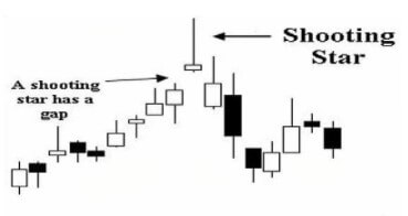
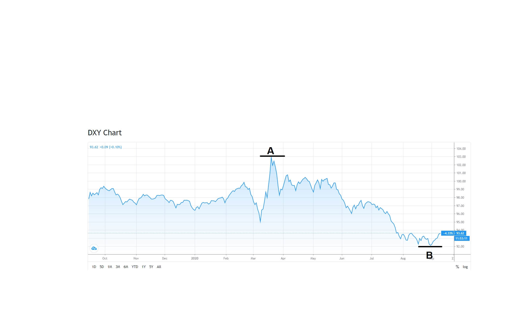
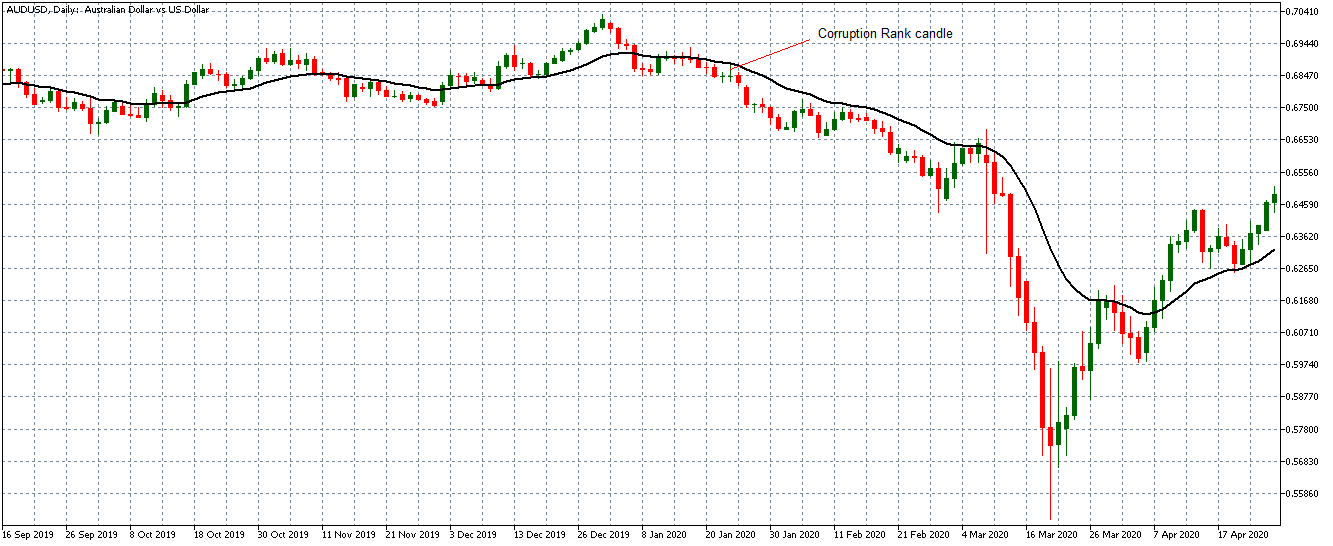
In case you are facing a similar problem, the best step you can take is to withdraw from trading, start all over again, and learn more about this market. This is such a specific situation and such an important signal that some traders should consider moving on to some other markets or businesses. Having this outcome directly indicates that a trader has not developed the necessary mindset which this particular market requires. Both reckless trading and the timid one may equally endanger your account because the risk can never be too high or too low in the forex market. Even if you managed to increase your account by 4% in a single year, it would still not be good enough if you had to go at great lengths to achieve this. Traders need to find that right balance and also think of some other factors, such as time, effort, and profitability, because there may be a safe but much easier, faster, and more lucrative way to seeing your finances grow.

This market is not risk-free, so it all boils down to the question of whether doing trading has a point. If you see that your finances are not developing accordingly, you may consider doing demo trading to learn how to set risk sensibly. If you have yet to do demo trading, you should bear in mind that this will help you build your system, psychology, money management, and trade management skills so that your account reflects these in a positive way and that you can transfer and exhibit the same level of skillfulness in real trading. Both demo and real trading, however, should not be void of risk since the most prosperous traders take many risks, but they know how to manage them properly, successfully minimizing the chance to fail. Consequently, the word risk does not imply that you are acting carelessly, but that you are intelligently assessing where you can invest to have financial benefits.

As risk is a necessary part of this line of business, but also the one that we need to control, we have to consider which percentage of the account any individual should be trading. Most of the available sources advise traders not to go above 2% of their entire trading accounts on each trade. Nevertheless, what this means is that the suggested percentage is the maximum limit, not the average one. While your stop loss should always reflect this, you can feel at ease knowing that most losses rarely exceed this amount. So, if you have 50 thousand USD, the 2% value would equal 1000. Although this may seem like a large quantity of money, and thus a large amount to risk, we need to understand that timid trading will not get you far and that you will not lose the entire thousand even if you happen to fail. Therefore, what understanding risk means is that every trader should allow themselves the opportunity to take risks, but also apply a strategy to minimize those risks.

To successfully track and control the risk level, you can always rely on the ATR, an indicator that tells traders how many pips on average a currency pair moves from the top to the bottom of the candle. While this tool cannot exactly predict the future, it can assist traders with money management, seeing how a currency pair is moving at present and what direction it may take later. Some of the best traders in this market suggest that the stop loss should be set at 1.5 times the ATR (default MT4 settings) value at the moment of position opening to see the greatest benefits, on the daily timeframe. Therefore, if a currency pair’s average true range (ATR) is 80 pips, the stop loss should be 120 pips away from the current price. With the help of this tool, you will always be able to set your stop loss and secure your trading, although once your profit starts to accrue, this limit is going to change.

How can we find out what the pip value is going to be? Even though we cannot expect to have the same pip value across the chart, what you can do is see how much the 2% of your account actually is. As the account will keep increasing and decreasing in value, the risk limit is naturally going to follow these oscillations. Afterward, we will need to count the 1.5 ATR of the currency pair and put the stop loss there. The last step to take here is to divide the risk (a dollar amount) by the 1.5 ATR (pips amount) to learn how much money you should put per pip on each trade. You can rely on this simple calculation for each trade you enter and apply it in your daily chart to get specific insight and information.

Most trades do not involve exact numbers, so let us say that your net account value is 50,263 USD. To estimate the risk, you will multiply this number by 0.02. Upon calculating the 2% of the account (roughly amounting to 1005 USD), we will seek the currency pair we want to trade and find the ATR only to multiply it by 1.5. If your ATR is 86 as in the example below, you should get a pip stop loss of 129.

If you focus on the tip of the pointer, you will see that the price is at 1.1707. We can, in this case, decide to go long, which is why we are going to use this number and deduct 129 (we would do addition if we were going short) to learn where we should enter the stop loss order. Finally, we are going to calculate the pip value by dividing 1005 by 129, which approximately equals 7.7 USD. After acquiring the necessary information, we know that one pip equals $7.7, so we can estimate that the trade unit value should be 78,000 for the EUR/USD currency pair, or 0.78 lots. We will insert the stop loss afterward and enter the trade, as shown in the image below. Note that in the MT4 platform you can use different tools published on the MQL 5 market for this purpose to automate the whole process. There are even some EAs. If you want to really get this easy, try to use Tipu Stops and IceFX Trade Info panel so everything is precalculated for each asset. Just use the drag option to the Stop Loss line on the chart.

While this is a secure way to assess risk, you should always look for the right indicator which will signal you to exit bad trades on time. What is more, you should previously make use of an indicator that can tell you that you are on the right path and inform you that you should stop trading before your price hits your stop loss. By researching and creating your own indicator algorithm, and combining these confirmation and exit indicators as well, you will successfully trade in this market and mitigate the amount of incurring risk.

In terms of how many trades we can do at the same time, the information provided by professional traders suggests that any individual can enter as many trades as they want under the condition that the 2% rule is applied. However, we should also be mindful of the fact that the same currency is not to be traded more than once at the 2% risk. Even if your chart is signaling that you should be investing in a particular currency, you should not by any means be investing in several pairs involving this particular currency (e.g. EUR/USD, USD/JPY, and AUD/USD) long or short at the same time. Should you fail to abide by this rule, you will suddenly have 6% of your account on this one currency (USD) and, having done this, you have actually taken on too much risk all at once. In case this currency goes the opposite direction, you may be damaging your account to an irreversible extent.

Therefore, despite the fact that this approach has been used by various professional traders, you may want to pay close attention not to fall for the trap of over-leveraging. To avoid making this mistake, you should always follow the first signal for that particular currency. Should you, then, receive a long signal on the EUR/JPY pair and another long signal on the EUR/AUD one, you should opt for the one you saw first and follow through. Although we may see the opportunity and potential financial rewards, sometimes less is more in this world. Having said this, you can also apply the half-and-half approach and put 1% on each pair, which can almost function as a hedge saving you from loss should one on the pairs fail to bring you profit. You may also decide to take half the risk and wait for another trade as you can see some favorable progressions coming your way soon, which is not something professionals would advise you to do very frequently because you may be stopping yourself from earning sufficiently by trading timidly.

Risks have often been disregarded as inherently bad, but in the world of forex trading, we know that they are unavoidable and necessary to make a profit. By adopting these practical steps in your everyday trading, even if you are doing demo trading now, you will learn how to set the risk level properly, without protecting you too hard from failure or playing recklessly. A smart trader is thus not the one who fears risk or casts it away as an unimportant factor, but the one who deals with it effectively, applying the strategies discussed in this article intelligently and consistently.

Categories
Forex Stop-loss & argets

The One Time-Frame That Might Give Us the Best Results

One of the main conflicts that traders have with themselves is how they are going to organize their time. Work-life balance is one of the key figures in our lives. Without the schedule, our trading could be stressful and compromise our productivity. Ultimately, if we are not careful, it can lead to over-trading, dullness, information overload, and burnout. So if we want to have any chance of winning in the forex industry we need to go outside of conventional thinking. A constant sea of conventional thinking is always there but if we want to vault ourselves into that fraction of a percent where we can improve our trading, we need to reconsider which is the best time frame to trade forex.

As we all know, by time frame on most charting platforms we can trade the 5 minutes chart, 15 minutes, 30 minutes, 1 hour, 4 hours, daily, weekly, and the monthly chart. These charts are the most common depending on the platform we trade. So where we can search for the best chance of winning? Word winning has a different meaning for everyone. What we might perceive here as the winning in forex is consistent profit. Consistent profit over and over to the point where we go long-term and look 12 months after we started or 12 months after we started keeping track. Are we at a consistent well-organized path to where we can trade real money and make a good living off that? Are we trading with good enough results to where somebody can notice that and hire us? Or to a lesser degree, are we increasing and improving at a good enough pace to where we are going to get there soon? That is the winning according to professional traders. So the best time frame to trade forex if we want to win consistently might be the daily chart. Why do we believe that the daily chart might be the far superior chart to trade forex? There are 4 main reasons for this statement. The first reason, everything on a daily chart, every technical tool works better and more consistently than any other chart out there.

Even if we use some not that good tools like the RSI indicator or trend lines, they work better on the daily chart then they do anywhere else. In other words, trades win more often. If there’s any constant in all of this research among traders is that every single time the daily chart turns out to be more consistent than any other chart. The second reason, why the daily chart might be the far superior time frame to use is that we don’t have to be slaves to the markets. Trading does not suppose to be super long, we could just turn on our charts, look at all currency pairs, our algorithms, and the system that we put together tells us one of three things. Either we make a trade, manage a trade we’re already in or we do nothing and move on. That is how it supposed to be and after we can do whatever we want because we want to achieve a great life-work balance. So some traders who trade on 5 minutes or 15 minutes chart might be trading a lot longer than someone who is trading on the daily chart because they want to get in and get out and make that quick money. How quick is that money really? The market doesn’t always start moving when we think it’s going to so there can be a lot of waiting.

Sometimes there are days where the market just never gets off the ground therefore it could be a lot of waiting for nothing. The forex trader life can be nerve-racking and horrible or it could be blissful, wonderful, and rewarding. The third reason, why the daily chart might be the best option is that news events matter a lot less to us than before. What do we mean by this? Well, on one hand, if we are trading smaller time frames news events on particular currencies that don’t even have a lot of significance can disturb our trade instantly if they don’t go our way. On other hand, the news event might actually be in our favor but for some reason, banks could decide to take opposite way even though the news event was good so we could easily find ourselves in a helpless feeling of sitting behind our system and scratching our head after a losing trade. If we manage to get those feelings out of our trading, life could be much better, it’s going to be a lot less to worry about.

Essentially, we don’t have any control over those news events. The news events are killers and if we have a chance to avoid most of them and if we are able to sidestep most of them that could be a great addition to our daily chart routine. Going on further, we will try to reveal the fourth reason why we might trade the daily chart exclusively. The big banks of the world, the people who are responsible for moving prices up and down employ traders that go to work every day for the purpose of moving the market against the popular side to knock those orders out and put that money back into their pockets so they could redistribute it back in the market and make the price go up and down. Professional traders claim that banks are doing this over and over every day and because of that the daily chart traders might be less exposed to these financial earthquakes than for example the 15 minutes chart traders.

Why? Because there’s a lot more of 15 minutes chart traders and they are trading all the time which means there’s an endless supply of traders out there for the banks to take from. The same reason why Las Vegas casinos are making tons of money on slot machines because there are always people there pulling that lever and hitting buttons over and over again regardless of how much they are actually wagering. It is important to mention that according to our knowledge the weekly chart and the monthly chart time frame do not perform better than the daily chart. Simply, the weekly chart time frame contains too many huge news events where we can no longer avoid them so there might be a big risk for us to ruin our trade. There can be thousands of pips in this time frame so it is highly questionable is it worth it.

For those who are skeptical about the daily time frame, there’s a solution. They can try to do both at the same time and compare which one can give us better and more stable results. If both works, then perfect, we could trade in both time frames. In the end, we will never have control over the market but we concluded that forex trading is such a rare combination of things where we can have a large impact and somewhat control the outcome. If we set things the right way we might have some measure of control and we believe that the journey starts where we can eliminate things that we cannot control. The daily chart might be the right way to get things done as we all want them and be closer to our central mission of becoming the best traders that we could potentially become. Hopefully, in the future, we can attack the market with more confidence.

Categories
Forex Technical Analysis

A Fundamental Analysis Twist for the Technical Trader

Fundamental analysis mostly encapsulates social, economic, and political analyses of the forex market and in what ways they may affect currency pairs. It is known that in the trading strategy we have 3 types of analysis: technical, fundamental, and sentimental. How big attention we should give to this type of analysis? Could fundamental analysis be detrimental to our trading?

There is a big difference between the forex investor and the forex trader. Forex investors have time to just sit back and let somebody else do the work. They can make trades based on pure speculation or slow-moving events. On the other hand, traders grind, they do hard work, they get dirty. They get in, make money, and get out, based on what they have right in front of them. Does fundamental analysis apply to traders? How exactly forex twitter and big multi-billion dollar financial organizations and their experts affect our trading?

Fundamentals include politics, global market conditions, and economic indicators and reports. We will try to dig deeper into these. Politics can greatly affect the price of a currency pair every once in a while especially because of media. We just never know when. So trying to follow anything politically might be the waste of time because we are never going to be able to anticipate what some of the world leaders are going to say or do. If we can’t anticipate then there’s no way we can trade it. Global market conditions like: “What is the state of the European Union right now?” or “What is the state of the United States economy?”

With questions like this people can speculate for hours and how that might affect the economy which when it trickles all the way down to us and what we want to happen with the currency pair we trading, means absolutely nothing. Finally, when we do hear a piece of news that might be beneficial for us, it is really hard to process. For example, something big happens in China. How is that going to affect the economy and interest rates? Then, how will that affect inflation? Ultimately, how is that going to affect the price of yuan? Simply, it can be too many variables in place for anybody to really decipher how any of this information is going to directly affect the currency pair that we want to trade.

With fundamentals, it’s usually big, grandiose, complicated guessing game with all these movable parts that in the end doesn’t amount to anything. When it comes to technical analysis at least we have things in front of us that we do know and we actually can use. Now in our world, what we in real-time do have to contend with are economic indicators and reports. Things like non-farm payrolls, PMI numbers, or interest rates. When news reports come out saying if those figures have changed or if they haven’t, we know when they are coming. That might be our advantage. A lot of traders are used to watching different news outlets but we need to try to distinguish the real information from the people who give us useless fundamental analysis that cannot help us. These things only divert us from what is important.

Forex Twitter channels are also sources with questionable usage. Someone can be pretty unhelpful and make a lot of money in the forex world just by tweeting out news events that already happened. As traders, we are on top of the things, and we don’t need to be told some things because we have 2 eyes and we have a chart and that tells us all we ever need to know. So we might consider clicking the unfollow button on most of these twitter feeds. Sometimes we might hear about a news event that already happened and somebody on financial news saying things like: “Building permits in the US came in at 1.24 million and this is slightly below the forecast of 1.27 million”. Well, we could be grateful for that update but the thing is this is not really an update. Like every forex trader on planet, we also have our news calendars and we are usually pretty informed, we already know that all of that just happened. If we were trading the dollar, for example, we would probably be aware of all this. If not, most of this information would be totally irrelevant for someone who is a forex trader.

Like we said forex investors might do something with this kind of information because of their slow, laid-back pace of playing the game, but we as forex traders have been moved on five different ways since that news event came out. Financial news channels and forex twitter are full of these things. Another thing that these news outlets like to do is not only do they tell us what happened in the past, they tell us what’s coming up. Again, we have a calendar, we know that. It is our responsibility to know. Things like this don’t really apply to a real trader. If someone of us is a super forgetful, irresponsible trader then paying attention to fundamental analysis is the least of his problems. Sometimes on certain web sites, we might see people try to predict where the price is going to go based on the news that just came out or the news that might be coming up.

Still, there are major issues around this. It is still information that is hard to use. A lot of times what boils down to what they’re saying is: “Price might go up or down”. Well, thank you guys for that, that’s ultra helpful. And when they do some kind of predictions they almost always point to price levels, support and resistance line, or Fibonacci level. These predictions are usually wrong according to professional traders. Traders, who is responsible for making prices go up and down? We all know this. It’s the big banks, it always has been. When it comes to news events banks don’t have a reason to move, they just don’t react. Before the news event even comes out the big banks already know where they’re going to take price. It’s just the matter if the trader’s money switches from one way to another based on the news event that comes. if that news event is so one-sided and for example, the euro gets stronger. The banks still control when that happens, so they might lose a little amount of money during this process because the news could be just great in this situation.

In the meantime, they are going to find out where all those stop losses are and they are going to knock them out so they can collect as much money as they possibly can from spot forex traders before they take price where it’s going to go. It is not the case that great news just comes out for a particular currency and price immediately starts shooting that way. We usually see a lot of up and down jagged action first, a lot of fake news, sometimes prices are going the wrong way and we wonder why. That is the banks doing what they’re doing and they will always get theirs. The sooner we realize this the better off we could be. Simply, trying to follow fundamental analysis might be a glorious waste of time. This could actually be good news because technical analysis in the end always wins. If our technical analysis is amazing we might almost forget about fundamental analysis which can be liberated because it is a huge discombobulated confusing time-eater in most cases.

Of course, we still need to be aware of big news events but that shouldn’t be a problem because we have a news calendar. That might be the reminder that we need to focus on unless there’s a major political election coming up or some financial turmoil. The news event coming out usually does not apply to any of the currencies we trade, most of the time we can just slip through it. We could pretty much widdle all of the fundament analysis down into a small handful of news events that we’re already know are happening and when they’re happening, we could adjust our levels a little bit and move on. We have this wonderful luxury as spot forex traders that people who trade stocks, bonds, and CFD’s don’t have in a sense to where we can do over 99% of our trading directly from our charts and still potentially have great success with it. Most traders never realize this. After everything discussed here, we might try to re-think how and where we should invest our time.

Categories
Forex Fundamental Analysis

Minimum Wages – Understanding This Macro Economic Indicator

Introduction

Minimum Wages are essential for protecting citizens and ensuring that everyone gets a fair share of the fruits of the progress made. Minimum Wages act as the foundation for everyone at the entry-level to compete equally to the top. Minimum Wages are used by a majority of the countries across the world. Understanding Minimum Wages and its importance can help us better understand improvement in people’s living standards over time alongside the country’s economic growth.

What are Minimum Wages?

The International Labor Organization (ILO) defines Minimum Wages as “the minimum amount of remuneration that an employer is required to pay wage earners for the work performed during a given period, which cannot be reduced by collective agreement or an individual contract.” It is the least money paid out for work as a wage over a given period. It cannot be lowered by mutual understanding nor through a legal agreement. Hence, it is the lowest remuneration that an employer can give their employees.

The Minimum Wage can be set by a statute, wage board or council, competent authority decision, industrial or labor courts, tribunals, or law enforced collective arguments. Most countries had introduced the Minimum Wages by the end of the twentieth century.

Minimum Wages initially started off to stop exploiting workers in sweatshops (places with unacceptable working conditions, potentially illegal and dangerous). Owners at such places generally had dominion over that workplace and people working. But later on, it became a means to help uplift the lower-income families. Minimum Wages were first incorporated by New Zealand in 1894, followed by many other countries gradually.

How can the Minimum Wage numbers be used for analysis?

Minimum Wages acted as the price floor beneath which a worker may not sell their labor. The purpose of Minimum Wages is to set a barrier to exploiting the labor force through unduly low wages for their work. It will ensure a just and equitable way of distributing the returns on the progress made collectively. It will also ensure people receive the money required to sustain a living and act as legal protection for people who need it.

Minimum Wages are also used as part of a policy to eradicate poverty. It also helps curb inequality amongst employees based on age, sex, or race for the work of equal value done. Minimum Wages also acts as a floor for wage negotiations and collective agreements. Any negotiation always has a legal and reasonable base, only above which all negotiations can take place and shall not fall below it.

The effect of increasing the Minimum Wage had a negligible impact on the employment rate in general. Still, cost-cutting in other sectors and the profitability of the company become vulnerable. Minimum Wage level adjustments are deemed to be made from time to time, meaning whenever the board feels it is needed based on the cost-of-living indices. Most countries adjust their Minimum Wages yearly, some do on a six-month basis, and some do it on a two-year basis.

Inflation and Cost-of-Living fluctuations erode the purchasing and protection power of the Minimum Wage. At such times, unscheduled interventions become essential to keep protecting the labor force.

Fixing Minimum Wage too low defeats the very purpose for which they were set and too high creates a significant impact on employment, worsening the situation. Careful and objective decisions have to be made to set and adjust Minimum Wages periodically as per economic conditions.

Setting too low could constrain consumer spending, which is terrible for the economy as it fuels the GDP. Setting too high could trigger inflation on subsequent levels, hurting exports, decreasing profit margins, and reducing employment.

The ILO deems the following three economic factors to take into account to set Minimum Wages: economic development requirements, productivity levels, and desirability of achieving and maintaining high levels of employment. All the factors are correlated and have to be set to optimize all three economic factors.

The ratio of Minimum to Average Wage is also used to understand wage inequality among laborers within an organization. In developed economies, Minimum Wages generally range 35 to 60 percent of the Median Wage. In developing economies, the percentage is even higher, indicating higher-level workers are relatively underpaid. Minimum Wage at aggregated levels classified based on regions can also help central authorities to identify lagging states or regions, where the standard of living can be improved and economic backwardness eradicated.

Images Credit: International Labour Organization

Impact on Currency

Minimum Wages changes are often annual and do not have an impact on currency markets as it pertains to a particular section of working-class people. Minimum Wage is a low impact lagging indicator and does not deem any importance in the currency markets.

It is useful for central authorities and vulnerable workgroups to raise their living standards and maintain economic equality. When everyone is treated justly in terms of wages, economic growth is not crippled by exploitation and discrimination.

Economic Reports

In the United States, the Department of Labor enforces the Fair Labor Standards Act (FLSA) and sets the Minimum Wage and overtime pay standards. It is enforced by the Department’s Wage and Hour Division. Annual revisions to the same are made and announced, if any.

Sources of Minimum Wages

  • Minimum Wage details set by the Department of Labor is available here.
  • The OECD also maintains the same as Real Minimum Wages.
  • Consolidated reports of Minimum Wages of most countries can be found on Trading Economics.
  • We can find guidelines on setting the Minimum Wage and various nuances associated with it on ILO.

Minimum Wages Announcement – Impact due to news release

The Minimum Wage is an employees’ base rate of pay for ordinary hours worked. It is dependent on the industrial policies that apply to their employment. Employees cannot be paid less than their Minimum Wage, even if they agree to receive it.

Every year, the work commission reviews the minimum wages received by employees in the national workplace system and then submits it to the government’s labor ministry. Looking at the suggestions mentioned, the government increases the minimum wages for workers of the nation. Minimum wages have little impact on the value of a currency as it does not considerably affect the industrial output and the economy.

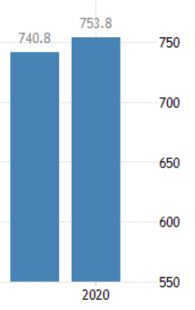
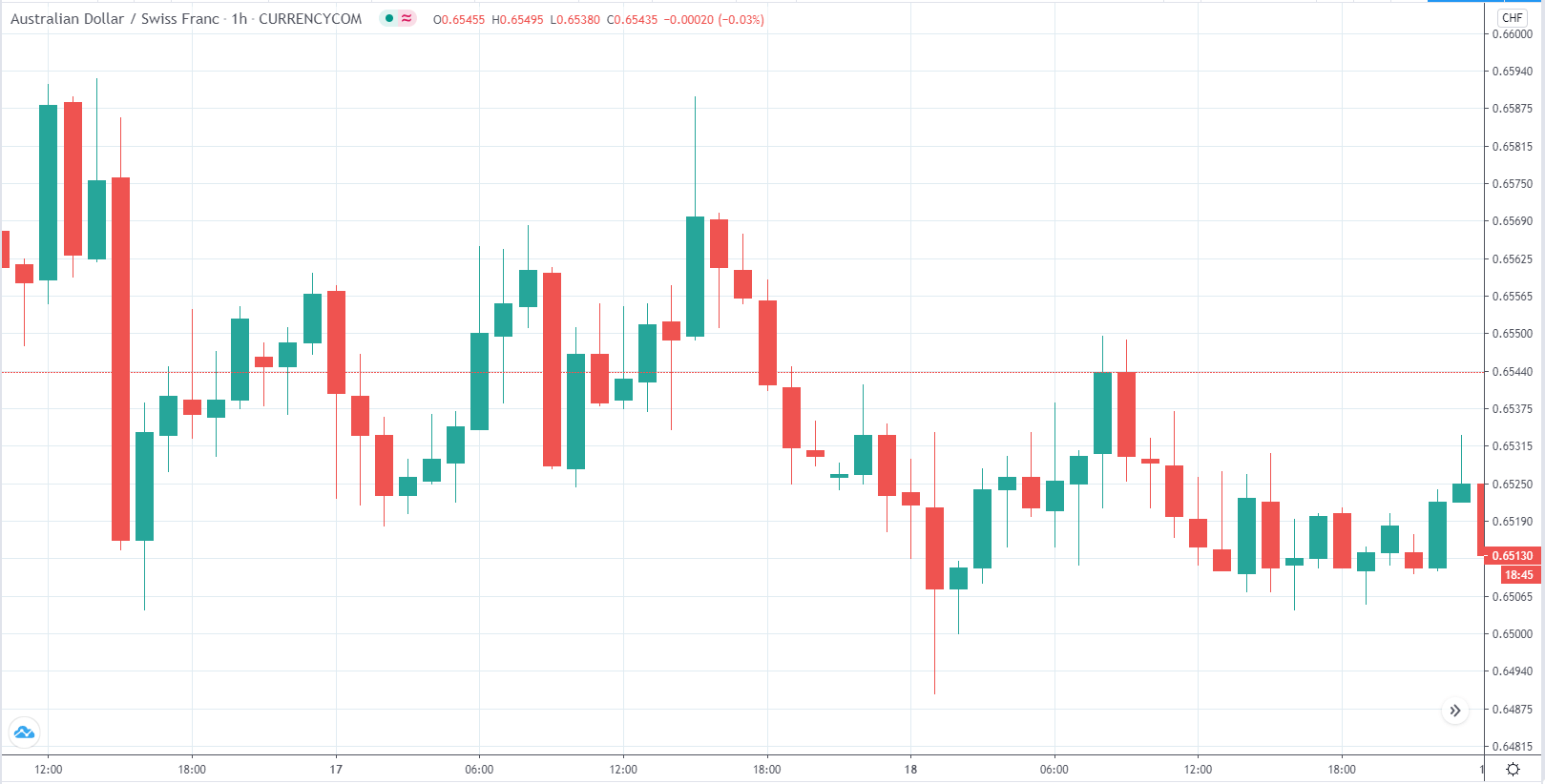
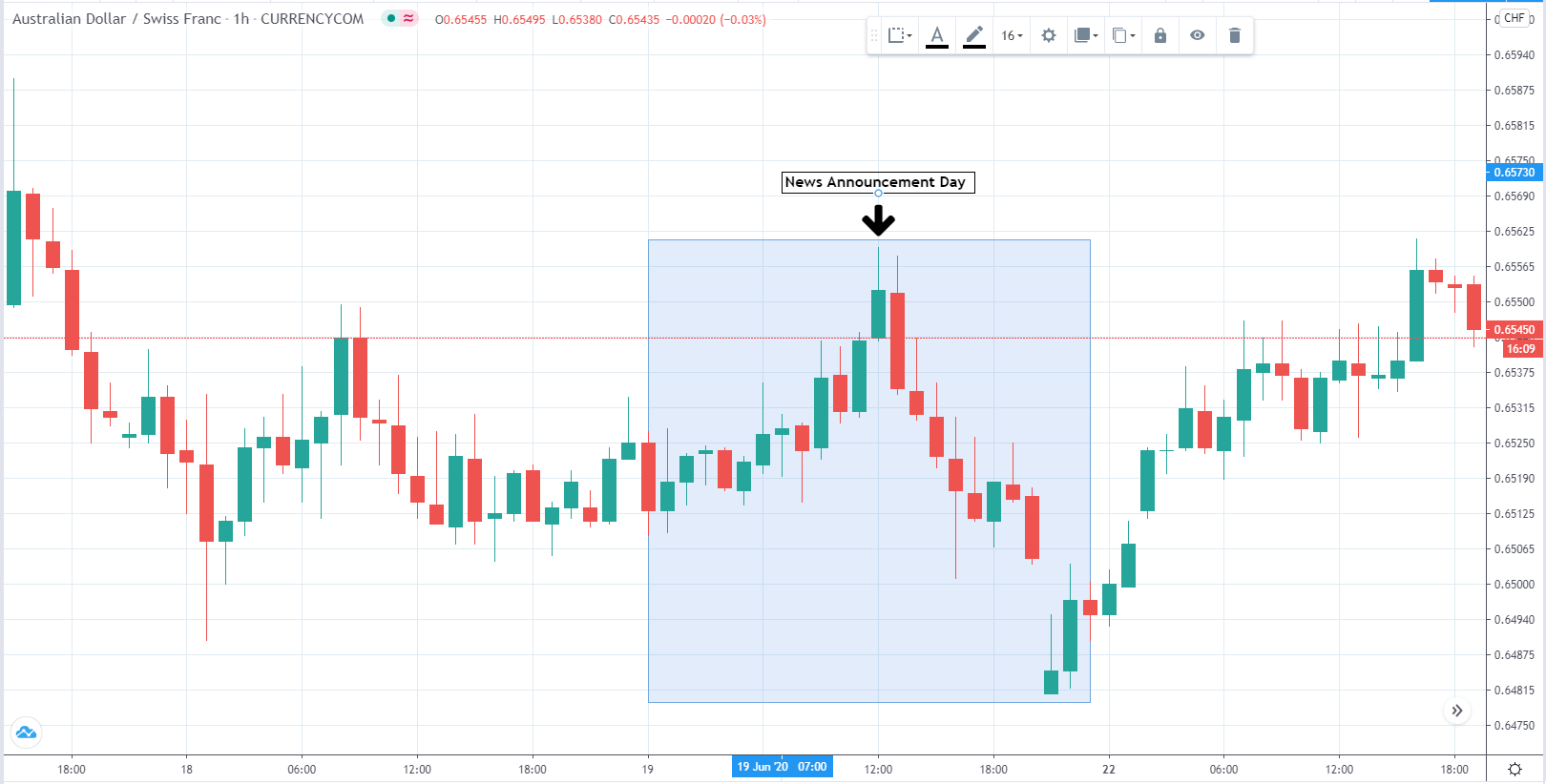
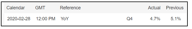
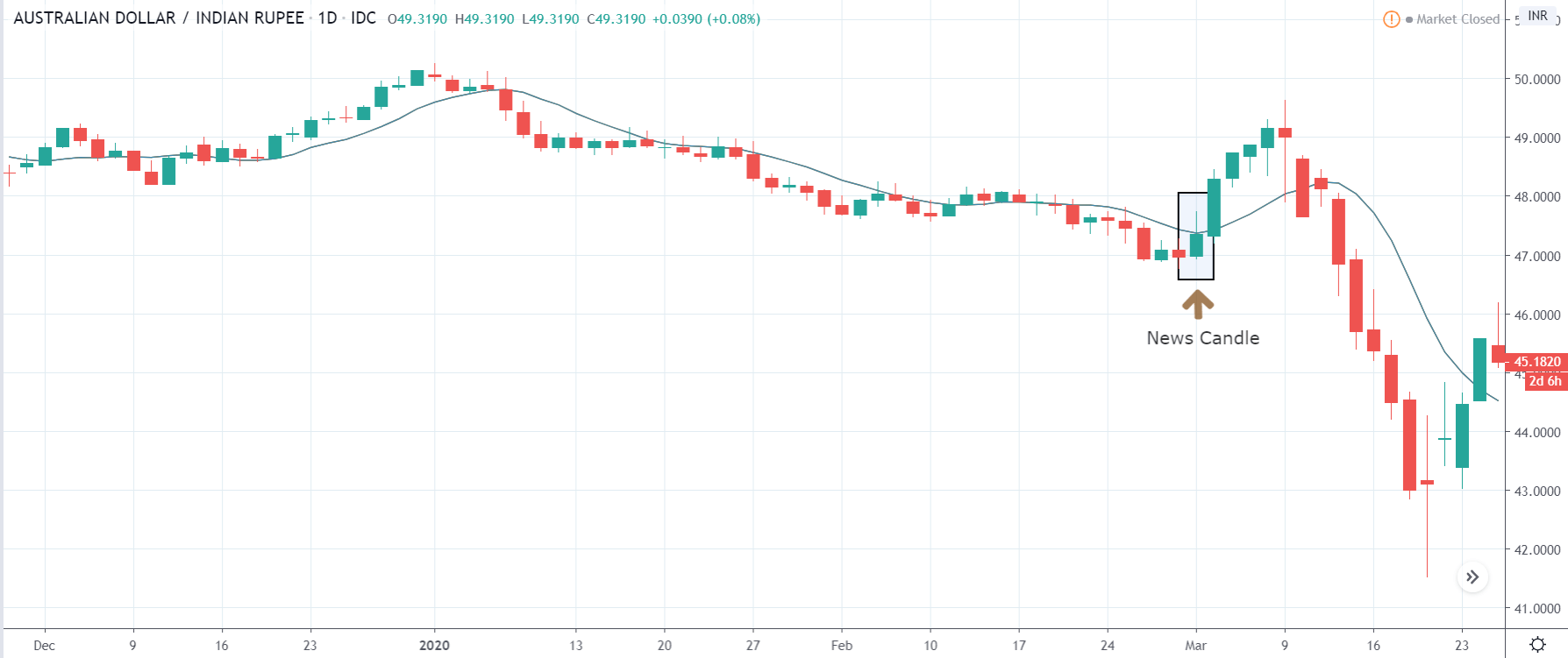
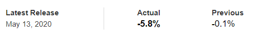
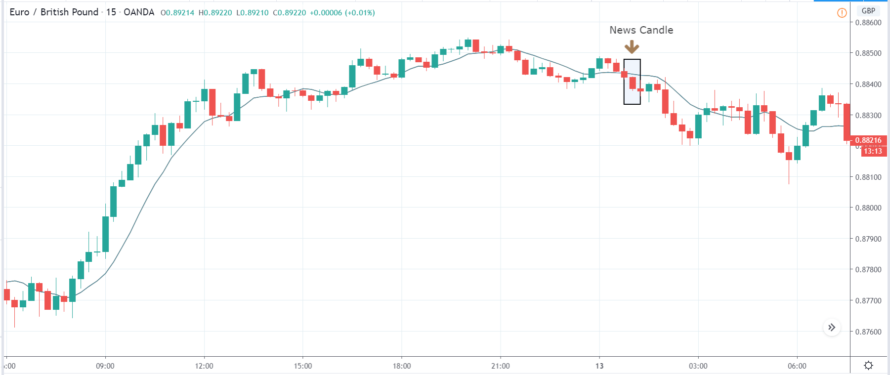
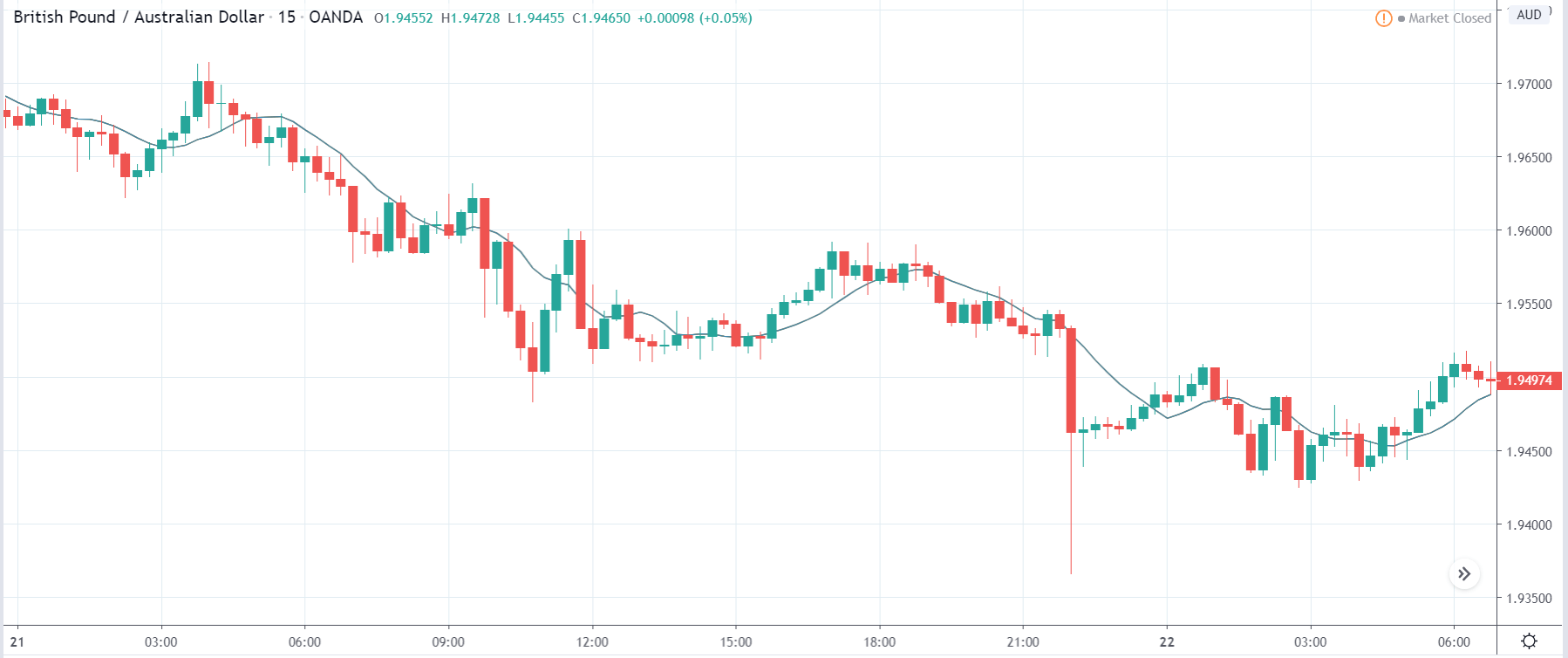
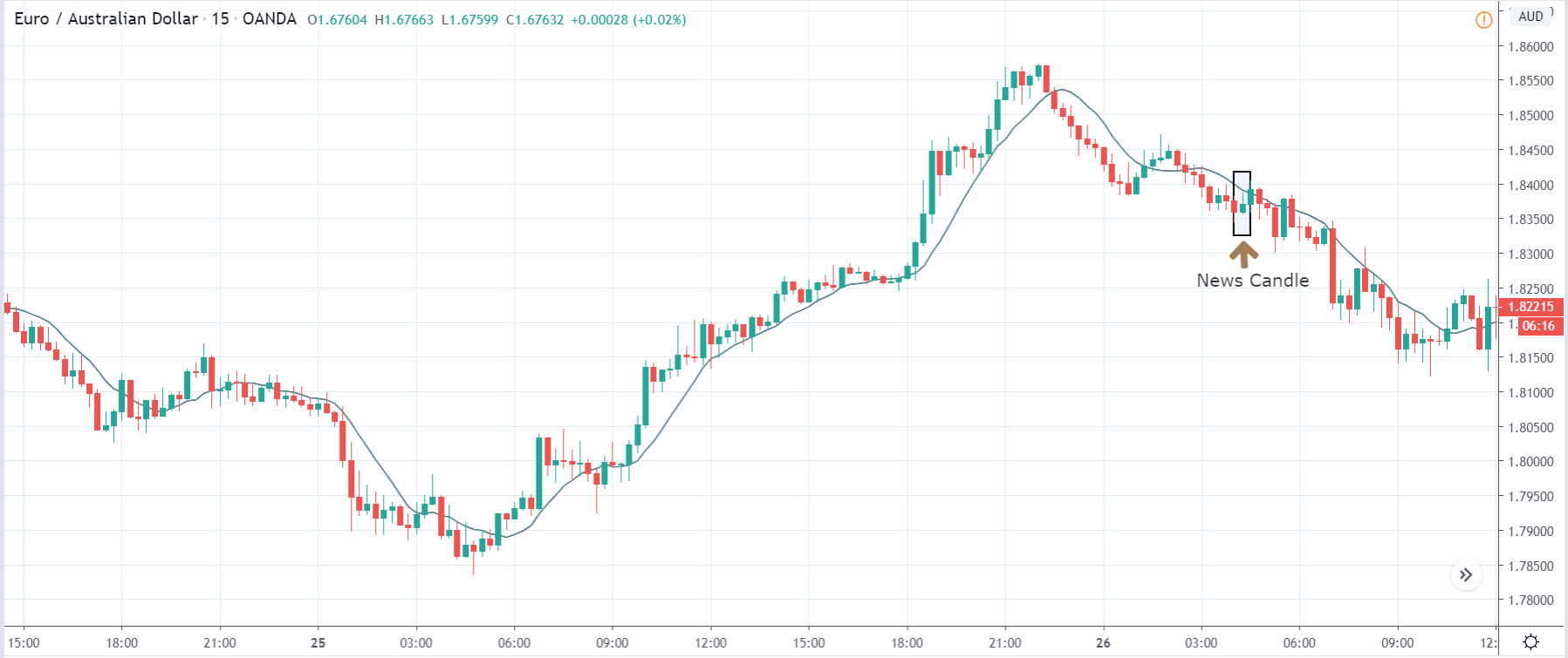
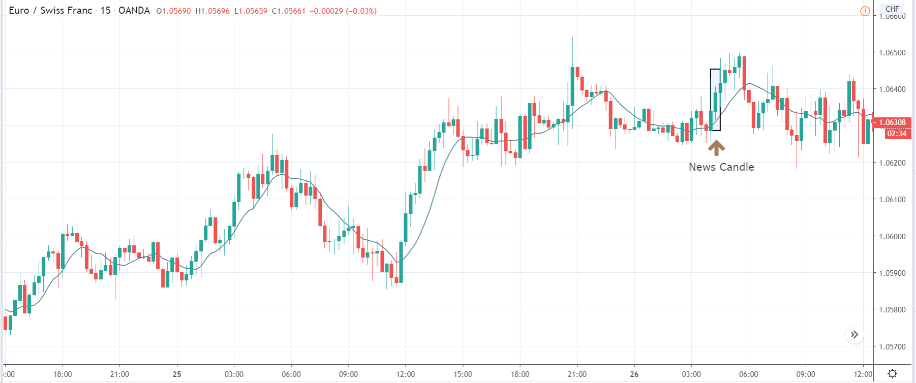
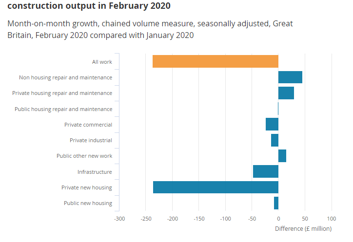
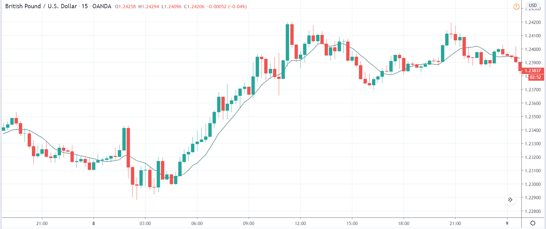
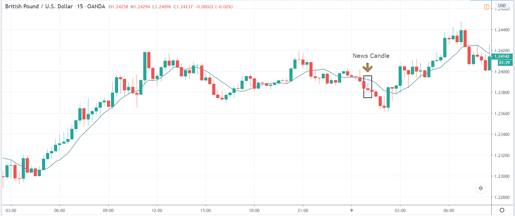
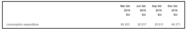
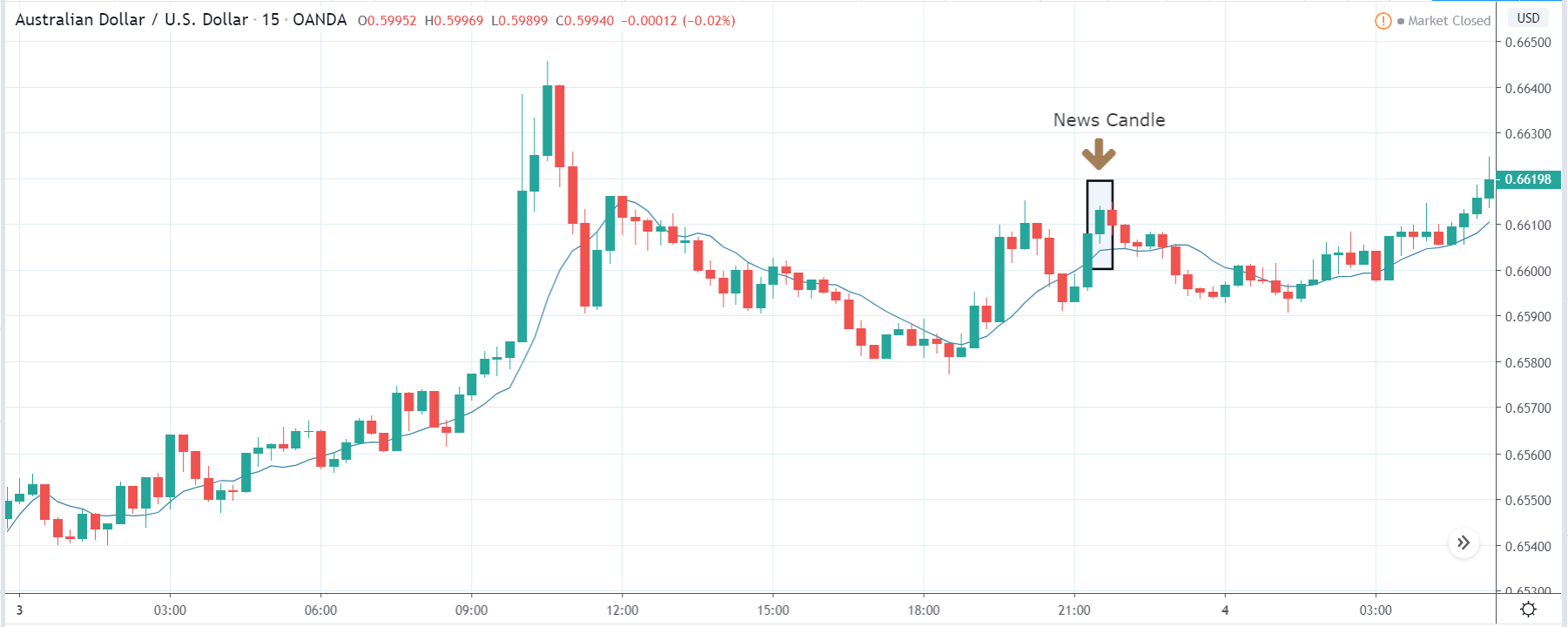
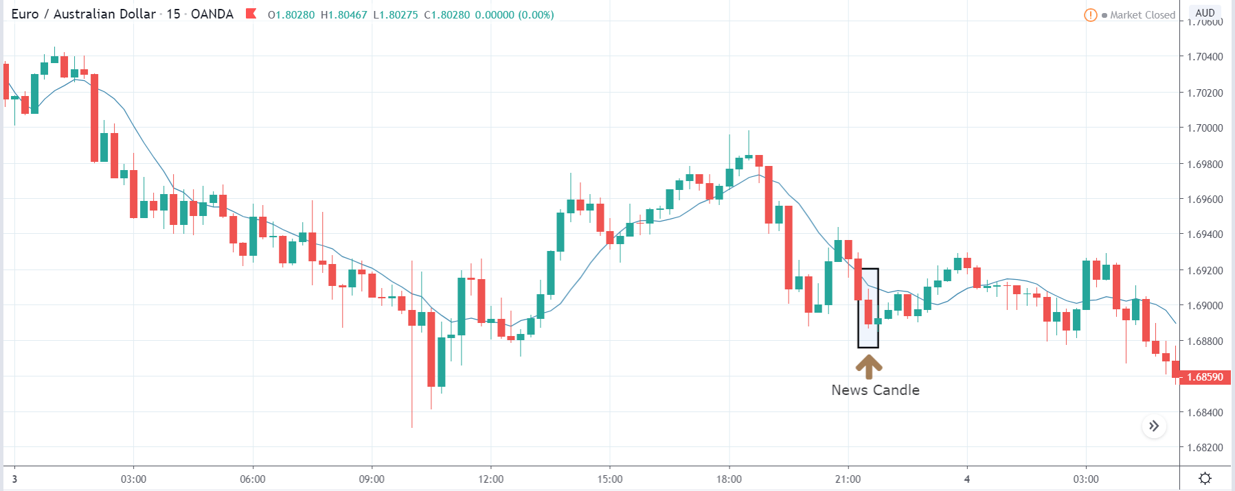
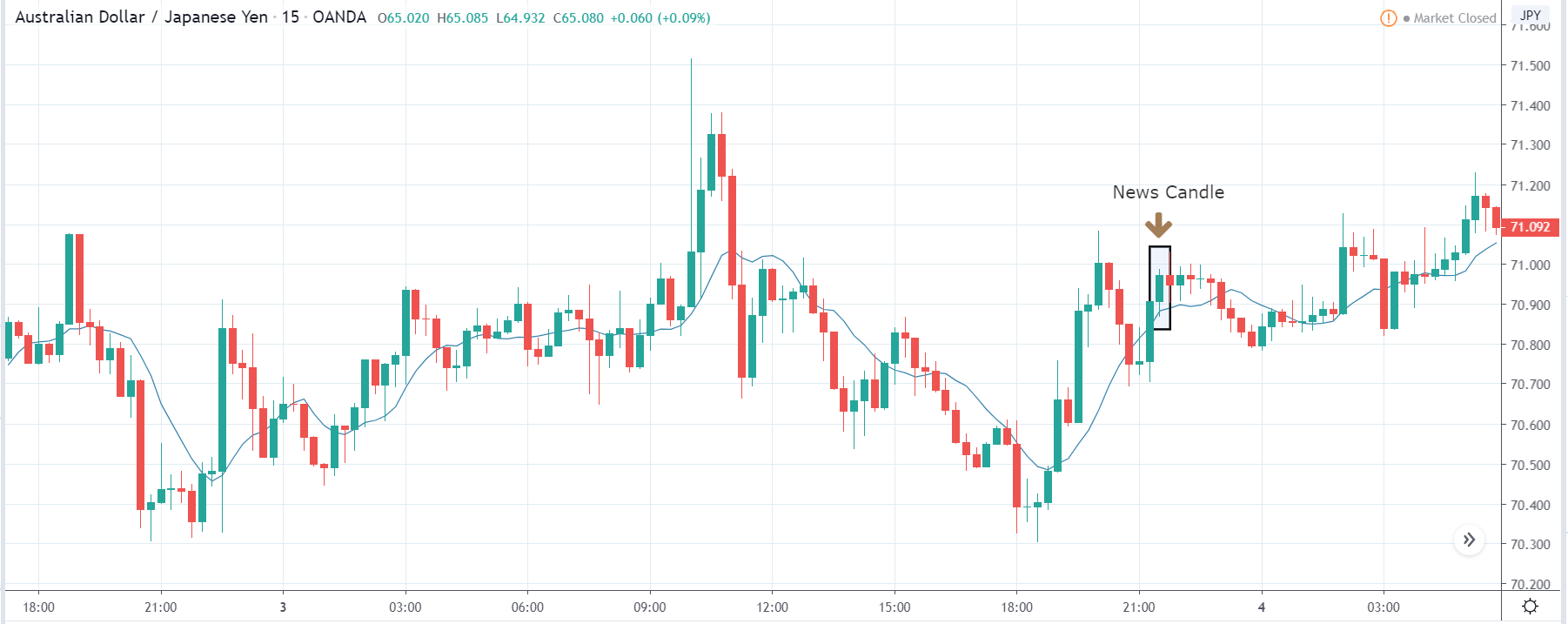
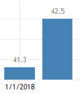
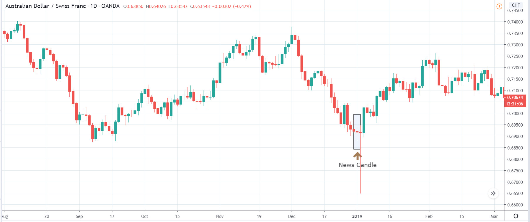
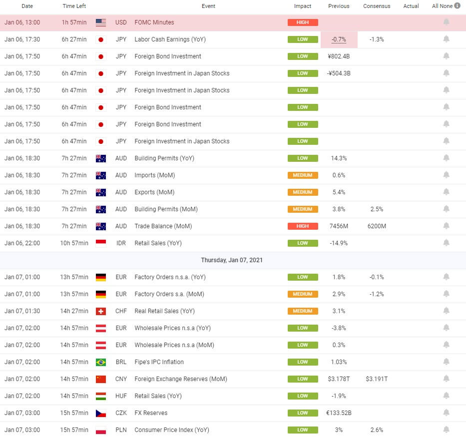
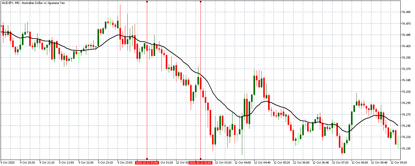
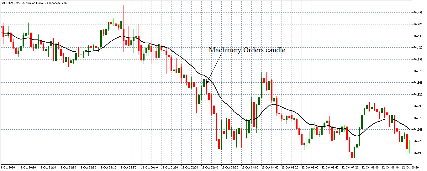
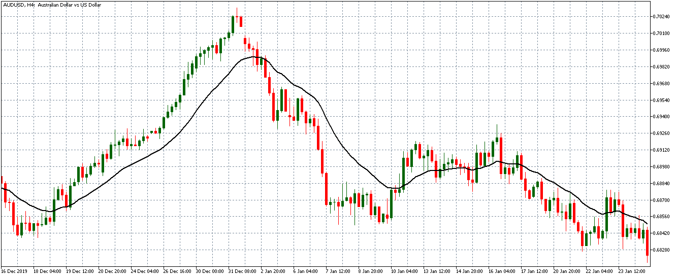
The below image shows that the weekly wages were increased for Australian employees in 2020. Although the difference is not huge, it still is a positive step taken for the daily wage workers. Looking at the data, we should not expect significant volatility in the currency pairs during the announcement.

AUD/EUR | Before the announcement

In the above image of the AUD/EUR 1-hour timeframe chart, we try to establish potential trading opportunities. The pair has been ranging for the past three days before June 19th, 2020.

AUD/EUR | After the announcement

The above image highlights the news announcement day. It may seem there was a small uptrend that was built was erased in the second half of the day. An increase in the minimum wages in favor of AUD did not break the trend established a few days earlier. The pair continues its range post the announcement day also.

AUD/USD | Before the announcement

The above image highlights the AUD/USD pair a few days before the news announcement day. No trend has been established as of now.

AUD/USD | After the announcement

The above image highlights the news announcement day, and we see a similar pattern to the AUD/EUR. We see it is in the typical volatility range of the AUD/USD. The news announcement did not help AUD break the previous and post ranging trend here also.

AUD/CHF | Before the announcement

The above image is AUD/CHF pair, and here also, no potential trading opportunities are building up until June 19th, 2020.

AUD/CHF | After the announcement

The above image highlights the news announcement, and we see that the news did not move the currency in favor of AUD. The AUD/CHF continued to stay in the same range as before the news release day.

Overall, in all the three scenarios, we see the minimum wage economic indicator despite coming in favor of AUD; the market impact was negligible. The market is aware that it is a low impact indicator and affects only a specific section of the labor force.

Hence, changes in minimum wages of a country do not translate to its currency volatility, as already confirmed through our fundamental analysis. Moreover, it is a yearly statistic, and the corresponding effects of increased minimum wages will be captured through monthly indicators better.

Categories
Forex Fundamental Analysis

What Does The ‘GDP Growth Rate’ Forex Driver Say About A Nation’s Economy?

Introduction

GDP Growth Rate is the most critical fundamental macroeconomic indicator for measuring economic prosperity. It is the number one macroeconomic indicator, and all other leading, coincident, and lagging indicators are all trying to predict what GDP Growth Rate would be. Our fundamental analysis revolves around predicting the growth rate before the GDP Growth Rate reveals it. It is the de facto measure of economic growth for all countries worldwide.

The importance of this economic indicator cannot be understated. GDP Growth Rate figures move the markets like no other, be it the currency or the stock markets. Hence, understanding the significance of this macroeconomic indicator is paramount for traders and investors.

What is the GDP Growth Rate?

Gross Domestic Product

It is a measure of the total economic output of a country. It is the total monetary value of all the goods and services produced within the country regardless of citizenship (resident or foreign national). The commonly used term “size of the economy” refers to this economic indicator. The US is the world’s largest economy, and it means it has the highest nominal GDP or highest economic output.

GDP Growth Rate

GDP Growth Rate is the measure of the rate of economic growth. In other words, it tells the pace at which an economy is growing. Generally, developing or emerging economies like China, India, or Japan will have a higher GDP growth rate than the mature or developed economies like the United States, United Kingdom, etc.

Mathematically, it is the percentage change of Gross Domestic Product with regards to the previous quarter. Although the GDP Growth Rate is reported quarterly, it is annualized for better analysis and comparison. It means that the quarterly GDP is scaled to a year to compare the Growth Rate with the previous year and understand whether the economy is growing faster or slower compared to the previous year. 

The other reason is that the GDP Growth Rate changes according to the business cycle and is usually very high during the last quarter, accounting for holiday shopping from consumers driving up the GDP. Hence, annualizing with seasonal adjustment makes it more accurate for analysis. The Real GDP Growth Rate accounts for inflation and is the most-watched GDP statistic.

The GDP Growth Rate is affected by the four components of the GDP:

A | Consumer Spending: It is also called Personal Consumption. It represents spending associated with the end-consumers or the general population. The Personal Consumption Expenditure reports, Retail Sales, are all different economic indicators representing Consumer Spending. It makes up about 69% of the total GDP in the United States.

B | Business Investment: Economic Output of the Business Sector makes up 18% of the total GDP in the United States. Business Surveys like Purchasing Manager’s Index, Industrial Production, etc. help assess the Business Sector’s contribution to economic output.

C | Government Spending: It involves all the expenditures incurred by the Government to maintain and stimulate economic growth and run its operations. In the United States, significant proportions of Government Spending go to Social Security, Medicare benefits, and Defense Spending. It accounts for 17% of the total economic output for the United States.

D | Net Exports: It is the difference between the total exports and imports. Revenue is generated from exports and depleted from imports. Developing economies will mostly have positive Net Exports as it is an integral part of their revenue generation. The United States has -5% Net Exports of the total GDP, meaning it is a net importer.

How can the GDP Growth Rate numbers be used for analysis?

When the economy is growing or expanding, the GDP Growth Rate is favorable. When the GDP Growth Rate is increasingly positive, businesses, jobs, and personal income all grow followingly. Developing economies grow faster than mature economies (as the developed economies are already more saturated compared to developing ones). It is generally standard for matured economies to peak out at 3-4% GDP Growth Rate and developing economies can have anywhere between 5-20%.

When the economy is slowing or contracting, businesses will halt new investments and plans to avoid deflation. New hiring is also postponed; people will save more than spend to prepare for the oncoming deflationary conditions. The economy comes to a slowdown. The Government intervenes through fiscal and monetary levers to stimulate economic growth and bring it back to normal conditions and maintain the growth rate. Overall, the GDP growth rate tells us the economy’s health.

Impact on Currency

The GDP is a lagging macroeconomic indicator that has high-impact on the market volatility. Investors’ decisions are based on the GDP growth rate. It is a proportional indicator. High GDP Growth Rates are suitable for the economy overall and vice-versa.

Though it is a lagging indicator, it has many implications for the economy. It is the most extensive measure of economic activity and the primary gauge of the economy’s health. GDP Growth Rate comparisons amongst different economies are vital for currency markets, and hence, it has a very high impact on the currency market.

Economic Reports

For the United States, the Bureau of Economic Analysis releases quarterly GDP Growth Rate figures on its official website every quarter. The release schedule is already mentioned on the website and is generally released one month after the quarter ends. 

Major international organizations like the World Bank, International Monetary Fund, OECD, etc. actively maintain track of most countries on their official website: 

Sources of GDP Growth Rate

For the United States, the BEA reports are available here.

The St. Louis FRED keeps track of all the GDP and its related components in one place on its official website. You can find that information in the sources mentioned below.  

GDP & GNP – FRED 

GDP Growth Rate – World Bank

GDP Growth Rate – IMF

Impact of the “GDP Growth Rate” news release on the Forex market

In the previous section of the article, we explained the GDP Growth Rate fundamental indicator and saw how it could be used for gauging the strength of an economy. The GDP Growth Rate indicates how quickly or slowly the economy is growing or shrinking.

It is driven by four components of GDP, the largest being personal consumption expenditures. But economists prefer using real GDP when measuring growth because it is inflation-adjusted. When the economy is improving, the GDP Growth Rate is favorable. If it is contracting, businesses hold off investing in new technologies. If GDP Growth Rate turns, then the country’s economy is in a recession.

In the following section, we will analyze India’s GDP Growth data and observe the change in volatility due to the news announcement. The below image shows the fourth quarter GDP Growth data of India, where there has been a fall in the value compared to the previous quarter. The most critical and highest contributor to the growth of the Indian economy is services. Let us find out the reaction of the market to this data.  

USD/INR | Before the announcement:

We shall start with the USD/INR currency pair to study the impact of GDP Growth Rate on the Indian Rupee. The above image shows the ‘Daily’ time-frame chart of the currency before the news announcement, where we see that the market is moving within a ‘range’ and currently the price seems to have broken out of the ‘range.’ The volatility is high on the upside, indicating that the Indian Rupee is weakening. Depending on the GDP Growth Rate data, we will take a suitable position.  

USD/INR | After the announcement:

After the news announcement, we see a sudden rise in the volatility to the upside. The price moves higher initially, but selling pressure from the top makes the ‘news candle’ to close with a wick on the top. This was a result of the harmful GDP Growth data where there was a reduction in the Growth Rate from last quarter.   

INR/JPY | Before the announcement:

INR/JPY | After the announcement:

The above images represent the INR/JPY currency pair, where it is clear from the first image that the price was moving in a ‘range’ before the announcement, and presently it has broken the ‘support’ with a lot of strength. This is the first sign of weakness in the Indian Rupee that could probably extend. If the price remains below the moving average, a ‘sell’ trade can be initiated.

After the news announcement, the price crashes lower but immediately gets reversed, and the ‘news candle’ closes with a wick on the bottom. The initial reaction was a result of the weak GDP Growth Rate, which lead to the further weakening of the currency. Volatility increased to the downside due to the news announcement, which was on expected lines.

AUD/INR | Before the announcement:

AUD/INR | After the announcement:

The above images are that of AUD/INR currency, where we see before the news announcement, the market is in a downtrend, and currently, the price is at its lowest point. Technically, we should be looking to sell the currency pair after a price retracement to the nearest’ resistance’ level or an appropriate Fibonacci ratio. Therefore, depending on the volatility change due to the news release, we will take a pair.

After the news announcement, the volatility emerges to the upside, and we see a sudden rise in the price that also goes above the moving average. This was a result of the weak GDP Growth Rate that made traders to ‘long’ in the currency pair by selling Indian Rupees. The news release hurts the currency where the weakness persists for a while, but later, the downtrend continues.

We hope you understood the concept of “GDP Growth Rate” and its impact on the Forex price charts after its news release. All the best. Cheers!

Categories
Forex Fundamental Analysis

‘GDP From Manufacturing’ – Understanding The Macro Economic Indicator & Its Impact

Introduction

GDP from Manufacturing is significant for many developing economies. It is their primary driver for economic growth to improve the standard of living and generate wealth. Manufacturing Sector has supported a large share of jobs in the economy. 

Manufacturing Sector has helped many economies to come out of underdeveloped status to developing nation status. Hence, understanding GDP from Manufacturing has varying significance in different countries is suitable for macroeconomic view in the international markets.

What is the GDP from Manufacturing?

Gross Domestic Product

GDP is a basic measure of a country’s total economic output. It is the total monetary value of all the goods and services produced within the country regardless of citizenship (resident or foreign national).

It is the market value of all the finished goods and services within a nation’s geographical borders for a given period. The period is generally a quarter (3 months) or a year. The commonly used term “size of the economy” refers to this economic indicator. The USA has the world’s largest economy, and it means it has the highest nominal GDP or highest economic output.

Manufacturing

It is producing goods for use or sale labor, processing equipment, or machinery. It is a process that could be physical, chemical, or mechanical. The manufacturing sector mainly uses raw materials to make finished goods for consumption by end customers or intermediate goods for other manufacturing industries. For example, a car Manufacturing company could import raw iron ore metal, and process it to produce metal car body parts.

In the lifecycle of a finished good, the Manufacturing comes in as the second stage in the supply chain right after the source of raw materials. The manufacturing sector includes plants, factories, mills, and generally use power-driven machinery in their process. The manufacturing sector can also include small businesses, or home startups like bakeries, candy stores, or custom tailors, etc.

How can the GDP from Manufacturing numbers be used for analysis?

Manufacturing is an essential component of GDP. In the United States, it contributed 11.6% of total GDP. Manufactured products make up half of the total United States exports. In the United States alone, the Manufacturing Sector has 12.85 million jobs, about 8.5% of the total workforce. The importance of the Manufacturing Sector is evident from the rapidly developing economies like China, Japan, and India. 

The industrialization has been the main propellent for economic growth in these countries that put them back on the map. With export-led growth, China has primarily used Manufacturing Sectors to achieve growth rates of 10% and above to catch up with the advanced economies like the United Kingdom, and the United States. Manufacturing Sector is a labor-intensive sector, and it requires skilled labor. Despite the advent of modern technologies, equipment, and automated machinery, it still requires skilled laborers to fill the gaps.

Developing economies do not have a competitive edge over the developed economies in the services sector. But they do have the advantage in the Manufacturing and Industrial Sectors due to the availability of cheap labor. The low costs associated with a low standard of living and maintenance attracts business to establish their production centers in such countries. For example, an autoworker in Detroit makes 58 dollars an hour compared to 8 dollars in Mexico.

With an improved standard of living in developed economies like the United States, the cost of labor is high in comparison. It is the primary reason for the decline in the Manufacturing Sector growth in the developed economies for over two decades, paired with rapid growth in developing economies during the same period. 

With many developed economies transitioning more into the services sector, the Manufacturing Sector has lost its fair share in developed economies while developing ones like China have significantly increased their Manufacturing Industry production levels. 

About Thirty percent of the GDP of China comes from the Manufacturing Sector alone. Hence, we can understand that the Manufacturing Sector is the primary source of growth for many developing countries. The above plot shows the increase in Manufacturing Production in China. It is steady and steep growth. The vertical axis is plotted in CNY HML (Chinese Yuan Hundred Millions).

As the countries develop, they start to get involved in the Service sector by investing the wealth generated from the Manufacturing Sector to come on par with developed economies and establish a total equilibrium. But there is a long way to go before all developing economies become developed.

Impact on Currency

The GDP from Manufacturing in itself is not a high impact indicator, as the broader measures like Real GDP and GDP Growth Rates are more important for the Currency Markets. GDP from Manufacturing does not paint the full picture of the economy. It can be an essential tool for the Central Authorities to keep track of Manufacturing Sector performance and its implications to the economy.

As established, the Manufacturing Sector is a significant contributor to economic growth for developing economies. Hence, changes in this sector widely affect the overall economic health, and all the dependent industries therein. It is a proportional and lagging indicator. Higher GDP from Manufacturing is good for the economy and its currency, and vice-versa.

Economic Reports

For the United States, the Bureau of Economic Analysis releases quarterly GDP figures on its official website every quarter. The release schedule is already mentioned on the website and is generally released one month after the quarter ends.

In the full report, we can extract the GDP from Manufacturing figures. We can also go through GDP by Industry to get the Manufacturing Industry performance in the report. The World Bank actively maintains track of GDP by Sector figures of most countries on its official website.

Sources of GDP from Manufacturing

For the United States, the BEA reports are available below: 

World Bank also maintains the Manufacturing Sector’s contribution as a percentage of GDP on its official website, as given below for reference. ‘GDP From Manufacturing’ of various economies can be found here.

Impact of the ‘GDP from Manufacturing’ news release on the price charts

The manufacturing sector is crucial for the development of a country. The growth of machinery output and technological improvements are the main drivers of economic growth. The service sector, too, is dependent on most of the manufactured goods. Manufacturing also revives the economy by creating tens of millions of new jobs, eradicating recession.

Therefore, the manufacturing sector contributes a significant part of the GDP of a country. When we drill down to the fundamental analysis of the currency, investors do not look at the manufacturing sector’s contribution alone but consider the distinct GDP as the leading indicator of economic growth.

For example, we will be analyzing the influence of GDP on various currency pairs and see the impact it makes on the value of a currency. The below image displays the previous and latest GDP in the United Kingdom released in May, where we see a significant drop in the GDP compared to the previous month. Let us find out if the market reacts positively or negatively to the news release.  

GBP/USD | Before the announcement:

We shall start our analysis with the GBP/USD currency pair, where the above image shows the properties of the pair before the news announcement. We can see in the above image that the market is in a downtrend, and recently the price has been moving within a ‘range.’ Since the GDP announcement is a high impact event, we should wait for the news release to clarify the direction of the market.  

GBP/USD | After the announcement:

After the news announcement, we witness a slight amount of volatility in the currency pair where the price initially goes up, and later it closes with a wick on the top. We do not observe the kind of impact that was expected due to the news release may be because the market had already priced in a negative outlook. Since the impact was less, we should look to trade the currency pair based on technical indicators and chart patterns.     

GBP/CAD | Before the announcement:

GBP/CAD | After the announcement:

The above images represent the GBP/CAD currency pair, where we see in the first image that the market seems to be resuming the downtrend after a price retracement to the resistance. Given that the impact of GDP announcement is high, we will look to take a ‘short’ only after confirmation from the market. There is a probability that the market may turn to the upside from this point if the news comes out to be positive for the British Pound.

After the news announcement, we see that the price rises above the moving average, and it closes with some bullishness. Even though the GDP data was fragile, traders bought British Pound and strengthened the currency. One of the reasons could be that the market has factored in the negative expectations, which led to a positive reaction after the news release. One should analyze the pair technically before taking a position in the currency.  

EUR/GBP | Before the announcement:

EUR/GBP | After the announcement:

The above images are of the NZD/GBP currency pair, where we see that the market is in a steady uptrend before the news announcement, signifying the enormous amount of weakness in the British Pound. Ideally, we will be looking to buy the currency pair after a suitable price retracement to the ‘support’ or ‘demand’ area. By the way, we should also not forget that the news release can reverse the trend.

After the news announcement, we see that the market reacts negatively to the news release but positive for the British Pound since it is on the right-hand side of the currency. The volatility slightly increases to the downside, which is evident from bearish ‘news candle.’

That’s about ‘GDP from Manufacturing’ and its influence on the Forex market after its news release. If you have any questions, please let us know in the comments below. Good luck!

Categories
Forex Daily Topic Forex Fundamental Analysis

The Importance Of ‘Steel Production’ & Its Impact On The Forex Market

Introduction

Steel is a commodity of paramount importance in today’s international economy. Steel is a staple for the modern economy, and its wide range of usage from the tiniest needles to the largest bridges and tallest buildings makes it an essential commodity for economic prosperity.

Steel is no less critical than Food and Energy for today’s modern world. The far-reaching utility and demand thereof of Steel makes it a good economic indicator for us to understand its impact on exporting and importing economies.

What is Steel Production?

Iron and alloying elements like carbon, chromium, manganese, nickel, and vanadium are added to produce different types of Steel.  Steel industry began in the late 1850s before which it was an expensive commodity that was exclusively used for armors and cutleries primarily.

After the invention of the Bessemer and open-hearth process, Steel Production became easier. By the 1860-70s, the steel industry started to grow rapidly and continues to do so even today. Steel is the most sought after commodity for its durability and strength. It is used for building heavy machinery in the world, like in cars and engines. The natural abundance of Iron and Carbon makes it an affordable commodity for large scale production and supply.

Today Steel is mainly produced through techniques called basic oxygen steelmaking and Direct Reduced Iron (DRI) in an electric arc furnace. Steel’s unique magnetic properties make it an accessible material to recover from the waste for recycling. Steel retains its properties even after undergoing many recycling processes. Hence, it is reusable and economical.

How can the Steel Production numbers be used for analysis?

On a standalone basis, the steel industry directly contributes about 3.8% to the total global GDP as per 2017 research. The indirect impacts meaning the industries that depend on steel production, contribute 10.7% to the global GDP.

The importance of Steel Production apart from its utility is that the supply chain of Steel is very long. The number of dependent industries way more than any other industry. As per 2017’s research by Oxford Economics for every two jobs added in the steel sector, 13 additional jobs are supported through its worldwide supply chain. About 40 million people work in this supply chain of Steel. Indirectly it supported 259 million jobs worldwide and was worth 8.2 trillion dollars in 2017.

Steel is a critical input in the work of many other industrial sectors that produce items essential for the economy to function like hand tools, complex factory machines, Lorries, trains, railway tracks, and aircraft. It is apart from the countless items from day-to-day life like cutlery, tables, cars, bikes, etc. Hence, the economic activity goes beyond the steel-producing locations to multiple sectors across countries. Some of the primary industries that use Steel are Construction, Electronic, Transportation, Automotive, Mechanical Equipment, Energy Production and Distribution, Food and Water, Tools, and Machinery industries.

As the demand for Steel continues to rise, the exporting countries would be at a more significant advantage in terms of economic growth, as evident by below ongoing historical trend.

(Source – worldsteel.org)

Below are the rankings of major economies ranked in terms of exports and imports

(Source – worldsteel.org)

Hence, countries that are net exporters of Steel would be at a higher economic advantage in terms of its own consumption needs and revenue generation through exports. As economies continue to improve the standard of living of their population, the demand for Steel will continue to increase.

Developing economies like China and India have tapped into this market and increased their Steel production over the last decade to achieve export-led-growth. As evident from the above statistics, the developed economies like the United States and the European Union continue to be a net importer while developing economies China and Japan are the leading exporters of the same.

Significant changes in the Steel Production figures will, therefore, have adverse effects on the exporting and importing economy. Hence, Steel Production directly influences economic performance and, therefore, the currency value of that economy.

Impact on Currency 

Steel production is a proportional indicator. An increase in production is beneficial for the economy and thereby for the currency. Steel is a global commodity produced worldwide. Hence, Steel Production figures are useful in identifying the long term megatrends and newly developing Steel industries that will have long term impact.

The short-term fluctuations within the Steel Industry itself would be recorded through other more extensive indicators like Industrial Production (IP) Index in the United States. It is a low impact indicator and is more useful for making long-term sector-wise investment strategies.

Economic Reports

The World Steel Association represents about 85% of the total steel producers across the world. It aims to find global solutions to the environmental challenge to identify trends and bring together regional and national steel producers.

It publishes monthly and annual reports on steel production figures comparing economies in terms of exports, imports, contributions to global GDP on its official website. The monthly reports are usually published in the last week of a month for the previous month.

Sources of Steel Production

The WSA monthly press releases are available here. Statistical figures of global economies are available here and here. The worldwide statistical figures are also available here. The economic impact of Steel is also reported by the American Iron and Steel Institute here.

Impact of the ‘Steel Production’ news release on the Forex market

We saw how Steel Production plays a vital role in an economy with both economic and social impact. Steel is one of the essential materials for the construction of buildings and the manufacturing of many other materials. It creates opportunities in the innovation sector and in research & development projects around the world. Given such a wide range of applications, it is apparent that it has a fair amount of impact on the economy and on the currency. An in-depth analysis revealed that in 2017, the steel industry sold 2.5 trillion worth of products and created U.S. $500 billion value. The steel industry also supports and facilitates 96 million jobs globally.

In this article, we will be analyzing the impact of U.K. Steel Production on the British Pound and witness the change in volatility during the official news announcement. The below image shows the latest Steel Production data in the U.K. produced in the month of April. A higher than expected reading is taken to be bullish for the currency. Contrarily, a lower than expected reading is considered to be negative.

GBP/USD | Before the announcement:

We shall start with the GBP/USD currency pair for examining the impact on the British Pound. In the above price chart, it is clear that the overall trend of the market is down, but recently the price has pulled back quite deep. This is an indication that the downtrend may be coming to an end, and this could turn into a reversal. We will take a suitable position in the market based on the news release.

GBP/USD | After the announcement:

After the news announcement, volatility increases on the downside in the beginning, but later, the price reverses and closes in the green. The buyers push the price higher owing to positive Steel Production data, and the price forms a ‘hammer’ candlestick pattern. The Steel Production news release produced moderate volatility in the currency pair and, lastly, strengthened the British Pound. We need to be careful before taking a ‘buy’ trade as the major trend is down, and the impact of this news is not long-lasting.

GBP/AUD | Before the announcement:

GBP/AUD | After the announcement:

The above images represent the GBP/AUD currency pair. Before the news announcement, the market is in a strong downtrend, and recently the price has pulled back is very gradual in nature. The price action suggests that the market might continue its downtrend and so we will be looking to sell the currency pair after noticing some trend continuation patterns.

After the news announcement, the price reacts mildly to the news data where it nor sharply moves higher nor crashes below. The Steel Production has a slightly positive impact on the pair and lately the volatility to the upside. One should not forget that traders do not give much importance to this data, so one cannot expect the market to continue moving higher. As long as we don’t see trend reversal patterns in the market, an uptrend is far away.

GBP/CHF | Before the announcement:

GBP/CHF | After the announcement:

The above images are that of the GBP/CHF currency pair, where we see that the market is in a downtrend, and lately, the price is has retraced to the ‘resistance’ area. With this, the market has also shown some trend continuation patterns indicating that the downtrend will continue at any moment. If the news release does not change the structure of the chart, this can be an ideal chart pattern for taking a ‘short’ trade.

After the news announcement, the price initially falls lower, but buyers immediately take the price higher, and the candle closes with a wick on the bottom. Although the volatility is low after the announcement, the market is moving on both the directions and produces a neutral effect on the currency pair.

That’s about ‘Steel Production’ and its impact on the Forex market after its news release. If you have any questions, please let us know in the comments below. Good luck!

Categories
Forex Fundamental Analysis

How Does The ‘Private Sector Credit’ Data Impacts The Foreign Exchange Market?

Introduction

Changes in Private Sector Credit and the nominal values can be used to assess the recent economic stability and oncoming trend. It is an indicator of economic health and can be used as a broad metric to know the overall economy’s liquidity and rate of economic growth. Hence, Private Sector Credit can be utilized as an economic indicator for our fundamental analysis to double-check our current assessments and forecasts.

What is the Private Sector Credit?

As the name suggests, Private Sector Credit refers to the financial resources provided to the Private Industry in the form of loans, securities, or other forms of capital by the financial institutions like Commercial banks, finance companies, or other financial institutions, etc.

How can the Private Sector Credit numbers be used for analysis?

Private Sector Credit is affected by the following factors:

Interest Rates – Higher interest rates from financial institutions can discourage private business firms from taking credit. As the credit becomes “expensive,” it drives out the small businesses’ chances of obtaining credit. Only the top-tier institutions may be able to borrow the credit. The Interest Rates that are prevalent in the market is influenced by the Central Bank’s interest rates. In the United States, it is called the Fed Funds Rate. Hence, Central Authorities also play a key role in loan affordability for the private sector.

A loose monetary policy, where Central Banks inject money into the market through open market operations (purchasing bonds, securities), increases the liquidity of the banking sector, which slowly passes on to other sectors of the economy. It decreases the overall Bank Lending Rates and encourages people and businesses to avail credit. It is generally called a dovish approach.

In a tight monetary policy, Central Banks withdraw money from the economy by selling bonds, securities to decrease liquidity. It results in Banks increasing their short-term interest rates. It encourages people to deposit and save more than borrow and spend. It is generally called a hawkish approach.

Credit Rating – Every individual and corporation has a credit rating that tells the worthiness of the candidate for credit. It measures the risk associated with defaulting on the credit. A high credit rating indicates the risk of default is very less, and banks would be willing to lend more, and even in some cases, at a lower rate. A bad credit rating, in most cases, prevents banks from lending, while some institutions may prefer to lend less, or at a higher interest rate than the market rate for the risk associated.

The Credit Rating is backward-looking; it looks at the candidate’s credit history. The good performance of the business is possible in a healthy economy and vice-versa. Hence, past economic health also influences current credit scores. Economic health, business performance, and credit ratings are interlinked, in a feedback loop, one affects the other.

Property Prices – Since Credits are mostly backed by collateral in the form of assets like real estate, or houses, an increase in the property prices creates a wealth effect. It gives a positive sentiment for the financial institutions to lend resources to the private sector, be it consumers or business firms.

Government Backing – When businesses are backed by Government support, lending is also easy. It is more observable in developing economies, where Governments actively support private businesses to boost employment rates, wage growth, and overall economic growth. The government in developing economies may assist in land acquisition for business set up or disburse loans at cheaper rates to the corporate firms.

Increase in Private Sector Credit indicates the financial institutions are confident about the past and current economic conditions and predict that the economic stability shall continue for the near future, at least. When the confidence of financial institutions is deteriorated by inflation fluctuations, unstable markets, banks increase deposit rate interests, to promote saving, thereby increasing their liquidity, and refrain from lending to a significant extent.

Tight lending environments are symptoms of a weak economic growth rate. An increase in the real GDP growth rate has been observed to be followed by increased Private Sector Credit. In turn, this increased credit helps businesses to increase employee staff, improve productivity. It overall increases economic activity and further assists in the GDP growth rate. Hence, both feed-off each other. Slowdowns also feed-off each other, and it accelerates the stagnation or economic downturn. In such cases, the Government or Central Bank intervention is crucial to keep the economy going.

Impact on Currency

In the context of currency markets, Private Sector Credit figures would be a backward-looking indicator (lagging or coincident indicator) as credit is issued if past business performance and current economic conditions are favorable. Hence, Private Sector Credit is a coincident indicator reflective of the current economic conditions.

The Private Sector Credit is not market sensitive, changes in the figures build up over time, and hence, it is a low impact indicator for predicting short-term currency moves within a 1-2 month time horizon. It is useful for assessing a long-term economic trend, though.

Economic Reports

The World Bank maintains the Domestic Credit to Private Sectors in the form of an online database on its official website. Statistics are added once individual countries’ statistics are reported.

For the United States, a weekly report of the Assets and Liabilities of Commercial Banks in the United States is released by the Federal Reserve, from which we can derive the Private Sector Credit information. The report is released every Friday at 4:15 PM.

Sources of Private Sector Credit

For the United States, Private Sector Credit data is maintained by the St. Louis FRED, and that information can be found here. World Bank Private Sector data is available here.

We can find Private Sector Credit statistics for many countries in nominal terms and as percentages of GDP here.

Impact of the ‘Private Sector Credit’ news release on the price charts

Now that we have a clear understanding of the Private Sector Credit economic indicator, we will now watch the impact of the news announcement on various currency pairs and analyze the data. Private loans measure the change in the total value of new loans issued to consumers and businesses in the private sector. To an extent, the allowances will determine the growth of the private sector.

Thus, the higher the government and banks lend to companies, the greater will be the development. The investor considers this data to be an important parameter when making large investment decisions in a currency or in the stock market. However, when it comes to short term movement of the currency, traders don’t pay a lot of attention to the data.

In today’s example, we will be analyzing the Private Sector Credit in the Eurozone and examine the change in volatility in major Euro pairs due to the announcement. A higher than expected reading should be positive for the currency while a lower than expected reading should be negative for the currency.

EUR/USD | Before the announcement:

We shall begin with the EUR/USD currency pair and examine the impact on this pair. In the above image, we see that the pair is in an uptrend, and just before the news announcement, the price has is at its highest point. Depending on the reaction of the market to the Private Sector Credit news, we will be able to take a position in the market.

EUR/USD | After the announcement:

After the news announcement, we witness a lukewarm reaction from the market, and there is hardly any change in volatility. This is because the Private Sector Credit was nearly the same as before with an increase in a mere 0.1%. This cannot be considered as a major boost to the private sector as the government and banks did not increase lending of loans by a vast percentage. As the impact was least, one can trade the pair on the ‘long’ side by joining the uptrend.

EUR/AUD | Before the announcement:

EUR/AUD | After the announcement:

The above images represent the EUR/NZD currency pair, where we see that before the news announcement, the market has displayed reversal patterns, and there is a possibility that the market might turn into a downtrend. If the news announcement does not increase the volatility to the upside and price does not cross above the moving average, one can some ‘short’ positions expecting a further downward move.

After the news announcement, the price moves higher by a tad bit, and the ‘news candle’ displays little volatility. As the price remains below the moving average and impact was not great, one can take a risk-free ‘short’ trade in the market with a stop-loss above the recent ‘high.’

EUR/CHF | Before the announcement:

EUR/CHF | After the announcement:

Finally, we will discuss the impact on the EUR/CHF currency pair. Here, we see that the overall trend of the market is up and recently the price has started moving in a ‘range.’ Before the news announcement, the price is at the bottom of the range, and thus a buying pressure can come back into the market at any moment. As the impact of Private Sector Credit is less, aggressive traders can ‘long’ position in the market as the price is at the lower end of the range.

After the news release, volatility expands on the upside, and the price closes with a huge amount of bullishness. The Private Sector Credit data proved to be very positive for this pair, which resulted in a sharp rise in the price to the higher side. After the close of ‘news candle,’ traders can go ‘long’ with stop loss below the support and a ‘take-profit’ at the resistance of the range. We cannot have a much higher ‘take-profit’ as the impact will not last long.

That’s about ‘Private Sector Credit’ and its impact on the Forex market after its news release. If you have any questions, please let us know in the comments below. Good luck!

Categories
Forex Daily Topic Forex Fundamental Analysis

Importance Of ‘Construction Output’ As An Economic Indicator

Introduction

Construction activity is the beginning phase of an expected economic growth, which is more vividly evident in the developing economies than developed economies. New infrastructures, buildings, renovations are all part of an expanding economy. Construction is an important economic indicator to assess economic health.

What is Construction Output?

Construction Output is the measure of building and civil engineering work in monetary terms. It is the amount of construction work done measured as the money charged to the customers. It refers to the construction work performed by an enterprise whose principal activity is classified as Construction. Since a measure of the amount of work is proportional to fees charged for the activity, it is measured in the domestic currency of the region where the construction activity was undertaken.

Overall, Construction Output is a measure of the amount charged to customers for construction activity by construction companies in a specific period ( monthly, quarterly, annually). The UK Construction Output is based on a sample survey of 8,000 businesses employing over 100 people or having an annual turn over greater than 60 million sterling pounds. The Construction Output excludes the Value Added Tax (VAT) and payments to subcontractors.

The Construction Output data reporting based on sectors, new or existing renovations, seasonal adjustments, volume, value-based, etc. precisely as illustrated for reference below:

(Picture Credits – Ons.gov)

The Construction Output data is also reported in the index format, where the base index period is 2016, for which the score is 100, and subsequent reports would be scored in comparison to this index period. Typically, it is widely discussed in terms of percentage changes concerning the previous month.

How can the Construction Output numbers be used for analysis?

The Construction Output is a significant economic indicator in the United Kingdom, that is closely watched by both private and public sectors, especially by the Bank of England and HM Treasury. The Construction Output figures assist them in policy reforms and economic-decisions. Growth is a process of emergence of new and better things and discarding old inefficient ones. Construction, in this sense, is just that. Construction involves the erection of new buildings, infrastructures, renovations, expansions of existing infrastructures.

Increased Construction Output implies more people employed, better wages in the construction sector, more demand for raw materials for the Construction, etc. The very act of Construction has a ripple effect on the economy.

Secondly, the Construction of corporate infrastructures or commercial structures implies that these buildings will be used for further economic activities. For example, a company doubling its company size is planning to double its staff and correspondingly the business that it generates. Hence, Construction Output figures improvement is indicative of an improvement in many other sectors.

All these improvements correlated with Construction Output also stimulate consumer confidence and encourages consumer spending, which further stimulates the economy and boosts growth. The importance of Construction Output is also evident from the fact that it is taken into account for the compilation of the GDP monthly estimate.

New Orders in the Construction Industry

It is a quarterly report produced by the administrative data provided by the Barbour ABI. Construction Output data reflects immediate short term health of the economy as it accounts for the construction work that has already taken place. Whereas, the New Orders report from the ONS provides more a forward-looking estimate of the potential construction activity in Great Britain.

New Orders are also crucial in gaining insight into the upcoming economic trends. Hence, it is advisable to use the New Orders report in conjunction with Construction Output report data to assess current and ongoing economic trends more precisely. It is a quarterly report. It is also presented as an index report for which the base index period is 2016, i.e., the New Orders score for 2016 is 100, and all subsequent reports are reported in comparison to this index value.

Impact on Currency

The Construction Output is a coincident indicator in the short-run. Still, it can also be used to gauge upcoming economic trends based on the type of Construction Activities are being undertaken. Also, if we take the New Orders report, both together can act as a leading economic indicator.

Construction Output reflects the current economic conditions by showing the value of the Construction Activity that has already taken place every month.  It is a proportional economic indicator, meaning an increase in Construction Output figures is good for the economy and correspondingly for the currency and vice-versa.

Economic Reports

The Construction Output reports are published approximately six weeks after the reference month by the Office for National Statistics (ONS) on its official website.

Monthly Construction Output reports go back to 2010 for the United Kingdom. A derived data set going back to 1997 can be obtained from monthly GDP data sets. The Construction Output reports are available in seasonally adjusted and unadjusted formats, and at current prices and chained volume measures (excludes effects of inflation).

For the United States, the Bureau of Economic Analysis releases GDP by Industry quarterly and annual estimates, which serves as a close or relatable statistic for the Construction Output of the United Kingdom. As such, there is no Construction Output dedicated nationwide statistics in the United States. Hence, GDP by Sector analysis helps us to analyze the Construction Industry’s performance in the United States.

Sources of Construction Output

We can find the latest Construction Output statistics for the United Kingdom can be found below.

For the United States – Gross Output of Private Industries: Construction

Construction Output reports for various countries are available here.

Impact of the ‘Construction Output’ news release on the price charts

By now, we believe that you have understood the significance of Construction Output in an economy, which essentially includes construction work done by enterprises that are used for measuring the growth of the construction sector. It gives an insight into the supply on the housing and construction market. The Construction industry is one of the first to go into recession when the economy declines but also to recover as conditions improve. The Construction Sector has a marginal influence on the GDP of an economy. Thus, investors do not give a lot of importance to the data when it comes to the fundamental analysis of a currency.

In today’s illustration, we will explore the impact of the Construction Output news announcement on different currency pairs and compare the change in volatility. The below image shows the previous, forecasted, and latest data of the United Kingdom, where we see a reduction in total output in the month of March. Let us look at how the market reacted to this data.

GBP/USD | Before the announcement:

The first pair we will look into is the GBP/USD currency pair, where the above image shows the characteristics of the pair before the news announcement. The market is in a strong uptrend and has started moving in a range with the price at the bottom of the range at the moment. Thus, we can expect buyers to show up any time from this point. As economists are expecting healthier Construction Output data, traders can take a ‘long’ position with a strict stop loss below the ‘support.’

GBP/USD | After the announcement:

After the news announcement, the market drops slightly owing to weak Construction Output data, and the volatility is seen to increase on the downside. But since the impact of this news release is less, the effect will not last long on the currency pair, and we cannot expect the market to break key technical levels. This is why the price reacts strongly from the ‘support’ and bounces off. Traders need to analyze the pair technically and trade accordingly.

GBP/AUD | Before the announcement:

GBP/AUD | After the announcement:

The above images represent the GBP/AUD currency pair, where we see that before the news is announced, the market was in a strong downtrend indicating a great amount of weakness in the British Pound. Currently, we can say that the price in the ‘demand’ area and thus we can expect bullish pressure to come back in the market at any moment. It is not recommended to buy the currency pair as the downtrend is dominant, and there are no signs of reversal.

After the news announcement, the price quickly moves up and closes as a bullish candle. In this pair, the Construction Output data get an opposite reaction from the market where the volatility increases to the upside soon after the announcement. Traders can take a ‘short’ position in the market after a suitable price retracement to a key technical level.

EUR/GBP | Before the announcement:

EUR/GBP | After the announcement:

The above charts belong to the EUR/GBP currency pair, where we see that the market is in an overall downtrend before the announcement, and currently, the price is in a retracement mode. Since the British Pound is on the right-hand side of the pair, a down-trending market means the currency is extremely strong. Looking at the price action, we can say that the downtrend will continue and now we need to find the right place to enter the market.

After the news announcement, the price initially goes lower, but the currency gets immediately bought into, and volatility increases to the upside. This was a result of poor Construction Output data were traders bought the currency pair by selling British Pound. As the impact is least, the up move does not sustain, and the downtrend continues.

That’s about ‘Construction Output’ and the impact on its news release on the Forex price charts. Shoot your questions in the comments below, and we would be happy to answer them. Cheers!

Categories
Forex Daily Topic Forex Fundamental Analysis

Importance Of ‘Government Spending’ & It’s Relative News Impact On The Forex Market

Introduction

Government Spending is an essential determinant of the economy’s growth. The portion of GDP that is allocated to Government Spending can primarily set the pace of economic growth. Increased Government Spending has been a critical lever to stimulate the economy during times of recession.

Government Spending numbers also determine whether the Government is elected by people next time or not. Hence, Government Spending numbers also can help or hurt the Government in elections. Thus, this can be considered a critical macroeconomic indicator for economists, analysts to predict upcoming trends.

What is Government Spending?

The Government Consumption Expenditures and Gross Investment are together, forming what is called Government Spending in general. Both of these are the final expenditures accounted for by the governing sector. Government Consumption Expenditures contains Spending by the governing body to produce and provide goods and services to the public. Expenditures would typically include National Defense and Public School Educations, etc.

Gross Investments includes the Spending by Government for fixed assets that directly benefit the general public. Investments can consist of road construction, public transports, or procuring military equipment. Hence, overall Government Spending refers to the money spent on the acquisition of goods and services such as education, health, social protection, and defense. When the Government procures products and services for current use to directly benefit an individual or collective requirements of the community, it is called Government final consumption spending. When the same is done for future use, it is classified as Government investment.

Government Spending assists businesses and people economically in many ways. Unemployment compensation, Child Nutrition, Student Loans, retirement and disability programs, etc. all are facilitated out of Government’s revenue. During the time of recession or economic contractions, the Government increases its Spending and decreasing tax rates to stimulate the economy and vice-versa.

There are four primary sources for Government Spending:

  • Tax Receipts
  • Indirect Taxes
  • Money borrowing from citizens (ex: government bonds)
  • Money borrowing from foreign (ex: Loans from World Bank)

How can the Government Spending numbers be used for analysis?

The main factors that affect Government Spending are:

Mandatory Programs: In the United States, necessary programs like Social Security, Medicaid, and Medicare make up about two-thirds of federal expenses. As more baby-boomers reach retirement age, the increase in all the above costs puts weight on Government that affects its spending capability. These kinds of payments where there is no exchange of goods and services in return are classified as Transfer Payments Spending.

National Debt and Interest bills: The United States currently has a record-high debt level of 22 trillion US dollars, which, when taken as a percentage of GDP, exceeds a hundred percent. What this means is that the National Debt is greater than the revenue it generates. Even if the entire GDP were allocated to service debt hypothetically, it would still not suffice. Such skyrocketed debt levels have put the country in between a rock and a hard place. The United States must keep the interest rates low to be able to continue paying its interests to avoid the risk of default.

Defaulting on the debt could be catastrophic for the nation and can lead to economic collapse. Increased deficit spending (Spending beyond budget) to stimulate the economy during times of recessions and bearing expenses of war and international contingency operations all have piled on the debt burden further.

Discretionary Spending: For the above two categories, the Government has no choice but to spend, but Discretionary Spending is for everything else. The Government decides how much money is to allocate to programs. Cutting back majorly on these can hurt the governing bodies in the next elections. Increased Discretionary Spendings can help in the short-run, but in the long run, all these will catch up, and consequences can be severe.

GDP: The revenue itself is an essential factor; decreased GDP rates can create deflationary situations that the Government tries to avoid in all conditions. Increased productivity and stimulations that result in higher prints in GDP can help service debts and still have enough resources to spend on economic activities freely. Increased taxes can help build up revenue for the Government but can lead to losing elections as the public might vote them out for imposing higher taxes. The Governments have increasingly relied on deficit spending to boost economic growth as indicative of the below graph.

Impact on Currency

By relative comparison with previous years, what policymakers have decided to spend on can determine many local level and national level economic impacts. Cutting back on certain sections can lead to slowdowns in that sector and vice-versa. Investors and Economists use this to predict economic trends.

In general, a relative increase in Government Spending is good for the economy. This indicator is typically expressed as a percentage of GDP, signifying how many portions of the total revenue Government has prioritized over debt servicing to stimulate growth. Government Spending for a given business cycle will decide the economy’s inflationary or deflationary conditions. When the economy is growing at a faster pace than the targeted rate, the Government can cut back on Spending and service their debts, or increase taxes to stabilize and vice-versa.

In this sense, Government Spending is a proportional indicator, the more, the better for the economy. It is a lagging indicator, as it is usually reactionary to situations in the marketplace and not an initiative effort. Government Spending is a lever used generally to fix an issue that already has happened (hyperinflation or deflation), hence has a lower impact on the long-term market volatility in the world of trading markets, although there may be some panic trading due to press releases.

Economic Reports

The Bureau of Economic Analysis releases quarterly reports on Government Receipts and Expenditures, which contains the Spending on different sectors, on their official website.

The Organisation for Economic Co-operation and Development also releases quarterly estimates of the associated countries on their official websites under the category of General Government Spending in two varieties: Government Spending per Capita and Government Spending as a percentage of its GDP.

Sources of Government Spending

The United States Bureau of Economic Analysis reports are available here:

The General Government Spending details are available for OECD countries on their official website here

Quarterly Government Spending reports of the United States Government can be found here categorically.

Below is a comparative index for countries – Government Spending as a percentage of GDP. Government Spending as a percentage of GDP – Trading Economics

Impact of the ‘Government Spending’ news release on the price charts

We understood in the previous section of the article that Government Spending refers to the money spent by the public sector for purchasing goods and providing essential services such as education, healthcare, social protection, and security. The two major categories of Spending include Current Spending and Capital Spending.

Government Spending ensures that the country is having basic facilities such as roads, bridges, hospitals, schools, and other allowances such as unemployment and disability benefits. Hence public sector spending plays a crucial part in the economic growth of a country. If Government Spending of a country is high, it also attracts foreign investment and other capital flows. Thus, the greater the Government spends, the greater will be the growth of the currency.

Today we will be discussing the impact of the news release on various currency pairs and examine the change in volatility before and after the release. For this, we have collected the latest Government Spending data of Australia, where the below image shows the quarter-on-quarter numbers of the same. The latest figures show an increase in Government Spending for the December quarter compared to the previous quarter.

AUD/USD | Before the announcement:

The first currency pair we will be discussing is the AUD/USD pair, where, in the above image, we see that the market is on the verge of continuing its uptrend after an appropriate retracement. At this point, if the Government Spending comes out to be positive for the Australian economy, we can expect the price to rise at least the recent ‘high.’ But if it were to be negative, we can expect a short-term reversal in the market.

AUD/USD | After the announcement:

Looking at the chart above, we can say that the market reacted positively to the news announcement and the price closed as a bullish candle. The bullishness in currency is due to the encouraging Government Spending data, which showed an increase in expenditure from the previous quarter. The upbeat data created cheer among traders, which made them go ‘long’ in the currency pair and buy more Australian dollars. One can ‘buy’ the currency pair after the news release after seeing that the data was better than last time.

EUR/AUD | Before the announcement:

EUR/AUD | After the announcement:

The above images represent the EUR/AUD currency pair, and as we can see, the overall trend and here too market seems to be continuing its downtrend after an appropriate retracement. Since the Australian dollar is on the right-hand side, a downtrend shows strength in the currency. Aggressive traders can take go ‘short’ in the currency pair before the news announcement as the trend shows an increase in the Government Spending from quarter-on-quarter. Remember that the stop loss should be kept higher than the recent ‘high’ due to increased volatility during the announcement.

After the numbers are released, volatility increases on the downside, and the price closes as a bearish candle, indicating selling pressure in the market. This is due to better than expected Government Spending data, which was higher than last time, and thus the market suddenly goes lower. One can go ‘short’ in the currency pair after analyzing the outcome of the data, with a stop loss above the recent ‘high.’

AUD/USD | Before the announcement:

AUD/USD | After the announcement:

Lastly, we find out the impact of the news on AUD/JPY currency pair, where we, in the first image we see that the market is range-bound and just before the announcement the price is at the ‘resistance’ of the range. This means we could expect sellers to become active at this point. However, the reaction depends on the Government Spending data, which can cause spikes on either side of the market. A ‘buy’ is also not recommended as the market is not in an uptrend.

After the news is announced, we witness a similar impact where the price goes higher and closes as a bullish candle. The positive news outcome and an increase in volatility to the upside is the ideal trade setup for going ‘long’ in the market. Thus, one can buy the currency pair with a stop loss below the support and a higher ‘take-profit.’

That’s about ‘Government Spending’ and its impact on the Forex market after its news release. If you have any questions, please let us know in the comments below. Good luck!

Categories
Forex Daily Topic Forex Fundamental Analysis

Everything About ‘Home Ownership Rate’ & Its Impact On The Forex Price Charts

Introduction

Home Ownership Rate is an economic indicator that is extensively used by both the public and private sector organizations to predict the demand for different types of Houses. It also forms a part of the index of leading economic indicators and thereby is used by the Federal Government and economists to forecast the economic health of the country. It is useful for investors from abroad also to gauge the standard of living or wealth per individual or financial health of a country.

 What is Home Ownership Rate?

Home Ownership Rate is the proportion of households that are owners. In simple terms, it is the ratio of the number of houses occupied by their owners to the total number of occupied houses in the region. The region can be country, state, or a metropolitical area.

Hence, the Home Ownership Rate is given by the following equation:

In the above equation, a housing unit can be a house, apartment, condo, or single room or group of rooms that are occupied or intended for occupancy as separate living quarters. In the United States, the Home Ownership Rate is provided by the United States Census Bureau for the entire U.S., states, regions, for the 75 largest Metropolitan Statistical Areas (MSAs).

The Census Bureau collects using a probability selected sample for about 72,000 housing units, both occupied and vacant. Households from all the 50 states and the District of Columbia are part of the survey for the four consecutive months.

How can the Home Ownership Rate numbers be used for analysis? 

The Home Ownership Rate tells us the number of householders that are owning a house. Owning a home signifies a lot of things. Firstly, owning a home means that either you are wealthy enough to own a home or at least have an income source (job or business) whose prospects you are confident about.

An individual or family decides to take home only when their financial prospects are looking confident, in most cases. When more people have their own homes, it indicates healthy liquidity of the economy, where enough people have had enough money to own a home, which is not cheap at all.

The below two graphs are the Quarterly Home Ownership rates and Real GDP growth rate. It is easily seen that when the economy is seeing improvement in Home Ownership rates, there is a correlating increase in GDP. During the downtrends also the same mirroring is observable in GDP and the Ownership rate. Hence, this becomes a leading economic indicator to predict a growing or contracting trend for the economy.

When the Home Ownership rate decreases, it indicates fewer and fewer people can afford to own a home, or more people are selling off their homes to secure their future. When the people of the country are not confident about their economic prospects, then they would prefer to save for a rainy day than take a risk with a big mortgage and own a house for which they may or may not be able to pay the bills consistently.

Decreasing Ownership rates are indicative of tight lending environments where higher interest rates discourage householders from procuring mortgages for homes. It is an indication that the government is pulling money out of the system to deflate the economy. Increasing Home Ownership Rates are indicative of the lending environment that is currently prevailing in the economy. An increase in the rates is indicative of loose monetary policy enabling the banks to lend out money at lower interest rates, thereby making it more affordable to the potential buying householders.

Loose monetary policy from the Central Authorities is intended to spur economic growth, which translates to such effects (increase in rates of ownership). Such a stimulus generally tends to keep the economy either going or growing in most cases, possibly avoiding any deflation.

Impact on Currency

The Home Ownership Rate is a leading proportional economic indicator. When the number of Households owned and occupied number increases, it is accompanied by signs of an expanding or growing economy, which is appreciating for the currency. An increase in the Home Ownership rate is appreciating for currency for the coming quarters and vice-versa.

The impact of the Home Ownership Rate is mild as more frequent reports like Building Permits overshadow it that indicates before houses are even built. Building Permits reports are monthly, and hence, the trends are spotted in advance before it is also confirmed by the Housing Starts, Housing Completion, and Home Ownership Rates.

Economic Reports

The Census Bureau publishes quarterly and annual reports on its official website for the United States along with other reports like Rental and Housing Vacancy rates. Homeownership Rates are also reported based on the age of the householder and also by family status.

The release dates for each quarterly report are already posted on its official website. It is typically released around 25-28th of the reporting month for the previous quarter at about 10:00 AM. Graphical statistics for the same are also available on its official website as illustrated below:

Sources of Home Ownership Rate

We can find the latest Home Ownership Rate report from the United States Census Bureau here – Home Ownership Rate – Census Bureau. The annual statistics for the same can be found here – Census Bureau – Quarterly and Annual. The same data is also available with comprehensive plotting tools on the St. Louis FRED website. Below is the reference for the same – Home Ownership Rate – FREDHousing, and Homeownership Rate. The Home Ownership Rate for various countries is available here for further analysis – Home Ownership Rate – Trading Economics.

Impact of the ‘Home Ownership Rate’ news release on the price charts

In the previous section of the article, we learned about the ‘House Ownership Rate’ fundamental indicator, which is nothing but the percentage of homes that are occupied by owners in a country. The Census Bureau releases this data, which includes info about the state of ownership overall, after the end of every year. Home Ownership is considered an important part of contributing to a productive society. The government promotes Home Ownership by offering tax deals and cheap loans as it creates an asset for people to invest and accumulate their wealth. It indirectly encourages the growth of a country, socially and financially.

The below image shows the graphical representation of the House Ownership Rate of Switzerland in 2017 and 2018. As we can, the rate increased to 42.5% percent in 2018 from 41.3% in 2017. A higher than expected data is considered to be positive for the currency while a lower than expected reading is taken as negative. Let us analyze the reaction of the market to this data and view the change in volatility due to the announcement.

GBP/CHF | Before the announcement:

We shall start with the GBP/CHF currency pair, where the above chart represents the ‘daily’ time frame chart of the pair. We see that the price is in a downtrend and is presently at its lowest point. Technical analysis suggests that until we have a price retracement, we cannot trade in the direction of the trend. Depending on the impact of the news announcement, we will be able to a suitable position in the market.

GBP/CHF | After the announcement:

After the news announcement, we see that market falls lower, and volatility increases to the downside. The market reaction can be explained by the fact that the House Ownership Rate came out to be positive for the economy, which made traders sell the currency pair and go ‘long’ in Swiss Franc. As the impact of this news event is less, we cannot expect the market to go lower and make ‘lower lows.’ Thus, one needs to cautious before taking a sell trade.

AUD/CHF | Before the announcement:

AUD/CHF | After the announcement:

The above images represent the AUD/CHF currency pair, where we see that before the news announcement, the market was in a strong downtrend indicating a great amount of strength in Swiss Franc. Currently, the price is at a place where the market had rallied earlier, also known as the ‘demand’ area. Thus, we can expect buyers to come back into the market at any moment. Aggressive traders at this stage can go buy the currency with a strict stop loss.

After the news announcement, the price initially goes lower but gets immediately bought, and the ‘news candle’ leaves a wick on the bottom. Volatility is witnessed on both sides of the market, and the price closes near its opening price. The news release did not have an adverse impact on the pair and cause any major change in the price chart. Once the price moves higher and gives an indication, traders can go ‘long’ in the currency pair with a stop loss below the ‘news candle.’

NZD/CHF | Before the announcement:

NZD/CHF | After the announcement:

The above images are that of the NZD/CHF currency pair where the overall trend appears to be up, and recently the price has retraced to a key technical level. Here, the Swiss Franc does not appear to very strong, and the New Zealand dollar is showing signs of strength. If the news release does not influence the currency pair strongly, this could be an ideal setup for going ‘long’ in the market.

After the news announcement, the market’s reaction to the news data was minimal, and we hardly see a change in volatility. An increase in volatility to the upside is a confirmation sign that the market will continue its uptrend, and a further move to the upside can be expected.

That’s about ‘House Ownership Rate’ and its impact on the Forex market after its news release. If you have any questions, please let us know in the comments below. Good luck!