Traders believe if they need to trade the forex market, they need to keep up with the – news, fundamental analysis, you must check the various reports, read the currency articles, and then finally use the technical analysis where all the type of indicators are available for you to master them then only start the trading. If you want to avoid these things, then there is another way for you. Price action trading is a simple and effective method you can use to trade the markets successfully. Here you don’t need to master the fundamentals or indicators, instead focus purely on what price action is saying.
Traders believe if they need to trade the forex market, they need to keep up with the – news, fundamental analysis, you must check the various reports, read the currency articles, and then finally use the technical analysis where all the type of indicators are available for you to master them then only start the trading. If you want to avoid these things, then there is another way for you. Price action trading is a simple and effective method you can use to trade the markets successfully. Here you don’t need to master the fundamentals or indicators, instead focus purely on what price action is saying.
Traders believe if they need to trade the forex market, they need to keep up with the – news, fundamental analysis, you must check the various reports, read the currency articles, and then finally use the technical analysis where all the type of indicators are available for you to master them then only start the trading. If you want to avoid these things, then there is another way for you. Price action trading is a simple and effective method you can use to trade the markets successfully. Here you don’t need to master the fundamentals or indicators, instead focus purely on what price action is saying.
Price action explains the market movements via the chart patterns, candlesticks, and by using the trend lines. The formations of the trading patterns are the direct result of how the collective traders thinking about particular situations, in short, the perceptions of the collective consciousness forming these patterns on the price chart. Each trading patterns have some meanings and traders who master these patterns use them for trading the market successfully.
PRICE ACTIONS TRADING TOOLS
DEFINING THE SUPPORT AND RESISTANCE LEVELS
The concepts of support and resistance are the highly discussed attributes of the technical analysis. Almost every trader around the globe knew about support and resistance trading. A support level tends to acts as a barrier to price action. It is a level where the price action can be expected to pause due to the demand. Most of the retailers use the support area to buy the asset. Support levels are mainly derived from the memories of the traders. For example, traders always check on the historical price data to find out the significant support levels. These are the levels from where the last time prices respond, and by using that level, they placed the buy orders with the expectations of the price reversals. The more closer the price action is to the support level, the bigger the demand will be. Always look for the significant support levels on the price charts to take trades; major support levels are where the higher timeframes gave reversals in the past.
On the other hand, resistance levels are useful to take the selling trades. The resistance level is also acting as a barrier to the uptrend. It is a level where all the traders take the selling trades in the past. The higher the timeframe is, the stronger the resistance area will be. The sixty-minute or four-hour chart doesn’t hold enough power to reverse the trend; it is the daily weekly resistance levels that can easily change the trend. If you are using the lower timeframe resistance levels, then use them for smaller trades, and if you desired to catch the full trend, then merely a higher timeframe is a good choice for you.
CHART PATTERNS
The price action traders use chart pattern trading. Over time professional traders find out the patterns on the price chart, which reflects the psychology of the buyers and sellers. These patterns become the most popular and leading way in the industry to trade the markets. All you need to do is to interpret these patterns very well to use them. Most traders made mistakes where they jump into the half-formed patterns and end up on the losing side. In the markets confirmations of the pattern is very crucial to make any trading decision.
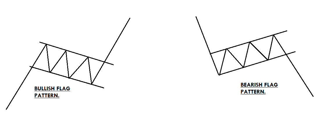
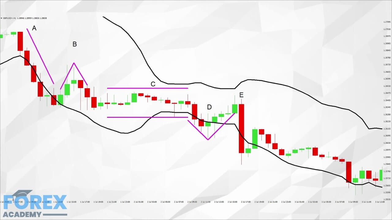
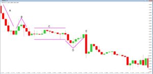
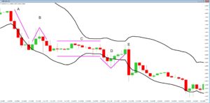
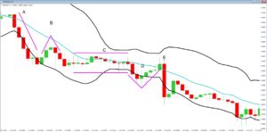
FLAG PATTERN
A flag is a technical chart pattern that appears in a strong uptrend. It is a continuation pattern that consists of a long pole and a downside flag. It is named because of the way it reminds the viewer of a flag or a flagpole. The pattern is used to take the trade with the trend, or it is useful to time your trades. In an ongoing trend, wait for the prices to pull back enough, after that draw the two lines above and below the price action to draw the pattern. The bottom of the pattern should not exceed the midpoint of the flagpole and wait for the breakout to take the trade. In buying trade, stops should be below the entry and go for a brand new higher high.
TRIANGLE PATTERN
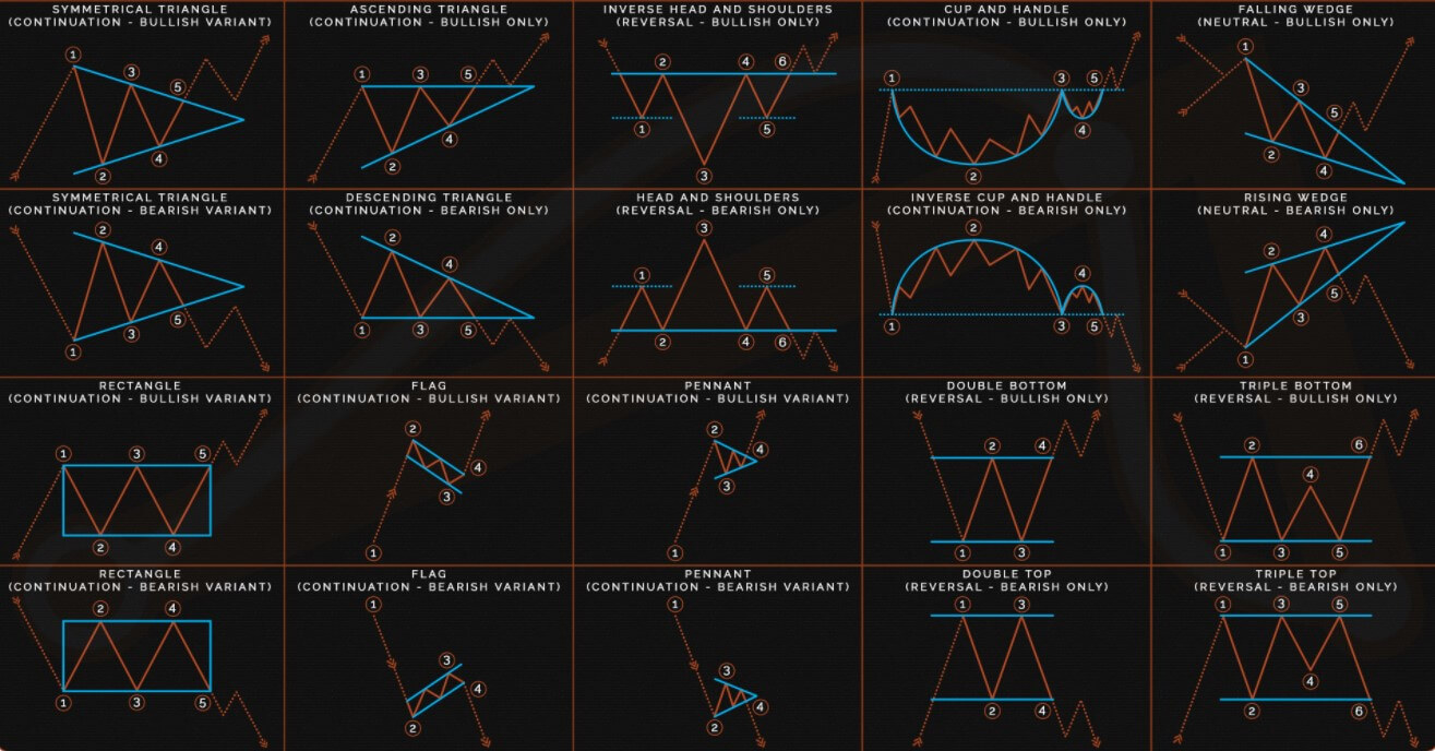
There are so many different types of triangle patterns in the market. The patterns are formed by crossovers of the support and resistance lines. Below are a few triangle patterns we mentioned.
Ascending Triangle (It consists of a static resistance and ascending support) – It is a continuation pattern that appears in an uptrend. The entry should be taken at the breakout of the resistance level.
Descending Triangle (It consists of static support and descending resistance) – This one is also a continuation pattern that appears in a downtrend. The price action moves slowly inside the pattern because both of the parties hold equal power. In contrast, the breakout of the pattern indicates the sellers overtake the show.
Symmetrical Triangle (The support and resistance of the pattern converge at the one point.) This pattern represents the period of consolidation before the price is forced to move in one direction. The breakout marks the starting of the uptrend, whereas the breakdown of the lower line is an indication to go short. So this pattern is also known as a falling and rising wedge pattern.
Expanding Triangle (Both the support and resistance lines are moving away from each other) this one is a very tricky pattern because price action makes new high and new low in each wave. It is very hard to know the direction of the market when the prices move inside the pattern, so always wait for the breakout or breakdown to take the trade.
All of the triangle patterns are only useful to trade after the breakdown or breakout. The price inside the patterns gave no signal of which side they are going to break, so it is better to wait for the breakout to make any trading decision.
CANDLESTICK CHART PATTERNS
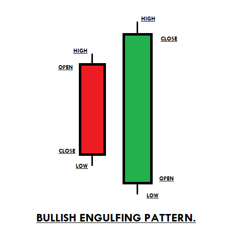
ENGULFING PATTERN
Engulfing is a reversal pattern; there are two types of engulfing patterns. The first is bullish engulfing and the second one is bearish engulfing. Engulfing pattern consists of two candles where the first candle overtakes by the second candle. The bullish engulfing pattern appears at the end of the downtrend; the first candle is red, which completely overtakes the second candle, which is green in colour. The bearish engulfing pattern appears in an uptrend; the first candle is green in colour followed by the red candle, which engulfs the first one. The bearish engulfing signals the bears take over the bulls and expect the new downtrend, whereas the bullish engulfing pattern indicates the bulls take over the bears and expect the beginning of the brand new higher highs. The stop-loss order must be below the pattern in an uptrend formation, and the stops for the downtrend formation must be above the pattern, for booking profits choose the higher timeframe major levels.
SHOOTING STAR AND MORNING STAR
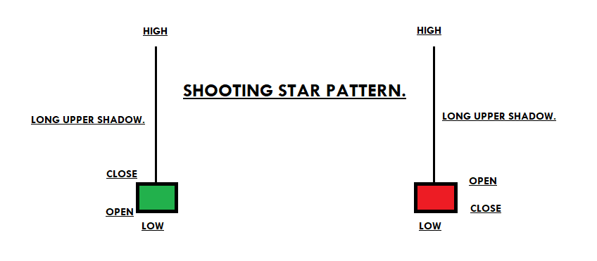
SHOOTING STAR
A shooting star is a bearish candlestick pattern that opens, advances throughout the day, and then closes near the open of the day. In short, it is a long upper shadow, the small body which indicates the selling trades. The pattern opens in an uptrend indicates the buyers are strong, goes higher but closes back at the opening price shows the sellers pressure.
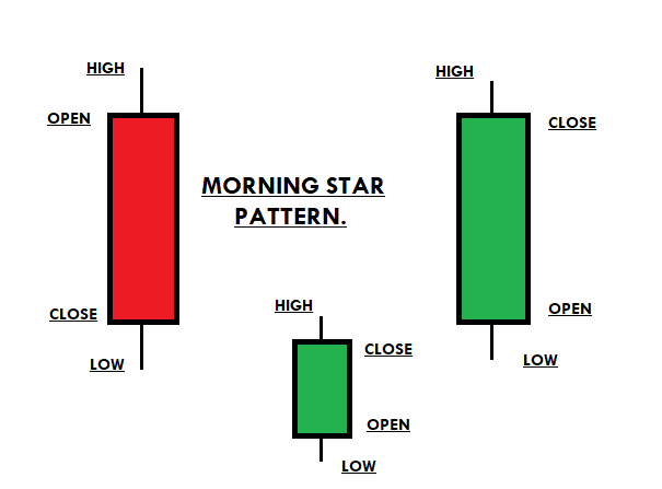
MORNING STAR
A morning star is a three candlestick pattern that appears at the end of the downtrend. It is a reversal pattern that shows the buyers were first in control and the second candle was the fight between both parties and the third candle was green in colour which indicates the buyers won the battle and they are ready for the brand new higher high. Entry should be at the closing of the pattern and ride the uptrend until there are indications of another reversal.
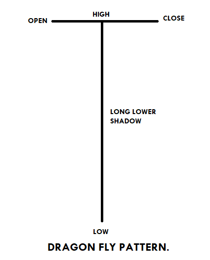
DRAGONFLY PATTERN
Dragonfly is a bullish reversal pattern that indicates the beginning of an uptrend. The pattern consists of a long lower shadow, which means sellers tried to take the prices down, but the buyers came back and closed the prices the same as the opening price. The unique name “Dragon Fly” means the buyers are very aggressive, and now they are all set to print the brand new higher high. Traders should wait for the next candle to close above the lowest price of the previous candle to confirm the Dragonfly pattern. The stop loss should be below the candle, and for taking profit go for a brand new higher high. The pattern doesn’t occur frequently, but when it happens, it often ends up giving more significant buying trades.
FAKE BREAKOUT
A fake breakout happens when the price action breaks the major level and comes back again. When the fake breakout occurred, if you witness any candlestick pattern, then that’s a good sign for you to take the trade in the direction of the established trend.
CONCLUSION
Traders believe it’s not possible to trade the markets without the indicators. But it’s just another myth. There are so many different ways to trade the market, and using candlesticks, chart patterns, fake-outs are just another way. Every trader has its style of trading; some like to trade the indicators, some chart patterns, and another candlestick pattern. Choose whatever the way you want and trade the market. The above-explained ways are the leading technical tools; you can even pair the candlestick patterns with the chart formations to improve the odds in your favour. If you find the fake-out, the candlestick pattern then followed by chart pattern, then the trade even has a higher odds to perform. When the markets prints the guaranteed trades go big and always use the stop-loss orders.
Chartist analysis in forex consists of identifying figures on the price chart, these are usually repeated historically so you can practice in their identification, also they are usually formed in different financial instruments and periods of time, and through them, it is possible to predict with some reliability where the next price movement will follow. It is perhaps the most classic form of analysis in Forex and surely one of the most effective, so your knowledge is always very advisable.
Chartist analysis in forex consists of identifying figures on the price chart, these are usually repeated historically so you can practice in their identification, also they are usually formed in different financial instruments and periods of time, and through them, it is possible to predict with some reliability where the next price movement will follow. It is perhaps the most classic form of analysis in Forex and surely one of the most effective, so your knowledge is always very advisable.
Chartist analysis in forex consists of identifying figures on the price chart, these are usually repeated historically so you can practice in their identification, also they are usually formed in different financial instruments and periods of time, and through them, it is possible to predict with some reliability where the next price movement will follow. It is perhaps the most classic form of analysis in Forex and surely one of the most effective, so your knowledge is always very advisable.
Chartist figures are formed because the market makes oscillations and leaves a “trail” which helps to detect these figures. There are chartist figures that allow confirming the changes of trend, to identify opportunities to enter the market as well as to set objectives in the prices. Chartist figures are more effective in operating in high temporality, although in short periods they usually appear more frequently, also the failures are very recurrent.
Price Pattern in Forex Technical Analysis
The analysis of price movements originated exactly when the price chart appeared. The first graphs were drawn on millimeter paper, and it was then that the first analysts noticed that there were some areas on the graph where the price made similar oscillations at different intervals of time. Traders called them price patterns because the first patterns looked similar to geometric objects, such as a triangle, a square, or a diamond. With the appearance of computer screens and the analysis of longer time periods, new patterns began to appear. Traders use chart patterns to identify trading signals, or signs of future price movements, to enter to trade at the right place.
Chart Patterns You Should Know
“Triangle”
There are several different types of triangles, however, all are based on the same principle. In classical technical analysis, the triangle is classified as a continuation pattern of the trend. This means that the trend that has been on the market before the formation of the triangle may continue after its formation is completed.
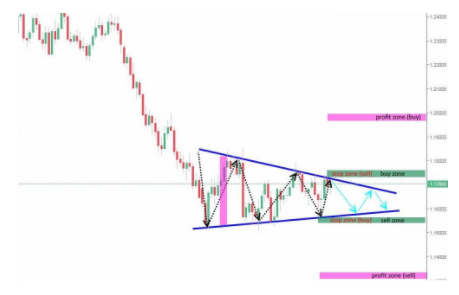
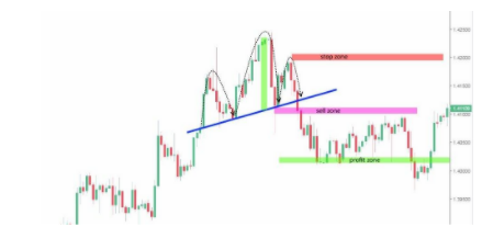
Technically, a triangle is a lateral channel of narrowing that usually emerges at the end of the trend. Basically, the triangle is resolved when the range of price fluctuation decreases to the limit, an impulse arises and the price penetrates one of the limits of the figure, moves away from the rupture. I suggest analyzing the break scenarios both upward and downward in the given example. Although the triangle is the continuation figure, it is no more than a probability, and therefore it is worth considering an alternative scenario.
When trading with a triangle pattern, it makes some sense to open a buying position when the price, having passed the resistance line of the pattern, has reached and exceeded the local highs, marked before the break of the resistance line (buy zone). Expected earnings must be set when the price passes a distance less than or equal to the amplitude of the first wave of the figure (profit zone buy). In this case, a stop loss can be placed at the local minimum level that preceded the breakpoint of the resistance line (stop zone buy).
A sales position can be opened when the price has penetrated the figure support line, reached, or pressed through the local minimum level that preceded the breakpoint of the support line (sell zone). Expected earnings should be set when the price has passed a distance less than or equal to the amplitude of the first wave of the figure (profit zone sell). A stop-loss, in this case, must be placed at the level of the local maximum that preceded the breakpoint of the support line (stop zone sell).
“Double Top”
This pattern is classified as the simplest, so the probability of its effective implementation is somewhat lower than that of other patterns. In classical technical analysis, the double vertex is classified as a trend change pattern. This means that the trend that has been on the market before the formation of the pattern may change after its formation is completed.
The figure represents two consecutive maxima, whose peaks are at approximately the same level. The pattern can be straight and inclined, in the latter case you should carefully examine the bases of the upper parts which should be parallel to the maxima.
In classical analysis, a double vertex works only if the trend is reversed and the price decreases, if the price reaches the third maximum, the formation becomes the triple vertex pattern.
A sales position can be opened when the price has penetrated the figure support line, reached, or pressed through the local minimum level that preceded the breakpoint of the support line (sell zone). Expected winnings must be set when the price has passed a distance less than or equal to the height of any vertex of the figure (profit zone).
“Head & Shoulders”
The figure represents three consecutive maxima, whose maxima are at different levels: central must be above the other two, and the first and third, in turn, must be about one height. However, there are some pattern modifications when the shoulders are at different levels. In this pattern, we must ensure that the central maximum is higher than both shoulders. Another key feature for identifying the pattern is a clear trend line, which precedes the pattern’s appearance.
The pattern can be straight and inclined, in the latter case, you should be careful to check if the bases of the upper parts are parallel to their maxima. The minimums between these maxima are connected by a trend line called the neck.
A selling position can be opened when the price has penetrated the neckline of the figure, reached, or pressed through the local minimum level that preceded the breakpoint of the neckline (sell zone). Expected earnings should be set when the price has passed a distance less than or equal to the height of the central vertex (head) of the figure (profit zone). A stop-loss, in this case, must be placed at the level of the local maximum that preceded the point of break of the neckline or at the level of the vertex of the second shoulder (stop zone).
“Wedge”
In classical technical analysis, the wedge is classified as a continuation pattern of the trend.
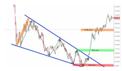
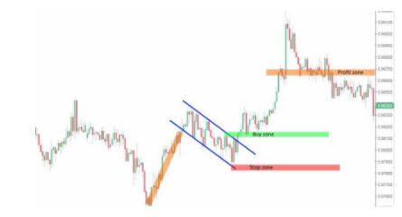
Technically, the wedge, like the triangle is a lateral channel constriction, but another difference between the wedge and the triangle is its size. The wedge is usually much larger than the triangle and sometimes takes months and sometimes years to form. Therefore, in classical wedge analysis, it is usually implemented in the opposite direction to the formation of the pattern itself, in other words, the trend changes. A purchase position can be opened when the price has penetrated the resistance line of the figure, reached, or pressed through the local maximum level that preceded the breakpoint of the resistance line (buy zone).
“Flag”
This price pattern is classified as the simplest, therefore its efficiency depends on numerous factors. In classical technical analysis, the flag is classified as a continuation pattern of the trend.
The pattern indicates a corrective retreat, following the strong directed movement that often looks like a channel, tilted against the prevailing trend. In classic technical analysis, the flag pattern works only if the trend continues its direction. A purchase position can be opened when the price has penetrated the resistance line of the figure, reached, or pressed through the local maximum level that preceded the breakpoint of the resistance line (buy zone). The angle formed between the predominant trend and the flag channel should not be greater than 90 degrees. The flagship channel itself should not revert in price more than half of the previous trend.
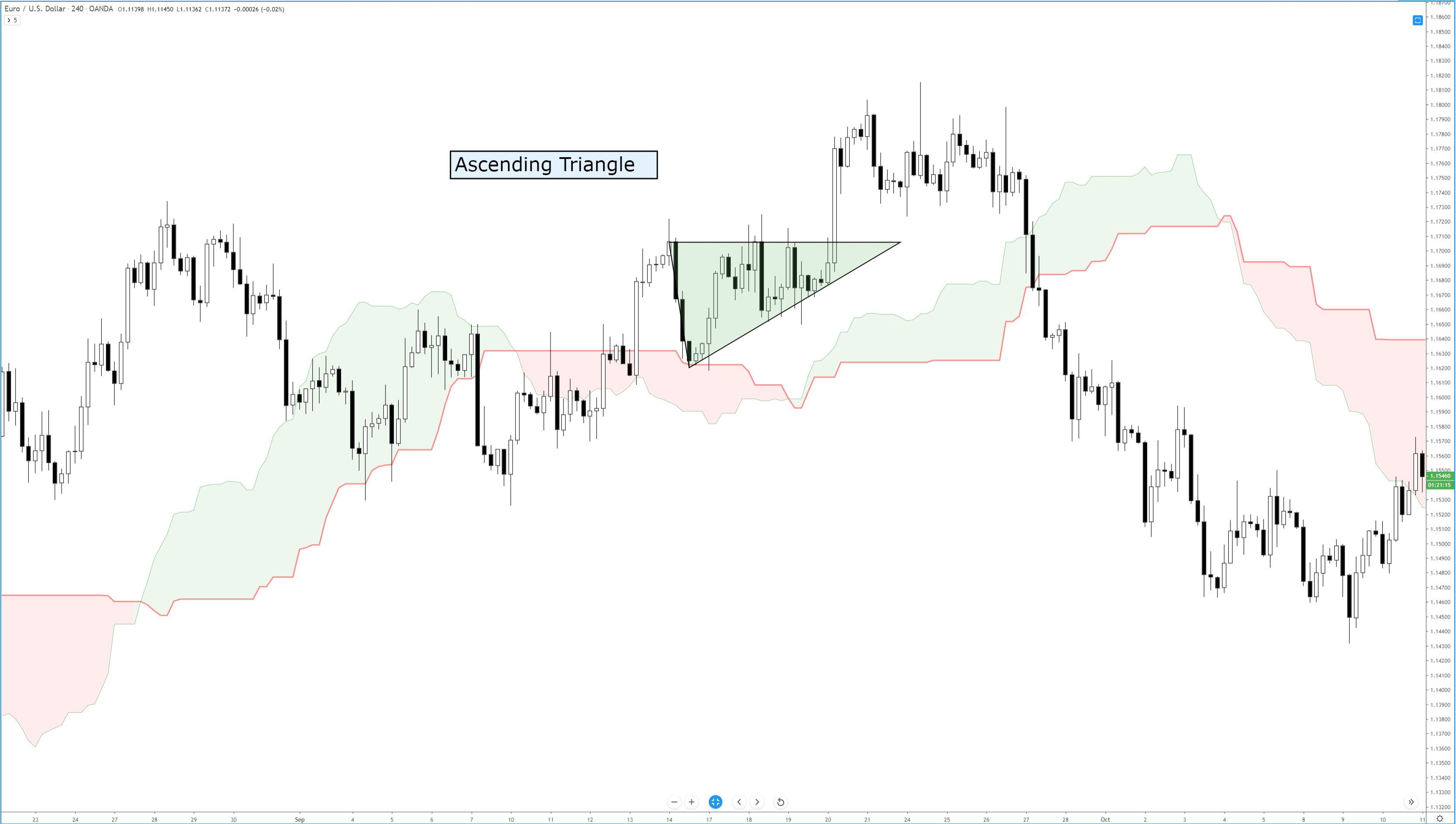
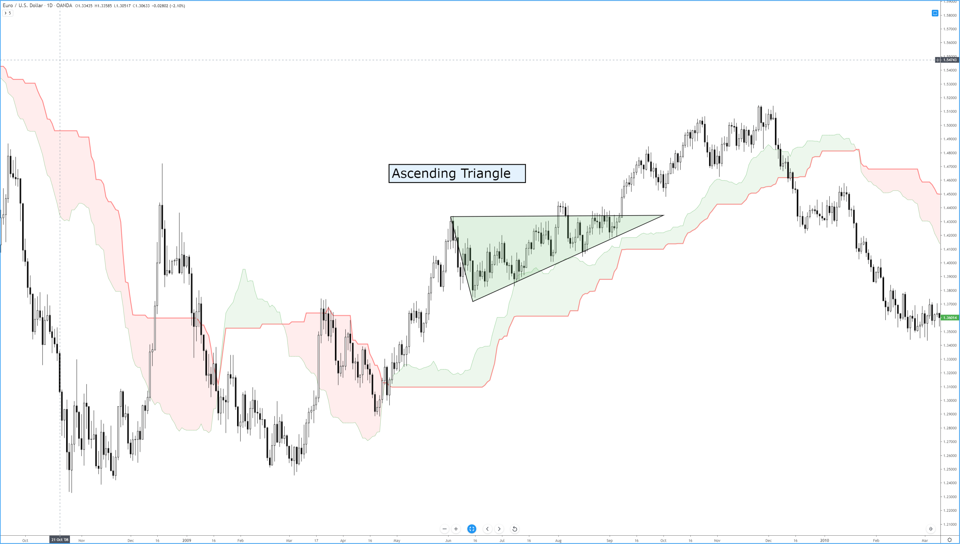
Of all the bullish continuation patterns that exist, few are as sought after as the ascending triangle. Like all triangle patterns, their development and construction are dependent on two trendlines that intersect and form an apex. The two primary identifying conditions of an ascending triangle I a flat, horizontal top and an upward sloping trendline.
Ascending Triangle
In addition to the two trendlines, there is a specific kind of behavior that the candlesticks must perform. The upper trendline and the lower trendline must be touched at least twice. Ideally, and according to Bulkowski, there should not be much open space inside the triangle. The same volume behavior that occurs in other triangles occurs here in the ascending triangle: price often breaks out in the final 2/3rds of the triangle, and volume decreases before the breakout. The psychology behind the formation of the ascending triangle is essential to understand. The pattern represents an apparent battle between longs and shorts. Short traders are under the impression that because the resistance level has been tested and has held, it will remain stronger. Long traders are under the impression that prices will move higher because of the formation of higher lows and an upward sloping trendline. Ultimately, shorts cover very quickly, just before or immediately after the breakout of the upper resistance.
Bulkowski recorded that, in equity markets, the breakout direction of an ascending triangle is upwards 64% of the time. Dahlquist and Kirkpatrick recorded that upwards breakouts occur 77% of the time. Interestingly, the performance of this pattern is roughly average across all patterns – this is contrary to the belief of many traders who self-report a high positive expectancy of upwards breakouts. Dahlquist and Kirkpatrick did warn that there are many false breakouts and that failure rates are between 11% and 13%.
As with any pattern, it is essential to pay attention to price action first and then find tools to help you filter whether an entry at the breakout is appropriate. Additionally, be wary of throwbacks as they are frequent over 50% of the time – many conservative traders wait for a retest of the breakout to confirm a valid break from the ascending triangle.
Sources:
Kirkpatrick, C. D., & Dahlquist, J. R. (2016). Technical analysis: the complete resource for financial market technicians. Upper Saddle River: Financial Times/Prentice Hall.
Bulkowski, T. N. (2013). Visual guide to chart patterns. New York, NY: Bloomberg Press.
Bulkowski, T. N. (2008). Encyclopedia of candlestick charts. Hoboken, NJ: J. Wiley & Sons.
Bulkowski, T. N. (2002). Trading classic chart patterns. New York: Wiley.
I always describe markets as a battlefield… And the evening star candle pattern (also called evening star or evening star) is absolutely related to a battle. On the battlefield, preparation is key. The story begins in feudal Japan about 450 years ago. One of Japan’s three great generals, Oda Nobunaga, is attempting to wrest control […]
I always describe markets as a battlefield… And the evening star candle pattern (also called evening star or evening star) is absolutely related to a battle. On the battlefield, preparation is key. The story begins in feudal Japan about 450 years ago. One of Japan’s three great generals, Oda Nobunaga, is attempting to wrest control […]
I always describe markets as a battlefield… And the evening star candle pattern (also called evening star or evening star) is absolutely related to a battle.
On the battlefield, preparation is key. The story begins in feudal Japan about 450 years ago. One of Japan’s three great generals, Oda Nobunaga, is attempting to wrest control of the fertile rice lands from his enemy. A strong local defensive position and 3 rivers stand in your way. If Nobunaga wants to win, his army must cross the rivers. Once they do, the battle will be on their side. But if your army can’t cross the rivers, it’ll be a bad sign. The army finally manages to cross the 3 rivers and wins the battle. He gets control of new land and more rice, Japan’s strong currency at the time. His legend grows. Well, let us move on to this day…
The Battlefield of the Stock Market
The scene: A stock trader looking at his screens, looking for the perfect time to close a long position. Will the stock price continue to rise? Or will there be a bearish turn? If the bulls finally win the battle, the trader has the option to hold the position for more winnings, like Nobunaga winning the battle in ancient Japan. But if the bass players win, then it’s time to close the position and leave. A sign appears on the chart opposite the trader: the evening star candle pattern of three rivers. The trader knows that the chances of overcoming resistance are slim. Goal met. It’s time to step out of position. The merchant places a sales order. Moments pass. The order is executed and the merchant leans back, grateful for having studied the patterns. Does it seem too dramatic?
In my opinion, learning patterns are a key basis for learning to operate. The names of Japanese candle patterns hint at emotional confusion and refer many times to legends. It makes them more attractive to learn. But they go beyond names and stories. As a trader, learning these patterns will teach you about the psychology of the market. The battle between bulls and bears is psychological. Arm yourself well and you can be victorious. But not understanding the patterns could mean the end of your career as a trader or investor.
What is the Evening Star Candle Pattern?
An evening star candle is a turning pattern. This means that the momentum of a recent trend is slowing down. The evening star candle pattern is a bearish reversal. The upward momentum, controlled by the bullies, begins to lose strength. The star is a period of equilibrium between bullish and bearish with little price movement. Then the momentum changes and the bearings take over.
The first candle has a long body and is bullish: the price closes at a higher price than opened. In this case, in the pattern of stars of the night, there will be a gap until the second candle. This is the star.
The star signals a slowdown in momentum. It has a short body (called spinning top) or none (called Doji). It can be green or red. The most important thing we have to understand is that there is a balance between buyers and sellers.
The third sail is bearish: the opening price is higher than the closing price. The ideal evening star opens from the star to the third candle. The third candle ends abruptly in the body of the first candle.
Note: In the case of the evening star pattern, you should pay more attention to the candle body than to the shade. Shadows are the lines that extend above and below the body of the candle. They represent the trading range of that period. The candle body means the prices between opening and closing. A higher closed green candle that was opened. A red candle closed below the level it opened.
Knowing the Morning Star Pattern
The so-called morning star pattern is precisely the opposite of the evening star candle pattern. We’re talking about a reversal pattern that indicates the shift from a bearish to a bullish trend. As we have seen with the pattern of the evening star, we must detail the existence of three candles with the central sail with a long shadow down that has been bought by the bullies. The third candle is the confirmation candle of the upward turning pattern. Do you want to see the morning star pattern along with a higher volume? It is also a more convincing pattern if it occurs around a support level.
How does the Evening Star Pattern Work?
As I said earlier, the evening star candle pattern is an indication of a trend change. The evening star pattern acts as a visual guide to what happens in investor sentiment. The evening star candle day is the day of indecision between the bulls and the bears. If the third day is a low gap, it may be a good indication to sell a long position. Or you might want to cut short to take advantage of the downward movement.
Benefits of the Evening Star Candle Pattern
All star patterns (yes, there are others, including the morning star pattern) are spin patterns. All represent a deadlock between sellers and buyers. The benefit for you as a trader is that they are predictable. A warning before we look at an example from real life: this is not an exact science. It’s based on experience and study, but that doesn’t mean it always happens. You need to study!
One more caveat: When you look at graphs over different periods of time, you may not see the same pattern.
I used a 1-minute candle in the chart example below. When I looked at the 2-minute candle for the same chart, the pattern was different. It was a bearish wraparound pattern, another spin pattern. It confirmed what I was seeing on the 1-minute candle chart.
What we need to learn from using different periods of candles: perspective can make a big difference in action charts.
Example of Evening Star Pattern
The classic evening star candle pattern has a space between the first and second candle bodies. An ideal night star would also open between the second and third sail bodies. Steve Nison, the creator of the book “Japanese Candlestick Charting Techniques”, clarifies this point in his book. Nison brought Japanese candle graphics to the West. The book is a classic and it is well worth spending time with it if you want to better understand candle graphics.
Three White Soldiers and Black Crows
Three white or green soldiers is a bullish sail pattern. It is used as an indication of a reversal after a bearish trend on a chart. The figure of the three soldiers is a long-bodied candle attainment green or white. They open inside the body of the previous candle and close above the closure of the previous candles. There are usually no long shadows on the sails. The opposite of this pattern of candles is the three black crows. They indicate a reversal of an upward trend.
Three “Inside Up and Down”
Three “Inside Up and Down” is another turn pattern. We might be seeing the reversal of an uptrend or bearish trend. This pattern requires three candles to appear in a specific sequence. In an upward trend turning downwards will be a long green or white candle, then there will be a short red or black candle that closes and opens within the same body of the first candle. The third candle shall be a black or red candle that closes below the closure of the previous candle. In a bearish trend chart that is reversed upwards, the sails will be the opposite.
Importance of Action Indicators
Many traders use technical indicators along with patterns. Combined they can provide powerful information to set up your trading plan. One of the most popular indicators together with the evening or evening star candle is the relative force index (RSI). The RSI indicator measures the momentum to determine if a stock is overbought or oversold. Overbought or oversold conditions, measured by the RSI, indicate a likely turn. There are two reasons to use the RSI with the evening star pattern. Initially to see the daily levels of the RSI indicator in an overbought condition. Then, once you change the timeframe (step #4 below), use RSI to confirm the reversal.
The Evening Star Candle Pattern in 7 Steps
Let’s put this in perspective. If you spend time looking for evening star candle patterns to operate, you might be waiting until it runs. It’s a pattern that doesn’t always sweat. It is very positive to be able to recognize it and even have a plan prepared for those occasions when you see it.
#1 Set the correct chart timeframe: Setting the right timeframe depends largely on your trading strategy. You can (and should) change the deadlines I give you to adapt them to your strategy. You should practice paper trading to prove your thesis. For the sake of understanding the technical analysis of evening stars, imagine you are looking at a longer-term graph. Let’s think we’re talking about a one-year chart with a day candles. You are starting with the longer-term chart to get a general idea of the price action.
#2 Know the opening, maximum, minimum, and closing prices: If you look at a chart with day candles, you’re essentially doing this. You are looking at the daily opening and closing prices (the body of the candle) and the maximum and minimum prices (the shadows or wicks).
#3 Wait until the daily RSI exceeds 70: Many operators consider that a crossing of the RSI above 70 is a clear sign of over-purchase. It is a common strategy used by currency traders.
#4 Reduce the time frame: Once the overbought condition has been identified, with the RSI indicator having a value greater than 70, long-term chart, it’s time to zoom in. A common timeframe for this is the five-minute candle chart. Many traders like it because it is neither too fast nor too slow.
I want to reiterate the difference in graphics when I look at different time frames. While degrading the time frame to the five-minute graph is one way to play this, it’s not an exact science. Remember, RSI is calculated using a certain number of periods; 14 is the most common.
#5 Short sale: Short selling is the option to borrow to sell assets. You can borrow at a very high price and wait for the price to go down. Assuming the price drops, you buy shares at a lower price to return the shares to the broker. This is how some traders approach a market with a bearish trend or a stock with a bearish trend.
Warning: I do not recommend opening shorts for novice traders. It is a risky and difficult strategy. He could get caught in a short lock. That said, let’s look at how the evening star pattern can indicate a bearish reversal and a potential short play. Watch the stock price action you want to sell short. Depending on the time period you are using, watch for actions to rise and the star to appear. But don’t come in when you see the star.
Wait.
Why?
Because first, he wants to confirm the turn. Again, opening shorts is a very risky strategy. You need access to shares for short. All brokers do not have to have the shares to borrow them. You should make sure you have the knowledge action you are performing. Have a plan. Therefore, you should make sure you can find actions short. Then wait until the third candle confirms the pattern. Then the question is to sell and wait for the price to go down.
What can we do if the price reversal does not work as we expect? Follow my rule number one and cut the losses quickly. When you cut short, you lose money if the stock price goes up above the entry price. That’s because he pays more for the actions needed to close his position.
#6 Put a Stop Loss: A stop loss is your preset exit price if the operation goes wrong. You can set electronically established loss limits, but I’m not a big fan of doing this. I put a mental stop. If the price moves too fast, you can go long to your stop loss. This is called sliding. If you use a mental stop-loss, you can customize it. You can find the best price available to buy stocks and close your position. If you are in a short position, the stop-loss must be higher than the entry price. Assuming that everything is correct, at what point do you close the position? Many traders claim that it is convenient to wait until the RSI indicator drops to a level below 30. I would prefer you to have a clear negotiation plan and stick to it. That may or may not involve further use of RSI.
Now is the time to…
#7 (hopefully) Take advantage of your winnings! If your operation went well, enjoy the reward. Set your target before trading. I often aim at 10%, 20%, or 30%. Those trades add up. Remember, my results are unusual. Trading is risky. Keep in mind that you may lose money. Do your own research and never risk more than you can afford to lose.
Conclusion
The evening star pattern indicates a shift from bullish to bearish. Traders who detect this pattern can use it to determine when it is time to exit long positions or enter short trades.
If you are new to forex trading, chart patterns are likely to attract your attention quickly because the trader community is full of praises for this kind of trading. They will certainly seem appealing due to habits developed from a young age when our parents used different shapes and forms to keep us entertained and […]
If you are new to forex trading, chart patterns are likely to attract your attention quickly because the trader community is full of praises for this kind of trading. They will certainly seem appealing due to habits developed from a young age when our parents used different shapes and forms to keep us entertained and […]
If you are new to forex trading, chart patterns are likely to attract your attention quickly because the trader community is full of praises for this kind of trading. They will certainly seem appealing due to habits developed from a young age when our parents used different shapes and forms to keep us entertained and amused. Nowadays, the entire toy industry and children based video games are based on shapes and forms used to provide preschool education to toddlers and children. Our brains are naturally wired to see patterns in every abstract form, be it star constellations or forex charts. We give meaning to randomness. Therefore, who could blame you for jumping on the chart pattern bandwagon once you enter the world of forex trading?
Indeed, some pattern names will easily trigger childhood memories that instantly attract you to explore more about pattern trading: triangle, wedge, rectangle, flag, and pennant. Some of them are appealing enough, such as head-n-shoulders or cup-n-handle. It just sounds like fun and games, and why not have some of it while trading. To make things more serious, most traders will tell you that it works and they will provide you with an abundance of examples. But the question is: have you learned to lose fun games when you were a kid?
The question is posed because there is not much information available on when chart patterns are not working. In reality, chart patterns supporters will show you examples when chart patterns have already worked but will rarely share the failed stories on using patterns that have completely misled them. The first instance would obviously create an image of a prominent trader, while the latter would discredit them and portray them as a showoff. Therefore, psychology plays a significant role in chart pattern trading as the availability of successful examples plays hand in hand with the trader’s inclination and ability to boost self-confidence. Reliance on the limited information that is available to the narrow circle of traders and a strong belief in skills that provide an advantage over the competition will eventually lead to overconfidence. Such a mindset represents a perfect stage for doubtless use of chart patterns as successful examples visible only in the aftermath is seen as an actual confirmation of self-confidence and perceived ingenuity. This fact is your first red flag when considering chart patterns as your go-to strategy in forex trading.
It is also important to keep in mind that the overwhelming majority of traders are impressed by chart patterns, which is why new traders are attracted to this kind of trading. It is a classic example of social learning theory that can be summarized as the acquisition of new behaviors by noticing and imitating the behavior of others in the group. That same theory is proven in social experiments in which a random person not aware of the experiment is acting the same way as the group participating in the experiment, without even knowing the reasons for such behavior and regardless of how ridiculous that behavior may be. Simply put, chart patterns should not be utilized without any doubts just because the overwhelming majority is doing so, according to the contrarian traders’ opinion. This resonates as the second red flag especially if you put in the perspective that the majority of traders are on the losing end of the forex market.
As a beginner, it is not easy to spot a forming shape when looking at charts. In fact, you have to draw it yourself and there are no clear instructions on how to do it. Line drawing can cause a lot of frustration, consume much of the precious time, and requires plenty of creativity. You are bound to make mistakes, redraw numerous lines and shapes and it still does not guarantee success. A good example that demonstrates drawing patterns is a matter of frustration rather than efficiency is drawing trend lines. As you may know already, traders analyze charts in numerous different manners and therefore see trend lines arising at different points. Therefore, your decision on breakouts and entry points will differ from other traders and chances are that the same is applicable to drawing chart patterns. There is simply no consistency in drawing patterns. When the first red flag is added to the equation, the fact that chart patterns work perfectly for others makes us question our own abilities and we quickly start blaming ourselves when the drawn patterns are not giving results.
Finally, it is not shapes and forms that move the prices but the big banks reacting to the retail traders. None of them are putting effort into creating triangles and wedges on the charts. On the contrary, they are bound to form eventually as a natural process of market movements. Their natural formation is not a clear indicator that prices are going to take a direction predicted by the pattern, despite the time amount invested in identifying the pattern. The reality is that the prices still have even odds of going one way or another, and there are more systematic ways to connect the dots that give us a higher chance of success than chart patterns.
Forex trading is not universal science and many different strategies and approaches could be used – and even developed – by traders. Those who develop unique trading systems based on evidence that demonstrate consistent results are more likely to achieve success, simply because they start to trust the process over time. In the process of building their exclusive trading system, traders develop a greater understanding of arising issues and use distinctive rationale thus dealing with market obscurities more effectively. Such traders do not waste time identifying and drawing shapes nor do they adjust their skills and knowledge to the chart pattern system that has not been empirically proven.
Although chart patterns are not supported by practical evidence that would confirm their (in)famous reputation, the red flags pointed out in this article represent just one school of thought. There is no need to change the system heavily relying on chart patterns that yield profits, as it certainly is a powerful tool for those traders who found the winning formula. Such traders may have a strong argument on using chart patterns; however, they cannot draw the lines and shapes for all the traders who just can’t get it right. And it is no surprise overwhelming majority struggles with chart patterns since there is more evidence available on why chart patterns do not work in practice. Once caught in its web, it is difficult for traders to break away from the habit of identifying shapes on the chart. Moreover, they tend to modify their systems and overthink when they spot a shape on the horizon. In an effort to avoid this trap, any trader should eventually pose the same question when getting lost with chart patterns: would I rather trust my own work and judgment or follow the signs along the way?
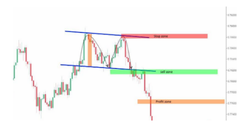
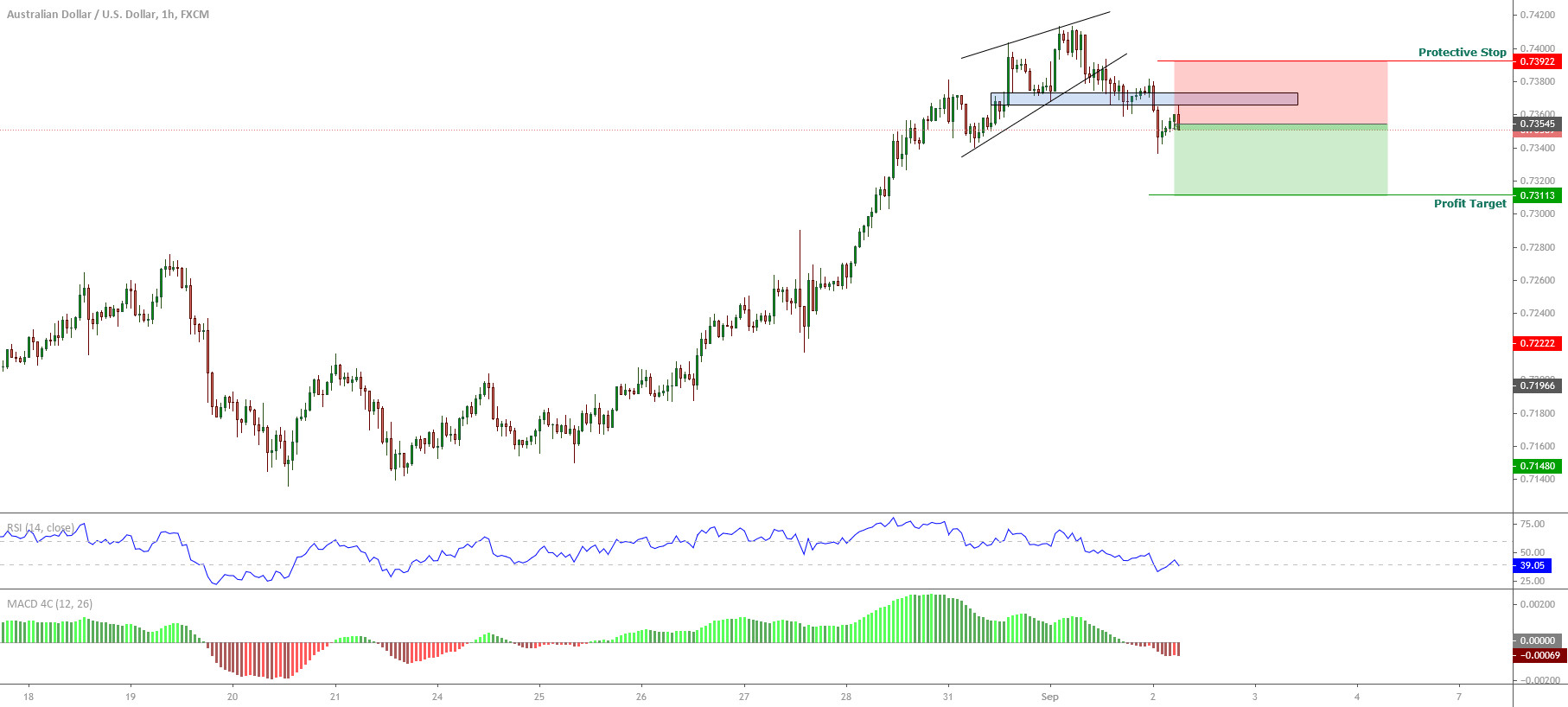
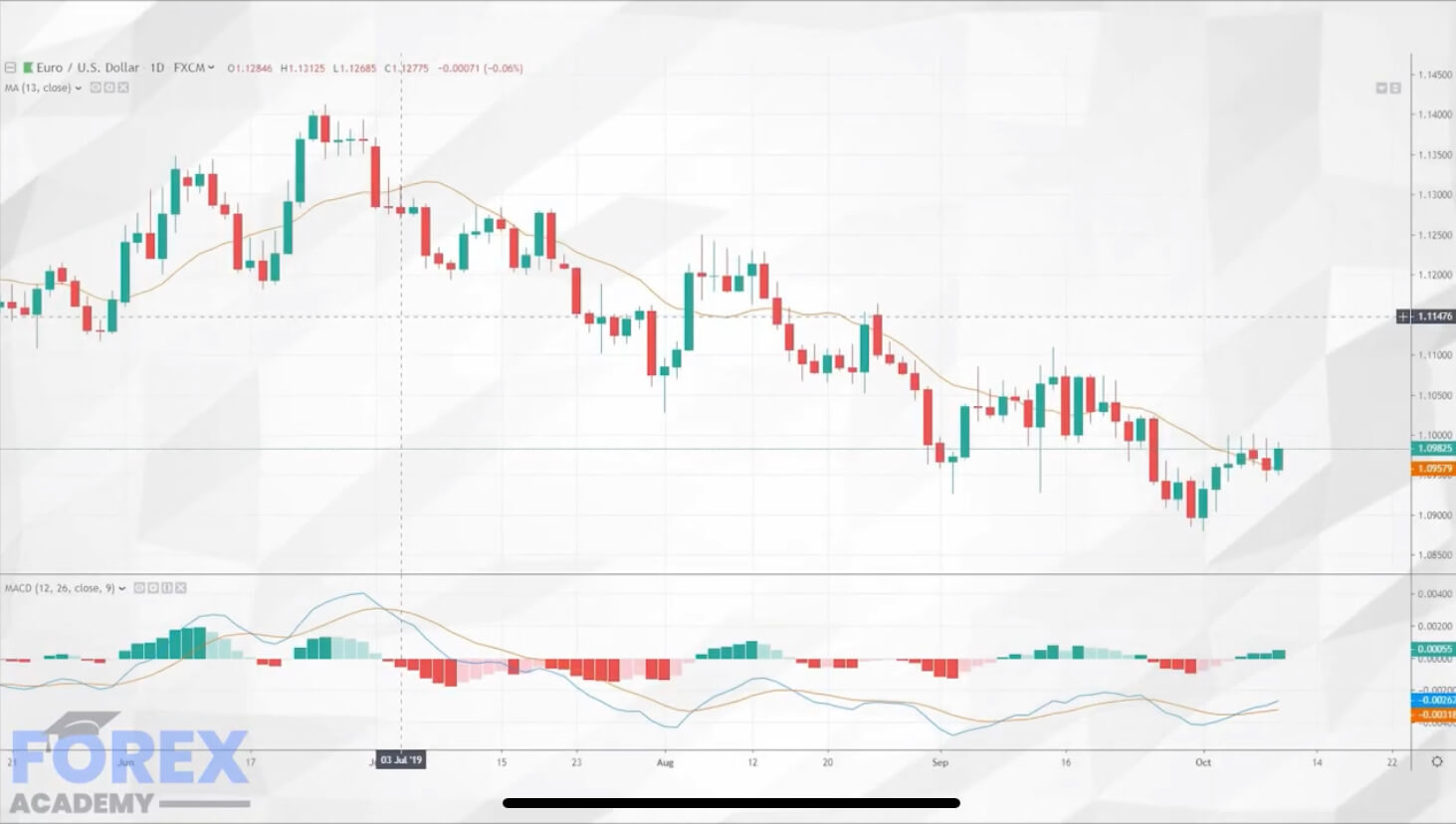
The AUDUSD pair, in its hourly chart, exposes a downward sequence after surpassed the psychological barrier of 0.74 on the Tuesday trading session. In the same way, the re-test and bounce of the U.S. Dollar index at 91.75, the lowest level since mid-May 2018, lead us to expect further movement in favor of the Greenback for the following trading sessions.
From the next chart, we observe a downward movement after the breakdown of an ascending wedge pattern. The consolidation below the last relevant swing at 0.7365(blue box) and the RSI oscillator moving below level 40 confirms the intraday bearish bias that should lead the coming sessions.
The movement below the level 0.7365 carries us to weight bearish positions expecting intraday profits at 0.7310, which corresponds to the last consolidation level of August 28th.
Our invalidation level is located at 0.7392, which corresponds to the first congestion zone after the first drop of the ascending wedge pattern.
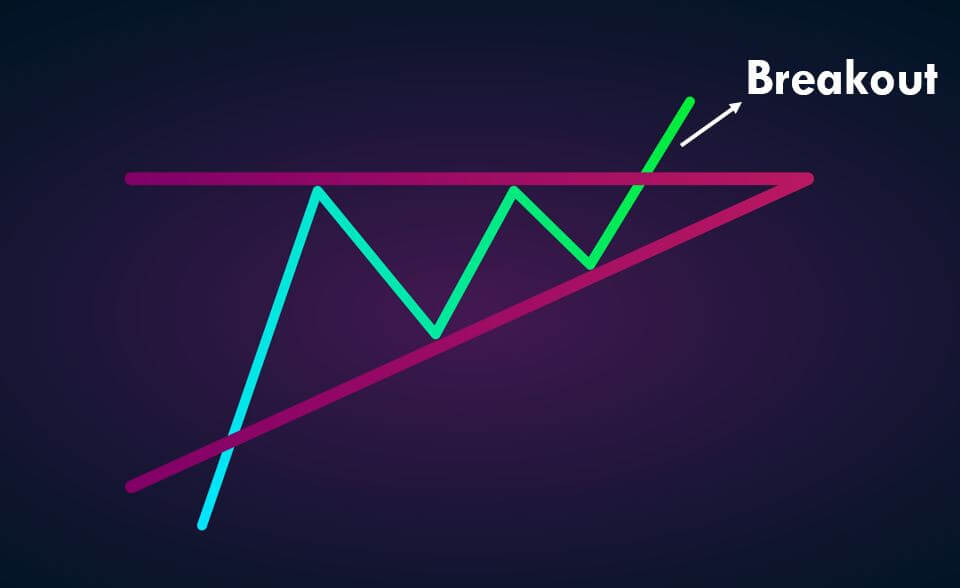
Breakouts trading and trading the triangle chart pattern are two different trading tools. A breakout occurs when the price goes above or below the significant support resistance area. It indicates that the price is ready to move in the direction of the breakout, and any entry near the breakout will be fruitful. This is the reason why breakout trading is considered a leading method of trading in the industry as it helps the traders to anticipate the trend and ride the potential moves.
On the other hand, the Triangle is a technical chart pattern. The best description of the triangle chart pattern is as a horizontal continuation chart pattern, which helps the traders in finding the best entry on the price chart. At the beginning of the pattern, it is widest, and as the market continues the ranging move, the price starts to move in a limited, narrow range, and as a result, we witness the point of the Triangle on the trading chart.
The Trading Strategies
There are two types of triangle chart patterns. The first one is ascending chart pattern, and the second is the descending chart pattern.
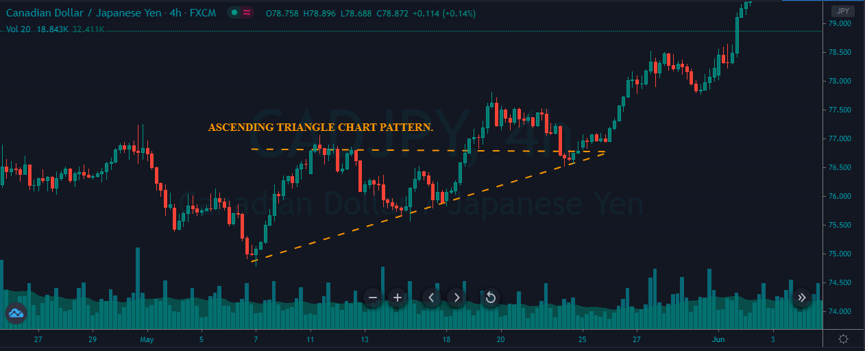
Ascending Triangle Chart Pattern
Ascending Triangle is a bullish chart pattern that helps traders to take buy trade in an ongoing uptrend. The image below represents the formation of an Ascending Triangle chart pattern in the CAD/JPY Forex pair.
The image below represents our entry, exit, stop-loss, and take-profit in the CAD/JPY forex pair. As you can see, in an uptrend, when the price broke above the chart pattern line, it is a sign that the buyers are strengthening. Therefore, if the price is holding above the support line, it is an indication for us to go long in this pair.
Right after our entry, we can see that the price smoothly ran towards the north, and printed a brand new higher high. We can close our trade based on any nearest support area, and we also can use any indicator for the exit. The stop-loss order was placed just below the entry. In a strong trending market, the smaller stops are good enough to ride the trend.
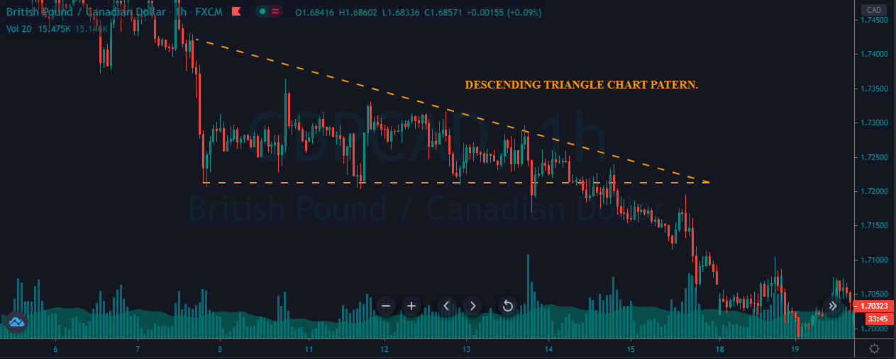
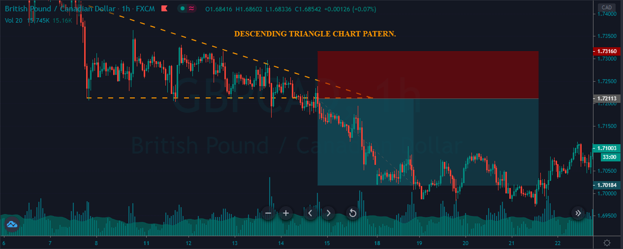
Descending Triangle Chart Pattern
The Descending Triangle is a bearish chart pattern that helps traders in taking sell trades in an ongoing downtrend. The image below indicates the formation of a Descending Triangle pattern in the GBP/CAD Forex pair.
The below price chart of the GBP/CAD pair represents our entry, exit, and stop-loss. In a downtrend, when the price breaks below the support area, it’s a sign that the strong buyers failed to push the price higher, and any hold below the resistance line is an indication to go short. Soon after our entry, price blasted down south, printing a brand new lower low.
The descending Triangle is simple and easy to trade Forex chart pattern. Most of the time, this pattern offers excellent risk to reward entry trades. So when you see the pattern on the price chart, don’t forget to scale your position for more significant gains.
That’s about trading the ascending and descending Triangle chart pattern breakouts. Take the below quick quiz before you go. Cheers.
The fundamental question that any technical investor asks it is where a trend begins and ends? The final aspiration of the analyst is to identify the start of a new market direction as early as possible, enter the market, and make money with the trend.
A technical tool that could aid in the reversal trend identification process is the reversal chart patterns, which we will review in this educational article.
Three-Point Patterns
Three-point patterns are chart formations that can be broken into two categories, identified as reversal and continuation patterns. But, in this regard, the technical trader should consider that sometimes reversal chart formations may act as continuation patterns.
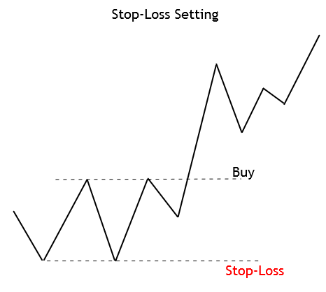
Stop-Loss Setting: In general terms, the stop-loss level should be located above (or below) of the nearest peak or valley of the entry-level of the chart formation.
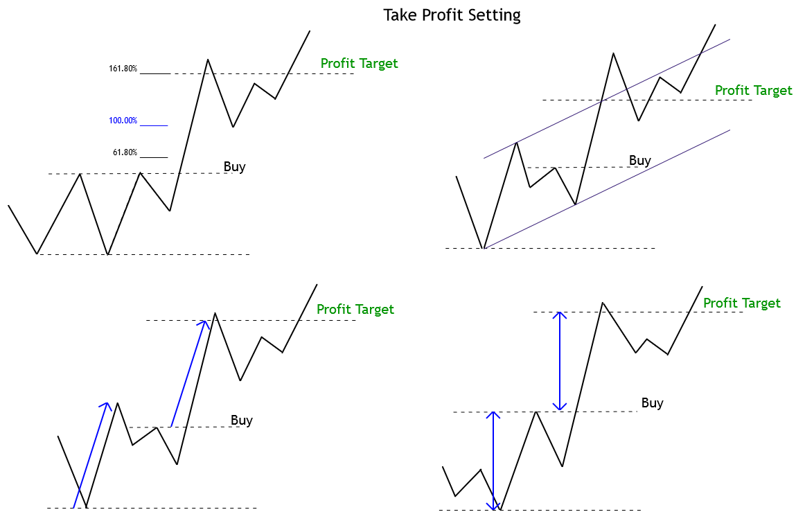
Take Profit Setting: There is a broad range of methods available to the technical trader to establish a profit target level. Some of the options to establish this level are:
Trailing Stop Use: A trailing stop is an added method to protect profits. The trail stop advances as the move progresses in favor of the trade, but the stop level holds during retracements. This method not always improve the results, although it is an excellent psychological anchor. The downside of using trailing stops, however, is that it could generate a premature closure of the trade, thus not allowing a trade to mature properly while the current trend is still progressing.
Classical Three-Point Patterns
In the technical analysis literature, there exists a wide variety of chart patterns. However, both Thomas Bulkowski, as Fischer and Fischer, agree on a reduced group of trend reversal patterns as the best indicators of a reversal. These are identified as follows.
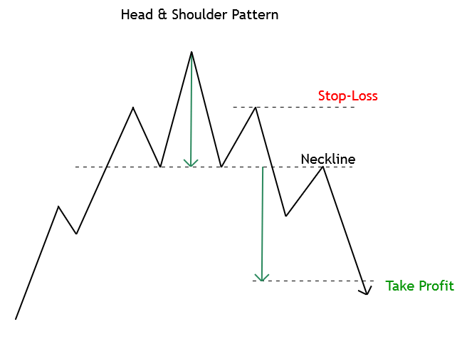
Head and Shoulder Pattern: The H&S pattern is the most popular trend reversal pattern. H&S tends to appear regularly in the financial charts. However, in some cases, the H&S formation fails, and the market action continues developing with its previous trend. An ideal Head and Shoulder pattern should have the right shoulder at the same level as the right shoulder.
A market entry might be taken once the price action breaks and confirms the close below (or above) the neckline. The stop-loss should be placed above the second shoulder. The profit target level is assumed to be placed at an equivalent distance taken from the head to neckline, and projected from the breakout level.
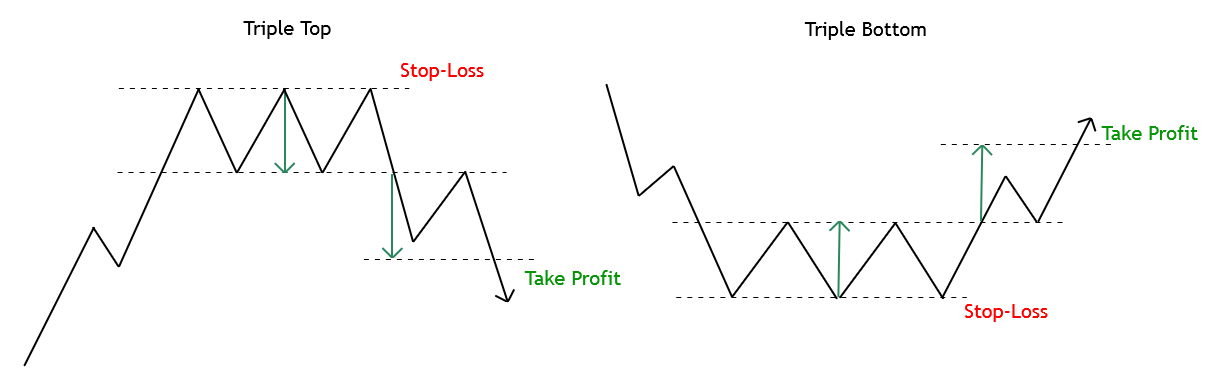
Triple Top and Bottom: These formations rarely appear in financial markets. However, when they do, they tend to be profitable.
The entry signal is to be set once the price breaks and closes above (or below) the top (or the low) price range. The stop-loss level should be placed below (or above) the triple top (or bottom) range. As a profit target, it is recommended a range equivalent to the length of the high and low, projected from the breakout level.
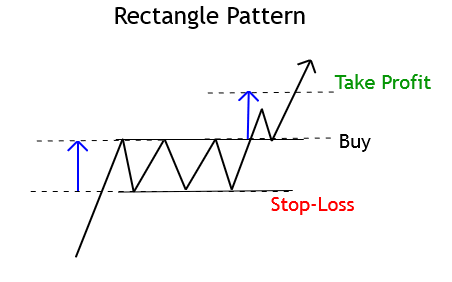
Rectangle Pattern: In this formation, the price moves between two parallel trend-lines that progress horizontally. A trade signal will trigger after the price breaks and closes above (or below) the rectangle range.
A conservative way to confirm the entry signal consists of waiting for the closeout of the rectangle formation range. The stop-loss and profit target levels hold the same arrangement as in a triple top and bottom pattern.
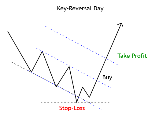
Key-Reversal Days: Although a Hammer Candlestick pattern offers poor performance, it tends to increase when the price action develops a hammer in a third peak or valley at the end of a fast market.
This pattern does not have any specific entry setup; however, Fischer and Fischer considers that for the pattern to be considered, the shadow’s length of the hammer should be at least three times its body.
The stop-loss should stay below (or above) the low of the key-reversal day. The profit target level may be set at the same distance as the previous trading range.
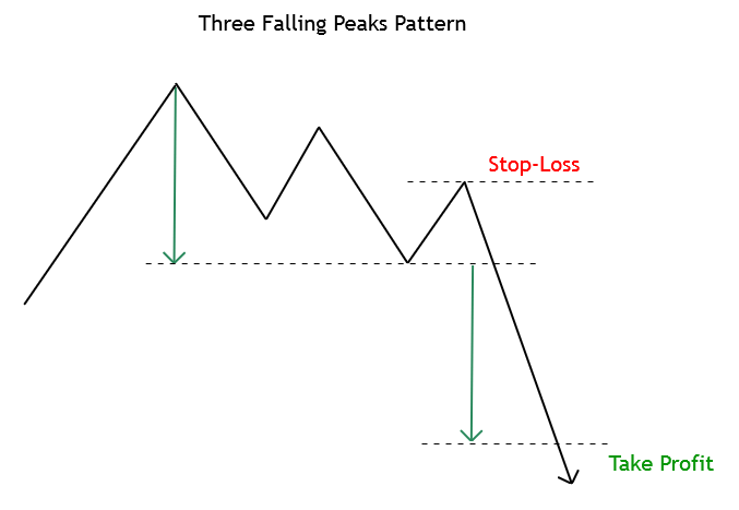
Three Ascending Valleys and Three Descending Peaks: These formations are usually the most reliable three-point patterns.
The essence of these formations, higher (or lower) highs and lows, indicate the continuation of the trend. Generally, a long position signal will trigger if the price rises above the highest peak and a short position when the price settles below the lowest valley.
The stop-loss should be located above (or below) the recent peak (or valley.) Finally, the profit-target level should be set at the equivalent distance of the previous range projected from the entry-level.
Triangles:Triangle patterns shows three basic variations, symmetric, descending, and ascending. The symmetric triangle could be both a reversal and a continuation formation; however, the ascending and descending triangles usually are continuation patterns.
The entry signal happens when the price breaks the triangle base-line. A stop-loss order may be located above the triangle top. In the opposite case, the protective stop should be placed below the triangle.
As profit-target level, a range from the highest to the lowest level of the triangle can be projected from the breakout level.
Conclusions
The identification of the beginning of a new trend and how to make money from it has been the primary investor’s quest since Charles Dow’s era. Three-point patterns are useful tools not only to identify trend reversals but also to recognize continuation patterns.
In this context, Bulkowski’s work cited by Fischer and Fischer provides a useful statistical study, illustrating the failure rate of a broad range of chart formations. For example, the rectangle top pattern when the price breaks up has a 2% failure rate. On the other hand, the top key-reversal pattern has a 24% failure rate.
Lastly, Bulkowski’s ranking study could be a powerful tool for the technical trader, seeking ways to reduce the risk of his market entries. In this regard, identifying the patterns and their execution requires practice and confidence when placing the order on a breakout.
Suggested Readings
Fischer, R., Fischer J.; Candlesticks, Fibonacci, and Chart Patterns Trading Tools; John Wiley & Sons; 1st Edition (2003).
Bulkowski, T.; Encyclopedia of Chart Patterns; John Wiley & Sons; 2nd Edition (2005).
In our previous articles, we had reviewed several technical formations that render signals for potential market-entry setups in a trend reversal context or trend continuation.
In this educational article, we will review the characteristics of the double top and double bottom pattern.
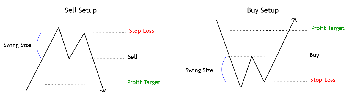
The Nature of Double Top and Bottom
The double top and double top formations are the most popular trend reversal technical patterns in financial markets. These patterns characterize themselves by developing an internal “M” and “W” structures on double tops and double bottoms respectively.
Considering the fractal nature of financial markets, the technical trader can detect these formations in any timeframe, from intraday chart to monthly range.
The double top formation tends to be tough to identify, especially if the second peak is higher than the first one. This situation occurs because the technical trader could be waiting for the uptrend continuation or a bullish trap.
The Setup Rules
The price action will generate an entry signal if the price breaks and closes below (or above) the swing between both peaks (or valleys), as shown in the following figure.
The stop-loss order will take place above the last high (or low); this distance between the entry-level and the previous top (or bottom) is known as the swing size, as illustrated in the last figure.
The double top/bottom pattern holds an easy way to identify the profit target level. The technical rule says that if the swing size is 50 pips, the profit target will locate at 50 pips from the entry-level.
The Behavior of the Double Top and Bottom Formation
Thomas Bulkowski, in his “Encyclopedia of Chart Patterns,” described the performance of double top and bottom considering some shape variations as a rounded peak or a spike.
In general, Bulkowski reveals that on average, the break-even and failure rate of the double top pattern is 11.5%, while the percentage of break-even and failure of double bottom is 6.5%. However, the double top formation tends to reach its price target 71.5%, while the double bottom tends to strike its target 51.25% of times.
Bulkowski summarizes its finds stating that some variations of double top and bottom patterns with a narrow range perform better than those that show a wide one.
Conclusions
In this educational article, we reviewed the essential reversal formation known as the double top and double bottom pattern. The setup studied provides the technical trader a one to tone risk to reward ratio, which could be increased as the trade advances in favor of the trend.
In the next article, we’ll review the use of Fibonacci tools as retracements and extensions to identify trade opportunities.
Suggested Readings
Fischer, R., Fischer J.; Candlesticks, Fibonacci, and Chart Patterns Trading Tools; John Wiley & Sons; 1st Edition (2003).
Bulkowski, T.; Encyclopedia of Chart Patterns; John Wiley & Sons; 2nd Edition (2005).
In our previous educational article, we presented a set of trend reversal patterns, which allowed the investor to participate from the beginning of a new trend. Sometimes, however, for various reasons, the investor doesn’t join the latest trend. When this situation occurs, a continuation pattern may present an opportunity for the investor to join and make an entry to the trend in progress.
In this educational article, we’ll present a set of continuation patterns that help traders to time new trades in the direction of the established trend.
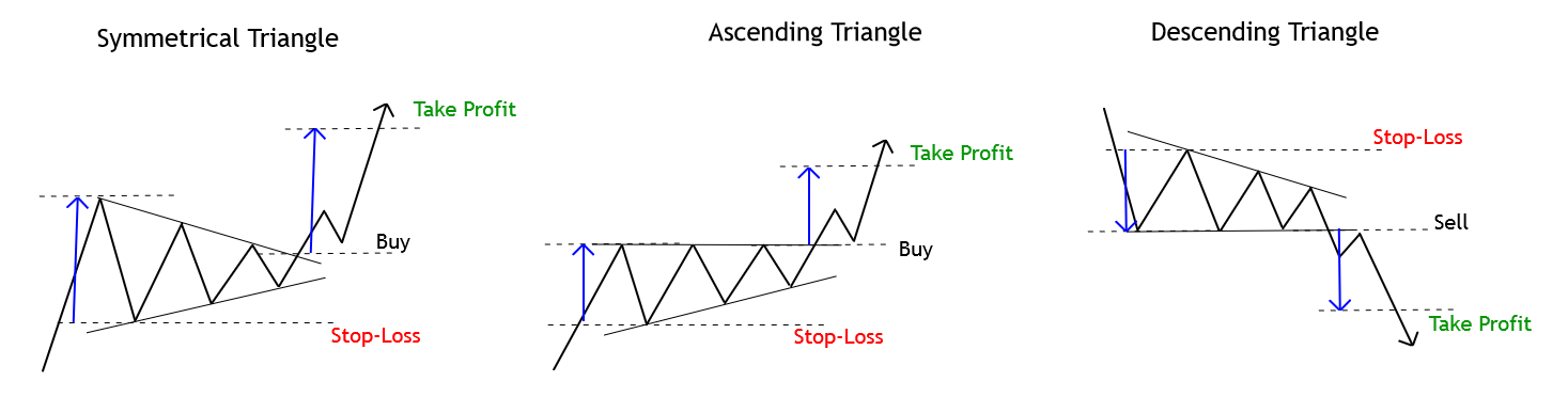
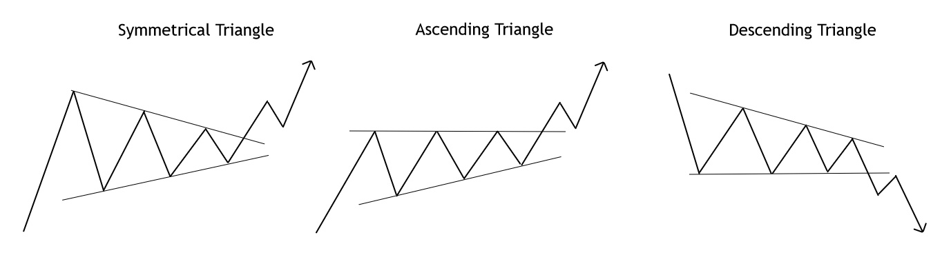
Triangles
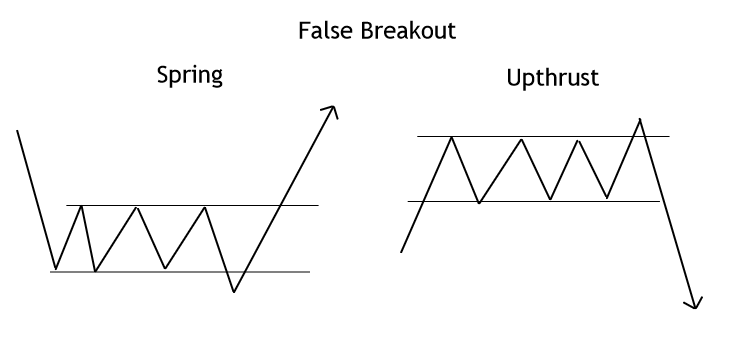
There are three basic types of triangles: symmetrical, ascending, and descending. A triangle pattern must contain at least two peaks and two valleys; however, considering the odds of a false breakout, in conservative trading, the investor should wait for the third peak (or valley) to complete and be able to recognize two valleys (or peaks) in the pattern.
The symmetrical triangle is characterized by having two converging trend lines. In a bull market, a buy-side position will trigger once the price breaks and closes above the upper trend line. The confirmation of this setup is given by a close above the last peak preceding the breakout.
On the ascending triangle, the upper trendline is horizontal and represents a short-term resistance, while the baseline is an ascending dynamic support. A market entry will be activated once the price breaks and closes above the horizontal guideline.
The descending triangle is a bearish continuation pattern in which the base guideline is short-term support, and the descending upper trendline acts as a dynamic resistance. A sell-side signal will rise once the price break and closes below the horizontal guideline.
The initial profit target corresponds to the range of the bigger height of the triangle pattern projected from the breakout level in the trend direction.
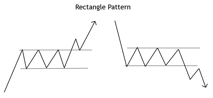
Rectangle Pattern
The rectangle formation generally acts as a continuation pattern; however, it can sometimes act as a reversal pattern when the price action develops a triple top or bottom structure. The next figure represents the rectangle pattern breakout.
A buy-side signal will arise if the price breaks and closes above the resistance, in a bear market, a sell-side signal will trigger once the price breaks and closes below the support of the sideways formation. An initial profit target level will be the amplitude of the rectangle pattern. Investors should be alert for false breakouts and set propper stop-loss levels and breakout confirmation rules.
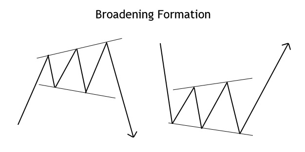
Broadening Formation
The broadening pattern is a complex formation difficult to trade due to its divergent guidelines expands across time as an expanding triangle. The following figure illustrates the broadening pattern.
In a conservative market positioning, the investor should consider that this formation tends to appear at the end of a trend. On the other hand, investors should also wait for the completion of three peaks or valleys, and then the breakout and close above or below the previous high or low. Reward/risk ratios are a handicap in these formations, as the invalidation level tends to be far away from the entry levels.
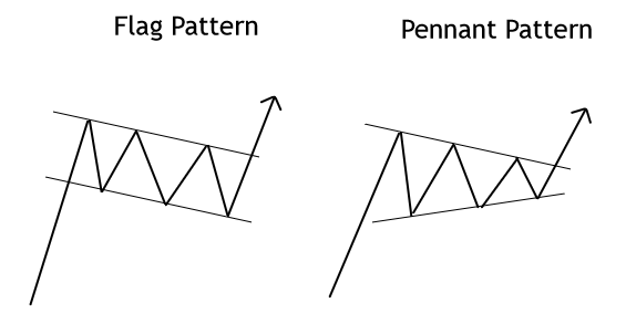
Flag and Pennant Pattern
The flag pattern is a technical formation that goes against the prevailing trend that tends to retrace up to fifty percent of the previous movement. To trade this formation, the investor should wait for the flag structure to complete its three peaks or valleys depending on the last move.
A buy-side position will trigger once the price breaks and closes above the descending dynamic resistance. The initial profit target will be the price range of the previous upward move. A sell-side position will show up when the price completes three peaks and breaks and closes below the lower line of the flag.
The pennant pattern looks similar to a symmetrical triangle, but the pennant takes less time than a symmetrical triangle. A bullish position will be valid if the price completes three valleys and then breaks and closes above the pennant’s upper guideline. Similarly, a bearish trade will emerge once the price breaks and closes below the lower trendline of the pennant formation.
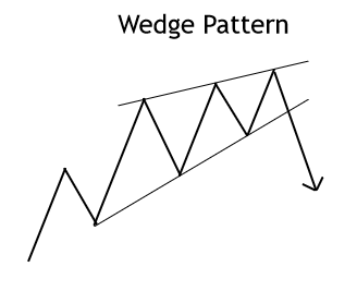
Wedge Pattern
The wedge pattern is a technical formation that looks like a symmetrical triangle moving with the primary trend, but whose outcome is mostly against it. In consequence, an ascending wedge is a bearish formation, and a descending wedge is bullish.
In a bullish wedge formation, the investor should wait for the three peaks to be completed before deciding a short position entry. The initial profit target will be defined by the range of the broadest side of the wedge (between the upper and lower guideline).
In a bear market, the entry setup requires that the technical formation completes three valleys before a buy-side order could be established.
Conclusions
In this educational article, we presented a set of chart patterns that could provide to the chart patterns’ investor a group of strategies to entry and exit setups from the market.
Trend-follower traders should remember that in financial markets, trends show up merely about 30%. In this context, continuation patterns provide opportunities to join the trend when it is already in progress.
In the following article, we’ll present a set of guidelines to use trendlines and trend channels to create a trading strategy.
Suggested Readings
Fischer, R., Fischer J.; Candlesticks, Fibonacci, and Chart Patterns Trading Tools; John Wiley & Sons; 1st Edition (2003).
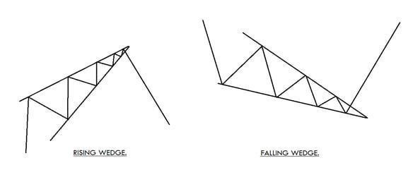
The Wedge is a technical chart pattern that is commonly used by the traders, market technicians and chartists to find the upcoming market trend. This pattern is always formed at the bottom/top of the trend, indicating a potential change in the market’s direction. In short, the Wedge is a trend reversal pattern. One key benefit of the Wedge pattern is they it is comparatively easy to identify on the price charts. This pattern is traded by most of the technical traders as it provides precise entries and exits.
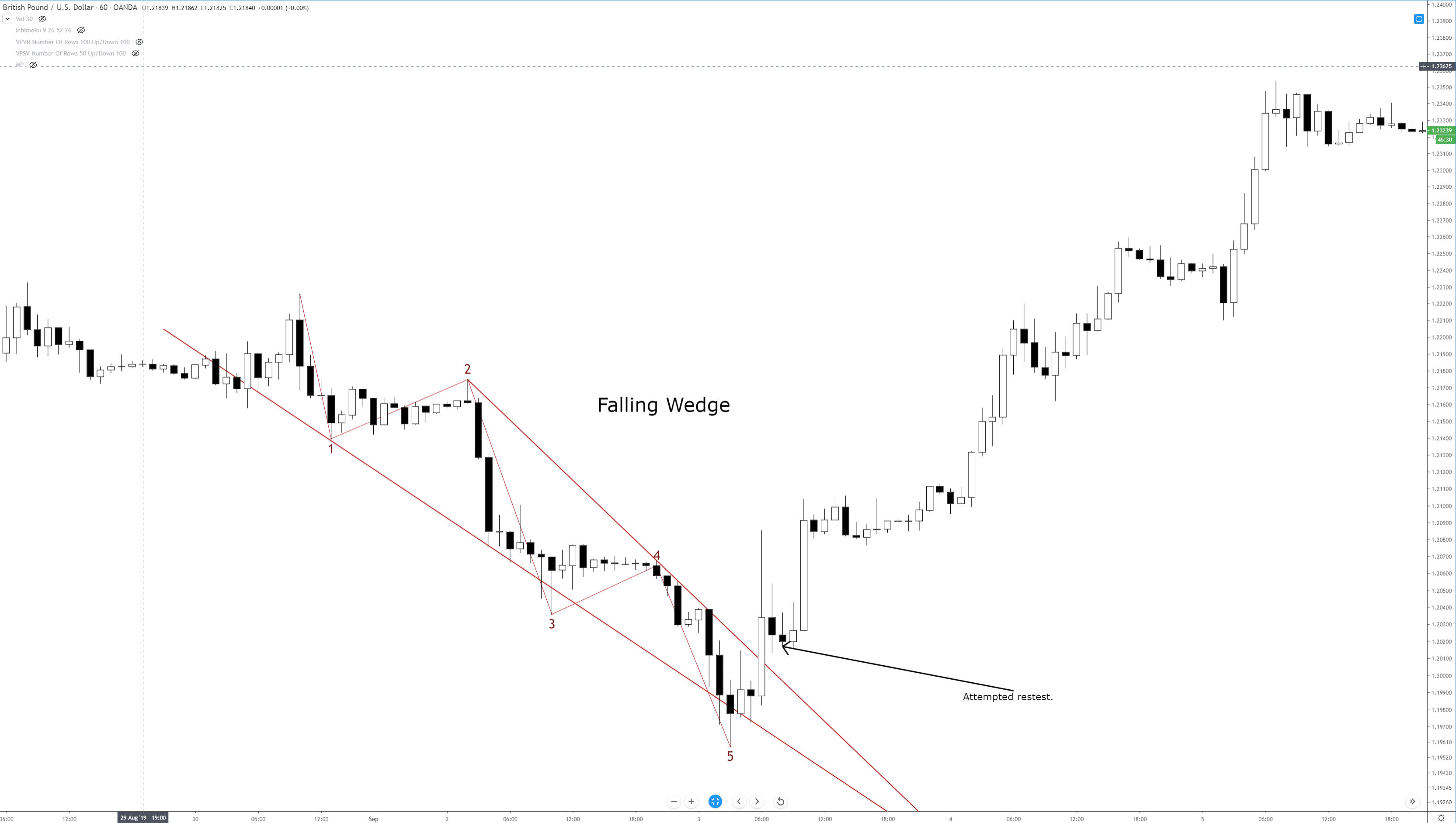
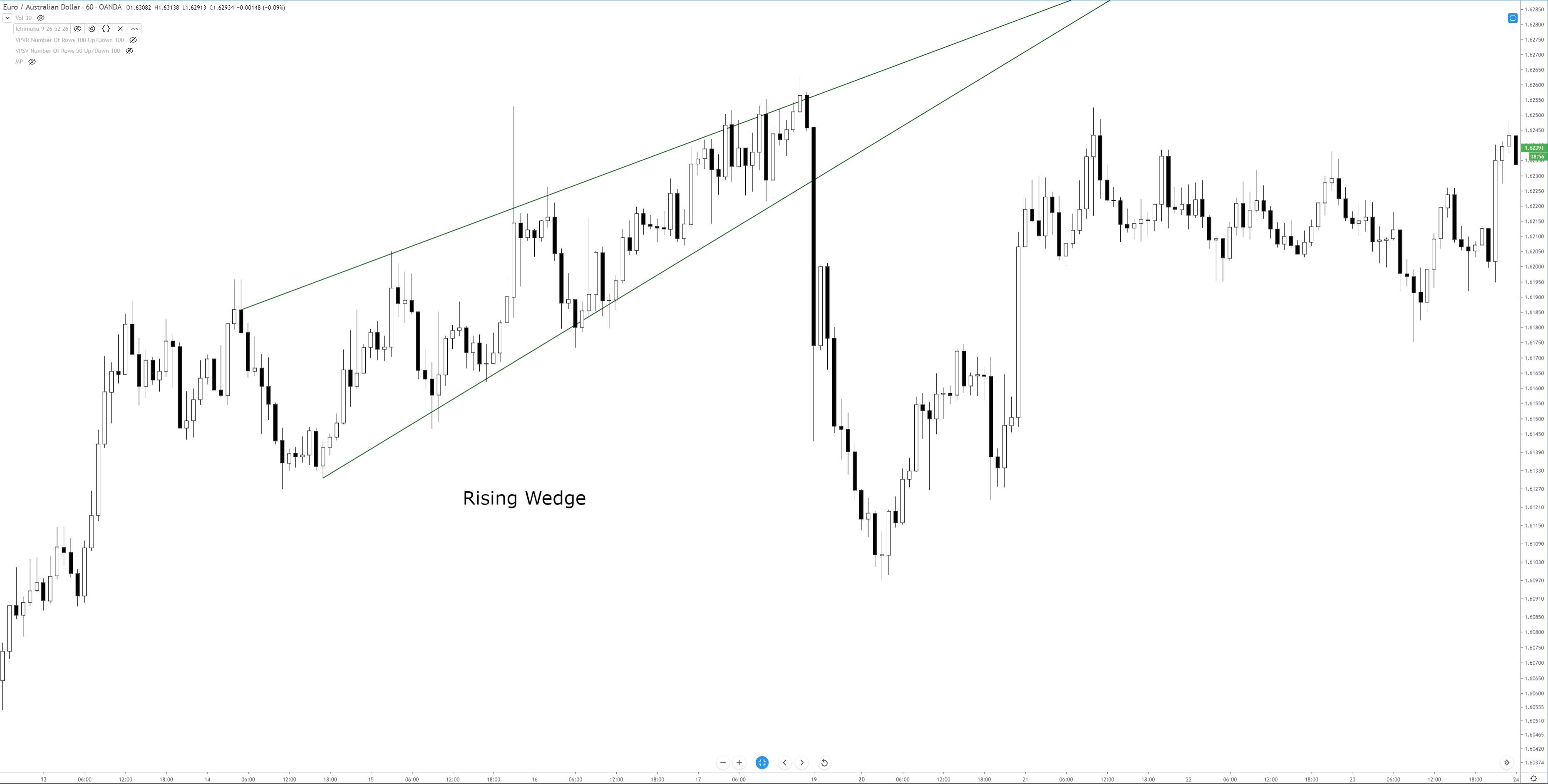
There are two types of Wedge patterns – The Rising Wedge & the Falling Wedge.
The Rising Wedge
The Rising Wedge is a bearish reversal pattern, and it appears in an uptrend. This pattern seems to look wide at the bottom and contracts as the price move higher. To form a Rising Wedge pattern, two higher highs must touch the upper line; likewise, two reaction lows to the lower line. The point at which the upper and lower lines merge indicates the completion of the pattern.
The Falling Wedge
This pattern is just opposite to the Rising Wedge pattern. It appears in an ongoing downtrend, and it is a bullish reversal pattern. The appearance of these patterns is an indication for us to go long. This pattern begins wide at the top and contracts as the price moves lower. To form this pattern, the two lower lows must react with the support line, and the two higher lows must react with the resistance line. When both the lines converge, we can say that the pattern is complete.
Trading The Wedge Chart Pattern
The Rising Wedge
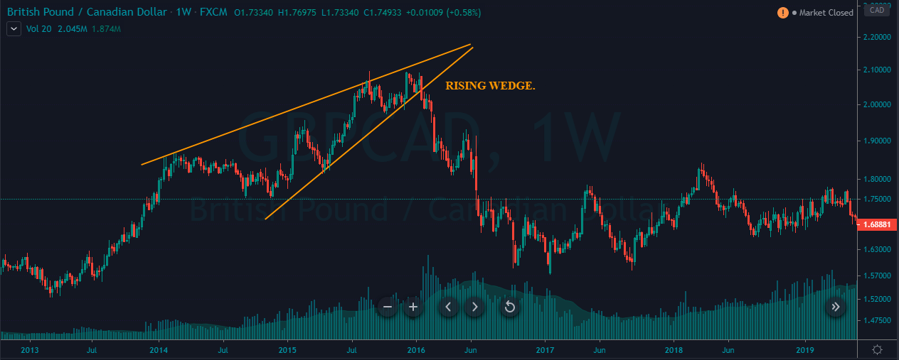
The below chart represents the formation of a Rising Wedge chart pattern on the GBP/CAD Forex pair.
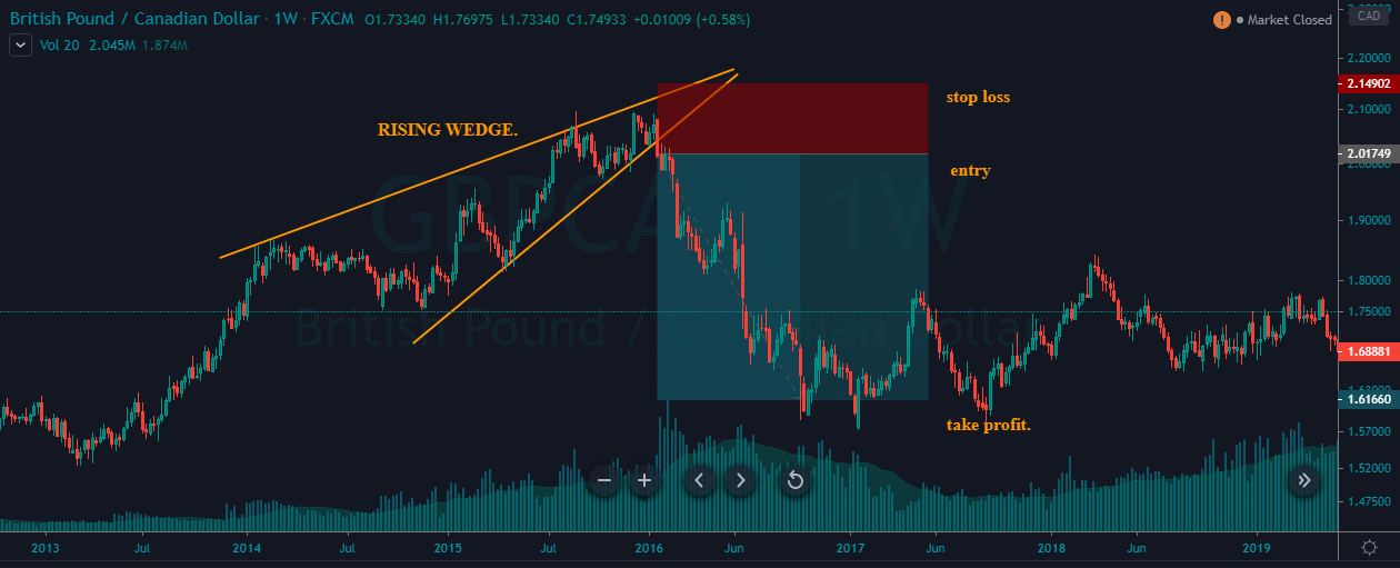
There are two ways to trade the Rising Wedge pattern. We can go short when the price hits the upper resistance line, and if the price breaks the below line, holding our positions for longer targets is a wise thing to do. The second and the conventional way is to wait for the price action to break below the support line and take the sell position only after the confirmation.
In the example below, we took sell entry when the price action broke the support line. Place the stop-loss just above the recent high and ride the markets for deeper targets. We had booked our profits when the price action started to struggle as it is an indication of a market reversal soon.
The Falling Wedge Pattern
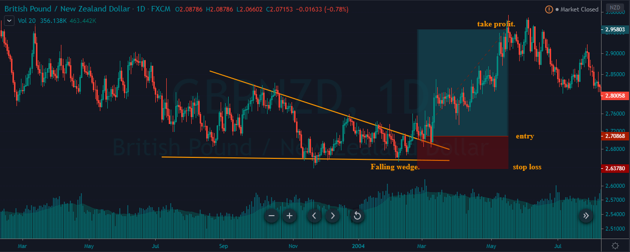
The image chart represents the formation of the Falling Wedge pattern in the GBP/NZD Forex pair. We can see that both the parties were fighting in a downtrend and when the market prints a Falling Wedge pattern, it is an indication for us to go long.
At the beginning of March, the price broke above the Falling Wedge pattern, and we end up entering for a buy. The stop-loss was placed just below the support line, and the take profit was at the major resistance area.
That’s about Raising & Falling Wedge pattern and how to trade them. If you have any questions, please let us know in the comments below. Also, to learn advanced trading strategies related to this pattern, you can follow this link. Cheers.
As you all know, we have completed Course 3.0 successfully. Thanks a lot for the brilliant response and great job on the quizzes you all have taken. We have covered some of the most critical fundamentals pertaining to technical analysis in course 3.0. Please make sure to practice all the concepts we have discussed in a demo account. Without practice, it is impossible to ace the Forex Market using technical analysis. We have also made a quick navigation guide for Course 3.0 so that it’ll be easier for you to get a quick recap whenever required. You can find that guide in the link below.
With all these learnings in mind, we will be moving on to the Forex Academy Course 4.0. We have discussed most of the basics concerning technical trading in the previous course. Hence, we will be exploring some sophisticated strategies and intermediate to advanced concepts of technical analysis in Course 4.0. It is crucial to have acquired the knowledge of whatever we have studied in the previous course to catch up with these complex concepts. So it is highly recommended to finish the previous course before starting off with this one.
Each of these topics will have about 7 to 10 course articles with corresponding quizzes. The USP of this course are the writers who prepared TOC and the related content. They are professional technical & price action traders who have a combined experience of 20+ years in the Forex market. So make sure to follow all the concepts that are discussed in this course and practice them well to become a successful Technical Trader. Also, try to answer the quiz questions until you get all the questions right. We wish you all the luck. Cheers!
Something that I stress repeatedly throughout our series on chart patterns is the difference between traditional markets like the stock market and the forex market. I’m sure a good number of readers have spent time reading books on technical analysis and have recorded and have seen various statistics regarding the performance of the various chart patterns that exist. There’s a big problem that exists in the realm of technical analysis and its use in forex markets, and that is related to nearly 100% of all technical analysis trading material focused on the stock market. Why is this a problem? Several reasons.
Statistical performance values for chart patterns based on the pattern’s performance in the stock market is overwhelmingly long-biased: the stock market has been in a bull market for over a decade.
Forex markets do not ‘trend’ in the traditional sense of financial analysis, they range.
In a nutshell, just because a particular pattern in the stock market may not perform that well in the forex market, it does not mean that its performance isn’t positive in forex. I’ve learned that most underperforming chart patterns in the stock market perform very well in forex markets. As always, make sure you do your own due diligence and research – investigate each pattern for yourself and see how they play out in your own trading.
To begin learning about Chart Patterns, follow this series of education articles.
Kirkpatrick, C. D., & Dahlquist, J. R. (2016). Technical analysis: the complete resource for financial market technicians. Upper Saddle River: Financial Times/Prentice Hall.
Bulkowski, T. N. (2013). Visual guide to chart patterns. New York, NY: Bloomberg Press.
Bulkowski, T. N. (2008). Encyclopedia of candlestick charts. Hoboken, NJ: J. Wiley & Sons.
Bulkowski, T. N. (2002). Trading classic chart patterns. New York: Wiley.
I want to stress, again, that the frequency and positive expectancy of patterns in technical analysis will vary from market to market. Most of the literature is written for the stock market, which is an overwhelmingly long-biased market. So, bullish patterns perform much better than bearish patterns in the stock market. I don’t have any real statistics to reference other than my years of trading experience. It has been my experience that wedge patterns are one of the most profitable setups in the forex market.
Wedges look like (and in fact, are) extended triangles. Wedges are made of two trend lines that are drawn just like a triangle. The difference between wedge patterns and triangle patterns is simple: the trendlines in a wedge pattern point in the same direction. Ascending triangles have flat tops and a rising bottom. Descending triangles have flat bottoms with declining tops. Symmetrical triangles have a downtrend line and an uptrend line. Wedges are different. Rising wedges have a trendline both above and below price sloping up. Falling wedges have a trendline both above and below, but sloping down. Depending on the technical analysis material you read, you will see wedges that may look like channels, and that is fine – many do.
Wedge patterns should tell you one thing: the end is coming. Because wedges have two trendlines that point in the same direction, the slope of the move is often extreme and is indicative of a climax move. These are incredibly profitable and favorable patterns when you spot them – and they are horrible to trade against if you are trading inside of them. If you read Bulkowski’s work, you’ll know that he recommends at the trendlines in a wedge should be touched at least five times in order for the wedge pattern to authentic. This is true in the stock market as well as in the forex market.
Rising Wedge
Rising Wedge
You might think that a rising wedge pattern shows up at the top of a trend, and it often does. But you will also find the rising wedge appear at the bottom of a trend. When you see the rising wedge appear after a prolonged downtrend, be careful! The rising wedge that forms after a long bear move is often a continuation pattern. An easy way to think of the rising wedge is that it is an overwhelmingly bearish pattern. It doesn’t matter where it shows up in any trend – it is an extremely bearish pattern.
When I am trading the rising wedge, I generally take the initial breakout that moves below the second to last test of the bottom trendline. The example above shows that there is no immediate retest of the breakout lower. Retests do happen, but they are less frequent than what we see in the ascending, descending and symmetrical triangles.
Falling Wedge
Falling Wedge
The inverse of the rising wedge pattern is the falling wedge pattern. It can show up at either the end of an uptrend or a downtrend. If you see a falling wedge that occurs at the top of an uptrend, then you could we witnessing a false breakdown lower and see a resumption of the prior bull move. If you see the falling wedge at the end of a downtrend, then you can expect a swift reversal or deep throwback. Just like the rising wedge, the falling wedge is heavily biased towards one direction: overwhelmingly bullish.
On the image above, I’ve added an Impulse Wave to show how you can use Elliot Waves to help determine whether or not a wedge pattern is valid. Remember: Bulkowski said that that a wedge pattern is only confirmed when the trendlines have been tested at least five times. Another condition on the chart above that we didn’t see on the falling wedge is the attempted retest of the break. Again, retests are common in all patterns, but they are definitely less frequent with wedge patterns – that has been my experience with them in forex markets.
When trading the falling wedge, I like to enter when price moves above the second to last swing high. On the chart above, the entry would be above wave four.
Sources:
Kirkpatrick, C. D., & Dahlquist, J. R. (2016). Technical analysis: the complete resource for financial market technicians. Upper Saddle River: Financial Times/Prentice Hall.
Bulkowski, T. N. (2013). Visual guide to chart patterns. New York, NY: Bloomberg Press.
Bulkowski, T. N. (2008). Encyclopedia of candlestick charts. Hoboken, NJ: J. Wiley & Sons.
Bulkowski, T. N. (2002). Trading classic chart patterns. New York: Wiley.
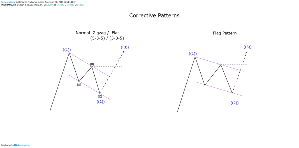
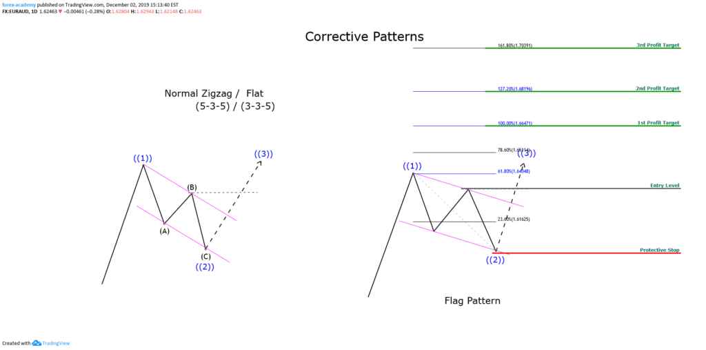
In our previous article, we discussed how we could simplify the zigzag and flat pattern by the chartist figure known as a flag. In this educational article, we will see how triangles can be used in wave analysis.
In our previous article, we discussed how we could simplify the zigzag and flat pattern by the chartist figure known as a flag. In this educational article, we will see how triangles can be used in wave analysis.
In our previous article, we discussed how we could simplify the zigzag and flat pattern by the chartist figure known as a flag. In this educational article, we will see how triangles can be used in wave analysis.
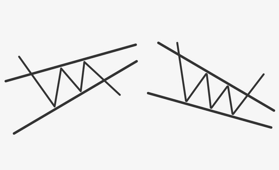
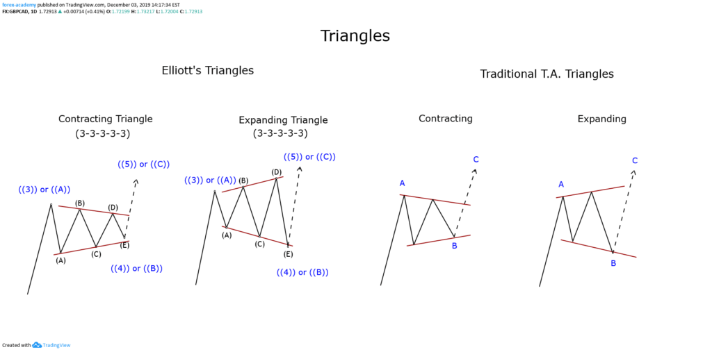
The Background
Within the Elliott wave theory, triangles represent one of the three basic corrective formations. Similarly, in traditional technical analysis, triangles represent consolidation and continuation formations of the trend.
Elliott defined triangles as a formation that have an internal structure subdivided into five waves following a 3-3-3-3-3 sequence. At its time, Elliott identified two triangle variations, which are classified as expansive or contractive.
In general terms, triangles represent the market indecision or the balance between the buying and selling forces.
The following chart shows the model of the triangles in their contractive and expansive variants, under the Elliott Waves theory and Traditional Technical Analysis perspective.
According to the point of view of the traditional technical analysis, we can observe that the triangle pattern is not forced to have five internal segments, as in Elliott’s wave theory. In consequence, a truncated zigzag or truncated flat structure could be simplified by a triangle pattern.
The Trading Setup
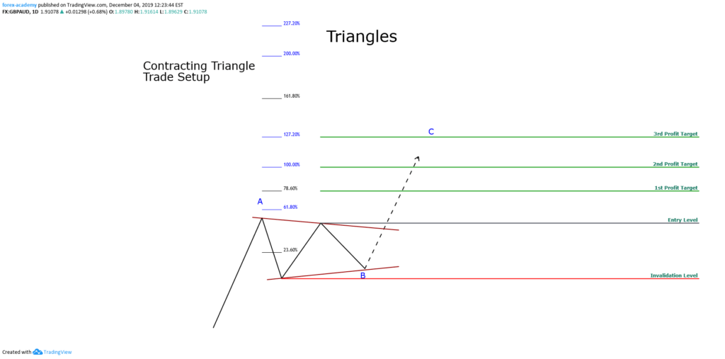
The trade configuration of a contracting triangle pattern has the following characteristics:
Entry Level: A buying (or selling) position will be activated if the price exceeds and closes above the swing of the previous top.
Profit Target: The first profit target level will take place at 78.6% of the Fibonacci expansion, while the second will be at 100%, and finally, the third profit target level will be at 127.2%.
Protective Stop: The invalidation level of the trade setup will be located below the lowest swing of the triangle pattern.
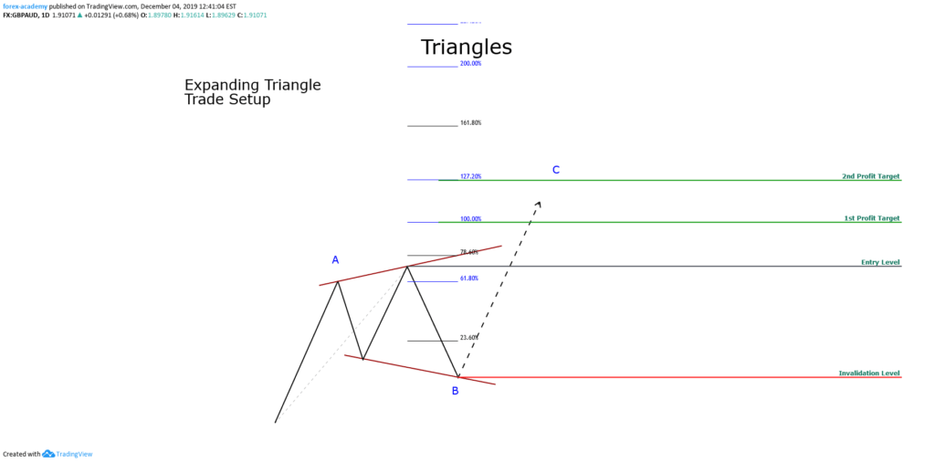
The trade configuration of an expansive triangle pattern has the following properties:
Entry Level: The trade will be activated if the price exceeds the height of the expanding triangle.
Profit Target: The first profit target level will be at 100% of the Fibonacci expansion. The second profit target level will be at 127.2%.
Protective Stop: The level of invalidation will be located below the lowest low of the expansive triangle pattern.
Examples
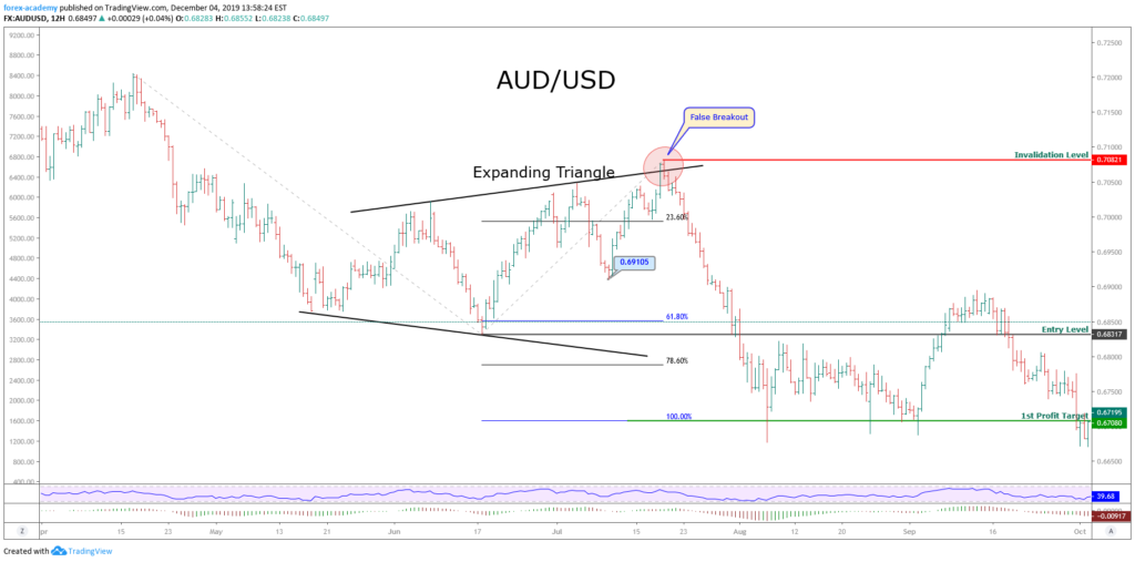
The following chart corresponds to the AUDUSD pair in its 12-hour timeframe. We can observe that the price action developed an expanding triangle formation, which began from mid-May 2019 and culminated in mid-July 2019.
From the chart, we detect that the expanding triangle reached its highest level at 0.70821, which corresponded to a false breakout. Subsequently, the price action resolved the next movement with a drop that took it to plunge until 0.66771.
The sell-side entry was activated once the price closed below the lowest level of the expanding triangle at 0.68317. Once activated the sales position, the price reached the first target at 0.67080.
Another possibility of entry that could be considered would be the closing below the last relevant swing, that is, the closing below 0.69105. This option could provide the trader with a higher profit compared to the risk taken compared to the original entry setup.
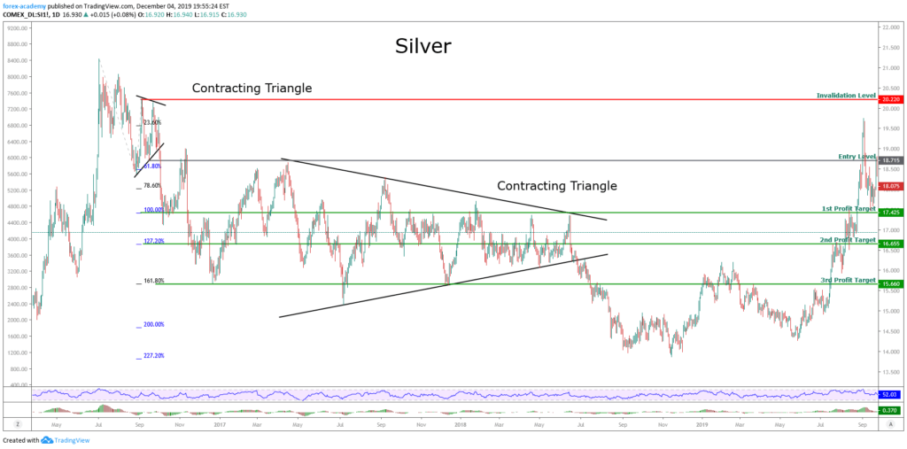
The next example corresponds to Silver in its daily chart. From the figure, we observe that the price made a record high early July 2016, reaching $21,225 per ounce, after this, the price action performed a corrective movement, once its found support, Silver built a tight contractive triangle.
After breaking below $18,715, Silver activated a bearish scenario that drove the price to fall to the third bearish target at $15.66 per ounce.
After having fulfilled the third bearish target, the price fell and reached $18.435 on April 17, 2017, where Silver began to build a contractive triangular structure that lasted until the end of June 2018.
Once the downward break of the long-lasting triangle occurred, we see that the price made a limited downward movement, which did not yield below $14 per ounce.
Conclusion
Based on the discussion of this article, we can conclude that regardless of the corrective structures that have three or five internal waves, these can be simplified as triangular patterns. Also, we can observe that a corrective wave or a short-range narrow triangle is likely to have an extended move that, in terms of Elliott’s wave theory, could correspond to an extended wave.
On the other hand, extensive triangular formations, or of a wide range, could lead the price to move in a range not as broad as in the previous case.
Finally, in the last example, we recognize how the alternation principle works in Elliott’s wave theory. Just as the first observed triangle is simple, and has a short duration, and the second corrective formation is extensive and complex.
Is it possible to simplify the wave analysis and compare it with classic chartist patterns? Identifying Elliott Wave patterns can seem confusing, especially if you are looking to differentiate between a flat or a zigzag pattern. In this educational article, we will look at some of Elliott’s patterns and compare them to traditional chartist figures.
Is it possible to simplify the wave analysis and compare it with classic chartist patterns? Identifying Elliott Wave patterns can seem confusing, especially if you are looking to differentiate between a flat or a zigzag pattern. In this educational article, we will look at some of Elliott’s patterns and compare them to traditional chartist figures.
Is it possible to simplify the wave analysis and compare it with classic chartist patterns? Identifying Elliott Wave patterns can seem confusing, especially if you are looking to differentiate between a flat or a zigzag pattern. In this educational article, we will look at some of Elliott’s patterns and compare them to traditional chartist figures.
The Normal Zigzag, Flat and the Flag Pattern
In the Elliott wave theory, the zigzag and the flat pattern are formations built by three internal waves. At the same time, depending on the strength of the corrective move, these could be more or less profound. The following figure shows the comparison between a normal corrective wave, which can be a zigzag or flat, and the flag pattern.
If we remember the wave theory, a zigzag pattern follows a 5-3-5 sequence, and the flat structure, a 3-3-5 internal subdivision. However, both formations can be simplified as a three-legs formation. Now, as we can see in the previous figure, the normal Zigzag and Flat structures can be simplified by a flag pattern.
The flag pattern is a chartist figure that represents a pause of the market trend and usually resolves as a continuation of the previous movement. The same situation occurs with the zigzag and flat pattern.
The flag pattern is spotted by a descending (or ascending) move, which connects in a tight range, its highs, and lows within a parallel channel.
The following chart exposes a series of flag formations detected on the GBPJPY cross in its 12-hour range.
On the figure, we observe that Flag patterns are commonly found in financial markets. According to Thomas Bulkowski’s publication, the flag pattern has a break-even or failure rate below 4%, which converts it as a “pretty nice” pattern to trade.
Flag Pattern Trade Setup
The flag trade setup is similar to the zigzag of flat configuration.
Entry: The trade is triggered once the price surpasses the end of wave “B,” or the previous swing high or low.
Protective Stop: The trade will be invalid if the price drops below the low of the flag.
Target: We will determine the profit target level using the Fibonacci expansion tool. The first target will be at the 100% level, as a second target at 127.2%, and the third profit target level will place at 161.8%
Putting All-together
The following chart illustrates the GBPCHF in its 8-hour range. In early January 2019, the cross developed a rally from 1.2248, which drove to the price until 1.2573. Once reached this high, the price action formed a corrective move in three waves. The bullish position was activated once price action surpassed the previous swing at 1.2524.
After the breakout, the price rallied over the three profit targets proposed. Note how the price runs when the flag pattern is tight and high, and the difference when the flag is broad in terms of price and time.
Conclusion
From the analysis realized, we conclude that a corrective structure as a normal zigzag or flat formation can be simplified as a flag pattern. This simplification could aid the traders in reducing the time analysis elapsed to the decision process before to place an order.
The confidence level of this pattern as a continuation figure could contribute to reducing the risk in the trading process.
https://youtu.be/-UweJmM32L4
Chart Patterns
Chart patterns, or technical analysis, is how traders determine possible future price action direction by incorporating ‘technical’ tools onto their PC screens. The resulting patterns they
https://youtu.be/-UweJmM32L4
Chart Patterns
Chart patterns, or technical analysis, is how traders determine possible future price action direction by incorporating ‘technical’ tools onto their PC screens. The resulting patterns they
Chart Patterns
Chart patterns, or technical analysis, is how traders determine possible future price action direction by incorporating ‘technical’ tools onto their PC screens. The resulting patterns they see on their screens, including the current exchange rate of a Forex pair, while factoring in volume, time of day, recent and future economic data releases via fundamental analysis, provide an effective way of gauging future price action direction.
Forex trading only took off in the retail sector in the early 2000s. Before that, and largely thanks to the advent of the internet, technical trading was almost unheard of in the institutional Forex market. Today, retail Forex traders take for granted the myriad of available technical trading platforms such as the; Metatrader MT4 platform, Trade Station, Currenex, Ctrader, etc. These incredible platforms, which are mostly free to retail Traders, would have been an institutional traders dream come true in the 1970s, 80s, and 90s. Back then, traders, technical analysis depended on plotting exchange rates into a notebook or on a spreadsheet. However, time and technology have moved on, and the internet has allowed liquidity to increase exponentially year on year. People can now make a reliable living by trading in favor of recurring patterns that they see on their computer screens. It is quite amazing that many economies around the world are often affected, both negatively and positively, by exchange rate fluctuations because of patterns on traders’ screens which tell them to buy or sell.
Example A
In the example ‘A,’ we can see a 1-hour chart of the GBPUSD pair. In the chart, we are only using Japanese candlesticks. We advise that you always read a chart from left to right because it tells a story. Traders typically draw their own trendlines, and that’s what we have done here. In this diagram at section ‘A,’ we can see that there has been a bearish trend. This was followed at section B’ buy a pull-back or consolidation and then continuation to the downside. This produced an upside-down V formation, which traders look for when considering a possible continuation in the downward trend. However, price stalls in section ‘C,’ which is littered with small candlesticks. Price action then slips into a sidewards momentum. These smaller candlesticks, some of which open and close at the same exchange rate, tells traders that there is a lack of liquidity in the market during this phase. Section ‘D’ is a continuation to the downside, and where price action has gone through the support line, we drew in at section ‘C.’ The continuation is short-lived, and we had a bullish pullback, again with the v-shape formation clearly evident. However, the bearish engulfing candlestick marked ‘E’ takes out all of the candlesticks in Section ‘D’ telling traders that a large amount of liquidity has gone through at this point and that the sellers are in command. Subsequently, we see price action continue to fall.
Example B
In example ‘B’ we have added Bollinger bands to our chart. Bollinger bands were developed by John Bollinger, whose book on the subject, “Bollinger on Bollinger Bands” (2001), was transcribed into over 11 languages and is widely used in the trading community. Bollinger bands plot deviations from the exchange rate onto a chart that materialize as two lines, one either side of the and outside of price action. The theory is that over 90% of price action will remain within the bands. Therefore, traders look for certain aspects to occur during the formation of the bands to help them with their trading decisions.
During the sell-off at section ‘A’ we can see that the bands are widening while moving in a downward direction. However, as volatility gains, price moves outside of the bands. But we can see that price action moves back inside the Bollinger bands to begin the V formation at section B. During the consolidation period at section ‘C,’ we can see that the bands move together to form a narrow tunnel. Typically traders will expect larger liquidity entering the market during times of bands expansion from a narrow contraction, and during the bottom of section ‘D,’ we see an increase in liquidity which pushes through the Bollinger bands, only for the bulls to buy the pair back inside. Subsequently, we see that the bearish engulfing candlestick marked ‘E’ pushes through the Bollinger bands to the downside, before buyers bring the pair back inside again. Price action then continues to the downside, while staying inside the Bollinger bands, until the bottom right-hand side of our screenshot, where we can see some tails piercing through the Bollinger bands, only for price action to pull the candlesticks back inside.
In diagram ‘D,’ we have added another favorite tool as used by technical traders: a moving average. The blue line is a 14 period, simple, moving average. It calculates the highest point and the lowest point of each of the previous 14 candlesticks and plots the average measurements on the screen in the form of a line. In our example we can see that once price action falls below our moving average at section ‘A’, it begins to form an invisible area of resistance, where price action moves up to it on a number of occasions at sections ‘B’, ‘C’, ‘D’ and ‘E’ before price action continues to the downside. Trainers typically use several moving averages on their screens in order to determine price direction, consolidation, continuation, and price reversal areas.
There are hundreds of technical analysis tools available to Forex traders. However, the more you have on your screen is not necessarily more of an advantage! In fact, too many analysis tools may hamper your trading by clouding your judgment. The best technical tool will always be the price action itself, which is a leading indicator. So, here at Forex.Academy, we recommend that you do not overload your screens with technical analysis tools. Keep things as simple as possible when deciding which technical tools to implement in your trading style and methodology.
There are two important ways that people trade the currency markets: The first system is by way of fundamental analysis, such as trading based on macroeconomics, including interest
https://youtu.be/VgxXgLg9WzI
There are two important ways that people trade the currency markets: The first system is by way of fundamental analysis, such as trading based on macroeconomics, including interest
There are two important ways that people trade the currency markets: The first system is by way of fundamental analysis, such as trading based on macroeconomics, including interest and exchange rates and national productivity. The second method is by way of technical analysis. In this section, we will be looking at technical analysis. Traders look at charts with different time frames to show them a picture of how a particular financial asset is moving/trading over a particular time frame (up or down, or sideways). They will then use this information to decide the direction of their trade.
So let’s start with diagram A. In this chart, we can see the daily price action (movement) of the Euro Dollar against the US dollar (EUR:USD) pair and where the current exchange rate is quoted at 1.09837. This particular chart is the most basic with just a simple line graph which starts on the left hand side of the chart and where you can see that the line graph is going up and down in a random-looking fashion, while capturing the exchange rate on the chart on an hour-by-hour basis, and where the pair ends up to the right of the diagram, which shows the current exchange rate.
In the diagram we can see some peaks and troughs, and we can see some sideways moving price action, however, if you were expected to use this information only, to place a trade, you would find it very difficult indeed to gauge when to get into the trade and went to get out.
One of the most common features that traders like to use in technical analysis is Japanese candlesticks.
Here in diagram B, we have exchanged the line graph in diagram A for the candlesticks. For each daily time frame, a candlestick will open and close. In this example, the green candlesticks denote a movement to the upside during a one 24 hour period, and the red candlesticks show movement to the downside for a 24 hour period. The different types and shapes of the candlesticks are used to determine when a particular currency pair may be stalling in either direction. We will look at the shapes of candlesticks and how traders use them to interpret movement in more detail later on in this course.
In diagram C, we can see another tool that traders like to use in technical analysis to define direction of price action is the use of bar charts. Each bar consists of 3 lines, two small horizontal lines, one to the left and one to the right of the vertical. At the beginning of each time frame the exchange rate will open with the small horizontal line on the left-hand side of the vertical line and then price action will move upwards, or downwards (or it may not move at all along the vertical line at all) and then at the end of the time frame we can see the horizontal line on the right-hand side denoting where price action finished at the end of the period.
In diagram D, we have reverted back to the candlestick chart. However, now we have added tools which are widely regarded as the most commonly used in technical analysis. First of those tools is an orange line which goes through the candlesticks from left to right. This is a moving average. In this case, the line calculates the top and bottom of the previous nine candlesticks and denotes it as a continuous line on the chart. Traders can easily change the parameters of the moving average depending on their style of trading. However, the basic principle is that if price action is moving upwards above the moving average, it may continue to do so, and if price action comes below the moving average, it may show that a trend is developing to the downside.
At the bottom of the chart, we can see an independently placed tool on the chart, which is called the MACD (moving average convergence and divergence). This consists of 2 features: the first is a histogram which moves upwards and downwards around a zero axis, and it also has two moving averages, which also alternate above the zero-axis and which crossover each other.
If we now turn to diagram E, we have drawn in two vertical blue lines. The first blue line on the 1st of July shows a large red descending candlestick, which takes out the previous six days move and falls underneath the nine-period moving average.
If we now follow the blue line down to the MACD, we can see that the moving averages have crossed over and are moving in a downward direction, and the histogram is also moving in a downward direction towards the zero-axis. Technical traders will see this as an opportunity to go short or sell this particular pair, and in the subsequent candlesticks, we can indeed see that the price action moves in a downward direction. Conversely, on the 5th of August, where we have drawn the blue line, the opposite happens, and price begins to move in an upward direction.
There are many many technical tools to use in your trading. But I’m sure you will agree that the original line graph, while looking chaotic, can be exchanged for tools such as candlesticks, moving averages and the MACD, to more clearly define the direction of a particular currency pair and give you the edge in your trading.
Hello, and welcome to the latest installment on-demand course, brought to you by Forex.Academy. In this particular course, we will be unveiling the mysteries behind
[embed]https://youtu.be/VnNdK8HDSNs[/embed]
Hello, and welcome to the latest installment on-demand course, brought to you by Forex.Academy. In this particular course, we will be unveiling the mysteries behind
Hello, and welcome to the latest installment on-demand course, brought to you by Forex.Academy. In this particular course, we will be unveiling the mysteries behind technical charting patterns and outlining how their use can supplement the trading decisions of the most technical trader. Before we begin, please take a moment to read through the disclaimer and note there is financial risk involved in trading the financial markets. The outline of this course will aid to develop the technical skills needed to assess charting patterns, whilst combining both theory and practice for a deeper understanding of how to apply these skills in the marketplace. Throughout this course, we’ll be first and foremost looking at the origins of technical charting, and deciphering where exactly those price depictions came from. We will be answering the question as to why technical charting is so important for us as technical traders, then we’ll delve into both candlestick formations and technical charting patterns, before moving on to technical recognition.
So, where do we actually look for these candlestick formations or these technical charting patterns in the markets? What do they actually tell us? Do they tell us a story about where the market is moving in this short, medium, or long term? This brings us all nicely to market phases, looking at those price movements both in the short, medium, and long term and trying to build an idea of actual trade identification. Where is the market more likely to move to as a result of these technical charting patterns? We will obviously be looking at practical application, looking in-depth at the MT4 trading platform, and finishing off the course, we will be looking into the MT4 platform with some practical application, looking at both the charting patterns and using some technical identification to look for these very promising trade opportunities within the markets.
First and foremost, let’s have a look at the origins of technical charting. Where did it all arise from? The earliest sign of the Japanese candlestick, we can look back to the 18th century, between rice traders in Japan. Inevitably, we can say that this led to a ‘grassroots’ commodity market in the product, in the commodity rice itself. This meant that prices were actually dictated in a form structure of a candlestick that was actually built from the rice itself. We can just look at a quick picture here, of one, two, maybe six or seven grains of rice actually depict the early candlestick that takes the very form and shape of our candlesticks on our MT4 platform trading the markets online today.
Moving on from that early origin, we see communication and international trade really begin to develop throughout the 19th century. A price quotation was transformed to tailor for a universal appetite. What do we mean when we say to tailor for a universal appetite? Given the increase in interest in financial trading and financial markets and how disposable income, or investment income changed, where the ordinary investor could look at a daily newspaper, look at a price quotation and look to invest, or to speculate in the financial markets. We’ve seen the birth of, over the 1920s and 1930s, trading via price quotation in daily newspapers, something that was done each and every day. The ordinary investor could look at those newspapers, trying to get a technical idea of where the markets are in their own head, but obviously, as time moves on, that was quickly outdated by the birth of telegraphy. If you’re aware of the Telegraph machine, that formulated on to the ‘ticker tape,’ where traders can look at printing of ticker tape for instant price action on the commodity or asset they’re looking to trade.
Even though it was more primitive, those early thoughts of trend analysis were developed between both investors and commodity traders. These were known as the ‘ticker’ traders. Looking at a roll of paper, they could see prices gradually tick-tick-tick, gradually perhaps increase, which really revolutionized and coined the phrase ‘Don’t fight the tape.’ So, don’t fight the trend. Really, today we say as technical analysts that the trend is our friend. Very similar in terms of technical charting and trying to define an origin of price movement.
If you have read any financial literature, or would like to read some financial literature on trading, I would very much recommend Reminiscences of a Stock Operator, by Edwin LeFevre, which tells the story of some stock traders and commodity traders in the 1920s and 30s. Big bullish traders would take huge positions in the marketplaces by merely reading the tape. Such a fantastic read, and it shows you the development of price charting and technical charting through tick trading.
We have obviously seen the rise of computer technology. Everything is traded online at the moment, but with the rise of the machines, I suppose that’s really led to the recording of price history from the 1970s and 1980s onwards. What that did, is it actually changed how traders discover and dictate prices. Obviously, if we are students with technical analysis, we know that how we judge many of our decisions is by looking at previous price history that can give us an idea, or an inclination, as to where future prices may move to. The fact that we look at recorded price history over time has really changed the origin on the movement in time, from more technical charting specifically, from a primitive Japanese candlestick.
Why is technical charting so important to us? Well, given the huge liquidity in today’s market, and what I mean by that, is that there is a large amount of market participation between small traders, big banks, and international organizations. A huge amount of participation, a huge amount of liquidity in the markets today, allows us to assume the technical charting is the most efficient method of assessing prices. Why would that be? Why could we look at a technical chart today, at a specific price in time, and say that price is efficient? Well, because we take for granted now that all information available to the markets is embodied in the price of a Japanese candlestick at the moment. Otherwise, all unavailable prices that were traded on would be insider trading. We assess that the markets have been totally efficient, given all circumstances are embodied in the price. That leads us on to assume that market participants, ourselves as traders, are, as a result, efficient in trading practice.
Price discovery nowadays is completely Universal in factors that change it. To take, for example, historical price action, a trading volume on technical indication. These technical attributes to the trader have just as much an effect on price change and traditional fundamentals. So, if we take a commodity, perhaps like the oil market, there is the supply and demand function to that market that certainly drastically changed its prices, but we know that oil is quite technical with many support levels and trading volume. The historical price action of things like this provides a technical indication, so that a large minority of traders decide to particularly only trade-off that price, and therefore create price change as a result. So, it is technically very important for the technical trader.
As we move forward to candlestick formation and technical charting, a quick prelude to really understand the Japanese candlestick itself, not just as one particular candlestick, but how we chose the common state range as traders. In our study of financial markets as technical traders, we must understand that each Japanese candlestick tells us a story. The story can be either timid in nature, or could be an epic battle of price between buyers and sellers. Yes, in candlestick observation, we are often provided with a clue to a decision on future price discovery. So, in each and every different candlestick, we see a story, a battle between buyers and sellers. It could be a very large trading day, or it could be quite a timid, small trading day, but there is a story to be told. Is that enough information to base trading decisions off? Not quite sure. However, there is much more information to analyze in technical charting patterns than simply looking at the individual candles. Accepting this will allow us to become price action specialists. That’s really what we’re trying to do here as technical traders, become price action specialists, by both looking at technical indication, looking at candlestick formations, and looking at technical charting patterns to give us some insight into market structure and future price movement. Again, in assessing the formation of the Japanese candlestick, we must identify exactly how important the price action is, first of all, but that there is a story to be told, and what that story is exactly trying to tell us.
Let’s have a look at a few examples here to decipher and see if we can figure out a story in terms of price action for each candlestick formation. For our first confirmation, we have a bearish engulfing continuation. Again, I posed the question, what story does the bearish engulfing continuation structure tell? Let’s observe the market trade for just a moment. In the previous view we just witnessed the market trading from left to right over a period of five trading periods, let’s say five days, and we’re starting from one and finishing with an engulfing bearish candle. What story does that tell us if we actually look from left to right? After a small sell-off at one, the market actually took three trading candlesticks to retrace its prices and return to previous levels on two. So, we could say that we actually had a bit of weakness after period one, but the market really had to work hard to retrace that weakness, and actually took three full trading periods to retrace price back up to previous levels before the sell-off. What is massively significant is the final candlestick. Again, given that we’ve seen some limited strength in the previous three days, it seemed to be very hard work for the Bulls to push the market back up. We see all of that effort totally and utterly erased in the final candlestick of trading. That final candlestick actually completely outweighs the first sell-off account. That’s structurally significant for us, and it tells us a story. The market was weak, it really worked hard to try and retrace the weakness, and then the Bears came in, and weakness prevailed. This is a strong signal that this market is weak.
Moving on to our second candlestick formation structure. We call this a lead-up to rejection. What story does the lead-up to rejection structure tell? Let’s observe the candlesticks trade. Looking at the previous price section, we see some early relative weakness and then a reversal at one. With the final two candlesticks finishing bullish, we can see the final structure creates a V in the market. Particularly, each candle is significantly important. In reverse, we see some early weakness. We see at level one, a hammer candlestick, and the close of the hammer candlestick at one is just above this level of support created by the early structure from the previous candlestick. The fact that it closes above that level tells us that it is a strong hammer, a bullish hammer. And that candlestick alone, the story is telling us that there could be a possible reversal. However, as we follow the price continuation to the upside with two, we see that the market opened and actually traded down within the trading period a little below the resistance level, was rejected instantly, and finished on a high for the day. That tells us that we have much more confirmation, that we have seen the lead up to rejection confirmed, and that expectations are certainly for prices to increase, which we see with the final comments, like a continuation to the upside. So, the structural support is very significant at the V structure. The price section tells us that the market is rejecting a potential sell-off and is potentially very strong.
In observing our third candlestick formation, we can look at what we know as the Three Bullish Soldiers. Again, we can pose the question, what story does the Three Bullish Soldiers structure tell? We see that the market has experienced a downtrend, and by looking and observing the price action trade, the bullish candlesticks almost signify a rejection of the low. Again, the question, what structure has been created, and what story is it telling us about the market equation? Well, after a long mature downtrend, bulls are technical investors, very frequently looking for clues for a change in sentiment. You do get that specifically, as sentimental traders look for value. If a market is particularly stock trading, if it is a strong asset, but has experienced a period of weakness. Or a foreign exchange, which is relatively strong over a long period but has seen a short-term downtrend. Investors often look for periods to get long that market, or to buy the market, and the Three Bullish Soldiers do provide this sign. Three consecutive trading periods of bullish activity, with the market closing with three consecutive new highs at one, two, and three. That indicates to us that the market has possibly shifted and is now potentially stronger.
Now, as we look to candlestick formations and technical charting, combining them both together, we must assess the short-term story of the market in question. We can then build with technical analysis, in aiming to identify technical charting patterns. The first of our technical charting patterns is the Head and Shoulders, on the reverse Inverted Head and Shoulder pattern. Let’s observe how the market trades. With the Head and Shoulders, the market is trading from the upside, trading in a bullish trend, and we see some resistance on a continuation for a further boost of the trend to the upside. We then see our first Shoulder created, and as the market reverses, we see a higher high creating the head of the market. We then see a level created in the market, where the market bounces, creating our second Shoulder and trading to the downside. This is technically very significant, as we see price expectation then results to the downside, given we almost see this man here presenting our Head and Shoulders in the market. So, there is a real rejection to the upside, given that we are feeling to reach higher highs. A rejection to the second Shoulder confirms us on the market breaks, or resistance to continue to the downside. The same technical setup is in the Inverted Head and Shoulders. Only it is to the upside, where the market creates a low, then a further low rejects the low, where the points of resistance price expectation breaks the resistance to continue to the upside.
As we move on to Double Top on Double bottom technical charting patterns, we can see they are very similar, but instead contrast two directions with the market. With the Double Top, the market trades from below and rejects a new high. That creates a structure, both to the open downside, with a further rejection to the downside, and creates some price consolidation within this period. We then get a further rejection to the upside on a bunch from that level trading down and breaching through its earlier level of support. The market expectation is for the market to trade. Continue to the downside. We can see clearly that the Double Top has been created almost in this fashion, and the market reverses from the Double Top peak. Again, the Double Bottom is very similar and will take the W shape where parallel resistance has been created on both sides of the consolidation. Where the market breaks to the upside, we do get price expectation in preferring a break to the upside potential. When observing these Double Top and Double Bottom situations in the markets, the main question we would ask ourselves is, how does it affect the trend in the medium or long term? Is it just going to be a short burst or price consolidation breakdown, or is it going to delve into something deeper? It very much depends on how the market is trading, and the higher the breakout stems from the break from Double Top or Double Bottom. Within this same Double Top, we can use this example to the right here, where the market trades in an almost unassured bullish fashion before creating our Double Top. We see it’s well defined. The market breaks to the downside, and at that time, sentiment shifts to a bearish activity. So, the trade there would certainly be to look for places or areas to short the market, given the Double Top rejection.
Similar to the Double Top on Double Bottom, we have a Triple Top and Triple Bottom. The only difference being that you often see stronger areas of price consolidation creating three tops or three bottoms, and as a result, we do see significant breakout opportunity as a result from the lack of continuation in the price consolidation. That would be a general rule of thumb as a technical trader, the more price consolidation you see in the market, and for a longer period of time, the greater expectancy you can have of a stronger breakout in the opposite direction. Or, when the final market structure breaks down, we can often see very strong shifts. So, generally speaking, if we are looking at these two previous price technical charting patterns with the Double Top on Triple Top, for example, we would see a stronger burst to the downside in the Triple Top than we would see in the Double Top and vice-versa. With the Triple Bottom on the Double Bottom, we would see a larger increase in bullish activity, with the break to the upside with the Triple Bottom on the Double Bottom.
In looking for price structures in the markets, very prominent price structures tend to be particularly in the Forex markets, the technical charting pattern of the Ascending and Descending Triangles. That’s indicative of the volatility that are in the Forex markets. As we look at the Ascending Descending Triangles, we can see that there is a level of price consolidation, a squeeze in the markets, creating this Triangle structure, and the Triangle structure is to the upside, as seen as such. We then get the market break creating an expected surge of volume and once the market structure fails, or breaks down to the upside. With the Descending Triangle, it’s no different. Only that price does create consolidation in the same zig-zag fashion. Finally, when we get confirmed triangle formation, we see a breakout to the downside, given that price consolidation is squeezing more prevalently to the downside.
Moving on to our Wedge Continuation and Wedge Reversal, we see these two Wedge formations are very acute in the markets they form with price consolidation. It can give us very close hints to where price is likely to break from in very short periods of time. The reason being particularly, if we look at the Wedge Continuation to the left here, the market trades down with a period of consolidation within this Wedge, fashioned actually looks to consolidate up to the upside a little, before actually breaking down to the downside. That would be quite significant, as traders expect the market consolidation pushing to the upside. Alternatively, the break to the downside would cause that greater burst, if you will, in rejection to the downside with the continuation. The reversal is slightly different, where we see the wedge to the downside. You see trade income from the Bear is down, creating the price structure through the right-hand side and then, instead of breaking down through with a continuation of the trend, actually reversing the overall trend on trading and pointing to the upside.
Let’s look here at our Bull Flags and Bear Flags. Again, quite prominent in the Forex markets. Taking a similar structure to Wedge Formations, the Bull Flag trades up with the direction or preferred bullish trend. It does create a price consolidation that almost looks like a Wedge to the downside. The only difference is that it creates this very well-defined Flag and actually trades to the upside and with the continuation. The Bear Flag would be in the opposite direction, where it trades to the downside. We see the market trade creating a Wedge structure, and then we get continuation to the downside in the direction of the trend, unfulfilling our Bear Flag structure.
Perhaps one of the most common uses of technical analysis lends itself to identifying channels within the market. Certainly, one of the most common practical technical charting patterns that you can identify is simply done by the use of two diagonal lines, either to the upside or downside, confirming or disconfirming bullish trend channels or bearish trend channels. As we follow the price action, we can see that it doesn’t always have to correspond to both highs and lows of the channel itself. As long as it conforms to trading within the channel trend line, we can say that is a confirmed channel that we can trade with the direction of that trend, given we can find trading opportunities within. Here we have a bullish channel, which is well confirmed, given the sheer amount of trading range that we have in the channel. The question I suppose that would pose would be whether to actually buy the market at this price, given that it is traded down to our trend line. We’ve seen the price punch from it before, and in terms of following the trend, that could certainly be a good method of trade identification in terms of following the trend for this market.
As technical analysts, it’s very important that we learn to combine what we learn and actually implement in the markets together. Just like observing one particular candlestick at a time, as opposed to looking at a larger, broader range of candlesticks. We look for more information within our technical analysis within price charting, or technical charting, and within our candlestick formations. Here, we’re going to ask the question, how can we apply technical analysis on charting patterns?
What I’m going to do is actually use my epic pen highlighter to try and identify some of the price patterns, some of the technical chartings, and some of the candlesticks that are very unique to us in actually trying to identify how to trade the market. Towards the bottom of the candlestick chart here, we’re looking at the EURUSD. We can identify this column here, this Doji comes to here, which tells us that the market is certainly unsure that we’ll see any explosive trading to the upside. It does quickly reject it with the bearish candle afterwards, and we get some price consolidation after, to show us that we have real indecision. In terms of an overall trend, what we’re looking for is perhaps an explosive move, or a bit of trading volume to give us that signal, and we certainly see it with this large candlestick here. We see this is a bullish engulfing candle, and we see the market shoot a trend to the upside from there. That starts to form this channel to the upside. Over a long price period here, we see this channel, and we know that it’s the bullish trend starting to form. We’re looking for opportunities to buy this market and unfollow the trend. We do see a level of support and resistance here, just creating a little floor in the market. We’re unsure. So again, we need a sign of where exactly to enter to relook to follow the trend. We’ve seen rejections from these levels at one, two, three, four, five, six, several points there, and we’re looking for a confirmed break to let us know that we’re still in this trend and that the trend may continue to the upside. We do get the movement with another bullish engulfing, that confirms to us that there’s a potential movement to the upside. However, again, with the Doji candlesticks here, we can see that this is short-lived. The bullish activity is short-lived, and perhaps we are creating a bit of resistance to the upside here, and we should, should the market not want to continue. Overall, if you can see, this doji sends the trend down. There’s a real rejection from these highs, back down to our already resistance level here. As you can see, I’m going to use a different color pen. We have exactly what we’ve been looking for. We have our Head & Shoulders here, there’s our first Shoulder, then we go up to our Head and then we’re starting to form down to this new Shoulder here. So where is the market more likely to move to at this instance here? We’re simply looking for a sign. We get the same with our bearish engulfing candle here. A huge candle, which does signify that we have a rejection of these highs and that the previous uptrend is short-lived. We’re expecting the price to actually resolve itself to the downside here. We do get more of a price structure here with these Doji candles, outlining the fact that the market has some uncertainty, and we follow this price consolidation here within this period. Again, we look, and we have a further break to the upside, with another engulfing candle wiping out the price action of the consolidation in its entirety and moving towards the upside again.
If we were to delete those illustrations and actually look and pinpoint some of the most unique candlestick structures, actually recognizing our technical analysis with charting patterns, we can find that we were assessing some of the main features within this pricing chart here. So, we have a bullish engulfing to the left, and many hammers there dictating the rejection of price to the downside. An Inverted Hammer, Double Inverted Hammer, they’re creating our Head and Shoulders early and rejecting price to the upside dojis as well, to describe some uncertainty in the market, and then we get some bullish engulfing candlesticks, which further continued the trend to the upside. As technical analysts, we know that markets do not trade in a linear fashion. Very rarely do we see something trade in a linear fashion to the up or downside. Perhaps, we could look at Bitcoin over the last three months before Christmas, trading in a very linear fashion, but these situations do not come about very often. So, we do need to use our technical analysis in terms of spotting good identification trades, in terms of following trades and finding those areas of price consolidation and breaks. Even with clear, well-defined trends, the markets will pull back on experienced short-term reversals. Trends are often interrupted by periods of consolidations, and of course, we are never 100% sure that a technical pullback will only be a short-term reversal. That is very true. We never over commit in a trade because we’re never sure that the market, even though a small term pullback and with the most well-defined trend or channel or technical price charting setup, we’re never 100% sure that it may only be a short-term reversal.
Let’s look at these market phases in more detail. What are market phases visible here in the gold market? What I’m going to do is just highlight some possible phases that are very visible in the gold market, so that we can notify before we delve into the practical application side of the course, where these market phases are in the marketplace and how they would affect our trading. First and foremost, we have bullish and bearish phases. We can see quite clearly where the bullish phases are. We have many large trends to the upside with these bullish phases. Some very significant ones showing us that there’s significant price change and that within these periods, we should be bulls, as opposed to bears. To the downside, again in the gold market, it does not trade in linear. Perhaps the most significant market phase that we can see in this gold market is the appearance of a well-established trend from low to high here. This is over a long-dated period, and you can see it is the most well-established trend in the whole price action chart of the gold market. Now, the fact that it breaks this resistant level here tells us that there is an opportunity in actually continuing the trade here. From this engulfing candle here, this portion is engulfing, and in terms of the overall trend, it is the longest trend here. We also have a very well-established trend here to the upside that provides us with a very extensive bullish channel that would provide us with certainly a fantastic opportunity. We know that this is a well-defined market phase before reversing from these highs and trading back down with a small bullish reversal channel. When considering to enter the financial markets, particularly with this gold market in front of us, we can see that there are numerous amounts of different market phases. In understanding which market phase is actually currently trading, that will allow us to enter the market based on our technical analysis, hopefully on a much better price.
As we look towards charting and pattern identifications on technical indicators, we know that there are many technical indicators available to retail traders to assist them with proper identification of charting patterns. Let’s use our knowledge of candlestick formation, price charting, and technical indication to identify some existing charting patterns in the markets. I will move on towards our MT4 trading platform to assess the markets, look for charting patterns in duplication and technical indicators in real-time. The first tool we’re going to look at is the Fibonacci retracement level. It’s a very useful tool, and it works very well for some particular asset classes. Gold would be one certainly, and oil would be another. The foreign exchange markets would, of course, conform to a lot of Fibonacci retracement levels, given the technical side to the foreign exchange markets.
How do we actually use Fibonacci retracement levels, and what are they? Basically, they work off a series of numbers, based on the Fibonacci sequence. Those numbers give a percentage from high to low in terms of their actual use. What traders look for in the markets, is a period of trading, to assess a high low and to depict trading levels within a certain range. So, we’ll use a few here to assess the markets as they were from the 12th of December to a period up to this new high. We will place our Fibonacci retracement level from low to high at this current time. Our Fibonacci retracement level, which allows us to make trades as such, given that we know of the market’s volatility, that they’ll trade up and down in a zigzag or nonlinear fashion, and we can make trading opportunities based on these. So, as we place our Fibonacci from low to high here, we’ll look for areas of retracement to either trade between the levels, or look for breakout opportunities from those levels. We can see that it already has conformed here and has traded up to this new high, but this is our level from high to low, so what we would be expecting is for something significant to happen around these areas here to our levels.
One very important note to make with Fibonacci retracements is that they do not work all the time. Just like any other technical indicator looking for price patterns, they are never 100% reliable. However, they are quite popular commonplace in terms of the retail trading environment. Also, institutional traders will often use them for their analysis over the long term, given that many traders are observing these levels.
In doing some analysis from this Double-M from high to low 12th of December to roughly the middle of April, we can see that we have made a high, and we’re looking to trade around these levels. We can see that the market did pull back significantly here, and we get an exact bounce from our zero percent back to our main level of resistance from the Fibonacci level, up towards new highs. We have placed our Fibonacci retracement from low to our new high, and are expecting to make trades from these retracement levels. We know our highs here, and we are observing all of the retracement levels. If the market trends to the downside, we are either looking to break through them, or we’re looking for serious support levels to buy the market, or levels of support to make those trades from.
One thing to really consider is that this is one form of technical indication to look at price patterns. It is not 100% reliable, nor does it work all the time across asset classes. Because of its use and its significance and acceptance in retail, both retail and professional trading world traders across the world are quite frequently looking and observing these levels. It almost becomes a self-fulfilling prophecy that the markets bounce or retrace from such levels.
Just looking at these levels, we can see that there are several retracements, one from its new high, created from the bounce from a linear downward trend reversal. We get the trend trading down as well, some price confusion around this area, we get a break in here, and then back up to the upside, continuing to bounce from that level to get some real trend continuation to the downside. Again, almost directly at our 50% retracement level, we get a continued break on the trend bounce reversal to the upside, and it lasts for quite a well-structured trend up to new highs here. Looking at some broader price action, we can see that the market does reverse off this and retracement level again several times, as it almost creates a price structure here, reverting down to new lows. It does so here as well, where we get some price consolidation in an Ascending Triangle, but rejected from the Fibonacci, and straight down to new lows again. Given the markets have continued their trading since this last Fibonacci retracement level has been implemented, traders will often update their new Fibonacci retracement level to reflect the latest price action. That’s exactly what we’ll do here, and we’ll see if it conforms to the rules and regulations that traders are trying to optimize when using Fibonacci retracement levels. We’ll move to look to implement a new Fibonacci retracement level, perhaps off a new high to low, and look for possible trading opportunities within.
This time we’ll go high to low from more relative price action and see if it corresponds or provides us with some support levels that we can make trades off, and look for price charting action. If we were to zoom in on this price action here, we can see that it certainly conforms, in an essence, to many of the same levels that were presented before. In looking at the high of this Fibonacci retracement, we will annotate this high from high to low and look at our several retracement levels. Straightaway, I can notice and point out that we have the same level as before previously. We see at the 50% on a retracement level, the market certainly retraces and does not want to pierce, or break up with some continuation of a bullish trend to the upside. We get continuation again to the downside from our 50% retrace level. Here as well, at the 23.6 retracement level, we have extensive support and resistance given to us at this level here. We can see the period of consolidation trades between these levels for a consolidated period of time before breaking to the downside. Our resistance level bounces straight off the low, and then a very strong strand breaks up through the continuation with our channel to the upside. Again, as we get the strong break, the bullish behavior takes the market through our 63.8 level. We do get some consolidation here, but again it’s actually the retracement level itself that provides some support over several periods and keeps the retracement within our support levels of 100% and 61.8%. We have price consolidation between these periods, and the market seems to be conforming to our Fibonacci retracement levels.
Moving on to our euro dollar Head & Shoulders Double Top, it’s very well defined indeed. This is one that we outlined throughout this slide show presentation, but I wanted to outline it again. We have some very good sell ups here within the eurodollar, a currency pair, and you can see how it conforms quite well to the sell ups indeed. Looking across the eurodollar, we see a strong bullish trend to the upside. We do see prices conform to our first Shoulder, then our Head as the Doji candles reject the highest not one, not two, not three, but four times. We get price continuation with a little uncertainty, creating our second Shoulder, and then we finally get the burst to the downside. It is short-lived, however, and we do get continuation in with the trend overall to the upside. There are plenty of trading decisions to be made given this resistance level here. It’s well defined through our Head & Shoulders price charting, and when we get this engulfing combo, it is quite a strong signal that there will be a continued movement to the downside. Again, we can reassess the market at this period here with the price consolidation breaking. We do get the retracement on this candle here, which is quite significant, this bullish engulfing candle, to let us know that it actually has rejected the Head & Shoulders pricing chart. That’s quite significant to know as well, that yes we have used our analysis to look at the Head & Shoulders, but given the price action almost immediately after, it is telling us that it is rejecting the candlestick structure, the pricing pattern as well, and that the market actually prefers continuation to the upside.
As you move further up the market, we can see a very well-defined Double Top. The market trades to the upside and continues to push on, creating a Double Top, moving down to the downside, creating our structure here, before bouncing back up from our level, and creating our second Top before reversing. So, now that we’re looking at this, we’re asking ourselves where does the market wants to trade now? If we get a break to the downside, certainly the expectation, just like in the previous slide-show presentation within the course. The market certainly prefers a continuation or an expectation of continuation to the downside should the market trade and close below that level.
Now we move on to a Head & Shoulders formation and looking at the charting pattern here with the NZDUSD. It’s well-defined. We can clearly see over a longer time period that we have a Head & Shoulders here, with the Head being here. We have a very strong trend to the upside, creating this Shoulder, then we get a movement to the topside, creating this Head. Then we get very well defined, almost other same level here, but breaking our same level of support and resistance here, and a very well-defined Head & Shoulders formation. The question is, what do we do? We have seen false breakers to the downside and around this area, but certainly looking at the Head & Shoulders formation, given the volatility of the markets, we can see that price expectation does favor the downside. Certainly, we get continuation trading to the downside quite strongly after a period of volatility.
Moving on to the cable markets, otherwise known as the GBPUSD, we can see some very well-formed Ascending Triangle formations. If we actually squeeze the price action in a little better, it’s probably a little more well-defined over the long to medium term. What we’ll do is actually use our Descending Triangle to define this. Here, we have quite a long period of bullish activity. Looking from the channel here, we can see a very strong channel to the upside. Now there is a lot of movement in this price, we certainly know that, but if we’re ever looking for our breakout opportunity in the currency pair, surely, we can look at this as a sort of short-term, medium-term Ascending Triangle forming. What we’ll do is just zoom in on the price action here a little and analyze this recent price action here. You see, the Triangle is well-defined here, price consolidation is moving towards the upside. We do get trading within this channel quite extensively, but if we’re looking for any sign that there’s consolidation, not just within the period from 9th of June to the 9th of January, but over the longer run, certainly this candle is the clue that price action is going to break from a level. We see a very well-defined Ascending Triangle coming up from lower lows and higher highs here, consolidating within this period here, we see a shift and a break to the upside. We then see the trend really start to push away to the upside, and that really gives us the confirmation that we’ve made a good decision here. Breaking from the Ascending Triangle formation to a long position here would certainly be the trade of the day.
Moving on to our final chart, we’re going to look at the Canadian dollar, and specifically, we’re going to look at candlestick charting patterns. We know that looking at one particular Japanese candlestick doesn’t provide us with all the information. The actual charting patterns themselves can provide us with a little more information. However, that doesn’t mean that you’re always going to be correct in decision making. I’d like to highlight that as well, with a few points. I’ll use my blue pen again here. We have some very bullish channels here, and that tells us that this previous price action that is led here is totally outweighed, totally obliterated by this large bullish move to the upside. In terms of stacking the odds in your favor, a buy position here would certainly be of a higher probability than a sell position. That’s what we do as technical traders, try and stack the odds in our favour. We do get the candle, given that one particular, then with the following two candles here, we get the confirmation to the upside. So, that lends itself to try and identify early signals of a trend, albeit in a very short space of time. The trend moves up quickly and provides with decent risk on a trade of that size. If we look at some candlesticks here, we can also see our Inverted Hammer here. This would be a very clear signal that after a long bullish period, the market has rejected any further notion of trading to the upside. The market is more likely to actually reverse that signal, but what we need to do, is to actually take the price structure itself into greater value. Particularly, this combo, one, two, three, four, five, these five panels here. We get continued rejection to the upside. Even with the bullish candle, we get the market trading down on closing, with the following day reversing again. The fact that this candle here closes just below the level lets us know that this continuation to the upside has been rejected, and is no more likely to continue with an upward trend. We think of the market obviously trading down, with a little more uncertainty to lower levels. At the moment exactly, we see a little reverse to more bullish behavior, indicative of our Doji candle, and we see a further continuation to the upside.
What is significant about this price action next, is that we can see in one, two, three, four candlesticks we see some quite strong bullish price action. Inevitably, it doesn’t actually lead to anything. The bearish engulfing candle here totally outweighs the recent price action, which should also send us a signal that the market is rejecting a bullish sentiment, and that there should be some continuation to the downside. However, we can see once we have the full story if we take this full story into play from this, maybe two-week period. Actually, it’s just volatility. These two candlesticks certainly tell us the story that there is indecision in the markets, that there’s no real push to the downside. Given the engulfing candle should tell us that the market has rejected bullish activity and it trades back up within a sort of two-day period after that. So, it’s good to really look at a period like this of two weeks, to look for an overall trend story that actually defines in its sense this whole.
I’ll just use a different color of my pen here; this actually defines this entire period of consolidation. I’ll just highlight that circle, I apologize it’s a little messy, and really what we’re looking for is actually a structural failure or something to tell us that this period of consolidation is over. That’s kind of what happens in the most recent price action after this, so I’ll just delete this price section for now. I’m going back to my blue pen. We see this structure here, and we see the area that we had our price consolidation in. We’re looking for a close, and we actually get the close of this candle just below the resistance level here. We’ll call the resistance level R. Again, a confirmed, I wouldn’t say engulfing candle, but certainly, a candle down to the bottom, closing on the low here. That tells us that we have a confirmed breakout to the downside stacking the odds in our favor. We are looking for a continuation to move to the downside, and certainly, we get the trend, albeit for this sort of short to medium term, to new lows here around February time of 2018. Again, straight away from the new lows, we get a bounce with a bullish engulfing candle. This time, we get continuation, so this candle, candle number two, we will call it, perhaps gives us just as much information as candle number one, in the fact that the trance seems to want to continue from the bullish engulfing. We do get movement to the upside, so that’s where we’re at now. We see a bit of rejection to the upside with this candlestick here in the reversal. However, with the structural failure reversing down and getting a little indecision in this candle, we see the trend start to continue with a bit of uncertainty. In the middle, we could almost see this as a Three Bullish Soldier formation, and that could give us an indication that the longer-term trend is to the upside.
That will conclude the practical application side of candlestick charting patterns and technical identifications. Thank you for joining us here at Forex Academy, and we’ll see you next time.