Categories
Forex Videos

Forex – How To Trade The USDJPY Pair!

How to trade the USDJPY pair


Thank you for joining this forex academy educational video.

How to trade the US dollar Japanese yen pair?
The US dollar Japanese yen is one of the so-called major pairs, and accounted for 13.2% of all the daily forex transactions settled during 2019. And the yen is the most frequently traded currency in Asia.
The United States is seen as the largest economy on the planet, albeit battered and bruised by the Covid pandemic, and Japan also has a strong economy, largely export-driven, and many things in common with the United States, including large stock markets. The relationship between the two countries is ever improving and has evolved significantly since the post-world war II era.

The pair can be extremely volatile at times and prone to large swings, but the basic rule of thumb is that when the United States was pre covid and its economy was strong, traders preferred dollars over yen. And since the United States has been in the grip of the pandemic, and even though the economy still massively outweighs that of Japan, traders prefer to buy the Japanese yen in times of uncertainty. It is seen as a safe-haven currency.

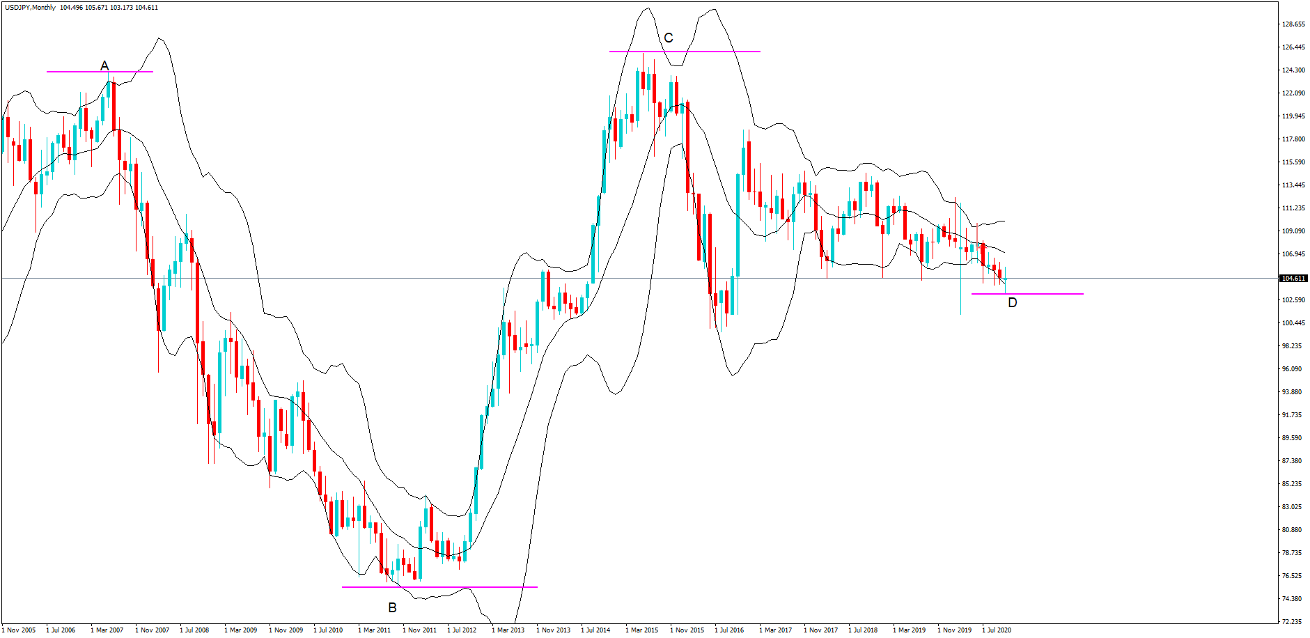
Let’s take a look at some price action on this monthly chart, where we see an A, B, C, D price swing since August 2006 of almost 13,000 pips. This is not a pair to be traded without caution and tight stop losses by retail traders.

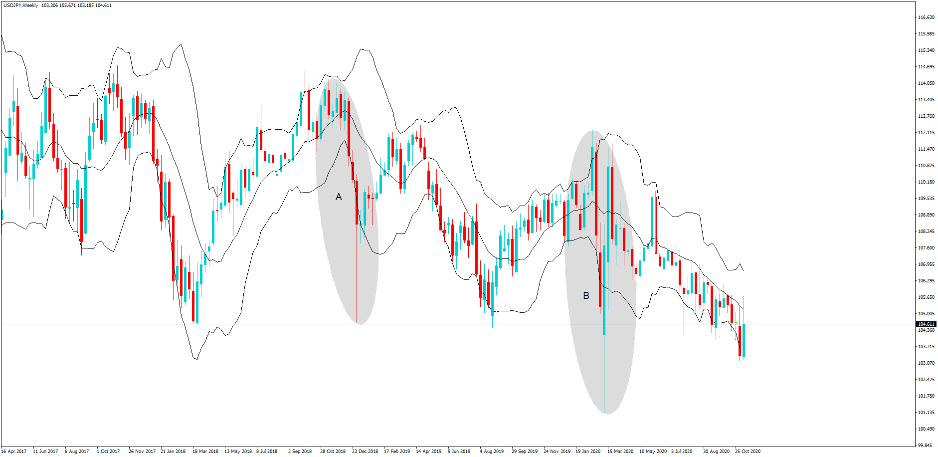
This weekly chart highlights two periods A and B between 2018 and 2020, where the difference between the top and bottom of both ranges is approximately 1000 pips. Again, these are account busting moves if you are on the wrong side of the trade and without a cautious stop loss in place.

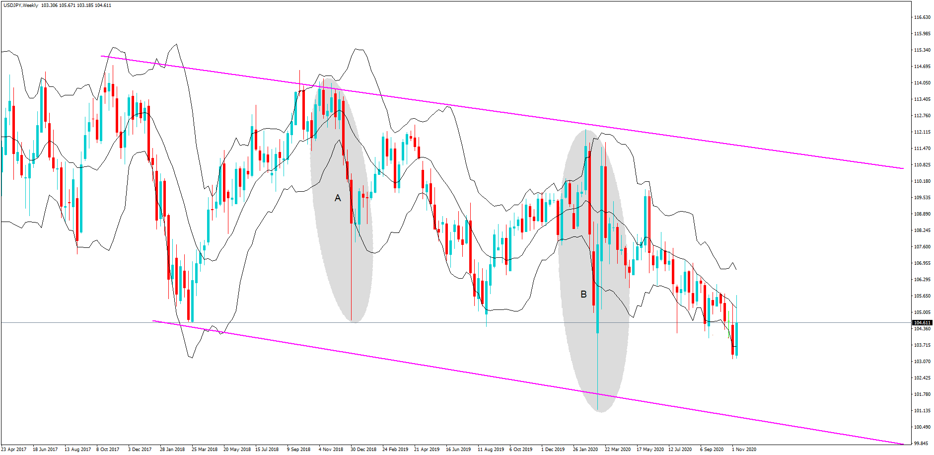
And yet, the overall trend as seen clearly here, again, on the weekly chart, which shows a snapshot of the pair since April 2017, is a downtrend. The yen is stronger overall.

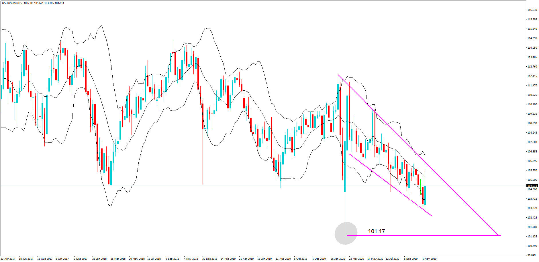
Here we are still looking at the weekly chart. However, we have highlighted a couple of stages in the price action for this pair. Firstly, we must note the high at position A, with an exchange rate of 112.17, and the low at 101.17, which came just a couple of weeks later, where the yen was being bought as a safe-haven asset against the US dollar as the pandemic began to take hold. This was a significant swing in the exchange rate.
Now take a look at the bear channel shown at position C. Institutions look at the higher time frames and, as they hold all the aces in terms of their ability to move the markets with the size of their forex transaction, this is where retail traders need to focus their attention with regard to likely price action moves for the longer term.


Of course, retail traders should never trade on weekly or monthly timeframes because they would need to incorporate huge stop losses. We have already demonstrated with this pair moves of over 1000 pics is simply nothing here.

But they can and should use the information to try and establish the overall trend that institutional traders are looking at.
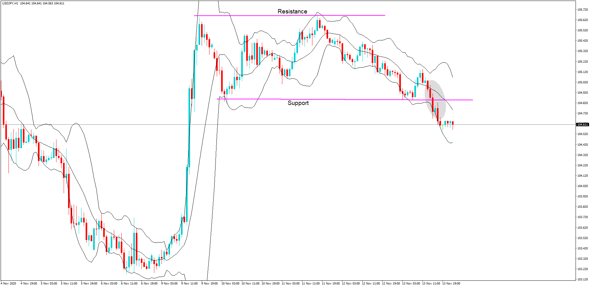
And here, we have brought the timeframe down to an hourly one, and we can see that since the 10th of November 2020, we have two peaks forming a line of resistance. Two areas forming a line of support and the grey circle, which clearly shows a breach of that support line, and with all of the uncertainty going on with regard to a new United States president, the worsening situation with regard to the pandemic in America with 150,000 new cases reported just a few days ago; we can only surmise that with all of this information that traders may continue to push the pair and to the previous low of 101.00 which we saw earlier on the monthly chart while favoring the safe-haven stats of the yen over the US dollar.

In conclusion, traders should be looking for potential signs of a weakening or pullbacks to get on board to short this pair. As we have clearly seen, the pair is subject to huge price swings, and tight stops should be incorporated.

Categories
Chart Patterns Forex Trading Guides

Chart Patterns: Start Here

Chart Patterns: Start Here

Something that I stress repeatedly throughout our series on chart patterns is the difference between traditional markets like the stock market and the forex market. I’m sure a good number of readers have spent time reading books on technical analysis and have recorded and have seen various statistics regarding the performance of the various chart patterns that exist. There’s a big problem that exists in the realm of technical analysis and its use in forex markets, and that is related to nearly 100% of all technical analysis trading material focused on the stock market. Why is this a problem? Several reasons.

  1. Statistical performance values for chart patterns based on the pattern’s performance in the stock market is overwhelmingly long-biased: the stock market has been in a bull market for over a decade.
  2. Forex markets do not ‘trend’ in the traditional sense of financial analysis, they range.

In a nutshell, just because a particular pattern in the stock market may not perform that well in the forex market, it does not mean that its performance isn’t positive in forex. I’ve learned that most underperforming chart patterns in the stock market perform very well in forex markets. As always, make sure you do your own due diligence and research – investigate each pattern for yourself and see how they play out in your own trading.

To begin learning about Chart Patterns, follow this series of education articles.

Chart Patterns: Pullbacks and Throwbacks

Chart Patterns: Symmetrical Triangles

Chart Patterns: Ascending Triangles

Chart Patterns: Descending Triangles

Chart Patterns: Head-And-Shoulder Patterns

Chart Patterns: Broadening Patterns


Sources:

Kirkpatrick, C. D., & Dahlquist, J. R. (2016). Technical analysis: the complete resource for financial market technicians. Upper Saddle River: Financial Times/Prentice Hall.

Bulkowski, T. N. (2013). Visual guide to chart patterns. New York, NY: Bloomberg Press.

Bulkowski, T. N. (2008). Encyclopedia of candlestick charts. Hoboken, NJ: J. Wiley & Sons.

Bulkowski, T. N. (2002). Trading classic chart patterns. New York: Wiley.


Categories
Chart Patterns

Chart Patterns: The Head And Shoulders Pattern

The Head And Shoulders Pattern

Of all the patterns that exist in any market, the most well known is the Head And Shoulder Pattern. Kirkpatrick and Dahlquist’s book, Technical Analysis, detailed many studies on the performance of this pattern. The result of all the data is that the Head And Shoulder Pattern is the most profitable of all standard patterns. Interestingly, Dalquist and Kirkpatrick made no distinction between the performance of the head and shoulder pattern and the inverse head and shoulder pattern (sometimes called the bottom forming head and shoulder pattern). While this pattern is successful across many markets, it is also the pattern that causes the most losses to new traders. We’ll get into the specifics of why this pattern destroys a good number of traders. First, we need to understand what the pattern is.

Regular and Inverse Head & Shoulder Pattern

The image above shows two head and shoulder patterns, the regular pattern and the inverse pattern. It just so happened that the daily chart of the AUDUSD conveniently had both of the patterns right next to each other – not a common occurrence. Now, you can and will read a lot of rules and theories behind the head and shoulder pattern. I could go into the behavior of this pattern, the psychology behind the three triangles that make up the broader pattern, the symmetrical nature of the left and right shoulders, etc., etc., etc., but we don’t need to complicate a pattern that can be very easily understood.

There’s a great book by Larry Pesavento titled Trade What You See. While the book Trade What You See is focused primarily on Harmonic Patterns, the title always stuck with me. If you were to stand in front of a mirror, you would more than likely notice the symmetrical nature of your left and right shoulders (unless you’ve had some significant injury or disease. There’s a good number of people who believe that both the right and left shoulders need to be as exact as possible – but this isn’t necessary.

Here’s a simple rule to follow:

If it doesn’t look like a human head and shoulder, then it probably isn’t a head and shoulder pattern.

 Are you familiar with the poker game Texas Hold’em or any other form of poker? There are several maxims that poker players follow, one of them is ‘Don’t chase the straight or the flush.’ Why? Because when you get dealt a hand that is missing just one card for your straight or one more suite to complete your flush, the odds are overwhelmingly against you getting that final card to complete the straight/flush. Head and shoulder patterns are the same way. The head and shoulder pattern is only complete when the neckline has been broken. Let me repeat that three times for you:

A head and shoulders pattern is not complete until the neckline is broken.

A head and shoulders pattern is not complete until the neckline is broken.

A head and shoulders pattern is not complete until the neckline is broken.

Failed Head & Shoulder Pattern


Many a trading account has been the victim of trying to anticipate the completion of a head and shoulder pattern, only to have it be broken. In addition to being the most profitable basic pattern, the head and shoulder pattern is also one of the most rejected patterns. We don’t chase straights or flushes in poker, and we don’t chase patterns in trading. In addition to the information above, here are some other factors that can help you interpret the head and shoulder pattern:

  1. If the volume in the left shoulder is greater than the right shoulder, there is an increased likelihood of the head and shoulder pattern completing.
  2. If the volume in the right shoulder is greater than the left shoulder, failure rates are higher.
  3. Horizontal necklines increase the probability of a head and shoulder pattern completing.
  4. The more dramatic the slop of the neckline, the more likely the pattern will fail to develop.
  5. Aggressive entries can be taken immediately when the price breaks the neckline.
  6. Conservative entries can be taken after the neckline has been re-tested post-breakout.
  7. If price breaks the neckline, retracements occur almost 70% of the time.


Sources:

Kirkpatrick, C. D., & Dahlquist, J. R. (2016). Technical analysis: the complete resource for financial market technicians. Upper Saddle River: Financial Times/Prentice Hall.

Bulkowski, T. N. (2013). Visual guide to chart patterns. New York, NY: Bloomberg Press.

Bulkowski, T. N. (2008). Encyclopedia of candlestick charts. Hoboken, NJ: J. Wiley & Sons.

Bulkowski, T. N. (2002). Trading classic chart patterns. New York: Wiley.

Categories
Forex Chart Basics

All you need to be introduced to Trading Charts – Part 1: Line, Bar, and Candlestick Charts

Why Technical Analysis?

The expression “technical analysis” originated from the belief that price action is all that is required to make sound trading decisions. Fundamental analysts believe that fundamental or structural influences are already incorporated in the history of the price. The concept of price action analysis is credited to Charles Dow, the author of the Dow theory, around 1900.

Starting from there, TA began to rise in importance to traders. The idea that price movement discounts all new information seemed rational. Concepts such as price trending, price confirmation, support, resistance, divergence, and volume confirming price started to emerge.

TA practitioners believe that the current price represents the instantaneous consensus of value. It’s the cost at which someone is ready to buy and a different person to sell. That agreement depends on the different beliefs persons hold about the prevailing market situation. A potential seller believes that odds the price continuing moving up are minimal or that it will surely go down shortly. Opposing this view, a buyer, maybe trading in a different timeframe, might think it is the right place for the asset to start an uptrend. There’s a third category of people: Traders that are expecting to detect another price level to make a decision.

Charts

Traders using technical analysis record prices in charts. Since thousands of transactions happen every minute, chartists accumulate the market action in packets called timeframes. The x-axis registers the passing of time, while the Y-axis register the prices. Usually, volume bars are added at the bottom of the graph.

When traders and investors had to draw the charts on graphical paper, the usual was to use a daily timeframe and follow the daily closings. With the advent of personal computers and dedicated charting packages, we can find charts from sub-minute timeframes to hours, days, weeks, and months. Precisely, the MetaTrader 4 platform allows timeframes of 1 min, 5 min, 15 min, 30, min, 1 hour, 2, hours, 4 hours, one day, one week and one month.

Line charts

The most basic chart is the line chart. Line charts connect the ending price of every frame with a line.

Fig 1 – Line chart of the Bitcoin in a daily timeframe.

Bar charts

Line charts are useful to see trends but lack the information about how volatile was the session. To record this kind of information, chartists decided to draw vertical bars in every time segment, showing four critical elements: The open (O), the high (H), the Low (L), and the Close(C) prices of every segment of trading activity. That’s why sometimes they are called OHLC charts.

Fig 2 –  The same Bitcoin segment of history in a daily bar chart.

As we already stated, every bar is composed of four prices. The Open price is shown as a horizontal mark on the left side of the bar. A close price is depicted as a horizontal mark on the right side of the bar. The high is the highest point of the bar, and the Low price is the lowest part of a bar. The Close is the most crucial level, followed in importance by the Open, and then the high and the low.

Fig 3 – Bar anatomy.

The most probable price path for the bar shown above is the price moving from Open to High, then descending to the Low and finally having the strength to close higher. But we don’t know for sure. It might have moved from open to low, from there to a high to descend to the closing level, finally.  What we know for sure is that the sellers had the strength to drive down the price.

Candlestick charts

Candlesticks are a relatively new way to draw charts. They were introduced to the western world by the work of Steve Nison on the Japanse charting and trading methods.

They use the same four points, OHLC, but a body of the candle is formed between the Open and the Close. The rest of the price action, beyond that range, is left as a line called wick or shadow.

Fig 4 –  The same Bitcoin segment of history in a daily candlestick chart

 Traditionally a bullish candle was drawn hollow or white, while the bearish candle is drawn in black. Now we can assign any color to it. On figure 4, the upward candlesticks are depicted in turquoise, and the red candles denote descending prices.

Candlestick charts are much more graphical, and traders can see immediately if the trend is up or down. During the uptrend seen in fig 4, the turquoise color is prevalent, while the color shifted to red in the downtrend that followed.

Fig 5 –  The candlestick Anatomy

On candlestick charts, the Open and close prices are deducted by the context. The ascending candlestick moves from a lower open to a higher close, while the descending one moves from a higher open to a lower close.

The next article will be dedicated to introducing other forms of charting, such as Renko, three-line break, and point and figure.


Categories
Ichimoku

Ichimoku Strategy #2 – K-Cross, The Day Trading Strategy

The Kijun-Sen Crossover (Crossunder) Strategy is the second in my series over Ichimoku Kinko Hyo. There are two trades setups provided for the long and short side of a market. This strategy also comes from Manesh Patel’s book, Trading with Ichimoku Clouds: The essential guide to Ichimoku Kinko Hyo technical analysis.

Patel called this the day-trading strategy. He warned that this trading strategy has the lowest risk factor out of all of his strategies. The positive expectancy rate is lower, and so being stopped out of trades is a normal consequence of this strategy. He also indicated that the win/loss ratio could be extremely high.

Kijun-Sen Cross Bullish Rules

  1. Price crosses above the Kijun-Sen.
  2. Tenkan-Sen greater than the Kijun-Sen.
    1. If the Tenkan-Sen is less than the Kijun-Sen, then the Tenkan-Sen should be pointing up while the Kijun-Sen is flat.
  3. Chikou Span in open space.
  4. Future Senkout Span B is flat or pointing up.
    1. If Future Senkou Span A is less than Future Senkou Span B, then Future Senkou Span A must be pointing up.
  5. Price, Tenkan-Sen, Kijun-Sen, and Chikou Span should not be in the Cloud. If they are, it should be a thick cloud.
  6. Price not far from the Tenkan-Sen or Kijun-Sen
  7. Optional: Future Cloud is not thick.
K-Cross Strategy Bullish Entry


Kijun-Sen Cross Bearish Rules

  1. Prices cross below the Kijun-Sen.
  2. Tenkan-Sen less than the Kijun-Sen.
    1. If the Tenkan-Sen is less than the Kijun-Sen, then the Tenkan-Sen should be pointing up while the Kijun-Sen is flat.
  3. Chikou Span in open space.
  4. Future Senkou Span B is flat for pointing down.
    1. If Future Senkou Span A is greater than Future Senkou Span B, then Future Senkou Span A must be pointing down.
  5. Price, Tenkan-Sen, Kijun-Sen, and Chikou Span should not be in the Cloud. If they are, it should be a thick Cloud.
  6. Price not far from the Tenkan-Sen or Kijun-Sen
  7. Optional: Future Cloud is not thick.
K-Cross Strategy Bearish Entry


Sources: Péloille Karen. (2017). Trading with Ichimoku: a practical guide to low-risk Ichimoku strategies. Petersfield, Hampshire: Harriman House Ltd.

Patel, M. (2010). Trading with Ichimoku clouds: the essential guide to Ichimoku Kinko Hyo technical analysis. Hoboken, NJ: John Wiley & Sons.

Linton, D. (2010). Cloud charts: trading success with the Ichimoku Technique. London: Updata.

Elliot, N. (2012). Ichimoku charts: an introduction to Ichimoku Kinko Clouds. Petersfield, Hampshire: Harriman House Ltd.

Categories
Forex Market Analysis

Weekly Trading Strategy

Trading Set-Up for the Week

DAX


Without taking a clear direction DAX is still going sideways. Regarding tehcnicals, it is approching the end of the recent weekly triangle it has formed. It should at least approach the top of it, where we may close the position. In terms of fundamentals they should support an upward movement as the corporate results and macroeconomic indicators remain solid.

US Dollar Index


US Dollar Index continues bouncing back and forth. Hence, for now we remain bullish after retesting the monthly bearish trend.

EURUSD


EURUSD continues its clears downtrend and just broke small weeklt support which even confirms strongly the strength of this bearish trend. So that, we remain bearish anbd still hold the short the position.

GBPUSD


GBPUSD drops and we hold the short. Continuies its clear downtrend without any relevant support in the horizon which confirms the long path of this short. For now we keep holding and waiting for the perfect moment to cash out.

USDJPY


After breaking a key monthly bearish down trend USDJPY and then retesting it, it has formed a clear breakout pattern which is taking time to take off. For now, we remain patient and wait for the continuation of the bull trend.

Crude Oil


The huge increase of concerns about inflation has mainly been due to Trump’s proteccionism and high oil prices. As tarde wars lower so has to do oil prices in order to lower concerns about inflation. From the technical side it remaind as clear breakout formation after the retest of the monthly bull trend.