General overview:
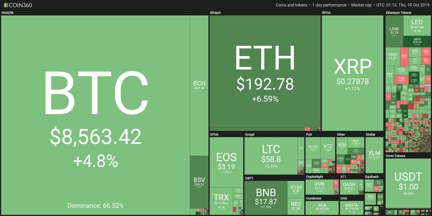
Cryptocurrency Market Cap: 265,511,000,000$
24h Vol: $9,014,760,000
BTC Dominance: 44.8%
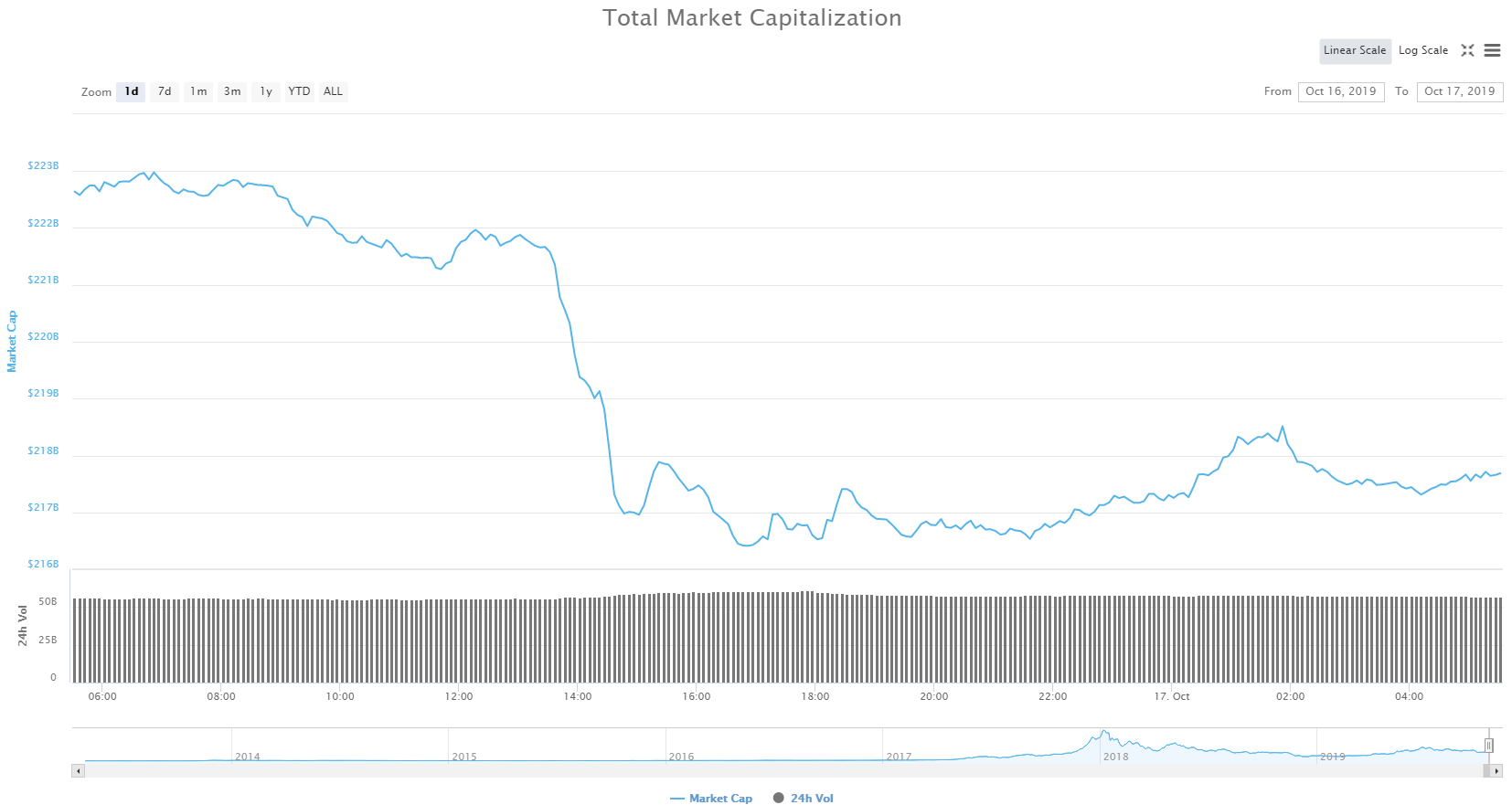
Current Crypto Market Cap
In the last 24 hours crypto market cap has slightly risen from its lowest point at 259,285,000,000$ to its highest point at 267,789,00,000$ and has now pulled back to 265,511,000,000$ because of the resistance at these levels.
As we’ve recently bounced upward from a support around 250B which is where we were on November 25th last year, more sideways movement is expected.
News:
Some positive news came out in the last 24 hours which might change this sideways action to an upward trajectory.
As it turns out, State Bank of Pakistan never banned the use of cryptocurrencies.
>The State Bank of Pakistan (SBP) has released information that seeks to clarify the bank’s position on digital currencies. Although the statement “advises” both the public and institutions against dealing in the coins, it is not an outright ban.
Source: Thomas Delahunty | April 8, 2018, newsbtc.com
Soros, Rothschild, and Big Institutional Investors are Entering Bitcoin Market
>Financial moguls, including George Soros, the Rothschild family, and others, now have their sights set on Bitcoin. It makes for an interesting development, albeit the potential impact has yet to be determined.
Source: JP Buntinx | April 8, 2018, newsbtc.com
Petition To Reverse Indian Central Bank’s Crypto Ban Gains 17,000 Signatures
>A Change.org petition for “Mak[ing] India at the forefront of Blockchain Applications Revolution” in response to the Indian central bank ending all dealings with crypto-related accounts this week has gained over 17,000 thousand signature since going online April 5.
Source: Molly Jane Zuckerman | April 8, 2018, cointelegraph.com
OTC Bitcoin Trading Surges in Canada, Same May Happen in India
>In Canada, it seems OTC trading is quickly gaining popularity. Just last week, the volume has spiked well beyond the regular volume. Over in India, the regulatory situation has taken a bit of a dire turn. The Reserve Bank of India made it clear banks are expected to end support for cryptocurrency companies. Exchanges and trading solutions may find different ways to counter this solution, assuming the need arises to do so.
Source: JP Buntinx | April 8, 2018, newsbtc.com
Analysis
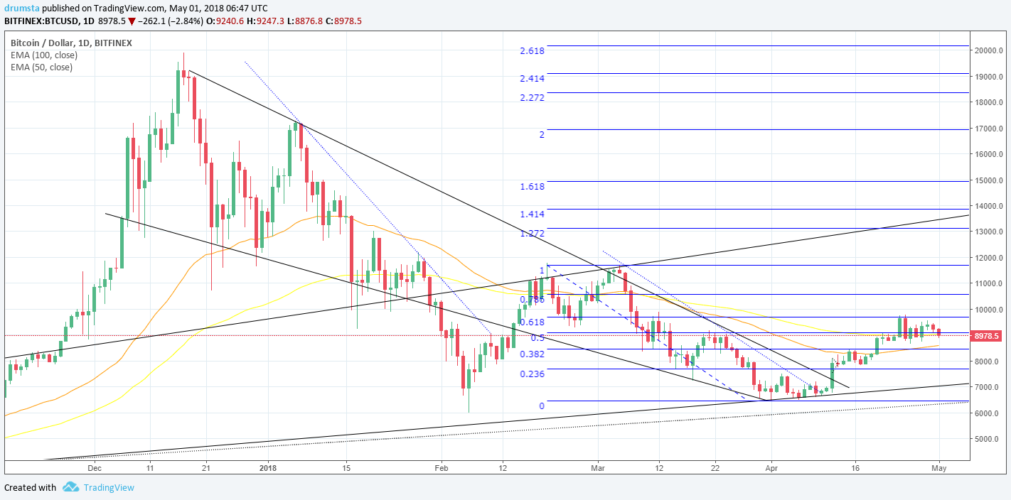
BTC/USD

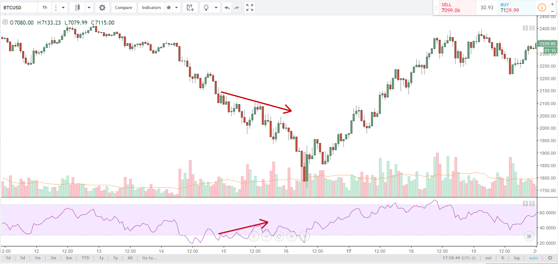
As you can see from this daily chart, the price is still in this falling wedge, which started as a correction on December 16. Since then the price has fallen around 65% and is now sitting around 7000$ after the uptrend support line, originating from July 17 last year, repealed the price.
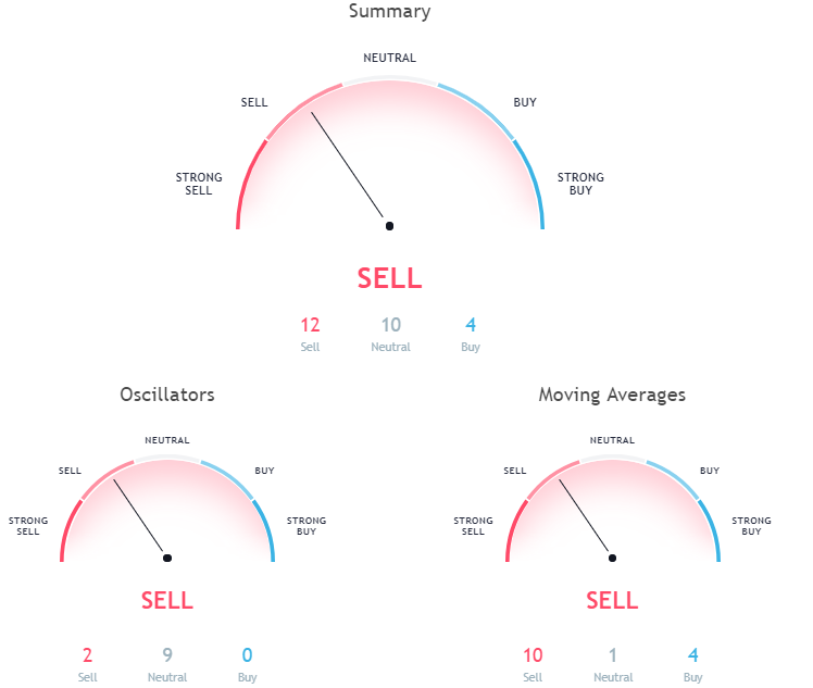
 The current crypto market cap sentiment for Bitcoin is slightly negative, meaning that mentions and discussions on the web are leaning 10% toward negative.
Source: sentiment.io

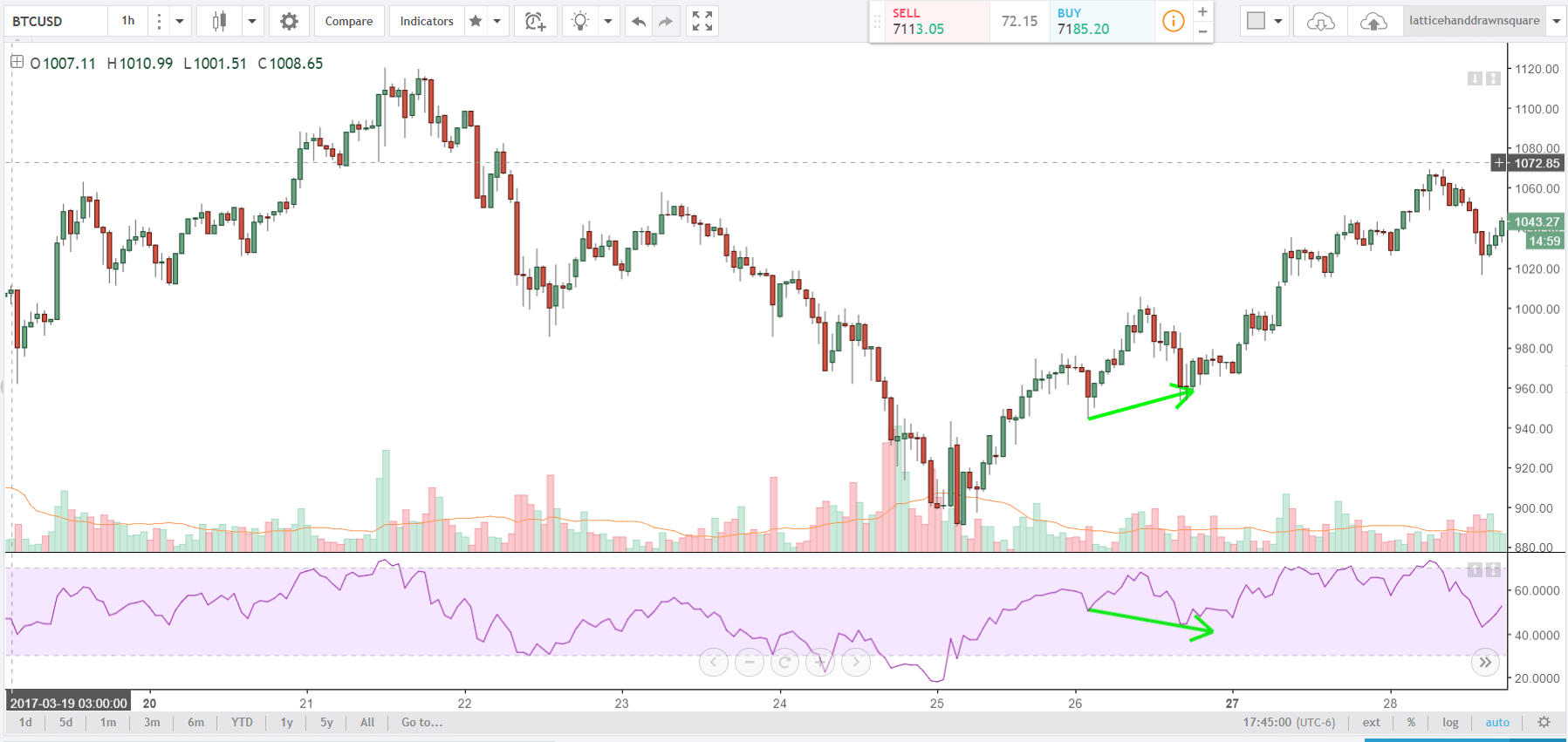
Zooming into an hourly chart, we can clearly see the interaction with the uptrend support line and how it held pretty good. The price is currently experiencing sideways movement because of the interaction with these significant levels which can be interpreted as indecision.
Overall hourly chart signals a buy.

Even though hourly chart signals a buy, be cautious if trading, as we are still in a no-trade zone, and without confirmation for a trend reversal. As you can see from the daily chart, I’ve drawn another non-confirmed uptrend support line (dotted line), originating from March 25 last year. That line crosses over 50% Fibonacci level which is very significant, so in the next couple of days, I will be closely monitoring price action, as I am expecting another downward movement to retest those levels which in terms of price will be 6000$. However I am not expecting it to be a wick like last time on February 6, but a proper close, and a wick to extend to 5500$.
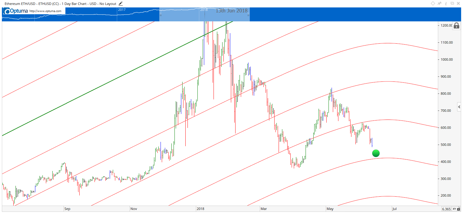
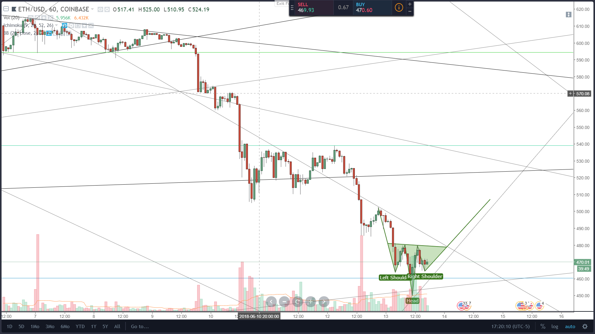
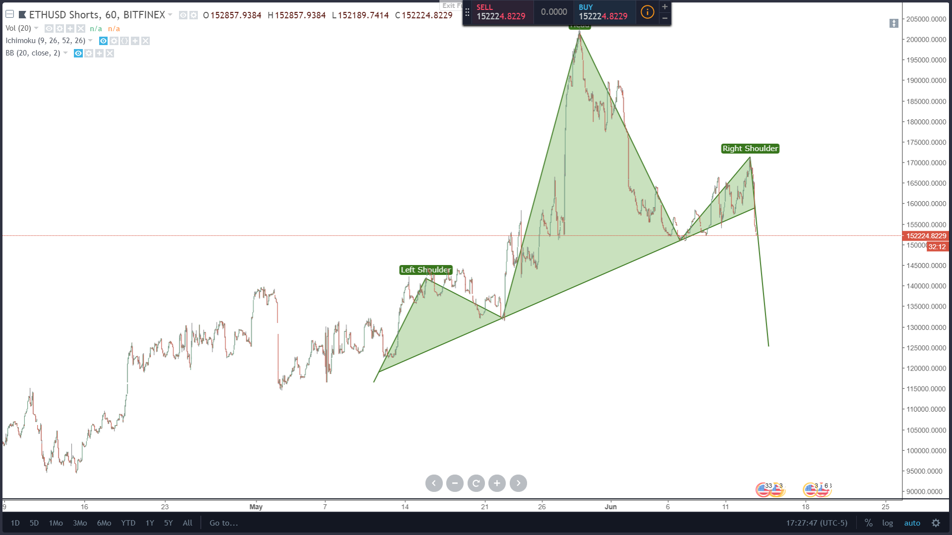
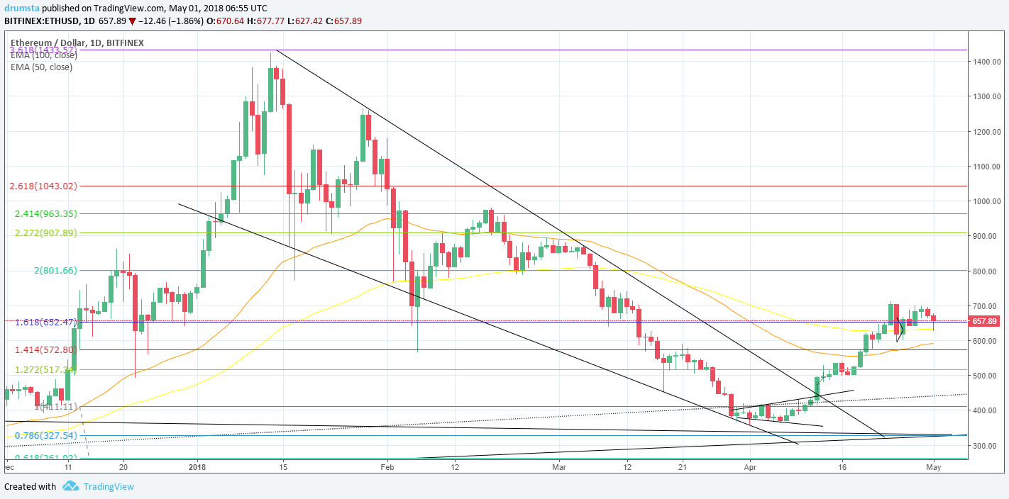
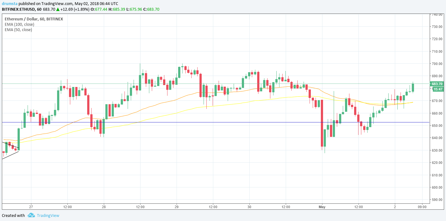
ETH/USD

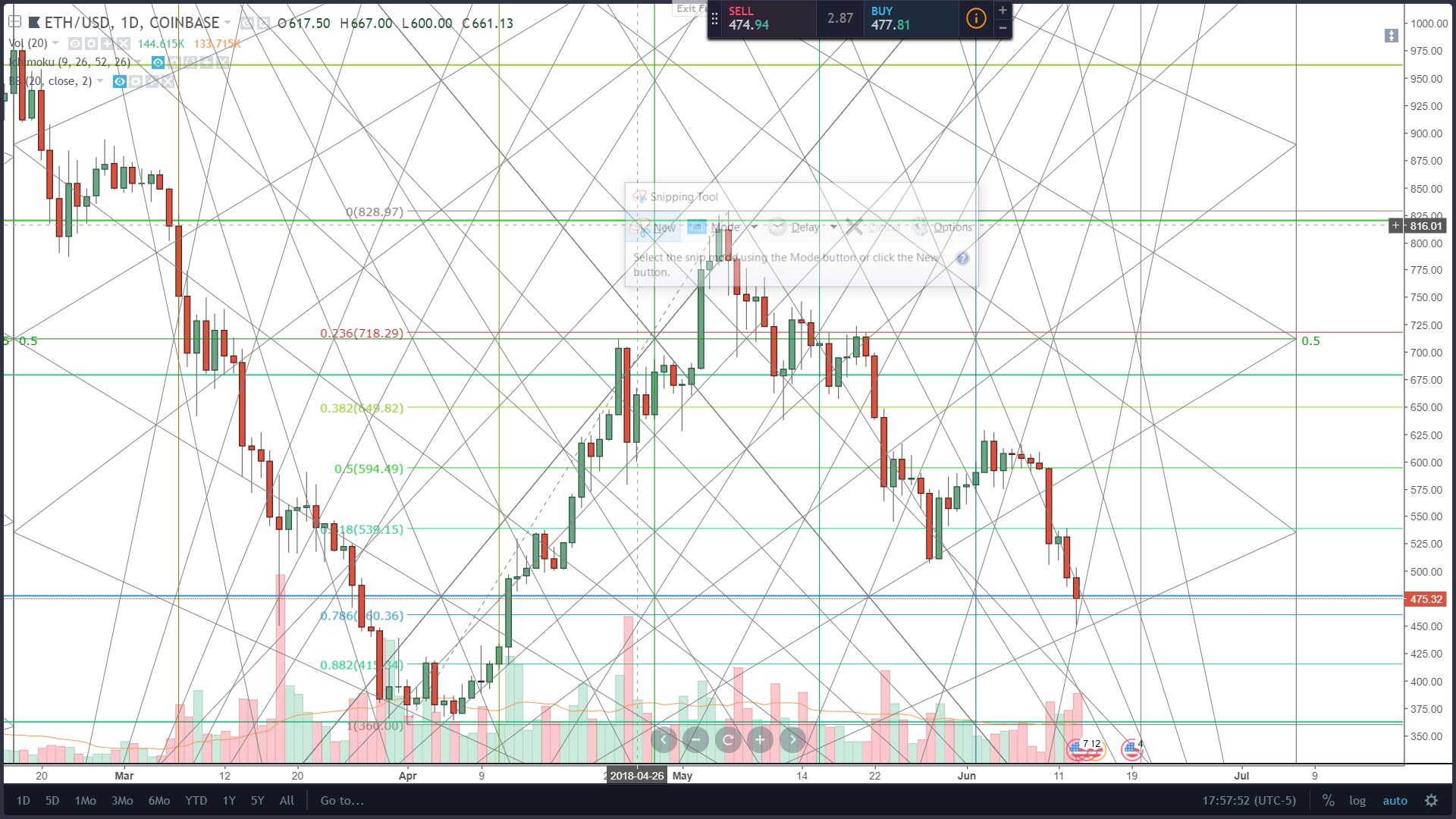
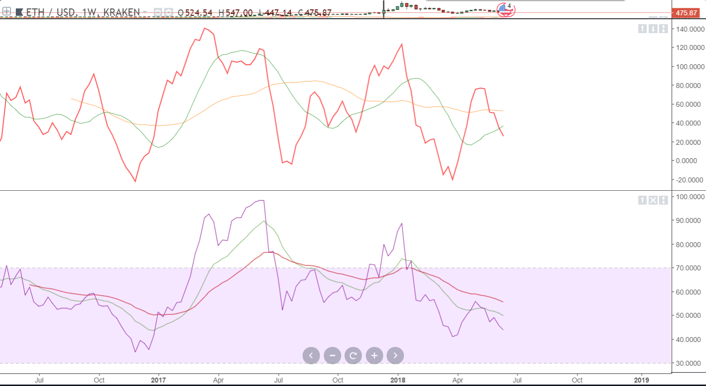
Ethereum daily chart shows that the price is still in the falling wedge, and not only that but has also fallen below the secondary uptrend support as is now sitting at around 400$ which is a 71% less than at its highest point of 1419$ per ETH on January 13.
 The current Ethereum sentiment is mixed, meaning that there are equally positive and negative mentions and discussions on the web.
Source: sentiment.io

In the last 24 hours, ETH price has risen 6.95% and is now sitting at 412$ interacting with a 100% Fibonacci level that was the top of the range on June 12 last year.
Overall hourly chart signals a buy.

Even though the price is showing an upward movement, Ethereum is like Bitcoin in a no-trade zone. Closely monitor what happens at these levels, as I would expect the price to go down from here to the cross-section of the uptrend support line number 2, top of the triangle from which the price has previously broken and 0.78 Fibo level which will be in the term of price around 330$.
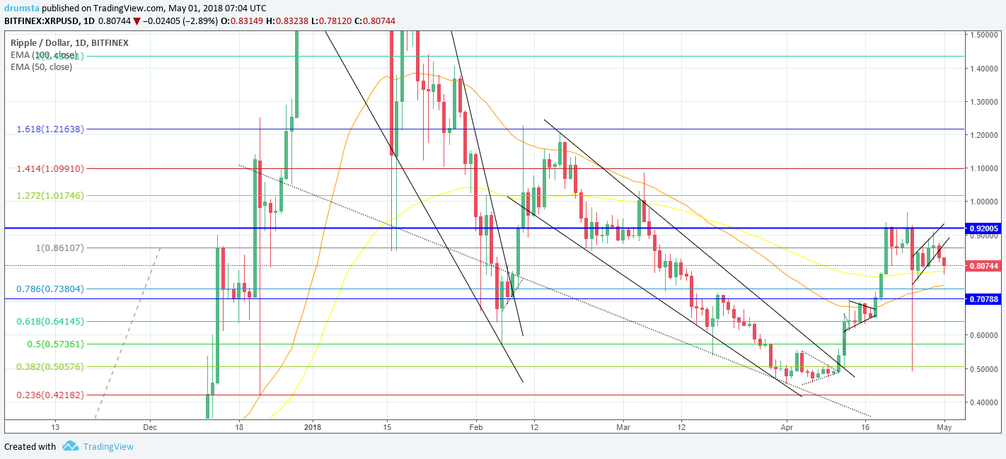
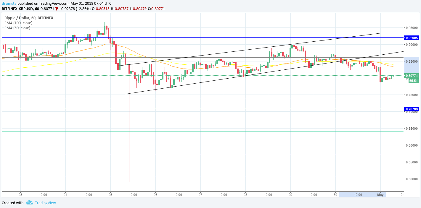
XRP/USD

As you can see from this daily chart, the price was broken out of the first falling wedge only to get caught into a downward channel that brought the price down to where it is now sitting at around 0.5$ interacting with 0.38 Fibonacci level which is 57% less than the starting point of the channel.
 The current Ripple sentiment is slightly negative, meaning mentions and discussions on the web are just slightly leaning toward the negative side.
Source: sentiment.io

Hourly chart shows sideways price action but definitely on a short-term uptrend in which the price rose up 5.66% in the last 24 hours and is now interacting with 0.38 Fibo level which serves as a resistance point for now.
Overall hourly chart signals a buy.

What is stated about Bitcoin and Ethereum implies here as well – no trade zone.
Conclusion
As a conclusion, I would like to say that the correlation between these three cryptocurrencies is strong and that they are all in the same point of their cycle. These are interesting levels as the downtrend is losing its momentum and the bulls are waiting for a confirmation to reenter the market. Expect a lot of sideways action as we are nearing the accumulation zone.


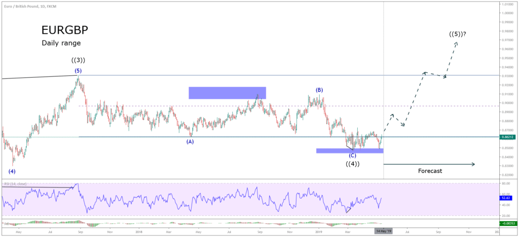
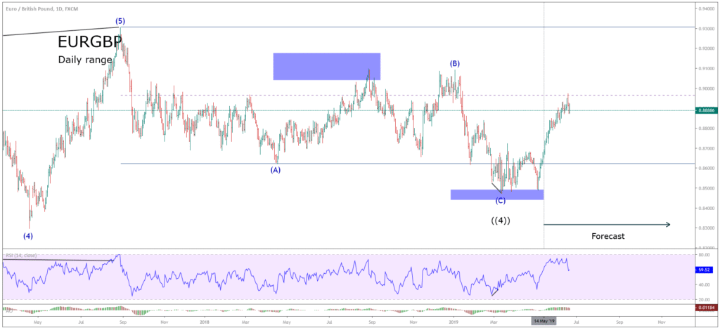
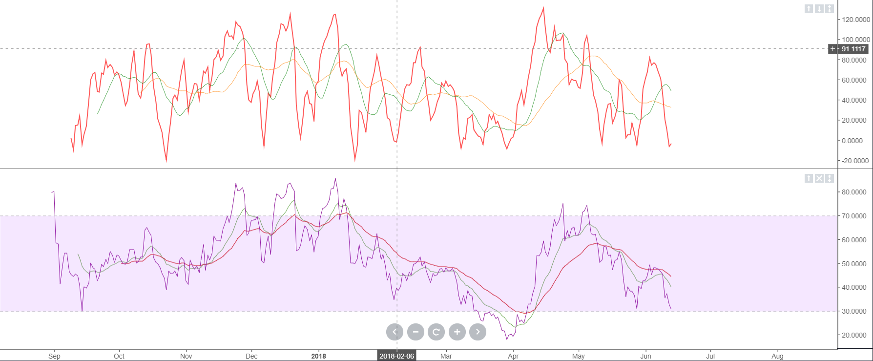
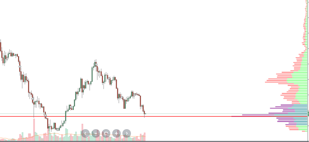
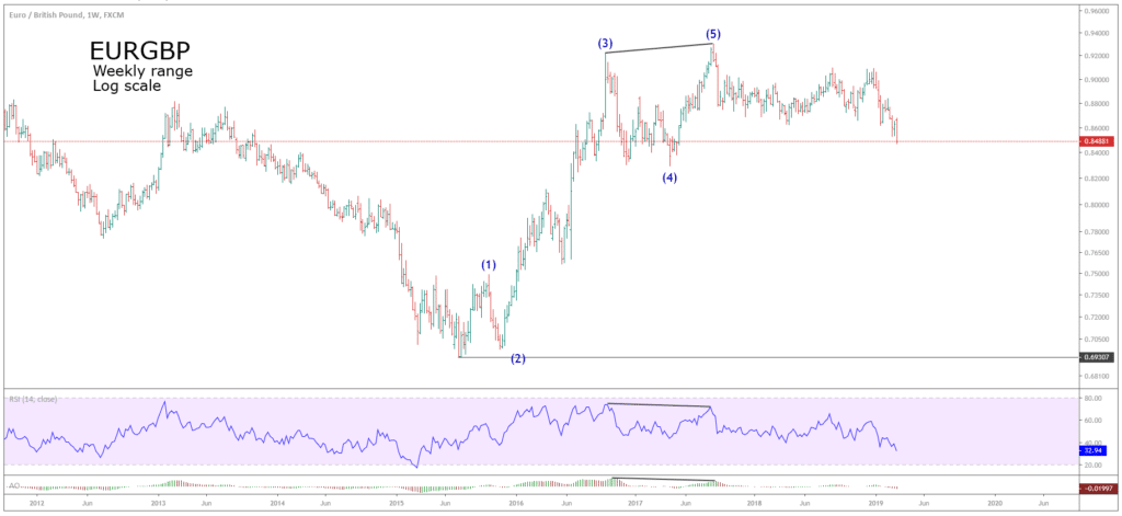 Both the RSI and the Awesome Oscillator display a bearish divergence, that helped us to identify waves (3) and (5).