Categories
Forex Daily Topic Point and Figure

Point & Figure: Profit Target and Stop-loss Settings Made Simple

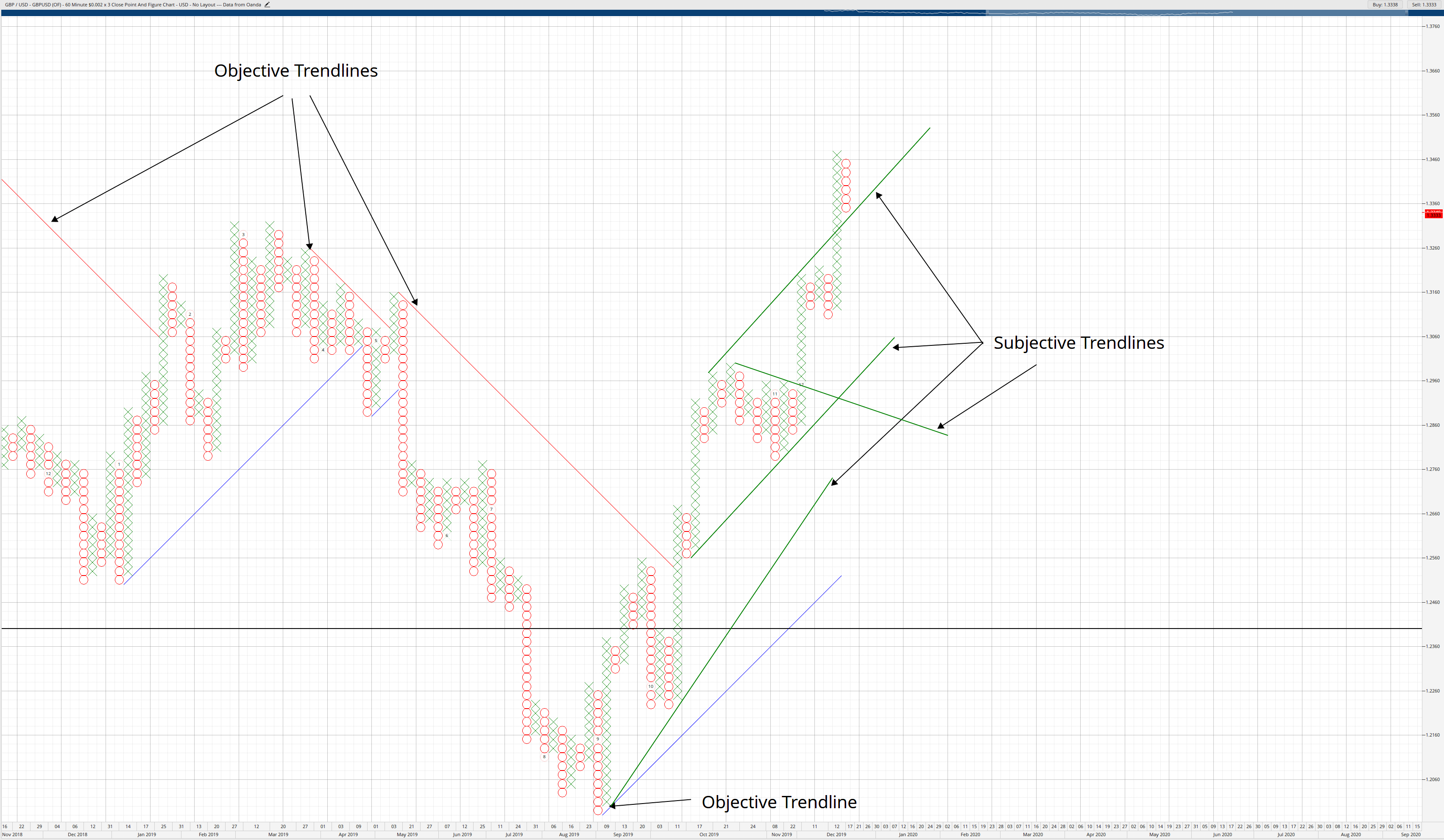
Something new traders struggle with is trying to find appropriate profit targets and stop targets. Point & Figure charts make a process that is a struggle into something that is very, very easy. Two methods can be used to identify profit targets on a Point & Figure chart: Vertical Method and Horizontal Method. I am only going to show you the Vertical Method because the entire series I’ve done here has strictly been on the use of 3-box reversal Point & Figure charts.

The Horizontal Method can be found in Jeremy Du Plessis’s work. The Horizontal Method is more applicable to the most traditional form of Point & Figure – the 1-box reversal chart. There’s a formula for calculating the profit target on Point & Figure. Don’t get freaked about the word formula – the process is very simple.

Long Profit Target
Long Profit Target

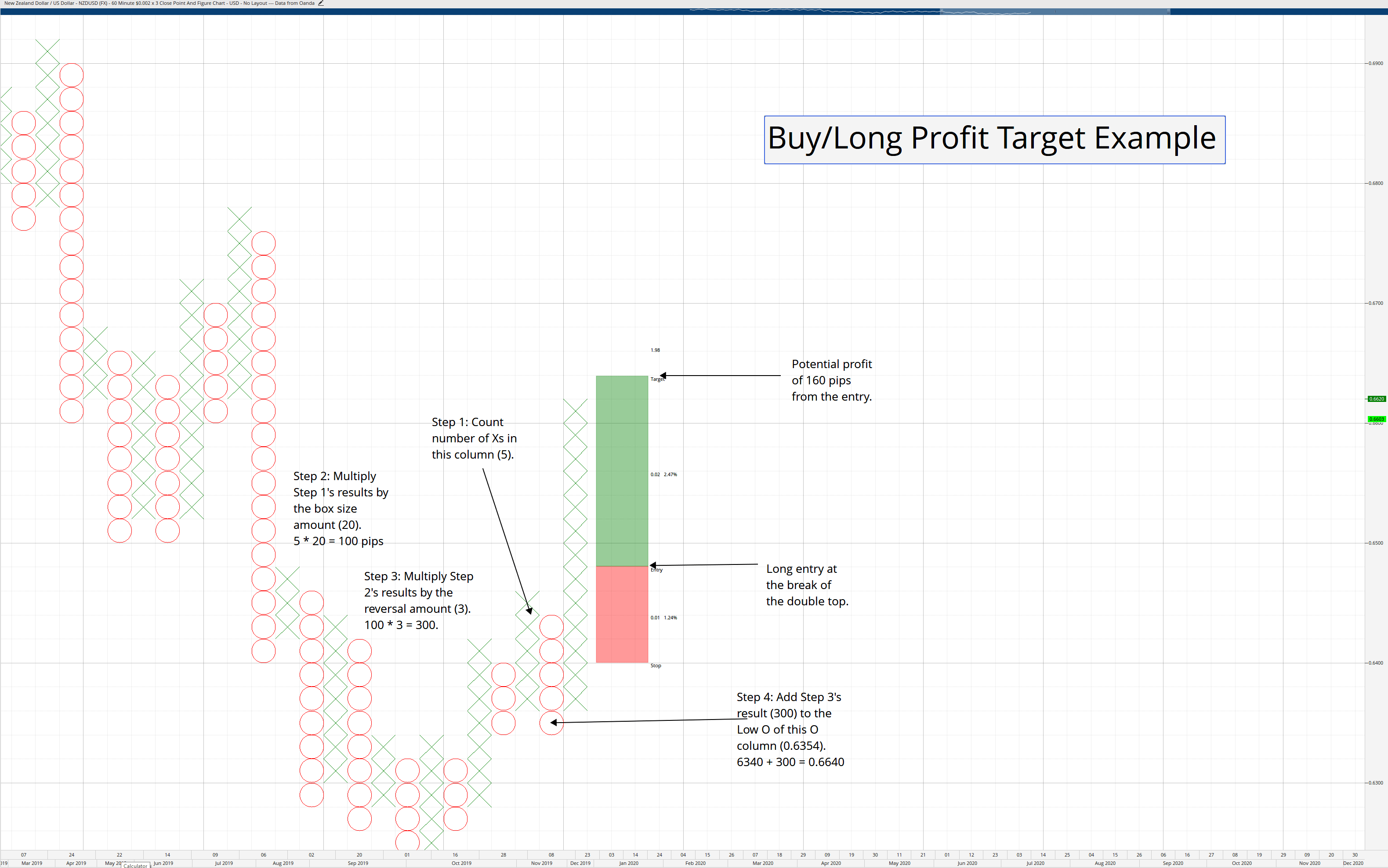
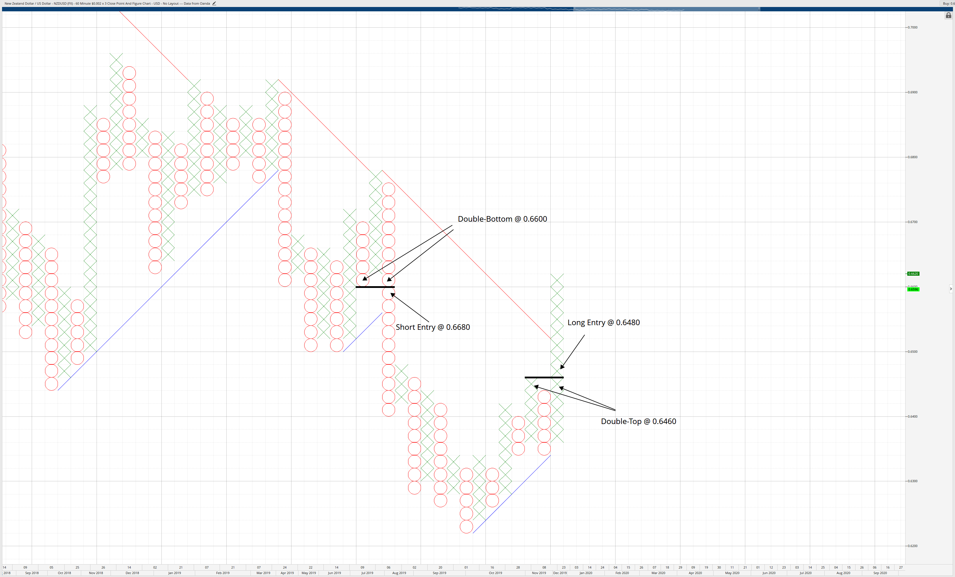
Buy/Long Profit Target = (number of Xs in prior column * box size) * (reversal amount) + lowest O of the current O column.

Short Profit Target
Short Profit Target

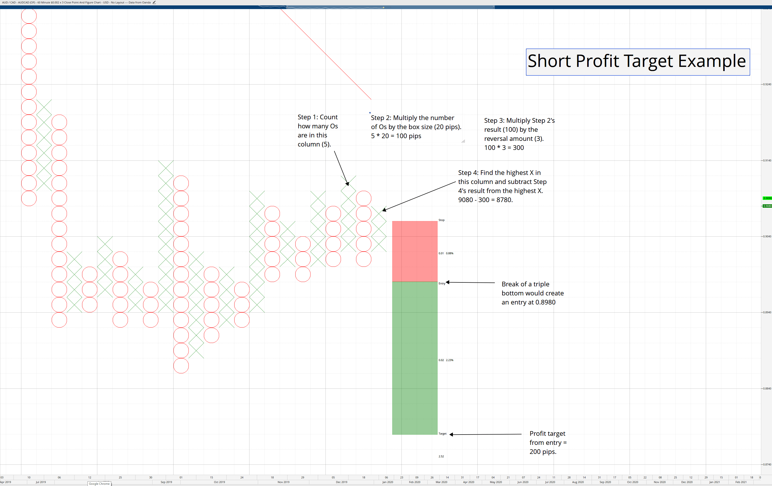
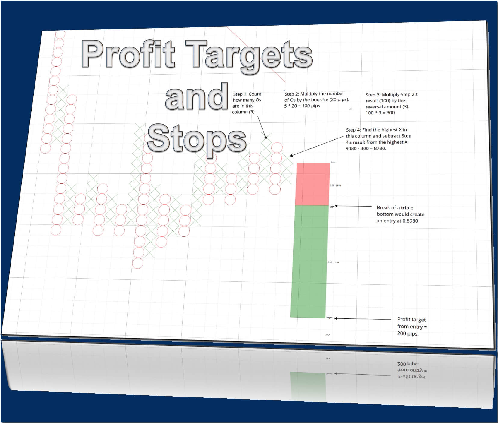
Short Profit Target = (Number of Os in prior column * box size) * (reversal amount) – highest X of the current X column.


Stops

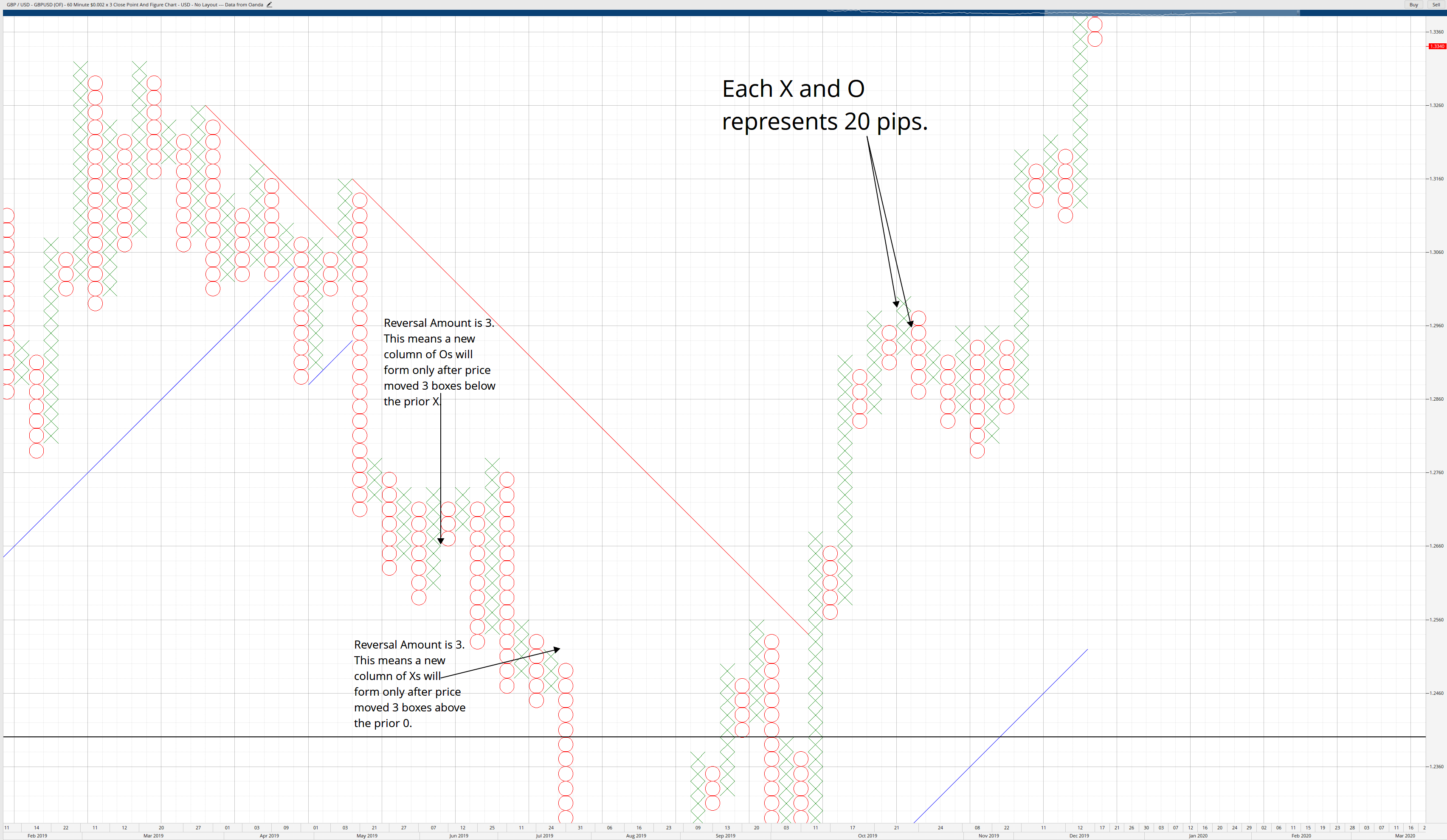
Regarding stops, I always stick with the reversal amount – so my risk is always, no matter the trade, 3-boxes worth. On my standard 20-pip box size Point & Figure charts, 60 pips are my max loss on any trade. Some authors suggest putting the stop one box below (or above) the reversal amount, but I’ve always stuck with the reversal amount being my stop.

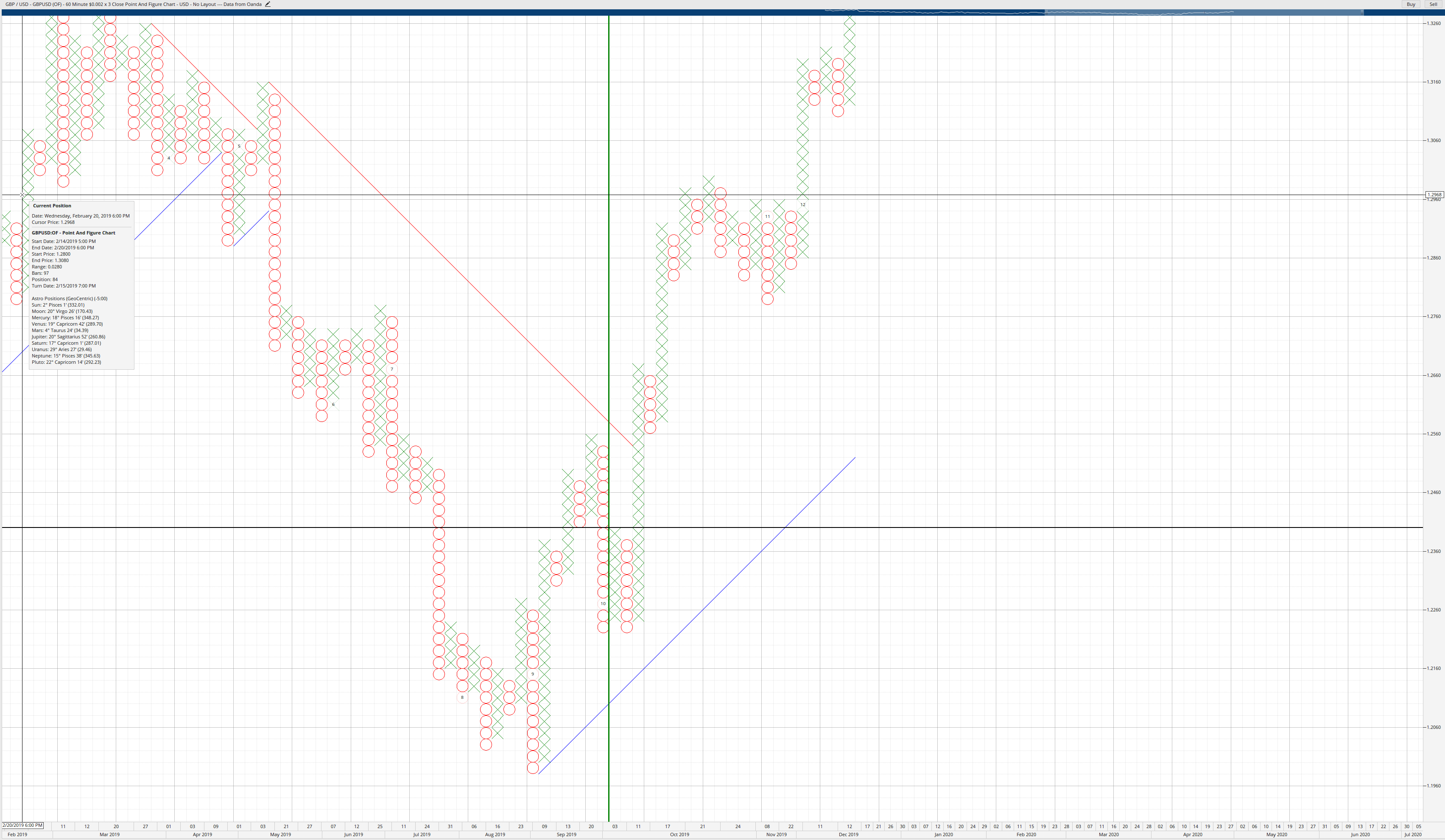
The Blind Entry Trading System

I want to tell you something that might be a little mind-boggling. I’ve been teaching Point & Figure to another class this year, and we’ve focused on live testing the ‘blind entry’ trading strategy in Point & Figure – which is nothing more than taking every single multiple-top or multiple-bottom break without any other filter. We focused on the following pairs:

GBPUSD, AUDUSD, USDCAD, USDJPY, GBPJPY, EURGBP, EURUSD, and AUDJPY.

We did not use any profit targets. We exited trades only when the reversal column appeared. So our losses were always limited to just 60 pips on a 20-pip/3-box reversal Point & Figure chart. We traded from March 1st, 2019 through December 7th, 2019. The results below detail the net pips at the end of our trading period:

GBPUSD = +1,060 pips

AUDUSD = -60 pips

USDCAD = +200 pips

UDSJPY = +1060 pips

GBPJPY = + 2,620 pips

EURGBP = +480 pips

EURUSD = -280 pips

AUDJPY = +1,200 pips

Net Total pips = +6,280 (the average for the class was +5443 pips).

To put that into perspective, with a 0.1 (10,000 unit) Lot size, that’s a net $6,280.00. A full Lot would have equaled a net $62,800. I had one woman who traded an odd 3.33 Lots as her standard position size (I guess it is not that odd if you think about it). She led the pack with her real net pip count at +6,880 – with a 3.33 lot size that meant she made a net $229,104. I was and remain very envious of her performance – she should probably be teaching!


Sources:

Dorsey, T. J. (2013). Point and figure charting: the essential application for forecasting and tracking market prices (4th ed.). Hoboken, NJ: John Wiley & Sons.

Kirkpatrick II, C. D., & Dahlquist, J.R. (2016). Technical Analysis: The Complete Resource for Financial Market Technicians (Third). Old Tappan, NJ: Pearson.

Plessis, J.J. (2012). Definitive Guide to Point and Figure – a comprehensive guide to the theory (2nd ed.). Great Britain: Harriman House Publishing.

DeVilliers, V., & Taylor, O. (2008). Point and figure charting. London: Financial Times/Prentice Hall.

Categories
Forex Daily Topic Point and Figure

Point & Figure Charts: Introduction

Point & Figure Charts

If the only chart style you have ever been familiar with is Japanese candlesticks or American bar charts, then no doubt Point & Figure charts will look very foreign. They have the appearance of random and new while also being very organized and very old looking. Point and Figure charts are the earliest known forms of technical charting that we know of, and many civilizations have generated some Point and Figure charts out necessity. Another concept that may be difficult to grasp if you are new to price action only chart styles is that Point and Figure charts are an intraday charting style, but is void of any time component. Live data is necessary when using Point and Figure charts. The fact that Point and Figure is an intraday chart style will confound most people who are familiar with charts that utilize the component of time, like Japanese candlesticks. Most of you who are learning about Point and Figure charts will assume that Point and Figure is a long term chart form. It is tough to create the mindset that time is not a factor in Point and Figure. But let’s get to the chart.


Point & Figure Chart Basics – Box Size and Reversal Amount

Point & Figure charts are represented by a Box Size and a Reversal Amount. Boxes are represented as Xs and Os. The trader or analyst determines the Box Size. Depending on the market you are trading and the Reversal Amount, the Box Size will vary from one market and instrument to the next. I will provide a table with the box sizes I use in my trading at the end of this article. On a Point & Figure chart, Xs and Os represent price direction. Xs, often colored green, represent price moving up. Os, usually colored red, represent price moving down.

The trader or analyst also defines the Reversal Amount. Historically, Point & Figure charts were 1-box Reversal charts. Today, 3-box reversal charts are the most common. There is no limit on the number of boxes required for a reversal. I only use 3-box reversal charts – they perform exceptionally well in Forex markets. The Reversal Amount dictates how many boxes price needs to move to print a new column of Xs or Os. Let’s look at the Box Size and Reversal Amount on the chart below.Box Size & Reversal Amount

Box Size & Reversal Amount

Pair Box Size (in pips) Pair Box Size (in pips)
AUDCAD 20 GBPAUD 40
AUDCHF 20 GBPCAD 40
AUDJPY 20 GBPCHF 20
AUDUSD 10 GBPJPY 20
CADJPY 20 GBPNZD 40
CHFJPY 20 GBPUSD 20
EURAUD 40 NZDCAD 20
EURCAD 20 NZDJPY 20
EURCHF 20 NZDUSD 20
EURGBP 20 USDCAD 20
EURJPY 20 USDJPY 20
EURNZD 40 USDCHF 20
EURUSD 20


How much time does it take for a column to change from X to O?

Your transition to a price action only chart from a Japanese candlestick chart is going to continually be hampered by continuing to think that ‘time’ has someplace on a Point & Figure chart. You will look at a chart and say to yourself, ‘Well, that column of Xs has been there for a while, it can’t move anymore, it will probably reverse.’ While the concept of time is not used, some pieces of software will allow you to imprint the month on the chart where the month’s number will appear at the price level it was trading at when the month started. This can give those who are transitioning to Point & Figure as a new chart style some ‘grasp’ of time. See below.

Months on Boxes
Months on Boxes

Some traders may find having the month displayed as a benefit. Is it useful? I think so. It does at least give a sort of perspective of time and how long something has remained in a single column or how many reversals have been printed on the screen. Additionally, cycle analysis teaches that we often see some of the highest probabilities of trend changes or corrective moves occurring at the start of a new month. If we observe a new month starting near an extreme high or low, we could be looking at an imminent reversal with at least a high probability short term trade option.


Trend Lines and Patterns

Another concept that people new to a price action only chart style might find difficult to understand is that P&F charts are always in a bear or bull market. And depending on the time frames you trade on a Japanese candlestick chart, Point & Figure charts may change bull and bear trends frequently or infrequently. Two types of trendlines can be drawn on a Point & Figure chart:

  1. Objective (requires only one point to draw).
  2. Subjective (requires two or more to draw).
Trendlines
Trendlines

Objective Trend Lines or Dominant Angles are also called 45-degree angles. Dominant angles only require one point to be drawn, and they are always drawn from O to X or X to O (in 3-box reversal charts) – and always to the column right next to eachother. The software I am using for these articles is called Optuma by Market Analyst. In Optuma’s software, they auto-draw some of the dominant trend lines. Subjective trendlines are drawn the same way you would draw any other trendline on a Japanese candlestick chart. I rarely, if ever, utilize subjective trendlines. In some of the strategies I will go over, the dominant/45-degree trendlines are useful in determining the direction of the trading you should take.

Patterns such as flags and pennants will show up on Point & Figure charts just like you would see on Japanese candlestick charts. The same principles that we would apply in trading continuation patterns like flags and pennants are the same on a Point & Figure chart. There are some stark differences between the breakouts of a pattern on a candlestick chart versus a Point & Figure chart. There is a primary difference between how we treat breakouts of patterns and trendlines on a Point & Figure chart versus a candlestick chart.


Most Important Rule To Follow

                There is one primary rule that must be followed when trading on Point & Figure charts.

Only Enter Trades After Multipletops/Multiplebottoms have been broken.

I’ve said that Point & Figure charts are unambiguous. The entry rules in Point & Figure reinforces that statement. When a multiple top appears, the entry is always on the next X above the multiple top. When multiple bottoms appear, the entry is always on the next O below the multiple bottom. See the charts below:

Double Top & Double Bottom
Multiple Tops and Bottoms

A question often arises when an X or O breaks a trendline: do you enter a trade when the trendline is broken? It depends. The entry rules of multiple tops and multiple bottoms still apply. Even if the price breaks a trendline, a multiple top or bottom needs to be broken to take an entry. Further discussion into entry rules and entry strategies will be discussed in further articles.


Sources:

Dorsey, T. J. (2013). Point and figure charting: the essential application for forecasting and tracking market prices (4th ed.). Hoboken, NJ: John Wiley & Sons.

Kirkpatrick II, C. D., & Dahlquist, J.R. (2016). Technical Analysis: The Complete Resource for Financial Market Technicians (Third). Old Tappan, NJ: Pearson.

Plessis, J.J. (2012). Definitive Guide to Point and Figure – a comprehensive guide to the theory (2nd ed.). Great Britain: Harriman House Publishing.

DeVilliers, V., & Taylor, O. (2008). Point and figure charting. London: Financial Times/Prentice Hall.