Categories
Forex Daily Topic Forex Price-Action Strategies

Manage Your Trade Differently on Different Charts

In today’s lesson, we are going to demonstrate an example of an H1 breakout strategy. Before hitting the target, at some point, the price gets sluggish. Nevertheless, it hits the target in the end. Let us now proceed to find out the lesson it has to offer us.

This is an H1 chart. The price gets choppy within these two horizontal lines. It has a rejection and makes a bearish move upon producing a bearish inside bar. The chart is yet to make a breakout. Until it makes a breakout, it does not have anything to offer to the buyers or the sellers. However, as it stands, the buyers may have an upper hand here. Let us proceed to the next chart.

Here it comes. After a long while, a candle breaches through the level of support closing well below it. The candle has a long lower shadow, but the breakout is explicit. The sellers are to wait for the next candle to close its lowest low to trigger a short entry.

The next candle comes out as a strong bearish candle. This is one perfect looking bearish candle to attract the sellers to trigger an entry. The sellers may trigger a short entry right after the candle closes, setting stop-loss above the level where the trend starts with 1R.

As expected, the price heads towards the South with good bearish momentum. However, look at the last candle. It comes out as a spinning top. In a strong bearish trend, it is not considered as a strong bullish reversal candle. Moreover, it is an H1 chart, and the entry is triggered based on the H1 breakout strategy. Thus, the sellers must hold their position and wait. To be precise, they should not even look at this chart anymore by following the rule of ‘Set and Forget.’

The price hits the target. The next candle, after the spinning top comes out as a bearish candle. However, it closes within consolidation support. If it were an H4 or the daily chart, the sellers would have to close the trade manually. This is the difference between trading on the minor chart and major chart.

If we have a plan to take trading as our fulltime business, we may have to trade on different charts from the 15M to Weekly. Trade management varies from chart to chart. This is what we must remember. In the beginning, we shall master on a particular chart that we are comfortable with. Then, we may start trading on the other charts, preferably on the demo first. Once we are confident, we may trade on that chart in our live account. We must not apply a strategy or manage the trade the same way on the weekly chart that we are successful on the H1 or the 15 Chart.

Categories
Crypto Daily Topic

Whale Transfers and Their Influence on Bitcoin Price

If you are a bitcoin enthusiast or trader, you probably know that the markets are prone to price swings triggered by such things as government regulations, market news, and the good old supply and demand.

But are you aware of a lesser-known factor that could cause BTC prices to plummet, spike, or even affect their market value? Whenever you’ve seen a sudden boom or a decline in BTC prices, it’s very likely those movements were caused by a “whale.”

But what are Whales in Crypto Space? 

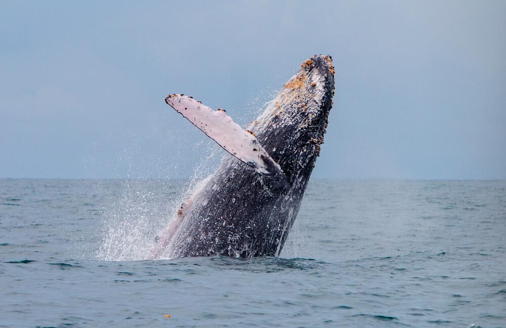
Whales are known to have an enormous size and sheer strength. In cryptocurrency trading, whales are the biggest and most influential players in the “ocean.”

The reference to whales in crypto trading originates from traditional financial markets and gambling circles. The very term “crypto whales’ should give you a clue of the utter power of these players. It’s not hard to realize that a single transaction made by them is enough to cause waves that will reverberate throughout the cryptocurrency ecosystem.

Who are the Bitcoin Whales?

The forefront question at this point is; just who are these so-called whales? Are they individuals, investment companies, are they even known at all? The answer is yes, and no.

Whales can be people with enormous amounts of capital to invest in cryptocurrencies, or they can be finance institutions like trusts and hedge funds. And yes, some whales are well-known people, beginning with bitcoin’s very creator – Satoshi Nakamoto, who is estimated to own at least a million bitcoins. Whales that are companies include Pantera Bitcoin Fund and Fortress Investment Group.

Currently, 40% of bitcoin is owned by just a thousand people. This means there are many anonymous whales in the market – and their movement could change the entire bitcoin landscape if someone decided to sell large portions of their holding.

How Whales Affect Bitcoin Prices  

The activity of whales can impact crypto markets significantly. Prices can dramatically decline or shoot up, and the market value can increase or decrease. When whales buy or sell a cryptocurrency, they do so in tens or even hundreds of millions, sending prices plummeting or spiking.

When a whale buys out massive volumes of BTC, it will drive the value of BTC high because it sends the signal that it is in demand.  The opposite is true for whale sell orders. BTC prices will drop because it will look like the currency is being disposed of, diminishing its value in the eyes of investors. 

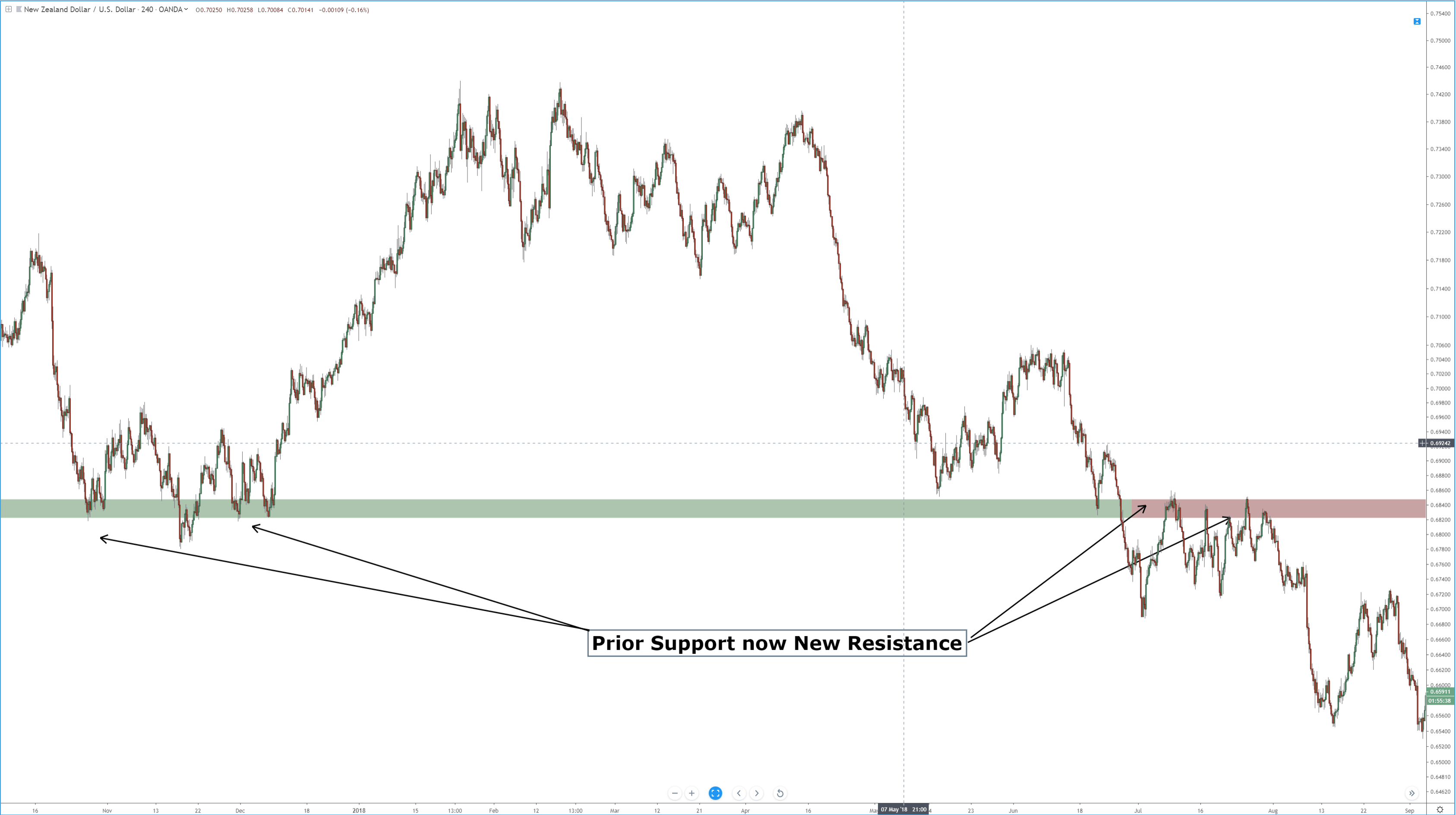
To grasp the impact that whales can trigger on the market, consider when two anonymous whales sold over 13,000 BTC in 2018 (total value of the sell was more than $100 million). This fact caused the price to decline by a whopping $200 in just under 20 minutes.

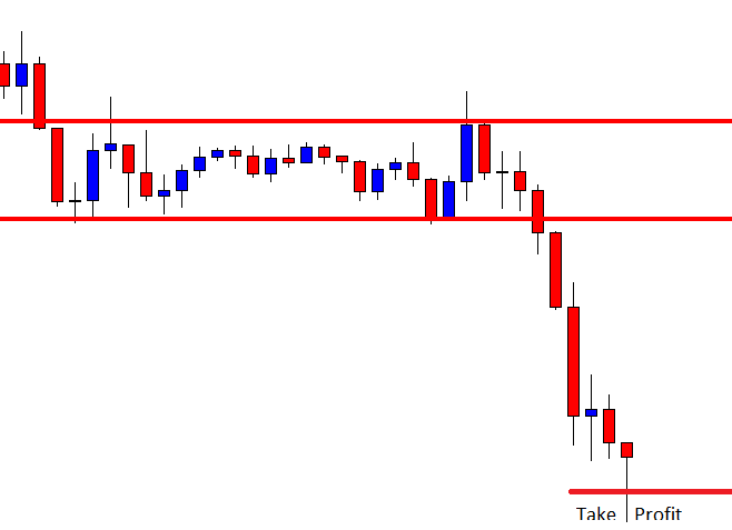
Whale-Watching: How to Detect Whale Movement

In the crypto trading sea, it’s wiser to swim along with whales than to move in the opposite direction. So if you’re looking to buy or sell bitcoin, why not wait for a whale to emerge first?  Below are some clues that can help you spot whales on the horizon – before they make a big splash. 

Detecting When a Whale Is Buying:

If you’re a “small fish” wishing to buy bitcoin, doing so at the same time as whales can guarantee you good profits with low risks. Here are some tips for detecting when whales are buying:

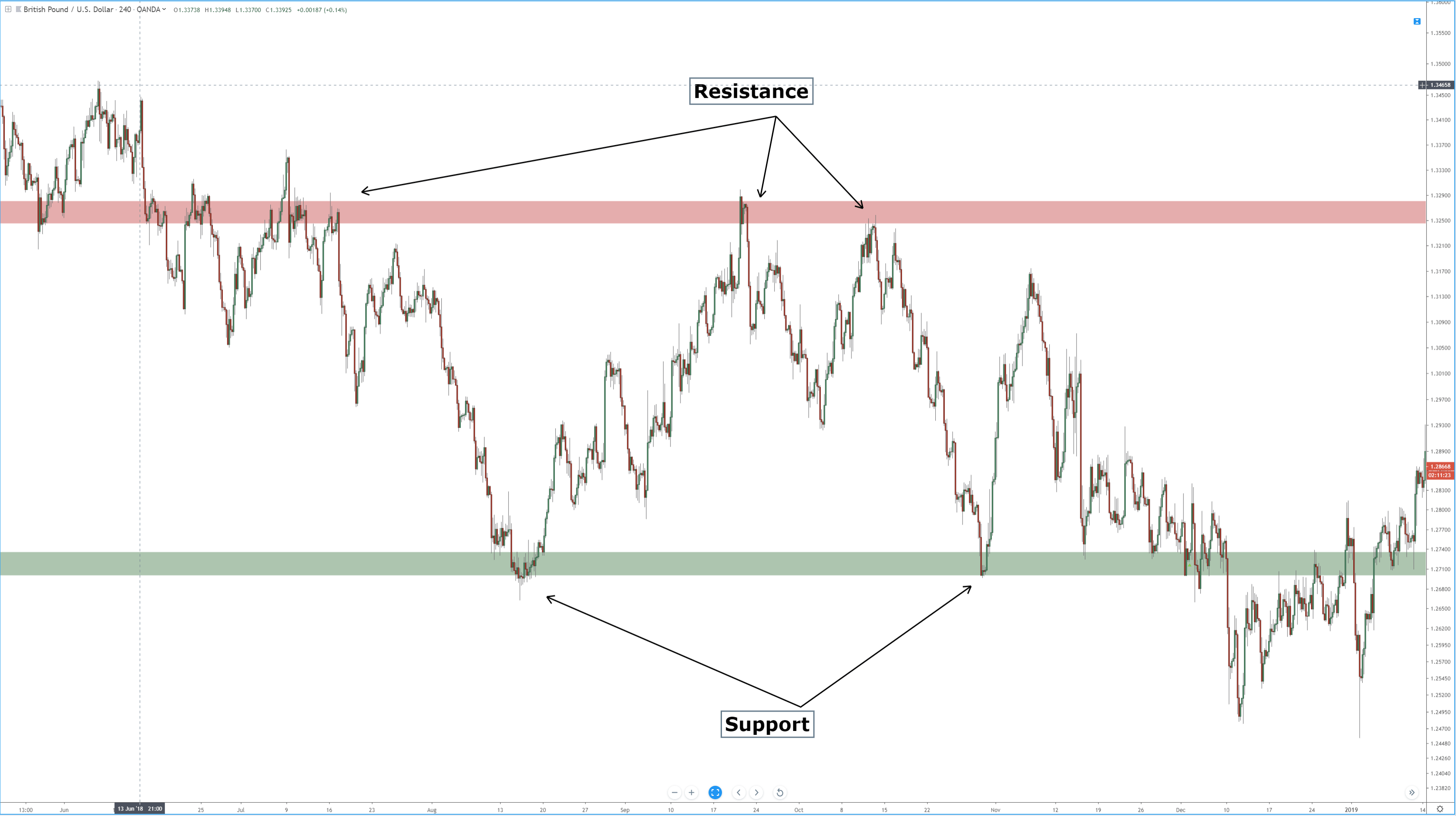
☑️ Look For an Increase in Volatility and Price When the Markets Are Quiet 

If bitcoin has been trading at roughly the same price and suddenly there’s larger-than-normal volatility and price, there could be a whale or several whales who have entered the market.

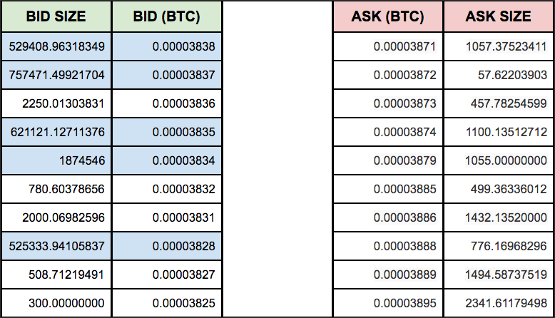
☑️ Look Out for Strange Bid Sizes in the Order Book

Keep an eye out for significant increases in order books. If you spot a sudden swell in bid sizes, a whale might be in play. For instance, suppose the usual bid size is 1000 and the ask size 2000. When a crypto whale is trading, the order book will register abnormally high bid sizes.

Detecting When a Whale Is Selling

The very act of whales placing sell orders is risky for traders holding smaller positions because this usually liquidates huge sums of the asset. In this scenario, you don’t want to hold on to your bitcoins very long. Here’s how to track a selling whale:

☑️ Check Abrupt Cancellation of Large Buy Orders

If you just noticed big buy orders quickly vanish from the order book, there is a possibility that a whale or a group of them is about to do a massive offload (selling in large quantities).

☑️ Look Out For a Sudden Uptrend that quickly disappears

Did you notice a sudden surge in price momentum, which quickly disappears as fast as it came? It’s highly unlikely this change was triggered by market news or a disruptive news story. It signals the presence of a whale. 

☑️ Look out for A Strong volume Acceleration 

A rapid increase in volume is another indication a whale is in play. But just how big of a jump should you watch out for? Usually, you want to be on the lookout for more than 3x larger than the routine volume.

Conclusion

The inherent nature of crypto prices is they will always drop and spike from time to time. This is what makes cryptocurrency trading possible (and fun) because investors are betting against future movement of prices. Crypto whales are one of the most powerful price movers. Understanding what they are and when they are going to move could help you make more accurate and profitable trades.

Categories
Forex Basics

Supply, Demand and Liquidity as Drivers of Prices

Markets are “places” where people and institutions exchange assets. It may be stock shares, commodities, grain, livestock, or currencies, but all markets behave similarly. Buyers and sellers look for the best possible price. A buyer seeks to buy at the cheapest possible price, while the seller wants to sell at the highest price.

How prices move

If we order buyers and sellers by the price they are willing to accept, we could see some buyers are bidding an amount very close to the price sellers are asking, and from there, the distance grows in a kind funnel-like shape.

For a sell to occur, one of them must cross the bridge and accept the other side’s price. Also, when a seller moves and takes the ask price for the first time, the “Last price” moves down a little. If another seller does the same, there might be other buyers willing to buy at the same level or not. If there are more buyers at that level, the next seller who takes the ask does not create an additional downward movement. If all buyers disappear from this level, the seller should accept a worse price, moving the asset down, or hold until a buyer takes his bid.

Conversely, if a buyer takes a bid price for the first time, the price of the asset moves up. If other buyers get in and deplete this level from sellers, they should buy at higher prices or wait till a seller takes his ask price.

Supply and Demand

Demand

The demand for an asset decreases as the price increases. The rate of that decline depends on the need for the asset and also on the perceived future value of the asset.

Supply

The supply increases as the price increases. The rate of increment depends mostly on the sellers’ belief about the future price growth of the security.

Equilibrium

Supply and demand are what drives prices up and down. If there are an equal number of buyers and sellers, the price stays at one level and is said to be in equilibrium.

When there are more buyers than sellers, the price moves up until a new equilibrium is reached. Conversely, if the number of sellers is higher, the price moves down until sellers and buyers get the new equilibrium.

Fair Price

The equilibrium is the result of a consensus about the fair price of the security, but fair price changes with the passage of time. The change in fair price may come from technical factors ( overbought-oversold levels, pivot points, breakouts), economic reports such as interest rates, GDP, manufacturing, nonfarm Payrolls, and inflation, or unexpected news events. The new price does not manifest itself in a single and swift price movement because that price is not known at the time. That’s the reason for the appearance of trends.

Liquidity

Liquidity is the term used to define the number of buyers and sellers present in the market.

In a very liquid market, the number of buyers and sellers is vast. Large-sized orders do not affect the price much. Also, bid and ask prices get closer to each other because buyers and sellers compete among themselves to offer their best bid and ask prices. That means spread tightens.

A market with low liquidity shows a scarcity of buyers and sellers. The size and number of operations are tiny, and one small order can produce significant price variations up or down. Also, usually, spreads widen because there is less competition among participants. Low liquidity may cause market manipulations since it is easy to drive prices up or down.

Liquidity does not depend only on the market in question. It changes with the time of the day. For instance, the EURUSD shows less liquidity during the Tokyo session. Then it grows when the European exchanged opens, and it maximizes at the open of the US session. Finally, it fades after Europe closes its markets and traded volume declines further after the US closes.

Final words

  • Supply and demand drive the prices up or down until an equilibrium is reached.
  • The equilibrium breaks by a change in the perception of value by the parties trading it.
  • High liquidity is the key factor for tightening spreads and making markets flow without price manipulation.
Categories
Forex Price Action

Support and Resistance

Support and Resistance

One of the fundamentals of Technical Analysis is the theory and methodology of support and resistance. In a odd turn of events, some of the most advanced methods of identifying support and resistance are not only relatively unknown, but they are some of the original Technical Analysis theories. Some of those methods include identifying support and resistance according to naturally squared numbers, numbers related to an angular nature in Gann’s tools, harmonic ratios, pivots, Fibonacci levels, and other more esoteric methods. For this article, though, the focus is on identifying support and resistance based on prior traded price levels and ranges**.


What are Support and Resistance?

When you hear the word’s support and resistance, the definitions of those words may be the first thing that comes to your mind. Support indicates that something will assist or strengthen while resistance indicates rejection. In Technical Analysis, support means a level that is below the price, and resistance is above price.

The image above shows resistance as a red band and support as a green band. It’s important to understand that support and resistance on a candlestick chart should never be viewed as a static and exact price level. With a chart style that has such dynamic time and price levels, like Japanese candlesticks, support and resistance are an area or range of value. Determining the support and resistance levels requires a ‘zoomed’ out view of the chart. When you get a broader view of the past price action, you can see price levels where price has moved lower and then reversed higher (support) as well as price levels where price move higher and then reversed lower (resistance). The most important levels are those that show past resistance becoming support and vice-a-versa.

Prior Support turned into Future Resistance


Use another chart style to find support and resistance

Renko Chart

While it may seem simple to find support and resistance on a candlestick chart, there are some alternatives. The length of the wicks and body of candlesticks can vary and can add to the confusion. Using a Renko (above) chart simplifies the process of finding support and resistance by reducing the noise on the chart and providing less ambiguity when looking for highs and lows. Take note of how these resistance and support levels are drawn on a price-action-only chart. With a price action only chart, I don’t draw a value area like I would on a candlestick chart. But if you are not comfortable using a price-action-only chart and want to stick to a candlestick chart, then another trick that might help is to remove the wicks from the candlesticks. Look at the side by side comparison below.

Wicks VS No Wicks

Both charts display a weekly chart of the CADCHF pair. On the left, we have a regular candlestick chart with wicks – wicks that are all over the place. The chart on the right is the same as on the left, but with no wicks displayed. You can see how much more clear the tops and bottoms are on the right. This can make it a little easier to spot support and resistance levels.


** It is the view of this author that past support and resistance levels are inefficient for today’s markets. However, the method discussed in this article is part of a foundation of learning that can be applied to future price level analysis.