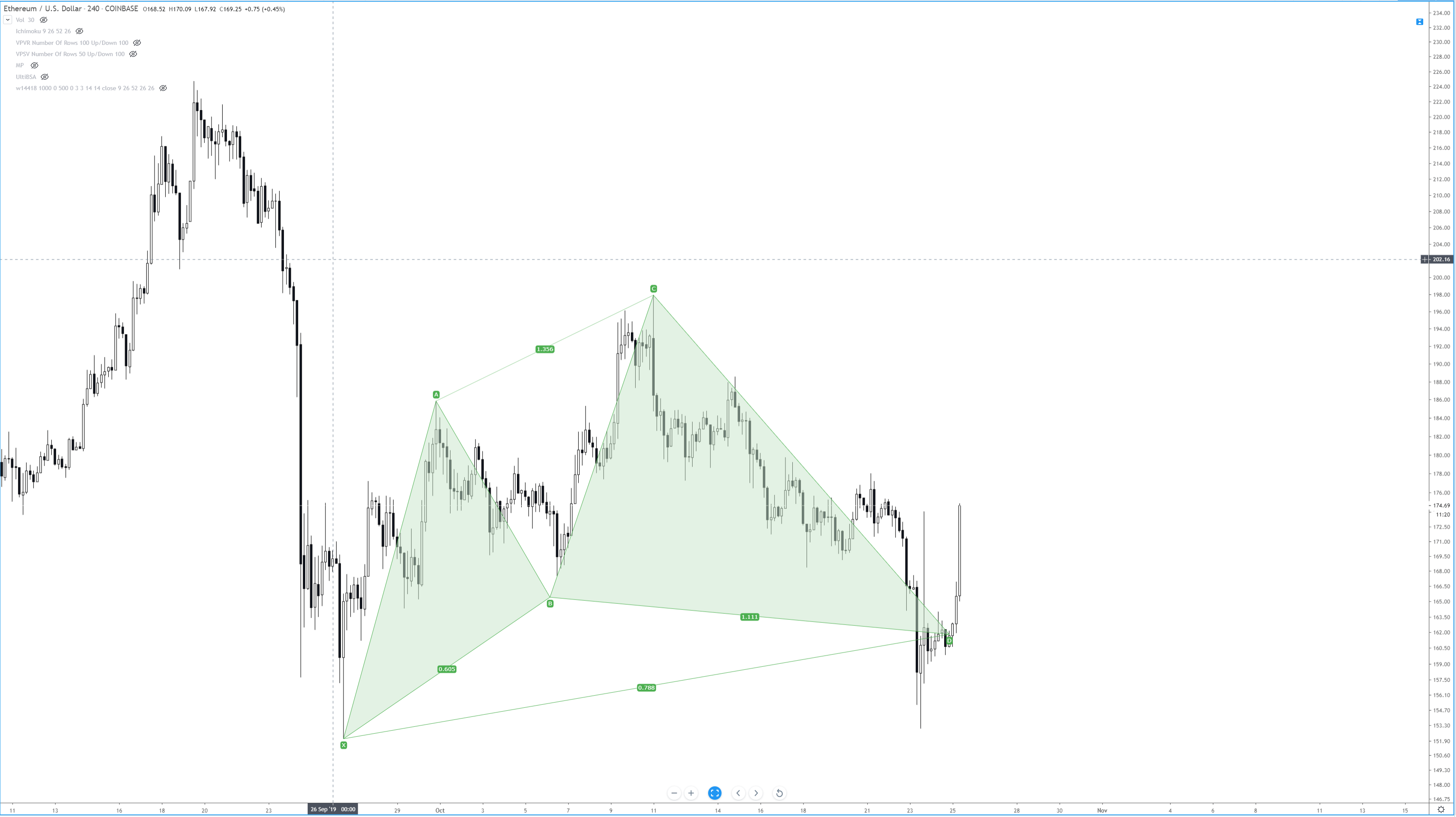
Chart Patterns: Start Here
Something that I stress repeatedly throughout our series on chart patterns is the difference between traditional markets like the stock market and the forex market. I’m sure a good number of readers have spent time reading books on technical analysis and have recorded and have seen various statistics regarding the performance of the various chart patterns that exist. There’s a big problem that exists in the realm of technical analysis and its use in forex markets, and that is related to nearly 100% of all technical analysis trading material focused on the stock market. Why is this a problem? Several reasons.
- Statistical performance values for chart patterns based on the pattern’s performance in the stock market is overwhelmingly long-biased: the stock market has been in a bull market for over a decade.
- Forex markets do not ‘trend’ in the traditional sense of financial analysis, they range.
In a nutshell, just because a particular pattern in the stock market may not perform that well in the forex market, it does not mean that its performance isn’t positive in forex. I’ve learned that most underperforming chart patterns in the stock market perform very well in forex markets. As always, make sure you do your own due diligence and research – investigate each pattern for yourself and see how they play out in your own trading.
To begin learning about Chart Patterns, follow this series of education articles.
Chart Patterns: Pullbacks and Throwbacks
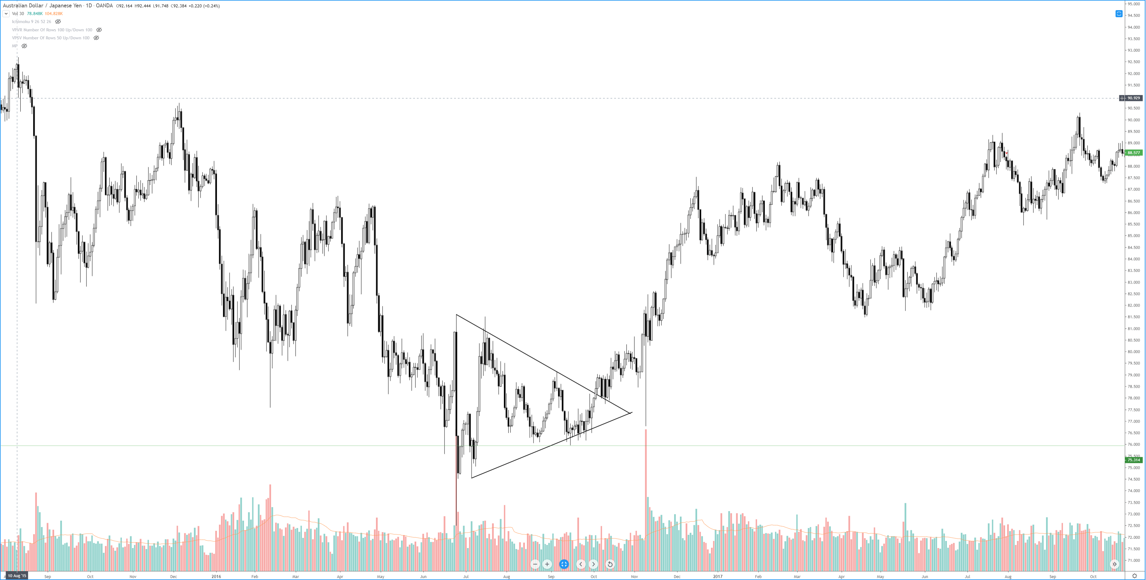
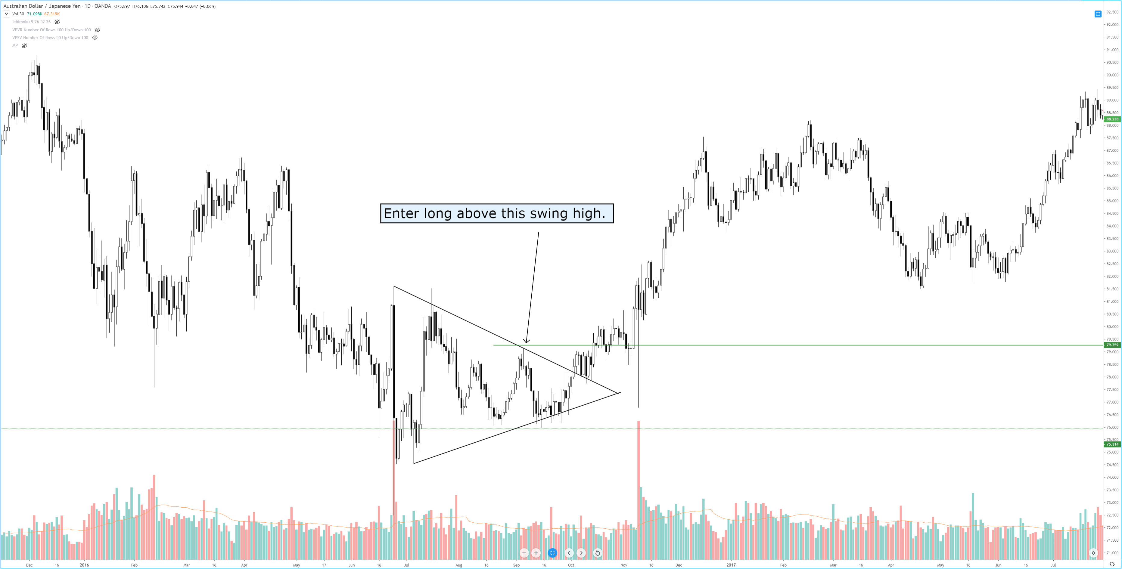
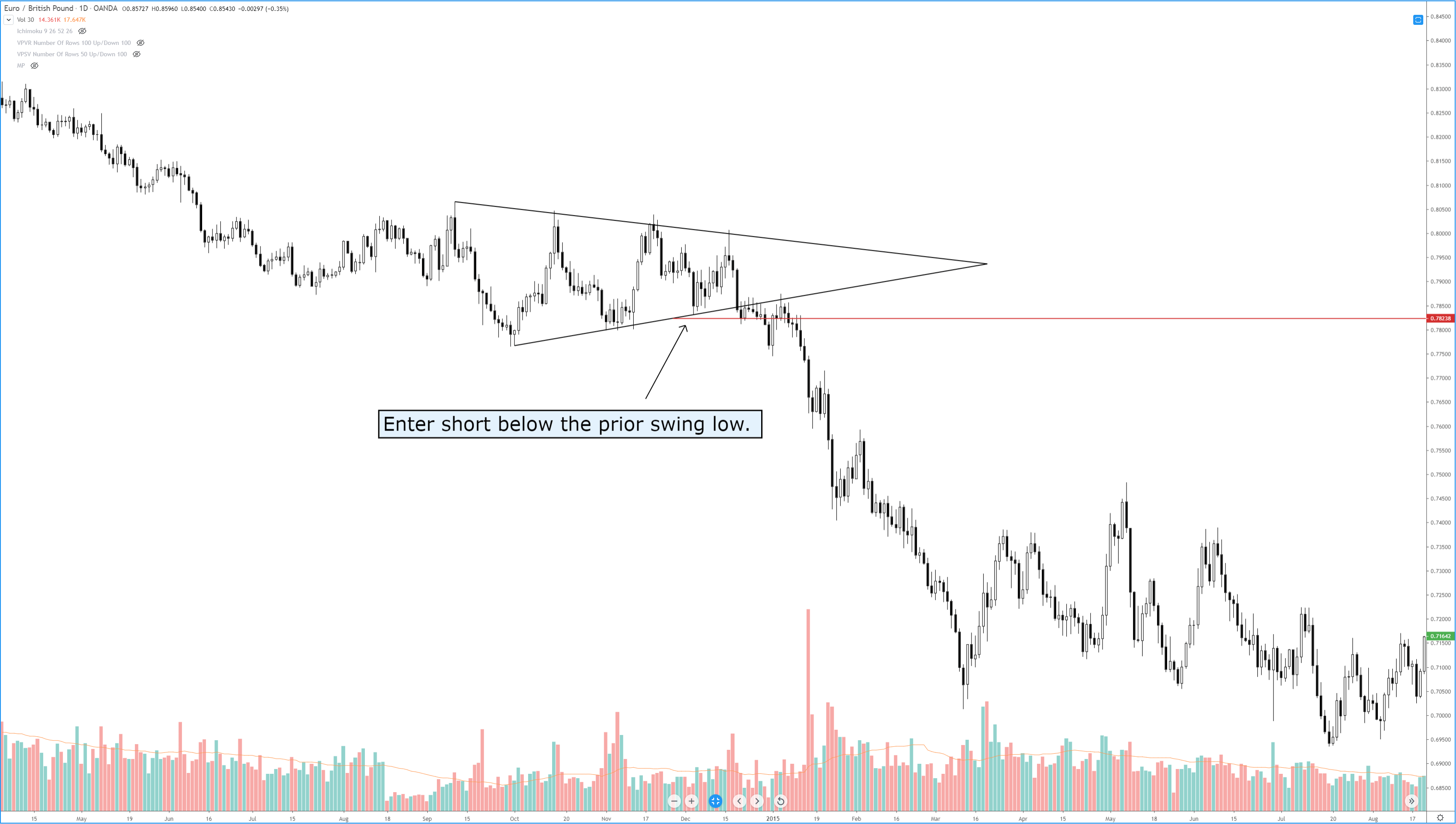
Chart Patterns: Symmetrical Triangles
Chart Patterns: Ascending Triangles
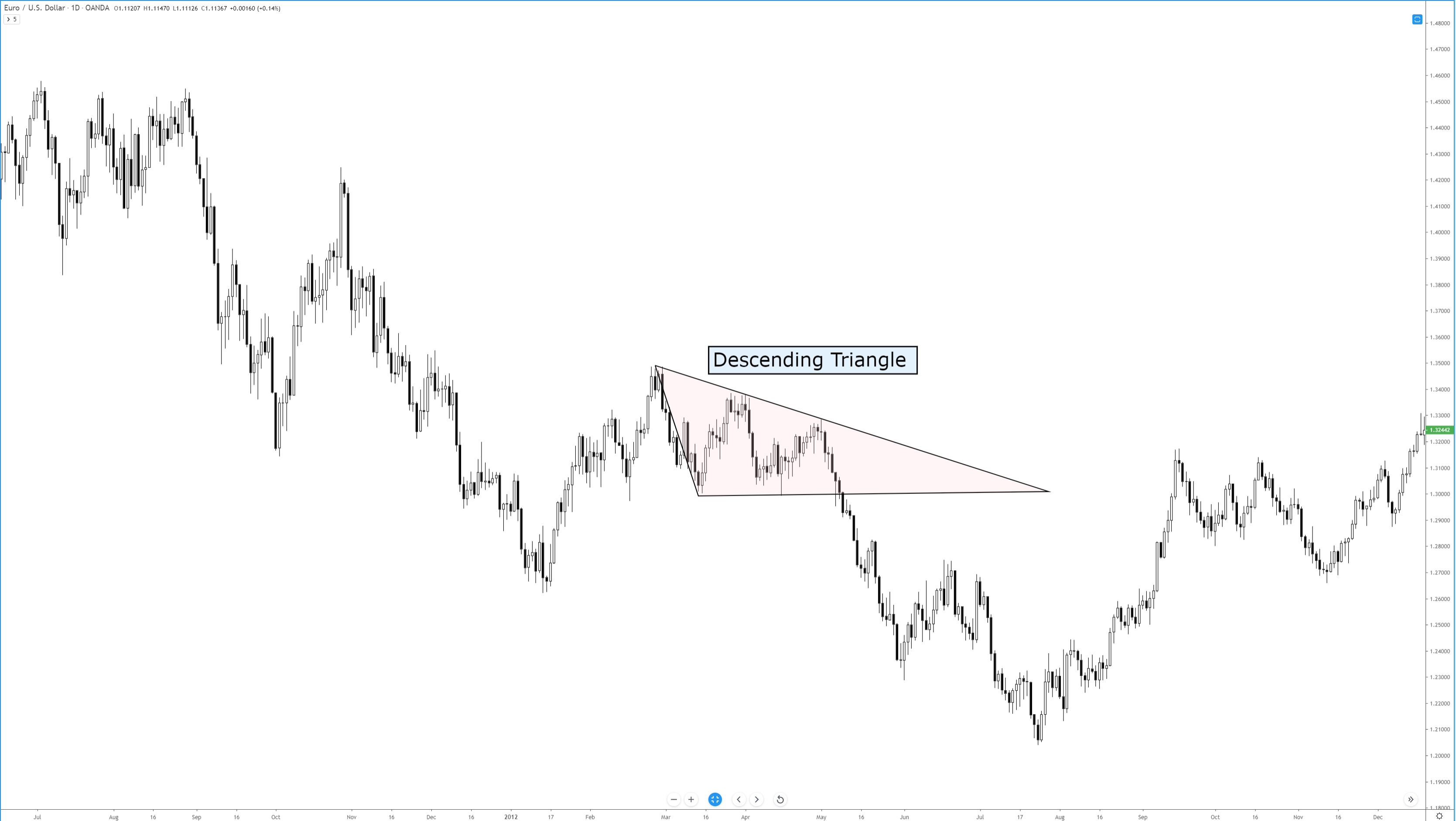
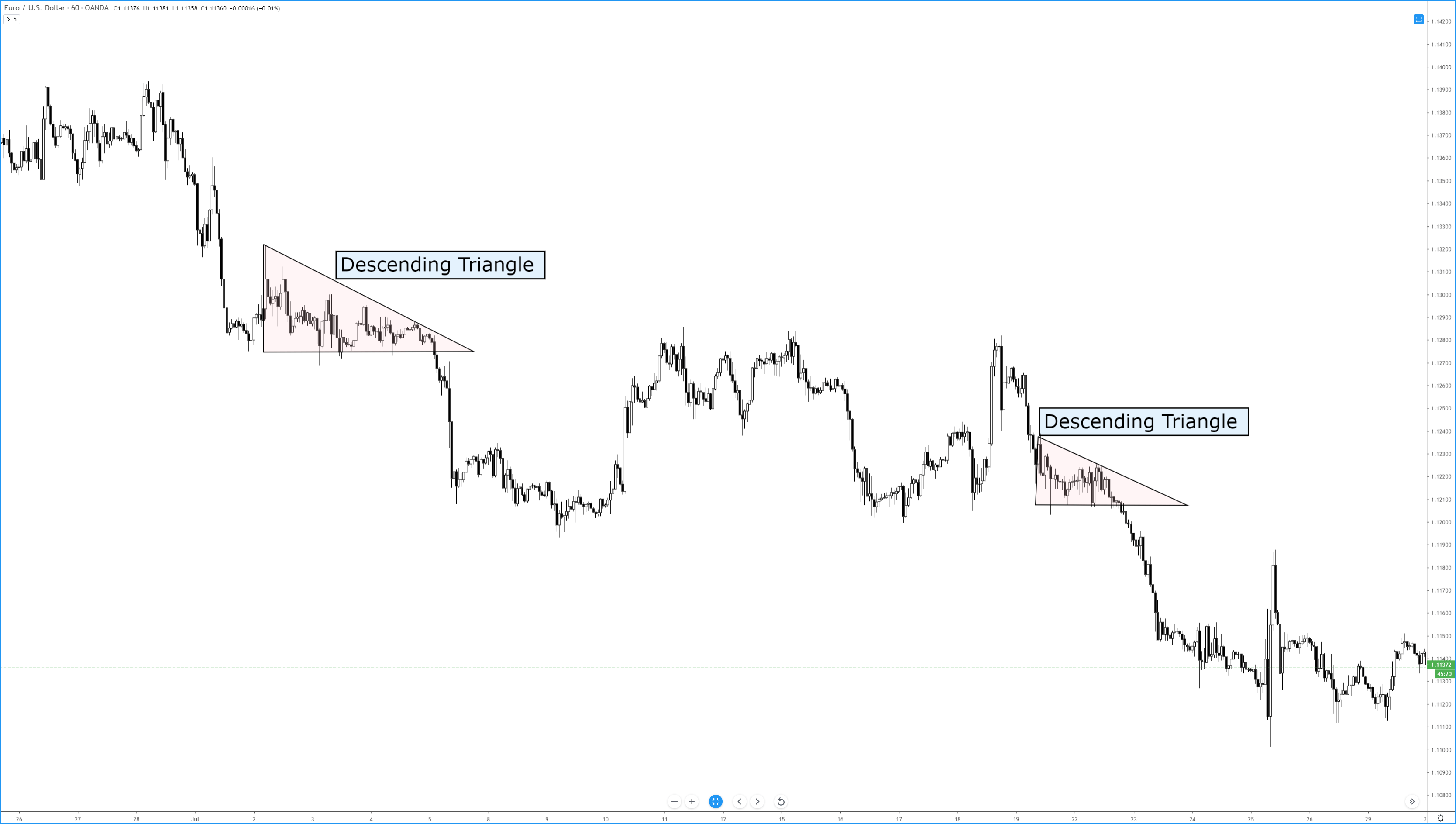
Chart Patterns: Descending Triangles
Chart Patterns: Head-And-Shoulder Patterns
Chart Patterns: Broadening Patterns
Sources:
Kirkpatrick, C. D., & Dahlquist, J. R. (2016). Technical analysis: the complete resource for financial market technicians. Upper Saddle River: Financial Times/Prentice Hall.
Bulkowski, T. N. (2013). Visual guide to chart patterns. New York, NY: Bloomberg Press.
Bulkowski, T. N. (2008). Encyclopedia of candlestick charts. Hoboken, NJ: J. Wiley & Sons.
Bulkowski, T. N. (2002). Trading classic chart patterns. New York: Wiley.