Categories
Chart Patterns Forex Daily Topic

Chart Patterns: Ascending Triangles

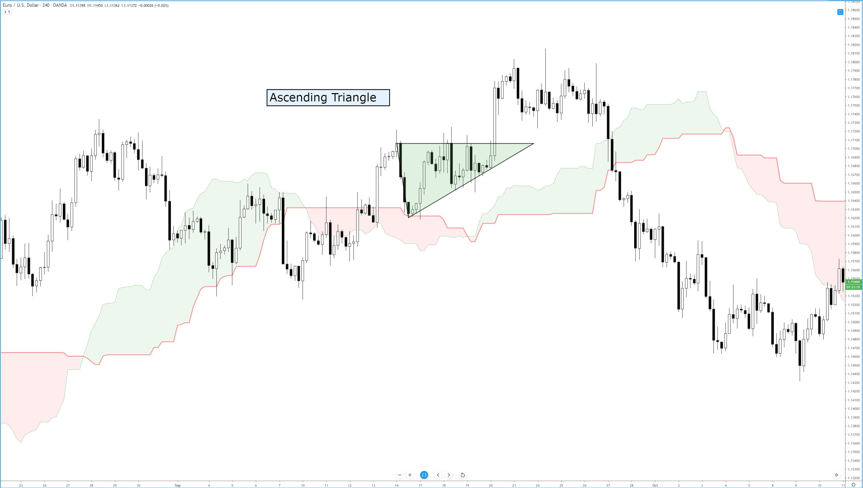
Of all the bullish continuation patterns that exist, few are as sought after as the ascending triangle. Like all triangle patterns, their development and construction are dependent on two trendlines that intersect and form an apex. The two primary identifying conditions of an ascending triangle I a flat, horizontal top and an upward sloping trendline.

Ascending Triangle
Ascending Triangle

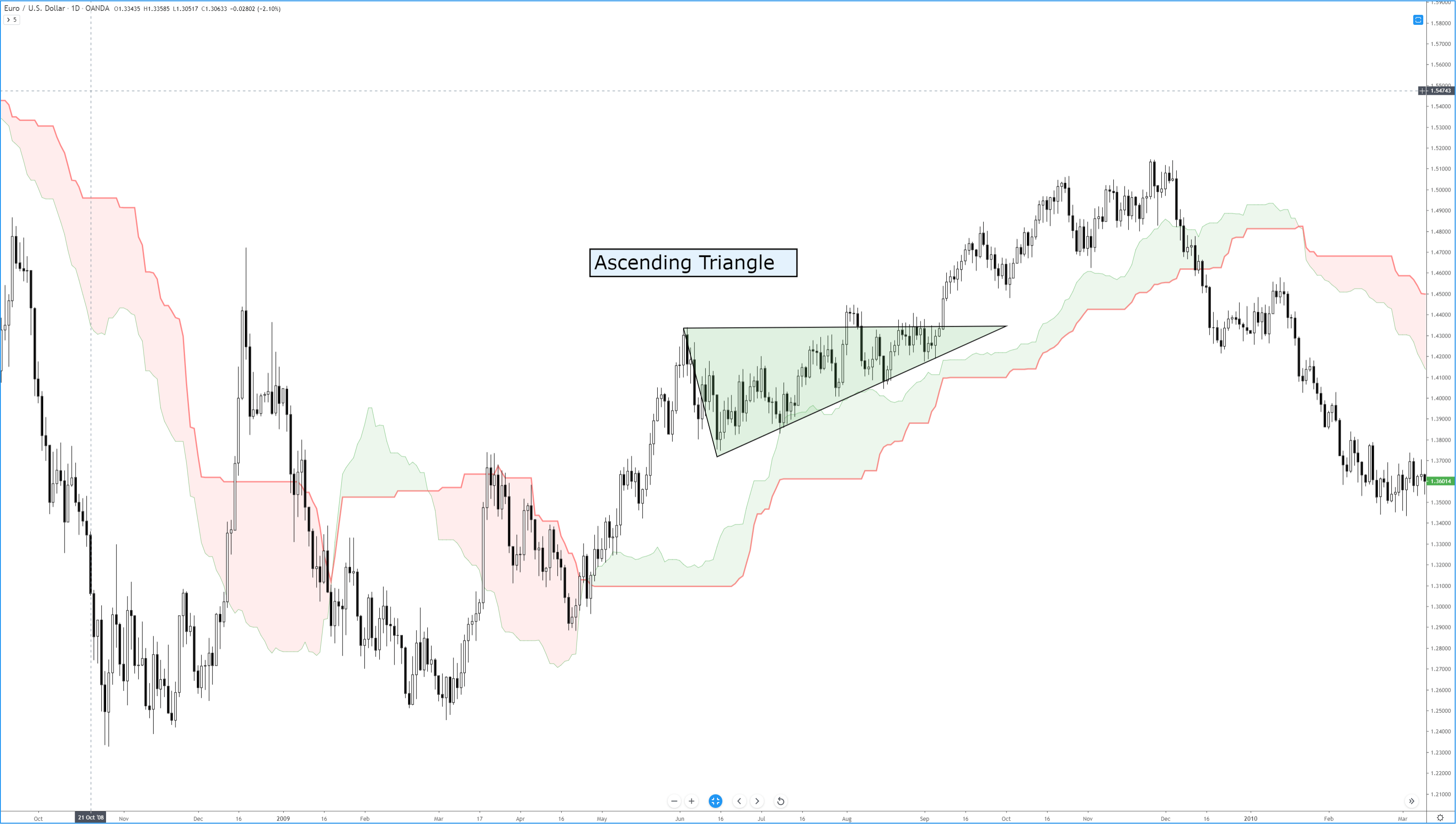
In addition to the two trendlines, there is a specific kind of behavior that the candlesticks must perform. The upper trendline and the lower trendline must be touched at least twice. Ideally, and according to Bulkowski, there should not be much open space inside the triangle. The same volume behavior that occurs in other triangles occurs here in the ascending triangle: price often breaks out in the final 2/3rds of the triangle, and volume decreases before the breakout. The psychology behind the formation of the ascending triangle is essential to understand. The pattern represents an apparent battle between longs and shorts. Short traders are under the impression that because the resistance level has been tested and has held, it will remain stronger. Long traders are under the impression that prices will move higher because of the formation of higher lows and an upward sloping trendline. Ultimately, shorts cover very quickly, just before or immediately after the breakout of the upper resistance.

Bulkowski recorded that, in equity markets, the breakout direction of an ascending triangle is upwards 64% of the time. Dahlquist and Kirkpatrick recorded that upwards breakouts occur 77% of the time. Interestingly, the performance of this pattern is roughly average across all patterns – this is contrary to the belief of many traders who self-report a high positive expectancy of upwards breakouts. Dahlquist and Kirkpatrick did warn that there are many false breakouts and that failure rates are between 11% and 13%.

As with any pattern, it is essential to pay attention to price action first and then find tools to help you filter whether an entry at the breakout is appropriate. Additionally, be wary of throwbacks as they are frequent over 50% of the time – many conservative traders wait for a retest of the breakout to confirm a valid break from the ascending triangle.


Sources:

Kirkpatrick, C. D., & Dahlquist, J. R. (2016). Technical analysis: the complete resource for financial market technicians. Upper Saddle River: Financial Times/Prentice Hall.

Bulkowski, T. N. (2013). Visual guide to chart patterns. New York, NY: Bloomberg Press.

Bulkowski, T. N. (2008). Encyclopedia of candlestick charts. Hoboken, NJ: J. Wiley & Sons.

Bulkowski, T. N. (2002). Trading classic chart patterns. New York: Wiley.

Categories
Forex Course

49. Quick History & Introduction To Japanese Candlesticks

What are Candlestick Charts?

A candlestick chart is simply a way of depicting the price moment’s information. Since these chats are very famous, they are available on almost every trading platform. Candlestick charts were first developed by a Japanese rice trader Sokyu Honma in the late 17th century. He is known as the father of candlesticks. Yes, it has been more than 250 years since this chart has been devised and yet they are so relevant even today.

Sokyu Honma – Father of Candlesticks

(Photo Credits – Alchetron)

Japanese are huge technical traders. They use a combination of candlestick techniques & western charts to analyze the market. The primary advantage of a candlestick chart is that it identifies the underlying psychology of traders in the market. This feature differentiates candlesticks from the other chart types we know today.

Have you come across terminologies like ‘hanging-man,’ ‘dark-cloud,’ and ‘evening-star’ but not sure what they are? Good. In the first part of this course lessons, we will be discussing everything about candlesticks and its patterns. We will also discuss how to use these charts & patterns to make profitable trades, as it will open a new way of analysis for you and show how Japanese candlesticks can enhance your trading performance.

Why do most of the traders use candlestick charts? 

There is a great interest in candlesticks by top traders. There are many reasons for that, and few of them are listed below:

🕯️ Candlestick charts are flexible. This is because they can be used as standalone or in combination with other technical indicators. These charts provide an extra dimension to the analysis.

🕯️ This technical approach is an age-old tradition of analysis, which has evolved from centuries of trial and error.

🕯️ Japanese are quite visual on the terms used to describe the patterns. A term like ‘hanging-man’ will spark interest among traders. There are hundreds of such names. Once a trader gets an understanding of what that pattern is, they will not be able to trade without using them.

🕯️ Another important reason for using the candlestick chart is that it can be paired along with the bar charts for people who see bar charts alone.

🕯️ All the usual technical analysis tools can be easily used with candlestick chartings, such as moving averages, trend lines, Elliot waves, retracements, and more. These charts provide a unique way of analysis, which is not provided by any other charting tool.

Limitations of using the Candlestick charts

🕯️ As with all other charting methods, candlestick pattern depends on the interpretation of the trader. This could be one of their limitations. As a trader gain experience, they discover which candlestick pattern suits them the best.

🕯️ Every candlestick has a close. Therefore, traders will have to wait for the close to get a valid trading signal. However, a trader might try and anticipate what the close would be a few minutes before the actual close.

🕯️ The opening price is vital in candlestick. Traders with no access to live market data might not be able to get the opening price of a security.

That’s about the introduction to Candlestick charts, its pros & cons. In the next article, we will learn the anatomy of a single candlestick chart so that you can read the chart better. Make sure to take the quiz below before moving on. Cheers!

[wp_quiz id=”59568″]
Categories
Forex Chart Basics

Unusual Candlestick Chart Types

In our previous article, we have seen the mainstream chart types, out of which the candlestick charts are the most prevalent in the current markets. But traders devised other ways to represent the price action in their search to get an edge over the rest of the traders. In this article, we are going to describe two popular variations of the basic candlestick chart.

Tick Charts

Tick Charts look similar to a candlestick chart, and every bar indeed is a real candlestick. But a Tick Chart does not depict a linear time scale. Instead, the chart moves to another bar every time a determined number of ticks have been reached.
And what is a tick? A tick is defined as one trade. So a 100-tick chart changes to a new candle every 100 trades, no matter its size.

Advantages of Tick charts

The main advantage of tick charts is that it allows spotting bars mostly populated by non-pro trades. Since every bar is made of the same number of trades, it is easy to detect bars with low volume, caused mainly through retail accounts. That allows pros to fade them and collect their money.

Tick charts homogenize the potential volatility on every bar because all bars represent the same number of trades. Therefore, it compresses low liquidity time segments into a few or one candlestick and expands hyperactive times into several candles. That way, amoving averages, and other indicators are more accurate. Also, the price action can be better appreciated, breakouts appear earlier, and chart cycles show up better.


Range Charts

Range charts are a convenient kind of chart. It also gets rid of the temporal method to move to the next bar. The idea of a range chart is to switch to a new bar once the chart has covered the assigned range. On the example supplied, the EURUSD is drawn using a 10-point range. Every candlestick covers ten pips and moves to the next bar. If the instrument is stuck inside a tight range, that candle may last for hours, until volatility comes back and the price creates a breakout.

Advantages of Range Charts

A range chart acts as a filter for ranging periods if the range size is adequately set, so trades can more easily avoid choppy market action, and only act on trendy segments.
Range charts also homogenize volatility.

Trends can be spotted more quickly as a result, and the trader can act on breakouts sooner than with regular candlestick charts. As happens with tick charts, indicators such as moving averages, MACD, and Stochastics work better with range charts.

The key to a proper range setting is to see when a relevant range starts a trend. It is easy to experiment until the adequate range hides most of the sideways action and takes away these harmful periods of inactivity. Looking at the average true range indicator on the timeframe of reference can help with the decision. The style of the trade should be taken into account. A scalping trading style calls for shorter ranges than a 4-hour trader.

To trade using range charts, we can add trend lines, averages, and other indicators. Range charts, as said, are excellent charts for the early entry of breakouts. Finally, range charts are very handy to spot momentum, so trade strategies based on volatility work better using them.