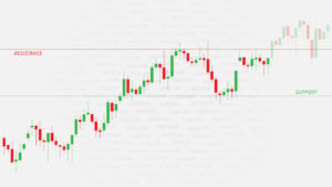
In our previous article, we have seen the mainstream chart types, out of which the candlestick charts are the most prevalent in the current markets. But traders devised other ways to represent the price action in their search to get an edge over the rest of the traders. In this article, we are going to describe two popular variations of the basic candlestick chart.
Tick Charts
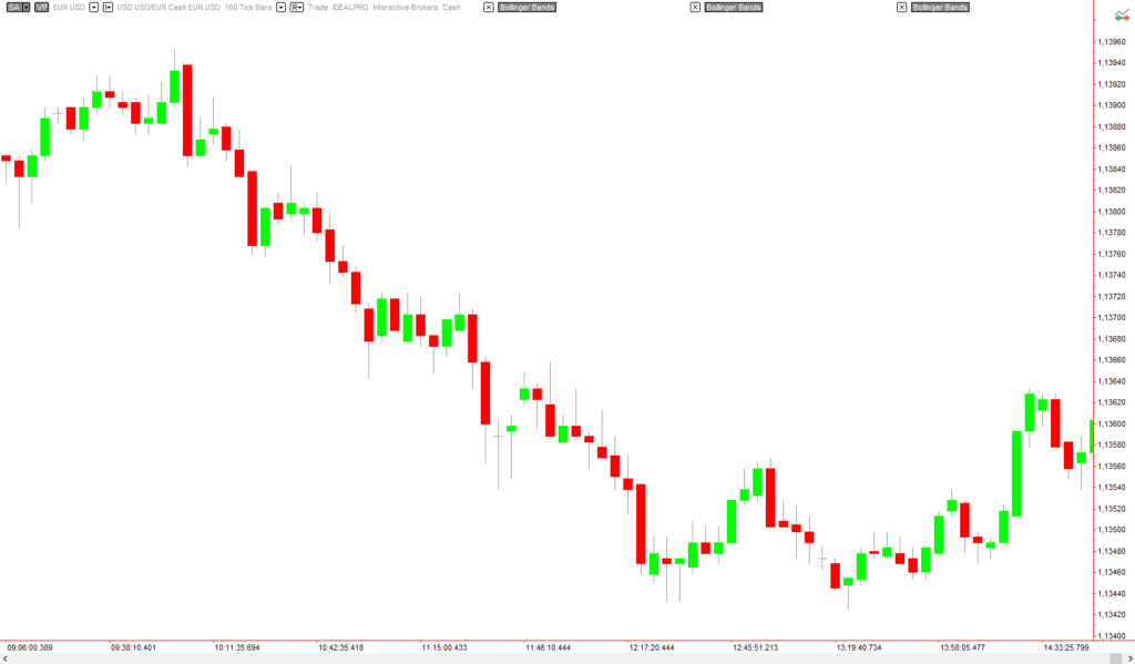
Tick Charts look similar to a candlestick chart, and every bar indeed is a real candlestick. But a Tick Chart does not depict a linear time scale. Instead, the chart moves to another bar every time a determined number of ticks have been reached.
And what is a tick? A tick is defined as one trade. So a 100-tick chart changes to a new candle every 100 trades, no matter its size.
Advantages of Tick charts
The main advantage of tick charts is that it allows spotting bars mostly populated by non-pro trades. Since every bar is made of the same number of trades, it is easy to detect bars with low volume, caused mainly through retail accounts. That allows pros to fade them and collect their money.
Tick charts homogenize the potential volatility on every bar because all bars represent the same number of trades. Therefore, it compresses low liquidity time segments into a few or one candlestick and expands hyperactive times into several candles. That way, amoving averages, and other indicators are more accurate. Also, the price action can be better appreciated, breakouts appear earlier, and chart cycles show up better.
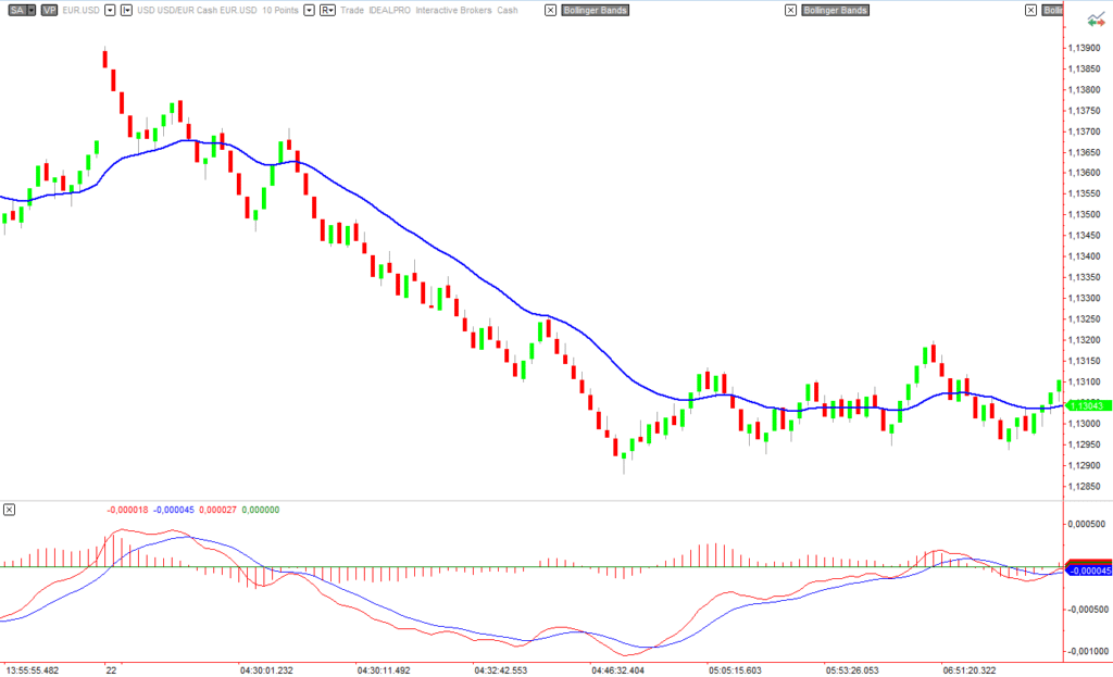
Range Charts
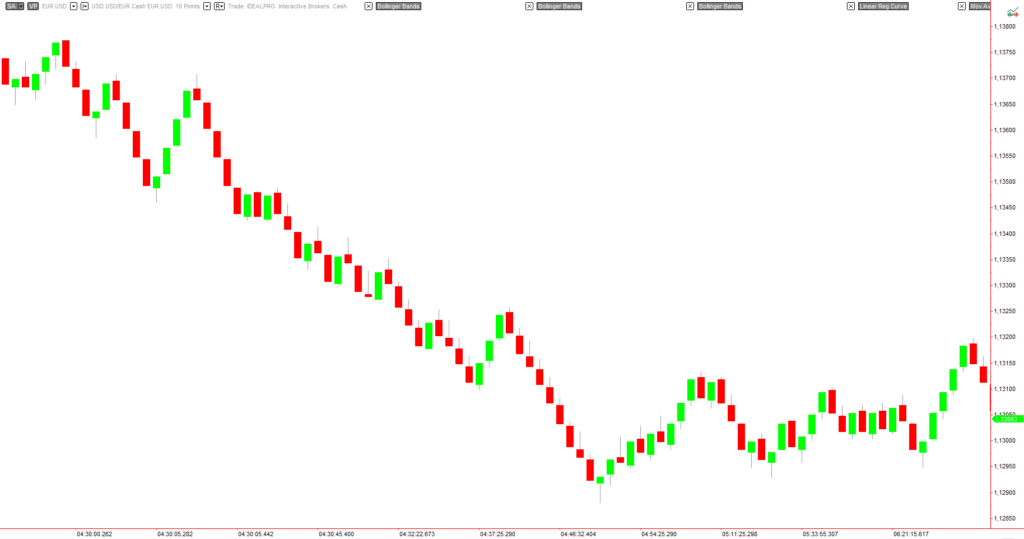
Range charts are a convenient kind of chart. It also gets rid of the temporal method to move to the next bar. The idea of a range chart is to switch to a new bar once the chart has covered the assigned range. On the example supplied, the EURUSD is drawn using a 10-point range. Every candlestick covers ten pips and moves to the next bar. If the instrument is stuck inside a tight range, that candle may last for hours, until volatility comes back and the price creates a breakout.
Advantages of Range Charts
A range chart acts as a filter for ranging periods if the range size is adequately set, so trades can more easily avoid choppy market action, and only act on trendy segments.
Range charts also homogenize volatility.
Trends can be spotted more quickly as a result, and the trader can act on breakouts sooner than with regular candlestick charts. As happens with tick charts, indicators such as moving averages, MACD, and Stochastics work better with range charts.
The key to a proper range setting is to see when a relevant range starts a trend. It is easy to experiment until the adequate range hides most of the sideways action and takes away these harmful periods of inactivity. Looking at the average true range indicator on the timeframe of reference can help with the decision. The style of the trade should be taken into account. A scalping trading style calls for shorter ranges than a 4-hour trader.
To trade using range charts, we can add trend lines, averages, and other indicators. Range charts, as said, are excellent charts for the early entry of breakouts. Finally, range charts are very handy to spot momentum, so trade strategies based on volatility work better using them.