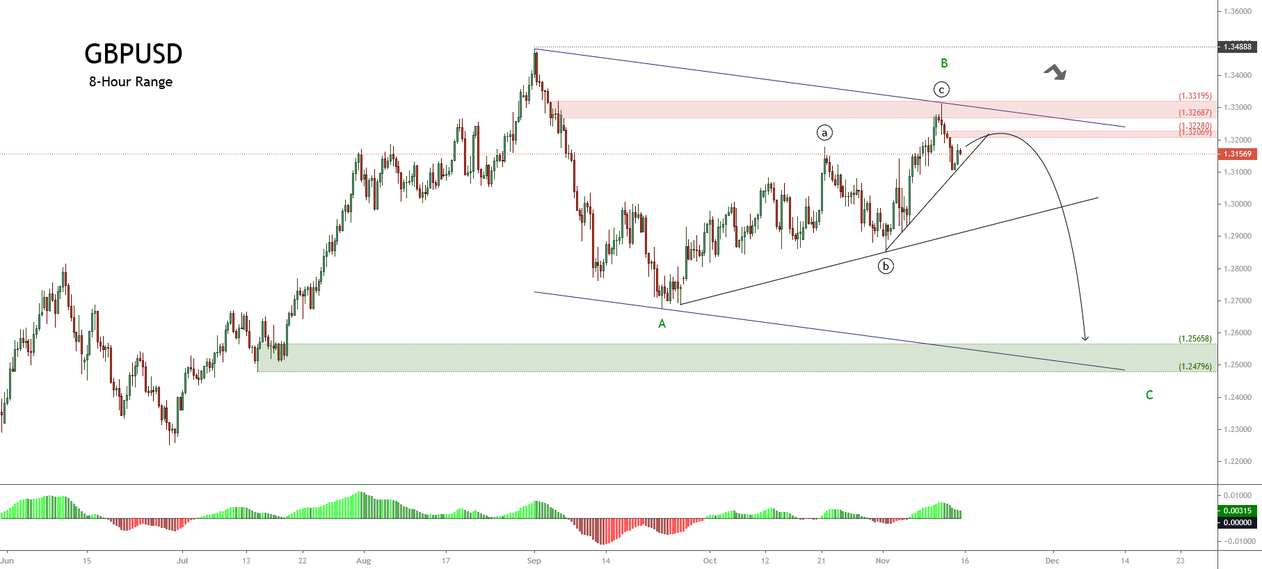
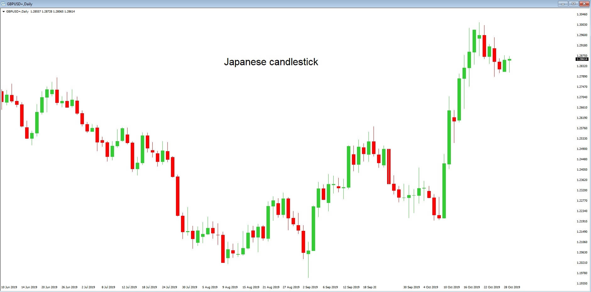
Introduction
Candlestick Analysis is likely the most popular analysis method to read the market and allow the market analyst to understand the traders’ sentiment over time.
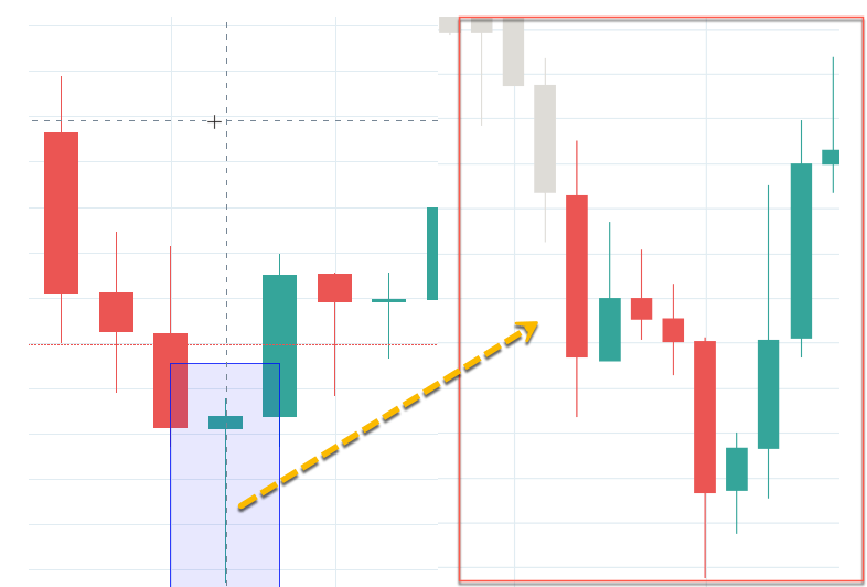
In this educational article, we will review some candlestick patterns, which could be used as technical formations to spot market turn, recognize and enter early in the new trend.
Candlesticks Basics
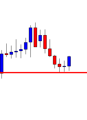
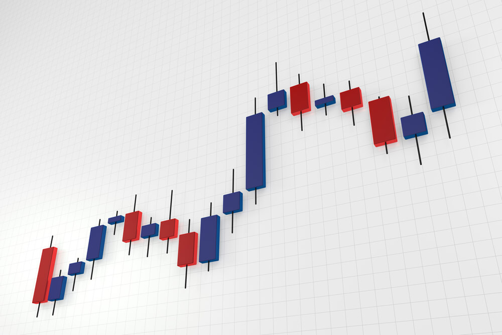
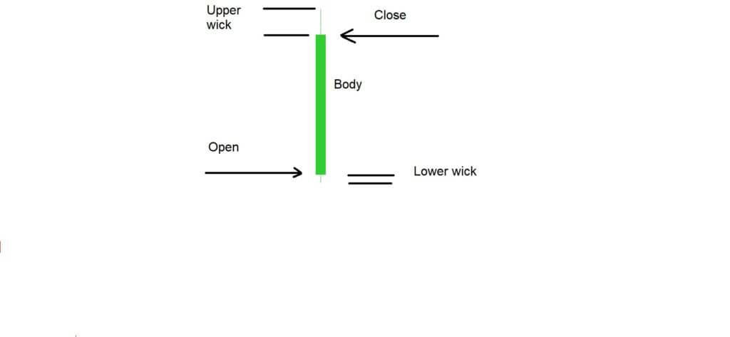
Candlesticks use the same information that OHLC bars; however, candlestick charts show the market information differently. The components of candlesticks are the open price, high, low, and close in a specific range of time, such as weekly, daily, and intraday. The following figure represents the structure of a candlestick in a bullish and bearish context.
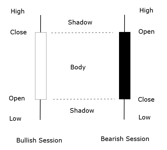
In the previous figure, we observe that the range between the open and close prices of the candlestick forms the body of the candle. If the close of the session is higher than the open, then the candle is bullish (white). If the close price level is lower than the open price level, then the candle will be bearish (Black).
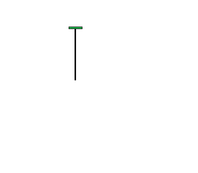
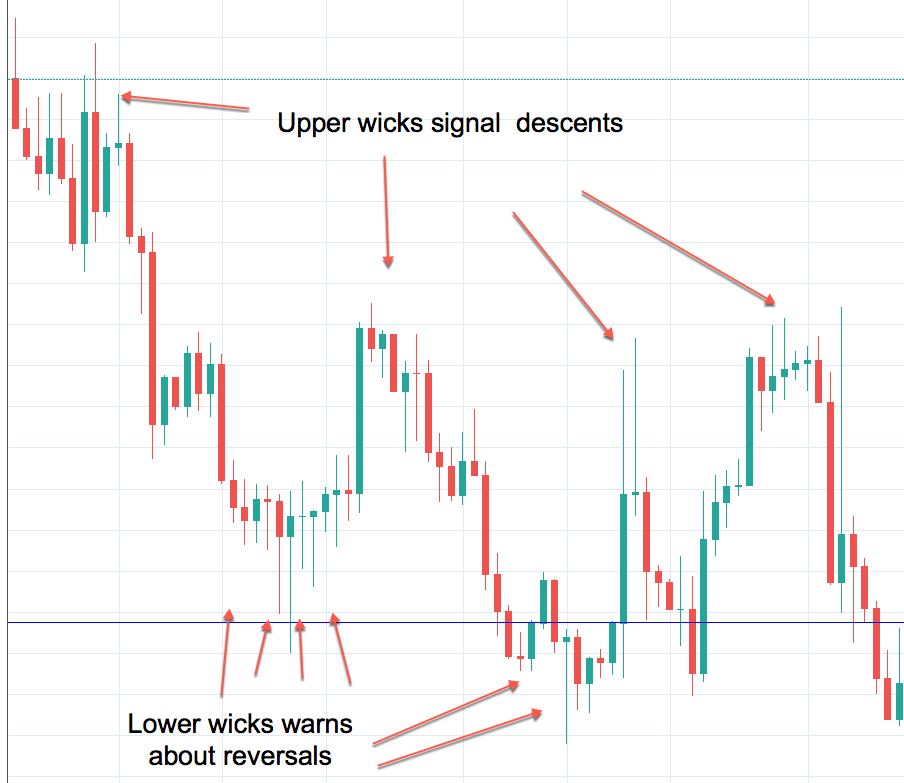
The range of the prices that moves above and below the body of the candle is called the shadow or wick, whose length can be from very short to quite long. The span between the high and low of the candle reveals how volatile it has been the trading session or intraday period.
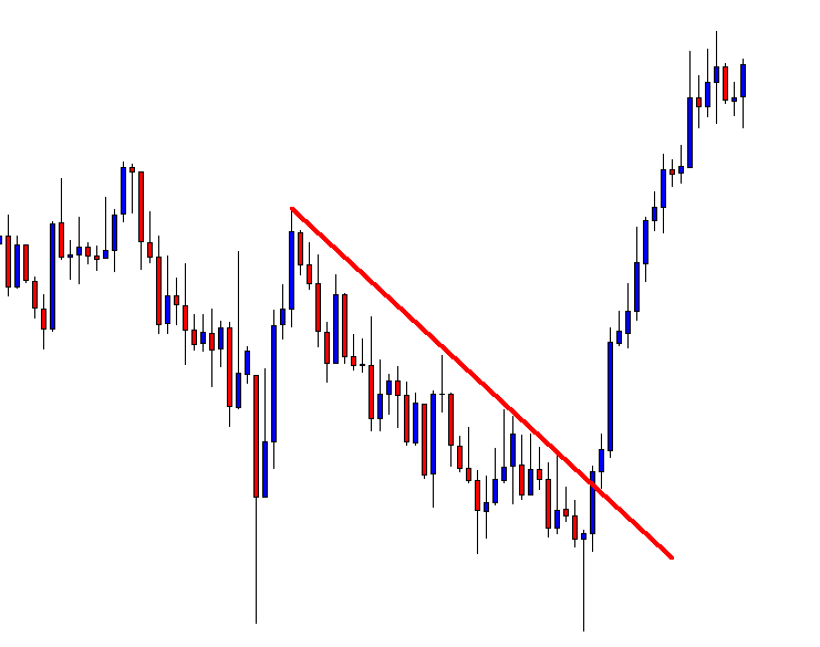
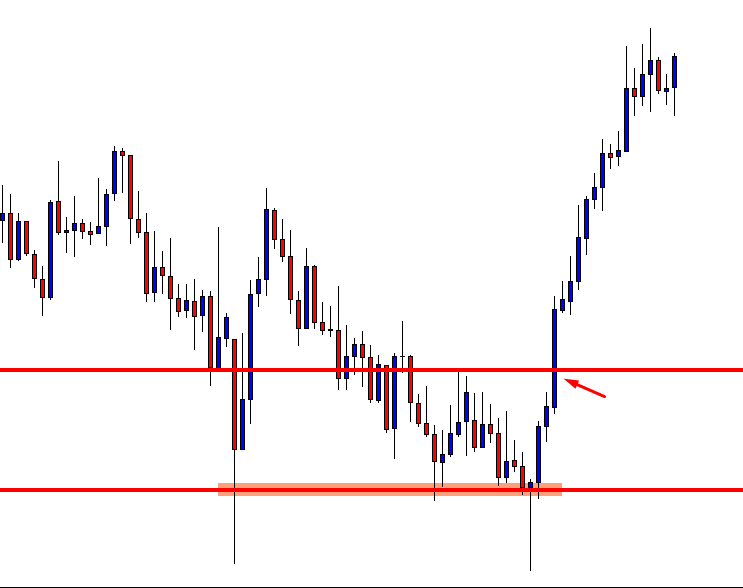
Candlesticks Formations to Trade
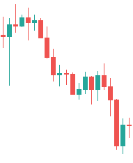
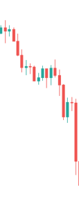
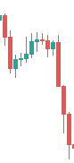
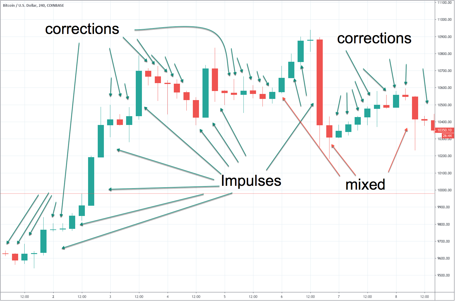
Candlesticks formations provide a variety of information concerning the market movements. For instance, it can reveal when the price is in a slowdown, in trend, or soon to reverse in the next trading sessions. The understanding of these formations is essential to chart analysis because candlesticks charts can be analyzed without lag.
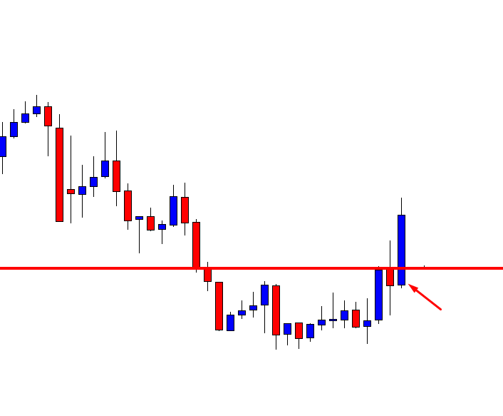
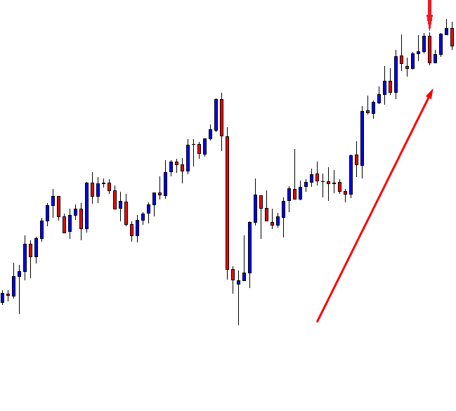
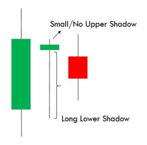
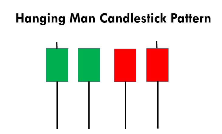
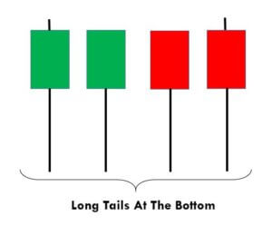
Hammer and Hanging Man
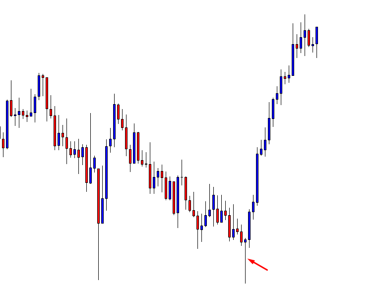
A Hammer is a candlestick pattern that shows a small body and a long shadow, with its close is near the high of the day. When the Hammer is located at the end of a bearish trend, the Hammer is considered a bullish reversal signal.
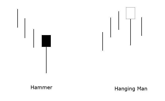
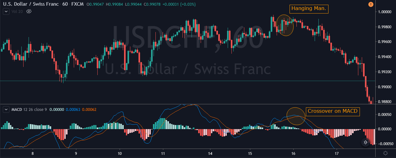
The Hanging Man is similar to the Hammer, but it appears at the end of an uptrend; this pattern reveals the possibility of a reversion of the uptrend.
Both Hammer and Hanging Man should have a large shadow compared to its body. The shadow extension will be indicative of the volatility of a trading session where the price plummeted and then recovered to close the session at the top of the trading range.
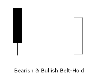
Belt-Hold Pattern
The Bullish Belt-Hold pattern is a formation in which the opening price is at the low of the session. Prices start to rally and close near the top of the session’s range with higher momentum. The opposite occurs on the bearish pattern, where the price opens at the high of the range and closes near the low.
If the next open is higher than the close of the bearish belt-hold candle, then it is likely that the price will continue moving higher. If the price opens below the bullish belt-hold close, then it is likely the market will continue moving bearish.
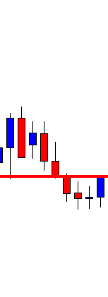
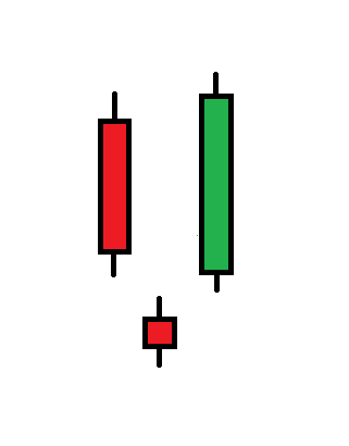
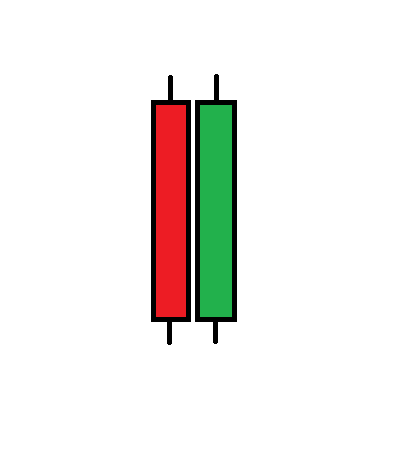
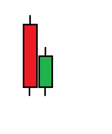
Engulfing Pattern
The engulfing pattern is a formation that requires a pair of candlesticks to complete the formation. The bullish engulfing pattern is a formation that suggests the reversion of the downtrend and surges at the end of a bearish trend. The opposite case occurs when the market moves in an uptrend. An engulfing pattern is one of the most powerful of the candlestick reversal signals.
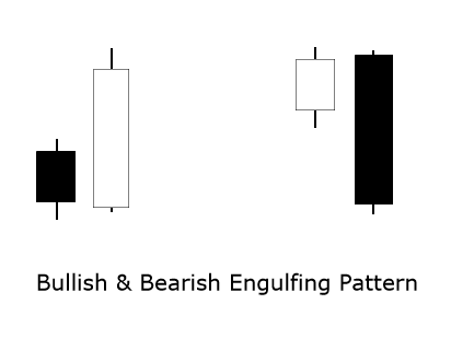
The formation is completed once that large bullish candlestick body completely covers the body of a smaller candle of the previous trading session. The larger is the timeframe where the engulfing pattern appears, the more significative will be the reversal. The following figure represents the bullish and bearish engulfing pattern.
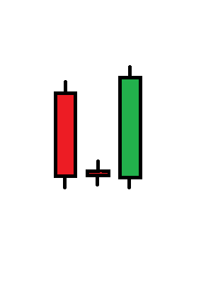
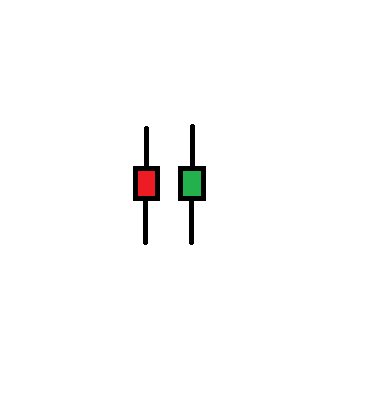
Harami Pattern & Harami Cross
The harami pattern, also known as an inside bar, requires two candlesticks to complete the formation—however, the harami pattern, or inside bar, the weakest of the reversal patterns.
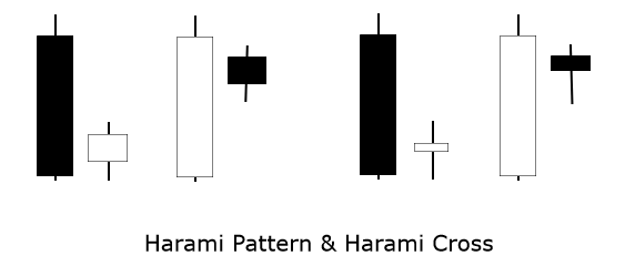
The harami pattern is a formation with a small body that fits entirely into a large body candle. This pattern is indicative of the reversion of the trend, and its importance grows if the formation appears after a prolonged trend. The harami cross is a particular case of the harami pattern; the pattern consists of almost identical opening and closing levels.
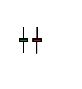
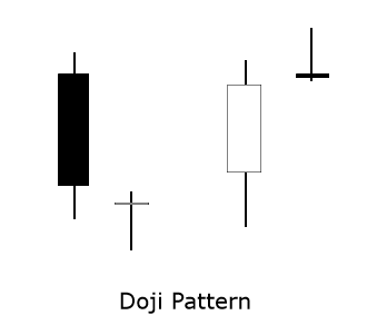
The Doji Pattern
The doji pattern appears when the trend moves in an exhaustion stage. This pattern is characterized by a vanishing body, where the session’s open and close prices are almost identical.
The importance of a doji grows after an extended uptrend or downtrend. If following a doji, it appears an engulfing pattern, the possibility of a potential reversal move will increase.
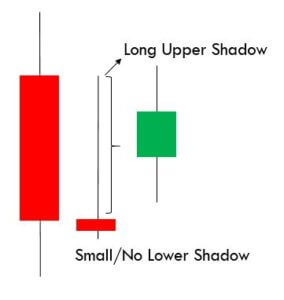
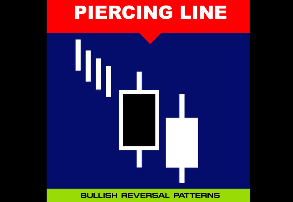
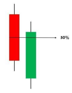
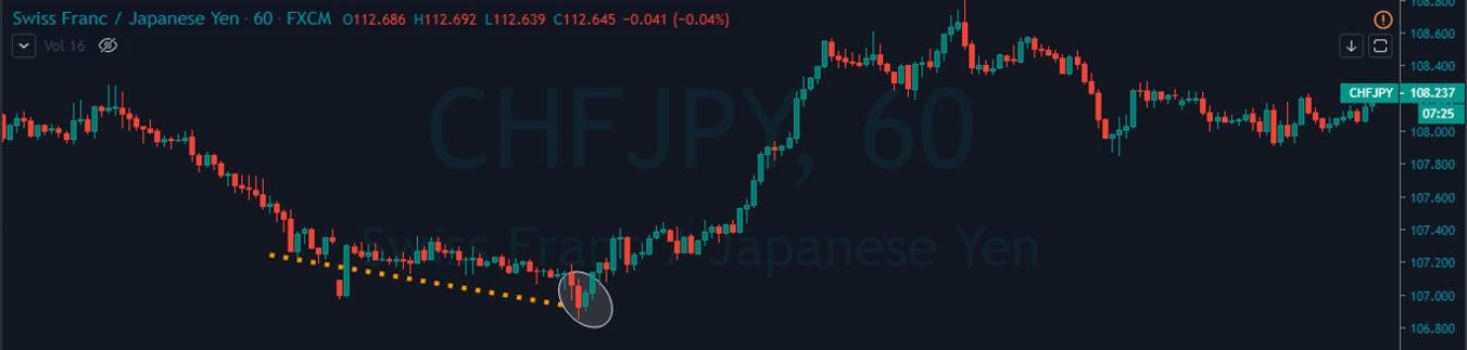
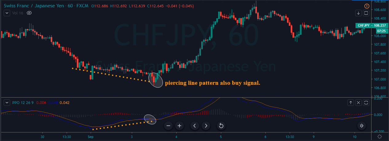
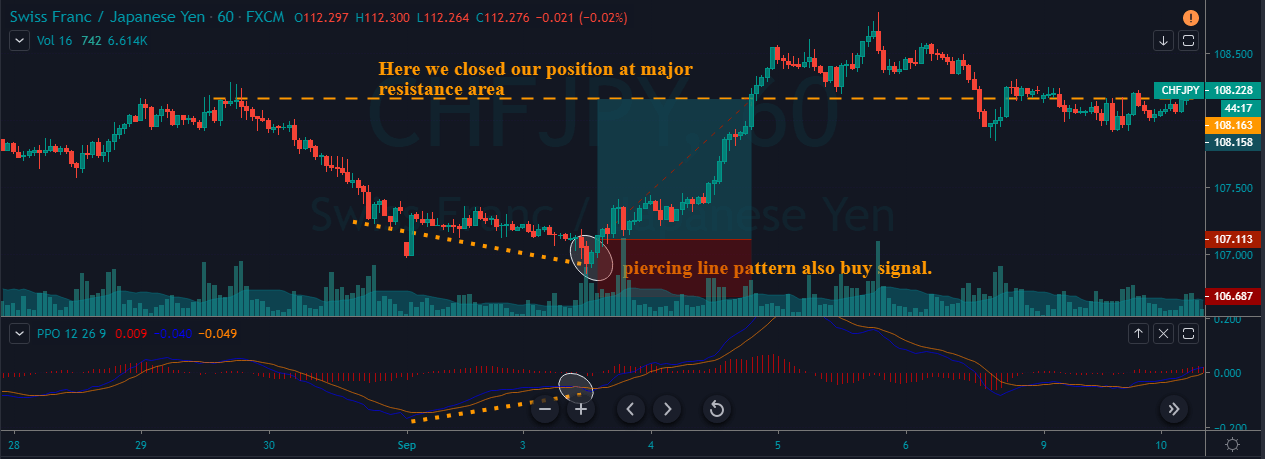
Piercing Pattern and Dark-Cloud Cover
The piercing formation has similarities with the bullish engulfing pattern and is characterized by its appearance at the bottom of a downtrend. The main difference from the bullish engulfing pattern is that the bullish candle on the Piercing Pattern does not fully cover the previous candlestick. Instead, it closes above the 50% level.
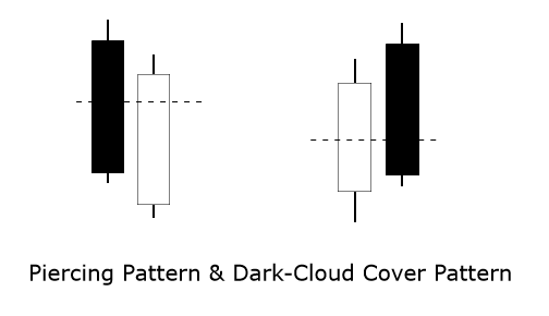
The dark cloud cover is a bearish reversal formation. In this case, the bearish candle is a big body candlestick that covers at least 50% of the previous trading session’s candle. The strength of the reversal signal will be stronger, as more extension is covered.
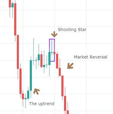
Morning Star and Evening Star
The star candlestick pattern is a formation where a price gap separates a small body candle from the body of the previous candlestick. The star could be a doji or a narrow range candle. This formation warns the market analyst of an imminent reversion of the trend.
A Morning Star pattern is a bullish reversal formation that appears in the bottom of a downtrend and requires three candlesticks. The first candle is a powerful bearish candle with a body of wide range. The second candle corresponds to the star, and it is a candlestick of a narrow range, separated by a gap with the previous candle. The third candle is a bullish candle with upward momentum. The body of this candle should surpass 50% of the first candlestick.
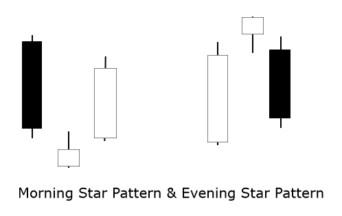
The Evening Star pattern is a bearish reversal formation that appears at the end of a bullish trend. similarly to a morning star pattern, the range of the third candle will be indicative of the strength of the reversal movement
Conclusions
In this educational article, we reviewed seven candlesticks patterns that show trend reversals in a specific range of time. One of the pros of these candlestick patterns is that it is not a lagging indicator, and its analysis could provide the information the market sentiment without delay.
However, although the candlestick analysis could provide an entry setup, they can not provide a target level by itself. This type of study should be accompanied by complementary techniques to improve the odds of success and determine potential profit targets.
In the following article, we will review the use of chart patterns to determine the trend.
Suggested Readings
- Fischer, R., Fischer J.; Candlesticks, Fibonacci, and Chart Patterns Trading Tools; John Wiley & Sons; 1st Edition (2003).


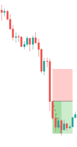
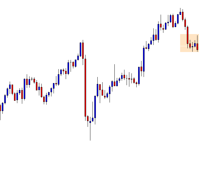
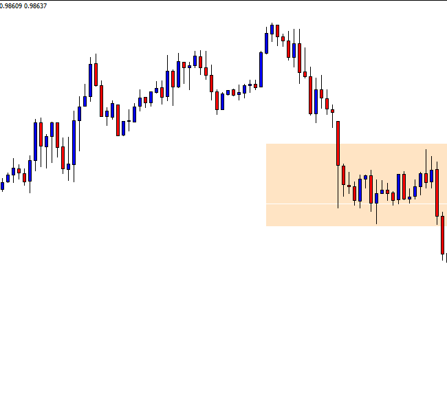
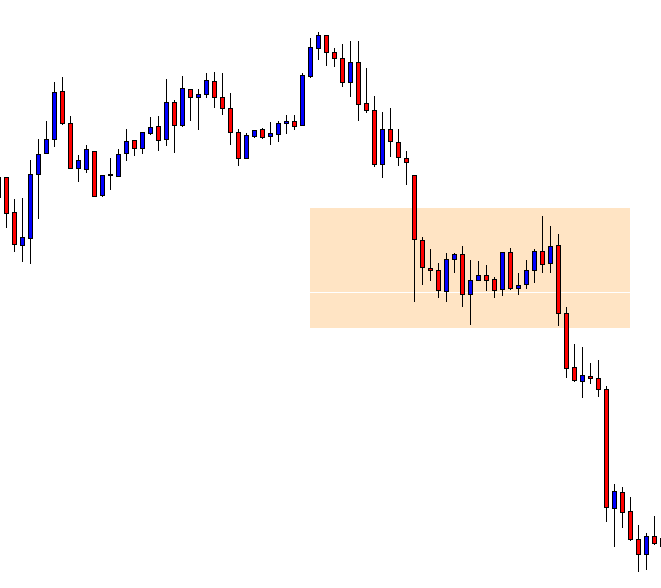
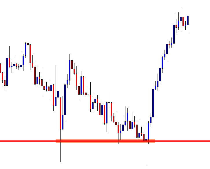
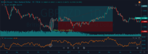
 Below is a picture of how this pattern would like on the chart and how the trend reversal takes place.
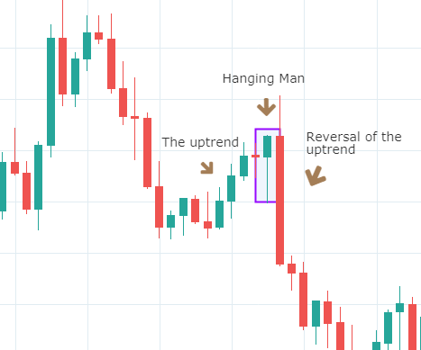


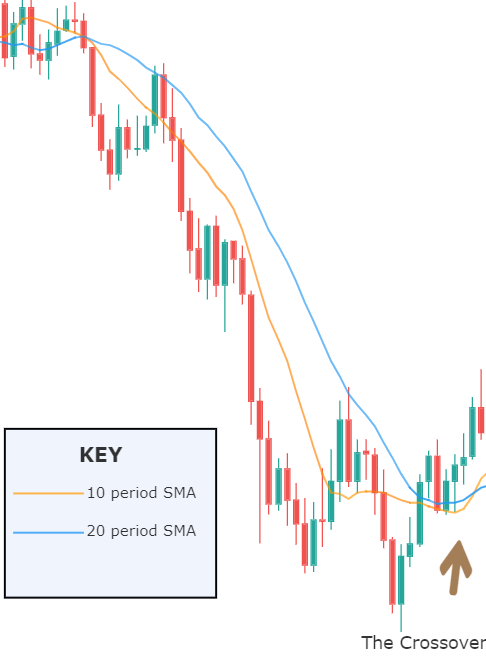
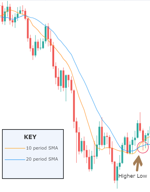
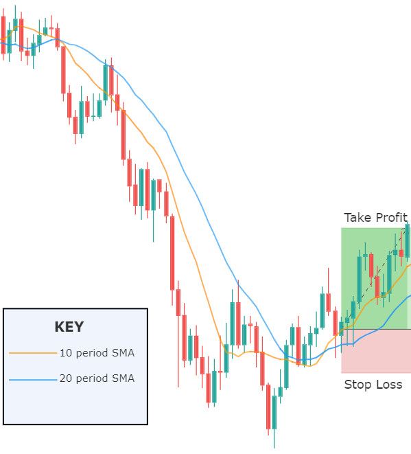
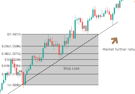
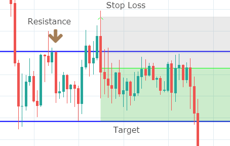
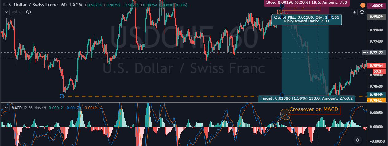
 Step 3 – Step Loss & Take Profit
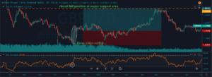
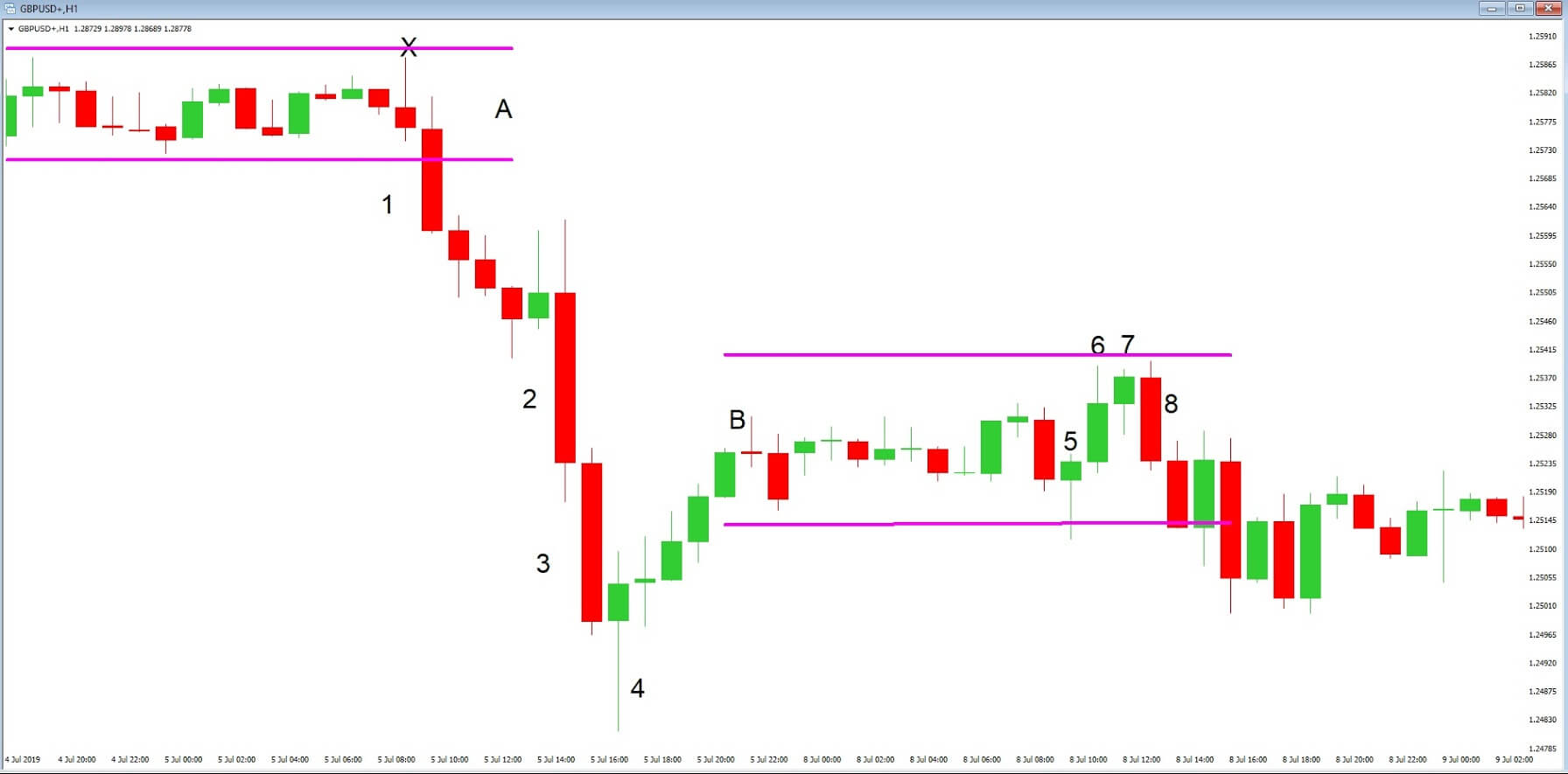
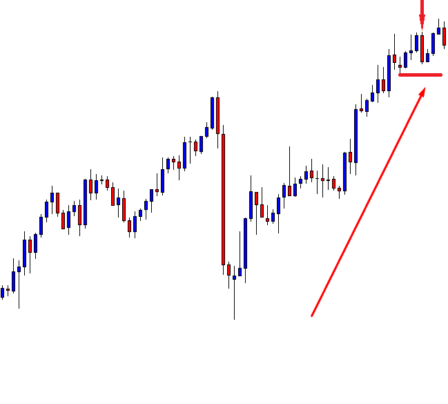
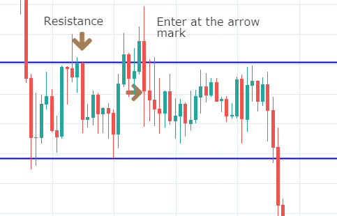
 This pattern is not confirmed unless the price falls shortly after the Hanging Man. If the next candle closes above the high of the Hanging Man, this pattern is not valid. After the pattern, if the very next candlestick falls, then it’s a clear indication of the reversal. Now, if you see a Hanging Man candlestick and the above-discussed rules apply, you can go ahead and take the trade. But since it is crucial to have an extra confirmation, let’s pair this pattern with a technical indicator.
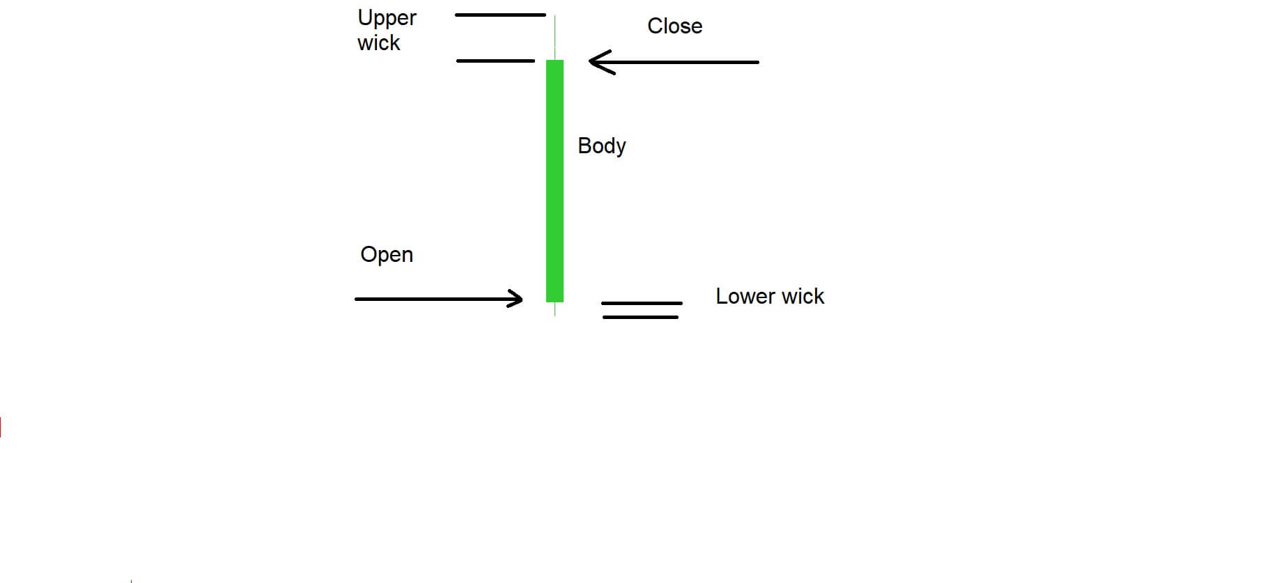
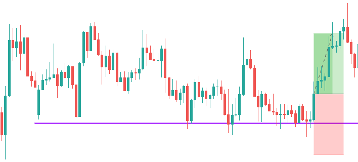
 Example ‘D’ is a typical candlestick shape that traders see regularly on their charts. We have marked the points where the candlestick opened and closed. If the candlestick closes above the exchange rate at the point of which it opened, it is considered to be a bullish candlestick. If it closes below the exchange rate at the point of opening, it is considered to be bearish. Candlesticks can also open and close at the same exchange rate.