Categories
Forex Indicators

Top 5 Forex Trend Indicators for New and Experienced Traders

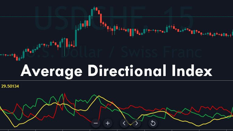
There are thousands of indicators out there. In fact, there are so many that it is impossible to look at them all. What you may find when going through them is that a lot of them are actually different variations of a few different major indicators, with the creator having simply made a few small changes here and there. The underlying principle and method behind the indicators are fundamentally the same, in fact, for most of them, you would not actually see much difference at all.

So we are going to be looking at some of the more widely used trend-based indicators that are out there. You most likely will have heard of some of them or even used a variation of one yourself. Let’s take a look at what these major and popular trend indicators are.

Price Action

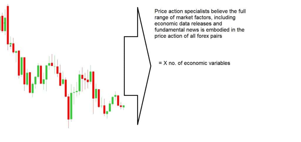
This is probably the one that most people would have heard of. In fact, some people who know nothing about Forex or trading may well have heard of this one too. When it comes to trading, price is the number one variable that we will be looking at and it is one that dictates the majority of moves within the markets. So getting a good understanding of what price action does and how the trends work is often the first thing that people set out to learn.

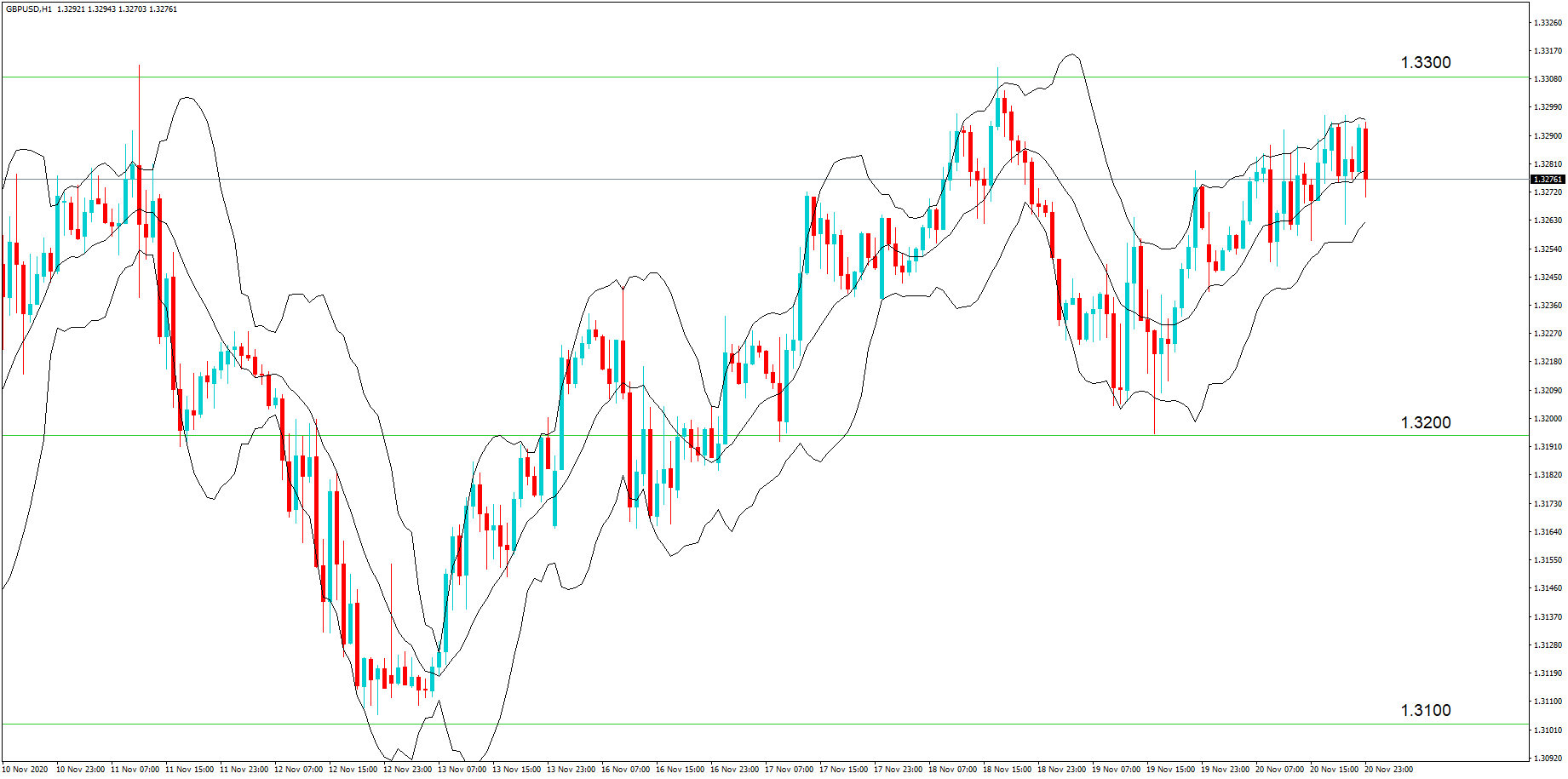
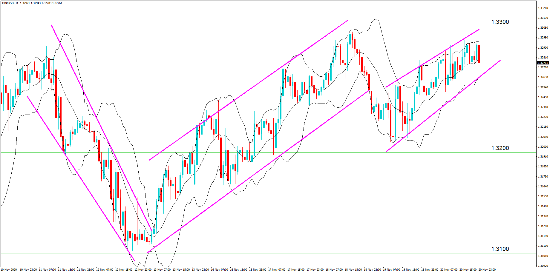
There are multiple different ways to look at price action. There are higher highs or lower lows and it is something that every trader should understand. We are not going to be going into detail here on how you actually analyse it, but there are hundreds of indicators out there that you are able to add onto your charts which give a fantastic overview of the current price action that is going on within the markets. The current price can tell you a lot about the current trends. The good thing about some of the price action indicators is that they also include trend lines, making it far easier to see where the current price sits within the current trend, a valuable tool for any trader or any experience level.
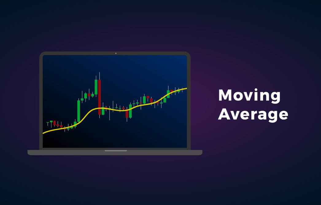
Moving Averages

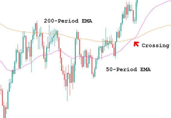
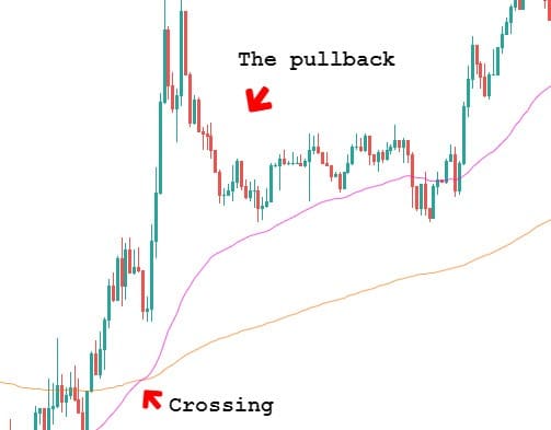
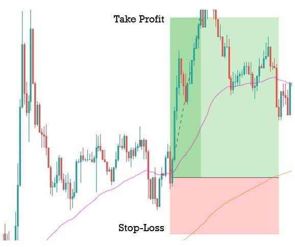
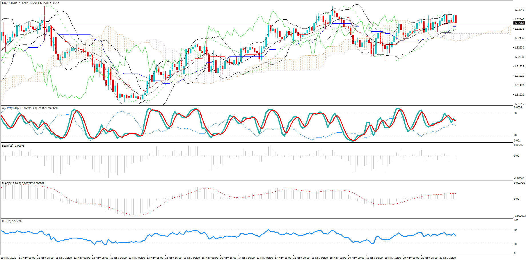
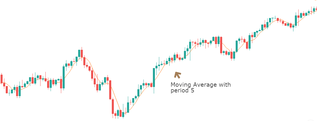
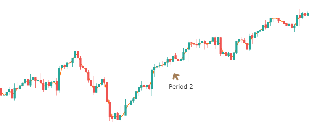
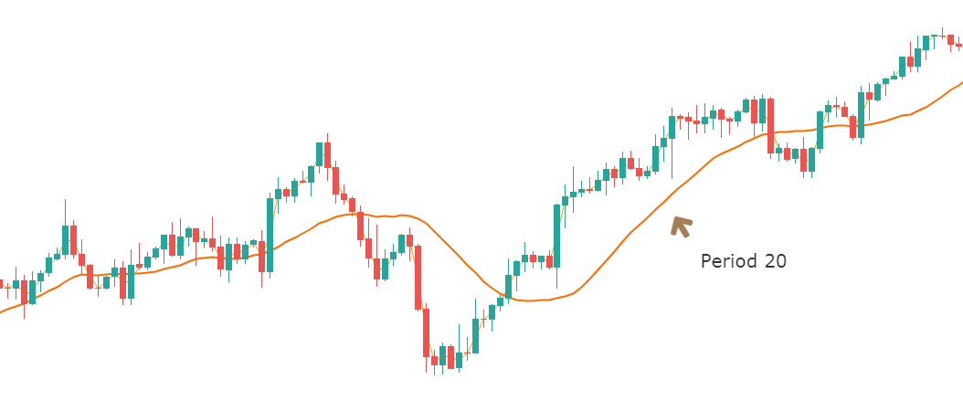
One of the most used indicators when it comes to trading forex would have to be the moving average indicator. It is used to help identify the trends within the markets. There are multiple different forms of moving averages but they all follow the same ideas and aim to plot the average prices of a currency over a specific period of time over the price itself.

What the indicator suggests is that if the current price is above or below the current average price. It should indicate whether the markets are currently bullish or bearish. You are also able to work out the possible strength of a trend by looking at the steepness of the moving average slope. The steeper that the slope is, the stronger the trend would be. More often than not, you would use a long term in a short term moving average at the same time to help confirm any possible bullish or bearish movements.

The moving averages indicators are often used in conjunction with other indicators to help set up trades for specific strategies. Even if you do not use it for your trading, having a general idea of the current trend and where that trend sits above the average price can be invaluable to your trading, including both entry and exit positions.
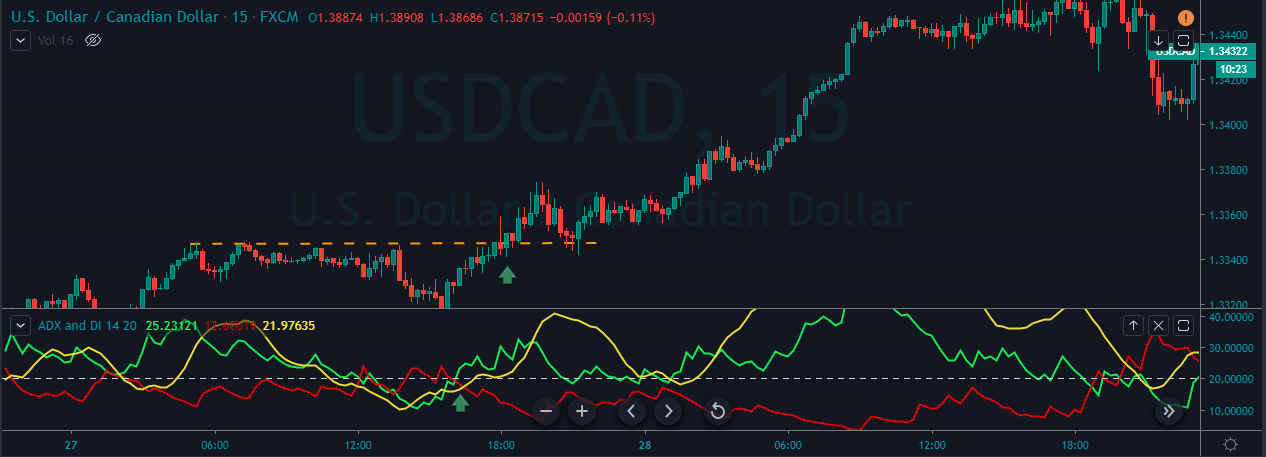
The Parabolic SAR

Parabolic SAR, which stands for Stop and Reverse, is a great indicator that a lot of people use. The way it works is by identifying the short term trends within the markets. It will simply place dots on the charts which will be either above or below the high or the low in the price.

It works by using a number of different variables to help calculate its values. It uses things like acceleration factor and extreme price to do this. It is extremely useful when looking at the short term trends and the changes that are happening within these trends. It can be used to help with both entry and exits of trades as it is good at showing where the reversal could happen. It should also be used multiple times to enable for better correlation and confirmations of the short term trends and the changes that could be taking place.
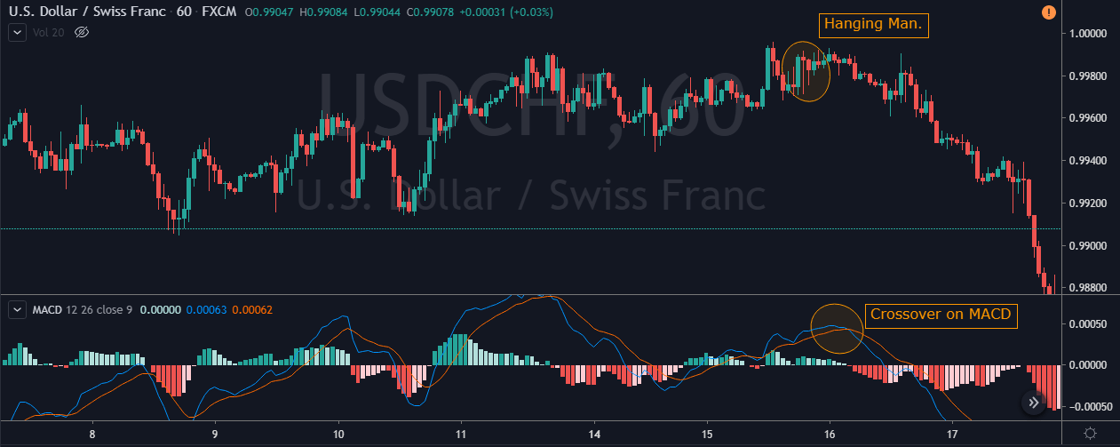
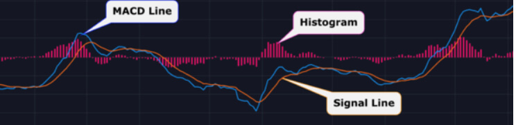
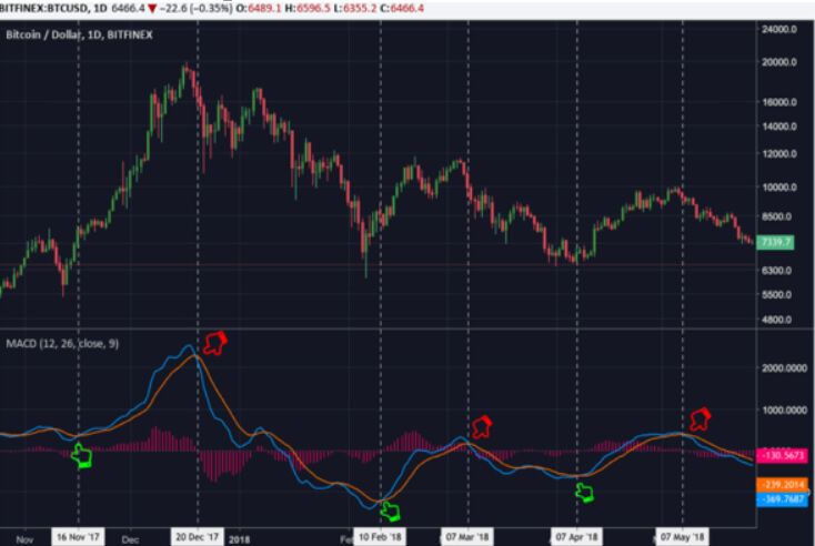
The MACD

Also known as Moving Average Convergence, divergence, it is an oscillator which means that it will usually measure variables and changes in things like momentum and volatility. The MACD indicator is slightly different though because it also acts as a trend indicator, as well as calculating the momentum in the price of a currency.

The MACD indicator includes a histogram which will oscillate around the 0-level. The fast and slow lines are known as the MACD line and the signal line. The indicator gets its values from the exponential moving average indicator with a setting of 12 and 26 periods. The trends that are shown in the price charts are validated by using a combination of variables in the MACD indicator. MACD is widely used and there are a lot of indicators and expert advisors out there that have implemented it into their strategies and into their indicators, so you do not need to look far to see MACD being mentioned.
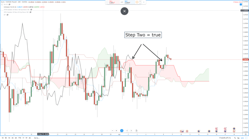
Ichimoku Cloud

This indicator is also known as Ichimoku Kinko Hyo, is a pretty unique one as it is a trending system within itself, not needing any additional input. It was developed to work as a trend following indicator which has a large number of variables included in it for customisation and adaptations.

The cloud within the indicator is often seen as the support and resistance level areas within the markets. The Chikou, Kijun-sen and Trinjensen measure the 9-period and 26-period levels on the charts. The Ichimoku Cloud indicator is fast becoming one of the most used trend indicators and is now getting used more and more by new and experienced traders. On first impression, it can look a little daunting due to the vast numbers of options and variables available, however, during a time of sustained trend in the markets, the indicator is able to give very good and very accurate results, which is why it is now so highly used.

So those are some of the most popular trend indicators that are being used right now. Which one you should use is entirely up to you. Some match and combine with certain strategies while some do not, some are far simpler than others, but the decision of which to use will need to be based on what will work best with your current strategy. All we know is that they are all incredibly helpful and potentially powerful tools that you can add to your trading arsenal.

Categories
Forex Course

183. Introduction To Trading The ‘News’

Introduction

The forex market, or any other financial market, is always driven by sentiment. And by sentiment, we mean; investors will only pay what they believe an asset is worth. More so, their investment decisions are primarily ‘future-looking,’ meaning that the types of trades they make will reflect their expectations about the value of the asset they trade.

So, what drives the price of currency pairs in the forex market?

The simplest answer is the fundamentals of a country. Let’s revisit the forex basics here for a bit. The price of a currency pair is the exchange rate between two currencies. This price doesn’t just move up and down arbitrarily. It is determined by the economic value of either country – what is called fundamentals. You might be tempted to think that technical indicators drive price action in forex. Quite the opposite – almost all the time, the technical indicator follows the news.

So, when one country’s fundamentals improve or are believed to improve, the value of its currency will increase relative to other currencies. Similarly, when the country’s fundamentals deteriorate or are expected to worsen, the currency will depreciate.

Remember the laws of demand and supply. When the demand is high, prices tend to go up, and when demand falls, prices fall along with it. The same applies to the forex market. When fundamentals improve or are expected to improve, the currency is in high demand making its value increase. When fundamentals worsen or are expected to, traders dump the currency as its value drops.

So, how do forex traders know if the fundamentals of the country have improved or worsened? News! News, as always, is the carrier of everything.

Where to find News in the Forex Market?

In the forex market, news can be delivered in various ways. There are hundreds, if not thousands, of organizations and government agencies that publish various economic indicators. But don’t worry, you won’t have to go through thousands of webpages just to find relevant news regarding the currency pairs you are trading. Things are a bit neat in the forex market when it comes to news releases. The economic calendar simplifies things for you. Here, you will find virtually every scheduled publication of economic indicators from every country! This way, you get to know what’s happening and when it is happening.

Here’s a screengrab of an economic calendar.

Furthermore, these scheduled releases have been categorized depending on the magnitude of their impact. Of course, not all economic indicators impact a currency the same way. Some have negligible effects.

[wp_quiz id=”94071″]
Categories
Forex Videos

Forex Technical Indicators That Will Lose You Money!


Thank you for joining this Forex academy educational video.

In this educational tutorial, we will be looking at one of the main reasons why new traders lose money when they start trading Forex.

A first, let’s take a look at this warning which regulated brokers in the United Kingdom must adhere to on their website:  contracts for difference, also known as cfds, are complex instruments and come with a high risk of losing money rapidly due to leverage.  72.6% of retail investor accounts lose money when trading cfds.  You should consider whether you understand how cfds work and whether you can afford to take the highest risk of losing your money.

We have hidden the name of this broker, but in fact, 72.6% is one of the lower percentages of retail traders losing money, some are above 80%.

And yet, these high levels of losers remain the same year after year.  So, what is going on?  Unfortunately, most new traders will not go to the lengths of studying how the currency markets work.  They hardly ever bother to learn about fundamental analysis, which is crucial. Most of them will look at a couple of videos on YouTube, where so-called traders claim to have made money on a particular trade setup, which they may have the need to record several times previously in order to come up with one successful winning trade.  And yet most new traders will follow this strategy blindly and where of course, the markets can change direction in an instance, thus leaving them wondering what went wrong and how they lost their money.

The next common mistake made by new traders, who may have trolled through the internet to find some trade setups, is to overload their screens with too many indicators, which can be a hindrance because one ends up focusing on the indicators, which tend to be lagging price action,  and not the most important indicator on the screen itself; price action, which is a leading indicator.

Often these types of traders will look at one of the indicators, which might suggest price is going to go in a certain direction, and then trade according to that one single indicator, which may be in contradiction to the others. Occasionally they will be right, but more often than not they will be wrong, and end up losing money on a trade.

Let’s take a look at that chart again, which is a 1-hour chart of the British pound to US dollar, and by stripping out all of the indicators and drawing in three lines, we can much more easily see that price action is simply gravitating towards three major levels, 1.31 1.32 and 1.33.

INSERT C again

Yet this was impossible to see with all of the indicators on the previous chart.

And now, when we add in three very simple trendlines, we can see a clear direction of this pair, which trades within the trendlines and within the 3 key levels of 1.3100, 1.3200, and 1.3300. 

Unless taught, most new traders would never consider drawing trendlines on their charts and stripping away many of the technical indicators they have become reliant on.

 Another area where new traders fall down is trading over economic data releases because they have not bothered to follow a calendar or are not aware are of the significance of avoiding trading during times of high impact data releases.

Or trading during the end of a particular time zone, where the new time zone traders may have a completely different approach to the markets due to the local sentiment, which can cause price action reversal.

Trading the markets, especially foreign exchange, is extremely complex, just as the warning at the beginning of this video mentioned.  New traders are advised to comprehensively learn about how professional traders go about their daily business.  They must learn how to read price action, which is the best leading indicator of all.  They must also learn about fundamental analysis, how one market will affect the other, such as the stock market’s relationship with the foreign exchange market.

In conclusion, the absolute good news is that all of this information is available on the forex academy website.  It has been put together by extremely competent and experienced traders with a wealth of knowledge and great success behind them.  Be patient; take the time to troll through all of the videos because every one of them will help you to become a more successful trader.

Categories
Forex Indicators

How to Trade with Sentiment Indicators

Can sentiment indicators help us make good investment decisions? When is the best time to use them? In this article, we will see three of the main sentiment indicators used by traders.

A market is efficient if the prices of the assets listed therein reflect all available information. In addition, whenever new information appears, the price should be collected quickly. In such a market, value and price would match all assets. As all participants would have the same information, it would be impossible to obtain a consistent performance over the average, except by pure chance.

In order for this market to exist, certain characteristics should be given, in addition to all participants having the same access to information. Primarily, market participants should act rationally on the basis of any new information they receive.

You don’t need to be any great expert on behavioral finance to realize that human beings are far from acting rationally. Emotions are very important in the decision-making process, in all areas. Also in investments. There are all the discoveries of behavioral finance to prove it.

The logical consequence of accepting this is that markets should not be efficient. However, the vast majority of studies show that markets are indeed efficient (or at least quite efficient). News is quickly reflected in prices (both macro and business results, etc.). And the reality is that there are not too many managers able to beat their benchmarks, consistently, is also proof of that. And the truth is that even among those who beat them, almost none can truly be considered an outlier.

Emotions are very important as they significantly affect our decision-making process, in all areas. Also in investments.

Obviously, the topic gives for much more than a brief article, but it is relevant to keep it in mind when carrying out an analysis, whatever the type. In this context, it seems wise to ensure, inspired by Andrew Lo’s ideas, that markets that tend to efficiency but are not fully efficient are most likely. In other words, no investment strategy will generate results on average consistently over time and it will therefore be necessary to adapt to the changing environment. That is why it is so necessary to diversify strategies.

We have developed three ideas so far: that the market is quite efficient, that it should not be so because human beings do not always act rationally, and that the same strategies do not always work. A consequence of all three could be that there are times when the irrationality of market actors reaches such an extreme that price and value do not coincide. This could be used to beat the market for a while until irrationality returns to normal levels. And it is in this context that indicators of market sentiment make sense.

Sentiment indicators are those that try to measure market expectations, to find out if they are rational or not.

The best indicator of feeling is, without a doubt, the price itself. As Homma, father of Japanese candles, said, “To know about the market, ask the market”. The problem is that at all, the market will tell us if the value matches the price. We have to compare the price with something: with oneself (current price versus historical, basis of technical analysis) or against balance sheet data of the companies that compose it, as for example against its profits or sales (the basis of fundamental analysis).

In this sense, any analysis can be considered an analysis of feelings. For example, if we use the PER (sometimes that the benefits are contained in the price of a stock) as an indicator, we will know that the valuations are useful in long periods, but it is a bad idea to use them to make market timing. Therefore, it can be thought that there are market moments where it is rational that valuations are above average until they reach a certain level that is unsustainable.

Pure sentiment indicators, in any case, are those that compare current prices with other assets (for example fixed income against equities through the EYG, but also the evolution of assets refuge against cyclical, etc.), with their own components (number of companies doing maxima) or with the investor positioning (Ratio Put/Call or the American Investors survey).

Sentiment Indicators: VIX Index

One of the best-known sentiment indicators is the VIX. In short, it measures the volatility that traders expect in the next 30 days. It usually picks up when markets fall and that’s why it’s called the fear index. Investing in VIX, up or down, is complex and should be reserved only for more sophisticated investors who understand well the characteristics of the products available.

As an indicator, VIX is an example of how to benefit from “opposing opinion theory”. This philosophy defends that, in very extreme moments, it is worth positioning against the majority of the market. It is interesting to observe the strong VIX rebounds (when it is about 1.5 deviations typical of its mean)

For VIX it is interesting because although its negative correlation coincides with the S&P 500 is very high (when the S&P 500 has negative returns the VIX usually rebound), its correlation with future returns is zero or even positive. So, it’s very interesting to observe the strong VIX rebounds (when it is about 1.5 deviations typical of its mean). These moments have often given interesting buying opportunities.

We must stress that the strategy we are citing has not worked on the other side: historically low VIX levels have not been followed by S&P 500 drops. VIX exhibits some asymmetry in its average returns and is usually faster when above-average than when below average.

Sentiment Indicators: Ratio Put/Call

Another well-known sentiment indicator is the Ratio Put/Call. This ratio simply measures the volume of Put options between the volume of Call options. Broadly speaking, Put options are often used to take bearish positions and Call for bullish positions. If this indicator picks up means that there is either more volume of Puts or less of Calls and therefore the risk perception of operators increases. Similarly, if the indicator falls, it usually indicates greater complacency.

This ratio simply measures the volume of Put options between the volume of Call options.

It should be noted that the back-tests I have done on this indicator show quite poor results. For example, a strategy based on being 100% in Equities in bullish extremes, 100% in bonds in bearish extremes, and 50%/50% in the rest of the scenarios, is not able to beat a simple strategy of 50% Equities, 50% Bonds.

The above strategy is done using the CBOE aggregate indicator (known as Put/Call Ratio Composite or Total). Includes stock and index options. It is sometimes criticized for including indices because many investors use indices to make hedges and relative value strategies, which distorts it somewhat as a measure of positioning. However, using the Equity Put/Call Ratio results do not vary much.

Finally, it should be added that such indices are also calculated on other organised markets, such as ECI. However, the most often followed are those of the CBOE.

Sentiment Indicators: American Association of Individual Investors Survey

The last sentiment indicator I wanted to talk about in the article is the investor sentiment analysis conducted by the American Association of Private Investors. It is true that it can be criticized that sentiment indicators based on surveys could be less reliable than those based on the market, but the truth is that it is interesting to see a combination of both and their possible divergences, both between them and vis-à-vis the market.

Since 1987, AAII members are asked the same question every week: Do you think the stock market will rise, fall or stay as it is in 6 months? And every Thursday the results are published.

There are many ways to process published data, but perhaps the most interesting results can be found in the so-called Bull/Bear Ratio. This indicator is as simple as dividing the percentage of bullies among the bearings. Some add neutrals to bullies, but the results do not change significantly. The backtests on this indicator are surprisingly good.

In general, when the indicator reaches bearish extremes (fear) it would have been a good idea to add, giving good results even in the longer periods, and reduce in the bullish extremes.

Again, it is not a strategy in itself, nor an infallible indicator. But it proves a certain tendency that gives basis to the theory of opposing opinion. In line with what is seen in the VIX, it proves the initial theory: although markets tend to be efficient, there are times when they are not and the irrationality of investors overcomes. And these are just the moments to act.

Categories
Forex Course

89. Identifying Trading Signals Using The ‘ADX’ Indicator

Introduction

The ADX indicator is created by a technical analysis legend, ‘J Welles Wilder.’ ADX (Average Directional Index) shows how strong the market is trending in any direction. This indicator doesn’t have a negative value, so it is not like the oscillators that may fluctuate above and below the price action. The indicator gives a reading that ranges between 0 and 50 levels. Higher the reading goes, stronger the trend is, and lower the reading goes, weaker the trend is.

The ADX Indicator Consists of Three Lines.

  1. The ADX Line.
  2. The DI+ Line. (Plus Directional Movement Index)
  3. The DI – Line. (Minus Directional Movement Index)

The chart above is the visualization of the ADX indicator. We can see the green line (DM+), the Red Line (DM-), and the Yellow Line. (ADX)

Trend Direction and Crossovers

Buy Example

To take a buy trade using this indicator, the first requirement is that the ADX line should be above the 20 level. This indicates that the market is in an uptrend. We go long when the DI+ crosses the DI- from above as it indicates a buy signal.

The chart below is the EUR/AUD Forex pair, where we have identified a buy trade using the ADX indicator. As we can see, the market was in an uptrend, and it is confirmed by the ADX line going above the 20 level. At the same time, we can also see the crossover happening between the DI+ and DI- lines of this indicator. This clearly indicates a buying trade in this pair.

The stop-loss placed below the close of the recent candle is good enough, and we must exit our position when the ADX line (yellow line) goes below the 25 level.

Sell Example

The first requirement to take a seeling position using the ADX indicator is that the ADX line must be below the 20 level. This indicates that the market is in a downtrend. We go short when the DI+ line crosses the DI- line from below as it indicates a sell signal.

The below chart of the GBP/USD Forex pair indicates a sell signal. In a downtrend, when the ADX line (yellow line) goes below the 20 level, it confirms the strength of the downtrend. At the same time, when the DI+ crosses the DI-  from below, it shows that the sellers are ready to resume the downtrend.

Breakout Trading Using The ADX Indicator

This strategy is similar to the crossover strategy that is discussed above. However, we are adding the price action breakout part to it. The idea is to go long when the ADX line is above the 20 level and when the DI+ crosses the DI- line from above. Also, the price action must break above the major resistance level to confirm the buying signal.

As we can see, in the below USD/CAD Forex chart, when the ADX line goes above the 20 level, it indicates that the uptrend is gaining strength. It also means that we can expect a break above the resistance line soon. When the price action broke above the resistance line, we can see the crossover on the ADX indicator. This clearly indicates a buy trade in this currency pair.

We can exit the trades when the opposite signal is triggered. Most of the time, breakout trades travel quite far. So if your goal is to ride longer moves, exit your position when the momentum of the uptrend starts to die or when the price action approaches the major resistance area.

That’s about the ADX indicator and related trading strategies using this indicator. If you have any questions, please let us know in the comments below. Cheers!

[wp_quiz id=”68035″]
Categories
Forex Course

81. Learn To Trade Using The ‘RSI’ Indicator

Introduction

In our previous article, we have learned how to trade the markets using the Bollinger Bands. We hope you have used that indicator in a demo account and got a hang of it. Now, in this course lesson, let’s learn the identification of trading opportunities using a reliable indicator know as RSI.

RSI is one of the most famous indicators used in the Forex and the Stock market. It stands for the ‘Relative Strength Index’ and is developed by an American technical analyst – J. Welles Wilder. This momentum indicator measures the magnitude of the price change to identify the oversold and overbought market conditions.

The RSI indicator consists of a line graph that oscillates between zero and 100 levels. Traditionally, the market is considered overbought when the indicator goes above the 70-level. Likewise, the market is considered oversold when RSI goes below the 30-level. These traditional levels can be adjusted according to different market situations. But if you are a novice trader, it is advisable to go with the default setting of the RSI.

When the market is in an overbought condition, it indicates a sell signal in the currency pair. Likewise, if the market is in an oversold condition, we can expect a reversal to the buy-side. To confirm the buy and sell signals generated by the oversold and overbought market conditions, it is advisable to also look for centerline crossovers.

When the RSI line goes above the 50-level, it means that the strength of the uptrend is increasing, and it is safe to hold our positions up to the 70-level. When the centerline goes below the 50-level, it indicates the weakening in strength and any open sell position until the 30-level is good to hold.

RSI is one of those indicators which is not overlapped with the price action. It stays below the price charts. Below we can see the snippet of how the RSI would look on the charts. The highlighted light purple region marks the 70 and 30 levels, and the moving line in the middle is the RSI line.

How To Trade Using The RSI Indicator

There are various ways to use the RSI indicator to generate consistent signals from the market. You can use this indicator stand-alone, or you can pair it with other indicators and with candlestick patterns for additional confirmation. In this article, let’s learn the traditional way of using the RSI indicator along with RSI divergence and RSI trendline breakout strategies.

Traditional Overbought/Oversold Strategy

In the traditional way, we just hit the Buy when the RSI indicator gives sharp reversal at the oversold area. Contrarily, we go short when the RSI indicator reverses at the overbought area. The image below represents the Buy and Sell trade in the AUD/CAD Forex pair. We must close our positions when the market triggers the opposite signal. Stop-loss can be placed just below the close of the recent candle.

RSI Divergence Strategy

Divergence is when the price action moves into one direction, and the indicator moves in another direction. It essentially means that the indicator does not agree with the price move, and soon a reversal is expected. In other words, RSI divergence is known as a trend reversal indication.

In the below image, price action prints the RSI divergence twice, and both times the market reversed to the opposite side. When the market gives us a reversal, find any candlestick pattern or any reliable indicator to confirm the trading signal generated.

In the below image, we have identified the market divergence twice, and both the times the market reversed. If traded correctly, this strategy will result in high profitable trades.

Trendline Breakout Strategy

RSI trend line breaks out is a quite popular strategy as it is used by most of the professional traders. In the image below, when price action and the RSI indicator breaks the trend line, we can see the market blasting to the north.

Always remember to strictly go long in an uptrend, and go short in a downtrend while using this strategy. Buying must be done when the market is in an overbought condition, and the selling must be done when the market is in an oversold condition.

If you want to confirm the entry, wait for the price action to hold above the breakout line to know that the breakout is valid. Exit your positions when the RSI reaches the opposite market condition.

That’s about RSI and trading strategies using this indicator. Try using this indicator on a demo account today and experiment with the above-given strategies. Let us know if you have any questions in the comments below. Cheers!

[wp_quiz id=”66690″]
Categories
Crypto Videos

How To Trade Cryptocurrencies Using The MACD Indicator Part 1

Trading cryptocurrencies using the MACD indicator – part 1/2

While there are many technical indicators that can help with identifying changes in the strength, momentum, or the duration of a trend, none of them are simpler than the Moving Average Convergence Divergence, better known as MACD.

By definition, the MACD indicator turns two moving averages into a momentum oscillator. It does so by subtracting the longer period moving average from the shorter period moving average.
As the MACD indicator is a “lagging” or a “trend following” indicator, it actually trails pricing events that already took place in order to determine the strength of the current trend.
As with most indicators, though, you won’t make money just by understanding the indicator works, but rather by knowing how to use this indicator. However, it is still worth explaining what MACD is, so you have a better understanding of why it is such a widely used and loved indicator.

What is MACD

MACD is composed of three main components: the MACD line (which is the blue oscillator), the signal line (which is the orange oscillator), and the histogram.

MACD line is typically made up of the 12-period exponential moving average (EMA) minus the 26-period exponential moving average.
The signal line is typically the 9-period EMA of the MACD line.
The histogram represents the difference between the MACD line and the signal line.

How to interpret the MACD indicator
It might be hard to explain how MACD works, but it is actually one of the easiest indicators to interpret as everything is represented clearly and visually.

The MACD Cross

When the MACD line performs a cross above the signal line, it is interpreted by the traders as a bullish cross. On the other hand, when the MACD line crosses under, traders know that this is a bearish cross. These crosses indicate a shift in momentum, which can represent a buy or sell opportunity.

BTC/USD example

As seen in the picture, MACD crosses provide confirmation of a trend change. This is true, at least in the short term.

As an example, the MACD line crossed above the signal line on November 16, 2017, presenting a buy signal. The MACD line stayed above the signal line for over a month, which resulted in the price increasing more than 150% before the next bearish cross. The bear cross, which occurred on December 20, 2017, signaled a change of trend to bearish.

It’s recommended (and almost necessary) to use the MACD indicator in conjunction with some other indicators such as volume or RSI because MACD, just like any other indicator, is not 100% accurate and can give off false signals.
Check out part 2 of Trading cryptocurrencies using the MACD indicator to learn more about how this indicator shows overbought and oversold market conditions as well as about what zero-line represents.

Categories
Forex Course

70 – Introduction To Moving Averages

Introduction

After understanding various applications of the Fibonacci indicator, it’s time to learn about the next best indicator in technical analysis – Moving Average. MA is one of the most popular indicators in the technical trading community. This indicator, just like the Fibonacci Indicator, has a lot of applications and is commonly used by traders for different reasons.

A moving average smoothens the price movements and its fluctuations by eliminating the ‘noise’ in the market. By doing this, MAs shows us the actual underlying trend. A moving average is computed by taking the average closing price of a currency for the last ‘X’ number of candles. There are many moving averages depending on the number of periods (candles) considered.

Below is how a 5-Period Moving Average looks on the price chart.

One of the primary applications of the Moving Average indicator is to predict future price movements with high accuracy. As we can see in the above chart, the slope of the line determines the potential direction of the market. In this case, it is a clear uptrend.

Every Moving Average has its own level of smoothness. This essentially means how quickly the MA line reacts to the change in price. To make a Moving Average smoother, we can easily do so by choosing the average closing prices of many candles. In simpler words, higher the number of periods chosen, smoother is the Moving Average.

Selecting the appropriate ‘Length’ (Period) of a Moving Average

The ‘length’ of the Moving Average affects how this indicator would look on the chart. When we choose an MA with a shorter length, only a few data points will be included in the calculation of that MA. This results in the line overlapping with almost every candlestick.

The below chart gives a clear idea of a small ‘length’ Moving Average.

The advantage of a smaller length moving average is that every price will have an influence on the line. However, when a moving average of small ‘length’ is chosen, it reduces the usefulness of it, and one might not get an insight into the overall trend.

The longer the length of the moving average, the more data points it ll have. This means every single price movement will not have a significant effect on the MA line. The below chart gives a clear idea of a long ‘length’ moving average.

On the flip side, if too many data points are included, large and vital price fluctuations will never be considered making the MA too smooth. Hence we won’t be able to detect any kind of trend.

Both situations of choosing ‘lengths’ can make it difficult for users to predict the direction of the market in the near future. For this reason, it is crucial to choose the optimal ‘length’ of the Moving Average, and that should be based on our trading time frame and not any random number.

Conclusion

Moving Averages generate important trading signals and especially when two MAs are paired with each other. They give both trend continuation and reversal signals with risk-free trade entries. A simple way of reading the MA line is as follows – A rising MA indicates that the underlying currency pair is in an uptrend. Likewise, a declining MA means that the currency pair is in a downtrend.

In the next article, we will be learning two critical types of moving averages – Simple Moving Average and Exponential Moving Average, along with their applications on the charts. Stay Tuned!

[wp_quiz id=”65304″]
Categories
Candlestick patterns Forex Basic Strategies Forex Trading Strategies

Pairing The Hanging Man Candlestick Pattern With MACD Indicator

Introduction

The Hanging Man is a visual candlestick pattern which is used by traders and chartists in all type of markets. The term ‘Hanging Man’ refers to the shape of the candlestick. Visually the hanging man looks like a ‘T,’ and it appears in an uptrend. The formation of this candlestick is an indication that the uptrend is losing its strength. Meaning, sellers started showing interest, and the current trend of an asset is going to get reversed. Anyone can easily predict from the name of this pattern that it is viewed as a bearish sign.

The Hanging Man candle composes of a small body and a long lower shadow with little or no upper shadow. The vital point to remember is that the hanging man pattern is a warning of the upcoming price change, so do not take it as a signal to go short. Also, trading solely based on one pattern is risky. To confirm the sign given by the Hanging Man pattern, traders must pair it with support resistance or any other trading indicator.

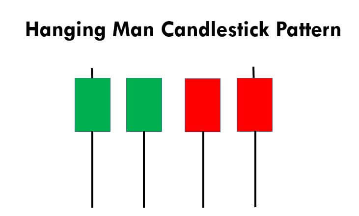
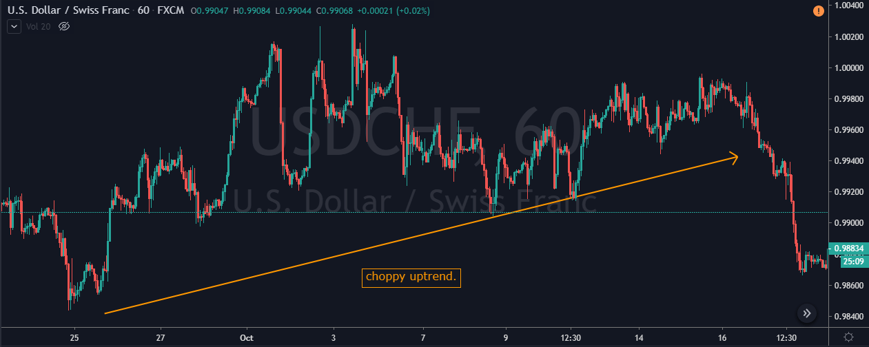
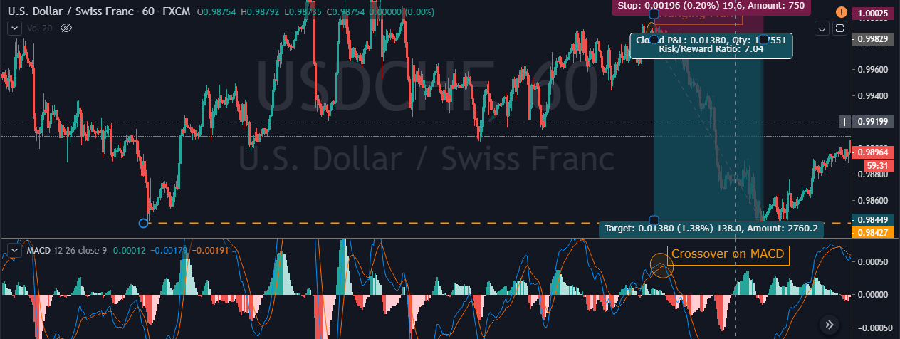
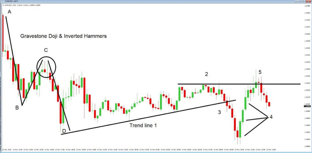
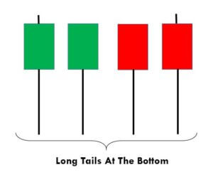
This pattern is not confirmed unless the price falls shortly after the Hanging Man. If the next candle closes above the high of the Hanging Man, this pattern is not valid. After the pattern, if the very next candlestick falls, then it’s a clear indication of the reversal. Now, if you see a Hanging Man candlestick and the above-discussed rules apply, you can go ahead and take the trade. But since it is crucial to have an extra confirmation, let’s pair this pattern with a technical indicator.

Pairing the Hanging Man Pattern With MACD Indicator

In this strategy, we have paired the Hanging Man pattern with the MACD indicator so that we can filter out the low probability trades. MACD stands for Moving Average Convergence and Divergence, and it is one of the most popular indicators in the market. It is essentially an oscillator that is used for trading ranges, trend pullbacks, etc. Also, this indicator identifies the overbought and oversold market conditions. In this strategy, we are using the default setting of the MACD indicator to identify the trades.

Step 1 – Confirm the uptrend first on your trading timeframe

We can’t use the Hanging Man pattern to take the buy trades. Since it is a reversal pattern, it only signals the selling trades. So first of all, find out the uptrend in any currency pair. One more primary thing to remember when trading this pattern is this – After finding a clear uptrend, if you see the market printing the Hanging Man, then try not to trade that pair. Because, in a strong trend, it’s not easy for a single candle to change the direction of the entire trend. But if you find this pattern when the uptrend is a bit choppy, it has higher chances to perform. As we can see in the image below, the uptrend in USD/CHF was not strong enough.

Step 2 - Find out the Hanging Man pattern on your trading timeframe

Some traders use two or three timeframes to trade patterns. But that’s not the right way of pattern trading. If you are an intraday trader, use only lower timeframes to identify the pattern. So the next step here is to find out the Hanging Man in this chart. Also, apply the MACD indicator. For us to go short, the MACD indicator must be in the overbought area.

As you can see in the image below, the USD/CHF Forex pair prints a Hanging Man pattern. This is the first clue for us that the buyers aren’t able to push the market higher. Soon after the crossover happened on the MACD indicator, we can say that this forex pair is in the overbought condition. So now, two forces are aligned, and they are indicating us to go short. Within a few hours, the pair rolls over, and it prints brand new lower low.

Step 3 – Entry, Take Profit & Stop Loss

We go short as soon as we see the Hanging Man candlesticks and MACD indicator at the overbought area, we can go short. In this pair, buyers were quite weak, and this is an indication for us to place deeper targets. As we suggest in every strategy, often close your position at significant support/resistance area, or when the market starts to print the opposite pattern. In this pair, we closed our full trade at 0.9844. Overall it was 7R trade, and we made nearly 140+ pips.

Placing the stop loss depends on what kind of trader you are. Some advanced traders use their intuition to close their positions, while some use logical ways such as checking the power of the opposite party. In this trade, we know that the buyers are not strong enough, so there is no need to use the spacious stop loss.

Difference Between Hanging Man and Hammer Patterns

The Hanging Man and Hammer both look the same terms of size and shape. Both of these patterns have long, lower shadows and small bodies. But the Hanging Man forms in an uptrend, and it is a bearish reversal pattern. Whereas the Hammer forms in a downtrend, and it is a bullish reversal pattern. These two patterns appear in both short and long term trends. Do not use these patterns alone to trade the market. Always use them in conjunction with some other reliable indicators or any other trading tool.

Bottom Line

Most of the professional traders never see this pattern alone as a predictor of a potential trend reversal. Because there will be times when the price action continues to move upward even after the appearance of the Hanging Man. Hence technical indicator support is required to confirm the reversal of the trend. Make sure to stick to the rules of the pattern so that you can use it to your advantage. This pattern forms in all the timeframes, but we suggest you master it on a single timeframe first. Cheers!

Categories
Forex Basic Strategies

The Most Simple Scalping Strategy To Trade The Forex Market!

What is Scalping?

Scalping is one of the trading styles in the forex market, which is gaining popularity with the emergence of artificial intelligence and automated trading systems. Nowadays, there are a set of traders who enjoy scalping than day trading, swing trading, or position trading.

The main difference between scalping and other styles of trading is that in scalping, the trading time frame is very short and face-paced. The holding period does not last more than a few minutes, whereas ‘positional’ traders hold their trades from 1-Hour to few weeks. Scalpers find trading opportunities on very short timeframes such as the 1-Minute and 3-Minutes.

Impulsive traders are the ones who are most attracted to scalping, as they don’t want to wait for a trade to set up on the higher time frame. Sadly, new traders fall into this trap and start scalping the market, totally unaware of the risk it carries.

To scalp, a trader needs to be experienced. We recommend first being consistently profitable on the higher time frame or swing trading and then move on to scalping. Because this form of trading is extremely difficult as it requires a trader to make decisions in mere seconds or minutes.

5-Minute Scalping Strategy

In this section, we’ll cover a simple yet very effective scalping strategy on the 5-minute timeframe. The most suitable time to implement this strategy is during volatile market conditions. This means the best results are obtained during the New York-London session overlap (8:00 AM to 12:00 PM EST). During this time, trading costs are also relatively low, and liquidity is high, which is essential for the scalpers to take a trade.

We will be using two exponential moving averages in this strategy. Below are the indicators that one needs to apply to their charts.

  • 50-Period exponential moving average
  • 200-Period exponential moving average
  • Stochastic indicator

The Strategy

Let us look at the detailed steps involved in the 5-minute scalping strategy.

Step 1️⃣ – Identify the current trend

The two EMAs are used to indicate the trend in the 5-minute chart. To identify the larger trend, a trader will have to change the time frame to 15-minutes. Identifying the bigger trend is crucial to understand the overall direction of the market. The 50-period EMA is much faster than the 200-period EMA, which means it reacts to price changes more quickly.

If a faster (50-period) EMA crosses above the slower EMA (200-period), it means the prices are starting to rise, and the uptrend is more likely to be established. Similarly, a cross of faster EMA below the slower EMA indicates a drop in the price, and that also means a downtrend is about to form. Always make sure to take trades in the direction of the major trend.

Step 2️⃣ – Look for a pullback

Once we determine the current trend on the 5-minute chart based on EMA’s, it is time to wait for a pullback and stabilization of the price. This is one of the most important steps in this strategy as prices tend to make false moves after strong ups or downs. By waiting for the pullbacks, we can prevent ourselves from entering long or short positions too early.

Step 3️⃣ – Confirmation with the Stochastic Indicator

Finally, the Stochastic indicator gives the confirmation signal and helps us to take only highly-profitable trades. A reading above 80 indicates that the recent up move was strong, and a down move can be expected at any time. This is referred to as the overbought market condition. Whereas, a reading below 20 indicates that the recent down move was strong, and an up move is about to come. This market condition is referred to as the oversold market condition. After a pullback to the EMA’s, the Stochastic Indicator’s final confirmation gives us the perfect trade entry.

Let us understand this strategy better with the help of an example.

Chart-1

The above figure is a 5-minute chart of a currency pair, and the 200-period EMA is represented by the orange line while the 50-period EMA is represented by the pink line. The cross of the pink line above the orange line signals that the currency pair is entering into an uptrend on the 5-minute chart. As long as the faster EMA remains above the slower EMA, we’ll only look for buying opportunities. This step is to identify the direction and crossing of the two EMAs.

Chart-2

A trader shouldn’t be going ‘long’ as soon as they see the lines crossing. They should always wait for the pullback and only then take an entry. In ‘chart-2’, when we move further, we were getting the kind of pullback that we exactly need.

The next question is, at which point to buy?

Chart-3

The Stochastic plotted in the above chart helps in giving us the perfect entry points by getting into the oversold area. One can take a risk-free entry after all the indicators support the direction of the market.

Chart-4
Finally, the trade would look something like this (chart-4). The risk to reward ratio (RRR) of this trade is 2:5, which is very good. Also, make sure to place precise stop-loss and take profit orders, as shown above.

Final words

Scalping is a faced-paced way of trading that is preferred by a lot of traders these days. The main difference between scalping and other styles of trading is the timeframes involved in analyzing the market. This type of trading carries certain risks that are unavoidable, such as high trading costs and market noise, which can impact your profits. We hope you find this article informative. Let us know if you have any questions below. Cheers!

Categories
Forex Videos

Technical indicators Vs Price Action – Which Is Best For High Probability Forex Trades


Technical indicators V. Price Action


The foundation of price action trading is based on the discipline of making all trading decisions based on chart analysis only. A chart, relating to a specific period of time, or time frame, reflects the beliefs of traders in the form of ‘price action.’
Technical traders believe that economic data and other global news events are the catalysts for price action movement. Technical trading assumes that we don’t need to fundamentally assess such data in order to trade the forex market successfully. The reason for this is because all economic data and related world news that causes price movement are ultimately reflected in the price seen on a chart.

Example A


In example ‘A’, the candlestick formation shows an elevated price action at the beginning of the charts on the left-hand side, and then falls lower and traders believe that the market news is ‘in the price’ and therefore they are safe to trade the charts on the basis that their technical indicators are telling them that the price action is overbought, or oversold, and that therefore their chart indicators have a greater probability of offering winning trade set-ups until the next release of economic including such things as unemployment, CPI and inflation, gross domestic product or GDP, interest rate changes and political events and conflicts.


Example B


How do we analyze the price action? Let’s look at the example ‘B.’ This is a 15-minute time frame chart of the EURUSD pair. Each of the Japanese candlesticks presents 15 minutes of price action. Traders always read their charts from left to right, and in the case of Japanese candlesticks trading, they try to decipher the meaning of each candlestick, either individually or as part of a trend.


Example C

In the example ‘C,’ we have highlighted some Gravestone Doji’s and Inverted Hammers, which traders look out for because they tend to occur at times of price action slowing just before a reversal.


Example D

In example ‘D’ this is made much clearer by the use of some technical lines to identify an A, B, C, D, price action, and where at position C, technical traders would be looking for a push lower to the ‘D’ position, purely based on the gravestone and inverted hammer candlestick formations.


Example E


Now let’s look at example E, we have now added a trend line at position 1, and we can see a clear trend which is moving to the upside, and where price action bounces off our trendline as it gradually pulls back from the lows of the previous A, B, C, D, price swing. However, price action begins to flatten out at position 2, and when the price breaks through our trend line at position 3, our bear traders will no doubt be wondering if there is going to be a continual push lower to add to the overall trend of this chart. But the push lower is short-lived, and price reverses during position 4, and where these three candlestick formation is known as three Bullish soldiers and typically denotes a strong bullish trend. Price action falters at position 5, and this becomes an area of resistance, or a ceiling because technical traders will have drawn a trendline, such as ours, and noted that price failed to go above this level on three previous occasions at position 2. Indeed price action begins to fall lower from position 5.

So, in these examples, we can see just how important price action alone, in the form of Japanese candlesticks, and a few lines drawn onto our charts can be so effective in analyzing the ‘clean’ price of an exchange rate. There is an abundance of information when we drill down and look for it. But this can only be truly established by learning about how Japanese candlesticks can define price movements, the stalling, and reversal of price movement, and the indisputable evidence they provide of support and resistance on the basis that these candlestick shapes and formations simply repeat themselves time after time. Price action is a leading indicator, whereas technical indicators, which are overlaid onto chats and follow a statistical measurement of price, are lagging indicators. While technical indicators are an extremely effective tool in technical analysis, they often throw up false signals, or simply leg behind price action so far as to be unreliable when used on their own and without factoring in price action.

Here at Forex.Academy we recommend that new traders learn about the significance of Japanese candlesticks, and study their charts, and read them from left to right, because they tell a story of where price action has been, and where it is likely to move to in the future, based on the fact that all the relevant fundamental data is already encapsulated in the exchange rate of a particular price action.