Introduction
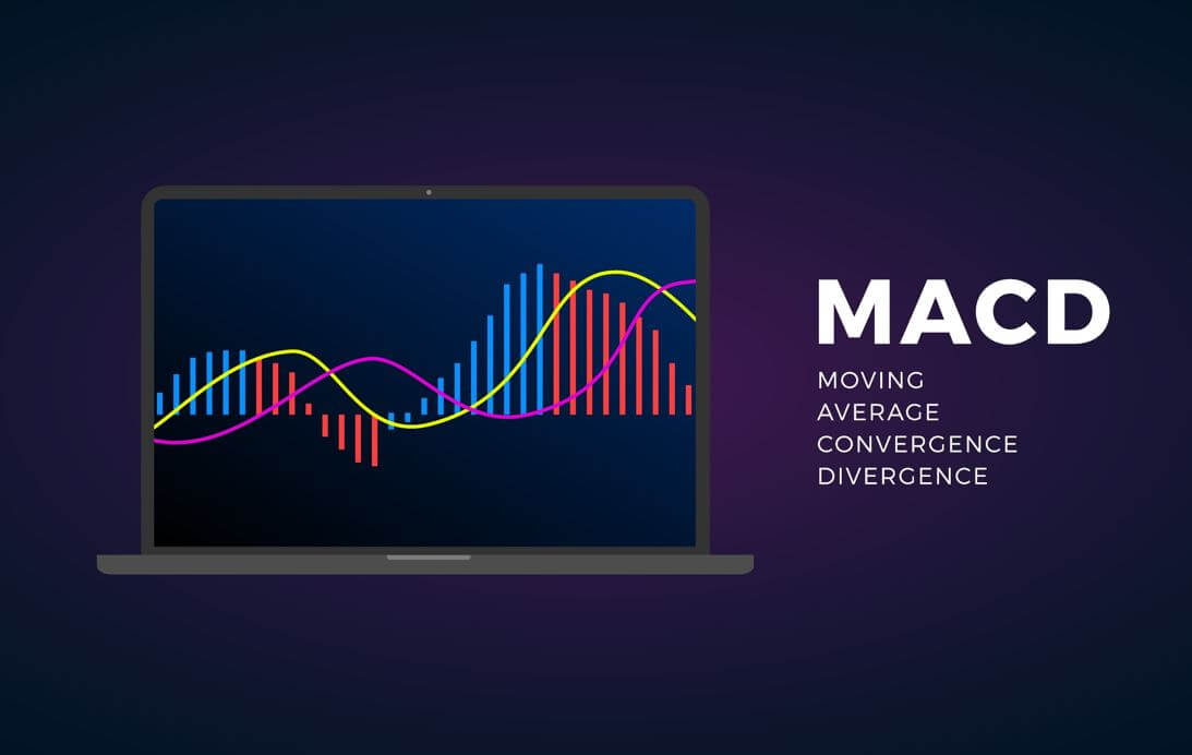
Moving Average Convergence-Divergence, MACD, was developed in 1979 by Gerald Appel as a market timing tool, and it’s an advanced derivation of moving averages.
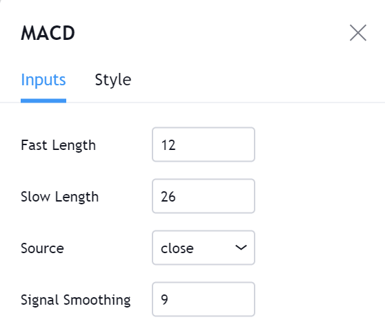
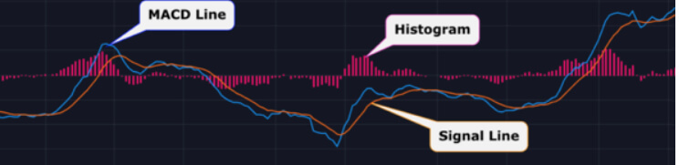
MACD consists of two exponential moving averages (EMA’s) of different periods that are subtracted, forming what is called the fast line. There is a second, slow line, that’s a short-period moving average of the fast line.
How to compute the standard MACD:
- Compute the 12-period EMA of prices (usually the closing price).
- Compute the 26-period EMA of prices.
- Subtract 2. from 1. Its result is the fast MACD line.
- Compute the 9-period EMA of 3. Its result is the slow Signal line.
Almost any charting software allows a user to modify these periods and the price type (Open, High, Low, Close, or an average of all four).
According to LeBeau and Lucas, on their classic book “Computer analysis of the Futures Market” Gerald Appel had two setups: One for the entry side and another one for the closing side.
The entry side is 8-17-9, while the relatively slower closing side is 12-26-9, which became the standard for commercial charting software. That seems to indicate that Gerald Appel favored getting in early in the trend and, then, holding into winners a bit more and let profits run.
My preference for intraday trading is 12-26-6, smoothing the signal line with a 6-period EMA. That reduces the indicator’s lag, producing earlier entries, but keeping the short-term and long-term EMAs distance.
It’s not a good idea to optimize MACD for a particular market, but, I think that a quicker formula is suitable for less than average volatility markets, and those with higher volatility require more prolonged EMA’s period.
Interpretation:
Price represents the consensus of value at a particular moment. A moving average is an average consensus over a period of time. The long-period EMA on a MACD reflects the longer-term consensus, while the short one represents a fresher consensus that is emerging.
The subtraction of the moving averages that shapes the fast MACD line reveals shifts in the short-term opinion in comparison to the longer term (older) view.
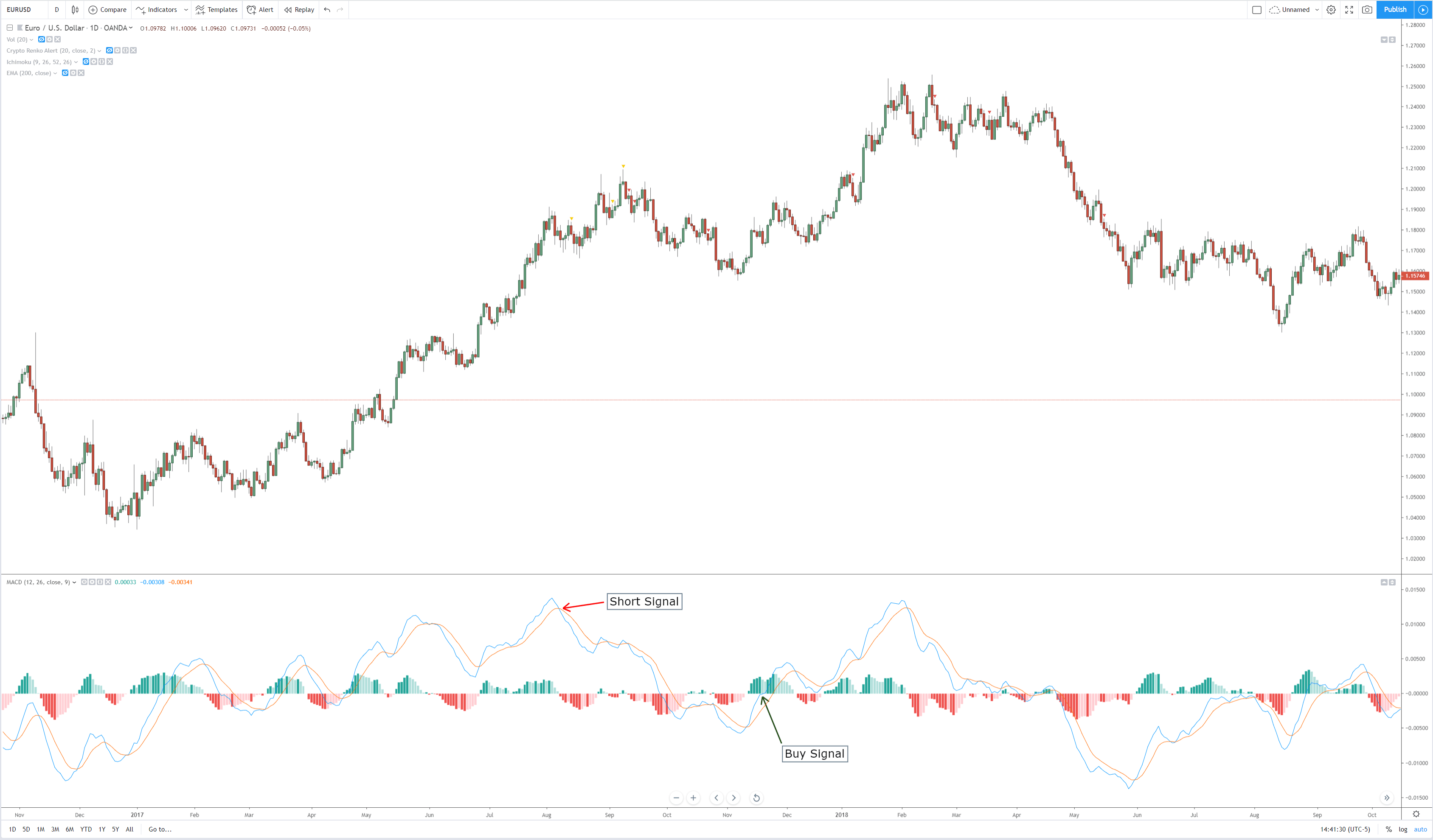
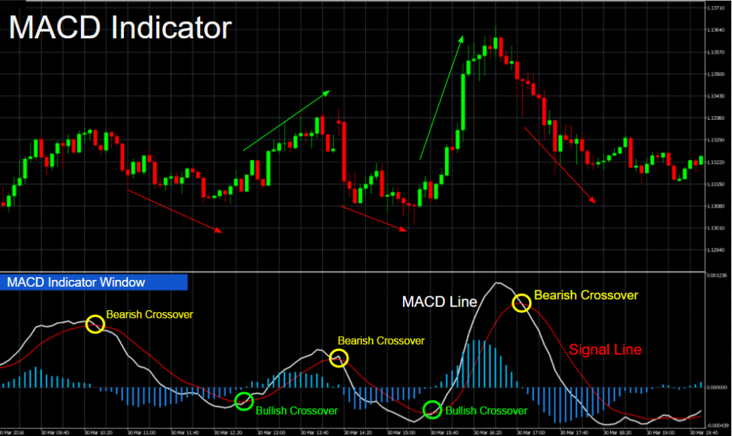
Signal Crossovers
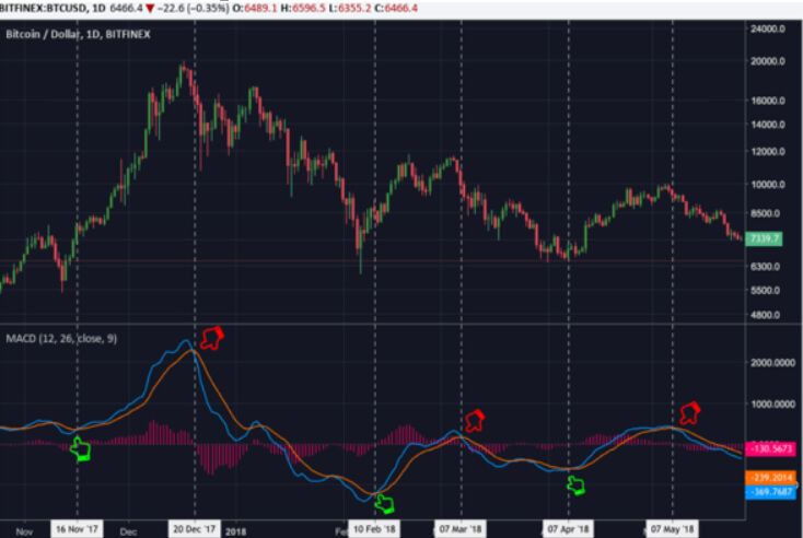
The usual MACD signal is a crossover between the fast MACD line and the signal line. When the fast MACD line moves above the slow signal line, it means a bull cycle has begun. If the fast MACD line crosses under the slow signal, a corrective cycle has started.
We have to be cautious to trade naked MACD crossovers because during quiet periods MACD crossovers deliver numerous false signals that might drive us into a streak of consecutive losing trades. But we have on hand several interpretations of this indicator that will help us get better use of it.
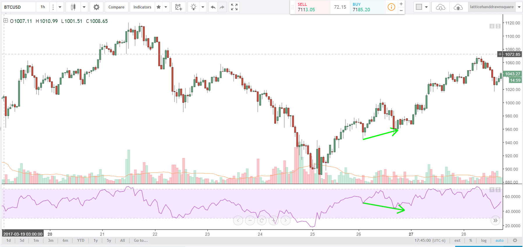
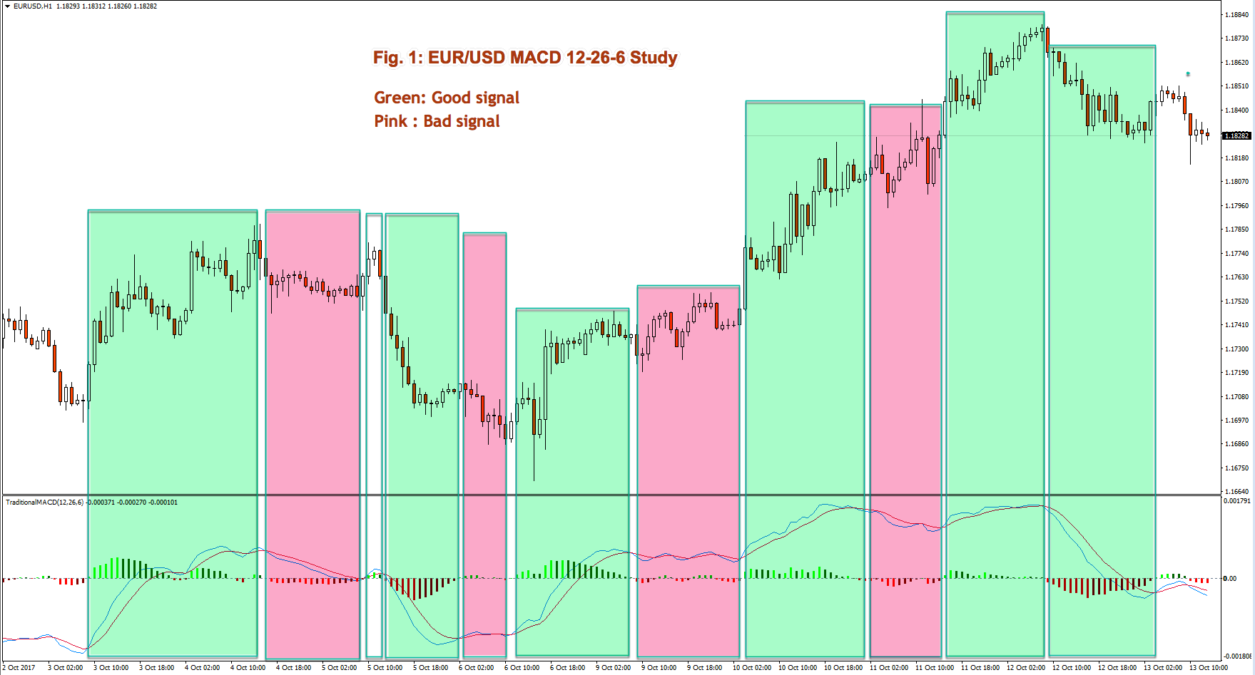
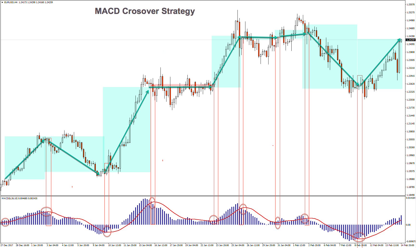
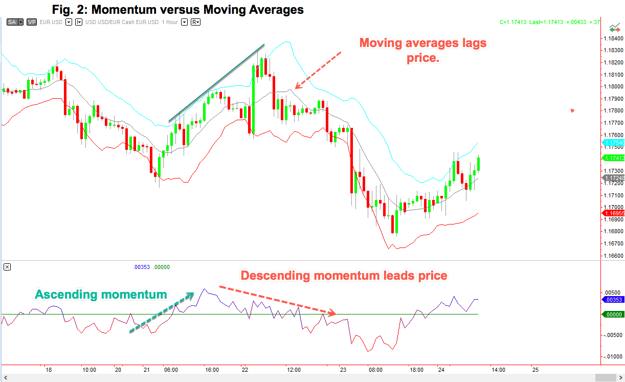
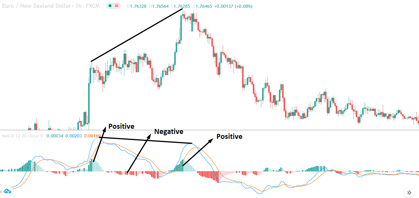
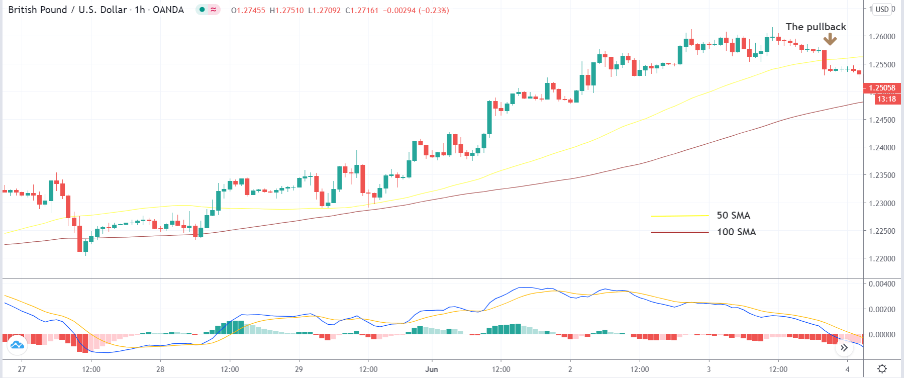
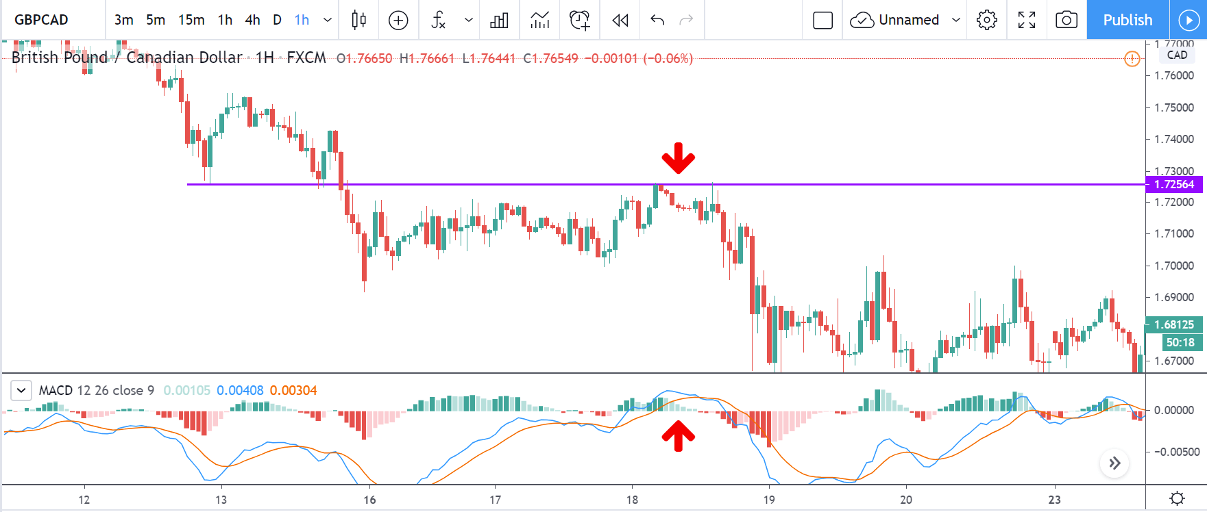
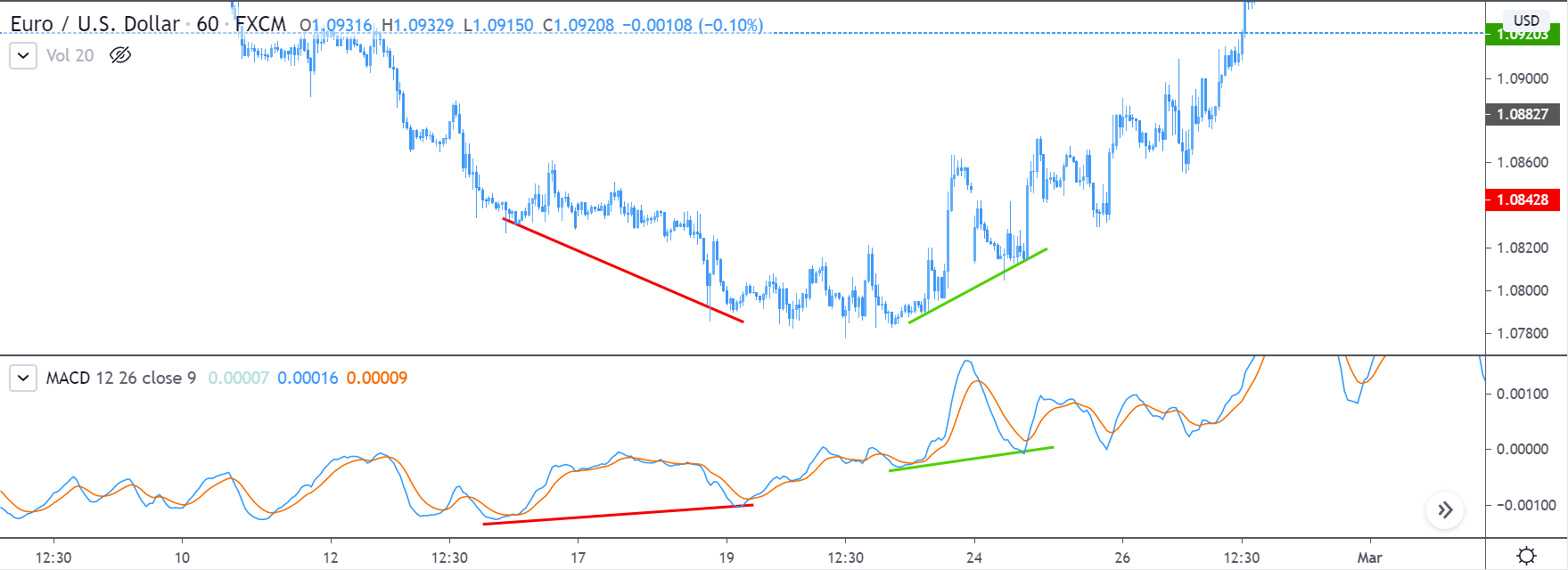
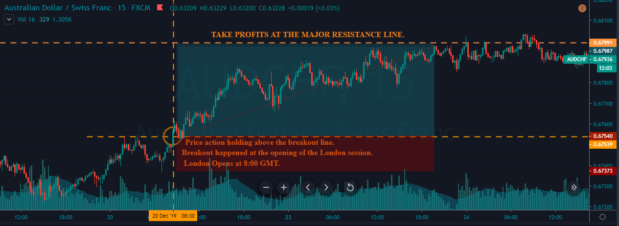
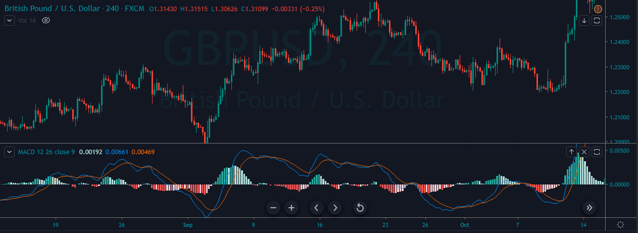
 In Fig. 1 we present an example of a EUR/USD 1-hour chart. There, we may observe that pink – unproductive- areas are usually crossovers going against the trend, which take place in reactive trend segments with sideways price movement. In spite of those failed entries, MACD crossovers are an efficient way to spot trend changes.
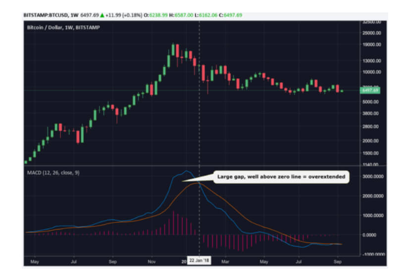
Overbought-Oversold indicator:
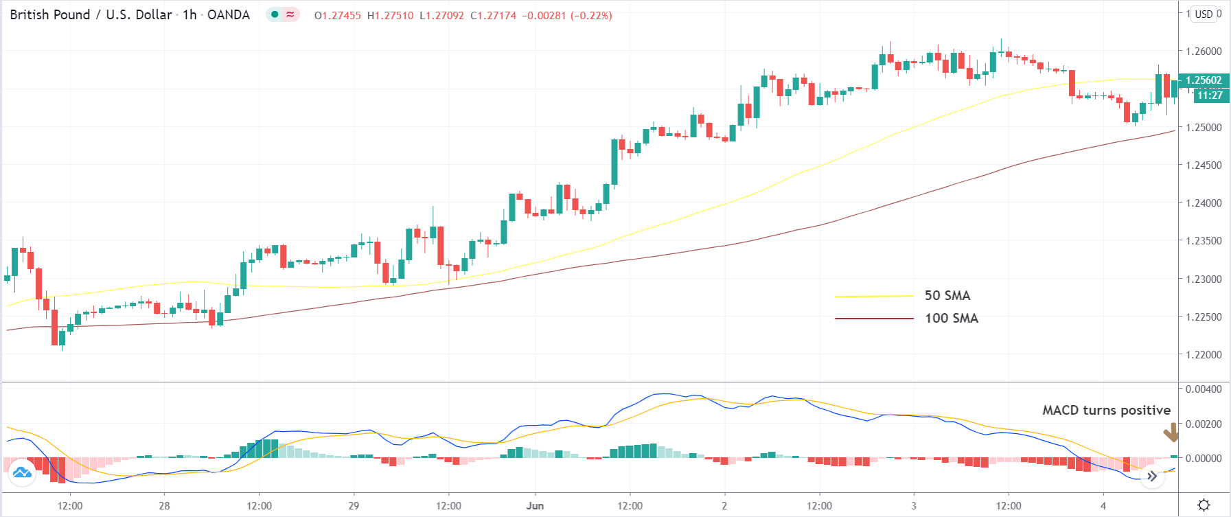
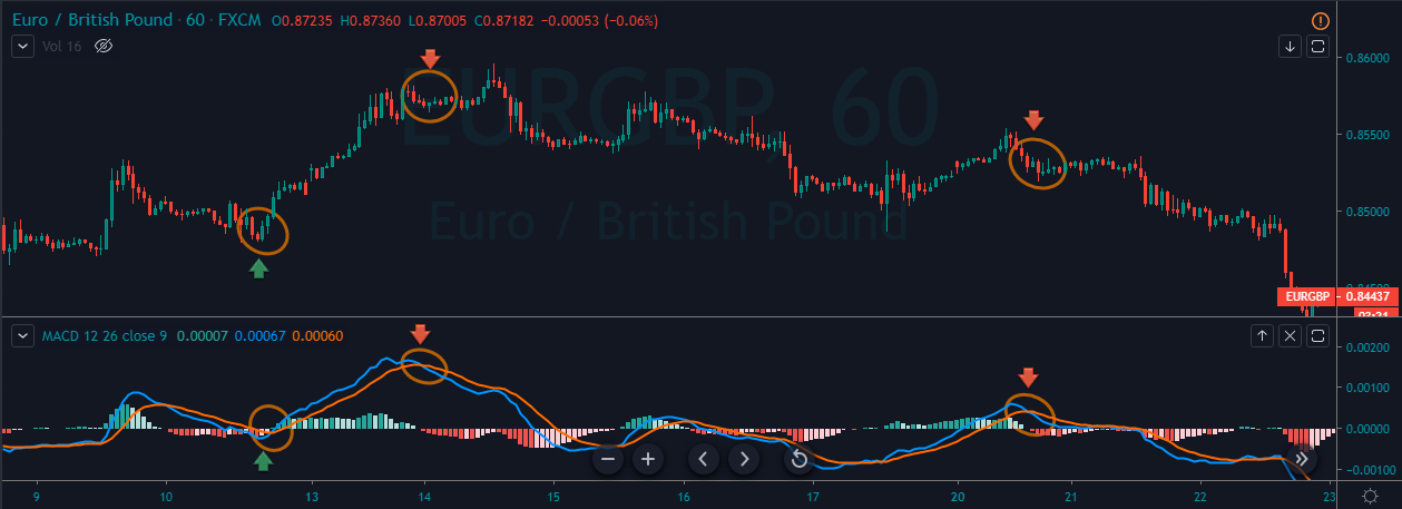
MACD can be used to spot when the market is overbought or oversold. As an example, on the EUR/USD, when MACD lines are above +0.0012 (using MT4) prices are close to overbought. Conversely, when MACD lines cross below -0.0012 the market may be close to a short-term low. Thus, under those two conditions, stops should be tightened and take partial profits.
Crossovers above/below those levels are worthwhile as entries. On the contrary, crossovers that happen in the band between zero and any of those levels are usually irrelevant, if occurring against the current trend. But MACD crossovers that go with the trend, confirmed by, for instance, a breakout on support or resistance, shall be considered.
A powerful signal happens when there’s a crossover against the previous trend that fails and then a crossover with the trend takes place (see fig 2, points E and F).
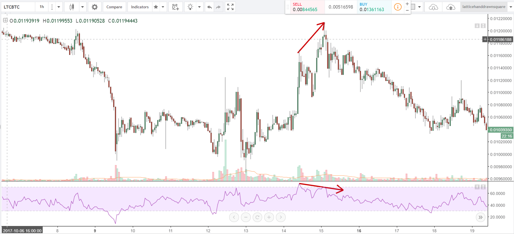
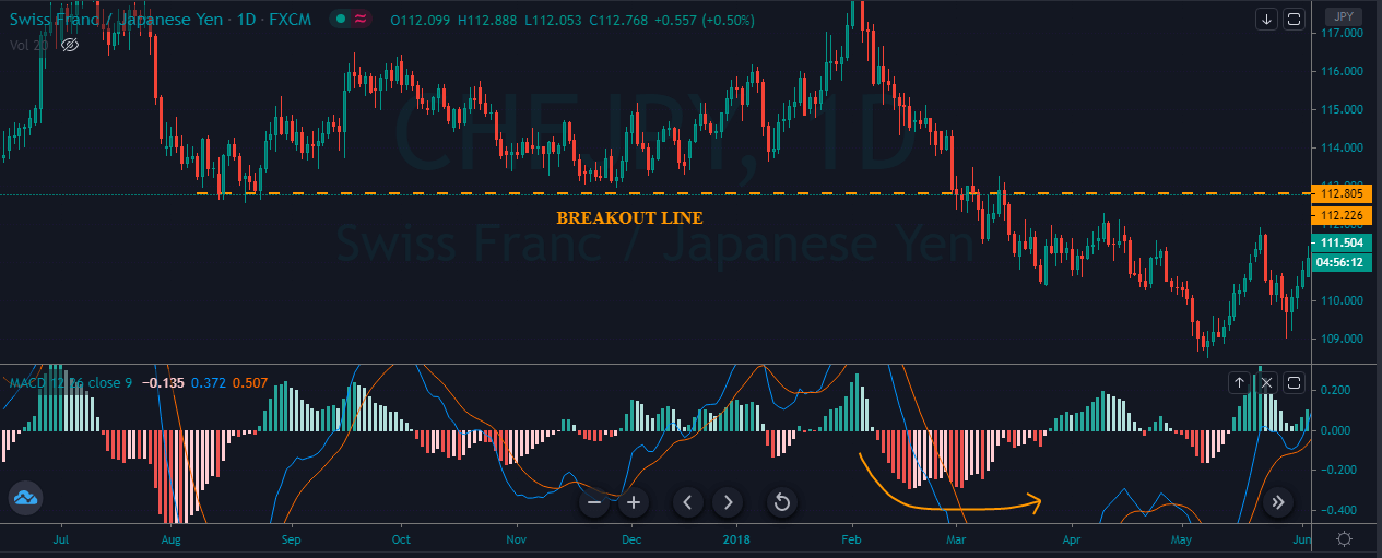
The overbought or oversold MACD levels shall be assessed for each market and condition, monitoring them from time to time, to get good results. The reason is that automatic MT4 level adjustment depends on the volatility and price levels; thus, the resulting MACD values might show shockingly different values. For instance, watching today’s USD/JPY MACD study, the optimum levels for overbought and oversold levels are at about ± 0.2. This issue seems annoying, but it’s not, as this is solved easily by observing the latest extreme conditions and checking the MACD level where they took place.

As an example, let’s observe Fig.2 MACD behavior on the USD/JPY. On A, the crossover to short the USD is close to the zero line, so it’s rejected. There we missed a profitable short. Then on B, we got a buy signal that is at oversold levels, so we take it. Then we reach C, but the crossover doesn’t happen in overbought levels. Therefore, we keep our position, and hold it up to D, closing it and reversing. This resulted in a 2X reward compared to an exit at C. Our short position wiggled but we hold it and price reached point E, and there we exit it since the MACD signal wiggled at oversold levels. At point F we observed an evident breakout with a MACD crossover that’s in the rejection band, but goes with the current trend, so we take it. Finally, at G we exit.
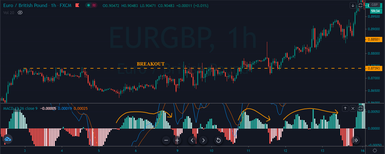
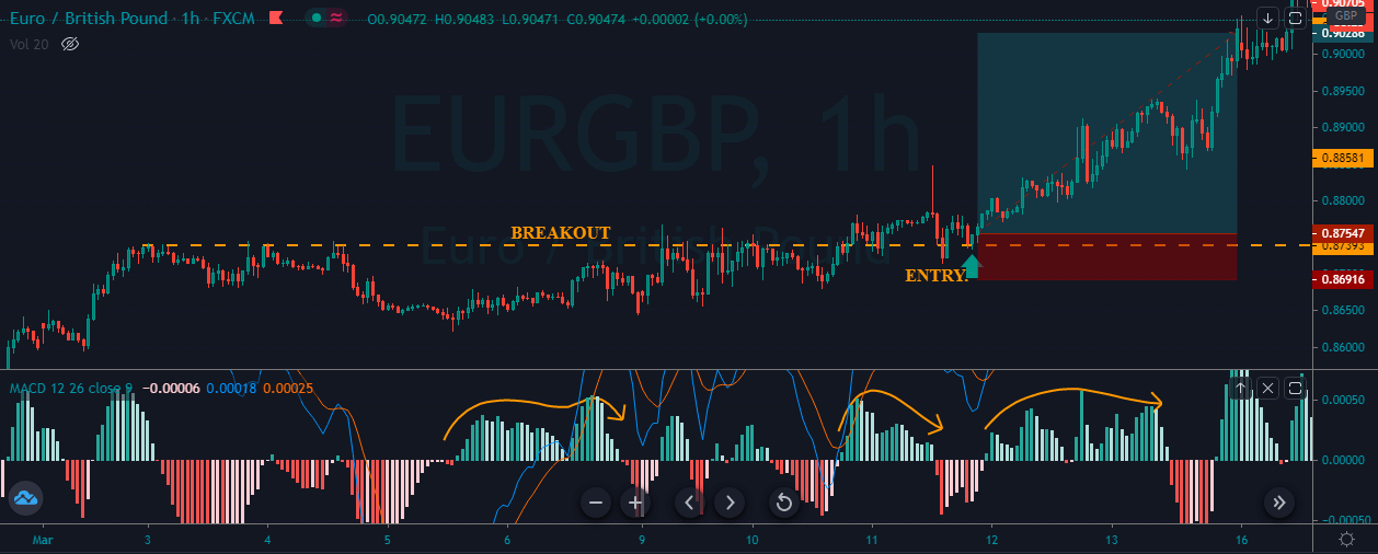
MACD trend lines
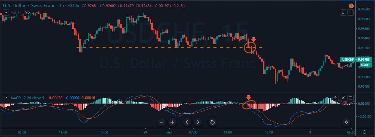
A variation of the crossover signals is obtained using trend lines. By drawing lines parallel to the signal lines, we obtain early entry points, in advance of MACD crossovers. According to LeBeau and Lucas, MACD crossovers that are preceded by, or in sync with, a trend line crossover tend to be more relevant. I haven’t found any evidence of that on intraday charts, Nevertheless, since all indicators present unavoidable delays that hurt profits, I think worth studying the use of a trend line parallel to the MACD signal.
I think this method is an interesting addition, especially on sideways channels in conjunction with the concept of overbought-oversold MACD, and the complement of profit targets at congestion areas.

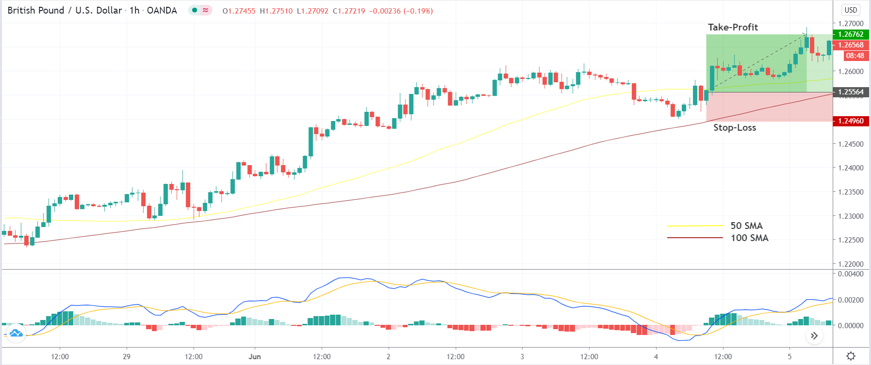
Fig 3 shows an example, taken from a very choppy sideways channel in the USD/JPY 1 hourly chart from 28-Sept-2017 until 10-Oct-2017. The green highlighted areas show the profitable trades and its magnitude. There’s only one pink shaded segment, which corresponds to a failed trade. That’s a huge feat! Just one loser out of 11 trades on a very choppy channel, that has been the first choppy area I’ve found. No cherry-picking at all.
Just to avoid after the fact selection, on this example we didn’t take any crossover outside overbought and oversold areas that went against the current trend. The only criticism of this exercise might be trade Nr. 1 that was profitable because we didn’t set any stop.
However, even if we accept that trade as a loser, the numbers are quite sound: One very profitable trade (4), four good trades (3,5,7, and 11), two average trades (6 and 9), two scratch trades (2 and 10) and two losing trades (1 and 8).
I find this method worthwhile for just the exits, as well, if the break of the line happens in overbought or oversold areas.
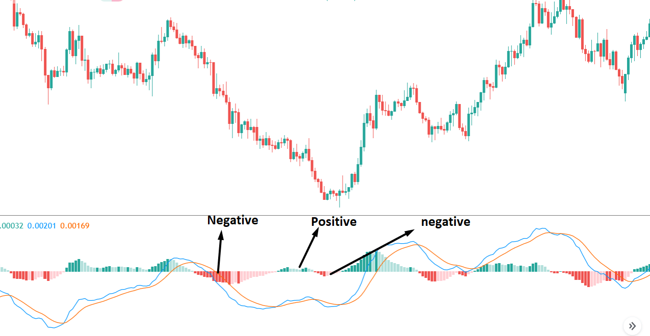
MACD Histogram
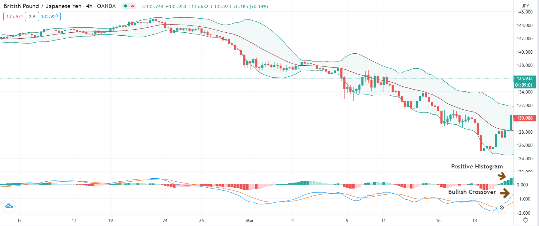
MACD histogram displays the difference between the MACD line and the Signal line as a histogram: vertical bars whose lengths correspond to that difference. When a MACD crossover happens, this corresponds to a zero crossing of the MACDhist. Positive histogram values correspond to the MACD line above the signal line, and negative values below the signal line.
MACDhist = MACD line – Signal line

When the difference increases, meaning the trend has momentum, the corresponding lines are larger. Conversely, when it’s decreasing, bars get shorter, giving early warning of the potential weakness of the trend.
Thus, positive and negative peaks on the MACD histogram corresponds to the maximum momentum of the trend, and a retreat from the maximum values shows the shift in sentiment that sooner than later might stop the trend.
Consequently, it’s best to trade in sync with the slope of the MACD histogram, as it shows the dominant group: Bulls if raising bears if decreasing.
A corollary to this statement is: On an open trade if the MACD histogram decreases, tighten your stops. It doesn’t mean that the trend is going to reverse but it might, especially if prices are on a sideways channel.
New peaks and valleys:
When a new record peak on the MACD histogram is reached during an uptrend, it shows that the current trend is healthy and that prices are, likely, to continue moving up. A New record valley during a downtrend means that prices most likely will retest the recent low or keep moving down.
Dr. Elder has a helpful analogy to the MACD histogram: “MACD-Histogram works like headlights on a car—it gives you a glimpse of the road ahead. Not all the way home, mind you, but enough to drive safely at a reasonable speed.”
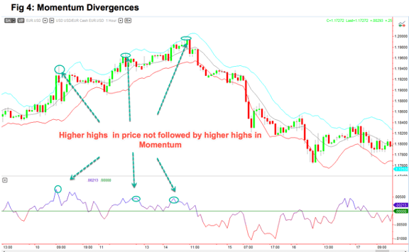
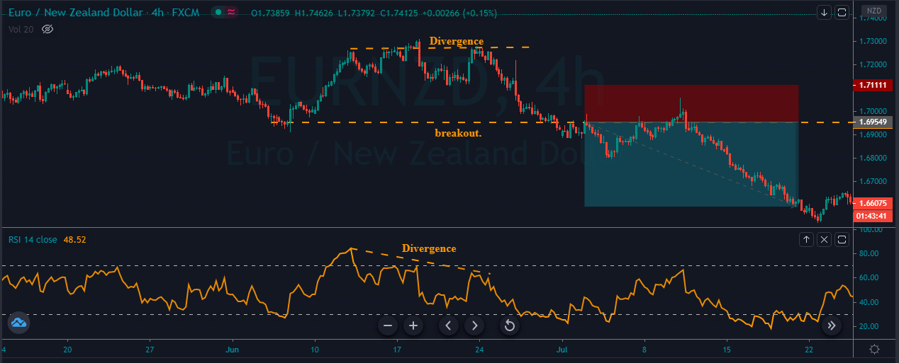
Divergences
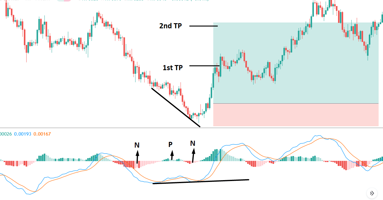
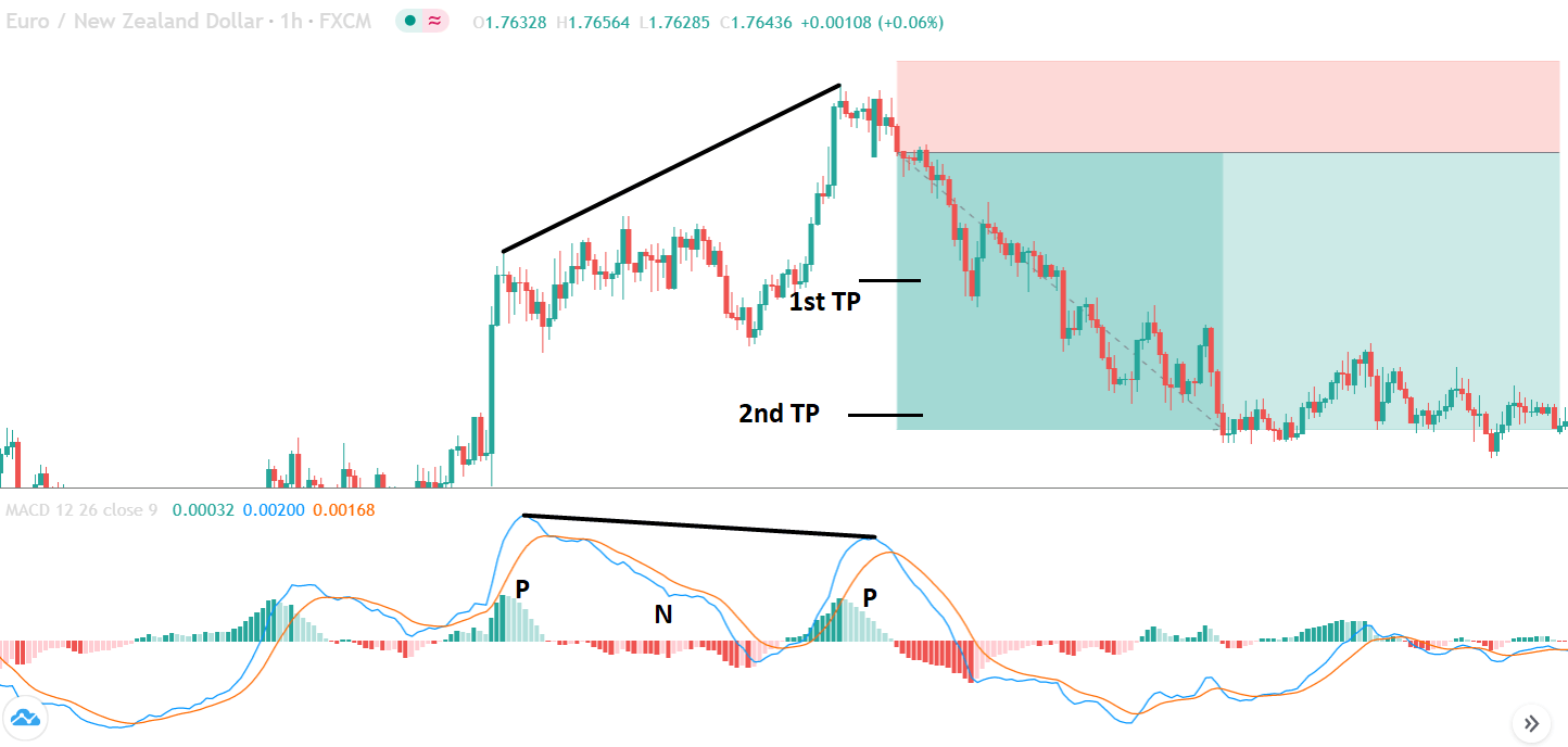
According to several authors, divergences are among the most valuable signals in MACD, especially in sideways price channels.
A divergence happens when we spot a new high or low in the price, but it isn’t followed by the corresponding high or low on the MACD lines.
bullish divergence
This pattern happens, as might be obvious, at the end of a downward trend, and is a bottom indicator.

Please, note that the histogram has crossed the center line at point b. Point c may appear on the positive side, as in here, or at the negative side, but making a higher valley than at point a. For the pattern to be called divergence, the crossing of the zero line must happen. If it doesn’t happen, it’s not a bullish divergence.
The divergence in the MACD histogram is reinforced by a signal line divergence, as well. Such combined pattern is rare – the usual is just a histogram divergence with the MACD lines not following higher lows-, and it shows a higher likelihood that the coming trend would be strong.
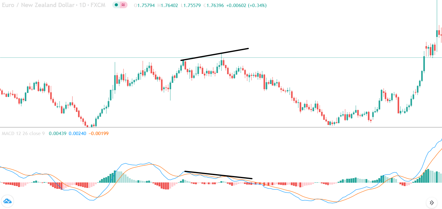
Bearish divergence
A bearish divergence is a specular pattern to the bullish divergence, so it happens in uptrends. Price has reached a new high, roll back and then move up to a higher high, without a confirmation of a MACD histogram higher high. As in the previous case, the B point has to cross the zero line, in this case to the negative side.

Fig. 6 show a triple bearish divergence in which a middle top failed to continue going down. When the second big high at C isn’t able to make a new high on the MACD-Hist and neither does on the MACD signal, then a bearish divergence is confirmed.
According to Alexander Elder, “missing the right shoulder” divergences in which the second peak at c fails to cross the zero line, are rare, but producing strong downward moves.
Conclusion
MACD is a versatile study that helps traders spot trend reversals early on, allowing them to trade with the trend.
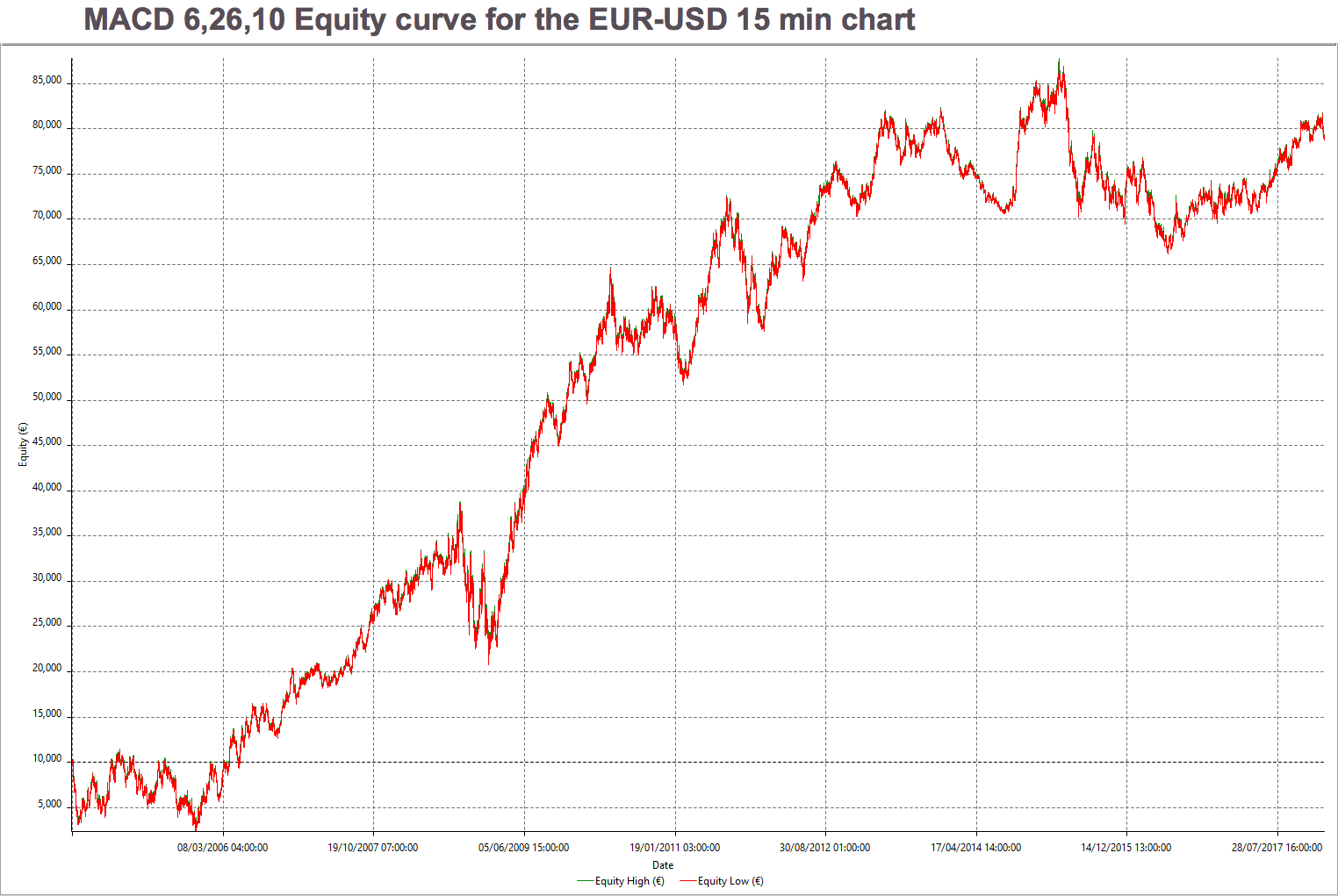
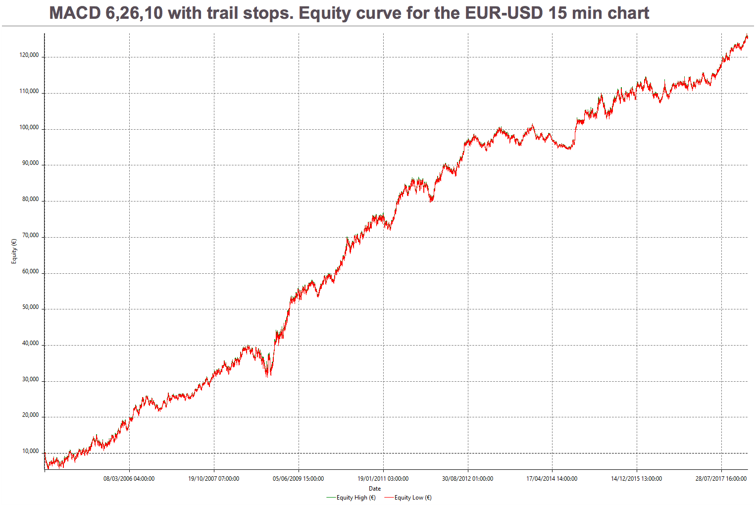
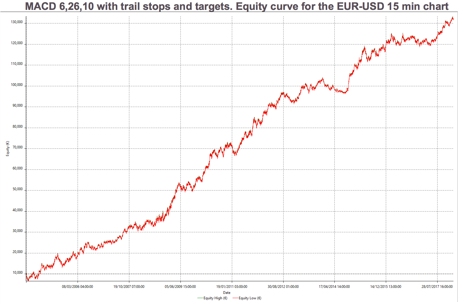
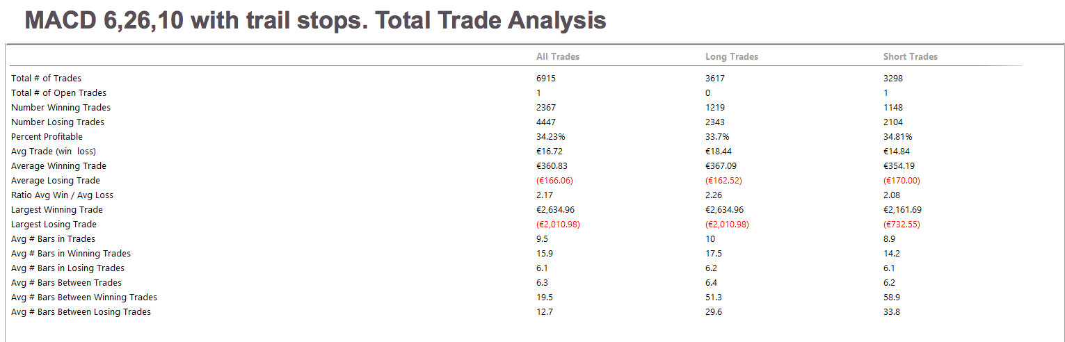
The combination of MACD entries with sensible stops and targets, together with some market filter that forbids trading during congestion areas can make for a simple and robust trading system, that’s a bit more sophisticated than simple MA crossovers and with potentially better overall performance.
References:
The New Trading for a Living, Alexander Elder
Computer Analysis of the Futures Markets, Lucas and LeBeau
©Forex.Academy


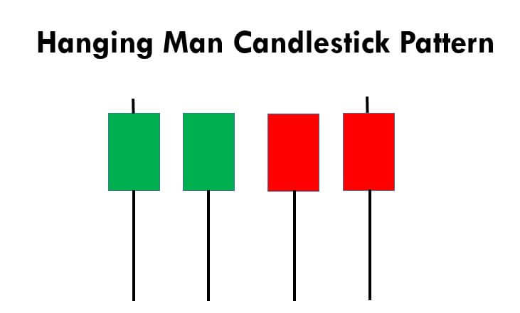
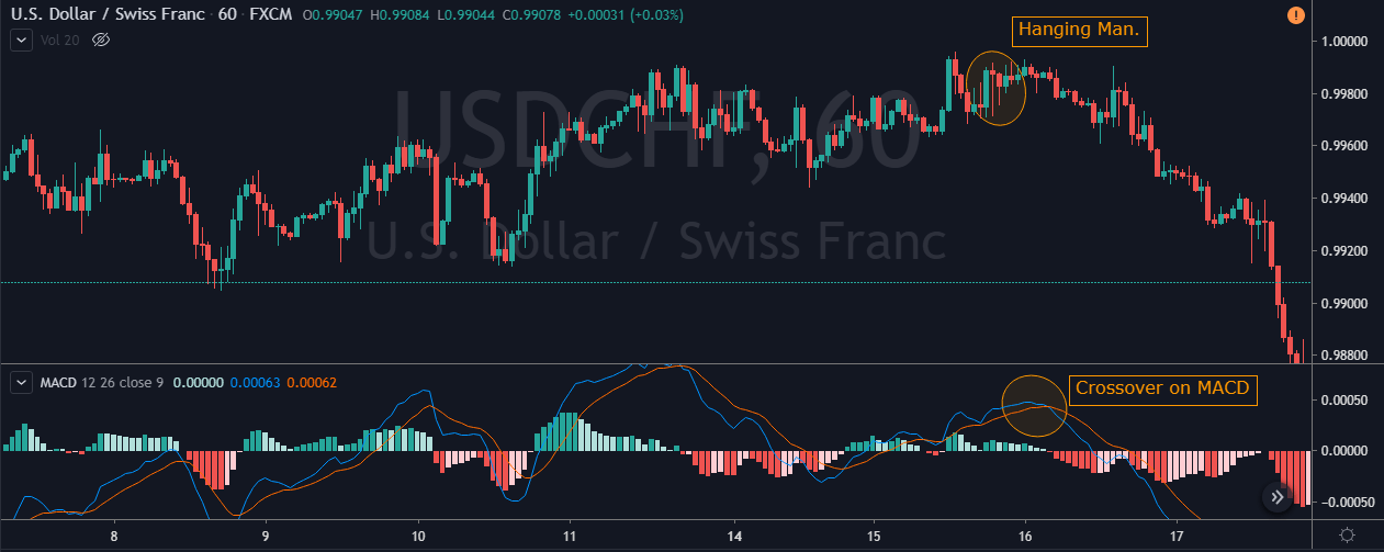
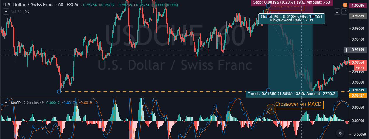
 This pattern is not confirmed unless the price falls shortly after the Hanging Man. If the next candle closes above the high of the Hanging Man, this pattern is not valid. After the pattern, if the very next candlestick falls, then it’s a clear indication of the reversal. Now, if you see a Hanging Man candlestick and the above-discussed rules apply, you can go ahead and take the trade. But since it is crucial to have an extra confirmation, let’s pair this pattern with a technical indicator.