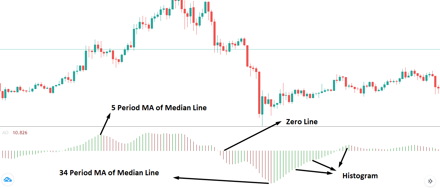
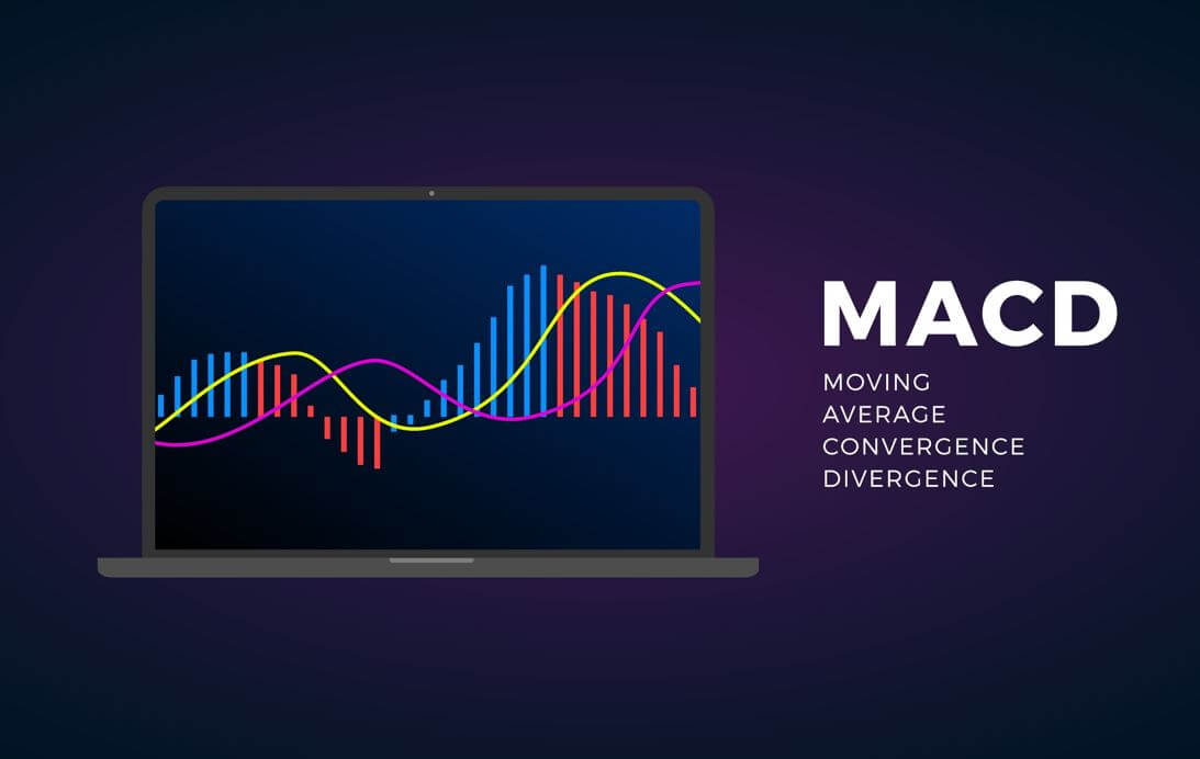
Categories
Forex Basic Strategies

Ever Heard Of The Andrew’s Pitchfork Forex Trading Strategy?

Introduction

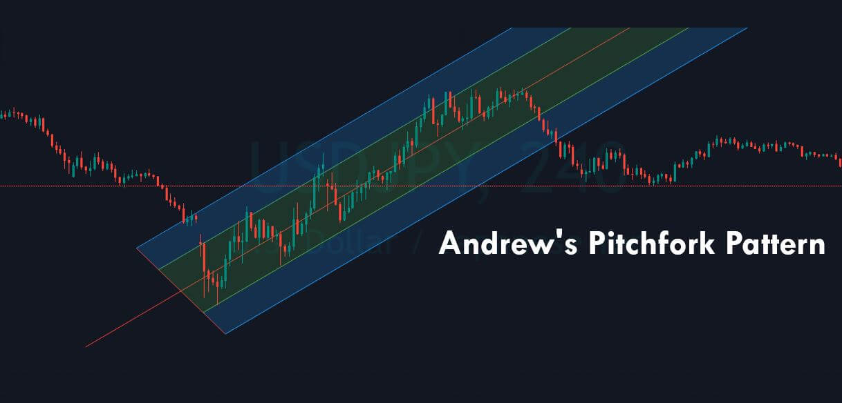
Pitchfork is a technical indicator developed by Alan Andrews. This indicator consists of three parallel lines- These three lines help us identify the possible support and resistance levels. They also do help us in recognizing potential breakout and breakdown levels. With this, we can identify possible trading opportunities in the Forex market. Long term investors use this indicator to identify and gauge the overall cycles that affect the activity of the underlying currency pair.

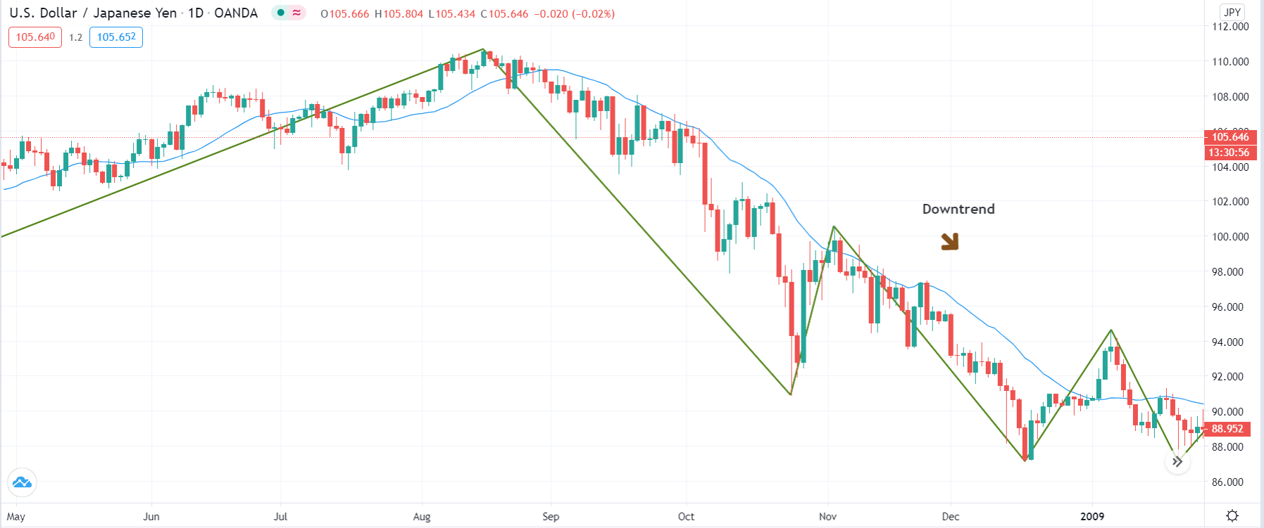
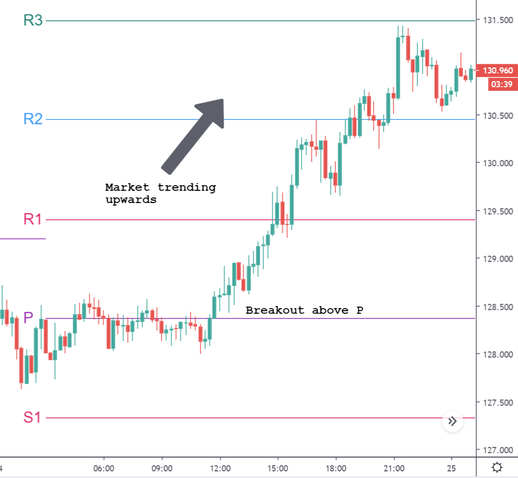
Three lines of Andrew’s pitchfork tool are as follows. The first one is the median trend line in the center, and the two equidistant trend lines on each side. Moving from left to right of the chart, these lines are drawn by selecting the three points, which are usually a reaction of highs and lows. As long as price action holds inside the Andrew pitchfork tool, it indicates that the trend is in place. Reversals occur when the price breaks the pitchfork.

Andrew’s pitchfork indicator can be used on all the timeframes, and it works on every single chart. Note that this indicator works very well on all types of securities, such as stocks, cryptocurrencies, futures, or the Forex market.

Picking The Three Points

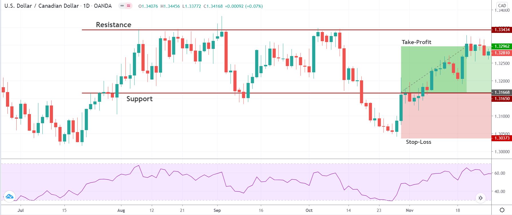
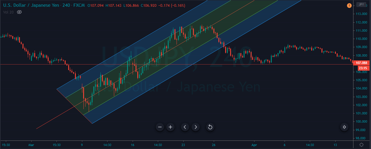
The first step to know before using Andrew’s pitchfork tool is to select the three points for drawing the trend lines. The first point that we chose must be either a high or low that occurs on the price chart. Once that point is chosen, we must identify the trough and peak to the right and left sides of this point. This must be a pullback, which is opposite in the direction of the ongoing trend. Once these points have been isolated, the indicator is placed on the price chart. The two prongs formed by the peak and trough serves as a support and resistance of the trend as shown below.

Trading Strategies Using The Andrew Pitchfork Tool

Mini Median Method

This one is the most basic and popular strategy used by the traders to trade the market using the Pitchfork indicator. We must place the Andrew Pitchfork tool in a strong ongoing trend and look for the buy/sell opportunities.

In the below image, we marked a few trading opportunities presented by this indicator.  We can see that when the price hits the lower line of the tool, we went long. Likewise, we have activated sell trades when the price action hits the median line. This strategy is basic, but it provides a good risk to reward ratio trades in a strong trending market.

In case of a buy entry, exit your position when the price hits the median line. Conversely, take sell when price reverses at the median line, and we can book our profit at the lower line. Place the stop loss a few pips above your entry and ride the move.

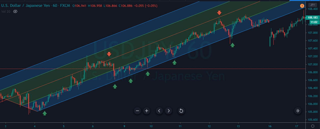
This approach works best for aggressive traders who prefer to pull the trigger when prices reach any significant level. So, if you are an aggressive trader, you can go with this approach. But if you are a conservative/confirmation trader, follow the next strategy.

For Conservative Traders

Most conservative traders do not prefer taking many trades in a single day because they tend to seek extra confirmation before pulling the trigger. This Pitchfork strategy is for them.

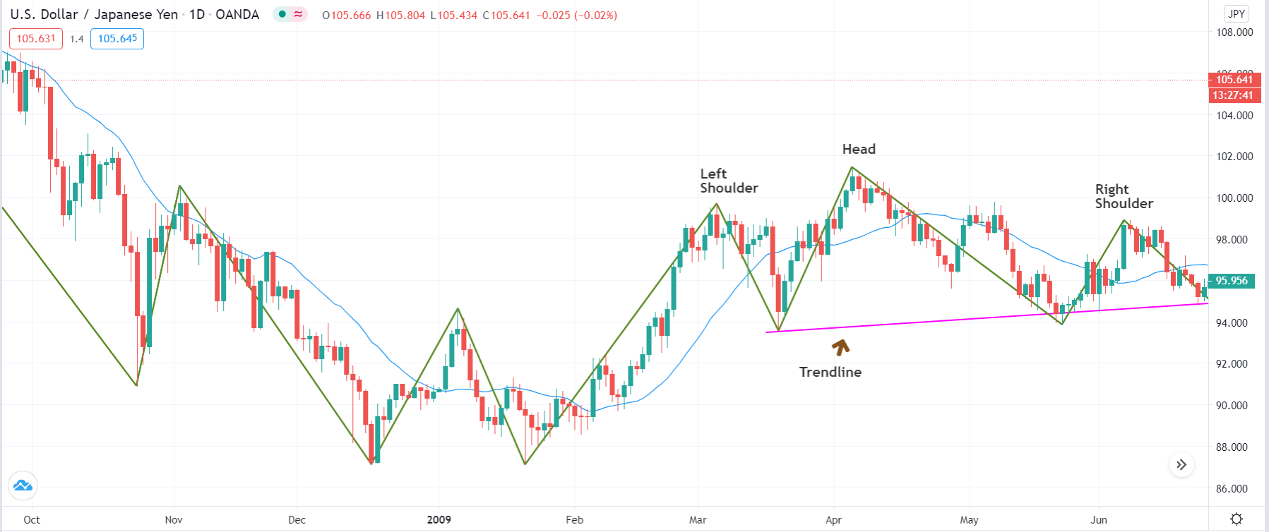
When the price action approaches the lower line of the indicator, wait for the price action to hold there to take entry. The holding confirms that the price action respects the dynamic support line, and going long from here will be a good idea.

As you can see in the below price-chart, the USDJPY was in a strong uptrend. We have identified three opportunities to go long, but out of three, only two trades were held at the lower support line to confirm the entry. Both of our trades worked very well, and they went on to make a brand-new higher high.

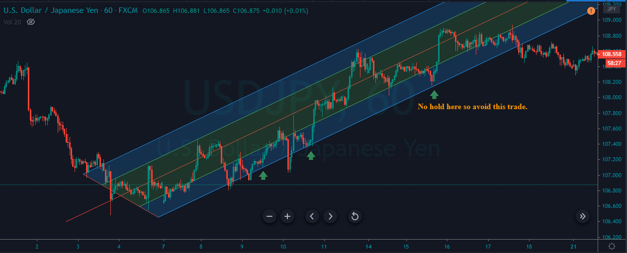
By using this approach, we can safely trade the market. We must always go for smaller stops because the holding at any significant area confirms the power of buyers.
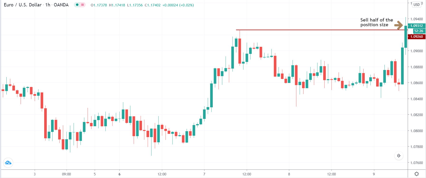
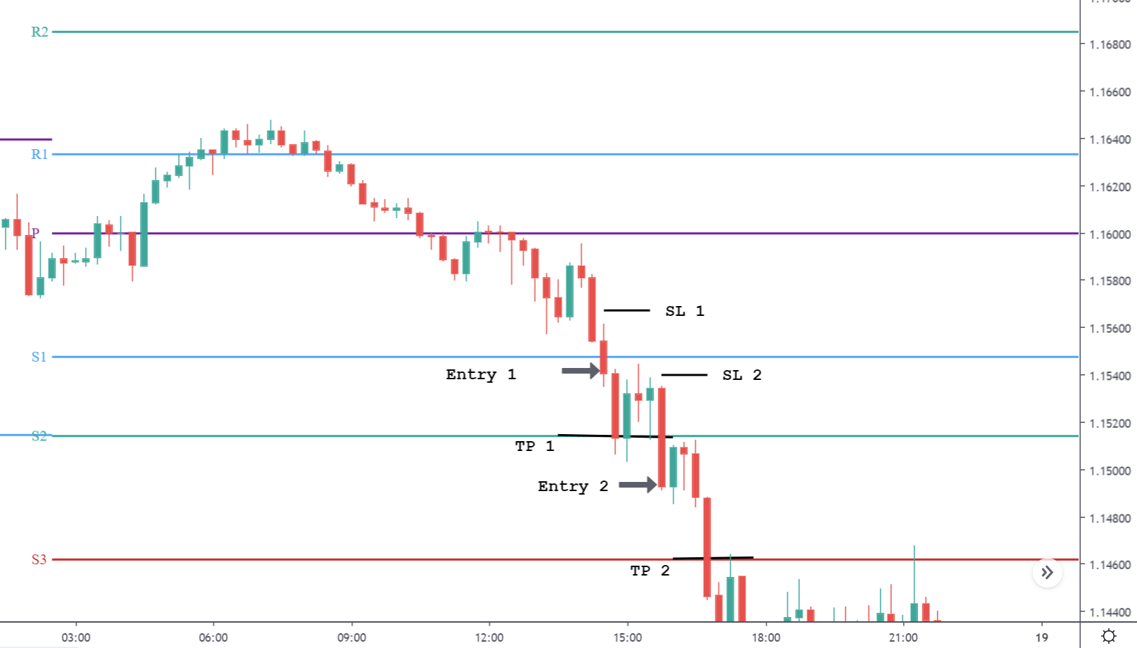
Breakout Trading

Breakout trading is a popular way to trade the markets. Most of the highly successful traders, market technicians, chartists, banks, hedge fund managers use this approach to trade the Forex market. In this strategy, let’s understand trading the breakouts successfully by using the Andrew Pitchfork tool.

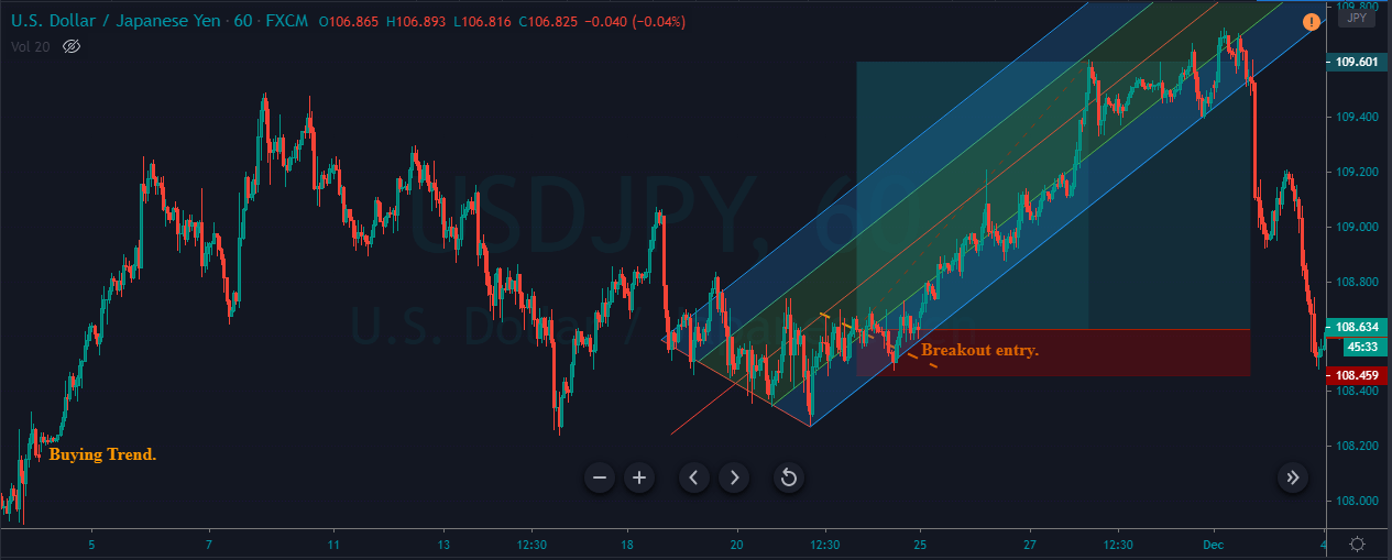
The idea is to find a strong trending market first and wait for the price to pullback. When the price gives enough pullback, place the Andrew pitchfork tool on price action and wait for the breakout in the ongoing trend direction. When the breakout happens, take the trade in the direction of the ongoing trend.

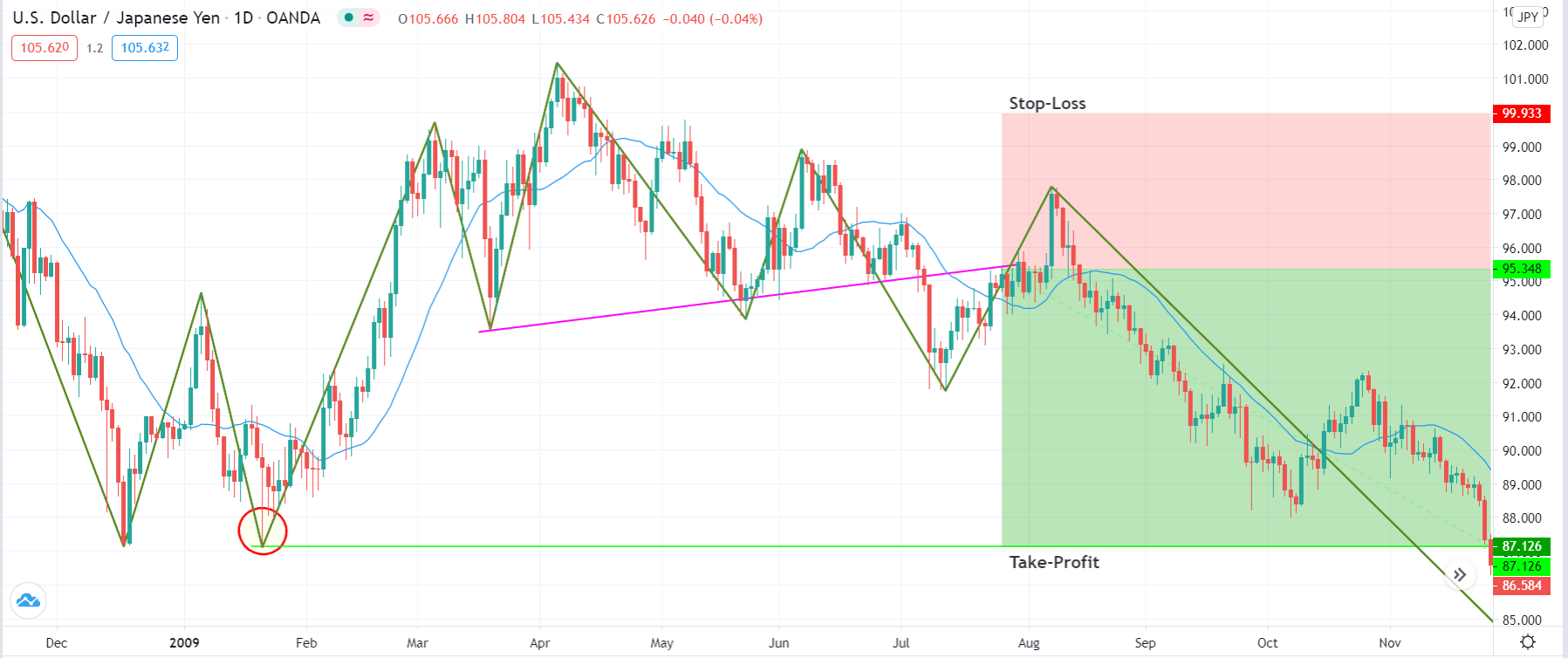
As you can see in the below image, the USDJPY was in an uptrend, giving quite deeper pullbacks. When we got enough pullback, we applied the tool on the price action, and when the breakout happened, we went long. Look for the breakouts only in the direction of the ongoing trend.

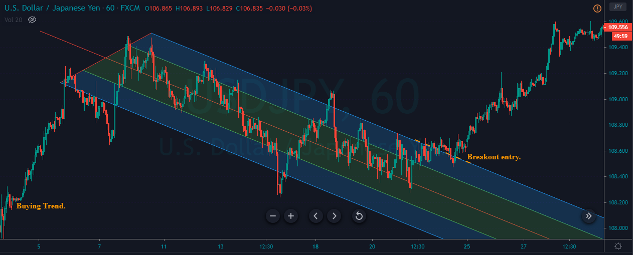
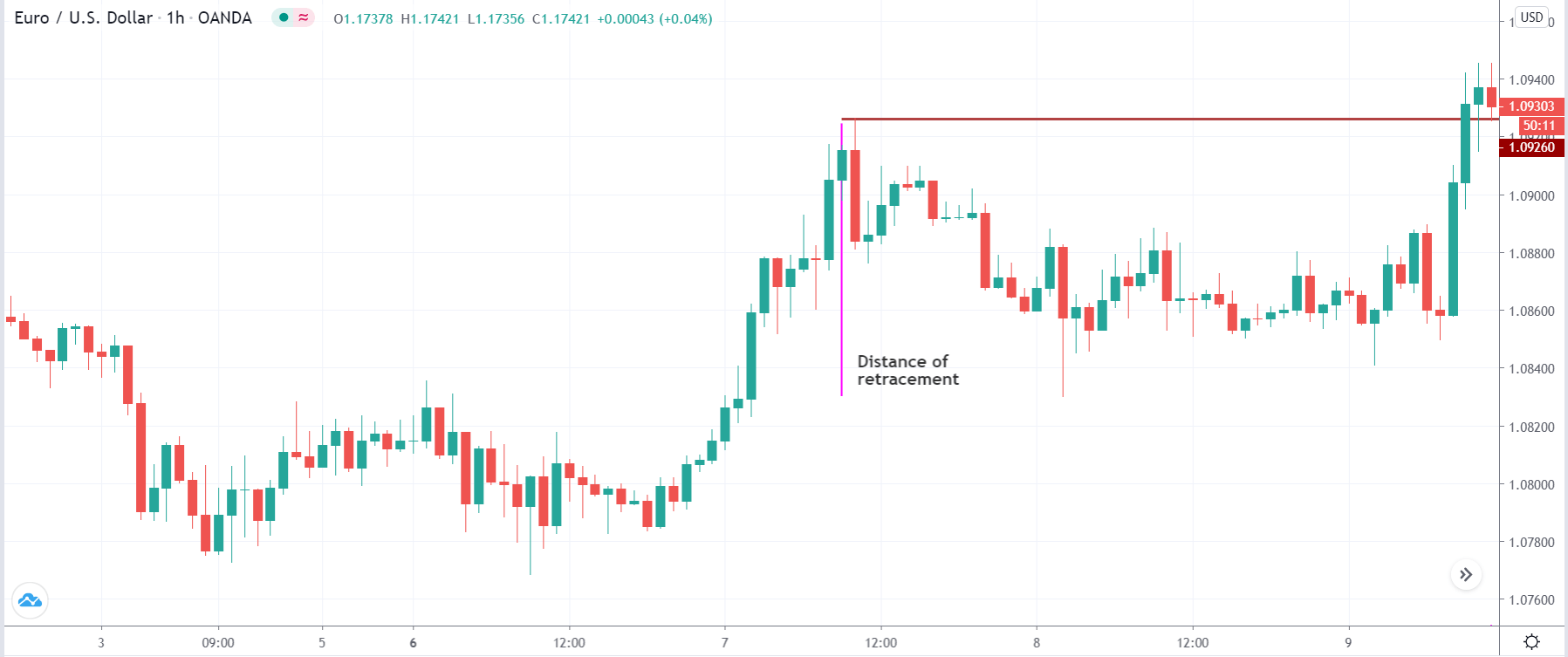
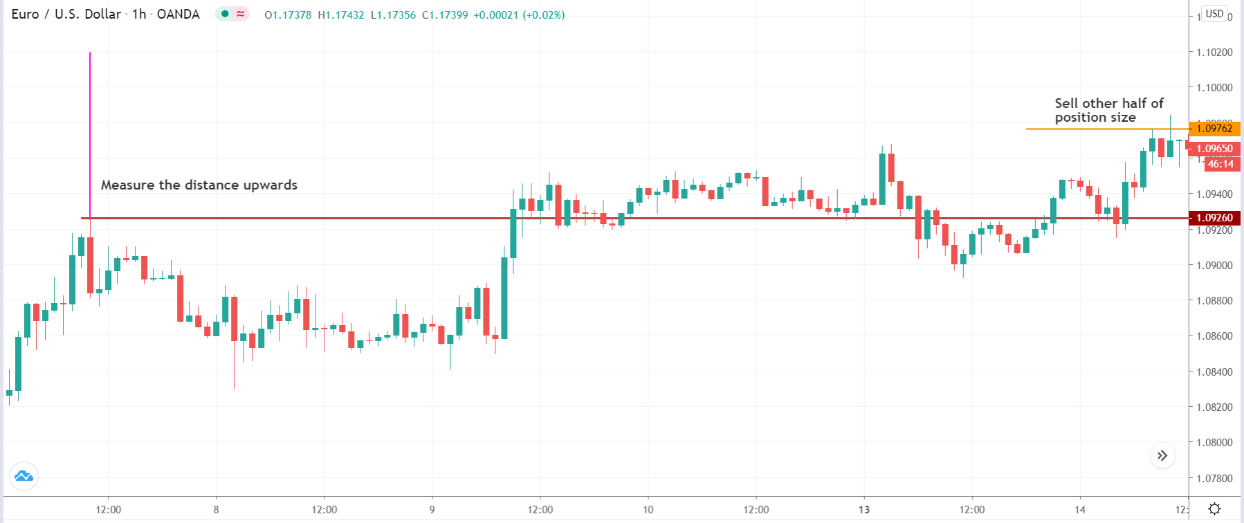
The chart below represents our buy entry and risk management in this pair. We went long when the breakout happened, and the stop-loss order was placed just below the breakout line.

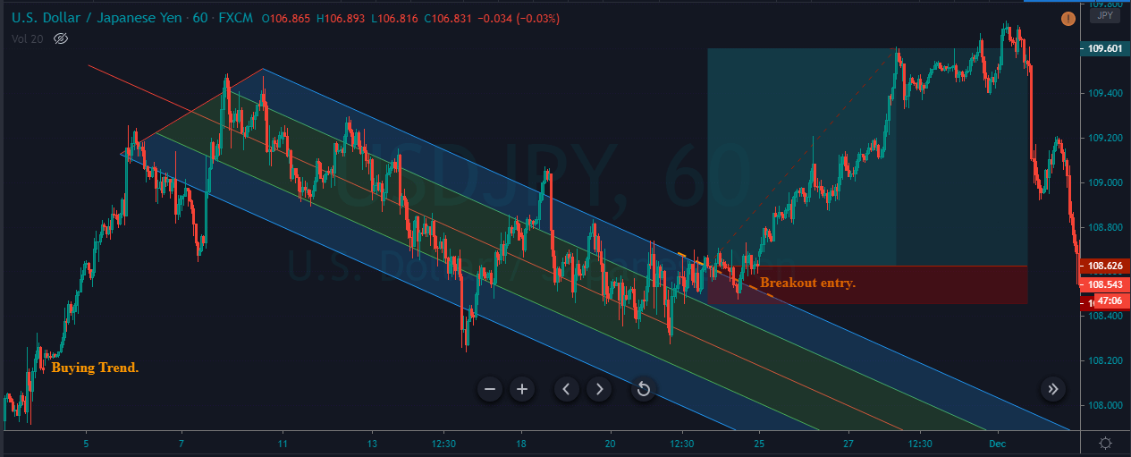
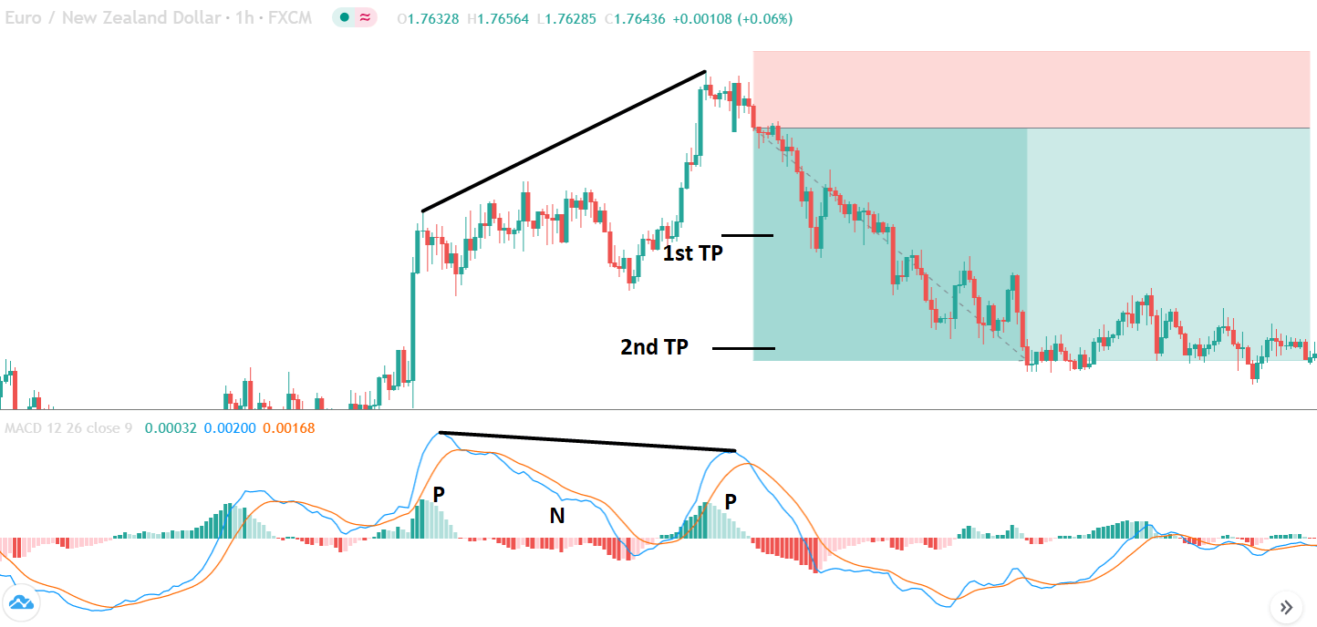
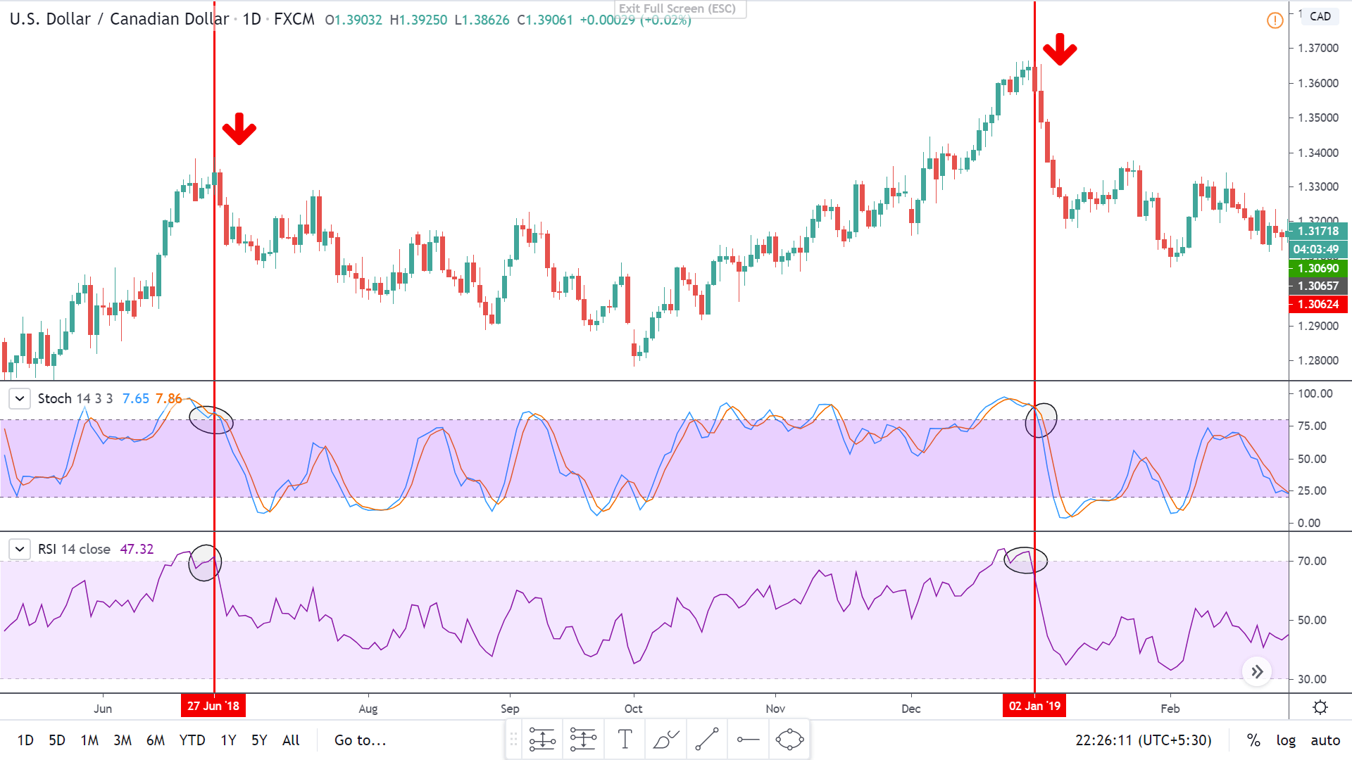
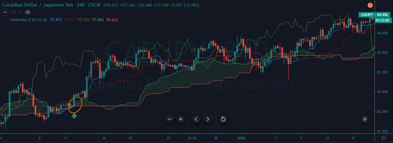
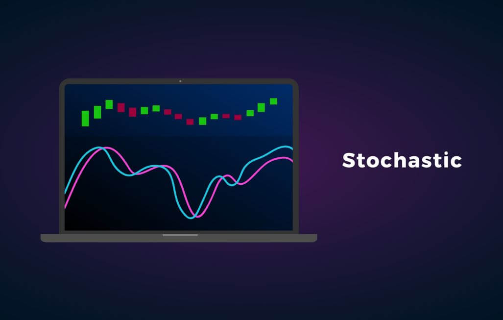
There are several ways to book our profits. We can use indicators like RSI and Stochastic to confirm our exits. Here we have used the pitchfork itself to book our profit in the above-discussed trade. When we activate a trade at the breakout, the first thing we must do is to apply the Andrew Pitchfork tool in the direction of our trade and wait for the price action to break the tool to book the profits.

In the below image, we applied the tool when our trade took off, and at around 109.60, the price strongly broke the Andrew pitchfork tool. This is an indication for us to close our whole buying position. Also, you can notice that after our exit, the price action blasted to the south.

Conclusion

Just like other trading tools, Andrew pitchfork is not perfect. We need to have strong knowledge of the money management techniques in place before using this tool on live markets. If you are a novice trader, it is advisable to gain experience by experimenting with this tool on the demo account. Using this tool first hand, we are sure that you will discover various ways of using this tool. This will enhance your ability to understand the market better. Cheers!

Categories
Forex Basic Strategies

Filtering The Most Profitable Trading Signals Using The ‘Zig-Zag’ Forex Trading Strategy

Introduction

In today’s article, we discuss a strategy that is based on the unfamous zig-zag indicator. The zig-zag indicator serves to shows changes and continuation in trends that occur in price movements. Usually, this indicator is used by traders to look for reversal points in the market. But in today’s strategy, we will use the zig-zag indicator to trade the continuation of a trend. However, if we think a little deep, this type of trading is also a form of ‘reversal trading’ where we will be finding the reversal points in a smaller trend within the larger trend.

At first glance, the indicator appears very simple but is not easy to understand by novice traders. The trading strategy that uses this indicator is not special because it uses this indicator, but since we are imparting various other concepts of technical analysis such as chart patterns, trend lines, and price action. But using this indicator alone too can generate good trading signals provided the trader is having good skill of this indicator properly.

Time Frame

The ‘zig-zag’ strategy can only be applied to the ‘Daily’ time frame. Hence, this strategy is not for intraday and short-term traders. We need to have a longer time horizon to trade using this strategy.

Indicators

We use two technical indicators in this strategy

  • Simple Moving Average (20-period)
  • Zig-Zag (default setting)

Currency Pairs

We can apply the following strategy on both minor and major currency pairs. Liquidity and volatility will not be a major issue here as we are trading on higher time frames.

Strategy Concept

We are basically using the zig-zag indicator to identify classic chart patterns of technical analysis and trade them. The indicator is very effective in reducing the noise by helping the technical trader in viewing the larger picture and general market direction. Here, we look for appropriate chart patterns and associated price action indications within the context of a trend.

When these patterns are formed just anywhere on the chart, they do not hold much value as there is no logic to that. Once we identify a trend using the simple moving average (SMA), we wait for trend continuation signs provided to us by the zig-zag indicator and the chart pattern. The formation of the chart pattern is the first sign of trend continuation. Once price action develops and the market moves in the direction of the major trend, we look for ‘entry’ signals and then only enter into a trade.

One of the astounding features of this strategy is it’s risk-to-reward (RR) ratio. Trades executed this strategy have high risk-to-reward (RR) because we are trading with the major trend and the need for a smaller stop-loss. Not only is ‘RR’ of trades high, but also the probability of winning is much higher in this strategy due to stricter rules and time given for a trade setup to be formed. Now that we got a gist of the strategy, let us find out the actions required to execute the strategy.

Trade Setup

In order to execute the strategy, we have considered the ‘Daily’ chart of the USD/JPY currency pair, where we will be illustrating a ‘short’ trade. Here are the steps to execute the strategy.

Step 1: Firstly, we have to identify the trend of the market on the ‘Daily’ chart. This can easily be done with the help of the simple moving average (SMA) indicator. If the price stays below the SMA for a long period of time, we say that the market is in a downtrend. And if it remains above the SMA for a sufficient period of time, we say that the market is in an uptrend. It is worthwhile to note that zig-zag is not being used for establishing the trend.

The below image shows that the market is in a strong downtrend in the case of USD/JPY.

Step 2: After identifying the trend of the market, we wait for the market to form a ‘head and shoulders’ pattern in a down-trending market and an ‘inverse head and shoulders’ pattern in an up-trending market. Here’s where the application of the zig-zag indicator comes into the picture. The chart pattern should essentially be indicated by the zig-zag pattern—the lines of indicator show the ‘real’ formation of the pattern in the market. In addition to this, we plot a trendline that connects the ‘lows’ (head and shoulders) or ‘highs’ (inverse head and shoulders) of the pattern as indicated by the indicator. This completes the execution of 80% of the strategy’s rules.

Step 3: We enter the market for a ‘buy’ or ‘sell’ after the price breaks the trendline and ‘tests’ it on the other side. In simple words, in a ‘head and shoulders’ pattern, we enter for a ‘sell’ when price breaks the ‘support’ trendline and re-tests after making a ‘lower low.’ While in an ‘inverse head and shoulders pattern,’ we enter for a ‘buy’ when price breaks the ‘resistance’ trendline and re-tests after making a ‘higher high.’

The below image shows how a ‘short’ entry is taken.

Step 4: Now, let us determine the stop-loss and take-profit levels for the strategy. When ‘short,’ we place a stop-loss above the right shoulder of the ‘head-and-shoulder’ pattern. Similarly, when ‘long, stop-loss is placed below the right shoulder of the ‘inverse head-and-shoulder’ pattern. Take-profit will be set at the ‘lower low ‘of the major downtrend and at the ‘higher high’ of the major uptrend. The risk-to-reward (RR) of trades executed using this strategy will be at least 1:1.5.

The below image shows the result of sample trade executed using the zig-zag strategy.

Strategy Roundup

Even though the above strategy takes a lot of time to present a potential trade, the risk-to-reward and probability of winning of these trades are worth waiting for. There are many applications of the zig-zag indicators. Traders make use of other technical indicators like the Stochastic Oscillator and Relative Strength Index (RSI) together with the zig-zag indicator to locate the overbought and oversold conditions of the market.

Categories
Forex Basic Strategies

The Amazing Combination of ‘EMA & RSI’ While Trading The Forex Market

Introduction

Previously, we discussed several trading strategies that involved a combination of different indicators, but the number did not exceed two or three. In today’s article, we present a trading system that is based on five different Exponential Moving Averages, combined with the Relative Strength Index (RSI). This strategy will make a lot of sense to traders who are at an intermediate level of trading. It is totally mechanical in nature and requires a thorough understanding of technical indicators of MT4 or MT5.

Time Frame

The strategy can almost be used on any time frame, but a larger one is preferred, 1 hour or higher. This means the strategy is not suitable for trading during the day.

Indicators

As said, we will use five different Exponential Moving Averages and one Relative Strength Index (RSI). This is the reason we need to be well versed in the technical indicators.

Currency Pairs

This strategy can be used with any currency pair. Also, with few commodities as well. Liquidity will not be an issue here since we are trading on the higher time frames.

Strategy Concept

Firstly, we use 80-period EMA to identify the major trend of the market. If the price is above 80 EMA, we say that the market is in a bull market, while if it is below the 80 EMA, the market is in a bear market. Secondly, we use the 21-period and 13-period EMA to point out the current trend direction, meaning, the current minor trend within the major trend. If the EMA with a shorter period is above the one with the longer period, we have a minor bull trend, and vice versa.

Third, we use the other two EMAs with even shorter ‘periods’ in conjunction with the Relative Strength Index (RSI) to generate entry signals. These are the 3-period EMA and 5-period EMA. The crossing of these two EMAs supported by the appropriate value of RSI, tells us whether to go long or short in the currency pair.

However, a more conservative approach would be by ignoring the entry signals, which are in the opposite direction of the major trend. Therefore a ‘long’ entry signal would be generated when the 3-period EMA penetrates the 5-period EMA from below and starts moving higher. Also, the 80-period EMA must be below the price action discussed above, and RSI must have a value exceeding 50. We execute the trade once the signal bar closes beyond the 5-period EMA.

Conversely, a ‘short’ entry will be taken when the 3-period EMA penetrates the 5-period EMA from above and continues lower. This must be coupled with an RSI value below 50, and 80-period EMA be above the price action.

Trade Setup

In order to explain the strategy, we have considered the 4-hour chart of USD/CAD, where we will be applying the rules of the strategy to execute a ‘long’ trade.

Step 1

Since this a trend-based strategy, the first step is to identify the major direction of the market using the 80-period EMA. It is important that the price remains above the EMA for at least four consecutive higher highs and higher lows before we can call it an uptrend. Likewise, the price should be below the 80-period EMA for a minimum of 4 lower lows and lower highs.

The below image shows a clear uptrend visible on USD/CAD on the 4-hour chart.

Step 2

Once we have identified the trend, we need to wait for a price retracement that could give us an opportunity to enter the market and ride the trend. We need to evaluate if this a true retracement or the start of a reversal. In this step, we should wait until the price develops a ‘range’ or the 80-period EMA becomes flat. This partially confirms that the retracement is real, and the price could be making a new ‘high’ or ‘low.’

In the example we have taken, we can see how the price starts to move in a ‘range’ along with the flattening of the EMA. Next, let us discuss the ‘entry’ part of the strategy.

Step 3

We shall enter the market for a ‘buy’ when all the smaller EMAs cross the 80-period from below. The 3-period EMA should penetrate the 5-period EMA and start moving forward to generate a reliable ‘buy’ signal. Along with this, at the entry bar, the RSI should be above the 50 levels, and both the 3 and 5 periods EMA should cross the 13-21 EMA channel. Once all of these conditions are fulfilled, we can take a risk-free entry into the market. The same rules apply while taking a ‘short’ trade but in reverse.

The below image clearly shows the ‘entry’ where all the conditions mentioned above are met.

Step 4

Once we have entered the trade, we need to determine the stop-loss and take-profit levels. For this strategy, the take-profit and stop-loss are placed in such a way that the resultant risk-to-reward of the trade is 2.5. The RR is derived mathematically, where we have taken into consideration the possibility of a new ‘high’ or ‘low’ as we are trading in a strong trending environment.

Accordingly, we have set the take-profit and stop-loss in our example, as shown below.

Strategy Roundup

Combining two or more technical indicators has always proven profitable for traders. The above-discussed strategy considers the trend of the market, momentum, strength of the retracement, and shift of ‘highs’ and ‘lows,’ which makes it an amazing strategy to be used while trading part-time or full-time. Since there are many rules and requirements for the strategy, the probability of occurrence of trade-setup is less, but once formed, it can provide amazing results.

Categories
Forex Basic Strategies

Generating Reliable Trading Signals Using ‘The Power of Two’ Forex Strategy

Introduction 

In the previous article, we discussed a strategy that was based on three indicators, namely the RSI, Stochastic, and SMA. It was not only a bit complex in nature but involved many rules that had to be fulfilled before we could make a ‘trade.’ Also, the probability of occurrence of the signal was lower as it involved many indicators.

In today’s article, we will discuss a setup that is observed more often in the market and has a higher probability of success. Again, the strategy may not be suitable for day traders as it used a longer time frame for analysis. In this strategy, we will be examining the 4-hour time frame chart of the currency pairs. This is simpler than the previous strategy.

Time Frame

As mentioned in the previous paragraph, the strategy yields the best results when applied on the 4-hour time frame. However, the ‘daily’ is also a suitable time frame for the strategy.

Indicators

We will be using the Relative Strength Index (RSI), with a 14-bar period. The overbought and oversold levels stand at 70 and 30, respectively. We also apply the Bollinger Band indicator with its default settings.

Currency Pairs

This is the best part of the strategy, where we can apply on all currency pairs listed on the broker’s platform, including few minor and exotic pairs.

Strategy Concept

The strategy is based on a simple concept that the RSI is a very powerful indicator of a trend. It can accurately identify the highs and lows that will give rise to a new trend. This is combined with the Bollinger Band indicator to generate exact entry points for the strategy.

The trend becomes especially reliable when the reading of RSI makes a swift jump from an oversold level to a median level (above 50) and vice-versa. The Bollinger Band indicates the formation of a ‘low,’ after which we can execute a ‘long’ trade. Similarly, when Bollinger Band pin-points a ‘high,’ we execute ‘short’ trades in the market. The exact rules of ‘entry’ will be discussed in the next section of the article.

The risk-to-reward (RR) of the trades done using this strategy is highly appealing. This is because it employs a small stop-loss with a much higher take-profit. If the market is in a strong trending state, traders can ride their profits as long as they see signs of reversal.

Trade Setup 

In order to explain the strategy, we have considered the 4-hour chart of GBP/JPY, where we will be illustrating a ‘long’ trade. Here are the steps to execute the strategy.

Step 1

The first step is to open the 4-hour timeframe of the desired currency pair and plot Bollinger Band and RSI indicator on it. Just from the appearance and basic knowledge of trends, identify the trend of the market. This means if the market is making higher highs and higher lows, the market is in an uptrend. And if we see lower lows and lower highs on the chart, it is a downtrend. We can also take the assistance of a simple moving average (SMA) to get a clear picture of the trend.

In the case of GBP/JPY, it is evident from the below image that the market is in a strong downtrend.


Step 2

Next, we need to wait for the price to go above the highest point visible on the chart, where we will be analyzing signs of a reversal to the downside. Similarly, we need to wait for the price to go below the lowest point visible on the chart, where we will be analyzing the signs of a reversal to the upside. For example, suppose the price is near its lowest point visible on the chart. In that case, we say that market may be reversing to the upside if a bearish candle closes below the lower band of the Bollinger Band, and the immediate next candle is a bullish candle that closes above the lower band. This has to be accompanied by the RSI moving into the oversold zone (below 30).

In case of a reversal of an uptrend, a bullish candle should close above the upper band of the Bollinger band with a bearish candle that closes below the upper band. At this price, the RSI should indicate an overbought situation of the market (above 70).

Step 3

This is the easiest step of the strategy where we have to only observe the movement of price following the ‘two-candle’ pattern discussed in the previous step. Essentially, we need to see that the price starts moving in the direction of the reversal, i.e., above or below the median line of Bollinger Band. This should again be accompanied by a rising RSI for ‘long’ entry and falling RSI for a ‘short’ entry.

In the below image, we can see how the rise in price above the median line goes with a sudden rise in RSI.

Step 4

In this step, we determine the stop-loss and take-profit for the trade done using this strategy. The stop-loss is placed just below the ‘low’ or above the ‘high’ from where the market reverses. However, there is no fixed take-profit level here. We exit a ‘long’ trade once RSI goes below 50 and start moving lower. While a ‘short’ trade is exited as soon as RSI goes past the level of 50.

As we can see in the image below, the market reversed fully, and the trade turned to be extremely profitable.

Strategy Roundup

When Bollinger Band and RSI are combined to generate trade signals, we can accurately identify the market top and bottom where we take advantage of the reversal. But this can only be done efficiently after practicing well. The above strategy is suitable for swing and part-time traders.

Categories
Forex Basic Strategies

Learning To Trade The Forex Market Using ‘2-Period RSI’ Trading Strategy

Introduction

When we look for a trade setup, most of the times we do not have an idea of the strategy, we will be using for taking a particular trade. From there, we start to pick random indicators and start trading using those indicators without a proper strategy associated with that indicator. With our 2-Period RSI strategy, we will solve this confusion by looking at the market with a systematic approach that involves using the RSI indicator. In addition to the RSI indicator, we will also use a 20-period EMA. Most importantly, we will look to take trades in the direction of the main trend.

Now that we know what our goals are, we will look into the various parameters of the strategy and understand how to apply the same.

Time Frame

This strategy works well on the 5-minutes and 15-minutes time frame. This is a perfect intraday trading strategy.

Indicators

The strategy uses RSI as its major indicator. We also use the EMA for identification of the trend. Both the indicators are applied with their default settings.

Currency Pairs

This strategy is applicable to most of the currency pairs listed on the broker’s platform. However, illiquid pair should be completely avoided.

Strategy Concept 

The concept of the strategy is very simple if we have a clear understanding of the previously discussed strategy. The basic idea of here is to trade the retracement of an established trend. Therefore, the strategy can only be used when the market is trending. Once the trend has been identified, we wait for a ‘pullback’ in the price and then take an ‘entry’ in the direction of the market after a suitable confirmation. The Relative Strength Index (RSI) is an important indicator in this strategy which helps us in measuring the over-extended phase of the retracement.

A reading above 70 indicates an over-extended ‘up’ move while a reading below 30 indicates an over-extended ‘down’ move. In an uptrend, we will look for a retracement that is overextended, implying that the RSI should be below 30. While in a downtrend, we will look for a retracement that is overextended, implying that the RSI should be above 70. The crucial part of the strategy is that we don’t enter for a ‘buy’ or ‘sell’ soon after the RSI gives an indication, but instead wait for a sign of reversal that confirms the continuation of the trend.

Trade Setup

In order to explain the strategy, we will be taking a ‘long’ trade in the GBP/USD currency pair on the 5-minutes chart using the 2-period RSI strategy.

Step 1

The first step is to identify the major direction of the market. Many technical indicators help in identification of the trend, but the one that is suitable for this strategy is the EMA. We will identify the trend of the market using the 20-period EMA, which is best suited as per the conditions of the strategy.

In our example, we have identified an uptrend whose retracement shall be evaluated.

Step 2

Next, we need to wait for the market to turn from its highest or lowest point, depending on the trend, and then check if that is a retracement or a reversal. After the price starts to pull back, we wait until the RSI shows a reading below 30, in an uptrend and above 70, in a downtrend. Once that happens, we become alert and watch the price cautiously.

Step 3

Now we wait for the price to reverse and close above the 20-period EMA, in an uptrend and close below the EMA, in a downtrend. Ensuring this step is critical as it confirms the continuation of the trend. We enter the market with an appropriate position at the close of the candle. There are two ways of entering the market. One, wait for the candle to close and then enter. Second, enter at the crossing of the price above or below the EMA. The second approach is an aggressive form of ‘entry’ and is not recommended for everyone. There is also a conservative form of entry, that is entering at the re-test of the EMA.

In the below image, we can see that we are entering at the close of the bullish candle above the EMA. But since the candle is long and has a large body, the ‘entry’ price is much higher than what we were looking for.

Step 4

Finally, we determine the stop-loss and take-profit for the strategy. The stop-loss is placed below the ‘low’ from where the market reverses and starts moving higher in case of a ‘long’ trade. In a ‘short’ trade, it will be placed above the ‘high’ from where the market reverses and starts moving lower. Since we are trading with the trend, the ‘take-profit’ can be set at the new ’high’ or ‘low’ that will result in a higher risk-to-reward ratio.

In our case, the risk-to-reward ratio of the trade is just 1:1 since we took a late ‘entry.’

Strategy Roundup

We are making use of the RSI indicator in a most constructive way which helps us in identifying when the market is overbought or oversold. Using the concept of trends, we are applying the strategy to reduce risk and maximise gains. The rule for entering the market in this strategy is what stands out. We are entering only after getting clear signs of confirmation from the market. We can also trail our stop-loss and exit when we get signs of another reversal. This is an aggressive way of taking profit and is mostly done to increase the gains.

Categories
Forex Basic Strategies

Let’s Learn Some Momentum Trading Techniques Using The Awesome Oscillator

Introduction

Bill Williams was the one to first developed the Awesome Oscillator, and it essentially indicates the market momentum. On the other hand, RSI (Relative Strength Index) is a trading indicator that provides an idea of the overbought and oversold zone. In the Awesome Oscillator based trading strategy, we will use the Awesome Oscillator to determine the market direction and use the RSI to increase the probability by eliminating unwanted market movements.

The Awesome Oscillator

Bill Williams has created the Awesome Oscillators to identify the market momentum of a currency pair. Besides the forex market, this trading strategy works well in all financial markets, including the stock, indices, cryptocurrencies, and commodities. The elements of this trading indicator are pointed out in the image below.

  • The first element of Awesome Oscillator is the 34 period’s simple moving average indicating the median of the last 34 candlesticks.
  • 5-period simple moving averages indicate the median of the last five candlesticks.
  • Histogram and Zero Line.

Let’s have a look at how these elements represent in a market:

  • When the Awesome Oscillator is below the zero lines, we should focus on the short term moving average. If the 5 SMA moves below the 34 SMA, it will indicate a downtrend.
  • If the position of Awesome Oscillator is above the zero lines, we can consider the trend as an uptrend.
  • If the Awesome Oscillator histogram moves to the green zone, we can consider the candlestick that moved higher than the previous candle.
  • We will consider the histogram at the red zone that is smaller than the previous candlestick.
  • The rules mentioned above are not exact buying and selling signals. Instead, it provides a trading opportunity where traders should consider other confirmations.

We can also identify the divergence between the price and the Awesome Oscillator to find a trading opportunity.

If you see the price of a currency pair to make a lower low from the left side to the right side, but the Awesome Oscillator makes the opposite, you can find a potential divergence. In divergence, the Awesome Oscillator should create two peaks above the zero lines considering the market condition.

Awesome Oscillator with RSI Trading Strategy

In this trading strategy, we will combine the Awesome Oscillator to identify the market momentum and the Relative Strength Index to get the overbought or oversold zone. If we can combine these accurately, we can make a trading strategy that can provide a good profit.

This strategy works very well in most of the currency pairs and time frames. Therefore, we can take swing trade, day trade, and even position trade. Besides the technical formation using these two indicators, we will use price action to enter the trade. Moreover, we will use stop loss and take profit as a risk management tool before taking the trading decisions.

Now let’s move to the trading strategy. In the image below, we can see the visual representation of how to trade using the Awesome Oscillator RSI trading strategy. The rules for buying and selling of a currency pair are mentioned below:

Buy Trade Setup

  • At first, the RSI should be below the 30 levels and point to an upward reversal.
  • When the RSI moves above the 30 levels, we will consider buying signals only if the Awesome Oscillator shows a green bar.
  • When the green bar appears, we can place a buy stop about 2- 5 pips above the current candlestick and allow the price to take our trade automatically.
  • Sometimes RSI might signal 1-2 candlestick later than the Awesome Oscillator. In that case, we can consider trading entry by taking a smaller lot.

Sell Trade Setup

  • At first, the RSI should be above the 70 levels and point to a downward reversal.
  • When the RSI moves below the 70 levels, we will consider selling signals only if the Awesome Oscillator shows a red bar.
  • When the red bar appears, we can place a sell stop about 2- 5 pips below the current candlestick and allow the price to take our trade automatically.
  • Sometimes RSI might signal 1-2 candlestick later than the Awesome Oscillator. In that case, we can consider trading entry by taking a smaller lot.

In this strategy, we did not consider the histogram crossing zero lines. However, suppose you want to increase the probability of your trading. You can look at the zero line cross as a further trading condition that will indicate the overbought and oversold zone.

Stop Loss And Take Profit Idea

The stop loss and take profit idea is a vital element of any trading strategy. There are many ways to set take profit and stop-loss depending on the market swing low and Sewing high. In a buy trade setup, the stop loss should be below the recent swing low with 10 to 15 pips buffer. Similarly, in a sell trade, the stop loss should be above the recent swing high with 10 to 15 pips buffer.

Another idea of a stop-loss plan is to set it at 1.5X ATR. It will indicate the actual volatility of the currency pair that you are trading. Besides the stop-loss setting, take profits can be set with a multiple-level approach. You can hold your position until the Awesome Oscillator crossed above or below the zero lines. Later on, you can monitor the momentum of the price to identify the next take profit level.

Summary

Let’s summarise the awesome oscillator and RSI trading strategy:

  • If the RSI is above the 70 levels and points downward movement, we will consider selling setups only, and if the RSI starts to move from the 30 levels, we will consider buying only.
  • To enter the trade, we can take a pending order above or below the previous candle if other conditions meet.
  • The stop loss should be below the swing low or swing high with some buffer or at 1.5 X ATR.
  • For setting take profit, you can hold the trade until the Awesome Oscillator crosses above or below the zero lines. Moreover, if the market conditions allow you to extend the take profit.

In every trading strategy, trade management is an essential tool that a trader should not ignore. In the forex market, we anticipate the price based on our technical and fundamental analysis. As we trade on probabilities, there will be conditions where the market will hit our stop loss. Therefore, strong trade management is the only way to keep your balance steady growth.

Categories
Forex Basic Strategies

Divergence Trading – MACD Regular Divergence Forex Strategy

Introduction

MACD regular divergence is a trading strategy that considers the relationship between Moving Average Convergence Divergence and the price.

MACD, a technical indicator, invented by Gerald Appel in 1979. It is very famous among professional and institutional traders; therefore, it can provide a reliable trading opportunity. On the other hand, divergence is a significant concept in trading that happens between the price and oscillator.

In most of the cases, oscillators like MACD or RSI move with the price. However, there is some condition where MACD does not follow the same direction of the price and creates divergence.

What is the MACD Divergence Strategy?

MACD is a Momentum based indicator that shows the correlation between two moving averages. Traders use this indicator in stocks, bonds, and forex trading as a trend continuation and reversal indicator. If you want to become a successful forex trader, MACD would be the best indicator to follow.

If you use a momentum-based strategy, MACD is the best available technical indicator for you. If you trade using the MACD divergence strategy, it will show you the proper entry and exit points.

There are several types of divergence, but in most cases, investors use the following types of divergences:

Hidden Divergence

It happens when the MACD histogram creates divergence with the price. It indicates a minor market reversal and significant trend continuation.

Regular Divergence

It happens when MACD EMA moves to the opposite direction of the price. Regular divergence from a significant support or resistance level indicates a potential market reversal.

In the example below, we can see a naked chart with a MACD indicator.

If you look at the image, you can see several lower lows, and higher highs in the price and MACD EMA also followed the same direction. However, there is some point where the price and MACD did not follow the same direction as indicated in the image below.

This is how divergence forms in the price. It indicates a potential market reversal if it happens from significant support or resistance levels.

Bullish MACD Regular Divergence Trading Strategy

Bullish MACD regular divergence happens when the price of a currency pair moves to the opposite direction of the MACD histogram from a significant support level. Therefore, bullish MACD divergence strategy is considered as the positive divergence signal.

Timeframe

In this trading strategy, there is no specification of the timeframe. However, this trading strategy works well in H1 and H4 timeframe.

Currency Pair

The MACD divergence trading strategy works well in most major and minor currency pairs, including EURUSD, GBPUSD, USDJPY, and AUDUSD.

Location of the Divergence

It is essential to identify the location of the price. In this bullish divergence trading strategy, the price should form the divergence in a critical support level. Any divergence from a random place rather than a vital level would not provide good profitability. Before moving to the entry point, we should find Negative Positive and Negative (NPN) MACD histogram to form.

Entry

After forming the divergence, we should wait for a bearish reversal candlestick to enter the trade. Make sure to enter the trade as soon as the candle closes.

Stop Loss and Take Profit

In the bullish divergence trading strategy, stop loss would be below the reversal candlestick candle with 10-15 pips buffer.

The first take profit level would be based on 1:1 risk: reward, where you should close 50% of the trade and move the stop loss at breakeven. Later on, the 2nd take profit level would be based on near term event level from where the market is expected to show some correction.

However, as part of the trade management, you can extend the take profit level based on the market momentum. If the price shows an impulsive bullish pressure near the resistance level, it may break the level by creating a new high. In that case, you can extend the take profit level if your trade management system allows.

Bearish MACD Regular Divergence Trading Strategy

Bearish MACD regular divergence happens when the price of a currency pair moves to the opposite direction of the MACD histogram from a prominent resistance level. It is also considered as a negative divergence signal.

Timeframe

Similar to the bullish divergence, this trading strategy works well in H1 and H4 timeframe. You can use this trading strategy in all timeframes, but the higher timeframe provides a reliable result. On the other hand, traders often find it challenging to observe the price in daily and weekly timeframes. Therefore, H1 and H4 are ideal for swing traders.

Currency Pair

The bearish MACD divergence trading strategy works well in most major and minor currency pairs, including EURUSD, GBPUSD, USDJPY, and AUDUSD.

Location of the Divergence

It is essential to identify the location of the price. In this bearish regular divergence trading strategy, the divergence should format a significant resistance level. Any divergence from a random place would not provide good profitability.

Before moving to the entry point, we should find Positive Negative Positive (PNP) MACD histogram to form.

Entry

After forming the divergence, we should wait for a bullish reversal candlestick to enter the trade. Make sure to enter the trade as soon as the candle closes.

Stop Loss and Take Profit

In the bullish divergence trading strategy, stop loss would be above the reversal candlestick candle with 10-15 pips buffer.

The first take profit level would be based on 1:1 risk: reward, where you should close 50% of the trade and move the stop loss at breakeven. Later on, the 2nd take profit level would be based on the near term event level.

Summary

Let’s summaries the MACD regular divergence trading strategy:

  • Find the divergence based on NPN and PNP from a significant level.
  • Enter the trade after a reversal candlestick formation.
  • Stop-loss should be below or above the reversal candlestick with 10 to 15 pips buffer.
  • The first take profit would be based on 1:1 risk: reward ratio, and the second take profit would be based on the price action on the next event level.

There are more ways to use divergence as a trading strategy. Besides the divergence formation, you should focus on how the price is approaching a critical level. Any weakness at a significant level would indicate the first impression of market reversal. Later on, the divergence would indicate the final try of the opposite party. Happy Trading!

Categories
Forex Basic Strategies

Everything About The ‘RSI Rollercoaster’ Forex Trading Strategy

Introduction

Sometimes it is best to choose the simplest path of trading. The Relative Strength Index (RSI), invented by Welles Wilder, is one of the oldest and most popular technical analysis tools. If best traders in the world were asked to rank the technical indicators, RSI would certainly be accorded in the top five. It has the unique ability to measure turns in price by measuring the momentum of the turn, which is impossible by any other technical tool in technical analysis.

The standard RSI setting of 70 and 30 serves as a clear sign of overbought and oversold, respectively. The RSI rollercoaster is a strategy that we have developed to take advantage of these turns in the market. The purpose of RSI rollercoaster is to make money from range-bound currency pairs.

Time Frame

This strategy is suitable for trading on the ‘daily’ time frame. It can also be used on the smaller time frames, but the success rate is not very encouraging.

Indicators

As the name suggests, we will be using the RSI indicator for the strategy. No other indicators will be used. Sime knowledge of price action will be helpful.

Currency Pairs

This strategy applies to all the currency pairs listed on the broker’s platform. If trading on the lower time frame, we need to look for highly liquid currency pairs.

Strategy Concept

The key to the RSI rollercoaster strategy versus the traditional RSI strategy is the way of trading the overbought and oversold levels. Here we look for a reversal candle, which provides a sign of exhaustion before taking the trade. This way, we prevent ourselves from picking the top or bottom of a ‘range’ by waiting for an indicator confirmation.

This strategy works best in a ‘ranging’ market where overbought and oversold signals are far more true indications of change in direction. Furthermore, from experience, we have observed that the setup is much more accurate on the ‘daily’ charts than on the smaller time frames such as the 4 hours or 1 hour.

The primary reason for this difference is that ‘daily’ charts include far more data points into their subset and, therefore, change in momentum tends to be more meaningful on longer time frames. Nevertheless, the disproportionate risk to reward ratio in this setup makes even the shorter time frame trades worth considering. We keep in mind that although the setup will fail more frequently on the shorter time frames, the losses will generally be smaller, keeping the overall risk manageable.

Trade Setup

In order to explain the strategy, we have considered an example of such a trade that was carried out on the USD/CAD pair. As the strategy produces a better result on the ‘daily’ time frame, we will be applying it to the ‘daily’ time frame chart. Let us see the steps to execute the strategy.

Step 1

The first step of the strategy is to open the ‘daily’ (preferable) time frame chart of the desired currency pair. Identify key levels of ‘support’ and ‘resistance.’ A ‘support’ or ‘resistance’ is only valid if the price has reacted off from this area at least twice. If the price has reacted only once, that means a ‘range’ has not yet been established.

The below image shows the clear formation of a ‘range’ where the price has reacted multiple times from the ‘ends.’

Step 2

In this step, we wait for the RSI indicator to cross above the 70 ‘mark ‘when the price is near ‘resistance’ or cross below the 30 marks when the price is near ‘support.’ During this time, the price action of the chart is not of much importance. Once the RSI shows a reading below 70 after crossing it, we will look for ‘sell’ opportunities depending on the price action. Similarly, when the RSI shows a reading above 30 after crossing below it, we will look for ‘buy’ opportunities depending on the price action.

In this case, we can see that the price breaks down below ‘support,’ which is an indication of ‘sell’ as per the theory of support and resistance. But as per our strategy, we will not be looking at the price action in this step, and we will focus only on the RSI indicator.

A few days later, we see that the RSI goes below the 30 ‘mark’ for a moment and starts moving higher. This is our first indication of going ‘long’ in the market.

Step 3

We ‘enter’ for a ‘sell’ when the price moves back into the ‘range’ after the indication from RSI. Similarly, we enter for a ‘buy’ when the price moves back into the ‘range’ after the indication from RSI. This price action indicates a false breakout or breakdown, which is identified rightly with the help of an indicator.

In our case, we are entering ‘long’ in the currency pair after we get a confirmation in the form of a bullish candle, as we can see in the below image.

Step 4

In this step, we determine the ‘stop-loss’ and ‘take-profit‘ levels for the strategy. When executing a ‘long’ trade, the stop-loss will be placed just above the ‘high’ where the price created a false breakout. And when executing a ‘sell’ trade, the ‘stop-loss’ will be placed just below the ‘low’ from where the price created a false breakdown. The ‘take-profit’ depends on the major trend of the market. If we are trading against the trend, it should be kept at 1:1 risk to reward or even a little lesser than that. If the ‘trade’ is taking place with the trend, it can be kept at 1:2 risk to reward.

Strategy Roundup

The RSI rollercoaster strategy is designed to squeeze as much profit as possible out of the turns at ‘support’ and ‘resistance.’ Instead of immediately entering into a position when the market moves into an overbought or oversold zone, the RSI, along with a little bit of price action, keeps us away from the market until we get a confirmation sign of the exhaustion. The RSI rollercoaster is almost always in the market, as long as we see wild moves on either side of the ‘range’ to stop-out traders.

Categories
Forex Basic Strategies

We Have Simplified The ‘Dolphin Trading Strategy’ For You!

Introduction

One of the most annoying things for a trader is getting stopped out of a ‘long’ trade on the lowest possible tick, after which the prices reverse and move higher. Likewise, nothing can get more annoying than getting out of a ‘short’ trade on the highest possible tick of the move, after which prices reverse and ultimately move in our direction for profit.

All of us would have experienced this unpleasant reality more than once. We have designed a strategy specifically to take advantage of these spike moves in currencies by carefully getting into a trade by anticipating a reversal.

Traders who like to bank on consistent and small profits might feel this strategy appealing despite experiencing frequent stop-outs. Before going through the strategy and the trade setup, we must understand that while it misses infrequently, but when it misses, the losses can be very large.

Therefore, it is absolutely crucial to honor the stop-loss in these setups because when it fails, it can mutate into a relentless runaway move than could blow up our entire account if we continue to hold on to our trades.

Time Frame

This strategy works well on all time frames above the 1 hour. This strategy cannot be used for scalping as the risk is higher.

Indicators

In this strategy, we will not be using any indicators as it is based on pre-determined rules and price action.

Currency Pairs

This strategy applies to almost all the currencies listed on the broker’s platform. However, illiquid pair should be completely avoided.

Strategy Concept   

The trade setup that is formed using this strategy lies on the assumption that support and resistance points of tops and bottoms exert an influence on price action after they are breached. They act like a magnetic field attracting prices back to these points after a majority of the stops have been triggered. The thesis behind this strategy is that it takes an enormous amount of power to breakout or breakdown from tops or bottoms that are created after an extended move.

In the case of a top, for example, making a new ‘high’ requires not only huge capital and power but also enough momentum to fuel the rally further. By the time it makes a ‘new’ high, much of the momentum has passed, and it is unlikely that we will see a new ‘high.’ Dolphins have a very strong memory, and since this strategy is based on the memory of the price, we have named this strategy as ‘The Dolphin Strategy.’

 Trade Setup

In order to explain the strategy, we have considered the EUR/USD pair, where we will be applying the strategy on the 1-hour time frame. Here is the step-by-step approach to executing the strategy effectively.

Step 1

First, we need to identify a sequence of ‘higher highs’ and ‘higher lows’ on the chart when looking for a ‘short’ trade setup. Similarly, we need to identify a sequence of ‘lower lows’ and ‘lower highs’ when looking for a ‘long’ trade. Then we are required to mark the highest point (‘short’ setup) or the lowest point on the chart (‘long’ setup).

In our case, as will be executing a ‘short’ trade, we have identified a swing ‘high’ on the chart shown in the below image.

Step 2

Assuming that we have calculated our position size, we will ‘sell’ half of our position size at the ‘high,’ which was identified in the previous step. In a ‘long’ setup, we will ‘buy’ half of our position size at the ‘low’ identified previously. If the market is strongly trending upwards or downwards, we have to take a position of size lesser than ‘half.’

We are taking half of our ‘short’ positions at the previous ‘high’ once the market starts moving upwards after a retracement.

Step 3

In this step, we have to measure the distance of the ‘retracement’ or ‘pullback,’ which takes place after the price makes the ‘high’ or ‘low’ that was identified in the first step. Measuring this distance with the help of a measuring tool is crucial as further steps of the strategy are based on this distance.

The below image shows the distance of the ‘pullback’, measured with the help of a vertical pink line.

Step 4

In this step, we need to measure the exact same distance that was measured in the previous step above the ‘high’ in an up move or below the ‘low’ in a down move. In a ‘short’ setup, when the price starts moving above the ‘high,’ we will execute the remaining half of the positions at the half-way mark of this distance. Likewise, in a ‘long’ setup, we will execute the remaining half of our positions at the half-way mark of this distance, when the price starts moving lower.

The below image shows the point on the chart where we have executed the remaining positions.

Step 5

Now that we have entered the market with full position size, we have to set an appropriate stop-loss and take-profit for the trade. The ‘stop-loss’ is placed at the price corresponding to the distance of the ‘pullback’ that was measured in ‘Step-3.’ We take profits at two places in this strategy.

The first ‘take-profit’ is at support turned resistance or resistance turned support line. And the second ‘take-profit’ is at the ‘higher low’ from where the market goes back to the ‘high’ identified in the first step. In a ‘long’ trade, it will be at the ‘lower high’ from where the market goes back to the ‘low’ identified in the first step.

Strategy Roundup

One of the concerns for some traders might have with the ‘Dolphin Strategy’ is its asymmetrical structure and complex rules. Readers with good maths skills and trading experience notice the best of the trade setups using this strategy and harvest high risk-to-reward ratios. Traders need to be very strict with their stop-loss as the market might move in one direction only. However, the strategy works in our favor as it is a high probability setup.

Categories
Forex Course

104. Understanding the Essence of the Momentum (Using MACD Indicator)

Introduction

Momentum indicators are those indicators that determine the rate of price changes in the market. These indicators are helpful in determining the change in the market trend. In this lesson, we shall be talking about the MACD indicator, which is one of the most extensively used momentum indicators.

Moving Average Convergence Divergence – MACD

Moving Average Convergence Divergence – MACD is a momentum indicator that primarily works on the relationship between two moving averages of an instrument’s price. Precisely, it takes Exponential Moving Average into consideration for its calculation.

A misconception in the industry is that MACD is a lagging indicator. There are a set of people considering it as a leading indicator, while some see it as a lagging indicator and use it as a confirmatory tool. Note that MACD is both leading as well as lagging indicators.

MACD is said to be a leading indicator when it is used to identify oversold and overbought conditions. It indicates the possibility of a reversal when the market is actually moving in the other direction. However, this form is not widely used. On the other hand, it is said to be a lagging indicator if it is used for crossovers. One will be aware of the market trend when there is a crossover on the indictor. But when this happens, the market would have already made its move.

Also, that’s not it. The real element of momentum is added by the histogram. This true aspect of MACD reveals the difference between the MACD line and the EMA. When the histogram is positive, i.e., above the zero-midpoint line but is declining towards the midline, then it indicates a weakening uptrend. On the contrary, if the histogram is below the zero-midpoint line, but is climbing towards it, then it signifies a slowing downtrend.

Apart from this, it is also used for identifying divergence in the market. That is, indicates when there is abnormal motion in the market, hence, indicating a possible change in direction.

What is the MACD indicator composed of?

The MACD is made up of two moving averages. One of them is referred to as the MACD line, which is derived by finding the difference between the 26-day EMA and the 12-day EMA. The other is the signal line, which is typically a 9-day EMA. And there is a zero-midpoint line where the histogram is placed.

MACD as a Momentum Indicator

To understand how momentum works in MACD, consider the example given below.

Firstly, the market is in a downtrend where the purple line represents the Support & Resistance level. In other terms, this line indicates a potential sell area. Below the price chart, the MACD indicator has plotted as well. Observing closely at the histogram at the marked arrow, it is seen that the histogram was falling towards the zero-midpoint line indicating the weakness of the buyers. Also, this situation happened in the area where the sellers are willing to hit the sell. In hindsight, the MACD gave the right signal solely from the histogram.

This hence concludes the lesson on momentum indicators. We hope you found this lesson very informative. If you have questions, leave us a comment below.

[wp_quiz id=”71030″]
Categories
Forex Course

103. Analyzing The Power Of Oscillators

Introduction

In the previous lesson, we had an introduction to oscillator indicators and understood how they work. In this lesson, we shall put that into action by analyzing some of the most used oscillators.

Quick Revision

In general, Oscillator is any object that moves back and forth between two points. In simple terms, anything that moves between two points, 1&2, is said to be an oscillator.

The concept remains the same for trading as well. An oscillator is an indicator which moves within two bounds in a range. When trading using oscillators, our eye catches interest when it is around the peaks and troughs. These areas generate buy and sell signals. Precisely, it indicates the end of a trend or the beginning of a new trend.

Trading Oscillators

Stochastic, Relative Strength Index, and Parabolic SAR are the extensively used oscillators by traders.

All these indicators work under the premise that the rate of price change begins to slow; that is, the number of buyers or sellers have reduced at the current trading price. And this change in the momentum indicates a possible trend reversal because the other party is losing its gas. Such indications are given when the oscillators are at the overbought or oversold regions.

Stochastic Indicator

The stochastic indicator is an oscillator whose upper and lower bounds are 80 and 20, respectively. So, if the line moves 80, it enters into the overbought region, and if it drops below 20, it is said to be in the oversold region.

Calculating stochastic variables

There are two line on the stochastic oscillator, namely, %K and %D. Both the values are calculated as follows:

%K = 100 x (Price – L) / (H – L)

%D = (K1 + K2 + K3) / 3

Where, in %K, H and L represent the Low and High for the specified period. And %D represents the average of the most three recent values of the %K.

Note: In the given example, the period is chosen as 14 (last 14 days/candles).

RSI Indicator

The Relative Strength Index (RSI) is a momentum oscillator that measures the rate of change of price and the magnitude of directional price movements. The RSI calculates the momentum as the ratio of higher close values and lower close values for a specified period. As it is an oscillator, it oscillates between the bounds 30 and 70. The interpretation for it is the same as that of other oscillators.

Interpretation Example

To illustrate the use of the oscillators, consider the given chart of USD/CAD on the 1D timeframe. To the price chart, the stochastic and the RSI oscillator has been applied.

At the vertical red lines, it can be seen that the market was overbought according to both the oscillators. This is an indication that the market which was in an uptrend priorly is not losing strength. Hence, in hindsight, the market falls as the oscillators start to make their way back into the range.

Bottom Line

Oscillators are great leading indicators that help in determining oversold and overbought conditions. It also gives traders an indication of the possibility of a market reversal. From the above example, it is seen that these indicators work like a charm. However, one must note that oscillators work in your favor, but not always. Sometimes, one oscillator indicates a buy while the other does not. These are the times when traders must avoid trading such instruments. As shown, oscillators must be used with other oscillators or technical tools to achieve the best out of it.

[wp_quiz id=”70760″]
Categories
Forex Course

102. Brief Introduction To Momentum Indicators

Introduction

Leading and lagging indicators are not the only categorizations of technical indicators. If we dig deeper, we can find more classifications and momentum indicators are one such classification in leading indicators. Before getting into momentum indicators, let’s first define the term momentum. Momentum, in general (physics), is the product of mass and velocity. The meaning of momentum is not different in trading too.

What are the Momentum Indicators?

Momentum indicators are a type of indicator that determines the velocity or the rate at which the price changes in security. Unlike moving averages, they don’t depict the direction of the market, only the rate of price change in any timeframe.

Calculating Momentum

The formula for the momentum indicators compares the most recent close price with the close price of a user-specified time frame. These indicators are displayed as a separate line and not on the price line or bar. Calculating momentum is simple. There are two variations to it but are quite similar. In both, momentum is obtained by the comparison between the latest closing price and a closing price ‘n’ periods from the past. The ‘n’ value must be set by the user.

1) Momentum = Current close price – ‘n’ period close price

2) Momentum = (Current close price / ‘n’ period close price) x 100

The first formula simply takes the difference between the closing prices while the second version calculates the rate of change in price and is expressed as a percentage.

When the market is moving upside or downside, the momentum indicator determines how strongly the move is happening. A positive number in the first version determines strength in the market towards the upside, while a negative number signifies bearish strength.

How are Momentum Indicators useful?

As mentioned, momentum indicators show/predict the strength of the movement in prices, regardless of the direction, be it up or down. Reversals are trades where one can make a massive killing with it. And momentum indicators help traders find spots where there is a possibility of the market to reverse. This is determined using a concept called divergence, which is discussed in the subsequent section.

Momentum indicators are specifically designed to show the relative strength of the buyers and sellers. If these indicators are combined with indicators that determine the direction of the market, it could turn out to be a complete strategy.

Concept of Divergence

Consider the chart of EUR/USD given below. The MACD indicator (momentum indicator) is plotted as well. From the price chart, the market was in a downtrend, but the divergence was moving upward. It means that the indicator has diverged from the price chart and is indicating that the sellers are losing strength.

In hindsight, the market reversed its direction and started to move upwards. Hence, the MACD predicted the reversal in the market. Moving forward, when the market laid its first higher low, the MACD too was inclined upwards, indicating that the buyers are strong, and the uptrend is real. And yet again, the MACD proved itself right.

This concludes the lesson on momentum indicators. In the coming lessons, let’s get more insights over this topic. Don’t forget to take the below quiz before you go.

[wp_quiz id=”70612″]
Categories
Forex Course

101. What Are Oscillators & How To Interpret Them?

Introduction

Technical Indicators are primarily used to confirm a price movement and the quality of a candlestick pattern, and also to create trading signals with them. Indicators are a great source of strength to confirm an existing analysis. Moreover, some indicators solely help in analyzing the trend, momentum, and volatility of the market.

As discussed previously discussed, there are two types of indicators, leading and lagging. And oscillators fall under the leading indicators. That is, they determine the trend of the market before-hand.

Indicator construction

There are two ways through which indicators are designed:

  1. Non-bounded
  2. Oscillators

Non-bounded, as the name suggests, they are the indicators that are not bound in a specific range. They usually display the strength and weaknesses, and to an extent, generates buy and sell signals.

Oscillators, on the other hand, are indicators that are bound within a range. For example, 0-100 is the range they oscillate between. However, based on the type of oscillator, the range varies.

Oscillators

Oscillators are technical indicators that are mainly used to determine the oversold and overbought conditions. These non-trending indicators are used when the market is not showing any certain trend in either direction. They are unlike the moving averages (MA), which determine the trend and overall direction of the market.

When security is under an overbought or oversold situation, the oscillators show its real value. It indicates that one of the parties is losing its strength, and the other is slowly starting to gain together.

Interpreting Oscillators

Oscillators are constructed with lower and upper bounds. And these bounds form a range. In the below oscillator, the purple region represents range-bound, where 30 is the lower bound, and 70 is the upper bound. The upper and lower bounds are also referred to as peaks and troughs. Typically, the peaks and troughs in the oscillator correspond to the peaks and troughs in the market as well.

Extreme Regions

The oversold and overbought regions are the extreme regions. That is, when the oscillator line shoots above the upper bound, the market is considered to be overbought. On the contrary, if the oscillator falls beneath the lower bound, the market is said to be overbought.

An overbought market means that the buying volume has diminished over a few trading days. So, there could be a possibility for investors to sell their positions. However, note that this interpretation holds true when the market was in a predominant uptrend and is currently consolidating.

An oversold market indicates that the selling volume, which was high in the past days, has now diminished. This could mean that the sellers are done selling with the security and might begin closing their positions. Hence, indicating a turn-around in the market.

Midpoint Line

A crossover at midpoint region of the range depicts the gain in strength of the buyer or sellers. From the oscillator given, 50 is the midpoint line. So, if the oscillators cross above the 50 mark, it indicates bullishness in the market. And if cuts below 50, it could indicate bearishness in the market.

This concludes the lesson oscillators. In the coming lessons, we shall discuss some strategies using a few oscillators. Stay tuned. Happy trading!

[wp_quiz id=”70529″]
Categories
Forex Course

100. Leading and Lagging Indicators: How are they different from one another?

Introduction

When getting started with trading, the first things people look out for are indicators. Indicators exist in both technical analysis and fundamental analysis. The difference between the two beings, fundamental indicators indicate or predict a long-term trend while technical indicators predict or confirm a short-term trend.

One of the best forms of analyzing the markets is by using indicators, as it helps interpret the trend in the market and also the opportunities available in them. Indicators are of two types, namely, leading indicators and lagging indicators. The former one is used to predict the future trend while the latter is used to confirm a trend.

What is a Leading Indicator?

It is a type of technical indicator that forecasts future prices in the market using past prices. That is, when the indicator makes its move, the prices follow a similar move. These indicators lead the price; hence they are called leading indicators.

However, never there is a 100 percent surety that the price will move in the direction as predicted by the indicator. Yet, traders can get their ideas from the indicators, see how the market unfolds, and then act accordingly.

What is a lagging indicator?

A Lagging indicator is also a technical indicator that uses past prices and confirms the trend of the market. It does not predict future price movements. Basically, it follows the change in the prices.

Classifying Indicators

There are five types of indicators in technical analysis. Let’s put these indicators in the right bag.

Trend indicators – It is a lagging indicator to analyze if the market is moving up or down.

Mean reversion indicators – A lagging indicator that measures the length of the price swing before it retraces back.

Relative strength indicators – It is an oscillator which is a leading indicator that measures the buying and selling pressure in the market.

Momentum indicators – This leading indicator evaluates the speed with which the price changes over time.

Volume indicators – could act as a leading or a lagging indicator that tallies up trades and quantify the buyers and sellers in the market.

Examples of leading indicators

The widely accepted and used leading indicators include:

  • Fibonacci Retracement
  • Donchian channel
  • Support and Resistance levels

Difference between Leading and Lagging Indicators 

Conclusion

All novice traders are in the hunt for the so-called “best indicator” in trading. But there is no such thing as ‘best’ indicator. Every indicator is a useful indicator if applied in the right way. For instance, we cannot use a trend indicator to predict the future of the market and then undermine that it does not work. Instead, one must understand the category under which an indicator falls and then use it accordingly.

I hope you were able to comprehend the types of indicators and the difference between them. In the next lesson, we shall apply some of the indicators into the real market and test them.

[wp_quiz id=”70435″]
Categories
Forex Course

97. Where Are The Pivot Point Levels Put To Use?

Introduction

In our previous two discussions, we enlightened you with different strategies for using the pivot points. If you noticed, there we focused only on the pivot support and resistance levels. We didn’t really touch base on the Pivot Point (P) level. So, in this chapter of pivot points, we shall understand how the pivot point level is useful.

The usefulness of Pivot Point

The pivot point is used to measure market sentiment. Yes, with pivot points, we can even gauge the sentiment of the market. In other words, the pivot point helps us determine the direction of the market. It tells us in which direction is the money flowing in the market. So, basically, it indicates the trend of the market. Now, let’s take a few examples to understand the use of pivot points.

What does a Pivot Point tell us?

We know that the pivot point determines the type of market we are in. Inferences are made when the price falls below or above the pivot point.

  • When the market breaks below the pivot point (P), it indicates a bearish market or a market where the sellers are under control.
  • When the market breaches above the pivot point (P), it indicates a bullish/buyer’s market.

Bearish Example

Consider the chart below representing the GBP/JPY on the 15min timeframe. The pivot points are indicated as shown. Initially, we can see that the market was holding above the Pivot Point (P). Later in the day, it broke below the pivot point and then continued to move south. Also, it didn’t even respect the support levels. From this, we can conclude that the support levels do not work every single time. It perfectly fine when it is combined with other tools of analysis. However, a breakout trader would’ve profited the most from it.

Most importantly, one must not use this pivot point level as a tool to enter a trade. It is only an indicator that determines the sentiment of the market. It only tells us if the buyers are showing interest in the currency pair or the sellers. And with information in hand, we use other trading techniques to time the market.

Bullish Example

In the below chart, we can see that the market was trading below the pivot point level. Then it shot up and broke the pivot level as shown. This marks the start of an uptrend. And it is clearly visible that the market headed north by breaking through R1 as well as R2. But at R3, it found resistance. Now since the market is trending up, one can look at the price drop from R2 as a discount and anticipate buying at the R2 level, which is ‘resistance turned support.’

Similarly, traders can determine the direction of the market using the pivot point level and time their entry based on other technical tools and ideas. We hope you found this lesson informative and interesting. Cheers!

[wp_quiz id=”69915″]
Categories
Forex Course

96. Trading Breakouts using Pivot Points

-Introduction

We know that pivot points are no different from the typical support and resistance levels. We also saw how these levels were respected when trading a ranging market. But, could it used to trade breakouts? Let’s find out in this lesson.

Just like your normal Support and Resistance, the pivot levels don’t hold forever. At one point or the other, the price breaks out from these levels. In our range strategy, we always hit buy at the support and sell at the resistance. But there are times the market breaks from these levels and stops us out. When such things happen, we can develop another plan ready for the same and take advantage of it.

In the trading community, there are two types of traders: aggressive traders and conservative traders. And the approach to trade breakouts is different for both. So, we made two strategies to benefit the aggressive as well as the conservative traders.

The Pivot Points Breakout Strategy

Doing it the Aggressive way

The aggressive approach to trade breakouts is very simple. The strategy for such traders is to trigger the trade when the price breaks above resistance or below the support. The logic to this is that the resistance/support which was supposed to hold is now not being respected. It means that the opposite party is showing more strength. Hence, we will also be following the stronger side.

Aggressive traders are the ones to catch the initial move of the breakout. But there is high risk involved in these types of entries.

Trade Example

Below is the chart of GBP/CHF on the 15min timeframe. The pivot points are marked as shown. Initially, we can see that the price broke below S1 support. Here, aggressive traders can get in for a sell after the close of the candle. Later, the price continued to fall down and ended up breaking the S2 support as well. This could be another entry for the aggressive breakout traders.

Placements

As aggressive traders, it is important to have good risk management on the trades. The most basic necessity is the placement of stop-loss and take-profit orders. For the above trades, traders can keep the stop-loss just above the level they entered the trade. However, it would be better to place the stop-loss much higher than that level because we can stay safe from spikes. And a typical TP would be the next Support level. Refer to the above chart to get better clarity on it.

Doing it the Conservative way

The conservative approach is more of a safe approach to trade breakouts. According to this strategy, look to enter the trade when the price retests the level after breaking through that level. In trading terms, this is called the ‘role reversal’ concept. This concept simply means the turning of ‘support into resistance’ and ‘resistance into support.’ For example, when the price breaks below the support level, it is not a ‘support’ anymore; but is now ‘resistance.’ Now, let’s put this into action.

Consider the same chart shown above. We shall be looking if there are opportunities for conservative traders in the same market. In the below chart, we can see that the market broke below the S1. So, now we treat S1 as the resistance and prepare to sell when the price retraces to the S1 level. Similarly, we can enter for a sell when the price breaks below S2 and retests back to S2.

When it comes to the placement of stop-loss and take-profit, one can follow the same approach, as explained in the aggressive traders’ placement.

This brings us to the end of this lesson. Note that the above strategy is only to get an understanding of how to trade breakouts using pivot points. It is highly recommended to apply other technical tools to have more odds in your favor. Cheers.

[wp_quiz id=”69720″]
Categories
Forex Course

90. The ATR Indicator & Its Corresponding Trading Strategy

Introduction

ATR (Average True Range) is a popular volatility indicator in the market. It is used to find how much the instrument moves on an average over a given period of time. This indicator is introduced by J. Welles Wilder Jr. in his book, ‘New Concepts in Technical Trading Systems.’ Apart from ATR, this book also includes some of the most famous technical indicators such as RSI, ADX, and Parabolic SAR, etc.

The ATR indicator was originally developed to trade the commodities market, but it has been modified in such a way that it could be widely used for stocks, indices, and the Forex market as well. This indicator is not developed to indicate the price direction. Instead, it is used to measure the volatility of the instrument, which is caused by the gaps, up & down moves. ATR is a boundless indicator, unlike the other indicators we learned till now. Higher the ATR level, higher is the market volatility, and lower the ATR level, lower is the volatility of the underlying asset.

Below is an illustration of how this indicator looks on a price chart.

Trading With The ATR Indicator

The image below represents the ATR indicator on a GBP/AUD Forex chart. The orange box indicates the pullback phase, and at this phase, we can see the ATR indicator keeps going down. This means that there is currently low volatility in this pair. Conversely, the uptrend in the Green box indicates high ATR value. This means the big players are back in the business, and they are accumulating big chunks. As a result, the instrument is quite volatile. Furthermore, the yellow box again shows a decline in volatility.

Traders can use this indicator to get an idea of how far the price of an asset is expected to move on a daily basis. We suggest you use this way of trading only on higher timeframes such as daily, weekly, and monthly. If the last closed candle of a daily chart shows 50 ATR value, it means that the last candle has moved 50 pips, and we can expect the next day price movement to move similarly.

First of all, we must find out the ATR value of the last closing candle on the daily chart. Then we can look for buy/sell opportunities at the opening of a new day’s candle. The profit target should be based on the last day’s ATR value. Some traders also use double the value of the ATR indicator to place their take-profit orders. It all depends on what kind of trade you are. If the ATR value is 50, we can go for 50 pip target (conservative move), or you can even go for the 100 pip target (aggressive move)

We can also use the ATR indicator for placing Stop-loss orders. When the ATR gives us the value of the present day, we can use those values to place the stop-loss orders below or above our entry points. If the market hits the stop-loss, it means that the daily price range is moving in the opposite direction. Hence we must exit our positions as soon as we can. The major benefit of placing the stop-loss orders by using the ATR value is that we can avoid the ‘market noise.’ That is, the unusual up and down moves will not stop us out.

Changing the Settings of this Indicator affects its Sensitivity

The standard setting of this indicator is 14, which means the ATR indicator will measure the market based on the last 14 candles. If we use a setting lower than 14, it makes the indicator more sensitive, and it will show us a choppier ATR line. On the other hand, a setting above 14 makes the indicator less sensitive to the price action and shows smoother reading.

In short, most of the Traders use the ATR indicator to check the market volatility and to place the stop-loss & take-profit orders. The higher value of the indicator implies that we must go for deeper stops, and the low value means we must go for smaller stops.

That’s about the ATR indicator and its use cases. Try using this indicator to check the market volatility and place accurate stop-loss orders. There are traders who use this indicator to enter the market as well, but those are advanced strategies that we will be discussing in the future. Cheers.

[wp_quiz id=”68339″]
Categories
Forex Course

89. Identifying Trading Signals Using The ‘ADX’ Indicator

Introduction

The ADX indicator is created by a technical analysis legend, ‘J Welles Wilder.’ ADX (Average Directional Index) shows how strong the market is trending in any direction. This indicator doesn’t have a negative value, so it is not like the oscillators that may fluctuate above and below the price action. The indicator gives a reading that ranges between 0 and 50 levels. Higher the reading goes, stronger the trend is, and lower the reading goes, weaker the trend is.

The ADX Indicator Consists of Three Lines.

  1. The ADX Line.
  2. The DI+ Line. (Plus Directional Movement Index)
  3. The DI – Line. (Minus Directional Movement Index)

The chart above is the visualization of the ADX indicator. We can see the green line (DM+), the Red Line (DM-), and the Yellow Line. (ADX)

Trend Direction and Crossovers

Buy Example

To take a buy trade using this indicator, the first requirement is that the ADX line should be above the 20 level. This indicates that the market is in an uptrend. We go long when the DI+ crosses the DI- from above as it indicates a buy signal.

The chart below is the EUR/AUD Forex pair, where we have identified a buy trade using the ADX indicator. As we can see, the market was in an uptrend, and it is confirmed by the ADX line going above the 20 level. At the same time, we can also see the crossover happening between the DI+ and DI- lines of this indicator. This clearly indicates a buying trade in this pair.

The stop-loss placed below the close of the recent candle is good enough, and we must exit our position when the ADX line (yellow line) goes below the 25 level.

Sell Example

The first requirement to take a seeling position using the ADX indicator is that the ADX line must be below the 20 level. This indicates that the market is in a downtrend. We go short when the DI+ line crosses the DI- line from below as it indicates a sell signal.

The below chart of the GBP/USD Forex pair indicates a sell signal. In a downtrend, when the ADX line (yellow line) goes below the 20 level, it confirms the strength of the downtrend. At the same time, when the DI+ crosses the DI-  from below, it shows that the sellers are ready to resume the downtrend.

Breakout Trading Using The ADX Indicator

This strategy is similar to the crossover strategy that is discussed above. However, we are adding the price action breakout part to it. The idea is to go long when the ADX line is above the 20 level and when the DI+ crosses the DI- line from above. Also, the price action must break above the major resistance level to confirm the buying signal.

As we can see, in the below USD/CAD Forex chart, when the ADX line goes above the 20 level, it indicates that the uptrend is gaining strength. It also means that we can expect a break above the resistance line soon. When the price action broke above the resistance line, we can see the crossover on the ADX indicator. This clearly indicates a buy trade in this currency pair.

We can exit the trades when the opposite signal is triggered. Most of the time, breakout trades travel quite far. So if your goal is to ride longer moves, exit your position when the momentum of the uptrend starts to die or when the price action approaches the major resistance area.

That’s about the ADX indicator and related trading strategies using this indicator. If you have any questions, please let us know in the comments below. Cheers!

[wp_quiz id=”68035″]
Categories
Forex Course

88. Trading The Forex Market Using The Amazing ‘Parabolic SAR’ Indicator

Introduction

Parabolic SAR is a trend following indicator that was developed by ‘Welles Welder.’ The SAR in the name stands for the ‘Stop and Reverse.’ Welder introduced this indicator in his 1978 book “New Concepts in Technical Trading System.” In this book, he also introduced many of the revolutionary indicators like RSI, ATR, and Directional Movement Concept.

As the trend of the currency pair extends over time, this indicator trails the price action. If the indicator is below the price action, it means that the price of the currency is rising, and when it goes above the price, it indicates that the market is in a downtrend. In this regard, the Parabolic SAR stops and reverses when the trend of the instrument changes its direction.

During the volatile market, the gap between the price action and the indicator widens. In a choppy or consolidation market, the indicator interacts with the price quite frequently. Most of the technical indicators represent the overbought and oversold market conditions, whereas the Parabolic SAR visually provides us an insight on where to exit our position.

Parabolic SAR – Trading Strategy

The basic strategy while trading with this indicator is to go long when the dots move below the candlestick and go short when the dots go above the candlestick. It is advisable to use this way only in a strong trending market. If the trend is choppy or if the price action is continuously being pulled back, this indicator will continuously give us the buy-sell signal. All of these trading signals won’t be genuine and can produce many losses if we trade all of those signals generated.

As we can see in the below EUR/NZD price chart, the market was in an uptrend. But the momentum of the buying trend was quite weak. That’s the reason why this pair gives a lot of buying and selling opportunities in this pair. If we trade every opportunity, we will end up on the losing side. This is the reason always we must always find the pair which is in a strong uptrend or downtrend.

Buy Example

First of all, find a currency pair that is in a strong uptrend. While the price is in an uptrend wait for the indicator to go below the price action when the price pulls back. If this happens, we can take buy entry. We can expect a ~ 50+ pip movement if the market is trending. Place the stop-loss just below the dots of the Parabolic SAR.

As we can see in the above image of the EUR/USD Forex pair, the market was in a strong uptrend. We have identified two trading opportunities, and both the trades gave us 150+ pip profit. One crucial thing to remember is, in an uptrend, only go for the buying trades and ignore all the sell signals. Place the stop-loss just below the parabolic dots and book the profit when the market gives an opposite signal.

Sell Example

For identifying sell opportunities, we must first find out a strong downtrend. When the indicator goes above the price action, we can activate our sell trades.

In the below chart, we have identified a couple of selling opportunities in the EUR/USD Forex pair. We can see that each trade travels a significant amount of time before we see the next trading opportunity. This is because the sellers were super strong. Parabolic SAR provides amazing trading opportunities in strong trending markets only. This is the only way to use this indicator for buying and selling.

That’s about the Parabolic SAR indicator and how to use it to trade the markets. This indicator can be combined with others to find the accuracy of the trading signals generated. Try using this indicator and let us know if you have any questions in the comments below. Cheers.

[wp_quiz id=”67826″]
Categories
Forex Course

87. Using Ichimoku Cloud To Identify Trading Signals In The Forex Market

Introduction

The Ichimoku Cloud is a Japanese charting method and a trading system developed by Mr. Goichi Hosoda. This indicator consists of many different lines embedded in the price chart. Hence it might look complicated at first and might even make novice traders unforgettable reading the charts. But with enough experience, we can grab all the information presented by the indicator. The indicator consists of five Moving Averages and a cloud formed by two of those averages. The default settings of the indicator are 9, 26, and 52, and these settings are configurable according to the trader preference.

Components of the Ichimoku Cloud

This indicator consists of five lines in total, as discussed. They are a Red Line (Tenken Sen), Blue Line (Kijun Sen), Green Line (Chinoku Span), and Two Orange lines that make the cloud (Senkou Span A and B). Each line of the indicator is a moving average, so we can also look at the Ichimoku cloud indicator as a five moving average indicator.

The Basic Interpretations of the Ichimoku Cloud

When the price is above the cloud, it means the market is in a bullish trend. Contrarily, when the price is below the cloud, it means the market is in a bearish trend. When the price action is in the middle of the trend, it means that the market is in a consolidation phase.

Below is how a Forex price chart looks when the Ichimoku cloud is plotted on it.

Ichimoku Cloud Trading Strategy – Buy

First of all, the price action must be above the cloud as it indicates that the market is in an uptrend. When the Tenken Sen (Red Line) crosses the Kijun Sen (Blue line) from below, it indicates a bullish signal, and we can go long.

Buy Example 1

The image below represents a buying trade in the CAD/JPY Forex pair. We can see that the cloud goes below the price action, and it indicates that the trend is up. Soon after Tenken Sen (Red Line) crosses the Kijun Sen (blue line) below the price action, we know that the pullback is exhausted, and buyers are ready to resume the uptrend.

Buy Example 2

The image below belongs to the Weekly chart of the USD/CHF Forex pair. In Dec 2000, the Ichimoku indicator generated a clear buy signal when the cloud was below the price action, and the crossover of both the lines shows that it’s a perfect moment to go long in this pair.

Ichimoku Cloud Trading Strategy – Sell

The price action must be below the cloud as it indicates that the market is in a downtrend. Go short when the Tenken Sen (Red Line) crosses the Kijun Sen (Blue line) from above as it indicates a sell signal.

Sell Example 1

The below example is from the daily chart. It doesn’t matter which timeframe we trade; this strategy works well on all the timeframes. In the below image, at first, the market was in the consolidation phase. When the cloud goes above the price action, it’s a sign for us to prepare to go short soon in this pair. When the Tenken Sen (Red Line) crosses the Kijun Sen (Blue Line), it indicated that the sellers are now ready to print a new lower low.

Sell Example 2

If you are an investor or a higher timeframe trader, the below example is for you. The Red arrows and the encircled area indicate that the price action is below the cloud. Also, the Tenken Sen (Red Line) crosses the Kijun Sen (Blue line), indicating a sell signal.

The example below we took was from 2016, and the price action continuously goes down for the complete year. We should be patient enough and have control over our emotions to ride longer moves. We have placed the stop-loss above the crossover of two lines and booked the profits when the cloud goes below the price action.

That’s about Ichimoku Cloud and relative trading strategies. There are many other ways through which the signals can be generated using this indicator, but the ones discussed above are the most basic yet reliable ones. Cheers.

[wp_quiz id=”67661″]
Categories
Forex Course

86. Learning To Trade Using The Dependable ‘Stochastic Oscillator’

Introduction

Stochastic is a momentum indicator that was developed in the late 1950s by ‘George Lane.’ This indicator does not follow the volume or price of the underlying instrument; instead, it measures the speed and momentum of the price action. As a result, the indicator changes its direction before the price itself. This makes the Stochastic a leading indicator in the market.
We can change the sensitivity of this indicator to the market movement by adjusting the settings. Stochastic is a bounded indicator which oscillates between the 0 to 100 level. When the indicator reaches the 70-level, it indicates the overbought markets, and when it goes below the 30-level, we can assume that the market is in an oversold condition. The bullish and bearish divergences on the Stochastic indicator help us in anticipating the upcoming price reversals.

Trading Strategies Using The Stochastic Oscillator

Oversold & Oversold Areas

This is the basic yet powerful Stochastic strategy that is widely used by most of the traders. The idea is to go long when the indicator reverses at the oversold area and go short when it reverses at the overbought area. Let’s understand this with an example.

The image below is an NZD/CAD Forex price chart. It represents two buying and one selling opportunity in an uptrend. These trades are solely taken based on the strategy that we discussed above.

We have placed the stop-loss just below the recent candle and close our position when the market gave an opposite signal. The market circumstances don’t matter as this indicator can be used in any situation. The crucial thing is to follow the rules of the indicator very well.

If the indicator generates a buy signal, only take buy entries, and when it says sell, only consider selling opportunities. If we are in a buy trade and if the indicator represents a sell trade, that is the time to close our position. Never be rigid and ignore the indicator signals to hold the position for extended targets. If that happens, we will be on the losing side.

Stochastic Indicator + Bollinger Bands

Bollinger band is a leading indicator, and it consists of two bands, which are above and below the price action. This indicator also has the centerline, which is a Moving Average. The bands of the indicator expand and contracts according to market volatility. They expand if the volatility is more and contract when the volatility is less.

Buy Example

First of all, find an uptrend in any Forex pair. When the price action hits the lower Bollinger Band, see if the Stochastic indicates the oversold market condition. If it does, it means that the sellers now have a hard time to go lower and taking buy entries from here will be a good idea.

As you can see in the below image, the EUR/AUD was in an uptrend. During the pullback phase, the Stochastic reaches the oversold area, and the price action hits the lower Bollinger Band. This is an indication to go long in this pair. As we have activated our trade, the price action blasts to the north. We can close our position when the Stochastic indicator reaches the overbought area. If you want to ride longer moves in the trending market, exit your position at the major resistance area.

Sell Example

First of all, find a downtrend in any Forex pair. When the price action hits the upper Bollinger Band, see if the Stochastic is indicating overbought market conditions. If it does, it means that the buyers now have a hard time to go higher and taking sell entries from here will be a good idea.

The image below is the EUR/CHF Forex pair, and the pair was in an overall downtrend. During the pullback phase, the price action turned sideways. But when the price action hits the upper Bollinger Band and the Stochastic indicator reverses at the overbought area, it is a sign to go short in this pair.

We can place the stop-loss just above the upper Bollinger band, and the take-profit must be at the higher timeframe’s support area. If you are an intraday trader, close your positions when both the indicators give an opposite signal.

That’s about Stochastic indicator and related trading strategies. If you have any doubts, let us know in the comments below. Cheers.

[wp_quiz id=”67442″]
Categories
Forex Course

85. Learning To Trade By Using The ‘True Strength Index’ Indicator

Introduction

The True Strength Index (TSI) is a technical indicator used to analyze the financial markets. ‘William Blau’ developed the indicator in the mid of 1991. If you are interested to know more about William Blau and the technical tools developed by him, we suggest you read his book – ‘Momentum, Direction, and Divergence.’ The True Strength Index abounds between the +100 and -100 levels, and most of the values fall between +25 and -25.

Typically, the price action moves between these levels, and they are considered as overbought and oversold levels. This indicator also warns the weakening of a trend through the divergence and indicates a potential trend changes via centerline. When the indicator goes above the zero-level, it means the indicator is in positive territory, and the buying market is strong. But if the indicator goes below the zero-level, it means that the indicator is in negative territory, and the selling market is strong.

Below is how the price chart looks when the True Strength Index indicator is plotted on it.

True Strength Index Trading Strategies

Traditional Trading Strategy

Buy Example

We must look for buy trades when the crossover of the TSI lines happen at the oversold levels and hold it until the price action reaches the overbought level. The image below represents a buying entry in the AUD/JPY Forex pair. In an uptrend, when the market gives a decent pullback, the TSI indicator reached the oversold area, which means that the sellers are exhausted now and prepare for the buys. Soon after the exhaustion, the crossover happened on the TSI indicator, indicating a buy trade.

Sell Example

Look out for selling opportunities when the crossover happens at the overbought levels and hold it until the price action reaches the oversold level. The below chart represents the sell trade in the AUD/JPY Forex pair. The TSI indicator reached the overbought level when the price action gave enough pullback; the crossover indicates the failure of buyers to move price action higher, and as a result, reversal happened. We can exit our positions at any of the major support levels, or when the indicator gives an opposite signal.

TSI Breakout Strategy

Buy Example

The strategy is to identify a breakout on the price chart. Once the breakout happens, the TSI indicator must be above the zero-line to take the buy trade. We can see that in the below image when the breakout happened on the EUR/CAD Forex pair. After the breakout, we can see that the TSI indicator was also above the zero line, indicating a buy signal in this pair. We can exit our positions at the higher timeframe’s resistance area or exit when the TSI reaches the overbought area.

Sell Example

In a downtrend, find out a sell-side breakout. After the breakout, if the TSI indicator goes below the zero-line, it indicates a sell trade. As we can see in the image below, when the price action broke the trend line, the TSI indicator also breaks below the zero line, which shows that the sellers are ready to print a brand new lower low in this pair.

That’s about TSI and trading strategies related to this indicator. Make sure to try this indicator and these strategies and let us know hoe did your trades go in the comments below. Cheers.

[wp_quiz id=”67291″]
Categories
Forex Course

83. Learning To Trade The Donchain Channel Indicator

Introduction

The Donchain channel indicator is one of the quite popular technical indicators in the market. It is developed by Richard Donchian in the mid-twentieth century. This indicator consists of three moving average lines calculated by the highest high and lowest low of the last ‘n’ period. The upper Donchian band marks the highest price of the security over the ‘n’ period of time, whereas the lower band of the indicator marks the lowest price of a security over the “n” period of time. The area between the upper and lower band represents the Donchian channel.

If the price action is stable, the Donchian channel stays in a narrow range, and in volatile market conditions, the Donchian channel indicator will be wider. In this way, the Donchian channel is a wonderful indicator to assess the volatility of the market. The upper Donchian band indicates the extent of bullish energy, highlighting the price action achieved a new high in a particular period. Whereas the centerline of the indicator identifies the mean reversion price for a particular period. The bottom line identifies the extent of bearish energy, highlighting the lowest price achieved by the sellers in a fight with the buyers.

Below is how the price chart looks once the Donchain Channel indicator is plotted on to it.

Trading Strategies Using The Donchain Channel Indicator

Scalping Strategy

This strategy is made for traders who prefer to make quick bucks from the market. By following this strategy, we can get a couple of trades in a single trading session. The idea is to go long when the price action hits the lower band and go short when the price hit the upper band. The preferred time frame will be a 5- or 3-minute chart.

The image above represents a couple of buying and selling trading opportunities. Scalping is the easiest way to make quick bucks from the market. When we take a buy or sell trade, and if the price action goes five pip against your entry, we suggest you close the trade and wait for the price action to give another trading opportunity. Book the profit when price action hits the opposite band of the indicator.

Donchain Channel To Trade The Trending Market

If the market is in an uptrend, it is advisable to go only for the buy trades, and if it is in a downtrend, only go for sell trades. In this way, we can filter out false trading opportunities, and by following the trend, we can easily hold our position for longer targets.

Buy Trade

The below image represents two buying opportunities that we have identified in the EUR/NZD pair. We can see that the trend was up, and if we take any of those small sell trades, we will end up on the losing side. So on a higher timeframe, it is advisable to trade with the trend. We have captured the whole buying movement in this Forex pair. This is the easiest and safest way to trade the market using this indicator

Sell Trade

The below image represents a couple of selling opportunities in the CAD/JPY Forex pair. We can scale our positions when the market gives an opportunity to do so. Or, we can close our positions when the opposite signal is triggered. Always wait for the desired signal with patience to trade the market.

The advantage of trading with the trend is that whenever the market gives us the trading opportunity, we can easily hit the trade without worrying much. Another advantage of trading with the trend is that we can go with a smaller stop-loss as the price action spikes very less in a trending market.

These are only a few applications of the Donchain Channel Indicator. You can follow our strategy section to learn many advanced applications of this indicator. Stay tuned to learn many more technical indicators. Cheers!

[wp_quiz id=”67024″]
Categories
Forex Course

82. Using The MACD Indicator To Identify Potential Trading Signals

Introduction

The MACD indicator was developed by Gerald Appel in the late 1970s. It stands for Moving Average Convergence and Divergence. MACD is quite popular, and it can be considered as one of the safest and most effective momentum indicators in the market. As the name suggests, this indicator is all about the convergence and divergence of the two moving averages. When the moving average moves away from each other, the convergence occurs. Likewise, the divergence occurs when the moving average of the indicator moves towards each other.

MACD fluctuates above and below the zero lines, unlike the RSI indicator that we discussed yesterday. Also, since MACD is an unbound indicator, it is not useful to find out the overbought and oversold market conditions. Instead, traders can look for the signal line crossovers, centerline crossovers, and divergence to trade the market.

The image below represents the MACD indicator on the GBP/USD Forex chart.

How To Trade Using The MACD Indicator?

Signal Line Crossovers

The signal line crossover is one of the most popular trading strategies designed around the MACD indicator. A bullish crossover occurs when the indicator prints a crossover below the zero-line.  Contrarily, A bearish crossover occurs when the MACD prints a crossover above the zero-line.

If you are trading the lower timeframe, these crossovers last for a few hours. But if you are trading the higher timeframe, these crossovers can last a few days or even weeks. In the below chart, we can see a buy and sell signal generated by using the MACD indicator. In simple words, crossover below the zero-line indicates a buying trade, and the crossover above the zero-line indicates a selling trade.

Trade The Zero Line By Following The Trend

When the MACD line goes above the zero-line, it means that the trend of the instrument is gaining strength. When this happens, any buying anticipation will be a good idea. Conversely, when the indicator goes below the zero-line, it indicates a strong downtrend, and going short in the market is a good idea at that point.

If we plan to go long, it is advisable to trade with the trend. In a buy trend, if the MACD line indicates a selling signal, try to ignore that signal and wait for the buy signal. The same applies to the sell-side as well. If we find any breakout or breakdown supporting the MACD signal, that increases the probability of our trade performing in our desired direction.

The below image represents a sell signal by using the MACD indicator. In a downtrend, when the price action broke the major resistance line, we can see a crossover on the MACD indicator below the zero-line. This clearly indicates the gained momentum by the sellers,, and going short from here will be a good idea. Make sure to book the profit when the MACD indicator gives the crossover to the buying side.

MACD Indicator + Double Moving Average

We have learned what Moving Averages are and how to use them on the price charts. In this strategy, we are pairing the MACD indicator with 9-period and 15-period moving averages to identify potential trading signals.

The strategy is to go long when the MACD gives a crossover below the zero-line and the moving averages crossover below the price action. Conversely, go short when the MACD indicator gives the crossover above the zero-line and the moving averages crossover above the price action. It is advisable to use this strategy in healthy market conditions, and the lower period averages work fine for intraday trading only.

As you can see in the below chart, the market was in an uptrend. Using this strategy, we have identified three buying opportunities. All of these three trading opportunities have gives us 70+ pip profit in just two days. As we know that the moving averages act as dynamic support and resistance to price action, it is safe to put the stops just below the moving average indicator and exit our position when any of the indicators give an opposite signal.

That’s about the MACD indicator and how to trade the Forex market using this indicator. If you have any questions, let us know in the comments below. Stay tuned to learn about many more technical indicators in the upcoming sections.

[wp_quiz id=”66874″]
Categories
Forex Course

81. Learn To Trade Using The ‘RSI’ Indicator

Introduction

In our previous article, we have learned how to trade the markets using the Bollinger Bands. We hope you have used that indicator in a demo account and got a hang of it. Now, in this course lesson, let’s learn the identification of trading opportunities using a reliable indicator know as RSI.

RSI is one of the most famous indicators used in the Forex and the Stock market. It stands for the ‘Relative Strength Index’ and is developed by an American technical analyst – J. Welles Wilder. This momentum indicator measures the magnitude of the price change to identify the oversold and overbought market conditions.

The RSI indicator consists of a line graph that oscillates between zero and 100 levels. Traditionally, the market is considered overbought when the indicator goes above the 70-level. Likewise, the market is considered oversold when RSI goes below the 30-level. These traditional levels can be adjusted according to different market situations. But if you are a novice trader, it is advisable to go with the default setting of the RSI.

When the market is in an overbought condition, it indicates a sell signal in the currency pair. Likewise, if the market is in an oversold condition, we can expect a reversal to the buy-side. To confirm the buy and sell signals generated by the oversold and overbought market conditions, it is advisable to also look for centerline crossovers.

When the RSI line goes above the 50-level, it means that the strength of the uptrend is increasing, and it is safe to hold our positions up to the 70-level. When the centerline goes below the 50-level, it indicates the weakening in strength and any open sell position until the 30-level is good to hold.

RSI is one of those indicators which is not overlapped with the price action. It stays below the price charts. Below we can see the snippet of how the RSI would look on the charts. The highlighted light purple region marks the 70 and 30 levels, and the moving line in the middle is the RSI line.

How To Trade Using The RSI Indicator

There are various ways to use the RSI indicator to generate consistent signals from the market. You can use this indicator stand-alone, or you can pair it with other indicators and with candlestick patterns for additional confirmation. In this article, let’s learn the traditional way of using the RSI indicator along with RSI divergence and RSI trendline breakout strategies.

Traditional Overbought/Oversold Strategy

In the traditional way, we just hit the Buy when the RSI indicator gives sharp reversal at the oversold area. Contrarily, we go short when the RSI indicator reverses at the overbought area. The image below represents the Buy and Sell trade in the AUD/CAD Forex pair. We must close our positions when the market triggers the opposite signal. Stop-loss can be placed just below the close of the recent candle.

RSI Divergence Strategy

Divergence is when the price action moves into one direction, and the indicator moves in another direction. It essentially means that the indicator does not agree with the price move, and soon a reversal is expected. In other words, RSI divergence is known as a trend reversal indication.

In the below image, price action prints the RSI divergence twice, and both times the market reversed to the opposite side. When the market gives us a reversal, find any candlestick pattern or any reliable indicator to confirm the trading signal generated.

In the below image, we have identified the market divergence twice, and both the times the market reversed. If traded correctly, this strategy will result in high profitable trades.

Trendline Breakout Strategy

RSI trend line breaks out is a quite popular strategy as it is used by most of the professional traders. In the image below, when price action and the RSI indicator breaks the trend line, we can see the market blasting to the north.

Always remember to strictly go long in an uptrend, and go short in a downtrend while using this strategy. Buying must be done when the market is in an overbought condition, and the selling must be done when the market is in an oversold condition.

If you want to confirm the entry, wait for the price action to hold above the breakout line to know that the breakout is valid. Exit your positions when the RSI reaches the opposite market condition.

That’s about RSI and trading strategies using this indicator. Try using this indicator on a demo account today and experiment with the above-given strategies. Let us know if you have any questions in the comments below. Cheers!

[wp_quiz id=”66690″]
Categories
Forex Course

79. Is Indicator Based Trading For You or Not? (Pros & Cons)

Introduction

In the previous course article, we have briefly discussed the basics of indicator-based trading. We have also understood the different types of indicators. Before considering how to trade using these indicators, let’s see if indicator based trading is for you or not. For that, we will be listing down some of the significant pros and cons involved in indicator-based trading. After going through this article, we will know why we should be using indicators to trade the markets and what we should be cautious about while using these indicators.

Pros of using Technical Indicators

Simplification

As discussed in the previous course article, Indicators mainly present the existing price and volume data on the price charts. For novice traders who have less knowledge of reading this data, can take the help of indicators to understand the price charts in a more precise way. Also, indicators act as a great tool to identify market strength.

For instance, using the Moving Average indicator, the direction of the trend can be found. By using the stochastic indicator, overbought and oversold areas can be found. These cannot be easily identified by the novice traders if not for these indicators.

Swift Decision Making

Since you aren’t entirely aware of most of the indicators, we would like to give you an example of the indicators we have learned till now. If you remember trading Fibonacci levels, we have taken our entries right after the price bounces after touching the respective Fib levels. It is impossible to make such swift decisions in the absence of these indicators. Hence we can say that indicator based trading allows us to make quick decisions comparatively.

Confirmation Tool

Indicators act like an excellent confirmation tool for experienced traders as well. For example, a technical trader identifies a candlestick pattern and wants to take trades based on that pattern. To confirm if the signal provided by the pattern is accurate or not, he can take the help of any technical indicator like RSI or Stochastic. If the indicator supports the signal provided by the pattern, the trader can confidently make trades.

Combination Capability  

Indicators can be combined to understand the market more clearly. For instance, Moving Averages can be combined with Fibonacci levels, and Stochastic can be combined with many other reliable indicators to generate accurate signals. If we wish to, we can even add an end number of indicators, but these additions should able to simplify the price chart rather than making it more complex.

Cons of using Technical Indicators

Unawareness of the complete picture

Novice traders who get used to trading with these indicators can never get an entire background on what’s happening behind the charts. If they get used to this, they can never become a professional technical trader. Also, they won’t be able to identify if the signal generated by the indicator is accurate or not. Hence, it is always crucial to understand why the indicator is moving the way it is so that we can make better trading decisions.

Not for pure price action traders

Price action trading is also a part of technical trading. It is purely based on the price movements of the asset alone. So price action traders might find indicator based trading a bit redundant because they know why the price is moving the way it is moving. Hence we can say that indicators don’t add more value to pure price action traders.

Lag Issue

By now, we know that there are lagging indicators that portray what has already happened in the market. These indicators do add significant value to indicator based trading, but they can’t be completely used to take the trades.

Final Word

These are some of the pros and cons involved in using indicators for trading the markets. So the answer to the question ‘If the Indicator based trading is for you or not?’ is yes. It is for you. But we have to be cautious and understand the entire picture instead of blindly following the indicators. In the upcoming articles, we will start learning how to take trades using various reliable indicators in the market. Cheers!