Categories
Forex Indicators

Negotiation Strategies on Arrow Indicators

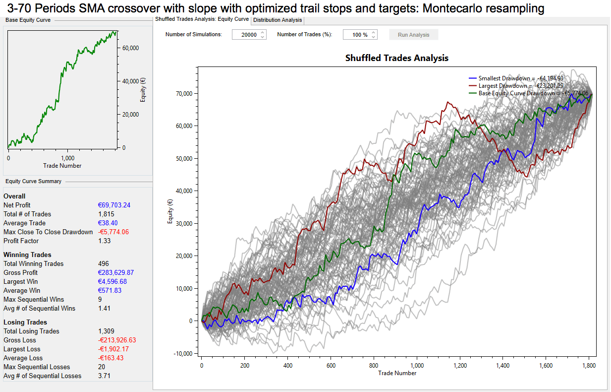
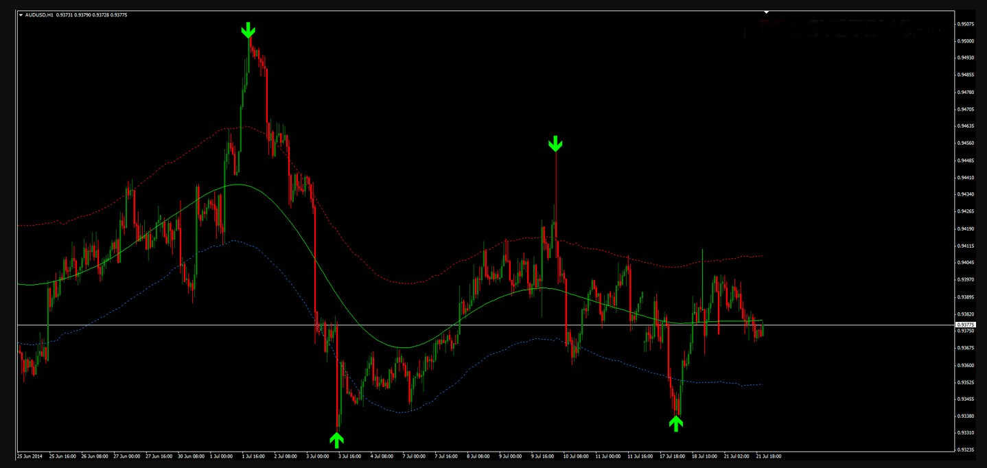
Arrow indicators are a set of tools for the “lazy” traders. On Forex charts, possible market entry points are indicated with arrows, green means the ability to open a long position, and red means a short position. The trader’s task is to be close to the platform and when the signal appears make the decision to follow it or not.

Advantages of Forex arrow trend indicators:

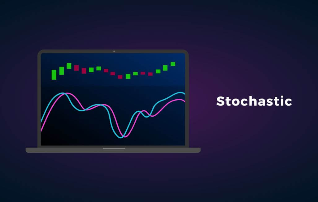
Arrow indicators are combined indicators that are based on several tools. They are usually based on basic classical indicators such as МА, RSI, MACD, Bollinger bands, stochastic, etc. A trader does not need to put on Forex always draws different lines and adjusts each indicator independently. Arrow indicators are already well combined and have been simplified adjustments. They are visually convenient and reduce the psychological and eye strain of a trader.

Disadvantages of arrow indicators:

Slips and repaints. Indicators are hardly applicable in scalping strategies. Problems with quotation provision, price noise, indicator lag, all these factors can cause the indicator signals to be redrawn, so an open position will not be profitable. The indicators are best to be used in the medium and long term trading on the H1 timeframe. The key factors should be observed when applying the indicators.

Which is the best way to choose an optimal arrow trend indicator for Forex:

It is better to choose an indicator according to a particular strategy. There are no versatile arrows indicators. One gives you much more accurate signals when the negotiation is flat, another in trend trading, and the other in long-term trading. You should try it on the demo account with at least 100 operations (the number depends on the frequency of the signals). Efficiency should not be less than 70% of the signs of success.

The indicator must have an open-source software for a trader to understand its operating principle and make any corrections if necessary. Below I will give as an example two arrow indicator strategies that can be used even by novice traders. There are links for you to download the indicators for MT4 (you can find them on their own on the Internet). To install the template, go to the “File” menu, choose the “Data Catalog” section and move the template you downloaded to the folder called “Templates”, move the indicators to the “MQL4” – “Indicators” folder.

Trading Strategies on Forex Arrow Trend Indicators

1. Sidus

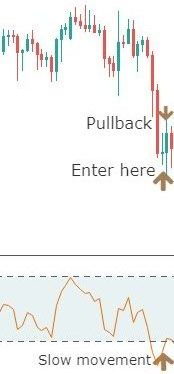
The combined indicator Sidus 2v shows the entry points by arrows: red for sale and green for purchase. The indicator is based on 2 very popular trading tools, classic RSI and EMA (exponential moving average). Sidus gives signs of purchase when the fast ЕМА is above EMA slow, RSI is above level 50. And on the contrary, the short position should be opened when RSI is less than 50 and the fast movement is below a slow one.

I recommend not trading in this strategy at the time of publishing news, choose the no lower timeframe of H1, H4 is better, apply the strategy for the currency pair EUR/USD. Optimal indicator adjustment: the rapid EMA period is 14, slow 21, the RSI period is 14.

Opening of a long position:

-When Sidus paints a green arrow we open a long position on the next sail.
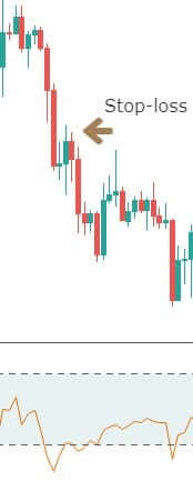
We place stop-loss fixed at 20 points.

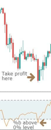
-When profit reaches 15 points, we move the stop loss to the opening point of the transaction (breakeven) and close 50% of the transaction. The remaining position must be secured by trailing stop at a distance of 15 points.

-To use a trailing stop, you need to have a VPS server, because when the connection is lost, the trailing stop does not work.

-The selling position is opened under the same conditions when a red arrow appears.

2. Point of entry

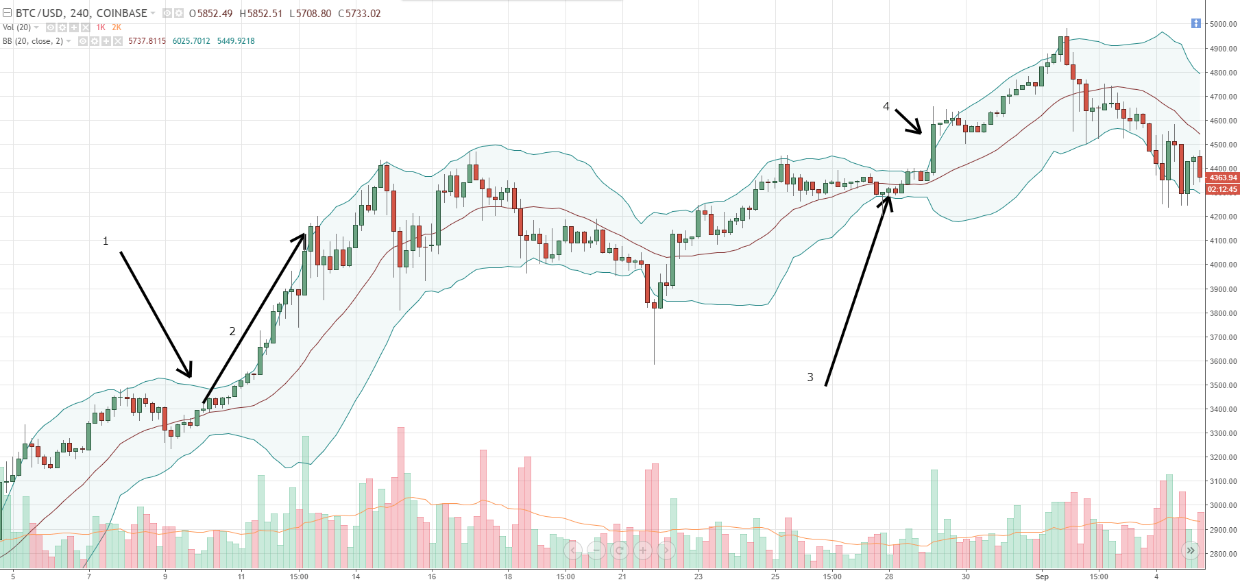
The Forex Dots arrow trend indicator points to a successful position to a trader, not with arrows, but with points, however, the essence does not change. Signals are always formed at the beginning of a price change cosine and use for calculations the current values of MA (moving averages). The advantage of the tools is extensive use: М15 timeframe (flexible enough conditions for strategies with different time periods), currency pairs are all volatile pairs (from the euro and dollar to the Swiss franc).

The Dots parameters are:

  • Length (indicator range) – 10
  • AppliedPrice (price type to use in calculations) – 0
  • Filter – 0
  • Deviation (vertical displacement of indicator) – 0
  • Shift (horizontal shift of indicator) – 0

Under different market conditions, indicator parameters can be changed as long as they have been previously tested on a demo or cents account.

Opening of a long position:

-The indicator paints a green dot that is above the minimum value of the rising sail. The distance between the minimum and the point is estimated visually (the less, the better). We open the position on the next sail.

-Stop-loss is set to the minimum value of the previous candle or to the green sign level (up to 10 points).

-We placed the trailing stop at a distance of 5 points and with it we left the market.

-The sale transaction opens the same way, but under opposite conditions: the indicator paints a red dot above the maximum of the falling candle.

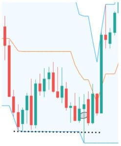
If on the Forex chart the distance between the maximum sail and a red dot visually seems too large compared to previous periods, I do not recommend opening the position. For example, in the previous examples the distance was about 2 points, but in the image below the distance is about 20 points.

The advantage of this indicator is that you can build numerous strategies in markets with different volatility. But if volatility is not a feature of the market or has a fundamental reason, the position cannot be opened. The indicator is versatile and proves to be 70% effective (i.e., the number of transactions closed by stop loss is negligible).

Categories
Forex Course

86. Learning To Trade Using The Dependable ‘Stochastic Oscillator’

Introduction

Stochastic is a momentum indicator that was developed in the late 1950s by ‘George Lane.’ This indicator does not follow the volume or price of the underlying instrument; instead, it measures the speed and momentum of the price action. As a result, the indicator changes its direction before the price itself. This makes the Stochastic a leading indicator in the market.
We can change the sensitivity of this indicator to the market movement by adjusting the settings. Stochastic is a bounded indicator which oscillates between the 0 to 100 level. When the indicator reaches the 70-level, it indicates the overbought markets, and when it goes below the 30-level, we can assume that the market is in an oversold condition. The bullish and bearish divergences on the Stochastic indicator help us in anticipating the upcoming price reversals.

Trading Strategies Using The Stochastic Oscillator

Oversold & Oversold Areas

This is the basic yet powerful Stochastic strategy that is widely used by most of the traders. The idea is to go long when the indicator reverses at the oversold area and go short when it reverses at the overbought area. Let’s understand this with an example.

The image below is an NZD/CAD Forex price chart. It represents two buying and one selling opportunity in an uptrend. These trades are solely taken based on the strategy that we discussed above.

We have placed the stop-loss just below the recent candle and close our position when the market gave an opposite signal. The market circumstances don’t matter as this indicator can be used in any situation. The crucial thing is to follow the rules of the indicator very well.

If the indicator generates a buy signal, only take buy entries, and when it says sell, only consider selling opportunities. If we are in a buy trade and if the indicator represents a sell trade, that is the time to close our position. Never be rigid and ignore the indicator signals to hold the position for extended targets. If that happens, we will be on the losing side.

Stochastic Indicator + Bollinger Bands

Bollinger band is a leading indicator, and it consists of two bands, which are above and below the price action. This indicator also has the centerline, which is a Moving Average. The bands of the indicator expand and contracts according to market volatility. They expand if the volatility is more and contract when the volatility is less.

Buy Example

First of all, find an uptrend in any Forex pair. When the price action hits the lower Bollinger Band, see if the Stochastic indicates the oversold market condition. If it does, it means that the sellers now have a hard time to go lower and taking buy entries from here will be a good idea.

As you can see in the below image, the EUR/AUD was in an uptrend. During the pullback phase, the Stochastic reaches the oversold area, and the price action hits the lower Bollinger Band. This is an indication to go long in this pair. As we have activated our trade, the price action blasts to the north. We can close our position when the Stochastic indicator reaches the overbought area. If you want to ride longer moves in the trending market, exit your position at the major resistance area.

Sell Example

First of all, find a downtrend in any Forex pair. When the price action hits the upper Bollinger Band, see if the Stochastic is indicating overbought market conditions. If it does, it means that the buyers now have a hard time to go higher and taking sell entries from here will be a good idea.

The image below is the EUR/CHF Forex pair, and the pair was in an overall downtrend. During the pullback phase, the price action turned sideways. But when the price action hits the upper Bollinger Band and the Stochastic indicator reverses at the overbought area, it is a sign to go short in this pair.

We can place the stop-loss just above the upper Bollinger band, and the take-profit must be at the higher timeframe’s support area. If you are an intraday trader, close your positions when both the indicators give an opposite signal.

That’s about Stochastic indicator and related trading strategies. If you have any doubts, let us know in the comments below. Cheers.

[wp_quiz id=”67442″]
Categories
Forex Basic Strategies

Trading With The Bollinger Band %B Indicator

Introduction

If you have experience trading with the Bollinger Bands indicator, you will find it easy to trade with the Bollinger Band %B indicator. The only difference is that, in this indicator, you can identify the relationship between the price and the bands with at most clarity.

What is the Bollinger Band %B indicator?

It is basically a technical indicator that quantifies the price of an asset with respect to the upper and lower limits of Bollinger Bands. We have derived 6 relations between the price and the indicator.

  • The %B is at zero when the currency pair is at the lower band.
  • % B will be at 100 when the currency pair is at the upper band.
  • The indicator is above 100 when the price of the currency pair above the upper band.
  • It is below zero when the price goes below the lower band.
  • The %B is above 50 when the price goes above the middle band.
  • And it is below 50 when the price goes below the middle band.

The Bollinger band %B uses the 20-day simple moving average (SMA) as the default parameter, just like the Bollinger Bands. This indicator is available on most of the trading platforms and terminals.

Bollinger Band %B formula

%B = (Price – Lower Band) / (Upper Band – Lower band)

Things to know

Before understanding the strategy, it is necessary to know a few things about the indicator as these concepts will be used in every step of the strategy. Below is the chart of a forex pair with the Bollinger Band %B indicator plotted to it.

  • The upper dashed line represents the 100% level of the %B indicator also known as the upper band.
  • The lower dashed line represents the 0% level also known as the lower band of the indicator.
  • The area in between the two dashed lines is known as the middle band.

These bands help us in identifying different trading opportunities. Hence, one needs to know about it before knowing the strategy.

The Strategy

Step 1: Identify the major trend

To identify the overall trend of the market, the trader needs to shrink the chart and determine the trend.

An uptrend is defined as a series of higher highs and higher lows, while a downtrend is defined as a series of lower lows and lower highs. In this strategy, we have taken the example of a downtrend, as shown in the figure. One can also see lower lows and lower highs in the above chart.

Let us see how the strategy works.

Step 2: Find the price where %B is above 100 or below 0 in the currency pair.

In this step, we are looking for the price where the indicator is above the upper band or below the lower band. This extreme price action is said to continue for long after taking a suitable entry.

A sell setup is formed when the indicator crosses below the lower band, and a buy setup is formed when the indicator crosses above the upper band. This strategy is almost reverse of other strategies (as oversold indicates buying in other strategies).

The above chart shows the crossing of the indicator below the lower band, which is apt for a sell trade. Just because the price is below the dashed line, we cannot take an entry immediately.

The next step is to find a pullback and then make an entry. We will then see how and where to take profits.

Step 3: Take an entry only at a suitable pullback.

By suitable pullback, we mean the opposite color candles should not be swift candles and should not make higher highs. If this happens, the current trend can be weak and may not sustain. The %B indicator can also assist us with the same, as the indicator should move slowly after crossing the lower band. If the indicator reacts and moves fast, it means the pullback is strong and could also result in a reversal. Finally, an entry can be taken after the close of at least two pullback candles.

The below figure explains the above paragraph clearly.

Step 4: Determining how to take profit

In this strategy, we follow a rule-based system for making profits which are again based on our indicator. A trader needs to cover his position after the indicator crosses the lower band once again and goes above the dashed line. This style of taking profit is different than in other strategies where it is based on a fixed percentage. This way of taking profits ensures that a trader is trading based on rules and guidelines which is a disciplined approach.

The below figure explains how profit is taken and the position is covered.

When the indicator goes above the 0% (lower band) level after crossing below, it means profit can be taken now and the trade can be closed.

Step 5: Place a protective stop

Stop-loss is a mandatory and essential part of risk management, hence it needs to determined before entering a trade. For this strategy, stop-loss is placed above the high of the pullback which makes it an optimal place. The stop-loss, in this case, is very small which increases the risk to reward ratio (RR) considerably.

Here is exactly where it is recommended to put the stop loss.

The final trade setup would look something like this 👇

This results in a minimum of 2:1 RRR.

Final words

This is one of the easiest strategies which can be learned by new and experienced traders. It makes use of simple Bollinger bands added with a %B indicator. This indicator can also be combined with several other technical indicators and trading systems, but this alone, too, has a very good level of accuracy.  Now, we have to follow the money management principles to take the best trades and make huge profits from the same strategy. For this, you can also refer to our money management article series, which talks on various risk management topics. Cheers!

Categories
Forex Elliott Wave

Elliott Wave Principle – Advanced Concepts – Part 3

The Relative Strength Index (RSI) indicator was developed in 1978 by J. Welles Wilder. the RSI is a Momentum indicator that measures the change of the price movement. In this educational article, we will review how to apply the RSI with the Elliott Wave Analysis.

The basics

Possibly, the RSI indicator is the most widespread indicator from professionals to retail traders. The RSI is an oscillator that moves in a range between 0 to 100. Alexander Elder describes it as a “leading or coincident indicator – never laggard.”
 
Some applications of RSI are tops and bottoms identification, divergences, failure swings, support and resistance, and chart formations.
 
In the Elliott wave theory, the RSI application can to aid in the wave identification process. In particular, the identification of divergences is the most used application in the wave analysis.
 
J. W. Wilder describes the divergence between the price action and RSI path as a “powerful indication that the market could reverse soon.
 
A divergence takes place when the price is still increasing, while the RSI began decreasing (bearish divergence). Or when the price falls, and the RSI climbs (bullish divergence.) In the wave analysis terms, divergences appear between the end of waves three and five. Let’s see a couple of examples.

RSI and the Elliott Wave Principle

Johnson & Johnson (NYSE:JNJ), on its weekly chart, illustrates the RSI and the Awesome Oscillator. Both indicators show the divergence created between the end of waves three and five.

On the JNJ chart, we also can observe the RSI levels when price action runs in a wave three. When this occurs, the RSI tends to move between the levels 70 and 80.

In a bull market scenario, usually, the price action tends to find support near to level 40. When the price moves in a bear market, the ascending correction tends to find resistance near to level 60. This concept, with the swings identification, can support the wave analysis.

The following chart corresponds to the Dollar Index (DXY) in its 8-hour timeframe. From the figure, we observe the bullish sequence developed in five internal legs, in which we observe that each leg has three waves.

As a conclusion from the study using the RSI indicator and wave analysis, the price action unveils an ending diagonal pattern. The Elliott wave structure shows us that the Greenback should see new lower lows.

Categories
Forex Basic Strategies Forex Trading Strategies

What Should Know About Trading Ranges Using Support & Resistance?

What is Range trading?

It is said that the market only trends for 30% of the time. So it becomes necessary to have a range trading strategy to take advantage of the other 70% of the time. Range trading is not difficult, but it requires discipline and determination to make most out of it. When a market is trending, it forms a pattern of higher highs and higher lows, in case of an uptrend. The move, in this case, is really strong and is known as an impulsive move. The other type of movement is known as the corrective move, which comes in the form of a pullback. Impulsive moves are stronger than corrective moves.

When the market is making any such moves, it finds itself stuck between a high or low and continues to oscillate between these two points. It means buyers and sellers are equally strong, and this creates a very choppy environment.

Traders now trade these extremes and continue to trade until price breaks out on either of the sides. These two points act as potential support and resistance points, used by traders to place their orders.

In the above chart, we have drawn a few lines from where the market bounced off. The price action in those areas creates many trading opportunities. The instrument in the chart first trends down and then puts up a low (marked by line 1). Initially, you might think it as a downtrend and expect the pattern of lower lows and lower highs to continue.

Then you see the market rally to line 2, from where the market falls back to line 3 but does not fall till line 1. This highlights the fact that the market is no more trending. The market instead could be stuck in a range between line 1 and line 2. These are not ‘defined’ prices. Always consider them as zones with a margin of error both outside and inside the range. A trader will look to position himself/herself at these zones of support and resistance that forms the range.

Why support and resistance?

The price that is stuck between these two extremes has a lot of significance. This is because, at this point, the price can either Stop, Reverse, or Breakout. When you have the right knowledge, it will stop you from simply pushing the buttons and will make you trade with a defined strategy.

Range = Consolidation

A range is nothing but a price consolidation of the overall trend move. It could either end the current trend or cause a reversal. The different price behavior pattern in the range creates many trading opportunities, which can be traded by all types of traders, depending on their risk appetite. Now let’s discuss some important trading strategies using support and resistance of ranges.

Strategy Using Technical Indicators

Using technical indicators to trade can aid your trading strategy. Especially while trading ranges, many indicators can be a part of your trading plan. Here, we have used the Stochastic Indicator as a tool to trade the ranges.

In the above image, the two lines represent the support and resistance of the range formed. When the price reaches the resistance at point 1, the Stochastic enters the overbought area, and the slowdown in momentum is the confirmation signal for a sell. The resistance pushes the price back to support (point 2), but this time the momentum is very strong, hence no entry. The stochastic also does not enter the oversold area clearly. Next time the price goes to resistance with greater momentum, and the Stochastic too does not give an entry signal as it is not in the overbought area. This means one shouldn’t be going short at this point.

Overall, there is only one risk-free trade available in the above chart, and that is at point 1 (short).

Strategy Recap

Firstly, we should be able to see the price at one of the extremes. When that happens, the indicator should show either be at overbought or oversold conditions. The momentum of the price should be an important factor that determines our entry. If we see reversal patterns, this could be the best entry with a good risk to reward ratio. Do not forget to place protective stops much below or above the support and resistance levels, respectively. This will always protect your trades from a false breakout.

When not to buy at support and sell at resistance in ranges

You must have probably heard traders saying that more time a level is tested, the stronger it becomes. This is not true in the case of our range break-out strategy. You need to start paying attention to the price patterns at these ends. If the price has made multiple touches, it could be getting ready for a breakout in the direction of the higher time frame.

The above chart is an example of such a scenario. It shows a range, and at point 1, you can see the strength in the candle as price pushes towards the resistance area. The next push makes the price to consolidate at the extreme. It appears to be a battle between the bulls and bears. It is also making higher lows as a part of the uptrend. Hence a breakout after this point is not surprising.

You don’t want to see the higher lows at the resistance extreme and lower highs at the support extreme.

The resistance could still work, and a reversal could happen, but this type of price action does not give much confidence for shorts. Only aggressive traders may find some entry in that consolidation, for a potential long. They can put a protective stop below the higher low that was formed before the accumulation.

We hope you find this strategy informative. Let us know if you have any questions in the comments below. Cheers!

Categories
Forex Elliott Wave

Elliott Wave Principle – Advanced Concepts – Part 2

Indicators are a useful tool that can aid in supporting the analysis process. In this educational article, we will review the Awesome Oscillator and how it can help us in an Elliott Wave study.

The basics

The Awesome Oscillator (AO) is also known as the Elliott Wave oscillator, was developed by Bill Williams. The AO measures the immediate momentum of the five previous periods, compared with the momentum of the last 34 periods.

The calculation is based on the simple moving average of the midpoint (HL / 2) of 34 periods minus the simple moving average of the midpoint of 5 periods.

Elliott Wave and the Awesome Oscillator

The following chart corresponds to the Johnson and Johnson (NYSE:JNJ) weekly chart. The bullish motive wave started with the August 2015 low at $128.51 per share. From this low, JNJ began to a bullish sequence, which drove it to reach the $148.32 level.


From the AO oscillator, we can recognize the following elements of the price action:

  1. Trend bias: If the trend is bullish, the AO will be positive. If it is bearish, the oscillator will move on the negative side. For our example, the market direction of the range of time studied corresponds to a bullish trend.
  2. Wave three: We can identify wave three with the most prominent distance of the AO. From the JNJ example, we distinguish a wave (3) of Intermediate degree labeled in black. At this point, the stock reached $125.90 per share. After this peak, JNJ started a corrective sequence, and the oscillator began to decrease, even moved in the negative side.
  3. Wave five: In the same way as the third wave, we can recognize the fifth wave watching the AO because momentum follows the dominant trend. However, in this segment, the oscillator shows a divergence between the peaks of waves three and five. In our example, JNJ ended the wave (5) on the half of January 2018 at $148.32 per share. We can observe the bearish divergence between the price and the oscillator.
  4. Corrective waves: We can use the AO to identify corrective waves watching how it decreases against the prevailing trend. From the JNJ chart, the oscillator turns negative when the price develops a retracement.

In summary, the Awesome Oscillator can be a useful tool to complement the EW analysis, especially in wave identification. A divergence involves the exhaustion of the movement, but the price is not compelled to reverse the trend.

Categories
Forex Basic Strategies

Trade Breakouts Like A Pro With This ‘Breakout Trading Strategy’

Introduction

In previous strategies article, we have discussed the ‘Turtle Soup Strategy by fading the Donchian channel.’ We hope you tried that strategy. In today’s article, let us discuss how to trade breakouts. We will also cover some of the best strategies used by professional traders to trade breakouts. Aggressive traders prefer trading this Breakout strategy compared to the conservative ones.

What is breakout trading?

To understand breakout trading, it is necessary to know the two important types of breakouts.

Defining a breakout

Breakout trading is an effort to enter the market when price moves outside a defined price range. The price range could be between support and resistance or between swing high and swing low. It is good if the breakout is accompanied by high volume.

Breakout of support and resistance

This type of breakout is quite simple and straight forward. The breakout of support and resistance should ideally happen with a big and bold candle. Because that shows the genuineness of the breakout. In the below chart, the candle closes well above the support and resistance level. In the below figure, it can be noticed instantly. A rule of thumb is that the bigger the breakout candle, the better it is.

Breakout of swing high and swing low

Very similar to the support and resistance breakout, this type of breakout has an additional filter. The filter is nothing but to trade the setups that offer the best outcome. In a swing high and swing low breakout, we enter the market after the price crosses a long-time high (1hr or 4hr high). That high should be followed by a strong sell-off. Conversely, the same is true for a swing low.  A trader must backtest their strategy before applying them to the live markets.

Best Breakout Strategy

To increase the accuracy of the signals generated by this strategy, we use an indicator known as Volume Weighted Moving Average (VWMA). It is a very simple technical indicator that is used for volume analysis. It resembles a moving average but is based on volume. It gives extra information than just the price of an asset. This indicator can be found on most of the trading platforms by default, and when plotted, it looks something like this.

Step 1: Identify the swing highs from where the market sold off very strongly and traveled a fair amount of distance. Mark that price on the chart.

The first step of a breakout strategy is to identify those levels and mark them as breakout trading levels. This step is important because we should pay attention to only significant and clear levels.

The resistance level we have identified in the above figure is a significant level. If you look closely, you will see rejection off the resistance level took the price down three times. Whenever there was a rally, the swing high stopped the price.

Step 2: Wait for a break and close above the resistance level

Once we have identified the swing highs, it’s just a game of patience and waiting. Next, we need a breakout candle to close above our resistance level. This is a sign that bulls are in full power.

It is not the end yet. We need confirmation from the VWMA indicator. This will give us the green signal to enter the trade in this breakout.

Step 3: Buy when the price closes above the VWMA

The final step of the breakout strategy is confirmation from the VWMA indicator. You should buy only if the VWMA is stretching above the close of the breakout candle. Visually, the VWMA should look stretched up. It is better if the moving average inclination is towards the upside.

Let’s understand this more clearly with the help of a chart.

In the above chart, prior to the breakout, the VWMA moved gradually higher, and after the breakout happened, the VWMA moved aggressively higher. This shows a strong presence of volume behind the breakout.

We haven’t still talked about placing our stop loss, which is crucial to reduce your losses in a trade. We also need to know where to book profits. This brings us to the final step of the strategy.

Step 4: Put stop loss below the breakout candle and take profit when you see a break below the VWMA

It is obvious to place the protective stop loss below the breakout candle. Because, if the price breaks below the candle that initiated the breakout, it will quickly tell that it was a false breakout.

Our take profit technique is automatic because a break below the VWMA suggests no more buyers are willing to participate in the current rally. We want to book profit at the early sign of market rollover.

We have taken the example of a buy trade. The same rules apply for a sell trade but in reverse. The best breakout strategy can be used in all market trends, whether up or down.

Bottom line

One of the advantages of our breakout trading strategy is that you’re trading with the momentum of the price. A final tip for all the traders while using this strategy is that, if the breakout happens after a big news event, then it is likely that big institution money is behind this breakout. When both fundamentals and technicals are working for you, the probability of success increases. We hope you find this strategy useful. If you have any questions, please let us know in the comments below. Cheers!

Categories
Forex Basic Strategies Forex Swing Trading

How To Trade The Infamous Turtle Soup Strategy?

In this article, we shall be covering the Turtle soup strategy by fading the Donchian channel, and Connor’s RSI strategy.

What is the Donchian Channel indicator?

The Donchian channel is an indicator that considers the high and low for N number of periods. For this particular Turtle Soup strategy, we will be setting the value of N=20, which accounts for the most recent 20 days.

This indicator works based on the highs and lows made by the market. The channel makes a stair-stepping pattern for every high or low made in a period of 20 days.

Below is a chart that shows the Donchian indicator applied to it.

From the above chart, we can clearly see that the top and bottom lines (blue lines) are moving in the form of a stair-stepping pattern representing the highs and lows over the past 20 days. Precisely, the black arrows represent the highs and lows in a look back of 20 days.

Trading the Turtle Soup Strategy

The Turtle Soup is a strategy developed by a trader and author Linda Bradford-Raschke. She published this strategy in one of her books named “Street Smarts: High Probability Short-Term Trading Strategies.” Talking about history, this strategy was taught to a set of novice traders (called the Turtles) by Richard Dennis and William Eckhardt in the 1980s. Also, this strategy is in reference to a well-known strategy called ‘Turtle Trading.’ Over the years, Linda Bradford-Raschke inverted the logic and reasoning behind this strategy and came up with a short-term trading method using this strategy.

Strategy 1: Adding confirmation to Donchian Channel breakout

This is the typical Turtle strategy.

The Turtle strategy using the Donchian channel is simple. When the market breaks above the resistance line, we can prepare to go long. Similarly, when the market goes below the support line, we can go short.

Here are some of the tips and tricks for using this indicator.

  • When the market breaks above/below the lines, make sure that the price is holding above/below it.
  • The candle that breaks the line must be quite strong.

Trading Example

Consider the below figure. Reading from the left, we can see that the market was holding at the upper line of the channel. Later, a huge green candle broke above the channel. Many would hit a buy at this moment, but we wait for a confirmation. When another candle shows a bullish sentiment as well, we can hit the buy at the point shown on the chart.

According to the original Turtle trading strategy, a stop loss of ‘two volatile units is kept,’ which is equal to n-period ATR x 2.

However, to keep it simple, you can keep the stop loss a few pips below the candle, which broke the channel.

Let’s do the converse

In the above example, we saw the typical way of trading the Turtle strategy. In this set of examples, we shall reverse the logic. That is, we will look to go long when the price breaks below the channel and short when the price breaks above the channel. Let’s consider a few examples for the same.

Buy strategy

Let’s say the market makes a 20 day low and is visible on the Donchian channel. Later, the price comes down to that low and even tries to break below it. Once the price shoots right back up to the line, we anticipate on the buy.

Rules:

  • The new 20 day low must be at least four days apart from the previous 20 day low. So, you cannot compare the low of yesterday and the low of today as the difference is just one day apart.
  • Entry must be 5-10 pips above the previous 20 day low.
  • Stop loss must be placed 1-2 pips below the low of today.
  • Aim for a take profit of 1R.

Sell strategy

The sell strategy is just the opposite of the strategy discussed for a buy. When a 20 day high is challenged for the second time having a gap of at least four days from the previous low, we can look to go short.

Rules:

  • The 20 day high must be at least four days in the past.
  • Entry must be placed 5-10 pips below the 20 day low.
  • Stop loss must be placed 1-2 pip of today’s low.
  • Aim for a take profit of 1R.

Trading examples

Buy example

Below is the chart of the EUR/USD on the Daily timeframe. Starting from the left, we can see that the market came down and made a 20 day low (indicated by the black dotted line). Now that we have the first low, we wait for the price to down to that low in more than four candles (days). And when the price spikes below the prior low and comes back up, we can hit the buy at the encircled region.

As far as the stop loss and take profit is concerned, we can keep a stop loss 2-4 pips below the low of the present candle and aim for a good 1:1 RR on this trade.

Sell example

In the below chart, the market made a 20 day high up to the black dotted line. Later, the price goes above the previous 20 days high yet again. Here, the price holds above the line and then drops below the next candle. So, once it’s below by 5-10 pips from the previous 20 days high, we can go short. And the stop loss and take profit are self-explanatory.

Conclusion

With no disrespect to the turtle trading strategy, we can conclude that this strategy can be used in both ways. This strategy is backtested and proven by a number of experienced traders. Try this strategy in your trading activities and let us know if you have any questions in the comments below. Happy Trading!

Categories
Forex Indicators

Bollinger Bands

Bollinger Bands

Bollinger Bands are a type of volatility oscillator created by the great technical analyst John Bollinger. If this is your first time seeing this indicator, it probably looks both daunting, confusing, and somewhat silly. But it is a powerful tool for trading and identifying when prices are contracting and then when they finally breakout. There are some critical components of Bollinger Bands.

  1. The middle line is just a moving average, by default, a 20 SMA.
  2. The lines above and below the middle line are the volatility bands, observe how the ‘bubble’ gets expands as price moves up or down in a significant fashion.
  3. Most important is what is called the ‘Squeeze’ or a ‘Bollinger Squeeze.’ The Squeeze signifies decreased volatility and is evident when the bubble gets smaller, and the lines become very close. Squeezes are extremely important to watch.

Let’s look at a chart and see these concepts.

  1. Notice the bands contracting, ‘squeezing’ into each other.
  2. Notice the release, price is continuously pushing higher against the bands, and the bubble is expanding.
  3. Again, notice how price begins to consolidate and form another squeeze.
  4. The release after the squeeze.


Top touches do not mean “sell”, and bottom touches do not mean “buy”

Too often, new traders view indicators and oscillators with certain upper and lower boundaries as conditions to trade to the contrary. Bollinger Bands are no exception. People often assume, incorrectly, that when prices touch the upper band, then the price is somehow ‘oversold,’ and then a short trade should be taken. The inverse is true with bottom band touches.

In reality, prices will often ‘walk’ the bands. You should look at any instrument and see how often prices will trend higher by piercing and riding the bands higher or lower. This frequently occurs after both the upper and lower bands converge closer together, and the space between them constricts. This pattern is known as ‘The Squeeze.’


The Squeeze

Mr. Bollinger himself wrote that The Squeeze was a condition that created more questions than any other component in his Bollinger Band system. At the beginning of this article, I mentioned that Bollinger Bands are a volatility indicator – that is precisely what the upper and lower bands represent. When volatility increases, the bands expand and move farther away from one another. When volatility decreases, that is when we see the bands constrict, forming The Squeeze. Squeezes always precede increased volatility, and squeezes always occur after a period of significant volatility – a classic chicken or the egg problem. Regardless of which happens first, The Squeeze should be recognized as an opportunity to identify when a future explosive move may occur.

One should observe the direction of the breakout almost with suspicion. You will often find many false breakouts occur where price begins to trade in one direction at the beginning of a squeeze, only to reverse and start trending in the opposite direction. There are many ways to filter and interpret which breakouts are genuine and which are false – but that is for a lesson for another time.

Key Points

  1. Bollinger Bands are a measure of volatility.
  2. Price touching the upper or lower bands does not mean an automatic inverse trading move.
  3. Price will often ride the bands in a trend.
  4. Squeezes present opportunities.
Categories
Forex Educational Library

How to Trade Using the RSI

Introduction

In 1978, J. Welles Wilder Jr published the Relative Strength Index (RSI) in the book “New Concepts in Technical Trading Systems.” Wilder describes the RSI as “a tool which can add a new dimension to chart interpretation.” Some of these interpretations are tops and bottoms identification, divergences, failure swings, support and resistance, and chart formations.

The Relative Strength Index is probably the most popular indicator used by professional and retail traders. It’s an oscillator which moves in a range between 0 to 100. A. Elder describes the RSI as a “leading or coincident indicator – never laggard.” In this article, we will show these different ways to use the RSI.

Tops and Bottoms Identification

The theory about this indicator states: “when the RSI goes above 70 or below 30, the Index will usually top or bottom out,  before the real market top or bottom, providing evidence that a reversal or at least an important reaction is imminent”. Some traders have modified these levels to 80 – 20.

The basic trading idea is:

  • Buy zone: when the RSI is below the 30 (or 20) level.
  • Sell zone: when the RSI is above the 70 (or 80) level.

A trading system based on this interpretation is an easy way to lose money. The following example shows what I mean:

Relative Strength Index (RSI)

Figure 1: Tops and Bottoms signals

Source: Personal Collection


In figure 1, an example of a trading system based on Top and Bottoms is shown, with RSI levels of 30 and 70 (or 20 and 80) as entry signals.  To make it short, most of the time the entry signals were false and didn’t allow catching significant trends.

Divergences are the most popular use; Wilder describes the divergence between price movement and RSI as a “very strong indication that the market turning point is imminent.” Divergence takes place when the price is increasing, and the RSI is flat or decreasing (this is known as bearish divergence); the opposite case happens when the price is decreasing, and the RSI is flat or increasing (bullish divergence).

How to trade using the Relative Strength Index (RSI)

Figure 2: Divergences


As shown in Figure 2, the divergences are a price weakening formation. That does not mean that it’s a turning point or that you should position yourself in the opposite direction.

Failure Swing

LeBeau and Lucas describe Failure Swing as a formation “which is easier to observe in the RSI study itself than in the underlying chart.” A strong indication of market reversal occurs when the RSI climbs above the 30 level or plunges below the 70 level.

Failure Swing

Figure 3: Failure Swing


As we can see in figure 3, the failure swing is part of the divergence concept, and it only confirms that the divergence is real. But you must pay attention and be careful with the failure swing as an entry signal because it is not a rule. The potential trade requires price-action confirmation.

Support and Resistance

The theory says that “support and resistance often show up clearly on the RSI before becoming apparent on the bar chart.” Some authors use the 50 level as a support level in a bullish trend or as resistance in a bearish trend. Hayden proposes the following rules for each trend direction:

  • In a bullish trend, the RSI will find support at 40 and resistance at 80.
  • In a bearish trend, the RSI will find support at 20 and resistance at 60.

RSI Support and Resistance

Figure 4: Support and Resistance.


In figure 4, the RSI shows how the RSI works as support and resistance on a bearish and a bullish trend. In the bearish trend, the 60-70’s zone is acting as resistance levels and 30-20’s zone as support. In a contrarian case, during the bullish trend, 70-80’s are the resistance zone, and 40-30’s the support zone.

Chart Formations

The RSI could display a pattern similar to those present in chart formations which may not be clear on the price chart, for example, triangles, pennants, breakouts, buy or sell points. A formation breakout indicates a move in the breakout direction.

RSI Chart Formations

Figure 5: Chart Formations


The most common formation is the triangle as a consolidation pattern before an explosive move. However, also is common to see false breakouts before the real move (see figure 5).

RSI chart formations breakout as a trading signal:

Buy Signal: When RSI breaks above its downtrend line place an order to buy above the latest price peak to catch the upside move.

Sell Signal: When RSI breaks below its uptrend line place an order to sell short below the latest price to catch a downside breakout.

We must consider that, usually, the RSI breaks its trendline one or two periods before price does.  In this sense, it’s important to get a confirmation using price-action.

COMMENTARY

To summarize, the RSI is a popular indicator between professional and retail traders alike.  It’s characterized by being a leading indicator. While every one of those styles (divergences, failure swing, support and resistance, and chart formations) can be used independently, that’s not a powerful tool.

A more reliable way to apply the RSI is using a mix of those methods, but the main issue here is how to trade using the RSI.

Some tips to use the RSI:

  1. Determine what is the primary trend? The “big picture” of the traded market.
  2. Identify key levels (swings), divergences, failure swings, chart formations between Price and RSI. In bear markets, wait for a resistance level (60-70’s zone). In bull markets, wait for support levels (40-30’s zone).
  3. Observe price and RSI breakouts.
  4. The order could be placed at the open of the candle, or when the price reaches a specific level (limit or stop orders).
  5. The stop-loss level could be set beyond the last swing high or low, or specific number of pips away.
  6. Profit-taking, ideally, should be set, at least, at two times the distance from the entry point to the stop-loss. Another possibility is to find a key level and set it close to it if the reward is worth its risk
  7. As trade management, the use of a trailing stop should be considered.
  8. If the market moves without us, let it go. The market will provide more opportunities.


Trading with the RSI

Figure 6: Trading with the RSI (*)

Source: Personal Collection


Trading with the Relative Strength Index (RSI)

Figure 7: Trading with the RSI (*)

Source: Personal Collection

As you can see figures 6 and 7, the RSI is an indicator that does much more than an identification of overbought and oversold price levels. It helps us detecting trade opportunities, areas of movement exhaustion, confirmation of price patterns (price level failures), and chart patterns. However, RSI signals and patterns should only be used as a guide.  A relationship of those signals with the price action should always be present.

(*) This is a simulated analysis and trade application.

SUGGESTED READINGS

  • Wilder, J.W. (1978). New Concepts in Technical Trading Systems. North Carolina: Trend Research.
  • Hayden, J. (2004). RSI: The Complete Guide. South Carolina: Traders Press Inc.
  • LeBeau, Ch., Lucas, D. (1991). Computer Analysis of the Futures Market. New York: McGraw-Hill.
  • Elder, A. (2014). The New Trading for a Living. New Jersey: John Wiley & Sons, Inc.


Keywords:

Technical Indicators, RSI, Education.


©Forex.Academy