Categories
Forex Basic Strategies

Pivot Trading Strategy – Easiest Way To Trade Pivot Points

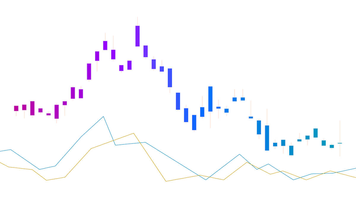
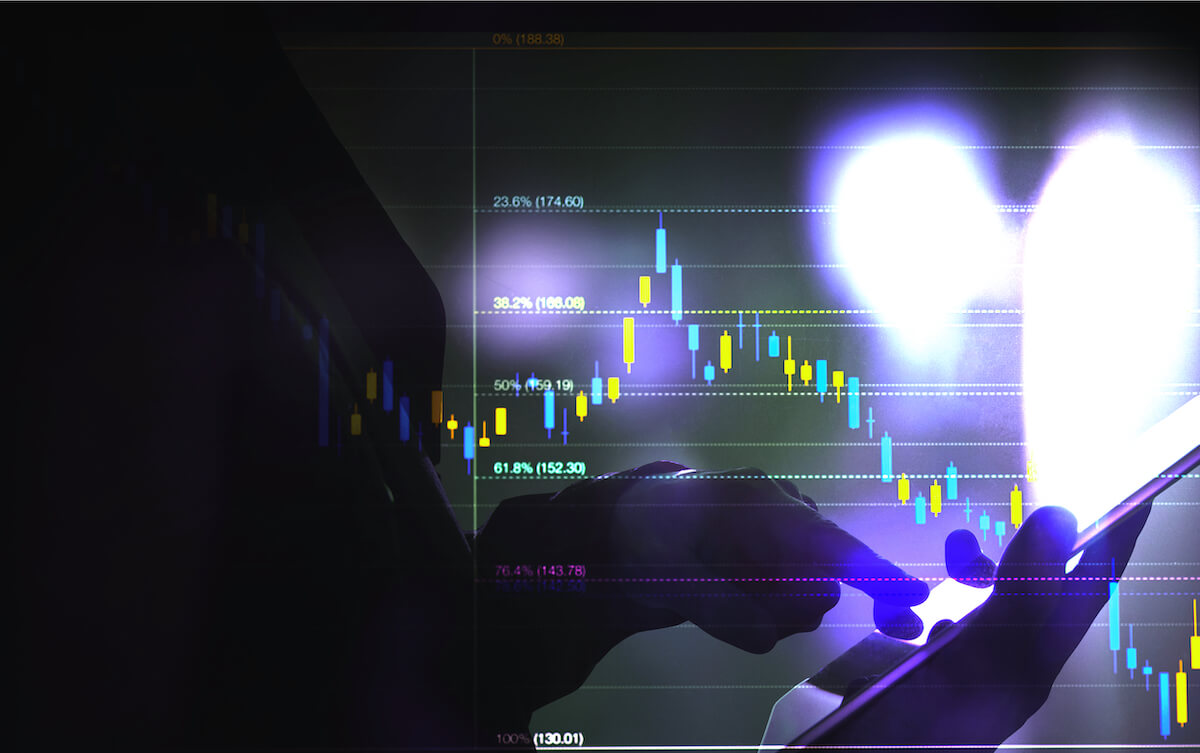
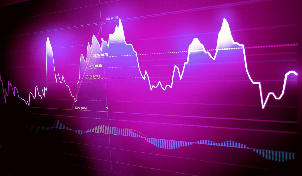
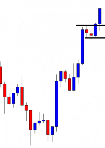
Pivot points are the significant levels used by the market technician to determine the future movement and the major support/resistance levels on the price chart. Pivot point takes the prior period high, low, and close to estimate the future support and resistance levels. Pivot points are the leading indicator, and once they are set on a price chart, it will remain the same throughout the day.

Timeframes

The pivot point of the 1, 5, 10, and 15-minute chart use the prior day high, low, and close. Whereas the pivot points for the 30, 60, and 240-minute chart use the last week high, low, and close to calculate the pivot points. Once the new week starts, the pivot point appears on the price chart until the end of the week.
The pivot point for the daily and chart use the prior month data, and the pivot point for the weekly and the monthly chart use the last year’s data. The new pivot point for the year ahead will be calculated on the 1st of January. These would be based on the high, low, and close of the last year’s pivot points.

There is a total of seven basics pivot levels on the price chart.

  1. Basic pivot level – It is the middle of the center pivot line.
  2. Resistance 1 (R1) It is the first pivot point above the centerline.
  3. Resistance 2 (R2) It is the second pivot level above resistance 1.
  4. Resistance 3 (R3) It is the third pivot level above resistance 2.
  5. Support 1 (S1) It is the first pivot level below the middle pivot line.
  6. Support 2 (S2) It is the second pivot level below support 1.
  7. Support 3 (S3) It is the third pivot level below support 2.

Trading Strategies Using Pivot Points

There are various pivot point trading strategies in the market; this one is especially we created for our fellow traders, our strategy is backtested on demo and even on trading simulation, so you no need to put the work required to find out the probability of this strategy—all we suggest you follow this strategy very well to make consistent money from the market.

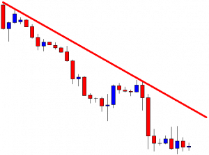
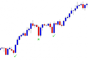
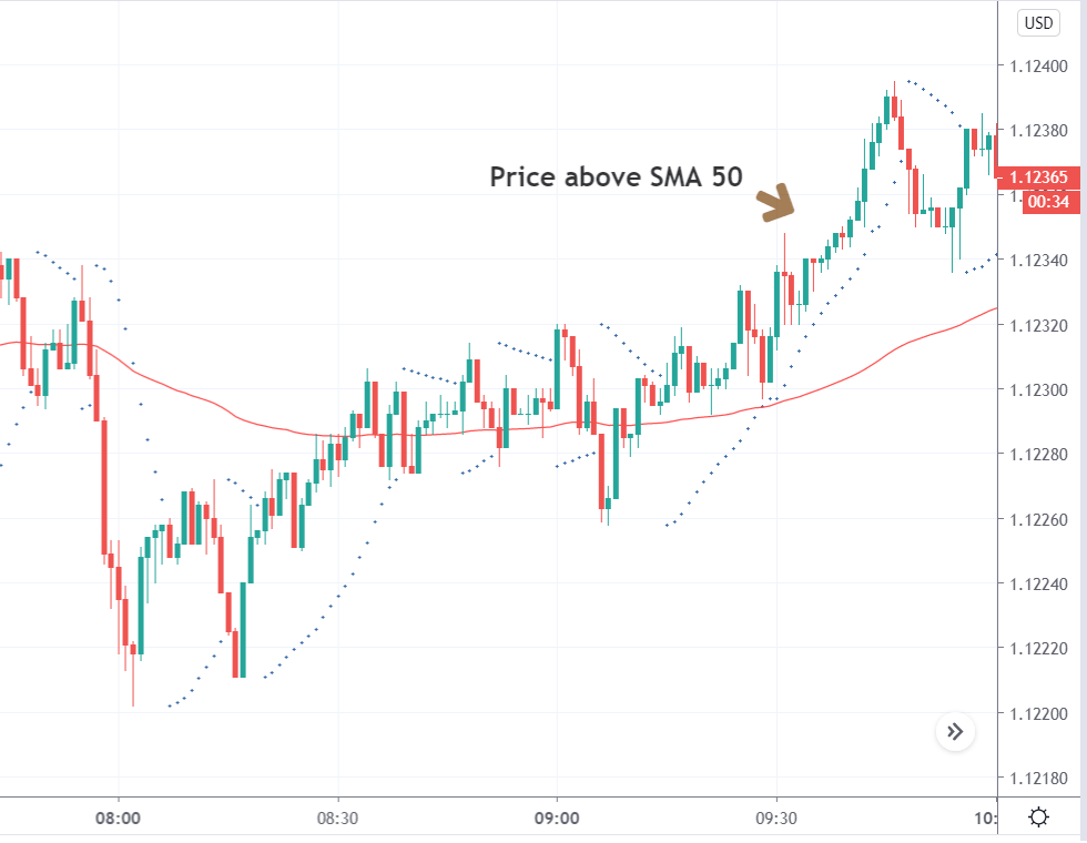
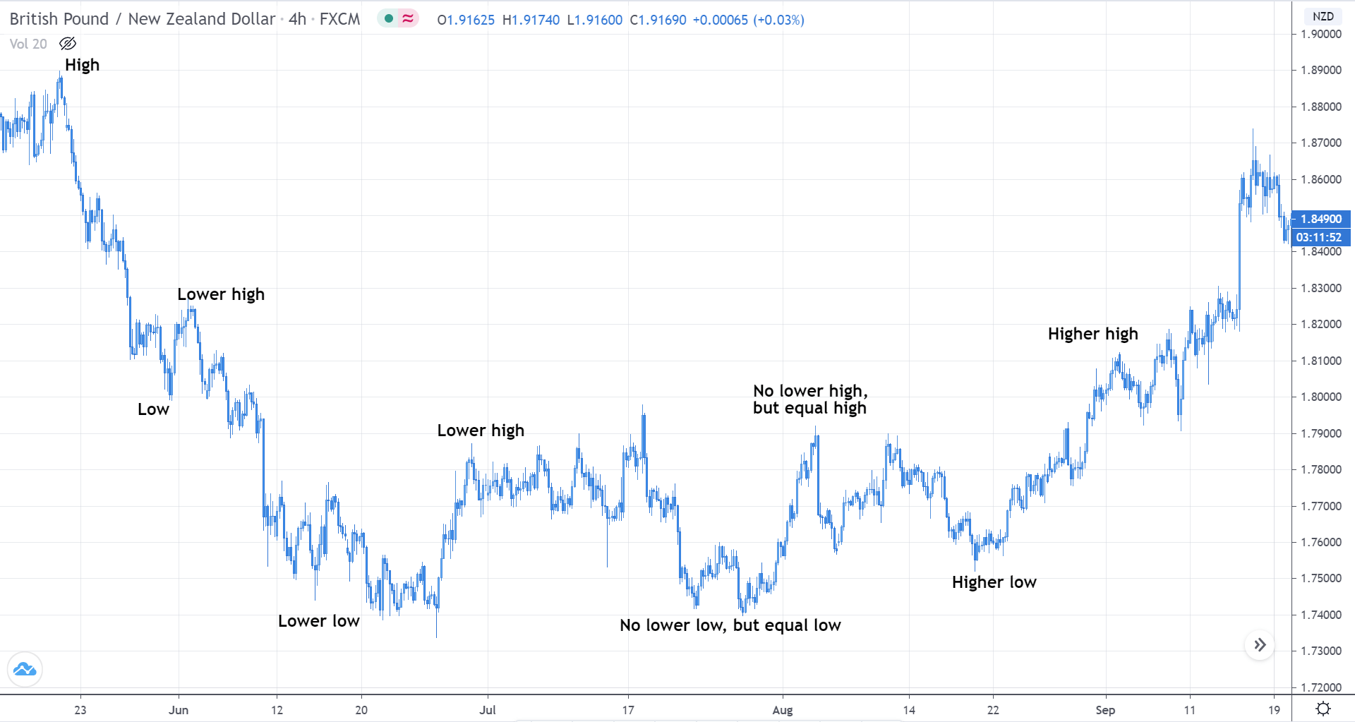
Pivot points most often work very well in trending market conditions; some traders even use pivot points on lower timeframes to scalp the markets. The strategy is to find out the uptrend in any instrument and wait for the pivot point to go above the Pivot point centerline, and then wait for the pullback back to the pivot line to take buy entry. You can close your position at resistance one if the market momentum is choppy, and even in a strong trending market, you can also book the profit at resistance two or three.

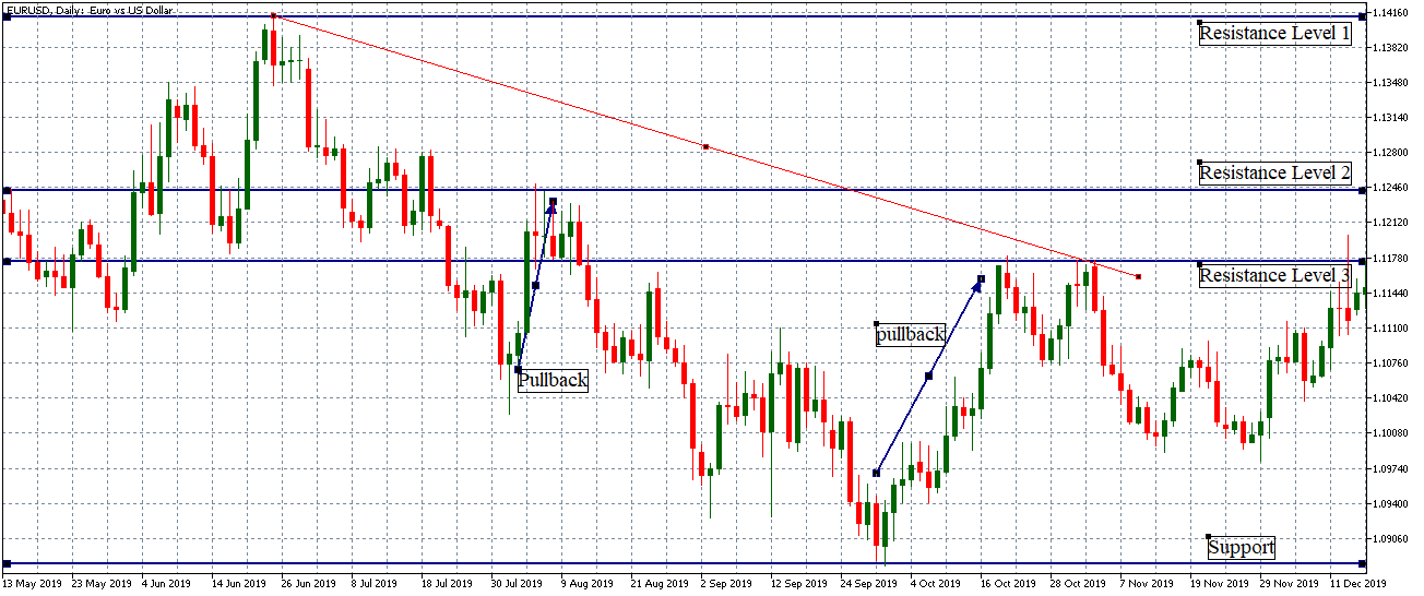
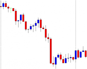
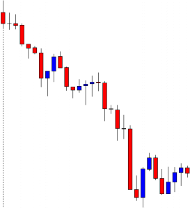
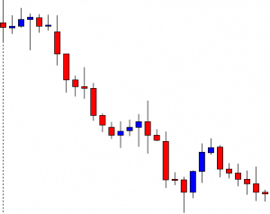
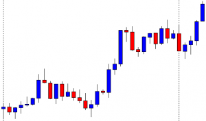
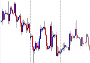
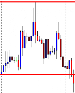
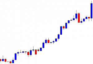
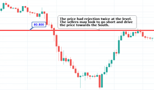
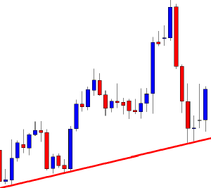
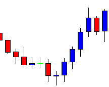
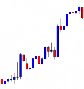
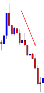
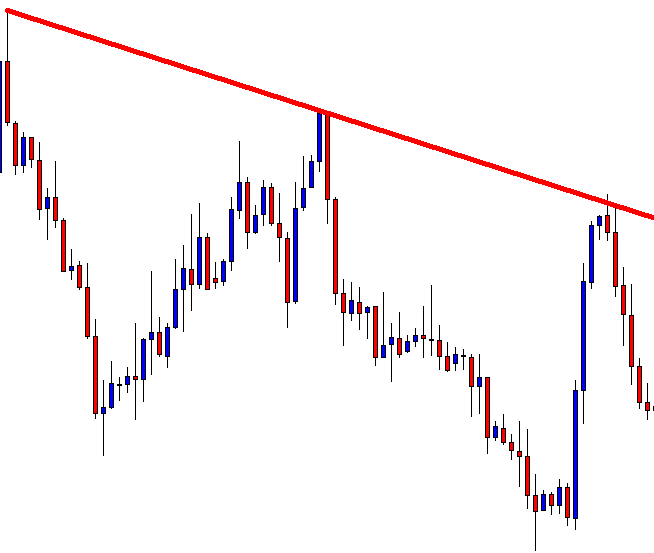
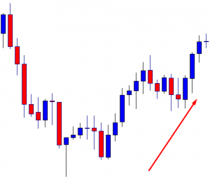
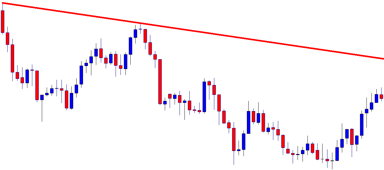
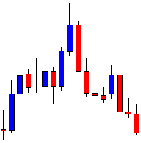
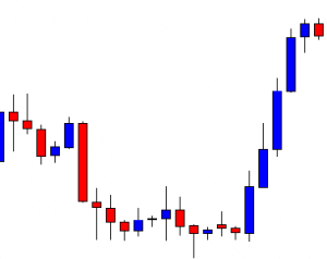
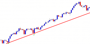
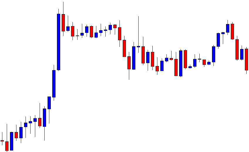
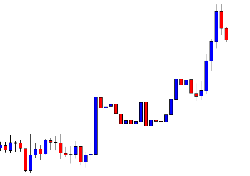
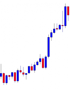
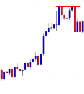
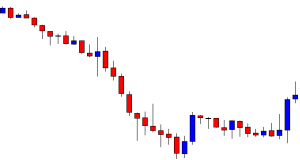
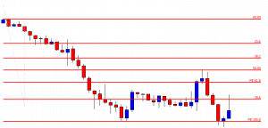
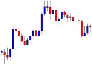
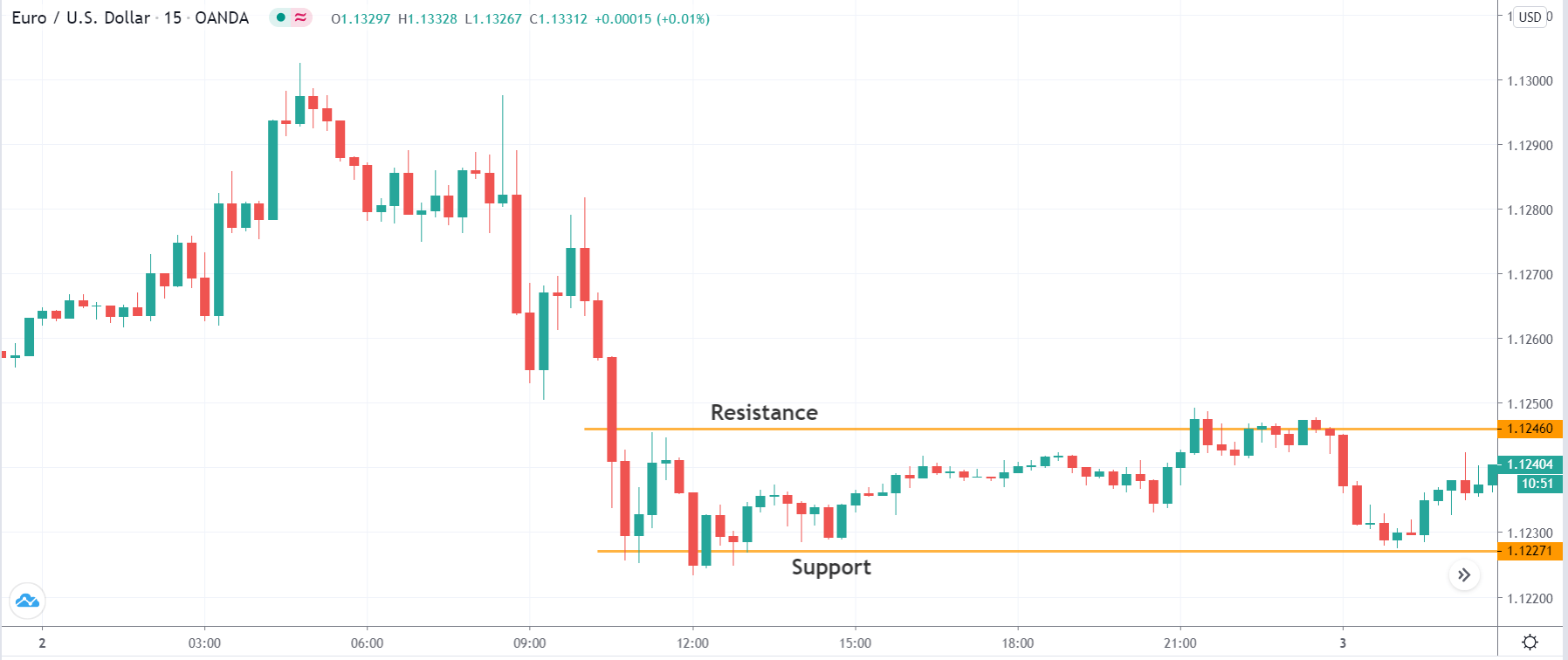
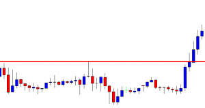
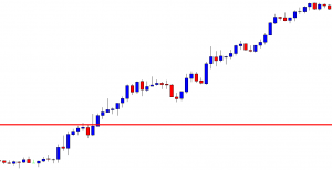
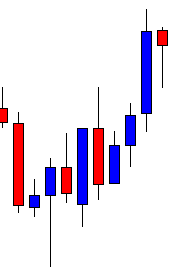
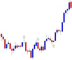
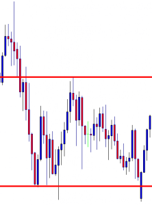
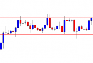
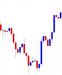
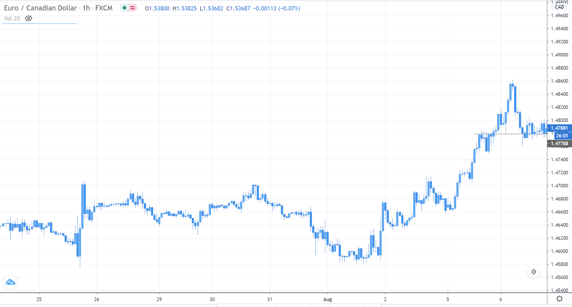
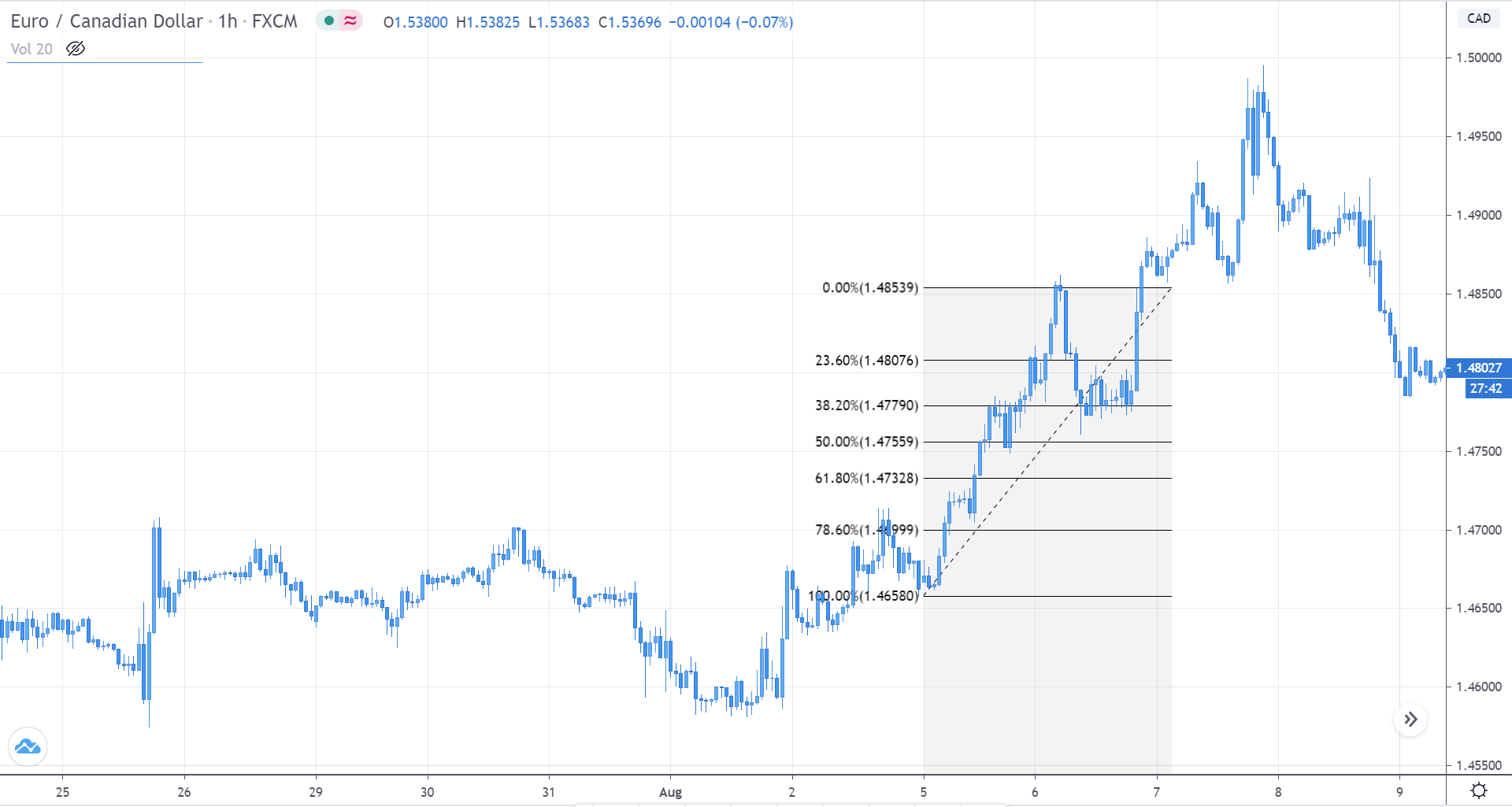
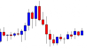
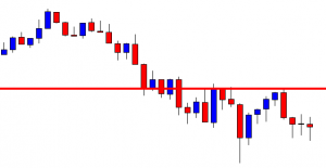
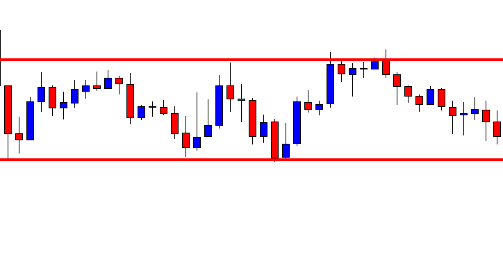
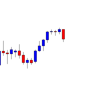
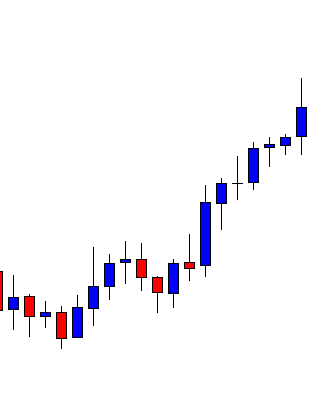
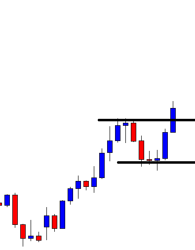
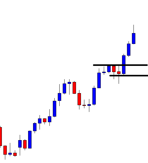
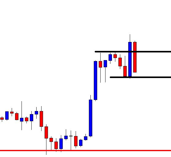
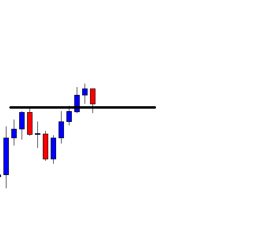
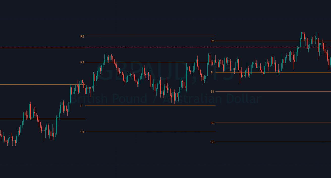
The image below represents the uptrend in the GBPAUD forex pair.

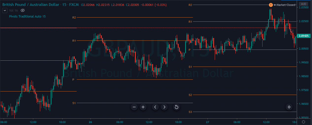
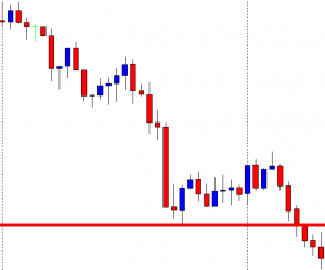
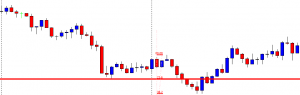
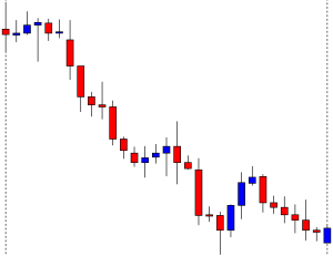
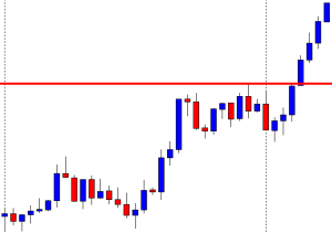
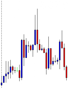
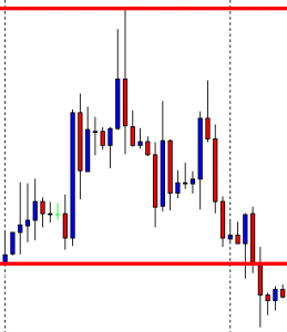
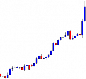
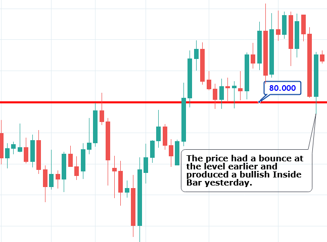
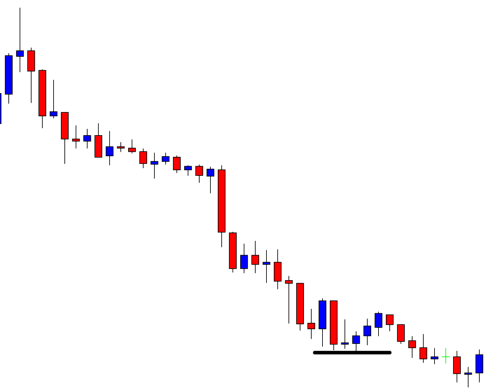
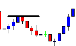
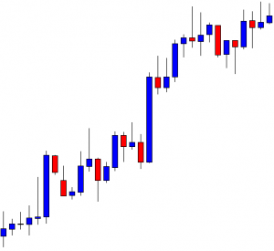
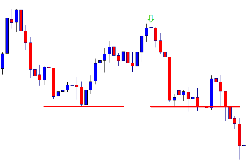
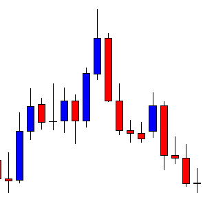
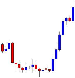
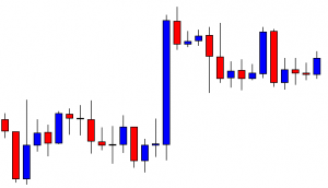
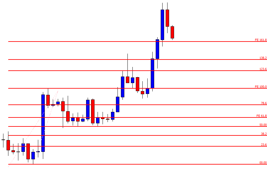
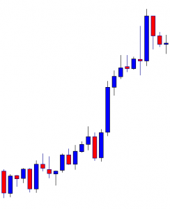
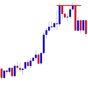
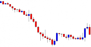
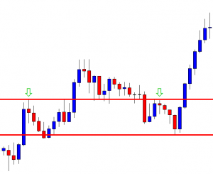
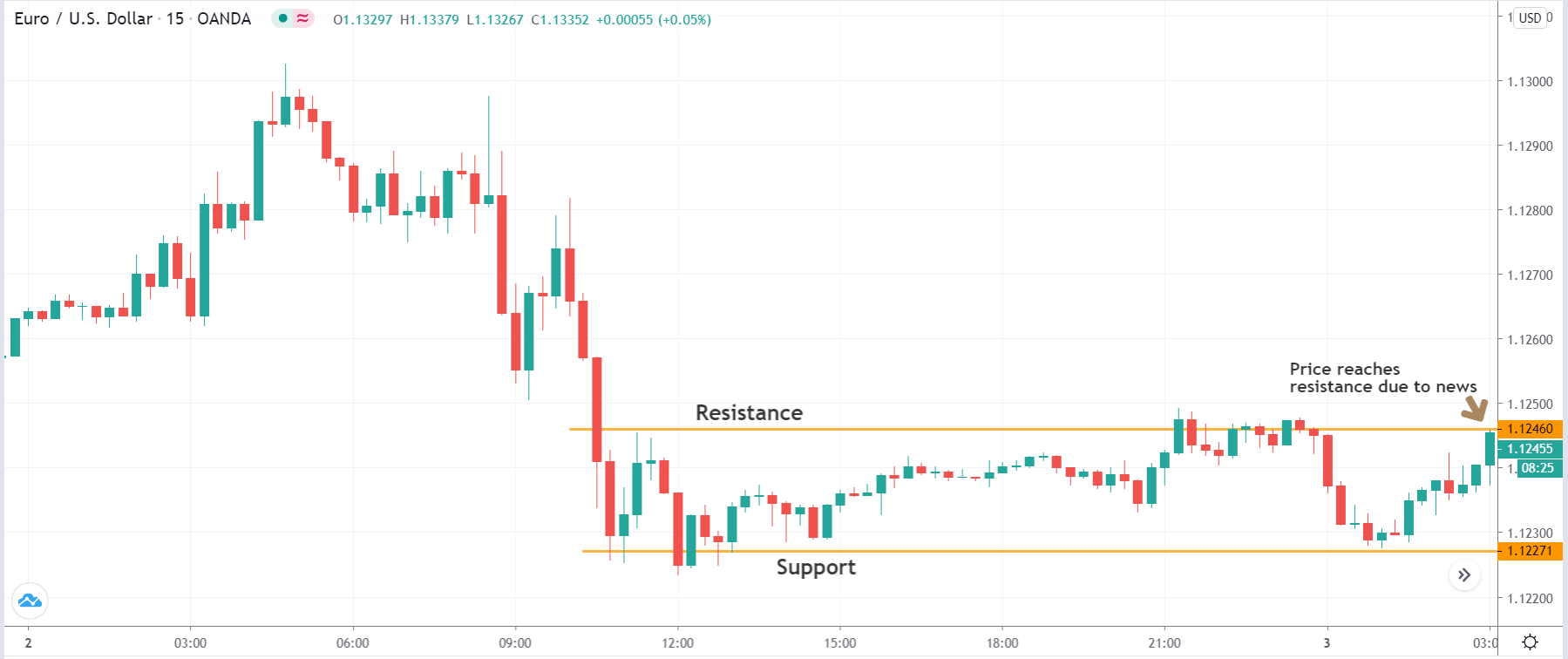
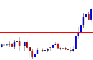
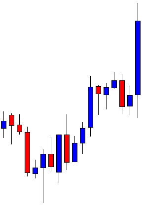
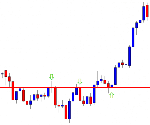
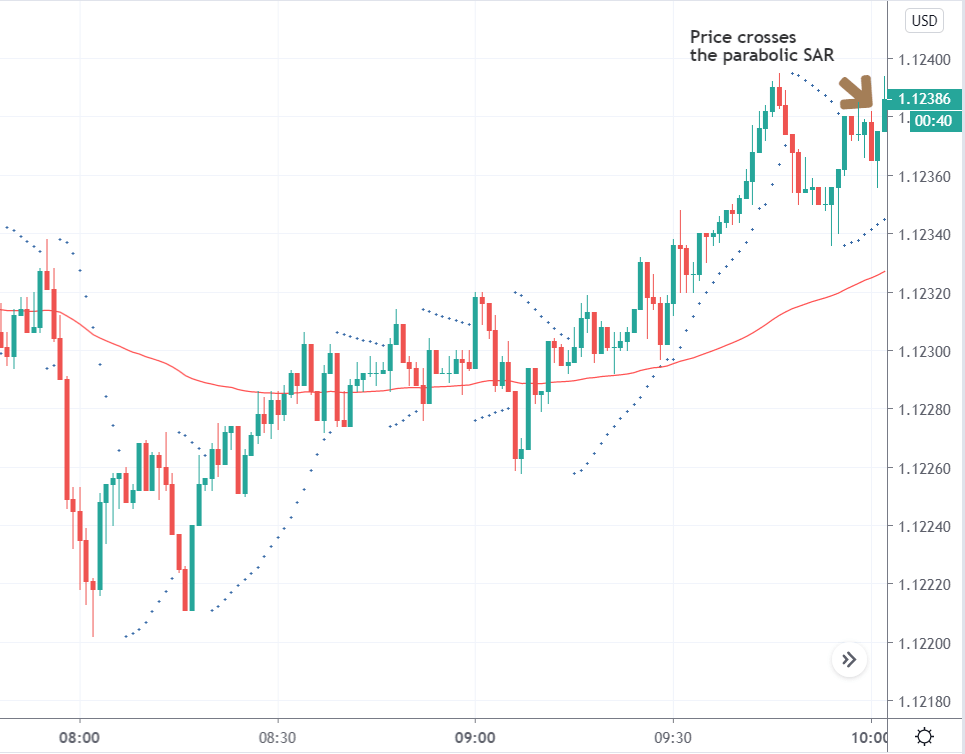
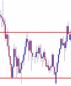
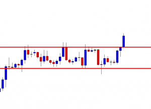
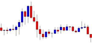
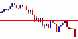
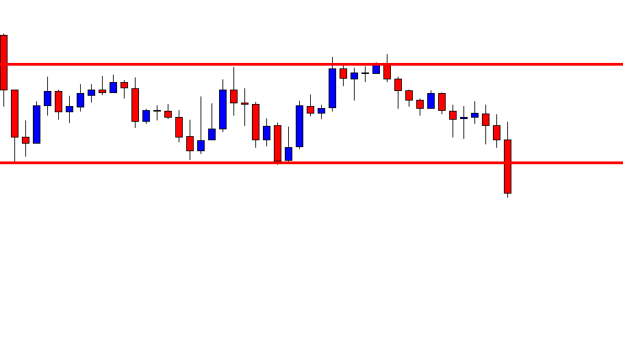
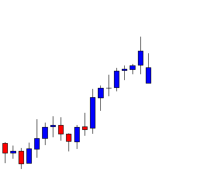
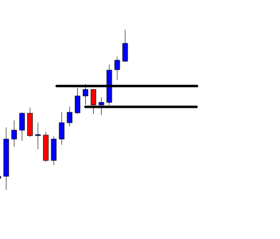
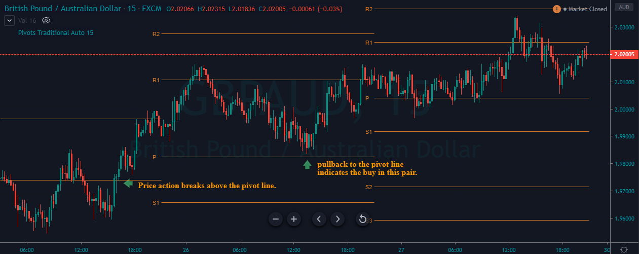
The image below represents our buying entry in this pair.  Notice that the day before our entry price action breaks the pivot line and the very next price action pullback to the pivot line. Keep in mind that the pullback must hold at the pivot line then only it confirms the buy trade, never place the limit order at the pivot line. Let the price action test the support line take entry.

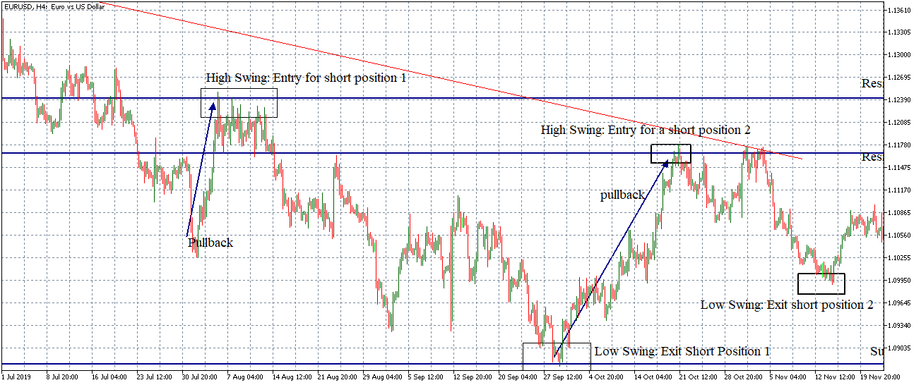
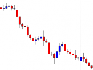
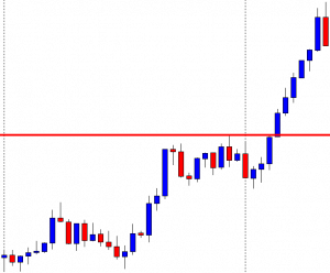
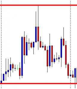
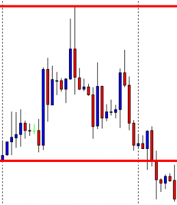
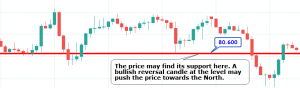
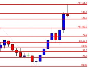
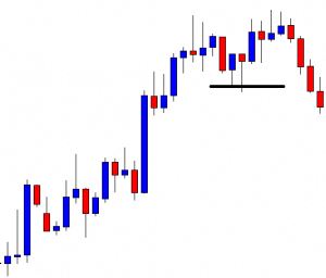
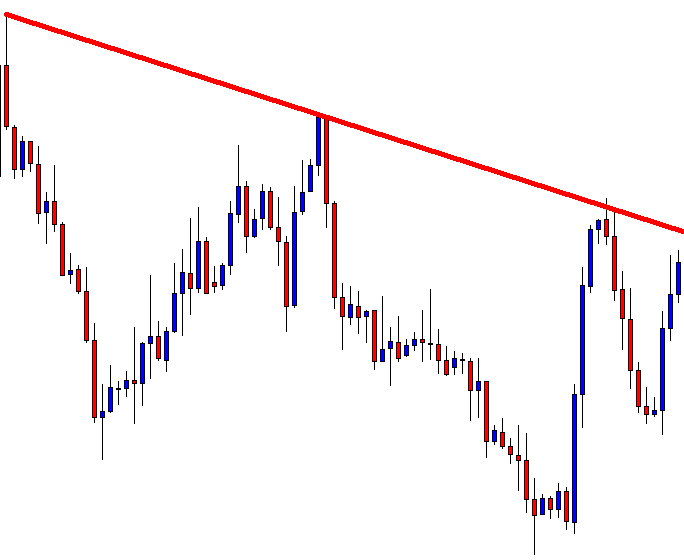
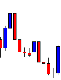
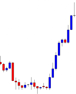
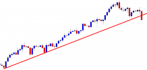
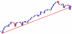
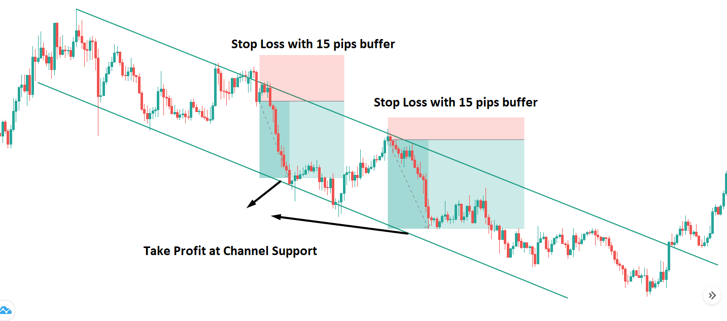
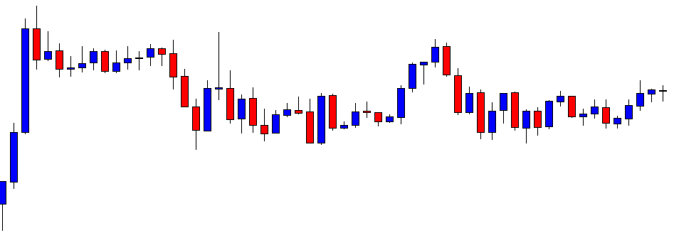
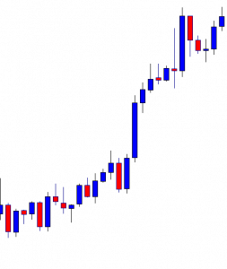
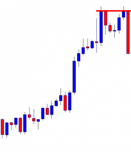
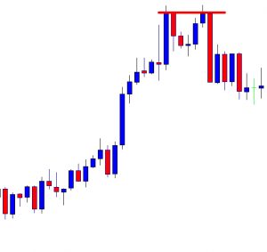
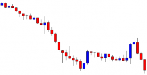
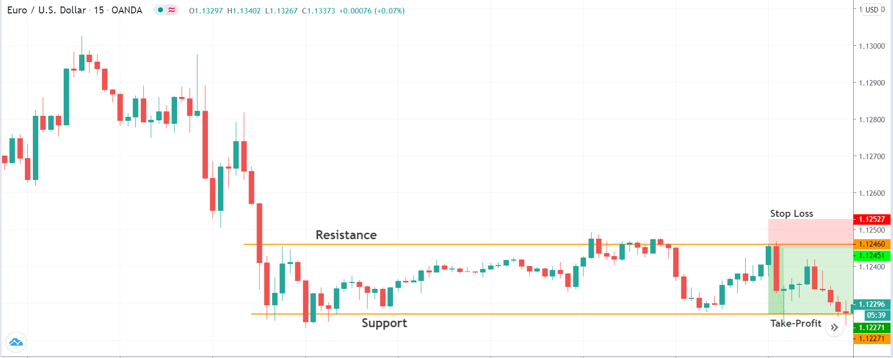
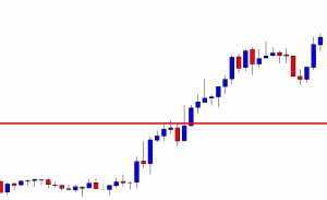
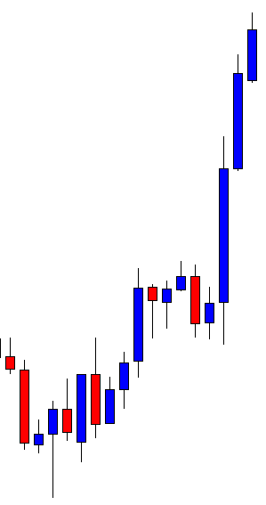
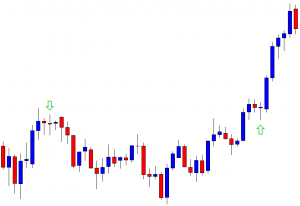
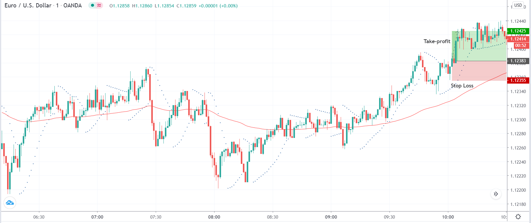
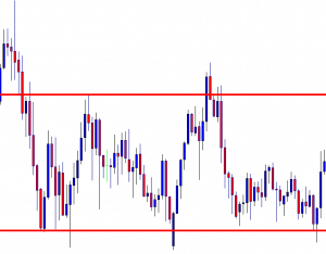
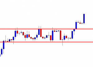
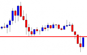
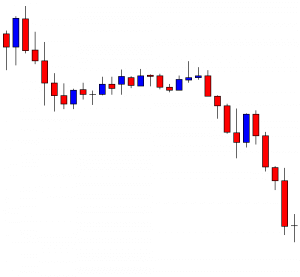
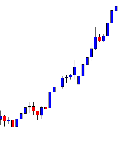
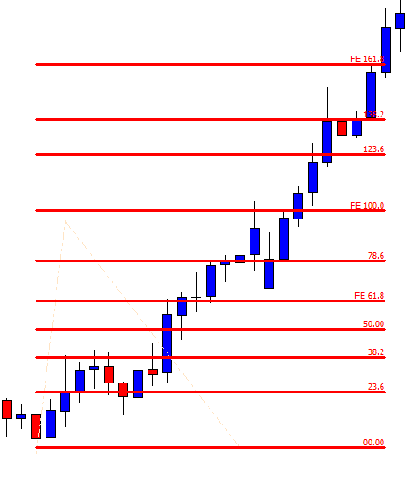
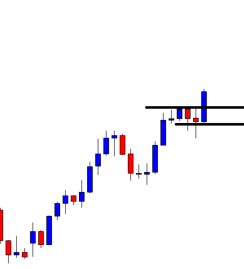
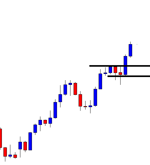
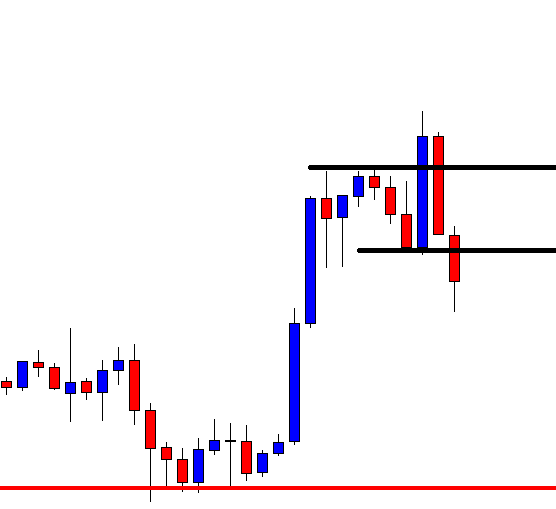
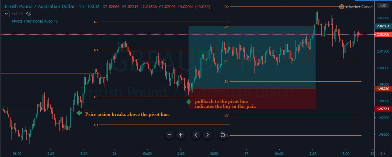
The image below represents our entry, exit, and take profit in the GBPAUD forex pair. When you follow so many steps to take an entry, it means that you are going for the precision in the market, and for the precision entries, always put the stop loss just below the entry price. In the image below, notice that our stop loss was just below the pivot line, and for the take profit, we go to the R1 of the next day, which was R2 for the previous day. Take profit is an art in the market, and when you use the pivot points, it’s even easier to book profit. If the price action immediately approaches the R1, then you can expect the price action to hit the R2 or even R3. If the price action shows you the struggle to hit the R1, then simply do not expect the deeper targets.

Pivot Points + Double Moving Average

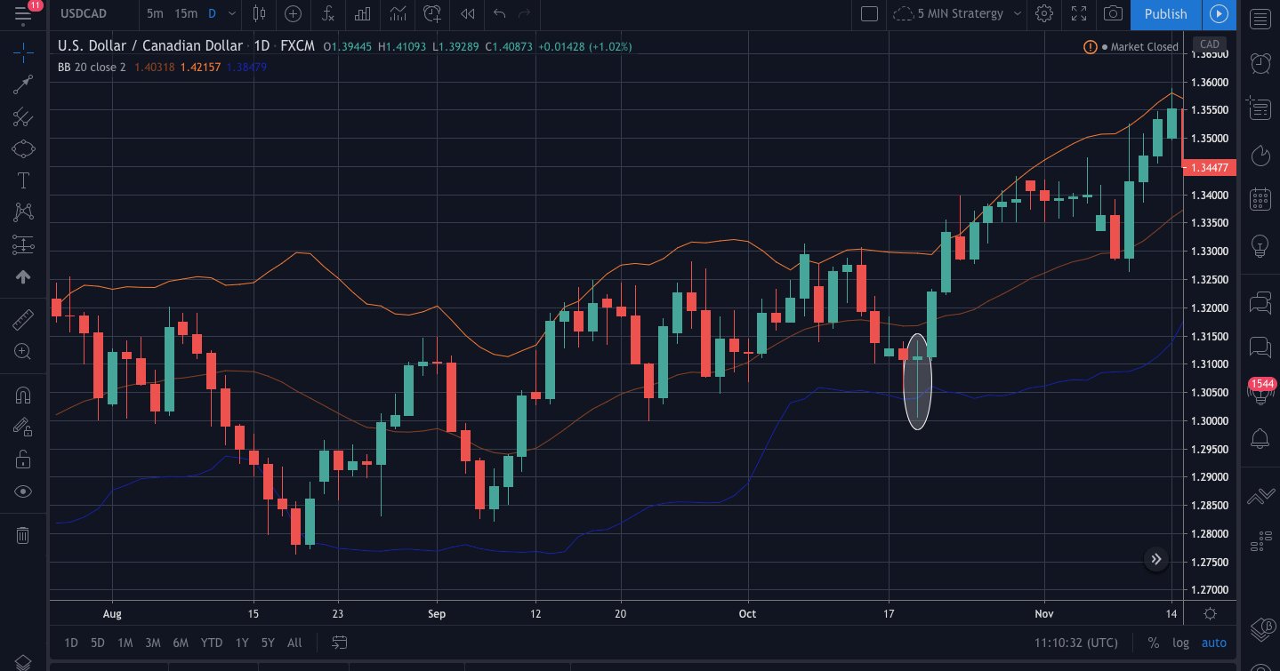
Moving average is a widely used indicator in the market which smooths out the price action by filtering out the noise from the random short-term price fluctuations. There are an infinite amount of moving averages in the market, which helps the traders to identify the market trend, entry, and exit also the potential reversals. When the moving average goes above the price action, it means that the trend is down, and when it goes below the price action, it indicates the uptrend in the security. In this strategy, we used the 30 and 15-period average to trade the market.

The trading strategy is, first of all, to find out the downtrend in any pair and wait for the prices to close below the pivot line also check the crossover above the price action on a double moving average to take an entry.

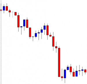
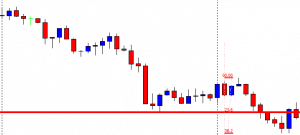
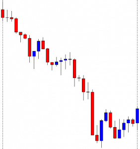
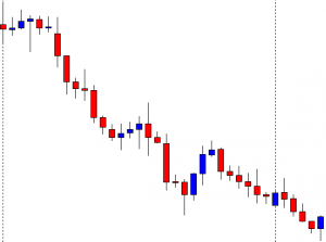
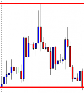
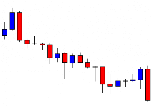
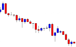
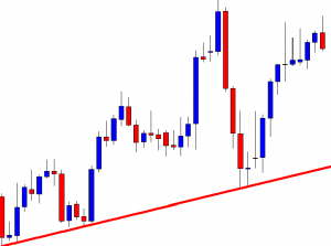
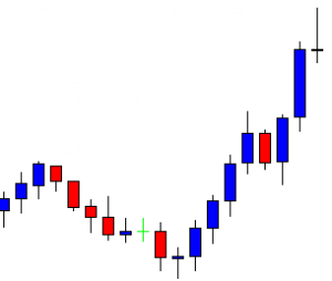
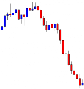
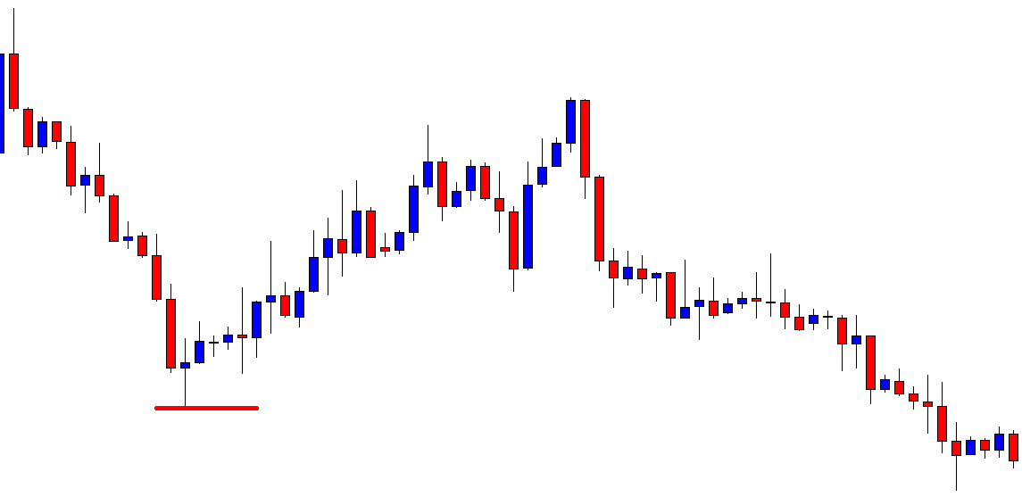
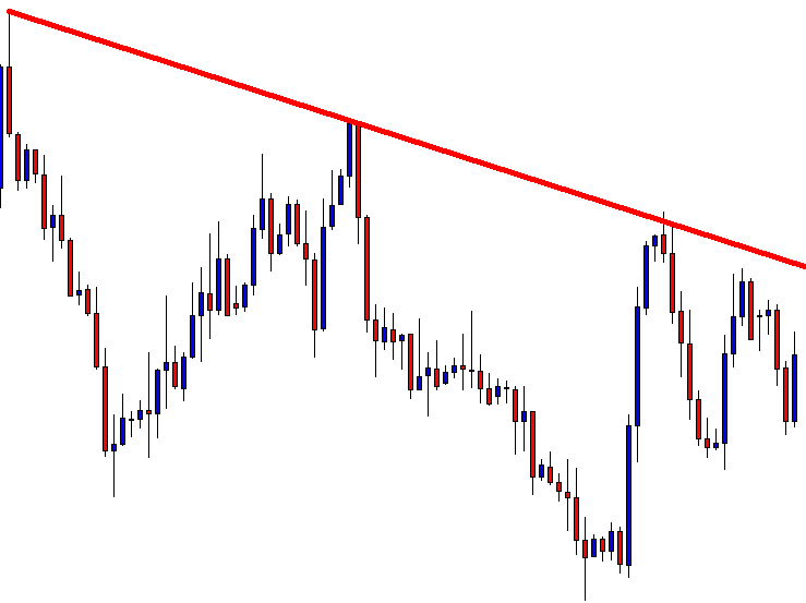
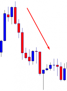
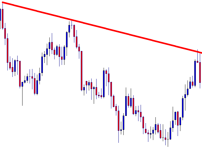
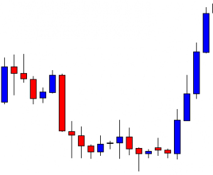
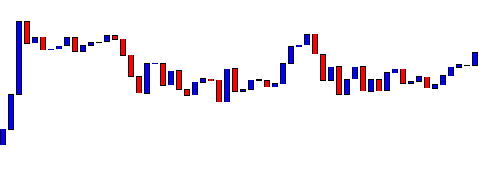
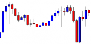
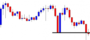
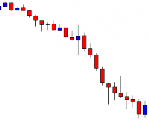
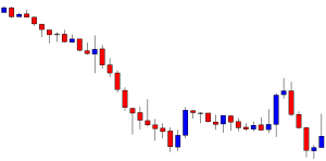
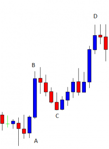
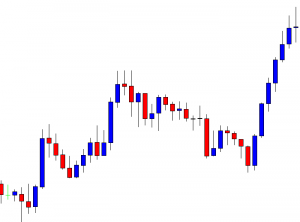
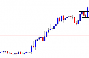
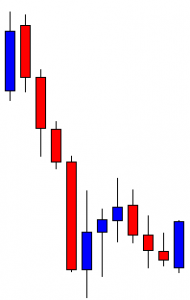
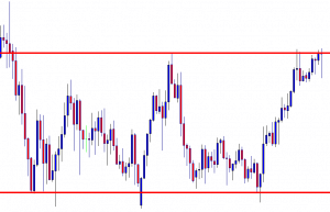
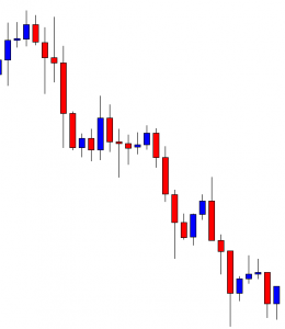
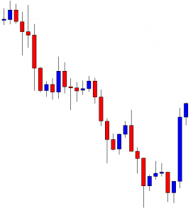
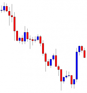
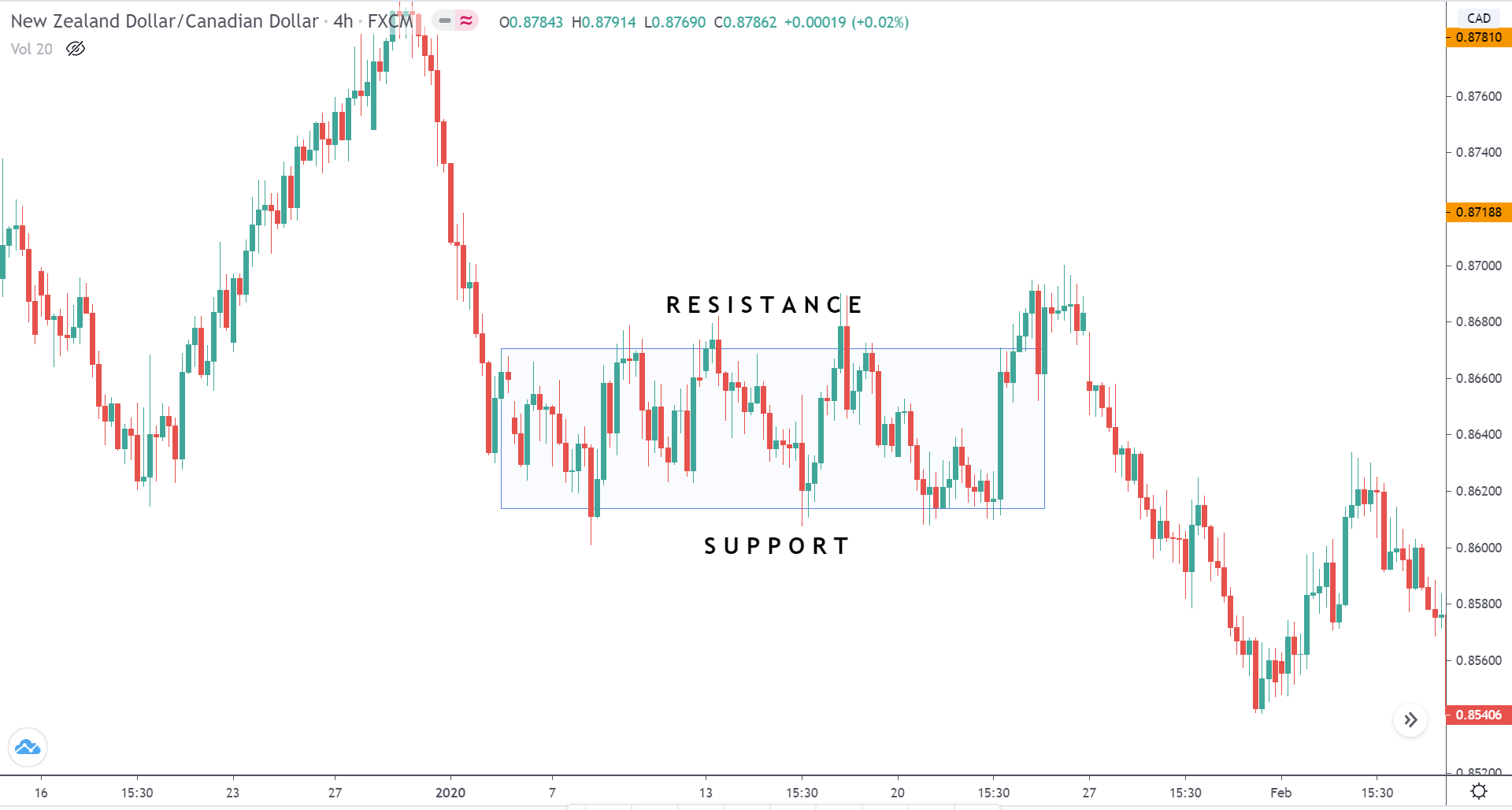
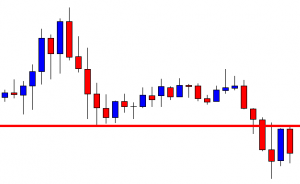
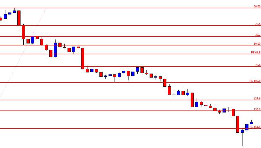
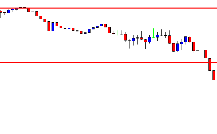
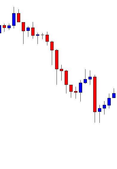
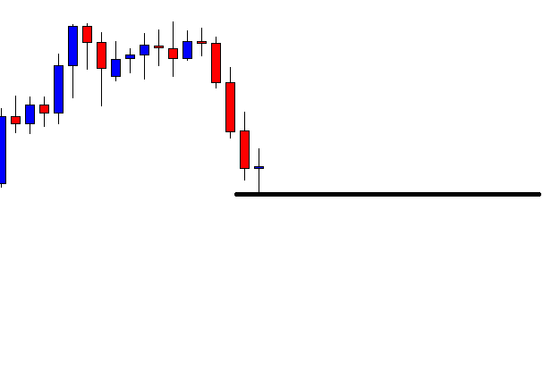
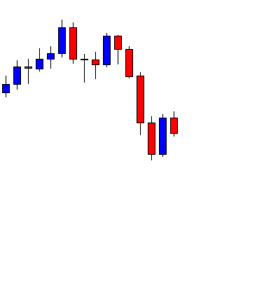
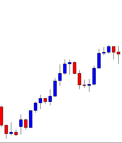
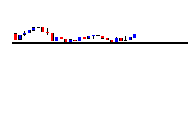
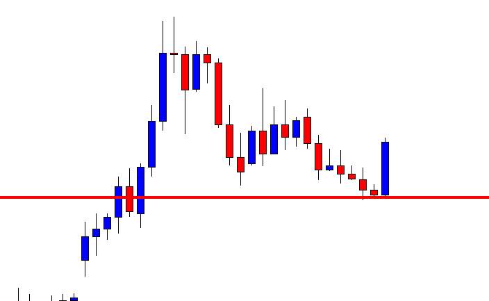
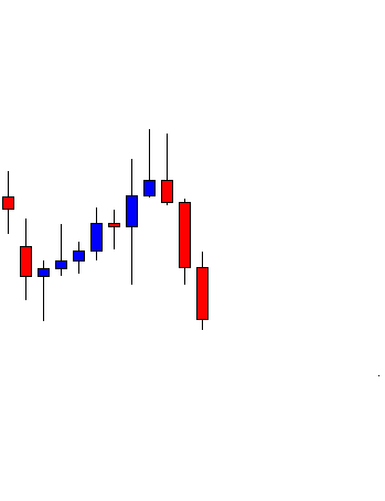
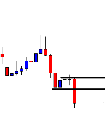
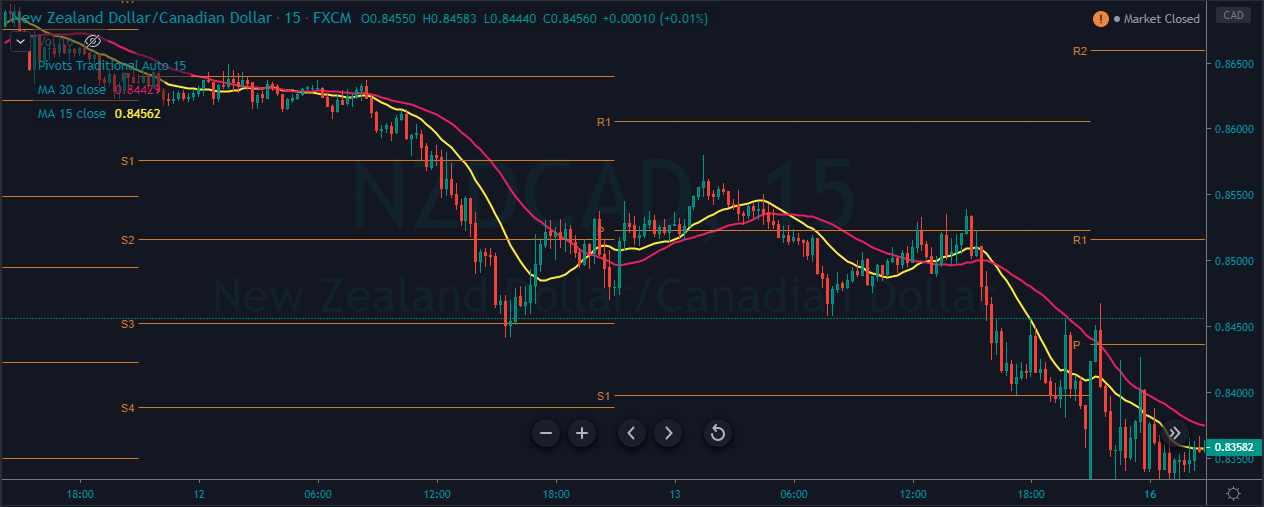
The image below represents the downtrend in an NZDCAD forex pair.

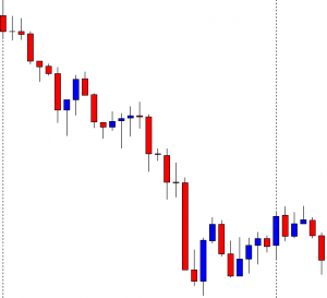
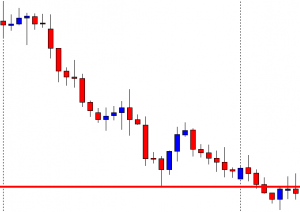
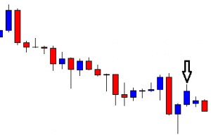
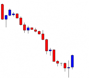
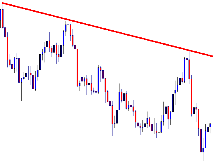
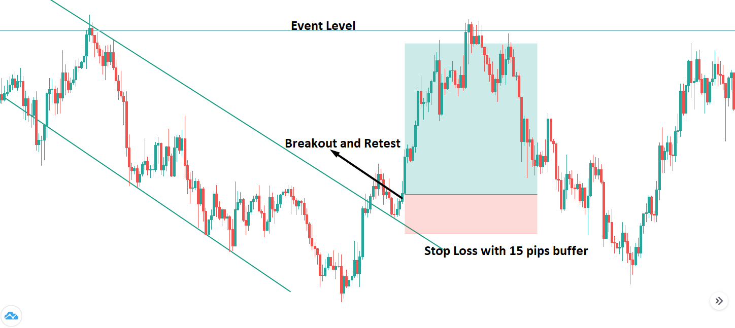
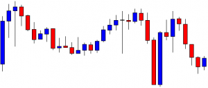
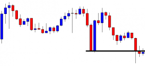
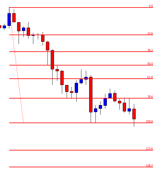
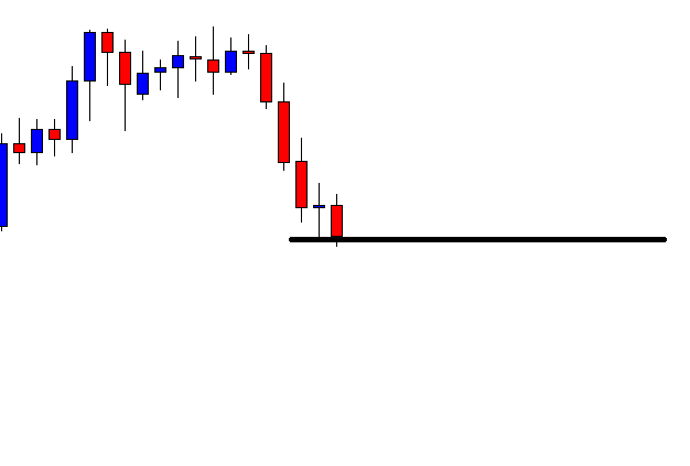
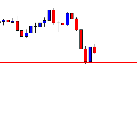
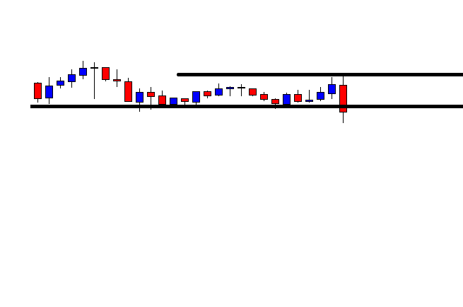
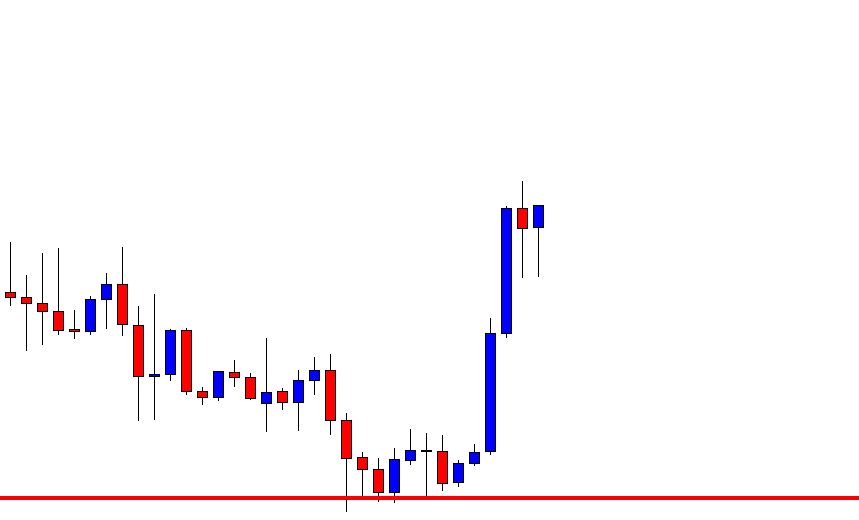
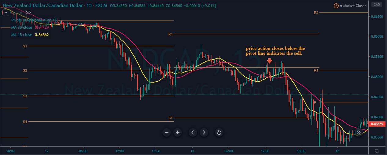
As you can see in the below image of the NZDCAD forex pair, it indicates the selling entry in this pair. In a downtrend, when the price action holds below the pivot line, it shows that the prices respect the resistance area; also, the crossover on the MA indicates the market is ready to print a brand new lower low.

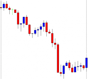
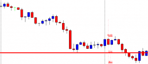
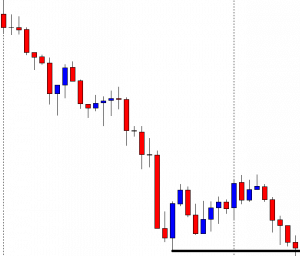
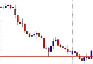
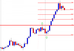
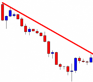
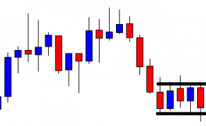
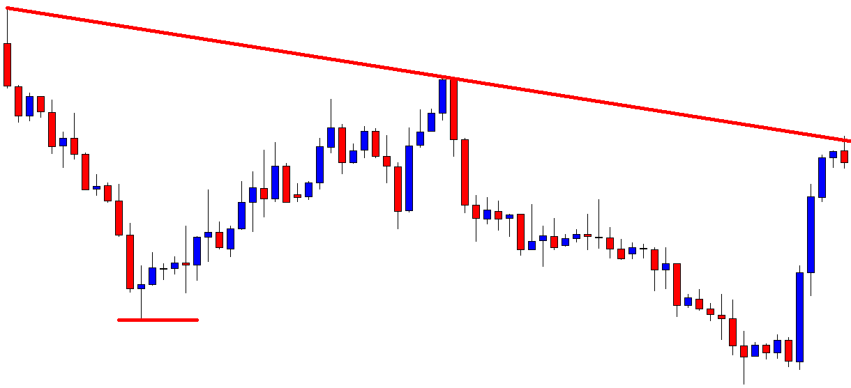
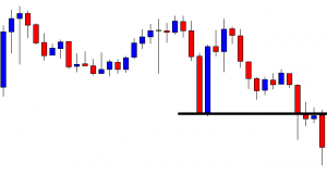
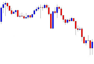
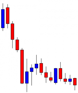
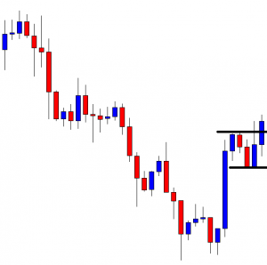
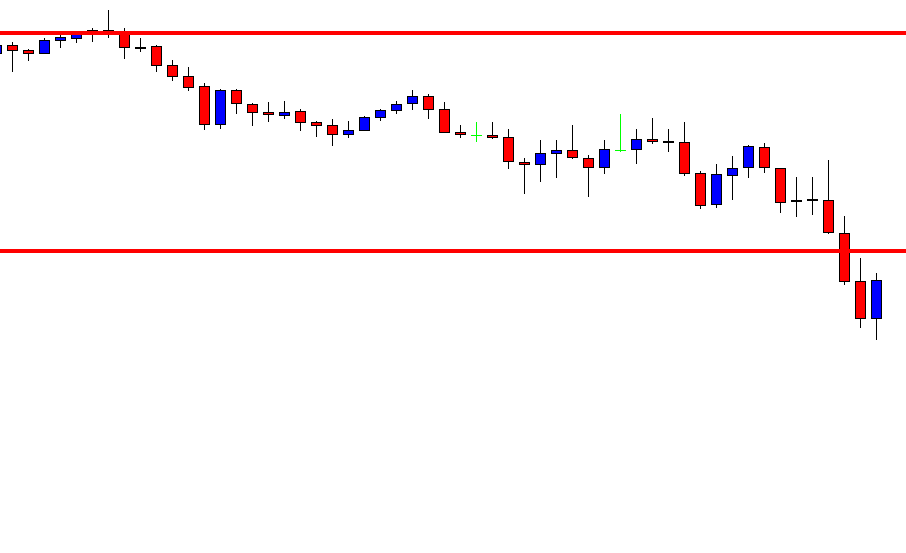
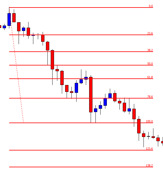
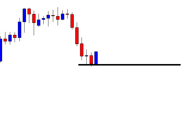
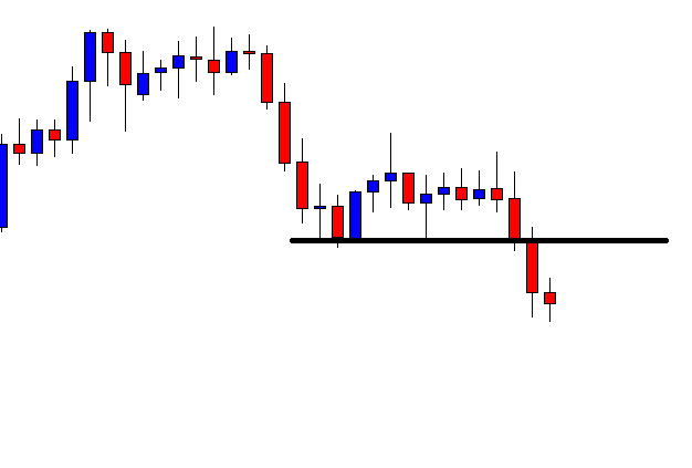
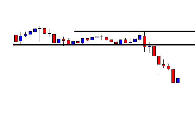
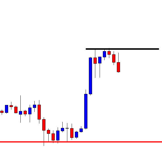
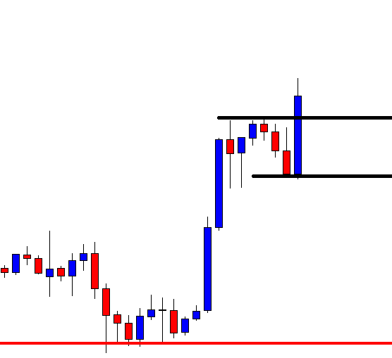
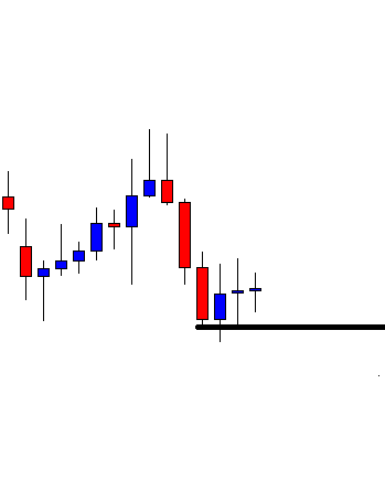
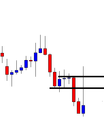
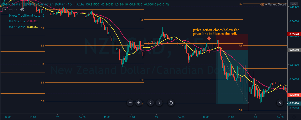
The below image represents our entry, exit, and take profit in this pair. As you can see, the entry was when prices hold below the pivot line, and the stops were just above the pivot line because the holds below show that the buyers hold no power to break above the pivot line. After our entry, price action strongly blasts to the north, which shows that we can expect our trade to travel even longer. Price action holds for some time at the S1, and then it immediately blasts to the S2 and prints the brand new lower low.

Conclusion

Pivot points are the leading indicator in the industry, which provides a glance at potential support and resistance level in the market. These levels are useful for taking an entry, or it can be useful for putting stop loss or for booking profit also. AS the leading indicator, you can use them all alone to trade the market, or you can pair them with some other indicator to trade the market. The critical benefit of pivot points is they work on all the financial markets also on all the trading timeframes. Try not to use this indicator in the ranging conditions and also avoid the use in the highly volatile markets.

Categories
Forex Course

172. Using Multiple Timeframe Analysis To Identify Accurate Entries & Exits

Introduction 

At this stage, you are now familiar with how to conduct multiple timeframe analysis for the different type of forex trades. In the previous lesson, we covered why you should look at multiple timeframes when trading forex. Now, let’s narrow down to how you can use multiple timeframe analysis to determine which price levels make the best entry and exit points to match your trading style.

Why is it important? 

Using longer timeframes helps get the bigger picture while the shorter timeframes show you how the dominant trend is constituted. Support and resistance levels are used to determine the best entry and points of a trade. To properly illustrate this, we will use the example of a forex swing trader.

For a forex swing trader, positions are left open from overnight up to a few weeks. Daily timeframes are used to establish the dominant market trend for a currency pair. This timeframe will help you establish long-term support and resistance levels.

Forex Swing Trader Daily Timeframe for EUR/USD Primary Trend

The daily forex timeframe for the EUR/USD shows that the pair is on a downtrend, as evidenced by the lower lows and lower highs. The lowest low from the daily timeframe will enable the forex swing trader to establish the support level. Lower highs are formed when the price of the pair attempts a ‘pull-back.’ These lower highs will be used to set the resistance levels.

Since the dominant trend is downward, the resistance levels will be used as the ‘high swings, ’ which will be the best entry point for a short position. The resistance levels are used since the currency pair’s price is unlikely to break above this level.

Forex Swing Trader EUR/USD 4-hour Trigger Timeframe

To determine the best entry and exit points, as a forex swing trader, you use the 4-hour timeframe. When the 4-hour candles don’t breach the resistance level, you open a short trade and exit when the 4-hour candle touches the support level at the low swing.

This strategy can be adopted for the other type of forex trades.

Using multiple timeframe analysis for different forex orders

With a top-down analysis approach, different types of traders can use multiple timeframe analysis for executing different types of forex orders. Take a forex day trader, for example.

Forex Day Trader 1-hour Primary Trend Timeframe for EUR/USD

After establishing the support and resistance level, the forex day trader can use the resistance level to set the sell limit or the buy stop order. The support level is ideal to set the buy limit or the sell stop orders. The ‘stop-loss’ and ‘take profit’ levels can then be set to exit these trades depending on your risk management measures.

[wp_quiz id=”89182″]
Categories
Forex Course

170. Why Consider Analysing Multiple Timeframes When Trading Forex?

Introduction 

Our previous lessons have covered trading multiple timeframes in forex and which timeframes are suitable for your trading style. To some forex traders, trading multiple forex timeframes can seem tedious and time-consuming. Here are some of the most important reasons why you should look at multiple timeframes when trading forex.

1. To easily identify trends and their momentum 

Depending on the type of forex trader you are, multiple timeframes will enable you to see the prevailing market trends at a glance by filtering out periodic price spikes. It is easier to identify the direction of the market trends and consolidations, whether in the short- or long-term.

For the long-term market trend, you can use the weekly and the monthly timeframes, while the intermediate market trend can best be identified by the 4-hour to daily timeframes. Timeframes of between five minutes and one hour can be used to determine the short-term market position.

The longer timeframes filter out the short-term price fluctuations, which might otherwise result in trend inconsistencies when viewed alone. The periodic fluctuations in the short-term add up in the long-term. With multiple timeframe analysis, the strength and consistency of the short-term trend can be compared to that in the long-term. This comparison is made by observing whether the prevailing long-term trend was dominant in the short-term as well.

2. To establish the significance of fundamental indicators

Using multiple trend analysis, you can easily establish the magnitude that news release of economic indicators has on a given currency pair. To determine the significance of the economic indicators, you can use different timeframes to establish how long the news release affected price action. The effects of high-impact fundamental indicators can be traced from the shorter timeframe to the longer timeframes. Low-impact indicators only affect price action on the shorter timeframe.

3. Identifying the support and resistance levels

Based on the forex trading style you choose, you can use the more extended timeframe within your category to establish the support and resistance levels in the market trend. Shorter timeframes can then be used to trigger entry and exit points for a trade.

These support and resistance levels are crucial in deciding the forex order type you want to execute. Say, for example, you want to use a buy limit order. You will use the support level as your trigger price. Similarly, the support level can be used as the trigger price for a sell stop order. You can use the resistance level as the trigger price for the sell limit and buy stop orders.

4. To avoid the lagging effects of technical indicators

Technical forex indicators are lagging since they derive their properties from the price action of a forex pair. Therefore, the forecasting significance of multiple timeframe analysis in the forex market can be said to be leading that of the technical indicators. Furthermore, some technical forex indicators can produce conflicting signals. Thus, trading with multiple timeframes improves your forex analysis.

We hope you understood why it is crucial to consider analyzing various timeframes while analyzing the Forex market. Please take the below quiz to know if you got the concepts correctly. Cheers!

[wp_quiz id=”89156″]
Categories
Forex Daily Topic Forex Price Action

How to Professionally Deal with Fake Breakouts!

In today’s lesson, we are going to demonstrate an example of an H4 breakout at the weekly low. The price consolidates after the breakout and produces a bearish reversal candle right at the breakout level. It is a matter of time for the sellers to go short and drives the price towards the South. Let us find out what actually happens.

The chart shows that the price makes a good bearish move. It finds its support where the pair is traded for a while. The pair closes its week by producing a bearish candle. By looking at the chart, it looks that the sellers are going to keep their eyes on the chart next week.

The pair produces a bullish engulfing candle to start its trading week. The buyers on the minor charts may push the price towards the North. However, the H4 chart is still bearish biased.

The chart shows that the price may have found its resistance. The price has been in consolidation for a while. The last candle comes out as a bearish engulfing candle. The price may make its move towards the South now.

The chart produces consecutive bearish candles and makes a breakout at the last week’s low. The pair is traded below the breakout level for two more candles as well. The sellers are to wait for the price to consolidate and produce a bearish reversal candle followed by a breakout at the consolidation support to go short in the pair.

The chart produces a bullish engulfing candle closing within the breakout level. The next candle comes out as a bearish inside bar. The sellers would love to get a bearish engulfing candle closing below the bullish candle’s low. However, a breakout at the consolidation support would signal the sellers to go short in the pair. By drawing Fibonacci levels on the chart with Fibonacci extension, we see that the price finds its support at the level of 38.2% and finds its resistance at the level of 23.6%. In a word, the stage is getting ready for the Bear to make a move.

The chart produces a bullish candle. It is not a good sign, but the sellers still have hope. If the chart produces a bearish reversal candle again followed by a breakout at the level of 38.2%, the game is on for the sellers.

Now, the chart produces another bullish candle and heads towards the North. The sellers must be very disappointed since it seemed such a nice trade setup for them. The reality is it often happens to all traders. No point in being disappointed, but it must be dealt with professionalism.

Categories
Forex Price Action

Weekly High/Low Breakout Trading: Importance of Candles’ Body before Making a Breakout

In today’s lesson, we are going to demonstrate an example of an H4 chart that seems promising to make a breakout at the last week’s low. It produces a strong bearish candle as well at last, but the price does not head towards the South. We try to find out the possible reason behind that.

It is an H4 chart. The chart shows that the price heads towards the South with good bearish momentum. The price bounces twice at a level of support. The pair closes its trading week by producing a bearish candle.

The pair starts its next week by producing a bullish engulfing candle. It means the breakout length gets bigger, which attracts the sellers more. The sellers are to wait for the price to make a bearish reversal candle followed by a breakout at the weekly low.

The price finds its resistance and produces two consecutive bearish candles. The sellers are to keep their eyes on the chart closely. It seems that the Bear is going to make a breakout soon. Let us proceed to the next chart to see what happens next.

The chart continues to produce bearish candles. However, it has not made a breakout at the weekly low yet. The last candle comes out as a spinning top closing within the weekly low.

The chart produces a spinning top followed by a bullish engulfing candle. The price then consolidates within the last week’s low and a new resistance. The last candle comes out as a bearish engulfing candle closing just below the weekly low. The question is whether it should be considered as a breakout. It is a breakout, but the H4 traders should skip taking entry on this chart based on a weekly high/low breakout. The reason behind that is the chart takes too long to make the breakout. Once the price starts trending, it must make a breakout without producing any reversal candle. It means if the chart produced the last candle right after the first spinning top; it would be a hunting ground for the sellers. Since it produces four bullish reversal candles before making the breakout, the chart does not belong to the H4 traders based on the weekly low anymore. We must not forget that it must consolidate after a breakout, though. It means it must produce bullish reversal candle/candles in case of a bearish breakout, but it must make a breakout only by producing bearish candles and vice versa.

Categories
Forex Price Action

Disobeying the Breakout

In today’s lesson, we will demonstrate an example of a chart that makes a breakout, consolidates, and produces a reversal candle. However, it does not make a breakout at consolidation support. Thus, it does not offer an entry. Nevertheless, it makes a move towards the breakout direction later. We try to find out whether breakout traders find an entry from that move or not.

The chart shows that the price makes a long bearish move. It finds its support where it bounces twice. The chart ends its trading week by producing a Doji candle. The next week should be interesting.

The chart produces a bullish engulfing candle. The buyers may wait for the price to make a breakout at the last swing high. On the other hand, the sellers are to wait for the price to make a breakout at the last week’s low.

The chart produces a spinning top, and the price heads towards the South. It makes a breakout at the last week’s low. Thus, the sellers may keep an eye on this chart for the price to consolidate and produces a bearish reversal candle to offer them a short entry.

It produces a bullish engulfing candle. It is a strong bullish candle. However, the breakout level is still intact. If the level produces a bearish reversal candle followed by a breakout at consolidation support, the Bear may keep dominating in the pair.

The chart produces a Doji candle followed by a spinning top right at the breakout level. The sellers may go short below consolidation support. It looks it is a matter of time for the Bear to make a long move towards the South.

The chart produces a bullish candle breaching the breakout level. It spoils the sellers’ party. The weekly low is disobeyed by the H4 chart. Thus, the H4 sellers may skip taking entry on this chart. The chart becomes no hunting zone for both the buyers and the sellers as far as the H4 chart is concerned. Let us proceed and find out what happens next.

The price makes a bearish move. The pair is trading below the last week’s low. Look at the momentum. The price has been rather sluggish to head towards the South. It is because the pair is traded on other minor charts. As mentioned, if the price disobeys breakout on a chart, it is better not to trade based on that chart. The price may go either way, which makes things difficult for the traders to trade.

Categories
Forex Daily Topic Forex Price Action

Fibonacci Extension: How It Helps Traders

In today’s lesson, we will demonstrate an example of an H4 chart that makes a breakout heading towards the North. However, the chart does not offer entry. We try to find out the reason behind it.

It is an H4 chart. The chart shows that the price makes a good bullish move. Thus, the weekly candle ends up being a bullish candle. Let us proceed to the next chart to see how the price starts next week.

The first candle comes out as a bearish engulfing candle. However, the support level where the price had a bounce and headed towards the North is intact. The buyers may eye on the chart for the price to have a bounce and make a bullish breakout at the weekly high.

The chart produces a bullish inside bar. The candle is produced right at the level of support. It is not a strong bullish reversal candle, but things look good for the buyers.

The chart produces three more bullish candles breaching the level of resistance. The buyers are to wait for the price to consolidate and produce a bullish reversal candle to offer them a long entry.

The price keeps heading towards the North without having consolidation. In naked eyes, it seems that the price has traveled a long way. If it consolidates now, should the buyers go long?

The chart produces a bearish candle. It means the price may consolidate now. The breakout level is far away. If the price makes a bearish correction up to the breakout level, it will come out as a long bearish wave. This often changes the trend or makes the price get choppy, at least. Let us draw a Fibonacci Extension and explain it with the Fibonacci levels.

We know when the price makes a breakout; Fibonacci Extension can be used to determine the wave’s length. The breakout length is measured at 23.6%. The best level for the price to consolidate within 23.6% to 38.2% or 38.2% to 50.0%. Over here, the price consolidates within 61.8% to 78.6%. It means the price does not have much space to travel. Thus, the buyers may skip taking entry on this chart as far as the risk-reward ratio is concerned. The price may go up to the level of 100.0%, but it often ends up being choppy or makes a reversal in such cases. This is when Fibonacci Extension comes out as a handy tool with what traders can determine the trend’s potential length and calculate whether they should take an entry or not.

Categories
Forex Daily Topic Forex Price Action

Importance of Choosing the Right Chart

In today’s lesson, we will demonstrate an example of a chart that makes a breakout at the weekly low, consolidates, and produces an excellent bearish engulfing candle. It looks like a good short entry for the sellers. However, things do not go as the sellers would love to see. We try to find out what may be the reason behind it.

It is the H4 chart. The chart shows that the price action has been choppy for the last three weeks. The price has been roaming around within two horizontal levels. Ideally, the price action traders would love to skip eying on such a chart to trade at. Let us proceed and see the H4 chart of the last week.

The chart shows that the price makes a bullish move to start its trading week. Then, it makes a bearish move and closes around the level where it started its week. It seems that the minor time frame sellers are driving the price down.

The chart produces a bullish engulfing candle right at the last week’s swing low. The minor time frame traders may push the price towards the North. The H4 sellers, on the other hand, may wait for the price to make a breakout at the swing low to go short on the chart. This is what the breakout traders usually do. However, the question is whether they should do it on this chart or not? We find it out in a minute.

It seems that the Bear is about to make a breakout at the last week’s low. The last candle comes out as a bearish engulfing candle closing right at the level of support.

The price makes a breakout at the weekly low. The last candle comes out as a bearish candle closing well below the level of support. The breakout traders are to wait for the price to consolidate.

The price consolidates. The last candle comes out as a bearish inside bar. If the price makes a breakout at the last swing low, the breakout traders usually trigger a short entry. Let us proceed and see what the price does.

The chart produces a bearish engulfing candle. It is an A+ signal candle as far as the breakout trading strategy is concerned. The sellers may want to trigger a short entry right after the last candle closes.

The chart produces a bullish engulfing candle and heads towards the North instead. The Forex market is unpredictable. The price could go either way anytime. However, it looks strange after the chart producing such a nice signal candle. There is nothing wrong with the entry apart from the fact that the chart has been choppy for the last three weeks. It means either the pair is waiting for a high impact news event to find its new direction or traded based on a bigger time frame. In a word, the price action traders may skip eying on such a chart to trade at. For them, choosing the right chart plays a vital role. Today’s example proves it again.

Categories
Forex Daily Topic Forex Price Action

Keep an Eye at the Last Daily Candle’s Closing

In today’s lesson, we are going to demonstrate an example of the daily-H4 chart combination trading. In the daily-H4 chart combination trading, the daily chart plays a very significant role. As long as the price in the daily chart heads towards the trend, the traders may find the opportunities to take entry. Let us now proceed and find out what that means.

It is a daily chart. The chart shows that the price heads towards the North with good bullish momentum. The last candle comes out as an inverted hammer with a tiny bullish body. The long upper shadow suggests that the price has a strong rejection at a level of resistance. Nevertheless, the candle has a bullish body, and the candle closes above its last candle’s highest high. Thus, the daily-H4 combination traders may flip over to the H4 chart to go long in the pair.

This is how the H4 chart looks. It produces a bearish engulfing candle followed by a spinning top. It seems that the price may have found its support. If the price makes a breakout at the last swing high, the buyers may go long in the pair.

The chart produces two more bullish candles. The last candle comes out as a hammer with a bearish body. It seems that the price does not know where to go. Traders must be patient here.

The chart produces a bullish engulfing candle closing well above the last swing high. The buyers may trigger a long entry right after the last candle closes. It seems that the bull may make another strong move towards the North. Let us find out how the trade goes.

As expected, the price heads towards the trend with extreme bullish pressure. It hits 1R by the next candle. The candle closes with a thick bullish body. It means that the buyers still have control in the chart. Thus, the buyers may wait for the price to consolidate and get a bullish reversal candle followed by a bullish breakout to go long and drive the price towards the North further.

If we concentrate on the daily chart, we see that the last daily candle is not a strong bullish candle. However, consolidation and a bullish engulfing candle in the H4 chart attract the buyers to go long in the pair. As long as the daily candle closes above/below the last candles highest high/lowest low, the daily-H4 chart combination traders shall keep their eyes in the H4 chart for finding trading opportunities.

Categories
Forex Daily Topic Forex Price Action

Trendline Trading: A Trendline forming with a Tiny Slope

In today’s lesson, we are going to demonstrate the formation of a down-trending Trendline. A trendline can be formed with a double top or double bottom as well. However, double top’s resistance or double bottom’s support may not be horizontal. Let us find out how they may look in the chart.

The chart shows that the price heads towards the South with moderate bearish pressure. The last candle comes out as a bearish engulfing candle closing well below the last swing low. The sellers may wait for the price to consolidate or make a bullish correction to go short.

The chart produces two bullish candles. The price has a rejection from the zone where it had a rejection earlier. The last rejection does not come from horizontal support, but it looks adjacent to that. Thus, it can be considered as a double top’s resistance zone.

The price heads towards the South by making a breakout at the last swing low. It produces a bullish inside bar. If the chart produces a bearish reversal candle, the sellers may go short below the last swing low. Let us proceed to find out what happens next.

The price gets bearish by making a breakout at the last swing low. Look at the last three candles. The combination of these three candles is called Morning Star. It seems that the price may make a long bullish correction. Can you guess where the price may find its next resistance?

We can draw a down-trending trendline here by using those points of the double top. Look at the price action around the trendline’s resistance. The last candle comes out as a bullish candle with an upper shadow. A bearish reversal candle at the trendline’s resistance may drive the price towards the South again.

The trendline’s resistance produces a bearish engulfing candle. It has a long lower shadow, though. The sellers may go short below the last candle’s lowest low. Let us find out what the price does.

As expected, the price makes a strong bearish move and makes a new lower low. Thus, the sellers may wait again for the price to go towards the trendline’s resistance and get a bearish reversal candle to go short in the pair. In a word, a very valid trendline is in play in this chart. Do you remember how it has started? It has started from a point that does not seem to form a trendline. The slope has been tiny, making it difficult to spot out. However, the market often produces such a trendline with a tiny slope, which shall be taken into account by the trendline traders.

Categories
Forex Market Analysis

CAD/JPY: A massive round number holding the key

CAD/JPY produced a bullish inside bar yesterday. The price had a bounce at the same level earlier and made a bullish move. The daily chart suggests that the price has some space to travel towards the North. However, if a bullish inside bar is followed by a bearish engulfing candle, it ends up being prolific for the sellers. The H4 chart looks bullish. On the other hand, the H1 chart looks a bit bearish biased. Thus, traders are to be very watchful to trade in the pair. Let us now have a look at three vital charts.

Chart 1 CAD/JPY Daily Chart

The chart shows that it had a bounce at the level of 80.000 earlier. It is a massive round number. It pushed the price towards the North, and the price made a bearish move, closing within the level. Yesterday’s candle came out as a bullish inside bar. As far as the round numbered support is concerned, the price may make a bullish move. However, if the price gets bearish and ends up producing a bearish engulfing candle closing below 80.000, the sellers may go short in the pair aggressively and drive the price towards the level of 78.300. On the other hand, if the price gets bullish, it may find its next resistance around 81.400.

Chart 2 CAD/JPY H4 Chart

The chart shows that the price upon having a bounce at the level of 80.800 produced a spinning top and headed towards the North. It made a bullish breakout at the level of 80.600. The pair had a rejection at 80.800. It has been in a bearish correction. The level of 80.600 may work as a level of support. If the level ends up producing a bullish reversal candle, the buyers may go long above the level of 80.800. The price may find its next resistance around 81.400.

Chart 3 CAD/JPY H1 Chart

The price had a rejection at the level of 80.800 twice. It produced a bearish engulfing candle. The pair is trading around the neckline at 80.640. A bearish reversal candle may attract the sellers to go short in the pair and drive the price towards the South. The price may find its next support around 80.150. On the other hand, the buyers are to wait to go long above the level of 80.800.

The H1 chart looks bearish biased. However, the daily and the H4 chart look bullish. Considering these three charts, it seems that the pair may end up having another bullish day.

Categories
Forex Daily Topic Forex Price Action

Trend Line Trading: The Entries to be Skipped

In today’s lesson, we are going to demonstrate an example of a chart that trends towards the North by obeying a trendline. It offers a long entry once the trendline is established. At the fourth bounce, it produces a bullish reversal candle. We find out whether the buyers should take a long entry or not upon getting the bullish reversal candle at the trendline’s support. Let us get started.

The chart shows that the price heads towards the North upon producing a bullish reversal candle. It consolidates and resumes its bullish journey. The chart looks like the buyers’ hunting ground.

The price upon producing a spinning top, it produces a long bearish candle. It consolidates with some candles and produces a bullish engulfing candle. The buyers may keep an eye in the chart to go long above the last swing high. If the price makes a bullish breakout, the buyers get two swing lows and two swing highs to draw an uptrending trend line.

Here it goes. The price makes a bullish breakout and heads towards the North further. The chart produces a bearish engulfing candle. It may make a bearish correction. As it looks, the chart belongs to the Bull without any doubt.

The price makes a bearish correction; consolidates and heads towards the North again. The breakout traders may find a long opportunity and grab some pips. The price makes a long bearish correction. In fact, it makes a breakout at a significant level of swing low. It seems that the chart is slightly bearish biased. Have a look at the chart below.

The trendline’s support holds the price and produces a bullish engulfing candle. The trendline traders may go long in the pair right after the last candle closes. The last swing high is the safest option to set take profit. It means the risk-reward ratio looks good for the trendline traders.

The price heads towards the North with good bullish momentum. However, it seems that the horizontal level of resistance is too strong to be breached. The price consolidates here with several candles. The last candle comes out as a bearish engulfing candle. The buyers may close the entry. The question is does the price come back to the trendline’s support or it makes a breakout at the highest high.  Let us proceed to the next chart and find out what happens.

The price comes back at the trendline’s support. It produces a hammer. Should the buyers go long from here as far as trendline trading is concerned? Think about it for a minute.

If your answer is ‘No’, you are right. The reason why the buyers should not go long from here is it does not make a new higher high upon getting its last bounce. In fact, traders may wait for the price to make a breakout at the trendline’s support and go short in the pair. In our forthcoming lessons, we will learn about trendline breakout and trendline breakout trading. Stay tuned.

Categories
Forex Price Action

Fibonacci Trading: Fibonacci Levels Maximize Profit for Intraday Traders

In today’s lesson, we are going to demonstrate an H1 chart offering an entry by using intraday support/resistance. To go with it, Fibonacci levels are used to spot out the stop-loss and take-profit levels. Let us now get started.

The chart shows that the price makes a long bearish move. The H1 chart makes a breakout at the last day’s lowest low (black drawn line). Usually, the chart attracts the sellers to look for short opportunities upon getting a bearish reversal candle. However, look at the combination of the last three candles. It is called Morning Star, which is one of the strongest bullish reversal patterns.

The price heads towards the North and goes back in the last day’s lowest low. Moreover, it makes a breakout at today’s highest high as well (black drawn line). Within four candles, the chart looks good for the buyers. The buyers may look to go long in the pair upon getting a bullish reversal candle at the breakout level.

The chart produces a bearish candle. The breakout level seems to hold the price as a level of support. A bullish reversal candle at the level may attract the buyers to go long and push the price towards the North further.

Here it comes. The chart produces a bullish engulfing candle right at the breakout level. The buyers may trigger a long entry right after the last candle closes by setting stop loss below the lowest low of the signal candle. We are going to talk about the take profit level in a minute. Let us find out how the trade goes.

The chart produces a bullish candle. The price heads towards the upside with the next candle as well. However, the candle comes out as a Doji candle having a long upper shadow. It suggests that the price may make a bearish correction or make a bearish reversal. Since the trade setup is based on the H1 chart, the buyers may lose a good number of pips if they are to wait for the chart to produce a reversal candle to close their entry. It is tough to manage trade in the H1 chart manually. Thus, setting the take profit is the best way. The question is, where should we set our take profit? In this regard, Fibonacci levels come extremely handy. Let us draw the Fibonacci levels in the chart and find out how they work in the chart above.

There you go. The price produces a bullish reversal candle at 61.8% level and heads towards the level of 161.8%. It means the buyers may achieve 1:2 risk-reward easily by using Fibonacci levels in intraday trading. In our fore coming lessons, we are going to demonstrate more examples of integration of Fibonacci levels and intraday trading. Stay tuned.

Categories
Forex Daily Topic Forex Price Action

A Classic Example of Trading on a Double Top

Last week, in one of our lessons, we showed an example of how the price gets bullish based on the double bottom and flipped support. In today’s lesson, we are going to demonstrate an example of a double top and flipped resistance. a Double Top is the opposite of a Double Bottom, so it drives the price towards the South. It is one of the strongest bearish reversal patterns. Traders love to go short when a chart produces a double top in the Forex market. Let us now proceed and find out how it usually works.

The chart shows that the price heads towards the North and finds its resistance. It produces a bearish engulfing candle. Sellers on the minor chart may look to go short in the chart. However, the sellers in this chart may wait for either the price consolidates and makes a bearish breakout or to produce a double top.

The price finds its support and heads towards the level of resistance again. It consolidates around the level of resistance. A bearish reversal candle followed by a breakout at the last support may attract the sellers to go short in the pair since the chart would produce a double top, and the breakout would be a neckline breakout.

Here it goes. The price heads towards the South with good bearish momentum. It makes a breakout at the neckline and produces one more bearish candle. The sellers are going to wait to go short in the pair below the lowest low. However, it is best to wait for the price to consolidate around the breakout level and produce a bearish reversal candle to get a better risk-reward.

The price consolidates around the breakout level and produces a bearish engulfing candle at the breakout level. The sellers may go short below consolidation’s support by setting stop-loss above consolidation’s resistance and by setting a take-profit target with 1R at least. Please note, a double bottom/double top and consolidation around the neckline breakout level usually offers more than 1R. Let us find out how the trade goes.

The price heads towards the downside with extreme bearish momentum. It produces an inverted hammer. The price may make a bullish correction from here. Count the length that the price has traveled so far. It has traveled a long way offering about 6R to the sellers. One trade like this in a week may make a trader fulfilled. Thus, keep your eyes on patterns such as the Double Top/Double Bottom. Remember the procedure; wait for the price to consolidate and produce a reversal candle at the breakout level; trigger an entry below consolidation support/resistance, and manage your trade accordingly.

Categories
Forex Market Analysis

Daily F.X. Analysis, September 01 – Top Trade Setups In Forex – Dollar Weakens Amid NFP Forecast! 

On the news front, the eyes will be on the series of economic events like Manufacturing PMI data from Europe, the U.K., and the U.S. Economy. Overall, almost all of the events are expected to report neutral results. Therefore, any surprisingly bad or good data may drive some price action in the market today.

Economic Events to Watch Today  


EUR/USD – Daily Analysis

The EUR/USD closed at 1.19359 after placing a high of 1.19659 and a low of 1.18841. The EUR/USD pair continued its bullish trend for the second day and rose to its highest since August 18 on Monday amid broad-based U.S. dollar weakness. Every month, the currency pair EUR/USD rose for the 4th consecutive month in August. The improved risk sentiment followed the positive momentum in the EUR/USD pair in the market amid a rise in the U.S. stock futures.

 On Monday, the U.S. stock futures opened the day with modest gains as the market was on track to rack up their best August in more than 30 years. The upward momentum in stocks came after the S&P 500 and NASDAQ closed at an all-time high on Friday, with the former looking set to record its most robust August performance in 34 years.

The rally in the stock market was backed by the improved risk sentiment powered by massive monetary and fiscal stimulus in recent months that offset the concerns over the outlook of economic recovery from the coronavirus pandemic. Besides, the optimism around the vaccine development and treatments for COVID-19 and the robust demand for tech stocks also boosted the risk sentiment.

During the previous week, the Federal Reserve Chairman Jerome Powell shifted the policy to average inflation targeting that allowed inflation to surpass the 2% target. This shift raised concerns that interest rates were locked near-zero for as much as five years and weighed heavily on the U.S. dollar. The weak U.S. dollar helped EUR/USD to post gains on Monday.

Meanwhile, the German Prelim CPI in August dropped to -0.1% from the anticipated 0.0% and weighed on Euro on the data front. The Spanish Flash CPI fell in August to -0.5% from the July’s -0.6%. The Italian Prelim CPI in August came in line with the expectations of 0.3%. Most data from the European side came against Euro and limited the additional gains in EUR/USD pair on Monday.

While from the U.S. side, the Fed Vice Chair, Richard Clarida said on Monday that Federal Reserve would turn to discuss the next possible steps in the U.S. central bank’s fight against coronavirus induced economic fallout as a new policy framework has been set in place. The possible steps include linking interest rates directly with a return to full employment and possible expansion in monthly asset purchases to aid the economy through the COVID-19 crisis further.

Furthermore, the risk sentiment was also boosted by the news that the highly awaited Oxford vaccine will begin its phase-3 trials in the United States on Tuesday. This also helped EUR/USD pair to post gains on Monday.

Whereas, the World Health Organization pointed out encouraging signs that countries in Europe could deal with the coronavirus outbreak, despite the increase in cases since lockdown measures were lifted. According to a Senior Advisor to the Director-General at WHO, Bruce Aylward said that Europe has learned how to identify, isolate, and quarantine. It also helped raise the local currency Euro and added further in EUR/USD pair gains.

Daily Technical Levels

Support Pivot Resistance
1.1891 1.1929 1.1975
1.1846 1.2012
1.1808 1.2058

 EUR/USD– Trading Tip

The EUR/USD is trading sharply bullish amid the weaker dollar, leading EUR/USD pair towards 1.1993 level. The EUR/USD pair has violated the resistance level of 1.1960 level, which is now working as a support for Eur. On the upper side, the pair may find resistance at 1.2025 and 1.2065 levels today. The bullish bias remains dominant.


GBP/USD – Daily Analysis

The GBP/USD closed at 1.33651 after placing a high of 1.33956 and a low of 1.3309. Overall the movement of the GBP/USD pair remained bullish throughout the day. The GBP/USD pair extended its previous day’s bullish streak on Monday and posted gains for the third consecutive month on August amid broad-based U.S. dollar weakness and improved risk-on market sentiment.

The risk-sensitive British Pound gained on Monday due to many factors, including the dovish policy shift from the U.S. Federal Reserve, development in vaccine & treatments of COVID-19. At the same time, some lingering tensions in US-China kept the pair’s gains limited.

On Friday, the U.S. Federal Reserve shifted to a dovish policy that allowed inflation to pass over the 2% target, which means continued low-interest rates for almost five years. This weighed on the U.S. dollar and helped GBP/USD to post gains on Monday.

Meanwhile, the market sentiment was also powered by the positive headlines from the vaccine front as a possible virus vaccine made by Oxford has announced to start its phase-3 trials from Tuesday. Moreover, the US-listed Chinese tech companies were heading to Hong Kong exchange from New York Exchange amid increased US-China dispute. This weighed on market sentiment and kept a check on additional gains in GBP/USD pair.

Whereas, on the Brexit front, the U.K. Government has said that the European Union was making Brexit talks unnecessarily difficult after France accused the U.K. of deliberately stalling in negotiations.

In last week, U.K. and E.U. ended their latest round of negotiation with very little progress due to warnings of no-deal Brexit if issues did not settle within a few weeks. Only four months have left until the transition period ends, and both sides have failed to resolve their issues and are still stuck on various points, including fisheries and state aid policy.

Recently French Foreign Minister Jean-Yves Le Drian has blamed the U.K. for the deadlock and said that the failure in progress in talks was because of the United Kingdom’s intransigent and unrealistic attitude. Whereas, the U.K. has said that it has been clear from the outset about the U.K. approach’s principles. A spokeswoman said that the U.K. seeks a relationship that respects their sovereignty and has a free trade agreement the E.U. has with like-minded countries.

E.U. still insists not only that the U.K. must accept continuity with E.U. state aid and fisheries policy but also that the U.K. must agree before any further work can be done un any other area of negotiation. This also includes the legal texts that make in unnecessarily difficult to make progress. Next week, another round of talks will occur, and investors are looking forward to it for fresh clues.

 Daily Technical Levels

Support Pivot Resistance
1.3314 1.3355 1.3409
1.3260 1.3450
1.3219 1.3504

 GBP/USD– Trading Tip

The GBP/USD is trading with a neutral bias below an immediate resistance level of 1.3425 level. Closing of candles below 1.3420 level is likely to drive selling until the 38.2% Fibonacci support level of 1.3350 and 61.8% Fibonacci support level of 1.3305 level. The MACD has also crossed below 0, supporting selling bias in the GBP/USD pair. On the higher side, a bullish breakout of 1.3420 level can lead the Cable towards 1.3511 level. Let’s consider taking buying trades over 1.3350 level today.  


USD/JPY – Daily Analysis

The USD/JPY pair was closed at 105.901 after placing a high of 106.094 and a low of 105.208. The USD/JPY pair moved in an upward direction on Monday despite the broad-based U.S. dollar weakness. The pair, which posted a loss of more than100 pips on Friday amid the resignation of Japanese Prime Minister Shinzo Abe, recovered about half of the previous losses on Monday.

The risk-on market sentiment made it difficult for the safe-haven Japanese Yen to find demand on Monday and helped pair USD/JPY moved higher on board. The heightened optimism for an effective coronavirus treatment and the U.S. Food & Drug Administration’s decision to fast-track vaccine approval added in the risk-sentiment. Besides, the news that the Oxford vaccine will also start its phase-3 trials on the next day also powered the risk sentiment and weighed on JPY that pushed the USD/JPY pair even higher at the start of the week. 

However, with the lingering tensions between the U.S. & China, the US-listed Chinese tech companies were preferring the Hong Kong Exchange with Alibaba affiliate Ant Group, one of the most highly predicted initial public offerings ready for a dual listing in Shanghai and Hong Kong. This kept the additional gains in USD/JPY limited on Monday.

The U.S. dollar was under heavy selling pressure on Monday amid U.S. Dollar Index slumped to more than two years, the lowest level at 91.99.

The pressure surrounding the greenback was increased in the absence of any significant fundamentals on Monday, and the market kept following the strategy of a policy shift from the Federal Reserve on Friday.

Meanwhile, on Monday, Vice Chairman Richard Clarida explained that as Federal Reserve has shifted from its previous policy and has set a new policy framework, the central bank’s focus will now shift towards the next promises made by it to fight against the coronavirus induced economic slump.

Fed made promises to link interest rates to the direct return of full employment and increase the monthly assets purchases to boost the economy through the economic crisis followed by the coronavirus pandemic.

On the other hand, at 04:50 GMT, the Prelim Industrial Production in July increased to 8.0% from the expected 5.0% and supported the Japanese Yen. The Retail Sales for the year from Japan dropped to -2.8% from the forecasted -1.7% and weighed on the Japanese Yen that pushed the pair USD/JPY even higher on board.

At 10:00 GMT, the Consumer Confidence from Japan in August increased to 29.3 against the expected 28.7 and supported the Japanese Yen. At 10:02 GMT, the Housing Starts came in as -11.4% against the anticipated -12.0% and supported the Japanese Yen but failed to reverse the USD/JPY pair’s bullish movement.

Daily Technical Levels

Support Pivot Resistance
105.4200 105.7600 106.2300
104.9500 106.5700
104.6200 107.0300

USD/JPY – Trading Tips

The USD/JPY is trading within a sideways range of 105.866 to 105.200 range. The pair entered into the oversold zone previously, but now it has completed 23.6% Fibonacci retracement, and above this, the next target is likely to be found around 105.870. The MACD has crossed over 0 and has entered into the buying zone. Bullish bias seems dominant in the market today. Therefore, we may see USD/JPY prices soaring towards 38.2% Fibo levels of 105.870. Buying can be seen at over 105.200 level today. Good luck! 

Categories
Forex Daily Topic Forex Price Action

Trend Line Trading and Trade Management

In today’s lesson, we are going to demonstrate an example of trendline trading and how the trade may be managed. We know that trading with a trendline is very rewarding since an established trendline often ends up offering several entries. However, things may not always go as smoothly as we like. Like other trading strategies, trendline trading may end up offering entries that may not hit the target or make traders have a loss. In today’s lesson, we are going to see an example of trendline trading, where things do not go according to traders’ expectations.

The chart shows that the price makes a strong bearish move. It may have found its support. It produces two bullish candles. The sellers may wait for the price to make a breakout at the lowest low to go short in the pair. Let us find out what happens next.

The price makes a long bullish move followed by a bearish correction. It produces a bearish engulfing candle and heads towards the South again. The chart is bearish biased, but the pair is trading around the level, where it had a bounce earlier.

The price makes a breakout at the level and trades below the level for several candles. It means the sellers have two higher highs from where the price makes two bearish breakouts. It means the sellers can draw a trendline here and wait for the price to go towards the trendline’s resistance to go short in the pair.

The price heads towards the South and produces a bearish engulfing candle. The sellers may trigger a short entry right after the last candle closes by setting take profit at the last swing low.

It looks fantastic for the sellers. The price heads towards the target in a hurry. It seems the sellers do not have to wait too long to reach the target. The way it has been going, the price may end up making a breakout at the last swing low too.

It does not. The price finds its support and produces a bullish engulfing candle. It heads towards the trendline’s resistance. The sellers must be disappointed with the entry. They may have to encounter a loss here.

The price finds its resistance as well. It does not go towards the trendline’s resistance, but it makes a bearish move. Look at the last candle. It comes out as a bullish engulfing candle. The entry is running with some profit, and the trendline’s resistance is still intact. What do you think the sellers do with the entry? If we follow ‘set and forget,’ we may leave it like this and wait until the price hits either the stop loss or the take profit. It is an H4 chart. Many traders look after their trades and manage their trade by taking a decision as far as price action is concerned. In this case, they may do two things.

  1. Close the whole trade
  2. Close 50% trade and let rest of the 50% run

We come across three types of trade management here. It is up to you which one you choose. Choose one that suits your trading style and stick with it.

Categories
Forex Price Action

Trendline Trading: Major Chart’s Support/Resistance and Take-Profit Target

In today’s lesson, we are going to demonstrate an example of trendline trading where the price trends towards the South by obeying a down-trending trendline. In one of our lessons, we learned the importance of choosing a chart for trendline trading. In today’s example, we find out one more point to go with that. Let us get started.

It is an H4 chart. The chart shows that the price heads towards the South by having a bullish correction. The chart shows that the price produces a double bottom. The buyers may keep their eyes on the chart to go long upon having a breakout at the neckline.

The price makes a breakout at the neckline and heads towards the North. It makes a bearish correction and resumes its bullish journey. The last wave suggests that the buyers may push the price towards the level, where the price made its bearish move earlier.

It does not. The price finds its resistance and makes a strong bearish move. It makes a breakout at the last swing low. What does that mean? It means we have two swing highs. With those, we can draw a down-trending trend line and wait for the price to go towards the trendline’s resistance to go short in the pair.

The price attempts to go towards the trendline’s resistance several times. However, it comes back to its horizontal support again. If we look at the horizontal support, the price bounces at the level three times. It becomes daily support, considering the number of H4 candles. On the other hand, the trendline’s resistance is an H4 resistance. The question is whether the H4 trendline traders should wait to go short from the trendline’s resistance or not? Let us proceed to the next chart and find more about it.

The chart produces a bearish engulfing candle. The price trends towards the South from the same trendline’s resistance. It produces another bearish reversal candle in the same chart.  Ideally, trendline traders should trigger a short entry right after the last candle closes by setting their take profit at the horizontal support. This is how the daily support is respected as well as the H4 sellers go short in the pair by using the trendline trading strategy. Let us see how the trade goes.

Wow! The price heads towards the South with good bearish momentum. It hits the target and makes a breakout at the horizontal support. It means the trendline is still active. The sellers may wait again for the price to go towards the trendline’s resistance and to get a bearish reversal candle to go short in the pair.

We must choose the right chart for trendline trading to take entry and we must remember the bigger time frame’s support/resistance to set take profit. If the risk-reward ratio is at least 1:1, we may take entry. If it is less than 1:1, we may skip taking entry and concentrate on some other charts.

Categories
Forex Price Action

Strong Reversal Pattern in the Daily Chart? Make Full Use of It

In today’s lesson, we are going to demonstrate an example of a daily chart, which ends up offering an H4 entry by producing a Morning Star in the daily chart. The Morning Star is one of the strongest bullish reversal patterns. The combination traders may make full use of it too. This is what we are going to demonstrate in today’s lesson. Let us get started.

It is a daily chart. The chart shows that the price makes a bearish move. The last candle closes within a level, where the price had a bounce earlier. The buyers may keep their eyes on the chart to get a bullish reversal to go long in the pair. Let us proceed to the next chart to find out what happens next.

The chart produces a Doji candle. It means neither the buyers nor the sellers are confident. The next candle is going to be very crucial. A bearish candle may drive the price towards the South. On the other hand, a bullish reversal candle may push the price towards the North.

The candle comes out as a bullish engulfing candle closing well above the Doji candle’s upper wick. It is a sign that the buyers may take over. Do not forget that the chart produces a Morning Star. It is one of the strongest bullish reversal patterns. The buyers on the daily chart may keep their eyes on the pair to go long with their different strategies. What do the daily-H4 combination traders do? They are to flip over to the H4 chart to find out long entry. Let us flip over to the H4 chart.

The H4 chart shows that the price heads towards the North with good bullish momentum. The price has not produced any bearish candles yet. The combination traders are to wait for the price to consolidate and produce a bullish reversal candle to go long in the pair.

The chart produces a bearish candle. The candle length suggests that the bull may show its strength in the next candle. If that happens, the buyers may find the opportunity to trigger a long entry.

The chart produces a bullish engulfing candle closing well above consolidation resistance. The buyers may trigger a long entry right after the last candle closes. Let us proceed to the next chart to find out how the entry goes.

The price heads towards the North further. Do not forget to notice the upper wick’s length. It means buyers on the minor charts have had a feast here. Most probably, it is because of the Morning Star in the daily chart. When a daily chart produces a Morning Star, it usually attracts buyers in the minor charts and vice versa. Thus, keep your eyes on the daily chart and make full use of it when it produces such a strong reversal pattern.

Categories
Forex Signals

EUR/USD Choppy Trading Continues – An Update on Signal!

The EUR/USD remain depressive near 1.18 level, mainly due to the coronavirus latest report, which fueled fears that the economic recovery could halt once again. Despite the risk-off market sentiment in the Asian stock markets, the broad-based U.S. dollar struggled to draw safe-haven bids but failed at least now. In turn, the currency pair got helped to limit its deeper losses and hold above 1.18 level. The on-going U.S. Congress’s failure to reach an agreement for the country’s latest COVID-19 stimulus package also adds a burden to the greenback and helps currency pair. At the moment, the EUR/USD currency pair is currently trading at 1.1802 and consolidating in the range between 1.1791 – 1.1826.

The Cases increased by 1,449 in Germany on the day against Thursday’s +1,445. While the death count increased by 14, the tally showed. Considering the current situation of the virus in Europe, Germany’s Health Minister Jens Spahn said that they are very concerned about the surge in the coronavirus cases but assured that the health system would control everything. As in result, the shared currency weakened and contributed to the currency pair losses.

On the other hand, the on-going uncertainty surrounding the much-awaited U.S. fiscal stimulus or the second wave of coronavirus (COVID-19) adds burden on the broad-based U.S. dollar and capped further downside for the currency pair. The Democrats and Republicans are still struggling to approve an additional stimulus package as authorities hinted that additional stimulus is needed to control the recent wave of the coronavirus’s negative impact.

Despite Thursday’s upbeat U.S. jobs data, the broad-based U.S. dollar failed to gain any positive traction and edged lower on the day as doubts over the U.S. economic recovery remain amid coronavirus crisis. However, the losses in the U.S. dollar helped the currency pair to limit its deeper losses. Whereas, the U.S. Dollar Index that tracks the greenback against a basket of other currencies dropped 0.08% to 93.243.

Across the pond, the investor sentiment dampened once again by disappointing Chinese data released earlier in the day. At the data front, China’s industrial production increased by 4.8% over the previous year in July. At the same time, the output expanded for the 4th-straight month, against expectations for a 5.1% year-on-year rise. In the meantime, the retail sales fell 1.1%, worse than an expected 0.1% expansion.

The data overshadowed the optimism made by the deceleration in China’s factory deflation signaled by the producer price index released earlier this month and weakened the risk sentiment in the Asia markets. However, the risk-off market sentiment helped the U.S. dollar put the safe-haven bid and capped its deeper losses.

Moving on, the shared currency could face losses if the Eurozone Gross Domestic Product, which is scheduled to release at 09:00 GMT, shows a bigger-than-expected economic recession in the 2nd-quarter.


The EUR/USD is trading neutral on Friday, as traders seem to wait for major economic data to help drive a breakout. The bullish sentiment seems dominant as the EUR/USD pair trades at 1.1818 level, holding right below an immediate resistance level of 1.1820. Below this, the pair is likely to trade bearish until 1.1783 and 1.1745 level. Conversely, the bullish breakout of the 1.1820 level can lead the pair to be further higher until 1.1860 and the 1.1890 levels.

Entry Price – Sell 1.18014
Stop Loss – 1.18414
Take Profit – 1.17614
Risk to Reward – 1:1
Profit & Loss Per Standard Lot = -$400/ +$400
Profit & Loss Per Micro Lot = -$40/ +$40

Fellas, now you can check out forex trading signals via Forex Academy mobile app. Follow the links below.

iPhone Users: https://apps.apple.com/es/app/fasignals/id1521281368

Andriod Users: https://play.google.com/store/apps/details?id=academy.forex.thesignal&hl=en_US

Categories
Forex Price Action

Trend Line Trading: Keep an Eye at New Highs/Lows

In today’s lesson, we are going to demonstrate an example of trendline trading. The trendline trading is one of the most consistent trading strategies. Thus, a trader can make profits by properly dealing with how trends develop. In today’s example, we will demonstrate a chart with an up-trending trendline, where the price goes down trendline’s support. However, it produces a bullish reversal candle and ends up offering a long entry. Let us get started.

The chart shows that the price heads towards the North upon finding its support. It has several higher lows that can be used to draw trendlines. However, before drawing a trendline on a chart, we have to spot out the most significant higher lows to draw an upward trend line and, conversely, the most significant lower highs to draw a downtrend line. Over here, look at the two points with the ‘right’ marks. Let us proceed to the next chart to find out how it looks with a drawn trendline.

We have drawn the trendline by using two right marks. Ideally, traders are to wait for the price to come at the level of support (trendline’s support) and get a bullish reversal candle to go long in the pair. At the last swing low, the price approaches at the level of support. However, the chart does not produce a bullish reversal candle at the level of support. They may wait for the price to come right at the drawn trendline’s support.

The price comes down. One of the bearish reversal candles closes below the level of support. The sellers may become interested here that the price may end up making a bearish breakout. If the next candle closes below the trendline, the sellers may consider having a breakout. Let us find out what happens.

The next candle does not close below the trendline. It comes back in. It means that the price obeys the trendline’s support. The last candle comes out as a bullish Marubozu candle forming by testing the trendline support. The buyers may go long in the pair again and push the price towards the last swing high.

The price heads towards the North at a moderate pace. As far as the bullish reversal candle is concerned, it is supposed to create more buying pressure. Anyway, the price hits buyers’ first take profit target. It may continue its bullish journey if it makes a bullish breakout at the last swing high. If it does not make a new higher high but comes back at the trendline’s support, the price may get choppy. If it makes a new higher high, the trendline becomes active, and the buyers may wait to go long from the trendline’s support again.

Categories
Forex Basic Strategies

Dynamic Channel Trading Using The Concepts Of Price Action!

Introduction

In forex, the dynamic channel trading is a profitable strategy that forms with standard trendlines. It indicates a potential move to identify the market direction both to the downside and upside. On the other hand, price action is a method to identify the price direction based on price behavior. Therefore, we can create a profitable trading strategy by reading the price action from any channel support and resistance level.

In general, traders use price channel as a technical analysis tool that helps to identify the potential market movement. The dynamic channel moves like a zigzag by creating lower lows and higher highs. In Forex trading, we usually have two types of dynamic channels:

  • An upward or ascending channel
  • Downward or descending channel

Dynamic Channel Identification

We can easily identify the dynamic channel by connecting the swing lows or swings highs they create. In an upwards dynamic channel, it will move with the price with a higher high formation.

Similarly, in a downward dynamic channel, it will move with the price by creating lower lows.

In the image above, we can see that the higher highs and the lower lows connected through straight lines. The dynamic price channel shows a significant movement from down to upside in the trend line. The trendline below the price may work as a dynamic support level, and the trendline above the price may work as a dynamic resistance level.

Besides the dynamic channel, we will use the concept of price action by measuring what buyers and sellers are doing in the market. Any slower and corrective movement from the dynamic channel support and resistance would indicate a possibility of a potential market reversal.

Later on, we will use the appropriate reversal candlestick from that area to enter a trade. In this trading strategy, we can make a profit when the price is trading within the channel, or it breaks out from the channel. However, we will filter out the unusual false movement by reading the price action.

Bullish Dynamic Channel Trading Strategy

In the bullish channel continuation trade setup, we will identify the price that is moving upside within the channel.

Identify the Price Location

Central banks and big financial institutes drive the price of a currency pair. Therefore, institutional traders focus on long timeframes mostly, as it provides the most reliable price direction. Therefore, we will move to the daily or weekly timeframe and identify the location of the price. We will consider channels that only meets the following condition:

⚠️ An upward channel should move within an uptrend above a key support level.

Entry

In an upside movement of a price channel, there will be new higher highs. Therefore, we need to identify a price channel where the price moves down towards channel support with a corrective speed. We will enter the trade as soon as the price rejects the channel support with a reversal candlestick formation.

Stop Loss

In a bullish channel trading, the stop loss would be below the reversal candlestick with 10 to 15 pips buffer.

Take Profit

The primary aim of the taking profit would be the immediate channel resistance. However, we have to read the price action to make a trading decision regarding the take profit.

If the price starts to move with an impulsive bullish pressure, it can go beyond the channel resistance. In that case, we can take some partial closing 10-15 pips below the channel resistance and wait for the price to test any event level.

Bearish Dynamic Channel Trading Strategy

In the bearish channel continuation trade setup, we will identify the price that is moving downside within the channel.

Identify the Price Location

Based on the price action context, we will move to the daily or weekly timeframe and identify the price’s location. We will consider channels that only meets the following conditions:

⚠️ A downward channel should move within a downtrend from a key resistance level.
Entry

In the downward price channel, there will be lower lows. Therefore, we need to identify a price channel where the price is moving down towards a channel resistance with a corrective speed. Therefore, we will read the price action and enter the trade as soon as it rejects the channel resistance with a reversal candlestick pattern.

Stop Loss

In the bearish channel trading, the stop loss would be above the reversal candlestick with 10 to 15 pips buffer.

Take Profit

The primary aim of the taking profit would be the immediate channel support. However, we have to read the price action to make a trading decision regarding the take profit.

If the price starts to move with an impulsive bearish pressure, it can go beyond the channel support. In that case, we can take some partial closing 10-15 pips above the channel support and close the rest of the amount at the next event level.

Channel Breakout Trading Strategy

In forex trading, when the price crossed (above or below) the channel, there is a profitable trading strategy. For making the trade sustainable, we need to identify the speed of the breakout. When institutions or banks enter the market, we see such massive breakout from the channel support or resistance.

Entry

After a massive breakout from a dynamic channel, we will wait for a correction. The correction indicates that the massive breakout would be strong. We will wait until the price moves to the channel support or resistance level with a corrective speed and enter the trade as soon as it rejects the level with a reversal candlestick formation.

Stop Loss

Setting a stop loss is similar to the channel continuation trade setup. You can put your stop loss above or below the reversal candlestick with 10 to 15 pips buffer.

Take Profit

The primary target of the channel breakout is the immediate event level. However, you can extend the take profit by reading the price action. If the power of the breakout is strong, the price may move beyond the immediate event level.

Conclusion

The Forex market is a competitive trading market where trade management is a key element for a forex trader. No trading strategy can assure you a confirmed profit. Therefore, it is recommended to use not more than 2% risk per trade and move the stop-loss at breakeven as soon as the price creates new lows or highs.

Categories
Forex Daily Topic Forex Fibonacci

Fibonacci Trading: A Reversal Candle is to be Followed by a Good Signal Candle

In today’s lesson, we are going to demonstrate an example of an H1-15M chart, which made a good bullish move upon producing a bullish reversal candle at a key Fibonacci level. The H1 chart produces an H1 bullish engulfing candle earlier, but the price does not head towards the North. It takes time then produces another bullish reversal candle. It then heads towards the North with good bullish momentum. We try to find out why it does not make a bullish move at the first attempt but makes it at the second.

This is an H1 chart. The chart shows that the price makes a good bullish move and then makes a bearish correction. It consolidates for a while at a level of support and produces a bullish engulfing candle. The H1-15M combination traders may flip over to the 15M chart to trigger entry upon getting a 15M bullish candle. Let us find out what happens next.

This is the H1 chart too. The chart shows that the price produces a bearish engulfing candle instead. We have not flipped over to the 15M chart yet. Let us find out how the 15M chart looks.

This is the 15M chart. The chart shows that the price does not produce any bullish candle closing ahead of the H1 bullish reversal candle. Thus, the price heads towards the South. The last candle comes out as a bearish engulfing candle in the 15M chart. It does not look good for the buyers anymore.

The price consolidates with more candles. The last candle comes out as a bullish engulfing candle again. The chart produces the candle at the same level. The combination traders may flip over to the 15M chart again to look for entry. Let us find out what the 15M chart produces this time.

This is how the 15M chart looks. The buyers may wait for a 15M candle to close above the last H1 candle’s close. The chart suggests that the level of support is a strong one, which may push the price towards the North with good bullish momentum.

The last candle comes out as a bullish candle closing above the last H1 candle’s resistance. The buyers may trigger a long entry right after the candle closes by setting stop loss below the level of support. We find out the level take profit with the help of Fibonacci levels.

See how the price moves towards the North. The price makes a bullish move and makes a new higher high. It makes a bearish correction and then heads towards the North again. Let us draw the Fibonacci extension on the chart.

The Fibonacci level shows that the price hits 161.8%. It goes even further up. It makes a bearish correction before producing the last wave. The level of 100% works as a level of support.

We have seen how important it is that the 15M chart produces a bullish continuation candle to offer an entry. At the first reversal, the price does not head towards the North since the chart does not produce any 15M bullish continuation. On the second occasion, it produces  a bullish continuation, and the buyers find an opportunity to go long and push the price towards the magic Fibonacci level of 161.8%


Categories
Forex Daily Topic Forex Price Action

Even a Fragile Breakout Makes the Price Move

In today’s lesson, we are going to demonstrate an example of a chart producing a double top and offering entry. The breakout does not look that promising though. However, the price heads towards the breakout direction and makes a long bearish move. Let us get started.

The chart shows that the price has a rejection at a level and makes a bearish move. Upon finding its support, it produces a bullish engulfing candle and heads towards the North. The chart produces a bearish inside bar around the level of double top resistance. It may attract the sellers to keep their eyes on the chart to go short upon a neckline breakout.

The price heads towards the South with good bearish momentum. The last candle comes out as a bullish inside bar. It is a sign that the chart may get choppy instead of making a breakout at the neckline. However, we never know. The sellers may keep patience and wait for a bearish breakout.

The price consolidates for a while and makes a bearish move. The last candle closes below the neckline. It is a kind of breakout that the sellers are waiting for, but it is a breakout. Let us wait and see what the price does here.

The chart produces a spinning top. The candle closes within the breakout level. Thus, it is a valid breakout. The sellers may wait for the chart to produce a bearish engulfing candle closing well below the last swing low. Let us proceed to the next chart.

Look at the last candle. The candle comes out as a bearish engulfing candle closing well below the last swing low. The sellers may trigger a short entry right after the last candle closes by setting stop-loss above the breakout level and take profit with 1R.

The price heads towards the South with excellent bearish momentum. It hits the target of 1R in a hurry too. This means the trade setup has worked for the sellers nicely. Considering the breakout factor, the trade setup is not an A+ trade setup. However, we may consider two important factors here.

  1. Double Top
  2. The signal candle.

These two factors are significant to make the price move. Yes, when an A+ momentum breakout goes with two of them, it gives us more chances to make a profit out of the trade. Today’s example shows that as long as it’s a breakout, upon the breakout confirmation, the price may head towards the trend direction with good momentum if the mentioned two factors meet all the requirements.


Categories
Forex Daily Topic Forex Price Action

To Hold It or Not?

In today’s lesson, we are going to demonstrate an example of an H4 chart offering entry after consolidation. The price does not head towards the breakout direction after triggering the entry as expected. It is Friday and the market is going to close. The question is whether we hold the position during the weekend or close the position. Let us find this out.

This is an H4 chart. The chart shows that the price heads towards the North with good bullish momentum. The last candle comes out as a bearish inside bar. The chart belongs to the buyers. The price may make a bearish reversal from here. The sellers must wait to get a strong bearish reversal pattern to go short in the pair.

The chart produces another bearish candle followed by a doji candle. The buyers may wait for the price to make a breakout at the wave’s highest high to go long in the pair.

The price heads towards the North but does not make a bullish breakout. If the chart produces a bearish reversal candle around the level, it may get bearish. On the other hand, the buyers may still be hopeful that they get a bullish breakout to push the price towards the North further.

The chart produces a bearish engulfing candle right at the double top resistance. It makes a breakout at the neckline as well. Thus, the sellers may keep their eyes on the chart to go short and drive the price towards the South.

The price consolidates for a while. It produces a bearish reversal candle, but it does not make a bearish breakout to offer a short entry. The last candle comes out as a bullish candle. Both the buyers and the sellers must wait and let the price decide to give them a direction.

The chart produces a bearish engulfing candle closing well below consolidation support. The sellers may trigger a short entry right after the last candle closes by setting take profit with 1R. Let us proceed to the next chart to find out how the trade goes.

The price consolidates again. The chart upon producing a bearish engulfing candle at a double top resistance and getting consolidation, it does not move towards the trend’s direction. The sellers do not expect that. However, this is how the market goes. The market is going to close within three hours. Do the sellers close the position?

It is an H4 chart. If it were other intraday charts such as the H1, 15 M, 5M, we may close the position. In this case, the reversal candle is an engulfing candle; the reversal pattern is a double top; the price consolidates accordingly, and the signal candle comes out as a bearish engulfing candle as well. Thus, considering these factors the sellers may hold the position.


Categories
Forex Fibonacci

Fibonacci Levels: How Much Does 50% Level Influence the Market?

In today’s lesson, we are going to demonstrate an example of a chart, in which the price makes a reversal from 50% Fibonacci level. We know if the price makes a reversal from 61.8%, it usually goes up to 161.8%; if it makes a reversal from 38.2%, it goes up to 138.2%. In both cases, traders get good risk-reward. Do you ever wonder what happens if the price makes a reversal from 50%? Let us find this out through an example.

The chart shows that the price heads towards the South with good bearish momentum. It produces two bullish candles and heads towards the South. Look at the last candle. It comes out as a bullish inside bar. It makes a bullish correction. However, the sellers may wait for a bearish engulfing candle to go short in the pair.

The price has been in a bullish correction. It produces some bearish reversal candles, but it does not create any bearish momentum. The last candle comes out with a little bullish body having a long upper shadow. Let us proceed to the next chart to find out what happens next.

The last candle comes out as a bearish engulfing candle. It is a strong sign that the price may head towards the South again. The sellers may flip over to the minor chart to trigger entry.

The price heads towards the South with extreme bearish pressure. The last candle comes out as a bearish Marubozu candle. It seems that the price may continue its bearish journey towards the South further. Let us find out what actually happens.

It does not continue its bearish journey. It finds its support. Upon producing a hammer, it heads towards the North with one more bullish candle. It seems that it may continue its bearish journey considering bearish engulfing candle as a reversal candle. Next, two candles come out as strong bearish candles too. What may be the reason that the price makes a bullish reversal here? Let us find this out with Fibonacci levels.

If we calculate, we find that the price makes a bearish reversal from Fibonacci 50% level. It then heads towards the South with extreme bearish momentum. However, it finds its support at the Fibonacci 100.00 level. Usually, this is what happens when the price trends from the 50% level. A question may be raised here whether we should take entry if the price trends from the 50% Fibo level. It depends on risk-reward. If it offers a good reward, then we may take an entry. In most cases, it does not offer a good reward; thus, we may skip taking those entries.


Categories
Forex Price Action

Price Action Trading: Factors that you should Remember

In today’s lesson, we are going to demonstrate an example of a chart offering an entry upon producing a bullish reversal candle followed by a breakout. The chart produces a bullish reversal candle earlier too, but that did not make the price move towards the North. We’ll try to find out why it does not head towards the North at its first attempt. Let us get started.

The chart shows that the price heads towards the North upon producing an ABC pattern. We may notice that we have four significant points here, such A, B, C, and D. The price most likely reacts at these levels again. Let us proceed to the next chart.

The price heads towards the South at a moderate pace. The last candle comes out as a bearish Marubozu candle. It seems that the price may remain bearish for a while. Let us proceed to the next chart to find out what happens next.

The chart produces an inverted hammer. It is a sign of a bullish reversal. However, considering point B, the price makes a bearish breakout at the level. Thus, the pair may continue its bearish move. The sellers may look for short opportunities in the minor chart.

The next candle does not make a bearish breakout. It comes out as a bullish candle. The last candle comes out as a Doji candle. Ideally, neither the bull nor the bear dominates in the pair. The sellers are to wait for the price to make a breakout at the last swing low. The buyers are to wait for the price to make a bullish reversal candle closing above consolidation resistance. Let us see what the price does.

The price comes down. It produces a bullish engulfing candle. Some sellers may have to encounter a loss here. Upon creating the bullish engulfing candle, the price heads towards the North with good bullish momentum. Now a few questions may be raised here.

  1. Why does the price not head towards the North but comes down?
  2. Why does the price not continue its bearish move but produces a bullish engulfing candle?
  3. Why does not price head towards the North at its second attempt?


Have a look at the chart below with some drawings in it.

At its first attempt, the price does not make a breakout at the level of resistance drawn. The price reacts at this level several times. Thus, this is a crucial level, which is to be counted by the buyers before taking long entries. The price finds its resistance here and makes a bearish move. It finds its support at the drawn line, where the price reacts to it earlier as well. The reversal candle comes out as a Doji candle, and the chart takes four candles to make the breakout. This is one of the reasons that the price does not continue its bearish move.

At its last attempt, it produces a bullish engulfing candle, the candle is produced at a key level, the price makes a breakout at the last swing low, and the breakout candle comes out as a strong bullish candle. These factors attract more buyers and make the price move towards the North with good bullish momentum. We need to remember such factors every time we take entries as far as price action trading is concerned.

Categories
Forex Basic Strategies

‘Balk the Talk’ Strategy – Combining Fundamentals With Technical Analysis!

Introduction

Fear is the greatest driving force in humans. We tend to react drastically in times of fear or when they are presented with sudden moves from the market. Fear is an emotion that drives traders around the world to watch out for every news announcement, for fear of missing out on important information. Fear results in fast decisions by traders, which are most of the time taken without thinking.

In the previous article, we mentioned that trading the news is one of the best ways to make a profit in a short period of time. We also mentioned focusing on news events with the highest impact (red flags) on the currency. In today’s strategy, we will be trading the Forex market by looking at news events that have the least impact on the currency and do not have a long-lasting effect on the pair.

Timeframe

Balk the talk strategy works well with the 15-minutes timeframe only. Since we are dealing with small price movements, we will capture those little gains by analyzing the 5 minutes time frame chart.

Indicators

In this strategy, we will not be using any technical indicators.

Currency Pairs

The strategy is suitable for trading in all major currency pairs listed on the broker’s platform. Make sure not to use the strategy on Minor and Exotic currency pairs. Currency pairs such as EUR/USD, USD/JPY, GBP/USD, USD/CHF, USD/CAD, AUD/USD, GBP/JPY, and NZD/USD are highly preferred.

Strategy Concept

Although we are trading based on the news data, this strategy’s concept is very different from the previous strategy. Here we will be taking advantage of the sudden surge in volatility due to the news announcement. The volatility leads to price movement, which is not reliable and mostly false. Hence, we will analyze the charts from a technical point of view and position in the currency pair based on the indications provided by technical analysis.

News events that have orange and yellow flags associated with them are the ones that are not of great importance to traders. Even then, during the news announcement, the volatility gives rise to price movement, mostly not dependable. This means any move in the market created by such news releases does not last for long, and the market continues to move in regular from a few minutes after the news release. We will take advantage of this false movement by combining the market’s current price with that of the key technical levels.

Trade Setup

In order to illustrate the strategy, we will be taking the example of the Final Services PMI news announcement, which was released recently. We will analyze the impact of data PMI on the currency and see how we can take a suitable position in the currency based on the volatility induced in the pair due to the announcement.

Step 1

The first step of the strategy is to look for news events that have an orange or yellow flag linked to them. Note down the date and time of the announcement and open the respective chart. We recommend looking for news announcements of major economies only and trade in currency pairs involving the U.S. dollar.

In our example, we will be considering the impact of Services PMI on the EUR/USD currency pair.

Step 2

In this step, we will mark out the key technical levels on the chart. They could be support, resistance, demand, supply, and some indicator signals. Based on the sign of each technical level, we will take the position accordingly.

We can see in the image below that we have identified two important levels of support and resistance and marked them on the chart.

Step 3

The crux of the strategy is that we wait for the price to reach our key technical levels as a result of the volatility due to the news announcement. Once the price reaches those levels, we will place trades based on our technical analysis and understanding of market psychology. For example, in the below image, we see that due to the Services PMI news release price reaches exactly to our resistance, which we had marked in the previous step. Since the PMI data was slightly better than expectations, it led to bullishness in the currency, thereby taking the price marginally higher.

Since the Services PMI is a low impact event, we cannot afford the market to continuously move higher. This means it will respect key technical levels and follow the major trend of the market. In this case, the trend is down. Therefore, we trigger a ‘short’ trade precisely at the resistance, taking a bearable risk.

Step 4

The next step is to determine stop-loss and take-profit levels for the strategy. Since we are taking an aggressive entry, the stop loss for the trade will be small, resulting in a high risk to reward ratio. The take-profit is pretty much straightforward, where it will be set at the latest obstacle.

In this case, the take-profit is placed at the support of the range, which is ideal for booking profits.

Strategy Roundup

The strategy takes advantage of the market reaction when the actual figures of some news events are not of great importance to traders. Such news announcements only create panic in the market with no confidence. Keep in mind that this requires many things to be assessed before being able to successfully use this strategy over and over again. This means a lot of practice is required to apply in the strategy effectively. Pay attention to news releases which do not hold much ground. All the best!

Categories
Forex Price Action

H1-15M Combination Trading: Consolidation Level May Vary

In today’s lesson, we are going to demonstrate an example of an H1-15 chart combination trading. The price makes a strong bearish move in the daily chart. Then, it is trapped within two horizontal levels. Next, it makes a bullish breakout and ends up offering an excellent entry. Let us get started.

This is the H1 chart. The chart shows that the price is trapped within two horizontal levels. Upon having a bounce, the price heads towards the North. The buyers are to wait for the price to make a bullish breakout at the level of resistance. Let us proceed to the next chart.

The chart shows that the price heads towards the North and trades above the level of resistance upon making a bullish breakout. The H1-15M chart combination traders are to wait for the price to consolidate and produce a bullish reversal candle to offer them a long entry.

Here it comes. One of the candles comes out as a bearish engulfing candle. However, the next candle comes out as a bullish engulfing candle closing above consolidation resistance. The H1-15M combination traders may flip over to the 15M chart to trigger a long entry.

This is how the 15M chart looks, and it looks very bullish. The buyers are to wait for a bullish candle to close above the last candles to trigger a long entry. As far as the recent price action is concerned, it may not take too long to produce a 15M signal candle.

The chart produces two bearish candles and consolidates. The last candle comes out as a bullish engulfing candle closing well above consolidation resistance. The buyers may trigger a long entry right after the last 15M candle closes by setting a stop-loss order below consolidation support and by a take-profit target with 1R. Let us find out how the trade goes.

The price heads towards the North with good bullish momentum and hits 1R in a hurry too. It keeps going towards the North. It may extend its bullish wave as well. Ideally, the price is to consolidate around the breakout level.

In this example, the price consolidates way above the breakout level. It often happens in the H1 chart. It does not mean that we do not get the opportunity to take an entry. Chart combination trading may help us take entries in such a situation. Once a breakout takes place (H1 chart), we are to wait for the price to consolidate and produce a reversal candle. Then, we are to flip over to the 15M chart and wait for the trend continuation to trigger entry.

Categories
Forex Daily Topic Forex Price Action

If Double Bottom/Top Does Not Offer Entry, Wait for Triple Bottom/Top

In today’s lesson, we are going to demonstrate an example of double bottom support, which does not end up producing entry. However, the price comes back to the level of support again, and upon producing a triple bottom, support offers a beautiful trade setup. Let us get started.

This is the daily chart. The price makes a strong bearish move and bounces off at a level of support. It produces a bullish inside bar and heads towards the North. The price comes back to the level of support again upon producing a bullish engulfing candle. The buyers may flip over to the H4 chart for the price to consolidate and produce a bullish engulfing candle to trigger a long entry.

We are still on the daily chart. The H4 chart does not consolidate or produce a bullish reversal candle. On the daily chart, the price comes down again and consolidates around the level of support. Both the buyers and the sellers are to wait for the price to see what it does. Does it produce a bullish reversal candle, or does it make a bearish breakout?

The chart produces a bullish engulfing candle at the level of support again. It has become a level of triple support. Thus, the buyers may be more interested in going long in the pair. The buyers may flip over to the H4 chart now.

This is how the H4 chart looks. The last candle comes out as a hammer. The buyers are to wait for a bullish engulfing candle to trigger a long entry. Let us proceed to the next chart to find out what the price does.

The price consolidates for four more H4 candles. At last, it produces a bullish engulfing candle closing well above consolidation resistance. It takes a long time to produce the signal candle, but it does just before the day ends. It is a valid signal. The buyers may trigger a long entry right after the last candle closes by setting take profit with 1R.

The price heads towards the North with good momentum and hits the target. The extreme bullishness of the signal candle makes the price hit the target in a hurry.

If we look back, when the chart produces the first bullish engulfing candle at the level of double bottom support, it does not end up offering an entry. When it bounces again at the same level of support, it ends up offering an entry. This is what may happen more often than traders think. If a buyer leaves the chart when it does not offer entry, he will lose the chance to make a profit from the trade setup that we have demonstrated here.

Categories
Forex Chart Basics

How to Guess Support/Resistance Level Well Ahead?

In today’s example, we are going to demonstrate an example of a fundamental character of support/resistance. We know the importance of support/resistance in trading. Thus, if we get a clue about spotting support/resistance well ahead, it comes out handy. Let us find out whether it is possible or not.

This is a daily chart. The chart shows that the price heads towards the North with good bullish momentum. It makes bearish correction and keeps resuming its bullish journey. With naked eyes, we see that the price finds its support at three points. Let us investigate the chart with some drawings on it.

We have spotted out three points where the price gets rejection twice. When the price makes a bullish move, at its second wave, it finds its support at the third arrowed point. It works with a simple equation. Can you guess what that is?

Let us draw a line. We see that the price gets rejection at the same level twice. It means it is a level of resistance when the price is bearish. The price breaches the level later and finds its support at the same level. It produces a bullish reversal candle and heads towards the North. Once the price makes a bullish breakout, the buyers shall wait for the price to make a bearish correction. If the level produces a bullish reversal candle, the pair may head towards the North by offering a long entry. This is what happens here. Let us see the same chart by zooming out.

This is the same chart. We have spotted out two significant points and spotted them with two arrows. I assume this time you guess what I am going to say. Yes, the price makes a bullish breakout and finds its support at the breakout level. This is the level, which is a level of resistance in this chart. Since it gets broken and the chart produces a bullish reversal candle, the buyers may go long in the pair again. Let us draw a line here.

See how the price reacts here. Upon producing a Morning Star, the price heads towards the North with good bullish momentum. The price makes even a stronger move this time.

The plan of a buyer should be eyeing on the level to get a bullish reversal candle where the price finds its resistance when it is bearish and vice versa. This makes traders’ life easy, and in the end, it helps them make a better trading decision.

Categories
Forex Basic Strategies

Trading The Rapid Fire Strategy – A Reliable Scalping Technique

Introduction

In recent times, the scalping style of trading has gained a lot of attraction from all types of traders. These strategies are characterized by high-volume trading, which is designed to enter the market frequently to make just a few pips.

Most scalping strategies are built using indicators that can make it extremely tough for beginners who are new to the markets. This is one of the reasons why scalping is not recommended for new traders. Whichever scalping strategy we use, we need to make sure that the broker’s platform allows us to employ the strategy on the lowest time frames.

The two scalping techniques we will be discussing are – Rapid-fire and Piranha. These strategies are developed on the 1 minute and 5 minutes time frame charts, respectively. These two time-frames provide ample opportunities to enter in and out of the market several times a day.

Although scalping can be exciting, it can lead to fatigue and loss of concentration due to constant monitoring of the markets. Therefore, besides just knowing about the strategy, one should meditate and learn to be away from the markets when not required. Overtrading does not profit all the time.

The rapid-fire strategy has two basic requirements:

Highly liquid currency pair | Lower timeframe

This criterion led to the development of the strategy on the 1-minute time frame chart using the EUR/USD currency pair. With this strategy, one can find around 30 to 40 trading opportunities every day.

Time Frame

The rapid-fire strategy works well with the 1 minute and even 2 minutes time frame charts, where each candlestick represents one minute of price movement.

Indicators

We use two indicators for the rapid-fire strategy with the following settings.

  1. Parabolic SAR – Step size 0.02 | Maximum 0.2
  2. A simple moving average (SMA) with period 50 and apply to close.

Currency Pairs

The strategy is designed specifically for most liquid currency pairs as EUR/USD, GBP/USD, USD/JPY, and a few others. However, the EUR/USD pair is the most preferred pair for the strategy.

Strategy Concept

The rapid-fire is basically a trend trading strategy. So, we will be applying the strategy on the pullback of a major trend. The strategy combines two trend indicators, SMA 60 and Parabolic SAR, with the appropriate setting. The SMA is used to identify the major trend of the market. This means we look to buy the currency pair when the price is above the SMA, and similarly, we look to short the pair when the below the SMA.

The Parabolic SAR is used to give the exact entry signal after identifying the market direction and pattern. Once we identify the direction, when the price moves above or below the parabolic SAR, we take a trade based on the current position of the price. Let us understand this in detail.

Trade Setup

In order to explain the step by step procedure of the strategy, we have considered the EUR/USD currency pair where we will be applying the strategy on the 1-minute time frame chart. It is advised not to switch to a time frame any lower than 1 minute as it is very hectic.

Step 1

Since it is a trend trading strategy, the first step is to identify the major trend of the market and wait for a retracement. If the retracement comes close to the SMA, it is the ideal case of a pullback. The longer the price remains above or below the SMA, the stronger is the trend.

In our example, we see the market is in an uptrend, as shown in the below image, where the price is well above the SMA for a long time.

Step 2

We can see that there are two dotted lines of the parabolic SAR, an upper one, and another is the lower. The next and most crucial step of the strategy is looking for the entry signal. In case of an uptrend, when the price retracement comes in from the highest point, the price is below the parabolic SAR, which means the price is still in its retracement frame. When the price goes above the upper dotted line of the parabolic SAR, it signals a continuation of the trend, and we enter right at the close of the candle above the SAR.

In the below image, we can see how the price crosses the parabolic SAR and signals an upward price movement.

Step 3

This is the final step of the strategy, where we determine our take-profit and stop-loss levels for the strategy. The stop loss is placed below the previous ‘low,’ or in some cases below the second previous low if the previous low is too close. In case of a downtrend, it is above the previous ‘high.’ As the stop loss is not too big, the risk to reward ratio is more than 1 for this strategy. The take-profit is set at 15-20 pips above or below the entry price, depending on ‘long’ or ‘short’ position.

In our case, the risk to reward of the trade was 1.5, where the market moves further above the take-profit point. Since we are trading with the trend, the trade has the potential to move much further, and thus, one can use trailing stop loss to maximize the gains.

Strategy Roundup

The rapid-fire strategy could also give another entry signal during the course of current trade. It is common to encounter consecutive trade signals one after the other, simply because of the low time frame being used. However, it requires a lot of practice before one can spot them. One should know how to manage the trades, especially when the setups come in fast and furious. The rapid-fire strategy works best in trading markets, which requires quick thinking and swift reactions.

Categories
Forex Chart Basics Forex Daily Topic Forex Price-Action Strategies

Spotting Out Support/Resistance is an Art

Support/Resistance levels are one of the most important factors in trading. In today’s lesson, we are going to demonstrate an example of adjustment in determining the support/resistance level.

Forex market gets volatile from time to time. It often produces spikes. Sometimes traders have to count those spikes to determine support/resistance level, and sometimes they do not have to do that. We try to learn when we have to count, and when we do not have to count those.

This is an H1 chart. However, any chart may look like this. If we are to draw support/resistance levels here, we may find out the two most significant points where the price bounces and where it gets a rejection from. Let us proceed to the next chart with those two lines.

Look at the level of drawn support. The price bounces at the level and produces a bullish inside bar. It comes back at the level and bounces twice. At the second bounce, it produces a long lower shadow and heads towards the North. We may skip counting the spike here and draw the level of support at where the price produces a bullish inside bar and bounces twice later.

Look at the level of resistance. This is where we have counted spikes since the price reacts at the level earlier. However, we may have to adjust it later. We will be able to find this out later as far as price action is concerned.

When the price comes back down, it breaches the level of support and produces a good bullish candle. However, there is a gap, and the price goes back within the previous level of support. Thus, we may still consider the drawn level as a significant level of support.

The price heads towards the North and breaches the level of drawn resistance. The price comes back within the drawn level again. The drawn level is still a significant level of resistance since the price reacts to it. However, we have a new highest high, which must be counted.

The price heads towards the South and reacts to the level of drawn support again. Upon producing a bullish inside bar, it heads towards the North again. Here are two questions.

  1. Where would you set your take profit level as a buyer?
  2. Do you have anything else to do here?

As a buyer, you may consider taking your profit at the previously drawn level. Here we have drawn the level of resistance with a little adjustment. Have you noticed it? Yes, this is what you have to do. Spotting out significant points and monitoring price action around them are two most important things to be able to make adjustments with the support/resistance level. To be able to trade accordingly, we often need to do this. Thus, we must learn the art of adjusting the support/resistance level.

Categories
Forex Price Action

Do Not Abandon a Chart with Choppy Price Action

In today’s lesson, we are going to demonstrate an example of a chart where the price gets caught within two horizontal levels and makes a bullish breakout. We try to find out what it has to offer and how the price action goes. Let us get started.

The price makes a strong bullish move. Upon finding its resistance, it is in a bearish correction. The buyers may eagerly wait to go long in a chart like this if the chart makes a breakout at the last highest high. The last two candles come out as bullish candles. It seems that the price may have found its support.

The chart shows that two lines may be drawn by using significant levels, where the price reacts several times. The buyers may eye on the price and hope that the chart makes a breakout at the level of resistance to offer them a long entry.

The chart shows that it does not make a breakout at the highest high. However, it gets rejection and makes another bearish move towards the level of support. Here is an interesting thing. The sellers may wait for the chart to make a breakout and offer them a short entry here since the level is a double top resistance.

The chart does not make a breakout, but it produces a long bullish engulfing candle. It gets rejected again and heads towards the South. Upon having a bounce, it heads towards the North. Two horizontal levels may be drawn, which is called horizontal channel or box channel. The price may go either way. Now, the buyers are to wait for a bullish breakout and go long in the pair.

After a long while, the chart makes a bullish breakout. The buyers may wait for the price to make a correction/consolidate and produce a bullish reversal candle to offer them a long entry.

The price makes a bearish correction and seems to have found its support. It produces a doji candle. The buyers may get ready to trigger a long entry. Some buyers may flip over to the smaller chart to trigger a long entry, and some may go long above the last highest high. Some may wait for a bullish engulfing candle closing above resistance. It depends on their trading strategy.

The chart produces a bullish engulfing candle closing above consolidation resistance. The price may head towards the North with good bullish momentum as far as the last candle’s attributes are concerned.

The price heads towards the North and hits 1R within the next candle. The last candle comes out as a bearish inside bar. It suggests that the price may consolidate and make a bearish correction. In the end, the buyers have made some green pips.

The market ranges most of the time. When it makes a breakout, it does not take too long to offer an entry. In today’s lesson, we have seen that the price makes us wait for a long. It takes a long time to make a breakout. Traders must keep their eyes on such charts and wait for the price to take a direction. In the end, even a choppy chart may end up offering a good entry too.

Categories
Forex Daily Topic Forex Price Action

Double Top or Double Bottom Often Offers More

In today’s lesson, we are going to demonstrate an example of a chart offering multiple entries upon producing the double bottom. We know the double bottom is one of the strongest bullish reversal patterns. When a chart produces a double bottom, price action traders keep their eyes on the chart to keep going long. Usually, a double top or a double bottom ends up offering multiple entries. Let us now have a look at today’s example of how it offers us multiple entries.

This is an H4 chart. The chart shows that the price heads towards the South with good bearish momentum. It makes a long bearish move too. However, look at the last candle in the chart. It comes out as a bullish inside bar, which is produced at double bottom support. The buyers are to wait for a breakout at the neckline and go long in the pair.

The chart shows that one of the candles breaches through the neckline level. The next candle comes out as a bullish candle. The buyers are to wait for the price to consolidate and produce a bullish reversal candle to go long in the pair.

Upon producing a bearish inside bar, the price produces a bearish candle. The last candle looks very bearish. However, the buyers must keep their eyes on the chart since it may produce a bullish reversal candle anytime as far as double bottom and neckline breakout are concerned.

The chart produces a bullish reversal candle followed by another bullish candle breaching through consolidation resistance. The buyers may trigger a long entry right after the last candle closes by setting stop loss below consolidation support and by setting take profit with 1R.

The price heads towards the North with good bullish momentum. It hits 1R within the next candle. The price consolidates and produces a bullish reversal candle closing above the last swing high. Do you notice anything here? Yes, this is another entry. The buyers may trigger a long entry right after the last candle closes. Let us have a look at the trade setup with two horizontal lines on the chart.

The price heads towards the North again and hits 1R within the next candle. It seems that the buyers are having a feast here. The way it has been going, they may wait for the price to consolidate again and produce another bullish reversal candle to offer them one more entry. In a word, this is a chart that is going to be closely monitored by the buyers until it produces a strong bearish reversal pattern such as a double top or a bearish engulfing candle on the daily chart (this is an H4 chart). Next time when you see a double top or bottom on a chart, keep eyeing on the chart to make full use of that.


Categories
Forex Course

138. How to Identify Potential Market Reversals?

Introduction

In the previous lesson, we discussed the concept of retracement and reversal. We also understood how they are different from each other. However, just knowing if the terminology will not help in the forex market. Being able to predict if the price is retracing or reversing is the name of the game because this will significantly bring down your losing trades and increase the number of winning trades.

Retracement or Reversal?

In technical analysis, there are several ways to predict if the market is undergoing a retracement or a reversal. Here are some of the ways to differentiate between the two.

Fibonacci Retracement

Fibonacci retracements are very popular in technical analysis space. They are based on a sequence of key numbers identified by Leonardo Fibonacci, a mathematician.

In technical analysis (trading), Fibonacci retracement is drawn by taking two extreme points on a price chart, which results in different levels or ratios – 23.6%, 38.2%, 50%, 61.8%, and 100%. These Fibonacci ratios are used by traders to determine possible support and resistance levels in the market. Typically, these are the level where the price tends to hold and reverse from the current direction. Having that said, the price does not hold at every Fibonacci level. It holds perfectly only when it is combined with the price action on the charts.

Consider the below chart of EURCAD. In the recent chart, we see that the market is in an uptrend. The grey ray represents the support and resistance level. After making a higher high, the price has retraced to the S&R level.

Now the question arises if this retracement is a pullback to the uptrend or a potential reversal. To figure this out, we shall apply the Fibonacci retracement to the chart.

In the below chart, we have incorporated the Fibonacci retracement onto the price chart. If we look at the same S&R level, we see that the price is also holding at the 38% level. Hence, this gives us double confirmation that the market is preparing to head north. And in hindsight, the price does make a higher high.

Market Transition

Traders, especially Price Action traders, study the movement in the prices to determine if the market is preparing for a possible reversal. If a market is going for a reversal, the market gives simple yet effective hints and clues about it. The violation from the definition of a trend is the clue that the market is possibly going to turn around for a reversal.

Let us consider the example of a reversal to the upside. Initially, the market will be in a downtrend, making lower lows and lower highs. But, when it retraces and tries to make a new lower low, it leaves equal low. This becomes our first clue on a market reversal. From the point of the equal low, it rallies up but fails to make a lower high.

Instead, it makes an equal high. These two hints are an indication that the price is not moving according to the definition of a downtrend, and there could be a possible reversal. To confirm the same, we wait for the price to make a higher low. If it does make a higher low, instead of a lower low, we can predict that the market is preparing to head north.

Below is a self-explanatory illustration for the above explanation.

Take the below quiz to check if you have got the concepts correctly. Cheers!

[wp_quiz id=”79321″]
Categories
Forex Course

136. Learning To Trade The Ranging Market?

Introduction

A Range is a state of the market where the prices move back and forth between the upper bound and the lower bound. A ranging market is also referred to as a choppy, sideways, or a flat market. Unlike a trend, the prices do not move in one specific direction for a long time. A range on a time frame, when looked on a smaller time frame, the price trends in one direction for a while, reverses its direction, and trends in the opposite direction.

Understanding Support and Resistance

Knowing support and resistance is an essential concept to understand a range. These two terms form the basis of a range.

Support

In simple words, support is the level in the market where the prices tend to go up. It is the region where the buyers are interested to aggressively buy the security, causing the prices to shoot up. In other words, it is an area where there is a high demand for the currency pair. A level can be regarded as support when the price reacts multiple times (with power) from that area.

Resistance

Resistance is a level in the market where the prices tend to drop. It is the price where sellers are willing to sell or short sell the asset. They prevent the market from going higher from a specific level. Resistance is no different from that of supply.

Resistance can be understood in terms of buyers. It is an area in the market where the buyers are not interested in buying at that price as they find it expensive. Since there is no demand from the buyers, the prices drop. And when it drops to the support area, the buyers show up again. Thus, due to a higher demand than supply at the support region, the prices rise.

The combination of both support and resistance makes a range. For instance, let’s say the market drops to the $5 mark every time it touches the $10 price. Visually, the market is moving sideways, and such a market is referred to as a range. Here, the $5 price is the support level, and the $10 price is the resistance. A similar example of the same is illustrated below.

ADX indicator for ranging markets

The Average Directional Index indicator can be applied to determine if the market is trending or ranging. A value above 25 indicates that the market is in a strong trending state, while a value of less than 25 signifies that the market is in a consolidation (range) state.

Below is the live chart of AUD/CAD on the 4H time frame. Looking at the chart from a bird’s eye perspective, the market started as an uptrend, held for a while, continued with the same trend, and is currently ranging again. In this sequence, we can observe that the ADX was below the 25-mark line when the market was consolidating, and greater than 25 when it was trending upwards.

We hope you found this lesson on ranging markets interesting and informative. In the next lessons, we shall get into more detail and understand concepts like retracements and reversal. Happy learning!

[wp_quiz id=”78971″]
Categories
Forex Daily Topic Forex Price Action

The H1-15M Charts Combination Trading: Watch Out for Signal Candle’s Attributes

Reversal candle’s attributes play a significant role in driving the price towards the trend. An Inside Bar is considered to be the weakest reversal candlestick. However, in combination trading, even an Inside Bar may create good momentum as a reversal candle. In today’s lesson, we are going to demonstrate an example of that.

This is an H1 chart. The chart shows that the price heads towards the South with good bearish momentum. The price has a bounce at a level of support and makes a bullish correction. The sellers are to wait for a bearish breakout at the lowest low of the wave.

The chart produces a bearish reversal candle that comes out as a bearish engulfing candle. The last candle comes out as a bearish candle as well. However, it has a long lower shadow.

The chart makes a breakout at the lowest low of the wave. The last candle comes out as a bullish engulfing candle, which is a strong bullish reversal candle. However, the sellers may still keep their hope. If the breakout level produces a bearish reversal candle, they are right on the track.

This is what the H1-15M combination traders are waiting for. It produces a bearish reversal candle. Now they have to wait for a 15 M bearish candle to go short in the pair. It is time for the combination traders to flip over to the 15M chart.

This is how the 15M chart looks. The sellers are to wait for the price to produce a bearish candle closing below the last 15M candle. Let us wait and see what the price does. Let us proceed to the next chart.

The last candle comes out as a bearish candle without having any lower shadow.

The sellers would love to see a candle like this every time as a signal candle.  The combination traders may trigger a short entry right after the last candle closes. Let us find out how the entry goes.

This is the H1 chart again. The price heads towards the South with extreme bearish momentum. The last candle comes out as a doji candle. The price hits 1R within two candles. Those who love letting their winners run, they may close their entry right after the last candle closes.

If we notice, the bearish reversal candle at the breakout level comes out as an Inside Bar. However, it creates a strong bearish momentum. It is because the 15M signal candle comes out as a strong bearish continuation candle. Thus, combination traders may focus more on the signal candle. Signal candle’s attributes are more important than the reversal candle’s attributes as far as chart combination trading is concerned.


Categories
Forex Course

127. Getting started with ‘Divergence Trading’

Introduction

There are several types of technical traders in the forex industry. Some trade based on price action while some trade using indicators. Price action traders typically do not use any indicator, but the Divergence is an exception to it. Divergence is an indicator concept that can yield immense risk to reward if used correctly. It is a powerful tool that helps traders catch the absolute peak and trough of the market.

What is Divergence?

Generally, the meaning of Divergence is to move apart. And the meaning of trading is no different. In forex, Divergence is a scenario when the price charts do not agree with the movement of the indicator. In a sense, if the price moves in one direction, the indicator moves in the other direction.

Formation of Divergence

Divergence can be found by comparing the price action on the charts with an oscillator indicator. Typically, Divergence is formed in trending markets. That is, they occur in markets that move making higher highs and or lower lows.

Consider a market a market making higher highs and higher lows. The job of an oscillator indicator is to follow the price action. Thus, the indicator should also follow an upward trajectory. But, if the charts make higher highs and the indicator makes an equal or higher low, then we conclude that there is a divergence in the market.

Significance of Divergence

Divergence is used to signify that there is something not right in the market and the uptrend. In an uptrend, for instance, the market breaks above the recent resistance (high), makes a new high, retraces to the Support & Resistance level, and continues the same cycle. But when the market makes a higher high with Divergence, there is a high possibility that the market might not hold at the S&R level. The market could reverse or might drop slightly below the S&R and then continue the uptrend.

Indicators used to Identify Divergence

Divergences can be identified using oscillator indicators. An oscillator, going by the name, moves between two levels – overbought and oversold. Typically, a level above 70-80 is considered overbought, and a level below 20-30 indicates an oversold market.

Following are the most commonly used indicators to identify Divergence

  1. Relative Strength Index (RSI)
  2. Stochastic Indicator
  3. Moving Average Convergence Divergence (MACD)

Types of Divergence

Based on the direction of the market, there are two types of Divergence:

Regular Divergence

This is the most used type of Divergence and very easy to spot. They are found at the top or bottom of a trend and are used to give a reversal signal. Regular Divergence can again be split into two types: Bullish Divergence | Bearish Divergence.

Hidden Divergence

Hidden divergences are relatively trickier to spot. Converse to regular Divergence, hidden Divergence is used for a trend continuation indication. They are typically found in the middle of a trend. Hidden divergences, too, can be divided into two types: Hidden Bullish divergence | Hidden Bearish Divergence.

That’s about the introduction to divergences. In the next lesson, we shall elaborate on each of the divergence types.

[wp_quiz id=”77516″]
Categories
Forex Price Action

H1-15M Combination Strategy: Entry upon Consolidation and Fibo Targets

In today’s lesson, we are going to demonstrate an example of the H1 -15M combination trading strategy offering entry upon consolidation. We are going to integrate Fibonacci levels to see how far the price moves. This would give us an idea of how effective Fibonacci levels are to determine the stop loss and take profit level. Let us get started.

The H1 chart shows that the price makes a strong bearish move and finds its support. The black marked level is the level of H1 support here. The price moves towards the North with two candles and may have found its resistance. One of the candles comes out as a bearish engulfing candle. Traders are to wait for an H1 breakout followed by a 15M bearish reversal candle to go short in the pair. Let us see what happens here.

The chart produces one more bearish candle followed by a doji candle. It means the price consolidates in this chart. The next candle closes just below the level of support. Ideally, this is not a perfect breakout candle. However, the price consolidates and produces an H1 bearish reversal candle (the last candle). This is a signal that the price may get bearish and head towards the South. Let us flip over to the 15M chart.

The 15M chart shows that the last candle comes out as a bullish candle. Do not forget that H1 candle closes with a bearish body. Thus, a 15M bearish reversal candle (preferably engulfing candle) will push the price towards the South.

Look at the last 15M candle. It comes out as a bearish engulfing candle closing well below the last candle. This means the price may head towards the South with good bearish momentum. Let us proceed to the next chart with Fibonacci levels to find out how far the price heads to.

The price trends from the 78.6% level and reaches 161.8%. Usually, the 78.6% Fibo level drives the price towards the level of 138.2% with good momentum. It often reaches up to the level of 161.8% because of momentum. However, we may set our target at 138.2% if it trends from 78.6%. Another point you may have noticed is that we draw Fibonacci levels by using the lowest low, not the H1 support. These are two different things.

If the H1 chart makes a straight breakout, we may wait for a 15M reversal candle to take entry. If it consolidates and produces an H1 reversal candle, we may trigger entry if 15M chart produces a strong reversal candle closing well below the wave’s lowest low. Do some backtesting; you will see many charts where the price makes a move like this. Stay tuned. We will reveal more examples of this.


Categories
Forex Daily Topic Forex Price Action

The H1-15M Combination Trading in a Bearish Market

In today’s lesson, we are going to demonstrate an example of the H1-15M combination trading strategy offering a short entry. In one of our previous lessons, we demonstrated an example of a long entry. Let us see how it ends up offering us the entry.

This is an H1 chart. The chart shows that the price gets caught within two horizontal levels. The chart shows that the price after getting the last rejection has been heading towards the South. The sellers are to wait for a bearish breakout to go short in the pair.

Here it comes. The last candle breaches the level of support closing well below it. The H1-15M combination traders may flip over to the 15M chart to get a bearish reversal candle for triggering a short entry. Let us flip over to the 15M chart.

This is how the 15M chart looks. As expected, the last candle comes out as a bearish candle. If the next 15M candle comes out as a bearish candle closing below the last candle, the sellers may trigger a short entry. If the chart consolidates, the sellers are to wait for a 15M bearish reversal candle to take the entry. Let us find out what happens here.

The chart produces a bullish corrective candle. The sellers are to wait for a bearish reversal candle to go short in the pair. Usually, if the price makes a correction, it goes towards the breakout level and produces a reversal candle there. Let us find out where it produces a bearish reversal candle for the sellers.

The chart produces a bearish engulfing candle closing below consolidation support. The sellers may trigger a short entry right after the last candle closes. Stop Loss and Take Profit are to be set according to the H1 chart. Stop Loss is to be set above H1 horizontal resistance before the breakout, and Take Profit is to be set with 1R. Let us now find out how the entry goes.

This is the H1 chart. We see that the price heads towards the South with good bearish momentum and hits the target of 1R with ease. After producing the 15M bearish reversal candle, the price never looks back but goes towards the trend’s direction. This is what usually happens in the H1-15M combination trading. The price heads towards the trend’s direction without wasting time.

Do a lot of backtesting in your trading chart to find out some entries based on the H1-15M chart. Then, do some demo trading with the strategy before going live. It will help you be a better trader.


Categories
Forex Basic Strategies

Best Way To Trade The ‘Pin Bar’ Forex Chart Pattern – The Pin Bar Reversal Strategy!

Introduction

Price action or Candlestick analysis combined with some of the factors and confirmations is more reliable as they work out even without using too many indicators on the price chart. Using many indicators on the charts makes it difficult for traders to see the bigger picture (opportunities) in the market. We have numerous candlestick patterns in trading, but there are few on which many traders have their eyes on. One of those is the Pin bar candlestick pattern.

The pin bar candle is mostly used as a reversal pattern. A pin bar typically consists of a price bar with a long wick or shadow. The region between the open and close of the pin bar is called its real body, and a long tail is known as the wick. Pin bars generally have small real bodies in comparison to their long wick. The body of the pin bar is one-third of the total size of the candle. The long wicks of the candle show the area of the price that was rejected and signifies that the price will now move in the opposite direction of the wick.

The psychology behind trading a pin bar candle is that when a price is moving in one direction and reaches significant support or resistance level, it gets rejections. Rejection in a downtrend signifies that the seller pressure (supply) in the market is decreasing, and the buyer pressure (demand) has started increasing and vice versa. The pin bar, either bullish or bearish, signifies that the price does not want to go more down or up and want to reverse from that strong support or resistance level.

Understanding The Bullish & Bearish Pin Bars

Every time a pin bar candle occurring at a strong level does not always mean that the market is going to reverse from that level. To make this valuable, we must see that the overall picture and not just a single candle. In this trading strategy, we will see how we can analyze the overall market near that confluence level. Before that, let’s understand the two types of pin bar candlestick patterns.

Bullish Pin Bar Reversal Pattern

The bullish pin bar candle occurs when the price comes near a strong support level; this leads to the formation of a long wick of the pin bar and shows rejection from that level. This candle usually forms at the end of a downtrend and signifies that there can be either a short-term uptrend or a full reversal forming a strong uptrend.

Bearish Pin Bar Reversal Pattern

The bearish pin bar candle occurs when the price comes near a strong resistance level; this leads to the formation of a long wick of the pin bar and shows rejection from that level. This candle usually forms at the end of an uptrend and signifies that there can be either a short-term downtrend or a full reversal forming a strong downtrend.

Trading Strategies

Pairing The Pin Bar candles With Support & Resistance Levels

As already mentioned, just finding a pin bar candle at the support and resistance level is just not sufficient to trade. We have to figure out what the market is exactly trying to show us. When we see the candles approaching a strong support or resistance level, we have to analyze all the previous candles carefully. If the candles are very big and the momentum is very high, it is less likely to bounce back from that particular level. So, what we have to do is carefully track the candles with wicks. Candles with wicks show that the particular trend momentum is getting weak, and the pressure is reducing as the level is approaching.

After we see candles with wicks and some weaker candles, we will wait for our pin bar candle. As soon as we see the pin bar candle, we have to wait for the next candle to close above the pin bar’s high. We can then buy or sell in the market and place our stop loss 2-3 pips below the pin bar’s low.

In the below USDCAD 1Hr chart, we can see that the market touches the support level 3 times, the first time the candle was a long and strong bearish candle, and so we must take trades as the picture is still not clear. The second time when the market reaches the support, we see the candles have small bodies and more wicks. This tells us that the seller pressure is decreasing. Finally, for the third time, the market started getting rejections even before touching the support level, and we can also see so many long wicks in the candles. Finally, we see a pin bar candle touching the support level and getting the rejection, and then we see so good bullish momentum.

Below is the chart of USDCAD 1hr, market getting a rejection from the resistance level.

Pin Bar Pattern + Bollinger Bands

We are already familiar with one of the famous indicator called the Bollinger band that is used to measure the volatility of the market. We will now use a pin bar with the Bollinger band and understand how we can find some good trades opportunities.

The below chart is USDCAD 1Hr time frame over here. We can see that the market has not pierced the lower band since a long time as mostly the price is between the upper and the lower band. Moving forward, when the candles come close to the lower band, we see a pin bar occurring after the market gets rejection. After the formation of a pin bar candle, we can see the market getting the buying momentum, and it becomes bullish.

Trading With The Confluence Level

As from the above strategies, we are clear how the market behaves when a pin bar occurs at strong support and resistance level and the extreme level of Bollinger band. Now we will see what happens when a pin bar occurs at confluence level. A confluence level is an area that is on the radar of many traders, and many technical indicators generate the same signal. This trading concept is used by price action traders to filter their entry points and spot high probability signals in the market.

The below example is the pin bar forming at the extreme lower band and a strong support level. We can see that as the market reaches the support level, the bodies of the candles get weaker and smaller, forming longer wicks. Also, the pin bar pierces the lower band near that support level giving us a better signal for a buy.

Talking about the entry and exit points, our entry will be the point when the next candle crosses the high of the pin bar candle. As we see, it is a bullish pin bar; we can be sure that our entry is good if it crosses the high with good momentum. Our exit here will be the next strong resistance level. If you use a trailing stop loss, then we can move the stop loss to breakeven and be in the trade as long as you see the higher high higher low as, after a trend reversal, the candles move very fast and gives more profit and risk to reward ratio.

Conclusion

Trading with a pin bar candle has been proven to be one of the most effective trading strategies. As we saw, we must have a watch on all the candles when it approaches a confluence level because a single candlestick will not give us much information about what market is going to do next. The reliability of these candles is more with the higher time frame as it omits the noises on the chart, and we can have a clear picture. If you are a day trader, then you can 30min or 1hr time frame for executing the trade. Cheers!

Categories
Forex Fibonacci

Fibonacci Trading: Be sure whether the Level is Held or Breached

Breakout plays a very vital role in the Forex market. Traders use breakout, breakout levels to make a trading decision. Fibonacci traders are to make sure whether a particular level is breached or it holds the price to make a better trading decision. In today’s lesson, we are going to demonstrate an example where Fibonacci traders may need to concentrate more to be sure about the Fibonacci level from where the price trends. Let us get started.

This is an H1 chart. The chart shows that the price makes a strong bearish move. It makes an upside correction followed by a strong bearish move again. The price has been having an upside correction again. Fibonacci traders are to draw the Fibonacci levels in the chart to find out where the price makes a bearish reversal and how far it may go up to.

Here are the levels. The chart shows that the price produces a bearish engulfing candle and heads towards the South with good bearish momentum. The question is whether the price trends from 78.6% or 61.8%. It is a vital issue since the price heads towards either 138.2% or 161.8% based on these two levels. If we concentrate on the chart, we see one of the bullish candles closes above the 78.6% level. However, the price comes back within the 78.6% level with the next candle. This means the H1 chart does not make a bullish breakout at 78.6%. The sellers may plan their entries to go short up to 138.2% in this chart. Let us proceed to the next chart to find out what price does.

The price breaches the 100.0 level and trades below for several candles. The sellers may wait for a bearish reversal candle and go short in the pair as long as they are satisfied with the risk-reward factor. Usually, it is best if the price goes back to the 100.0 level and produces a bearish reversal candle around the level as far as the risk-reward ratio is concerned. However, it may be produced anywhere between 100.0% to 123.6%. The sellers with different strategies may set their stop loss at different levels, but their last take profit level is to be set at 138.2 %. Let us proceed to the next chart to find out what the price does next.

The chart shows that the price hits 138.2%. As expected, it has been roaming around the level. It seems that the price may have found its support around 138.2% level, and it may make a bullish reversal. The sellers with Fibonacci levels have completed their mission with perfection.

Categories
Forex Daily Topic Forex Price Action

Spot the Chart Accordingly before Triggering for an Entry

In today’s lesson, we are going to demonstrate an example of a chart, which may entice traders to take entry more than once. Some traders may get themselves engaged in taking entry. We find out why we price action traders skip taking those entries. Let us get started.

This is an H4 chart. The price makes a strong bearish move by producing three consecutive Marubozu bearish candles. The last candle comes out as a doji candle. The price may consolidate now. The sellers are to wait for a strong bearish reversal candle upon consolidation to go short in the pair. Let us proceed to the next chart.

The chart produces a bearish Marubozu candle again. As a reversal candle, it is a strong one. However, the price has not consolidated well. It has produced the bearish reversal candle upon having a shallow consolidation. Moreover, the last candle does not close below the level of support. Thus, the sellers may skip taking the entry but wait for the right time to come. The chart still looks good for the sellers.

The chart produces a bullish engulfing candle. The price may make a deeper consolidation this time. The sellers may keep their eyes on the chart again to go short in the pair. Let us proceed to the next chart to find out what happens next.

The price makes a deeper consolidation. Upon finding its resistance, it makes a bearish move. It seems that the price may make a breakout here. A question may be raised here whether the sellers on the H4 chart shall take the entry or not? We find out the answer in a minute. Meanwhile, let us proceed to the next chart.

The next H4 candle closes well below the level of support. The pair trades below the breakout level for one more candle as well. However, the sellers on the H4 chart may skip taking the entry. The reason behind that is the chart takes more than six candles (a day) to make the breakout. This level of support is a daily level of support now. Thus, the sellers may take the trading decision as far as the daily chart is concerned. If they take their trading decision by observing the H4 chart, it may not be that fruitful. The risk-reward may not be a good one. It may not end up being a daily breakout, but the price may come back in. Or, the daily chart may produce a bullish corrective candle next day, which makes the price hit the H4 sellers stop loss. Thus, in such cases, they might have to take losses only because the pair belongs to the daily chart. Thus, for better trading, traders shall take a closer look before taking entry on a chart to determine whether it favors their trading chart.

Categories
Forex Chart Basics Forex Daily Topic

Chart Combination Traders: Do Not Forget to Calculate This

In today’s lesson, we are going to demonstrate an example of the Daily-H4 chart combination, which may end up producing a trading signal. We find out soon whether it produces a trading signal or not in the end. Let us get started.

This is the daily chart. The chart shows that the price makes a strong bullish move. It seems that the price has found its resistance. The last candle comes out as a bearish engulfing candle. This suggests that the sellers in the intraday charts may get themselves engaged to look for short opportunities in the pair. Let us flip over to one of the major intraday major charts, the H4 chart.

The chart shows that the price makes a strong bearish move and produces a bullish engulfing candle followed by a bearish inside bar. However, the daily candle ends up being a bearish engulfing candle, thus the H4 sellers have an upper hand than the buyers.  Let us proceed to the next chart with some drawings in it.

The price bounces off at the red marked level. The sellers are to wait for the price to make a breakout at the level of support to go short in the pair. The last candle in this chart comes out as a bearish inside bar. The price may head towards the level of support and make the breakout. However, the sellers may have to wait since an inside bar is not a strong reversal candle. Let us find out what happens next.

The price heads towards the South and bounces off several times at the level of support. It does not make the breakout though. The last candle comes out as a bullish engulfing candle too. A bullish engulfing candle at the level of support indicates that the buyers may get themselves engaged in buying soon. Moreover, there are six H4 candles after that bearish engulfing daily candle (A trading day contains six H4 candles). The level of support has become daily support now. Thus, the H4 sellers must wait for the daily chart to produce another bearish candle before going short in the pair.

It is often seen that if an H4 candle breaks a daily support/resistance, the price does not head towards the breakout direction in a hurry. It often consolidates around the level, which sometimes makes traders lose money. The same thing shall be maintained in the H4-H1 chart combination as well. If an H1 candle does not make a breakout (after an H4 reversal candle) within next four H1 candles, the support resistance becomes H4 support/resistance. Traders shall wait for upcoming H4 candles to give them the price direction and trade.

Categories
Forex Daily Topic Forex Fibonacci

Draw Fibonacci Levels on Your Trading Chart

Fibonacci traders are to find out a good move, followed by a price correction. They keep their eyes on the 61.8% level with extreme attention. If the level of 61.8% produces a reversal candle, traders trigger for entry. Usually, the price goes up to the level of 161.8% if the price trends from 61.8%. This allows an excellent risk-reward to the traders as well. In today’s article, we are going to demonstrate an example of how the golden ratio of 61.8% plays such an important role in moving the market towards the trend. Let us get started.

The chart shows that it makes a bullish move upon producing a bullish engulfing candle. The price makes a downside correction and moves towards the North again. This time the price makes the move with good bullish momentum. The Fibonacci traders are to wait for the price to make a downside correction and draw Fibonacci levels to go long in the pair. Let us proceed to the next chart to find out whether it starts having downside correction or heads towards the North further.

This is an interesting move by the chart. It has a bearish gap, but the candle comes out as a bullish candle. Despite having an upper shadow, this is a bullish reversal candle. Let us find out how the price reacts upon getting such a bullish reversal candle.

The price heads towards the North with extreme bullish momentum. The bull outplays the bear. This is such a strong bullish move that the buyers would love to make full use of it. Do you notice something interesting? Yes, the price trends from the 61.8% zone. Let us draw the Fibonacci levels and see how it looks.

The chart shows that despite having a bearish gap, the chart produces a bullish candle within 61.8% zone and heads towards the North. It hits the level of 161.8% in a hurry as well. This is what the Fibonacci golden ratio level does almost all the time. There are different ways of trading and catch such a move. Some traders enter before the breakout, while some enter after the breakout at the highest high of the wave. Both have merits and demerits, which we will learn in our forthcoming Fibonacci lessons. Meanwhile, concentrate on your chart and practice drawing Fibonacci levels by pointing out the highest high and the lowest low. Start practicing this, so you get well acquainted with Fibonacci significant levels and how the price reacts to them. This will help you trade much better soon.

Categories
Forex Price-Action Strategies

Good Things Come to Those Who Wait

Patience is a virtue. Forex traders need to keep patience and must not get carried away. It is not easy, but to be successful in trading, traders must be patient. A trader needs to have a sniper approach. He is to wait for the best trade setup to trigger an entry. The Forex market often produces entry with less chance. If a trader can restrain himself from taking those entries, he would be able to keep a better winning ratio. In the end, it gives him more confidence and makes him a good trader. In today’s lesson, we are going to demonstrate an example of an entry with less chance and a good entry. Let us get started.

The chart shows that the price makes a strong bullish move. Upon finding its resistance, it makes a bearish correction. It finds its support and produces a bullish engulfing candle. Such a nice price action for the buyers this is! However, it takes one more candle to make a breakout at consolidation resistance. As far as the breakout trading strategy is concerned, this is not an A+ trade setup. The price may come back down and consolidates again. Thus, it is better to skip such an entry.

The chart produces two more bullish candles, but the price does not go too further up. It rather starts having consolidation. The buyers may keep an eye on this chart to see whether it produces a bullish engulfing candle.

The chart does not take long to produce such a good-looking bullish engulfing candle closing well above consolidation resistance. This is an A+ trade setup. The buyers may trigger a long entry right after the last candle closes by setting stop loss below consolidation support and by setting take profit with 1R. Let’s proceed to the next chart to find out how the entry goes.

The chart produces another bullish candle. The last two candles suggest that the bull has taken control. It may hit the target soon.

As expected, the price hits the target. The last candle comes out as a bullish candle having an upper shadow. The price may reverse now. Anyway, the buyers have made some green pips. Their plan has worked well.

If we look back to the chart, we find that the first entry would not be that good an entry. It would make them wait too long. Often the price goes the other way and hits the stop loss. The second one comes out as an excellent entry. It does not make them wait but hits the target in a hurry. Traders must remember that if they want to avoid waiting with their entry to hit the target, they must wait and calculate well before triggering an entry.

Categories
Forex Price-Action Strategies

The Longer It Ranges, The Harder It Breaks

Price action traders usually look for entries on the chart that has a clear trend. However, even a choppy chart end up providing good entry to the traders. In today’s lesson, we are going to show how a choppy chart ends up producing a good entry. Let us get started.

The chart shows that the price has been choppy. It bounces at a level of support three times. As far as resistance is concerned, the price has a rejection at a level once and comes back down. Then, it heads towards the upside and finds its resistance getting rejection twice. The level of support seems stronger than the resistance here.

The price finds its resistance, and at the second rejection, it makes a breakout. As mentioned, the price bounces three times at the level of support. Thus, the breakout is strong as well. The sellers are to wait for the price to be held by the breakout level and a bearish reversal candle to go short in the pair.

The next candle comes out as a doji candle closing within the breakout level. The breakout comes out as a valid breakout. The sellers are to wait for the level to create a bearish reversal candle to trigger a short entry.

Here it comes. The last candle on the chart comes out as a bearish engulfing candle closing well below the last swing low. The sellers may trigger a short entry right after the candle closes by setting stop loss above the resistance and by setting take profit with 1R. Let us proceed to the next chart to find out how the entry goes.

The price heads towards the South with good bearish momentum. The price hits the take profit (1R). The last candle suggests that the price may head towards the South further. Some traders may take partial profits and let the rest of the trade run to make more pips.

The chart produces a bullish inside bar. The chart still favors the Bear. However, it may be time for the sellers to give it a second thought to close the whole trade. If we look at the chart, the price heads towards the downside and hits the target without producing any bullish candle in between. This is how it usually goes if the price makes a breakout within a long choppy market. Thus, traders may keep their eyes on the choppy charts to see whether the price makes a breakout to offer them an entry. A breakout in a choppy market is often very rewarding.

Categories
Forex Price-Action Strategies

Forex Price Action: Do Not Be Over Confident

Engulfing candle is the strongest reversal candle. In a bearish market, the buyers wait for a bullish engulfing candle and flip over to the minor chart to take entry. It does not usually go wrong. However, from time to time, things may not go according to traders’ expectations, even with engulfing candle. In today’s lesson, we are going to demonstrate an example of that. Let us proceed.

This is a daily chart. The chart shows that the price makes a bearish move and finds its support. It produces a bullish engulfing candle. Thus, the H4 breakout traders may flip over to the H4 chart and wait for the price to consolidate and to create a bullish engulfing candle to go long in the pair. Let us flip over to the H4 chart.

The H4 chart also looks very bullish. The price starts having consolidation. Then, it produces a hammer. It seems the chart may not take too long to produce a bullish engulfing candle breaching consolidation resistance.

The chart produces another bullish candle closing within consolidation resistance. The price heads towards the South to search for its support. It has been taking longer than the buyers’ expectations. They must not be impatient but keep their eyes on the chart.

The price finds its support and produces a bullish engulfing candle. The candle closes well above consolidation resistance. The buyers may trigger a long entry right after the last candle closes by setting stop loss below the level of support and by setting take profit with 1R. The signal candle suggests that the buyers find a good deal here. Let us proceed to the next chart to find out what the price does.

I do not think that the buyers are ready for this. The last candle comes out as a bearish inside bar, but it closes within consolidation resistance and support. It does not hit stop loss yet. The buyers still have a chance to win this. This looks ominous for them, though.

The price hits stop loss now. The last candle comes out as a bearish candle closing below consolidation support this time. All of a sudden, it becomes the sellers’ territory. The H4 buyers must avoid this chart for a while.

The lesson we get from today’s example is a chart, which looks only for the buyers’ turns into opposite within two candles. Things get changed anytime in the Forex market. Thus, traders should not be overconfident with their analysis, strategy at any point in their trading life.

Categories
Forex Daily Topic Forex Price-Action Strategies

Forex Price Action: A Losing Trade

Forex trading is considered one of the riskiest businesses. The market is volatile and it gets unpredictable from time to time. There is no trading strategy, which can guarantee one hundred per cent success. Thus, Forex traders must be mentally prepared to take losses. In today’s lesson, we are going to demonstrate an example of a losing trade.

The chart shows that the price upon finding its resistance heads towards the South with good bearish momentum. The first candle comes out as a bearish engulfing candle followed by two bearish candles. These suggest that the bear takes control. The sellers are to wait for the price to consolidate and a bearish engulfing candle to go short in the pair. Let us proceed to the next chart to find out what the price does.

The price finds its support. It produces a bullish inside bar followed by two doji candles. It seems that the price has been searching for its resistance. The sellers are to keep their eyes on this chart.

The price finds its resistance. It produces a bearish engulfing candle closing below consolidation resistance. Without any doubt, this is an A+ breakout candle. The sellers may trigger a short entry right after the candle closes by setting stop loss above consolidation resistance and by setting take profit with 1R. Let us find out how the trade goes.

It looks fantastic for the sellers. The next candle comes out as a bearish candle as well. Consecutive two bearish candles suggest that the bear is in a hurry to hit the take profit. The sellers may not have to wait too long to achieve their target as far as the price action in this chart is concerned.

Would you believe it? The next candle comes out as an inverted hammer. The upper shadow hits the stop loss. The sellers are out with their entry with a loss. That was beyond their imagination some might say. However, it happens a lot in the Forex market. Thus, traders must not be overconfident with any entry. Discipline and money management are to be maintained with every single trade.

Some traders, especially at the beginning can’t take losses easily. It bugs them up. Losing money may make them think something is wrong with their strategy. There is nothing wrong if traders want to try to develop new strategies. However, they should not just lose the belief and abandon a long proven strategy all of a sudden.

Categories
Forex Price-Action Strategies

Price Action Trading: The Morning Star at a Breakout Level

Breakout is the first thing that attracts the price action traders to keep eying on a chart. Then, correction/consolidation followed by reversal candle breaching consolidation support/resistance is the signal to trigger an entry.

The breakout level plays an important role, which often becomes consolidation support/resistance and produces the reversal candle. Sometimes a breakout level produces even stronger reversal patterns such as Morning Star and Evening Star. When that happens, it attracts more traders and brings more liquidity. In today’s lesson, we are going to demonstrate an example where the breakout level holds the price as support; produces the Morning Star to offer a long entry. Let us get started.

The chart shows that the price heads towards the North with good bullish momentum. On its way, it makes a breakout at the highest high. The pair then produces a bearish reversal candle to consolidate around the breakout level. The buyers are to keep an eye on this chart. If the breakout level produces a bullish engulfing candle closing well above consolidation resistance, they may trigger a long entry.

The chart produces a Doji candle (tiny bullish body with long shadows both sides). The breakout level holds the price, for which the buyers are going to be very keen to keep an eye on this pair. If the next candle comes out as a bullish engulfing candle, it would also form a candlestick pattern called Morning Star.

The chart produces a bullish engulfing candle closing well above consolidation resistance. A bullish engulfing candle is enough to attract the buyers to go long in this chart. The combination of the last three candle forms Morning Star, which is a strong bullish reversal candlestick pattern. The buyers may trigger a long entry right after the last candle closes. Stop Loss is to be set below the breakout level and Take Profit is to be set with 1R. Let us proceed to the next chart to see how the trade goes.

The next candle comes out as a bullish candle. The buyers seem to have taken control. The price may hit the target soon.

It takes only two candles to hit the target. Traders make some green pips in a hurry. If we analyze this trade, we find

  1. The price makes a bullish breakout and comes back at the breakout level.
  2. The breakout level works as support and holds the price
  3. It produces a bullish engulfing candle closing above consolidation resistance.
  4. It produces a candlestick pattern called Morning Star as well.