Categories
Forex Basic Strategies

Trading Reversals Using Bullish Reversal Candlestick Patterns

Hundreds and hundreds of trading tools make it super easy for the traders to trade the markets. There are candlestick patterns, indicators, price action trading. All of these things making trading are an easy game for the traders. In this article, we are using the reversal patterns and double moving average to successfully trade the counter trend situations. Below is the explanation of a couple of reversals candlesticks and the double moving average.

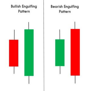
BULLISH ENGULFING PATTERN

Bullish engulfing is a reversal pattern that appears at the end of the downtrend. The pattern consists of two candles, Red and Green. The first candle is red, which indicates the sellers are in control and the second candle completely engulfs the first candle, which shows that the buyers overtake the sellers.

HAMMER

Hammer is a single candle reversal pattern, and it appears in a downtrend. The pattern forms a hammer-shaped candlestick, where the lower shadow is twice as big the size of the real body of the pattern. The boy of the candlestick represents the closing and opening price, and the lower shadow indicates the low of the candle.
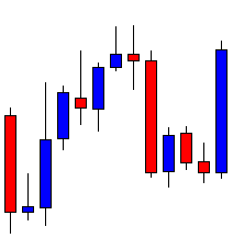
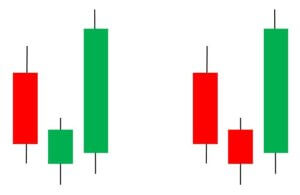
MORNING STAR

Morning star is a reversal three candle pattern appears in a downtrend. The first candle is red indicating the downtrend and the second candle opens gap down which means the sellers are in control and the third candle pushes the prices and closed near the opening of the first candle indicating the buyers stepping in and get ready for the brand new higher high.
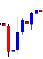
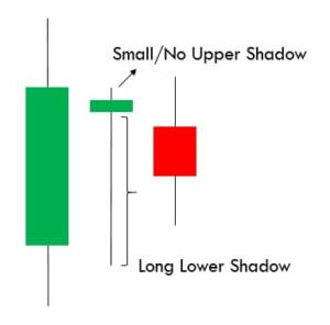
DRAGONFLY PATTERN

Dragonfly is a single candle pattern which shows the extreme strength of the buyers. The candle open, close and high is the same, indicating the buyers are ready for the brand new higher high. It has a long lower shadow with no upper body.

MOVING AVERAGES

Moving average is a trend following lagging indicator based on the past price. The indicator is used for identifying market trends. If it is pointing upward and below the price, it means the trend is up, and if it is above the price and pointing downward, it means the trend is down. All the type of traders uses moving averages, and there are infinite numbers of averages exists, which traders used according to the market circumstances. If you are a lower timeframe trader, then use the lower averages and if you are trading the higher timeframe or swing trader, then go for the bigger averages.

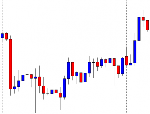
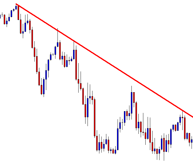
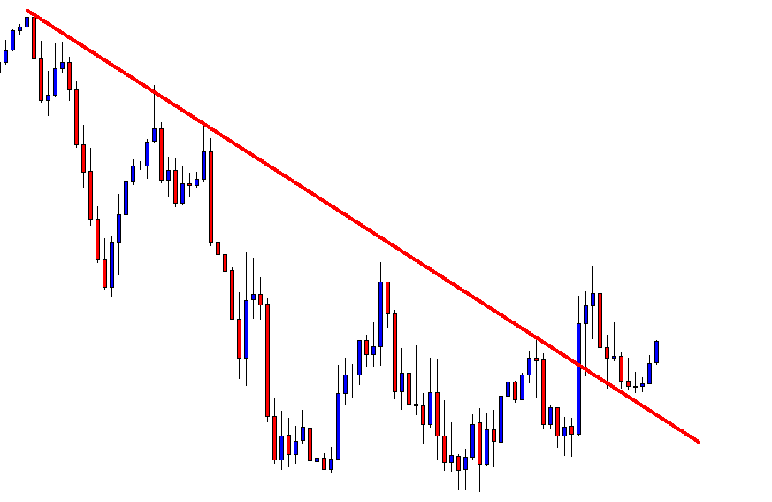
REVERSAL TRADING STRATEGIES

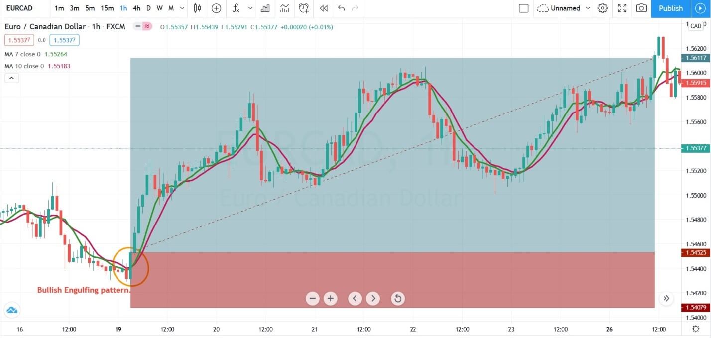
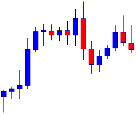
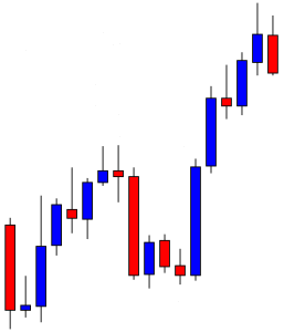
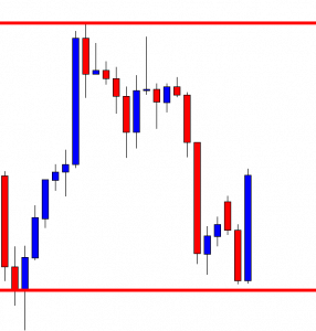
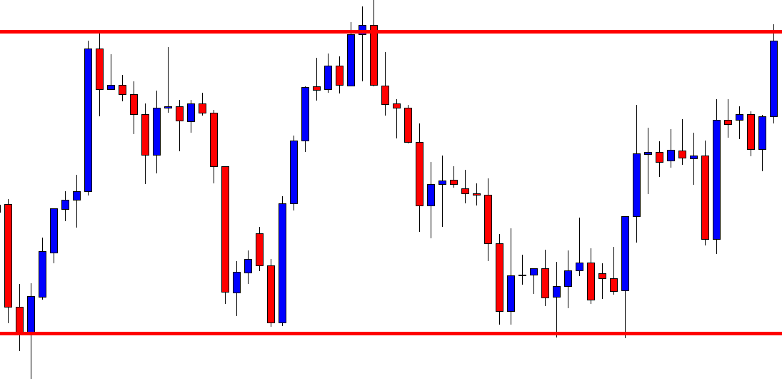
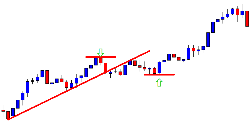
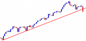
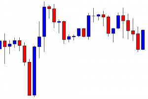
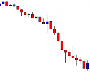
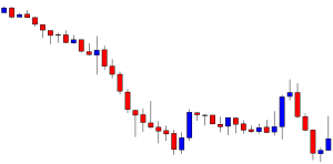
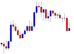
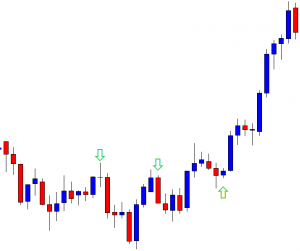
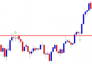
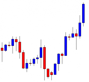
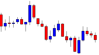
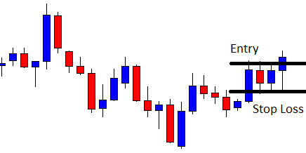
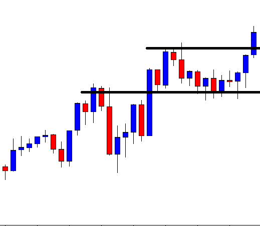
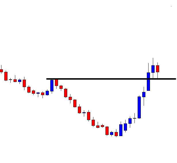
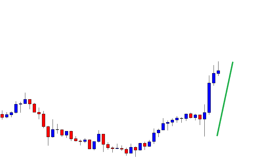
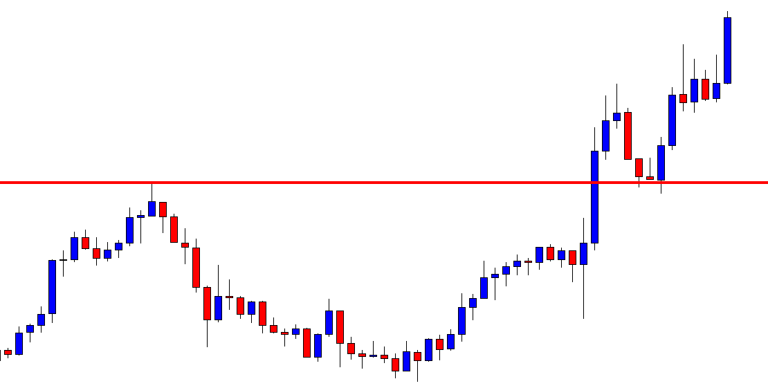
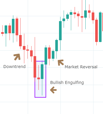
The image below represents the Bullish engulfing pattern in the EURCAD forex pair.

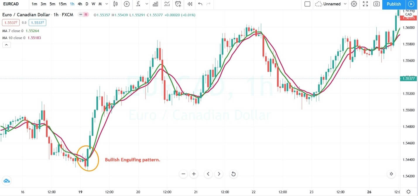
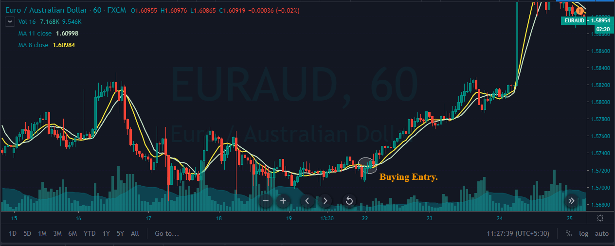
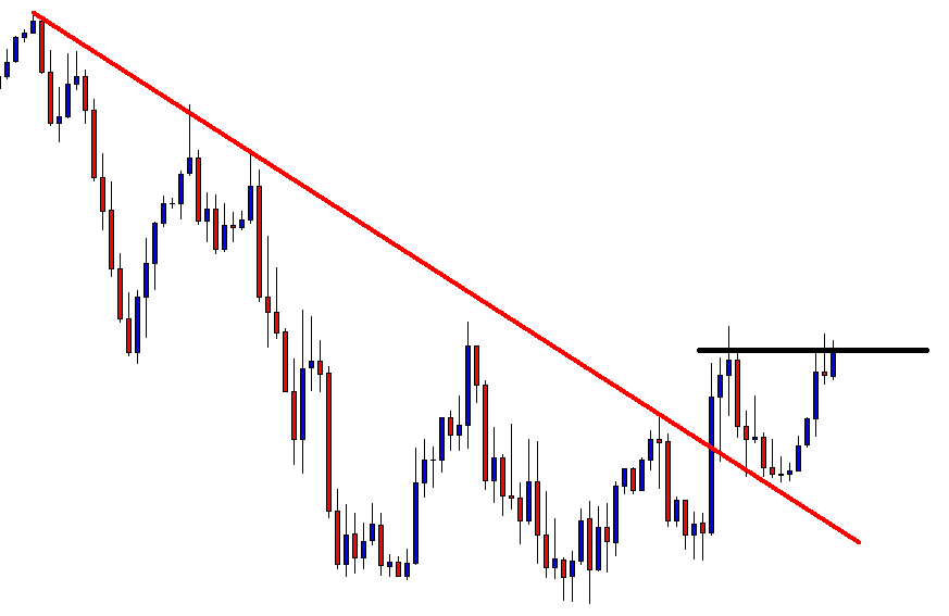
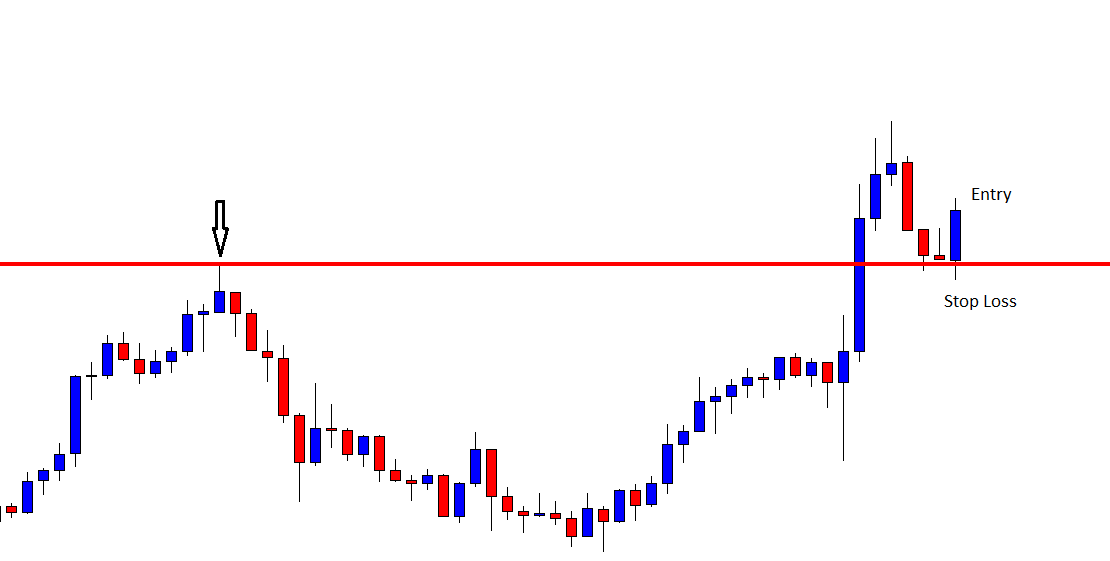
The image below represents the buying entry after the short term reversal in the EURCAD. When the second green candle completely engulfs the first red candle and closes above both of the moving averages, it was an indication to go long. We took the entry after the pattern completion and choose to go for a brand new higher high with stops below the entry.

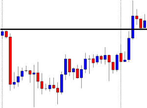
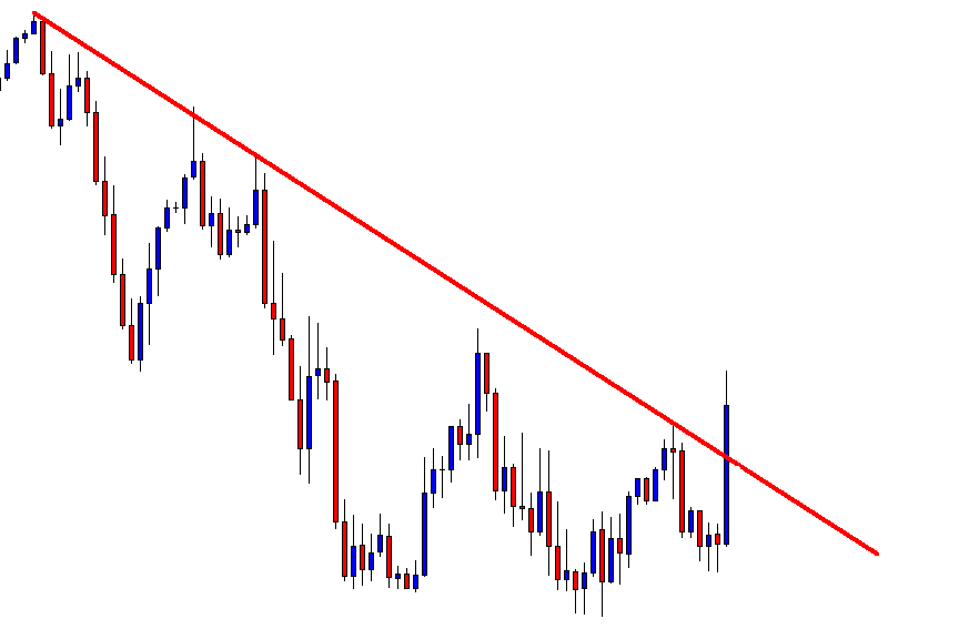
TRADING THE HAMMER PATTERN

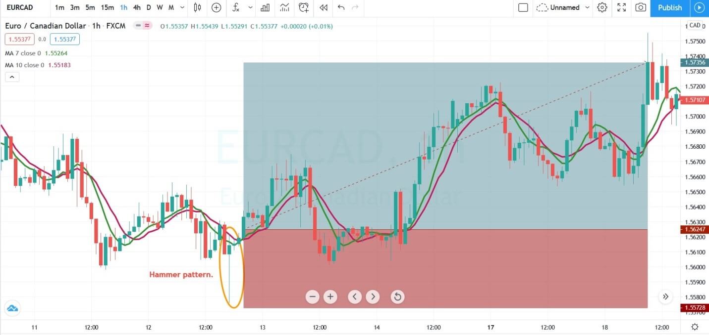
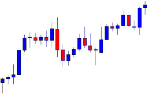
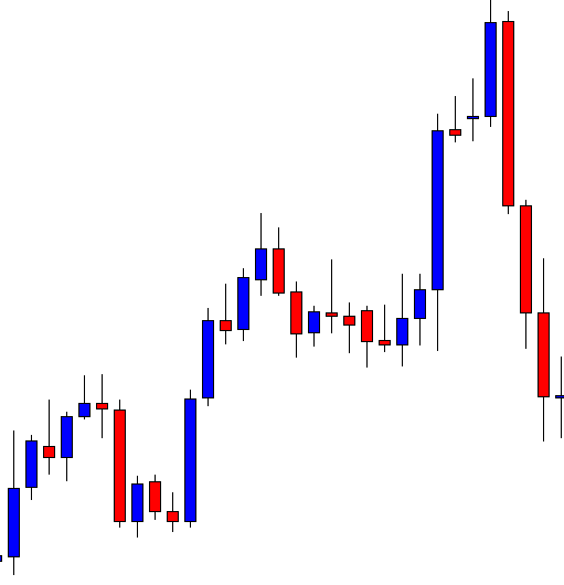
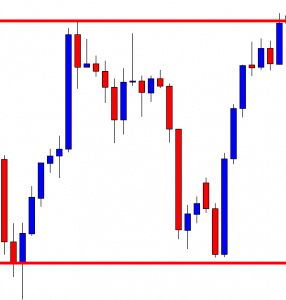
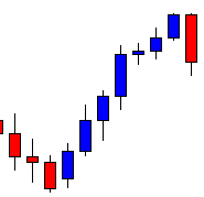
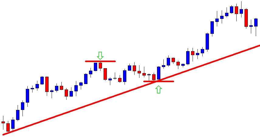
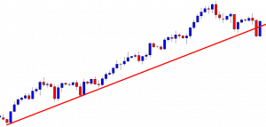
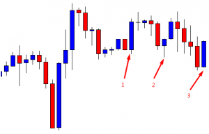
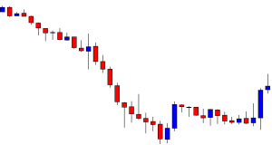
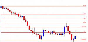
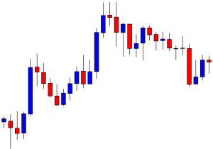
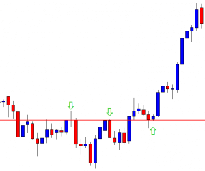
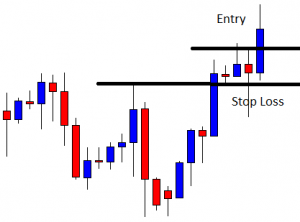
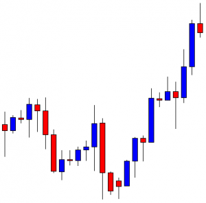
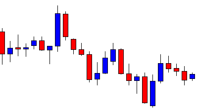
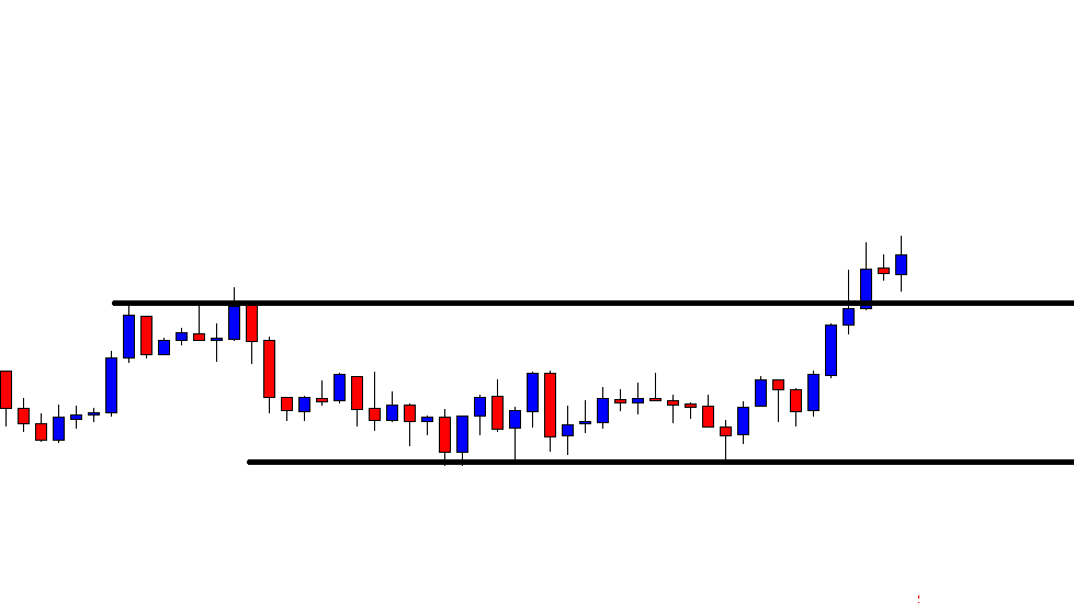
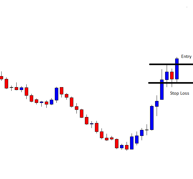
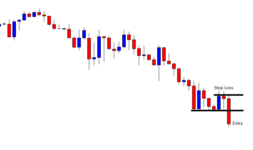
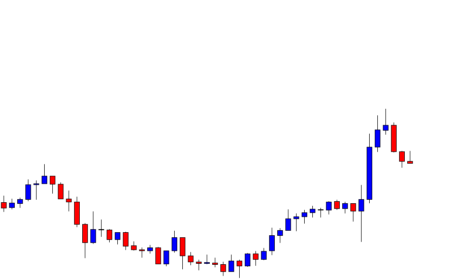
The image below represents the Hammer pattern in the EURCAD forex pair.

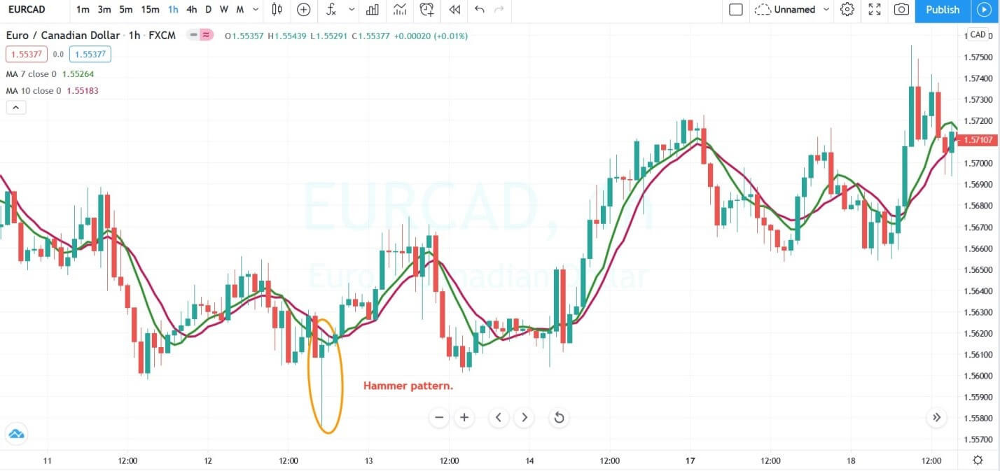
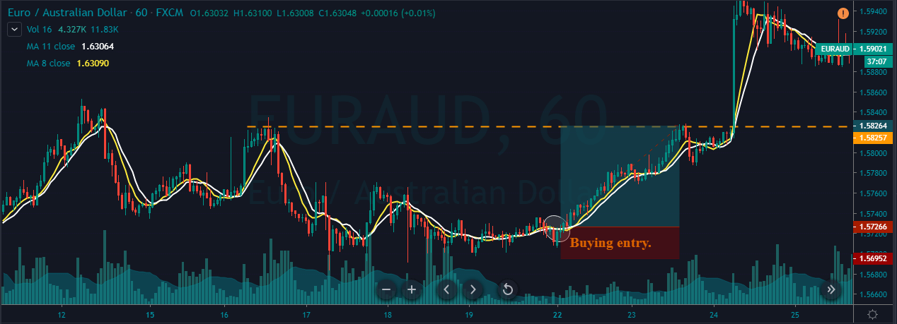
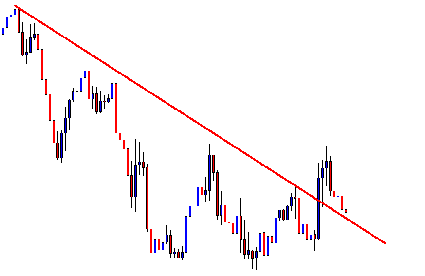
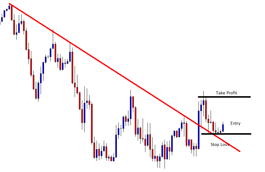
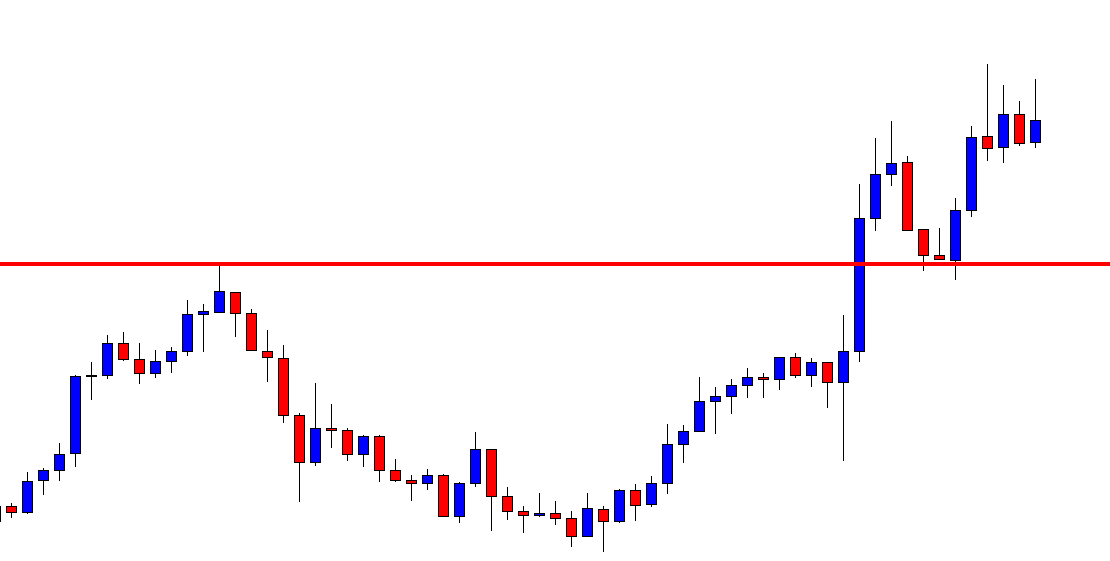
The image below represents the hammer pattern and our buying entry in the EURCAD as you can see the price action prints the hammer pattern, but it failed to go above the moving average. At this stage, some trader chooses not to trade the pattern just because half of the criteria aren’t met. This happened some tie in the market where one tool is saying something and another one is saying something. In these situations, it is advisable to have enough patience and let the second trading tool to align with the first one. In our trade after the three hours prices goes above the moving average, which indicated the buying momentum is back into the show. With the stops just below the pattern, we choose to milk the trend for the brand new higher high.

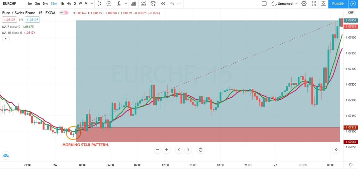
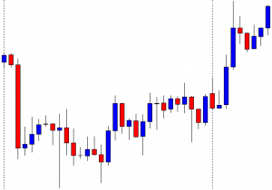
TRADING THE MORNING STAR PATTERN

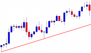
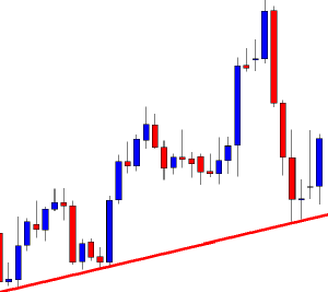
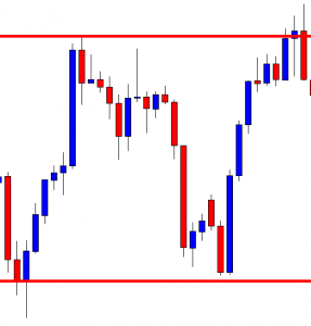
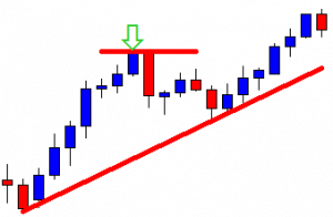
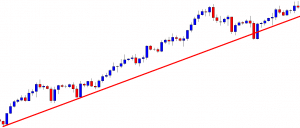
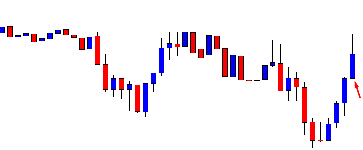
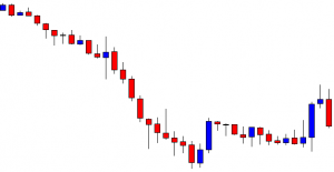
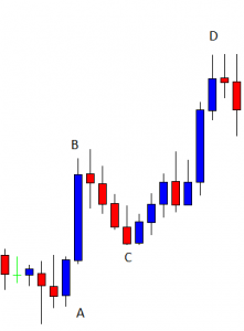
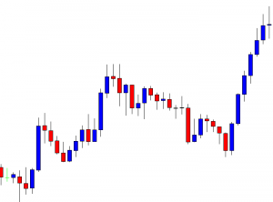
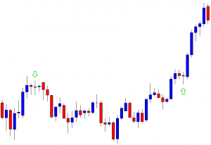
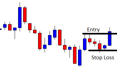
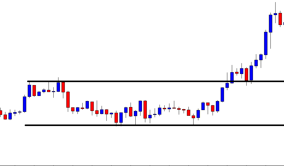
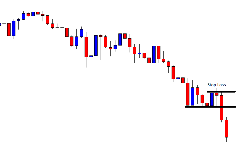
The image below represents the Morning star pattern in the EURCHF forex pair.

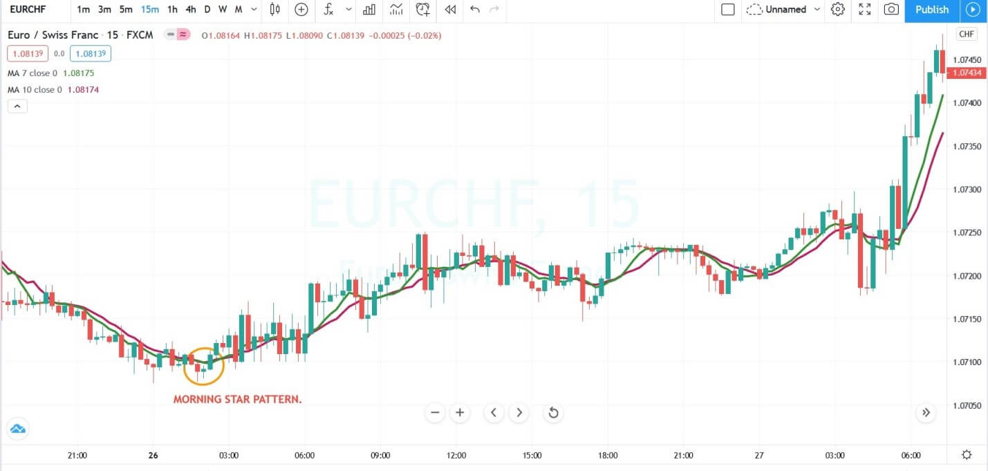
The image below represents our entry, exit, and stop-loss in the EURCHF forex pair. The market was in a downtrend, and when the prices prints the morning star pattern and both of the moving averages goes above the price, it means the market is printed at the bottom, and going long will be beneficial. We activated the buying entry after the pattern completion with the stops just below the entry, and for taking profit, the brand new higher high was a good area.
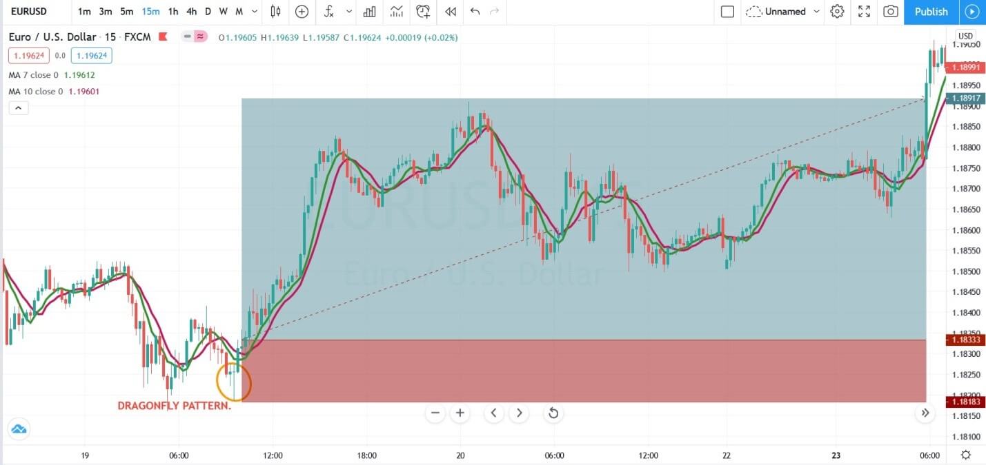
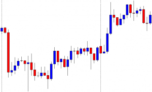
DRAGONFLY PATTERN

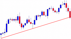
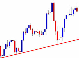
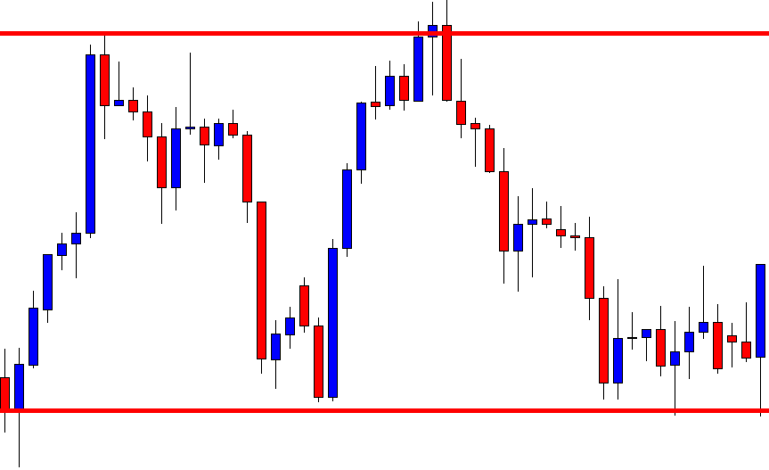
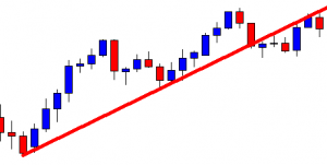
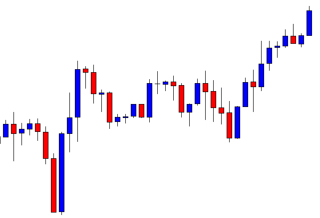
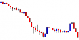
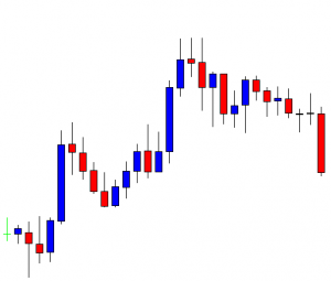
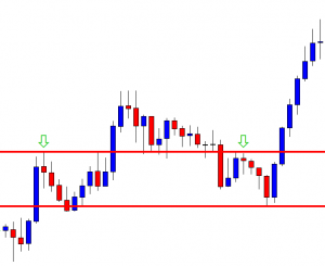
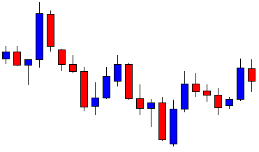
The image below represents the buying trade in the EURUSD forex pair.

As you can see in an ongoing downtrend when the market printed the dragonfly pattern, but it was below the moving average, which means we need to wait for another signal to line up to take the trade. Patience matters, if you take trade by having only one signal, then the chances of loss are very high. So wait let the things to settle, let both of the tools to align in one direction then only go. On this 15 minute chart when the moving average goes above the price action, we choose to go long with the stops below the entry.

CONCLUSION

In today’s world, we have a lot of tools which makes trading is an easy game. Do not try to use all the trading tools; instead, choose the one or two and master them on demo first then only choose another one. Here in this article, we discussed the four well-known candlestick patterns to trade the reversals. By pairing them with the moving average traders can time the market well. In these four trading strategies, two of them gave use the trades immediately, and two of them took some time to confirm the entry. Never be in a hurry to pull the trigger; it can produce disastrous effects. The major problem with the traders is that they always try to tell the market what to do next; instead, it is the market duty to tell us what to do next in the game, when to pull the trigger and when not.

Categories
Forex Daily Topic Forex Price Action

Weekly High/Low Breakout Trading: The Chart You May Want to Avoid

In today’s lesson, we are going to demonstrate an example of a breakout at a weekly high. The price consolidates afterward but fails to make a breakout at consolidation resistance. Thus, the price does not head towards the North. Let us find out how that happens and what lesson it holds for us.

It is an H4 chart. The chart shows that the price makes a strong bearish move to start its trading week. Then, it gets choppy for the rest of the week. The chart closes its week, producing a bullish engulfing candle. Let us proceed to see how the next week goes.

The chart produces a bullish candle to start its trading week. However, it produces three consecutive bullish candles and makes a breakout at the last weekly high. The buyers are to wait for the price to consolidate and produce a bullish reversal candle closing above consolidation resistance to go long in the pair.

The chart produces two bearish candles closing within the breakout level. A bullish reversal candle closing above consolidation resistance is the signal for the buyers to trigger entry. They must keep their eyes on this chart.

The chart produces a bullish inside bar. It is a bullish reversal candle but not a very strong one. Since it closes within consolidation resistance, the buyers are to wait longer for the chart to produce a bullish candle closing above consolidation resistance.

The chart produces two more bullish candles. However, it has not made a breakout yet. It has been taking too long to produce the signal candle. Let us wait and see what it produces afterwards.

It produces a bearish inside bar at the consolidation resistance. It does not look good for the buyers. The price has a rejection at the level, and it produces a bearish inside bar. It means it is a double top resistance. A breakout at the last swing low may change the equation and attract the sellers instead. Let us proceed and see what happens next.

The price does not make a breakout at the last swing low, either. It produces a doji candle followed by a bullish engulfing candle at the last swing low. It means the chart keeps traders waiting for the next breakout. The bull holds the edge but weekly high/low breakout traders do not love to see such price action after a breakout. It is best to avoid taking entry on a chart like this.


Categories
Forex Price Action

It is Not over until It’s Over

In today’s lesson, we are going to demonstrate an example of a trendline trade setup. The price heads towards the North, and upon finding its support, it keeps moving towards the upside. At some point, it seems that the price is about to make a breakout at the trendline. However, the trendline works as a level of support and produces a beautiful bullish engulfing candle ending up offering a long entry. Let us find out how that happens.

The chart shows that the price makes a bullish move and comes down to make a bearish correction. It makes a bullish move again but finds its resistance around the same level. At the moment, the chart suggests that the bears have the upper hand.

The chart produces a Doji candle having a long lower spike. It pushes the price towards the North, and the price makes a breakout at the highest high. The last move confirms that the bull has taken control. The buyers may look for buying opportunities. Assume you are a trendline trader. Do you see anything?

Yes, you can draw an up-trending trendline. The last candle comes out as a bearish engulfing candle. It suggests that the price may make a bearish correction. As a trendline trader, you are to wait for the price to produce a bullish reversal candle at the trendline’s support to go long on the chart.

The chart produces two more candles that are bearish. The last candle closes just below the trendline’s support. It seems that the price is about to make a breakout at the trendline. The next candle is going to be very crucial for both. If the next candle comes out as a bullish reversal candle, the buyers are going to push the price towards the North. On the other hand, if the next candle comes out as a bearish candle closing below the trendline’s support, the sellers may push the price towards the South. Let us find out what happens next.

The chart produces a copybook bullish engulfing candle. Traders love to get this kind of reversal candle. The buyers may trigger a long entry right after the last candle closes. Let us proceed to find out how the trade goes.

The price heads towards the North with good bullish momentum. It makes a breakout at the last swing high as well. It means the trendline is still valid for the buyers. The chart produces a bearish reversal candle. Thus, the buyers may consider taking their profit out here.

If we look back, we find that the trendline’s support produces an excellent bullish reversal candle, which some buyers may not expect. This is what often happens in the market. Thus, never give up until its really over.

Categories
Forex Daily Topic Forex Price Action

Trend Line Trading: The Entries to be Skipped

In today’s lesson, we are going to demonstrate an example of a chart that trends towards the North by obeying a trendline. It offers a long entry once the trendline is established. At the fourth bounce, it produces a bullish reversal candle. We find out whether the buyers should take a long entry or not upon getting the bullish reversal candle at the trendline’s support. Let us get started.

The chart shows that the price heads towards the North upon producing a bullish reversal candle. It consolidates and resumes its bullish journey. The chart looks like the buyers’ hunting ground.

The price upon producing a spinning top, it produces a long bearish candle. It consolidates with some candles and produces a bullish engulfing candle. The buyers may keep an eye in the chart to go long above the last swing high. If the price makes a bullish breakout, the buyers get two swing lows and two swing highs to draw an uptrending trend line.

Here it goes. The price makes a bullish breakout and heads towards the North further. The chart produces a bearish engulfing candle. It may make a bearish correction. As it looks, the chart belongs to the Bull without any doubt.

The price makes a bearish correction; consolidates and heads towards the North again. The breakout traders may find a long opportunity and grab some pips. The price makes a long bearish correction. In fact, it makes a breakout at a significant level of swing low. It seems that the chart is slightly bearish biased. Have a look at the chart below.

The trendline’s support holds the price and produces a bullish engulfing candle. The trendline traders may go long in the pair right after the last candle closes. The last swing high is the safest option to set take profit. It means the risk-reward ratio looks good for the trendline traders.

The price heads towards the North with good bullish momentum. However, it seems that the horizontal level of resistance is too strong to be breached. The price consolidates here with several candles. The last candle comes out as a bearish engulfing candle. The buyers may close the entry. The question is does the price come back to the trendline’s support or it makes a breakout at the highest high.  Let us proceed to the next chart and find out what happens.

The price comes back at the trendline’s support. It produces a hammer. Should the buyers go long from here as far as trendline trading is concerned? Think about it for a minute.

If your answer is ‘No’, you are right. The reason why the buyers should not go long from here is it does not make a new higher high upon getting its last bounce. In fact, traders may wait for the price to make a breakout at the trendline’s support and go short in the pair. In our forthcoming lessons, we will learn about trendline breakout and trendline breakout trading. Stay tuned.

Categories
Forex Price Action

The Beauty of Horizontal Channel Trading

In today’s lesson, we are going to demonstrate an example of a chart where the price gets caught within a horizontal channel. We’ll try to learn how we can trade and make the most of it. Let us get started.

The chart shows that, after being bearish, the price bounces at the drawn level. It produces a bullish engulfing candle and heads towards the North. The chart is bullish-biased. Thus, price-action traders are to look for long entries. Let us see what happens.

The price finds its resistance instead. It produces a bearish inside bar, but it does not make a new higher high. Thus, the buyers do not get an opportunity to go long at the top. The price heads towards the South towards the level of support. Since the level has been working as a level of support, the buyers may wait for the price to produce a bullish reversal candle to go long in the pair.

The chart shows that the price produces a bullish engulfing candle at the support zone. The buyers may trigger a long entry by setting stop loss below the candle’s lowest low and by setting take profit at the level of resistance. The risk-reward looks good.

The price heads towards the North with good bullish momentum. It hits the target in a hurry too. At the moment, the price is right at the level of resistance. Can you guess what traders should do now? Look at the next chart.

The chart shows that the price produces a bearish engulfing candle at the resistance zone. A point is to be noticed here that the chart produces a bullish spinning top. However, it cannot be considered a breakout. It rather produces a bearish engulfing candle. Thus, the traders may go short in the pair by setting take profit at the support zone and by setting stop-loss above the last candle’s highest high.

The price heads towards the South with an average pace. It consolidates for a while and resumes its bearish journey. The price has been roaming around the level of support for quite a while. It means the support gets even stronger. Look at the last candle. It comes out as a bullish engulfing candle. The buyers may trigger another long entry here. Let us find out what happens next.

The price hits the target. The price makes a long bearish correction and tests the buyers’ patience, though. However, in the end, the buyers come out with their pips. Trading is beautiful when the price moves like this, isn’t it?

Categories
Forex Price Action

Trend Line Trading: An Incident That Often Confuses Traders

In today’s lesson, we are going to demonstrate an occurrence that often happens when the price trends with a trendline. A trendline works as a support/resistance. However, there is a little dissimilarity between horizontal support/resistance and trendline support/resistance. To draw a horizontal support/resistance, one bounce or rejection is enough. However, a trendline can be drawn only when the price makes a new higher low/lower high. This is what traders must remember, and we find this out the reason behind it.

The price makes a strong bullish move, as it produces seven consecutive bullish candles. The last candle comes out as a bearish engulfing candle. Considering the trend’s length, the buyers may keep their eyes on the pair to go long upon having a bullish reversal candle at flipped support.

The price consolidates and bounces at the same level twice. The last candle comes out as a bullish reversal candle. The buyers on the minor chart may look to go long in the pair and push the price towards the North.

The price heads towards the North and makes a breakout at the last swing high. It means we can draw an up-trending trend line and wait for the price to come at trendline’s support and to get a bullish reversal candle to go long in the pair. Let us find out what happens next.

The price does not produce a bullish reversal candle. It makes a breakout at trendline’s support and trades below the level for several candles. If the price makes a breakout at the last swing low, the sellers may look to go short in the pair. Let us see what happens next.

The price upon finding its horizontal support heads towards the North and makes a breakout at the last swing high. What does that mean? It means we can draw an up-trending trend line by using the last swing low from where the price makes a bullish breakout. Let us draw it and see how it looks.

It is a new trendline. It offers price to makes more bearish correction and more space towards the North to travel. As a matter of fact, its support zone has changed, but the new trendline is valid for the same old chart. It’s an incident that happens in the Forex market so often. Thus, keep an eye on a chart closely and do not make an immediate trading decision. Be sure about the breakout. If the breakout is confirmed, change your trading direction. If the breakout is not confirmed, let the price decide its way. We just have to follow the price and trade with its direction.

Categories
Forex Price Action

Trend Line Trading: Keep an Eye at New Highs/Lows

In today’s lesson, we are going to demonstrate an example of trendline trading. The trendline trading is one of the most consistent trading strategies. Thus, a trader can make profits by properly dealing with how trends develop. In today’s example, we will demonstrate a chart with an up-trending trendline, where the price goes down trendline’s support. However, it produces a bullish reversal candle and ends up offering a long entry. Let us get started.

The chart shows that the price heads towards the North upon finding its support. It has several higher lows that can be used to draw trendlines. However, before drawing a trendline on a chart, we have to spot out the most significant higher lows to draw an upward trend line and, conversely, the most significant lower highs to draw a downtrend line. Over here, look at the two points with the ‘right’ marks. Let us proceed to the next chart to find out how it looks with a drawn trendline.

We have drawn the trendline by using two right marks. Ideally, traders are to wait for the price to come at the level of support (trendline’s support) and get a bullish reversal candle to go long in the pair. At the last swing low, the price approaches at the level of support. However, the chart does not produce a bullish reversal candle at the level of support. They may wait for the price to come right at the drawn trendline’s support.

The price comes down. One of the bearish reversal candles closes below the level of support. The sellers may become interested here that the price may end up making a bearish breakout. If the next candle closes below the trendline, the sellers may consider having a breakout. Let us find out what happens.

The next candle does not close below the trendline. It comes back in. It means that the price obeys the trendline’s support. The last candle comes out as a bullish Marubozu candle forming by testing the trendline support. The buyers may go long in the pair again and push the price towards the last swing high.

The price heads towards the North at a moderate pace. As far as the bullish reversal candle is concerned, it is supposed to create more buying pressure. Anyway, the price hits buyers’ first take profit target. It may continue its bullish journey if it makes a bullish breakout at the last swing high. If it does not make a new higher high but comes back at the trendline’s support, the price may get choppy. If it makes a new higher high, the trendline becomes active, and the buyers may wait to go long from the trendline’s support again.

Categories
Forex Daily Topic Forex Price Action

Pay Attention to the Signal Candle Along with Reversal Candle

In today’s lesson, we are going to demonstrate an example of a combination of an H1-15M chart trading strategy. The price makes a strong bullish move and makes a long bearish correction. It produces several bullish reversal candles, but the price does not react to all of them. It makes its bullish move at last. We try to find out why it reacts to that particular bullish reversal candle. Let us get started.

This is an H1 chart. The chart shows that the price produces a bullish engulfing candle and heads towards the North. The buyers are to wait for the price to make a bearish correction and produce a bullish reversal candle to go long again in the pair. The last candle comes out as a hanging man. It may make the pair make a bearish correction. Let us proceed to the next chart to find out what happens next.

The price makes a long bearish correction. It produces several bullish reversal candles. However, it does not make its bullish move. If we spot out, we find that there have been three significant bullish reversal candles. To make things clearer, have a look at the chart below.

Here are the three most significant bullish reversal candles that the chart produces. On the first two occasions, the price does not head towards the North. Let’s try to dig out what happens on the first occasion. On the first occasion, the chart produces a bullish engulfing candle. This is one of the strongest bullish reversal candles. The buyers are to flip over to the 15M chart. If the 15M chart produces a bullish continuation candle, they may trigger a long entry. Over here, the 15M chart does not produce a bullish continuation candle. Thus, the price does not head towards the North. On the second occasion, the 15M chart produces a bullish continuation candle. You can assume by the look of the next H1 candle. However, the price does not continue its move or makes a breakout at the highest high. The reason behind that is the reversal candle comes out as an Inside bar. On the third occasion, the reversal candle comes out as a bullish engulfing candle. Let us flip over to the 15M chart.

Look at the arrowed candle. This is what comes out after the bullish engulfing candle. The buyers have been waiting to get a candle like this after a strong H1 bullish reversal candle. They may trigger a long entry right after the candle closes (15M). Let us find out how the price moves now.

It moves towards the North with good bullish momentum. We must notice that when two factors come together, the price reacts vigorously. We may find that sometimes the price moves on the case of the second occasion as well. However, when it meets two of them together (H1 bullish engulfing and 15M bullish continuation and vice versa), most likely, it goes towards the trend and helps traders make money.

Categories
Forex Fibonacci

Fibonacci Levels: How Much Does 50% Level Influence the Market?

In today’s lesson, we are going to demonstrate an example of a chart, in which the price makes a reversal from 50% Fibonacci level. We know if the price makes a reversal from 61.8%, it usually goes up to 161.8%; if it makes a reversal from 38.2%, it goes up to 138.2%. In both cases, traders get good risk-reward. Do you ever wonder what happens if the price makes a reversal from 50%? Let us find this out through an example.

The chart shows that the price heads towards the South with good bearish momentum. It produces two bullish candles and heads towards the South. Look at the last candle. It comes out as a bullish inside bar. It makes a bullish correction. However, the sellers may wait for a bearish engulfing candle to go short in the pair.

The price has been in a bullish correction. It produces some bearish reversal candles, but it does not create any bearish momentum. The last candle comes out with a little bullish body having a long upper shadow. Let us proceed to the next chart to find out what happens next.

The last candle comes out as a bearish engulfing candle. It is a strong sign that the price may head towards the South again. The sellers may flip over to the minor chart to trigger entry.

The price heads towards the South with extreme bearish pressure. The last candle comes out as a bearish Marubozu candle. It seems that the price may continue its bearish journey towards the South further. Let us find out what actually happens.

It does not continue its bearish journey. It finds its support. Upon producing a hammer, it heads towards the North with one more bullish candle. It seems that it may continue its bearish journey considering bearish engulfing candle as a reversal candle. Next, two candles come out as strong bearish candles too. What may be the reason that the price makes a bullish reversal here? Let us find this out with Fibonacci levels.

If we calculate, we find that the price makes a bearish reversal from Fibonacci 50% level. It then heads towards the South with extreme bearish momentum. However, it finds its support at the Fibonacci 100.00 level. Usually, this is what happens when the price trends from the 50% level. A question may be raised here whether we should take entry if the price trends from the 50% Fibo level. It depends on risk-reward. If it offers a good reward, then we may take an entry. In most cases, it does not offer a good reward; thus, we may skip taking those entries.


Categories
Forex Price Action

Price Action Trading: Factors that you should Remember

In today’s lesson, we are going to demonstrate an example of a chart offering an entry upon producing a bullish reversal candle followed by a breakout. The chart produces a bullish reversal candle earlier too, but that did not make the price move towards the North. We’ll try to find out why it does not head towards the North at its first attempt. Let us get started.

The chart shows that the price heads towards the North upon producing an ABC pattern. We may notice that we have four significant points here, such A, B, C, and D. The price most likely reacts at these levels again. Let us proceed to the next chart.

The price heads towards the South at a moderate pace. The last candle comes out as a bearish Marubozu candle. It seems that the price may remain bearish for a while. Let us proceed to the next chart to find out what happens next.

The chart produces an inverted hammer. It is a sign of a bullish reversal. However, considering point B, the price makes a bearish breakout at the level. Thus, the pair may continue its bearish move. The sellers may look for short opportunities in the minor chart.

The next candle does not make a bearish breakout. It comes out as a bullish candle. The last candle comes out as a Doji candle. Ideally, neither the bull nor the bear dominates in the pair. The sellers are to wait for the price to make a breakout at the last swing low. The buyers are to wait for the price to make a bullish reversal candle closing above consolidation resistance. Let us see what the price does.

The price comes down. It produces a bullish engulfing candle. Some sellers may have to encounter a loss here. Upon creating the bullish engulfing candle, the price heads towards the North with good bullish momentum. Now a few questions may be raised here.

  1. Why does the price not head towards the North but comes down?
  2. Why does the price not continue its bearish move but produces a bullish engulfing candle?
  3. Why does not price head towards the North at its second attempt?


Have a look at the chart below with some drawings in it.

At its first attempt, the price does not make a breakout at the level of resistance drawn. The price reacts at this level several times. Thus, this is a crucial level, which is to be counted by the buyers before taking long entries. The price finds its resistance here and makes a bearish move. It finds its support at the drawn line, where the price reacts to it earlier as well. The reversal candle comes out as a Doji candle, and the chart takes four candles to make the breakout. This is one of the reasons that the price does not continue its bearish move.

At its last attempt, it produces a bullish engulfing candle, the candle is produced at a key level, the price makes a breakout at the last swing low, and the breakout candle comes out as a strong bullish candle. These factors attract more buyers and make the price move towards the North with good bullish momentum. We need to remember such factors every time we take entries as far as price action trading is concerned.

Categories
Forex Chart Basics

How to Guess Support/Resistance Level Well Ahead?

In today’s example, we are going to demonstrate an example of a fundamental character of support/resistance. We know the importance of support/resistance in trading. Thus, if we get a clue about spotting support/resistance well ahead, it comes out handy. Let us find out whether it is possible or not.

This is a daily chart. The chart shows that the price heads towards the North with good bullish momentum. It makes bearish correction and keeps resuming its bullish journey. With naked eyes, we see that the price finds its support at three points. Let us investigate the chart with some drawings on it.

We have spotted out three points where the price gets rejection twice. When the price makes a bullish move, at its second wave, it finds its support at the third arrowed point. It works with a simple equation. Can you guess what that is?

Let us draw a line. We see that the price gets rejection at the same level twice. It means it is a level of resistance when the price is bearish. The price breaches the level later and finds its support at the same level. It produces a bullish reversal candle and heads towards the North. Once the price makes a bullish breakout, the buyers shall wait for the price to make a bearish correction. If the level produces a bullish reversal candle, the pair may head towards the North by offering a long entry. This is what happens here. Let us see the same chart by zooming out.

This is the same chart. We have spotted out two significant points and spotted them with two arrows. I assume this time you guess what I am going to say. Yes, the price makes a bullish breakout and finds its support at the breakout level. This is the level, which is a level of resistance in this chart. Since it gets broken and the chart produces a bullish reversal candle, the buyers may go long in the pair again. Let us draw a line here.

See how the price reacts here. Upon producing a Morning Star, the price heads towards the North with good bullish momentum. The price makes even a stronger move this time.

The plan of a buyer should be eyeing on the level to get a bullish reversal candle where the price finds its resistance when it is bearish and vice versa. This makes traders’ life easy, and in the end, it helps them make a better trading decision.

Categories
Forex Price Action

Traders are to be Artists

In today’s lesson, we are going to demonstrate an example of the daily-H4 chart combination trading. The H4 chart offers a long entry. The chart’s breakout and level of support are to be spotted with some calculation. We try to learn those from today’s lesson.

This is the daily chart. The chart shows that the price makes a very strong bullish move. It then makes a bearish correction. At the correction, it produces a bullish engulfing candle once but continues its journey towards the South. The daily-H4 chart combination traders may have flipped over to the H4 chart upon having that bullish engulfing candle. Anyway, look at the last candle. It is a strong bullish reversal candle. The buyers may flip over to the H4 chart to go long in the pair.

This is how the H4 chart looks. The last candle comes out as a doji candle. The buyers are to wait for the price to consolidate and produce a bullish candle to trigger a long entry.

The chart shows that the price consolidates and produces a bullish engulfing candle. Let’s focus on those two drawn levels. We may not count the lower spike of that spinning top to draw the support line. We try to draw the line by using a flipped level that holds some candle’s wicks and bodies of all the candles. To draw the level of resistance, we count the spike of the spinning top (the last rejection) but skip some part of the upper shadow of a candle. Yes, it is not a bad idea to draw a breakout level by using spikes to some extent. In most cases, however, significant rejection, along with candles’ bodies, matters a lot. Let us assume that we trigger a long entry in this chart.

The price heads towards the North with good bullish momentum. The last candle does not hit the target of 1R, but the price is almost there. It seems that the buyers may not have to wait too long to achieve their target.

The last candle comes out as a bearish candle with a long upper shadow (the body is relatively thicker though). However, the upper shadow shows that the price hits the target. However, it is a bearish reversal candle because the body closes within the last bullish candle, suggesting that the price may continue its bullish move.

If we look back and study with the flipped H4 chart, we find that the buyers are to count some factors to draw consolidation support and resistance. They are to count some spikes and to skip some of those. As we know, trading is not science; it is an art. Thus, traders are to be artists. To be an artist (successful trader), one needs a lot of practice and experience.

Categories
Forex Price Action

When the Same Chart Offers a Better Trade Setup

In today’s lesson, we are going to demonstrate an example of an H4 chart offering two entries. The first one does not create enough bullish momentum right after the breakout, but the second one does. Let us now get started.

The chart shows that after being bearish for a long while, the chart produces two bullish candles consecutively. The H4 traders may keep their eyes on the daily chart to get a daily bullish reversal. Then, consolidation followed by an H4 bullish reversal candle would be the signal to go long in the pair.

The price starts having a bearish correction. The buyers are to wait for a bullish reversal candle first to go look for a long opportunity. The price is at a significant level, where it reacted earlier several times. The reversal candle might be around the corner.

Yes, the chart produces a bullish Inside bar. It is not a strong bullish reversal candle, but it is a sign that the price may get bullish soon, considering other factors. Let us proceed to the next chart.

The next candle comes out as a bullish candle with a long bullish body having a tiny upper shadow. The buyers may trigger a long entry right after the candle closes by setting stop loss below consolidation support and by setting take profit with 1R.

The next candle comes out as a bearish inside bar. The buyers usually would love to see the price head towards the trend’s direction after triggering entry. It does not happen here. However, it does not look too bad.

What a surprise! The chart offers one more entry. Look at the last candle, which comes out as a bullish engulfing candle closing well above consolidation resistance. Some buyers may trigger another entry. Yes, it is a debatable issue whether traders should take multiple entries in the same pair. At least, if traders miss the first chance, they may consider taking entry here. Let us find out what the price does next.

The price heads towards the North with good bullish momentum. It hits the buyers’ target with ease. On the second occasion, the bullish engulfing candle forming right at consolidation support makes the pair very bullish. On the first occasion, the price does not get that bullish after the signal candle. On any day, the second signal is better than the first one. Some traders do not like taking multiple entries, which is fair enough. If a trader does not mind taking multiple entries, he may as well consider taking entry if it is a better trade setup than the last one with relatively a smaller lot than his usual trading lot.


Categories
Forex Price Action

The H1-15M Breakout Trading: Concentrate on Breakout and Reversal Candle

In today’s lesson, we are going to demonstrate an example of a trade setup based on the H1-15M chart combination. Usually, the straighter the first move, the better it is.  However, the price sometimes consolidates in the first arm as well. Such consolidation makes a move look weak and may hold us back from eyeing on the chart. We try to find out whether we should skip eyeing on such a chart or not.

This is an H1 chart. The chart shows that the price makes a bullish move. Then, it produces a bearish inside bar followed by a bullish engulfing candle. The H1-15M buyers may flip over to the 15M chart to get a 15M bullish reversal candle to trigger a long entry. However, those two bearish H1 candles suggest that the 15M chart does not produce any bullish reversal candle after the H1 breakout. The price starts having a bearish correction instead.

The chart makes its bullish move, followed by a bearish correction. The bullish move does not look that impressive. It consolidates before making the bearish correction. Many traders may skip eyeing on this chart to go long in the pair. Ideally, the H1-15M combination trading requires an H1 breakout followed by a 15M bullish reversal to offer a long entry. Let us proceed to the next chart to find out what the price does here.

The price finds its support and heads towards the North. The last candle closes above the level of resistance. This is an H1 breakout. The H1-15M combination traders are to flip over to the 15M chart to trigger a long entry. Let us flip over to the 15M chart first.

This is how the 15M chart looks right after the H1 breakout. If the price comes back to the breakout level, and the level produces a 15M bullish reversal candle, the buyers may trigger a long entry.

The 15M chart produces a bearish engulfing candle closing within the breakout level. The next candle comes out as a bullish engulfing candle. The H1-15M buyers may trigger a long entry right after the last candle closes by setting stop loss below consolidation support and by setting take profit with 1R.

The price never looks back before hitting 1R. It heads towards the North at a very good pace. Consolidation and bullish reversal candle come out exactly the buyers would want to get. Do not forget that the first bullish move does not look that impressive. The breakout and 15M chart’s price action attract the buyers to go long here, though. This is what we are to look for in the H1-15M combination trading. It is good if the price makes a strong move in the first arm. However, if it does not, we may still eye on the chart to see whether it makes an H1 breakout and offers us an entry by producing a 15M bullish reversal candle.

Categories
Forex Price-Action Strategies

Forex Price Action: Trendline Breakout Strategy

In today’s lesson, we are going to demonstrate an example of trendline breakout trading. Price action trading is mainly based on support/resistance and breakout. It does not mean that support/resistance is only horizontal. A trendline works as support/resistance as well. Let us now proceed and find out how a trendline breakout offers entry.

The price has been bearish by obeying a down-trending trendline. The price has rejection at the trendline four times. Now, it is the sellers’ territory. However, one bullish candle may change the game.

Here it is. One big bullish candle breaches through the trendline’s resistance closing well above it. Usually, trendline breakout traders wait for the price to come back at the trendline again and get a reversal candle to take entry. This is the safest thing to do in trendline breakout trading.

The chart shows that the price heads towards the North for two more candles and comes down for a correction. Trendline’s resistance becomes support now, which is what happens with horizontal support/resistance. The buyers are to wait for a bullish reversal candle to go long in this chart. Typically, a bullish engulfing candle is the best reversal candle to go long as far as the trendline breakout trading strategy.

The chart produces two doji candles. These are reversal candles. However, look at the last candle. This is a bullish engulfing candle; thus, the buyers may go long right after the candle closes. Stop loss is to be set below the new support.

The next candle comes out as a bullish candle too. This looks good for the buyers. Since the price makes a breakout, confirms the breakout, and produces a bullish engulfing candle, it may make a new higher high. However, the safest option to set take profit is at the last swing high.

The price heads towards the North with good bullish momentum. The price hits the last swing high in a hurry. It gets us 2R here. As long as it offers us 1R, we shall go with it. If it offers less than 1R, we may skip taking the entry. The last candle comes out as a bullish candle. It suggests that the price may make a bullish breakout. That is another game. If we want to take a long entry upon the next bullish breakout, it would be based on a horizontal breakout trading strategy.

Trendline breakout trading is quite simple and rewarding. Stay tuned to get to more about trendline breakout trading strategy in our fore coming lessons.


Categories
Forex Daily Topic Forex Price-Action Strategies

Keeping an Eye on Some Levels Comes Handy

Forex price action trading requires a clearer chart. Traders are to keep an eye on candlesticks’ attributes, consolidation, reversal candle, and support/resistance levels. The last swing high and the last swing low are two levels that traders must count. However, the price often reacts to certain levels, where it reacts heavily earlier. We may keep an eye on those closely since they often offer entries. In today’s lesson, we are going to demonstrate an example of that.

The chart produces a bullish engulfing candle after being bearish for a long time. The buyers still hold the key. However, the sellers may keep start eyeing on the pair as well. The chart shows a pullback level in its bearish wave. The highest high is further up, though. Thus, if the price makes a bullish move from here, it would be a big one.

The price heads towards the North with good bullish momentum. The buyers are to wait for the price to consolidate and produce a bullish signal candle to go long on the pair. A level of resistance (drawn level) is nearby. The price may consolidate around the level. Thus, this is time for the buyers to keep an eye in the pair closely.

The price does not consolidate around the level of resistance, but it makes a breakout.  Some traders may think that they have wasted time here by keeping an eye on the pair, which is never right. In Forex trading, we need to invest money and time. After such a breakout, the price usually keeps going towards the trend’s direction for one or two more candles before having consolidation. Do not forget, it often consolidates around the breakout level and offers entry.

The chart produces one more bullish candle followed by a bearish candle. The last candle closes within the breakout level. This means the price is having consolidation around the breakout level. If the chart produces a bullish engulfing candle closing consolidation resistance, the buyers are going to push the price towards the North.

The buyers crave for getting such a good–looking bullish candle to go long from here. The equation is simple here. The buyers may trigger a long entry right after the candle closes. Let us find out how the entry goes.

The price heads towards the North with good bullish momentum. The buyers achieve their 1R easily here. The highest high is further up. Thus, it may remain bullish for some more candles.

The price may consolidate and offer entry at any level when it is trending. However, it tends to consolidate around some particular levels often. By spotting them out, we may make our trading life a bit easier.

Categories
Forex Price-Action Strategies

Price Action Trading: Weekend and Partial Profit Taking

Partial profit taking is an option to be safe with our investment. It provides less reward to some extent. However, for the Forex traders, it is a great way to make sure that they cash in some profit or lose less money in a particular trade. In today’s lesson, we are going to demonstrate an example of a trade setup offering an entry four hours before the market closes. Traders have only one H4 candle to hit their target, or they would have to carry the trade during the weekend. Let us find out what we should do in such a situation

This is an H4 chart. The price heads towards the South at a moderate pace. The last candle comes out as a bullish engulfing candle. This may work as a bullish reversal for the minor charts’ traders. However, the H4 breakout sellers are to wait for the chart to produce a bearish engulfing candle closing below consolidation support to offer them a short entry.

The price makes a bearish breakout. However, the H4 breakout sellers do not wait for such a breakout. The last candle comes out as a bearish engulfing candle, but the consolidation is shallow. Thus, the sellers may skip taking this entry as well.

Again, the price consolidates and makes another bearish move. This time it does not make any bearish breakout. The chart may end up producing a double bottom here. It is a long way to go. Meanwhile, the sellers must wait.

The chart produces a bullish engulfing candle followed by a bearish inside bar. Now, it looks that the buyers may take control. Let us proceed to the next chart and find out what happens next.

What a Surprise for the H4 breakout sellers! The last candle comes out as a bearish engulfing candle closing well below consolidation support. The sellers may trigger a short entry right after the last candle closes with 1 R by setting stop-loss above consolidation resistance. Do not forget this is Friday. The market is closing within 4 hours.

This is how the last candle looks. It suggests that the price may keep heading towards the South. However, carry trade during the weekend on the H4 chart is risky a little. The market often starts Monday with big gaps that affect the H4 charts. Thus, the sellers may consider taking a partial profit just before the market closes on Friday. It would not get them to achieve 1R in the end, but it would make sure that they earn some profit out of it. Even if the rest of the trade hits the stop loss, he will not lose as much as he would with his whole trade.


Categories
Forex Daily Topic Forex Price-Action Strategies

ABC Pattern Trading: A Little Adjustment Needed According to the Charts

The ABC pattern is one of the traders’ favorite trading patterns for its lucrative risk-reward. It usually offers at least 1:2 risk-reward. In many cases, it offers even more. However, the price may sometimes find it hard to make a breakout at point B. That is where the ABC pattern traders must be patient and hold their nerves while trading on the minor charts. However, with major charts, it is a bit different. In today’s lesson, we are going to demonstrate an example of the ABC pattern trading on a minor chart.

This is an H1 chart. The price heads towards the North with good bullish momentum after having consolidation for a long time. The ABC pattern traders are to wait for the price to make a downside correction and produce a bullish reversal candle at C point.

The price has been on a downside correction. It produces three consecutive bearish candles. The ABC pattern buyers shall keep their close eyes on the chart to get a bullish reversal candle.

The chart produces a bullish engulfing candle. This is an A+ bullish reversal candle. The ABC pattern traders have some drawing work to do before the price produces a reversal candle. We find this out in a minute. Can you guess where the chart produces the bullish reversal candle? Have a look at the chart below.

Do you notice that the price had a massive rejection at the same level earlier? The chart produces the bullish reversal candle at the flipped support. This is an ideal C point. The buyers may trigger a long entry right after the candle closes by setting stop loss below the signal candle. As mentioned, take profit may be set at least with 1:2 risk-reward.

After triggering the entry, the price heads towards the North with good bullish momentum for three more candles. It then starts having consolidation around the last swing high (at point B). It often happens. The buyers must wait and hold their positions since the trade setup in on the H1 chart. The intraday ABC pattern traders must follow the rule “Set and Forget”. With the H4, the Daily, it is different though. Let us proceed to the next chart.

The chart produces another bullish candle and hits the target. The buyers’ have achieved their 2 R target. We must remember that when we trade on the ABC pattern, we adjust our target according to the chart. Intraday charts (5M, 15M, H1) usually makes a breakout at Point B. Thus, we let the trade run and decide its route. On the other hand, if an entry is taken on the charts such as the H4 and the daily based on the ABC pattern, we may consider taking at least 50% profit at Point B. This is where a little adjustment is needed if we trade based on the ABC pattern.

Categories
Forex Basic Strategies

Trading The ‘AB=CD’ Harmonic Pattern Using Fibonacci Ratios

Introduction

H.M Gartley published a book known as ‘Profits in the Stock Market’ in 1932. In this book, Gartley shared the entire group of harmonic patterns that are widely being used by traders across the world. AB=CD is one such pattern from the harmonic group. As time has passed, professional traders and market technicians improved this pattern a lot. They have also incorporated the Fibonacci ratios to this pattern, which will be discussed in this article.

AB=CD is a reversal pattern that helps traders in predicting when the price action of an underlying asset is about to reverse. It is a visual geometric pattern comprised of three consecutive price swings. This pattern helps to identify the trading opportunities in all types of markets, on any timeframe, and in any kind of market condition. Bullish AB=CD pattern helps traders in identifying higher probability buy trades, whereas bearish AB=CD patterns help in determining selling opportunities.

This pattern includes a total of four letters – A, B, C, D. Each turning point represents a significant high or low on the chart. These turning points are referred to as AB move, BC move, and the CD move. Let’s see how traders must perceive this pattern in the upcoming sections.

AB=CD Pattern Rules

Bullish AB=CD Pattern

  • The bullish AB=CD pattern always appears in a downtrend.
  • First of all, point A to B will be any random downtrend move.
  • Then the price action must go into the counter side of the AB move, printing the B to C move.
  • The original selling trend should resume and print the CD leg resembling the AB leg.
  • Once all these three moves are completed, we can conclude that the market has printed the bullish AB=CD pattern
  • Activate the buy trades only at point D.

Bearish AB=CD Pattern

  • Bearish AB=CD pattern is nothing but a mirror image of the Bullish AB=CD pattern.
  • The pattern begins with a bullish line from point A to B.
  • These points could be any random move in an uptrend.
  • B to C move should reverse the trend of the market but shouldn’t cross point A.
  • C to D move should be equal in size to point A and B.
  • Once all these moves are completed, we can conclude that the market has printed the bearish AB=CD pattern
  • Start taking sell trades only from point D.

AB=CD Pattern – Fibonacci Ratios

As already mentioned, Fibonacci ratios can be used to confirm the validity of the AB=CD patter. Below are the fib levels that are incorporated in the AB=CD pattern by trading experts for pattern validation.

BC leg is the 61.8% Fib retracement of AB leg.

CD leg is the 127.2% Fib retracement of BC leg.

Only at these retracement levels, the length of AB will be equal to the length of the CD.

Only take the trades if these above Fibonacci levels are matching with the setup on your charts. Ignore the setup if the Fib levels aren’t matching.

As you can see in the above image, the BC move retraces 61.8 of the AB and CD move is the 127.2% extension of the BC move. Also, the length of the AB move is equal to the extent of CD, i.e., both the movements must take the same time to develop on the charts. If any underlying currency pair is confirming all the mentioned rules, only then we can safely anticipate a higher probability trade.

AB= CD Pattern Trading Strategy

We believe by now, you understood the formation of the AB=CD pattern very well. Now let’s combine this pattern with the Fibs ratio as discussed to learn how to trade this pattern in the right way. As soon as we identify this pattern on the price chart, the only problem most of the traders have is while determining the accurate Fib ratios. Novice or intermediate traders go wrong most of the time in this aspect. As a result, they lose their trade. So make sure always to set the accurate fibs ratio and only then trade the AB=CD setup.

Bullish AB=CD Pattern

In the below EUR/USD 240 minutes chart, we can see that the pair was in an overall downtrend. We can also see that the CD move is equal in size to AB move. Also, after applying Fib ratios, we now know that the BC is 61.8% retracement of the AB move, and CD is the 127% extension of the BC. Therefore we can confirm the validity of the Bullish AB=CD pattern.

Entry, Stop-loss & Take Profit

Execute a buying trade at point D. Furthermore, always place the stops just below the D point. This is because, if price action goes beyond this point, it invalidates the pattern. This pattern provides two ‘take profit’ targets. The first one is point C, and the other is point A. We have closed our full position at point A because after activating our trade, the price action immediately blasted to the north. This indicates that we can expect more extended targets in this pair.

Bearish AB=CD Pattern

In the below 60 minute chart of the NZD/CAD Forex pair, the market was in an uptrend. This means that if at all, we are expecting an AB=CD pattern, it will be bearish. Notice that the AB is completely equal in size to the CD move. Following the rules of the pattern is critical while trading the AB=CD pattern. After applying Fibs, we can see that the BC is 61.8% retracement of the AB move, and the CD move was also a 127% extension of the BC move on the price chart. This confirms the authenticity of the bearish AB=CD pattern. We have executed a sell trade at point D. Although it was not a smooth ride, we have closed our full position at the major support area.

Bottom Line 

AB=CD is one of the most popular trading patterns in the market. It is straightforward to identify, confirm, and trade as well. Also, we get to see this pattern frequently in the market, and traders can pair it with other forms of technical analysis to improve the odds of their trades. Always remember to follow the rules of the game; else, it is very difficult to win the game of trading. We hope you find this strategy useful. Try applying this strategy on a demo account and then apply it on the live charts. If you have enough questions, let us know in the comments below. Cheers!

Categories
Forex Course

57. Trading Triple Candlestick Patterns – Part 2 (Reversal)

Introduction

We have discussed some of the major triple candlestick continuous patterns in the previous articles. In this lesson, let’s talk about the triple candlestick reversal patterns. Morning Star and Three Inside Up patterns are very well known as they provide some of the most profitable signals. Let’s get right into the topic.

Morning Star Candlestick Pattern

Morning Star is a bullish candlestick pattern consisting of three candles and is interpreted as a bull force. The pattern is formed following a downtrend and indicates the start of an uptrend, which is a complete reversal. After an occurrence of the Morning Star, traders seek reversal confirmation through additional technical indicators. The RSI is one such indicator which tells that the market has gone into an oversold condition and that a reversal can happen anytime.

Below is how a Morning Star Pattern looks like on a price chart

Criteria for the Morning Star pattern

  1. The first candle is a long bearish candle with little or no wicks.
  2. The second candle is a smaller bullish or bearish candle that captures the indecision state of the market, where the sellers start to lose control.
  3. The third and last candle is a long bullish candle that confirms the reversal and marks a new uptrend.

A trader must lookout for a bullish position in the Forex pair once they identify the Morning Star pattern on the charts. Another important factor for traders to consider is to pair this pattern with a volume indicator for additional confirmation.

Three Inside Up Candlestick Pattern

The Three Inside Up is also a triple candlestick reversal pattern. This pattern indicates the signs of the current trend losing momentum, and warns the market movement in the opposite direction. It is a bullish pattern that is composed of large bearish candle, a smaller candle contained within the previous candle, and then a bullish candle that closes above the second candle.

Below is the picture of how the Three Inside Up pattern would appear on a chart.

Criteria for the pattern

  1. The market should be in a downtrend with a large bearish first candle.
  2. The second candle should open and close within the real body of the first candle, which shows that sellers have stopped selling further.
  3. The third candle is a bullish candle that closes above the second candle, trapping all the short-sellers and attracting the bulls.

Traders must take long positions at the end of the third candle or on the following green candle, which provides additional confirmation. This pattern is not always reliable when used stand-alone. So there are chances that the trend could reverse once again quickly. So risk management should be in place before taking any trades. A stop-loss must be placed below the second candle, and it depends on how much risk the trader is willing to take.

Conclusion

The opposite of the Morning Star candlestick pattern is the Evening star. Even this is a reversal pattern, but it signals a reversal of an uptrend into a downtrend. Likewise, the opposite of the Three Inside Up pattern is the Three Inside Down pattern, which reverses an uptrend. Learn about more triple candlestick patterns and how to trade them. The more you research, the better trader you will be. Cheers.

[wp_quiz id=”61446″]
Categories
Forex Course

55. Learning The Dual Candlestick Patterns – Part 2 (Reversal)

Introduction

In the previous lesson, we learned Continuous Dual Candlestick Patterns by taking examples of the two most traded patterns. In this lesson, we will see how to generate trading signals using Dual Candlestick reversal patterns. We will mainly look at the two widely used dual candlestick patterns – Engulfing and Dark Cloud Cover patterns. As the names suggest, both of these patterns consist of two candlesticks, and when we see them on a price chart, we should be anticipating a trend reversal shortly.

Engulfing Candlestick Pattern 

Engulfing is a two-candle trend reversal pattern. It got its name from the fact that the second candle completely engulfs the first candle, irrespective of its size. There are both Bullish Engulfing and Bearish Engulfing patterns. A Bullish Engulfing can be identified when a small (preferably) red candle of the downtrend is followed by a large green candle that overpowers the previous candle entirely. Vice-versa for a Bearish Engulfing Pattern.

Below is the picture of how the Bullish Engulfing pattern looks like on a chart.

Criteria for the pattern

  • The body of the second candle should be at least twice the size of the first candle.
  • Even though it is a dual-candlestick pattern, Bullish Engulfing gives the best reversal signals when the bullish candle engulfs the bodies of four or more previous candlesticks.
  • It is better if the Engulfing candle does not have any upper wicks. This shows the buying interest among investors and increases the likelihood of Green candles in the following days.

The Bullish Engulfing Pattern is a powerful reversal pattern that has the potential to reverse the current downtrend and turn it into an uptrend. Hence, traders always look out for this pattern and take big positions in the market by adding to their ‘long’ positions.

Dark Cloud Cover Candlestick pattern

The Dark Cloud Cover pattern is a bearish reversal candlestick pattern that is formed from two candles. In this pattern, the Red candle opens above the close of the prior candle and then closes below the midpoint of the previous green candle.

This pattern implies that buyers are trying to push the price higher, but sellers finally take over and push the price sharply down. A shift in momentum causes the trend to reverse, and this marks the beginning of a new downtrend.

Below is an image of the Dark Cloud Cover pattern that makes a reversal of the trend.

Criteria for the pattern

  1. The first requirement is to have an uptrend that is clearly visible on any chart.
  2. The second candle should be a gap up that, by the end of the day, comes down and closes as a bearish candle.
  3. The bearish candle needs to close below the midpoint of the previous bullish candle.

Traders usually wait for confirmation before taking aggressive short positions in the underlying Forex pair. The confirmation is just another Red candle following the first Red candle. On the close of the third candle, traders sell the currency and exit on the following days as the price continues to decline. They place stop-loss just above the high of the bearish candle.

Conclusion

The Engulfing pattern is a bullish reversal pattern, which is one of the easiest patterns to identify and trade. Talking about the bearish reversal Dark Cloud Cover pattern, it has the potential to identify the lower lows and lower highs, which is very rewarding on the downside. This was about the Dual Candlestick reversal patterns. Please explore more patterns of this kind to increase your exposure. In the next lesson, we will talk about the triple candlestick patterns and their types. Cheers!

[wp_quiz id=”60890″]
Categories
Forex Course

53. Trading The Single Candlestick Patterns – Part 2

Introduction

In the previous lesson, we discussed some basic single candlestick patterns, which gave us trend continuation signals. In this lesson, we will look at reversal patterns that are formed by a single candlestick and how traders should perceive them.

These patterns are very important to learn as they indicate clear market reversals. So essentially, when we find these patterns on the charts, we should anticipate a reversal and take our trades accordingly.

The Hanging Man Candlestick Pattern

A Hanging Man is a single candlestick pattern that occurs during an uptrend. They give warning signals that markets are going to fall. This candlestick pattern is composed of a small body, a long lower shadow, and no upper shadow. Since it is a reversal pattern that reverses the current uptrend, The Hanging Man indicates the selling pressure that is starting to increase. Below is how the Hanging Man candlestick would look like.

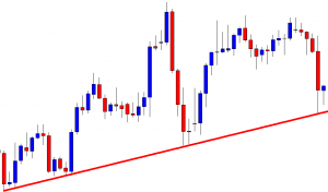
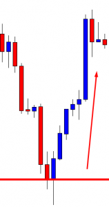
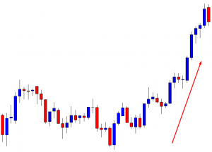
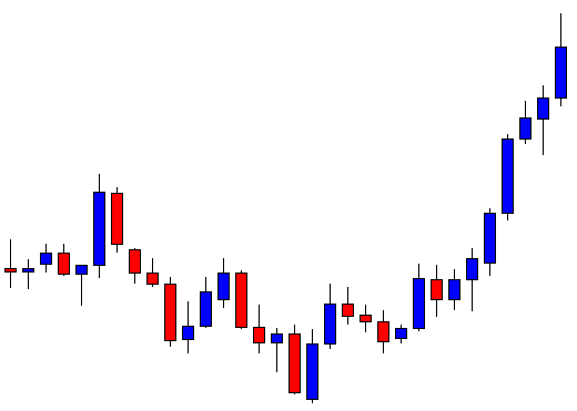
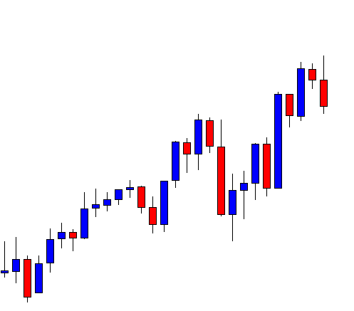
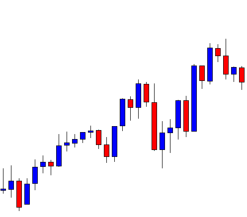
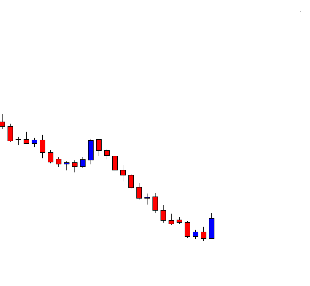
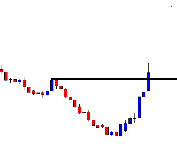
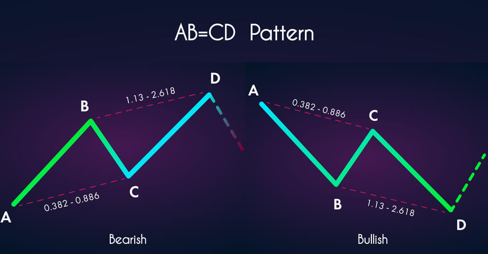
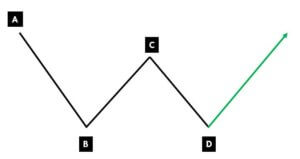
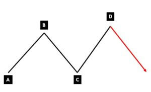
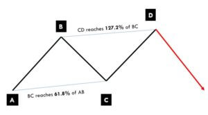
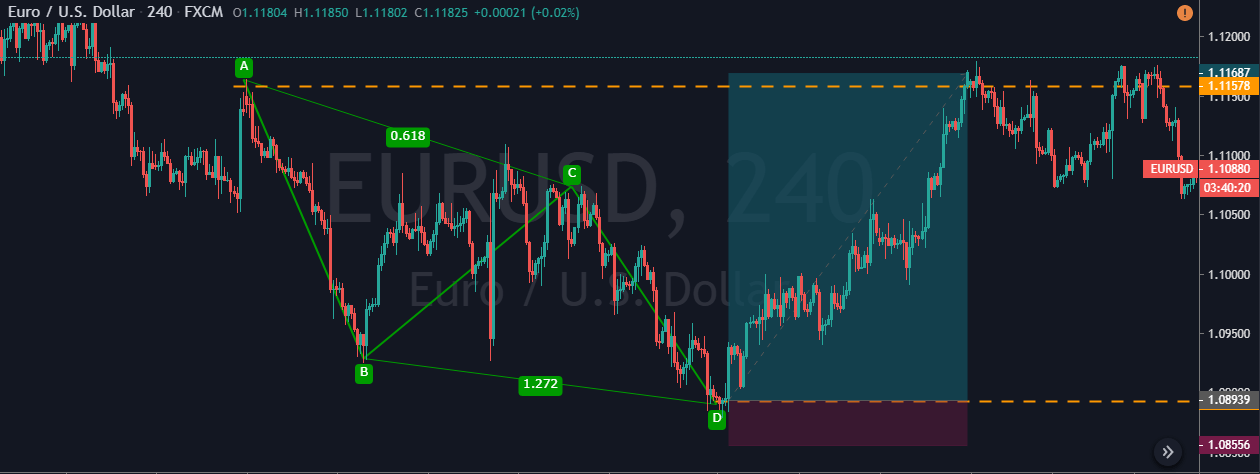
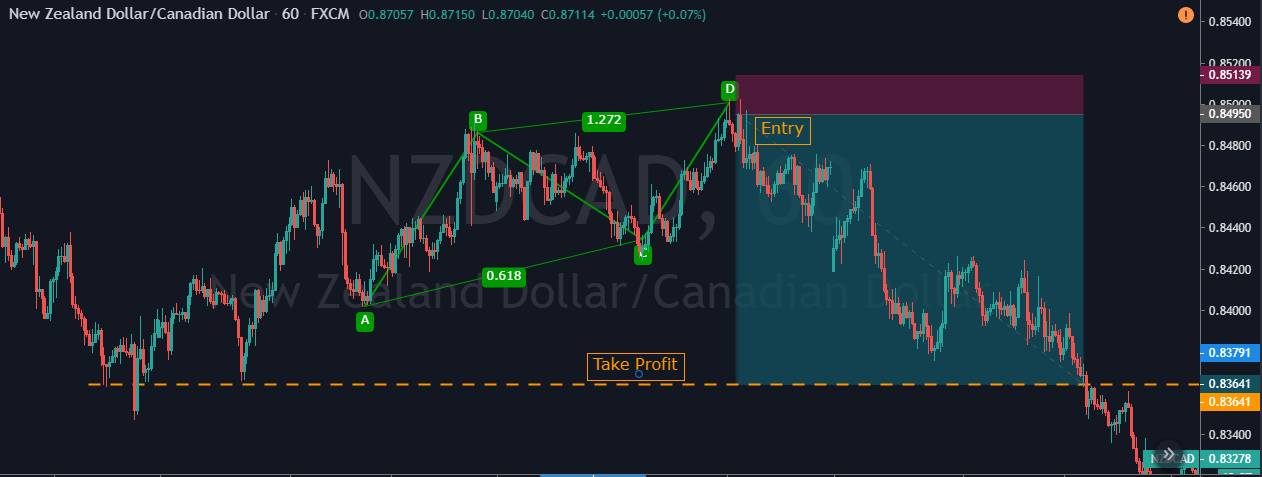
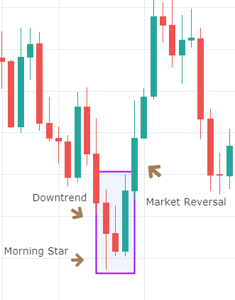
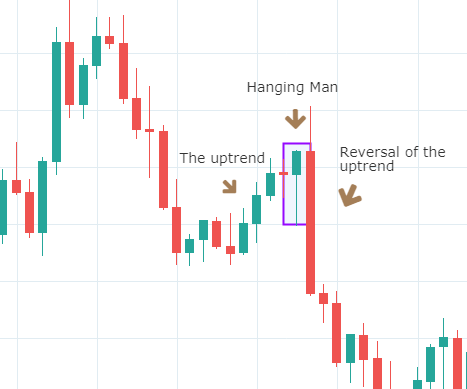
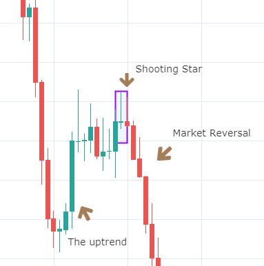
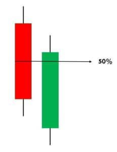
Below is a picture of how this pattern would like on the chart and how the trend reversal takes place.

Pattern Confirmation Criteria

  • Hanging Man is a single candlestick pattern that forms after a small rally in the price. The price rally can also be big, but it should at least be composed of few candles moving higher overall.
  • The candle must have a small body and a lower shadow at least twice the size of the real body.
  • This pattern is only a warning and a bearish candle after the formation of this pattern is highly desired. This is necessary for the Hanging Man pattern to prove to be a valid reversal. This is called confirmation.

The Hanging Man pattern is used by traders to exit long positions or enter into new short positions. After entering for a short position, stop loss can be placed above the high of the Hanging Man candle.

The Shooting Star Candlestick Pattern 

A Shooting Star is a bearish single candlestick pattern which also indicates a market reversal. It has a long upper shadow with little or no lower shadow and a small body.

This pattern typically occurs after an uptrend and forms near the lowest price of the day. The Shooting Star pattern can be seen as the market creating potential resistance around the price range. It implies that the sellers stepped in, erasing all the gains, and pushed the price near the open. Basically, at the appearance of this pattern, buyers are losing control, and sellers are taking over.

Below is a picture of how the pattern would look like on a chart

Pattern Confirmation Criteria

  • The pattern must appear after an advance in price. The price must rally in at least alternate green and red candles if not in all green candles.
  • The distance between the highest price of the candle and the opening price must be twice the length of the body of the candle.
  • It is best if there is no shadow below the body of the candle.

Traders should not take immediate action after the formation of this pattern. They should wait to see what the next candle does following the Shooting Star. If they see a further price decline, they may sell or short that currency pair. However, if the price continues to rise, it means the uptrend is still intact. So traders must favor long positions over shorting.

The difference between the Hanging Man and the Shooting Star is in the length of upper and lower shadows along with the context. By now, we have understood how continuous and reversal single candlestick patterns work. In the upcoming lessons, we will be learning dual candlestick patterns and their implication. Cheers!

[wp_quiz id=”60770″]
Categories
Forex Basic Strategies

Identify Reliable Trading Signals Using ‘Piercing Line’ Candlestick Pattern

Introduction

The Piercing Line is a simple and effective candlestick pattern, and it is used to trade the bullish reversals in the market. This pattern typically appears in a downtrend. Also, when it appears in a significant support area, we can consider it more reliable. Piercing Line is a two candlestick pattern where the sellers influence the first candle, and the second candle is responded by enthusiastic buyers. Piercing Line essentially indicates the bears losing control, and bulls taking over the market.

  1. First of all, in a downtrend, the first candle of the pattern should be bearish.
  2. The second candle should be bullish, and it should open lower than the closing of the previous candle, and it must close above the midpoint of the bearish candle.

This indicates that buyers now overwhelmed the sellers. In terms of supply-demand, this pattern shows that the supply is depleted somewhere, and the demand for buying has increased. Remember not to trade this pattern alone. Always use it in conjunction with some credible indicators or other trading tools to further enhance the probability of winning.

Piercing Line Pattern Trading Strategies

Piercing Line Pattern + Percentage Price Oscillator

In this strategy, we have paired the Piercing Line pattern with the Percentage Price Oscillator to generate credible trading signals. The Percentage Price Oscillator is a momentum indicator. It consists of a centerline, histogram, and the two moving averages. Just like the MACD indicator, the PPO also represents the convergence and divergence in price action. This indicator gives a crossover at the overbought and oversold market conditions.

When price action crosses the centerline, it means that the bullish or bearish momentum is super strong. We want to let you know that PPO is not that popular in the industry. Also, it is not available in the MT4 terminal. However, you can download this indicator from this link and add it to your MT4 terminal. If you are a Tradingview user, search the PPO indicator in the indicators tab, and you should be able to find it.

Step 1 – Find out the Piercing Line pattern in a downtrend.

Step 2 – Once you find the Piercing Line pattern, the next step is to wait for the reversal to happen on the PPO indicator at the oversold market conditions.

In the below CHFJPY chart, the market was in an overall downtrend. We can see the market printing Piercing Line pattern, and that is an indication of a trend reversal. We can also see the PPO indicator giving crossover in the overbought area at the same time. Both of these clues indicate a clear buy signal in this pair. We can also see the price action showing divergence, which is another clue to go long. If we are able to find all of these clues on a single price chart, we shouldn’t mind placing bigger trades.

Step 3 – Stop-loss and Take Profit

PPO indicator quite often gives high probability trading signals. So when we take trades of that kind, most of the time, we must place the stop loss just below the first candle of the Piercing Line indicator.

There are several ways to book profits. For this particular strategy, we can close our position when the PPO reversed at the overbought area or when the market starts printing the opposite pattern. If you plan to make more money in a single trade with extra risk, it is advisable to book the profit at the higher timeframe’s major resistance area.

In the below chart, we can see that we have closed our whole position at the major resistance area and the stop-loss order was just below the recent low.

Piercing Line Pattern + Double Moving Average

In this strategy, we have paired the Piercing Line pattern with the Double Moving Average. Moving Average is a very well-known indicator in the industry. Many average indicators are available in the market. If you are using the lower period average, expect more trading signals. Contrarily, if you are using the higher period average, expect fewer but accurate signals.

Step 1 – First of all, find out the Piercing Line pattern in a downtrend.

Step 2 – Activate the buy trade when the lower period MA crosses the higher period MA. In the below EURAUD Forex chart, the price action was in a downtrend, and around the 22nd of December, the market prints the Piercing Line pattern. This means that the sellers now have a hard time to go lower, and buyers took over the market. Furthermore, when a lower period moving average crosses the higher period moving average, it is a clear indication to go long. After our entry, price action immediately prints a brand new higher high.

Step3 – Stop-loss and Take Profit

If you are an aggressive trader, use the recent low for stop loss. But if you are a conservative trader, make sure to place wider stop losses. If you plan to ride the longer moves, wait for the price action to hit the daily support area. But if you plan to go for intraday trades only, we suggest you exit your position when the double MA gives the opposite signal.

In the below chart, we can see that we have closed our full positions at the higher timeframe major resistance area, and stop-loss was just below the recent low. Overall, it was a 3R trade.

Bottom Line

Piercing Line pattern is a bottom reversal pattern, and it is one of the very well-known bullish reversal patterns. We can say that this pattern is exactly the opposite of the Dark Cloud Cover pattern. We won’t be able to see this pattern very frequently on the price chart, but when it appears, a trend reversal is guaranteed. Sometimes you will find this pattern in the consolidation phase, but it’s not worth your time to trade it in ranges. So it is always recommended to find this pattern in a clear trending market because that’s where we can generate more effective signals. The only limitation of this pattern is that it requires the use of other technical tools to confirm the signal and cannot be used stand-alone. But that’s the case of most of the candlestick patterns, so that’s not a major limitation.

That’s about the Piercing Line candlestick pattern. Let us know if you have any questions in the comments below. Cheers!

Categories
Forex Price-Action Strategies

Trading the ABC Pattern

In today’s lesson, we are going to demonstrate an example of an ABC pattern trading on a daily chart. The ABC pattern is one of the most consistent trading patterns in the financial market. It offers an excellent risk-reward as well as a high winning percentage. Let us get started.

This is a daily chart. The price after being bullish makes a bearish move. The last candle comes out as a doji candle. This is a bullish reversal candle, which is not a strong one. However, look at the level where the price produces the doji candle.

It is a flipped level of support. Technically, the buyers are to wait for a bullish reversal candle to go long around this level. Since this is not a strong bullish reversal candle, the buyers might as well wait for a bullish engulfing candle to go long from here.

Here it comes. This is a bullish engulfing candle closing above the last bearish candle. This means it produces a morning star. The buyers may trigger a long entry right after the last candle closes. This point is known as point C in the ABC chart pattern. Traders shall set their stop loss below the level of support. With take profit, they are to be tricky. The last swing high (or low) often becomes a big factor. Thus, buyers may consider taking a partial profit. Have a look at the chart below.

The price often roams around and even makes a reversal at this point. This point is known as point B. If we take out the 50% profit around this level and let the rest of it run, we give ourselves a chance to win more pips without any risk. If the price produces an ABC pattern, in 70% cases, it makes a new higher high or lower low. Let us find out what happens here.

The price makes a breakout. We have taken out some of our profits. Now, we may consider using a trailing stop setting below the last candle (breakout candle). We must be patient and hold the trade until the price produces a strong bearish reversal candle.

The price heads towards the North with good bullish momentum, and then it produces a bearish reversal candle. It may still head towards the North if it makes a bullish breakout after consolidation. Meanwhile, we may come out with the rest of the trade.

The price pattern is produced in almost all the pairs and in all time frames. It is one of the most common price patterns, which is favorite among the financial traders. To be able to trade and make money out of it, we need to have a lot of back-testing and practice.