Categories
Forex Fundamental Analysis

AUD/USD Global Macro Analysis – Part 3

AUD/USD Exogenous Analysis

In the exogenous analysis, we will compare the differentials in the US and the Australian economies at an international level. We will use:

  • The differential in GDP growth in the US and Australia
  • The US and Australian interest rate differential
  • The differential in the US and Australian balance of trade

The differential in GDP growth in the US and Australia

Domestically, the value of USD and AUD are pushed by the changes in the macroeconomic factors that drive GDP growth. The dynamic of the AUD/USD exchange rate is affected by the difference in the GDP growth rate. The country with a faster GDP growth will see its currency appreciate more than the one with slower growth.

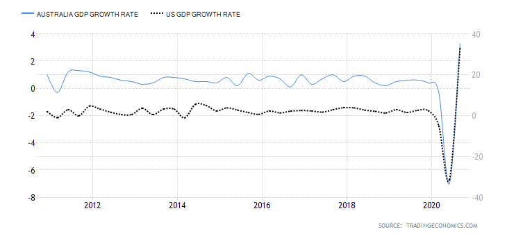
In Q3 of 2020, the Australian GDP increased by 3.3% compared to the 7% drop in Q2. The US economy expanded by 33.1% in Q3 2020 compared to a 31.4% drop in Q2. In the first three quarters, the US economy has contracted by 3.3% while the Australian economy has contracted by 4%. Therefore, the GDP growth differential between Australia and the US is -0.7%. Based on the correlation analysis with the AUD/USD pair, we assign a score of -2.

The US and Australian interest rate differential

This measures the difference between the interest rate set by the Reserve Bank of Australia (RBA) and the US Federal Reserve. In the forex market, carry traders tend to be bullish when a currency pair has a positive interest rate differential and bearish when it is negative. That is because more investor funds flow towards the country with a higher interest rate.

At the onset of the COVID-19 pandemic, the RBA cut interest rates from 0.75% to 0.1%, while the Federal Reserve cut interest rates from 1.75% to 0.25%. That makes the interest rate differential for the AUD/USD pair -0.15%. Based on correlation analysis with the exchange rate for the AUD/USD pair, we assign a score of -2.

The differential in the US and Australian balance of trade

The difference between the balance of trade for Australia and the US will help determine which currency is in higher demand in international trade. Note that increased demand in the forex market also increases the value of that currency.

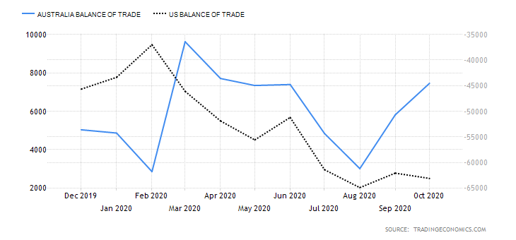
In October 2020, Australia’s trade surplus increased to AUD 7.46 billion compared to 5.82 billion in September. However, it is still lower than the highest recorded AUD 9.62 billion surpluses in March. The US had a trade deficit of $63.1 billion in October, which has been expanding since January. The balance of trade differential is $68.633 billion between Australia and the US. Based on the correlation with the AUD/USD exchange rate, we assign a score of 6.

Conclusion

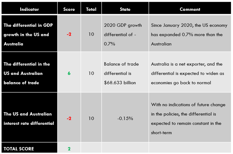
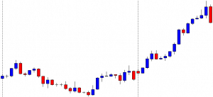
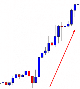
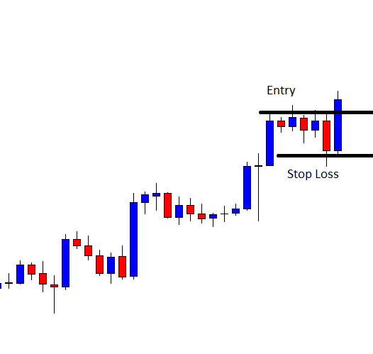
The exogenous score for the AUD/USD pair is 2. It means that we can expect that the pair will be on a bullish trend in the short-term.

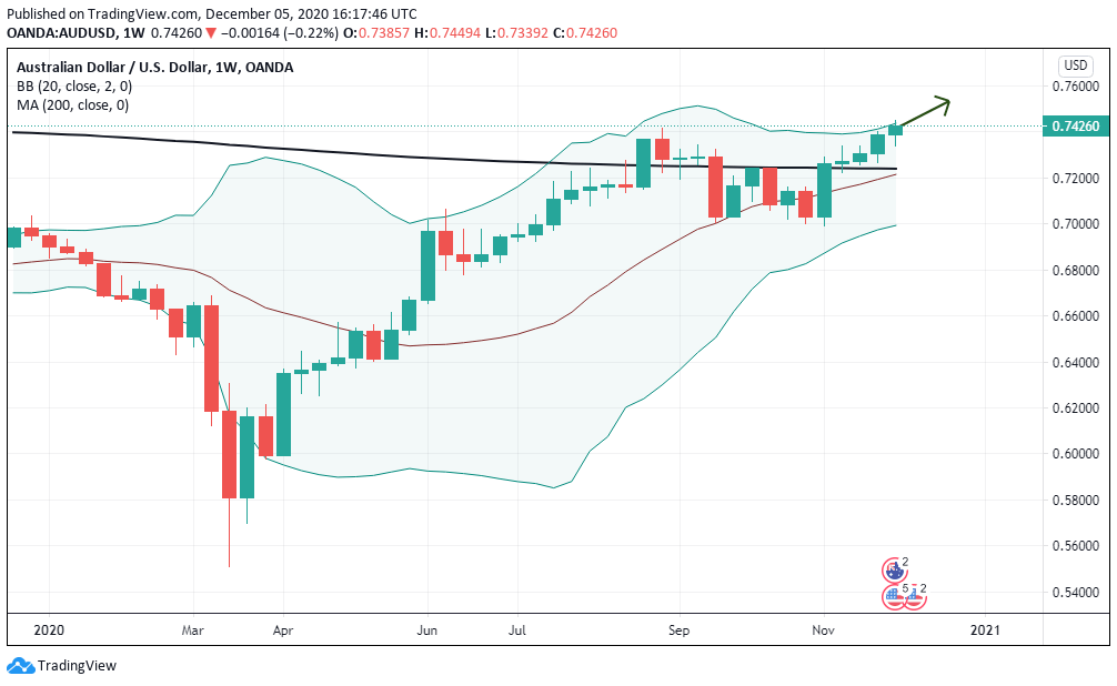
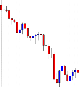
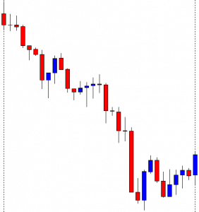
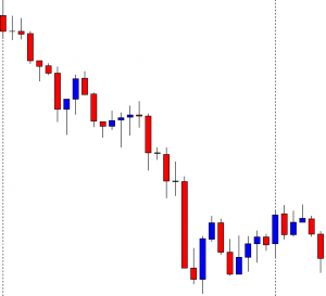
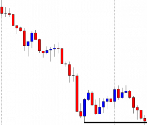
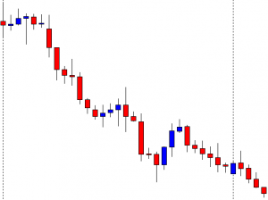
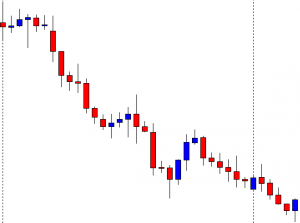
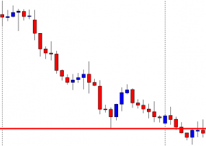
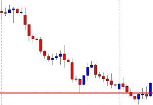
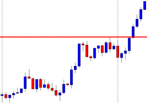
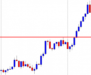
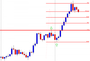
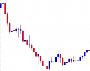
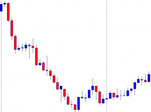
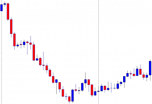
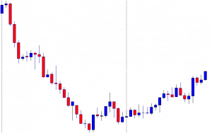
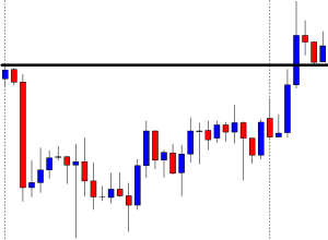
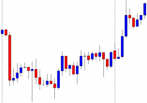
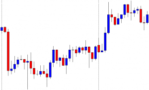
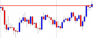
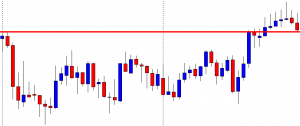
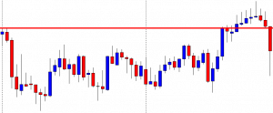
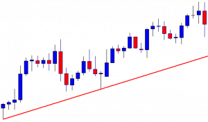
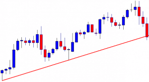
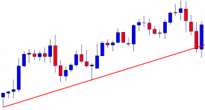
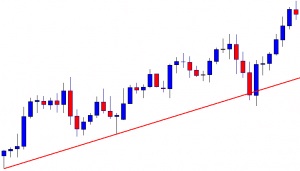
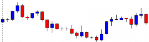
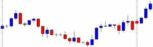
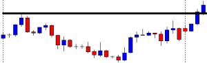
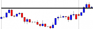
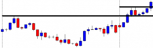
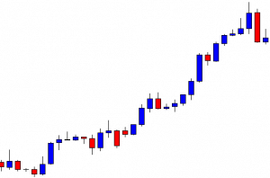
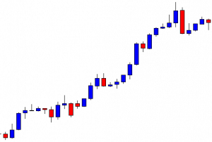
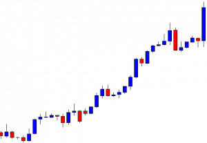
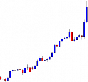
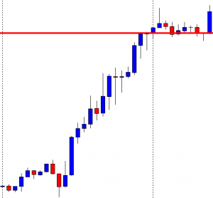
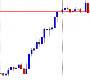
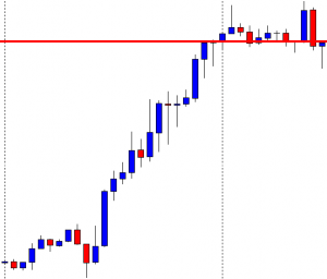
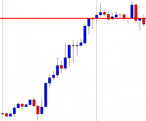
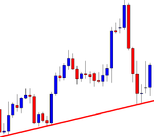
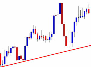
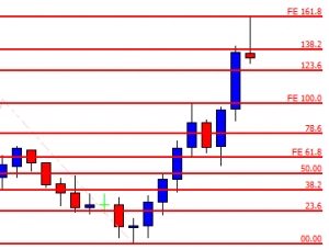
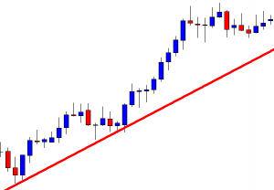
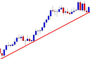
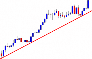
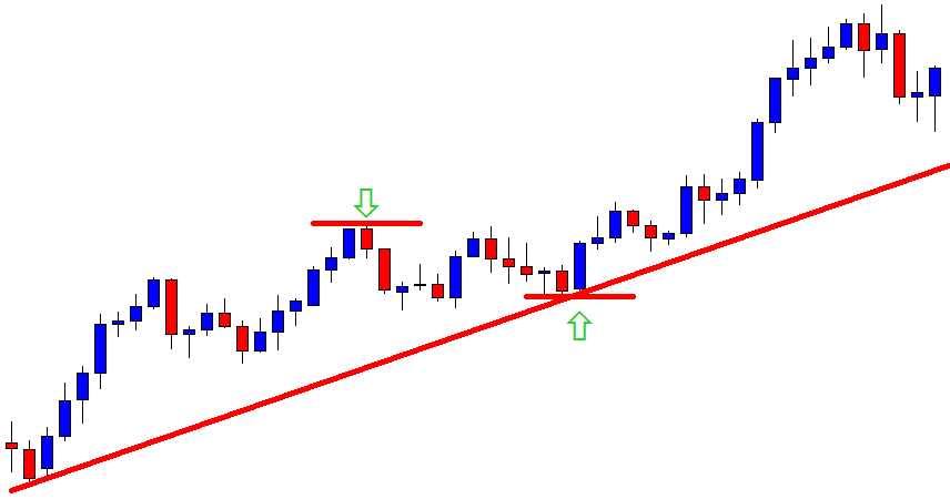
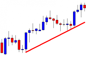
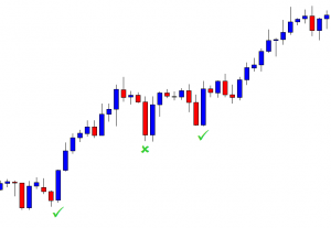
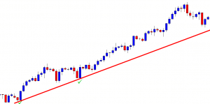
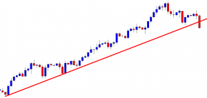
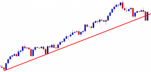
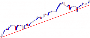
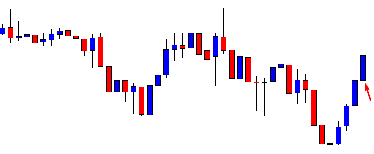
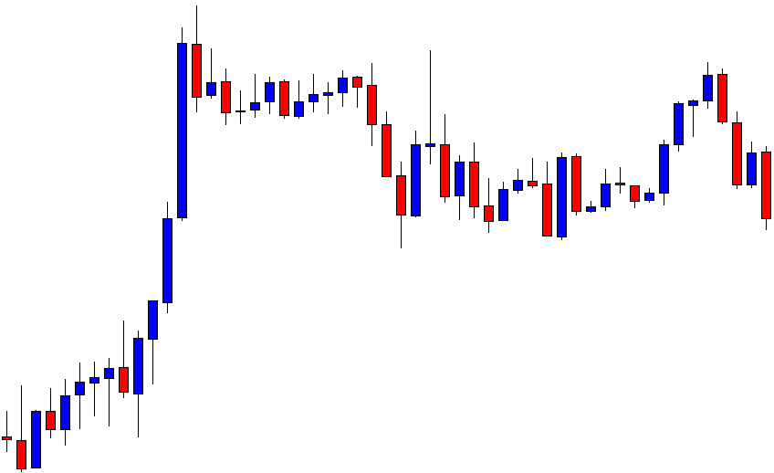
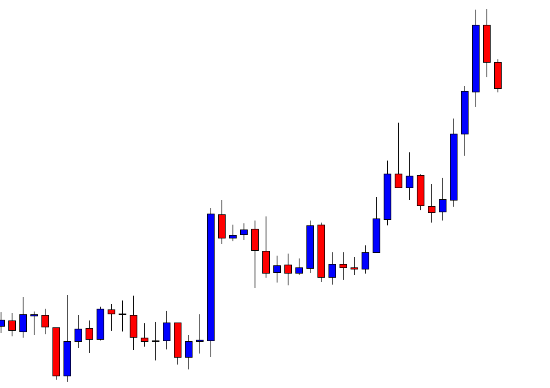
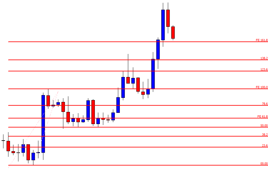
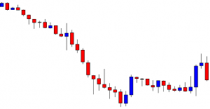
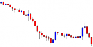
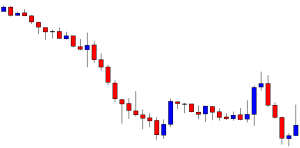
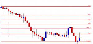
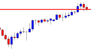
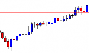
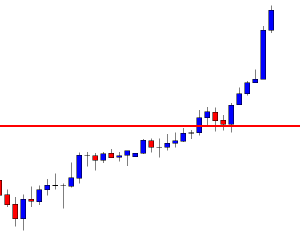
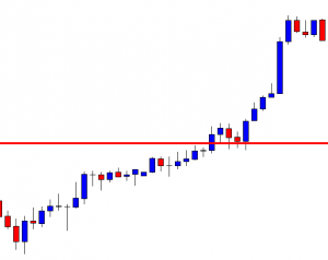
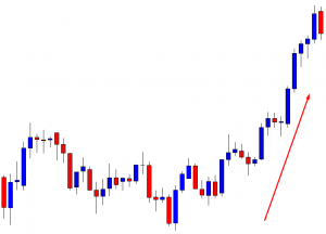
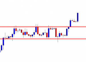
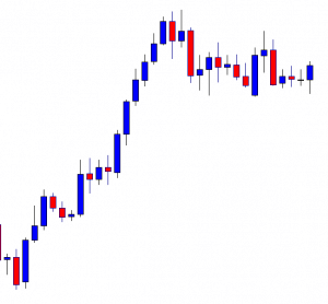
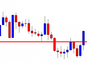
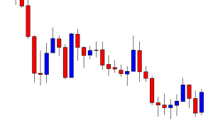
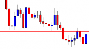
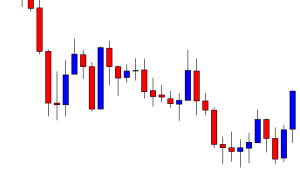
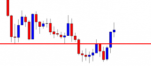
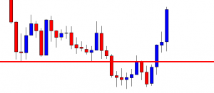
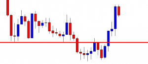
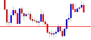
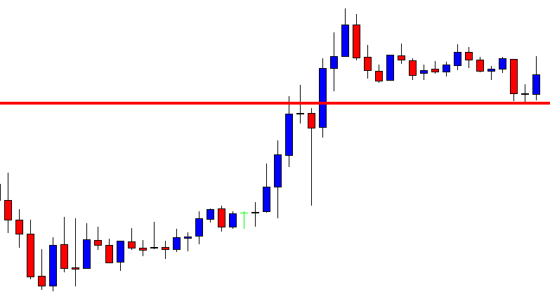
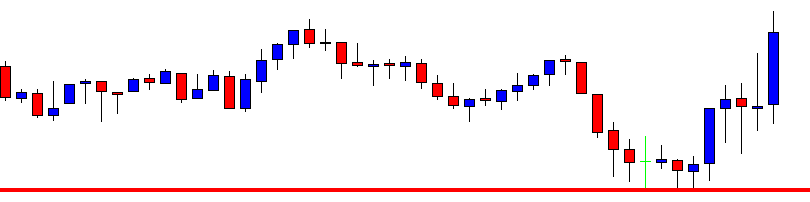
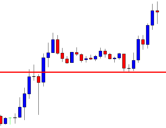
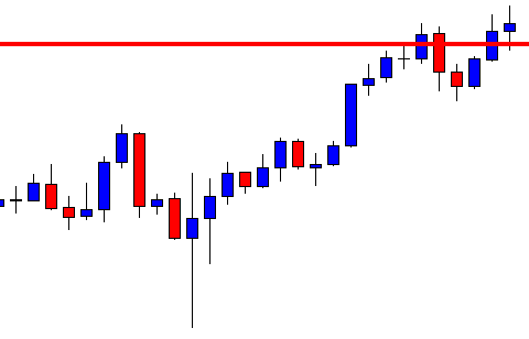
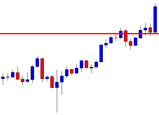
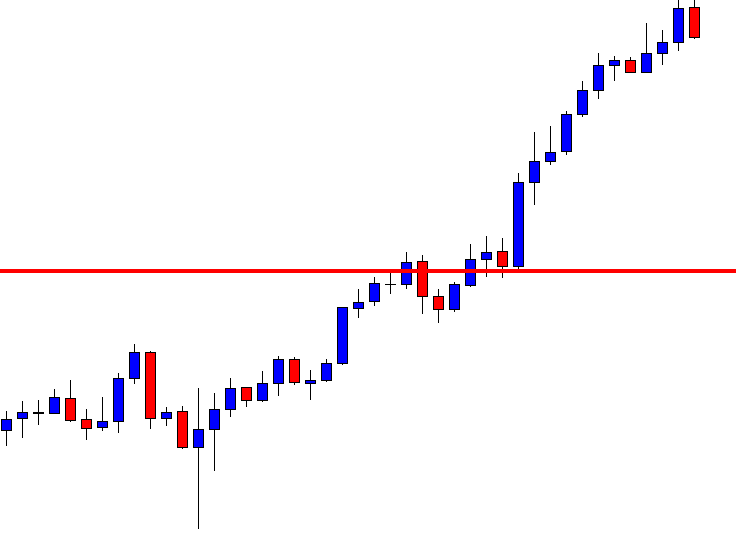
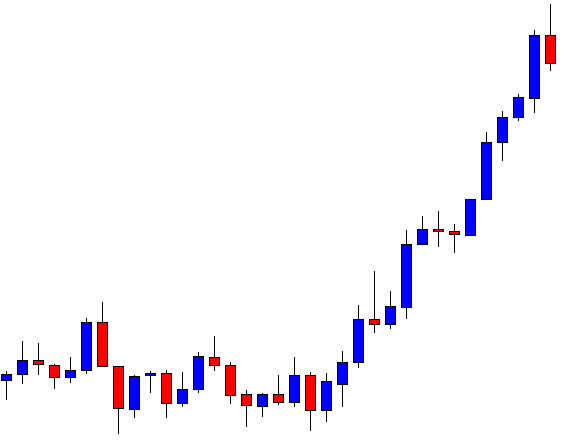
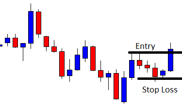
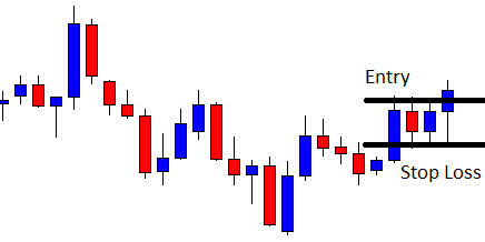
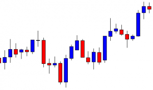
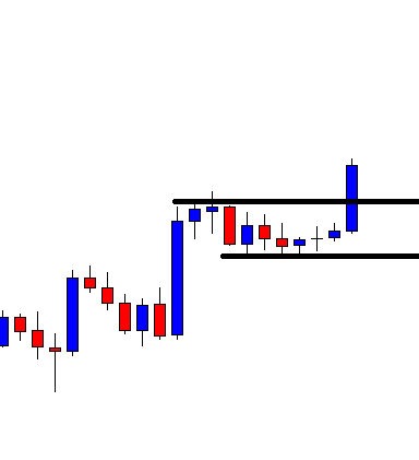
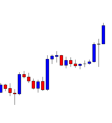
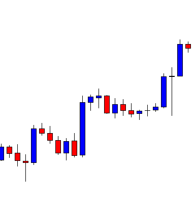
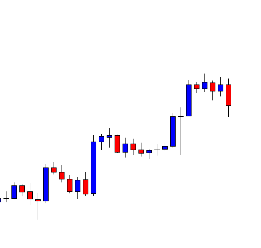
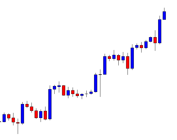
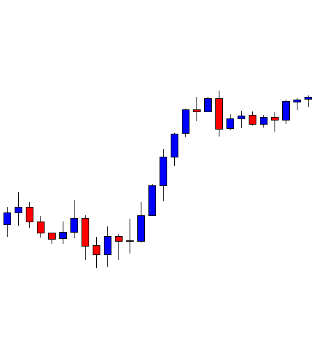
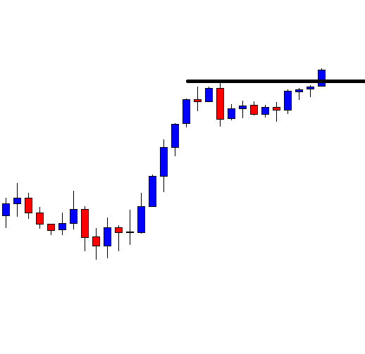
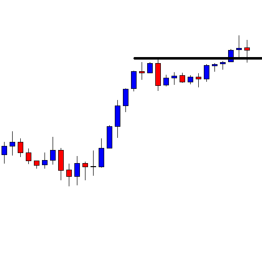
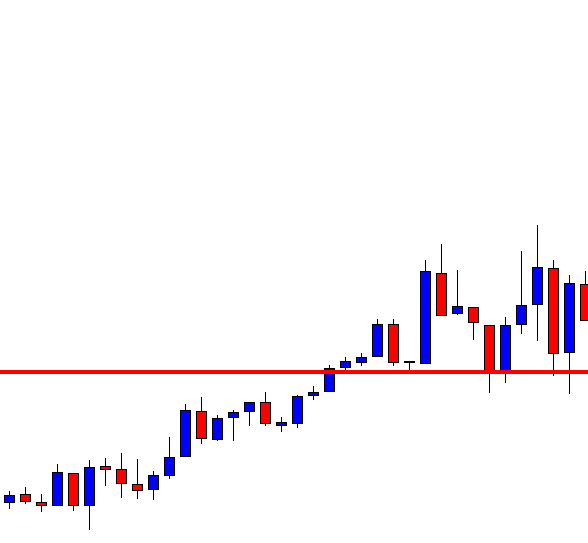
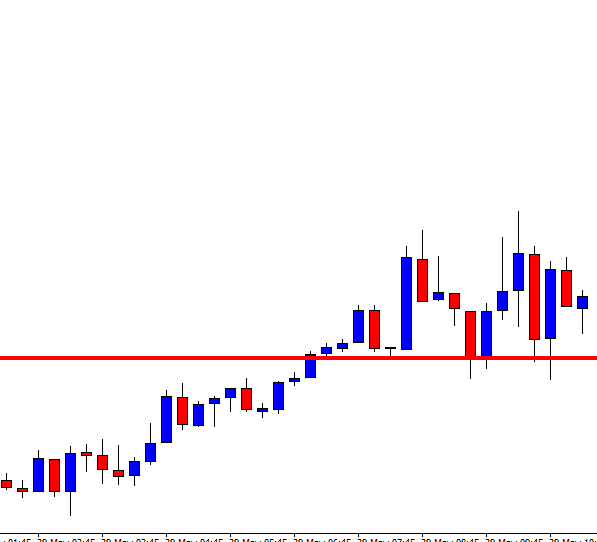
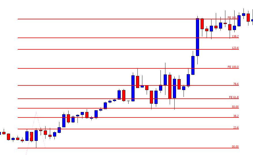
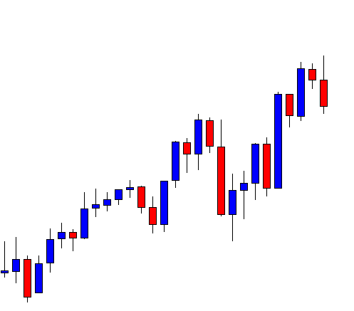
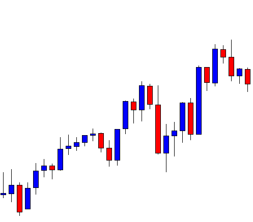
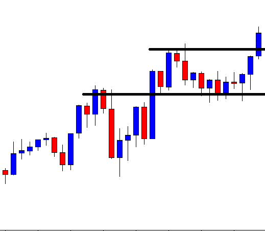
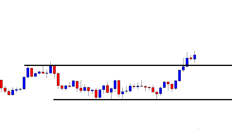
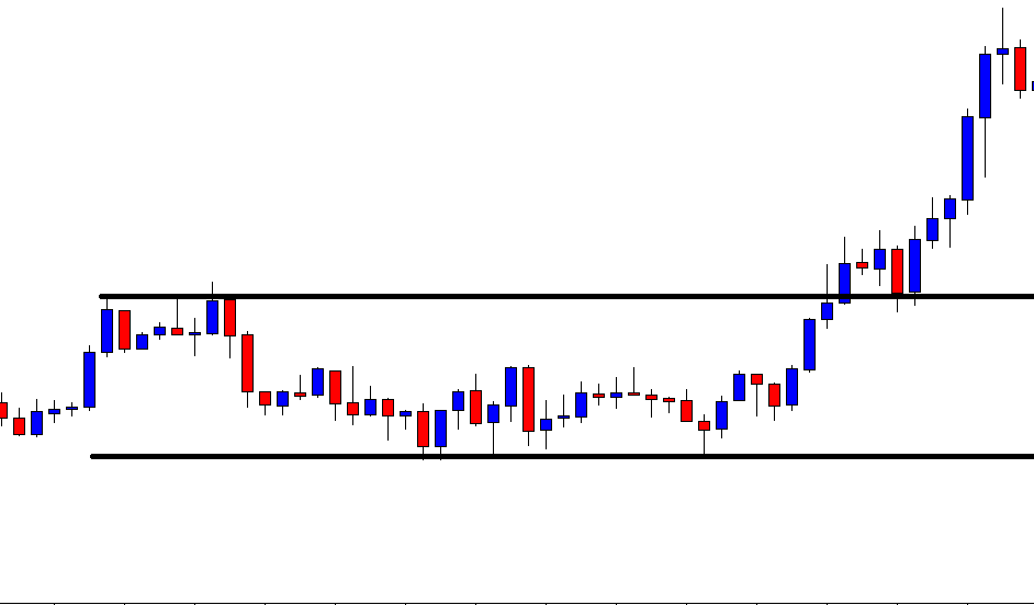
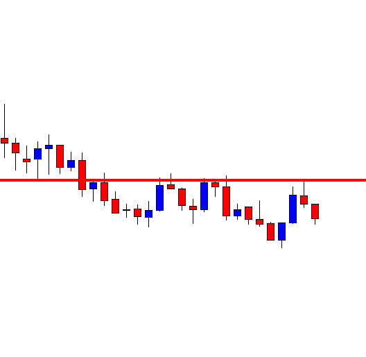
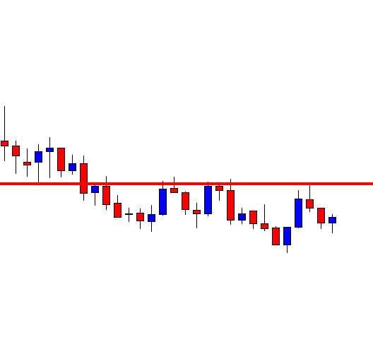
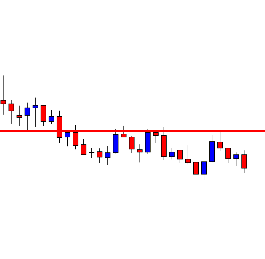
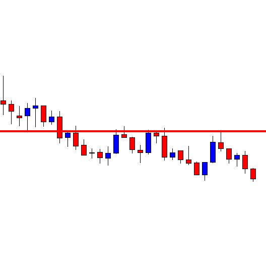
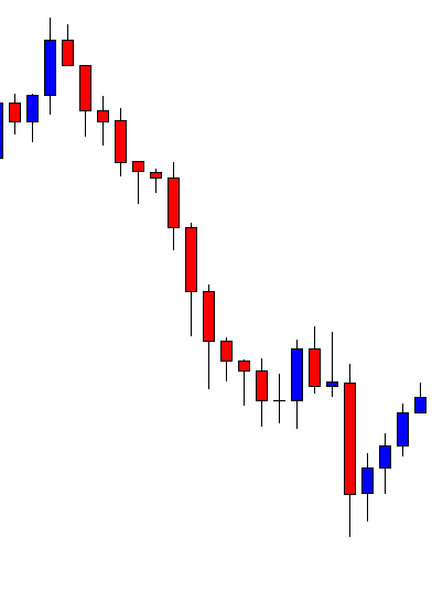
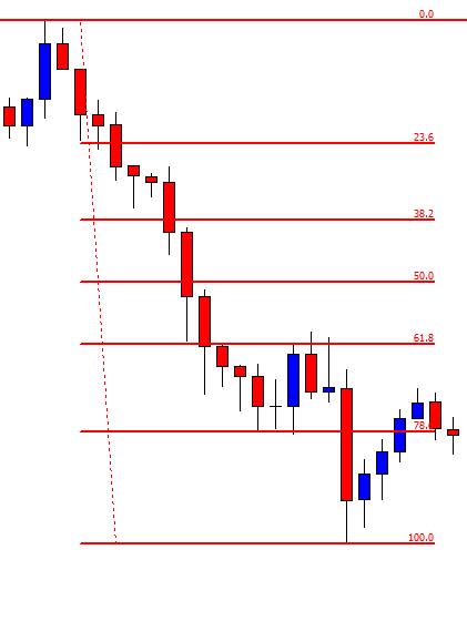
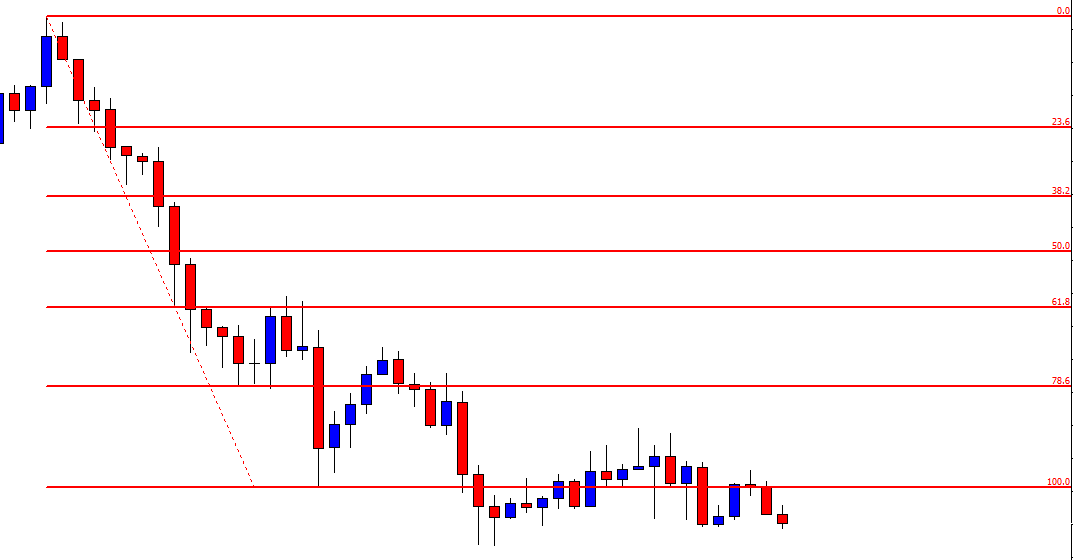
In technical analysis, the short-term bullish trend is supported by the fact that the pair is trading above the 200-period MA and breaching the upper Bollinger Band. Cheers!

Categories
Forex Course

175. Understanding ‘Market Sentiment’ In The Forex Market

Introduction

By now, you have come across terms like bear markets, bull markets, and neutral markets. At their core, these terms represent market sentiment. In this lesson, we will learn about market sentiment in forex and what brings it about.

What Is Market Sentiment?

Forex traders execute their trades based on how they think the market will move. If you are a forex trader, for whatever your reasons, you must have thought at some point, “…I think the price for the GBP/USD will rise, let me go long on the pair.” This decision was your sentiment about that particular currency pair. By making that trade, you have expressed your sentiment about the currency pair.

However, not every other forex trader would have agreed with you that the price for the GBP/USD would rise. Some forex traders thought the pair would fall and go short. Hence, at any given moment, some traders will hold the assertion that a given currency pair will rise while others claim that the pair will drop. Therefore, at any given moment, there will always be traders favoring going either long or short. Those who are in the majority form the market sentiment.

Therefore, market sentiment is the overall belief of the majority of traders. In the forex market, the market sentiment is the dominant consensus by active traders about a particular currency.

Types of Forex Market Sentiment

Bullish market sentiment occurs when most traders believe that the price for a particular currency pair will rise, and they go long.

Bearish market sentiment occurs when more forex traders short a currency pair because they believe that the price will fall.

Neutral market sentiment occurs when an equal number of traders are going long and short on the same currency pair.

What brings about market sentiment in forex?

In the forex market, sentiments express the outlook of traders about a particular currency or currency pair. Thus, the two main drivers of market sentiment in the forex markets are geopolitical developments and fundamental economic indicators.

Geopolitics

Unexpected political events may impact the future of a country’s economic prospects. In the current climate, some of the significant geopolitical developments that affect market sentiment in forex include; Brexit, the Sino-American trade war, and the 2020 US presidential elections.

Let’s look at Brexit, for instance. In September 2020, there has been increased pessimism about Brexit negotiations with the UK threatening not to honor an earlier agreement with the EU. To forex traders, this increases the chance that the UK will not secure favorable trade deals and also ruin its reputation globally. Since this poses a risk for the UK economy, market sentiment was bearish on the GBP.

Fundamental Economic Indicators

These indicators show how the economy has fared. They show if the economic condition of a country has been growing, stagnating, or worsening. Forex traders base their market sentiments by making their judgments about the economy’s future, depending on how they interpret the publication of these indicators.

If an economic indicator, say unemployment rate, is better than what analysts predicted, it shows that the economy is expanding hence better prospects. When the fundamental indicators are positive, forex traders will adopt a bullish stance on that country’s currency. Conversely, negative fundamental data leads to a bearish sentiment on the currency.

[wp_quiz id=”89638″]
Categories
Forex Price Action

Weekly High/Low Breakout Trading: Importance of Candles’ Body before Making a Breakout

In today’s lesson, we are going to demonstrate an example of an H4 chart that seems promising to make a breakout at the last week’s low. It produces a strong bearish candle as well at last, but the price does not head towards the South. We try to find out the possible reason behind that.

It is an H4 chart. The chart shows that the price heads towards the South with good bearish momentum. The price bounces twice at a level of support. The pair closes its trading week by producing a bearish candle.

The pair starts its next week by producing a bullish engulfing candle. It means the breakout length gets bigger, which attracts the sellers more. The sellers are to wait for the price to make a bearish reversal candle followed by a breakout at the weekly low.

The price finds its resistance and produces two consecutive bearish candles. The sellers are to keep their eyes on the chart closely. It seems that the Bear is going to make a breakout soon. Let us proceed to the next chart to see what happens next.

The chart continues to produce bearish candles. However, it has not made a breakout at the weekly low yet. The last candle comes out as a spinning top closing within the weekly low.

The chart produces a spinning top followed by a bullish engulfing candle. The price then consolidates within the last week’s low and a new resistance. The last candle comes out as a bearish engulfing candle closing just below the weekly low. The question is whether it should be considered as a breakout. It is a breakout, but the H4 traders should skip taking entry on this chart based on a weekly high/low breakout. The reason behind that is the chart takes too long to make the breakout. Once the price starts trending, it must make a breakout without producing any reversal candle. It means if the chart produced the last candle right after the first spinning top; it would be a hunting ground for the sellers. Since it produces four bullish reversal candles before making the breakout, the chart does not belong to the H4 traders based on the weekly low anymore. We must not forget that it must consolidate after a breakout, though. It means it must produce bullish reversal candle/candles in case of a bearish breakout, but it must make a breakout only by producing bearish candles and vice versa.

Categories
Forex Price Action

Disobeying the Breakout

In today’s lesson, we will demonstrate an example of a chart that makes a breakout, consolidates, and produces a reversal candle. However, it does not make a breakout at consolidation support. Thus, it does not offer an entry. Nevertheless, it makes a move towards the breakout direction later. We try to find out whether breakout traders find an entry from that move or not.

The chart shows that the price makes a long bearish move. It finds its support where it bounces twice. The chart ends its trading week by producing a Doji candle. The next week should be interesting.

The chart produces a bullish engulfing candle. The buyers may wait for the price to make a breakout at the last swing high. On the other hand, the sellers are to wait for the price to make a breakout at the last week’s low.

The chart produces a spinning top, and the price heads towards the South. It makes a breakout at the last week’s low. Thus, the sellers may keep an eye on this chart for the price to consolidate and produces a bearish reversal candle to offer them a short entry.

It produces a bullish engulfing candle. It is a strong bullish candle. However, the breakout level is still intact. If the level produces a bearish reversal candle followed by a breakout at consolidation support, the Bear may keep dominating in the pair.

The chart produces a Doji candle followed by a spinning top right at the breakout level. The sellers may go short below consolidation support. It looks it is a matter of time for the Bear to make a long move towards the South.

The chart produces a bullish candle breaching the breakout level. It spoils the sellers’ party. The weekly low is disobeyed by the H4 chart. Thus, the H4 sellers may skip taking entry on this chart. The chart becomes no hunting zone for both the buyers and the sellers as far as the H4 chart is concerned. Let us proceed and find out what happens next.

The price makes a bearish move. The pair is trading below the last week’s low. Look at the momentum. The price has been rather sluggish to head towards the South. It is because the pair is traded on other minor charts. As mentioned, if the price disobeys breakout on a chart, it is better not to trade based on that chart. The price may go either way, which makes things difficult for the traders to trade.

Categories
Forex Daily Topic Forex Price Action

Fibonacci Extension: How It Helps Traders

In today’s lesson, we will demonstrate an example of an H4 chart that makes a breakout heading towards the North. However, the chart does not offer entry. We try to find out the reason behind it.

It is an H4 chart. The chart shows that the price makes a good bullish move. Thus, the weekly candle ends up being a bullish candle. Let us proceed to the next chart to see how the price starts next week.

The first candle comes out as a bearish engulfing candle. However, the support level where the price had a bounce and headed towards the North is intact. The buyers may eye on the chart for the price to have a bounce and make a bullish breakout at the weekly high.

The chart produces a bullish inside bar. The candle is produced right at the level of support. It is not a strong bullish reversal candle, but things look good for the buyers.

The chart produces three more bullish candles breaching the level of resistance. The buyers are to wait for the price to consolidate and produce a bullish reversal candle to offer them a long entry.

The price keeps heading towards the North without having consolidation. In naked eyes, it seems that the price has traveled a long way. If it consolidates now, should the buyers go long?

The chart produces a bearish candle. It means the price may consolidate now. The breakout level is far away. If the price makes a bearish correction up to the breakout level, it will come out as a long bearish wave. This often changes the trend or makes the price get choppy, at least. Let us draw a Fibonacci Extension and explain it with the Fibonacci levels.

We know when the price makes a breakout; Fibonacci Extension can be used to determine the wave’s length. The breakout length is measured at 23.6%. The best level for the price to consolidate within 23.6% to 38.2% or 38.2% to 50.0%. Over here, the price consolidates within 61.8% to 78.6%. It means the price does not have much space to travel. Thus, the buyers may skip taking entry on this chart as far as the risk-reward ratio is concerned. The price may go up to the level of 100.0%, but it often ends up being choppy or makes a reversal in such cases. This is when Fibonacci Extension comes out as a handy tool with what traders can determine the trend’s potential length and calculate whether they should take an entry or not.

Categories
Forex Price Action

Do Not Be Biased, Take Decisions According to the Chart

In today’s lesson, we are going to demonstrate an example of a chart that makes a good bullish move but ends up having a rejection at a double top resistance. The price then shows the potential to make a bullish breakout. However, it has another rejection around the last week’s high and makes a bearish breakout. It looks good for the sellers at the time. We find out what happens afterward.

This is the H4 chart. The price makes a long bullish move. It ranges for a while and then continues its bullish journey again. Look at the last candle on the chart. It comes out as a bearish inside bar. Do not miss the point that the candle is produced right at the resistance, where the price has had a rejection.

The chart produces a bullish candle to start the next week. It then ranges for a while and produces two bullish candles. It seems that the price may head towards the North and makes a bullish breakout at the last weekly high.

It does not. It rather finds its resistance around the same level. Moreover, it produces a bearish engulfing candle. To be more precise, the chart produces an evening star. It is a strong bearish reversal candle. Let us wait and see what the price does next.

The chart produces a long bearish candle breaching the last swing low. The breakout is significant since the price trends from the last weekly low. The sellers may keep their eyes in the pair to go short. Before going short on this chart, the sellers shall wait for the price to make a bullish retracement since the price is within the last weekly range. Keep that in mind that the price is to make a bullish correction to offer a short entry.

The price does not make a bullish correction. It rather consolidates and produces a bearish reversal candle. Since the price is within the last weekly range, so it is not a short signal.

Here it goes. The price gets choppy. This chart becomes a risky chart to trade. Thus, traders might as well skip eyeing on the chart to trade at. At first, it looks good for the buyers. Then, it shows potential for the Bear to dominate since the price has several rejections at the same level. However, it ends up being an extremely choppy chart.  Thus, do not be biased with your initial assumption. Wait for the breakout, confirmation, and then trade.

Categories
Forex Daily Topic Forex Price Action

Trading Within Last Weekly Range

In today’s lesson, we will demonstrate an example of a chart where the price is having a retracement within the last weekly range. The price produces a double bottom and makes a breakout at the neckline. It then consolidates but does not head towards the North as it normally does when it makes a breakout at weekly high/low. Let us proceed and find out the possible reason behind it.

The price makes a long bearish move and finds its support. Upon producing a bullish engulfing candle, it heads towards the North and comes back again. At the support zone, it produces a bullish inside bar. Let us see what happens next.

The price heads towards the North next week. It means it is trading within the last week’s range. The price is at the last swing high. If it makes a bullish breakout, the buyers may want to go long at its weakness.

The chart produces two bearish candles followed by a bullish engulfing candle closing within the last swing high. It seems that the price may consolidate more to find its way.

The price upon producing a spinning top followed by a bullish engulfing candle makes a bullish breakout at the last swing high. It is a neckline breakout of a double bottom. The buyers may keep their eyes on the chart to go long on its weakness.

The price produces a bearish inside bar followed by a spinning top with a bullish body. Then, it produces a bullish candle closing above consolidation resistance. Since it is a breakout at the resistance, it is supposed to be a buy signal. The question is whether the buyers should trigger a long entry or not. Let us see the next chart.

The price gets choppy, struggling to make a breakout towards the North. The buyers would not love to see such price action after triggering the entry. If the price makes a breakout at the last week high/low, traders wait for the price to consolidate and produce a bullish/bearish reversal candle to take entry upon a breakout. On the other hand, if the price trades within last week’s range, the price usually makes retracement (instead of consolidation) to offer entry. The Fibonacci level, such as the 38.2% and 61.8%, play a significant role in producing the reversal candle. In today’s chart, the price is in the weekly range. Thus, traders are to wait for the price to make a retracement to offer them entry. It rather consolidates, which ends up making the price choppy.

Categories
Forex Daily Topic Forex Price Action

Weekly High/Low Breakout Trading: The Chart You May Want to Avoid

In today’s lesson, we are going to demonstrate an example of a breakout at a weekly high. The price consolidates afterward but fails to make a breakout at consolidation resistance. Thus, the price does not head towards the North. Let us find out how that happens and what lesson it holds for us.

It is an H4 chart. The chart shows that the price makes a strong bearish move to start its trading week. Then, it gets choppy for the rest of the week. The chart closes its week, producing a bullish engulfing candle. Let us proceed to see how the next week goes.

The chart produces a bullish candle to start its trading week. However, it produces three consecutive bullish candles and makes a breakout at the last weekly high. The buyers are to wait for the price to consolidate and produce a bullish reversal candle closing above consolidation resistance to go long in the pair.

The chart produces two bearish candles closing within the breakout level. A bullish reversal candle closing above consolidation resistance is the signal for the buyers to trigger entry. They must keep their eyes on this chart.

The chart produces a bullish inside bar. It is a bullish reversal candle but not a very strong one. Since it closes within consolidation resistance, the buyers are to wait longer for the chart to produce a bullish candle closing above consolidation resistance.

The chart produces two more bullish candles. However, it has not made a breakout yet. It has been taking too long to produce the signal candle. Let us wait and see what it produces afterwards.

It produces a bearish inside bar at the consolidation resistance. It does not look good for the buyers. The price has a rejection at the level, and it produces a bearish inside bar. It means it is a double top resistance. A breakout at the last swing low may change the equation and attract the sellers instead. Let us proceed and see what happens next.

The price does not make a breakout at the last swing low, either. It produces a doji candle followed by a bullish engulfing candle at the last swing low. It means the chart keeps traders waiting for the next breakout. The bull holds the edge but weekly high/low breakout traders do not love to see such price action after a breakout. It is best to avoid taking entry on a chart like this.


Categories
Forex Daily Topic Forex Price Action

Weekly High/Low Breakout Trading: Count the Breakout Candle’s Attributes

In today’s lesson, we are going to demonstrate an example of an H4 breakout at the last week’s high. However, the price does not head towards the North as it usually does. Let’s find out why that happens.

The chart shows that the price after making a strong bearish move gets choppy. The H4 traders may wait for the price to make a breakout at either side. A bullish breakout may attract the buyers to go long in the pair. On the other hand, the sellers may wait for the price to make a bearish breakout.

The price produces a bearish candle to start the next week. The price finds its support, and it heads towards the North. However, the last weekly high is still intact. The buyers must wait for the breakout at the level to go long.

The price finds its intraweek resistance. It comes down. Intraweek support holds the price and produces a bullish inside bar. It is not a strong bullish reversal candle. However, it is produced at double bottom support. Let us wait and see whether it makes a breakout at the neckline or not.

The price heads towards the North and makes a breakout at the neckline. The candle closes within the last week’s high and consolidates. It then produces a bullish candle closing above the last week’s high. However, the candle has a long upper shadow. Considering its upper shadow, traders do not usually get attracted to trade upon such a breakout candle.

As anticipated, the chart produces some bullish candles with long upper shadow after the breakout. The price heads towards the North with a sluggish pace. It then produces a bearish Pin Bar and drives the price towards the breakout level again. A bullish reversal candle closing above consolidation resistance may attract the buyers to go long in the chart again. Let us find out what happens next.

The chart produces a long bearish candle with long lower shadow. The pair is trading within the last week’s range again. The H4 buyers have lost their hope. They may skip eying on the chart to concentrate on somewhere else.

If we look back, a double bottom, along with a breakout at the last week’s high, do not push the price towards the North. Most probably, this is because of the breakout candle’s attributes. We may still keep an eye on such a chart, but it would be wise to concentrate more on those charts, which makes a breakout with a commanding candle.


Categories
Forex Daily Topic Forex Price Action

Count the Breakout Length

In today’s lesson, we are going to demonstrate an example of a chart where the price makes an H4 breakout at the last week’s low. However, the chart does not offer entries. It rather gets choppy. We will try to find out the reason behind that. Let us get started.

It is an H4 chart. The chart shows that the price makes a bearish move and had a bullish correction. Upon producing a bearish engulfing candle, it heads towards the South again. The market is about to close for the weekend, and the sellers are going to wait for the H4 chart to make a bearish breakout and go short in the pair.

The chart produces a Doji candle to start its trading week. The next candle comes out as a bearish engulfing candle. It seems that the pair is going to make an H4 breakout at the week’s low soon.

The chart produces a long bearish candle closing well below the week’s low. It does not consolidate but produces a spinning top with a bearish body. The chart looks bearish, and the sellers may love to wait for the price to consolidate and to offer them a short entry. The question is whether they should wait to go short in the pair or not.

Look at those two drawn lines. One at the above indicates the highest high of the current week. The other one at the bottom indicates the lowest low of the last week. The difference between these two lines is vital. It determines the length of the next move. Usually, the price travels twice the distance of that length with good momentum. Once it travels three times that distance, the price usually makes longer consolidation or correction. The price travels three times that distance here. Thus, it may make a long bullish correction.

The chart produces a bullish engulfing candle followed by another bullish candle closing within the last week’s lowest low. The chart then creates an inverted hammer and drives the price towards the South. Look at the pace of that bearish move. It has been sluggish, and it suggests that the sellers are not interested in going short in this chart. The price has been roaming around the last swing low for quite a while. In a word, the H4 traders must wait for the price to give them the next direction. Meanwhile, it is a chart not to invest money and time in.

Categories
Forex Price Action

It is Not over until It’s Over

In today’s lesson, we are going to demonstrate an example of a trendline trade setup. The price heads towards the North, and upon finding its support, it keeps moving towards the upside. At some point, it seems that the price is about to make a breakout at the trendline. However, the trendline works as a level of support and produces a beautiful bullish engulfing candle ending up offering a long entry. Let us find out how that happens.

The chart shows that the price makes a bullish move and comes down to make a bearish correction. It makes a bullish move again but finds its resistance around the same level. At the moment, the chart suggests that the bears have the upper hand.

The chart produces a Doji candle having a long lower spike. It pushes the price towards the North, and the price makes a breakout at the highest high. The last move confirms that the bull has taken control. The buyers may look for buying opportunities. Assume you are a trendline trader. Do you see anything?

Yes, you can draw an up-trending trendline. The last candle comes out as a bearish engulfing candle. It suggests that the price may make a bearish correction. As a trendline trader, you are to wait for the price to produce a bullish reversal candle at the trendline’s support to go long on the chart.

The chart produces two more candles that are bearish. The last candle closes just below the trendline’s support. It seems that the price is about to make a breakout at the trendline. The next candle is going to be very crucial for both. If the next candle comes out as a bullish reversal candle, the buyers are going to push the price towards the North. On the other hand, if the next candle comes out as a bearish candle closing below the trendline’s support, the sellers may push the price towards the South. Let us find out what happens next.

The chart produces a copybook bullish engulfing candle. Traders love to get this kind of reversal candle. The buyers may trigger a long entry right after the last candle closes. Let us proceed to find out how the trade goes.

The price heads towards the North with good bullish momentum. It makes a breakout at the last swing high as well. It means the trendline is still valid for the buyers. The chart produces a bearish reversal candle. Thus, the buyers may consider taking their profit out here.

If we look back, we find that the trendline’s support produces an excellent bullish reversal candle, which some buyers may not expect. This is what often happens in the market. Thus, never give up until its really over.

Categories
Forex Daily Topic Forex Price Action

Using Weekly High or Weekly Low in the H4 Chart Trading

The Weekly high or Weekly low plays a significant part in the H4 chart traders. In today’s lesson, we will demonstrate an example of how last week’s high works as a level of support and pushes the price towards the upside by offering a long entry to the buyers. Let us get started.

It is an H4 chart. Look at the vertical dotted line. The price starts its week with a spinning top having a bullish body. The price then heads towards the North and come down again. In the end, the price closes its week around the level where it starts its trading week.

The pair starts its week with a spinning top having a bearish body this time. The price heads towards the North and makes a breakout at the last week’s high. The price usually comes back at the breakout level to have consolidation and ends up offering entry upon producing a reversal candle. Let us draw the breakout level to have a clearer picture.

The drawn line indicates the last week’s high. Now, the H4 chart suggests that the price made a breakout, and the pair is trading above the level currently. The buyers are to wait for the price to consolidate and produce a bullish reversal candle to go long in the pair.

The chart produces a bearish candle closing within the breakout level first. The next candle comes out as a Doji candle. The buyers are to wait for a breakout at consolidation resistance to go long in the pair. Let us proceed to the next chart to find out what the price does next.

The chart produces three more bullish candles. One of the candles breaches through the level of resistance closing above it. The buyers may trigger a long entry right after the last candle closes. The buyers may set their stop loss below the breakout level. To set the take-profit level, the buyers may set their take profit with 2R. It is the best thing about this trading strategy. It offers at least 2R. Sometimes the price travels even more than 2R. Let us find out how the trade goes.

The price heads towards the North with good bullish momentum. Before hitting 2R, it produces a bearish inside bar. It continues its journey towards the North and travels more than 2R. The last candle comes out as a bearish engulfing candle. It suggests that the price may get bearish now.

The best things about using the strategy are

  1. Traders know where the price is going to consolidate.
  2. Which level is going to produce the signal candle.
  3. It offers an excellent risk-reward.
Categories
Forex Daily Topic Forex Price Action

Keep an Eye at the Last Daily Candle’s Closing

In today’s lesson, we are going to demonstrate an example of the daily-H4 chart combination trading. In the daily-H4 chart combination trading, the daily chart plays a very significant role. As long as the price in the daily chart heads towards the trend, the traders may find the opportunities to take entry. Let us now proceed and find out what that means.

It is a daily chart. The chart shows that the price heads towards the North with good bullish momentum. The last candle comes out as an inverted hammer with a tiny bullish body. The long upper shadow suggests that the price has a strong rejection at a level of resistance. Nevertheless, the candle has a bullish body, and the candle closes above its last candle’s highest high. Thus, the daily-H4 combination traders may flip over to the H4 chart to go long in the pair.

This is how the H4 chart looks. It produces a bearish engulfing candle followed by a spinning top. It seems that the price may have found its support. If the price makes a breakout at the last swing high, the buyers may go long in the pair.

The chart produces two more bullish candles. The last candle comes out as a hammer with a bearish body. It seems that the price does not know where to go. Traders must be patient here.

The chart produces a bullish engulfing candle closing well above the last swing high. The buyers may trigger a long entry right after the last candle closes. It seems that the bull may make another strong move towards the North. Let us find out how the trade goes.

As expected, the price heads towards the trend with extreme bullish pressure. It hits 1R by the next candle. The candle closes with a thick bullish body. It means that the buyers still have control in the chart. Thus, the buyers may wait for the price to consolidate and get a bullish reversal candle followed by a bullish breakout to go long and drive the price towards the North further.

If we concentrate on the daily chart, we see that the last daily candle is not a strong bullish candle. However, consolidation and a bullish engulfing candle in the H4 chart attract the buyers to go long in the pair. As long as the daily candle closes above/below the last candles highest high/lowest low, the daily-H4 chart combination traders shall keep their eyes in the H4 chart for finding trading opportunities.

Categories
Forex Daily Topic Forex Price Action

Trendline Trading: A Trendline forming with a Tiny Slope

In today’s lesson, we are going to demonstrate the formation of a down-trending Trendline. A trendline can be formed with a double top or double bottom as well. However, double top’s resistance or double bottom’s support may not be horizontal. Let us find out how they may look in the chart.

The chart shows that the price heads towards the South with moderate bearish pressure. The last candle comes out as a bearish engulfing candle closing well below the last swing low. The sellers may wait for the price to consolidate or make a bullish correction to go short.

The chart produces two bullish candles. The price has a rejection from the zone where it had a rejection earlier. The last rejection does not come from horizontal support, but it looks adjacent to that. Thus, it can be considered as a double top’s resistance zone.

The price heads towards the South by making a breakout at the last swing low. It produces a bullish inside bar. If the chart produces a bearish reversal candle, the sellers may go short below the last swing low. Let us proceed to find out what happens next.

The price gets bearish by making a breakout at the last swing low. Look at the last three candles. The combination of these three candles is called Morning Star. It seems that the price may make a long bullish correction. Can you guess where the price may find its next resistance?

We can draw a down-trending trendline here by using those points of the double top. Look at the price action around the trendline’s resistance. The last candle comes out as a bullish candle with an upper shadow. A bearish reversal candle at the trendline’s resistance may drive the price towards the South again.

The trendline’s resistance produces a bearish engulfing candle. It has a long lower shadow, though. The sellers may go short below the last candle’s lowest low. Let us find out what the price does.

As expected, the price makes a strong bearish move and makes a new lower low. Thus, the sellers may wait again for the price to go towards the trendline’s resistance and get a bearish reversal candle to go short in the pair. In a word, a very valid trendline is in play in this chart. Do you remember how it has started? It has started from a point that does not seem to form a trendline. The slope has been tiny, making it difficult to spot out. However, the market often produces such a trendline with a tiny slope, which shall be taken into account by the trendline traders.

Categories
Forex Daily Topic Forex Price Action

Intraday Trading: Watch Out for Highest High/Lowest Low

In today’s lesson, we are going to demonstrate an intraday chart that ends up offering an entry. Intraday trading can be prolific if it is done in the right way. In today’s example, the price heads towards the North by making a good bullish move. It seems that the bull is in control. However, the price gets bearish later and ends up offering entry to the sellers. Let us find out how that happens.

It is an H1 chart. The chart shows that the price makes a good bullish move. The last candle comes out as a hanging man. The price does not make any bearish correction, so the daily candle closes without having an upper shadow. It suggests that the bull may dominate in the pair the next day.

The next day, the price makes a bullish breakout at the last day’s highest high. The pair is trading above the level. Ideally, the price above the last day’s highest high means the bull is in control. However, in this chart, the price does not make any bearish correction before making the breakout. Thus, the buyers are to wait for the price to consolidate and produce a bullish reversal candle to go long in the pair.

The next candle comes out as a bearish engulfing candle. The candle closes below the breakout level. If the level works as a level of resistance, the sellers may come into play and go short in the pair. Let us find out what happens next.

The next candle comes out as a hammer closing within the breakout level. It looks good for the sellers. The sellers may wait for the price to produce a bearish reversal candle and go short below the hammer’s lowest low.

The chart produces a bearish engulfing candle closing below the hammer’s body. The sellers may trigger a short entry below the hammer’s lower shadow. The last day’s lowest low offers the price to travel towards the North with a good reward.

One of the candles comes out as a bearish Marubozu candle closing well below the hammer’s lowest low. The entry may be triggered earlier just by using price breakout. Some traders may wait for a 15M breakout to trigger the entry, and some even wait for an H1 breakout. Ideally, a 15M breakout is good enough to trigger such entry. Traders may set their stop loss above the breakout level since it is the new resistance and Take profit with 2R. If they set the stop loss above the trend’s highest high, they may set take profit at the previous day’s lowest low. Let us find out how the entry goes.

The price heads towards the South with good bearish momentum. It hits 2R in a hurry. The way it has been going, it may hit the previous day’s lowest low soon as well.

To do intraday trading, pay attention to the last day’s highest high and lowest low, breakout, breakout confirmation, and reversal candle. Do some backtesting and then try live trading with a tiny lot at the beginning. Once you have mastered this, it can make your hand full.

Categories
Forex Market Analysis

CAD/JPY: A massive round number holding the key

CAD/JPY produced a bullish inside bar yesterday. The price had a bounce at the same level earlier and made a bullish move. The daily chart suggests that the price has some space to travel towards the North. However, if a bullish inside bar is followed by a bearish engulfing candle, it ends up being prolific for the sellers. The H4 chart looks bullish. On the other hand, the H1 chart looks a bit bearish biased. Thus, traders are to be very watchful to trade in the pair. Let us now have a look at three vital charts.

Chart 1 CAD/JPY Daily Chart

The chart shows that it had a bounce at the level of 80.000 earlier. It is a massive round number. It pushed the price towards the North, and the price made a bearish move, closing within the level. Yesterday’s candle came out as a bullish inside bar. As far as the round numbered support is concerned, the price may make a bullish move. However, if the price gets bearish and ends up producing a bearish engulfing candle closing below 80.000, the sellers may go short in the pair aggressively and drive the price towards the level of 78.300. On the other hand, if the price gets bullish, it may find its next resistance around 81.400.

Chart 2 CAD/JPY H4 Chart

The chart shows that the price upon having a bounce at the level of 80.800 produced a spinning top and headed towards the North. It made a bullish breakout at the level of 80.600. The pair had a rejection at 80.800. It has been in a bearish correction. The level of 80.600 may work as a level of support. If the level ends up producing a bullish reversal candle, the buyers may go long above the level of 80.800. The price may find its next resistance around 81.400.

Chart 3 CAD/JPY H1 Chart

The price had a rejection at the level of 80.800 twice. It produced a bearish engulfing candle. The pair is trading around the neckline at 80.640. A bearish reversal candle may attract the sellers to go short in the pair and drive the price towards the South. The price may find its next support around 80.150. On the other hand, the buyers are to wait to go long above the level of 80.800.

The H1 chart looks bearish biased. However, the daily and the H4 chart look bullish. Considering these three charts, it seems that the pair may end up having another bullish day.

Categories
Forex Daily Topic Forex Price Action

Trend Line Trading: The Entries to be Skipped

In today’s lesson, we are going to demonstrate an example of a chart that trends towards the North by obeying a trendline. It offers a long entry once the trendline is established. At the fourth bounce, it produces a bullish reversal candle. We find out whether the buyers should take a long entry or not upon getting the bullish reversal candle at the trendline’s support. Let us get started.

The chart shows that the price heads towards the North upon producing a bullish reversal candle. It consolidates and resumes its bullish journey. The chart looks like the buyers’ hunting ground.

The price upon producing a spinning top, it produces a long bearish candle. It consolidates with some candles and produces a bullish engulfing candle. The buyers may keep an eye in the chart to go long above the last swing high. If the price makes a bullish breakout, the buyers get two swing lows and two swing highs to draw an uptrending trend line.

Here it goes. The price makes a bullish breakout and heads towards the North further. The chart produces a bearish engulfing candle. It may make a bearish correction. As it looks, the chart belongs to the Bull without any doubt.

The price makes a bearish correction; consolidates and heads towards the North again. The breakout traders may find a long opportunity and grab some pips. The price makes a long bearish correction. In fact, it makes a breakout at a significant level of swing low. It seems that the chart is slightly bearish biased. Have a look at the chart below.

The trendline’s support holds the price and produces a bullish engulfing candle. The trendline traders may go long in the pair right after the last candle closes. The last swing high is the safest option to set take profit. It means the risk-reward ratio looks good for the trendline traders.

The price heads towards the North with good bullish momentum. However, it seems that the horizontal level of resistance is too strong to be breached. The price consolidates here with several candles. The last candle comes out as a bearish engulfing candle. The buyers may close the entry. The question is does the price come back to the trendline’s support or it makes a breakout at the highest high.  Let us proceed to the next chart and find out what happens.

The price comes back at the trendline’s support. It produces a hammer. Should the buyers go long from here as far as trendline trading is concerned? Think about it for a minute.

If your answer is ‘No’, you are right. The reason why the buyers should not go long from here is it does not make a new higher high upon getting its last bounce. In fact, traders may wait for the price to make a breakout at the trendline’s support and go short in the pair. In our forthcoming lessons, we will learn about trendline breakout and trendline breakout trading. Stay tuned.

Categories
Forex Price Action

Fibonacci Trading: Fibonacci Levels Maximize Profit for Intraday Traders

In today’s lesson, we are going to demonstrate an H1 chart offering an entry by using intraday support/resistance. To go with it, Fibonacci levels are used to spot out the stop-loss and take-profit levels. Let us now get started.

The chart shows that the price makes a long bearish move. The H1 chart makes a breakout at the last day’s lowest low (black drawn line). Usually, the chart attracts the sellers to look for short opportunities upon getting a bearish reversal candle. However, look at the combination of the last three candles. It is called Morning Star, which is one of the strongest bullish reversal patterns.

The price heads towards the North and goes back in the last day’s lowest low. Moreover, it makes a breakout at today’s highest high as well (black drawn line). Within four candles, the chart looks good for the buyers. The buyers may look to go long in the pair upon getting a bullish reversal candle at the breakout level.

The chart produces a bearish candle. The breakout level seems to hold the price as a level of support. A bullish reversal candle at the level may attract the buyers to go long and push the price towards the North further.

Here it comes. The chart produces a bullish engulfing candle right at the breakout level. The buyers may trigger a long entry right after the last candle closes by setting stop loss below the lowest low of the signal candle. We are going to talk about the take profit level in a minute. Let us find out how the trade goes.

The chart produces a bullish candle. The price heads towards the upside with the next candle as well. However, the candle comes out as a Doji candle having a long upper shadow. It suggests that the price may make a bearish correction or make a bearish reversal. Since the trade setup is based on the H1 chart, the buyers may lose a good number of pips if they are to wait for the chart to produce a reversal candle to close their entry. It is tough to manage trade in the H1 chart manually. Thus, setting the take profit is the best way. The question is, where should we set our take profit? In this regard, Fibonacci levels come extremely handy. Let us draw the Fibonacci levels in the chart and find out how they work in the chart above.

There you go. The price produces a bullish reversal candle at 61.8% level and heads towards the level of 161.8%. It means the buyers may achieve 1:2 risk-reward easily by using Fibonacci levels in intraday trading. In our fore coming lessons, we are going to demonstrate more examples of integration of Fibonacci levels and intraday trading. Stay tuned.

Categories
Forex Price Action

Trendline Trading: Be Sensible to Count or Not to Count Shadows

We are going to demonstrate an example of trendline trading in today’s lesson. The price, after being bearish, produces a bullish engulfing candle and heads towards the North. It makes a bearish correction and produces another bullish candle to make a bullish breakout at the last swing high. At the second bounce, the candles have tiny lower shadows. In the end, the pair makes another bullish move at the trendline’s support without counting those lower shadows at the second bounce. Let us now have a look at what and how that happens.

The price makes a bearish move makes a bullish correction and resumes its bearish journey. Upon finding its support, it produces a bullish engulfing candle at the last bounce in this chart. The chart is slightly bearish biased. Let us see what happens next.

The chart produces another bullish candle, consolidates, and heads towards the North. Then, it makes a bearish correction. A bullish reversal candle followed by a breakout at the highest high will make the chart a hunting ground for the buyers.

The chart produces a bullish engulfing candle and makes a breakout at the last swing high. It means the buyers may draw a trendline and wait for the price to come back at the trendline’s support to go long in the pair.

This is the drawn trendline, which is drawn by using the first two spikes. However, spikes at the second bounce are not counted. After the second bounce, the price heads towards the North, but it doesn’t come at the trendline’ support to offer a long entry to the buyers. As long as the price does not breach the trendline support, it is valid, and traders may wait for the price to come back at the trendline’s support and offer them a long entry.

Here it comes. The chart produces a bullish engulfing candle right at the trendline’s support. The buyers may go long right after the last candle closes by setting stop loss below the signal candle’s lowest low and by setting take profit with 1R. Let us find out how the trade goes.

The price hits 1R in a hurry. It then produces a spinning top. However, the next candle comes out as a bullish engulfing candle, which suggests that the buyers may wait again for the price to come back at trendline’s support to take another long entry.

If we use spikes of the second bounce, the trendline’s support would have more space for the price to travel. We have used spikes of the first bounce and candle’s bodies of the second bounce. Since both spikes of the second bounce cannot be added with a line, it is better to skip it. Moreover, the price at the third bounce produces a bullish engulfing candle. Most probably, the price is going to obey the trendline. This is what happens here, and this is what usually happens with a trendline.

Categories
Forex Daily Topic Forex Price Action

The Double Bottom and the Flipped Level of Support

In today’s lesson, we are going to demonstrate an example of a double bottom, which pushes the price towards the North. The example also proves an old theory of support becomes resistance or resistance becomes support after a breakout. Let us get started.

The chart shows that the price makes a bearish move and finds its support. The level of support produces a bullish candle, which is followed by two more bullish candles. The buyers may wait for the price to consolidate and produce a bullish reversal candle to go long in the pair.

The price makes a long bearish correction. It comes back to the level of support again. A bearish breakout may attract the sellers to go short and drive the price towards the South. On the other hand, the buyers may wait to get a bullish reversal candle at its second bounce.

The chart produces a bullish engulfing candle. Since it is produced at the second bounce, the buyers in the chart may wait for the price to make a breakout at the neckline and go long.

The price heads towards the North with good bullish momentum. It makes a breakout at the neckline and trades above the level for one more candle. The buyers would love to see the price to consolidate or make a bearish correction at the breakout level and produce a bullish reversal candle to trigger a long entry.

The price makes a bearish correction and produces a bullish engulfing candle closing above the level of resistance. The buyers may trigger a long entry right after the last candle closes by setting Stop Loss below the candle’s lowest low and by setting Take Profit with 1R. Here we must notice that the neckline level becomes the level of support. This is one of the most reliable theories in the financial market.

The price heads towards the North with extreme bullish momentum. It hits 1R in a hurry and travels towards the North further. The last candle comes out as a hanging man, which is a bearish reversal candle. However, it is not a strong one. The price may keep traveling towards the North. Anyway, the buyers achieve their target with the entry, which is taken on two theories.

  1. Double Bottom- A very strong bullish reversal pattern
  2. Resistance works as a level of support after the breakout.

In the case of a double bottom and neckline breakout, we may sometimes find that the price does not come at the breakout level. It consolidates well above and makes a bullish move. In some cases, the price may not hit the target. However, if the price comes and produces a bullish reversal candle at the breakout level, the price may hit the target in most of the cases.

Categories
Forex Price Action

Trend Line Trading: An Incident That Often Confuses Traders

In today’s lesson, we are going to demonstrate an occurrence that often happens when the price trends with a trendline. A trendline works as a support/resistance. However, there is a little dissimilarity between horizontal support/resistance and trendline support/resistance. To draw a horizontal support/resistance, one bounce or rejection is enough. However, a trendline can be drawn only when the price makes a new higher low/lower high. This is what traders must remember, and we find this out the reason behind it.

The price makes a strong bullish move, as it produces seven consecutive bullish candles. The last candle comes out as a bearish engulfing candle. Considering the trend’s length, the buyers may keep their eyes on the pair to go long upon having a bullish reversal candle at flipped support.

The price consolidates and bounces at the same level twice. The last candle comes out as a bullish reversal candle. The buyers on the minor chart may look to go long in the pair and push the price towards the North.

The price heads towards the North and makes a breakout at the last swing high. It means we can draw an up-trending trend line and wait for the price to come at trendline’s support and to get a bullish reversal candle to go long in the pair. Let us find out what happens next.

The price does not produce a bullish reversal candle. It makes a breakout at trendline’s support and trades below the level for several candles. If the price makes a breakout at the last swing low, the sellers may look to go short in the pair. Let us see what happens next.

The price upon finding its horizontal support heads towards the North and makes a breakout at the last swing high. What does that mean? It means we can draw an up-trending trend line by using the last swing low from where the price makes a bullish breakout. Let us draw it and see how it looks.

It is a new trendline. It offers price to makes more bearish correction and more space towards the North to travel. As a matter of fact, its support zone has changed, but the new trendline is valid for the same old chart. It’s an incident that happens in the Forex market so often. Thus, keep an eye on a chart closely and do not make an immediate trading decision. Be sure about the breakout. If the breakout is confirmed, change your trading direction. If the breakout is not confirmed, let the price decide its way. We just have to follow the price and trade with its direction.

Categories
Forex Daily Topic Forex Price Action

Trend Line Trading: It Takes at Least ‘two’ to Draw a Trend Line

In today’s lesson, we are going to demonstrate an example of trendline trading. We try to learn what steps traders need to take to trade using a trendline strategy. We are going to demonstrate a chart, which heads towards the North by obeying an up-trending trend line. With the trend line trading strategy, we must remember, “It takes at least ‘two’ lows to draw a trend line.” Let us proceed and find out how it works.

The chart shows that the price produces a double bottom and heads towards the North. The buyers may wait for the price to make a bearish correction and create a bullish reversal candle to go long in the pair. The last candle comes out as a bearish pin bar. The price may make a bearish correction from here.

The price makes a long bearish correction. It produces several Doji candles. However, it does not create any bullish momentum. It is an H4 chart. The correction takes more than six candles. The level of resistance becomes a daily resistance. Some buyers may skip eyeing on the chart to go long in the pair. Let us see what happens next.

The chart produces a bullish engulfing candle and heads towards the North by making a new higher high. Do you notice anything here? Yes, we can draw an up-trending trend line. Let us draw it.

Over here, we have two swing lows. At the second swing low, the price makes a breakout at the last swing high. It means as far as fundamentals of drawing a trend line is concerned, the chart offers the buyers to draw an up-trending trend line. We must remember that it takes at least two swing lows (price trending higher from those points) to draw a trend line. The buyers are to wait for the price to come at the level of support and produce a bullish reversal candle to go long in the pair.

The price comes at the level of support and produces a bullish pin bar. It is delivered right at the trendline’s support. The buyers may get ready to go long in the pair above the reversal candle’s highest high.

The next candle comes out like a spinning top, which breaks the reversal candle’s highest high. However, the price does not head towards the North according to the buyers’ expectations. Nevertheless, on the next day, the price makes bearish correction at intraday charts and heads towards the North. Let us proceed to the following chart to find out how the trade goes.

The price hits the first target in a hurry. It makes a breakout at the level and creates a new higher high as well. It means the buyers are going to keep their eyes on the chart to go long again from the trendline’s support, and this is the beauty of the trendline trading.

Categories
Forex Price Action

Trend Line Trading: Keep an Eye at New Highs/Lows

In today’s lesson, we are going to demonstrate an example of trendline trading. The trendline trading is one of the most consistent trading strategies. Thus, a trader can make profits by properly dealing with how trends develop. In today’s example, we will demonstrate a chart with an up-trending trendline, where the price goes down trendline’s support. However, it produces a bullish reversal candle and ends up offering a long entry. Let us get started.

The chart shows that the price heads towards the North upon finding its support. It has several higher lows that can be used to draw trendlines. However, before drawing a trendline on a chart, we have to spot out the most significant higher lows to draw an upward trend line and, conversely, the most significant lower highs to draw a downtrend line. Over here, look at the two points with the ‘right’ marks. Let us proceed to the next chart to find out how it looks with a drawn trendline.

We have drawn the trendline by using two right marks. Ideally, traders are to wait for the price to come at the level of support (trendline’s support) and get a bullish reversal candle to go long in the pair. At the last swing low, the price approaches at the level of support. However, the chart does not produce a bullish reversal candle at the level of support. They may wait for the price to come right at the drawn trendline’s support.

The price comes down. One of the bearish reversal candles closes below the level of support. The sellers may become interested here that the price may end up making a bearish breakout. If the next candle closes below the trendline, the sellers may consider having a breakout. Let us find out what happens.

The next candle does not close below the trendline. It comes back in. It means that the price obeys the trendline’s support. The last candle comes out as a bullish Marubozu candle forming by testing the trendline support. The buyers may go long in the pair again and push the price towards the last swing high.

The price heads towards the North at a moderate pace. As far as the bullish reversal candle is concerned, it is supposed to create more buying pressure. Anyway, the price hits buyers’ first take profit target. It may continue its bullish journey if it makes a bullish breakout at the last swing high. If it does not make a new higher high but comes back at the trendline’s support, the price may get choppy. If it makes a new higher high, the trendline becomes active, and the buyers may wait to go long from the trendline’s support again.

Categories
Forex Daily Topic Forex Price Action

Pay Attention to the Signal Candle Along with Reversal Candle

In today’s lesson, we are going to demonstrate an example of a combination of an H1-15M chart trading strategy. The price makes a strong bullish move and makes a long bearish correction. It produces several bullish reversal candles, but the price does not react to all of them. It makes its bullish move at last. We try to find out why it reacts to that particular bullish reversal candle. Let us get started.

This is an H1 chart. The chart shows that the price produces a bullish engulfing candle and heads towards the North. The buyers are to wait for the price to make a bearish correction and produce a bullish reversal candle to go long again in the pair. The last candle comes out as a hanging man. It may make the pair make a bearish correction. Let us proceed to the next chart to find out what happens next.

The price makes a long bearish correction. It produces several bullish reversal candles. However, it does not make its bullish move. If we spot out, we find that there have been three significant bullish reversal candles. To make things clearer, have a look at the chart below.

Here are the three most significant bullish reversal candles that the chart produces. On the first two occasions, the price does not head towards the North. Let’s try to dig out what happens on the first occasion. On the first occasion, the chart produces a bullish engulfing candle. This is one of the strongest bullish reversal candles. The buyers are to flip over to the 15M chart. If the 15M chart produces a bullish continuation candle, they may trigger a long entry. Over here, the 15M chart does not produce a bullish continuation candle. Thus, the price does not head towards the North. On the second occasion, the 15M chart produces a bullish continuation candle. You can assume by the look of the next H1 candle. However, the price does not continue its move or makes a breakout at the highest high. The reason behind that is the reversal candle comes out as an Inside bar. On the third occasion, the reversal candle comes out as a bullish engulfing candle. Let us flip over to the 15M chart.

Look at the arrowed candle. This is what comes out after the bullish engulfing candle. The buyers have been waiting to get a candle like this after a strong H1 bullish reversal candle. They may trigger a long entry right after the candle closes (15M). Let us find out how the price moves now.

It moves towards the North with good bullish momentum. We must notice that when two factors come together, the price reacts vigorously. We may find that sometimes the price moves on the case of the second occasion as well. However, when it meets two of them together (H1 bullish engulfing and 15M bullish continuation and vice versa), most likely, it goes towards the trend and helps traders make money.

Categories
Forex Daily Topic Forex Fibonacci

Fibonacci Trading: A Reversal Candle is to be Followed by a Good Signal Candle

In today’s lesson, we are going to demonstrate an example of an H1-15M chart, which made a good bullish move upon producing a bullish reversal candle at a key Fibonacci level. The H1 chart produces an H1 bullish engulfing candle earlier, but the price does not head towards the North. It takes time then produces another bullish reversal candle. It then heads towards the North with good bullish momentum. We try to find out why it does not make a bullish move at the first attempt but makes it at the second.

This is an H1 chart. The chart shows that the price makes a good bullish move and then makes a bearish correction. It consolidates for a while at a level of support and produces a bullish engulfing candle. The H1-15M combination traders may flip over to the 15M chart to trigger entry upon getting a 15M bullish candle. Let us find out what happens next.

This is the H1 chart too. The chart shows that the price produces a bearish engulfing candle instead. We have not flipped over to the 15M chart yet. Let us find out how the 15M chart looks.

This is the 15M chart. The chart shows that the price does not produce any bullish candle closing ahead of the H1 bullish reversal candle. Thus, the price heads towards the South. The last candle comes out as a bearish engulfing candle in the 15M chart. It does not look good for the buyers anymore.

The price consolidates with more candles. The last candle comes out as a bullish engulfing candle again. The chart produces the candle at the same level. The combination traders may flip over to the 15M chart again to look for entry. Let us find out what the 15M chart produces this time.

This is how the 15M chart looks. The buyers may wait for a 15M candle to close above the last H1 candle’s close. The chart suggests that the level of support is a strong one, which may push the price towards the North with good bullish momentum.

The last candle comes out as a bullish candle closing above the last H1 candle’s resistance. The buyers may trigger a long entry right after the candle closes by setting stop loss below the level of support. We find out the level take profit with the help of Fibonacci levels.

See how the price moves towards the North. The price makes a bullish move and makes a new higher high. It makes a bearish correction and then heads towards the North again. Let us draw the Fibonacci extension on the chart.

The Fibonacci level shows that the price hits 161.8%. It goes even further up. It makes a bearish correction before producing the last wave. The level of 100% works as a level of support.

We have seen how important it is that the 15M chart produces a bullish continuation candle to offer an entry. At the first reversal, the price does not head towards the North since the chart does not produce any 15M bullish continuation. On the second occasion, it produces  a bullish continuation, and the buyers find an opportunity to go long and push the price towards the magic Fibonacci level of 161.8%


Categories
Forex Fibonacci

Fibonacci Levels: How Much Does 50% Level Influence the Market?

In today’s lesson, we are going to demonstrate an example of a chart, in which the price makes a reversal from 50% Fibonacci level. We know if the price makes a reversal from 61.8%, it usually goes up to 161.8%; if it makes a reversal from 38.2%, it goes up to 138.2%. In both cases, traders get good risk-reward. Do you ever wonder what happens if the price makes a reversal from 50%? Let us find this out through an example.

The chart shows that the price heads towards the South with good bearish momentum. It produces two bullish candles and heads towards the South. Look at the last candle. It comes out as a bullish inside bar. It makes a bullish correction. However, the sellers may wait for a bearish engulfing candle to go short in the pair.

The price has been in a bullish correction. It produces some bearish reversal candles, but it does not create any bearish momentum. The last candle comes out with a little bullish body having a long upper shadow. Let us proceed to the next chart to find out what happens next.

The last candle comes out as a bearish engulfing candle. It is a strong sign that the price may head towards the South again. The sellers may flip over to the minor chart to trigger entry.

The price heads towards the South with extreme bearish pressure. The last candle comes out as a bearish Marubozu candle. It seems that the price may continue its bearish journey towards the South further. Let us find out what actually happens.

It does not continue its bearish journey. It finds its support. Upon producing a hammer, it heads towards the North with one more bullish candle. It seems that it may continue its bearish journey considering bearish engulfing candle as a reversal candle. Next, two candles come out as strong bearish candles too. What may be the reason that the price makes a bullish reversal here? Let us find this out with Fibonacci levels.

If we calculate, we find that the price makes a bearish reversal from Fibonacci 50% level. It then heads towards the South with extreme bearish momentum. However, it finds its support at the Fibonacci 100.00 level. Usually, this is what happens when the price trends from the 50% level. A question may be raised here whether we should take entry if the price trends from the 50% Fibo level. It depends on risk-reward. If it offers a good reward, then we may take an entry. In most cases, it does not offer a good reward; thus, we may skip taking those entries.


Categories
Forex Price Action

Price Action Trading: Factors that you should Remember

In today’s lesson, we are going to demonstrate an example of a chart offering an entry upon producing a bullish reversal candle followed by a breakout. The chart produces a bullish reversal candle earlier too, but that did not make the price move towards the North. We’ll try to find out why it does not head towards the North at its first attempt. Let us get started.

The chart shows that the price heads towards the North upon producing an ABC pattern. We may notice that we have four significant points here, such A, B, C, and D. The price most likely reacts at these levels again. Let us proceed to the next chart.

The price heads towards the South at a moderate pace. The last candle comes out as a bearish Marubozu candle. It seems that the price may remain bearish for a while. Let us proceed to the next chart to find out what happens next.

The chart produces an inverted hammer. It is a sign of a bullish reversal. However, considering point B, the price makes a bearish breakout at the level. Thus, the pair may continue its bearish move. The sellers may look for short opportunities in the minor chart.

The next candle does not make a bearish breakout. It comes out as a bullish candle. The last candle comes out as a Doji candle. Ideally, neither the bull nor the bear dominates in the pair. The sellers are to wait for the price to make a breakout at the last swing low. The buyers are to wait for the price to make a bullish reversal candle closing above consolidation resistance. Let us see what the price does.

The price comes down. It produces a bullish engulfing candle. Some sellers may have to encounter a loss here. Upon creating the bullish engulfing candle, the price heads towards the North with good bullish momentum. Now a few questions may be raised here.

  1. Why does the price not head towards the North but comes down?
  2. Why does the price not continue its bearish move but produces a bullish engulfing candle?
  3. Why does not price head towards the North at its second attempt?


Have a look at the chart below with some drawings in it.

At its first attempt, the price does not make a breakout at the level of resistance drawn. The price reacts at this level several times. Thus, this is a crucial level, which is to be counted by the buyers before taking long entries. The price finds its resistance here and makes a bearish move. It finds its support at the drawn line, where the price reacts to it earlier as well. The reversal candle comes out as a Doji candle, and the chart takes four candles to make the breakout. This is one of the reasons that the price does not continue its bearish move.

At its last attempt, it produces a bullish engulfing candle, the candle is produced at a key level, the price makes a breakout at the last swing low, and the breakout candle comes out as a strong bullish candle. These factors attract more buyers and make the price move towards the North with good bullish momentum. We need to remember such factors every time we take entries as far as price action trading is concerned.

Categories
Forex Daily Topic Forex Price Action

Reversal Breakouts Offer a Lot

The trend is traders’ friend. Breakout is traders’ best friend. In today’s lesson, we are going to demonstrate an example of an H1 breakout, which makes a reversal even in the daily chart. Thus, the price heads towards the breakout direction with good momentum ending up offering an excellent reward. Let us get started.

The chart shows that the price makes a strong bearish move and finds its support. Upon producing a bullish engulfing candle, the price heads towards the North at a moderate pace. The price does not make a breakout at the last swing high. Thus, the chart is still bearish biased. Please note, the H1 chart does not show, but the daily trend has been bearish in this chart.

The chart shows that one of the candles breaches through the last swing high, closing well above the level. The last candle comes out as a bullish candle as well. It confirms the breakout. The buyers may wait for the price to consolidate and get a bullish reversal candle to go long in the pair.

The last two candles come out as bearish candles. The spinning top closes within the level of support. If the level produces a bullish engulfing candle, the buyers may go long in the pair.

The last candle comes out as a bullish engulfing candle closing well above consolidation resistance. The buyers may trigger a long entry right after the candle closes by setting stop loss below the level of support and by setting take profit with 1R.

The price heads towards the North with extreme bullish momentum. The way the chart looks, it seems it may continue its journey for a while. The chart shows that the buyers achieve their target within the next two candles after triggering the entry. Let us proceed to the following chart to see what the price does.

The last candle comes out as a bearish engulfing candle. It is produced at the second rejection as well. This means the chart forms a double top here. A double top resistance forming a bearish engulfing candle suggests that the price may make a bearish move here. However, if we calculate the length of the bullish move, it ends up being a very good one. This is what usually happens when the price makes a breakout at the last daily candle’s highest high when the daily chart is bearish and if the breakout takes place at the lowest low when the daily trend is bullish. Make sure the price consolidates and produces a strong reversal candle at the breakout level. If that happens, it often ends up offering an excellent reward in the end.

Categories
Forex Chart Basics

How to Guess Support/Resistance Level Well Ahead?

In today’s example, we are going to demonstrate an example of a fundamental character of support/resistance. We know the importance of support/resistance in trading. Thus, if we get a clue about spotting support/resistance well ahead, it comes out handy. Let us find out whether it is possible or not.

This is a daily chart. The chart shows that the price heads towards the North with good bullish momentum. It makes bearish correction and keeps resuming its bullish journey. With naked eyes, we see that the price finds its support at three points. Let us investigate the chart with some drawings on it.

We have spotted out three points where the price gets rejection twice. When the price makes a bullish move, at its second wave, it finds its support at the third arrowed point. It works with a simple equation. Can you guess what that is?

Let us draw a line. We see that the price gets rejection at the same level twice. It means it is a level of resistance when the price is bearish. The price breaches the level later and finds its support at the same level. It produces a bullish reversal candle and heads towards the North. Once the price makes a bullish breakout, the buyers shall wait for the price to make a bearish correction. If the level produces a bullish reversal candle, the pair may head towards the North by offering a long entry. This is what happens here. Let us see the same chart by zooming out.

This is the same chart. We have spotted out two significant points and spotted them with two arrows. I assume this time you guess what I am going to say. Yes, the price makes a bullish breakout and finds its support at the breakout level. This is the level, which is a level of resistance in this chart. Since it gets broken and the chart produces a bullish reversal candle, the buyers may go long in the pair again. Let us draw a line here.

See how the price reacts here. Upon producing a Morning Star, the price heads towards the North with good bullish momentum. The price makes even a stronger move this time.

The plan of a buyer should be eyeing on the level to get a bullish reversal candle where the price finds its resistance when it is bearish and vice versa. This makes traders’ life easy, and in the end, it helps them make a better trading decision.

Categories
Forex Chart Basics Forex Daily Topic Forex Price-Action Strategies

Spotting Out Support/Resistance is an Art

Support/Resistance levels are one of the most important factors in trading. In today’s lesson, we are going to demonstrate an example of adjustment in determining the support/resistance level.

Forex market gets volatile from time to time. It often produces spikes. Sometimes traders have to count those spikes to determine support/resistance level, and sometimes they do not have to do that. We try to learn when we have to count, and when we do not have to count those.

This is an H1 chart. However, any chart may look like this. If we are to draw support/resistance levels here, we may find out the two most significant points where the price bounces and where it gets a rejection from. Let us proceed to the next chart with those two lines.

Look at the level of drawn support. The price bounces at the level and produces a bullish inside bar. It comes back at the level and bounces twice. At the second bounce, it produces a long lower shadow and heads towards the North. We may skip counting the spike here and draw the level of support at where the price produces a bullish inside bar and bounces twice later.

Look at the level of resistance. This is where we have counted spikes since the price reacts at the level earlier. However, we may have to adjust it later. We will be able to find this out later as far as price action is concerned.

When the price comes back down, it breaches the level of support and produces a good bullish candle. However, there is a gap, and the price goes back within the previous level of support. Thus, we may still consider the drawn level as a significant level of support.

The price heads towards the North and breaches the level of drawn resistance. The price comes back within the drawn level again. The drawn level is still a significant level of resistance since the price reacts to it. However, we have a new highest high, which must be counted.

The price heads towards the South and reacts to the level of drawn support again. Upon producing a bullish inside bar, it heads towards the North again. Here are two questions.

  1. Where would you set your take profit level as a buyer?
  2. Do you have anything else to do here?

As a buyer, you may consider taking your profit at the previously drawn level. Here we have drawn the level of resistance with a little adjustment. Have you noticed it? Yes, this is what you have to do. Spotting out significant points and monitoring price action around them are two most important things to be able to make adjustments with the support/resistance level. To be able to trade accordingly, we often need to do this. Thus, we must learn the art of adjusting the support/resistance level.

Categories
Forex Price Action

Do Not Abandon a Chart with Choppy Price Action

In today’s lesson, we are going to demonstrate an example of a chart where the price gets caught within two horizontal levels and makes a bullish breakout. We try to find out what it has to offer and how the price action goes. Let us get started.

The price makes a strong bullish move. Upon finding its resistance, it is in a bearish correction. The buyers may eagerly wait to go long in a chart like this if the chart makes a breakout at the last highest high. The last two candles come out as bullish candles. It seems that the price may have found its support.

The chart shows that two lines may be drawn by using significant levels, where the price reacts several times. The buyers may eye on the price and hope that the chart makes a breakout at the level of resistance to offer them a long entry.

The chart shows that it does not make a breakout at the highest high. However, it gets rejection and makes another bearish move towards the level of support. Here is an interesting thing. The sellers may wait for the chart to make a breakout and offer them a short entry here since the level is a double top resistance.

The chart does not make a breakout, but it produces a long bullish engulfing candle. It gets rejected again and heads towards the South. Upon having a bounce, it heads towards the North. Two horizontal levels may be drawn, which is called horizontal channel or box channel. The price may go either way. Now, the buyers are to wait for a bullish breakout and go long in the pair.

After a long while, the chart makes a bullish breakout. The buyers may wait for the price to make a correction/consolidate and produce a bullish reversal candle to offer them a long entry.

The price makes a bearish correction and seems to have found its support. It produces a doji candle. The buyers may get ready to trigger a long entry. Some buyers may flip over to the smaller chart to trigger a long entry, and some may go long above the last highest high. Some may wait for a bullish engulfing candle closing above resistance. It depends on their trading strategy.

The chart produces a bullish engulfing candle closing above consolidation resistance. The price may head towards the North with good bullish momentum as far as the last candle’s attributes are concerned.

The price heads towards the North and hits 1R within the next candle. The last candle comes out as a bearish inside bar. It suggests that the price may consolidate and make a bearish correction. In the end, the buyers have made some green pips.

The market ranges most of the time. When it makes a breakout, it does not take too long to offer an entry. In today’s lesson, we have seen that the price makes us wait for a long. It takes a long time to make a breakout. Traders must keep their eyes on such charts and wait for the price to take a direction. In the end, even a choppy chart may end up offering a good entry too.

Categories
Forex Price Action

How Market Tests You and What You May Learn from It

In today’s lesson, we are going to demonstrate an example of a daily-H4 chart combination trading, which has a good lesson to give us. Usually, daily-H4 combination traders look for a strong reversal candle in the daily chart. Then, they flip over to the H4 chart to trigger entry upon consolidation and a signal candle. We get all these in our today’s example, but the price acts a bit differently after triggering the entry. Let us proceed to find out what happens there.

It is the daily chart. The chart shows that the price produces a bullish engulfing candle at a level of support where the price bounces several times. The combination traders may flip over to the H4 chart now and wait for the price to consolidate and produce a bullish reversal candle.

This is how the H4 chart looks. It looks very bullish. The last candle comes out as a bullish candle closing within a level, where the price gets rejection twice. The pair may consolidate here.

The pair produces a bearish engulfing candle. This is a strong bearish reversal candle. However, the H4 buyers must not lose their hope since the last daily candle comes out as a bullish candle. They must wait with hope.

The next candle comes out as a bullish engulfing candle closing above the level of resistance. The buyers may go trigger a long entry right after the last candle closes by setting stop loss below consolidation support and by setting take profit with 1R. Typically, this is an ideal price action to go long for the daily-H4 chart combination traders. Let us proceed to the next chart to find out what happens next.

The next candle comes out as a bullish pin bar. Look at the lower shadow. The price is about to hit the stop loss. However, if the stop loss is set here accordingly, the entry is safe. Nevertheless, the last candle comes out as a surprise for the buyers. It has three lessons to give us. We will learn them in the conclusion. Meanwhile, let us find out how the entry goes.

The price then heads towards the North with a moderate pace and hits the target. The combination traders make some profit out of the trade. It is good. Let us now find out what those three lessons are.

  1. Look at the daily chart again. See the price consolidates within two horizontal levels. There are two resistances. It means the price does not have enough space to travel towards the North as far as the daily chart is concerned. It may have held some buyers in the H4 chart back to go long in the pair.
  2. Set your stop loss accordingly with some safety pips as well.
  3. Be patient. If a trade does not go according to your expectation, do not panic.


Categories
Forex Daily Topic Forex Price Action

Evaluate Whether the Chart Belongs to Your Strategy or Not?

In today’s lesson, we are going to demonstrate an example of an H1 chart, where the price makes a bearish breakout and produces a bearish reversal candle upon making a bullish correction. However, things do not go as the sellers would like. Let us find out what happens and what the reason may imply.

The chart shows that the price produces two bearish candles consecutively. The level of support seems to be a strong one. It may produce a bullish reversal candle and push the price towards the North. However, the sellers may wait for the price to make a bearish breakout at the level of support.

Here it comes. The next candle breaches the level of support closing well below the level. This is one good-looking breakout candle. The sellers are to wait for the price to consolidate or make a bullish correction to produce a short signal.

The price makes a bullish correction. The last candle closes within the breakout level. Please pay attention to the number of candles the chart uses to make the bullish correction. The chart takes five candles to complete the correction. It means the level of support has become H4 support. Let us proceed to the next chart.

The chart produces a bearish inside bar. This is a bearish reversal candle, of course. However, the question may be raised here whether the sellers take a short entry depending on the H1 chart or not? Let us assume that a seller triggers a short entry by setting stop-loss above the breakout level.

The next candle comes out as a bearish candle. However, the last candle comes out as a bullish engulfing candle. The level is H4 support now. Thus, the buyers may look to go long in the pair and drive the price towards the North. It does not look good for the seller. The price may hit stop loss.

The next candle comes out as a strong bullish candle closing well above the breakout level. The short entry has been wiped off. If we consider the sequence bearish breakout, bullish correction, bearish reversal candle at the breakout level, it seems perfect to go short in the pair. What goes wrong here? In the Forex market, any entry may go wrong. However, over here, the H1 sellers may miss the point that the support is not H1 support anymore. It is H4 support since the level of support holds five candles. This is why the H1 traders may skip taking the short entry in this chart. It often happens in combination trading that traders forget to calculate or synchronize the chart that they are trading at. However, to be successful in trading, traders must not miss this point.

Categories
Forex Daily Topic Forex Price Action

The H1-15M Charts Combination Trading: Watch Out for Signal Candle’s Attributes

Reversal candle’s attributes play a significant role in driving the price towards the trend. An Inside Bar is considered to be the weakest reversal candlestick. However, in combination trading, even an Inside Bar may create good momentum as a reversal candle. In today’s lesson, we are going to demonstrate an example of that.

This is an H1 chart. The chart shows that the price heads towards the South with good bearish momentum. The price has a bounce at a level of support and makes a bullish correction. The sellers are to wait for a bearish breakout at the lowest low of the wave.

The chart produces a bearish reversal candle that comes out as a bearish engulfing candle. The last candle comes out as a bearish candle as well. However, it has a long lower shadow.

The chart makes a breakout at the lowest low of the wave. The last candle comes out as a bullish engulfing candle, which is a strong bullish reversal candle. However, the sellers may still keep their hope. If the breakout level produces a bearish reversal candle, they are right on the track.

This is what the H1-15M combination traders are waiting for. It produces a bearish reversal candle. Now they have to wait for a 15 M bearish candle to go short in the pair. It is time for the combination traders to flip over to the 15M chart.

This is how the 15M chart looks. The sellers are to wait for the price to produce a bearish candle closing below the last 15M candle. Let us wait and see what the price does. Let us proceed to the next chart.

The last candle comes out as a bearish candle without having any lower shadow.

The sellers would love to see a candle like this every time as a signal candle.  The combination traders may trigger a short entry right after the last candle closes. Let us find out how the entry goes.

This is the H1 chart again. The price heads towards the South with extreme bearish momentum. The last candle comes out as a doji candle. The price hits 1R within two candles. Those who love letting their winners run, they may close their entry right after the last candle closes.

If we notice, the bearish reversal candle at the breakout level comes out as an Inside Bar. However, it creates a strong bearish momentum. It is because the 15M signal candle comes out as a strong bearish continuation candle. Thus, combination traders may focus more on the signal candle. Signal candle’s attributes are more important than the reversal candle’s attributes as far as chart combination trading is concerned.


Categories
Forex Price Action

One Minute Down, Next Minute Up

The Double Bottom is one of the strongest bullish reversal patterns. When the price gets its second bounce at the same level and makes a breakout at the last swing high, the pattern it produces is called the double bottom. In today’s lesson, we are going to demonstrate an example of a double bottom in the H1 chart. At the end of the wave, an interesting thing happens. Let us proceed and find out how the double bottom offers entry and what that interesting thing is.

This is an H1 chart. The chart shows that the price has its second bounce and produces a bullish engulfing candle. Since the same level of support produces a bullish engulfing candle at the second bounce, it is going to have a strong impact on the market if it makes a breakout at the last swing high.

Here is the level of resistance, which the buyers are going to wait for a breakout to go long in the pair upon breakout confirmation. The price reacted at the drawn level earlier as well. Thus, this has been a significant level. The last rejection signifies it more.

Look at the next candle. The candle comes out as a bullish Marubozu candle. The candle closes well above the level where the price had a rejection earlier. Some buyers may want to trigger a long entry right after the last candle closes. Some buyers may wait for the breakout confirmation to go long in the pair.

The next candle comes out as a spinning top with a tiny bullish body. The price closes above the last candle’s highest high. It confirms the breakout. The buyers may trigger a long entry right after the last candle closes since they have the breakout confirmation.

See how the price heads towards the North with good bullish momentum. The price hits 1R within one candle. The last candle suggests that the price may continue its move towards the North. Let us see what happens next.

The chart produces a bearish inside bar. It suggests that the price is still bullish. If the next candle comes out as a bullish engulfing candle, the price may resume its journey towards the North with good bullish momentum. However, many buyers may come out with their profit and wait for the next bullish reversal candle to go long.

The price gets choppy within two horizontal levels. The last candle comes out as a bearish engulfing candle. Do you notice anything interesting here? Yes, the chart produces a Double Top this time, and it produces a bearish engulfing candle at the second rejection. The sellers may want to go short if the price makes a breakout at the last lowest low. This is how things change in the Forex market. It is interesting, is not it?

Categories
Forex Course

134. Knowing the State of the Market

Introduction

Many newcomers and novice traders believe that the market moves in a random direction. They think it is all about the fundamental factors that keep the market going. In reality, the market does move based on fundamental factors, but it doesn’t imply that the prices move in random directions. The prices on the charts move in a specific direction as they are nothing but the past transactions of the big institutional players.

Charts tell a lot about the market environment. It clearly determines who is in control of the market – the buyer or the sellers. Based on this, there are three states of the market:

  • Trend
  • Range
  • Channel

Broadly speaking, in any market, be it Stock, commodity, currency, or cryptocurrency, the prices move only these three states. Let us understand each of them.

Of course, there are several types of chart patterns, but they all fall in one of the types on a bigger picture. All technical traders must have an understanding of the market environment. Whatever be the strategy, it will work applied in the right state of the market. Also, every type of market has its own concepts to trade.

Trend

The most evident type of market is a trending market. At the same time, it is one of the most confusing states to understand. A trending market is a type where the prices make Higher High & Higher Low sequences or Lower Low & Lower High sequences. In other words, in a trending market, the prices make a Higher High / Lower Low, retrace to the Support & Resistance, and continue with the same pattern.

A trending market is a type that can be found in any type of market. That is, even in ranges and channels, trends can be spotted (in a miniature picture).

Based on the direction of the market, we can divide trends into two types –

Uptrend (Bullish) – A market that faces upwards is an uptrend. The price makes Higher Highs and Higher Lows. It is a market where the buyers (bulls) are in control of the market. Note that a Higher High alone cannot be regarded as an uptrend.

Downtrend (Bearish) – A market whose trajectory is downwards is referred to as a downtrend. The price moves by making Lower Lows and Lower Highs. In this market, the sellers (bears) dominate the market.

Range

A ranging market is a type where the price does not create Higher Highs of Lower Lows. Thus, it moves sideways. There is a certain price shoots up and a price where it drops. It moves within these two prices. In this market, both buyers and sellers are strong. For example, if we say the market is ranging between 0.1200 and 0.2400, it means that the buyers are pushing up the market to 0.2400 from 0.1200, while the sellers are hitting it right back down to 0.1200.

Channel

A channel is basically a tilted channel. In other sense, a channel is a trend that is quite weak. In a channel, the price does try to make a Higher Highs or Lower Lows but retraces deeply before going for the next set. In a trend, the market respects the Support & Resistance, but the channel does not.

We hope you were able to get a gist on the states of the market. In the coming article, we shall elaborate on each of the types and understand how to trade them.

[wp_quiz id=”81457″]
Categories
Forex Price Action

Traders are to be Artists

In today’s lesson, we are going to demonstrate an example of the daily-H4 chart combination trading. The H4 chart offers a long entry. The chart’s breakout and level of support are to be spotted with some calculation. We try to learn those from today’s lesson.

This is the daily chart. The chart shows that the price makes a very strong bullish move. It then makes a bearish correction. At the correction, it produces a bullish engulfing candle once but continues its journey towards the South. The daily-H4 chart combination traders may have flipped over to the H4 chart upon having that bullish engulfing candle. Anyway, look at the last candle. It is a strong bullish reversal candle. The buyers may flip over to the H4 chart to go long in the pair.

This is how the H4 chart looks. The last candle comes out as a doji candle. The buyers are to wait for the price to consolidate and produce a bullish candle to trigger a long entry.

The chart shows that the price consolidates and produces a bullish engulfing candle. Let’s focus on those two drawn levels. We may not count the lower spike of that spinning top to draw the support line. We try to draw the line by using a flipped level that holds some candle’s wicks and bodies of all the candles. To draw the level of resistance, we count the spike of the spinning top (the last rejection) but skip some part of the upper shadow of a candle. Yes, it is not a bad idea to draw a breakout level by using spikes to some extent. In most cases, however, significant rejection, along with candles’ bodies, matters a lot. Let us assume that we trigger a long entry in this chart.

The price heads towards the North with good bullish momentum. The last candle does not hit the target of 1R, but the price is almost there. It seems that the buyers may not have to wait too long to achieve their target.

The last candle comes out as a bearish candle with a long upper shadow (the body is relatively thicker though). However, the upper shadow shows that the price hits the target. However, it is a bearish reversal candle because the body closes within the last bullish candle, suggesting that the price may continue its bullish move.

If we look back and study with the flipped H4 chart, we find that the buyers are to count some factors to draw consolidation support and resistance. They are to count some spikes and to skip some of those. As we know, trading is not science; it is an art. Thus, traders are to be artists. To be an artist (successful trader), one needs a lot of practice and experience.

Categories
Forex Price Action

H1-15M Chart Combination Trading: Mind the Weekend

In today’s lesson, we are going to demonstrate an example of H1-15M chart combination trading. Usually, the H1-15M chart combination trading offers 1:2 risk-reward. However, in this example, the buyers may need to come out with their profit with 1:1 risk-reward. We find out why they shall do that so.

This is the H1 chart. The price heads towards the North with good bullish momentum. The price breaches the last swing high and continues its journey towards the North upon confirming the breakout. Look at the last candle. It comes out as a strong bearish candle. The buyers are to keep their eyes on the pair to get a bullish reversal candle to go long.

The price makes a long bearish correction. Look at the last candle in the chart. It comes out as a bullish candle. The combination of the previous three candles is not a morning star since the last candle does not close above the bearish candle. Nevertheless, the last candle comes out as a bullish engulfing candle. It is a strong bullish reversal candle. It is time for the buyers to flip over to the 15M chart.

This is how the 15M chart looks like. A bullish candle closing above the last candle’s body would be a good signal to go long in the pair. The buyers must keep their eyes in the chart. Let us proceed to the next chart to find out how it comes out.

Look at the last candle. This is one beautiful bullish engulfing candle closing well above the last candle’s wick. A signal candle like this attracts more buyers and usually brings good liquidity. The H1-15 chart combination traders may trigger a long entry right after the last candle closes by setting stop loss below the support level and by setting take profit with 2R. Let us now flip over to the H1 chart again to see how the trade goes.

The price heads towards the North with good bullish momentum. It hits 1R in a hurry. The last candle comes out as an inside bar, which is the weakest bearish reversal candle. In most cases, H1-15 chart combination trading offers 1:2 risk-reward. The question is whether the buyers keep holding the trade or not. I may mention that it is Friday and only three/four hours to go to shut down the market. I think now you know what buyers should do here. Yes, they should close the trade and come out with the 1R profit. The H1-15M chart combination traders should not keep holding their trade during the weekend. In some cases, it may bring them some extra pips. However, in many cases, it may hurt them badly.


Categories
Forex Price Action

Mark Significant Levels and Watch out Price Action around Them

In today’s lesson, we are going to demonstrate an example of the H4-H1 chart combination trading where the breakout takes place, but the traders have to be sensible to spot out the breakout. Let us get started.

This is an H4 chart. The chart shows that the price heads towards the North upon having its second bounce at the level of support. Look at the last candle. The candle comes out as a bullish engulfing candle since it closes well above the body of the last candle. Can you spot something out here?

The candle closes well above the level where the price had a rejection earlier. The price reacted around the same level before producing the last candle. If we draw a level by using the significant level, which has been working as the level of resistance, we see that the last candle breaches the level. This means the piercing may be considered a breakout. Let us now flip over to the H1 chart.

This is how the H1 chart looks. The chart shows that the last candle comes out as a Spinning Top. The H4-H1 buyers are to wait for the price to consolidate and to get a bullish reversal candle to go long in the pair. Let us wait and see what the price does.

The chart produces a bearish engulfing candle closing within the breakout level. Look at the last candle. The last candle came out as a long bullish engulfing candle. The buyers may get huge confidence about the earlier H4 breakout and trigger a long entry right after the last candle closes. Let us now find out how the entry goes.

The price heads towards the North with good bullish momentum. The last candle comes out as a bearish Inside Bar. This action suggests that the Bull may continue its run. It is a bearish reversal candle (the weakest one). Thus, the buyers may consider closing their entry. In the end, this comes out as an excellent trade setup.

If we concentrate on the breakout, it is to be found out by the traders. Without drawing the horizontal line, it would be difficult to found that out. Thus, mark the points that are significant and keep looking at our charts. It would help you find out breakout and make the trading decision easily. Some breakouts may not seem like a breakout without drawing lines on the chart. Thus, pick your drawing tool to mark significant levels with horizontal lines/trend lines/channels on your trading chart and watch out how the price reacts around them.

Categories
Forex Price Action

The Trend in a Bigger Frame is Traders’ True Friend

There is a saying in financial trading “Trend is traders’ friend.” Without any doubt, this is true. In a chart combination trading, a bigger timeframe’s trend plays an important role and helps traders a lot to go with an entry in its counterpart. Let us have a look through an example of how it works.

This is a daily chart. The chart shows that the price heads towards the North at a moderate pace. The last candle comes out as a bullish candle closing well above consolidation resistance. It means the daily traders may start eyeing to go long in the pair.  The daily-H4 combination traders may flip over to the H4 chart for the price to consolidate and produce a long signal.

This is the flipped H4 chart. The chart shows that the last candle comes out as a bullish candle with an upper shadow. The buyers are to wait for the price to consolidate now.

The price consolidates and produces a bullish candle breaching consolidation resistance. Here is a thing. The consolidation range is shallow. The consolidation range plays a significant role in determining the next move’s length. The length of consolidation here does not suggest that the next move will be a big one. The daily-H4 combination traders may trigger a long entry by setting stop loss below consolidation support and by setting take profit with 1R. Let us proceed to the next chart.

The price hits the target of 1R by the next candle. Concentrate on the last candle. The candle comes out as a bullish Marubozu candle. It suggests that the price may head towards the North further. Let us find out how far it goes.

The price heads towards the North with three more candles. This means it travels almost three times more length than the combination traders have anticipated. Can you guess what may be the reason for this?

The daily chart is in a strong bullish trend. The last daily candle breaches through consolidation resistance and makes a strong statement about its bullishness. That may have attracted the daily buyers to go long in the pair as well. This brings extra liquidity and helps the price head towards the North with extreme pressure. This happens most of the time in combination trading. If the bigger chart makes a breakout and has a solid trend, the price seems to head towards the trend’s direction at a good pace in the minor chart. The combination traders may keep this in their mind and make full use of this.

Categories
Forex Price Action

When the Same Chart Offers a Better Trade Setup

In today’s lesson, we are going to demonstrate an example of an H4 chart offering two entries. The first one does not create enough bullish momentum right after the breakout, but the second one does. Let us now get started.

The chart shows that after being bearish for a long while, the chart produces two bullish candles consecutively. The H4 traders may keep their eyes on the daily chart to get a daily bullish reversal. Then, consolidation followed by an H4 bullish reversal candle would be the signal to go long in the pair.

The price starts having a bearish correction. The buyers are to wait for a bullish reversal candle first to go look for a long opportunity. The price is at a significant level, where it reacted earlier several times. The reversal candle might be around the corner.

Yes, the chart produces a bullish Inside bar. It is not a strong bullish reversal candle, but it is a sign that the price may get bullish soon, considering other factors. Let us proceed to the next chart.

The next candle comes out as a bullish candle with a long bullish body having a tiny upper shadow. The buyers may trigger a long entry right after the candle closes by setting stop loss below consolidation support and by setting take profit with 1R.

The next candle comes out as a bearish inside bar. The buyers usually would love to see the price head towards the trend’s direction after triggering entry. It does not happen here. However, it does not look too bad.

What a surprise! The chart offers one more entry. Look at the last candle, which comes out as a bullish engulfing candle closing well above consolidation resistance. Some buyers may trigger another entry. Yes, it is a debatable issue whether traders should take multiple entries in the same pair. At least, if traders miss the first chance, they may consider taking entry here. Let us find out what the price does next.

The price heads towards the North with good bullish momentum. It hits the buyers’ target with ease. On the second occasion, the bullish engulfing candle forming right at consolidation support makes the pair very bullish. On the first occasion, the price does not get that bullish after the signal candle. On any day, the second signal is better than the first one. Some traders do not like taking multiple entries, which is fair enough. If a trader does not mind taking multiple entries, he may as well consider taking entry if it is a better trade setup than the last one with relatively a smaller lot than his usual trading lot.


Categories
Forex Price-Action Strategies

Do not Forget to Check the Daily Chart

In today’s lesson, we demonstrate an example of an H4 chart and try to evaluate its price movement after breakouts. The chart shows that the price makes three breakouts altogether. The first two breakouts do not create that much momentum towards the breakout, but the last one does. We try to find out the reason behind it.

This is an H4 chart. The chart shows that the price makes a bullish move and consolidates. It seems that the price has found its support since it has already produced a bullish engulfing candle. The buyers may go long in the pair above consolidation resistance.

The chart shows that consolidation resistance is a strong level of resistance where the price gets rejection several times. Since it is an H4 chart, three times rejections, on the same level, means that it is a daily level of resistance. Thus, an H4 breakout may not create that much momentum all the time.

The chart shows that the price after making a breakout consolidates for a long time again. It is because of the daily resistance factor. The daily candle confirms the breakout. Thus, the price in the H4 chart consolidates. Look at the last candle. This comes out as a bullish candle breaching consolidation resistance. Let us find out what happens next.

The last H4 bearish inside bar is the last candle of the day. It means the daily candle comes out as a bullish candle after the daily breakout, breakout confirmation, and daily reversal candle.

The price consolidates with one more candle to start the next trading day. A bullish reversal candle may push the price towards the North with good bullish momentum. Since the chart now belongs to the H4 traders as well.

Here it is. The chart produces a bullish engulfing candle closing well above consolidation resistance. The length of consolidation is shallow. However, the bullish reversal candle looks to be a perfect signal candle.

There she goes. The price heads towards the North with extreme bullish momentum. The last candle suggests that the price may continue its bullish journey. Let’s look at the last move. The price does not consolidate with enough depth, but it makes a strong bullish move. On the other hand, on the first two occasions, it consolidates well, but its breakout does not create good momentum. It is because, on the first two occasions, there is a daily resistance factor. The level of daily resistance makes the H4 traders wait for more. Once the price makes a breakout on the daily chart, it heads towards the breakout direction with good momentum. The H4 traders are to check the daily chart before taking entry. This is one more reason to check that one thoroughly.

Categories
Forex Price Action

Some to Take and Some to Skip

In today’s lesson, we are going to demonstrate an example of an H4 chart, which seems to be offering several entries. However, a trader has to be very calculative before taking an entry. Some entries are there to be taken, and some are there not to be taken. We would try to find out why we shall skip taking some entries. Let us get started.

This is an H4 chart. The chart shows that the price makes a strong bullish move and consolidates for a long time. The last candle comes out as a bullish candle breaching consolidation resistance. It usually a scenario of taking a long entry. Before taking an entry, we must calculate whether the price consolidates for more than a day or not. Over here, the price consolidates more than a day. It means the level of resistance becomes daily resistance. The breakout is not for the H4-daily combination traders to trigger a long entry.

The chart shows that the price heads towards the North. The buyers may wait for the price to consolidate and get a bullish reversal candle to go long in the pair. They must keep their eyes on the pair.

The chart produces a bearish inside bar. It may consolidate more and make a deeper consolidation. This is what the buyers are to hope for. Let us find out what the price does here.

The chart shows that the price consolidates for five candles altogether. The last bullish candle is the last H4 candle of that day. It means if the chart produces the next candle as a bullish engulfing candle, the buyers will have an opportunity to go long in the pair. Otherwise, they are to wait longer.

The last candle comes out as a bullish engulfing candle breaching consolidation resistance. The buyers may trigger a long entry right after the last candle closes by setting stop loss below consolidation support and by setting take profit with 1R.

The price consolidates again and produces a bullish engulfing candle. It seems the bull is going to dominate in the pair for a long time since it finds another level of support. When price trends like that, traders add more positions, and the price keeps trending relatively for a longer time.

Here it is. The price hits the target of 1R. They buyers grab some green pips. Yes, they wait for the price to hit the target. Some traders may take a partial profit out of it and let the rest of the trade run to grab more pips.

In this lesson, we have demonstrated that traders may take the second entry and skip the first one because of the daily resistance factor. Traders must calculate these things before taking entry.

Categories
Forex Price Action

The H1-15M Combination Trading: Waiting for an H1 Reversal Candle Ensures Better Reward

The H1 reversal candle plays a significant part in the H1-15M chart combination trading. If the traders wait to get an H1 reversal candle, by using candle’s lower low/higher high, they get a better risk-reward. In a bearish market, a trader needs to wait for an H1 bearish reversal candle after the breakout. In a bullish market, he needs to do the opposite. In today’s lesson, we are going to demonstrate an example of a bullish market where the H1-15M chart combination offers an entry upon producing an H1 bullish reversal candle. Let us get started.

This is an H1 chart. The chart shows that the price heads towards the North with good bullish momentum. The price, then upon finding its resistance, has been in a bearish correction. It consolidates around a level and heads towards the North. The buyers are to keep their eyes on the chart with a hope that it may make a bullish breakout.

The chart shows that the last candle makes a bullish breakout closing well above the last highest high. The buyers are to wait for the chart to produce an H1 bullish reversal candle followed by a 15M bullish candle to trigger a long entry. Let us keep watching the chart to get that H1 bullish reversal candle.

The chart shows that it produces two doji candles. It means the price has been in bearish correction at the minor charts. An H1 bullish reversal candle at the breakout level would be the ‘getting ready’ signal to go long in the pair.

Look at the last candle. The last candle comes out as a bullish candle forming at the breakout level. The buyers are waiting for the chart to produce such a candle. They may flip over to the 15M chart now. Let us flip over to the 15M chart.

The last candle comes out as a bearish inside bar. Since the H1 candle closes as a bullish candle, so a 15M bullish candle is the signal to trigger a long entry. Let us proceed to the next chart.

Here it is. The chart produces a bullish Pin Bar. The buyers may trigger a long entry right after the last candle closes. Traders may set their stop loss below the H1 bullish reversal candle’s lowest low, which is below the red-marked level. To set take profit, they may use Fibonacci levels. If the price trends from 61.8%, it usually goes up to the level of 161.8%. Let us find out how this one goes.

Yes, the price heads towards the level of 161.8% with good bullish momentum. If we flip over to the 15M chart right after the breakout, we would take entry by setting stop loss below 00.00%. By waiting for an H1 reversal candle, we may set the stop loss below 38.2%. This ensures a better risk-reward. On the other hand, if we always wait to get an H1 reversal candle after the breakout, we may not get it all the time. Thus, we end up being offered less number of entries in the H1-15M chart combination trading.


Categories
Forex Daily Topic Forex Price Action

The Levels You Need to Pay Extra Attention

Support and Resistance are the two key factors of Forex trading. The good thing is in most cases time these levels can be guessed well earlier. By drawing support/resistance levels where the price reacts earlier,   we can spot those levels. This helps a trader set his stop loss, take profit and make a trading decision. In today’s lesson, we are going to demonstrate an example of how the previous levels where the price reacts earlier play a significant part as far as support/resistance is concerned.

Look at the chart carefully. The price makes a strong bearish move and makes an upside correction. The chart produces a spinning top followed by a bearish engulfing candle. If we consider the existent trend and candlestick pattern, it is a short signal. The question is whether it really is a short signal or not. Look at the next chart.

At the correction, one of the candles breaches through a level. This level was a level of support earlier. After being bearish, the level should work as a level of resistance. It does not. The price breaches through the level. In fact, it may work as a level of support again. If it produces a bullish reversal candle, the buyers are going to take control here.

The level seems to hold the price as a level of support. It produces two a bullish pin bar and a doji candle. If it produces a bullish engulfing candle here, the price may get bullish and head towards the North.

The chart produces a bullish engulfing candle closing well above the wave’s highest high. Let us calculate whether the buyers should go long here or not. The price makes a bullish move breaching a significant level. The price makes a bearish correction and the breakout level works as a level of support. As far as price action trading is concerned, traders may trigger a long entry right after the last candle closes.

As expected, the price heads towards the North with good bullish momentum. It gets the buyers 1R already. The last candle comes out as a bearish inside bar. The price may reverse now. However, there is still a 40% possibility that the price continues its bullish move. Let us assume that the buyers close the trade and cash in some profit.

If we consider the whole scenario, the market seems bearish in naked eyes. When we draw the significant level, it gives us a clearer picture of the breakout and correction. We, then realize that the market is actually bullish. A long entry at the pullback gets the buyers some green pips. This is what Support and Resistance (significant levels) do.

Categories
Forex Price Action

The H1-15M Breakout Trading: Concentrate on Breakout and Reversal Candle

In today’s lesson, we are going to demonstrate an example of a trade setup based on the H1-15M chart combination. Usually, the straighter the first move, the better it is.  However, the price sometimes consolidates in the first arm as well. Such consolidation makes a move look weak and may hold us back from eyeing on the chart. We try to find out whether we should skip eyeing on such a chart or not.

This is an H1 chart. The chart shows that the price makes a bullish move. Then, it produces a bearish inside bar followed by a bullish engulfing candle. The H1-15M buyers may flip over to the 15M chart to get a 15M bullish reversal candle to trigger a long entry. However, those two bearish H1 candles suggest that the 15M chart does not produce any bullish reversal candle after the H1 breakout. The price starts having a bearish correction instead.

The chart makes its bullish move, followed by a bearish correction. The bullish move does not look that impressive. It consolidates before making the bearish correction. Many traders may skip eyeing on this chart to go long in the pair. Ideally, the H1-15M combination trading requires an H1 breakout followed by a 15M bullish reversal to offer a long entry. Let us proceed to the next chart to find out what the price does here.

The price finds its support and heads towards the North. The last candle closes above the level of resistance. This is an H1 breakout. The H1-15M combination traders are to flip over to the 15M chart to trigger a long entry. Let us flip over to the 15M chart first.

This is how the 15M chart looks right after the H1 breakout. If the price comes back to the breakout level, and the level produces a 15M bullish reversal candle, the buyers may trigger a long entry.

The 15M chart produces a bearish engulfing candle closing within the breakout level. The next candle comes out as a bullish engulfing candle. The H1-15M buyers may trigger a long entry right after the last candle closes by setting stop loss below consolidation support and by setting take profit with 1R.

The price never looks back before hitting 1R. It heads towards the North at a very good pace. Consolidation and bullish reversal candle come out exactly the buyers would want to get. Do not forget that the first bullish move does not look that impressive. The breakout and 15M chart’s price action attract the buyers to go long here, though. This is what we are to look for in the H1-15M combination trading. It is good if the price makes a strong move in the first arm. However, if it does not, we may still eye on the chart to see whether it makes an H1 breakout and offers us an entry by producing a 15M bullish reversal candle.

Categories
Forex Fibonacci

Fibonacci Trading: How Fibonacci Levels Give Clues to the Traders

In today’s Fibonacci lesson, we are going to demonstrate an example of a chart, which makes a bearish move. We dig into the charts and find out how we can take an entry based on Fibonacci levels and how the levels may help us giving clues to execute our plan. Let us get started.

The above figure shows an H1 chart. The chart shows that the price makes a bearish move at a moderate pace. It seems that the price finds its support. It has been having consolidation around the level of support having bounces three times. The last candle in this chart comes out as a bullish Marubozu candle. This may push the price towards the North. However, the sellers may still have the hope that they may get a bearish breakout here. Let us proceed to the next chart to find out what the price does.

The chart produces a bearish engulfing candle breaching the level of support. The pair trades for two more candles after the breakout. An important point is to be noticed here that the price is having an upside correction after the breakout. Sometimes price keeps trending after a breakout, whereas sometimes price makes the correction. Fibonacci levels have an important role to play in this. Thus, if we use Fibonacci levels, we are able to find out whether the price trends or makes correction well ahead. Let us now find out how we take the entry. We are to flip over to the minor chart. Since this is an H1 chart, we may flip over to the 15 M chart to trigger the entry.

Look at the arrowed candle. The candle comes out as a bearish Marubozu candle forming track rail. The candle is formed right at a flipped resistance. A short entry may be triggered right after the arrowed candle closes. The chart also shows how the price heads towards the South after the signal candle. Let us now see the H1 chart with Fibonacci levels.

The chart shows that the price trends from 78.6% level. Thus, it may reverse at 138.2%. It hits 161.8% here. However, we may set our target at 138.2% if the price trends from 78.6% to be safe. The Stop Loss may be set here above 100.0 Fibonacci level.

These are the things we must remember when we trade a chart trending from a 78.6% level.

  1. The price may make a reversal at 138.2.
  2. If the price trends from 78.2%, it most probably makes a correction after the breakout. Otherwise, it does not give a good risk-reward as well.


Categories
Forex Basic Strategies

Profiting From The Rounding Top & Rounding Bottom Forex Pattern.

Introduction

The Rounding Top and Rounding Bottom are two of the most famous trend reversal patterns in the Forex trading industry. These patterns are mostly used to catch the end of a trend in both bullish and bearish markets. These patterns are extremely reliable as they are back-tested rigorously by a number of professional technical traders. Learning the trading of these patterns introduces us to a lot of trading opportunities while riding a brand new trend. Always remember that the Rounding top pattern appears at the top of an uptrend, and the Rounding Bottom pattern appears at the bottom of a downtrend.

Rounding Top

The Rounding Top pattern appears to be in the form of an inverted ‘U’ shape. Hence it is also referred to as an ‘Inverse Saucer.’ This pattern resembles the Double Top chart pattern but a bit more complex than that. Most of the time, the Rounding Top appears at the major resistance level on a price chart. This pattern has three major components – A rounding shape where the price action fails to print a higher high, a taper off, and the beginning of the lower trend.

Rounding Bottom 

The Rounding Bottom is a bearish reversal chart pattern, and it appears at the end of a downtrend, indicating a long term reversal in the price action. This pattern resembles the Cup and Handle pattern, but it doesn’t go through the temporary downward trend of the handle portion. This pattern can be found at the major support area in any trading timeframe. Just like the Rounding Top, this pattern also has three major components –  The Rounding Shape, where the price action fails to print a brand new lower low, taper off, and the beginning of an uptrend.

Trading The Rounding Top Pattern

The below CAD/CHF charts represents the formation of a Rounding Top pattern in this Forex pair.

We had decided to go short as soon as the pattern is confirmed when the price reached the neckline. The bear candles on the price chart were stronger than the bull candles indicating the gaining strength of sellers in the market. The sell trade is activated when the price goes below the neckline. Stop-loss is placed just above the region where the pattern is formed.

After activating the trade, price action didn’t blast to the south immediately. Instead, it pulled back to buy-side, before eventually going down. In this kind of situation, most of the traders doubt their strategy and exit their positions because of fear. But since our analysis is strong enough, it is a good idea to hold our positions and wait for the price to move in our direction.

Trading The Rounding Bottom Pattern

The below EUR/USD, 240 Minutes chart, represents the formation of the Rounding Bottom pattern on the price chart. We can see the market being in a downtrend when the Rounding Bottom pattern is formed. This is a clear indication for us to understand that the bears are losing momentum, and bulls are about to take over the market. We took a buy-entry when the price went above the neckline. The take-profit was placed at the higher timeframe’s significant resistance area.

Rounding Top Pattern + RSI Indicator

In this strategy, we have paired the Rounding Top pattern with the RSI indicator to identify accurate trading signals. As we all know, the RSI is a momentum indicator that measures the magnitude of the price change. RSI stands for Relative Strength Index, and it is developed, J. Welles Welder.

This indicator oscillates between the 0 and 100 levels. When RSI reaches the 70 level, it indicates overbought market conditions, and we must expect a downside reversal. Likewise, when it reaches the 30 level, it indicates the oversold conditions, and we must expect a buy-side reversal.

The strategy is simple –  Identify the Rounding Top pattern and see if the price action is going below the neckline. If yes, check where the RSI indicator is. If it is in the overbought area, it is a clear indication for us to go short.

The below price chart represents the formation of the Rounding Top pattern on the EUR/CHF Forex pair.

In the below chart, we can see the price going below the neckline. At the same time, RSI gave a reversal at the overbought area, indicating us to go short in this pair. We have activated the trade at the neckline, and the stop-loss placement was above the most recent higher low. We had closed our positions when the price action started to struggle at the Bottom.

Rounding Bottom Pattern + RSI Indicator

The below chart represents the formation of the Rounding Bottom pattern on the NZD/CAD Forex pair.

We had gone long when the price broke the neckline, and the RSI gave a reversal at the oversold area. As you can see in the chart below, right after our buy activation, the price smoothly blasted to the north. We booked our whole profits when the price reached a significant resistance area. Stop-loss was just below our entry as the neckline acts as a strong support to the price action.

Conclusion

The Rounding Top and Bottom are bullish and bearish reversal patterns that are used to identify the end of an ongoing trend. You need to know that you must wait for the breakout of the neckline to take long or short positions according to the pattern formed. The stop-loss can be placed above the neckline when trading the Rounding Top and below the neckline when trading the Rounding Bottom pattern.

The take-profit must be equal to the size of the pattern formed, and if the trend is strong enough, consider going for deeper targets. Overall, these patterns are quite popular and easy to spot on the price chart. Practice trading these patterns using a trading simulator or a demo account before applying these strategies on live accounts.

We hope you find these strategies informative. If you have any questions, make sure to let us know in the comments below. Cheers.

Categories
Forex Price-Action Strategies

Price Action Trading: Dealing with Daily Chart’s Support/Resistance

In today’s price action lesson, we are going to demonstrate an example of a daily chart where the price reacts to support and resistance. We will dig into the chart and find out what message it has to offer us.

The chart shows that the price heads towards the North upon producing a bullish track rail pattern. The next candle comes out as another bullish candle. However, the price finds its resistance. The level has been working as a level of resistance where the price has rejection twice already. Look at the last candle on the chart. It comes out as a bearish inside bar. However, the level is now triple top resistance. Intraday sellers may look to go short in the pair and drive the price towards the South.

As expected, the pair produces another bearish candle. The last swing low offers enough space for the sellers to go short in the pair. Thus, they may still go short in the pair and drive the price towards the South further. The daily sellers are to wait for the price to consolidate and produce a bearish reversal candle to offer them a short entry. Let us see what happens next.

The chart produces a bullish inside bar. The sellers on the daily chart may go short if the next daily candle comes out as a bearish reversal candle. They are to keep this chart on their watch list.

The next candle comes out as a bearish engulfing candle. This means the sellers on the daily chart may go short in the pair and drive the price towards the last swing low as far as price action trading is concerned. If the next daily candle breaches the level of support (last swing low), they may keep holding the position to grab more pips. Let us find out what happens next.

The next candle comes out as a bearish candle closing within the last swing low though. The sellers make some green pips. It might be time for them to close the trade since the candle closes within the level of support. If the candle closes below the level of support, it would surely be a different ball game for the sellers.

Intraday traders obey Support/Resistance on the daily chart a lot. Thus, daily support/resistance plays a significant role in the Forex market to make a reversal/correction/consolidation. Thus, if we take entry even based on the daily chart, we must count those to manage our entries.

Categories
Forex Fibonacci

Fibonacci Trading: When Momentum is Lacking

Traders wait for the price to trend from 61.8% Fibonacci level. This is what attracts more traders to trade, which generates good momentum. When the price trends from 61.8% level, it usually goes up to 161.8%. Since the price gets enough space to move, it offers better risk-reward. This is another reason that Fibonacci traders love to trade in a chart when the price trends from 61.8%. However, the Forex market is uncertain. We may see that the price does not head towards 161.8% with good momentum upon trending from 61.8% from time to time. In today’s lesson, we are going to demonstrate an example of this.

This is an H1 chart. The chart shows that the price heads towards the South with good bearish momentum. Upon producing a strong bearish candle, it starts having a bullish correction. Fibonacci traders shall get themselves ready by drawing Fibo levels on the chart to find out potential short opportunities in the pair.

Here it is. The chart shows that the price breaches 78.6% level and trades above the level for two more candles. This means the price is in 61.8% zone. If the price trends from here, it may go towards 161.8% level. Yes, it would be better if the price goes towards the North and trends right from the level 61.8%. Nevertheless, the sellers still are to count the move from 61.8% zone. The chart produces a bearish engulfing candle followed by a doji candle. Since the reversal candle comes out as a bearish engulfing candle forming from 61.8% zone, some sellers may trigger a short entry (some may wait for the price to breach the last lowest low). Let us proceed to the next chart to find out what the price does.

The price heads towards the South and it makes a breakout at the last swing low as well. The pair may get more short orders now. However, the price does not head towards the South. It seems that 161.8% level is far away for the price to reach. It does not usually happen but this is how the Forex market runs. It does not always run on a single equation. A question may be raised here what does a trader do with his entry? Since it is an H1 chart based entry, it must be left behind and let it decide its fate by setting Stop Loss and Take Profit accordingly.