In this analysis, we will look into endogenous economic factors that influence Australia and Switzerland’s growth. We will analyze factors that affect the fluctuation of the exchange rate of the AUD/CHF forex pair.
Ranking Scale
Both the endogenous and exogenous factors are ranked on a sliding scale from -10 to +10. The ranking depends on correlation analysis of the endogenous factors with domestic GDP growth, and exogenous factors with the AUD/CHF exchange rate.
Domestic currency increases in value when the endogenous factor has a positive score and depreciates if it is negative. Similarly, the AUD/CHF exchange rate rises if the exogenous score is positive and drops if negative.
Summary – CHF Endogenous Analysis
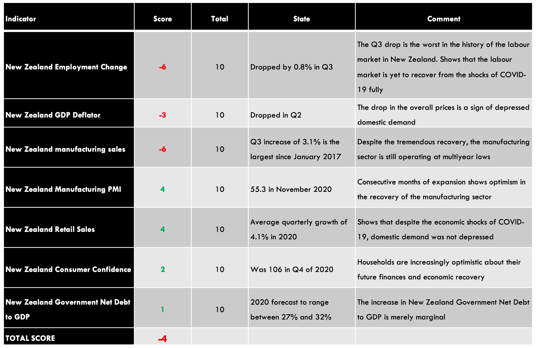
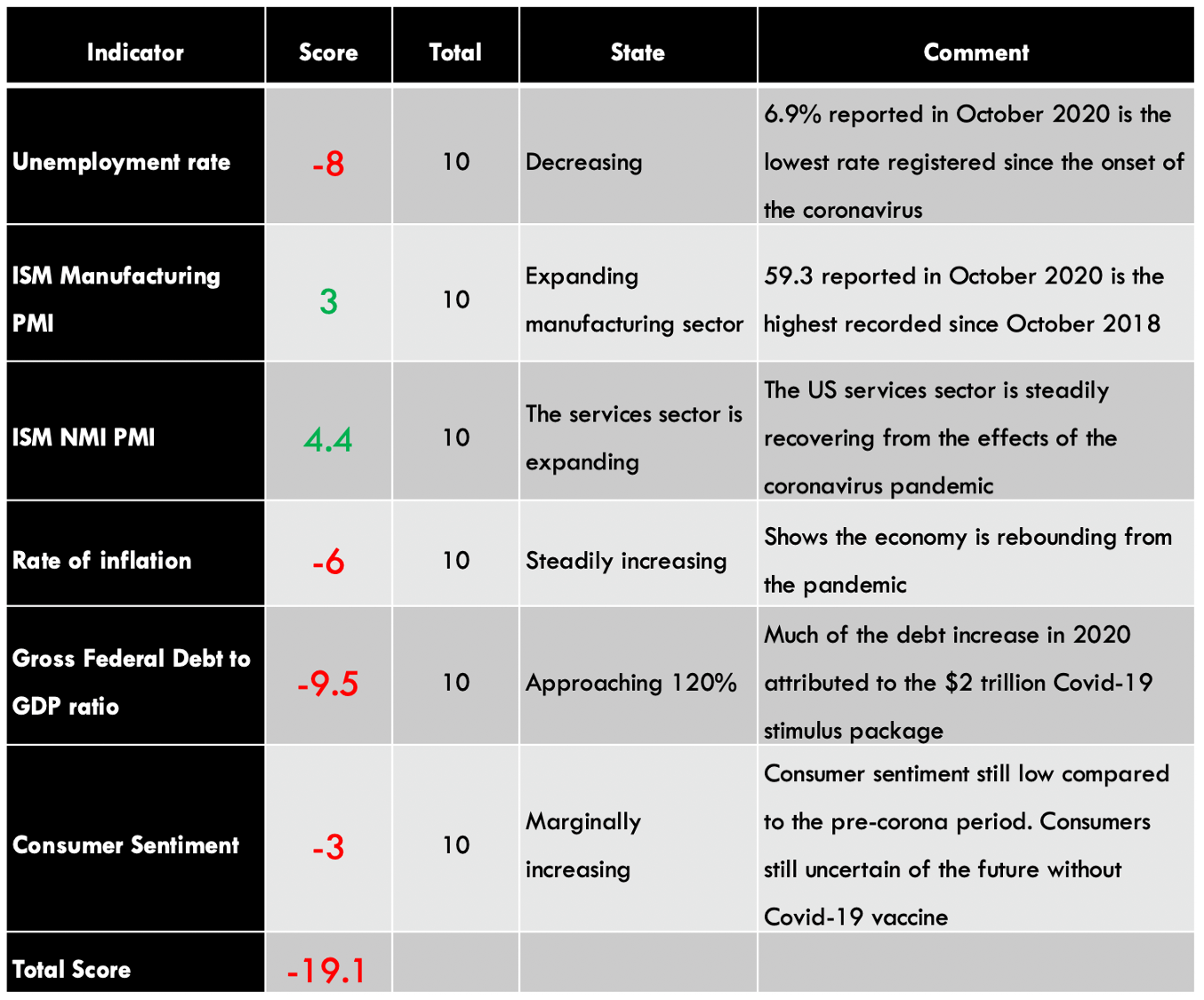
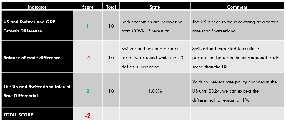
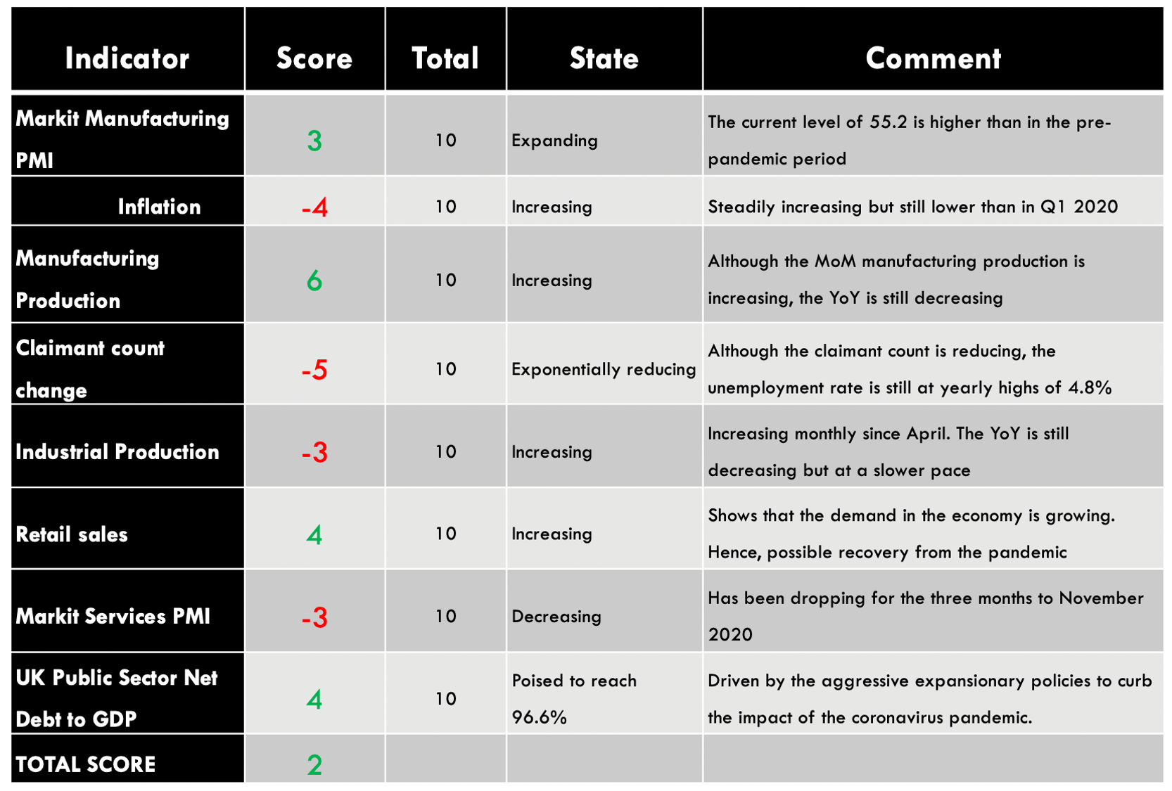
| Indicator | Score | Total | State | Comment |
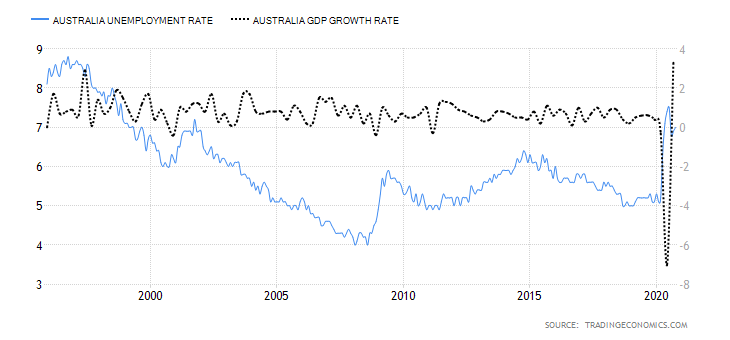
| Switzerland Unemployed Persons | -6 | 10 | 153,270 in November 2020 | 2020 mean is 142,100 above the historic average of 59,003 |
| Switzerland Producer Prices Change | -3 | 10 | Decreased by 2.7% in November 2020 | Represents the 23rd consecutive month of a price decrease |
| Switzerland Capacity Utilisation | -6 | 10 | 78.11% in Q4 2020 | Q4 is the lowest recorded in 2020. It’s also lower than the historical average of 80.03% |
| Switzerland Household Saving Ratio | -5 | 10 | Expected to reach 15.4% in 2020 | This would be the highest level in Switzerland’s history |
| Switzerland House Price Index | 1 | 10 | 172.82 points in Q3 2020 | Throughout 2020, the Swiss Residential House Price Index has remained above the historic average of 106.48 points |
| Switzerland Fiscal Expenditure | 3 | 10 | Projected to hit 235 billion CHF in 2020 | This would be the highest level in Switzerland’s history. It’s a direct result of the unprecedented expansionary fiscal policy |
| Switzerland Bankruptcies | 1 | 10 | 14,800 companies in 2020 | Precipitated by the adverse operating and economic conditions due to the coronavirus pandemic |
| TOTAL SCORE | -15 |
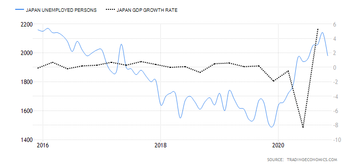
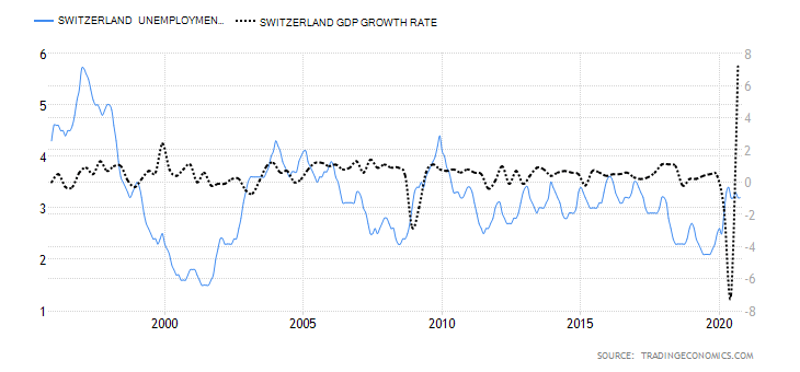
- Switzerland Unemployed Persons
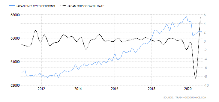
In Switzerland, the labour market is made up of Swiss citizens aged 16 to 65 years. The number of unemployed persons includes those who are available for work but could not get employed during the survey period. Note that the number of unemployed persons does not cover those working temporarily and must include those who have made efforts to seek gainful employment within four weeks. This number shows the prevailing economic situation in Switzerland since employment levels correspond to economic growth.
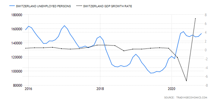
In November 2020, unemployed persons in Switzerland rose to 153,270 from 149,118 in October. In 2020, the mean of the unemployed persons in Switzerland is around 142,100 above the historic average of 59003. It has a score of -6
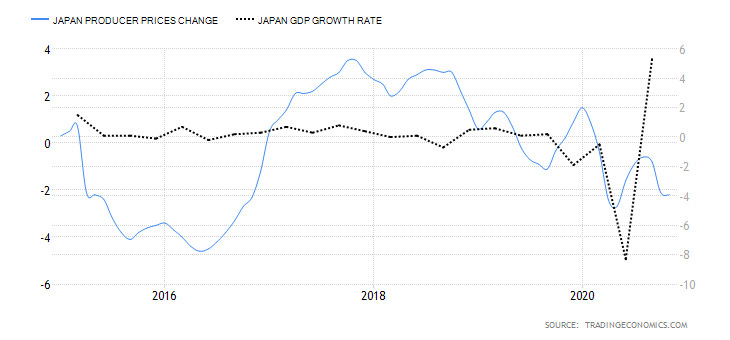
- Switzerland Producer and Import Prices
The Swiss PPI measures the change in the price of goods produced within the country and sold to wholesalers. It also includes the price changes of goods that are imported for resale in Switzerland. The PPI is a leading indicator of inflation in Switzerland since the change in the producer prices is passed to the final consumers of the products.
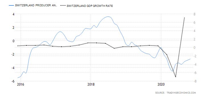
In November 2020, the YoY Swiss PPI dropped by 2.7% compared to a 2.9% drop recorded in October. This is the 23rd consecutive drop in the PPI. However, it was the slowest drop since March indicating that domestic demand is picking up. It has a score of -3.
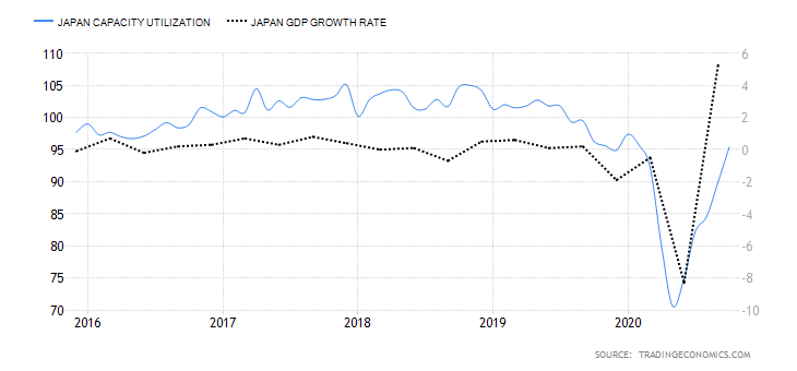
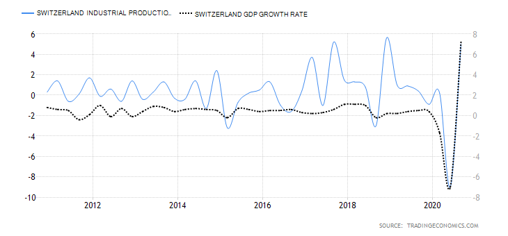
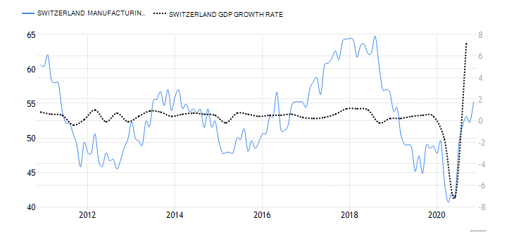
- Switzerland Capacity Utilisation
This tracks the percentage change in the ratio of actual industrial production in Switzerland and the maximum potential output. This ratio shows the rate at which the Swiss industries utilise the available resources. Typically, when the capacity utilisation rate increases, the output in the Swiss industrial sector also increases. This corresponds to economic expansion and improved living standards.
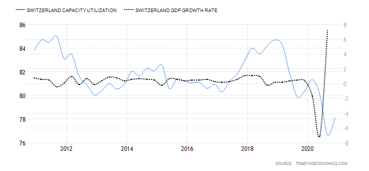
In Q4 2020, the Swiss capacity utilisation rose to 78.11% compared to 76.67% in Q3. However, the Q4 ratio is lower than the 81.34% in Q1, 80.03% in Q3, and the historical average of 83.45%. Consequently, it has a score of -6.
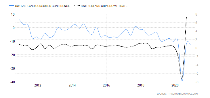
- Switzerland Household Saving Rate
This is the ratio between the amount that Swiss households save to their disposable income. In an economy, when the savings rate is high, domestic consumption takes a hit. Since a higher household savings rate corresponds to a drop in domestic demand, it leads to a decrease in GDP growth, and vice versa.
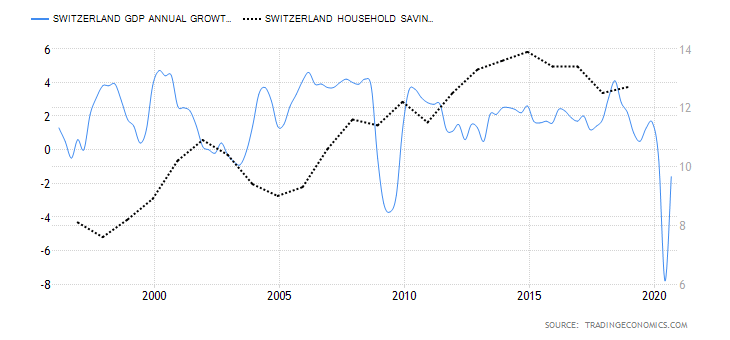
In 2020, Switzerland household saving rate is projected to hit 15.4%, which would mark the highest level in Switzerland’s history. It has a score of -5.
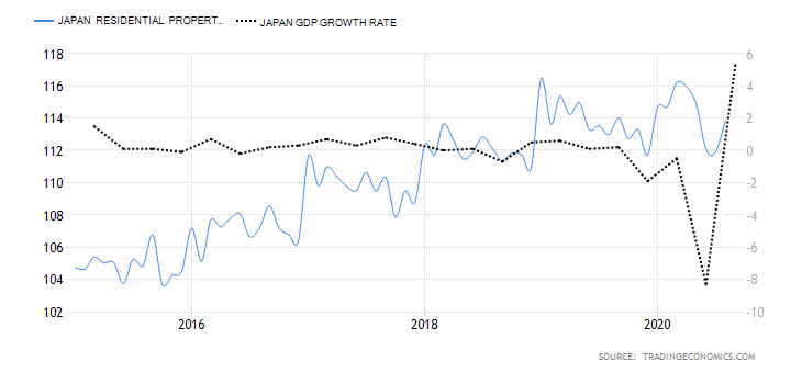
- Switzerland Residential House Price Index
This index tracks the change in the quarterly change of the price of single-family homes. Price change in the real estate sector is a leading indicator of overall economic growth. Residential property increases in price due to rising demand, which means there is access to affordable financing or increased disposable income.
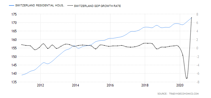
In Q3 of 2020, Swiss housing price index increased to 172.82 points from 169.22 points in Q2. Throughout 2020, the Swiss HPI has remained above the historic average of 106.48 points. This shows that domestic residential property did not take a hit as a result of the coronavirus pandemic. It has a score of 1.
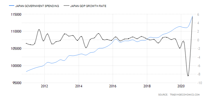
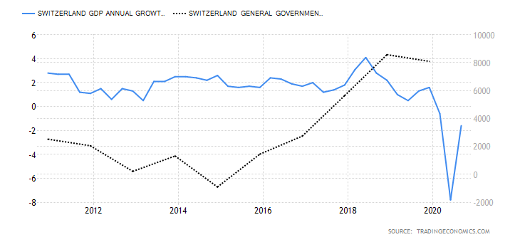
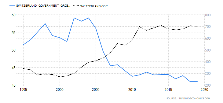
- Switzerland Fiscal Expenditure
This measures the totality of expenses by the Swiss government. They include expenditure on goods and services, public investment, and transfer payments. Note that fiscal expenditure is a primary method for the government to influence the economic growth rate.
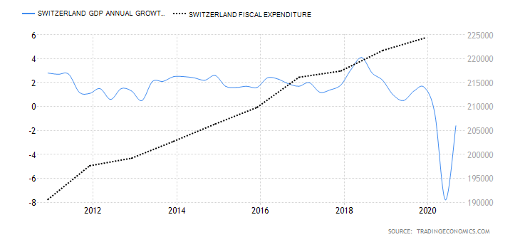
In 2019, the Swiss government’s fiscal expenditure increased to 224.309 billion CHF from 221.715 billion CHF. It is projected to hit an all-time high of 235 billion CHF in 2020 due to unprecedented fiscal expansionary measures to combat the pandemic. It has a score of 3.
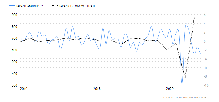
- Switzerland Bankruptcies
This measures the number of companies operating in Switzerland that are forced to close down due to the inability to service their debt obligations. Typically, the number of bankruptcies increases when the economy is performing poorly.
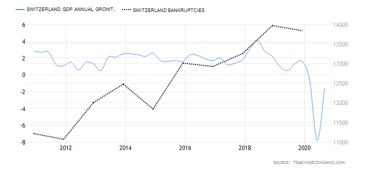
In 2020, the number of Swiss bankruptcies is projected to reach historic highs of about 14,800. It has a score of 1.
AUD/CHF Exogenous Analysis
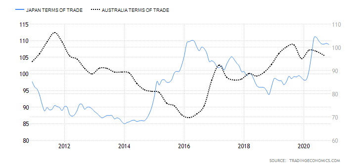
- Australia and Switzerland Terms of Trade Differential
A country’s terms of trade are derived from dividing the value of its exports with its imports. Thus, a country with a surplus net current account balance has terms of trade above 100%. Conversely, when its balance of payments has a deficit, the terms of trade will be below 100%.
In international trade, the domestic currency appreciates when a country has favourable terms of trade, and depreciate when unfavourable. Thus, when the differential of the terms of trade between Australia and Switzerland is negative, the AUD/CHF pair is expected to be on a downtrend. If the differential is positive, we can expect an uptrend for the AUD/CHF pair.
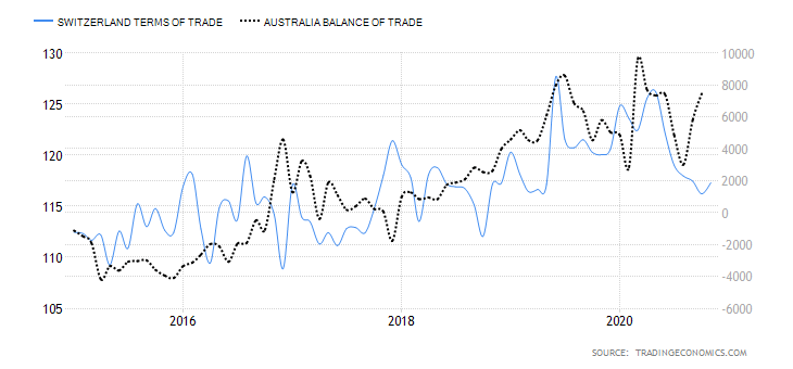
From January to October 2020, Australia’s average TOT was 97.9% while Switzerland had 121.15%. The differential is -23.25% and has a score of -4.
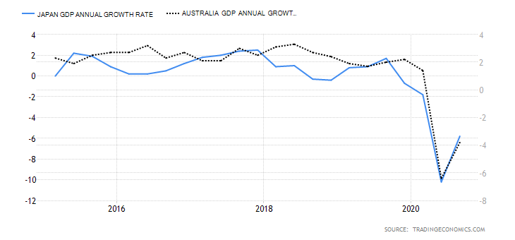
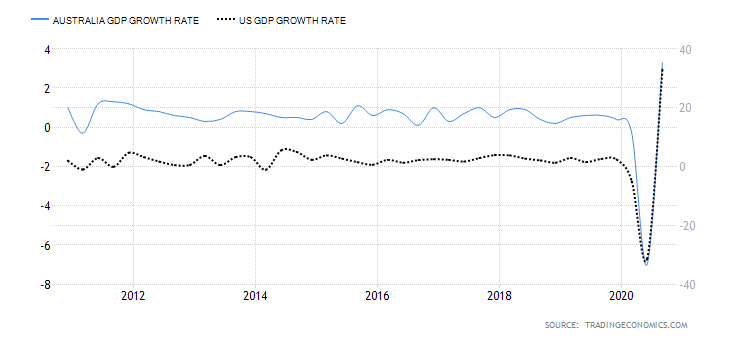
- Annual GDP Growth Rate Differential between Australia and Switzerland
The differential in the annual GDP growth rate is the difference between Australia’s and Swiss annualised GDP growth rate. Naturally, a country with a higher GDP growth rate tends to have a stronger currency than those with a slower GDP growth rate.
When this differential is positive, Australia has a higher annualised GDP rate than Switzerland. Since the AUD will subsequently appreciate more than the CHF, we can expect a bullish trend for the AUD/CHF pair. Conversely, if the Swiss economy has a higher annual GDP growth rate, then the differential will be negative. Consequently, the AUD/CHF pair has a bearish trend.
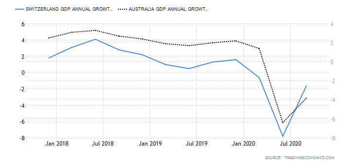
Australia had an annual GDP growth rate of -8.8% during the first three quarters of 2020, while the Swiss economy has an annual growth rate of -10%. The differential is 1.2%, and it has a score of 2.
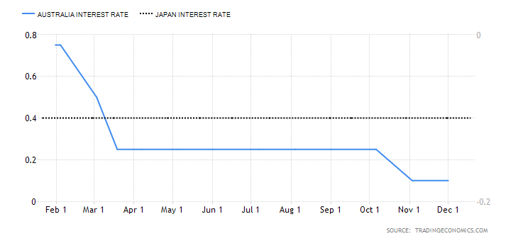
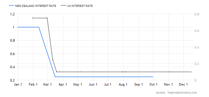
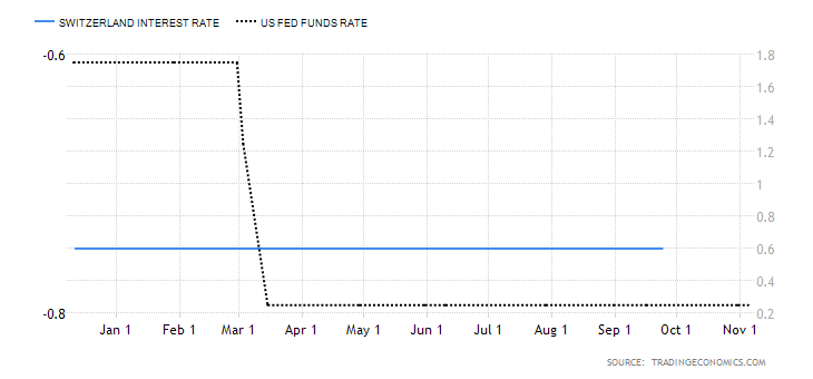
- The AUD/CHF interest rate differential
In the forex market, the interest rate differential determines the flow of capital between two currencies. For the AUD/CHF pair, the interest rate differential determines if traders and investors will go long or short the pair.
A positive interest rate differential means that Australia has higher interest rates than Switzerland; hence a bullish AUD/CHF pair. Negative differential means Switzerland has a higher interest rate than Australia; hence a bearish AUD/CHF.
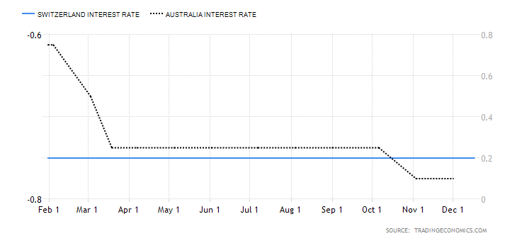
In 2020, the Reserve Bank of Australia cut interest rates from 0.75% to 0.1% while the Swiss National Bank maintained interest rate at -0.75%. Therefore, the interest rate differential for the AUD/CHF pair is 0.85%, and it has a score of 5.
Conclusion
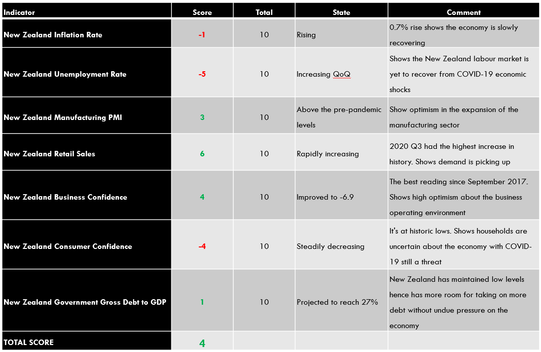
| Indicator | Score | Total | State | Comment |
| Australia and Switzerland Terms of Trade Differential | -4 | 10 | A differential of -23.25% | Switzerland has a current account surplus hence better terms of trade than Australia |
| Annual GDP Growth Rate Differential between Australia and Switzerland | 2 | 10 | 1.20% | Australian economy marginally contracted at a slower pace than the Swiss economy |
| The AUD/CHF interest rate differential | 5 | 10 | 0.85% | The SNB has maintained interest rate at -0.75% and has no short-term prospects of changing the policy. A policy change from the RBA might trigger any changes in the differential |
| TOTAL SCORE | 3 |
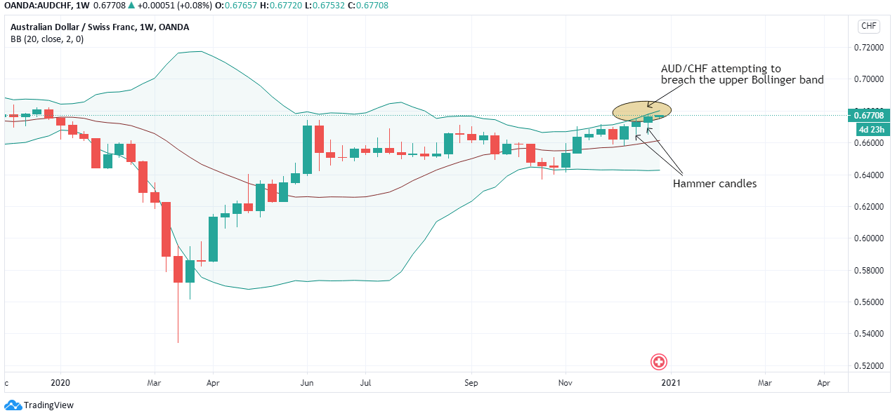
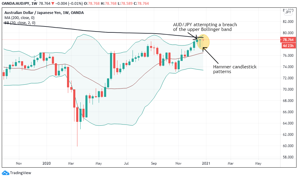
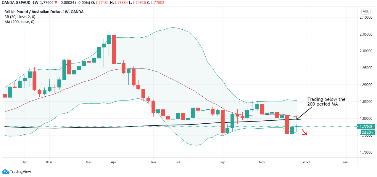
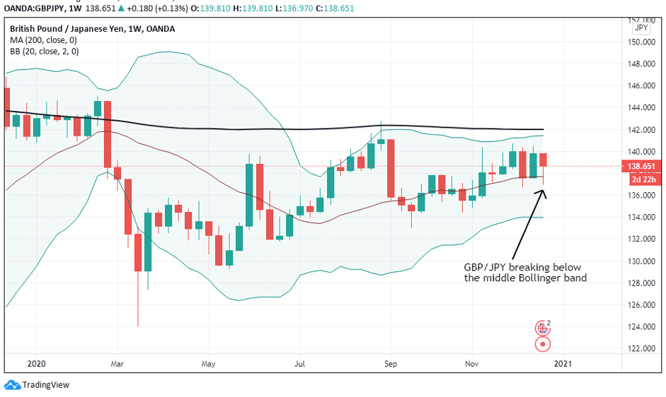
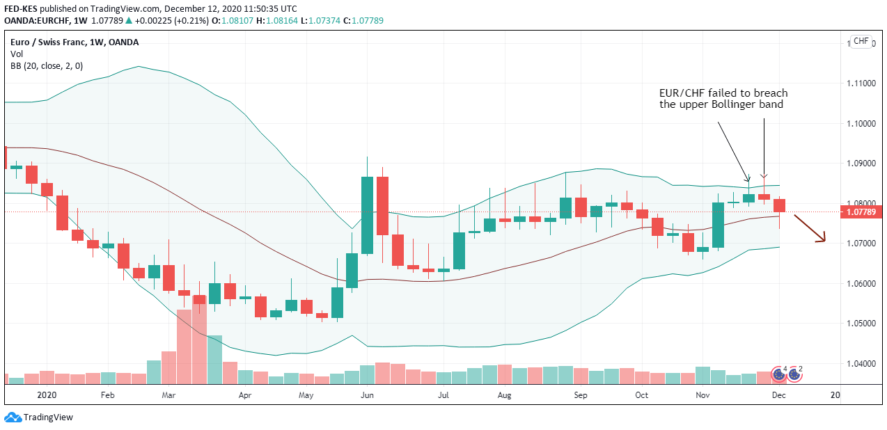
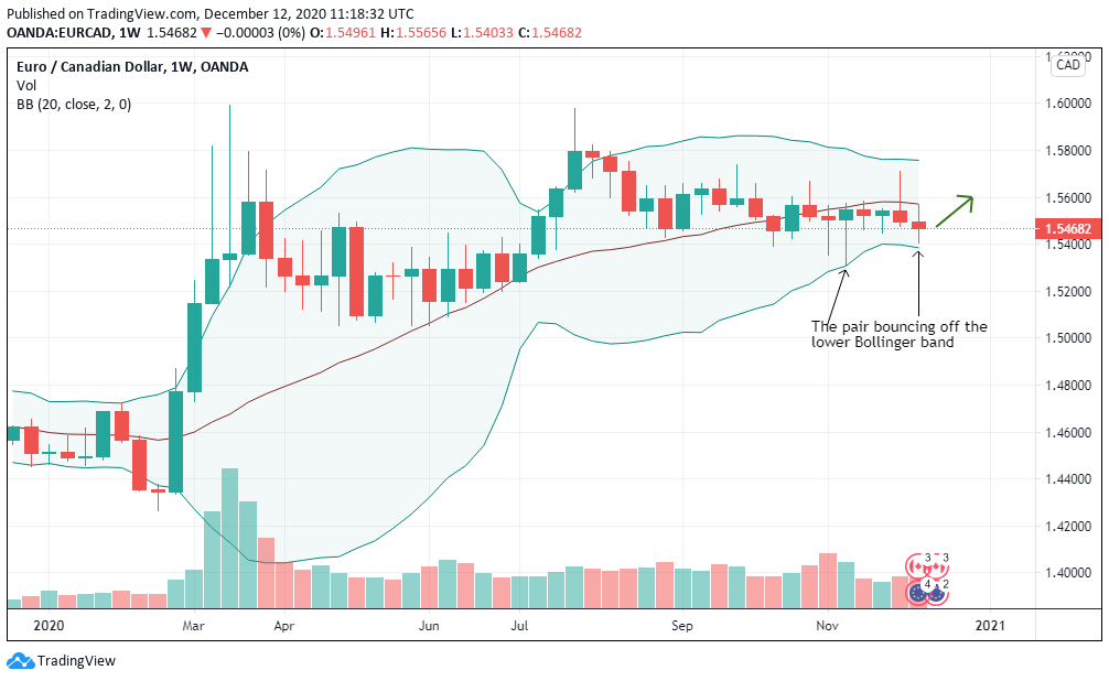
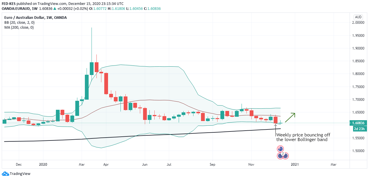
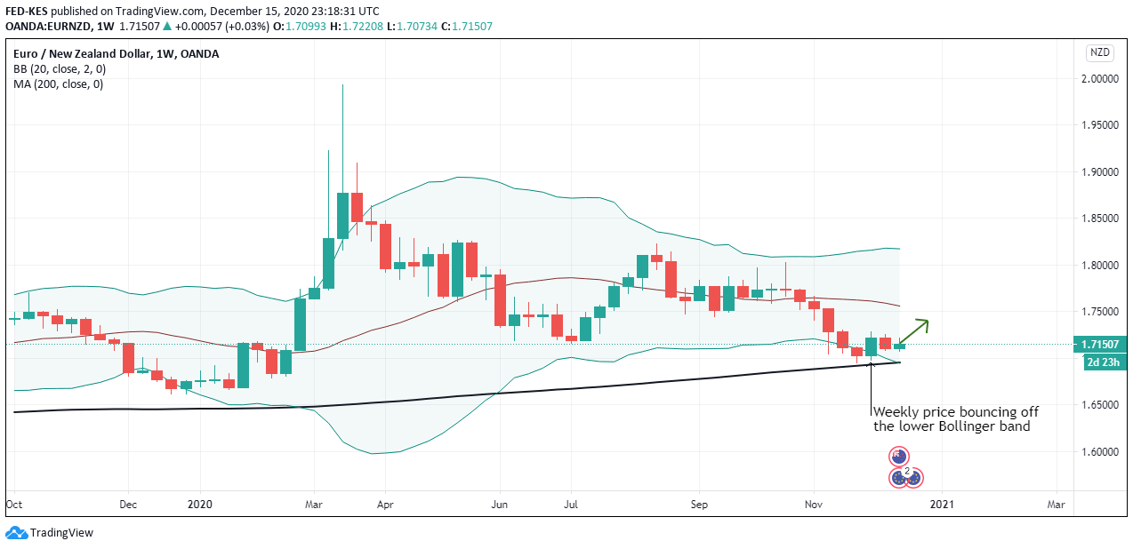
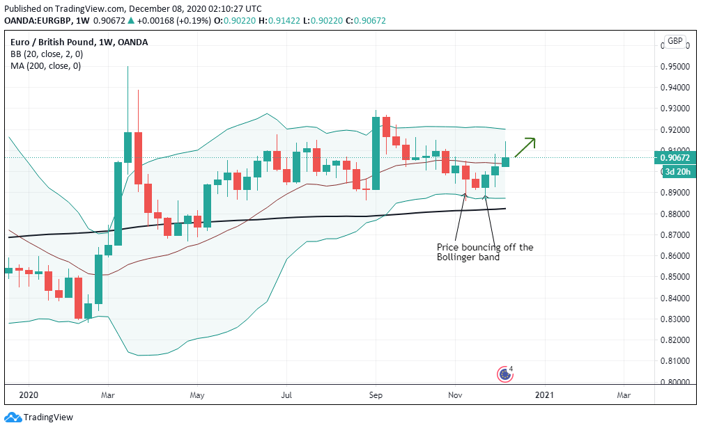
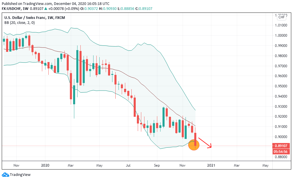
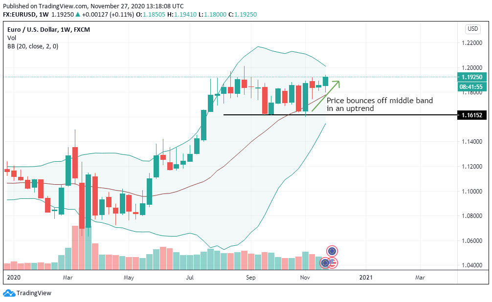
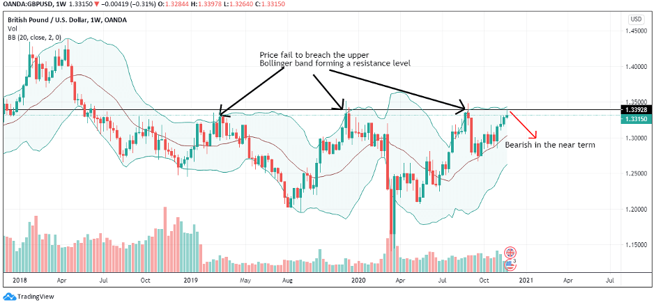
The cumulative exogenous score for the AUD/CHF pair is 3, which implies that we can expect the pair to continue trading on a bullish trend. The pair’s weekly chart’s technical analysis shows it is attempting to break through the upper Bollinger band. Furthermore, it has formed a series of bullish ‘hammer’ candles meaning that sellers have failed to drive down the exchange rate.


 It is normal that you can think after all this when you open your trading platform “what if the flute sounds? what if it does?”. We’ve all read the typical news in the newspaper where it tells you that x person won an incredible amount of money with x event. Quick and easy. Here the survival bias is very high. Don’t tell you that that could be 0.0001%


