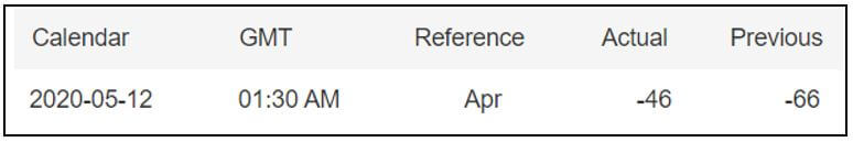
Categories
Forex Fundamental Analysis

Does ‘Retail Sales Monitor’ (RSM) Economic Indicator Impacts The Forex Market?

Introduction

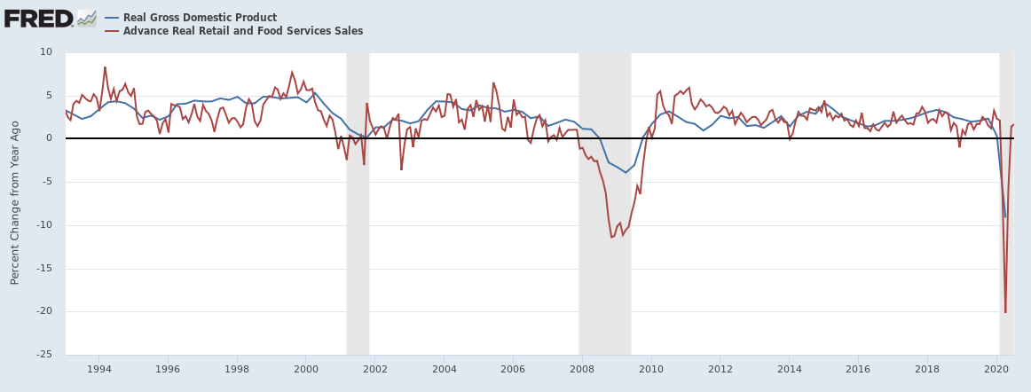
The level of demand can be said to be the primary driving factor in any economy. In the long run, the fiscal and monetary policies that are implemented by governments and central banks can be traced back to the aggregate demand within the economy. The consumption by households accounts for over 65% of the national GDP. Since retail sales account for most of the consumption by households, monitoring retail sales data can provide a useful predictor of the GDP and inflation.

Understanding Retail Sales Monitor

The Retail Sales Monitor is a precise measure of the performance in the retail sector. The RSM is measured monthly in the UK by the British Retail Consortium (BRC), whose participating members represent about 70% of the UK’s retail industry.

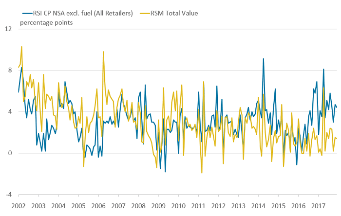
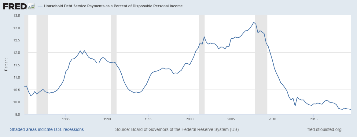
Source: The UK Office for National Statistics

The BRC is comprised of over 170 major retailers and thousands of independent retailers. The BRC member businesses have sales of over £180 billion and with 1.5 million employees. Since the RSM measures the change in the actual value of same-store sales in BRC-member retail outlets in the UK, the data can be used as a confident measure of the UK’s retail sector health and the broader economy.

In the UK, the retail sector is the largest employer in the private sector, which means that tracking the retail sector changes gives an overview of the economy and business cycles and insights into the labor market.

Using Retail Sales Monitor in Analysis

The RSM data couldn’t be more relevant in the current climate of Coronavirus afflicted economy and post-Brexit operating environment. Here are some of the ways this data can and is used for analysis.

In any economy, growth is driven by demand. Household purchases account for over 65% of the GDP, which makes the RSM data a vital leading indicator of economic health. When the retail sales monitor shows an increase in households’ consumption, it means that more money is circulating in the economy.

Several factors can be attributed to increased demand by households. Firstly, increased employment levels in the economy or an increase in real wages mean that the economy’s overall disposable income also increases. As a result, households can now consume more quantities of goods and services. More so, the increased disposable income tends to lead to the flourishing of discretionary consumer industries and a general rise in the aggregate demand.

An increase in aggregate supply leads to the expansion of production activities hence overall economic growth. Secondly, increased demand can be a sign of easy access to affordable funding by the households. Generally, if households and businesses have easy access to cheaper financing sources, it forebodes an increase in economic activities, which leads to economic expansion.

As an economic indicator, the retail sales monitor can be used as an authoritative leading indicator of recessions and recoveries since its data covers over 70% of the retail sector. For example, when the economy is at its peak, it is characterized by RSM’s historical highs and lower unemployment levels. When the RSM begins to drop consistently, this can be taken as a sign that the economy is undergoing a recession. The period of recession is characterized by an increase in the rate of unemployment and lower disposable income, which makes households cut back on their consumption and prioritize essential goods and services.

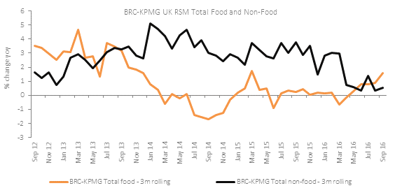
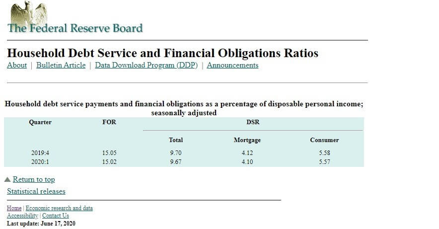
Source: Retail Economics

Conversely, when the economy is at its lowest during recessions or depressions, it is characterized by historical lows RSM and a higher unemployment rate. In this scenario, when the RSM begins to rise steadily, it could be taken as a sign that the economy is undergoing recovery. This period will be marked by improving labor market conditions hence increased demand that drives the RSM higher.

Using the RSM as a leading indicator of recessions and recoveries can help governments and central banks implement fiscal and monetary policies. When the RSM drops and shows signs that the economy could be headed for a recession, expansionary fiscal and monetary policies could be implemented. These policies will help to stimulate the economy and avoid depression.

On the other hand, when the RSM is continually rising at a faster rate, contractionary monetary and fiscal policies could be implemented. These policies are meant to mop up excess liquidity of the money supply and increase borrowing costs, thus avoiding an unsustainable rate of inflation and an overheating economy.

Impact on Currency

There are two main ways in which the RSM data can impact a country’s currency. By showing the economic growth and as an indicator for potential monetary and fiscal policies.

When the RSM has been steadily increasing, forex traders can anticipate that contractionary policies will be implemented to avoid unsustainable economic growth. One of such policies involves interest rate hikes, which make the currency appreciate relative to others. Conversely, expansionary monetary and fiscal policies can be anticipated in the event of a persistent drop in the RSM. Such policies include cutting interest rates, which depreciates the local currency.

The currency can be expected to be relatively stronger when the RSM is increasing. In this case, economic conditions are improving, unemployment levels are dropping, and a general improvement in households’ welfare. On the other hand, a dropping RSM is negative for the currency because it is seen as an indicator of a contracting economy and worsening labor conditions.

Sources of Data

In the UK, the RSM data is collated by the British Retail Consortium and KPMG. The data is published monthly by the British Retail Consortium.

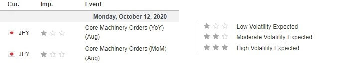
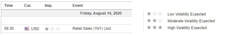
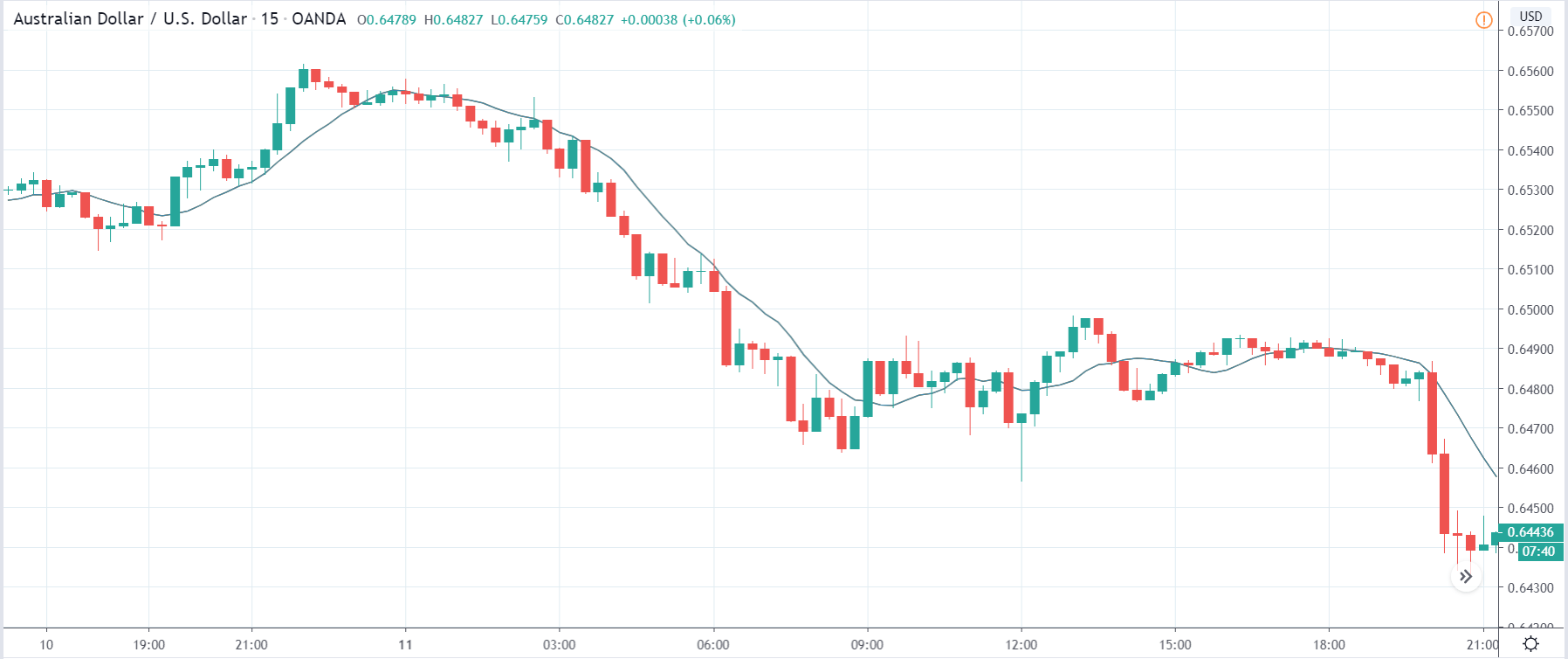
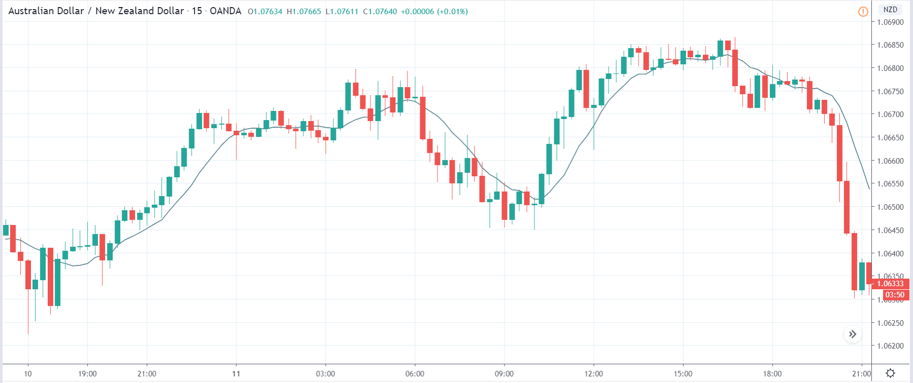
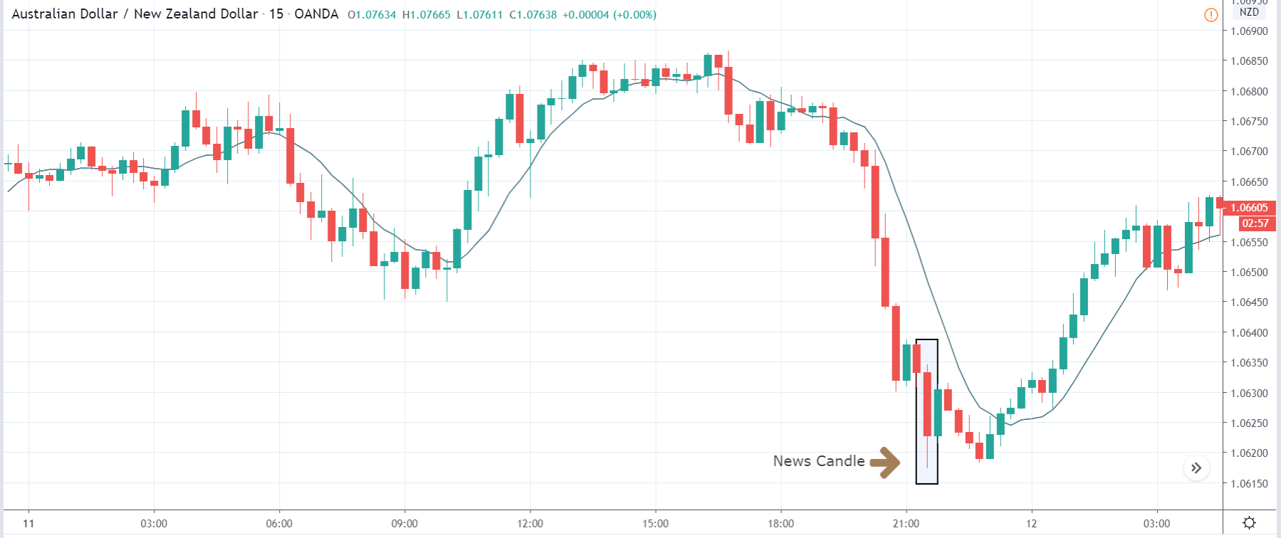
How Retail Sales Monitor Data Release Affects Forex Price Charts

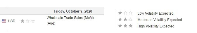
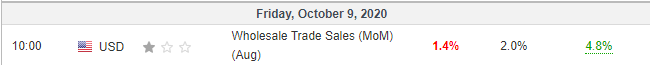
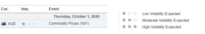
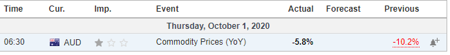
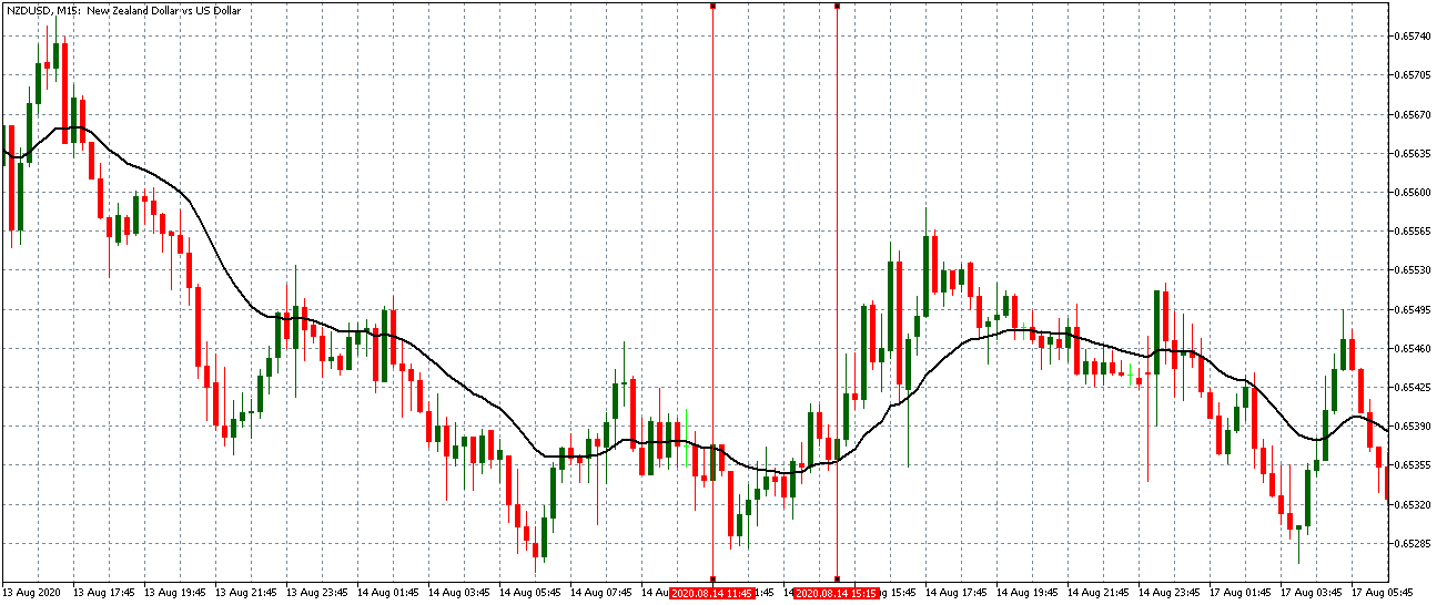
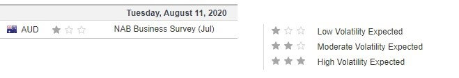
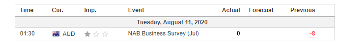
The recent publication of the retail sales monitor data was on October 12, 2020, at 11.00 PM GMT and accessed at Forex Factory.

The screengrab below from Forex Factory; as can be seen, a low impact on the GBP is expected when the RSM data is published.

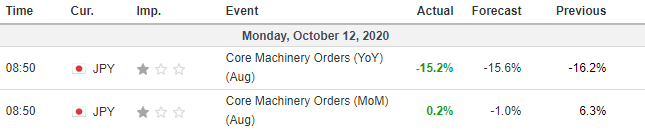
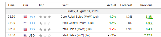
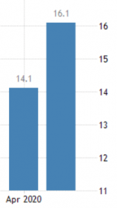
In September 2020, the BRC increased by 6.1%. This change was greater than the 4.7% change recorded in August 2020 and higher than the analysts’ expectation of a 3.5% change. Theoretically, this positive RSM is expected to have a positive impact on the GBP.

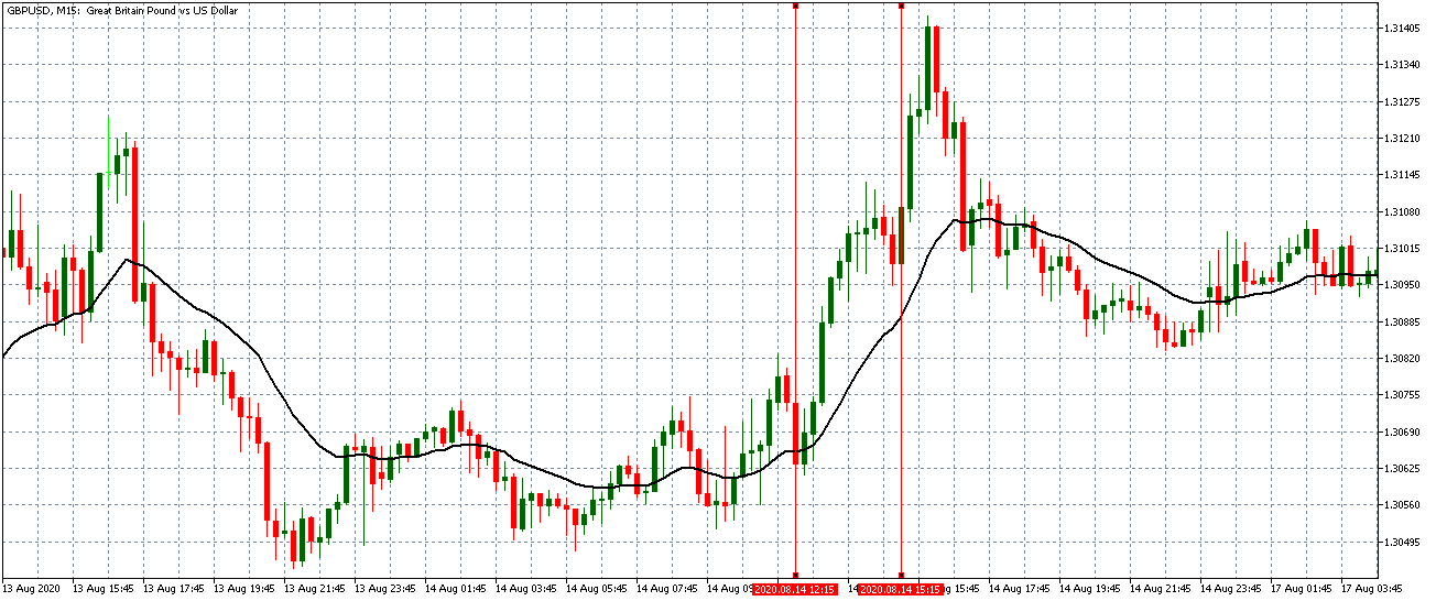
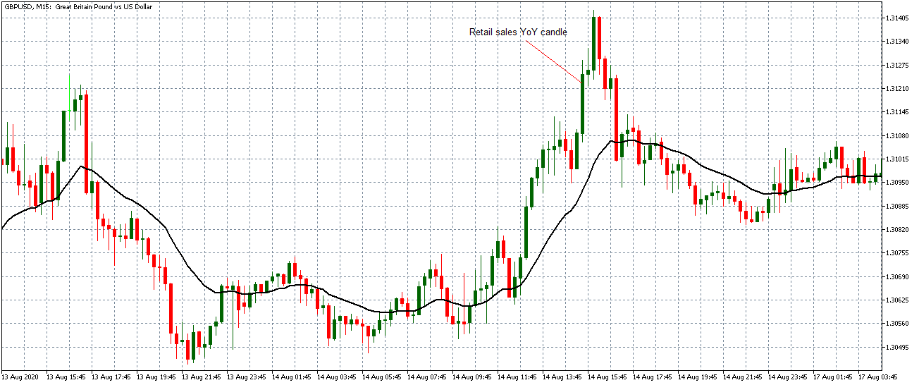
Let’s see how this release impacted the GBP/USD forex charts.

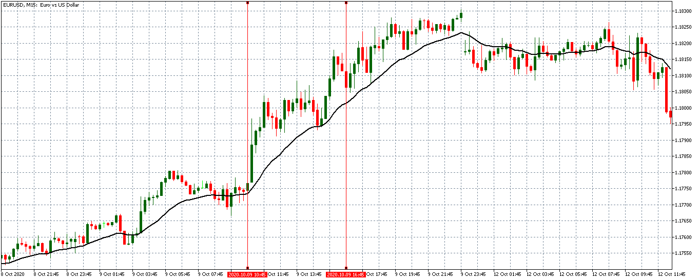
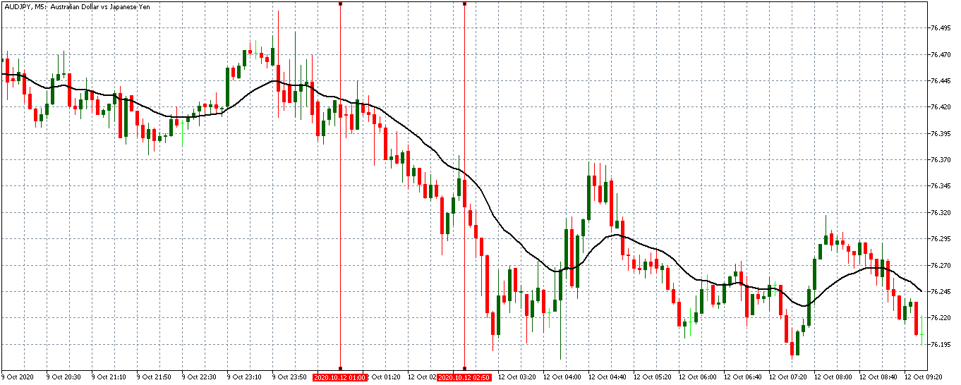
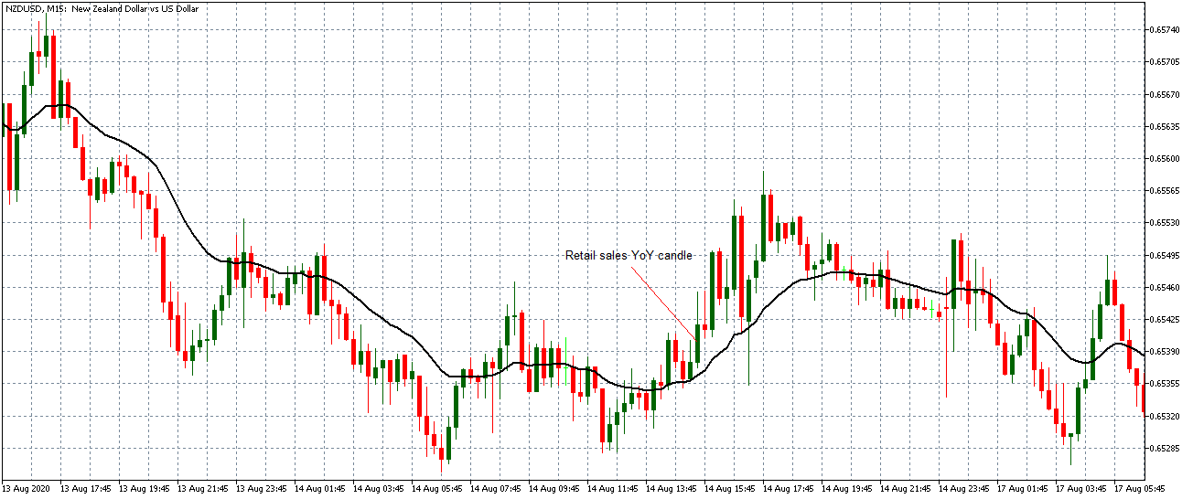
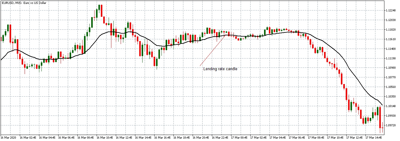
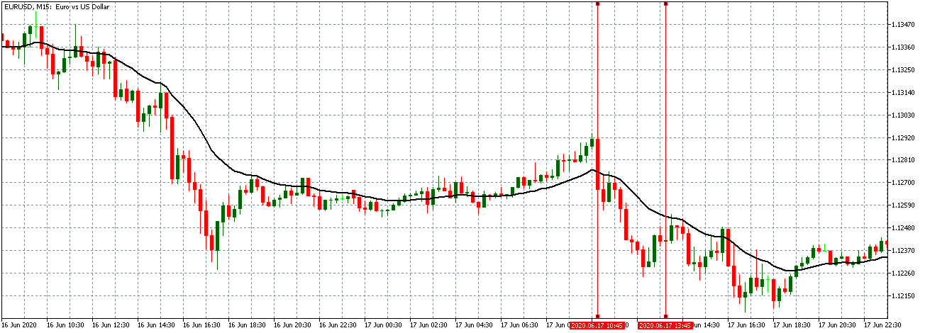
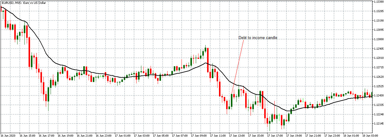
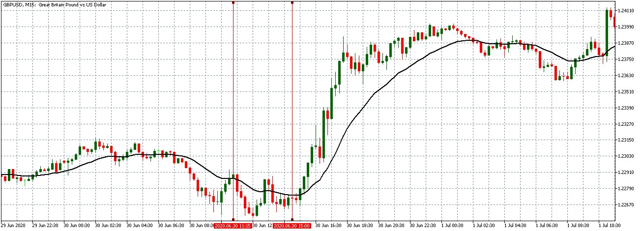
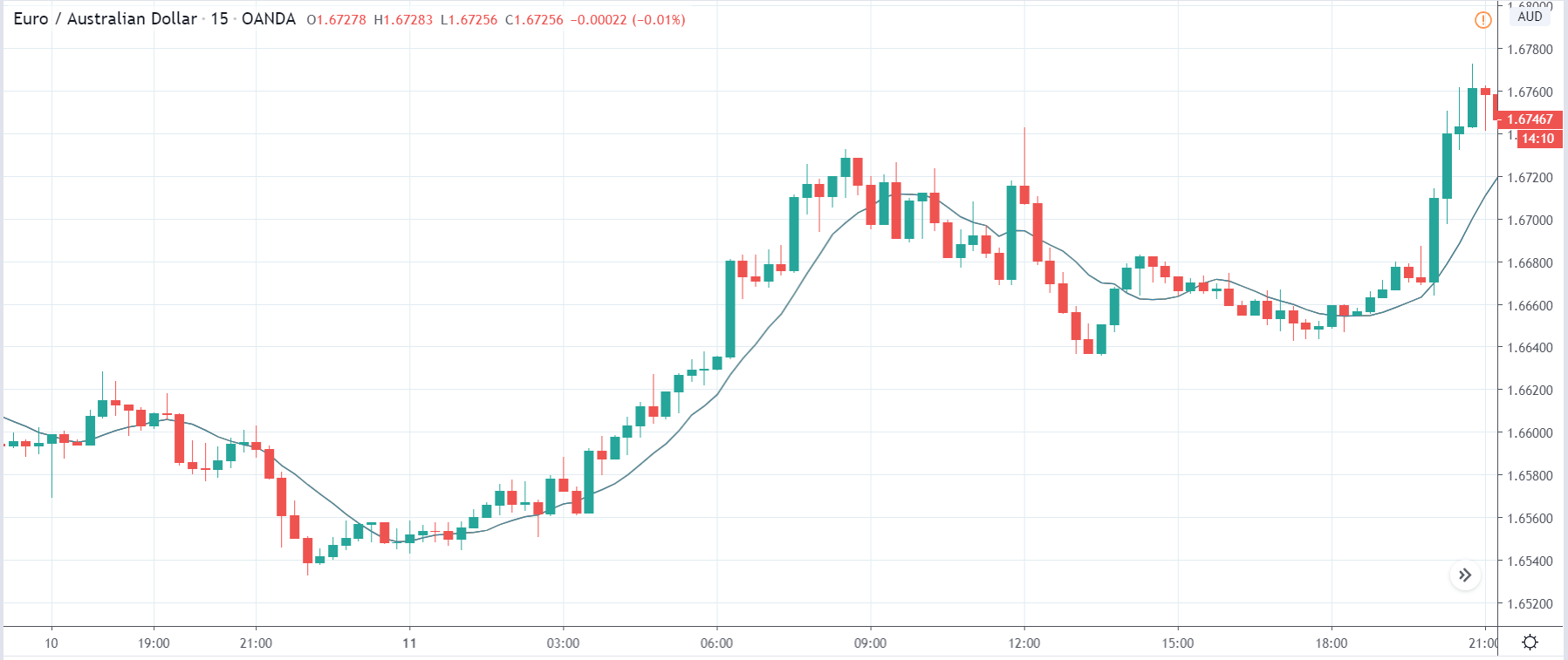
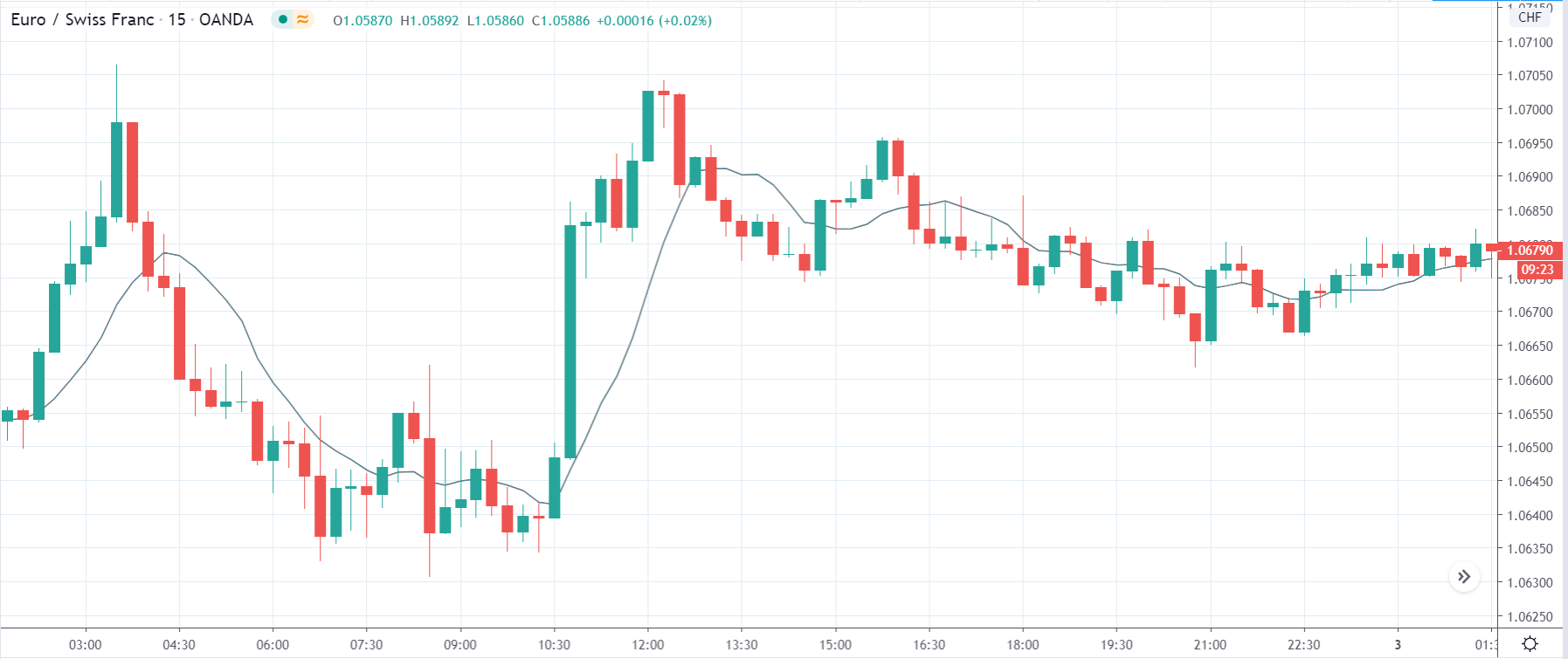
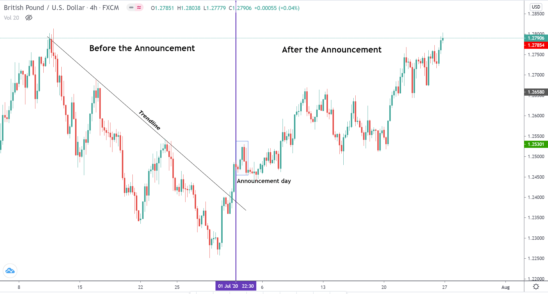
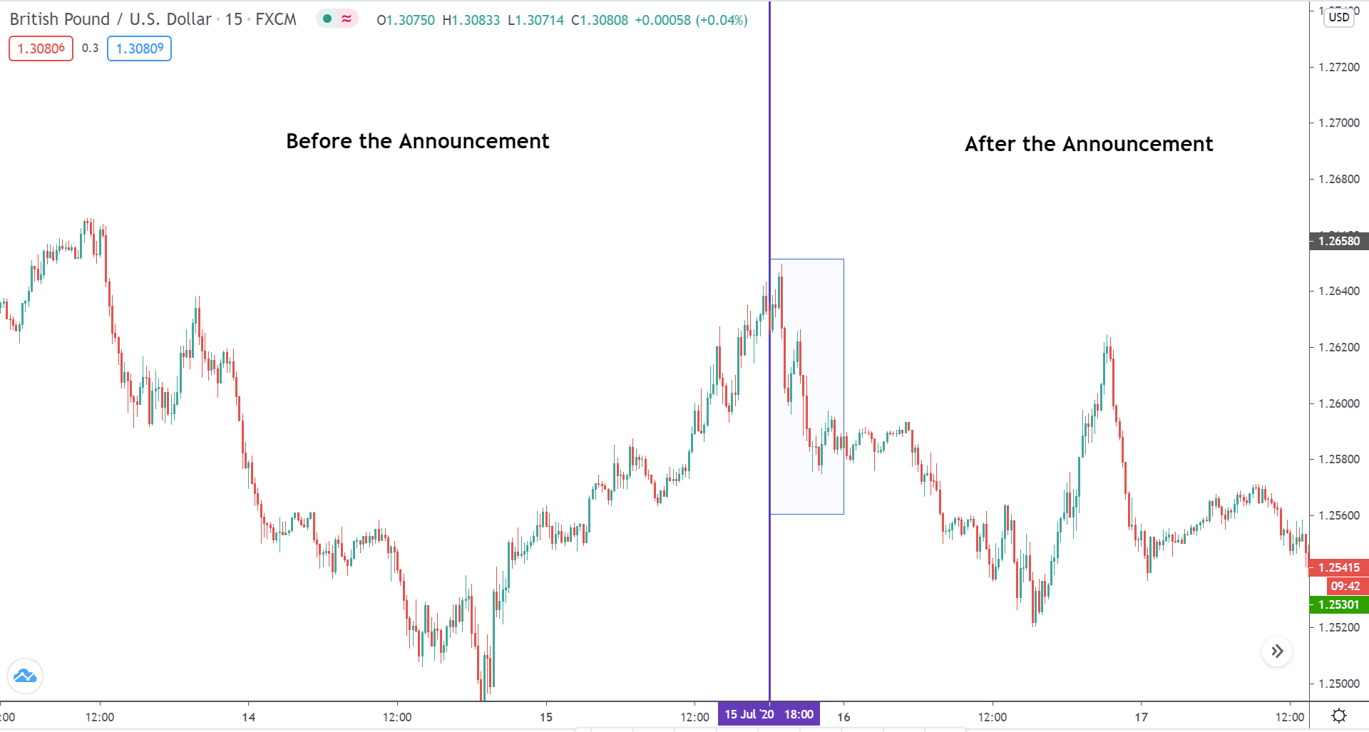
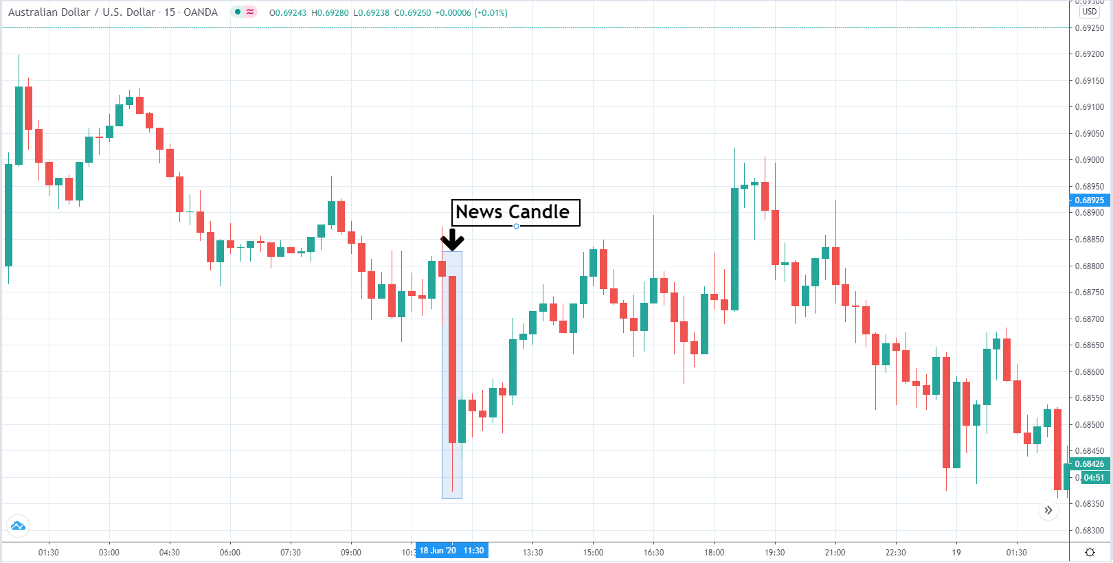
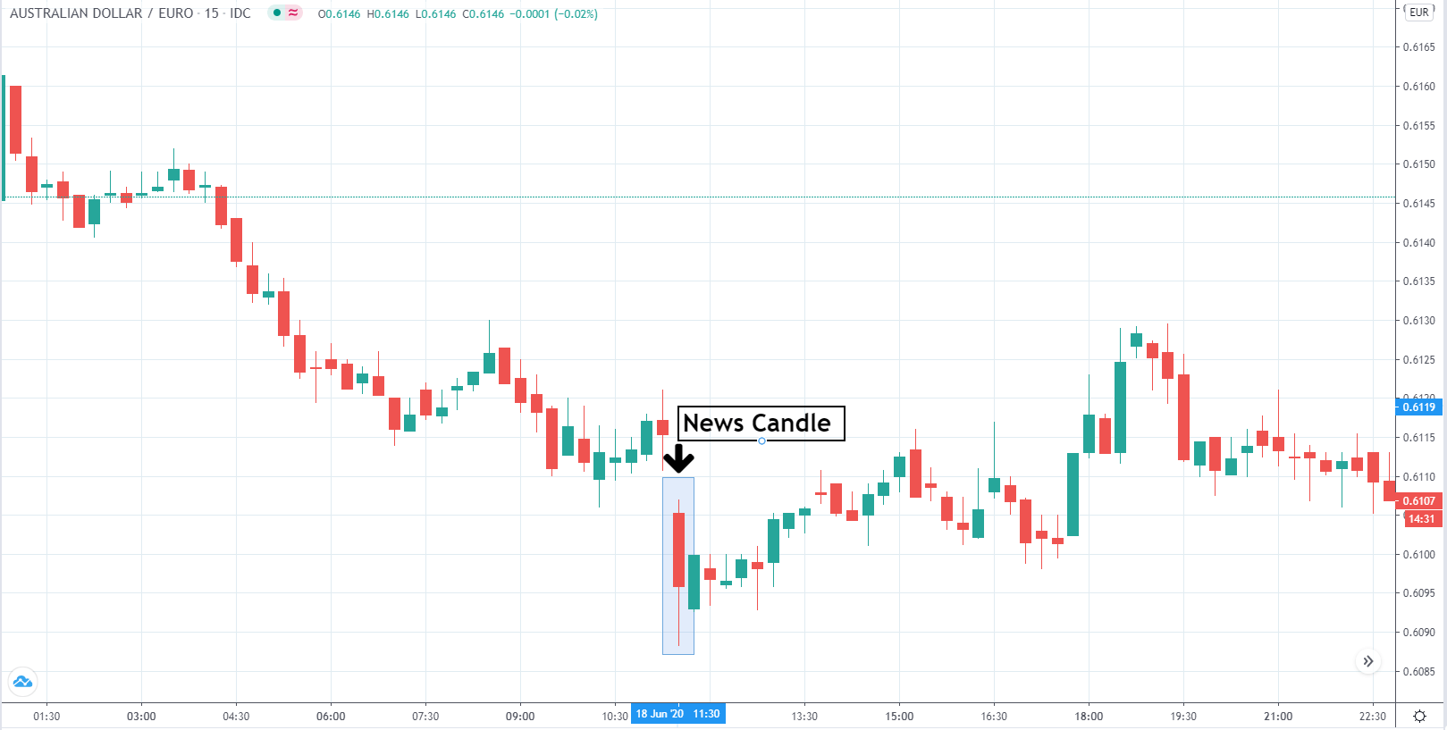
EUR/USD: Before the Retail Sales Monitor Release on October 12, 2020, 
Just Before 11.00 PM GMT

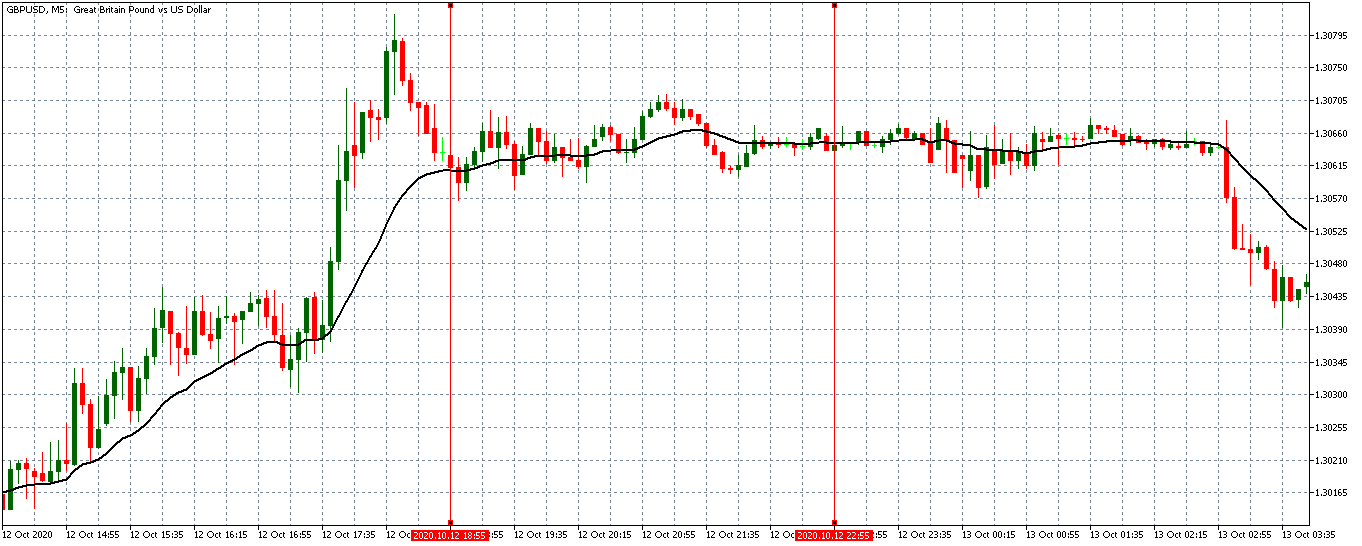
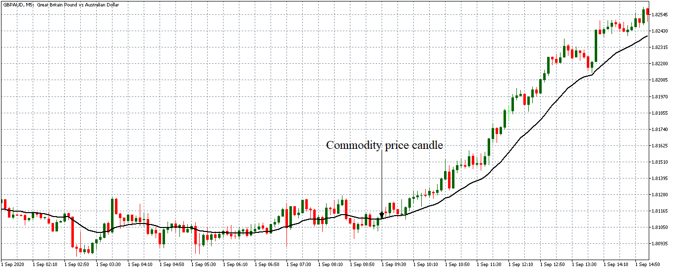
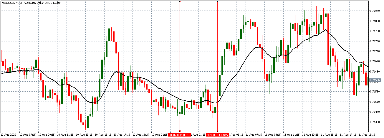
Before the publication of the RSM data, the GBP/USD pair was trading in a neutral pattern. As shown by the 5-minute chart above, the 20-period MA had flattened with candles forming just around it.

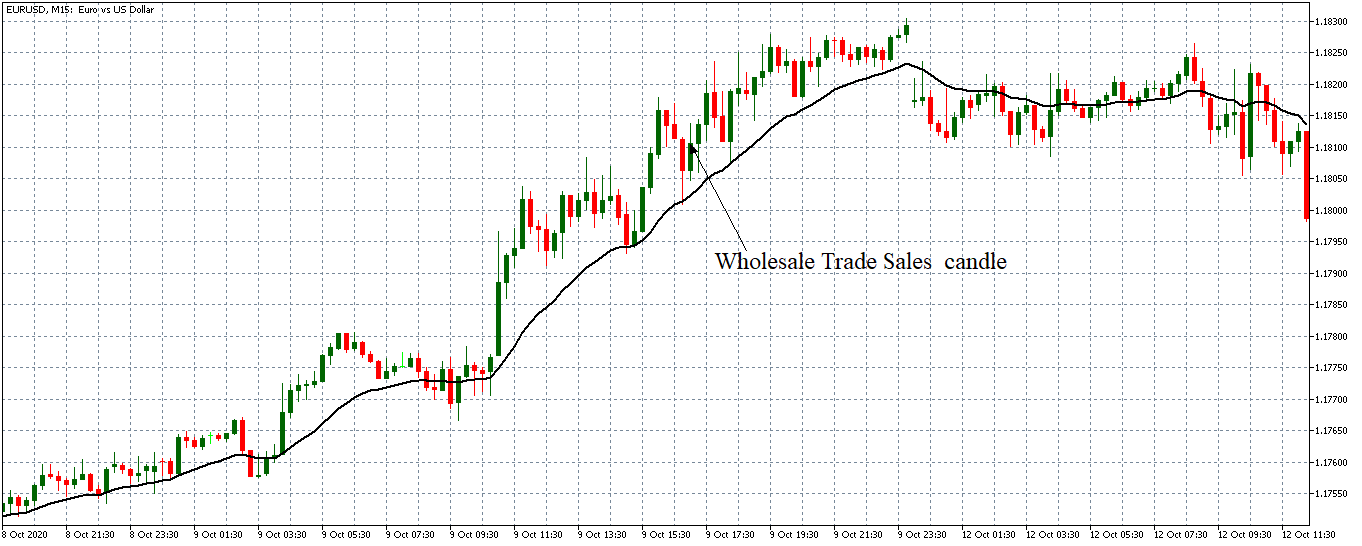
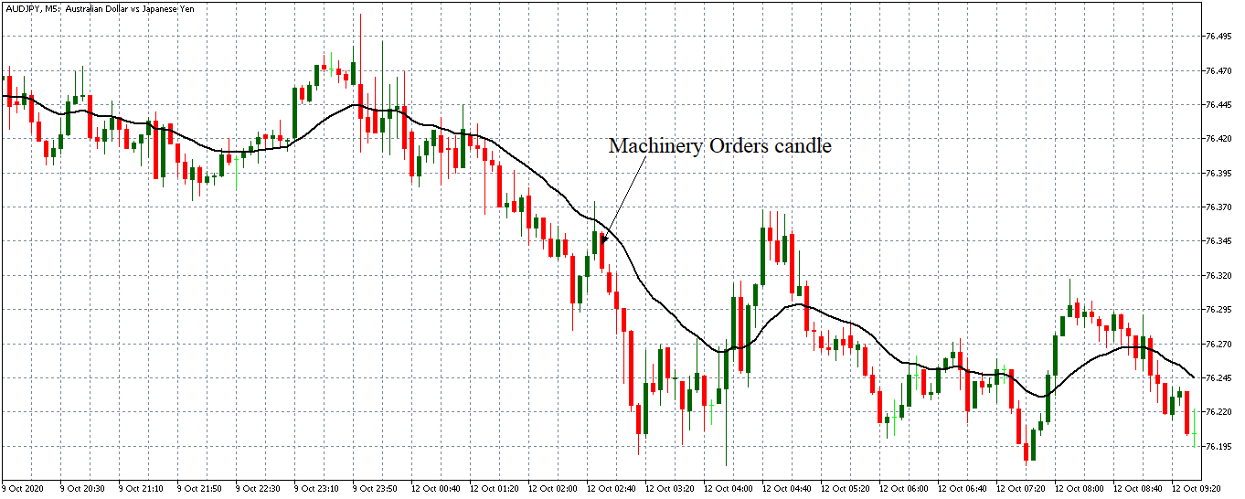
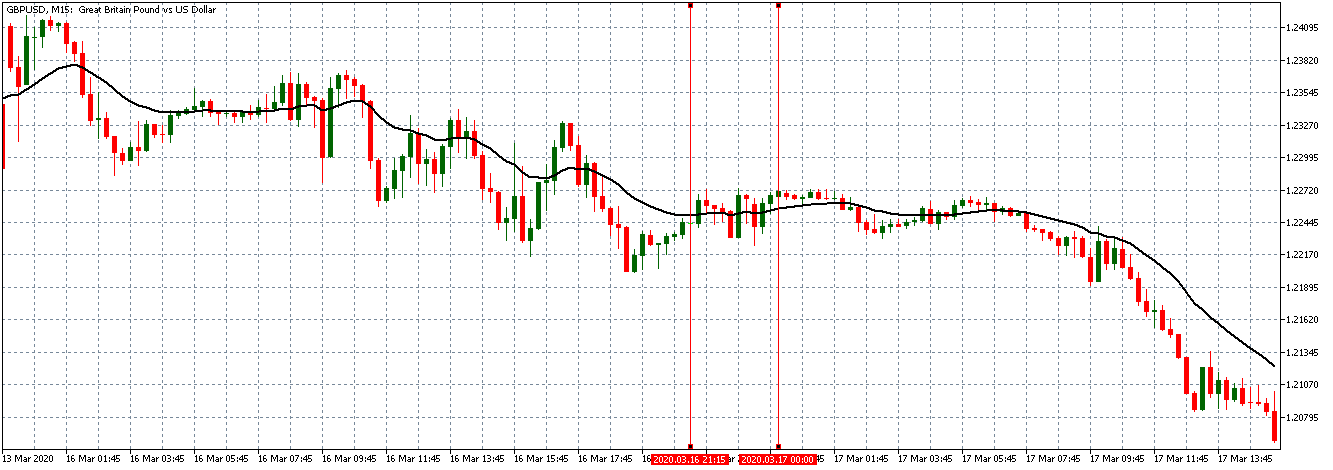
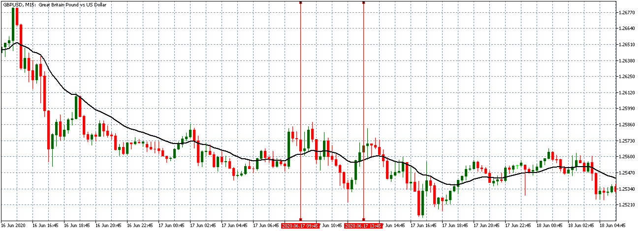
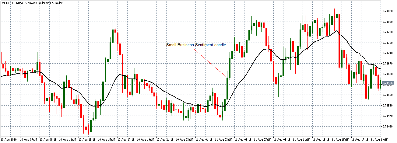
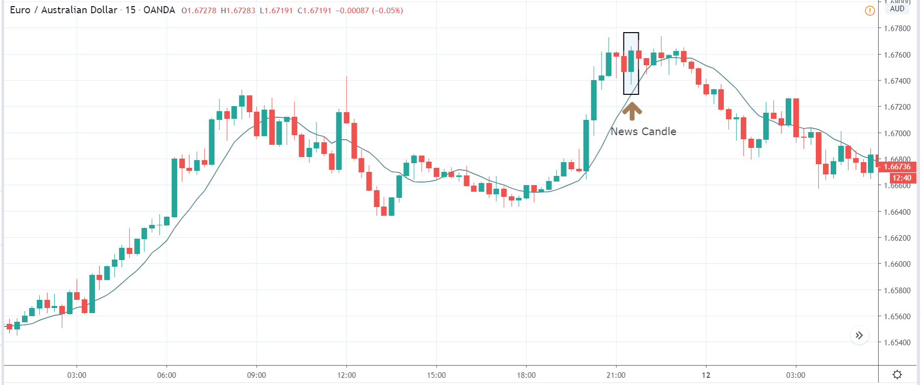
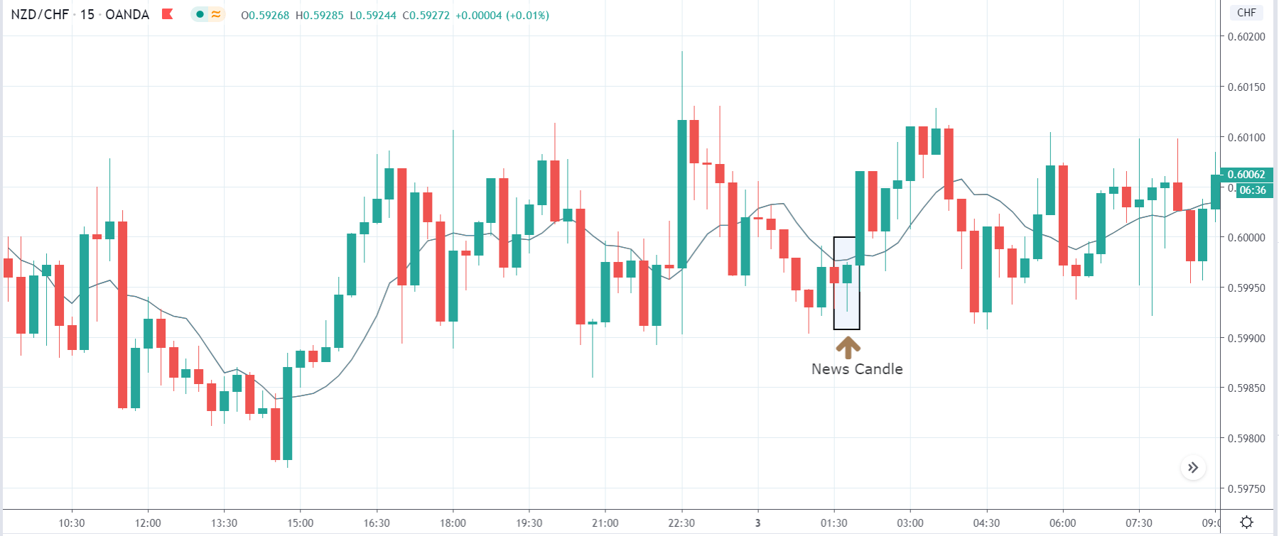
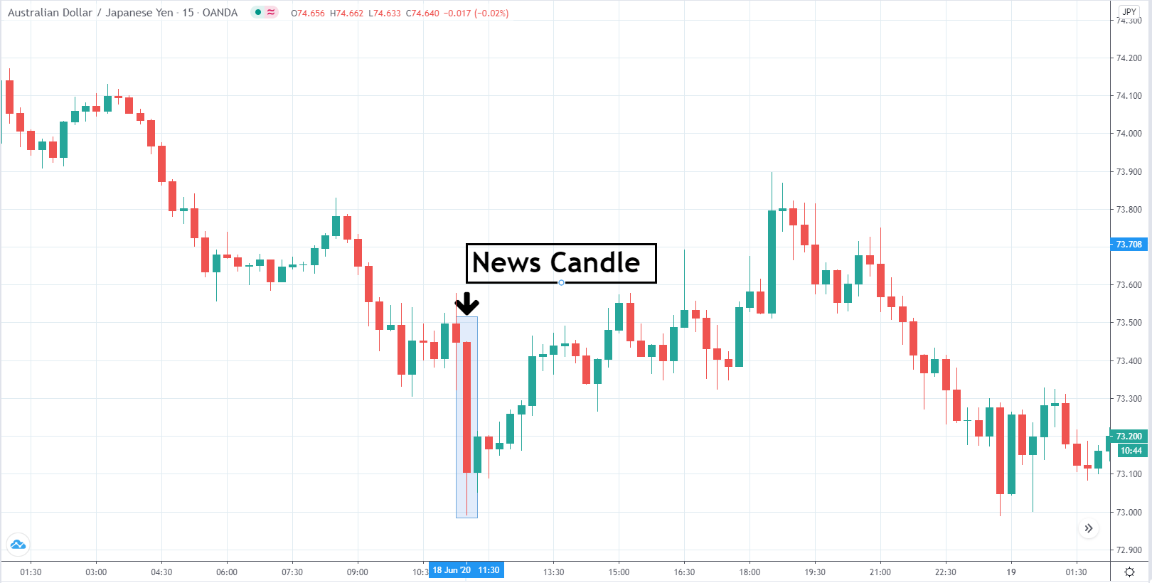
EUR/USD: After the Retail Sales Monitor Release on October 12, 2020, 
at 11.00 PM GMT

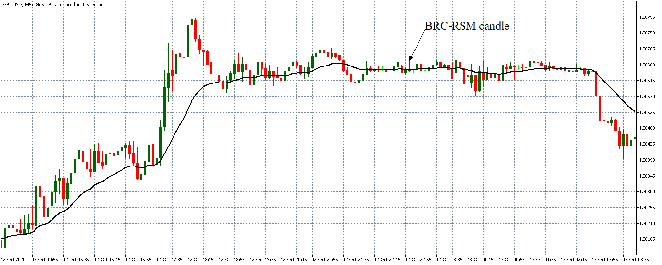
The pair formed a 5-minute ‘Inverted Hammer’ candle after the RSM data publication. However, the release of the data did not have any noticeable impact on the pair. The GBP/USD pair continued trading in the previously observed neutral trend with the 20-period MA still flattened.

Bottom Line

Most forex traders tend to pay attention to the retail sales data, which is usually scheduled for ten days after the RSM publication. The retail sales data are considered to cover the entire economy hence the low-impact nature of the retail sales monitor as an indicator in the forex market.

Categories
Forex Fundamental Analysis

Everything About ‘Business Investment’ Fundamental Forex Driver

Introduction

The economy is intricately woven. Although consumption accounts for about 70% of the GDP, this consumption wouldn’t be met if the supply was cut short. The point here is – all aspects of the economy are intertwined. Therefore, a change in one aspect of the economy is bound to influence the others significantly. In this article, we will see how investments by businesses influence the economy and how it impacts the forex market.

Understanding Business Investment

In the most basic sense, business investment is defined as spending money to acquire assets, start a business, or expand a business with the anticipation of making profits.

As an economic indicator, Business Investment’ represents the change in capital expenditure in the private sector. This expenditure is an inflation-adjusted value.

Source: Ernst & Young UK

In the UK, for example, business investment data is published quarterly. The data in this report is usually segregated depending on the asset type. These categories include; private sector business investment, investment in transport equipment, investment in ICT equipment and machinery, investment in buildings and structure, and investment in intellectual property products. Cultivated biological resources and the manufacture of weapons are included in the calculation. Note that the following are excluded from the calculation of the data in this report: expenditure on residential dwellings, expenditure on land and existing building, and the cost of ownership or transfer of non-produced assets.

In the calculation of the Business Investment’ in the UK, the data from the Annual Business Survey (ABS) is used to establish a benchmark on investment for various industries.

Using Business Investment in Analysis

As we mentioned earlier, business investment is part of the GDP and is also correlated with other economic aspects. The fact business investment data measures the value of the inflation-adjusted value of capital expenditure gives us a dependable ‘real’ figure of the economic activities over a specific period.

The primary effect of business investment will be on the labor market. When business investment increases, it could mean that new business ventures are being set up or the existing ones are being scaled up and expanded. In both instances, it means that more labor will be required. Remember that business investment encompasses investments made in any profit-making venture; it could be in agriculture, in the financial markets, or the informal sector. As a result, increased business investment lowers the rate of unemployment in the economy.

Furthermore, the increased production leads to the growth of output hence higher levels of GDP.

Source: Ernst & Young UK

Conversely, when business investment decreases, it could imply that economic activities are being scaled down. Scaling down operation implies that less labor will be needed. The result is an increase in unemployment levels. More so, scaling down operations implies low economic outputs hence lower levels of GDP.

Business investment goes hand in hand with the level of demand in the economy. Business investment can be said to be responding to levels of demand. Therefore, when business investment increases, it means that there is a higher demand in the economy. By itself, the increased demand means that other aspects of the economy, such as the labor market, are performing well. On the other hand, decreasing business investment means that demand is falling. Demand Reduction is synonymous to a contracting economy.

The business investment data can also be used to analyze the business cycles and, as a result, help in forecasting recessions and recoveries in the economy. Using historical data on business investment, we can establish a pattern. This pattern will show us periods when business investments were slowing down, when they were stagnating, and when they were rapidly increasing. Naturally, periods when business investments are increasing can be regarded as the expansion stage. The recession stage is characterized by a continuous fall in business investments. When business investments have stagnated, this period could be considered the peak of the business cycle.

In predicting recessions and recoveries, let’s use the example of the coronavirus pandemic. Towards the end of the first quarter of 2020, business investments dropped continuously. The continuous drop in business investment was because investors anticipated the demand in the economy to be severely depressed, especially in the consumer discretion industry. While other sectors of the economy saw some increased investments, most sectors experienced a drastic reduction in business investments. The primary goal when making any investment is to earn profits. In this instance, due to the social distancing rules, massive losses were forecasted across the economy. As a result, business investment reduced as investors looked to reduce their exposure to a contracting economy.

At the beginning of the third quarter of 2020, business investment started increasing. This period signified the beginning of economic recovery from the coronavirus-induced recession. The recovery was prompted by a host of expansionary monetary and fiscal policies implemented by governments and central banks. These policies included lowering interest rates and offering economic stimulus packages of trillions of dollars. These policies signified the revival of the economy to the private sector, hence the increase in business investment.

Impact of Business Investment on Currency

In the forex market, the level of business investment can be used to foretell the policy actions of governments and central banks.

In any economy, the private sector is the single largest employer. Therefore, when the business investment is continuously falling, it can be anticipated that the labor market conditions will worsen, and demand in the economy will be severely depressed. This scenario may trigger expansionary fiscal and monetary policies to stimulate the economy and avoid a recession. Such policies make the domestic currency depreciate relative to others.

Conversely, the currency will appreciate when business investment increases. This increase can sign that the economy is performing well with an increase in the money supply. Contractionary monetary and fiscal policies may be implemented to avoid runaway inflation and prevent the economy from overheating. These policies make the domestic currency appreciate.

Sources of Data

In the UK, the Office for National Statistics publishes the quarterly business investment data. Trading Economics has in-depth and historical data on the UK business investment. It also publishes data on global business investment.

How Business Investment Data Release Affects The Forex Price Charts?

The most recent publication of the UK’s business investment data was on September 30, 2020, at 6.00 AM GMT. The release can be accessed from Investing.com. Moderate volatility is to be expected on the GBP when the data is released.

In the second quarter of 2020, business investment in the UK decreased by 26.5%, which was better than the -31.4% expected by analysts.

Let’s see how this release impacted the EUR/GBP pair.

EUR/GBP: Before the Business Investment Data Release on September 30, 2020, 
just before 6.00 AM GMT

The EUR/GBP pair was trading in a weak uptrend before the publication of the UK business investment data. As shown in the above 15-minute chart, candles are forming just above the 20-period MA.

EUR/GBP: After the Business Investment Data Release on September 30, 2020,
at 6.00 AM GMT

The pair formed a 15-minuted bearish ‘Doji’ candle after the news release. Subsequently, the pair adopted a bearish trend.

Bottom Line

While business investment is a significant indicator in the forex market, we may not entirely know the extent of its impact on the GBP. This is because its publication is scheduled at the same time as the GDP – which is a high-impact economic indicator.

Categories
Forex Fundamental Analysis

Impact of ‘Commodity Prices’  On The Forex Market

Introduction

Thanks to international trade, some countries prosper disproportionately than others. The disproportionality in the balance of payments is mostly owed to the type of exports a country produces. Countries that are net exporters of precious commodities tend to have a better balance of payment than net importers. For this reason, the fluctuation of these commodities tends significantly affect their economy.

Understanding Commodity Prices 

A commodity can be defined as any physical product that can be traded in any form of exchange. With commodities, there is little differentiation, if any, regardless of where they originate. For example, we can say that an ounce of gold from South Africa is the same as an ounce of gold from Australia.

Naturally, different parts of the world are endowed with different types of natural resources. Furthermore, since commodities are inherently used to produce other goods and services, their value entirely depends on their rarity and demand. Take Copper and Wheat, for example. Both are commodities. But you cannot compare the value of a kilo of copper and a kilo of wheat. Copper is a rare and limited precious commodity, while wheat is readily cultivated. Therefore, a country that is a net exporter of copper will have a better balance of payment than a country that is a net exporter of wheat.

Furthermore, let’s take an example of country A with the largest deposit of commodity X in the world. In this case, country A is basically a monopoly; if it wanted to control the commodity prices, it would reduce the production of the commodity. By doing so, the demand for commodity X would exceed the supply, which means that country A will receive higher prices. Now, imagine a scenario where vast deposits of commodity X are discovered in country B. It now means that the supply of commodity X in the international market will increase, and as a result, the price of commodity X will decrease.

For countries whose economies heavily dependent on commodity exports, the fluctuation of commodity prices heavily impacts the earnings. Furthermore, the changes in the demand for these commodities also affect the GDP of these countries. Note that the price of these commodities also varies depending on their quality. For commodities which are used for trading in the future market, the minimum quality accepted is called the basis grade,

Using Commodity Prices  in Analysis

The commodity prices usually tend to impact the economies which heavily rely on the export of commodities to fund public expenditures.

An increase in commodity prices means that the producing country will receive more income. In turn, this translates to increased wages for workers involved in the production or mining of the commodity. Since households are well compensated, their welfare will significantly increase. Note that for countries heavily dependent on commodity exports, these commodities’ mining or production usually employs a majority in the labor market. Therefore, an increase in wages will significantly impact the changes in the aggregate demand in the economy for consumer goods and services.

This increase in demand tends to lead to an increase in the production of consumer goods. As a result, there will be an expansion of the consumer industry. More so, the expansion of these sectors leads to more job creation hence lowering unemployment levels. Other sectors of the economy will also benefit from this increase in wages. The real estate sector will also flourish since the increase in wages means that households can now afford to fund the purchase of homes or qualify for mortgages.

Conversely, a decline in the prices of commodities means that the labor involved will be compensated lesser. The resultant effect will be a contraction in demand for consumer goods and services since households will be forced to prioritize expenditure on essential products. Consequently, the consumer discretion industry will contract as producers scale down operations to match the decreased demand. As a result, some jobs in these sectors will be lost, contributing to increased unemployment. Therefore, we can see there is a direct link between the changes in commodity prices to the growth of the domestic economy and changes in the domestic employment levels.

Let’s look at another scenario. Say the economy of country A is intertwined with that of country C – country A imports multiple commodities from country C. Since country A’s economy heavily relies on commodities, the prices of these commodities increase, which means that the balance of payment of country A improves and that its citizens are well off. Thus, country A can afford to import more products from country C. therefore, country C’s economy will prosper. Increased imports from A means that production in C will increase, expand its economy, and improve labor market conditions.

Conversely, when commodity prices fall, it means that economic conditions in country A might deteriorate. Consequently, imports from country C will decrease, leading to either C’s economy to contract or a slowdown in its growth. This is usually the case with Australia and New Zealand, whose economies are close to each other.

Source: St. Louis FRED

Therefore, commodity prices do not just affect the economy of countries whose exports are majorly comprised of commodities.

Impact on Currency

The impact of the changes in the commodity price in the forex market is pretty straightforward.

When a country exports a commodity to the international market, it is paid in its currency. Therefore, when the commodity prices increase, it means that the domestic currency will be in high demand. Importers of the commodity will have to convert more of their currencies into the domestic currency. As a result, the value of the domestic currency will appreciate relative to other currencies.

On the other hand, a fall in the commodity means fewer amounts of the domestic currency will be required to purchase the exports. Consequently, the domestic currency will marginally depreciate relative to others.

Sources of Data

In Australia, the Reserve Bank of Australia publishes the Index of Commodity Prices report monthly.

Source: RBA

Trading Economics has a comprehensive list of commodity prices in both the spot and futures market.

How Commodity Prices Data Release Affects The Forex Price Charts?

The latest publication of the Index of Commodity Prices report by the RBA was on October 1, 2020, at 6.30 AM GMT and can be accessed at Invetsing.com. The release of the commodity prices is expected to have a low impact on the AUD.

In September 2020, the YoY the Australian commodity index decreased by 5.8% compared to a 10.2% decline in the YoY index for August 2020.

Let’s see if this release had an impact on the AUD.

GBP/AUD: Before Commodity Price Release on October 1, 2020, 
just before 6.30 AM GMT

The GBP/AUD pair was trading in a neutral pattern before the publication of the Australian commodity index. The 20-period MA was flattened with candles forming just around it.

GBP/AUD: After Commodity Price Release on October 1, 2020, at 6.30 AM GMT

The pair formed a 5-minute bullish candle when the commodity prices were released. Subsequently, the 20-period MA steadily rose with candles forming above it, showing that the AUD weakened against the GBP.

Bottom Line

In Australia, commodity exports account for about 50% of the export income. While this report plays a vital role in forecasting the Australian economy, it is a low-impact economic indicator in the forex market.

Categories
Forex Daily Topic Forex Fundamental Analysis

Everything You Need To Know About The ‘Jobs to Applications Ratio’

Introduction

For any economy, one of the best indicators of health in the labor market is how quickly the unemployed get absorbed into the job industry. This would indicate if the current economy is expanding at par with the growing number of job seekers. Apart from showing the absorption rate in the job market, it can also be used as a coincident economic indicator.

Understanding Jobs to Applications Ratio

The jobs to applications ratio help to put into perspective the number of job vacancies available vs. the number of job applications made during a particular time.

The job vacancies, in this case, represents the totality of the existing Job Vacancies from the previous reporting period that haven’t been filled and the new vacancies in the current period. For example, the total job vacancies for October 2020 would include the unfilled vacancies from the previous months in 2020 and the vacancies that became available in October 2020. The number of job applications does not necessarily need to be those that directly applied for these vacancies. This number is the totality of job seekers who have registered with employment bureaus across the country seeking employment.

Therefore, the formula of the jobs to applications ratio is 

When the number of active job openings is higher than that of active job seekers, the jobs to applications ratio will be higher than 1. Furthermore, the jobs to applications ratio will increase if the number of job openings increases faster than that of active job seekers. Conversely, if the number of active job seekers is higher than that of active openings, the jobs to applications ratio will be lower. Similarly, when the number of active job seekers grows at a faster pace than that of active job openings, the jobs to applications ratio will decrease at a rapid rate.

In most countries, the number of graduates from tertiary academic institutions is usually high. For this reason, most jobs to applications ratio reports usually exclude new school graduates and part-time job seekers. The primary reason for doing this is to smoothen the data since it is not expected that the labor market will absorb all graduates.

Using Jobs to Applications Ratio in Analysis

The Jobs to Applications Ratio shows the health of the labor market and is also a coincident indicator of economic growth. The best way to use the jobs to applications ratio in the analysis is by viewing it as a time series. It will enable you to compare the change in the economy over time easily.

To understand the implication of the Jobs to Application Ratio, we must first understand how job openings and unemployment come about. When the economy is expanding, the unemployment levels go down. An expanding economy is mainly driven by an increase in demand in the economy. Usually, household demand is the primary driver of the increase in aggregate demand.

When the aggregate demand rises, producers of goods and services must also scale up their operations to take advantage of the increasing demand and to avoid distortion of equilibrium price. When they expand their operations, they will need to hire more workers; this is where the unemployment levels go down. Also, note that when the unemployment rate reduces, it means that households’ expenditure increases, which also leads to the expansion of the economy. It is a feedback loop.

It also means that when the economy is contracting, it is a sign of a decrease in aggregate demand. This decrease force producers of consumer goods and services to cut back their production, which results in fewer job openings and increased unemployment.

Now let’s see what jobs to application ratio has to do with all this. When the Jobs to Applications Ratio is increasing over time, it implies that the number of active job openings is growing faster than that of the active job seekers. If, for example, the jobs to applications ratio has been increasing steadily over the past couple of months or years, it would mean the economy has been expanding. This increase shows that increasingly more jobs have been created in the economy.

Alternatively, it could mean that the rate of job retention in the economy is higher since fewer people lose their jobs and begin seeking employment all over again. Conversely, when the Jobs to Applications Ratio is continually decreasing, it means that the economy is contracting and the economy is creating fewer jobs. It could also mean that more jobs are lost in the economy hence the higher number of new job seekers.

The Jobs to Applications Ratio can also show the business cycles and periods of recession and expansion in the economy. When the Jobs to Applications Ratio continually drops, it implies that the economy has been contracting over an extended period with a growing number of unemployed in the economy. This is a clear sign of economic recession. In Japan, for example, the persistent drop in the job to application ratio coincided with the coronavirus-induced recession of the first half of 2020.

Source: Japan Institute for Labour Policy and Training

In times of economic recovery, businesses are presumed to gradually increase their operations, which means that the jobs to applications ratio will steadily increase.

Impact of Jobs to Applications Ratio on Currency

The value of the currency fluctuates depending on the perceived economic growth. Thus, the direct impact that jobs to applications ration has on currency is its inherent ability to show economic expansions and contractions.

The domestic currency will be expected to appreciate when the jobs to applications ratio increases. The increase in the jobs to applications ratio shows that the economy has been growing hence improved living standards.

Conversely, the domestic currency will depreciate when the jobs to application ratio are steadily decreasing. The continual decrease shows that the domestic economy has been contracting.

Sources of Data

In Japan, the Japan Institute for Labour Policy and Training is responsible for conducting surveys of the Japanese labor market. The institute publishes the data on Jobs to Applications Ratio monthly.

Trading Economics has a historical review of the Japanese jobs to applications ratio.

How Jobs to Applications Ratio Release Affects The Forex Price Charts

The Japan Institute for Labour Policy and Training published the latest jobs to applications ratio on October 2, 2020, at 8.30 AM JST. The release is accessed from Investing.com. Moderate volatility is expected on the JPY when the data is published.

In August 2020, the jobs/applications ratio was 1.04 compared to the 1.08 recorded in July 2020. Furthermore, the August ratio was less than the analysts’ expectations of 1.05.

Let’s see how this release impacted the JPY.

USD/JPY: Before Jobs to Applications Ratio Release on October 2, 2020, 
just before 8.30 AM JST

Before the release of the ratio, the USD/JPY pair was trading in a subdued uptrend. The 20-period MA was only slightly rising.

USD/JPY: After Jobs to Applications Ratio Release on October 2, 2020, 
at 8.30 AM JST

The pair formed a 5-minute bearish “hammer” candle immediately after the release of the ratio. Subsequently, it traded in a neutral pattern before adopting a bullish trend.

Bottom Line

The Jobs to Applications Ratio plays a significant role in establishing the health of the labor market. However, in the forex market, the unemployment rate is the most-watched economic indicator when it comes to the health of the labor market.

Categories
Forex Fundamental Analysis

The Impact Of ‘Machinery Orders’ Fundamental Indicator News Release On The Forex Market

Introduction

Industrial and manufacturing productions are one of the pillars of any economy. Whenever policies are implemented, governments tend to focus on ways to improve or increase production in the country. The main significance of manufacturing and industrial production is that they create employment opportunities in the local economy and ensure value addition to domestic products, making them competitive in the international markets. Furthermore, they contribute majorly towards technological advancements, which is why data on machinery orders is vital.

Understanding Machinery Orders

As an economic indicator, machinery orders measures the change in the total value of new orders placed with machine manufacturers, excluding ships and utilities.

The data on machinery orders are categorized into orders by; the private sector, the manufacturing sector, governments, overseas orders, and orders made through agencies. All these orders exclude volatile orders from power companies and those of ships.

Source: Cabinet Office, Government of Japan

The machinery orders by electric companies and that of ships are considered too volatile. This volatility is thanks to the fact that ships and the machinery used by electric companies are extremely expensive. Furthermore, these orders usually are placed once over long periods. Therefore, including these orders might unfairly distort the value of the machinery orders data.

To get a clear picture of what machinery, in this case, means, here are some of the components that are included in the machinery orders data. They are metal cutting machines, rolling machines, boilers, power units, electronic and communication equipment, motor vehicles, and aircraft.

Machinery orders from the government are categorized into; transport, communication, ministry of defence, and national and local government orders.

In the industrial sector, machinery orders are categorized by the manufacturing and nonmanufacturing sectors. The nonmanufacturing orders include agriculture, forestry, fishing, construction, electric supply, real estate, finance and insurance, and transportation. Some of the categories of orders in the manufacturing sector include; food and beverages, textile, chemical and chemical production, electrical and telecommunication machinery, and shipbuilding.

Using Machinery Orders for Analysis

By now, you already understand that machinery orders data encompass every aspect of the economy. It ranges from domestic government orders, agriculture, manufacturing and production, services delivery, and even foreign orders. As a result, the monthly machinery orders data can offer a treasure of information not only about the domestic economy but also foreign economies as well.

Source: Cabinet Office, Government of Japan

When companies invest in new machinery, it is considered a capital investment. Capital expenditure is usually considered whenever there is an anticipation of increased demands and services provided by the company. In this case, companies must scale up their operations to increase supply to match the increased demand. In the general economy, an increase in aggregate demand can result from increased money supply in the economy. Thus, it can be taken as a sign that unemployment levels in the economy have reduced or that households are receiving higher wages. Both of these factors can be attributed to an expanding economy.

Note that machinery, in this case, means heavy-duty machinery. Typically, these types of machinery take long in the production and assembly lines. At times, orders have to be placed weeks or months in advance. Therefore, the machinery delivered now may have possibly taken months in the assembly line. When the machinery orders increase, we can deduce that these machinery producers and assembly plants have to employ more labor.

Consequently, an increase in machinery orders means that unemployment levels will reduce. In turn, households’ welfare will improve, and aggregate demand for consumer products will rise. In the end, discretionary consumer industries will also flourish. A decrease in the machinery orders will tend to have the opposite effect.

Suffice to say, the machinery in question here are not cheap. Most companies finance their capital expenditure using lines of credit. Therefore, an increase in machinery orders could imply the availability of cheap credit in the economy. Access to cheap financing by companies and households stimulates the economy by increasing consumption and investments. As a result, the increased aggregate demand leads to an increase in the GDP and expansion of the economy.

Machinery orders data can also be used as an indicator of the economic cycles and to predict upcoming recessions and economic recoveries. When firms anticipate that the economy will go through a rough patch and demand will fall, they cut back on production. Scaling down operations means that they won’t be ordering any more machinery to be used in the production. Conversely, when companies are optimistic that the economy will rebound from recession or a depression, they will order more machinery to scale up their production in anticipation of the increased demand. Furthermore, when the economy is going through an expansion, the aggregate demand tends to increase rapidly. This rapid increase forces companies to increase their machinery orders to enable them to keep up with the demand.

Impact on Currency

The machinery orders data is vital in showing the current and anticipated state of the economy. For the domestic currency, this information is crucial.

The currency will appreciate when the machinery orders increase. Machinery orders are seen as a leading indicator of industrial and manufacturing production. Therefore, when the orders increase, the economy can anticipate an increase in industrial production. And along with it, a decrease in the level of unemployment. Generally, the increase in machinery orders means that the economy is expanding.

Conversely, when machinery orders are on a continuous decline, it means that businesses expect a more challenging operating environment. They will scale down their operations in anticipation of a decline in the demand for their goods and services. In this scenario, higher levels of unemployment should be expected in the economy. Since the economy is contracting, the domestic currency can be expected to depreciate relative to others.

Sources of Data

In this analysis, we will focus on Japan since one of the world’s leading producers of heavy machinery. The Cabinet Office, Government of Japan, releases the monthly machinery orders data in Japan. Trading Economics publishes in-depth and historical data of the Japanese machinery orders.

How Machinery Orders Data Release Affects The Forex Price Charts

The Cabinet Office, Government of Japan, published the latest machinery orders data on October 12, 2020, at 8.50 AM JST. The release can be accessed at Investing.com. The release of this data is expected to have a low impact on the JPY.

In August 2020, the monthly core machinery orders in Japan increased by 0.2% compared to the 6.3% increase in July 2020. During the same period, the YoY core machinery orders were -15.2% compared to -16.2% in the previous reading. Both the MoM and YoY data were better than analysts’ expectations.

Let’s see how this release impacted the AUD/JPY forex charts.

AUD/JPY: Before the Machinery Orders Data Release on October 12, 2020, 
just before 8.50 AM JST

Before the release of Japan’s machinery orders data, the AUD/JPY pair was trading in a steady downtrend. The 20-period MA was falling with candles forming below it. Fifteen minutes before the news release, the pair formed three bullish 5-minute candles showing that the JPY was weakening against the AUD.

AUD/JPY: After the Machinery Orders Data Release on October 12, 2020, 
at 8.50 AM JST

As expected, the pair AUD/JPY pair formed a long 5-minute bearish candle. Subsequently, the pair traded in a renewed downtrend as the 20-period MA steeply fell with candles forming further below it.

Bottom Line

Although the machinery orders data is a low-impact economic indicator, its release had a significant impact on the forex price action. This is because better than expected data shows that the Japanese economy might be bouncing back from the coronavirus-induced recession.

Categories
Forex Fundamental Analysis

The Importance of ‘Wages’ In Determining The Economic Condition of a Nation

Introduction

It is completely fair to say that it would be difficult to sustain a country’s economy in the absence of households’ consumption. The amount of money that employees are typically paid determines their purchasing power and their level of demand. Wages can, therefore, be said to be the best leading indicators of consumer inflation. More so, we can establish a direct correlation between the wages paid and the growth of the economy. For this reason, forex traders need to understand how wages drive the economy and the currency.

Understanding Wages

Wages are compensation that an employer pays their employees over a predefined period. It is the price of labour for the contribution to the production of goods and services. Thus, wages can be regarded as anything of value an employer gives an employee in exchange for their services. Wages include salaries, hourly wages, commissions, benefits and bonuses.

There are two categories of wages: nominal and real wages.

Nominal wages: are the amount of money that an employee is paid for the work done. Nominal wages are expressed in terms of pure monetary value.

Real wages: are the wages received by the employees adjusted for the rate of inflation. Real wages show the purchasing power of money. They are meant to guide on how the overall living standards have changed over time.

Therefore, Real wages = nominal wages – inflation

How Wages can be used for analysis

Their levels of disposable income determine the purchasing power of the households. The disposable income is directly proportional to the wages received. Therefore, the amount of wages paid for labour affects not only the quality of life of the households but also economic growth.

Growth in the wages received can be considered as a source of demand. Wages contribute a significant proportion of income for the middle- and low-class households who do not have other sources of income from investments. Assuming no corresponding increase in taxation, an increase in the wages corresponds to an increase in the amount of disposable income. Higher wages also give households the capacity to borrow more from financial institutions at competitive rates. The cheaper loans significantly contribute to increased aggregate demand. In this case, more goods and services will be demanded. The increase in aggregate demand compels producers to increase their scale of production to match the supply and demand. Consequently, the employment levels increase while the economy expands.

Source: St. Louis FRED

Conversely, decreasing wage growth implies that a decrease in disposable income. A reduction in the aggregate demand and supply will follow. Producers will be forced to scale back their operations, increasing the unemployment rate and consequently a slow-down in the economic growth.

Investments and savings rate rise with the growth in wages. These investments create employment opportunities and spur innovation within the economy. Contrary to this, the decrease in wages forces households to prioritise consumption over investments and saving. The resultant effect is fewer new job opportunities and stifled innovation. As can be seen, changes in the level of wages have a multiplier effect on the economy.

A rise in the rate of inflation is primarily driven by a disproportionate increase in demand driven by a rise in wages. Rising wages lead to a wage push inflation. This particular type of inflation is a result of an increase in prices of goods and services by producers to maintain corporate profits after an increase in the wages. Furthermore, since the responsiveness of supply to an increase in demand is not instant, increasing wages results in inflation since more money will be chasing the same amount of goods.

Impact of Wages on Currency

Forex traders monitor the fundamental indicators to gauge economic growth and speculate on the central banks’ policies. Central banks set their average inflation targets which guide their monetary policies. In the US, the inflation rate target is 2%.

When the wages increase, it forestalls a growth in the economy due to increased investments, aggregate demand and supply. An increase in employment levels also accompanies it. Since the value of a country’s currency is directly proportionate to its economic performance and outlook, wages growth leads to the appreciation of the currency. More so, consistent growth in wages is accompanied by wage push inflation. To keep this inflation under control, the central banks may implement contractionary policies to increase the cost of borrowing money and encourage savings and investments. These policies appreciate the currency.

A decrease in wages implies that the economy could be contracting due to declining aggregate demand and supply within the economy. If the central banks fear that this might result in a recession, they will implement expansionary monetary policies such as lowering interest rates. These policies tend to depreciate the currency.

Sources of Data

This analysis will focus on Australian wages. The comprehensive indicator of wages is Australian Wage Price Index which measures Wages, salaries, and other earnings, corrected for inflation overtime to produce a measure of actual changes in purchasing power. Thus, it measures the change in the price businesses, and the government pay for labour, excluding bonuses.

The real earnings data is released quarterly by the Australian Bureau of Statistics. The statistics can be accessed here.

Statistics on the global wages by country can be accessed at Trading Economics.

How Real Earnings Data Release Affects The Forex Price Charts

The most recent real earnings data in Australia was released on August 12, 2020, at 1.30 AM GMT. A summary review of the data release can be accessed at the Australian Bureau of Statistics website. The screengrab below is of the monthly real earnings from Investing.com.

As can be seen, the release of the real earnings data is expected to have a moderate volatility impact on the AUD

The screengrab below shows the most recent change in the Australian wage price index. In the second quarter of 2020, the wage price index grew by 0.2%. This growth is slower than the 0.5% increase in the first quarter of 2020. More so, the change in the second quarter was lower than analysts’ expectations of a 0.3% increase.

In theory, this improvement should lead to depreciation of the AUD relative to other currencies.

Now, let’s see how this release made an impact on the Forex price charts of a few selected pairs

AUD/USD: Before the Wage Price Index QoQ Data Release on 
August 12, 2020, Just Before 1.30 AM GMT

From the above 15-minute chart of AUD/USD, the pair can be seen trading in a subdued downtrend before the data release. This trend is evidenced by candles forming just below an almost flattening 20-period Moving Average.

AUD/USD: After the Wage Price Index QoQ Data Release 

After the data release, the pair formed a long 15-minute bearish candle indicating the weakening of the AUD as expected. The weak wages price index data resulted in the selloff of the AUD, which led to the pair adopting a steady trend. This downtrend is shown by the steeply falling the 20-period MA with subsequent candles forming further below it.

Now let’s see how this news release impacted other major currency pairs.

GBP/AUD: Before the Wage Price Index QoQ Data Release on 
August 12, 2020, Just Before 1.30 AM GMT

The GBP/AUD pair traded in a neutral trend before the wages data release. As shown above, the 15-minute candles are forming just around an already flat 20-period MA. This trend indicates that traders were inactive waiting for the data release.

GBP/AUD: After the Wage Price Index QoQ Data Release 

As expected, the GBP/AUD pair formed a long 15-minute bullish candle indicating the selloff of the AUD due to the weaker than expected data. Subsequently, the pair adopted a bullish trend as the 20-period MA steadily rising with candles forming further above it.

EUR/AUD: Before the Wage Price Index QoQ Data Release on 
August 12, 2020, Just Before 1.30 AM GMT

EUR/AUD: After the Wage Price Index QoQ Data Release

The EUR/AUD pair traded in a similar neutral pattern as the GBP/AUD pair before the wages data release. 15-minute candles can be seen forming just around a flattened 20-period MA. Similar to the GBP/AUD pair, the EUR/AUD formed a long 15-minute bullish candle immediately after the wages data release. Subsequently, the pair adopted a strong bullish trend as the 20-period MA rose steeply with candles forming further above it.

Bottom Line

From the above analyses, it is evident that the wages data has a significant effect on price action. Although the wage price index is categorised as a medium-impact indicator, its impact was amplified by the ongoing effects of the coronavirus pandemic. The worse than expected wages data indicated that the Australian labour industry is yet to recover from the economic shocks of Covid-19.

Therefore, traders should avoid having significant positions open with pairs involving the AUD before the release of the quarterly wage price index.

Categories
Forex Fundamental Analysis

Everything You Should Know About ‘Retail Sales YoY’ Macro Economic Indicator

Introduction

The computation of gross domestic product takes into account the consumption by households. In the households’ consumption, the retail sales data is considered to be the best leading indicator. Retail sales account for the majority of consumption by households. Retail sales are estimated to account for up to 70% of the US economy. It is, therefore, important for forex traders to understand how it affects the economy and the currency.

Understanding Retail Sales YoY

Retail Sales: the definition of retail sales is the purchase of finished goods and services by the end consumers. As an economic indicator, retail sales are used to measure the changes in the value of the goods and services bought at the retail level. This change can be monthly (retail sales MoM) or over the previous twelve months (retail sales YoY).

Retail Sales YoY: covers the retail sales made to consumers for the preceding 12 calendar months. It measures the rate of change in the value of purchases made by households.

How Retail Sales YoY is Measured

The data collected for the YoY retail sales cover all retail outlets from physical stores to e-commerce. It also includes data from the services sector, such as hotels and restaurants. According to the US Census Bureau, retail sales are divided into 13 categories, which include: e-commerce retailers, department stores, food and beverage stores, health and beauty stores; furniture stores; hospitality, apparel, building stores, auto dealers, and gas stations.

In the US, the measurement of the annual retail sales is done using the Annual Retail Trade Survey (ARTS). The ARTS is aimed at giving the estimates of the national total annual sales, sales taxes, e-commerce sales, end-of-year inventories, purchases, total operating expenses, gross margins, and end-of-year accounts receivable for retail businesses. This survey is conducted annually.

The retail sales YoY tends to be influenced by the seasonality of the economic activities since it covers more extended periods. These seasons including the holiday shopping seasons account for about 20% of the retail sales YoY. As a result, retail sales YoY cannot be expected to provide the most current and up-to-date retail data.

How Retail Sales YoY can be used in Analysis

As aforementioned, the retail sales account for about 70% of the GDP, making it a vital leading indicator.

Consumer spending drives the economy. An increase in retail sales implies that more money is circulating in the economy. This increase could be a result of increased wages, which increases the disposable income, increase in the rate of employment; and accessibility to loans and credit. All these factors increase the aggregate demand within an economy. The increase in demand leads to an increase in aggregate supply. This increase leads to the creation of more employment opportunities due to the expansion of businesses. Therefore, a steady increase in the retail sales YoY signifies that the economy has been steadily expanding over the long term.

Source: St. Louis FRED

Declining retail sales YoY is an indicator that the economy might be contracting. The decrease in retail sales implies that there is less disposable income within the economy, either as a result of low wages or job cuts. Subsequently, there will be reduced demand for the finished goods and services in the economy, which will, in turn, compel producers to cut the output to avoid price distortion. The reduction in the production will force them to scale down their operations, leading to more unemployment. Thus, a continually decreasing retail sales YoY could be an indicator of a looming economic recession.

Since the retail sales YoY are spread out over 12 calendar months, it provides a comprehensive outlook for the central banks to monitor the effectiveness of their monetary policies. In the US, the Federal Reserve Board uses the accounts receivable data in monitoring retail credit lending.

Monitoring the retail sale YoY enables the Federal Reserve to keep an eye on the rate of inflation. A continually increasing retail sales YoY, if left unchecked, could lead to an increased rate of inflation beyond the target rate. Thus, to ensure this does not happen, the central banks consider this data when making the interest rate decision.

Conversely, since a continually decreasing retail sales YoY forebode a possibility of a recession, this data encourages governments and central banks to implement expansionary fiscal and monetary policies. These policies, such as cutting the interest rates, are meant to reduce the cost of borrowing and increase access to credit hence spurring demand within the economy.

Impact on Currency

As established, an increase in the retail sales YoY is synonymous with an increase in economic activities and an expanding economy. A country’s economic growth leads to an increase in the value of its currency. Thus, increasing retail sales YoY results in currency appreciation.

Conversely, the declining retail sales YoY forebodes a looming recession and a possible interest rate cut in the future. More so, this decline signifies an increase in the unemployment levels and a contracting economy. All these factors contribute to the depreciating of a country’s currency.

In the forex market, the retail sales YoY is a low-level economic indicator. It is overshadowed by the MoM retail sales data, which represents the more recent changes observed within the economy.

Sources of Retail Sales YoY Data

In the US, the retail sales YoY data is released monthly by the United States Census Bureau, along with the monthly updates. A comprehensive breakdown of the US retail sales YoY can be accessed at St. Louis FRED website. Statistics on the global retail sales YoY can be accessed at Trading Economics.

How Retail Sales YoY Data Release Affects The Forex Price Charts

The most recent retail sales YoY data was released on August 14, 2020, at 8.30 AM ET. A more in-depth review of the data release can be accessed at the US Census Bureau website.

The screengrab below is of the retail sales YoY from Investing.com. On the right is a legend that indicates the level of impact the fundamental indicator has on the USD.

As can be seen, the retail sales YoY data release is expected to cause low volatility on the USD.

In the 12 months to July 2020, the retail sales YoY in the US increased by 2.74%. This increase is higher compared to the previous increase of 2.12%. In theory, this increase should appreciate the USD relative to other currencies.

The screengrab above shows the simultaneous release of the monthly retail sales data and the retail sales YoY data. It is to be expected that the monthly retail sales data will dampen any impact that the retail sales YoY would have had on the price action.

EUR/USD: Before the Retail Sales, YoY Data Release on 
August 14, 2020, Just Before 8.30 AM ET

As we can see from the above 15-minute EUR/USD chart, the pair was trading in a weak uptrend. This trend is proved by the 15-minute candles crossing above the slightly rising 20-period Moving Average.

EUR/USD: After the  Retail Sales, YoY Data Release on 
August 14, 2020, at 8.30 AM ET

After the news announcement, the pair formed a 15-minute bullish candle. This candle indicates that the USD weakened against the EUR. Subsequently, the pair continued trading in a renewed uptrend as the 20-period MA rose steeply.

GBP/USD: Before the Retail Sales YoY Data Release on 
August 14, 2020, Just Before 8.30 AM ET

Before the data release, the GBP/USD pair was trading in a steady uptrend. This trend is evidenced by a steeply rising 20-period MA, with bullish candles forming further above it.

GBP/USD: After the  Retail Sales, YoY Data Release on 
August 14, 2020, at 8.30 AM ET

Similar to the EUR/USD, the GBP/USD pair formed a long 15-minute bullish candle after the news release. The pair continued to trade in the previously observed uptrend before peaking and slowly flattening.

NZD/USD: Before the Retail Sales, YoY Data Release on 
August 14, 2020, Just Before 8.30 AM ET

NZD/USD: After the  Retail Sales, YoY Data Release on 
August 14, 2020, at 8.30 AM ET

Before the retail sales YoY data release, the NZD/USD pair was trading in a similar trend as the EUR/USD pair. The 15-minute candles were crossing above a flattening 20-period Moving Average. After the news announcement, the pair formed a  long 15-minute bullish candle as did the EUR/USD and GBP/USD pairs. Subsequently, the pair traded in a renewed uptrend as the 20-period MA rose steeply with candles forming further above it.

Bottom Line

The retail sales YoY provides vital long-term data about the economic outlook of the households and their consumption patterns. In the forex markets, however, the retail sales YoY data is overshadowed by the retail sales MoM data, which is release concurrently. From this analysis, the increase of the retail sales YoY data for July 2020 had no impact on the price action since the markets reacted to the negative monthly retail sales data.

Categories
Forex Fundamental Analysis

Importance of ‘Lending Rate’ News Announcement on the Forex market

Introduction

The ease with which money can be obtained within a country primarily drives the business sector and consumer spending. Consumer Spending and Businesses mostly make up the GDP of a country. Hence, understanding Lending Rates and its impact on the economy can help us build our fundamental analysis better.

What is Lending Rate?

Lending Rate: The rate at which a bank or a financial institution charges its customers for lending money. It is the fee that is to be paid by the customer for the borrowed money. Bank Lending Rate, in general, is the Bank Prime Rate.

Bank Prime Rate: It is the rate of interest that banks charge their most creditworthy customers. It is the lowest interest rate at which banks generally gives out loans. On the receiving end usually are large corporations with a good track record with the concerned bank. Generally, the loans taken are also huge.

Other forms of loans like house mortgage, vehicle loans, or personal loans, are all either partly or wholly based on the prime rate. It is also important to note that the Central Bank’s interest rates set the bank lending rate. For the United States, the Federal Reserve’s, the Federal Open Market Committee (FOMC) determines the target fed funds rate.  Fed funds rate will ultimately influence all the Bank lending rates on account of competition.

How can the Lending Rate numbers be used for analysis?

Banks and financial institutions are the primary source of money for businesses and consumers across the country. Hence, Bank Lending Rates can mainly drive business direction and influence consumer spending.

The Central Banks will influence the interest rates through their open-market operations in the inter-bank market by purchasing or selling bonds. When Central Banks buy bonds, they inject money into the economy, thereby effectively inducing inflation. It is popularly referred to as the “Dovish” approach. When the Central Bank sells bonds, it is effectively withdrawing money from the economy, making money scarce and costly to borrow. It is popularly referred to as the “Hawkish” approach.

When the Central Bank wants to deflate the economy, they will sell bonds, and when they decide to inflate, they will effectively buy bonds. In the private sector, Consumer Spending makes up about two-thirds of the United States’ GDP, and the rest is mostly by the business sector. The ease with which money is made available to people and business organisations affects the economy in a big way.

When lending rates are low, businesses can procure loans easily; they can run, maintain, and expand their current businesses. On the other hand, when the lending rates are high, only the high-end companies can procure loans. Meanwhile the rest of the business struggle to stay afloat in the deflationary environment. Businesses would be forced to keep their expansionary plans on halt when loan rates are high.

Consumers are also encouraged to take on loans when the rates are low. It promotes consumer spending, which, in turn, boosts local business. On the other hand, when interest rates are high, consumers would tend to save more spend less. When spending is less, businesses also slow down, especially sectors that do business with non-essentials like entertainment, luxury, or recreation.

On the international scale, the lending rates and deposit rates of banks from different countries also drive the flow of speculative money from international investors. When the lending rate in one country’s bank is lower than the deposit rate in another country’s bank, investors can generate revenue through a “carry.” Investors will borrow from the low-yielding currency bank and deposit in the high-yielding currency bank. The difference between these two rates is the margin they make.

The above plot shows the actual plot between the interest rates differential (AUS IR – USA IR) and the AUD USD exchange rate. As we can see, whenever the difference between the interest rates rises in favour of AUD, the exchange rate tends to follow. There is a strong correlation between both in the long run.

Since the Central Bank’s interest rates primarily determine all the lending rates (all types), investors generally calculate interest rate differentials by subtracting interest rates of two countries to see potential “carry” opportunities. Hence, when low-interest rates are prevalent, currencies lose value, on account of inflation and also outflow of money into other countries where deposit rates are higher.

Overall, the lending rates and deposit rates together move the currency markets in favour of the country’s currency, having higher deposit rates.

 Impact on Currency

The underlying Central Bank interest rates influence lending rates. The market is more sensitive to Central Bank interest rate changes than the bank lending rates. The lending rates of banks are also not as immediate as the Central Bank’s interest rate changes. Hence, although lending rates impact the economy, its effects are only apparent after about 10-12 months.

Hence, Lending rates are a low-medium impact indicator in the currency markets, as the leading indicator Central Bank interest rates take precedence over bank lending and deposit rates.

Economic Reports

The lending rates of banks can be found from the respective banks from which we would want to borrow money. For the United States, the Federal Reserve publishes Monday to Friday the daily Interest Rates in its H.15 report at 4:15 PM on its official website. Weekly, Monthly, Semi-annual, and Annual rates of the same are also available. The average Bank Prime Rates are also available in the same report.

Sources of Lending Rate

The United States Fed Fund Rates are available here. The prim Bank Loan Rate is available in a more consolidated and illustrative way for our analysis in the St. Louis FRED website. Consolidated Bank Lending Interest Rates of different countries are available here.

How Lending Rates Affects Price Charts

The lending rates can either create expansionary or contractionary effects within an economy.  Let’s now have a look at how it affects the price action in the forex market. In the US, lending rates entirely depend on the Federal Reserve’s Fund Rate. On March 4, 2020, the lending rates were cut from 4.75% to 4.25%. This cut coincided with the Federal Reserves’ interest rate cut from 1.75% to 1.25% on March 3.

On March 16, 2020, the lending rates were reduced from 4.25% to 3.25%. This cut coincided with the Federal Reserves’ interest rate cut from 1.25% to 0.25% on March 15.

For this reason, the lending rates rarely affect the price action in the forex markets.

In the US, the Bank Prime rate is published every weekday at 4.15 PM ET. Below is a screengrab from the US Federal Reserve showing the latest bank prime rates.

As can be seen, the rate has remained at 3.25% from March 16, 2020. For this analysis, we will consider if the change on March 16, 4.15 PM ET from 4.25% to 3.25% had any effect on the price action of selected currency pairs.

EUR/USD: Before Lending Rate Change on March 16, 2020, 
Just Before 4.15 PM ET

Between 10.00 AM and 4.00 PM ET, the EUR/USD pair was on a neutral trend. This neutral trend is shown on the 15-minute chart above with bullish and bearish candles forming slightly above the flattening 20-period Moving Average.

EUR/USD: After Lending Rate Change on March 16, 
2020, 4.15 PM ET

As shown by the chart above, the EUR/USD pair formed a slightly bullish 15-minute candle after the daily release of the lending rates. As earlier mentioned, the release of the lending rates is not expected to have any significant impact on the price action. This sentiment is further supported by the lack of change in the prevailing trend after the news release since the pair continued trading on a neutral stance.

GBP/USD: Before Lending Rate Change on March 16, 2020, 
Just Before 4.15 PM ET

The GBP/USD pair showed a similar neutral trading pattern as the EUR/USD pair between 1.00 PM and 4.00 PM ET. This pattern can be seen on the above 15-minute chart with candles forming on the flat 20-period Moving Average.

GBP/USD: After Lending Rate Change on March 16, 
2020, 4.15 PM ET

After the news release, the pair formed a slightly bearish 15-minute candle but continued trading in the earlier neutral trend.

NZD/USD: Before Lending Rate Change on March 16, 2020, 
Just Before 4.15 PM ET

NZD/USD: After Lending Rate Change on March 16, 
2020, 4.15 PM ET

Unlike the EUR/USD and the GBP/USD pairs, the NZD/USD pair had a steady downtrend between 12.15 PM and 4.00 PM ET. After the release of the daily lending rates, the pair formed a bullish 15-minute candle, but just like the other pairs, the news was not significant enough to change the prevailing market trend.

As we noticed earlier, the lending rates move in tandem with the Federal funds rate. Since the lending rates have always remained unchanged in the market and forex traders have anticipated this, hence the lack of volatility accompanying the news release.

Categories
Forex Fundamental Analysis

Everything About ‘Households Debt to Income’ as a Macro Economic Indicator

Introduction

Households Debt to Income is another metric that is used to assess the relative wealth and standard of living of people in the nation. It can give us hints on the spending patterns and circulation of currency and liquidity of the nation overall. Hence, Households Debt to Income ratio is beneficial for economists, investors, and also to deepen our foundation in fundamental analysis.

What is Households Debt to Income?

Debt-to-Income (DTI): The DTI is an individual financial measure that is defined as the ratio of total monthly debt payments to his monthly gross income.

Gross income refers to the income received from the employer or workplace and does not include any of the tax deductions.

The DTI is calculated using the below-given formula.

Disposable Personal Income (DPI): Disposable Personal Income, also called After-Tax Income, is the remainder of an individual’s income after all federal tax deductions. Hence, It is the amount people are able to spend, save, or invest.

Household Debt Service Ratio and Financial Obligations Ratio: The household Debt Service Ratio (DSR) is the ratio of total household debt payments to Disposable Personal Income (DPI).

Mortgage DSR: It is the total quarterly required mortgage payments divided by total quarterly Disposable Personal Income.

Consumer DSR: It is the ratio of aggregate quarterly scheduled consumer debt payments to total quarterly Disposable Personal Income (DPI). The Mortgage DSR and the Consumer DSR together form the DSR.

Financial Obligations Ratio: It is a broader measure than the Debt Service Ratio (DSR) as it takes into account rent payments, auto lease deductions, house owners’ insurance, and property tax.

How can the Households Debt to Income numbers be used for analysis?

DTI is a personal financial metric that is used by banks to determine the individual’s credit eligibility. A DTI ratio should be no more than 43% to be eligible for mortgage credit, but most banks prefer 36% as a healthy DTI ratio to lend money.

The household Debt Service Ratio & Financial Obligations Ratio is more useful, and large scale public data releases for fundamental analysis. The proportion of income that goes into servicing debt payments determines Discretionary Income, Personal Savings, and Personal Consumption Expenditures. Higher the Households Debt to Income ratio, the lesser the money available for other needs.

The Households Debt to Income measures the degree of indebtedness of Households, or in other words, it measures the burden of debt on Households people. The higher the numbers, the greater the load and lesser freedom to spend on other things. As debt burden increases, Discretionary Spending (i.e., for personal enjoyment) decreases, and the income is used entirely to meet the necessities only.

An increase in DPI or decrease in debt payment (by foreclosure or servicing all installments at once) is the two ways to reduce the Debt to Income percentage.

The Households Debt to Income is an essential metric for Government and Policymakers as dangerously high levels in these figures is what led to the financial crisis of 2008 in the United States.

Impact on Currency

High Households Debt to Income figure slows down the economy as debt durations are usually serviced for years. Higher numbers also indicate decreased spending as people spend more money to save and to maintain repayments. This cut back on expenditures results in slowing down businesses, especially those based on Discretionary items (ex: Fashion, entertainment, luxury, etc.) take a severe hit. The overall effect would be a lower print of  GDP, and in extreme cases, it can result in a recession.

Households Debt to Income is an inverse indicator, meaning lower figures are good for economy and currency. The numbers are released quarterly due to which the statistics are available only four times a year, and the limitations of the data set make it a low impact indicator for traders. It is a long-term indicator and shows more of a long-term trend. It is not capable of reflecting an immediate shift in trends due to which the number’s impact is low on volatility and serves as a useful indicator for long-term investors, economists, and policymakers.

Economic Reports

The Board of Governors of the Federal Reserve System in the United States releases the quarterly DSR and FOR reports on its official website. The data set goes back to 1980.

DSR & FOR Limitations: The limitations of current sources of data make the calculation of the ratio especially tricky. The ideal data set for such an estimate requires payments on every loan held by each household, which is not available, and hence the series is only the best estimate of the debt service ratio faced by households. Nonetheless, this estimate is beneficial over time, as it generates a time series that captures the critical changes in the household debt service burden. The series are revised as better data, or improved methods of estimation become available.

Sources of Households Debt to Income

The DSR and FOR figures are available here:

DSR & FOR – Federal Reserve

Graphical and Comprehensive summary of all the Households Debt related are available here:

St. Louis FRED – DSR & FOR

Households Debt to Income for various countries is available here:

Households DTI – TradingEconomics

How Households Debt to Income Affects The Price Charts

Within an economy, the household debt to income is vital to indicate the consumption patterns. In the forex market, however, this indicator is not expected to cause any significant impact on the price action. The household debt to income data is released quarterly in the US.

The latest release was on July 17, 2020, at 7.00 AM ET. The screengrab below is from the Federal Reserve website. It shows the latest household debt service and financial obligations ratios in the US.

The debt service ratio for the first quarter of 2020 decreased from 9.7% in the fourth quarter of 2019 to 9.67%. Theoretically, this decline in the debt to income ratio is supposed to be positive for the USD.

Let’s see how this news release made an impact on the Forex price charts.

EUR/USD: Before Households Debt to Income Release on June 17,
2020, Just Before 7.00 AM ET

Before the news release of the household debt to income, the EUR/USD pair was trading on a steady downtrend. This trend is evidenced by the 15-minute candles forming below the 20-period Moving Average, as shown in the chart above.

EUR/USD: After Households Debt to Income Release on June 17,
2020, 7.00 AM ET

After the news release, the pair formed a bullish 15-minute candle indicating that the USD had weakened. The weakening of the USD is contrary to a bearish expectation since the households’ debt to income had reduced, the USD would be stronger. The pair later continued to trade in the previously observed downtrend.

Now let’s see how this news release impacted other major currency pairs.

GBP/USD: Before Households Debt to Income Release on June 17, 
2020, Just Before 7.00 AM ET

Before the news release, the GBP/USD pair had been attempting to recover from a short-lived downtrend. This recovery is evidenced by the candles crossing above a flattening 20-period Moving Average.

GBP/USD: After Households Debt to Income Release on June 17, 
2020, 7.00 AM ET

After the news release, the pair formed a 15-minute bullish “Doji star” candle. The pair traded within a neutral trend afterward with the 20-period Moving Average flattening. As observed with the EUR/USD pair, GBP/USD did not react accordingly, as theoretically expected, to the positive households’ debt to income data.

AUD/USD: Before Households Debt to Income Release on June 17, 
2020, Just Before 7.00 AM ET

AUD/USD: After Households Debt to Income Release on June 17, 
2020, 7.00 AM ET

Before the news release, the AUD/USD pair showed a similar trend as the GBP/USD pair attempting to recover from a short-lived downtrend. As can be seen, the 20-period Moving Average has already started flattening before the news release.

After the data release, the AUD/USD pair formed a 15-minute bullish candle. The pair continued trading in a neutral trend with candles forming on a flat 20-period Moving Average.

From the above analyses, the news release of the household to debt income data produced contrary effects on the USD. More so, the indicator’s impact on the currency pairs is negligible.

Categories
Forex Fundamental Analysis

Impact of ‘Bankruptcies’ News Release On The Forex Assets

Introduction

A bankruptcy on paper and in reality differ in several meaningful ways. The short and long-term implications both have to be fully taken into the picture before forming an opinion or drawing any inference from the Bankruptcy statistics. Contrary to popular belief, it is not as bad as it sounds and is more frequent for businesses to file for bankruptcy as a means to reset their business to become profitable. Correctly understanding bankruptcy, its implications, and its statistics can help us make better trade decisions in the long run.

What is Bankruptcy?

Bankruptcy is the legal state of an individual or a company that has become insolvent. When an individual or a company is unable to repay its debt, it can file a petition for bankruptcy in the federal court. When individuals lose their income source or when a business takes on continued periods of losses are likely to file bankruptcy.

The bankruptcy process starts when a petition is filed by the debtor or the creditor, although it is more common for the debtors to file for bankruptcy. Successful processing of a bankruptcy petition can benefit the debtor to be discharged of their debts, thus giving them the freedom from the overburdening debts and restart.

When a bankruptcy petition is processed, the assets of the debtor are evaluated, and an appropriate portion may be allotted to repay the creditors. Whether all of the assets are sold off to repay debt or not depends on the types of bankruptcies filed. Many a time, creditors may need to reorganize the debt to allow the debtor to pay off the debt in smaller installments over three to five years.

How can the Bankruptcies numbers be used for analysis?

On paper, all this may seem favorable to the debtor offering immediate relief from the overwhelming debts.  The debtor may not be required to pay at all if the debtor does not have assets or income or at least greatly waive off their debt installments. Successful proceeding of a bankruptcy petition can partially or entirely waive off debts for a chance to save your home or business from going-under.

Such an exemption comes at a cost, though. As mentioned, on paper, it seems like a favorable option for the debtor in a tight spot, but in the long-run, it has far-reaching implications. If a debtor is filing bankruptcy, chances are, their credit score has already gone wrong due to failed payment dues in past months. When the bankruptcy is filed, it will stay on the record of that individual or company for ten years. In this process, the credit rating goes low, and a remark of bankruptcy on record prevents you from being eligible for future credits, loans, mortgages, or even credit cards.

When lending sources are all cut off, then it is challenging for both individuals and businesses to become profitable. Some may even end up borrowing from sources where interest rates are much higher than the standard rates, ending up in deeper trouble than before.

Filing bankruptcy is more frequent for businesses to reorganize their remaining assets and come up with a new strategy to be profitable. All the bankruptcy cases are handled in the federal courts by a bankruptcy judge. They are classified as per the bankruptcy code that details different chapters for different types of bankruptcy case scenarios.

From a macroeconomic perspective, bankruptcy filing gives both the debtors and creditors a fresh start by allowing debtors to be eligible for credit and creditors to recover some portion of the credit. Having such a system that can accommodate failures of individuals and companies is a sign of a fair and inclusive economy that embraces and tolerates both ups and downs of individuals and businesses.

From a purely business and growth perspective, increasing bankruptcy cases is just plain bad for the economy as it indicates businesses are shutting down, and people are losing jobs. Both of those scenarios do no good for the economic growth and contribute negatively to both growth and consumer & business sentiment within the nation. Filing of bankruptcy thrashes the equity market performance of corporations as investors lose confidence in the business.

Recessions, war-times, or times like global pandemic observe an increasing number of bankruptcy cases indicating that the economy is not faring well. Hence, from an economic standpoint, the “fewer the better” would be the goal for a prosperous economy.

Impact on Currency

Filing Bankruptcy is often the last resort for the debtor when all other options are closed. Hence, the bankruptcy statistics are backward-looking or a lagging indicator confirming an ongoing past trend which could have been deduced from the past poor performance. Bankruptcy statistics would then be useful for economic analysts for analysis but does not serve as a useful indicator either for the equity or the currency markets. Hence, bankruptcy figures could be overlooked for other leading macroeconomic indicators for the currency markets.

Economic Reports

The United States Courts provide historical data of the quarterly reports of bankruptcy filings in the country on its official website. The Organization for Economic Co-operation and Development (OECD) also maintains bankruptcy statistics for reporting members. Moody’s analytics also provide personal and corporate bankruptcy filings on their official website.

Sources of Bankruptcy Statistics

The US Courts maintain bankruptcy filings records on its website.

The OECD Bankruptcy statistics are also helpful for quick reference of the OECD member countries.

Global Bankruptcy statistics are available on Trading Economics.

Moody’s analytics also report personal bankruptcies.

How Bankruptcies’Data Release Affects The Price Charts

Estimating the exact impact of bankruptcies on an economy is hard to quantify. Since the bankruptcies data is released quarterly, its impact on the forex market tends to be negligible because the data is backward-looking. The most recent data was released on June 30, 2020, at 8.00 AM ET and can be accessed from the United States Courts website here. The historical bankruptcies’ data in the US can be accessed at the Trading Economics website.

The screengrab below is from the quarterly bankruptcies’ data from Trading Economics.

As can be seen, the total number of bankruptcies in the United States decreased to 22,482 companies in the second quarter of 2020 from 23,114 companies in the first quarter of 2020.

Now, let’s see how this release made an impact on the Forex price charts.

EUR/USD: Before the Quarterly Bankruptcies Data Release on August 2020, 
Just Before 8.00 AM ET

As can be seen in the above 15-minute EUR/USD chart, the pair was trading on a weak downtrend. This trend can be affirmed since the 20- period Moving Average is decreasing in the steepness of its decline with candles forming closer to it.

EUR/USD: After the Quarterly Bankruptcies Data Release on August 2020, 8.00 AM ET

After the release of the bankruptcies data, the pair formed a 15-minute “hammer” candle. This pattern indicates that the USD became weaker against the EUR. This trend is contrary to the expectations since the number of bankruptcies had declined from the previous quarter. The pair adopted a bullish stance with the candles crossing above a now rising 20-period Moving Average.

Now let’s see how this news release impacted other major currency pairs.

GBP/USD: Before the Quarterly Bankruptcies Data Release on August 2020, 
Just Before 8.00 AM ET

The GBP/USD pair showed a similar weakening downtrend trend as observed with the EUR/USD pair before the release of the bankruptcies data. The 15-minute candles can be seen, forming closer to the 20- period Moving Average, whose downward steepness is decreasing.

GBP/USD: After the Quarterly Bankruptcies Data Release on August 2020, 8.00 AM ET

After the news release, the pair formed a 15-minute bearish “Doji star” candle. Similar to the EUR/USD pair, GBP/USD  adopted a bullish stance with the candles crossing above a now rising 20-period Moving Average.

AUD/USD: Before the Quarterly Bankruptcies Data Release on August 2020, 
Just Before 8.00 AM ET

AUD/USD: After the Quarterly Bankruptcies Data Release on August 2020, 8.00 AM ET

Unlike the downtrends observed with the EUR/USD and the GBP/USD pairs, the AUD/USD traded within a subdued neutral trend before the bankruptcies data release. The 15-minute candles were forming around an already flattened 20-period MA. After the data release, the pair formed a 15-minute bullish “Doji star” candle. It later traded in the same bullish pattern as observed in the other pairs.

Bottom Line

In the current age of the coronavirus pandemic, data on bankruptcies provide a vital indicator of the economic conditions. However, in the forex market, these data do not carry much significance, as shown by the above analyses.

Categories
Forex Fundamental Analysis

Understanding The Importance Of ‘Small Business Sentiment’ In The Forex Market

Introduction

Small Businesses and self-employed account for a large portion of the private sector. Small and medium scale businesses’ success and failure impact a large section of the country’s population. Critical economic indicators like employment rate, consumer spending, GDP are all directly affected by the performance of small scale businesses. By paying attention to small business sentiment indices, the severity of economic conditions can be assessed more accurately, helping us to form more informed investment decisions.

What is Small Business Sentiment?

Small Business

The definitions of a small business differ across corporations, regions, and countries. The Australian Bureau of Statistics (ABS) defines a small business as an independent and privately owned, managed by an individual or a small group of people, and have less than 20 employees. A business having 20-199 employees is termed a medium scale business.

Small Businesses are generally diverse, but broadly they can be segregated into a few broad categories, though. One of those sectors includes providing services to other businesses and households that can include professionals like plumbers, home doctors, electricians, etc. Another sector includes retail outlets like grocery, bars, saloons, etc. Finally, another sector that these businesses can be categorized into is the niche service and goods providers in the manufacturing, construction, and agricultural sectors.

Given the diversity, a large number of activities are taken up by these businesses. In many areas where large businesses cannot reach out due to lack of business viability, these small ones plug the gap. For instance, a remote area having a population of about 50-100 people would not be suitable for a supermarket; instead, a small private grocery shop would do the trick.

Small Business Sentiment indices try to measure the general sentiment towards the business outlook in the current and coming months. Since the sentiment is abstract, the numbers are not precisely quantifiable and differ from person to person. Still, the sentiment indices are calculated as an average of a selected sample of small businesses every month or quarter. Higher and more positive numbers indicate a positive outlook towards business prospects and indicate the economy is likely to grow and prosper. On the other hand, low and negative numbers indicate a weak business prospect, and the economy is likely to slow down.

How can the Small Business Sentiment numbers be used for analysis?

In the case of Australia, that has over two million businesses that come under the category of small businesses, which is over 95% of the entire business sector. The large and established business sectors contribute to the remaining 5%. Since the failure rate of small businesses is quite high in any economy compared to the business giants, focusing on it gives us more accurate and economy sensitive data.

While big corporations generally have their profits nearly constant with mild swings during all business cycles, the small businesses are more sensitive, and their P/L (Profit/Loss) swings quite wildly over business cycles. Small businesses are more vulnerable and take a bigger hit from economic shocks resulting in closures or filing bankruptcy. In contrast, larger businesses are more resilient and can weather economic storms.

The small businesses contribute to a large share of employment; in Australia, it accounted for 43% of total employment. Small businesses are also generally the source of innovations where the smaller size of the organization gives room for the more creative expression of employees. For instance, in the video gaming industry, some of the most innovative gameplay mechanics have come from indie studios (small remote studios) that have had humble beginnings.

Overall the small-business sentiment gives more economy-sensitive data, where the direct impact and severity of economic conditions can be easily measured. The footprint of large businesses in terms of global or nationwide presence masks the underlying weaker economic growth in particular areas. For instance, an international giant like Sony may have had poor sales in the music industry, which are not reflected in its final sales figures if they had a good sale in the electronics department.

The high failure rate of small businesses can broadly impact the employment rate, consumer spending. The large scale failure of small businesses can be in general attributed to weak economic conditions, less consumer demand, high dollar value, lack of additional or tolerant policy from the Government to support small and medium businesses.

Impact on Currency

As the currency markets deal with macroeconomic indicators, small business sentiment indicators are overlooked for the broader and more inclusive business sentiment indicators like AIG MI (Australia Industry Group Manufacturing Index). The small business sentiment is useful for a more in-depth analysis of small regional companies and is useful for equity traders focusing on small company stocks. It is also useful for the Government officials to understand and draw out any support policies to maintain employment rate, and avoid bankruptcy to small-scale businesses.

It is also worth noting that not all countries maintain sentiment indices for small businesses, which makes analysis and comparison difficult for currency traders. Currency traders generally look for economic conditions across multiple countries to decide on investing in a currency; in that case, small business indices are not useful. Overall, it is a low-impact leading economic indicator that the currency markets generally overlook due to other alternative macroeconomic leading indicators.

Economic Reports

In Australia, the National Australian Bank publishes monthly and quarterly reports on the performance of small-business and their prospects on its official website. A detailed report on how different sectors are faring during current economic conditions and probable business directions are all listed out in the reports.

The National Federation of Independent Business (NFIB) Small Business Optimism Index is famous in the United States for reporting monthly small business sentiment on its official website.

Sources of Small Business Sentiment Indices

We can find the Small Business Sentiment indices for Australia on NAB. We can find consolidated reports of Small Business Sentiment for available countries on Trading Economics along with NFIB statistics.

How Small Business Sentiment Data Release Affects The Price Charts?

As mentioned earlier, the National Australian Bank (NAB) is the primary source of business sentiment in Australia. The bank publishes monthly, and quarterly NAB Business Sentiment reports. The most recent report was released on August 11, 2020, at 1.30 AM GMT and can be accessed at Investing.com here. A more in-depth review of the monthly business survey in Australia can be accessed at the National Australian Bank website.

The screengrab below is of the NAB Business Confidence from Investing.com. On the right, is a legend that indicates the level of impact the Fundamental Indicator has on the AUD.

As can be seen, low impact is expected on the AUD upon the release of the NAB Business Confidence report. The screengrab below shows the most recent changes in business confidence in Australia. In July 2020, the index improved from -8 to 0, showing that business sentiment in Australia improved during the survey period. Therefore, it is expected that the AUD will be stronger compared to other currencies.

Now, let’s see how this release made an impact on the Forex price charts.

AUD/USD: Before NAB BC Release on August 11, 2020, Just Before 1.30 AM GMT

As can be seen on the above 15-minute chart, the AUD/USD pair was trading on a neutral pattern before the NAB Business Confidence report release. This trend is evidenced by candles forming on a flattening 20-period Moving Average, indicating that traders were waiting for the news release.

AUD/USD: After NAB BC Release on August 11, 2020, 1.30 AM GMT

After the news release, the pair formed a 15-minute bullish candle. As expected, the AUD adopted a bullish stance and continued trading in steady uptrend afterward with a sharply rising 20-period Moving Average.

Now let’s see how this news release impacted other major currency pairs.

AUD/JPY: Before NAB BC Release on August 11, 2020, Just Before 1.30 AM GMT

Before the news release, the AUD/JPY pair was shifting its trading trend from neutral to an uptrend. Bullish candles are forming above the 20-period Moving Average.

AUD/JPY: After NAB BC Release on August 11, 2020, 1.30 AM GMT

Similar to the AUD/USD pair, the AUD/JPY pair formed a bullish 15-minute candle after the news release. The pair later continued trading in a steady uptrend.

AUD/CAD: Before NAB BC Release on August 11, 2020, Just Before 1.30  AM GMT

AUD/CAD: After NAB BC Release on August 11, 2020, 1.30 AM GMT

The AUD/CAD pair was trading in a similar neutral pattern as the AUD/USD pair before the news release. This trend is shown by candles forming on and around a flat 20-period Moving Average. After the news release, the pair formed a bullish 15-minute candle and adopted a bullish uptrend, as observed in the previous pairs.

Bottom Line

Theoretically, the small business sentiment is a low-impact indicator. However, in the age of Coronavirus afflicted economies, it has become a useful leading indicator of economic health and potential recovery. This phenomenon is what propelled the NAB Business Confidence indicator to have the observed significant impact on the AUD.

Categories
Forex Fundamental Analysis

What Is Business Confidence & How Does Its News Release Impact The Forex Market?

Introduction

Business Confidence is the most important leading indicator for economic growth that is closely watched by traders, investors, economists, and even policymakers. Business Confidence survey provides the take of the business sector on their near-term prospects that helps us understand what the oncoming quarterly conditions will be.  Business Confidence Indexes are crucial for fundamental analysis.

What is Business Confidence?

The economy can be broadly categorized as the private and public sectors. The public sector involves all the government and central bank-related offices and industries. The private sector is composed of two main participants: Businesses and Consumers. In the United States, Businesses make up 34% of the private sector. The business sector is again broadly divided based on output as the Manufacturing Industry and Services Industry. The Manufacturing Sector is primarily related to industries that manufacture and sell physical goods. The Services Sector deals with the Services that are essentially non-physical and are challenging to quantify.

The Manufacturing Sector makes up 20% of the GDP, and the remainder 80% is attributed to the Services Sector. Since the business industry is the real economic wealth of the nation, it is the primary source of the Gross Domestic Product. Hence, Business Confidence Indexes can give us an excellent assessment of the upcoming economic trends in the Industry.

Business Confidence Indexes are based on surveys taken from some of the largest industries in both the manufacturing and services sector, asking them about their current business conditions and their outlook about business activity in the coming 2-3 months.

In the US, the publishing of the Manufacturing Purchasing Manager’s Index is done by the institute of supply management every month. It is a survey of about 400 largest manufacturers in the United States of America. It also publishes a Non-Manufacturing Index, which is the same index associated with the Services Industry.

Note

The approach may vary amongst the surveying companies. For example, the National Australia Bank Business Confidence Index is computed on a net balance basis.  In it, the surveyed companies are asked whether there is a positive or negative outlook. Their question would be per se, “Excluding normal seasonal changes, how do you expect business conditions of your industry to change in the next three months?”. The result is calculated as positive, less negative responses, which is the net balance.

How can Business Confidence numbers be used for analysis?

The question that is generally asked in the study is related to MOM changes in the Business Activity, New Orders, Production, Employment, Deliveries, and Inventories with equal weightage.

The Manufacturing PMI and Services NMI ratings lie within the range of 0-100. A score above 50 implies an expansion in the economic activity, and a score below 50 implies contraction. Although across the globe, different survey companies follow different metrics, like the NAB Business Confidence Index follows a zero-based scale, where a score above zero indicates positive sentiment and less than indicates a bearish sentiment.

Business Confidence or Business Sentiment is analogous to Consumer Sentiment, except that the figures are more fact-oriented, as it takes into account the business inventory count, estimates, current production levels, etc. It is asking the business owners about their outlook on the economic prospects in the short-term.

Business Confidence Surveys are very important for policymakers also. They use these statistics to intervene by fiscal and monetary policy reforms to combat deflationary threats, if any.

Impact on Currency

Historically, in the United States, PMI and NMI have predicted GDP growth with 85% accuracy 12-months ahead of time, as illustrated in the below ISM PMI plot against quarterly Real GDP growth. The correlation of business confidence with economic growth is strong, and hence, it is an important leading economic indicator.

Market volatility is sensitive to Business Confidence Indexes. Significant moves in the index cause volatility in the market. It is a high impact leading indicator. High business confidence translates to improving economic prospects, which will translate to higher GDP prints and currency appreciation.

Business Confidence Announcement – Impact due to news release

Till now, we have comprehended the Business Confidence economic indicator. It is essentially used to monitor output growth and to anticipate turning points in economic activity. Numbers above 100 suggests increased confidence in near future business performance, and numbers below 100 indicate pessimism towards future performance. Therefore, investors give a reasonable amount of importance to the data while analyzing a currency.

In today’s lesson, we will look at the NAB Business Confidence Index that is a key measure of Busines Confidence in Australia, published monthly and quarterly by National Australia Bank (NAB). The survey is that is carried out covers hundreds of Australian companies and few banks which measures business conditions in the country. A positive reading can be interpreted as good for the currency and equities, while a negative reading can be interpreted as a warning sign to the government, which leads to a build-up of bearish positions in the currency.

AUD/USD | Before the announcement

We shall start with the USD/JPY pair to observe the change in volatility due to the news release. The above price chart shows the state of the market before the news announcement, where we see the market is in a strong downtrend and the price currently is at the lowest point. We need to wait for a price retracement to the ‘resistance’ to take a ‘sell’ position in the currency pair. Until then, we will see what impact the news makes on the chart.

AUD/USD | After the announcement

After the news announcement, the price moves lower and volatility increases to the downside. The Business Confidence reading was better than last time, but it was good enough to drive the price higher. Therefore, traders sold Australian dollars soon after the release and weakened the currency. In order to take a ‘sell’ trade, as mentioned earlier, we need a price retracement before we can join the trend.

AUD/NZD | Before the announcement

AUD/NZD | After the announcement

The above images represent the AUD/NZD currency pair, where we notice a resilient move to the downside a few minutes before the news announcement. Currently, the price is at a point from where the market had reversed earlier to the upside. Thus, this could serve as a strong ‘support’ area from where we can again expect buying pressure. Depending on the change in volatility due to the news release, we will take an appropriate position.

After the news announcement, the price sharply drops, and we witness a big fall in the market. We can ascertain that the market was a much better Business Confidence reading, which is why traders went ‘short’ in the currency. However, this was immediately retracted by a bullish candle that recovered all the losses.

EUR/AUD | Before the announcement

EUR/AUD | After the announcement

The above images belong to the EUR/AUD currency pair. We can see that before the news release, the market is in a strong uptrend signifying the great amount of weakness in the Australian dollar since it is positioned at the right-hand side of the currency. Since it is an uptrend, we will look to buy the currency pair after the price retraces a ‘support’ or ‘demand’ area.

After the news release, the market continues to move higher, and the ‘news candle’ closes with some bullishness. We observe a similar impact of the Business Confidence numbers announcement on this pair as well, which initially weakens the currency but finally strengthens it. All the best!

Categories
Forex Fundamental Analysis

Everything About GDP From Transport & Its Impact On The Forex Price Charts

Introduction

The Transportation Industry’s contribution to GDP is both direct and indirect. The real contribution of Transportation to overall economic growth goes beyond what the GDP can measure. Hence, Understanding the Role of Transportation in economic activity and its underlying importance that is both visible and subtle is essential for our overall fundamental analysis.

What is GDP from Transport?

Transportation

Transportation includes the types of services that are provided through operating vehicles, moving goods, or people over public transport systems like roads, railways, waterways, airways, etc.

The supply side of the Transportation system is called the Transportation Industry. It is also essential to note that the Standard Industrial Classification (SIC) and North American Industrial Classification System (NAIC) both consider Transportation as a separate industry. They do so through a standard set of definitions and criteria. Hence, not all Transportation services come under the Transportation Industry.

The Transportation services’ contribution to GDP can be measured in the following ways:

Final Demand: It is calculated by adding all the expenditures by households, private firms, and the government on Transportation related goods and services.

Value Added: It is calculated as the GDP contribution by the Transportation services overall. Transportation Value Added is a gauge of the transportation sector’s contribution to GDP. It is based on the difference between transportation services sold value and the goods and services used to produce Transportation.

The Bureau of Economic Analysis (BEA) takes industry value added to be a measure of an industry’s contribution to GDP.

From measurement viewpoint, three types of transportation operations can be distinguished:

  • For-hire operations: It includes those services conducted by transportation industries on a fee basis. A trucking company’s trucking operations is an instance of for-hire operations. 
  • In-house operations: also called, own-account operations, is conducted by non-transportation industries for their use. For instance, the Coca-cola company may transport its beverages to its local warehouse for storage through its trucks. 
  • Final user operations: Final users include the general population (end consumers) and the government who purchase transportation services like cars, trucks for their use.

Transportation Satellite Accounts: The Satellite industry segregates data by focusing on types of economic activity. Hence, the TSAs depict the contribution of for-hire, in-house, and household transportation services as they all form part of the Transportation Industry.

How can the GDP from Transport numbers be used for analysis?

The Transportation-related Final Demand metric is useful to compare the expenditures incurred on other industries like healthcare or housing. For sector-wise, growth analysis, investors can use this to gauge, which industries are experiencing increasing demand that can help them to invest accordingly.

On the other hand, it is not an accurate metric to measure the Transportation needed to support and sustain economic activity. For instance, if the investment into Transportation infrastructure is underfunded, then correspondingly, it will underestimate the final demand due to low economic output. The Transportation industry’s contribution in the year 2019 and 2018 has stayed around 3.2% of GDP as per BEA.

The value-added contribution of Transportation Industry to GDP is, however, understated for the following two reasons:

  • It only includes the contribution of for-hire transportation services. Many industries use transportation services for their use. In-house services do not contribute to GDP.
  • The extent to which industries depend on Transportation is not depicted in these figures. Mobility and interconnectivity between industries, states, and countries are critical factors in business growth in today’s interconnected international markets.

Accessibility to resources, end consumers are all enabled through Transportation and are heavily impacted with poor transportation infrastructure. The US Department of Transportation – Bureau of Transportation Statistics accounts for the TSA reports, and they, by far, depict the contribution of the Transportation industry better than other measures published.

Impact on Currency

GDP from transport does not paint the full picture of the economy but tells us the direct contribution of the Transport industry to the overall GDP. Still, for the International Markets, it does not serve as a useful indicator. It is a proportional and lagging indicator. Higher GDP from Transport is good for the economy and its corresponding currency, and vice-versa.

Sources of GDP from Transport

For the United States, the BEA reports are available here – GDP -BEA

We can use the GDP by Industry to get the transport’s contribution to GDP here –

GDP by Industry – BEATransportation Statistics –Annual Report – BTS

Transportation’s contribution to GDP for the world can be found here –

GDP from Transportation – Trading Economics

GDP from Transport Announcement – Impact due to news release

The main role of transport is to provide access to different locations to individuals and businesses. Transport facilitates a wider range of social and economic transactions than would otherwise be possible. Transport is an important sector in its own weight. Transport infrastructure and transport operations together account for more than 5% of the country’s GDP. In developed countries, further investment in that infrastructure will not only result in economic growth but also improve the quality of life, lower costs to access resources and markets, and improve safety.

Therefore, the transport sector is an important sector of the economy that many long-term benefits associated with it. Fundamentally speaking, investors would not invest based on a currency based on the contribution made by the transport sector alone, as its direct influence on the GDP is less. The transport industry indirectly helps in boosting the GDP by assisting in all business activities.

In today’s article, we will observe the impact of GDP on various currency pairs and observe the change in volatility because of its news announcement. For illustration, we have collected the latest GDP data of Switzerland, which was released in March. The below image shows that the GDP in the fourth quarter was slightly better than expectations and higher than the previous quarter.

USD/CHF | Before the announcement

Let us start with the USD/JPY currency pair in order to analyze the impact of GDP on the Swiss Franc. In the above Forex price chart, we see that the overall trend of the market is down where recently the price is moving in a ‘range.’ After the occurrence of a trend continuation pattern, a ‘sell’ trade can be taken with less risk. Conservative traders should wait for news releases and trade after the volatility settles down.

USD/CHF | After the announcement

After the news announcement, the price marginally increases that takes the market higher by just a few pips. We can argue that the GDP data had the least impact on the currency pair and did not induce any volatility in the market. As the data was as expected, it did not turn the market downside, and it moves as usual.

EUR/CHF | Before the announcement

EUR/CHF | After the announcement

The above images represent the EUR/CHF currency pair, it is clear that before the news release, the market is in an uptrend, and few minutes before the release, the price has been moving within a ‘range.’ This means the news event could either result in a continuation of the trend or a reversal of the trend.

Hence it is recommended to wait for the news announcement to watch the impact it makes on the price chart. After the news announcement, there is a slight increase in volatility to the downside after the close of news candle resulting in strengthening of the Swiss Franc. However, the ‘news candle’ itself appears to be impact-less, where there is hardly any change in price during the announcement.

NZD/CHF | Before the announcement

NZD/CHF | After the announcement

The above images are related to the NZD/CHF currency pair, where we see that the market is moving sideways before the news announcement. Just before the release, the price is close to the bottom of the ‘range.’ As the impact of these numbers is less, aggressive traders can take ‘long’ positions when technically the location is supporting for a ‘buy.’

After the news announcement, the market moves higher, and there is an increase in volatility to the upside. Since the GDP was not extremely bullish or bearish, the market did not react violently to the news release. Therefore, in such times we need to look at the charts from a technical angle. All the best!

Categories
Forex Fundamental Analysis

What Does ‘Exports by Category’ Data Indicate About A Nation’s Economy?

Introduction

Export is an essential component of a country’s balance of trade. International trade is the heart of the FOREX market that constitutes the fundamental moves in currency pairs. The imbalance in various country’s balance of trade is offset by equal and opposite volatility in currencies. Hence, understanding the macroeconomic dynamics of trade relations, compositions, and how they are tied to currency values can deepen our fundamental analysis.

What are Exports by Category?

Export: It is the sale of domestically produced goods or services to the foreign market. If goods manufactured within the nation are sold to customers outside the country’s borders, it is referred to as an export. On the other hand, imports are the purchase of foreign goods or services by a country. Generally, a country exports a particular commodity because it either efficiently manufactures or is more capable than the importing country.

A country like Canada, which has abundant oil reserves, can export to countries like China, which has a massive demand for its industrial economy. Similarly, China may export electronics to other countries like the United States, as they have a competitive edge in that domain. Exports bring domestic currency into the country in exchange for produced goods and services. Imports bring in goods and services into the country and send out the domestic currency. Hence, countries must maintain a “balance” in its international trade to keep currencies in an equilibrium.

How can the Exports by Category numbers be used for analysis?

If a country’s exports exceed its imports, it is said to have a trade surplus or a positive balance of trade. On the contrary, if a country’s imports exceed its exports, it is said to have a trade deficit or negative balance of trade. Imports signify consumption, and exports signify production. In a perfect world, the trade balance would be zero, meaning a country would produce equal to what it consumes. In reality, the balances are skewed and change from time to time.

When a country exports, it accumulates wealth. Many developing economies like China have increasingly depended on exports for their economic growth. By investing heavily in optimizing its industries and resources, many developing economies could export goods at a lower price to developed economies. A trade surplus (exports exceeding imports) is generally seen as beneficial to the economy. Prolonged periods of trade surplus, drains the international market of that country’s currency, thereby increasing its valuation against other currencies.

When a currency valuation appreciates imports become cheaper as more goods can be procured per unit of currency. In general, a trade surplus is seen as beneficial, but it may not always be the case. For instance, a country might increase its imports of construction materials to develop its cities and state infrastructure. During this time, it may have a trade deficit, but later once the work is done, its exports may improve beyond its previous highs and pay off for the years it maintained a deficit.

Countries export and import in millions and billions of dollars. When a country exports goods, it does so in large quantities, and the corresponding transaction would also be significant. Such transactions amongst countries with different currencies need to be exchanged. Such exchanges in the international FOREX market occurring for fundamental reasons sets off the equilibrium.

By the natural market forces through demand and supply, currencies will come to a new equilibrium. The movement in currency values through such fundamental moves is accompanied by speculative transactions from investors and traders worldwide. Approximately 20% of all FOREX transactions occur for pure fundamental reasons while remaining occurs for speculative purposes.

Understanding the portfolio of exports a country has can help us get a fundamental idea about the underlying goods and service exports that influence currency moves. For instance, Australia depends heavily on Iron Ore exports (approximately 20%). The Iron exported is sold mainly to China and Japan. If business activity in China reduced because of some reason, a decrease in demand would reduce exports for Australia, followed by a corresponding drop in AUD currency value.

The below image depicts how AUD value against USD follows Iron Ore prices. Hence, countries that depend on fewer exports experience higher volatility than countries with a more diverse portfolio of export and imports.

Impact on Currency

The ‘Exports by Category’ is not an economic indicator but is an essential statistic to understand the country’s trade relations. The composition of exports of a country does not vary significantly every month as exports and imports are based on trade agreements and business contracts that generally last years at a stretch. Exports by Category can be used to identify which goods and services are potential influencers for currency volatility. Hence, overall it is an essential requisite for fundamental analysis but not an economic indicator.

Economic Reports

For the United States, the Census Bureau tracks all the import and export statistics on its official website. The international trades categorized based on trade partners and Categories of goods and services are also available.

Sources of Exports by Category

The Census Bureau’s International Trade Data, the Export & Import by Trade Partner, Foreign Trade has all the necessary details. Consolidated reports of Exports by Category for most countries is available on Trading Economics.

Exports by Category News Release – Impact on the Currency Market

We know that Exports is an important fundamental driver of an economy, that can significantly impact a nation’s currency. Digging deep into Exports, we can widen the heading into Exports by Category and Exports by country. In other words, the result of the two is reflected in the Exports data.

Exports by Category, not being an economic indicator, barely has any impact on the currency of an economy. Moreover, the data is based on trade contracts, due to which the numbers do not change often. Nonetheless, let us combine the Export by Category and Exports data to study the volatility change in the currency market.

Exports Report – USD

Exports by Category – United States

According to the reports, the US’s exports dropped by USD 6.6 billion from the previous month, reading USD 144.5 billion in May 2020. Looking at the Exports by Category data, all the top five categories saw a decline in Exports.

EURUSD – Before the Announcement

Below is the price chart of EURUSD on the 4H timeframe. Before the release of the Exports by Category (Exports), we see that the market is consolidating, and there is no clear trend as such. However, the market is slightly leaving lower highs and lower lows, indicating EUR weakness and USD strength.

EURUSD – After the Announcement

On the day of the news release, it is seen that the price showed bullishness in the beginning. However, it got rejected by the sellers by the end of the day.

In the following days, we can see that the market broke out from the consolidation and began to trend north, implying USD weakness and EUR strength. There certainly would be several factors to it, but one of the accountable factors can be the disappointing numbers projected by the Exports.

USDJPY – Before the Announcement

Prior to the release, we can see clearly that the USDJPY market was crashing down. However, it saw bullishness in the last week of June.

USDJPY – After the Announcement

The USDJPY price saw feeble volatility on the day the news was released. In hindsight, the market dropped and continued the predominant downtrend. This indicates that the USDJPY has negatively affected post the Exports by Category numbers.

GBPUSD – Before the Announcement

Before the report on Exports by Category, the GBPUSD market was in an evident downtrend, as represented by the trendline.

GBPUSD – After the Announcement

A day before the numbers were reported, the price aggressively broke above the trendline, indicating a reversal.

When the news released, the price tried going higher but was pushed right back down by the sellers. However, subsequently, the market did change direction and began to trend north.

Thus, it can be concluded that the market did not have an immediate effect on the prices but did have an expected outcome in the short-term. Cheers!

Categories
Forex Fundamental Analysis

What Should You Know About ‘Export Prices’ & Its Relative Impact On The Forex Market

Introduction

Exports and Imports are vital components of a country’s Trade Balance that directly affects currency value. Careful balancing of export and import prices is necessary for maintaining currency value. Understanding how export prices affect the overall trades, domestic businesses, and ultimately currency value can help us build a more accurate fundamental analysis.

What are Export Prices?

Export prices are the selling price on the products and services to be sold in the international market. It is the price of goods and services that are domestically produced and sold to foreign countries. Hence, it is the prices fixed on goods and services which is intended for sale by the exporter in the overseas market.

In the United States, the Export prices are measured as part of the “U.S. Import and Export Price Index.” Export price and Import price both together form a sort of “net” price that helps us understand whether we are exporting more and gaining, or importing more and losing.

How can the Export Prices numbers be used for analysis?

In today’s modern world, many nations have opened themselves up for international trade. It is quite common for foreign brands to compete with local brands in many countries. Globalization has led to rapid growth for the global economy. Exports and Imports are two essential elements of a country’s trade balance. Imbalance in trade creates a deficit or surplus that directly affects the country’s currency.

Increased exports and reduced imports mean more goods and services go out of the country, and currency comes in. When currency comes in, the foreign demand for currency increases, and thereby currency value goes up. If exports bring more currency into the country than imports send out, the country experiences a trade surplus, which is good for the economy and currency.

Increased import over export indicates more dollars are spent and go out in importing products and services than dollars coming in for the goods sent out. When the international market is flooded with a currency due to increased imports, its currency value falls against other currencies. In such a situation, a country is said to have a trade deficit. Export prices can rise for the following reasons:

Increased production cost

As the manufacturing or cost of the raw materials increases, it eats away the company’s profit margin. To avoid this, companies may translate these increased production costs to the end consumer by pricing their goods higher.

As companies not only have to compete with fellow local businesses, they need to compete with companies from other countries. An increase in prices through production cost inflation may put the country at a disadvantage and lose sales in the international market. Hence, even though export prices increased, the sales volume will decrease negating the effect. It generally does not work in favor of the country and its currency.

Increased demand

As demand for a particular good or service increases, the company may raise its prices to compensate for the limited supply. Price increase as a result of increased demand is always beneficial for the company, country, and currency. Export and import prices are used for many purposes, and some of which are:

  • Based on changes in export and import prices, we can predict future prices and domestic inflation.
  • We can evaluate currency values and exchange rates based on overall exports and imports for a given pair of countries.
  • It can be used as a reference for setting up other trade agreements and price levels.
  • It can also be used for identifying global price trends for any specific product or service.
  • They can be used to deflate or devaluate trade statistics.

Export prices are specifically more critical for developing economies, as through exports, they primarily achieve their growth. Export-led growth has benefitted developing economies to create wealth and developed countries to get goods at much lower prices in the international market.

Change in currency value also affects export and import prices. Weak domestic currency brings in more currency during exports while making it harder to import as they become relatively more expensive. A strong currency hurts exporters while it favors imports as more goods can be purchased per unit of currency.

Hence, we observe countries undergo “trade wars.” Trade war means countries intentionally devalue their currencies during exports and peg it higher during imports in their favor. Such tactics are regularly used by China, and seeing these other countries also do the same. Competitively devaluating or valuating domestic currency higher to make trades favorable to their countries is referred to as a Trade war. Hence, any increase in export price should solely happen through an increase in demand, as that is the only way the economy benefits in the long run.

Impact on Currency

Export prices alone do not provide us with a complete picture of a country’s trade balance. The overall export minus import price is what determines the overall currency value. Hence, for currency markets, the export prices alone do not provide the necessary insight. Therefore, it is a low impact indicator. But on an absolute basis, an increase in export prices is good for the economy and the currency and vice-versa.

Economic Reports

In the United States, the Bureau of Labor Statistics (BLS) publishes monthly export prices as part of its “Import/Export Price Indexes” at 8:30 AM around the middle of the month. It is reported in percentage changes compared to the previous month and is also reported by categorizing based on end-use.

Sources of Export Prices

We can find the Export Price as part of the Import/Export Price Indexes and end-use versions. We can find consolidated statistics on export prices for most countries on Trading Economics.

Export Prices – Impact Due To News Release

Export prices is an important fundamental indicator in analyzing other economic drivers. When it is combined with the Import Prices, the trade balance is obtained, which plays a vital role in the foreign exchange market. The trade balance is also a fundamental indicator that heavily impacts the currency of a country. Thus, traders always keep an eye on the release of the trade balance report.

Coming to Export Prices, it alone does not induce much volatility relative to that of the trade balance. However, since the trade balance is dependent on the Export Prices and Import Prices, traders do keep a watch on these data releases to get insights on the overall output of the trade balance.

Export Prices Report

Before is the latest report on Export Prices, which came out to be 1.4%. The Export Prices were expected to rise by 0.8%, but the actual number beat the forecast.

USDCAD – Before the Announcement

Before the announcement of the Export Prices data for the month of June, we can see that the market was in a fresh downtrend making news lows every step of the way.

USDCAD – After the Announcement

The news was published during the open of the New York session. It is seen that, right on the announcement of the data, the USD prices collapsed against the Canadian dollar. With the release of the report and the open of the New New York market, the market volatility was boosted.

In this case, we see that the market followed the direction of the overall trend. Thus, traders can take advantage of the volatility due to news and market open and trade based on their analysis. However, they should ensure that the report is within the normal range and not an outlier. During abnormal values, a trader may better off stay away from the related currency, and its pairs.

NZDUSD – Before the Announcement

A day before the release of the Export Prices report, the market was in an uptrend, signifying NZD strength and USD weakness.

NZDUSD – After the Announcement

Once the news was out, the volatility of the market remained the same, despite the open of the US market. This clearly implies that NZDUSD was stayed non-impacted with the Export Prices report. However, in the subsequent day, the market reversed its direction from an uptrend to a downtrend.

GBPUSD – Before the Announcement

On the day of the announcement of the data, the market was in a strong bullish movement. And the time of release, the price was trading right at the supply area.

GBPUSD – After the Announcement

Once the board released the report, the price aggressively turned around and shot south. The reason for the down move can be accounted for the supply region, while the increased volatility could be due to the news and the open of the North American markets. Cheers!

Categories
Forex Fundamental Analysis

The Impact of ‘Youth Unemployment Rate’ News Release On The Forex Price Charts

Introduction

Youth unemployment is toxic to economic growth. It has long and short-term impacts on the economy that are concerning. With economies struggling to achieve growth and being vulnerable to the economic crisis, youth unemployment has become a more significant threat to growth than ever. Understanding the root causes and possible solutions to youth unemployment can help secure our future economic growth.

What is Youth Unemployment Rate?

Youth Unemployment Rate is the percentage share of the young labor force that is jobless. While the upper and lower limit of age categorizing youth varies across regions, the United Nations categorize people between the age of 15-24. Some countries extend the upper limit to the mid-thirties also.

Youth unemployment is a situation where young people who are actively seeking, willing, and able to work are unable to find a job. Youth unemployment rates generally tend to be higher than the adult rates in all countries across the world. Youth makes up roughly 17% of the world population, and more than 85% of them live in developing countries.

How can the Youth Unemployment Rate date be used for analysis?

Youth Unemployment is caused by many factors, the primary among them being:

Skill Gap

The first and primary root cause of youth unemployment is the gap between the traditional education system and current market skill requirements. The current knowledge acquired through graduation, or any degree is not tailored to the disruptive technological society. With technologies changing so rapidly, the education systems should also be updated to take these changing times into account and provide relevant knowledge.

Employment Regulations

With so many laws protecting employees through labor acts and minimum wage policies, companies are pickier in hiring. Also, companies do not want to invest their earnings into new youth training for months and then reap benefits. Hence, companies are offering part-time jobs or contract hiring work that youth has no choice but to take. During economic downturns, employment protection plans protect employees and leave the contract workers vulnerable. Hence, during economic downturns and downsizing, youths are the first to be laid off.

Public Assistance

Many countries provide income support and assistance initiatives to youth until economic conditions improve. While such programs are good or bad for the youth remains debatable, some say it creates dependence on such programs. Keeping the youth unemployed even longer through such programs will further throw them off the career track.

The effects of youth unemployment are worse than we imagine them to be!
Lost Generation

Unemployed youth are often referred to as the lost generation. They are called so not only for the productivity lost but also for the direct and indirect impact it has on the youth and their families. As the saying goes, “a good start is half-race won,” similarly, a lousy start is also half-race lost. Youth unemployment has said to affect earnings for twenty years.

The hierarchical structure of corporations and late employment of youth puts them on the back seat in the career race, making it very hard for them to catch up with their peers in terms of earnings, position, and skill. Since they have not been able to build up their knowledge and skill during the period of unemployment, there is a substantial decrease in lifetime earnings.

Mental Risk

If a job is hard to find for youth, they often lower their job requirements. More often, they compromise and do jobs that they do not like, and it has an impact on their happiness, job satisfaction, and mental health. It is also reported that unemployed youth are more isolated from the community.

Political unrest

In modern times, political tensions and anti-social behaviors have been attributed to long periods of youth unemployment. The youth who do not have any productive work to engage in are succumbing to such anti-social activities and hooliganisms more, lately.

Increased Public Spending

As more and more youth remain unemployed, benefits payment increase to accommodate the youth. Hence, more of the tax revenues are spent on providing support. Decreased spending inhibits the government from allocating funds where it is needed to assist economic growth.

Decreased Innovation

As youth remains unemployed, the divergent and out-of-box ideas are missed out in the companies. Youth brings energy, dynamism, fresh perspectives onto the table with each passing generation. As innovation decreases, companies die out, thus affecting the economy in the long-run.

Incarceration

An idle mind is the devil’s workshop. If more youth remains unemployed, vulnerability to incarcerating activities increases, youth suicides also rise when unemployment is rampant in youth.

Impact on Currency

The Youth unemployment rate is an economic factor that affects the long-term progress of the economy more severely than the short-term. As seen, it has multi-layered negative impacts in terms of earnings on the youth and also on their families.

For the currency markets, the unemployment rate factors in the youth unemployment rate. Hence, youth unemployment is a low-impact coincident indicator that is more useful for the central authorities to make policy-based decisions.

Economic Reports

In the United States, the Bureau of Labor Statistics (BLS) publishes employment and unemployment statistics in their employment situation report every month. The report classifies it further based on age, sex, industry, etc. It is released on the first Friday at 8:30 AM Eastern Standard Time.

Sources of Youth Unemployment Rate

The United States Bureau of Labor Statistics publishes monthly employment and unemployment reports on its official website. Youth unemployment monthly and annual reports are available. The Organization for Economic Cooperation and Development (OECD) also maintains youth unemployment data on its official website.

Consolidated reports of youth unemployment rates across the world can be found in Trading Economics. World Bank also maintains records of Youth Unemployment Rates.

Youth Unemployment Rate – Impact Due To News Release

Youth Unemployment refers to unemployed persons looking for a job but cannot find the age range defined by the United Nations. This age group currently stands between 15-24 years. Youth unemployment rates tend to higher than the adult rates in almost every country. Forex traders look at general unemployment figures, which are the sum of unemployed persons across all ages and take a currency position based on the numbers. They do not consider the individual components of unemployment data as it does not provide a complete picture.

We will be analyzing be the latest youth unemployment figures of Australia and witness the change in volatility due to the news release. Looking at the below graph, we can say that youth unemployment increased in May by 2% compared to April. Even though the data is not very encouraging, let us determine the market’s reaction to this data.

AUD/USD | Before The Announcement

The above image shows the 15-minute timeframe AUD/USD chart before June 18, 2020. No trends have been established and shows no significant volatility.

AUD/USD | After The Announcement

The above image shows the highlighted candle that represents the news announcement. As the youth unemployment rate came in unfavorable to AUD, there is a significant bearish movement in the pair. The bearish move has happened because of the simultaneous release of the employment change and aggregate unemployment rate reports alongside.  Both the reports underperformed, driving the AUD value further down. The unemployment rate is a high impact indicator and has magnified the effects of youth unemployment figures.

AUD/EUR | Before The Announcement

The above image shows the 15-minute timeframe of AUD/EUR pair where AUD gained momentum till June 18 but only to fall back to its previous normal by 11:00 AM.

AUD/EUR | After The Announcement

The above image highlights the news candle, where we can see the biggest bear candle with the longest down wick throughout the range. The bearish pressures from unemployment rates and employment change have helped put the selling pressure on AUD against EUR.

AUD/JPY | Before The Announcement

The above image is a 15-minute timeframe AUD/JPY chart. No potential trends have started till 11:00 AM of June 18, 2020.

AUD/JPY | After The Announcement

The above image highlights the news candle showing the combined effect of the youth unemployment rate, unemployment rate, and employment change. All three reports did not favor AUD, leading in the biggest bear candle with a long wick showing high sell pressure on AUD against JPY.

Final Words

The charts could be very misleading for novice traders to make them think that the youth unemployment rate has induced such volatility. Unemployment rates and employment changes are closely watched statistics and major indicators. It is essential to understand that all the volatility for AUD against major currencies was induced through the two major indicators and not the youth-unemployment rate.

Even if the youth-unemployment rate had come in favor of AUD, it would have been overshadowed by the bearish sentiment induced from unemployment rates and employment change reports. Hence, the youth unemployment rate is a low-impact indicator that is overlooked for the broader indicators, as mentioned.

Categories
Forex Fundamental Analysis

What Is ‘Employment Change’ & How Can This Data Be Used For Our Analysis?

Introduction

Employment statistics are closely watched by the market because of their direct effect on consumer spending. Consumer spending makes up over two-thirds of the country’s GDP for many countries. Hence, understanding Employment Change, its place in the reports, and its impact on market volatility are crucial for building reliable fundamental analysis.

What is Employment Change?

Employment

It is the state of having a paid job. A person is considered employed if it does any work for pay or profit. People who are eligible for employment are between the age of 15 and 64 and are called the working-age population.

Employment Change

Unlike most reports which are reported in percentage or ratios to understand the statistics better, the Employment Change reports the nominal change. Employment Change is the change in the number of jobs added or lost over the previous month.

For example, if there were 20,000 jobs in January, and, in February, the figure was 25,000 jobs, then the Employment change would be +5,000. If the total jobs in February were 10,000 only then the Employment Change would report -10,000. Hence, positive numbers indicate job growth or new jobs added to the economy. Conversely, negative numbers indicate jobs were removed from the economy.

It measures the estimated change in the number of employed people during the previous month, excluding the farming and government industry. Hence, it accounts for the non-farm payroll employees, that are widely used statistics to monitor employment levels.

How can the Employment Change numbers be used for analysis?

Employment is a politically and economically vital statistic in any country. High levels of unemployment threaten social structure, and the ruling party’s governance. There have been incidents in many examples, where high unemployment periods have led to an increased number of crime and suicide death rates. Hence, Central Authorities are politically committed to ensuring low levels of unemployment at all times.

High unemployment is terrible for the economy. As Consumer Spending makes more than 70% of the total Gross Domestic Product for many countries, it is no wonder employment statistics are one of the primary indicators in the currency markets. Employment has a direct effect on Consumer Spending. As more people are employed, more people have disposable cash to meet their needs and discretionary spending. Hence, high employment boosts Consumer Spending, which in turn propels the GDP higher.

High unemployment levels tend to have a ripple effect on the economy, as jobs removed from one sector also tends to induce the same effect on dependent industries, and on a smaller scale on indirectly dependent industries and the overall economy.

For instance, if a car manufacturing company has a slow down in business, and decides to lay off half of its staff, then the company supplying tires to this company will also see reduced demand, leading to the same lay off and reduction in business. Also, indirectly dependent industries like car paint and servicing shops, car perfume selling shops would similarly take a hit. Hence, we see how lay-offs in one sector tend to creep into other sectors as well.

Also, during this cascading effect, there is a definite impact on consumer sentiment as well. A drop in consumer confidence also discourages the spending habits of people, which further impacts consumer spending. Hence, people who are still employed are also affected by unemployment in one or the other way. People generally start saving for a rainy day when employment levels drop, thinking their turn is also around the corner. Generally, industries dealing with luxury and recreation tend to take the worst hit during economic slowdowns and recessions.

Employment Change is a nominal figure that is a little misleading and confusing to correctly analyze the severity of positive or negative numbers as it is a function of the population. A country showing -10,000 jobs lost over the previous month could be ignorable for a country like India or China where the population is vast, and critical for small countries where the population is just in a few million. Hence, people generally prefer the unemployment rate and other percentage metrics to analyze the severity of the country’s employment situation correctly.

Impact on Currency

Even though it is a nominal figure, this report’s earliness gives it an edge over other reports, as traders are always looking to be ahead of the game and beat the market trend before it sets in. Hence, seasoned traders look at the Employment Change reports and analyze them historically to make investment decisions before market trends are set in motion. Hence, there tends to be a lot of market volatility around Employment Change reports.

Employment Change is a coincident and high impact indicator that can generate enough market volatility during significant changes in the reports. It is always best to combine reports with initial jobless claims reports, non-farm payroll statistics to build a broader understanding in the long-term to correctly trade these short and long-term volatilities around the time of report’s releases.

Economic Reports

In the United States, the Bureau of Labor Statistics (BLS) publishes monthly, quarterly, semi-annually, and yearly reports of the Employment change seasonally adjusted figures on its website. The report classifies change in employment as per the major industry sectors.

ADP publishes Employment Change reports on its official website about two days after a month ends. Hence, it is a day or two earlier than other employment situation reports published by BLS. ADP Non-farm employment change is the closely watched statistic before BLS releases its Employment Situation Report later.

Image Credit: U.S. Bureau of Labor Statistics

Sources of Employment Change

We can find the earliest Employment Change report from the ADP employment report.

The United States Bureau of Labor Statistics publishes monthly Employment Change, employment, and unemployment reports on its official website.

We can also find the same indexes and many others with a comprehensive summary and statistics of various categories on the St. Louis FRED.

Consolidated reports of Employment Change of most countries can also be found in Trading Economics.

That’s about ‘Employment Change’ fundamental Forex driver. As mentioned above, the impact of this indicator’s new release on the Forex price charts is minimal. However, if we combine them with other credible employment data like initial jobless claims and non-farm payroll statistics, we can get a broader understanding, which is crucial. Cheers!