Introduction
ZEW Economic Sentiment Index is a leading economic indicator that specially focuses on Germany and a few other countries. The correlation of the index with the growth is healthy. Hence, like any other business sentiment index, it is handy for our fundamental analysis to predict near-term economic activity, and identify potential opportunities.
What is the ZEW Economic Sentiment Index?
The ZEW Economic Sentiment Index is a sentiment index compiled out of the ZEW Financial Market Survey. ZEW stands for Zentrum für Europäische Wirtschaftsforschung, which means the Center for European Economic Research.
ZEW Financial Market Survey
It was introduced in 1991. A survey of about 350 analysts working at banks, insurances, and significant industrial firms are surveyed in a time frame of about two weeks. The proportion of participants from different sectors generally remains constant. It collects the general German sentiment or expectations with regards to the development of six international financial markets, especially Germany.
The panel of financial experts selected for the survey express their near-term expectations of the business cycle growth and progress, inflation rates, short and long term interest rates, stock market, exchange rates, and the oil prices. The survey questions aim to answer the situations in Germany, the USA, Japan, France, Great Britain, Italy, and the Euro-zone as a whole.
The experts are finally asked to assess the profitability of many economic sectors like banks, insurances, trade, construction, vehicle industry, chemistry, electronics, mechanical engineering, utilities, services, telecommunication, and information technology. Each expert forecasts on every category form a fraction that reflects different assumptions in percentages. The score from each individual in percentages are summed together to give an overall sentiment.
The results of this method, when it is applied to forecasted changes in the economic situation in Germany, is known as the “ZEW Indicator of Economic Sentiment.” The ZEW Indicator of Economic Sentiment is obtained from the results of the ZEW Financial Market Survey. It is computed as the difference between the percentage share of analysts that are bullish and those that are bearish towards the German economy in six months.
For instance, if 30% of the survey respondents predict the German economic situation to deteriorate, 20% expect it to remain the same as before, and 50% expect it to improve. The overall score of the survey would be a positive value of 20. It is a bullish reading and suggests that financial experts see positive signs for growth in the medium term.
Note: The IFO Business Climate Index is also a similar survey-based index that is popular in Germany. It is also a monthly report that surveys over 7,000 companies in Germany to obtain business condition sentiment for the near term. It measures business confidence and is also a leading indicator. It is a weighted index, meaning company scores are weighted in based on their contribution to the economy’s revenue.
However, the ZEW panel comprises of financial experts and is more diverse in its area of coverage as it also publishes estimates about other economic zones outside of Germany. IFO is business sentiment, while ZEW is economic sentiment, economic sentiment is a broader gauge, and hence, for our fundamental analysis, it is more useful.
How can the ZEW Sentiment Index numbers be used for analysis?
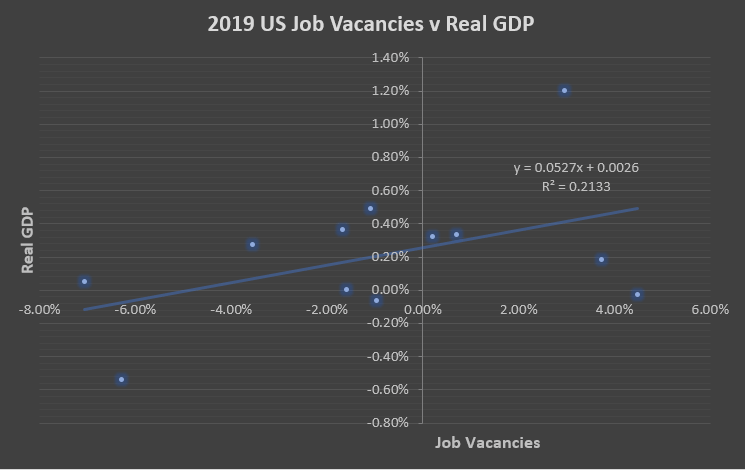
Sentiment Index in any country or any sector is the leading economic indicators for traders, investors, economists, and policymakers. Since the ZEW Sentiment Index is composed of a panel of financial market experts, people who are well-versed with the economy and business cycles throughout their career, their assessments generally have a strong correlation with actual GDP growth.
As with any sentiment index, the ZEW index also tends to be overly sensitive to changes in the economy, meaning the results sometimes would seem exaggerated but in the right direction. For our analysis, the direction of the economy is essential, and the magnitude can be understood over time with historical data.
Overall, the Economic Sentiment Index is helpful for us to predict the upcoming six-month changes with a good amount of certainty.
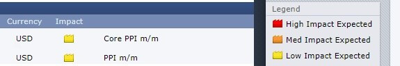
Impact on Currency
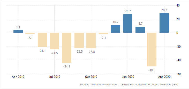
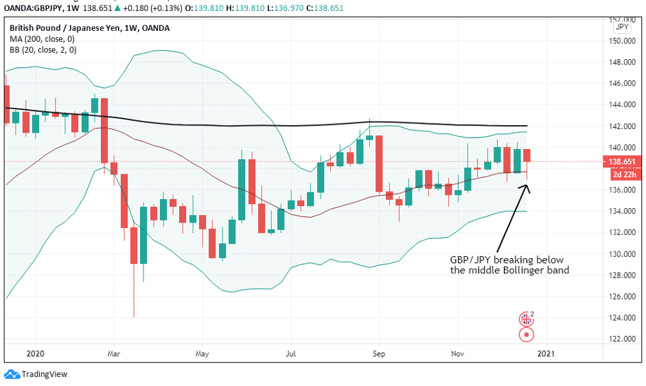
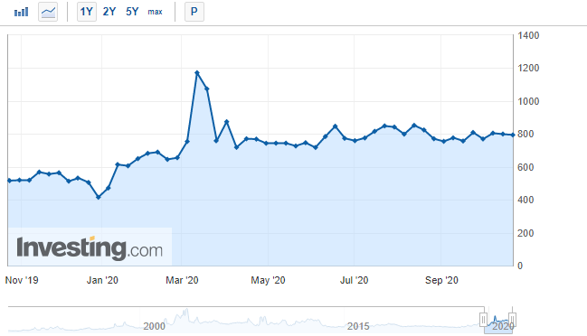
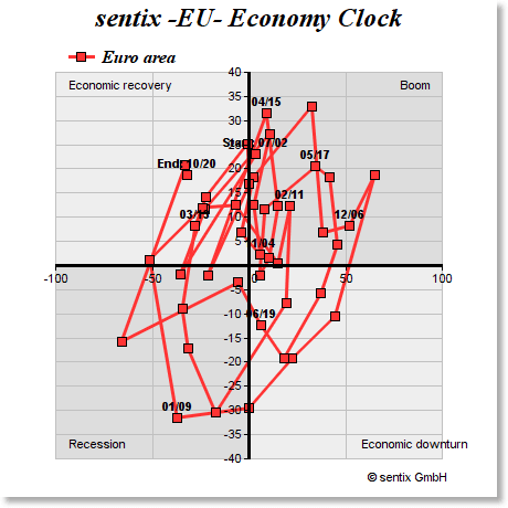
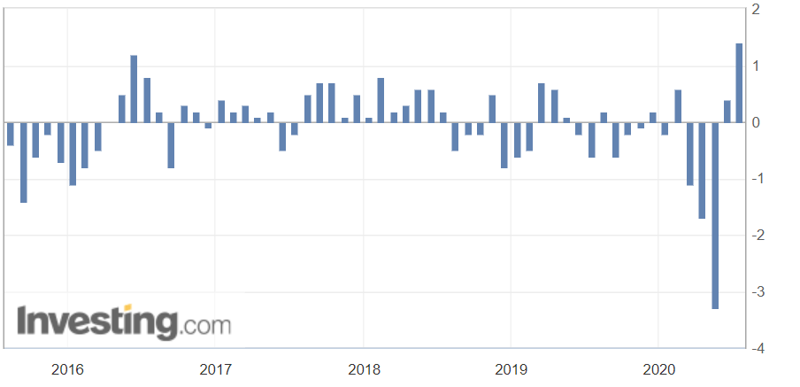
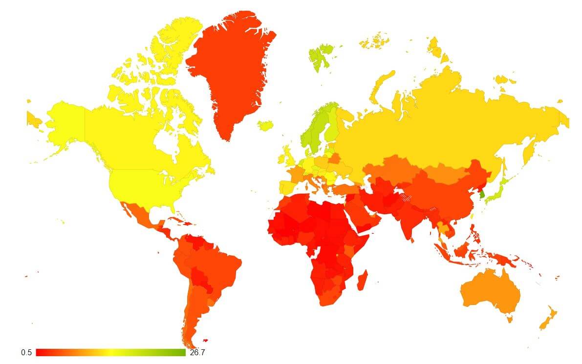
Market volatility is sensitive to Economic Sentiment Indexes. Significant moves in the index cause volatility in the market. It is a leading indicator. The above picture is a snapshot of ZEW for the past one year.
High Positive Economic Sentiment Index figures translate to improving economic prospects, which will translate to higher GDP prints and currency appreciation. Low or NegativeEconomic Sentiment Index figures translate to possible business slowdowns in the near-term, in extreme cases, even a recession. It will translate to the contracting economy, and lower GDP print, and thereby leading to currency depreciation.
Economic Reports
The ZEW Economic Sentiment Index is released every month on its official website, with insightful comments on different sectors. The IFO reports and ZEW Economic Sentiment Index are the two popular Sentiment Indexes in Germany.
Other companies also publish Economic Sentiment numbers, and IHS Markit Group is one such company that puts out numbers on the international scale for many countries. Internationally, IHS Markit business surveys are popular, but within Germany, ZEW is more popular amongst the traders, investors, policymakers.
Sources of ZEW Economic Sentiment Index
We can monitor the reports on the official website of the ZEW.
We can also go through the Sentiment Index of other countries here.
We can also find the aggregated statistics of all business confidence indexes for various countries here.
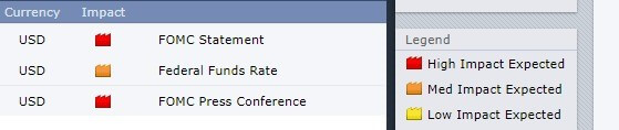
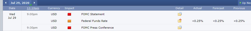
Impact of the ”ZEW Economic Sentiment Index” news release on the Forex market
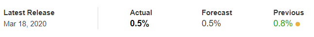
In the previous section of the article, we understood the ZEW Economic Sentiment fundamental indicator, which essentially rates the outlook of an economy for a six-month period. On the index, a level above zero indicates optimism, below indicates pessimism. It is a leading indicator of economic health.
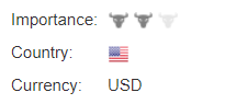
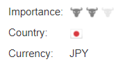
The reading is compiled from a survey of about 350 German institutional investors and analysts. Therefore, it is given a fair amount of importance from investors, especially when analyzing growth in the Eurozone. The ZEW financial market survey covers a number of areas, sectors, and regions which are used to create the ZEW Economic Sentiment.

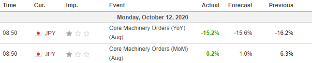
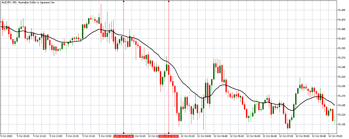
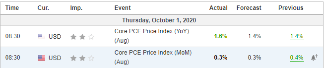
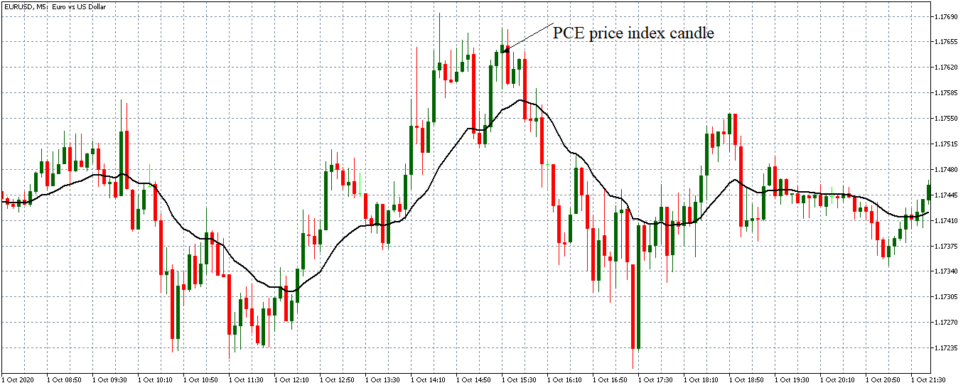
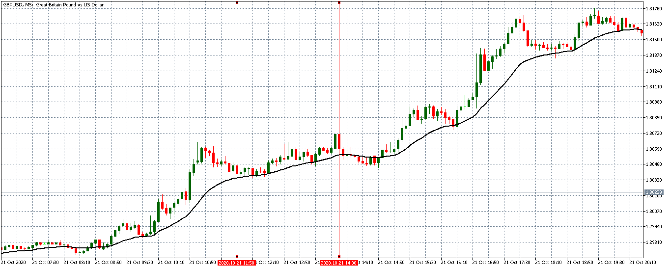
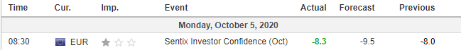
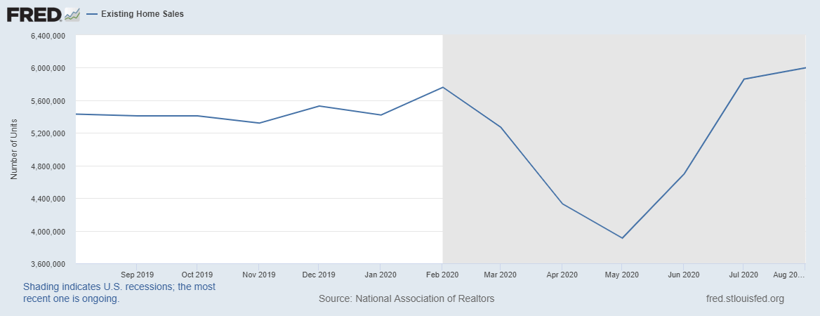
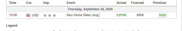
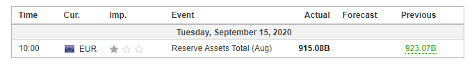
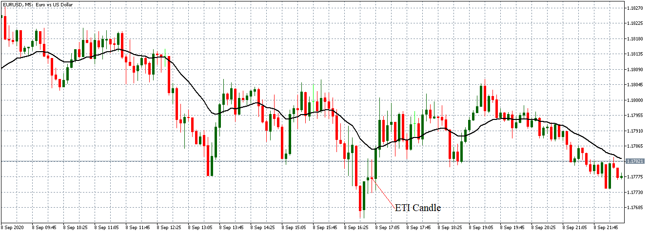
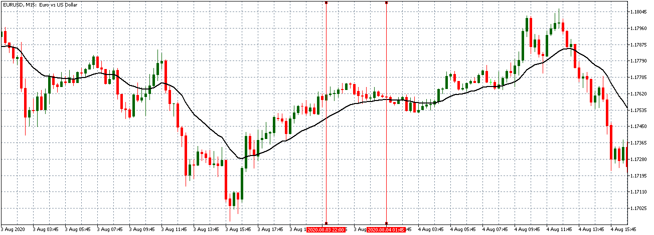
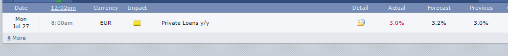
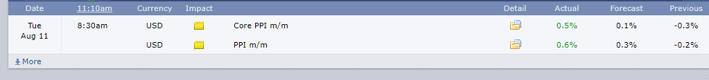
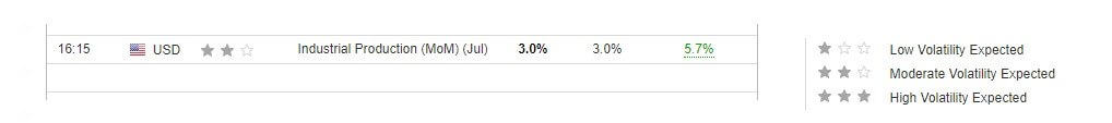
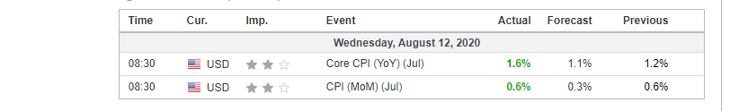
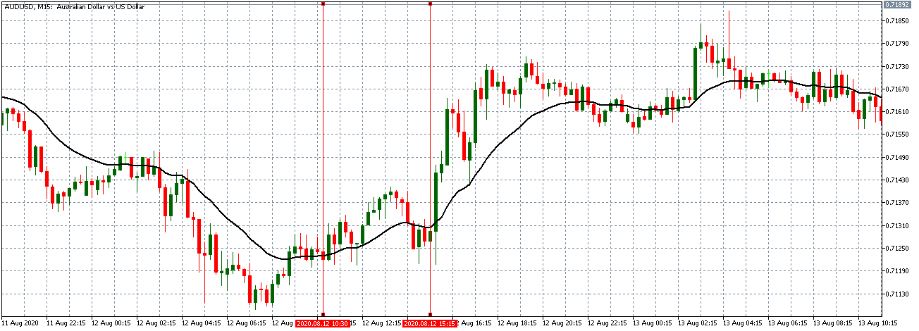
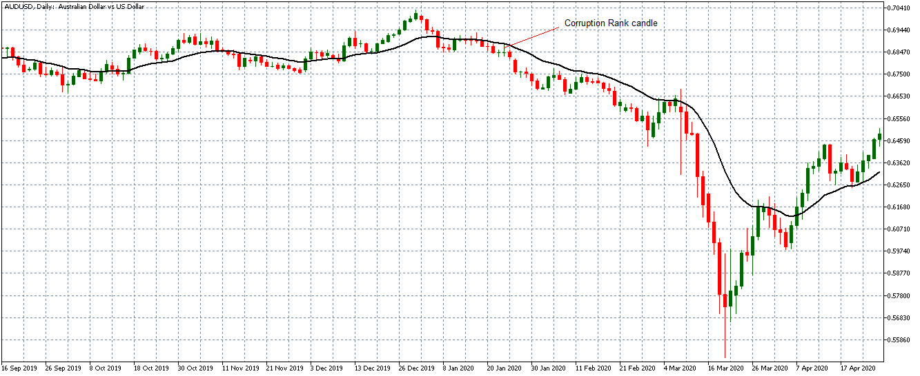
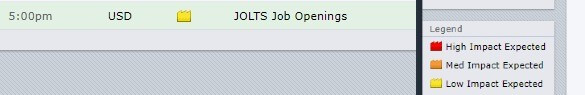
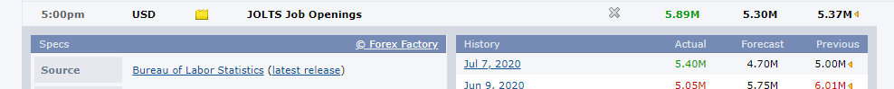
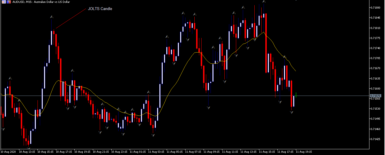
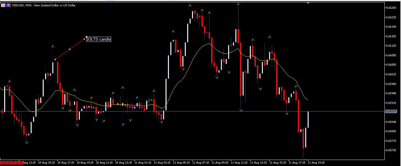
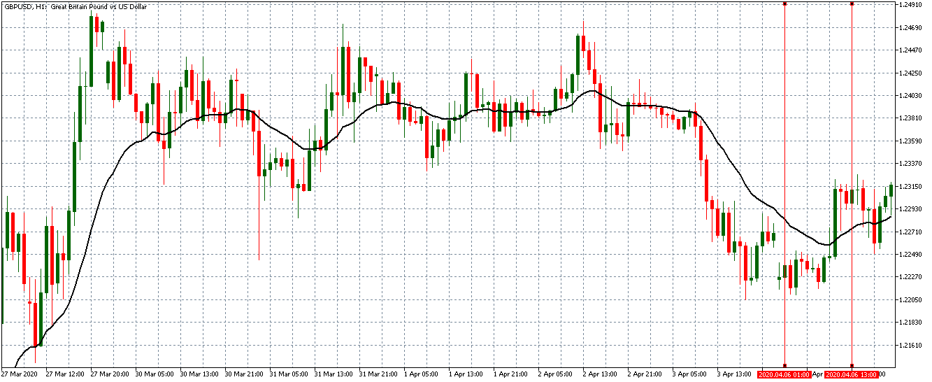
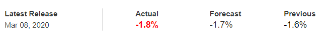
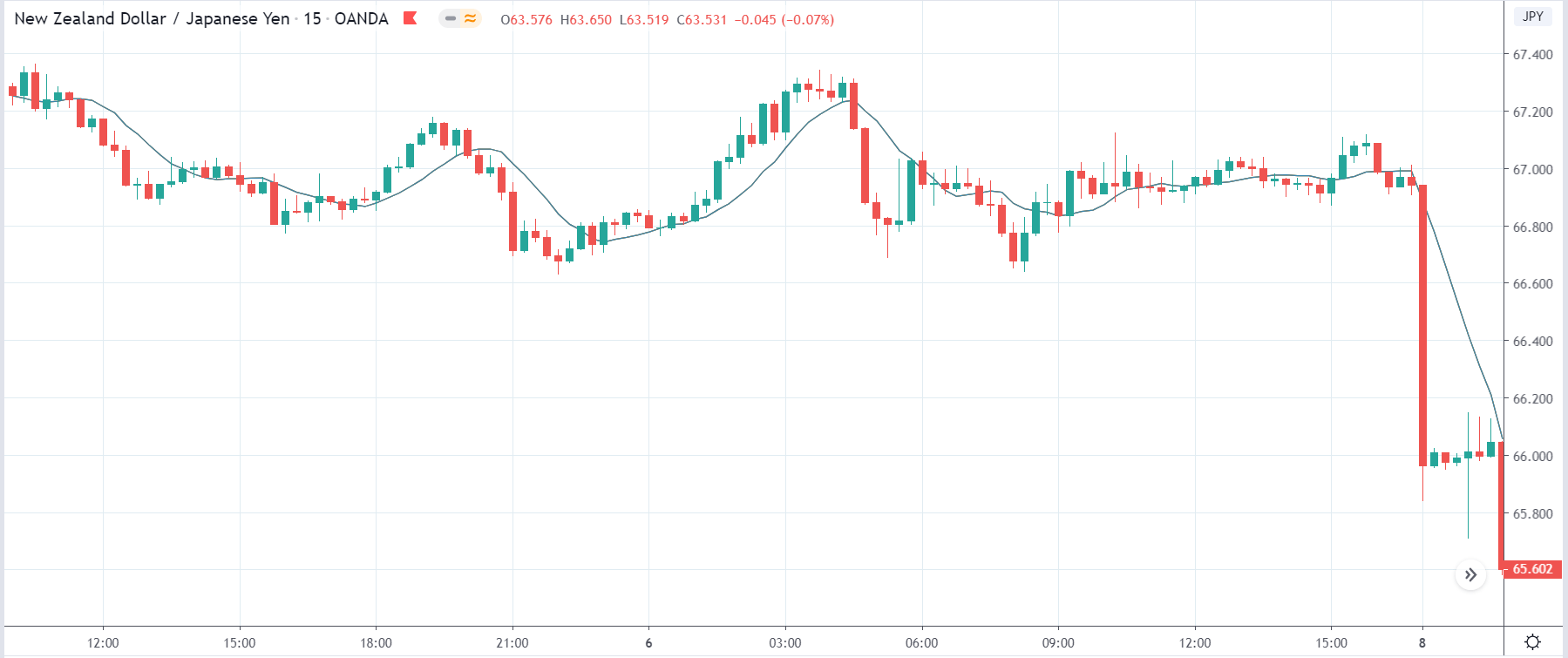
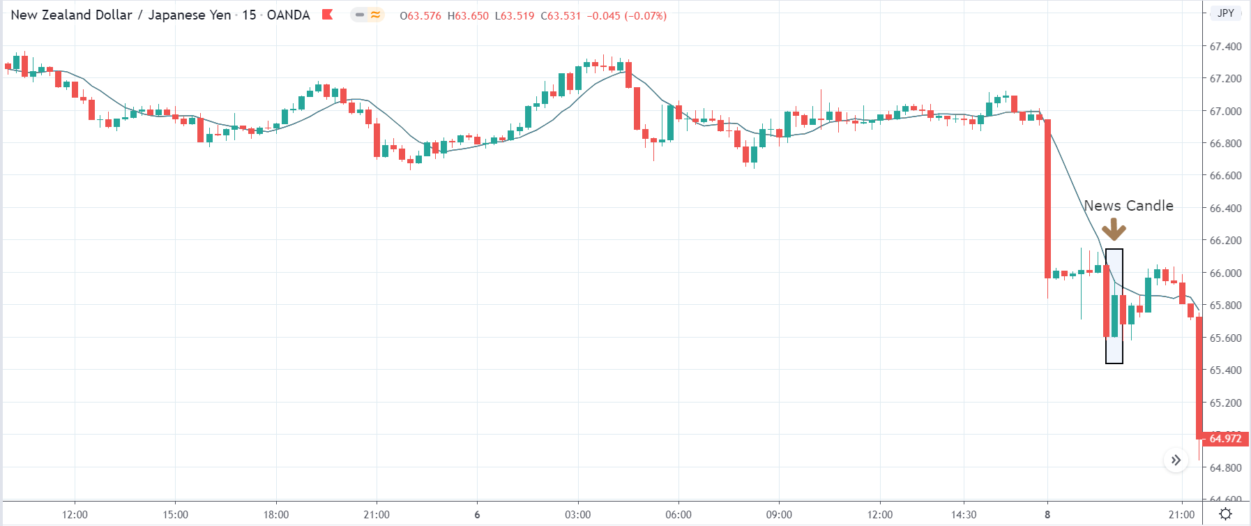
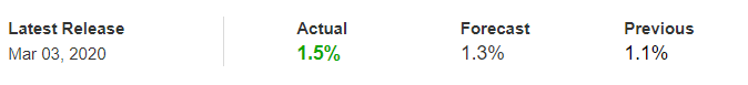
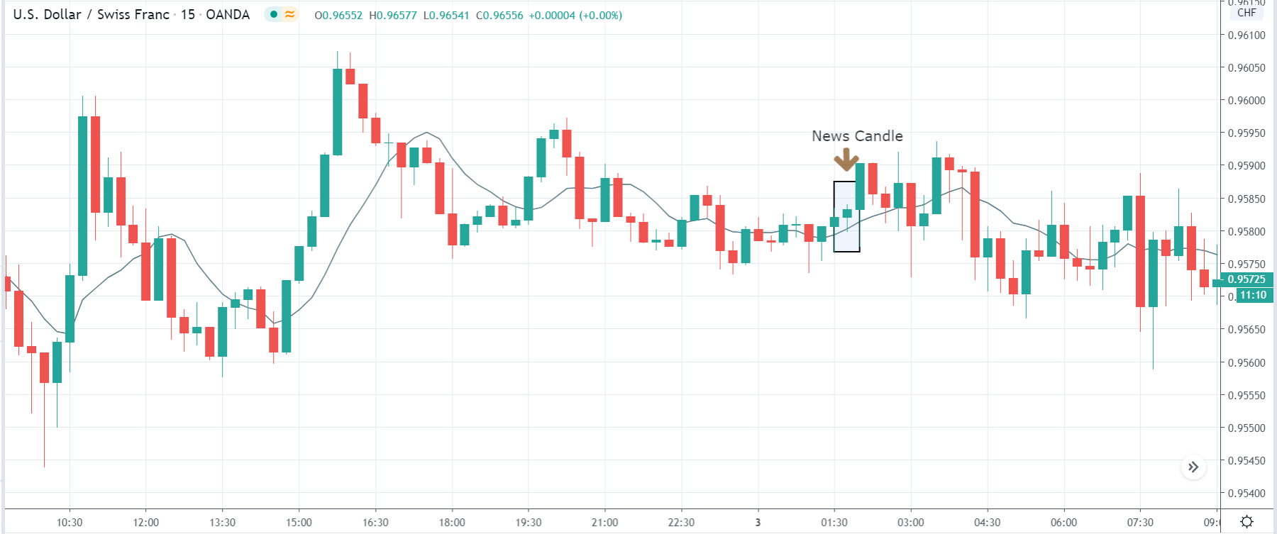
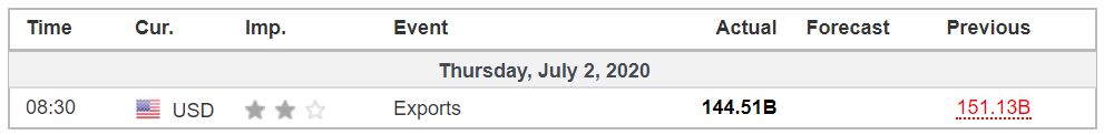
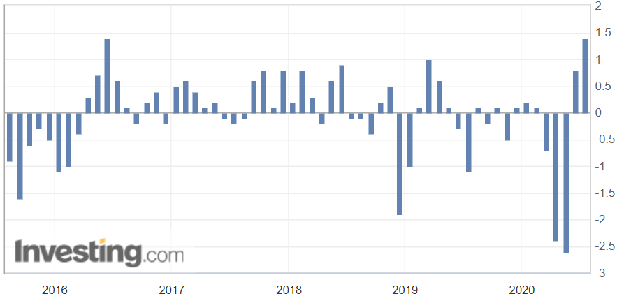
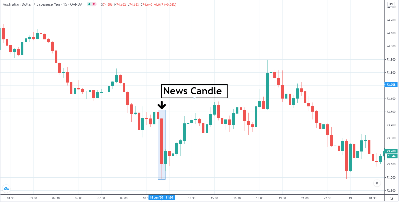
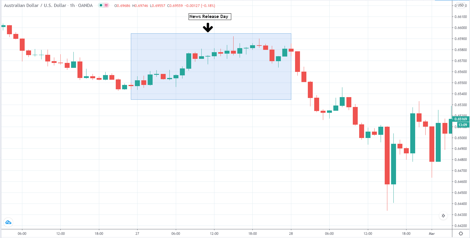
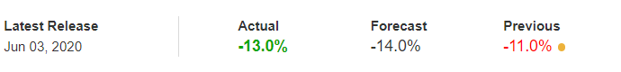
In this part of the article, we will examine the impact of the ZEW Economic Sentiment indicator on the value of various currencies involving the EUR and witness the change in volatility. For that, we have collected the latest data of ZEW Economic Sentiment, which was published in the month of April. We can see in the below image that the index jumped by a huge margin in April 2020, which was well above market expectations.

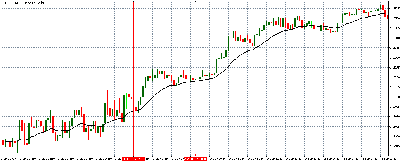
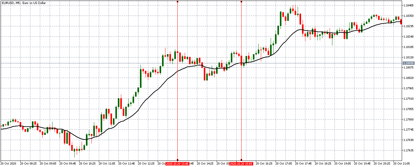
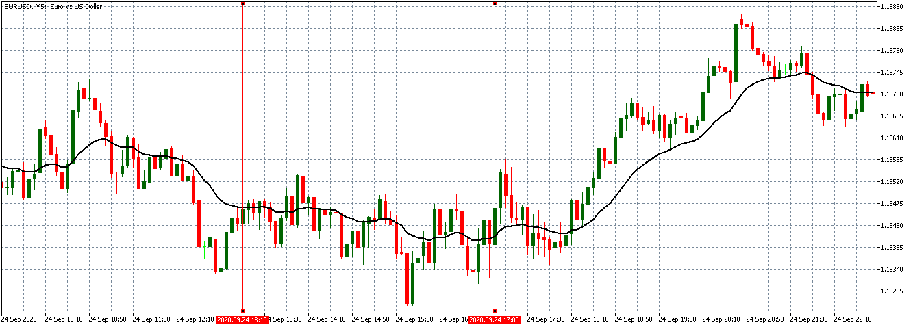
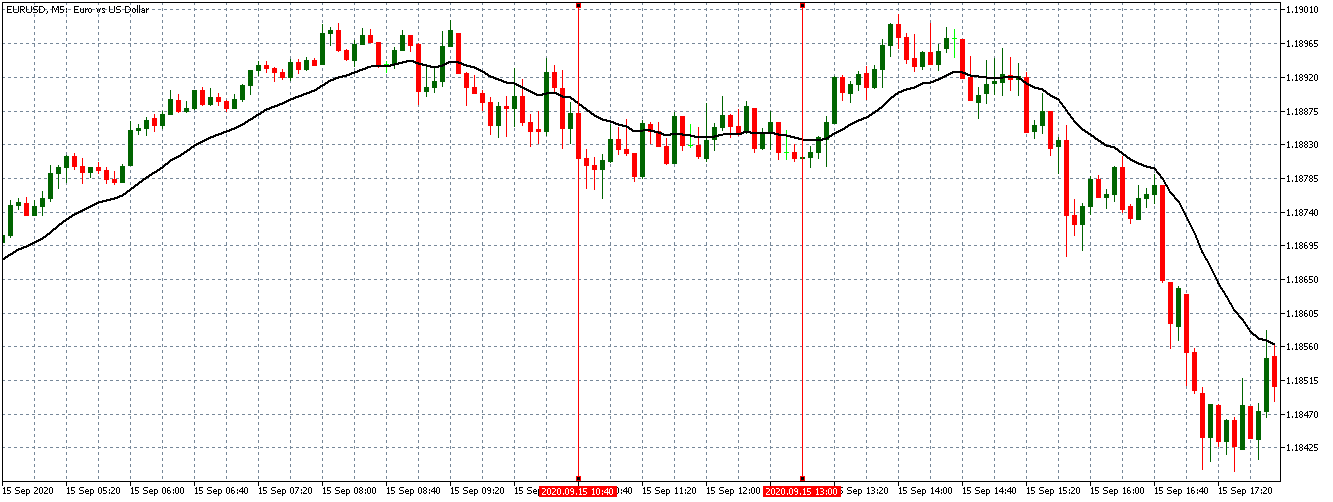
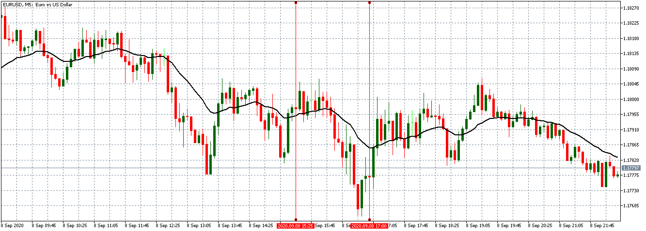
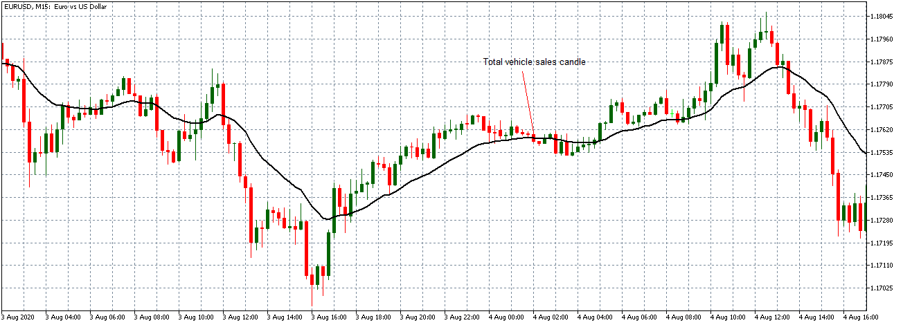
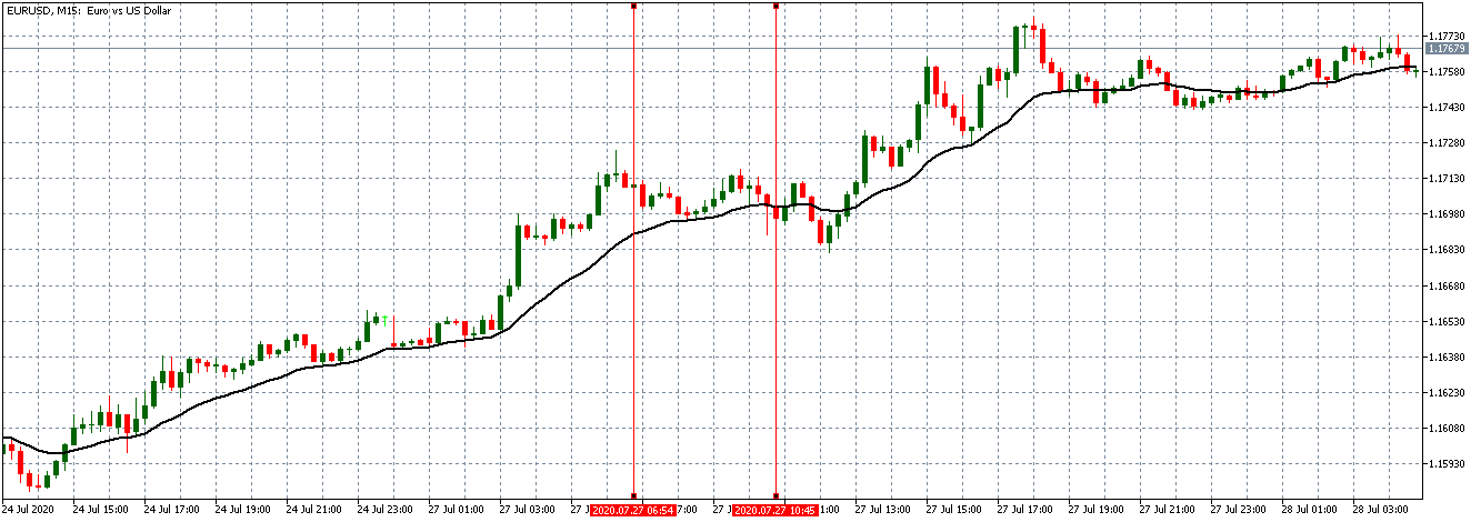
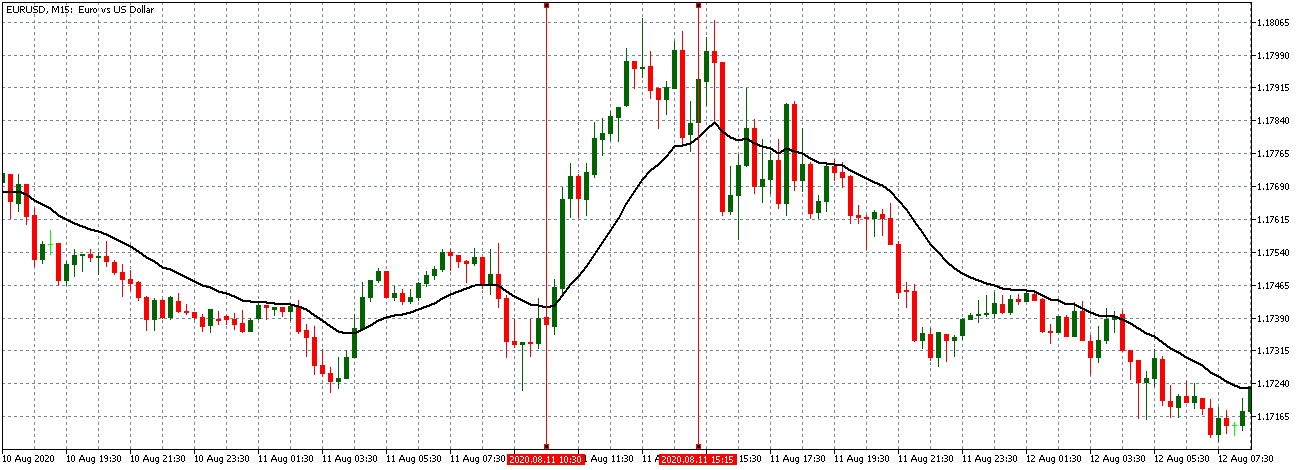
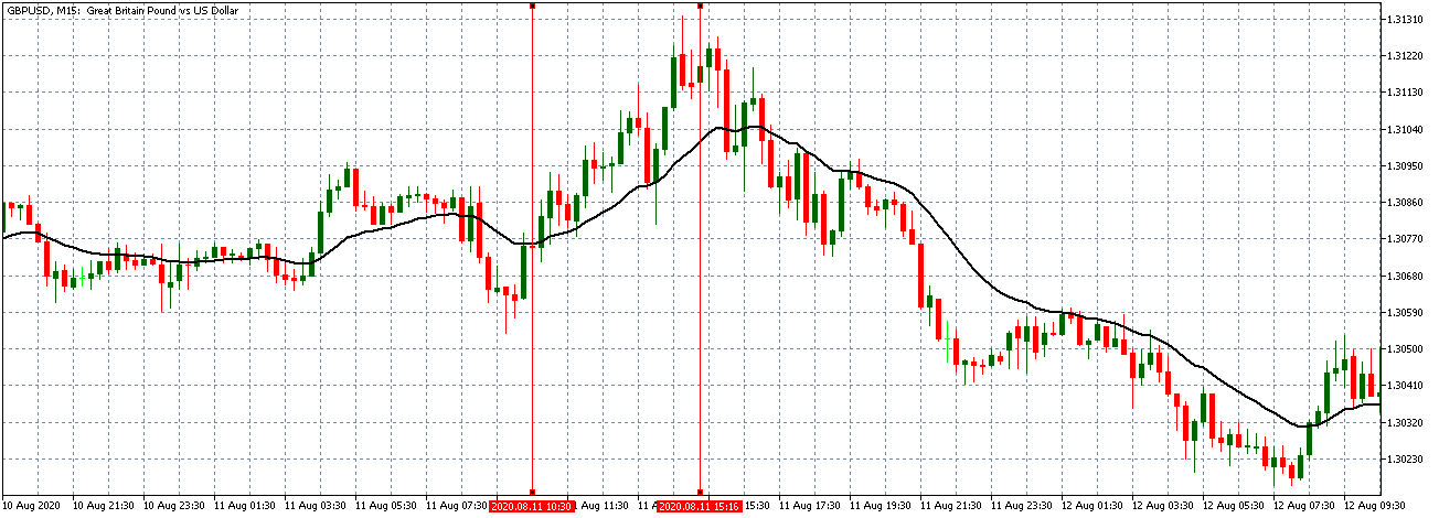
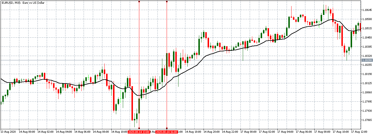
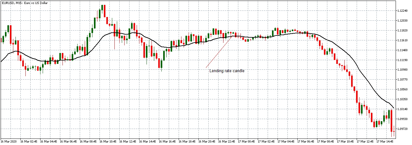
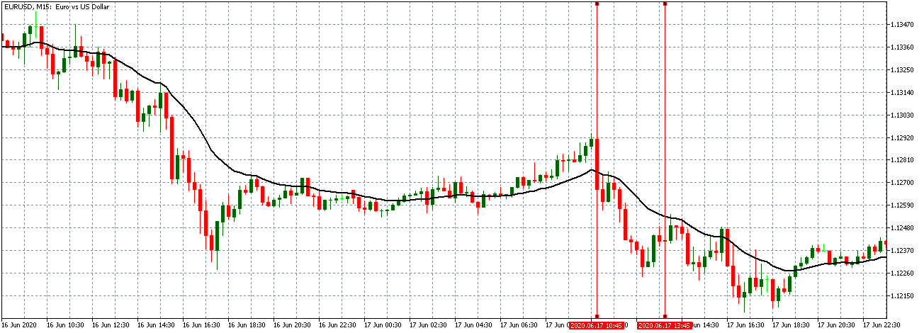
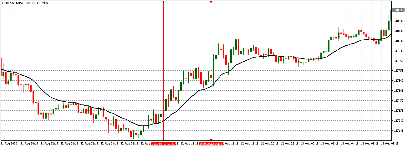
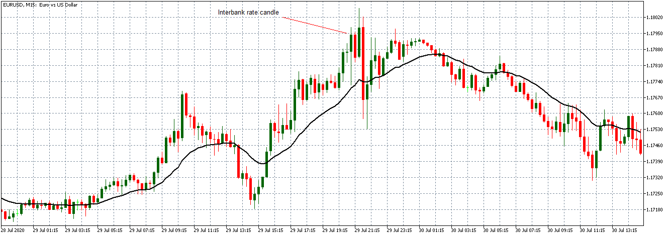
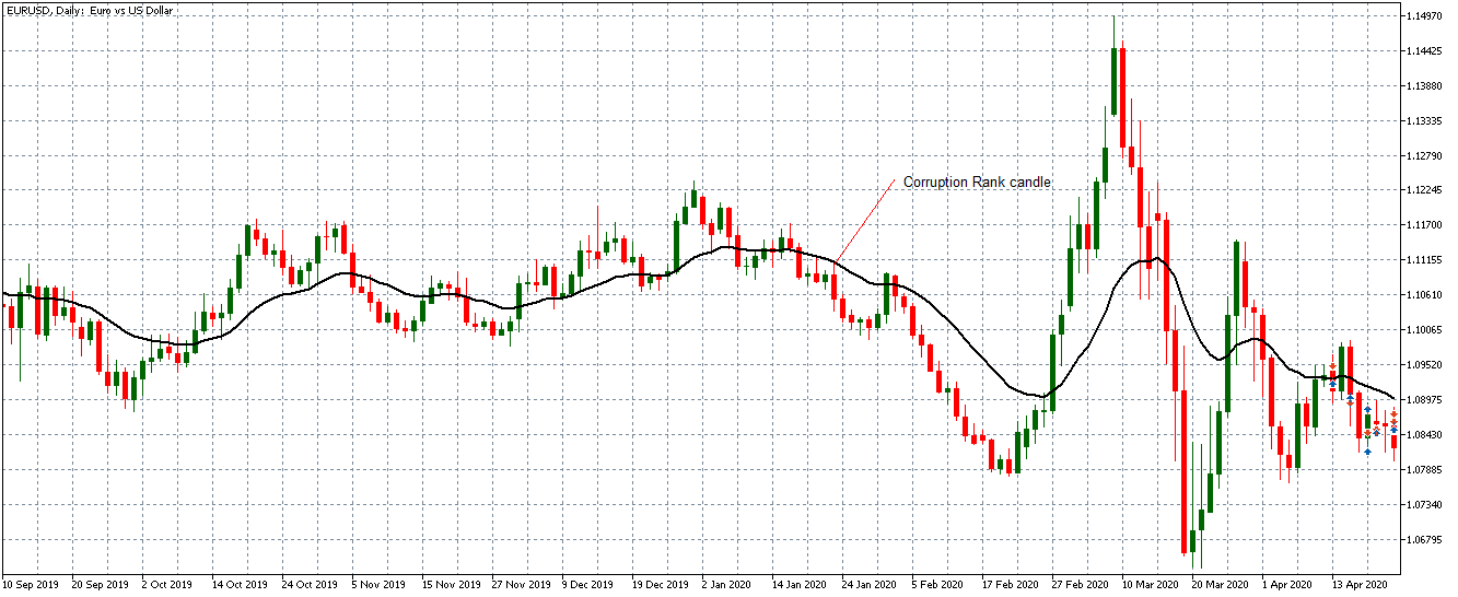
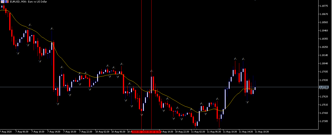
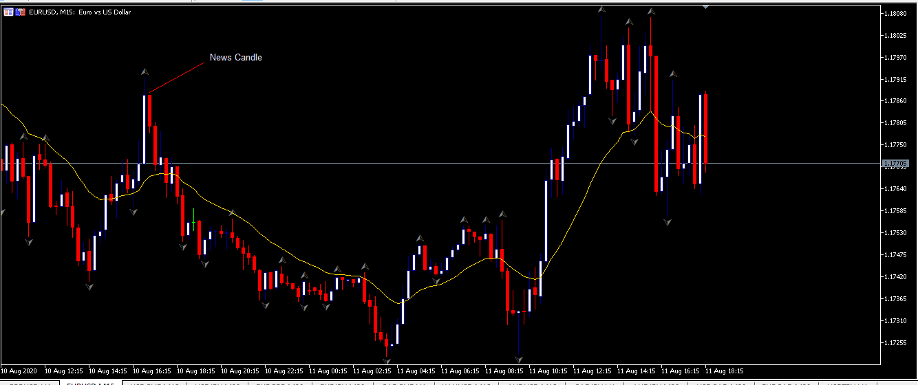
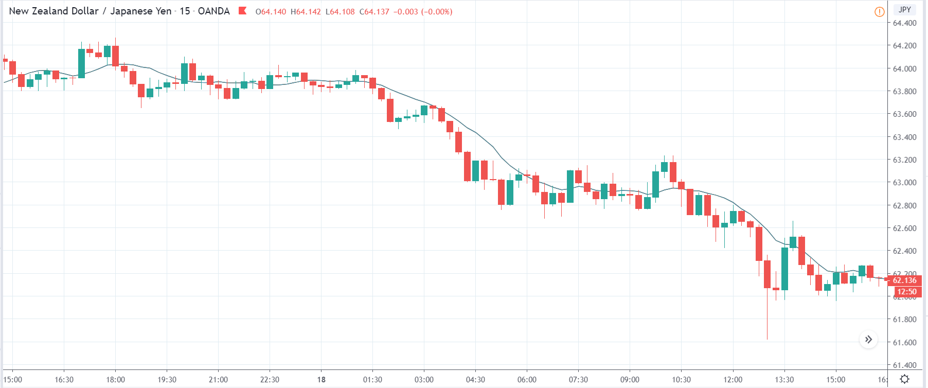
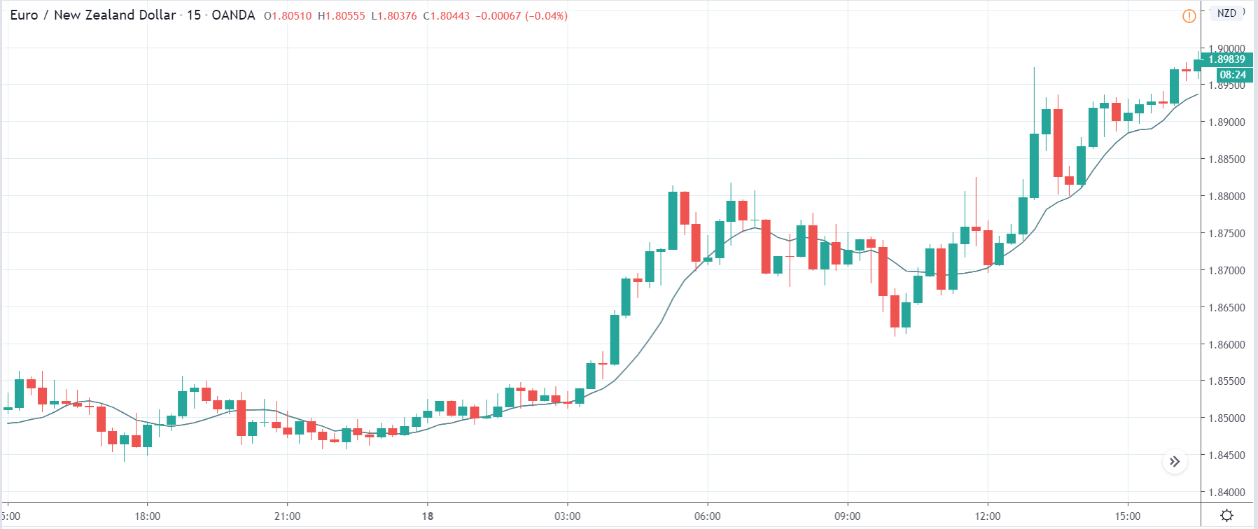
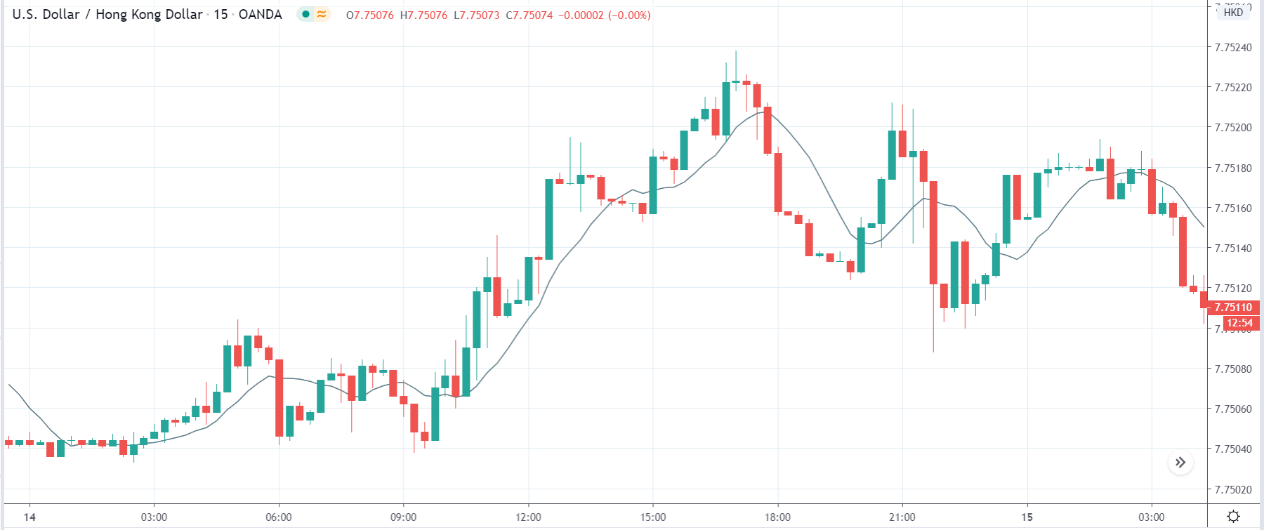
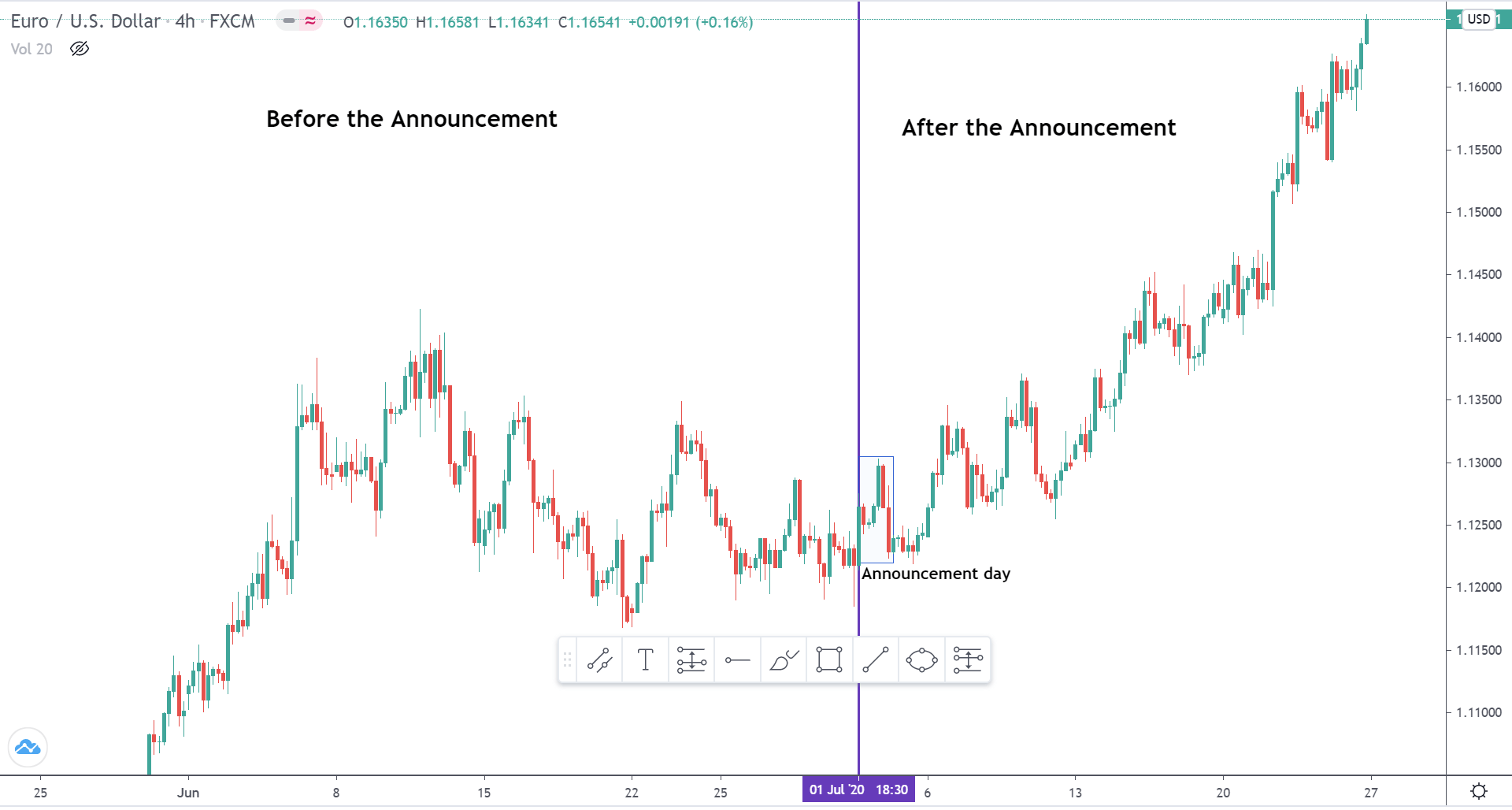
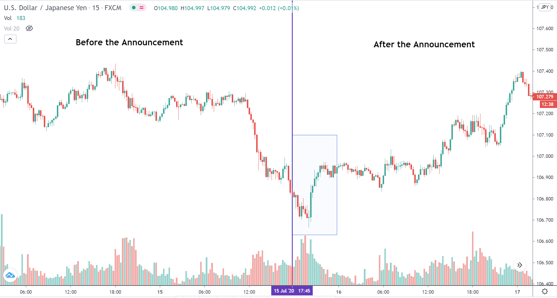
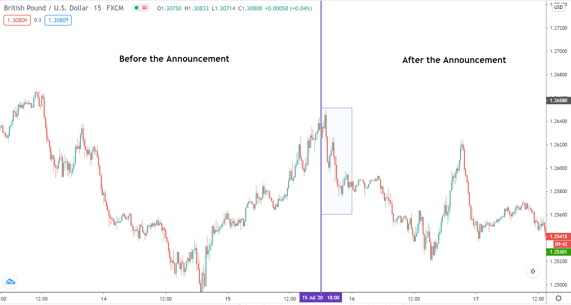
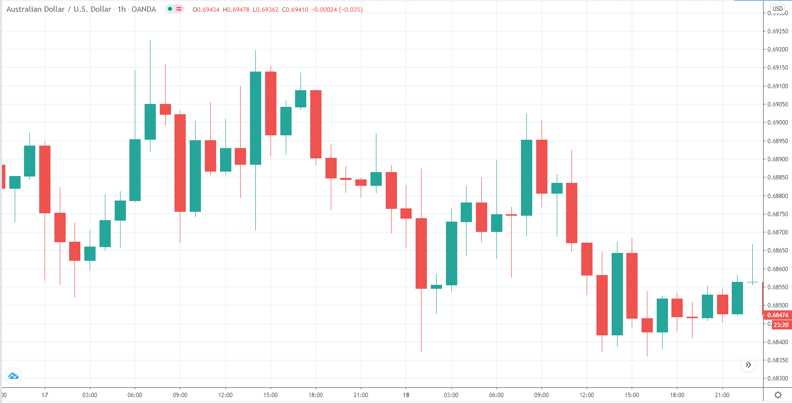
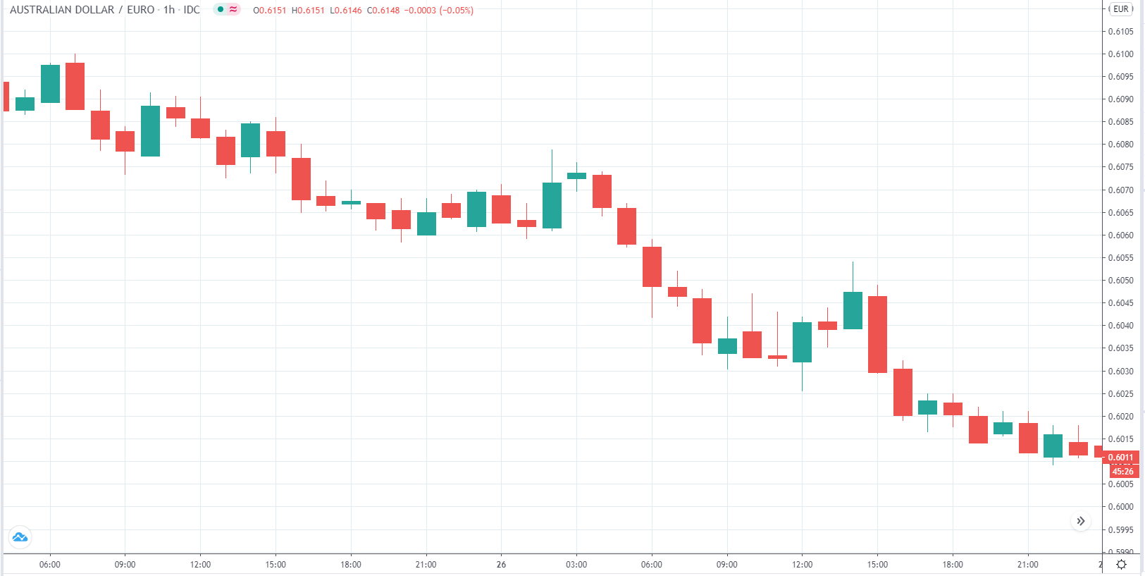
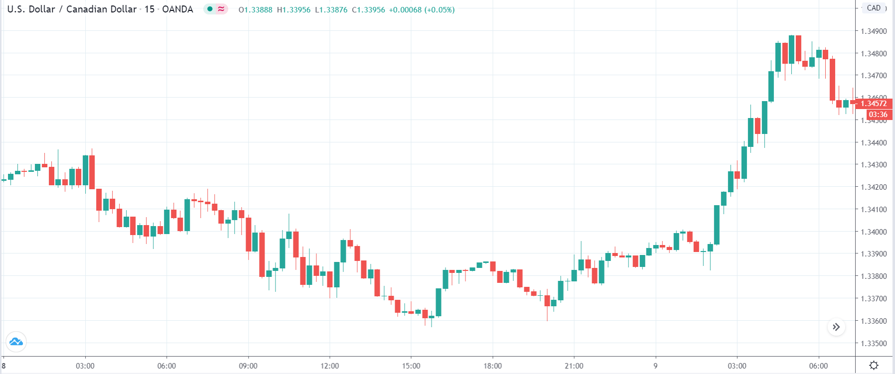
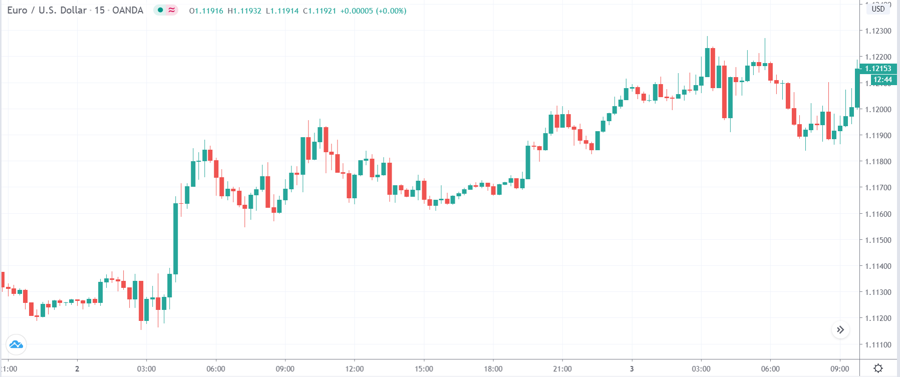
EUR/USD | Before the announcement
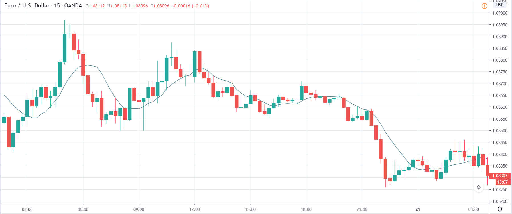
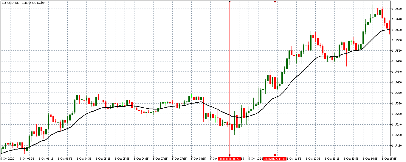
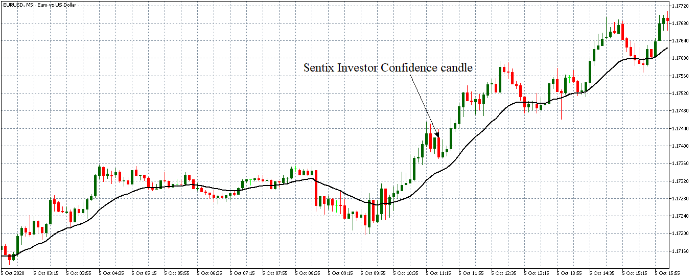
Let us start with the EUR/USD currency pair to observe the impact of the ZEW Economic Sentiment Indicator on the value of EUR. The above image shows the state of the chart before the news announcement, where we see that the price is in a downtrend, and very recently, the price has formed a ”range.” Just before the news release, the price is at the bottom of the ”range,” so we can expect buyers to come back in the market, initiating some strength in the Euro.
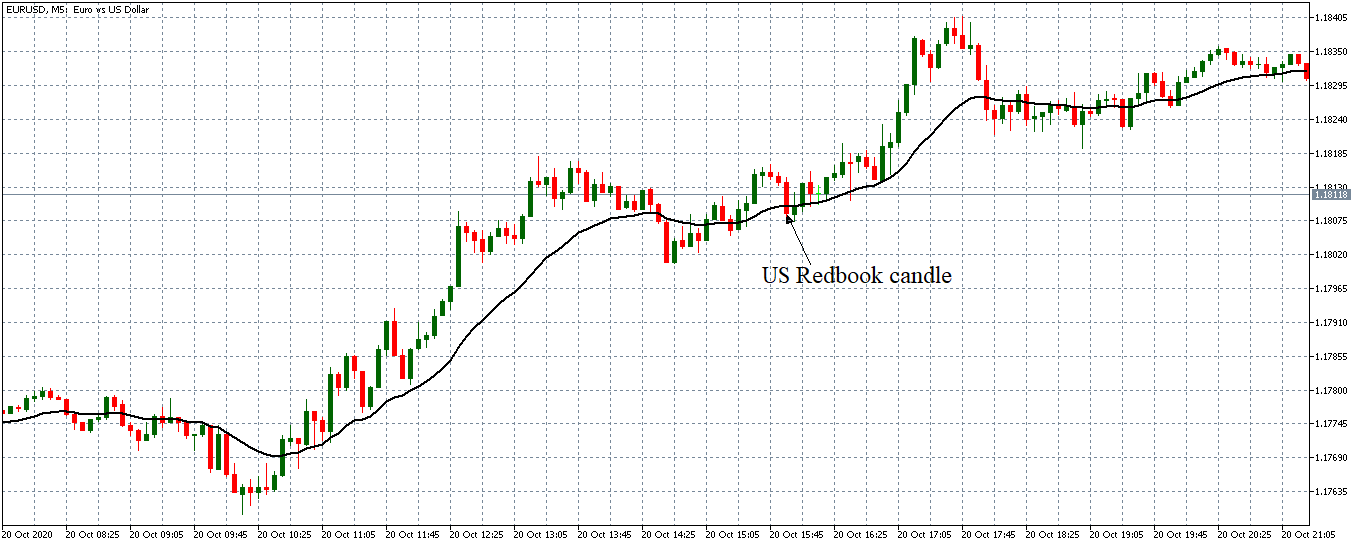
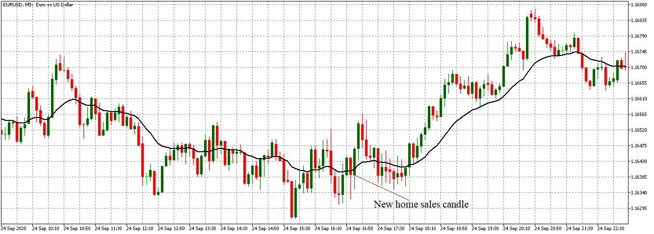
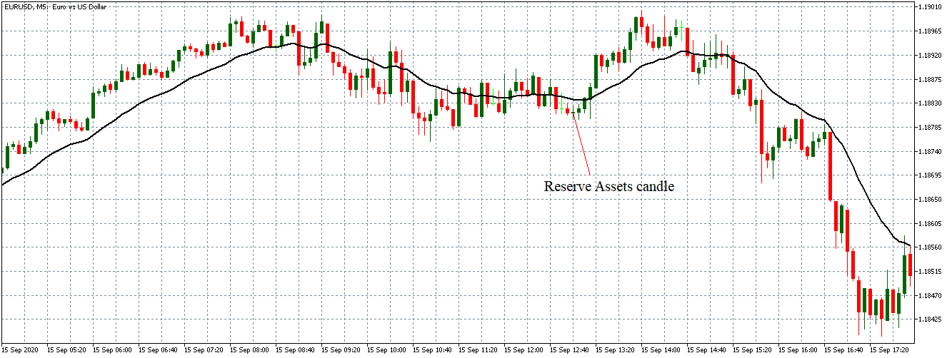
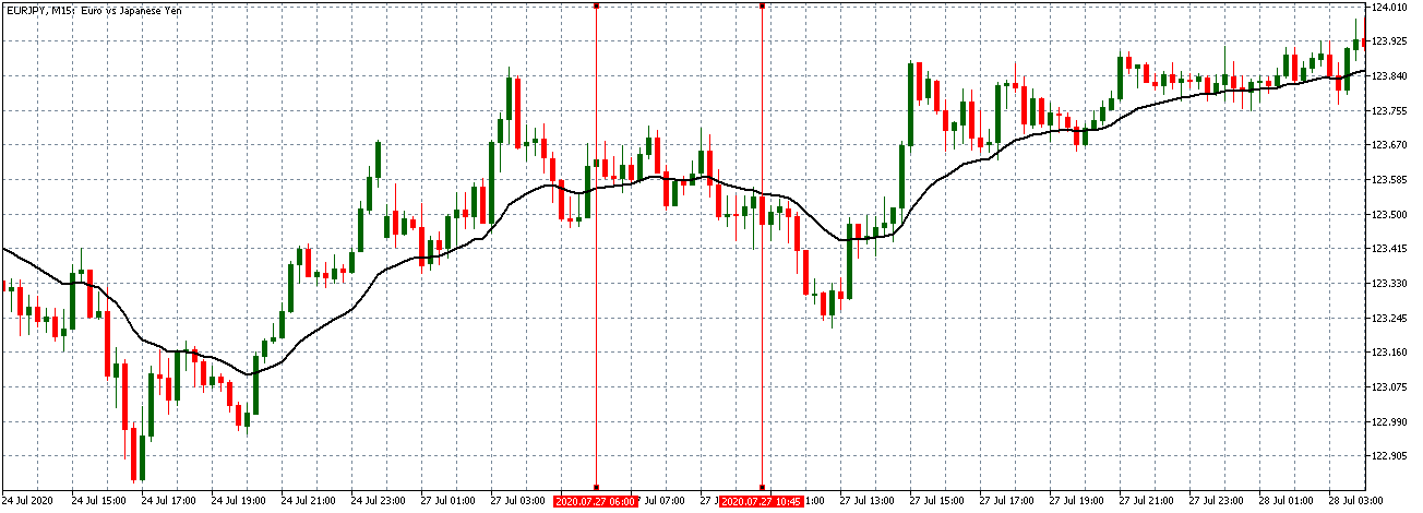
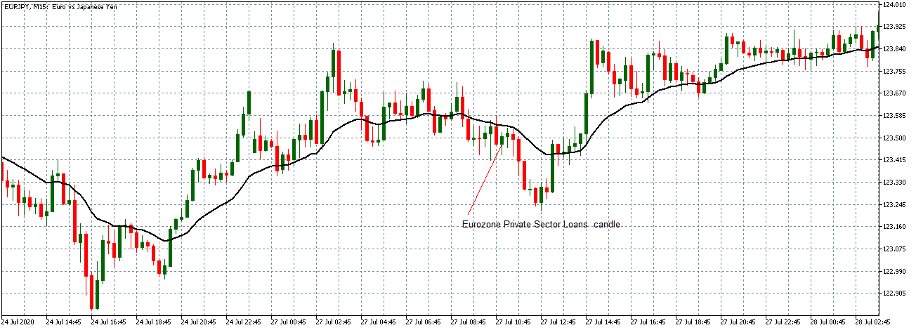
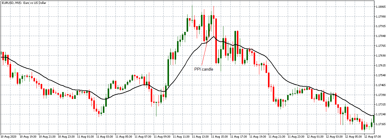
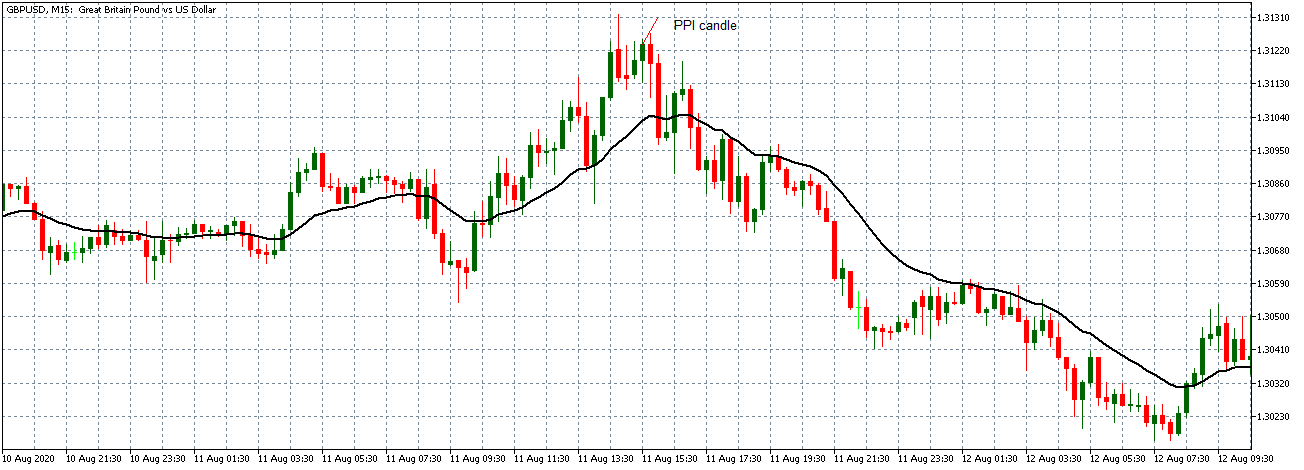
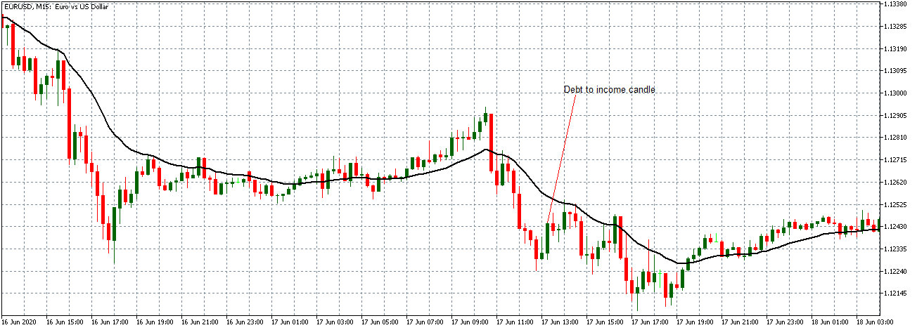
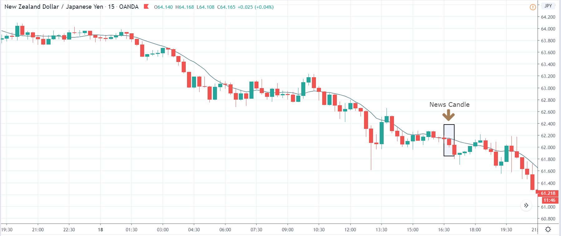
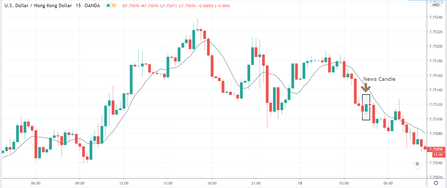
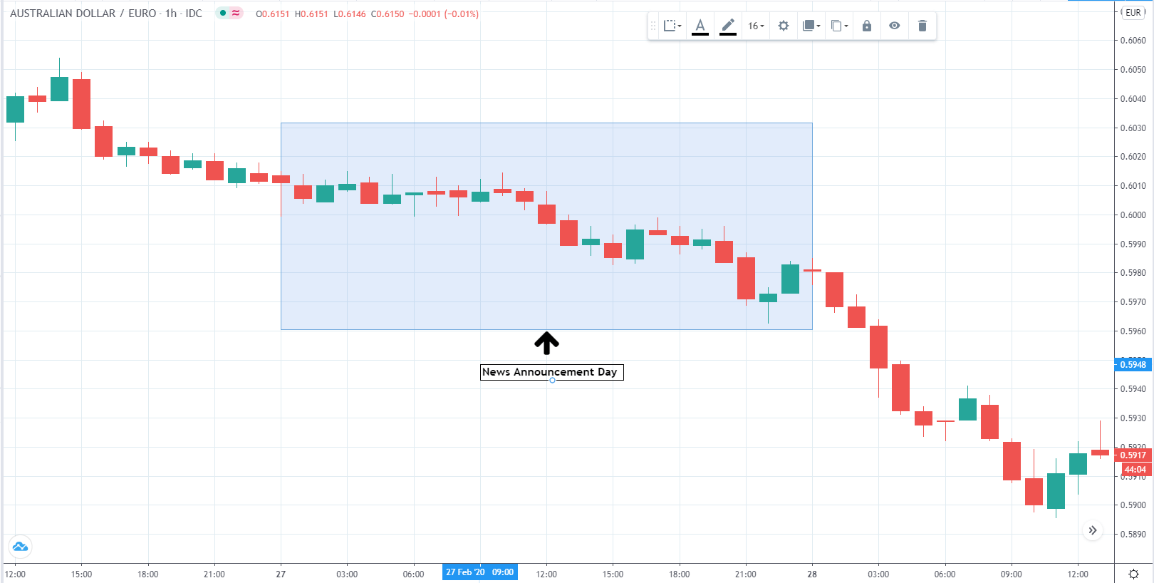
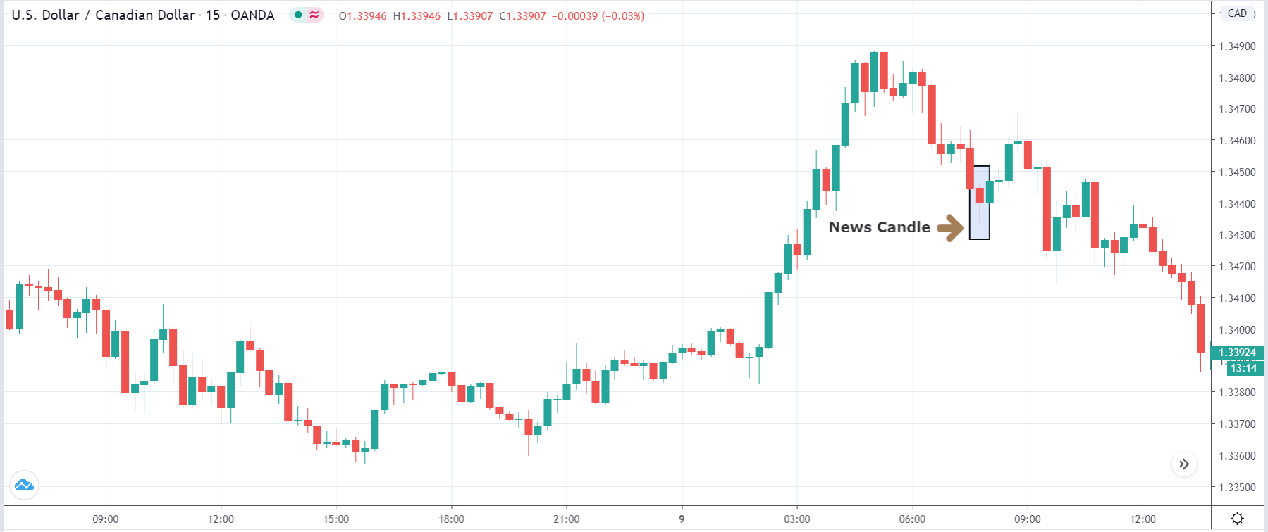
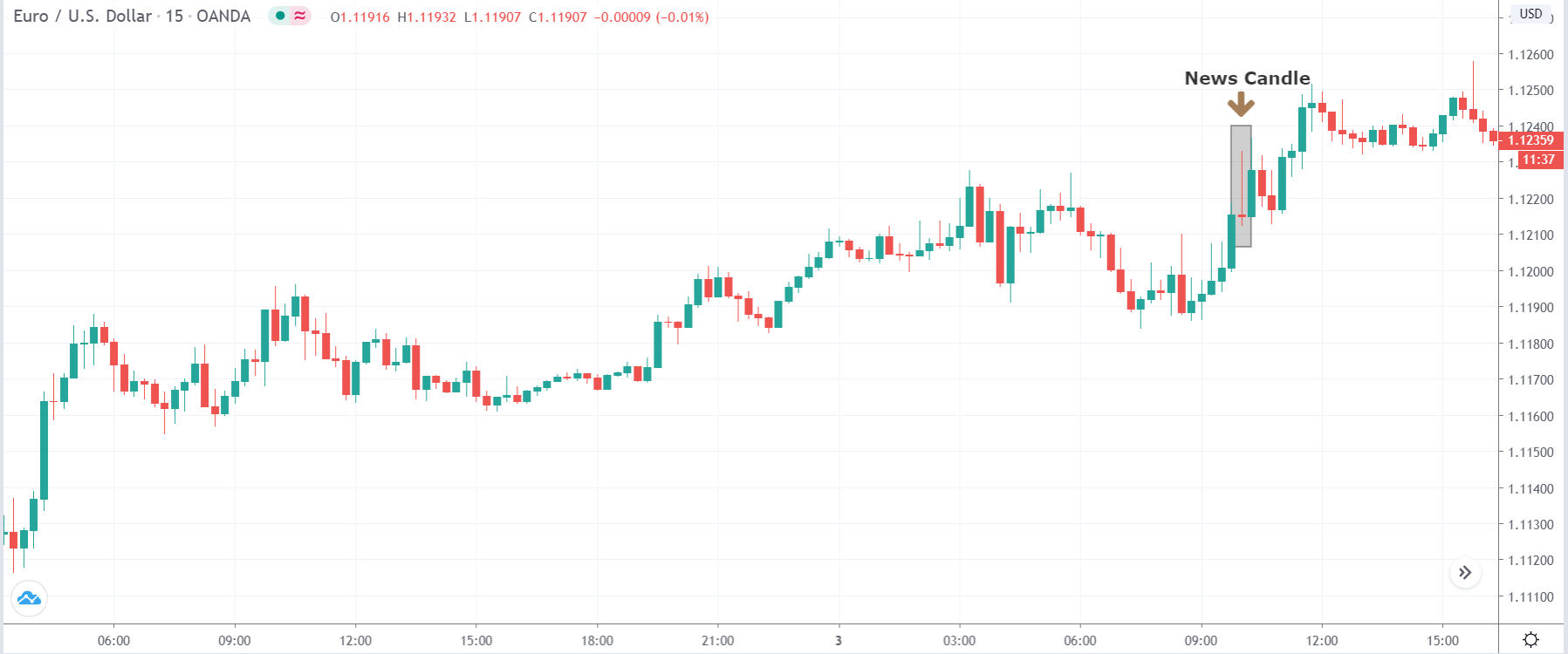
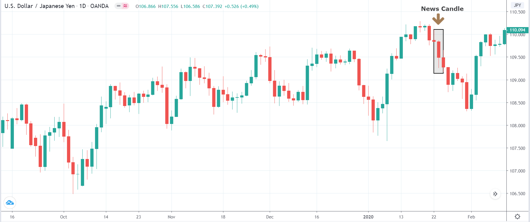
EUR/USD | After the announcement
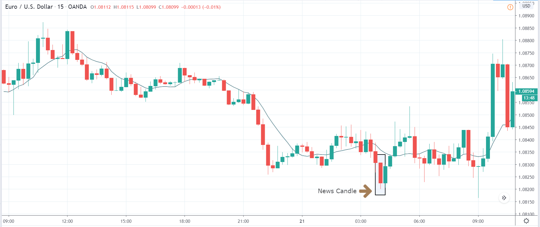
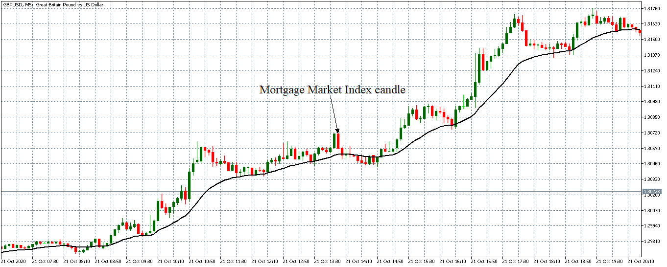
After the news announcement, market crashes below the ”support” of the ”range” and volatility increases to the downside. Although the ZEW Economic Sentiment was extremely positive for the economy, market participants do not by Euro immediately at the ”news candle,” but instead, we see a rally in the price after the close of ”news candle.” Thus, we witness moderate volatility in the currency pair after the news release.
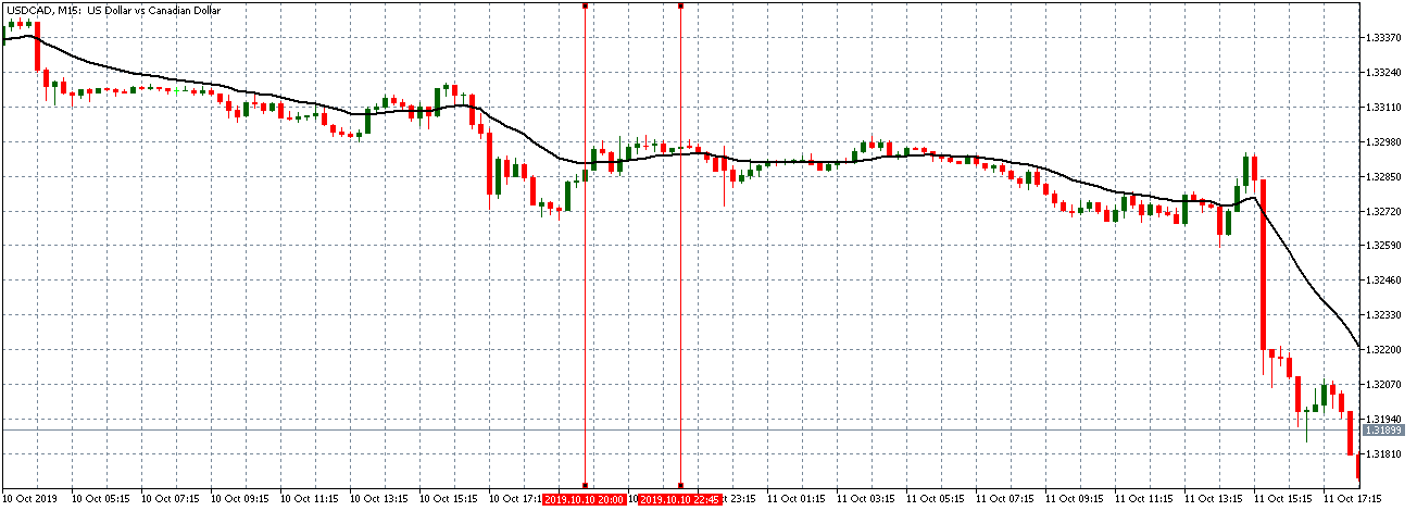
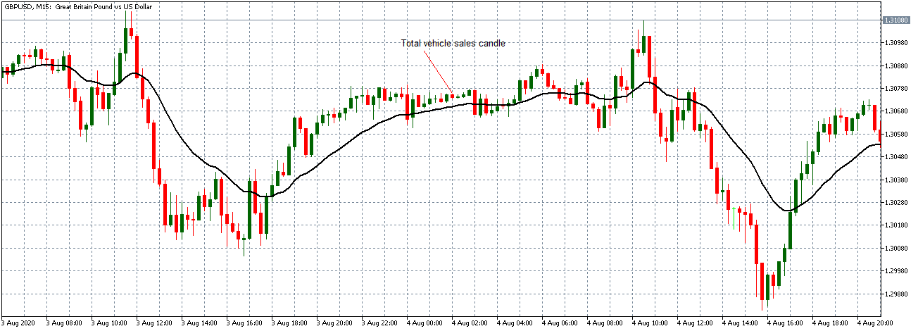
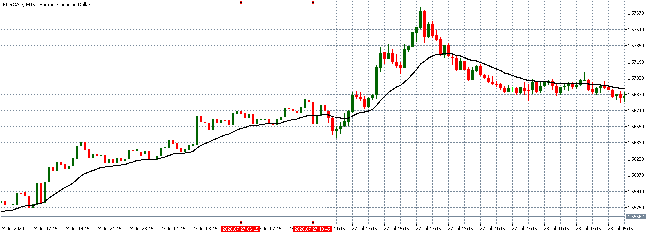
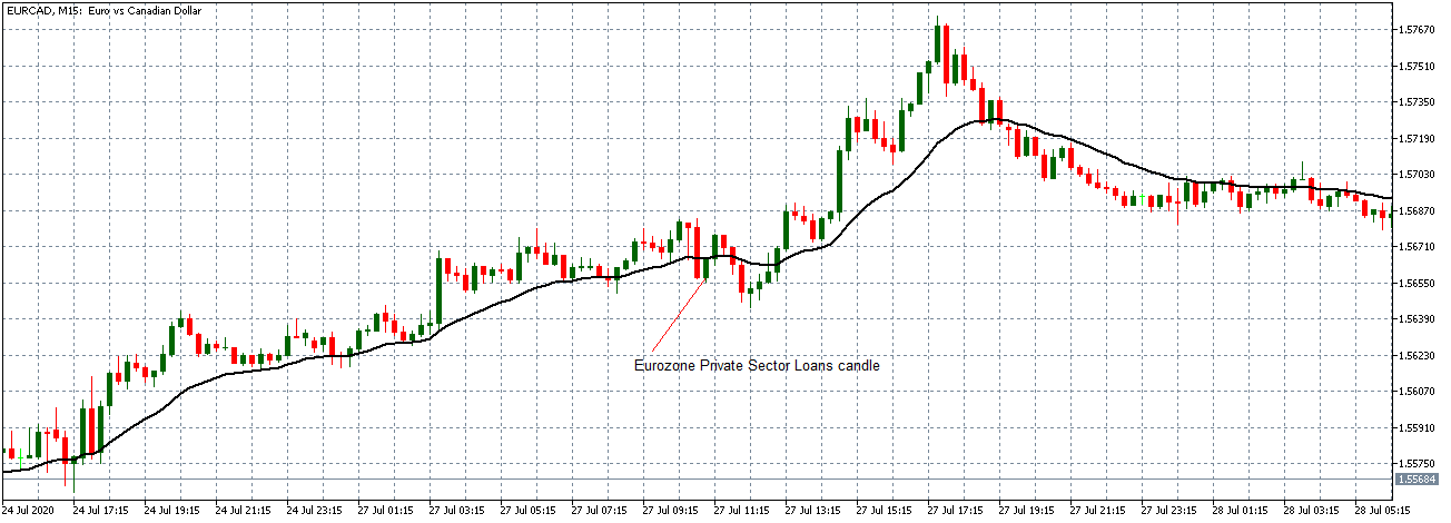
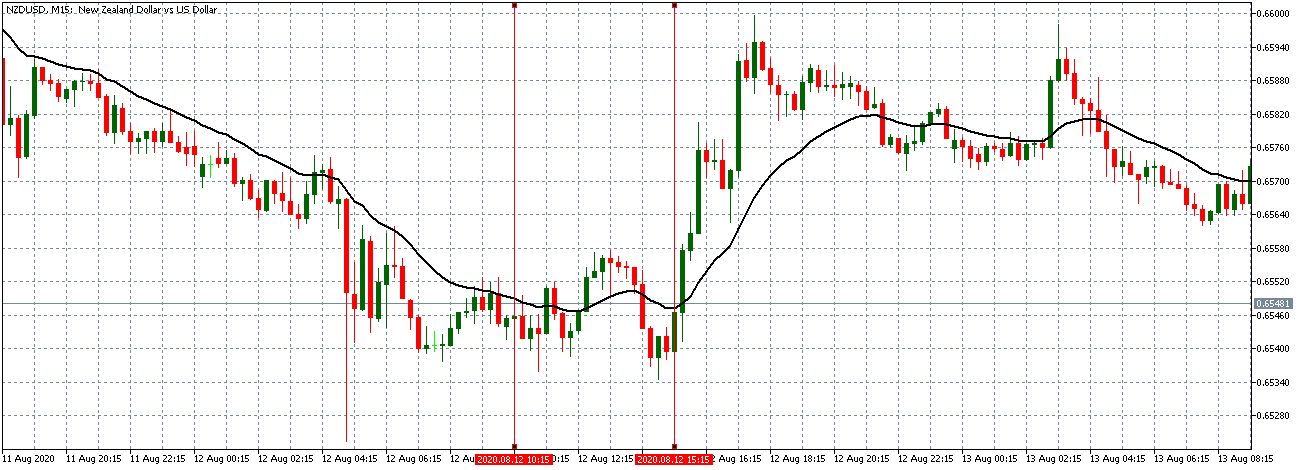
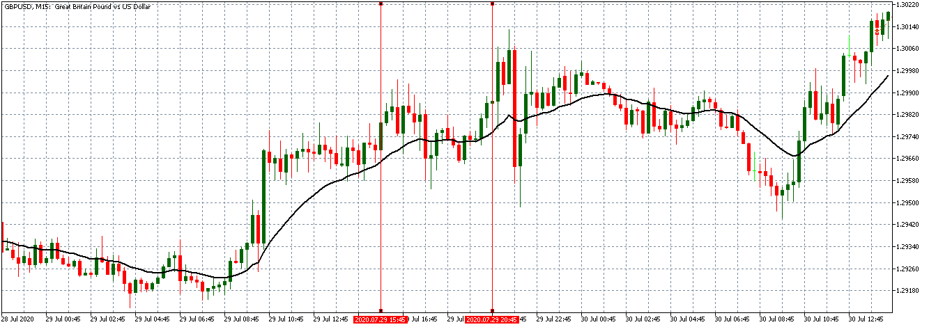
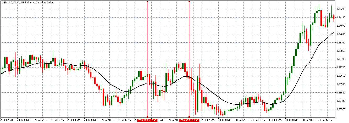
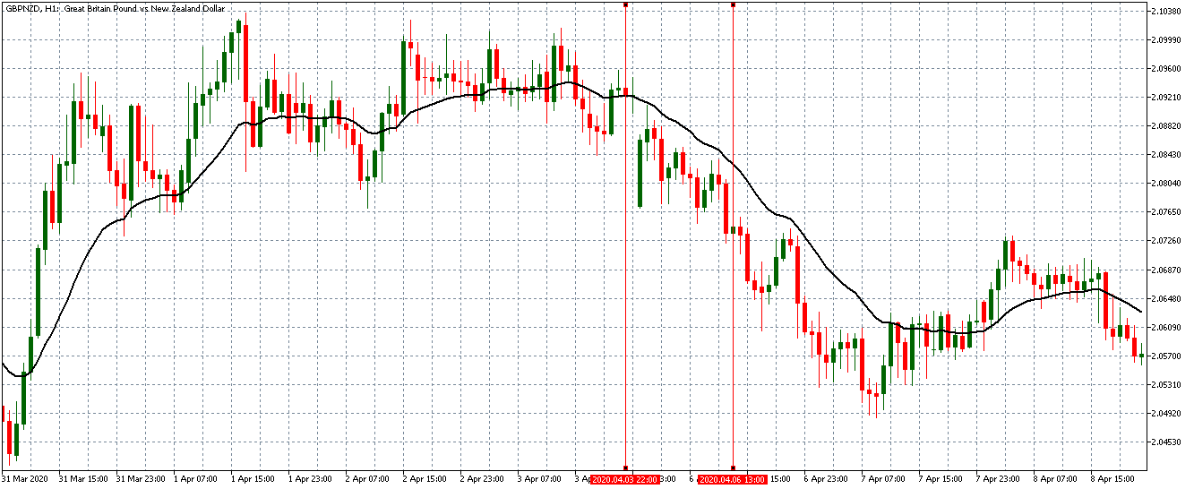
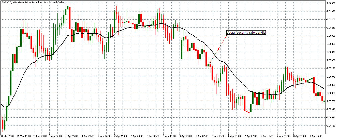
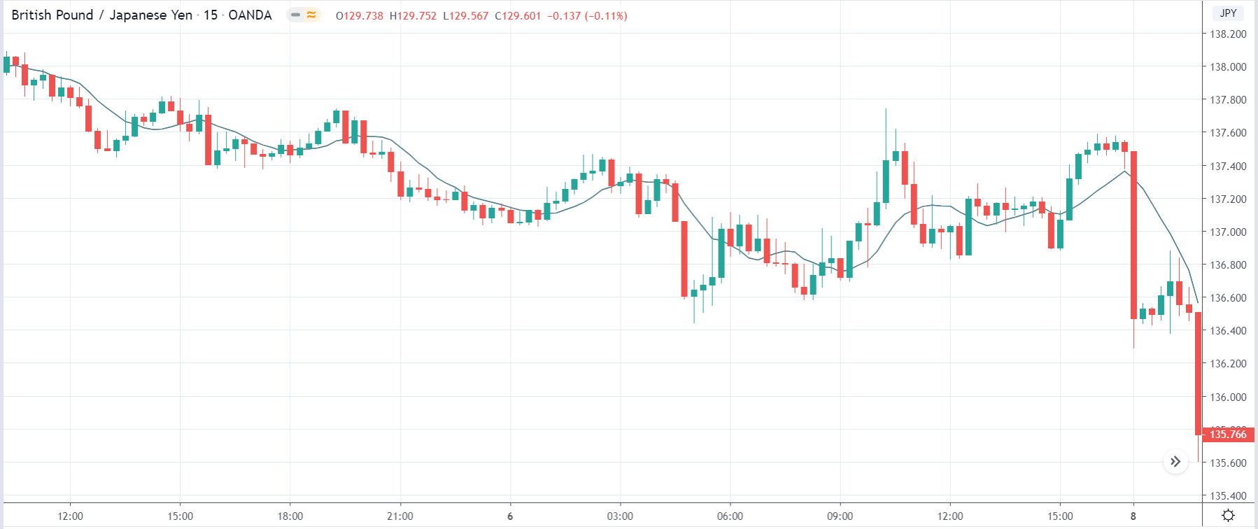
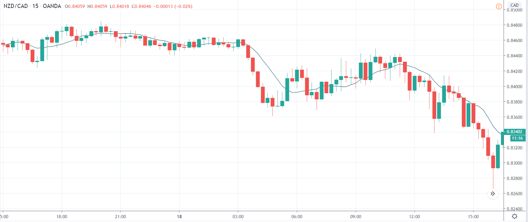
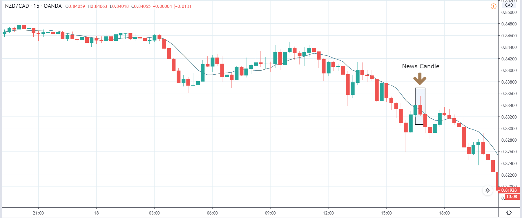
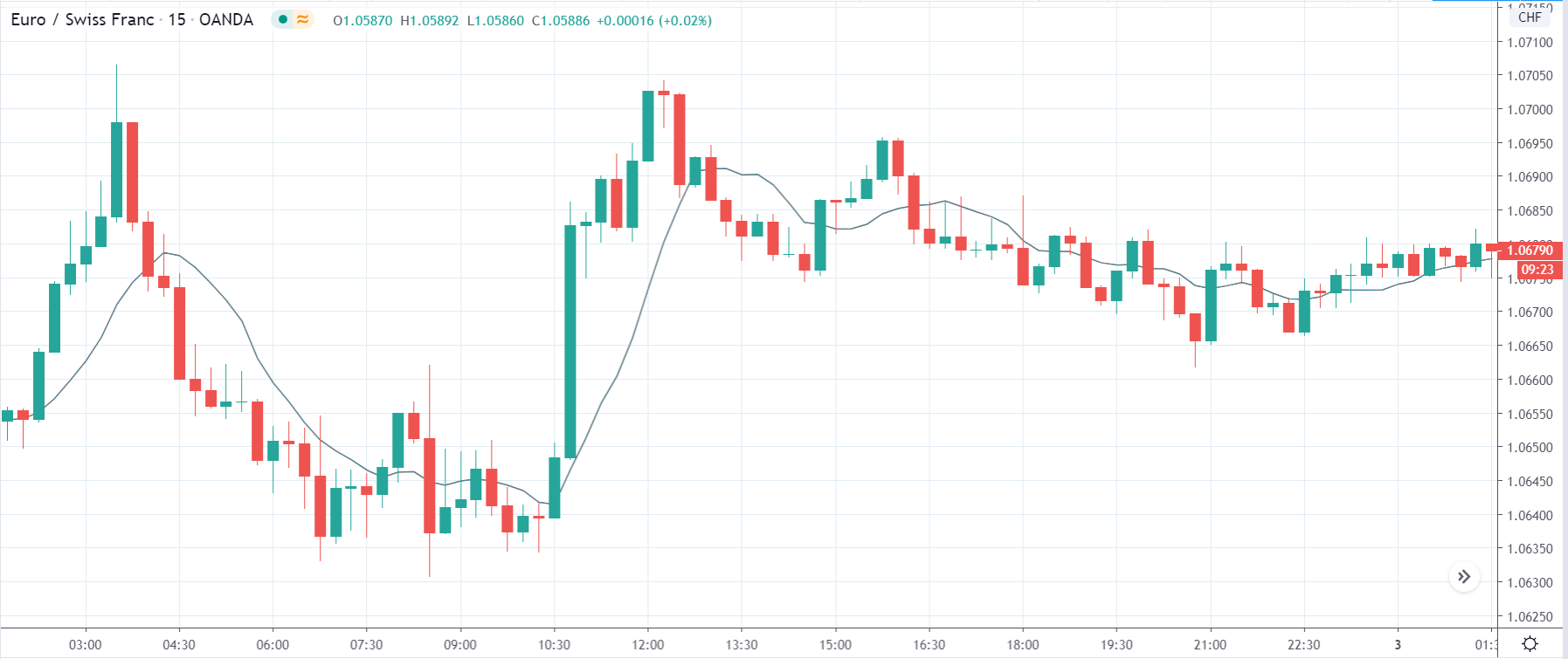
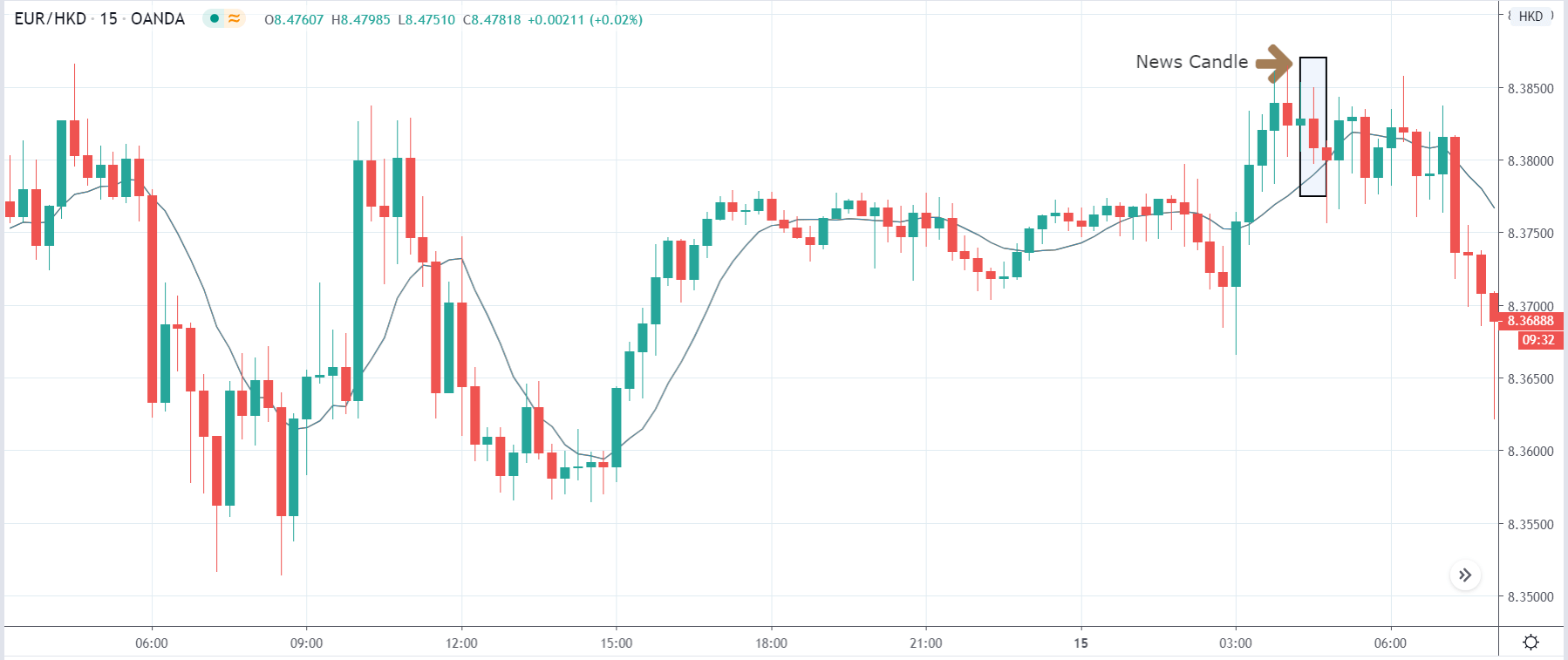
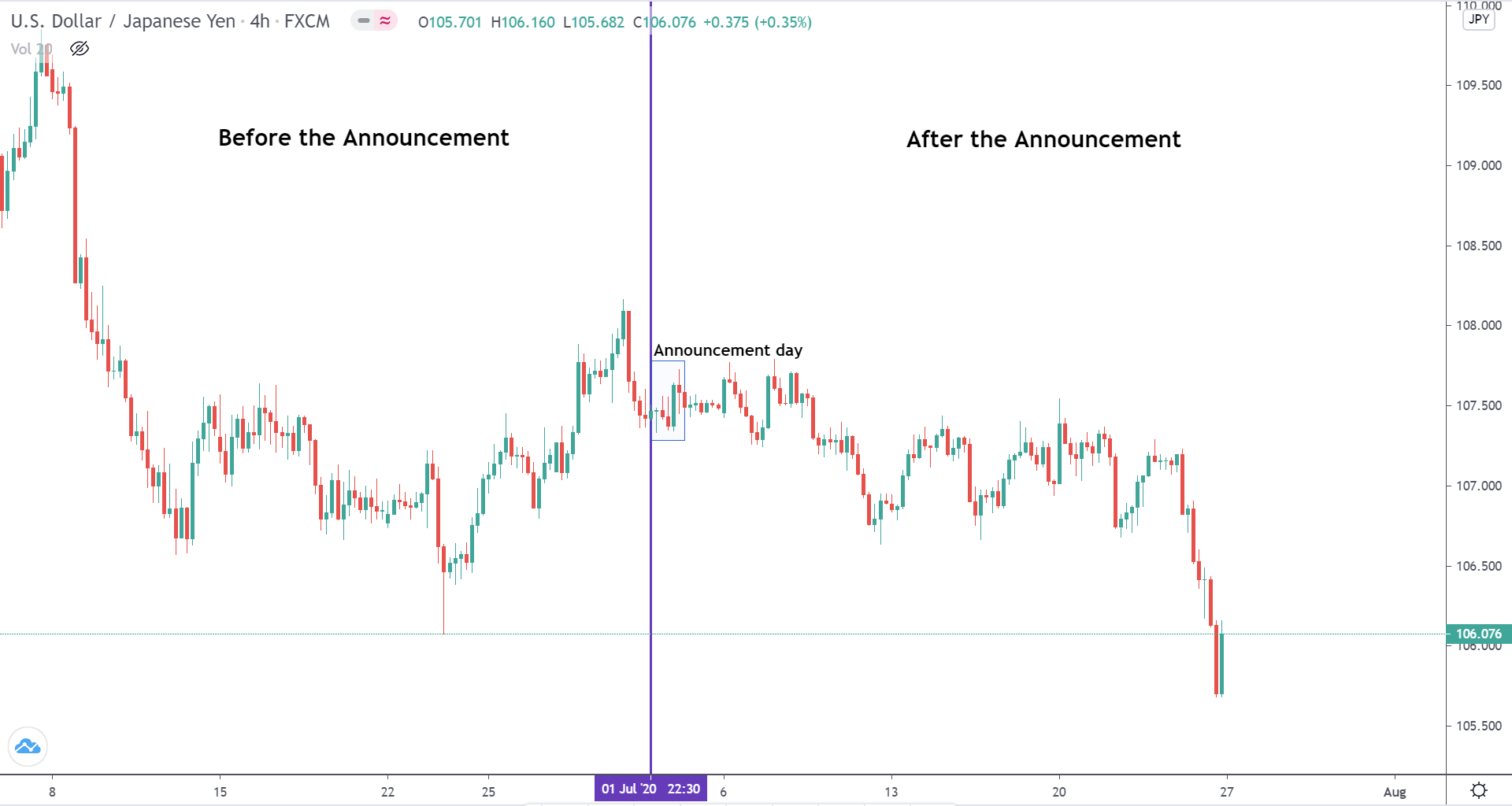
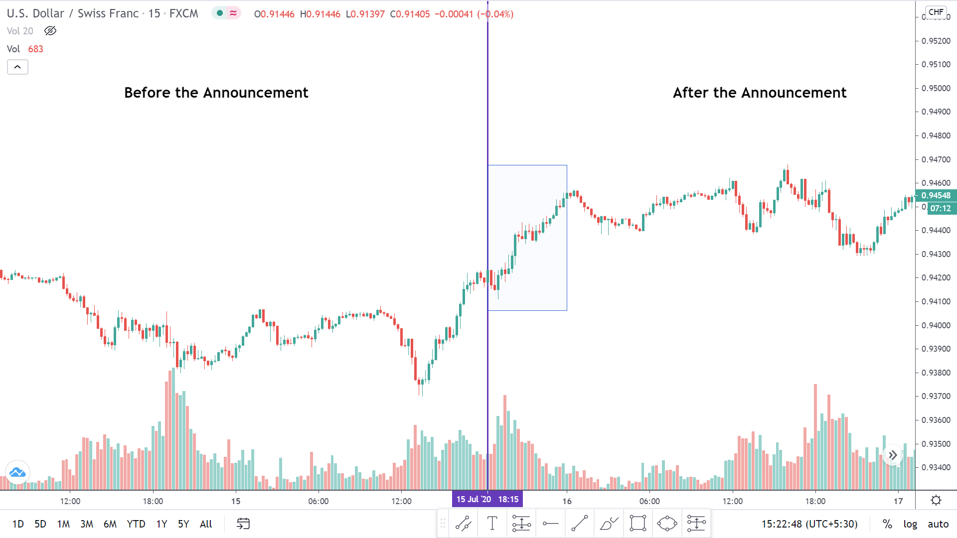
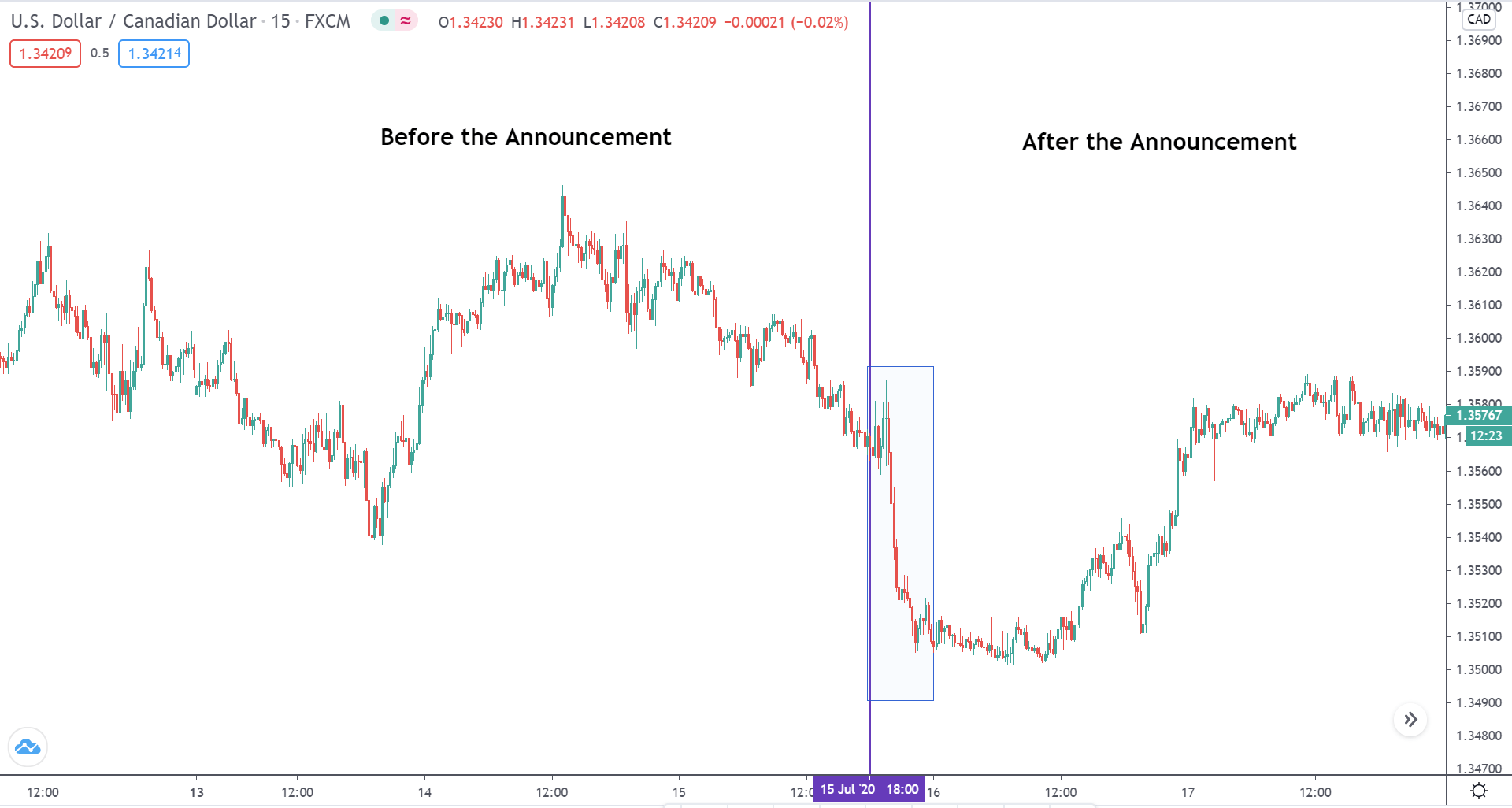
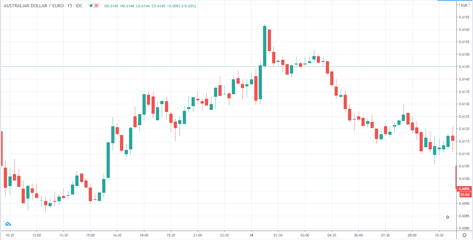
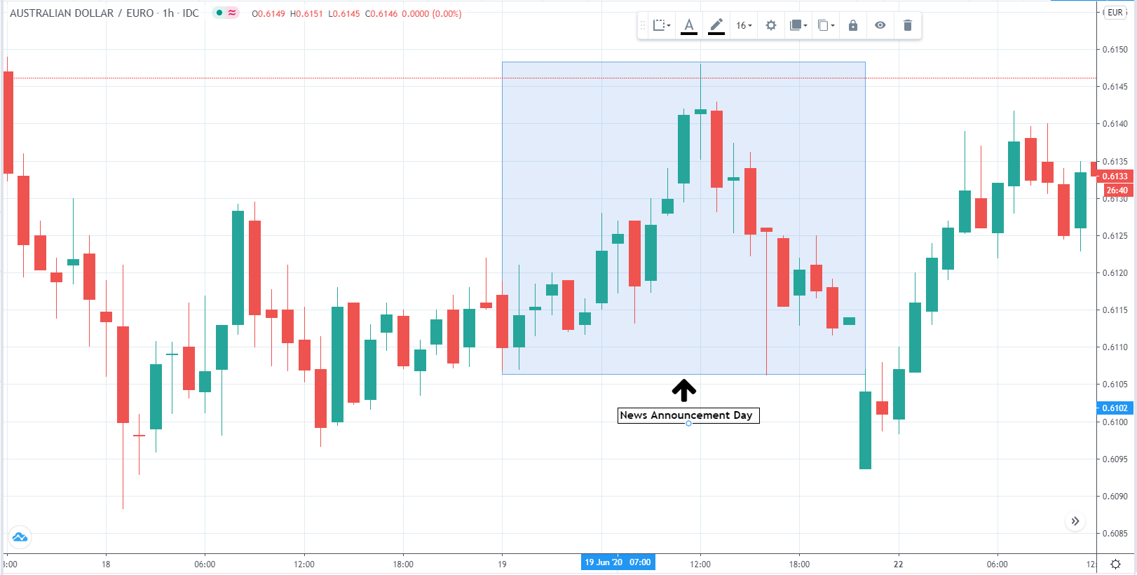
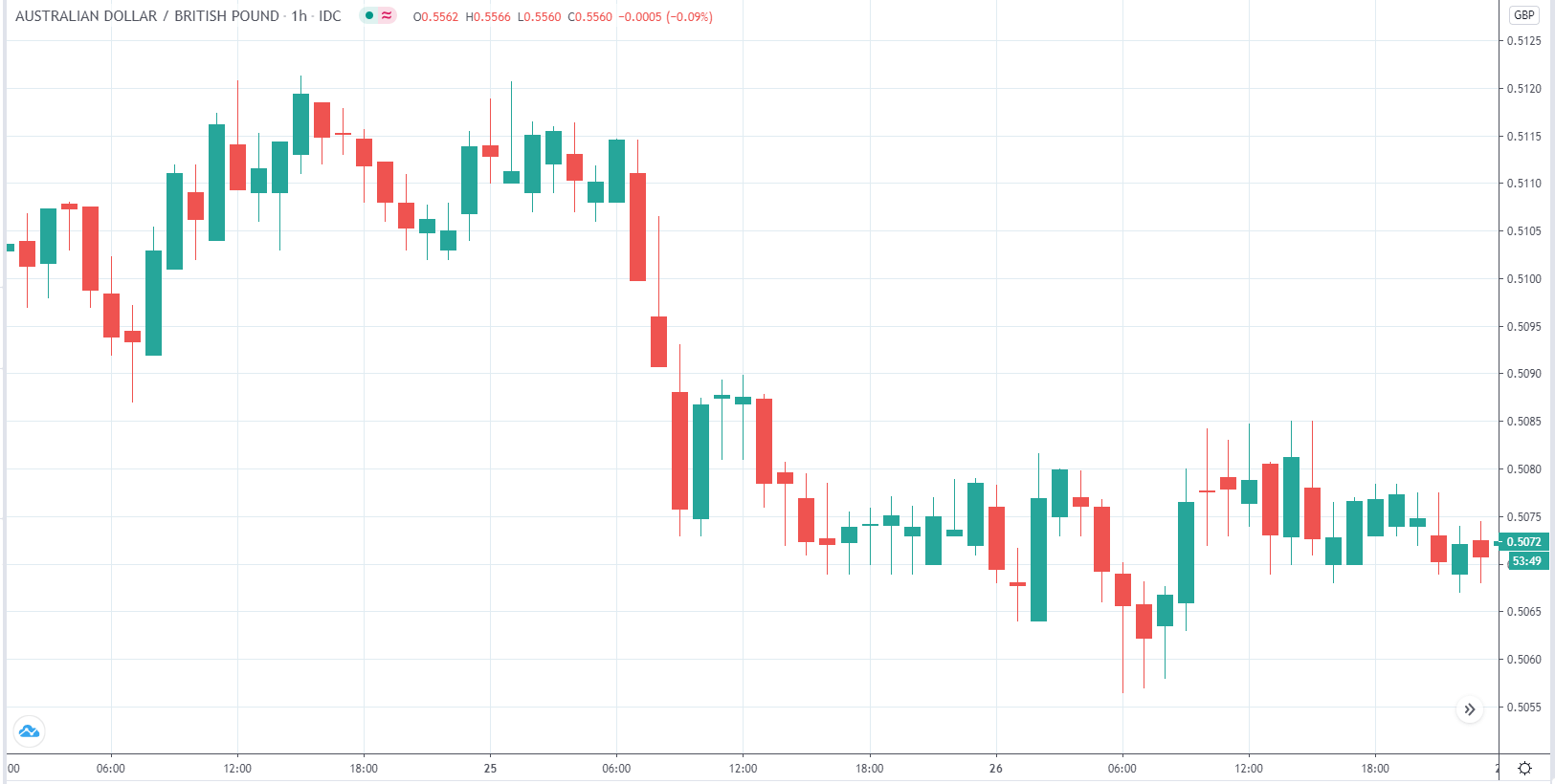
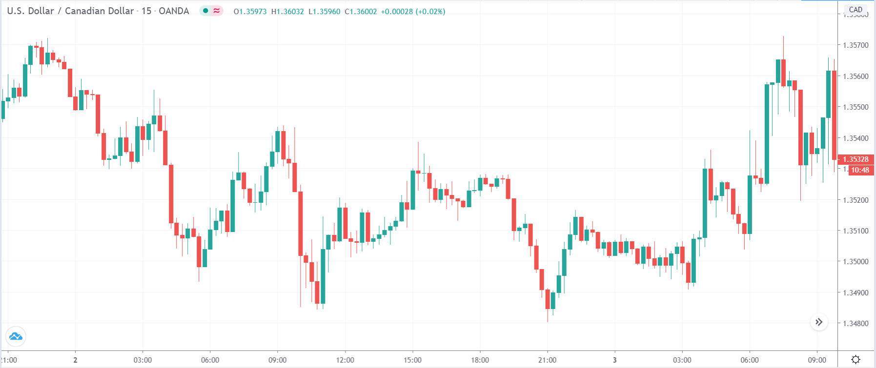
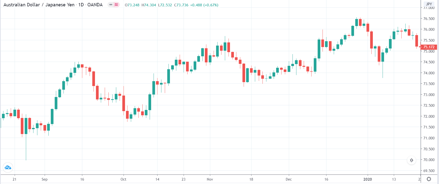
EUR/CAD | Before the announcement
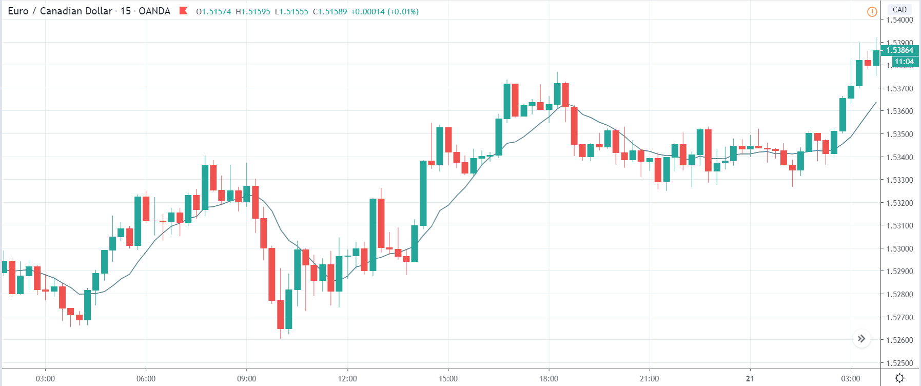
The above images represent the EUR/CAD currency pair, where, in the first image, we see that the market is in an uptrend signifying strength in the Euro. Currently, the price is at its highest point, crossing the previous ”higher high.” As per the technical analysis, we should wait for price retracement to a ”support” or ”demand” area in order to join the trend. Depending on the impact of the news release, we will position ourselves in the currency.
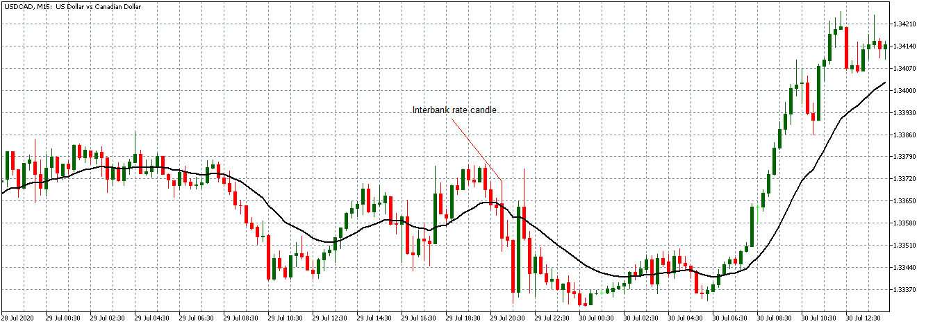
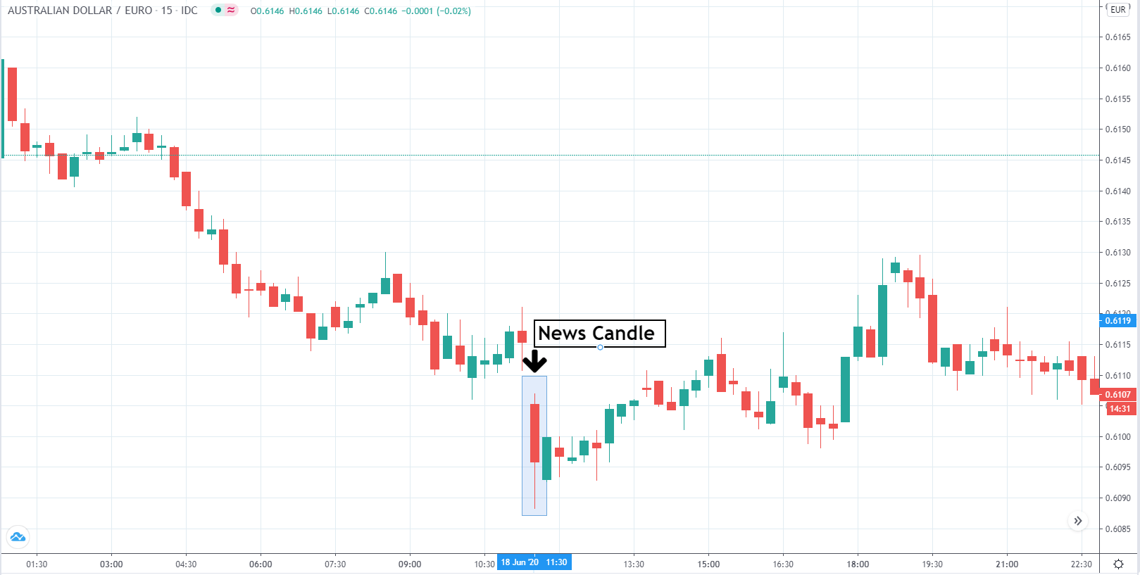
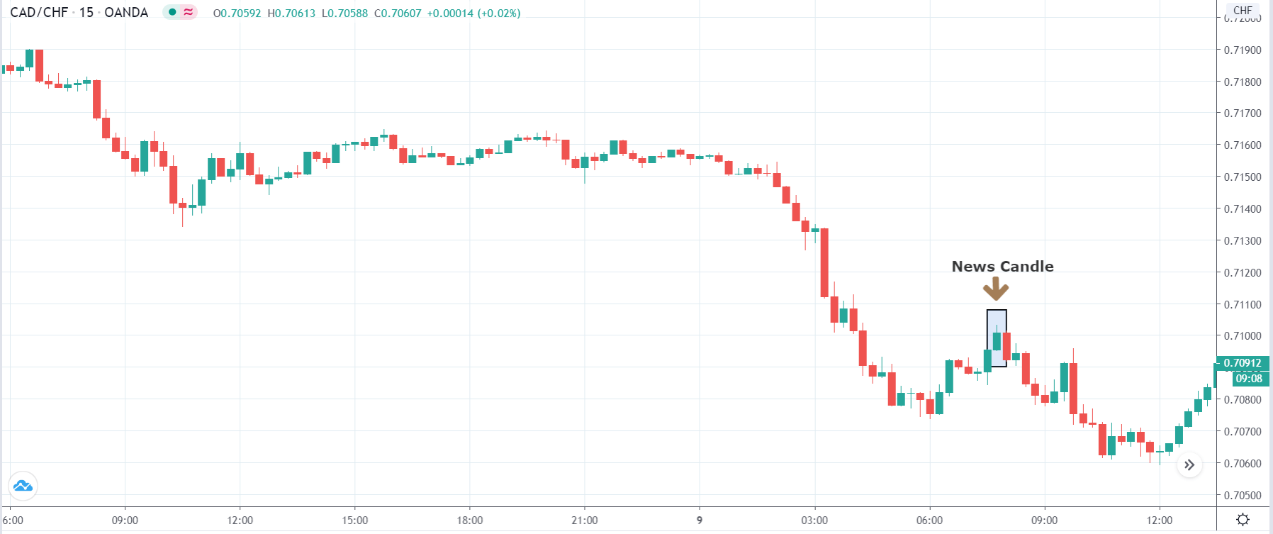
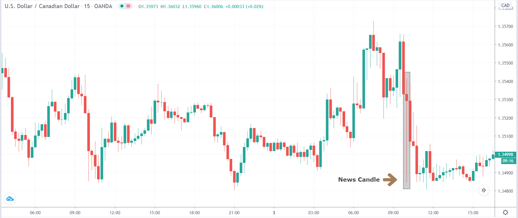
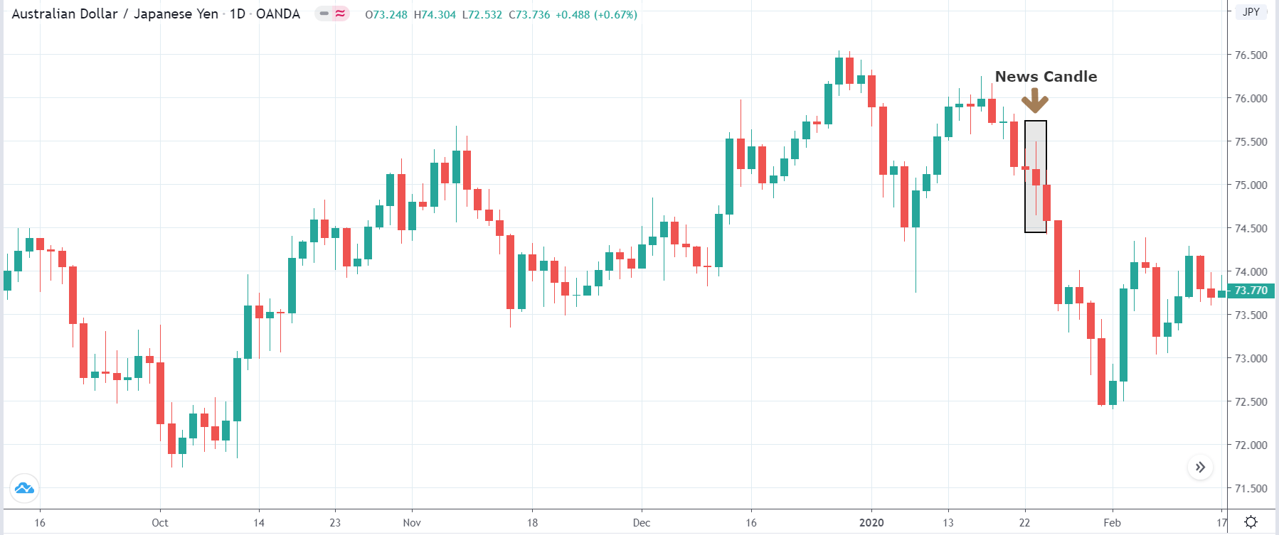
EUR/CAD | After the announcement
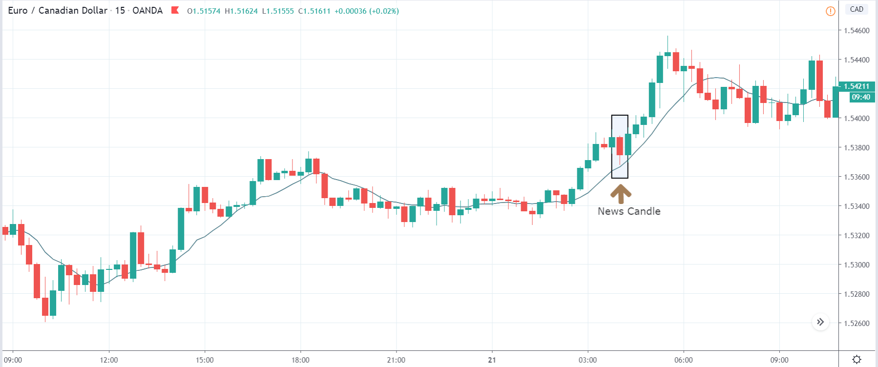
After the news announcement, the price initially falls lower due to volatility, but it does not sustain at that level where the buyers immediately take the price higher. We can see that the market bounces exactly from the moving average and continues to move higher. The market is seen to react oppositely to the ZEW Index at the time of release, but one should not conclude the impact of news from just one candle.
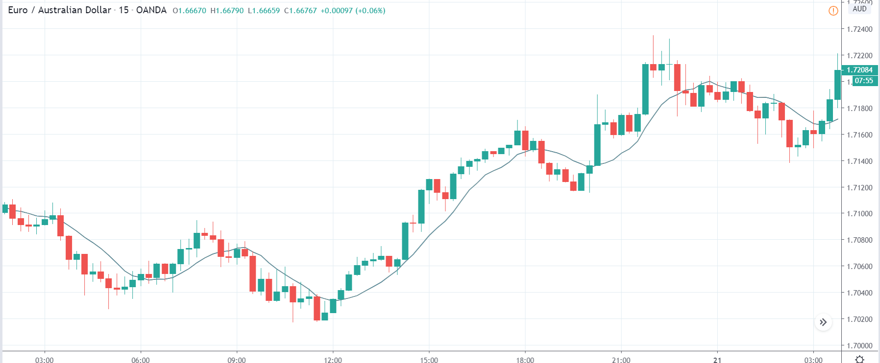
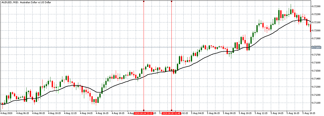
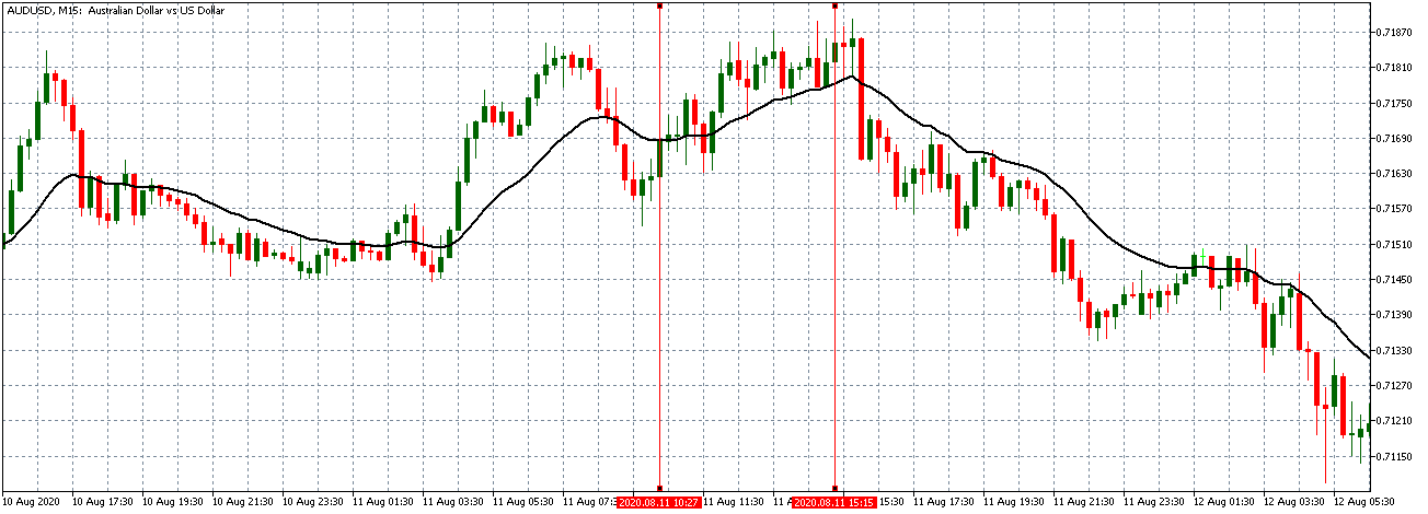
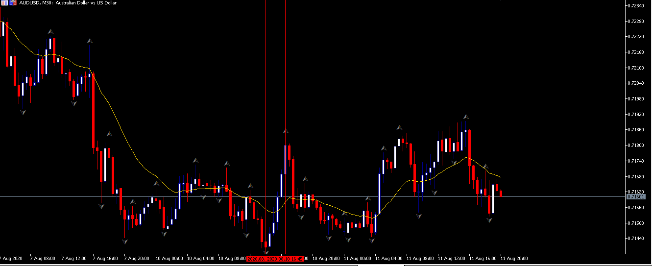
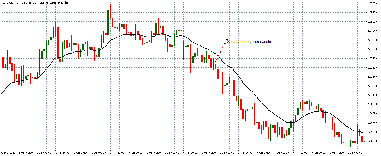
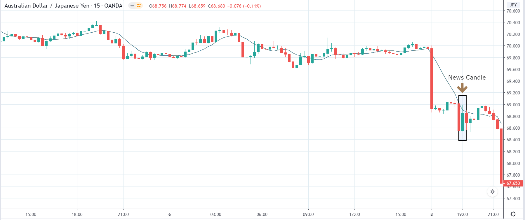
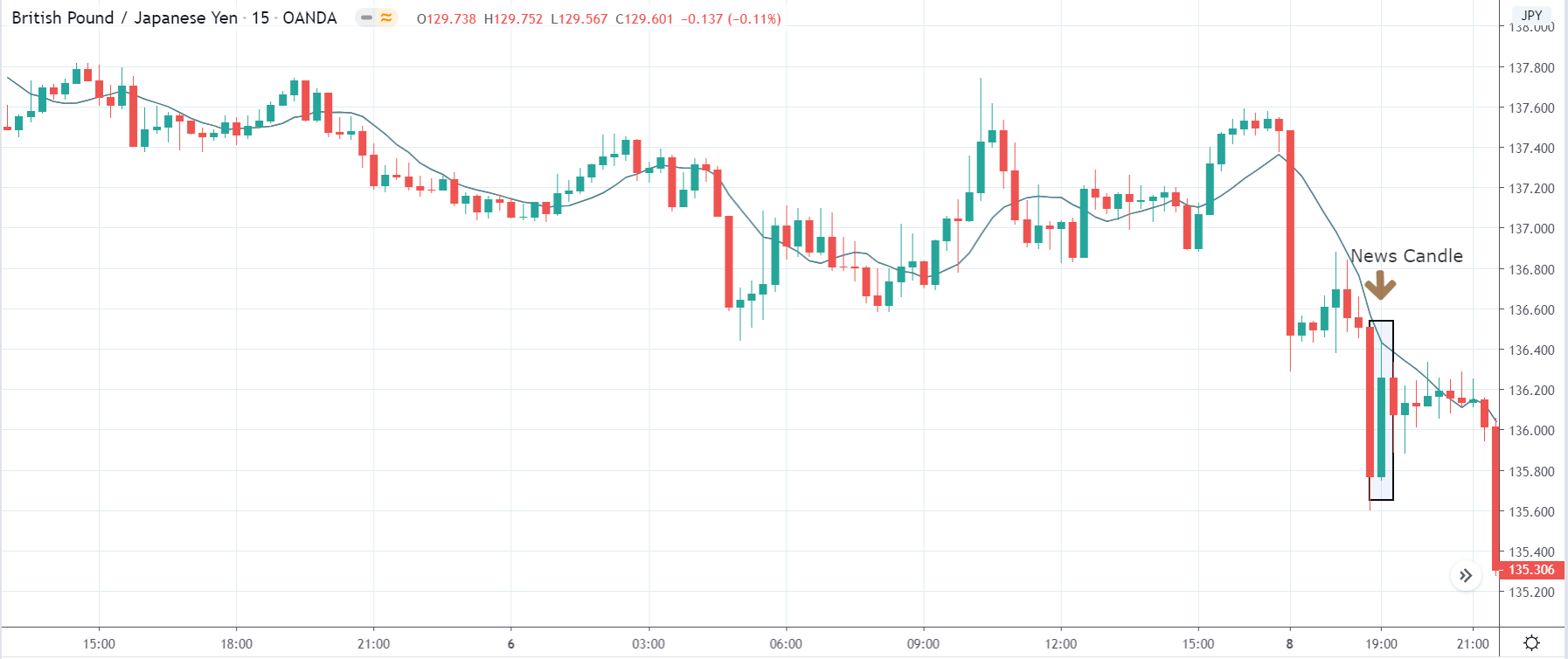
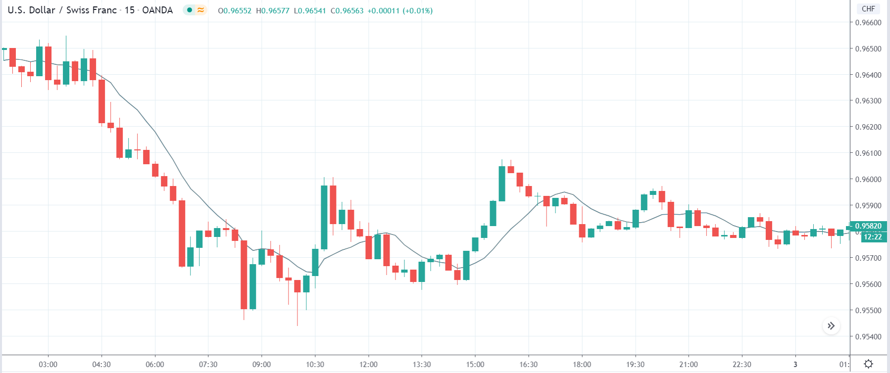
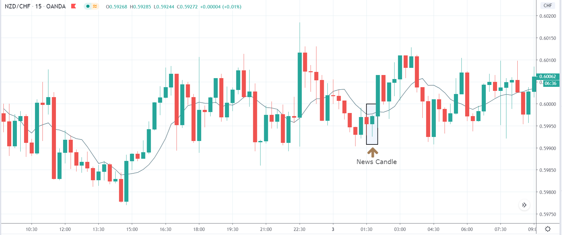
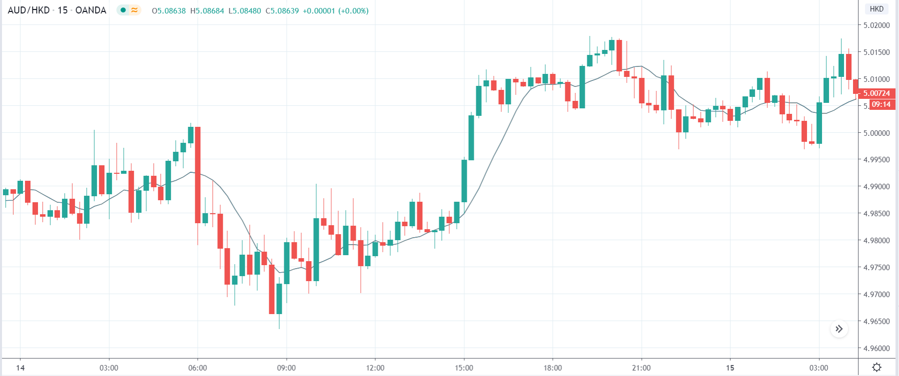
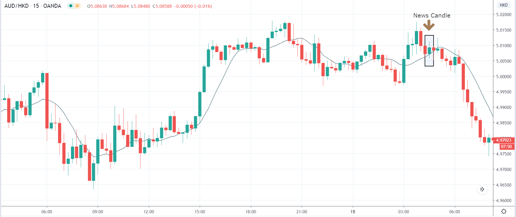
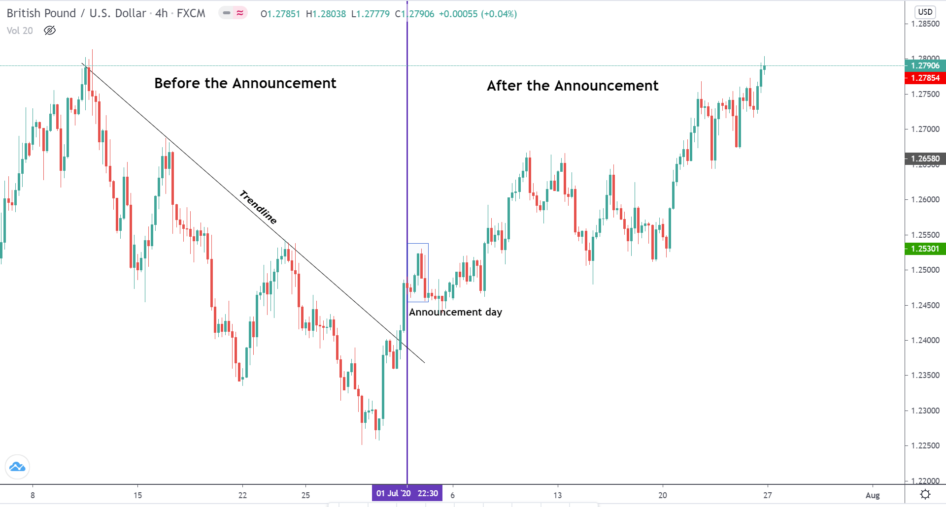
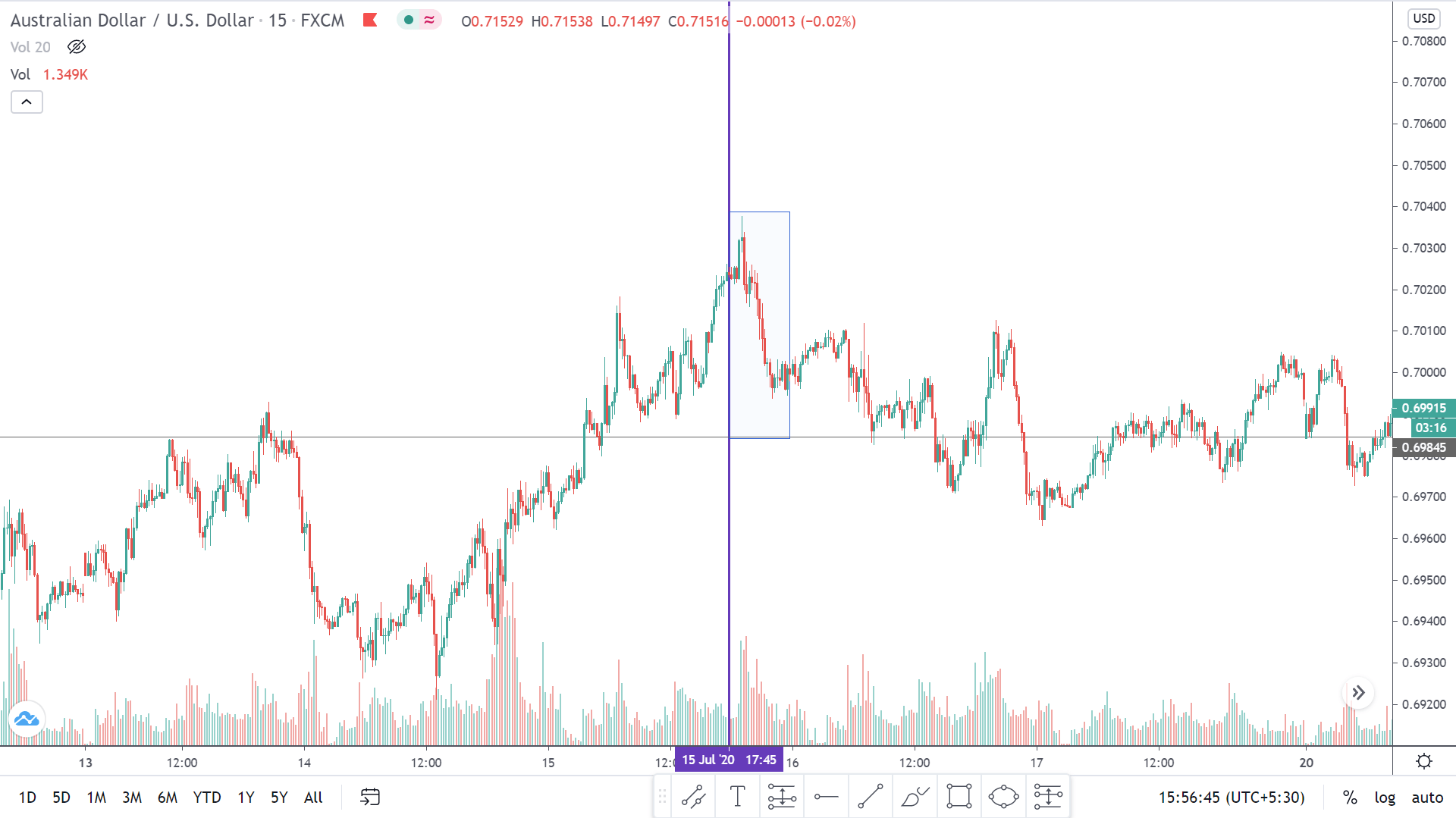
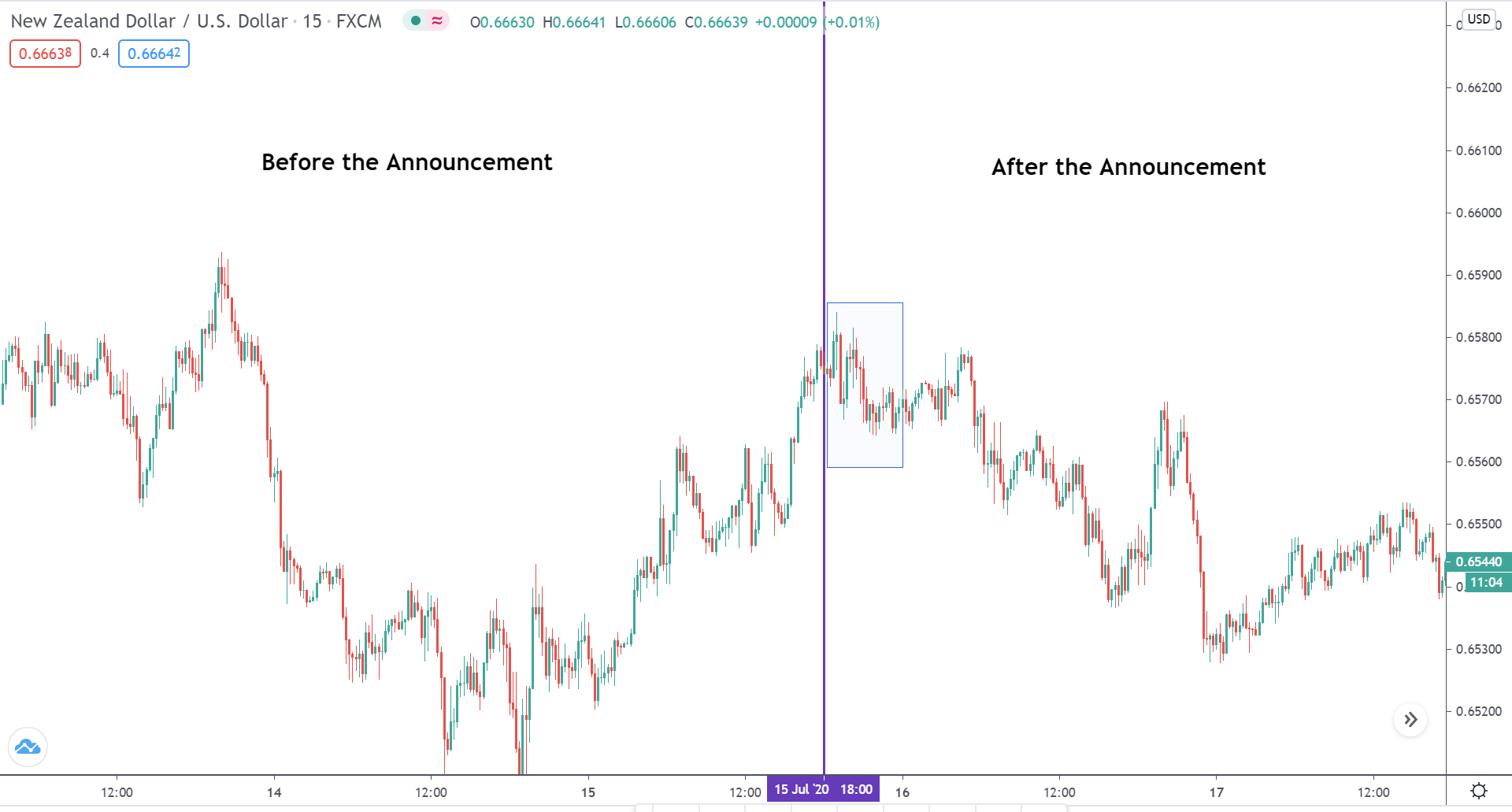
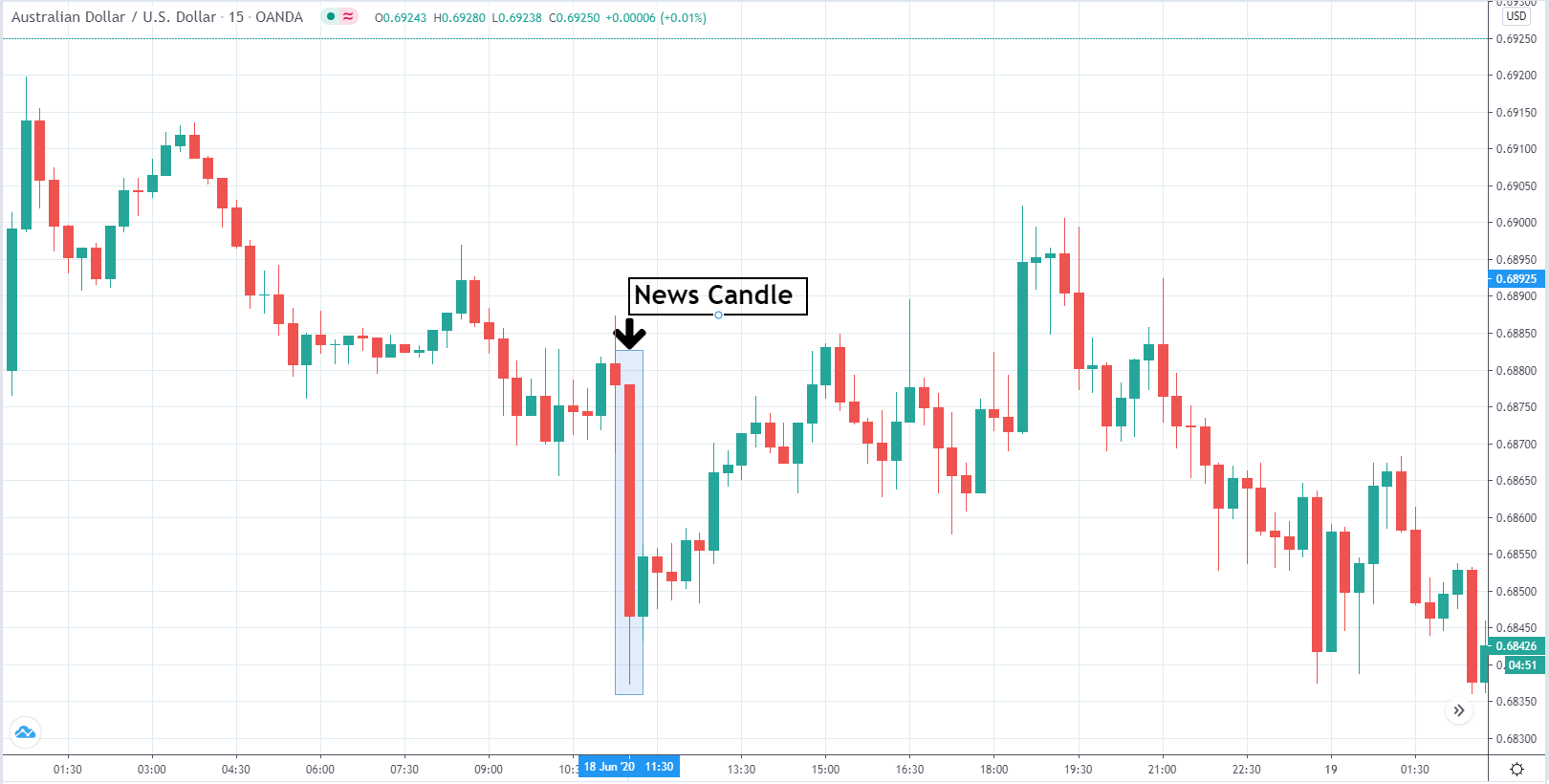
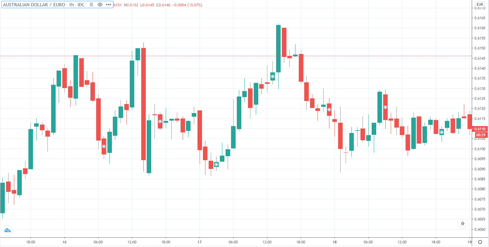
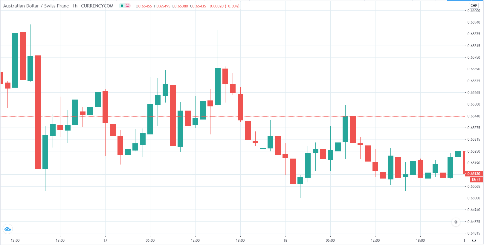
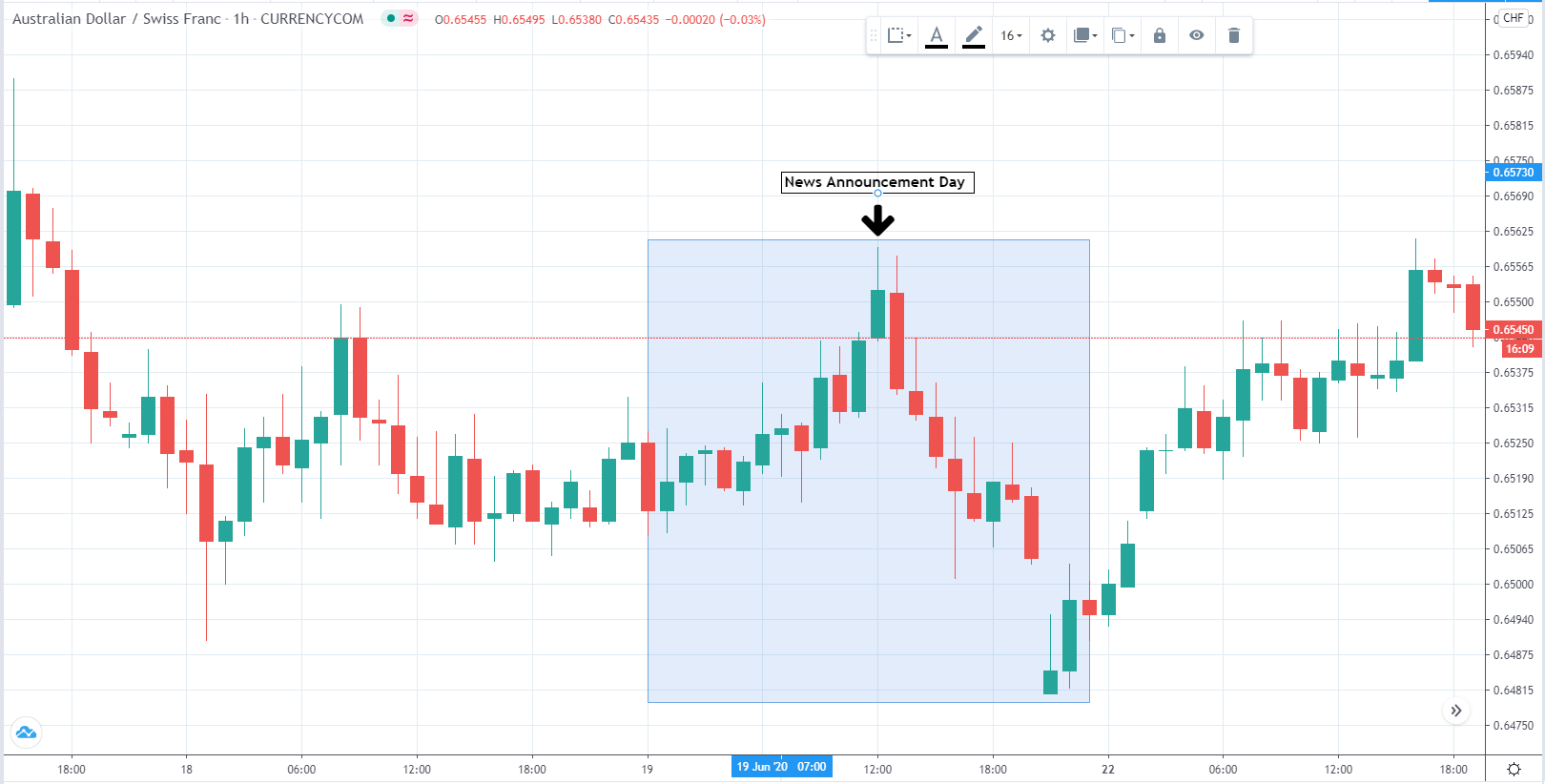
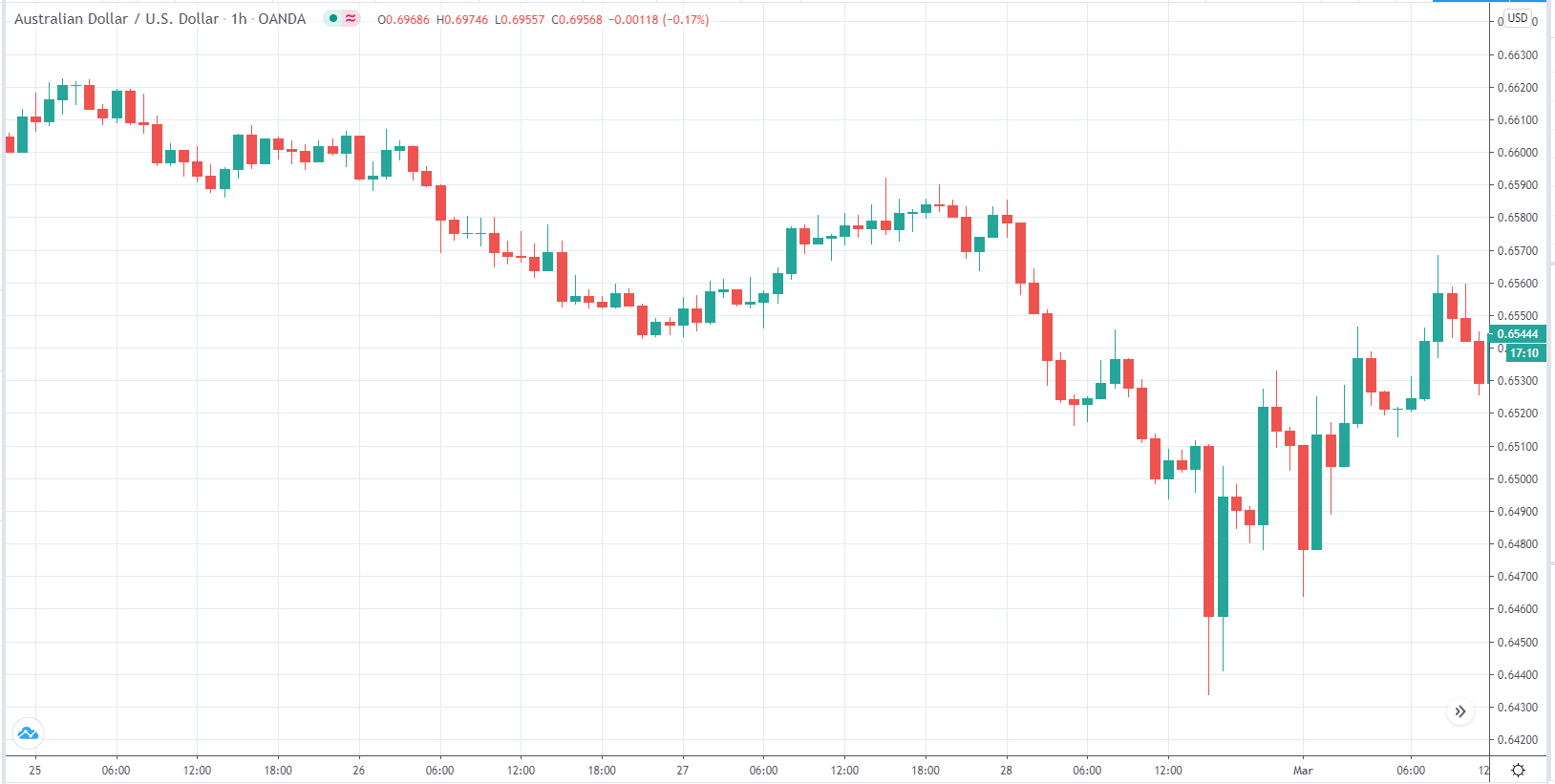
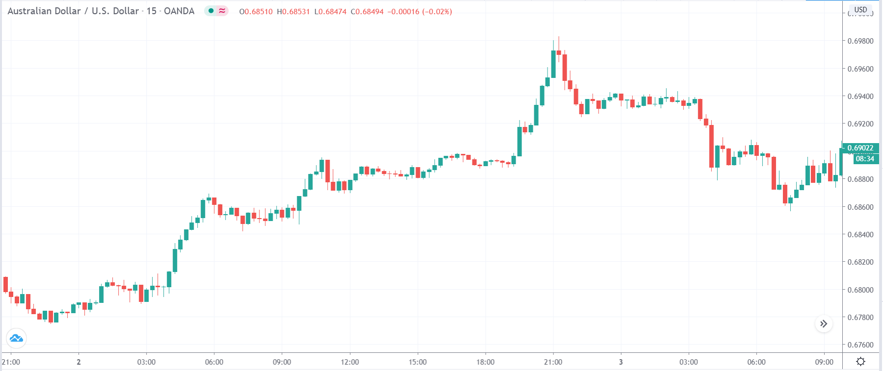
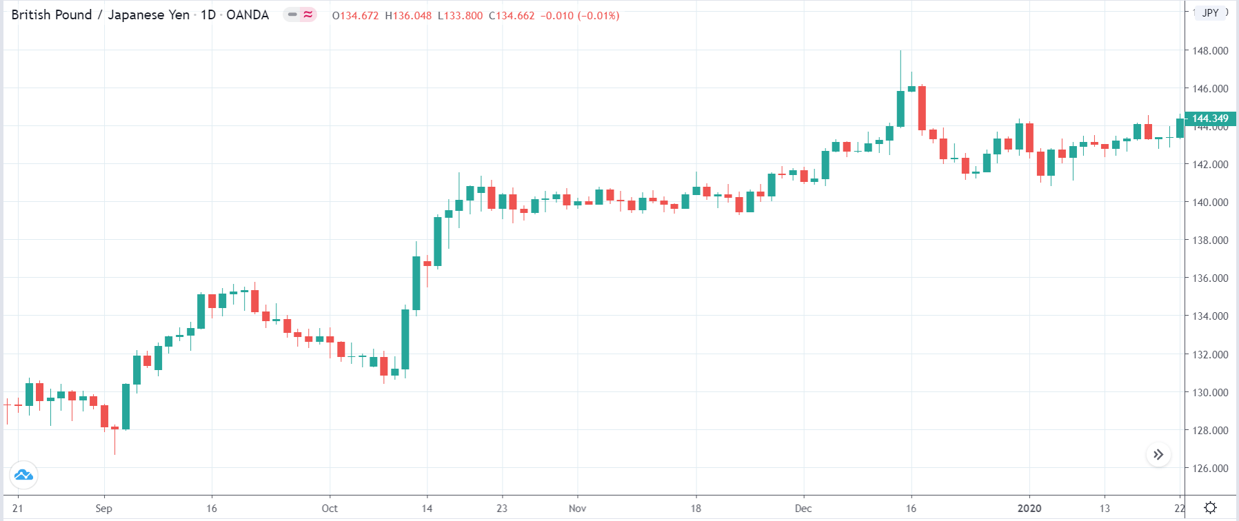
EUR/AUD | Before the announcement
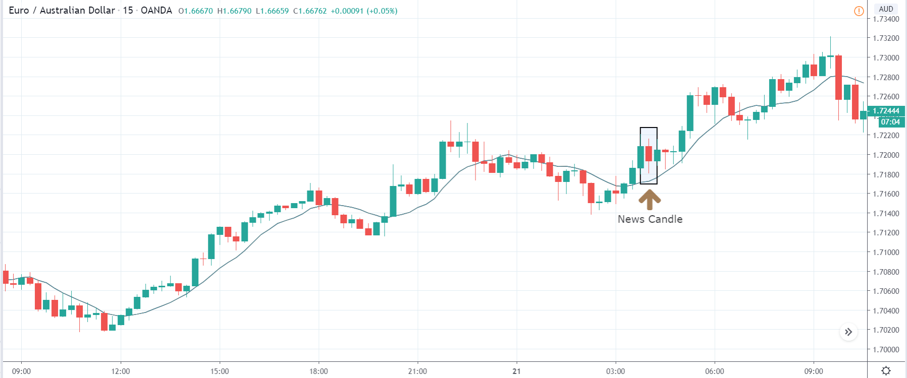
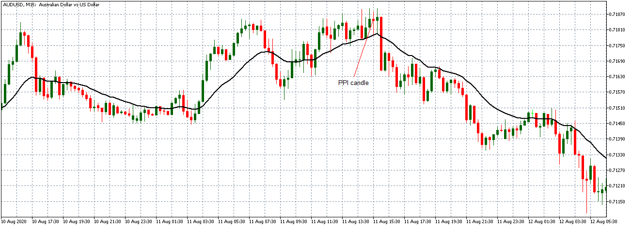
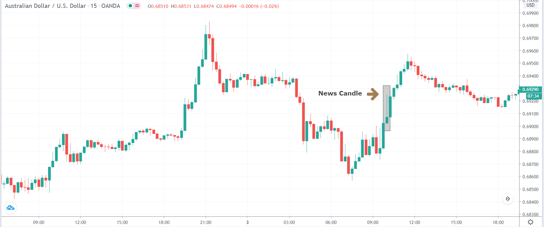
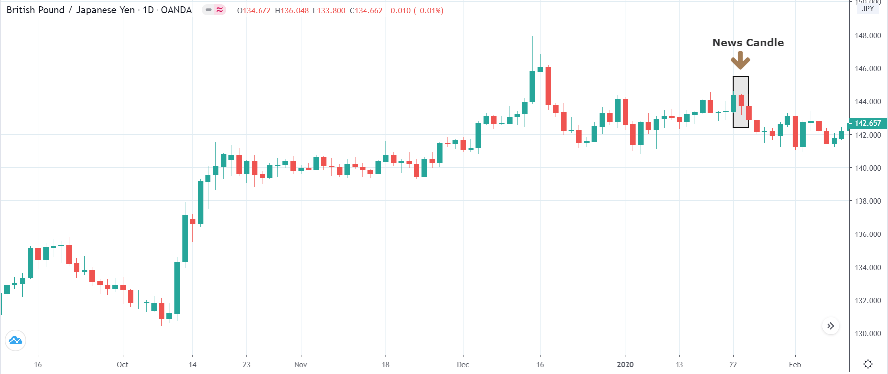
EUR/AUD | After the announcement
The above images are that of the EUR/CAD currency pair, where we see that before the news announcement, the market is in a strong uptrend again, signifying the great amount of strength in the Euro. Just before the release, the price appears to be at the ”supply” area, which means we should expect some selling pressure from this point. A breakout trade is possible if the price sufficiently breaks the ”supply” area.
After the news announcement, we witness slight bearishness in the currency but was not large enough to cause a reversal of the trend. We see that the price only hovers at the ”supply” area, with no major impact, which results in a breakout.
That’s about the ‘ZEW Economic Sentiment Index’ and the relative impact of its news announcement on the Forex price charts. Let us know if you have doubts regarding the article in the comments below. Cheers!


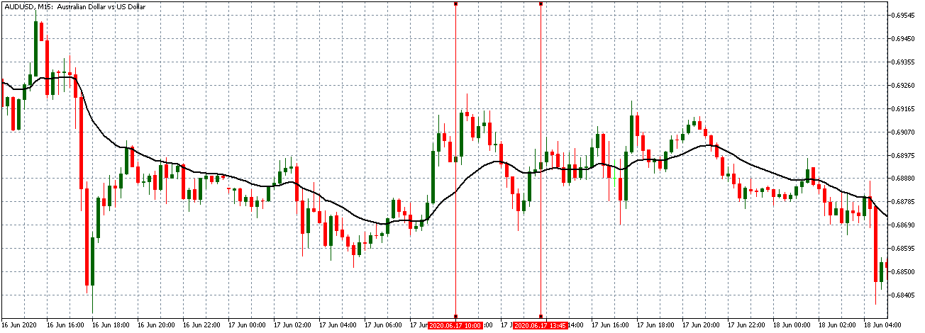
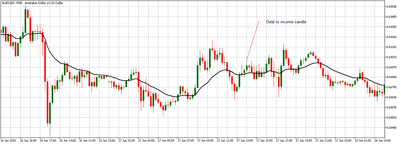


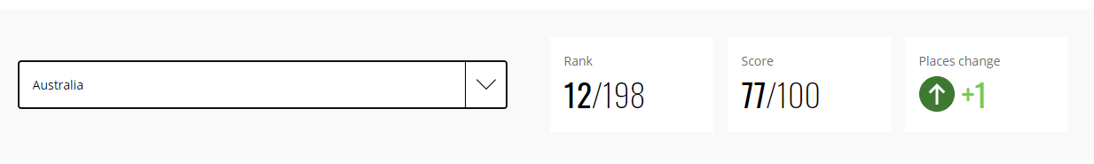


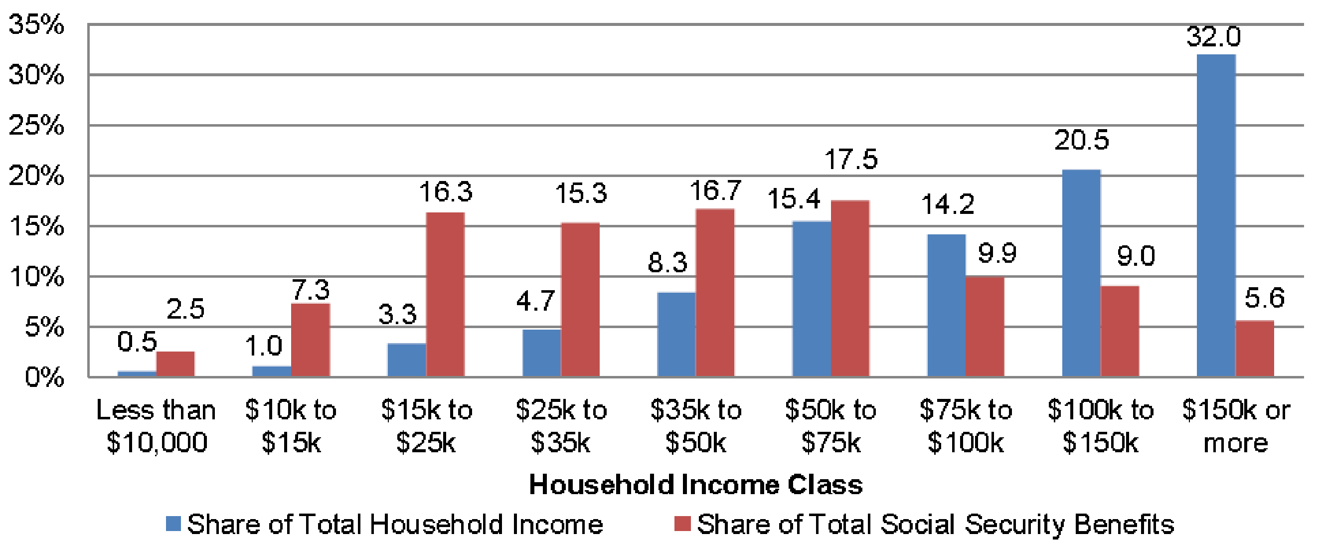


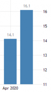


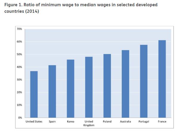
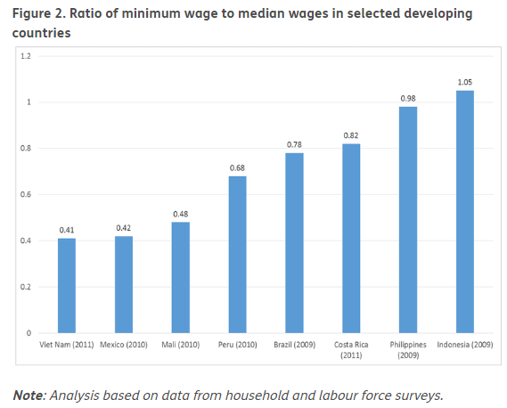
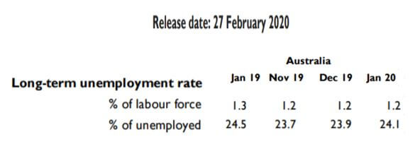
 The below image shows that the weekly wages were increased for Australian employees in 2020. Although the difference is not huge, it still is a positive step taken for the daily wage workers. Looking at the data, we should not expect significant volatility in the currency pairs during the announcement.
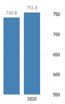


