Categories
Forex Fundamental Analysis

Ease of Doing Business – Comprehending This Macro-Economic Indicator

What is the ‘Ease of Doing Business Index?’

The ease of doing business index was created jointly by two leading economists, namely Simeon Djankov and Gerhard Pohl from the Central and Eastern sector of the World Bank Group. It is an aggregate number that includes different parameters that define the ease of doing business in a country. The ease of doing business (EODB) measures the country’s position in offering the best regulatory practices. Though the World Bank started publishing the reports in 2003, the ranking only started only in 2006.

The EODB study captures the experience of small and medium-sized companies in a country with their regulators and the relationship with their customers, by measuring time, costs, and red tape they deal with. The goal of the World Bank is to provide an objective basis for understanding and to improve the regulatory environment for businesses worldwide.

Methodology

The survey consists of a questionnaire made by a team of experts with the assistance of academic advisors. The questionnaire consists of feedback on business cases that cover topics such as business location, size, and nature of its operations. This survey’s motive is to collect information that is affecting their business and not to measure conditions such as the nation’s proximity to large markets, quality of infrastructure, interest rates, and inflation.

The next step of the data-gathering process involves over 12,500 expert contributors such as lawyers and accountants from 190 countries in the survey to interact with the Doing Business team in conference calls, written reviews, and visits by the global team. Respondents fill out the surveys and provide information relevant to laws, regulations, and different fees charged.

A nation’s ranking is decided after assessing the following factors:

  • Starting a business – idea, time, procedure, and capital required to open a new business
  • Construction permits – permissions, land, and cost to build a warehouse
  • Electricity access – procedure, time and cost needed to obtain an electricity connection from the electricity board
  • Property registration- procedure, time, and cost required to register the warehouse with the local government body
  • Getting credit and loan – the process involved in getting credit from banks, and depth of credit information index
  • Investor protection – the extent of disclosure, liability, and ease of shareholder suits
  • Payment of taxes – tax filing process, preparation of tax filing and number of taxes paid
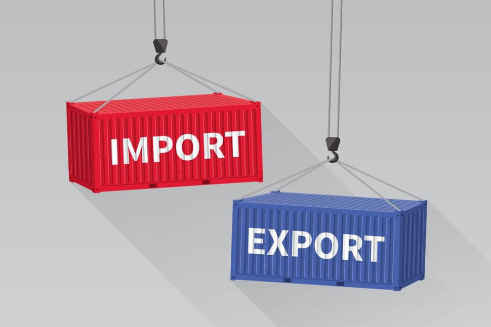
  • Cross border trading – number of documents required, and cost for import and export
  • Enforcing contracts – procedure, time, and cost to impose debt contract
  • Insolvency process – time, cost and recovery rate under a bankruptcy proceeding

Based on the score obtained in the above sub-indices, a country is assigned a rank in the ease of doing business index. The ease of doing business report is a complete assessment of competitiveness or the business environment. Still, rather it should be considered as a proxy of the regulatory framework faced by the private sector before starting a new business.

The Economic Reports

The ease of doing business reports is an annual report published by a team led by Djankov in 2003. The report is then elaborated by the World Bank Group that basically measures the costs firm is incurring for business operations. The World Bank report is, in fact, an important knowledgeable product in the field of private sector development. It has also motivated the design of various regulatory reforms in developing countries. The study presents a detailed study of costs, time, and procedures that a private firm is subject to before opening the company. This then creates rankings for a country.

Impact on Currency

The Doing Business report is used by policymakers, politicians and development experts, journalists, and, most importantly, the fund managers to understand the easiness of starting a business in the country. More companies mean more jobs, and more jobs mean faster development. Growth in the economy is directly related to the companies’ performance and the opening of new businesses. Therefore, when regulations are eased for starting a business, it contributes to the GDP of the country longer and increases the value of the currency in the international market.

Sources of information on Ease of Doing Business 

The ease of doing business report is one of the most sought reports in the finance industry, so many financial institutions and economic websites give mention ranking of a country after collecting the data from official sources. However, the data published by the World Bank is the most reliable and factual.

Sources

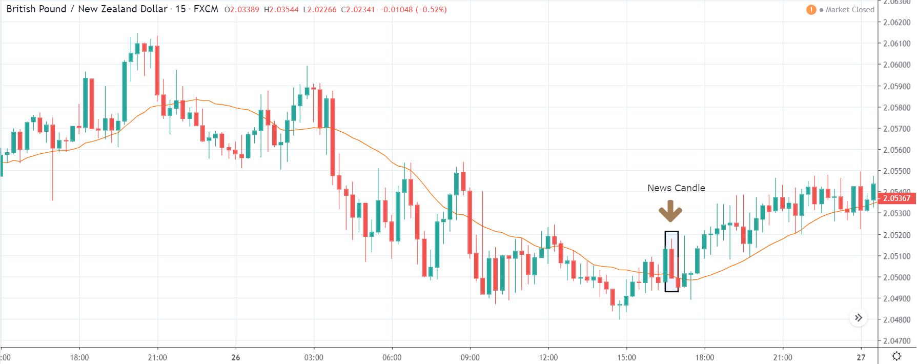
GBP (Sterling) – https://tradingeconomics.com/united-kingdom/ease-of-doing-business

AUD – https://tradingeconomics.com/australia/ease-of-doing-business

USD – https://tradingeconomics.com/united-states/ease-of-doing-business

CAD – https://tradingeconomics.com/canada/ease-of-doing-business

CHF – https://tradingeconomics.com/switzerland/ease-of-doing-business

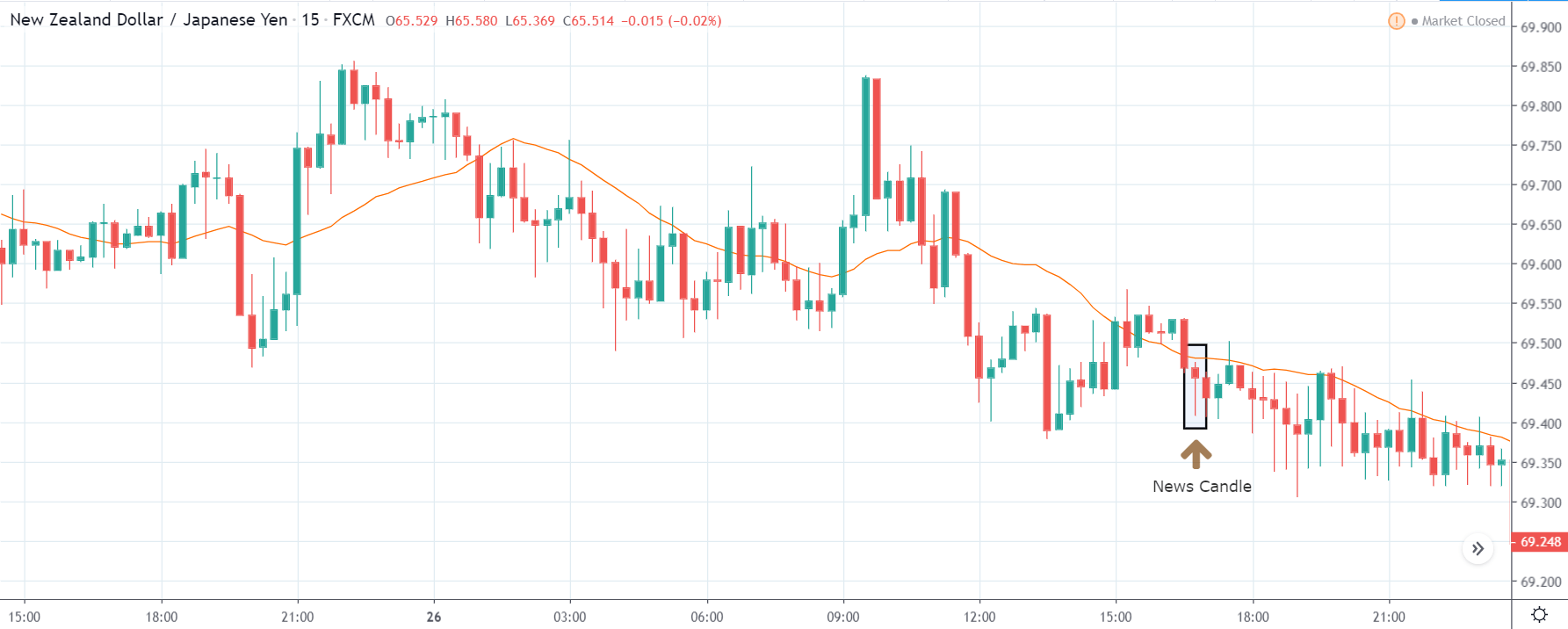
JPY – https://tradingeconomics.com/japan/ease-of-doing-business

NZD – https://tradingeconomics.com/new-zealand/ease-of-doing-business

Ease of Doing Business report is one of the most discussed issues around the world. The report that is issued by the World Bank gets a lot of attention from the government around the world. For country authorities, it sheds light on regulatory aspects of their business climate. For business representatives, it helps initiate debates and dialogue about reform.

The private sector creates pressure on the respective government to ensure required reforms to indirectly improve the country’s rank in the EODB index. Investors take the decision of investment in a country based on the ranking of that country in the ease of doing business report. From the World Bank’s point of view, it demonstrates an unconditional ability to provide knowledge and resource information. This exercise by the World Bank generates information that is useful and relevant.

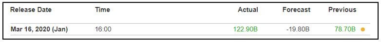
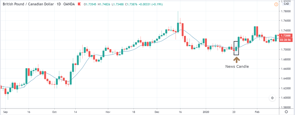
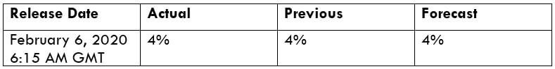
Impact due to news release

In the previous section of the article, we understood the definition of ‘Ease of Doing Business’ and the methodology used for ranking a country. Now we will extend our discussion in identifying the impact of the news announcement on the value of a currency. Many case studies tell correlation exists between ease of doing business and FDI flows.

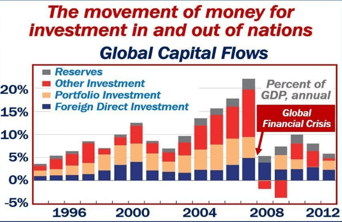
One study finds that judicial independence and labor market flexibility are significantly associated with FDI flows. The number of procedures required to start a business and strength of the arbitration regime both have a significant and robust effect on FDI. Due to these reasons, foreign investors always invest in an economy where business activities can be carried out without any obstructions.

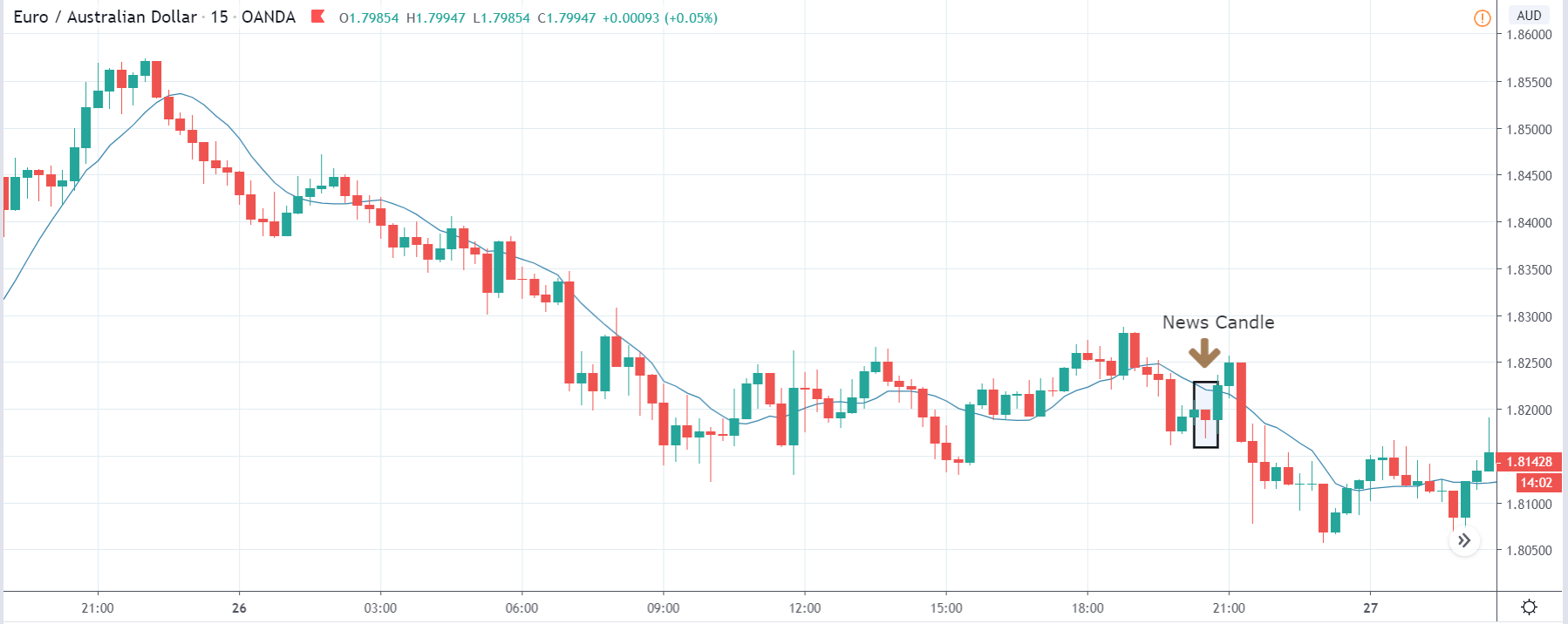
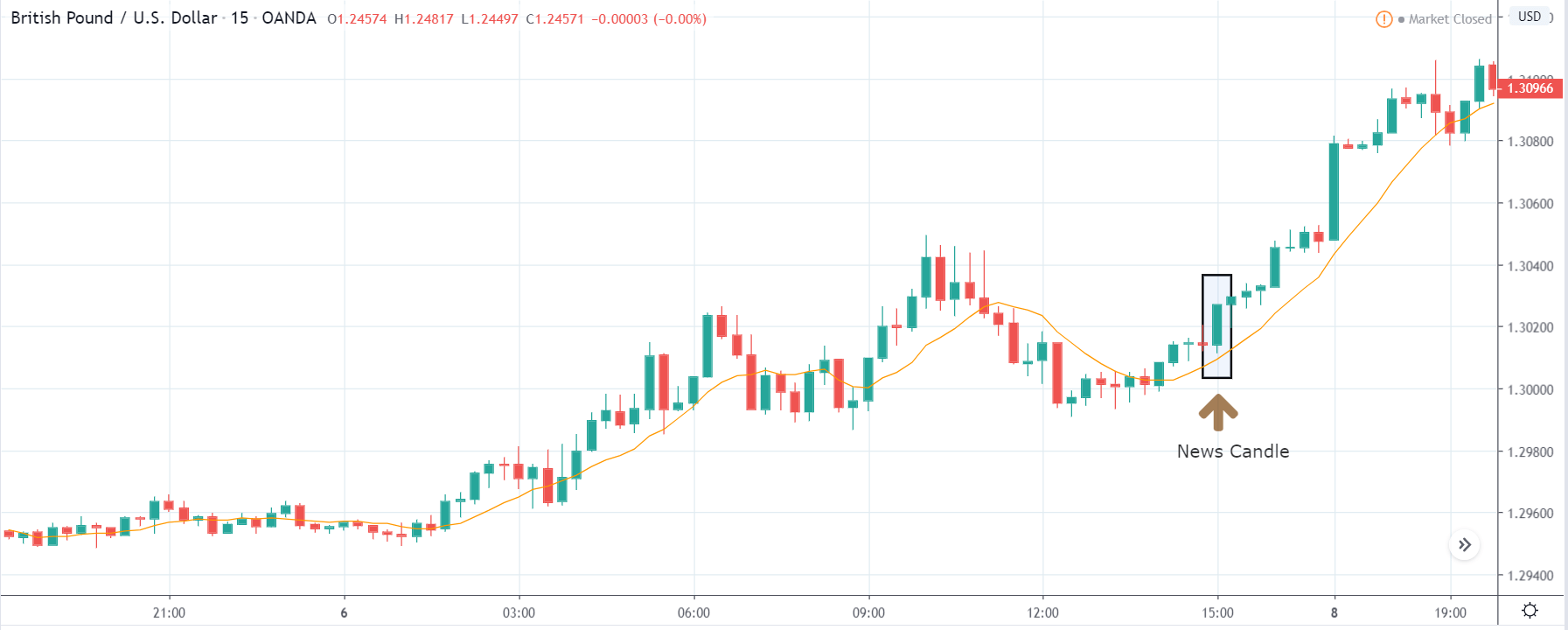
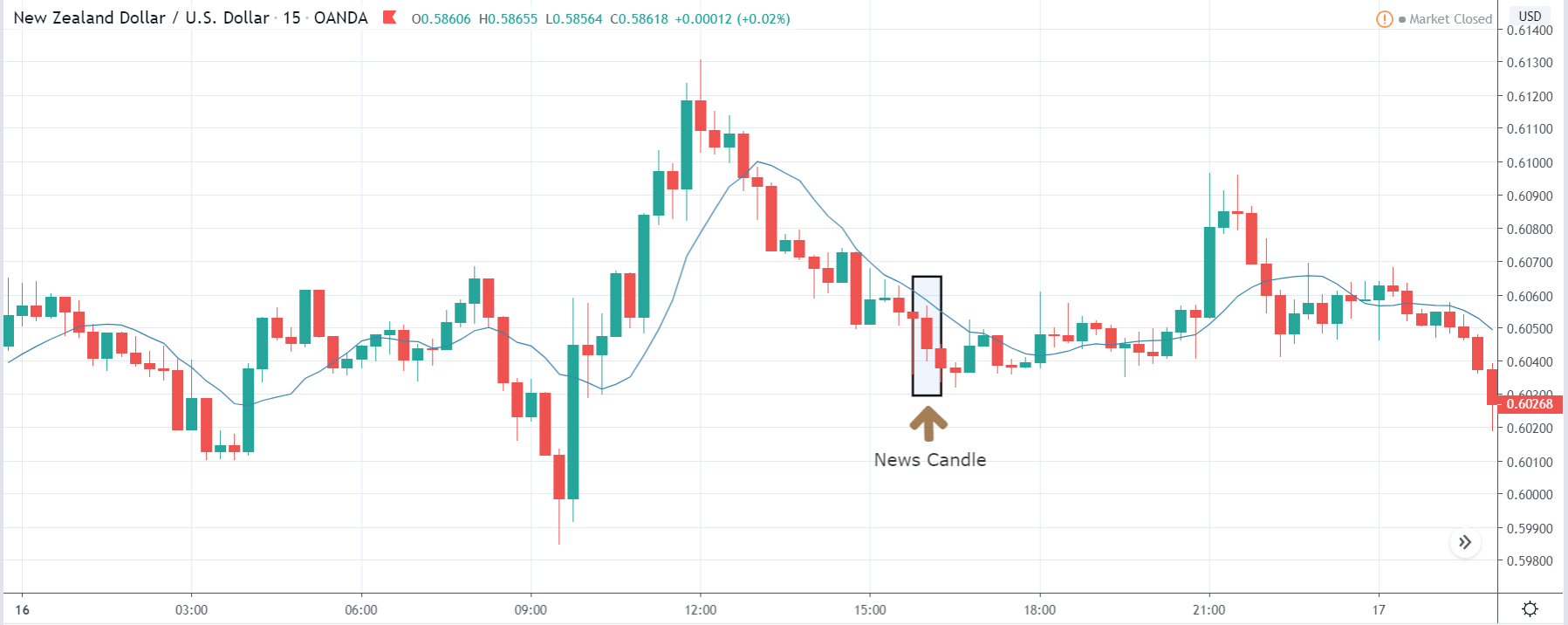
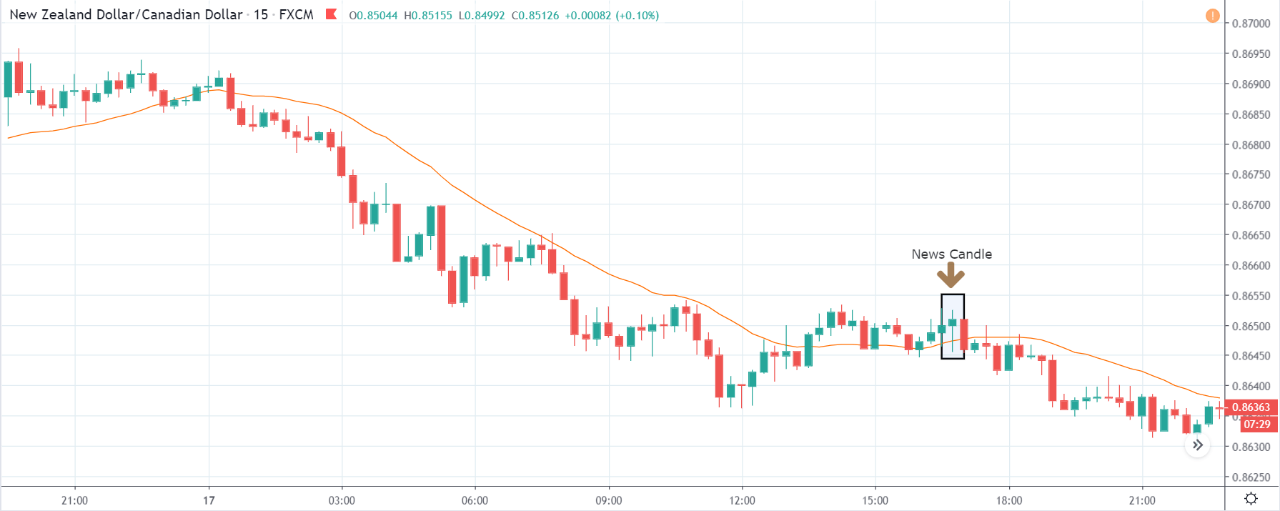
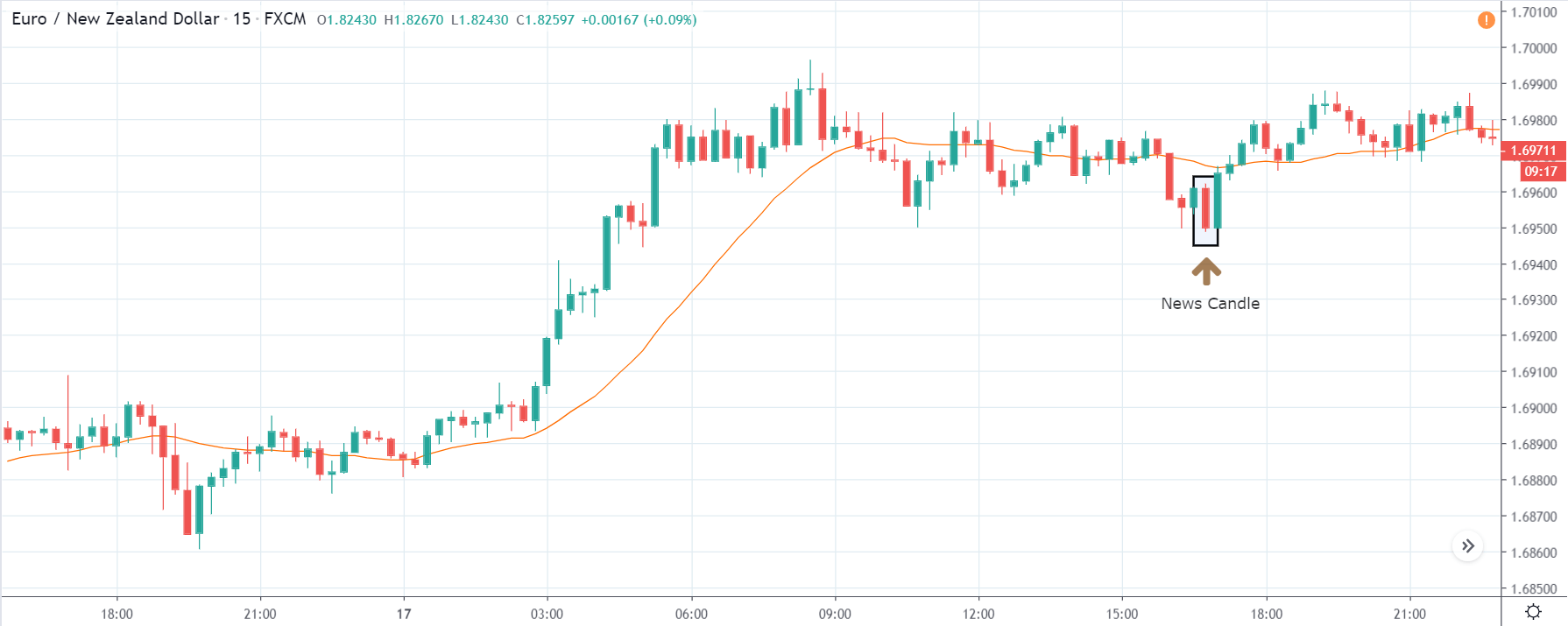
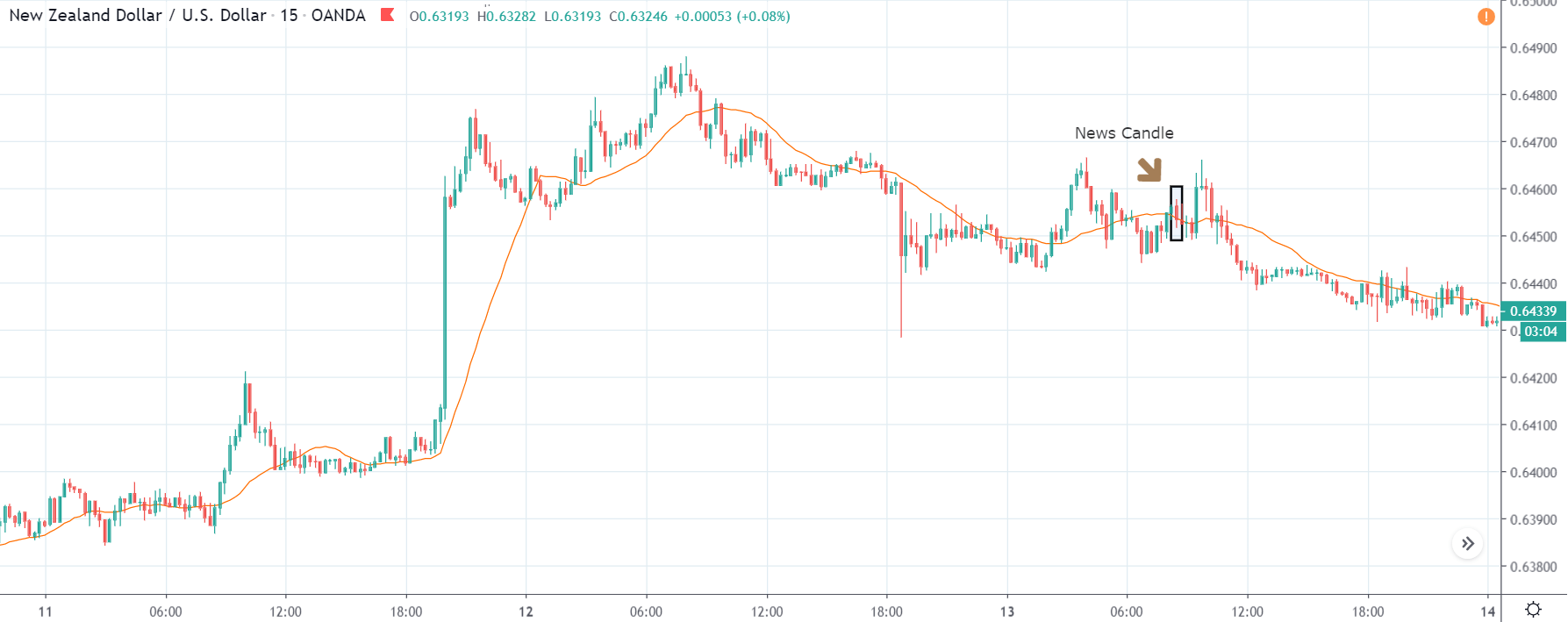
In today’s lesson, we will analyze the impact of ‘Ease of Doing Business’ on different currencies and analyze the change in volatility due to its news release. The below image is a graphical representation of Switzerland’s rank in 2018 and 2019. We see that the country had shown improvement in it’s ranking by two places. Let us find out the reaction of the market to this announcement.

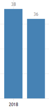
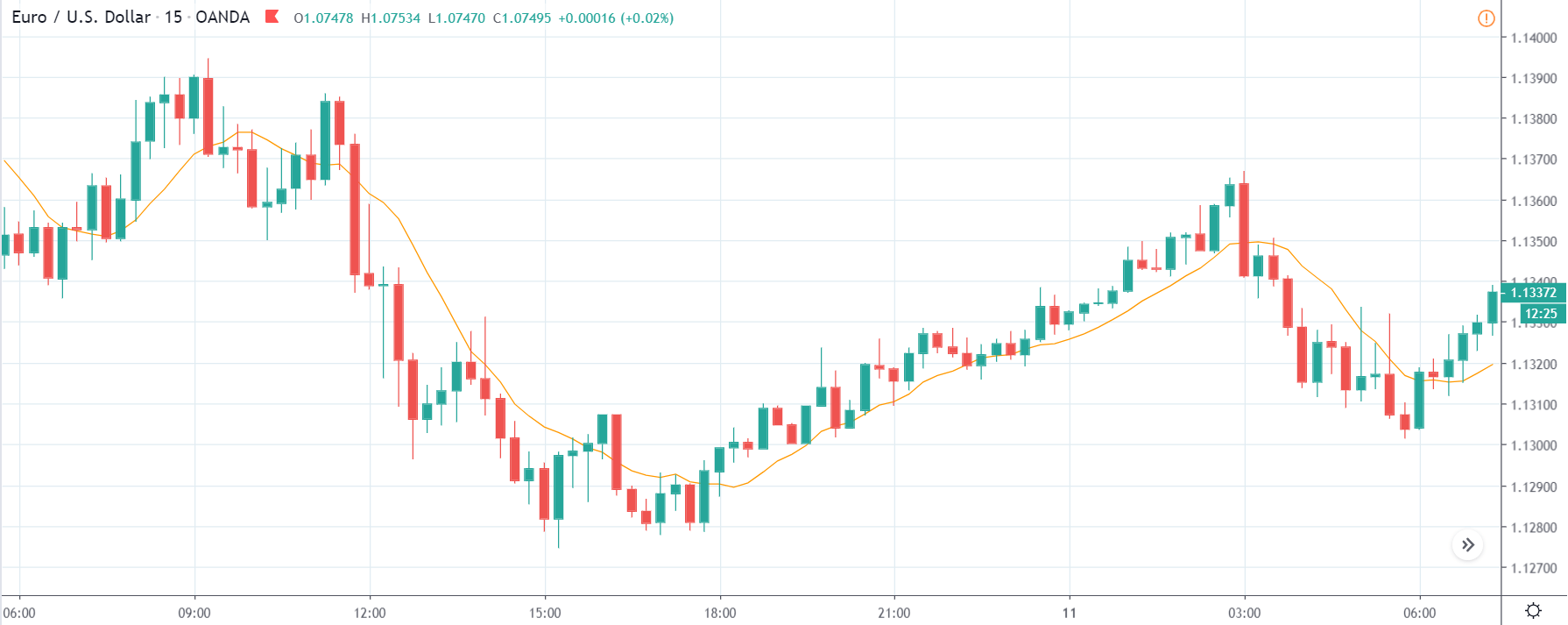
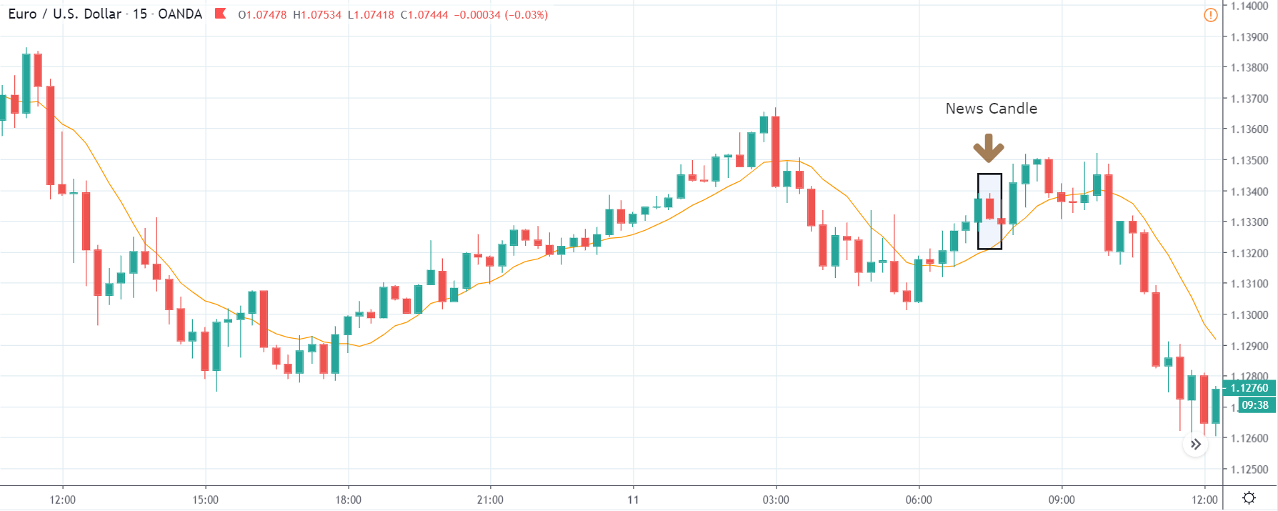
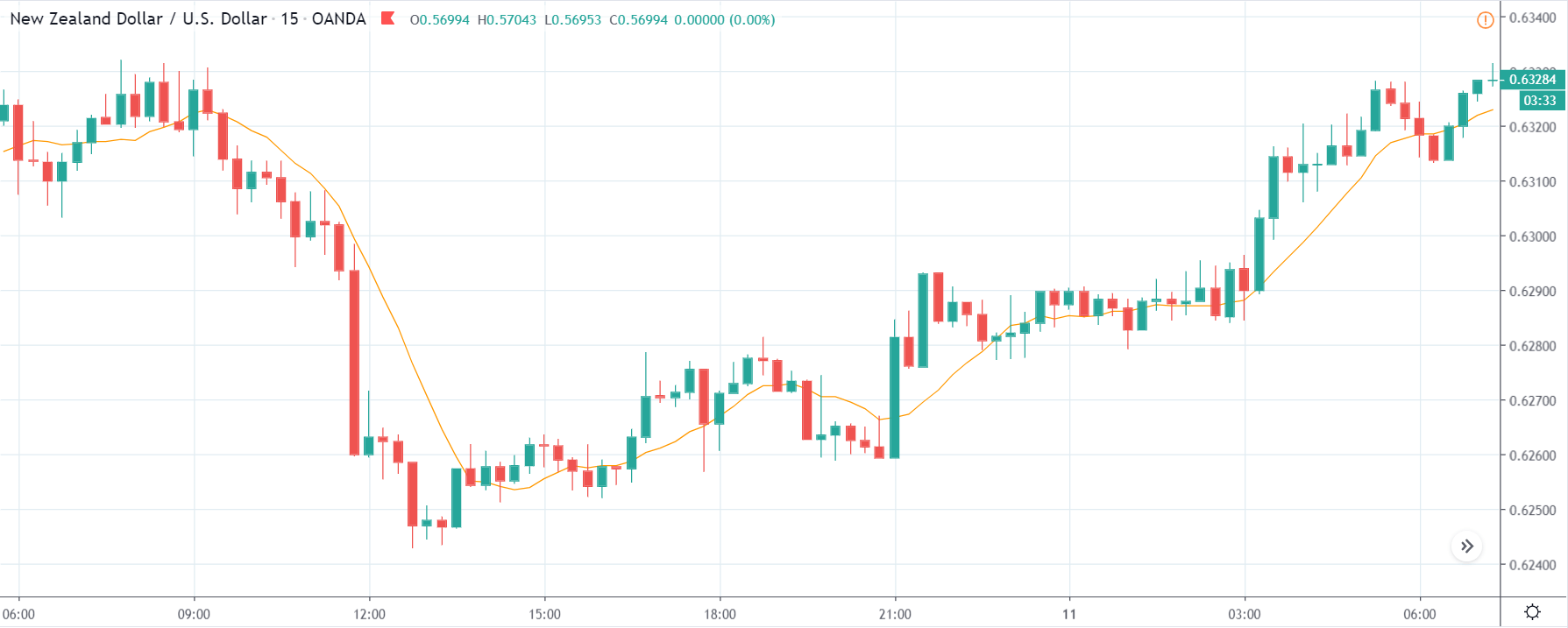
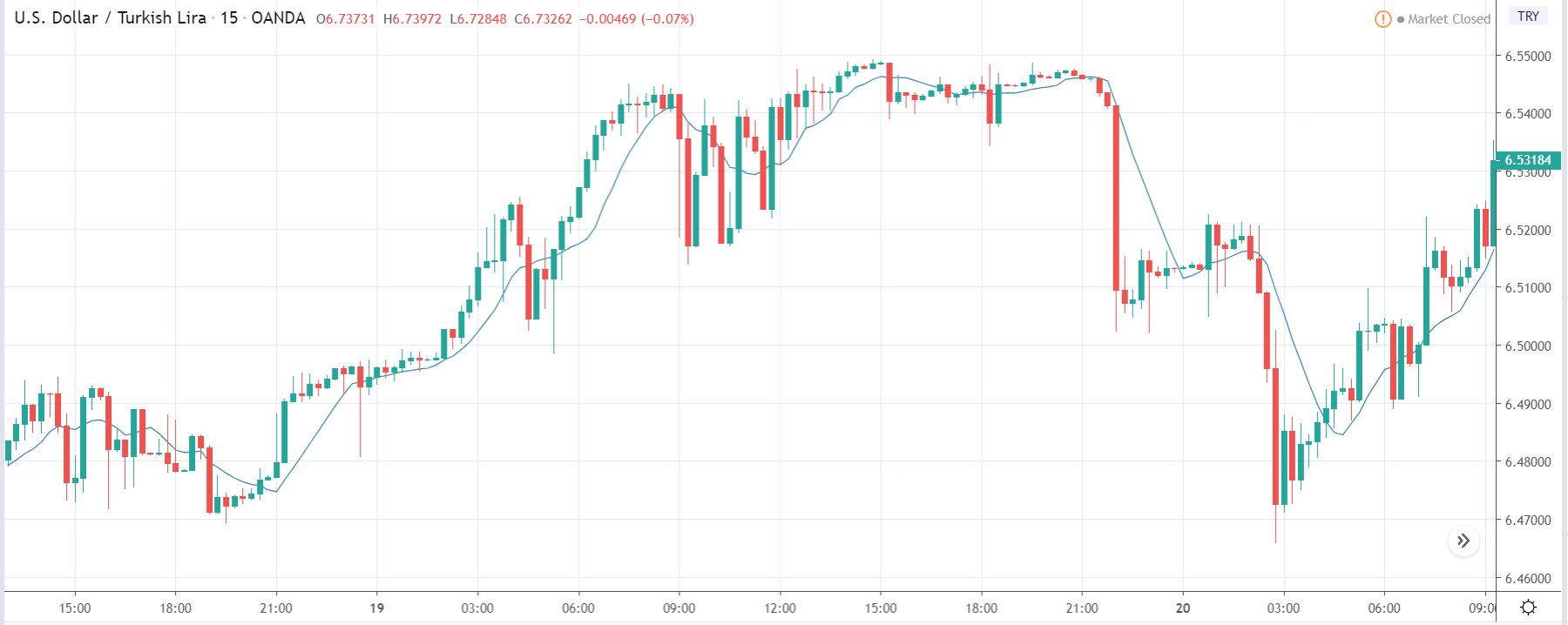
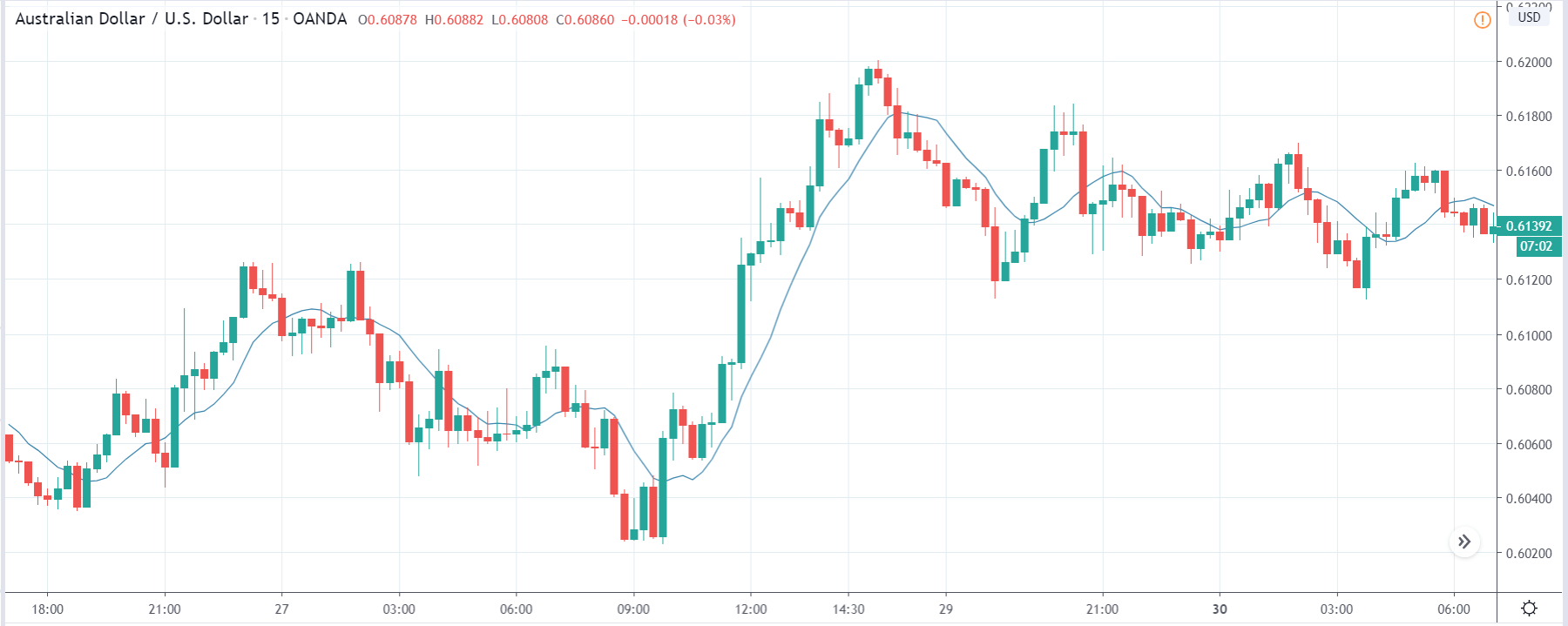
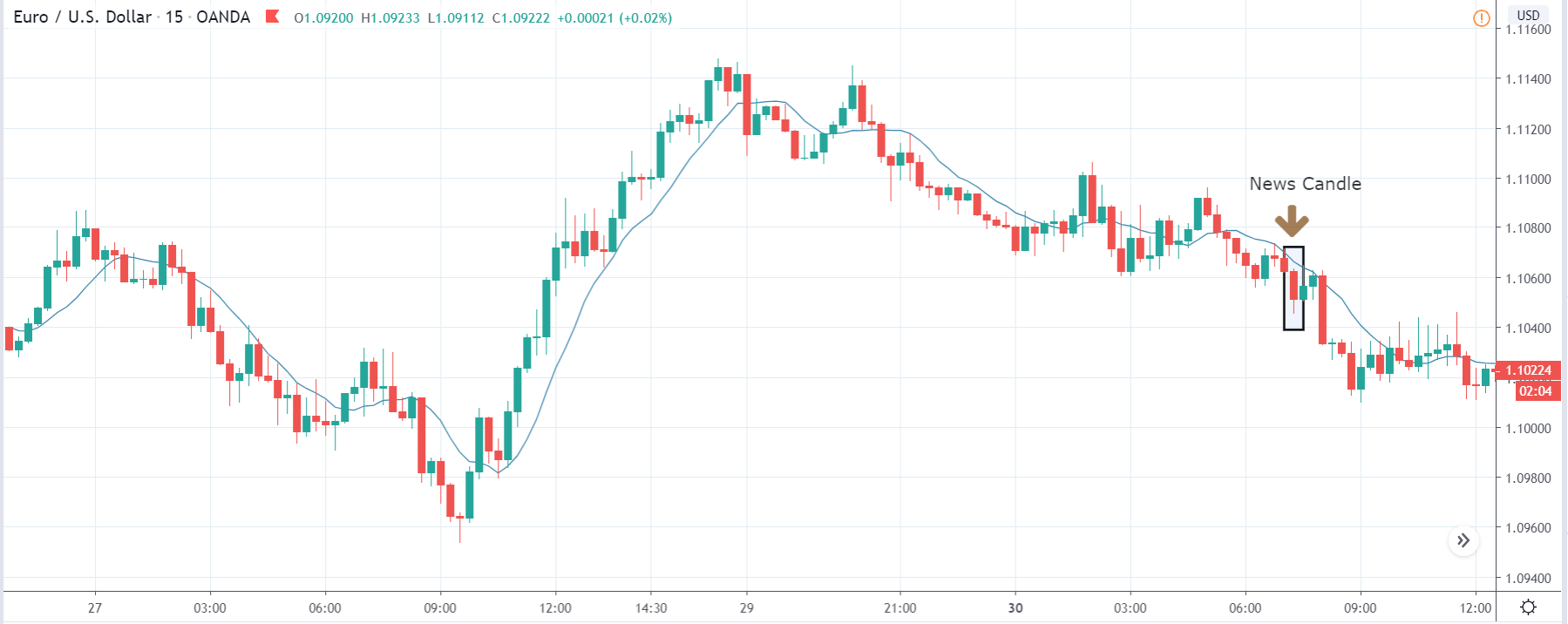
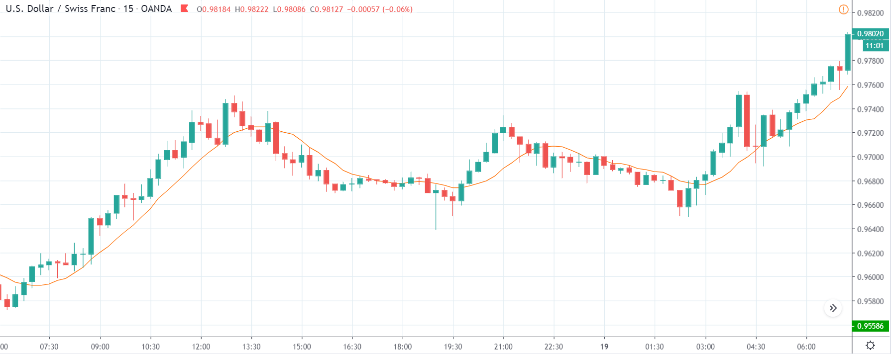
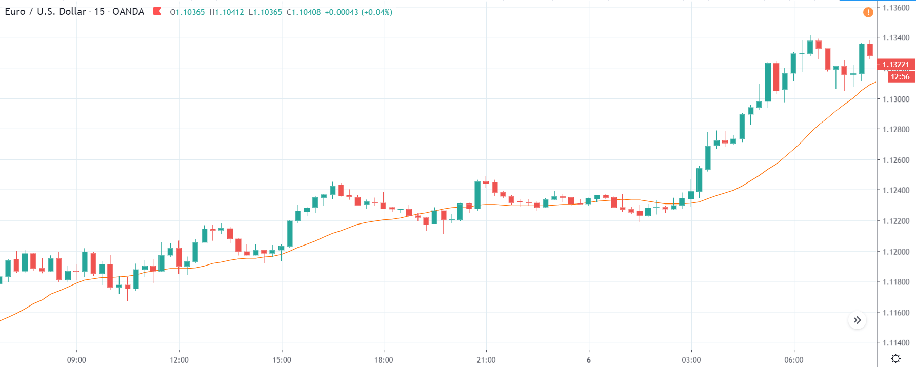
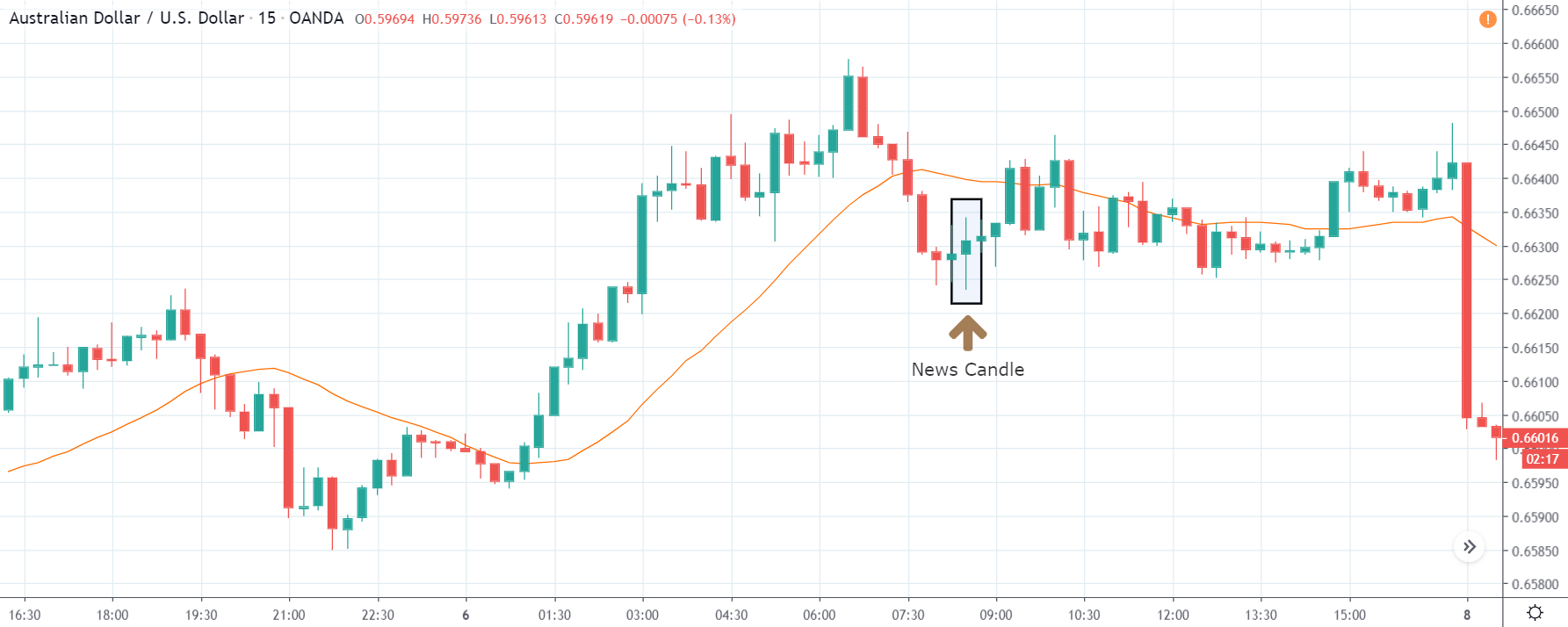
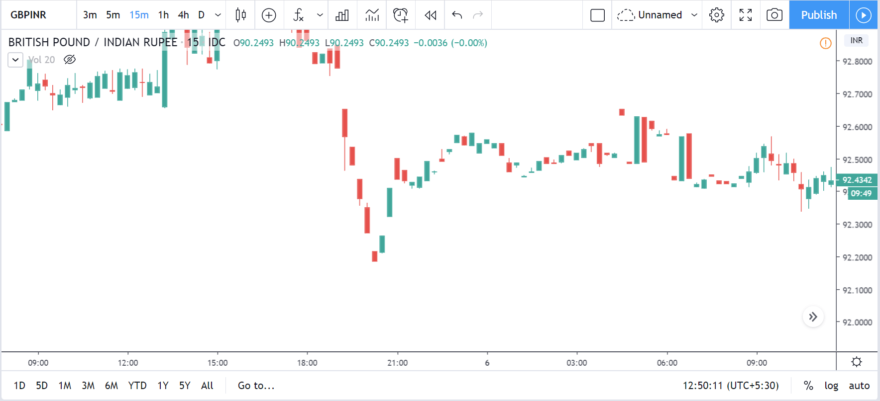
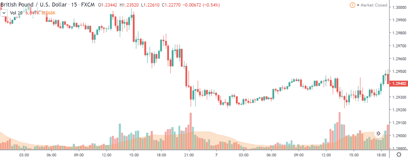
USD/CHF | Before the announcement

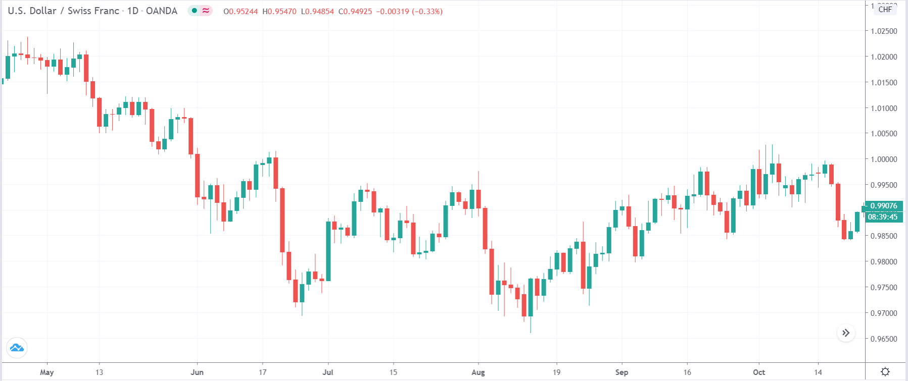
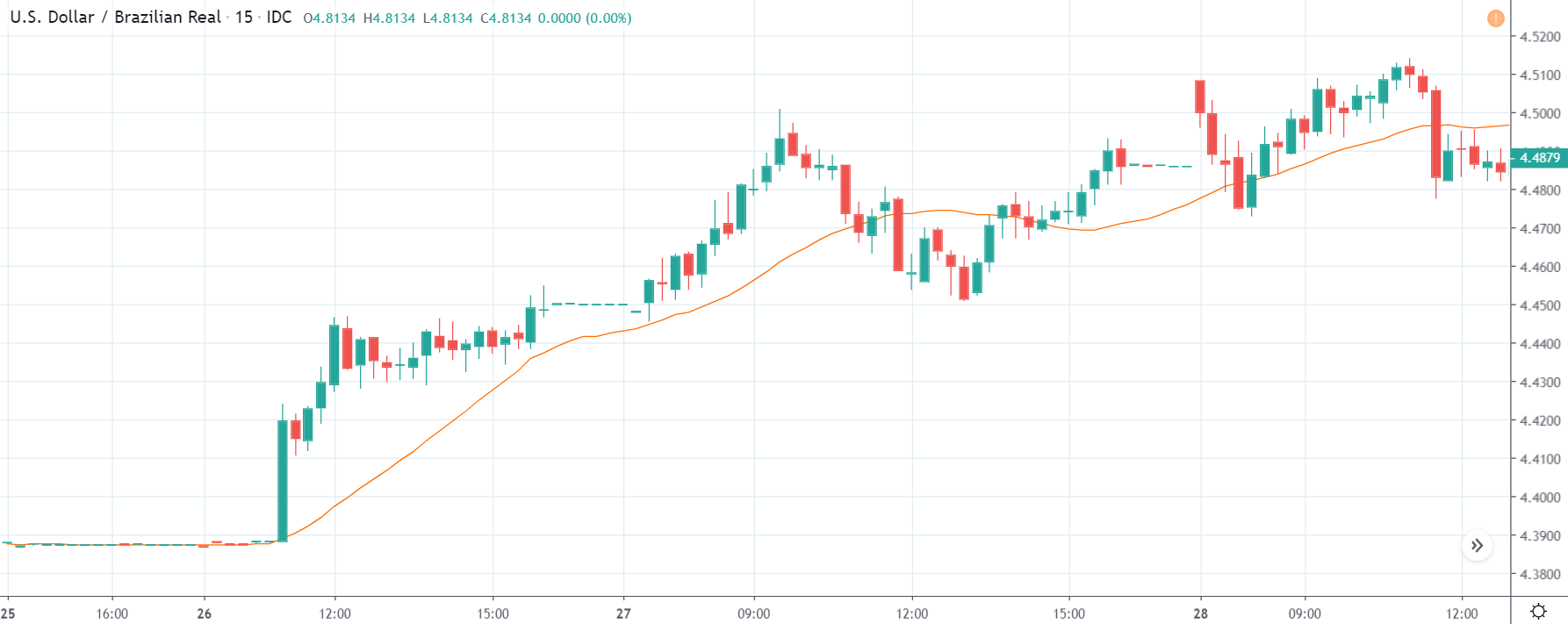
Let us start with the USD/CHF currency pair to analyze the impact of the ‘Ease of Doing Business’ announcement. The above image is the daily time frame chart of the currency pair, where we can see that the pair is moving within a ‘range.’ Presently, the price is at a resistance area, which means sellers can push the price lower anytime soon. Therefore, we should be cautious before taking a ‘buy’ trade in this pair.

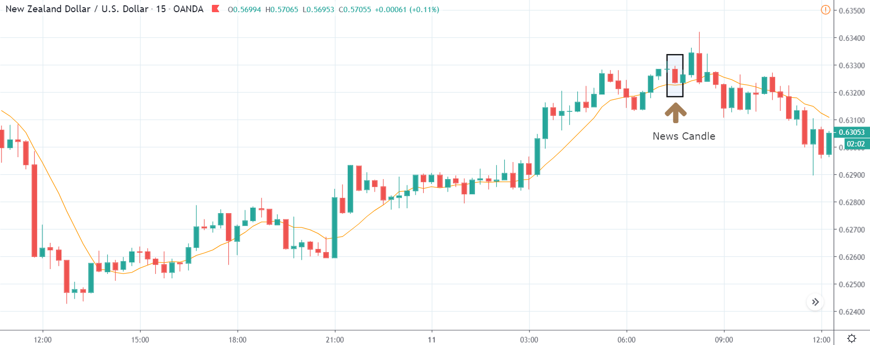
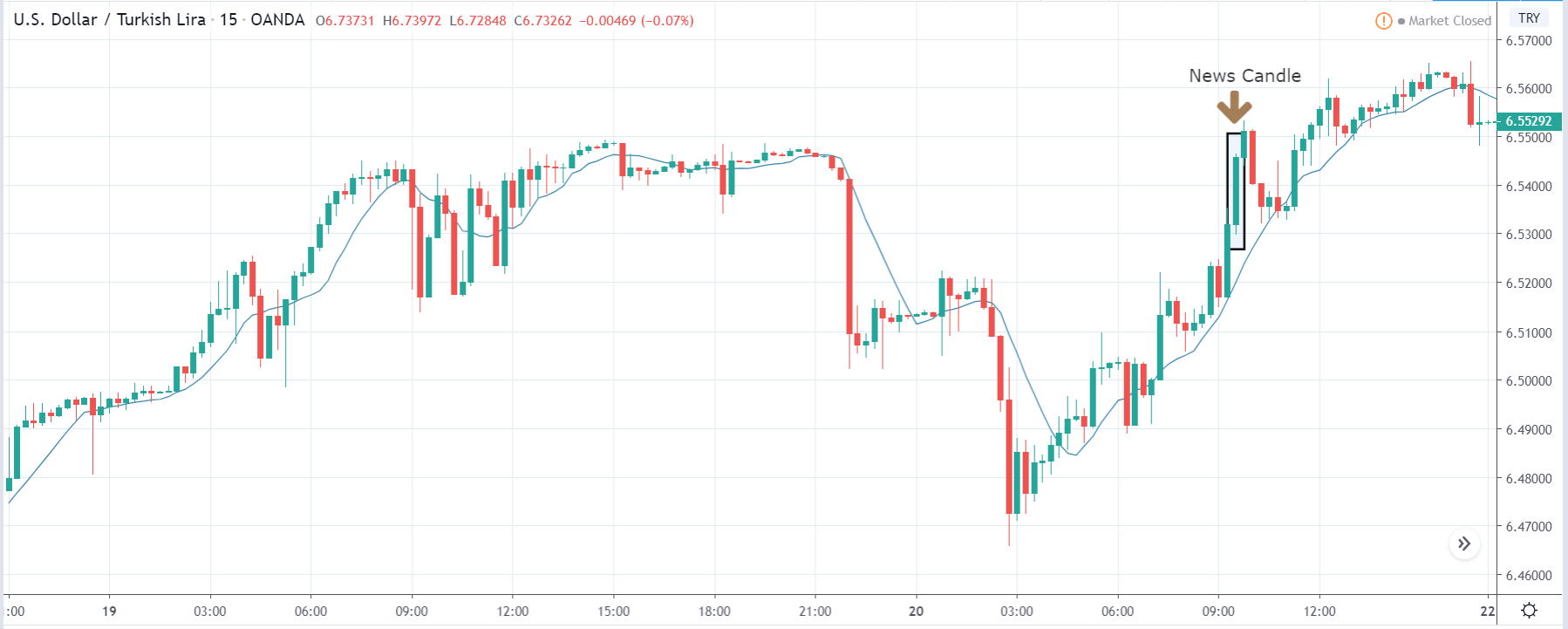
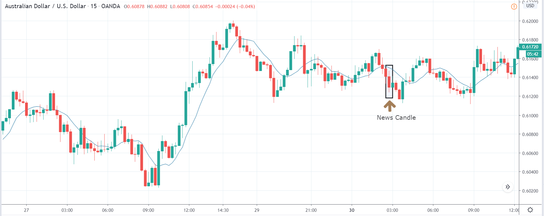
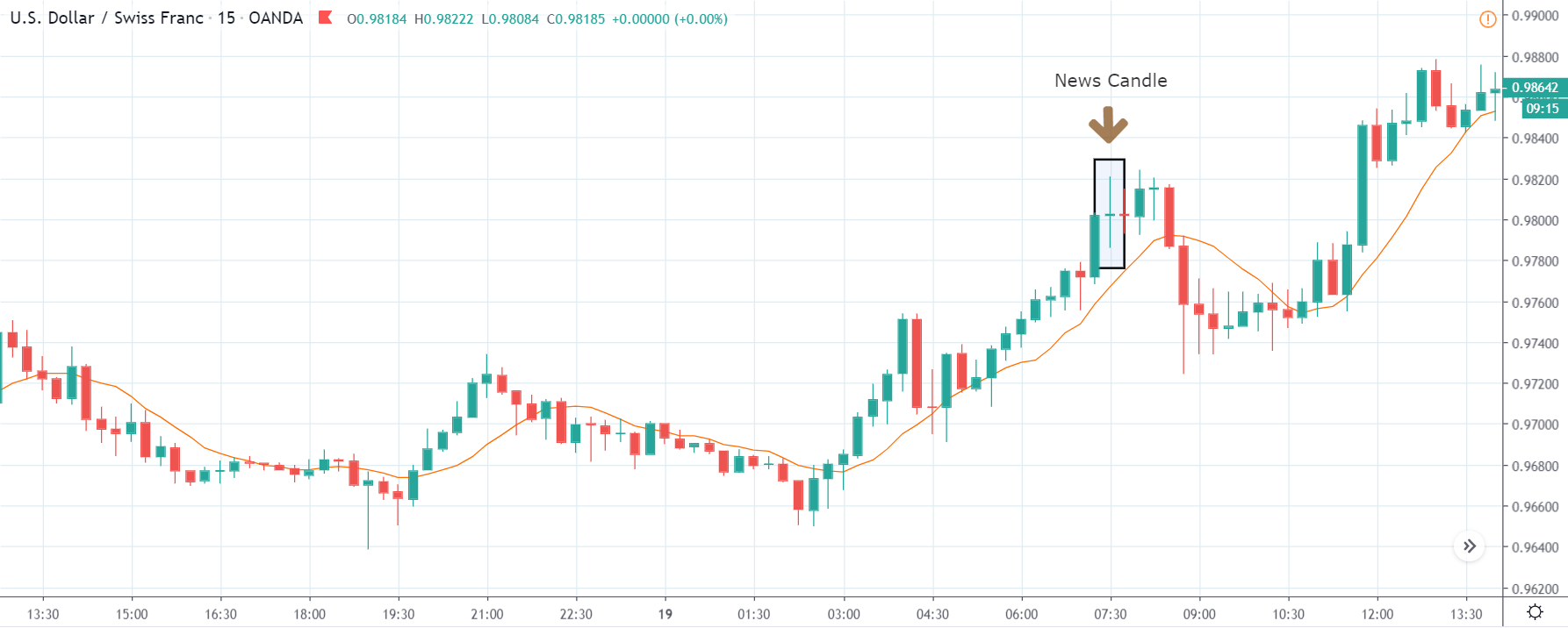
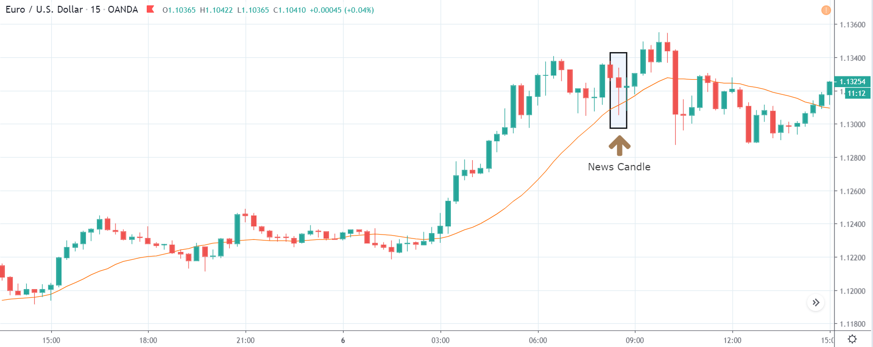
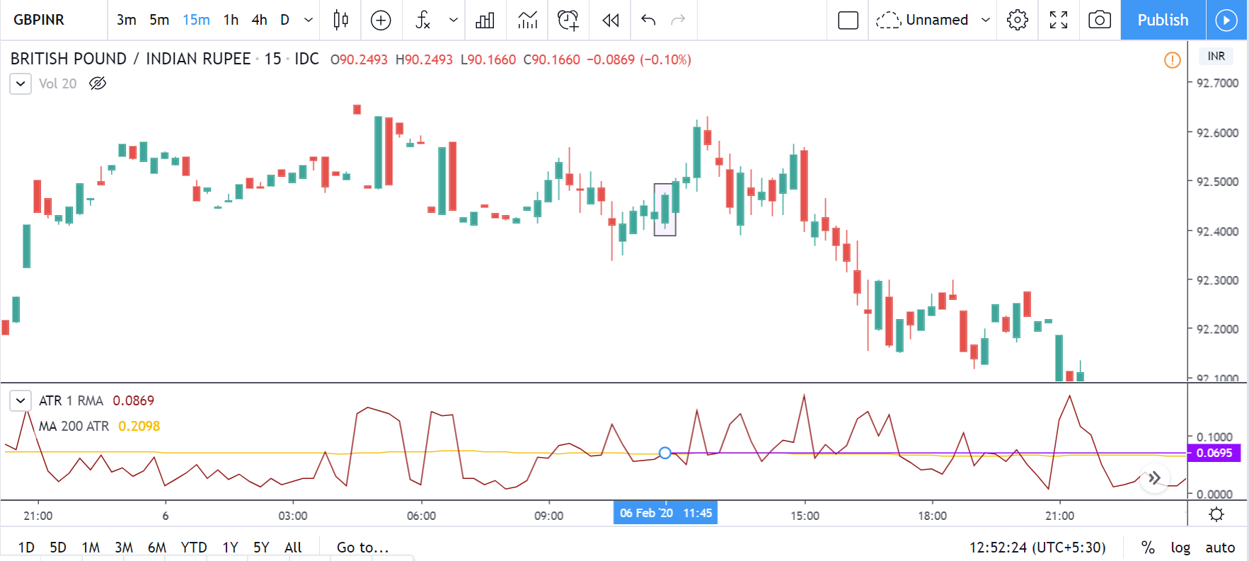
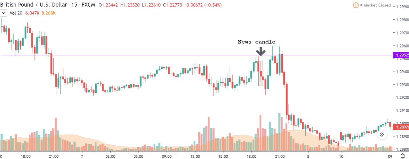
USD/CHF | After the announcement

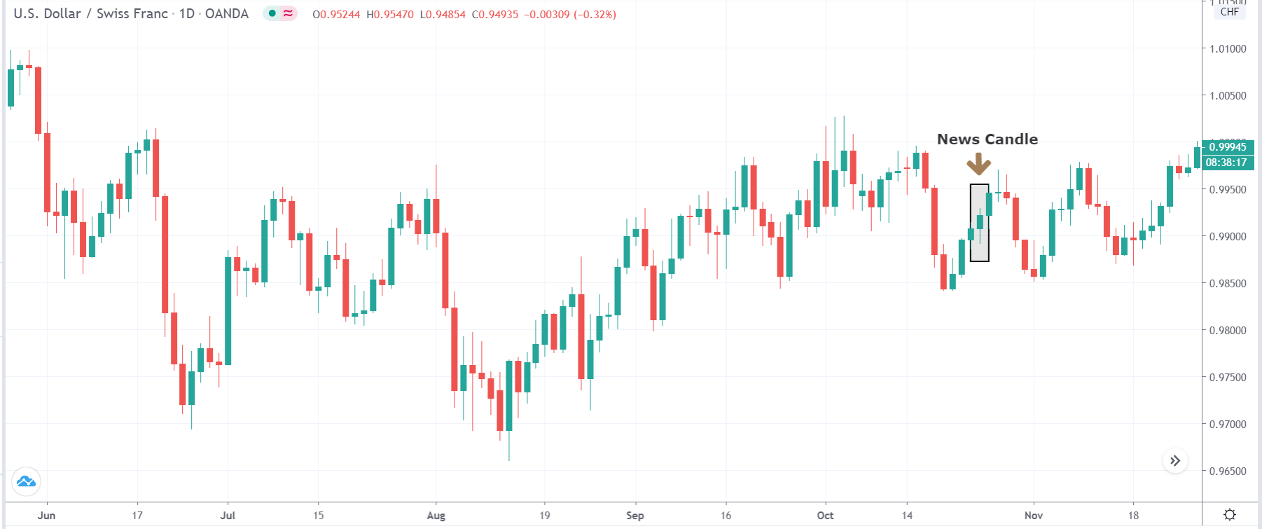
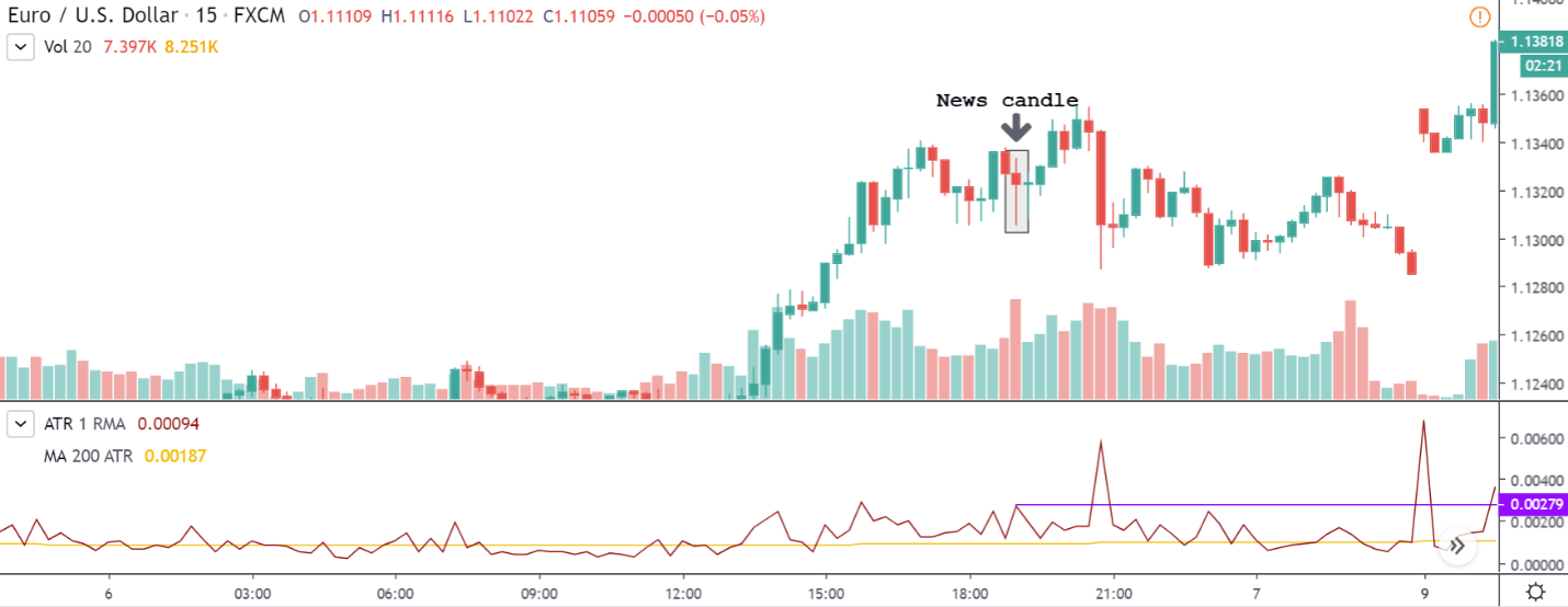
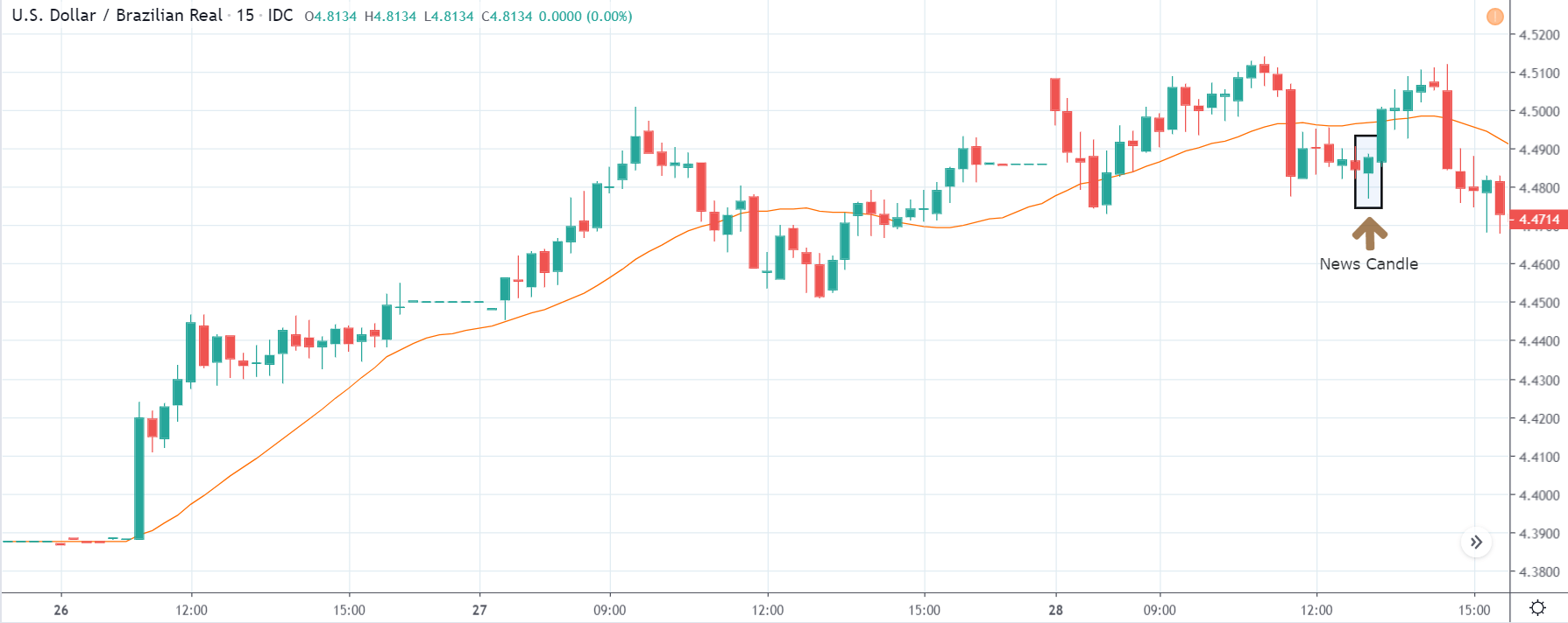
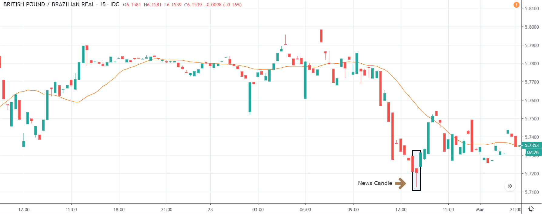
After the news announcement, a slight amount of volatility is witnessed, which takes the price higher that results in the formation of a bullish ‘news candle.’ Since the Swiss Franc is on the left-hand side of the pair, a bullish candle indicates bearishness for the currency, and that is becoming weak. We can say that the news announcement a slight negative on the currency.

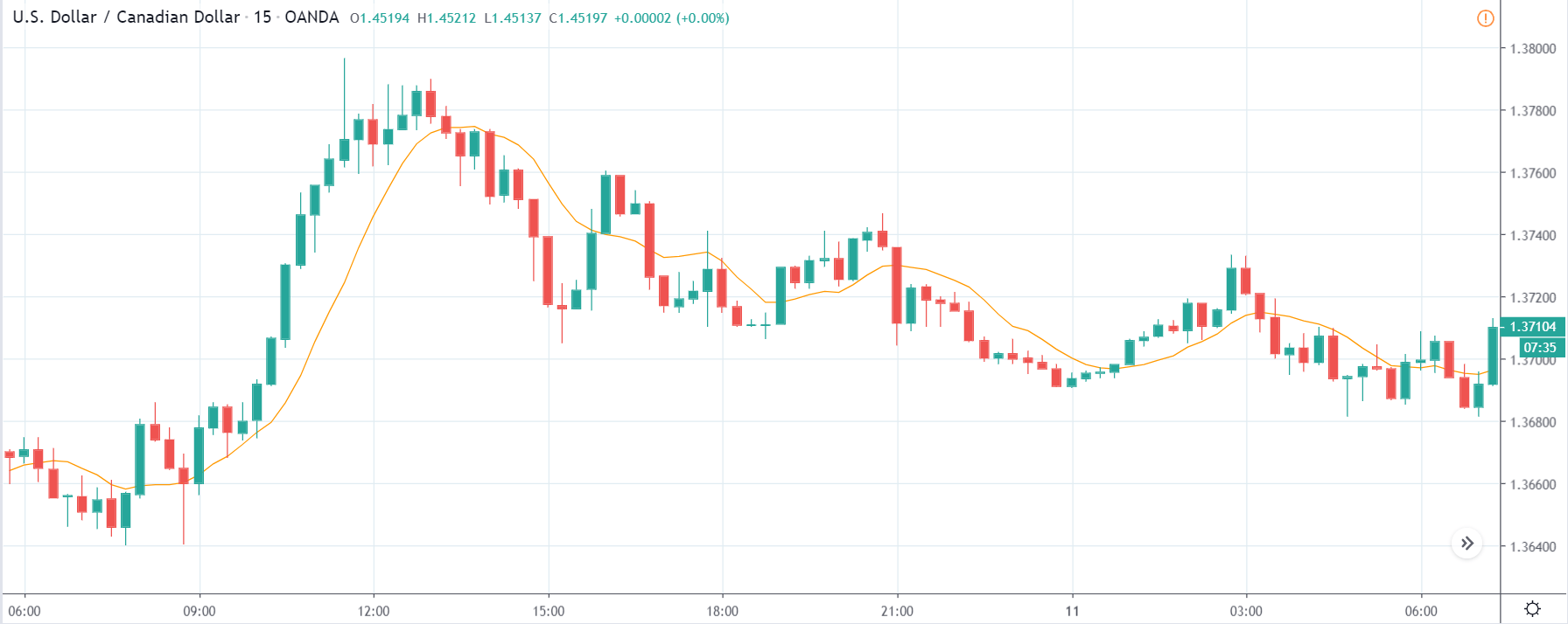
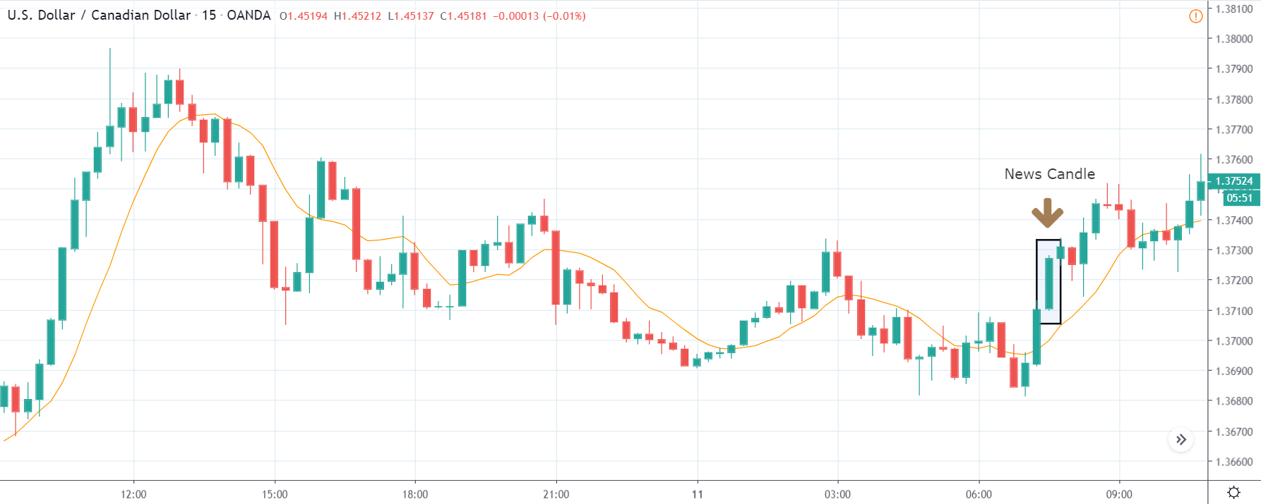
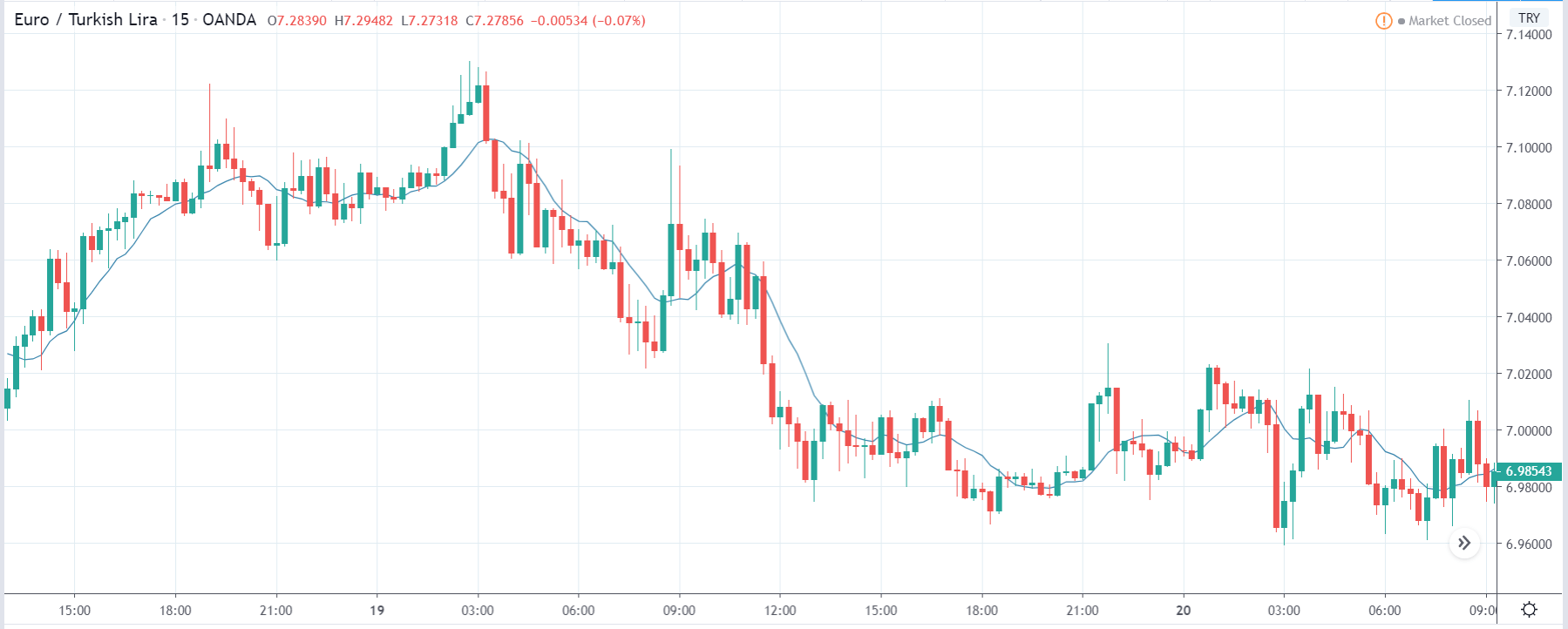
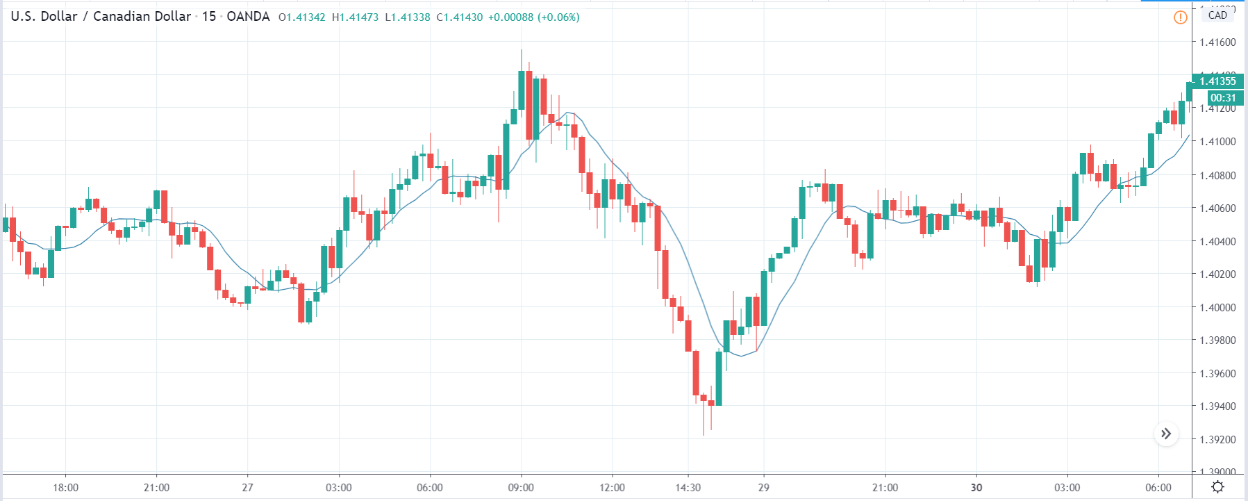
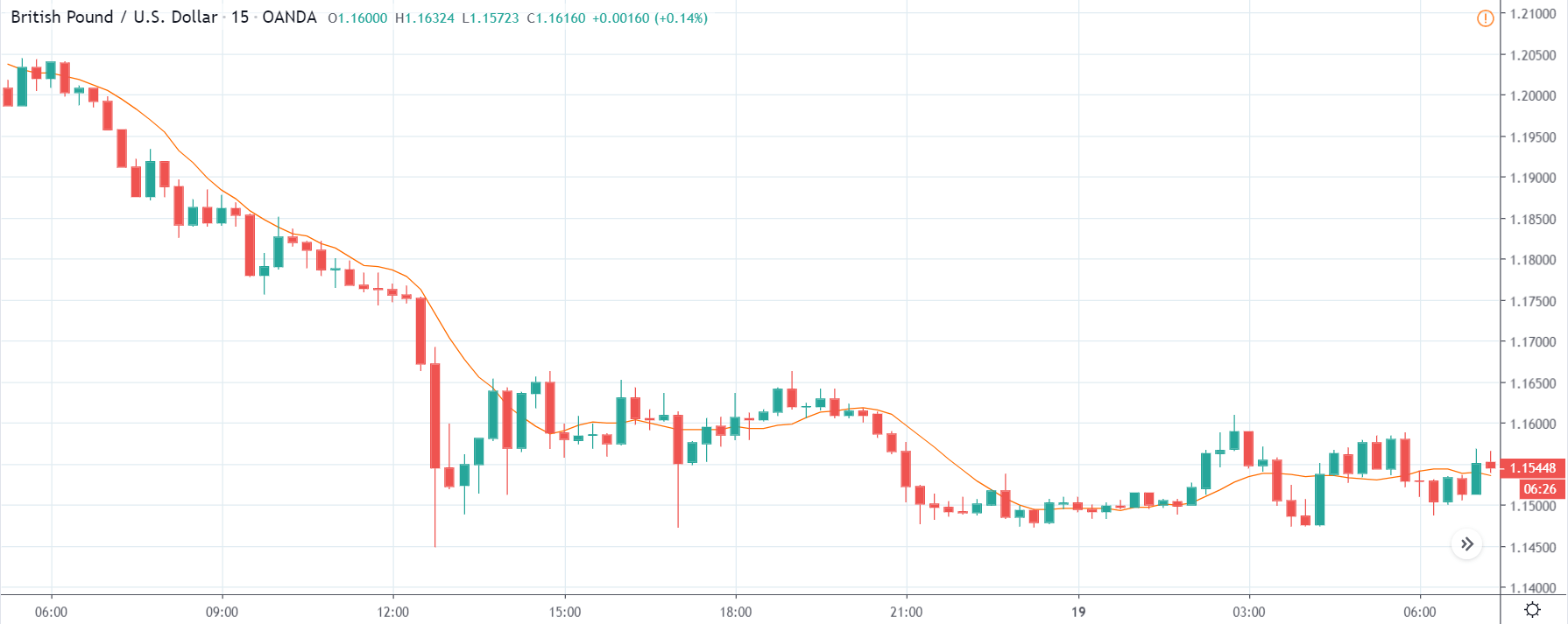
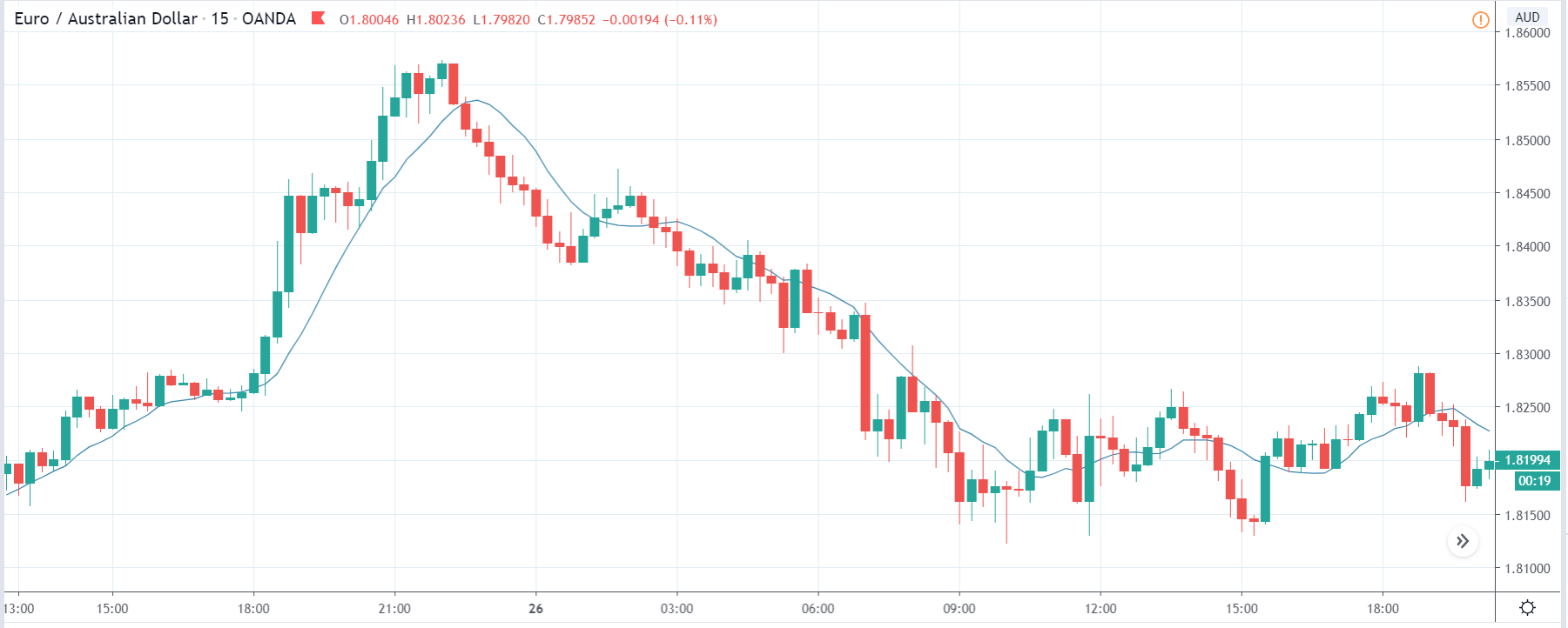
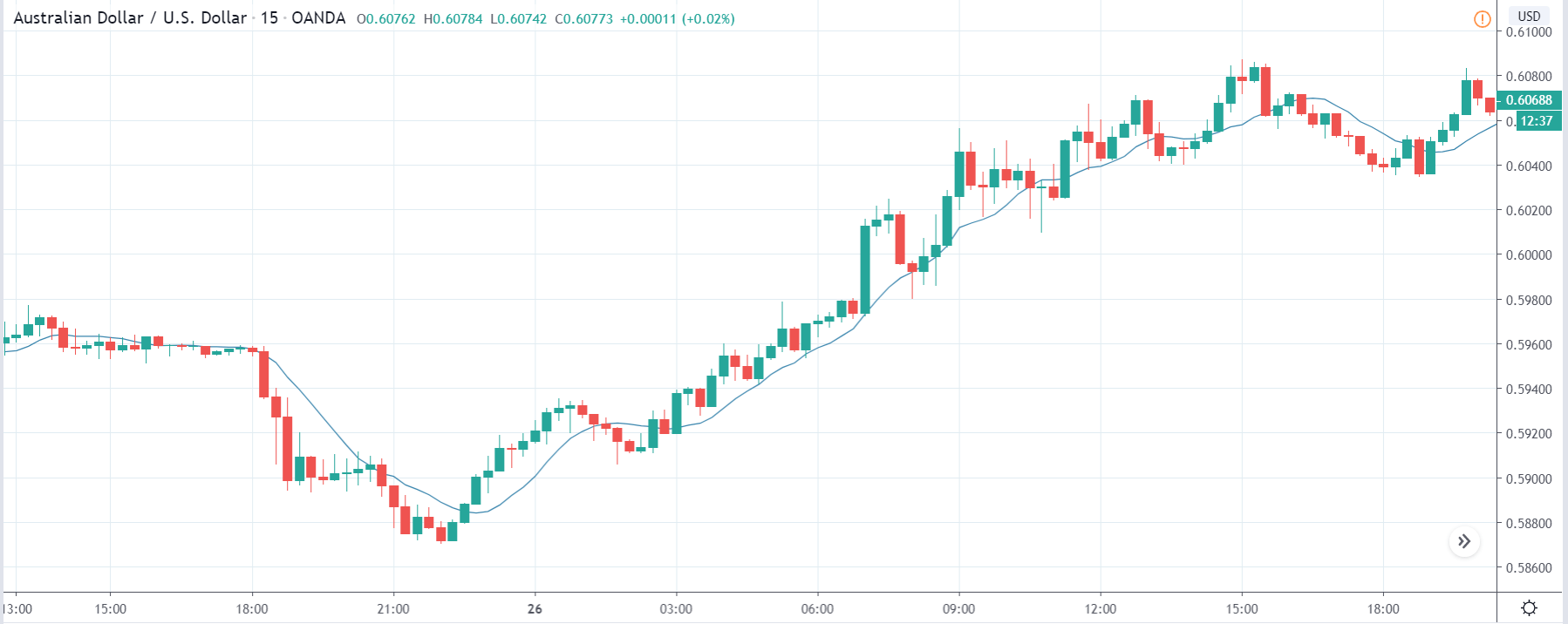
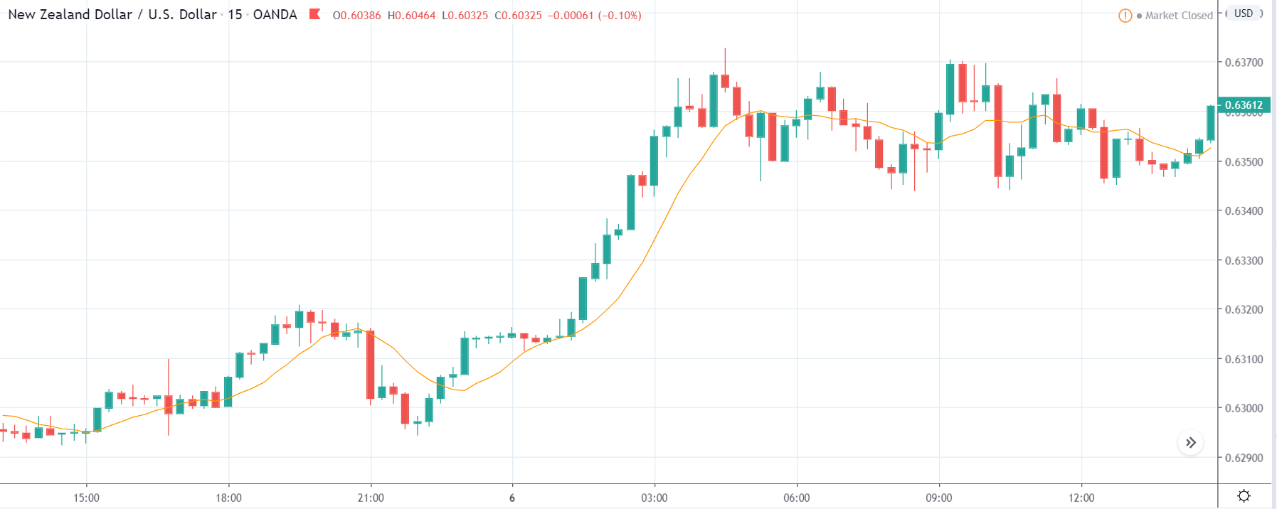
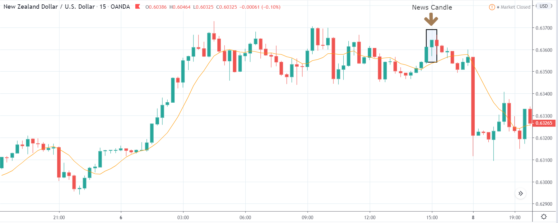
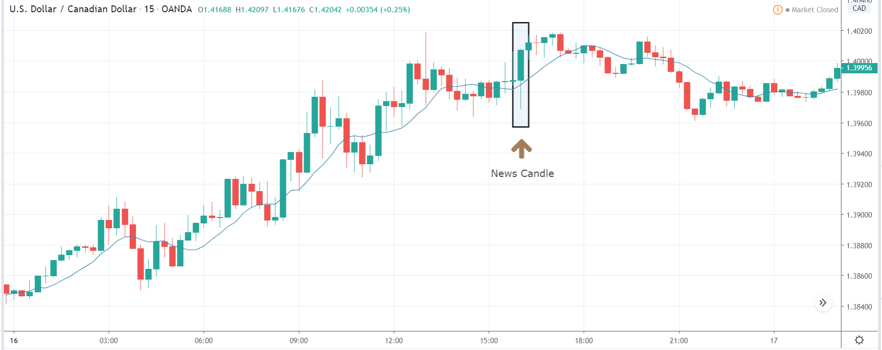
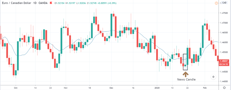
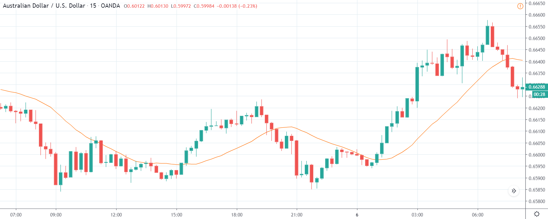
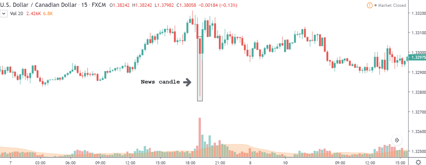
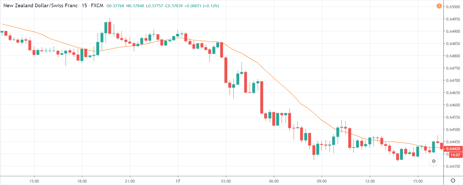
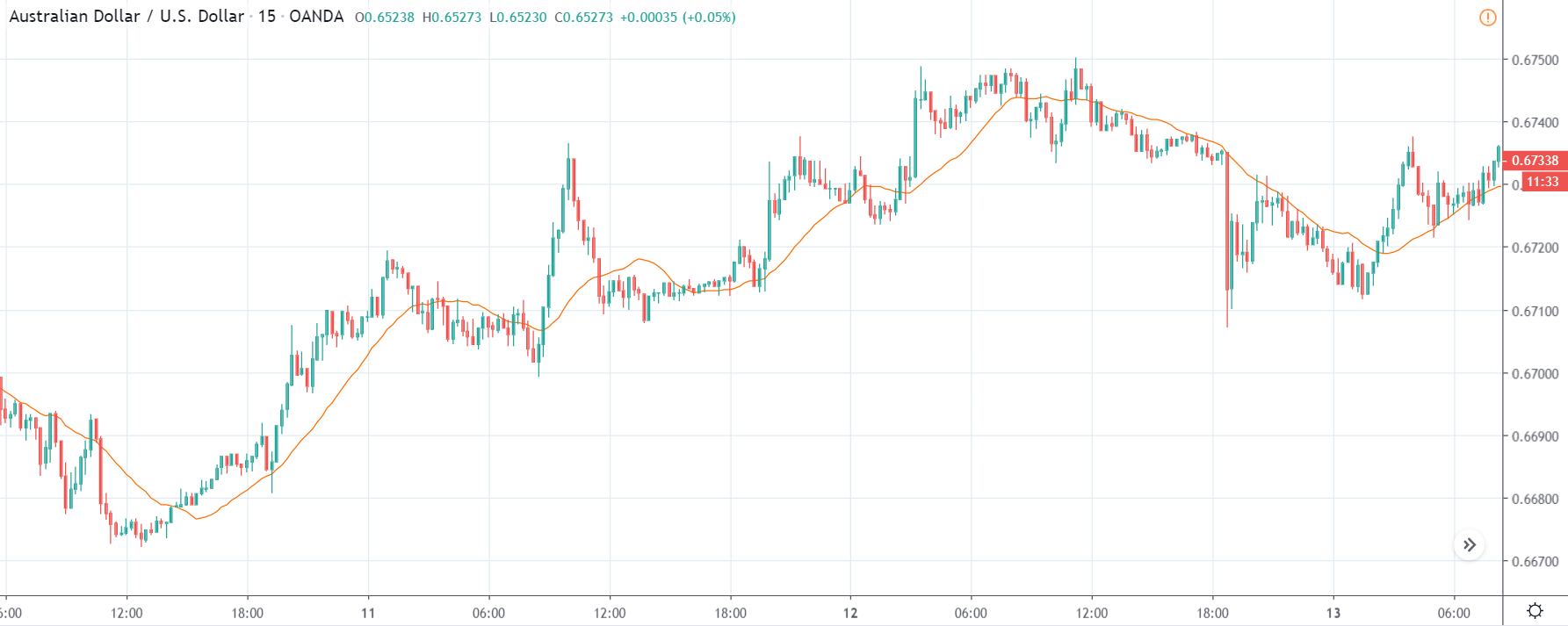
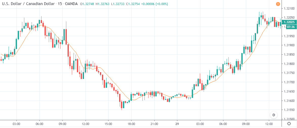
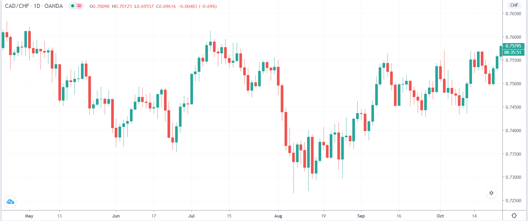
CAD/CHF | Before the announcement

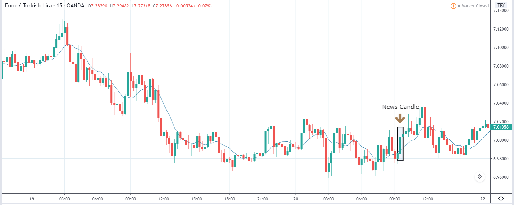
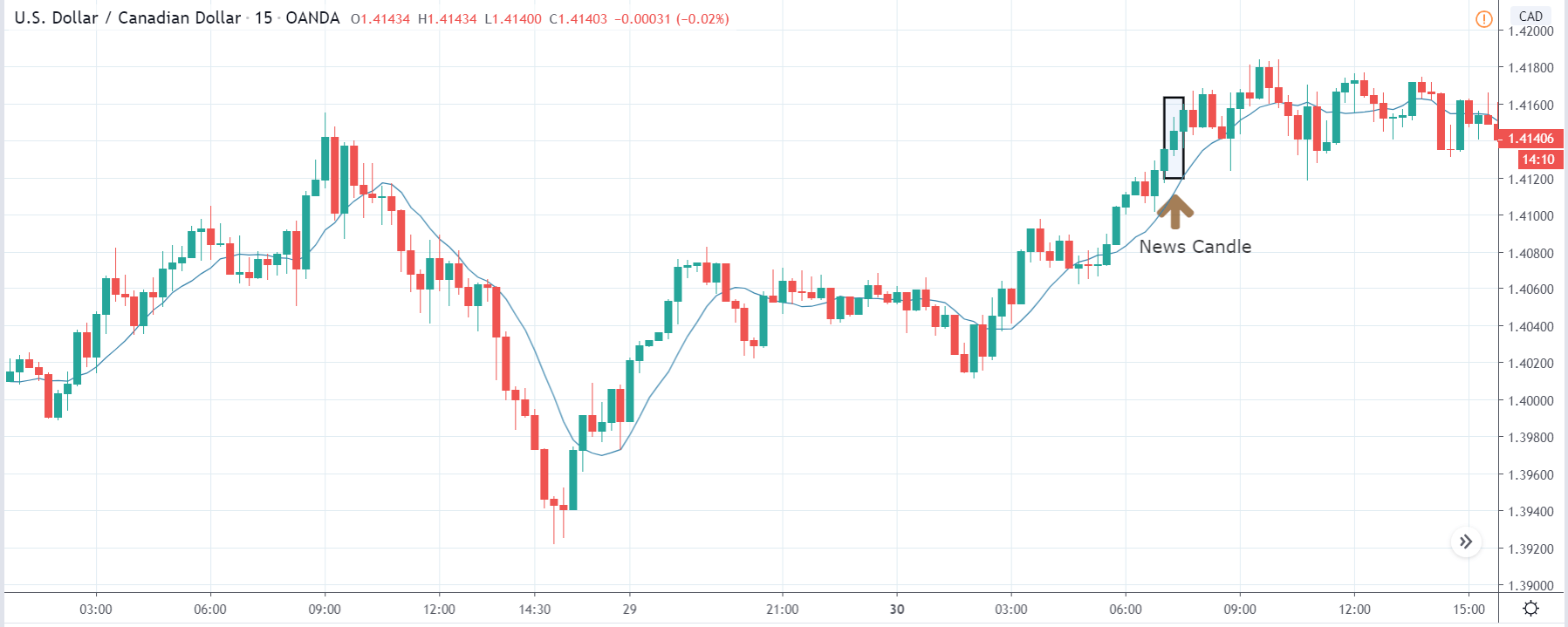
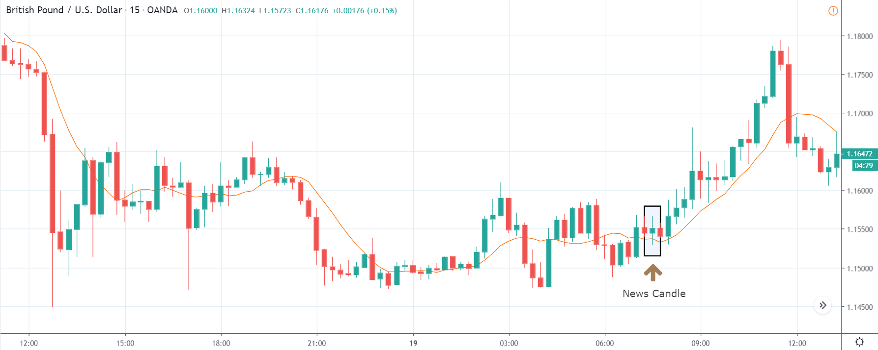
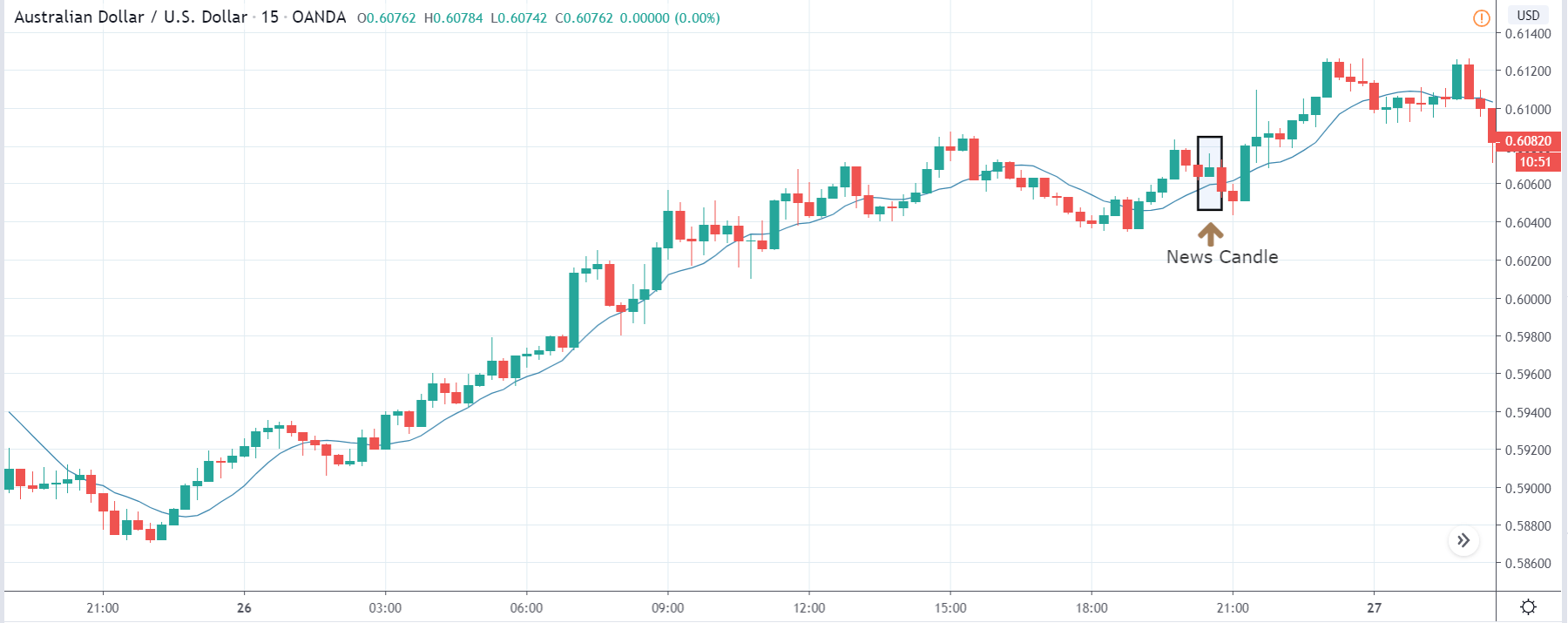
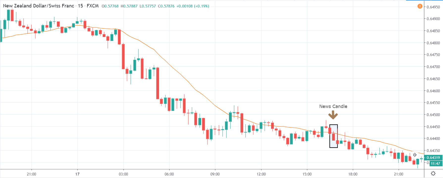
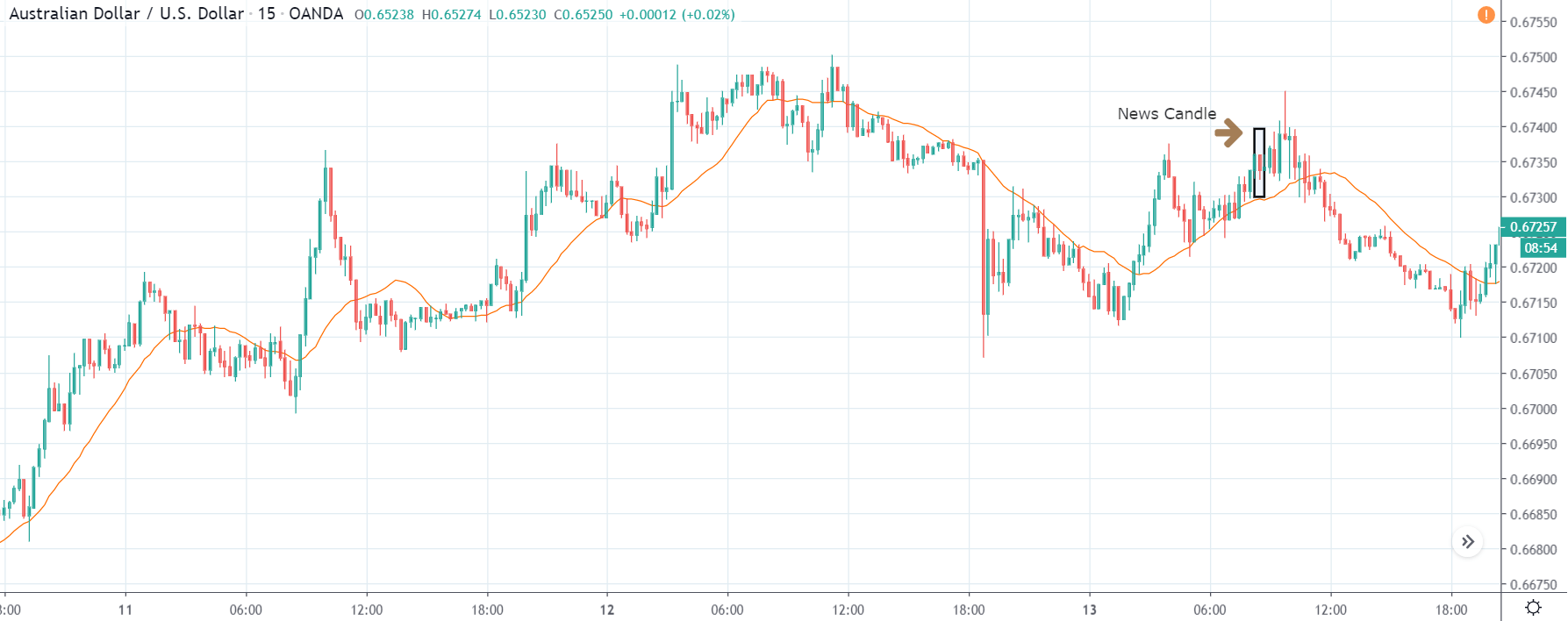
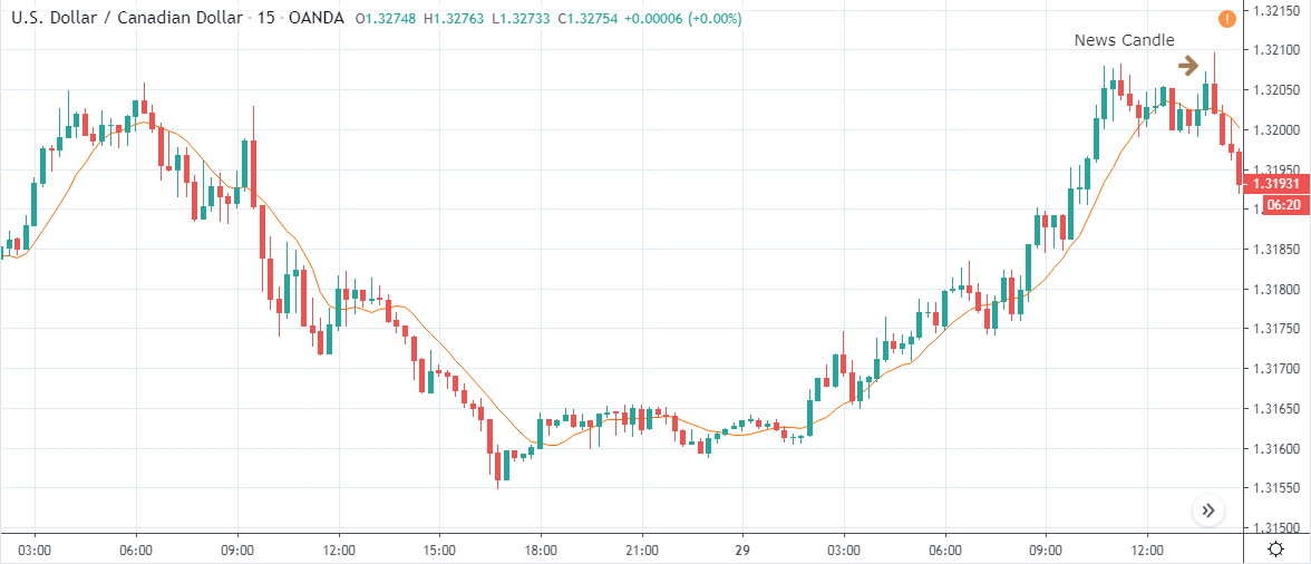
CAD/CHF | After the announcement

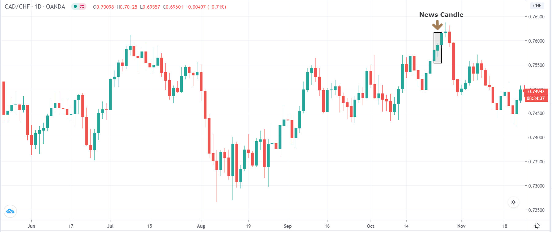
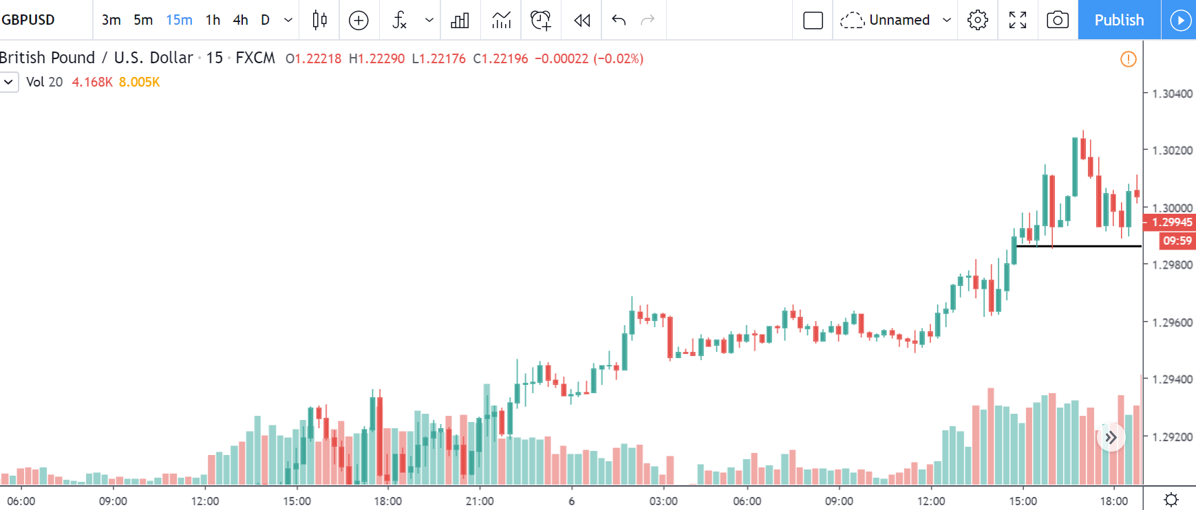
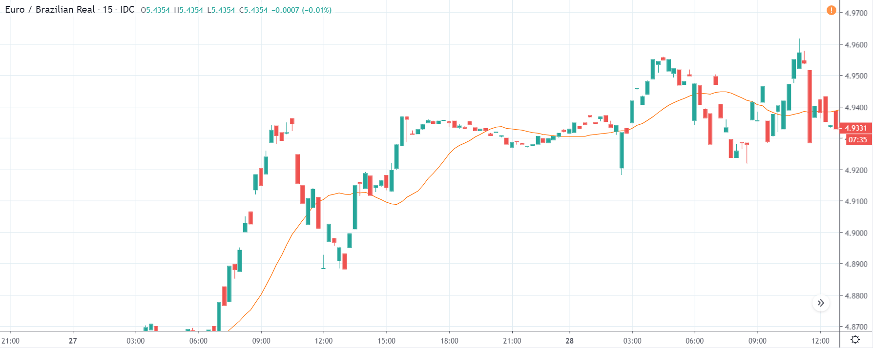
The above images represent the CAD/CHF currency pair, where it appears that the market is moving in a channel before the news announcement. We should be looking to sell the currency pair as the price is at the top of the channel. However, the news announcement shall give us a clear direction of the market. We will not be taking any position before the news release as the news release has a moderate to high impact on the currency pair.

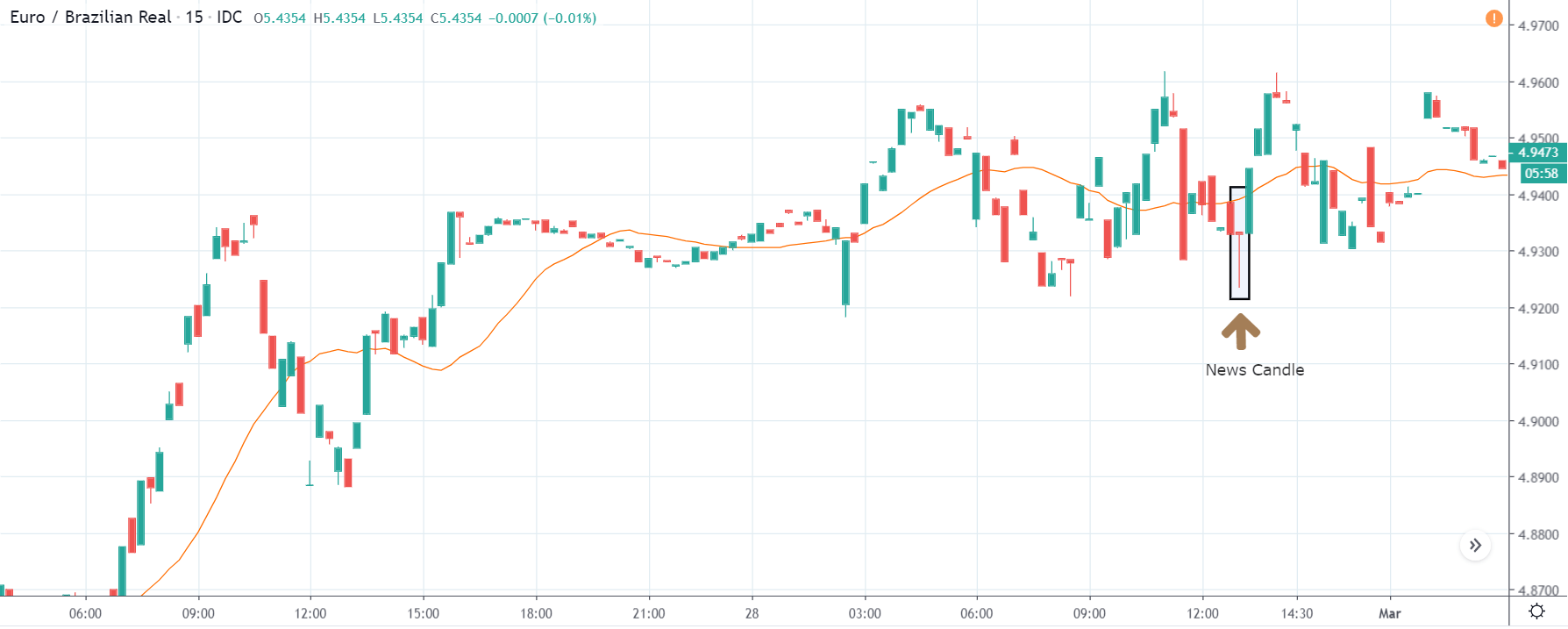
After the news announcement, the price moves a little higher and closes with some amount of bullishness. As the ‘ease of doing business’ was not so encouraging for the economy, traders went ‘short’ in Swiss Franc right after the news release. However, the effect does not last long, and the market collapses a couple of days later.

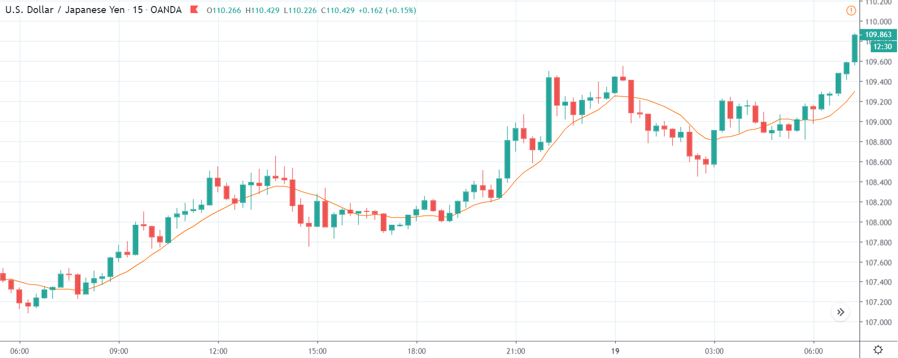
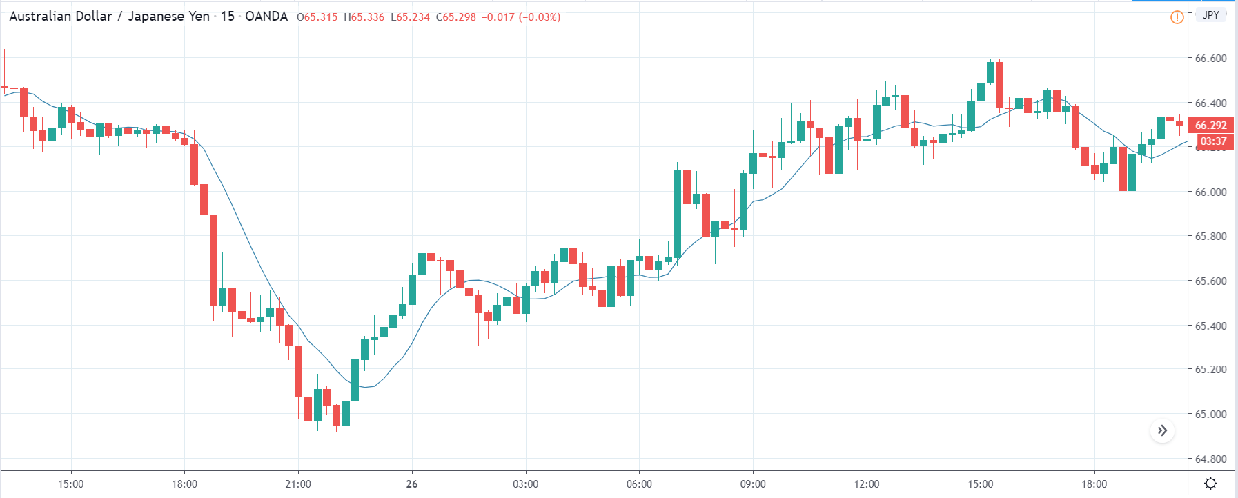
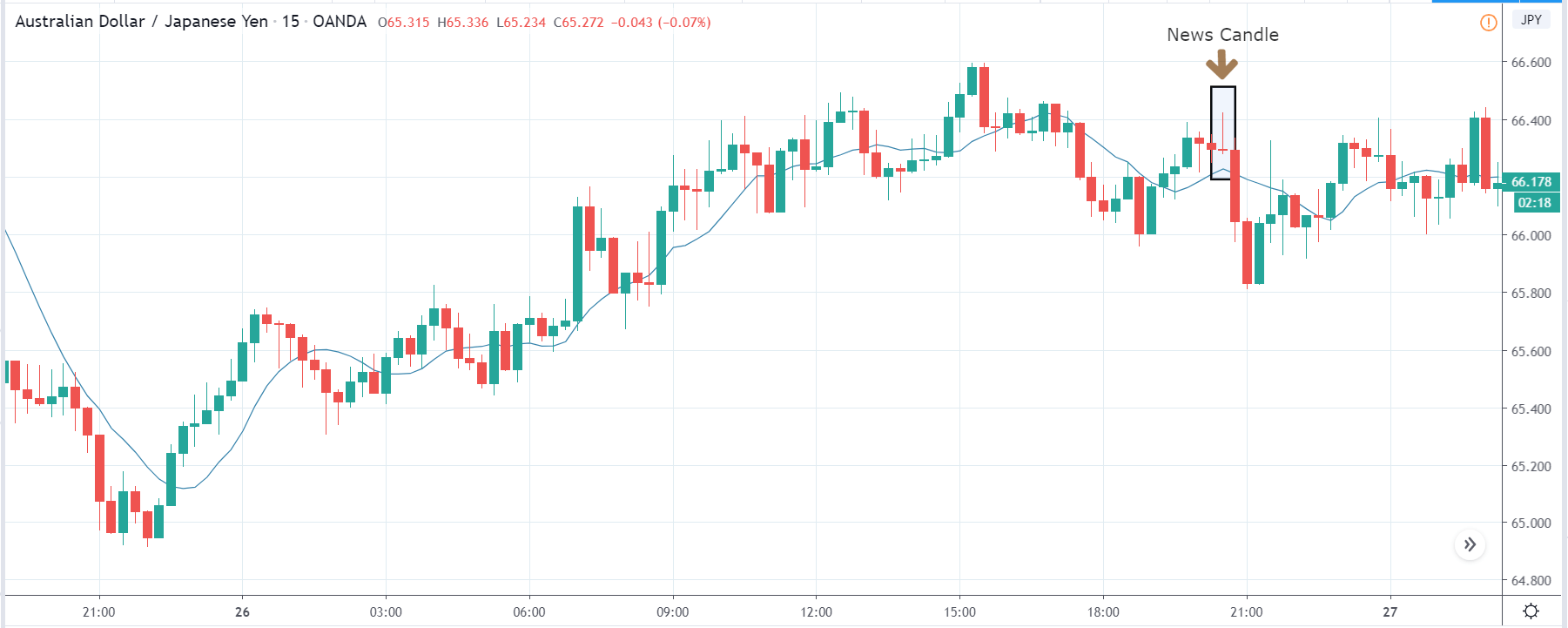
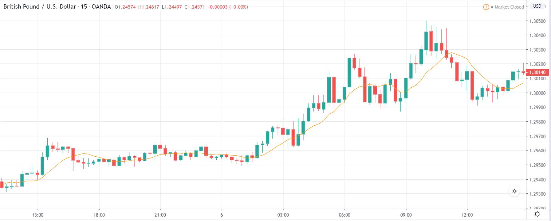
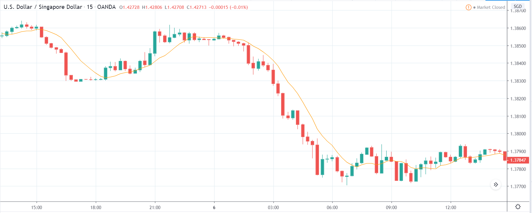
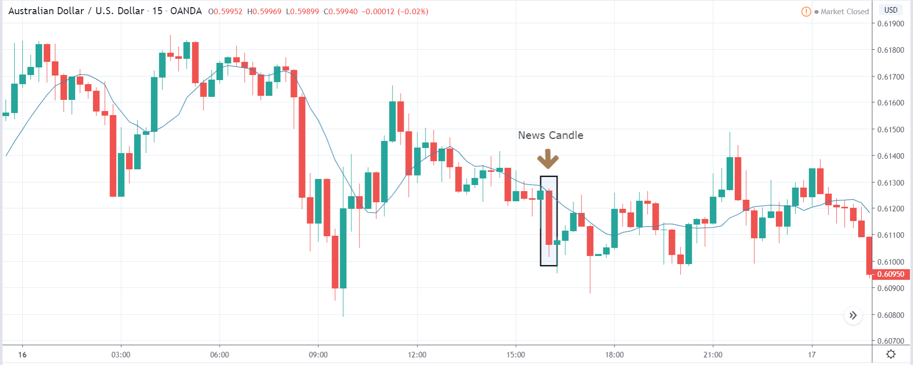
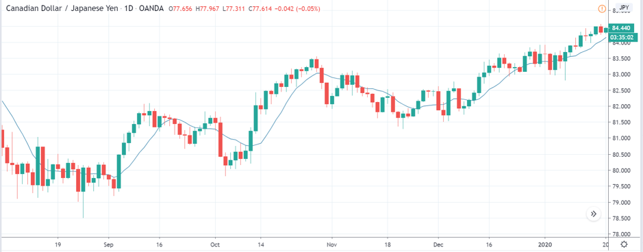
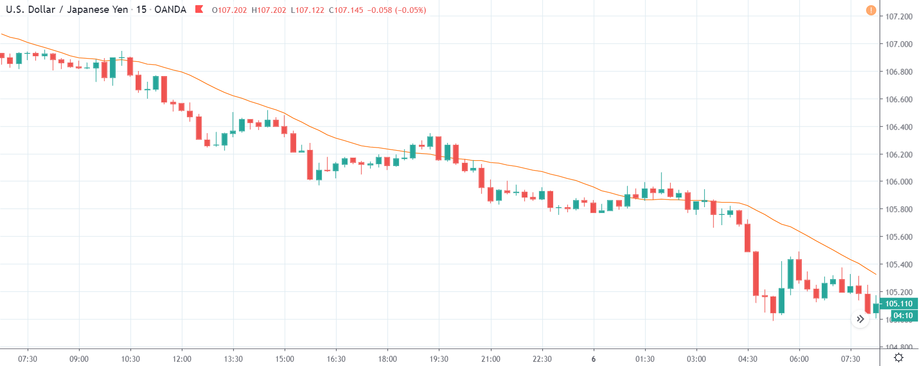
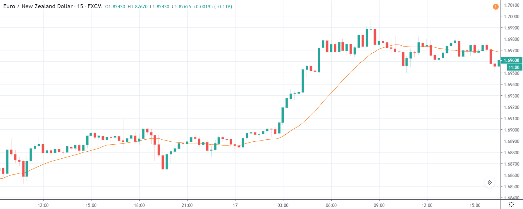
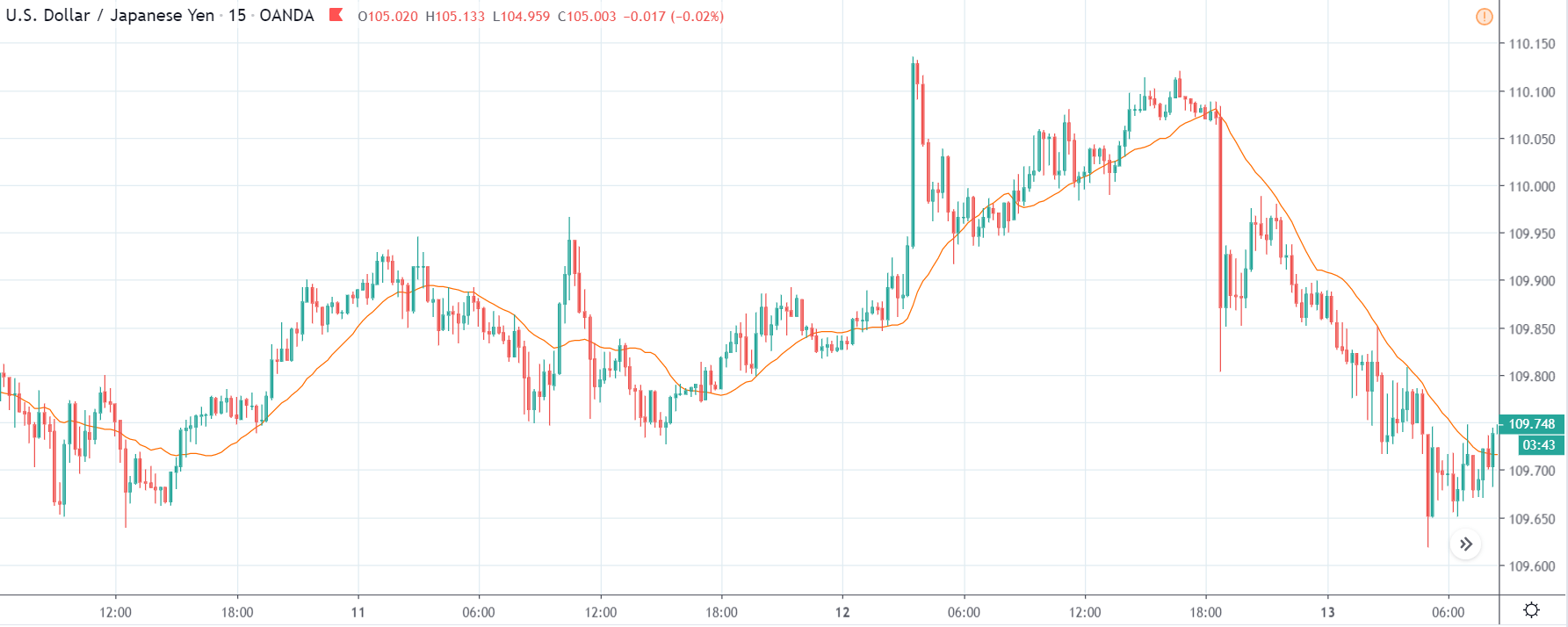
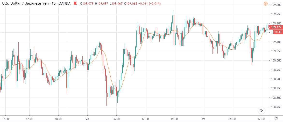
CHF/JPY | Before the announcement

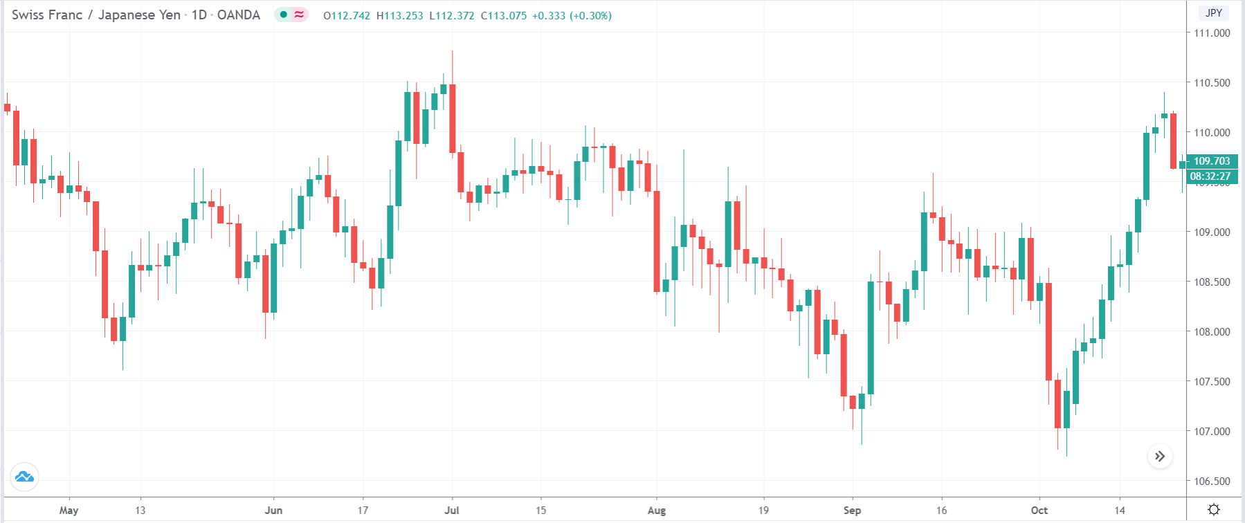
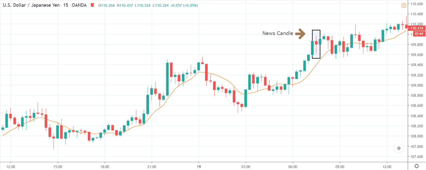
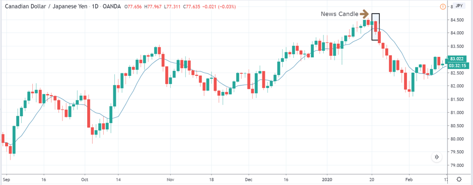
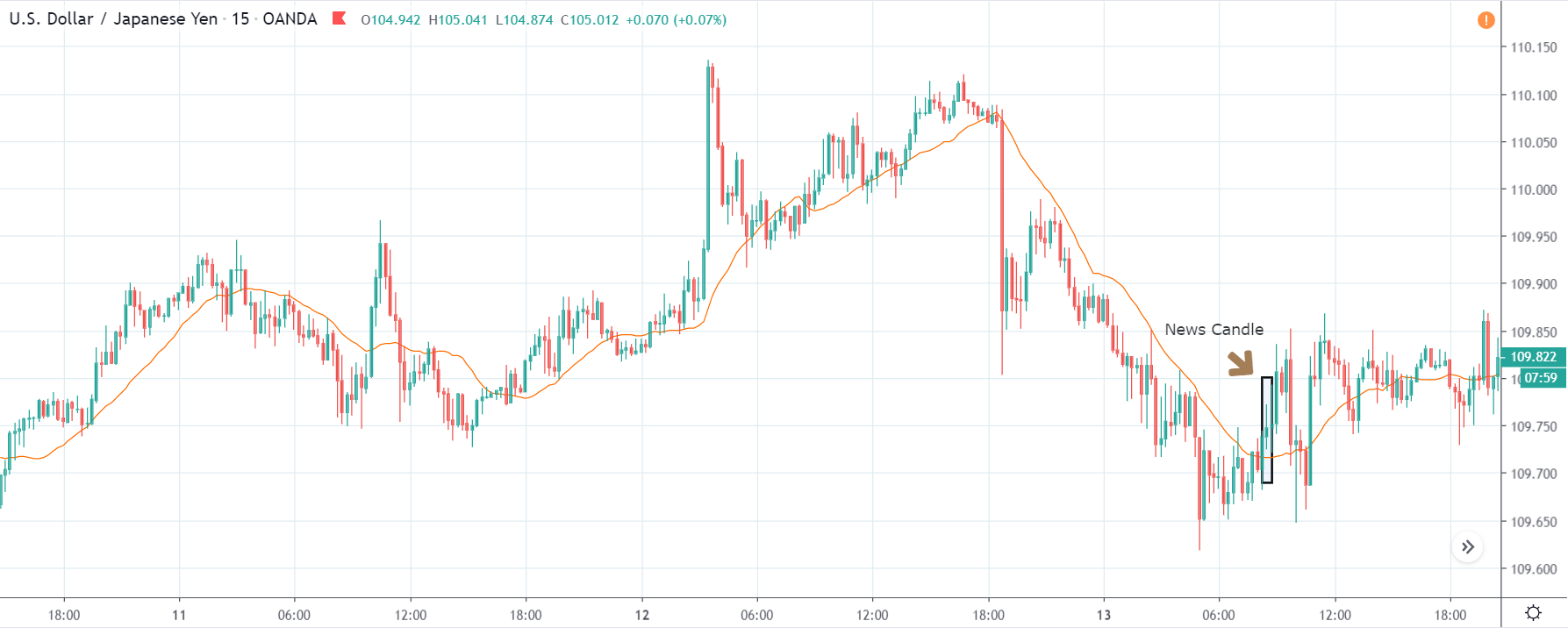
CHF/JPY | After the announcement

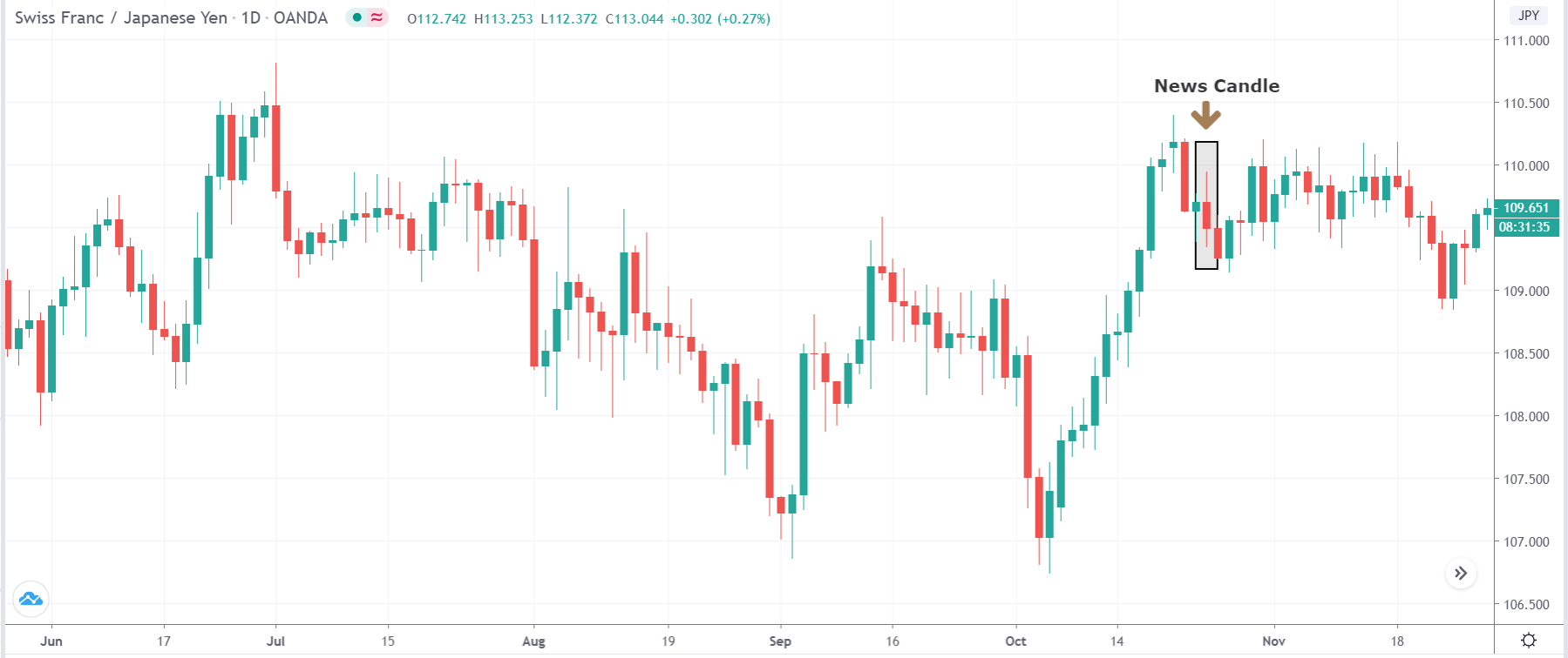
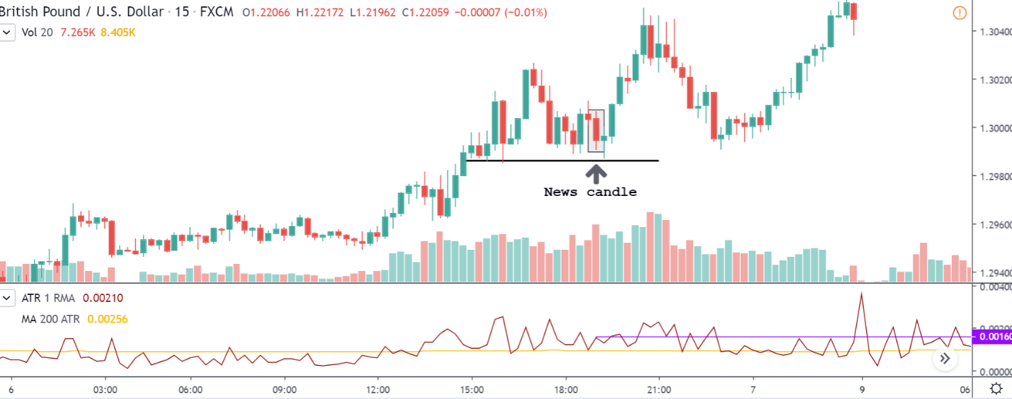
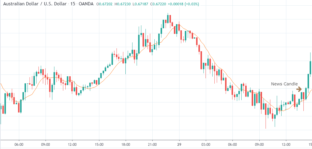
The above images are that of the CHF/JPY currency pair, where we see a strong move to the upside before the news announcement, and currently, the price is at the resistance turned support area. There is a high chance of buyers becoming active at this point; hence, sell trades should be avoided.

After the news announcement, we witness some volatility in the market that takes the price lower but not by a lot. The impact was not great on this currency pair as the country slipped below by two places in the ‘ease of doing business’ ranking. When the impact of news settles down, one should start analyzing the pair technically and take the position accordingly.

That’s about the ‘Ease of Doing Business’ as an economic indicator and its relative impact on the Foreign Exchange market. Cheers!

Categories
Forex Fundamental Analysis

Why ‘Core Consumer Price’ Is Considered A Crucial Macro Economic Indicator?

Introduction

The Core Consumer Prices are a sub-segment of the Consumer Prices, which is used by professionals and economists to get a more accurate picture of the inflation within the country. Understanding of Consumer Price movements can help traders predict inflation rates, industrial trends, identify demand, and supply gaps to invest in a particular section of goods and services. It is a widely used statistic and is one of the critical components in assessing economic expansion or contraction, thereby.

What is Core Consumer Price?

The ”Core “ Consumer Price is the generally called name for the “Consumer Price for All Urban Consumers: All Items Less Food and Energy.” This term comes up in the Consumer Price Index monthly published Reports where this is another variant of the CPI-U and is widely known as the “Core” CPI where CPI stands for Consumer Price Index.

What is the Consumer Price Index?

Consumer Price Index is a survey report which determines the average price of some of the most commonly purchased goods. These goods include toothpaste, grocery, fuel, etc. Instead of using a simple average, each good is assigned a specific weight based on the degree of their importance amongst the people. For instance, milk will have a higher weightage in the mean price calculation compared to the furniture.

Core Consumer Price Index is the same Consumer Price Index for all the commonly consumed goods and services except food and energy items. This distinction has arisen due to the highly volatile nature of food and energy prices.

Why are the food & energy prices volatile in the first place?

Let us talk about food first. In the short run, the supply of food cannot immediately accommodate the increase in demand for food. To meet the increased demand,  it has to result in the planting of more seeds and growing, which take somewhere about a few months to at least a year.

Due to this situation, we say the supply is inelastic to the demand, meaning it cannot stretch immediately to meet the demand. Hence, the demand-supply gap causes price volatility. For example, in India itself last year, the price of onions went up to 150 rupees per kg from its usual 30 rupees per kg. This volatility can also occur due to crop loss at the time of adverse weather conditions or due to some other issues like forest fires etc.

The same goes for energy items like crude oil. Industries or Countries that are heavily dependent on these sources have little choice but to pay higher prices when there is a shortage of supply. Switching from one source of energy to another or alternate forms of power is not a small task, nor is it a viable solution. The primary energy source areas have been historically subjected to political tensions, which have led to significant shocks in oil prices worldwide. Factors like weather conditions also hinder oil production, or unexpected incidents can lead to significant dips in the energy supply levels in the global market.

Below is a historical 70-year plot of Crude oil prices where shaded regions indicate periods of recession.

(Source: MACROTRENDS)

With such a massive rise and drops in prices, it is very easy to overlook the actual inflation or deflation within the economy. As the CPI takes into account the food and energy prices, there can be situations where the food and energy prices skyrocket while other items have observed deflationary trends in their prices to a scale that the volatility masks the deflationary trend or vice versa is also true.

To avoid this inaccuracy in CPI, the Core CPI comes into the picture, which is a more accurate inflationary measure than the CPI-U.

Economic Reports

The Bureau of Labor Statistics generally conducts a survey of 80,000 consumer item prices to create the Index and publishes it monthly.

BLS data collectors visit in person, or virtually through the internet, or call thousands of retail stores, service establishments, rental units, and doctors all over the United States. They do this to generate info on the prices of items and then measure price changes in the CPI.

How can the Core Consumer Prices be Used for Analysis?

The index data set goes as way back; for example, Core CPI goes as far back as 1957. With such a large data set, the reliability of the data set is high, and it usually depicts the macroeconomic picture of a country with reasonable confidence.

CPI changes are useful to ascertain the retail-price modifications associated with the Cost of Living. Hence it is widely used to determine inflation in the United States.

Many payment agreements are directly tied to CPI; it can affect the incomes of 80 million people. Social Security benefits, various pension payments are all indexed by CPI. Hence, CORE CPI is essential to understand current monetary conditions and can also be used to assess how the governments and policymakers will act to these changes.

Impact on Currency

In general, CPI is associated as a proportional indicator meaning higher CPI signals currency appreciation for traders and vice versa.

Below is a snapshot of CORE CPI plotted against GDP for the last 15 years, and we see this macroeconomic indicator’s importance in fundamental analysis:

Sources of Consumer Price Index

The U.S. Bureau of Labor Statistics releases all the indexes as mentioned here –

Consumer Price Index and Core CPI

CPIAUCSL: CPI for Urban Consumers: All Items in U.S. City Average: Broadly uses the statistic for a measure of overall inflation in prices. It includes Food and Energy prices, unlike CPIFESL. This info can be found here.

CPIFESL: Consumer Price Index for All Urban Consumers: All Items Less Food and Energy in U.S. City Average: It excludes volatile components like Food and Energy (Oil Prices) and gives more of a Core CPI change within the United States. This info can be found here & here.

Impact of the ‘Core Consumer Prices’ news release on the price charts

The Core CPI is not only an important indicator of inflation but that of the overall economy, thus it is sure to impact the value of the currency. In this section of the article, we will be discussing that impact and look to trade the news announcement. As we can see in the below image, core CPI is said to highly impact the currency when the numbers are being announced. The data released on a monthly and yearly basis, but today we will be analyzing the month-on-month core CPI data of the United States.

The below image shows the latest Core CPI data for the month of February, along with the forecasted and previous numbers. A higher than expected reading is considered to be bullish for the currency while a lower than expected reading is believed to be bearish. The latest figures show that the Core CPI numbers were unchanged from before, which was exactly predicted by economists. The CPI numbers are published by the U.S. Bureau of Labor Statistics, the official agency that carries out surveys and collections. Now let us analyze the impact it created on the U.S. dollar.

EUR/USD | Before The Announcement

We start with the most liquid forex pair in the world, which is the EUR/USD pair. Looking at the from a technical perspective, before the news announcement, we see a market reversal retracement on the downside with a retracement to the nearest ‘higher high’. One can assume that the market has factored in the Core CPI data as it is expected to remain the same as before. Hence, one should not expect a great amount of volatility during the announcement. Technically, we can take a ‘short’ trade in the above pair, but without having a lot of assumptions, it is advised to keep a wide stop loss to protect ourselves from spikes.

EUR/USD | After The Announcement

The Core CPI numbers are announced, and since it was on expected lines, the price falls a little, showing some bullishness for the U.S. dollar. As there was minimal volatility, we can confidently take a ‘short’ trade with a stop loss above the recent ‘higher high.’ The ‘take profit’ for this trade should be near the recent ‘low’ or ‘support’ area. We shouldn’t forget that earlier, it was said that it is a high impactful event, but due to subdued expectations, it did not induce high volatility.

USD/CAD | Before The Announcement

USD/CAD | After The Announcement

The above images represent the USD/CAD currency pair where it looks like, before the news announcement, the market is in a pullback mode, and this is the perfect scenario for going ‘long’ in the market. As the impact of Core CPI is high, it could turn the market either way; hence it is safer to wait for the news release and then a suitable position in the market.

After the news announcement is made, we see that the volatility expands on the upside, which takes the currency higher. This could essentially be the confirmation sign for trend continuation, and we can now enter for a ‘buy’ with a stop loss below the recent ‘low.’ Since there was no reduction in Core CPI numbers, it resulted in being positive for the U.S. dollar, and thus we see a bullish candle after the news release.

NZD/USD | Before The Announcement


NZD/USD | After The Announcement

Here, in NZD/USD currency pair, before the news announcement, we see an uptrend, and since the U.S. dollar is on the right-hand side, it shows the excessive weakness of the same. The behavior of this chart is different from that of the above-discussed pairs due to the strength in the New Zealand dollar.

Therefore, only a significant increase in the Core CPI can result in a reversal of the trend else we can witness volatility on both sides. Since the news announcement was mildly positive for the U.S. economy, the price drops but not enough. Hence, we can conclude that the news release did not cause much volatility in the pair, and the current trend is still intact.

That’s about ‘Core Consumer Prices’ and its impact on the Forex price charts after its news release. If you have any questions, please let us know in the comments below. Good luck!

Categories
Forex Fundamental Analysis

How The ‘Government Debt’ Numbers Impact A Nation’s Currency Value?

Introduction

Government Debt as an economic indicator has recently been gaining more attention from economists, investors, and traders. Many economies have chosen to actively take on debts to boost economic growth. Hence, it has become a metric & also a concern for many.

Just like a piling up debt is terrible for a householder, huge government debt is a negative sign for any economy. How the debt is used to run economic activities, methods deployed to repay it, all these have a long-term financial impact. In this sense, Government Debt is a critical metric by itself that needs to be watched out for, as investors decide to lend money to governments, basing this also as one of the reasons.

Government Debt levels have consequences that are many-fold to understand. Hence, understanding Government Debt now is more important than ever as the world’s largest economies are taking on debts beyond their revenues.

What is Government Debt?

Government Debt, also called Sovereign Debt, Country Debt, National Debt is the total public Debt and intragovernmental Debt owed by the governing body of the country. It is the money that the Government owes to its creditors.

            Government Debt = Public Debt + Intragovernmental Debt

Public Debt – It is the Debt held by the public. The Government owes this Debt to the buyers of the government bonds, who can be its citizens, foreign investors, or even foreign governments.

Intragovernmental Debt – It is the Debt owed by the Government to other Government departments. It is generally used to fund Government and citizen’s pensions. The Social Security Retirement account would be one such typical example.

Whenever the Government spends more than its generated revenue, it creates a budget deficit and adds to the total Government Debt. To operate in this budget deficit mode, the Government has to issue treasury bills, notes, and bonds, which are promissory notes to lenders that the Government shall pay back the amount along with interests.

Hence, The National Public Debt is the net accumulation of all annual budget deficits of the Federal Government.

How can the Government Debt numbers be used for analysis?

The Governments depend mainly on public spending to stimulate growth in the economy by assisting businesses and individuals in the form of unemployment compensations, wage hikes, etc. This leaves Government no choice but to fall back on taking on more Debt and keep paying interests from the tax revenues and other income sources.

The piling Debt may let things continue smoothly now but will inevitably tighten the belt for the economy in the future. When Debts go out of hand, it can lead to economic collapse, as default on Debts leads to reduced credibility and may lead to a lack of funds during times of need.

When support is lost for the Government, it has to fall back on assets, selling them and thus going to the brink of bankruptcy. At this stage, a nation is vulnerable as enemy nations can also use this situation to their advantage to wage wars in extreme cases. When there is no monetary support, business slowdowns and recessions are unavoidable.

The following are some strategies the Government may opt to reduce the debt burden:

📎 Low-Interest Rates: By lowering interest rates through open market operations, the Government can make borrowing money easy for the business and people in the economy to boost the economy. This has been the case in the United States. Prolonged low-interest-rate environments have not proven to be an effective solution to Debt-ridden Governments.

📎 Monetization: Countries like the United States, whose currency is not pegged to any other currency or commodity, can print off money and clear Debt. But this can lead to hyperinflation and currency depreciation. Hence, it is not preferable.

📎 Spending Cuts: This is the hard pill to swallow that actually works. It is the spending that leads to an increasing debt burden. If the Government cuts back on spending, which is equivalent to cutting back of money supply into specific segments or programs, that will lead to deflationary situations in the economy that can lead to a recession. Furthermore, when the Government cuts back on spending, they lose the support of citizens and fear losing favors in elections by businesses and the population.

📎 Tax Raises: The main culprit is failing to cut back on spending. As the spending continues to rise year after year, increased tax revenues do little to help reduce the burden of Debt. It is the most common practice but is not effective in the long run.

📎 Pro-Business/ Pro-Trade: By selling off real assets like real estate, gold, and military equipment, the Government can reduce the burden. It is like selling your house to pay off the mortgage. This type of solution is not applicable to all countries, but some like Saudi Arabia reduced their Debt significantly from a debt 80% of GDP to 10% in seven years by selling off oil.

📎 Debt restructuring or Bailouts: When the solvency of the Government is at the brink, Debt restructuring (renegotiating the terms of Debt, or partial payments) is one final option. It is a pseudo-defaulting case. This is not also a practical solution, as the credibility is damaged after this, as it tells the world that the economy is weak.

📎 Default: Defaulting may seem the most effective way to get rid off Debt. This is considered only when there are no other options for the Government. This leads to a lack of future monetary support from the rest of the world. Defaulters like Pakistan, Greece, and Spain are good examples of this. Defaulting occurs when the Debt burden crosses way beyond the tipping point, which is 77%. For the United States, it has already passed 100% in recent years.

Impact on Currency

The National Debt is an increasing concern in recent years as the repayments are starting to take more massive proportions of the Government’s revenue. What method the Government decides to opt for to tackle its debt burden in a given year directs the growth for that business year.

The Government Debt is a proportional indicator, meaning higher Government debt numbers are more stimulating for the economy, and appreciating for the currency and vice-versa. The vital thing to note here is that as long as the Debt has not gone way out of control that the Government cannot afford to pay the interests also. For the United States, the Debt burden will be unbearable by 2034, at which point they have to cut back on spending and raise taxes.

The Government Debt is a lagging and reactionary number. It is taken on to solve an issue and is not an initiative effort. Debt numbers follow the already ongoing situation. Hence, it has a low market impact. The more direct implications of the taken Debt are manifested through press releases and other news reports like wage growth, employment statistics, etc.

Economic Reports

The Treasury Department has the “Debt to the Penny” section on their website which shows, the daily Debt after all purchase and sale of the Government Bonds.

The U.S. Treasury Department releases quarterly, end of the period, the Federal Government’s Debt reports.

Sources of Government Debt

The Office of Management has a historical tables section where we can find Federal Debt records. Some of the most reliable sources are given below.

Impact of the ‘Government Debt’ news release on the price charts 

Government Debt which also known as the national debt, is the public and intergovernmental debt owned by the federal government. The government may take a loan from the World Bank and or from other financial institutions for a variety of reasons. It could be required for fulfilling the needs of the people, for defense purposes, or for stabilizing the economy. A moderate increase in debt will boost economic growth, but too much debt is not good for the economy.

It dampens growth over the long term. Higher debt means a higher rate of interest and, thus, more burden on the government while repaying the loan. Investors compare the debt held by the government and its ability to pay it off. Based on this data, they have a short to long term view on the currency. However, traders do not react violently to the Government Debt news release and make few adjustments to their positions in the market.

In today’s article, we will be analyzing the impact of the Government Debt announcement on Turkish Lira as traders identify the debt of the Turkish Government. The below image shows the previous and latest Government debt of Turkey, which indicates an increase in debt from last month.

USD/TRY | Before The Announcement

The above image represents the USD/TRY currency pair before the news announcement. We see that the chart is in an uptrend and the price has broken many resistance points. Currently, it is approaching a major resistance area from where the market has reversed earlier. High volatility on the upside could be an indication that the market is expecting a weak Government Debt data. One can join the uptrend only after the market gives a retracement.

USD/TRY | After The Announcement

As soon as the Government Debt data is announced, the market violently moves higher, and price rises quickly to the top. The reason behind the increase in volatility to the upside is that the Government Debt increased by almost $70B for the month of March. As a rise in Debt is considered to be negative for the economy, this explains why traders and investors sold Turkish Lira and bought U.S. dollars after the numbers were announced. The bullish ‘news candle’ is a sign of trend continuation, and thus one can go ‘long’ in the pair after a suitable price retracement.

TRY/JPY | Before The Announcement

TRY/JPY | After The Announcement

Next, we will discuss the impact of the news on the TRY/JPY currency pair, where we see that the market is moving in a range, and the overall trend is up. As the Turkish Lira is on the left-hand side, a ranging market indicates an indecision state of the market. Before the news announcement, price is at the ‘resistance’ area, and thus one can expect some selling pressure from this point, which can take the price lower. In such a market scenario, aggressive traders can take a ‘short’ trade in the market, expecting bad news for the economy.

The news release resulted in volatility expansion on the downside as the market reacted negatively owing to poor Government Debt data. The price crashed and closed as a strong bearish candle. But this was immediately retraced by a bullish candle, which could be due to the reaction from ‘support’ of the range. Thus, one should go ‘short’ in the pair after the price breaks key levels as the overall trend is up.

EUR/TRY | Before The Announcement

EUR/TRY | After The Announcement

The above images are that of the EUR/TRY currency pair, and here too, the market is range-bound where the overall trend is down. Since the Turkish Lira is on the left-hand side, a ranging market indicates a moderate strength in the currency. Just before the announcement, price is at the ‘bottom’ of the range, and one can expect some buying strength in the market, which can take the price higher from here. The safer approach is to wait for the shift in volatility due to news release and then trade based on the data.

After the data is released, the market, just as in the above pairs, moves higher sharply, and traders sell Turkish Lira. The bullish ‘news candle’ indicates that the Government Debt data was extremely bad for the economy and thereby prompting traders to go ‘long’ in the pair. As now the price is at resistance, one should wait for a breakout and then ‘buy.’

That’s about ‘Government Debt’ and its impact on the Forex market after its news release. If you have any questions, please let us know in the comments below. Good luck!

Categories
Forex Fundamental Analysis

Does The News Release Of ‘Gasoline Prices’ Impact The Forex Market?

Introduction

Despite the advent of alternate and renewable sources of energy, Oil remains the largest consumed non-renewable energy resource on the planet. Even after the Greenhouse effect debates, pollution, etc. we are still using Oil in a big way.

Although a shift has begun, a complete switch out of Oil will definitely take some decades and a lot of technological innovations. Gasoline Price is very closely tied to Consumer Expenditure, and many industrial activities, volatility in Gasoline Prices, affects the economy directly. Hence, understanding of Gasoline Price changes, its causes and consequences are essential for us in assessing macroeconomic indicators like Inflation, Personal Consumption Expenditures, or Consumer Prices Index, etc.

What is Gasoline Price? And Why is it important?

Gasoline is a carbon-based fuel that is extracted from Crude Oil through a process of distillation and refinement. Crude Oil is dark, heavy, and a sticky liquid that is naturally formed inside Earth. It is extracted, boiled to varying degrees, to distill away impurities to obtain purer forms like Diesel, Petrol (or Gasoline), or Fuel Oils, etc. Gasoline is lighter and is more in demand in the market.

As shown below, Oil is still the largest consumed energy source in the world, accounting for about 34% of all energy sources consumed. Gasoline is one of the first products that is obtained from Crude Oil. The general population and many industries depend on Gasoline heavily to conduct their lifestyle. Today almost, every household has a car or bike that requires Gasoline.

Changing Gasoline prices have a direct effect on the general public and dependent industries like Transportation sectors. Increasing Gasoline prices are always followed by a bitter reaction from the public as it increases their daily expenditures, how industries ship goods.

Gasoline prices are dependent on the following critical factors

(Source: gaspricesexplained.com)

Crude Oil Prices: The raw material used for Gasoline production primarily drives the Crude Oil Price as per the United States Energy Information Administration. Crude Oil is available on almost all the continents, except Australia, where it is quite less relatively. Countries like Saudi Arabia, Venezuela have the most abundant reserves of Crude Oil and are essential players in the global Oil market.

The process of extraction is also dependent on terrain where Crude Oil is found. For example, in Canada, the sandpits of Alberta make it challenging to extract Crude Oil that makes it relatively expensive.

Refining: The number of impurities present in the extracted Crude Oil also categorizes the Oil into “sweet or sour Oil.” Sweeter/Lighter Crude Oil contains lesser impurities and hence is easier to refine. The heavy or sour Oil is more abundant and relatively less in demand. The sweet is the more preferred Oil and is the standard when we see Crude Oil pricing. Refining costs vary seasonally as different parts of the world have to follow different mandates on pollution levels, refining technologies available in the regions. Other ingredients like ethanol that are mixed into Gasoline are also minor factors.

Taxes: Taxes add to the Gasoline prices. The Governing body of the country imposes the excise taxes that add to the final consumer price. As of now, on average, all taxes, i.e., federal and local state taxes, included average to 17% of the total Gasoline price.

(Picture Credits: gaspricesexplained.com)

Transportation: Most of the Gasoline is shipped from refineries by pipeline to terminals near consumer regions. It is delivered through tanker trucks to individual gas stations. The price of all this transportation cost and profits are included in the final price. The taxes and transportation costs remain largely constant relative to the Crude Oil price volatility.

Organization of the Petroleum Exporting Countries (OPEC): It is an organization of 12-oil major producing countries that make up 46% of the world’s oil production. They regulate the price of fuel to sustain this non-renewable resource for an extended period.

Speculation: Energy traders speculate Oil prices frequently that drive up or down the Oil prices based on their projected views about the future Oil prices. The volatility is increased due to speculation and tends to create an asset bubble.

How can the Gasoline Price numbers be used for analysis?

There is a positive correlation between Gasoline and Crude Oil prices in general. The dependency on Gasoline, a high growth rate of the emerging countries, increasing world population, etc. all have increased the demand for Gasoline overtime. For now, there is no significant alternative to compete with Gasoline. Other options like Natural Gas, Electric vehicles are in their budding state and would take some years before they can become worthy alternatives.

Gasoline is a daily consumption, a non-durable commodity that is required by every country. There is no country as of now that is entirely Gasoline-independent. Every country uses Gasoline for one or the other purposes as it has 84% fuel efficiency when burnt (meaning 84% of it is converted into energy).

As attempts to significantly switch to alternate sources of energy are being made, there is still some time left before we see renewable alternatives to Gasoline.

Impact on Currency

An increase in Gasoline Prices is reflected in the Personal Consumption Expenditures reports. As fewer people are able to afford highly-priced Gasoline, Industries dependent on Gasoline mainly observe a cut in their profits that slows down their business. To avoid this, they may increase prices of their end product to compensate for this increase, which again inflates the economy further. The rising costs of Gasoline are terrible for the economy and the currency. It leads to price rises lead to currency depreciation.

Lowered Gasoline prices, stimulate consumption, and increases expenditure in other sectors by public and dependent industries. Changes in Gasoline prices due to Crude Oil price changes take about 4-6 weeks to translate. Gasoline prices are lagging indicators for the Energy traders and have a low impact on the Energy trading community. On the other hand, prolonged increases in Gasoline prices has long term depreciating impact on the currency and the economy.

Economic Reports

Gasoline prices are available daily on the internet on many websites. For the United States, The United States Energy Information and Administration releases the weekly Petroleum status report on its official website.

The OPEC’s Monthly Oil Market Report details the significant causes affecting the world Oil Market that is published on the 12-16th of every month on their website.

Sources of Gasoline Prices

Global Oil market prices & News can be found in the below-mentioned sources.

Oil PricesOPEC – Oil Prices and reserves dataOPEC MOMRGlobal Gasoline Prices – Trading Economics | EIA – Weekly

Impact of the ‘Gasoline Prices’ news release on the price charts 

Gasoline Prices have a major role to play went it comes to the development of the nation. Everyone knows that higher Gas Prices will make each of to pay more at petrol bunks, leaving less to spend on other goods and services. It not only has an effect on the public on an individual level, but higher gas prices also have an effect on the broader economy. Economists and analysts also believe that there is a direct correlation between consumer confidence, spending habits, and gas prices. As gas prices decrease, a large percentage of institutional traders feel that the economy is ‘getting better.’ By this, we can say that the announcement of Gasoline Prices have a major impact on the currency pairs and can cause moderate to high volatility in the pair.

In today’s article, we will be analyzing the impact of Gasoline prices of North America on the U.S. dollar. The Gasoline Prices are published on a Weekly, Monthly, and Annual basis by the U.S. Energy Information Administration. They also provide a statistical analysis of the report. The above image shows the weekly retail Gasoline Prices.

AUD/USD | Before The Announcement

We start our analysis with the AUD/USD currency pair, and the above image shows the state of the chart before the Gasoline Prices are announced. The market essentially is moving in a ‘range’ where the price is repeatedly reacting from ‘resistance’ equals ‘support’ area. Also, the overall trend remains to be up. In such a market scenario, it is prudent to wait for the news announcement and then trade based on the change in volatility in the market. As the Gasoline Price economic indicator is a highly impactful event, there can be extreme movements in the market on either side. However, technically, the bias is on the ‘buy’ side.

AUD/USD | After The Announcement

After the weekly Gasoline Prices are released, price drops sharply, and volatility increases on the downside, owing to a decrease in the Gasoline Prices compared to the previous week. As the U.S. dollar is on the right-hand side of the pair, to buy the U.S. dollar, we need to sell the currency pair. This is why we see a fall in the price after the data is announced, which was positive for the U.S. economy. Even though the market reacted to the news release on expected lines, we should not forget that the price is exactly at the bottom of the range. It is not surprising to see buying strength from here, and therefore we should wait for key levels to be broken to trade based on the News.

EUR/USD | Before The Announcement

EUR/USD | After The Announcement

The above images represent the EUR/USD currency pair. Looking at the first image, we can say that the market is in a downtrend that began recently. Since the selling pressure is above average in the pair, a news announcement that is positive for the U.S. economy is favorable for taking a ‘short’ trade in the pair. On the other hand, we can look to ‘buy’ the pair only if the news release is extremely bad for the U.S. economy.

After the announcement is made, the market falls, and what we see is a firm bearish candle. A decrease in Gasoline Prices is considered to be positive for the economy and, thus, the currency, which is why traders sell Euro and buy U.S. dollars. One can sell the currency pair after a retracement of the price to the moving average.

USD/CAD | Before The Announcement

USD/CAD | After The Announcement

Lastly, we discuss the USD/CAD currency pair where before the news announcement, we see that the market is in a very strong uptrend and currently at a place from where the market had reversed earlier. The continuous bullish green candles suggest a great amount of strength in the U.S. dollar. Thus, a negative Gasoline Price indicator data that is bad enough to cause a reversal in the trend is an appropriate situation for going ‘short’ in the pair. Technically, the chart is more supportive of going ‘long’ in the pair.

After the data is released, we see that the price breaks out above the resistance area and closes as a ‘bullish’ candle. Here too, the market reacted similarly to the above pairs based on the robust Gasoline Prices. One should be ‘buying’ this pair only after the price retraces to the moving average and bounces off from the line. In this way, we will be trading along with the trend, and the stop loss will be below the ‘news candle.’

That’s about ‘Gasoline Prices’ and its news release impact on the Forex market. If you have any questions, let us know in the comments below. Good luck!

Categories
Forex Fundamental Analysis

‘Initial Jobless Claims’ – What Should You Know About This Fundamental Indicator?

Introduction

The Initial Jobless Claims is a weekly statistics released by the United States department of labor. Unlike most other indicators that are released monthly, this report has an additional advantage. Because the Initial Jobless Claims report predicts the unemployment two to three weeks ahead compared to the employment report that is released monthly.

What is the Initial Jobless Claims report?

Jobless claims report comes directly from the United States department of labor, AKA. DOL. The department of labor is an executive branch of the United States Federal government and is mainly responsible for monitoring and promoting employment, employee welfare, improving employee wages, and helping them to claim their employment benefits. To do so, it enforces the main Federal laws and regulations.

The United state has a provision for providing insurance for those who are unemployed. In the year 1935, this policy came into implementation. Although it does not mean that every unemployed person is eligible, it has certain criteria. Insurance is provided to the people who have worked for a certain period and have recently lost their job due to factors that do not directly involve them.

For example, seasonal layoffs or business closure, the unemployment compensation insurance is applicable. The payment of compensations is for about 20-26 weeks, which may vary from state to state. The amount is usually a percentage of their most recent average wage for the year.

The initial jobless claim is different from them continued jobless claims. This report only shows the number of people who have applied for the unemployment benefit for the first time during the last week. In this regard, it becomes slightly more important than the continued jobless claim as it indicates the increase or decrease in the unemployment rate within the country.

How is the Initial Jobless Claims calculated?

The Initial Jobless Claims is prepared by the department of labor, which receives this data from state unemployment offices, which intern receive them from the local unemployment offices. The department of labor releases this report at 8:30 a.m. Eastern Standard Time.

Although many citizens apply for the benefit, it necessarily does not represent all the eligible people. Because, it is just a claiming, which will be either considered valid or invalid by the respective departments later.

Is the Initial Jobless Claims important?

When trying to assess the importance of the Initial Jobless Claims report as an economic indicator, there are many things we need to keep in mind.

The report does not cover the entire population. Not all people who are eligible for benefits apply for the same. Many people who are not eligible for the benefits will also apply. Also, the report is very volatile from week to week and is also a function of seasonality.  Hence, A four week moving average of the Initial Jobless Claims report irons out this volatility.

Below is a snapshot of the initial jobless claim report for the period of January- 2018 to February-2020. As we discussed, the numbers are very volatile, which makes it one of the ‘not-so-easy to decode’ economic indicators.

An increase in the Initial Jobless Claims report numbers relative to the previous numbers tells that more people have lost a job in the recent time. This has been historically associated with times of GDP contraction and economic stagnation. In other words, it indicates the beginning of an upcoming recession. A conversely significant decrease in the report occurs when the economy is coming out of recession and progressing towards economic growth (GDP expansion).

How can the Initial Jobless Claims Report be Used for Analysis?

The Initial Jobless Claims can act as abridge towards assessing the unemployment rate or the employment situation report (which are released monthly). The frequency of the report is the main advantage in comparison to other indicators. Because it allows interested people to get the most current economic situation. As mentioned, it can give us an idea about economic health two to three weeks before the employment reports that are released monthly.

Some Forex traders who are looking to buy or sell the US dollar can use this report for the most recent data in this regard. Higher the number, lesser is the confidence in the economy’s strength and vice versa. But in general, this is a minor indicator in comparison to the monthly reports, which are complete, thorough, and consistently reliable as they cover a greater section of the nation’s population.

Overall the Initial Jobless Claims report is a cruder and rudimentary indicator and is not robust or consistent at all times. But to some extent, it can reflect the direction in which the economy is heading. It may not be easy for us to know the minor movements in the economy accurately, but major movements get definitely reflected. In such cases, the Initial Jobless Claims report can also act as one of the main leading indicators to predict any oncoming recession or expansion of the economy.

Sources of Initial Jobless Claims Reports

The United States Department of Labor releases the Initial Jobless Claims report weekly on their official website in the ‘news releases’ section. Reference link – Initial Unemployment Insurance Claims

You can also find the same indexes diversified and other related categories like Continued claims etc. on the St. Louis website.

Impact of the ‘Initial Jobless Claims’ news release on the price charts 

After understanding the definition and significance of Initial Jobless Claims as an economic indicator, we are ready to find out the impact of the same on the currency. As we know that Initial Jobless Claims measures the number of individuals who filed for unemployment insurance for the first time during the week, and the impact is said to vary from week to week. A higher than expected reading is considered to be negative for the currency while a lower than expected data is taken as positive. The data has a moderate to high impact on a currency that causes a fair amount of volatility in the pair.

The below image shows the previous, forecasted and actual number of people who filed for unemployment insurance for the third week of March. We can see that the Jobless Claims were much higher than before with a rise in 70K people. From prerequisite knowledge, this should be extremely negative for the economy and hence the currency, but let us examine the reaction of the market.

USD/JPY | Before The Announcement

We start our analysis with the USD/JPY currency pair, where we notice a strong uptrend, which a result of excessive buying interest of US dollars. The strength in the US dollar could be due to another fundamental factor that is driving the currency higher. Technical analysis tells that when the market is trending strongly in one direction, we need to wait for a retracement to join the trend or wait for market reversal patterns. Hence, before the news announcement, we do not find any suitable way to position ourselves in the market.

USD/JPY | After The Announcement

After the Initial Jobless Claims are announced, volatility increases on both sides but finally closes in the form of ‘Doji’ candlestick pattern. Even though the data was very bad, it was bad enough to cause a reversal in the market. After looking at the market reaction, we can say that the data created confusion among traders as the market consolidates after the news release. Since the Unemployment data did not cause the price to break key levels of support and resistance, the uptrend is still intact. Therefore, one can enter for a ‘buy’ after an indication from an important technical indicator.

GBP/USD | Before The Announcement

GBP/USD | After The Announcement

The above images represent the GBP/USD currency pair, where we witness a strong downward move on the previous day before the news release. After the big move, market moves in a range, and just before the announcement, the price is at the ‘support’ area. This means traders who are optimistic about the Unemployment data can position themselves on the ‘long’ side with a strict stop-loss below the support.

After the news announcement, we hardly notice a change in volatility, and the candle again forms an indecisive pattern. Since the Jobless Claims data did not cause any drastic change in volatility, traders can enter for new ‘long’ positions or hold on their existing ones and should compulsorily exit at the nearest resistance.

GBP/USD | Before The Announcement

GBP/USD | After The Announcement

The GBP/USD currency pair shows similar characteristics as that of the USD/JPY pair, where before the news announcement, the market is in a strong uptrend. In such market scenarios, we essentially cannot position ourselves on any side of the market as we don’t have any technical factors supporting our trade. Therefore, it is wise to wait for the news release and then act based on the data.

After the Initial Jobless Claims numbers were announced, we see an increase in volatility but with no bias. It results in the formation of an ideal ‘Doji’ candlestick pattern with wicks on both sides and small body. Since the market did not collapse, we can conclude that the data was not damaging to the US dollar. From the trading point of view, we cannot enter for ‘buy’ even after the news release as technically, we need a retracement before we join the trend.

That’s about ‘Initial Jobless Claims’ and its relative news release impact on the Forex price charts. If you have any questions, please let us know in the comments below. All the best.

Categories
Forex Fundamental Analysis

The Impact Of ‘Personal Saving’ News Release On The Forex Price Charts

Introduction

Personal Saving is one of the main components of Personal Income. Savings can give us hints on Consumer Spending patterns and future sentiments concerning financial matters. Personal Spending and Personal Savings are two primary sections into which the Disposable Personal Income divides, and the proportion of these two helps us ascertain short-term and long-term economic activity. Hence, understanding Personal Savings and Personal Savings Rate reports can help us solidify our understanding of fundamental analysis.

What is Personal Saving?

Personal Saving is the difference between Disposable Personal Income and Personal Outlays.

Disposable Personal Income (DPI), also called After-Tax Income, is the remainder of an individual’s income after all federal tax deductions. Hence, It is the amount people can spend, save, or invest.

Personal Outlays, or Personal Spending, refers to all the expenditures incurred to conduct one’s lifestyle, like rent, internet, fuel, transportation, groceries, etc.

For example, If an individual earns 100,000 dollars per year and his tax-deductible is 30%. His DPI is 70,000 dollars. If his year around expenses amount to 63,000 dollars, then the Personal Savings would be 7,000 dollars. Here, the Personal Saving rate would be 10%. Personal Savings would be the amount left after all the expenses have been deducted from the available income.

Personal Savings Rate (PSR) is the ratio of Personal Saving to the Disposable Personal Income expressed as a percentage.

Marginal Propensity to Save (MPS): It is one more metric used to assess Saving, which is defined as the ratio of the amount saved for each additional dollar. If a person got 100 dollars extra as a bonus this month, and if he spends 60 dollars of it and saves 40 dollars, then his MPS would be 0.4 (40/100). His general savings saw an increase of 40 dollars, and his disposable income saw an increase of 100 dollars. Hence, MPS considers the change in savings to change in income rather than the actual Saving.

Factors That Affect Personal Saving

DPI: An increase in Disposable Personal Income generally translates to increased savings once the necessities are met. Low levels of DPI mean that the majority of the available income is spent on Personal Expenditures leaving little room for saving. Personal Saving has been affected by variations in household net worth, consumer debt, and housing investment. In 2008 and 2009, during the most recent recession, the personal saving rate increased by about two percentage points each year, reaching 5.9 percent in 2009.

Economic Stability: Unstable economic conditions and frequent recessionary periods induce higher saving patterns in the general public as they cut back on their expenses to save for future rainy days. A growing and healthy economy see a stable saving rate and an increase in personal consumption, as people spend more when they have a positive sentiment towards their future financial security.

Deposit Rates: Banks pay interest to depositors for their deposited money. Higher interest rates can attract the general public to save money overspending as it would generate more money for future consumption.

Individual preference: How people traditionally see debt, mortgages, and savings also determines people’s saving and spending patterns. Generally, people from unstable economic regions or developing economies tend to save more than people who have always been in a stable economy. For example, the China saving rate is 35%, while that of America is around 8%. This cultural backdrop also plays a role in people’s tendency to save and spend. The proportion of different people within the economy will determine the direction of Personal Saving Rates.

How can Personal Saving numbers be used for analysis?

Changes in the saving rate are inversely related to changes in household net worth (i.e., cost of a house) as a percentage of DPI. The ratio of household net worth to DPI typically rises during periods in which household real estate and financial assets are appreciating and falls when these assets are losing value. As household assets appreciate, incentives to save from current income are lessened, while incentives to save are increased during periods of falling asset values.

An increase in Personal Savings is good for banks as they can give out more loans in one aspect and hence is good in the long run for the economy. But, in the short term, it implies expenses are cut back, which means businesses will see a slowdown, and that is not good either. An optimal balance between Spending and Saving has to be struck for sustained growth.

Personal Savings usually see an increase during economic shocks and recessionary periods. Hence a significant spike in Saving Rate can be considered as an indicator of an ongoing financial contractionary period.

Personal Savings numbers simply would be a function of growing population and inflation. If the economy improves, so does the Personal Savings. For example, saving 100 dollars ten years back and now are two different things. We have to take inflation and increase in wages into account. Personal Saving Rate is more accurate in this regard as it is proportional. This is illustrated clearly in the below graphs of PS and PSR, respectively.

Hence, PSR is more prevalent amongst economists and investors for analysis. Also, Marginal Propensity to Save is higher for wealthier people than for poorer people. Hence, MPS can also be used to understand what is the standard of living and wealth the general public is enjoying, which reflects the strength and wealth of the overall economy itself.

Impact on Currency

As such, there is no direct one-to-one indication of Personal Savings figure to GDP, but there is a pattern here, during deflationary conditions when the currency value depreciates there is an upward spike in Personal Savings figures. In this sense, it is an inverse indicator and has a mild-to-low impact on the currency market. Economic shocks can also increase the Personal Savings figure.

Due to the long-term nature of the figures themselves, the currency volatility is low around these numbers compared to other macroeconomic indicators. Still, they are useful in understanding the long-term direction of the economy.

Economic Reports

The United States Commerce –  Bureau of Economic Analysis releases Personal Saving as part of the monthly report titled “Personal Income and Outlays.”

BEA releases the report in the last week of the month for the previous month. Quarterly and Annual reports, Seasonally adjusted versions of the same, along with Personal Saving Rate Reports, are all available under this release.

Unlike the PCE (Personal Consumption Expenditure) report, the Personal Saving figures are not expressed in percentages. Instead, the Personal Saving Rates is more popular, which is a percentage metric.

Sources of Personal Saving

The monthly Personal Saving numbers releases can be found on the official website of the Bureau of Economic Analysis under the “Current Release” section. This data can be found here – Consumer Spending – BEA. The Personal Saving Rate report can be found here.

Historical and Graphical comparisons are available on the St. Louis FRED website. Visit these pages to access this information. Personal Savings – FREDPSR – FRED.

Personal Savings date for countries other than the USA can be found here.

Impact of the ‘Personal Saving’ news release on the price charts 

The Personal Savings Rate is a big determinant of economic activity. The savings of an individual are directly related to consumer spending, which accounts for 63% of GDP. Higher savings can generate higher levels of investments and boost productivity over the longer term. The Harrod-Domar model of economic growth suggests that the level of Personal Savings is a key factor in determining growth. This has an effect on the value of the currency, and traders have a short to long term view on the currency based on the Personal Savings data. Today we will be analyzing the fourth quarter Personal Savings data of Australia that was released on the following date.

The below image shows the latest and previous Personal Savings data, where it was decreased to 3.6% percent in the fourth quarter of 2019 from 4.8% percent in the third quarter of 2019. A higher than expected reading is considered to be bullish for the currency while a lower than expected reading is considered to be bearish.

AUD/JPY | Before The Announcement

The first pair we will be examining is the AUD/JPY currency pair, and as we can see in the above image, the price has shown signs of reversal and might be going lower. Just before the announcement, the market has retraced the recent down move and is somewhere near the support turned resistance area. Technically, this is the ideal situation for going ‘short’ in the market, but it is wise to do so after we get confirmation from the market.

 AUD/JPY | After The Announcement

After the Personal Saving numbers are announced, there is a sudden surge in volatility where the price the initially moves higher, but this gets immediately sold into, and the ‘news candle’ leaves a large wick on the top. When traders found the Personal Savings to be lower than last time, they sold Australian dollars and weakened the currency. This happened as the news was not healthy for the Australian economy. Once the volatility increases to the downside, one can go ‘short’ in the pair with a stop loss above the ‘news candle’ and a ‘take-profit‘ near the ‘support’ area.

EUR/AUD | Before The Announcement 

EUR/AUD | After The Announcement

The above images are that of the EUR/AUD currency pair, and since the Australian dollar is on the right-hand side, a down-trending market, as in this case, indicates strength in the currency. After the big move to the downside, the market has started moving in a range and volatility appears to be high on both sides. Just before the news release, price is at the bottom of the range, known as ‘support,’ and from here, we can expect some buying force, which can take the market higher.

But as there is news release in the next few minutes, it can bring a drastic change in volatility, and we cannot predict where the market will go. After the announcement is made, we see a similar reaction from the market as in the above pair, and the ‘news candle’ leaves a wick on the bottom. We find that the Personal Savings was lower than last time and poor. This is why we see some buying interest in the market from the support, and thus we can go ‘long’ in the market with a stringent ‘take-profit’ near the resistance.

NZD/USD | Before The Announcement


NZD/USD | After The Announcement

These images represent the AUD/USD currency pair, where we see that the market is in a strong uptrend, and the Australian dollar is showing a lot of strength. Before the Personal Savings numbers are announced, price is above the moving average, and the uptrend is very much in place. As we do not have any forecasted data available with us, we cannot take any position in the prior to the announcement. We need to notice the change in volatility and then take suitable in the market.

After the Personal Savings data is announced, the market falls owing to poor Personal Spending data, and we see some selling pressure. But since the price does fall drastically and we do not see any trend reversal patterns, going ‘short’ in this pair is ruled out. Thus, the news announcement does not have a major impact on this pair as the uptrend is very strong.

This completes our discussion on the fundamental indicator ‘Personal Spending’ and the impact of its news release on the Forex market. If you have any questions, please let us know in the comments below. Cheers.

Categories
Forex Fundamental Analysis

Impact Of ‘Consumer Credit’ Economic Indicator On The Forex Market

Introduction

Consumer Credit is one of the economic indicators used by economists to analyze the health of the economy. It can be useful to infer the direction of other economic indicators like Spending, inflation, and standard of living. Although it is a low impact indicator in the trading world, a good understanding of Consumer Credit can be beneficial for strengthening our overall fundamental analysis.

What is Consumer Credit?

Consumer Credit refers to the debt incurred by individuals to serve their immediate needs. Consumer Credit here, in general, applies to the short-term loans given out to spend on their daily requirements like groceries, paying electricity bills. Consumer Credit is different in this context from long-term loans like House Mortgages, which are secured by real-estate. Consumer Credit is usually unsecured with no collateral.

Consumer Credit in these days comes in the form of Credit Cards mostly although there are other variants. The limit of Credit available on a given Credit Card depends on the net-salary of the individual. In general, the Credit limit is 8-12 times the monthly salary. Credit Cards are issued to people usually who can show a consistent flow of income in their bank statements, which generally translates to job-holders and business people as their default rate is lower than that of unemployed people.

Consumer Credit is made available through banks, retailers (like shopping malls, retail chains) and other small agencies to enable customers to be able to fulfill their immediate needs and pay-off at a later date with interest. The credit limit, interest rate, and the time after which the interest comes into effect vary from one lender to another. There are two different types of credits, and let’s discuss them in detail below.

Installment Credit

Installment Credit is given out for a specific purchase, and is issued for a definite amount for a fixed period and fixed monthly installments. The monthly payments are usually equal, and the time frame ranges from 3-month to 5-years generally. Installment Credit is also called EMI (Easy Monthly Installments) nowadays.

It is popular among the general population as it is widely used to make goods and services which are more on the expensive side, like a car, TV, or furniture, etc.  For example, a 3500$ bike could be purchased with an EMI, where the individual may make the initial downpayment of 500$ and choose to pay the remainder 3000$ as 500$ monthly installments in the form of a 6-month tenure EMI plus a little extra service charge for issuing this Credit.

Revolving Credit

Revolving Credits are used for any type of purchase, unlike Installment Credit. Revolving Credit is mostly available in the form of Credit Cards, where the line of Credit is open to the maximum limit set by the lender.

For example, a 50,000 dollar limit Credit Card can be simultaneously used to purchase a 20,000 dollars item and also again for anything else that is worth up to 30,000 dollars. The Credit line stays open as long as the individual pays the minimum amount to settle the interest on the Credit issued. It may even never be paid in full as long as we pay the minimum interest while the overall credit piles up.

This is unsecured Credit, and hence the interest rates on this type of Credit are high, which is risky as once you default, the interests can pile up very quickly, making it very difficult to recover. For example, a 10,000 dollar revolving credit, when you miss payments, let us say for six months, then the total settlement of the Credit can go up to 20,000 dollars also. This can also affect the credit rating of the individual debarring him from future Credit approvals from the agencies.

How can the Consumer Credit numbers be used for analysis?

As Consumer Credit refers to the short-term loans which are usually paid back with a little interest, generally, Consumers take Credit for personal enjoyment or servicing immediate needs. Hence, it tells us the Consumer’s confidence towards repayment of the incurred Credit.

People facing tight monetary situations during job loss generally cut back on Spending and stay away from such Credits. Hence, an increase in Consumer Credit can be seen as a sign of a healthy and growing economy.

Increased Credit numbers also tell us that banks and other retail agencies are willing to lend out money, as they are confident about the repayment and their prospects. High Credit also signifies that the liquidity of the economy is too high, meaning there is enough cash flowing in the system to give Credit lenders confidence to supply Credits to more and more individuals.

Impact on Currency

Consumer Credit number is a proportional indicator. Higher Consumer Credit numbers are good for the economy and thereby for the currency. Lower Consumer Credit signifies tight monetary conditions resulting in deflationary situations in the marketplace, which is depreciating for the economy. When Credit goes down, so does Spending, and thereby, business slowdowns are apparent once the demand is reduced, which is terrible for the economy anyway. 

Economic Reports

In the United States, the Board of Governors of the Federal Reserve System releases the Consumer Credit report around the fifth business day of every month on their official website under the section called G.19. The reports are released in Billions of Dollars in both Seasonally Adjusted and Not Seasonally Adjusted formats. The data report set goes back until 1945. The report details of the type of credits also, like Car loans, personal loans, with which institutions being the lenders of the Credit and the related maturity periods.

Sources of Consumer Credit

Monthly Consumer Credit Reports can be found here.

Fred Consumer Credit & Consumer Credit Owned and Securitized information can be found here & here, respectively.

If you are interested in comparing the Consumer Credit numbers of different nations, you can do that here.

Impact of the ‘Consumer Credit’ news release on the price chart 

In the previous section of the article, we understood and comprehended the Consumer Credit economic indicator, which essentially measures the change in the total value of outstanding consumer credit that requires installment payments. It is also strongly related to consumer spending and credit. Repeated revisions to the methodology result in volatile figures during a specific period of time. Consumer Credit does not majorly affect the value of a currency, and the volatility witnessed during the news release is on the lower side.

The image below shows the latest month-on-month Consumer Credit data of the U.S. that is published by the Federal Reserve. Traders usually have a short term view on the market based on the data, as it is not an enormous event, and it does not have a long-term impact on the currency. A higher than expected reading should be positive for the currency while a lower than expected is considered to be negative. Let us analyze the market reaction.

GBP/USD | Before The Announcement

First, we look into the GBP/USD currency pair, where we see that the market is pretty much range-bound, and just before the announcement, price is near the ‘support’ area. The volatility appears to be high both sides, and sudden movement can be expected on any side of the market after the news release. Since the economists have forecasted a lower Consumer Credit this time, as the price is at ‘support’ aggressive traders can enter for a ‘buy’ due to pessimistic expectations. Conservative traders will only be able to take a trade after we get a clear indication from the market.

GBP/USD | After The Announcement

After the Consumer Credit numbers are announced, the market quickly goes higher and shows up a strong bullish candle. The market rightly reacted to the bad Consumer Credit data as the data was much lower than expectations. This made traders and investors sell U.S. dollars, and thus volatility increased on the upside. Now that we have got a clear indication from the market, we can confidently enter for a ‘buy’ as the data was terrible for the U.S. economy. In this case, the market is expected to make new ‘highs,’ and thus, we can hold on our trades as long as we see signs of reversal.

NZD/USD | Before The Announcement

NZD/USD | After The Announcement

The next currency pair which we will discuss is the NZD/USD pair, and from the first image (before the announcement), we can clearly say that the characteristics of the chart are similar to the previously discussed pair. The reason is that here too, the U.S. dollar is on the right-hand side. One major difference is that, just before the news announcement, price is at the ‘resistance’ area. So, based on the forecasted Consumer Credit numbers, we cannot enter for a ‘buy’ as technically this is where traders sell a currency pair.

After the news release, the price tries to go down, but it gets immediately pushed up, and the candle closes in green. This happens as a consequence of poor Consumer Credit data. In this pair, volatility is seen on both sides after the announcement. However, from a trading point of view, since some selling pressure is seen, it is advised to wait for a breakout above the ‘resistance’ and then go ‘long’ in the market.

USD/SGD | Before The Announcement

USD/SGD | After The Announcement

The above images represent the USD/SGD currency pair, and since the U.S dollar is on the left-hand side, we see a down-trending nature of the market and recently is moving in a range. The volatility seems to have slowed a bit before the news announcement, and there are no signs of reversal. Right before the announcement, price is at the bottom of the range, also known as ‘support,’ and hence one cannot go ‘short’ in the pair based on the predicted Consumer Credit data.

We should always use technical analysis along with fundamental analysis to enter a trade. After the news announcement, price falls owing to bad data, but it fails to break the ‘support.’ This illustrates the importance of the amount of impact of an economic indicator on a currency pair. Until the impact is visible, we cannot decide as to which side of the market we should be trading.

That’s about Consumer Credit and the impact of its new release on the Forex market. Please let us know if you have any queries in the comments below. All the best.

Categories
Forex Fundamental Analysis

Comprehending ‘Capital Flows’ As A Macro Economic Indicator

Introduction

Capital Flow is a useful indicator to assess the relative strength of economies and sectors within an economy. Capital always tends to flow towards growing, improving, and strengthening regions, be it industries, economies, or even currencies. Tracking the flow of Capital can help us understand the expanding areas within a nation and also throughout the world. It also gives us an insight over which sectors are contracting or experiencing a slowdown. Hence, understanding Capital Flow is crucial for investors and traders to make critical investment decisions.

What is Capital Flows?

Capital Flow refers to the money movement within an economy amongst different classes or economies in the broader sense. Capital movement from one sector to another can be for various purposes like an investment, trade, or business operations. On a small scale, individual investors can direct their savings and investment capital into securities such as mutual funds, bonds, or stocks, etc.

On the medium scale, It can include money flow within corporations in the form of investment funds, capital spending on business operations, and R&D. For example, Big tech Giants like Apple or Microsoft can direct their funds on expanding their production sites in other countries. In this case, Capital flows out of the country, or they may choose to invest in Research and Development Sector to develop new products and services, where Capital flows into that division, which is usually headquartered in the native country, in this case, the United States.

On the larger scale, Capital Flows are directed by Government from their federal tax receipts to many outlets like public spending programs, regulatory operations, foreign trades, currencies, and foreign investments, etc. On what aspects the Government decides to direct the flow of Capital can imply many things like development, employment, inflation, foreign goods, imports, etc.

As the entire world runs on money, directing the flow of money is essential. An excess of influx or deficit of money flow can be detrimental for any sector. Hence, the Government segregates Capital Flows into different types for studying, regulating, and policy-making purposes. The following are the Capital Flow types:

Asset-class movements: It refers to the changes of Capital between liquid currency, stocks, bonds and other financial instruments like real estate, metals (ex. Gold, Iron, etc.)

Venture Capital: It refers to the shift in trends of capital movements directing towards startup businesses. Which sector new startup businesses are seeing capital inflow and which are not is tracked through Venture Capital statistics.

Mutual Funds Flow: It tracks the overall addition or withdrawal from the underlying classes of its funds, which can be bonds, stocks, banks, or other mutual funds. Inflow and outflow from one segment to others can imply many things for investors. In general, the influx of Capital Flow into a sector is positive, while outflow is depreciating for that segment class.

Capital Spending Budgets: It refers to the Capital movements for the corporate institutions and is used to monitor growth and expansionary plans of the corporate based on their budget allocation patterns.

Federal Budgets: This is the critical component amongst Capital Flows as it has a long-term impact on the economy and can either attract or drive-off foreign investors. It refers to the budget plans allocated for public spending, running economic operations and regulations, etc.

How can the Capital Flows numbers be used for analysis?

Money accompanies the growth period. Money always follows where there is growth or improvement. In the financial markets, this is called “hot money,” which refers to the funds from investors throughout the world. Whenever a stock market performs good, or an industrial sector improves or comes up with an innovation, it is followed by an increase in the inflow of Capital.

The capital flow can assess the relative strength of capital markets into and out of the markets or the liquidity of that stock market. As the United States is the world’s largest economy and accordingly, it is having the top two stock exchanges, i.e., the New York Stock Exchange (NYSE) and Nasdaq (NASDAQ) beating all the global stock exchanges.

At the corporate level, the flow of Capital helps investors assess the current financial stature of the company and their probable future plans. For example, Investments into expansionary plans are likely to generate more revenue in the future.

The Government’s Federal Budget can be used to analyze how much growth can be expected based on the current public spending and what portion goes into servicing debts. For instance, Higher budget allocation for public spending is indicative of an effort to stimulate the economy in a positive direction. Similarly, interest rates, bond yields can all determine Capital flow in and out of the economy.

Impact on Currency

When Capital flows into the country, the currency appreciates and vice-versa. For example, when the USA regularly imports foreign goods resulting in dollars going out of the country, this results in excess of U.S. dollars in the global economy due to which the value depreciates. On the other hand, if the USA continuously exports its goods, for this other countries send dollars into the USA, creating a deficit in the rest of the world. Accordingly, the demand for dollar increases and currency appreciates.

Generally, High yield rates (ex: Treasury Bonds), bank interest rates deposits relative to other economies attract Capital into the economy. When markets experience a slowdown or heading for a crash, it is amplified by the outflow of cash as it propels the de-liquefication and further drives down the confidence of people. Hence, healthy Capital inflow is essential to maintain the economy and for the currency to hold its value against other currencies. The same is illustrated in the below plot:

(Chart Credits – Market Business News)

Economic Reports

Capital Flow is a broad metric with several components, as discussed. The corporate balance sheets and press releases can be used to understand the Capital Flow within corporate sectors, which they usually release quarterly, or annually on their own official websites. The Federal Reserve System releases of the United States releases its Federal Budget and its recent revisions on its official website. There are many online platforms to track the status of the global stock exchanges themselves to observe the Capital Flow.

Sources of Capital Flows

Fed Balance Sheet Data & Information can be accessed here.

Information on major indices can be found here.

Capital Flow metrics with illustrative graphs for analysis can be found here.

Impact of the ‘Capital Flows’ news release on the price chart 

Now that we have understood the importance and significance of Capital Flows in a country, we shall study the impact of the same on the value of a currency. Capital Flows does not only mean the movement of funds across countries, but it is also measured in terms of investment in asset-classes, venture capital, federal budget, mutual funds, and government spending.

Capital Flows have quite an impact on the economy, if not a major effect. The revenue of the local Exchange Market, money supply and liquidity are some of the parameters which fall prey to any disturbances in the Capital Flows. Traders and Investors keep a watch on the Capital Flows data and monitor the trend of Flows. They will be interested in investing in the country only if they feel that there is growth potential looking at the monthly data.

In this section, we will be looking at the Capital Flows data of the U.S. collected in the Month of February and analyzed the impact on various currency pairs. This data is collected and published by the Department of Commerce’s Bureau of Economic Analysis. A higher than expected reading should be taken to be positive for the currency while lower than expected data is considered to be negative.

USD/CAD | Before The Announcement

Let us first analyze the USD/CAD currency pair. The above image shows the characteristics of the chart before the announcement was made, and we see that the pair in a strong uptrend moving aggressively higher. The uptrend could be due to another fundamental reason which we are not sure about. Thus, we should not be taking ‘short’ trades based on the forecasted data as we don’t see any signs of reversal on the chart.

USD/CAD | After The Announcement

After the Capital flows data is published, we witness a large amount of volatility in the market, and finally, the price closed as a bullish candle. Due to the increased volatility, the price initially went lower, but later, when traders apprehended the numbers, they bought U.S. dollars aggressively, and the ‘news candle’ closed with great strength. This reaction was because the Capital Flows data was largely above expectations and much higher than last time. However, one should not chase the market and enter for ‘buy’ but instead wait for a retracement to join the trend.

AUD/USD | Before The Announcement

AUD/USD | After The Announcement

These are the images of the AUD/USD currency pair, where the first image shows the state of the chart before the announcement is made. In the first image, we see that the price is mostly moving in a ‘range,’ and there is a fair amount of volatility on both sides. Just before the news release, the price is a little above the ‘support’ area, and one can expect some green candles from this point.

This means one should be cautious before taking any ‘sell’ trade from here. After the news announcement, the price sharply drops lower, and we see a rise in the volatility to the downside. Traders again bought U.S. dollars in this pair, and the price closed as a strong bearish candle exactly at the ‘support.’ One could use the supply point of the ‘news candle’ and then take a ‘short’ trade with a  stop loss above the recent high.

NZD/USD | Before The Announcement

NZD/USD | After The Announcement

Next, we discuss the NZD/USD currency pair where before the announcement is made, the market is range-bound, and currently, the price is in the middle of the range. Aggressive traders who wish to ‘buy’ the currency pair based on the forecasted data can do so, but they do should be willing to close their positions after the release if there is a huge difference in the actual data.

But as the volatility is high to the downside, it is advised to wait for the news outcome and then trade based on the market reaction. After the news release, traders sell the currency pair owing to wonderful Capital Flows data for the U.S. economy, and here too, the price closes as a bearish candle. Now we are sure that the weakness could be increasing in the pair, and one can take a risk-free ‘short’ trade with a stop-loss above the ‘resistance’ of the range.

That’s about Capital Flows and the impact of its new release on the Foreign Exchange price charts. Let us know if you have any questions in the comments below. Cheers.

Categories
Forex Fundamental Analysis

What Should You Know About ‘Income Tax’ As A Fundamental Indicator?

What is the Income Tax?

An Income Tax is a percentage of our income that the government takes in the form of taxes. Income Tax is paid by individuals and entities depending on the level of earning and gains during a financial year. In most of the countries, a single income tax does not usually apply to the entire income, but rather various rates apply to different portions of the “taxable income.” The different tax rates and the income levels at which they apply vary widely.

Types of Income which attracts Tax 

Income Tax is a direct tax that is levied on the income and other types of earnings of an individual in a financial year. Below are some types of incomes and taxation rules.

Income from Salary: This includes basic salary, taxable allowances, and profit in lieu of salary, pension received by the person who himself has retired from the service. They all fall under the category of taxable income.

Income from business/profession: This includes presumptive incomes from business and professions that individuals do in their capacity and maybe their part-time work. This is also added to the taxable income after adjustment of the allowed deductions.

Income from properties: A taxable person may also own one or more house properties. These properties can be self-occupied or rented out or even vacant. The rules of Income Tax state that rent from house properties is to be treated for the purpose of calculation of taxable income. An income tax assessee can, however, claim certain deductions for house maintenance in certain areas.

Capital Gains: They are the gains that one makes from selling capital assets like Gold, house properties, stocks, mutual funds, securities, etc. Although capital gains are a part income tax, they are not added to taxable income, as they are taxed at different rates.

Economics and Income Tax

Tax plays a major role in maintaining a balance between people, businesses, and governments,  which broadly represents the economic activity of a country. Here are two ways in which changes to Income Tax affects the economic activity and well being of people.

Tax Incentives

By granting incentives, taxes can affect both supply and demand in an economy. Reducing marginal tax rates on wages can motivate workers to work more. Expanding the income tax credit can bring more low-skilled workers into the labor force. Reducing Tax rates can also encourage to employed persons to invest in stocks and bonds, which improves the capital flow of companies.

Budget Deficit

Large Tax cuts can slow economic growth by increasing budget deficits. When the economy is operating at its potential, a sudden reduction in tax rates may provoke the government to borrow capital from foreign investors and institutions. They will also divert some funds allocated to private investment, reducing productive capacity relative to what it could have been. Either way, deficits increase and thus reduce well-being.

The Economic Reports

The Income-tax rates are announced every year by the Finance Ministry during a press release, which puts out all the slabs and tax brackets based on the income level. This is usually the Central Government tax rate, but there is also a yearly announcement made by all the states, which impose income taxes in the same way the federal government does. In some countries, a single tax rate is applicable to everyone, regardless of the income level. This is called a “flat tax.”

Analyzing The Data

Investors, when analyzing a currency Fundamentally, give extreme importance to the Capital Gains tax of that country. Income Tax is not a major concern for investors when taking a position in the market. But a major deviation from the standard Income Tax rates catches the attention of investors. However, if the Federal government has been maintaining a fixed rate over the years without any major changes, there is no reason to worry, as they fell, the economy is stable. However, an increase in Capital Gains tax is not taken well by the institutional investors, which changes their stance on the economy and the currency, mostly to negative.      

Impact on the currency

A study conducted by economists examined the impact of taxes on the real exchange rates through their effects on economic activity. Their report says that an increase in the capital interest tax rate leads to depreciation in the currency, while an increase in the wage or consumption tax leads to a real domestic currency appreciation. This hypothesis is supported by the data estimations of annual data from 10 OECD countries over 17 years.

A marginal increase in Income Tax is considered to be good for the economy as it increases the revenue of government organizations, but a substantial increase in tax rate can have a reverse effect on the economy, and this will be unbearable for salaried persons.

Source of information on Income Tax rates

Income Tax rates are available on the official website of the finance department of the country, where one can also find the rates for previous years as well (of more than 30 years). Using this information, a trader can analyze the trend in the Income Tax rates over the years. Here is a list of major countries of the world with their Income Tax rates.

Links to Income Tax information sources

GBP (Sterling)USDEURCHFCADNZDJPY

Income Taxes is a compulsory contribution to state revenue, levied by the government on workers’ income and business profits. This gives the ability to the government to provide basic safety and community systems for the public. This ensures freedom and basic living standards that citizens expect. Therefore, it is the duty of citizens to timely file Income Tax returns and be a responsible civilian.  

Impact of the Income Tax news release on the price chart 

After having a clear understanding of the Income Tax and its role in the economy, we will now extend our discussion and study the impact of the same on the value of a currency. Investors and traders mainly consider the Capital Gains tax rates, which is also a form of Income Tax. Any major changes to the Capital Gains tax cause extreme volatility in the currency pair and a change in the outlook for that currency. Thus, the income tax alone is not explicitly taken into account by traders.

In the upcoming sections, we will analyze the change in volatility in the currency pair due to the announcement of Income Tax rates. The above image shows the Federal Tax rates of Canada for 2020, where we can see the percentage of income that will be levied as Income Tax on individuals of the country. This is also known as ‘Tax Bracket.’ The maximum Income Tax rate stood at 33%, and this rate has been maintained from the past four years. This data is published by the Canada Revenue Agency, where one can find other tax rates as well.

GBP/CAD | Before The Announcement

We start our discussion with the GBP/CAD currency pair, where the above image shows the behavior of the chart before the news announcement. Price action suggests that the price seems to be retracing the big uptrend and is at a key ‘support’ level. If the Income Tax rate announcement comes out to be negative for the Canadian economy and not per expectations, one can take a ‘buy’ trade in the above pair. Whereas positive data might not result in a trend reversal as the overall trend is up.

GBP/CAD | After The Announcement

After the announcement, we see that the price moves higher, and it closes with a fair amount of bullishness. The increase in volatility to the upside is a sign of continuation of the trend, and this shows that the data was not very positive for the Canadian dollar. The bullish ‘news candle’ indicates a weakness in the currency where traders find the data to be negative for the economy. As the market moves higher, once can go ‘long’ in the market with a stop loss below the ‘news candle’ and ‘take profit’ at the recent ‘high.’

EUR/CAD | Before The Announcement


EUR/CAD | After The Announcement

The above images represent the EUR/CAD currency pair. In the first image, we see that the price is moving within a range, and just before the announcement of Income-tax rates, the price is at the bottom of the range. Since the price is at an optimal place for going ‘long’ in the market, aggressive traders can buy the currency pair with a strict stop loss of a few pips below the ‘support’ area.

We are essentially advantage of the increased volatility and movement in the pair. After the Income Tax rates are published, the market moves higher similar to the GBP/CAD pair, but later, the market gets sold into, and the candle closes with a large wick on the top. We can say that the news data was neutral to negative for the economy. Thus, there some confusion among traders can be seen. As the ‘news candle’ is not a bullish candle, it is wise to wait for the price to cross above the moving average and then a ‘buy’ trade.

CAD/JPY | Before The Announcement

CAD/JPY | After The Announcement

Lastly, we discuss the CAD/JPY currency pair, where the characteristics of the chart appear to be different from the above two pairs. Since the Canadian dollar is on the left-hand side, an uptrend in the first image signifies a great amount of strength in the currency. As the market is continuously moving higher before the announcement, we need a lot of confirmation from the market in order to go ‘short’ in the market. I

f the news data is positive for the economy, the move gets accelerated to on the upside and, in that case, once can join the trend after a retracement. After the news announcement, the market crashes, and volatility increases to the downside, thereby indicating a possible reversal. The bearish ‘news candle’ shows that the Income Tax rates were not very positive for the economy, and thus traders sold Canadian dollars. One should take ‘short’ trade only after the price goes below the moving average.

That’s about Income Tax and the impact of its new release on the Forex Market. Let us know if you have any questions in the comments below. Cheers.

Categories
Forex Fundamental Analysis

‘Non Farm Payroll’ as a Macro Economic Indicator & Its Impact On The Forex Market

Introduction

The NFP is one of the most important fundamental indicators in the Forex market, which causes large price movements in currency pairs. This article will explain the basics of NFP, the role of NFP in economics, and how to interpret the NFP data after its release.

What is the Nonfarm Payroll (NFP)?

The Nonfarm Payroll report gives the number of jobs added or lost in a country compared to the previous month. These numbers do not include agricultural farmers, employees belonging to the non-profit organization, self-employed individuals, private households, and employees of military agencies. NFP also provides the statistics of the long-term employment and youth unemployment rates. This indicator tells which sector of the economy is generating jobs and which are not. The government investigates these numbers carefully and takes appropriate actions to improve the employment situation of that sector.

The economic reports of NFP

The ‘Employment Situation’ report is a monthly report that is released by the Bureau of Labor Statistics (BLS) on the first Friday of every month. The report is released at approximately 8:30 in the morning. The NFP report is a comprehensive report that is made after the survey of two major sectors of the economy. The two sectors are the ‘Household Sector’ and the ‘Establishment Sector.’ The ‘Household Survey’ gives the employment rate of individuals in various categories, and the ‘Establishment Survey’ provides the number of new nonfarm payroll jobs added within the economy.

Survey of the ‘Household Sector’

Key components of this survey include

  • The total unemployment rates
  • Unemployment rate based on Gender
  • Unemployment rate based on Race
  • Unemployment rate based on Education
  • Unemployment rate based on Age
  • Reason behind unemployment
  • Participation (for employment) rate by individuals

Survey of the ‘Establishment Sector’

Key components of this survey include

  • The total nonfarm payrolls added by industries of durable goods, non-durable goods, services, and government
  • Hours worked by employees
  • Average hourly earnings of employees

Analyzing the Data

The economic report of NFP is an essential factor of fundamental analysis that investment managers evaluate before making investment decisions. This data is crucial when determining the strength of the economy and, thus, the value of the currency. One can analyze the data by comparing the release of the current month to that of the previous month. This comparison helps to determine if the country has generated more jobs for its people or have, they lost more jobs compared to the previous month.

Based on the month on month numbers, we can conclude if the economy is strengthening or deteriorating. We can also anticipate if the US economy will perform at the expected growth rate, or there will be a reduction in the GDP.

Impact on currency

When unemployment rates are low, banks and institutions gain confidence in that economy and will be willing to invest in that country. When several other banks invest in the country, it leads to an appreciation of the currency and the economy. Forex traders and investors consider this factor as a very important indicator for predicting the future value of a currency.

NFP data has a direct impact on most of the asset classes, including Forex, commodities, equities, and Index CFDs. It is seen that the market reacts quickly to the data with a huge rise in volume. During the news announcement, all major market players and institutions take new positions in the market or exit their existing positions. As millions of positions are created and removed at the same time, one can witness heavy volatility during the news release. The condition of the job market has a direct link to consumer spending, which represents the health of the economy. When people of a nation are employed, they use their wages for purchasing various goods and services to fulfill their needs.  This means the consumer spending automatically increases.

Sources of information on NFP

The Bureau of Labour Statistics (BLS) releases the typical NFP data on the first Friday of each month. However, the first round of data is released on the third Friday after the end of the reference week. But as traders, we need to focus on the data that is released on the first Friday of each month and monitor it carefully. We also need to keep with us the previous month’s data and the forecast for the current month. There are many financial websites that give a graphical representation of the historical data that will give a clear understanding of how the NFP data has changed over time.

Sources of information for major economies  

USDCHFCAD

Nonfarm Payroll is vital because it is released monthly and is a very good indicator of the current state of the economy. This data can be found on the ‘economic calendar’ of every broker. When the unemployment rate is high, policymakers tend to have a monetary that will increase economic output and increase employment. There are timely revisions that take place to review the components of NFP, and the components may change if necessary. Another aspect of unemployment is the number of working hours and hourly wages. It is possible that people are employed but will be working part-time or earning less for that work.

The NFP data release is accompanied by increased volatility and widened spreads, which means in order to avoid getting stopped out, we recommend using larger stop loss without changing the risk to reward ratio. This is possible is we use no leverage at all during NFP news release and enter with a smaller position in the market. We need to do 90% of the analysis even before the news is released so that when the actual data is out, we should quickly be able to decide if we have to go ‘long’ or ‘short’ in any given Forex pair.

Impact Of NFP News Release On The Forex market

The non-farm-payroll (NFP) is a key economic indicator that measures the health of the economy for the United States. The NFP represents the number of jobs added in a period of one month that excludes farmers, government employees, and employees of other non-profit organizations.

So, a higher than expected reading should be taken as positive for the US dollar, while a lower than expected reading is taken to be negative for the US dollar. NFP releases generally cause large movements not only in the forex market but also in the commodity and stock market. In this section of the article, we will explain the impact of NFP on the price chart and see how to apply the NFP data in our trading strategy.

The below image was taken from Forex Factory, and the red indication there implies that this Fundamental Indicator’s new release will have a strong impact on the Forex price charts.

The below image shows the latest NFP data that was collected for the month of February. The NFP data is published by the Bureau of Labor Statistics (BLS), which also carries out surveys across the country. Based on the NFP data, traders and investors from all over the world take suitable positions in the market, which is the reason behind increased volatility. The expected NFP results for March 8, 2020, was around 175k (job additions), and the actual data came out to be 273K (job additions), which was much better. Even though this should be positive for the US economy, let us see how the market reacted.

EUR/USD | Before the announcement | March 6th, 2020

We shall start with the most liquid currency pair in the world and see the impact of NFP news release on it. In the above chart, EUR/USD is in strong uptrend signifying the weakness of the US dollar. One of the reasons behind the weakness is lower NFP expectations from economists as compared to the previous data. The market feels that there were fewer job creations in the month of February, and hence they don’t want to buy US dollars. From a technical perspective, the market is just going up without a retracement, and we cannot take a position on any side at this point. When there is constant movement on one side, it is better to wait for the news outcome, and then based on the data, one can enter the market.

EUR/USD | After the announcement | March 6th, 2020

The NFP numbers were the same as before, and an equal number of jobs were created this time too. This was more than what the market was expecting and optimistic data for the US dollar. In the above chart, we see that the price falls soon after the NFP data was announced, and the US dollar strengthens all of a sudden. The volatility expands on the downside as NFP data was above expectations, but it could not result in a reversal of the trend. The ‘news candle’ leaves a wick on the bottom, and the price rallies further up. Since the current data was no better than previous data, some traders consider it to be negative for the economy and hence sell US dollars. Until one gets clear reversal patterns, he/she should not go ‘short’ in the market, thinking that the data is positive.

USD/JPY | Before the announcement | March 6th, 2020


USD/JPY | After the announcement | March 6th, 2020

The above images represent the chart of the USD/JPY currency pair, where the market is in a strong downtrend, again showing the weakness of the US dollar. Since the impact of NFP is high, robust data can result in a reversal of the trend, and a weak to not-so-positive data can result in trend continuation. For risk aversion, one needs to go ‘long’ in the market with a great amount of caution, and we need to combine the news outcome with technical analysis. However, it is much easier to go ‘short’ in the pair if the NFP data is not good. After the news announcement, we see the bullish candle and witness increased volatility on the upside. But this NFP data was not sufficient to talk the price even to the recent ‘higher high,’ this means the data was mildly positive for the US economy.

AUD/USD | Before the announcement | March 6th, 2020

AUD/USD | After the announcement | March 6th, 2020

In the AUD/USD currency pair, the US dollar is much stronger than other pairs where the price is below the moving average before the news announcement. Since the US dollar is already showing strength, we can say that a mildly positive data can take the currency lower and result in an extended downward move. And only a negative NFP data can result in an up move. After the NFP data is released, we see a formation of the ‘Doji’ candlestick pattern, indicating indecision in the market. As the price continues to remain below the moving average, we can expect the volatility to increase on the downside.

That’s about Nonfarm Payrolls and its impact on the Forex market. If you have any questions, let us know in the comments below. Cheers.

Categories
Forex Fundamental Analysis

The Impact Of ‘Cash Reserve Ratio’ On A Country’s Currency

Introduction to Cash Reserve Ratio

The cash reserve ratio (CRR), also called the reserve ratio, is the minimum amount of deposits of the clients that are to be held by the commercial banks as cash or deposits with the central bank of the country. It is expressed in terms of a percentage. However, the rest can be used for investment and lending purposes. This is primarily done for two reasons; one, to maintain liquidity in the banks, and two, to not let the banks go bankrupt when they need to pay their depositors when demanded.

The amount deposited by the commercial bank into the central bank is unlike depositing into debt and equity funds. That is, the central banks will not pay any interest to the commercial banks for it.

How is the Cash Reserve Ratio Calculated?

The Reserve Requirement times the Bank Deposits yields the Cash Reserve Ratio.

Cash Reserve Ratio = Reserve Requirement Bank Deposits

Where,

Reserve Requirement is a percentage value determined the central banks by considering factors such as supply and demand, inflation rate, spending rate, trade deficits, etc.

Bank Deposits is the Net Demand and Time Liabilities (NDTL), which is the deposits made by the customers into commercial banks.

To understand this clearly, let’s take an example. Let’s say a depositor deposits the US $5000 into his bank account. This amount is referred to as Net demand and Time Liability (Bank Deposits). Also, consider the reserve ratio (reserve requirement) to be 6%. Now, the bank will have to hold 6% of the depositor’s amount (the US $5000) as reserves; that is, US $300 is given to the central bank as cash reserves. The leftover amount (US $4700) can be used for investment as well as for lending loans. If we were to assume that the lost out of $4700, then the bank will have will still $300 safe with the central bank.

The Measure and Impacts of Cash Reserve Ratio 

The Cash Reserve Ratio is an important tool in the monetary policy. As its primary use, the reserve ratio is used to control the money supply of an economy. It also regulates inflation rates and keeps in the liquidity flowing in the markets.

The Reserve Ratio typically measures the change in the interest rates and inflation in an economy. Now, let’s vary the CRR and check on the changes in the inflation rates, interest rates, and the money supply.

Case 1: Decrease in the Cash Reserve Ratio

The CRR is the part of deposits of the customers that are held by the central banks. Now, if there is a decrease in the CRR, the amount held by the central banks is lesser, which implies that the commercial banks will have more amount in their hands. In such scenarios, the banks typically reduce the interest rates on loans they provide. Also, the decrease in the reserve ratio increases the money supply in an economy, and this, in turn, increases the inflation rate.

Case 2: Increase in the Cash Reserve Ratio

The implication when the CRR increases is the opposite of the above case. An increase in the CRR means that the amount held by the central banks is higher, which reduces the amount held by the commercial banks. Now since they have less money in hand, they compensate it by increasing the interest rates on the loans they provide. The money supply, in this case, decrease, which drops the inflation rates as well.

Impact of Reserve Ratio on the Currency

The Reserve Ratio does have an impact on the currency, but indirectly. It does help in determining the demand for the currency. In the previous section, we saw that an increase or decrease in CRR affects inflation and interest rates. As a matter of fact, an increase in the interest rate increases the demand for the currency, given all other factors are kept in favor of the currency. Also, the increase in the interest rates attracts more foreign investors, which creates more demand for the currency. On the other hand, the decline in the interest rates, in general, brings down the demand for that currency. Foreign investors, too, don’t have their eyes here anymore.

Note that, Reserve Ratio or the interest rate for that matter alone does not determine the demand for that currency. There are several other considerations that must be made along with this—for instance, the relationship between interest rates and inflation. Higher interest rates with a decent and feeble increase in inflation can prove a positive effect on the currency.

Cash Reserve Ratio: The Stats

There are portals over the internet where one can find the historical data as well as the forecast data. One can also analyze them by the different types of graphical representations they provide.

India | Brazil | China | Russia

How often is the data released?

The frequency of release of the reports is the same for most of the countries. In countries such as China, Malaysia, Russia, Brazil, etc. the data released every month, while it is released daily in India.

Effect of Cash Reserve Ratio on the Price Charts

Now that we’ve fairly got an idea about the reserve ratio, let’s see how the prices are affected after these reports are out. Precisely, we will see how the volatility of the market has changed as well as the effect in volume.

For our example, we will be taking the Indian Rupee into account to analyze the charts. The frequency of release of data of Reserve Ratio in India is daily. The reports are published by the Reserve Bank of India.

Note that the Cash Reserve Raito data has a feeble impact on the currencies. Since the CRR is indirectly impacted on the currency, the level of impact is pretty low compared to other fundamental indicators such as interest rates, GDP, inflation, etc.

Consider the below announcement made by the Reserve Bank of India. We can that the announcement was made on February 6th at 6:15 AM GMT, and the value reported was 4%, which was the same as the previous month as well as forecasted value.

Now, since the actual values are the same as the previous and the forecasted value, we cannot expect any high volatility or a shoot up in volume as such. However, let’s analyze a few charts and see its impact.

USD/INR | Before the Announcement – (February 6, 2020)

Below is a chart of USD/INR on the 15min timeframe just before the news was released.

USD/INR | After the Announcement – (February 6, 2020)

Consider the chart of USD/INR on the 15min timeframe after the release of the news. The news candle is represented as well. We can see that the news favored the US dollar but not the Indian Rupee. However, the movement wasn’t as gigantic as such. The volatility was above the average, and the volume was quite low. From this, we can conclude that the reports didn’t have any massive impact on the USD/INR.

EUR/INR | Before the Announcement – (February 6, 2020)

EUR/INR | After the Announcement – (February 6, 2020)

Below is the chart of EUR/INR in the 15min timeframe. The news candle has been marked in the box, as shown. We can clearly infer that the news candle barely made a drastic move in the market. Nonetheless, the volatility was above the average mark. So, news traders cannot expect any high volatility during the release of the news. And traders who stay away from the markets during the news can now trade fearlessly as the news doesn’t have a major impact on the currency.

GBP/INR | Before the Announcement – (February 6, 2020)

GBP/INR | After the Announcement – (February 6, 2020)

Below is the chart GBP/INR on the 15min timeframe after the release of the news. The news candle is illustrated in the box, as shown. Similar to the USD/INR and the EUR/INR, this pair, too, has not shown any rise in the volatility as such. In fact, the volatility of this pair is at the average line. So, with this, we can conclude that the Cash Reserve Ratio barely has an impact on the currency.

Conclusion

The Cash Reserve Ratio is the amount of money that is deposited by the commercial banks into the central banks. This is primarily done to maintain the volatility in the banks. The reserve ratio is an important monetary policy tool. Moreover, it determines and maintains the interest rates, inflation, as well as the money supply of an economy. A rise or fall in the CRR brings a change in the previously mentioned indicators. Hence, this is a vital and very helpful fundamental indicator for both economists and investors. But comparatively, it is less helpful for the day traders, as the impact is feeble.

Categories
Forex Fundamental Analysis

‘Labor Force Participation Rate’ & It’s Impact On The Forex Market

What is the Labor Force Participation Rate?

Labor force participation rate can be defined as the group of the population who are between the age of 16 and 64 in the economy that is currently employed or unemployed (seeking employment). The other set of the population, including the ones who are still undergoing studies, people who are above the age of 64, and the housewives, do not fall into the labor force participation rate. As far as the formula for this concerned, it is the sum of all the employed people and the people seeking employment divided by the total noninstitutionalized, civilian working-age population*.

LFPR = Labor Force / Civilian Non-Institutionalized Population

Where Labor Force = Employed + Unemployed

Working-age population – this is the population of people in an area that is considered to be capable of working in a predetermined age range criterion.

More about Labor Force Participation Rate

The LFPR is a measure to evaluate the working-age population in an economy. This working-age population is a dataset of only those people who are between the age of 16-64.

Since the LFPR involves the calculation of the number of employed and unemployed people, this indicator is closely related to the unemployment rate. The LFPR is a vital metric when the economy is under recession or is slowing down. This is when the people get their eye caught into the unemployment data.

When the market is under recession, the labor force participation rate tends to go down. The reason to account for it is simple. At the time of recession, the economic activity is feeble, which results in fewer jobs across the nation. This, in turn, discourages the people from focusing on their employment and hence leads to a lowering of the participation rate. In addition, the participation rate is an important factor in understanding the unemployment rate.

The group of people who are not interested in working or are in some sort of insignificant type of job is not included in the participation rate. But, when it comes to the understanding of the unemployment rate in detail, we do take the participation rate into account. A population that has a majority of them who are aging, it can have a negative impact on the economy of any country. And this is when the labor participation rate comes into play. If the value is on the higher side, this is a good sign for the economy. But, for smaller values, the countries need to be cautious of their economies. This is the reason, both participation rate, as well as the unemployment rate, must be looked carefully into and simultaneously to get a clear understanding of the overall employment status in the economy.

What do the trends have to say?

Consider the above chart representing the labor force participating rate in the U.S. for two over two decades from 2000 to the present year. Defining as per the chart, the labor force participation rate is the population of people who are able to work as a percentage of the total population.

Going behind the specified period, the rate increased from 1960 to 2000, as women came into the picture of the workforce. At the beginning of 2000, the rate peaked at 67.3 percent. But, due to the recession that happened the very next year, the rate dropped to 65.9 percent by April 2014. Similarly, the recession in 2008, lowered the labor force participation rate even more to 62.3 percent by October 2015. In the coming years, though there wasn’t any significant financial crisis, the rate had risen only to 62.9 percent.

The primary implication to drop could be the falling of the supply of workers. So now, fewer works should manage to negotiate for higher wages. But things turned out to be different. The income inequality increased, and as a result, the average income workers were hit hard. And understandably, they could not put up a competition with robots. Moreover, businesses replaced capital equipment instead of hiring more labor as they found it be cost-effective.

The consistent falling rates of the labor force participation can be boiled to the four points listed below:

  • An aging population
  • Long-term unemployment, leading to structural unemployment
  • Increased opioid dependency
  • Sickness to the extent that they cannot work

How the ‘Labor Force Participation Rate’ Impacts the Economy?

The countries whose population has a skilled and mobile labor force that can adapt to the changing business needs, tend to have a good labor force and stable participation rate.

Investment in human capital plays a role in the valuation of the LFPR. When countries invest more in human capital and stand better than the crowd (rest of the countries), their economy tends to stay above the average mark.

Labor mobility acts as a great add-on to the labor force as well as the economy. The nations with mobile workers have the skill set to negotiate workers, change employers, and start new businesses. The U.S. is one such example of the same. They are much better than other developed countries when it comes to moving to find a job.

Impact of Labor Force Participation Rate on the Currency

The labor force participation rate determines the population in an economy who are employed and unemployed in a certain predefined age range. And this goes hand in hand with the unemployment rate of an economy. Hence, we can conclude that the impact of the currency from LFPR correlates with the unemployment rate.

A rise in the labor force participation rate implies an increase in the participation rate. And this is a positive sign for the economy of a country. Thus, an increase in the participation rate can lead to an appreciation in the value of a currency.

Contrarily, a downfall in the labor force participation rate implies that the labor force is dropped due to the bad performance of an economy. This typically happens during recession times. Therefore, to sum it up, a decline in the LFPR could indicate a negative effect on the currency.

Reliable Sources for Statistics on Labor Force Participation Rate

Firstly, the frequency of release of reports on the Labor Force Participation Rate is 30 days. All the data is expressed as a percent.

Below is a list of links through which one can access the participation rate data for different countries. The information that can be retrieved from the sources are as follows:

  • Actual, previous, highest, and lowest data
  • Graphical statistics for a period of more than 25 years
  • Forecast

USD | GBPEUR

For the rest of the countries, you may click the link here to access the reports.

Impact of Labor Force Participation Rate Announcement on the Price Charts

Now that we’ve understood pretty much on the theoretical concepts of Labor Force Participation Rate, let’s get a little technical and see how the reports of this economic indicator affect the prices of the currency. Basically, we will be seeing the movement in the charts before the release of the news and then observe its effects after the release of the news.

As already mentioned, this data is released on a monthly basis for most of the countries. For our discussion, we shall be considering the LFPR of the United States. That is, we will be analyzing how the LFPR affects rates of the U.S. Dollar.

Consider the below report released by the U.S. Bureau of Labor Statistics. The Labor Force Participation Rate in the United States has remained unchanged at 63.4 percent in February 2020. Note that, though the data is released in March, in reality, it is the reports for the month of February.

Now that we know the actual value is the same as the previous data, as well as the forecasted data, let us examine how it has affected the prices of the U.S. Dollar.

EUR/USD | Before the Announcement (March 6, 2020)

Consider the EUR/USD chart on the 15min timeframe. At this point in time, we can see that the market is in an uptrend and is presently moving sideways. Let’s see how the price is affected when the news comes out the next candle.

EUR/USD | After the Announcement (March 6, 2020)

Below is the same chart, but after the announcement of the news. The news candle is clearly represented in the chart as well.

We can see that after the news was released, the candlestick left a small wick on the top and a long wick on the bottom and closed a few pips below the open price. We can infer that the news didn’t much create a drastic move in the market. This is because the actual rate was the same as the previous rate. However, the volatility of the market showed an increase. The ATR indicator indicated that the current market volatility was ten pips. But, the volatility after the news release jumped to 27 pips. The volume too increased after the release of the news, which can be seen at the bottom of the chart.

This also means that the news could not really affect the current trend of the market. So, traders can still look out to buy entries after the release of the news. For instance, the wick in the bottom could be interpreted as the strength of the buyers in the market.

GBP/USD | Before the Announcement (March 6, 2020)

Below is the chart of GBP/USD on the 15min timeframe. The market is in an uptrend and currently is at the support (black line). We need to see if the news will respect the support or will break through it.

GBP/USD | After the Announcement (March 6, 2020)

Below is the same chart of GBP/USD after the announcement of the news. We can see that the news was positive for the USD. However, the USD wasn’t strong enough to break below the support. And this was because the actual value was the same as the previous value.

Coming to the volatility, the average volatility was ten pips, and when the news came out, the volatility increased 16 pips, which was decently above the average value. There was a slight increase in the volume as well.

As far as trading this pair is concerned, we can prepare to go long when a doji-like candle was formed at the support area.

Conclusion

Labor Force Participation rate is that economic indicator that measures the workforce of a country by considering a specific age group. As mentioned, the LFPR and the unemployment rate are closely related to each other. That is, for assessing the unemployment rate, having an idea about the participation rate is quite vital. The labor force participation rate has a good weightage in the valuation of the economy of a nation. It has its effects on currencies as well. So, this indicator turns to be handy for economists as well as traders and investors.

Categories
Forex Fundamental Analysis

Impact of Unemployment Rate On A Nation’s Economy & It’s Currency

Introduction

The unemployment rate is a fundamental indicator of macroeconomics. Before getting into defining the unemployment rate, let’s first understand what even unemployment is. Later, we shall get deep into understanding the unemployment rate and its effects on the economy and the currency (using price charts).

What Is Unemployment?

To put it in simple terms, Unemployment is a scenario where a person is constantly looking for work but is unable to find it. So, works are considered to be unemployed if they do not work but are capable and are willing to do so. This is a great factor in determining the health of the economy. And the measure of unemployment is what is termed as the unemployment rate.

Understanding Unemployment Rate

The unemployment rate can be defined as the percentage of unemployed workers in the total labor force, where the total labor force comprises of all the employed and unemployed citizens within an economy. Mathematically, it is the number of labor force divided by the number of unemployed people. And as mentioned, to be considered unemployed, the person must have an active history of them looking for jobs. So, if you’ve given up looking for a job or work, you will not be considered unemployed.

More about Unemployment

Unemployment is a vital economic indicator as it indicates the inability of the workforce to obtain work to contribute to the productive output of the economy. The simple implication of unemployment would be less total production than that could have been possible. Also, an economy with high unemployment would have lower growth output with disproportional fall in the requirement for basic consumption.

On the flip side of things, a low unemployment rate implies that the economy is producing goods almost at its full capacity, having a commendable output, and rising standard living standards. Talking it further, an extremely low unemployment rate would mean an overheating economy and signs for inflationary pressures. It could be a hard time for businesses that would be in need of additional workers.

Types of Unemployment

Now that the definition of unemployment is clear, let us go ahead and understand how economists have classified unemployment. Unemployment is broadly classified into two types, namely, voluntary and involuntary. Voluntary unemployment is the case when the person has quit the job voluntarily in search of another job. But, in the case of Involuntary unemployment, the person has been fired by the organization. Now, the person must look for other employment. Voluntary and involuntary unemployment can be further divided into four types.

  • Frictional Unemployment
  • Cyclic Unemployment
  • Structural Unemployment
  • Institutional Unemployment
Frictional Unemployment

Frictional Unemployment is the most obvious type of unemployment. This occurs when a person is in between jobs. When a person quits a company, it takes some time to search for a new job. However, this unemployment is typically short-lived. Moreover, this type of unemployment does not really cause problems for the economy. Frictional unemployment is something natural, as ideally, it is not possible to find a job right after a person leaves a job.

Cyclic Unemployment

Unemployment varies based on the cycles of the economy is termed as cyclic unemployment. During the course of economic growth and declines, there is variation in the number of unemployed workers. For example, during economic recessions, unemployment rises, and during economic growth, unemployment decreases.

Structural Unemployment

This type of unemployment causes due to the advancements in the technology, or the structure through which the labor markets operate. The technological advancements could be the automation of manufacturing or the use of automobiles in place of horse-drawn transport. Such things lead to unemployment because there is no requirement of labor for it.

Institutional Unemployment

The consequence of permanent or long-term institutional factors and incentives in the economy could be unemployment. Such unemployment is called institutional unemployment. Some of the factors leading to institutional unemployment include

Government policies
  • High minimum wage floods
  • Generous social benefit programs
  • Restrictive occupational licensing laws
Labor market phenomena
  • Efficiency labor
  • Discriminatory hiring
Labor market institutions
  • A high rate of unionizations

How the Unemployment Rate Affects the Economy

We know that the unemployment rate is a vital indicator, as it gauges the joblessness in an economy. This, in turn, gauges the economic growth rate as well.

The unemployment rate economic indicator is a lagging indicator. This indicator does not predict that the market is going to rise or go under recession, but it measures the effect of the economic events. Based on the event, this indicator makes a move. For example, the unemployment rate does not rise until the recession has officially begun. But, a point to note is that the unemployment rate continues to rise even after the recession starts to fade away.

There are two reasons for it. One of them is that the companies are reluctant to lay off their people when the economy takes a downside. For large companies, it might take a few months to come up with a layoff plan. Secondly, the companies are more reluctant to hire new workers until they have a confirmation that the economy has stepped into the expansion phase of the business cycle.

For example, during the well-known financial crises that happened in 2008, the recession actually began during the first quarter of the year. The US GDP had 1.8 percent. Until May 2008, the unemployment rate was 5.5 percent. But, when the recession came down, and the economy started to do well, the unemployment rate hit 10.2 percent in October 2009.

So, with this, we can entitle the unemployment rate as a powerful confirmation indicator rather than a lagging indicator. For example, if the other leading indicators are already showing an expansion in the economy, and the unemployment rate has started to decline, then you are confident that the companies are yet again going to hire people.

Unemployment Rate and its Impact on the Currency

As already discussed, unemployment signals the economic growth of a country. If the economy is doing is bad, then then the unemployment rate rises. And if the economy is growing fairly, the unemployment rate declines. When it comes to currency, it is proportional to the economic growth of a country. This, in turn, implies that unemployment is inversely proportional to the value of the currency.

Frequency of the release of the Unemployment rate

The unemployment rates are released by the Bureau of Labor Statistics on Friday of every month. Typically, the present values are compared with the previous month’s values. Sometimes, a year-to-year comparison is made as well.

Dependable Sources of Information 

With the list of sources mentioned below for different countries, one can obtain valuable statistical information on the unemployment rates. Specifically speaking, one can get a visual representation of the historical values over a period of as high as 25 years. Apart from that, users get access to information regarding the actual, previous, highest, lowest unemployment rates as well.

USD | CAD | CHF | AUD | JPY | EUR | GBP

How the ‘Unemployment Rate’ News Release Affects the Price Charts?

Now that we have a good amount of theoretical information on the Unemployment rate, let’s get a little technical. In this section, we shall analyze how the prices of the currencies are affected after the release of the reports.

As mentioned, the reports on the unemployment rate are released by the Bureau of Labor Statistics on a monthly basis, typically on Fridays. As a usual effect, it is said that the actual data less than the forecasted data is good for the currency.

Also, note that, as per sources (Forex factory), this news is expected to have a high impact on the currency. For our illustration, we have taken into account of the Unemployment rate of the US released on 7th February.

In the below image, we can see that the Actual percentage is 3.6%, which is 0.1% higher than the forecasted percentage (3.5%). Also, it is higher than the previous month’s value. So, we can conclude that the unemployment rate in the US has increased in February compared to January.

When it comes to the effect on the forex exchange market, we can expect the US dollar to drop as the unemployment rate has increased (which is not good for the economy).

Now, let’s see its effect on few USD charts by pairing it with other major currencies.

USD/CAD | Before Announcement – 7th February

Below is the candlestick chart of USD/CAD on the 15min timeframe. If we were to look at the recent trend, we could see that the market is in an uptrend. Now, we need to see if the trend continues after the release of the news or reverses its direction.

USD/CAD | After Announcement – 7th February

Below is the candlestick chart of USD/CAD on the 15min timeframe after the release of the news. The news candle is indicated as shown. We can see that when the news was released, the market just plunged down. Here, we can infer that the market moved as the way we expected it to move. Also, the volatility surged up when the news came out. If you look at the volume indicator as well, we can see that the volume shot up high.

However, in hindsight, the market recovered from the drop and left a wick on the bottom. With this, we can conclude that the drop in price was consumed by the strong buyers. The buyers did not let sellers reverse the market.

EUR/USD | Before Announcement – 7th February

In the below chart of EUR/USD, we can see that the market is in a downtrend, where the purple line represents the support and resistance line. Currently, before the release of the news, the market is in the S&R area. We need to see how the market will react after the news.

EUR/USD | After Announcement – 7th February

When the news was announced, we can see that the market went up, came down, and closed below the open price. There was strength from both sides, and the volatility was pretty high. If you look at the volume bar corresponding to the news candle, we can see that the volume too was high at that point in time.

In this currency pair, EUR is the base currency, and USD is the quote currency. According to the impact of the news, the market was supposed to shoot up. The market did try to go higher but got rejected by the sellers. So, basically, the seller’s market was more dominated than the news in this case.

 GBP/USD | Before Announcement – 7th February

GBP/USD | After Announcement – 7th February

Below is the chart of GBP/USD on the 15min timeframes after the release of the news. We can see that this chart is very similar to the EUR/USD chart. The news candle initially shot up, but came down and closed red. The volatility during this time was quite high, which can be inferred from the corresponding volume bar below. And according to the news, the market was supposed to go north, but the market continued its downtrend.

Bottom line

The unemployment rate, though a lagging indicator, should not be taken for granted. It is as vital as the other economic indicators such as GDP, inflation rate, interest rate, etc. Employment is one of the primary reasons for the economies do well. Economies with high unemployment rates are being hit hard. Coming to the investors’ and traders’ point of view, one must keep an eye on the rate of this indicator and treat it as a powerful confirmation tool rather than just a lagging indicator.

Categories
Forex Fundamental Analysis

What Is Balance Of Trade & What Impact Does It Have On The Forex market?

Introduction

The Balance Of Trade AKA. BOT is essentially the difference or variance in a nation’s export and import. When understood correctly, this indicator can help us in evaluating the relative robustness of any given economy compared to the other ones. 

Understanding Balance Of Trade

In the simplest of analogies, consider a scenario where a rice seller sells $1000 worth of rice to other grain sellers in the market over a month. Within that month, if he had purchased $800 worth of goods like vegetables, fruits, etc. from the other vendors, his Balance Of Trade would be $200.

Here, in this example, the market is the entire world, and the rice seller is equivalent to a nation. $1000 is the net worth of the exported goods and services that went out of the country, whereas the $800 is the net worth of the imported goods and services that came into the country. In this case, $200 is the trade surplus that the country is having.

Therefore, Balance Of Trade can be considered as a difference between what goes out (exports) and what comes in (imports) over a given time frame. And depending on whether exports or imports are greater, a nation is said to be running a Trade Surplus or Trade Deficit, respectively. Fundamentally, an Export is when a foreign resident or nation purchases an in-country produced good or service, and an Import is when an in-country citizen purchases goods or services from foreign.

How is the Balance Of Trade calculated?

In the previous article, we understood the formula of a country’s current account. That is, Current Account = (Exports – Imports) + Net Income + Net Current Transfers.

In the above formula, (Exports – Imports) is the Balance of Trade.

How Can This Economic Indicator Be Used For Analysis?

Investors can use Balance Of Trade numbers to ascertain whether the overall economic activity of a nation has grown or slowed down concerning the previous month’s/quarter’s/year’s numbers. For example, a country which has seen a trade surplus for let’s say over ten years, and due to some calamities, its exports got hit. The nation might enter into a trade deficit or a reduced trade surplus. Such a relative comparison can help investors to ascertain whether a country’s economy is booming or slowing down.

In an absolute sense, a Trade surplus or Trade deficit, as discussed, cannot tell in entirety. But it will definitely give us a macroeconomic picture of an economy’s health and what the nation has undergone in the present business cycle. Let’s assume a country is a major exporter of oil for which it receives a majority of its income. If the production of oil is doubled, automatically there will be an increase in the demand for that currency worldwide. This will result in an appreciation of that country’s currency.

Not just this, but the Balance Of Trade can also point towards many things like an increase in employment or an oncoming expansion or recession when viewed with correct perspective and analysis.

Impact of Balance Of Trade on Currency

By simply looking at the BOT numbers, we cannot conclude whether a nation is experiencing growth or slow down straight away. Because the Balance Of Trade only projects a partial picture and not the whole picture.

A developing country might want to import more goods and services from abroad, which increases the competition in their respective markets. Thereby they keep the prices and inflation low. During these periods, that country will have a Trade Deficit. To an outsider, it will only look like the country is consuming more than it is producing. So this scenario can be wrongly assumed as the country’s economy is slowing down. But in reality, what if the country is experiencing a trade deficit for the first six months and a trade surplus for the next six months?

Developed nations like the United States and the U.K. have experienced long periods of trade deficits against developing and emerging economies like China and Japan, who have maintained trade surpluses for long times. Hence, the time frame, business cycles, the relative situation with other countries all factor in to give a correct interpretation to the BOT.

But in general, most of the time, an increase in the Balance of Trade number is good for Currency. It is a proportional indicator, meaning. Lower or negative Balance of Trade numbers relative to previous periods signals currency depreciation and vice versa.

Balance of Trade & Balance of Payments

BOT is a major component of a Nation’s BOPs, i.e., Balance Of Payments. Balance Of Payments, ideally, should always equate to zero, giving us a complete account of all things traded in and out of an economy. A nation can have a surplus while having a trade deficit. This happens when other components of Balance Of Payments like Financial Account or Capital Account run into large surpluses.

But in general, countries prefer to have a trade surplus, and it is obvious. A country in net terms receiving a gain or profit for their goods and services would mean that the people of that country will experience higher wealth, and it would automatically result in a higher standard of living. And also, by continually exporting, they would develop a competitive edge in the global market. This would also increase employment within the nation, which, in general, is favorable for the nation. But as said, it is always not necessary for this condition to be true. It depends on what goals the country has in mind for future short term deficits also matters.

Hence Balance Of Trade is one of the important indicators for analysts to ascertain a country’s economic activity and current health of an economy.

Economic Reports

Since the Balance of Trade is about imports and exports, data for the same is publicly available on a monthly basis for all the countries. The reports are released in the United States by the U.S. Bureau of Economic Analysis and the U.S. Census Bureau. The units would be typically in millions of dollars for most reports and for most nations. The popularly used reports are typically seasonally adjusted to give a more accurate report.

Sources of Balance Of Trade

To get the latest information about this economic indicator for the United States, you can refer to this link. To know all the diverse components involved in Balance Of Payments and International Trade, you can refer to this page from The Bureau Of Economic Analysis.

Impact Of ‘BOT’ News Release On The Price Charts

Now that we know the meaning of trade balance and how it affects the economy, we shall extend our discussion and understand how it impacts any of the currencies after the news announcement is made.

As we can see in the below image, the Trade Balance indicator has the least effect on currency (yellow indicator implies the least impact on currency). Hence, this might not cause extreme volatility in the currency pair after the news release. It is still important to understand the effect and look at how we can position ourselves in the market in such scenarios.

For illustration, we have chosen the New Zealand Dollar in our example, and we will analyze the latest’ Trade Balance’ data of the same. The data shows that Trade Balance was increased by 44M as compared to the previous reading, which is said to be positive for the currency. But let us see how the market reacted to this data after the announcement was made.

NZD/JPY | Before The Announcement - (Feb 26th, 2019)

The below chart shows that the overall trend is down, which means the New Zealand dollar is very weak. As said in the above paragraph that changes in Trade Balance of a country do not have much impact on the currency, so better than expected data can only cause a reversal of the trend. However, if the data is retained at previous reading, we can expect a continuation of the downtrend, and volatility will be more on the downside. We will be looking to trade the above currency on the ‘short’ side if the Trade Balance data is bad for the country since even positive data cannot push the currency higher.

NZD/JPY | After The Announcement - (Feb 26th, 2019)

After the news announcement, we see that the price crashed below the moving average, reacting to the not-so-good numbers of Trade Balance for New Zealand. The market participants were expecting much better Trade Balance data, but after seeing that it was increased by mere 44M, they were disappointed and hence sold New Zealand dollars. We can take advantage of this change in volatility by taking risk-free ‘short’ positions in the pair soon after the market falls below the moving average. We can hold on to our trade as long as the price is below the moving average and exit once we see signs of reversal.

GBP/NZD | Before The Announcement - (Feb 26th, 2019)

Here we can see that the New Zealand dollar is on the right-hand side, and since the market is in a downtrend, the currency is strong. In this situation, a risk-free way to trade this pair is by going ‘long’ if the Trade balance numbers are not good for the pair and after trend reversal signals. Since the downtrend is not very strong, we can take ‘short’ positions only if it breaks the recent ‘lows’ and shows signs of trend continuation.

GBP/NZD | After The Announcement - (Feb 26th, 2019)

After the numbers are out, we see the positive reaction for the New Zealand dollar as the numbers were better than last time, but it could not take it lower. Since the data was weak, we can ‘long’ positions in the pair once the price makes a ‘higher low’ after crossing above the moving average.

EUR/NZD | Before The Announcement - (Feb 26th, 2019)

The above chart represents the currency pair of EUR/NZD, which shows similar characteristics as that of the NZD/JPY pair but in reverse as the New Zealand dollar is on the right-hand side. In this pair, the New Zealand dollar is extremely weak, and we also the price is above the moving average showing the strength of the uptrend. Therefore taking’ short’ positions in this pair is not advisable even if the Trade Balance data is good for the New Zealand economy, as it is a less impactful event, and the reversal might not last. A better option would be to go ‘long’ in this pair.

EUR/NZD | After The Announcement - (Feb 26th, 2019)

After the news announcement, we see a red candle, and the price bounces off the moving average, continuing its uptrend. Since the data was not very positive, the market continues its uptrend, and thereby the New Zealand dollar weakens further. This could be the perfect setup for a ‘buy’ since all parameters are in our favor. The volatility here expands on the upside, after the news release.

That’s about the Balance of Trade and its impact on the Forex currency pairs. We just wanted to show how the markets get impacted after the news release. It is always advisable to combine these fundamental factors with technical analysis as well to ace the Forex markets. Cheers.

Categories
Forex Fundamental Analysis

Comprehending ‘Current Account to GDP Ratio’ Economic Indicator

Introduction

The Current Account balance represents one half of the nation’s Balance Of Payments. This number typically ranges in billions and trillions. When trying to comprehend such big numbers, a strong understanding of what do these numbers represent in actuality is paramount.

What is the Current Account Balance?

The equations given below represent what Current Account balance is composed of and how it contributes to the nation’s Balance Of Payments

The current account balance is the sum of the Balance Of Trade, Net Income, and Net Current Transfers. Fundamentally, the Balance Of Trade represents the difference between total exports and imports of goods and services for that nation.

Balance Of Trade: The Balance Of Trade is the difference between the revenue generated by export and the expenditure incurred by the imports. A nation that exports more than what it imports is said to be running a trade surplus. Conversely, a country whose imports exceed its exports is said to be running a trade deficit. A country that is having a trade deficit is said to have a negative Balance Of Trade, and a trade surplus country is said to have a positive Balance Of Trade.

Net Income: It represents the income received by a country for its investments in areas like real estate or holding in foreign shares, etc.

Net Current Transfers: The net current transfer represents one-directional transfer between one Nation to another without any equivalent financial item in return. This may take the form of worker remittances, charitable fund transfer, or even relief funds, etc.

All these three components are combined to form what is called the current account balance of a nation.  A country with a negative current account balance is a net borrower from the rest of the world, and that which has a positive current account balance is a net lender to the rest of the world.

For example, the United States, which is running a negative current account balance, indicates that the nation is importing or consuming more than it is exporting or producing, thereby sending trillions of dollars out of the nation in exchange for equivalent goods and services.

Current Account & Capital Account

The Capital Account reflects the opposite of what current account balance shows. If a country is importing commodities by sending out money, it must receive an equivalent amount of money in one form or another from a certain set of sources. The Capital Account reflects those sources.

A country receives capital when its domestic assets are purchased by foreign bodies. The same country also spends money when it purchases foreign assets using domestic currency. The total of these both may result in a positive or negative capital account. A country running a negative current account balance must have, by definition, a positive equivalent capital account as the total of the entire Balance Of Payments should equal to zero.

How is the Current Account Balance to GDP calculated?

The current account balance, which often ranges in billions and trillions, is expressed as a percentage of GDP. The Bureau of Economic Analysis releases the current account balance quarterly, semi-annually, and annually. The World Bank publishes current account balance as a percentage of GDP for all the nations.

Below is the snapshot of the current account balance as a percentage of GDP for the United States published by the World Bank on their official website.

How can the Current Account Balance to GDP be Used for Analysis?

The current account balance is an entire country’s economic figure, and when calculated as a percentage of the Gross Domestic Product GDP, we can draw a lot of conclusions about the current economic situation within the nation.

We have to also keep in mind that simply a negative current account balance or its percentage does not mean that the economy is stagnating nor a positive current account balance indicates a growing economy. The United States has been running in a negative current account balance since 1980.

The current account balance is one part of the Balance Of Payments, and when we look in the absolute sense, we will not be able to assess the nation’s economic situation properly. Instead, if we look at the percentage concerning the previous number, we might be able to know whether the economic conditions have improved or declined concerning earlier periods.

For example, in the US, a $1.1 billion reduction of the current account deficit in the third quarter of 2019 concerning the previous quarter was mainly due to increased income and reduced goods deficits, as mentioned by the Bureau of Economic Analysis.

Impact On The Currency

The Current Account balance reflects the overall economic activity and the revenue circulation in and out of the country. As a percentage of GDP, it can give us a relative comparison on a global scale with other competing nations. In general, it is a proportional indicator. Meaning, an increase in the results in currency appreciation on a relative basis with previous periods and vice-versa.

On a relative basis, the measured changes in the percentages can help us understand which country’s economic activity has grown or contracted. Such macro-economic indicators are very useful for many people. For instance, Governments can take policy decisions or put appropriate pressure or give support to certain businesses, either increase or decrease economic activity.

Traders can also use these indicators to predict currency movement and may decide to invest. Large and unpredictable movements in the current account balance can shake the confidence of investors in either direction, i.e., positively or negatively.

Sources of Current Account Balance to GDP

The United States Bureau of Economic Analysis releases quarterly reports of the Current Account Balance numbers. It can be found here.

Also, the World Bank releases Current Account Balance as a percentage of GDP on its official website for many countries. Those numbers can be found here.

Impact Of ‘CA To GDP’ Announcement On The Price Charts

In this section of the article, we shall see how the Current Account % of GDP will impact the currency and cause a change in the volatility. We will be analyzing the Current Account % of GDP data of New Zealand by observing the changes in the data from previous reading to the current reading.

The Current Account % of GDP data is released every quarter, and thus we will have four readings in a year. The latest data available to us is of the 3rd quarter released in the month of December and the 4th quarter data will be released in March. As we can see below, this indicator has the least impact on the currency (Yellow Implies Least Impact), and we should not expect much volatility after the news announcement.

Below is the Current Account % of GDP of December quarter, which is released by the ‘Statistics New Zealand’ agency, which collects information from people and organizations through censuses and surveys. It is also known as ‘Stats NZ’ and is a government department. The data shows that the Current Account % of GDP was increased by 0.1%, which we will now see what impact it created on the charts.

NZD/CAD | Before The Announcement - (Dec 17th, 2019)

Before the news announcement market is in a clear downtrend and is attempting for a pullback. When we are talking about the impact of the news, we know that since it is a less impactful event, a better than expected result would mean a partial reversal of the trend. If the numbers are not that good for the ‘New Zealand Dollar’ we should expect a continuation of the current trend.

Thus, from a trading point of view, it is better to join the current downtrend if the Current Account % of GDP is maintained somewhere around the previous reading. We should not be going ‘long’ in the market even if the data is good for ‘New Zealand Dollar’ since the impact of the indicator is not high, and then the rally will not last.

NZD/CAD | After The Announcement - (Dec 17th, 2019)

The Current Account % to GDP was increased by 0.1%, which is mildly positive for the New Zealand Dollar. We see the initial reaction of the market where the candle barely closes in green. The volatility witnessed is also very less due to the above-mentioned reason.

Therefore, we can trade this currency pair on the ‘short’ side, after the price goes below the moving average line, which will our confirmation sign for the trend continuation. Since the news outcome was not good for the New Zealand Dollar, the downtrend could continue further, and we should be able to easily make a profit on the downside.

NZD/CHF | Before The Announcement - (Dec 17th, 2019)


NZD/CHF | After The Announcement - (Dec 17th, 2019)

The above chart represents the currency pair of NZD/CHF, which shows similar characteristics as that of the NZD/CAD currency pair. In this pair, we can notice that the news release did not even take the price above the moving average line, which means the data is very weak when compared to Swiss Franc. The market became volatile after the news release and took the price down. Thus, this is a much better pair for taking a ‘short’ trade with an amazing risk to reward ratio. We can also continue to hold on to our profits as long as the price is below the moving average.

EUR/NZD | Before The Announcement - (Dec 17th, 2019)

EUR/NZD | After The Announcement - (Dec 17th, 2019)

In this currency pair, the New Zealand Dollar is on the right side, so we see an uptrend illustrating the weakness of the currency. Since the Current Account % of GDP data was slightly positive for the New Zealand Dollar, we see a red candle after the news announcement, but later it was fully overshadowed by the green candle. This means the Current Account numbers were not good enough to take the currency lower.

What we see after the news release is a ‘Bullish Engulfing’ candlestick pattern, which is essentially a trend continuation pattern. Thus, once the price goes above the moving average line, we can enter for’ longs’ in this pair with a stop loss below the red candle and aiming for a new ‘higher high.

That’s about the Current Account To GDP ratio Economic Indicator and its impact on the Forex market. If you have any questions, please let us know in the comments below. All the best.

Categories
Forex Fundamental Analysis

How ‘Government Debt to GDP Ratio’ Impacts The Forex Market

‘8765Introduction

Government Debt to GDP is one of the main indicators which points towards the current health of an economy and its probable future monetary prospects. For a long time, analysts have used Government Debt to GDP ratio as one of the reliable indicators in ascertaining a country’s economic health and its resultant country’s currency worth.

What is the Government debt-to-GDP ratio?

The debt-to-GDP is the proportion of a country’s total public debt to its GDP (Gross Domestic Product). In simpler words, it is the ratio of what a country owes to what a country earns. The debt-to-GDP ratio of a country compares its sovereign money owed to its total economic output for the year. Here the output is measured by gross domestic product.

Why is the Government debt-to-GDP ratio important?

When we contrast what a nation owes against what it outputs, the debt-to-GDP ratio assuredly indicates a nation’s potential to repay its dues. The Government debt to GDP in many places is conveyed as a percentage. This ratio can also mean the time required by a nation to repay and close off the owed sum where we assume if GDP is entirety used for its debt repayment.

The Government debt-to-GDP ratio is a beneficial indicator for analysts, economists, investors, and leaders. It enables them to ascertain a country’s potential to repay its owed debt. An excessive debt to GDP ratio tells that the country isn’t generating enough output to be able to repay its debt. A small ratio means there is enough income to pay off the interest on its debt.

To elaborate in layman terms, consider this analogy where a nation is like an employee, and GDP is like his/her income. Financial Institutions will be willing to give a bigger loan if they earn a higher salary. In the same way, investors would come forward to take on a country’s debt if it generates more revenue.

If investors start to lose confidence in repayment by a country, they will tend to expect a higher return in the interest rate for their lent money for the higher defaulting risk. That results in the rise of the country’s cost of debt. It means the debt itself becomes more expensive in the sense that more money goes on in just paying interests only. Such situations can quickly become a financial crisis and thereby resulting in depreciation on their credit score. That will, in turn, impact their money lending capacity and credibility in the future.

How can Government debt-to-GDP ratio be Used for Analysis?

If a Government has spent more in the past than they have received in tax revenues, it means they are injecting more money into the economy than they are withdrawing and vice versa. In general, injections are inflationary and withdrawals deflationary. The higher the percentage of Debt to GDP a Government has, the more they have to spend to maintain inflation or GDP growth or risk defaulting on their debt.

As the debt to GDP ratio increases, Economic growth becomes more dependent on Public Spending. If the Government decides to cut public spending, then this would mean if all things being equal, reduce the debt to GDP ratio and be deflationary. The thing we need to notice here is that a higher debt to GDP ratio means there is more pressure to inflate. The only choices are to deflate (which is not desirable), default on the debt (not desirable), or to inflate further.

Historically 80% level of debt to GDP is usually seen as the trouble zone. The default zone is above 100%, where it means that what country earns is less than what country owes. Interest rate suppression is necessary to keep interest bill on Government debt to a minimum. At levels of 100%+ Debt to GDP Ratio, Governments have no choice but to continue to inflate further.

Impact on Currency

If a country’s debt-to-GDP ratio increases, it often points towards an oncoming recessionary period. When a country’s GDP decelerates during a contraction, it causes federal revenue, in the form of taxes and federal receipts, etc., declining.  This results in currency depreciation. In this type of situation, generally, the government tends to increase its public spending to spur growth in the economy. If this spending produces the desired effect, the recession will waive off. Taxes and federal revenues will again increase, and the debt-to-GDP ratio should accordingly return to normal.

When the entire world’s economy keeps on improving, investors will tolerate a higher exposure on their lent money because they seek higher returns. The returns on U.S. debt will increase as requests for U.S. Debt depreciates. If a particular country’s interest rate returns are higher than usual, we also need to keep in mind the fact that the probable reason for such high rates are either because the nation is already in a lot of debt, so it is very likely to default, and it certainly is in less demand in the market.

The country has to give out larger sums of interest to get them to purchase its bonds and lend their money to the Government. Hence, Investors generally choose developed nations or nations with a proven track record of repayment. In general, a decrease in the Debt to GDP number indicates a growing economy, which ultimately results in strengthening the currency.

Economic Reports

To calculate the debt-to-GDP ratio, we have to know mainly two things: the country’s current owed sum and the country’s generated revenue, i.e., its real Gross Domestic Product. This data is publicly available, and it is released quarterly. The majority of economic analysts, professional traders, look at total overall debt, but some institutions, like the CIA, only consider the total public debt to publish in their publishes.

Sources of Government Debt to GDP

The Research Division of St. Louis FRED is in the top 1% of all economics research departments worldwide. St. Louis Fed publications provide analysis, information, and instruction for the journalists, the general public, and students. These outlets allow us to effectively address economic trends, explore historical trends, and current data for economic policy.

For the United States, we can get a comprehensive analysis of Federal Debt, Total Public Debt, and Total Public Debt as a Percentage of Gross Domestic Product, Federal Surplus or Deficit. All of these details with illustrative historical analysis and many more subcategories of the same can be found in the St. Louis website.

Inflation Rates of some of the major economies can be found below.

United Kingdom | Australia United States | Switzerland | Euro Area | Canada | Japan 

How ‘Government Debt to GDP Ratio’ News Release Affects The Price Charts?

After understanding the Government Debt to GDP economic indicator, we will now see how a currency is affected after the news announcement is made. To understand the effect, we have chosen ‘Brazilian Real’ as the reference currency, as the data available is appropriate for analyzing the impact made by the news.

The Debt-to-GDP ratio data has the least importance and does not cause much volatility in the currency pair after the news release. This is the reason why most countries do not announce the data every month and review the GDP ratio on a yearly basis. But Brazil is one country where the government releases the data on a monthly basis. Let us analyze the lastest Debt to GDP ratio of Brazil.

The Debt to GDP ratio of Brazil is released by the Brazilian Institute of Geography and Statistics (IBGE), which is the official agency responsible for the collection of various information about Brazil. We see that the Debt to GDP ratio was reduced by a mere 1.5% from the previous January’s ratio. Let us find out how the market reacted to this.

Note: The ‘Brazilian Real’ is an ’emerging currency’ which is not traded in high volumes and hence can appear to be illiquid at times.

USD/BRL | Before The Announcement - (Feb 28th, 2020)

In USD/BRL, the market before the news announcement is in an uptrend showing the weakness of the ‘Brazilian Real.’ The price, just before the data is about to release, has broken the moving average line, which could be a sign of reversal. As we mentioned in the previous section of the article, lower than expected reading is taken as positive for the currency and should strengthen the currency.

Hence if the data is much lower than 55.7%, we can take a ‘short’ trade and expect a trend reversal. In this case, we will also have a confirmation from the MA. Whereas if the data is maintained around the previous reading or increased, it is bad for the currency, and we need to wait for some trend continuation signs to join the uptrend.

USD/BRL | After The Announcement - (Feb 28th, 2020)

After the news announcement is made, traders see that there was not much change in the Debt to GDP ratio, where was it was reduced by just 1.5%. This is the reason why USD/BRL did not collapse, which would strengthen the ‘Brazilian Real.’ The price did go down for a while but later created a spike on the bottom and closed above the opening price.

This spike could be a sign of trend continuation, and one can go ‘long’ in the market with a stop loss below the ‘low’ of the spike and targeting the recent high. We are essentially taking advantage of the increase in volatility after the news announcement.

EUR/BRL | Before The Announcement - (Feb 28th, 2020)

EUR/BRL | After The Announcement - (Feb 28th, 2020)

The EUR/BRL currency pair shows similar characteristics as that of the USD/BRL pair but with a major difference that the price remains below the moving average most of the time. Even though a wonderful rejection is seen at the time of news announcement, it is advised to go ‘long’ in this pair with a smaller position size and taking profit at the earliest. The debt to GDP ratio was not reduced much to create an impact on the pair, which can be seen from the ranging nature of the market after the news release.

GBP/BRL | Before The Announcement - (Feb 28th, 2020)

GBP/BRL | After The Announcement - (Feb 28th, 2020)

In the above chart, we can see that the currency pair is already in a downtrend, showing the strength of the ‘Brazilian Real.’ Since the pair is in a strong downtrend, not so good news for the Brazilian Real would mean no reversal of the current trend. However, this currency pair could prove to be the best pair for trading among all other pairs if the news outcome is positive for the Brazilian Real as we will be trading with the trend.

After the news announcement is made, the market barely goes above the moving average, which means going ‘long’ in this pair can be very risky. Therefore, the only way to trade in such scenarios is when the news outcome is positive for the currency pair on the right-hand side and profit on the downside.

That’s about Government Debt To GDP Ratio and its impact on some of the Forex currency pairs. In case of any queries, let us know in the comments below. Cheers.

Categories
Forex Fundamental Analysis

What Is ‘Inflation Rate’ & Why Is It One Of The Most Important Fundamental Indicators?

Introduction

Based on the current inflation rate and future monetary policies, we can effectively gauge the current economic situation of a country. Using the Inflation rate data, we can also get an insight into the current currency’s value and in which direction the economy is heading towards. Hence we must look at this key indicator in its depth to solidify our fundamental analysis.

What is Inflation?

In Economics, Inflation is the increase in the prices of goods & services, and the resultant fall in the purchasing power of a currency. What this means, in general, is that when a country experiences Inflation, the prices of the most commonly used goods & services by the citizens of a country increase. Because of this, the average person has to spend more money to buy the same amount of goods which cost less in the previous period.

For instance, if John went to a grocery store to purchase his monthly groceries, and it cost him 100$ in 2018. Next year, i.e., in 2019, John goes to the same store to buy the same set of goods, and it had cost him 105$. Now John either has to remove some items or pay more to make the same purchase. Here John has experienced Inflation of 5%.

What is Inflation Rate?

The percentage increase in the price of goods & services over a period (usually monthly or yearly) is called the Inflation Rate. In our previous example of John, we see we have an inflation rate of 5%.

Inflation Rate is compounding in nature, i.e., it is always calculated with reference to the most recent statistic and not any particular base year or a base inflation rate. For example, if John were to buy the same goods in 2020, if it costs him 110$, then John has experienced 4.54% of Inflation and not 10% inflation.

Why is Inflation Rate important?

Inflation, in general, when kept in check, is good for an economy as it fuels growth. The increase in the prices of common goods and services means people have to compete and work better to earn more to meet their needs. But as in any case, excess or high Inflation can be crippling for an economy.

Because the citizens of the country get poorer when the purchasing power of the currency falls due to a high increase in prices, inflation Rates can be used to gauge the current financial health of an economy and what the citizens of a country are currently experiencing.

How does Inflation Occur?

A general view in the economic sector is that steady Inflation occurs when the money supply in the country outpaces economic growth. It means more currency is being circulated into the economy than its equivalent activity (revenue-generating practices). Inflation occurs mainly due to the rise in prices. But in brief, Inflation can occur due to the following situations:

Demand-Supply Gap: When the demand for a particular good is higher than the supply or production of the same, then there is a natural surge in the price of that good.

Increased Money Supply: When more money is in circulation in the economy, it means an individual has more disposable cash. This increases consumer spending due to a positive future sentiment resulting in increased demand, which ultimately increases the price of goods.

Cost-Push Effect: When the cost of inputs to the process of manufacturing good increases, it coherently increases the overall cost of the finished good. This results in a higher selling price of goods, which ultimately results in Inflation.

Built-In: Built-in inflation happens when there is a sort of feedback loop in the prices of goods and incomes of people. As people demand higher wages to meet the needs, it results in higher prices of goods and services to fund their demand and vice-versa. This adaptive price and wage adjustment automatically feed off each other and result in an increase in prices.

How is Inflation measured?

Based on different sectors, the costs of different sets of goods & services are used to calculate different inflation indexes. However, there are some most commonly used inflation indices in the market, like the Consumer Price Index (CPI) and Producer Price Index (PPI) in the United States.

Consumer Price Index (CPI): The Bureau of Labor Statistics (BLS) surveys the prices of 80,000 consumer items to create the Index and publishes it on a monthly basis. It is a measure of an aggregate price level of most commonly purchased goods and services like food, shelter, clothing, and transportation fares. Service fees like water and sewer service, sales taxes by the urban population, which represent 87% of the US population, are weighted into the percentage, based on their importance in terms of need.

Changes in CPI are used to ascertain the retail-price changes associated with the Cost of Living, and hence it is used widely to assess Inflation in the USA. In this Index, there are many subcategories wherein certain goods are either included or excluded to give a more accurate picture of Inflation in absolute or relative terms. For example, Core CPI strips away food, gas, and oil prices from the equation whose prices are volatile in nature.

Producer Price Index (PPI): It measures the average change in the selling prices received by domestic producers for their output over a period of time (usually monthly). Unlike CPI, which measures retail prices from the viewpoint of end customers who purchase the items, PPI measures the prices at which goods and services are sold to outlets from the manufacturer. PPI measures the first commercial transaction, and hence it does not include the various taxes and service costs that are associated and built into the CPI.

PPI vs. CPI

PPI measures the change in average prices that an initial-producer or manufacturer receives whilst CPI estimates the change in average prices that an end-consumer pays out. The prices received by the producers differ from the prices paid by the end-consumers, on the basis of a variety of factors like taxes, trade, transport cost, and distribution margin, etc.

Sources of Inflation Indexes

The US Bureau of Labor Statistics releases all the above-mentioned indexes here:

Consumer Price Index | Producer Price Index 

Inflation Rates of some of the major economies can be found below.

United Kingdom | Australia | United States | Switzerland | Euro Area | Canada | Japan 

How ”Inflation Rate” News Release Affects The Price Charts?

In this section of the article, we shall find out how the Inflation rate news announcement will impact the US Dollar and notice the change in volatility after the news is released. As discussed above, CPI is a well-known indicator of Inflation as it measures the change in the price of goods and services consumed by households. Therefore, the data which we should be paying attention to is the CPI values and analyze its numbers. We can see that the Inflation Rate does have a high impact on the currency of the respective country.

Below, we can see the month-on-month numbers of CPI, which is released by the US Bureau of Labor Statistics. The data shows that the CPI was increased by 0.1% compared to the previous month, which is exactly what the analysts forecasted.

Now, let’s see how this news release made an impact on the Forex price charts.

USD/JPY | Before The Announcement - (Feb 13th, 2020)

On the chart, we have plotted a 20 ”period” Moving Average to give us a clear direction of the market. From the above chart, it is clear that the US Dollar is in a strong downtrend, which is also evident from the fact that the price remains below the ”Moving Average” throughout. Just before the news announcement, we see a ranging action, which means the market is in a confused state.

Now we have two options with us, one, to ”long” in the market if there is a sudden large movement on the upside and, two, to take advantage of the volatility in either direction by trading in ”options.” We recommend to go with the first option only if you have a large risk appetite, else choose the second option by not having any directional bias. Let us see which of the above options will be suitable after the news announcement is made.

USD/JPY | After The Announcement - (Feb 13th, 2020)

After the CPI numbers are announced, we see that the price does not go up by a lot, and it creates a spike on the top and falls below the moving average. It is very apparent that the news did not create the expected volatility in the above currency pair. From the trading point of view, in the two options discussed above, the first one is completely ruled out as the market did not show a strong bullish sign, and if we had gone with the second option, we would land in no-loss/no-profit situation.

The reason for extremely low volatility after the news announcement can be explained by the fact that the CPI numbers were merely increased by 0.1%. Since an increase in CPI is positive for the US Dollar, the market does not fall much and continues to hover around the same price.

AUD/USD | Before The Announcement - (Feb 13th, 2020)

AUD/USD | After The Announcement - (Feb 13th, 2020)

The above charts represent the currency pair of AUD/USD. Here since the US dollar is on the right side, we should see a red candle after the news release since the CPI data was good for the US dollar. By looking at the reaction of the market, we can say that the volatility did increase after the news announcement, which means AUD/USD proved to be better compared to USD/JPY.

A mere rise in the CPI number was good enough for the currency pair to turn into a downtrend from an uptrend. One can also see that the price goes below the moving average indicator. This means that the Australian Dollar is a very weak pair compared to the US dollar, the reason why the US dollar became so strong after the news release. Hence one can take a ”short” trade in the currency pair after the price breaks the MA line.

NZD/USD | Before The Announcement - (Feb 13th, 2020)

NZD/USD | After The Announcement - (Feb 13th, 2020)

The above charts represent the currency pair of NZD/USD. It shows similar characteristics as that of the AUD/USD pair before and after the news announcement. The CPI data caused the US dollar to strengthen against the New Zealand dollar, where the volatility change can be seen when the market turns into a downtrend.

The CPI data did have a positive impact on the currency pair, but the pair did not collapse. This means the data may not be very positive against the New Zealand dollar, where the price just remains on the MA line after news release and does point to a clear downtrend. Hence, all traders who went ”short” in this pair should look to take profits early in such market conditions as the market can reverse anytime.

That’s about Inflation Rates and its impact on some of the major Forex currency pairs. If you have any queries, please let us know in the comments below. Cheers.

Categories
Forex Fundamental Analysis

Understanding ‘Interest Rate’ & It’s Impact On Various Currency Pairs

Introduction

Economic indicators measure how strong the economy of a country is. They `can measure specific sectors of the economy, such as housing or manufacturing sector, or they give measurements of the country as a whole, such as GDP or Unemployment. The following article will explain one such crucial economic indicator that drives the value of the currency – Interest Rate.

What is Interest Rate?

The interest rate is a fee we are supposed to pay for the money we borrow from the bank. It is generally expressed in terms of a percentage on the principal amount borrowed. The Bank’s primary source of income comes from the difference in the interest rate they charge to the borrowers and the lenders. They operate and profit from the difference between these rates.

When interest rates are high in a country, banks find it difficult to pass on such rates to consumers as it corresponds to fewer loans and more savings. This reduces spending in people, which will have an impact on the economy. Also, raising the interest rates curbs inflation and thus improves the economy.

Types of Interest Rates

The interest rate is frequently used by money managers while making investment decisions, and they look at different types of rates. The different kinds of Rates are Nominal, Real, and Effective interest rates. These are classified on the basis of critical economic factors that can help investors become smarter consumers and better investors. Let’s understand each of these types below.

Nominal Interest Rate

Nominal Interest Rate is the rate that is stated on a loan or bond. It signifies the actual price which the borrowers need to pay lenders in order to use their money. For example, if the nominal rate on loan is 10%, borrowers can expect to pay $10 of interest for every $100 they borrow from the lenders. This is referred to as the coupon rate because it used to be stamped on coupons that were redeemed by bondholders.

Real Interest Rate

It is named this way because, unlike the Nominal Interest Rate, it considers Inflation to give investors an appropriate measure of the consumer’s buying power. If an annually compounding bond gives an 8% Nominal yield and the inflation rate is 4%, the real rate of interest is only 4%. This can be put in the form of an equation as:

Real Interest Rate = Nominal Interest Rate – Inflation Rate

There are other pieces of information that the above formula provides in addition to the Real Rate. Borrowers and investors make use of this info to make informed financial decisions. They are:

  • When the Inflation Rates are negative, Real Rates exceed Nominal Rates, and the opposite is true when Inflation Rates are favorable.
  • There is one theory that suggests that Inflation Rate moves alongside the Nominal Interest Rate over time. Therefore, investors who have a long time horizon will be able to get investment returns on an Inflation-adjusted basis.
Effective Interest Rate

This type of Interest Rate takes the concept of compounding into account that the investors and borrowers need to be aware of. Let us understand how Effective Interest rate works with an example. If a bond pays 8% annually and compounds semi-annually, an investor who invests $1000 in this bond will receive $40 of interest payments for the first six months and $41.6 of interest for the next six months. In total, the investor gets $81.6 for the year. In this example, the Nominal Rate is 8%, and the Effective Interest Rate is 8.16%.

Economic reports & Frequency of the release 

Federal Open Market Committee (FOMC) members vote on where to set the Target Interest Rate. Later, they release the reports on the same with the actual rate and analysis. The policies of Central Banks also have an impact on the Interest Rates of a country. The Reserve Bank members hold meetings eight times a year and once every six weeks to evaluate the Interest Rates. These economic reports are published on a monthly and quarterly basis, and investors can compare the previous Interest Rates to Current Rates and analyze how they changed over time.

Impact on Currency

Investors are always interested in countries that have the highest Interest Rate, and they are more likely to invest in that economy. The demand for local currency is expected to increase, which leads to an increase in value.

High-Interest Rate means residents of that country get a higher rate of return on the deposit they made in banks and on capital investments. So obviously, investors will invest their capital in countries where they get a higher rate of return for holding their money.

Under normal economic circumstances, when investments increase in a country, the value of the currency appreciates and thus attracting the traders across the world.

Sources of information on Interest Rate

The Interest Rate data of some of the major economies can be found in the below references. The Rates of the respective countries are also available on the Reserve Bank website. However, the FOMC makes an annual report on the Interest rate that can be found here.

Authentic Sources To Find The Info On Interest Rates 

GBP – https://tradingeconomics.com/united-kingdom/interest-rate

AUD – https://tradingeconomics.com/australia/interest-rate

USD – https://tradingeconomics.com/united-states/interest-rate

CHF – https://tradingeconomics.com/switzerland/interest-rate

EUR – https://tradingeconomics.com/euro-area/interest-rate

CAD – https://tradingeconomics.com/canada/interest-rate

NZD – https://tradingeconomics.com/new-zealand/interest-rate

JPY – https://tradingeconomics.com/japan/interest-rate  

Interest Rate is one of the crucial factors that impact the currency of a country. It is especially crucial for traders who prefer taking trades on Fundamental analysis. But it is advised not to trade just based on this fundamental indicator alone. It is always better to combine the fundamental factors with proper technical analysis to get an edge over the market.

How ‘Interest Rate’ News Release Affects The Price Charts?

It is important to understand how the new releases of macroeconomic indicators like interest rates have an impact on the price charts. Below, we have provided some of the examples to demonstrate the impact of Interest Rates news release on various Forex markets. There is a reliable forum where all the government news release date is published, and it is known as Forex Factory.  Here, we can find all the present and historical information regarding most of the fundamental indicators like GDP, Interest Rates, Inflation Rate, etc.

Below we can see a snapshot taken from the Forex Factory website. FOMC (Federal Open Market Committee) is a branch of the Federal Reserve Board that releases the Interest Rate data according to the predetermined frequency. On the right, we can see a legend that indicates the level of impact the Fundamental Indicator has on the corresponding currency.

Below, we can see the latest figures for Interest Rate data released by FOMC. We can see that the rate hasn’t changed from the previous release (both Actual and Previous being 1.75%)


Now, let’s see how this news release made an impact on the Forex price charts.

USD/JPY | Before The Announcement - (Jan 29th, 2020 | Just Before 2:00 PM) 

From the above chart, it is clear that before the news releases, the market was in a consolidation state (observe the last few candles.) Most of the Fundamental traders and investors must be waiting for the latest Interest Rate numbers. We have also plotted an MA on the chart to identify the market direction, and we can see the MA also being flat before the news release.

USD/JPY | After The Announcement - (Jan 29th, 2020 | Just After 2:00 PM)

Right after the release, we can observe a Bullish candle, which shows the initial reaction to the Interest Rate. It seemed to be positive for the US dollar, but later the market collapsed. The Interest Rates remained unchanged and were maintained the same as before, which should be positive for the US dollar. Hence, we see that initial reaction.

But why did the market collapse after a few minutes? This is because the market was expecting a rise in the interest rates, but FOMC kept a neutral stance and did not raise the rates. This explains the reason why the market fell after the announcement. The MA, too, does not rise exponentially, which shows the weakness of the buyers.

Since the market moved quite violently, later, the news release could prove to be profitable for the option traders who did not have any directional bias. There will be many traders who would want to take advantage of the market volatility right after the news release. So, even before the news is out, they employ various options strategies and make a profit. This requires a high amount of experience and knowledge of options and is not recommended for beginners. Now, let’s quickly see how this new release has impacted some of the other major Forex currency pairs.

USD/CAD | Before The Announcement - (Jan 29th, 2020 | Just Before 2:00 PM)

USD/CAD | After The Announcement - (Jan 29th, 2020 | Just After 2:00 PM)

From the above charts, it is clear that the USD/CAD pair shows similar characteristics as that of our USD/JPY example. The last few candles before the news release portray a bit of consolidation prior to the news release, followed by a spike during the news announcement and then finally a collapse. One can take short trade in this pair and make a profit on the downside. Make sure to combine this with technical analysis for extra confirmation.

 AUD/USD | Before The Announcement - (Jan 29th, 2020 | Just Before 2:00 PM)

AUD/USD | After The Announcement - (Jan 29th, 2020 | Just After 2:00 PM)

Since the US dollar is on the right side in this pair, ideally, we should see a bullish momentum after the news release. We can see that right after the release, the market prints a spike on the downside and forms a ‘hanging man’ pattern, which could be a sign of trend reversal. It can be clearly observed that the news had a significant impact on this pair as it reversed the trend almost completely.

Bottom Line

All we wanted to say is that the major Fundamental Indicators do have a significant impact on the price charts. At times we can see that these news releases can increase the market volatility significantly and even change the direction of the underlying trend. When we combine these Fundamental Factors with the Technical Analysis, we will be able to predict the market accurately and take trades with at most accuracy. Cheers!

We hope you find this article informative. If you have any questions, let us know in the comments below. Cheers!