Introduction
Although government expenditures play an important role in the economy, investments by the private sector can be said to be the backbone of any economy. Therefore, when the private sector businesses have a rosy outlook on the economy, it can be expected that they will increase their investments. For governments, economists, financial analysts, and forex traders, tracking investors’ expectations can help understand and even predict the future economy.
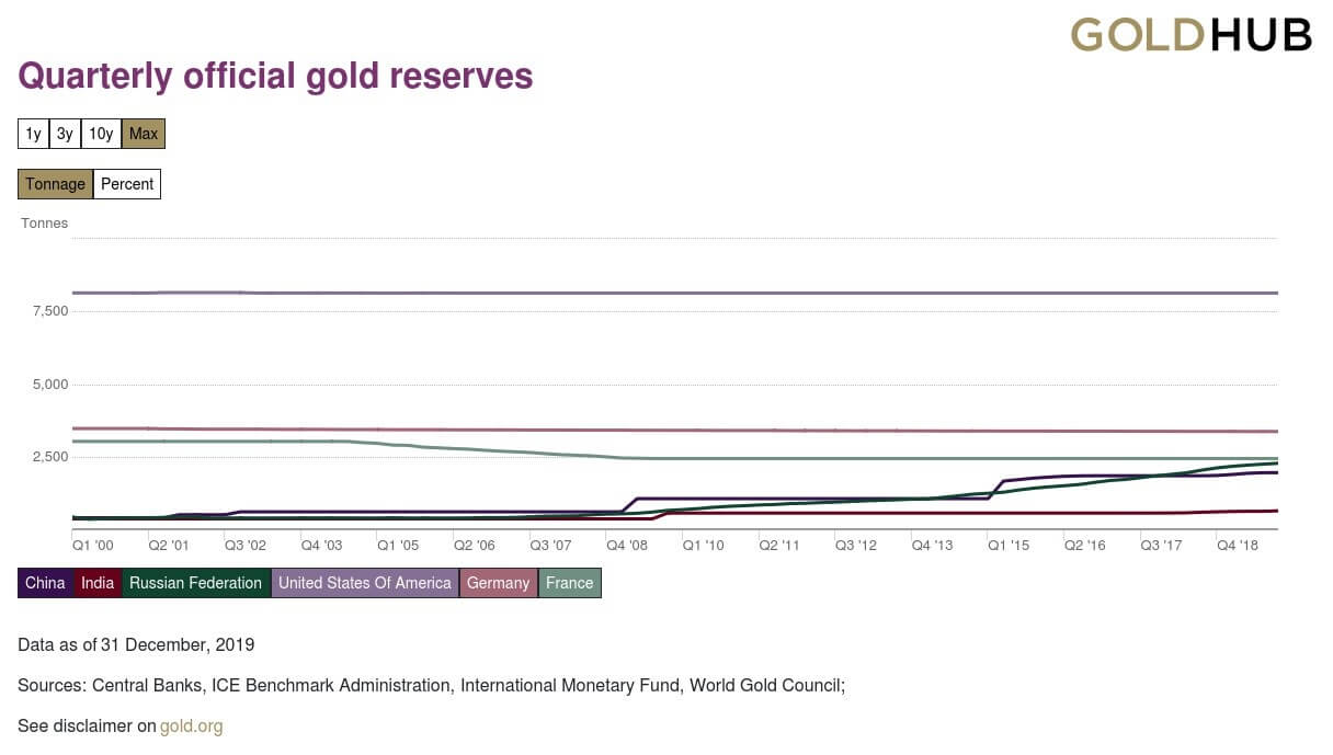
Understanding Germany Ifo Business Climate Index
The Ifo business climate index is used to rate the current business climate in Germany and also rates the expectations of businesses for the next six months. Thus, we can say that the Ifo Business Climate is a leading indicator of economic development in Germany.
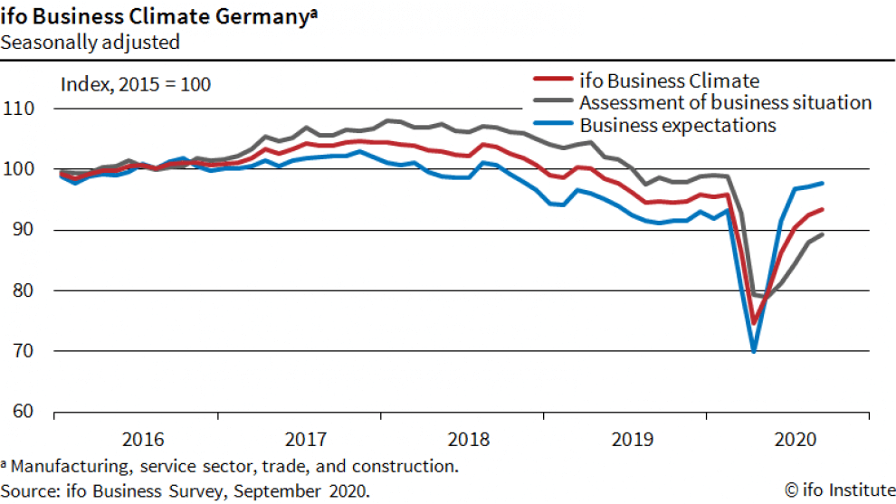
Source: Ifo Institute
Since Germany is the largest economy in the Euro area, this index plays a vital role in influencing the E.U’s overall economic activity.
Calculating the Germany Ifo Business Climate Index
The Ifo Institute for Economic Research conducts a monthly survey of about 9000 businesses operating in Germany. The businesses operate in the construction, wholesaling and retailing, manufacturing, and service sectors – i.e., the survey covers the entirety of the German economy.
In the survey, the respondents are required to give their assessments of the current business environment and what they expect over the coming six months. In their responses, they can say that the current business environment is “good,” “satisfactorily,” or “poor.” For their expectations, they can respond as either “more favorable,” “unchanged,” or “more unfavorable.”
The Ifo then weighs these responses. The weight attached is based on the importance of the industry’s contribution to the overall economy. Their importance is gauged by the percentage of employees they have and their contribution to the GDP.
The balance in the current business situation is determined by the difference between the percentage of “good” and “poor” responses. Similarly, the balance business expectations are the difference between the percentage of the “more favorable” and “more unfavorable” responses. The business climate is calculated by taking the average of the balances of the current business situation and the expectations.
The Ifo index is seasonally adjusted to ensure that some of the recurring patterns are eliminated from the time series. To seasonally adjust the data, the Ifo Institute employs the X-13ARIMA-SEATS procedure developed by the U.S. Census Bureau.
Using the Germany Ifo Business Climate Index in Analysis
There are several ways in which this index can be used to show how the German economy is progressing.
When the index increases over time, it shows that the businesses are more inclined to increase their capital expenditure and investments in various projects in the economy. In doing so, they effectively ensure that the economic output will increase, which leads to higher GDP. Similarly, an increase in investments into economic projects and capital expenditures leads to an increase in production activities, which leads to higher employment levels.
Therefore, we can say that when the Ifo business climate index increases, it is expected that the rate of unemployment will reduce. Conversely, the rate of unemployment should be expected to rise when the Ifo business climate index drops. This is because the drop in the index implies that businesses expect business conditions will be more favorable. They will be prompted to cut back on investments and scale down core operations to mitigate losses. The resultant effect is lower levels of GDP and a higher unemployment rate.
Over the long term, the Ifo business climate index may be used to show the trends in business cycles and even used to predict recessions and economic recoveries. One of the primary drivers of any business is profiteering, which comes from their products’ demand. When businesses anticipate the demand to fall, their expectations are “more unfavorable.”
We know that the aggregate demand depends on the households’ demand. Therefore, when the demand is expected to fall, households are expected to have lesser disposable income, which could result from low wages and prevalent job losses; these are characteristics of a contraction. Therefore, when the Ifo business climate is continuously dropping, we can expect that the economy might go through bouts of recession.
On the other hand, if the Ifo business climate is steadily rising, it shows that the economy will undergo a steady period of expansion. This expansion comes from the fact that businesses will expect the demand for their goods and services to increase. This instance implies that households have more disposable income, which means wages have increased or employment increased.
Furthermore, when the economy has been through depression or recession, an improvement in the Ifo business climate index shows that the future is “more favorable.” It means that businesses do not expect the ongoing stage of recessions or depression to persist into the future. These expectations imply that businesses expect to increase their investments, a clear sign of economic recoveries.
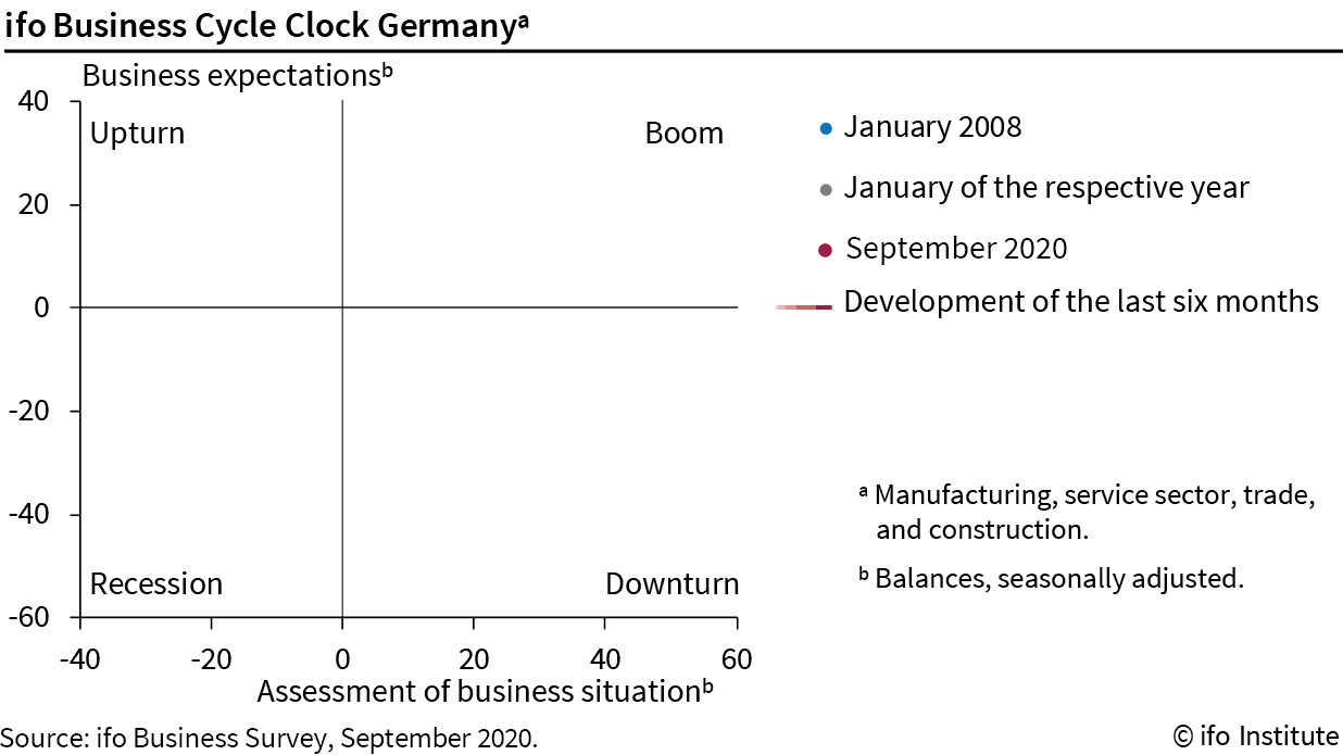
Source: Ifo Institute
Impact of Germany Ifo Business Climate Index on the Euro
Germany is the largest economy in the E.U.; therefore, its economic outlook is bound to significantly impact the Euro since the EUR fluctuates depending on the economic performance of its member countries.
When the Germany Ifo Business Climate Index rises, it means that the German economy is expected to grow. Furthermore, the benefits of the resultant expansion of business operations in Germany might spill over to other countries in the E.U. in terms of job creation. As a result, the EUR will appreciate relative to other currencies.
Conversely, the EUR is expected to depreciate relative to other currencies when the Germany Ifo Business Climate Index continually drops. This drop signifies a potential contraction of the German economy, which may affect other EU-member countries.
Sources of Data
The Ifo Institute for Economic Research is responsible for conducting the surveys, aggregating data, and publishing the Germany Ifo Business Climate Index. Trading Economics has a historical time-series data of the Germany Ifo Business Climate Index.
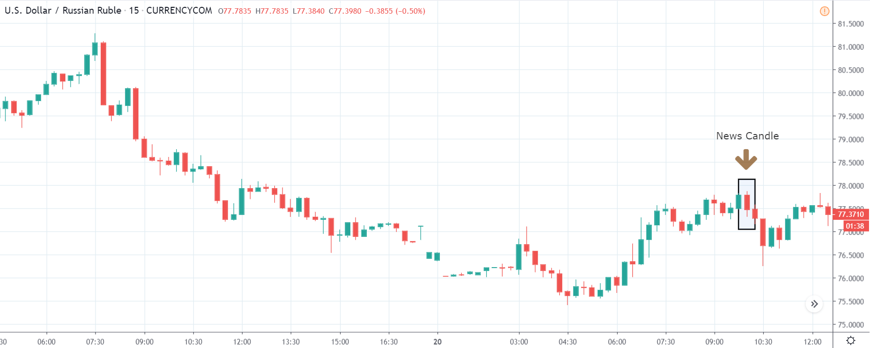
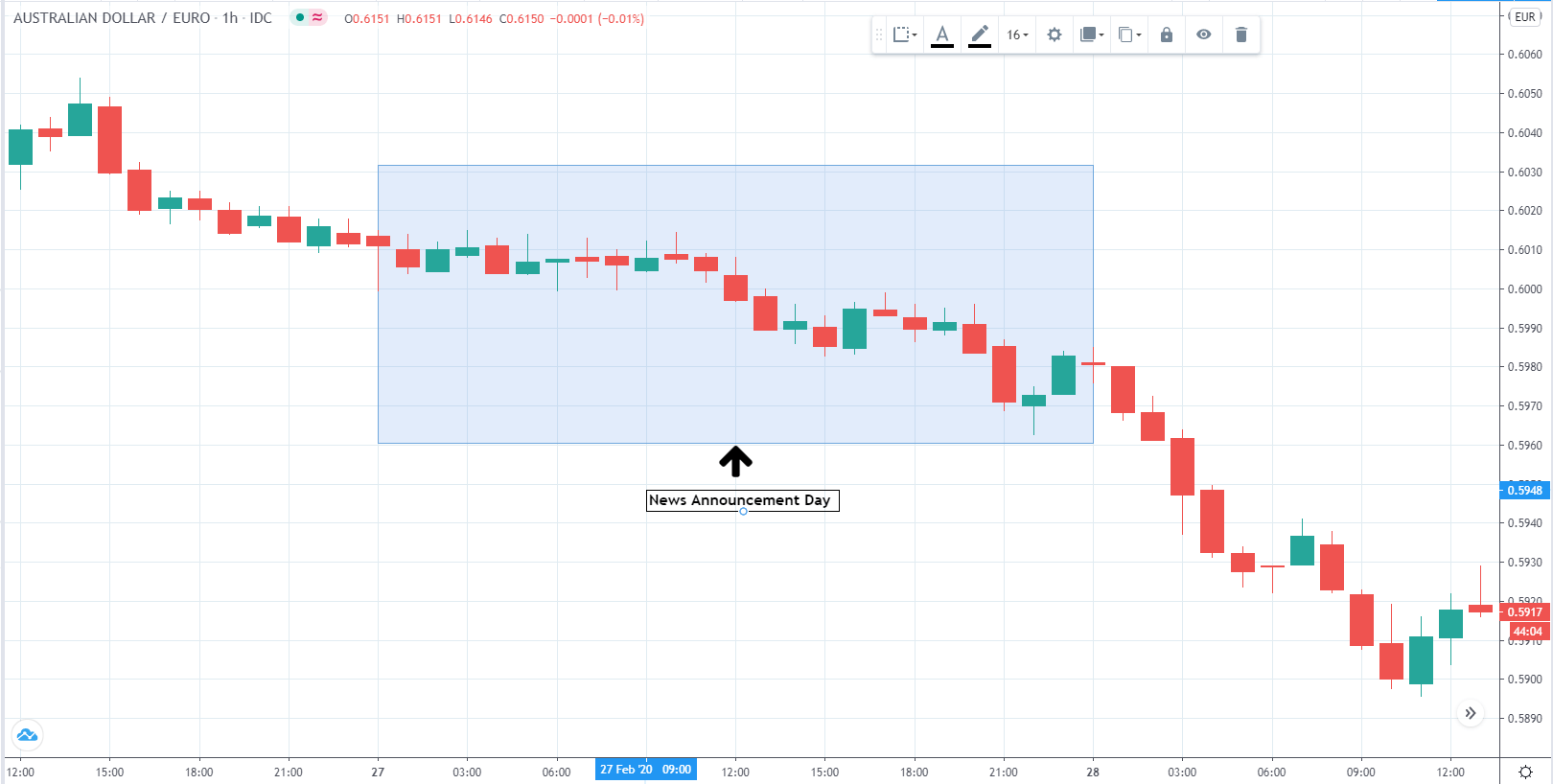
How Germany Ifo Business Climate Index Release Affects The Forex Price Charts
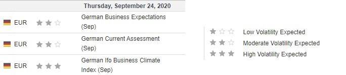
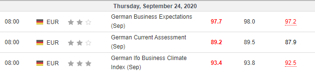
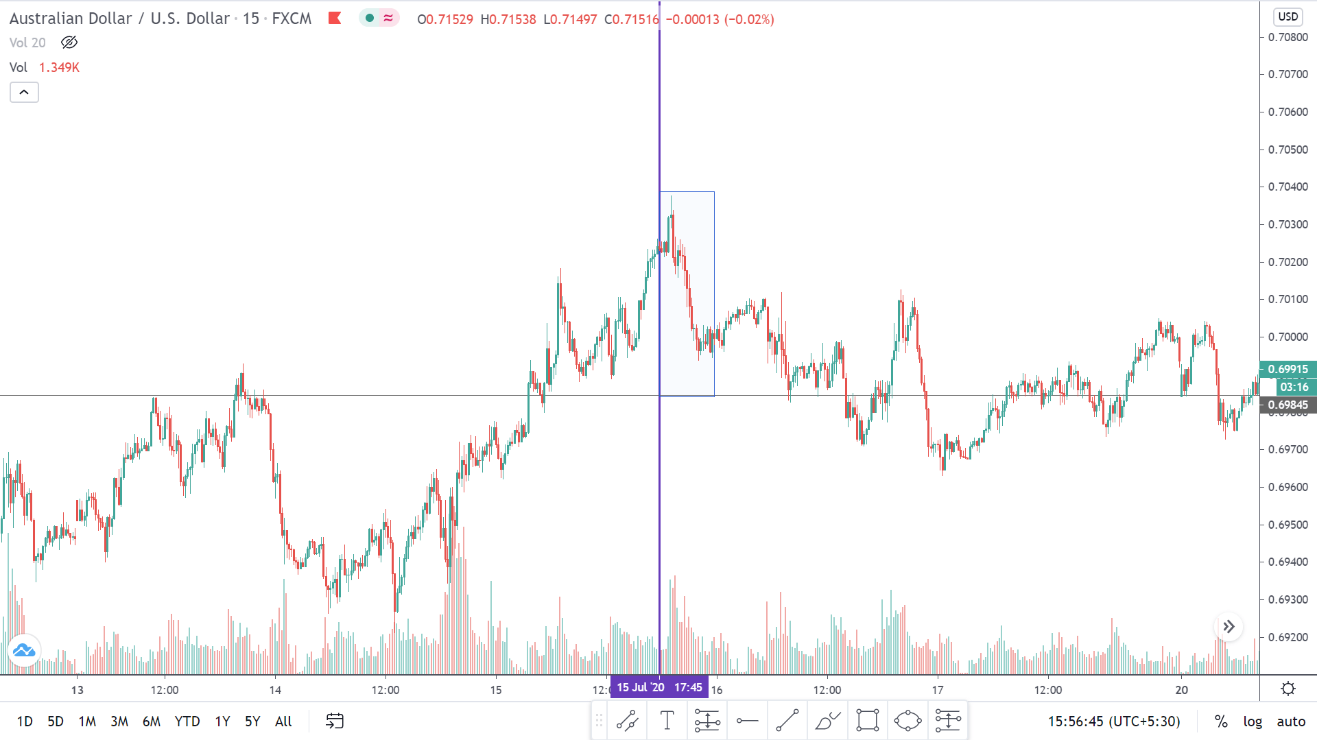
The Ifo Institute for Economic Research published the latest business climate index on September 24, 2020, at 8.00 AM GMT. The release can be accessed at Investing.com. From the screengrab below, we can see that the German Ifo business climate index is a high-impact indicator.
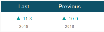
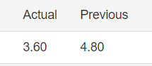
In September 2020, the German Ifo business climate index was 93.4, lower than the analysts’ expectation of 93.8.
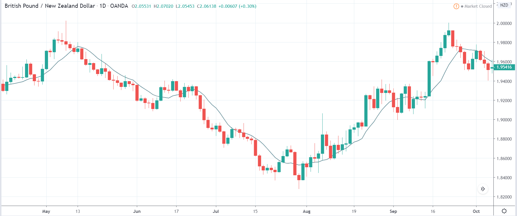
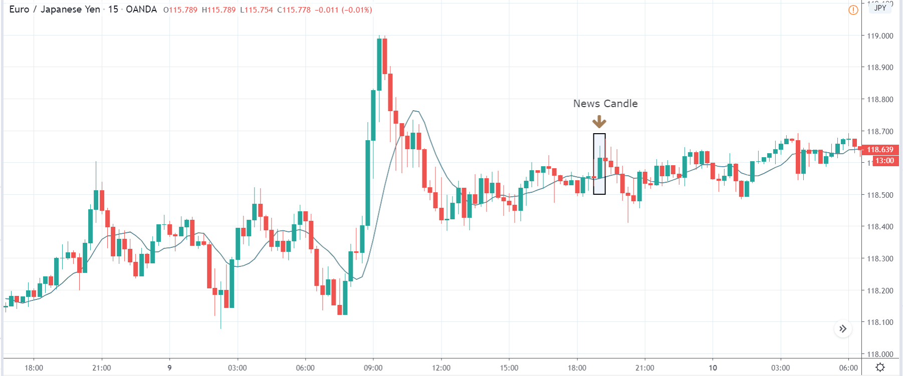
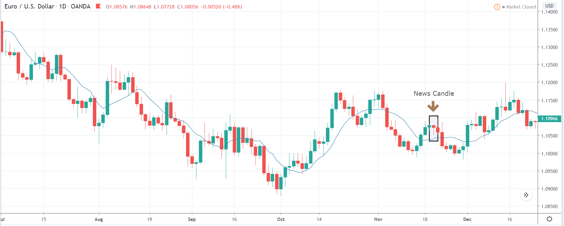
Let’s see how this lower than expected release impacted the EUR/GBP price action.
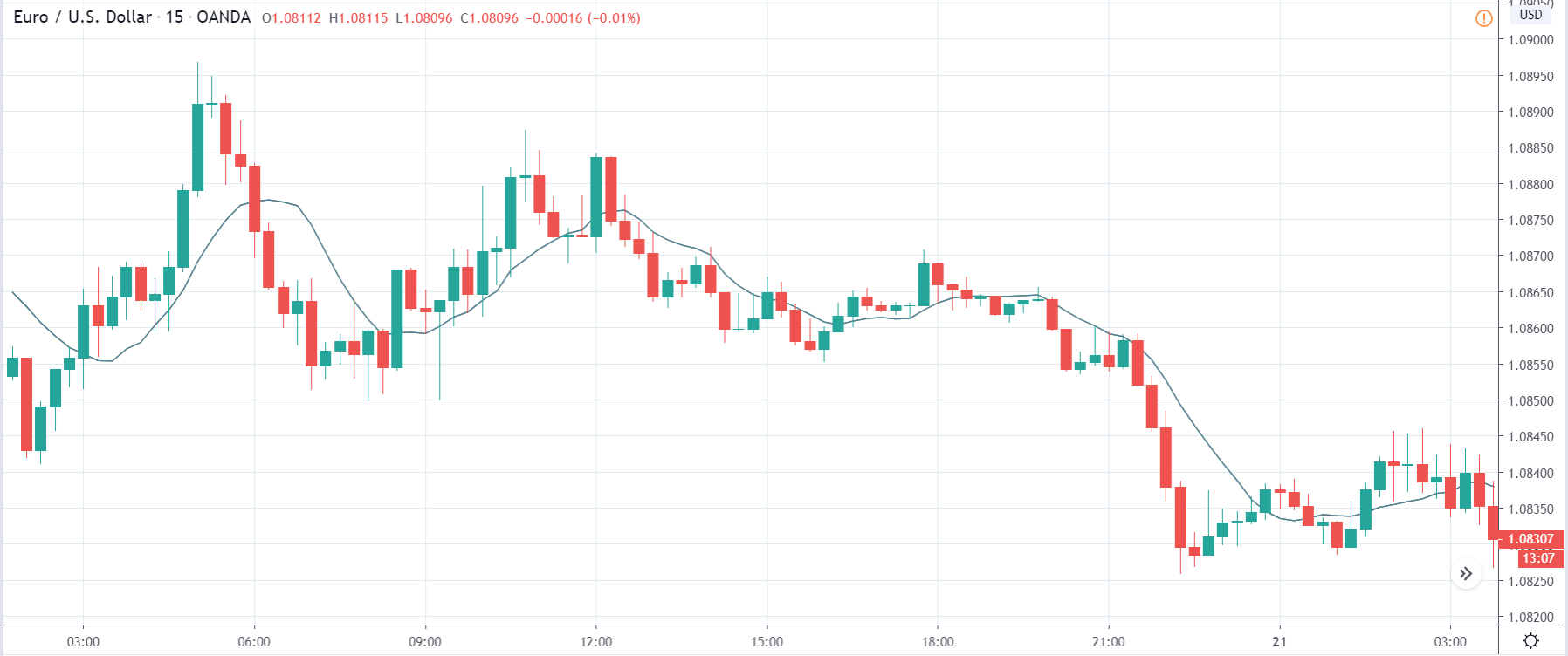
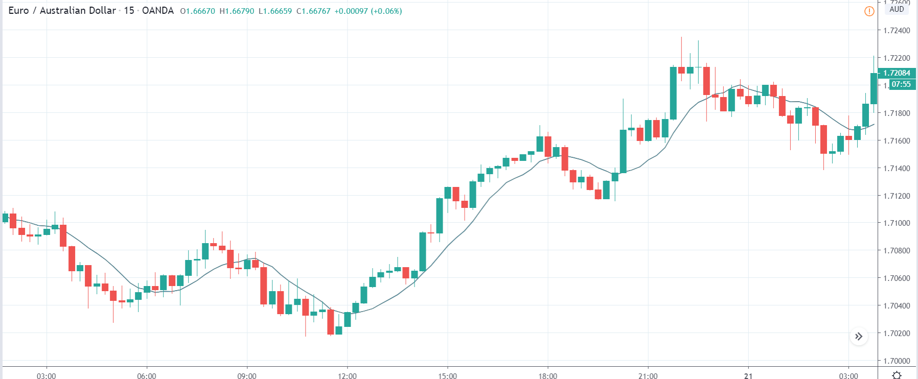
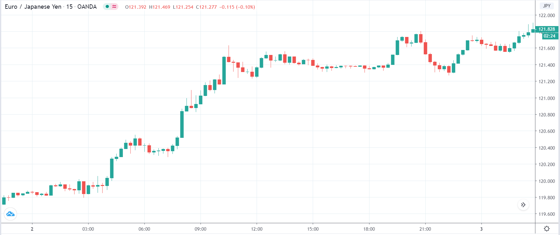
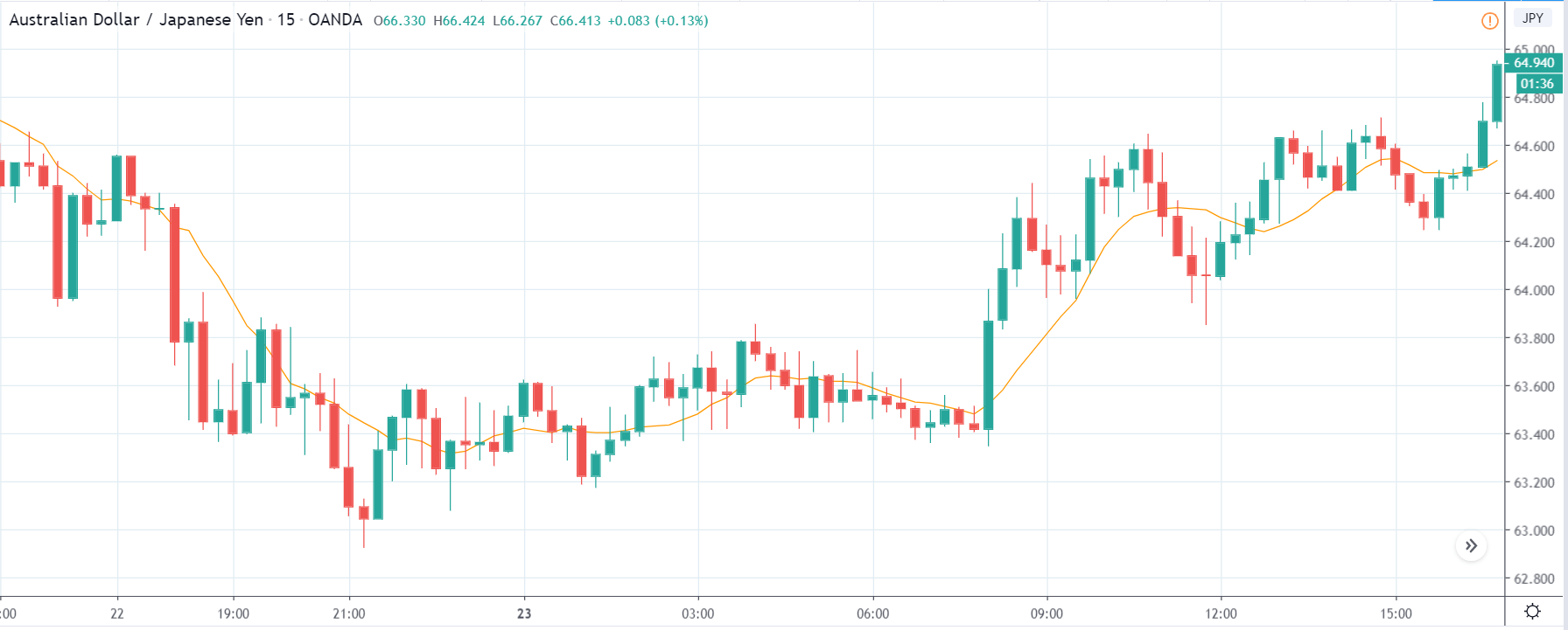
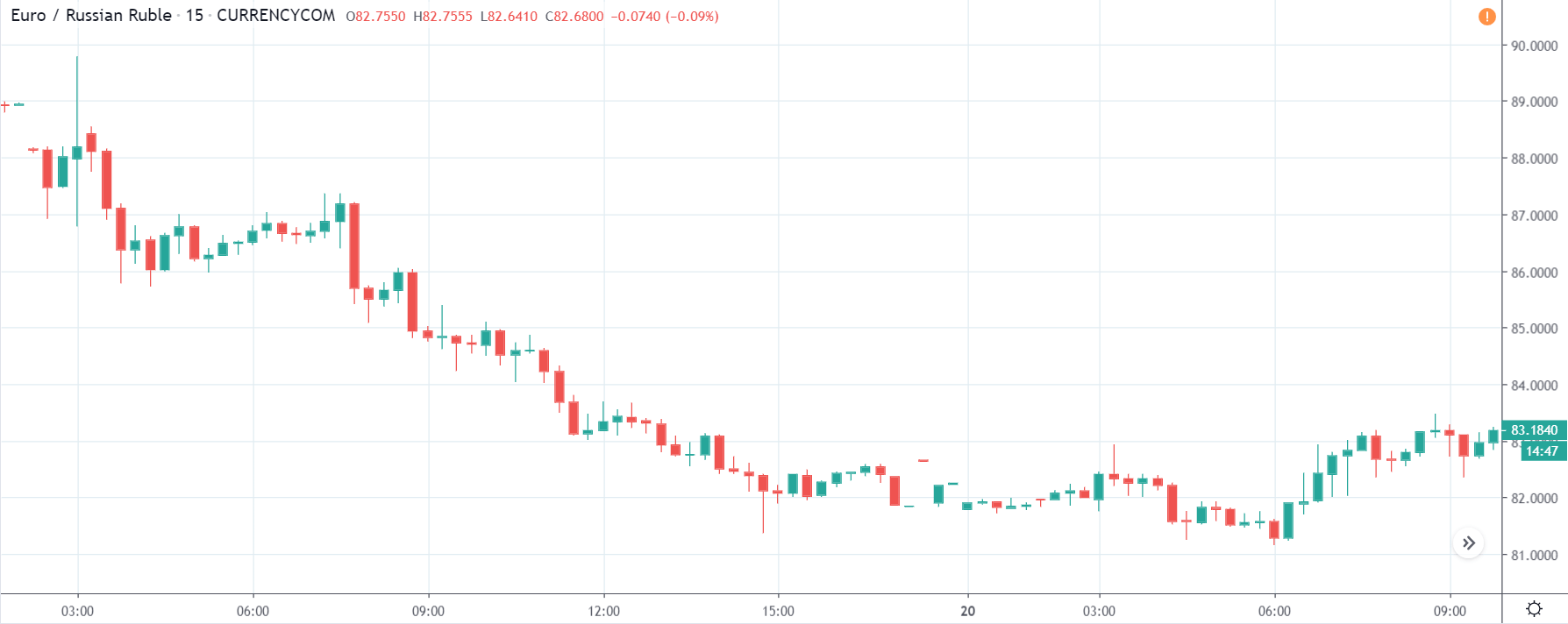
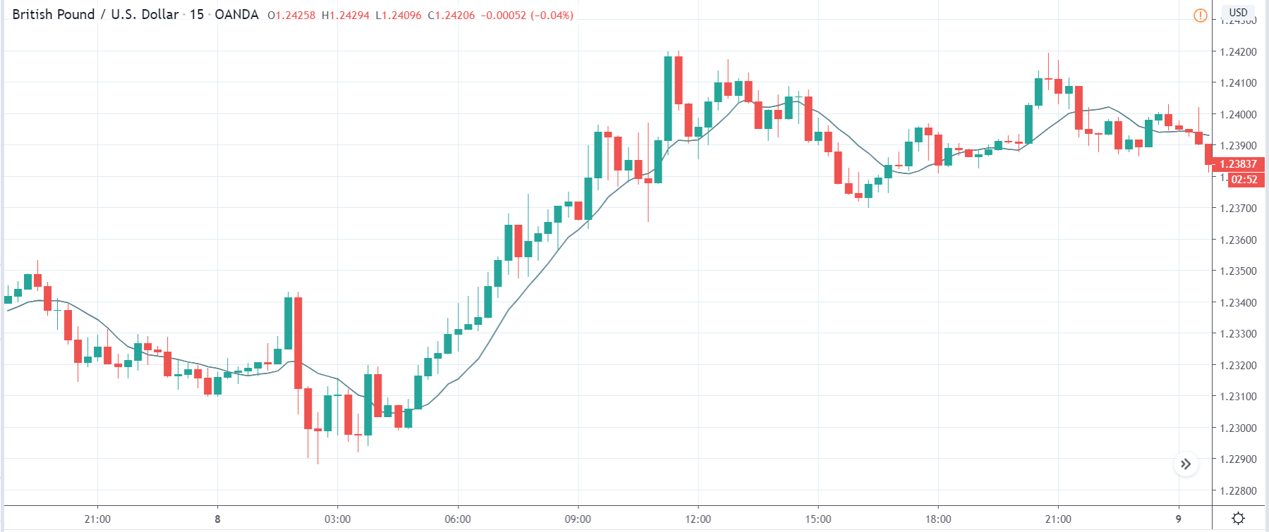
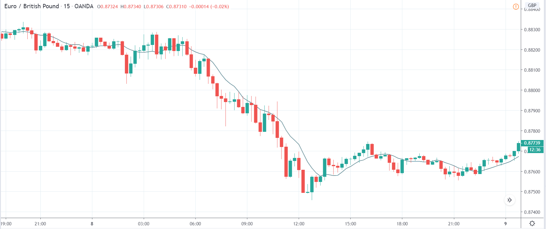
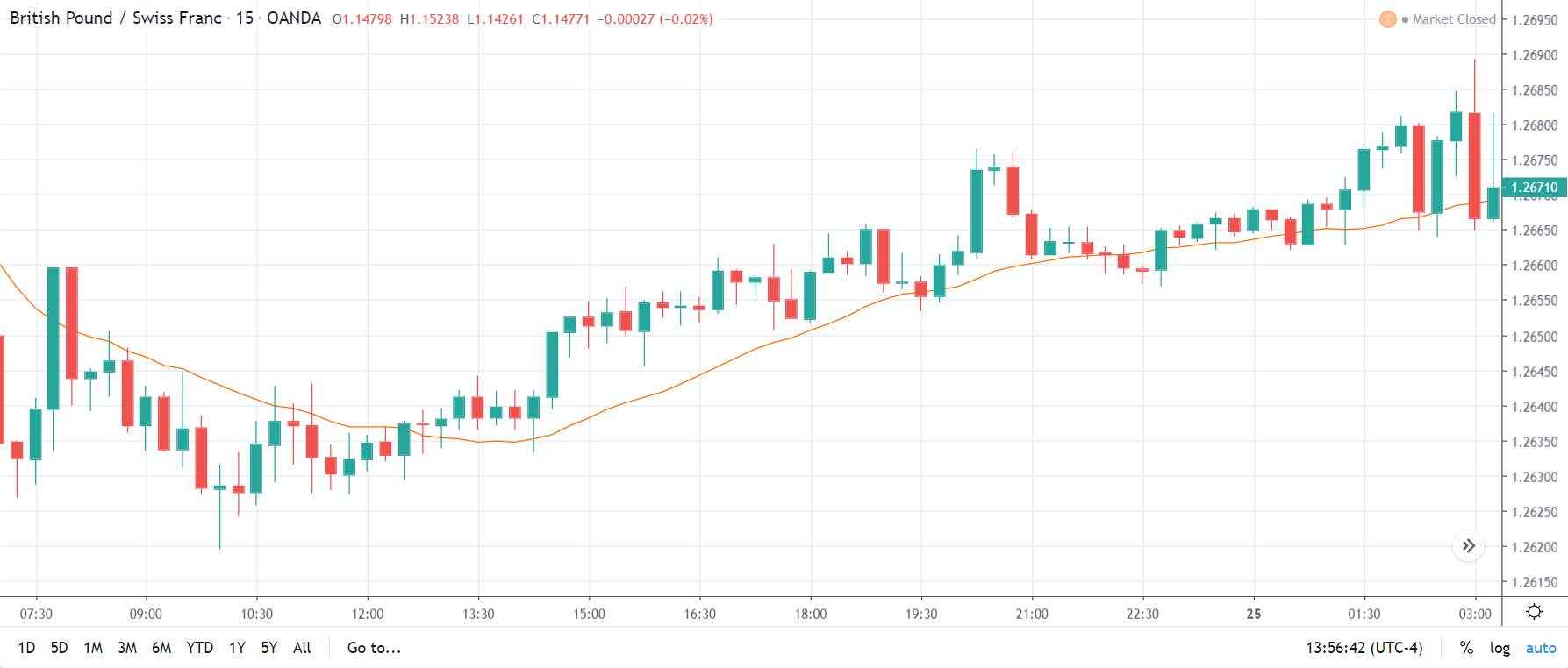
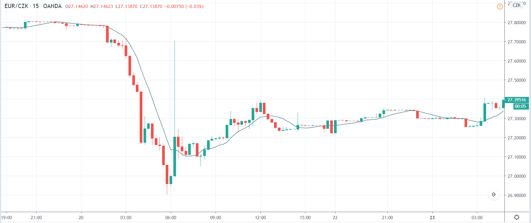
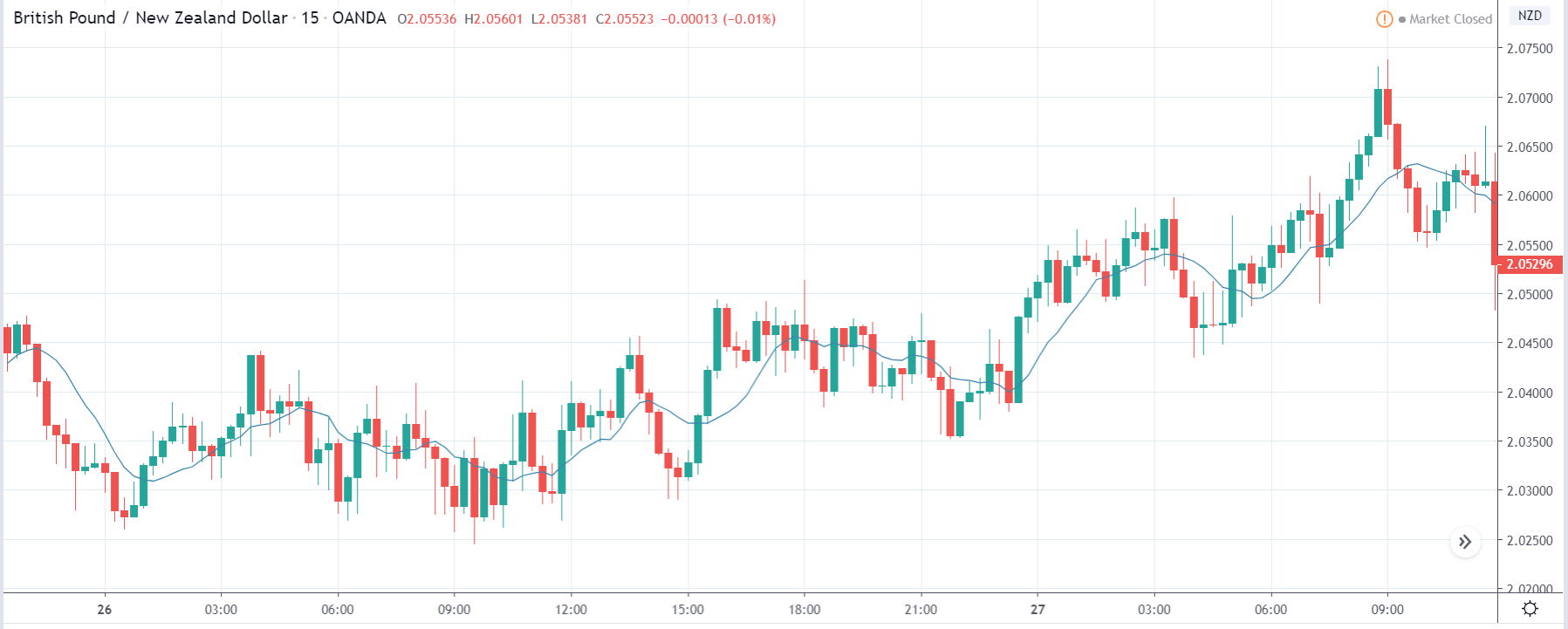
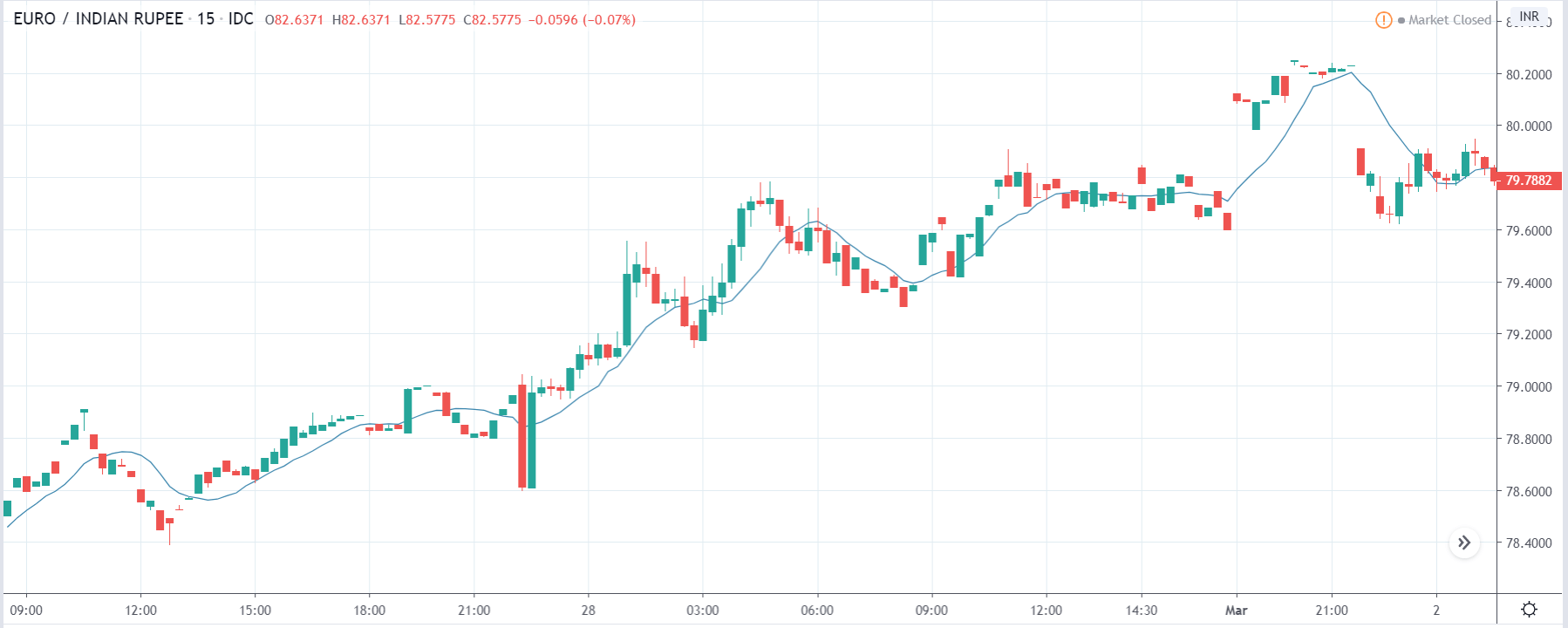
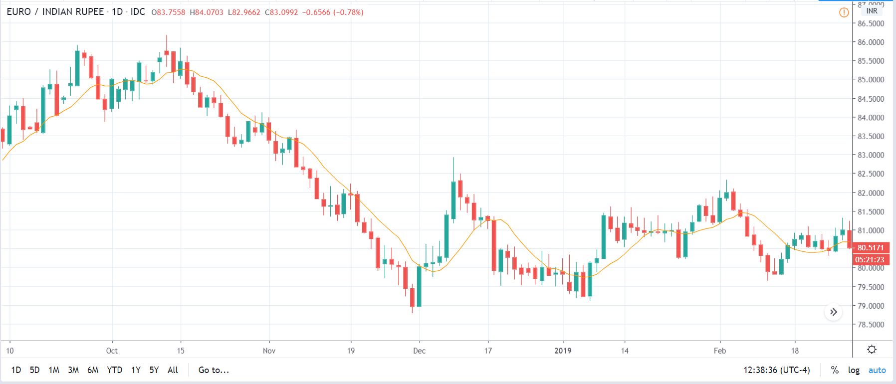
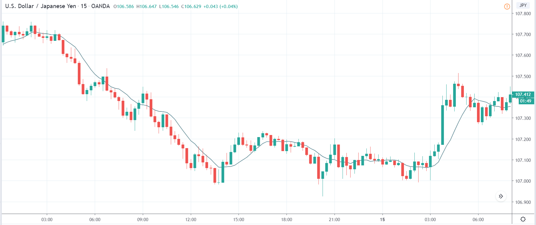
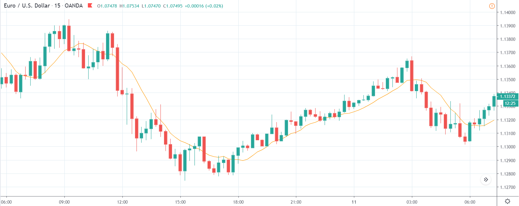
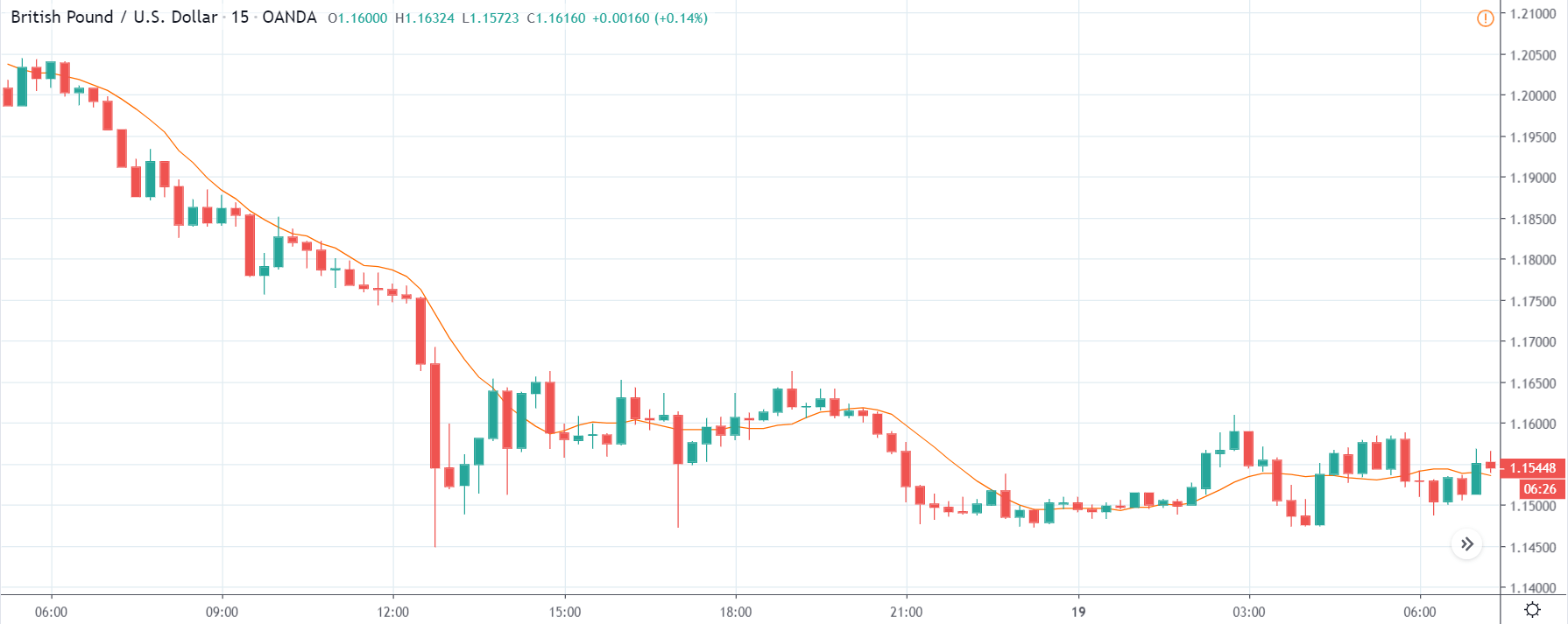
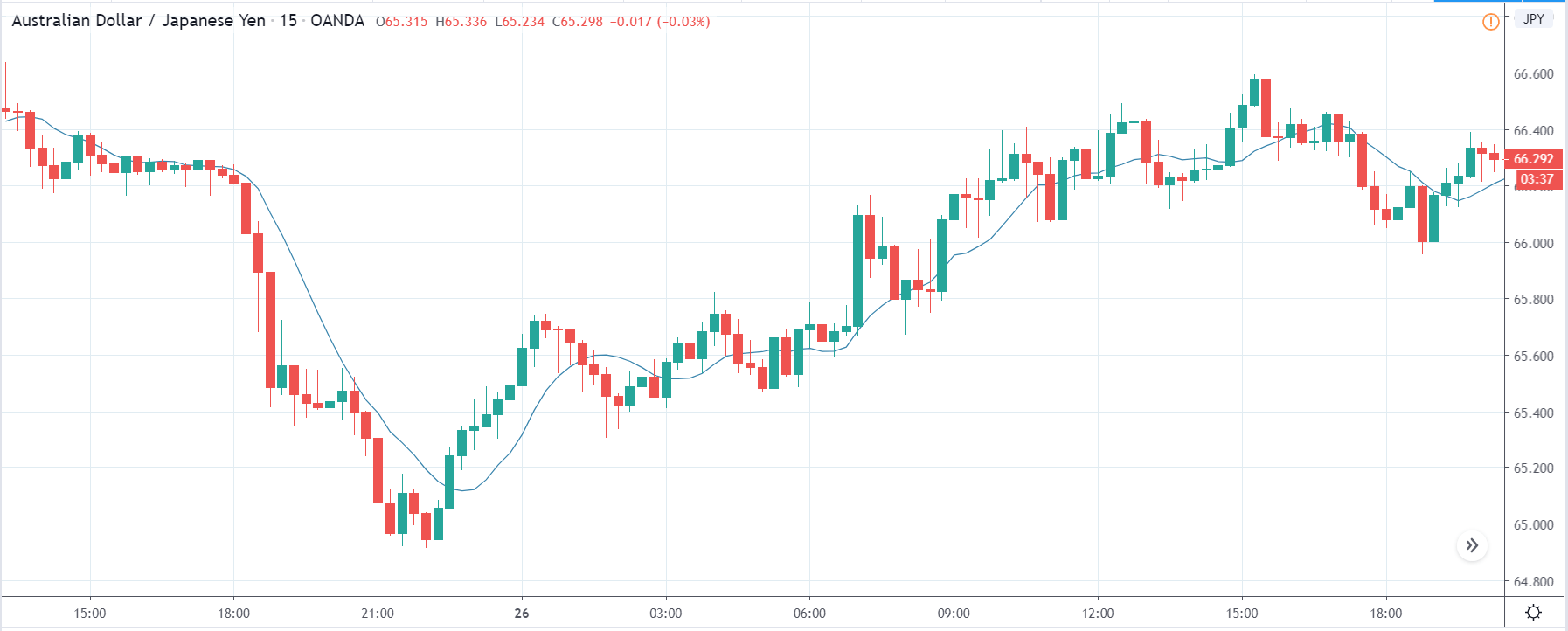
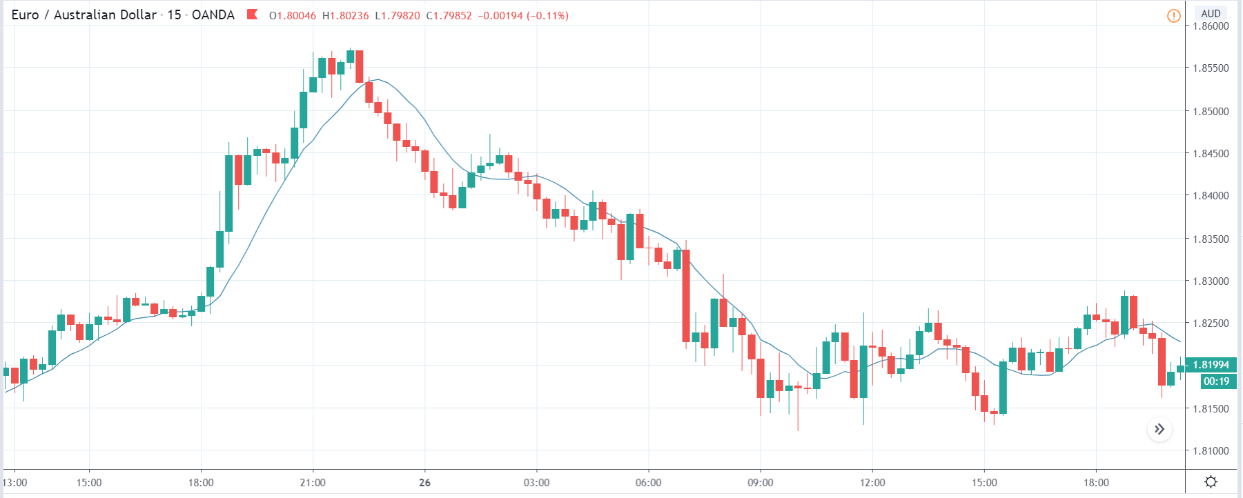
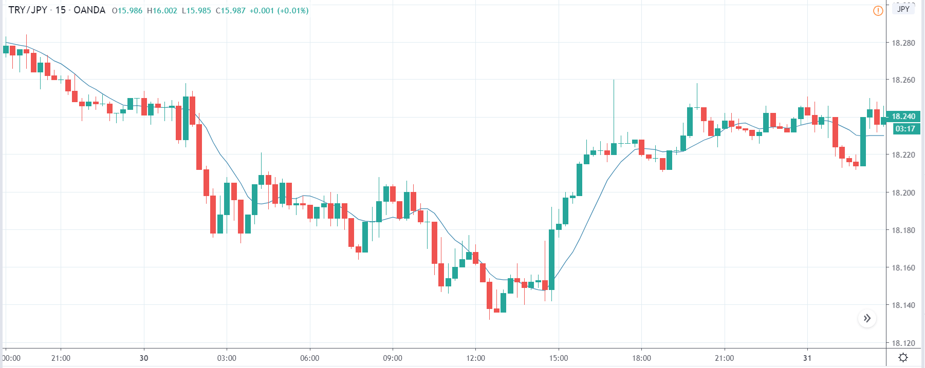
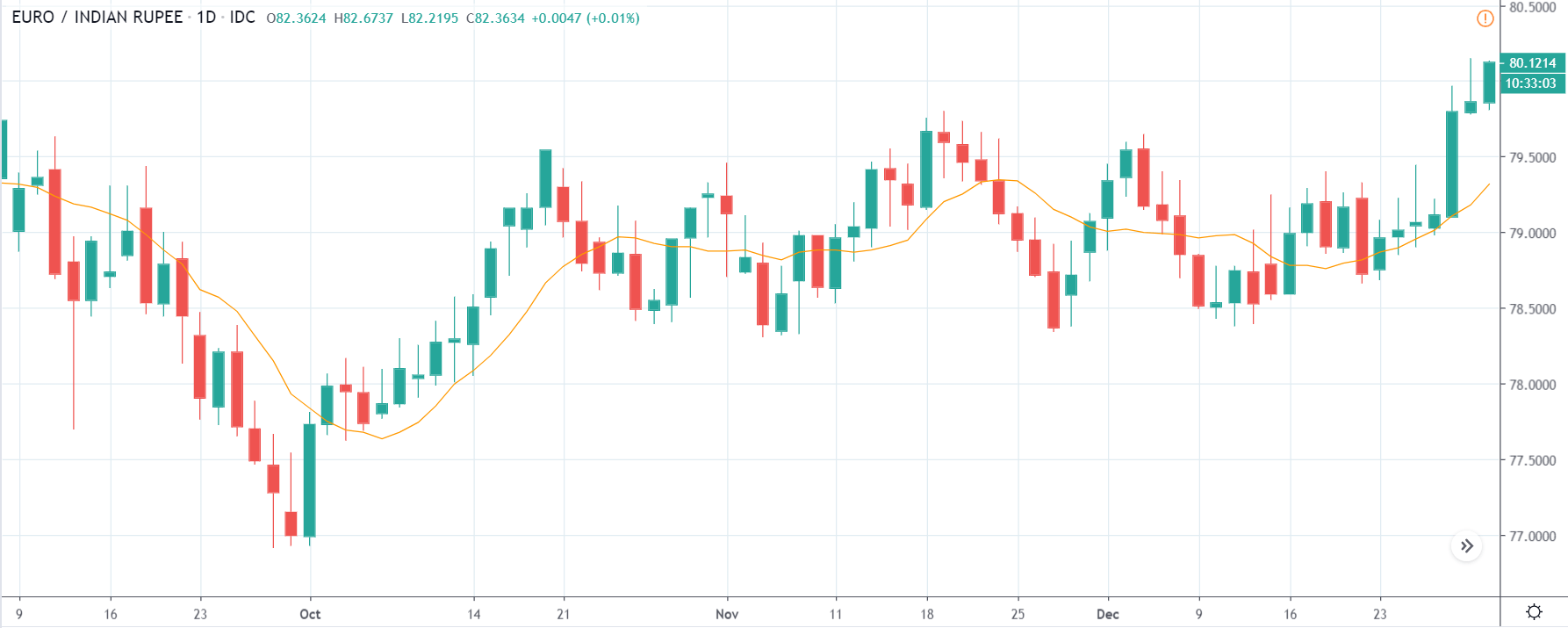
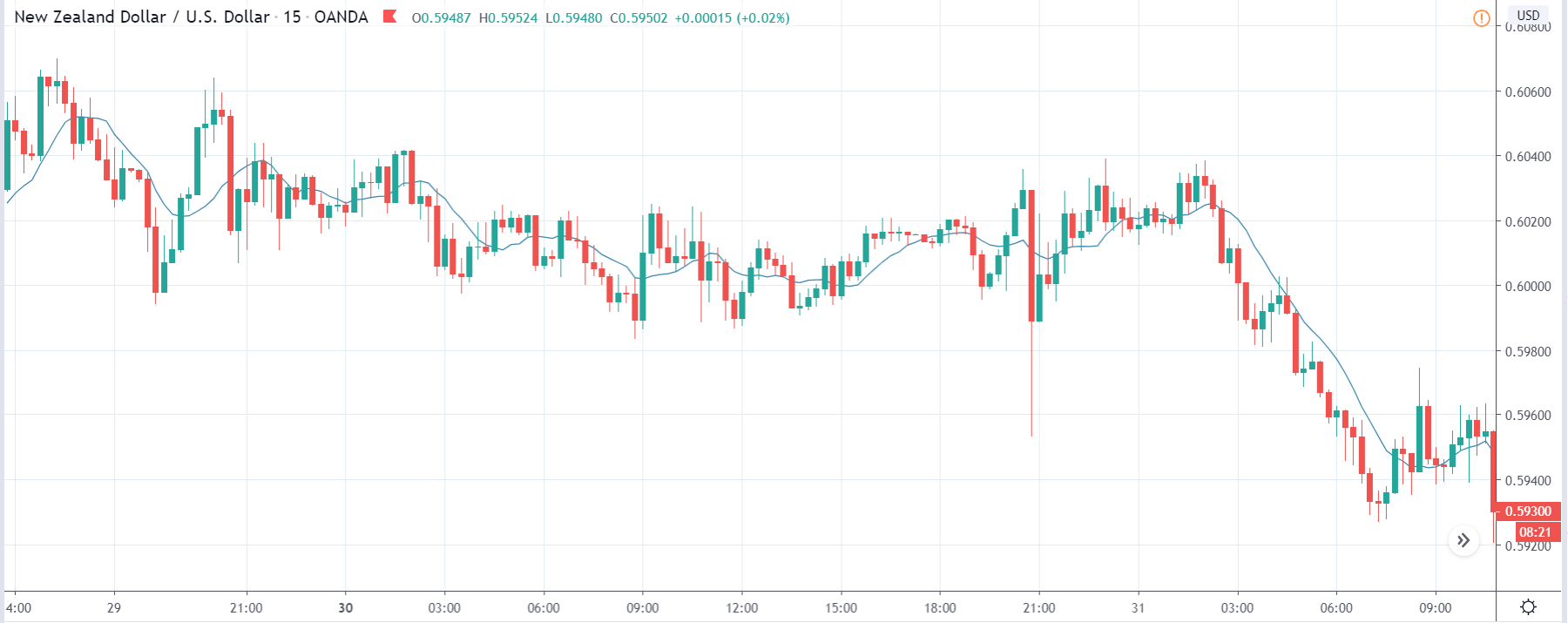
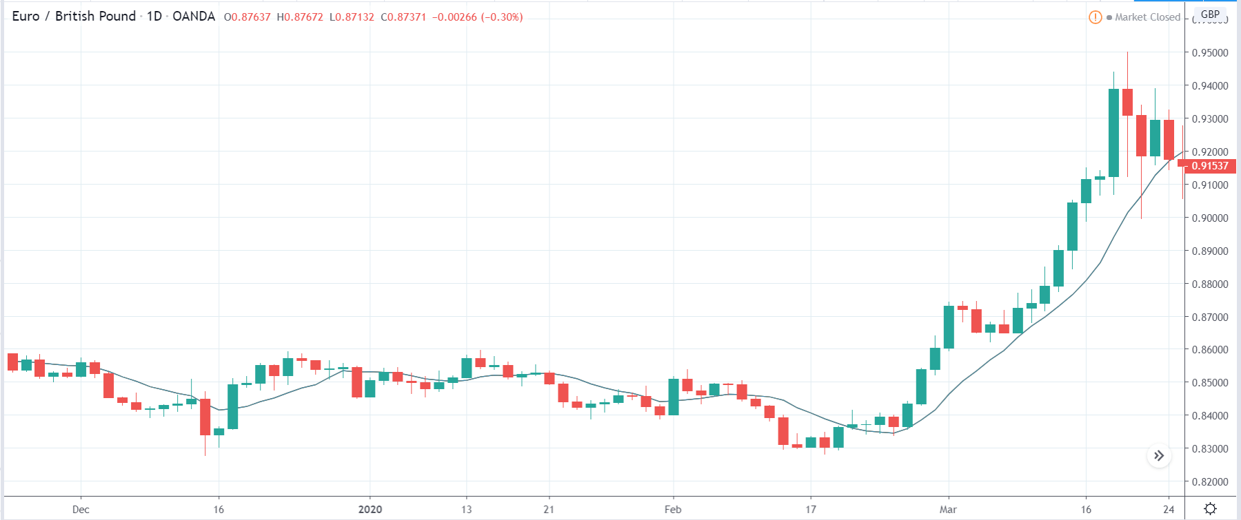
EUR/GBP: Before Germany Ifo Business Climate Index Release on
September 24, 2020, just before 8.00 AM GMT
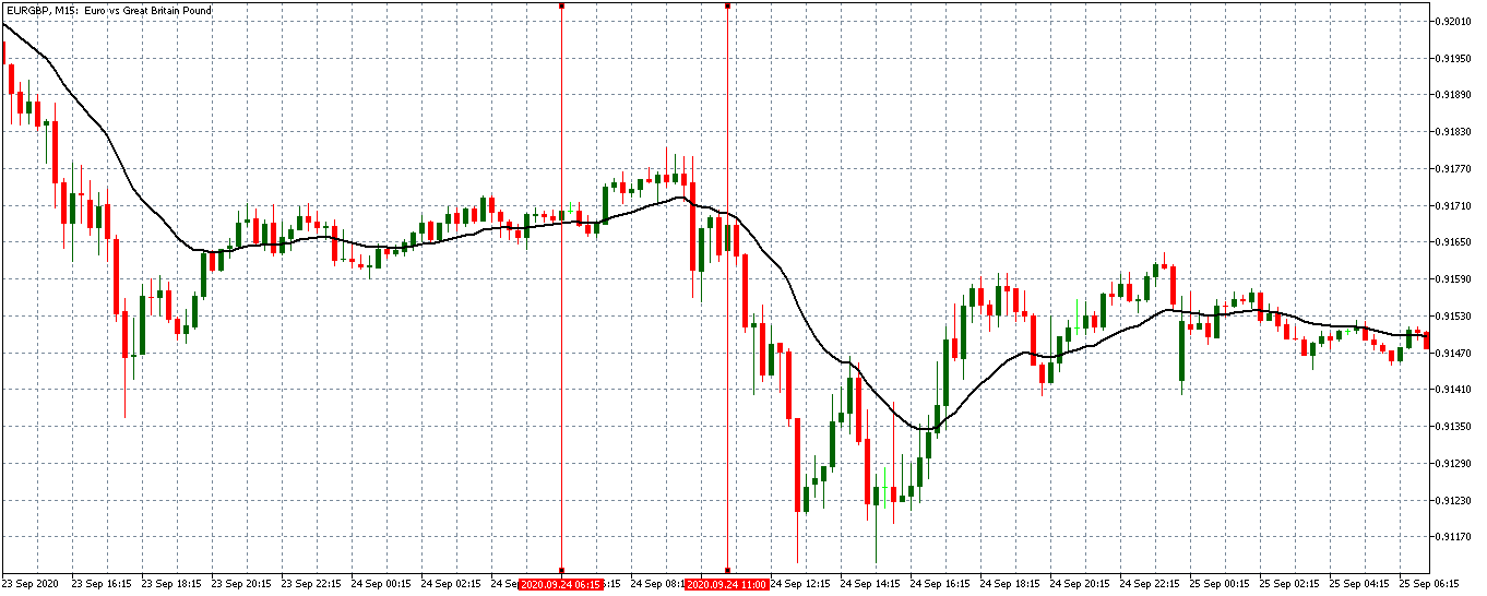
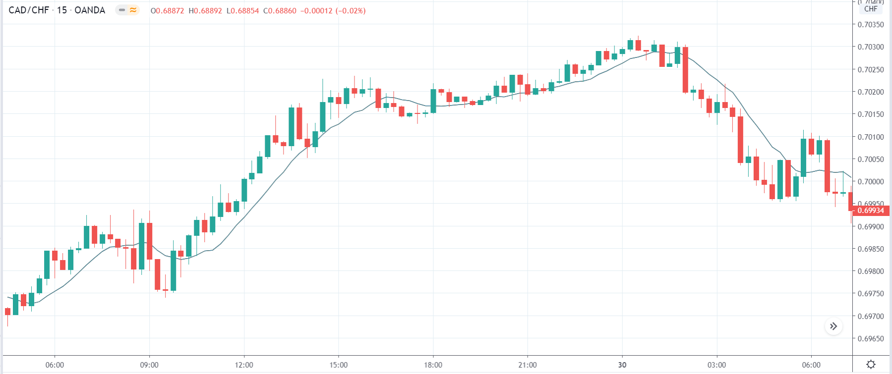
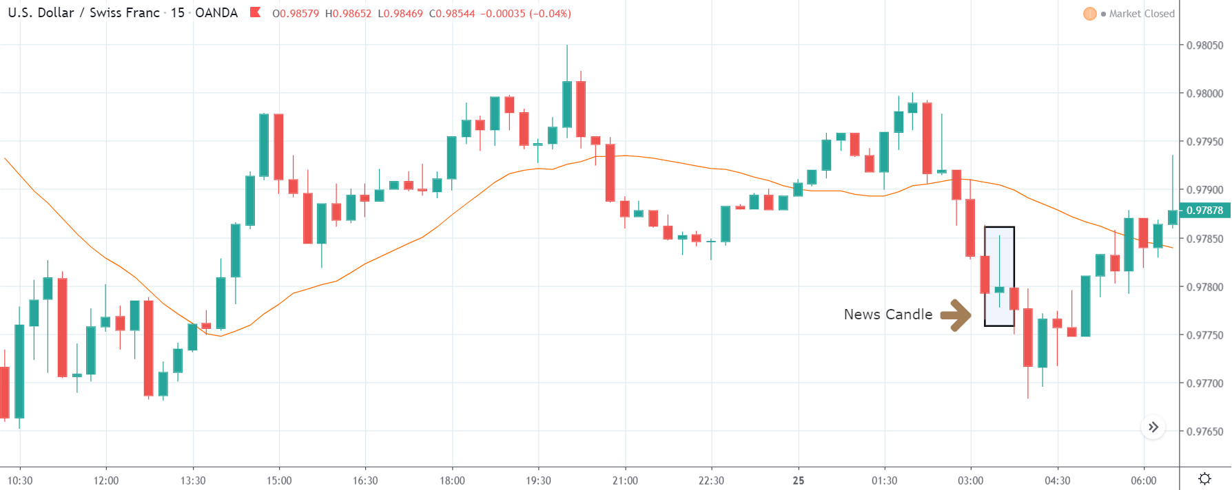
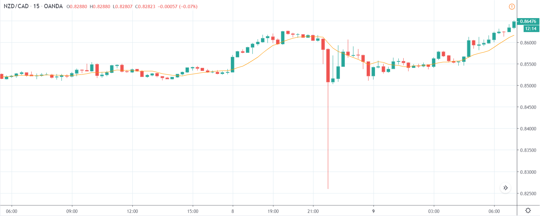
Before the release of the index, the EURGBP pair was trading in a weak uptrend. The 20-period M.A. was almost flattening. They adopted a weak downtrend moment before the release.
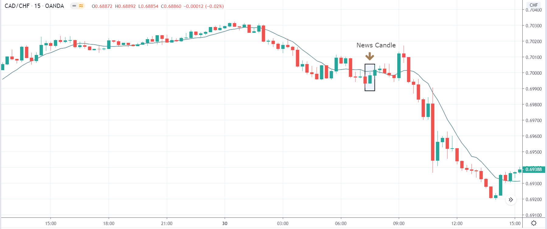
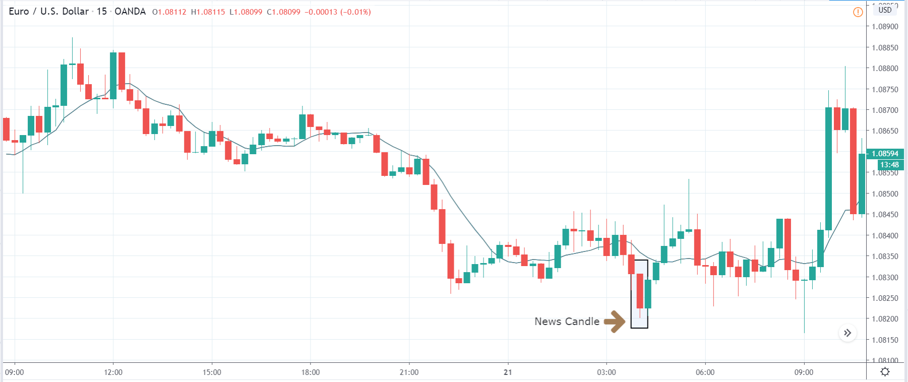
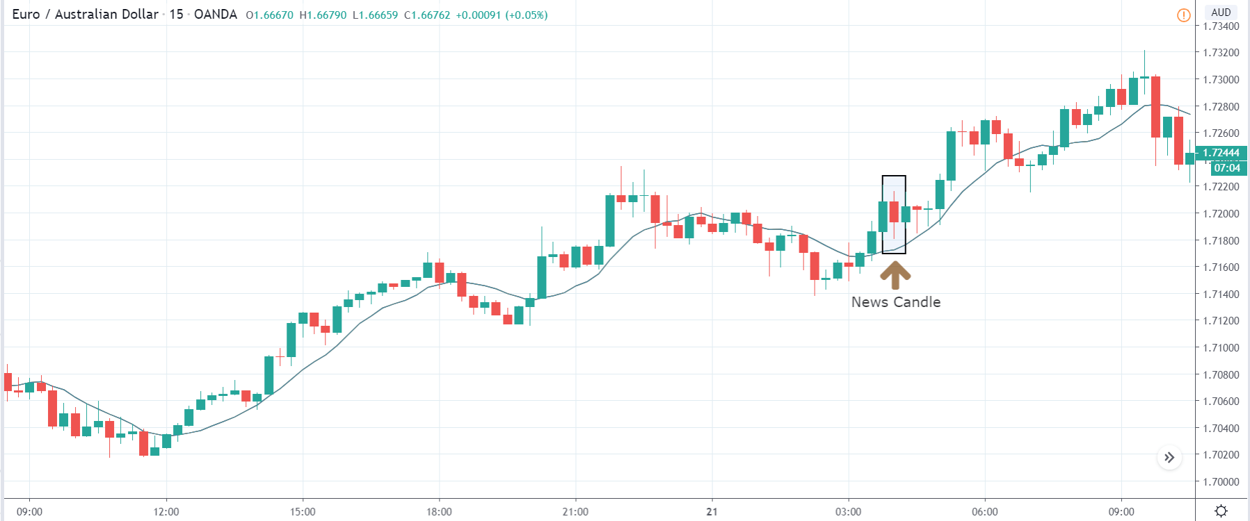
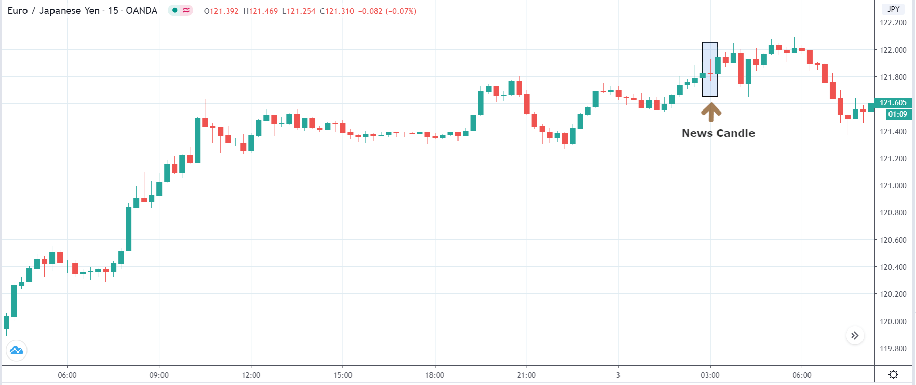
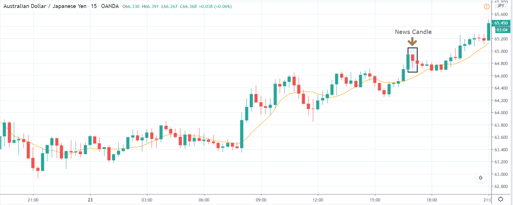
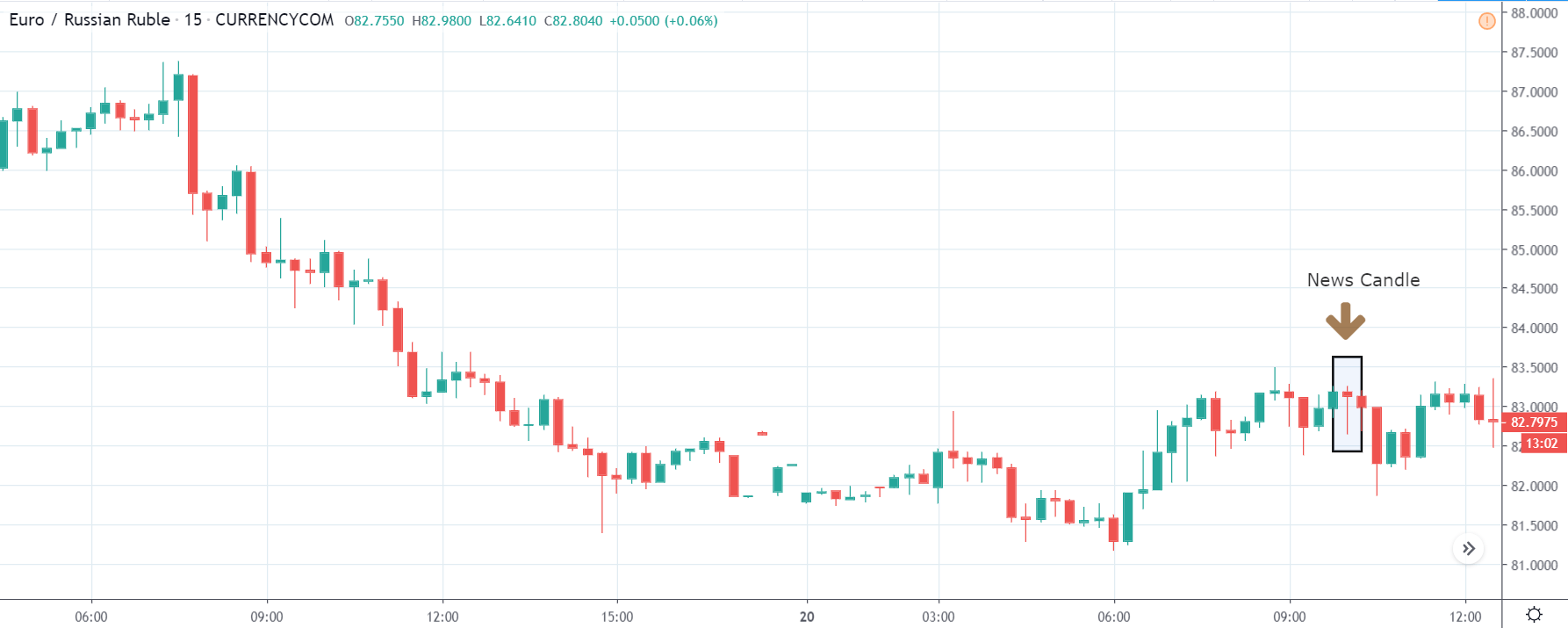
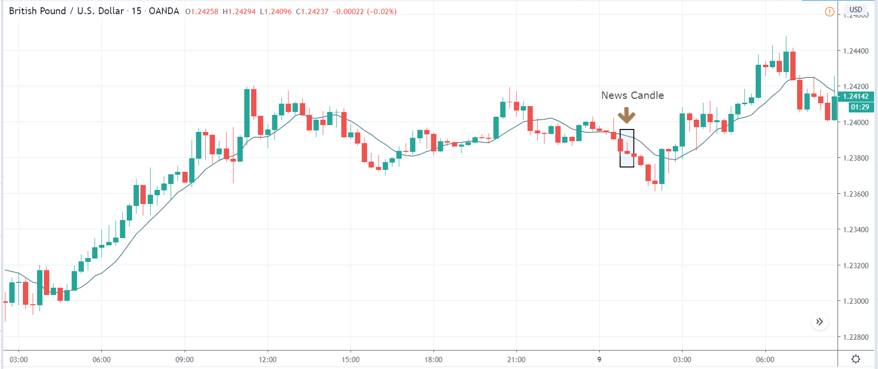
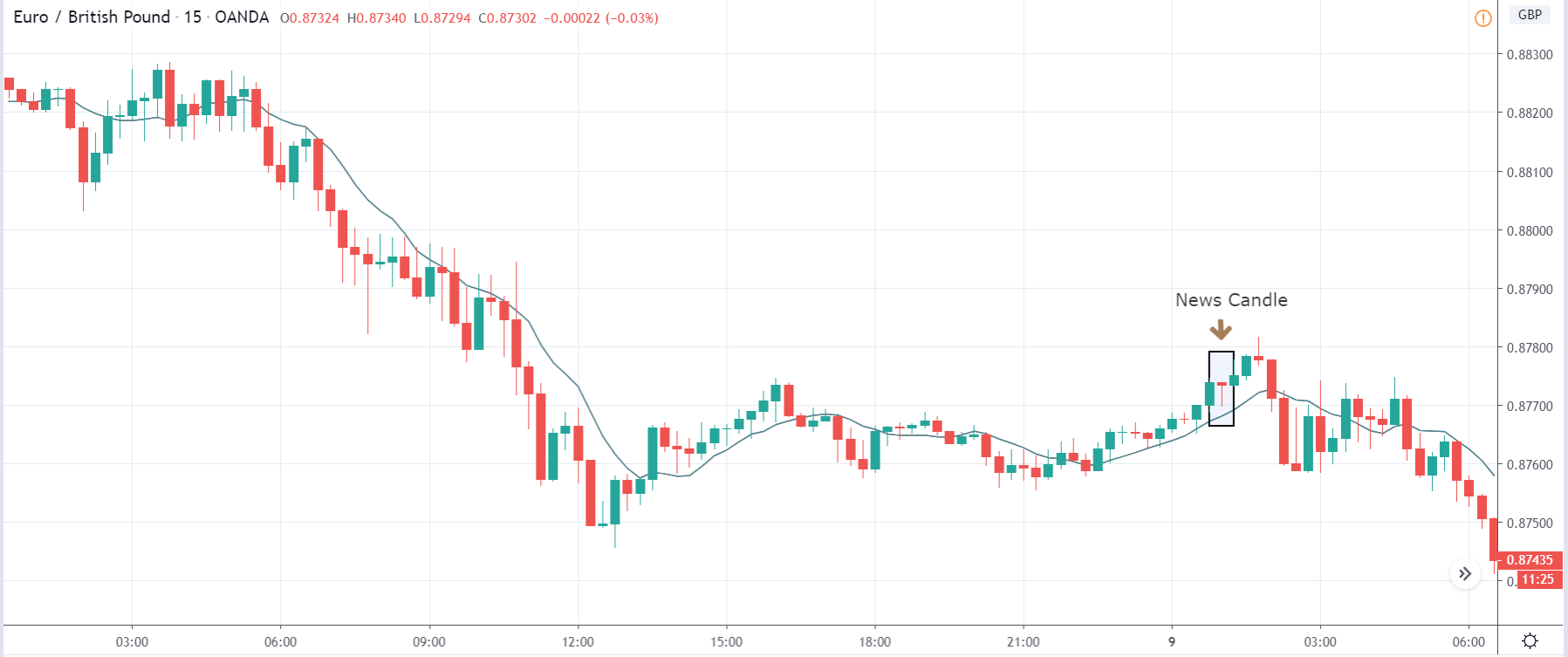
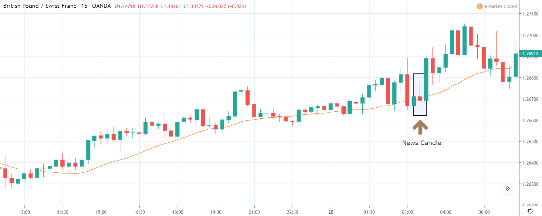
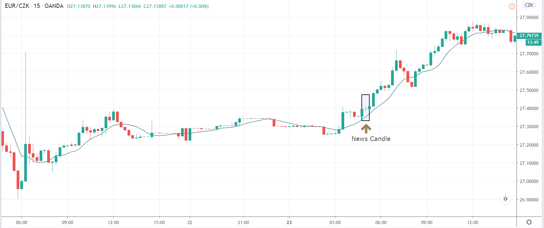
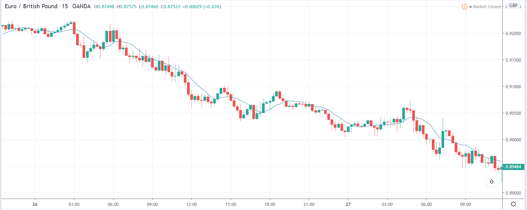
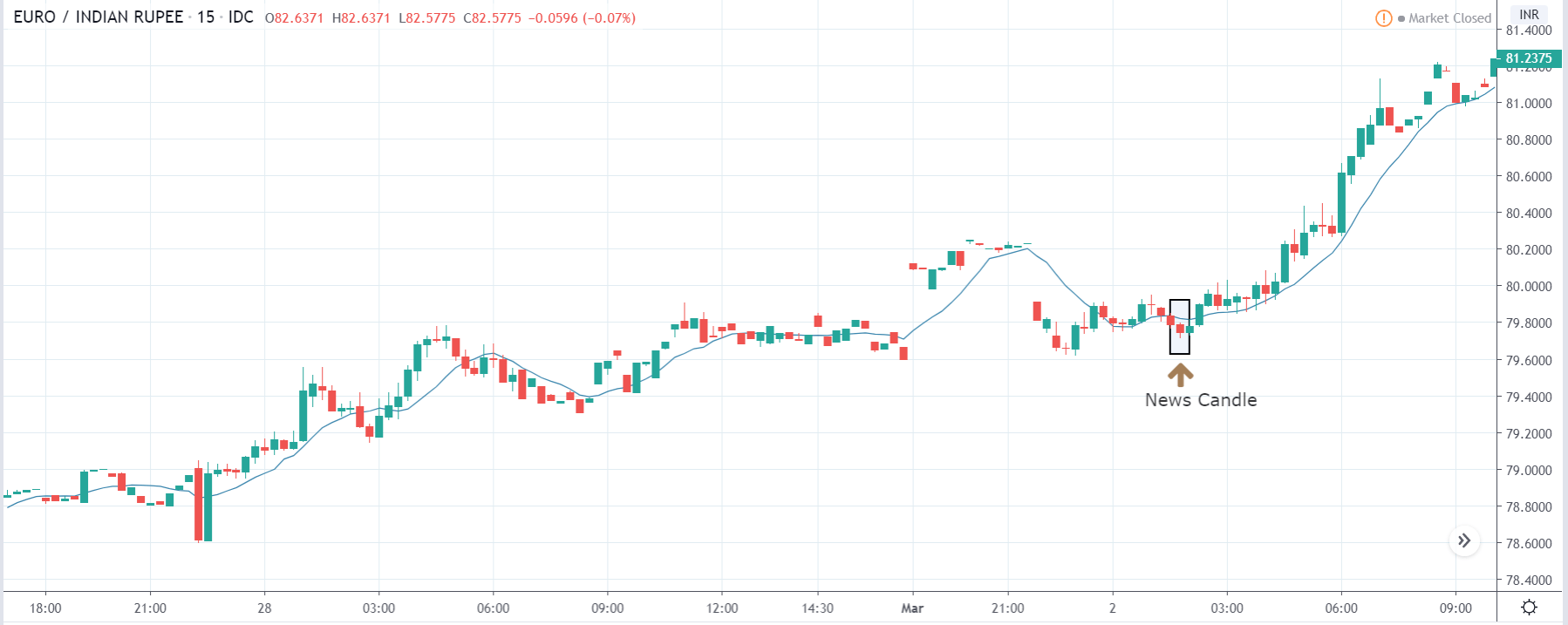
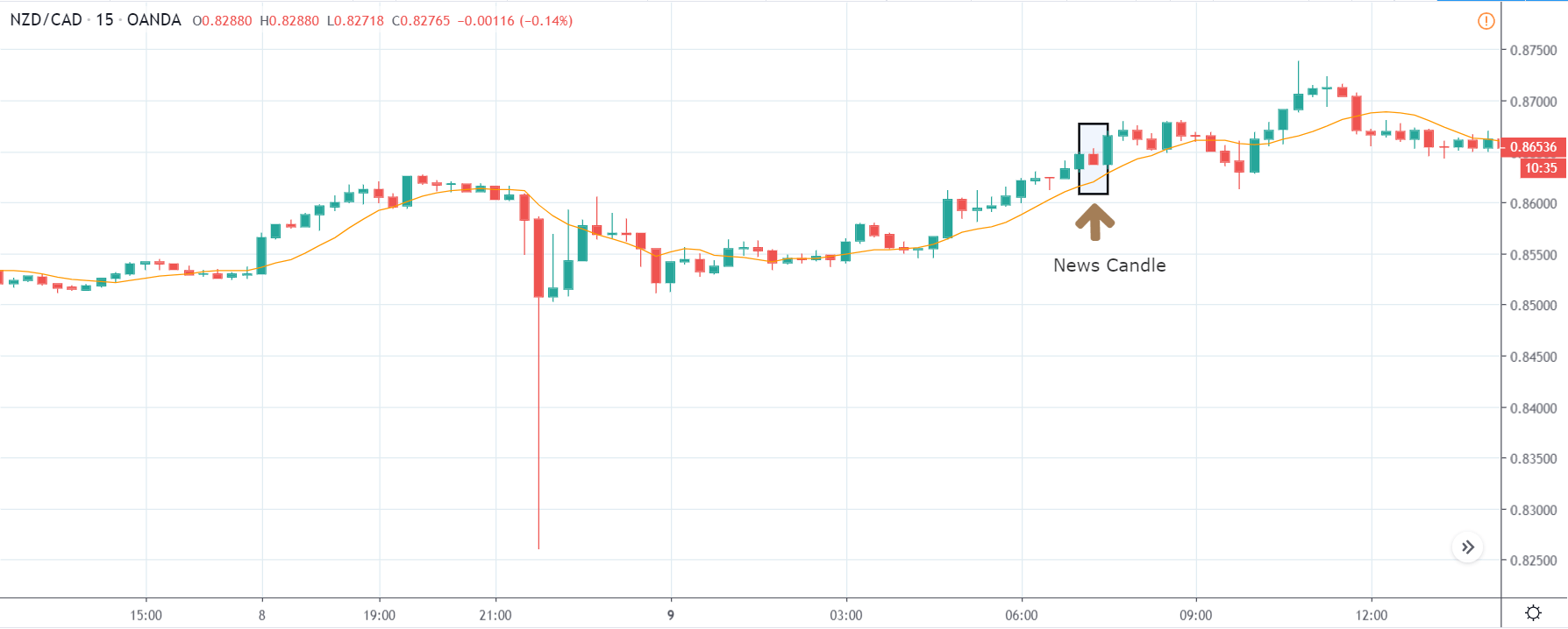
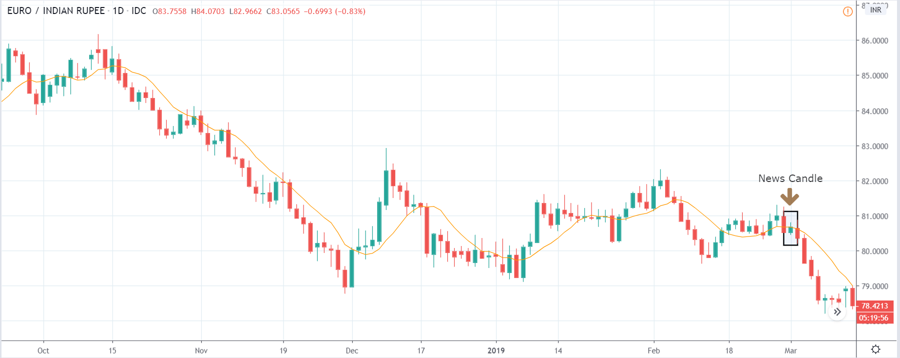
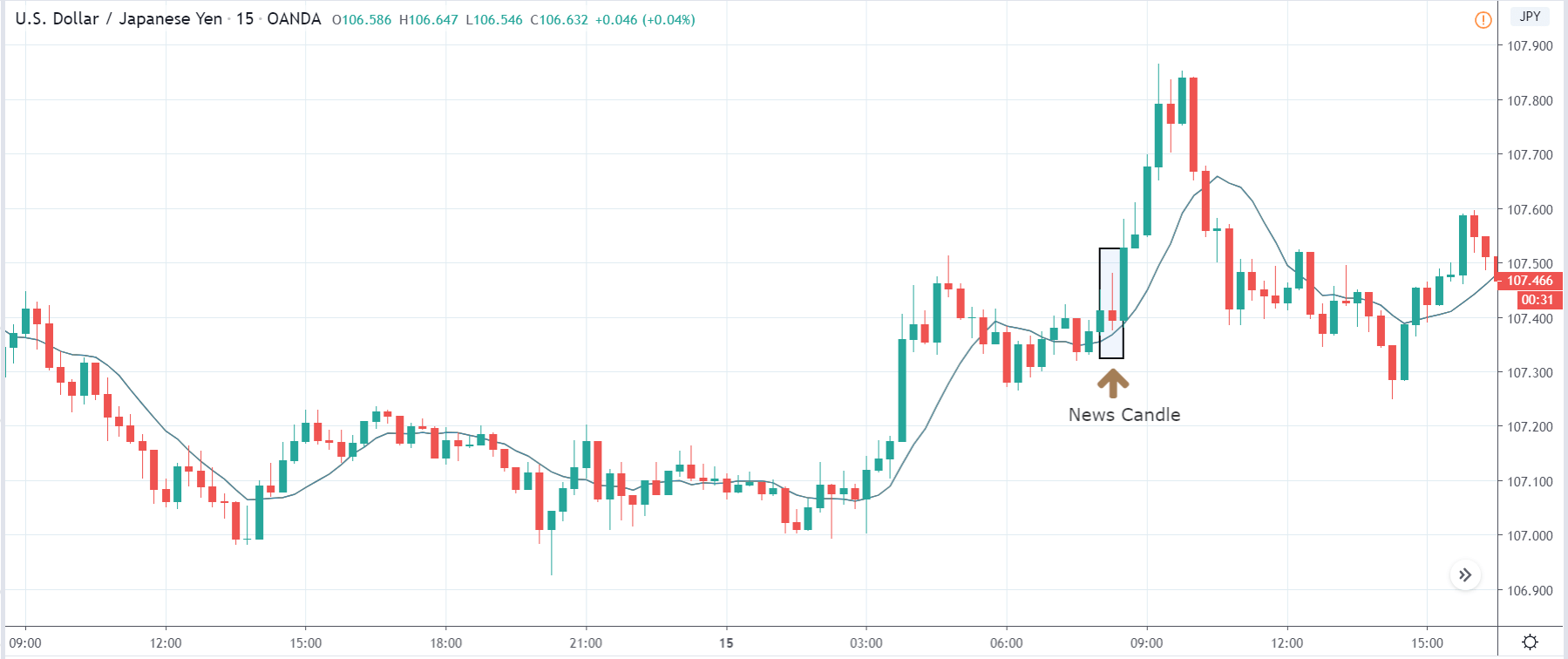
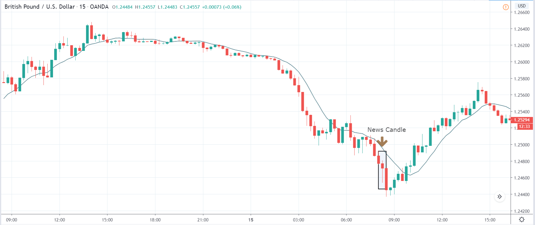
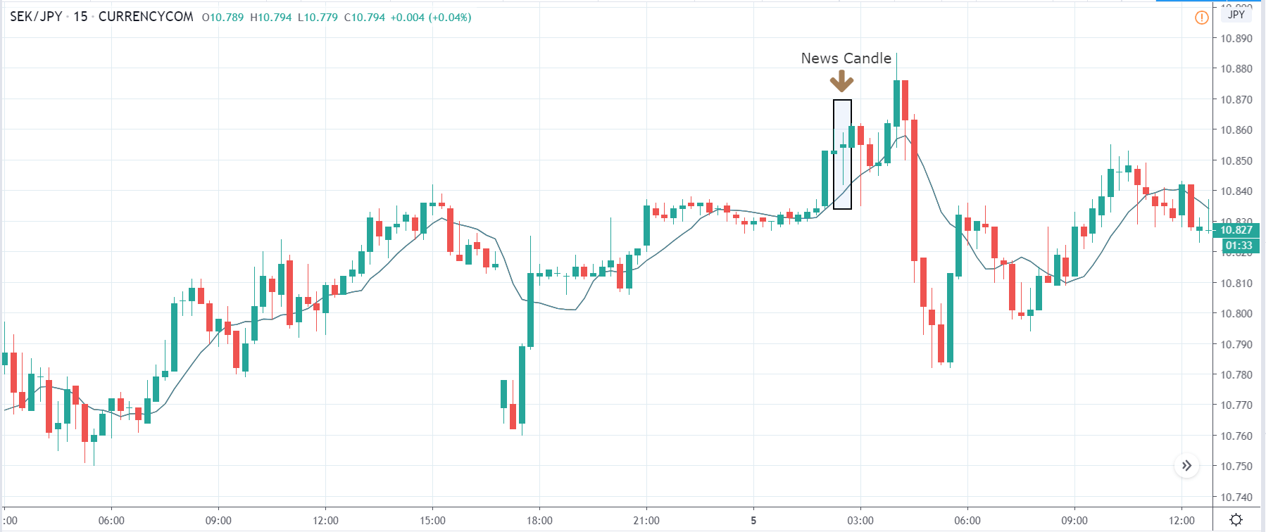
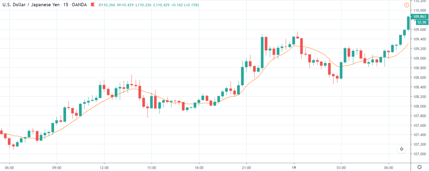
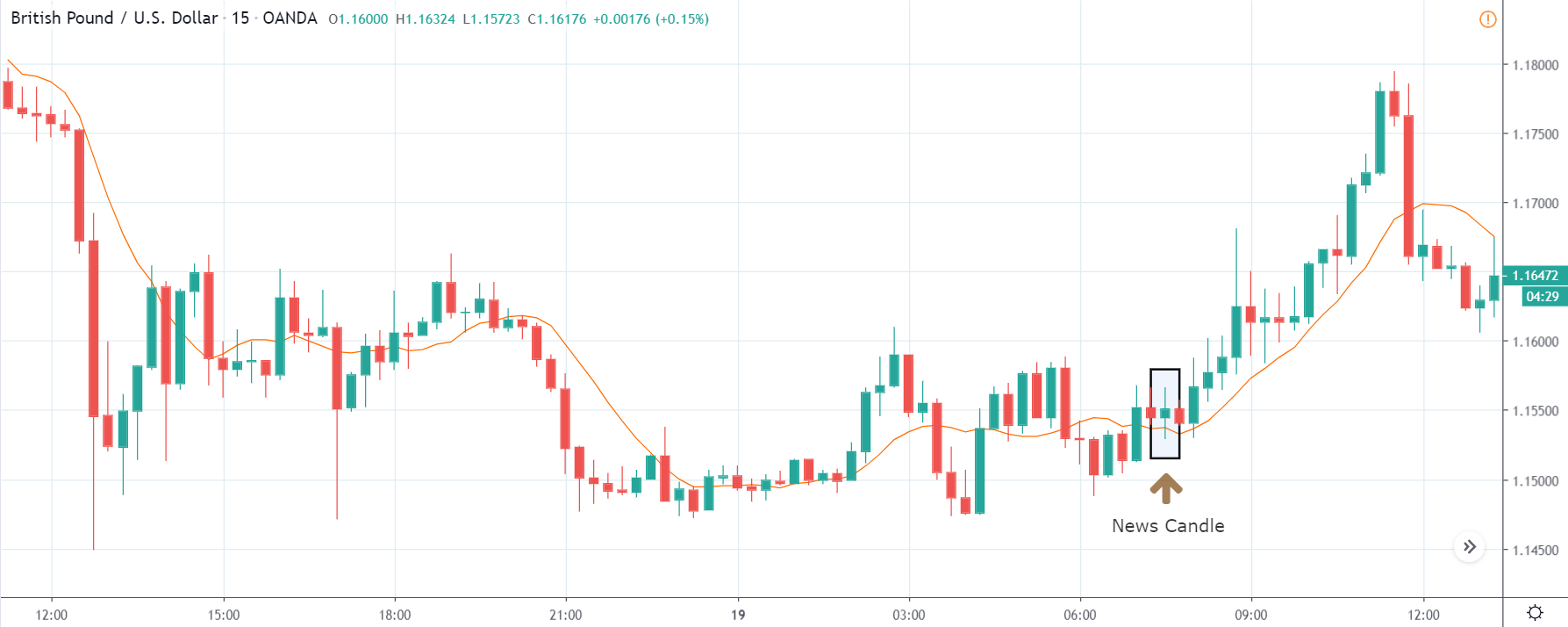
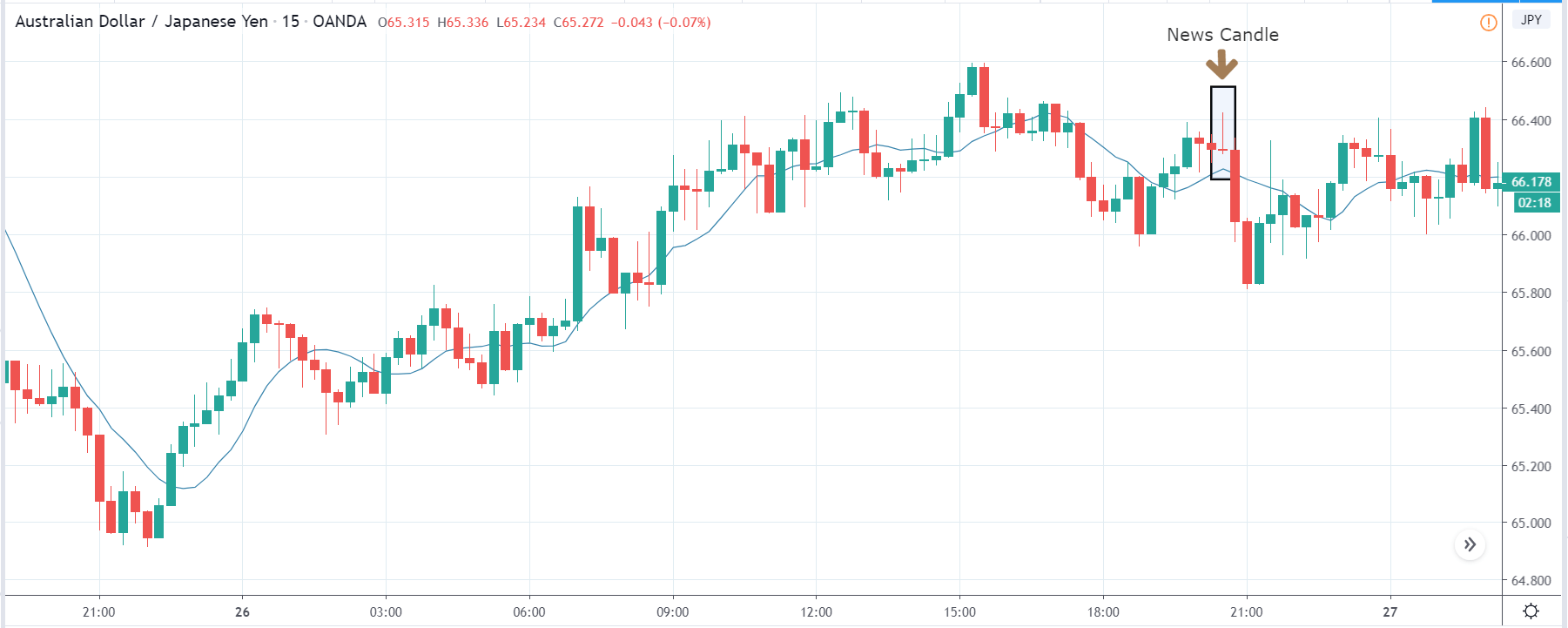
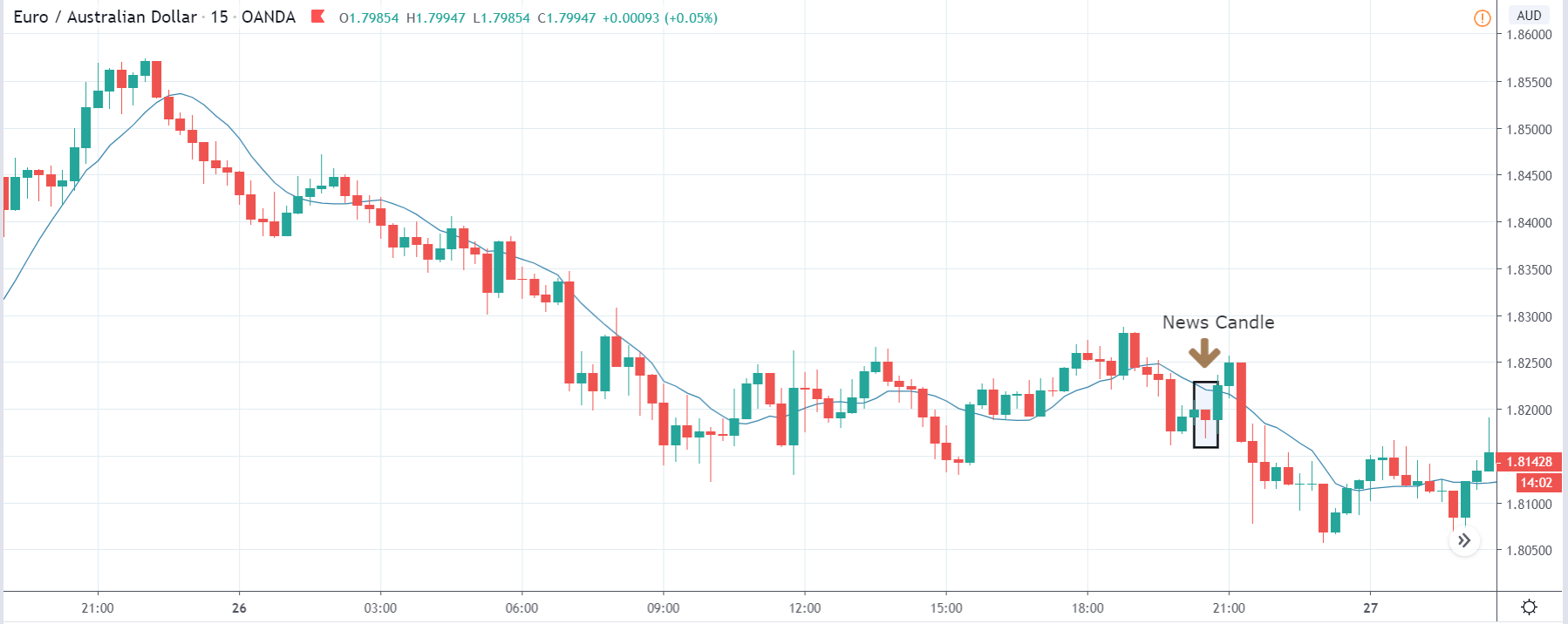
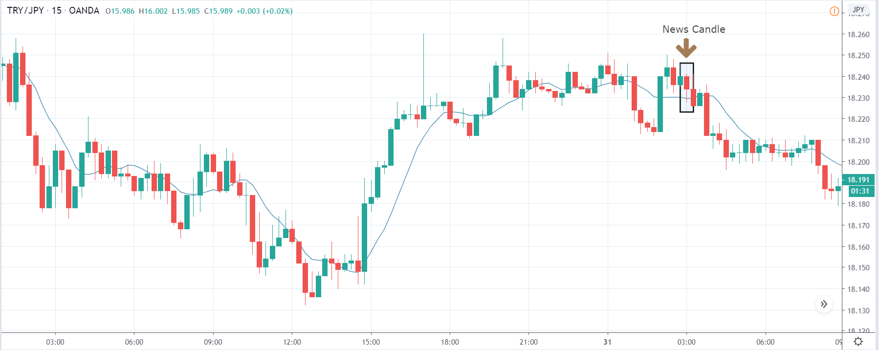
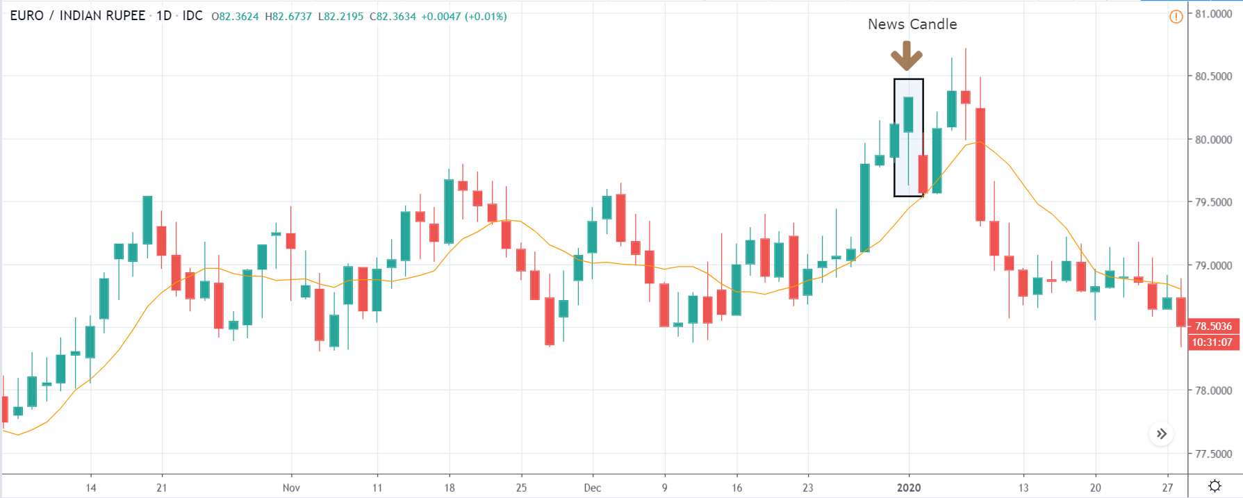
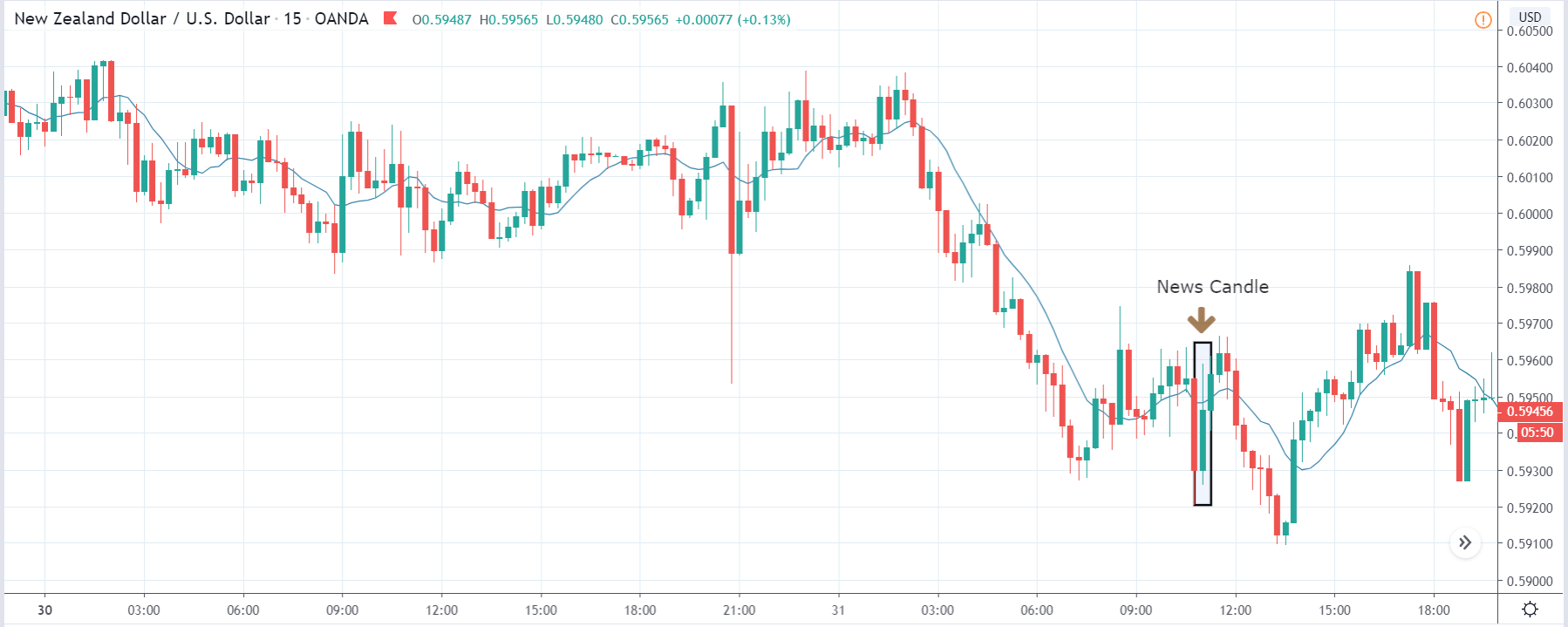
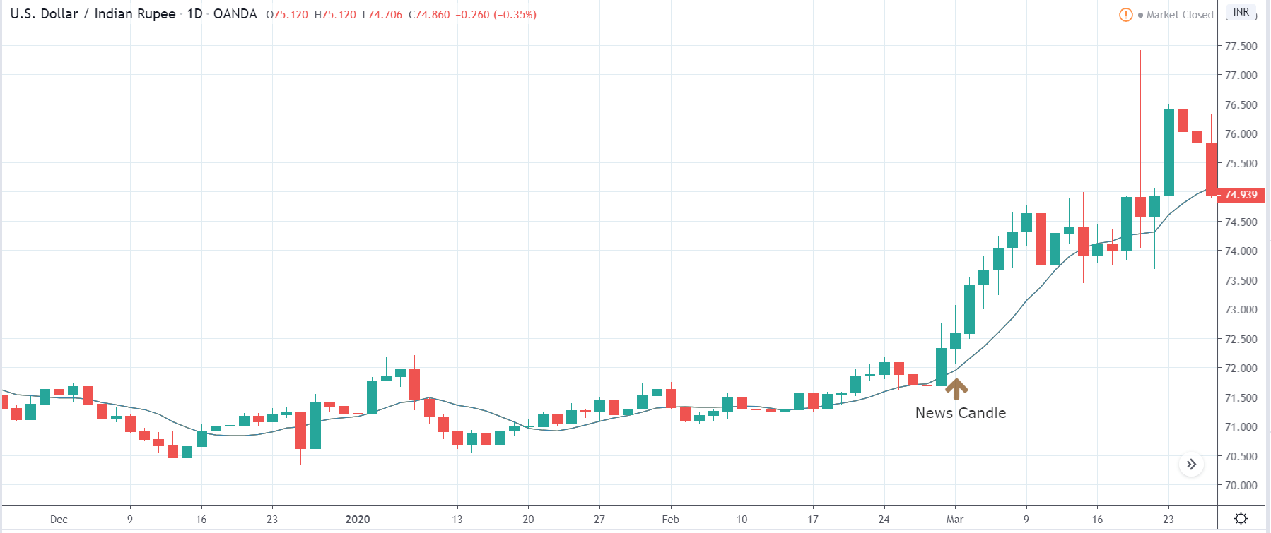
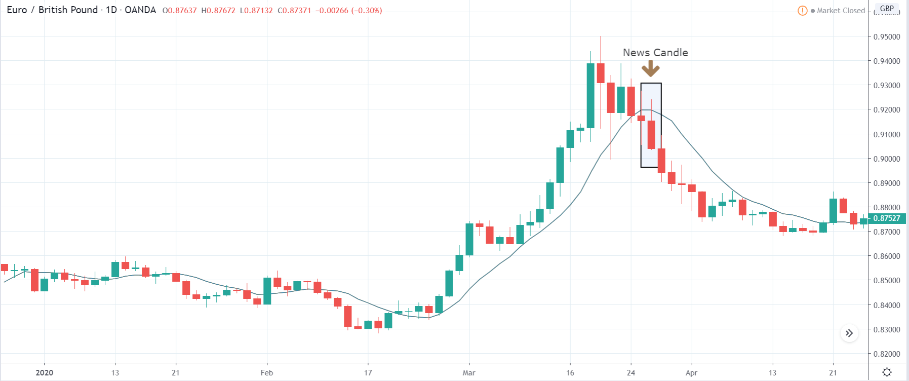
EUR/GBP: After Germany Ifo Business Climate Index Release on
September 24, 2020, at 8.00 AM GMT
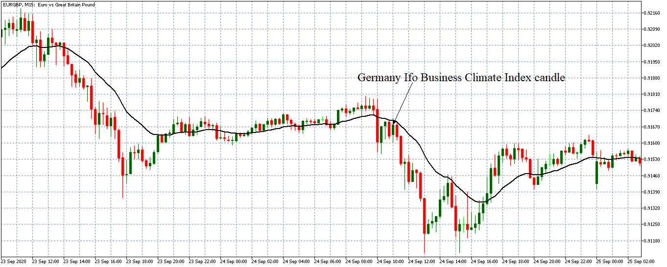
After the release of the Germany Ifo Business Climate Index, the pair formed a 15-minute bullish candle but adopted a strong downtrend afterward. The 20-period M.A. steeply fell with candles forming further below it. This trend shows that the EUR weakened against the GBP since the Germany Ifo Business Climate Index was weaker than expected.
As shown by the above analyses, the Germany Ifo Business Climate Index has a significant impact on forex price actions.


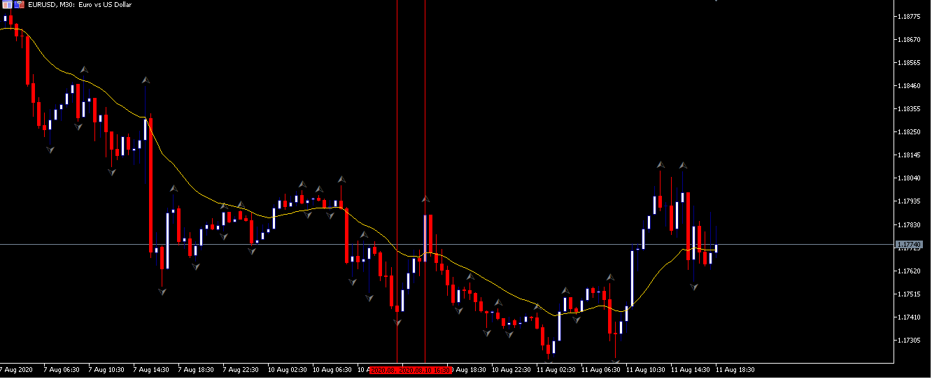
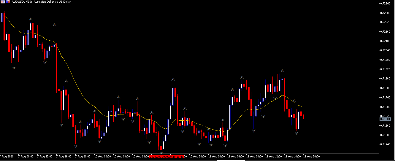
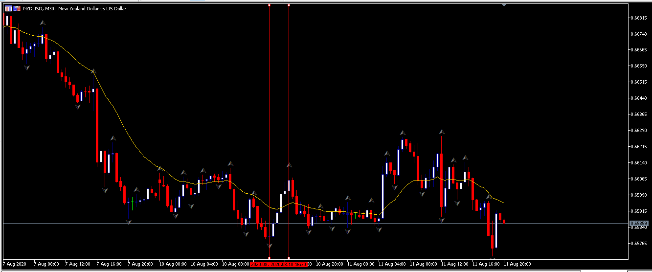

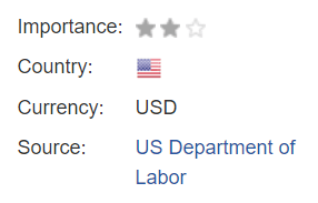
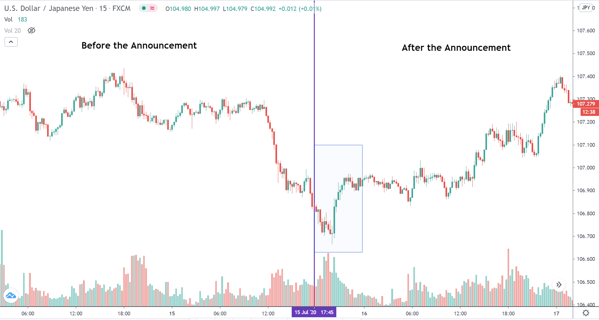


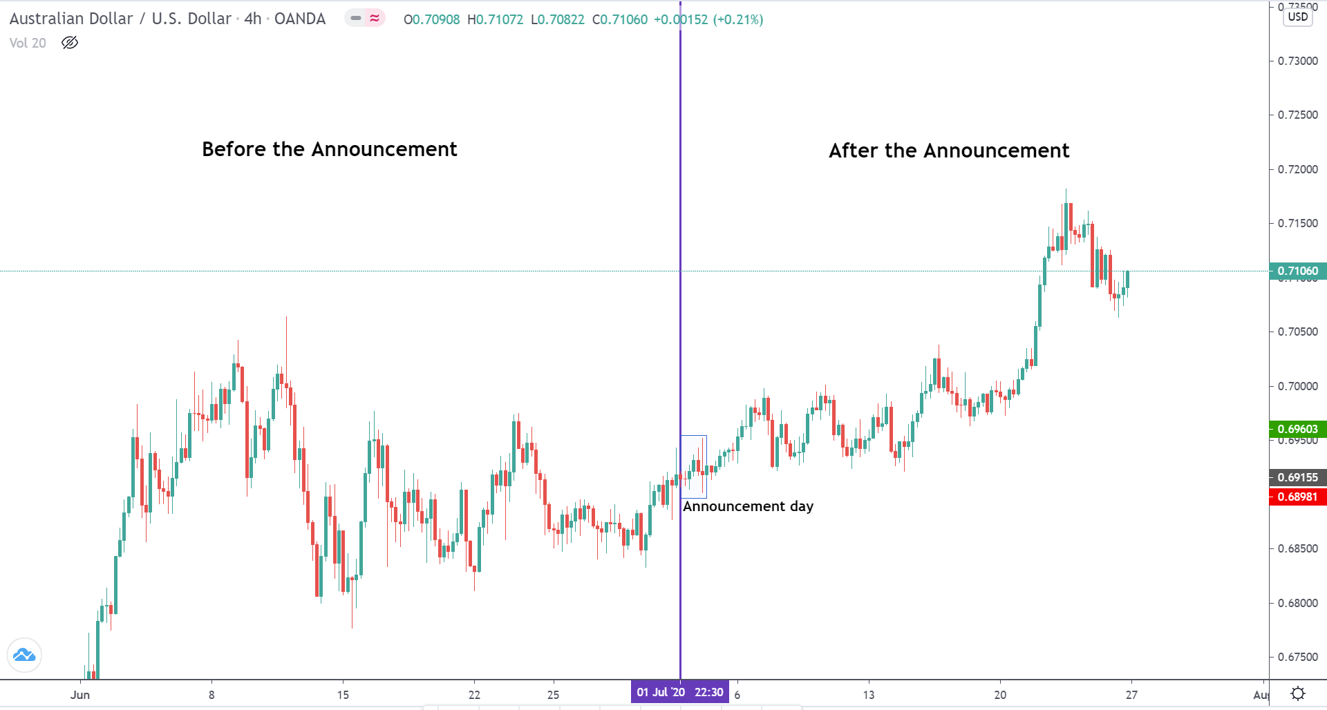
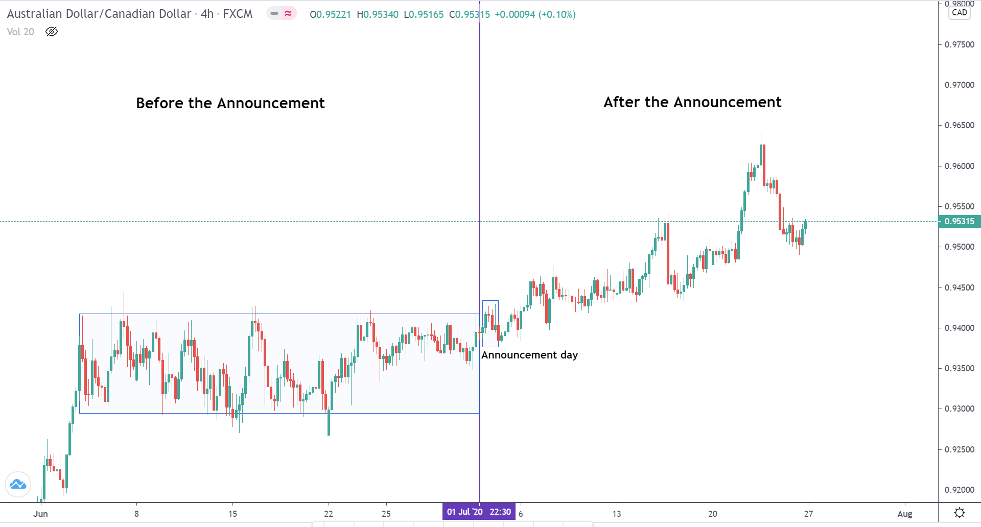
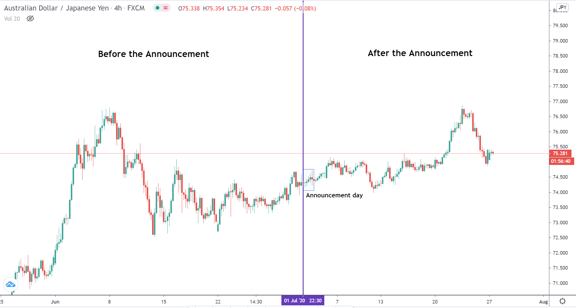

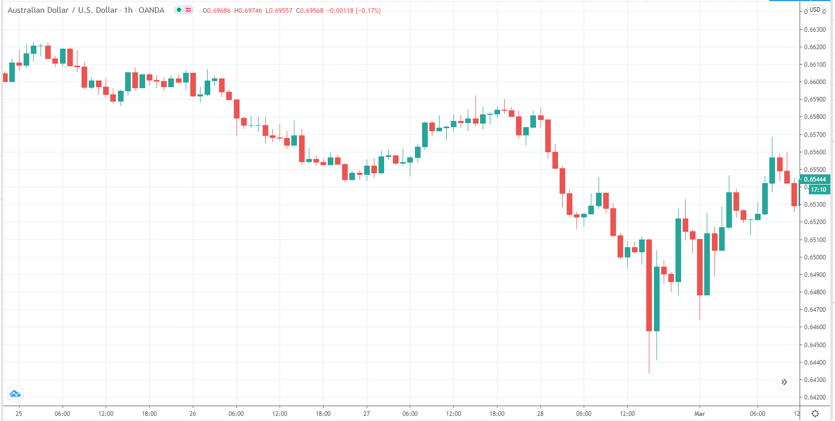
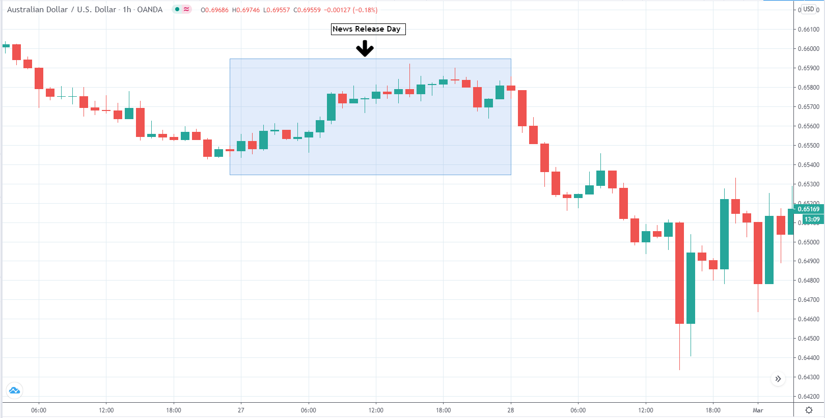


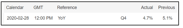


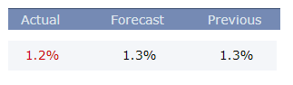
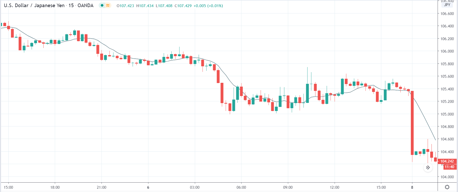
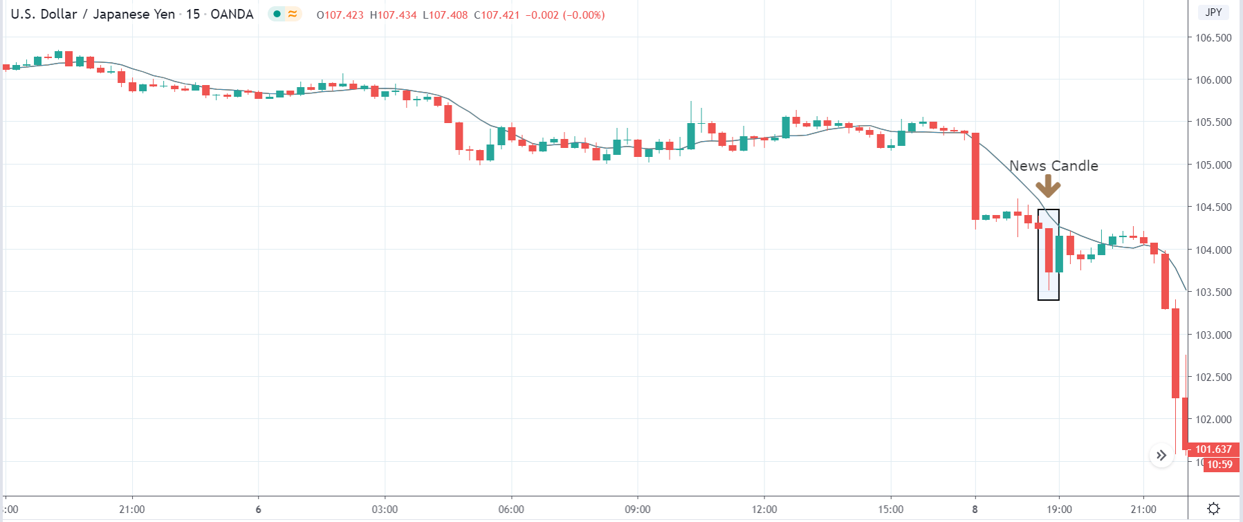
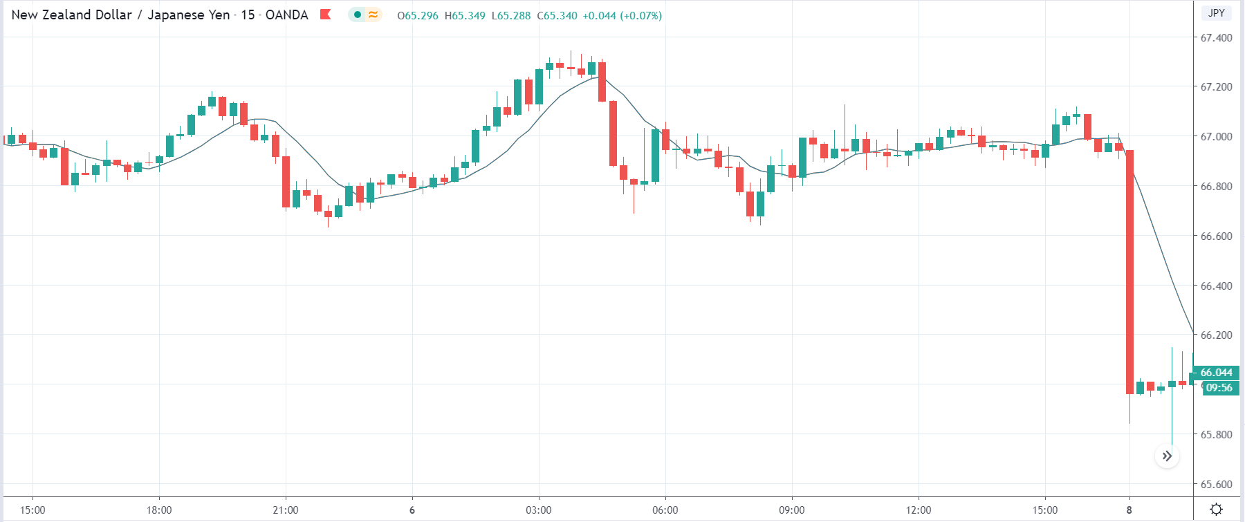
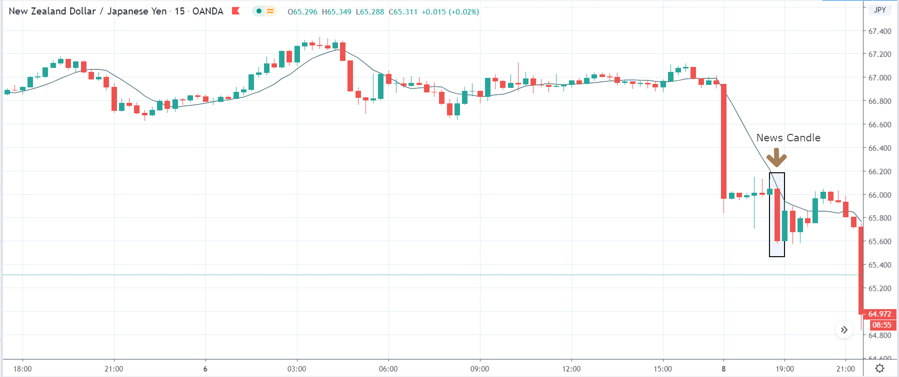

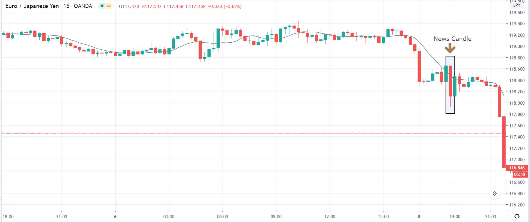
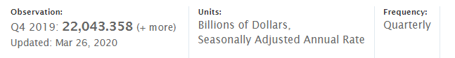
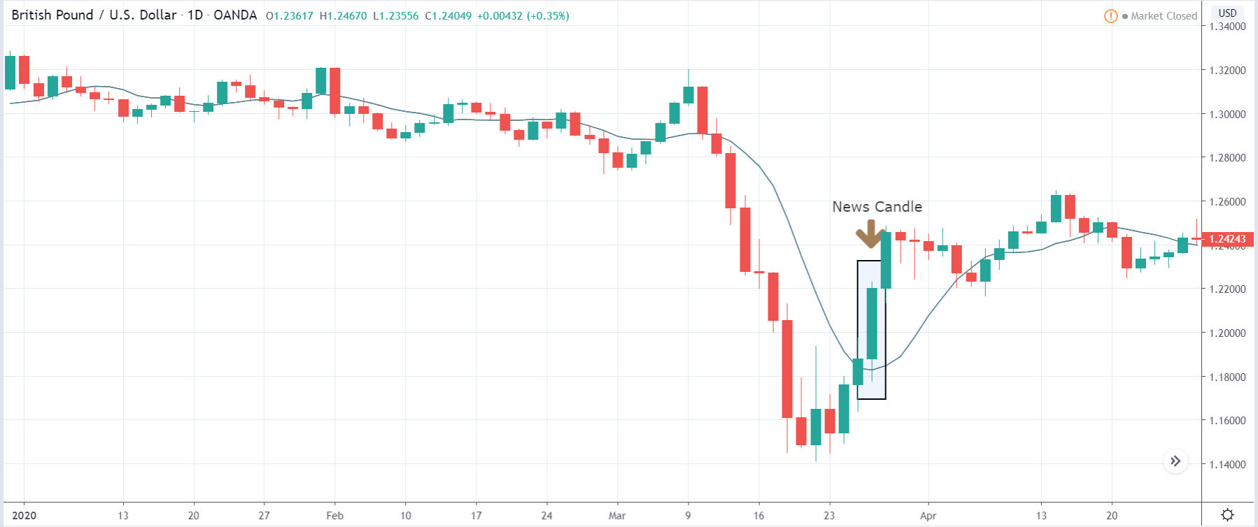
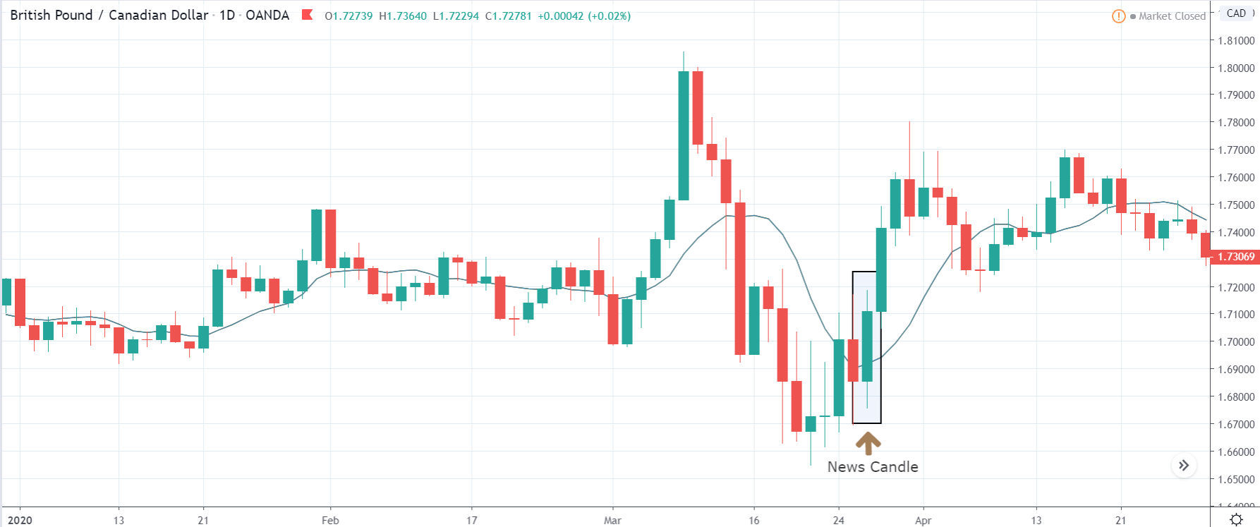
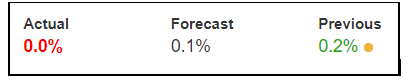
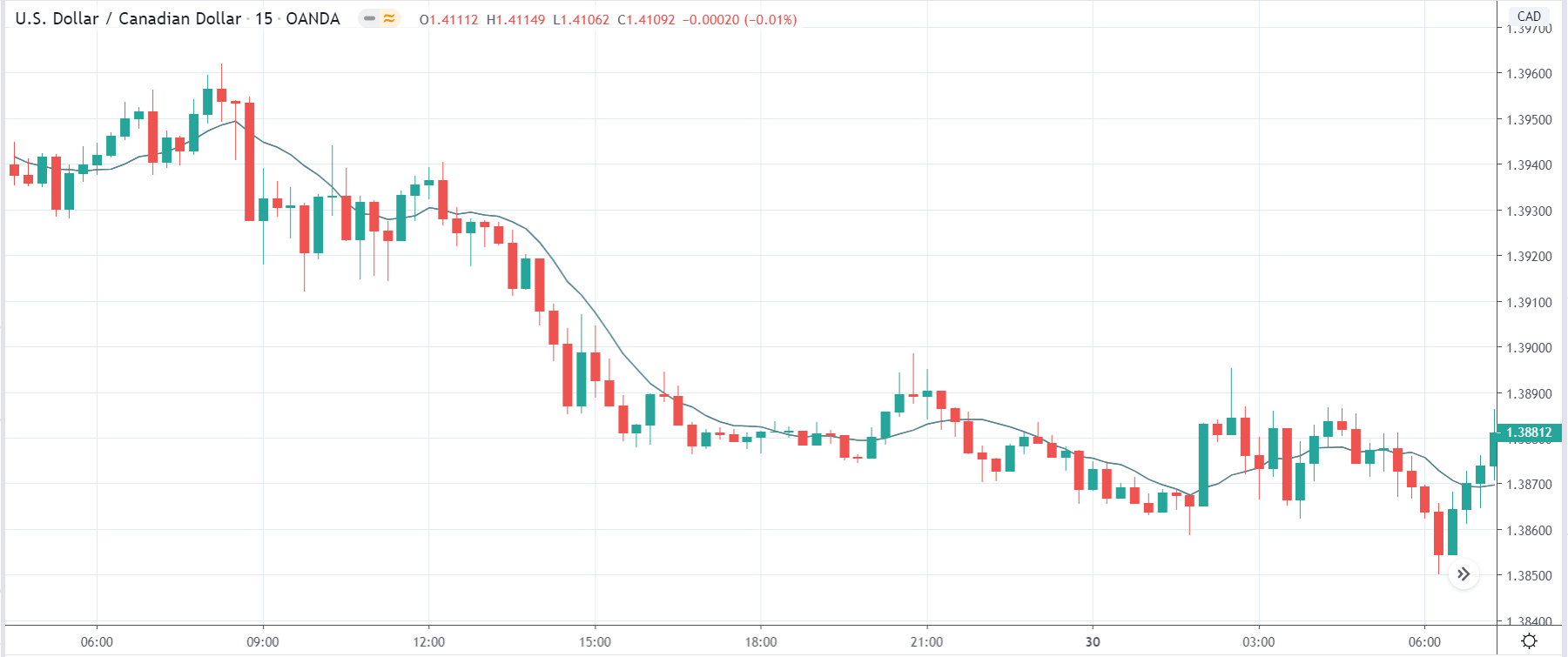
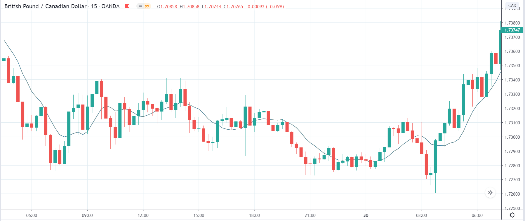
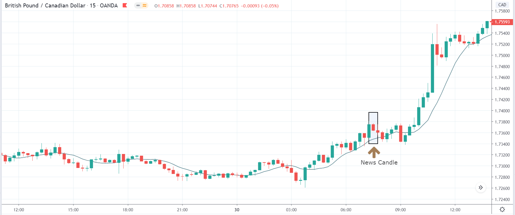
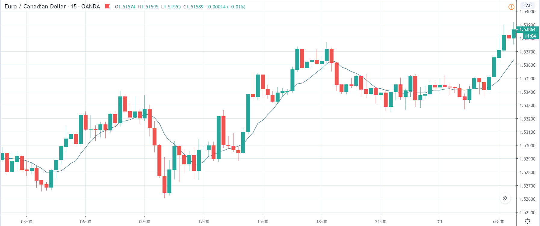
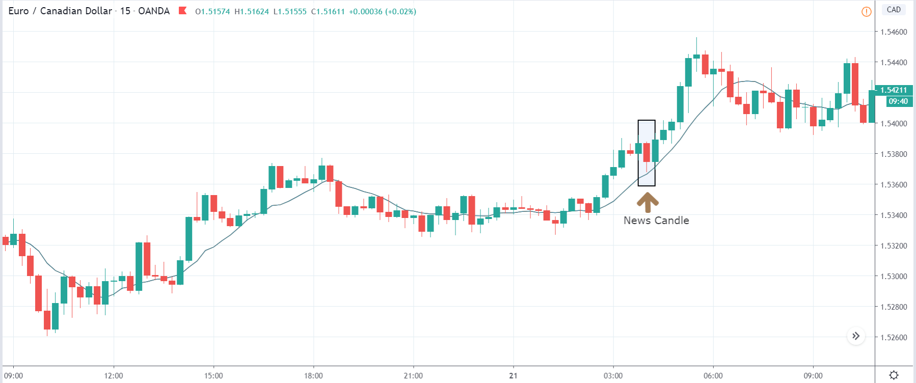
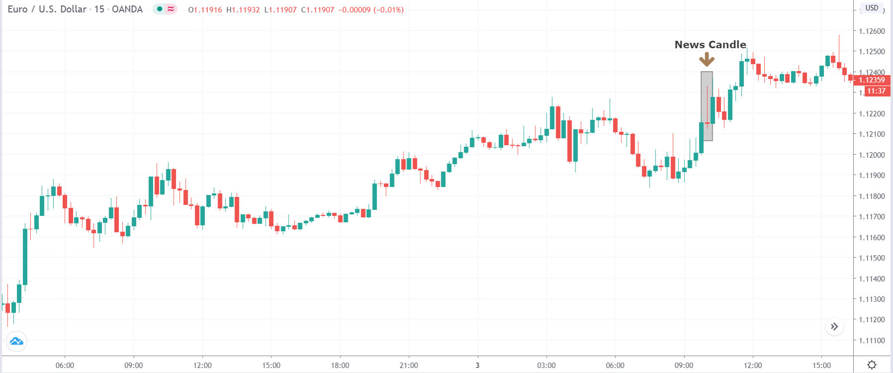
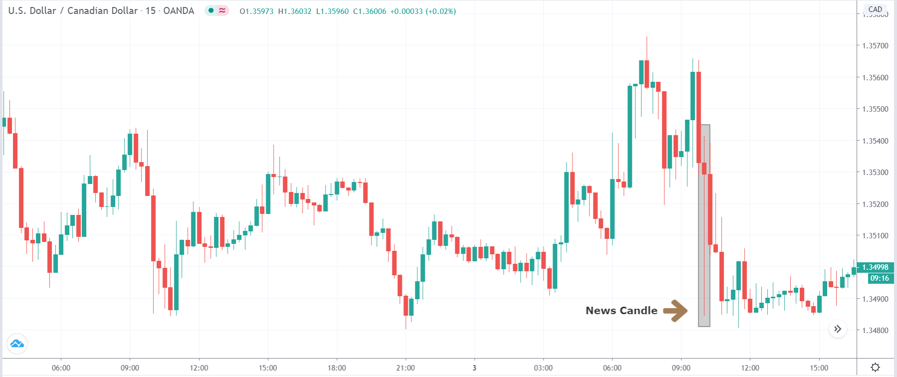
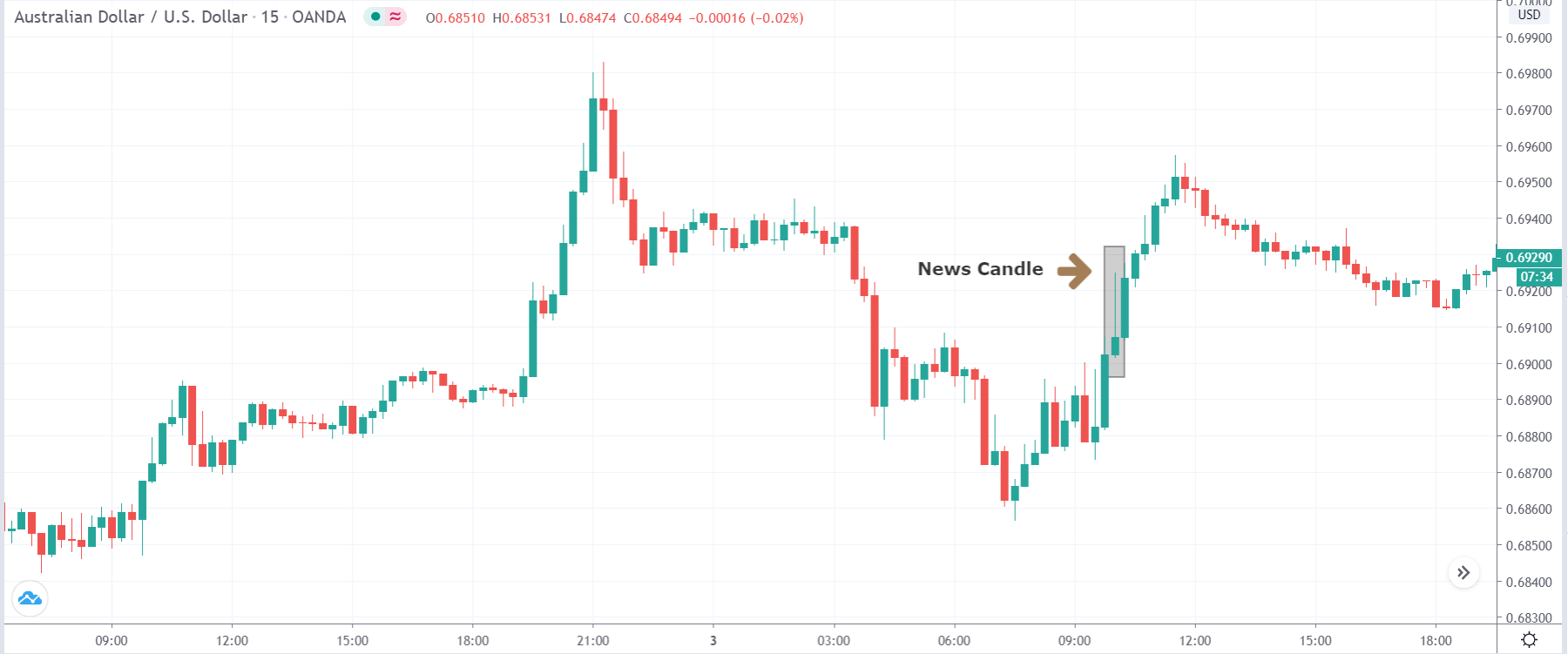
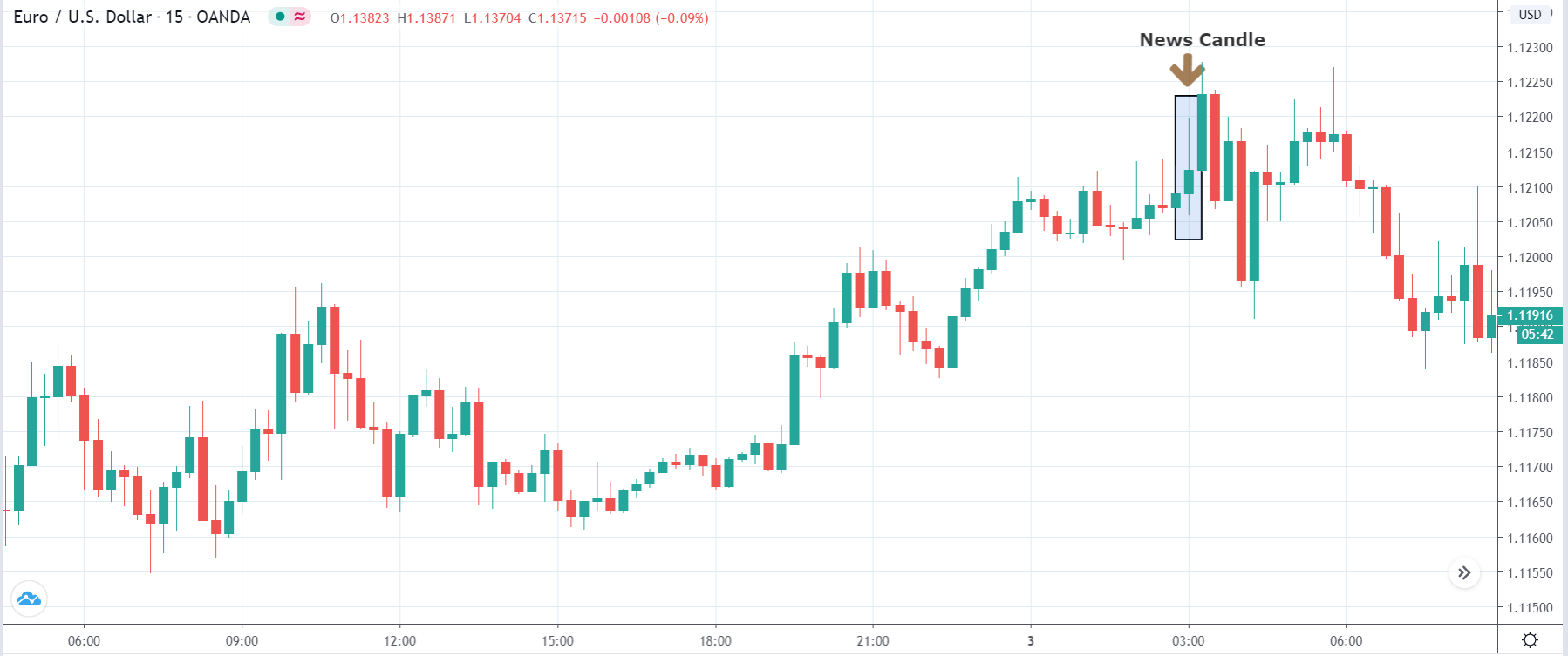
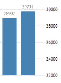
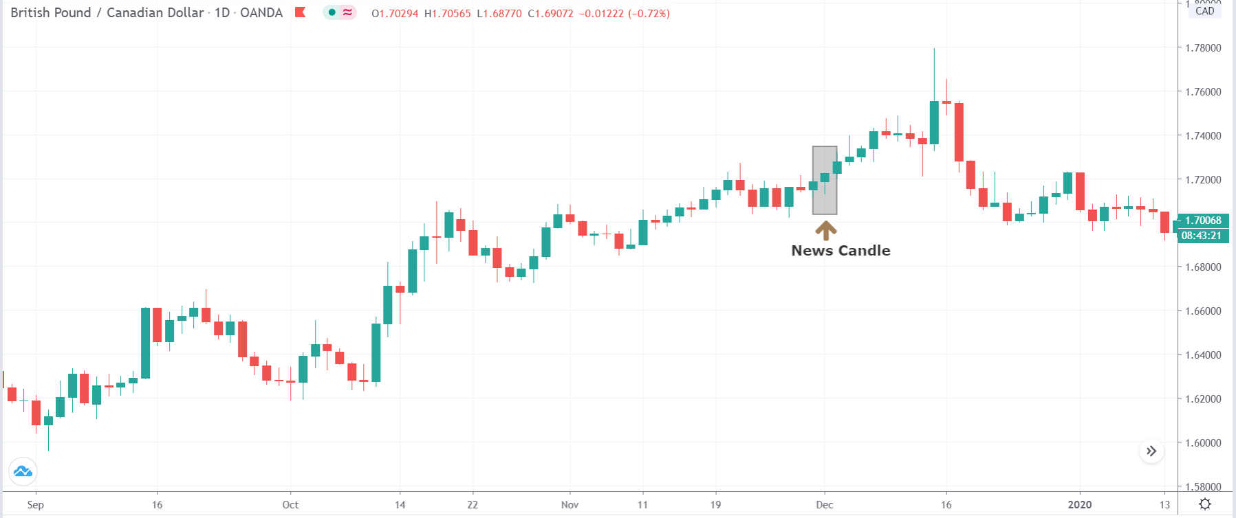
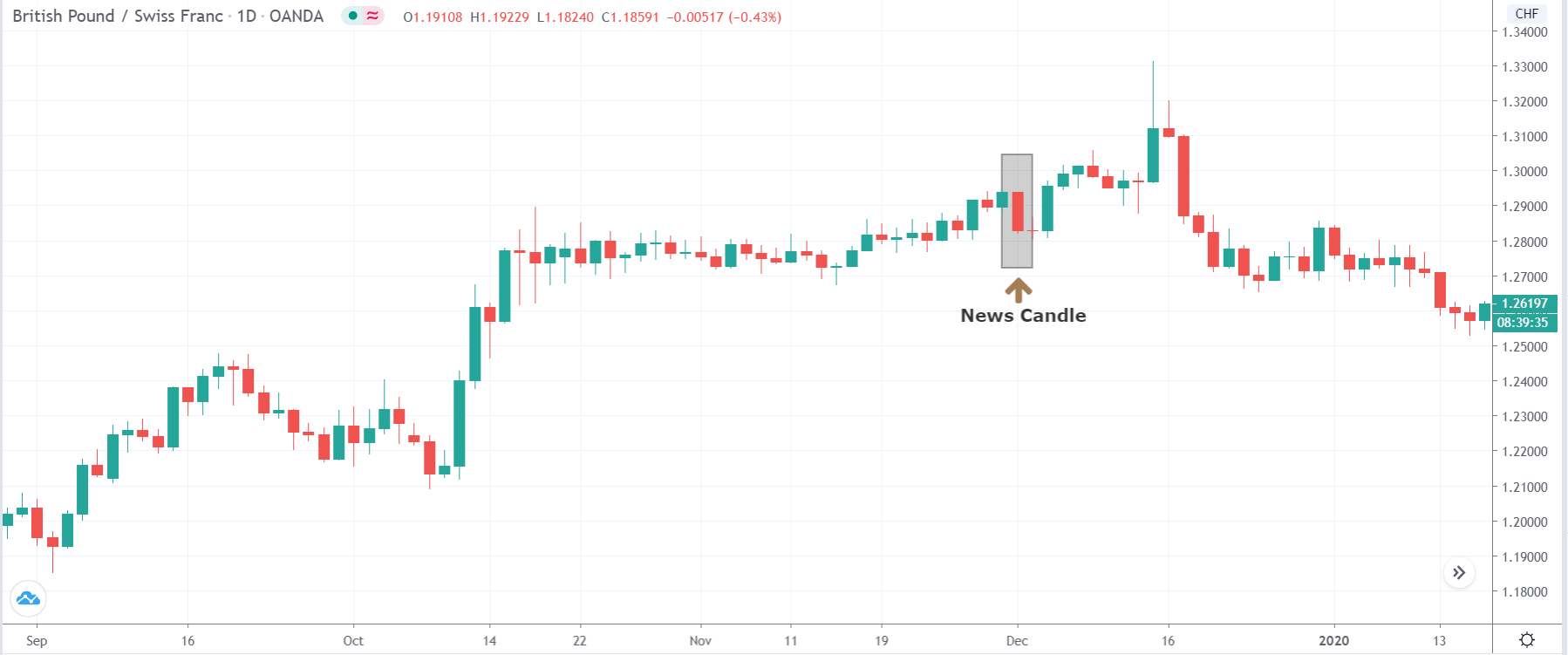
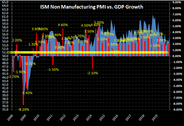
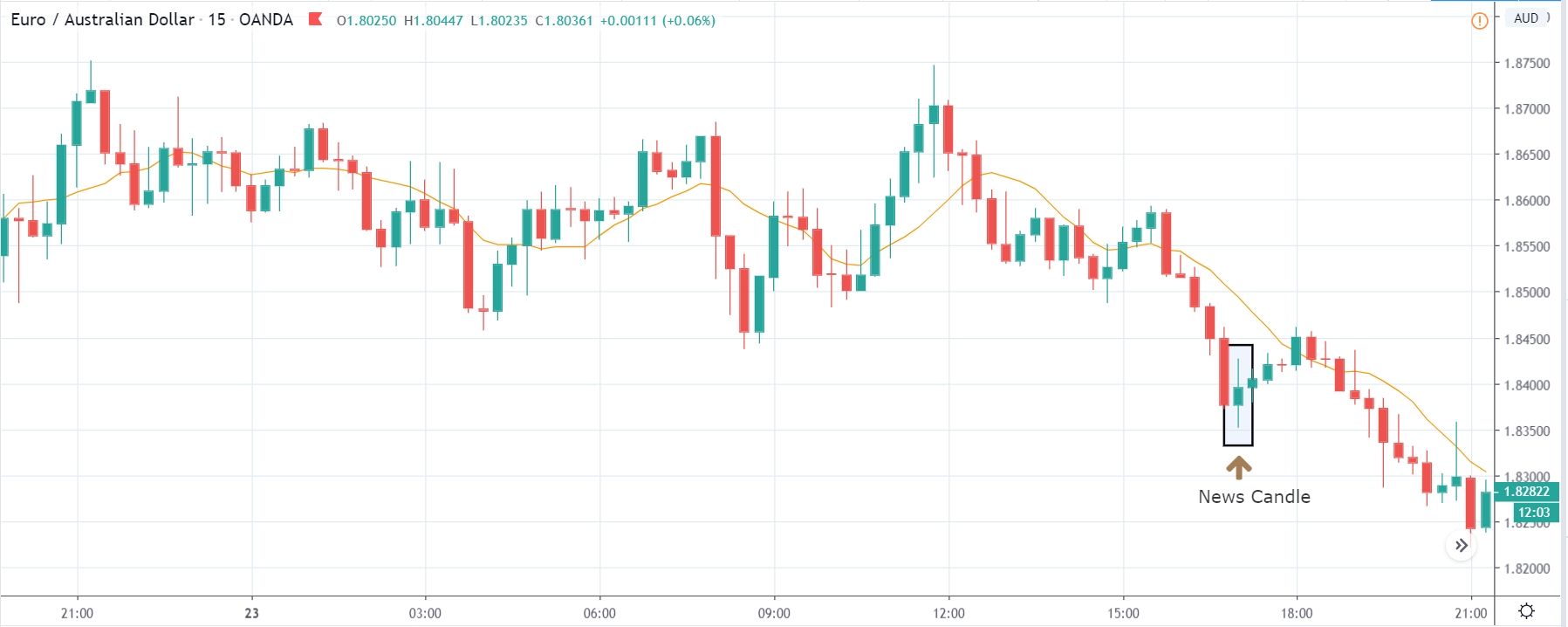
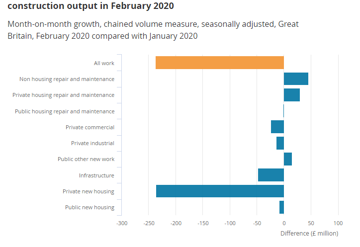
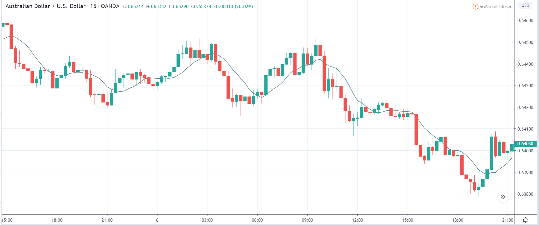
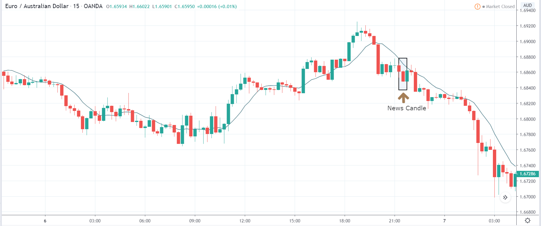
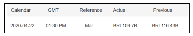
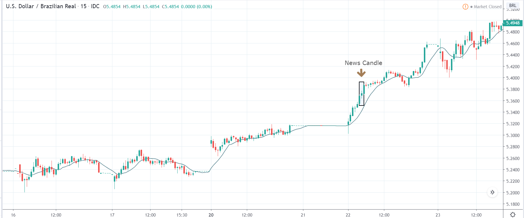
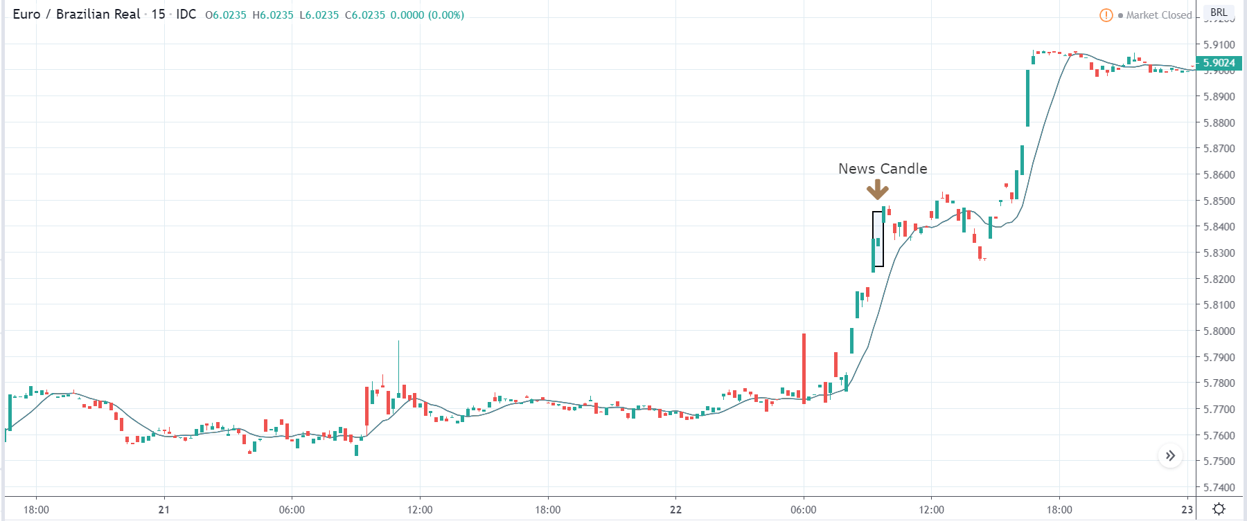
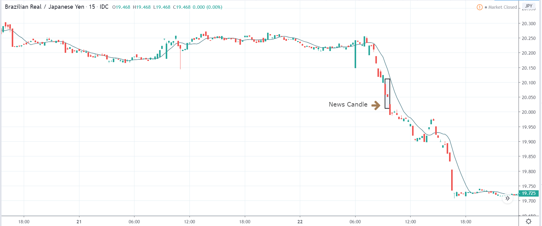
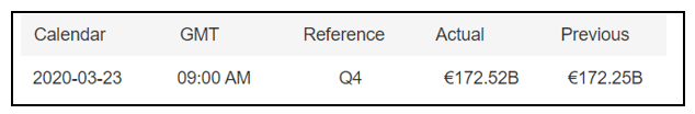
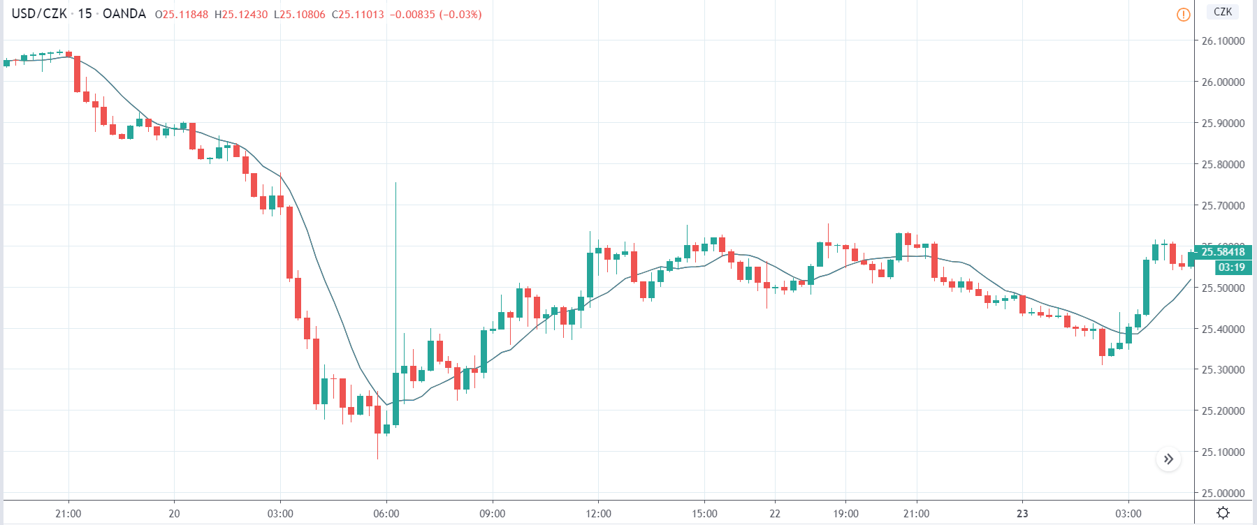
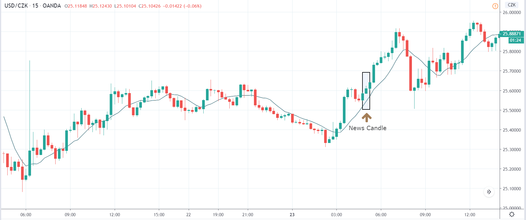
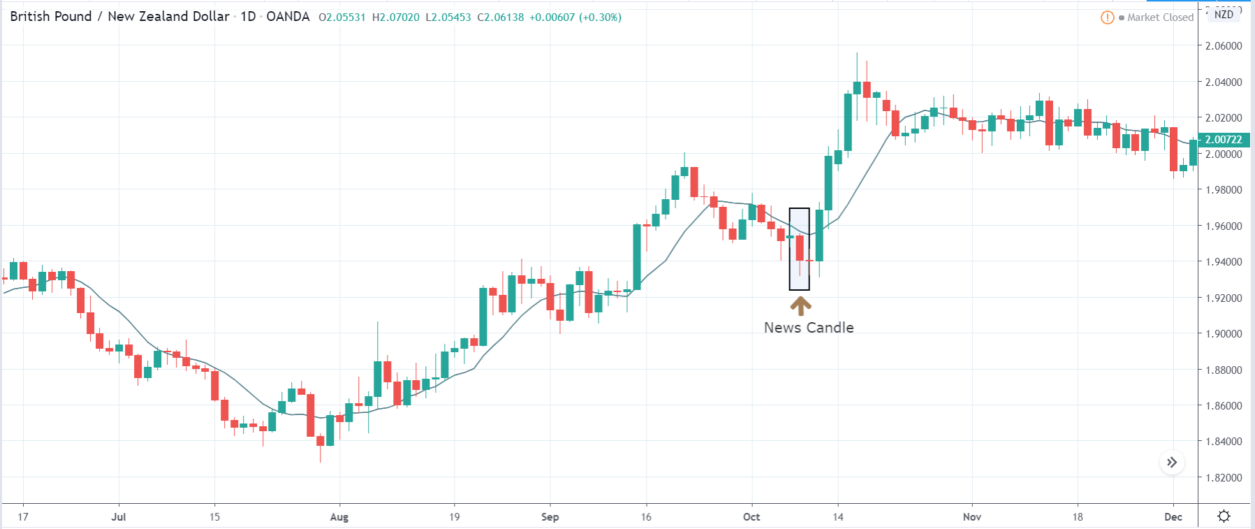
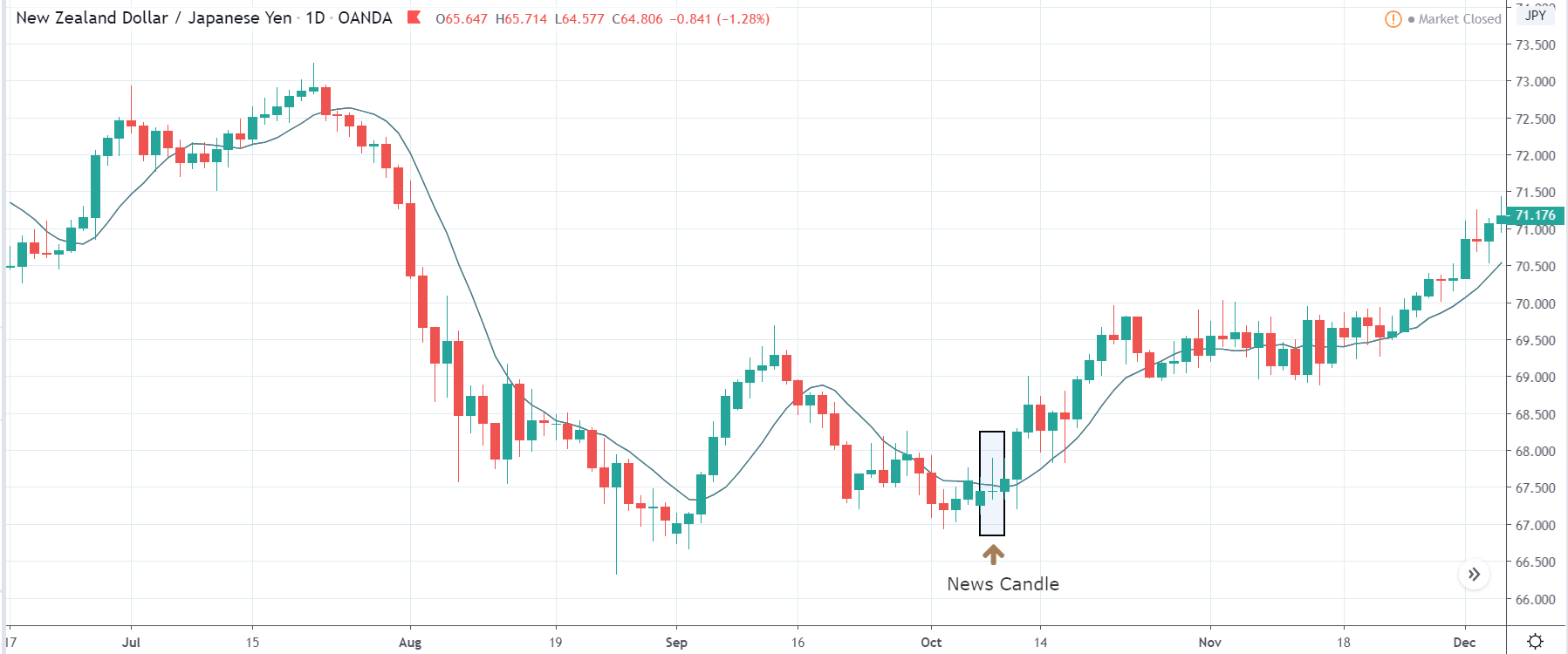
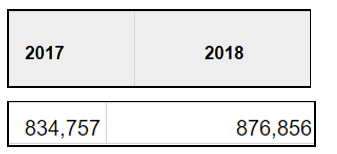
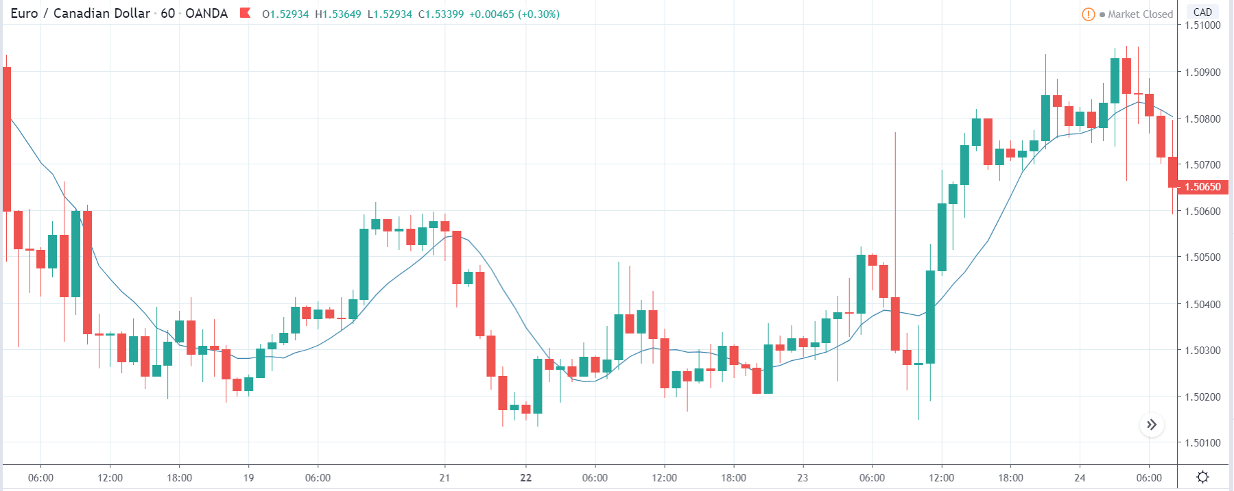
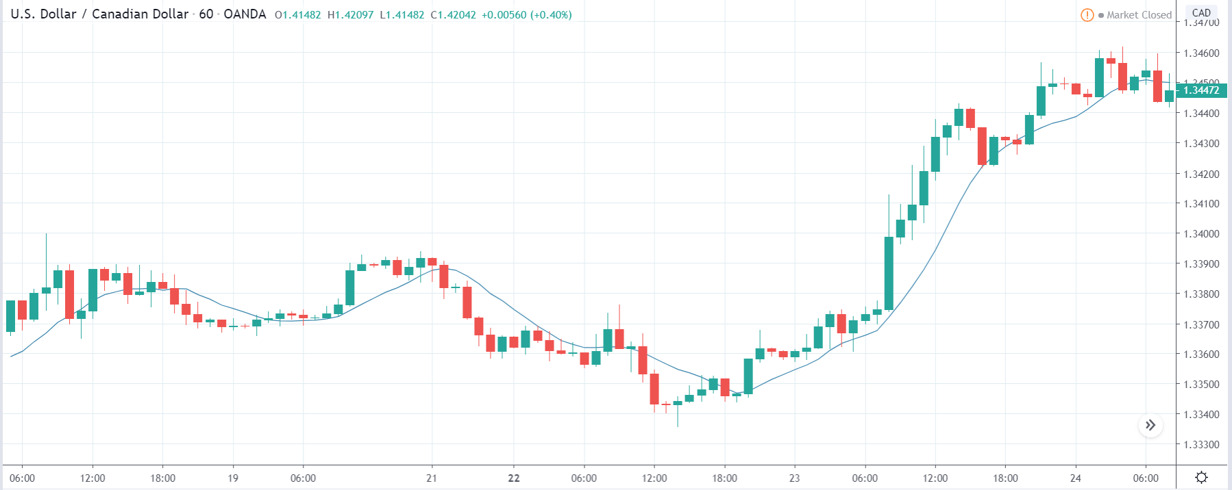
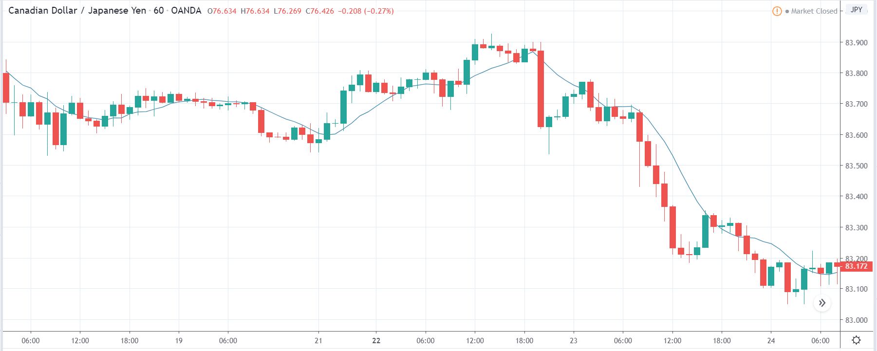
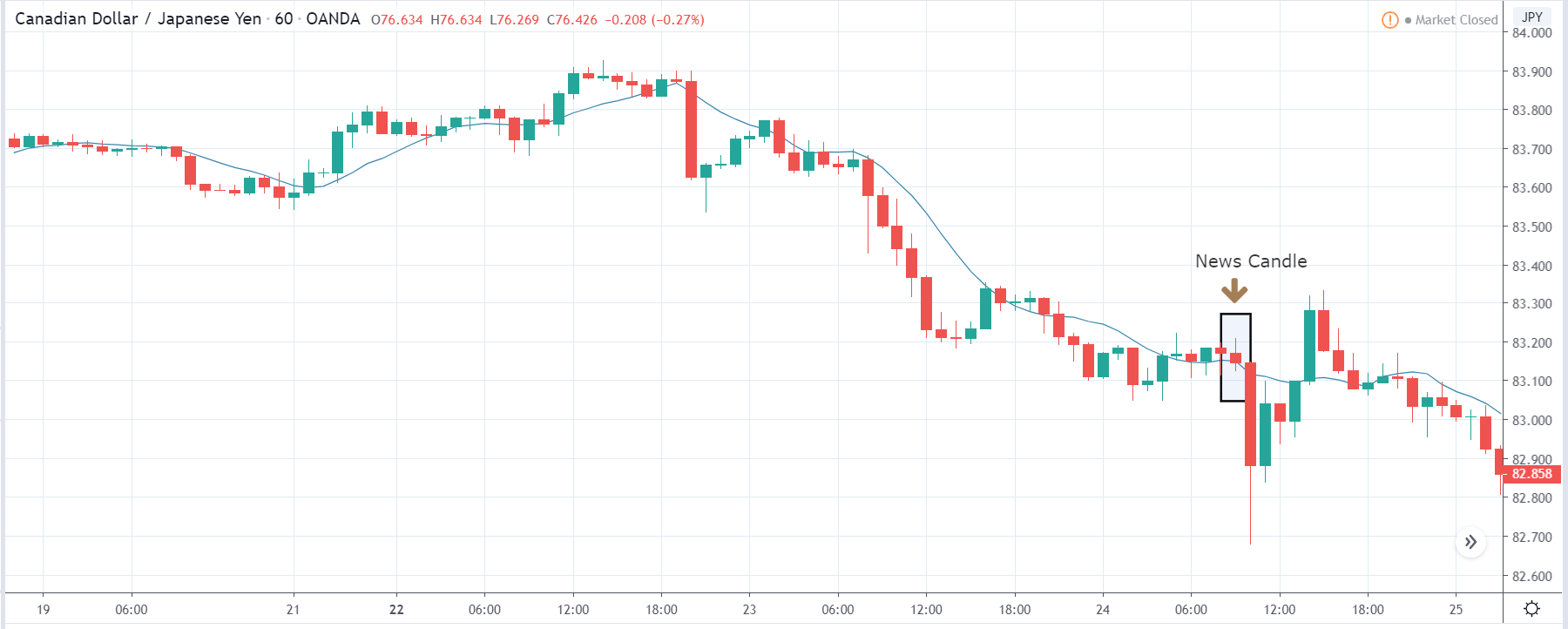
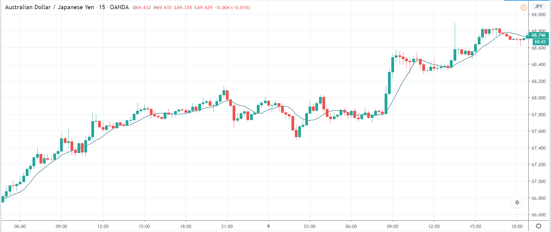
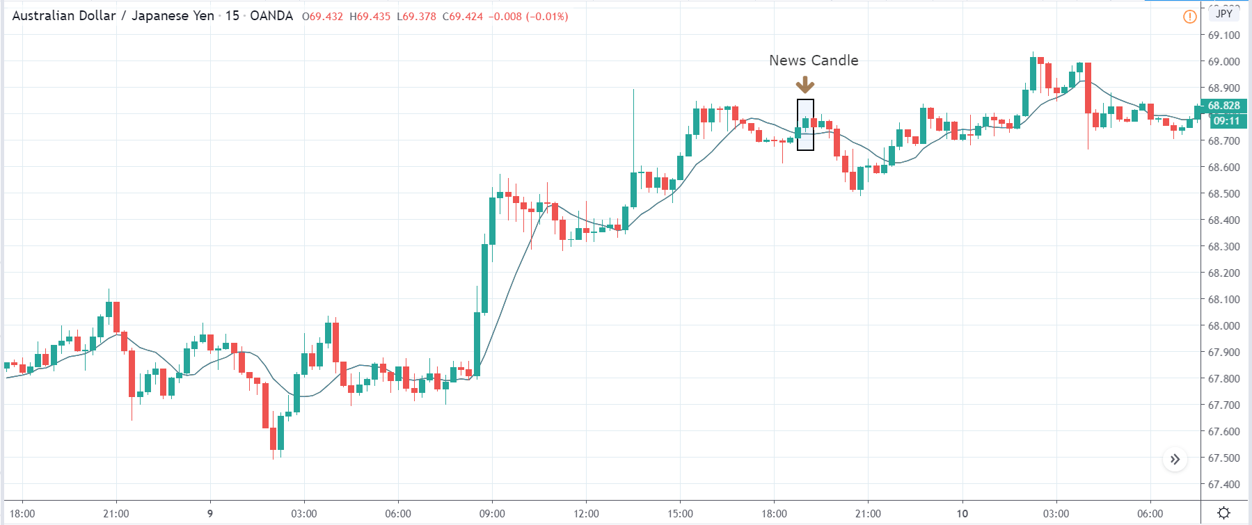
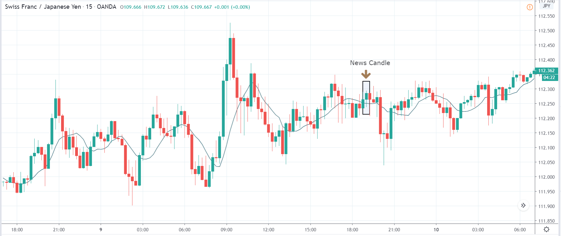
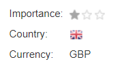
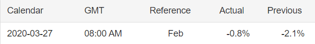
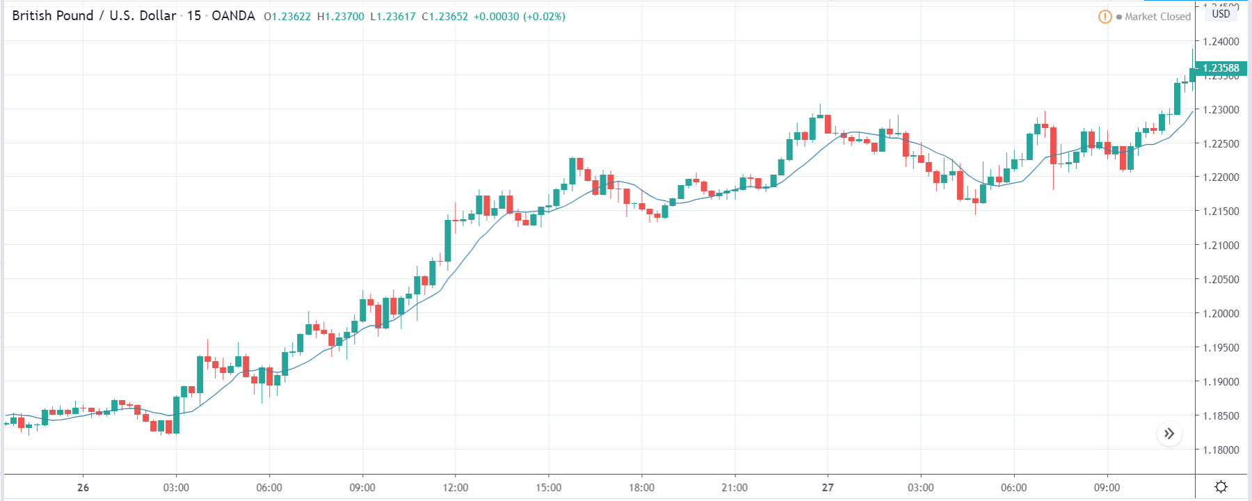
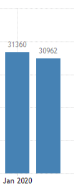
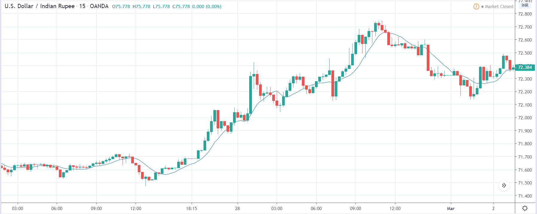
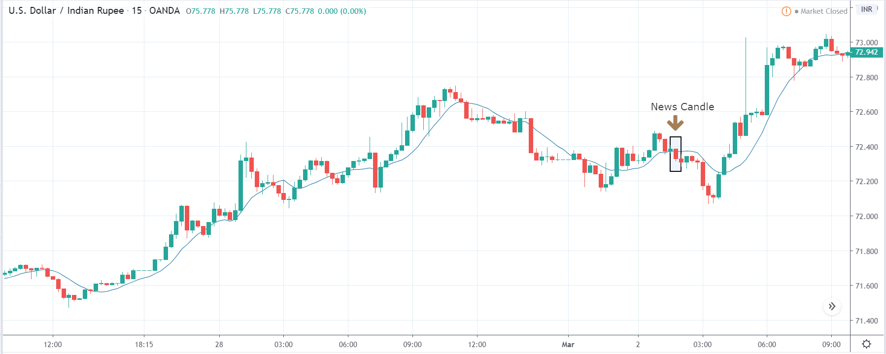
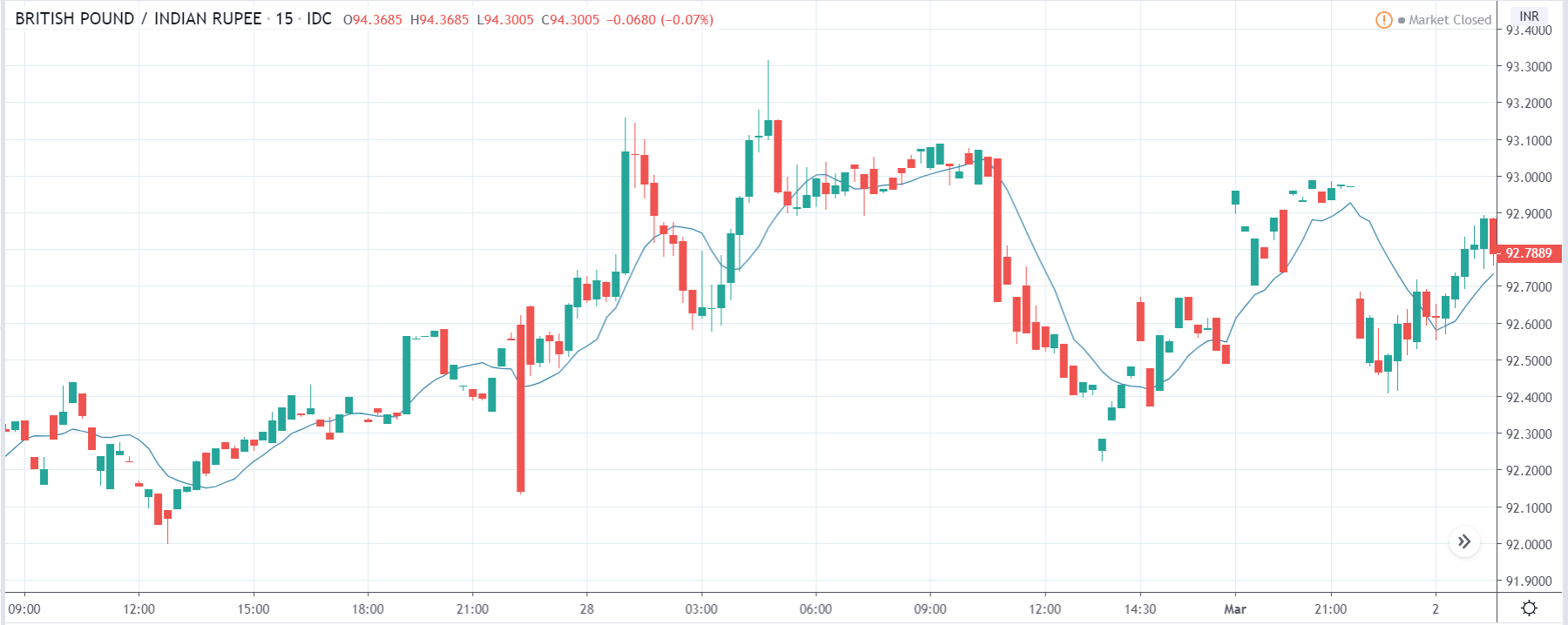
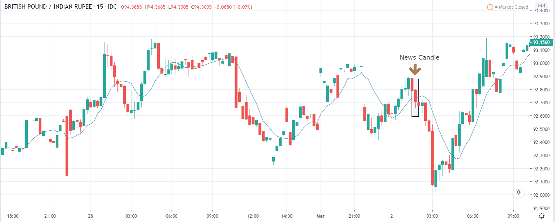
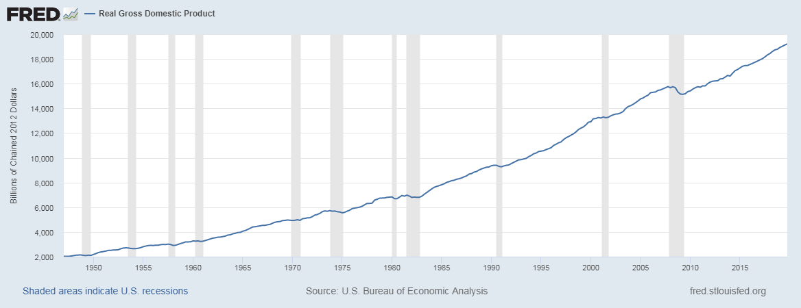
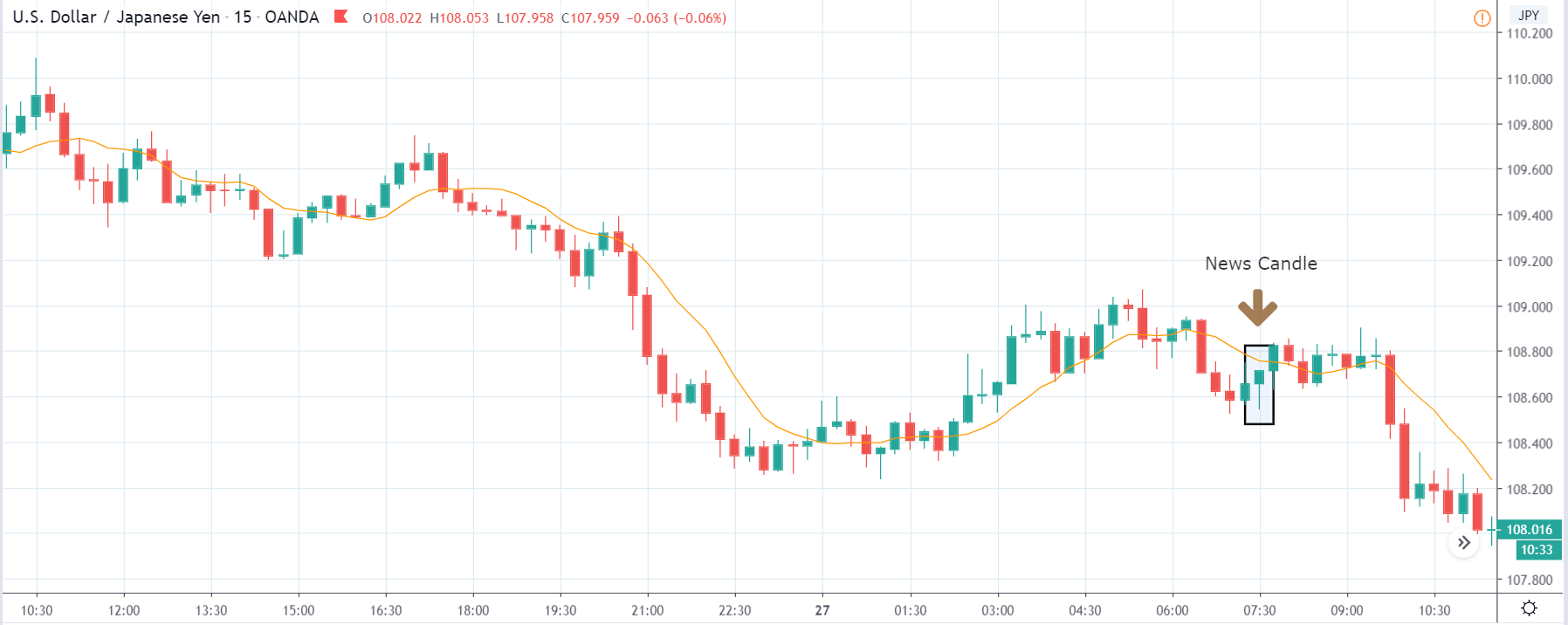
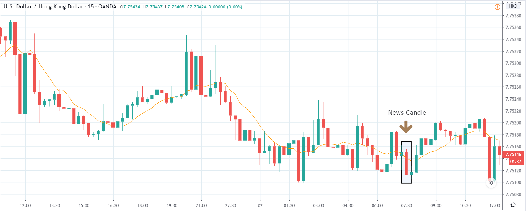
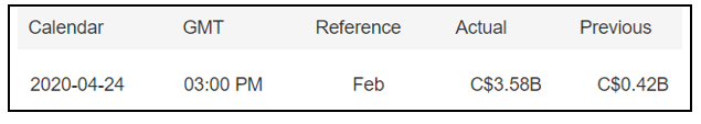
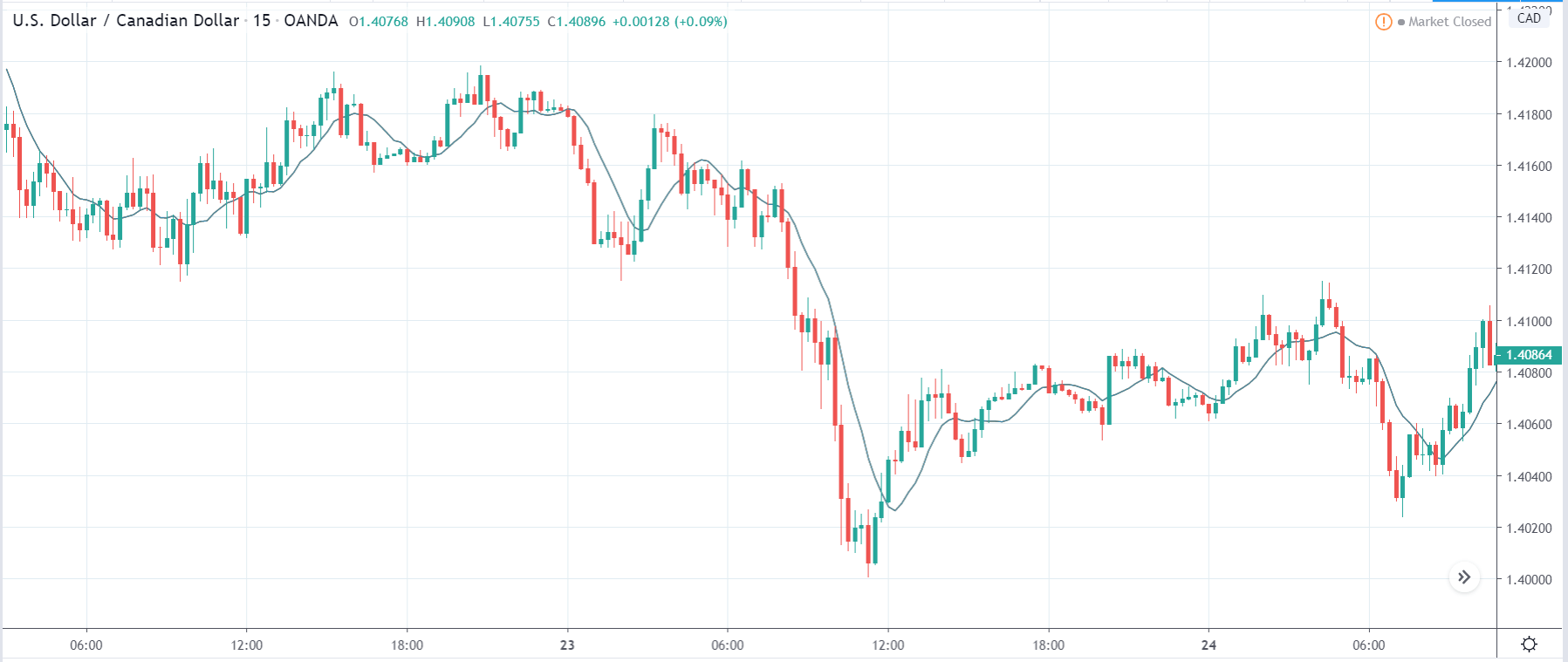
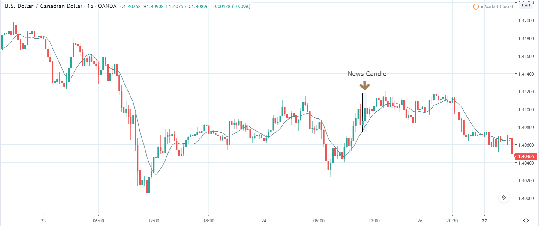
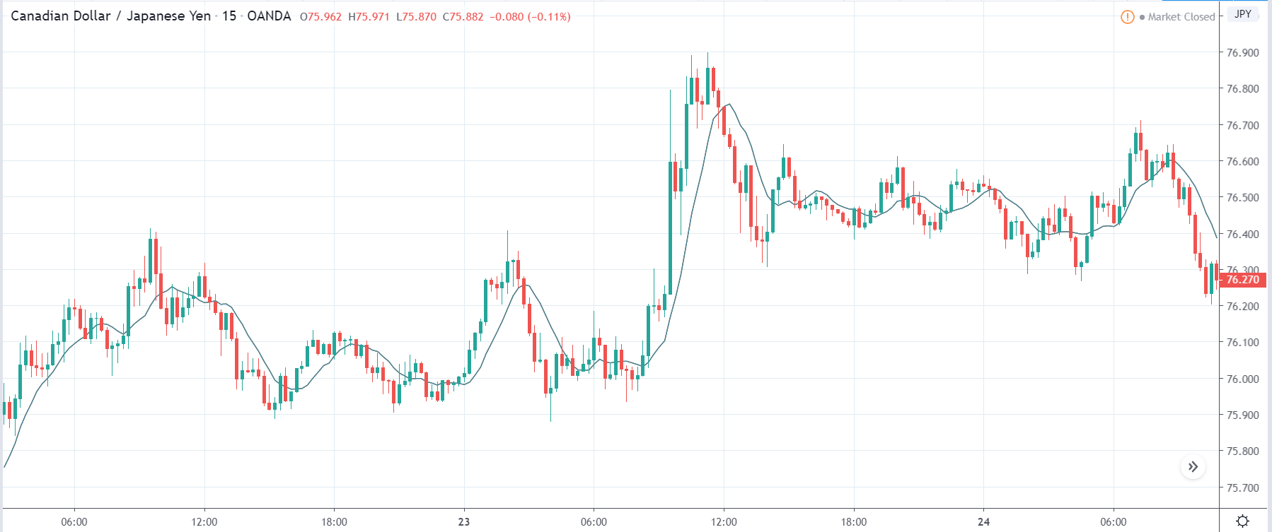
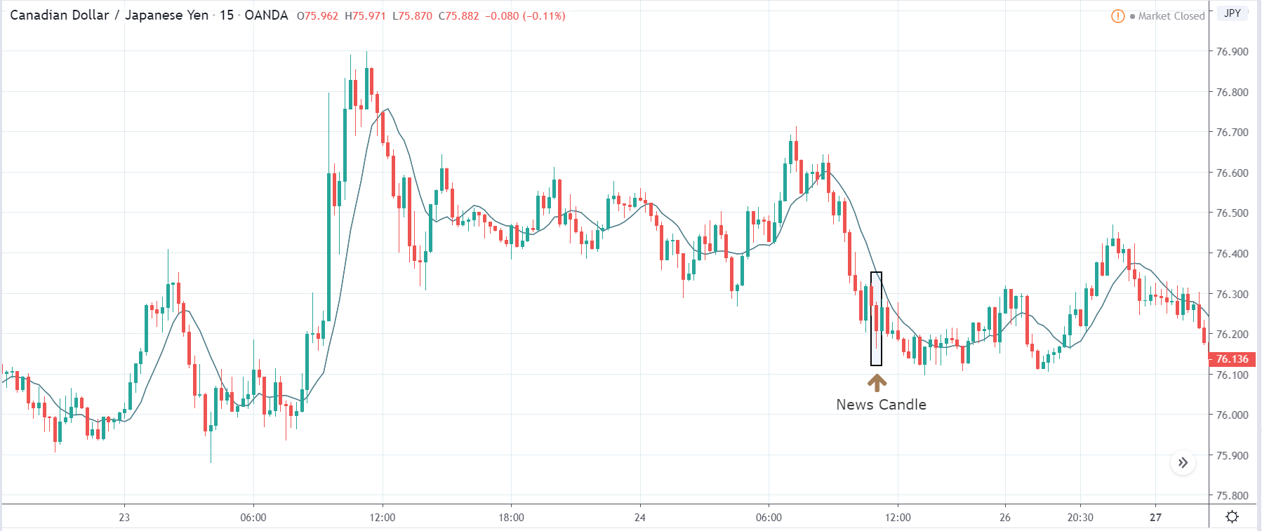
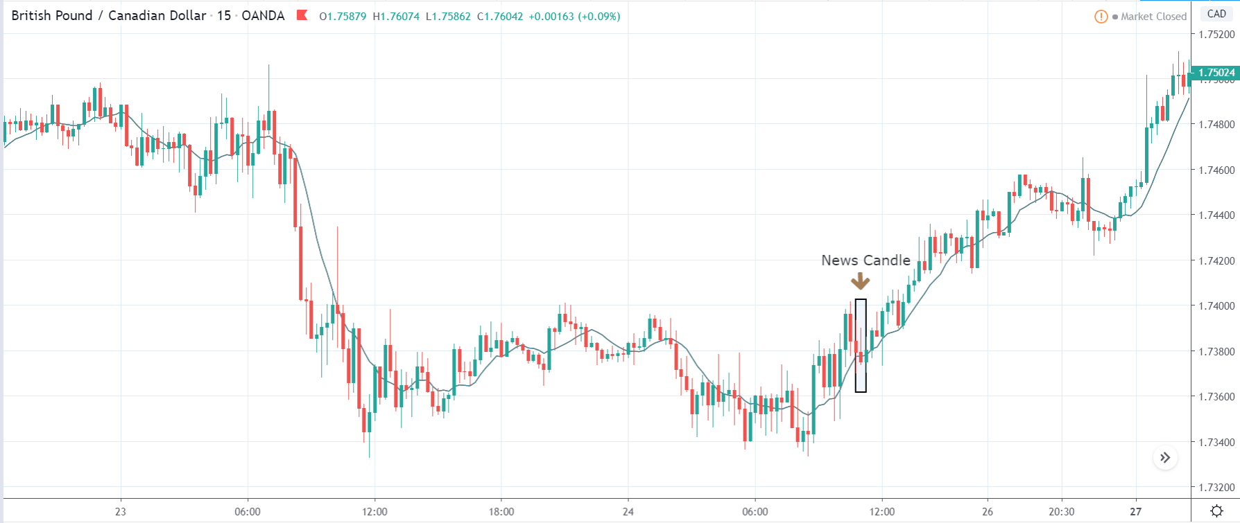
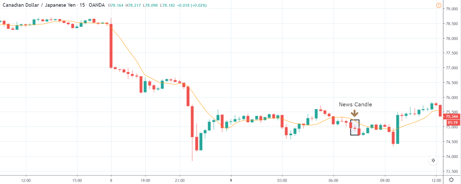
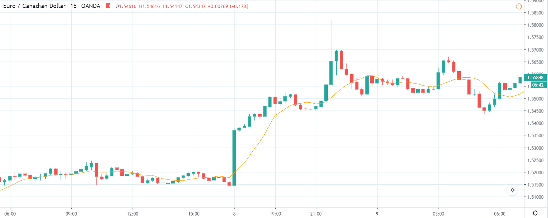
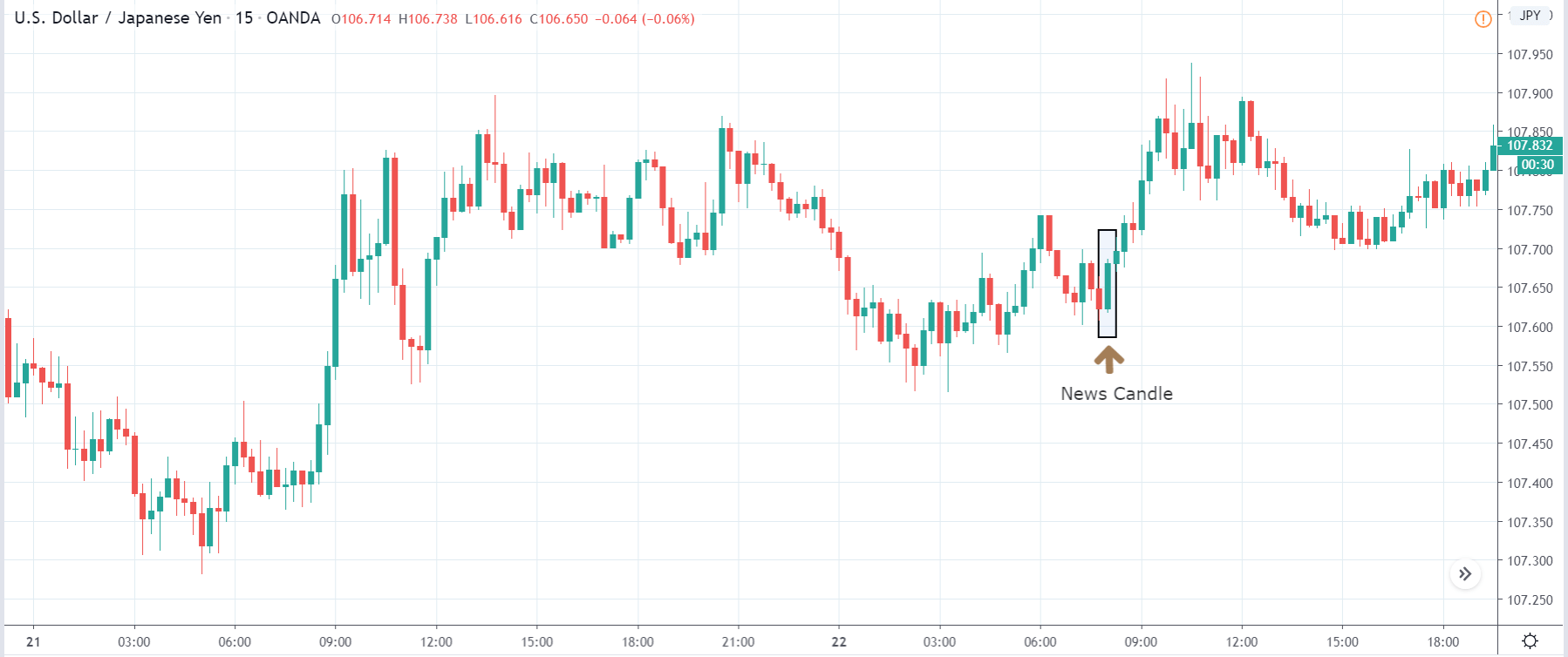
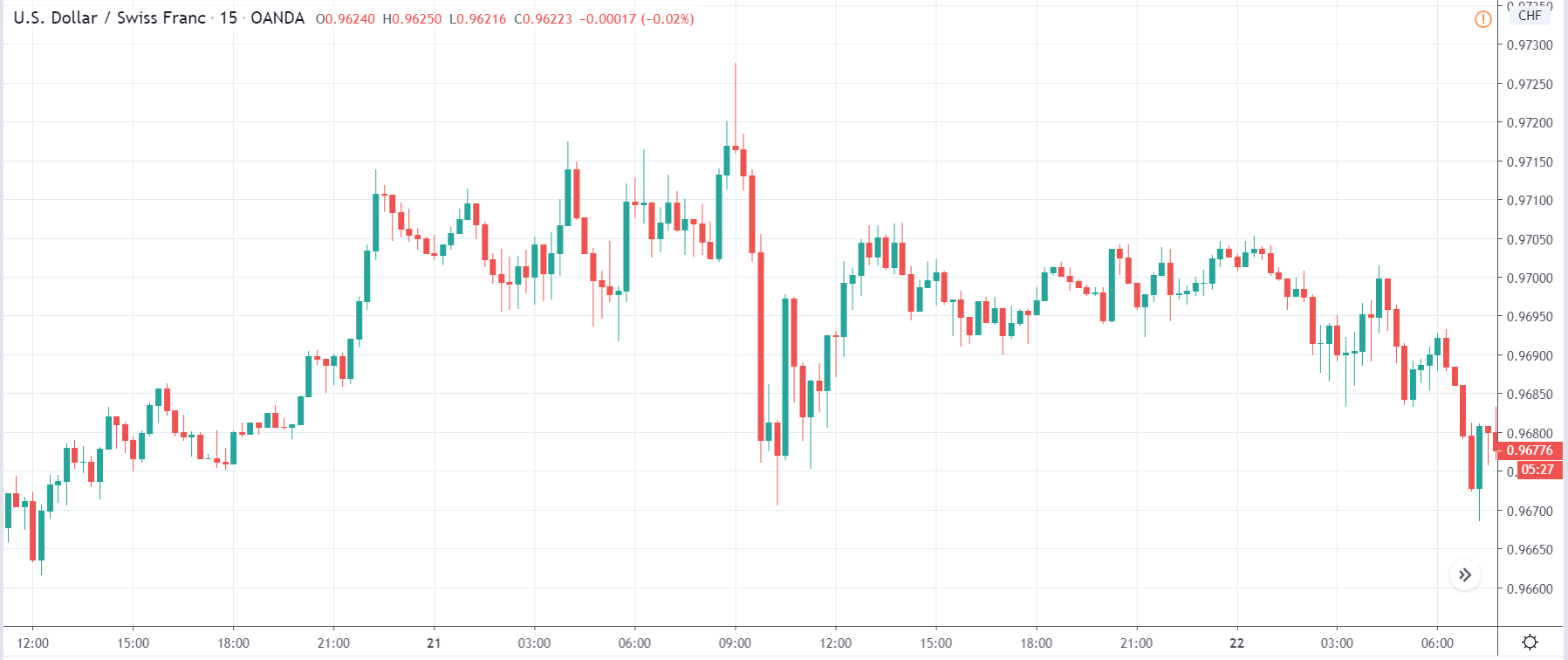
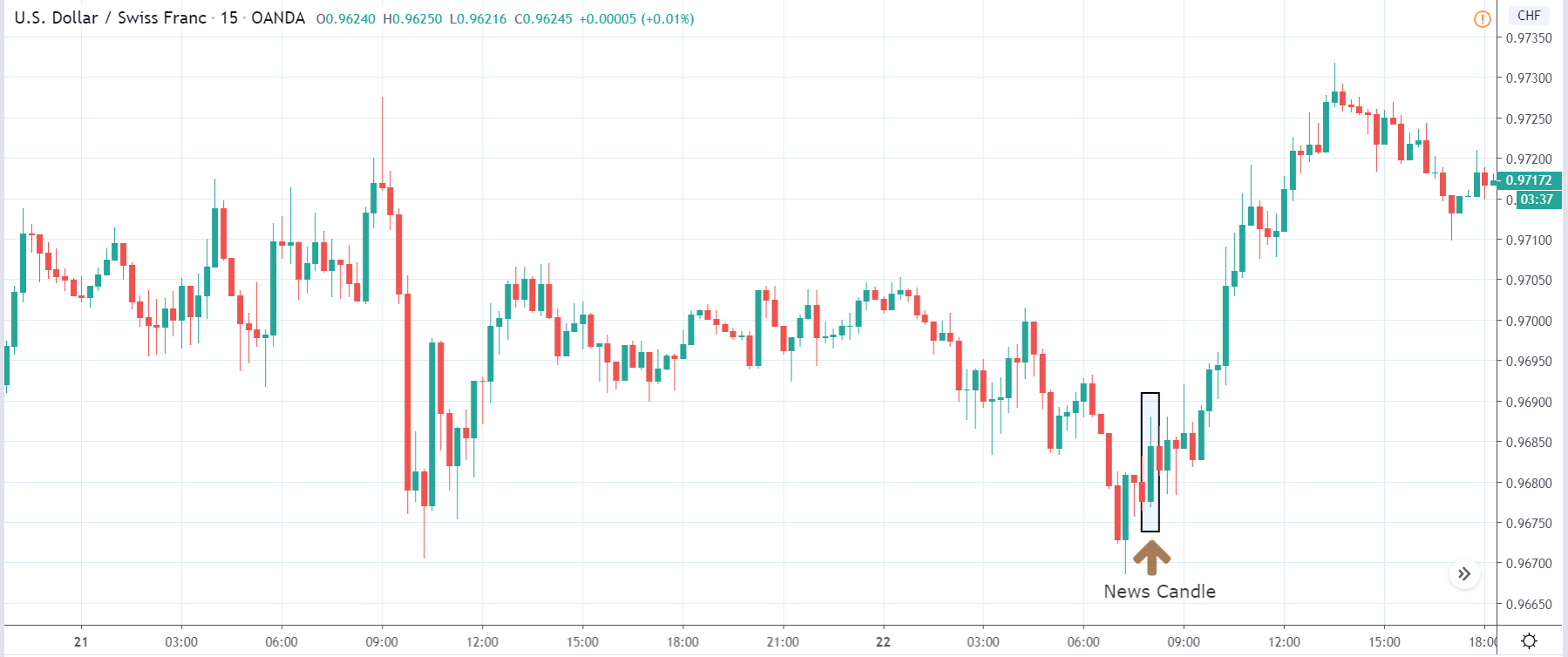
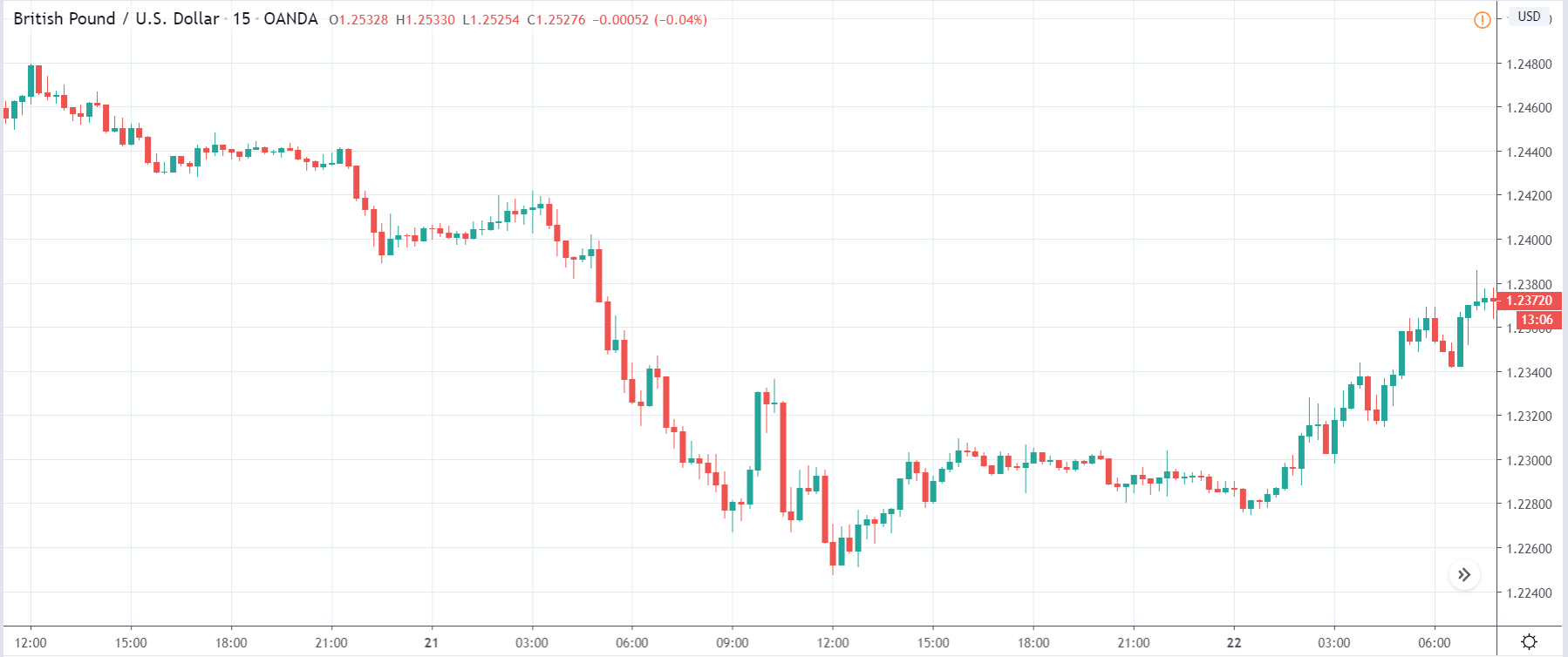
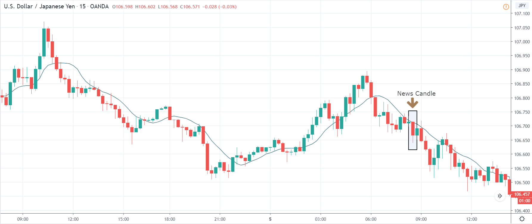
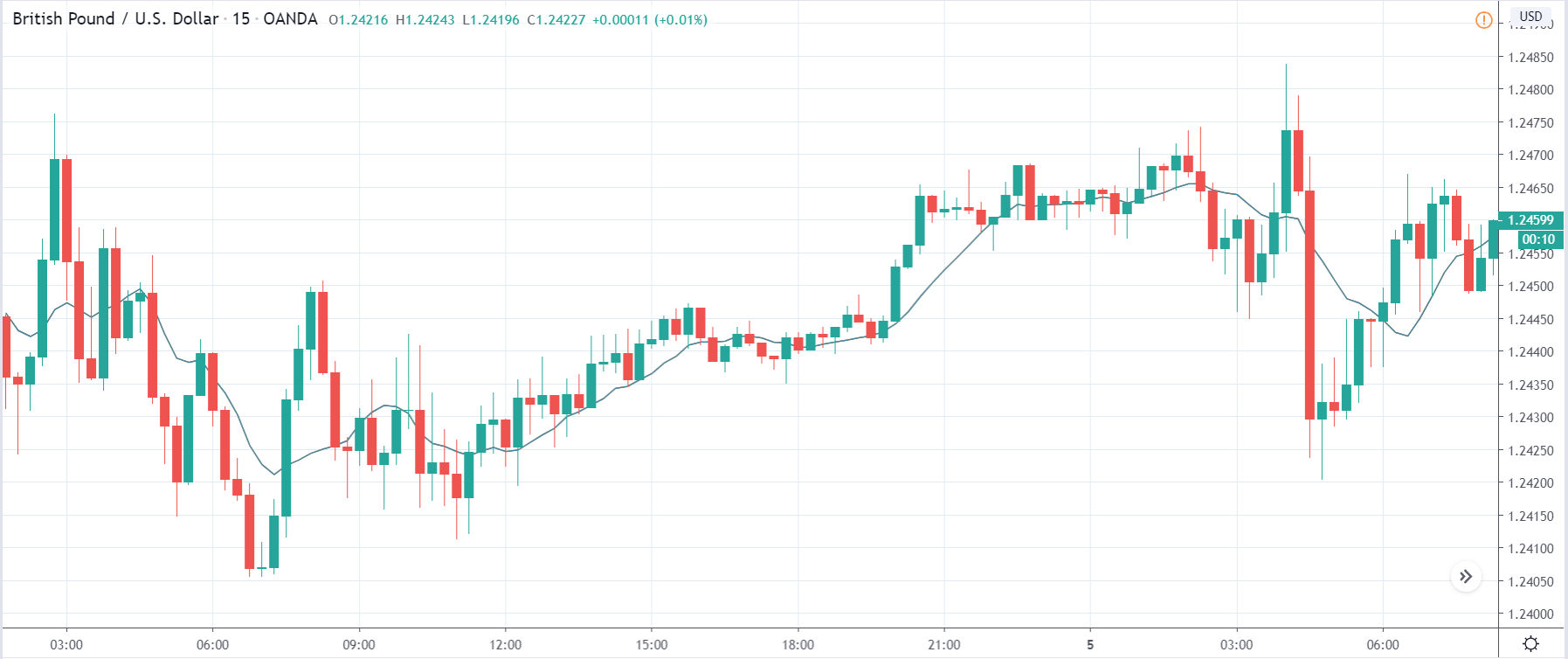
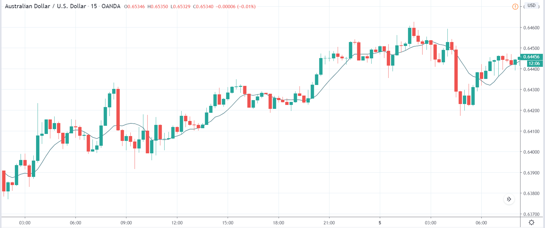
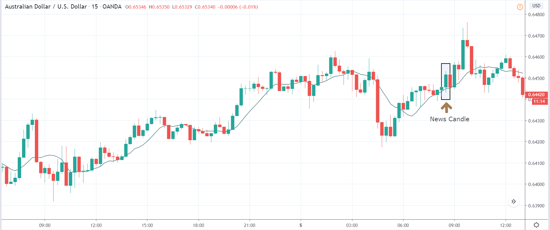
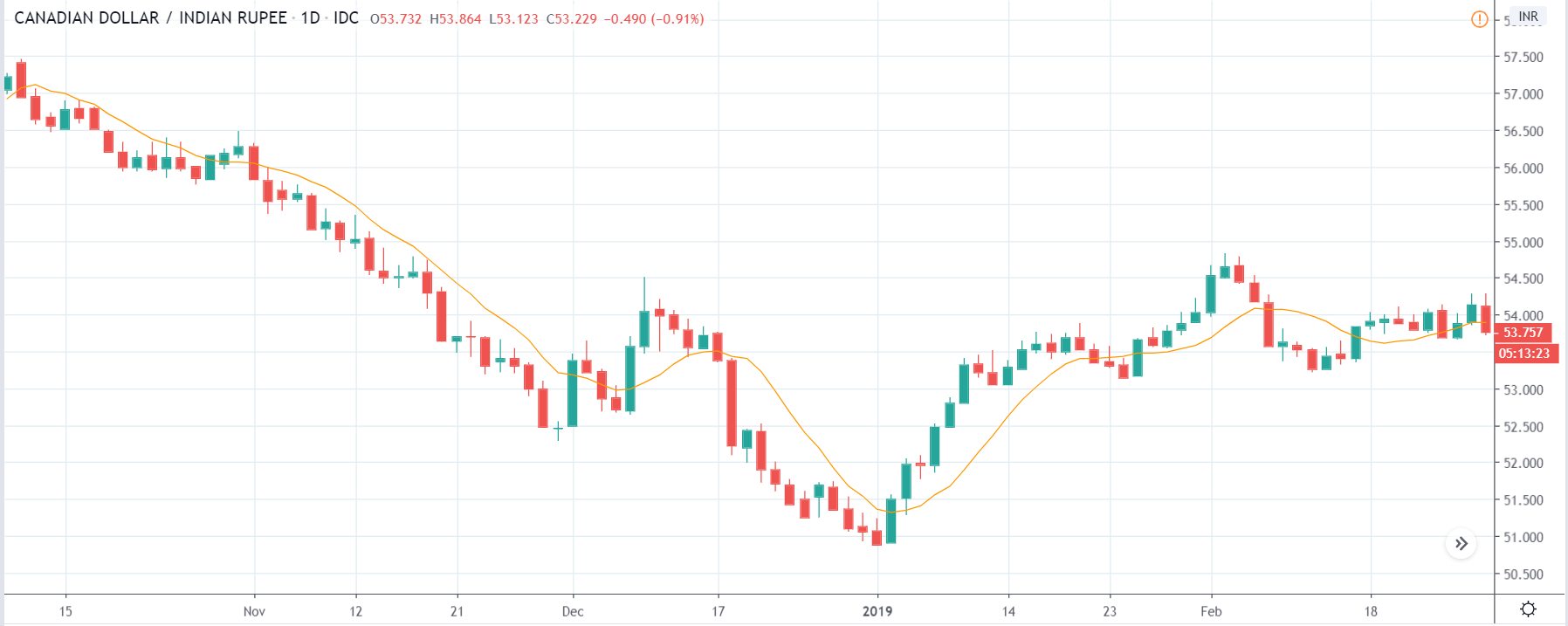
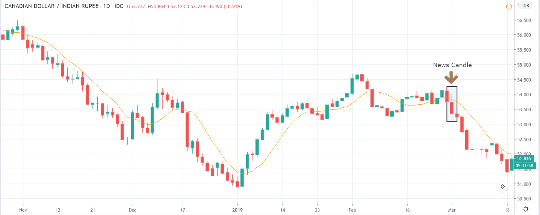
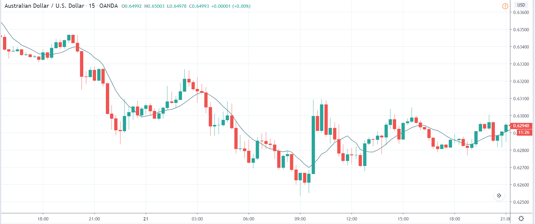
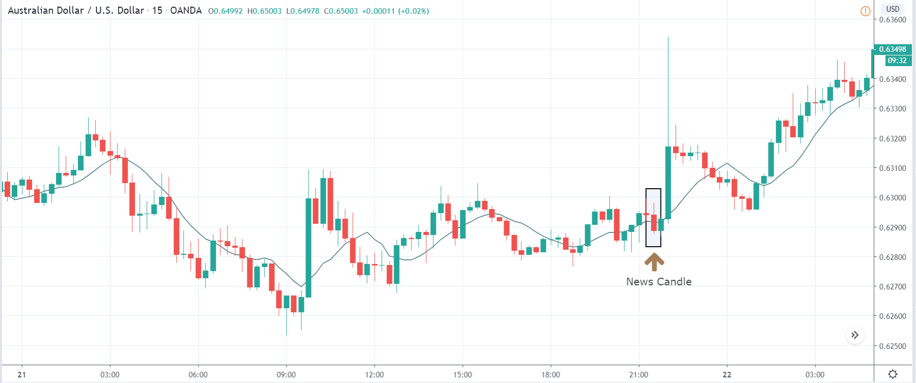
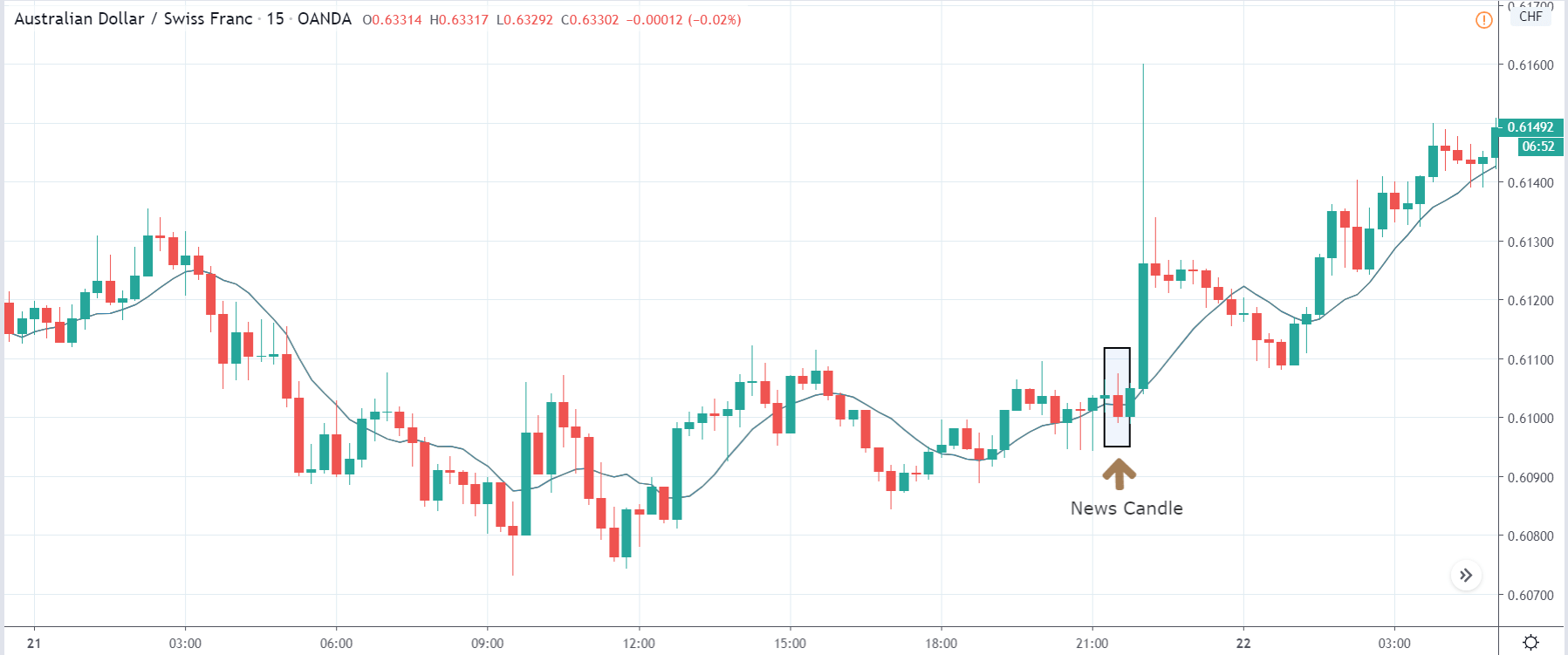
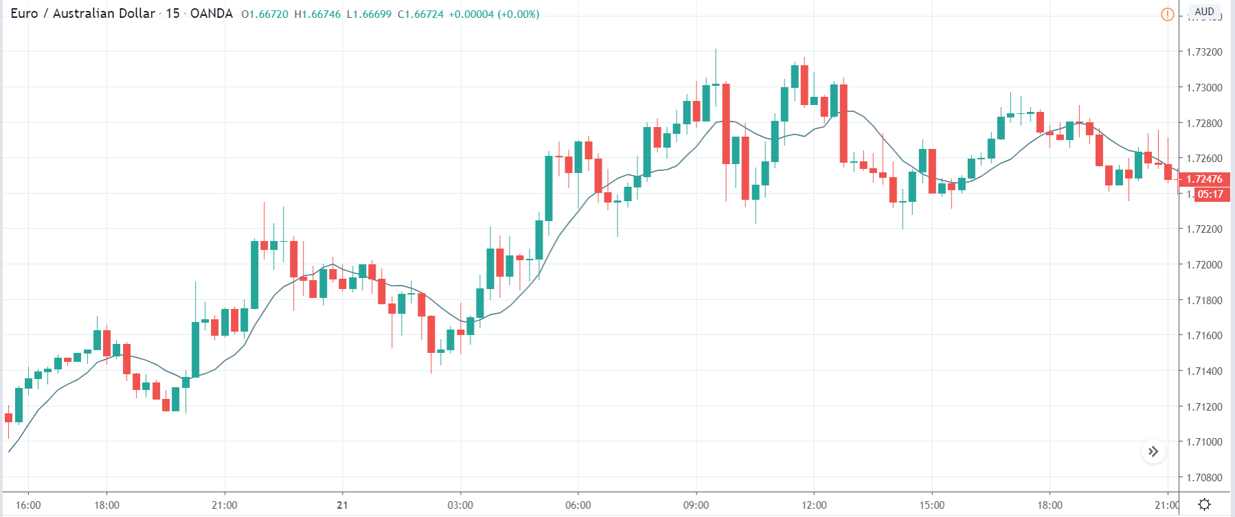
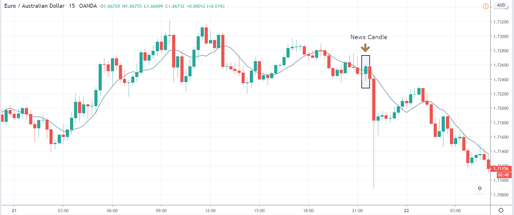
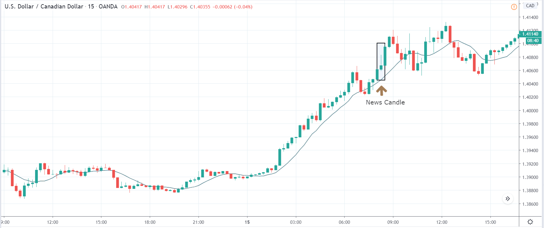
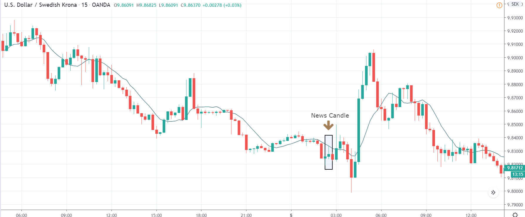
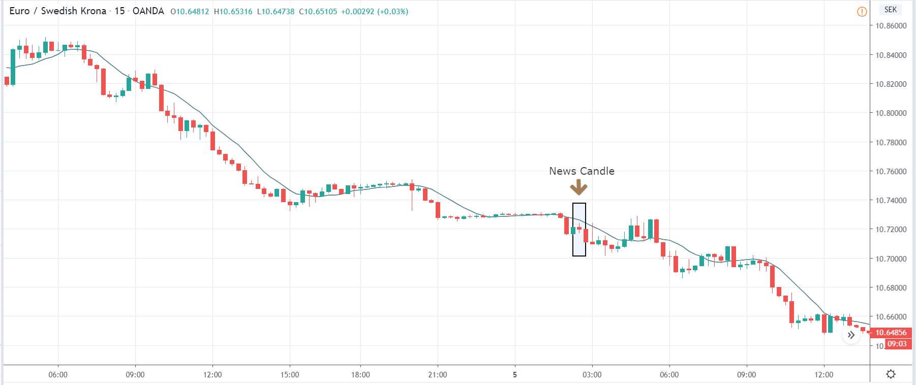
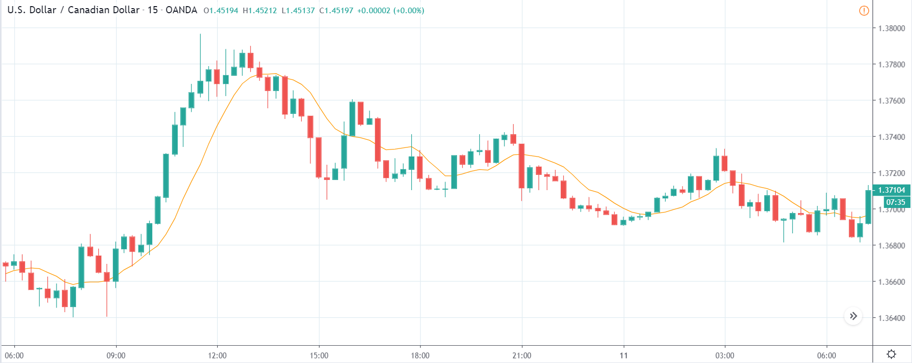
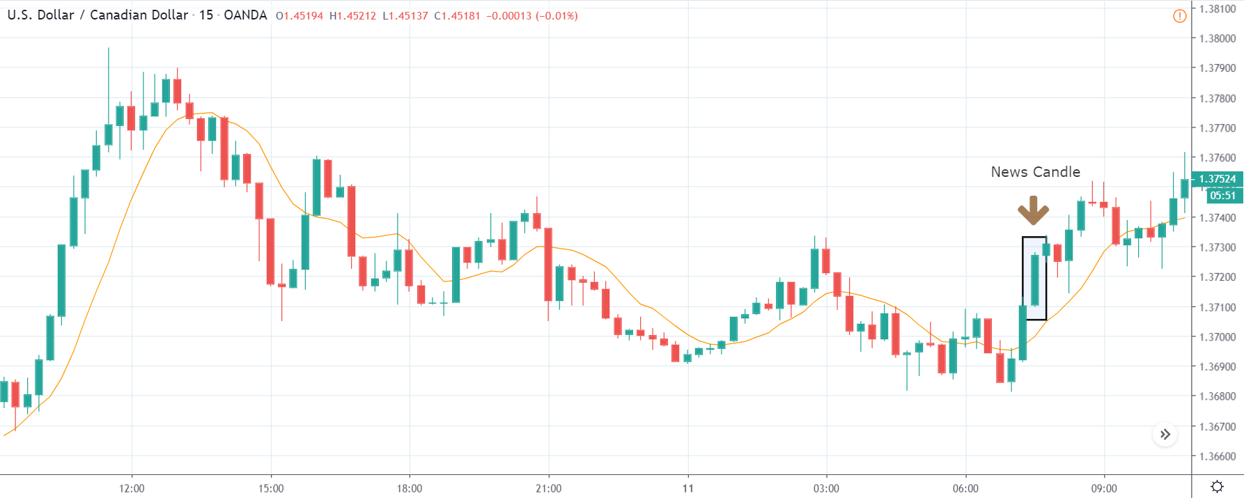
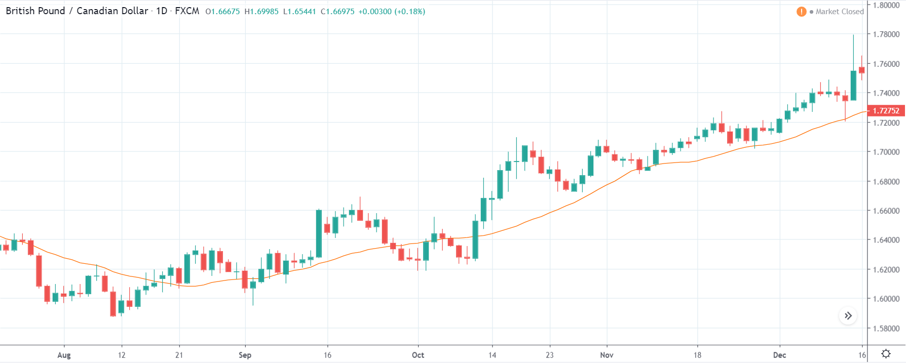
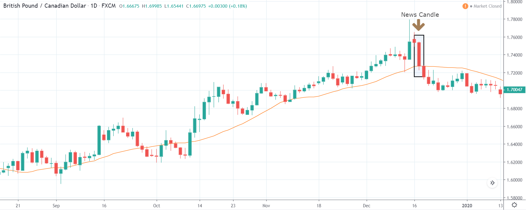
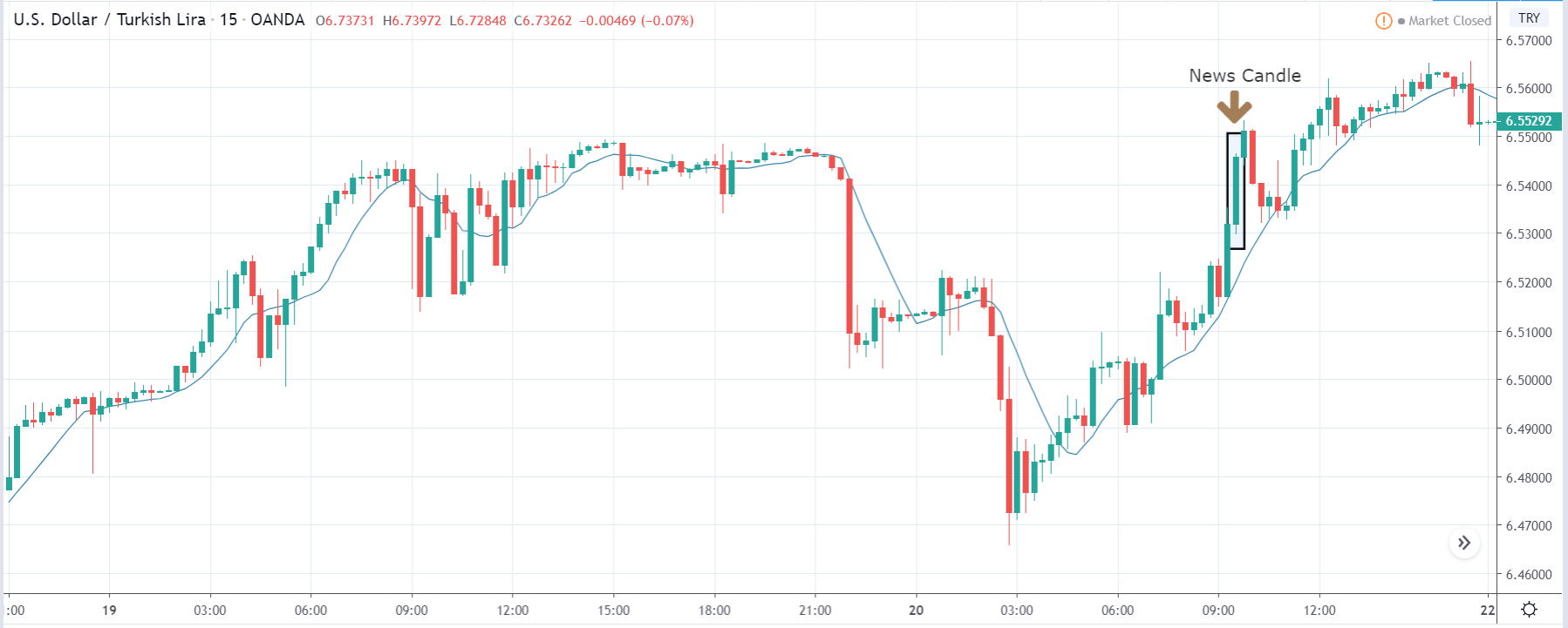
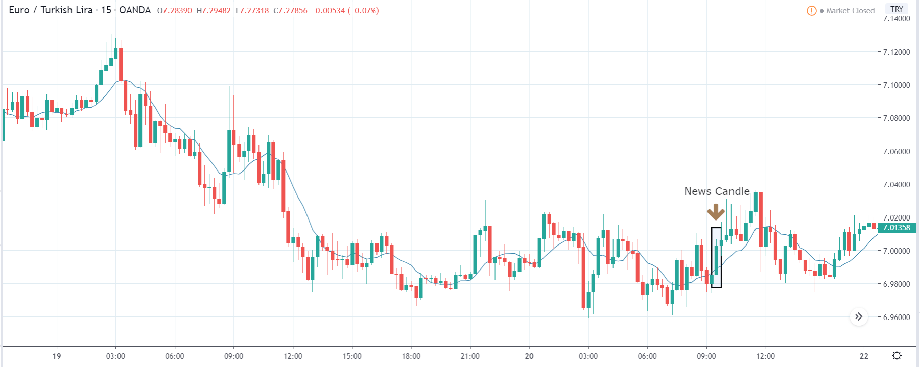
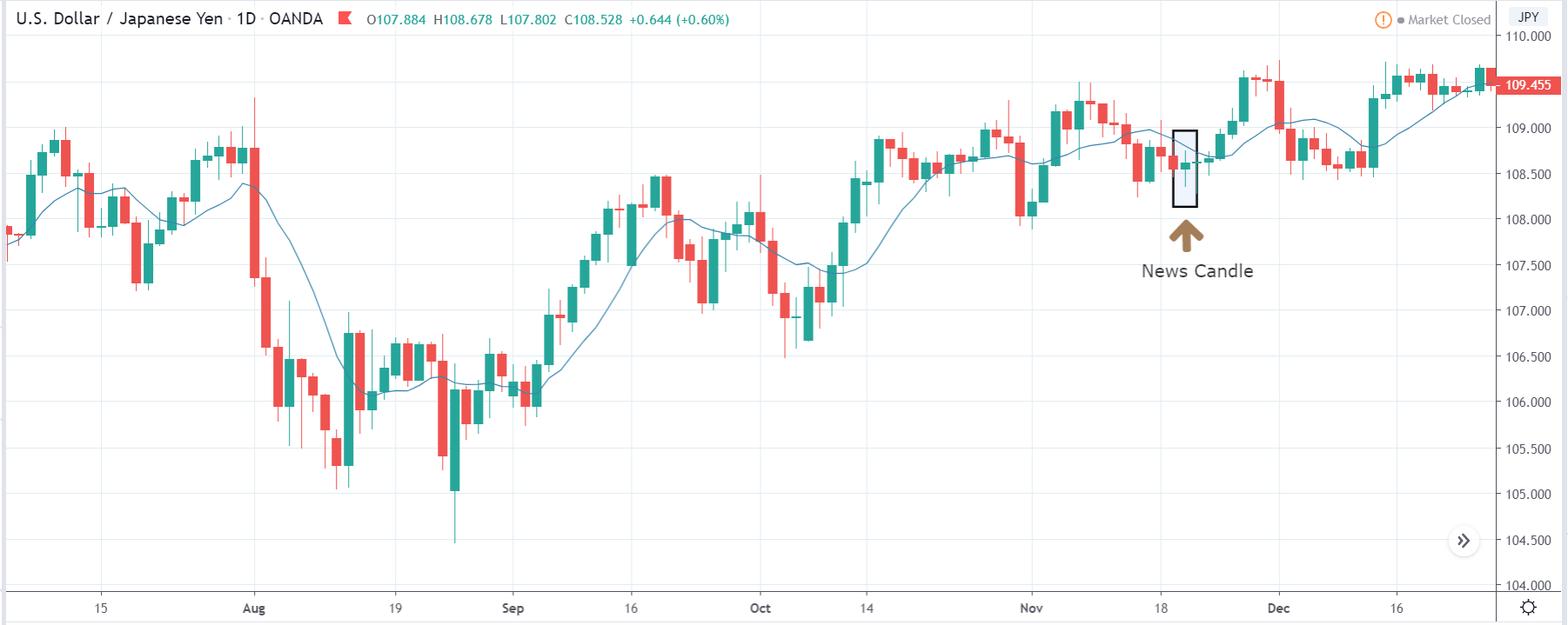
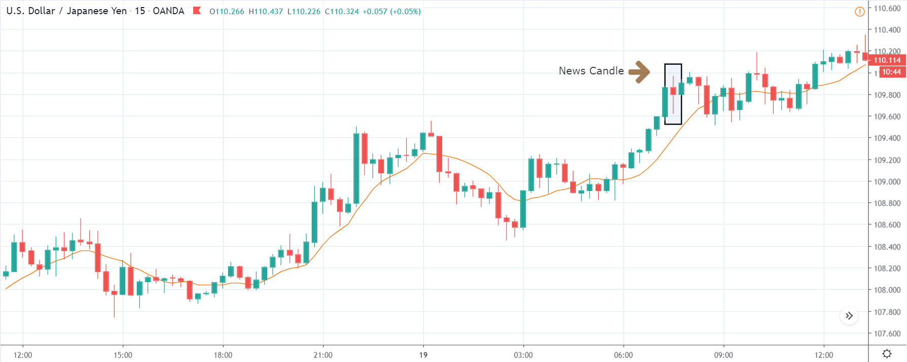
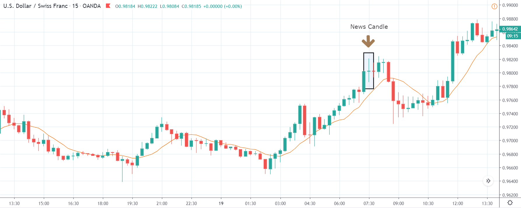
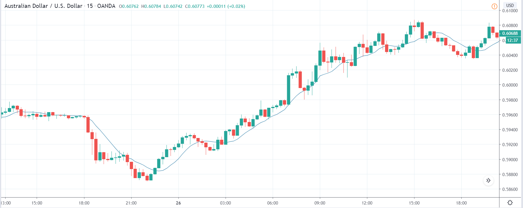
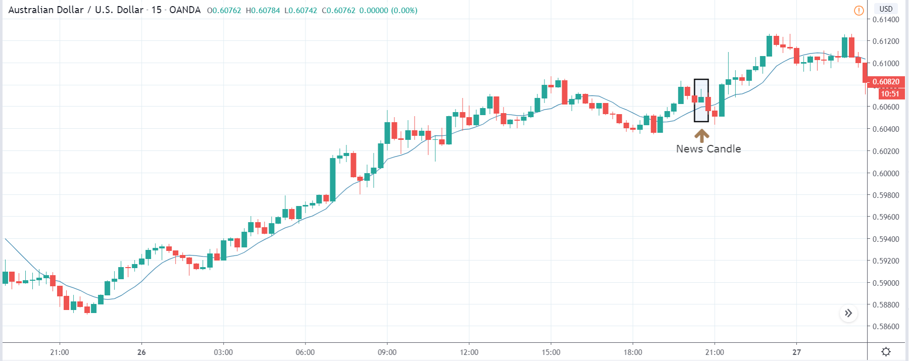
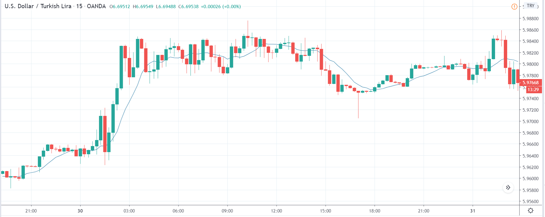
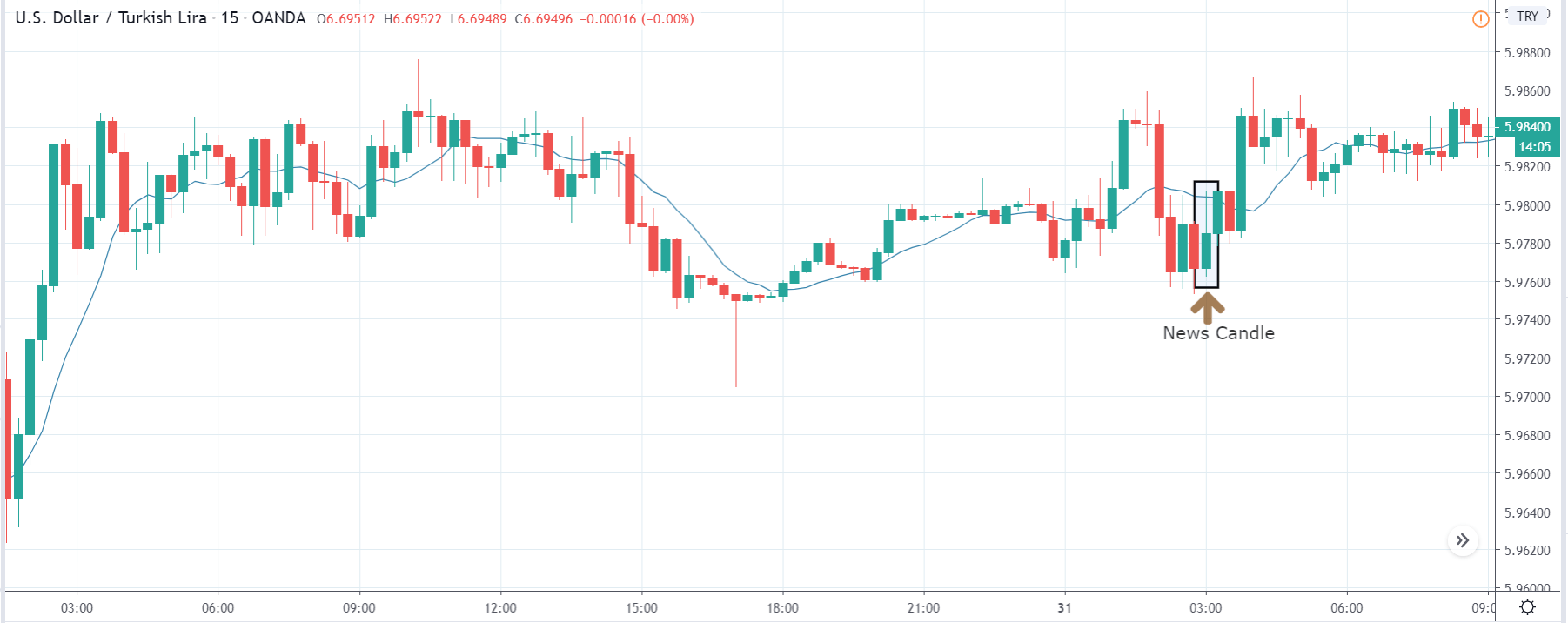
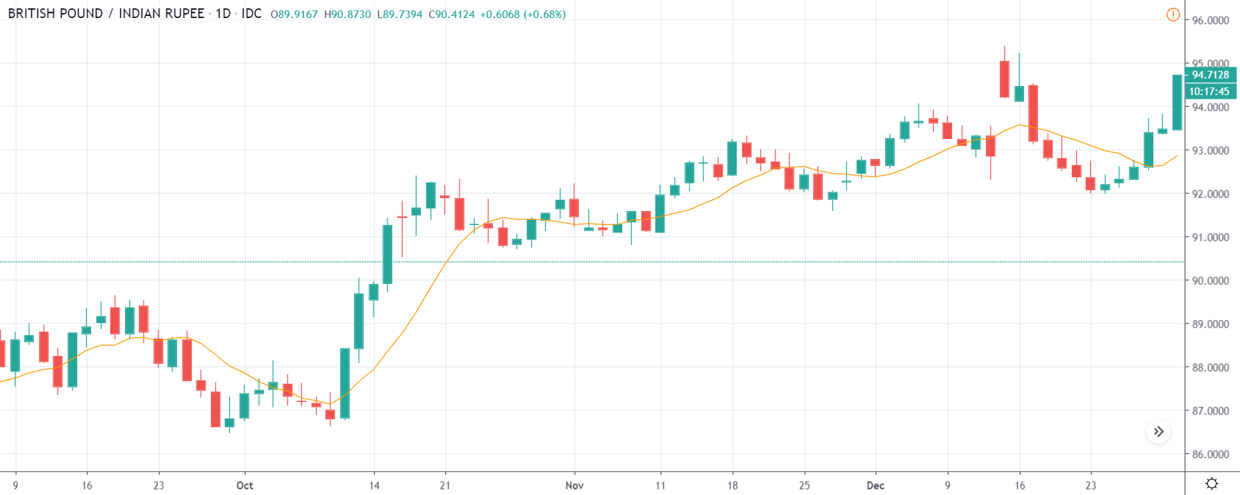
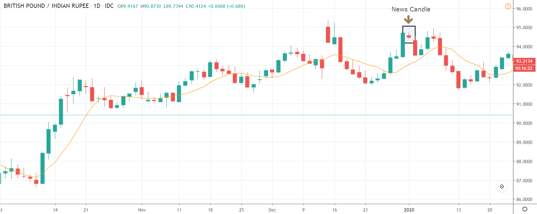
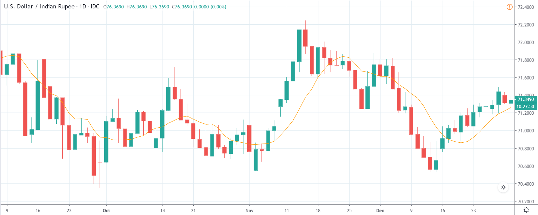
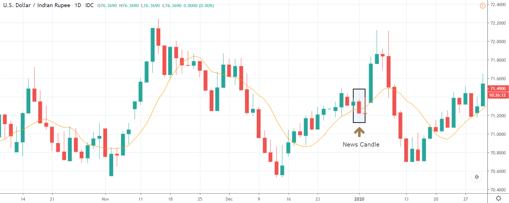
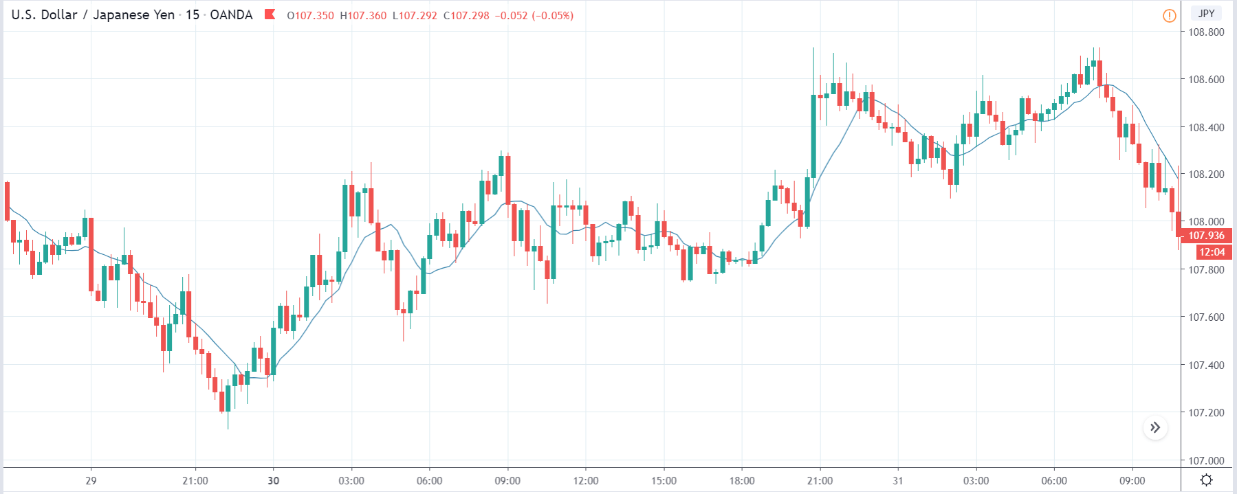
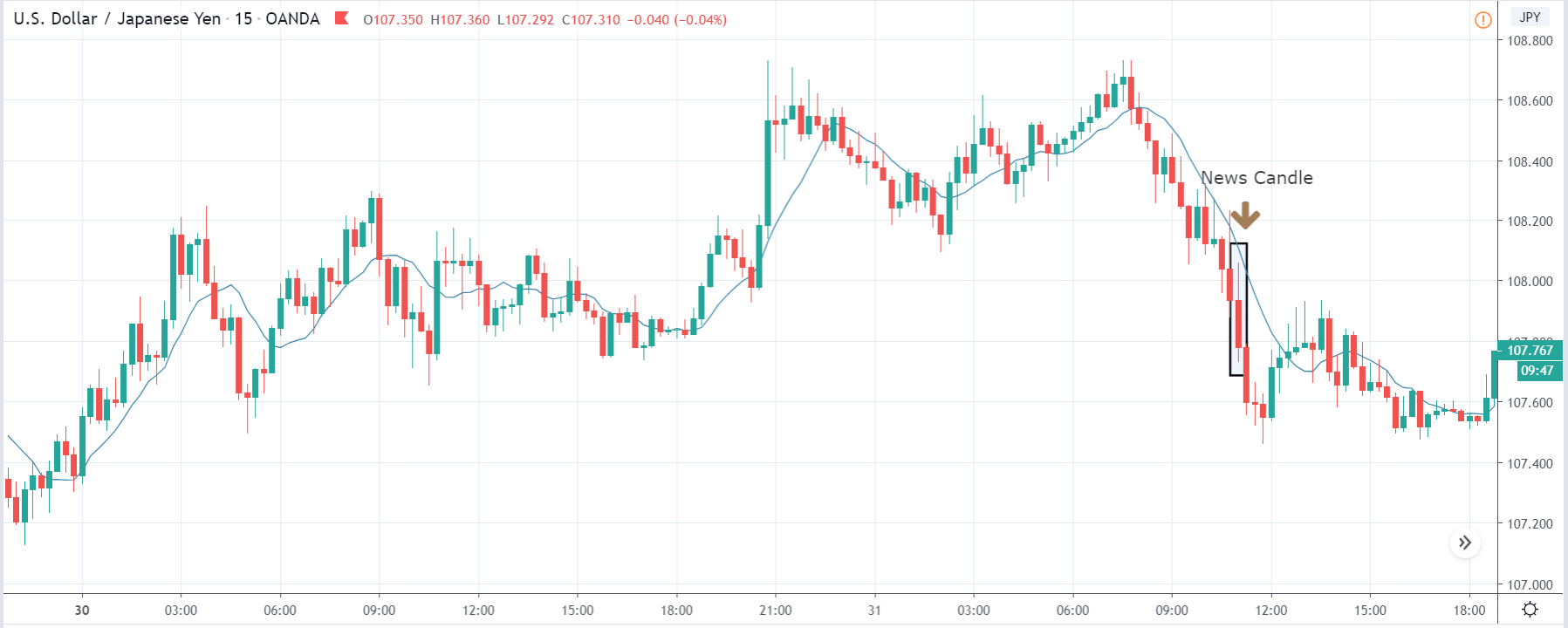
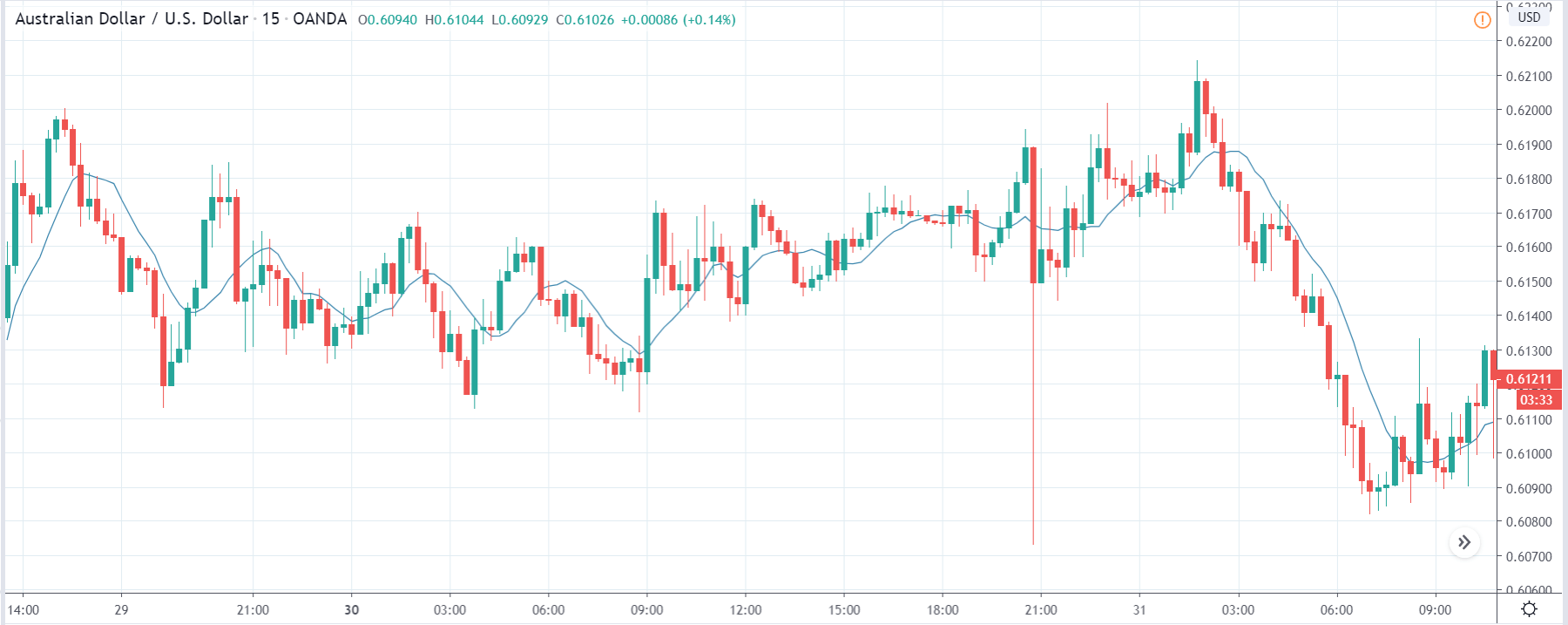
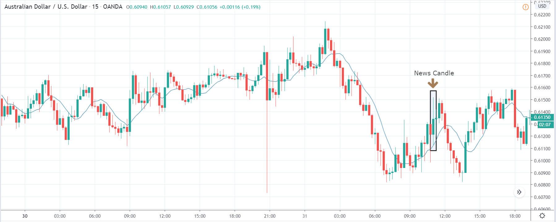
 In today’s lesson, we will analyze the impact of GDP on various currency pairs by observing the change in volatility before and after the news announcement. For that purpose, we have collected the GDP data of Canada, where the below image shows the month-on-month GDP data released recently. Let us find out the market’s reaction to this data.