
Introduction
This analysis will evaluate the endogenous factors that affect the domestic economy in both the UK and Canada. We’ll also cover exogenous factors that influence the price of the GBP/CAD pair.
Ranking Scale
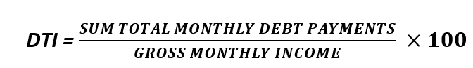
After analysis, we will rank both the exogenous and the endogenous factors on a scale from -10 to +10.
Endogenous factors will be ranked after a correlation analysis with the GDP growth rate. If negative, it means that either the GBP or the CAD have depreciated. If positive, it means that the domestic currency has appreciated.
The exogenous factors are ranked based on their correlation with the GBP/CAD pair’s exchange rate. When negative, it means that the price will drop. The price will be expected to increase if the exogenous analysis is positive.
Summary – GBP Endogenous Analysis
A -15 score on Pound’s Endogenous Analysis indicates that this currency has depreciated since the beginning of 2020.
Summary – CAD Endogenous Analysis
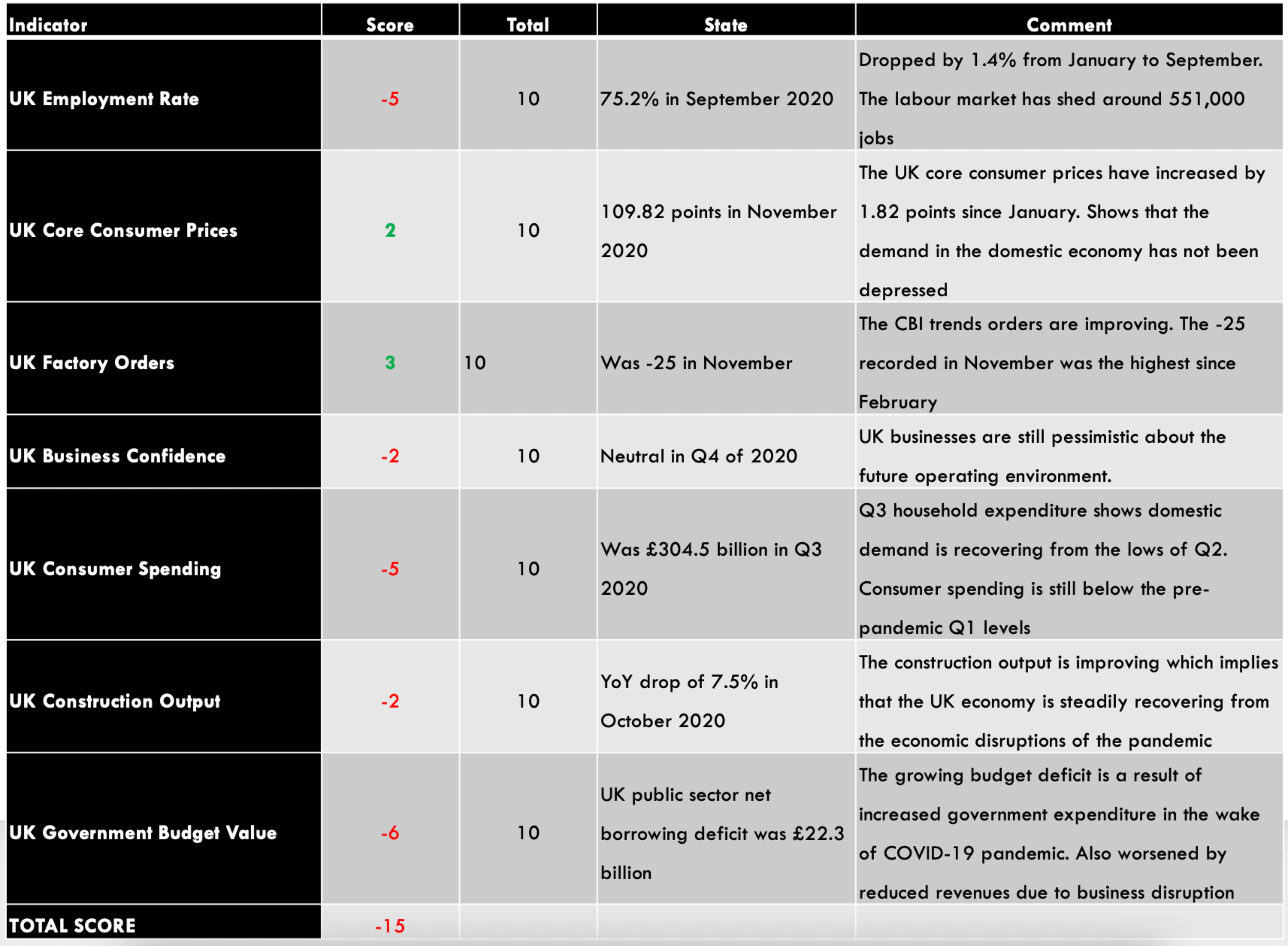
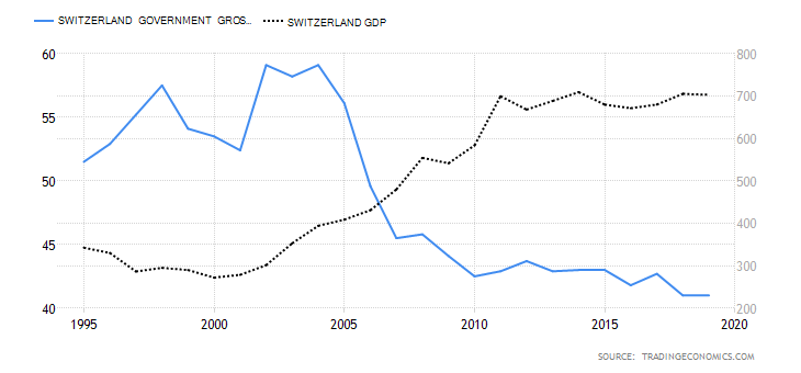
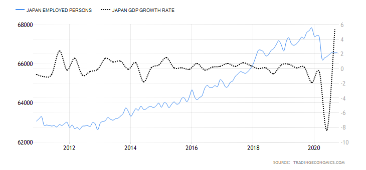
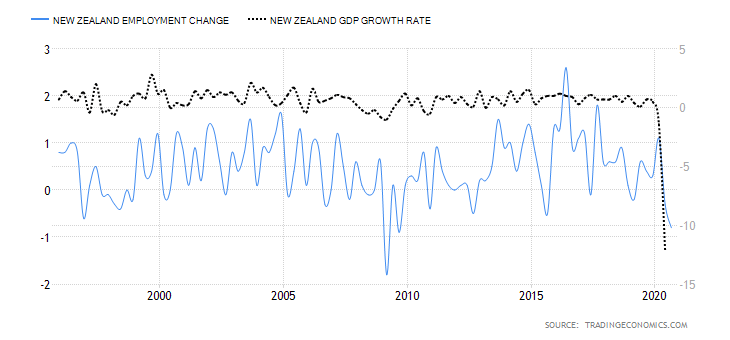
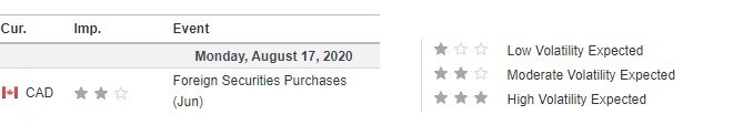
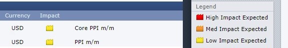
- Canada Employment Rate
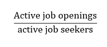
The Canadian employment rate measures the percentage of the labor force that is employed during a particular period. The developments in the labor market are a leading indicator of overall economic growth. When the economy is expanding, there are more job openings, hence a higher employment rate. Conversely, when the economy is going through a recession, businesses close down, leading to a dropping employment rate.
In November 2020, the employment rate in Canada rose to 59.5% from 59.4% in October. Although the employment rate has been steadily increasing from the lows of 52.1% in April, it is still lower than in January. Canada’s employment rate has a score of -6.
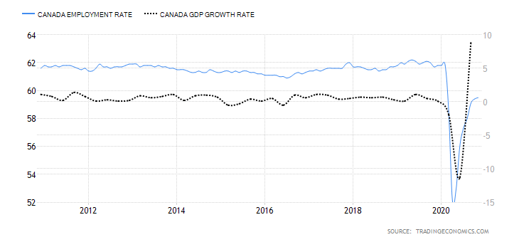
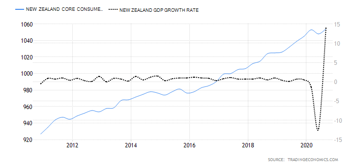
- Canada Core Consumer Prices
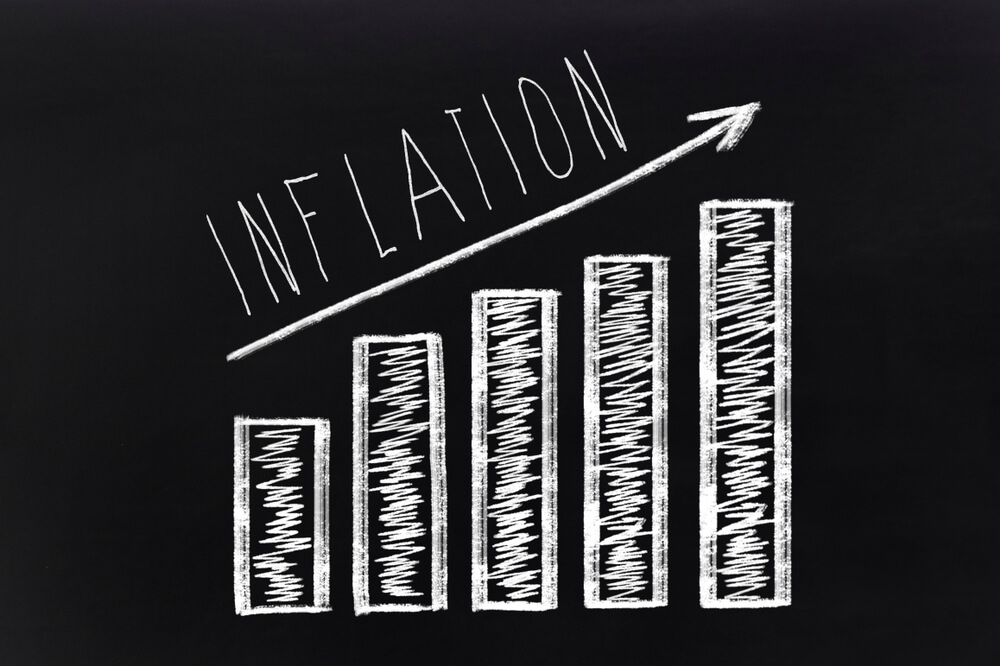
This index measures the overall change in Canada’s inflation rate based on a survey of price changes for a basket of consumer goods. The rate of inflation gauges the increase in economic activity. Typically, when demand is depressed in an economy, prices drop, resulting in lower inflation. Conversely, when demand increases, prices tend to increase, resulting in a higher rate of inflation.
In November 2020, Canada’s core consumer prices rose to 136.6 points from 136.3 in October. Between January and November, the index has increased by 2 points. It has a score of 3.
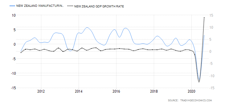
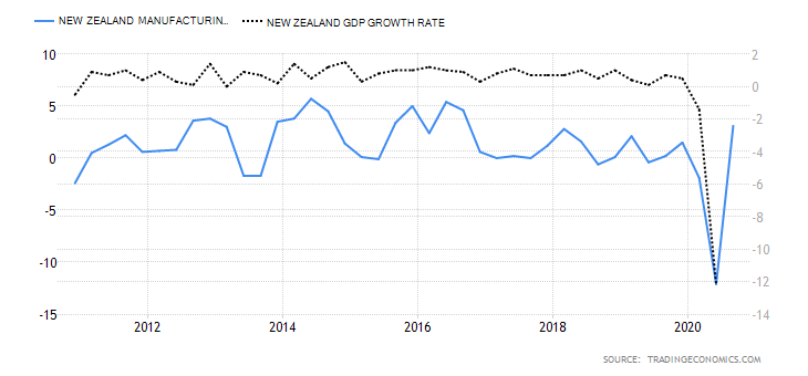
- Canada Manufacturing Production
This index measures the YoY change in the value of the output from the Canadian manufacturing sector. Canadian manufacturing is a significant contributor to the labor market and economic growth. In the age of the coronavirus disruption, changes in manufacturing production show how faster the economy is bouncing back.

In September 2020, the YoY manufacturing production in Canada dropped by 4.24%. This is an improvement compared to the 5.34% drop recorded in August. Canadian manufacturing production has a score of -2.
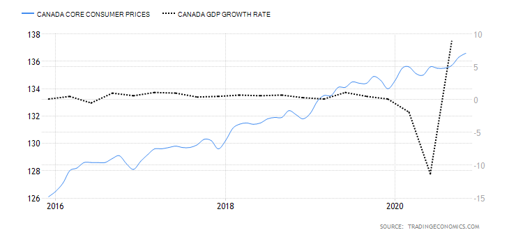
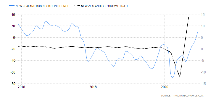
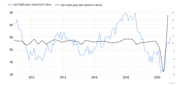
- Canada Business Confidence
The Ivey Purchasing Managers Index (PMI) measures monthly business confidence in Canada. In the survey, private and public companies rate whether the current business activity is higher or lower than the previous month. The index survey aspects including inventories, purchases, deliveries from suppliers, output prices, and employment.
When the index is over 50, it means that purchases have increased from the preceding month. Reading of below 50 shows a decrease in purchases.
In November 2020, Canadian business confidence dropped to 52.7 from 54.5 in October. This was the lowest reading since May, when the economy began rebounding from the shocks of COVID-19. Consequently, Canada’s business confidence has a score of 1.
- Canada Consumer Spending
This measures the final market value of all household expenditures on goods and services. It also includes expenditure by non-profit organizations that serve households in Canada but excludes purchases of homes. Consumer spending plays a critical role in economic growth.
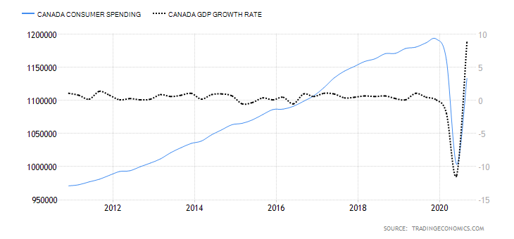
In Q3 of 2020, consumer spending in Canada rose to CAD 1.13 trillion from CAD 1 trillion in Q2. However, it is still lower than consumer spending recorded in Q1. Thus, Canada’s consumer spending has a score of -4.
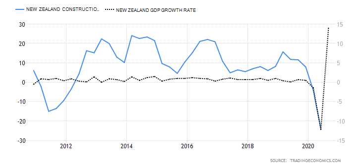
- Canada New Housing Price Index
The Canadian NHPI measures the changes in the selling price of newly built residential houses. The price measured is that paid by the home buyers to the contractors. Note that the price comparison is strictly between houses of the same specification. The NHPI shows the construction sector’s growth trends; hence, it corresponds to changes in the labor market and GDP growth.
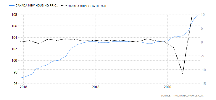
In November 2020, the Canadian NHPI rose to 107.9 from 107.3 in October. Thus, we assign a score of 3.
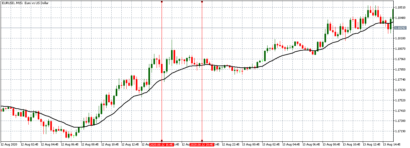
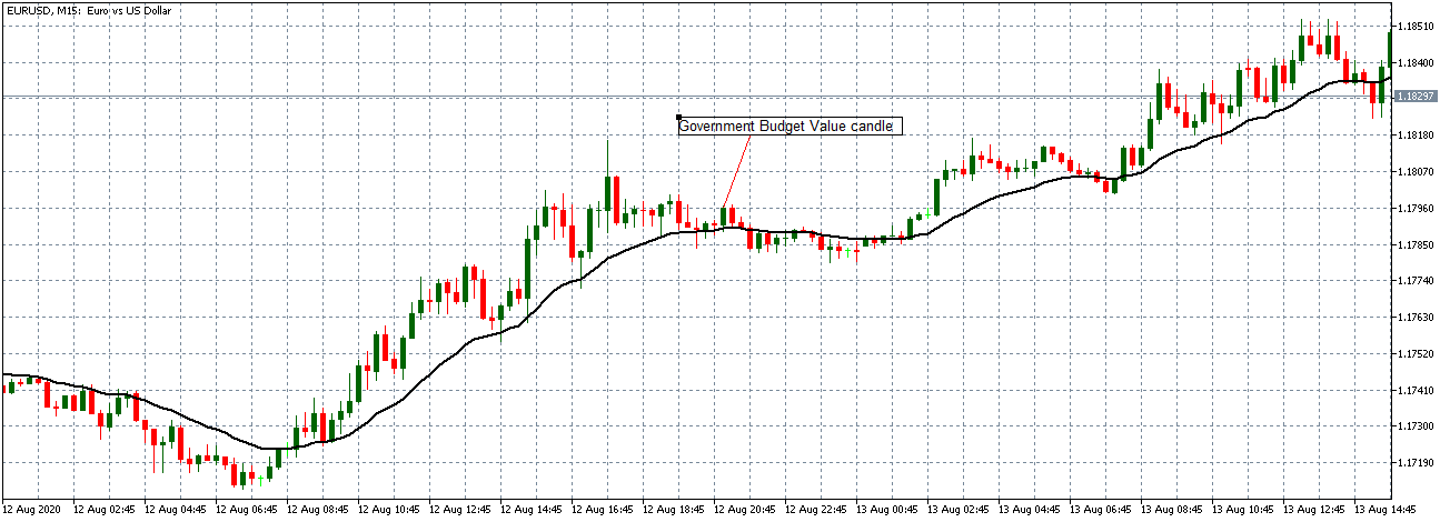
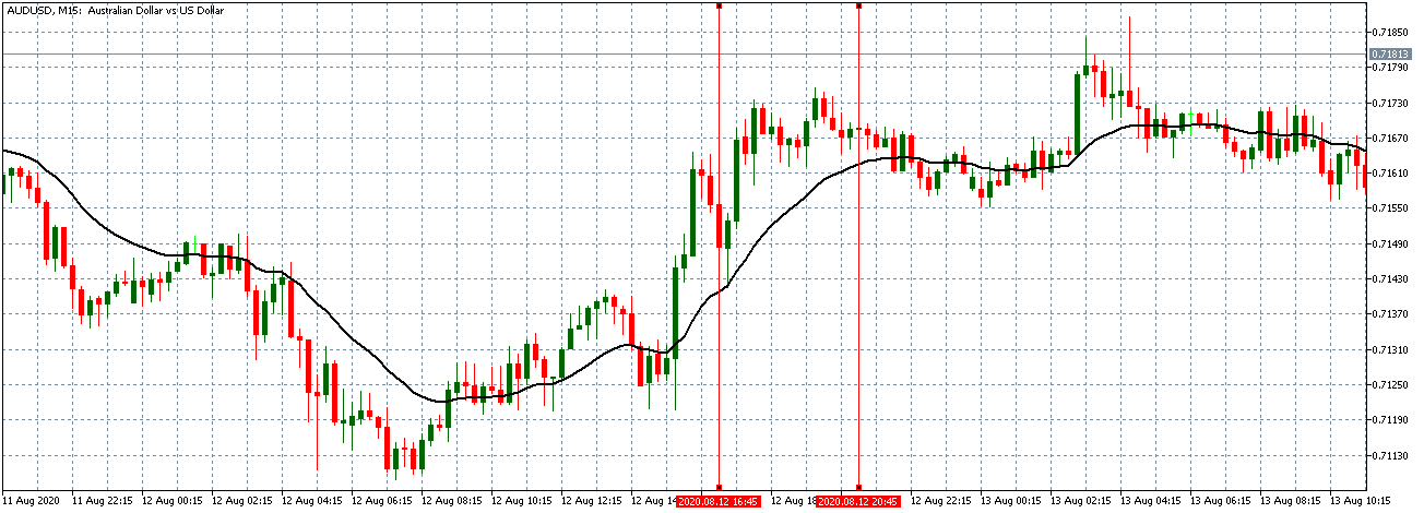
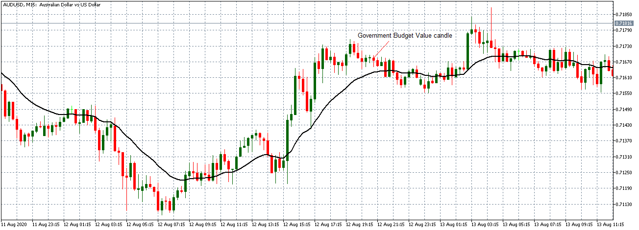
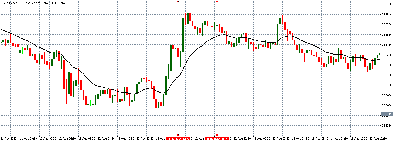
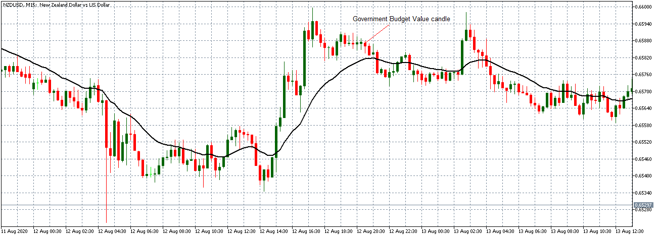
- Canada Government Budget Value
This indicator tracks the changes in the difference between the Canadian government revenues and expenditures. It shows whether the government is running a surplus or a deficit. It also breaks down the changes in the receipts by the government. This helps to show how the overall economy is fairing.
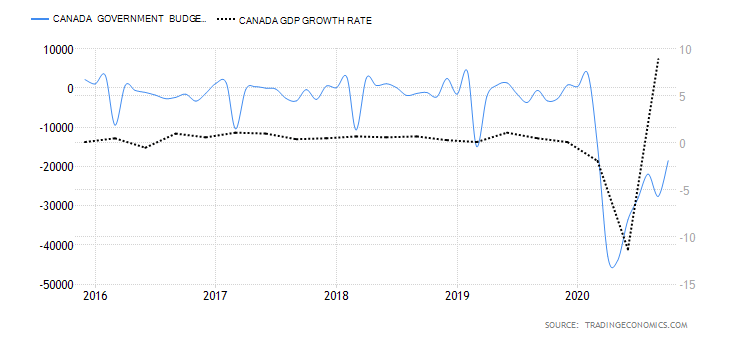
In October 2020, the Canadian government budget had a deficit of CAD 18.51 billion compared to CAD 27.59 billion in September. Throughout the year, the budget deficits have been due to the economic shocks brought on by the coronavirus pandemic. The Canadian government had to ramp up expenditure through its Economic Response Plan, while revenues dropped in the same period. We assign it a score of -5.
Conclusion
| Indicator | Score | Total | State | Comment |
| Canada Employment Rate | -6 | 10 | 59.5% in November 2020 | The employment rate is steadily increasing. It is, however, still below January levels |
| Canada Core Consumer Prices | 3 | 10 | 136.6 points in November 2020 | Since January, it has increased by 2 points. That shows demand in the economy has kept prices higher |
| Canada Manufacturing Production | -2 | 10 | YoY dropped by 4.24% in September 2020 | A slight increase from -5.34% recorded in August. This shows that the manufacturing production is returning to the pre-pandemic levels |
| Canada Business Confidence | 1 | 10 | 52.7 in November | November level was the lowest since the economy began to recover in May. It’s expected to improve as mass vaccinations against COVID-19 rolls out |
| Canada Consumer Spending | -4 | 10 | Was CAD 1.13 trillion Q3 2020 | Recovered from CAD 1 trillion in Q2 but still lower than Q1. This shows that demand is increasing in the economy |
| Canada New Housing Price Index | 3 | 10 | November NHPI was 107.9 | It has been increasing, which shows that output in the construction industry is improving |
| Canada Government Budget Value | -5 | 10 | a budget deficit of CAD 18.51 billion in October | The deficit widened in 2020, driven by unprecedented fiscal policies to curb recessionary pressure from the pandemic |
| TOTAL SCORE | -10 |
A score of -10 indicates that the CAD has depreciated since the beginning of the year 2020.
In the next article, you can find the exogenous analysis of GBP/CAD where we have forecasted this pair’s future price movements. Cheers.
GBP/CAD Exogenous Analysis
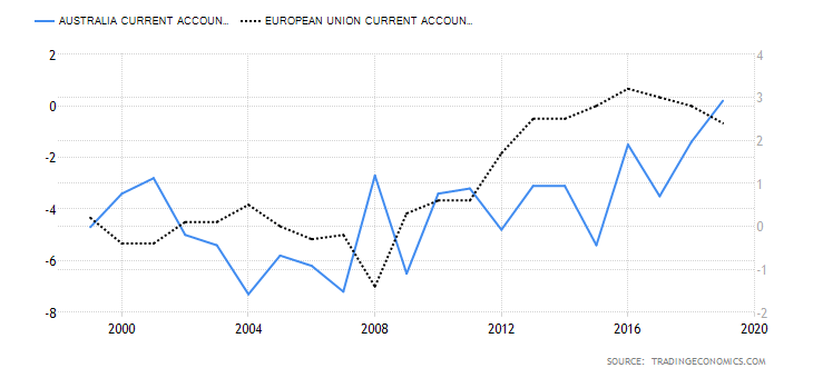
- The UK and Canada Current Account Differential
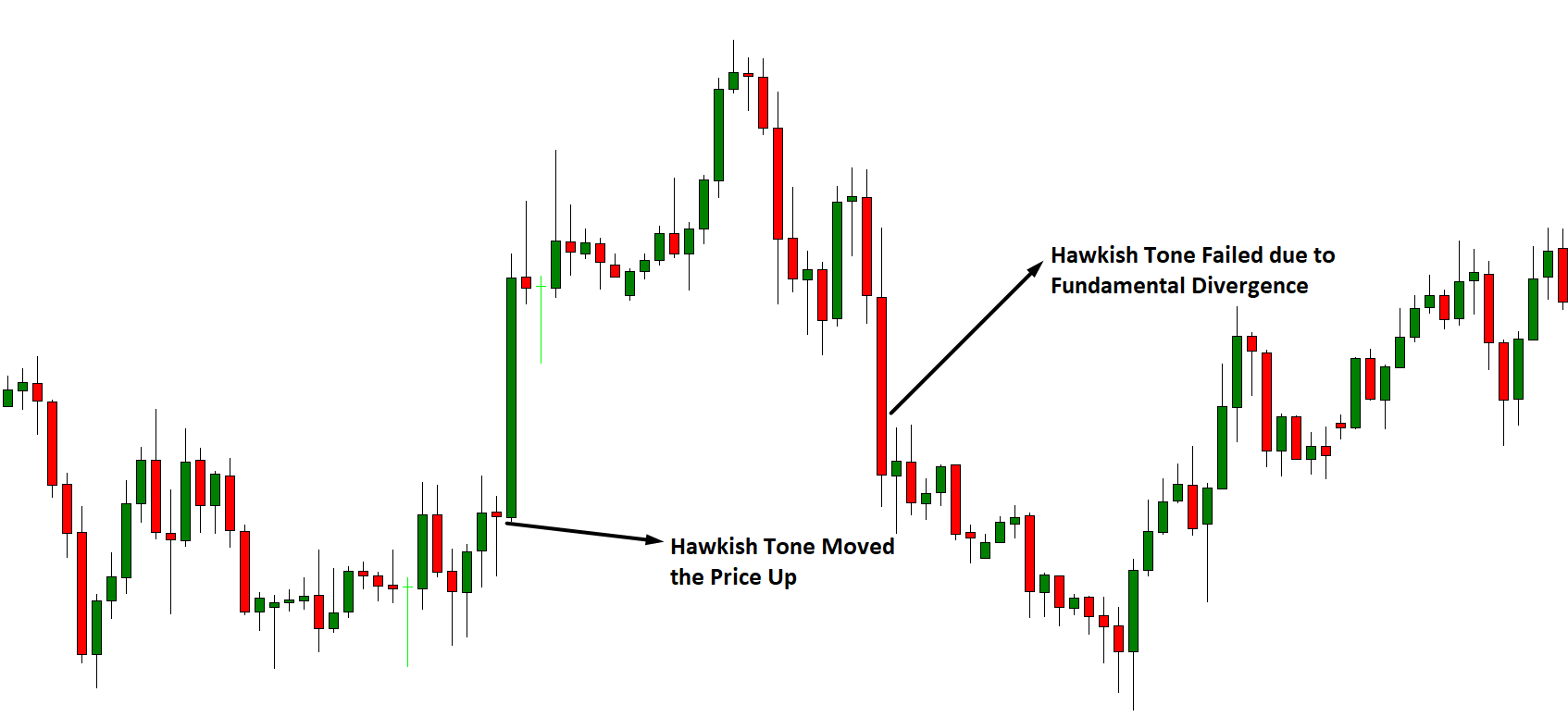
The current account differential between the UK and Canada can determine if the GBP/CAD pair is bullish or bearish. If the differential is positive, it means that the UK has a higher current account balance than Canada. This would imply that the GBP is in higher demand in the forex market than the CAD; hence, it is a bullish trend for the pair. Conversely, if the current account differential is negative, it means that the UK has a lesser current balance than Canada. It would imply that the GBP has a lower demand than the CAD in the forex market; hence, a bearish trend for the pair.
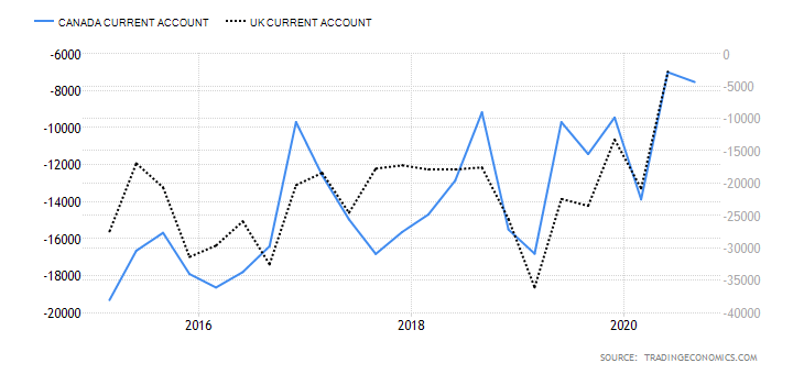
In Q3 of 2020, the UK had a current account deficit of $20.97 billion while Canada had a $5.83 billion deficit. Thus, the current account differential is -$15.14 billion. We assign a score of -2.
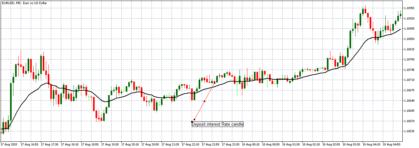
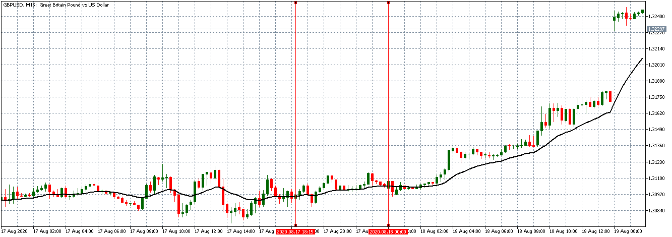
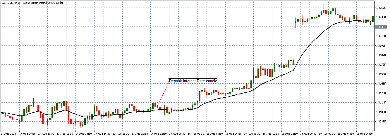
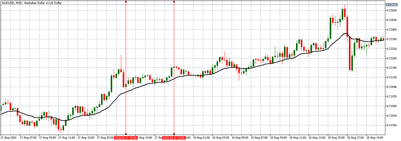
- The interest rate differential between the UK and Canada
The interest rate differential is the difference between the Bank of England’s interest rate and that by the Bank of Canada. In the forex market, carry traders use the interest rate differential to decide whether to buy or short a currency pair. When the interest rate differential is positive, traders will earn the differential by going long. If the differential is negative, traders can earn the differential by shorting the currency pair.
Therefore, if the GBP/CAD pair’s interest rate differential is positive, the pair is bound to adopt a bullish trend. Conversely, if negative, the pair is bound to be bearish.
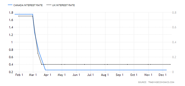
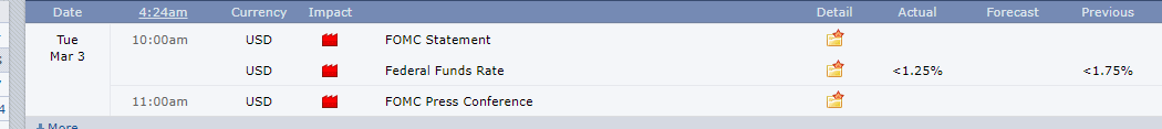
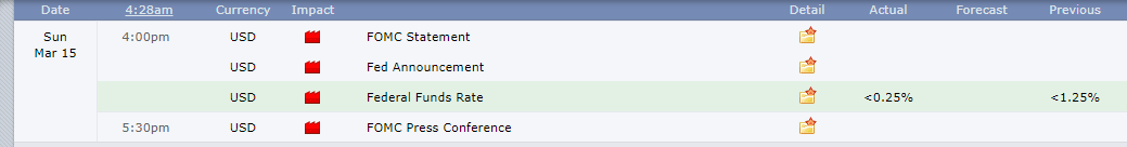
In 2020, the interest rate in the UK dropped from 0.75% to 0.1%. In Canada, the BOC cut the interest rate from 1.75% to 0.25%. Therefore, the interest rate differential is -0.15%. The interest rate differential between the UK and Canada has a score of -1.
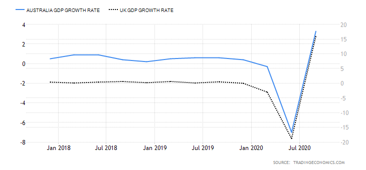
- The differential in GDP growth rate between the UK and Canada
This differential measures the changes in the growth rate between the two economies. It is a preferred method of comparison since economies are of different sizes. Naturally, the economy with a higher GDP growth rate will have its currency appreciate more. Therefore, if the GDP growth rate differential is positive, it means that the GBP/CAD pair is bullish. If negative, then the pair is bearish.

During the first three quarters of 2020, the UK economy has contracted by 5.8%, while the Canadian economy has contracted by 3.3%. This makes the GDP growth rate differential -2.5%. Hence, a score of -1.
Conclusion
| Indicator | Score | Total | State | Comment |
| The UK and Canada Current Account Differential | -2 | 10 | A differential of – $15.14 | The UK has a higher deficit than Canada |
| The interest rate differential between the UK and Canada | -1 | 10 | -0.15% | Expected to remain at -0.15% until either economy have recovered |
| The differential in GDP growth rate between the UK and Canada | -1 | 10 | 3.30% | The Canadian economy contracted at a slower pace than the UK economy |
| TOTAL SCORE | -4 |
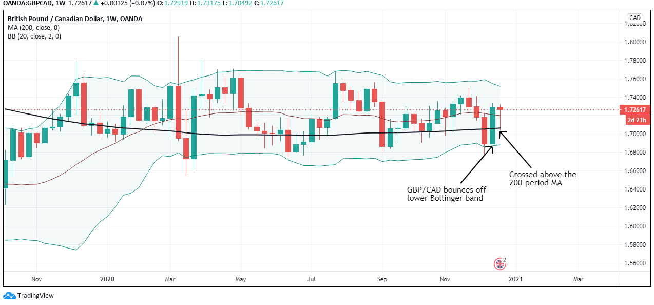
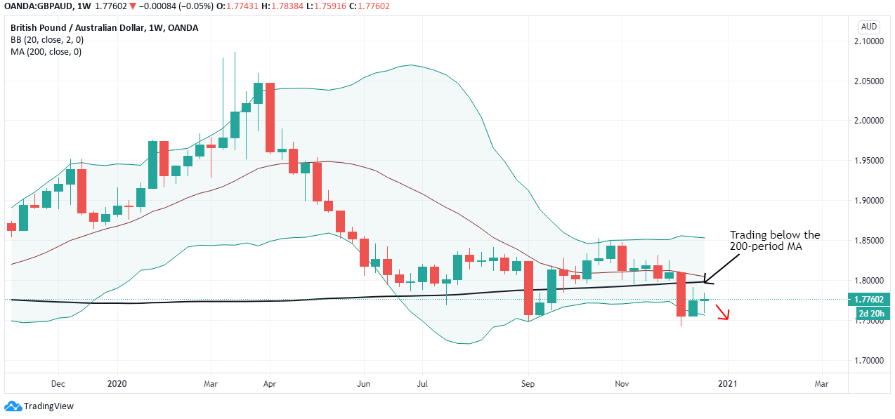
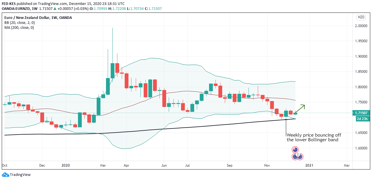
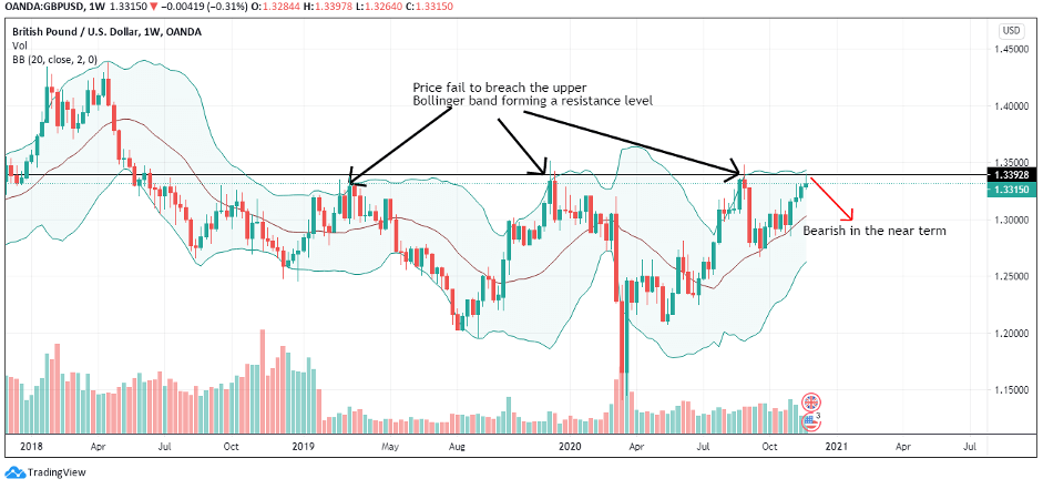
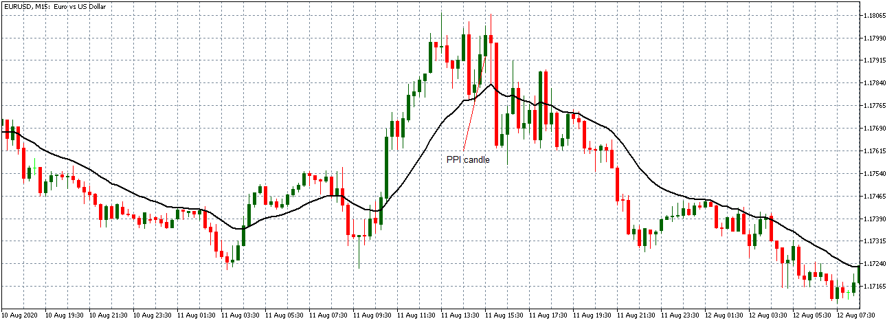
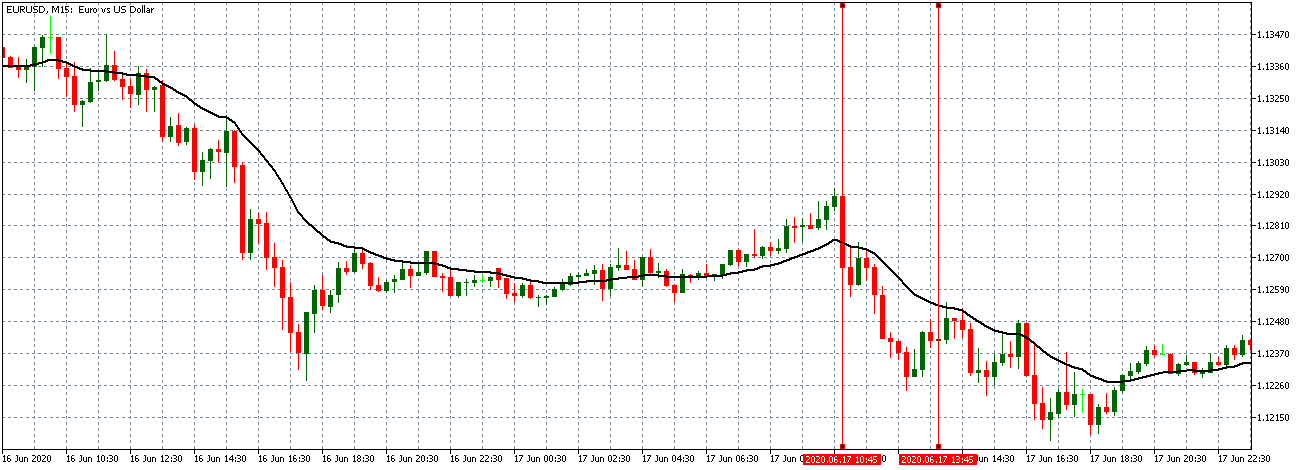
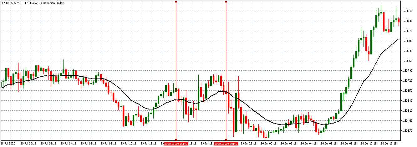
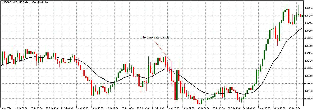
The cumulative score for the exogenous factors is -4. This means that we can expect the GBP/CAD pair to trade in a downtrend in the short term. However, technical analysis shows the pair adopting a bullish trend with the weekly chart trading above the 200-period MA. More so, the pair is seen bouncing off the lower Bollinger band.
Keep an eye on the near-term changes in the exogenous factors.


