Categories
Forex Course

199. Effects Of Gold On AUD/USD & USD/CHF Currency Pairs

Introduction

Gold is among the most traded commodities globally due to the good intrinsic value of this asset. Considering that Gold is less impacted by uncertain conditions, its prices rise when other economies perform badly and fall when there is an economic boom.

Gold impacts AUD/USD and USD/CHF in opposite manners. Price fluctuations in Gold primarily impact three major currencies that include AUD, USD, and CHF. Let’s discuss how Gold affects AUD/USD and USD/CHF.

The Effect of Gold in AUD/USD

When the price of gold rises, the AUD/USD will move upwards. These two aspects share a positive correlation; most of the time, they move together. An increase in the U.S. dollar generally contributes to the gold prices to fall and vice versa. The price of Gold perfectly depicts the economic health of the country.

During an economic crisis in the country, investors purchase Gold as protection from inflation or an economic crisis. But the inner value of the Gold does not change whether or not there is a crisis. Furthermore, gold value is displayed in the dollar, meaning every gold transaction, you spend/receive a dollar.

Australia’s Economy and its Impact on Gold Prices

AUD and Gold share a positive relationship and are inversely related to the USD. If the gold price rises, the Australian exports will increase, resulting in the expansion of the economy and foreign investment. When the gold price increases, the AUD/USD will move upwards because of the increasing demand for the AUD.

Impact on the USD/CHF

The Switzerland currency holds a positive correlation with Gold. This is because 25% of CHF is supported by the gold reserves. The refineries in Switzerland also process 70% unrefined gold every year. Additionally, Gold and CHF are inflation hedging during uncertain times.

Therefore, when the price of gold increases, the CHF value also appreciates or increases, vice-versa. Gold has a positive relationship with CHF and an inverse relationship with USD/CHF. When the price of gold rises, the value of USD/CHF falls down and vice-versa.

[wp_quiz id=”97481″]
Categories
Forex Fundamental Analysis

Analysing The Impact Of ‘Wholesale Trade Sales’ On The Forex Market

Introduction

When it comes to households’ consumption, the retail sales data is usually considered the best leading indicator. Most people rarely have wholesale trade sales in mind. However, the importance of wholesale trade sales data should not be underestimated. Whenever retailers face an increase in demand by consumers, their next stop is to the wholesalers. Furthermore, when retailers anticipate increased demand, they stock up directly from wholesalers. Thus, wholesale trade sales data can be used as a leading indicator of retail sales and the overall demand in the economy.

Understanding  Wholesale Trade Sales

A wholesaler is a business whose core operations strictly involve selling to institutions, governments, or other businesses. A wholesaler rarely deals with the end consumer. Wholesalers usually conduct their businesses from warehouses and do not market their services to households. Their place in the supply chain is to provide retailers and vendors with goods.

As an economic indicator, the wholesale trade sales measures the monetary value of the inventories and sales made by registered wholesalers over a particular period.

How are the Wholesale Trade Sales Measured?

In the US, the Census Bureau conducts a sample survey to determine the national wholesale trade sales and publishes its findings in the ‘Monthly Wholesale Trade: Sales And Inventories’ report. This report contains end-of-month inventories, monthly sales, and inventories-to-sales ratios. These aspects of the reports are segmented by the type f business that the wholesale operates. Some of the wholesalers covered by the report include; jobbers or wholesale merchants, exporters and importers, and distributors of industrial goods. The report excludes agents who market products for mining firms, refineries, and manufacturers.

The samples contained in the monthly report are selected through the strata design, which is defined by the type of business sampled and the annual sales for the businesses. In this report, wholesalers of all sizes are included. It is updated quarterly to capture the changes in the sector.

Since the sampling method is used to create the final monthly report, the estimates on the inventories and sales are arrived at by the summation of the collected, weighted data. These estimates are then seasonally adjusted and benchmarked to the annual surveys. Note that the report is susceptible to sampling and non-sampling errors.

Using Wholesale Trade Sales for Analysis

The wholesale trade sales data can be used as a leading indicator of retail sales and consumer spending, estimated to drive up to 70% of the GDP.

Source: St. Louis FRED

The wholesale sector is an integral intermediary in the distribution of goods to the final consumer. Therefore, an increase in sales can be seen as an increase in demand by households. As an economic indicator, this increase could signal that the welfare of households is improving and they have more disposable income hence the increase in demand. The increased disposable income could result from increased employment levels in the economy or higher wages received by households. In either scenario, more money is circulating in the economy. It shows that the economy is expanding.

On the other hand, if the wholesale sales are continually decreasing, it could be considered a sign of depressed demand in the economy. The decrease in demand might be resulting from the lower circulation of money in the economy. An increase in unemployment levels or a decrease in household wages can be attributed to the depressed demand. In this instance, it shows that the economy is contracting.

Suppliers and manufacturers can also use wholesale sales data to determine their level of output to match the demand, hence avoid distorting the equilibrium prices. When wholesale trade sales are increasing, the manufacturers and producers will increase their output to match the level of demand in the economy. When the sales are increasing more than the inventories, producers, and manufacturers will have to scale up their production. Increasing production entails hiring more labor hence a decrease in the unemployment levels. This instance shows that the overall economy is expanding.

Conversely, when inventories are increasing more than the wholesale sales, it indicates that demand is falling. The producers and manufacturers will be forced to scale down their operations to avoid having excess supply than demand, which will distort the market prices. As a result, jobs will be lost in the economy making households worse off. Furthermore, corporate profits will b expected to take a hit.

Impact on Currency

Economic growth and the rate of inflation are the two ways wholesale trade sales data can impact the forex market.

An increase in wholesale sales shows that there is an increase in aggregate demand. In this case, the economy is poised to perform well in the coming months, with discretionary sectors flourishing. The increased demand drives the economic growth towards expansion, which might be accompanied by increased demand-driven inflation. Therefore, in the forex market, a sustained increase in wholesale trade sales can be seen as a potential trigger of contractionary monetary and fiscal policies. These policies are implemented to ensure that economic growth is within sustainable levels and the rate of inflation stays below the target rate. As a result, the currency appreciates relative to others.

Conversely, a continuous decline of the wholesale trade sales will lead to the depreciation of the currency. In the forex market, falling wholesale trade sales show a decline in the aggregate demand, which might result in deflation and, eventually, a stagnating economy. To prevent this from happening, governments and central banks might adopt expansionary fiscal and monetary policies. Although these policies are meant to stimulate the economy, they result in the depreciation of the currency.

Sources of Wholesale Trade Sales Data

The US Census Bureau publishes the monthly ‘Wholesale Trade: Sales And Inventories’ report. St. Louis FRED publishes a comprehensive historical coverage of wholesale trade sales in the US.

Source: St. Louis FRED

How Wholesale Trade Sales Data Release Affects The Forex Price Charts?

The US Census Bureau published the latest monthly ‘Wholesale Trade: Sales And Inventories’ report on October 9, 2020, at 10.00 AM EST. This released can be accessed at Investing.com. As shown by the screengrab below, low volatility is expected upon releasing the wholesale trade sales data.

In August 2020, wholesale trade sales grew by 1.4%. This growth was lower than the 4.8% growth recorded in July 2020 and lower than analysts’ expectation of a 2.0% growth.

Theoretically, this lower-than-expected growth should be negative for the USD.

Let’s see how this release impacted the EUR/USD forex charts.

EUR/USD: Before the Wholesale Trade Sales Data Release on October 9, 2020, 
Just Before 10.00 AM ET

The pair can be seen to be trading in a steady uptrend before the news release. The 20-period MA is steeply rising with candles forming above it.

EUR/USD: After the Wholesale Trade Sales Data Release on October 9, 2020, 
at 10.00 AM ET

After the news release, the EUR/USD pair formed a 15-minute bullish candle, as expected. This candle showed that the USD weakened against the EUR immediately, the worse than expected wholesale trade sales data was released. Subsequently, the pair continued trading in a renewed uptrend.

Bottom Line

Although the wholesale trade sales data is regarded as a low-impact economic indicator, it is significant in the current economy. The data can be used to show the rate of economic recovery after the coronavirus induced recession.

Categories
Forex Course

179. Using the COT Report for Trading & Analysis

Introduction

Our previous lessons have covered where you can access the Commitment of Traders Report and the components contained within the report. In this lesson, we discuss how you can use the Commitment of Traders Report in forex trading.

Since the COT report gives the market sentiment in forex, this report’s publication should affect the price action in forex. Most forex traders pay attention to the non-commercial traders’ category of the COT report. The interest with the non-commercial traders is because these traders are considered speculative participants.

The nonreportable positions held by small-scale retail traders are not significant enough to move the markets. Similarly, since commercial traders are not considered speculative traders, the impact of their positions on price action tends to be subdued.

How the COT Report Affects Price Action?

When the non-commercial traders are accumulating their positions, it affirms a particular trend. Let’s take the AUD/USD, for example. When non-commercial traders, over time, are accumulating futures short position on the AUD as the AUD/USD pair falls, is a confirmation that this downtrend will persist. Conversely, when the non-commercial traders are accumulating future long positions of the AUD as the AUD/USD keeps rising, it is a confirmation that the uptrend will continue. This way, you can use the COT report as a trend confirmation indicator.

The COT report can also be used to indicate the overbought and oversold regions. The non-commercial traders, i.e., speculators, have a limit on how much they can buy or sell. These traders will reach a point where they would want to close their positions and take profits. Furthermore, when in a persistent uptrend, speculators might feel it’s no longer profitable to keep buying futures contracts at higher prices. Similarly, in a downtrend, these traders might not consider it profitable to keep selling at lower prices.

When the speculators have reached their critical limits in the forex futures, they begin reversing their trends. For day traders, the impact of the COT is diminished since its effects are long-term.

How the COT Report Publication Affects Forex Charts?

The screengrab below is GBP futures. At the bottom, if the COT indicator is showing the trend of commercial traders, non-commercial traders, and retail traders. In this case, we are interested in the non-commercial traders (i.e., large traders) since their positions influence the trend.

As you can see, the market moves at pace with the changes in the positioning of the large traders.

[wp_quiz id=”89690″]
Categories
Forex Fundamental Analysis

Exploring The ‘US Baker Hughes Oil Rig Count’ Macro Economic Indicator

Introduction

Countries like the US and Canada, whose economies largely depend on oil, knowing if oil production is increasing or decreasing can offer valuable insight into the economy. The changes in production not only serve as a leading indicator of demand for oil and its products but also of the labor market.

Understanding US Baker Hughes Oil Rig Count

Baker Hughes is an American energy technology company providing oil field services. The company specializes in the oil and gas industry, providing services from exploration, formation evaluation, oil drilling, production, and reservoir consulting. Baker Hughes is operational in over 120 countries. Other services provided by the company include turbomachinery and process solutions, software and analytics, and measurements, testing, and control, throughout the oil and gas industry.

The US Baker Hughes Oil Rig Count reports the number of oil and gas rigs operating in the US. The report is published every Friday at noon EST. The report details the rig count based on location, i.e., the number of rigs operational on land, inland waters, and offshore. It also contains a section on “US Breakout Information,” which has subsections on oil, gas, and miscellaneous.

This section of the report also shows the number of directional, horizontal, or vertical rigs. Furthermore, the report also shows the ‘Major State Variances.’ A different section of the US Baker Hughes Oil Rig Count report also breaks down the Rotary oil and gas rigs operations by State and location.

Suffice to say, the US Baker Hughes Oil Rig Count report provides a comprehensive look into the oil and gas weekly operations. The report shows the rigs that are operational during the current reporting period and the change from the previous reported period. It also shows the current change from a year ago.

Using US Baker Hughes Oil Rig Count in Analysis

The US Baker Hughes Oil Rig Count can show the demand for oil and oil products. Furthermore, the report is a leading indicator of the demand for products and services offered by the oil service industry.

When the oil rig count increases, more oil rigs have become operational during the reporting period. In the labor industry, this increase has two implications – an increase in direct and indirect labor. Direct labor increases since the workers in these rigs become active. Indirect labor is in the form of workers who will provide ancillary services to the operational oil rigs. In cities where these rigs are operational, they form an integral part of the economy. Therefore, when they are operational, the economies in these regions flourish, and the unemployment levels decline.

Furthermore, the consumer discretionary sectors also expand due to an increase in household demand. Conversely, when the count reduces, it means that the oil rigs are shutting down. The consequence of this is layoffs, which eventually depresses the demand in the economy. It is essential to know that while oil production in the US is not the major employer in the labor market, the effects of massive job losses on the broader economy cannot be ignored.

The increase in the US Baker Hughes Oil Rig Count means that there is an increasing oil demand.  To better understand the oil demand, we first need to understand the top consumers of oil in the economy. According to the US Energy Information Administration, the top consumers of oil in the US are; transportation 68%, industries 26%, residential 3%, commercial 2%, and electric power less than 1%. Therefore, we can safely conclude that whenever oil production increases, the increase in demand is primarily driven by transportation and industrial sectors.

Here is the implication to the economy, when oil demand by these two industries increases, demand for goods and services offered by these two sectors has also increased. In the transportation sector, whenever the demand for oil increases, it means that more people are purchasing cars. In the industrial sector, the increase in demand for oil implies an expansion in operations. An increase follows the expansion in employment opportunities and increased economic output. In both these instances, it is implied that the economy is growing.

Conversely, when the rigs are shutting down, it is usually to avoid overproduction, which might grossly distort the oil prices. This reduction in oil supply could be taken as a sign of a decrease in demand. Based on the top consumers of oil in the US, a decline in the oil demand implies that the economy is contracting.

The US Baker Hughes Oil Rig Count can also be used to show periods of economic recession and recovery. Take the example of the recent coronavirus pandemic. The pandemic resulted in nationwide lockdowns and social distancing. Virtually, transportation was halted as the majority of the population opted to work from home. Industries were shut down to depressed demand. This implied that the oil demand plummeted, which was followed by a recession of the US economy.

Source: Trading Economics

When the US economy started resuming some sense of normalcy, we can notice the US Baker Hughes Oil Rig Count increasing. This showed that the oil demand was picking up again, which means that transportations and industrial sectors were upping their operations.

Source: Trading Economics

Impact of US Baker Hughes Oil Rig Count on the USD

The value of a country’s currency depends on the fundamentals of its economy. Since the US Baker Hughes Oil Rig Count can be used as a leading indicator of the US economy, the change in the count impacts the USD.

Theoretically, an increase in the US Baker Hughes Oil Rig Count should be accompanied by an appreciating USD. The increasing count signifies that the US economy is expanding. Conversely, a decline in the count means that the US economy is contracting; hence the USD should be expected to depreciate.

Sources of Data

Baker Hughes publishes the US Baker Hughes Oil Rig Count report at the end of every working week. Trading Economics has a historical time series data of the US Baker Hughes Oil Rig Count.

How US Baker Hughes Oil Rig Count Release Affects The Forex Price Charts

The most recent publication was on October 23, 2020, at 1.00 PM EST and accessed at Investing.com. The USD is expected to experience moderate volatility when this report is published.

In the week to October 23, 2020, the number of oil rigs operating in the US was 211, increasing from 205 a week earlier.

Let’s find out how this increase impacted the USD.

GBP/USD: Before US Baker Hughes Oil Rig Count Release on October 23, 2020, 
just before 1.00 PM EST

Before the release of the US Baker Hughes Oil Rig Count, the GBP/USD pair was trading in a weak downtrend. From the above 5-minute chart, we can observe that the 20-period MA was only slightly dropping.

GBP/USD: After US Baker Hughes Oil Rig Count Release on October 23, 2020, 
at 1.00 PM EST

After the release, the pair formed a 5-minute bearish “hammer” candle. Subsequently, the pair traded in a weaker downtrend as the 20-period MA was flattening with candles forming just around it.

Bottom Line

The US Baker Hughes Oil Rig Count plays a vital role as a leading indicator of the demand for oil and oil products. As shown by the above analyses, the US Baker Hughes Oil Rig Count doesn’t significantly impact the Forex price action.

Categories
Forex Fundamental Analysis

The Impact Of ‘Machinery Orders’ Fundamental Indicator News Release On The Forex Market

Introduction

Industrial and manufacturing productions are one of the pillars of any economy. Whenever policies are implemented, governments tend to focus on ways to improve or increase production in the country. The main significance of manufacturing and industrial production is that they create employment opportunities in the local economy and ensure value addition to domestic products, making them competitive in the international markets. Furthermore, they contribute majorly towards technological advancements, which is why data on machinery orders is vital.

Understanding Machinery Orders

As an economic indicator, machinery orders measures the change in the total value of new orders placed with machine manufacturers, excluding ships and utilities.

The data on machinery orders are categorized into orders by; the private sector, the manufacturing sector, governments, overseas orders, and orders made through agencies. All these orders exclude volatile orders from power companies and those of ships.

Source: Cabinet Office, Government of Japan

The machinery orders by electric companies and that of ships are considered too volatile. This volatility is thanks to the fact that ships and the machinery used by electric companies are extremely expensive. Furthermore, these orders usually are placed once over long periods. Therefore, including these orders might unfairly distort the value of the machinery orders data.

To get a clear picture of what machinery, in this case, means, here are some of the components that are included in the machinery orders data. They are metal cutting machines, rolling machines, boilers, power units, electronic and communication equipment, motor vehicles, and aircraft.

Machinery orders from the government are categorized into; transport, communication, ministry of defence, and national and local government orders.

In the industrial sector, machinery orders are categorized by the manufacturing and nonmanufacturing sectors. The nonmanufacturing orders include agriculture, forestry, fishing, construction, electric supply, real estate, finance and insurance, and transportation. Some of the categories of orders in the manufacturing sector include; food and beverages, textile, chemical and chemical production, electrical and telecommunication machinery, and shipbuilding.

Using Machinery Orders for Analysis

By now, you already understand that machinery orders data encompass every aspect of the economy. It ranges from domestic government orders, agriculture, manufacturing and production, services delivery, and even foreign orders. As a result, the monthly machinery orders data can offer a treasure of information not only about the domestic economy but also foreign economies as well.

Source: Cabinet Office, Government of Japan

When companies invest in new machinery, it is considered a capital investment. Capital expenditure is usually considered whenever there is an anticipation of increased demands and services provided by the company. In this case, companies must scale up their operations to increase supply to match the increased demand. In the general economy, an increase in aggregate demand can result from increased money supply in the economy. Thus, it can be taken as a sign that unemployment levels in the economy have reduced or that households are receiving higher wages. Both of these factors can be attributed to an expanding economy.

Note that machinery, in this case, means heavy-duty machinery. Typically, these types of machinery take long in the production and assembly lines. At times, orders have to be placed weeks or months in advance. Therefore, the machinery delivered now may have possibly taken months in the assembly line. When the machinery orders increase, we can deduce that these machinery producers and assembly plants have to employ more labor.

Consequently, an increase in machinery orders means that unemployment levels will reduce. In turn, households’ welfare will improve, and aggregate demand for consumer products will rise. In the end, discretionary consumer industries will also flourish. A decrease in the machinery orders will tend to have the opposite effect.

Suffice to say, the machinery in question here are not cheap. Most companies finance their capital expenditure using lines of credit. Therefore, an increase in machinery orders could imply the availability of cheap credit in the economy. Access to cheap financing by companies and households stimulates the economy by increasing consumption and investments. As a result, the increased aggregate demand leads to an increase in the GDP and expansion of the economy.

Machinery orders data can also be used as an indicator of the economic cycles and to predict upcoming recessions and economic recoveries. When firms anticipate that the economy will go through a rough patch and demand will fall, they cut back on production. Scaling down operations means that they won’t be ordering any more machinery to be used in the production. Conversely, when companies are optimistic that the economy will rebound from recession or a depression, they will order more machinery to scale up their production in anticipation of the increased demand. Furthermore, when the economy is going through an expansion, the aggregate demand tends to increase rapidly. This rapid increase forces companies to increase their machinery orders to enable them to keep up with the demand.

Impact on Currency

The machinery orders data is vital in showing the current and anticipated state of the economy. For the domestic currency, this information is crucial.

The currency will appreciate when the machinery orders increase. Machinery orders are seen as a leading indicator of industrial and manufacturing production. Therefore, when the orders increase, the economy can anticipate an increase in industrial production. And along with it, a decrease in the level of unemployment. Generally, the increase in machinery orders means that the economy is expanding.

Conversely, when machinery orders are on a continuous decline, it means that businesses expect a more challenging operating environment. They will scale down their operations in anticipation of a decline in the demand for their goods and services. In this scenario, higher levels of unemployment should be expected in the economy. Since the economy is contracting, the domestic currency can be expected to depreciate relative to others.

Sources of Data

In this analysis, we will focus on Japan since one of the world’s leading producers of heavy machinery. The Cabinet Office, Government of Japan, releases the monthly machinery orders data in Japan. Trading Economics publishes in-depth and historical data of the Japanese machinery orders.

How Machinery Orders Data Release Affects The Forex Price Charts

The Cabinet Office, Government of Japan, published the latest machinery orders data on October 12, 2020, at 8.50 AM JST. The release can be accessed at Investing.com. The release of this data is expected to have a low impact on the JPY.

In August 2020, the monthly core machinery orders in Japan increased by 0.2% compared to the 6.3% increase in July 2020. During the same period, the YoY core machinery orders were -15.2% compared to -16.2% in the previous reading. Both the MoM and YoY data were better than analysts’ expectations.

Let’s see how this release impacted the AUD/JPY forex charts.

AUD/JPY: Before the Machinery Orders Data Release on October 12, 2020, 
just before 8.50 AM JST

Before the release of Japan’s machinery orders data, the AUD/JPY pair was trading in a steady downtrend. The 20-period MA was falling with candles forming below it. Fifteen minutes before the news release, the pair formed three bullish 5-minute candles showing that the JPY was weakening against the AUD.

AUD/JPY: After the Machinery Orders Data Release on October 12, 2020, 
at 8.50 AM JST

As expected, the pair AUD/JPY pair formed a long 5-minute bearish candle. Subsequently, the pair traded in a renewed downtrend as the 20-period MA steeply fell with candles forming further below it.

Bottom Line

Although the machinery orders data is a low-impact economic indicator, its release had a significant impact on the forex price action. This is because better than expected data shows that the Japanese economy might be bouncing back from the coronavirus-induced recession.

Categories
Forex Fundamental Analysis

What Should You Know About ‘Mortgage Market Index’ Macro Economic Indicator

Introduction

In the recent past, the real estate market has been a critical indicator of economic performance. As with any other aspect of the financial market that intertwines with consumer demand, the significance of the mortgage market cannot be overstated. Knowing if mortgage applications have increased or reduced can tell a lot about the demand in the housing market and households’ welfare. This index can be a leading indicator of demand in the economy.

Understanding the Mortgage Market Index

Primarily, the mortgage market index tracks the number of mortgage applications over a specific period. In the US, for example, the mortgage market index is compiled by the US Mortgage Bankers Association (MBA). The MBA mortgage market index is released weekly. MBA has an association of about 2200 members encompassing the entire real estate financing industry. The companies included in the association are deal originators, compliance officers, deal underwriters, servicers, and information technology personnel. These companies are active in residential, multi-family, and commercial real estate.

Owing to its vast network of real estate companies across the country, MBA is in the best position to provide comprehensive coverage of the mortgage applications made. The published data shows both seasonally adjusted and unadjusted changes in the US’s number of mortgage applications. Furthermore, the report also includes the Refinance Index,  which shows the number of applications made by households wishing to refinance their mortgages. The report also includes seasonally adjusted and unadjusted ‘Purchase Index,’ which shows the number of outright purchases in the real estate sector during that week.

Furthermore, this weekly report analyses the change in the Adjustable-Rate Mortgage (ARM) applications. As the name suggests, the ARM is a mortgage in which the interest rate payable on the balance varies throughout its life. The number of the Federal Housing Administration (FHA) loans are also included in the report. It further analyses the average contract interest rate for 30-year fixed-rate mortgages with Jumbo loan balances and conforming loan balances. Jumbo loan balances are those above $510,400 while conforming loan balances are less than this amount. Finally, the MBA mortgage market weekly report analyses the change in the average contract interest rate for 15-year fixed-rate mortgages.

Using the Mortgage Market Index in Analysis

The change in the number of mortgages in an economy tells a lot about the prevailing economic conditions. These conditions range from demand in real estate to prevailing monetary policies. Both of these aspects are integral in the growth of an economy.

When the mortgage market index is rising, it means that the number of mortgage applications has increased. The increase in mortgage applications could imply that there is a growing demand for real estate. One thing you have to know, when people decide to invest in the housing market, it normally means that they have increased disposable income and have thus fulfilled all other intermediate needs.

An increase in disposable income in the economy means that more people are gainfully employed or that wages have increased. In both these circumstances, we can deduce that the economy is expanding. The reason for this deduction is because when demand in the real estate market expands, it means that demand in the consumer discretionary industry has also increased. Thus, the output in the economy is higher.

More so, when the mortgage market index rises, it could mean that households and investors in the economy have access to cheap finance. Either they are creditworthiness has improved, or the market interest rates are lower. When the interest rate is lower in the market, it is usually due to the central banks’ expansionary monetary policy.

Such expansionary policies are adopted when the central banks aim to stimulate the growth of the economy. It means that people have access to cheap money and can borrow more. When there is a growing money supply in the economy, households can increase their consumption, and investors can scale up their operations. Overall, the economy will experience an increase in output, thus in the GDP.

Furthermore, it could also mean that households who previously could not afford to service a mortgage can now be able to afford mortgages due to low-interest rates. This scenario played out towards the end of the first quarter of 2020 when the US Federal Reserve made a series of interest rate cuts. The MBA mortgage market index is seen to have hiked. This hike can be taken as a sign that households and investors were taking advantage of the expansionary policies by increasing their holding in the real estate sector.

Source: Investing.com

On the other hand, a drop in the MBA mortgage index means that the demand for demand in the housing market is waning. The decrease in demand could be synonymous with an overall contraction of demand in the economy. The contraction of aggregate demand can be taken as a sign that the overall economy is also contracting. Similarly, it can also be taken as a sign that the public has lost confidence in the housing market as during the 2007 – 2008 housing market crash.

Source: Investing.com

Impact of the Mortgage Market Index on Currency

In theory, the domestic currency should be susceptible to fluctuations in the mortgage market index.

When the index increases, it can be taken as a sign that there is an increased money supply in the economy. Under such circumstances, contractionary monetary and fiscal policies might be implemented, such as hiking the interest rates. When such policies are adopted, the domestic currency tends to increase in value compared to other currencies in the forex market.

Conversely, when the index is continually dropping, it can be taken as an indicator of overall economic contraction. In this instance, expansionary policies might be implemented, like lowering interest rates to encourage consumption and prevent the economy from slipping into a recession. These policies make domestic currency depreciate.

Sources of Data

In the US, the mortgage market index is compiled and published weekly by the Mortgage Bankers Association. A historical time series of the data is available at Investing.com.

How the US Mortgage Market Index Affects The Forex Price Charts

The latest publication by the MBA was on October 21, 2020, at 7.00 AM EST. As seen in the screengrab below, a low impact on the USD is expected when the index is published.

For the one week to October 21, 2020, the mortgage market index was 794.2 compared to 798.9 in the previous publication.

Let’s see how this publication impacted the USD.

GBP/USD: Before US Mortgage Market Index Release on October 21, 2020, 
just before 7.00 AM EST

Before the publication of the US Mortgage Market Index, the EUR/USD pair was trading in a weak uptrend. In the above 5-minute chart, the 20-period MA is almost flattened with candles forming slightly above it.

GBP/USD: After US Mortgage Market Index Release on October 21, 2020, 
at 7.00 AM EST

The pair formed a 5-minute bearish candle after the release of the index. It later traded in a neutral trend as the 20-period MA flattened, and candles formed around it.

Bottom Line

This article has shown that the US MBA Mortgage Market Index plays an essential role as an indicator of demand in the housing market. But as shown by the above analyses, this economic indicator has no significant impact on price action in the forex market.

Categories
Forex Fundamental Analysis

Foreign Securities Purchases Impact on Forex Currencies

Introduction

For the longest time, the performance of a country’s financial and capital markets has been touted as an indicator of economic health. On the other hand, foreign investors’ participation in the local financial and capital market can be taken as a sign of confidence in the local economy. Therefore, monitoring foreign securities purchases can be used as a gauge of investors’ confidence in the local economy.

Understanding Foreign Securities Purchases

Foreign securities purchases measure the involvement of foreigners in the domestic financial and capital markets. It includes the value of local bonds, stocks, and money-market assets bought by foreigners over a particular period.

The financial market is considered the backbone of any economy. Every sector of the economy is interconnected with the financial market, not just by transactions. Companies, businesses, and governments use the financial and capital markets as a source of funds. Through IPOs, companies can raise funds that will be used for business expansions. Governments issue bonds and treasury bills in the money markets, which are used to fund government expenditures. In the secondary markets, however, these financial assets’ prices tend to reflect investors’ sentiments.

Therefore, foreign investors’ level of participation in the local financial markets can be used as a leading indicator of economic sentiment.

Using Foreign Securities Purchases in Analysis

Primarily, the data of foreign securities purchases shows foreign interest in the domestic economy. This data has various applications to government agencies, investors, and even forex traders.

The stock and money markets are driven by sentiment. The basics of how the financial market works is that; you buy a financial asset when prices are low and sell when prices are high. For example, in the stock markets, the price of a company’s stock is tied to its financial performance. So, when its performance is well, the share price will rise, and when the performance is deteriorating, the share price will fall. Another critical factor that drives the fluctuation in share price is a sentiment about the company’s performance.

When traders anticipate that the company will have a windfall – either increased demand for its core products or the launch of a new product line – the share price will rise. The rise in the share price is driven by the fundamental laws of demand and supply. The price will rise when there is an increased demand from investors to buy the shares, which means that those buying exceed the number of those selling. The price will fall when investors are selling the shares, which increases its supply relative to those demanding to purchase it.

Using this aspect of the stock markets, when foreign investors flood the domestic market to purchase shares, it means that they anticipate that the companies will perform better soon. As we have explained, a better financial performance by a company could result from increased demand for its products or expansion in business operations.

Since the stock market is forward-looking, increased buying activity can be interpreted as a vote of confidence that economic conditions are going to improve. Let’s take the example of the S&P 500. On October 19, 2020, the index closed just above 3400 from lows of 2237 on March 23, 2020, at the height of the Coronavirus pandemic.

Therefore, a rebound in the stock markets can be taken as a sign that investor confidence is increasing and improving economic conditions.

Source: St. Louis FRED

However, note that there is a disconnect between the GDP and the performance of the stock market. Most people tend to make the mistake of assuming that the growth of the stock market is synonymous to an increase in the GDP. While this might be true in some cases, it is purely coincidental, because the stock market is only one component of the economy. While the economy’s growth tends to encompass all aspects ranging from the growth of the labor market to household consumption, the stock market is majorly a reflection of corporate profits. For example, while the S&P 500 recovered from March to October 2020, the GDP was on a steady fall.

Source: St. Louis FRED

The other way foreign securities purchases can be used for analysis is through the purchases in the money markets, especially government bonds and treasury bills. When foreigners swam the domestic market to purchase government securities, it can be taken as a sign that the domestic economy is offering better returns compared to other international economies.

Furthermore, increased foreigner participation in the domestic money markets can be taken as a sign that the local economy is regarded as a safe heaven. It is a vote of confidence that the domestic economy is stable and comparatively less volatile, which means that their investments will receive a steady return and no chances of an outright loss of capital.

Impact on Currency

As a leading indicator of economic sentiment, foreign securities purchase data can show what investors think about economic recoveries. When the foreign securities purchases increase in times of economic recessions or slump, it can be taken as a vote of confidence by the investors that the economy will rebound in the near term. The logic behind this is that no one would want to invest in an economy bound to fall or one that has no signs of recovery. In such an instance, the currency will appreciate.

Similarly, the local currency will appreciate relative to others since an increase in foreign securities purchases implies that the domestic economy offers better returns. These higher returns could be a direct result of higher interest rates. Higher interest rates mean that the local currency will appreciate.

Conversely, when the foreign securities purchases data is on a decline, it shows that investors are fleeing the domestic economy. They can either get better returns on investment in other economies or believe that the local economy is headed for rough times. In this case, the local currency will depreciate relative to others.

Sources of Data

Statistics Canada collates and publishes foreign securities purchases data in Canada. The data published is of the prior two months. A more in-depth and historical review of the foreign securities purchases in Canada is available at Trading Economics.

How Foreign Securities Purchases Data Release Affects Forex Price Charts

For this analysis, we will focus on the August 17, 2020, release of the foreign securities purchases data at 8.30 AM EST. The data can be accessed from Investing.com. Moderate volatility is expected when the data is released.

In June 2020, Canada’s net foreign securities purchases were -13.52 billion compared to 22.39 billion in May 2020.

Let’s see what impact this release had on the CAD.

GBP/CAD: Before Foreign Securities Purchases Release on October 17, 2020, 
Just Before 8.30 AM EST

From the above 5-minute GBP/CAD chart, the pair was trading in a steady downtrend before the release of the data. The 20-period MA was steeply falling with candles forming further below it. This trend shows that the CAD was strong during this period.

GBP/CAD: After Foreign Securities Purchases Release on October 17, 2020, 
at 8.30 AM EST

The pair formed a long 5-minute candle upon the release of the data. As expected, the negative net foreign securities purchases in Canada resulted in the weakening of the CAD. Subsequently, the pair traded adopted a subdued uptrend with the 20-period MA slightly rising and candles forming just above it.

Bottom Line

The foreign securities purchases data is a moderate-impact economic indicator. Since it only serves to show investor confidence in the economy, it does not result in high volatility when released. Cheers!

Categories
Forex Fundamental Analysis

The Impact of ‘Gross Domestic Product Estimate’ Economic Indicator On The Forex Market

Introduction

In most economies globally, the GDP data is published by governments or government agencies quarterly. This would mean that analysts, economists, and households would have to wait for a full quarter to know how the economy is performing. Naturally, this long wait can be frustrating and, in some cases, inconveniencing. Therefore, having some form of estimate as to what the GDP might be can be quite useful.

Understanding Gross Domestic Product Estimate

As the name suggests, the GDP estimate serves to estimate an economy’s GDP before the release of the official government-published GDP report.

These estimates are arrived at by surveying the industries within the country. In the UK, for example, the following industries are surveyed; production, manufacturing, mining and quarrying, agriculture, construction, private services, and public services. Most estimates adopted globally use the bottom-up methodology.

Source: National Institute of Economic and Social Research

In the UK, the National Institute of Economic and Social Research (NIESR) publishes a rolling monthly estimate of the GDP growth using the bottom-up methodology. Hence, its GDP estimate covers the preceding three months. Since the GDP estimates are published monthly, it means that NIESR releases at least four GDP estimates before the government’s publication. Using the bottom-up analysis to estimate the GDP, NIESR uses statistical models to aggregate the most recent trends observed within the GDP subcomponents. The statistical models are fed the latest trends, and they forecast the most probable outcome in these subcomponents. Note that these forecasts are only short-term.

While the GDP estimates are not always accurate to the exact decimal percentage, they provide an accurate GDP representation.

Using the Gross Domestic Product Estimate in Analysis

The GDP estimate data can be used in the timely analysis of economic performance. Here is how this data can be used.

In many countries, the macroeconomics policies are usually set more frequently than quarterly. However, since the economic performance is the centerpiece in any macroeconomic policy-making, it is vital to know the most recent GDP data. By tracking the trends of the top components of the GDP, the GDP estimates can provide the most recent data. Therefore, this will help the policymakers to implement more informed policies. Let’s see how the contrast between the GDP estimate and the actual GDP can make a difference in policy implementation.

For example, during the second quarter of 2020, governments and central banks wanted to implement expansionary fiscal and monetary policies. At this point, the only GDP data available to them is the actual GDP for the first quarter of 2020. But for most economies, the 2020 Q1 GDP showed economic growth. On the other hand, the more recent GDP estimates could show that contractions were already visible in the economy.

In this scenario, if policymakers were to use the actual data available to then – the Q1 GDP – they would have made undesirable policies. These policies would have further harmed the economy. On the other hand, if the GDP estimates would have been used to aid the policy implementation, chances are, the most suitable and appropriate monetary and fiscal policies would have been adopted. Here, the GDP estimate would have helped them make relevant policies and ensuring that these policies are implemented timely.

Furthermore, the GDP estimates can also be used to establish whether the policies implemented are working as expected. If expansionary policies are implemented, their primary goal is to spur demand and stimulate economic growth. Using the GDP estimate, policymakers can track to see if there are any changes experienced in the economy. Some aspects like inflation take a long time to adjust, but demand generated by households is almost instantaneous. Therefore, the GDP estimate can be used to gauge the effectiveness of the implemented policies. Take the stimulus packages adopted in Q2 2020 after the pandemic; they were meant to stimulate demand by households, which would lead to economic recovery. With the GDP estimate, we could tell whether the stimulus package worked or not.

When accurate, the advance GDP estimate can be a leading indicator of the actual GDP. Therefore, the GDP estimate data can be used to show the prevailing trends in the economy. For instance, it can be used to show looming periods of recession and any upcoming recoveries. Say that the trailing three months captured by the GDP estimate shows that the economy’s major subcomponents are struggling with demand and contracting. This data can be taken to mean that for that quarter, there is a higher probability that the overall economy would contract. Conversely, when the subcomponents being tracked show growth, it can be expected that the overall economy would have expanded in that quarter.

It’s not just the governments that can benefit from the GDP estimate data. The private sector as well can use the data to plan their economic activity. Take the example that the GDP estimate shows that a particular sector in the economy has been contracting for the previous three months. Investors in this sector can presume that the demand for goods or services from the sector is depressed. In this instance, to avoid venturing into loss-making businesses, investors can make informed decisions about where and when to invest their money.

Impact on Currency

When the GDP estimate shows that the short-term economy is expanding, the domestic currency will appreciate relative to others. A short-term expansion indicates that demand levels in the economy are higher, which implies that unemployment levels are low and households’ welfare is improving.

The domestic currency will depreciate if the GDP estimate shows that the economy is contracting. The primary driver of a contracting economy is decreased expenditure by households contributing almost 70% of the GDP. The decline in demand can be taken as a sign of higher unemployment levels.

Sources of Data

In the UK, the National Institute of Economic and Social Research publishes the monthly and quarterly UK GDP estimate.

How GDP Estimate Release Affects The Forex Price Charts

The most recent UK GDP estimate published by NIESR was on October 9, 2020, at 11.10 AM GMT and accessed at Investng.com. Moderate volatility on the GBP can be expected when the NIESR GDP estimate is published.

During this period, the UK GDP is estimated to have grown by 15.2% compared to 8.0% in the previous reading.

Let’s see how this release impacted the GBP.

EUR/GBP: Before NIESR GDP Estimate Release on October 9, 2020, 
just before 11.10 AM GMT

Before the release of the NIESR GDP Estimate, the EUR/GBP pair was trading in a subdued uptrend. The 20-period MA transitioned from a steep rise to an almost flattened trend with candles forming just above it.

EUR/GBP: After NIESR GDP Estimate Release on October 9, 2020, 
at 11.10 AM GMT

After the GDP estimate release, the EUR/GBP pair formed a 5-minute bullish ‘inverted hammer’ candles with a long wick. This candle represents a period of volatility in the pair as the market absorbed the data. Subsequently, the pair traded in a neutral trend before adopting a steady downtrend with the 20-period MA steeply falling.

Bottom Line

The GDP estimate is not just relevant to investors and policymakers; as shown by the above analyses, it can result in periods of increased volatility in the forex market when it is published. Cheers!

Categories
Forex Videos

Halloween Forex Week – Don’t Trade Until You’ve Seen This!

Halloween for forex traders – the scariest event on the calendar for a long time!

Trading in the financial markets is inherently risky. And professional traders will try and mitigate risk by using an economic calendar to either deliberately trade risky events such as interest rate decisions by central governments or gross domestic product announcements, etc. or to avoid them at all costs.
But now and then, risk events come along that truly worry professional traders and investors. The financial week commencing the 2nd of November 2020 has the potential to cause a tsunami of price action movements in financial assets, including currencies, stocks, and bonds, metals, cryptocurrencies, oil, and commodities. Essentially, everything that can be traded will undoubtedly see volatility during this week.

So why should traders be worried about this week?

The financial markets are in a state of flux with large investors and institutions looking to mitigates risky forthcoming events. This means juggling their portfolios in order to diversify against the risk of a huge stock market falls, especially in the United States should Joe Biden become the next president. This is due to fears that he will have a negative impact on the markets with regard to democrats’ policies, including higher taxation and increased regulations for businesses across the USA.

We have already seen increased volatility in the financial markets, especially with currencies where the US dollar has broadly strengthened against other currencies, especially the major currency pairs. While some of this may be attributed to the month-end readjustment by financial institutions and upcoming planning for year-end rebalancing, the bulk of this activity is due to the forthcoming and tightly contested key economic calendar event for this year, which is the US presidential elections on the 3rd of November.

This just happened to coincide with the Japanese monetary policy meeting minutes being released on Tuesday, as well as the Reserve Bank of Australia releasing its interest rate decision. While the election winner will not be announced on the same day, markets will be braced for when the announcement eventually does come. The completely different styles of presidency being offered by both parties are said to have positive and negative impacts for stock markets, with President Trump’s policies of low taxation and low corporate red tape seen as positive for the economy and where Biden’s policies are the opposite and thus create a negative sentiment for the economy.
This event, which is dynamic and has the potential to cause huge market swings on its own, but it happens to coincide with an increase in the Coved transmissions globally, and where a second wave of the pandemic is sweeping across Europe and the United States, where last week 70,000 cases of the infection were reported in a single day.

It also coincides with the United Kingdom, Germany, and France initiating lockdowns for their peoples to try and contain the virus. As if that wasn’t enough to contend with, financial traders have to keep an eye on the Brexit future trade deal negotiations, which are a critical junction, with just a few days remaining to allow the United Kingdom and European Union to agree on a tariff-free future trade deal. If they are unable to do so, the United Kingdom will exit the transition period at the end of December without a formal trade deal with its European friends, and this, coupled with the economic situation unfolding due to the coronavirus, will be seen as a boot on the throat of the ailing British economy, which is struggling because of the ongoing Covid crisis.

And if you have been looking at your economic calendar for the forthcoming week, the sea of red, in terms of high impact events, continues on Thursday with the Bank of England interest rates decision and the United States federal Bank interest rate decision also compounding nervousness for the jittery markets.
And as if it needed a cherry on the top, on Friday, the US non-farm payrolls for October numbers are released. Historically a huge market-moving event could cause spikes as volumes lessen due to risk and where this would impact liquidity, causing wide spreads.
The best thing is to trade with tight stops, expect the unexpected, and even better still, sit back if you don’t need to trade and watch this incredible week unfold.

Categories
Forex Course

161. Learning To Trade Interest Rate Differentials

Introduction

In forex trading, every trader anticipates the upcoming price of a currency pair in several ways. Traders and analysts use market analysis tools like capital flows or price action to predict the currency pair’s future direction. However, some use interest rate differentials to predict the upcoming price movement of a currency pair.

What is the Interest Rate Differential?

In trading a currency pair, buying towards the currency with a higher interest rate and selling the currency with a lower interest rate is a way to make money from the forex market, which is known as interest rate differential or price appreciation.

The interest rate differential makes the forward point that makes up a forward currency rate. The forward rate is created by adding or subtracting the current exchange rate and making a new rate. At that rate, traders can buy or sell a currency pair in the future. Let’s have a look at the example of interest rate differential.

If we want to sell the USDJPY 10 year in the future, we have to make a payment to the buyer. The amount should be based on the difference between the US interest rate and the Japanese interest rate. Later on, we will make payment to the buyer at the current spot rate plus interest rate differential between the US interest rate and the Japanese interest rate.

How to Make Profit from Interest Rate Differential

The higher interest rate of a country has a higher demand for holding currencies than the country with a lower interest rate. The main reason behind the differential is that it costs a trader to hold on to a currency that has a lower interest rate.

Using this concept, we can predict the future price of a currency pair. If the US interest rate goes higher or the Japanese interest rate goes lower, the USDJPY price will move towards the direction of interest rate differential. Similarly, if the US interest rate goes lower or the Japanese interest rate increases, the USDJPY price will likely move lower.

Conclusion

In forex trading, we take trading decisions based on probabilities, and interest rate differential is one of these probabilities. Traders can take the ultimate trading decision by considering this element besides the fundamental and technical analysis.

[wp_quiz id=”86464″]
Categories
Forex Course

158. Where to Find Authentic Forex News and Market Data?

Introduction

Fundamental analysis is an integrated part of forex trading. It provides an exact logic and reason behind the movement of a currency pair. However, the fundamental analysis depends on several fundamental releases and news. Therefore, it is evident for a trader to know the source of this news.

What is Forex News and Market Data?

Forex news is economic, geopolitical, and financial news that may directly affect the price of a currency pair. Moreover, fundamental data are economic releases that show the current and upcoming economic conditions of a country.

The price of currency pairs depends on many factors, and traders evaluate it to anticipate the market movement. For example, if a country achieved its targeted inflation rate, and the central bank raised the interest rate, it will indicate stronger economic conditions that may influence traders to take traders in a specific direction.

However, it is essential to find the source where the forex news and market data are available.

Where to Find Forex News and Market Data

Forex trading becomes very easy nowadays as most economic news and market data are available on the internet as soon as it releases. Therefore, forex trading becomes very attractive to retail traders as they can operate all their activities from home with a computer and a stable internet connection.

Let’s have a look where we can find this information:

Forex Brokers

Many forex brokers provide integrated market news and an economic calendar where the upcoming economic releases and events are scheduled. It will update as soon as the news comes and will provide historical data. Some brokers provide exclusive technical and fundamental analysis based on forex news and market data, which is also helpful for traders.

News Portal

Besides the forex broker, there are many websites where forex economic calendar and events are released. It also provides technical and fundamental analysis based on the available information. However, some trading portals offer live charts with economic data.

Image Source: www.forexfactory.com

Forex Indicator

Besides the MT4 and MT5 trading platform’s stock indicator, several custom-based indicators show the upcoming news in a box within the price chart. When the news comes, it shows the result immediately on the chart. On the other hand, MT4 and MT5 have a built-in economic and fundamental news service, which is very useful.

Conclusion

It is not very hard to find forex news and market data as it is available publicly, and anyone can access it. However, the challenging part is getting the news immediately after release. The news’s timing may differ based on the quality of the internet connection and execution speed of the news providing website.

[wp_quiz id=”86437″]
Categories
Forex Course

157. What Expectations Do Forex Market Have On The Financial News?

Introduction

Economic releases and news are essential for traders who make trading decisions based on fundamental analysis. Economic news is publicly available as soon as it releases. Therefore, traders can access it from any internet connection enabled device. As economic releases directly affect the currency market, traders must understand how to use it.

Types of Economic News

There are three types of economic news for the currency market- low impact, medium impact, and high impact. Among these types, the high impact news is essential as it immediately impacts a currency pair. Some example of high impact economic news is-

  • Interest rate decision
  • Inflation report
  • Retail Sales
  • PMI
  • GDP
  • Export and Import
  • Foreign Currency Reserve

Besides, the high impact news, medium, and low impact news often create a good movement in the market, which is not very frequent. Therefore, we should stick to high and medium impact news only.

How Economic News Affect the Currency Pair?

There are three significant elements of the economic news that a trader should consider while doing analysis. They are:

  • Previous Release- Previous data is the most recent release used to compare with the current data.
  • Expectation- Before releasing every news, analysts project the data. If the news comes better than expected, it will be shown in green and indicate a positive effect on the currency.
  • Current Release- It is the most important part as trading decisions depend on it. The current release is the data that usually release on a particular day.

Let’s have a look at how to read the news:

  • The current release is better than the Previous release- Good for the currency
  • The current release is better than the expectation- good for the currency
  • The current release is worse than the previous release- bad for the currency
  • The current release is worse than the expectation- bad for the currency.

Image Source: www.forexfactory.com

In the above image’s marked area, we can see that the US monthly retail sales came at 1.2%, where the previous data was 8.4%, and the expectation was 2%. As the news massively declined from 8.4% to 1.2%, the US Dollar became weaker than the Euro as indicated in the image below:

Conclusion

As of the above discussion, we can say that better than expected and previous data may positively impact the currency, and weaker than expected data will negatively impact a currency. However, we should consider the overall fundamental outlook of a country to take the ultimate trading decision.

[wp_quiz id=”86431″]
Categories
Forex Fundamental Analysis

Importance Of ‘Existing Home Sales’ Forex Fundamental Indicator

Introduction

In any economy, the real estate market provides insights about households’ sentiment of the future and their present welfare. Policymakers, central bankers, businesses, economic analysts, and individual consumers track real estate data. They do so, to deduce, in one form or another, information about the state of the economy. The Existing Home Sales figure is estimated to account for up to 90% of total home sales. For forex traders, existing-home sales data provides an invaluable insight into the economy.

Understanding Existing Home Sales

Existing homes are homes owned and occupied before being listed in the market. Therefore, existing home sales as an economic indicator show the data on the sale of homes pre-owned and pre-occupied before being listed in the market.

Existing home sales data captures the prices and sales volume of existing homes in a country. It is worth noting that the existing home sales data strictly records transactions that have been completed. This record is unlike the new home sales, which includes data on partial payments and agreements of sale.

Calculating Existing Home Sales

Each month, a survey is done to determine the volume of existing-home sales and their prices. In the US, for example, a survey is done by selecting a nationally representative sample of 160 Boards and Multiple Listing Services. This sample represents about 40% of the total existing-home sales.

A non-seasonally adjusted data on existing home sales is derived by aggregating the raw data from the sample. The aggregated data is then weighted to represent the national existing home sales accurately.

A seasonally adjusted existing home sales data is arrived at by annualizing. This adjustment helps to smoothen out the disparities that arise due to seasons. Here’s how the disparity comes along. Research has shown that home resales are higher during spring and summer and slows down during winter. Therefore, from November to February, the resale of homes is lower. Typically, it is assumed that people tend to search for homes when the weather conditions are more agreeable, thus increasing demand and, with it, prices of homes. This seasonal difference is removed with annualizing, creating a more realistic trend in the existing home sales.

Note that the annualized existing home sales for a particular month show the resales the month represents if the resale pace for that month were to be maintained for 12 consecutive months.

Using Existing Home Sales in Analysis

As an economic indicator, existing home sales are regarded as a lagging indicator. However, since the data shows the changes in the number of home resales and the prices, it can provide invaluable insight into the trend of households’ welfare and the general economic health.

Most of the transactions in real estate involve mortgages. Let’s take an example of an increase in existing home sales shows that more households can afford and service mortgages. This increase could be for a number of reasons.

Source: St. Louis FRED

Firstly, it could show that the welfare of the households has improved. The improvement could result from an increase in disposable income or an increase in the rate of employment. Increasing disposable income means that households have more money to invest in the real estate market, whether speculatively or not. An increase in the employment levels, on the other hand, means that households who previously could not afford to buy a home are now eligible for mortgages. I both these instances, the existing home sales data shows that the economy is expanding and the welfare of households is improved.

Secondly, increasing home sales imply that interest rates are low, allowing more households to borrow cheaply. The availability of lower interest rates shows that the demand in the economy is bound to increase, which leads to economic growth.

Thirdly, since existing home sales involve the current homeowners selling their property, it means that they believe they can get better rates in the current market. This is especially true for speculative investors who participate in real estate to profit from price fluctuations over time. Now, a speculative homeowner buys a home at a lower price to resell when prices are higher. An increase in the price of homes means the economy is currently performing better than it previously did. Thus, an increase in the existing home sales shows economic improvement.

Similarly, current speculating home buyers offer the sentiment that they believe the economy is going to perform better in the near term. Therefore, existing-home sales data can be used to show periods of economic recoveries and forestall an impending recession.

Source: St. Louis FRED

Impact on Currency

As we have seen, existing home sales can be used to gauge how the economy is performing. Although it is lagging, it can be used as a leading indicator for the aggregate demand in the economy as well as the general economic health. Let’s see how this analysis affects the forex market.

An increase in the existing home sales shows that the economy has been performing well. It also indicates that households’ welfare is improving, with higher employment levels and increased disposable income, which can further influence the growth of the economy. Similarly, since an increase in the existing home sales offers the sentiment of a perceived economic improvement, it translates to the increasing value of the country’s currency.

Conversely, a country’s currency will depreciate as the existing home sales reduce. Continually dropping existing home sales imply worsening economic conditions for the households. These adverse conditions could result from increasing unemployment levels, higher income taxes, or general anticipation of challenging economic conditions that force households to cut back on discretionary expenditures.

Sources of Data

The National Association of Realtors is responsible for the survey and the publication of the US existing home sales data. An in-depth and historical review of the existing home sales data, both seasonally and non-seasonally adjusted, is published by St. Louis FRED. Trading Economics publishes global existing home sales data.

How the Monthly Existing Home Sales Data Release Affects Forex Price Charts

The most recent existing-home sales data in the US was released on September 22, 2020, at 10.00 AM ET and can be accessed at Forex Factory.

The screengrab below is of the monthly existing home sales from Forex Factory. To the right is a legend that indicates the level of impact the fundamental indicator has on the USD.

As can be seen, this is a low-impact indicator.

In August 2020, existing home sales were 6m compared to 5.86m in July. The sales were lower than analysts’ expectations of 6.05m.

Now, let’s see how this release made an impact on the Forex price charts.

EUR/USD: Before Existing Home Sales Release on September 22, 2020, 
Just Before 10.00 AM ET

The pair was trading in a new-found steady downtrend. This trend can be seen with the 20-period MA steeply falling with candles forming further below it.

EUR/USD: After Existing Home Sales Release on September 22, 2020, at 10.00 AM ET

After the news release, the pair formed a 5-minute ‘Doji’ candle. Subsequently, the pair continued to trade in the earlier observed downtrend.

Bottom Line

As expected, the existing home sales release had a negligible effect on the EUR/USD pair. Therefore, we conclude that in the forex market, existing-home sales data is a negligible indicator.

Categories
Forex Fundamental Analysis

The Impact Of ‘Money Supply’ Fundamental Indicator On the Forex Price Charts

Introduction

Inflation plays an undeniable role in influencing the fiscal and monetary policies implemented within an economy. These policies’ role is to either mop up money from the economy or inject more money into the economy. Primarily, the rate of inflation tends to fluctuate depending on the amount of money in circulation. When the money in circulation is high, so is the rate of inflation, and when it’s low, the rate of inflation lowers. For this reason, the money supply statistics are vital and can be used as a leading indicator of inflation.

Understanding Money Supply

The money supply is the totality of the cash in circulation within an economy, bank deposits, and other liquid assets that can quickly be converted to cash. Note that the money supply is measured over a specific period, and it excludes any form of a physical asset that must be sold to convert to cash, lines of credit, and credit cards.

There are three commonly used measures of the money supply in an economy. They are M1, M2, and M3.

M1 Money Supply

This measure of money involves the entirety of the cash in circulation, i.e., the amount of money held by the public. This measure includes travelers’ checks, checkable deposits, and demand deposits with commercial banks. The money held by central banks and depository vaults is excluded from this measure. The M1 money supply is also known as the narrow measure of the money supply and can be referred to as the M0 money supply in other countries.

Source: St. Louis FRED

M2 Money Supply

This measure of the money supply is the intermediate measure. It includes the M1 money supply as well as time deposits in commercial banks, savings deposits, and the balance in the retail money market funds.

Source: St. Louis FRED

M3 Money Supply

This measure of the money supply is broad. It includes the M2 money supply as well as larger time deposits depending on the country, shorter-term repurchase agreements, institutional money market funds’ balance, and larger liquid assets. Note that this measure of money mainly focuses on the money within an economy used as a store of value.

Source: St. Louis FRED

Monetary Base

As a measure of money supply, the monetary base measures the entirety of the money in circulation and those held by the central banks as deposits by the commercial banks.

How to use Money Supply in Analysis

As we noted earlier, both fiscal and monetary policies are influenced by the economy’s money supply. For companies and households, the analysis of money supply not only helps predict the interest rates but also to determine business cycles, expected changes in the price levels and inflation.

Money supply in an economy can be used to analyze and identify seasonal business cycles. When the economy is going through a period of recovery and expansion to the peak, the economy’s money supply will increase steadily. During recovery, there is an increase in aggregate demand, unemployment levels reduce, and households’ welfare improves. At this point, the money supply in the economy begins to increase. The supply rapidly increases during the expansion cycle than during recovery. At the peak, the money supply in the economy stagnates, and the increase is lower than the previous two stages.

Similarly, the money supply begins to drop when the economy is going through a recession to depression. These periods are characterized by a decrease in the GDP levels signaling a shrinking economy, accompanied by higher unemployment levels and diminished aggregate demand in the economy.

Furthermore, an increase in money supply in an economy leads to lower interest rates, which means that businesses and households can invest more in the economy. More so, increased money supply stimulates increased demand by consumers, which leads to increased production and demand for labor. The rise in aggregate demand is followed by increased aggregate supply, which leads to economic expansion and growth of consumer discretionary industries.

Impact on Currency

The most notable impact of the money supply is inflation. Inflation is the increase in the prices of goods and services over time.

When the money supply is increasing, it shows that households have more money to spend, which increases the aggregate demand. Since the supply doesn’t change at the same pace as demand, the resulting scenario is an increase in the prices of goods and services. In most countries, the central banks have a target rate of inflation.

Therefore, when inflation is increasing, the central banks will employ deflationary monetary policies, such as increasing interest rates. The deflationary policies are designed to increase the cost of money and discourage consumption. Therefore, in the forex market, an increase in money supply can be seen as a signal of a future hike in the interest rates, which makes the local currency appreciate relative to others.

Conversely, a decrease in the money supply signals an economic recession, loss of jobs, and a shrinking economy. For governments, preventing economic recessions is paramount. Thus, a constant decrease in the money supply will trigger the implementation of expansionary fiscal policies. The fiscal policies can be accompanied by expansionary monetary policies by the central banks. These policies aim to spur economic growth and are negative for the currency. Therefore, a decrease in the money supply implies a possible interest rate cut in the future, which makes the local currency depreciate relative to others.

Sources of Data

In the US, the Federal Reserve publishes the money supply data and releases it monthly in the Money Stock Measures – H.6 Release. An in-depth review of the US’s total money supply can be accessed at St. Louis FRED, along with the historical data on M1 money supply, M2 money supply, and M3 money supply. Trading Economics publishes data on global M1 money supply, global M2 money supply, and global M3 money supply. In the EU, the data on the money supply can be accessed from the European Central Bank.

How the Money Supply Data Release Affects Forex Price Charts

The most recent release of the EU’s money supply data was on September 25, 2020, at 8.00 AM GMT and can be accessed at Investing.com.

The screengrab below is of the monthly M3 money supply from Investing.com. To the right is a clear legend that indicates the impact level of the FI has on the EUR.

As can be seen, this low volatility is expected upon the release of the M3 money supply data.

In August 2020, the M3 money supply in Europe grew by 9.5% compared to the 10.1% increase in July. The August increase was lower than analysts’ expectations of 10.2%.

Now, let’s see how this release made an impact on the Forex price charts.

EUR/USD: Before the M3 Money Supply Data Release on September 25, 2020, 
Just Before 8.00 AM GMT

Before the publication of the M3 money supply, the EUR/USD pair was trading in a subdued uptrend. Candles were forming just above a slightly rising 20-period MA.

EUR/USD: After the M3 Money Supply Data Release on September 25, 2020, 
at 8.00 AM GMT

The pair formed a 5-minute bearish candle after the release of the data. Subsequently, the pair adopted a strong downtrend as the 20-period MA fell steeply with candles forming further below it.

Bottom Line

The money supply data is generally expected to a mild impact on the forex price action. For this release, however, the worse than expected data was more pronounced in the markets. This effect could be attributed to the fact that the markets expected that the ECB’s pandemic stimulus program would have a visible impact on the money supply.

Categories
Forex Fundamental Analysis

Everything You Should Know About ‘Reserve Assets’ As A Macro Economic Indicator

Introduction

In the current age of globalization and increasing international trade, every country strives to have a favorable balance of payment and a stable currency in the international market. As is with any other market, a currency’s exchange rate is majorly determined by the forces of demand and supply. For stability of its exchange rate, a country might opt to purchase its currencies from the international market to reduce its supply, using its reserve assets.

Understanding Reserve Assets

In finance, reserve assets refer to foreign currencies held and controlled by a country’s central bank. The central banks are mandated to use the reserve currency as they deem fit to benefit the local economy. A reserve currency is supposed to be a universally accepted currency whose value is relatively stable over time. The US dollar is the most preferred reserve currency. Other major currencies include the Euro and GBP.

Purposes of the Reserve Assets

A country’s central bank can use the reserve assets it controls in several ways.

The reserve assets can be used to influence the exchange rate of the local currency against international currencies. Countries can do this whether their exchange rate is fixed or floating. For a fixed exchange rate, a country will peg the exchange rate of its currency against a reserve currency. Pegging the local currency against another one means that the local currency’s value will adjust at the same rate as the other currency.

In this case, when the local government wants to increase its currency value, it uses the reserve assets to buy its currency from the international market. In turn, the demand for the local currency goes up along with its value. The main goal for currency pegging is to remove inflation or changes in the interest rates from impacting the trade between two economies.

Source: St. Louis FRED

For countries whose exchange rate is floating, the central banks use the reserve assets to adjust their currencies relative to that of the reserve currency. If a country wants to weaken its currency to make its exports competitive in the international market, it will sell its currency to buy reserve assets. Conversely, if it wants to increase its currency value, it will use the reserve assets to purchase its currency from the international market.

Another function of the is to shore up the economy in case of natural or human-made disasters. In such disasters, economic activities in the country may be crippled, which significantly lowers the exports. Consequently, the foreign exchange earned in the international market. The central banks use the reserve assets to ensure there is enough liquidity of foreign currency for importation.

Furthermore, in such disasters, investors may flee the country by withdrawing from the local banks. The resultant shortage of foreign currency will reduce the value of the local currency. The central banks can use the reserve assets to buy the local currency to prevent over-inflation and keep the local currency stable.

The country’s reserve assets are also used to meet its financial obligations, such as debt repayment. When a country borrows from the international markets, the interest payments are usually demanded to be paid in the reserve currency. Debtors prefer the reserve currency since it guarantees them that their cash flow is protected from rapid inflation. Therefore, having adequate reserve assets gives investors and creditors confidence that their capital is protected.

Using the reserve assets data for analysis

There is a minimum limit of reserve assets that a country is recommended to hold. This minimum threshold is meant to ensure that in case of any economic shocks, the country can fund essential imports in the short term. Furthermore, the minimum reserves should cover all the country’s debt obligations for about a year.

Therefore, when the reserve assets held by a country are dropping, it could indicate that the economy is experiencing shocks, and the central banks have stepped in to mitigate. When these levels are continually dropping, it means that the economic shocks being experienced are not reducing.

Source: St. Louis FRED

Considering that the reserve assets increase when the balance of payments accounts is improving, a drop in the reserve assets signals that a country in exceedingly becoming a net importer. A reduction in the number of exports or a drop in the value of exports results in net imports. Either way, it implies that the country’s living standards have deteriorated, and unemployment is on the rise.

All these factors point towards a shrinking economy. Conversely, a constant increase in reserve assets implies that the country is a net exporter, which could increase the quantity of exports or quality through value addition. These two factors signal a growing economy with possibly improving labor market conditions.

Impact on Currency

Apart from the direct influence of the exchange rate by buying and selling the reserve assets, here are some of the ways changing levels of a country’s reserve assets impact its currency. Higher reserve assets levels show that the country is well prepared to deal with any unforeseen economic shocks. For investors, this is a sign of stability and encourages them to invest in the country, which leads to lower unemployment and economic growth. Thus, increasing levels of reserve assets lead to a currency’s appreciation.

Conversely, a persistent drop in the reserve assets is negative for the currency. Dropping reserve assets is an indicator that the local currency is under pressure, and the central banks are selling reserve assets to stabilize the currency. Similarly, it could mean that exports in the economy have been reducing over time. Both these instances point towards an adversely affected economy.

Sources of Data

In the US, the data on reserve assets is published monthly by the US Federal Reserve Board, while in the EU, it is published by the European Central BankThe IMF publishes data on global reserve assets balances.

How Reserve Assets Data Release Affects Forex Price Charts

The most recent release of the EU’s reserve assets data was on September 15, 2020, at 10.00 AM GMT. The release can be accessed at Investing.com. The screengrab below is of the monthly reserve assets from Investing.com. To the right is a legend that indicates the level of impact the FI has on the EUR.

As can be seen, this low volatility is expected upon the release of the reserve assets data.

In August 2020, the EU’s total reserve assets were 915.08 billion compared to 923.07 billion in July 2020.

EUR/USD: Before the Reserve Assets Data Release on September 15, 2020, 
Just Before 10.00 AM GMT

Before the publication of the reserve assets data by the ECB, the EUR/USD pair was trading in a neutral trend. The 20-period MA was flattening with candles forming just around it.

EUR/USD: After the Reserve Assets Data Release on September 15, 2020, 
at 10.00 AM GMT

After the news release, the pair formed a 5-minute “Doji” candle. Subsequently, the pair adopted a bullish trend with candles crossing and forming above the rising 20-period MA.

Bottom Line

The total reserve assets that a country holds is a crucial indicator of its economic health and balance of payments condition. But as can be seen in the above analyses, this indicator has no significant impact on the forex price action. We hope you found this article informative. Let us know if you have any questions in the comments below. Cheers!

Categories
Forex Fundamental Analysis

Understanding ‘Social Security Rate For Employees’ Forex Fundamental Driver

Introduction

The Social Security Program of the United States is the government insurance program for retirees, disabled, and survivors. It is one of the most extensive Government Spending programs and affects the majority of its population. Hence, it is a macroeconomic statistic, and changes in the same results a significant impact on its citizens. An insight into the Social Security Rates and how it affects the individual and the economy as a whole can help us understand the monetary structure of the United States.

What is Social Security Rate For Employees?

The Social Security Program (SSP) is managed by the Social Security Administration (SSA) of the United States. The SSA is a federal agency and defines the SSP as a protection program against income loss due to retirement, disability, or death. The Social Security Program is officially called the Old-Age, Survivors, and Disability Insurance (OASDI) program.

The funds collected by the SSP are divided between two funds, namely the Old-Age and Survivors Insurance (OASI) and Disability Insurance (DI) Trust Funds. Retired workers and their families, or survivors (ex: wife of an expired husband) receive benefits from the OASI funds. The DI trust funds provide benefits to the disabled and their families. The benefits are paid out monthly to the eligible people.

The Social Security Programs receives its funds primarily from the currently active employees enrolled in the program, employers, and as well as self-employed citizens. The funds received at present are not stored for the future, instead, they are utilized to pay out for the currently eligible retirees. The cycle goes on, and it means the current employee pays out for the already retired people, and when the employee himself retires would be paid out through funds collected from the paying employees at that time.

Apart from the employee, employer, and self-employed, funds receive income from investments and interests on investments, and taxations of benefits. For the year 2020, the Social Security Rate is 12.4%, which is evenly divided amongst the employer and the employee. Hence, the employee pays 6.2% of their income. Generally, It is deducted monthly from their income. On the other hand, the self-employed people like small shop owners or freelancers are subject to pay the full 12.4% themselves.

The benefits apply to people who have enrolled and have paid for a minimum of ten years. The retirement age at which they are eligible for collecting their pension is 62, while people who wait longer, like the age of 66 or 70, receive higher and better benefits accordingly. The Social Security Tax has a cap limit of $137,700, above which the earned income is not subject to the tax deduction.

How can the Social Security Rate For Employees numbers be used for analysis?

Since the Social Security deductions are directly taken out from the gross salary, it directly affects the Personal Consumption Expenditure (PCE) and thereby Consumer Spending. Both of these are macroeconomic indicators bearing high significance in terms of currency market volatility. Suppose the taxes increase, Consumer Spending decreases, which can drive the economy into a recession. Consumer spending makes up two-thirds of the United State’s GDP.

The program collects from millions of people and pays out to millions of people. The transactions are in billions of dollars every year. Any change in the percentage is bound to affect a large chunk of the country’s population directly. Hence, the changes in the rates are less frequent over the years and change only during significant policy reforms.

The regressive nature is often criticized, meaning the more affluent section of the society ends up paying lesser than the lower-income bracket people due to the tax cap limit. Also, the model of the Social Security Program is a cause of worry for many as the increased life expectancy and the diminishing worker-to-retiree ratio will ultimately result in depletion of funds soon.

As the population stops to grow, and more people retire than the number of people actively working will ultimately force the Government to either raise taxes or retirement age-limit or decrease benefits. None of those above options is favorable, and the Government needs to plug this gap in funds sooner than later.

 Impact on Currency

The Social Security Rate for the employees is revised every year. Most of the time, it tends to remain constant and changes only in small incremental steps over a few years at a time. Therefore, the volatility induced in the currency markets is negligible unless significant changes occur. Above all, the changes would be priced into the market through news updates long before official statistics are published. Hence, Social Security Rate for employees is a low-impact indicator and can be overlooked for more frequent statistics in the currency markets.

Economic Reports

The Social Security tax rates for both the employee and employer are provided by the Social Security Administration of the United States on its official website. The historical figures of the same are also available. The OECD (Organization for Economic Co-operation and Development) also maintains the tax rates for employees of its member countries on its official website.

Sources of Social Security Rate For Employees

Social Security Rates for employees is available on the Social Security Administration website.

Social Security Rates for employees is also available on the OECD’s official website.

Social Security Rates for employees (similar policies with different names) across the world can be found in Trading Economics.

How Social Security Rate For Employees Announcement Affects The Price Charts

For employees, the social security tax is deducted through payroll withholding by the employer. This rate is split in half between the employee and the employer. Since the social security rate in the US is 15.3 %, an employee contributes 7.65% of their earnings up to $137,700.

The screengrab below shows the current social security rate for companies in the US from Trading Economics.

The latest review of the US social security rate was on October 10, 2019, at 4.00 PM ET, and the press release can be accessed here.

USD/CAD: Before Employee Social Security Rate Release October 
10, 2019, just before 4.00 PM ET

As can be seen on the above 15-minute chart, the USD/CAD pair was trading on a neutral trend before the news release. This trend is shown by the candles forming around an already flat 20-period Moving Average. This trend signifies relative market inactivity at this time.

USD/CAD: After Employee Social Security Rate Release October 
10, 2019, at 4.00 PM ET

After the news release, no market volatility is observed. The US/CAD pair forms a 15-minute “Shooting Star” candle. Afterward, the pair struggled to alter the trading pattern with the candles attempting to cross below the 20-period Moving Average but subsequently continued trading in the previously observed neutral pattern.

USD/JPY: Before Employee Social Security Rate Release October 
10, 2020, just before 4.00 PM ET

Before the news release, the USD/JPY market is on a weak uptrend. The pair can be seen struggling to maintain this trend as observed by multiple bearish spikes. The pair adopts a downtrend 30 minutes before the news release.

USD/JPY: After Employee Social Security Rate Release October 
10, 2019, at 4.00 PM ET

After the news release, the pair forms a 15-minute bearish candle. However, the news is not significant enough to maintain the earlier observed downtrend.

USD/CHF: Before Employee Social Security Rate Release October 
10, 2020, just before 4.00 PM ET

USD/CHF: After Employee Social Security Rate Release October 
10, 2019, at 4.00 PM ET

Before the news release, the USD/CHF pair shows a similar trading pattern as the USD/CAD pair. The pair was trading on a neutral trend with 15-minute candles forming around a flattening 20-period Moving Average. As the USD/JPY, the pair showed signs of reversing into a downtrend 30 minutes before the news release. After the release, USD/CHF formed a 15-minute “Shooting Star” candle. It later continued trading in a downtrend with subsequent candles forming below the 20-period Moving Average.

Bottom Line

On October 10, 2019, the US effectively increased the social security rate. Theoretically, this is supposed to be positive for the USD. However, as shown by our analyses, this news release had no significant price action impact on any currency paired with the US dollar.

Categories
Forex Fundamental Analysis

The Importance of ‘Wages’ In Determining The Economic Condition of a Nation

Introduction

It is completely fair to say that it would be difficult to sustain a country’s economy in the absence of households’ consumption. The amount of money that employees are typically paid determines their purchasing power and their level of demand. Wages can, therefore, be said to be the best leading indicators of consumer inflation. More so, we can establish a direct correlation between the wages paid and the growth of the economy. For this reason, forex traders need to understand how wages drive the economy and the currency.

Understanding Wages

Wages are compensation that an employer pays their employees over a predefined period. It is the price of labour for the contribution to the production of goods and services. Thus, wages can be regarded as anything of value an employer gives an employee in exchange for their services. Wages include salaries, hourly wages, commissions, benefits and bonuses.

There are two categories of wages: nominal and real wages.

Nominal wages: are the amount of money that an employee is paid for the work done. Nominal wages are expressed in terms of pure monetary value.

Real wages: are the wages received by the employees adjusted for the rate of inflation. Real wages show the purchasing power of money. They are meant to guide on how the overall living standards have changed over time.

Therefore, Real wages = nominal wages – inflation

How Wages can be used for analysis

Their levels of disposable income determine the purchasing power of the households. The disposable income is directly proportional to the wages received. Therefore, the amount of wages paid for labour affects not only the quality of life of the households but also economic growth.

Growth in the wages received can be considered as a source of demand. Wages contribute a significant proportion of income for the middle- and low-class households who do not have other sources of income from investments. Assuming no corresponding increase in taxation, an increase in the wages corresponds to an increase in the amount of disposable income. Higher wages also give households the capacity to borrow more from financial institutions at competitive rates. The cheaper loans significantly contribute to increased aggregate demand. In this case, more goods and services will be demanded. The increase in aggregate demand compels producers to increase their scale of production to match the supply and demand. Consequently, the employment levels increase while the economy expands.

Source: St. Louis FRED

Conversely, decreasing wage growth implies that a decrease in disposable income. A reduction in the aggregate demand and supply will follow. Producers will be forced to scale back their operations, increasing the unemployment rate and consequently a slow-down in the economic growth.

Investments and savings rate rise with the growth in wages. These investments create employment opportunities and spur innovation within the economy. Contrary to this, the decrease in wages forces households to prioritise consumption over investments and saving. The resultant effect is fewer new job opportunities and stifled innovation. As can be seen, changes in the level of wages have a multiplier effect on the economy.

A rise in the rate of inflation is primarily driven by a disproportionate increase in demand driven by a rise in wages. Rising wages lead to a wage push inflation. This particular type of inflation is a result of an increase in prices of goods and services by producers to maintain corporate profits after an increase in the wages. Furthermore, since the responsiveness of supply to an increase in demand is not instant, increasing wages results in inflation since more money will be chasing the same amount of goods.

Impact of Wages on Currency

Forex traders monitor the fundamental indicators to gauge economic growth and speculate on the central banks’ policies. Central banks set their average inflation targets which guide their monetary policies. In the US, the inflation rate target is 2%.

When the wages increase, it forestalls a growth in the economy due to increased investments, aggregate demand and supply. An increase in employment levels also accompanies it. Since the value of a country’s currency is directly proportionate to its economic performance and outlook, wages growth leads to the appreciation of the currency. More so, consistent growth in wages is accompanied by wage push inflation. To keep this inflation under control, the central banks may implement contractionary policies to increase the cost of borrowing money and encourage savings and investments. These policies appreciate the currency.

A decrease in wages implies that the economy could be contracting due to declining aggregate demand and supply within the economy. If the central banks fear that this might result in a recession, they will implement expansionary monetary policies such as lowering interest rates. These policies tend to depreciate the currency.

Sources of Data

This analysis will focus on Australian wages. The comprehensive indicator of wages is Australian Wage Price Index which measures Wages, salaries, and other earnings, corrected for inflation overtime to produce a measure of actual changes in purchasing power. Thus, it measures the change in the price businesses, and the government pay for labour, excluding bonuses.

The real earnings data is released quarterly by the Australian Bureau of Statistics. The statistics can be accessed here.

Statistics on the global wages by country can be accessed at Trading Economics.

How Real Earnings Data Release Affects The Forex Price Charts

The most recent real earnings data in Australia was released on August 12, 2020, at 1.30 AM GMT. A summary review of the data release can be accessed at the Australian Bureau of Statistics website. The screengrab below is of the monthly real earnings from Investing.com.

As can be seen, the release of the real earnings data is expected to have a moderate volatility impact on the AUD

The screengrab below shows the most recent change in the Australian wage price index. In the second quarter of 2020, the wage price index grew by 0.2%. This growth is slower than the 0.5% increase in the first quarter of 2020. More so, the change in the second quarter was lower than analysts’ expectations of a 0.3% increase.

In theory, this improvement should lead to depreciation of the AUD relative to other currencies.

Now, let’s see how this release made an impact on the Forex price charts of a few selected pairs

AUD/USD: Before the Wage Price Index QoQ Data Release on 
August 12, 2020, Just Before 1.30 AM GMT

From the above 15-minute chart of AUD/USD, the pair can be seen trading in a subdued downtrend before the data release. This trend is evidenced by candles forming just below an almost flattening 20-period Moving Average.

AUD/USD: After the Wage Price Index QoQ Data Release 

After the data release, the pair formed a long 15-minute bearish candle indicating the weakening of the AUD as expected. The weak wages price index data resulted in the selloff of the AUD, which led to the pair adopting a steady trend. This downtrend is shown by the steeply falling the 20-period MA with subsequent candles forming further below it.

Now let’s see how this news release impacted other major currency pairs.

GBP/AUD: Before the Wage Price Index QoQ Data Release on 
August 12, 2020, Just Before 1.30 AM GMT

The GBP/AUD pair traded in a neutral trend before the wages data release. As shown above, the 15-minute candles are forming just around an already flat 20-period MA. This trend indicates that traders were inactive waiting for the data release.

GBP/AUD: After the Wage Price Index QoQ Data Release 

As expected, the GBP/AUD pair formed a long 15-minute bullish candle indicating the selloff of the AUD due to the weaker than expected data. Subsequently, the pair adopted a bullish trend as the 20-period MA steadily rising with candles forming further above it.

EUR/AUD: Before the Wage Price Index QoQ Data Release on 
August 12, 2020, Just Before 1.30 AM GMT

EUR/AUD: After the Wage Price Index QoQ Data Release

The EUR/AUD pair traded in a similar neutral pattern as the GBP/AUD pair before the wages data release. 15-minute candles can be seen forming just around a flattened 20-period MA. Similar to the GBP/AUD pair, the EUR/AUD formed a long 15-minute bullish candle immediately after the wages data release. Subsequently, the pair adopted a strong bullish trend as the 20-period MA rose steeply with candles forming further above it.

Bottom Line

From the above analyses, it is evident that the wages data has a significant effect on price action. Although the wage price index is categorised as a medium-impact indicator, its impact was amplified by the ongoing effects of the coronavirus pandemic. The worse than expected wages data indicated that the Australian labour industry is yet to recover from the economic shocks of Covid-19.

Therefore, traders should avoid having significant positions open with pairs involving the AUD before the release of the quarterly wage price index.

Categories
Forex Fundamental Analysis

The Importance of ‘Loan Growth’ as a Forex Macro Economic Indicator

Introduction

Loan Growth is a suitable parameter for us to check whether the monetary strategies implemented by the Central Authorities are coming into play yet or not. Loan Growth also helps us to gauge the health of the economy in terms of liquidity. Loan Growth percentage serves as a litmus test, especially in a capitalist economy, where credit and inflation primarily drive the economy forward.

What is Loan Growth?

Loan: It is a debt incurred by an individual or entity. The lender is generally a bank, financial institution, or the Government. The lender credits the borrower a sum of money. The borrower agrees to specific terms and conditions that can include finance charges, interest payments, due dates, and other conditions.

Loans can be secured or unsecured. In secured loans, the loan is given out against collateral with a financial value like a property, mortgages, or securities, etc.

Loan Growth: Loan Growth refers to the percentage increase in the number of loans issued overall by banks in a particular region over a particular time frame. The time frame can be monthly, semi-annual, or annual.

Most modern economies today we see are capitalist economies, i.e., they grow through capitalism. A capitalist economy requires money to expand and grow. Hence, credit is an inevitable fuel required for economic growth.

How can the Loan Growth numbers be used for analysis?

A healthy increase in the percentage of Loans is suitable for a stable and healthy economy. But as with any case, there is no perfect economy, and there are two sides of analysis to Loan Growth.

First Scenario

A healthy economy means it is growing at a stable rate year over year with mild inflation each year. Credit fuels economic growth in this type of economy. In this type of economy, an increase in the number of loans taken can be considered a positive sign for the economy.

Businesses can grow beyond just cash in hand. Householders can purchase homes without saving the entire cost before purchase. Governments can meet their spending needs without relying solely on tax revenues. Be it a business, householder, or a Government can smoothen out their economic activities in terms of money. They will take credit when in deficit and payback when in surplus.

An increase in Loan Growth can imply that more people are creditworthy, and more businesses are taking credit to expand and grow. Both of these scenarios are good for the GDP and is a good sign for the economy.

Second Scenario

The first scenario takes into the assumption that the economy is strong and stable. In reality, currently, most of the developed nations are struggling to maintain their economic growth. For example, the United States debt to GDP ratio is above 100%, which indicates that even if the entire GDP were given out to repay the debt, it would still be in some debt. Most of the developed nations have taken substantial credits to keep the economy from ticking over.

Keeping economic growth and global competency in mind, most countries have invested heavily in overgrowing in the short-term. By taking on more and more debts, countries may have achieved the necessary growth and needs now but have pushed their problems to the future.

Economists argue that eventually, there would be a time when countries cannot afford any more debt and would be backed into a corner. The only way out then would be at a considerable cost of losing out more than what they had made. Studies also show that rapid loan growth than the long term average also has seen an increase in underperforming or bad loans.

It is also essential to know that increase in Loan Growth should be accompanied by the fact that no bad loans are given out. Giving loans to people and businesses who do not have the eligibility but just because money is lying around is also a problem.

In the United States itself, the Government has been injecting money into the economy since the financial crisis in the form of Money Supply and Quantitative Easing programs to inflate their way out of depression or recession. Until now, the Government has not been able to reduce debt and is only taking on more debt to sustain the current growth.

An increase in loans is good or bad for the economy remains debatable for many. Without credit, sector growth is almost unimaginable in present times. For our analysis, we can use the Loan Growth rate as a litmus test to see whether the injected money from the Central Authorities has started reaching the public and businesses.

When the Central Authorities want to inflate the economy, they reduce interest rates by injecting money into the interbank market. The injected money takes time to get into the economy, and loans are one form in which this money gets circulated.

Overall, for our analysis, once Loan Growth shows increasing numbers, we can assume that the injected money is reaching the intended sectors, and consequent effects could be predicted on businesses and consumers. Loan Growth is indicative of a growing economy in general and is more prominent in developing countries.

Impact on Currency

Loan Growth is a by-product of a reduction in interest rates from the Central Banks of the country and an increase in employment and business growth. An increase in Loans indicates that money is “cheaper” to borrow. It is inflationary for the economy and is given out to induce growth (which may or may not happen).

An increase in Loan Growth depreciates currency as more money is competing against the same set of goods and services. A decrease in Loan growth appreciates the currency as the reduced liquidity forces goods and services to come at reduced prices.

Overall, Loan Growth is a low-impact indicator, as the Central Bank’s interest rates are the leading indicators, and the desired effect from increased loans can be traced from other leading indicators like Consumer and Business surveys.

Economic Reports

Since Loan Growth is not a significant economic indicator, official publications for significant countries are not explicitly published but can be obtained through reports analysis. For our reference, the Trading Economics website consolidates the Credit Growth in different sectors for data available countries on its official website. Since it is a consolidation, frequency and time of publication vary from country to country.

Sources of Loan Growth

Loan Growth consolidated available data for different countries are available here.

“The impact of bank lending on Palestine economic growth: an econometric analysis of time series data” has been referenced for this article.

How Loan Growth Affects The Price Charts

Loan growth is not a statistic. Most forex traders keep an eye when making their trades. The lack of interest is because it is considered a their-tier leading indicator. It is, however, essential to know how the release of this fundamental economic indicator affects the forex price charts.

In the EU, loan growth data is released monthly by the European Central Bank about 28 days after the month ends. It represents the change in the total value of new loans issued to consumers and businesses in the private sector. The most recent release was on July 27, 2020, 8.00 AM GMT can be accessed here. A more in-depth review of the economic news release can be accessed at the ECB website.

Below is a screengrab of the Forex Factory website. On the right, we can see a legend that indicates the level of impact the Fundamental Indicator has on the EUR.

As can be seen, low impact is expected on the EUR.

The screengrab below is of the most recent change in the loan growth in the EU. In June 2020, private loans grew by 3% as compared to the same period in 2019. This change represented a flat growth from the previous release. Based on our fundamental analysis, this should be positive for the EUR.

Now, let’s see how this positive news release made an impact on the Forex price charts.

EUR/USD: Before Loan Growth release on July 27, 2020, 
Just Before 8.00 AM GMT

From the above chart, the EUR/USD pair is trading on a neutral trend before the data release. The candles are forming around the flattening 20-period Moving Average. This trend is an indication of relative market inactivity.

EUR/USD: After Loan Growth release on July 27, 
2020, 8.00 AM GMT

After the news release, the pair forms a 15-minute bullish candle as EUR becomes stronger as expected. However, the news release was not strong enough to cause a shift in the pair’s trend since the pair continued to trade in the previously observed neutral trend.

Now let’s see how this news release impacted other major currency pairs.

EUR/JPY: Before Loan Growth release on July 27, 2020, 
Just Before 8.00 AM GMT

Before the news release, EUR/JPY traded in a similar neutral trend as observed with the EUR/USD with the candles forming around a flattening 20-period Moving Average.

EUR/JPY: After Loan Growth release on July 27, 
2020, 8.00 AM GMT

As observed with the EUR/USD pair, EUR/JPY formed a 15-minute bullish candle after the news release as expected. The subsequent trend does now significantly shift.

EUR/CAD: Before Loan Growth release on July 27, 2020, 
Just Before 8.00 AM GMT

EUR/CAD: After Loan Growth release on July 27, 2020, 
8.00 AM GMT

The EUR/CAD pair shows a similar neutral trading pattern as the EUR/USD and EUR/JPY pair before the news release. After the news release, the pair forms a 15-minute bullish candle but later continued trading in the earlier observed neutral trend as the 20-period Moving Average flattens.

The release of the loan growth data has an instant short-term effect on the EUR. The data is, however, not significant enough to cause any relevant shift in the prevailing market trend.

Categories
Forex Fundamental Analysis

Everything About ‘Households Debt to Income’ as a Macro Economic Indicator

Introduction

Households Debt to Income is another metric that is used to assess the relative wealth and standard of living of people in the nation. It can give us hints on the spending patterns and circulation of currency and liquidity of the nation overall. Hence, Households Debt to Income ratio is beneficial for economists, investors, and also to deepen our foundation in fundamental analysis.

What is Households Debt to Income?

Debt-to-Income (DTI): The DTI is an individual financial measure that is defined as the ratio of total monthly debt payments to his monthly gross income.

Gross income refers to the income received from the employer or workplace and does not include any of the tax deductions.

The DTI is calculated using the below-given formula.

Disposable Personal Income (DPI): Disposable Personal Income, also called After-Tax Income, is the remainder of an individual’s income after all federal tax deductions. Hence, It is the amount people are able to spend, save, or invest.

Household Debt Service Ratio and Financial Obligations Ratio: The household Debt Service Ratio (DSR) is the ratio of total household debt payments to Disposable Personal Income (DPI).

Mortgage DSR: It is the total quarterly required mortgage payments divided by total quarterly Disposable Personal Income.

Consumer DSR: It is the ratio of aggregate quarterly scheduled consumer debt payments to total quarterly Disposable Personal Income (DPI). The Mortgage DSR and the Consumer DSR together form the DSR.

Financial Obligations Ratio: It is a broader measure than the Debt Service Ratio (DSR) as it takes into account rent payments, auto lease deductions, house owners’ insurance, and property tax.

How can the Households Debt to Income numbers be used for analysis?

DTI is a personal financial metric that is used by banks to determine the individual’s credit eligibility. A DTI ratio should be no more than 43% to be eligible for mortgage credit, but most banks prefer 36% as a healthy DTI ratio to lend money.

The household Debt Service Ratio & Financial Obligations Ratio is more useful, and large scale public data releases for fundamental analysis. The proportion of income that goes into servicing debt payments determines Discretionary Income, Personal Savings, and Personal Consumption Expenditures. Higher the Households Debt to Income ratio, the lesser the money available for other needs.

The Households Debt to Income measures the degree of indebtedness of Households, or in other words, it measures the burden of debt on Households people. The higher the numbers, the greater the load and lesser freedom to spend on other things. As debt burden increases, Discretionary Spending (i.e., for personal enjoyment) decreases, and the income is used entirely to meet the necessities only.

An increase in DPI or decrease in debt payment (by foreclosure or servicing all installments at once) is the two ways to reduce the Debt to Income percentage.

The Households Debt to Income is an essential metric for Government and Policymakers as dangerously high levels in these figures is what led to the financial crisis of 2008 in the United States.

Impact on Currency

High Households Debt to Income figure slows down the economy as debt durations are usually serviced for years. Higher numbers also indicate decreased spending as people spend more money to save and to maintain repayments. This cut back on expenditures results in slowing down businesses, especially those based on Discretionary items (ex: Fashion, entertainment, luxury, etc.) take a severe hit. The overall effect would be a lower print of  GDP, and in extreme cases, it can result in a recession.

Households Debt to Income is an inverse indicator, meaning lower figures are good for economy and currency. The numbers are released quarterly due to which the statistics are available only four times a year, and the limitations of the data set make it a low impact indicator for traders. It is a long-term indicator and shows more of a long-term trend. It is not capable of reflecting an immediate shift in trends due to which the number’s impact is low on volatility and serves as a useful indicator for long-term investors, economists, and policymakers.

Economic Reports

The Board of Governors of the Federal Reserve System in the United States releases the quarterly DSR and FOR reports on its official website. The data set goes back to 1980.

DSR & FOR Limitations: The limitations of current sources of data make the calculation of the ratio especially tricky. The ideal data set for such an estimate requires payments on every loan held by each household, which is not available, and hence the series is only the best estimate of the debt service ratio faced by households. Nonetheless, this estimate is beneficial over time, as it generates a time series that captures the critical changes in the household debt service burden. The series are revised as better data, or improved methods of estimation become available.

Sources of Households Debt to Income

The DSR and FOR figures are available here:

DSR & FOR – Federal Reserve

Graphical and Comprehensive summary of all the Households Debt related are available here:

St. Louis FRED – DSR & FOR

Households Debt to Income for various countries is available here:

Households DTI – TradingEconomics

How Households Debt to Income Affects The Price Charts

Within an economy, the household debt to income is vital to indicate the consumption patterns. In the forex market, however, this indicator is not expected to cause any significant impact on the price action. The household debt to income data is released quarterly in the US.

The latest release was on July 17, 2020, at 7.00 AM ET. The screengrab below is from the Federal Reserve website. It shows the latest household debt service and financial obligations ratios in the US.

The debt service ratio for the first quarter of 2020 decreased from 9.7% in the fourth quarter of 2019 to 9.67%. Theoretically, this decline in the debt to income ratio is supposed to be positive for the USD.

Let’s see how this news release made an impact on the Forex price charts.

EUR/USD: Before Households Debt to Income Release on June 17,
2020, Just Before 7.00 AM ET

Before the news release of the household debt to income, the EUR/USD pair was trading on a steady downtrend. This trend is evidenced by the 15-minute candles forming below the 20-period Moving Average, as shown in the chart above.

EUR/USD: After Households Debt to Income Release on June 17,
2020, 7.00 AM ET

After the news release, the pair formed a bullish 15-minute candle indicating that the USD had weakened. The weakening of the USD is contrary to a bearish expectation since the households’ debt to income had reduced, the USD would be stronger. The pair later continued to trade in the previously observed downtrend.

Now let’s see how this news release impacted other major currency pairs.

GBP/USD: Before Households Debt to Income Release on June 17, 
2020, Just Before 7.00 AM ET

Before the news release, the GBP/USD pair had been attempting to recover from a short-lived downtrend. This recovery is evidenced by the candles crossing above a flattening 20-period Moving Average.

GBP/USD: After Households Debt to Income Release on June 17, 
2020, 7.00 AM ET

After the news release, the pair formed a 15-minute bullish “Doji star” candle. The pair traded within a neutral trend afterward with the 20-period Moving Average flattening. As observed with the EUR/USD pair, GBP/USD did not react accordingly, as theoretically expected, to the positive households’ debt to income data.

AUD/USD: Before Households Debt to Income Release on June 17, 
2020, Just Before 7.00 AM ET

AUD/USD: After Households Debt to Income Release on June 17, 
2020, 7.00 AM ET

Before the news release, the AUD/USD pair showed a similar trend as the GBP/USD pair attempting to recover from a short-lived downtrend. As can be seen, the 20-period Moving Average has already started flattening before the news release.

After the data release, the AUD/USD pair formed a 15-minute bullish candle. The pair continued trading in a neutral trend with candles forming on a flat 20-period Moving Average.

From the above analyses, the news release of the household to debt income data produced contrary effects on the USD. More so, the indicator’s impact on the currency pairs is negligible.

Categories
Forex Fundamental Analysis

Everything About Deposit Interest Rate as a Macro Economic Indicator

Introduction

Deposit Interest Rates play a crucial role in controlling the flow of money within the economy and the international market. The interest rate differentials have always directed the flow of speculative money in and out of countries, thereby affecting the currency exchange rates. Hence, it is crucial to understand Deposit rates as an economic factor in the FOREX industry.

What is Deposit Interest Rate?

Deposit Interest Rate: It is the money financial institutions pay the depositing party. The deposit account holders put some money in the bank for which the bank pays out interest. Deposit accounts can be a savings account, Certificates of Deposit (CD), and self-directed deposit retirement accounts.

Banks give loans to its customers at a higher rate than the interest they pay out on their deposit accounts. It is this spread between the lending rate and deposit rate that banks make their profit and is called Net Interest Margin.

How can the Deposit Interest Rate numbers be used for analysis?

Potentially, banks are free to set their deposit rates at whatever rate they desire, but they have to keep competition and business into account. Deposits provide financial institutions with the necessary liquidity to maintain business and give out more loans. Banks need to give out loans to make a profit, but also needs to have depositors to provide the required liquidity. Within the country, when the deposit interest rates are low, people would be more interested in investing their money in stocks or other money markets where there is a possibility of a higher return on their capital.

Conversely, banks may increase their deposit rates to attract investors to deposit their capital providing banks with the necessary liquidity to fund their loans. Investors see bank deposits as a safe bet against the risky stock or money markets where they are subjected to a potential loss. Customers are also encouraged to save more and spend less when they get a higher return on their deposits. In the international markets, investors check and compare the lending and deposit rates of major banks in different countries. When the deposit rate of a bank in one country is higher than the lending rate of a bank in another country, there is a chance of making money.

Investors, traders, or some institutions may borrow money from a low-interest rate country and deposit in another country where the rates are high. This difference in the lending and deposit rates amongst banks of different countries is called Interest Rate Differential or ‘Carry.’ For example, let us assume when the deposit rate in Australia is 5%, and the lending rate in the United States is 3.5%. The difference of 1.5% return will move the speculative or “hot” money out of the United States and into Australia. When the Australian Dollars start to flow into the country, the global FOREX market is deprived of the AUD currency, and, hence, it is appreciated.

The below plot also shows the historical difference between the interest rates differential (AUS IR – USA IR) and the AUD USD exchange rate. As we can see, whenever the difference between the interest rates rises in favour of AUD, the exchange rate tends to follow. There is a good correlation between both in the long run. Whenever the direction changes in favour of the United States, so does the exchange rate.

Hence, the “carry” essentially directs the flow of “hot” money in and out of countries whenever there is an increase in interest rates differentials. The larger the difference and consistent the direction of the differential in the plot (positive or negative) more will be the inflow of money in that direction.

When the differential is near or close to zero, then the speculative money may be forced into other options to generate revenue. The interest rate differential may be prominent when paired against small and developing countries to that of developed countries in general. As most of the developed economies are struggling to maintain their growth and have been forced to keep interest rates low, it indeed is a little tricky to find currency pairs to generate a significant carry.

Impact on Currency

Deposit rates have a definite impact on the currency markets. It is one half of the money flow equation. When the lending rates and deposit rates are checked and compared, money flow starts in favour of the higher deposit rate country that appreciates the currency value and vice-versa.

Therefore, deposit rates alone do not determine currency value fluctuations. But in general, it is safe to say that higher deposit rates tend to appreciate currency’s value as the market is deprived of that currency. Conversely, low-interest rates on deposits discourage saving and thereby go into spending, which contributes to inflation and currency depreciation.

Economic Reports

The deposit interest rates of local banks can be found on the respective banks from which we would want to borrow money. But in general, the deposit rates and lending rates due to market forces are subject to be close to the country’s Central Bank’s target rate.

For the United States, it is the Fed Funds target rate, and the actual rate is called the effective Fed Funds rate. The Federal Reserve publishes Monday to Friday the daily Interest Rates in its H.15 report at 4:15 PM on its official website. Weekly, Monthly, Semi-annual and Annual rates of the same are also available.

Sources of Deposit Interest Rate

The United States Fed Rates are available here. The monthly effective Fed Funds rates are available in a more consolidated and illustrative way for our analysis in the St. Louis FRED website. Consolidated Deposit Interest Rates of different countries are available here.

How Deposit Interest Rate Affects Price Charts

For forex traders, monitoring other economic indicators is usually meant to help them predict what interest rates are going to be in the future. However, since the deposit interest rates largely depend on the federal funds rate, they rarely have any significant impact on the forex markets by itself. It is worth noting that the US FOMC only meets eight times in a year to determine the federal funds’ target rate. This explains the lack of impact by the deposit interest rate.

In the US, the Fed Funds target rate, on which deposit interest rates are based on, are published every weekday at 4.15 PM ET. Below is a screengrab of the Fed Funds target rate from August 11 to August 17, 2020.

As can be seen, the rate has remained the same at 0.1%. The screenshot below is from Forex Factory, showing that the latest FOMC decision recommended that the Fed Funds target rate remains between 0% and 0.25%.

Now that we’ve established the impact that the deposit interest rate has on the economy and the currency valuation let’s see how it impacts the price action of some select currency pairs.

EUR/USD: Before Effective Fed Funds Rate Release August 17, 
2020, Just Before 4.15 PM ET

The 15-minute EUR/USD chart above shows that the market between 10.15 AM and 4 PM ET on August 17, 2020, had no specific trend. The market has adopted an almost neutral stance with the candles forming just around the flattening 20-period Moving Average.

EUR/USD: After Effective Fed Funds Rate Release August 17, 
2020, 4.15 PM ET

As can be seen on the chart above, immediately after the daily update on the Effective Fed Funds rate, there is a slightly bullish 5-minute candle forms. The news, however, is not significant enough to the market to cause any spikes or change the prevailing market trend. As can be seen, the pair continued with its neutral trend and a flattening 20-period Moving Average.

Let’s see how this new release has impacted some of the other major Forex currency pairs.

GBP/USD: Before Effective Fed Funds Rate Release August 17,
2020, Just Before 4.15 PM ET

The neutral trend observed with the EUR/USD pair before the daily release of the Effective Fed Funds Rate can be seen on the GBP/USD chart above. The candles formed just around the flattening 20-period Moving Average.

GBP/USD: After Effective Fed Funds Rate Release August 17, 
2020, 4.15 PM ET

After the news release, a 15-minute bullish candle forms. However, the same neutral trends persist with the pair indicating that the news was not significant enough to move the markets and cause a change in the trend.

AUD/USD: Before Effective Fed Funds Rate Release August 17, 
2020, Just Before 4.15 PM ET

AUD/USD: After Effective Fed Funds Rate Release August 17,
2020, 4.15 PM ET

Unlike with the EUR/USD and the GBP/USD pairs, the AUD/USD pair had a clear uptrend before the daily release of the Effective Fed Funds Rate. This uptrend was not a steady one since the candles formed just above an almost flattening 20-period Moving Average. After the news release, a bullish 15-minute candle is formed. The news was, however, not significant enough to alter the prevailing market trend.

While the deposit interest rate is vital in determining the flow of money in an economy, it plays an almost insignificant role in moving the forex markets. Cheers.

Categories
Forex Fundamental Analysis

Understanding The Importance Of ‘Small Business Sentiment’ In The Forex Market

Introduction

Small Businesses and self-employed account for a large portion of the private sector. Small and medium scale businesses’ success and failure impact a large section of the country’s population. Critical economic indicators like employment rate, consumer spending, GDP are all directly affected by the performance of small scale businesses. By paying attention to small business sentiment indices, the severity of economic conditions can be assessed more accurately, helping us to form more informed investment decisions.

What is Small Business Sentiment?

Small Business

The definitions of a small business differ across corporations, regions, and countries. The Australian Bureau of Statistics (ABS) defines a small business as an independent and privately owned, managed by an individual or a small group of people, and have less than 20 employees. A business having 20-199 employees is termed a medium scale business.

Small Businesses are generally diverse, but broadly they can be segregated into a few broad categories, though. One of those sectors includes providing services to other businesses and households that can include professionals like plumbers, home doctors, electricians, etc. Another sector includes retail outlets like grocery, bars, saloons, etc. Finally, another sector that these businesses can be categorized into is the niche service and goods providers in the manufacturing, construction, and agricultural sectors.

Given the diversity, a large number of activities are taken up by these businesses. In many areas where large businesses cannot reach out due to lack of business viability, these small ones plug the gap. For instance, a remote area having a population of about 50-100 people would not be suitable for a supermarket; instead, a small private grocery shop would do the trick.

Small Business Sentiment indices try to measure the general sentiment towards the business outlook in the current and coming months. Since the sentiment is abstract, the numbers are not precisely quantifiable and differ from person to person. Still, the sentiment indices are calculated as an average of a selected sample of small businesses every month or quarter. Higher and more positive numbers indicate a positive outlook towards business prospects and indicate the economy is likely to grow and prosper. On the other hand, low and negative numbers indicate a weak business prospect, and the economy is likely to slow down.

How can the Small Business Sentiment numbers be used for analysis?

In the case of Australia, that has over two million businesses that come under the category of small businesses, which is over 95% of the entire business sector. The large and established business sectors contribute to the remaining 5%. Since the failure rate of small businesses is quite high in any economy compared to the business giants, focusing on it gives us more accurate and economy sensitive data.

While big corporations generally have their profits nearly constant with mild swings during all business cycles, the small businesses are more sensitive, and their P/L (Profit/Loss) swings quite wildly over business cycles. Small businesses are more vulnerable and take a bigger hit from economic shocks resulting in closures or filing bankruptcy. In contrast, larger businesses are more resilient and can weather economic storms.

The small businesses contribute to a large share of employment; in Australia, it accounted for 43% of total employment. Small businesses are also generally the source of innovations where the smaller size of the organization gives room for the more creative expression of employees. For instance, in the video gaming industry, some of the most innovative gameplay mechanics have come from indie studios (small remote studios) that have had humble beginnings.

Overall the small-business sentiment gives more economy-sensitive data, where the direct impact and severity of economic conditions can be easily measured. The footprint of large businesses in terms of global or nationwide presence masks the underlying weaker economic growth in particular areas. For instance, an international giant like Sony may have had poor sales in the music industry, which are not reflected in its final sales figures if they had a good sale in the electronics department.

The high failure rate of small businesses can broadly impact the employment rate, consumer spending. The large scale failure of small businesses can be in general attributed to weak economic conditions, less consumer demand, high dollar value, lack of additional or tolerant policy from the Government to support small and medium businesses.

Impact on Currency

As the currency markets deal with macroeconomic indicators, small business sentiment indicators are overlooked for the broader and more inclusive business sentiment indicators like AIG MI (Australia Industry Group Manufacturing Index). The small business sentiment is useful for a more in-depth analysis of small regional companies and is useful for equity traders focusing on small company stocks. It is also useful for the Government officials to understand and draw out any support policies to maintain employment rate, and avoid bankruptcy to small-scale businesses.

It is also worth noting that not all countries maintain sentiment indices for small businesses, which makes analysis and comparison difficult for currency traders. Currency traders generally look for economic conditions across multiple countries to decide on investing in a currency; in that case, small business indices are not useful. Overall, it is a low-impact leading economic indicator that the currency markets generally overlook due to other alternative macroeconomic leading indicators.

Economic Reports

In Australia, the National Australian Bank publishes monthly and quarterly reports on the performance of small-business and their prospects on its official website. A detailed report on how different sectors are faring during current economic conditions and probable business directions are all listed out in the reports.

The National Federation of Independent Business (NFIB) Small Business Optimism Index is famous in the United States for reporting monthly small business sentiment on its official website.

Sources of Small Business Sentiment Indices

We can find the Small Business Sentiment indices for Australia on NAB. We can find consolidated reports of Small Business Sentiment for available countries on Trading Economics along with NFIB statistics.

How Small Business Sentiment Data Release Affects The Price Charts?

As mentioned earlier, the National Australian Bank (NAB) is the primary source of business sentiment in Australia. The bank publishes monthly, and quarterly NAB Business Sentiment reports. The most recent report was released on August 11, 2020, at 1.30 AM GMT and can be accessed at Investing.com here. A more in-depth review of the monthly business survey in Australia can be accessed at the National Australian Bank website.

The screengrab below is of the NAB Business Confidence from Investing.com. On the right, is a legend that indicates the level of impact the Fundamental Indicator has on the AUD.

As can be seen, low impact is expected on the AUD upon the release of the NAB Business Confidence report. The screengrab below shows the most recent changes in business confidence in Australia. In July 2020, the index improved from -8 to 0, showing that business sentiment in Australia improved during the survey period. Therefore, it is expected that the AUD will be stronger compared to other currencies.

Now, let’s see how this release made an impact on the Forex price charts.

AUD/USD: Before NAB BC Release on August 11, 2020, Just Before 1.30 AM GMT

As can be seen on the above 15-minute chart, the AUD/USD pair was trading on a neutral pattern before the NAB Business Confidence report release. This trend is evidenced by candles forming on a flattening 20-period Moving Average, indicating that traders were waiting for the news release.

AUD/USD: After NAB BC Release on August 11, 2020, 1.30 AM GMT

After the news release, the pair formed a 15-minute bullish candle. As expected, the AUD adopted a bullish stance and continued trading in steady uptrend afterward with a sharply rising 20-period Moving Average.

Now let’s see how this news release impacted other major currency pairs.

AUD/JPY: Before NAB BC Release on August 11, 2020, Just Before 1.30 AM GMT

Before the news release, the AUD/JPY pair was shifting its trading trend from neutral to an uptrend. Bullish candles are forming above the 20-period Moving Average.

AUD/JPY: After NAB BC Release on August 11, 2020, 1.30 AM GMT

Similar to the AUD/USD pair, the AUD/JPY pair formed a bullish 15-minute candle after the news release. The pair later continued trading in a steady uptrend.

AUD/CAD: Before NAB BC Release on August 11, 2020, Just Before 1.30  AM GMT

AUD/CAD: After NAB BC Release on August 11, 2020, 1.30 AM GMT

The AUD/CAD pair was trading in a similar neutral pattern as the AUD/USD pair before the news release. This trend is shown by candles forming on and around a flat 20-period Moving Average. After the news release, the pair formed a bullish 15-minute candle and adopted a bullish uptrend, as observed in the previous pairs.

Bottom Line

Theoretically, the small business sentiment is a low-impact indicator. However, in the age of Coronavirus afflicted economies, it has become a useful leading indicator of economic health and potential recovery. This phenomenon is what propelled the NAB Business Confidence indicator to have the observed significant impact on the AUD.

Categories
Forex Fundamental Analysis

Understanding ‘GDP from Services’ As A Macro Economic Indicator

Introduction

The different proportion of contribution to GDP from the three sectors (primary, secondary, tertiary) can tell us a lot about the economic development stage a country is at the moment. GDP from Services can help us gauge the transition of countries from developing to developed status efficiently. Hence, it is useful for Central Authorities and business people to understand the growth of the Service Sector.

What is GDP from Services? 

Service Sector

It refers to the production of intangible goods, services to be exact, that are not goods. Services are intangible, non-quantifiable, and formless. The result of service may or may not produce a physical good. For example, a construction service would give the client a building, whereas a lawnmowing service would not. It is the largest sector in the global economy and bears high significance in advanced economies.

How can the GDP from Services numbers be used for analysis?

The three different sectors of an economy are associated with different activities. The primary sector is mainly associated with dealing with agriculture, farming. It answers the basic needs. The secondary sector deals with industrialization, where livelihood, employment are answered through the production of goods.

The tertiary sector comes into picture when the basic needs like food, employment, security are taken care of. The tertiary sector consists mainly of services. Countries that have Service Sector as their main contributor to GDP are generally considered the more advanced economies. Indeed, the underdeveloped nations will primarily struggle for food and water, where Agriculture would be the primary need to feed the population.

The industrialization growth will be associated with low-cost wage labors working in factories for mass production to compete in the global market. Whereas, the service sector will be associated with high-cost services generally to provide “good-to-have” commodities.

For example, a vegetable is cheaper than an industrial product. Likewise, an industry product would be cheaper than a service sector like antivirus software. The cost of a 1kg of potato is about 2.50 US dollars, whereas 1kg of potato chips from a company like lays would cost 10 US dollars, whereas a Netflix subscription (service) would cost around 10-15 dollars a month.

It is a general trend where a software employee (service sector) gets paid more than a factory worker (industrial sector). A factory worker generally gets paid more than a farmer (agricultural sector). It is easily observed the wealth generated from the Service Sector far outpaces that of the Industrial Sector and essentially the Agricultural Sector.

In general, countries start to grow from underdeveloped to developing nations through industrialization. China and Japan would be good examples of industrialization-led growth. Once a country has firmly established its primary and secondary sectors, it can reach the status of a developed economy through the service sector only. India and China would be good examples of developing economies, increasing their service sector to generate higher wealth.

Hence, GDP from Service is essential to assess the status of a country transitioning from an emerging or developing economy status to a developed economy. As the contribution of Service Sector to GDP increases, it implies that more percentage of people are engaged in higher revenue-generating activities, and have crossed the stages of addressing basic survival needs.

It is also essential to understand that GDP from Service can increase only when the country is firmly established and stable in the primary and secondary sectors. Because when primary and secondary needs are not answered, people will first engage in meeting primary needs and not providing services.

The developed economies have substantial contributions to GDP from Service Sector. For example, the United States and the United Kingdom, have about 80% of their GDP contributed from the Service Sector. Developing economies like India and China have over 50% of their GDP from Service Sector. Underdeveloped nations like Uganda have only 24% of the Service Sector.

Impact on Currency

Leading indicators like Services PMI or NMI already forecast the GDP from Service, which would mean the increases from GDP from Services is already priced into the market. It is a proportional and lagging indicator.

Also, GDP from Services does not paint the full picture of the economy. Still, it can be an essential tool for the Central Authorities to keep track of Service Sector performance and its relative implications to the economy. As established, the Service Sector is a significant contributor to the GDP in developing and developed economies.

Hence, Service Sector GDP improvements bring more prosperity to a nation than an equivalent improvement in Agriculture or Industrial GDP. Service Sector GDP increase brings wealth to a nation and improves the standard of living of its people better than any other sector. A country can become a developed nation only when its Service Sector GDP increases to 70-80% of its GDP.

In general, Higher GDP from Services is good for the economy and its currency, and vice-versa.

Sources of GDP from Services

For the United States, the BEA reports are available here – GDP -BEAGDP by Industry – BEA. World Bank also maintains the Service Sector’s contribution as a percentage of GDP on its official website – Service Sector – World % of GDPGDP from Services – Trading Economics.

GDP from Services Announcement – Impact due to the news release

In the previous section of the article, we saw the contribution made by the service sector to the GDP, and it’s importance in the growth of the economy. But when it comes to fundamental analysis of a currency, the service sector’s contribution alone is not of great importance to investors as it represents only a small portion of the whole GDP.

Therefore, traders and investors look at a broader figure, which is essentially the GDP itself, and take a currency position based on the GDP of a country. So an increase or decrease in the contribution of ‘Services’ to GDP does not have any impact on the currency.

Now, let’s analyze the impact of GDP on different currency pairs and observe the change in volatility due to the news release. The below image shows the latest quarter on quarter GDP data of New Zealand released in March.

NZD/JPY - Before the announcement

We will start with the NZD/JPY currency pair to examine the impact of GDP on the New Zealand dollar. The above chart shows the state of the market before the news announcement, where we see that the price was in a downtrend with the least number of retracements. Depending on the impact of the news release, we will position ourselves accordingly in the market. However, we should be looking to take a ‘short’ trade since the major trend of the market is down.

NZD/JPY - After the announcement

After the news announcement, the market moves lower by a little where the price closes, forming a bearish ‘news candle.’ The GDP data in the fourth quarter was lower than last time, which drove the price below the moving average. However, it did not cause a major crash in the market where the volatility slightly increased to the downside soon after the news release. One should wait for a price retracement before a ‘short’ trade.

NZD/CAD - Before the announcement

NZD/CAD - After the announcement:

The above images represent the NZD/CAD currency pair where we see in the first image the price violently moved lower, and few minutes before the news release, it has reversed from the ‘lows.’ Until the reversal is confirmed, we should be looking to sell the currency pair since the down move is very strong. Since a major news event is due, one should wait for its release and take a position based on the change in volatility.

After the news announcement, volatility expands on the downside, and the ‘news candle’ closes, forming a trend continuation pattern. The market reacted negatively to the GDP data since there was a decrease in the GDP by 0.3% in the fourth quarter. This can be taken as an opportunity for joining the downtrend where one can take a ‘short’ position with a stop loss above the ‘news candle.’

EUR/NZD - Before the announcement

EUR/NZD - After the announcement

The above images are that of the EUR/NZD currency pair, where the market is in an uptrend, and the price is currently at its highest point. The chart signifies weakness in the New Zealand dollar before the news announcement with no signs of strength. Technically, we will be looking to buy the currency pair after a pullback to a key technical level.

After the news announcement, the price moves higher and volatility expands on the upside, thereby further weakening the New Zealand dollar since it is on the right-hand side of the pair. At this point, one should be cautious by not taking a ‘long’ position as it would imply chasing the market. Cheers!

Categories
Forex Fundamental Analysis

Exploring The ‘GDP From Utilities’ Forex Fundamental Indicator & Its Impact On The Market

Introduction

The Utility sector is the safe-haven sector for investors during economic slowdowns. The volatility of the Utility Sector is very low compared to any other market, be it currency, stocks, or any other financial market. Understanding the nuances involved with the GDP from the Utility Sector can help us identify money flow patterns during slowdowns and growth periods.

What is GDP from Utilities?

Utility Sector

As per the Bureau of Economic Analysis Department of Commerce: The Utility Sector comprises of industries that provide the following utilities: electricity, natural gas, water, and steam supply, sewage removal. Hence, the Utilities Sector deals with the most necessary commodities for the functioning of modern-day society. It deals with the most indispensable resources.

Functioning of societies without electric power is impossible.

One research even shows if electricity was not available for two weeks, 50% of survey members stated they could not survive. Water, Sewage systems, natural gas are all pillars for conducting our social life. Hence, these basic amenities produce profits; they are part of public service and hence are heavily regulated.

Within the sector itself, specific activities associated with utilities also vary. Electric power includes generation, transmission, and distribution. So some companies may only focus themselves on the sub-categories within the Utility sector.

Water supply includes treatment and distribution. Steam supply includes provision and distribution. Sewage removal consists of the collection, treatment, waste disposal through sewer systems, and sewage treatment facilities.

How can the GDP from Utility numbers be used for analysis?

Utilities generally give its investors stable and consistent dividends. It is relatively less volatile compared to other equity markets. During times of recession, the non-essential goods and services sectors take the worst hit while Utility Sector the least. As utilities are a necessity, their performance is consistent in the long run.

Typically investors buy utilities as long-term holdings for their dividend income and portfolio stability. During recessions, where the Central Authorities cut interest rates to stimulate the economy, investors flock to Utility stocks as a more secure alternative. When economic growth is restored, investors may find better alternatives than utility sectors.

Since this sector is heavily regulated, raising rates to increase revenue for the companies. The infrastructure required to run utility services are expensive and require high capital to maintain and upgrade over time. Hence, Utility providing companies have debts in their balance sheets, taken for maintenance and continuity. Hence, these industries are susceptible to interest rate fluctuations, as interests on their debts vary accordingly.

Consumers also have an impact on the Utility sector. Since many states let consumers choose their utility provider, the competition forces companies to keep competitive prices, that overall decreases their profits. Long-term power purchase agreements or water supply contracts can also incur dent on profits for companies when utility generation costs increase over time.

It is also crucial to know the growth of the Utility Sector is also a function of population and industrialization. Developing economies observe a rise in new factories, and industries would require higher utility services. The contrast in the sector’s economic size would be apparent while contrasting underdeveloped and developed economies.

Capitalization of utility services can lead to monopoly or resource control to private industries to their advantage for profits. Overall, we also must consider that utility services are to be accessible to all classes of people. Hence, regulation by the government is essential to keep it affordable for the lower sections of society.

The regulation also ensures that sustainable development is kept as a priority over profits. As the generation of electricity from fossil fuels like coal, and water supply from underground water, both of which are exhaustible. Therefore, revenue-wise, Utility Sector is not a significant contributor. In the United States, it contributed about 1.6% of value to GDP for the year 2018 and 2019.

Impact on Currency

The GDP from Utilities is a low impact indicator compared to the Broader measures like GDP Growth Rates and Real GDP. GDP from Utilities does not paint the full picture of the economy but tells us the direct contribution of the Utility Sector to the overall GDP. It is useful for long-term investors as a safe-haven during economic slowdowns.

Still, for the International Currency Markets, it does not serve as a useful indicator. It is a proportional and lagging indicator. Higher GDP from Utilities will impact the economy and its currency positively. Contrarily, low GDP from utilities will have a negative impact.

Sources of GDP from Utilities

GDP from Utilities Announcement – Impact due to news release

The Utility sector is an important part of any country as it consists of essential products that are consumed by people daily. Water, gas, electricity are some of the products of the Utility sector. Naturally, they play a vital role in economic and social development. Governments are responsible for ensuring access to service under an accountable regulatory framework.

Utilities are one of the key stakeholders in the economic development team. This industry is also important because all business requires these essential services to operate. Therefore, its contribution to the GDP is increasing year by year. When it comes to fundamental analysis of the currency, investors consider the nominal GDP as an indicator of the economy’s growth.

In today’s example, we will examine the impact of GDP on the value of a currency and see the change in volatility because of its news release. The below image shows the first-quarter GDP data of Hong Kong, where we see a big drop in the value from the previous quarter. Let us find out the reaction of the market to this data.

USD/HKD | Before the announcement

Let us first examine the USD/HKD currency pair to analyze the impact of GDP on the Hong Kong dollar. In the above price chart, it is clear that the market is moving within a ‘range’ where the overall trend is up. Before the news announcement, the price is at the bottom of the ‘range,’ which means there is a high chance of buyers getting active from this point. Aggressive traders can ‘long’ positions as the market is expecting weak GDP data for the first quarter.

USD/HKD | After the announcement

After the news announcement, the price rises by a few pips, and the market moves higher by little. As the GDP data was very bad, the rose higher, which resulted in the weakening of the currency. But this did not bring the kind of weakness and bearishness expected, as the GDP had dropped by more than 5%. This means the new release had the least impact on the currency pair.

EUR/HKD | Before the announcement

EUR/HKD | After the announcement

The above images represent the EUR/HKD currency pair, where we see that before the news announcement, the price has broken out of the small ‘range’ that was formed few hours before the news release. Until the breakout is confirmed, one should not consider buying the currency pair as the news announcement could lower the price and make this a false breakout.

After the news announcement, the market moves lower and volatility increases to the downside, resulting in the Hong Kong dollar’s strengthening. We witness an opposite reaction from the market in this currency pair, where the currency gains strength after the news release. This means the market has already priced in weak GDP data and reacted positively to the GDP data. We recommend using technical indicators to confirm the breakout and then take ‘long’ positions.

AUD/HKD | Before the announcement

AUD/HKD | After the announcement

The above images are that of AUD/HKD dollar, where we see that before the market is moving within a ‘range’ before the news announcement where the price is currently in the middle of the ‘range.’ Another thing we notice is that the overall trend of the market is up, which means we need to be cautious before taking a ‘sell’ trade in the currency pair.

After the news announcement, we see that the price marginally moves higher and closes with a slight amount of bullishness. This means the GDP did not impact the currency pair adversely and minimal effect on the pair. One could take a ‘short’ trade after price moves below the moving average.

Categories
Forex Fundamental Analysis

What Does ‘Exports by Category’ Data Indicate About A Nation’s Economy?

Introduction

Export is an essential component of a country’s balance of trade. International trade is the heart of the FOREX market that constitutes the fundamental moves in currency pairs. The imbalance in various country’s balance of trade is offset by equal and opposite volatility in currencies. Hence, understanding the macroeconomic dynamics of trade relations, compositions, and how they are tied to currency values can deepen our fundamental analysis.

What are Exports by Category?

Export: It is the sale of domestically produced goods or services to the foreign market. If goods manufactured within the nation are sold to customers outside the country’s borders, it is referred to as an export. On the other hand, imports are the purchase of foreign goods or services by a country. Generally, a country exports a particular commodity because it either efficiently manufactures or is more capable than the importing country.

A country like Canada, which has abundant oil reserves, can export to countries like China, which has a massive demand for its industrial economy. Similarly, China may export electronics to other countries like the United States, as they have a competitive edge in that domain. Exports bring domestic currency into the country in exchange for produced goods and services. Imports bring in goods and services into the country and send out the domestic currency. Hence, countries must maintain a “balance” in its international trade to keep currencies in an equilibrium.

How can the Exports by Category numbers be used for analysis?

If a country’s exports exceed its imports, it is said to have a trade surplus or a positive balance of trade. On the contrary, if a country’s imports exceed its exports, it is said to have a trade deficit or negative balance of trade. Imports signify consumption, and exports signify production. In a perfect world, the trade balance would be zero, meaning a country would produce equal to what it consumes. In reality, the balances are skewed and change from time to time.

When a country exports, it accumulates wealth. Many developing economies like China have increasingly depended on exports for their economic growth. By investing heavily in optimizing its industries and resources, many developing economies could export goods at a lower price to developed economies. A trade surplus (exports exceeding imports) is generally seen as beneficial to the economy. Prolonged periods of trade surplus, drains the international market of that country’s currency, thereby increasing its valuation against other currencies.

When a currency valuation appreciates imports become cheaper as more goods can be procured per unit of currency. In general, a trade surplus is seen as beneficial, but it may not always be the case. For instance, a country might increase its imports of construction materials to develop its cities and state infrastructure. During this time, it may have a trade deficit, but later once the work is done, its exports may improve beyond its previous highs and pay off for the years it maintained a deficit.

Countries export and import in millions and billions of dollars. When a country exports goods, it does so in large quantities, and the corresponding transaction would also be significant. Such transactions amongst countries with different currencies need to be exchanged. Such exchanges in the international FOREX market occurring for fundamental reasons sets off the equilibrium.

By the natural market forces through demand and supply, currencies will come to a new equilibrium. The movement in currency values through such fundamental moves is accompanied by speculative transactions from investors and traders worldwide. Approximately 20% of all FOREX transactions occur for pure fundamental reasons while remaining occurs for speculative purposes.

Understanding the portfolio of exports a country has can help us get a fundamental idea about the underlying goods and service exports that influence currency moves. For instance, Australia depends heavily on Iron Ore exports (approximately 20%). The Iron exported is sold mainly to China and Japan. If business activity in China reduced because of some reason, a decrease in demand would reduce exports for Australia, followed by a corresponding drop in AUD currency value.

The below image depicts how AUD value against USD follows Iron Ore prices. Hence, countries that depend on fewer exports experience higher volatility than countries with a more diverse portfolio of export and imports.

Impact on Currency

The ‘Exports by Category’ is not an economic indicator but is an essential statistic to understand the country’s trade relations. The composition of exports of a country does not vary significantly every month as exports and imports are based on trade agreements and business contracts that generally last years at a stretch. Exports by Category can be used to identify which goods and services are potential influencers for currency volatility. Hence, overall it is an essential requisite for fundamental analysis but not an economic indicator.

Economic Reports

For the United States, the Census Bureau tracks all the import and export statistics on its official website. The international trades categorized based on trade partners and Categories of goods and services are also available.

Sources of Exports by Category

The Census Bureau’s International Trade Data, the Export & Import by Trade Partner, Foreign Trade has all the necessary details. Consolidated reports of Exports by Category for most countries is available on Trading Economics.

Exports by Category News Release – Impact on the Currency Market

We know that Exports is an important fundamental driver of an economy, that can significantly impact a nation’s currency. Digging deep into Exports, we can widen the heading into Exports by Category and Exports by country. In other words, the result of the two is reflected in the Exports data.

Exports by Category, not being an economic indicator, barely has any impact on the currency of an economy. Moreover, the data is based on trade contracts, due to which the numbers do not change often. Nonetheless, let us combine the Export by Category and Exports data to study the volatility change in the currency market.

Exports Report – USD

Exports by Category – United States

According to the reports, the US’s exports dropped by USD 6.6 billion from the previous month, reading USD 144.5 billion in May 2020. Looking at the Exports by Category data, all the top five categories saw a decline in Exports.

EURUSD – Before the Announcement

Below is the price chart of EURUSD on the 4H timeframe. Before the release of the Exports by Category (Exports), we see that the market is consolidating, and there is no clear trend as such. However, the market is slightly leaving lower highs and lower lows, indicating EUR weakness and USD strength.

EURUSD – After the Announcement

On the day of the news release, it is seen that the price showed bullishness in the beginning. However, it got rejected by the sellers by the end of the day.

In the following days, we can see that the market broke out from the consolidation and began to trend north, implying USD weakness and EUR strength. There certainly would be several factors to it, but one of the accountable factors can be the disappointing numbers projected by the Exports.

USDJPY – Before the Announcement

Prior to the release, we can see clearly that the USDJPY market was crashing down. However, it saw bullishness in the last week of June.

USDJPY – After the Announcement

The USDJPY price saw feeble volatility on the day the news was released. In hindsight, the market dropped and continued the predominant downtrend. This indicates that the USDJPY has negatively affected post the Exports by Category numbers.

GBPUSD – Before the Announcement

Before the report on Exports by Category, the GBPUSD market was in an evident downtrend, as represented by the trendline.

GBPUSD – After the Announcement

A day before the numbers were reported, the price aggressively broke above the trendline, indicating a reversal.

When the news released, the price tried going higher but was pushed right back down by the sellers. However, subsequently, the market did change direction and began to trend north.

Thus, it can be concluded that the market did not have an immediate effect on the prices but did have an expected outcome in the short-term. Cheers!

Categories
Forex Fundamental Analysis

‘Imports by Country’ – How Crucial Is It To Know About This Fundamental Forex Driver?

Introduction

Currency values are critical for international trade and vice-versa. The exchange rates are directly influenced by changes in import and export composition, quantity, and prices. The volatility of a currency is directly associated with the country’s import and export relations with other countries. Understanding how international trade affects currencies in the forex market is paramount for fundamental analysis.

What are Imports by Country?

A country’s trade balance (net exports and imports) is critical for currency valuation. The Balance of Trade refers to the required balance to exist between the total monetary value of a nation’s exports and imports. It is key to currency valuation. When a country exports, domestic currency comes into the country in exchange for the sale of products. When a country imports, the currency goes out in exchange for purchasing goods outside the country. Hence, a balance of exports and imports to maintain a healthy economy.

It is often necessary to understand a nation’s export and import composition to grasp its ties with other countries. Countries’ dependency on goods and services from other nations induces leverage and power for the exporting countries. For example, the United States imports 20% of all its goods from China. If China were to cut-off all its exports to the United States, that would dramatically impact the United States economy and its currency. Hence, the categorization of imports based on country and goods gives us an idea of the underlying relationships between currencies.

United States Imports by Country 

Source: Trading Economics
How can the Imports by Country numbers be used for analysis?

Today’s global world is one that is tightly interconnected and has complex links amongst countries. Understanding trade composition helps us in identifying where to look for volatility. For instance, the United States only imports about 2% of its products from India. If, for some reason, the import prices changed from India in either direction or completely stopped, it would not impact the trade balance significantly.

Hence, categorization based on countries helps us understand the dependencies a particular country has. Heavy dependence on a limited set of countries, especially for primary resources like energy and food, is not suitable for the economy. During times of a natural disaster in the exporting country will affect the dependent countries also.

A country that solely depends on its trade relations with fewer countries is likely to see more volatility in currency valuation. The more diverse the portfolio of a country in terms of its international trade partners, the more robust the currency is. Hence, currencies like the AUD, CAD are more volatile currencies because their exports are heavily dependent on fewer markets, unlike the EUR and USD.

Imports and Exports by country and category of products are equally essential to understand a nation’s currency volatility. For instance, Australia’s heavy dependency on coal and iron ore exports to china and japan induces volatility in AUD currency in correlation with coal and iron ore prices.

The Imports by country is not an economic indicator but is a prerequisite for understanding macroeconomic analysis of currency pairs. Currency valuations are primarily affected by trade relations a country has. It is not frequent for a country to change its import composition by country often, but it has a significant impact on the currency when it does.

Imports form only one half of the equation. Overall to understand the macroeconomic dynamics, both exports and imports have to be taken into account. Also, currency value change has a direct effect on imports and exports. When the Domestic currency appreciates imports are cheaper and profit margin increases for importing companies but hurts exporters as they receive fewer dollars than before. When the domestic currency depreciates, imports get hurt while exporters benefit. Some countries competitively peg their currency lower during export and higher during import. This phenomenon is sometimes referred to as “currency wars.”

Changes in import and export composition as a result of trade agreements or tariffs imposed has a more direct impact on companies that constitute the import and export goods and services. Hence, stock prices of companies are more sensitive to import and export data.

Impact on Currency

Imports categorized based on countries is for segregation and analysis purposes only. It is not an economic indicator in itself. Still, it is essential to understand the existing trade partners of a country to know which currencies are being exchanged for what goods. Imports and Exports both make up the balance of trade, which helps to analyze currency valuation.

Hence, Imports categorized by country are although useful, changes in the composition are necessary for a macroeconomic picture but does not induce volatility in itself. Any change in composition would have already been announced in news reports that would be priced into the market. It is useful at the starting point for establishing currency analysis, but it is neither an economic indicator nor induces any volatility in currencies.

Economic Reports

For the United States, The Census Bureau tracks and consolidates import and export composition on its official website. It releases monthly data ranking countries with which it had exports and imports. It details all the goods and services that are exported or imported from the partner countries.

Sources of Imports by Country

Census Bureau’s Trade highlights reports are available here. We can find a consolidated listing of “Imports by country” of most countries on Trading Economics.

Imports by Country News Release – Impact on Price Charts

Imports by Country is an important piece in analyzing the “Trade” and “Imports” fundamental indicators. It alone is not an economic indicator but is one of the components that make up a fundamental indicator. Precisely, the balance of trade is the economic driver that references the data obtained from Imports and Exports. Extending further, the data from Imports is acquired from factors like Imports by Country and Imports by Category.

Imports by Country alone does not pump up the volatility of the market. Also, the report is released during the release of the Imports data.

Imports Report – Untied States

United States Imports by Country

The USA is the second-largest importer in the world. The imports of the USA are China, the European Union, Euro Area, Canada, Mexico. For the May data, the overall imports dropped from $200.9 billion to $199.1 billion. Imports from China and Canada increased the previous month, but the rest saw a slight decline.

NZDUSD – Before the Announcement

In the below chart of NZDUSD, on the 4H time frame, we can see that the market is in an uptrend. It made a high to 0.65815. Since then, the price has been retracing.

NZDUSD – After the Announcement

On the day of the report announcement, the NZD showed strength, while USD showed weakness. However, the volatility and volume remained average. In the following days, the bullishness remained intact. In fact, after consolidating for a while at the resistance, the price made a new high. Thus, we can conclude that the Imports by Country indirectly did affect the USD price.

AUDUSD – Before the Announcement

From the price chart of AUDUSD, we can see that the price action is similar to that of NZDUSD. Before the announcement of the news, the market was in a strong uptrend.  After making a high to 0.69845, the prices have been pulling back down.

AUDUSD – After the Announcement

During the announcement of the news, the market volatility was unchanged. However, in the subsequent sessions, the market reacted negatively on USD, and the price touched the recent high and even made a higher high. The market perhaps did react as expected to the new, but in the later weeks.

USDCHF – Before the Announcement

Before the announcement of the news, the market was in a pullback phase of a downtrend.

USDCHF – After the Announcement

On the announcement day, the volatility of the market was feeble. The price pushed to the downside but with low volume that is typically seen during the announcement of major news events.

In the following trading days, the predominant downtrend continued where the price made a new low from 0.93828. This down move could be due to several factors; however, there could be a slight effect on the Imports by Country report. Cheers!

Categories
Forex Fundamental Analysis

What Should You Know About ‘Export Prices’ & Its Relative Impact On The Forex Market

Introduction

Exports and Imports are vital components of a country’s Trade Balance that directly affects currency value. Careful balancing of export and import prices is necessary for maintaining currency value. Understanding how export prices affect the overall trades, domestic businesses, and ultimately currency value can help us build a more accurate fundamental analysis.

What are Export Prices?

Export prices are the selling price on the products and services to be sold in the international market. It is the price of goods and services that are domestically produced and sold to foreign countries. Hence, it is the prices fixed on goods and services which is intended for sale by the exporter in the overseas market.

In the United States, the Export prices are measured as part of the “U.S. Import and Export Price Index.” Export price and Import price both together form a sort of “net” price that helps us understand whether we are exporting more and gaining, or importing more and losing.

How can the Export Prices numbers be used for analysis?

In today’s modern world, many nations have opened themselves up for international trade. It is quite common for foreign brands to compete with local brands in many countries. Globalization has led to rapid growth for the global economy. Exports and Imports are two essential elements of a country’s trade balance. Imbalance in trade creates a deficit or surplus that directly affects the country’s currency.

Increased exports and reduced imports mean more goods and services go out of the country, and currency comes in. When currency comes in, the foreign demand for currency increases, and thereby currency value goes up. If exports bring more currency into the country than imports send out, the country experiences a trade surplus, which is good for the economy and currency.

Increased import over export indicates more dollars are spent and go out in importing products and services than dollars coming in for the goods sent out. When the international market is flooded with a currency due to increased imports, its currency value falls against other currencies. In such a situation, a country is said to have a trade deficit. Export prices can rise for the following reasons:

Increased production cost

As the manufacturing or cost of the raw materials increases, it eats away the company’s profit margin. To avoid this, companies may translate these increased production costs to the end consumer by pricing their goods higher.

As companies not only have to compete with fellow local businesses, they need to compete with companies from other countries. An increase in prices through production cost inflation may put the country at a disadvantage and lose sales in the international market. Hence, even though export prices increased, the sales volume will decrease negating the effect. It generally does not work in favor of the country and its currency.

Increased demand

As demand for a particular good or service increases, the company may raise its prices to compensate for the limited supply. Price increase as a result of increased demand is always beneficial for the company, country, and currency. Export and import prices are used for many purposes, and some of which are:

  • Based on changes in export and import prices, we can predict future prices and domestic inflation.
  • We can evaluate currency values and exchange rates based on overall exports and imports for a given pair of countries.
  • It can be used as a reference for setting up other trade agreements and price levels.
  • It can also be used for identifying global price trends for any specific product or service.
  • They can be used to deflate or devaluate trade statistics.

Export prices are specifically more critical for developing economies, as through exports, they primarily achieve their growth. Export-led growth has benefitted developing economies to create wealth and developed countries to get goods at much lower prices in the international market.

Change in currency value also affects export and import prices. Weak domestic currency brings in more currency during exports while making it harder to import as they become relatively more expensive. A strong currency hurts exporters while it favors imports as more goods can be purchased per unit of currency.

Hence, we observe countries undergo “trade wars.” Trade war means countries intentionally devalue their currencies during exports and peg it higher during imports in their favor. Such tactics are regularly used by China, and seeing these other countries also do the same. Competitively devaluating or valuating domestic currency higher to make trades favorable to their countries is referred to as a Trade war. Hence, any increase in export price should solely happen through an increase in demand, as that is the only way the economy benefits in the long run.

Impact on Currency

Export prices alone do not provide us with a complete picture of a country’s trade balance. The overall export minus import price is what determines the overall currency value. Hence, for currency markets, the export prices alone do not provide the necessary insight. Therefore, it is a low impact indicator. But on an absolute basis, an increase in export prices is good for the economy and the currency and vice-versa.

Economic Reports

In the United States, the Bureau of Labor Statistics (BLS) publishes monthly export prices as part of its “Import/Export Price Indexes” at 8:30 AM around the middle of the month. It is reported in percentage changes compared to the previous month and is also reported by categorizing based on end-use.

Sources of Export Prices

We can find the Export Price as part of the Import/Export Price Indexes and end-use versions. We can find consolidated statistics on export prices for most countries on Trading Economics.

Export Prices – Impact Due To News Release

Export prices is an important fundamental indicator in analyzing other economic drivers. When it is combined with the Import Prices, the trade balance is obtained, which plays a vital role in the foreign exchange market. The trade balance is also a fundamental indicator that heavily impacts the currency of a country. Thus, traders always keep an eye on the release of the trade balance report.

Coming to Export Prices, it alone does not induce much volatility relative to that of the trade balance. However, since the trade balance is dependent on the Export Prices and Import Prices, traders do keep a watch on these data releases to get insights on the overall output of the trade balance.

Export Prices Report

Before is the latest report on Export Prices, which came out to be 1.4%. The Export Prices were expected to rise by 0.8%, but the actual number beat the forecast.

USDCAD – Before the Announcement

Before the announcement of the Export Prices data for the month of June, we can see that the market was in a fresh downtrend making news lows every step of the way.

USDCAD – After the Announcement

The news was published during the open of the New York session. It is seen that, right on the announcement of the data, the USD prices collapsed against the Canadian dollar. With the release of the report and the open of the New New York market, the market volatility was boosted.

In this case, we see that the market followed the direction of the overall trend. Thus, traders can take advantage of the volatility due to news and market open and trade based on their analysis. However, they should ensure that the report is within the normal range and not an outlier. During abnormal values, a trader may better off stay away from the related currency, and its pairs.

NZDUSD – Before the Announcement

A day before the release of the Export Prices report, the market was in an uptrend, signifying NZD strength and USD weakness.

NZDUSD – After the Announcement

Once the news was out, the volatility of the market remained the same, despite the open of the US market. This clearly implies that NZDUSD was stayed non-impacted with the Export Prices report. However, in the subsequent day, the market reversed its direction from an uptrend to a downtrend.

GBPUSD – Before the Announcement

On the day of the announcement of the data, the market was in a strong bullish movement. And the time of release, the price was trading right at the supply area.

GBPUSD – After the Announcement

Once the board released the report, the price aggressively turned around and shot south. The reason for the down move can be accounted for the supply region, while the increased volatility could be due to the news and the open of the North American markets. Cheers!

Categories
Forex Fundamental Analysis

Everything About ‘Harmonized Consumer Prices’ Macro Economic Indicator

Introduction

Harmonized Index of Consumer Prices (HICP) is the go-to indicator for monitoring inflation statistics in the European Union (EU). Inflation reports are vital for the currency markets, as inflation directly erodes currency value. Hence, domestically and internationally, inflation statistics play equally critical roles in currency valuations. Understanding HICP is mandatory for building fundamental analysis related to the European Union countries.

What are Harmonized Consumer Prices?

Harmonized Index of Consumer Prices (HICP)

It is a list of the final price paid by European end-consumer for a basket of commonly used goods and services. Like the United States has the Consumer Price Index (CPI) as a means of regularly measuring inflation levels month over month, the European Union (EU) has HICP. The average change in the price of the selected goods and services gives us a clear idea about the inflation rates in the EU.

The HICP differs from United States CPI because it takes inflation data from each member nation of the European Central Bank (ECB). It is also a weighted index, meaning that goods are given a specific weightage based on demand, or how essential and frequently used by the consumers. The consumer goods basket is derived from data of both rural and urban areas of each member nation.

How can the Harmonized CP numbers be used for analysis?

The Harmonized Index of Consumer Prices (HICP) is measured and given by each of the European Union (EU) member states. European Union is a political and economic union of 27 states located primarily in Europe. It is given out to measure inflation and help the European Central Bank (ECB) to form monetary policies accordingly if required. Every member country’s HICP measures the shifts over time in the prices of the basket of selected goods and services purchased, used, or paid for by households of that nation.

The “commonly used goods and services” include coffee, meat, tobacco, fruits, household appliances, electricity, clothing, pharmaceuticals, cars, and other commonly used products. It is also worth mentioning that the index excludes owner-occupied housing costs.

The HICP is also used for the Monetary Union Index of Consumer Prices (MUICP), an aggregate measure of consumer inflation for all countries of the eurozone. The eurozone represents all countries of the European Union that have incorporated the Eurodollar as their national currency. The primary aim of HICP is to maintain price stability. It defines the stable inflation rate in the euro area as below two percent annually.

Amongst HICP and MUICP, the HICP is a broader measure of inflation, but for trading, traders would prefer MUICP as it tells about the inflation concerning the European Dollar (EUR). The MUICP is calculated by selecting HICP from the eurozone countries only. All the member nations use the same methodology to calculate their respective HICP, enabling them to compare with each other and easily calculate the MUICP directly.

The selected goods and services are updated annually to account for the changes in consumer spending patterns. Each country’s weightage represents its consumption expenditure share in the entire euro area.

Inflation is the fuel that drives the economy. It is a double-edged sword, too much inflation erodes currency value, and citizens become poorer, and too low causes deflation, which slows the economy making money “costly.” A low and steady inflation rate is the only solution to keep the economy growing for capitalist economies.

When inflation rates fall below the long-term averages, the central authorities may use fiscal (government actions, ex: tax cuts) or monetary levers (central bank actions, ex: lower interest rates) to counter deflation and induce inflation. When the inflation rate is above the long-term rate, it is called hyperinflation, and central authorities may intervene and tighten the belt to deflate the economy. They can raise interest rates, increase taxes to deflate the economy to normal levels.

Inflation statistics like the HICP are coincident indicators as they tell us about the current price inflation. They are affected by leading indicators and policymaker’s responses. The HICP is closely watched by economists, central authorities, consumers, and even traders. In the currency markets, relative inflation can help us predict which currency’s value is eroding relatively faster. Inflation also affects the GDP of the country, which is a primary macroeconomic indicator for currency trading.

Impact on Currency

Currency markets emphasize on leading indicators over coincident indicators to always stay a step ahead of market trends. Coincident indicators confirm the trends rather than predict. Due to this, the impact of the HICP indicator in the market is low. For currency traders, MUICP and currency-specific aggregates are more useful than aggregate metrics like HICP to check inflation. Hence, overall, HICP is a low impact coincident indicator that can be overlooked for more country-specific inflation statistics.

Economic Reports

HICP data is published by Eurostat every month. It is the statistical office of the European Union. A brief estimate for the euro is published at the end of the month, followed by the detailed version containing indices of all member states approximately two weeks later. On the Eurostat page, we can find monthly, annual data, a detailed listing of country weights, item weights, prices, etc.

Sources of Harmonized Consumer Prices

We can know more about HICP in detail from the European Central Bank’s official website and the official data on the Eurostat page. We can find the consolidated monthly reports of HICP on Trading Economics.

Harmonized Consumer Prices – Effect on Price Charts

The Harmonized Index of Consumer Prices (HICP) is a coincident indicator. In essence, this indicator does not predict the future price action of currency but is coincident with it. Typically, metrics such as MUICP and other price reports induce volatility in the market. But HICP alone does not increase the volatility of the market.

Impact

The data is exclusive to the European Union and is released by the Federal Statistical Office. The impact of HICP on the currency market is negligible.

Harmonized Consumer Prices Report June

Below is the report of HICP for the month of June released in July. As per the data, the HICP increased from 108.47 to 108.58.

EURUSD – Before the Announcement

Before the announcement of the report, the market was in an uptrend making higher highs and higher lows.

EURUSD – After the Announcement

On the day of the announcement of the report, the prices retraced in the first half of the day and shot north aggressively and made a new higher high during the New York session. On the volumes side, there was feeble volatility in the Asian and European sessions, while it increased with the open of the US markets. That said, the increase in the volatility was not abnormal, which is typically seen during the release of major economic reports.

EURAUD – Before the Announcement

Before the report was released, the market was moving in an inclined channel showing EUR strength.

EURAUD – After the Announcement

After the report came out, the price break through the channeling market and began to trend. By the end of the day, the EURAUD price was up 0.65% from the previous day. This bullishness could perhaps be from the incident HICP report. However, the subsequent day, the market lost all its gains.

EURNZD – Before the Announcement

Prior to the announcement of the report, the market which was consolidating had begun to show mild bullishness.

EURNZD – After the Announcement

On the day the news was announced, the price continued to rise higher and higher for the entire day. In fact, EURNZD outperformed both EURUSD and EURAUD. There would be several factors that could’ve inflated the price, but a moderate effect could be through the positive HICP news. On the volatility side, there was no aggressive rise in volatility. However, the volume significantly increased during the North American session.

Thus, traders can analyze the technical factors of the market and open positions without any hesitation from the HICP report. That said, conservative traders may wait for the reports to be released, and then enter if the report is in favor of their speculated direction.

Categories
Forex Fundamental Analysis

What Can We Infer From A Country’s Central Bank Balance Sheet?

Introduction

Banks Balance Sheets are useful to ascertain the financial performance of the banks; this is correlated as an economic indicator when the bank in question is the Central Bank of the nation, for example, The Federal Reserve Bank of the United States. A Bank’s Balance Sheet can help us analyze its financial activities in terms of how much money has gone in and out of the banks and in what form, which can have different consequences on the economy. Hence, Analyzing a Bank’s Balance Sheet is useful for investors and also for our fundamental analysis.

What is Bank’s Balance Sheet?

A Bank’s Balance Sheet is a comprehensive summary of its total assets and liabilities. Assets here refer to financial instruments that BRING-IN revenue and liabilities refer to those for which the Banks need to pay off.  In simpler words, assets are what the bank “OWNS” and liabilities are what a company “OWES.”

Banking is a highly leveraged business. Banks make a profit solely out of the interest they receive on the lent out loans and the interest they pay out on the money deposited into their banks. Depositors would typically be general populations opening a savings account for their income and business firms having current accounts usually to maintain and run their holdings.

A Bank’s Balance Sheet has two important categories that divide the entire data, i.e., Assets and Liabilities. For the common man, liability would be a home loan which takes away a portion of his income and an asset would be the home itself on which he may or may not receive rent.

Assets | The assets of a bank can be the following
Reserves

Banks are to follow mandates as dictated by the Central Banks to maintain a certain amount of their total deposits as reserves, which cannot be used to lend out loans in order to maintain solvency during critical times. This mandate also makes sure banks maintain enough cash to meet the withdrawal demands daily at all times.

Loans

For the common man, a loan would be a liability, but for a bank, it is an asset as it brings in revenue in the form of interest. Banks can give credit to the general public, business firms, or even government through bonds. A loan is one of the primary sources of a bank’s income, and the proportion of loans to deposits can make or break a bank when they do not balance out.

Excess loans and fewer deposits can result in insufficient funds to meet withdrawal needs, and excess deposits can eat away the profit margin as the fewer loans do not generate enough revenue to balance out deposit rate amounts.

Cash

The liquid money that the banks maintain to run everyday operations and to show healthy solvency is the most precious of all assets as they can be traded without any loss of value directly without any lag.

Securities

Banks often purchase securities like the Treasury Bonds for which they receive interests regularly, which adds to their total assets.

Fixed Assets

Banks of decent size and scale often diversify their assets by purchasing fixed assets like real estate or gold deposits, which appreciate over time and match up with inflation and act as alternate forms of their other assets.

Balances at Central Banks

Banks are also required to maintain a certain proportion of balances in Central Banks.

Liabilities | The liabilities of a bank could be the following
Deposits

Money deposited by customers who can be people or business organizations.

Money owed to Other Banks

Banks lend each other money in the interbank market when they are either excess or short of their reserves.

Money owed to Bondholders

People owning bonds of banks receive money from the bank, and this generally includes shares and dividends that banks need to pay out as per bond agreement.

Owner’s Equity

Money that belongs to people who invested during the start of the company and helped it run.

Why Bank’s Balance Sheet?

In our context, we need to see the Central Bank’s Balance Sheet, which tells us what open market operations are being conducted by them, which can give us clues about the money circulation conditions in the economy. Since Money Supply metrics like M0, M1, M2 all originate at the Central Bank of a country, their actions and mandates can have a ripple effect in the entire banking system of the nation.

Hence, Central Banks are at the very heart of the Money Supply of a country. With their operations, they can pull out money from the economy or push new money into the system to ensure a smooth run of the economy.

How can the Balance Sheet numbers be used for analysis?

Central Bank activities have a direct influence on inflation and deflation. The Federal Bank in the United States for the past few years has been an active purchaser of bonds as part of the Quantitative Easing Programme, and this has led to a low-interest-rate environment and inflationary conditions. When the Fed releases money into the system on such large scales, it allows banks to lend more money to people and thereby to stimulate the economy. Withdrawal of money by selling their bonds could result in deflationary conditions likewise.

Besides this, what bonds the Fed purchasing is also important, as they have been continuously buying the government bonds to transfer government debt onto themselves, to help the government-run and be able to pay their interest bills in this low-interest-rate environment.

Impact on Currency

The Central Bank’s Balance sheet as a percentage of GDP is just another form of Government debt to GDP ratio, with the only difference being here the debt is owed to the Central Bank. When the debt of government goes beyond 80%, here the only viable choice is to maintain this inflationary condition and low-interest-rate environment.

A decreasing percentage of balance to GDP indicates a growing economy and strengthening of the currency, and an increasing proportion of the same shows an oncoming recessionary period, which is depreciating for the economy.

Economic Reports

In the United States, the Fed’s Balance Sheets are released on Thursday at 4:30 PM every week. Their balance sheet is included in the Federal Reserve’s H.4.1 statistical release titled, “Factors Affecting Reserve Balances of Depository Institutions and Condition Statement of Federal Reserve Banks,” available on the official website.

There are also quarterly reports available for the same, measured as a percentage of GDP in the St. Louis FRED website, which is also a useful tool to monitor the bank’s activity.

Sources of Bank’s Balance Sheets

Below are the official Fed’s Balance Sheet reports – Fed Bal Sheet

Pictorial representation of the same is available in a comprehensive manner in the official website of FRED – FRED – Bal Sheet

Factors affecting Reserve Balances weekly reports can be found here – Thursday Fed Report

The news announcement of this fundamental Forex driver doesn’t have a great impact on the price charts. But we can look at the numbers of Government Debt to GDP ratio as mentioned above to trade the market. Cheers!

Categories
Forex Fundamental Analysis

Minimum Wages – Understanding This Macro Economic Indicator

Introduction

Minimum Wages are essential for protecting citizens and ensuring that everyone gets a fair share of the fruits of the progress made. Minimum Wages act as the foundation for everyone at the entry-level to compete equally to the top. Minimum Wages are used by a majority of the countries across the world. Understanding Minimum Wages and its importance can help us better understand improvement in people’s living standards over time alongside the country’s economic growth.

What are Minimum Wages?

The International Labor Organization (ILO) defines Minimum Wages as “the minimum amount of remuneration that an employer is required to pay wage earners for the work performed during a given period, which cannot be reduced by collective agreement or an individual contract.” It is the least money paid out for work as a wage over a given period. It cannot be lowered by mutual understanding nor through a legal agreement. Hence, it is the lowest remuneration that an employer can give their employees.

The Minimum Wage can be set by a statute, wage board or council, competent authority decision, industrial or labor courts, tribunals, or law enforced collective arguments. Most countries had introduced the Minimum Wages by the end of the twentieth century.

Minimum Wages initially started off to stop exploiting workers in sweatshops (places with unacceptable working conditions, potentially illegal and dangerous). Owners at such places generally had dominion over that workplace and people working. But later on, it became a means to help uplift the lower-income families. Minimum Wages were first incorporated by New Zealand in 1894, followed by many other countries gradually.

How can the Minimum Wage numbers be used for analysis?

Minimum Wages acted as the price floor beneath which a worker may not sell their labor. The purpose of Minimum Wages is to set a barrier to exploiting the labor force through unduly low wages for their work. It will ensure a just and equitable way of distributing the returns on the progress made collectively. It will also ensure people receive the money required to sustain a living and act as legal protection for people who need it.

Minimum Wages are also used as part of a policy to eradicate poverty. It also helps curb inequality amongst employees based on age, sex, or race for the work of equal value done. Minimum Wages also acts as a floor for wage negotiations and collective agreements. Any negotiation always has a legal and reasonable base, only above which all negotiations can take place and shall not fall below it.

The effect of increasing the Minimum Wage had a negligible impact on the employment rate in general. Still, cost-cutting in other sectors and the profitability of the company become vulnerable. Minimum Wage level adjustments are deemed to be made from time to time, meaning whenever the board feels it is needed based on the cost-of-living indices. Most countries adjust their Minimum Wages yearly, some do on a six-month basis, and some do it on a two-year basis.

Inflation and Cost-of-Living fluctuations erode the purchasing and protection power of the Minimum Wage. At such times, unscheduled interventions become essential to keep protecting the labor force.

Fixing Minimum Wage too low defeats the very purpose for which they were set and too high creates a significant impact on employment, worsening the situation. Careful and objective decisions have to be made to set and adjust Minimum Wages periodically as per economic conditions.

Setting too low could constrain consumer spending, which is terrible for the economy as it fuels the GDP. Setting too high could trigger inflation on subsequent levels, hurting exports, decreasing profit margins, and reducing employment.

The ILO deems the following three economic factors to take into account to set Minimum Wages: economic development requirements, productivity levels, and desirability of achieving and maintaining high levels of employment. All the factors are correlated and have to be set to optimize all three economic factors.

The ratio of Minimum to Average Wage is also used to understand wage inequality among laborers within an organization. In developed economies, Minimum Wages generally range 35 to 60 percent of the Median Wage. In developing economies, the percentage is even higher, indicating higher-level workers are relatively underpaid. Minimum Wage at aggregated levels classified based on regions can also help central authorities to identify lagging states or regions, where the standard of living can be improved and economic backwardness eradicated.

Images Credit: International Labour Organization

Impact on Currency

Minimum Wages changes are often annual and do not have an impact on currency markets as it pertains to a particular section of working-class people. Minimum Wage is a low impact lagging indicator and does not deem any importance in the currency markets.

It is useful for central authorities and vulnerable workgroups to raise their living standards and maintain economic equality. When everyone is treated justly in terms of wages, economic growth is not crippled by exploitation and discrimination.

Economic Reports

In the United States, the Department of Labor enforces the Fair Labor Standards Act (FLSA) and sets the Minimum Wage and overtime pay standards. It is enforced by the Department’s Wage and Hour Division. Annual revisions to the same are made and announced, if any.

Sources of Minimum Wages

  • Minimum Wage details set by the Department of Labor is available here.
  • The OECD also maintains the same as Real Minimum Wages.
  • Consolidated reports of Minimum Wages of most countries can be found on Trading Economics.
  • We can find guidelines on setting the Minimum Wage and various nuances associated with it on ILO.

Minimum Wages Announcement – Impact due to news release

The Minimum Wage is an employees’ base rate of pay for ordinary hours worked. It is dependent on the industrial policies that apply to their employment. Employees cannot be paid less than their Minimum Wage, even if they agree to receive it.

Every year, the work commission reviews the minimum wages received by employees in the national workplace system and then submits it to the government’s labor ministry. Looking at the suggestions mentioned, the government increases the minimum wages for workers of the nation. Minimum wages have little impact on the value of a currency as it does not considerably affect the industrial output and the economy.

The below image shows that the weekly wages were increased for Australian employees in 2020. Although the difference is not huge, it still is a positive step taken for the daily wage workers. Looking at the data, we should not expect significant volatility in the currency pairs during the announcement.

AUD/EUR | Before the announcement

In the above image of the AUD/EUR 1-hour timeframe chart, we try to establish potential trading opportunities. The pair has been ranging for the past three days before June 19th, 2020.

AUD/EUR | After the announcement

The above image highlights the news announcement day. It may seem there was a small uptrend that was built was erased in the second half of the day. An increase in the minimum wages in favor of AUD did not break the trend established a few days earlier. The pair continues its range post the announcement day also.

AUD/USD | Before the announcement

The above image highlights the AUD/USD pair a few days before the news announcement day. No trend has been established as of now.

AUD/USD | After the announcement

The above image highlights the news announcement day, and we see a similar pattern to the AUD/EUR. We see it is in the typical volatility range of the AUD/USD. The news announcement did not help AUD break the previous and post ranging trend here also.

AUD/CHF | Before the announcement

The above image is AUD/CHF pair, and here also, no potential trading opportunities are building up until June 19th, 2020.

AUD/CHF | After the announcement

The above image highlights the news announcement, and we see that the news did not move the currency in favor of AUD. The AUD/CHF continued to stay in the same range as before the news release day.

Overall, in all the three scenarios, we see the minimum wage economic indicator despite coming in favor of AUD; the market impact was negligible. The market is aware that it is a low impact indicator and affects only a specific section of the labor force.

Hence, changes in minimum wages of a country do not translate to its currency volatility, as already confirmed through our fundamental analysis. Moreover, it is a yearly statistic, and the corresponding effects of increased minimum wages will be captured through monthly indicators better.

Categories
Forex Daily Topic Forex Fundamental Analysis

Understanding ‘Full-Time Employment’ Fundamental Forex Driver

Introduction

Full-Time Employment statistical figures are a good measure for long term economic growth. Understanding the difference between part-time and  Full-Time employment and its economic impact can help us better understand the long-term trends in economic growth.

What is a Full-Time Employment?

Employment

It is the state of having paid work. A person is considered employed if they do any work for pay or profit. People who are eligible for employment are between the age of 15 and 64 and are called the working-age population.

Full-Time Employment

As such, there is no fixed law defining and differentiating full and part-time employment. Conventionally 40 hours a week has been considered as Full-Time employment, but lately, deviations from this have been observed.

For instance, the United States Bureau of Labor Statistics (BLS) describes 35 hours or more per week as Full-Time employment. Conversely, 1 to 34 hours of work per week is considered part-time employment. The Affordable Care Act (ACA) explains Full-Time employees as those who are working for 30 or more hours a week.

How can the Full-Time Employment numbers be used for analysis?

Distinguishing between the part and Full-Time employment has benefits. Full-Time employment generally has the following benefits over part-time or contract-based employment:

Paid leaves: Full-Time employees are eligible to take leaves or vacation for which there would be no loss of pay. It is generally not applicable to part-time employees. Most part-time employees have a per hour payment. They are paid for the number of hours worked.

Healthcare plans: When an employee spends most of his life working for an organization, it is the company’s responsibility to take care of his health and well being. Full-Time employees enjoy the benefits of healthcare insurance for themselves and their family members as well. Health insurances secure employees against heavy financial losses during health emergencies. Part-time employees don’t generally have those benefits.

Pension plans: Full-Time employees are also given the benefits of retirement plans through pension funds or any other retirement scheme. It financially secures the employee in his/her old age, which is essential. Part-time employees generally do not have any such benefits and usually have to save for retirement themselves.

Job Security: During times of economic slowdown or even worse a recession, companies generally lay off their part-time and contract workforce first. Full-Time employees are their prime assets and generally are managers or professionals in the organization. Hence, Full-Time employees are generally less vulnerable to business and economic cycles.

Part-time employees could also be seasonal and find it hard to get work during off-seasons and are more vulnerable to business cycles.

It is easy to infer that the standard of living of Full-Time employees is generally better than that of their counterparts. As employees feel more financially secure in a Full-Time job, their spending habits would reflect the same. Credit eligibility also is more for Full-Time employees over part-time ones. Hence, in the long run, much of the consumer spending would likely be coming from Full-Time employees.

No one seeks part-time employment voluntarily, and no one wants to sit idle during certain quarters of a year. When companies are making long term progress in their profits rather than short-term gains during particular business cycles, a growth in Full-Time employment could be observed. When businesses are fully established in their sector and are marginally well-off, they opt to hire and retain Full-Time employees more. Otherwise, companies would rely on seasonal hiring and firing strategy only to keep the business running.

Policymakers giving the necessary support and means in terms of infrastructure, financial support, ease of doing business could help organizations to grow faster and offer better employment benefits. As more people from the labor force go into the full-time employment category, fewer people are working as part-time employees overall. When the majority of the labor force is full-time employed, we can expect a robust economy and steady economic growth that is immune to both domestic and international business and economic cycles.

Impact on Currency

Full-Time employment and its other half part-time employment only come into picture when we are trying to assess long-term economic growth and improvements in the citizens’ living standards. Hence, Full-Time employment statistics are more useful to policymakers who are committed to bringing wellbeing to their citizens through meaningful policies.

The currency markets are more concerned with the overall picture and the current business cycle’s impact on the currencies. Hence, Full-Time employment statistics, which are only part of the total labor force, do not move the markets like other employment indicators.

Full-Time employment is a low impact coincident indicator that is more useful for measuring long-term improvements in the quality of people’s lives for investors and policymakers only.

Economic Reports

In the United States, the Bureau of Labor Statistics (BLS) publishes monthly, quarterly, semi-annually, and yearly Employment Situation Reports on its website. The labor force statistics from the Current Population Survey details the nominal values of the full and part-time workers classifying them based on age, sex, race, and ethnicity. Full-Time employment reports are available monthly, quarterly, and annually.

Sources of Full-Time Employment

The United States Bureau of Labor Statistics Current Population Survey details Full and Part-time employment statistics in detail. The United States Bureau of Labor Statistics publishes monthly employment and unemployment reports that are very useful for market analysis. We can also find the same indexes and many others with a comprehensive summary and statistics of various categories on the St. Louis FRED that are relevant for our study. Consolidated reports of Full-Time employment for most countries can be found in Trading Economics.

Full-Time Employment Announcement – Impact due to news release

Full-time employment refers to the number of people working a specified number of hours or more per week at their main job or only job. The number of hours is fixed by the government, who later classify employees in different categories.

Traders and investors worldwide watch the indicator value closely as it tells about a country’s employment situation. For example, in Canada, if a person works 30 hours or more per week, he is considered a full-time Employee. One should expect high volatility in the currency during and after the news release.

The below image shows the employment change in Canada during May. We see that full-time employment increased in Canada by 219.40, which should be positive for the currency. Let us witness the impact of this news release on the Canadian dollar by considering various currency pairs.

CAD/USD | Before the announcement

Let us start with the CAD/USD currency pair to observe the impact of full-time employment change on the Canadian dollar. The above snapshot shows the 15 minutes time-frame chart of the currency pair. The currency has been maintaining a range before the news announcement, and it is only three hours before the release, there seems to be a positive momentum building up for CAD/USD.

CAD/USD | After the announcement

After the news announcement, the price initially moves higher, but this is immediately sold, and the market erases most of the gains. The wick on top of the news candle indicates a strong buy sentiment that is carried over, and momentum continues to build up over the next days. As we can see, despite strong sell at the end-of-the-day positive momentum still built up and the market reached a new high than before the news announcement.

AUD/CAD | Before the announcement

The above image is a snapshot of the AUD/CAD pair on a 15-minute time frame before CAD full employment data release at 12:30 GMT. As we can see before the news announcement, positive momentum was building up, and a downward trend started just hours before the news candle.

AUD/CAD | After the announcement

After the news announcement that came in favor of CAD, AUD/CAD falling momentum increases, and investors lose further confidence in AUD, and a strong sell is seen. That momentum is carried over to the next two days, and the AUD continues to fall against CAD.

CAD/JPY Before the announcement

The above image is a 15-minute time-frame snapshot of CAD/JPY. Before the news announcement, there is no clear uptrend or downtrend.

CAD/JPY After the announcement

It is only after positive news for CAD through full-time employment report the uptrend is further amplified and continues throughout the next few days.

The full-time employment data was able to move currency in favor of CAD against significant currencies after the news announcement confirming the importance of the economic indicator.

Categories
Forex Fundamental Analysis

The Impact Of ‘Labor Costs’ Fundamental Driver’s News Release On The Price Charts

Introduction

Labor Cost is a critical element affecting business profitability and sustainability. Labor costs have a direct feedback effect on inflation rates. Understanding its effect on the labor force, economic growth, and inflation helps understand how market forces act.

What are Labor Costs?

It is defined as the total cost of labor used in a business. It is the sum of all wages paid out to the employees of business by the employer. Labor costs include payroll taxes and employee benefits also. Hence, from a business standpoint, it is part of business expenditure dealing with human resources. It can also be defined as the wages cost paid to workers during an accounting period, including taxes and benefits.

Most often, countries measure Unit Labor Cost, which is the labor compensation for a unit of business value produced. It is also a measure of international competitiveness amongst different labor markets throughout the world. Many companies in the United States have shifted their production plants to countries like Mexico, China, and India, where labor cost is relatively lower than the United States.

Labor costs are broadly categorized into the following two categories:

Direct cost: It is the cost of labor that can be traced to produce. It is the labor cost of employees that produce a product. It is a tangible measure. For example, if forty employees are working on assembling and packing an automobile engine, then the labor cost can be traced to the engine’s sale prices.

Indirect cost: It is the labor cost that cannot be traced to any tangible business produce. For instance, building security does not contribute to business output but ensures the safety of the place. It is generally associated with support labor that maintains business activity.

Businesses price in the labor costs, material charges, and overheads, if any, into the final sales price of the product or service they produce. The final product must factor in all the costs incurred; otherwise, it can hurt the company’s profit margin.

While it is easier to evaluate direct costs, indirect costs are a little trickier to evaluate due to their intangible nature. Undervaluation or overvaluation of costs drives the actual price of products away from correct prices. Undervaluation can force employees to quit for better opportunities. Overvaluation can hurt business profit or translate those prices into the end product. When overvalued products hit markets, they lose out to competition and hurt business. Hence, correctly modeling labor costs is vital for business sustenance.

Labor costs are sometimes also classified as fixed and variable costs. Variable costs change based on the amount of work done or business production. For instance, workers working on the production line can see reduced or increased work during business cycles. In such instances, workers are paid for the hours worked, or the output produced. Fixed costs do not vary over the entire business cycle. For instance, a contract with a maintenance company for a year would be fixed for repairs throughout the year.

How can the Labor Costs numbers be used for analysis?

Labor costs are affected by the following factors:

Labor Availability: The supply and demand for labor will drive labor costs. Lack of availability of the required skilled laborers for a particular business can drive up the labor costs due to demand outweighing supply. Conversely, when the market is saturated, labor costs go down due to market forces.

Workplace Location: The cost of living varies across different regions. Businesses having multiple branches can offer different pay for the same work in different areas due to differences in living costs. Wages are generally high in metropolitan cities and lower in semiurban areas.

Task Complexity: The more complex the work, the more a business pays out for it. The task difficulty drives up the labor cost.

Efficiency and Productivity: Efficiency can improve productivity for the same hours of work and workforce. It can increase business profits that can translate into higher labor wages also.

Worker Unions: Hiring a union member ensures that the wages are above a particular minimum pay set by the union. Unions have control over demand and supply of workers, thereby having the power to negotiate labor wages.

Legislation: With many countries adopting minimum wages, and having dedicated acts and laws to protect labor exploitation, labor costs have a price floor below which it cannot drop.

Employer’s idealogy: Some business owners place more emphasis on its employees and view them as the heart of the business. Such people pay higher wages compared to other businesses that emphasize more on profit.

Labor costs are directly proportional to inflation. As prices rise, the cost of living increases and laborers demand higher wages. When labor costs increase, the profit margin of the company decreases. To avoid a reduction in profits, companies may employ cost-cutting mechanisms or lay-offs to accommodate the new wage hike. A significant increase in labor costs can increase unemployment.

On the flip side, the increased labor cost may translate to the product’s end sale price, giving a feedback loop to price inflation. It continues until market equilibrium is achieved through the open demand and supply market forces.

Impact on Currency

Significant and quick increases in the labor market induce inflation, which is depreciating for the currency. Labor cost in itself does not directly affect the country’s currency worth. It is part of a more extensive system. Labor costs are seen from the business point of view and are associated more with inflation.

Overall, labor costs are low impact lagging indicators that do not have a significant effect on currency market volatility. It is deemed more useful for businesses and policymakers to balance laborer’s well-being and business sustainability.

Economic Reports

In the United States, the Bureau of Labor Statistics releases quarterly “Labor Productivity and Costs” that details the Unit Labor Cost also. The report is released in the following mid of the month for the previous quarter.

Sources of Labor Costs

The BLS Labor Productivity and Costs report contains the Unit Labor Cost reports.

The OECD also maintains data of the Unit Labor Cost data of its member countries.

Consolidated Labor Costs data is also available on Trading Economics for most countries.

Labor Costs Announcement – Impact due to news release

In the previous section of the article, we understood the labor costs economic indicator, which essentially measures the change in the price companies pays for labor, excluding overtime. It is a leading indicator of consumer inflation. High labor costs make workers better off, but they reduce companies’ profits and net cash flow.

Policies that increase labor costs can significantly affect employment and working standards, which has an indirect impact on the overall economy. Since labor costs are a company-specific factor, its impact is primarily felt on the company’s stock price and the stock market.  Hence, currency traders do not give much importance to the official labor costs news release.

In today’s article, we will be analyzing the latest labor costs data of New Zealand that was released in May. In the below image, we can see that labor costs were slightly lower than last time and almost equal to market expectations. Let us find out the market’s reaction to this data.

NZD/USD | Before the announcement

The above image shows the NZD/USD 15-minute timeframe chart right until 22:30 GMT. The news release is at 22:45 GMT. Before the news release, the market has no clear pattern and maintains a range with no clear uptrends or downtrends.

NZD/USD | After the announcement

After the news announcement at 22:45 GMT of labor costs Index quarterly reports, which came a little lower than the forecast, no new trends developed. The pair kept its ranging trend before, during, and after the news release.

NZD/CAD | Before the announcement

The above image is the NZD/CAD 15-minute timeframe chart, and we can see here also there is no clear trend building up throughout the day. The currency pair has been in a ranging trend throughout the timeline.

NZD/CAD | After the announcement

After the news announcement, there seems to be no significant volatility in either direction. The news did not create enough volatility to bring about any trend.

NZD/EUR | Before the announcement

The above chart is the NZD/EUR 15-minute time frame chart, and there have been here also no trends building up before the news announcement. There are no potential trade signals here until now.

NZD/EUR | After the announcement

After the news announcement, there seems to be no volatility around the candle. The pair did not build any momentum after the announcement also.

In conclusion, even though the news announcement came slightly less favorable to the NZD currency, we did not see any downtrends for NZD currency against any other currency. The market ignored the news, and there was no impact significant enough to move the currency in either direction. All of this again firmly establishes our fundamental conclusion that the labor costs economic indicator is a low impact indicator in the currency markets and can be overlooked for the fundamental analysis of currencies.

Categories
Forex Fundamental Analysis

Everything You Should Know About ‘GDP Per Capita PPP’ Macro Economic Indicator

Introduction

GDP per Capita PPP is the popular macroeconomic indicator for comparing economic prosperity and wellbeing of its citizens amongst countries, especially those with different currencies. As currencies can be managed lower or higher, GDP per Capita PPP is the most commonly used metric by economists for comparison and analysis.

GDP and its related metrics are the most important economic indicators for macroeconomic analysis, especially for traders’ fundamental analysis. Hence, it is imperative to understand GDP per Capita PPP to better understand relative economic prosperity in the international market place.

What is GDP Per Capita PPP?

GDP

Gross Domestic Product helps in measuring a country’s total economic output. It is the total monetary value of all the goods and services produced within the country regardless of citizenship (resident or foreign national).

It is the market value of all the finished goods and services within a nation’s geographical borders for a given period. The period is generally a quarter (3 months) or a year.

The commonly used term “size of the economy” refers to this economic indicator. The USA has the world’s largest economy, and it means it has the highest nominal GDP or highest economic output.

GDP Per Capita

It is a metric obtained by dividing a country’s GDP by its population count. Here, “per Capita” translates to “per average head” or “for one individual.” Hence, GDP per Capita is the measure of economic output per person. It tells us how much economic output is attributed to a citizen. Hence, it is a measure of national wealth. On the other hand, it can also tell us the economic productivity of the people.

Purchasing Power Parity (PPP)

It is an economic theory that compares different countries’ purchasing power through a basket of goods common in both countries. By evaluating the cost of a particular good in both countries, the PPP is calculated. For example, comparing the price of 1 gallon of milk in two countries would help us know the purchasing power parity. Parity means a state of being equal, and all things being equal, how much currency is required to procure identical goods in both countries helps understand the purchasing power of that country.

It measures how much a particular set of goods and services cost in each country, instead of the exchange rates that can be manipulated by speculative trading, or central authorities’ intervention.

A wide range of goods and services are taken into account to develop the PPP, and hence the process is complicated, but once generated, the PPP remains mostly constant in the long run.

GDP Per Capita PPP

If we want to compare GDP per Capita amongst countries, we use the Purchasing Power Parity (PPP). Through PPP measure, we can compare countries on equal terms, as many countries have different currencies, comparing economic output becomes difficult. Hence PPP measures everything in the United States dollar terms, thus creating a base standard for comparison.

How can the GDP per Capita PPP numbers be used for analysis?

Using nominal GDP values for economic growth comparisons would be misleading as currencies are often manipulated in favor of countries by the governing agencies. For example, China frequently devaluates currencies to increase their income through exports and offer their goods at a competitive price in the international markets.

Hence, using the GDP per Capita PPP is a more sensible approach as PPP values stay stable over more extended time frames and better understand and analyze economies with different currencies. The below table proves our above analysis.

It is important to understand we use PPP for making a fair comparison, but PPP is not perfect, it has the following limitations:

Taxes: Tax policies differ from country to country and consequently affects the price of goods and services, thereby making the PPP skewed.

Transportation: Goods need not be available across the planet at the same level. The import of goods from the manufacturing site would add to the prices of the goods differently to different countries. 

Tariffs: Governments can intervene to impose tariff barriers for economic reasons like protecting domestic businesses, which may again impact the imported product prices, making it costlier in the concerned country.

Non-Traded Services: Cost of Labor, utility, or equipment costs variation can also induce price differences in the reference goods.

Market Competition: Popularity in particular areas can give companies an edge and enable them to price higher than in other countries. Established reputation can change prices, which varies from its market presence duration. On the international scale, the popularity of a good is not the same across all economies and hence can skew prices.

All the above factors limit PPP in some ways, but PPP is still better than nominal GDP comparisons. So, GDP per Capita PPP may not be perfect, but currently, there is no better metric for economic prosperity comparisons amongst countries.
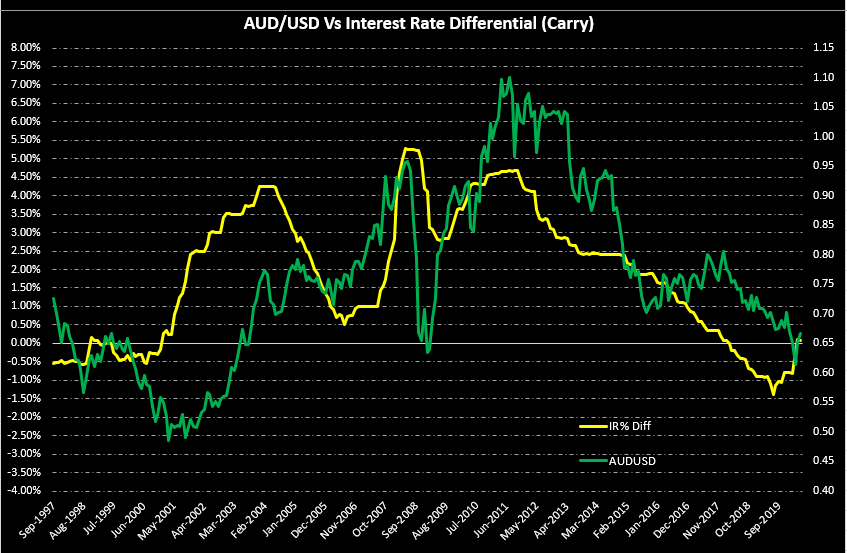
Impact on Currency

GDP metrics are used in a variety of ways by a variety of people. Economists and Central Authorities primarily use GDP per Capita PPP to understand its people’s economic wellbeing in contrast to other economies. GDP Growth Rate is primarily used by Traders, Business people, and Investors to make business decisions.

GDP per Capita PPP would likely be more useful for Policymakers, and Business people. Business people can use this as a wealth metric and consequently decide the products to suit the budget of people. The higher the wealth of the individual citizen, the costlier products and services they can afford. Hence, business decisions can also be impacted.

The PPP value can be used to base exchange rate fluctuations and identify signs of strengthening or weakening of currencies. 

It is a proportional high impact indicator. Higher GDP per Capita PPP is good for the currency and the economy and vice-versa. Although for trading decisions, GDP Growth Rate serves as a more relevant metric for comparisons amongst different currency countries. Also, GDP per Capita PPP is a yearly statistic and is more relevant for long term investment decisions than short-term currency trading decisions.

Economic Reports

Major international organizations like the World Bank, International Monetary Fund, OECD, etc. actively maintain track of most countries’ GDP figures on their official website. The World Bank maintains the GDP per Capita PPP for most countries. Every three years, the World Bank announces a report comparing the productivity and growth of different countries based on PPP. It is a yearly data.

Sources of GDP per Capita PPP

GDP per Capita PPP – World Bank

GDP per Capita PPP – CIA World Factbook

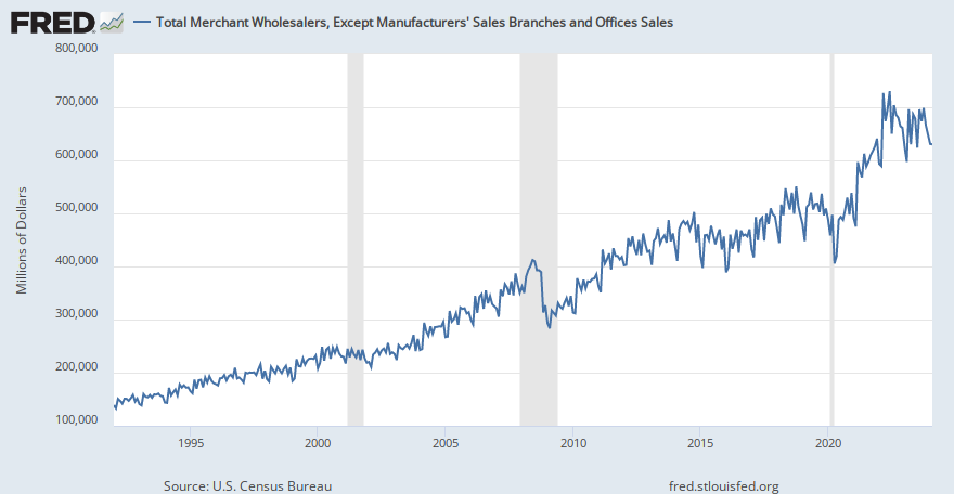
GDP per Capita PPP – the United States – FRED

We can find a consolidated list of the same here as well.

Impact of the ‘GDP Per Capita PPP’ news release on the price charts 

In the previous section of the article, we understood the definition of GDP based on PPP and how it is different from the nominal GDP. PPP based GDP is converted to international dollars using purchasing power parity rates and divided by the total population. 

Purchasing Power Parity (PPP) between two countries, X and Y, is the ratio of several units from country X’s currency required to purchase in country X. The same quantity of an excellent/service as one unit of country Y’s currency will purchase in country Y. It can be used mostly to compare inflation in two and, to some extent, the economic growth. But the nominal GDP is one that taken into consideration while making investment decisions.

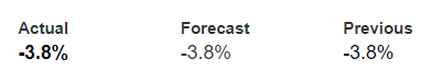
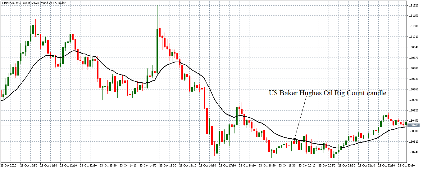
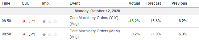
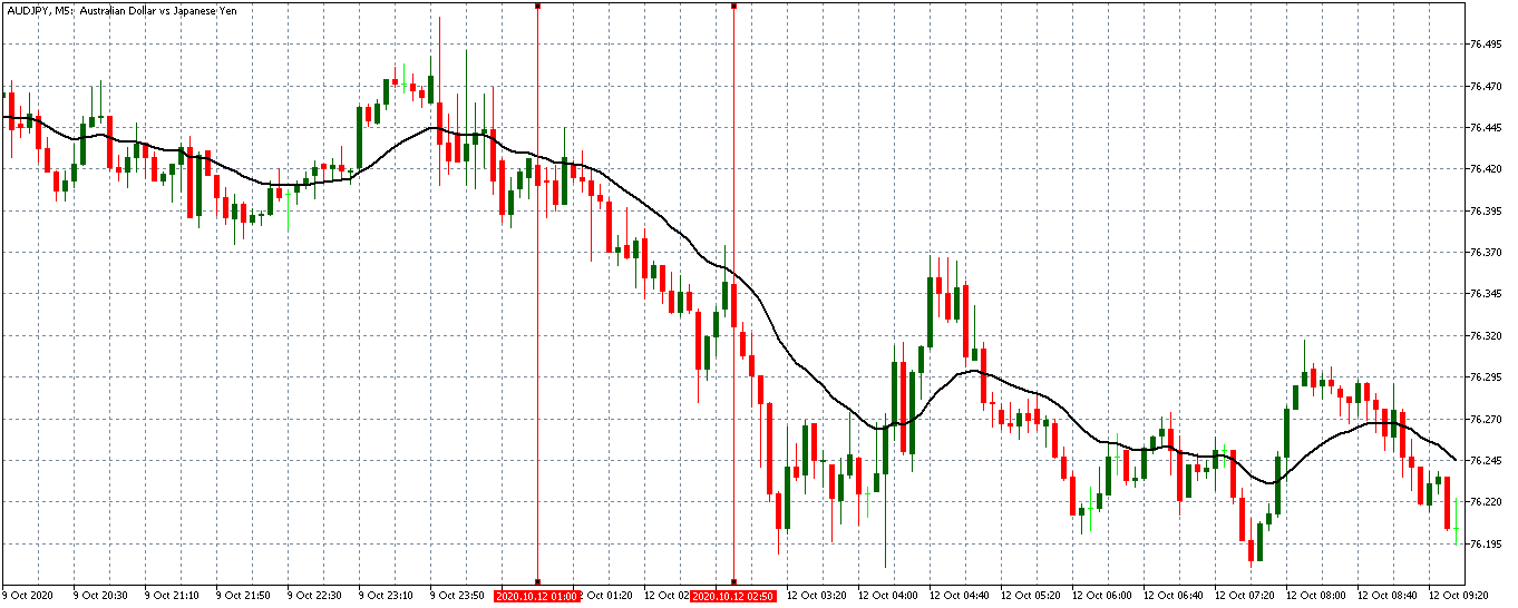
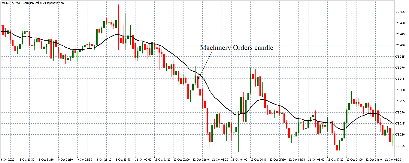
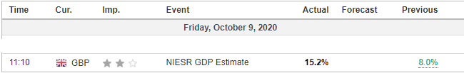
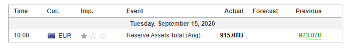
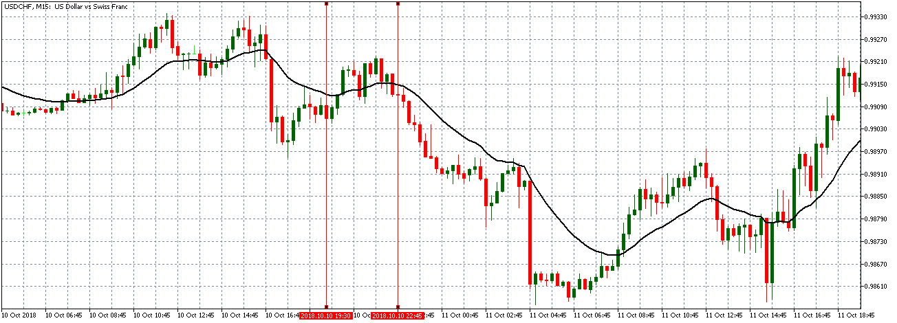
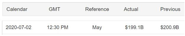
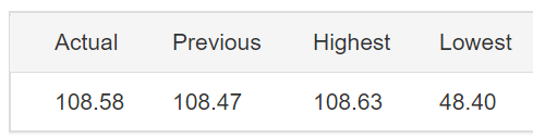
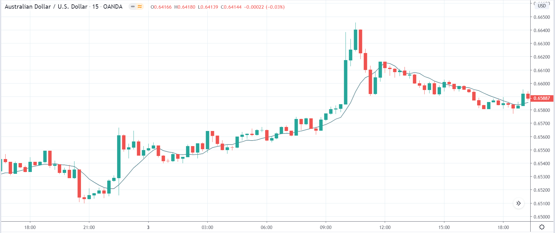
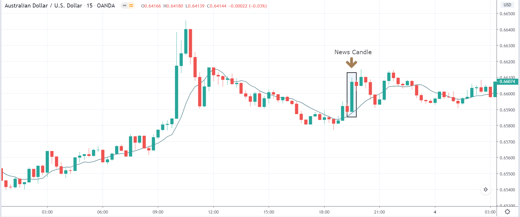
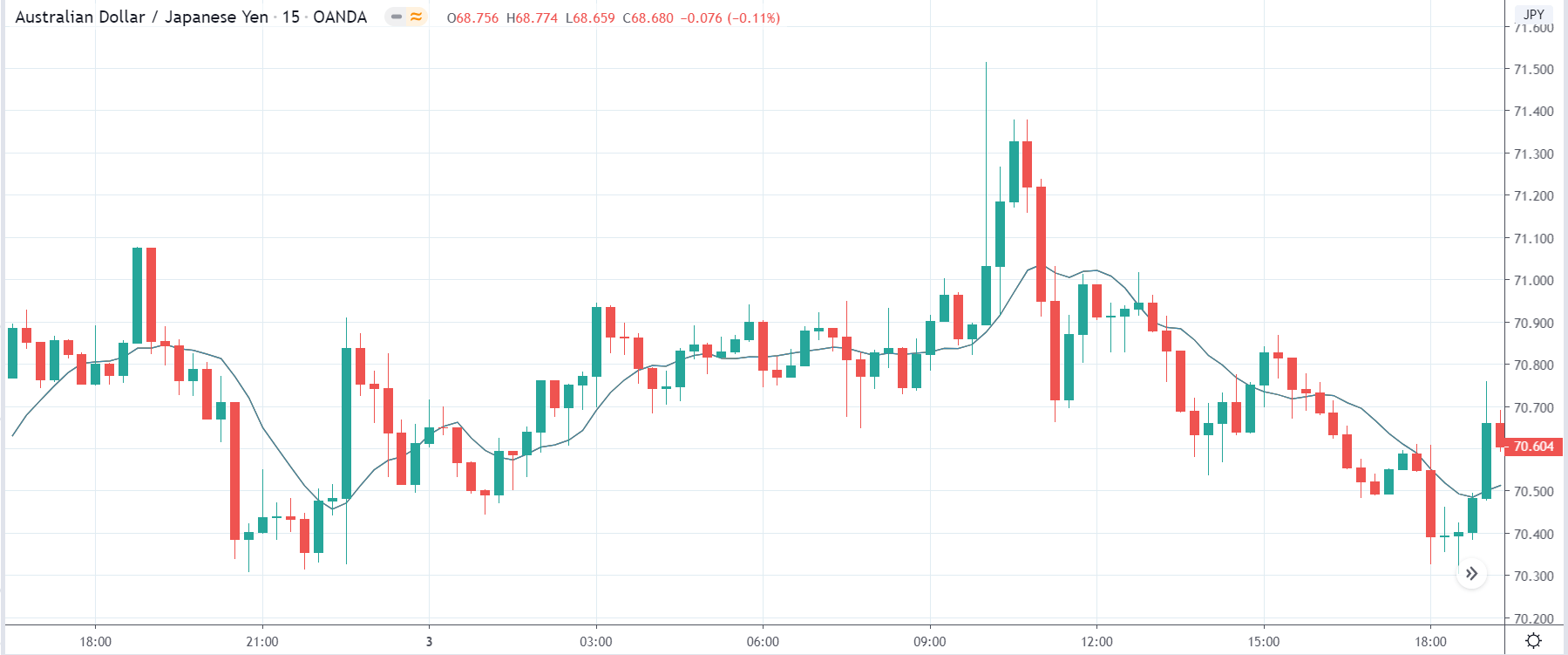
In today’s example, we will observe the impact of GDP on various currency pairs and witness the change in volatility due to the official news release. The below image shows the GDP in the Euro Zone during the fourth quarter, where we see the GDP was as in the previous quarter. Let us find out the reaction of the market. 

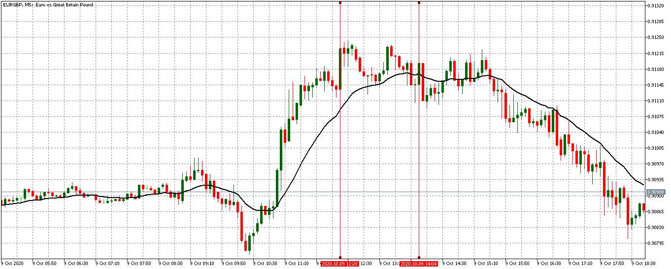
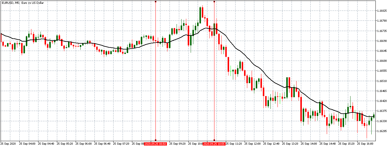
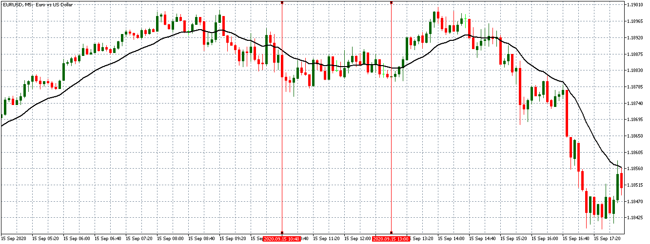
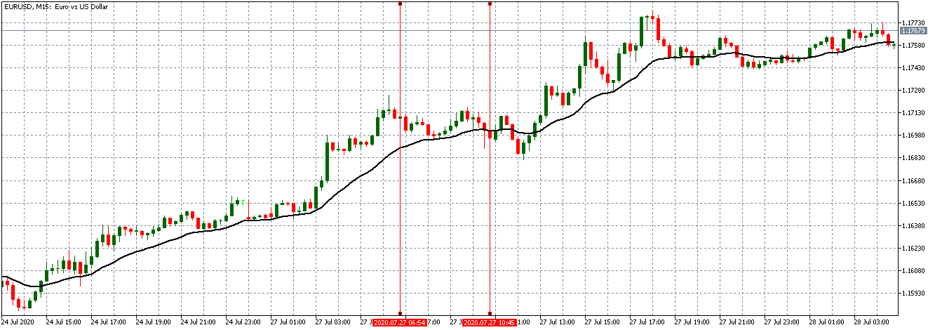
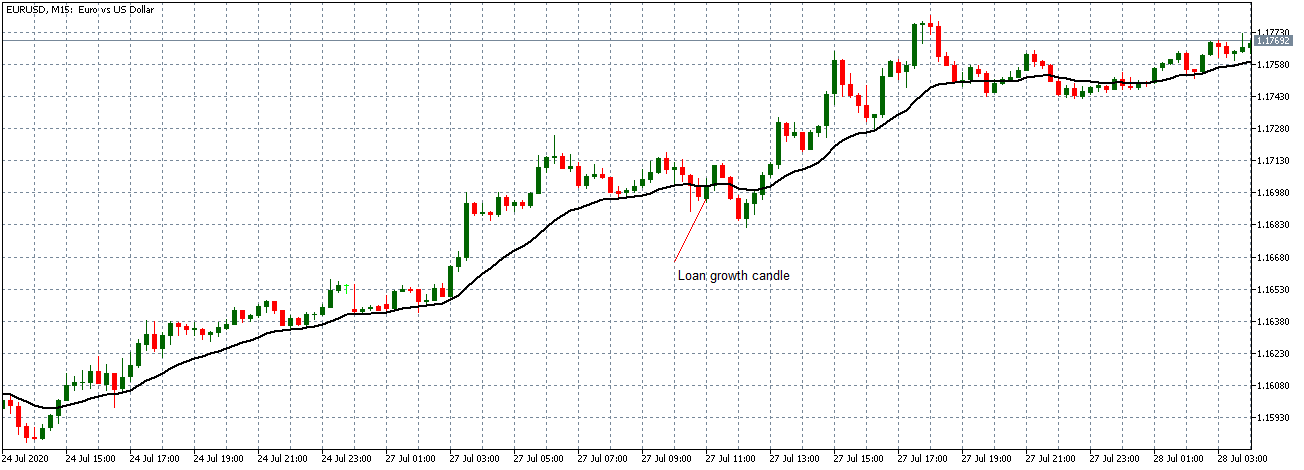
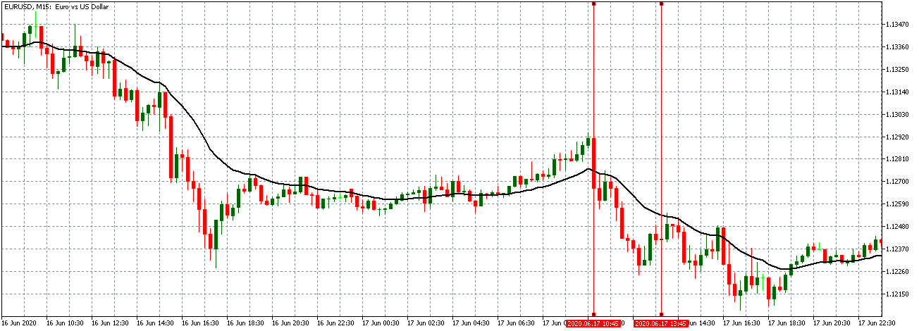
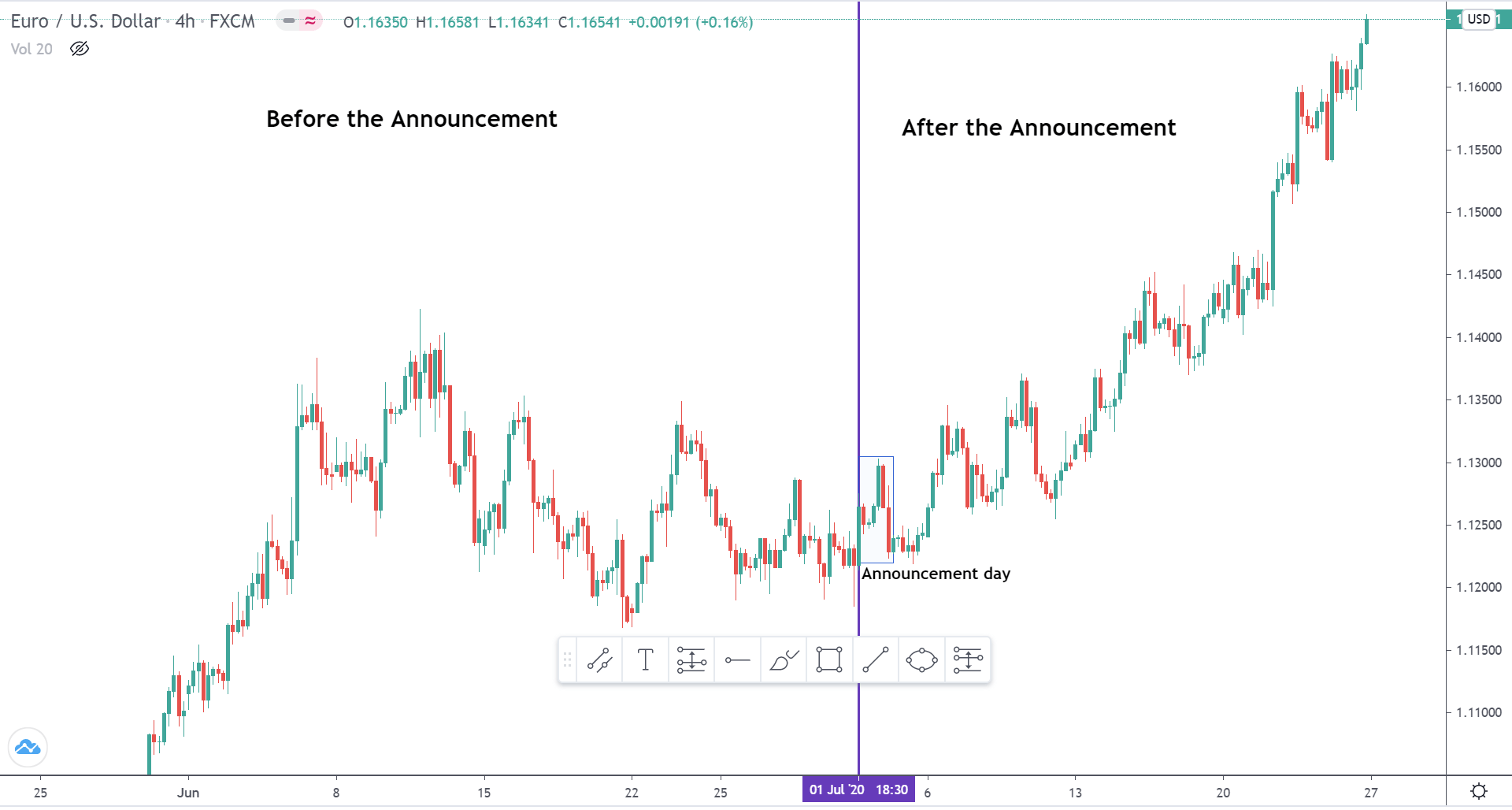
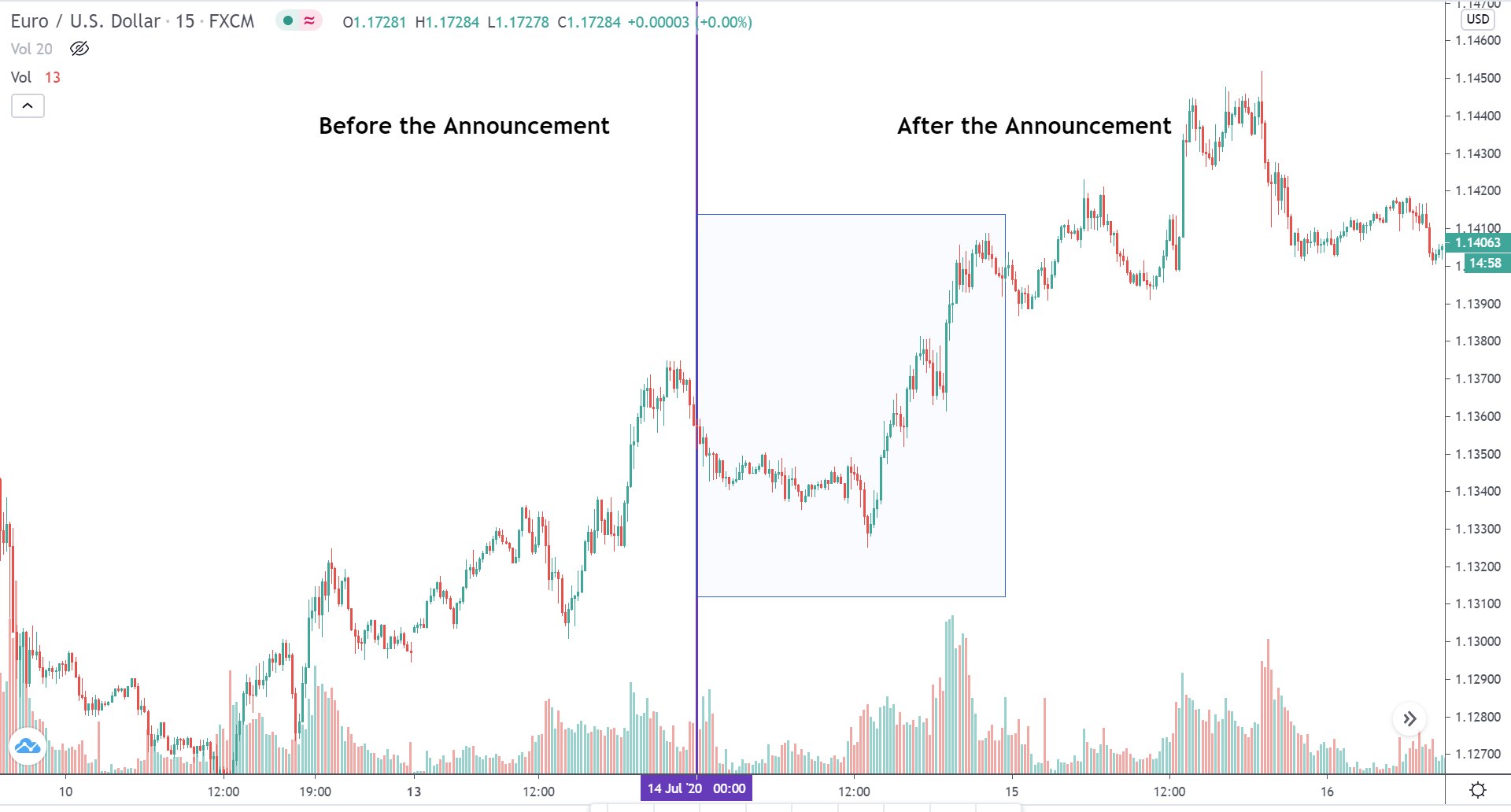
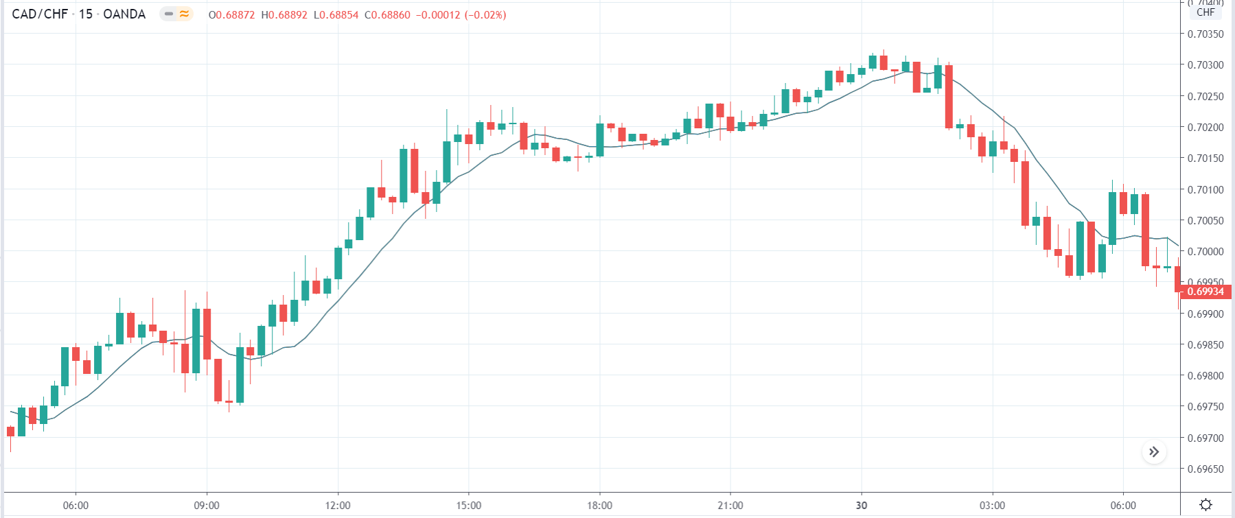
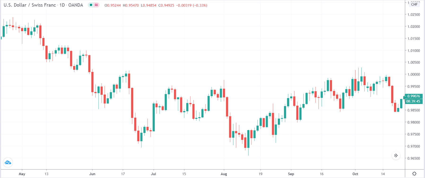
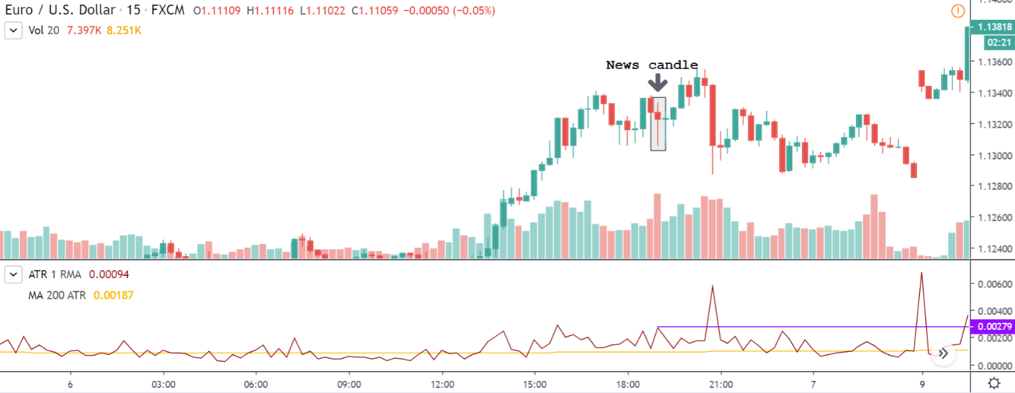
EUR/USD | Before the announcement:

We shall start with the EUR/USD currency pair to analyze the impact of GDP on the Euro. It is clear from the preceding illustration that the market is not trending in any direction, which means there is confusion concerning the market trend. Therefore, until we have clarity in the market, it is smart not to take any trade.

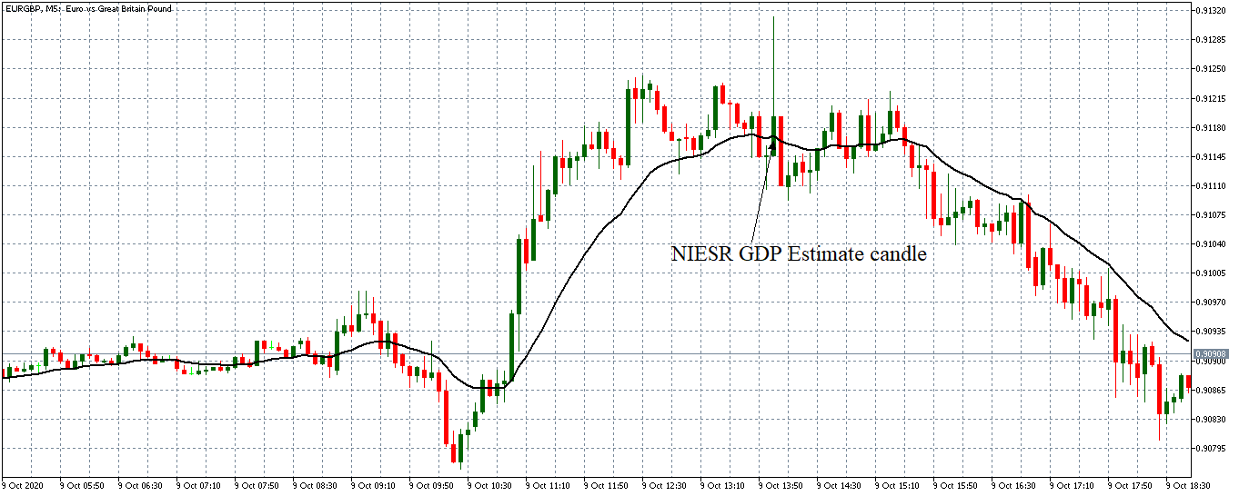
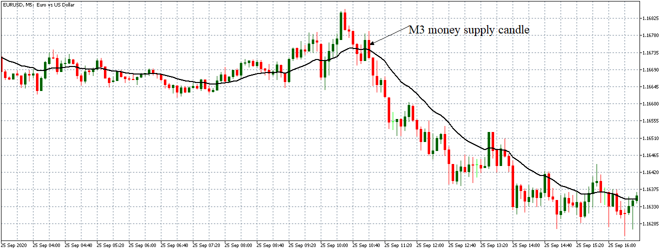
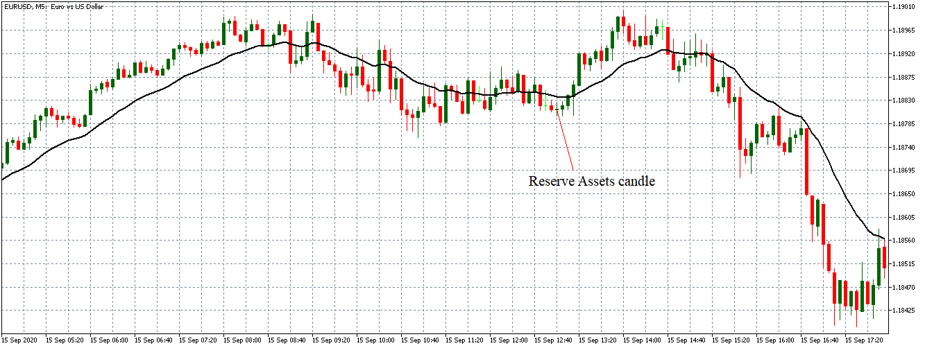
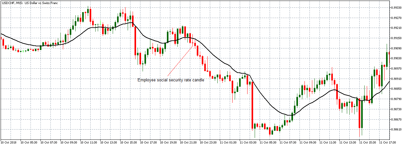
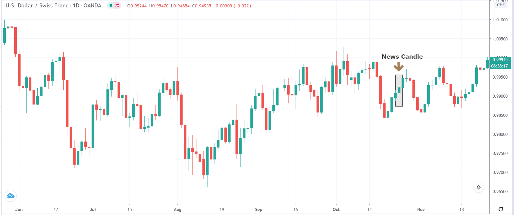
EUR/USD | After the announcement:

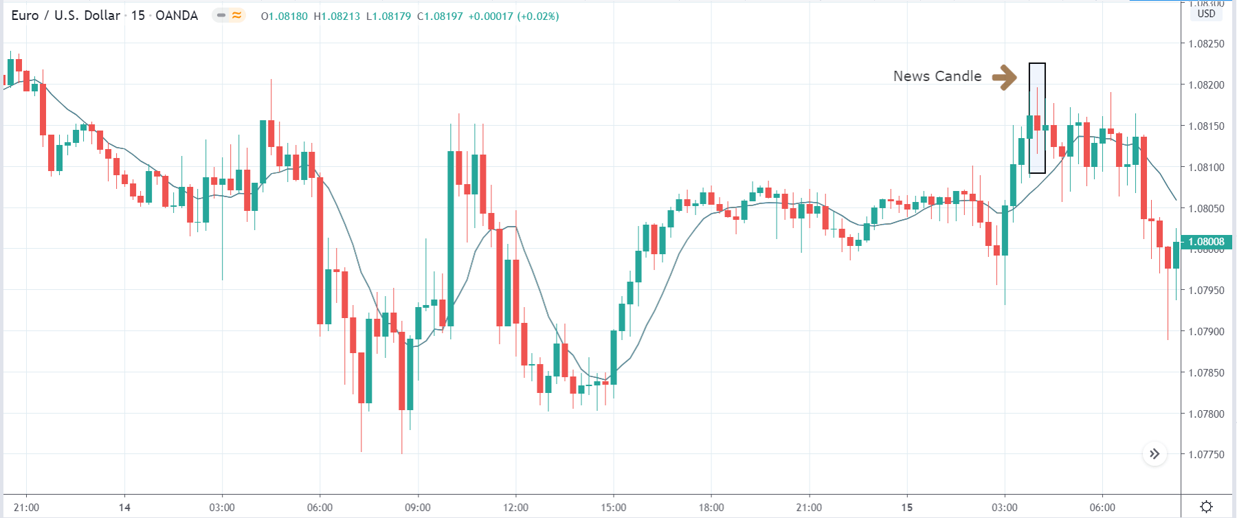
After the news announcement, the price gets volatile as it moves in both the directions and finally, closes near the opening price. The GDP data did not strengthen or weaken the currency where the ‘news candle’ closed, forming an indecision candlestick pattern. As the news release did not bring about any significant change to the currency pair, one should analyze the currency based on technical indicators.    

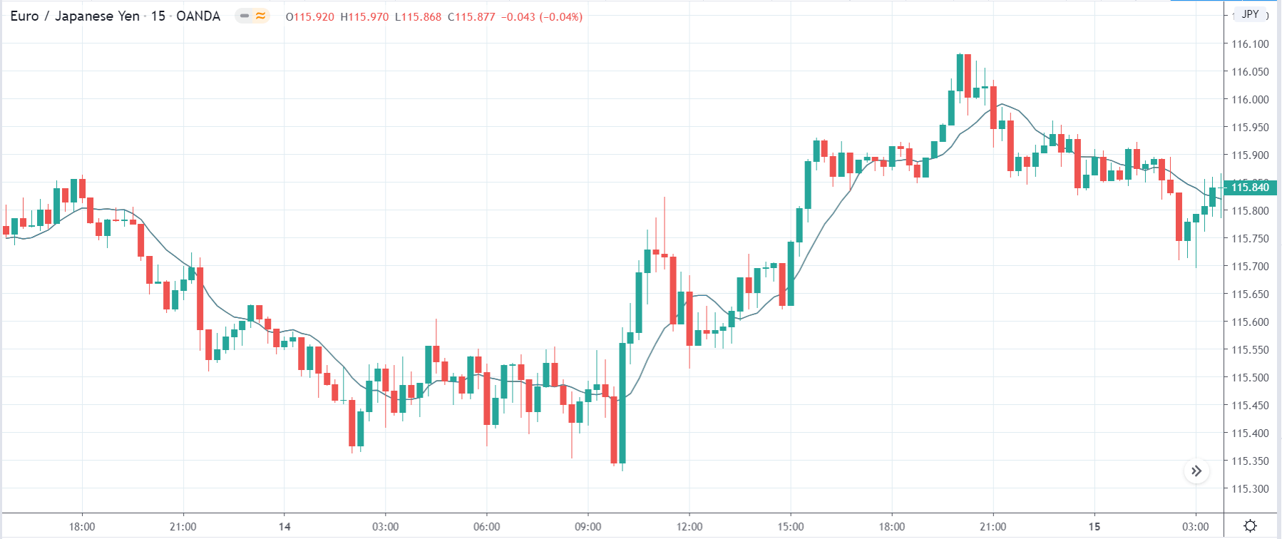
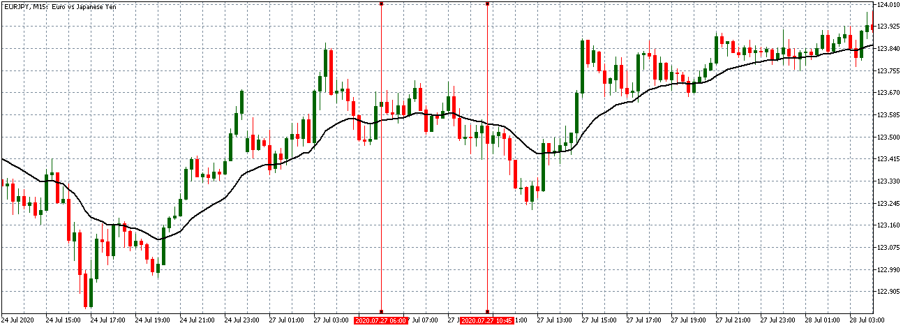
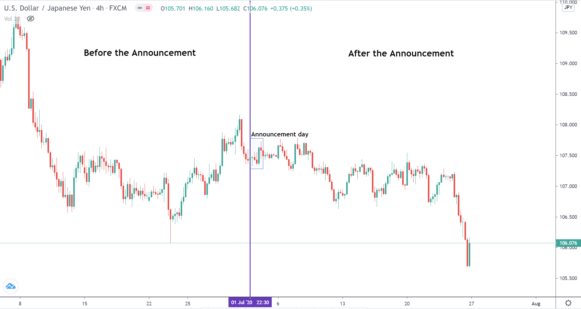
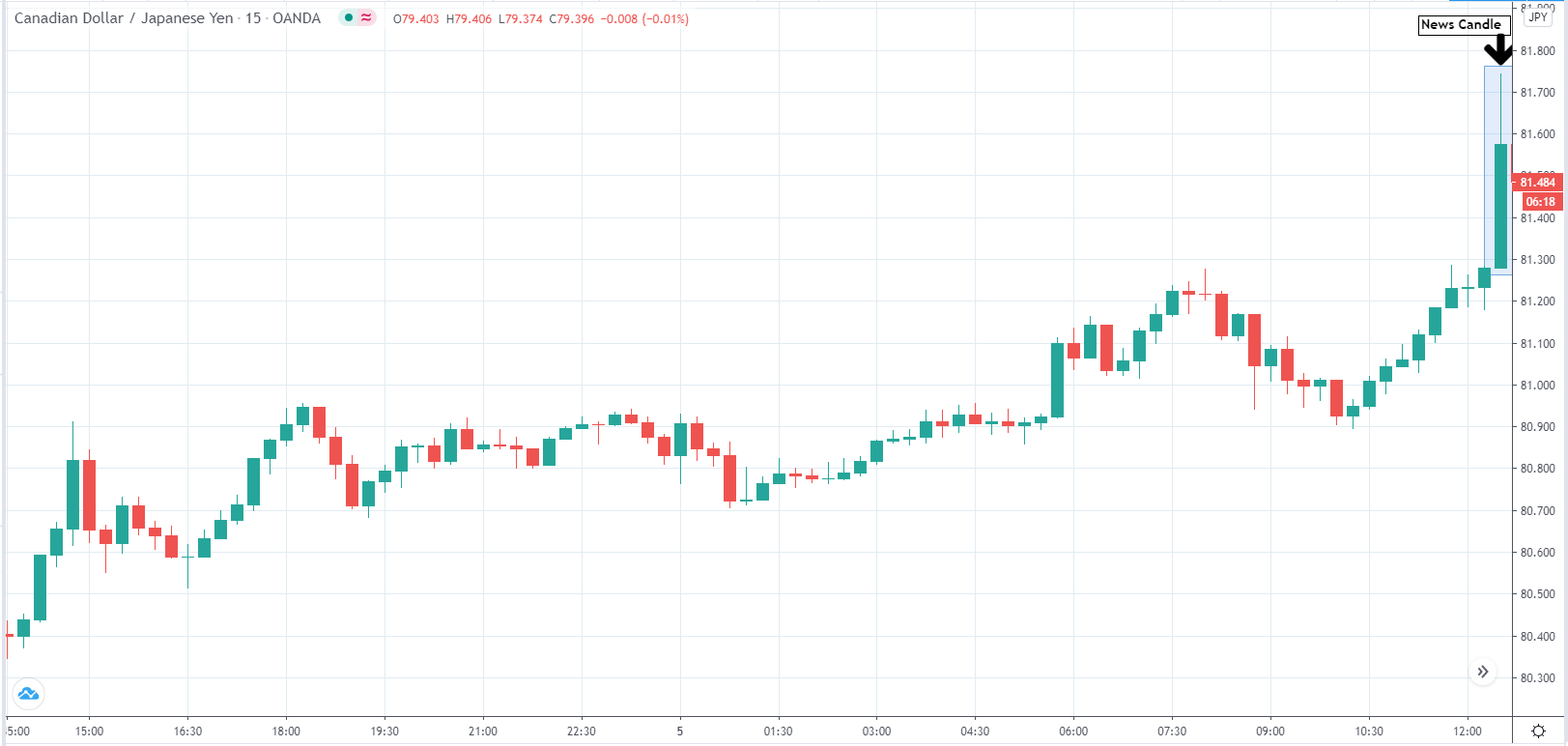
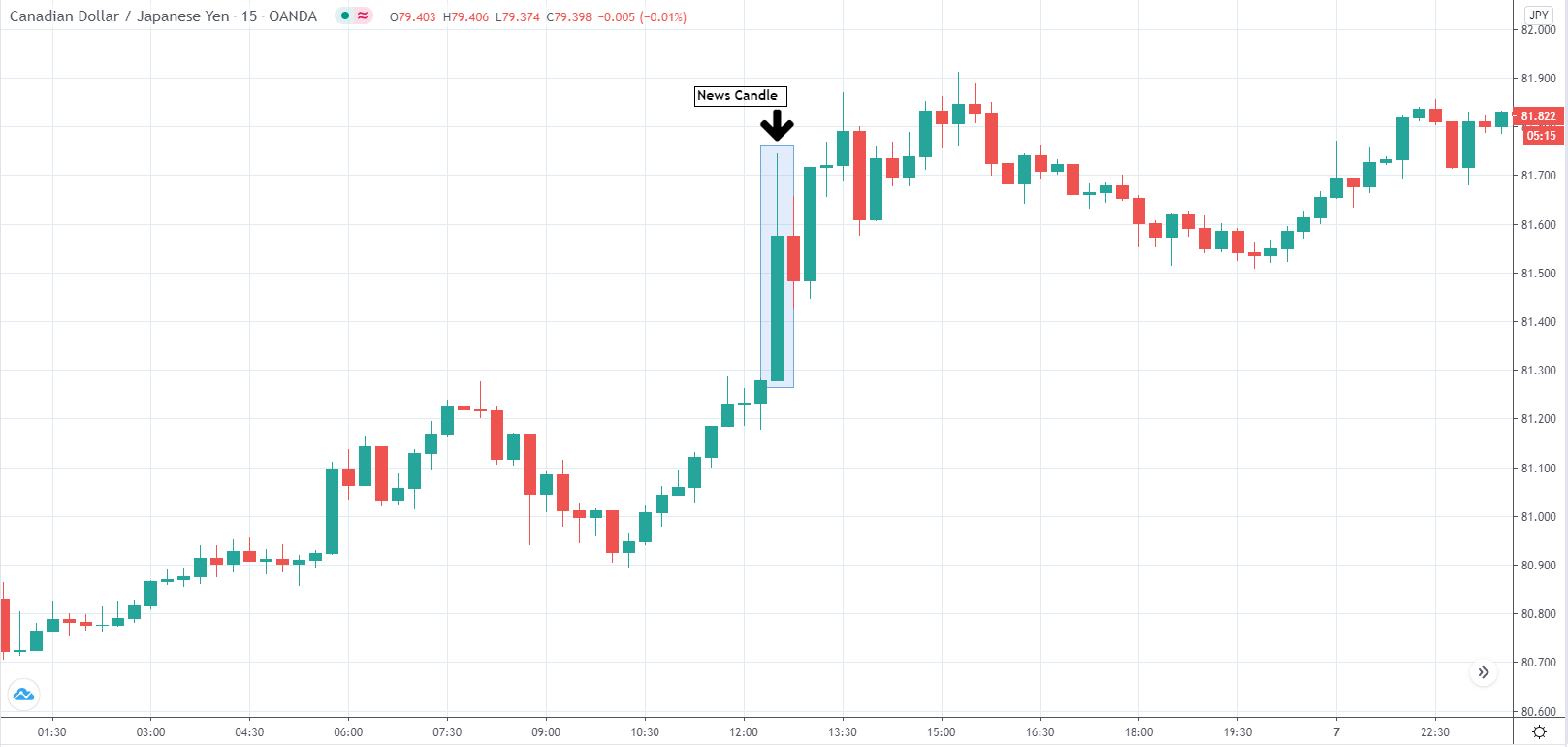
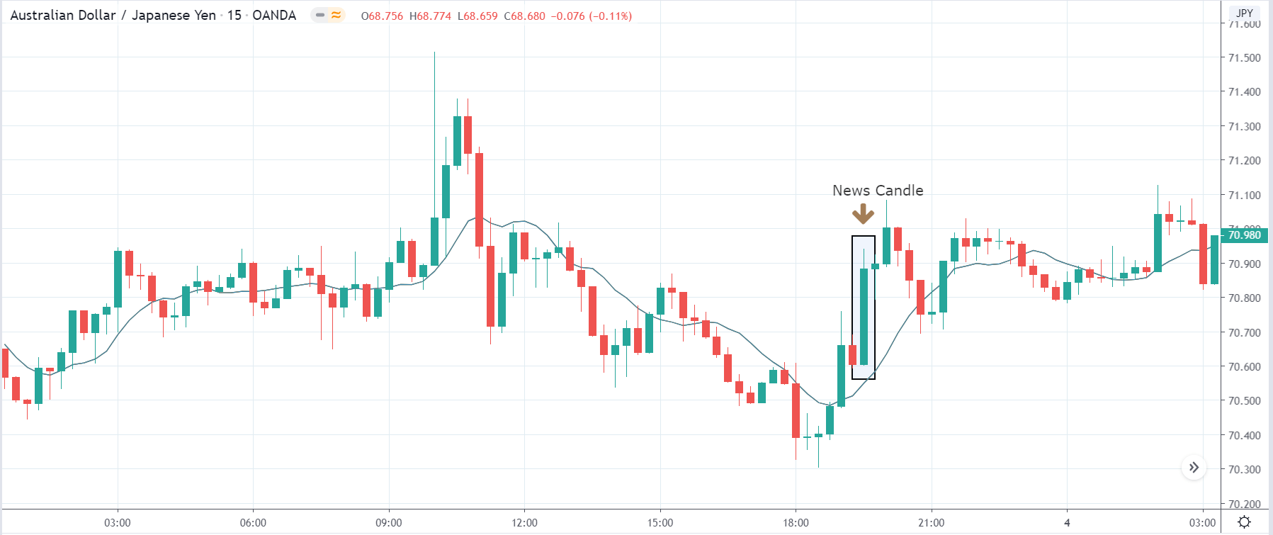
EUR/JPY | Before the announcement:

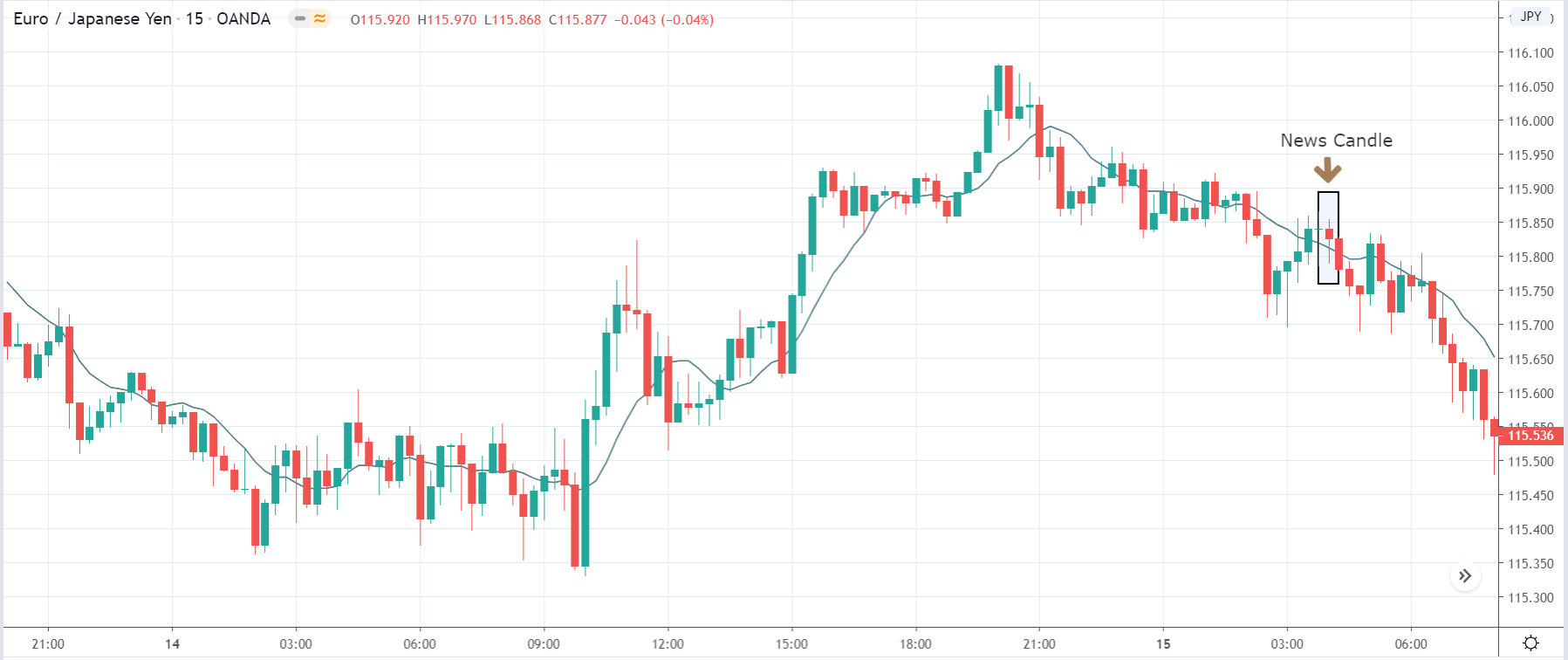
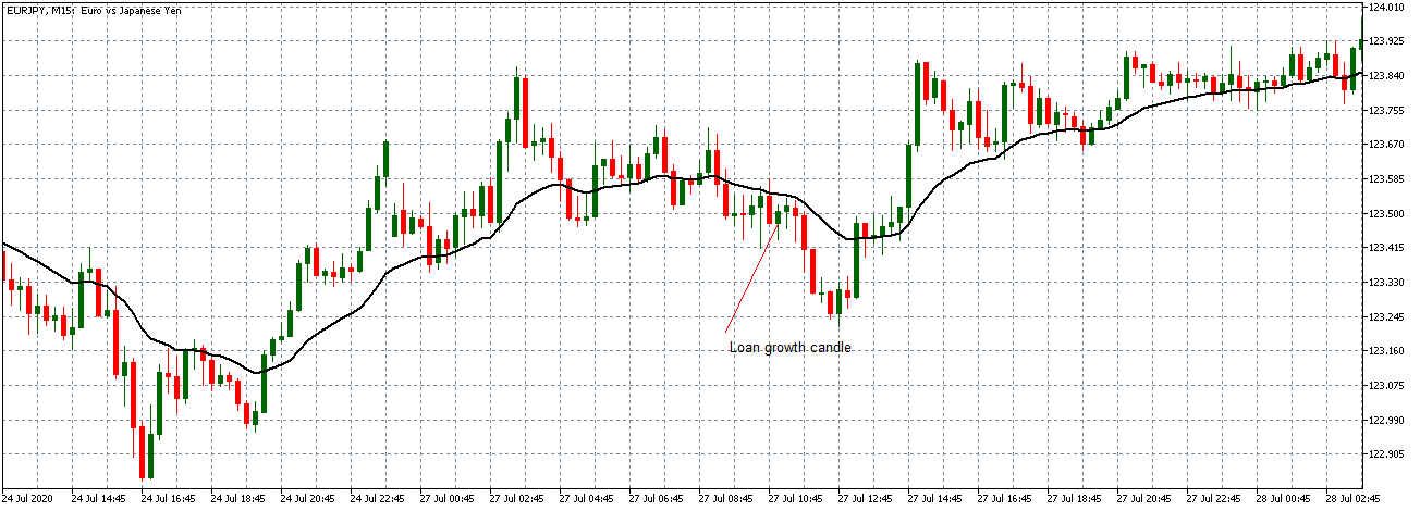
EUR/JPY | After the announcement:

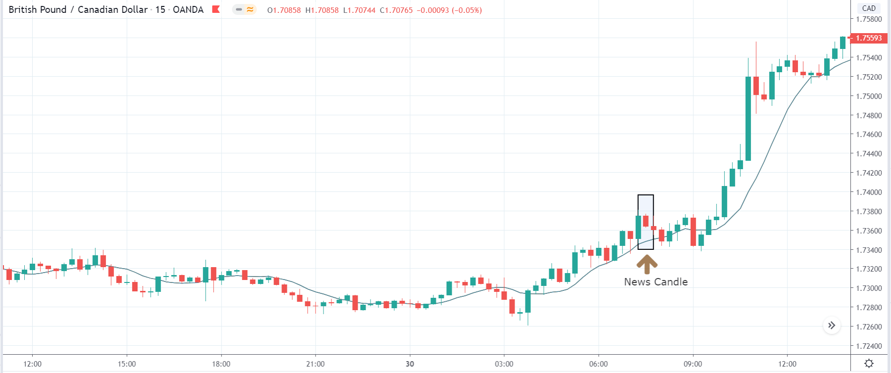
The above images represent the EUR/JPY currency pair, where we see that the overall trend of the market is up, and recently it is has shown signs of reversal before the news announcement. One needs to wait for confirmation before taking a trade as the news event can cause significant changes to the existing chart pattern, resulting in an unnecessary loss. Until the price is below the moving average, the uptrend shall not continue.

After the news announcement, the price initially moves lower, but it gets immediately bought and closes with a wick on the bottom. There is some volatility seen, which eventually takes the market lower. The GDP data came out to be as expected, where it was the same as before. Since there was no improvement in the GDP, we can ascertain that it was negative for the currency.    

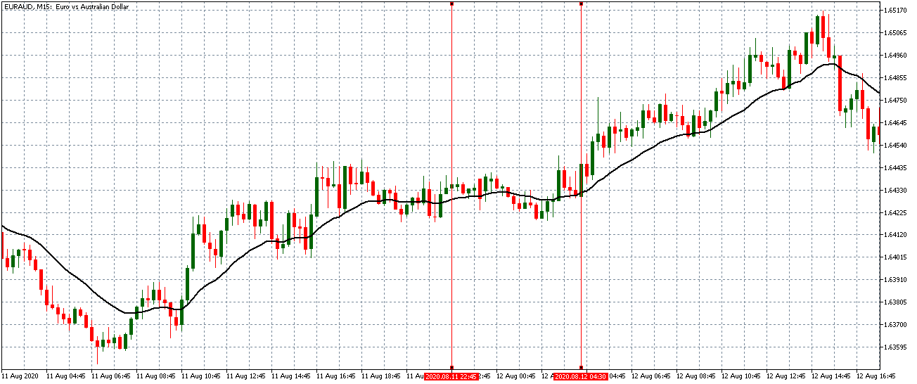
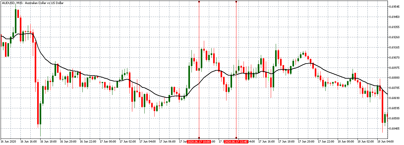
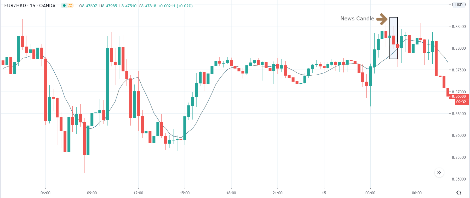
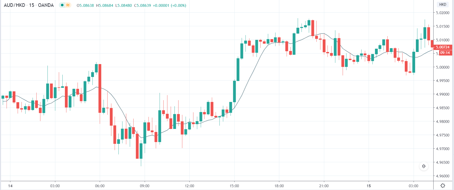
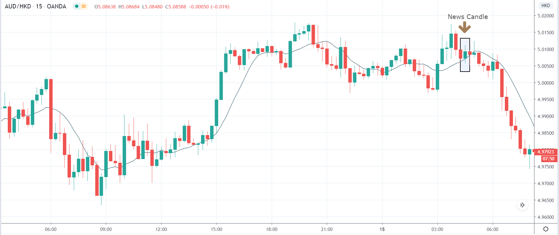
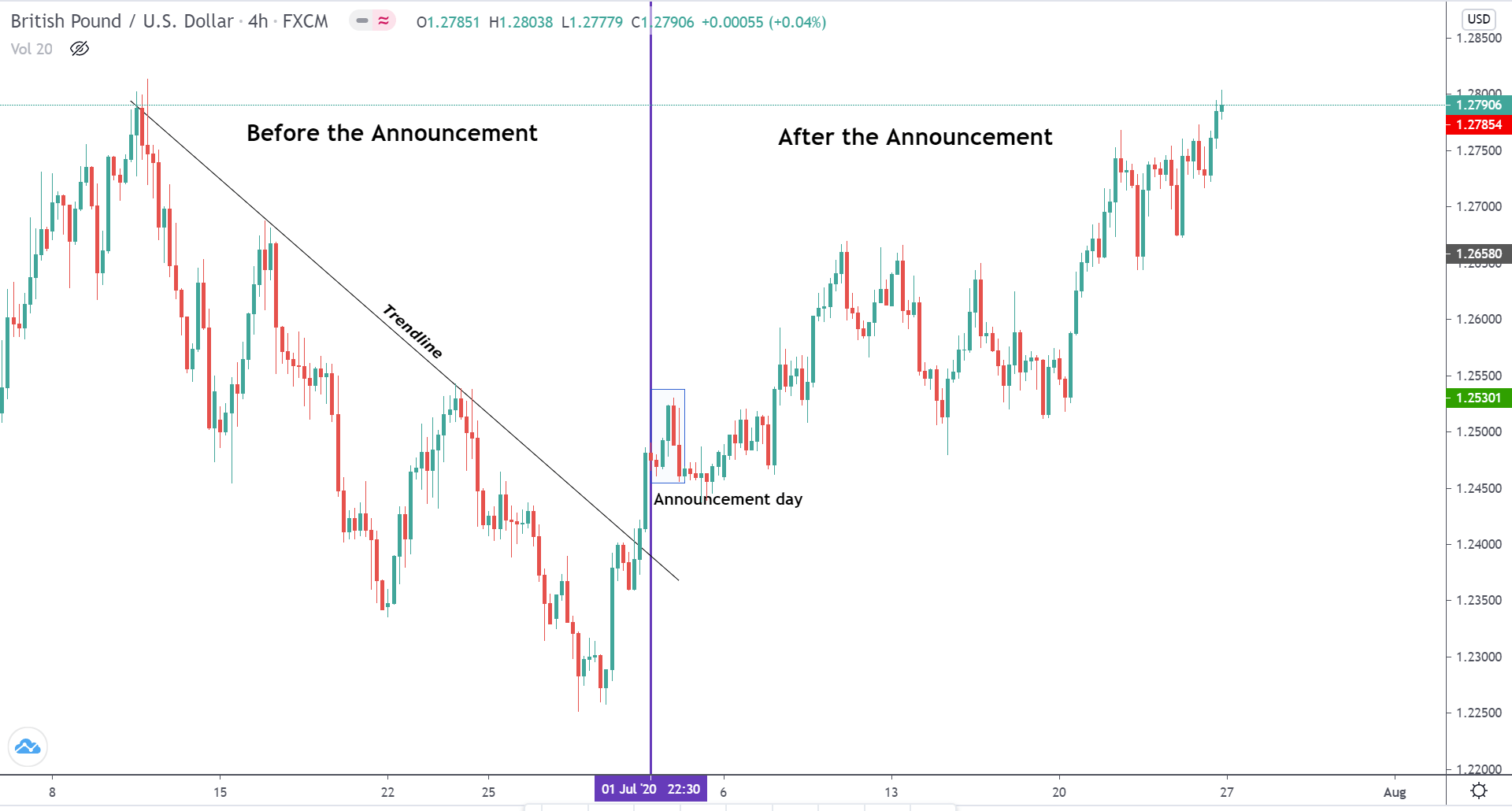
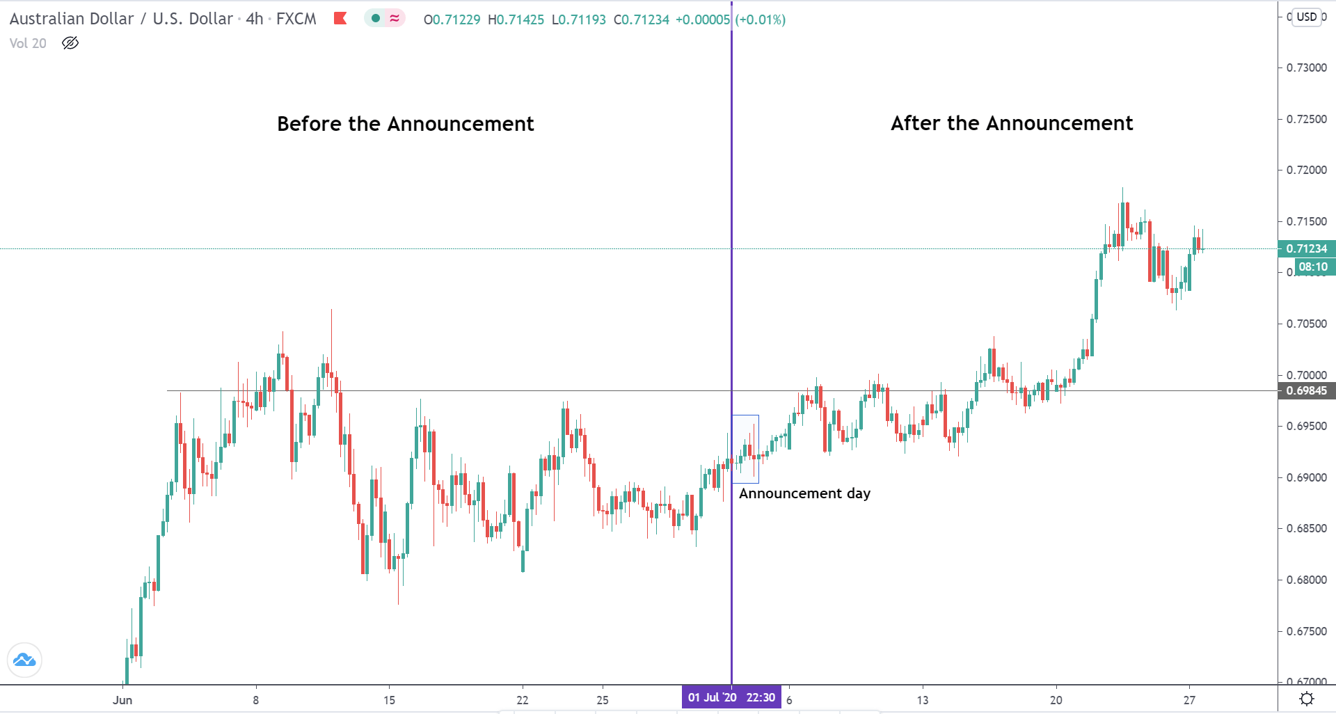
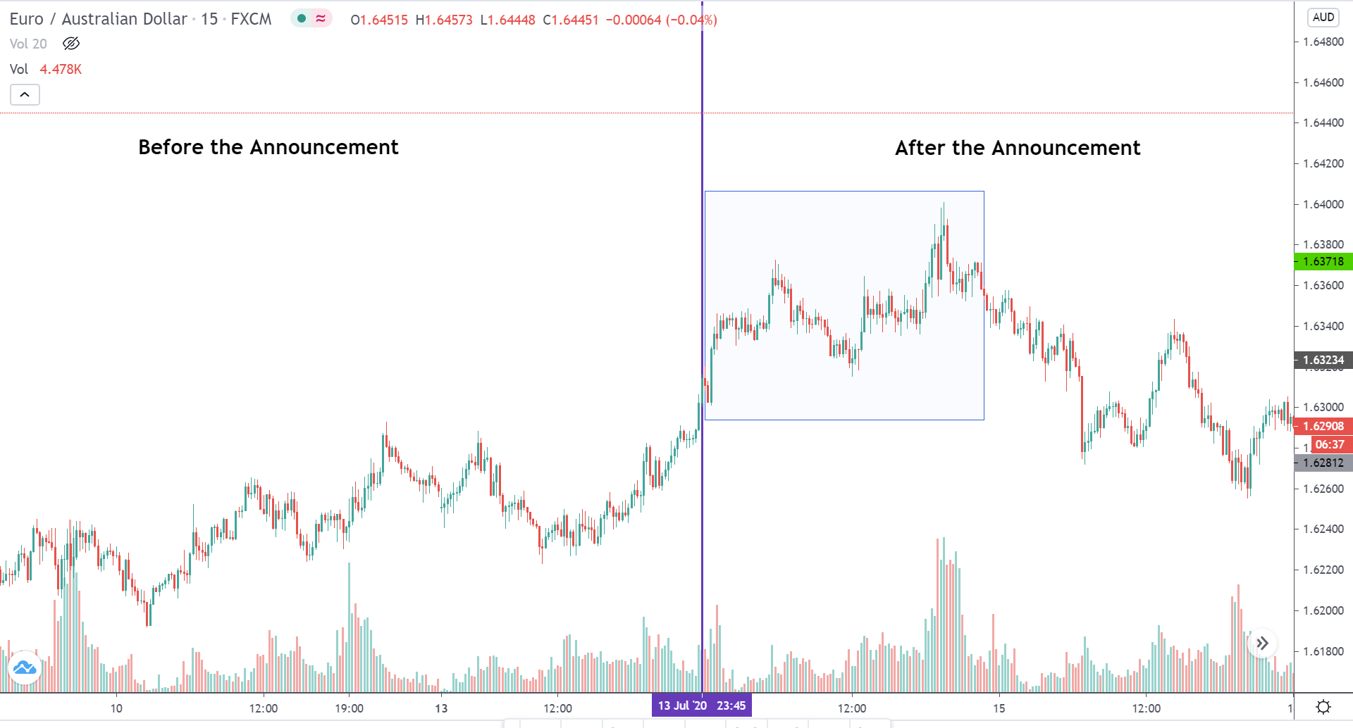
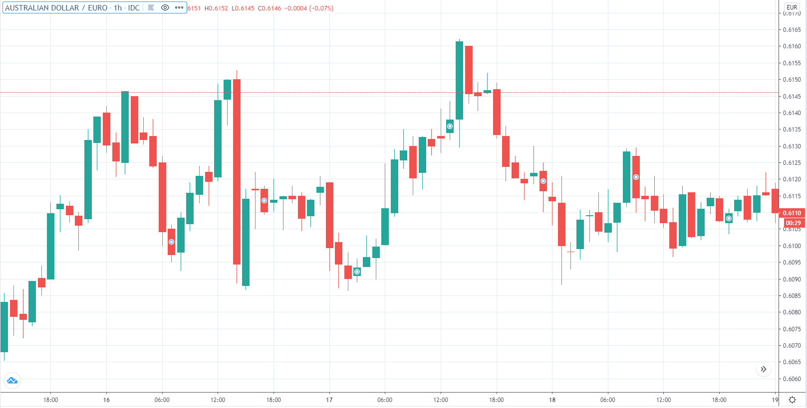
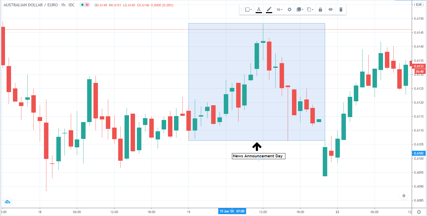
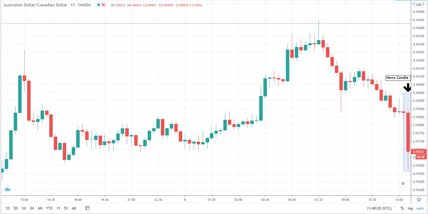
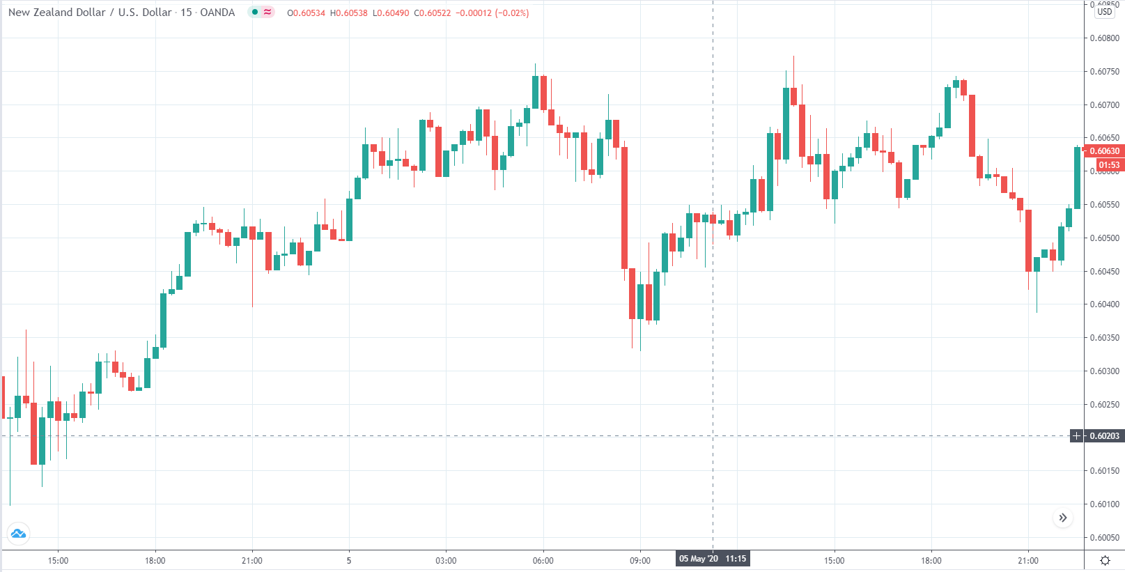
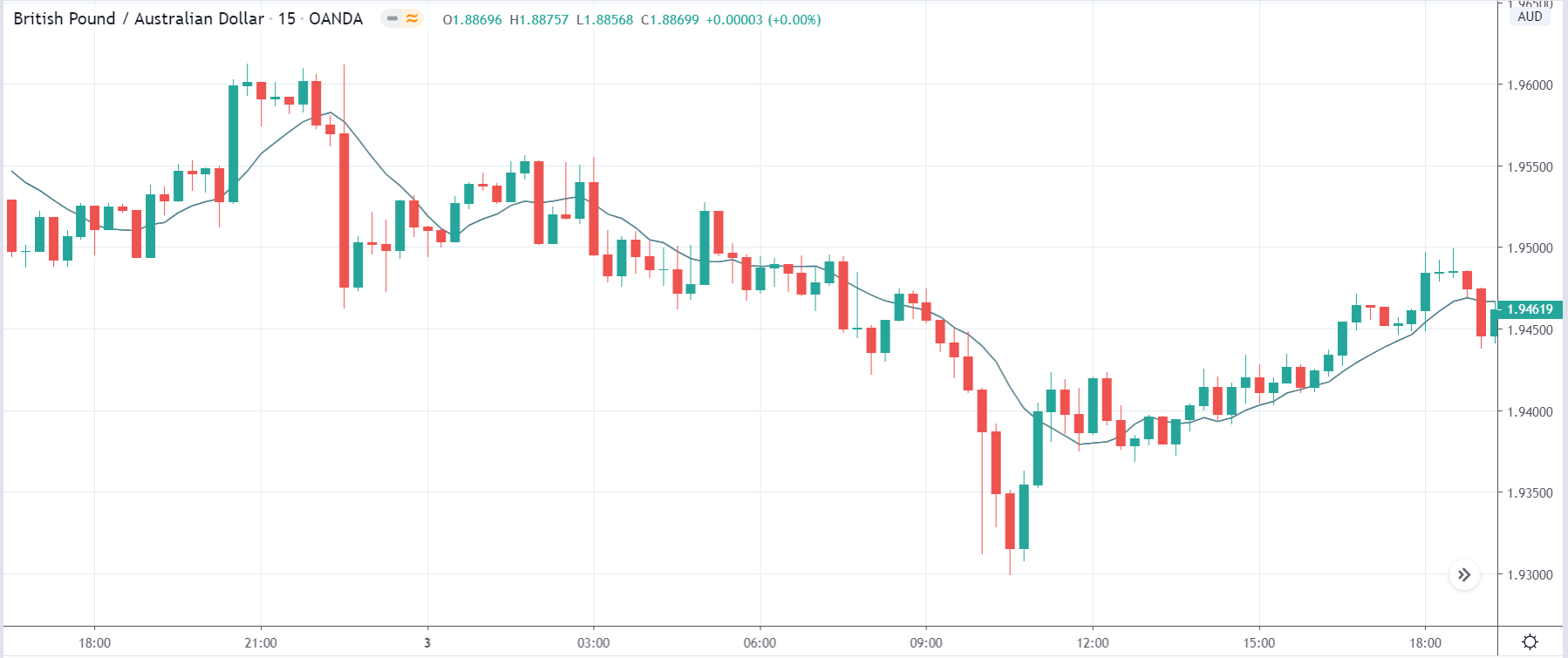
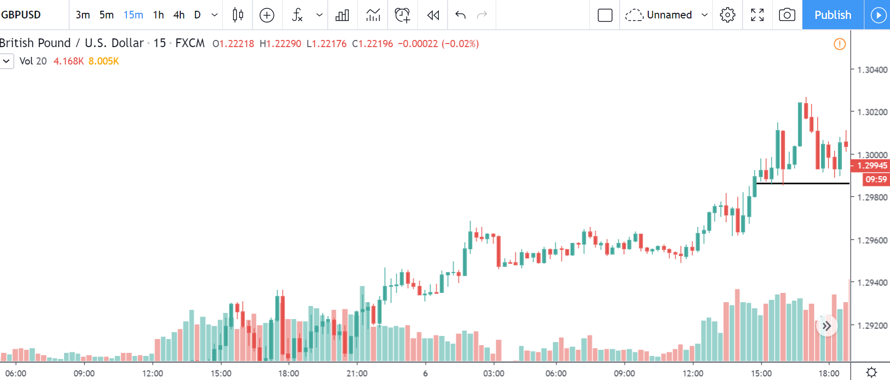
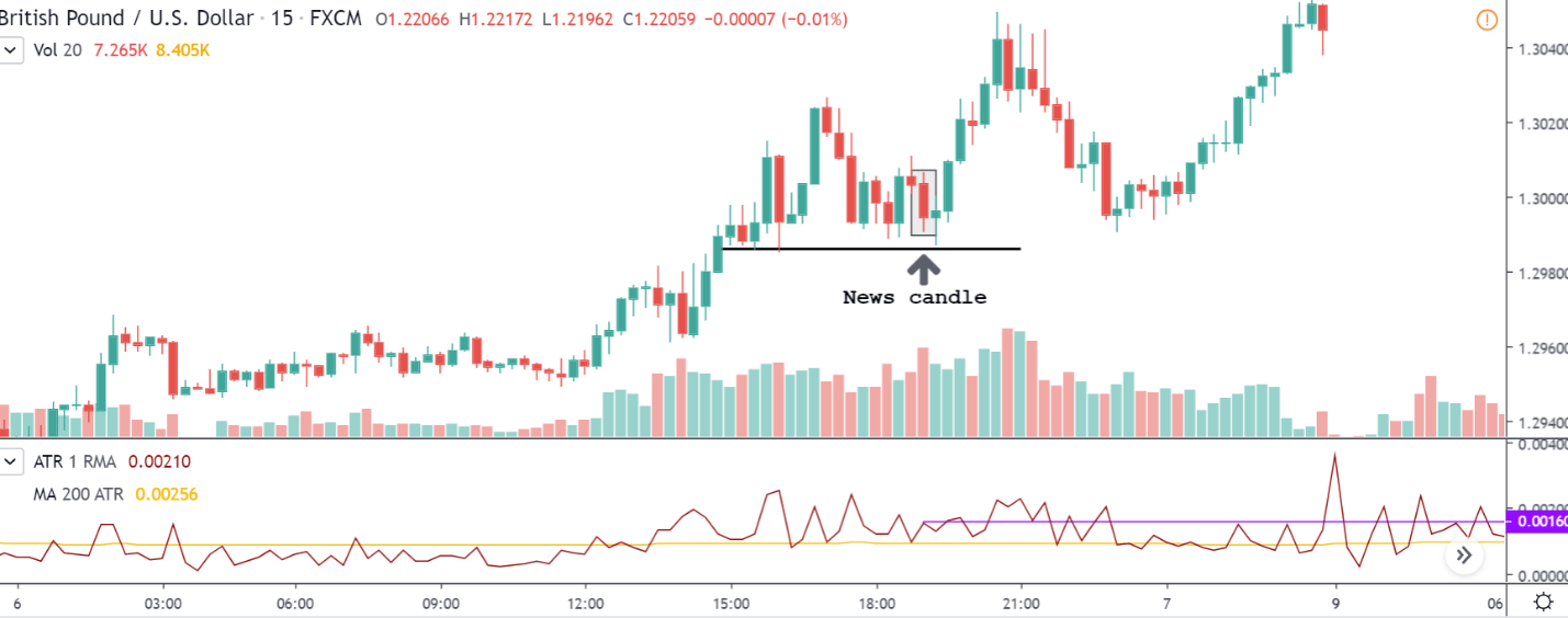
EUR/AUD | Before the announcement:

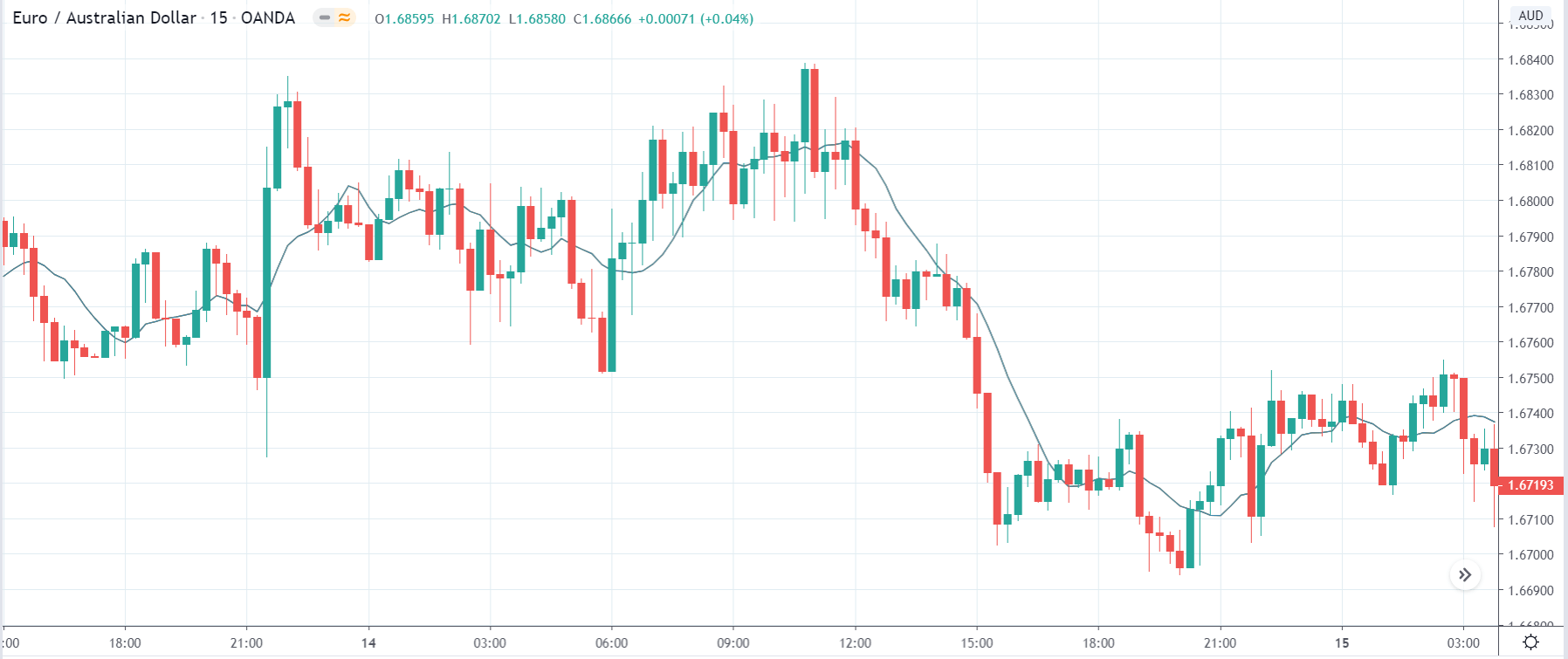
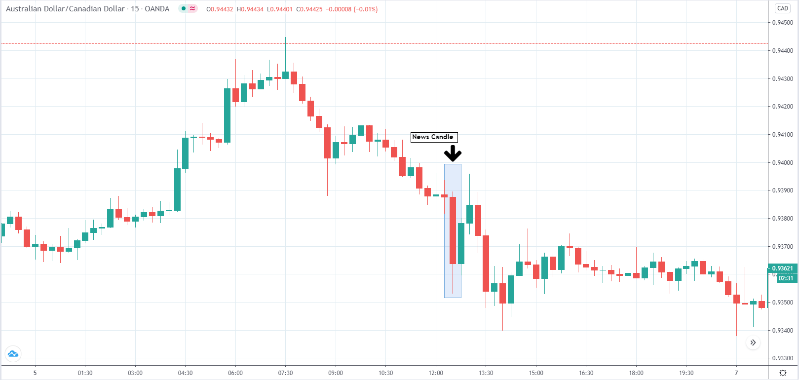
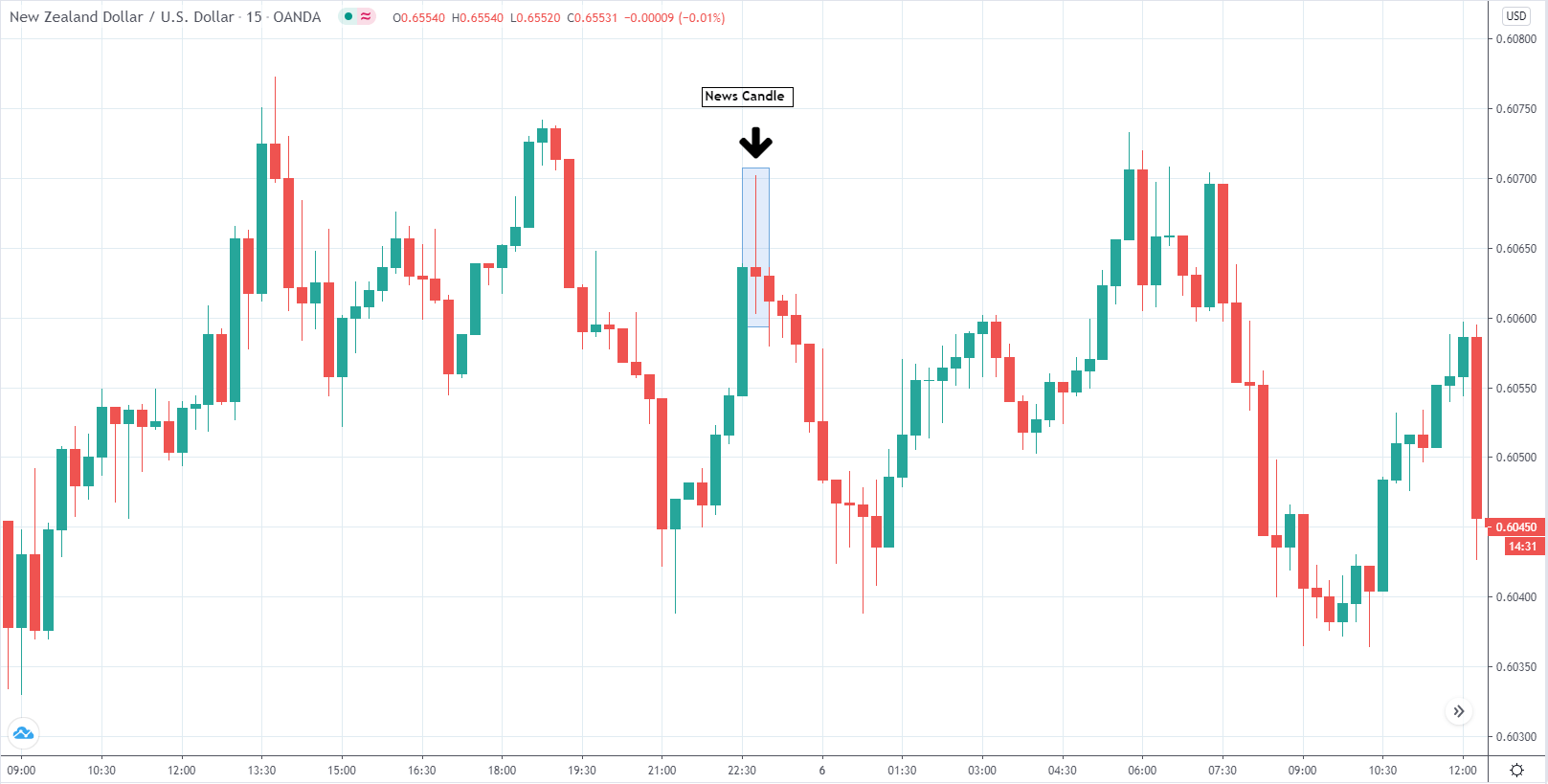
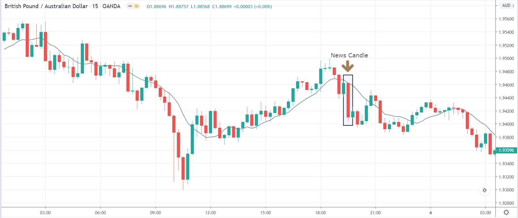
EUR/AUD | After the announcement:

The above images are that of EUR/AUD currency pair, where we see that before the news announcement, the market is in a strong downtrend, and currently, the price is on the verge of continuing the downward move. However, since a significant news announcement is due, there is a possibility that it can change the trend, hence need to take a position based on the impact of the news.

After the news announcement, market shoots up, and volatility increases to the upside. Here we see that the GDP data has a positive impact on the Euro, and the currency strengthens after the news release. Now it is clear that selling the currency pair is no longer valid.

We hope you understood all about the ‘GDP Per Capita PPP.’ Do let us know your thoughts in the comments below. Happy Trading!
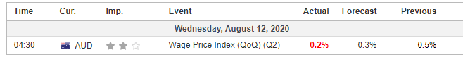
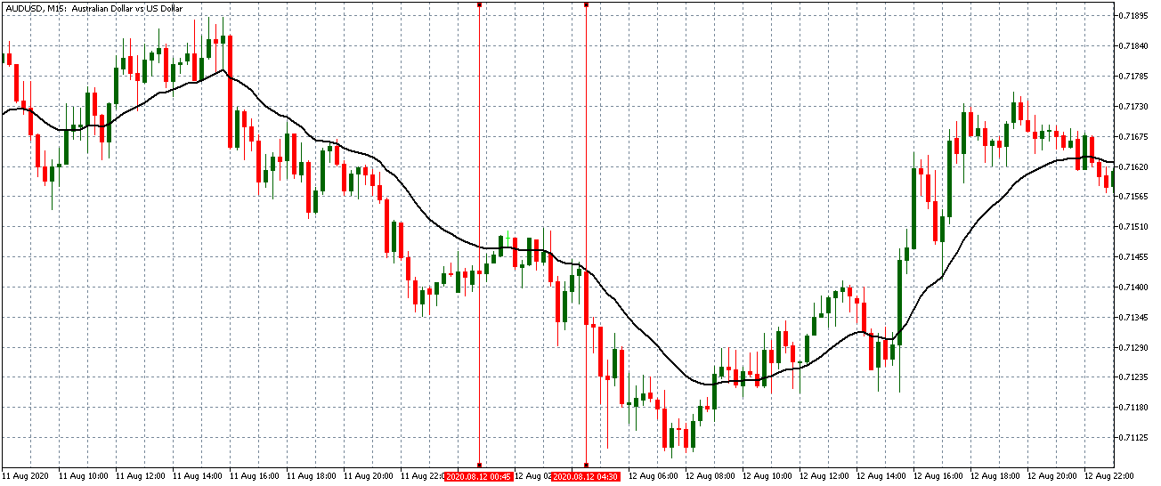
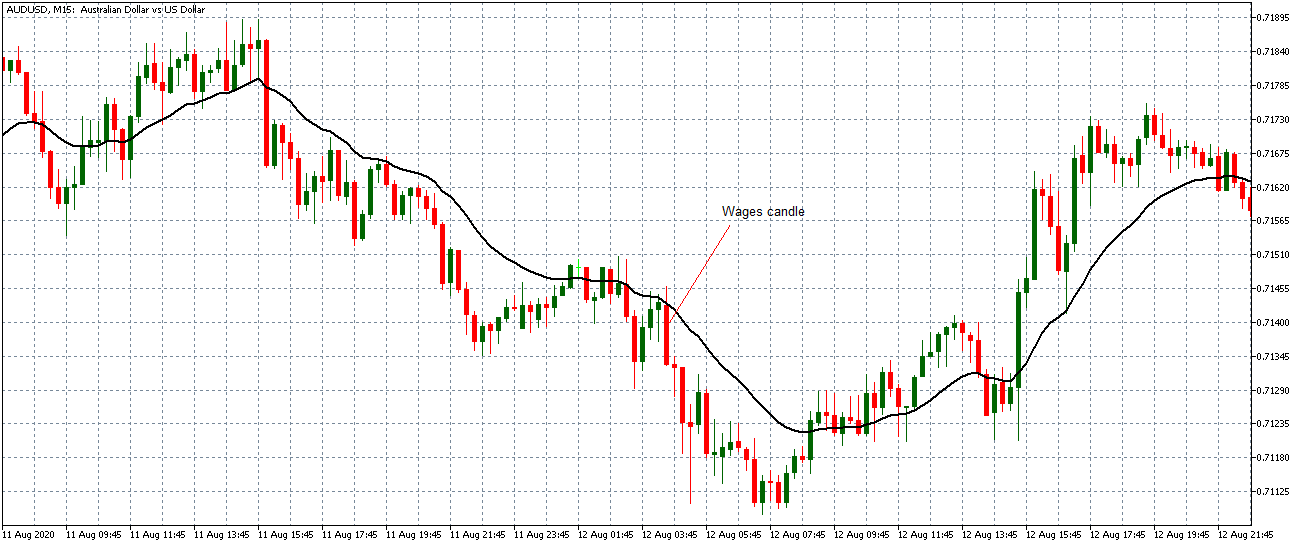
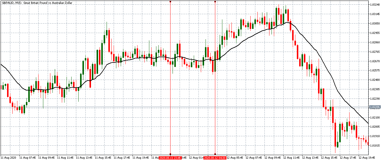
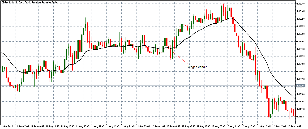
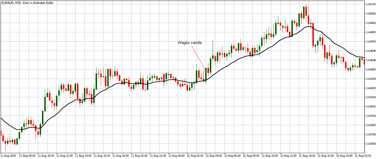
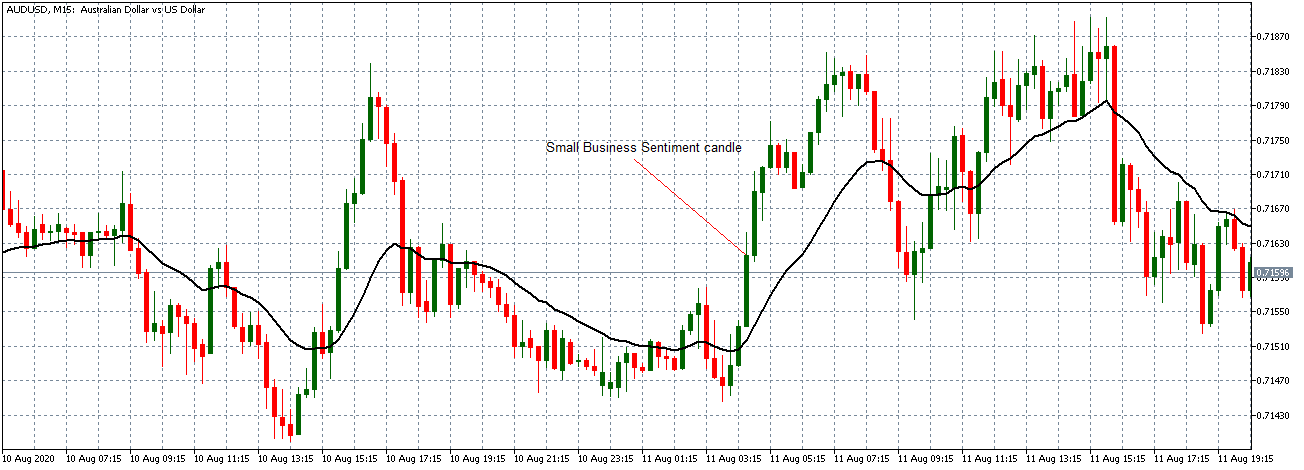
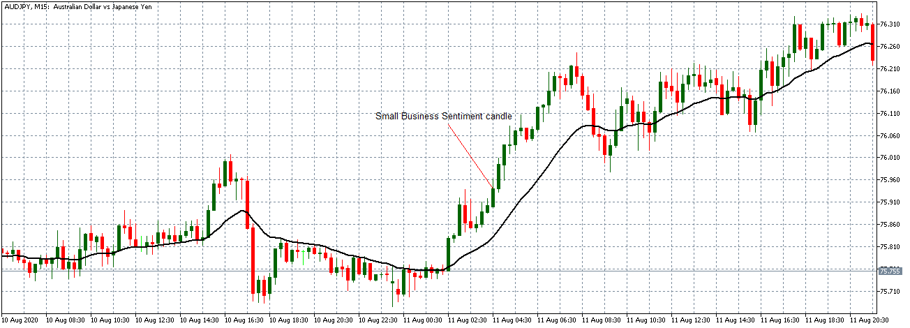
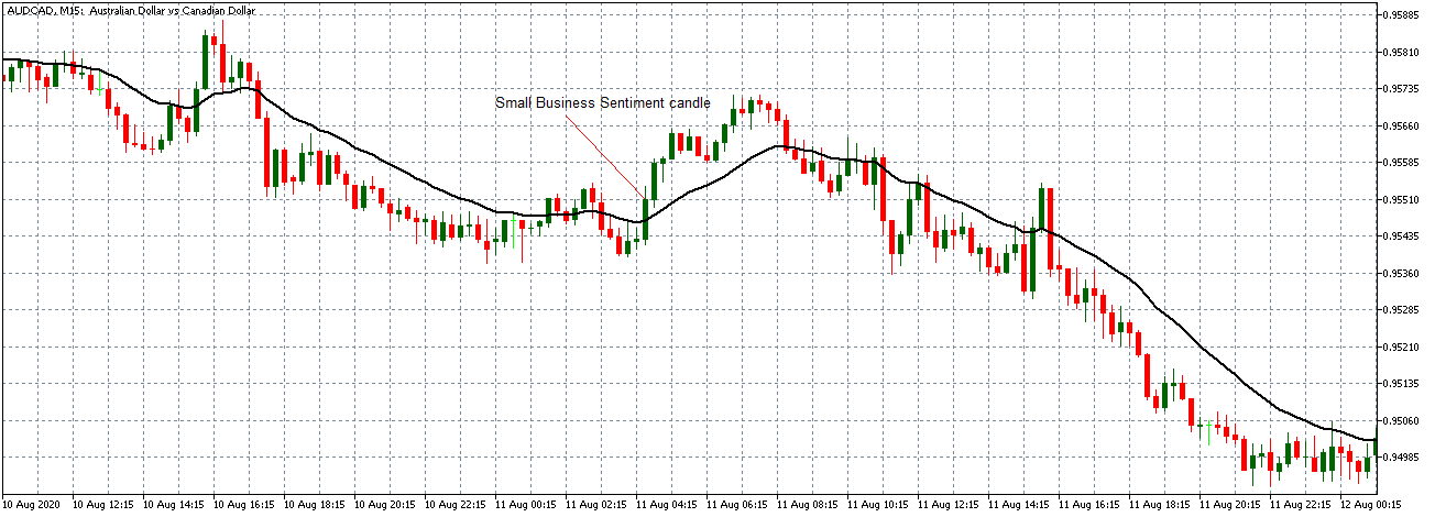
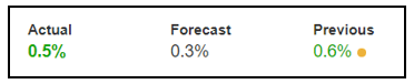
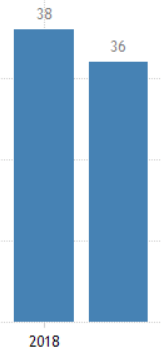
Categories
Forex Fundamental Analysis

The Impact Of ‘GDP From Agriculture’ News Announcement On The Forex Price Charts

Introduction

Economic output from the Agriculture Sector is non-negotiable for the economy. The increasing population must be fed and meet the demands of consumption at all times. Hence, the Central Government is committed to making positive growth in the Agriculture Sector. Agriculture Sector is the primary sector where Government Spending goes.

Since food is an essential commodity, it is an ever-green industry that will never run out of demand. Hence, understanding this sector can help us understand dependent industries’ performance and expenses associated with personal consumption.

What is GDP from Agriculture?

Gross Domestic Product 

GDP is the measure of a country’s total economic output. It is the total monetary value of all the goods and services produced within the country regardless of citizenship (resident or foreign national).

It is the market value of all the finished goods and services within a nation’s geographical borders for a given period. The period is generally a quarter (3 months) or a year.

Agriculture Sector

Also, it accounts for all the activities associated with crop production called the Primary Sector of an economy. From the point of cultivation to end-marketing of the food products all are accounted under the Agriculture Sector. It primarily includes farming, fishing, and forestry.

The quick increase in the world population has put pressure on the Agriculture sector to bring innovations through science and technology to increase crop yield. Agriculture Sector is the primary source of food for a country’s population.

The Agriculture Sector goes beyond farm business and includes farm-related industries like Food Service and Food Manufacturing (Packaged Foods, Processed Foods).

How can the GDP from Agriculture numbers be used for analysis?

The agriculture sector contributes about 6.4% of the World GDP. The most significant contributor to this being China, followed by India. China accounts for 19.49%, and India accounts for 7.39% of total agricultural output. The United States is in third place. 

It is necessary to understand the economic output of Agriculture is a function of population, as China, India, and the USA are ranked in population terms in the same order.

The three sectors of the economy, namely, primary Sector, secondary (Industry) Sector, and tertiary (Service) sector, contribute to the overall GDP. It is common for developed nations to have a high contribution to GDP from the Service Sector. Developing economies like China, Japan would have higher contributions from the Industry Sector. The underdeveloped economies would have Agriculture or Primary Sector as a leading contributor to GDP.

In the United States, the entire Agriculture Sector contributes about 5.4% of the GDP. The farms have only contributed 1% of GDP, and the rest is contributed to by the dependent industries that rely on agricultural input to produce goods. The Food Service, Textiles, Beverages, Processed Foods, Tobacco products, etc. contribute the remaining 4% to the GDP.

11% of the total U.S. employment is accounted for by the Agriculture Sector, which is about 22 million jobs in 2018. Food accounts for 13% expenditure of an average American Household. 

It is essential to understand that food is an essential requirement for conducting our livelihood. Hence, Government Spending first prioritizes the Agriculture Sector and releases benefit programs to assist the sector and maintain and grow its economic output. The society and Government will quickly collapse if the Agriculture Sector slows down, and that is why it is called the “Primary Sector.”

The Government Outlays on Food Programs and Nutrition Assistance exceeds that of any other federal program. Improper management and assistance to the Agriculture Sector can lead to price hikes in the food industry. It would trigger a negative response from the public that could cost them in the next elections. Hence, the Government is committed to assisting the Agriculture Sector at all times, good or bad.

Impact on Currency

GDP from Agriculture in itself is not a high impact indicator, as the broader measures like Real GDP and GDP Growth Rates are more important for the Currency Markets. 

GDP from Agriculture does not paint the full picture of the economy, but can be an essential tool for the Central Authorities to keep track of Agriculture Sector performance. Businesses dependent on Agriculture input may use this data to understand potential business opportunities amongst different countries. Still, for the International Currency Markets, it does not serve as a useful indicator.

It is a proportional and lagging indicator. Higher GDP from Agriculture is good for the economy and its currency, and vice-versa.

Economic Reports

For the United States, the Bureau of Economic Analysis releases quarterly GDP figures on its official website every quarter. The release schedule is already mentioned on the website and is generally released one month after the quarter ends.

In the full report, we can extract the GDP from Agriculture figures. We can also go through GDP by Industry to get the Construction Industry performance in the report. Major international organizations like the World Bank, CIA World Factbook, etc. actively maintain GDP by Sector figures of most countries on their official website.

Sources of GDP from Agriculture

For the United States, the BEA reports are available in the sources mentioned below. 

GDP -BEAGDP by Industry – BEAFARM – GDP

The St. Louis FRED keeps track of all the GDP and its related components in one place on its official website hereWorld Bank also maintains the Agriculture Sector as a percentage of GDP on its official websiteWe can find GDP sector composition for different countries here. We can find the consolidated list of Agriculture – GDP figures for most countries here.

Impact of the “GDP from Agriculture” news release on the Forex market

The agricultural sector plays an essential role in the process of economic development of a country. It contributes to the economic prosperity of advanced countries, and its role in the economic development of underdeveloped countries is of vital importance. In other words, countries where per capita real income is low, the emphasis is laid on agricultural and other primary industries.

History tells us that agricultural prosperity contributed considerably to the national income and the GDP. When we are talking about the impact of this contribution on the currency, we will have to say that it is least and not of much importance to investors. They look at broader data, which is the GDP, and make decisions based on the reading. 

In today’s example, we will examine the impact of GDP on different currency pairs and observe the volatility due to the news announcement. The below image shows the latest quarter GDP data of Australia, where it was more or less the same as in the quarter. Let us find out the reaction of the market to this news release.

AUD/USD | Before the announcement:

We will first look at the AUD/USD currency pair to observe the impact of GDP on the Australian dollar. In the above image, we see that the market is in an uptrend, and recently the price seems to have retraced the up move. This is an ideal chart pattern for joining the trend, but since a significant news announcement is due, we need to wait to understand the impact it creates on the chart.

AUD/USD | After the announcement:


After the news announcement, the market moves higher, where the price rises sharply above the moving average. The bullish ‘news candle’ is a consequence of better than expected GDP data, which was higher by 0.2%. Although it was marginally less than the previous quarter, it turned out to be positive for the currency. This is a confirmation sign of trend continuation where one can expect a new ‘higher high.’      

AUD/JPY | Before the announcement:

AUD/JPY | After the announcement:

The above images represent the AUD/JPY currency pair, where the market moves within a ‘range’ before the news announcement. We also notice an initial reaction from the ‘support’ where the price has moved higher from the ‘low.’ Since economists have forecasted a lower GDP estimate in the fourth quarter, it is not recommended to take a ‘long’ position before the news release.

After the news announcement, we see that the price quickly moves up, and market surges to the upside. As the GDP data was beyond expectations, traders bought Australian dollars and strengthened the currency. Therefore, the news release has a hugely positive impact on the currency pair. In this pair, once needs to be cautious before taking buy trade as the price is at the top of the ‘range.’ 

GBP/AUD | Before the announcement:

GBP/AUD | After the announcement:

The above images are that of GBP/AUD currency pair, where we see that before the news announcement, the market has retraced the downtrend by more than half, indicating that the Australian dollar has gained strength newly. After the occurrence of trend continuation candlestick patterns, it could result in a flawless sell trade. However, there is also a probability that the news release could change the dynamics of the chart.

After the news announcement, market crashes and the price significantly moves lower. As the GDP data was positive for the economy, it leads to bullishness in the Australian dollar resulting in the price fall. One could take a risk-free ‘short’ position at this point, expecting the market to move much lower.

That’s about ‘GDP from Agriculture’ and its impact on the Forex market after its news release. If you have any questions, please let us know in the comments below. Good luck!

Categories
Forex Fundamental Analysis

The Impact Of ‘GDP Constant Prices’ News Announcement On The Forex Market

Introduction

GDP Constant Prices is the primary indicator used by Government Agencies, Economists, Investors, Traders for year-to-year analysis of economic progress. GDP Constant Prices is the real scorecard for a country’s progress. 

It is a national level indicator and is closely watched by the market. The most important fundamental indicator Real GDP Growth Rate is derived from GDP Constant Prices. Hence, overall it is very critical for us to understand GDP Constant Prices and its nuances for correct interpretation.

What is GDP Constant Prices Indicator?

Gross Domestic Product (GDP) 

GDP is the measure of a country’s total economic output. It is the total monetary value of all the goods and services produced within the country regardless of citizenship (resident or foreign national).

Nominal GDP is also called Current Dollar GDP. It is the market value of all the finished goods and services within a nation’s geographical borders for a given period. The period is generally a quarter (3 months) or a year.

The commonly used term “size of the economy” refers to this economic indicator. USA has the world’s biggest economy, which means it has the highest nominal GDP or highest economic output.

GDP Constant Prices

It is the inflation-adjusted GDP value. It is the total monetary value of all goods and services produced, excluding the effects of inflation in prices. It is also called Real GDP, Constant Dollar GDP, Inflation-Corrected GDP, or only Constant Prices. The raw value of the economic output is called the Nominal GDP, whereas Real GDP accounts for inflation effects and is a more accurate measure of growth.

GDP Constant Prices or Real GDP is obtained by dividing the Nominal GDP with a GDP deflator. The GDP deflator is an inflation measurement from a fixed base year. Real GDP is inflation-adjusted to compare on an as-if basis with the base year GDP. It means GDPs are compared as if the prices remained the same as the base year and see if the GDP has improved due to increased economic activity.

Calculating GDP Deflator is a bit tedious process, that is best left to the experts like the Bureau of Economic Analysis. The Real GDP is made up of the following components and is affected by them:

A) Consumer Spending: It represents spending associated with the end-consumers or the general population. It makes up about 69% of the total GDP in the United States.

B) Business Investment: Economic Output of the Business Sector makes up 18% of the total GDP in the United States. 

C) Government Spending: It involves all the expenditures incurred by the Government to maintain and stimulate economic growth and run its operations. It accounts for 17% of the total economic output for the United States.

D) Net Exports: It is the difference between the total exports and imports. The United States has a -5% Net Exports of the total GDP, meaning it is a net importer.

How can the GDP Constant Prices numbers be used for analysis?

Inflation is the underlying fire that drives capitalist economies. In general, a low inflation rate of 2-3 % a year is good for the economy. A stable inflation rate of 2-3% will stimulate economic growth to achieve a 3-5% annual GDP growth for developed economies.

As prices increase year-over-year, the economic output will also seem inflated even though it is the same as the previous year. Hence, Real GDP is a more accurate measure of scoring the economic output of a country.

Nominal GDP is useful when comparing economic output within a year among different quarters, while it is more sensible to use Real GDP for year-over-year comparison. Policymakers use both Nominal and Constant Prices GDP for economic assessment and implementing policy reforms as deemed necessary.

When inflation is positive (which is the cast most of the time), the GDP Constant Prices will be lesser than Nominal GDP. When there is deflation in the economy (during slowdowns or recessions), the GDP Constant Prices may be higher than the nominal GDP value.

GDP Constant Prices is better for assessing long-term growth, or knowing whether the economy has grown over the previous year or not. With Nominal GDP, it is difficult to tell whether an increase in the figures is due to an expanding economy or just a factor of inflating prices of goods and services.

Impact on Currency

GDP data is essential for almost everyone. Economists use for macroeconomic analysis and Central Bank planning. Policymakers are committed to maintaining a steady Real GDP Growth. Hence, Central Authorities also watch it tightly.

Investors make decisions based on GDP data. Businesses hold their expansion plans based on economic stability and market stability, as indicated by GDP. Traders heavily trade once GDP estimates and actual figures are published.

Hence, overall it is a high impact indicator. It is a proportional macroeconomic indicator, meaning higher GDP Constant Prices are suitable for the overall economy and currency. The opposite also holds. 

Lower Real GDP prints indicate weakening economy, businesses hold hiring or investment plans, spending is reduced, and in extreme cases, it can lead to a recession. All of this leads to currency depreciation.

Economic Reports

In the United States, the Bureau of Economic Analysis publishes quarterly and annual Nominal and Real GDP reports on its official website. It is released almost 30 days after a quarter ends. The schedule of release is available on the website. The headline number is the GDP Constant Prices figure, GDP Growth Rate figure.

Major international organizations like the World Bank, International Monetary Fund, OECD, etc. actively maintain track of most countries’ GDP figures on their official website.

Sources of GDP Constant Prices

For the United States, the BEA reports are available here 

The St. Louis FRED keeps track of all the GDP and its related components in one place on its official website here:

GDP & GNP – FRED

Real GDP – FRED

The World Bank GDP Constant Prices with base year as 2010 in US Dollar terms are available here:

GDP Constant Prices (2010 US$) – World Bank

OECD – GDP Constant Prices and other variants

We can find a consolidated list of most countries’ GDP Constant Prices here.

Impact of the ”GDP Constant Prices” news release on the Forex market

GDP Constant Prices, also known as real GDP, is a measure of GDP that has been adjusted for the price level. Current prices measure the GDP using the actual prices we notice in the economy. Current prices make no adjustments for inflation. However, constant prices adjust to the effects of inflation. Using persistent prices enables us to measure the actual change in the outcome and not just rise due to inflation’s effects. The real GDP is calculated by dividing nominal GDP over a GDP deflator. When nominal is higher than real, inflation is occurring, and when real is higher than nominal, deflation is occurring. Fundamentally speaking, nominal GDP matters to investors when taking a position in currency or the stock market.      
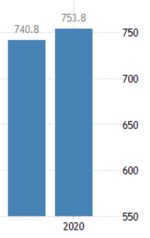
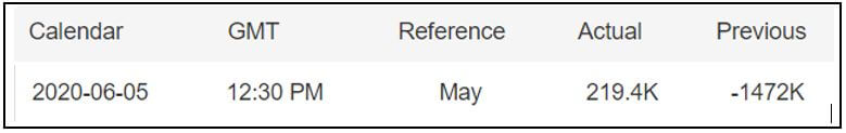
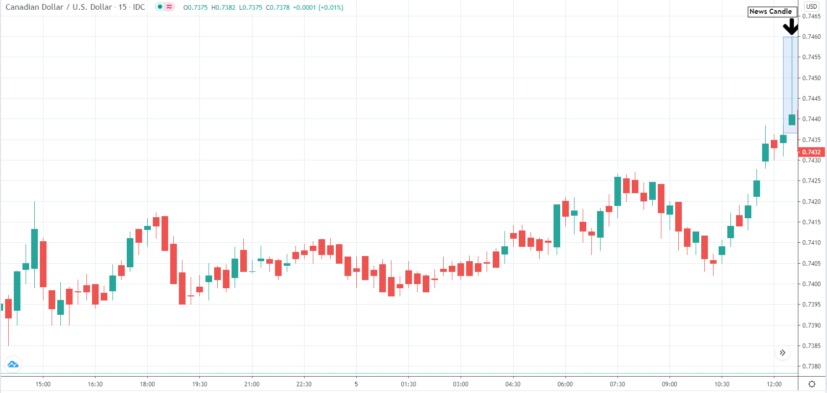
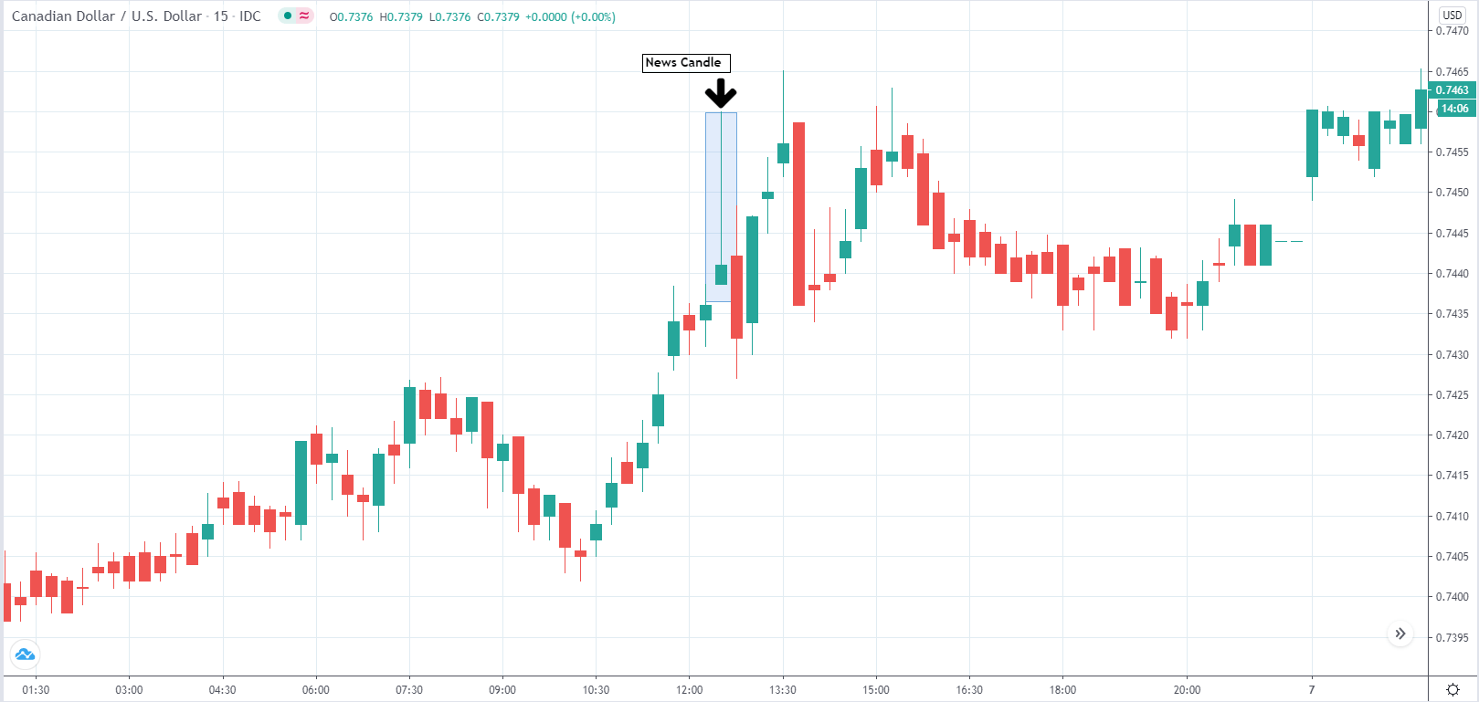
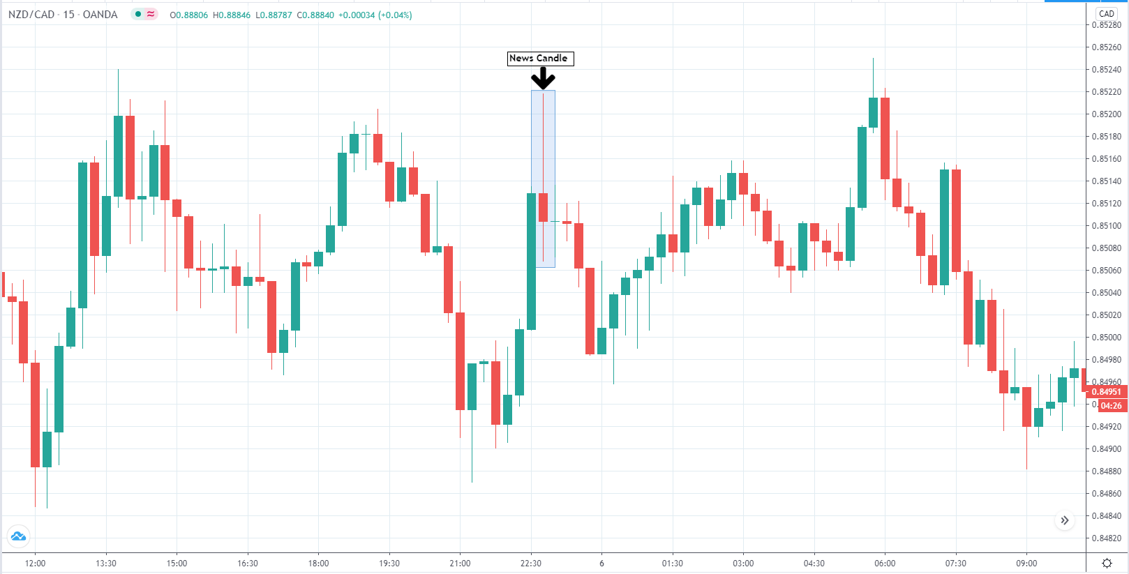
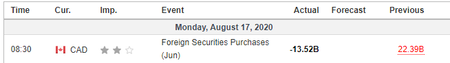
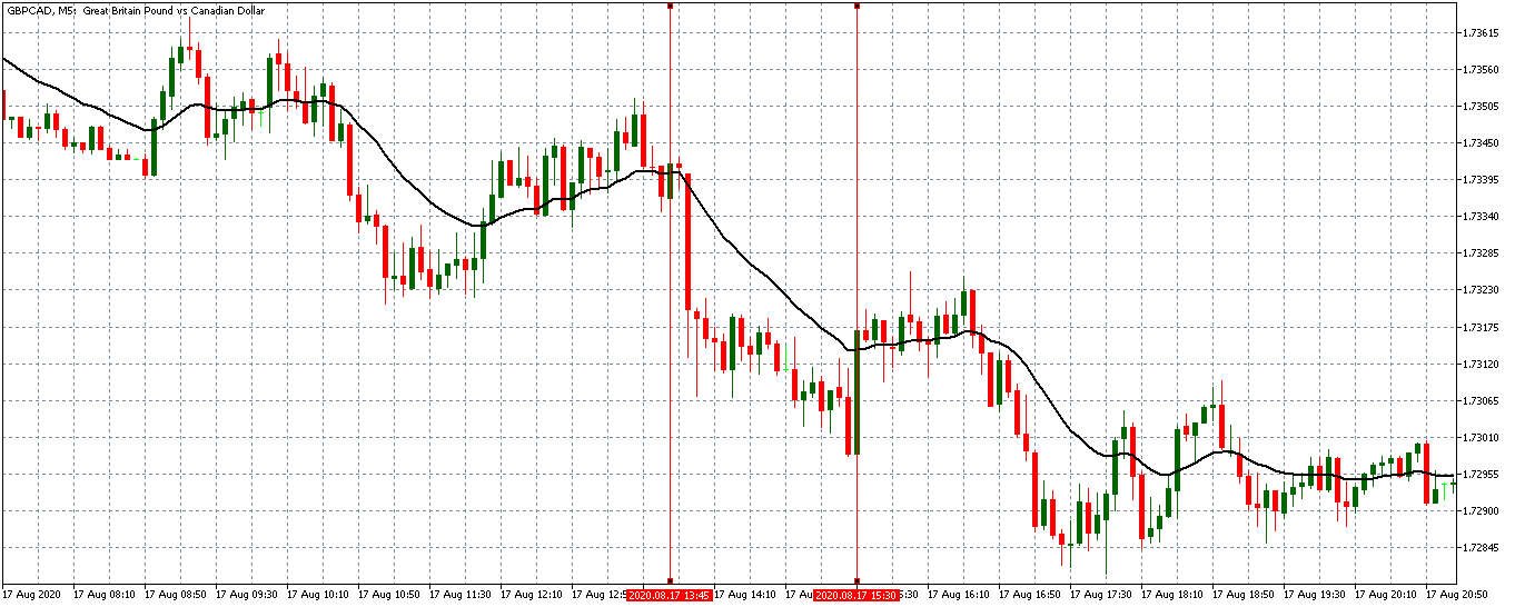
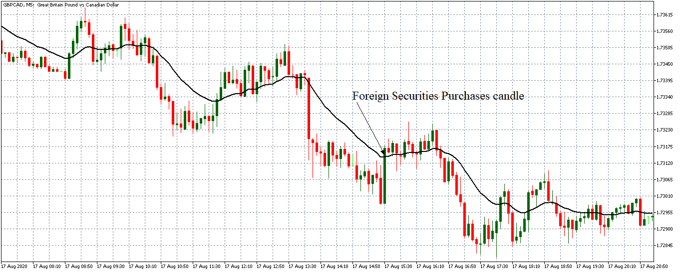
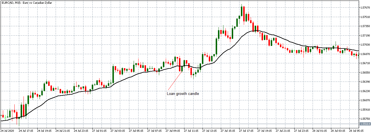
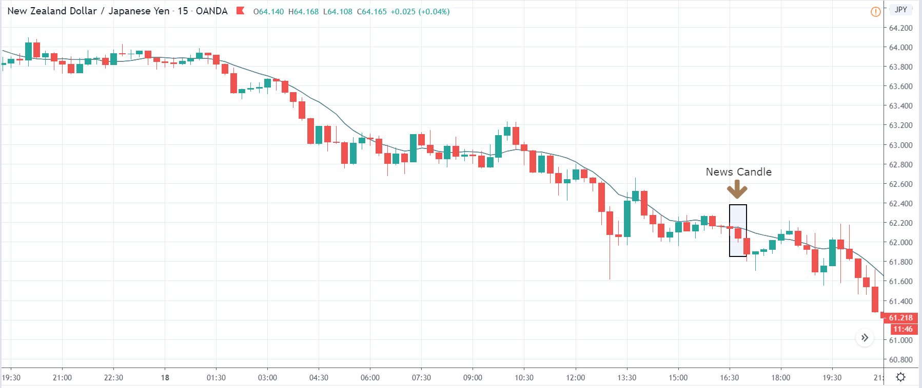
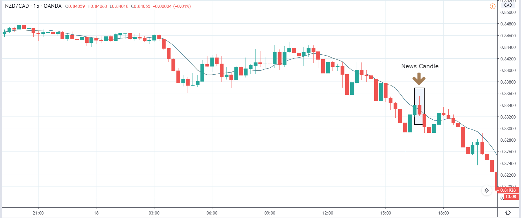
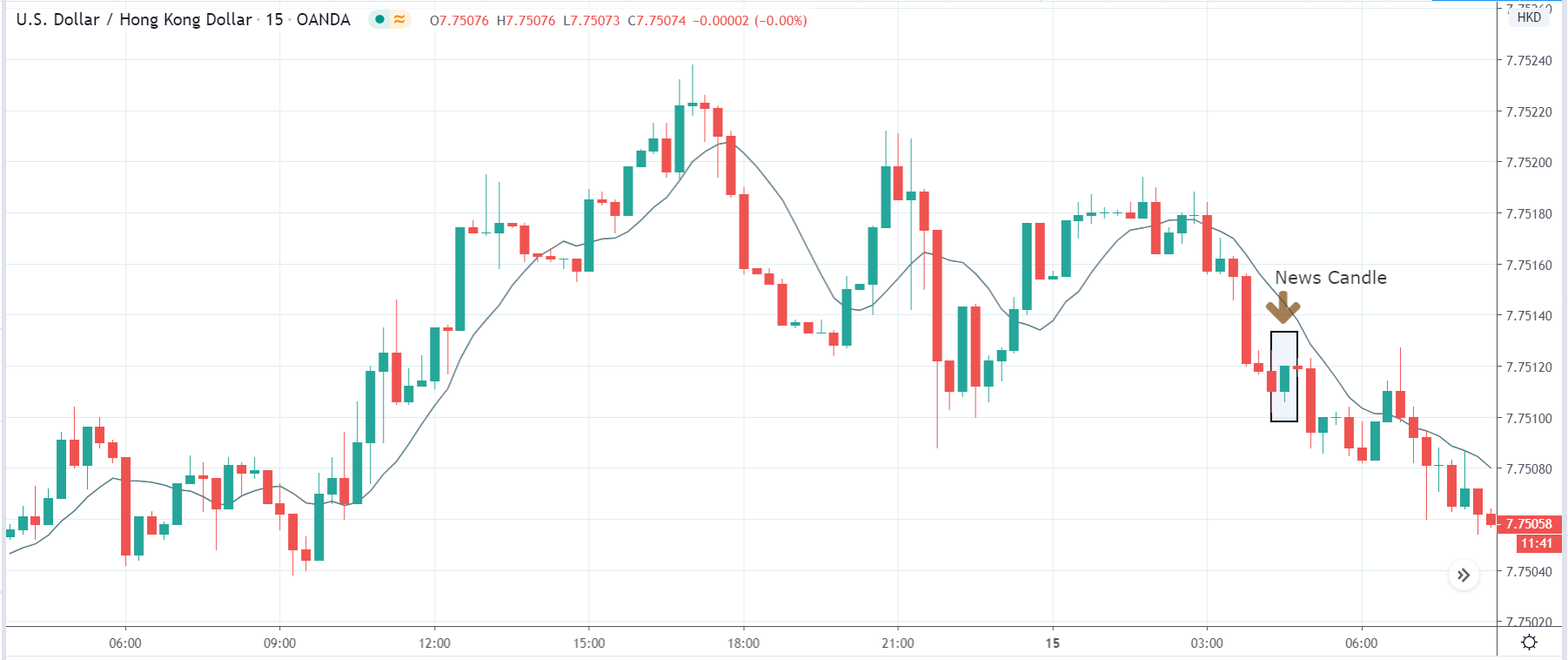
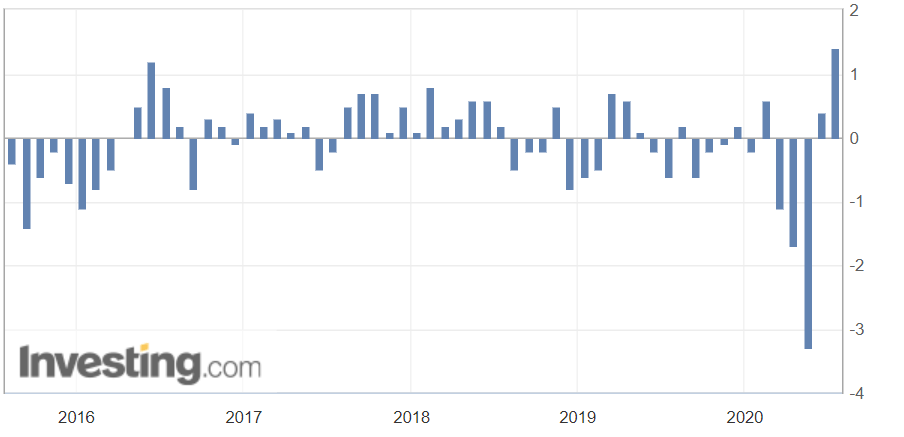
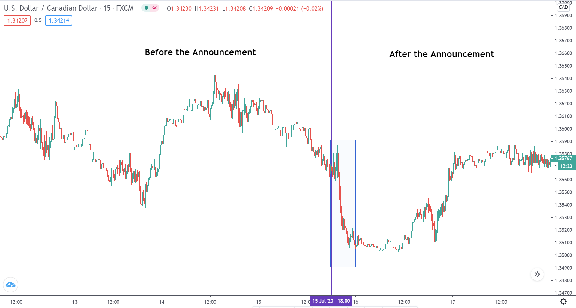
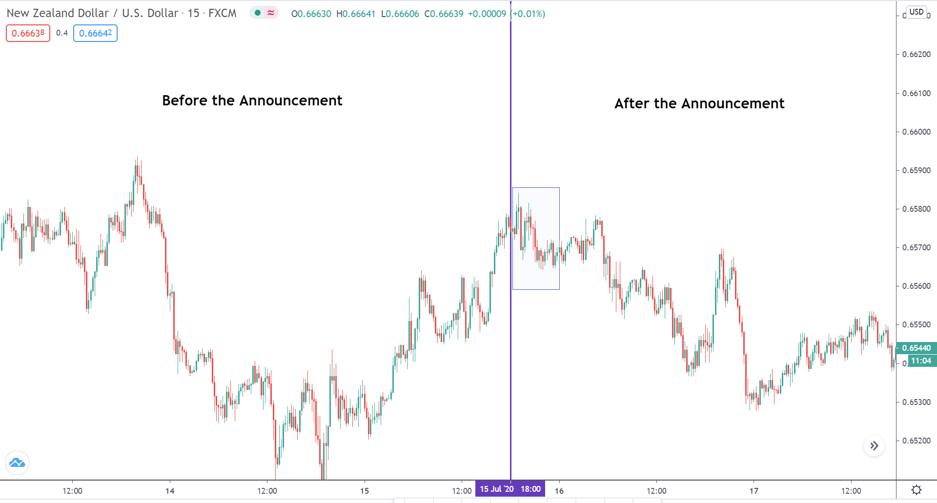
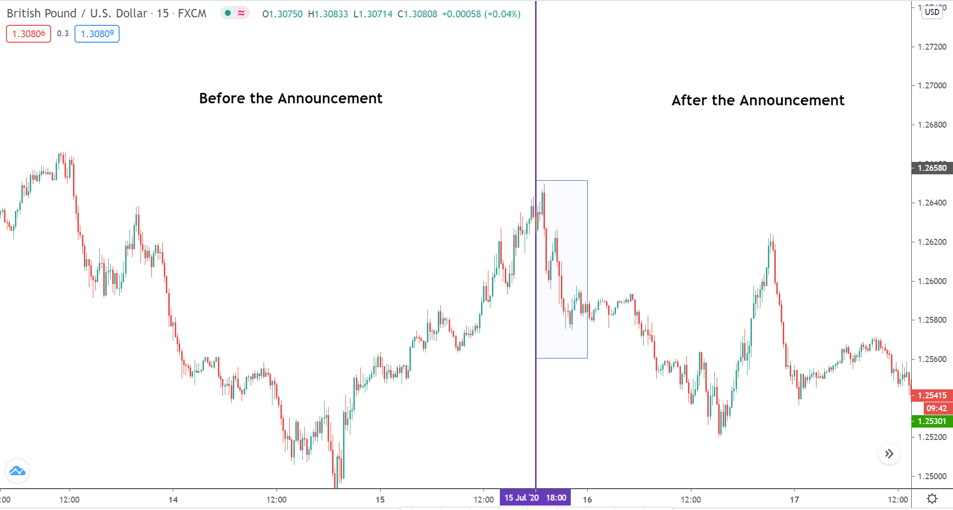
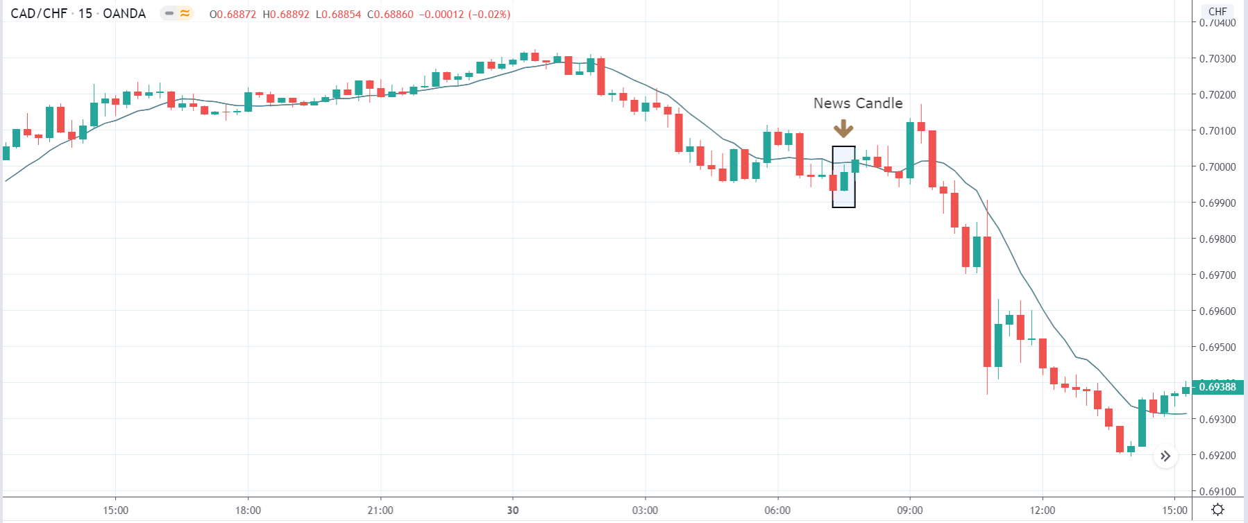
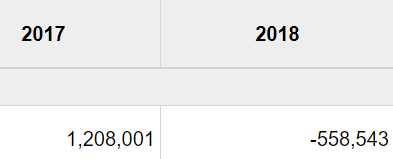
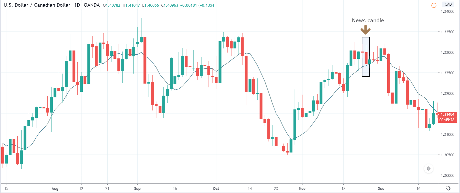
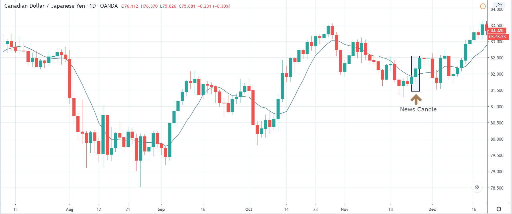
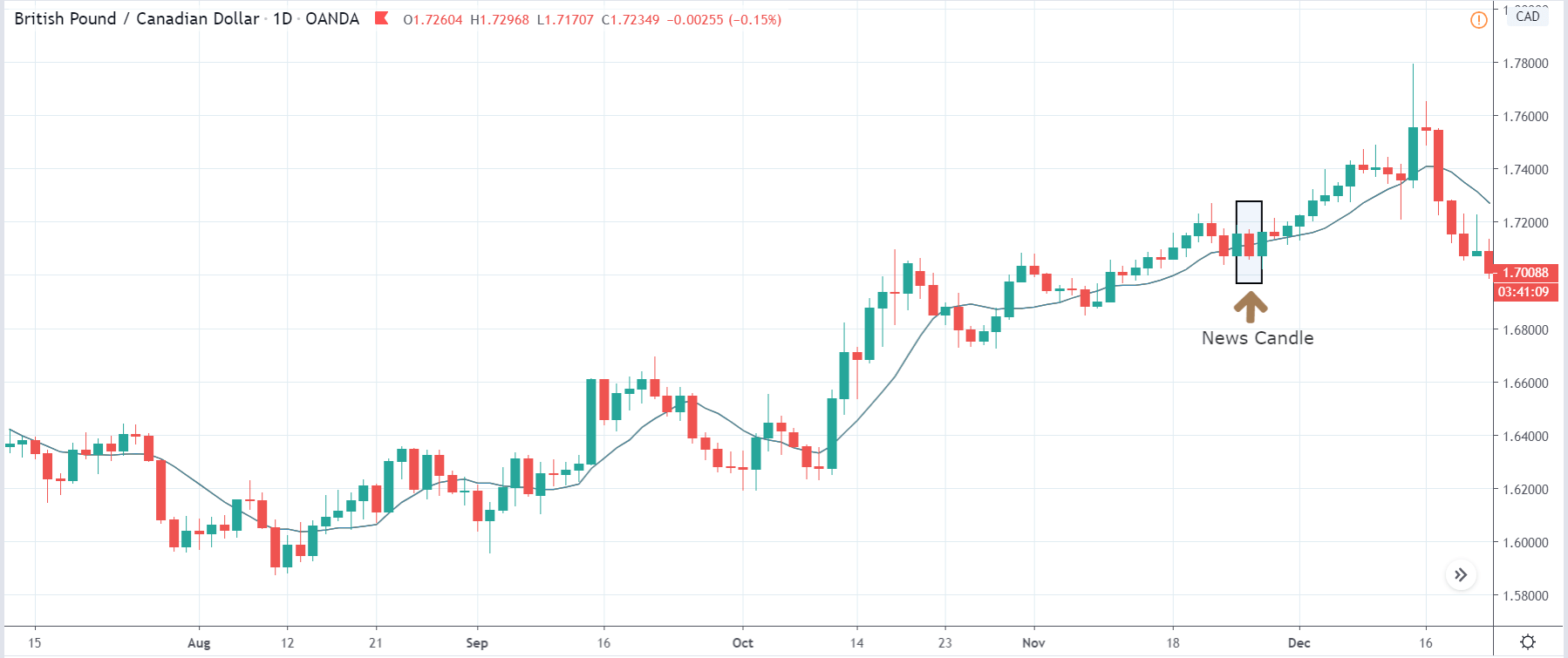
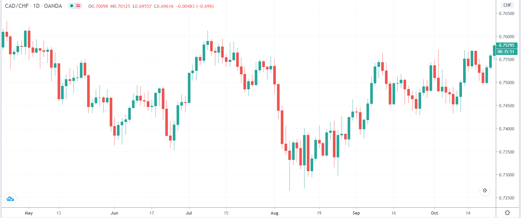
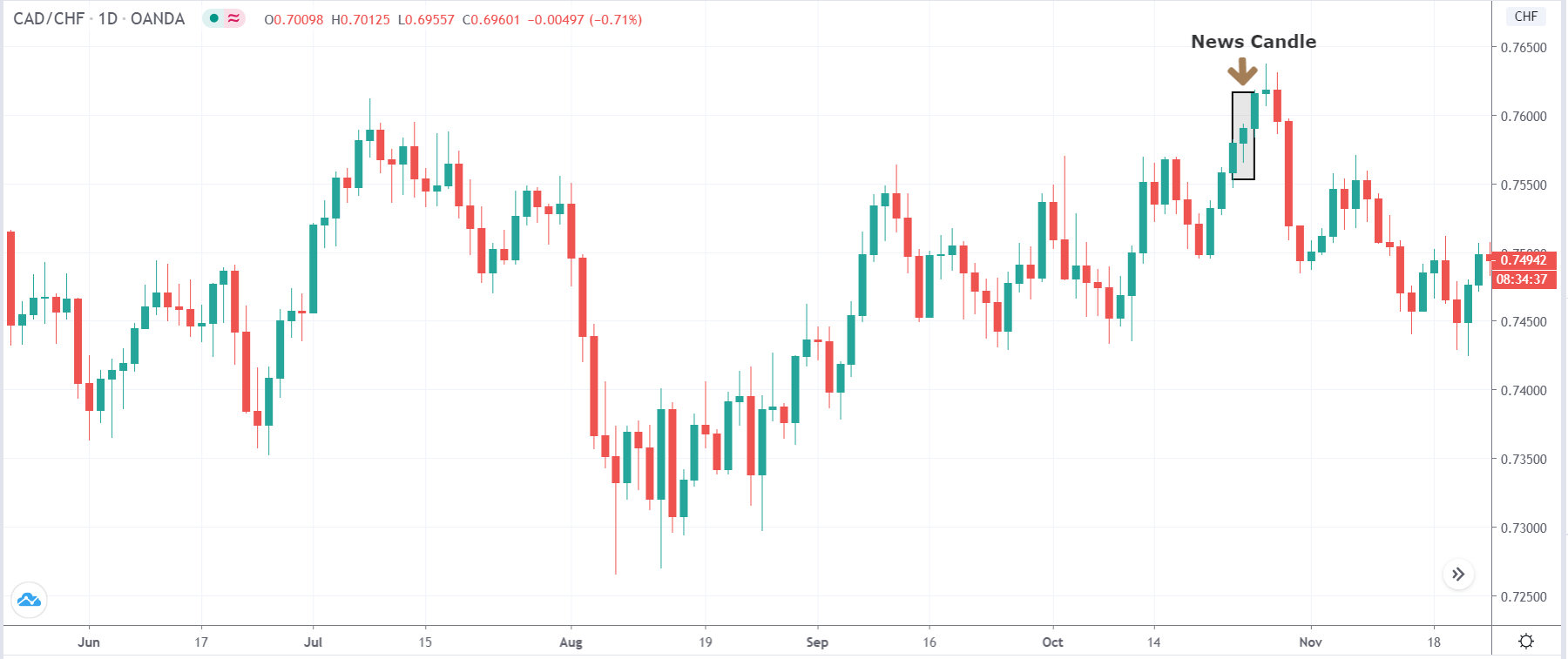
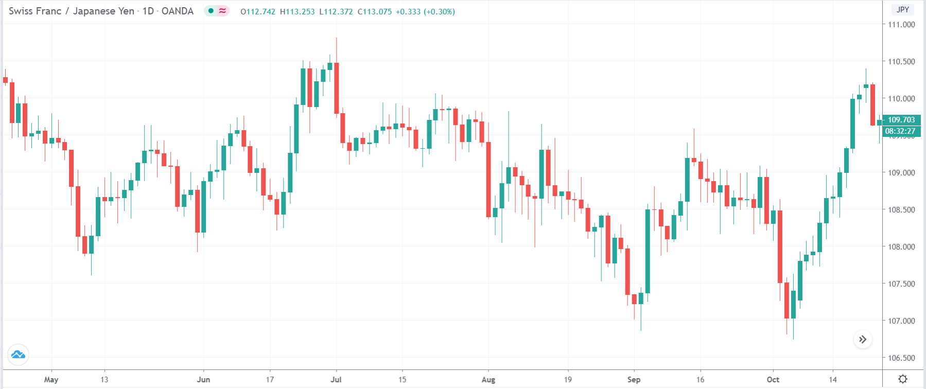
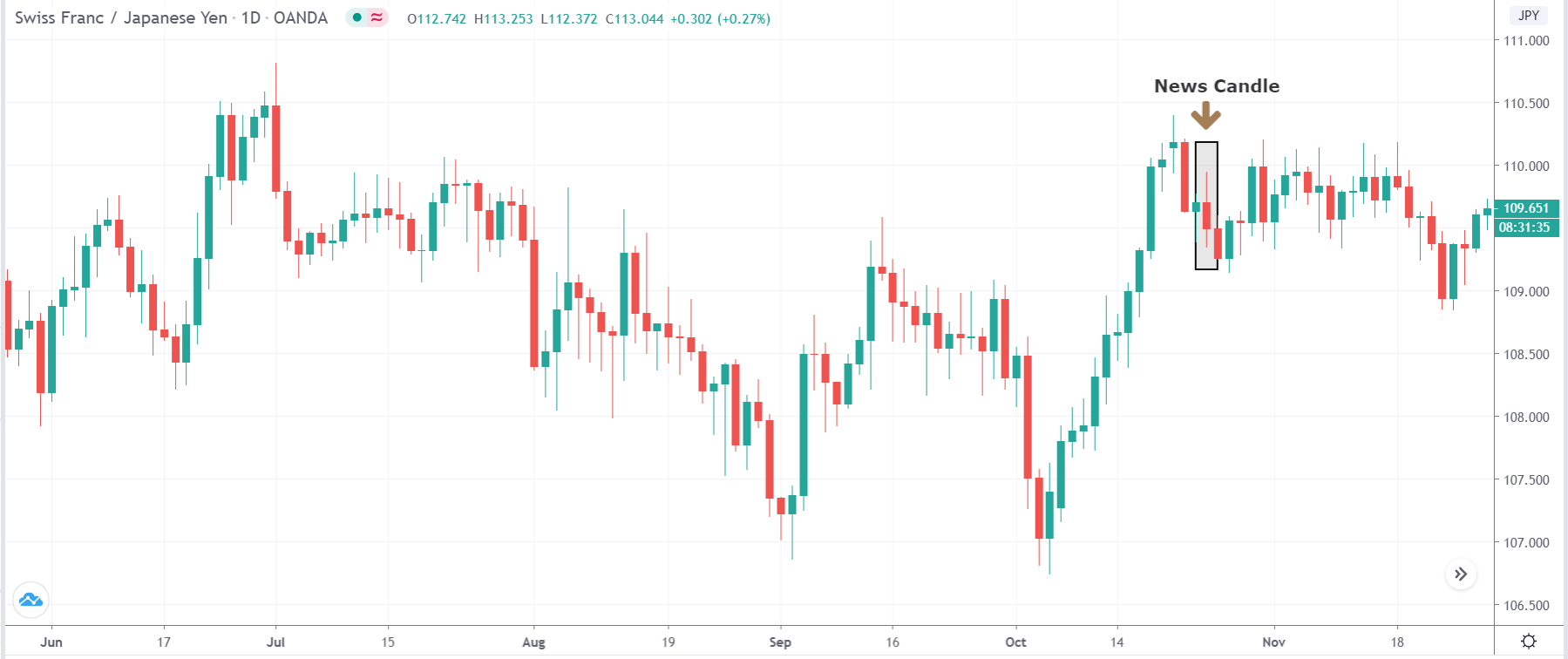
In today’s lesson, we will analyze the impact of GDP on various currency pairs by observing the change in volatility before and after the news announcement. For that purpose, we have collected the GDP data of Canada, where the below image shows the month-on-month GDP data released recently. Let us find out the market’s reaction to this data.
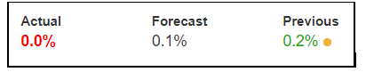
USD/CAD | Before the announcement:

We will start with the USD/CAD currency pair to observe the impact of GDP on the Canadian dollar. The above image shows the state of the chart before the news announcement, where we see that the market is in a downtrend, and recently the price has reversed to the upside. Either could result in a reversal of the trend or a continuation of the current trend. The impact of GDP will decide the direction of the market and so our position. 

USD/CAD | After the announcement

After the news announcement, the price drops below the moving average, and the market falls considerably owing to the positive GDP data. Even though there was a decrease in the GDP, it was only a tad bit lower and much around the market expectations. Hence, it proved to be bullish for the Canadian dollar, and the market goes lower. One should confirm the continuation of the trend using technical indicators before taking a ‘short’ trade.

GBP/CAD | Before the announcement:

GBP/CAD | After the announcement:

The above images represent the GBP/CAD currency pair, where we see in the first image that the market has broken out from a downward ‘channel’ and is moving higher and higher from then on. It very likely that the up move will continue further, which makes us wait for a price retracement to take a buy trade. Based on the volatility caused by the news release, we will have a clear idea about the direction of the market.

After the news announcement, volatility slightly increases to the downside, and the market falls by a few pips. The bearish ‘news candle’ is a consequence of the positive GDP data, mostly on expected lines. We need to note that the news release did not change the overall trend of the market, where the uptrend is still intact.    

CAD/CHF | Before the announcement:

CAD/CHF | After the announcement:

The above images are that of CAD/CHF currency pair, where we see that before the news announcement, the market has reversed from an uptrend to a downtrend and is currently on the verge of continuing the downward move. Since the GDP has a high impact on the currency (indicated by the red box), it is advised not to take any position before the news release.

After the news announcement, the price moves higher by a small amount and manages to close on a bullish mark. The GDP data was close to what was expected, it leads to bullishness within a currency, and hence the Canadian dollar gains strength for a short while.

We hope you understood the concept of ‘GDP Constant Prices’ and how the Forex price charts get affected after its news release. All the best. Cheers!

Categories
Forex Fundamental Analysis

Everything About ‘Changes in Inventories’ Macro Economic Indicator

Introduction

Changes in Inventories are one of the primary business leading economic indicators that can give us insight into economic prospects for the coming months. Understanding of Inventory Changes and Sales can help us forecast economic growth, which is our primary objective through Fundamental Analysis.

What are Changes in Inventories?

Inventory: It is the stock of goods that retailers, wholesalers, and manufacturers hold with them. Inventory is measured in their appropriate dollar values. Businesses often keep stock of their finished goods when they predict an increase in sales in the coming months so that they are ready to meet the increased demand and can lock in profits.

The Monthly Retail Trade Survey, the Manufacturer’s Shipments, Inventories, and Orders Survey, and the Monthly Wholesale Trade Survey are the primary sources from which Business Inventory is compiled.

At the level of Retail Merchandise, Inventories are measured at cost level at the retailers as per the FIFO (first-in, first-out) method of valuation. At the Wholesalers who distribute goods to retailers, the inventories’ values are added to the business inventories every month. At the manufacturer level, the inventories, whether in raw material, work-in-process or finished, are valued at cost, primarily by the FIFO method of valuation.

How can the Changes in Inventories numbers be used for analysis?

Business owners and retailers have a certain kind of acquaintance with market trends, and due to their years of experience running their business, they know the subtle trends of increase in sales, demand, etc. Hence, Businesses stocking up on inventories is not a joke, as it costs them real money for producing as well as holding the stocks. If they did not forecast an increase, they would not have increased inventories in the first place.

Seasonally Adjusted Inventory Changes can thus act as a leading indicator for the increase in consumer consumption, which is good for business, and the economy. On the other hand, increased inventory figures could also indicate that the sales have fallen, and thus creating an inventory stockpile, which indicates decreased consumer spending, which signals terrible times for the economy are ahead.

Hence, it is often essential to combine Inventory figures with Retail Sales figures to correctly gauge the economic trend. Retail Sales figures indicate actual consumption of goods by consumers and hence is the more accurate figure when compared to Changes in Inventories.

An increase in Manufacturing Production is followed by an increase in Inventory. It is then followed by an increase in Retail Sales. The first two stages, i.e., increase in Manufacturing Production and Inventory Changes, are still forecast, i.e., the rolled dice can turn either way. But Retail Sales is a guaranteed economic indicator, as money comes back into the pockets of retailers and manufacturers.

Hence, the more commonly watched statistic out of the business inventories figures is the Inventory-to Sales Ratio. It is the ratio of Inventory value to Retail Sales figures. It gives us an indication, by how many times the inventories outpace the Retail Sales. The lesser the number, the better.

For example, an Inventory-to-Sales Ratio of 2.5 indicates that there is enough inventory stock to supply 2.5 months of Retail Sales. When the ratio increases, it is an indication that the inventories are increasing in contrast to the sales, which indicates the economy is slowing down. The upcoming Production activity would be reduced until the current Inventory stock starts to deplete off. On the other hand, when the ratio is falling, it is indicative of manufacturers to increase production activity to the oncoming increase in demand.

Inventories are primarily concerned with the Manufacturing Sector, which accounts for 20% of GDP in the United States. It drives a significant portion nonetheless.  An increase in manufacturing activity as a consequence of decreasing ratio figures can add to employment, or even wage growth, which is good for the economy. Increased employment further stimulates Consumer Spending as more people have the cash to spend, which cyclically boosts the economy.

Impact on Currency

Changes in Inventory figures can be leading indicators. If correctly put, way too leading. It means that the changes in inventories are figures at the start of the manufacturing process-consumer purchase lifecycle. The indicator has two-way conclusions to be drawn, as discussed above. Hence, the traders who are not well versed with the industry should use this indicator with caution, as an increase in Inventory can mean slowdown or expected growth both.

Only investors or traders who have a historical perspective of the figures can use this indicator effectively to predict growth months ahead of the market. In general, the market follows Retail Sales and Ratio as reliable metrics, and hence there are significant moves in the market around these figures. Hence, although a leading indicator of economic growth, it is advised to combine it with Retail Sales figures to affirm your assessment of economic activity.

Economic Reports

In the United States, the Bureau of Economic Analysis releases quarterly reports of the GDP, wherein the section of “Key Sources and Assumptions” contains the details of “Changes in Private Inventories.” The BEA publishes quarterly reports on its official website after every quarter. The release dates are also posted on its official website.

The United States Census Bureau maintains the Manufacturing & Trade Inventories on its official website.

Sources of Changes in Inventories

BEA – Gross Domestic Product

The St. Louis FRED website makes the search and analysis of Inventories data from BEA a lot easier. The links are given below

Change in Private Real Inventories – FRED

Change in Private Inventories – FRED

Census Bureau – Inventory

Census Bureau – Shipment, Inventory, and Orders

Inventory data for various countries are available in statistical and list format here.

Impact of the ‘Change in Inventory’ news release on the Forex market

The Change in Inventory measures the value of change in producer-owned inventories between the beginning and the end of the calendar year. For businesses, the build-up of inventories can be a threat. The problem is that these inventories will probably be cut in the future, depressing demand for goods and leading to production cutbacks. In hard times, managers work hard to cut back on inventories. All companies need to be prepared for business cycles, which is driven by inventory swings. Companies must try to reduce their inventories by reevaluating their practices.

In today’s lesson, we will analyze the change in inventory levels of many agricultural commodities, particularly grains, that are produced in a given year and stored or held until they are marketed. The annual value of inventory change represents the gross value of agricultural production. The below image shows the net Change in Inventory from 2017 to 2018 in the agricultural sector of Canada. This value has been estimated for durum wheat, oats, rye, corn, soybean, potatoes, tobacco, and many other commodities. Let us find out how the market responds to this data.

USD/CAD | Before the announcement:

Let us start with the USD/CAD currency pair in order to observe the impact of the Change Inventory on the Canadian dollar. In the above image, we see that the market is in moving within a ‘range,’ and currently, the price is at the top of the ‘range.’ Since the impact of this news event is less on a currency, aggressive traders can take ‘short’ positions with a large stop loss.

USD/CAD | After the announcement:

After the news announcement, the market moves lower, and the price reaches to the moving average. The bearish ‘news candle’ indicates that the Change in Inventory data was positive for the Canadian economy, which resulted in the strengthening of the currency. The close of ‘news candle’ is a confirmation sign of a down move. Thus, one could take a risk-free ‘short’ position soon after the news release.

CAD/JPY | Before the announcement:

CAD/JPY | After the announcement:

The above images represent the CAD/JPY currency pair, where we see that before the news announcement, the market seems to be moving in a ‘channel’ with the price presently is at the bottom of the ‘channel.’ Since the Canadian dollar is on the left-hand side of the currency pair, an upward channel signifies strength in the currency. Therefore, traders who trade channel can buy the currency pair with a stop loss below an appropriate technical level.

After the news announcement, the price moves higher, and volatility expands on the upside. The ‘news candle’ closes with a fair amount of bullishness as a result of better than expected Change in Inventory data. At this point, once could confidently take a ‘long’ position with a target up to the higher end of the ‘channel.’

GBP/CAD | Before the announcement:

GBP/CAD | After the announcement:

The above images are that of GBP/CAD currency pair, where we can see in the first image that the market is in a strong uptrend, which signifies the great amount of weakness in the Canadian dollar. Technically, we should be looking to buy the currency pair after a price retracement to a ‘support’ or ‘demand’ area. Until then, we will be monitoring the impact of the news release.

After the news announcement, volatility slightly increases to the downside, and we witness a fall in the price. However, the Change in Inventory does not have a major on the currency pair where the Canadian dollar strengthens only momentarily. One needs to still wait for a pullback in order to join the uptrend.

That’s about the ‘Change in Inventory’ and the relative impact of its news announcement on the Forex price charts. Let us know if you have doubts regarding the article in the comments below. Cheers!

Categories
Forex Fundamental Analysis

Ease of Doing Business – Comprehending This Macro-Economic Indicator

What is the ‘Ease of Doing Business Index?’

The ease of doing business index was created jointly by two leading economists, namely Simeon Djankov and Gerhard Pohl from the Central and Eastern sector of the World Bank Group. It is an aggregate number that includes different parameters that define the ease of doing business in a country. The ease of doing business (EODB) measures the country’s position in offering the best regulatory practices. Though the World Bank started publishing the reports in 2003, the ranking only started only in 2006.

The EODB study captures the experience of small and medium-sized companies in a country with their regulators and the relationship with their customers, by measuring time, costs, and red tape they deal with. The goal of the World Bank is to provide an objective basis for understanding and to improve the regulatory environment for businesses worldwide.

Methodology

The survey consists of a questionnaire made by a team of experts with the assistance of academic advisors. The questionnaire consists of feedback on business cases that cover topics such as business location, size, and nature of its operations. This survey’s motive is to collect information that is affecting their business and not to measure conditions such as the nation’s proximity to large markets, quality of infrastructure, interest rates, and inflation.

The next step of the data-gathering process involves over 12,500 expert contributors such as lawyers and accountants from 190 countries in the survey to interact with the Doing Business team in conference calls, written reviews, and visits by the global team. Respondents fill out the surveys and provide information relevant to laws, regulations, and different fees charged.

A nation’s ranking is decided after assessing the following factors:

  • Starting a business – idea, time, procedure, and capital required to open a new business
  • Construction permits – permissions, land, and cost to build a warehouse
  • Electricity access – procedure, time and cost needed to obtain an electricity connection from the electricity board
  • Property registration- procedure, time, and cost required to register the warehouse with the local government body
  • Getting credit and loan – the process involved in getting credit from banks, and depth of credit information index
  • Investor protection – the extent of disclosure, liability, and ease of shareholder suits
  • Payment of taxes – tax filing process, preparation of tax filing and number of taxes paid
  • Cross border trading – number of documents required, and cost for import and export
  • Enforcing contracts – procedure, time, and cost to impose debt contract
  • Insolvency process – time, cost and recovery rate under a bankruptcy proceeding

Based on the score obtained in the above sub-indices, a country is assigned a rank in the ease of doing business index. The ease of doing business report is a complete assessment of competitiveness or the business environment. Still, rather it should be considered as a proxy of the regulatory framework faced by the private sector before starting a new business.

The Economic Reports

The ease of doing business reports is an annual report published by a team led by Djankov in 2003. The report is then elaborated by the World Bank Group that basically measures the costs firm is incurring for business operations. The World Bank report is, in fact, an important knowledgeable product in the field of private sector development. It has also motivated the design of various regulatory reforms in developing countries. The study presents a detailed study of costs, time, and procedures that a private firm is subject to before opening the company. This then creates rankings for a country.

Impact on Currency

The Doing Business report is used by policymakers, politicians and development experts, journalists, and, most importantly, the fund managers to understand the easiness of starting a business in the country. More companies mean more jobs, and more jobs mean faster development. Growth in the economy is directly related to the companies’ performance and the opening of new businesses. Therefore, when regulations are eased for starting a business, it contributes to the GDP of the country longer and increases the value of the currency in the international market.

Sources of information on Ease of Doing Business 

The ease of doing business report is one of the most sought reports in the finance industry, so many financial institutions and economic websites give mention ranking of a country after collecting the data from official sources. However, the data published by the World Bank is the most reliable and factual.

Sources

GBP (Sterling) – https://tradingeconomics.com/united-kingdom/ease-of-doing-business

AUD – https://tradingeconomics.com/australia/ease-of-doing-business

USD – https://tradingeconomics.com/united-states/ease-of-doing-business

CAD – https://tradingeconomics.com/canada/ease-of-doing-business

CHF – https://tradingeconomics.com/switzerland/ease-of-doing-business

JPY – https://tradingeconomics.com/japan/ease-of-doing-business

NZD – https://tradingeconomics.com/new-zealand/ease-of-doing-business

Ease of Doing Business report is one of the most discussed issues around the world. The report that is issued by the World Bank gets a lot of attention from the government around the world. For country authorities, it sheds light on regulatory aspects of their business climate. For business representatives, it helps initiate debates and dialogue about reform.

The private sector creates pressure on the respective government to ensure required reforms to indirectly improve the country’s rank in the EODB index. Investors take the decision of investment in a country based on the ranking of that country in the ease of doing business report. From the World Bank’s point of view, it demonstrates an unconditional ability to provide knowledge and resource information. This exercise by the World Bank generates information that is useful and relevant.

Impact due to news release

In the previous section of the article, we understood the definition of ‘Ease of Doing Business’ and the methodology used for ranking a country. Now we will extend our discussion in identifying the impact of the news announcement on the value of a currency. Many case studies tell correlation exists between ease of doing business and FDI flows.

One study finds that judicial independence and labor market flexibility are significantly associated with FDI flows. The number of procedures required to start a business and strength of the arbitration regime both have a significant and robust effect on FDI. Due to these reasons, foreign investors always invest in an economy where business activities can be carried out without any obstructions.

In today’s lesson, we will analyze the impact of ‘Ease of Doing Business’ on different currencies and analyze the change in volatility due to its news release. The below image is a graphical representation of Switzerland’s rank in 2018 and 2019. We see that the country had shown improvement in it’s ranking by two places. Let us find out the reaction of the market to this announcement.

USD/CHF | Before the announcement

Let us start with the USD/CHF currency pair to analyze the impact of the ‘Ease of Doing Business’ announcement. The above image is the daily time frame chart of the currency pair, where we can see that the pair is moving within a ‘range.’ Presently, the price is at a resistance area, which means sellers can push the price lower anytime soon. Therefore, we should be cautious before taking a ‘buy’ trade in this pair.

USD/CHF | After the announcement

After the news announcement, a slight amount of volatility is witnessed, which takes the price higher that results in the formation of a bullish ‘news candle.’ Since the Swiss Franc is on the left-hand side of the pair, a bullish candle indicates bearishness for the currency, and that is becoming weak. We can say that the news announcement a slight negative on the currency.

CAD/CHF | Before the announcement

CAD/CHF | After the announcement

The above images represent the CAD/CHF currency pair, where it appears that the market is moving in a channel before the news announcement. We should be looking to sell the currency pair as the price is at the top of the channel. However, the news announcement shall give us a clear direction of the market. We will not be taking any position before the news release as the news release has a moderate to high impact on the currency pair.

After the news announcement, the price moves a little higher and closes with some amount of bullishness. As the ‘ease of doing business’ was not so encouraging for the economy, traders went ‘short’ in Swiss Franc right after the news release. However, the effect does not last long, and the market collapses a couple of days later.

CHF/JPY | Before the announcement

CHF/JPY | After the announcement

The above images are that of the CHF/JPY currency pair, where we see a strong move to the upside before the news announcement, and currently, the price is at the resistance turned support area. There is a high chance of buyers becoming active at this point; hence, sell trades should be avoided.

After the news announcement, we witness some volatility in the market that takes the price lower but not by a lot. The impact was not great on this currency pair as the country slipped below by two places in the ‘ease of doing business’ ranking. When the impact of news settles down, one should start analyzing the pair technically and take the position accordingly.

That’s about the ‘Ease of Doing Business’ as an economic indicator and its relative impact on the Foreign Exchange market. Cheers!

Categories
Forex Fundamental Analysis

‘Labor Force Participation Rate’ & It’s Impact On The Forex Market

What is the Labor Force Participation Rate?

Labor force participation rate can be defined as the group of the population who are between the age of 16 and 64 in the economy that is currently employed or unemployed (seeking employment). The other set of the population, including the ones who are still undergoing studies, people who are above the age of 64, and the housewives, do not fall into the labor force participation rate. As far as the formula for this concerned, it is the sum of all the employed people and the people seeking employment divided by the total noninstitutionalized, civilian working-age population*.

LFPR = Labor Force / Civilian Non-Institutionalized Population

Where Labor Force = Employed + Unemployed

Working-age population – this is the population of people in an area that is considered to be capable of working in a predetermined age range criterion.

More about Labor Force Participation Rate

The LFPR is a measure to evaluate the working-age population in an economy. This working-age population is a dataset of only those people who are between the age of 16-64.

Since the LFPR involves the calculation of the number of employed and unemployed people, this indicator is closely related to the unemployment rate. The LFPR is a vital metric when the economy is under recession or is slowing down. This is when the people get their eye caught into the unemployment data.

When the market is under recession, the labor force participation rate tends to go down. The reason to account for it is simple. At the time of recession, the economic activity is feeble, which results in fewer jobs across the nation. This, in turn, discourages the people from focusing on their employment and hence leads to a lowering of the participation rate. In addition, the participation rate is an important factor in understanding the unemployment rate.

The group of people who are not interested in working or are in some sort of insignificant type of job is not included in the participation rate. But, when it comes to the understanding of the unemployment rate in detail, we do take the participation rate into account. A population that has a majority of them who are aging, it can have a negative impact on the economy of any country. And this is when the labor participation rate comes into play. If the value is on the higher side, this is a good sign for the economy. But, for smaller values, the countries need to be cautious of their economies. This is the reason, both participation rate, as well as the unemployment rate, must be looked carefully into and simultaneously to get a clear understanding of the overall employment status in the economy.

What do the trends have to say?

Consider the above chart representing the labor force participating rate in the U.S. for two over two decades from 2000 to the present year. Defining as per the chart, the labor force participation rate is the population of people who are able to work as a percentage of the total population.

Going behind the specified period, the rate increased from 1960 to 2000, as women came into the picture of the workforce. At the beginning of 2000, the rate peaked at 67.3 percent. But, due to the recession that happened the very next year, the rate dropped to 65.9 percent by April 2014. Similarly, the recession in 2008, lowered the labor force participation rate even more to 62.3 percent by October 2015. In the coming years, though there wasn’t any significant financial crisis, the rate had risen only to 62.9 percent.

The primary implication to drop could be the falling of the supply of workers. So now, fewer works should manage to negotiate for higher wages. But things turned out to be different. The income inequality increased, and as a result, the average income workers were hit hard. And understandably, they could not put up a competition with robots. Moreover, businesses replaced capital equipment instead of hiring more labor as they found it be cost-effective.

The consistent falling rates of the labor force participation can be boiled to the four points listed below:

  • An aging population
  • Long-term unemployment, leading to structural unemployment
  • Increased opioid dependency
  • Sickness to the extent that they cannot work

How the ‘Labor Force Participation Rate’ Impacts the Economy?

The countries whose population has a skilled and mobile labor force that can adapt to the changing business needs, tend to have a good labor force and stable participation rate.

Investment in human capital plays a role in the valuation of the LFPR. When countries invest more in human capital and stand better than the crowd (rest of the countries), their economy tends to stay above the average mark.

Labor mobility acts as a great add-on to the labor force as well as the economy. The nations with mobile workers have the skill set to negotiate workers, change employers, and start new businesses. The U.S. is one such example of the same. They are much better than other developed countries when it comes to moving to find a job.

Impact of Labor Force Participation Rate on the Currency

The labor force participation rate determines the population in an economy who are employed and unemployed in a certain predefined age range. And this goes hand in hand with the unemployment rate of an economy. Hence, we can conclude that the impact of the currency from LFPR correlates with the unemployment rate.

A rise in the labor force participation rate implies an increase in the participation rate. And this is a positive sign for the economy of a country. Thus, an increase in the participation rate can lead to an appreciation in the value of a currency.

Contrarily, a downfall in the labor force participation rate implies that the labor force is dropped due to the bad performance of an economy. This typically happens during recession times. Therefore, to sum it up, a decline in the LFPR could indicate a negative effect on the currency.

Reliable Sources for Statistics on Labor Force Participation Rate

Firstly, the frequency of release of reports on the Labor Force Participation Rate is 30 days. All the data is expressed as a percent.

Below is a list of links through which one can access the participation rate data for different countries. The information that can be retrieved from the sources are as follows:

  • Actual, previous, highest, and lowest data
  • Graphical statistics for a period of more than 25 years
  • Forecast

USD | GBPEUR

For the rest of the countries, you may click the link here to access the reports.

Impact of Labor Force Participation Rate Announcement on the Price Charts

Now that we’ve understood pretty much on the theoretical concepts of Labor Force Participation Rate, let’s get a little technical and see how the reports of this economic indicator affect the prices of the currency. Basically, we will be seeing the movement in the charts before the release of the news and then observe its effects after the release of the news.

As already mentioned, this data is released on a monthly basis for most of the countries. For our discussion, we shall be considering the LFPR of the United States. That is, we will be analyzing how the LFPR affects rates of the U.S. Dollar.

Consider the below report released by the U.S. Bureau of Labor Statistics. The Labor Force Participation Rate in the United States has remained unchanged at 63.4 percent in February 2020. Note that, though the data is released in March, in reality, it is the reports for the month of February.

Now that we know the actual value is the same as the previous data, as well as the forecasted data, let us examine how it has affected the prices of the U.S. Dollar.

EUR/USD | Before the Announcement (March 6, 2020)

Consider the EUR/USD chart on the 15min timeframe. At this point in time, we can see that the market is in an uptrend and is presently moving sideways. Let’s see how the price is affected when the news comes out the next candle.

EUR/USD | After the Announcement (March 6, 2020)

Below is the same chart, but after the announcement of the news. The news candle is clearly represented in the chart as well.

We can see that after the news was released, the candlestick left a small wick on the top and a long wick on the bottom and closed a few pips below the open price. We can infer that the news didn’t much create a drastic move in the market. This is because the actual rate was the same as the previous rate. However, the volatility of the market showed an increase. The ATR indicator indicated that the current market volatility was ten pips. But, the volatility after the news release jumped to 27 pips. The volume too increased after the release of the news, which can be seen at the bottom of the chart.

This also means that the news could not really affect the current trend of the market. So, traders can still look out to buy entries after the release of the news. For instance, the wick in the bottom could be interpreted as the strength of the buyers in the market.

GBP/USD | Before the Announcement (March 6, 2020)

Below is the chart of GBP/USD on the 15min timeframe. The market is in an uptrend and currently is at the support (black line). We need to see if the news will respect the support or will break through it.

GBP/USD | After the Announcement (March 6, 2020)

Below is the same chart of GBP/USD after the announcement of the news. We can see that the news was positive for the USD. However, the USD wasn’t strong enough to break below the support. And this was because the actual value was the same as the previous value.

Coming to the volatility, the average volatility was ten pips, and when the news came out, the volatility increased 16 pips, which was decently above the average value. There was a slight increase in the volume as well.

As far as trading this pair is concerned, we can prepare to go long when a doji-like candle was formed at the support area.

Conclusion

Labor Force Participation rate is that economic indicator that measures the workforce of a country by considering a specific age group. As mentioned, the LFPR and the unemployment rate are closely related to each other. That is, for assessing the unemployment rate, having an idea about the participation rate is quite vital. The labor force participation rate has a good weightage in the valuation of the economy of a nation. It has its effects on currencies as well. So, this indicator turns to be handy for economists as well as traders and investors.