Categories
Forex Options

FX Options Market Combined Volume Expiries for 18 May 2020

Thank you for visiting the Forex Academy FX Options market combined volume expiries section. Each day, where available, we will bring you notable maturities in FX Options of amounts of $100 million-plus, and where these large combined maturities at specified currency exchange rates often have a magnetic effect on price action, especially in the hours leading to their maturities, which happens daily at 10.00 AM Eastern time. This is because the big institutional players hedge their positions accordingly. Each option expiry should be considered ‘in-play’ with a good chance of a strike if labelled in red, still in play and a possible strike if labelled in orange and ‘out of play’ and an unlikely strike if labelled in blue, with regard to the likelihood of price action meeting the strike price at maturity.

…………………………………………………………………………………………………………………..

FX Options Market Combined Volume Expiries due at 10:00 Eastern Time, via DTCC, can be found below.

EUR/USD: EUR amounts

  • 1.0700 793m
  • 1.0800 529m
  • 1.0875 564m
  • 1.0900 1.1bn

– GBP/USD: GBP amounts

  • 1.2050 227m
  • 1.2200 292m

– USD/JPY: USD amounts

  •   107.50 2.2bn

– AUD/USD: AUD amounts

  • 0.6495 634m

– NZD/USD: NZD amounts

  • 0.6000 733m


………………………………………………………………………………………………………………

As you can see on the charts we have also plotted the expiration levels at the various exchange rate maturities and we have also labelled in red, orange and blue. Therefore, if you see option expiry exchange rates labelled in red these should be considered in-play, because we believe there is a greater chance of the expiry maturing at these levels based on technical analysis at the time of writing. There is still a lesser possibility of a strike if they are in orange and so these are ‘in-play’ too. However, if we have labelled them in blue, they should be considered ‘not in-play’ and therefore price action would be unlikely to reach these levels, which are often referred to as Strikes, at the time of the 10 AM New York cut.

Our technical analysis is based on exchange rates which may be several hours earlier in the day and may not reflect price action at the time of the maturities. Also, we have not factored in economic data releases or key not speeches by policymakers, or potential market volatility leading up to the cut.

We have added some technical analysis but we suggest you take the levels and plot them onto your own trading charts and incorporate the information into your own trading methodology in order to use the information to your advantage.

Remember the higher the amount, the larger the gravitational pull towards the exchange rate maturity at 10:00 AM Eastern time.

If you want to learn how forex option expiries affect price action in the spot FX market see our educational article by clicking here: https://bit.ly/2VR2Nji

DISCLAIMER: Please note that this information is for educational purposes. Also, the maturities will look more or less likely to become a strike at 10 AM NY time due to exchange rate fluctuations resulting in a different perspective with regard to technical analysis, and also due to upcoming economic data releases for the associated pairs.

Categories
Forex Fundamental Analysis

‘Households Debt to GDP’ – What Should You Know About This Economic Indicator?

Introduction

Households Debt to GDP is an indicator of ascertaining the financial soundness of the economy. There is a certain amount of healthy correlation between the Households Debt and GDP, and by understanding this ratio correctly, we can predict major economic events with reasonable confidence. This metric has gained more attention around the time of the global financial crisis of 2008. Hence, understanding this metric is important in understanding long-term macroeconomic trends.

What is Households Debt to GDP?

Household Debt

It refers to the total debt incurred by households only. All the monthly debt payments people owning a home are taken into consideration. The debt can be of any type like mortgage loan, student loan, auto loan, personal loans, credit cards. Any form of credit for which you are paying back from your income is a debt in this context.

But, merely measuring household debt without any relative quantity to ascertain the burden of debt to an individual is not useful. For example, a country earning 100 billion dollars in a year having a debt of 70 billion dollars can be burdensome. While a nation making 200 billion dollars would be comfortable paying off this debt and still afford to invest in public spending and other activities. It is this relative context that appropriately paints the macroeconomic picture of a nation in front of us.

On the Macroeconomic level, GDP is equivalent to the income of the nation, and the portion of that income that goes into servicing debt payments determines what is left for other activities. The debt burden can also be measured in different forms, like by taking the ratio of the debt to disposable income or pre-tax income (gross income).

How can the Households Debt to GDP numbers be used for analysis?

The household debt impacts the Personal Spending (which is the amount left after deducting necessary expenditures from the Disposable Personal Income, DPI). High debt results in lower spending, which promotes saving and discourages spending. When spending is reduced, the demand falls in the market, and businesses enter a slowdown.   Expansionary plans are rolled back, and employees are laid off, resulting in deflationary conditions overall.

The financial crisis of 2008 – From 1980 to 2007, the increase in debts due to the low-interest rate environments stimulated the economy beyond its sustainable levels, which resulted in extended spending by individuals buying houses all over the United States.

Once the individuals bought their homes, till then, the market and economy were seeing a boom, but soon reality hit when people started repaying the debt, which reduced the overall spending that resulted in a slowdown of the overall economy. What happened here is, the government tried to give an artificial boost to the economy, which although sped up the economy for some time, it later dragged the economy back to the extent that even today, the economy’s growth rate is lower than it should be.

The debt burden led to a global financial crisis in many countries where loan defaults were becoming increasingly common. Many people just abandoned their house and debt, due to which the real estate market fell, the investors lost money, the stock market crashed. All this resulted in an economic collapse in the United States. Similar patterns followed throughout the world in many countries.

Historically, when the Households Debt reached 100% of GDP, the economy took a severe downturn and went into recession. The years leading up to the financial crunch, i.e., 2007, many industrialized countries experienced a major spike in Households Debt. Countries that experienced 100 and above percentage figures in the Households Debt to GDP ratio experienced the Credit Crunch and entered a prolonged slowdown period. In the below plot, we can see during the recession (shaded region), the Households Debt to GDP reached around a hundred percentage.

Impact on Currency

The Households Debt to GDP percentage figure is an inverse indicator. The higher numbers are bad for the economy and the currency. Lower values mean that either the debt has reduced, or the GDP has increased, or both. It is suitable for the economy, and the currency appreciates.

Since GDP is a quarterly figure, and hence the ratio numbers are also released quarterly. Also, the Households Debt to GDP is a long-term number, in the sense that the numbers will not rise or fall overnight. It may take years to build-up or go down. Hence it is a low-impact indicator as it is indicative of the long term trend and does not reflect the current short term trends in the economy.

But, Households Debt to GDP can be used to analyze severe economic downturns like that of 2008’s financial crisis. In this sense, investors, economists can use this statistic to predict any shocks that may occur in the future.

Economic Reports

The International Monetary Fund ( IMF) releases the Financial Soundness Indicators (FSI) for many economies based on the data they receive from the individual countries. There are no fixed release dates of the report’s release, as they compile and publish once they receive information from the source countries. The FSI data goes back to 2008 for many countries, but for some, it goes back to 2005.

The IMF FSI reports contain different types of loans and their ratios to GDP and other metrics that are available on their official website.

For the United States, the Board of Governors of the Federal Reserve System releases the report titled “Financial Accounts of the United States – Z.1”, also called Z1 reports, quarterly on their official website. This report gives the Households Assets and Liabilities and Net Worth, the charts show the balance sheet of households and non-profit organizations to DPI.

Sources of Households Debt to GDP

  • IMF FSI reports are available here.
  • United States Assets and Liabilities report can be found here.
  • The above-mentioned figures are available in the St. Louis FRED website.
  • Compilation of the Households Debt to GDP for all major economies is available here.

Impact of the ‘Households Debt to GDP’ news release on the price charts

After understanding the Household Debts to GDP economic indicator, we will now proceed and analyze the impact of the same on the country’s currency. The Household Debt to GDP is a metric that measures the country’s public debt to its Gross Domestic Product (GDP). From the definition, it is clear there exists an inverse correlation between the indicator and value of the currency. When there is an increase in the value of the indicator, it means people’s debts are increasing, and consumer spending is reducing. This negatively impacts the economy and, thus, the currency, whereas a decrease in Household Debts is positive for the currency.

In today’s example, let’s analyze the Household Debts to GDP data of India and find out the impact of the same on Indian Rupee. As we can see, India’s Household Debt accounted for 11.3% of the country’s Nominal GDP in March 2019, compared to the ratio of 10.9%  in the previous year. The year-on-year data is said to have a long term effect on the currency, and hence we are observing the impact on the ‘daily’ time frame chart.

EUR/INR | Before the announcement:

We first look at the EUR/INR currency pair, where we see that the price is in a major downtrend and has been moving in a range from the past two months. Just a few days before the news announcement, the market has retraced the downtrend partially and is on the verge of continuation of the trend. Technically, it is judicious to go ‘short’ in this pair as it is the best way to trade the trend. Now we only need confirmation from the market in terms of the market going below the moving average after the news release.

 EUR/INR | After the announcement:

After the news outcome, the market moves a little higher owing to weak Housing Debt to GDP data, and traders around the world sell Indian Rupee. There is an increase in volatility to the upside, but on the immediate next day, the market gets sold into. This means that even though the data was unhealthy for the Indian economy, it wasn’t as bad to take the price much higher and result in a reversal of the trend. Therefore, we enter the market for a ‘short’ trade only after the price slips below the moving average, and volatility increases on the downside.

GBP/INR | Before the announcement:

GBP/INR | After the announcement:

The above images represent the GBP/INR currency pair, and as we can see, the market has reversed the downtrend of 2018 and is currently in an uptrend. This up move started at the beginning of the year and has been new ‘highs. Before the announcement, the price seems to have made a top and might be going down to the ‘support’ area to resume the up move. Since we do not have the forecasted data of the indicator, we cannot take any position in the market. After the news announcement, the market does not fall much, nor does it go higher. This means the HOUSING DEBT TO GDP data was neutral for the economy and thus for the currency. As the change in HOUSING DEBT TO GDP was not drastic, we do not witness substantial volatility during the announcement. The ‘trade’ idea for this pair is similar to the above-discussed pair, where we go ‘short’ in the pair once the price goes below the moving average.

CAD/INR | Before the announcement:

CAD/INR | After the announcement:

In the CAD/INR currency pair, we see a retracement of the big downtrend of 2018 in the form of an uptrend, similar to the GBP/INR pair. One major difference is that the uptrend in this case not very strong and is unable to make new ‘highs. This means the down move is having more influence on the pair and that the up move might get sold into anytime. If the Housing Debt to GDP data were to be positive or neutral for the Indian economy, we could join the downtrend after suitable confirmation from the market. After the Housing Debt to GDP data is released, the price suddenly falls below the moving average, and volatility increases on the downside. A bearish ‘news candle’ shows the impact of the news on this pair, and we can conclude that Housing Debt to GDP data did not prove to be negative for this pair.

That’s about ‘Household Debts to GDP’ and how this economic indicator impacts the Forex market. For any queries, let us know in the comments below. Good luck!

Categories
Forex Fundamental Analysis

‘Leading Economic Index’ – Understanding This Forex Fundamental Driver

Introduction

Business people, Investors, and Politicians are often more interested in where the economy is heading than where it has been in the past or where it is right now. In this regard, the Leading Economic Index receives more attention than Coincident Index indicators or any individual economic indicators.

Leading Economic Index gives a more accurate snapshot of the future economic trend than any individual leading or coincident indicator. In this sense, the Leading Economic Index is essential to observe the economy’s ‘big picture’ better.

What is the Leading Economic Index?

Leading Economic Index is an amalgamation of multiple leading economic indicators that give us a better snapshot of the economic prospects of the country.

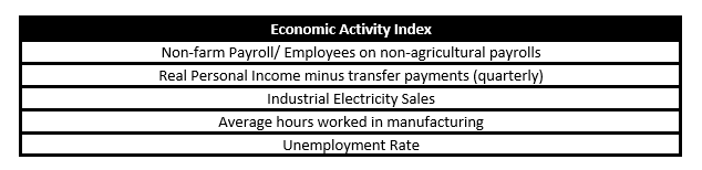
Economic Activity Index: The Economic Activity Index for the states presently includes five indicators, namely: non-farm employment, unemployment rate, average hours worked in manufacturing, industrial electricity sales, and real personal income minus transfer payments. It is a Coincident Economic Index that tells us the current economic situation in the broader sense. The below table summarizes the composition of the Economic Activity Index.

The Leading Economic Index uses the Economic Activity Index for each state as well as various state, regional, and national variables to predict the nine-month-ahead change in the state’s economic activity index. This estimate of the nine-month percentage change in the state’s current Economic Activity Index is the state’s Leading Index.

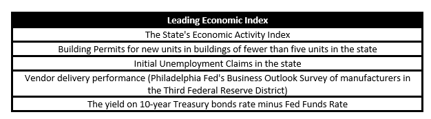
Hence, by using a mix of coincident indicators, leading indicators, and other variables, the Leading Economic Index is constructed. The below table summarizes the composition of the Leading Economic Index.

The Leading Economic Index has the base period 1992, i.e., the Leading Economic Index score for the year 1992 is 100. Based on this period, all subsequent index periods are scored.

A score below 100 is observed as contractionary. A score above 100 is seen as expansionary for the economy. The Leading Economic Index uses a time-series model (vector autoregression). The current and prior values of the forecast are combined to determine the future values of the index.

Below is a snapshot of the Leading Economic Index of the three districts and the USA:

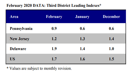
(Source – Philadelphia Fed)

How can the Leading Economic Index numbers be used for analysis?

Individual economic indicators like Initial Unemployment Claims, Purchasing Manager’s Index from the Institute of Supply Management, Employment rate can often give conflicting signals.

No one indicator can give us the broader economic outlook that we are seeking to have. It is often preferred to have an idea on different sectors (private, public, or manufacturing, services, or business, consumer) and different economic indicators to obtain a complete macroeconomic picture.

An economy consists of many moving parts, imports, exports, jobs, businesses, banks, money supply, etc. all these economic levers push or pull the economy. With so many levers in place, it is indeed difficult for the common man to know for sure the overall economic condition. The geography also plays a part, a slow down in one state does not necessarily translate to the overall economic slowdown, it might even be the case ten other states have improved above average.

In this regard, the Leading Economic Index is useful to get the big picture more accurately. As shown in the below plot, for Pennsylvania, four recessions since 1970 have been preceded by a minimum of three negative readings. The Leading Economic Index is generally measured as a change in percentage concerning the previous month score.

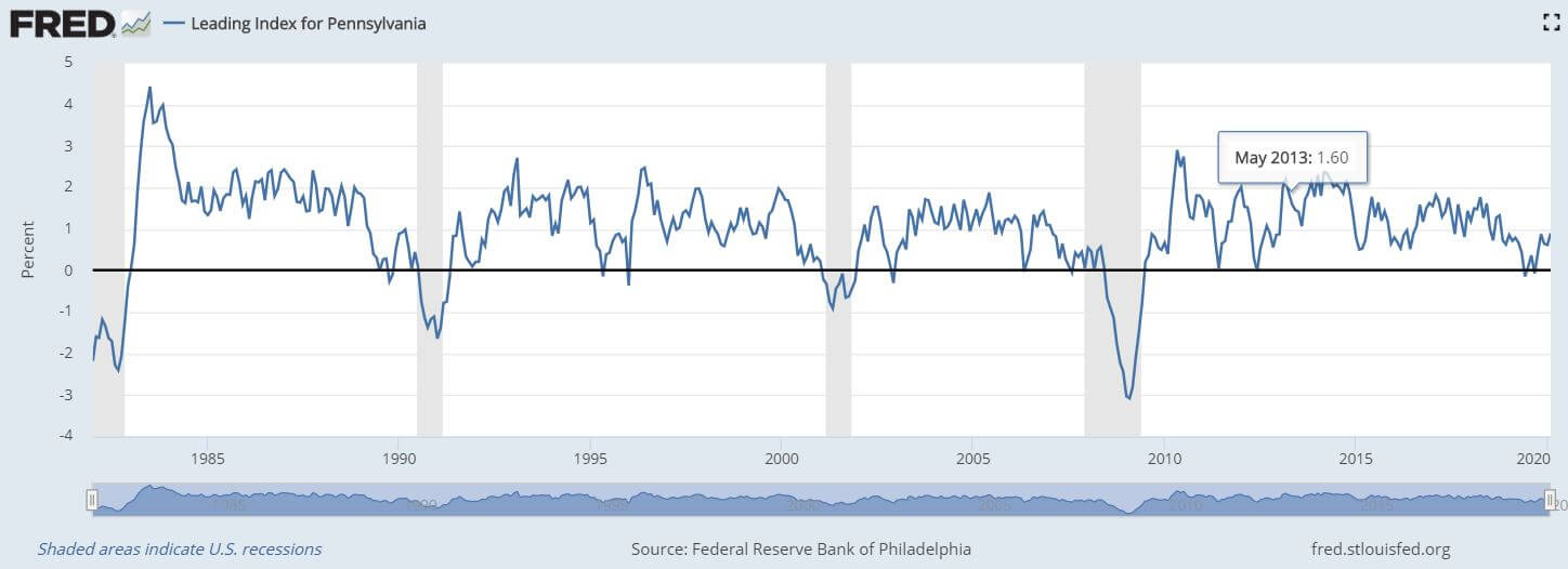
(Source – ST Louis Fed)


Impact on Currency

Improvement in the Leading Economic Index figures signals an expansionary growth in the economy ahead, which is appreciating for the currency and vice-versa.

In this sense, the Leading Economic Index is a leading and proportional economic indicator, i.e., it forecasts growth and the increase or decrease in figures generally translate into improvement or deterioration of the economic growth.

The Leading Economic Index is a low impact indicator as the data from the individual indicators that make up the Leading Economic Index would have already been released a week before, and the corresponding market short-term moves would have already taken place. Although, the long-term trends and forecasting power of the Leading Economic Index makes it a suitable tool for investors and long-term traders to assess economic direction over a time horizon of 3-6 months better.

Economic Reports

The Federal Reserve Bank of Philadelphia releases the Leading Economic Index for all of the 50 states. The Indexes are released every month generally a week after the release of the composing coincident indicators. The release dates for the upcoming year’s Leading Economic Index reports are already posted on its website.

Sources of the Leading Economic Index

The State’s Leading Economic Index is available on the official website of the Federal Reserve Bank of Philadelphia:

Leading Economic Index – FRB -P

Release Schedule – Leading Economic Indexes

The Leading Economic Index and the Coincident Economic Activity Index are also available on the St. Louis FRED website:

Leading Economic Index – FRED

Coincident Economic Activity – FRED

The Leading Economic Index for various countries are available here in statistical and list form:

Impact of the ‘Leading Economic Index’ news release on the price charts

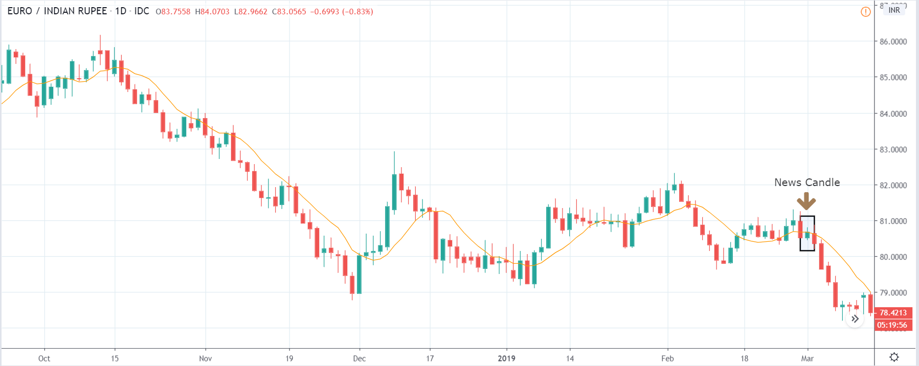
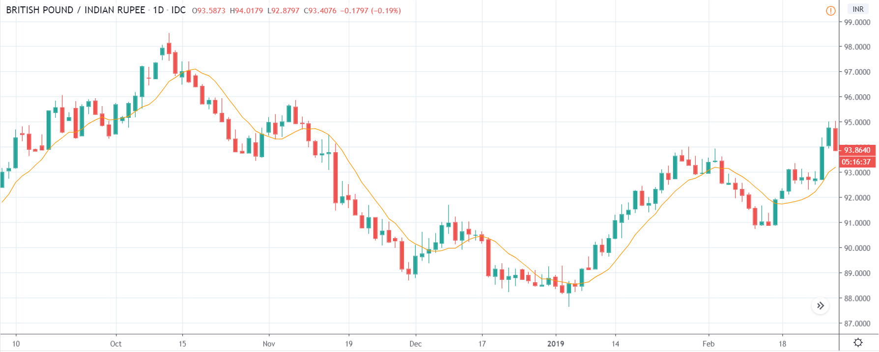
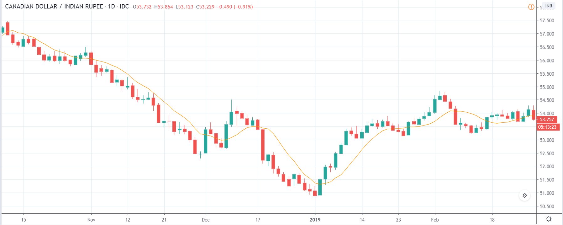
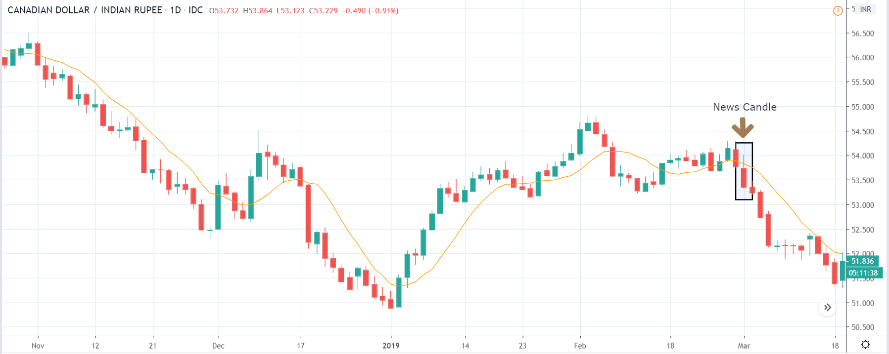
In the previous section, we described the Leading Economic Index fundamental indicator, where we said that it is a composite index that is based on nine economic indicators and is used to predict the direction of the economy. The data is gathered from economic indicators related to consumer confidence, housing, money supply, stock market prices, and interest rate spreads. The report tends to have a relatively muted impact on currency pairs because most of the indicators that are used in the calculation are released previously.

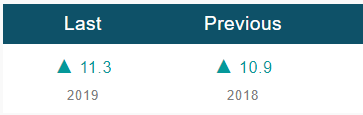
The below image shows the previous and latest data of Leading Economic Index indicator, where we see a decrease in 0.4% compared to the previous month. A higher than expected data should be taken to be positive for the currency and vice-versa. Let us observe the change in volatility due to the news release.

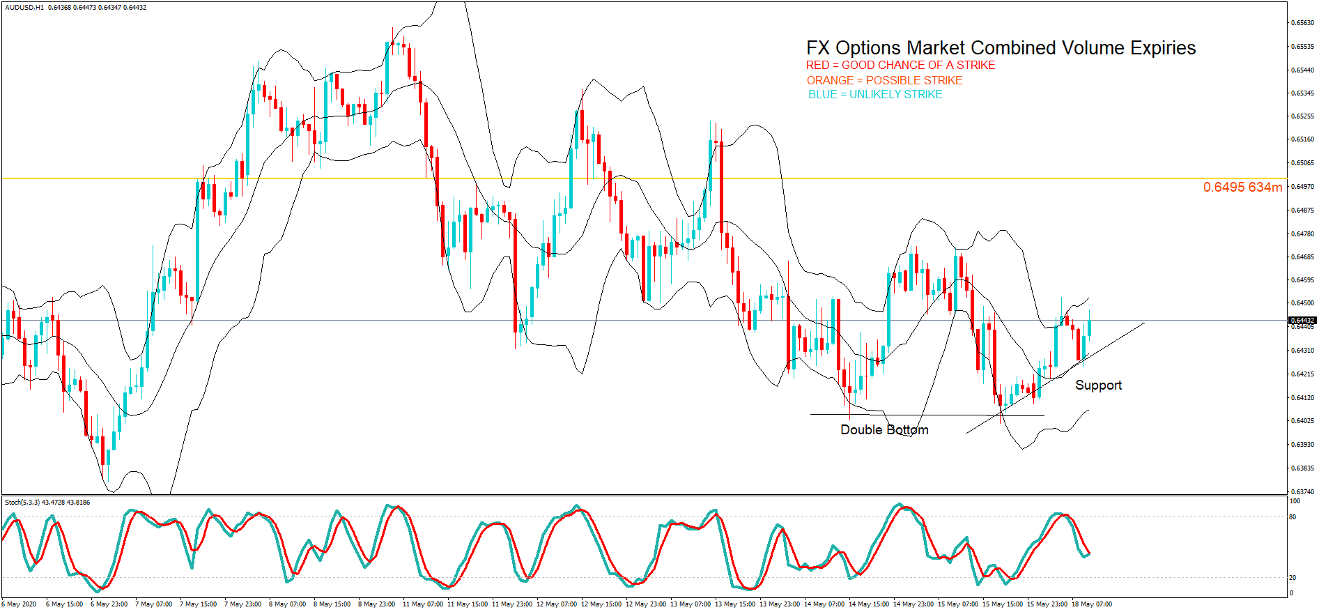
AUD/USD | Before the announcement:

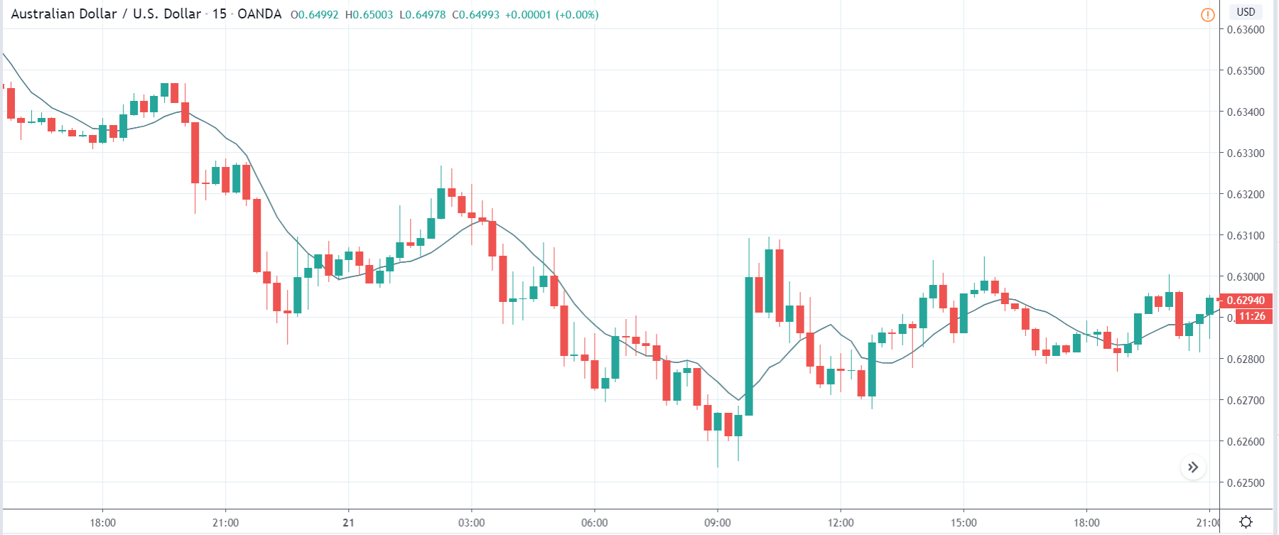
The above image shows the chart of the AUD/USD currency pair before the news announcement. We see that the price is in a downtrend, and recently it has formed a ‘range.’ This looks like a retracement where the price may continue its downtrend after touching a key technical level. Depending on the news data, we shall take an appropriate position in the market.

AUD/USD | After the announcement:

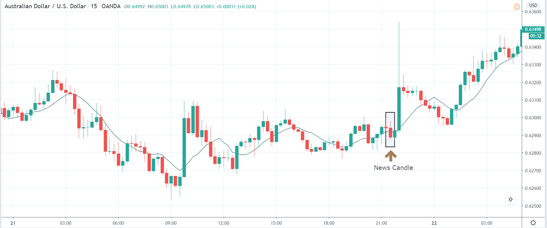
After the news announcement, the price falls and goes below the moving average, indicating that the Leading Economic Index data was negative for the economy. As there was a decrease in the value, traders went ‘short’ in the currency pair and increased the volatility to the downside. This was accompanied by another news event that was positive for the Australian dollar, and hence we see the sharp rise in price. Nonetheless, the Leading Economic Index was bad for the economy due to which the currency weakened initially.

AUD/CHF | Before the announcement: 

AUD/CHF | After the announcement:

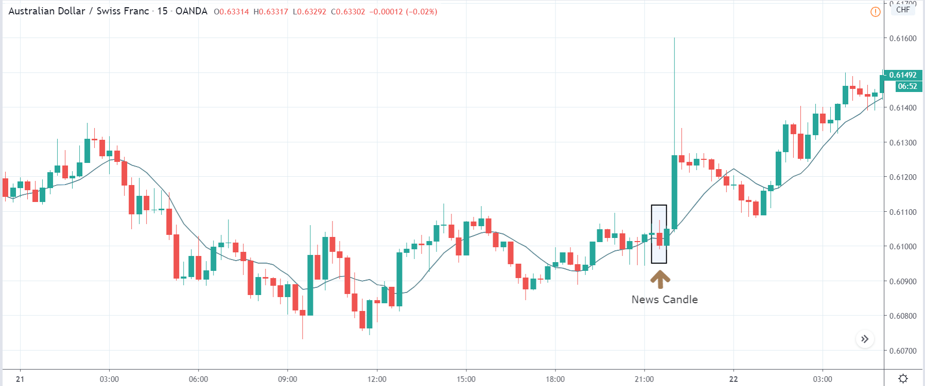
The above images represent the AUD/CHF currency pair, where we see that the characteristics of the chart are similar to the above-discussed pair before the news announcement. Here too, the market is in a downtrend signifying weakness in the Australian dollar, and the price has pulled back from its ‘lows’ recently. There is a possibility that the downtrend might continue depending on the outcome of the news. After the news announcement, the market moves lower, and the price closes as a bearish ‘news candle.’ Since this announcement followed another news release, one needs to be cautious before taking any position in the market. If we are to analyze this data alone, we can expect an increase in volatility to the downside, leading to further weakening of the currency.

EUR/AUD | Before the announcement: 

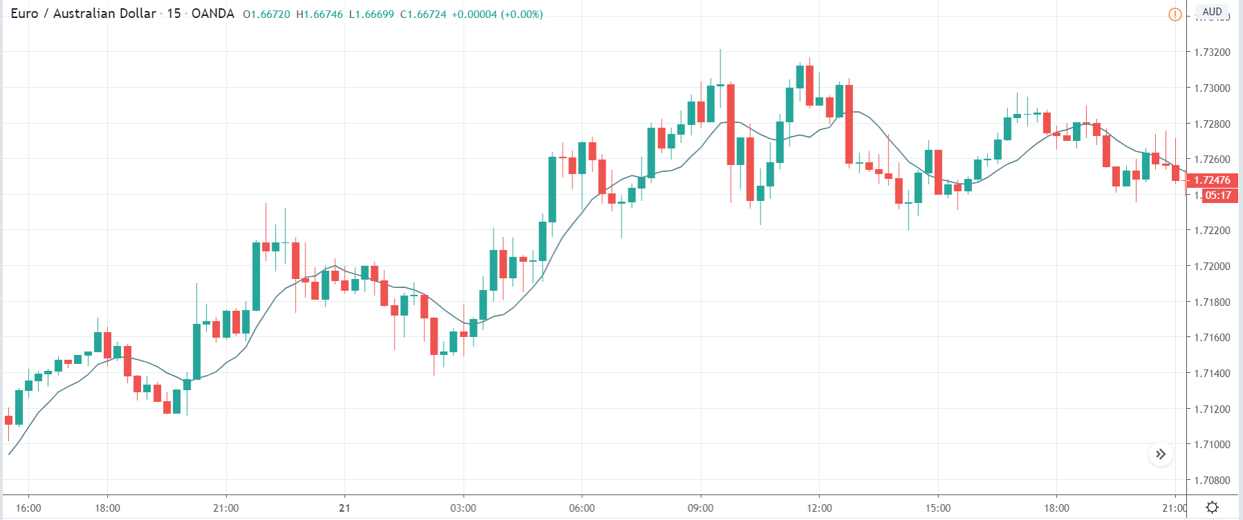
EUR/AUD | After the announcement:

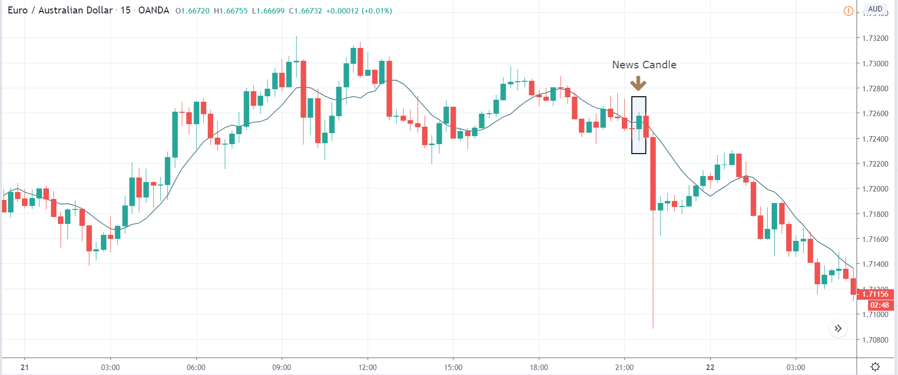
The above images are that of the EUR/AUD currency pair, and here, the market is an uptrend before the news announcement. Since the Australian dollar is on the right- hand side of the pair, an up-trending market indicates weakness in the currency. The price is currently moving in a ‘range,’ and just before the news release, it is at the bottom of the range. Ideally, this is the ideal place for going ‘long’ in the market. Aggressive traders can take a ‘long’ position with a stop loss below the support. After the news announcement, we see that the market moves higher, and the bullish ‘news candle’ indicates weak ‘Leading Economic Index’ data where there was a reduction in the value for the current month. Compared to the other fundamental drivers, the Leading Economic Indices news release would have taken the currency higher, and high volatility would be witnessed on the upside. Therefore, we need to keep a watch on the economic calendar to be aware of all the news announcements.

That’s about the ‘Leading Economic Index’ and its impact on the Forex market after its news release. If you have any questions, please let us know in the comments below. Good luck!