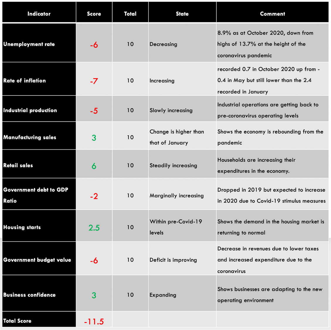
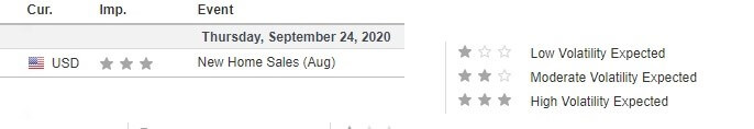
Categories
Forex Daily Topic Forex Fundamental Analysis

Everything You Need To Know About The ‘Jobs to Applications Ratio’

Introduction

For any economy, one of the best indicators of health in the labor market is how quickly the unemployed get absorbed into the job industry. This would indicate if the current economy is expanding at par with the growing number of job seekers. Apart from showing the absorption rate in the job market, it can also be used as a coincident economic indicator.

Understanding Jobs to Applications Ratio

The jobs to applications ratio help to put into perspective the number of job vacancies available vs. the number of job applications made during a particular time.

The job vacancies, in this case, represents the totality of the existing Job Vacancies from the previous reporting period that haven’t been filled and the new vacancies in the current period. For example, the total job vacancies for October 2020 would include the unfilled vacancies from the previous months in 2020 and the vacancies that became available in October 2020. The number of job applications does not necessarily need to be those that directly applied for these vacancies. This number is the totality of job seekers who have registered with employment bureaus across the country seeking employment.

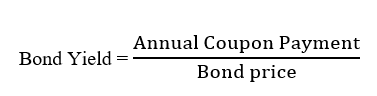
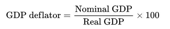
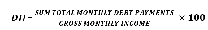
Therefore, the formula of the jobs to applications ratio is 

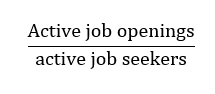
When the number of active job openings is higher than that of active job seekers, the jobs to applications ratio will be higher than 1. Furthermore, the jobs to applications ratio will increase if the number of job openings increases faster than that of active job seekers. Conversely, if the number of active job seekers is higher than that of active openings, the jobs to applications ratio will be lower. Similarly, when the number of active job seekers grows at a faster pace than that of active job openings, the jobs to applications ratio will decrease at a rapid rate.

In most countries, the number of graduates from tertiary academic institutions is usually high. For this reason, most jobs to applications ratio reports usually exclude new school graduates and part-time job seekers. The primary reason for doing this is to smoothen the data since it is not expected that the labor market will absorb all graduates.

Using Jobs to Applications Ratio in Analysis

The Jobs to Applications Ratio shows the health of the labor market and is also a coincident indicator of economic growth. The best way to use the jobs to applications ratio in the analysis is by viewing it as a time series. It will enable you to compare the change in the economy over time easily.

To understand the implication of the Jobs to Application Ratio, we must first understand how job openings and unemployment come about. When the economy is expanding, the unemployment levels go down. An expanding economy is mainly driven by an increase in demand in the economy. Usually, household demand is the primary driver of the increase in aggregate demand.

When the aggregate demand rises, producers of goods and services must also scale up their operations to take advantage of the increasing demand and to avoid distortion of equilibrium price. When they expand their operations, they will need to hire more workers; this is where the unemployment levels go down. Also, note that when the unemployment rate reduces, it means that households’ expenditure increases, which also leads to the expansion of the economy. It is a feedback loop.

It also means that when the economy is contracting, it is a sign of a decrease in aggregate demand. This decrease force producers of consumer goods and services to cut back their production, which results in fewer job openings and increased unemployment.

Now let’s see what jobs to application ratio has to do with all this. When the Jobs to Applications Ratio is increasing over time, it implies that the number of active job openings is growing faster than that of the active job seekers. If, for example, the jobs to applications ratio has been increasing steadily over the past couple of months or years, it would mean the economy has been expanding. This increase shows that increasingly more jobs have been created in the economy.

Alternatively, it could mean that the rate of job retention in the economy is higher since fewer people lose their jobs and begin seeking employment all over again. Conversely, when the Jobs to Applications Ratio is continually decreasing, it means that the economy is contracting and the economy is creating fewer jobs. It could also mean that more jobs are lost in the economy hence the higher number of new job seekers.

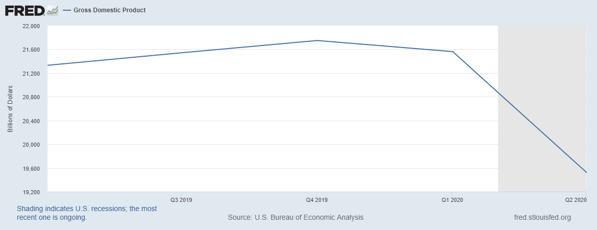
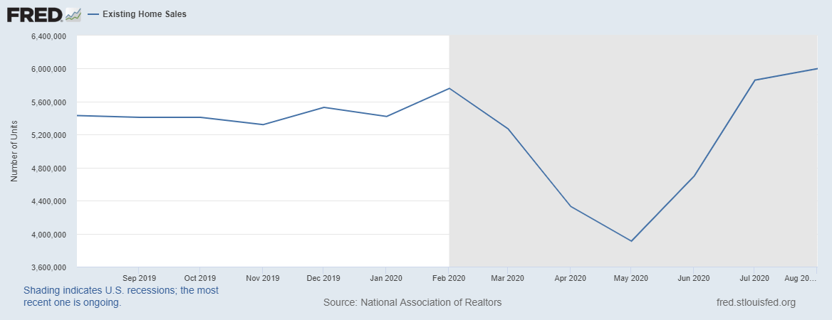
The Jobs to Applications Ratio can also show the business cycles and periods of recession and expansion in the economy. When the Jobs to Applications Ratio continually drops, it implies that the economy has been contracting over an extended period with a growing number of unemployed in the economy. This is a clear sign of economic recession. In Japan, for example, the persistent drop in the job to application ratio coincided with the coronavirus-induced recession of the first half of 2020.

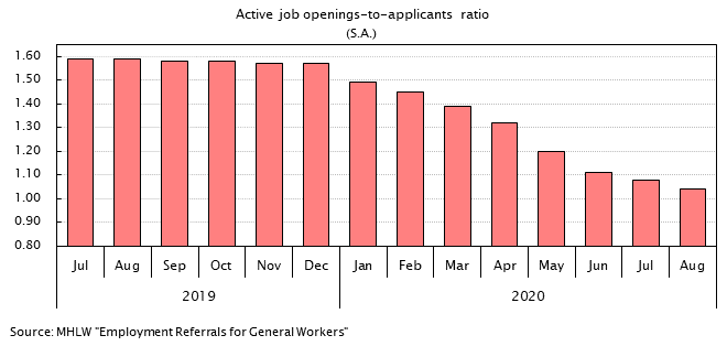
Source: Japan Institute for Labour Policy and Training

In times of economic recovery, businesses are presumed to gradually increase their operations, which means that the jobs to applications ratio will steadily increase.

Impact of Jobs to Applications Ratio on Currency

The value of the currency fluctuates depending on the perceived economic growth. Thus, the direct impact that jobs to applications ration has on currency is its inherent ability to show economic expansions and contractions.

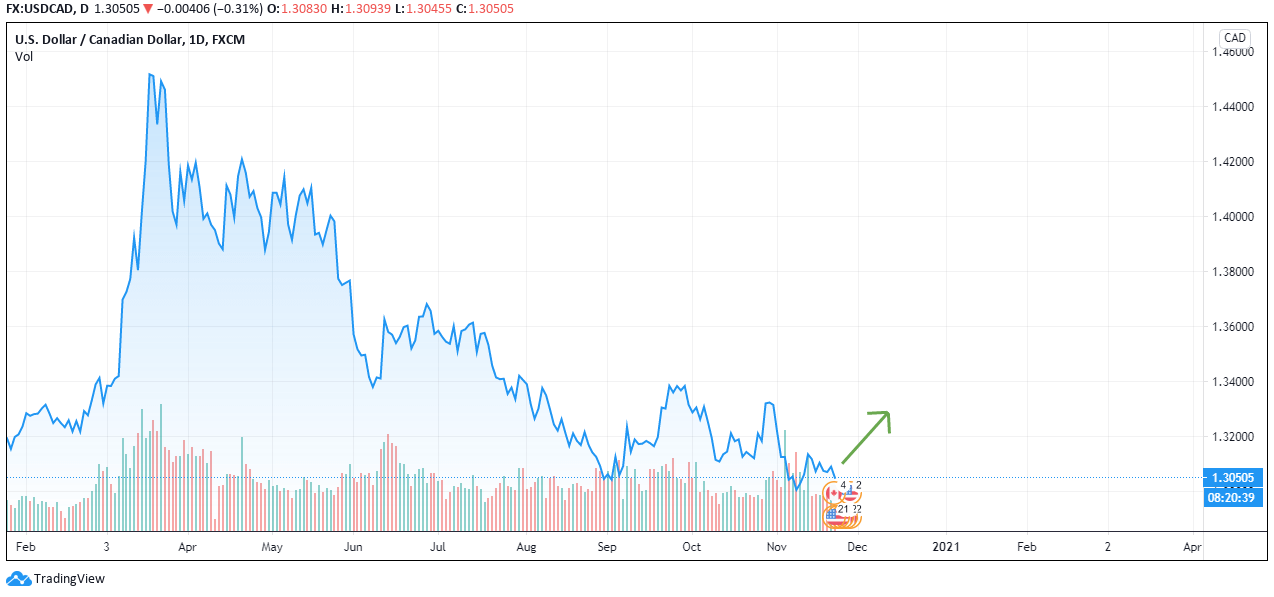
The domestic currency will be expected to appreciate when the jobs to applications ratio increases. The increase in the jobs to applications ratio shows that the economy has been growing hence improved living standards.

Conversely, the domestic currency will depreciate when the jobs to application ratio are steadily decreasing. The continual decrease shows that the domestic economy has been contracting.

Sources of Data

In Japan, the Japan Institute for Labour Policy and Training is responsible for conducting surveys of the Japanese labor market. The institute publishes the data on Jobs to Applications Ratio monthly.

Trading Economics has a historical review of the Japanese jobs to applications ratio.

How Jobs to Applications Ratio Release Affects The Forex Price Charts

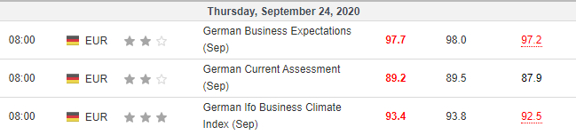
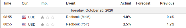
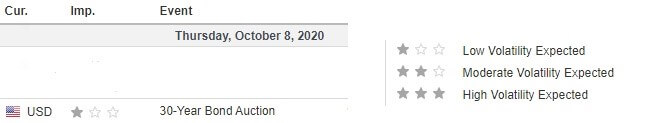
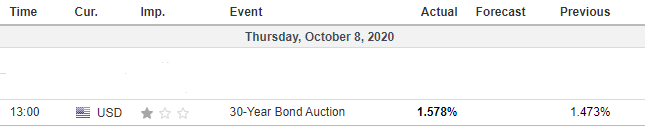
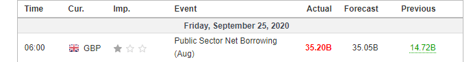
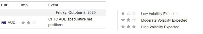
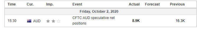
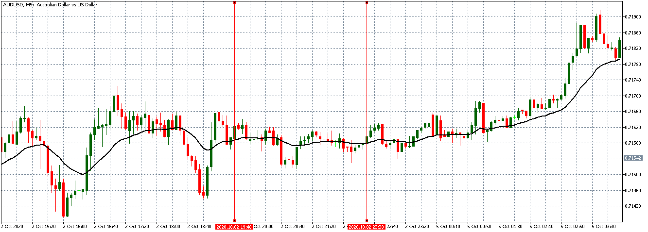
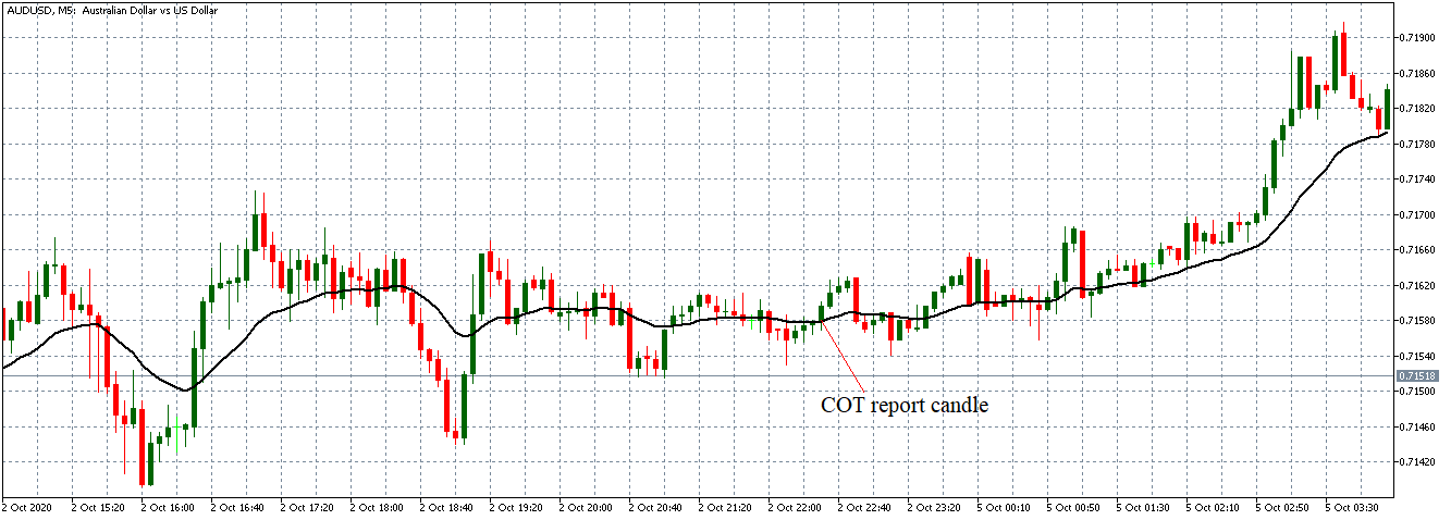
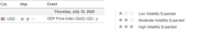
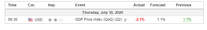
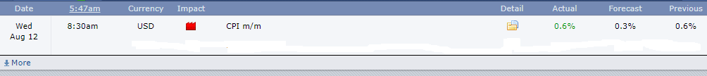
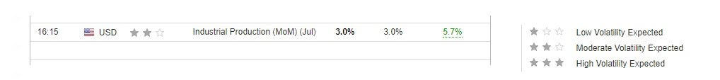
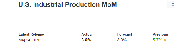
The Japan Institute for Labour Policy and Training published the latest jobs to applications ratio on October 2, 2020, at 8.30 AM JST. The release is accessed from Investing.com. Moderate volatility is expected on the JPY when the data is published.

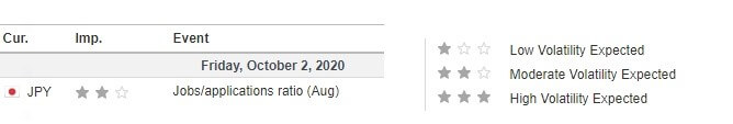
In August 2020, the jobs/applications ratio was 1.04 compared to the 1.08 recorded in July 2020. Furthermore, the August ratio was less than the analysts’ expectations of 1.05.

Let’s see how this release impacted the JPY.

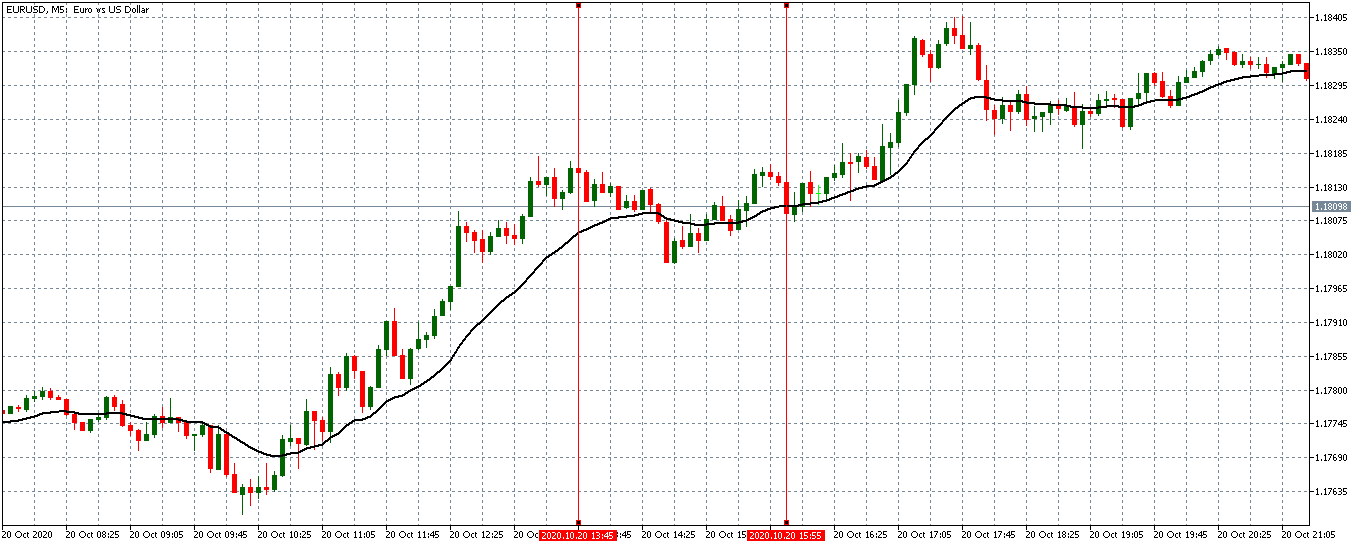
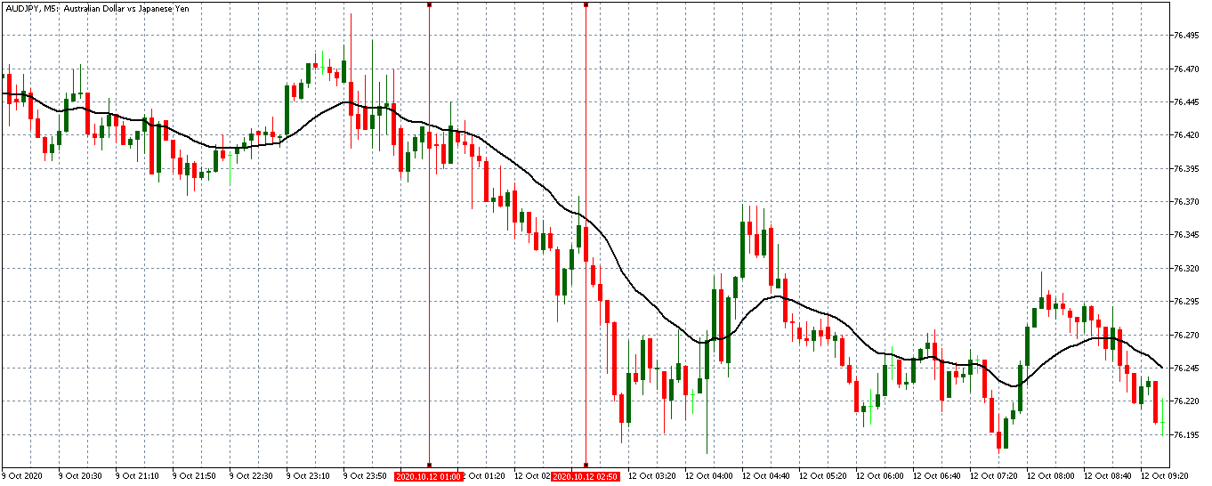
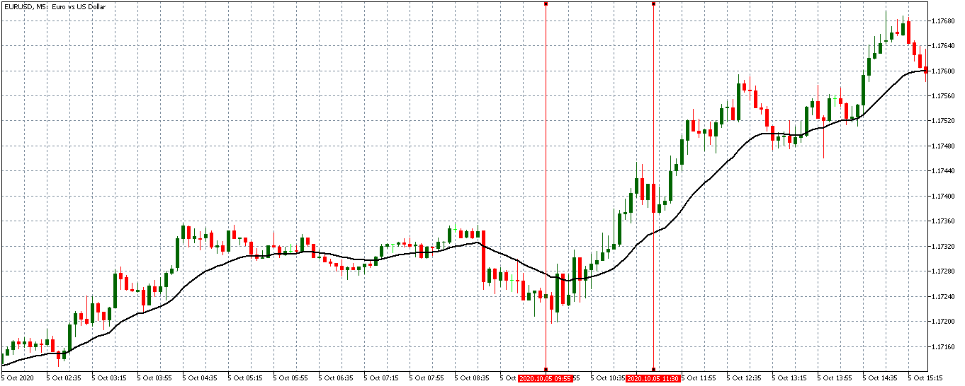
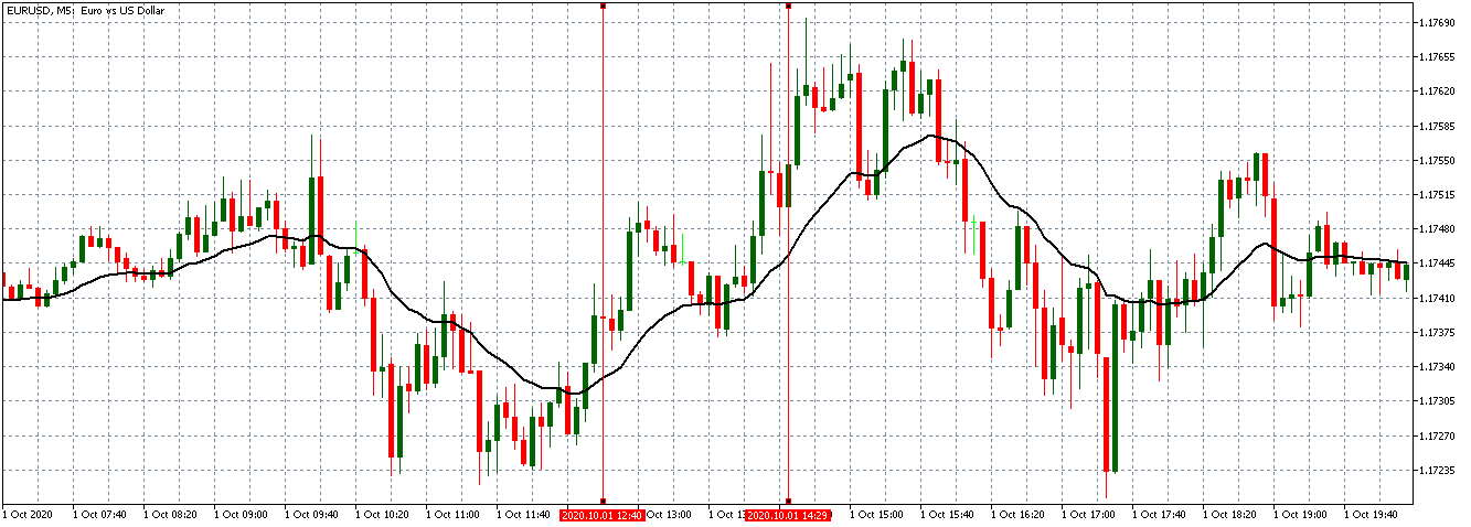
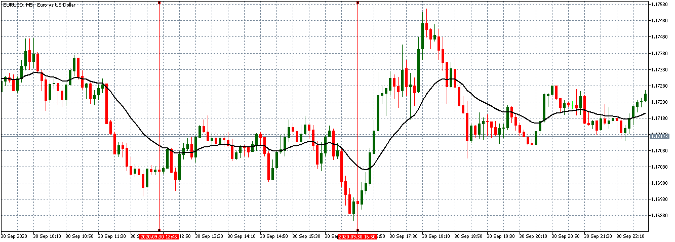
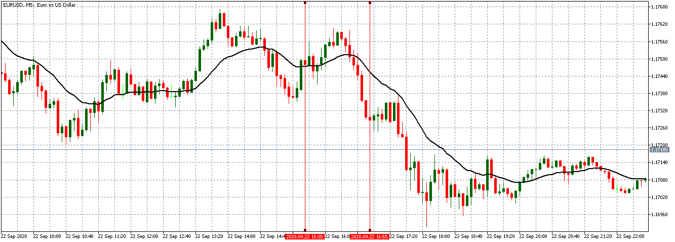
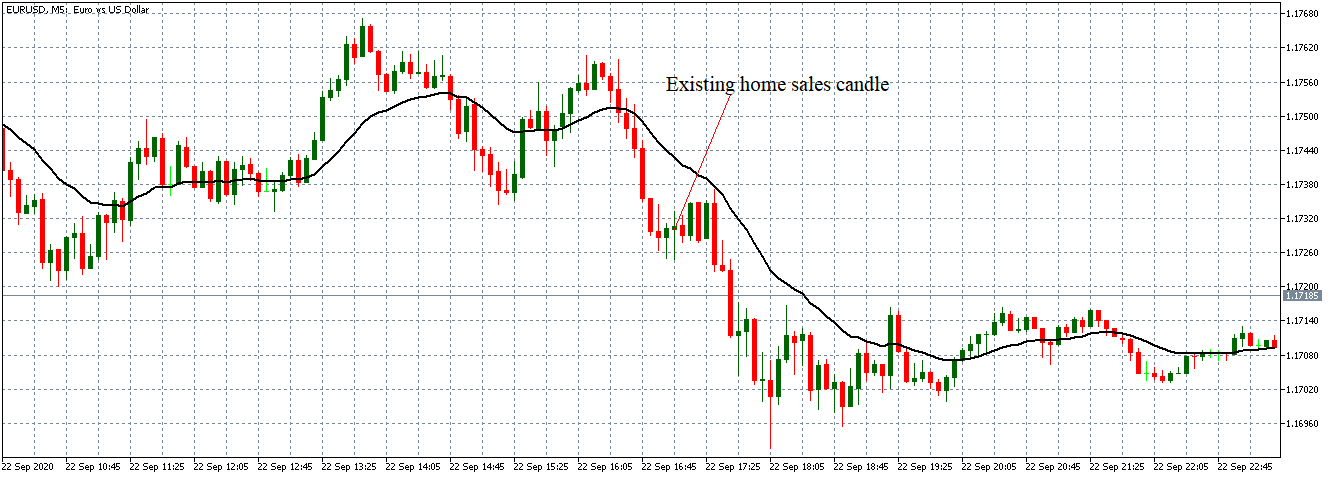
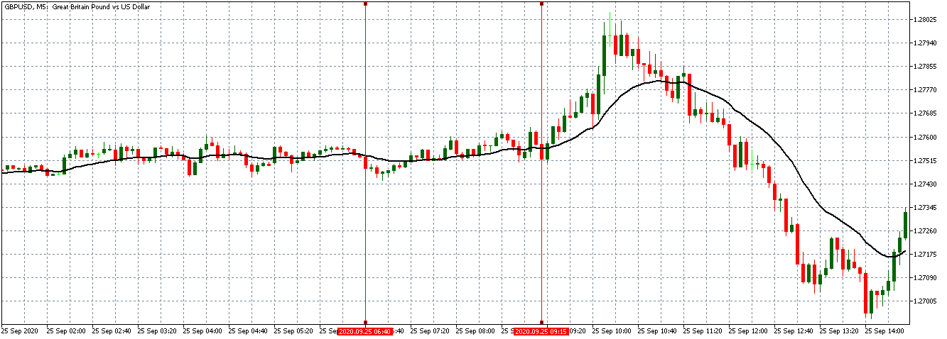
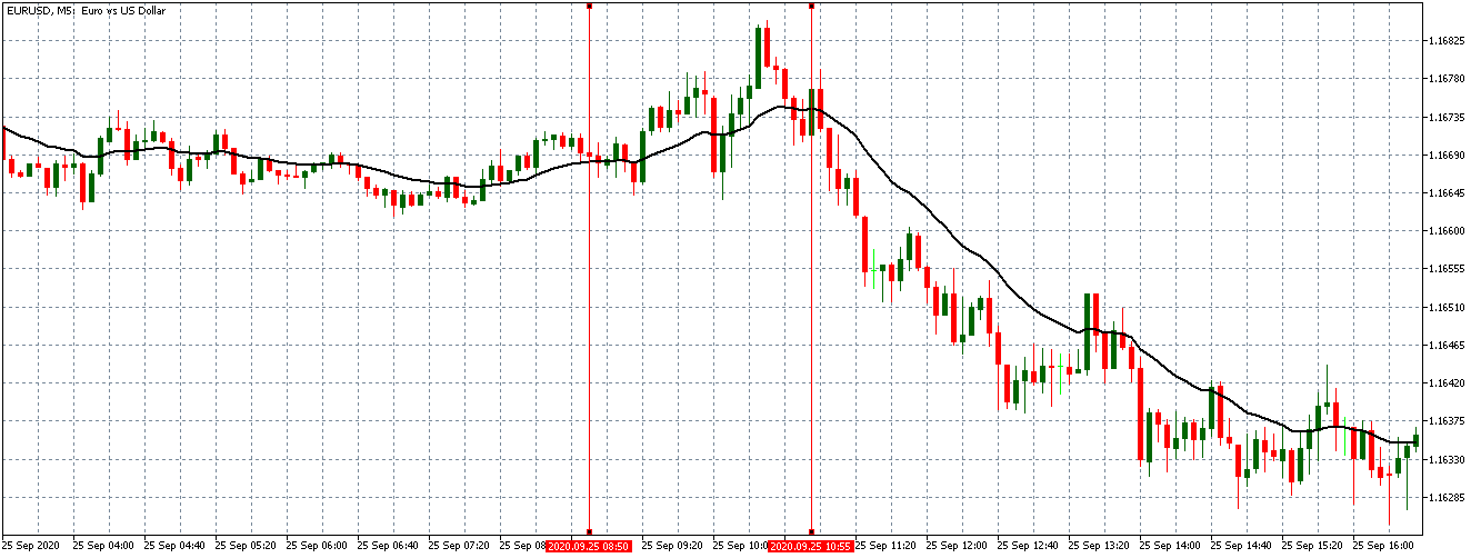
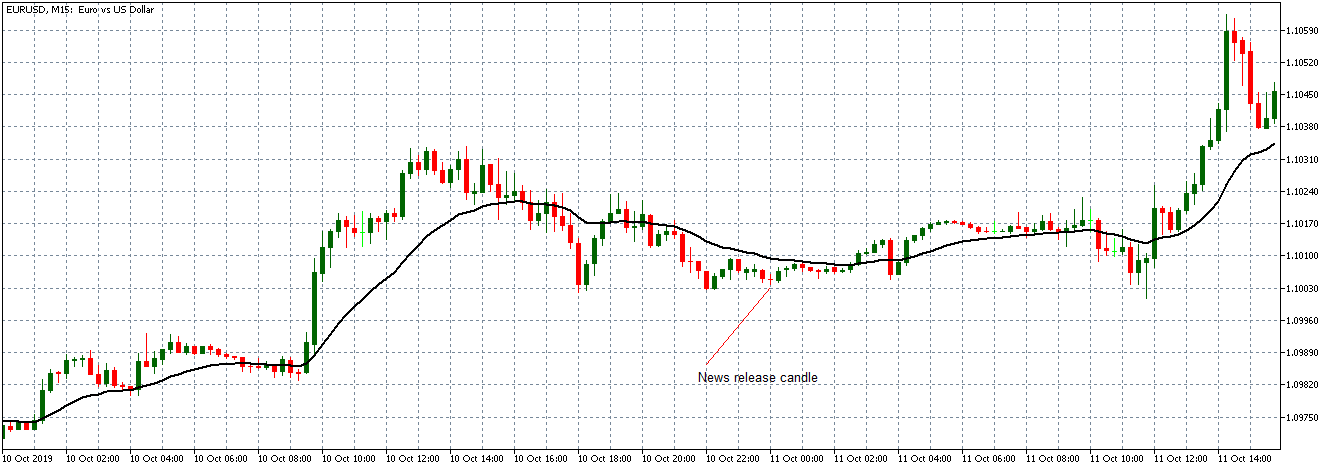
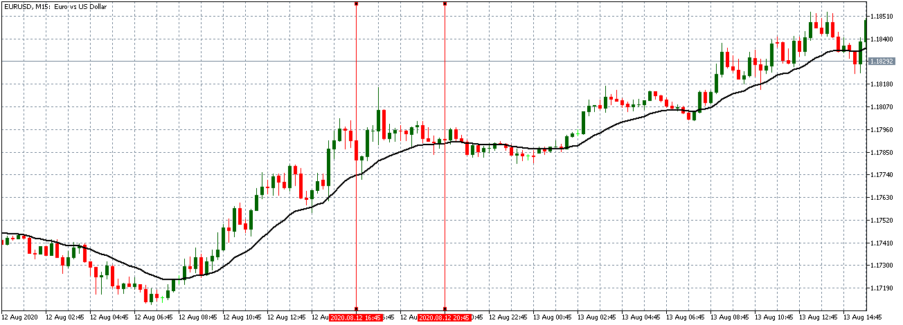
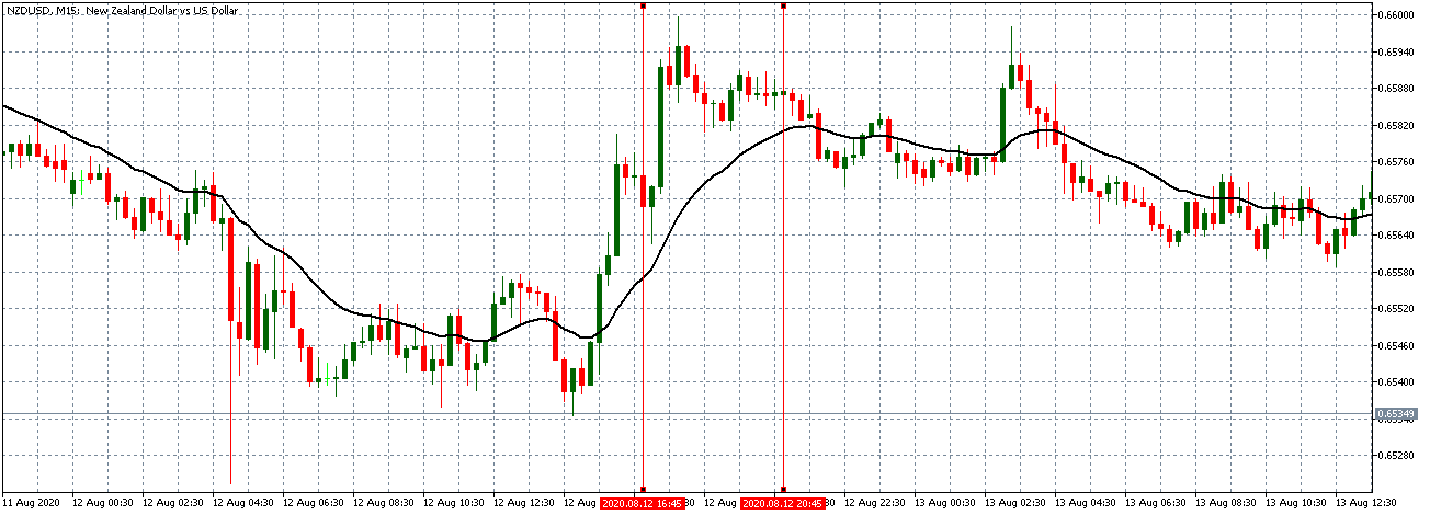
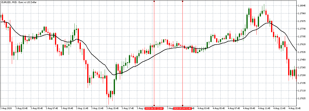
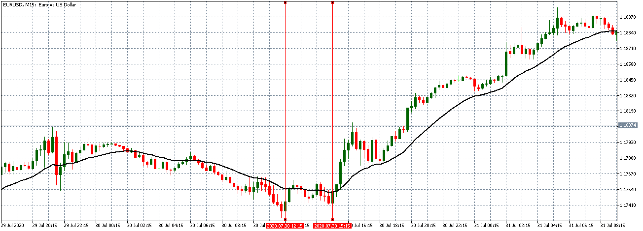
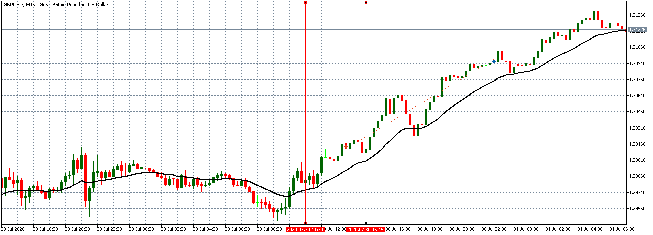
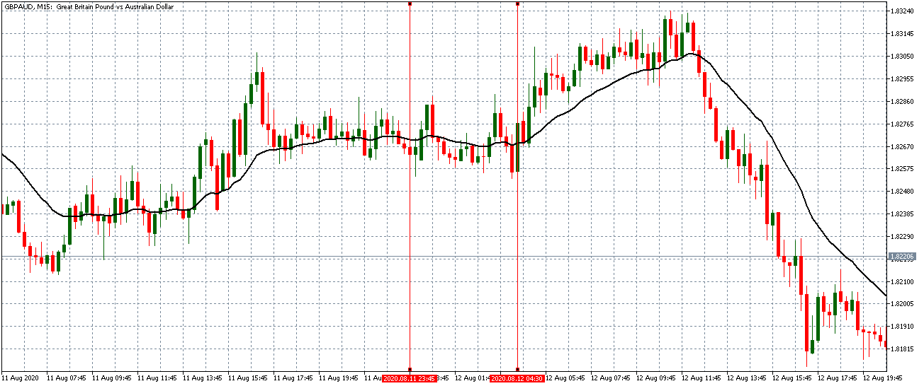
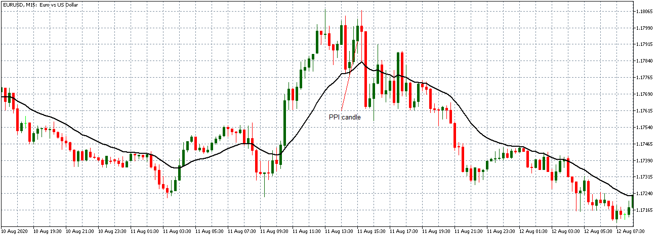
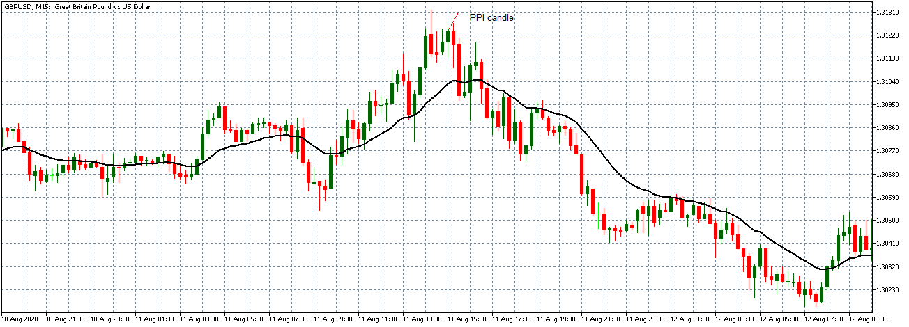
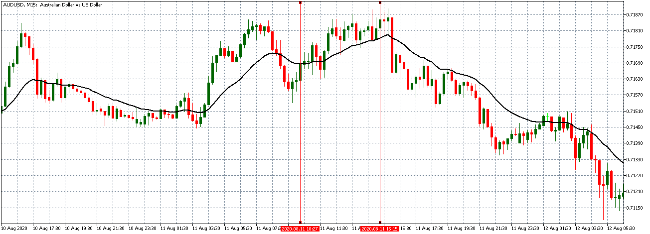
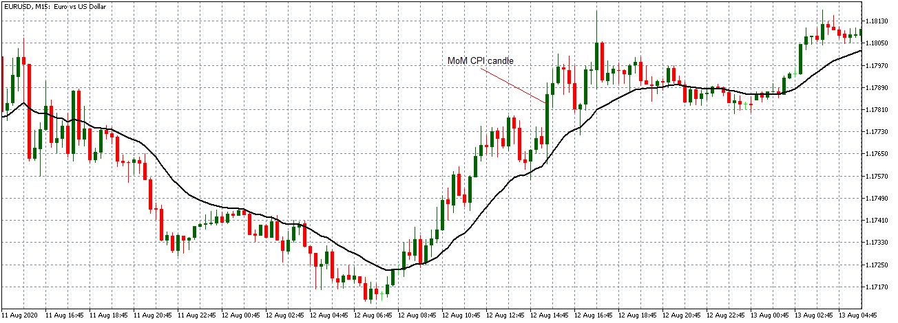
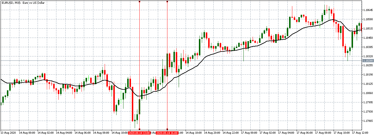
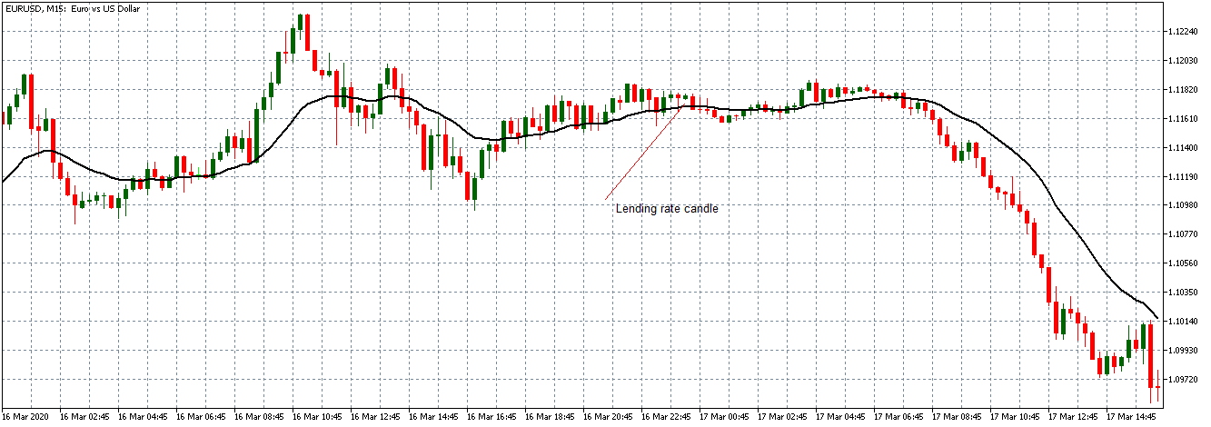
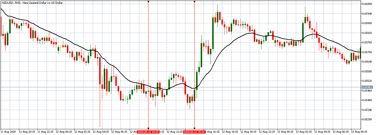
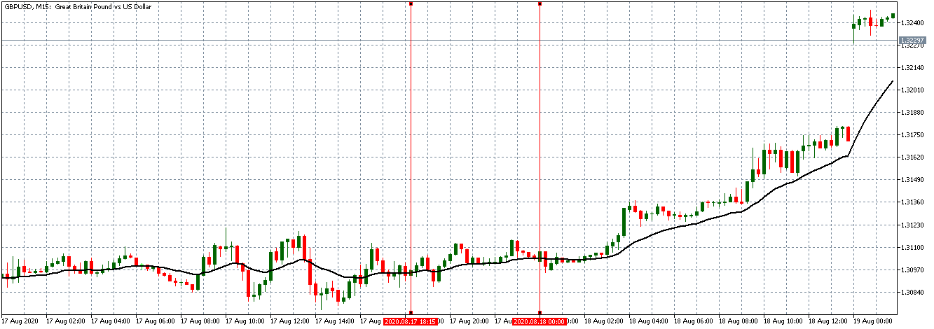
USD/JPY: Before Jobs to Applications Ratio Release on October 2, 2020, 
just before 8.30 AM JST

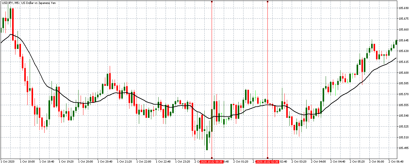
Before the release of the ratio, the USD/JPY pair was trading in a subdued uptrend. The 20-period MA was only slightly rising.

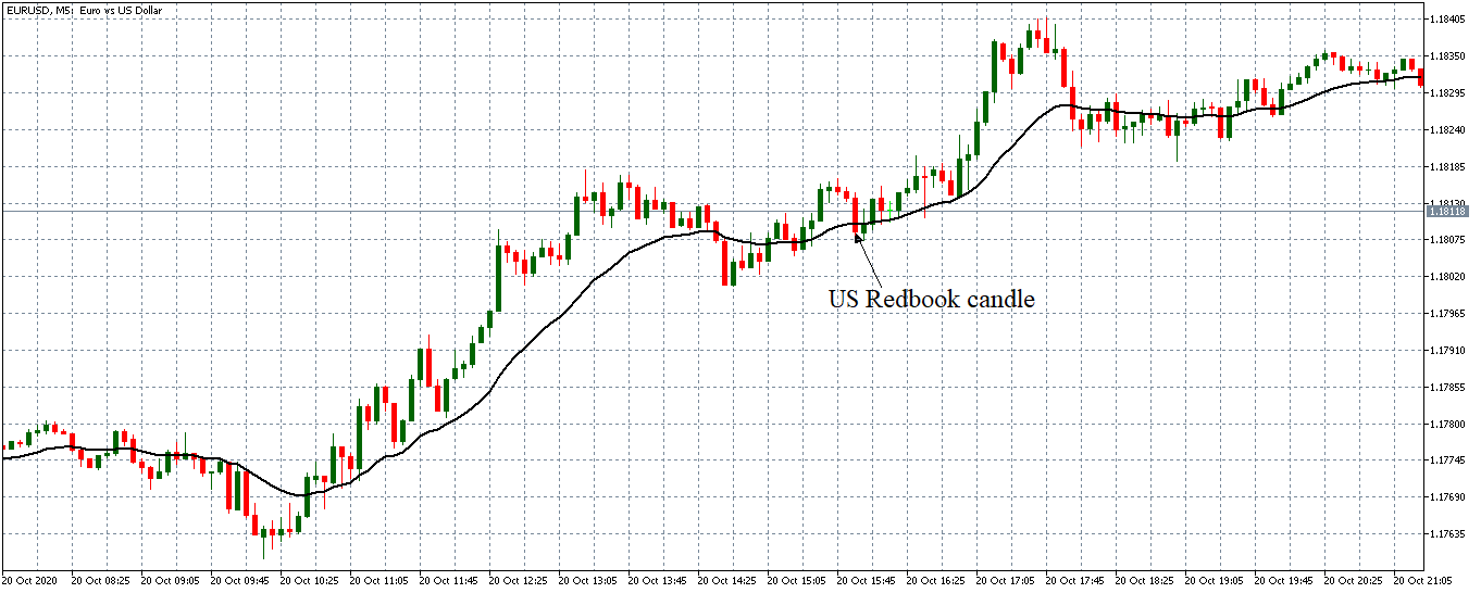
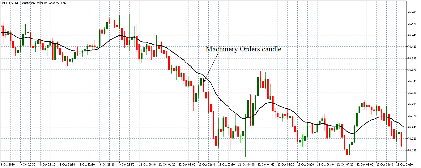
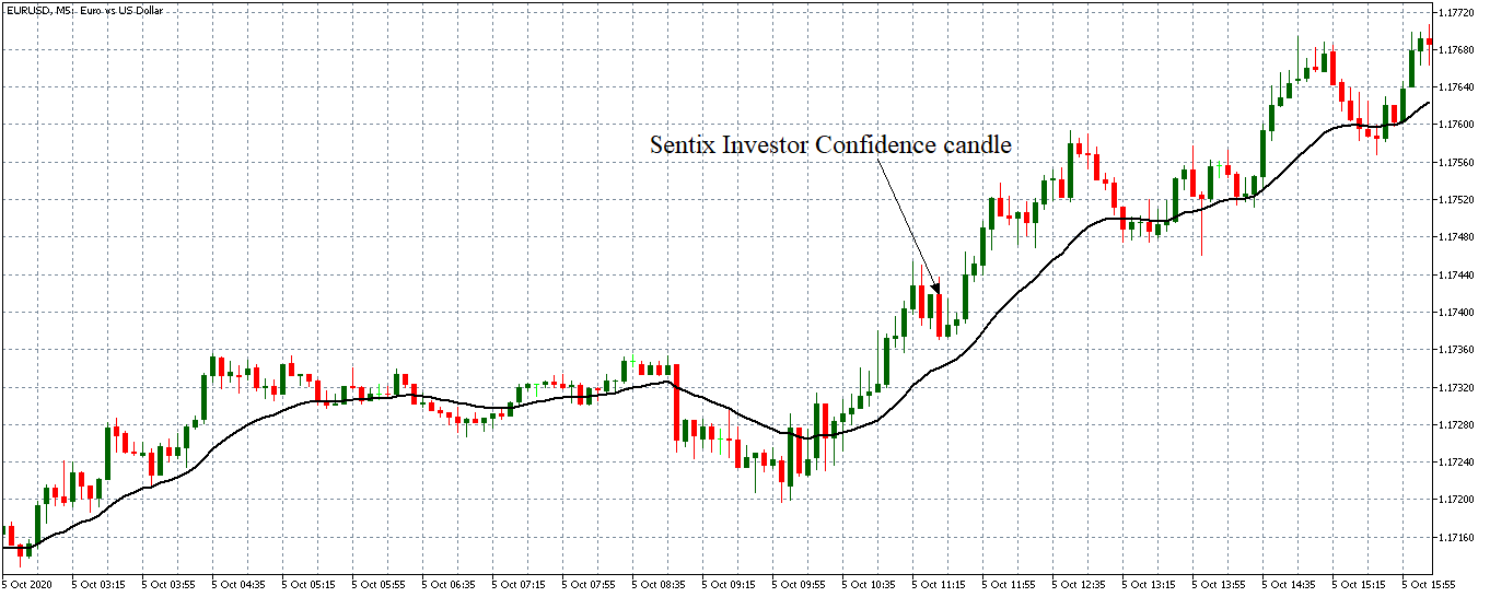
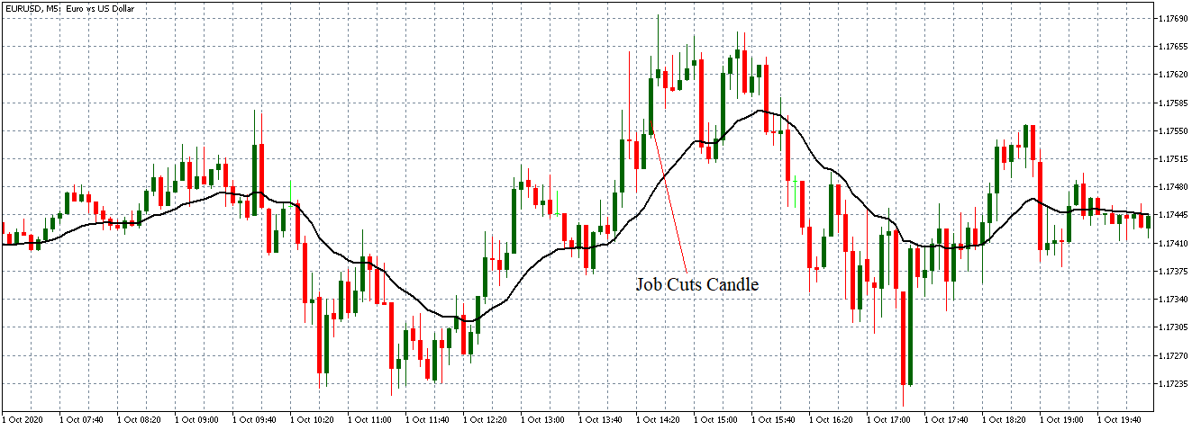
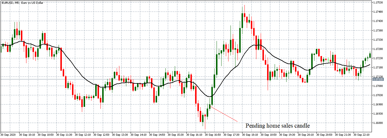
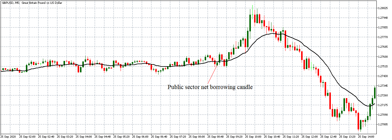
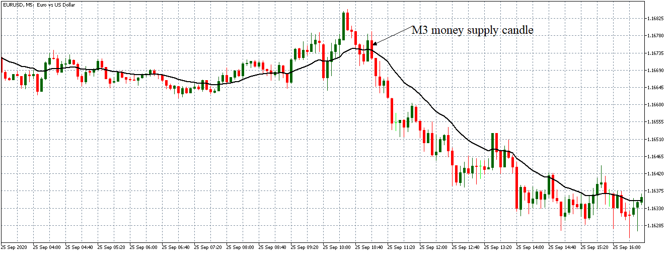
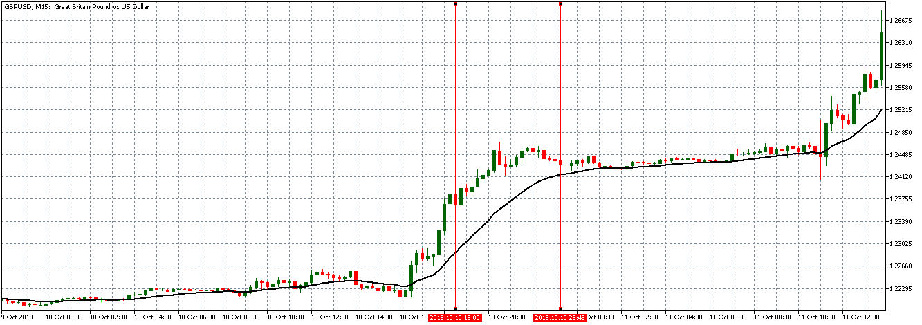
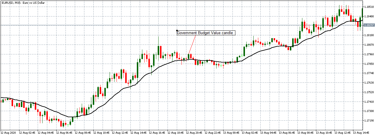
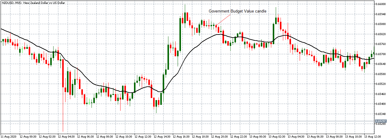
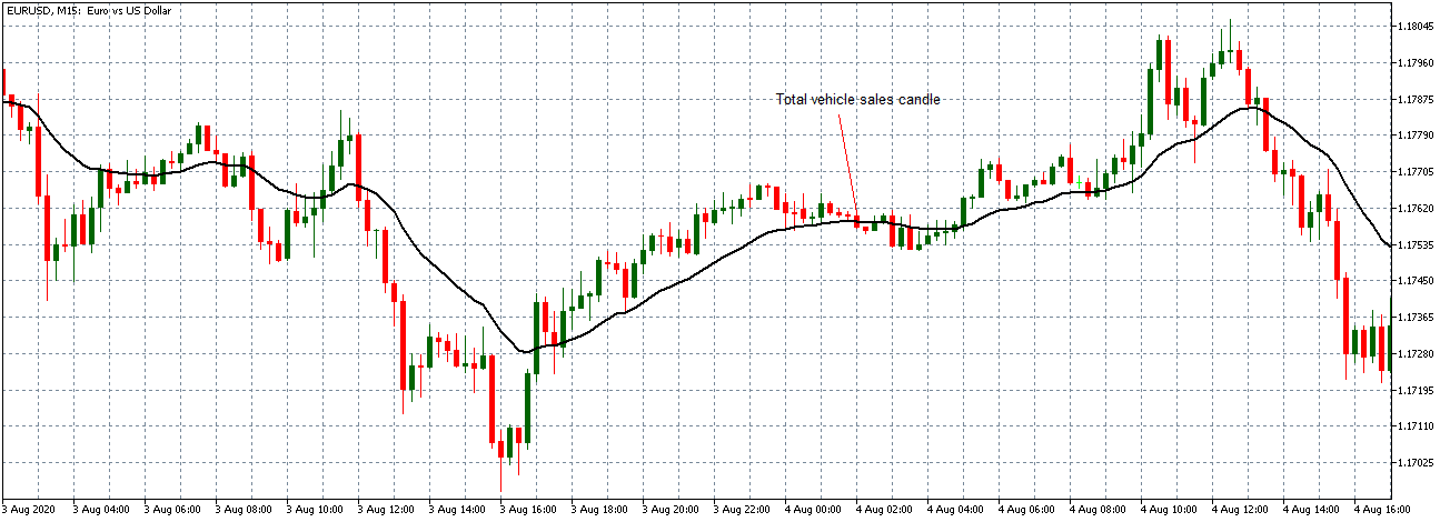
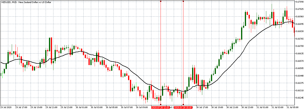
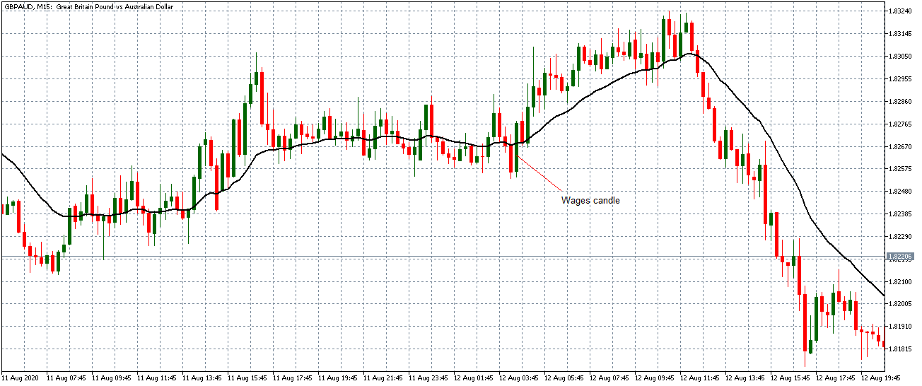
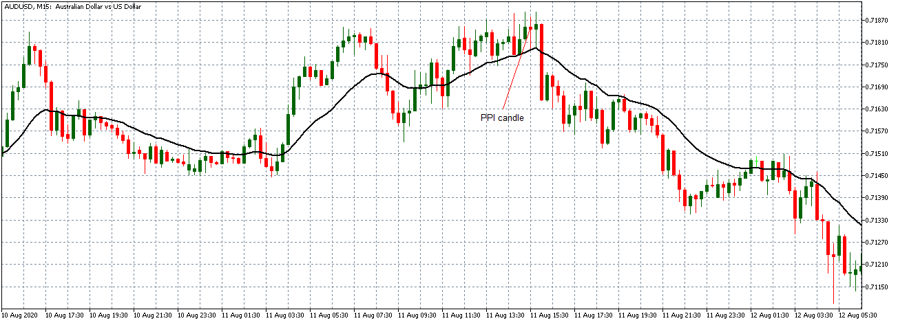
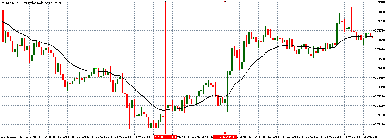
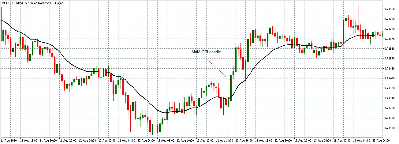
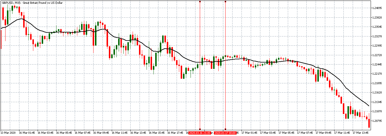
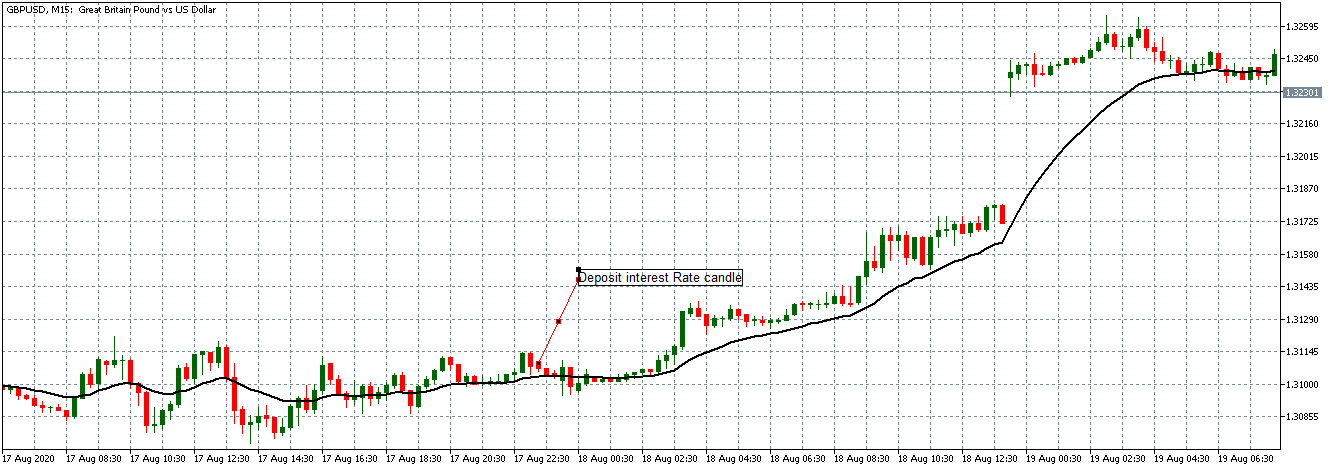
USD/JPY: After Jobs to Applications Ratio Release on October 2, 2020, 
at 8.30 AM JST

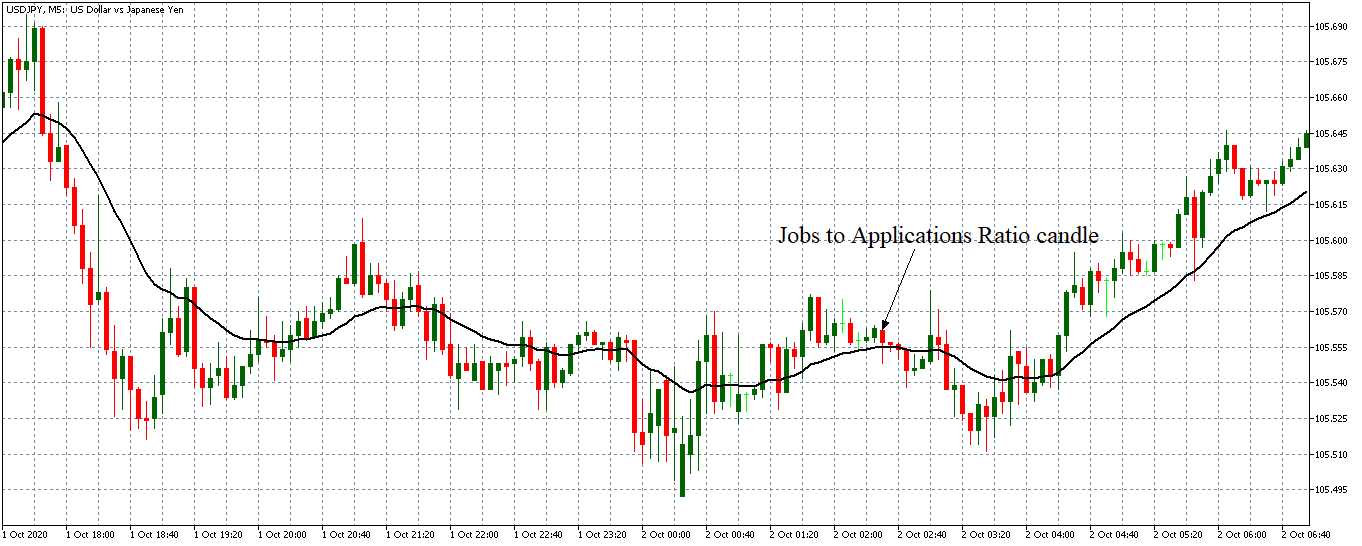
The pair formed a 5-minute bearish “hammer” candle immediately after the release of the ratio. Subsequently, it traded in a neutral pattern before adopting a bullish trend.

Bottom Line

The Jobs to Applications Ratio plays a significant role in establishing the health of the labor market. However, in the forex market, the unemployment rate is the most-watched economic indicator when it comes to the health of the labor market.

Categories
Forex Fundamental Analysis

USD/CAD Global Macro Analysis – Part 3

Introduction

The exogenous analysis for the USD/CAD pair will involve analyzing factors that significantly contribute to these two currencies’ interaction. Remember, when trading forex, you are trading a currency pair, which means you buy one currency and sell the other. With exogenous analysis, you get the bigger picture regarding the currency pair as a whole. In a sense, the exogenous analysis compares how the endogenous factors between the US and Canadian economies net against each other.

For the exogenous analysis, we’ll focus on:

US and Canadian Interest rate differential

Interest rate differential is the difference between the interest rates in the US and Canadian. When the interest rate in one country s higher than the other, investors will pull their funds from the country with the lower interest rate to invest in high yielding securities in the country with the higher interest rate.

Canada’s interest rate has for most of the year been higher than that in the US. We, therefore, expect that from March 2020, the USD weakened against the CAD. However, since the current interest rate differential is 0%, going forward, we do not expect that it will play a significant role in determining the value of the USD/CAD pair. Hence, we assign it a neutral score of 0.

GDP Growth Differential

A country’s GDP growth is mainly propelled by growth in international trade. Therefore, when the GDP expands, we can expect that the country is becoming a net exporter. That means the demand for its currency increases in the international market, which also increases its value.

Over the years, the Canadian GDP growth rate has outpaced that of the US. However, in the third quarter of 2020, the US GDP growth rate outpaced Canada by 23.1%. Based on our correlation analysis between the GDP differential and the USD/CAD pair, we assign an inflationary score of 2. If this trend continues, we expect a future strengthening of the USD against CAD.

Differences in Trade Balance

The balance of trade helps to show the trade deficits that a country operates in the international market. The trade deficit widens as the country consistently becomes a net importer. Furthermore, the trade deficit can also widen if the value of the goods exported by a country drops while the value of imports increases.

From April 2020, the Canadian trade deficit has been widening as compared to that of the US. In October 2020 data release, the Canadian trade deficit widened by CAD 3.25 billion while the US trade deficit widened by $3.1 billion. Due to its high correlation with the USD/CAD pair, we assign the difference in trade deficit an inflationary score of 3. If this trend persists, we expect it to result in bullish USD/CAD.

Conclusion

Based on the exogenous analysis, the USD/CAD gets an inflationary score of 5. It implies that if the current trend of the exogenous factors persists, we can expect a bullish trend for the USD/CAD pair in the near term.  Now that we know the trend, we can use technical analysis to find accurate entries and exits in this currency pair while keeping the bullish trend in mind.

From the exogenous analysis of the USD/CAD pair, we have observed that the pair is expected to adopt a bullish trend in the near term. Let’s see if this is supported by technical analysis. In the below weekly chart, we can see the pair bouncing off a 2-year support line and from the oversold territory of the Bollinger Bands. This indicates a clear bullish trend in the near future. 

We hope you found this analysis informative. Please let us know if you have any questions in the comments below, and we would love to address them. Cheers.

Categories
Forex Fundamental Analysis

USD/CAD Global Macro Analysis – Part 2

CAD Endogenous Analysis – Summary

The Canadian endogenous factors recorded a score of -11.5, implying a deflationary effect in the CAD as well. This means that according to the Fundamental indicators, the CAD has also lost its value since the year began, but not as much as the USD.

Unemployment Rate

The unemployment rate measures the number of people who do not have jobs and are actively seeking gainful employment. The unemployment rate is used to show business cycles and economic growth because when businesses expand, the demand for labor is higher when the economy is undergoing a contraction, the demand for labor decreases, and the unemployment rate increases.

In October 2020, the Canadian unemployment rate was 8.9% down from the historic highs of 13.7% registered in May 2020. The rate is still higher than the 5.6% average before the onset of the coronavirus pandemic.

Based on our correlation analyses, the Canadian unemployment rate gets a score of -6. It means that in 2020 the unemployment rate has a deflationary impact on the CAD.

Canadian Rate of Inflation

The Canadian CPI is a weighted average of the following categories: Shelter 27.5%, Transportation 9.3%, Food 16.1%, household operations 11.8%, education and recreation 11.8%, clothing 5.7%, health and personal care 5%, and alcohol and tobacco 3%.

The CPI target in Canada is 2%. The Bank of Canada uses monetary policy to maintain inflation within the target range of 2%. An increasing rate of inflation is positive for the CAD.

In October 2020, the annual inflation rate in Canada rose to 0.7 from lows of -0.4 in May 2020, but still below the 2.4 recorded in January.

We assign the Canadian rate of inflation a score of -7, meaning it had a negative impact on the CAD.

Canada Industrial production

Industrial production is used to measure the output from manufacturing, mining, and the utility sectors in Canada.

In August 2020, the industrial production in Canada declined by 9.04%. Based on our correlation analysis of the Canadian industrial production and GDP, we assign it a deflationary score of -5.

Manufacturing sales

The Canadian manufacturing sales measure the value changes in the output from the manufacturing goods in the economy. It can be used to measure the short-term health of the manufacturing sector and, by extension, the health of the overall economy.

In September 2020, the manufacturing sales were worth CAD 53.8 billion, representing a 1.4% increase from August. However, manufacturing sales are still 3.6% below the pre-coronavirus period.

Based on the correlation analysis with the Canadian GDP, we assign an inflationary score of 3 to the manufacturing sales.

Retail sales

The Canadian retail sales data measures the total value that households spend on purchasing goods and services for direct consumption. This value is adjusted for inflation.

Consumption by households accounts for up to 78% of the Canadian GDP. Changes in the retail sales data can be used as a leading indicator of the welfare of households. Higher retail sales imply increased demand in the economy hence higher manufacturing and lower unemployment rates.

The retail sales in September 2020 steadily increased by 1.1% from lows of -26.4% in April. Based on the correlation analysis with the GDP, we assign retail sales a score of 6.

Government debt to GDP ratio

In 2019, Canada’s public debt to GDP was 88.6, representing a 1.26% decline from 89.7 registered in 2018.

In 2020 the government debt to GDP in Canada is expected to rise due to the various stimulus packages necessitated by the coronavirus pandemic. However, based on the past correlation analysis with GDP, we assign a marginal deflationary score of -2 on Canada’s government debt to GDP ratio.

Canada housing starts

The housing starts indicators track the number of new residential buildings that begin construction. It is used as a leading indicator of the demand in the real estate market and demand in the housing market.

In October 2020, the housing starts in Canada were 214,875 units. Based on the correlation analysis with the GDP, we assign Canadian housing starts an inflationary score of 2.5.

Canada Government Budget Value

This indicator measures the value of the Canadian budget in terms of surplus or deficit. It takes into account the difference between revenues collected and the expenditures by the government. The government budget value doesn’t include public debt.

As of August 2020, the Canadian budget deficit was CAD 21.94 billion. Revenue collected by the government during the month dropped by CAD 1.3 billion, while expenditures increased by CAD 42.92 billion due to COVID-19 response measures.

Based on its high correlation with the GDP, we assign a deflationary score of -6.

Business confidence

In Canada, business confidence is measured by the Ivey Purchasing Managers’ Index (PMI). It measures the business expectations and operating environment from the perspective of an operating panel of purchasing managers from both private and public sectors across Canada.

The Ivey PMI focuses on supplier deliveries, purchases, employment, inventories, and prices. Values over 50 imply expansion while below 50 implies contraction.

The Ivey PMI reading for October 2020 was 54.5, indicating expansion. From our correlation analysis, we assign Canadian business confidence an inflationary score of 3.

In our next article, we will analyze the Exogenous factors of both USD and CAD to come to an appropriate conclusion.

Categories
Forex Fundamental Analysis

USD/CAD Global Macro Analysis – Part 1

Introduction

The global macro analysis of the USD/CAD pair involves the analysis of both the endogenous and exogenous factors inherent for both currencies. For this analysis, we’ll focus on analyzing those factors, which significantly impact both these currencies.

Endogenous factors are the fundamental economic factors that drive the GDP and economic growth in a country. These factors include fundamental economic indicators unique to a particular country. Note that although the fundamental economic indicators primarily drive an economy’s GDP, they can also be used to predict interest rate policies that impact the value of a currency. Therefore, we will analyze the endogenous factors that affect both the USD and the CAD.

Exogenous factors are the economic factors that define the relationship between these two currencies.

Ranking Scale

The endogenous factors are ranked on a sliding scale from -10 to +10; it shows their inflationary and deflationary impact on the respective currencies. This ranking scale is determined by the YTD change of the fundamental indicator being reviewed.

In this article, let’s first analyze the Endogenous factors that affect our base currency, that is, the USD.

USD Endogenous Analysis – Summary

While analyzing the endogenous factors affecting the USD, we have focused only on the indicators that significantly impact the economy. Due to the US’s coronavirus-induced economic recession, we can expect a net deflationary impact on the USD. The USD endogenous factors recorded a score of -19.1, implying a deflationary effect on the USD. This essentially means that according to these indicators, the USD has lost its value since the beginning of this year.

Unemployment rate

In the US, the rate of unemployment is used to determine the total percentage of the workforce that is actively looking for gainful employment.

The changes in the unemployment rate are also used to gauge the US economic recovery during the coronavirus pandemic. Reduction in the unemployment rate means that the economy is rebounding since we can deduce that when more companies resume operations,  more workers are employed.

The most recent unemployment rate for the US was 6.9% for October 2020. Notably, this is a significant decline from the historic highs of 14.7% registered in May 2020. Our correlation analyses assign the US unemployment rate a score of -8 in 2020, meaning that the unemployment rate had a deflationary impact on the USD in 2020.

ISM Manufacturing PMI

The Institute of Supply Management (ISM) Manufacturing Purchasing Managers Index (PMI) compiles data on over 400 US companies. This indicator tracks the changes in new export orders, imports, production, supplies and deliveries, inventories, price, employment, new orders, and the backlog of orders. The components of the indicator are weighted as follows: 30% for new orders, 25% for production, 20% for employment, 15% for deliveries, and 10% for inventories.

The US manufacturing sector accounts for about 20% of the overall GDP. When the index is above 50, it shows that the manufacturing sector is expanding, while a reading below 50 shows the sector is contracting.

The most recent publication of the ISM manufacturing PMI for October 2020 was 59.3 showing that the US manufacturing sector is expanding. Our correlation analysis gives the ISM manufacturing PMI a score of 3, meaning it had an inflationary effect on the USD in 2020.

ISM Non-manufacturing Purchasing Managers Index (ISM NMI PMI)

This indicator tracks the activities of over 370 purchasing and supply executives across 62 different services industries. The index aggregates the diffusion of the business activity, new orders, employment, and supplier deliveries in equal weights and seasonally adjusted.

Note that the services sector in the US contributes to about 80% of the overall GDP. When this index above 50, it means that the services sector is expanding. A  reading below 50 shows the sector is contracting.

Based on our correlation analysis, we assign the ISM non-manufacturing PMI a score of 4.4. It means it had an inflationary impact on the USD in 2020.

US rate of inflation

The inflation rate measures the changes in the prices of a basket of goods and services consumed by households. The consumer price index for all urban consumers (CPI-U) gives a better overview of the general population’s inflation rate since urban areas are generally the most populated.

A rapidly increasing inflation rate forebodes future interest rate hikes, which have an inflationary effect on the USD. A consistently dropping inflation rate could imply that interest rate cuts are looming, which depreciates the currency.

Our correlation analysis assigns the US rate of inflation a score of  -6, meaning it had a deflationary impact on the USD.

Gross Federal Debt to GDP ratio

This indicator measures the sustainability of the government’s debt. Effectively, the debt to GDP ratio compares what a country owes to what it produces hence showing its ability to repay its debts. This ratio can be used to determine when a government’s debt is getting unsustainably high. Hence, the higher the ratio, the more likely the default.

While it is normal for countries to operate budget deficit, increasing debt to GDP ratio is acceptable only when the country can sustainably finance its debt repayments at no expense to economic development. Note that the expansionary effect of higher debt to GDP ratio results in lower interest rates, hence, depreciating the domestic currency.

In 2020, the US debt to GDP ratio is 120; and according to our correlation analysis, we assign a score of -9.5, meaning it had a deflationary impact on the USD.

US Consumer Sentiment

The consumer confidence index is used to measure three aspects of the economy from the consumer’s perspective. It measures the consumers’ views on the prevailing economic conditions, their longer-term view on the economy, and personal financial situation.

The surveyed consumers and the questions posed are designed to represent all American households as accurately as possible statistically. Therefore, lower consumer sentiment means that consumers are more likely to reduce their consumption expenditure. Higher consumer sentiment implies that they are likely to increase their expenditure in the economy resulting in higher GDP.

The most recently published data on the US Michigan Consumer Sentiment showed the consumer sentiment was at 77 in November 2020 from yearly highs of 101 in February 2020. From our correlation analysis, we assign the consumer sentiment a score of -3, meaning it had a deflationary impact on the USD.

In the next article, you can find the endogenous analysis of CAD in the USD/CAD currency pair.

Categories
Forex Fundamental Analysis

Exploring The ‘US Baker Hughes Oil Rig Count’ Macro Economic Indicator

Introduction

Countries like the US and Canada, whose economies largely depend on oil, knowing if oil production is increasing or decreasing can offer valuable insight into the economy. The changes in production not only serve as a leading indicator of demand for oil and its products but also of the labor market.

Understanding US Baker Hughes Oil Rig Count

Baker Hughes is an American energy technology company providing oil field services. The company specializes in the oil and gas industry, providing services from exploration, formation evaluation, oil drilling, production, and reservoir consulting. Baker Hughes is operational in over 120 countries. Other services provided by the company include turbomachinery and process solutions, software and analytics, and measurements, testing, and control, throughout the oil and gas industry.

The US Baker Hughes Oil Rig Count reports the number of oil and gas rigs operating in the US. The report is published every Friday at noon EST. The report details the rig count based on location, i.e., the number of rigs operational on land, inland waters, and offshore. It also contains a section on “US Breakout Information,” which has subsections on oil, gas, and miscellaneous.

This section of the report also shows the number of directional, horizontal, or vertical rigs. Furthermore, the report also shows the ‘Major State Variances.’ A different section of the US Baker Hughes Oil Rig Count report also breaks down the Rotary oil and gas rigs operations by State and location.

Suffice to say, the US Baker Hughes Oil Rig Count report provides a comprehensive look into the oil and gas weekly operations. The report shows the rigs that are operational during the current reporting period and the change from the previous reported period. It also shows the current change from a year ago.

Using US Baker Hughes Oil Rig Count in Analysis

The US Baker Hughes Oil Rig Count can show the demand for oil and oil products. Furthermore, the report is a leading indicator of the demand for products and services offered by the oil service industry.

When the oil rig count increases, more oil rigs have become operational during the reporting period. In the labor industry, this increase has two implications – an increase in direct and indirect labor. Direct labor increases since the workers in these rigs become active. Indirect labor is in the form of workers who will provide ancillary services to the operational oil rigs. In cities where these rigs are operational, they form an integral part of the economy. Therefore, when they are operational, the economies in these regions flourish, and the unemployment levels decline.

Furthermore, the consumer discretionary sectors also expand due to an increase in household demand. Conversely, when the count reduces, it means that the oil rigs are shutting down. The consequence of this is layoffs, which eventually depresses the demand in the economy. It is essential to know that while oil production in the US is not the major employer in the labor market, the effects of massive job losses on the broader economy cannot be ignored.

The increase in the US Baker Hughes Oil Rig Count means that there is an increasing oil demand.  To better understand the oil demand, we first need to understand the top consumers of oil in the economy. According to the US Energy Information Administration, the top consumers of oil in the US are; transportation 68%, industries 26%, residential 3%, commercial 2%, and electric power less than 1%. Therefore, we can safely conclude that whenever oil production increases, the increase in demand is primarily driven by transportation and industrial sectors.

Here is the implication to the economy, when oil demand by these two industries increases, demand for goods and services offered by these two sectors has also increased. In the transportation sector, whenever the demand for oil increases, it means that more people are purchasing cars. In the industrial sector, the increase in demand for oil implies an expansion in operations. An increase follows the expansion in employment opportunities and increased economic output. In both these instances, it is implied that the economy is growing.

Conversely, when the rigs are shutting down, it is usually to avoid overproduction, which might grossly distort the oil prices. This reduction in oil supply could be taken as a sign of a decrease in demand. Based on the top consumers of oil in the US, a decline in the oil demand implies that the economy is contracting.

The US Baker Hughes Oil Rig Count can also be used to show periods of economic recession and recovery. Take the example of the recent coronavirus pandemic. The pandemic resulted in nationwide lockdowns and social distancing. Virtually, transportation was halted as the majority of the population opted to work from home. Industries were shut down to depressed demand. This implied that the oil demand plummeted, which was followed by a recession of the US economy.

Source: Trading Economics

When the US economy started resuming some sense of normalcy, we can notice the US Baker Hughes Oil Rig Count increasing. This showed that the oil demand was picking up again, which means that transportations and industrial sectors were upping their operations.

Source: Trading Economics

Impact of US Baker Hughes Oil Rig Count on the USD

The value of a country’s currency depends on the fundamentals of its economy. Since the US Baker Hughes Oil Rig Count can be used as a leading indicator of the US economy, the change in the count impacts the USD.

Theoretically, an increase in the US Baker Hughes Oil Rig Count should be accompanied by an appreciating USD. The increasing count signifies that the US economy is expanding. Conversely, a decline in the count means that the US economy is contracting; hence the USD should be expected to depreciate.

Sources of Data

Baker Hughes publishes the US Baker Hughes Oil Rig Count report at the end of every working week. Trading Economics has a historical time series data of the US Baker Hughes Oil Rig Count.

How US Baker Hughes Oil Rig Count Release Affects The Forex Price Charts

The most recent publication was on October 23, 2020, at 1.00 PM EST and accessed at Investing.com. The USD is expected to experience moderate volatility when this report is published.

In the week to October 23, 2020, the number of oil rigs operating in the US was 211, increasing from 205 a week earlier.

Let’s find out how this increase impacted the USD.

GBP/USD: Before US Baker Hughes Oil Rig Count Release on October 23, 2020, 
just before 1.00 PM EST

Before the release of the US Baker Hughes Oil Rig Count, the GBP/USD pair was trading in a weak downtrend. From the above 5-minute chart, we can observe that the 20-period MA was only slightly dropping.

GBP/USD: After US Baker Hughes Oil Rig Count Release on October 23, 2020, 
at 1.00 PM EST

After the release, the pair formed a 5-minute bearish “hammer” candle. Subsequently, the pair traded in a weaker downtrend as the 20-period MA was flattening with candles forming just around it.

Bottom Line

The US Baker Hughes Oil Rig Count plays a vital role as a leading indicator of the demand for oil and oil products. As shown by the above analyses, the US Baker Hughes Oil Rig Count doesn’t significantly impact the Forex price action.

Categories
Forex Fundamental Analysis

US 10-Year TIPS Auction – Everything About This Macro Economic Indicator

Introduction

For any long-term investment, taking the future rate of inflation into account is paramount. The reason for this is because inflation eats into the expected returns. Thus, if you could find a way to insulate your investments from this, you most definitely will. The goal of any inflation-protected investment is to ensure that you are cushioned from the reduction in the purchasing power.

Understanding the US 10-Year TIPS Auction

TIPS refers to Treasury Inflation-Protected Securities. As the name suggests, these are US government-issued securities meant to provide investors with protection against the effects of inflation.

US 10-Year TIPS are Inflation-Protected treasury bonds issued by the US Department of the Treasury. The principal on these bonds is meant to finance spending activities by the US government and is redeemable after ten years.

TIPS auction refers to the sale of the inflation-protected treasury bonds by the US Department of Treasury. Originally, the 10-Year US TIPS are auctioned twice a year – in January and July. The reopening auctions are done in March, May, September, and November. Thus, these auctions are scheduled every two months.

Discount rate: The percentage difference between the price at which the TIPS is bought at auction and the one at which it can be redeemed.

Maturity: For the US Treasury Inflation-Protected Securities, the maturity period refers to the maximum time an investor can hold the bonds before redemption. These bonds are usually issued with a maturity period of 5, 10, and 30 years from the auction date. Usually, the minimum duration of ownership is 45 days. Therefore, one can choose to sell their TIPS before maturity or hold them until maturity.

How to Buy TIPS

TIPS can only be bought in electronic form. The minimum amount of TIPS one can purchase is $100 and increments of $100 after that. The maximum amount that a bidder can purchase in a single auction is $5 million. During the auction, the interest rate on the TIPS is determined by the competitive buyers.

The competitive bidders usually specify the yield that they are willing to accept. The competitive bidders for TIPS are large buyers such as brokerage firms, investment firms, and banks. The competitive bidders set the yield for the TIPS, which requires one to have an in-depth knowledge of the money markets. Competitive bidders are required to submit the number of TIPS they intend to buy and the return on investment they seek. This return is the discount rate.

Not all competitive bids are accepted at the auction. When the competitive bid is equal to the high yield, less than the full amount wanted by an investor might be accepted. The bid might be entirely rejected if it is higher than the yield accepted during the auction. The non-competitive bidders are regarded as “takers” of the yield set by the winning competitive bidders.

Once the bidding process is over, the treasury distributes the issuance. Let’s say, for example, that in an auction, the US Department of Treasury is auctioning $20 billion worth of TIPS. If the non-competitive bids are worth $5 billion, they are all accepted. The remaining $15 billion is then distributed among the competitive bidders. The lower competitive bids are filled first until the $15 billion is exhausted.

Using the US 10-Year TIPS Auction for Analysis

Since the TIPS’s primary goal is to safeguard against the effects of inflation, the interest rate paid on them can be used as an indicator of possible inflation rates in the future.

Before we explain how the US 10-year TIPS auctions can be used for analysis, here are two things you need to keep in mind.

  • TIPS’s interest rate is paid semi-annually at a fixed rate, which is usually based on the adjusted principal.
  • Whenever inflation rises, the interest rate rises, and when there is deflation, the interest rate drops.

Once TIPS have been auctioned and traded in the secondary market, when inflation in the economy rises, the principal on TIPS increases as well. Thus, the interest rate payable on these TIPS increases as well. During the TIPS’ subsequent issues, the interest rate payable will reflect the prevailing rate of inflation. Furthermore, the discount rate set at the auctions can be used to gauge the level of confidence that investors have in the US economy. The lower discount rate shows that the current investment atmosphere in the economy is risky; hence, investors are willing to take lower returns than risk losing their principal in other markets.

On the other hand, when investors can get better returns in other markets within the economy, they would demand a higher discount rate. Furthermore, when there is deflation in the economy, the principal on the TIPS falls along with the interest rates payable.

Impact on Currency

Theoretically, the auction of the US 10-year TIPS can impact the currency in two ways. By showing the confidence level in the economy and by showing the prevailing rates of inflation.

When the interest rate payable on the TIPS increases, it shows that the levels are increasing. This increase shows that the economy is growing, which is good for the currency. Furthermore, the higher discount rate at auctions implies that investors can get better rates elsewhere in the economy.

Conversely, the currency will depreciate relative to others when TIPS’s interest rate decreases, which implies that there is deflation in the economy. This instance can also play out if discount rates at the auction are at historical lows. It shows that the economy is performing poorly and that investors may not get better returns elsewhere.

Sources of Data

US Department of Treasury is responsible for the auction of the US 10-year TIPS. The data of the latest TIPS auction can be accessed from Treasury Direct. Treasury Direct also publishes data on the upcoming TIPS auction, which can be accessed here.

St. Louis FRED publishes an in-depth series of the US 10-year TIPS.

Source: St. Louis FRED

How US 10-Year TIPS Auction Affects the Forex Price Charts

The most recent auction of the US 10-year TIPS was on September 17, 2020, at 1.00 PM EST. The data on the auction can be accessed at Investing.com. The US 10-Year TIPS auction is expected to have a low impact on the USD, as shown by the screengrab below.

During the recent auction, the rate for the 10-year TIPS was -0.996% compared to -0.930% on the July auction.

Let’s see what impact this release had on the USD.

EUR/USD: Before US 10-Year TIPS Auction on September 17, 2020, 
Just Before 1.00 PM EST  

Before the auction, the EUR/USD pair went from trading in a steady uptrend to a subdued uptrend. The 20-period MA can be seen going from a steep rise to almost flattening as the candles formed just above it.

EUR/USD: After US 10-Year TIPS Auction on September 17, 2020, at 1.00 PM EST

Immediately after the release of the auction data, the pair formed a 5-minute “Doji” candle. Subsequently, the EUR/USD pair continued to trade in the subdued uptrend with candles forming just above an almost flattened 20-period MA.

Bottom Line

From these analyses, we can establish that the US 10-year tips auction has no significant impact on the forex price charts. The reason for this could be because most forex traders do not keep an eye on bond auctions but instead focus on more mainstream indicators like the CPI and GDP.

Categories
Forex Fundamental Analysis

Everything About ‘Germany Ifo Business Climate Index’ Forex Fundamental Indicator

Introduction

Although government expenditures play an important role in the economy, investments by the private sector can be said to be the backbone of any economy. Therefore, when the private sector businesses have a rosy outlook on the economy, it can be expected that they will increase their investments. For governments, economists, financial analysts, and forex traders, tracking investors’ expectations can help understand and even predict the future economy.

Understanding Germany Ifo Business Climate Index

The Ifo business climate index is used to rate the current business climate in Germany and also rates the expectations of businesses for the next six months. Thus, we can say that the Ifo Business Climate is a leading indicator of economic development in Germany.

Source: Ifo Institute

Since Germany is the largest economy in the Euro area, this index plays a vital role in influencing the E.U’s overall economic activity.

Calculating the Germany Ifo Business Climate Index

The Ifo Institute for Economic Research conducts a monthly survey of about 9000 businesses operating in Germany. The businesses operate in the construction, wholesaling and retailing, manufacturing, and service sectors – i.e., the survey covers the entirety of the German economy.

In the survey, the respondents are required to give their assessments of the current business environment and what they expect over the coming six months. In their responses, they can say that the current business environment is “good,” “satisfactorily,” or “poor.” For their expectations, they can respond as either “more favorable,” “unchanged,” or “more unfavorable.”

The Ifo then weighs these responses. The weight attached is based on the importance of the industry’s contribution to the overall economy. Their importance is gauged by the percentage of employees they have and their contribution to the GDP.

The balance in the current business situation is determined by the difference between the percentage of “good” and “poor” responses. Similarly, the balance business expectations are the difference between the percentage of the “more favorable” and “more unfavorable” responses. The business climate is calculated by taking the average of the balances of the current business situation and the expectations.

The Ifo index is seasonally adjusted to ensure that some of the recurring patterns are eliminated from the time series. To seasonally adjust the data, the Ifo Institute employs the X-13ARIMA-SEATS procedure developed by the U.S. Census Bureau.

Using the Germany Ifo Business Climate Index in Analysis

There are several ways in which this index can be used to show how the German economy is progressing.

When the index increases over time, it shows that the businesses are more inclined to increase their capital expenditure and investments in various projects in the economy. In doing so, they effectively ensure that the economic output will increase, which leads to higher GDP. Similarly, an increase in investments into economic projects and capital expenditures leads to an increase in production activities, which leads to higher employment levels.

Therefore, we can say that when the Ifo business climate index increases, it is expected that the rate of unemployment will reduce. Conversely, the rate of unemployment should be expected to rise when the Ifo business climate index drops. This is because the drop in the index implies that businesses expect business conditions will be more favorable. They will be prompted to cut back on investments and scale down core operations to mitigate losses. The resultant effect is lower levels of GDP and a higher unemployment rate.

Over the long term, the Ifo business climate index may be used to show the trends in business cycles and even used to predict recessions and economic recoveries. One of the primary drivers of any business is profiteering, which comes from their products’ demand. When businesses anticipate the demand to fall, their expectations are “more unfavorable.”

We know that the aggregate demand depends on the households’ demand. Therefore, when the demand is expected to fall, households are expected to have lesser disposable income, which could result from low wages and prevalent job losses; these are characteristics of a contraction. Therefore, when the Ifo business climate is continuously dropping, we can expect that the economy might go through bouts of recession.

On the other hand, if the Ifo business climate is steadily rising, it shows that the economy will undergo a steady period of expansion. This expansion comes from the fact that businesses will expect the demand for their goods and services to increase. This instance implies that households have more disposable income, which means wages have increased or employment increased.

Furthermore, when the economy has been through depression or recession, an improvement in the Ifo business climate index shows that the future is “more favorable.” It means that businesses do not expect the ongoing stage of recessions or depression to persist into the future. These expectations imply that businesses expect to increase their investments, a clear sign of economic recoveries.


Source: Ifo Institute

Impact of Germany Ifo Business Climate Index on the Euro

Germany is the largest economy in the E.U.; therefore, its economic outlook is bound to significantly impact the Euro since the EUR fluctuates depending on the economic performance of its member countries.

When the Germany Ifo Business Climate Index rises, it means that the German economy is expected to grow. Furthermore, the benefits of the resultant expansion of business operations in Germany might spill over to other countries in the E.U. in terms of job creation. As a result, the EUR will appreciate relative to other currencies.

Conversely, the EUR is expected to depreciate relative to other currencies when the Germany Ifo Business Climate Index continually drops. This drop signifies a potential contraction of the German economy, which may affect other EU-member countries.

Sources of Data

The Ifo Institute for Economic Research is responsible for conducting the surveys, aggregating data, and publishing the Germany Ifo Business Climate Index. Trading Economics has a historical time-series data of the Germany Ifo Business Climate Index.

How Germany Ifo Business Climate Index Release Affects The Forex Price Charts

The Ifo Institute for Economic Research published the latest business climate index on September 24, 2020, at 8.00 AM GMT. The release can be accessed at Investing.com. From the screengrab below, we can see that the German Ifo business climate index is a high-impact indicator.

In September 2020, the German Ifo business climate index was 93.4, lower than the analysts’ expectation of 93.8.

Let’s see how this lower than expected release impacted the EUR/GBP price action.

EUR/GBP: Before Germany Ifo Business Climate Index Release on 
September 24, 2020, just before 8.00 AM GMT

Before the release of the index, the EURGBP pair was trading in a weak uptrend. The 20-period M.A. was almost flattening. They adopted a weak downtrend moment before the release.

EUR/GBP: After Germany Ifo Business Climate Index Release on 
September 24, 2020, at 8.00 AM GMT

After the release of the Germany Ifo Business Climate Index, the pair formed a 15-minute bullish candle but adopted a strong downtrend afterward. The 20-period M.A. steeply fell with candles forming further below it. This trend shows that the EUR weakened against the GBP since the Germany Ifo Business Climate Index was weaker than expected.

As shown by the above analyses, the Germany Ifo Business Climate Index has a significant impact on forex price actions.

Categories
Forex Fundamental Analysis

The Impact Of The ‘US Redbook’ News Release On The Forex Market

Introduction

The growth in any economy is primarily driven by the growth of retail sales to households. For this reason, monitoring retail sales data can be the most suitable way of gauging if the economy is expanding or not. In most national retail sales data, the data is collected through surveys. However, having an index solely based on the growth of same-store sales can help provide a more accurate sense of growth in the retail industry.

Understanding US Redbook

Redbook Research Inc. is an American company primarily dealing with market research on the momentum of retail sales, macro and quantitative analysis, and consumer demand factors in public and private retail sectors. The company publishes the Johnson Redbook Retail Sales Index, also known as the US Redbook, which is considered one of the most respected proprietary indicators on retail sales in the US.

The Redbook index measures the growth in the US retail sector. The index uses a sales-weighted of the year-over-year growth in sales of the same store. About 9000 large general merchandise stores primarily operating in the US retail sector are sampled. When these sampled stores’ monetary value is measured, their combined output accounts for about 80% of the national retail sales. Note that in the US, the official government retail sales data is compiled and released by the Department of Commerce.

The Redbook index is published weekly. In this publication, the report extensively analyses and explains the current trends in retail sales and the economy. Since households’ demand is highly elastic, the weekly US Redbook publication can capture the most recent trends in consumer demand. Thus, the Johnson Redbook Retail Sales Index provides advance data on the trends in retail sales in the US.

In this report, the comprehensive analysis covers the sales in the current month, the quarterly sales, year-on-year and annual sales, company rankings, and data on historical sales. The 9000 retailers are categorized into; Apparel Specialty, Sporting Goods, Home Improvement, Home Furnishings, Books, Toy & Hobby, Department, Discount, Footwear, Furniture, Drug, Electronic, Jewellery, and Miscellaneous.

Using US Redbook in Analysis

We have already established that the US Redbook’s retail index provides a comprehensive and advance trend in household consumption patterns.

When the weekly US Redbook retail index increases, it means that households’ consumption is on the rise. At its core, higher levels of consumption are driven by increased disposable income in the economy. An increase in household consumption means that there is a general increase in demand in the economy. When households’ demand increases, it could mean that the economy’s unemployment levels have reduced. Since more people are gainfully employed, there is increased disposable income for households, hence the increase in consumption represented by the rise in the Redbook index. Similarly, it could also mean that wages received by households are increasing, which increases disposable income.

Conversely, when the weekly Redbook retail index drops, it means that households have reduced disposable income. The reduction in disposable income could directly result from increasing levels of unemployment or a reduction in wages received by households. With less disposable income, people will be forced to cut back on their consumption. In both these cases, the US Redbook retail index increase implies that the economy is expanding; conversely, a drop in the index shows that the economy is contracting.

Source: Trading Economics

The US Redbook retail index can also be used as a precursor to economic recessions and recoveries. We already know that the majority of growth in the economy is driven by consumer demand. It is estimated that household consumption accounts for up to 70% of economic growth. Now, picture this. When the consumer demand is consistently dropping, suffice to say the GDP should also be expected to drop significantly. This period will be marked by a reduction in production and increased unemployment levels. Note that recession is described as a consistent drop in GDP for two successive quarters.

Source: St. Louis FRED

At the onset of the 2020 coronavirus pandemic, the weekly US Redbook retail index continuously dropped. From the period between March to May, the index dropped steadily. This period coincided with a drop in the US GDP. Due to the nationwide imposed lockdowns and social distancing rules, unemployment surged to historic highs of 14.7%. Naturally, demand in the economy was depressed.

In times of recessions, the US Redbook retail index can be handy in changes in household consumption. Policymakers can implement several expansionary policies meant to stimulate the economy. Since the official government retail sales data is published monthly, the US Redbook can be used to show any immediate response by households. The US Redbook index can therefore be used to show if the expansionary policies are working as they are expected to. One such instance can be seen after the US government implemented the 2020 stimulus package worth $2 trillion. The US Redbook retail index can be seen to be rising from the lowest points of May 2020.

Impact of US Redbook on USD

When the US Redbook retail index increases, we can expect the USD to appreciate relative to other currencies in the Forex market. A consistently rising index implies that the economy is steadily expanding, the unemployment rate is falling, and there is a general increase in money in the economy. In such a situation, governments and central banks might step in with contractionary fiscal and monetary policies. These policies are meant to prevent the economy from overheating and avoid unsustainable inflation levels due to the increase in the money supply. Such policies make domestic currency appreciate.

Conversely, a dropping US Redbook retail index shows that the general economy might be contracting. Consequently, expansionary fiscal and monetary policies like lowering interest rates might be implemented to stimulate the economy. Such policies make the domestic depreciate relative to others.

Sources of Data

Redbook Research Inc. published the weekly, monthly, and annual US Redbook Retail Sales Index. In-depth and historical data on the US Redbook Index is available at Trading Economics.

How US Redbook Index Release Affects The Forex Price Charts

Redbook Research Inc. published Retail Sales Index the latest data on October 20, 2020, at 8.55 AM EST. The news release can be accessed at Investing.com. This release is expected to have a low impact on the USD.

The MoM index increased by 1.0% in the latest publication compared to 0.4% in the previous reading. Similarly, the YoY index showed an increase of 2.5% compared to the previous 1.2%.

Let’s find out if this release has an impact on the USD.

EUR/USD: Before US Redbook Release on October 20, 2020, just before 8.55 AM EST

Before the release of the US Redbook data, the EUR/USD pair was trading in an almost neutral trend. The 20-period MA is seen to be flattening with candles forming just around it.

EUR/USD: After US Redbook Release on October 20, 2020, at 8.55 AM EST

The EUR/USD pair formed a 5-minute bearish candle immediately after the publication of the US Redbook report. Subsequently, the pair continued trading in the earlier observed subdued uptrend.

Bottom Line

This article has established that the US Redbook report is a crucial leading indicator of retail sales and consumer demand. However, in the forex market, its significance is diminished since most traders pay close attention to the US Department of Commerce’s monthly retail sales data.

Categories
Forex Fundamental Analysis

What Is Long Government Bond Auction and What Should You Know About It?

Introduction

Every government must finance its expenditures with a mixture of debt and revenue. Through debts, governments issue a mixture of short-term and long-term debt instruments to the public. When these debt instruments are being issued, they have an interest rate, one which government will pay the debt holders until maturity. For economists and financial market analysts, the interest rate paid can be used to analyze the government’s creditworthiness and the expected rate of inflation.

Understanding Long Term Bond Auction

A bond in finance is a fixed-income asset issued by an entity to borrow money from investors. Investors get to receive a fixed interest depending on the quantity they purchase. This fixed interest, called a coupon,  is usually paid at predetermined intervals until the bond reaches maturity.

Maturity is the duration in which an investor must hold the bond before they can redeem and get their principal back. It is the bond’s maturity that determines whether it is categorized as a short-term or long-term bond.

Long-term bonds are bonds that have maturities of more than one year.

On the other hand, long bonds are bonds with the longest possible maturity that the issuer can issue. For most governments, long bonds usually have a maturity of up to 30 years.

Long bond auction refers to when bond issuers offer the sale of long bonds to the public. It is at these actions where the rate is fixed. This rate is what bondholders will receive for holding the long bonds until maturity.

Bond yield is the return an investor can expect to receive from buying a bond. The bond yield usually comes into consideration when the bond starts trading in the secondary market. We will later see how this yield can be used for analysis.

Here is a list of long government bonds for the developed economies.

  • Austria 10-year bonds
  • The US 30-year bonds
  • Dutch 10-year bonds
  • Portugal 10-year bonds
  • Spain 50-year Obligation
  • France 30-year OAT
  • UK 30-year Treasury Gilts
  • Germany 30-year Bunds
  • Italy 30-year BTPs

The rate attached to these long bonds during auctions can tell us a lot about investor sentiment of these economies.

Using Government Long Bond Auction in Analysis

The rate ascribed to the bond at auction is what bondholders will expect to receive at predetermined intervals until maturity. Comparing this rate with the rates on past auctions, we can form an opinion about the debt situation of the country and the expected rate of inflation by the investors.

For investors, buying a bond is the equivalent of owning an asset that has a predetermined future cash flow. Since it is virtually unheard of for governments to default on interest rate payments or the repayment of principal upon maturity, long government bonds can be said to be risk-free. With this in mind, the only potential risk that bondholder faces is inflation. In fact, inflation has been called the “bond’s worst enemy.”

You see, a rise in inflation means that some percentage will erode the future purchasing power of money. This erosion of the value of future cash flows means that investors must demand a higher interest rate at long bond auctions. At the back of their minds, investors envision that the rate they demand at bond auctions must also include the expected inflation rate. Effectively, higher rates on bonds help mitigate the erosion in purchasing power of their future cash flows.

Source: St. Louis FRED

At the auction, the bond buyers would feel the need to bid for higher rates if they believe that the rate of inflation will remain relatively stable. In this scenario, they can be assured that the purchasing power of their expected cash flows won’t be eroded. So, what does long bind auction tell us about inflation? The rate at an auction will increase compared to the previous auction if investors believe that future inflation will rise. Conversely, the rate at the auction will decrease when investors hold the conviction that future inflation will remain relatively stable.

The other way government long bond auction can be used for analysis is by using the bond yield. For most economists and financial analysts, the yield is the most closely monitored aspect of a bond. The reason for this is because bond yield offers broad information about a country’s debt situation. Here’s the formula for calculation the bond yield.

Let’s use some simple calculations to illustrate how this works.

Say when the bond is being issued, it has a price of $1000 with an annual coupon payment of $50. Remember that the coupon payments are fixed and cannot change; investors can expect to receive this $50 until maturity.

In this case, the bond yield is 50/1000 * 100 = 5%

Now, imagine that the economic situation of a country is worsening, and it becomes increasingly indebted. In this case, the price of the bond will decrease, let’s say to $900, which means that the yield on the bond increases to 5.56%. Conversely, if the country’s economic performance improves, the bond prices will increase, meaning that the yield will fall. In our example, if the price increased to $1050, the yield will decrease to 4.76%.

Impact of Government Long Bond Auction on Currency

Using the yield on the long government bonds published during an auction, we can determine the economic performance. Therefore, when the yield increases, it means that economic performance in the country is worsening. To forex traders, this can be taken as a deep-seated economic contraction, which will make the domestic currency depreciate relative to others. On the other hand, if the yield falls during an auction, it could be considered a sign of economic prosperity. In this case, the domestic currency will appreciate.

Sources of Data

Globally, the central banks are responsible for auctioning long government bonds. Trading Economics has an exhaustive list of global government bonds and their yields. The United States Department of the Treasury, through TreasuryDirect, publishes the data on the US bond auctions.

How Government Long Bond Auction Affects The Forex Price Charts

The recent auction of the US 30-Year Bond was on October 8, 2020, at 1.00 PM EST and accessed at Investing.com. Low volatility is expected upon the release of the auction date.

In the October 8, 2020, auction, the yield on the US 30-year bond auction was 1.578% higher than the 1.473% of the previous auction.

Let’s see if this auction impacted the USD.

EUR/USD: Before Government Long Bond Auction on October 8, 2020, 
just before 1.00 PM EST

The EUR/USD pair was trading in a steady uptrend before releasing the US 30-Year Bond Auction yield. The 20-period MA can be seen rising with candles forming above it.

EUR/USD: After Government Long Bond Auction on October 8, 2020, at 1.00 PM EST

The pair formed a 5-minute bearish “hammer” candle immediately after the publication of the US 30-year bond yield. Subsequently, the pair traded in a subdued uptrend. The release of the data had no impact on the USD.

The auction of long government bonds serves a vital role in the economy. However, as we have observed in the above analyses, their impact on the forex market is not significant.

Categories
Forex Fundamental Analysis

The Impact Of ‘Machinery Orders’ Fundamental Indicator News Release On The Forex Market

Introduction

Industrial and manufacturing productions are one of the pillars of any economy. Whenever policies are implemented, governments tend to focus on ways to improve or increase production in the country. The main significance of manufacturing and industrial production is that they create employment opportunities in the local economy and ensure value addition to domestic products, making them competitive in the international markets. Furthermore, they contribute majorly towards technological advancements, which is why data on machinery orders is vital.

Understanding Machinery Orders

As an economic indicator, machinery orders measures the change in the total value of new orders placed with machine manufacturers, excluding ships and utilities.

The data on machinery orders are categorized into orders by; the private sector, the manufacturing sector, governments, overseas orders, and orders made through agencies. All these orders exclude volatile orders from power companies and those of ships.

Source: Cabinet Office, Government of Japan

The machinery orders by electric companies and that of ships are considered too volatile. This volatility is thanks to the fact that ships and the machinery used by electric companies are extremely expensive. Furthermore, these orders usually are placed once over long periods. Therefore, including these orders might unfairly distort the value of the machinery orders data.

To get a clear picture of what machinery, in this case, means, here are some of the components that are included in the machinery orders data. They are metal cutting machines, rolling machines, boilers, power units, electronic and communication equipment, motor vehicles, and aircraft.

Machinery orders from the government are categorized into; transport, communication, ministry of defence, and national and local government orders.

In the industrial sector, machinery orders are categorized by the manufacturing and nonmanufacturing sectors. The nonmanufacturing orders include agriculture, forestry, fishing, construction, electric supply, real estate, finance and insurance, and transportation. Some of the categories of orders in the manufacturing sector include; food and beverages, textile, chemical and chemical production, electrical and telecommunication machinery, and shipbuilding.

Using Machinery Orders for Analysis

By now, you already understand that machinery orders data encompass every aspect of the economy. It ranges from domestic government orders, agriculture, manufacturing and production, services delivery, and even foreign orders. As a result, the monthly machinery orders data can offer a treasure of information not only about the domestic economy but also foreign economies as well.

Source: Cabinet Office, Government of Japan

When companies invest in new machinery, it is considered a capital investment. Capital expenditure is usually considered whenever there is an anticipation of increased demands and services provided by the company. In this case, companies must scale up their operations to increase supply to match the increased demand. In the general economy, an increase in aggregate demand can result from increased money supply in the economy. Thus, it can be taken as a sign that unemployment levels in the economy have reduced or that households are receiving higher wages. Both of these factors can be attributed to an expanding economy.

Note that machinery, in this case, means heavy-duty machinery. Typically, these types of machinery take long in the production and assembly lines. At times, orders have to be placed weeks or months in advance. Therefore, the machinery delivered now may have possibly taken months in the assembly line. When the machinery orders increase, we can deduce that these machinery producers and assembly plants have to employ more labor.

Consequently, an increase in machinery orders means that unemployment levels will reduce. In turn, households’ welfare will improve, and aggregate demand for consumer products will rise. In the end, discretionary consumer industries will also flourish. A decrease in the machinery orders will tend to have the opposite effect.

Suffice to say, the machinery in question here are not cheap. Most companies finance their capital expenditure using lines of credit. Therefore, an increase in machinery orders could imply the availability of cheap credit in the economy. Access to cheap financing by companies and households stimulates the economy by increasing consumption and investments. As a result, the increased aggregate demand leads to an increase in the GDP and expansion of the economy.

Machinery orders data can also be used as an indicator of the economic cycles and to predict upcoming recessions and economic recoveries. When firms anticipate that the economy will go through a rough patch and demand will fall, they cut back on production. Scaling down operations means that they won’t be ordering any more machinery to be used in the production. Conversely, when companies are optimistic that the economy will rebound from recession or a depression, they will order more machinery to scale up their production in anticipation of the increased demand. Furthermore, when the economy is going through an expansion, the aggregate demand tends to increase rapidly. This rapid increase forces companies to increase their machinery orders to enable them to keep up with the demand.

Impact on Currency

The machinery orders data is vital in showing the current and anticipated state of the economy. For the domestic currency, this information is crucial.

The currency will appreciate when the machinery orders increase. Machinery orders are seen as a leading indicator of industrial and manufacturing production. Therefore, when the orders increase, the economy can anticipate an increase in industrial production. And along with it, a decrease in the level of unemployment. Generally, the increase in machinery orders means that the economy is expanding.

Conversely, when machinery orders are on a continuous decline, it means that businesses expect a more challenging operating environment. They will scale down their operations in anticipation of a decline in the demand for their goods and services. In this scenario, higher levels of unemployment should be expected in the economy. Since the economy is contracting, the domestic currency can be expected to depreciate relative to others.

Sources of Data

In this analysis, we will focus on Japan since one of the world’s leading producers of heavy machinery. The Cabinet Office, Government of Japan, releases the monthly machinery orders data in Japan. Trading Economics publishes in-depth and historical data of the Japanese machinery orders.

How Machinery Orders Data Release Affects The Forex Price Charts

The Cabinet Office, Government of Japan, published the latest machinery orders data on October 12, 2020, at 8.50 AM JST. The release can be accessed at Investing.com. The release of this data is expected to have a low impact on the JPY.

In August 2020, the monthly core machinery orders in Japan increased by 0.2% compared to the 6.3% increase in July 2020. During the same period, the YoY core machinery orders were -15.2% compared to -16.2% in the previous reading. Both the MoM and YoY data were better than analysts’ expectations.

Let’s see how this release impacted the AUD/JPY forex charts.

AUD/JPY: Before the Machinery Orders Data Release on October 12, 2020, 
just before 8.50 AM JST

Before the release of Japan’s machinery orders data, the AUD/JPY pair was trading in a steady downtrend. The 20-period MA was falling with candles forming below it. Fifteen minutes before the news release, the pair formed three bullish 5-minute candles showing that the JPY was weakening against the AUD.

AUD/JPY: After the Machinery Orders Data Release on October 12, 2020, 
at 8.50 AM JST

As expected, the pair AUD/JPY pair formed a long 5-minute bearish candle. Subsequently, the pair traded in a renewed downtrend as the 20-period MA steeply fell with candles forming further below it.

Bottom Line

Although the machinery orders data is a low-impact economic indicator, its release had a significant impact on the forex price action. This is because better than expected data shows that the Japanese economy might be bouncing back from the coronavirus-induced recession.

Categories
Forex Fundamental Analysis

The Importance Of ‘Personal Consumption Expenditures Price Index’ Macro Economic Indicator

Introduction

65%! That’s the average global economic output that households’ consumption contributes to economic output. Since inflation tends to go hand-in-hand with demand, most monetary policy decisions are centered around, ensuring a sustainable inflation rate in the economy.

You see, a manageable inflation growth can be the difference between a healthy economic growth, overheating heating economy, or a stagnating one. Therefore, understanding the factors that contribute to the overall inflation rate cannot just be the preserve for governments and central banks. This information can prove useful to forex traders as well.

Understanding PCE Price Index

To understand the PCE price index, we first need to understand PCE itself. Personal consumption expenditures measures how much households spend in an economy within a particular period. The consumption tracked by PCE includes consumption on durable goods, nondurable goods, and services.

Durable goods are consumer items that last for more than three years, such as cars and household appliances. On the other hand, nondurable goods include perishable consumer items like foodstuffs. The services, in this case, includes any services that might be sought by households ranging from professional services such as legal services to home-care services.

How PCE is Measured? 

As we have already established, most of the production within an economy is meant for household consumption. The government can be able to deduce the PCE using the GDP data. Firstly, the local manufacturers’ shipment data is used to estimate the amount designated for household consumption.

Next, deducing the consumption of services, the government uses data on revenue collected for utilities, professional services commissions, and receipts for services rendered. Net imports (i.e., imports fewer exports) are added, and the national inventory changes are subtracted. The resulting data represents the amount of consumption by households within the economy.

Purpose of the PCE Data

While PCE can be used to show the growth of aggregate demand and economic growth, it is also used to compute the PCE price index. The PCE price index is also known as PCE inflation. It measures the changes in the price of household goods and services over a specific period.

After obtaining the PCE data, it is converted into prices paid by the households. The conversion is achieved using the consumer price index. Note that the PCE price index incorporates the taxes paid, profit margins of the producers and suppliers, and the cost of delivery. Thus, the PCE price index is a broad measure.

Difference between PCE Price Index and the CPI

It is worth noting that both these indexes are used to measure the rate of inflation in an economy. However, the most notable difference between them is that the PCE data is derived from the GDP data and businesses’ surveys. CPI data, on the other hand, is arrived at from surveys conducted on the households. Based on their different sources, the PCE data covers a lot of the items that households on which household spend. Therefore, the PCE price index data tends to be smoothened since a significant change in the price of a single item won’t grossly distort the index.

Source: St. Louis FRED

Using PCE Data in Analysis

The PCE price index can be used as a broad measure of inflation within an economy. While CPI is a good measure of inflation, the PCE price index tracks the price changes in more goods consumed by households. More so, the price changes reflected in the PCE price index represents the cost of production, taxes, and the cost of delivering the goods and services to the consumers. Furthermore, using the core PCE price index eliminates the volatile prices of a few items, such as gasoline prices will distort the index reading compared to CPI.

Source: St. Louis FRED

As a measure of economic growth, the PCE data is unrivaled. Seeing that the PCE data itself is derived from the GDP figures, the changes in the immediate consumption by households can be used to track how the economy will grow in the short term. To properly gauge whether the increased expenditure on consumption is real or a result of inflation, the following factors are considered.

Firstly, is the quantity purchased by households increasing with little change in the prices? Are the households buying higher quantities at higher or lower prices? Are households spending more money to purchase lesser quantities? Since the PCE price index tracks broad changes in consumption, these factors will help determine whether the economy is growing or merely the prices of goods and services changing.

The changes in the PCE data can be used to show the conditions in the labor market. Household consumption represents the aggregate demand in the economy. Thus, when PCE increases, it shows that demand is increasing. The trickle-down effects of increased aggregate demand increase in the aggregate supply and expansion in production. The increased production implies that more labor will be needed hence lower unemployment levels and improved welfare. Conversely, decreasing PCE can be a leading indicator of worsening labor market conditions.

Impact on Currency

A straight line can be drawn from PCE to inflation to monetary policies. Demand is one of the primary factors behind inflation. In the forex market, the changes in PCE and PCE price index can be used to predict likely monetary policies. Note that most central banks use the PCE price index to set the target rate of inflation.

A continuous increase in PCE and rising PCE price index shows that inflation in the economy is increasing. Central banks are likely to implement contractionary monetary policies such as hiking interest rates to avoid an overheating economy. The contractionary policies make the currency appreciate relative to others.

Conversely, decreasing PCE levels accompanied by a lower PCE price index may be an indicator of a stagnating economy. Central banks are more likely to lower interest rates to stimulate the economy. Such expansionary policies make the currency depreciate relative to others.

Sources of Data

In the US, the Bureau of Economic Analysis publishes the Personal Income and Outlays report monthly. This report contains the PCE and PCE price index data. St. Louis FRED has an in-depth and historical analysis of the US’s PCE and PCE price index data.

How PCE Price Index Data Release Affects Forex Price Charts

In the US, the most recent publication of the PCE price index data was on October 1, 2020, at 8.30 AM EST and accessed at Investing.com.

Below is a screengrab from Investing.com. We can see that moderate volatility is expected in the forex market when the PCE price index data is released.

In August 2020, the core PCE price index increased by 1.6% from 1.4% in July 2020. This increase is expected to have a positive impact on the USD.

EUR/USD: Before PCE Price Index Release on October 1, 2020, 
Just Before 8.30 AM GMT

The EUR/USD pair was trading in a steady uptrend before the publication of the PCE price index data. The 20-period MA was steeply rising with candles forming above it.

EUR/USD: After PCE Price Index Release on October 1, 2020, at 8.30 AM GMT

After the release of the PCE price index data, the pair formed a 5-minute ‘Doji’ candle. As expected, the stronger USD made the pair adopt a bearish stance with the 20-period MA steeply falling and candles crossing over below it.

As observed, the PCE price index data release has a significant effect on the forex price action. Perhaps the relevance of the PCE data comes from the fact that the US Federal Reserve uses it to set the target inflation.

Categories
Forex Fundamental Analysis

US Crude Oil Inventories – Understanding This Fundamental Forex Driver

Introduction

Oil is one of the most universally used commodity. Its uses span every aspect of our lives, and we can’t escape from not using it. In the US, for example, the transportation sector consumes about 68% of the total oil in the economy while industries consume 26%. Therefore, by monitoring the inventories of crude oil, we can be able to deduce the changes in economic activities.

Understanding US Crude Oil Inventories

As an economic indicator, the US crude oil inventories measure the change in the stockpile of crude oil in major oil deports in the US. The US Energy Information Administration’s (EIA) publishes the crude oil inventories report weekly. This report tracks the changes in the number of barrels of commercial crude oil that is held by US firms.

The report is called Weekly Petroleum Status Report and is published on Thursday of every week. Below is a list of items from the report.

  • The US petroleum balance sheet
  • US crude oil refinery inputs
  • The daily average of US crude oil imports
  • The daily average of US commercial crude oil inventories. These inventories exclude those held by the Strategic Petroleum Reserve
  • The daily average of the total oil products supplied over the last four-week period

Using US Crude Oil Inventories

The uses of crude oil affect our daily lives. Although there has been a conscious shift towards green energy, crude oil, and its products are very much still part of our lives. To properly understand the implications of crude oil inventories on the US economy, we need to go back to supply and demand basics. Say that a supplier stocks inventory with the knowledge that there is consistent demand.

This demand is based on historical averages, of course. Now, if the supplier starts to notice that their inventory is increasing over time, it could mean that demand for their product is decreasing. Similarly, if their inventory gets depleted faster than average, it could indicate that demand for their product has increased over time. It is the same case with the US crude oil inventories.

When the crude oil invitatories increase, it is an indicator that demand for crude oil has gone down. The two significant consumers of oil in the US are the transportation sector and in industries. Suffice to say, when there is a substantial increase in the US crude oil inventories, the demand from these two sectors can be expected to have significantly declined. Let’s think about what we can infer about the economy using this logic. In nonfarm employment, the US industries are the largest employers in the labor market.

Since crude oil is used to run industries, crude oil inventories can be used as a leading indicator of economic health. A decline in demand for crude oil could mean that the industrial sector is cutting back on production and manufacturing. Being one of the largest employers in the US, scaling down industrial operations translates to massive job losses. There will be an overall increase in unemployment in the economy. The resultant unemployment also has its ripple effects on the consumer economy. Due to the decrease in disposable income, households will only spend on essential goods and services. As a result, the consumer discretionary industry will take a hit.

This increase in the US crude oil inventories can be witnessed towards the end of the first quarter in 2020. At the onset of the coronavirus pandemic, lockdowns and social distancing guidelines halted industrial activities and traveling. The demand for US crude oil took a hit, and inventories dramatically increased.

Source: Investing.com

Conversely, a continuous decrease in the US crude oil inventories could mean that crude oil demand is increasing. Any significant increase in the demand for crude oil can be taken as an increase in economic activities in the US’s transportation and industrial sectors. An increase in crude oil demand in the transportation sector could imply that more people are buying vehicles, which is an indicator of improved household welfare. In the industries, an increase in demand for crude oil means that industrial activities are expanding. This expansion translates to increased job opportunities and lower unemployment rates.

However, note that it is more plausible that a decrease in oil inventories can be a direct result of cutbacks in oil production by drilling companies. Back to the basics of the economy, the laws of supply and demand. It is inherent for any producer to strive to obtain the highest possible price in the market. According to the laws of supply and demand, oil producers might be attempting to stabilize the oil prices by cutting back on production. When prices are falling due to a decrease in demand, crude oil producers will try to cut back on drilling to stabilize the price. After all, it doesn’t make any economic sense to oversupply the market at lower prices while operation costs remain the same. This scenario was witnessed at the beginning of the second quarter of 2020. The graph below shows the decline in oil rigs that were operational in the US at the beginning of Q2 2020.

Source: Trading Economics

Due to depressed crude oil demand, crude oil prices were on a freefall, which led to cutbacks in production, hence a significant decline in inventories. Note that this decline in the US crude oil inventories does not coincide with economic expansion.

Impact of US Crude Oil Inventories on USD

We have observed that the increase in inventories can be associated with a decline in demand for crude oil. This decline in demand can imply that operations in major crude oil dependent sectors are scaling down. These are signs of economic contractions, which will make the USD depreciate in the forex market.

Conversely, when the inventories decrease, it could mean that the demand for crude oil has increased significantly. For economic sectors that are heavily dependent on crude oil, it means that they are expanding. Since this can be an indicator of economic growth, the USD can be expected to increase in value in the forex market.

Sources of Data

The US Energy Information Administration publishes the US crude oil inventories every week. Trading Economics has in-depth and historical time series data on the US crude oil inventories.

How US Crude Oil Inventories Release Affects The Forex Price Charts

The latest publication of the US Crude Oil Inventories was on October 21, 2020, at 9.30 AM EST. This release is available at Forex Factory. When the US crude oil inventories are published, low impact is expected on the USD.

In the latest release, the US crude oil inventories decreased by 1 million barrels compared to 3.8 million barrels in the previous week. This change was more than analysts’ expectations of a 0.5 million barrels decline.

Let’s see how this release impacted the USD.

GBP/USD: Before US Crude Oil Inventories Release on October 21, 2020, 
just before 9.30 AM EST

The GBP/USD pair was trading in a steady uptrend before releasing the US crude oil inventories data. The 20-period MA is seen to be steadily rising with candles forming above it.

GBP/USD: After US Crude Oil Inventories Release on October 21, 2020, 
at 9.30 AM EST

The pair formed a 5-minute bullish candle indicating the weakness of the USD. It continued trading in the steady uptrend for a while before adopting a neutral trend.

The US crude oil inventories data is a low impact indicator in the forex market. As shown above, the release of the data had no impact on forex price action.

Categories
Forex Fundamental Analysis

What Should You Know About ‘Mortgage Market Index’ Macro Economic Indicator

Introduction

In the recent past, the real estate market has been a critical indicator of economic performance. As with any other aspect of the financial market that intertwines with consumer demand, the significance of the mortgage market cannot be overstated. Knowing if mortgage applications have increased or reduced can tell a lot about the demand in the housing market and households’ welfare. This index can be a leading indicator of demand in the economy.

Understanding the Mortgage Market Index

Primarily, the mortgage market index tracks the number of mortgage applications over a specific period. In the US, for example, the mortgage market index is compiled by the US Mortgage Bankers Association (MBA). The MBA mortgage market index is released weekly. MBA has an association of about 2200 members encompassing the entire real estate financing industry. The companies included in the association are deal originators, compliance officers, deal underwriters, servicers, and information technology personnel. These companies are active in residential, multi-family, and commercial real estate.

Owing to its vast network of real estate companies across the country, MBA is in the best position to provide comprehensive coverage of the mortgage applications made. The published data shows both seasonally adjusted and unadjusted changes in the US’s number of mortgage applications. Furthermore, the report also includes the Refinance Index,  which shows the number of applications made by households wishing to refinance their mortgages. The report also includes seasonally adjusted and unadjusted ‘Purchase Index,’ which shows the number of outright purchases in the real estate sector during that week.

Furthermore, this weekly report analyses the change in the Adjustable-Rate Mortgage (ARM) applications. As the name suggests, the ARM is a mortgage in which the interest rate payable on the balance varies throughout its life. The number of the Federal Housing Administration (FHA) loans are also included in the report. It further analyses the average contract interest rate for 30-year fixed-rate mortgages with Jumbo loan balances and conforming loan balances. Jumbo loan balances are those above $510,400 while conforming loan balances are less than this amount. Finally, the MBA mortgage market weekly report analyses the change in the average contract interest rate for 15-year fixed-rate mortgages.

Using the Mortgage Market Index in Analysis

The change in the number of mortgages in an economy tells a lot about the prevailing economic conditions. These conditions range from demand in real estate to prevailing monetary policies. Both of these aspects are integral in the growth of an economy.

When the mortgage market index is rising, it means that the number of mortgage applications has increased. The increase in mortgage applications could imply that there is a growing demand for real estate. One thing you have to know, when people decide to invest in the housing market, it normally means that they have increased disposable income and have thus fulfilled all other intermediate needs.

An increase in disposable income in the economy means that more people are gainfully employed or that wages have increased. In both these circumstances, we can deduce that the economy is expanding. The reason for this deduction is because when demand in the real estate market expands, it means that demand in the consumer discretionary industry has also increased. Thus, the output in the economy is higher.

More so, when the mortgage market index rises, it could mean that households and investors in the economy have access to cheap finance. Either they are creditworthiness has improved, or the market interest rates are lower. When the interest rate is lower in the market, it is usually due to the central banks’ expansionary monetary policy.

Such expansionary policies are adopted when the central banks aim to stimulate the growth of the economy. It means that people have access to cheap money and can borrow more. When there is a growing money supply in the economy, households can increase their consumption, and investors can scale up their operations. Overall, the economy will experience an increase in output, thus in the GDP.

Furthermore, it could also mean that households who previously could not afford to service a mortgage can now be able to afford mortgages due to low-interest rates. This scenario played out towards the end of the first quarter of 2020 when the US Federal Reserve made a series of interest rate cuts. The MBA mortgage market index is seen to have hiked. This hike can be taken as a sign that households and investors were taking advantage of the expansionary policies by increasing their holding in the real estate sector.

Source: Investing.com

On the other hand, a drop in the MBA mortgage index means that the demand for demand in the housing market is waning. The decrease in demand could be synonymous with an overall contraction of demand in the economy. The contraction of aggregate demand can be taken as a sign that the overall economy is also contracting. Similarly, it can also be taken as a sign that the public has lost confidence in the housing market as during the 2007 – 2008 housing market crash.

Source: Investing.com

Impact of the Mortgage Market Index on Currency

In theory, the domestic currency should be susceptible to fluctuations in the mortgage market index.

When the index increases, it can be taken as a sign that there is an increased money supply in the economy. Under such circumstances, contractionary monetary and fiscal policies might be implemented, such as hiking the interest rates. When such policies are adopted, the domestic currency tends to increase in value compared to other currencies in the forex market.

Conversely, when the index is continually dropping, it can be taken as an indicator of overall economic contraction. In this instance, expansionary policies might be implemented, like lowering interest rates to encourage consumption and prevent the economy from slipping into a recession. These policies make domestic currency depreciate.

Sources of Data

In the US, the mortgage market index is compiled and published weekly by the Mortgage Bankers Association. A historical time series of the data is available at Investing.com.

How the US Mortgage Market Index Affects The Forex Price Charts

The latest publication by the MBA was on October 21, 2020, at 7.00 AM EST. As seen in the screengrab below, a low impact on the USD is expected when the index is published.

For the one week to October 21, 2020, the mortgage market index was 794.2 compared to 798.9 in the previous publication.

Let’s see how this publication impacted the USD.

GBP/USD: Before US Mortgage Market Index Release on October 21, 2020, 
just before 7.00 AM EST

Before the publication of the US Mortgage Market Index, the EUR/USD pair was trading in a weak uptrend. In the above 5-minute chart, the 20-period MA is almost flattened with candles forming slightly above it.

GBP/USD: After US Mortgage Market Index Release on October 21, 2020, 
at 7.00 AM EST

The pair formed a 5-minute bearish candle after the release of the index. It later traded in a neutral trend as the 20-period MA flattened, and candles formed around it.

Bottom Line

This article has shown that the US MBA Mortgage Market Index plays an essential role as an indicator of demand in the housing market. But as shown by the above analyses, this economic indicator has no significant impact on price action in the forex market.

Categories
Forex Fundamental Analysis

Foreign Securities Purchases Impact on Forex Currencies

Introduction

For the longest time, the performance of a country’s financial and capital markets has been touted as an indicator of economic health. On the other hand, foreign investors’ participation in the local financial and capital market can be taken as a sign of confidence in the local economy. Therefore, monitoring foreign securities purchases can be used as a gauge of investors’ confidence in the local economy.

Understanding Foreign Securities Purchases

Foreign securities purchases measure the involvement of foreigners in the domestic financial and capital markets. It includes the value of local bonds, stocks, and money-market assets bought by foreigners over a particular period.

The financial market is considered the backbone of any economy. Every sector of the economy is interconnected with the financial market, not just by transactions. Companies, businesses, and governments use the financial and capital markets as a source of funds. Through IPOs, companies can raise funds that will be used for business expansions. Governments issue bonds and treasury bills in the money markets, which are used to fund government expenditures. In the secondary markets, however, these financial assets’ prices tend to reflect investors’ sentiments.

Therefore, foreign investors’ level of participation in the local financial markets can be used as a leading indicator of economic sentiment.

Using Foreign Securities Purchases in Analysis

Primarily, the data of foreign securities purchases shows foreign interest in the domestic economy. This data has various applications to government agencies, investors, and even forex traders.

The stock and money markets are driven by sentiment. The basics of how the financial market works is that; you buy a financial asset when prices are low and sell when prices are high. For example, in the stock markets, the price of a company’s stock is tied to its financial performance. So, when its performance is well, the share price will rise, and when the performance is deteriorating, the share price will fall. Another critical factor that drives the fluctuation in share price is a sentiment about the company’s performance.

When traders anticipate that the company will have a windfall – either increased demand for its core products or the launch of a new product line – the share price will rise. The rise in the share price is driven by the fundamental laws of demand and supply. The price will rise when there is an increased demand from investors to buy the shares, which means that those buying exceed the number of those selling. The price will fall when investors are selling the shares, which increases its supply relative to those demanding to purchase it.

Using this aspect of the stock markets, when foreign investors flood the domestic market to purchase shares, it means that they anticipate that the companies will perform better soon. As we have explained, a better financial performance by a company could result from increased demand for its products or expansion in business operations.

Since the stock market is forward-looking, increased buying activity can be interpreted as a vote of confidence that economic conditions are going to improve. Let’s take the example of the S&P 500. On October 19, 2020, the index closed just above 3400 from lows of 2237 on March 23, 2020, at the height of the Coronavirus pandemic.

Therefore, a rebound in the stock markets can be taken as a sign that investor confidence is increasing and improving economic conditions.

Source: St. Louis FRED

However, note that there is a disconnect between the GDP and the performance of the stock market. Most people tend to make the mistake of assuming that the growth of the stock market is synonymous to an increase in the GDP. While this might be true in some cases, it is purely coincidental, because the stock market is only one component of the economy. While the economy’s growth tends to encompass all aspects ranging from the growth of the labor market to household consumption, the stock market is majorly a reflection of corporate profits. For example, while the S&P 500 recovered from March to October 2020, the GDP was on a steady fall.

Source: St. Louis FRED

The other way foreign securities purchases can be used for analysis is through the purchases in the money markets, especially government bonds and treasury bills. When foreigners swam the domestic market to purchase government securities, it can be taken as a sign that the domestic economy is offering better returns compared to other international economies.

Furthermore, increased foreigner participation in the domestic money markets can be taken as a sign that the local economy is regarded as a safe heaven. It is a vote of confidence that the domestic economy is stable and comparatively less volatile, which means that their investments will receive a steady return and no chances of an outright loss of capital.

Impact on Currency

As a leading indicator of economic sentiment, foreign securities purchase data can show what investors think about economic recoveries. When the foreign securities purchases increase in times of economic recessions or slump, it can be taken as a vote of confidence by the investors that the economy will rebound in the near term. The logic behind this is that no one would want to invest in an economy bound to fall or one that has no signs of recovery. In such an instance, the currency will appreciate.

Similarly, the local currency will appreciate relative to others since an increase in foreign securities purchases implies that the domestic economy offers better returns. These higher returns could be a direct result of higher interest rates. Higher interest rates mean that the local currency will appreciate.

Conversely, when the foreign securities purchases data is on a decline, it shows that investors are fleeing the domestic economy. They can either get better returns on investment in other economies or believe that the local economy is headed for rough times. In this case, the local currency will depreciate relative to others.

Sources of Data

Statistics Canada collates and publishes foreign securities purchases data in Canada. The data published is of the prior two months. A more in-depth and historical review of the foreign securities purchases in Canada is available at Trading Economics.

How Foreign Securities Purchases Data Release Affects Forex Price Charts

For this analysis, we will focus on the August 17, 2020, release of the foreign securities purchases data at 8.30 AM EST. The data can be accessed from Investing.com. Moderate volatility is expected when the data is released.

In June 2020, Canada’s net foreign securities purchases were -13.52 billion compared to 22.39 billion in May 2020.

Let’s see what impact this release had on the CAD.

GBP/CAD: Before Foreign Securities Purchases Release on October 17, 2020, 
Just Before 8.30 AM EST

From the above 5-minute GBP/CAD chart, the pair was trading in a steady downtrend before the release of the data. The 20-period MA was steeply falling with candles forming further below it. This trend shows that the CAD was strong during this period.

GBP/CAD: After Foreign Securities Purchases Release on October 17, 2020, 
at 8.30 AM EST

The pair formed a long 5-minute candle upon the release of the data. As expected, the negative net foreign securities purchases in Canada resulted in the weakening of the CAD. Subsequently, the pair traded adopted a subdued uptrend with the 20-period MA slightly rising and candles forming just above it.

Bottom Line

The foreign securities purchases data is a moderate-impact economic indicator. Since it only serves to show investor confidence in the economy, it does not result in high volatility when released. Cheers!

Categories
Forex Fundamental Analysis

The Impact of ‘Gross Domestic Product Estimate’ Economic Indicator On The Forex Market

Introduction

In most economies globally, the GDP data is published by governments or government agencies quarterly. This would mean that analysts, economists, and households would have to wait for a full quarter to know how the economy is performing. Naturally, this long wait can be frustrating and, in some cases, inconveniencing. Therefore, having some form of estimate as to what the GDP might be can be quite useful.

Understanding Gross Domestic Product Estimate

As the name suggests, the GDP estimate serves to estimate an economy’s GDP before the release of the official government-published GDP report.

These estimates are arrived at by surveying the industries within the country. In the UK, for example, the following industries are surveyed; production, manufacturing, mining and quarrying, agriculture, construction, private services, and public services. Most estimates adopted globally use the bottom-up methodology.

Source: National Institute of Economic and Social Research

In the UK, the National Institute of Economic and Social Research (NIESR) publishes a rolling monthly estimate of the GDP growth using the bottom-up methodology. Hence, its GDP estimate covers the preceding three months. Since the GDP estimates are published monthly, it means that NIESR releases at least four GDP estimates before the government’s publication. Using the bottom-up analysis to estimate the GDP, NIESR uses statistical models to aggregate the most recent trends observed within the GDP subcomponents. The statistical models are fed the latest trends, and they forecast the most probable outcome in these subcomponents. Note that these forecasts are only short-term.

While the GDP estimates are not always accurate to the exact decimal percentage, they provide an accurate GDP representation.

Using the Gross Domestic Product Estimate in Analysis

The GDP estimate data can be used in the timely analysis of economic performance. Here is how this data can be used.

In many countries, the macroeconomics policies are usually set more frequently than quarterly. However, since the economic performance is the centerpiece in any macroeconomic policy-making, it is vital to know the most recent GDP data. By tracking the trends of the top components of the GDP, the GDP estimates can provide the most recent data. Therefore, this will help the policymakers to implement more informed policies. Let’s see how the contrast between the GDP estimate and the actual GDP can make a difference in policy implementation.

For example, during the second quarter of 2020, governments and central banks wanted to implement expansionary fiscal and monetary policies. At this point, the only GDP data available to them is the actual GDP for the first quarter of 2020. But for most economies, the 2020 Q1 GDP showed economic growth. On the other hand, the more recent GDP estimates could show that contractions were already visible in the economy.

In this scenario, if policymakers were to use the actual data available to then – the Q1 GDP – they would have made undesirable policies. These policies would have further harmed the economy. On the other hand, if the GDP estimates would have been used to aid the policy implementation, chances are, the most suitable and appropriate monetary and fiscal policies would have been adopted. Here, the GDP estimate would have helped them make relevant policies and ensuring that these policies are implemented timely.

Furthermore, the GDP estimates can also be used to establish whether the policies implemented are working as expected. If expansionary policies are implemented, their primary goal is to spur demand and stimulate economic growth. Using the GDP estimate, policymakers can track to see if there are any changes experienced in the economy. Some aspects like inflation take a long time to adjust, but demand generated by households is almost instantaneous. Therefore, the GDP estimate can be used to gauge the effectiveness of the implemented policies. Take the stimulus packages adopted in Q2 2020 after the pandemic; they were meant to stimulate demand by households, which would lead to economic recovery. With the GDP estimate, we could tell whether the stimulus package worked or not.

When accurate, the advance GDP estimate can be a leading indicator of the actual GDP. Therefore, the GDP estimate data can be used to show the prevailing trends in the economy. For instance, it can be used to show looming periods of recession and any upcoming recoveries. Say that the trailing three months captured by the GDP estimate shows that the economy’s major subcomponents are struggling with demand and contracting. This data can be taken to mean that for that quarter, there is a higher probability that the overall economy would contract. Conversely, when the subcomponents being tracked show growth, it can be expected that the overall economy would have expanded in that quarter.

It’s not just the governments that can benefit from the GDP estimate data. The private sector as well can use the data to plan their economic activity. Take the example that the GDP estimate shows that a particular sector in the economy has been contracting for the previous three months. Investors in this sector can presume that the demand for goods or services from the sector is depressed. In this instance, to avoid venturing into loss-making businesses, investors can make informed decisions about where and when to invest their money.

Impact on Currency

When the GDP estimate shows that the short-term economy is expanding, the domestic currency will appreciate relative to others. A short-term expansion indicates that demand levels in the economy are higher, which implies that unemployment levels are low and households’ welfare is improving.

The domestic currency will depreciate if the GDP estimate shows that the economy is contracting. The primary driver of a contracting economy is decreased expenditure by households contributing almost 70% of the GDP. The decline in demand can be taken as a sign of higher unemployment levels.

Sources of Data

In the UK, the National Institute of Economic and Social Research publishes the monthly and quarterly UK GDP estimate.

How GDP Estimate Release Affects The Forex Price Charts

The most recent UK GDP estimate published by NIESR was on October 9, 2020, at 11.10 AM GMT and accessed at Investng.com. Moderate volatility on the GBP can be expected when the NIESR GDP estimate is published.

During this period, the UK GDP is estimated to have grown by 15.2% compared to 8.0% in the previous reading.

Let’s see how this release impacted the GBP.

EUR/GBP: Before NIESR GDP Estimate Release on October 9, 2020, 
just before 11.10 AM GMT

Before the release of the NIESR GDP Estimate, the EUR/GBP pair was trading in a subdued uptrend. The 20-period MA transitioned from a steep rise to an almost flattened trend with candles forming just above it.

EUR/GBP: After NIESR GDP Estimate Release on October 9, 2020, 
at 11.10 AM GMT

After the GDP estimate release, the EUR/GBP pair formed a 5-minute bullish ‘inverted hammer’ candles with a long wick. This candle represents a period of volatility in the pair as the market absorbed the data. Subsequently, the pair traded in a neutral trend before adopting a steady downtrend with the 20-period MA steeply falling.

Bottom Line

The GDP estimate is not just relevant to investors and policymakers; as shown by the above analyses, it can result in periods of increased volatility in the forex market when it is published. Cheers!

Categories
Forex Fundamental Analysis

The ‘Sentix Investor Confidence’: Revealing Market Sentiment

Introduction

The economy, financial, and forex markets are mainly driven by sentiment. Abstract aspects of demand and supply primarily drive these markets. A financial asset’s value will appreciate if a majority of investors believe that its future cash flows will increase. Conversely, the value of the asset will lower if these investors have a negative outlook on it. Therefore, knowing how most investors feel about the outlook of the economy can help you plan your future investments properly.

Understanding Sentix Investor Confidence

Investor confidence indexes are usually estimated by conducting surveys on investors and analysts throughout the economy.

In the EU, for example, the investors’ confidence is gauged using the ‘EU Sentix Investor Confidence’ index. Sentix is a German marketing and research firm predominantly dealing with behavioral finance. This index is compiled through a survey of about 2800 investors and analysts from across the 17-EU member countries. The primary role of the index is to obtain the confidence of the business people about the current economic climate and their anticipation about the future economy.

Sentix Investor Confidence Methodology

The Euro area Sentix economic report is categorized into the current situation and Expectations.

Current situation: This part of the report polls how the investors and analysts feel about the prevailing economic conditions. Ongoing geopolitical aspects inform the current economic conditions to the prevailing market conditions.

Source: Sentix

Expectations: As the name suggests, this part of the report concerns the future. Investors and analysts are polled to see what they think the future economic conditions will be. Do they expect the current conditions to improve, remain the same or deteriorate?

Both these parts of the report accommodate various economic indicators about the economy. The investors and analysts are asked their sentiments on various aspects of the economy, from the ease of doing business, labor conditions, interest rates to geopolitics.

As mentioned, Sentix surveys up to 2800 people who are mostly employees and investors in the private sector. The survey is conducted to ensure inclusivity of all economic sectors, thus obtaining a representative perspective about the state of the economy.

The results from the questionnaires are collated and indexed on a scale of -100 to 100. Readings of below 0 indicate that investors and analysts are pessimistic about the economy, with the severity of their pessimism increasing as the index approaches -100. On the other hand, a reading of above 0 shows optimism. The higher the index, the more optimistic the investors are about the economy.

Source: Sentix

Using Sentix Investor Confidence for Analysis

Keep in mind that the polled people for this index are experts – presumably authoritative in their various fields. Therefore, by following

Sentix

level of confidence in the economy can be incredibly helpful in making predictions about the economy at large.

Investments, in any economy, forms a major part of economic growth. When investors have a positive outlook about the economy, current, and future, we can expect them to make more investments in various sectors of the economy. Naturally, these investments create more jobs in the economy, increasing economic output, improving households’ welfare, and growing the GDP.

On the other hand, when the investors hold a negative outlook about the economy, they will halt any further investment plans. Some may go as far as cutting back on their investments. In this scenario, the industries in which they have invested in will be forced to scale down their operations. Consequently, the economy can expect a higher unemployment rate, depressed demand in the economy, reduced output, and a general contraction in the GDP.

Note that the current and the expectations of investor confidence aren’t always aligned. Policymakers can use this knowledge to make informed decisions on monetary and fiscal policies. When investors are confident about the current economic conditions but pessimists about the future, theoretically, governments and central banks could implement expansionary policies. Such policies will stimulate the economy and prevent any job losses, or adverse contractions of the economy in case investors shy away from further investing.

Furthermore, Sentix investor confidence is a vital indicator of recessions and recoveries. Let’s take the example of the ongoing coronavirus-induced recession. Towards the end of the first quarter of the year, investors were pessimistic about the future. They anticipated that the ravaging effects of the coronavirus would severely affect the economy. And true, as anticipated, the economy was ravaged. New investments during the months following the outbreak were at historic lows, and the unemployment levels globally were the highest ever witnessed. The Sentix investor confidence forestalls the current recession.

Similarly, the Sentix investor confidence index can be used to show signs of economic recoveries. Let’s still consider the example of the recent coronavirus pandemic; the Sentix investor confidence has been accurately used to show economic recovery signs. After governments and the European Central Bank (ECB) put in place economic expansionary measures, the Sentix investor confidence became less and less pessimistic. This showed that investors anticipated that the economy would recover.

Source: Sentix

Impact of Sentix Investor Confidence on Currency

As we mentioned earlier, sentiment is one of the major drivers of currency fluctuations. When the investor confidence is highly optimistic or improving from extreme pessimism, the domestic currency will appreciate. This appreciation is because investor confidence signals improvement in the economic condition, followed by lower unemployment levels, better living standards, and higher GDP levels.

Conversely, dropping levels in the Sentix investor confidence leads to the depreciation of the domestic currency relative to others. The depreciation is because forex traders will anticipate that adverse economic conditions will follow.

Sources of Data

Sentix conducts the surveys and publishes the Sentix Investor Confidence index for the Euro area.

How Sentix Investor Confidence Index Release Affects The Forex Price Charts

Sentix released the latest EU investor confidence index on October 5, 2020, at 8.30 AM GMT. The release of the index can be accessed at Investing.com. Since the investor confidence index is a low-impact indicator, low volatility is expected on the EUR.

In October 2020, the Sentix Investor Confidence index was -8.3 compared to -8.0 in September 2020. However, the October reading was better than the expected  -9.5.

Let’s find out how the October 2020 Sentix Investor Confidence index’s release impacted the ERU/USD price action.

EUR/USD: Before the Sentix Investor Confidence Index Release on October 5, 2020, 
just before 8.30 AM GMT

Before the release of the Sentix Investor Confidence Index, the EUR/USD pair was trading in a steady uptrend. The above 5-minute chart shows candles crossing above the 20-period MA and forming further above it.

EUR/USD: After the Sentix Investor Confidence Index Release on October 5, 2020, 
at 8.30 AM GMT 

After the release of the index, the EUR/USD pair formed a 5-minute bearish candle. However, the pair subsequently adopted a strong uptrend. The 20-period MA rose steeply with candles forming further above it. This trend shows that the EUR became stronger after the release.

Bottom Line

In the forex market, the Sentix Investor Confidence index is a low-impact indicator. In the current economic climate, however, this index can prove invaluable in predicting the directions of the economy – to show whether the Euro area economy is bouncing back from the effects of the coronavirus pandemic.

Categories
Forex Fundamental Analysis

Everything You Should Know About ‘Home Loans’ Macro Economic Indicator

Introduction

The real estate market has always been an integral part of the economy – any economy. Where the real estate sector flourishes, economic development follows. It can be argued that entire economies, from the pre-renaissance period, have been built on the back of a thriving real estate. The strategic economic importance of the real estate market is that, where houses are built, other infrastructure developments follow, social amenities, and market places. In the current age, the flourishing of the real estate sector can be taken as a leading indicator of household demand; and this is why monitoring home loans is essential.

Understanding Home Loans

A home loan is also known as an owner-occupier home loan. These loans are given to people who fully own their current home outright or have a mortgage on their existing primary residence. The home loans are usually meant to either fund the purchase of a second home or conduct renovations and improvements on the current home.

Therefore, home loans can be categorized into two; home equity loan or a mortgage.

Home mortgage: In this type of home loan, a financial institution lends money to an existing homeowner to fund the purchase of another home or to make renovations on the existing one. In this case, you transfer the deed on your current house to the banks, which is used as collateral. The financial institution can fund up to 80% of the value of your home. i.e., if your home is worth $100000, you can receive up to $80000 in the loan. Note that you will only get this type of mortgage if you outright own the home. In case you have an existing mortgage, you can opt for a home equity loan.

Home equity loan: If a mortgage funded your primary residence, you could take a second mortgage if you have enough equity on the current home. Whenever you pay down the first mortgage on your home, the value of your home equity increases. Let’s say your current home is worth $300,000, and you have an outstanding mortgage worth $100,000; this means you have equity of $200,000. Here, the equity represents the value you will remain with if you were to sell the home. Therefore, when you take a home equity loan, you will receive a lump sum amount equivalent to the equity you have on your current home.

In both types of home loans, your primary residence is the collateral. The lender is entitled to foreclose on these homes if you default on the repayment.

Using Home Loans for Analysis

As a significant indicator in the real estate market, home loans data can be used as an indicator of the overall demand in the economy. Let’s take an example of an increase in home loans.

When home loans are growing, it can be taken to mean that households have increased demand in the real estate market. Home loans are primarily used to conduct renovations on existing homes or fund the purchase of second homes. Since both these activities are not essential needs for a household, an increase in home loans can only mean that households have satisfactorily taken care of their primary and intermediate needs. Therefore, the welfare of households can be said to be improving when home loans are increasing.

Furthermore, since one is required to make a predetermined repayment on home loans or risk foreclosure, it would imply that households have a steady stream of income when they take these loans. On a macroeconomic level, an increase in the home loans would imply that unemployment levels are down or that households receive higher wages. Lower levels of unemployment and increased wages tend to increase disposable income.

In such cases, an increase in aggregate demand is expected hence overall economic growth. Note that in most economies, households’ demand for goods and services account for almost 70% of the GDP. Therefore, an increase in the demand for houses implies that almost every other sector has also experienced increased demand. These sectors range from those providing essential to intermediate goods and services to households.

The home loans data can also be used to show the economic cycles recessions to recoveries. If the economy has gone through a period of recession, an increase in home loans can sign that money is flowing through the economy. Low economic activities characterize the economic cycles of recessions and depressions; therefore, an increase in home loans can be taken as a sign of increased economic activities. This increase can be an indicator that the economy is going through periods of recovery.

Source: ABC News Australia

Impact on currency

The forex market is forward-looking. This attribute means that for every economic indicator released, the forex market tends to anticipate how these indicators would influence the future interest rate.

When home loans are increasing, it could mean two things. Either household has access to cheaper financing, or the economic growth has increased the flow of money. In the forex market, a continuous increase in home loans can be seen as a potential trigger for contractionary monetary policies like increasing the interest rate. Such policies result in the appreciation of the currency relative to others.

Conversely, a continuous drop in the home loans leads to depreciation of the currency relative to others. In this case, governments and central banks could view the drop in home loans as a sign of the economy slowing down. Expansionary monetary and fiscal policies could be implemented to prevent the economy from going into recession.

Sources of Data

In Australia, the Australian Bureau of Statistics (ABS) is responsible for the publication of the home loans data. Trading Economics has a historical review of the Australian home loans and a global comparison with other countries.

How Home Loans Data Release Affects the Forex Price Charts

The latest publication of the home loans data by the ABS was on October 9, 2020, at 1.30 AM GMT. The release can be accessed at Investing.com. From the screengrab below, the AUD’s moderate volatility should be expected when the home loans data is released.

The home loans MoM change for August 2020 was 13.6%, an increase from 10.7% in July 2020.

Let’s see what impact this release had on the AUD.

AUD/JPY: Before Home Loans Data Release on October 17, 2020, 
Just Before 1.30 AM GMT

The AUD/JPY pair was trading a mild downtrend before the release of the Australian home loans data. From the above 5-minute chart, the 20-period MA is slightly falling with candles forming just below it.

AUD/JPY: After Home Loans Data Release on October 17, 2020, at 1.30 AM GMT

The pair formed a 5-minute inverted bearish ‘hammer’ candles immediately after releasing the home loans data. Subsequently, the AUD/JPY adopted a subdued bullish trend as the 20-period MA began rising, and the candles crossing over it. As expected, this trend showed that the AUD became stronger after the increase in home loans.

Bottom Line

From the above analyses, we can conclude that although the home loans data is a moderate-impact economic indicator, it significantly impacts the forex price charts. This indicator’s impact can be said to have been amplified since it signals the rebounding of the real estate sector from the coronavirus-induced recessions.

Categories
Forex Fundamental Analysis

Everything You Should Know About ‘Job Cuts’ As A Forex Fundamental Indicator

Introduction

The labor market plays play a crucial role in determining the strength of the economy. Perhaps one of the most closely watched fundamental economic indicator is the unemployment rate since it is one of the leading indicators of demand. The growth of any economy is entirely dependent on the forces of demand and supply. Entire industries have been built by surging demand and crippled by lack of it.

Understanding Job Cuts

Job cuts represent the number of corporate employees who have been laid off over a given period. The job cuts report shows the national number of people who were laid off. This number is further broken down by industry, ranking those with the most job cuts to the least. The job cuts are compared monthly, quarter-on-quarter, yearly, and year-to-date. The report goes further to include the hiring plans announced by the various sectors, thus showing the potential number of job vacancies.

Therefore, we notice that the job cuts report serves to show job losses and future openings. Thus, it is a powerful indicator in the labor market and the economy since it can be used to predict whether recessions are coming, the state of economic recovery, and show the sentiment about the economy from employers’ perspective.

Using Job Cuts Report for Analysis

As an indicator of economic health, job cuts can signal the following.

An increasing number of job cuts is a precursor to higher unemployment levels and signals a shrinking economy. It is considered a leading indicator of unemployment. With more and more people losing their jobs, households’ disposable income will be on a decline. Consequently, the aggregate demand in the economy will decline, and with it, the aggregate supply. These declines imply that producers are scaling down their operations, matching the lowering demand to avoid market price distortion.

Source: St. Louis FRED

Since the job cuts report is categorized by industry, it serves to show which sectors of the economy are performing poorly. Job cuts are a result of the general challenging operating environment. It shows that companies are attempting to reduce operating costs as a result of a decline in demand. With this report, we can analyze which sectors are hard hit by tough economic times and which sectors are resilient. For investors, this analysis is instrumental in deciding which sector to invest in. the report can also be used to show which industries are worse affected by economic recessions.

It will be useful for policymakers to implement sector-specific policies to help cushion the labor market in the future. The job cuts report can be used to establish which economic sectors are susceptible to business cycles by analyzing which sectors have the most cuts in times of recessions. During a recession, the aggregate demand is falling, and when the economy is recovering, the aggregate demand increases. Thus, it is expected for job cuts to reduce in time of recovery and economic expansion.

Similarly, investors can use historical figures to help pinpoint the peak and trough levels of the business cycle. Typically, the economy has the most job cuts when the recession is at its worst. This point can be considered the trough – and it precedes a recovery. Here would be the optimal point of investing for investors who would want to capitalize on the effects of recovery. When the economic recovery is at its peak and unemployment levels are their lowest, it signifies that the economy might overheat.

Source: St. Louis FRED

Together with the analysis of business cycles, the job cuts report can provide a clear picture of the number of temporary workers in the labor market. It goes to reason that in times of recovery, businesses tend to hire more workers. However, businesses most impacted by the economic cycles would opt to engage temporary labor instead. In times of recession, most of these jobs are lost. Therefore, the job cuts report can be used to identify which industries hire the most temporary workers.

Job cuts could also be a result of automation, not entirely because of a decrease in the aggregate demand. It is worth noting that the automation of business processes results in improved efficiency, higher output, and possibly higher quality of goods and services. While all these might be good for the businesses and possibly the economy, the effects of the jobs lost will still be reflected in the economy.

Impact on Currency

When analyzing the labor market, most forex traders concentrate their attention on the employment report. However, job cuts report is released ahead of the employment situation report; it can provide leading insights. Here are some of the ways job cuts can impact the forex market. The job cuts are used to forestall recessions and recoveries.

When the job cuts are increasing, it signals that the aggregate demand in the economy will decline. Businesses scaling down operations implies low investor confidence in the economy, which could mean there is a net outflow of capital. Increasing unemployment levels, a shrinking economy, and more households relying on the government social security programs signal a recession. Expansionary fiscal and monetary policies will be implemented. One such policy includes lowering interest rates, which make the currency depreciate relative to others.

A reduction in the job cuts signals economic recovery, making the currency increase in value relative to others. When job cuts are steadily reducing, businesses are retaining more of their employees as time goes by. This retention is a sign of improving economic fundamentals.

Sources of Data

Challenger, Gray & Christmas publishes the US job cuts data. Challenger, Gray & Christmas is a global outplacement and career transitioning firm. Comprehensive historical coverage of the US job cuts is accessed at Trading Economics.

How Job Cuts Data Release Affects Forex Price Charts?

The most recent release of the US Challenger job cuts was on October 1, 2020, at 7.30 AM ET and accessed at Investing.com. The screengrab below is of the monthly Challenger job cuts.

Low volatility is to be expected when the job cuts report is released.

In September 2020, the number of US job cuts was 118.804K compared to 115.762K in August. In terms of the YoY change, the September job cuts represented a 185.9% change compared to a 116.5% change in August.

Now, let’s see how this release made an impact on the Forex price charts.

EUR/USD: Before the Challenger Job Cuts Release on October 1, 2020, 
Just Before 7.30 AM ET

Before the new release, the EUR/USD pair was trading in a general uptrend. As shown in the above 5-minute chart, the candles were forming above a rising 20-period MA.

EUR/USD: After the Challenger Job Cuts Release on October 1, 2020, 
at 7.30 AM ET

After the US job cuts report release, the pair formed a bullish 5-minute candle as expected, due to the weakening of the USD. Subsequently, the pair continued trading in a subdued uptrend with the 20-period MA flattening.

Bottom Line

The job cuts report plays a vital role in the economy, especially now, by showing the state of economic recovery from the coronavirus-induced recession. However, in the forex market, the job cuts report is a low-impact indicator since most traders and analysts pay the most attention to the employment situation report. The low impact nature can be seen as the release of the Challenger job cuts report failed to advance the bullish momentum of the EUR/USD pair.

Categories
Forex Fundamental Analysis

How ‘Pending Home Sales’ Data Can Be Used For Analysing The Forex Market?

Introduction

For any economy, the real estate sector plays a significant role in signaling consumer demand, credit situation, and economic sentiment. For this reason, policymakers track real estate data that can be used to inform their monetary and fiscal policies. Furthermore, economists, financial analysts, and consumers use this data for their varying needs. It is essential for a forex trader to understand how the trends of pending home sales affect the forex market.

Understanding Pending Home Sales

Pending home sales is defined as homes that are yet to be sold. The contracts for sales have been signed, but the transaction has not been completed yet.

Note that the pending home sales can also be used as a leading indicator of existing home sales. It is leading the home sales because, generally, a real estate contract takes about a month or two to close. Thus, when the contracts are closed, pending home sales become existing home sales. It can be said to offer concrete data on future home sales and the trend in real estate. Broadly, it is a leading indicator for the real estate industry based on the fact that pending home sales data involves signed contracts in real estate.

Source: St, Louis FRED

The pending home sales data is calculated monthly. In the US, for example, pending home sales data is published by the National Association of Realtors (NAR). NAR surveys about 100 Multiple Listing Service (MLS) and large real estate brokers. The MLS is a database tracking property at different stages of the sales cycle. The sample size covers 20% of all transactions, covering up to 50% of the existing home sales. Thus, the pending home sales provide a highly accurate forecast of the existing home sales compared to other housing indicators with lower coverage.

It is important to note that not all pending home sales are closed. It is normal to have a few real estate contracts that fall through or get canceled. However, about 80% of all pending home sales are settled.

Pending home sales index (PHSI) is an index based on the pending home sales. This index is considered more accurate than the aggregate data of the pending home sales. It accounts for 20% of the home contracts that fall through. Its accuracy stems from the fact that it is based on aggregated trends in the pending home sales, thus not skewed by the fallout rate.

Using Pending Home Sales in Analysis

It is important to use the aggregate pending home sales data alongside the pending home sales index. In general, real estate data offers invaluable insight into economic growth. Let’s take an example of increasing the pending home sales index.

Since it typically takes about a month or two for the pending home sales to close, an increase in the numbers shows that households expect to have sufficient funds to complete the sale. An increasing PHSI shows that the number of sellers is increasing as well as the number of buyers. Buyers expect that in the coming months, they will be well-off enough financially to close. Similarly, sellers expecting the proceeds from the sale, are going to be better off financially. Furthermore, the process of selling a home involves realtors, lawyers, and financial advisors who get a commission on the sale for their professional services. Therefore, higher PHSI shows that the economy is expanding.

Home sales rarely involve an all-cash transaction. An increase in the pending home sales signals that households have access to cheaper financing. The cheaper home-purchase financing can only be made possible by the availability of lower interest rates. The presence of a lower interest rate in the economy generally means that more people can afford loans and lines of credit. For consumers, this increases the aggregate demand in the economy, which increases the aggregate demand. Overall, the availability of cheap loans results in economic expansion and the growth of consumer discretionary industries.

For those participating in real estate speculatively, buying and selling a property can be used as a gauge of their economic growth sentiment. When speculative buyers are increasing, they have a positive outlook for the economy and that their property’s value will increase thanks to a future increase in demand. Similarly, when a speculative seller is increasing, they can now fetch more in terms of the value of their property compared to when they bought them. Thus, the current economy is performing better than it was previously. Thus, the pending home sales data can be used to show economic prospects and compare the present economic conditions against the past.

Impact on Currency

As we have seen above, the pending home sales data and the pending home sales index can offer insights into the current economic climate compared to the past and give sentiment about the future. Although it is considered a leading indicator in the real estate sector, pending home sales is regarded as a medium-impact indicator in the forex market. Here are two ways this indicator can potentially impact the currency.

An increasing pending home sales show improving household welfare. It signals the presence of lower unemployment levels and increased aggregate demand in the economy. Furthermore, since people purchase property, expecting them to appreciate, increasing pending home sales gives a positive economic sentiment for the future, which makes the currency appreciate relative to others.

Conversely, it is negative for the currency when pending home sales are on a decline. The decline shows that macroeconomic fundamentals, such as employment, are declining. More so, it indicates a pessimistic economic outlook.

Sources of Data

In the US, the pending home sales data and the pending home sales index are published monthly by the National Association of Realtors. Trading Economics provides a detailed look into the historical pending home sales statistics in the US.

How Pending Home Sales Data Release Affects Forex Price Charts

The most recent data on pending home sales in the US was released on September 30, 2020, at 10.00 AM ET. The release can be accessed at Forex Factory. An in-depth look into the latest pending home sales and the PHSI can be accessed at the NAR website.

The screengrab below is of the monthly pending home sales from Forex Factory. To the right, is a legend that indicates the level of impact the fundamental indicator has on the USD.

As can be seen, the pending home sales data is expected to have a medium impact on the USD upon its release.

The screengrab below shows the most recent change in pending home sales. In August 2020, the US pending home sales increased by 8.8% compared to 5.9% in July. This change was better than the expected 3.1%.

Now, let’s see how this release made an impact on the Forex price charts.

EUR/USD: Before Pending Home Sales Release on September 30, 2020, 
Just Before 10.00 AM ET

The above 5-minute EUR/USD chart shows the pair mostly trading in a neutral pattern before the news release. Twenty minutes before the announcement, the pair adopted a sharp downtrend with candles crossing below a dropping 20-period MA.

EUR/USD: After Pending Home Sales Release on September 30, 2020, at 10.00 AM ET

After the news release, the pair formed a 5-minute ‘inverted hammer’ candle. Subsequently, the pair adopted a bullish stance as the candles crossed and formed further above the 20-period MA.

Bottom Line

As seen above, the US’s release pending home sales data did not have any impact on the USD. Therefore, we can conclude that as a fundamental indicator, pending home sales has a negligible impact on the forex market.

Categories
Forex Fundamental Analysis

Everything About ‘Durable Goods Orders’ Macro Economic Indicator

Introduction

Industrial production contributes to over 62% of the jobs in the goods production industry. Therefore, any changes in this sector’s production activity bring forth ripple effects into the overall economy. Owing to the significant role that industrial production plays in the economy, the investment goods bought for use in the industrial sector offer invaluable insights into the changes in the sector. Thus, durable goods orders as an economic indicator can be used to signal economic growth and businesses’ and consumers’ sentiment.

Understanding Durable Goods Orders

Durable goods are expensive and long-lasting items that have a lifespan of at least three years. These goods do not depreciate quickly. They include; heavy-duty machinery used for industrial purposes, computers and telecommunication equipment, raw steel, and transport equipment.

Core durable goods are the totality of durable goods, excluding data from transportation and military orders. The transportation equipment is excluded to ensure smoothening out the effects it would have on the durable goods data as a result of one-time large orders of new vehicles.

Durable goods orders data is, therefore, a monthly survey that tracks the purchase of durable goods. This data is used to assess the prevailing trend in industrial activity.

How to use Durable Goods Orders in Analysis

Since durable goods are expensive and long-lasting, their purchase is made on an occasional basis. For analysis reasons, the durable goods orders are treated as capital expenditure. The durable goods orders are used to signal near-term and future economic prospects. Let’s see what this data tells us about the economy.

Firstly, durable goods are heavy-duty machinery whose assembly and manufacture takes a long time. Therefore, the duration from when the assembly line of these goods begins to the time they are delivered to the buyers shows a period of sustained economic activity.

Capital expenditure in the industrial sector has a multiplier effect. The data on durable goods orders implicitly shows the level of activity in the industries along the supply chain of making and delivering these goods. Higher durable goods orders imply higher commercial activities in the relevant industries, while lower durable goods orders show reduced activities. So, what does this data tell us about the economy? Let’s take the example of increasing durable goods orders.

Higher durable goods orders imply that more jobs are created in the assembly lines, manufacturing, and mining. The resultant increase in employment levels leads to improved living standards and an increase in aggregate demand for consumer products in the economy. The increased aggregate demand for discretionary consumer products will force producers in these sectors to scale up their production, leading to more job creation and economic growth. Thus, the increase in durable goods orders can have both a direct and indirect impact on economic growth and the growth of other consumer industries.

Durable goods are used to further the process of production or service delivery. Therefore, the data on durable goods orders can gauge the sentiment of businesses and consumers. It is fair to say that businesses and consumers purchase durable goods when they are convinced that the economy is on an uptrend. Durable goods orders can thus be used as a testament to improving economic conditions and living standards. It follows the logic that businesses would not be scaling their productions or engaging in capital expenditure if they did not firmly believe that the economy is growing and a future increase in their products’ demand.

Due to their expensive nature, the purchase of durable goods heavily relies on credit financing. Thus, an increase in durable goods orders can be used to show that lending conditions are favorable. This willingness of lenders can be taken as a sign of improved liquidity in the banking sector, which in itself shows that the economy is performing well.

When capital expenditures are made, it is to replace the existing technology with a better one. Therefore, an increase in durable goods orders can be seen as businesses upgrading their current production means. Consequently, improved technology leads to efficiency in the production process and service delivery. This efficiency not only applies to improved quality and quantity of output but also in the allocation of factors of production.

Impact on Currency

In the forex market, the central banks’ perceived monetary policy is the primary mover of exchange rates. Forex traders pay close attention to economic indicators to gauge the health of the economy and speculate on the central banks’ policy decisions. Here’s how the durable goods orders can be used to this end.

Higher durable goods orders are associated with higher employment levels, increased wage growth, and steady growth in the aggregate demand and supply in the economy. When this trend is sustained for an extended period, governments and central banks may have to step in with contractionary monetary and fiscal policies to avoid an overly high inflation rate and an overheating economy. Therefore, sustained growth in the durable goods orders can be seen as a precursor to higher interest rates, which leads to the appreciation of the currency.

Conversely, a continuous decline in durable goods orders is an indication that businesses and consumers have a negative sentiment about the future. This sentiment could result from higher levels of unemployment, dropping levels of aggregate demand, or a stagnating economy. To spur economic growth, expansionary fiscal or monetary policies will be adopted. One such policy is lowering interest rates to encourage borrowing by making the cost of money cheap. Thus, a continuous drop in the durable goods orders can be seen to forestall a drop in the interest rates, which depreciates the currency relative to others.

Source of Information related to Durable Goods Orders

The US Census Bureau collates and publishes the data on the US durable goods orders. An in-depth and historical review of the US’s durable goods orders is found at St. Louis FREDTrading Economics publishes global data on durable goods orders.

We hope you got an understanding of what this Fundamental Indicator is all about. Please let us know if you have any questions in the comments below. Cheers!

Categories
Forex Fundamental Analysis

Importance Of ‘Existing Home Sales’ Forex Fundamental Indicator

Introduction

In any economy, the real estate market provides insights about households’ sentiment of the future and their present welfare. Policymakers, central bankers, businesses, economic analysts, and individual consumers track real estate data. They do so, to deduce, in one form or another, information about the state of the economy. The Existing Home Sales figure is estimated to account for up to 90% of total home sales. For forex traders, existing-home sales data provides an invaluable insight into the economy.

Understanding Existing Home Sales

Existing homes are homes owned and occupied before being listed in the market. Therefore, existing home sales as an economic indicator show the data on the sale of homes pre-owned and pre-occupied before being listed in the market.

Existing home sales data captures the prices and sales volume of existing homes in a country. It is worth noting that the existing home sales data strictly records transactions that have been completed. This record is unlike the new home sales, which includes data on partial payments and agreements of sale.

Calculating Existing Home Sales

Each month, a survey is done to determine the volume of existing-home sales and their prices. In the US, for example, a survey is done by selecting a nationally representative sample of 160 Boards and Multiple Listing Services. This sample represents about 40% of the total existing-home sales.

A non-seasonally adjusted data on existing home sales is derived by aggregating the raw data from the sample. The aggregated data is then weighted to represent the national existing home sales accurately.

A seasonally adjusted existing home sales data is arrived at by annualizing. This adjustment helps to smoothen out the disparities that arise due to seasons. Here’s how the disparity comes along. Research has shown that home resales are higher during spring and summer and slows down during winter. Therefore, from November to February, the resale of homes is lower. Typically, it is assumed that people tend to search for homes when the weather conditions are more agreeable, thus increasing demand and, with it, prices of homes. This seasonal difference is removed with annualizing, creating a more realistic trend in the existing home sales.

Note that the annualized existing home sales for a particular month show the resales the month represents if the resale pace for that month were to be maintained for 12 consecutive months.

Using Existing Home Sales in Analysis

As an economic indicator, existing home sales are regarded as a lagging indicator. However, since the data shows the changes in the number of home resales and the prices, it can provide invaluable insight into the trend of households’ welfare and the general economic health.

Most of the transactions in real estate involve mortgages. Let’s take an example of an increase in existing home sales shows that more households can afford and service mortgages. This increase could be for a number of reasons.

Source: St. Louis FRED

Firstly, it could show that the welfare of the households has improved. The improvement could result from an increase in disposable income or an increase in the rate of employment. Increasing disposable income means that households have more money to invest in the real estate market, whether speculatively or not. An increase in the employment levels, on the other hand, means that households who previously could not afford to buy a home are now eligible for mortgages. I both these instances, the existing home sales data shows that the economy is expanding and the welfare of households is improved.

Secondly, increasing home sales imply that interest rates are low, allowing more households to borrow cheaply. The availability of lower interest rates shows that the demand in the economy is bound to increase, which leads to economic growth.

Thirdly, since existing home sales involve the current homeowners selling their property, it means that they believe they can get better rates in the current market. This is especially true for speculative investors who participate in real estate to profit from price fluctuations over time. Now, a speculative homeowner buys a home at a lower price to resell when prices are higher. An increase in the price of homes means the economy is currently performing better than it previously did. Thus, an increase in the existing home sales shows economic improvement.

Similarly, current speculating home buyers offer the sentiment that they believe the economy is going to perform better in the near term. Therefore, existing-home sales data can be used to show periods of economic recoveries and forestall an impending recession.

Source: St. Louis FRED

Impact on Currency

As we have seen, existing home sales can be used to gauge how the economy is performing. Although it is lagging, it can be used as a leading indicator for the aggregate demand in the economy as well as the general economic health. Let’s see how this analysis affects the forex market.

An increase in the existing home sales shows that the economy has been performing well. It also indicates that households’ welfare is improving, with higher employment levels and increased disposable income, which can further influence the growth of the economy. Similarly, since an increase in the existing home sales offers the sentiment of a perceived economic improvement, it translates to the increasing value of the country’s currency.

Conversely, a country’s currency will depreciate as the existing home sales reduce. Continually dropping existing home sales imply worsening economic conditions for the households. These adverse conditions could result from increasing unemployment levels, higher income taxes, or general anticipation of challenging economic conditions that force households to cut back on discretionary expenditures.

Sources of Data

The National Association of Realtors is responsible for the survey and the publication of the US existing home sales data. An in-depth and historical review of the existing home sales data, both seasonally and non-seasonally adjusted, is published by St. Louis FRED. Trading Economics publishes global existing home sales data.

How the Monthly Existing Home Sales Data Release Affects Forex Price Charts

The most recent existing-home sales data in the US was released on September 22, 2020, at 10.00 AM ET and can be accessed at Forex Factory.

The screengrab below is of the monthly existing home sales from Forex Factory. To the right is a legend that indicates the level of impact the fundamental indicator has on the USD.

As can be seen, this is a low-impact indicator.

In August 2020, existing home sales were 6m compared to 5.86m in July. The sales were lower than analysts’ expectations of 6.05m.

Now, let’s see how this release made an impact on the Forex price charts.

EUR/USD: Before Existing Home Sales Release on September 22, 2020, 
Just Before 10.00 AM ET

The pair was trading in a new-found steady downtrend. This trend can be seen with the 20-period MA steeply falling with candles forming further below it.

EUR/USD: After Existing Home Sales Release on September 22, 2020, at 10.00 AM ET

After the news release, the pair formed a 5-minute ‘Doji’ candle. Subsequently, the pair continued to trade in the earlier observed downtrend.

Bottom Line

As expected, the existing home sales release had a negligible effect on the EUR/USD pair. Therefore, we conclude that in the forex market, existing-home sales data is a negligible indicator.

Categories
Forex Fundamental Analysis Forex Technical Analysis

Cryptocurrency Negotiation Strategies for Fundamental and Technical Analysis

In this article, we summarize negotiation strategies for fundamental and technical analysis, telling you about the specific characteristics of cryptocurrency pairs in relation to fiduciary money and each other. You will learn: what news reacts more to cryptocurrencies, what are the prospects of start-ups, how to negotiate with patterns and resistance levels, and familiarize yourself with how to use the correlation dependency of cryptocurrency pairs with each other.

Cryptocurrency has become the most profitable asset of recent years. The strong side of cryptocurrencies: their high volatility, allowing them to win up to 30-50% in a successful operation in 1-3 days. No asset can show a similar result. However, high volatility carries great risks. If losing half the position in currency pairs in a day is only possible with the use of leverage, in cryptocurrencies it is possible to lose and without it. But the desire to win in the strong fluctuations of currencies does not stop. As the market moves in waves, there is always a chance to recover the previous loss without problems.

Cryptocurrency Trading Strategies

Compared to trading cryptocurrencies of exchange houses, Forex has a number of advantages:

Here you can open short positions. The high volatility indicates that currencies have long alternating ups and downs. This means that in case of an erroneous prognosis of the price direction it is necessary to simply open an opposite position, and in the case of an already open, or close in loss, or be patient until the quotes are not reversed. The undulating nature of the quotes is well visible in the weekly chart LTC/USD (Litecoin vs US Dollar). In addition to frequent intraday zigzags, the intra-week wave is clearly visible.

The speed of opening and closing of a position is several milliseconds. The purchase and sale of cryptocurrencies through purses can last several hours.

Perfect deposit protection. Nobody hacks into the broker’s accounts. Firstly, there is no sense (trading is done by CFDs), secondly, it is controlled by the regulator (exchanges are not controlled by anyone).

Trading According to Support and Resistance Levels

Graphical analysis in cryptocurrencies shows quite good results. Firstly, these are the psychological levels represented by the rounded figures. For example, for a ВТС is 6000, 7000, etc. coins often repel from rounded levels. It is easier for buyers to place a target sales level on a rounded number, in which a downward shift occurs. Below is the monthly graph of the pair DSH/USD (DASH vs US Dollar).

Also in the cryptocurrency market will be influenced by the general news: bankruptcy of cryptocurrency exchange houses, tightening of control over the trading of cryptocurrencies in China and South Korea, which represent the largest volume of sales, the loyalty of the legislation and the big corporations.

Trading According to Technical Analysis

As in currency trading, fundamental and technical analysis can be applied in the cryptocurrency market. Cryptocurrency is too young an instrument, in which there are a lot of speculative components. That’s why both options have advantages and disadvantages. Let’s look at the fundamentals of trading in technical and fundamental analysis.

Trading According to Fundamental Analysis

The cryptocurrencies presented are representatives of three types of projects. Payment systems (ВТС, LTC, XRP), decentralized networks for creation based on applications (ETH), anonymizer, payment systems with a high level of anonymity (XMR, DSH, ZEC). Consequently, they will influence the course of the news.

For example:

ETH/USD (Ethereum vs US Dollar). This pair will first be influenced by Vitalik Buterin’s statements regarding the effectiveness of the fork being performed, which includes the transition from the PoW algorithm to PoS. And although little information comes from him. However, ethereum is considered one of the most optimal currencies in the long run due to the potential interest of new projects on its platform.

XMR/USD (Monero vs US Dollar). Cryptocurrency encounters fierce resistance from legislation. Used for the gaming market and other online services, the currency is completely anonymous. This problem was one of the reasons the project lost its place in the Top 10 on the Coin Market Cap website. However, at the end of January, information appeared about the possible future merger of XMR and LTC. It is possible that developers are just filling in information. But if this happens, the hybrid will be able to turn the cryptocurrency market upside down.

Knowing there’s a perfect touch of levels, you can see. The yellow circle highlights the characteristic sections of the corridor. The first section is quite extensive, limited by the levels of 600 and 1000 US dollars. The second section that already shows the flat offensive is marked with a red circle and is at the level of 800 US dollars. The third section shows how the price has rebounded from the level of 400 US dollars, approaching 600 US dollars, almost stopped.

Rules for Building Support and Resistance Levels

-The level built by two points is not clear. Ideally, you should have at least three points. Let the price not reach the level or lose it slightly, it is not important for an overview.

-The ideal is the combination of the levels found in the short term and the long term, comparing how much they coincide.

-There are interesting indicators for MT4 that automatically draw levels. For example, PowerDynamiteAreas, ATR Levels.

Conclusion: In long term levels look pretty good due to the fact that traders basically don’t hold coins for long, winning on local raises. This is a psychological moment and must be taken into account in the development of the strategy. Some traders try to build strategies at Fibonacci levels, but for cryptocurrencies, this pattern is dubious, again due to psychology.

Trading According to Patterns

The psychology of traders is reflected in the cryptographic currency chart in the form of patterns, figures that indicate the possible reversion or origin of flat. Examples of the most common patterns in cryptocurrencies:

Pin bar. A candle with a very small body relative to the previous ones, a long shadow in the direction of the trend, and a short (or absent) reverse shadow. The model says that the price in the current term had a break forward, but at its end, it returned almost to the same positions. For a long position is a sign that the bulls stopped and a reversal is possible. The shade of a candle should be at least 2 times longer than the shade of the previous candle.

“Three soldiers on the move”. It is a model consisting of three consecutive sails (ascending or descending), each of which is larger than the previous one. The model shows that the trend has a pronounced direction. Generally, after them, there is a minor correction of 3-4 small candles. In the next sail of the main direction, one position can be opened.

For other more rare and less accurate patterns, but still useful, it is worth noting the following:

Double bottom (double vertex): Represents a double rebound of the support or resistance level. The first reverse can only be a correction before the level break. But if a second background (vertex) is formed and a rebound occurs, the trend will most likely develop.

Head and shoulders: A reverse figure, which is often found after a strong trend. It represents three consecutive peaks, of which the average is the highest (head). The first shoulder is characterized by a peak and a slight correction, the lowest point of which is not lower than the current price line. The head is a strong price boost, followed by recoil to the shoulder correction level. Then the third shoulder is formed, which means the attenuation of the trend and then you can safely open a short position. The second shoulder looks very confusing, but in the end, the price continues to fall.

Triangles, Flags, and Banners: Figures of consolidation, after which, as a general rule, follow the break of the limit of the figure.

Another interesting technical analysis tool is fractals. As practice shows, graphical analysis in the cryptocurrency market works under the same principles as in currency pairs. It will only be necessary to have the capacity to recognize the models in time and combine them with fundamental analysis and support levels.

If we are talking about technical indicators, in cryptocurrencies the classical stochastics, MACD, RSI, Momentum, ZigZag, sliding, give quite precise signals. The recommended period for the analysis, which mitigates volatility, is no less than H4.

Trading with Correlative Cryptocurrency Pairs

Compared to pairs, where the second currency is the US dollar, correlative pairs are less volatile. The strength of the coin in a pair, as practice shows, is determined by the enthusiasm of the market and its confidence in the project. A clear example is the strong outbursts of the last month. At the time of cascading growth, the “dinosaurs” ВТС and ETH grew more slowly. But at the time of a recession, they fell less.

At the time of growth of the entire cryptocurrency market, Ripple grew relative to both currencies, i.e., Bitcoin versus the dollar grew slower, than Ripple. But at the time of the reduction, the green line fell below the yellow line. This means that Bitcoin depreciated slower than Ripple. This is confirmed by Bitcoin’s share in capitalization. On January 10-13, it was 32-32.5% with a total capitalization of 750 billion US dollars, now the share of BTC is 35% with a capitalization of 400 billion US dollars. Very similar graphics in the other cryptocurrencies. The pair LTC/BTC (Litecoin vs Bitcoin) depreciated in the same proportion.

A stronger reduction in relation to BTC is the pair DSH/BTC (DASH vs Bitcoin) and ZEC/BTC (ZCash vs Bitcoin).

Conclusion: At the time of the rapid growth of the market it makes sense to bet on the reduction of ВТС in relation to other more recent projects, but at the time of the market fall “overflows” in ВТС. This can be explained as follows: Bitcoin is a payment system too old with many problems of scale and transaction speed. At the time of general growth, investors prefer to rely on young BTC analogs (this explains the drop in BTC’s share in capitalization from 60% in December 2017 to 35% by the end of February 2018). But in the moment of panic, the confidence towards BTC is much more due to its status in the world economic community.

Technical analysis can also be used in these pairs. And finally, some tips on trading cryptocurrencies on Forex:

-Do not use leverage or use it very carefully. Remember that because of volatility positions can be closed by stop out.

-Give preference to intraday trading, save on swaps.

-Limit the use of business advisors and better operate manually. The market is more subject to psychological and fundamental factors.

Categories
Cryptocurrencies Forex Fundamental Analysis

How Fundamental Factors Influence the Price of Cryptocurrencies

Investors believe in positive news and ignore the prohibitions of China and South Korea. On the eve of Segwit2x bitcoin for several days, it strengthened by more than 1000 US dollars and broke the level of 7000 dollars. Some believe that the exchange rate of bitcoin and cryptocurrencies is growing thanks to speculative capital, on the contrary others believe in the future of blockchain. A number of countries are on the road to progress, and some countries, on the contrary, impose limitations, trying to take cryptocurrencies under fiscal control. Traders ignore limitations, preferring to react to positive news. How fundamental factors influence cryptocurrencies and why legislative restrictions are ineffective.

What’s a Cryptocurrency Afraid Of?

Before a new bitcoin fork, there are still 2 weeks left, but cryptocurrency already puts new records on growth speed and historic highs. In recent days alone BTC has appreciated by more than 20%, rising from the level of 5700 to the level of 7200, in a year the cryptocurrency has grown almost 900% and clearly will not stop there. So far, analysts’ most optimistic forecasts regarding the bitcoin rate are around US$10,000 by the end of the year. According to the website of Coin Market Cup, the capitalization of bitcoin passed the level of 120 billion US dollars and represent more than 60% of the total capitalization of all cryptocurrencies. Still, a month ago, all capitalization accounted for about 130 billion and the share of bitcoin in it was about 47%.

For some prudent investors, such a rapid growth of bitcoin causes some concerns.

BTC speculative growth is too fast compared to other cryptocurrencies and may persist after fork (demand grows only because there is the possibility of obtaining coins after Segwit2x). Some analysts compare the situation of the cryptocurrency market with the situation of 2000 (“Bubble point”). Volatility of 400-500 US dollars in a day is too much. With such a sharp increase you can expect a no less sharp setback.

There are increasing restrictions on transactions and mining by several countries. Fears related to the reduction of bitcoin after fork are in vain. After the appearance of ВСН in August the bitcoin exchange rate instead went up. A similar situation with Bitcoin Gold. Only on fork eve was there a slight setback, and then again growth.

Fears in vain in relation to the “Dotcom Bubble”. Supporters of cryptocurrency believe that behind blockchain technology, in the future, it has as an argument the interest of corporations in technology. The capitalization of cryptocurrencies is 200 billion US dollars, the capitalization of NASDAQ companies at the time of the collapse of March 10, 2000 was trillions, so it is inappropriate to establish an analogy between cryptocurrencies and NASDAQ. The biggest problem with restrictions by other countries is that they can become an obstacle for bitcoin and cryptocurrencies.

How bitcoin responds to state restrictions and whether we should worry about them.

On September 4, 2017, in the media it was reported that China had banned ICO (initial offer of cryptocurrency), leaving the possibility for individuals to continue any operation with the cryptocurrency. A year ago, China accounted for about 85% of all bitcoin transactions, but after a series of restrictive measures, its volume dropped to less than 15%. Traders to China’s decision reacted with indolence, quotes fell temporarily from the 4800 level to the 4200 level and close to reaching the August lows.

The most influential traders reacted to the interruption of the trading of Chinese cryptocurrency ВТСС on September 14-15. This, obviously, we can see in the graph. A similar situation occurred on July 25, when one of the world’s largest stock exchanges ВТС stopped working. Then bitcoin lost about 20% of its value. This indicates that traders react more to practical problems with trading and trading than to any restrictions.

With the tightening of the policy of the Chinese authorities, the volume of bitcoin trading moved to Japan and South Korea. South Korea assumed about 30% of the cryptocurrency trading volume, ranking third in this indicator. By the end of September, traders were expecting the next blow, the ICO ban in South Korea. Although the country remains loyal to bitcoin, a ban is imposed on the emergence of new cryptocurrencies, as well as on all types of loans in digital currencies. The decision of South Korea on September 29 was almost ignored by traders, the low bitcoin of 4% compared to the subsequent growth is not serious.

Where the most active traders saw the news that Japan would legalize the cryptocurrency exchange and show loyalty to control over cryptocurrency trading. In April, Japan became the first country to equate bitcoin with fiduciary money. Last week bitcoin grows exclusively pending the November fork.

It is not far behind the countries of Asia and Russia. On October 24, Vladimir Putin ordered the government and the Central Bank to establish the requirements for the organization of cryptocurrency mining, and in the future to organize the registration of mining subjects. Previously, the Central Bank had already considered the possibility of taking control of the issuance and circulation of cryptocurrency in the country. The cryptocurrency exchange rate did not react to this message.

The desire of some countries to limit cryptocurrencies (and bitcoin, which has some degree of status as a means of payment) is understandable:

-The trading volume of cryptocurrencies and mining volumes are growing every day. And this is a good sector for taxes. And if income from trading on the stock exchange or Forex is taxed, why not tax income from trading in cryptocurrencies and mining?

-The virtue of cryptocurrency is anonymity. Countries that restrict the volume of cryptocurrency trading argue that they are preventing the country from withdrawing money by circumventing regulators and can serve as a means for money laundering.

-A country’s currency is an instrument for regulating the economy. And even the trading volume of the foreign currency is under the control of the regulator. The uncontrolled circulation of cryptocurrencies can be a threat to the economic integrity of the country.

Many countries still do not know how to interpret the concept of cryptocurrency from a financial point of view. The views of the authorities were as follows:

Cryptocurrencies are completely prohibited in Iceland, Vietnam, Bolivia, Ecuador, Bangladesh, Lebanon, Thailand (between countries it is easy to establish a parallel in terms of economic development). In Finland and Belgium, bitcoin is considered a valuable asset, exempt from VAT.

The United States

Here, cryptocurrency is a full-fledged financial instrument (commodity) subject to tax law. Already more than a year there is talk of the creation of the first ETF fund of cryptocurrency, but so far there is no permission from regulators.

Canada

Canada is completely open to bitcoin. Taxation is applied depending on how bitcoin is used: for resale or as an investment.

  1. Opinions are divided here. Germany with respect to bitcoin is loyal, admitting it as a “personal monetary fund”. In France, on the contrary, bitcoin is criticized for its anonymity. In 2015, the EU court abolished VAT on bitcoin transactions, calling it a kind of traditional currency.

In Cyprus, cryptocurrency status has not yet been determined, and in Bulgaria cryptocurrency is subject to taxation.

Russia

Cryptocurrency in this country is prohibited as a payment system, but mining is thriving, especially in regions with low electricity prices.

Most developed countries have not yet decided on bitcoin status and are looking for the possibility of its legitimization. They have already accepted the inevitability of cryptocurrency and allow operations on their territory. Amazon promised to start accepting bitcoins in October, at the moment does not accept bitcoins Aliexpress, but this problem is already beginning to be solved thanks to the help of intermediary services that accept cryptocurrencies and pay goods in real currency.

And now I’ll come back to the subject of fear of bitcoin and other cryptocurrencies, and what else they react to. It is easy to notice that traders ignore almost completely (or react in the short term) the decisions of countries, and vice versa, the price of cryptocurrencies grows at the time of reporting on new forks or agreements. Why traders ignore the prohibitions, it is easy to understand:

Regulators have almost no tools to limit cryptocurrency completely. Cloud services are on servers in different countries. It is almost impossible to ban mining or introduce a tax.

Cryptocurrency emission occurs in the global system. The lack of a single issuer (with the exception of private houses that create a cryptocurrency for personal purposes) does not permit the application of measures in relation to private natural persons.

While there is no unity between countries, the prohibition of cryptocurrency in one country automatically means the growth of its trading volume in another.

It is smarter to adapt to progressive technologies than to try to limit them.

The main key factors affecting cryptocurrency quotes are:

  • Innovations that make mining more profitable and simplistic.
  • Problems with cryptocurrency bags.

Bitcoin and ether in some cases have an inverse correlation with respect to other alts. Interest on a single alt may be the cause of the outflow of bitcoin money and vice versa, at the time of fundamental events (e.g., forks), the growth of bitcoin price is provided by the outflow of capital from other alts. The interest of traders with the project itself, which provides cryptocurrency. If the project is promising, then investors will react accordingly.

In the forums, you can find the opinion that volatility is related to algorithmic trading. It should be noted that analysts and themselves sometimes cannot accurately explain the reasons for the volatility of cryptocurrency, indicating a large speculative component and enormous popularity. In part, these are signs of a bubble, but maybe behind the cryptocurrency is really the future? And those who risk now, in the future will receive a huge benefit. In the near future, even bitcoin will not receive universal recognition, but within 5-10 years everything can change drastically.

While there are no serious fundamental factors that could deploy bitcoin in the opposite direction with a drop horizon of 25% or more. Traders prefer to hear positive news that can affect the reduction of commissions, the speed of transactions, the simplification of mining, and ignore all kinds of statements. That is probably the main difference between cryptocurrency and ordinary currencies, which are linked to speeches by representatives of the Fed, ECB, etc.

Categories
Forex Fundamental Analysis

What Should You Know About ‘Public Sector Net Borrowing’ Forex Fundamental Indicator

Introduction

Every government runs a budget. It is rare to find a scenario where a government has a balanced budget, i.e., its revenues match expenditures. Economists, policymakers, financial analysts, and consumers pay close attention to budget analysis figures. This interest in the budget is helpful to determine if the government is running a surplus or deficit. This information is vital in determining the country’s global credit rating, which will impact future investment decision-making, trade, and value of the currency.

Understanding Public Sector Net Borrowing

Public sector net borrowing refers to the government budget deficit. The budget deficit occurs when the income earned by the government is less than the public expenditures. Thus, the government can be said to be spending more than it collects in the form of taxes and trade. Governments fund their budgets, primarily using debt and taxation. While different governments have different lines of expenditures, they can all be summed up under three categories: current expenditures, capital expenditures, and transfer payments.

The budget deficits run by governments can tell us a lot about the health of the economy and possibly the cost of future funding. The budget report might be a complicated and tedious document for the average forex trader to analyze in its entirety. Thus, while there is a relationship between budget deficits and the economy’s health, it is advisable to compare the budget deficits with other economic indicators to get the full picture.

Increasing the budget deficit can tell us two things, either revenue collection is decreasing or the government expenditure is increasing rapidly. Here’s a look at how the budget deficit occurs. It starts with a decline in revenue. It is worth noting that exceedingly high budget deficits are connected to worsening economic conditions. When the economy is performing poorly, job losses become prevalent, leading to decreased aggregate demand forcing most companies to scale down while some discretionary consumer firms collapse entirely. Consequently, fewer people pay income tax, and corporate tax declines since most companies are making losses or bankrupt.

Naturally, most people will have to depend on social security programs to get essential needs. This overdependency forces the government to increase its expenditure on such programs. Furthermore, to bring the economy from recession, the government will be forced to increase capital expenditure to create more jobs and spur demand in the economy. Expansionary monetary policies, such as lowering interest rates, can also be used to make cheap loans available to the public.

Using Public Sector Net Borrowing in Analysis

Increasing budget deficit implies that the economy is slowing down, and the government is attempting to revive it. Budget deficits differ for different countries and may not necessarily give the entire picture of the economy’s health. Therefore, it is prudent to combine budget deficit analysis with the analysis of other fundamental economic indicators to determine if the expanding budget deficit is justifiable. For example, using a combination of unemployment levels and the aggressive government expenditure is creating the intended multiplier effect in the economy. More so, it can be used as a scorecard for the government’s fiscal policies’ efficiency and the public sector financial management.

With this strategy, we can spot if the budgetary allocations are going into viable capital expenditures or being spent on non-income generating activities such as paying for a bloated civil service wage. Furthermore, this approach can help stem out corruption in the public sector and seal any public monies’ leakages.

Source: St. Louis FRED

If the government employs expansionary fiscal policies year after year, it may result in a continually increasing inflation rate. Pumping more money into the economy continually increases the rate of inflation. In the flow of income, government spending is an injection. The resultant increase in the aggregate demand drives up prices since demand changes faster than producers can increase their production. It may be more challenging to keep the rising inflation in check if the central banks do not counter the expansionary policies. If the central banks do not implement contractionary monetary policies, the resultant inflation will distort the real wage and real interest rate levels in the economy.

Impact on Currency

As we mentioned earlier, forex traders should analyze the public sector net borrowing data along with other fundamental indicators to get a more comprehensive outlook of the economy. However, here is how the budget deficit affects the forex market.

An expanding public sector net borrowing is negative for the currency. An increasing budget deficit means that the government has to rely heavily on debt to fund its expenditure. With debt accumulation, repayment burden, especially the annual interest rates, weighs heavily on the revenues. If this trend persists, a significant portion of the government’s revenues will end up being used for debt servicing instead of development projects. The government may also be forced to restructure its debts, which come with increased costs. More so, if the growth of debt exceeds that of GDP, it would imply that the budget deficit is reaching unsustainable levels.

Source: St, Louis FRED

In the international markets, the country’s credit ratings will deteriorate. The country’s bonds may be downgraded from investment grade to junk bonds. Consequently, taking debt from the international markets will be more expensive since investors will demand a premium for taking higher risks. Borrowing from the domestic markets using treasury bills will be expensive since investors will demand higher discounts. Similarly, multilateral lenders will insist that the government implement a series of stringent austerity measures to qualify for loans and grants. All these factors come with severe economic and financial consequences for the country.

Sources of Data

In the United Kingdom, the Office for National Statistics (ONS) publishes the UK public sector net borrowing in its monthly Public Sector Finances reportTrading Economics publishes an in-depth review of the UK’s public sector net borrowing along with historical figures. A list of a country’s debt to GDP is also available at Trading Economics.

How Public Sector Net Borrowing Data Release Affects Forex Price Charts

The most recent release of the UK’s public sector net borrowing was on September 25, 2020, at 6.00 AM GMT and can be accessed at Investing.com.

The screengrab below is of the monthly UK public sector net borrowing from Investing.com. To the right, we can find a legend that indicates the level of impact this fundamental indicator has on the GBP.

As can be seen, this low volatility is expected.

In August 2020, UK’s public sector net borrowing worsened to 35.2B from 14.72B in July. This data was worse than analysts’ expectations of 35.05B.

Now, let’s see how this release made an impact on the Forex price charts.

GBP/USD: Before Public Sector Net Borrowing Release on September 25, 2020,
Just Before 6.00 AM GMT

Before the news release, the pair was trading in a neutral trend as shown by the above 5-minute GBP/USD chart. The 20-period MA was flattened with candles forming just around it.

GBP/USD: After Public Sector Net Borrowing Release on September 25, 2020, 
at 6.00 AM GMT

The pair formed a 5-minute bullish candle after the data release. This trend is contrary to the expected negative impact on GBP. Consequently, the pair adopted a bullish stance as the 20-period MA started rising with candles forming above it.

Although the Public Sector Net Borrowing is considered a vital indicator of economic health, public sector net borrowing data has an insignificant impact on the forex price charts.

Categories
Forex Fundamental Analysis

Understanding The Importance Of ‘New Home Sales’ Macro Economic Indicator

Introduction

In any economy, demand is one of the primary leading indicators of economic growth and inflation. Therefore, the aggregate demand data plays a vital role in predicting economic growth and possible monetary and fiscal policies. Although considered a lagging indicator, the data on new home sales provides insight into households’ changing demand and their income situation.

Understanding New Home Sales

As the name suggests, new home sales provide data on the newly built single-family that were sold or are for sale during a given period. New home sales data is also referred to as new residential sales. Sales mean that a deposit for the house has been taken or a sales agreement has been signed.

The data on new home sales is derived from a survey of a sample of houses from the building permits register. Since the data obtained is from a sample survey, it is bound to be subject to sampling variability as well as non-sampling error. Response bias, nonreporting, and under-coverage factors also influence this data. Nonetheless, the data is nationally representative.

The new home sales report shows data for the new privately-owned houses and new houses by construction stage. The report presents data that are both seasonally adjusted and those not seasonally adjusted.

  • The number of units sold during the period
  • The number of units for sale at the end of that period
  • The ratio between the houses sold and those for sale
  • The median and average sale price

How to use New Home Sales Data for Analysis

Although the new home sales data is generally regarded as a lagging economic indicator of demand in real estate, there is no dispute that broader macroeconomic trends influence new home sales. Here are some of the factors that influence new home sales.

Household income: Significant changes in the households’ disposable income will change their demand for new homes. Disposable income is the residual amount after paying taxes. These income changes could be brought about by an increase in wages, reduction in taxes, or investment windfall. If there is an increase in disposable income, households’ demand for new homes will increase. They could right away purchase already completed units or get into sale agreements for houses ongoing construction. Therefore, new home sales can be expected to increase during the period of increased household income. Conversely, a decrease in disposable income will make households cut back on non-essential expenditure, such as buying new homes. Consequently, new home sales will be expected to decline.

Unemployment: The rate of unemployment in the economy is directly linked to the households’ welfare. A lower unemployment rate implies that more households have income and can thus afford to put down deposits for a new home. Similarly, the unemployment rate reduction signifies that more people can afford to service a mortgage loan. Therefore, a low unemployment rate can be correlated to an increase in the demand for new houses, hence increasing new home sales.

Source: St. Louis FRED

Conversely, higher rates of unemployment mean that more people are out of gainful employment. This instance forces households to prioritize their expenditures to cater to the essential items. Furthermore, higher unemployment could mean that more households do not qualify for a mortgage. Thus, a reduction in the new home sales can be expected with increasing unemployment.

Interest rate: In the financial markets, the prevailing interest rate determines the cost of borrowing – especially home mortgages. When interest rates are low, it means that more households can afford to borrow cheaply. It becomes easier for households to service debt without digging too much into their income, thus ensuring no significant changes in their welfare. Since most households can afford to borrow cheaply when interest rates are low, the demand for new homes can be expected to increase.

When interest rates are high, the cost of borrowing increases, and with it, the cost of a mortgage. Higher rates would restrict some households from servicing expensive debt without significantly impacting their welfare. Thus, with an increasing interest rate, it can be expected that new home sales will decline.

Impact on Currency

The new home sales data can impact a country’s currency in several ways. Here is how.

The new home sales can be used to show economic recoveries. Buyers of new homes could be speculative buyers – those who expect these homes’ prices to increase in the future then resell. To them, to them, new homes are an investment. Thus, the new home sales data can be taken as a sentiment about the economy. An increase in the new home sales could imply that the future economy is expected to improve. Similarly, in times of recessions, like the current coronavirus-inflicted recession, the new home sales data can be used to show market recovery. Therefore, an increase in the new home sales can be seen as a sign of economic recovery, which increases the value of the currency relative to others.

The new home sales can also be used to show when an economy is headed for a recession. Typically, recessions are punctuated with declining economic conditions, such as an increasing unemployment rate. Continually declining new home sales could indicate a looming recession as economic welfare of households is deteriorating. Furthermore, in these circumstances, expansionary monetary and fiscal policies tend to be implemented. These policies are designed to prevent the worst-case scenario from playing out. In the first quarter of 2020, such expansionary policies were witnessed globally. They were meant to prevent extreme economic shocks from the coronavirus pandemic. These policies result in the depreciating of the currency relative to other currencies.

Sources of Data

In the US, for example, the US Census Bureau conducts the survey and publishes the new home sales data for the US. An in-depth and historical review of the US’s new home sales is available at St. Louis FREDTrading Economics publishes new home sales data for countries globally. Furthermore, you can access the forecast of the new home sales globally up to 2022.

How New Home Sales Data Release Affects Forex Price Charts

The most recent release of the US’s new home sales was on September 24, 2020, at 10.00 AM ET. The news release can be accessed at Investing.com.

The screengrab below is of the monthly new home sales from Investing.com. On the right, we can see a legend that indicates the level of impact this fundamental indicator has on the USD.

As can be seen, high volatility is to be expected.

In August 2020, the new home sales were 1011K compared to 965K in July. The sales were higher than the anticipated 895K. Thus, a strong USD is expected.

Now, let’s see how this release made an impact on the Forex price charts.

EUR/USD: Before New Home Sales Release on September 24, 2020, 
Just Before 10.00 AM ET

Before the news release, the EUR/USD pair was trading in a neutral pattern as the 5-minute candles formed just around a flattening 20-MA.

EUR/USD: After New Home Sales Release on September 24, 2020, at 10.00 AM ET

After the news release, the pair formed a 5-minute ‘hammer’ candle, indicating that the USD weakened. Subsequently, the pair adopted a bullish stance with the 20-period MA rising.

As shown by the above analyses, the US new home sales data release failed to produce significant volatility. Therefore, we can conclude that new home sales are insignificant in the forex market as an economic indicator.

Categories
Forex Fundamental Analysis

The Impact Of ‘Money Supply’ Fundamental Indicator On the Forex Price Charts

Introduction

Inflation plays an undeniable role in influencing the fiscal and monetary policies implemented within an economy. These policies’ role is to either mop up money from the economy or inject more money into the economy. Primarily, the rate of inflation tends to fluctuate depending on the amount of money in circulation. When the money in circulation is high, so is the rate of inflation, and when it’s low, the rate of inflation lowers. For this reason, the money supply statistics are vital and can be used as a leading indicator of inflation.

Understanding Money Supply

The money supply is the totality of the cash in circulation within an economy, bank deposits, and other liquid assets that can quickly be converted to cash. Note that the money supply is measured over a specific period, and it excludes any form of a physical asset that must be sold to convert to cash, lines of credit, and credit cards.

There are three commonly used measures of the money supply in an economy. They are M1, M2, and M3.

M1 Money Supply

This measure of money involves the entirety of the cash in circulation, i.e., the amount of money held by the public. This measure includes travelers’ checks, checkable deposits, and demand deposits with commercial banks. The money held by central banks and depository vaults is excluded from this measure. The M1 money supply is also known as the narrow measure of the money supply and can be referred to as the M0 money supply in other countries.

Source: St. Louis FRED

M2 Money Supply

This measure of the money supply is the intermediate measure. It includes the M1 money supply as well as time deposits in commercial banks, savings deposits, and the balance in the retail money market funds.

Source: St. Louis FRED

M3 Money Supply

This measure of the money supply is broad. It includes the M2 money supply as well as larger time deposits depending on the country, shorter-term repurchase agreements, institutional money market funds’ balance, and larger liquid assets. Note that this measure of money mainly focuses on the money within an economy used as a store of value.

Source: St. Louis FRED

Monetary Base

As a measure of money supply, the monetary base measures the entirety of the money in circulation and those held by the central banks as deposits by the commercial banks.

How to use Money Supply in Analysis

As we noted earlier, both fiscal and monetary policies are influenced by the economy’s money supply. For companies and households, the analysis of money supply not only helps predict the interest rates but also to determine business cycles, expected changes in the price levels and inflation.

Money supply in an economy can be used to analyze and identify seasonal business cycles. When the economy is going through a period of recovery and expansion to the peak, the economy’s money supply will increase steadily. During recovery, there is an increase in aggregate demand, unemployment levels reduce, and households’ welfare improves. At this point, the money supply in the economy begins to increase. The supply rapidly increases during the expansion cycle than during recovery. At the peak, the money supply in the economy stagnates, and the increase is lower than the previous two stages.

Similarly, the money supply begins to drop when the economy is going through a recession to depression. These periods are characterized by a decrease in the GDP levels signaling a shrinking economy, accompanied by higher unemployment levels and diminished aggregate demand in the economy.

Furthermore, an increase in money supply in an economy leads to lower interest rates, which means that businesses and households can invest more in the economy. More so, increased money supply stimulates increased demand by consumers, which leads to increased production and demand for labor. The rise in aggregate demand is followed by increased aggregate supply, which leads to economic expansion and growth of consumer discretionary industries.

Impact on Currency

The most notable impact of the money supply is inflation. Inflation is the increase in the prices of goods and services over time.

When the money supply is increasing, it shows that households have more money to spend, which increases the aggregate demand. Since the supply doesn’t change at the same pace as demand, the resulting scenario is an increase in the prices of goods and services. In most countries, the central banks have a target rate of inflation.

Therefore, when inflation is increasing, the central banks will employ deflationary monetary policies, such as increasing interest rates. The deflationary policies are designed to increase the cost of money and discourage consumption. Therefore, in the forex market, an increase in money supply can be seen as a signal of a future hike in the interest rates, which makes the local currency appreciate relative to others.

Conversely, a decrease in the money supply signals an economic recession, loss of jobs, and a shrinking economy. For governments, preventing economic recessions is paramount. Thus, a constant decrease in the money supply will trigger the implementation of expansionary fiscal policies. The fiscal policies can be accompanied by expansionary monetary policies by the central banks. These policies aim to spur economic growth and are negative for the currency. Therefore, a decrease in the money supply implies a possible interest rate cut in the future, which makes the local currency depreciate relative to others.

Sources of Data

In the US, the Federal Reserve publishes the money supply data and releases it monthly in the Money Stock Measures – H.6 Release. An in-depth review of the US’s total money supply can be accessed at St. Louis FRED, along with the historical data on M1 money supply, M2 money supply, and M3 money supply. Trading Economics publishes data on global M1 money supply, global M2 money supply, and global M3 money supply. In the EU, the data on the money supply can be accessed from the European Central Bank.

How the Money Supply Data Release Affects Forex Price Charts

The most recent release of the EU’s money supply data was on September 25, 2020, at 8.00 AM GMT and can be accessed at Investing.com.

The screengrab below is of the monthly M3 money supply from Investing.com. To the right is a clear legend that indicates the impact level of the FI has on the EUR.

As can be seen, this low volatility is expected upon the release of the M3 money supply data.

In August 2020, the M3 money supply in Europe grew by 9.5% compared to the 10.1% increase in July. The August increase was lower than analysts’ expectations of 10.2%.

Now, let’s see how this release made an impact on the Forex price charts.

EUR/USD: Before the M3 Money Supply Data Release on September 25, 2020, 
Just Before 8.00 AM GMT

Before the publication of the M3 money supply, the EUR/USD pair was trading in a subdued uptrend. Candles were forming just above a slightly rising 20-period MA.

EUR/USD: After the M3 Money Supply Data Release on September 25, 2020, 
at 8.00 AM GMT

The pair formed a 5-minute bearish candle after the release of the data. Subsequently, the pair adopted a strong downtrend as the 20-period MA fell steeply with candles forming further below it.

Bottom Line

The money supply data is generally expected to a mild impact on the forex price action. For this release, however, the worse than expected data was more pronounced in the markets. This effect could be attributed to the fact that the markets expected that the ECB’s pandemic stimulus program would have a visible impact on the money supply.

Categories
Forex Fundamental Analysis

Everything You Should Know About ‘Reserve Assets’ As A Macro Economic Indicator

Introduction

In the current age of globalization and increasing international trade, every country strives to have a favorable balance of payment and a stable currency in the international market. As is with any other market, a currency’s exchange rate is majorly determined by the forces of demand and supply. For stability of its exchange rate, a country might opt to purchase its currencies from the international market to reduce its supply, using its reserve assets.

Understanding Reserve Assets

In finance, reserve assets refer to foreign currencies held and controlled by a country’s central bank. The central banks are mandated to use the reserve currency as they deem fit to benefit the local economy. A reserve currency is supposed to be a universally accepted currency whose value is relatively stable over time. The US dollar is the most preferred reserve currency. Other major currencies include the Euro and GBP.

Purposes of the Reserve Assets

A country’s central bank can use the reserve assets it controls in several ways.

The reserve assets can be used to influence the exchange rate of the local currency against international currencies. Countries can do this whether their exchange rate is fixed or floating. For a fixed exchange rate, a country will peg the exchange rate of its currency against a reserve currency. Pegging the local currency against another one means that the local currency’s value will adjust at the same rate as the other currency.

In this case, when the local government wants to increase its currency value, it uses the reserve assets to buy its currency from the international market. In turn, the demand for the local currency goes up along with its value. The main goal for currency pegging is to remove inflation or changes in the interest rates from impacting the trade between two economies.

Source: St. Louis FRED

For countries whose exchange rate is floating, the central banks use the reserve assets to adjust their currencies relative to that of the reserve currency. If a country wants to weaken its currency to make its exports competitive in the international market, it will sell its currency to buy reserve assets. Conversely, if it wants to increase its currency value, it will use the reserve assets to purchase its currency from the international market.

Another function of the is to shore up the economy in case of natural or human-made disasters. In such disasters, economic activities in the country may be crippled, which significantly lowers the exports. Consequently, the foreign exchange earned in the international market. The central banks use the reserve assets to ensure there is enough liquidity of foreign currency for importation.

Furthermore, in such disasters, investors may flee the country by withdrawing from the local banks. The resultant shortage of foreign currency will reduce the value of the local currency. The central banks can use the reserve assets to buy the local currency to prevent over-inflation and keep the local currency stable.

The country’s reserve assets are also used to meet its financial obligations, such as debt repayment. When a country borrows from the international markets, the interest payments are usually demanded to be paid in the reserve currency. Debtors prefer the reserve currency since it guarantees them that their cash flow is protected from rapid inflation. Therefore, having adequate reserve assets gives investors and creditors confidence that their capital is protected.

Using the reserve assets data for analysis

There is a minimum limit of reserve assets that a country is recommended to hold. This minimum threshold is meant to ensure that in case of any economic shocks, the country can fund essential imports in the short term. Furthermore, the minimum reserves should cover all the country’s debt obligations for about a year.

Therefore, when the reserve assets held by a country are dropping, it could indicate that the economy is experiencing shocks, and the central banks have stepped in to mitigate. When these levels are continually dropping, it means that the economic shocks being experienced are not reducing.

Source: St. Louis FRED

Considering that the reserve assets increase when the balance of payments accounts is improving, a drop in the reserve assets signals that a country in exceedingly becoming a net importer. A reduction in the number of exports or a drop in the value of exports results in net imports. Either way, it implies that the country’s living standards have deteriorated, and unemployment is on the rise.

All these factors point towards a shrinking economy. Conversely, a constant increase in reserve assets implies that the country is a net exporter, which could increase the quantity of exports or quality through value addition. These two factors signal a growing economy with possibly improving labor market conditions.

Impact on Currency

Apart from the direct influence of the exchange rate by buying and selling the reserve assets, here are some of the ways changing levels of a country’s reserve assets impact its currency. Higher reserve assets levels show that the country is well prepared to deal with any unforeseen economic shocks. For investors, this is a sign of stability and encourages them to invest in the country, which leads to lower unemployment and economic growth. Thus, increasing levels of reserve assets lead to a currency’s appreciation.

Conversely, a persistent drop in the reserve assets is negative for the currency. Dropping reserve assets is an indicator that the local currency is under pressure, and the central banks are selling reserve assets to stabilize the currency. Similarly, it could mean that exports in the economy have been reducing over time. Both these instances point towards an adversely affected economy.

Sources of Data

In the US, the data on reserve assets is published monthly by the US Federal Reserve Board, while in the EU, it is published by the European Central BankThe IMF publishes data on global reserve assets balances.

How Reserve Assets Data Release Affects Forex Price Charts

The most recent release of the EU’s reserve assets data was on September 15, 2020, at 10.00 AM GMT. The release can be accessed at Investing.com. The screengrab below is of the monthly reserve assets from Investing.com. To the right is a legend that indicates the level of impact the FI has on the EUR.

As can be seen, this low volatility is expected upon the release of the reserve assets data.

In August 2020, the EU’s total reserve assets were 915.08 billion compared to 923.07 billion in July 2020.

EUR/USD: Before the Reserve Assets Data Release on September 15, 2020, 
Just Before 10.00 AM GMT

Before the publication of the reserve assets data by the ECB, the EUR/USD pair was trading in a neutral trend. The 20-period MA was flattening with candles forming just around it.

EUR/USD: After the Reserve Assets Data Release on September 15, 2020, 
at 10.00 AM GMT

After the news release, the pair formed a 5-minute “Doji” candle. Subsequently, the pair adopted a bullish trend with candles crossing and forming above the rising 20-period MA.

Bottom Line

The total reserve assets that a country holds is a crucial indicator of its economic health and balance of payments condition. But as can be seen in the above analyses, this indicator has no significant impact on the forex price action. We hope you found this article informative. Let us know if you have any questions in the comments below. Cheers!

Categories
Forex Fundamental Analysis

What Should you Know About Commitments of Traders (COT) Report?

Introduction

One of the most significant uncertainties for policymakers is the future economic performance. All the policies adopted by governments and central banks are geared towards influencing the future’s economic performance. Economists, financial analysts, and forex traders alike use models and economic indicators to predict future economic performance. The commitment of traders (COT) report gives some insight into future economic performance.

Understanding the Commitments of Traders Report

In the US, the COT report is published by the Commodities Futures Trading Commission (CFTC). The COT report shows participation in the future market.

The COT report is comprised of four different types of reports. They are:

Legacy reports: This report breaks down the open interest positions of commercial, noncommercial, and retail traders into long, short, and spread positions. The report shows the total interest positions that are open along with the changes from the previous reporting period. This report is broken down into the long and short versions of ‘Futures Only’ and ‘Futures-and-Options-Combined’ segments. The Legacy COT report shows the open interests for 17 exchanges.

Supplemental reports: This report document contracts 13 agricultural commodities. These contracts are of both futures and options positions for noncommercial, commercial, and index traders together with nonreportable positions.

Disaggregated reports: This report covers the following five sectors; agriculture, petroleum, and its products, natural gas and its products, electricity, and metal. This report’s market participants are categorized into; producers, swap dealers, managed money, and ‘Others.’

Producers are entities whose core business activities involve the production, processing, and handling of physical commodities. These producers use the futures market to manage or hedge against risks potential to their core operations.

Swap dealer is one who enters into an agreement to exchange cash flows of a given commodity over a specific period. They use the futures market to manage and hedge against risks inherent in their swaps.

Money manager, as used in this report, means a registered commodity pool operator, an unregistered fund, or a registered commodity trading advisor identified by CFTC. They participate in the futures markets on behalf of their clients.

Others represent all other participants in the futures markets who cannot be placed in the above categories.

Traders in Financial Futures (TFF) report: This report shows the participants in the futures market for currencies, stocks, US Treasury securities, VIX, and Bloomberg commodity index. It categorizes market participants into; dealers, asset managers, leveraged funds, and others.

Dealer/ Intermediary is a participant on the ‘sell-side’ of a trade. Although they do not exclusively participate in the futures market, they have matched books meant to offset their risks. They are made up of large banks.

An asset manager is an institutional investor such as pension funds and insurance companies whose clients are predominantly institutional.

Leveraged funds hedge funds, registered commodity pool operator, an unregistered fund, or registered commodity trading advisors. Their activities in the futures market involve arbitrage across and within markets and taking outright positions.

Others include all reportable traders who cannot be placed in the above categories.

Using the Commitments of Traders (COT) Report in analysis

The COT report can be used to show whether investors are going long or short in the futures market. The CFTC collects the data used in making the COT report from reporting firms such as Futures Commission Merchants, foreign brokers, exchanges, and clearing members. Individual traders can also self-report by filling out the CFTC Form 40.

The COT report shows the open interests in the futures and options market as of Tuesday of each week. Since the COT report also shows the changes in the open positions, it can be used to show the sentiment about the economy over time. It is worth noting that the market positioning of the commercial traders and the noncommercial (speculative) traders is always the opposite of each other.

Commercial traders handle physical commodities. For them, it is natural to expect that the future price of their commodities will rise. In the futures and options market, commercial traders are hedging against risk; thus, they go short just in case prices fall. The noncommercial traders do not handle the underlying physical commodities, and thus, they are participating in the futures market speculatively and can either be long or short. Therefore, by looking at the behavior of noncommercial traders in the futures markets, we can gain insight into future price trends and the economy.

Take the above example of wheat futures, when the noncommercial traders are net short positioned in the futures market, the prices of wheat falls. Consequently, the wheat farmers and traders receive lesser pay for their products. In this case, their purchasing power is lowered, which decreases the aggregate demand in the general economy.

Impact on Currency

Forex traders pay close attention to the noncommercial traders in the financial futures. These speculative buyers tend to lead the market. When they are net long in a particular currency, it means that the demand for that currency will increase and, with it, its value relative to others. For most forex traders, the best way to trade forex using the COT report is by establishing the overbought and the oversold regions. These are the regions where trend reversal is imminent – when the noncommercial traders are at the lowest point could indicate a period of sustained short selling, and a reversal could follow.

The COT report can also be used to show a trend. For example, let’s take an instance where noncommercial traders are continuously net long on a particular currency in the futures market while the price for that currency steadily increases. With this strategy, forex traders can use noncommercial traders’ market positioning as confirmation of a trend.

Sources of Data

The US CFTC publishes the COT report.

How the publication of the COT Report Affects Forex Price Charts

The latest publication of the COT report was on October 2, 2020, at 3.30 PM ET. The release of this publication can be accessed at Investing.com.

The screengrab below is of the weekly CFTC speculative net positions of the AUD from Investing.com. To the right is a legend that indicates the level of impact the fundamental indicator has on the AUD.

As can be seen, moderate volatility is to be expected.

As of Tuesday, September 29, 2020, the AUD’s speculative net positions was 8.9K compared to the previous Tuesday’s of 16.3K. Noncommercial traders are net-long in the AUD futures, which should be positive for the AUD.

Now, let’s see how this release made an impact on the Forex price charts.

AUD/USD: Before the COT Report Release on October 2, 2020, Just Before 3.30 PM ET

The AUD/USD pair was trading in a neutral position before the release of the COT report. The 20-period MA was flattened with candles forming just around it.

AUD/USD: After the COT Report Release on October 2, 2020, at 3.30 PM ET

The AUD/USD pair formed a -minute bullish candle after the COT report’s release indicating that the AUD had appreciated relative to the USD. However, the pair could not sustain a bullish trend since it later continued trading in a neutral trend.

The effects of the COT report are long-term. For this reason, the weekly publication of the report has little impact on the short-term forex market.

Categories
Forex Fundamental Analysis

Understanding ‘Employment Trends Index’ and The Impact Of Its News Release On The Forex Market

Introduction

In any economy, the employment rate can be said to be the primary driver of economic growth. Due to its importance, several fundamental indicators track the labor market changes and many more attempting to predict the future of the labour market. Government and central banks’ policymakers may feel comfortable poring through all these economic indicators for the labour market, but for regular forex traders and households, keeping track of all these labour market indicators can be tiresome and even confusing. The Employment Trends Index (ETI), one of the most relevant labour market indicators, is making it easier to understand the labor market trends.

Understanding the Employment Trends Index

The Employment Trends Index is made by aggregating eight labour market economic indicators. The ETI report breaks down which labour market indicators positively impact the ETI and ranks them from the most positive to the least. Through the aggregation of these indicators, the “noise” in the labor market trend is filtered out. It is worth noting that these labour market indicators have shown to be accurate in their areas. These indicators are explained below.

Initial unemployment claims: This labour market indicator is collated and published by the U.S. Department of Labor. The indicator is published the Thursday of every week, and it shows the number of people who filed for the unemployment benefits for the first time. It is thus considered the latest indicator of unemployment.

Job openings: The U.S. Bureau of Labor and Statistics publishes this economic indicator. These job vacancies show the gap in the labour market that needs to be filled. It indicates the unfulfilled demand in the labour market and the desirable skills sought by employers. It further shows the potential of households to be gainfully employed in the short term.

Number of Employees Hired by the Temporary-Help Industry: The U.S. Bureau of Labor Statistics publishes this statistic. It shows the relationship between the labour market and business cycles since most businesses hire more temporary workers during peak periods and expansion phases.
The ratio of Involuntarily Part-time to All Part-time Workers: Published by the U.S. Bureau of Labor Statistics, this indicator shows the number of employees who are forced to work part-time. The indicator can be correlated to sub-optimal economic conditions, which would make filling positions full time uneconomical. An increasing ratio indicates worsening economic conditions.
Industrial Production: This indicator shows the level of output in sectors such as mining, manufacturing, and energy. The U.S. Federal Reserve Board publishes it. An increasing industrial production indicates that the employment levels are increasing while dropping industrial production levels signals higher levels of job loss.

Source: St. Louis FRED

Percentage of Respondents Who Say They Find “Jobs Hard to Get”: This indicator shows the scarcity of employment opportunities in the economy. Higher percentage signals either a stagnating or a shrinking economy. The Conference Board Consumer Confidence Survey publishes it.
Percentage of Firms With Positions Not Able to Fill Right Now: This statistic shows the lack of particular expertise in the labour market. It is published by the National Federation of Independent Business Research Foundation.
Real Manufacturing and Trade Sales: This indicator shows the level of engagement in the labour market, and the U.S. Bureau of Economic Analysis publishes it.

How to use the Employment Trends Index an analysis

The fact that the ETI aggregates most of the crucial labour market indicators makes it an ideal tool for analyzing the economy.

Since the labour market is considered one of the primary drivers of the economy, monitoring its trend can be used to detect the onset of recessions or recoveries. Here’s how. When the ETI is continually dropping, it indicates that the labor market conditions are worsening progressively. This condition is accompanied by a constant drop in the aggregate demand and supply, most consumer discretionary industries will go out of business, and the economy will progressively contract. Conversely, during a period of economic recession, an increase in the ETI signifies that the economy is on a recovery path.

An increase in the ETI does not necessarily mean that each of the underlying eight labour maker indicators improved. A higher ETI could mean that most of these indicators were positive, or they all were. In either of these instances, it means that the overall labour market is improving – it shows that labour conditions are improving. One of the most notable impacts of an improving labour market is the improvement of households’ welfare, which increases the aggregate demand and supply in the economy.

Source: St. Louis FRED

Conversely, a dropping ETI could be caused by a majority of the underlying labour market indicators being negative or all of them being negative. In either of these instances, the labor markets’ conditions are deteriorating, a condition usually punctuated with higher unemployment levels.

Impact on Currency

The ETI could be associated with contractionary and expansionary monetary and fiscal policies. Here are some of the ways that the ETI could impact a country’s currency. A continually increasing ETI means that the labour market has been enjoying a long period of constant growth. Such an instance signifies that the economy has been expanding, the welfare of households improving, and the unemployment levels low.

In any economy, if these conditions are not sustainable, an overheating economy with unsustainable levels of inflation becomes prevalent. In this case, the governments and central banks may be induced to implement contractionary monetary and fiscal policies. Thus, in the forex market, an increasing ETI can be a precursor for higher interest rates, which makes the currency appreciate relative to others.

A constantly dropping ETI is negative for the currency. The dropping ETI means that the overall labour market has been performing poorly. It means that more people are losing their jobs, wages are low, overall aggregate demand is dropping, and the economy is shrinking. With higher unemployment levels, governments and central banks tend to implement expansionary fiscal and monetary policies to stimulate demand and prevent the economy from sinking into a recession. These expansionary policies, such as lowering interest rates, makes the currency drop in value relative to others. In the U.S., the ETI data is published monthly by The Conference Board.

How the Employment Trends Index Report Release Affects Forex Price Charts

The latest release of the ETI report was on September 8, 2020, at 10.00 AM ET and accessed at Investing.com. The screengrab below is of the monthly ETI from Investing.com. To the right is a legend that indicates the level of impact the fundamental indicator has on the USD.

As can be seen, low volatility is to be expected.

In August 2020, the ETI was 52.55 and increase from 51.37 in July 2020.

Now, let’s see how this release made an impact on the Forex price charts.

EUR/USD: Before the ETI Report Release | September 8, 2020. Before 10.00 AM ET

As seen in the above EUR/USD chart, the pair went from trading in a neutral trend to a steady downtrend. The 20-period M.A. is steeply falling with candles forming further below it.

EUR/USD: After the ETI Report Release on September 8, 2020, at 10.00 AM ET

After the ETI report release, the pair formed a bearish 5-minute “Doji” candle. Subsequently, the pair adopted a weak bullish trend with candles forming just above the 20-period M.A.

Bottom Line

In the forex market, traders rarely pay close attention to the ETI. Most traders prefer gauging the underlying aggregated indicators separately, which explains the lack of impact by releasing the ETI report since the index shows what traders already know. It only serves to show the trend.

Categories
Forex Fundamental Analysis

What Should You Know About ‘Social Security Rate For Companies’ Forex Fundamental Indicator?

Introduction

Social Security Program is one of the most extensive Government programs in the world that pays out billions of dollars to its citizens each year. Social Security is a macroeconomic program intended to act as a safe-net for active workers of the United States. Changes related to this program tends to affect the majority of the population. Hence, understanding its role and impact on the living conditions of people can give us a better insight into how such programs work.

What is Social Security Rate For Companies?

Social Security Program: The Social Security Program is designed to facilitate retirement benefits, survivor benefits, and disability income for the citizens of the United States. It is run by the federal agency known as Social Security Administration. Social Security is the word used for the Old-Age, Survivors, and Disability Insurance (OASDI) program.

The program was born on August 14, 1935, where President Franklin D. Roosevelt signed the Social Security Act into law of the United States. Since then, the program has continuously evolved and changed significantly over the years. It is a government insurance program designed to act as a safety net for the working population in the United States.

To be eligible for the Social Security retirement benefits, the worker must have an age of 62 at a minimum and should have enrolled and paid into the program for ten years or more. Workers who wait till later ages like 66 or 70 receive higher and higher benefits accordingly.

Apart from the worker himself, a divorced spouse can also be eligible for benefits provided she has not remarried, and their marriage lasted over ten years. Similarly, children of retirees can also be eligible until the age of 18, which can be longer in the case of disability or child being a student.

Social Security Tax: It is the tax levied upon both the employer and employee to fund the Social Security Program (SSP). It is collected as a payroll tax as mandated by the Federal Insurance Contributions Act (FICA) and the Self-Employed Contributions Act (SECA).

Social Security Rate: For the year 2020, the Social Security Rate is 12.4% that is evenly divided between the employee and the employer. It implies the Social Security Rate for Companies is 6.2%.  Social Security Tax is levied on the earned income of employees and self-employed taxpayers. Employers generally withhold this tax from the employee’s paycheck and forward it to the Government.

It is also worth mentioning that there is a tax cap to the Social Security Fund. For 2020, the Social Security tax cap is $137,700, meaning any income earned above 137,700 is not subject to the Social Security tax.

How can the Social Security Rate For Companies numbers be used for analysis?

Social Security is regressive, meaning it takes a more significant percentage of income from low-income earners than their higher-income counterparts. It occurs because of the tax cap, as mentioned earlier, due to which higher-income earner’s portion of income is not subject to this tax deduction.

The collected funds are not stored for the currently paying employee; instead, they are used for the retirees currently eligible for collection. Some have raised concerns on this way of approach when the baby boomer generation starts to collect its benefits, then the ratio of paying to the collecting people would be tipped off. It would mean that more people are collecting benefits than the people paying into it.

Hence, a common worry in the 21st century is the insolvency of the Social Security Funds due to the increased life expectancy of people and decreasing worker-retiree ratio. Proposed solutions to this from analysts were to increase the current rate to keep the program funded. Still, politicians are hesitant to endorse it due to fear of backlash or negative sentiment outburst from the public.

The 2020 report from the OASDI trustees projects that the retirement funds would be depleted by 2035 and disability funds in 2065. When that occurs, the taxes would not be enough to fund the entire Social Security program, and the Government needs to fill this gap. It may result in higher taxes on workers, fewer benefits, higher age requirements, or a combination of these.

For companies, an increase in Social Security Taxes directly cut down their profit margin, and hiring is more expensive. As a result, companies would be forced to keep employees only when required to avoid losses. Hence, Tax rates have a cascading effect on business profitability for companies as well as employment rates for the United States. When Social Security Taxes increase, the income offered to the employees is also affected, which can discourage personal consumption and spending for the working citizens.

Impact on Currency

The Social Security Rate for the Companies and the employees are revised every year. For consecutive years it tends to remain constant and tends to change in small incremental steps over a few years at a time. Hence, the volatility induced in the currency markets is almost zero to negligible most of the time unless significant changes occur. The changes also would be priced in through news updates into the market long before we receive official statistics.

Hence, Social Security Rate is a low-impact indicator and can be overlooked for more frequent statistics for the FOREX markets.

Economic Reports

The U.S. Social Security Administration provides the complete historical data of the Social Security tax rates for both the employee and employer on its official website. The Organization for Economic Co-operation and Development (OECD) also maintains the same for its member countries on its official website.

Sources of Social Security Rate For Companies

Social Security Rates for companies can be found on the Social Security Administration website.

Social Security Rates for employees can be found on the OECD’s official website.

Social Security Rates for companies (similar policies with different names) across the world can be found on Trading Economics.

How Social Security Rate for Companies News Release Affects Forex Price Charts

By law, companies are required to contribute half of the social security rate that their employees contribute. In the U.S., this rate for companies in 7.65% for each employee on the payroll for up to $ 137,700 per employee. This rate is reviewed annually and has remained unchanged in the U.S. for the past 25 years. For forex traders, this release of this rate in the U.S. is considered a non-news event since it is not expected to impact the forex market.

The screen capture below shows the current social security rate for companies in the U.S. taken from Trading Economics.

The latest review of the U.S. social security rate was on October 10, 2020, at 4.00 PM ET, and the press release can be accessed here.

Now, let’s see how this news release made an impact on the Forex price charts.

EUR/USD: Before social security rate release October 10, 2020, 
just before 4.00 PM ET

As can be seen on the above 15-minute EUR/USD chart, the pair is on a weak downtrend before the news release. This downtrend is evidenced by the candles forming slightly below the 20-period Moving Average between 12.00 PM and 3.45 PM ET. Furthermore, the Moving Average appears to be flattening.

EUR/USD: After social security rate release October 10, 2020,
at 4.00 PM ET

As expected, there was no market volatility after the news release about the social security rate for 2020. The chart above shows a 15-minute “Doji” candle forming after the news is released. The pair later traded on a neutral pattern as the 20-period Moving Average flattened. The news release about the social security rate for companies did not have any impact on the price action of the EUR/USD pair.

Let’s quickly see how this new release has impacted some of the other major Forex currency pairs.

GBP/USD: Before social security rate release October 10, 2020, 
just before 4.00 PM ET

Before the news release, the GBP/USD pair is on a steady uptrend, as shown by the chart above. An hour to the release, the uptrend became subdued, and the pair adopted a neutral pattern.

GBP/USD: After social security rate release October 10, 2020, 
at 4.00 PM ET

After the news release, the pair forms a 15-minute “Doji” candle. It continues to trade in the neutral pattern observed earlier.

AUD/USD: Before social security rate release October 10, 2020, 
just before 4.00 PM ET

 AUD/USD: After social security rate release October 10, 2020, 
 at 4.00 PM ET

The AUD/USD pair shows a similar neutral trading patter as the EUR/USD and GBP/USD pairs before the news release. This trend is evidenced by the 15-minute candlesticks forming around a flattening 20-period Moving Average between 1.00 PM and 3.45 PM ET. After the news release, the pair forms a 15-minute “Shooting star” candle and continues to trade in the same neutral pattern as before.

From the above analyses, it can be seen that the news release of the social security rate for companies does not have any impact on the price action.

Categories
Forex Fundamental Analysis

Understanding ‘Social Security Rate For Employees’ Forex Fundamental Driver

Introduction

The Social Security Program of the United States is the government insurance program for retirees, disabled, and survivors. It is one of the most extensive Government Spending programs and affects the majority of its population. Hence, it is a macroeconomic statistic, and changes in the same results a significant impact on its citizens. An insight into the Social Security Rates and how it affects the individual and the economy as a whole can help us understand the monetary structure of the United States.

What is Social Security Rate For Employees?

The Social Security Program (SSP) is managed by the Social Security Administration (SSA) of the United States. The SSA is a federal agency and defines the SSP as a protection program against income loss due to retirement, disability, or death. The Social Security Program is officially called the Old-Age, Survivors, and Disability Insurance (OASDI) program.

The funds collected by the SSP are divided between two funds, namely the Old-Age and Survivors Insurance (OASI) and Disability Insurance (DI) Trust Funds. Retired workers and their families, or survivors (ex: wife of an expired husband) receive benefits from the OASI funds. The DI trust funds provide benefits to the disabled and their families. The benefits are paid out monthly to the eligible people.

The Social Security Programs receives its funds primarily from the currently active employees enrolled in the program, employers, and as well as self-employed citizens. The funds received at present are not stored for the future, instead, they are utilized to pay out for the currently eligible retirees. The cycle goes on, and it means the current employee pays out for the already retired people, and when the employee himself retires would be paid out through funds collected from the paying employees at that time.

Apart from the employee, employer, and self-employed, funds receive income from investments and interests on investments, and taxations of benefits. For the year 2020, the Social Security Rate is 12.4%, which is evenly divided amongst the employer and the employee. Hence, the employee pays 6.2% of their income. Generally, It is deducted monthly from their income. On the other hand, the self-employed people like small shop owners or freelancers are subject to pay the full 12.4% themselves.

The benefits apply to people who have enrolled and have paid for a minimum of ten years. The retirement age at which they are eligible for collecting their pension is 62, while people who wait longer, like the age of 66 or 70, receive higher and better benefits accordingly. The Social Security Tax has a cap limit of $137,700, above which the earned income is not subject to the tax deduction.

How can the Social Security Rate For Employees numbers be used for analysis?

Since the Social Security deductions are directly taken out from the gross salary, it directly affects the Personal Consumption Expenditure (PCE) and thereby Consumer Spending. Both of these are macroeconomic indicators bearing high significance in terms of currency market volatility. Suppose the taxes increase, Consumer Spending decreases, which can drive the economy into a recession. Consumer spending makes up two-thirds of the United State’s GDP.

The program collects from millions of people and pays out to millions of people. The transactions are in billions of dollars every year. Any change in the percentage is bound to affect a large chunk of the country’s population directly. Hence, the changes in the rates are less frequent over the years and change only during significant policy reforms.

The regressive nature is often criticized, meaning the more affluent section of the society ends up paying lesser than the lower-income bracket people due to the tax cap limit. Also, the model of the Social Security Program is a cause of worry for many as the increased life expectancy and the diminishing worker-to-retiree ratio will ultimately result in depletion of funds soon.

As the population stops to grow, and more people retire than the number of people actively working will ultimately force the Government to either raise taxes or retirement age-limit or decrease benefits. None of those above options is favorable, and the Government needs to plug this gap in funds sooner than later.

 Impact on Currency

The Social Security Rate for the employees is revised every year. Most of the time, it tends to remain constant and changes only in small incremental steps over a few years at a time. Therefore, the volatility induced in the currency markets is negligible unless significant changes occur. Above all, the changes would be priced into the market through news updates long before official statistics are published. Hence, Social Security Rate for employees is a low-impact indicator and can be overlooked for more frequent statistics in the currency markets.

Economic Reports

The Social Security tax rates for both the employee and employer are provided by the Social Security Administration of the United States on its official website. The historical figures of the same are also available. The OECD (Organization for Economic Co-operation and Development) also maintains the tax rates for employees of its member countries on its official website.

Sources of Social Security Rate For Employees

Social Security Rates for employees is available on the Social Security Administration website.

Social Security Rates for employees is also available on the OECD’s official website.

Social Security Rates for employees (similar policies with different names) across the world can be found in Trading Economics.

How Social Security Rate For Employees Announcement Affects The Price Charts

For employees, the social security tax is deducted through payroll withholding by the employer. This rate is split in half between the employee and the employer. Since the social security rate in the US is 15.3 %, an employee contributes 7.65% of their earnings up to $137,700.

The screengrab below shows the current social security rate for companies in the US from Trading Economics.

The latest review of the US social security rate was on October 10, 2019, at 4.00 PM ET, and the press release can be accessed here.

USD/CAD: Before Employee Social Security Rate Release October 
10, 2019, just before 4.00 PM ET

As can be seen on the above 15-minute chart, the USD/CAD pair was trading on a neutral trend before the news release. This trend is shown by the candles forming around an already flat 20-period Moving Average. This trend signifies relative market inactivity at this time.

USD/CAD: After Employee Social Security Rate Release October 
10, 2019, at 4.00 PM ET

After the news release, no market volatility is observed. The US/CAD pair forms a 15-minute “Shooting Star” candle. Afterward, the pair struggled to alter the trading pattern with the candles attempting to cross below the 20-period Moving Average but subsequently continued trading in the previously observed neutral pattern.

USD/JPY: Before Employee Social Security Rate Release October 
10, 2020, just before 4.00 PM ET

Before the news release, the USD/JPY market is on a weak uptrend. The pair can be seen struggling to maintain this trend as observed by multiple bearish spikes. The pair adopts a downtrend 30 minutes before the news release.

USD/JPY: After Employee Social Security Rate Release October 
10, 2019, at 4.00 PM ET

After the news release, the pair forms a 15-minute bearish candle. However, the news is not significant enough to maintain the earlier observed downtrend.

USD/CHF: Before Employee Social Security Rate Release October 
10, 2020, just before 4.00 PM ET

USD/CHF: After Employee Social Security Rate Release October 
10, 2019, at 4.00 PM ET

Before the news release, the USD/CHF pair shows a similar trading pattern as the USD/CAD pair. The pair was trading on a neutral trend with 15-minute candles forming around a flattening 20-period Moving Average. As the USD/JPY, the pair showed signs of reversing into a downtrend 30 minutes before the news release. After the release, USD/CHF formed a 15-minute “Shooting Star” candle. It later continued trading in a downtrend with subsequent candles forming below the 20-period Moving Average.

Bottom Line

On October 10, 2019, the US effectively increased the social security rate. Theoretically, this is supposed to be positive for the USD. However, as shown by our analyses, this news release had no significant price action impact on any currency paired with the US dollar.

Categories
Forex Fundamental Analysis

Everything You Should Know About ‘Government Budget Value’ Fundamental Indicator

Introduction

Regardless of the country, the respective governments have a pivotal role to play in economic growth for a given year. The vast resources at the disposal of the nation and state’s government, when combined with effective planning and action, has yielded phenomenal results for many countries’ growth. Understanding the government budget and its role in economic growth helps us to predict how conducive the market place will be for economic growth for the fiscal year.

What is Government Budget Value?

Budget: A budget is a periodic estimation of revenue and expenses for a specified period. The time-frame can be monthly, quarterly, or even yearly. A budget can be drafted for an individual, a group, a business, the government, or anything else that has cash in-flow and out-flow.

Government Budget: When we refer to the term budget, it is generally associated with the local or central government. The Government Budget refers to the estimated or forecast of its expenditures and revenue for a particular period. The time-frame generally for which it is estimated is for a financial year, which may or may not coincide with the calendar year. The combined income and outlays of a government for a fiscal year make up the government budget.

Government Budget Value: Here, the government budget value refers to the actual dollar value of the entire budget. We are referring here to the raw or direct numerical dollar value of the total budget. The budget is drafted as per the plans and obligations of the government for the fiscal year. The government has obligations like paying out social security funds, interests, and principal on its debts, purchasing military equipment for national security, and other mandatory spending programs. The government receives incomes from interests on its investments, revenue from taxes, fees collected from government services offered, etc.

All these income sources, outlays are all detailed in the government budget report. It is analogous to a bank statement of an individual except that it is for the entire government as a single entity, and the transaction values would be in millions and billions of dollars.

How can the Government Budget Value numbers be used for analysis?

In the budget report, if the revenues exceed the expenditures, then it is called a budget surplus. When the expenditures exceed the revenue, it is called a budget deficit. When both the revenue and expenditure level off and are equal, it is called a budget balance. All three scenarios have different meanings and implications.

When there is a budget surplus, the government has additional funds to create new infrastructure, improve the living conditions, raise salaries of government officials, and even provide support for new businesses to improve business growth. In developed economies, when the government experiences prolonged periods of excessive budget surplus, there may be outbursts from the public to reduce taxes levied on them to make sure money stays with the people who earned and not the government. Ideally, a budget surplus is preferred.

The budget balance is an ideal situation for any government where all their outlays are met through the revenues received, although any change of plans or additional programs, if needed to be taken up, would push them to a deficit. In general, all the expected expenditures would be factored in. A balanced budget would indicate every penny is accounted for and is very hard to achieve in real-world scenarios. There would always be some differences in income and outlays.

When the income does not suffice the expenditures, we have a budget deficit. It is the less preferred and more commonly occurring scenario, especially for developed economies like the United States. However, some arguments can be made where a deficit is not always bad, as the government can borrow extra funds from investors to set up the infrastructure for future returns. Temporary deficits for future surplus are acceptable. Deficits arising out of sustainable expenses, meaning expenses that will pay off in the future more than what they cost now, are seen as good signs for the economy.

On the other hand, when the deficit arises out of unsustainable expenses, which are likely to continue due to increasing debt, interest payments, inflation, etc. all are warning signs for the economy. The government plugs in the deficit by issuing securities and treasury bonds. Corporations and investors buy these bonds. A budget deficit can arise out of a multitude of reasons. When the economic growth of the native country is slower than its trading partners, it would spend more and earn less, leading to a deficit. High unemployment rates, recessions, tight lending environments, increased government spending, etc. all add to the deficit.

The United States has been facing a deficit crisis for many years in succession now. Things are only getting worse as the baby boomer generation is retiring, further increasing the weight on the social security program adding to wider deficits in the budget. An ideal government should maintain a surplus or at least a balance to be safe. Still, like any real-world scenario, a surplus or balanced budget does not ensure or indicate high economic growth. It just makes economic growth more conducive and likely for the nation or state.

The nation’s growth depends on many factors, and one amongst them is through government budget planning and allocation of funds. When it is played right, many things fall in order, and a significant boost for the economy can be induced.

Impact on Currency

The Government Budget values are useful for analysts to ascertain what proportion of funds will be allocated to each of the listed programs. The raw value of the budget in itself is not useful for traders as it is just a number and does not bear significance until there is something to compare. In general, budget or government spending as a percentage of GDP offers a more relative picture to forecast whether stimulus from the government side is relatively more or less. Through it, we can forecast the growth rate and market environment.

The government budget value alone is not enough to bring forth any significant economic conclusions or make an investment decision. Hence, it is a low-impact lagging indicator that does not bring much volatility in the currency markets.

Economic Reports

The Treasury Department and Office of Management and Budget of the United States maintain the government budget reports on their official websites. Internationally, the World Bank and International Monetary Fund maintain the budget data for most countries.

Sources of Government Budget Value

Treasury department of the United States – Budget Reports and Office of Management and Budget – USA detail the budget reports

Government budget values for most countries are available on Trading Economics.

How Government Budget Value Release Affects The Price Charts

In the US, the Department of the Treasury is responsible for the release of the Monthly Treasury Statement. This statement contains the Federal Budget Balance, which is synonymous to the Government Budget Value. It measures the difference in value between the federal government’s income and spending during the previous month. The most recent release was on August 12, 2020, at 2.00 PM ET and can be accessed from Investing.com here. A more in-depth review of the Monthly Treasury Statement can be accessed at the US the Department of the Treasury here.

The screengrab below is of the monthly government budget value from Investing.com. On the right is a legend that indicates the level of impact the fundamental indicator has on the USD.

As can be seen, the government budget value data is expected to have a medium impact on the USD upon its release.

The image below shows the recent changes in the monthly government budget value in the US. In July 2020, the government budget value changed from a deficit of $864 billion to $63 billion, beating analysts’ expectations of a $193 billion deficit. This change is positive and, in theory, should make the USD stronger compared to other currencies.

Now, let’s see how this release made an impact on the Forex price charts.

EUR/USD: Before the Monthly Government Budget Value Release 
on August 12, 2020, Just Before 2.00 PM ET

Before the budget data release, the EUR/USD pair was trading in a subdued uptrend. As seen in the above chart, the 15-minute candles are forming closer to the 20-period Moving Average, whose steepness is decreasing.

EUR/USD: After the Monthly Government Budget Value Release 
on August 12, 2020, at 2.00 PM ET

After the data release, the pair formed a 15-minute bullish candle, indicating that the USD weakened against the EUR contrary to the expectation. However, the data release was not significant enough to cause a shift in the trading pattern. The pair traded in a neutral trend with candles forming around a flat 20-period Moving Average.

AUD/USD: Before the Monthly Government Budget Value Release 
on August 12, 2020, Just Before 2.00 PM ET

Before the data release, the AUD/USD pair traded in a steady uptrend with candles forming above a rising 20-period MA.

AUD/USD: After the Monthly Government Budget Value Release 
on August 12, 2020, at 2.00 PM ET

The pair formed a 15-minute bearish “hammer” candle after the data release. Similar to the EUR/USD, AUD/USD subsequently traded in a neutral trend with the 20-period MA flattening.

NZD/USD: Before the Monthly Government Budget Value Release 
on August 12, 2020, Just Before 2.00 PM ET

NZD/USD: After the Monthly Government Budget Value Release 
on August 12, 2020, at 2.00 PM ET

NZD/USD pair showed a similar steady uptrend as observed with the AUD/USD before the data release. The pair formed a 15-minute bearish candle. It subsequently traded in the neutral pattern observed with the other pairs.

Bottom Line

For economists, the monthly government budget value is an invaluable indicator showing the trends in government budget deficit, revenue, and expenditures. However, in the forex market, this fundamental indicator does not produce significant price action changes, as observed in the above analyses.

Categories
Forex Fundamental Analysis

What Should You Know About ‘Asylum Applications’ Fundamental Indicator

Introduction

People from war-ravaged countries seek refuge in neighboring countries for their protection and survival. There are countries where military conflicts, wars, and political tensions were so adverse that people had to leave their homeland to go to an entirely different country to protect their life and survive barely. An understanding of the refugee movements, the price neighboring countries pay, and the corresponding economic impacts for the host countries is worth knowing.

What are Asylum Applications?

It is essential that we first clarify the fundamental differences between the terms refugee, migrant, asylum seeker before we understand asylum applications.

Refugee: They are the people fleeing from their home country to neighboring countries due to armed conflict, political wars, and persecution. Their conditions are so adverse that the only way to save their life is to seek shelter in neighboring countries. The prospect of a career, financial independence are out of the question, and it is just a matter of survival for these people.

Migrants: These are the people who move out of their country of origin in pursuit of a better standard of living and to improve life quality. The reasons can include better education, finding work, or reuniting with families. Unlike refugees, migrants can return to their native safely. Migrants are subject to the immigration laws of the recipient countries.

Asylum seekers: Asylum seekers are people who have claimed to be a refugee, but their status has not been yet evaluated. This individual would have applied for asylum (place to stay) because he/she will be persecuted if returned to their homeland. Not all applicants will qualify as a refugee but will have to go through the due process to become one. Asylum applications refer to the number of people who have come from other countries to seek asylum in the host country.

How can the Asylum Applications numbers be used for analysis?

War-ravaged countries primarily produce refugees in such large numbers that the neighboring countries would need to provide aid by providing protection, shelter, food, clothing, and water. The provisions for these asylum applicants would have to be provided by the local and central Government. Based on the available resources that can be dispensed to provide aid, countries may choose to close their gates and refuse entry too.

It is difficult to give accurate estimates of the effect of asylum applications on the economy due to lack of before and after data estimates. Some researches have shown poorer host countries have had a negative impact while developed nations have had zero or some positive impact. It has also been found that the applicants have actively sought work to improve their living conditions in the host country.

It is worth noting that the countries from which people flee are often surrounded by countries of similar economic strength, meaning the host countries are also underdeveloped nations. For such countries hosting a large influx of asylum seekers would also be burdensome and negatively impact their economic conditions. Only in a few cases, there are scenarios that people have sought asylum in a developed nation. Most of the time, people move to a developed nation as migrants to seek better work and not as a refugee.

Some researches have also shown that the funds received through the relief providing organizations and programs like the World Food Program (WFP), which provide in cash or directly food, add to the income of the host country, thus boosting the economy. Adding people into the host country also increases consumer demand, as well as revenue generated through the refugees who have found work also boosts the economy.

The influx of the refugee is generally small and lies on the border sides of the country. The overall impact on the economy is many a time negligible and is significant only when the host country is a small economy in itself and is underdeveloped. The way the host country’s Government manages refugee situations also determines whether they lose or benefit out of it.

Only when the influx of asylum seekers increases suddenly due to an overnight development of some critical situations is the effect felt on the host country. Under such circumstances, the host country may need to allocate resources to provide aid, which would impact the Government spending budget. The more the funds allocated for such rescue programs, the lesser the funds available for the Government to spend on economy-boosting activities.

Large scale influx of asylum seekers can also add to unemployment in either the refugee camps or the jobs taken away from host country citizens by the refugees. Refugees are desperate for work and would offer their labor at a very minimum rate compared to the citizens of the host country. All these effects come into play during extreme war-like situations in neighboring countries; otherwise, the economy comes to a natural equilibrium in due time with negligible impact.

Impact on Currency

The impact of Asylum applications on economy and currency is not always clear due to lack of sufficient before and after scenario data. Asylum application data comes into use during critical times when we are trying to trade currencies of the host or the crisis countries. Any volatility in the market created would be through the general market sentiment reacting to the news and not from the statistics.

Hence, asylum applications are a low-impact indicator that is only useful in critical times for data gathering and analysis. Therefore, the currency markets overlook it as they would have priced in any economic shocks presented through media ahead of the statistics.

Economic Reports

The United Nations Refugee Agency (UNHCR) publishes monthly reports on asylum application count as and when they receive reports from the Government authorities of different countries. The consolidated data of the same reports are also available on Trading Economics.

Sources of Asylum Applications

We can find refugee briefs on UNHCR official website for reference and latest updates on refugee migration. Asylum Applications for available countries are consolidated and available on Trading Economics.

That’s about Asylum Applications and their importance. We hope you find this article informative and useful. Let us know if you have any questions in the comments below. Cheers!

Categories
Forex Fundamental Analysis

Do You Know That ‘IP Addresses’ of A Nation Is Also Considered A Macro Economic Indicator?

Introduction

The advent of the Internet and the rapid growth of technology over the years has dramatically changed the way we define development and living standards. The number of literate people nowadays do own an electronic gadget with access to the Internet. It was not the case long before, but now access to the Internet is seen as a growth measure for countries. Understanding the IP addresses count as a means to assess how developed a nation is fascinating to acknowledge and look back on how the Internet changed the world.

What is an IP Address?

Each electronic gadget with internet access has a unique identifier called its IP address. An analogy would be like the “from” address in a post letter. Successful transfer of to-and-fro of data from mailer to recipient is possible when “from” and “to” addresses are clear. The unique address of your computer machine is used to relay data across a network in either direction.

The majority of the networks today use TCP/IP (Transmission Control Protocol/Internet Protocol) as a means to communicate with other machines over a network. The unique identifier for a computer is known as its IP address.

There are two standards for IP address: IPv4 and IPv6 (v stands for version). All computers have the IPv4 address, and it is the prior version consisting of (24 =32 bit binary digits). At the same time, it will soon exhaust all possible combinations as more people start accessing the Internet. A sample IP address would look like “138.23.45.23” this. The IPv6 (26 = 128-bit binary digits) is the later implementation that came into the picture when we realized the limitation of IPv4 as the Internet was not an immediate trendsetter during its initial launch. The IPv6 will have six numbers as part of the address and would look something like “12.158.23.61.3.23” this.

How can the IP Addresses numbers be used for analysis?

Ten-twenty years ago, this article would be invalid as the Internet’s popularity grew exponentially until today to become an indispensable part of most economies. The Internet is now the primary source of information and communication. In today’s world countries, where the majority of people do not have access to the Internet are seen as third-world countries. It is a meaningful inference, though. Countries that have high literacy rates are bound to be aware of the Internet, computers, and similar electronic gadgets. People are rapidly incorporating technology all across the world and, through the Internet, are more connected than ever before.

Even if we look at the statistics and see the countries with one of the highest number of IP addresses are generally the most developed nations. Likewise, countries with the least number of IP addresses are generally underdeveloped nations. As more people are educated, have enough money to own a computer or electronic gadget, and have access to the Internet are likely to have a better living standard than those who do not.

One likely drawback of this type of inference would be that the IP address count is also a function of the population. Countries like India or China that have a large population count would easily surpass those who have a relatively small area of land and population. In that case, a percentage of the total population could be used to compare how many people have access to the Internet. In this digital age, the Internet is a powerful tool to incorporate new technologies, take advantage of access to external resources, and rapidly grow.

Businesses that do not have a “.com” are typically seen as not an established brand themselves. A digital presence of a business is almost mandatory as it has become one of the primary sources through which people know about the company. People, businesses, corporations, and governments are all accessible to us via the Internet. Hence, IP addresses count can give us more insight into how developed a country is than we think.

For instance, Bangalore, a city in India, is nowadays referred to as the Indian Silicon Valley due to a massive number of IT and Software companies operating as a primary business center there. With India incorporating electronic gadgets and the Internet (3G, 4G, and now 5G soon) boosted the economy, providing rapid growth and for consecutive years had one of the highest GDP growth rates globally. In this sense, the IP address count trend can be used to forecast growth trends in other developing countries.

Internet is a gold mine, companies like Facebook, Google have a net worth in billions, and the traditional definitions of large businesses do not apply to internet giants. Making proper use of the Internet and the available resources can potentially help in earning huge revenues. Even currency or stock trading are all done online for which we need internet access. Even this very article you are reading requires an internet connection and a computer (or a mobile) to begin-with.

Impact on Currency

The IP address count of countries serves as a general measure of prosperity. The relative growth of countries by the count and percentage share can be used to understand how open and adaptive countries are to the latest technologies. The countries with increasing IP addresses are likely to undergo a transformation and achieve high economic growth. We can forecast long-term trends through these statistics due to which it is a low-impact leading economic indicator as currency markets focus on current economic trends.

Economic Reports

The global count of IP addresses across countries is available through an internet company known as Akamai. However, the quarterly consolidated and graph plots of these statistics of most countries are available on Trading Economics.

That’s everything about IP Address Forex fundamental driver. It is obvious that there won’t be any impact on the price charts after the news release of this economic indicator. Cheers!

Categories
Forex Fundamental Analysis

The Impact Of ‘Total Vehicle Sales’ Data On The Forex Market

Introduction

Vehicle sales figures offer us much insight into the consumer demand and overall health of the economy. Changes in vehicle sales figures could also be used for predicting the near-future direction of economic growth. Understanding how vehicle sales figures can be used to infer upcoming trends in crucial economic indicators could always give us the advantage of being ahead of the market trend.

What is Total Vehicle Sales?

Total Vehicle Sales represent the overall number of domestically produced vehicles that have been sold. The reports could be monthly, quarterly, or even yearly, depending on the reporting vehicle manufacturing companies. In other words, Total Vehicle Sales is the annualized new vehicles sold count for a given month.

The automotive industry represents a vital component of the United States economy. It makes up about 3% of the total GDP and remains the largest industry in the manufacturing sector. It is responsible for employing lakhs of people in the United States and transacts in billions each year.

How can the Total Vehicle Sales numbers be used for analysis?

At first, the importance of the vehicle sales figure may not be apparent, but vehicle sales serve useful for economic analysis. A vehicle is a significant purchase for people. People buy vehicles when they are confident about their ability to make payments. It is possible only when they have considerable disposable income or procure loans at lower interest rates.

When people’s disposable income is considerable, it means the people are affluent financially and reflects the good health of the economy. On the other hand, when loans are available to more people at lower interest rates, it means there is sufficient monetary stimulus from Central Banks to promote economic growth and money is easy to come by. Such inflationary pressures stimulate economic growth and indicate that the economy is likely to grow steadily.

The increase in vehicle sales figures reinforces the positive affirmations forecasted by other economic indicators like consumer spending or interest rates. As consumer spending comprises more than two-thirds of the GDP, an increase in vehicle sales likely indicates a healthy two or three quarters that are going to continue in the economy.

Equity markets respond and perform exceptionally well around the Total Vehicle Sales figures, as the increasing figures in sales imply increasing profits for the related companies. The increase in profits due to sales is doubled down by the stock prices soaring higher, and vice-versa also holds. Hence, the vehicle sales figures are given much-deserved attention every month by the equity traders and the media. To some degree, currency markets feed off from the equity markets, but the effect is noticeable only when the changes are significant.

Vehicle purchases are considered to be discretionary spending, and when people are paying for such items, it indicates the economy is flourishing. The relation between vehicle sales and economic growth also becomes more apparent during recessions, where vehicle sales drop significantly. During the Great recession of 2007-2009, vehicle sales fell by 3 million.

With rapid development in the automobile industry, more durable vehicles that last longer, unlike older models, are coming into the market.  It means people need not buy new vehicles as frequently as before. Hence, recent trends should incorporate this factor also into the statistics.

Alongside this, there is a shift in the industry due to disruptive brands like Tesla introducing electric cars as a contrast to combustion engines. It affects the industry and the dependent oil and gasoline industries as well. Self-driving and Artificial Intelligence equipped automobiles are catching up with the people, and this could soon invalidate many traditional jobs that came as a result of the regular gasoline cars and trucks.

The current COVID-19 pandemic already cost the economies of most countries much than they could handle, and many industries suffered heavy losses. The silver lining for the automotive industry is coming from the fact that as people resume their regular life by going back to their work require a safe commute. Things are looking brighter for the automobile industry as more people are considering the safety assured through private commute over the risk involved in the public transportation system.

Impact on Currency

Vehicle Sales acts as a coincident indicator that reflects the health of the economy at the current state. The currency markets are focused more on the leading indicators before the trends pick up. Total vehicle sales prove to be more useful for the equity markets for trading on the automobile and other related industries, but currencies require more than just vehicle sales.

Hence, overall Total Vehicle Sales are a low-impact indicator for the FOREX market and are useful in double-checking or reaffirming our leading indicator predictions. Economists and business analysts will use total vehicle sales data to report current economic health, but currency traders can overlook this indicator for other macroeconomic leading indicators.

Economic Reports

The Bureau of Economic Analysis (BEA) provides monthly reports on total vehicle sales on its official website. Apart from this, the St. Louis FRED website also details the same figures historically in a more comprehensive and visually depictive way.

Sources of Total Vehicle Sales

We can obtain Total Vehicle Sales figures for the United States from BEA.

For analysis purposes, the St. Louis FRED website offers better resources and ease of access for Vehicle Sales figures.

We can obtain Global Total Vehicle Sales figures for the majority of the countries from Trading Economics.

How Total Vehicle Sales Data Release Affects The Price Charts

In the US economy, total vehicle sales data is an important leading indicator of consumer spending and consumer confidence. It measures the annualized number of new vehicles sold domestically in the reported month. The most recent data related to this was released on August 3, 2020, at 7.00 PM ET. The total vehicle sales is a combination of all car sales and all truck sales data and can be accessed from Investing.com here. The historical data of total vehicle sales can be accessed from Trading Economics here.

The screengrab below is of the monthly total vehicle sales from Investing.com.

As can be seen, the total vehicle sales data is expected to have a low impact on the USD upon its release.

The screengrab below shows the most recent changes in the monthly total vehicle sales data in the US. In July 2020, the monthly total vehicle sales were 14.5 million compared to 13.1 million in June 2020. This increase is expected to be positive for the USD.

Now, let’s see how this release made an impact on the Forex price charts.

EUR/USD: Before Monthly Total Vehicle Sales Release on August 
2020, Just Before 7.30 PM ET

From the above 15-min EUR/USD chart, the pair can be seen to be trading on a neutral trend before the release of the total vehicle sales data. This trend represents a period of relative market inactivity with candles forming near a flattening 20-period Moving Average.

EUR/USD: After the Monthly Total Vehicle Sales Release on 
August 2020, 7.30 PM ET

After the data release, this Forex pair formed a 15-minute bearish candle, indicating that the USD became stronger as expected due to the increase in total vehicle sales. The data release was, however, not significant enough to cause any market volatility as the pair continued to trade in a neutral trend with the 20-period Moving Average flattening.

GBP/USD: Before Monthly Total Vehicle Sales Release on August 
2020, Just Before 7.30 PM ET

Similar to the trend that we have observed with the EUR/USD pair, the GBP/USD was trading in a neutral pattern before the data release with candles forming around a flattening 20-period MA.

GBP/USD: After the Monthly Total Vehicle Sales Release on 
August 2020, 7.30 PM ET

After the news announcement, this pair formed a 15-min bearish candle but continued trading in the neutral trend observed before the data release.

AUD/USD: Before Monthly Total Vehicle Sales Release on August
2020, Just Before 7.30 PM ET

AUD/USD: After the Monthly Total Vehicle Sales Release on 
August 2020, 7.30 PM ET

As observed with the EUR/USD and the GBP/USD pairs, the AUD/USD traded within a subdued neutral trend before the data release. The pair formed a 15-minute bearish candle after the news release, but unlike the other pairs, it continued trading in a weak uptrend.

Although it plays a vital role as an indicator within the economy, it is evident that the total vehicle sales indicator does not cause any significant impact on the price action in the forex markets.

Categories
Forex Fundamental Analysis

Understanding What ‘GDP Deflator’ Is & Its Relative Impact On The Forex Market

Introduction

Investors and traders are continuously trying to determine which country is growing relatively faster to make currency investment decisions. Assessing growth for capitalist economies that use inflation as fuel can be tricky to understand. The differentiation between nominal and real growth, effects of inflation, and the role of a deflator are necessary to understand to arrive at correct conclusions from statistics.

What is GDP Deflator?

Most of the economies that we have today are capitalist economies and use inflation as the primary fuel for growth. Currency traders want to go “long” on currencies of countries that are experiencing relatively higher growth than other countries. Hence, a correct assessment of growth is crucial.

The broadest and most widely used measure of the growth of economies is the Gross Domestic Product (GDP). The GDP is the monetary measure of all goods and services produced within a country for a given period (quarter or year). Although, before GDP, Gross National Product (GNP) was widely used to compare growth amongst economies. GNP measures growth beyond borders and has certain limitations in its usage as a growth measure.

GDP Deflator

It is also known as GDP Price Deflator or Implicit price deflator. It measures the price changes in all goods and services produced within an economy. It measures inflation at the macroeconomic (or national) level. As prices of commodities increase over time, the GDP values are “inflated” over time.

For instance, a country that has a GDP of 10 million dollars for the year 2019 and 12 million dollars for the year 2020 would appear to have grown 20%. If the inflation rate for the duration was 10%, meaning the prices rose by 10% for all the commodities, then 1 million dollars out of 12 million dollars came purely through increased prices and not increased production. Hence, in 2020, the real GDP was only 11 million dollars. Therefore, real growth was only 10% instead of 20%.

The Nominal and Real GDP figures are vital to understand and measure the level of inflation by calculating the GDP deflator. The following formula gives the GDP deflator:

Here, the nominal GDP is the total dollar value of all commodities produced in an economy without accounting for inflation. It is a direct monetary measure of goods and services. Real GDP is the inflation-adjusted value of GDP. It strips away the effect of inflation from Nominal GDP to show real growth.

Deflators like the Real GDP also have a base year against which all other years’ figures are compared. For the United States, 2012 is the base year, meaning GDP deflator value for the year 2012 would be 100 (as nominal and real GDP would be equal due to zero inflation). Subsequent years will have higher or lower values accordingly to indicate inflation and deflation, respectively. The base year varies from country to country.

How can the GDP Deflator numbers be used for analysis?

It is essential to understand how inflation masks the real growth and leads us to make the wrong conclusions. As seen in the above example, countries may show higher and higher GDP figures, but in reality, they may have only achieved little or no growth at all. When comparing growth over several years, the GDP deflator is key to the analysis to strip away the effects of inflation. By employing the equation above, if we get a deflator score of say 110, it would indicate there is a 10 percent inflation during the observed period.

The Consumer Price Index (CPI) is the most popular and widely used indicator to measure inflation. The GDP deflator has some advantages over the CPI. As the CPI measures inflation for a fixed basket of goods and services, which does not change frequently, the GDP is a macroeconomic aggregate measure of inflation. The GDP deflator factors in any change in economic output and investment patterns. Any new change in the goods produced or change in the consumption patterns of people is accounted in by the GDP deflator, unlike CPI. The CPI basket is static and cannot account for commodities price changes that are not in the basket, whereas the deflator is all-inclusive in this regard.

It is also necessary to know that CPI includes the most commonly used goods and services that have an impact on the economy. It updates its basket as patterns change over the years. Hence, over time the GDP deflator and the CPI have similar trends and can be used interchangeably.

Impact on Currency

The GDP deflator is a basic measure of inflation that erodes currency value. It is an inversely proportional lagging indicator. High values of the deflator are bad for the currency value and vice-versa. Since it is one of the measures of inflation, it is a low-impact lagging indicator as it is not as popular and as frequent as the CPI. It is a quarterly statistic, whose effects are already priced in through more frequent inflation measuring statistics.

Economic Reports

The Bureau of EA releases quarterly reports of the GDP price deflator alongside the quarterly GDP figures on its official website for the United States. GDP and deflators are essential macroeconomic indicators, and therefore are available on the World Bank and many other international organizations like the OECD, IMF, etc.

Sources of GDP Deflator

The BEA releases its quarterly GDP deflator statistics on its official website for the public.

The World Bank also maintains GDP and GDP deflator statistics for most countries on its official website.

Deflator figures for most countries can be easily found on the Trading Economics website.

How GDP Deflator Data Release Affects The Price Charts

In the US, the GDP deflator is released by the Bureau of Economic Analysis quarterly, about 30 days after the quarter ends. It measures the annualized change in the price of all goods and services included in gross domestic product; and is the broadest inflationary indicator. The most recent data was released on July 30, 2020, at 8.30 AM ET can be accessed at Investing.com here. An in-depth review of the GDP deflator data release can be accessed at the Bureau of Economic Analysis website.

The screengrab below is of the GDP deflator from Investing.com. On the right, a legend indicates the level of impact the fundamental indicator has on the USD.

As can be seen, GDP deflator data is expected to have a medium impact on the USD after its release.

The screenshot below shows the most recent changes in the GDP deflator in the US. The GDP deflator changed by -2.1%, worse than analysts’ expectations of a 1.1% change. This change is expected to the negative for the USD.

Now, let’s see how this release made an impact on the Forex price charts.

EUR/USD: Before the GDP Deflator Data Release on July 30, 
2020, Just Before 8.30 AM ET

Before the news release, the EUR/USD pair traded in a neutral pattern. This trend is evidenced by the 15-minute candles forming on an already flattened 20-period Moving Average, as shown in the above chart.

EUR/USD: After the GDP Deflator Data Release on July 30, 
2020, at 8.30 AM ET

After the data release, the pair formed a 15-minute “hammer” candle. This trend is as expected since the USD weakened against the EUR. The data release was significant enough to cause a change in the market trend. The market adopted a steady bullish stance as the pair traded in an uptrend with the 20-period Moving Average steeply rising.

GBP/USD: Before the GDP Deflator Data Release on July 30, 
2020, Just Before 8.30 AM ET

Unlike the EUR/USD pair, the GBP/USD pair was trading in a steady uptrend before the data release.

GBP/USD: After the GDP Deflator Data Release on July 30, 
2020, at 8.30 AM ET

After the data release, the pair formed a bullish 15-minute candle. It subsequently traded in a renewed uptrend with the 20-period Moving Average steeply rising similar to the EUR/USD pair.

NZD/USD: Before the GDP Deflator Data Release on July 30, 
2020, Just Before 8.30 AM ET

NZD/USD: After the GDP Deflator Data Release on July 30, 
2020, at 8.30 AM ET

The NZD/USD pair was trading in a similar neutral pattern as the EUR/USD pair before the data release. Similar to the EUR/USD and the GBP/USD pairs, the NZD/USD pair formed a 15-minute bullish candle after the data release. Subsequently, the pair adopted an uptrend with the 20-period Moving Average steadily rising.

Bottom Line

As observed in this analysis, the GDP deflator has a strong impact on the price action, enough to alter the prevailing market trend upon its release. Forex traders should avoid having any significant open positions before the GDP deflator data release to avoid being caught on the wrong side of the news release.

Categories
Forex Fundamental Analysis

The Importance of ‘Wages’ In Determining The Economic Condition of a Nation

Introduction

It is completely fair to say that it would be difficult to sustain a country’s economy in the absence of households’ consumption. The amount of money that employees are typically paid determines their purchasing power and their level of demand. Wages can, therefore, be said to be the best leading indicators of consumer inflation. More so, we can establish a direct correlation between the wages paid and the growth of the economy. For this reason, forex traders need to understand how wages drive the economy and the currency.

Understanding Wages

Wages are compensation that an employer pays their employees over a predefined period. It is the price of labour for the contribution to the production of goods and services. Thus, wages can be regarded as anything of value an employer gives an employee in exchange for their services. Wages include salaries, hourly wages, commissions, benefits and bonuses.

There are two categories of wages: nominal and real wages.

Nominal wages: are the amount of money that an employee is paid for the work done. Nominal wages are expressed in terms of pure monetary value.

Real wages: are the wages received by the employees adjusted for the rate of inflation. Real wages show the purchasing power of money. They are meant to guide on how the overall living standards have changed over time.

Therefore, Real wages = nominal wages – inflation

How Wages can be used for analysis

Their levels of disposable income determine the purchasing power of the households. The disposable income is directly proportional to the wages received. Therefore, the amount of wages paid for labour affects not only the quality of life of the households but also economic growth.

Growth in the wages received can be considered as a source of demand. Wages contribute a significant proportion of income for the middle- and low-class households who do not have other sources of income from investments. Assuming no corresponding increase in taxation, an increase in the wages corresponds to an increase in the amount of disposable income. Higher wages also give households the capacity to borrow more from financial institutions at competitive rates. The cheaper loans significantly contribute to increased aggregate demand. In this case, more goods and services will be demanded. The increase in aggregate demand compels producers to increase their scale of production to match the supply and demand. Consequently, the employment levels increase while the economy expands.

Source: St. Louis FRED

Conversely, decreasing wage growth implies that a decrease in disposable income. A reduction in the aggregate demand and supply will follow. Producers will be forced to scale back their operations, increasing the unemployment rate and consequently a slow-down in the economic growth.

Investments and savings rate rise with the growth in wages. These investments create employment opportunities and spur innovation within the economy. Contrary to this, the decrease in wages forces households to prioritise consumption over investments and saving. The resultant effect is fewer new job opportunities and stifled innovation. As can be seen, changes in the level of wages have a multiplier effect on the economy.

A rise in the rate of inflation is primarily driven by a disproportionate increase in demand driven by a rise in wages. Rising wages lead to a wage push inflation. This particular type of inflation is a result of an increase in prices of goods and services by producers to maintain corporate profits after an increase in the wages. Furthermore, since the responsiveness of supply to an increase in demand is not instant, increasing wages results in inflation since more money will be chasing the same amount of goods.

Impact of Wages on Currency

Forex traders monitor the fundamental indicators to gauge economic growth and speculate on the central banks’ policies. Central banks set their average inflation targets which guide their monetary policies. In the US, the inflation rate target is 2%.

When the wages increase, it forestalls a growth in the economy due to increased investments, aggregate demand and supply. An increase in employment levels also accompanies it. Since the value of a country’s currency is directly proportionate to its economic performance and outlook, wages growth leads to the appreciation of the currency. More so, consistent growth in wages is accompanied by wage push inflation. To keep this inflation under control, the central banks may implement contractionary policies to increase the cost of borrowing money and encourage savings and investments. These policies appreciate the currency.

A decrease in wages implies that the economy could be contracting due to declining aggregate demand and supply within the economy. If the central banks fear that this might result in a recession, they will implement expansionary monetary policies such as lowering interest rates. These policies tend to depreciate the currency.

Sources of Data

This analysis will focus on Australian wages. The comprehensive indicator of wages is Australian Wage Price Index which measures Wages, salaries, and other earnings, corrected for inflation overtime to produce a measure of actual changes in purchasing power. Thus, it measures the change in the price businesses, and the government pay for labour, excluding bonuses.

The real earnings data is released quarterly by the Australian Bureau of Statistics. The statistics can be accessed here.

Statistics on the global wages by country can be accessed at Trading Economics.

How Real Earnings Data Release Affects The Forex Price Charts

The most recent real earnings data in Australia was released on August 12, 2020, at 1.30 AM GMT. A summary review of the data release can be accessed at the Australian Bureau of Statistics website. The screengrab below is of the monthly real earnings from Investing.com.

As can be seen, the release of the real earnings data is expected to have a moderate volatility impact on the AUD

The screengrab below shows the most recent change in the Australian wage price index. In the second quarter of 2020, the wage price index grew by 0.2%. This growth is slower than the 0.5% increase in the first quarter of 2020. More so, the change in the second quarter was lower than analysts’ expectations of a 0.3% increase.

In theory, this improvement should lead to depreciation of the AUD relative to other currencies.

Now, let’s see how this release made an impact on the Forex price charts of a few selected pairs

AUD/USD: Before the Wage Price Index QoQ Data Release on 
August 12, 2020, Just Before 1.30 AM GMT

From the above 15-minute chart of AUD/USD, the pair can be seen trading in a subdued downtrend before the data release. This trend is evidenced by candles forming just below an almost flattening 20-period Moving Average.

AUD/USD: After the Wage Price Index QoQ Data Release 

After the data release, the pair formed a long 15-minute bearish candle indicating the weakening of the AUD as expected. The weak wages price index data resulted in the selloff of the AUD, which led to the pair adopting a steady trend. This downtrend is shown by the steeply falling the 20-period MA with subsequent candles forming further below it.

Now let’s see how this news release impacted other major currency pairs.

GBP/AUD: Before the Wage Price Index QoQ Data Release on 
August 12, 2020, Just Before 1.30 AM GMT

The GBP/AUD pair traded in a neutral trend before the wages data release. As shown above, the 15-minute candles are forming just around an already flat 20-period MA. This trend indicates that traders were inactive waiting for the data release.

GBP/AUD: After the Wage Price Index QoQ Data Release 

As expected, the GBP/AUD pair formed a long 15-minute bullish candle indicating the selloff of the AUD due to the weaker than expected data. Subsequently, the pair adopted a bullish trend as the 20-period MA steadily rising with candles forming further above it.

EUR/AUD: Before the Wage Price Index QoQ Data Release on 
August 12, 2020, Just Before 1.30 AM GMT

EUR/AUD: After the Wage Price Index QoQ Data Release

The EUR/AUD pair traded in a similar neutral pattern as the GBP/AUD pair before the wages data release. 15-minute candles can be seen forming just around a flattened 20-period MA. Similar to the GBP/AUD pair, the EUR/AUD formed a long 15-minute bullish candle immediately after the wages data release. Subsequently, the pair adopted a strong bullish trend as the 20-period MA rose steeply with candles forming further above it.

Bottom Line

From the above analyses, it is evident that the wages data has a significant effect on price action. Although the wage price index is categorised as a medium-impact indicator, its impact was amplified by the ongoing effects of the coronavirus pandemic. The worse than expected wages data indicated that the Australian labour industry is yet to recover from the economic shocks of Covid-19.

Therefore, traders should avoid having significant positions open with pairs involving the AUD before the release of the quarterly wage price index.

Categories
Forex Fundamental Analysis

Everything You Should Know About ‘Retail Sales YoY’ Macro Economic Indicator

Introduction

The computation of gross domestic product takes into account the consumption by households. In the households’ consumption, the retail sales data is considered to be the best leading indicator. Retail sales account for the majority of consumption by households. Retail sales are estimated to account for up to 70% of the US economy. It is, therefore, important for forex traders to understand how it affects the economy and the currency.

Understanding Retail Sales YoY

Retail Sales: the definition of retail sales is the purchase of finished goods and services by the end consumers. As an economic indicator, retail sales are used to measure the changes in the value of the goods and services bought at the retail level. This change can be monthly (retail sales MoM) or over the previous twelve months (retail sales YoY).

Retail Sales YoY: covers the retail sales made to consumers for the preceding 12 calendar months. It measures the rate of change in the value of purchases made by households.

How Retail Sales YoY is Measured

The data collected for the YoY retail sales cover all retail outlets from physical stores to e-commerce. It also includes data from the services sector, such as hotels and restaurants. According to the US Census Bureau, retail sales are divided into 13 categories, which include: e-commerce retailers, department stores, food and beverage stores, health and beauty stores; furniture stores; hospitality, apparel, building stores, auto dealers, and gas stations.

In the US, the measurement of the annual retail sales is done using the Annual Retail Trade Survey (ARTS). The ARTS is aimed at giving the estimates of the national total annual sales, sales taxes, e-commerce sales, end-of-year inventories, purchases, total operating expenses, gross margins, and end-of-year accounts receivable for retail businesses. This survey is conducted annually.

The retail sales YoY tends to be influenced by the seasonality of the economic activities since it covers more extended periods. These seasons including the holiday shopping seasons account for about 20% of the retail sales YoY. As a result, retail sales YoY cannot be expected to provide the most current and up-to-date retail data.

How Retail Sales YoY can be used in Analysis

As aforementioned, the retail sales account for about 70% of the GDP, making it a vital leading indicator.

Consumer spending drives the economy. An increase in retail sales implies that more money is circulating in the economy. This increase could be a result of increased wages, which increases the disposable income, increase in the rate of employment; and accessibility to loans and credit. All these factors increase the aggregate demand within an economy. The increase in demand leads to an increase in aggregate supply. This increase leads to the creation of more employment opportunities due to the expansion of businesses. Therefore, a steady increase in the retail sales YoY signifies that the economy has been steadily expanding over the long term.

Source: St. Louis FRED

Declining retail sales YoY is an indicator that the economy might be contracting. The decrease in retail sales implies that there is less disposable income within the economy, either as a result of low wages or job cuts. Subsequently, there will be reduced demand for the finished goods and services in the economy, which will, in turn, compel producers to cut the output to avoid price distortion. The reduction in the production will force them to scale down their operations, leading to more unemployment. Thus, a continually decreasing retail sales YoY could be an indicator of a looming economic recession.

Since the retail sales YoY are spread out over 12 calendar months, it provides a comprehensive outlook for the central banks to monitor the effectiveness of their monetary policies. In the US, the Federal Reserve Board uses the accounts receivable data in monitoring retail credit lending.

Monitoring the retail sale YoY enables the Federal Reserve to keep an eye on the rate of inflation. A continually increasing retail sales YoY, if left unchecked, could lead to an increased rate of inflation beyond the target rate. Thus, to ensure this does not happen, the central banks consider this data when making the interest rate decision.

Conversely, since a continually decreasing retail sales YoY forebode a possibility of a recession, this data encourages governments and central banks to implement expansionary fiscal and monetary policies. These policies, such as cutting the interest rates, are meant to reduce the cost of borrowing and increase access to credit hence spurring demand within the economy.

Impact on Currency

As established, an increase in the retail sales YoY is synonymous with an increase in economic activities and an expanding economy. A country’s economic growth leads to an increase in the value of its currency. Thus, increasing retail sales YoY results in currency appreciation.

Conversely, the declining retail sales YoY forebodes a looming recession and a possible interest rate cut in the future. More so, this decline signifies an increase in the unemployment levels and a contracting economy. All these factors contribute to the depreciating of a country’s currency.

In the forex market, the retail sales YoY is a low-level economic indicator. It is overshadowed by the MoM retail sales data, which represents the more recent changes observed within the economy.

Sources of Retail Sales YoY Data

In the US, the retail sales YoY data is released monthly by the United States Census Bureau, along with the monthly updates. A comprehensive breakdown of the US retail sales YoY can be accessed at St. Louis FRED website. Statistics on the global retail sales YoY can be accessed at Trading Economics.

How Retail Sales YoY Data Release Affects The Forex Price Charts

The most recent retail sales YoY data was released on August 14, 2020, at 8.30 AM ET. A more in-depth review of the data release can be accessed at the US Census Bureau website.

The screengrab below is of the retail sales YoY from Investing.com. On the right is a legend that indicates the level of impact the fundamental indicator has on the USD.

As can be seen, the retail sales YoY data release is expected to cause low volatility on the USD.

In the 12 months to July 2020, the retail sales YoY in the US increased by 2.74%. This increase is higher compared to the previous increase of 2.12%. In theory, this increase should appreciate the USD relative to other currencies.

The screengrab above shows the simultaneous release of the monthly retail sales data and the retail sales YoY data. It is to be expected that the monthly retail sales data will dampen any impact that the retail sales YoY would have had on the price action.

EUR/USD: Before the Retail Sales, YoY Data Release on 
August 14, 2020, Just Before 8.30 AM ET

As we can see from the above 15-minute EUR/USD chart, the pair was trading in a weak uptrend. This trend is proved by the 15-minute candles crossing above the slightly rising 20-period Moving Average.

EUR/USD: After the  Retail Sales, YoY Data Release on 
August 14, 2020, at 8.30 AM ET

After the news announcement, the pair formed a 15-minute bullish candle. This candle indicates that the USD weakened against the EUR. Subsequently, the pair continued trading in a renewed uptrend as the 20-period MA rose steeply.

GBP/USD: Before the Retail Sales YoY Data Release on 
August 14, 2020, Just Before 8.30 AM ET

Before the data release, the GBP/USD pair was trading in a steady uptrend. This trend is evidenced by a steeply rising 20-period MA, with bullish candles forming further above it.

GBP/USD: After the  Retail Sales, YoY Data Release on 
August 14, 2020, at 8.30 AM ET

Similar to the EUR/USD, the GBP/USD pair formed a long 15-minute bullish candle after the news release. The pair continued to trade in the previously observed uptrend before peaking and slowly flattening.

NZD/USD: Before the Retail Sales, YoY Data Release on 
August 14, 2020, Just Before 8.30 AM ET

NZD/USD: After the  Retail Sales, YoY Data Release on 
August 14, 2020, at 8.30 AM ET

Before the retail sales YoY data release, the NZD/USD pair was trading in a similar trend as the EUR/USD pair. The 15-minute candles were crossing above a flattening 20-period Moving Average. After the news announcement, the pair formed a  long 15-minute bullish candle as did the EUR/USD and GBP/USD pairs. Subsequently, the pair traded in a renewed uptrend as the 20-period MA rose steeply with candles forming further above it.

Bottom Line

The retail sales YoY provides vital long-term data about the economic outlook of the households and their consumption patterns. In the forex markets, however, the retail sales YoY data is overshadowed by the retail sales MoM data, which is release concurrently. From this analysis, the increase of the retail sales YoY data for July 2020 had no impact on the price action since the markets reacted to the negative monthly retail sales data.

Categories
Forex Fundamental Analysis

What Should You Know About ‘Loans to Private Sector’ Fundamental Forex Driver

Introduction

Private Sector has a significant and crucial role to play in the economic growth of capitalist economies. The development of private sectors can single-handedly drive the GDP and development of the country forward. Credits and loan availability to the private sector can significantly impact the pace of expansion of the country. Hence, an analysis of the loans disbursed to the private sector can offer us much insight into the country’s growth.

What are Loans to Private Sector?

Loan

It is a credit incurred by an individual or entity. The creditor is generally a financial institution or the Government. The lenders give borrowers money on certain conditions that can include terms relating to the repayment date, interest charges, or other transactional fees. A loan can be secured or unsecured. In secured loans, the loan is given out against collateral like property, mortgages, or securities.

Private Sector

It refers to the part of the economy, which is not under state or central government’s control. The private sector industries are mostly privately owned and for-profit businesses. Private sectors can produce productive jobs, higher income, productivity growth. When private sectors are complemented with the Government sector’s support, the growth rate is multiplied many folds.

Loans to Private Sector

It refers to credits provided to the private sector by financial corporations. Credit can be as loans, nonequity securities purchases, and trade credits, etc. Financial corporations here can be monetary authorities (ex: Central Banks), finance and leasing companies, lenders, pension funds, insurance companies, and foreign exchange companies.

How can Loans to Private Sector numbers be used for analysis?

Most modern economies are capitalist economies, i.e., most of the GDP is derived from the private sector that operates on profitability. Economic indicators like employment, wage growth, the standard of living, GDP, etc. are all heavily dependent on the private sector. In the United States, the private sector contributes more than 85% of the total GDP. Hence, private sector growth is almost equivalent to the country’s growth.

In capitalist economies, the private sectors are competitive, provide high employment, better income, and lie at the forefront of technological innovation in general. Due to competition amongst fellow business organizations, the benefits of working in the private sector far exceed that of the public sector.

Credit plays a vital role in the economic growth of capitalist economies. Credit serves as a crucial channel for money transmission from central authorities to the private sector. Loans can fund production, consumption, and capital formation for businesses that, in turn, generate revenue for the country.

Loans can help private businesses to expand beyond just the cash in hand and speed up their growth rate. The ease with which credit facilities are made available to the private sector will largely control the pace of economic growth. The Government and the Central Bank authorities’ support in providing credit to private industries have historically proven to be very beneficial for the state and country’s urbanization and rapid growth.

On the flip side, a decrease or lack of credit availability can significantly impact small and medium businesses, resulting in halting expansion plans, laying off employees, or in the worst close filing bankruptcy.

The public sectors can only take care of the essential services and set rules and regulations in different areas. The required development has to come from the private sector. But it is the private sector that can boost economic growth through investment, employment, competition, innovation, and better wages.

In the underdeveloped economies, the Government’s support in credit and business support to the private sector has mostly helped uplift people from poverty. In the developing economies, private sector investments have dramatically improved the standard of living for many countries like China, Japan, and India. Private sectors of developed countries already enjoy the support from the public and banking sector, which explains their high GDP and consistent growth rate.

Impact on Currency

An increase in loans to the private sector is a positive sign for the economy. It indicates more businesses are now creditworthy and are working on expansionary plans. A healthy increase in the number of loans to the private sector is good for the future economy. An increase in loans to the private sector also indicates the market is more liquid, and the currency will lose value for the same set of goods and services. Conversely, a decrease in loans to the private sector means the market is less liquid, and money is costly. Currency appreciates, but economic growth is difficult to achieve.

Loans to private sector statistics are useful for the Governments and international investors and companies to check the health of the private sectors in a particular economy. International companies open businesses where ease of doing business is high. For them, it is a useful indicator. Private Sector Loan is not a significant economic indicator for the FOREX markets. Hence it is a low impact indicator.

Economic Reports

The World Bank collects domestic credit data to the Private Sector as a GDP percentage on their official website. The dataset is annual and covers most countries. The datasets are updated once they receive the latest data from the respective countries.

Sources of Loans to Private Sector

The World Bank’s Domestic Credit to private sector reports is available here.

We can also find a consolidated list of Loans to the private sector on the Trading Economics website.

How Loans to Private SectorAffects The Price Charts?

Loans to the private sector is not a statistic most forex traders keep an eye when making their trades. The lack of interest is because it is considered a their-tier leading indicator. It is, however, essential to know how the release of this fundamental economic indicator affects the forex price charts.

The Eurozone private sector loans data is released monthly by the European Central Bank about 28 days after the month ends. It measures the change in the total value of new loans issued to consumers and businesses in the private sector. The most recent release was on July 27, 2020, 8.00 AM GMT can be accessed here. A more in-depth review of the economic news release can be accessed at the ECB website.

Below is a screenshot of the Forex Factory official website. On the right side, we can see a legend that indicates the level of impact the Fundamental Indicator has on the EUR.

As can be seen, low impact is expected on the EUR.

The screengrab below is of the most recent change in private loans in the EU. In June 2020, private loans grew by 3% as compared to the same period in 2019. This change represented a flat growth from the previous release. Based on our fundamental analysis, this should be positive for the EUR.

Now, let’s see how this positive news release made an impact on the Forex price charts.

EUR/USD: Before Eurozone Private Sector Loans release on July 
27, 2020, Just Before 8.00 AM GMT

From the above chart, the EUR/USD pair is trading on a neutral trend before the data release. The candles are forming around the flattening 20-period Moving Average. This trend is an indication of relative market inactivity.

EUR/USD: After Eurozone Private Sector Loans release on July 
27, 2020, 8.00 AM GMT

After the news release, the pair forms a 15-minute bullish candle as EUR becomes stronger as expected. However, the news release was not strong enough to cause a shift in the pair’s trend since the pair continued to trade in the previously observed neutral trend.

Now let’s see how this news release impacted other major currency pairs.

EUR/JPY: Before Eurozone Private Sector Loans release on July 
27, 2020, Just Before 8.00 AM GMT

Before the news release, EUR/JPY traded in a similar neutral trend as observed with the EUR/USD with the candles forming around a flattening 20-period Moving Average.

EUR/JPY: After Eurozone Private Sector Loans release on July 
27, 2020, 8.00 AM GMT

As observed with the EUR/USD pair, EUR/JPY formed a 15-minute bullish candle after the news release as expected. The subsequent trend does now significantly shift.

EUR/CAD: Before Eurozone Private Sector Loans release on July 
27, 2020, Just Before 8.00 AM GMT

EUR/CAD: After Eurozone Private Sector Loans release on July 
27, 2020, 8.00 AM GMT

The EUR/CAD pair shows a similar neutral trading pattern as the EUR/USD and EUR/JPY pair before the news release. After the news release, the pair forms a 15-minute bullish candle but later continued trading in the earlier observed neutral trend as the 20-period Moving Average flattens.

Bottom Line

Loans to the private sector play a vital role in stimulating a country’s economic growth. From the above analyses, the release of the loan growth data has an instant short-term effect on the EUR. The data is, however, not significant enough to cause any relevant shift in the prevailing market trend.

Categories
Forex Fundamental Analysis

The Importance of ‘Loan Growth’ as a Forex Macro Economic Indicator

Introduction

Loan Growth is a suitable parameter for us to check whether the monetary strategies implemented by the Central Authorities are coming into play yet or not. Loan Growth also helps us to gauge the health of the economy in terms of liquidity. Loan Growth percentage serves as a litmus test, especially in a capitalist economy, where credit and inflation primarily drive the economy forward.

What is Loan Growth?

Loan: It is a debt incurred by an individual or entity. The lender is generally a bank, financial institution, or the Government. The lender credits the borrower a sum of money. The borrower agrees to specific terms and conditions that can include finance charges, interest payments, due dates, and other conditions.

Loans can be secured or unsecured. In secured loans, the loan is given out against collateral with a financial value like a property, mortgages, or securities, etc.

Loan Growth: Loan Growth refers to the percentage increase in the number of loans issued overall by banks in a particular region over a particular time frame. The time frame can be monthly, semi-annual, or annual.

Most modern economies today we see are capitalist economies, i.e., they grow through capitalism. A capitalist economy requires money to expand and grow. Hence, credit is an inevitable fuel required for economic growth.

How can the Loan Growth numbers be used for analysis?

A healthy increase in the percentage of Loans is suitable for a stable and healthy economy. But as with any case, there is no perfect economy, and there are two sides of analysis to Loan Growth.

First Scenario

A healthy economy means it is growing at a stable rate year over year with mild inflation each year. Credit fuels economic growth in this type of economy. In this type of economy, an increase in the number of loans taken can be considered a positive sign for the economy.

Businesses can grow beyond just cash in hand. Householders can purchase homes without saving the entire cost before purchase. Governments can meet their spending needs without relying solely on tax revenues. Be it a business, householder, or a Government can smoothen out their economic activities in terms of money. They will take credit when in deficit and payback when in surplus.

An increase in Loan Growth can imply that more people are creditworthy, and more businesses are taking credit to expand and grow. Both of these scenarios are good for the GDP and is a good sign for the economy.

Second Scenario

The first scenario takes into the assumption that the economy is strong and stable. In reality, currently, most of the developed nations are struggling to maintain their economic growth. For example, the United States debt to GDP ratio is above 100%, which indicates that even if the entire GDP were given out to repay the debt, it would still be in some debt. Most of the developed nations have taken substantial credits to keep the economy from ticking over.

Keeping economic growth and global competency in mind, most countries have invested heavily in overgrowing in the short-term. By taking on more and more debts, countries may have achieved the necessary growth and needs now but have pushed their problems to the future.

Economists argue that eventually, there would be a time when countries cannot afford any more debt and would be backed into a corner. The only way out then would be at a considerable cost of losing out more than what they had made. Studies also show that rapid loan growth than the long term average also has seen an increase in underperforming or bad loans.

It is also essential to know that increase in Loan Growth should be accompanied by the fact that no bad loans are given out. Giving loans to people and businesses who do not have the eligibility but just because money is lying around is also a problem.

In the United States itself, the Government has been injecting money into the economy since the financial crisis in the form of Money Supply and Quantitative Easing programs to inflate their way out of depression or recession. Until now, the Government has not been able to reduce debt and is only taking on more debt to sustain the current growth.

An increase in loans is good or bad for the economy remains debatable for many. Without credit, sector growth is almost unimaginable in present times. For our analysis, we can use the Loan Growth rate as a litmus test to see whether the injected money from the Central Authorities has started reaching the public and businesses.

When the Central Authorities want to inflate the economy, they reduce interest rates by injecting money into the interbank market. The injected money takes time to get into the economy, and loans are one form in which this money gets circulated.

Overall, for our analysis, once Loan Growth shows increasing numbers, we can assume that the injected money is reaching the intended sectors, and consequent effects could be predicted on businesses and consumers. Loan Growth is indicative of a growing economy in general and is more prominent in developing countries.

Impact on Currency

Loan Growth is a by-product of a reduction in interest rates from the Central Banks of the country and an increase in employment and business growth. An increase in Loans indicates that money is “cheaper” to borrow. It is inflationary for the economy and is given out to induce growth (which may or may not happen).

An increase in Loan Growth depreciates currency as more money is competing against the same set of goods and services. A decrease in Loan growth appreciates the currency as the reduced liquidity forces goods and services to come at reduced prices.

Overall, Loan Growth is a low-impact indicator, as the Central Bank’s interest rates are the leading indicators, and the desired effect from increased loans can be traced from other leading indicators like Consumer and Business surveys.

Economic Reports

Since Loan Growth is not a significant economic indicator, official publications for significant countries are not explicitly published but can be obtained through reports analysis. For our reference, the Trading Economics website consolidates the Credit Growth in different sectors for data available countries on its official website. Since it is a consolidation, frequency and time of publication vary from country to country.

Sources of Loan Growth

Loan Growth consolidated available data for different countries are available here.

“The impact of bank lending on Palestine economic growth: an econometric analysis of time series data” has been referenced for this article.

How Loan Growth Affects The Price Charts

Loan growth is not a statistic. Most forex traders keep an eye when making their trades. The lack of interest is because it is considered a their-tier leading indicator. It is, however, essential to know how the release of this fundamental economic indicator affects the forex price charts.

In the EU, loan growth data is released monthly by the European Central Bank about 28 days after the month ends. It represents the change in the total value of new loans issued to consumers and businesses in the private sector. The most recent release was on July 27, 2020, 8.00 AM GMT can be accessed here. A more in-depth review of the economic news release can be accessed at the ECB website.

Below is a screengrab of the Forex Factory website. On the right, we can see a legend that indicates the level of impact the Fundamental Indicator has on the EUR.

As can be seen, low impact is expected on the EUR.

The screengrab below is of the most recent change in the loan growth in the EU. In June 2020, private loans grew by 3% as compared to the same period in 2019. This change represented a flat growth from the previous release. Based on our fundamental analysis, this should be positive for the EUR.

Now, let’s see how this positive news release made an impact on the Forex price charts.

EUR/USD: Before Loan Growth release on July 27, 2020, 
Just Before 8.00 AM GMT

From the above chart, the EUR/USD pair is trading on a neutral trend before the data release. The candles are forming around the flattening 20-period Moving Average. This trend is an indication of relative market inactivity.

EUR/USD: After Loan Growth release on July 27, 
2020, 8.00 AM GMT

After the news release, the pair forms a 15-minute bullish candle as EUR becomes stronger as expected. However, the news release was not strong enough to cause a shift in the pair’s trend since the pair continued to trade in the previously observed neutral trend.

Now let’s see how this news release impacted other major currency pairs.

EUR/JPY: Before Loan Growth release on July 27, 2020, 
Just Before 8.00 AM GMT

Before the news release, EUR/JPY traded in a similar neutral trend as observed with the EUR/USD with the candles forming around a flattening 20-period Moving Average.

EUR/JPY: After Loan Growth release on July 27, 
2020, 8.00 AM GMT

As observed with the EUR/USD pair, EUR/JPY formed a 15-minute bullish candle after the news release as expected. The subsequent trend does now significantly shift.

EUR/CAD: Before Loan Growth release on July 27, 2020, 
Just Before 8.00 AM GMT

EUR/CAD: After Loan Growth release on July 27, 2020, 
8.00 AM GMT

The EUR/CAD pair shows a similar neutral trading pattern as the EUR/USD and EUR/JPY pair before the news release. After the news release, the pair forms a 15-minute bullish candle but later continued trading in the earlier observed neutral trend as the 20-period Moving Average flattens.

The release of the loan growth data has an instant short-term effect on the EUR. The data is, however, not significant enough to cause any relevant shift in the prevailing market trend.

Categories
Forex Fundamental Analysis

What Is GDP Annual Growth Rate & What Impact It Has On The Forex Price Charts?

Introduction

Apart from inflation, gross domestic product growth is one of the most closely monitored macroeconomic statistics. This interest in the GDP growth rate is because GDP is one of the leading indicators of economic health in any country. Therefore, apart from understanding how the GDP growth rate impacts a nation’s economy, forex traders must comprehend how it affects the exchange rate.

Understanding the GDP Annual Growth Rate

GDP: A country’s gross domestic product is the monetary measure of the entirety of goods and services that have been produced within an economy over a specific period. The formula for calculating the GDP for a country is summing up the households’ consumption expenditure, expenditure by the national government, spending by businesses, and the net value of exports. The fact that the GDP covers the entire expenditure within an economy makes it a robust leading indicator of economic health.

GDP Growth Rate: The measure of how the various components in an economy are changing over a given period is the GDP growth rate. The GDP growth rate shows how much a country’s economy has expanded or shrunk relative to the previous period. Thus, the GDP growth rate is the primary measure of how well or poorly an economy is performing.

GDP Annual Growth Rate: The GDP growth rate is calculated every quarter. However, the annual growth rate measures the change in the real GDP between a given quarter and a similar quarter in the previous calendar year. While the QoQ GDP growth rate gives a more recent picture of how the economy is fairing, the annual growth rate is necessary to indicate the longer-term trajectory of the economy.

How the GDP Annual Growth Rate is Measured

It is worth noting that the GDP annual growth rate is calculated using the “real” GDP, meaning that the GDP has been adjusted for inflation. This adjustment is made to ensure the effects of inflation do not result in a false sense of economic progression. There are two ways of determining the GDP annual growth rate.

The first one is by annualising the QoQ GDP growth rate. Annualising means converting the short term QoQ GDP growth rate into an annual rate.

Annualised GDP growth rate  = (1 + QoQ GDP)4 – 1

The second method for calculating the annual GDP growth rate is by comparing the rate of change from a given quarter with that of the same quarter in the previous year.

YoY GDP growth = (Current quarter GDP/ Similar Quarter's GDP – previous year) – 1

How the GDP Annual Growth Rate can be used for analysis

Economists track the GDP growth rate not just because it shows the current state of the economy but because it the primary objective of fiscal and monetary policy formulation. The annual GDP growth rate shows a long-term trajectory of the economy. It provides an effective measure to compare the sizes of economies of different countries.

Governments and central banks formulate their policies around the GDP growth numbers. When the YoY GDP is falling, expansionary monetary and fiscal policies that will be implemented. A falling GDP is an indicator that the economy is heading to higher levels of unemployment; reduced wages; and a general reduction in aggregate demand and supply. Therefore, to avoid recession, expansionary policies like a reduction in interest rates are introduced. These measures are reducing the cost of borrowing, which in turn leads to increased expenditure by households, businesses, and the government.

Conversely, a rapidly increasing growth rate of the annual GDP signifies that the economy is performing well. This economic prosperity translates to a higher rate of employment, higher wages; increased levels of investment and re-investments; and higher aggregate demand and supply within the economy. However, although an increasing GDP is good, a rapidly increasing annual growth rate could forebode an overheating economy.

An overheating economy is one that is experiencing an unsustainable period of prolonged economic growth. This prolonged growth risks high levels of runaway inflation in the economy due to the continually rising wages. More so, an overheating economy results in inefficient allocation of the factors of production since producers oversupply the economy to take advantage of the higher prices. These inefficiencies are likely to result in a nationwide economic recession.

To prevent the effects of an overheating economy, the government and central banks will implement contractionary monetary and fiscal policies. They include a reduction in government expenditure and increasing the interest rate. These policies will help slow down the rate of inflation and increase the cost of borrowing, effectively reducing the aggregate demand.

Therefore, the YoY GDP growth rate provides an important metric for the relevant authorities to ensure that the economy is progressing at a sustainable pace. Furthermore, it is a way for the governments and central banks to gauge the effectiveness of the policies put in place.

Impact on Currency

Forex traders keenly follow the changes in fundamental economic indicators to establish whether there will be a future hike or cut in the interest rate. A falling annual GDP growth rate is accompanied by expansionary monetary policies such as a reduction of the interest rate. This cut tends to depreciate a country’s currency. Therefore, a falling annual GDP growth rate is negative for the currency.

Conversely, an increasing annual GDP growth rate forestalls an increase in the interest rate to prevent runaway inflation. Therefore, it is expected that a rising annual GDP growth rate leads to the appreciating of the currency.

Sources of the GDP Annual Growth Rate

The statistics on global GDP annual growth rate can be accessed at Trading Economics and The World Bank.

How GDP Annual Growth Rate Data Release Affects The Forex?

This analysis will focus on the annual GDP growth rate in Australia. The most recent data release was on September 2, 2020, at 1.30 AM GMT and can be accessed at Forex Factory here. A more in-depth review of the data release can be accessed from the Australia Bureau of Statistics.

The screengrab below is of the annualised QoQ GDP growth rate from Forex Factory. On the right of the image is a legend that indicates the level of impact it has on the AUD.

As can be seen, both the annualised QoQ GDP growth rate data is expected o result in a high impact on the AUD.

In the 2nd quarter of 2020, the Australian economy contracted by an annualised rate of 7% compared to a 0.3% contraction in the first quarter. This contraction was worse than analysts’ expectation of 6%. This contraction is expected to depreciate the AUD relative to other currencies.

Let’s now analyse the impact made by this release on the Forex price charts of a few selected pairs.

AUD/USD: Before Annualised QoQ GDP Growth Rate Release on 
September 2, 2020, Just Before 1.30 AM GMT

From the above 15-minute chart, the AUD/USD pair was trading in a neutral trend before the data release. This trend is evidenced by candles forming just around an already flat 20-period Moving Average. However, 30 minutes to the news release, the pair adopted a steep downtrend forming two long bearish candles with the 20-period MA falling.

AUD/USD: After the Annualised QoQ GDP Growth Rate Release on 
September 2, 2020, at 1.30 AM GMT

After the data release, extreme volatility is observed. As expected, the pair forming a long 15-minute bearish candle due to the weakening AUD. The 20-period MA continued to fall steeply even though the pair started recovering from the worse than expected data release. Subsequently, the steepness of the 20-period MA subsided.

GBP/AUD: Before Annualised QoQ GDP Growth Rate Release on 
September 2, 2020, Just Before 1.30 AM GMT

The GBP/AUD pair traded in a similar pattern as observed with the AUD/USD pair before the annualised GDP data release.

GBP/AUD: After the Annualised QoQ GDP Growth Rate Release on 
September 2, 2020, at 1.30 AM GMT

As expected, after the news release, the pair formed a long 15-minute bullish candle due to the weakening AUD. As with the AUD/USD pair, the GBP/AUD pair underwent a period of correction with the 20-period MA flattening and the subsequent candles forming lower than the news candle.

EUR/AUD: Before Annualised QoQ GDP Growth Rate Release on 
September 2, 2020, Just Before 1.30 AM GMT

EUR/AUD: After the Annualised QoQ GDP Growth Rate Release on 
September 2, 2020, at 1.30 AM GMT

Like the other pairs, the EUR/AUD pair traded within a neutral trend with a significant shift in the trend immediately before the GDP data release. Like the GBP/AUD pair, the EUR/AUD pair formed a long 15-minute bullish candle after the news release due to the worse than expected data.

Bottom Line

The above analyses have shown that the GDP annual growth has a significant effect on price action. The period of relative market inactivity before the data release indicates that most forex traders avoid opening any new, significant positions until the data is released.

Categories
Forex Fundamental Analysis

What is Producer Prices Change and what should you know about it?

Introduction

For forex traders, the producer prices change come as an afterthought. The changes in the prices of the output by domestic producers is a vital macroeconomic indicator since it is considered a leading indicator of inflation. Therefore, understanding how these changes impact the economy, the rate of inflation, and the currency can be useful to forex traders.

Understanding Producer Prices Change

Producer prices change in the United States is measured using the producer price index (PPI). The PPI is a weighted index that measures the change in the price of finished goods and services sold by producers.

The consumer price index is the most cited metric for measuring inflation. However, PPI can be used as a measure of inflation; because it tracks the changes in prices from the perspective of producers. CPI tracks price changes from the consumers’ perspective. Therefore, PPI can be used as the foremost tracker of inflation since it measures the changes in the prices of output before it is distributed to the consumers. PPI can be considered to the purest change in the prices of output since it does not include the changes caused by sales taxes and mark-ups by retailers. Hence, PPI is predictive of the CPI, as shown by the correlation in the chart below.

Source: St. Louis FRED

Since the PPI does not represent the general and final changes in the prices of goods and services in an economy, it is regarded as a weak economic indicator in the forex market.

How PPI is measured

Although the PPI is quoted as the change in the price of the producers’ output, it is measured in three distinct stages based on the level of production. They include the PPI Commodity Index, which measures the changes in the price of input materials, PPI Processing Index, which measures the changes in the price of intermediate goods, and Core PPI, which measures the finished output.

It is worth noting that the prices of food and energy are considered to be highly volatile and are therefore not included in the computation of the core PPI. This omission is justified by the fact that their prices are reliant on the short term supply and demand, which makes it difficult to compare these prices in the long-run.

As mentioned earlier, PPI is a weighted index. Weighting means the size and importance of the items sampled are used. The changes in prices compared to those of 1982 as the base year.

How can the PPI be used for analysis?

The inflation data is among the most-watched economic indicators because the rate of inflation informs the monetary and fiscal policies in a country. Being a leading indicator for the CPI, the PPI serves an important role. This role is precipitated by the fact that inflation is one of the primary drivers of monetary and fiscal policies.

Rising inflation signifies the availability of cheap money, which encourages spending and investments. The Federal Reserve then raises interest rates to reduce the amount of money in circulation. At higher interest rates, borrowing money becomes expensive hence reducing consumption. Similarly, it becomes lucrative for households to save money since they earn more. Postponing consumption tends to reduce the amount of money I circulation hence lower rates of inflation.

Inarguably, low rates of inflation result in a stagnant economy. Although inflation is good for the economy, when it gets out of hand, it results in a rapid depreciation of a country’s currency. It is for this reason that the central banks use interest rate policies to set the desired maximum and minimum inflation rate. In the US, for example, the Federal Reserve has set the country’s inflation target at an average of 2%.

An increase in the PPI signifies that the overall rate of the CPI will also increase. This increase will reduce the purchasing power of the country’s currency since the same amount of money will afford a lesser quantity of goods and services. Therefore, an increasing rate of inflation encourages consumption within an economy because savers will be afraid that their money will lose value.

This increased consumption leads to growth within an economy. Conversely, a decreasing PPI signifies that the overall inflation is likely to reduce. This reduction, in turn, encourages people to save their money hence reducing the rate of consumption in an economy.

Inflation can result in a feedback loop. Hence, rising inflation will encourage more expenditure and investment in an economy leading to further inflation. This feedback loop occurs when savers opt for consumption to avoid the depreciation of their money; this, in turn, increases the amount of money in circulation, which causes the purchasing power of money even to reduce further.

Impact on Currency

The end goal for any forex trader is to establish whether a change in any fundamental indicator will lead to an interest rate hike or cuts. This anticipation is what primarily impacts the price action in the forex market.

A rising PPI  signifies rising inflation, which would be accompanied by an increase in the interest rates. Since the increasing interest rate is good for the currency, an increase in PPI results in appreciation of the currency relative to others.

Conversely, dropping levels of PPI signifies that the overall rate of inflation will fall. Therefore, a steadily dropping PPI forestall a drop in the interest rate. Therefore, decreasing levels of PPI leads to a depreciating currency.

Sources of Producer Price Changes

The producer price changes data can be accessed from the US Bureau of Labor Statistics, along with the monthly updates. A comprehensive look into the US PPI data can also be accessed from St. Louis FRED website. Statistics on global producer price changes can be accessed at Trading Economics.

How PPI Data Release Affects The Forex Price Charts

The most recent PPI data was released on August 11, 2020, and can be seen at Forex factory here. A more in-depth review of the PPI report from the Bureau of Labor Statistics can be accessed at the BLS website.

As can be seen, both the monthly PPI and core PPI data are expected to have a high impact on the USD upon release.

The screengrab below shows the most recent changes in the MoM PPI and core PPI in the US. In July 2020, the monthly PPI increased by 0.5% compared to a 0.3% decrease in June. The core PPI increased by 0.6% in July compared to a 0.2% decrease in June. Both changes in the MoM PPI and core PPI were better than analysts’ expectations of 0.1% and 0.3% increase, respectively.

Now, let’s see how this release made an impact on the Forex price charts of a few selected pairs.

EUR/USD: Before Monthly PPI Release on August 11, 2020, 
Just Before 8.30 AM ET

As can be seen from the above 15-minute chart of EUR/USD, the pair was on a steady uptrend before the release of PPI data. This trend is evidenced by candles forming above the steeply rising 20-period MA. However, 30 minutes before the release, the steady uptrend tapered with the 20-period MA peaking.

EUR/USD: After Monthly PPI Release on August 11, 2020, 
at 8.30 AM ET

After the PPI data release, the pair formed a 15-minute bullish candle followed by a period of volatility. The pair later adopted a bearish trading pattern with the 20-period MA steadily sloping downwards, showing that the USD became stronger as expected.

Now let’s see how this news release impacted other major currency pairs.

GBP/USD: Before Monthly PPI Release on August 11, 2020, 
Just Before 8.30 AM ET

Before the news release, the GBP/USD pair showed a similar steady uptrend as observed with the EUR/USD pair. As seen above, the 20-period MA is steeply rising with candles forming above it.

GBP/USD: After Monthly PPI Release on August 11, 2020, 
at 8.30 AM ET

After the PPI release, the pair formed a 15-minute bullish “hammer” candle. As with the EUR/USD, the pair subsequently reversed the uptrend and traded in a steady downtrend, the 20-period MA sloping downwards.

AUD/USD: Before Monthly PPI Release on August 11, 2020, 
Just Before 8.30 AM ET

AUD/USD: After Monthly PPI Release on August 11, 2020, 
at 8.30 AM ET

Unlike the strong uptrend observed with the EUR/USD and GBP/USD pairs, the AUD/USD pair traded in a weak uptrend before the PPI data release. This trend is evidenced by candles forming just around the slightly rising 20-period MA. After the news release, the pair formed a 15-minute “bearish Doji” candle signifying a period of volatility. The pair subsequently reversed the trend adopting a steady bearish stance with the 20-period MA sloping downwards.

Bottom Line

Although the PPI is a relatively low impact fundamental indicator compared to the CPI, this analysis has proved that its release has a significant impact on the price action. Forex traders should avoid having any significant positions open before the release of the PPI.

Categories
Forex Fundamental Analysis

Understanding The ‘Inflation Rate MoM’ Macro Economic Indicator

Introduction

The GDP and Inflation rate are two of the most closely watched macroeconomic statistics by economists, business analysts, investors, traders, government officials, and the general population. The inflation rate has an impact on everyone, and no one is exempt from it. Understanding its effect on the currency, economy, living conditions, and how to use it for our analysis is paramount.

What is Inflation Rate, MoM?

Inflation: The increase in the prices of commodities over time is called inflation. It is the rise in the cost of living over time where the purchasing power of the currency depreciates. Inflation erodes the value of the currency, meaning a unit of currency can procure lesser goods and services than before.  Inflation occurs when more currency is issued than the wealth of the country.

Inflation Rate: The percentage increase in price for a basket of goods and services for a particular period is called the inflation rate. It is used to measure the general increase in the cost of goods and services. It is contrasted by deflation, which refers to the appreciation of the currency and leads to decreased prices of commodities. When more currency chases, fewer assets inflation occurs.

Inflation Rate MoM: The general measure of the inflation rate is YoY, i.e., Year-over-Year. It serves as a means to measure how currency has faired over the year against inflation. The rate tells how fastly prices increased. The inflation rates are often low and incremental over time and hence make more sense for a YoY comparison for general use. However, for traders and investors, MoM is more useful for close monitoring to trade currencies.

How can the Inflation Rate MoM numbers be used for analysis?

As inflation continues, the standard of living deteriorates. Inflation is an essential economic indicator as it concerns the standard of living. Hence, it requires much attention to understand and analyze. Inflation can occur due to the following reasons: cost-push inflation, demand-pull inflation, and in-built inflation.

Demand-pull inflation: When too few goods are chased by too much money, we get demand-pull inflation. It is the most common form of inflation. The demand for commodities is so high that people are willing to pay higher prices.

Cost-push inflation: It occurs when there is a limit or constraint on the supply side of the demand-supply equation. A limited supply of a particular commodity makes it valuable, pushing its price higher. It can also occur when the cost of manufacturing or procuring raw materials increase that forces businesses to sell at higher prices.

Built-in inflation: It occurs out of people’s adaptive expectations of future inflation. As prices surge, workers demand higher pay due to which manufacturing costs increase and form a feedback loop. It forms a wage-price spiral as one feeds of another to reach a new higher equilibrium.

Inflation mainly affects middle-class and minimum wage workers as they immediately experience the effects of inflation. Generally, the monthly inflation rates would be less than 1% or 0.00 to 0.20% in general. Such increments can be useful for currency traders to short or long currency pairs by comparing relative inflation rates.

Central authorities are committed to ensuring a low and steady inflation rate throughout. The policies are also drafted to counter inflation or deflation. The central authorities would likely intervene with a loose-monetary policy to inject money into the system and induce inflation when the economy is undergoing a slowdown or deflation. A tight monetary policy (withdrawing money from the economy) would be used to induce deflation to counter hyperinflation.

Impact on Currency

The monthly inflation rates are essential economic indicators for both equity and currency traders. It is an inversely proportional high-impact coincident indicator. An increase in the inflation rate deteriorates currency value and vice-versa. As it has a direct impact on the currency, the volatility induced as a result of significant changes in the inflation rate is also high.

Economic Reports

There are multiple indices to measure the inflation rate. The CPI, Producer Price Index (PPI), Personal Consumption Expenditures (PCE), GDP Deflators are all popular statistics used for measuring inflation in a variety of ways.

The Bureau of Labor Statistics (BLS) of the United States releases the CPI and PPI reports on its official website every month. The GDP Deflator is published by the Bureau of Economic Analysis (BEA) every quarter. The PCE is also published by BEA every month.

Sources of Inflation Rate MoM

BLS publishes the Consumer Price Index (CPI) and Producer Price Index (PPI) on its official website. The data is available in seasonally adjusted and non-adjusted versions, as inflation is also affected by business cycles. A comprehensive and visual representation of these statistics is available on the St. Louis FRED website. The BEA releases its quarterly GDP deflator statistics and monthly Personal Consumption Expenditure (PCE) on its official website for the public. Consolidated statistics of monthly inflation reports of most countries are available on Trading Economics.

How the Monthly Inflation Rate Data Release Affects The Price Charts

For this analysis, we will use the monthly consumer price index (CPI) to measure the rate of inflation. The Bureau of Labor Statistics releases the MoM CPI data in the US. It measures the change in the price of goods and services from the perspective of the consumer. The most recent data was released on August 12, 2020, at 8.30 AM ET and can be accessed at Forex factory here. An in-depth review of the latest CPI data release can be accessed at the BLS website.

The image below shows the most recent changes in the MoM CPI in the US. In July 2020, the US CPI changed by 0.6%, the same increase as that of June.

Now, let’s see how this release made an impact on the Forex price charts.

EUR/USD: Before Monthly CPI Release on August 12, 2020, 
Just Before 8.30 AM ET

From the above 15-minute chart of the EUR/USD, the pair can be seen to be on a steady uptrend before the CPI data release. The 20-period MA in steeply rising with candles forming above it.

EUR/USD: After Monthly CPI Release on August 12, 2020, 
8.30 AM ET

After the data release, the pair formed a long 15-minute bullish candle indicating that the news release negatively impacted the USD. The pair subsequently continued trading in the previously observed uptrend.

Now let’s see how this news release impacted other major currency pairs.

AUD/USD: Before Monthly CPI Release on August 12, 2020, 
Just Before 8.30 AM ET

The AUD/USD pair traded in a subdued uptrend before the data release. The 15-minute candles are forming just around an almost flattening 20-period MA.

AUD/USD: After Monthly CPI Release on August 12, 2020, 
8.30 AM ET

Like the EUR/USD pair, the AUD/USD formed a long bullish 15-minute candle after the news release. Afterwards, the 20-period MA steeply rises as the pair adopted a steady uptrend.

NZD/USD: Before Monthly CPI Release on August 12, 2020, 
Just Before 8.30 AM ET

NZD/USD: After Monthly CPI Release on August 12, 2020, 
8.30 AM ET

Before the data release, the NZD/USD pair traded within a neutral pattern with the 15-minute candles crisscrossing an almost flattening 20-period MA. As observed with the other pairs, the NZD/USD formed a long 15-minute bullish candle after the news release. It subsequently traded in a steady uptrend with the 20-period MA steeply rising.

Bottom Line

In theory, an increasing rate of CPI should be a strong USD, but as observed in the above analyses, a high CPI resulted in a weakening USD. The CPI is often considered a leading indicator for interest rate; hence, a rising CPI is accompanied by a rising interest rate. However, since the US Fed had already indicated that it has no intention of increasing the interest rate, a high CPI implies a depreciating USD. It is, therefore, imperative that forex traders have the Fed’s decision in mind while trading with CPI data.

Categories
Forex Fundamental Analysis

What Should You Know About Industrial Production MoM Forex Indicator?

Introduction

Before the Service sector dominated the Industrial sector as a significant contributor to the GDP, it was the industrial production alone that was seen as a measure of economic growth. It still holds for many developing economies. Economies like China, Japan, India, etc. all had significant industrial revolutions that helped their countries to improve their economy. The industrial sector still contributes a considerable percentage to the economy and employs millions of people.

What is Industrial Production MoM?

Industrial Production: It refers to the total output produced by the industrial sector. Here the industrial sector consists of the mining, manufacturing, electric, and gas utility sectors. It is like a mini-GDP report for the industrial sector. By definition, it must be apparent that it primarily deals with tangible commodities or physical goods. On the other hand, The Service sector comprises of non-tangible entities largely.

The Industrial Production Index goes as back as 1919 if required, and is published by the Board of Governors of the Federal Reserve System in the United States. The extended time-frame availability of data makes it a more robust, reliable economic indicator as more data points are available relative to other sectors.

The data is aggregated by combining data in different units. Some of the data may be in dollar terms, some may be in tonnes (e.g., the weight of barrels of oils and steel), or inferred by the number of hours worked. The logged-in hours are obtained from the Bureau of Labor Statistics. It is expressed as a percentage of real output relative to a base period. The base year is currently 2012. The methodology incorporated to calculate the Industrial Production is the Fisher Ideal Index, where the contribution of each sector is weighted (the higher the contribution, the higher is the weightage in the index calculation).

Industrial Production Indices comes in YoY and MoM versions comparing production size with the previous year and month, respectively. The YoY figures deem more use to analysts and government officials to analyze the performance of the industrial sector for this financial year. The MoM (Month over Month) figures are useful for closely monitoring for the expected uptrends or downtrends during business cycles. The MoM figures are more useful for investors in this regard.

How can the Industrial Production MoM numbers be used for analysis?

We have to understand the significance of this statistic historically. Before the development of the service sector, i.e., before the era of computers and the internet, the most industrialized countries were the most advanced economies. Countries that had many factories manufacturing tons of commodities were seen as highly advanced economies back in the day. Hence, it is no surprise that at such times the Industrial Production figures were a direct measure for the economy’s economic activity and growth.

The general trend in economic growth has been that underdeveloped economies have the primary sector as a significant contributor to the GDP. The developing economies have the secondary sector (industrial sector) as the primary contributor to the GDP, while the developed economies have the tertiary (or service) sector.

For the United States, the Industrial Sector now contributes less than 20% to the overall GDP, while more than 80% comes from the Service sector itself. Although it may sound like only 20%, it is only in comparison, but individually the industrial sector is in itself huge and employs millions of people. 15-20% is still a significant contribution, and that is the reason why it is still being published as well as analyzed by investors, traders, analysts frequently to infer significant economic conclusions.

With machine automation, the advancement of technologies, and the introduction of artificial intelligence, many traditional jobs in the industrial sector are getting replaced. This trend is likely to continue further down the line. As of now, the Industrial Production figures bear some relevance, though it is only a matter of time that its contribution further falls and is overlooked by investors and analysts.

(Image Credit: St. Louis FRED)

The industrial sector is more sensitive to business cycles as well as economic shocks, as evident from the historical plot. The current COVID-19 pandemic has had a more significant impact on the industrial sector than the service sector due to the nature of business.

Impact on Currency

Since the Industrial Production figures only account for a few sectors of the economy, hence it is not a macroeconomic indicator encompassing all industries into its statistics. For this reason, the relative significance of this indicator in the currency markets is less. Whereas, investors looking to invest in stocks of companies belonging to the Industrial sector use Industrial Production MoM figures to make investment decisions. Overall, it is a low-impact coincident indicator that bears no significant volatility in the currency markets but has a significant influence on the equity markets.

Economic Reports

The Board of Governors of the Federal Reserve System publishes reports of the Industrial Production statistics as part of its monthly “G.17 Industrial Production and Capacity Utilization” report on its official website. It is released around the 15th of the month for the previous month. It is a preliminary estimate and is annotated with a superscript ‘p’ in the tables. It is subject to revision in the subsequent five months as more data becomes available. The report details both seasonally adjusted and unadjusted versions for our convenience.

Sources of Industrial Production MoM

The Federal Reserve publishes Industrial Production MoM reports on its official website. The same statistics are available with more tools for analysis on the St. Louis FRED website. Similar Industrial Production MoM statistics for most countries is available on the Trading Economics website.

How the Monthly Industrial Production Data Release Affects The Price Charts

In the US, the monthly industrial production data is released by the Federal Reserve about 16 days after the month ends. It measures the change in the total inflation-adjusted value of output produced by manufacturers, mines, and utilities. The most recent data was released on August 14, 2020, at 9.15 AM ET and can be accessed at Investing.com here. An in-depth review of the industrial production data release can be accessed at the Federal Reserve website.

The screengrab below is of the monthly industrial production from Investing.com.

As can be seen, the industrial production data is expected to have a low impact on the USD upon its release.

The screenshot below represents the most recent changes in the monthly industrial production in the US. In July 2020, the US industrial production increased by 3% down from a 5.7% increase in June. This change was in line with analysts’ expectations of a 3% change. Therefore, this is expected to be positive for the USD.

Now, let’s see how this release made an impact on the Forex price charts.

EUR/USD: Before the Monthly Industrial Production Data Release 
on August 14, 2020, Just Before 9.15 AM ET

Before the data release, the EUR/USD pair was trading in a renewed uptrend with the 15-minute candles forming above a steadily rising 20-period Moving Average. This pattern indicates that the USD was weakening against the EUR.

EUR/USD: After the Monthly Industrial Production Data Release 
on August 14, 2020, at 9.15 AM ET

As expected, the pair formed a 15-minute bearish candle after the data release indicating a  momentary strength in the USD. The data was, however, was not significant enough to bring forth a change in the trading pattern. The pair continued trading in the earlier observed uptrend with the 20-period Moving Average steadily rising.

Now let’s see how this news release impacted other major currency pairs.

NZD/USD: Before the Monthly Industrial Production Data Release 
on August 14, 2020, Just Before 9.15 AM ET

Similar to the trend observed with the EUR/USD pair, the NZD/USD was trading in an uptrend before the data release. The 20-period Moving Average can be seen to be steadily rising in the above 15-minute chart.

NZD/USD: After the Monthly Industrial Production Data Release 
on August 14, 2020, at 9.15 AM ET

After the data release, the pair formed a 15-minute bearish candle. As observed with the EUR/USD pair, NZD/USD continued trading in the earlier observed uptrend with the 20-period Moving Average steeply rising.

AUD/USD: Before the Monthly Industrial Production Data Release 
on August 14, 2020, Just Before 9.15 AM ET

AUD/USD: After the Monthly Industrial Production Data Release 
on August 14, 2020, at 9.15 AM ET

Before the data release, the AUD/USD pair was trading in a similar uptrend pattern as the EUR/USD and NZD/USD pairs. After the data release, the pair formed a 15-minute bearish candle and subsequently continued trading in the earlier observed uptrend similar to the other pairs.

Bottom Line

The monthly US industrial production data an important leading indicator of the economy’s health. From this analysis, however, while the data release affects the USD, it is not significant enough to cause a shift in the prevailing market trend.

Categories
Forex Fundamental Analysis

Importance of ‘Lending Rate’ News Announcement on the Forex market

Introduction

The ease with which money can be obtained within a country primarily drives the business sector and consumer spending. Consumer Spending and Businesses mostly make up the GDP of a country. Hence, understanding Lending Rates and its impact on the economy can help us build our fundamental analysis better.

What is Lending Rate?

Lending Rate: The rate at which a bank or a financial institution charges its customers for lending money. It is the fee that is to be paid by the customer for the borrowed money. Bank Lending Rate, in general, is the Bank Prime Rate.

Bank Prime Rate: It is the rate of interest that banks charge their most creditworthy customers. It is the lowest interest rate at which banks generally gives out loans. On the receiving end usually are large corporations with a good track record with the concerned bank. Generally, the loans taken are also huge.

Other forms of loans like house mortgage, vehicle loans, or personal loans, are all either partly or wholly based on the prime rate. It is also important to note that the Central Bank’s interest rates set the bank lending rate. For the United States, the Federal Reserve’s, the Federal Open Market Committee (FOMC) determines the target fed funds rate.  Fed funds rate will ultimately influence all the Bank lending rates on account of competition.

How can the Lending Rate numbers be used for analysis?

Banks and financial institutions are the primary source of money for businesses and consumers across the country. Hence, Bank Lending Rates can mainly drive business direction and influence consumer spending.

The Central Banks will influence the interest rates through their open-market operations in the inter-bank market by purchasing or selling bonds. When Central Banks buy bonds, they inject money into the economy, thereby effectively inducing inflation. It is popularly referred to as the “Dovish” approach. When the Central Bank sells bonds, it is effectively withdrawing money from the economy, making money scarce and costly to borrow. It is popularly referred to as the “Hawkish” approach.

When the Central Bank wants to deflate the economy, they will sell bonds, and when they decide to inflate, they will effectively buy bonds. In the private sector, Consumer Spending makes up about two-thirds of the United States’ GDP, and the rest is mostly by the business sector. The ease with which money is made available to people and business organisations affects the economy in a big way.

When lending rates are low, businesses can procure loans easily; they can run, maintain, and expand their current businesses. On the other hand, when the lending rates are high, only the high-end companies can procure loans. Meanwhile the rest of the business struggle to stay afloat in the deflationary environment. Businesses would be forced to keep their expansionary plans on halt when loan rates are high.

Consumers are also encouraged to take on loans when the rates are low. It promotes consumer spending, which, in turn, boosts local business. On the other hand, when interest rates are high, consumers would tend to save more spend less. When spending is less, businesses also slow down, especially sectors that do business with non-essentials like entertainment, luxury, or recreation.

On the international scale, the lending rates and deposit rates of banks from different countries also drive the flow of speculative money from international investors. When the lending rate in one country’s bank is lower than the deposit rate in another country’s bank, investors can generate revenue through a “carry.” Investors will borrow from the low-yielding currency bank and deposit in the high-yielding currency bank. The difference between these two rates is the margin they make.

The above plot shows the actual plot between the interest rates differential (AUS IR – USA IR) and the AUD USD exchange rate. As we can see, whenever the difference between the interest rates rises in favour of AUD, the exchange rate tends to follow. There is a strong correlation between both in the long run.

Since the Central Bank’s interest rates primarily determine all the lending rates (all types), investors generally calculate interest rate differentials by subtracting interest rates of two countries to see potential “carry” opportunities. Hence, when low-interest rates are prevalent, currencies lose value, on account of inflation and also outflow of money into other countries where deposit rates are higher.

Overall, the lending rates and deposit rates together move the currency markets in favour of the country’s currency, having higher deposit rates.

 Impact on Currency

The underlying Central Bank interest rates influence lending rates. The market is more sensitive to Central Bank interest rate changes than the bank lending rates. The lending rates of banks are also not as immediate as the Central Bank’s interest rate changes. Hence, although lending rates impact the economy, its effects are only apparent after about 10-12 months.

Hence, Lending rates are a low-medium impact indicator in the currency markets, as the leading indicator Central Bank interest rates take precedence over bank lending and deposit rates.

Economic Reports

The lending rates of banks can be found from the respective banks from which we would want to borrow money. For the United States, the Federal Reserve publishes Monday to Friday the daily Interest Rates in its H.15 report at 4:15 PM on its official website. Weekly, Monthly, Semi-annual, and Annual rates of the same are also available. The average Bank Prime Rates are also available in the same report.

Sources of Lending Rate

The United States Fed Fund Rates are available here. The prim Bank Loan Rate is available in a more consolidated and illustrative way for our analysis in the St. Louis FRED website. Consolidated Bank Lending Interest Rates of different countries are available here.

How Lending Rates Affects Price Charts

The lending rates can either create expansionary or contractionary effects within an economy.  Let’s now have a look at how it affects the price action in the forex market. In the US, lending rates entirely depend on the Federal Reserve’s Fund Rate. On March 4, 2020, the lending rates were cut from 4.75% to 4.25%. This cut coincided with the Federal Reserves’ interest rate cut from 1.75% to 1.25% on March 3.

On March 16, 2020, the lending rates were reduced from 4.25% to 3.25%. This cut coincided with the Federal Reserves’ interest rate cut from 1.25% to 0.25% on March 15.

For this reason, the lending rates rarely affect the price action in the forex markets.

In the US, the Bank Prime rate is published every weekday at 4.15 PM ET. Below is a screengrab from the US Federal Reserve showing the latest bank prime rates.

As can be seen, the rate has remained at 3.25% from March 16, 2020. For this analysis, we will consider if the change on March 16, 4.15 PM ET from 4.25% to 3.25% had any effect on the price action of selected currency pairs.

EUR/USD: Before Lending Rate Change on March 16, 2020, 
Just Before 4.15 PM ET

Between 10.00 AM and 4.00 PM ET, the EUR/USD pair was on a neutral trend. This neutral trend is shown on the 15-minute chart above with bullish and bearish candles forming slightly above the flattening 20-period Moving Average.

EUR/USD: After Lending Rate Change on March 16, 
2020, 4.15 PM ET

As shown by the chart above, the EUR/USD pair formed a slightly bullish 15-minute candle after the daily release of the lending rates. As earlier mentioned, the release of the lending rates is not expected to have any significant impact on the price action. This sentiment is further supported by the lack of change in the prevailing trend after the news release since the pair continued trading on a neutral stance.

GBP/USD: Before Lending Rate Change on March 16, 2020, 
Just Before 4.15 PM ET

The GBP/USD pair showed a similar neutral trading pattern as the EUR/USD pair between 1.00 PM and 4.00 PM ET. This pattern can be seen on the above 15-minute chart with candles forming on the flat 20-period Moving Average.

GBP/USD: After Lending Rate Change on March 16, 
2020, 4.15 PM ET

After the news release, the pair formed a slightly bearish 15-minute candle but continued trading in the earlier neutral trend.

NZD/USD: Before Lending Rate Change on March 16, 2020, 
Just Before 4.15 PM ET

NZD/USD: After Lending Rate Change on March 16, 
2020, 4.15 PM ET

Unlike the EUR/USD and the GBP/USD pairs, the NZD/USD pair had a steady downtrend between 12.15 PM and 4.00 PM ET. After the release of the daily lending rates, the pair formed a bullish 15-minute candle, but just like the other pairs, the news was not significant enough to change the prevailing market trend.

As we noticed earlier, the lending rates move in tandem with the Federal funds rate. Since the lending rates have always remained unchanged in the market and forex traders have anticipated this, hence the lack of volatility accompanying the news release.

Categories
Forex Fundamental Analysis

Everything About ‘Households Debt to Income’ as a Macro Economic Indicator

Introduction

Households Debt to Income is another metric that is used to assess the relative wealth and standard of living of people in the nation. It can give us hints on the spending patterns and circulation of currency and liquidity of the nation overall. Hence, Households Debt to Income ratio is beneficial for economists, investors, and also to deepen our foundation in fundamental analysis.

What is Households Debt to Income?

Debt-to-Income (DTI): The DTI is an individual financial measure that is defined as the ratio of total monthly debt payments to his monthly gross income.

Gross income refers to the income received from the employer or workplace and does not include any of the tax deductions.

The DTI is calculated using the below-given formula.

Disposable Personal Income (DPI): Disposable Personal Income, also called After-Tax Income, is the remainder of an individual’s income after all federal tax deductions. Hence, It is the amount people are able to spend, save, or invest.

Household Debt Service Ratio and Financial Obligations Ratio: The household Debt Service Ratio (DSR) is the ratio of total household debt payments to Disposable Personal Income (DPI).

Mortgage DSR: It is the total quarterly required mortgage payments divided by total quarterly Disposable Personal Income.

Consumer DSR: It is the ratio of aggregate quarterly scheduled consumer debt payments to total quarterly Disposable Personal Income (DPI). The Mortgage DSR and the Consumer DSR together form the DSR.

Financial Obligations Ratio: It is a broader measure than the Debt Service Ratio (DSR) as it takes into account rent payments, auto lease deductions, house owners’ insurance, and property tax.

How can the Households Debt to Income numbers be used for analysis?

DTI is a personal financial metric that is used by banks to determine the individual’s credit eligibility. A DTI ratio should be no more than 43% to be eligible for mortgage credit, but most banks prefer 36% as a healthy DTI ratio to lend money.

The household Debt Service Ratio & Financial Obligations Ratio is more useful, and large scale public data releases for fundamental analysis. The proportion of income that goes into servicing debt payments determines Discretionary Income, Personal Savings, and Personal Consumption Expenditures. Higher the Households Debt to Income ratio, the lesser the money available for other needs.

The Households Debt to Income measures the degree of indebtedness of Households, or in other words, it measures the burden of debt on Households people. The higher the numbers, the greater the load and lesser freedom to spend on other things. As debt burden increases, Discretionary Spending (i.e., for personal enjoyment) decreases, and the income is used entirely to meet the necessities only.

An increase in DPI or decrease in debt payment (by foreclosure or servicing all installments at once) is the two ways to reduce the Debt to Income percentage.

The Households Debt to Income is an essential metric for Government and Policymakers as dangerously high levels in these figures is what led to the financial crisis of 2008 in the United States.

Impact on Currency

High Households Debt to Income figure slows down the economy as debt durations are usually serviced for years. Higher numbers also indicate decreased spending as people spend more money to save and to maintain repayments. This cut back on expenditures results in slowing down businesses, especially those based on Discretionary items (ex: Fashion, entertainment, luxury, etc.) take a severe hit. The overall effect would be a lower print of  GDP, and in extreme cases, it can result in a recession.

Households Debt to Income is an inverse indicator, meaning lower figures are good for economy and currency. The numbers are released quarterly due to which the statistics are available only four times a year, and the limitations of the data set make it a low impact indicator for traders. It is a long-term indicator and shows more of a long-term trend. It is not capable of reflecting an immediate shift in trends due to which the number’s impact is low on volatility and serves as a useful indicator for long-term investors, economists, and policymakers.

Economic Reports

The Board of Governors of the Federal Reserve System in the United States releases the quarterly DSR and FOR reports on its official website. The data set goes back to 1980.

DSR & FOR Limitations: The limitations of current sources of data make the calculation of the ratio especially tricky. The ideal data set for such an estimate requires payments on every loan held by each household, which is not available, and hence the series is only the best estimate of the debt service ratio faced by households. Nonetheless, this estimate is beneficial over time, as it generates a time series that captures the critical changes in the household debt service burden. The series are revised as better data, or improved methods of estimation become available.

Sources of Households Debt to Income

The DSR and FOR figures are available here:

DSR & FOR – Federal Reserve

Graphical and Comprehensive summary of all the Households Debt related are available here:

St. Louis FRED – DSR & FOR

Households Debt to Income for various countries is available here:

Households DTI – TradingEconomics

How Households Debt to Income Affects The Price Charts

Within an economy, the household debt to income is vital to indicate the consumption patterns. In the forex market, however, this indicator is not expected to cause any significant impact on the price action. The household debt to income data is released quarterly in the US.

The latest release was on July 17, 2020, at 7.00 AM ET. The screengrab below is from the Federal Reserve website. It shows the latest household debt service and financial obligations ratios in the US.

The debt service ratio for the first quarter of 2020 decreased from 9.7% in the fourth quarter of 2019 to 9.67%. Theoretically, this decline in the debt to income ratio is supposed to be positive for the USD.

Let’s see how this news release made an impact on the Forex price charts.

EUR/USD: Before Households Debt to Income Release on June 17,
2020, Just Before 7.00 AM ET

Before the news release of the household debt to income, the EUR/USD pair was trading on a steady downtrend. This trend is evidenced by the 15-minute candles forming below the 20-period Moving Average, as shown in the chart above.

EUR/USD: After Households Debt to Income Release on June 17,
2020, 7.00 AM ET

After the news release, the pair formed a bullish 15-minute candle indicating that the USD had weakened. The weakening of the USD is contrary to a bearish expectation since the households’ debt to income had reduced, the USD would be stronger. The pair later continued to trade in the previously observed downtrend.

Now let’s see how this news release impacted other major currency pairs.

GBP/USD: Before Households Debt to Income Release on June 17, 
2020, Just Before 7.00 AM ET

Before the news release, the GBP/USD pair had been attempting to recover from a short-lived downtrend. This recovery is evidenced by the candles crossing above a flattening 20-period Moving Average.

GBP/USD: After Households Debt to Income Release on June 17, 
2020, 7.00 AM ET

After the news release, the pair formed a 15-minute bullish “Doji star” candle. The pair traded within a neutral trend afterward with the 20-period Moving Average flattening. As observed with the EUR/USD pair, GBP/USD did not react accordingly, as theoretically expected, to the positive households’ debt to income data.

AUD/USD: Before Households Debt to Income Release on June 17, 
2020, Just Before 7.00 AM ET

AUD/USD: After Households Debt to Income Release on June 17, 
2020, 7.00 AM ET

Before the news release, the AUD/USD pair showed a similar trend as the GBP/USD pair attempting to recover from a short-lived downtrend. As can be seen, the 20-period Moving Average has already started flattening before the news release.

After the data release, the AUD/USD pair formed a 15-minute bullish candle. The pair continued trading in a neutral trend with candles forming on a flat 20-period Moving Average.

From the above analyses, the news release of the household to debt income data produced contrary effects on the USD. More so, the indicator’s impact on the currency pairs is negligible.

Categories
Forex Fundamental Analysis

Fundamental Analysis for Beginners

Fundamental analysts believe that economic, social, and political events influence the forex market. Unlike technical analysis, which involves looking at past data on charts, fundamental analysis focuses on news headlines, economic data reports, and other qualifying factors to predict price movements in the market. This is mostly relevant to stocks but can be used with other instruments. Here are some things that fundamental analysts look at:

  • Economic calendars
  • News headlines
  • Unemployment records
  • Interest rates
  • Revenues, earnings, future growth, equity return on stocks
  • The Overall state of the economy
  • Supply & demand

As you can see, fundamental analysis is based on facts about a company or the economy. These different statistics can give one an idea of how the market is going to perform and whether to invest in a particular stock. The above examples can affect the economy for a country in different ways, for example, supply & demand can tell us whether the country has more imports or exports. Having more imports is not a good sign, as that means the country could go into debt. 

This data is usually used to determine a stock value so that one can determine if it is overvalued. Analysts that look at these factors often publish this data for their followers as this gives one an idea of whether the stock has a higher chance of rising in value or falling in price. Where technical analysts study past price data, fundamental analysis is more focused on how current or future events and economic data will influence prices. 

It’s important to know that fundamental analysis measures things in two different ways:

-Quantitative measurements can be measured or written in accurate numerical terms.

-Qualitative measurements are based more on characters, such as the size of a company or quantity.

Quantitative fundamentals are simply numbers and revolve around financial statements, revenue, profit, and other factors that can be expressed in accurate number readings. Qualitative measurements are more subjective. These could include brand-name recognition, the performance of a company’s executives, and other factors that cannot be measured as accurately. Most analysts take both types into consideration, rather than only focusing on one because both can tell us important information. 

When considering a company, fundamentalists consider their business model, competitive advantages, management principles, and important figures, and their policies. All of these factors can influence the company’s chances of success and the price of their stocks. 

If you’re interested in making decisions based on fundamentals, you’ll need to understand all of the driving factors that affect the economy and what influences decisions for companies. Be sure to do further research online to get into more detailed information about the things that fundamental analysts consider so that you can determine what you need to know before investing in an asset.

Categories
Forex Fundamental Analysis

Everything About Food Inflation & The Impact Of Its Release On The Forex Market

Introduction

Capitalist economies achieve economic growth using inflation as the primary fuel. Low and steady inflation rates are essential for achieving target GDP each year. Not all commodities inflate steadily and proportionally. Disproportional inflation amongst different sectors leads to over and underpricing of commodities. Food and Energy are the most basic of necessities in today’s modern society. Understanding how food inflation affects the population and the overall economy will help us better understand the inflation trends and their consequences.

What is Food Inflation?

Inflation is the typical increase in prices of commodities and a decrease in the purchasing power of money over time. Inflation is required to motivate people to work better to be able to afford it. If prices were stagnant, the necessity to grow or earn more would cease, thus halting the growth of a nation on the macro level. When that happens, people will remain in their current financial state and would not progress. Hence, inflation is the “necessary evil” or the required fuel for capitalist countries to achieve economic growth.

Food Inflation refers to the general increase in prices of food commodities. As prices inflate, our current income’s purchasing power erodes. Food and Energy are the necessities for us in this modern society. Although to some extent, Energy can be cut back on to get on with life, we cannot cut back on food.

Food is the fundamental right to every human being. Accessibility and affordability to food and water is a must for every individual regardless of their country. Food inflation monitors the affordability aspect of food within the nation; the consequences associated with it are more intricate than we might anticipate.

How can the Food Inflation numbers be used for analysis?

As people can procure fewer goods for a unit of currency over time, people can either cut back on expenses or earn more to compensate for inflation. Food expenses are mandatory expenditure part of income. High food inflation will take up a more substantial chunk out of the disposable income of individuals leaving less room for discretionary spending.

As the affordability of food decreases due to high food inflation, consumer spending is negatively affected. Consumer Spending is the primary component of GDP accounting for more than two-thirds of the nation’s GDP. In the same case, more people who are working on minimum wages find it more difficult to afford food and would be below the poverty line even when their wages are not.

Political implications would also be severe. The backlash from the public over Government’s inadequacy to control inflation would be severe and, at times, have led to strikes and bans in many countries over the years. The Government at such times faces severe criticism both from the public and the opposition parties and would likely lose the next elections.

Food inflation could also occur due to adverse weather conditions destroying crops, or mismanagement of supply and demand by the authorities, or even politically manipulating supply and demand for profit by local dealers. There have been incidents where supplies of grains were withheld to boost up the prices for better profits artificially.

In developing countries, there are incidents where Government-issued rations are also sold illegally for profit by some corrupt groups. Lack of proper support to farmers in terms of resources like electricity, water, seeds, loans could also impair them to produce a good yield. All such factors add to food inflation, whose burden falls upon the ordinary people.

It is necessary to understand that all other commodities excluding Food and Energy generally have at least some alternatives (or different brands) to choose from in case price inflates. For instance, people looking to buy clothes from a brand may switch to another brand to avoid paying the new inflated price. Food inflation effect cannot be avoided as quickly as was the previous case.

Government officials closely monitor the inflation levels and are politically committed to keeping inflation in check through fiscal and monetary levers at their dispense. Food and Energy prices are given special attention, and almost all the time, the response is quick and practical from the Government during times of disruption in the food supply.

During the COVID-19 pandemic, many countries’ governments released relief packages to make sure there is no food shortage. Despite the fact many people slipped through the cracks of these protection measures, nonetheless, Governments did everything they could to avoid starvation.

 Impact on Currency

Food inflation is part of overall consumer inflation. Consumer inflation is the primary macroeconomic indicator for currency traders to assess relative inflation amongst currency pairs. Hence, food inflation is overlooked by currency traders for the broader inflation measures like the Consumer Price Index (CPI) or Personal Consumption Expenditure (PCE).

Nonetheless, food inflation is beneficial for the government officials to keep it in check all the time and also for the economic analysts to report the same. Overall, food inflation is a low-impact coincident indicator in macroeconomic analysis for currency trading that is overlooked for broader inflation measuring statistics, as mentioned before.

Economic Reports

The Bureau of Labor Statistics publishes monthly inflation statistics as part of its Consumer Price Index report for the United States. This report has the food inflation statistics as the first criteria.

The St. Louis FRED also maintains the inflation statistics on its website and has many other tools to add to our analysis.

Sources of Food Inflation

Consumer Price Index from the US Bureau of Labor Statistics is available on its official website along with monthly updates.

We can find the same indexes along with many others with a comprehensive summary and statistics on the St. Louis FRED website.

We can find the global food inflation statistics of most countries on Trading Economics.

How Food Inflation Data Release Affects The Price Charts

In the US, the food inflation data is released simultaneously with the overall consumer price index (CPI) data. The data is released monthly about 16 days after the month ends. The most recent release was on August 12, 2020, at 8.30 AM ET and can be accessed at Investing.com here. A more in-depth review of the monthly report can be accessed at the US Bureau of Labor Statistics website.

It is worth noting that since the food inflation numbers are released together with the over CPI, it will be challenging to determine the effect it has on price action.

The screengrab below is of the monthly CPI from Investing.com. On the right, is a legend that indicates the level of impact the Fundamental Indicator has on the USD.

As can be seen, the CPI data is expected to have a medium impact on the USD upon its release.

The screengrab below shows the most recent changes in the monthly CPI data in the US. In July 2020, the monthly CPI increased by 0.6% better than analysts’ expectations of a 0.3% change. This positive change is therefore expected to make the USD stronger compared to other currencies.

Now, let’s see how this release made an impact on the Forex price charts.

EUR/USD: Before Monthly CPI Release on August 12, 2020, 
Just Before 8.30 AM ET


As can be seen from the above 15-minute chart, the EUR/USD pair was on a steady uptrend before the inflation news release. Bullish candles are forming above a steeply rising 20-period Moving Average, indicating the dollar was weakening before the release. Immediately before the news release, the uptrend can be seen to be weakening.

EUR/USD: After Monthly CPI Release on August 12, 
2020, 8.30 AM ET

After the news release, the pair formed a 15-minute bullish candle. Contrary to the expectations, the USD became weaker against the EUR since the pair continued to trade in the previously observed uptrend.

Now let’s see how this news release impacted other major currency pairs.

AUD/USD: Before Monthly CPI Release on August 12, 2020, Just Before 8.30 AM ET

The AUD/USD pair shows a similar trading pattern as the EUR/USD before the inflation news release. The pair is on an uptrend, which heads for a neutral trend immediately before the news release.

AUD/USD: After Monthly CPI Release on August 12, 2020, 
8.30 AM ET

As observed with the EUR/USD pair, the AUD/USD formed a bullish 15-minute candle after the news release. Afterward, the pair traded in a renewed uptrend with the 20-period Moving Average steeply rising.

NZD/USD: Before Monthly CPI Release on August 12, 2020, 
Just Before 8.30 AM ET

NZD/USD: After Monthly CPI Release on August 12, 2020, 
8.30 AM ET

Unlike the EUR/USD and the AUD/USD pairs, the NZD/USD traded within a subdued neutral trend with an observable downtrend immediately before the news release. However, after the news release, the pair formed a 15-minute bullish candle and traded in a steady uptrend, as seen with the other pairs.

Bottom Line

In theory, a positive CPI data should be followed by an appreciating USD. From the above analyses, however, the positive news release resulted in the weakening of the USD. This phenomenon can be choked to the effects of the coronavirus expectations, which have made fundamental indicators less reliable.

Categories
Forex Fundamental Analysis

Impact of ‘Employment Rate’ Economic Indicator On The Forex Market

Introduction

Employment is crucial for consumer spending, which makes more than two-thirds of the GDP for many countries. Understanding the employment rate and the cascading effect it has on the economy is paramount for fundamental analysis. The factors affecting the employment rate and business cycle patterns all inherently impact economic growth and currency valuation. Hence, understanding employment as an economic indicator will strengthen our analysis.

What is Employment Rate?

Employment Rate:  It is defined as the ratio of employed to the total available labour force. Here the labour force is defined as the sum of employed and unemployed persons. It is also considered as a measure of the extent to which the labour force is being used.

Unemployment is a state where an individual is actively searching for employment but cannot find work.

Unemployment Rate: It is defined as the percentage of unemployed people to the available labour force. It is the other half of the employment rate. Employment and unemployment rate combined should yield results as 100% as it equals the total available labour force.

How can the Employment Rate numbers be used for analysis?

Employment and unemployment can be considered as the two sides of the same coin. We can derive our fundamental conclusions from either direction. Employment Rate is essential for our analysis because it has a direct and cascading impact on consumer spending. In the US, consumer spending accounts for about 70% of the total GDP.

A high employment rate indicates that more people in the labour force have income that they can spend on purchasing goods and services. When consumer spending is on the rise, businesses flourish, leading to better wages, or even more employment. Overall, employment in one sector has an indirect positive effect on dependent sectors and a direct positive effect on the economy.

The Government is also politically committed to ensuring a low unemployment rate; otherwise, citizens will not favour them in the next elections. By providing proper support to local businesses, the Government can increase employment in the short run.

A high unemployment rate is very damaging to the economy. As more people are unemployed, there is a direct negative effect on consumer spending. In this scenario, also the cascading effect works and makes the situation worse. It also hurts the employed people.

Increased unemployment in the economy can bring down the employed morale, making them feel guilty for being employed while their colleagues are unemployed. It can also make employed people feel less secured and discourage their spending habits, and they may end up saving for a rainy day. Employed people may feel lucky enough to have a job that inhibits them from applying for better opportunities amid high unemployment.

Employment and Unemployment rates can also help investors to keep a pulse on the health of the economy. Overall it is essential to make sure the employment rate is always high and does not take a dip. Even when the unemployment rate rises linearly, it has an exponential impact on economic growth, and hence the central authorities try to avoid it at all times.

It is also essential to understand that employment rates are sensitive to business cycles in the short run. Hence, seasonally adjusted versions of the same are more useful for analysis. In the long run, the employment rates are significantly affected by government policies on higher education and income support. Policies that focus on the employment of women and disadvantaged groups also help increase the employment rate.

Both developing and underdeveloped countries’ governments have to focus on education policies and employment opportunities for their labour force if economic growth is the primary concern. Literacy and higher education in underdeveloped and developing nations have helped the economies grow stronger year-on-year.

Employment rates are coincident indicators and can also be used to predict or confirm oncoming recessionary or recovery periods, if any. The onset of a recession is accompanied by a massive unemployment rate or decreased employment rates. Hence, despite the propaganda of the media and Government, we can use employment data actually to confirm whether the economy is growing or stagnating. Accordingly, during recovery periods, employment rates start on a recovery trajectory back to its previous normal.

Impact on Currency

As an increase in employment rate points towards a growing economy, a high employment rate is good for the GDP and the currency. Hence, the employment rate is a proportional coincident indicator. An increase or decrease in employment rate is suggestive of improving or deteriorating the economy, respectively.

The forex market watches the unemployment rate more closely than the employment rate itself. Significant changes in the employment rate or the unemployment rate tend to have a considerable impact on market volatility. Still, generally employment rate in itself is a low impact indicator compared to the unemployment rate.

Employment change, initial jobless claims also precede unemployment rates, and the desired effects are already factored into the market before the employment rates are released. Hence, overall it is a low impact indicator.

Economic Reports

In the United States, the BLS surveys and tracks monthly employment and unemployment within the country. It classifies them based on geography, sex, race, industry, etc. The Employment Situation report is also published by the BLS, and it goes as far back as the 1940s. It is released by BLS on the first Friday at 8:30 AM Eastern Standard Time every month.

Sources of Employment Rate

The US BLS publishes monthly employment and unemployment reports on its official website. We can also find the same indexes and statistics of various categories on the St. Louis FRED. We can also find employment rate statistics published by the OECD countries here. Consolidated reports of employment rates of most countries can also be found in Trading Economics.

How Employment Rate News Release Affects The Price Charts

As we have already established, an increase or decrease in the employment rate can be used to gauge whether the economy is performing well or poorly. For forex traders, it is therefore imperative to understand how the news release of this macroeconomic indicator will impact the price action on various currency pairs.

In the US, employment reports are released monthly, usually on the first Friday after the month ends. The latest, expected, and all historical figures are published on the Forex Factory website. We can find the most recent release here. Below is a screengrab of the US unemployment rate from the Forex Factory website. On the right, we can see a legend that indicates the level of impact the Fundamental Indicator has on the corresponding currency.

As shown, the unemployment rate is a high impact indicator. The snapshot below shows the change in the US unemployment rate as released on August 7, 2020, at 1230GMT. For July 2020, the unemployment rate declined from 11.1% to 10.2%, beating the 10.5% decline forecasted by analysts.

Now, let’s see how this news release made an impact on the Forex price charts.

EUR/USD: Before Employment Data Release August 7, 2020, Just Before 1230GMT

The 30-minute EUR/USD chart above shows the market is on a downtrend from 0200 to 1200 GMT with the candles forming below the 20-period Moving Average. More so, the market was trading within a narrow price channel of between 1.1850 and 1.1810, indicating a calm market with traders waiting for the latest employment data to gauge the economic recovery.

EUR/USD: After Employment Data Release August 7, 2020, 1230GMT

As can be shown on the chart above, immediately after the news release, we can observe a sudden downward spike with a retraction. This spike indicates the market is having mixed reactions to the positive employment news hence the strong USD.

After the initial spike, the market can be seen to ‘absorb’ the positive news. The pair adopted a bearish outlook with the price breaking and staying below the earlier observed 1.1810 resistance level.

Since the pair had not shown any unexpected sudden swings before and after the new release, trading the news would have been profitable. For such a high impact economic indicator, it is advisable to open positions after the news release to avoid being caught on the losing end of the trend.

Now, let’s quickly see how this new release has impacted some of the other major Forex currency pairs.

GBP/USD: Before Employment Data Release August 7, 2020, Just Before 1230GMT

GBP/USD: After Employment Data Release August 7, 2020, 1230GMT

The GBP/USD pair showed a similar trend as the one observed with EUR/USD. The pair can be seen to have traded within a narrow price channel of 1.3122 and 1.3071 from 0700 to 1200 GMT. After the economic data release, the pair similarly had a sudden spike. It later adopted the same bullish stand as the EUR/USD pair, with price breaking and trading below the observed resistance level.

AUD/USD: Before Employment Data Release August 7, 2020, Just Before 1230GMT

GBP/USD: After Employment Data Release August 7, 2020, 1230GMT

Similar to the EUR/USD and the GBP/USD pairs, the AUD/USD traded within a price channel of 0.7221 and 0.7196 and no unexpected spikes before the news release. After the news release, a sudden spike can be observed with an accompanying retraction, and later the pair adopted a bullish stance breaking below the observed resistance level.

From the above analysis, the subdued market volatility before the release of the employment data and the subsequent volatility, it is evident that the employment rate is high impact indicator anticipated by forex traders.

Categories
Forex Fundamental Analysis

Everything About Deposit Interest Rate as a Macro Economic Indicator

Introduction

Deposit Interest Rates play a crucial role in controlling the flow of money within the economy and the international market. The interest rate differentials have always directed the flow of speculative money in and out of countries, thereby affecting the currency exchange rates. Hence, it is crucial to understand Deposit rates as an economic factor in the FOREX industry.

What is Deposit Interest Rate?

Deposit Interest Rate: It is the money financial institutions pay the depositing party. The deposit account holders put some money in the bank for which the bank pays out interest. Deposit accounts can be a savings account, Certificates of Deposit (CD), and self-directed deposit retirement accounts.

Banks give loans to its customers at a higher rate than the interest they pay out on their deposit accounts. It is this spread between the lending rate and deposit rate that banks make their profit and is called Net Interest Margin.

How can the Deposit Interest Rate numbers be used for analysis?

Potentially, banks are free to set their deposit rates at whatever rate they desire, but they have to keep competition and business into account. Deposits provide financial institutions with the necessary liquidity to maintain business and give out more loans. Banks need to give out loans to make a profit, but also needs to have depositors to provide the required liquidity. Within the country, when the deposit interest rates are low, people would be more interested in investing their money in stocks or other money markets where there is a possibility of a higher return on their capital.

Conversely, banks may increase their deposit rates to attract investors to deposit their capital providing banks with the necessary liquidity to fund their loans. Investors see bank deposits as a safe bet against the risky stock or money markets where they are subjected to a potential loss. Customers are also encouraged to save more and spend less when they get a higher return on their deposits. In the international markets, investors check and compare the lending and deposit rates of major banks in different countries. When the deposit rate of a bank in one country is higher than the lending rate of a bank in another country, there is a chance of making money.

Investors, traders, or some institutions may borrow money from a low-interest rate country and deposit in another country where the rates are high. This difference in the lending and deposit rates amongst banks of different countries is called Interest Rate Differential or ‘Carry.’ For example, let us assume when the deposit rate in Australia is 5%, and the lending rate in the United States is 3.5%. The difference of 1.5% return will move the speculative or “hot” money out of the United States and into Australia. When the Australian Dollars start to flow into the country, the global FOREX market is deprived of the AUD currency, and, hence, it is appreciated.

The below plot also shows the historical difference between the interest rates differential (AUS IR – USA IR) and the AUD USD exchange rate. As we can see, whenever the difference between the interest rates rises in favour of AUD, the exchange rate tends to follow. There is a good correlation between both in the long run. Whenever the direction changes in favour of the United States, so does the exchange rate.

Hence, the “carry” essentially directs the flow of “hot” money in and out of countries whenever there is an increase in interest rates differentials. The larger the difference and consistent the direction of the differential in the plot (positive or negative) more will be the inflow of money in that direction.

When the differential is near or close to zero, then the speculative money may be forced into other options to generate revenue. The interest rate differential may be prominent when paired against small and developing countries to that of developed countries in general. As most of the developed economies are struggling to maintain their growth and have been forced to keep interest rates low, it indeed is a little tricky to find currency pairs to generate a significant carry.

Impact on Currency

Deposit rates have a definite impact on the currency markets. It is one half of the money flow equation. When the lending rates and deposit rates are checked and compared, money flow starts in favour of the higher deposit rate country that appreciates the currency value and vice-versa.

Therefore, deposit rates alone do not determine currency value fluctuations. But in general, it is safe to say that higher deposit rates tend to appreciate currency’s value as the market is deprived of that currency. Conversely, low-interest rates on deposits discourage saving and thereby go into spending, which contributes to inflation and currency depreciation.

Economic Reports

The deposit interest rates of local banks can be found on the respective banks from which we would want to borrow money. But in general, the deposit rates and lending rates due to market forces are subject to be close to the country’s Central Bank’s target rate.

For the United States, it is the Fed Funds target rate, and the actual rate is called the effective Fed Funds rate. The Federal Reserve publishes Monday to Friday the daily Interest Rates in its H.15 report at 4:15 PM on its official website. Weekly, Monthly, Semi-annual and Annual rates of the same are also available.

Sources of Deposit Interest Rate

The United States Fed Rates are available here. The monthly effective Fed Funds rates are available in a more consolidated and illustrative way for our analysis in the St. Louis FRED website. Consolidated Deposit Interest Rates of different countries are available here.

How Deposit Interest Rate Affects Price Charts

For forex traders, monitoring other economic indicators is usually meant to help them predict what interest rates are going to be in the future. However, since the deposit interest rates largely depend on the federal funds rate, they rarely have any significant impact on the forex markets by itself. It is worth noting that the US FOMC only meets eight times in a year to determine the federal funds’ target rate. This explains the lack of impact by the deposit interest rate.

In the US, the Fed Funds target rate, on which deposit interest rates are based on, are published every weekday at 4.15 PM ET. Below is a screengrab of the Fed Funds target rate from August 11 to August 17, 2020.

As can be seen, the rate has remained the same at 0.1%. The screenshot below is from Forex Factory, showing that the latest FOMC decision recommended that the Fed Funds target rate remains between 0% and 0.25%.

Now that we’ve established the impact that the deposit interest rate has on the economy and the currency valuation let’s see how it impacts the price action of some select currency pairs.

EUR/USD: Before Effective Fed Funds Rate Release August 17, 
2020, Just Before 4.15 PM ET

The 15-minute EUR/USD chart above shows that the market between 10.15 AM and 4 PM ET on August 17, 2020, had no specific trend. The market has adopted an almost neutral stance with the candles forming just around the flattening 20-period Moving Average.

EUR/USD: After Effective Fed Funds Rate Release August 17, 
2020, 4.15 PM ET

As can be seen on the chart above, immediately after the daily update on the Effective Fed Funds rate, there is a slightly bullish 5-minute candle forms. The news, however, is not significant enough to the market to cause any spikes or change the prevailing market trend. As can be seen, the pair continued with its neutral trend and a flattening 20-period Moving Average.

Let’s see how this new release has impacted some of the other major Forex currency pairs.

GBP/USD: Before Effective Fed Funds Rate Release August 17,
2020, Just Before 4.15 PM ET

The neutral trend observed with the EUR/USD pair before the daily release of the Effective Fed Funds Rate can be seen on the GBP/USD chart above. The candles formed just around the flattening 20-period Moving Average.

GBP/USD: After Effective Fed Funds Rate Release August 17, 
2020, 4.15 PM ET

After the news release, a 15-minute bullish candle forms. However, the same neutral trends persist with the pair indicating that the news was not significant enough to move the markets and cause a change in the trend.

AUD/USD: Before Effective Fed Funds Rate Release August 17, 
2020, Just Before 4.15 PM ET

AUD/USD: After Effective Fed Funds Rate Release August 17,
2020, 4.15 PM ET

Unlike with the EUR/USD and the GBP/USD pairs, the AUD/USD pair had a clear uptrend before the daily release of the Effective Fed Funds Rate. This uptrend was not a steady one since the candles formed just above an almost flattening 20-period Moving Average. After the news release, a bullish 15-minute candle is formed. The news was, however, not significant enough to alter the prevailing market trend.

While the deposit interest rate is vital in determining the flow of money in an economy, it plays an almost insignificant role in moving the forex markets. Cheers.