Categories
Forex Education Forex Indicators

The Absolute Best Forex Indicators (and How to Combine Them)

One of the most challenging and time-consuming aspects is trying to find out what your trading style is and the time period that best suits you. From the perspective of technical analysis, that means finding the right tools that you will usually use and learning well.

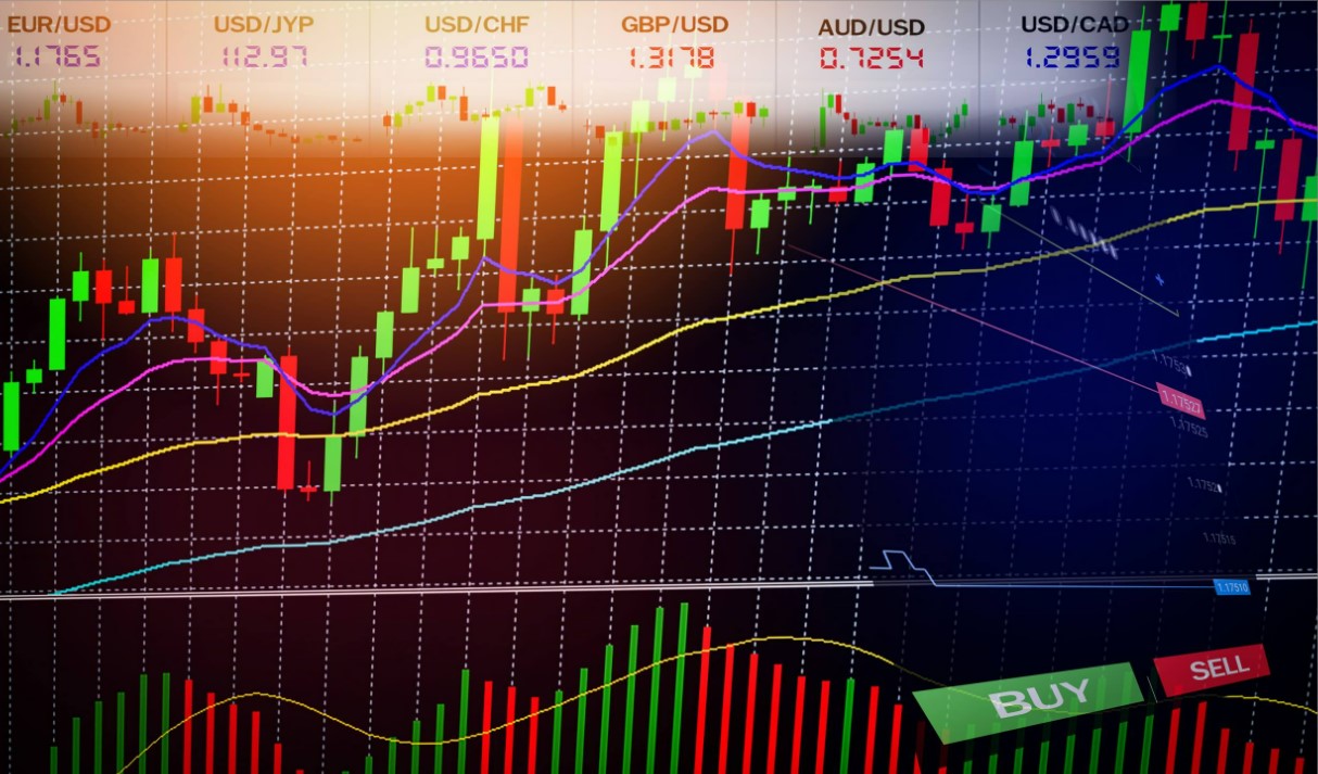
What are Forex indicators?

Forex indicators are useful in helping you answer these dilemmas. What to do if a currency is making historical maximums and minimums, so there is not enough or no support and resistance to guide you in and out decisions? How do you know if you’re not shopping at the top, or selling right at the bottom, right before the trend ends? Ideally, in any case, you’d wait for a retraction of some kind, but in the meantime, you risk losing the trend!

If you’re in a winning transaction and you’re approaching your planned exit, how do you know if you should take a planned exit, or leave at least some of the position in the hope of letting the winnings run with a trailing stop?

The consensus is about 5 technical indicators that in the balance indicated between sufficient information to make appropriate decisions and not too much for you do not suffer from an information overload, paralysis by analysis. Practically, a precise combination of forex indicators can mean anything from three to seven indicators; ultimately it is your decision. You don’t have to get attached to the same tools all the time; just limit the number you’re seeing at a certain point. Those negotiating over longer periods of time have more time and can afford to see more indicators. They should also be more informed about the key long-term indicators of:

The savings of the currencies they are trading.

The macroeconomic engines of the global economy push the appetite for risk and influence all markets all the time.

This is very critical. As a minimum, it involves following a few fundamental analyses to read and at least an indicator that gives you a big perspective like the S&P 500 index (and what is driving it in the period of time you chose).

Continue reading for more information or start risk-free trading and combine the best fórex indicators in a successful way. Use software to create Expert Advisors to test and optimize your strategy and use it as a fórex robot for automated trading.

Recommended Forex Indicators

While the number of indicators you choose may vary with your preferences, needs, and trading style, the main principle in selecting your toolkit of indicators is to have a balance that gives you a good perspective of the different types of information you need, specifically:

  • Trading trend or range
  • Momentum
  • Support/Resistance
  • Timing or cycles

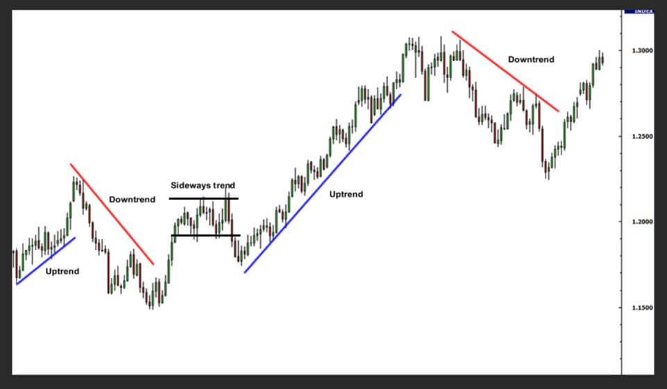
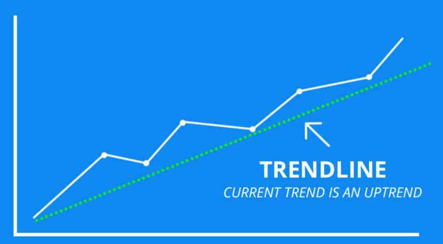
Trend or Range of Indicators

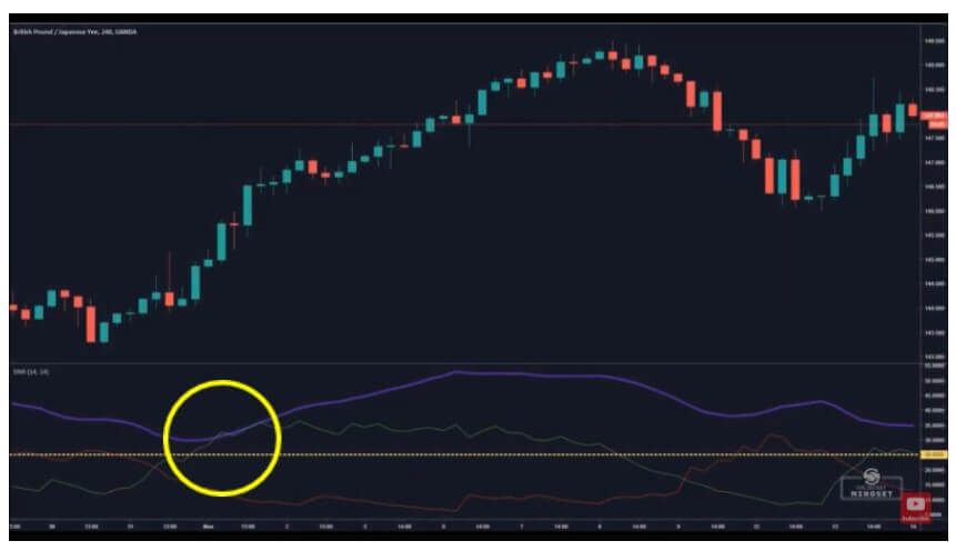
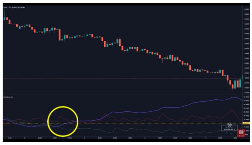
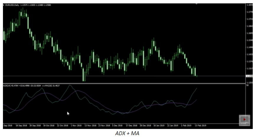
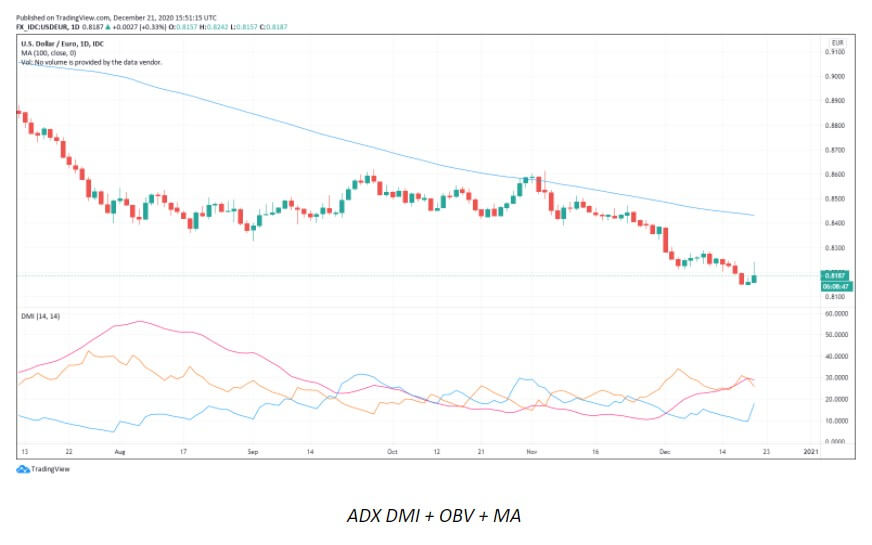
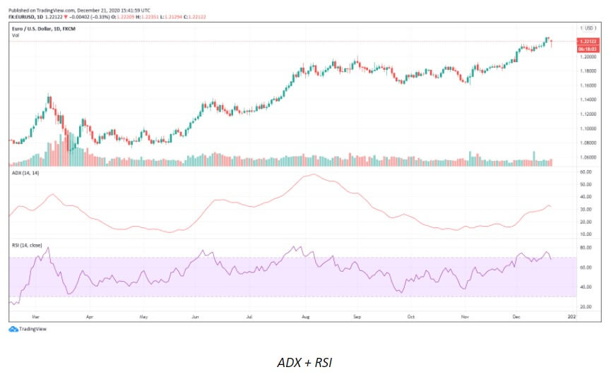
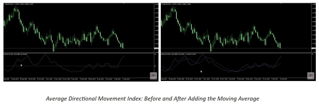
Indicators that follow trends, as the name suggests, are designed to take advantage of market trends. Examples of these include moving averages (Mms), the average directional index (ADX), and on-balance volume (OBV).

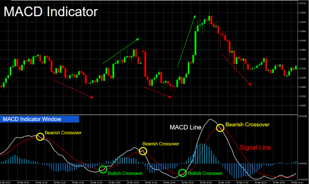
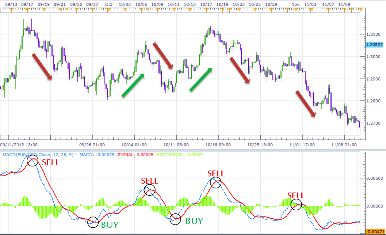
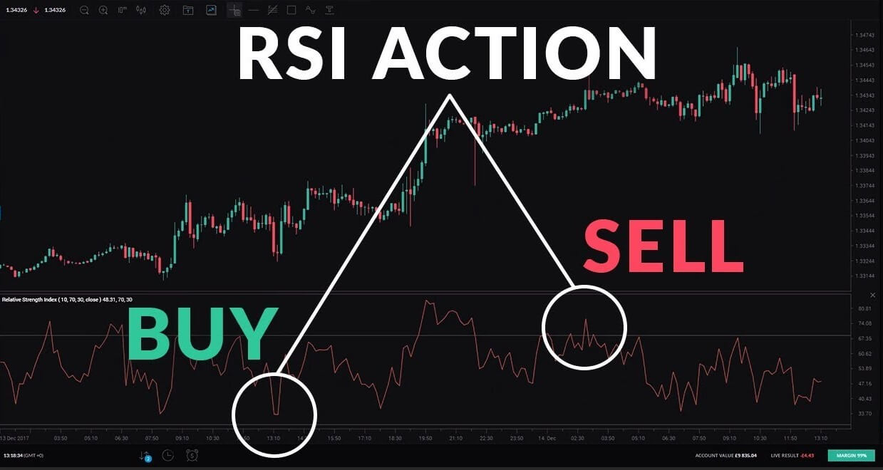
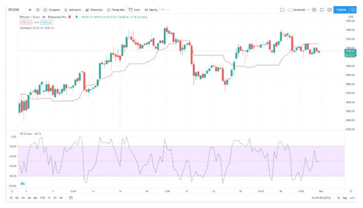
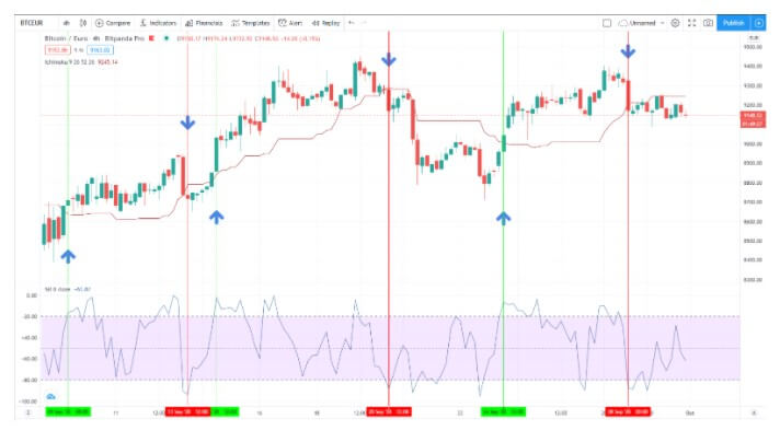
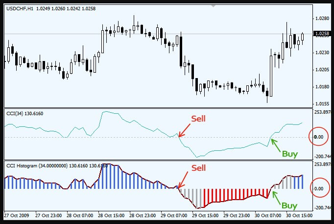
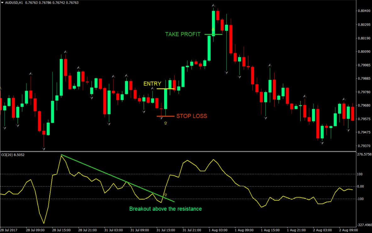
Range-based indicators are mostly designed to show oversold and oversold conditions in a price range that includes Bollinger Bands, the Commodity Channel Index (CCI), the Relative Strength Index (RSI), and the stochastics indicator. Some indicators, such as the moving average convergence divergence (MACD), can be used to generate either a trend-following signal or a range-based signal depending on the time periods used in the calculations.

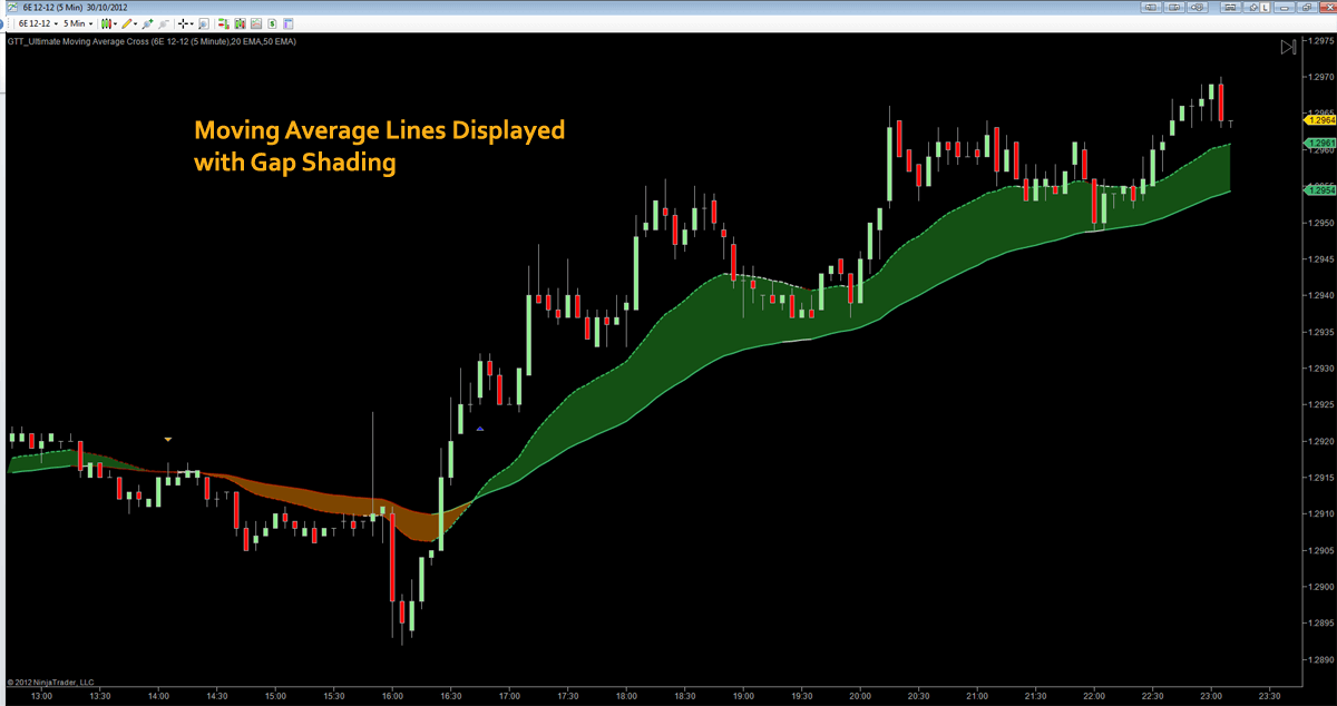
Probably the best fórex indicator in the world is the Double Bollinger Bands -The Bollinger Bands with a brilliant extension. Dbbs are really a hybrid trend and an indicator of momentum. In markets where there is a certain regression to the average, the DBB provides points of support and resistance(s/r). When there is a trend, they show the momentum of the trend and the power to stay probably.

The euro/yen with 50-day and 200-day moving averages. Image by Sabrina Jiang © Investopedia 2020

Indicators of Momentum

The basic problem traders and investors have is that they are paid to be correct about what will happen later, but the vast majority of the best-known indicators we have covered so far are lagging indicators rather than leading indicators. They inform us of the past, and with that information, what we can do in the best way is form a hypothesis about the future.

What does a trader do? uses momentum indicators. They are leading indicators because:

They can tell if a trend is strengthening or weakening.

They can tell whether an asset is overbought or over-exploited relative to past activity over a given period, and also indicate whether the trend is likely to reverse.

Knowing this can help you predict changes and have better returns.

Momentum indicators give you additional clues to put the odds of being right in your favor. There are many indicators of momentum, but now we will introduce only some of the most effective and easy to use:

Double Bollinger Bands

Three types of basic oscillators: Moving Average Convergence/Divergence (MACD), Relative Strength Index (RSI), and the Stochastic Oscillator. As with any other indicator, you can use these without knowing how well they work, although if you do, you will be able to use them more effectively and know how to adapt them to your specific situations.

You should consider using the Double Bollinger Bands and one or two oscillators you choose, especially the moving average convergence/divergence (MACD). A few lines of moving averages as we saw before (in periods of 10, 20, 50, 100 and 200) not only serve as indicators of momentum, they also provide points of support and resistance.

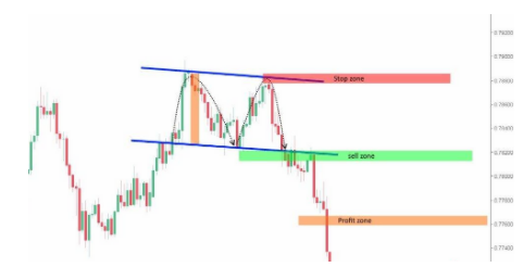
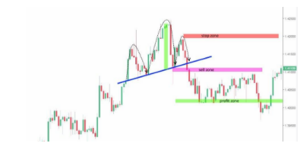
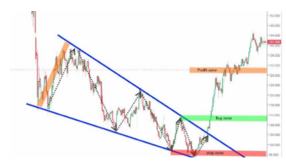
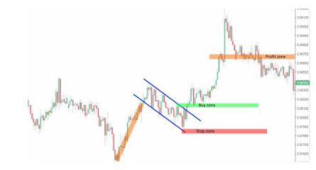
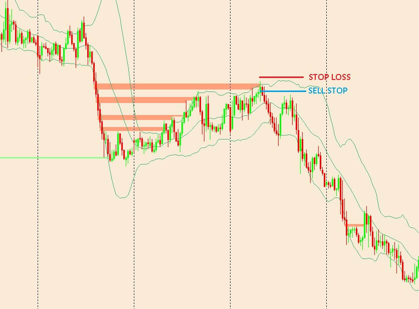
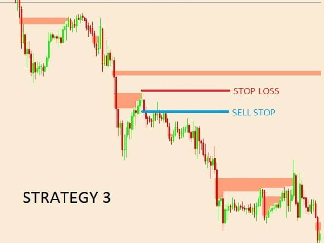
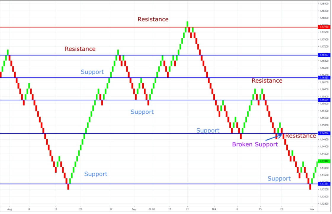
Points of Support/Resistance

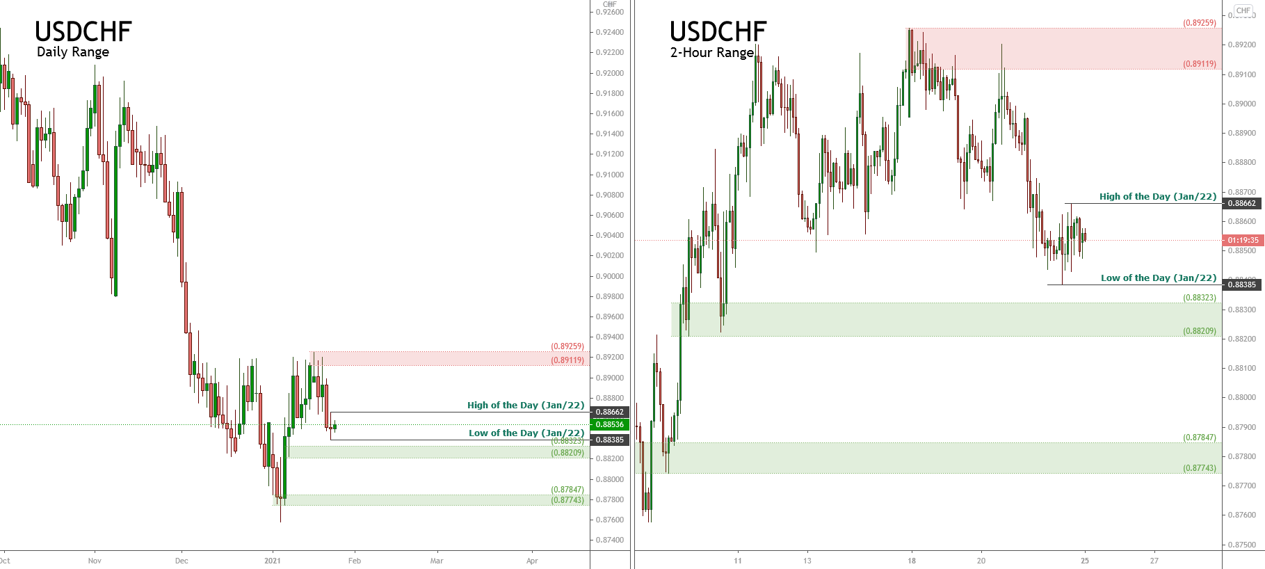
To add to the obvious price levels highlighted in your chart ( and in periods 4 or 5 times shorter and longer) you should always see:

  • The s/r points generated from the trend or range indicators.
  • The s/r points formed by the western style graphs, both their trend lines and the target points involved in new trends.
  • The s/r points transmitted by the pivot points.

The use of pivot points should be taken into account. A pivot point is no more than a technical analysis indicator, normally used to determine the market’s major trend over different time periods. The pivot point for it is simply the average of the maximum, minimum, and closing prices of the previous trading day. On the following day, the negotiation at a higher point of the pivot point indicates a bullish feeling, while if below the pivot point indicates a bearish trend.

The pivot point is the base of the indicator, but it also includes other support and strength levels that are projected based on pivot point calculations. All these levels help traders to try to guess where the price might have resistance or support. Similarly, if the price fluctuates around these tells the trader that the price goes in a certain direction.

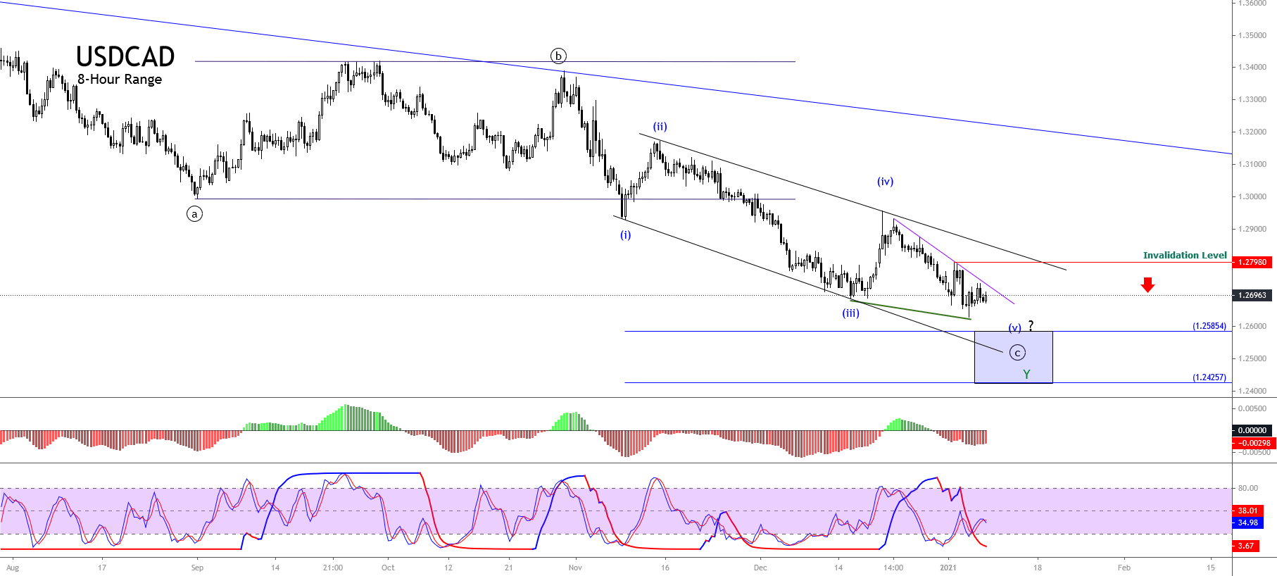
Synchronization or Cycle Indicators

Gann, Fibonacci, Dinapoli, Elliott Wave, and other similar studies are synchronization or cycle indicators. For example, the typical toolkit could include, in addition to any obvious s/r points:

A set of moving averages of periods of 10, 20, 50, 100, and 200: Again, these serve as s/r points as well as momentum indicators if they show a cross or a stratification.

Trend lines and channel lines show the trend and provide points of s/r.

Double Bollinger Bands and MACD show the changes in momentum.

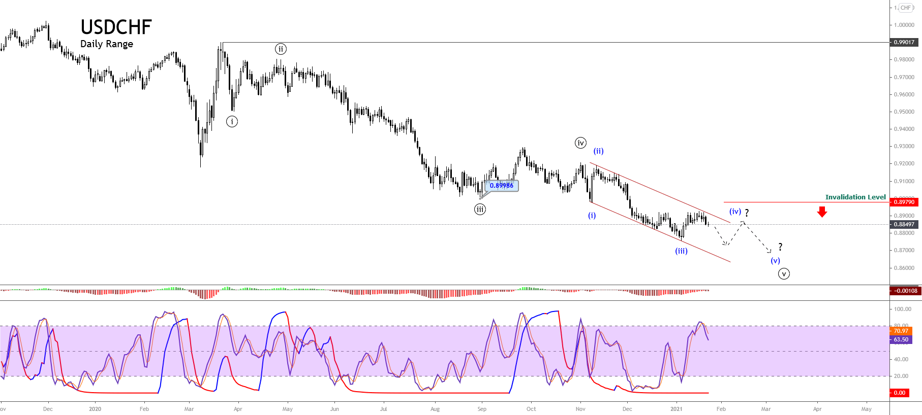
Fibonacci Setbacks One of the most recent trends in every period of time possible are the points s/r. If you need to re-draw these for every period of time you examine, do so, as the primary trend can vary dramatically over different periods of time.

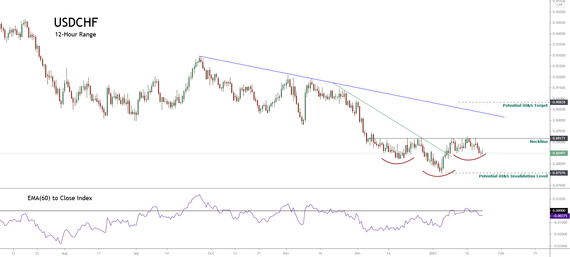
If you can locate any pattern on a western graph, note the levels involved of s/r (maxima, minima, necklines, shoulders, etc.). Japanese candle patterns provide short-term signs of continuing trend or a reversal.

Euro/yen cross with 50-day and 200-day moving averages and MACD indicator. Image by Sabrina Jiang © Investopedia 2020

How to Enter MT5 and MT4 Indicators Into Charts

Then you would have to apply this group of fórex indicators to the time period you are negotiating, as well as those 4 or 5 times longer or shorter. For example, if you are trading daily graphs, you should also see the weekly and two or four hours (depending on what defines your trading day whether it is 24 hours or 8 to 10 hours).

A good graphics program that includes the Metatrader 5 will allow you to store any group of indicators you want since a model on the chart can be applied to any chart of any asset your broker offers.

The purpose of this first visualization in a longer period of time (weekly, in our examples) is to find points of support and longer-term resistance that you should see in the graphs you are negotiating, hoping to find a currency pair that looks like it can reach the s/r área and provide an entry point with a lower risk. That is the first step in locating low-risk, high-yield transactions.

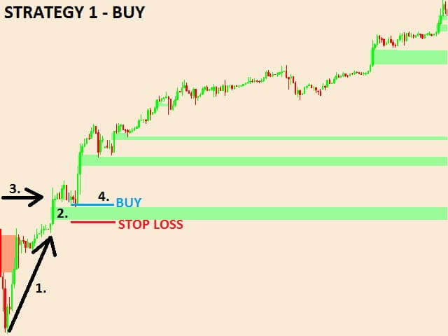
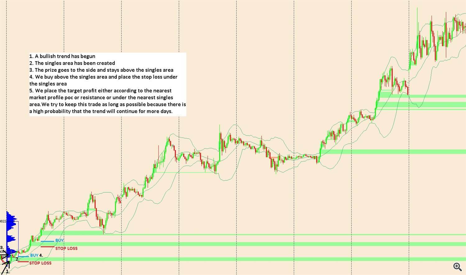
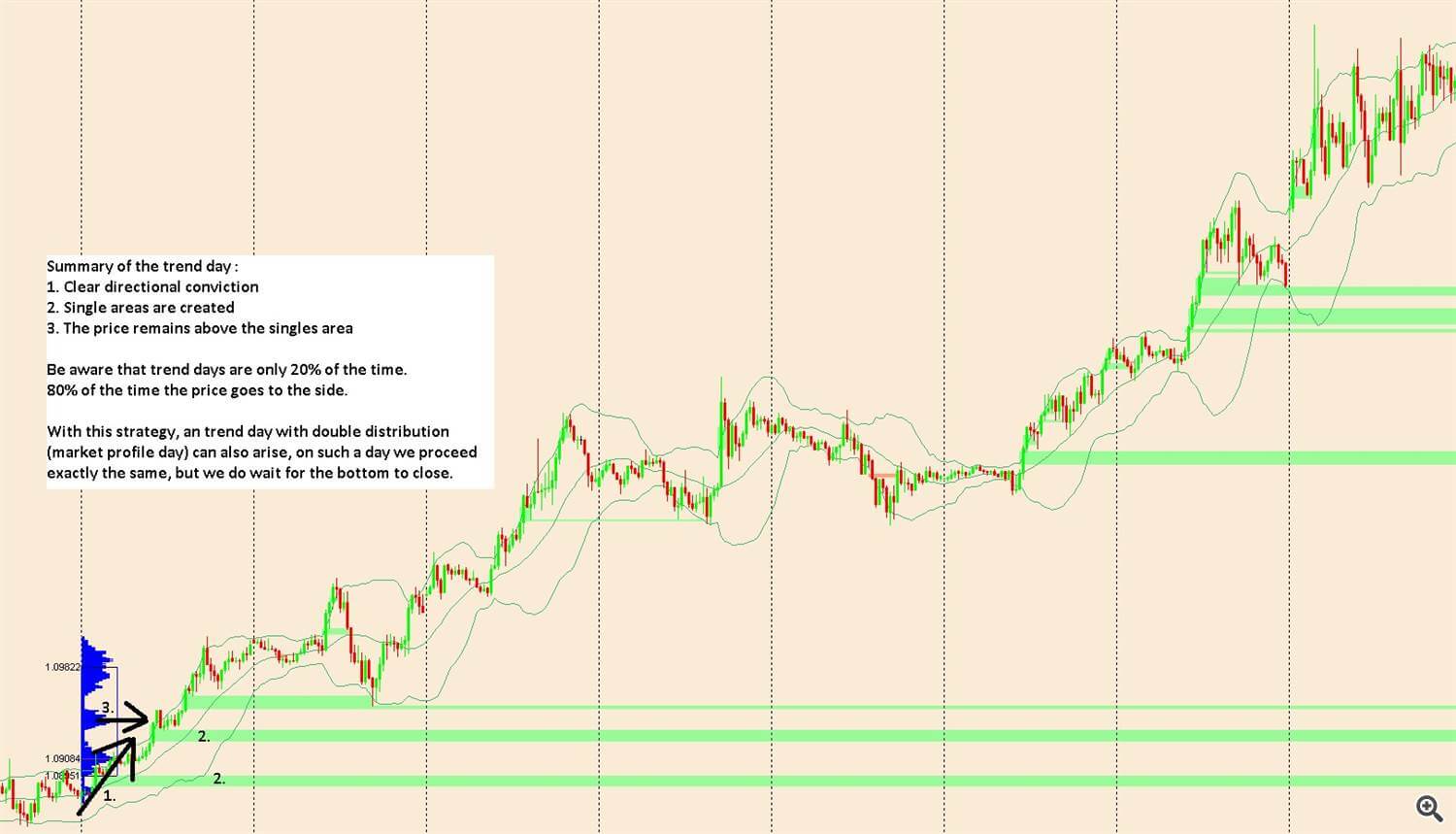
The second visualization would be to examine the possible inputs and outputs in the shortest time periods you are negotiating, to see if you can find situations where your entry point is two or three times further away from the exit point than is your stop loss. The point of taking the winnings is usually easy to see. It is where you can reach the correct stop-loss point that usually determines whether you take the transaction.

The third visualization would be to check in the shortest time period (from two to four hours of the time period in our examples) to see any short-term s/r points, just so you are informed of s/r. time points. If these points are held for much or too often, your transaction may be showing signs that it is failing and you would have to reduce the size of your position. However, these are quickly overcome, this is a sign of progress and a signal to consider adding to your position.

  1. Run an MT5 indicator on the graph.

The most appropriate way to enter an MT5 indicator is to remove it from the browser window. You can also use the indicator command to insert them from the Insert menu or the indicator button in the standard toolbar.

  1. Change the settings of an applied MT5 indicator.

The settings of using an MT5 indicator can be changed. Select the required indicators in the list of indicators and click on “Properties” or use the menu of indicators in the graph.

Use the menu to manage the indicators:

  1. Indicator Properties Properties – opens the properties of the indicators;
  2. Delete Indicator Delete Indicator – Deletes the selected indicator from the graph;
  3. Delete Indicators Window Delete Indicator Window – deletes the indicator subwindow. This command is only available in the indicator menu which is in a separate sub-window. ;
  4. List of indicators Indicator List – Opens the indicator list window.
  5. Move the cursor to a line, symbol, or to the limit of a histogram of an indicator, it is possible to define quite precisely the value of the indicator at this exact point.
  6. Customize the MT5 display appearance

You can customize the appearance of the indicators on the trading platform. You can configure the parameters of the indicators on your trading platform. You can configure the indicator parameters when you apply them to the graph or you can modify them later. The appearance of the indicator is adjusted in the tab “Properties”.

The Color, width, and style of the indicator are configured in the “Style” field.

  1. Choose data to draw an MT5 indicator.

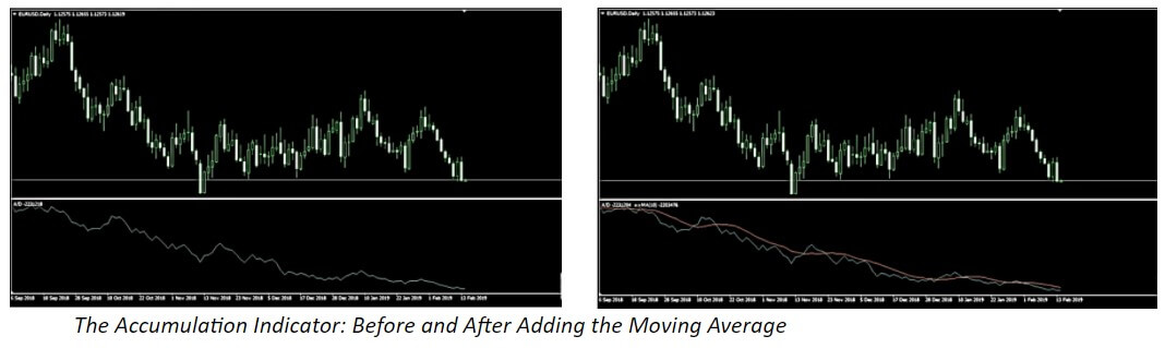
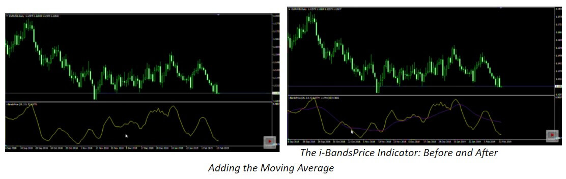
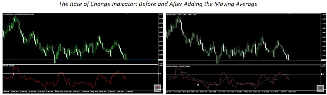
Technical indicators can be graphically based on price data and their derivatives as (Median Price, Typical Price, Weighted Close), also based on other indicators. For example, you can apply the moving average to an oscillator and have an additional AO signal line. First of all, it is mandatory to draw the indicator AO, and once drawn apply the moving mean to it. In the MM configuration select the option, “Previous Indicator’s Data” in the “Apply to” field. If you choose “First Indicator’s Data”, MM will be applied to the first indicator, it can be another indicator.

There are nice variants for the construction of an indicator:

  • Close – Based on closing prices.
  • Open – Based on opening prices.
  • High – based on maxima.
  • Low – Based on minimums.
  • Median Price (HL/2) – Based on medium price: (High + Low)/2.
  • Typical Price (HLC/3) – Based on typical price: (High + Low + Close)/3.
  • Weighted Close (HLCC/4) – Based on average heavy closing price: (High + Low + 2*Close)/4.
  • First indicator’s data – Based on values that were first applied to the indicator. The option to use data from the first indicator shall only be available for indicators in a secondary window because in the main window the main indicator is the price.
  • Previous indicator’s data – based on previous indicator values.
  1. Configure additional MT5 indicator levels.

For certain indicators, it is possible to enable additional levels. Open the tab “Levels” and click on “Add” and then enter the value of “level” in the table. You can also add the description of “level”.

The line color, width, and style of the levels can be configured below. To edit a “level”, click on “Edit” or double click on the appropriate field.

For the indicators applied to the price chart, the levels are drawn by adding the values of the indicator and the specified level. For indicators drawn in a secondary window, “levels” are drawn as horizontal lines through the value specified in the vertical scale.

  1. The MT5 display settings.

The display of the indicator for different time periods can be configured in the tab “Visualization”. The indicator shall only be shown for the specified time frames. This situation could be useful when the indicator is intended for use in specific time periods. The “Show in the Data Window” option allows you to manage the indicator information displayed in Data Window.

Euro/yen cross with three-day RSI overbought/oversold indicator. Image by Sabrina Jiang © Investopedia 2020

Combining the Best Forex Indicators

The forex indicators are great to guide us in manual trading. But if what we want is to automate trade and let Metatrader negotiate on its own while doing other things we cannot simply do that using indicators. Metatrader indicators do not contain trading logic. This is where Expert Advisors come in.

There are many tools that will allow you to generate unencrypted fórex robots. This is where we can help you quite a bit. Instead of spending hours coding, testing, changing, and optimizing your robots, we can offer you a tool that does it for you.

Robo-Advisor is designed to help you analyze, test, and generate strategies. It also allows you to export those strategies easily to the Expert Advisors so you can automate your trading on Metatrader.

Categories
Forex Education Forex Indicators

Forex Robots: Are they Money Making Machines?

If you have always wanted a robot to clean your house or take your dog for a walk, you would understand how attractive a Forex robot is. These services do not clean windows or take care of your pets, what they offer is definitely something much better: a relatively non-interventional way of trading in forex and other financial markets.

Many people dream of finding the perfect trading system, which guarantees profits and requires minimal effort for users. When many Forex robot programmers are available, there are some important questions to be answered.

What Is A Trading Bot?

As the name implies, a trading robot – also known as Robot Forex goes beyond simply testing trading strategies to currently apply them in real-time to make real transactions with live market data. When the robot generates a buying or selling signal, the platform automatically places the transaction. These systems have often been used by institutional traders for a long time in all markets. During the last few times, trading robots have become quite popular with private traders, particularly because they do not require any programming experience to create, execute and optimize them in an automated forex system.

Assuming the robot is well designed, tested, and its performance monitored, robot-assisted trading has some obvious advantages:

-You never miss an opportunity: the robot can work 24/7.

-There are no emotions, pure discipline: a trading robot eliminates the emotions of forex trading as long as you are disciplined enough to let the system work even when you believe that the rules do not apply under certain circumstances.

So if you do:

-You create a set of clear and unambiguous rules that can be expressed in a programming code.

-You have the time and experience to translate these rules into a program and test it, or use a programmer to do it. So automated trading is the best way to execute a precise forex strategy.

How Does A Forex Robot Work?

Trading robots use algorithms and advanced software to automate trading decisions. Services range from giving you a trading signal to placing and handling the transaction for you automatically requiring minimal or no human intervention. If you have a forex strategy that is strictly mechanical and does not require a human decision process, you can program your robot forex to make transactions 24 hours a day.

The most popular robots for retail customers are programmed on the Metatrader 5 platform. These robots are run on MetaTrader as “expert advisors” (trading robots) and are the implementation of some trading rules in a code that Metatrader or other trading platforms can understand and execute. MQL5 (Metaquotes Language) is the integrated programming language designed to develop forex robots with the Metatrader 5 platform and requires advanced programming skills. But, there are several tools available that allow you to generate unscheduled forex robots, known as “EA Generator” or “Strategy Builder” (EA generators or strategy developers).

What Is the Cost?

Many companies create and sell trading robots, but be careful who you do business with if you are in the market to buy one. It is not unusual for brokers, traders, and different unregulated websites to appear overnight and start selling a “get rich right away” robot, including a money-back guarantee so that your money will disappear within 30 days or less. Most of the robots that are made to be bought are not successful, so please do your research beforehand if you are thinking about buying one. The best thing is to be cautious because there are a lot of risks on the learning curve or mining data in the offers that are for purchase. As mentioned above, the alternative is to use an ea forex generator, designed to help you create, test, and export unlimited robots for Metatrader 5, without writing codes.

A Forex robot is much cheaper than a human manager or an account to copy the movements. Most companies sell robot forex for a one-time fee or a monthly fee as well as an annual fee. Even so, any forex robot needs constant parameter optimization and may fail after a successful start. In other cases, customers have access to an EA generator and even an expert within the company dedicated to consultation and support.

Those conditions do not apply to most of us, so the way most of us should use this option is using retail forex trading. Many forex brokers offer a variety of trading systems as part of their offerings. There’s nothing wrong with these, especially if you’re allowed to check them for a while to see how they work.

Expert Advisors (trading robots) are generally designed to work in specific environments, typically for a trend or markets that tend to regress, but not both. Before choosing a forex robot, you must understand what kind of markets and conditions the robot is designed for. A legitimate vendor will give you clear and concise information on what kind of conditions the robot works in, its performance, the amount of time it has been in operation, the benefit you can expect as well as the maximum you can lose.

As with any business proposition, if the benefits of a robot forex sound too good to be true, the odds are that it will. If the benefits look very out of place and their price is very low, well, I hope they allow you to test it first with a small amount of risk, otherwise, continue your search.

Ideally, as far as possible, review as much time as the robot has been operating and understand market conditions during that period of time. For example, at a time of growth and rising interest rates, the trading robots they buy will work well as the riskier currencies are favored. However, during the crises, these robots will suffer.

Typically, the more benefits you get, the greater the chance of losing. If a salesman offers you big profits and losses, he’s being honest. If the seller offers you high profits without a high risk of loss, you should be suspicious. There are many online trader forums dedicated to automatic trading; there are legitimate robot programmers and there are frauds, so consider yourself warned.

But, the main option is to build your own robot forex.

What is the Best Software for Robot Creation?

ROBO ADVISOR 007 is the only software to create robots online. With Robo Advisor 007 you can automate your forex strategy for Metatrader 5 in a comfortable and safe way. No need for you to know anything about advanced programming since the robot generator is smart enough to write the code for you. The source of the program is a very advanced algorithm that tests the strategy, similar to that of Metatrader, but much faster. The program is so fast that you can automatically create and test the strategies.

Robo Advisor 007 has several components:

The generator – The generator is in charge of creating and testing the systems automatically. The generator saves the most successful strategies in the collection. The moment a strategy is generated, it can be exported as a trading robot or send it to the editor for review and improvement.

The collection – when we are using the generator, the program stores successful strategies in a collection. You can search the strategies collected by a certain parameter and send it to the editor for export or review. You can also export the entire collection for further revalidation and use.

The editor- With the editor, you can create and edit strategies by modifying the indicators and parameters. When you edit a strategy, the program tests the historical data, displays the most important statistics, shows the balance sheet, and charts the curve of profits or losses. Since Robo Advisor tests are so fast you can improve your strategies while looking at the graphs. When you find a strategy you like you can export it as a forex robot.

Report- When a strategy is in the editor you can go to Report to see extensive information about test results in the historical data. The report page contains all statistical information, graphs, and the transaction log.

Exporting robots – You can export your robot forex to use in Metatrader. The exported robots use only standard MT5 indicators, which makes it very easy to use the robots in MT or upload your files to a VPS (virtual computer). You can confirm the operation of your robots with the software to test the strategies of Metatrader Strategy Tester with a demo account or data that are not known. If your tests are good, you can use your robot for real trading.

The idea or intention of Robo Advisor 007 is that software to create Forex robots with a good algorithm to test the strategies as well as an execution of the strategies in real time give you as a result a good benefit. Please be extremely careful when dealing with real money and always consider the risks.

How to Create a Robot with a Generator

With the powerful tools used by hedge funds or global investment managers and institutional traders, you can create forex robots with generators without any programming skills and without programming. You will see real results immediately and with just one click you can download the best robot for free and use it in Metatrader 5.

If you are a novice in the markets, you can generate strategies for forex, stocks, indices, raw materials, and cryptocurrencies with just a few clicks. You will see hundreds of strategies that are already tested and ready to be used. A robotic counselor (Robo-Advisor) gives you the possibility to use many strategies in a single account. This way, you can diversify risk and achieve more stable results.

Categories
Forex Education Forex Indicators

Differences Between Price Action and Forex Indicators

If a survey were conducted among Forex and Futures retailers and one of the questions was: “What method or system did they first use to negotiate?” Without any doubt, the vast majority of traders would say that they started with indicators such as moving averages, stochastic, MACD, Bollinger Bands, and the list would follow.

I’m very lucky to be able to talk and help traders with their trading objectives every day, and the list of methods and systems with indicators that I find are endless. You just have to look at any Forex forum to see how many of the new traders are scouring all the “Forex Systems” threads for the latest indicators, because people use new indicator systems whenever they can (not necessarily the most profitable).

The reason the indicators are so popular is that they feed into the new trader’s belief that the indicator can help predict where the price will go. In order to understand the indicators in the right way traders need to understand how the indicators are constructed and project their information. 98% of all indicators are built using old price information to make a late indicator. For example, a moving average is created using the old price to make a mobile line that traders can use in various ways.

The main problem with indicators is that they are always created after the event and traders are using previous information to guide them. In other words, they are using late information to make live trading calls.

A Dangerous Trading Mindset

The other major concern with indicators is that traders rarely stop at an indicator and that’s often where things begin to adjust to the trader mentality. A novice trader will normally have some winners with their first indicator. It doesn’t matter how many losses the trader has suffered or even if they terminate their account. What the trader tends to remember is that the first indicator helped him to make a winning transaction and above all the trader will remember that this first indicator helped to predict correctly the direction of the price. All the losses and bad thoughts have been completely relegated to one side because the trader has already moved on to what comes next and has already solved EXACTLY how it will do everything again and much more.

The trader often thinks: “If an indicator helped me to perform a winning transaction, then two indicators will surely help me to predict even better the direction of the price” and then when two do not help, three have to be even better, etc., but the problem is that, Like so many things in negotiation, this just doesn’t work out this way. Human beings in everyday life are programmed to think that anything worthwhile can’t be simple and new traders often spend a lot of time trying to make trading complicated by adding fantasy indicators for their trading thinking that the more indicators they use, the better they can predict the direction of the price, but this is the exact opposite of what traders have to do.

This mindset is a trap in which it is very easy to fall because the trader may find himself in the usual situation of adding more and more indicators like him begins to have more and more losses, with the erroneous mentality that indicators will help you predict the direction of the price. What ends up happening is that the trader, from the beginning of his trading trip, uses so many indicators in his charts that he ends up in a tremendous mess and in a state of paralysis of analysis. The trader finally ends up with many indicators in his charts, and they all tend to contradict each other and the trader can no longer operate, as he is very confused about what to do. So what does the trader have to do?

Forex Indicators

The simplest and least complicated method of negotiation in the world is the action of price. All that is needed to negotiate according to the share price is a chart of the stock of the blank price and its method of negotiation. The main difference between the indicators and the price share is that with the indicators you are using old and late price share information to try to predict the future, but with the stock price continually reading the live price as it is being printed on the chart.

There are no indicators or external influences at all that are used to trade according to the price share. Basically trading according to the share price is the ability to read the price and make trades on any chart, on any market, in any time frame, and without the use of any indicator at all. Below are two charts, face-to-face, with the price share chart on the left side with just the raw price share and the graph full of indicators on the right.

Training and commitment are required to succeed by operating on the basis of price action as with any other method of trading or worthwhile systems, but the reason why trading with the share price is so successful, and why many professional traders use it, is because it simplifies the negotiation process and the mentality required to be profitable.

Categories
Forex Education Forex Fundamental Analysis Forex Technical Analysis

Fundamental Analysis Vs. Technical Analysis

If you are trying with any kind of financial market for a significant period of time, you will start testing and forming some kind of system. Then, inevitably, you will begin to focus on technical or fundamental analysis, or maybe a little of both. The perfect understanding of the difference between the two types of analysis is the most important issue you should focus on when trying to make a decision about what kind of trader you want to be.

First, a bit of a disclaimer…

No matter what type of analysis you decide to use, it can be cost-effective. However, none of these types of analysis is 100% guaranteed. The fact that you become a good analyst from a technical or fundamental point of view does not mean you will inevitably earn money. As traders, what we’re looking for is the most likely scenario, not working with certainty. The long-term look is what you should focus on, which really means that you make transactions focused on what is most likely to happen, knowing that will not always work.

Technical Analysis

Most retail traders focus on technical analysis as it can be defined with some ease. What I mean by this is that it looks for things like support, endurance, trending lines, moving average crosses, and the like. For example, a trader who is using technical analysis to trade in the markets will observe the full share price.

With technical analysis, you can get a configuration like the following:

The EUR/USD pair has been removed from the upward movement. By using your Fibonacci recoil tool, you acknowledge that we have withdrawn 50% of the maxima, which is an area in which most traders related to Fibonacci would be interested in going long. Beyond that, we have the exponential moving average of 200 days just below the candle on the daily graph, which of course shows support. Finally, the candle formed a hammer, which is also bullish.

A trading system based on a technical analysis tells the trader to prolong.

The trader based on technical analysis is paying attention to what the price does, not necessarily to what it should do. Just follow what the market tells you in terms of price, and this makes trading in financial markets a little easier. This is why you don’t have to think about many other variables other than what the price is making and whether or not it comes close to your technical configuration concept. If you choose any other factors to participate in trade, such as fundamental analysis, something we’ll get to in a moment, things can get a little more complicated.

Fundamental Analysis

The fundamental analysis focuses on economic factors and what a market “should do”. What I want to express with that is that you will take the figures and the economic announcements and try to find out where the price is going. On an equal footing, if interest rates rise in one country over another, then that currency should rebound over the other. For example, interest rates are expected to continue to rise in the United States at the same time as the ECB remains quiet for the foreseeable future. If that is the case, the EUR / USD pair should eventually fall based on interest rate spreads. There is a multitude of announcements that could be looking at, perhaps, GDP figures, employment, and, of course, the prospects for interest rates.

Ultimately, Forex tends to move in the direction of expected interest rate movements. However, there are other problems that may arise, such as geopolitical situations. For example, Brexit has wreaked havoc on the price of sterling for some time. This is because there are many doubts and not necessarily due to the prospect of the interest rate. In a sense, however, even that route will lead to interest rates, at least in the long term. The idea, of course, is that there is a lot of uncertainty about the British economy when they leave the European Union, and we do not know what they will do with EU-related trading.

The EU is, of course, the UK’s largest trading partner, so this could obviously have a significant negative effect on the UK economy. People are essentially fleeing the British pound because of fear, or the fact that they believe that the Bank of the UK will have to keep interest rates extraordinarily low as the economy slows down. In the end, even the most opaque reasons eventually lead to interest rates, although it may not necessarily be immediately apparent.

Fundamental Vs. Technical

The most typical way traders get involved in the market is a combination of both types. For example, by using Brexit as a backdrop, we know that the British pound has fought for some time. A technical trader will understand the basics of that situation and recognize that selling the British pound makes more sense in general.

They understand the fundamentals of the negative for the British pound, although they don’t get too involved with all the nuances of economic advertisements. They just know the feeling is negative. With that information, they then begin to look for patterns of the sale in chandeliers, failures in resistance, or some other type of scenario in which we break down the support as examples.

With the use of both types of analysis, although most traders using a mixture probably use technical analysis of about 80%, the reality is that it gives you a bias in which to trade with the market. After all, fundamental long-term biases determine exactly what determines the trend, while the technical analyst simply looks for signals to get involved.

There is no right way to operate in the currency market, although it must be borne in mind that technical analysis is much simpler than fundamental because, at the end of the day, fundamental analysis suggests what “should happen,” ignoring what appears on the chart. So, I think most people use a little of both to make their trading decisions.

Categories
Chart Patterns Forex Forex Education

How Important are Chart Patterns in Forex?

Chartist analysis in forex consists of identifying figures on the price chart, these are usually repeated historically so you can practice in their identification, also they are usually formed in different financial instruments and periods of time, and through them, it is possible to predict with some reliability where the next price movement will follow. It is perhaps the most classic form of analysis in Forex and surely one of the most effective, so your knowledge is always very advisable.

Chartist figures are formed because the market makes oscillations and leaves a “trail” which helps to detect these figures. There are chartist figures that allow confirming the changes of trend, to identify opportunities to enter the market as well as to set objectives in the prices. Chartist figures are more effective in operating in high temporality, although in short periods they usually appear more frequently, also the failures are very recurrent.

Price Pattern in Forex Technical Analysis

The analysis of price movements originated exactly when the price chart appeared. The first graphs were drawn on millimeter paper, and it was then that the first analysts noticed that there were some areas on the graph where the price made similar oscillations at different intervals of time. Traders called them price patterns because the first patterns looked similar to geometric objects, such as a triangle, a square, or a diamond. With the appearance of computer screens and the analysis of longer time periods, new patterns began to appear. Traders use chart patterns to identify trading signals, or signs of future price movements, to enter to trade at the right place.

Chart Patterns You Should Know

“Triangle”

There are several different types of triangles, however, all are based on the same principle. In classical technical analysis, the triangle is classified as a continuation pattern of the trend. This means that the trend that has been on the market before the formation of the triangle may continue after its formation is completed.

Technically, a triangle is a lateral channel of narrowing that usually emerges at the end of the trend. Basically, the triangle is resolved when the range of price fluctuation decreases to the limit, an impulse arises and the price penetrates one of the limits of the figure, moves away from the rupture. I suggest analyzing the break scenarios both upward and downward in the given example. Although the triangle is the continuation figure, it is no more than a probability, and therefore it is worth considering an alternative scenario.

When trading with a triangle pattern, it makes some sense to open a buying position when the price, having passed the resistance line of the pattern, has reached and exceeded the local highs, marked before the break of the resistance line (buy zone). Expected earnings must be set when the price passes a distance less than or equal to the amplitude of the first wave of the figure (profit zone buy). In this case, a stop loss can be placed at the local minimum level that preceded the breakpoint of the resistance line (stop zone buy).

A sales position can be opened when the price has penetrated the figure support line, reached, or pressed through the local minimum level that preceded the breakpoint of the support line (sell zone). Expected earnings should be set when the price has passed a distance less than or equal to the amplitude of the first wave of the figure (profit zone sell). A stop-loss, in this case, must be placed at the level of the local maximum that preceded the breakpoint of the support line (stop zone sell).

“Double Top”

This pattern is classified as the simplest, so the probability of its effective implementation is somewhat lower than that of other patterns. In classical technical analysis, the double vertex is classified as a trend change pattern. This means that the trend that has been on the market before the formation of the pattern may change after its formation is completed.

The figure represents two consecutive maxima, whose peaks are at approximately the same level. The pattern can be straight and inclined, in the latter case you should carefully examine the bases of the upper parts which should be parallel to the maxima.

In classical analysis, a double vertex works only if the trend is reversed and the price decreases, if the price reaches the third maximum, the formation becomes the triple vertex pattern.

A sales position can be opened when the price has penetrated the figure support line, reached, or pressed through the local minimum level that preceded the breakpoint of the support line (sell zone). Expected winnings must be set when the price has passed a distance less than or equal to the height of any vertex of the figure (profit zone).

“Head & Shoulders”

The figure represents three consecutive maxima, whose maxima are at different levels: central must be above the other two, and the first and third, in turn, must be about one height. However, there are some pattern modifications when the shoulders are at different levels. In this pattern, we must ensure that the central maximum is higher than both shoulders. Another key feature for identifying the pattern is a clear trend line, which precedes the pattern’s appearance.

The pattern can be straight and inclined, in the latter case, you should be careful to check if the bases of the upper parts are parallel to their maxima. The minimums between these maxima are connected by a trend line called the neck.

A selling position can be opened when the price has penetrated the neckline of the figure, reached, or pressed through the local minimum level that preceded the breakpoint of the neckline (sell zone). Expected earnings should be set when the price has passed a distance less than or equal to the height of the central vertex (head) of the figure (profit zone). A stop-loss, in this case, must be placed at the level of the local maximum that preceded the point of break of the neckline or at the level of the vertex of the second shoulder (stop zone).

“Wedge”

In classical technical analysis, the wedge is classified as a continuation pattern of the trend.

Technically, the wedge, like the triangle is a lateral channel constriction, but another difference between the wedge and the triangle is its size. The wedge is usually much larger than the triangle and sometimes takes months and sometimes years to form. Therefore, in classical wedge analysis, it is usually implemented in the opposite direction to the formation of the pattern itself, in other words, the trend changes. A purchase position can be opened when the price has penetrated the resistance line of the figure, reached, or pressed through the local maximum level that preceded the breakpoint of the resistance line (buy zone).

“Flag”

This price pattern is classified as the simplest, therefore its efficiency depends on numerous factors. In classical technical analysis, the flag is classified as a continuation pattern of the trend.

The pattern indicates a corrective retreat, following the strong directed movement that often looks like a channel, tilted against the prevailing trend. In classic technical analysis, the flag pattern works only if the trend continues its direction. A purchase position can be opened when the price has penetrated the resistance line of the figure, reached, or pressed through the local maximum level that preceded the breakpoint of the resistance line (buy zone). The angle formed between the predominant trend and the flag channel should not be greater than 90 degrees. The flagship channel itself should not revert in price more than half of the previous trend.

Categories
Forex Technical Analysis

The Link Between Interest Rates and Forex Trading

Although there are many elements that influence the appreciation of a currency, one of the most important factors to consider is a country’s interest rates. In fact, assuming everything else stays the same, forex traders need to focus on interest rates more than anything else. In this article, we will explore what interest rates mean and how they impact the value of a country’s currency.

What to Look For

If we have a stable economic and geopolitical situation around the world, the foreign exchange market will favor a currency that is seeing an increase in the interest rate and more increases in the future. Even so, the interest rate is not the only factor affecting a currency. Other factors, such as war, geopolitical concerns, inflation, correlation with other markets, and many other things can be relevant.

When the interest rate is higher, it tends to attract a lot of foreign capital. The explanation is because money always wants to go to the place where it is “best treated.” For example, if you manage a large investment fund, you will look for greater returns for your clients. If country A pays 5% in bonus while other country B pays 2% in the same type of bonus, country A is the favorite with respect to where to invest. With the intention of buying that bond or investing in that financial asset, you need to buy in that country’s currency. (Some countries will take bonds or another currency like the American dollar, but we won’t talk about that in this article)

A Case Study

Let’s say you manage a large fund outside the UK. You have the instruction to put the money somewhere, and the most natural place you can put it is to go where we can find the largest growth. Generally speaking, central banks will realize an increase in interest rates if the economy is performing well. It’s a matter of time, but sometimes you might decide to enter a stock market, where you would have to shop in the local currency. The reason for having higher interest rates is that they are worried that the economy will overheat but at the same time there is a proclivity of financial assets to go up in that situation. Looking elsewhere in the world, you make the decision that Germany is the country where you plan to invest as many of the German multinationals are enjoying a big increase in exports. To buy stocks in the DAX you will need to buy euros.

Interest rates on Forex. In this scenario, you will need to purchase the EUR/GBP pair. If the European Union has a strong economy it will not only seek to buy shares in that market, it will also seek to buy bonds. Again, you will have to buy them in Euros. In that scenario, it is the natural flow of money to go after the highest yield. You could be in a situation where the UK has an interest rate of 1%. while Europe has an interest rate of 2.25%, for example.

But, a while later the situation in the world changes dramatically. We’re on the verge of a global recession, and you need to do something with your money. This was the situation during the financial crisis, which began in a way that most people would see as counter-intuitive. When the bubble burst, the initial movement was that the other currencies won. However, the US dollar began to win rapidly over time after the initial shock. The reason for this is that there are few places in the world that can absorb the kind of transactions that the treasure market can in the United States.

In that scenario, we had an exodus of capital from countries around the world in the treasure market, which brought up the value of the dollar. This was counter-intuitive because interest rates were being lowered quickly, but frankly, people were looking to keep their money in a safe place. It didn’t matter that possibly the money was going from New Zealand which had a 6% rate at the time to the United States which was lowering its interest rates. At the time, it wasn’t about getting some kind of return, it was about protecting the briefcases.

When things began to calm down, money managers began to buy other currencies such as the New Zealand dollar, the Australian dollar, and even emerging-market currencies such as the Turkish lira or the South African rand. Emerging market currencies were particularly attractive because some of the interest rates in those countries, despite being historically low for those areas, were still five or six times higher than those in developed countries. Once people thought it was safe to invest again, this was the first place that a lot of money went.

Interest rates are the main factor affecting the value of currencies. But much of it has to do with what traders think on a political and economic level. The general rule is that when people feel comfortable, they buy assets with a higher return, including currencies that have a higher return. When they are not comfortable, currencies with a lower interest rate such as the Japanese yen or the Swiss franc have historically performed better, alongside the dollar. Be sure to first understand the market risk, so you can follow interest rates in both directions.

Categories
Forex Indicators Forex Signals

How Do Forex Robots Actually Work?

What’s this about trading robots? Do they work? Are robots bad? Many questions are those that usually roll in the head when you hear the word “robot”. In the article I write today, I will try to expose what is this about Forex robots and everything that affects them, as well as some myths and realities. Let’s discuss…

How Do Forex Robots Work?

Before you start talking about how they work, do you know what a Forex robot is? A robot is nothing more or less than a few lines of code with clear rules of entry and exit to the market that are executed automatically. All this applied to the Forex market would simply be an automated strategy that buys and sells in the currency market. They are also called EA (Expert Advisor).

When I told you what it is, I explained how they work. But hey, can you make money with robots, or are they a scam? The performance or results of these automated strategies will depend on these previous strategies and their supervision, so if they are not profitable from the start, no matter how much they are automated they will not be. But if the strategy that is programmed is good, the result may be better.

Key Advantages

One of its great advantages is to be able to quantify the performance of the strategy that has been programmed. With a programmed strategy, you can perform a backtest and evaluate how that strategy has behaved before. If you have done discretionary or manual trading you will surely have tried different systems without having statistics or results of whether they have worked or not in the past. Come on, you’ve been playing with your money without knowing if what you were doing was profitable or not. Think for a moment, if you don’t quantify, how are you gonna know you’re making progress?

You need objectivity in making decisions when you make decisions. Otherwise, your results will be affected by your interpretation and here you have a good extra factor to make a mistake. How are you going to correct it? Systems or robots allow an objective market approach.

As you know, the accuracy of execution when trading is key. When you trade manually, you analyze wait for the moment and execute the order. When the process is automated, the order is released in less than a second without hesitation or analysis, or thoughts.

Another advantage more than considerable is that to execute the operations you do not have to leave your eyes looking at graphics for hours. You can do it uninterruptedly over time, even if you’re not in front of the screen. If you’re on a trip for a week or you have to do anything to stop you from being there, your operation may be running simultaneously. Be very clear, however, that they must be monitored and that the creation of automated systems requires time and work.

Closely related to the previous one, with robots you can trade in different assets simultaneously. Manually we are limited in this aspect. So you can diversify without problems.

And yes, the psychological approach. As you know, in this trading, psychology is important and it affects a lot. When the strategies are done in an automated way you reduce the psychological component quite a lot since your buying and selling decisions are not biased by your psychology. I say it’s reduced because you have to know that when robots have a negative or positive performance it will still affect you. But the main difference is that the results affect your psychology and not your decisions as it usually happens when operating in a discretionary manner.

Key Disadvantages

Although the advantages are clear, there are disadvantages. Most of the robots that are marketed on the Internet are based on martingales, grid. that reflect very good results and almost perfect performance curves but one day they break. Why? Because of the aggressive risk management rules they use. If you don’t think so, try downloading some for free and look at their results over a long period of time.

Why does this happen? Creating a good, cost-effective automated system is not easy. Programming a martingale or grid is not easy. So before you buy any robot, make sure they don’t use these techniques and that there’s no one hiding under a brand that can disappear tomorrow.

As for disadvantages when trading with robots something important is any technical failure that may arise and cause it not to run well. It is advisable to use VPS (a private virtual server) if this failure can affect your operation. I explain what a VPS is in this video:

Although it’s something that’s never happened to me yet, it is something that can happen. But it is as if the Internet connection fails. Also, failures or errors when programming the strategy (before executing it in real test it in demo or with very little capital).

Disadvantages are anything you might think might affect something that’s running remotely. Many such tasks already exist in different areas today.

What are the Limits of Robots?

We could say that robots do not work (always). I mean, there are systems that work perfectly for many years, but the vast majority die first. So? The solution is to have clear rules to disable these robots. If you don’t have an established plan, what are you going to do if your robot keeps losing money? Learn how to manage them.

Another limitation when using automated strategies is the over-optimization of parameters. What is that? Adjust your variables so that past results are very good. What’s the problem here? That we don’t know what’s going to happen on the market tomorrow, so it’s very likely that that robot won’t work well with new data when you apply it. Solution? Create a strategy and then validate it. Not the other way around. Remember that it is not about looking for perfect results, it is about getting real results.

Robots do not do magic, they have an added value with respect to manual trading that is quite clear, but it is something that you connect and you sit down to see how you drop the money. To take advantage of them is to be intelligent, but to ignore limitations is to be naive.

How to Choose A Forex Robot?

We talked about an important point earlier. Avoid using robots that apply aggressive risk management. If you’re going to choose a robot, spend some time contacting the person who created it, their background.

Don’t buy on pages you don’t know, in fact, I would tell you not to buy a robot as such but have expert supervision. As we’ve already seen, robots need to be managed. Be sure that you are able to learn to do all this by yourself in a simple way. You also have other alternatives in portals like Darwinex.

How to Program a Forex Robot

Today there are many tools to do so. From my experience, don’t get complicated and use those that allow you to start with a short learning curve. Some tips to create a good robot:

Set clear market entries and exits.

These things have to be made as easy as possible. You don’t need a thousand lines to make it work. Use the rule that your logic fits in a post it.

  • Always use stop-loss unless you don’t use any leverage.
  • Do it on assets that have liquidity so as not to pay a surcharge.
  • Schedule them to run in hours where there is volume on the market.

The Best Account Types

The most suitable accounts for trading with robots are the same as for manual trading. Accounts with low spreads, direct market execution, and adjusted swaps. Forex brokers are many, but with these features no longer so many. It is important that no use standard accounts or the behavior on the outcome curve you are going to get will be very different.

The Best Forex Robots

The best robots are the ones you know and create. Those that you can build in a simple way and also do different tests of robustness to know first hand their weaknesses and strengths.

For me, there are no good robots or bad robots. There are robots that work and there are robots that don’t work. I try to apply those who do and discard those who stop. I use more than a hundred strategies that I monitor daily and follow up. In this way everything is dynamic and although there are always strategies that do not work over a limited period of time, which is involved is that there are others that generate more than those.

Manual Trading or Robots?

Within the world of investment and trading, there are defenders of manual trading versus robots and vice versa. To say that manual trading doesn’t work seems very bold to me. In case a person hasn’t worked, why won’t it work?

After all, a robot can be a manual trading system that runs automatically. Provided that there are clear rules and a methodology, it is clear that both can be valid. Now, a forex robot has a number of advantages over manual trading that it doesn’t have. If we have the ability and the judgment that a person can have and the means to carry it out through robots, why not use both?

Categories
Forex Indicators

The True Benefits of the ATR Indicator

Instead of using your own judgment, some statistical measures of price volatility are available. One of the most popular is the ATR indicator (Average True Range), which measures the average movement for a given exchange torque ( or action, raw material, etc.) for a given period.

What Is the ATR Indicator?

The ATR indicator moves down and up as the price of an asset becomes larger or smaller. This indicator is based on price developments, so the reading is in dollars. For example, in share trading, a reading of 0.23 of the ATR means the price ranges from $0.23 on each price bar. In the currency market, the ATR will show you pips, then 0.0025 is the same as 25 pips.

A new reading of the ATR indicator is calculated as each period passes. On a one-minute graph, a new ATR reading is calculated every minute. In a daily graph, a new ATR reading is calculated every day. All these readings are plotted as a line continues, so traders can see how the volatility has changed as time goes on.

Since the ATR is based on how much an asset moves, the reading of an asset is not comparable with other isolation assets. To better understand the indicator, here is how we calculated it.

Finding the A, or average first requires finding the true range (True Range TR).

The TR is the largest of the following:

  • The current maximum less previous closure
  • Current minimum minus previous closure
  • Current maximum minus the current minimum

Whether the number is positive or negative, it doesn’t matter. The highest absolute value is the one used in the calculation.

The values are recorded every day, and then you get an average. If the ATR is averaged over the previous 14 periods, then the formula is as follows:

ATR = [( ATR Previous x 13) [ TR Current] / 14

Continue reading about the ATR or start playing a little with a risk-free demo account and see for yourself how the ATR indicator works in real-time.

Setting the ATR Indicator

Typically, the default parameter is 14 periods, that is, 14 days on the daily graph, 14 hours on the hour graph, and so on, but as time goes on you want to experiment with the parameters. Knowing the ATR for a certain period, traders can choose to place a stop loss at a certain percentage of that range, based on the entry point. Let’s take an example, traders with confidence in the trend direction who want to prevent their stop loss from being reached would place the stop loss at 80 or 100 percent of the ATR away from the entry point near strong support. They will accept the long loss if that stop is reached because they believe that the probability of that happening is slim.

Traders with lower confidence and greater risk aversion that they want less loss (even if there are more of them because the stop is reached) can place their stop closer, perhaps 50 percent or less from the ATR indicator outside the point of entry. When you know the usual volatility for a given period of time through ATR, you have a better idea of how far you want your stop loss fixed or dynamic to prevent a random movement from reaching it.

Let’s use an example of how to use the ATR indicator to measure volatility and place a fixed or dynamic stop loss command.

Measuring Volatility

We refer to the example above. In the figure below, we show the same daily graph EURUSD showing the daily candles for the transaction’s entry date on August 11, but this time we include the ATR, which shows that for the past 14 days or candles daily, The average price range was around 210 pips. Those interested in how the ATR is calculated can view it online.

However, if we wanted to decrease the chances of reaching a stop loss in exchange for a risk of further loss if the transaction turned against us, we could have established the stop loss at a distance of 50 percent or more from the ATR, 105 pips, below the point of entry or some different percentage of the ATR.

The point here is that there are two different ways to determine how far you are going to establish your stop loss. In this example of fórex trading, we use the most recent minimums as a guide while we could have used the ATR. Much depends on factors such as your appetite for risk, market conditions, and confidence in the transaction. For example, if you caught a retraction to strong support in a strong general trend, you may be more confident that that upward trend will return and allow a wider stop loss to prevent it from being triggered by random price movements. When you have less confidence, you can keep the stops tighter.

Setting an ATR Indicator in MetaTrader 4/5

This section shows how to configure the ATR indicator in MT5. Assume that you have opened a graph.

Adds an ATR indicator and sets the parameter for this indicator:

  • Click on Insert and move your mouse over Indicators and Trend
  • Click ATR indicator
  • Configuring the common parameters

After you have completed the above step, the settings menu appears. Most indicators can be controlled by many common parameters.

There are two types of parameters:

  1. Indicator calculations: e.g. the number of periods used by the ATR indicator (you don’t need to worry about this much in the beginning)
  2. Display of an indicator: e.g. How will it look? The thickness and colour of the lines, etc.

To change the indicator settings directly on the graph a while later: Right-click on the ATR indicator (you will have to be very exact on the indicator line to see the menu below)

Choose the ATR Properties: The menu parameter appears again where you can change the indicator.

To delete the ATR indicator: Right-click on the indicator you want to delete (you will have to be very exact on the indicator line to get the menu below). Click ‘Delete Indicator’ and the indicator will disappear from your chart.

Final Words

The ATR indicator is not directional like the MACD or RSI, rather as a unique indicator of volatility that reflects the degree of interest or disinterest in a movement. Strong movements, in either direction, are usually accompanied by long ranges, or long and true ranges. This is really true at the beginning of a movement. Not-so-inspiring movements can be accompanied by relatively narrow ranks. As such, the ATR can be used to validate the enthusiasm behind a movement or a rupture. An upward reversal with an increase in ATR would show a strong buying pressure and the reinforcement of a reversal. A break in bearish support with an increase in the ATR would show strong downward pressure on sales and reinforce the break-up of the support.

Understanding how to read the ATR indicator is important, but if you want some help, Metatrader offers a very useful indicator toolkit. Play a little on a demo fórex account and see for yourself how the ATR indicator can give you a lot of money.

Categories
Forex Indicators

Everything You Need to Know About Using MACD (Moving Average Convergence Divergence)

Moving averages identify trends when filtering price fluctuations. Under this idea, Gerald Appel, an analyst and portfolio manager from New York, developed a more advanced indicator. He called it Moving Average Convergence Divergence indicator MACD, which consists of not one but three exponential moving averages. It is seen in the graphs as two lines, whose intersections between them provide trading signals. One is called a MACD line and the other is called a signal line.

This oscillator has been involved in some controversy as to its classification. Mainly because there are analysts who classify it as a trend tracking indicator and others who consider it a follower of the cycle. We can be sure of the following: we are talking about the most effective oscillator after long-term cycles, hence the fact that it can be considered a follower of short- and medium-term trends.

Creating MACD

The MACD indicator originally consists of two lines: a solid line (called a MACD line) and a “strokes” line (called a signal line or signal). The MACD line develops from two exponential moving averages. It responds to price changes quite quickly. The signal line is developed from the MACD line, smoothed with another exponential moving average that responds to price changes in a slower way.

Buying and selling signals are given when the MACD line crosses above or below the signal line. The MACD indicator is included in most technical analysis software and is also on the DIF platform. Nowadays, no analyst needs to calculate it by hand as did its creator, Gerard Appel, because computers do this work faster and with greater precision. The MACD indicator is included in most technical analysis software.

Creation of the MACD:

  1. Calculate an exponential 12-day moving average at closing prices.
  2. Calculate an exponential moving average of 26 days of closing prices.
  3. Subtract the 26-day MME from the 12-day MME and draw its difference, as a continuous line. This is the MACD line.
  4. Calculate an exponential 9-day moving average of the MACD hotline and draw the result as a dashed line. This is the signal line.

Additional MACD Applications

Many operators try to optimize MACD by using other moving averages instead of the more commonly used MME for 12-26 and 9 days. Another option is to use MME 5-37 and 7 days. Some traders try to establish MACD links with market cycles. In the case of using cycles, the first MME should be one-quarter of the duration of the dominant cycle and the second MME should be half of the cycle. The third MME is a smoothing instrument, the length of which does not need to be connected to a cycle.

MACD Trading Rules

The intersections or intersections between the MACD and the signal lines identify changes in the market trend. Trading in the direction of crossing these lines means following the flow of the market. This system generates fewer operations and signal investments than an automatic system, based on an MMS.

  • When the MACD indicator passes the signal line, it gives a buy sign. Enter long and place a stop loss below the last minimum.
  • When the MACD indicator passes below the signal line, it gives a sell signal. Enter short and place a stop loss above the last maximum.

This type of oscillator has two uses. It helps to point out divergences. It also helps to identify short- and long-term variations, not only when the short average moves far above or below the larger average, but also by crossing the two.

MACD Histogram

The MACD histogram offers a deeper understanding of the balance of power between buyers and sellers than the original MACD. It shows not only who controls the market, buyers or sellers, but also whether they are strong or weak.

MACD histogram = MACD line – Signal line

The histogram of the MACD indicator shows the difference between the signal line and the MACD line. It graphically represents that difference as a histogram, a series of vertical bars.

When the MACD fast line is above the slow signal line, the MACD histogram is positive and is represented above the zero line. When the MACD fast line is below the slow signal line, the MACD histogram is negative and is represented below the zero line. When the two lines are touched, the MACD histogram is equal to zero.

Each time the distance between MACD and the signal lines increases, the MACD histogram expands. Each time the two lines join, the MACD histogram is shortened. The slope of the MACD histogram identifies the dominant market group. A growing MACD histogram shows that buyers are starting to strengthen. A decreasing MACD histogram shows that vendors are starting to strengthen.

The slope of the MACD histogram is more important than its position above or below the center line. The best-selling signals are when the MACD histogram is above zero but its address is bearish, showing that buyers are starting to sell out. The best buy signals occur when the MACD histogram is below the zero center line and its slope is bullish, showing that vendors are starting to tire.

However, there are systems that consider buying and selling signals at points where the MACD histogram cuts the zero line. In this case, the buy signal is given when the oscillator crosses from the bottom up, while the sell signal is given when the oscillator crosses the reference line from the top down.

Categories
Forex Technical Analysis

Monte Carlo Simulation Testing in Forex Trading

As a trader, when you need to calculate the risk or consistency of your trading system you need to test your trading systems. The Monte Carlo test is a good tool for this. The Monte Carlo method is based on a simulation where all possibilities are evaluated by a random number generation and all possible scenarios are simulated.

What we want is to generate so many random numbers as possible, in order to simulate as many of our trading scenarios as possible. It is something like saying what would happen if some variables like spread, input, and output or the price itself are altered. You will see how each option evolves over time in our trading system, whether it is viable in the long and short term, and what other variables may influence its course.

In this article, I will show you how this test can help you in your trading, some practical examples, and we will also know how to use it in a practical way.

How Can Monte Carlo Simulation Be Used?

You probably don’t know what this method is used for. The Monte-Carlo simulation is about the economy, both in companies and in investment, the latter being where it is mostly seen in action. Some situations where this type of simulation is made in investment are to create, value, and analyze investment portfolios. It also serves to value complex financial products, such as financial options or risk management models.

Since the return on investment is unpredictable, this type of method is used to assess different types of scenarios. A simple example is found in trading. As you know, movements in prices cannot be predicted. They can be approximated, but it is impossible to do so accurately. This is where the Monte Carlo simulation comes into play, where you try to mimic the behavior of a trading system or a set of them to analyze how these might evolve. Once the simulation is done, a very large number of possible scenarios are extracted.

Origin of the Name

Monte Carlo cites the name of a famous casino located in the Monaco Match. It is known to be the “gambling capital” as roulette is a simple random number generator. The system was first devised in 1946 when mathematician Stanislaw Ulam thought of an efficient method to improve his solo game.

It was on that occasion that he realized that would be easier to approximate the overall result of the solo match by making multiple tests with the cards and counting the proportions of the results than to calculate one by one all the combinations possibilities. He presented this idea to another mathematician, John Von Neumann, in its most rudimentary form. He was so impressed with the system that he put his efforts into refining the formula.

The technological advances, together with the computer and the theories of Alan Turing, allowed the advance of the investigation of this particular financial simulation to be facilitated. A letter from Neumann to the lab in Los Alamos was instrumental in spreading the formula to everyone. The use of the Monte Carlo model as a research tool comes from the work carried out in the development of the atomic bomb during the Second World War at the Los Alamos National Laboratory in the United States. 

This work involved the simulation of probabilistic hydrodynamic problems concerning neutron diffusion in the fission material. This diffusion has an eminently random behavior. Today, it is a fundamental part of raytracing algorithms for the generation of 3D images. In principle, it was idealized by Neumann to evaluate multiple integrals. Today, it is used in the labour market for all kinds of statistics, and very curiously, for high-risk administrative decisions, where it would be difficult to verify the validity of a variant.

Understanding Monte Carlo

The most essential data to keep in mind when doing your calculation is that you have to generate a good amount of random numbers. How can you generate random numbers? While at the Monte Carlo casino, this is used with a roulette wheel, this could take you longer than you have. The right thing for you is to make use of Software.

If we want to generate 10,000 random numbers, to give you an example, imagine how much time we would need to calculate each probability. Computer programs that generate these numbers are used. They are not considered purely random numbers, as they are created by the program with a formula. However, they are very similar to the random variables of reality. They are called pseudo-random numbers. Having said all this, it only remains to see a correct application of the method.

A practical example:

Computer-aided design (CAD) programs can quickly determine the volume of very complex models. Such software, in general, is not capable of determining volume (for example, for a prism, base area multiplied by height). So one of the things we’ll be able to do is divide the model into a set of small sub-models with which the volume can be determined. However, this consumes many resources for the calculation of the volume of each of the elements.

For this, they use Monte-Carlo simulations, which are more robust and efficient. The software knows the analytic expression of the model geometry (position of nodes, edges, and surfaces) and can approximate a point that is inside the model or outside at a much lower cost.

First, the software places the model within a known volume (for example, within a 1 m3 volume cube). It then generates a random point inside the known volume and records whether the point “has fallen” inside or outside the model. This process is repeated several times (thousands or millions), getting a very large record of how many points have been left inside and how many outside.

The probability of it falling in is proportional to the volume of the model, so the proportion of points that have fallen in, with respect to the total of points generated, is the same proportion of volume that the model occupies within the cube of 1 m3. If 50% of the points have fallen within, the model occupies 50% of the total volume, i.e., 0.5 m3. Obviously, the more points the software generates, the smaller the volume estimation error will be.

Excel Spreadsheet

One of the many ways to perform a Monte Carlo simulation is to make a random order of operations. For this, we can perform a simple simulation using a spreadsheet. First, start with the data from the next sample. They are trading operations, so you can make a list of the results of the backtest operations.

Now, assign the results to different ranges. Create result groups and attribute each result to your corresponding group. In LibreOffice, it can be done with:

Functions Category Frequency Matrix.

Continuing with the example, there is only one operation with a loss greater than -600, 3 operations with results between -300 and -200, and so on, until distributing the entire sample.

Calculate the relative frequency or probability with which each range is given (frequency is the equivalent of the total of operations). It also calculates the accumulated frequencies, then you can get the random number intervals associated with each operation.

So, the next thing to do is change the order of the random operations, we seek to generate random sequences of operations. How do you do this? Use the SEARCH function, where we select the array between groups and intervals as the RANDOM search criteria. (Between 0.9999). That’s what a Monte Carlo simulation would look like on a spreadsheet.

Each random number shall be linked to a range with a probability less than or equal to the random number obtained. Thus, if, for example, the generated number is 0.35, this will correspond to the range of 100. From the operating sequences, you can draw the different profit curves. By randomizing the order of operations, the capital curves yield completely different results. Based on the curves, you can calculate the trading system’s hope, scatter results, the maximum drawdown level you can expect, and any other ratio you need.

Applying Monte Carlo to Your Trading

The Monte Carlo test is ideal for you to stress your trading systems and see how they behave in different scenarios. Remember that every day the market changes. As we’re not entirely sure what’s going to happen tomorrow, we change the variables that affect our trading such as volatility, spread, prices. and see how our trading strategies react.

Those that despite varying the whole scenario still yield good results are those that will surely remain profitable. If on the contrary, a strategy with each simulation varies considerably the best thing is to discard it since in practice it can result in losses with any variation in market circumstances.

Use With Darwins

It is possible to either use the method to choose between different traders. We already know that thanks to the formula explained, it is possible to make random operations to generate new scenarios equally likely in each of them.

With the analysis that concerns the article, we will be able to know if a strategy or a darwin works and is robust and in what degree of reliability. To calculate the different curves, we will first need a sequence of results generated by a certain darwin, that is, we will need that the darwin has performed as many operations as possible.

The more I’ve done and the longer I’ve been operating, the better. To get this data, access the risk profile of the darwin you want to analyze, there we will have a histogram of all its operations. Once you have the table, you will have to generate a series of random numbers between 0 and 100 (or between 0 and 1, depending on how you have it set up), and depending on the one that comes out, we will assign a result to each operation. So, if our spreadsheet makes the random number 55, the result of that operation will be +2%.

How do you know this? Because the cumulative frequency of the +2% result is 68.90% and the cumulative frequency of -2% is 30.53, so any random number that comes out between 30.53 and 68.9 will have a result of +2%. You generate this for each operation on each curve, so you can choose the number of operations and the number of curves you intend to simulate.

A darwin with a positive mean means that, in the long run, he has a good chance of winning. Also, the standard deviation gives us an idea of the variability of the possible results of this darwin, the smaller it is, the better. These parameters depend on the number of curves you are going to simulate (the number of curves we have taken as an example is not enough, we have to simulate more, usually 1000 capital curves are simulated) and the number of operations we want to simulate. To analyze data from different darwins, you can do so through the Darwinex website.

Analysis of Monte Carlo

Monte Carlo analysis is one of the largest methods of analysis. Currently, he is one of the major players in high-risk stock calculations. Implementing this model in your trading means having more objective knowledge than you do. Although it seems like a method that throws a coin into the air, the formula used leaves little margin for error and will increase the reality of any fact you make.

Multinational companies, such as Google, have shared their successes in using the Monte Carlo analytical method. They bet large amounts of money on buying social networks and other digital services and are now at the top of the internet world. This type of analysis avoids possible failures when performing operations. In the same way, thanks to it, you can have more robust and consistent trading strategies.

Categories
Forex Indicators

How To Use the ADX for Forex Day Trading

All that glitters is not gold, they say. The same often applies to everything that is popular. And, if nothing else, ADX is one of the more popular indicators on the market.

Still, is there a way for us to use this tool effectively?

Traditional ADX Indicator

The average directional index (ADX) was developed more than 40 years ago. Nowadays, this tool is typically used by technical traders to measure volume. 

ADX consists of two main components – the ADX line and Directional Index (DI). The indicator aims to show trend strength and trend direction.

ADX line

The ADX line is a single line with a range of 0—100.

As this line is non-directional, it can only show trend strength. Therefore, while it measures the strength of the trend, it cannot distinguish between uptrends and downtrends.

So, the ADX line will rise during both a strong uptrend and a strong downtrend.

When the ADX is above 25 (like in the image below), the trend is strong enough to apply trend following strategies. However, traders who want to get faster signals often use the 20 ADX threshold as well.

When ADX is below 25, the market is in the consolidation stage. The image below portrays this well and, as we can see, there is a lack of a trend. With trends involving ADX below 25, we can no longer apply trend trading strategies but the strategies for ranging markets.

Directional Index

When the ADX is above 25 and the positive directional indicator (+DI) is above the negative one (-DI), the ADX measures the strength of an uptrend. The cross between the two DIs, together with the ADX line that is higher than 25, resulted in an excellent bullish move.

When the ADX is above 25 and +DI is below -DI, the ADX measures the strength of a downtrend. 

Values higher than 50 ADX indicate a very strong trend.

Important Facts

ADX should only be used with higher time frames because it tends to give false information on lower time frames. 

The ADX has a tendency to lag and the volume meter is generally very slow, which can lead you to enter the market too late.

The strategies used with the traditional ADX alone are insufficient and can offer a lot of false signals, but the ADX indicator can be used with other tools to obtain better signals.

Alternative ADX Uses

ADX + MA

ADX can serve as an example of how you can apply the moving average (MA) to a volume indicator

In the example below, we removed the ADX line (25) and added the MA, keeping the period at 10.

As ADX does not perform well during market consolidation, it would take a lot of time to go below that line and inform the trader that it is not a good time to trade. That is why traders take many losses with ADX alone when the market goes sideways.

Although this combination is not the best tool you can use, ADX has proved to perform better after the changes have been made.

ADX DMI + OBV + MA (100)

OBV (on-balance volume) shows whether the volume in the market is flowing in or out of the instrument.

The moving average (MA) of 100 is applied to determine is the momentum in the market is bullish or bearish.

A signal to enter appears when the two indicators indicate the same thing.

This strategy, however, always requires higher time frames as well as an instrument with some volatility and a high ATR.

Needless to say, traders must always use risk and money management skills to protect their trades from false signals and limit any potential losses.

ADX + RSI

Wait for the reading to get the ADX of 25 to know you are in a strong trend and that the trend is likely to develop. 

Use the last 50 candlesticks to determine the trend. Therefore, if the price is heading lower during the last 50 candlesticks, you are in a bearish trend. 

We will ignore the typical rule for using the Relative Strength Index (RSI) as we normally interpret the RSI reading below 30 as an oversold market and a reversal zone. To get an entry signal, use the same settings for both RSI and ADX.

Sell when the RSI indicator breaks, showing a reading below 30.

We will also add a stop loss for maximum protection. To determine the best location for your stop loss, find the last high of ADX before the entry. Then, identify the corresponding high on the price chart from the ADX high and place your stop-loss point there.

We will take profit after the ADX indicator breaks back below 25, which tells us that the strength of the prevailing trend is decreasing. You can also consider RSI going back into the normal zone as the exit point.

For a buy strategy, apply the exact opposite.

Non-Traditional ADX Indicators

ADXm

Unlike the traditional ADX indicator, which makes it hard to see where the market is headed, ADXm clearly shows both positive and negative ADX half-waves (colored parts of the line in the chart below).

ADXm uses the same method as the traditional ADX. We will use a reading of 20 to 25, depending on the time frame.

The original and this improved version differ with regard to price options. While the traditional ADX offers no price options (i.e. it uses fixed close, high, and low for circulation), ADXm allows traders to use three prices – the price for close, high, and low. 

Still, there are also many similarities between the two (e.g. the results, if default parameters are used).

DMI Oscillator

The original ADX uses SMMA (i.e. running MA or Wilders EMA), while DMI Oscillator allows traders to experiment with the other types of averages as well. 

The improved version also lets traders smooth the results of the oscillator. Moreover, it offers three different color options – on levels cross, zero cross, and slope. Change alerts are triggered according to the trader’s choice of color.

Traders seem to love DMI Oscillator because they can apply different strategies (scalping, swing trading, short term trading, binary trading, etc.) on different time frames and regardless of candle behavior.

Conclusion

The ADX indicator is great for determining trend strength – both bulls and bears at the same time. 

While it is good for identifying trending conditions, the traditional version of this tool may lag quite a lot. Not only does it often cause traders to enter trades too late but it also gives too many false signals, which then result in losses.

The daily time frame is the best option for using the ADX because it offers the least amount of inconsistency and incorrectness. 

The best profits come from catching strong trends and, with the right ADX strategy, you can accomplish your trading goals.

Since the standard version of ADX does not contain all data for the analysis of price action, it must be either used with other tools/indicators or simply replaced by a more recent, modified version.

It is extremely important to note that ADX (in particular) requires traders to rely on money management and risk management – especially with the original version. As Peter Borish says, we want to perceive ourselves as winners, but successful traders are always focusing on their losses. We cannot let the possibility of getting a false trend stand in the way of our (and our account’s) growth.

Finally, all indicators are just tools. We should use them only if they benefit us. Test ADX as well as all other ADX versions and tool combinations, and leave out anything that you feel you cannot use optimally.


Categories
Forex Elliott Wave Forex Market Analysis

USDJPY: Be Ready for this Flag Pattern Breakout

The USDJPY pair presents the breakout of a flag pattern corresponding to the third wave of Subminuette degree identified in green, triggered after the flag pattern breakout observed in Wednesday 26th session. Examine with us what’s next for the coming trading sessions.

Our Previous Analysis

Our previous Elliott wave analysis of the USDJPY pair commented on the complex corrective formation developed by USDJPY since the price topped at 111.715 in March 2020. Also, we recognized the internal structure as an incomplete triple-three pattern. 

As illustrated in the previous daily chart released in late December 2020, the USDJPY pair moved in an incomplete wave (c) of Minuette degree labeled in blue. Likewise, the lower degree sequence revealed the progress in an ending diagonal pattern, suggesting the corrective formation’s exhaustion, which belongs to wave B of Minor degree in green.

Likewise, the breakout of the trendline that connects the end of waves ii and iv of Subminuette degree labeled in green would confirm the end of wave B of Minor degree. In this context, once the USDJPY surpassed the upper-line of the ending diagonal pattern, the pair confirmed the end of wave B and the beginning of wave C of the same degree.

What’s Next?

The USDJPY surpassing the upper guideline of the ending diagonal pattern on January 07th confirmed the completion of wave B of Minor degree and the beginning of wave C of the same degree.

In this context, the first breakout the USDJPY formed in early January corresponds to wave i in green. Likewise, the consolidation sequence recognized as a flag pattern corresponds to wave ii. Both waves belong to wave C of Minor degree labeled in green.

The last breakout developed by the USDJPY activates wave iii that belongs to wave C in green. Its potential advance could strike the psychological barrier of level 106.

Summarizing, the mid-term Elliott wave view for the USDJPY pair suggests that the price action may advance in its wave iii of Subminuette degree, which belongs to the first segment of the internal structure of wave C of Minor degree identified in green. The upward wave iii in progress could exceed the psychological barrier of 106. It even could strike the supply zone between 106.561 and 107.050. Finally, the bullish scenario’s invalidation level is at the beginning of wave i in green, at 102.591.

Categories
Forex Price Action

How to Deal with Saturation of Sideway Market Movements

The market you are in is experiencing capital outflows, that is what is going on. Pull up your plan B. You noticed how the market has changed. It may not be trending as unusual and the opportunities have been scarce for a while. What do you do now? 

First, we need to acknowledge that the market never remains exactly the same. Sometimes the market will trend for a while after which we may see equally long (or longer) periods of consolidation. In fact, the market can be so devoid of any action that you may wonder if you are ever going to get a trade opportunity that is not a fake breakout.

From time to time, we will not be able to see any definitive upward or downward movement and the prices may not get to make your take profit targets, making traders insecure about the overall market direction.

So, how do you know that you are in a dead market?

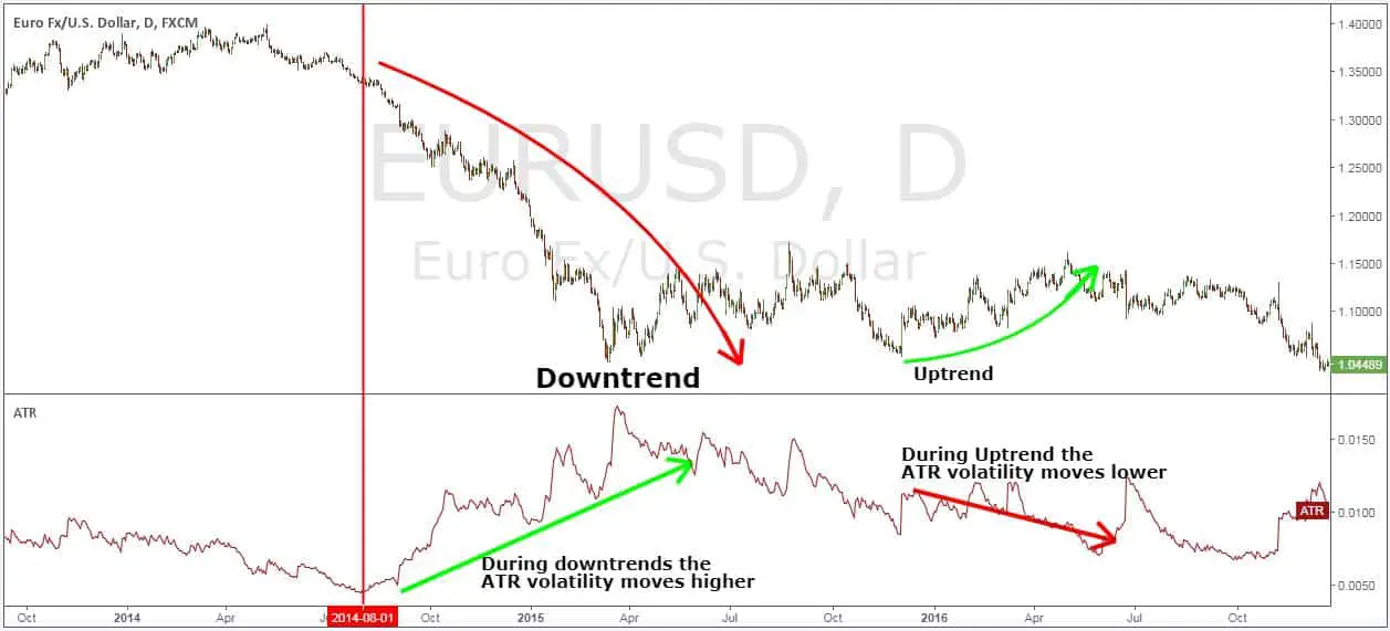
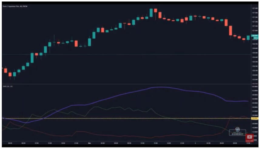
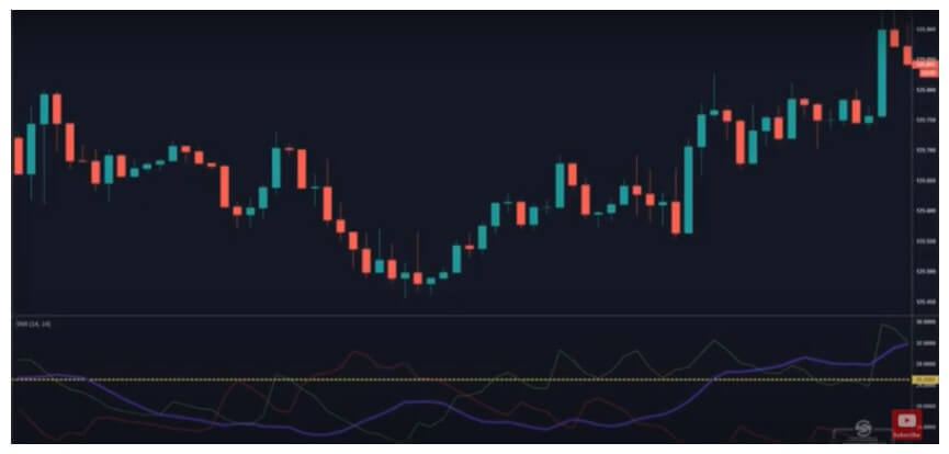
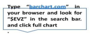
Even though we can determine market volume with the help of ATR, ADX, and Bollinger Bands, among other tools, the $EVZ volatility index has proved to be extremely useful and easy to use. When you open the full chart, you will be able to see a number under the heading “Euro FX VIX.” 

If this number is lower than seven (7), for example, this means that volume and volatility are low. Also, the lower the $EVZ index is, the lower the chance of winning a trend following trade is as well.

If we need volume to trade effectively, how should we then approach long market dry spells?

There are a few ways to deal with unfavorable markets. First of all, dead markets are not the markets we want to trade, especially as beginners. However, we can still be productive! As a beginner trader, you are probably developing your system and trying to see if your tools are giving you valid information on the market.

If you are backtesting or forward testing your system, you should be getting a clear sign not to engage in trading at the moment. If you are still getting signals that it is ok to proceed, you need to change the volume/volatility indicator you are using.

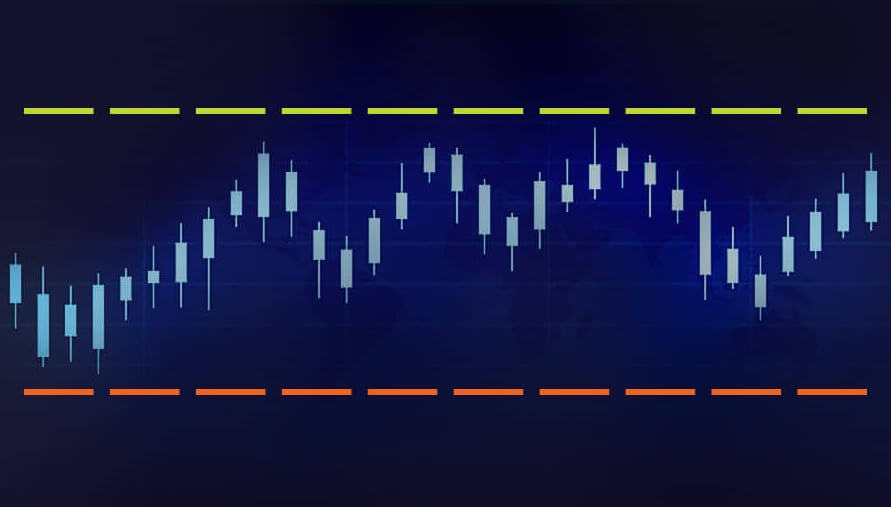
Still, low volume/volatility is a normal part of market oscillations, as these constantly fluctuate. Even if you are getting a lot of losing trades, do not get discouraged. Your time will come.

You may be wondering if you can still trade despite sideways market movements, and the answer is…

…YES and NO.

You should not trade at this time because the price direction guesswork is extremely hard to get right and you can easily lose a lot of money. If you aren’t getting any signals, there is no reason for you to push it. Just stay put.

If you are, however, getting signals to enter a few trades please choose wisely! For example, forex traders may not want to trade pairs whose currencies are heavily monitored by big banking institutions. Any strange news event will also be a reason strong enough to avoid certain currency pairs altogether at this time.

Also, be careful with your money management!

We cannot scale out when the market is unresponsive. Therefore, we should in such cases take the entire trade-off at the first take-profit point. While we may be getting wins that are smaller than usual, we know that these are safer wins after all. It is far better to have minor wins than major losses. Even if the trade you exited seems to be heading somewhere, do not be regretful. Cut your take profit targets.

If the market happens to be extremely low in volume and volatility, you should also manage your risk differently!

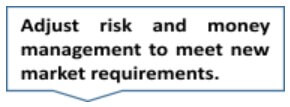
We usually cannot have a standard 2% risk on trades encumbered by sideways market movement. Reduce your risk to 1%, for example, if you see that the $EVZ index is reaching incredible lows, like in 2019. 

What you can also do in times like these is use a smaller time frame to pick up your wins more easily. Again, dead markets do not necessitate that you forsake your daily time frame by default, but it can be a good opportunity for you to see if there are any changes between different time frames. 

This is a reminder not to forget the power of your mind!

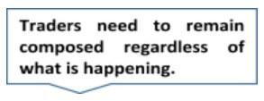
If you are not prepared mentally or emotionally, your account will suffer no matter the conditions. If you start panicking the first moment you spot any sideways market movement, the likelihood of you making a good decision will start to decrease exponentially.

There is also a major prejudice concerning market volume and volatility. What we need is balance – in the market and in our approach to it. Therefore, if we enter trades with high volatility or volume, we are also adding unnecessary risk, which can be detrimental to our accounts.

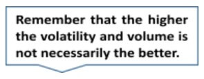
Looking for an ideal trading scenario to start trading is as futile as is failing to recognize the potential of dead markets. When we are faced with the saturation of sideways market movements, we should perceive the market as our fertile land. It is those moments that give us perfect room for improving our systems. Reflect on your past trades and decisions, and see what you can do better. Focus your attention on your trading and test, test, test. If you find a strategy that is working well in these conditions, this is your plan B, switch to it.

Unfavorable market conditions affect us all. Do not think that experts are making a ton of money under any circumstances. You may have even had plans to leave your current job and turn to trading only, but now is not the time. Make no rash decisions, keep all of your sources of income active, and just wait for everything to go back to normal. Even when it does, you may still need a few months or years for everything to work out as you planned.

What happens when the market finally comes back to us?

Well, no matter how well-developed your system is, most volume indicators cannot record the first big move as quickly as it occurs. So, now that you know that it isn’t your fault, do not give in to any doubts or regrets and just move on. 

Finally, there is no way for you to “trick the system” and evade the sideway market movements. It is a perfect time to develop a strategy that can work in dead markets, it will stay with you when the markets are dead again. Do not go looking for a volume indicator that would tell you what you want to hear. Instead of feeling sorrowful about your fate, look where you have the power to initiate change. Trading is not about making wins only. Protecting your account and making smart money is far more important. 

Categories
Forex Elliott Wave Forex Market Analysis

USDCHF: Examine These Three Charts Before Taking any Trade


Last week, the USDCHF pair developed a sideways movement pattern that looks like an inverted head and shoulder pattern. However, the primary mid-term trend remains dominated by bearish sentiment. Examine with us these three charts to help you foresee the pair’s potential movements in the coming sessions.

Inverted Head and Shoulder Pattern?

The USDCHF pair illustrated in the following 12-hour chart seems to develop a sideways formation after the accelerated decline observed during the second half of November 2020. After easing from the psychological support of 0.89, the price began to consolidate in a range between 0.8917 and 0.8757.

In the previous chart, the USDCHF seems to be forming an inverse head and shoulder (iH&S) pattern, suggesting a likely bullish reversal movement. According to chartist analysis, the iH&S formation will be confirmed if the price breaks and closes above the neckline located at 0.89171. 

For this reversal scenario, the invalidation level is located below the head, which holds its lowest level at 0.87576, corresponding to the low touched last January 06th.

Elliott Wave View Suggests Exhaustion

The big picture of the USDCHF pair exposed in its daily chart reveals the incomplete bearish impulsive sequence of Minute degree labeled in black, suggesting a limited decline.

As illustrated in the last chart, the USDCHF began a downward impulsive sequence of Minute degree on March 23rd when the price found fresh sellers at 0.99017. The price action reveals the completion of its third extended wave bearish move, which found support at 0.89986 in late August 2020, starting to advance mostly sideways in its wave ((iv)) in black. 

Once the sideways corrective formation corresponding to the fourth wave in black finished, the pair began to continue its declines in the wave ((v)) of Minute degree, which currently seems developing its wave (iv) of Minuette degree identified in blue. 

On the other hand, the timing and momentum oscillator reveals that the bearish pressure still controls the price action. In this context, the price would see a further decline, confirming Elliott Wave’s outlook of a pending fifth wave of Minuette degree.

This bearish continuation scenario’s invalidation level stays at 0.8979, which corresponds to the end of wave (i).

Price Action Reveals Indecision

The USDCHF pair in its daily chart unfolded in the bellow chart shows an indecision candle corresponding to the last Friday’s session, leaving a narrow body and long-tailed candlestick pattern. This market context carries us to expect a pause in the downward movement developed in previous trading sessions.

The confirmation of the bearish scenario will occur if the price closes below the LOD at 0.88385. Conversely, a reversal signal could be established by a Monday 25th session’s close if it exceeds Friday’s high of 0.88662.

In summary, the USDCHF pair develops a sideways formation that looks like an incomplete inverse head and shoulders pattern suggesting the potential bullish reversal sequence if the price soars above the neckline located at 0.89171. However, the Elliott wave outlook suggests further declines, corresponding to a possible wave (v) of Minuette degree labeled in blue. In this context, the price action reveals the indecision of the next direction. If the price decides to continue its decline, the USDCHF could re-test January’s 06 low zone.

Categories
Forex Indicators

The Application of the Moving Average on Indicators

Traders worldwide have shown interest in the Moving Average Convergence/Divergence indicator that we all know as MACD. Praised as a two-line indicator that has generated quite a few pips to many content creators, MACD can certainly point us toward the direction of discovering other amazing tools that we can incorporate into our trading systems. Since traders are constantly in search of the best components to help build their own algorithms, they inevitably come across a number of low-performing indicators from which their trades can hardly benefit. As a result, these traders immediately cast off the tools that they believe cannot make it to their favorites’ list, which may not be the approach that you will always want to take. Today, we are going to see how adding a moving average on various MT4 indicators can not only improve a tool’s performance but also prove to be the right move towards lucrative trades. 

Many beginners fail to acknowledge the importance of adjusting settings and learning about the ways to make some changes to the existing indicators in order to gain more profit. While MACD indicators’ fame grew due to the diversity of its functions, few actually know how using the moving average on other indicators can truly generate new and unexpected possibilities in many cases. If you are keen on growing a unique system and testing different options, then the use of moving averages can really become one of your favored solutions down the line. By adding a moving average on some of the less efficient indicators, you can have an entirely different experience with tools that you once defined as utterly futile for trading. Naturally, in some cases this approach will not seem to be applicable or useful; however, by incorporating moving averages in your system, you are introducing an additional layer of protection, as all traders look forward to finding indicators to prevent them from making bad decisions while trading in the forex market.

Today’s selection of indicators is meant to serve as a lesson on how you can improve some of the tools which overall do not provide desired results, rather than tell you which tools you should use in your everyday trading. You can later go back to the indicators you saved on a flash after you had stopped using them, as we will show you how some of the indicators that are already built on MT4 miraculously change after the moving average has been added. You can also open the MT4 while you are reading this article and make the same adjustments as we do while you are reading. Be prepared to take notes on some specific settings as well as remember a few key pieces of advice you should follow when you are attempting to carry out this process yourself. 

Accumulation

Accumulation is one of the indicators that are generally considered as bad in the forex trading community, especially due to the fact that traders cannot make any adjustments that could improve its performance. As you can see from the first image below, Accumulation is essentially a one-line indicator, which barely appears to be able to give any relevant information. However, once we apply the moving average, although you cannot expect drastic changes, the overall performance of this tool immediately improves.

In order to make the most of this, you will need to follow a few rules. Firstly, you should not alter the moving average of oscillators, yet expand the Trend tab in your Navigator window inside Indicators. Once you find the moving average there, you will need to drag it down to the indicator window you wish to apply it on. Then, a new window will pop out where you will be able to make further adjustments. What we did is we left the period where it was (10) and changed the settings from Close to First Indicator’s Data. If you, however, decide to apply the changes at Close, you will not see the line in the same place as in the right picture above, it will simply be applied to the price chart. Therefore, the two essential steps to take are to drag the moving average down and apply it to First Indicator’s Data.

The results these steps can deliver are much better than what you can hope to achieve without. The moving average is mostly going to tell you where the trend is, and after we applied this to Accumulation, we discovered five to six entry signals just by glancing over the chart. A better indicator would naturally offer more quality entry signals and, consequently, serve you better. However, the idea behind this is to change a one-line indicator to a two-line-cross one, which is believed to be one of the best confirmation indicators you can use. Even though these changes prevented you from quite a few problematic points, Accumulation is still not recommended to be used for everyday trading purposes. Some professional traders even claim to have tested this tool and every possible variation only to discover that it is not a viable, long-term option for them.

i-BandsPrice

Similar to the Accumulation indicator, i-BandsPrice is also a single line that does not perform very well in general. You can change this tool into a zero-cross indicator by following the steps we previously described. Although it does not truly get to zero, you can still see some benefits from these changes. What you should first do is alter the period and see the results this solution provides. Naturally, you will not go after every opportunity in the chart because you will want to avoid reversal trading. Nonetheless, what you do gain from making these adjustments, in this case, is the ability to discover when you can enter a trade. As with any other zero-cross indicator, i-BandsPrice can now also tell you to start trading when the indicator crosses over the zero line towards the negative or the positive.

Rate of Change (ROC)

In order to see more benefits from using the Rate of Change indicator, we first moved the period to 70. Then we added the zero line because it will tell us to go long if the line crosses the zero upward and vice versa. However, to make the most of it, you will need to add the moving average and look for the places when the lines are already both below zero: when the indicator crosses down again, you will have the opportunity to enter a continuation trade, which some experts see as their most lucrative trades. As ROC is one of the lower options on the performance spectrum, you will not be able to get many good trades despite the changes. Nevertheless, you can alter the period, moving it from 8 to 10 as we did, and see how it begins to resemble the MACD indicator is thought to successfully provide the greatest number of signals to enter continuation trades. Therefore, if you happen to come across a zero-line-cross indicator that seems to have a lot of potential, you can actually grant yourself more lucrative opportunities just by adding the moving average.

Average Directional Movement Index (ADX)

ADX can serve as an example of how you can apply the moving average to a volume indicator. Whenever the line goes above, trend traders receive the signal that they have enough volume to enter the trade. Likewise, whenever the line plunges, it is a signal to stay out of the market. In the example below, we kept the period of 14 and added another line (like we did before) at level 25. ADX has proved to be performing better once the changes have been applied, although it has also proved to give a lot of false signals as well. Another reason why professional traders typically dislike this tool is that it often lags. However, despite the opportunity to test how this tool performs after adding the moving average, we still have some other better options we can use to trade in this market. 

Once you remove the additional line and add the moving average, you will naturally not bring about some unforeseen, alchemical-like change, but you will be able to improve almost any volume or volatility indicator. Drag the moving average down as you did before and change the option from Close to First Indicator’s Data (we kept the period at 10), and you will see how fruitful the results your volume/volatility indicator gives are. If you kept the line we had before, you would have potentially taken a great number of losses because ADX would need too much time to go below. This way, however, you are improving the overall condition because the moving average always adjusts to the volume indicator. Therefore, you could get a signal to take a break at some point in the chart and another one to resume after a while, which is by far better than what the original, unchanged version of this indicator can provide.

As a forex trader, you will naturally be experiencing passing moments of consolidation and stagnation after trading for a period of time. You will then want your indicator to let you know when and how to avoid these troublesome points in the chart. Since the moving average can limit the negative effect a poorly performing tool can have on your trade and expand its functions in terms of quality, you can immediately start testing the indicators you discovered before but for which you could not find the right use. Now the indicators which could not help you seem to have a newfound potential to help you trade more successfully. What is more, the moving average can be applied in such a vast number of cases that it immediately increases the opportunity to win. You only need to take time to test and find a way to use a specific indicator after the changes have been made. Some indicators can only be improved to a certain degree with the MA, yet some others can truly illustrate a distinct difference in your trading.

Many traders are having a hard time finding the right exit indicator, for example. However, an exit indicator that a professional trader would find to be really good is typically a two-line-cross indicator. Luckily, with the help of the moving average, any one-line oscillator can become a two-line-cross indicator and, therefore, also an exit indicator that you can discover to be a really good solution for you. Improvement sometimes implies tweaking the settings, whereas it may also entail adding the moving average so as to give the tools that have not worked well in the past the chance to make a positive difference. The moving average can be applied to almost anything, as we said before, so it does bring a new sense of hope to traders who have had difficulty finding the right elements to complete their technical toolbox. This knowledge simply opens up a number of tremendous possibilities, as a single oscillator changed to a two-line-cross indicator is the proof that tools that were not very useful can be adjusted so that traders can actually make use of them. Whatsmore, indicators with two lines have first and second indicator data. In this case, you can apply MAs to both and have a kind of momentum gauge in an already established trend, for example, on line cross.

Go to your list of indicators that you considered as poor samples and start testing this solution to find out just how much the moving average can improve your trading. At least then you will know that you can write off a tool for good without having to go through periods of hesitation or doubt. Luckily, sometimes the improvement comes just after adding this second line, so you will never again need to question a decision you made with regard to indicators. According to professional traders, some of their most lucrative deals stemmed from continuation trades which these changes made possible. Hence, just by making these adjustments, you can turn a below-average indicator is a tool that is similar to MACD and experience numerous benefits long term. There are many variations and improved versions of MACD, RSI, and others, with a different type of calculations. Playing with MAs on these tools is a definitive winning combo. All you have to do is try it out.

Categories
Forex Indicators

Incorporating the Right Indicators Into Your Trading System

Technical traders are not making decisions on any other input but their set of indicators and rules. As a holistic approach, it is a trading system that combines position or risk management, chart analysis, and volatility/volume parameters, producing three types of signals: enter a trade, exit a trade and do not trade. Technical traders’ decisions are therefore based on a black and white mindset. In other words, their mind is not different than the trading systems they have made.

On a professional level, their mind is just thinking about testing out more to improve the system effectiveness on the forex market. This article will reveal an important view of how to add on an element or an indicator to a system that already has a few synergetic elements, each playing their role, and measure various categories from the market numbers. Using an example from one professional prop trader system structure, we can give an understanding of what to look for when improving your own trading system. 

Technical traders may follow a certain theory, using just John Ehlers’s indicators, for example, but it is proven that risk is mitigated by diversification. Even though the indicators from this researcher are somewhat predictive in nature, having another indicator from other theories that base on historic confirmation might be not only risk-mitigating but also create special chemistry when combined. Traders that are advanced already have a system and are probably familiar with the theories or how their indicators are made. Beginner traders are not familiar with this, and actually, they do not have to be to create effective systems. We will present you with a few shortcuts to finding this special indicator combination.

As an example, a trading system can have a volatility indicator based on which position size and risk management are based on. Having such a variable and adaptive way of controlling risk is imperative as discussed in other articles. ATR indicator is one such volatility measure. The next element in the system is a specialized volume or volatility indicator whose role is to tell us when there is not enough momentum in the market or trend and to just ignore signals from other indicators as the risk of price changing direction is increased. We are looking for quality trends to follow, a scientifically proven method of trading with the best results. When we are looking to exit a position, technical traders also make decisions after an indicator. This type of indicator should be great for finding points when trends exhaust and some think oscillators and reversal indicators are a good pick for this role.

A separate article also explains this in more detail. At the core of the system is the confirmation indicator, when to enter a trade is a starting point when we look at charts. Finding an indicator that proves to be very effective at finding emerging trends is a precious element but we all agree none is close to being right even 70% of the time. As this is the core of the system, why not make it better by adding an additional confirmation indicator? Having two different experts will generate better solutions than just one. Now, if we go on we might think more is better, but there is a thin line after which adding more indicators creates a detrimental effect on the system. It is too complicated. So adding just one additional confirmation indicator is enough. The point here is to make sure that the first trend confirmation signal is not a fake market move that just a whipsaw, so add another one that needs to produce a signal in the same direction before we make a trade. Eliminating losses from these fake moves has the same effect on our account as when we win. 

Confirmation indicators have various calculations, formulas, and ideas behind them, and that is great. As an analogy let’s say your system is a team of players. Each player has its role but we have all witnessed a magic bond between two or more players that are just extremely effective when combined. Of course, having a bad player and another bad player is going to be better but it is no-brainer because we want to have two greats. Finding great indicators is a long and tedious work, once we have one with the best backtesting and forward testing results, it is priceless. The ones that got to the top 10 of your list might be the ultimate additions to your number one. The good thing about these indicators is that they are abundant, unlike the volume indicators, and they are easy to test. 

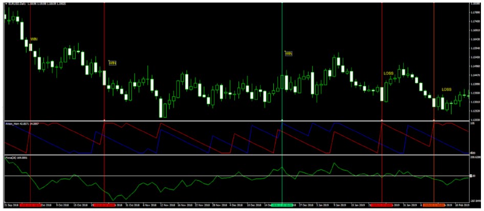
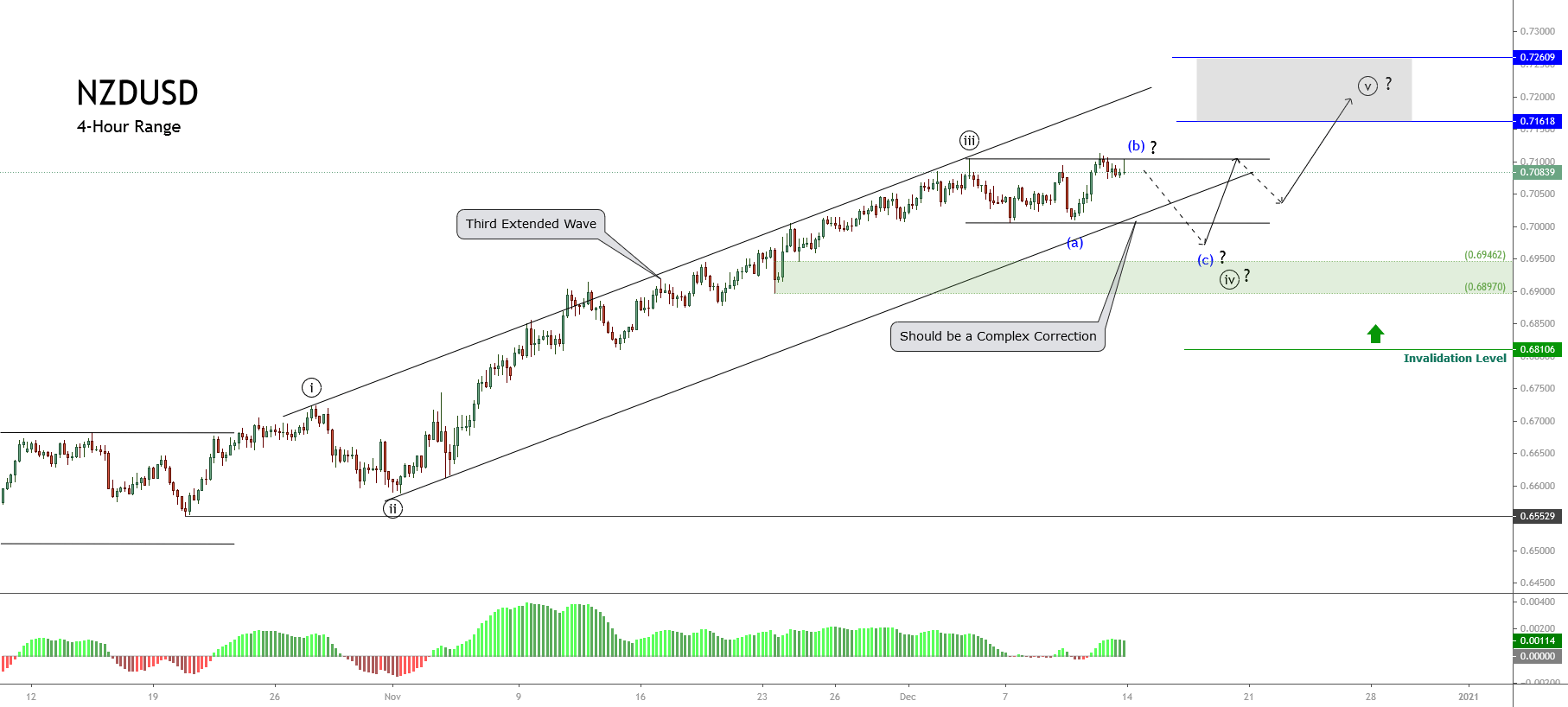
Trend confirmation indicators can be categorized to make this process beginner-friendly. Starting with the Zero Cross indicators, they are generating signals based on a line crossing a horizontal zero value line. A typical example of this is the Chaikin Money Flow (CMF), an indicator using volume and other market values in its formula. After all, traders are interested in how good it is for their system after backtesting and forward testing. When the main signal line is crossing the zero line it means a new trend or continuation is starting. If your main confirmation indicator is from the same category, you will need to change one to get the diversification effect.

The second category is the Line Cross-type. These are probably the most common type of indicators. MACD can be one example of this, although MACD also has a zero line. If you want to diversify, you will need to pay attention to different signals even the  MACD, for example, belongs to the Zero Line and the Line Cross category. The third category is the on chart indicators. Now, these indicators are the ones when applied are represented on the MT4 chart itself, not in a separate window below it. Moving Averages are a simple example of this type of indicator, and there are many ways you can classify a trade signal with them. Many systems have them and they can be an extremely effective tool. Finding the right Moving Average indicator is surely going to be worth the time. 

Now when we understand how to combine and diversify indicators, understand that the second confirmation indicator is there to filter losses made from the main one. Since cutting losses is the same as generating wins, we are looking for synergy results where the second indicator is filtering the losses but not filtering the wins. Volume indicators have a similar role here but know it is hard to find a volume indicator that does not filter a win in the way. The nature of measuring volatility or volume simply needs more data to be effective, consequently, they lag. Lagging may cause your system to miss the right moment to enter a trade and therefore a possible big win but this is just something we have to accept.

Additional confirmation indicators are not necessarily like this but they still add value to your system. Traders’ focus should be on cutting the losses, it is the main problem once you make your first system. When we find and adjust our second indicator, aim to cut a lot of losses. If a winner is filtered, try to adjust settings a bit but not at the cost of letting the losers in. As we have discussed in previous articles, your indicators should be recent, do not latch on to the popular ones, you will soon find others have better results in your testing. Combining different type indicators with great results is the way to go but know that sometimes the synergy might not be there. Similar to sports, you may collect the best players together in a team but the result can be disappointing. On other occasions, two great players that understand each other can beat the opposition alone. Interestingly, case studies have shown each had a different specialized skillset that adds value to the other. The goal is the same but the formula is based on different measures and the representation is different. 

You will find many times that your two confirmation indicators do not align, and this is good. Pay attention to the main setting adjustment you can make, the period. By having one faster and one slower confirmation indicator, you may find that sweet spot of filtering losses and keeping the winners. Whatever confirmation indicators you find, only testing will show you if this combo is worth keeping. The more pairs you test, the better the odds you will find a golden team. Other elements in your trading system should not be messed with during testing, you need to have control and compare only this confirmation indicator combination.

Here is an example provided by one prop trader demonstrating how this idea works in practice. We are going to use the EUR/USD currency pair. It is the most traded pair with many news, reports, and event that could push the trend the other way. As such it is considered the riskiest pair you can pick and should provide a lot of losses and wins. Losses we should cut by introducing a second confirmation indicator. From the picture below we can see our Aroon indicator is really having a hard time finding a winner. This chart is very nasty for trading trends with many whipsaws.

Red and green vertical lines are added once the indicator gives a signal to go short or long. Aroon was able to give us approximately 3 wins and 8 losing trades. We can see Aroon is a line cross indicator type, signals are generated once the red line crosses above the blue for short and vice versa. Let’s see what happens when we add a second confirmation indicator not belonging to the line cross-type. 

We have added an Exponential Moving Average for 20 periods as the on chart type indicator. Now if you use the EMA for generating signals only when the price crosses it, you will find many conflicting signals with the Aroon. When they are in conflict, we do not take that trade. When we take this rule to the chart, many of the losses are filtered. 

Now we have kept the winners and have only 6 losses. EMA might not give us great loss reduction but the end result is still better than before. Let’s try to find a better indicator. 

We have added the Force Index indicator and adjusted its period to 26 from the default 13. Additionally, a horizontal line is added at zero effectively making this indicator a zero line cross type! The result is we still have 3 winners and now only 2 losses. Before all this, we had 8 losing trades. So we have transformed our system from a 27% success rate to 60%. Note that your system still has a volume filter and other elements that boost this rate to a much better percentage. With good position sizing, money management, you should be profitable. You now have better odds than a 50-50 coin flip.

By the way, having proper money management and using a 50% success rate system can still yield profits. Just pay attention, what is presented is just a couple of trades on a single currency pair. What you need to do is test your indicator combinations on longer periods and other assets. We are aiming to create a system that works on every currency pair, without adjustments. The final product is a universal system you can use professionally for a long, long time. 

To conclude, the hard work you have to put in is necessary to find that perfect combo. Treat it like a treasure hunt, a game with real treasures behind. If this is exciting to you then it is just a matter of time when you complete your trading system and just trade as it says, consistently providing you with treasures. Your score list of tested indicators is useful, you can pick up your second confirmation indicator from there without searching through the forums and indicator websites. Use the tricks described here, add a line, test different periods and settings, add an MA to the indicator. Finally, the synergetic effect is easy to test, as demonstrated, you will not spend too much time to figure out you have a high % combo in front of you.

Categories
Forex Elliott Wave Forex Technical Analysis

Three Things you Ought to Know Before Buying EURUSD

The EURUSD eased the last trading week, losing 1.18%, leaving away from the yearly high at 1.23495 reached on last January 06th. The common currency accumulates losses by 1.14% (YTD), which, added to other market conditions commented in our current analysis, carries us to expect further declines in the following trading sessions.  

1. Retail Traders Seems to Look for Long Positions

Retail traders tend to place their trades against the primary trend, remaining on the wrong side on most occasions. Regarding this market participant behavior context, retail traders reduced their short positions from 79.77% reached last January 06th to 44% last Friday’s session, as the EURUSD pair accelerated its decline. 

Source: myfxbook.com

Retail traders’ increasing positioning to the long-side carries us to sustain the prospect for further declines in the following trading sessions.

2. The Price Violated its Short-Term Upward Trendline

The big picture of EURUSD illustrated in its daily chart reveals the violation of the secondary trendline plotted in green, corresponding to the last rally developed by the common currency since November 04th from the 1.16025 level, which found resistance on January 06th at 1.23495. This market context leads us to observe that the price could develop a correction proportional to the last rally.

In this regard, the Dow Theory view suggests that EURUSD’s corrective move depth might lie between 33% (1.21030) and 66% (1.18565). Moreover, the price could find support in the long-term upward trendline plotted in blue.

3. Timing and Momentum Oscillator Supports the Elliott Wave View.

The intraday Elliott wave view for the EURUSD pair exposed in the next 4-hour chart shows the completion of an ending diagonal pattern corresponding to wave (v) of Minuette degree labeled in blue and its bearish reaction after its finalization.

Once the common currency topped at 1.23495, the price developed an intraday corrective move subdivided into five internal segments of Subminuette degree identified in green. This five-wave sequence of lesser degree carries us to expect the progress in a potential zigzag pattern (5-3-5). 

On the other hand, the timing and momentum oscillator lead us to observe the first downward sequence’s exhaustion corresponding to wave (a) in blue. In consequence, the common currency should develop a corrective rally corresponding to wave (b). This upward move could hit the zone between 1.21576 and 1.22523.

Once the EURUSD completes its wave (b) in blue, the price action should start its bearish wave (c), which follows an internal structure subdivided into five waves. In this context, the bearish scenario’s invalidation level can be found at the end of wave (v) at 1.23495.

What’s Next?

According to Myfxbook.com’s Community Outlook, 56% of retail EURUSD traders are positioned to the long side. Likewise, the violation of a short-term upward trendline carries to expect further declines in the common currency for the coming trading sessions. Nevertheless, the EURUSD could be at the end of the first segment of a corrective formation. In this context, the price could develop an upward bounce that could reach the zone between 1.21579 and 1.22523. After the bounce conclusion, the common currency could find fresh sellers expecting to join a new downward sequence corresponding to wave (c).

If you are interested in finding trading opportunities using the Elliott Wave Principle, follow our Forex.Academy Educational Section.

Categories
Forex Elliott Wave Forex Market Analysis

Why GBPJPY Plummeted in Friday’s Session?

The GBPJPY cross declined on Friday trading session dragged 0.70% after the price surpassed the psychological barrier of 142, being the highest level reached since early September 2020.

Technical Overview

The GBPJPY cross drops over 100 pips on the last trading session of the week, accumulating a modest advance of 0.02% (YTD) since the yearly opening.

On the fundamental side, the industrial production in the United Kingdom eased 4.7% (YoY) in November 2020, informed the Office for National Statistics on Friday. The reading is worse than the decline of 4.2% expected by analysts. Likewise, both coronavirus lockdown and the Brexit uncertainty contributed to the decline in the industrial output.

Source: TradingEconomics.com

On the other hand, the doubts in the fourth quarter 2020 earnings season kick-off and the elected U.S. President Biden’s stimulus plan seem not enough to keep fueling the stock market participants’ euphoric sentiment. This context looks fading the record highs in the stock market, boosting the risk-off bias pushing lower the GBPJPY cross.

The big-picture illustrated in the next daily chart shows the price action moving in the extreme bullish sentiment where the cross ended the Friday session unveiling a bearish engulfing pattern, which carries to expect further declines in the coming trading sessions.

Finally, the piercing below the yearly opening level at 140.779 suggests potential declines during the first quarter of 2021.

Technical Outlook

Our previous analysis saw the progress in a complex correction identified as a double-three pattern (3-3-3). Nevertheless, the corrective rally suggests that the GBPJPY moves in a triple-three formation (3-3-3-3-3), which looks in its terminal stage.

The following 4-hour chart shows the completion of a triple-three pattern of Minute degree labeled in black, which moves inside a wave B of Minor degree identified in green since the cross found support at 133.040 touched in last September 22nd.

The internal structure of wave ((z)) in black shows its last corrective leg corresponding to wave (c) in blue, developing an ending diagonal pattern, which seems finished its wave v of Subminuette degree labeled in green. The breakdown of the guideline that connects the end of waves ii with iv carries to support the ending diagonal pattern’s finalization.

On the other hand, the timing indicator exposes the intraday oversold (see the yellow circle), which leads to the conclusion that the GBPJPY cross should develop an upward retracement as a flag pattern before continuing with its potential further decline.

In summary, the GBPJPY cross plummeted in last Friday’s session dragged by the completion of an ending diagonal pattern, which belongs to wave ((z)) of a triple-three formation, where its upper degree sequence corresponds to wave B of Minor degree. Although the news media continue supporting hopes in the stimulus plan for the U.S. economy, the Elliott wave structure showed by the cross unveils a different story.

According to the Elliott wave theory, the price should develop a downward wave C of Minor degree. The timing oscillator also suggests an intraday upward consolidation likely as a flag pattern before continuing its drops.

If you are interested in expanding your knowledge about the Elliott wave theory from the basics to advanced, visit our Forex.Academy Educational Section.

Categories
Forex Indicators

Using Parabolic SAR With Dynamic Stops Losses

One of the best-known indicators in the Forex market is the Parabolic SAR indicator. This is because it tells us when the momentum is changing, arriving early when the momentum changes can give you a winning advantage. SAR means to “stop and reverse” by definition. However, there is another way to use the Parabolic SAR, apart from trying to identify trend changes, either in the short or long term, and it is intended to use the indicator as a form of use of dynamic stops loss, either for a partial or total output.

What is the Parabolic SAR?

The Parabolic SAR formula was developed during the boom days of technical analysis in the 70s by Welles Wilder, who is the person who also designed the Relative Force Index (RSI). The relative strength index is pretty much the only Forex indicator that can produce a winning advantage on its own, so it’s worth taking a look at anything written by Welles Wilder.

The algebraic mathematical formula used to calculate the value of the indicator in each candle is complex, so I’m going to explain it in very simple conceptual terms, using for this a long example. When a candle makes a new maximum, the indicator sets a value below that candle. If the candles keep making new maxima, the value of the indicator rises along with the price but is increased proportionally by a factor selected by the user (0.02 is the most common).

The idea is that “time is our enemy” and that the best of any directional movement where we can be is in the part where the momentum keeps increasing. Thus, it is better to use this indicator in commercial trends or in strong directional movements. In fact, Wilder recommends using the Parabolic SAR indicator along with its ADX (Average Directional Index), which is also recognized as probably the best and most useful Forex indicator.

Parabolic SAR and Technical Analysis

Parabolic SAR is an extremely simple “binary” indicator and is often used in forecasting and trading strategies in the following ways:

-Determination of the trend. When a new candle is opened and the indicator prints its point on the other side of the candle from where it was on the previous candle, this indicates a change of trend and a possibility of entry into a trade.

-In determining the trend as indicated above, use the ADX indicator to determine whether the trend is powerful enough to have a justification for a new commercial entry, always in the direction of the trend.

-When a certain number of candles have been making new lows or highs with the indicator point always remaining above or below each candle, use the point price (or one near it) as a manually adjusted stop-loss (i.e., a dynamic stop loss) to signal an exit from a trade.

The Best Way to Use the Parabolic SAR

I think the best use of the Parabolic SAR indicator is like a trailing stop when it comes to operating in a strong directional movement. I don’t think it has a great value to determine when to enter: entering the trend direction in Forex is best determined by the break or, usually, better yet, by moving the signals from triple moving average crosses.

Normally, when operating in strong directional movements, the best benefit profile comes when trying to capture two different movements:

  • The initial short-term momentum movement; and
  • The long-term directional movement that begins at 1.

Trying to capture only movement 1 is usually not very profitable in the long run. A better trading strategy is to take partial gains when movement 1 ends, letting the rest of the position run in the hope that movement 2 will take place. Successfully capturing movement at 1 can give you the “take off” necessary to enter the trade at a good entry price that is sufficient to capture movement 2.

Understanding the Parabolic SAR Formula

You don’t really need to know the actual formula of any technical indicator in order to build a trading strategy, but it’s worth understanding why SAR parabolic points appear. In addition, if you want to create an Excel Parabolic SAR calculation file to build a decision support system for your daily transaction, you would need to know the parabolic SAR formula. However, here is the formula used to calculate the parabolic SAR values:

Sarn + 1 = Sarn + α (EP – Sarn)

In the formula Parabolic SAR, the Sarn is the current period and as +1 indicates, the Sarn + 1 is the value SAR of the next period. During an upward trend, the PE is the highest price on the trend, which would be the highest of most candles or bars on the trend. On the other hand, you can be quite sure that the EP would represent the lowest candle or bar in a downward trend. Since parabolic SAR points only appear above or below the price, it is not a difficult task for you to identify what the PE value represents.

The most important variable in parabolic SAR adjustments is α, which represents the acceleration factor in the formula. When you try to add the parabolic SAR indicator in the graph, your graphics package would normally set the value of α to 0.02.

You see, during an upward or downward trend when the price makes a new high or low, the acceleration factor increases by 0.02. This is why the gaps between the parabolic SAR points become larger during a strong trend and the size of the gaps shrink during a price consolidation. Although the default acceleration factor is set to 0.02, most graphics packages would allow you to change it. Maybe you’re wondering why you need it with the acceleration factor. Well, some stock prices are more volatile than others, and depending on the length of time you choose, optimizing the acceleration factor can actually improve your commercial performance.

For example, in the Tradingsim, it can reproduce the price action with different SAR acceleration factors to find the optimal value and test the market to see if the new value makes a major difference in the generation of parabolic SAR buy signals or Parabolic SAR Sell signals. If you see a positive result, you must customize the SAR formula to fit the share price feature of the share.

Using Parabolic SAR as Trailing Stop

One of the best things about this indicator is that it is extremely easy to use and does not really require any concern on the part of the user with regard to input values. The default values are perfect. One method is simply to manually adjust the stop-loss price to place it a few pips just beyond the indicator point as each new sail opens. A second option may be to wait for the candle to reverse and close beyond the point. This will most likely contribute to you getting better results in the long run.

Remember that your own calculations on any strategy you are using should be moved to the image. Let’s take an example, if you what you expect make a 50% commercial exit at a risk-reward ratio of approximately 2:1, and get an output signal at 0.5:1, which is far from that desired target, you would best ignore the output signal, or maybe move the stop loss to the balance point.

Warning: Only Use With Trending Markets

There are different ways to know for sure if a market is on a trend, but the Parabolic SAR indicator provides good visual aid. If the graph shows that the indicator is changing the point only occasionally, and fairly long chains of consecutive candles with all the points on the same side, then the market is “swinging” enough to give your operation a good chance of making a profit. If the dots are not in a series and are all displayed mixed, then it is a hectic market and it is probably best to avoid it.

Categories
Forex Technical Analysis

Can Trend Lines Alone Be Used to Make Trade Decisions?

Trend lines are simply lines that are drawn on a chart that when analyzed will give you as a trader an idea of the possible directions of the markets. A trend line is generally drawn over a pivot high and under pivot lows in order to show h prevailing direction of the markets. They are a visual representation of the support and resistance levels for the timeframe that you are looking at, they can show the direction and the speed of the price, and can also be used to help in the aid of working out various different patterns within a chart.

That’s what trend lines are, but what exactly do they show us? Trend lines are one of the most widely used and important tools that many traders use, especially for those into technical analysis. Instead of looking at past results and patterns, people who use trend lines are looking for the current trends in the markets. They will help a technical analyst to determine the current direction of the markets, as well as how quickly the rice is moving in that direction. Many traders believe that the trend is your friend and will trade in the same direction, so they use the trend as an indicator as to which direction to trade in.

Trendlines are pretty easy to use, even for those that are just starting out with trading. They can be drawn onto a chart in a simple way using open, close, high, and low markets. Some traders also like to use more than one trendline, they connect the highs to create an upper line and the lows in order to create a lower line. This will then create a channel that will offer the trader a view of the support and resistance levels. This can then be used to look for breakouts, a situation where the price breaks above or below the upper or lower lines, and this for some is the best opportunity to put on a trade.

There are some limitations to trendlines. The main limitation is that they need to be readjusted as more price data comes in. Keeping the same line when the markets have changed will make the indication that they are providing completely irrelevant to the current situation. So you will need to adjust it each time the prices change. There is also no set place to attach the points to, different traders will use different data points, meaning that each person’s trend lines will be slightly different from each other, which can, in turn, give a completely or slightly altered image of what the markets are doing. If you create a trendline during a period of low volume, as soon as the volume increases it can easily break through the lines, so trend lines are more reliable during times of at reduced average volume.

There are ways to get around the fact that they need to be constantly adjusted. There are some indicators and expert advisors that can help to draw on the lines automatically, these can also then be used to update the lines without any input from yourself. The downside to this is that it will be doing it automatically, so you won’t have much control over where the lines are being drawn. You’ll need to work out whether you want to put the work in and do it manually and accurately to your own likes, or to allow it to happen automatically but understand that the ones may not be in the exact places that you prefer.

So the question now is whether or not you could use trend lines by themselves in order to trade. The answer is both yes and no. Not the most helpful I am sure that you agree. Trend lines offer us a lot of information and can be enough for some people and for certain more simply trading strategies. Using the trendline will give you an indication of the direction that the markets are going, and many traders will only trade in the same direction as the trend. So the indicator does give you an idea of the direction to the trend, but the problem is that it does not give much more information than when used by itself.

You can also use two trend lines, an upper and a lower. This can give you slightly more information. Having both the upper and lower trendlines will create a channel that the price is moving along, and you can use this channel to work out a little more information. If the channel is narrowing or widening will give you a little idea of what the markets are about to do. You can also use those trend lines to look for breakouts. The price should be moving between the channels. Once it breaks out from either the lower or the upper line, then this could indicate that a breakout is about to happen, something that a lot of traders like to trade.

Ultimately, the trend lines are very simple to use but they offer limited information. So you can use them alone in order to analyse the markets and to trade. There may well be some people who are successful at trading this way. Having said that, a lot of traders like to use trend lines along with a number of other indicators, and the trend lines are exactly that, an indicator. They do not give you exact trades to enter, they do not provide you with a whole host of information, just a simple high and low channel. So many traders like to use trendlines along with a number of other indicators which will allow them to better analyse the markets and to work out what may be happening next.

The answer to our question is yes, you can use trendlines alone to trade, but you will be provided with very limited information. Using only trendlines will work with a few basic strategies, but if you want to use a more advanced strategy then you will need to use more than just trend lines to do your analysis.

Categories
Forex Elliott Wave Forex Market Analysis

EURAUD Under Bearish Pressure, What’s ahead?

The EURAUD cross is advancing in its incomplete third wave from a mid-term downward sequence that remains in play. Follow with us on what the Elliott wave theory tells about its next movement.

Technical Overview 

The big picture of the EURAUD cross unveiled in the following 12-hour chart exposes the price action moving in the extreme bearish sentiment zone during the second week of the year. However, both the acceleration and oversold could suggest the exhaustion of the bear market.

The following 12-hour chart exposes the market participants’ sentiment, unfolded by the 90-day high and low range. The figure reveals the institutional activity pushing the cross in the extreme bearish zone and consolidating under the yearly opening price at 1.58763.

On the other hand, the EMA(60) to Close Index recently pierced the -0.0300 level. This reading suggests both the oversold and the exhaustion of its accelerated downtrend identified with the black trend-line.

In this context, the accelerated downward trend-line breakout and the close above yearly opening price should warn about potential recoveries in the EURAUD cross.

Technical Outlook

The short-term Elliott wave outlook for the EURAUD cross unfolded in the 8-hour chart reveals the progress of an incomplete bearish impulsive wave of Minuette degree labeled in blue, suggesting further drops.

The previous chart illustrates the downward sequence that began on October 20th when the cross found fresh sellers at 1.68273 and started a bearish structural series of Minute degree labeled in black, which currently could be in its wave ((c)) or ((iii)). The internal structure seems developing its wave (iii) of Minuette degree identified in blue. 

The wave (iii) potential bearish target can be found between 1.56175 and 1.55359, which coincides with the descending channel’s base-line. Once the price tests the possible target area, the market participants could carry up the EURAUD cross toward the short-term descending channel’s upper line.

Regarding the wave (iv) in blue, considering the alternation principle, as wave (ii) is a simple corrective formation in price and time, wave (iv) should be complex and should last longer than wave (ii).

On the other hand, both the trend indicator and the timing plus momentum oscillator remain, supporting the bearish bias. Each rally could represent an opportunity to add positions to the bearish side.

In summary, the EURAUD cross continues in the extreme bearish sentiment zone advancing in an incomplete downward sequence, which could find support in the potential target zone between 1.56175 and 1.55539. Once the price finds support, the cross could start to bounce toward the upper line of its short-term descending channel. Finally, the bearish scenario analyzed will be invalid if the price soars above 1.60416, corresponding to the end of wave (i) in blue.

Categories
Forex Elliott Wave Forex Market Analysis

Is US Dollar Index Ready for a Rally?

The US Dollar Index reveals exhaustion signals of its bearish trend. A trend that remains in progress since the currency basket topped at 102.992 pm mid-March 2020. Follow with us what signs show the Greenback to expect a rally during the first quarter of the year.

Technical Overview

The big picture of the US Dollar Index (DXY) illustrated in the next weekly chart reveals the downtrend that remains active since the price found fresh sellers at 102.992 in mid-March 2020. The following figure also exposes the market participants’ sentiment represented by the 52-week high and low range.

The previous figure shows the extreme bearish sentiment dominating the big participants’ bias since mid-March 2020. Nevertheless, the long-tailed candlestick corresponding to the last trading week that was closed above the yearly opening, suggests the bearish trend’s exhaustion in progress.

On the other hand, the reading -4.26 observed in the EMA(52) to Close Index suggests the currency basket is oversold; thus, a potential corrective rally could occur in the coming weeks.

The mid-term Elliott wave view of the US Dollar Index exposed in the next 8-hour chart suggests completing an extended third wave of Minute degree labeled in black, when the price found support at 89.209 on January 06th.

Once the price found support, the price started to bounce, developing an incomplete wave (a) of Minuette degree identified in blue, which belongs to wave ((iv)) in black. Finally, the momentum and timing oscillator suggests that the bearish pressure persists, and the current upward movement could correspond to a corrective rally.

Technical Outlook

The mid-term outlook for the US Dollar Index unfolded in the next 8-hour chart shows the incomplete wave ((iv)) in black, which advances in wave (a) identified in blue. In this context, the current climb experienced by the Greenback could be a corrective rally.

According to Elliott Wave theory, the fourth wave in progress could retrace to 50% of wave ((iii)),  and reach 91.205. Likewise, considering that the second wave was a simple correction in terms of price and time, the current fourth wave should be complex in terms of price, time, or both. 

On the other hand, if the price extends beyond 50%, this could indicate weakness in the bearish pressure. If the price action advances above 92.107, the bearish scenario will be invalidated leading us to expect more upward movement.

In summary

The US Dollar Index completed a bearish third wave of Minute degree at 89.209 on January 06th, when it began to bounce, starting an upward corrective rally that remains in progress. The current intraday movement could reach 91.206 where the price could complete its wave (a) of Minuette degree labeled in blue. On the other hand, considering the alternation principle, the current corrective formation, the structure should be complex in terms of price, time, or both. Finally, the bearish scenario’s invalidation level locates at 92.107, corresponding to the end of wave ((i)) in black.

Categories
Forex Basic Strategies Forex Indicators Forex Service Review Forex Services Reviews-2

Market Profile Singles Indicator Review

Today we will examine the Market Profile Singles Indicator (we could also call it a single print indicator or gap indicator), which is available on the mql5.com market in metatrader4 and metatrader5 versions.

The developer of this indicator is Tomas Papp, who is located in Slovakia, and currently has 7 products available on the MQL5 market.

It is fair to point out that four of his products are completely FREE and are in a full-working version. These are: Close partially, Close partially MT5, Display Spread meter, Display Spread meter MT5. So it’s definitely worth a try.

Overview of the Market Profile Singles 

This indicator is based on market profile theory. It was designed to show “singles areas.” But, what exactly is a singles area?

Theory of the Market Profile Singles

Singles, or single prints, or gaps of the profile are placed inside a profile structure, not at the upper or lower edge. They are represented with single TPOs printed on the Market profile. Singles draw our attention to places where the price moved very fast (impulse movements). They leave low-volume nodes with liquidity gaps and, therefore, the market imbalance. Thus, Singles show us an area of imbalance. Singles are usually created when the market reacts to unexpected news. These reports can generate extreme imbalances and prepare the spawn for the extreme emotional reactions of buyers and sellers.

The market will usually revisit this area to examine as these price levels are attractive for forex traders, as support or resistance zones. Why should these traders be there? Because the market literally flew through the area, and only a small number of traders got a chance to trade there. For this reason, these areas are likely to be filled in the future.

The author also adds: “These inefficient moves tend to get filled, and we can seek trading opportunities once they get filled, or we can also enter before they get filled and use these single prints as targets.”

The author points out: Used as support/resistance zones, but be careful not always. Usually, it works very well on trendy days. See market profile days: trend day (Strategy 1 – BUY – third picture) and trend day with double distribution (Strategy 1 – SELL- third picture).

Practical use of the Market Profile Singles Indicator

So let’s imagine the strategies that the author himself recommends. Of course, it’s up to you whether you use these strategies or whether you trade other strategies for the singles area. Here we will review the following ones:

  • Strategy 1: The trend is your friend
  • Strategy 2: Test the nearest level
  • Strategy3: Close singles and continuing the trend

The author comments that these three strategies are common and repeated in the market, so it is profitable to trade them all.

The recommended time frame is M30, especially when using Strategy 2.

It is good to start the trend day and increase the profit, but be aware that trendy days happen only 15 – 20% of the time. Therefore, the author recommends mainly strategy 2, which is precise 75-80% of the time.


Strategy 1 – BUY :

  1. A bullish trend has begun.
  2. The singles area has been created.
  3. The prize moves sideways and stays above the singles area.
  4. We buy above the singles area and place the stop loss under the singles area.
  5. We place the profit target either according to the nearest market profile POC or resistance or under the nearest singles area. We try to keep this trade as long as possible because there is a high probability that the trend will continue for more days.

Strategy 1 – SELL :

  1. The bear trend has begun.
  2. The singles area has been created.
  3. The prize goes to the side and stays under the singles area.
  4. We sell below the singles area and place the stop loss above the singles area.
  5. We will place the target profit either according to the nearest market profile POC or support or above the nearest singles area. We try to keep this trade as long as possible because there is a high probability that the trend will continue for more days.


Before we start with Strategy 2, let’s explain the Initial Balance(IB) concept. IB is the price range of (usually) of the first two 30-minute bars of the session of the Market Profile. Therefore, Initial Balance may help define the context for the trading day.

The IBH (Initial Balance High) is also seen as an area of resistance, and the IBL (Initial Balance Low) as an area of support until it is broken.

Strategy 2 – one day – BUY:

This strategy will take place on a given day.

  1. There is a singles area near IB. (a singles area was created on a given day)
  2. The price goes sideways or creates a V-shape
  3. We expect to return to the singles area or IB. We buy low and place the stop loss below the daily low (preferably a little lower) and place the target profit below the IBL (preferably a little lower).


Strategy 2 – one day – SELL:

This strategy will take place on a given day.

  1. There is a singles area near IB. (a singles area was created on a given day)
  2. The price goes sideways or creates a reversed font V
  3. We expect to return to the singles area or IB. We sell high and place the stop loss above the daily high (preferably a little higher) and place the target profit above the IBH (preferably a little higher).


Strategy 2- more days- BUY:

This strategy takes more than one day to complete (Singles were created one or more days ago)

  1. After the trend, the price goes sideways and does not create a new low (or only minimal but with big problems)
  2. Nearby is a singles area (Since the price cannot go to one side, there is a high probability that these singles will close).
  3. We buy at a low, placing a stop-loss order a bit lower. We will place the target profile under the singles area.


Strategy 2- more days- SELL:

This strategy takes longer than one day (Singles were created one or more days ago)

  1. After the trend, the price goes to the side and does not create a new high (or only minimal but with big problems)
  2. Nearby is a singles area ( Since the price cannot go to one side, there is a high probability that these singles will close ).
  3. We sell at a high, and we place a stop-loss a bit higher. We will place the target profile above the singles area.

Strategy 3 – BUY:

  1. The current candle closes singles.
  2. Add a pending order above the singles area and place the stop-loss under the singles area or the candle’s low. (whichever is lower)
  3. Another candle must occur above the singles area. (If this does not happen, we will delete the pending order) .
  4. We will place the profit-target either according to the nearest market profile POC or resistance or under the nearest singles area.


Strategy 3 – SELL:

  1. The current candle closes singles.
  2. Add a pending order under the singles area and place the stop-loss above the singles area or candle’s high (whichever is higher).
  3. Another candle must occur under the singles area. (If this does not happen, we will delete the pending order) .
  4. We will place the profit-target either according to the nearest market profile POC or support or above the nearest singles area.

Discussion

These strategies look really interesting.  As the author himself says:

It’s not just a strategy. There is more to it in profitable trading. For me personally, they are most important when trading: Probability of profit, patience, quality signals with a good risk reward ratio (minimum 3: 1) and my head. I think this is the most important.

In this, we must agree with the author.


Service Cost

The current cost of this indicator is $50. You are also able to rent the indicator. For a one-month rental, it is $30 per month. There is also a demo version available it is always worth testing out the demos before purchasing. Though.

After purchasing the indicator, the author sends two more indicators to his customers as a gift: Market Profile Indicator and Support and Resistance Indicator.

Conclusion: There are only 2 reviews for the indicator so far, but they have 5 stars and are very positive.

For us, this indicator is interesting, and it is a big plus that the author shares his strategies. The price is also acceptable since the indicator costs 50 USD = 5 copies (10-USD / 1 piece), and since the author sends another 2 indicators as a gift, this price is really worthwhile.

The author added:

By studying the market profile and monitoring the market, I came up with an indicator and strategies we would like to present to you. Here you can try it for free :


MT4: https://www.mql5.com/en/market/product/52715

MT5: https://www.mql5.com/en/market/product/53385


And here you can watch the video:


Also, a complete description of the strategies and all the pictures can be seen HERE :

Other completely free of charge tools:

https://www.mql5.com/en/users/tomo007/seller#products


Categories
Forex Elliott Wave Forex Market Analysis

USDCAD Bullish Divergence in a Complex Corrective Formation; What’s next?

The big picture of the USDCAD pair shows a bullish divergence suggesting the exhaustion of the current bearish trend that remains active since past March 2020 when the price topped at 1.46674 and began to decline in a complex corrective pattern. Follow with us what’s next for Lonnie.

Technical Overview

The long-term Elliott wave view of the USDCAD pair unfolded in its 2-day chart and log-scale, illustrates a downward movement that began on the second half of March 2020 when the price found fresh sellers at level 1.46674. Once the price topped, the Lonnie started to decline in a complex corrective formation identified as a double-three pattern (3-3-3) of Minor degree labeled in green.

According to the textbook, the double-three pattern characterizes itself by following an internal sequence subdivided into 3-3-3, each “three” a complete corrective formation. In this regard, the previous figure shows the price action moving in the third segment of the double-tree pattern corresponding to its wave Y. Also, the lower degree structural sequence reveals the progress in its wave ((c)) of Minute degree identified in black.

On the other hand, the technical indicators support the bearish bias that dominates the downtrend, persisting since March 2020. Both the trend and the momentum oscillators confirm the downtrend in progress. Nevertheless, the timing oscillator shows a bullish divergence plotted in green. This reading suggests the exhaustion of the bearish trend. In this context, the candlesticks formations observed in the last chart remains weighting declines over rallies.

Technical Outlook

The short-term outlook for USDCAD exposed in the next 8-hour chart reveals the incomplete downward advance corresponding to wave ((c)) of Minute degree identified in black, suggesting a potential new decline.

The figure illustrates the downward channel in play that connects the extremes of waves (i)-(iii) and (ii)-(iv) Minuette degree identified in blue. The Elliott Wave theory suggests that the penetration below the base-line between waves (i) and (iii) could reveal the end of wave (v). In this regard, a potential new decline could strike the area bounded between 1.2585 and 1.2425. Likewise, the gap between momentum and timing oscillators supports the likely additional downward move in the USDCAD pair. 

In summary, the USDCAD advances in a downward complex corrective sequence identified as a double-three pattern of Minor degree, which looks running in its wave Y. Simultaneously, the internal structure reveals the progress in its wave ((c)) of Minute degree, which could see a new drop to the potential target area between 1.2585 and 1.2425. Finally, the bearish scenario will invalidate if the price soars and closes above 1.27980.

Categories
Forex Indicators

RSI: The Best Forex Indicator?

Far from being something that will help you operate profitably, the usual use of Forex indicators really causes more losses than gains among inexperienced traders. However, if you are going to use them, then you should know that the best Forex indicator is the RSI (Relative Strength Index).

What is the RSI (Relative Strength Index)?

The RSI reflects the momentum and it is well known that following the momentum in the foreign exchange market increases the chances of profits. The RSI is an indicator of momentum in the Forex market and, in fact, it is the best indicator of momentum. If you are willing to use the RSI, probably the best way to use it is to go long when it is above 50 in all time frames, and operate short if it is below 50 in all time frames. It is best to always operate with the trend of the last 10 weeks or so. The formula of the relative strength index was created in the 70s, as were many other concepts of technical analysis. 

Relative Strength Index – Forex Indicators

The calculation of the relative force is performed by calculating the ratio of upward changes per unit of time to downward changes per unit of time during the review period. The actual calculation of the indicator, however, is more complex than we need to know here. What is important to know is that if we look back over a period of, say, 10 units of time and each of those 10 candles closed upwards, the RSI will show a number very close to 100. If each and every one of those 10 closed candles, the number will always be very close to 0. If the financial asset is fairly balanced between drops and raises, the RSI will show 50. The relative force index is defined as a pulse oscillator. Shows whether bulls or bears are winning in the review period, and this period can be adjusted by the trader.

Technical Analysis of the Relative Force Index

The RSI indicator is normally used in forex trading strategies in the following ways:

  1. When the RSI is above 70, a price drop should be expected. A drop below 70 after having been above 70 is taken as confirmation that the price is starting a downward movement.
  2. When the RSI is below 30, a price increase should be expected. A rise above the level of 30 after having been below 30 is taken as confirmation that the price is starting an upward movement.
  3. When the RSI crosses above 50 after being below 50, it is taken as a sign that the price is beginning a bullish movement.
  4. When the RSI crosses below 50 after being above 50, it is taken as a sign that the price is beginning a bearish movement.

Methods 3 and 4 described above in relation to crossing the level of 50 are generally higher than the first and second methods concerning 30 and 70. That’s because more long-term Forex earnings can be achieved by following trends instead of always expecting prices to bounce back to where they were: just be careful not to move the stop loss to the break-even point too quickly.

Forex Indicators

This is a point where we will pay more attention – if it is better to follow trends, or “diminish” them by doing trades against them. There are many outdated tips on this subject, most of which were in the years prior to 1971, at a time when exchange rates, although they were fixed at the price of gold or other currencies. In this era, trading was mainly in shares or, to a lesser extent, in raw materials. It is a reality that commodities and stocks tend to show markedly different pricing behaviour from the exchange rates of Forex currency pairs – stocks and commodities show trends more often, are more volatile, and follow longer and stronger trends than Forex currency pairs, which show a stronger tendency to return to average.

This means that when making Forex trades, most of the time, using the RSI to trades against directional moves using methods 1 and 2 described above, will work more often, but it will generate less utility than the use of Methods 3 and 4 to track trading trends in the direction of the strong prevailing trend, where such a trend exists. Although it may seem attractive to try to earn smaller amounts more often and use money management to increase profits quickly, It is much more difficult to build a cost-effective medium-reversion model than to build a cost-effective trend tracking model, even when trading with Forex currency pairs. The best way to operate at RSI 50 level crossings is to use the indicator in multiple time frames for the same currency pair.

Crossing The 50 Level In Various Time Frames

Open several charts of the same currency pair in several time frames: weekly, daily, H4, up to the minute. Open the RSI flag in all charts and make sure the 50 level is checked. Virtually all forex graphics programs or software include the RSI, so it should not be difficult to use it. A good period to use in this indicator is 10. It is also important that the market review period is the same in all different time frames.

If you can find a currency pair that in all the higher time frames is above or below 50, and in the lower time frames is on the other side of 50, then you can expect the lower time frame to cross again above 50 and should accordingly open an operation in the direction of the long-term trend.

The higher or lower the RSI, the better the operation. In the forex markets, it is a universal law: strong trends are more likely to continue and a reversal that then turns tends to move very well in the direction of the trend. This method is a smart way to use a forex indicator because it identifies setbacks within strong trends and tells you when the setback is likely to end.

Categories
Forex Technical Analysis

Quantitative Trading and Its Differences with Technical Analysis

Today’s article is about definitions. Maybe for those who read us regularly, it is not necessary, but every day new readers approach for whom all this subject of quantitative trading, technical analysis, backtesting, chartismo… etc sounds more or less Chinese. Quantitative trading is my way of understanding trading today. It’s what I do and what I work with. So today I will provide my definition on the subject.

Quantitative Analysis: Talk of Numbers

When we refer to quantitative analysis we are talking about examining numerical variables. In the case of investment or speculation on the stock exchange, we are talking about quotes, volume, indicators, correlations, etc. Other aspects that cannot be reliably quantified, such as the change of the CEO of a company or the results of the presidential elections, are not taken into account. Working on the basis of these numerical variables, quantitative analysis uses mathematical and statistical methods to establish models for developing trading systems.

A quantitative trading system can be very sophisticated and trades highly complex derivative instruments, or it can be a simple system that trades shares. The asset type does not qualify for the type of trading. You need to work with models. I don’t know if you’ve ever heard the phrase: “All models are wrong, but some are useful.” When we refer to quantitative analysis, this is the case. So, indeed, you need to work with models. Why?

I personally have several reasons:

-On the one hand, the models are more accurate than our discretionary judgments. The psychological aspect has an important weight in our decisions.

-We are human and cognitive biases affect our perception of reality. Finding ways to master them is always positive

-They streamline decision-making. Using systems allows you to have a much faster reaction.

-It allows several approaches to be addressed.

-Models or systems give you the framework to work with.

But remember that models are simplifications. In order for a system to be efficient, it needs to cover only part of reality. There is no all-terrain system that never fails and is perfect. Hence, the plan to follow is the use of a portfolio of systems combining different strategies: pairs trading, arbitrations, mean-reverting until even tracking trends.

Working With Odds

In a quantitative trading strategy, you work with probabilities. There are no certainties but probabilistic models to explain the behavior of the market. In algorithmic trading, everything is written. There’s no algorithmic trading without computers.

Quantitative trading, also called algorithmic trading, is a systematic way of trading. It is said that a system does not exist unless its rules are written. Well, in algorithmic trading all rules are written in the computer code of the system. Metrics are used when quantitative trading systems are developed. These metrics and ratios help in the development and use of the system to make decisions.

HFT (high-frequency trading) is quantitative trading, but not all quantitative trading is HFT. It’s understood, right? Quantitative trading is not synonymous with high-frequency trading, nor does it necessarily mean intraday trading. Quantitative analysis can be used perfectly in larger time frames such as daily or even weekly.

What happens is that trading systems that operate in very short periods of time are automatic systems. It is an algorithm that sends the orders to the market and hence the association with algorithmic trading /quantitative.

A trader using a quantitative system may or may not transmit orders automatically to the broker. Transmitting orders automatically is the norm, but it is not mandatory. An automatic system retrieves quotes in real-time directly from the broker or other data provider, executes an algorithm leading to trading signals, and sends orders directly to the broker for execution.

A semi-automatic system, for example, can run the algorithm and generate the input or output signals, but it is you as a trader who is responsible for sending the orders to the broker. The advantage of the automatic system is the reduction of human error. Especially, that kind of human error that causes you as a trader to break the rules of the system. Does it sound like you have made this kind of mistake? It’s impossible to break the rules here. In addition, the obvious advantage is the increase in execution speed, so for systems that work in short time frames, a fully automated system is indispensable.

Quantitative Versus Technical Analysis

Quantitative analysis and technical analysis have commonalities, but also fundamental differences in their principles. To clarify the terms, we start by defining what is the technical analysis

The main idea of the technical analysis is that “the price discounts everything”. All the information you need to make your trading decisions is based on quotes, and in some cases also on volume. From quotes, the technical analyst tries to look for recurring patterns that can predict future price behavior.

This is a common point with quantitative analysis, which can also be based (but not necessarily exclusively) on quotations and look for patterns in them. But what differs is the method and the form.

In technical analysis, one way of identifying patterns is chartism. By chartism, we mean figures such as shoulder-head-shoulder, triangles, Elliot waves, etc. Well, chartist analysis based on graphs has a subjective component incompatible with quantitative analysis.

Technical analysis is mainly based on visual examination of charts or charts. By looking at the graphs, trends are established, the points of support and resistance, the crossings of indicators, etc. The technical trader makes his decisions, usually discretionary, looking at the charts and trading according to what he sees.

On the other hand, quantitative trading is not based on what you see in the chart. If you want, you can illustrate your system by plotting the signals on a chart, but it is not essential to generate the input and output signals to the market. Your signals come from the trading system you’ve programmed, not from what your eyes see.

Discretionary or Non-Discretionary

Quantitative trading is not discretionary. Trades are taken according to pre-established rules. The trader who operates on the basis of technical analysis does make discretionary decisions. I’ll tell you about my experience when I only operated by following technical analysis. Perhaps you are familiar with it.

1- You’re in front of the screen.

2- You are convinced that now is a good time to do a trade.

3- You look for any sign on the chart. You look, you look and you look.

4- In the end, you end up performing an operation, but based on the emotion and your previous belief that conditions you.

5- Evidently, then you try to justify the operation by arguing technical reasons: that if it looked like a certain figure, that if the resistance X would break, all this only to justify a decision not 100% rational and influenced by your cognitive biases.

Down Theory

The second idea on which technical analysis is based is Down theory. According to this theory, prices are driven by trends. The trader that operates on the basis of technical analysis tries to take advantage of these trends to obtain profitable trades.

Quantitative analysis is not based on this theory. It does not blindly accept that prices follow trends. What you are looking for is to analyze for each asset and time frame how its behavior is. From the results of the analysis, look for the best way to take advantage of the behavior studied.

Backtesting is something that distinguishes quantitative trading from discretionary trading. When you operate a quantitative trading system it’s because you’ve done a backtest before. Discretionary trading cannot backtest because the entry and exit conditions are not the same over time.

Conclusion

Remember that we already said at the beginning of this article, the main characteristic of quantitative trading is that it is based on mathematical and statistical models. Chartist figures, Elliot waves, and hunches are not incorporated here. It is not worth it if in the graph I see a flag or a bat, if I am in wave 4 of the extended third or if it is an ABC. There is no place at all for a subjective opinion. Only data matters. Then we can already say that it is the opposite of discretionary trading.

In quantitative trading, decisions to buy and sell assets, whether shares, ETFs, futures, forex, etc- are based on a computer algorithm. Hence quantitative trading is also known as algorithmic trading. The starting point of a quantitative trading system is data. What types of data? The system can incorporate quotation data such as price and volume, global economic data such as interest rates or inflation, asset financial ratios such as cash flow, income, DTE, EPS, etc.

A technical analysis strategy can be part of a quantitative system if it can be coded. However, not all technical analysis can be included in the quantitative, for example, some chartist techniques are subjective, cannot be quantified, and need candles in the future for the confirmation of the figure. Let’s say one of the differences is in the quality of the analysis. Many technical analysts look for patterns that they say repeat themselves, but cannot prove how often statistics these patterns precede certain price movements.

Categories
Forex Elliott Wave Forex Market Analysis

GBPCAD Triangle Pattern Completion. What’s Next?

The GBPCAD cross shows the completion of an Elliott wave triangle developed in its wave ((b)) of Minute degree, which moves inside the incomplete wave 2 of Minor degree. 

Technical Overview

The big picture of GBPCAD cross under the Elliott Wave view exposed in the following daily chart shows the progress of a corrective structure that began on March 09th when the price found fresh sellers at 1.80531. Once the cross topped at 180531, the cross completed an impulsive wave identified as wave 1 of Minor degree labeled in green and began to develop its wave 2 of the same degree, which remains incomplete.

The previous chart also shows the price developed its wave ((a)) of Minute degree in black as a sharp decline, making its next path corresponding to wave ((b)) as a triangle pattern. This price context carries us to verify the alternation principle between waves inside a corrective pattern. In fact,  the speedy first corrective leg gave way to an elapsed second move in an extended time range compared with wave ((a)). Likewise, the next decline corresponding to wave ((c)) shouldn’t be as quick as wave ((a)).

On the other hand, the piercing below the base-line of the triangle that connects the end of waves (b) and (d) of Minuette degree labeled in blue suggests that the cross could see further declines in the following weeks. Additionally, considering that the price action didn’t surpass the end of wave (e), the likelihood of further drops increases.

Technical Outlook

The next daily chart exposes the time segment of the corrective sequence corresponding to wave 2 of Minor degree, in which waves ((a)) and ((b)) in black were moving for 259 days, starting when the cross topped at 1.80531 and till the end of wave (e) in blue. Additionally, the piercing of the base-line that connects the end of waves (b) and (b) suggests that wave (c) should be in progress.

In this context, the incomplete bearish sequence in progress corresponding to wave ((c)) could extend in a fraction of 259 days, for example, 50 percent of that time or approximately 130 days, which carries us to foresee a downward correction in the GBPCAD cross till early April 2021. Likewise, the potential bearish target zone can be found between 1.65562 and 1.63042.

In summary, the GBPCAD cross advances in an incomplete corrective sequence corresponding to wave 2 of Minor degree. Simultaneously, its internal structure reveals the progress in its wave ((c)). The potential bearish target for this segment extends between 165562 and 1.63042. Also, the downward sequence could elapse until early April 2021. Finally, the invalidation level of the current bearish scenario is located at 1.75549.

Categories
Forex Elliott Wave Forex Market Analysis

Is the US Dollar Index Finding A Bottom?

Technical Overview

The US Dollar Index (DXY) continues bouncing in the extreme bearish sentiment zone, testing the resistance at 90.983. The breakout of this resistance level could lead to expect further upsides in the following trading sessions.

The following figure shows the US Dollar Index in its 8-hour timeframe exposing the mid-term market participants’ sentiment unfolded by the 90-day high and low range, revealing the bearish trend’s exhaustion. In this context, the surpassing of the next resistance at 90.983 could warn about the Greenback recovery, which could boost the price until the next resistance is located at 92.236. Likewise, the exhaustion could imply the consolidation of the bearish trend.

On the other hand, the primary mid-term trend plotted in blue shows the bearish pressure that remains in progress and the current since DXY found resistance at 94.742 on September 25th. Likewise, the secondary trend identified with the accelerated green downward trendline shows a pause of the short-term downtrend started at 94.302 on November 04th. In this context, the pause in progress represented by the rising minor trend could develop a limited rally, which could carry the price to test the precious swing at 91.200 reached on December 09th.

Technical Outlook

The short-term Elliott wave view for DXY exposed in the next 4-hour chart reveals the end of the bearish wave ((iii)) of Minute degree labeled in black and the start of wave ((iv)) of the same degree, suggesting the possibility of a corrective rally, which could take until January 20212.

From the previous chart, we distinguish the start of wave ((iv)) identified in black, which began when DXY found support at 89.73 on December 17th, ending the third wave of Minute degree labeled in black. Likewise, the price action surpassed the short-term downward trendline plotted in green, suggesting the bearish sequence’s exhaustion that began at 94.302 on November 04th.

With the short-term trendline piercing, DXY developed the first segment of a corrective wave of Subminuette degree identified as wave a labeled in green, which found resistance in the supply zone between 91.014 and 91.200. Once topped at 91.018, the Greenback retraced, developing its wave b of the same degree, which found support in the intraday demand zone between 90.262 and 90.059. 

The textbook suggests that the price action should develop a third move identified as wave c in green, which could advance until the next supply zone bounded between 91.412 and 91.580. Once the US Dollar Index completes the third segment, the Greenback will complete the wave (a) of Minuette degree identified in blue corresponding to the first segment of the wave ((iv)) in black.

In summary, the US Dollar Index looks starting to develop the first segment of the fourth wave of Minute degree, suggesting the pause of the primary trend’s downtrend, which could last up until January 2021. In this regard, DXY currently found temporary support at 89.730, and the price could develop a new decline corresponding to the fifth wave of Minute degree. The potential next decline could pierce the previous low, being its potential next bearish target located at 88.864. Finally, if the price action surpasses the invalidation level placed at 92.107, the Greenback could start to show recovery signals, which could carry to expect a bullish reversal move.

Categories
Forex Fundamental Analysis Forex Technical Analysis

Fundamental Analysis Vs Technical Analysis: Know the Differences!

Traders make decisions about when and what to trade based on several different factors. Fundamental and technical analysis are two different methods that one can use to predict what will happen with any given instrument by looking at different types of data. As a forex trader, you’ll need to understand the differences between these key schools of thought so that you can make more informed trading decisions. Both fundamental and technical analysis can give you an edge in the markets, but you’ll need to decide which one sounds the most appealing or consider using both methods. 

Fundamental Analysis

Fundamental analysis aims to measure the intrinsic value of a stock by looking at several different factors about the company. This method considers earnings, outgoing costs, assets, liabilities, the overall business model, the status of those in charge, and many other things about a company in order to get the best idea of where prices will go. Some of these things can be measured in simple numerical terms, while others can’t.

For example, you’ll find statistics and numbers when it comes to things like earning reports but evaluating the company’s business model is more of a personal interpretation. Real-time events can also affect the company evaluation. If a scandal goes down involving a certain company, for example, you can expect its revenue to fall. All of these things are taken into consideration when one measures the intrinsic value of a company through fundamental analysis. 

Technical Analysis

Technical analysts exclusively consider a stock’s price and volume, with no need to calculate extra factors. Traders using this method look at charts in order to identify the history of patterns and trends for an idea of what they will do in the future. Some examples of the most popular forms of technical analysis include simple moving averages, support & resistance, trend lines, and other indicators. There are three main types of technical analysis – bar, candlestick, and line charts. Each of these is created using the same price data but will display the data in different ways. This school of thought believes in the idea that charts are great for predicting the past. 

The Bottom Line

While fundamental and technical analysis both aim to predict where a stock’s price will go, each school of thought uses very different methods to come up with its prediction. Fundamental analysts aim to measure the intrinsic value of a company by taking several factors into account, including hard numbers and some personal interpretation. Technical analysts study charts from the past with the stock’s volume and price being the only information considered. While technical analysts look at more complex information about companies that affect a stock’s price in the present and future, technical analysts study charts from the past to get an idea of where the price will go in the future. Both methods have been proven to be effective, so one would need to personally decide which to use.

Categories
Forex Elliott Wave Forex Market Analysis

AUDNZD: Profiting from its Intraday Triangle Pattern

The AUDNZD cross seems to start a movement in wave 3 of Minor degree labeled in green after completing its second corrective wave of the same degree, which found its bottom at 1.04181 on December 01st.

Technical Overview

The big picture of the AUDNZD cross and under the Elliott Wave perspective and illustrated in the following daily chart reveals the bullish sequence of Minor degree that began last March 09th, when the price pierced the parity level, dropping to 0.99906.

Once the price found fresh buyers, the Oceanic cross climbed in five internal movements of Minute degree, identified in black, until 1.10438, where the cross completed its first wave in green. After this completion, AUDNZD dropped in a complex corrective formation identified as a double-three pattern, which found support at 1.04181 on December 01st. From there, it bounced up to the current levels. 

On the other hand, the breakout of the short-term descending trendline that connects the end of wave ((x)), in black, with the end of wave (b), in blue, suggests the end of the second wave of Minor degree.

Short-term Technical Outlook

The intraday view unfolded in the next 2-hour chart shows the rally that remains in progress since December 01st when the cross found fresh buyers at 1.04181 suggesting further upsides in the following trading sessions.

The previous chart shows the wave (iii) movement of the Minuette degree labeled in blue, which currently looks consolidating its internal structure in a potential running triangle pattern. 

According to the Elliott Wave theory, practically all running triangle patterns tend to be confused with ending diagonals driving retail traders to open trades in the opposite direction to the current trend instead of considering the pattern as a continuation of the trend. Therefore under this scenario, our main bias remains on the bullish side. In this regard, this triangular pattern makes us think that the Oceanic cross might continue extending its movement until the potential target zone between 1.0758 and 1.0816, where the price could complete its third wave, in blue.

In summary, the AUDNZD cross completed its second wave of Minor degree subdivided in a descending three-wave sequence calling for a new upward movement in favor of the first rally, which should follow a five-wave sequence. In this context, the internal structure shows the progress in the third wave of an impulsive wave, which looks consolidating in a running triangle pattern. The potential target of the current rally is located between 1.0758 and 1.0816. On the other hand, the bullish scenario’s invalidation level is set at 1.04181, corresponding to the origin of the current upward sequence.

Categories
Forex Elliott Wave Forex Technical Analysis

EURJPY Consolidates Expecting Further Upsides

Technical Overview

The EURJPY cross consolidates in the extreme bullish sentiment zone, suggesting a bullish continuation of the strong upward movement developed in early December.

The following daily chart exposes the EURJPY cross developing a consolidation pattern, which looks like a flag pattern bounded between 125.77 and 126.70. According to the chartist analysis, the formation suggests the continuation of the previous movement. In this case, the cross could extend its gains surpassing the next resistance corresponding to the 52-week high located at 127.075.

The mid-term overview for the EURJPY cross reveals its primary trend plotted in blue, supporting a rally that remains in progress since the price confirmed its bottom at 114.397 touched on last May 07th. The secondary trend traced in green and minor trend drawn in black supports the price acceleration, which currently consolidates carrying to expect the bullish continuation for the following trading sessions.

Technical Outlook

The big picture for the EURJPY cross under the Elliott wave perspective unfolded in the next 12-hour chart shows the incomplete corrective rally corresponding to wave ((b)) of Minute degree labeled in black. This corrective rally remains in progress since the price found fresh buyers at 121.617 on last October 29th and could reach new yearly highs.

The upper degree structure of the EURJPY cross illustrated in the previous chart exposes the progress in wave B of Minor degree labeled in green, which began when the cross completed its wave A at 127.075 on last September 01st. Currently, the price advances in its wave ((b)) in black. Likewise, its internal structural series shows the development in the wave (c) of Minuette degree labeled in blue, which at the same time, looks starting to develop the wave v of Suminuette degree identified in green.

In this context, the EURJPY cross could extend its gains toward the potential target zone bounded between 126.96 until 128.08, where the cross could find fresh sellers expecting to drag the price to new lows developing the wave ((c)) in black. 

In this regard, if the price confirms its new bearish leg, the cross could complete the third segment of wave B in green. On the other hand, considering both the alternation principle and the wave ((a)) and ((b)) looks extended in terms of time, the wave ((c)) could be a sharp decline.

In conclusion, the EURJPY cross moves mostly upward in a corrective rally that belongs to wave ((b)), corresponding to the second segment of the upper degree wave B. If the price breaks the sideways consolidation structure developed since early December, the cross could strike the potential target zone between 126.96 and 128.08. Likewise, the invalidation level of the bullish scenario locates at 125.130.

Categories
Forex Elliott Wave Forex Market Analysis

Will 1.24 be the Next EURUSD Yearly High?

The EURUSD pair continues extending its gains after surpass its psychological resistance of $1.22 for the first time since late April 2018. The common currency gained over 9.20% (YTD), encouraged by the US Dollar weakness.

Technical Overview

The following daily chart illustrates the long-term market participants’ sentiment unfolded within the 52-week high and low range. The figure shows the progression starting from 1.06359, which corresponds to the lowest level of the year. 

The long-term primary trend identified with the trend-line in blue reveals that bull traders remain the market control since last March 23rd when the price found and confirmed the bottom at 1.06359 after the massive sell-off occurred last mid-February. Moreover, both the secondary trend (green trend-line) and the minor trend (black trend-line) show the bullish acceleration that carries the cross from November 04th when the EURUSD found fresh buyers expecting further upsides. 

On the other hand, although the trend looks mostly bullish, the EMA(60) to close index is moving in its overbought zone; thus, we should be prepared fr the upward movement in progress to end soon. Under this context, the main bias for bulls should change from buy to hold. Also, Bearish traders should expect confirmation signals such as a significative breakdown before placing their short positions.

Technical Overview

The mid-term Elliott wave view of the EURUSD pair exposed in the next 12-hour timeframe chart reveals the price action is reaching its second target level of $1.22575 proposed in our previous analysis. Also, the chart illustrates its progress in an incomplete wave 5 of Minor degree labeled in green.

The lesser degree structure observed in the fifth wave in green shows the progression of the wave ((iii)) of Minute degree labeled in black, which simultaneously appears advancing in its internal fifth wave of Minuette degree identified in blue. The Elliott Wave textbook suggests that, currently, the common currency moves in an extended wave. In this context, once the pair completes its rally, it should start to consolidate in its wave ((iv)) in black. This corrective formation could find support in the demand zone between 1.21061 and 1.20586, which could bring the possibility to join the long-term bullish trend. The potential target for wave 5 in green is $1.2405.

In summary, the EURUSD pair moves in its third wave of Minute degree, which should complete its rally in the coming trading sessions. The next path corresponding to wave ((iv)) in black could drag the price until the demand zone between 1.21061 and 1.20586, where the common currency could start a new rally with a potential target at 1.2405. Finally, the invalidation level of the bullish scenario is $1.19201.

Categories
Forex Technical Analysis

US Dollar Index awaiting FOMC Meeting in the Extreme Bearish Zone

The US Dollar Index (DXY) reached a new yearly low of 90.128, expecting the last FOMC interest rate decision meeting of the year. The analysts’ consensus anticipates the rate unchanged at 0.25% by the FED.

Source: TradingEconomics.com

Technical Overview

The short-term overview for the Greenback illustrated in the following 8-hour chart displays the short-term market participants’ sentiment unfolded by the 90-day high and low range, which shows the price action moving in the extreme bearish sentiment zone. Likewise, the bullish divergence observed on the EMA(60) to Close Index carries to expect a recovery for the following trading sessions.

On the other hand, the short-term primary trend outlined with its trend-line drawn in blue reveals that the bearish bias remains intact since September 25th, when the price topped at 94.742. The secondary trend plotted with the trend-line in green shows the acceleration of the downward movement that began on November 04th at 94.302.

Nevertheless, the breakdown of the last sideways range developed by DXY during the latest trading session, combined with the bullish divergence observed between the price and the EMA to Close indicator, makes us suspect a bounce, which could hit the resistance of the extreme bearish sentiment zone at 91.282.

Short-term Technical Outlook

The short-term Elliott wave view for the US Dollar Index unfolded by the next 4-hour chart exposes the bearish progression of wave ((iii)) of Minute degree labeled in black that belongs to the downward sequence that began on November 04th at 94.302. 


According to the textbook, the price action requires to confirm the third wave’s completion before acknowledging the start of the wave ((iv)) in black. In this regard, the internal structure of the wave ((iii)) added to the bullish divergence observed in the MACD oscillator; thus, suggesting the advance in wave (v) of Minuette degree identified in blue.

On the other hand, considering both the alternation principle and that the second wave of the same degree looks simple in terms of price and time, the next corrective structure should be complex in terms of price, time, or both.

In this context, the next DXY path could produce a bounce corresponding to the fourth wave of Minute degree, advancing to the supply zone between 91.014 and 91.200, and even strike the 91.580 level.

In summary, the US Dollar Index looks advancing in the fifth wave of Minuette degree that belongs to the third wave of Minute degree. In this context, the price action could experience a bounce corresponding to the fourth wave of Minute degree, which could move up to 91.850. Nevertheless, if the price surpasses the invalidation level located at 92.107, the Greenback could be showing the start of a reversal of the current bearish trend.

Categories
Forex Elliott Wave Forex Market Analysis

EURAUD Advances Supported by the RBA Minutes

Technical Overview

The EURAUD cross advanced on the overnight trading session, expecting the minutes from the last Reserve Australia Bank (RBA) interest rate decision meeting, where policymakers decided to keep unchanged the rate at 0.1% for the second month in a row.

Source: TradingEconomics.com

On the technical side, the following 12-hour chart shows the short-term market sentiment unfolded by the 90-day high and low range, which illustrates the cross consolidating in the extreme bearish sentiment zone

The bullish candlestick formation developed during the recent trading sessions carries to suspect the possibility of a short-term bounce. This bounce could find strike the level 1.62374 that corresponds to the resistance of the extreme bearish zone.

On the other hand, the short-term primary trend plotted in blue shows the bearish bias that remains in progress. The secondary trend also shows the intraday downward acceleration, which dragged the price until 1.60408, where the cross found support. Likewise, the bounce observed on the EMA(60) to Close Index carries to support the possibility of a limited recovery.

Technical Outlook

The short-term Elliott wave view for the EURAUD cross shows the downward progress of the incomplete five-wave sequence of Minute degree labeled in black, suggesting a limited recovery in the following trading sessions.

The next 4-hour chart shows the bearish movement subdivided into a five-wave sequence of Minute degree identified in black. It began on October 20th at 1.68273 and found its temporary bottom at 1.60408 on December 11th.

The previous figure illustrates the price looks advancing in its fifth wave in black, which after the bottom reached on the last Friday 11 session completed its wave (iii) of Minuette degree labeled in blue. In this context, according to the Elliott wave theory, the price action should start to develop a corrective formation, which could find resistance in the supply zone between 1.61786 and 1.62271.

On the other hand, considering that the wave ((iii)) in black looks like the extended wave, the fifth wave could have a limited extension. In this context, the lesser degree structure of the wave ((v)) could pierce slightly below the end of wave (iii) in blue.

In conclusion, the EURAUD cross shows the possibility of a limited recovery, which could strike the supply zone between 1.61786 and 1.62271, where the price could start to consolidate in a sideways range with support at the end of wave (iii) at 1.60408. On the other hand, if the cross surpasses the supply zone, it would indicate further recoveries, and the price could start a bullish rally. Finally, the invalidation level of the current bearish scenario locates at 1.62872.

Categories
Forex Indicators

The Williams %R Indicator: Winning Custom Interpretation Twists

There are special ways we can take signals out of an indicator, ways not described by default. In many cases we find an indicator that is not very good for its role in our system, we have better-performing ones. We try different settings to improve it and this may take a lot of time when we backtest, especially if there are many settings. 

Now, if you are a veteran in technical analysis, you probably have tested many indicators and know about adding Moving Averages on top of indicator data. If not, we have done an article about this customization that could generate very accurate signals out of simple, mediocre indicators we have scratched as bad on our top list before. Whatsmore, even indicators that have a different role by default can be converted to other roles just by adding MAs. 

The Williams %R is a reversal type indicator, an oscillator with overbought and oversold signals. In theory, it does not fit into the trend following method of trading and we might just skip it because our system is designed and needs trend confirmations. When we discuss exit indicators, the reversal type indicators fit very well into this exit signal role. Yet Williams %R is probably not good enough even as an exit indicator for your trend following system. Thorough analysts do not move on until they exhaust all possibilities out of an indicator, be it by adding MA if possible, changing settings, or interpreting signals for other, unorthodox uses. In this article, we will tackle how a mediocre indicator in all categories can become our top indicator just by having a different view of its signals. 

Very few reversal indicators can be made a good trend indicator. They are simply not made for that role. Williams %R is a rare diamond by accident that can be made useful. Williams %R is not in the Bill Williams indicator family where you can find Awesome, Alligator, Fractals, MFI, and others, which are generally not great for trend following algorithms according to professional prop traders. Williams %R is made by Larry Willaims and it is already integrated into the MT4 platform so you do not need to look for it. The settings by default are not optimal if you want to trade it using our algorithm structure but you can try and test different settings, every system is unique. As our traders say, typically they do not test indicators with lower period settings than by default. It is usually done with defaults or a bit longer to smooth the indicator, but Williams %R is another exception.

According to our tests and testimonies from professional technical traders, the daily timeframe is the best choice for many reasons, not only performance-wise. However, Willimas %R seems to be better at lower frames than the daily. This does not mean that if you trade on a daily only Williams %R is not useful. You will need to test. Lower timeframes, even 4 hour is good enough just do not go lower than 15 minutes. Williams %R is a confirmation indicator with the way we use it, but it is not great for continuation trades. The way we use it is completely the opposite of what it is made for. Let’s get into more detail.

In the picture below we have already included Williams %R with a modified period setting to 8, the Kijun-Sen from the Ichimoku indicator on default settings as our baseline and we are on the 4-hour timeframe. Williams %R has another interesting fact – it has a scale from 0 level and below. The area from 0 to -20 is regarded as the overbought area and the area from -80 to -100 is the oversold area. It is rare to see indicators with these values but do not be confused, if you want to add the “zero” line to experiment just add a horizontal at -50. Similarly to the popular RSI indicator, Williams %R generates a signal once the oscillator line crosses the overbought and oversold levels into the middle range. 

When applied on the BTC/EUR chart above we see a lot of signals that didn’t end well, most likely in a loss when interpreted in a classic way. On certain occasions, the signals were very good, as the bullish trend on the left side of the picture. False signals frequency is hard to eliminate here, even if we add the volume filter. Simply, Williams %R has a choppy behavior by default so we need something to counter this issue.

When we observe how and when trends start, it is noticeable every trend starts when the line enters either the oversold or overbought area of the indicator. In the picture below we have marked all entries allowed by the baseline. Out of 6, only one was a losing trade, and that one was a small loss compared to the trends captured. This way gives out interesting and consistent results, even though the indicator was never designed for it. For those not familiar with the baseline element in our analysis, only when the price crosses and closes above or below it we look at the Williams %R for a trade entry signal. If you go to lower timeframes such as H1, 30M, and 15M, this way continues to give you good signals. Beginner traders that like trading on lower timeframes deviate from our algorithm principles, however, Williams %R is a good to go indicator which will likely outperform their current confirmation indicators. When the market is ranging, this indicator will rarely give you a signal, often the line will stay in the normal range, making it a great loss eliminator. When you par it up with the volume filter, you can scratch almost every fake signal in a ranging market

To conclude, we flip the original signal interpretation. A classic way of trading this indicator is going long when the Williams %R line exits the oversold range into the normal -20 to -80 area and going short when the line exits the overbought, upper area. Now we flip this into going long when the line enters the oversold and overbought areas. This is similar to the CCI, and some momentum oscillators, but Willimas %R does the job better according to our testing. As for exit signals and continuations, it does not prove to be as efficient, however, we encourage you to test this out. Finds like this are not so rare if you try to research and test every interesting indicator. When you see it is very bad at its first intention, a small twist in settings, Moving Average addon, or another signal interpretation can flip it into a top indicator. Adding Moving Averages on this indicator is possible which brings a whole new area for interpretations across different roles. Note you need to select Apply to “First Indicator Data” first so the MA is on top of the indicator window.  

Categories
Forex Technical Analysis

Why Is Everyone Talking About Renko Charts?

Is the Renko chart a revolution in forex trading? A game-changer? Or is it a dead-end that’s going to cost you time and money? Read this to find out!

A Jenga Tower Made of Renga

Renko charts, conceived and designed in Japan, are a potentially revolutionary trading tool and everyone’s talking about them. The basic concept is relatively simple but the ripple effects are not and they could have a huge impact on how you trade. So what is a Renko chart anyway?

In the simplest possible terms, a Renko chart is composed of bricks (rather than candles) that are called renga – after the Japanese word for “brick”. Each brick represents a given price movement – in forex trading, this is expressed by a pip value that you determine when creating the chart. The bricks form when the price moves enough in one direction to cover the pip value. That sounds simple enough, doesn’t it?  

The first knock-on effect of forming a chart this way is that it knocks out the timeframe. That’s not to say there isn’t a time component to a Renko chart – the time axis is still along X but the way bricks form is not the same way candles form in a traditional chart. We’re used to a candle forming once a set amount of time has passed, regardless of how much the price has moved during that time but on a Renko chart, this approach is turned on its head. The renga bricks form only when the price has moved sufficiently in one direction – which, if the price is moving sideways enough to stay within the pip value you selected for the chart, could take quite some time. Purely theoretically, the brick could take indefinitely long to form if the price stays level (of course, that’s never going to actually happen but isn’t there something a bit unsettling about the idea that it could?). Conversely, when the price moves sharply, a long line of renga bricks might form in a very short time. But, because there is no timeframe, looking back at a run of bricks, you won’t have any indication of how quickly events unfolded.

So if a Renko chart is such an inversion of the usual rules for the way your chart forms over time, how will it affect your trading? Well, that’s what we’re here to find out.

How to Navigate a Renko Chart

Charts, just like the maps used by seafarers of ye olde times, are your guide to sailing the waves of the market, and, just like the maps of yore, they will adapt and new innovations will appear over time. Renko is just such an innovation and knowing what it can do for your ability to navigate through choppy seas is vital. In fact, it is important to know what it is, what it does, and how it works, even if you don’t end up using it. This is down to the simple fact that, if you want to improve and grow as a trader, you need to understand the tools that are out there and how they can potentially improve your trading.

First of all, the rules underpinning a Renko chart are so different it almost calls out for you to forget everything you’ve ever learned about reading a chart. But at the same time, when you start out playing around with a Renko chart, it will feel like everything’s dumbed down and simplified. The fact that the bricks form at the pip value you set, will make everything look almost laughably simple – and that might not be a bad thing.

So your first task is to set the pip value. The lower pip values will, of course, make the bricks form more quickly as the price moves small amounts in any given direction. This means the chart will unfold with greater speed, which may make it seem daunting to anyone used to trading on the longer timeframes. And, indeed, the smaller pip values are used by traders who are using the Ranko chart for scalping. Traders who are accustomed to longer timeframes will want to slow the chart down by selecting larger pip values. Traders who use the daily chart might struggle with Renko and decide that ultimately this isn’t the tool for them. More on that later.

When you just begin playing around with a Renko chart, it’s probably worth your while setting the pip value quite low (say 10 pips, for example) because this will give you a chart that unfolds relatively quickly, which makes it easier to manipulate and test in a shorter time than a chart you set to, say, 50 pips. The 50 pip Renko chart will take too long to develop new bricks (unless you’re using it on a super-volatile currency), which will slow down your testing protocol.

The first thing you’ll notice with the Renko chart is that all of the bricks are the same length – that’s because you are the one who sets the pip value they represent. The second thing you’ll notice is that there are bricks of two different colours – one represents the price going long and the other represents the price going short. Depending on your platform, you’ll likely be able to go into the settings and change the colours if the default ones don’t suit you.

Renko and Reversals

You will immediately have noticed that no two bricks on the chart are next to one another. They always form at the corners. This has important implications for the way Renko charts record a change in the price direction and you will want to make sure you have your head wrapped around this properly so that it doesn’t trip you up.

For the direction in which the bricks appear to change, there has to be a significant change in the price direction. How does that work? Well, let’s say you’re looking at a Renko chart set to ten pips and the price of a currency drops thirty pips. That will form three bricks in the downward direction – that is, three bricks showing that the price is going short. But, from here, the price can drop a further nine pips before it forms a new renga brick in that direction. And if the price movement starts going long, it can make up those nine pips but it still won’t have formed a new brick. In fact, it can go long for another 19 pips (taking it all the way back to the start of the last brick that formed on your screen) and it still won’t form a new brick showing the upward movement. In fact, from our imagined point of nine pips below the latest downward brick, the price would have to go long for 29 pips before you’ll get a newly-formed brick in the other direction.

This feature of the Renko chart is really important to understand and to bear in mind when designing strategies that rely on using Renko. When the price changes direction – or reverses, you could say – it doesn’t just need to go back X pips, it needs to go back in the other direction 2X pips for it to show on the chart. This will, of course, impact how you determine your entry and exit points when actually entering a trade.

The Pros and Cons of Renko

While you’re sitting there, trying to get your head around this whole new approach to following price movements, it is also worth going over some of the pros and cons of using a Renko chart in your trading. We say “some of” because a lot of this is going to depend on the kind of trader you are and how you have set up your whole approach to trading. Renko is, after all, just one of the tools available to you and though it may seem revolutionary and even though everyone is talking about it, ultimately that doesn’t mean it will end up being something you use. This is worth bearing in mind when you look over some of the advantages it offers and some of the disadvantages inherent to using it.

The first pro is kind of a big one. It will be immediately obvious to you the moment you open up a Renko chart on your platform. This thing is easy to read! It cuts out all of the noise of a traditional chart and boils it down to its bare essentials. There are lots of people out there – and if you are one of them, there’s no shame in that – who even get distracted by the noise of traditional charts. Sometimes this can follow you for several years into your trading career. The fact is that noise can be a distraction and can muddle your decision-making particularly at the most critical junctures: choosing entry and exit points. Renko is basically designed with that fact in mind as a tool deliberately made to reduce noise down to a minimum. It does this by filtering out all price movements that are smaller than the pip value you selected for the bricks. There’s no way around it, this is a big deal. It enables traders to more clearly identify trends in price movements. One of the holy grails of forex trading. It makes it so that all you really have to keep an eye on is how the line of bricks is shaping up and which brick is coming next.

Now, while being able to more easily identify trends certainly looks like a huge pro for Renko, it does come with a proviso. Which is that with great simplicity comes great responsibility. In order to truly take advantage of the trends that show up in your Renko chart, you will have to formulate a strict set of rules for entries and exits and you will have to stick to them. And that’s where some of the cons start to wriggle out of the woodwork.

By taking away the noise, Renko charts also wipe out something that might be quite useful, they erase a lot of the detail. That can end up having a couple of effects that could seriously impact your trading. The first of these is that it can conceal sharp movements in the price that fall within the pip values of a brick. This can lead to sending you mixed up signals for trade entries and can also result in the whipsaw effect – where the price reaches the point at which a new brick is formed but then slips back the other way immediately.

To protect yourself from these effects, you’ll probably design a rule that means you enter the trade only once a trend is a couple of Renko bricks deep – that is, once two or more bricks show the price heading in one direction. The first side-effect of this is that it will eat into the profit you can take away from that trade (because you’ve already had to wait for two or more bricks to form before entering). The second side-effect is knowing where to set your exit.

Most people will probably see a trend until the bricks change color and direction. That’s not necessarily a bad way to do it but – If you remember that it takes a price reversal equal to two bricks worth of pips before you see a change on your Renko chart – you’ll realize that this will also cut into your earnings from a trade. In short, even if everything goes according to plan, you’re losing two bricks-worth from your entry and two bricks-worth from your exit. That can still result in a profitable trade if the trend runs far enough but it’s also worth remembering that things don’t always go according to plan.

If you open up a Renko chart for any currency pair, you’re sure to see these nice, runs of bricks going up and down across your screen. And, sure enough, Renko charts do identify some pretty nice trends from time to time. But, you will also see these places on the Renko chart where the bricks zig-zag, changing to one color and then quickly changing back. If you apply the rules we just discussed, waiting for two bricks to enter and a change back to the exit, then these areas of flux are going to seriously ruin your day.  

As well as cutting down on the detail of traditional charts, Renko also cuts down on the flexibility available to you. By setting the pip value that determines brick sizes on your chart, you are marrying your trading system to the volatility of the market at the moment you do that. As the volatility changes both in the market and across currency pairs, you’re going to want to adjust your Renko chart. Of course, switching the pip value is easy enough but the knock-on effects can be disastrous. As the volatility of a currency pair changes from day to day, you might find that the bricks on your chart are forming too quickly or too slowly but if you adjust the pip values, you are impacting the consistency of your system. Not to mention the fact that by increasing the brick size you are also losing more detail as far as the price movement is concerned. The alternative is to stick to one value and, ultimately, become a slave to it as volatility changes gear.

Finally, as far as the cons are concerned, there is the fact that Renko charts are only suitable for certain kinds of trading. They are more appropriate for traders who are looking to catch trends and who trade on shorter timeframes. Traders who are chasing reversals or those who prefer to trade on the daily chart are basically left out in the cold. Reversal traders will simply dump Renko as soon as they see it, simply because of the way Renko charts display changes in price direction. Daily chart traders, on the other hand, will feel they have to stay chained to their trading platform in fear of missing price movements on the Renko chart. With Renko charts, they simply cannot trade by logging in for half an hour each day and going over the day’s progress, because all they will see is the number of trades they have missed. In short, if you are a daily chart trader and you want to use Renko charts, you are probably going to have to completely change the way you trade.

Land of Opportunity

Just as a blank space on an old sailing map can represent both opportunity and peril to a seasoned mariner, so Renko charts can be both of those things to a trader looking for new territory to explore. Although there may be clear cons to the way Renko works with your current trading set-up, that doesn’t mean it is not a land of opportunity if you are willing to change up and develop new ways of doing things.

For example, the current set of indicators you rely on in your trading system will work completely differently on a Renko chart. Chances are, in fact, that they will probably turn out to not be applicable or will not work very well (if at all) with a Renko chart. However, there are literally thousands of indicators out there that might turn out to work even better. This is because of the hugely different way a Renko chart operates compared to traditional charts, resulting in the data it provides to an indicator being significantly different as well. This opens up so many possibilities – there are in actual fact an endless number of combinations that could turn out to be incredibly successful if you are willing to put the work in and try them out.

The only way to truly explore the potential of Renko is to devote the time and effort it takes to do some serious testing. Obviously, plenty of traders who have spent years on developing and fine-tuning a system that works for them (and, hopefully, works in an objective sense), will be unwilling to chop and change at this stage. On the other hand, of course, there is a huge cohort of traders out there who are still searching for a system that suits them and that works. Traders such as those will likely relish the opportunity to explore some uncharted waters and go in search of the undiscovered country.

For those willing to put in the time and leg-work it will take to work this out properly, Renko charts could be a source of both adventure and success – as long as this exploration is undertaken in a level-headed way. Be aware of the downsides, make sure you know the potential pitfalls, keep your head screwed on properly but, by all means, go and take Renko charts for a spin and see if they suit your trading style.

Categories
Forex Elliott Wave Forex Market Analysis

NZDUSD Could Reach a New Yearly High

The NZDUSD pair continues extending its gains, testing the psychological barrier of 0.71, helped by the US Dollar weakness. The Oceanic currency outperforms over 5.4% during the current year. Also, the pair advances over 27% since it confirmed its bottom on March 22nd at 0.55862.

Technical Overview

The big picture of the NZDUSD illustrated in the following 12-hour chart shows the primary upward trend, its trendline plotted in blue, intact since March 22nd when the price confirmed its bottom at 0.55862 and began the rally that remains in progress to date. Likewise, the secondary trend and its green trendline reveal the acceleration of the price testing by the third time the psychological barrier of 0.71.

Considering that the NZDUSD pair currently re-tests the 0.71 level, the price could extend its gains, reaching a new yearly high, to find resistance in the next psychological resistance of 0.72.

Short-term Technical Outlook

The short-term Elliott wave view for the NZDUSD pair unfolded by its 4-hour chart led us to observe an incomplete impulsive sequence of Minute degree labeled in black, which began on October 22nd price found fresh buyers at 0.65529.

The previous chart illustrates the impulsive structure that continues progressing and looks to develop its fourth wave of Minute degree labeled in black. Moreover, in the chart, we should remark that the third wave, which looks like the extended wave of the incomplete impulsive sequence identified in black, has found resistance at 0.71043 on December 03rd. 

Once the price topped the yearly high at 0.71043, the pair began to develop a sideways corrective formation, still progressing. In this regard, considering both the alternation principle stated by the Elliott Wave Theory and that wave ((ii)) in black looks like a simple corrective pattern, the current wave ((iv)) of the same degree should be complex in terms of price, time, or both.

In this scenario, the price action might retrace until the demand zone bounded between 0.69462 and 0.68970, where the Kiwi could find fresh buyers expecting to boost the pair toward a new yearly high. This high could strike the potential target zone between 0.71618 and 0.7260.

In summary, the short-term Elliott wave perspective for the NZDUSD pair reveals the advance in a bullish trend that currently moves mostly sideways in an incomplete corrective formation. The fourth wave in progress could find support in the demand zone bounded between 0.69462 and 0.68970. Likewise, fresh buyers could boost the price toward 0.71618 and extend its gains until 0.7260. Finally, the invalidation level of the current bullish scenario is located at 0.68106.

Categories
Forex Indicators

SSL Indicator Methods that You Can Put to Use Today

As any forex trader worth their salt knows, there are a bewildering number of indicators out there to choose from – which is why you need a quick and handy overview to give you the lowdown.

Introducing the SSL Channel Chart Alert Indicator

Popularly known as the SSL, the Semaphore Signal Level Channel Chart Alert (can you see why everyone knows it by a shorter name?) is an indicator that combines moving averages to provide you with a clear visual signal for dynamics in price movement. In short, it seeks to show you when trends in the price emerge.

It does this by showing you two different-coloured lines that appear on your chart and track price movements. We say they appear on your chart because in most iterations this indicator is overlaid onto your chart, though there are off-chart versions available too. This is really down to your own preferences as a trader – would you rather your chart be clean and simple and have your indicators appearing separately in another window or do you like everything to be displayed in one place, making it easier to cross-reference? There is another thing to factor in here, which is whether you can find a good off-chart SSL. It has been primarily designed as an overlay indicator so if you do opt for an off-chart version, it goes without saying that you should make sure that it works as advertised.

When the two lines intersect, the indicator is signaling that the price movement is changing direction or is about to change direction (from long to short or from short to long). When setting up the SSL on your platform, you will have an opportunity to choose the colour of the two lines – make sure you select colours that make sense to you and don’t clash with anything else you have set up on your chart. Having a cluttered chart can be distracting enough without also having to squint to see colours that are too similar to one another or that clash in some other way.

Another thing to bear in mind when setting up the SSL is that it will have some alerts built-in – it is, after all, called the SSL Channel Chart Alert. Now, it depends a little on how you like to trade but our recommendation is that you turn these alerts off – especially until you have a good sense of how the indicator works and what you want to use it for. There is another reason why switching the alerts off is probably a good idea. And that’s the fact that the indicator might give you false signals as the price teeters back and forth before a candle closes. This would probably result in you getting alerts popping up before you can really use them and also could be confusing and even misleading. Plenty of technical traders who make heavy use of indicators will advise that you wait until a candle has closed before taking a reading or signal from your indicator and this applies just as much to the SSL as to other indicators.

Quick and Simple SSL Strategy

Ok, so the SSL is doing its darndest to show you trends in the price movement but when it gets down to it, how do you actually use it?

Well, first things first, as with any indicator you are considering using as part of your trading system, you are going to want to run this one through a pretty robust testing regimen that includes both backtesting and forward testing through a demo account. And what you will discover when you run the SSL through testing is that here and there it picks out some pretty juicy price trends. Remember, when the two lines intersect, the SSL is telling you that the price movement is changing direction and you can use this as an entry signal if you are confident that this change of direction – or reversal, for want of a better term – is likely to develop into a trend.

But – there’s always a but isn’t there – the other thing you will notice is that the SSL will also lead you down some blind alleys that would result in losses if you traded on them. You’ll notice this particularly when the market is ranging or going sideways, where the SSL will pick out changes in direction that don’t develop into trends.

Now, there’s a chance that in your testing process you will find that these losses are outweighed by the gains made when the SSL does successfully pick out a trend. Nevertheless, you will still want to minimise those losses and the way to do that is to pair the SSL with a second indicator that will help you to eliminate at least some of those losses without also holding you back from getting in on the gains.

The best way to do this is to pair the SSL with a volume or volatility indicator and some strategies will also suggest using a momentum indicator. Examples of indicators the SSL is commonly paired with include the ATR, Force Index, Volume Oscillator, and the Stochastic. Whichever one you go for, the outcome you are looking for is for this second indicator to tell you whether a change in the price direction flagged by the SSL has the strength to turn into a price trend. All of these approaches have their various merits and choosing between them will depend on the indicators you are comfortable with and other aspects of your trading system.

So, how might a typical trade with the SSL look? Well, you will be on the lookout for the two SSL lines to converge and intersect, this will give you your initial signal that the price movement is changing direction and that a trend could emerge. At this crossover point you will want to check what your confirmation indicator is telling you – if, for example, there is an insufficient volume in the market at that point, you should hold back and avoid entering a trade. If, conversely, the volume is there to indicate there would be the strength behind the move, this is an entry signal. You may want to hold back until an extra bar completes before you enter a trade as this will additionally protect you against the price dithering or backtracking. Pairing the SSL with a good second indicator to filter out price movements that lack strength could halve the losses it would otherwise generate.

The SSL and Exit Signals

One other rather neat feature of the SSL is that it provides both entry and exit signals. As described above, you would enter a trade when the SSL lines cross over (assuming your other indicators confirm the trade signal) and that will hopefully take you into a nice price trend. Just as with the trade entry signal, the SSL lines will then again converge and intersect. As we know, this indicated that the price movement is about to change direction – if you are in a trade, this neatly provides you with an exit signal. 

In a sense, if you do end up using the SSL, it kind of ties you into using it both to enter and exit trades. But this doesn’t have to be a bad thing at all. As you will see if you run it through your testing ground, the SSL has the potential to take you into some nice trends and, assuming you are sticking to the system as you design it, you should be able to ride those to grab gains that outweigh the smaller losses that it will also throw up from time to time.

Key Takeaways

The SSL can be used as a combined entry and exit indicator that will lead you to trends in price movements and, if properly paired with a secondary confirmation indicator, can help you to take advantage of those trends. When the market is not trending, the SSL will definitely throw out false signals that could lead you to losses but these can be mitigated by using it in conjunction with a good volume or volatility indicator.

Even if you don’t end up using it as part of your system, the SSL is a great little learning tool. Just taking it for a test-run and seeing which other indicators it pairs well with can help you to develop as a trader. What’s more, it is a useful asset to have around and once you start tweaking it, adjusting the settings, and playing around with combinations of secondary indicators, you might find that this is an indicator that has some real value to it.


Categories
Forex Indicators

A Detailed Look at the CCI Indicator, Warts and All

Some market indicators are single-purpose juggernauts that resemble something designed in a Soviet tractor factory to inflexibly do one job and one job only and others look on the surface like sleek, adaptable, multi-function jet fighters that can serve a number of purposes and be used across different markets. But does that make them better? Or even good? Is it good as a confirmation or trade exit indicator? Read on to find out.

What is the CCI?

It’ll take you no time at all to figure out that the Commodity Channel Index – popularly known as the CCI – was originally developed for commodity trading. It was developed back in the 1980s, at a time when spot forex trading wasn’t even a thing, to help commodities traders identify changes in long-term market trends. However, as anyone and everyone in the social media forex sphere (and beyond) will tell you, it isn’t used just for trading in commodities and forex traders regularly make use of its adaptability to hammer it into several different roles. 

Indeed, one of the praise-worthy things about the CCI is how it can be adapted to perform various tasks and how you can use it in different ways. This is partly a result of how it was designed. In short, the CCI takes the current price of a stock or currency and compares it to an average price for that stock or currency over a period that you can adjust. This means that what it’s ultimately telling you is how much from the mean the price is deviating at the moment. Coupled with lines offset at deviations of +100, +200, +300 and -100, -200 and -300 and with the fact that it is used across different timeframes and scooping up different periods to generate the average (typically 14, 20, 30, or 50), which means it can suit numerous different applications.

Common CCI Strategies

If you go online and search CCI strategies or how to use the CCI you will easily find a plethora of different approaches. There are probably about five or six main ways The CCI gets packaged but of those, there are three dominant categories that will crop up again and again – which is why these three merit a closer look.

Before we get started, however, it is worth pointing out a few basics. As mentioned, the CCI is pretty flexible – meaning that adjusting its settings allows you to use it in different ways and with different outcomes. One aspect of this is that the strategies below often rely on the CCI to be set up differently and to be used in different approaches to trading, including different timeframes and trading styles.

A crucial setting of the CCI that you need to adapt to the way you are using the CCI is the period it covers. It is important here that you are aware of the trade-off you are making when adjusting the indicator’s period. The CCI uses the period to generate the average price from which the actual price of the currency is deviating. It is fundamental to how the CCI works. A short period (for example, 14 or 20 – both of which are common CCI defaults) will give you more signals and they will appear earlier in the price movement but they will contain more inaccuracies. And inaccuracies here could spell more failed signals so that’s something to really watch out for.

Increasing the time period the CCI scoops up to generate its average price will result in more accurate signals but the downside is that they will often appear late when the price movement is already well underway. So while this might mean you are getting more reliable trade signals, you are not necessarily getting them on time to make the most of your trades. It’s a trade-off you will need to play around with to get the hang of it but it is also something that affects how you will end up using the CCI in your trading. 

Another thing to bear in mind is that CCI trading signals usually come in the form of it crossing the +100 line into “overbought” territory or the -100 line into “oversold” territory. In forex trading, currencies can’t be overbought or oversold in the same way as commodities but these signals nonetheless remain the crux of using the CCI to trade forex. It is worth remembering that some strategies will rely on an even more cautious approach where the trade signal is defined as the CCI crossing the +200 or -200 line and that some traders also use a zero-line cross strategy.

By covering some of the more popular strategies here it is not our intention to recommend any of them – they are here to give you a basic overview of how the CCI is commonly used and what it can potentially do. It should go without saying that you are not advised to start using the CCI – or any other indicator, for that matter – without first taking it through a rigorous testing phase (including both back and forward testing) where you will check and double-check both that it works as you need it to and that it suits your own personal trading style.

The Zero-Line Cross

In most cases, the zero-line cross strategy with the CCI is used on short or very short timeframes to catch price movements that develop into small mini-trends. This approach gives better results during those times when the market is particularly active and are also better at catching trends on short timeframes than they are on longer timeframes.

A popular version of this approach would be to combine two CCI indicators operating on different periods (for example, 20 and 50) with an exponential moving average on a short timeframe – say, the one-minute chart. An entry signal would then be generated when the 50 period CCI crosses the zero-line and is confirmed by the shorter-period CCI and the moving average. If the price movement is long and the 50 CCI crosses the zero-line, the confirmation should come in the form of the 20 CCI line remaining below the zero-line and the price is above the moving average. If either one of these confirmations fails to occur, the trade signal is false and you should not enter the trade.

This same set-up will also generate a handy exit signal. If you entered a long trade, like in the above example, and you are still in the trade when the indicators line up again to give you a short trade signal, this is your cue to close the trade. The kicker is that this will sometimes happen before your trade has had a chance to become a winner. To mitigate against this, you should be particularly careful about the market conditions when entering into short-term trades. It will take a great deal of backtesting and time spent on your demo account before you be comfortable about when this approach is likely to reliably and consistently give you winners.

Reversal Hunting with the CCI

Another popular trading strategy that is advertised for the CCI across online trading guides is its use in reversal trading. Reversal trading is an inherently risky business and should not be entered into lightly. Whether the CCI is the right tool for this approach or not is something that is hotly debated and only those who have thoroughly tested a reversal strategy to the point at which they are happy with its results should attempt it. That said, there are a huge number of reversal strategies out there relying on the CCI so it is worth looking at what a typical one might involve, even just for completeness sake.

In most of these strategies, you are waiting for the CCI line to cross the +100 line or the -100 line and then cross back. As you can already guess, this will throw up a lot of failed trades so most strategies seek to limit those by adding in more lines for the CCI to cross. If you do this your trade signal will be generated when the CCI crosses one of these outlying lines (say the +250, for a short trade) and then drops back down to cross the +100 line as well. Reverse this for a long trade, where the line crosses the -250 line, crosses back, and then also crosses the -100 line. Adding in that extra line will, of course, drastically reduce the number of trade signals you get out of this thing but the hope is that it will also drastically cut down the number of false reversals it leads you into. Combine this approach with a filter indicator, such as a good volume indicator to further reduce the number of false signals.

Whether an approach such as this is viable is something you will have to figure out yourself through a robust testing regimen, which will also give you an opportunity to try out tweaks to the approach, such as the distance between the overbought and oversold lines or the period of the CCI.

Breakouts with the CCI

Of the three most common uses for the CCI, hunting down breakouts from low or high bases is probably the most workable. The neat thing about this approach is that it works on a greater variety of timeframes, making it more appealing to a broader range of traders. The crux of the strategy is to wait until the market enters a high or low base (i.e. it goes sideways and forms a base after a strong movement upwards or downwards). Here the hope is that a signal from the CCI will confirm that the price is about to break out of the base and continue its previous movement. 

As with most other strategies using the CCI, this one also relies on the overbought and oversold lines at +100 and -100 but here the market conditions and how the price has been moving before the signal are critical. To enter a trade using this strategy, wait until the price forms a base after a strong movement in one direction or the other. In this example, let’s assume the market has gone to a high base after it has trended upwards for a while. If that’s the case, you are looking for the CCI to cross the +100 overbought line – and that’s your trade entry signal. To catch low bases, you are simply looking for the mirror image of this to occur, where the CCI crosses the -100 line after a low base has formed. Again, this is your signal that a breakdown from here is likely. 

As with anything in forex trading, there are a couple of problems with this approach. The first of these is that you are relying on the market to provide you with the right conditions for entry and that might leave you hanging around and waiting for quite a while. This is because in a market where there isn’t a clear trend, you will still get these signals but they will burn you if you use them outside of the price movement pattern described above. This makes the CCI a potentially useful indicator to have as a backup. You can use your usual setup to trade in more varied market conditions and then only pull the CCI out for those occasions when you feel you can really put it to work. Getting this right will, of course, take a lot of testing and long sessions in a demo account, making sure that this approach fits with the system you have in place and with the way you like to trade. 

The second serious problem is that even if you wait until the ideal conditions are in place, the CCI will still throw up false signals that will lead you into losing trades. You can mitigate this somewhat by waiting for it to cross the +200 or -200 line (depending on whether you’re looking at a high or low base). But this is a trade-off where what you gain in risk reduction, you lose in responsiveness. So, if you’re waiting for it to cut across an overbought or oversold line that’s further out, you might miss trades that would have been winners and you also might enter winning trades later, which could cut into your profits.

A third problem with using the CCI in this way is that it will cause you serious angst once you are already in a trade. Let’s say you followed all the rules, waited for a high base to form, waited for the CCI to give you your trade entry signal, and pulled the trigger on that trade. Now you’re in it, wondering how long you should stay in to maximise gains. Well, this is where the CCI can easily trip you up by tumbling in the other direction and crashing through that oversold line. This will look like a pretty hefty exit signal and many traders would take that as a sign that it’s time to bug out. But even if you do get out when it looks like the CCI is telling you, you could easily end up watching the price simply carry on in the same direction it was already going as though the CCI wasn’t even there. Well, that’s not a happy sight for any trader, you feel like you’re watching money you could have made simply sailing away. The trouble is these exit signals are often false. The upshot is that if you used the CCI to get you into a trade from a high or low base breakout, you shouldn’t also use it as an exit indicator. It simply won’t give you reliable enough signals for that.

Troublesome Hurdles or Insurmountable Problems?

So as you can see from these preferred strategies for using the CCI in forex trading there are different things you can use it for. It’s clearly easy enough to adapt to a variety of trading strategies and the sheer volume of suggested strategies out there on the forex internet tells you that this thing is popular. But, here’s the catch, just because something is flexible and popular doesn’t automatically mean it’s any good.

The first red flag that should pop up in your head when you look at the CCI is that it was designed well over a decade before the spot trading of forex was even a thing. Now, on its own, that doesn’t necessarily have to translate into a major problem for the indicator itself. You might even wonder whether the fact that it was designed so long ago doesn’t lend it a certain kind of venerability. Like, if it was designed so long ago and is still used today, doesn’t that mean it has survived the test of time? Well, let’s put it like this, how many items of technology do you use on a regular basis that are from the 1980s? Are you still using an 80s cell phone? Are you watching shows on an 80s TV? You might still have an 80s car in the garage and you might even love it but you know that it is by now a classic car and that if you really needed a car to do a job – because ultimately that’s what you need from an indicator – you’re going to want something more up to date. At the end of the day, the age of this thing should at the very least make you think, “Hey, I wonder if there are more recent, better indicators out there that are designed for what I need?” And, of course, there are.

That’s another thing about the CCI – not only was it designed in the early nineteen eighties but it was also designed with commodity trading in mind. At its most basic level, measures whether a security is overbought or oversold and that alone should make you think twice. Because, while it’s important to know if stocks or commodities are overbought and oversold since they have intrinsic value, this isn’t particularly useful for forex. That isn’t to say that there are no limits on the price of a currency, that the price can go as high or low as it wants with nothing holding it back. If the price movement in either direction is drastic enough, then a government or national financial institution is going to step in and try to rein it in. But that isn’t the same kind of thing as the limits of supply and demand that perform the role of, let’s say, natural checks and balances in the equity and commodity worlds. Moreover, that intervention might take a long time to get agreed upon and could come many thousands of pips down the line and even when it comes, it will bear no relationship to the overbought and oversold lines on your indicator. 

Now, these are pretty fundamental problems with the CCI but if its age and the fact that the way it functions is basically completely divorced from the way forex markets work aren’t enough to give you pause, there’s another thing for you to think about.

Circular Popularity

Reading all of this, you might be wondering, if it’s old and designed for different markets, why in the world would the CCI continue to be popular. There are a couple of main reasons for this. The first is that it is pretty popular in commodity trading where it is used pretty commonly and is more suited to doing a good job. What then happens is that traders who come over to forex trading from commodities are familiar with it and want to go on using it. So they try to make it work by bashing what is basically a square peg into a round hole. But they don’t just stop there, in addition to carrying on trying to use it for forex trading, they also make tutorials about it for youtube and sing its praises on forex social media.

The second reason it’s popular is simply because it’s popular. The forex internet can sometimes become its own little group-think bubble. Not only do people happily regurgitate what they’ve heard without actually giving it a try but they also often tell each other what they want to hear. Now, the first part of this is a big enough problem on its own because when lots of people – even people with a certain standing in the community, for want of a better term – talk about a thing as though its good they can amplify it to the point where the voices of those people who’ve tried it and might have something critical to say get drowned out.

Add to that the fact that there are people out there trying to get likes and views and follows and that they can do this by telling you what you want to hear and you’ve got a much more serious problem on your hands. There are no magic bullets in forex trading and no one indicator can solve all of your problems but if you put out a video or blog saying, “Hey, this indicator is a magic bullet that solves all your problems” then people are going to tune in. And not just that but you’re going to get way more viewers or readers than the guy saying, “you know what, this indicator doesn’t work too well”.

Lastly, this vicious popularity circle gets compounded by the fact that people are not too willing, generally speaking, to own up to their own mistakes and failings. So even in the comments under a blog piece or video or social media post you won’t get too many people saying, “Hey, I tried this and it didn’t work at all for me, in fact, I lost money using it.” This is pretty understandable since most forex traders are more likely to assume they were doing something wrong with the tool they were using than that the tool itself was the problem. That and no one likes shouting from the hilltops about something that went wrong – we’d all much rather boast about the things that went right.

But it goes further than that even because sometimes you will see people skating over the losses the CCI generates even in the videos and posts they put out to sing its praises. Sometimes you can see these on the very chart they’ve pulled up to show you how well it works but they’ll just mention them in passing or not mention them at all. Now, this is kind of cherry-picking is downright misleading – especially for people who are new to trading and who might not spot those losses because they’re working so hard to understand the wins properly. As disingenuous as this is, it still contributes to an indicator’s popularity because it gets people talking about it.

Okay, so it’s popular but not necessarily because it’s genuinely good – you’ve got that by now. But, in this case, popularity is a problem all on its own. You see when an indicator is as popular as the CCI (or a few others out there that also seem to draw a crowd even though they aren’t very useful) then people coming into trading see it and get it into their heads that this is all there is out there. If you’re just starting out as a forex trader and you see thousands of people out there talking about the CCI, you’re going to start to think that there aren’t other indicators that can fill this role. But nothing could be further from the truth.

So What Now?

First thing’s first. There is no harm in trying to understand how the CCI works and how you might use it in its optimal role. By trying it out harmlessly and at no risk to yourself or others in a backtesting/forward testing trial, you can view the whole process as an incredibly useful learning experience. Not only will you see what it can and can’t do but you will also learn something more about your own trading habits and the system you use will naturally evolve as you become more experienced.

That said, by testing this thing thoroughly, you will also be able to evaluate whether it can be put to use in some limited scenarios and in specific market conditions – such as, for breakouts from high and low bases as described above. Ultimately, however, the best thing to do would be to take the contents of this piece and use them as a springboard from which you can embark on a search for newer, better indicators. Rest assured, there are indicators out there that perform similar roles to the CCI but are specifically designed for forex trading and for integration with the kinds of platforms forex traders use.

All you need to do is get out there, search around, and do your own research and testing. After all, why would you use an old jack of all trades indicator designed for the commodities markets at a time when personal computers were barely a thing when you could instead find more modern, better tools out there for free on the internet. You will have to put in the work, of course, but the rewards are out there for the taking. 

Categories
Forex Technical Analysis

Burning the Japanese Candlestick at Both Ends?

Japanese candlestick patterns are a popular forex trading tool but are they really useful or can they be more of a burden than an asset? Read on to hear both sides of the story and get insights you won’t find elsewhere.

Storytelling Candlesticks?

The first thing to say here is that this is a look at how forex traders use candlestick patterns as a technical tool and not about the use of Japanese candlesticks as an alternative to bar charts. Compared with the more traditional bar charts – that were used more heavily in the past – Japanese candlestick charts have only a slight advantage. Overall, both types display the exact same information, with the candlesticks perhaps making it a little easier to identify patterns and some people will also tell you that they are just easier to read and neater.

The other thing to remember about candlestick charts (though this does also apply to bar charts) is that – unlike, say, a line chart – Japanese candlesticks are telling you a story about how the price moved over a given time period. Let’s say you are trading using the one-day chart. Well, with a candlestick chart, for any given day you will know where the price was when trading opened, where the price peaked, where it bottomed out, and where it closed – all just by looking at a single candle for a second or two! All on its own, that’s magic. But the real story behind Japanese candlesticks isn’t about how they display price movements. It’s a little more involved than that.

History Lesson?

Japanese candlesticks go back a long way. Now, it is really not very interesting to most traders to read long histories of where their trading tools come from – most people just want to know how they work or if they even work at all. That’s pretty easy to understand and, in most cases, the history of an indicator or any other tool isn’t particularly fascinating and is generally pretty irrelevant. With Japanese candlesticks, it is actually pretty useful to know where the technique originates from, so as to better understand the role it plays today.

So, the story behind Japanese candlesticks is that they were originally developed in Japan a couple of hundred years ago to help traders track the price of rice on their own internal markets. They were popularised in the rest of the world in the early 90s when a guy called Steve Nison who wrote a hefty book about them and how recognizing patterns in the candlesticks can be used to analyze patterns in the prices of equity, commodities, and forex. The key part of the book’s success back when it was originally published is that it detailed how these patterns can help traders to discern, if not always predict, possible future price movements. 

Supply and Demand

Some traders say that being able to use candlesticks to predict what’s coming down the road in terms of price movements is more of an art than a science. That may or may not be true but, if it is, it is definitely an art that you can learn. As we said before, each candlestick on your chart is telling you a story but put together they are telling you a larger piece of that story. Learning to recognize these patterns and being able to understand the story your candlesticks are telling you is where the art comes in. But one thing is for certain, the main characters in the story are always supply and demand. The story arc is always about the balance between sellers and buyers.

When it comes to trading, it is easy to forget the fundamentals that underpin how the market works. We all get lost in indicators, tools, charts, news events, and a plethora of other distractions and we just forget that the fundamental elements that drive price in one direction or the other is the balance between buyers and sellers. In short, supply and demand. Now, of course, there are a million factors that drive supply and demand – some big news story, government intervention in the market, the machinations of big players, and so on – but these factors are all expressed by how they affect the relationship between buyers and sellers. Say the UK government decides to curb government borrowing and the Bank of England decides to do nothing in response – well, this might undermine confidence in GBP and the price drops relative to the dollar and the euro. That’s all very well but the real driving force bringing the price down is that people who were worried about the breaking news and decided to sell their GBP outnumbered people who were looking to buy GBP at that time. Sellers outnumbered buyers and the price dropped. 

All the other indicators we use ultimately derive all of their data from this one simple fact. From whether there were more buyers or more sellers over a given period. Now, the beauty of Japanese candlesticks is that they give you a much more stripped-down view of the true nature of things. The stories they tell have all the noise stripped away and just show you the relationship between buyers and sellers.

The best way to show you how they do that is to take a look at a couple of examples. Now, this is nowhere near being an exhaustive list of Japanese candlestick patterns – there are literally hundreds of these things out there and very few people know more than a few. This is more of an opportunity to give you a sense of how they work so, before you take these and start applying them to your trading, be aware that any real use of these patterns will require your own research and testing (as well as making sure you use them in conjunction with other indicators as part of a broader trading system that includes risk analysis and money management). You just don’t get anything handed to you in this game, you have to put the work in.

Another thing to bear in mind is that these patterns work better on the longer timeframes. On shorter timeframes like the one-minute chart, you will still have these patterns emerging but their accuracy will be so low as to make them unusable. This is because the price is shifting around so fast it generates a lot of noise and makes the patterns unreliable. At the longer timeframes, the patterns will make more sense but the trade-off is that they will also be less timely, which will delay your entry and exit signals. This is a trade-off between accuracy and timeliness that you’re making with every indicator out there so you have to be aware of it and compensate for it with the way you manage your trades.

Examples – The Hammer

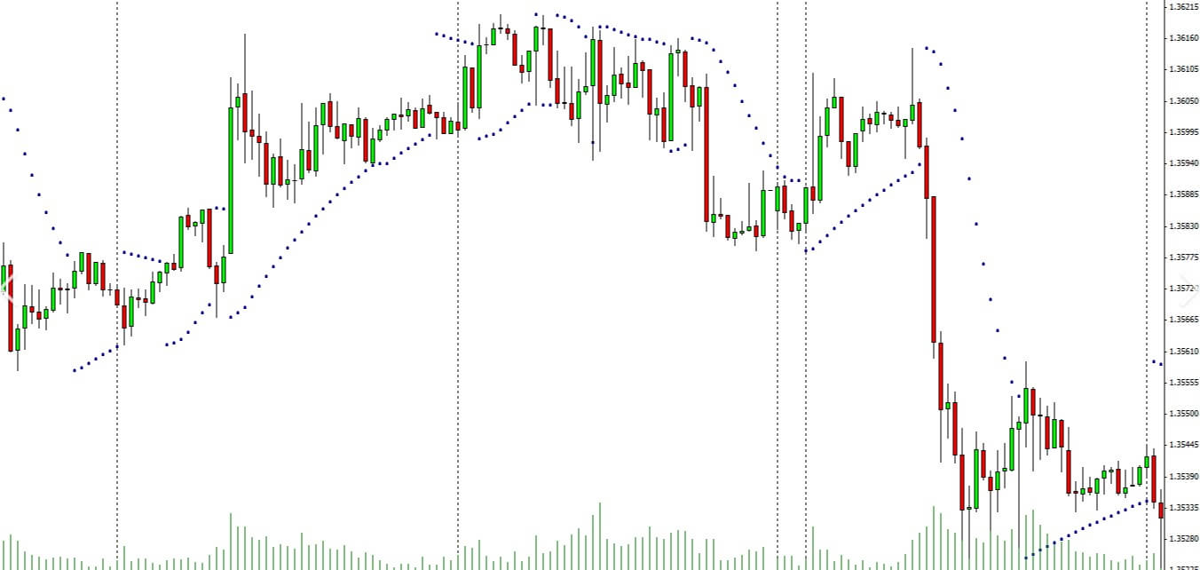
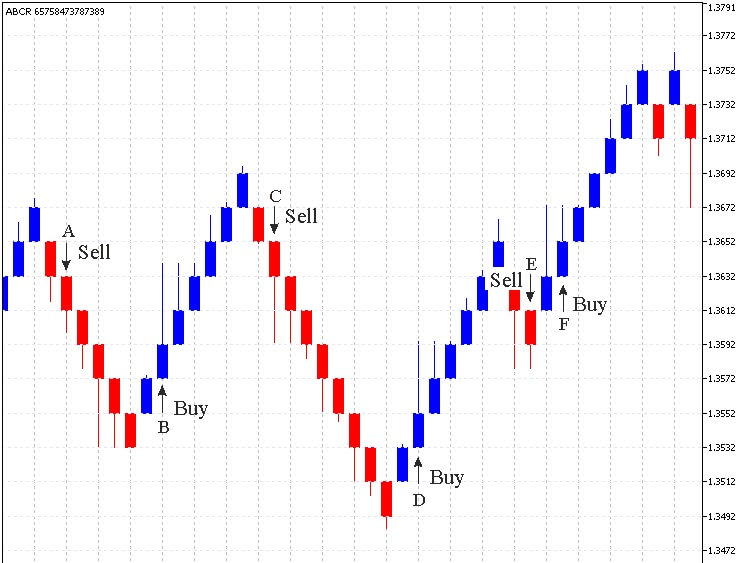
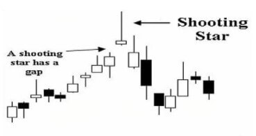
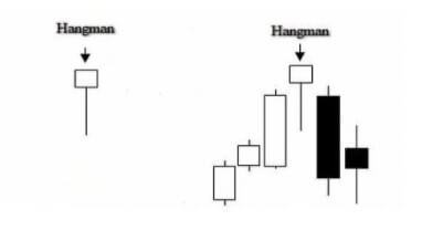
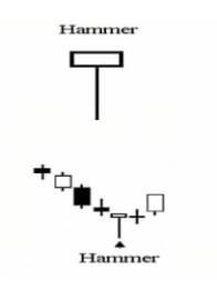
A hammer is a candlestick with a short body, a long lower shadow, and a small or no upper shadow. The story the candlestick is telling you is that the price dropped after opening but rallied during the time period and ended up close to the opening price (sometimes over and sometimes under).

Typically, you’ll see hammers close to the bottom of a clear downward price movement and they indicate that sellers predominated but that, eventually, enough buyers came into the market to sway the price the other way. Of course, you might also see hammers when the market is ranging or moving sideways where they are more likely to deceive you about where the price is going to go. After a strong short trend, however, they often signal a change in the price direction.

As with all of these patterns, they are a signal – there is no guarantee about the direction of the price after a given candlestick pattern. You might see a hammer come in and think it represents a reversal but the price can easily just turn around and burn you afterward. Smart traders who suspect that a downward trend has concluded once they see a hammer will wait for one or even two confirmation candles to form before pulling the trigger on a trade.

Examples – The Shooting Star

Just as a hammer signals a possible change of direction in the price movement after a downward trend, so its mirror image, the shooting star, signals a possible change of direction when it appears at the peak of an upward trend.

Since it is fully a mirror image of the hammer, the shooting star has a long upper shadow, it is also possible to glean a sense of the strength of the turnaround from the length of this shadow – a short shadow likely signals a dampened change of direction while a long upper shadow (sometimes many times longer than the body) is a sign of a more bearish pullback. The best examples of a shooting star will form above the previous candle – that is, its open, lows and close should all be above the shadow of the previous candle.

It is important to be aware that a shooting star pattern and an inverted hammer pattern both look exactly the same but that they differ in one crucial detail. A shooting star will appear at the top of an upward trend and signals a coming downturn, while an inverted hammer will appear at the bottom of a downward trend and, much like its sibling, the hammer signals a change of direction for the price movement. 

Examples – The Doji Star

A doji star or just plain ol’ doji is a candlestick that forms when the open and close price is so close that the candle looks like a cross. The name doji comes from the Japanese word for error or mistake, which is apt given what this candlestick is signaling. There are several types of doji but they are all telling you more or less the same thing – the price has reached a balance point and there is no strong trend in either direction.

You’ll see them in all sorts of contexts, so no matter what the market is doing at any given time, you could have a doji forming. That said, they are still giving traders a signal to be aware of and think about. Though they often crop up when the price is moving sideways – that is not the doji you are looking for. They are much more useful to you when they form after a strong move in either direction. Dojis represent indecision at the best of times but after a healthy trend, they are telling you that equilibrium is being reached between buyers and sellers and that could be a sign that the trend is losing strength. 

Of course, a doji doesn’t always mean there is going to be a turning point and you should watch out for those moments when a trend wavers a bit for a time and then simply carries on going because that could easily kick up a doji. 

Examples – The Hanging Man

The hanging man or hangman is, in many ways, a similar candlestick pattern to a shooting star – in the sense that it represents a possible reversal of sentiment at the top of an upward price movement. Don’t be fooled, however, because there are differences.

A typical hanging man will look much like a hammer or an inverted shooting star – with a relatively small real body, a long lower shadow, and little or no upper shadow. The longer the lower shadow, the stronger the candlestick is as a signal. But the context is important because, unlike a hammer, a hanging man appears at the peak of an upward trend. Also important is the story the candlestick is telling us. From the shape of the candle, we can tell that buyers managed to rein in a sell-off that occurred between the open and close. Though you could read this to mean that the buying sentiment prevailed in the end, most traders will see this deep sell-off as a sign that the trend is losing strength.

There are many traders out there who think of the hanging man as being more useful for short-term changes in direction and that, as such, it should be used more as an exit signal than as an entry into a short trade. In that sense, it could be a useful addition to your toolkit as a way of maximizing wins by preventing the price from dropping through your stops.

Examples – The Bullish Engulfment

The bullish engulfing pattern or engulfing bull is a Japanese candlestick formation made up of two candles rather than one. It forms when a smaller bearish candle is followed immediately by a larger bullish candle whose body is bigger than the real body of the smaller candle. You don’t need to worry too much about the shadows of the smaller candle – the main aspect is the second candle’s large body being bigger than that of its little predecessor. The story that this tells us of the first candle representing a slowing downward price movement, the price opening lower still on the second candle but then closing near the period’s highs (which is why the second engulfing bull candle will often have small upper and lower shadows). This is important, especially for the upper shadow because it then indicates that the price was still heading upwards when the candle closed.

Since the bullish engulfment is telling you that buyers clearly won out during the second candle’s formation, it is usually taken to mean that the downward sentiment is losing strength and that a reversal could be imminent. This is why it is important for the open price of the second candle to be lower than the close of the first – this means that the downward trend continued but was eventually reversed by bulls winning out over bears.

The Other Side of Japanese Candlesticks

Understanding the patterns of Japanese candlesticks and using that knowledge to assist your trading (in conjunction with other indicators and tools) is hugely popular in forex. But although it is true to say that it is popular, that doesn’t mean that there are not those out there who think that Japanese candlesticks are either ineffective to the point of being meaningless or that they could actually be hurting your trading.

Supply and Demand?

The first of these criticisms of candlestick patterns as a tool in trading goes to the very heart of the power of what Japanese candlesticks are all about and it goes a little like this: Japanese candlesticks were originally developed and also later adapted as a tool for trading commodities (rice, in the original iteration) and stocks – both of which conform to the rules of supply and demand much more closely than forex. And there are elements of truth to that criticism. In forex trading, demand is certainly a factor but the supply side of the equation works rather differently than in commodities and stocks because the supply of a currency isn’t as limited – in theory, it is completely unlimited.

However, though there is some truth in there, that doesn’t mean that the story Japanese candlesticks tell traders about the relationship between sellers and buyers during a given time period is completely invalidated. Forex is still subject to the principle that price increases when buyers outnumber sellers and decreases when the reverse is true. But, and here’s the clincher, while it doesn’t invalidate the candlesticks approach, it is still something to bear in mind. You will see times when a candlestick pattern that unfolds just perfectly on your screen still doesn’t go on to give you the price movement you were expecting.

Well, as a trader, what does that tell you and where does that leave you? Ultimately, if you’re a smart trader, it leaves you pretty much where you started. It means that you cannot rely solely on following Japanese candlestick patterns without combining them with a well-worked out trading system that includes other indicators and a host of highly honed risk and money management techniques that you have adapted over time to suit your trading style.

The Big Players

Another – and very closely related – criticism of Japanese candlesticks comes from those that see the actions of big, powerful market players lurking behind every price move and directing the ups and downs of the market in the short term but also, and especially, in the longer term. That may initially sound like conspiracy theory hogwash to some readers but there is more to it than that. In forex, just as in most markets (but perhaps, at the end of the day, more so in forex), there certainly are huge and powerful financial institutions, funds, and so forth that influence the prices on forex markets. Traders need to be aware of that and the fact that this undermines to some extent the purity of a simple supply and demand equation.

There’s another side to this to also be aware of. Japanese candlesticks have become so popular now among retail forex traders that their huge popularity is also one of the main things that hold them back. They are so widespread now as a technique that they have been analyzed to death by the big players in the market and the algorithms and software they use that their reliability has been seriously degraded. The big players will happily use software that recognizes a pattern in the blink of an eye – a million times faster than any human trader would – and uses this advanced knowledge to analyze how the vast majority of traders will react to the emergence of this pattern relying on popular patterns. This essentially traps you – the slow human – in a computer-laid trap where you following the received wisdom in responding to a given pattern will be your ultimate undoing. 

Pattern Blindness

A third major criticism of using Japanese candlesticks – and perhaps the most valid – is based on how our brains work. Humans evolved over millions of years to be able to pick out patterns. Back when we were hunter-gatherers, this helped us to survive, to spot the tiger among the bushes, to find food, and generally to get by. Over time we became masters at it – second to none. But the thing is, being able to see patterns in the modern world isn’t quite the question of life or death that it once was. In fact, it’s of limited application. And then, along comes forex trading and Japanese candlesticks and suddenly we’re back in our element again. So, sure, our innate ability to spot patterns comes in handy sometimes but there’s also a downside.

The drawback of being such fine-tuned pattern identifiers is that we also tend to see them even when we shouldn’t. Sometimes that might mean seeing the savior of your choice in a piece of toast or getting creeped out by random shapes in the dark, but at other times it could be seeing an inverse hammer or a bullish engulfment on a chart. But there’s another couple of elements to the pattern recognition that could also really get in your way when using Japanese candlesticks in trading.

One of these is that you start looking at charts and seeing the candlestick patterns on it but because you’ve become so convinced by all of the hype around Japanese candlesticks, you start only seeing the wins and allowing your eyes to simply skate over the losses. This happens partly because Japanese candlesticks are so popular and so talked about on the forex internet and people become kind of indoctrinated to seeing their successes. You spend so much time watching videos or reading blogs that tell you over and again that these things work that it gradually becomes harder and harder for you to see the times when they don’t.

This generates a kind of belief because, well, wouldn’t it be great if this worked as advertised? You could just look at a chart, see a pattern emerging and you’d know what the market was going to do next – just in time to enter a trade and make a handy little profit from what you know. Once that sense of belief and hope is ingrained, you lose your objectivity and your ability to see things for what they are. And once you’re in that territory, you forget that belief and hope cannot replace a well-tested and well-thought-through strategy. Moreover, once you’ve gone deep enough and trained your brain to see these patterns, you can become blind to all of the other approaches to forex trading there are out there. 

A final piece of the pattern-seeing puzzle is that when you’ve trained your brain to pick out patterns of Japanese candlesticks, it becomes very difficult to untrain your brain again. Even if you stop using them actively as a tool, you’re still going to be seeing them everywhere while you’re trading. In a sense, using this approach to trading lures your brain into a trap from which it can become difficult to escape. Even when you think you’re free because you’ve stopped using candlestick patterns, you go on seeing them and they introduce doubt at a subconscious level, affecting your trading decisions.

Testing Yourself and Your System

Ultimately, whether there is any value to scanning the charts for patterns of Japanese candlesticks is something you will have to decide for yourself. The one thing that’s for sure is that you can’t fully trust your own brain to be objective about it. The only way to be truly and, above all, objectively sure whether any given approach or tool is valid and performs the way you need it to is to test it.

Believing and hoping that something is going to work – even believing other people’s judgment about it – leads to all kinds of problems. Not least of which is the fact that when it almost inevitably fails to work in the long term, the first person you’re going to blame is yourself because your instinct will tell you that you must be doing something wrong: “How can all these people be having success with this tool but it isn’t working for me – there must be something I’m not doing right”. The only way to combat that doubt is to make sure the tools and approaches you’re using have been tested by you and that you are comfortable with how they work.

Now, that doesn’t mean backtesting an approach once on a single currency pair and then clunking it into your system right away. No, if you want to test to remove the fallibility of your subjective and imperfect human brain, you have to put the work in. That means backtesting each tool you plan to use, comparing them with one another, and testing them in conjunction with each other. Then, when you feel like you’ve backtested thoroughly enough, it’s time to take your tools and your trading system out on the road – but in a demo account. Because forward testing is just as important as backtesting and can be even better at highlighting the weaknesses in a tool or indicator.

All of this is just as true with Japanese candlesticks as it is with any other tool that you’re thinking of using. The advantage of backtesting Japanese candlestick patterns, however, is that any individual pattern actually doesn’t crop up all that often. Not only does this make it quicker to backtest them but also you can backtest a whole slew of patterns all at once, just by picking them out of a chart going back a significant amount of time. Conversely, however, they will take longer to forward test than signals that crop up with greater frequency.

At the end of the day, it’s important to have a good overview of how a particular trading tool works but you should take nobody’s word for anything. Believe neither the proponents of a tool nor the detractors – ultimately, be careful about how much you believe your own subjective thought processes – because nobody is going to tell you as much info as you can learn by putting a tool through a robust testing regimen.

Categories
Forex Technical Analysis

Prop Trader’s Use of Moving Averages

Moving Averages are very versatile in ways how you can interpret them for signals. Whatsmore, adding more than one creates a plethora of ideas as many patterns and shapes emerge in conjunction with the chart. Therefore, traders can make complete systems out of these indicators and all of them are unique in their way.

Some MAs are used more often, such as 100-period MA, 20-period Exponential MA, or 9-period EMA, still, signal interpretations are subjective and MAs are used with other indicators and analysis. This article will address how one professional prop trader uses MAs as an element in their trading system and it should give you an idea of what other uses MAs have aside from traditional trading signal generation. We will present opinions that should not be considered as a fact or trading advice, just as an example of how it is used for technical trend-following systems. 

A trader who wants to have a robust and universal system looks to implement measurements of different factor types on the market, covering areas of importance on their trades. According to one such system structure example used by professionals, MA is one element of 6 others. Other elements or tools focus on volume indicators, two trend confirmation indicators, a trade exit indicator, flat markets filter, and volatility measurement for risk management purposes (ATR indicator). Moving Average can double as an Exit indicator when the price cross-closes it but for our example, it is used as a higher probability direction filter. We will go more into this function later, let’s first address the use of the MA as a Trailing Stop.

Trailing Stops

Trailing Stop can be regarded as a trade Exit function with adaptive movement to the price, it will follow the price in real-time and automatically move the level at which a position will be closed if that price level is hit. Most trading platforms or clients like the MT4 have this implemented. Although, Trailing Stops can be calculated based on the moving averages rather than just using the points distance trailing which is a basic Trailing Stop calculation. Now, as there are many types of MAs it means Trailing Stops can also be customized in various ways.

Such tools exist for MT4 and MT5, most of them are a form of Expert Advisor script that expands the way you can use real-time trailing stops for your exits, and more often than not it is more effective than the standard, distance-based trailing stop. Of course, you do not have to use such tools if you do not need real-time custom trailing stops, instead you can just add MA of your choice to your chart and move the Stop Loss order level to it. This is very easy to do if you are on the daily timeframe but gets very demanding if your target timeframe is below M30, especially once you have multiple positions to trail. 

The way we can trail on the daily chart is simple. Once our Take Profit target is hit, we move the Stop Loss to the moving average of choice. Or, we can just wait for the price to cross the MA and close the order manually. There are differences here, the first way is more aggressive because if the currency pair becomes more volatile it is likely your stop loss level will be triggered even though the close price has not crossed the MA. So the second method will not “accidentally” close the position prematurely because of the volatility increase, still, it leaves room for flash crashes or other sudden moves to negate gains we might have got from the trend.

In this case, MA has a trade exit function, while trailing the MA with the stop loss order will ensure our profits from the trend. You should pay attention to the MA period settings and set to single-digit numbers as this is what prop traders recommend for the daily chart systems. Trailing stop or exit function MA should not follow the price to the point it is almost the same, the moving average should average the price value and absorb price volatility to some degree but not lag too much. 

MA Lagging

Talking about the MA lag, it leads us to mention why some technical prop traders are not fans of MA crossovers. You probably know that MA crossovers are very common signal generators unless you are just starting to trade. Moving Averages absorb volatility so we have a cleaner insight where the trend is emerging, ending, stalling, and so on. When we use MA crossover as trend confirmation indicators, the signal they generate is not optimal. It either lags or if we set low periods – fake signals are overwhelming. No matter what type of MA you use, they seem to always be late to the party. Using popular MAs mentioned above, you may have heard about the Golden Cross and the Death Cross.

200 EMA (red line) and the 50 EMA (blue line) on the EUR/USD chart

It is obvious from the picture above that these MAs do not cross often on the daily chart our system is using. Golden Cross is a signal when the 50 EMA crosses the 200 EMA and Death Cross is the opposite, short trade signal. These are used often in stocks trading, creating a kind of uniform traders’ behavior once the crossovers happen, putting more pressure on the price momentum. This phenomenon is waited for by investor traders and the strategy has some success because of this coordinated move to dump or hype a stock. Unfortunately, forex is not a good market for these strategies. You may notice trends once the crosses happen but it is not related to the trader sentiment. Whatsmore, the signals are so spread apart you may have to wait for years to happen. If we zoom out the EUR/USD chart you can notice this, meaning even investor-type forex traders will use other trading options for trend confirmations. 

Daily EUR/USD with EMAs zoomed out

Now we need something that moves faster so we can have signals in a more reasonable time span. We can also use the popular 20 and 50 period EMAs. 

NZD currency basket with the 20/50 period EMAs

The trend confirmation signals on the MA cross are now more frequent and can be applied to a currency basket, for example, for currency strength analysis. This setup can be used on a currency pair too, however, for a professional, these signals are not good enough. Notice that the cross signals lag to the point they are too late for the bigger trends on the NZD basket picture, entering almost in the middle of the 4 visible confirmations. Smaller trends at the end of the chart are completely off, giving you signals when the trend is over.

Moving averages have this flaw when facing a directionless market, but your system should have a volume or volatility indicator/filter that should save you from these losses by giving you a signal to stop trading. Sticking to the MAs subject, a better option is a very simple adjustment on how we interpret the signal to enter. Let’s just focus on the 50 EMA and delete the other. The trend confirmation signal is when the price cross-closes the 50 EMA. Now we have a very different and much better entry point, capturing most of the 4 trends in the picture.

NZD basket with only 50 EMA

Notice that during the periods of trend exhaustion the signals are not always perfect. If we consider you have an indicator that filters flat periods, each trend entry is at an optimal point, providing you with profits even during smaller trends at the chart end. 

When you find an MA that does a great job crossing the price when the trends emerge, that one is absolute gold. Finding one needs a lot of searching and testing, and the MA element plays an important role in the prop trader systems. They also call it the Baseline. 

The Baseline Concept

The Baseline concept takes your signals from the first and second confirmation indicators and filters any that are not in line with the MA signal. By doing this, small corrections on the major trends are filtered in case your confirmation indicators are wrong. Once the corrections are exhausted, the major trend continues where you again reenter. This major trend is considered exhausted once the price cross-closes the Baseline and a new one emerges or a period of calm, trendless action is about. Moving Averages are very bad in these flat conditions, so is your baseline, therefore volume or volatility tools need to step in. 

By going short only if the major trend is going down, and vice versa, you add up your odds of having a winning trade. Now, this is only one of the baseline functions. In your quest of finding a good MA as a baseline element in your system, you will find so many options and so many settings you can change you might not be sure it is the right one as something better is just around the corner. If you are not sure, take a zoomed-out approach. Your MA of choice should cross the price action at points where new trends emerge but allow smaller corrections of the major trend without fake cross signals.

It should be sensitive enough to give you optimal signals once a new trend starts, unlike 200 EMA for example, which is just too slow for our trading way on a daily chart. Some traders like MAs that are calculated in a way so they represent an average and signals you cannot see with eyes only by just looking at price action. A number of these MAs are developed by John Ehlers but you should aim for an MA that fits your system and take a holistic approach to it. 

The Baseline serves as a major trend filter but prop traders understand other concepts to it. Price actions always tend to return to the average value, once it deviates. Unless there is a strong driver (news event) to push the price out of the normal deviation range, the correction towards the baseline is likely. Technical Prop traders measure this distance the price has moved away from the baseline. According to it, they create a rule – if the price has moved too far away from the baseline once it crossed it, they will not make a trade. This signal to enter (if other indicators confirm) will not be optimal, the odds are not very good now. Now, how to measure and find out if the price has moved too far? One of the easiest ways is by looking at the ATR indicator. Measuring the price level pip range from the baseline and comparing it to the ATR (14) gives you an estimate if it is too far.

ATR

ATR measures the volatility of the currency pair and it will give you a measure of how much the price can move away from your baseline daily. If the price is above the daily ATR value, it is a mark it deviated from the normal ranges. This point is also where technical traders put their first Take Profit and move Stop Loss to breakeven. Another important baseline role is also measuring the distance where to put your initial Stop Loss when you enter a trade. According to some testing done by prop traders, the 1.5xATR range is most optimal on a daily chart, but this setting should be adjusted to your system as it may be more or less sensitive.

Of course, only back and forward testing can give you an answer to where the best point is for your system and 1.5xATR can serve as a starting setting. To make your testing process faster, there are tools (for MT4 and MT5) that plot ATR lines above and below the price levels so you can easily see if a trade can be made, if it hit the TP or SL, etc. These tools are not available by default in the MT4 so you will need to find one.

As we can see, the baseline is an important element not just for major trend gauging but also a base for your risk management. A combination of these creates a complete solution to your trading, excluding your guesses that are more often than not bad in terms of probability calculations. As MAs are abundant on the internet, the search for them will likely be easier than for the volume tools, for example. The much harder part is the long testing phase with different settings and calculation types.

Know there are interesting solutions on some specialized forum/websites where one tool can hold several MA calculations, such as TEMA, ADX, Athens MA, SineWave MA, DEMA, Jurik MA, many smoothing options, filtering, and other settings that make an incredible array of how you define your baseline. In conclusion, know MA crossover signals are not a very good option as trade entry signals, MAs are not very good in ranging markets and that there are multiple uses for them, you just need to test a lot. 

Categories
Forex Elliott Wave Forex Technical Analysis

EURGBP Soars!, More Gains Ahead?

The EURGBP cross soared on Friday session, surpassing the psychological 0.92 barrier, advancing until the target area forecasted in our previous short-term analysis (here.)

Technical Overview

Our previous analysis discussed the completion of the complex corrective formation identified as a double-three pattern of Minute degree labeled in black, which began on last September 11th at 0.92916 and finished on November 11th at 0.88610. Likewise, after the double-three completion, the cross completed the wave B of Minor degree identified in green.

Once the EURGBP found the bottom at 0.88610, the cross began a rally corresponding to wave C. We have seen in our previous analysis the price completed wave ((ii)) at 0.88667 on November 23rd. After this completion, both the breakout of the descending trendline of the second wave in black and the strong bullish long-body candlestick formation developed in the November 27th session confirmed the start of the third wave in black.

Technical Outlook

During the last trading session of the week, the short-term Elliott wave view for the EURGBP cross exposed in the following 8-hour chart reveals the acceleration in its advance, which surpassed the supply zone between 0.92008 and 0.92181, finding resistance at 0.92298.

The impulsive upward movement observed during Friday’s session allows us to distinguish the completion of the wave ((iii)) at 0.92298 and the beginning of the fourth wave of the same degree.

In this context, the current corrective formation identified as wave ((iv)) in black could decline until the previous supply zone between 0.90686 and 0.90446, where the cross could find fresh buyers. Once the fourth wave completes, the cross should advance in a new rally corresponding to wave ((v)), which would be subdivided into a five-wave sequence. The potential target for the end of wave C is within the next supply zone between 0.92568 and 0.92916.

In summary, the EURGBP cross appears moving in an incomplete wave C of Minor degree, which, in its lesser degree count, shows the beginning of the fourth wave in black. This corrective formation could decline until the previous supply zone is located between 0.90446 and 0.90686. The cross, then, could find fresh buyers expecting the continuation of the trend that would push up the price toward the supply zone between 0.92568 and 0.92916.

Lastly, the invalidation level for this bullish scenario can be found at 0.90031.

Categories
Forex Elliott Wave Forex Market Analysis

EURNZD Consolidates after Bouncing from its Recent Lows

The EURNZD cross is seen consolidating near the extreme bearish sentiment zone backed by the strength of the New Zealand dollar. This consolidation suggests a pause of the downward sequence that began on August 20th and ended heavily oversold after its latest decline that drove it to 1.69472.

Technical Overview

The following 12-hour chart illustrates the short-term markets participants’ sentiment bounded by the 90 high and low range, which shows the price consolidating in the extreme bearish sentiment zone after the cross found support on 1.69472 on November 24th.

Furthermore, the previous chart shows the primary trend outlined a blue trend-line that tells the bias remains mostly bearish. Likewise, the secondary trend represented with the green trend-line exposes the downward acceleration, and, shows also its consolidation range between the levels of 1.69472 and 1.72664.

Finally, as long as the EURNZD cross keeps moving below level 1.72664, the bias will remain bearish, so we could expect further drops, likely below 1.69472. Whereas, the breakout of the extreme bearish zone of 1.72664 to the upside could indicate the start of a recovery.

Short-term Technical Outlook

The short-term outlook for the EURNZD cross under the Elliott Wave perspective is shown in the next 2-hour chart and seen moving in an incomplete downward sequence. The current leg in which is moving corresponds to the wave ((c)) of Minute degree labeled in black.  Within that wave ((c)), the price is advancing in its fourth wave of Minuette degree identified in blue.


We see all that the wave ((c)) of Minute degree labeled in black came after the completion of the wave ((b)), which ends on 1.80212 where the cross found fresh sellers dragging it in an accelerated bearish movement. In this context, the current wave ((c)) should develop an internal structure of five waves.

Right now, the chart shows the action is happening in its fourth wave, in blue, which could be advancing in its internal wave b of Subminuette degree identified in green. This leg could possibly test November’s lows. Likewise, considering that the third wave, in blue, looks like an extended wave, the fourth wave should be complex in price, time, or both. Therefore, the current corrective wave could continue evlving likely until early 2021.

Concerning the fifth wave, in blue, and considering that the third one of the same degree was the extended movement, there are two potential scenarios for the cross:

  • First scenario: the cross fails in its downward sequence finding fresh buyers above the end of the third wave, in blue, at 1.69472.
  • Second scenario: the cross penetrates below 1.69472, creating a new lower low. In this case, this new leg down could continue until the psychological barrier of 1.68.

In summary, the EURNZD cross currently moves in a corrective formation in the extreme bearish sentiment zone. In this context, our principal bias remains neutral until the completion of the fourth wave in blue. Once the cross ends the current consolidation, we could seek short positions following the direction of the fifth wave. Finally, the invalidation level of the bearish scenario locates at 1.73606.

Categories
Forex Indicators

Top 5 Forex Trend Indicators for New and Experienced Traders

There are thousands of indicators out there. In fact, there are so many that it is impossible to look at them all. What you may find when going through them is that a lot of them are actually different variations of a few different major indicators, with the creator having simply made a few small changes here and there. The underlying principle and method behind the indicators are fundamentally the same, in fact, for most of them, you would not actually see much difference at all.

So we are going to be looking at some of the more widely used trend-based indicators that are out there. You most likely will have heard of some of them or even used a variation of one yourself. Let’s take a look at what these major and popular trend indicators are.

Price Action

This is probably the one that most people would have heard of. In fact, some people who know nothing about Forex or trading may well have heard of this one too. When it comes to trading, price is the number one variable that we will be looking at and it is one that dictates the majority of moves within the markets. So getting a good understanding of what price action does and how the trends work is often the first thing that people set out to learn.

There are multiple different ways to look at price action. There are higher highs or lower lows and it is something that every trader should understand. We are not going to be going into detail here on how you actually analyse it, but there are hundreds of indicators out there that you are able to add onto your charts which give a fantastic overview of the current price action that is going on within the markets. The current price can tell you a lot about the current trends. The good thing about some of the price action indicators is that they also include trend lines, making it far easier to see where the current price sits within the current trend, a valuable tool for any trader or any experience level.

Moving Averages

One of the most used indicators when it comes to trading forex would have to be the moving average indicator. It is used to help identify the trends within the markets. There are multiple different forms of moving averages but they all follow the same ideas and aim to plot the average prices of a currency over a specific period of time over the price itself.

What the indicator suggests is that if the current price is above or below the current average price. It should indicate whether the markets are currently bullish or bearish. You are also able to work out the possible strength of a trend by looking at the steepness of the moving average slope. The steeper that the slope is, the stronger the trend would be. More often than not, you would use a long term in a short term moving average at the same time to help confirm any possible bullish or bearish movements.

The moving averages indicators are often used in conjunction with other indicators to help set up trades for specific strategies. Even if you do not use it for your trading, having a general idea of the current trend and where that trend sits above the average price can be invaluable to your trading, including both entry and exit positions.

The Parabolic SAR

Parabolic SAR, which stands for Stop and Reverse, is a great indicator that a lot of people use. The way it works is by identifying the short term trends within the markets. It will simply place dots on the charts which will be either above or below the high or the low in the price.

It works by using a number of different variables to help calculate its values. It uses things like acceleration factor and extreme price to do this. It is extremely useful when looking at the short term trends and the changes that are happening within these trends. It can be used to help with both entry and exits of trades as it is good at showing where the reversal could happen. It should also be used multiple times to enable for better correlation and confirmations of the short term trends and the changes that could be taking place.

The MACD

Also known as Moving Average Convergence, divergence, it is an oscillator which means that it will usually measure variables and changes in things like momentum and volatility. The MACD indicator is slightly different though because it also acts as a trend indicator, as well as calculating the momentum in the price of a currency.

The MACD indicator includes a histogram which will oscillate around the 0-level. The fast and slow lines are known as the MACD line and the signal line. The indicator gets its values from the exponential moving average indicator with a setting of 12 and 26 periods. The trends that are shown in the price charts are validated by using a combination of variables in the MACD indicator. MACD is widely used and there are a lot of indicators and expert advisors out there that have implemented it into their strategies and into their indicators, so you do not need to look far to see MACD being mentioned.

Ichimoku Cloud

This indicator is also known as Ichimoku Kinko Hyo, is a pretty unique one as it is a trending system within itself, not needing any additional input. It was developed to work as a trend following indicator which has a large number of variables included in it for customisation and adaptations.

The cloud within the indicator is often seen as the support and resistance level areas within the markets. The Chikou, Kijun-sen and Trinjensen measure the 9-period and 26-period levels on the charts. The Ichimoku Cloud indicator is fast becoming one of the most used trend indicators and is now getting used more and more by new and experienced traders. On first impression, it can look a little daunting due to the vast numbers of options and variables available, however, during a time of sustained trend in the markets, the indicator is able to give very good and very accurate results, which is why it is now so highly used.

So those are some of the most popular trend indicators that are being used right now. Which one you should use is entirely up to you. Some match and combine with certain strategies while some do not, some are far simpler than others, but the decision of which to use will need to be based on what will work best with your current strategy. All we know is that they are all incredibly helpful and potentially powerful tools that you can add to your trading arsenal.

Categories
Forex Elliott Wave Forex Technical Analysis

EURJPY Consolidates Expecting the ECB Decision Ahead

The EURJPY cross consolidates in the overnight trading session expecting the ECB interest rate decision statement that will take place before the U.S. opening bell. The analysts’ consensus doesn’t expect changes both in the interest rate that remains at 0.0% and in the deposit facility rate that keeps at -0.50%.

Source: TradingEconomics.com

Technical Overview

The following 8-hour chart shows the EURJPY market participants’ sentiment, where the cross looks consolidating in the extreme bullish zone, developing a flag pattern. This chartist pattern suggests the continuation of the previous movement. In this case, the technical formation could be indicative of further upsides for the following trading sessions.

Moreover, the primary trend identified with the upward trend-line in blue remains on the bullish side. Also, the secondary trendline plotted in green reveals the bullish acceleration of the price action. This market context is confirmed by the EMA(60) to Close Index, with a reading above the level 2.000 that suggests the overbought levels and the potential correction or consolidation of the previous rally.

Short-term Technical Outlook

The EURJPY under the intraday Elliott wave perspective unfolded in its 2-hour chart illustrates the advance in an incomplete corrective rally corresponding to wave ((b)) of Minute degree labeled in black. The internal structure shows the cross advancing in its incomplete wave (c) of Minuette degree marked in blue, suggesting a further upside in the following trading sessions.

At the same time, the previous chart reveals the internal five-wave sequence of wave (c) in blue, which exposes the sideways progress of its fourth wave of Subminuette degree identified in green, which belongs to the wave (c) of Minuette degree. 

In this context, considering that the price action could develop a new upward movement, the cross could advance in its fifth wave in green to the potential target zone between 126.84 and 127.48, where the EURJPY cross could complete the wave (c) in blue, and the wave ((b)) in black. Likewise, once this corrective rally completes, the price could start to develop a downward movement identified as wave ((c)) in black.

In this regard, according to the Elliott Wave theory and considering that the mid-term structure corresponds to an incomplete corrective formation constituted by a three-wave sequence, after the completion of the wave ((b)) in black, the price should start to decline in its wave ((c)) with an internal structure subdivided into a five-wave sequence.

Summarizing, the EURJPY cross currently develops a consolidation pattern, which leads to expect a new upward movement with a potential target between 126.84 and 127.48. Once the price completed its target, the cross may start to decline in a five-wave sequence corresponding to wave ((c)) of Minute degree.

Finally, the invalidation level of the current bullish scenario can be found at 124.566.

Categories
Forex Elliott Wave Forex Market Analysis

GBPUSD Ending Diagonal Completion a Warning Sign for a Trend Reversal?

In our last GBPUSD analysis, we discussed its upward advance in an incomplete ending diagonal pattern. We said that the terminal Elliott wave formation progressed in its fifth wave of Minuette degree identified in blue that belongs to a wave ((c)) of Minute degree labeled in black. Likewise, the wave ((c)) corresponds to the third internal segment of the wave B of Minor degree identified in green. 

Technical Overview

The big picture unveiled the sideways movement in an incomplete corrective formation, which could correspond to an expanding flat pattern. In this regard, after the completion of wave B, the Sterling should start developing wave C, which should lead to a decline of this major pair in a five-wave internal sequence.

On the other hand, the following 8-hour chart reveals the market participants’ sentiment unfolded by the 90-day high and low range, which looks advancing in the extreme bullish sentiment zone. 

The previous chart illustrates the bullish failure in the Wednesday trading session, which couldn’t strike the last high of 1.35394. This failure added to the breakdown of the previous upward trendline plotted in green leads us to expect further declines in the coming trading sessions, likely to the ascending primary trend-line identified in blue.

Short-term Technical Outlook

The intraday Elliott wave view for the GBPUSD pair displayed by the following 2-hour chart exposes the breakdown of the ending diagonal pattern formed on December 07th, confirming the completion of the terminal formation unveiled in the wave ((c)) identified in black. 

Once the Pound found the intraday support at 1.32238, the price action began to bounce in an internal corrective rally subdivided in a three-wave sequence corresponding to wave ((ii)) in black, founding resistance at 1.34779 on the Wednesday trading session.

In this regard, the breakdown of the intraday trend-line that connects the waves ((i)) and (b) should confirm the downward progress of its wave ((iii)) in black, which according to the Elliott wave theory, should be the largest wave of the downward sequence.

The third wave in black could find support in the demand zone between 1.31296 and 1.31064. If the price action continues deteriorating, the Cable could drop toward the next demand zone between 1.29843 and 1.29144.

Summarizing

After the GBPUSD pair made a breakdown of its ending diagonal pattern, is currently moving in a corrective rally corresponding to wave ((ii)), which should give way to a new decline corresponding to the third wave of Minute degree. According to the textbook, this movement should be the largest decline of the current downward sequence and could find support in the demand zone between 1.31296 and 1.31064. Finally, the invalidation level of the current bearish scenario can be found at 1.35394.

Categories
Forex Elliott Wave Forex Market Analysis

EURUSD: is 1.22 at Hand?

The EURUSD pair advances in the extreme bullish sentiment range, consolidating the short-term rally that started on November 04th when the price found fresh buyers at 1.15615.

Technical Overview

The following 8-hour chart shows the short-term participants’ sentiment keeps pushing higher the price action. In this view, the common currency looks to consolidate the pair’s impulsive movement that began in early November.

In this chart, we can see that the current primary trend is clearly bullish. Simultaneously, the accelerated trendline identified with the green line shows the short-term bull market remains intact.

On the other hand, both the intraday sideways channel and the retracement observed in the EMA(60) to Close Index lead to a consolidation of the rally experienced by the common currency during the previous trading sessions.

Therefore, if the price action penetrates below 1.20338, the likelihood of a reversal movement in the EURUSD increases.

Short-term Technical Outlook

The short-term Elliott Wave view for the EURUSD pair unfolded in the next 4-hour chart reveals the advance in an incomplete bullish impulsive wave of Minor degree identified in green.

The EURUSD 4-hour chart illustrates the impulsive rally that began on November 04th when the price found fresh buyers at 1.16025. The price action currently looks to have completed its third wave of Minute degree labeled in black, confirmed by the broadest distance shown on the MACD oscillator

On the other hand, the consolidation structure in progress reveals the potential sideways advance of its fourth wave. Considering the Elliott Wave Principle, the fourth wave shouldn’t penetrate below the invalidation level located at 1.19201, which corresponds to the end of wave ((i)) in black.

Also, considering both the second wave, which looks like a simple corrective pattern, and the alternation principle on corrective waves, the fourth wave should be a complex correction. In this context, the fourth wave could be a triangle or a combination of simple waves grouped in a double-three or a triple-three formation.

Finally, the extension in terms of time should indicate the exhaustion of the bullish pressure; thus, the common currency could soon end its bullish cycle.

Categories
Forex Elliott Wave Forex Market Analysis

GBPAUD Consolidates in an Incomplete Correction

The GBPAUD cross continues consolidating in what is a corrective formation that continues in development since October 22nd when the price found fresh sellers on 1.85272. In this context, the current consolidation pattern suggests a coming rally in the following trading weeks.

Technical Overview

The next 12-hour chart illustrates the short-term market participants’ sentiment displaying the 90-day high and low range, which bounced in the bearish sentiment zone finding resistance in the neutral level of 1.80104, where the cross is still moving in the current trading session. However, as long as the GBPAUD cross doesn’t surpass and closes above the level of 1.80104, the bias will stay mostly bearish.

The primary trend identified in blue shows that the current uptrend remains in its formation process. In this context, the corrective movement in progress represents a secondary trend from the last upward move that carried the cross from 1.74935 to 1.85272.

Short-term Technical Outlook

The short-term Elliott wave view for the GBPAUD cross shown in the following 4-hour chart reveals the downward advance in an incomplete double-three pattern of Minute degree labeled in black, which suggests further declines for the following trading sessions.

The previous chart shows the GBPAUD developing a double three pattern. According to the textbook, this complex corrective formation follows an internal sequence subdivided into 3-3-3, where each three corresponds to a basic corrective structure.

Currently, the cross looks advancing in its wave (c) of Minuette degree labeled in blue, which belongs to the wave ((y)) of Minute degree identified in black. The movement developed until now fits two potential scenarios:

  • The first scenario considers the pause in the wave (c), which could see further declines to the demand zone between 1.7774 and 1.7716. The cross could even extend its drops until 1.7610 and 1.7554, where the price could find fresh buyers expecting a boost in its price to new highs.
  • The second occurs if the price ends its wave (c) in blue and rally toward fresh highs. In this context, the cross should confirm the breakout of the supply zone resistance at 1.8041. Also, the cross must break up the ((x))-(b) trend-line.

Finally, the invalidation level for this bearish sequence in progress can be found at the end of wave (b) in blue at 1.82144.

Categories
Forex Elliott Wave Forex Technical Analysis

US Dollar Index Under Bearish Pressure. What’s next?

The US Dollar Index (DXY) consolidates on Monday’s session in the extreme bearish sentiment zone bouncing a modest 0.06% from the last Friday 04th, from 90.476 to 90.757. However, the technical perspective is mostly bearish for the DXY basket of currencies.

Technical Overview

The following 8-hour chart shows the mid-term market participants’ sentiment unfolded in its 90-day high and low range. The figure reveals the bearish pressure that carries the Greenback in the extreme bearish zone between 90.476 and 91.543. Likewise, the intraday sideways candlestick formation suggests the likelihood of a pause and the downward continuation for the following trading sessions.

Regarding the US Dollar’s trend, the primary trend plotted in the blue line reveals the bearish bias. The secondary trend identified in green suggested the downward acceleration since November 04th when the price failed its bullish advance at 94.316. Likewise, the broader distance between the primary trend-line and the price leads to a limited correction before continuing the bearish path.

Short-term Technical Outlook

The short-term Elliott Wave perspective for the US Dollar Index exposed in the next 2-hour chart suggests the incomplete downward advance of a five-wave sequence, which could be starting to consolidate in its fourth wave of Minuette degree identified in blue.

The current bearish sequence began on November 04th when the price found fresh sellers at 90.302 and began a decline that is still present to date. The previous chart suggests the completion of the third wave of Minuette degree. This Elliott wave context is supported by the broadest distance observed in the MACD oscillator.

On the other hand, considering that the second corrective wave seems simple in terms of price and time, the alternation principle suggests that the fourth wave in progress should be complex in terms of price, time, or both. In this context, the next corrective pattern could be a triangle pattern or a combination such as a double-three or a triple-three formation.

The implication of the fourth wave’s extension could be indicative of the exhaustion of the bearish trend, and the price action should reverse soon.

Finally, if the price action rises and closes above the supply zone between 91.412 and 91.580, the US Dollar Index could reveal a possible reversion of the current bearish trend.

Categories
Forex Technical Analysis

Using Moving Averages as Professional Traders Do – Here’s How…

Some traders use moving averages as resistance and support indicators or focus on whether a candle has closed above or below a specific moving average. The ability to use moving averages in the same manner as professional traders can make all the difference in the world with regards to your earnings. With that in mind, allow us to explain just how to do this.

Los Cruces

A cross is the most basic type of signal and many traders favor it because it eliminates the emotional element of trading. The most basic type of crossing occurs when the price of an asset moves on one side of a moving average and ends on the other. As we have commented, price crossings are used by traders to identify impulse changes and can be used as a basic output or input forex strategy. A crossing below a moving average can signal the beginning of a downward trend and will probably be used by traders as a signal to close any existing long position. On the contrary, a closure above a moving average from below may suggest the beginning of a new upward trend.

The second type of crossing occurs when a short-term average crosses through a long-term average. This signal is used by traders to detect when the momentum is changing in one direction and a strong movement is likely to approach. A buying signal is generated when the short-term average crosses above the long-term average, while a selling signal occurs when a short-term average crosses below a long-term average.

These methods are not the best way to use moving averages. In fact, they can be used much more cost-effectively if we use moving averages as impulse indicators, indicating the absence or strength of a trend, in company with other factors that recommend entry. This is how moving averages are often used by Forex market professionals.

Types of Moving Socks

There are several different types of moving socks and we should know each one before using them. Almost all graphics platforms offer all kinds of moving socks. Firstly, you should know that moving averages can be applied to the closing price, the opening price, or to high or low prices in a timeframe. They are usually applied to closing prices, and this is logical since closing prices are of great importance, and each opening price is also a closing price or a previous candle. Closing prices weigh heavily on the samples because it is often a level at which the price has settled.

At this point, let’s take a look at each type of moving average.

The simple moving average (SMA) is only an average of all the periods to which it refers.

The exponential moving mean (EMA) is calculated by giving more weight to the most recent value. In other words, we say that, for example, if the price has not moved, but starts to go up, an EMA will be demonstrating a higher level than an SMA for that same review time period.

The linear weighted moving average, sometimes referred to simply as a weighted moving average (LWMA or WMA), is like the EMA, being also calculated by giving more weight to the most recent value, but the weighting is proportional throughout the data series, while EMA only gives more weight to the most recent sample.

There are other types of moving stockings, but you don’t need to worry about them. These three types can provide you with everything you need.

Important Moving Stockings

There are some specific moving averages that are used by many traders. I will describe them here, but I do not suggest that much attention be paid where the price is related to any of them as if this were something very important in itself. The important moving averages are:

  • 20 EMA
  • 50 SMA
  • 100 SMA
  • 200 SMA
  • 200 EMA

Using Moving Stockings as Impulse Indicators

One of the best occasions to use moving socks like professionals is to use them as impulse indicators to determine if there is a trend and how strong it is. The best advantage that retail traders can take advantage of is to be able to trade in the direction of the trend if there is one.

One way to do this is to observe the slope angle of a moving average. For example, in a strong bullish trend, many traders will be looking at the angle of EMA 20. If the angle is consistent and strong, it is a sign that we have a trend in place. Note how, in the graph below, the EMA 20 is showing a rather strong angle, and also note that the price has remained largely below it in the graph. This is a sign of a downward trend.

Crosses of Moving Averages as Impulse Indicators

A more sophisticated way to do this is to check if a faster moving average is above a slower moving average and check this in several time frames. When you have bigger time frames that show a good trend, but a regression in smaller time frames, this could give you a chance to get in the direction of the trend, when moving averages cross again in the same direction as the time frame greater or smaller.

A combination of moving stockings that I like to wear is EMA 3 as a fast-moving average and SMA 10 as a slow-moving average. There is nothing especially magical about these numbers – beware of traders who swear that something like the LWMA 42 is a magic indicator -, but the difference between them tends to offer us an early warning of a change in the direction of the market. In fact, when we use this combination, I not only check several time frames, but I also need to see that the 10-period RSI indicator matches the address. This type of trading strategy using the moving average in various time frames can be very profitable.

In the example graph below, these two moving averages in all upper time frames are showing EMA 3 below SMA 10. In this 5-minute graph, while this quality existed within the larger time frames, EMA 3 retreated twice before crossing again below SMA 10 as indicated by the blue arrows. These two crossings could have provided profitable operations in the short term.

Deviation From Moving Averages

It is generally not sufficiently appreciated that almost all trend indicators are based on some sort of moving averages. For example, the Bollinger Band is simply the EMA 20 in the center with statistical deviation channels based on the historical price range.

Another way to use a mobile average is to take high probability quick pips following the following strategy. Let’s say that a very short-term moving average like EMA 20 is showing a strong angle and the price generally staying above it. If the price falls suddenly hard enough to get below the moving average, there is a high probability that the price will go back quickly to get back above it.

Another strategy is to look for a candle that is not touching the moving stockings at all, but that is indicating a movement back towards the moving stockings area. 

Frequently Asked Questions

How is the moving average calculated?

Basically, a moving average can be calculated by adding the last closing prices of “X” periods and then dividing that number by “X”.

What is EMA trading?

One type of essential tool for assessing trends in markets is the exponential moving average (EMA). In this article, we will present a specific type of stockings called Exponential Moving Media.

What is a mobile media filter?

Using statistics, a moving average is a calculation that is used to analyze a data set in point mode to create averages series. Thus the moving averages are a list of numbers in which each is the average of a subset of the original data.