Is the Renko chart a revolution in forex trading? A game-changer? Or is it a dead-end that’s going to cost you time and money? Read this to find out!
A Jenga Tower Made of Renga
Renko charts, conceived and designed in Japan, are a potentially revolutionary trading tool and everyone’s talking about them. The basic concept is relatively simple but the ripple effects are not and they could have a huge impact on how you trade. So what is a Renko chart anyway?
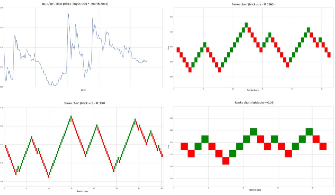
In the simplest possible terms, a Renko chart is composed of bricks (rather than candles) that are called renga – after the Japanese word for “brick”. Each brick represents a given price movement – in forex trading, this is expressed by a pip value that you determine when creating the chart. The bricks form when the price moves enough in one direction to cover the pip value. That sounds simple enough, doesn’t it?
The first knock-on effect of forming a chart this way is that it knocks out the timeframe. That’s not to say there isn’t a time component to a Renko chart – the time axis is still along X but the way bricks form is not the same way candles form in a traditional chart. We’re used to a candle forming once a set amount of time has passed, regardless of how much the price has moved during that time but on a Renko chart, this approach is turned on its head. The renga bricks form only when the price has moved sufficiently in one direction – which, if the price is moving sideways enough to stay within the pip value you selected for the chart, could take quite some time. Purely theoretically, the brick could take indefinitely long to form if the price stays level (of course, that’s never going to actually happen but isn’t there something a bit unsettling about the idea that it could?). Conversely, when the price moves sharply, a long line of renga bricks might form in a very short time. But, because there is no timeframe, looking back at a run of bricks, you won’t have any indication of how quickly events unfolded.
So if a Renko chart is such an inversion of the usual rules for the way your chart forms over time, how will it affect your trading? Well, that’s what we’re here to find out.
How to Navigate a Renko Chart
Charts, just like the maps used by seafarers of ye olde times, are your guide to sailing the waves of the market, and, just like the maps of yore, they will adapt and new innovations will appear over time. Renko is just such an innovation and knowing what it can do for your ability to navigate through choppy seas is vital. In fact, it is important to know what it is, what it does, and how it works, even if you don’t end up using it. This is down to the simple fact that, if you want to improve and grow as a trader, you need to understand the tools that are out there and how they can potentially improve your trading.
First of all, the rules underpinning a Renko chart are so different it almost calls out for you to forget everything you’ve ever learned about reading a chart. But at the same time, when you start out playing around with a Renko chart, it will feel like everything’s dumbed down and simplified. The fact that the bricks form at the pip value you set, will make everything look almost laughably simple – and that might not be a bad thing.
So your first task is to set the pip value. The lower pip values will, of course, make the bricks form more quickly as the price moves small amounts in any given direction. This means the chart will unfold with greater speed, which may make it seem daunting to anyone used to trading on the longer timeframes. And, indeed, the smaller pip values are used by traders who are using the Ranko chart for scalping. Traders who are accustomed to longer timeframes will want to slow the chart down by selecting larger pip values. Traders who use the daily chart might struggle with Renko and decide that ultimately this isn’t the tool for them. More on that later.
When you just begin playing around with a Renko chart, it’s probably worth your while setting the pip value quite low (say 10 pips, for example) because this will give you a chart that unfolds relatively quickly, which makes it easier to manipulate and test in a shorter time than a chart you set to, say, 50 pips. The 50 pip Renko chart will take too long to develop new bricks (unless you’re using it on a super-volatile currency), which will slow down your testing protocol.
The first thing you’ll notice with the Renko chart is that all of the bricks are the same length – that’s because you are the one who sets the pip value they represent. The second thing you’ll notice is that there are bricks of two different colours – one represents the price going long and the other represents the price going short. Depending on your platform, you’ll likely be able to go into the settings and change the colours if the default ones don’t suit you.
Renko and Reversals
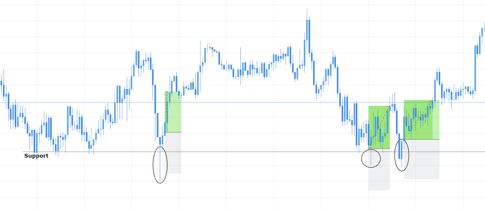
You will immediately have noticed that no two bricks on the chart are next to one another. They always form at the corners. This has important implications for the way Renko charts record a change in the price direction and you will want to make sure you have your head wrapped around this properly so that it doesn’t trip you up.
For the direction in which the bricks appear to change, there has to be a significant change in the price direction. How does that work? Well, let’s say you’re looking at a Renko chart set to ten pips and the price of a currency drops thirty pips. That will form three bricks in the downward direction – that is, three bricks showing that the price is going short. But, from here, the price can drop a further nine pips before it forms a new renga brick in that direction. And if the price movement starts going long, it can make up those nine pips but it still won’t have formed a new brick. In fact, it can go long for another 19 pips (taking it all the way back to the start of the last brick that formed on your screen) and it still won’t form a new brick showing the upward movement. In fact, from our imagined point of nine pips below the latest downward brick, the price would have to go long for 29 pips before you’ll get a newly-formed brick in the other direction.
This feature of the Renko chart is really important to understand and to bear in mind when designing strategies that rely on using Renko. When the price changes direction – or reverses, you could say – it doesn’t just need to go back X pips, it needs to go back in the other direction 2X pips for it to show on the chart. This will, of course, impact how you determine your entry and exit points when actually entering a trade.
The Pros and Cons of Renko
While you’re sitting there, trying to get your head around this whole new approach to following price movements, it is also worth going over some of the pros and cons of using a Renko chart in your trading. We say “some of” because a lot of this is going to depend on the kind of trader you are and how you have set up your whole approach to trading. Renko is, after all, just one of the tools available to you and though it may seem revolutionary and even though everyone is talking about it, ultimately that doesn’t mean it will end up being something you use. This is worth bearing in mind when you look over some of the advantages it offers and some of the disadvantages inherent to using it.
The first pro is kind of a big one. It will be immediately obvious to you the moment you open up a Renko chart on your platform. This thing is easy to read! It cuts out all of the noise of a traditional chart and boils it down to its bare essentials. There are lots of people out there – and if you are one of them, there’s no shame in that – who even get distracted by the noise of traditional charts. Sometimes this can follow you for several years into your trading career. The fact is that noise can be a distraction and can muddle your decision-making particularly at the most critical junctures: choosing entry and exit points. Renko is basically designed with that fact in mind as a tool deliberately made to reduce noise down to a minimum. It does this by filtering out all price movements that are smaller than the pip value you selected for the bricks. There’s no way around it, this is a big deal. It enables traders to more clearly identify trends in price movements. One of the holy grails of forex trading. It makes it so that all you really have to keep an eye on is how the line of bricks is shaping up and which brick is coming next.
Now, while being able to more easily identify trends certainly looks like a huge pro for Renko, it does come with a proviso. Which is that with great simplicity comes great responsibility. In order to truly take advantage of the trends that show up in your Renko chart, you will have to formulate a strict set of rules for entries and exits and you will have to stick to them. And that’s where some of the cons start to wriggle out of the woodwork.
By taking away the noise, Renko charts also wipe out something that might be quite useful, they erase a lot of the detail. That can end up having a couple of effects that could seriously impact your trading. The first of these is that it can conceal sharp movements in the price that fall within the pip values of a brick. This can lead to sending you mixed up signals for trade entries and can also result in the whipsaw effect – where the price reaches the point at which a new brick is formed but then slips back the other way immediately.
To protect yourself from these effects, you’ll probably design a rule that means you enter the trade only once a trend is a couple of Renko bricks deep – that is, once two or more bricks show the price heading in one direction. The first side-effect of this is that it will eat into the profit you can take away from that trade (because you’ve already had to wait for two or more bricks to form before entering). The second side-effect is knowing where to set your exit.
Most people will probably see a trend until the bricks change color and direction. That’s not necessarily a bad way to do it but – If you remember that it takes a price reversal equal to two bricks worth of pips before you see a change on your Renko chart – you’ll realize that this will also cut into your earnings from a trade. In short, even if everything goes according to plan, you’re losing two bricks-worth from your entry and two bricks-worth from your exit. That can still result in a profitable trade if the trend runs far enough but it’s also worth remembering that things don’t always go according to plan.
If you open up a Renko chart for any currency pair, you’re sure to see these nice, runs of bricks going up and down across your screen. And, sure enough, Renko charts do identify some pretty nice trends from time to time. But, you will also see these places on the Renko chart where the bricks zig-zag, changing to one color and then quickly changing back. If you apply the rules we just discussed, waiting for two bricks to enter and a change back to the exit, then these areas of flux are going to seriously ruin your day.
As well as cutting down on the detail of traditional charts, Renko also cuts down on the flexibility available to you. By setting the pip value that determines brick sizes on your chart, you are marrying your trading system to the volatility of the market at the moment you do that. As the volatility changes both in the market and across currency pairs, you’re going to want to adjust your Renko chart. Of course, switching the pip value is easy enough but the knock-on effects can be disastrous. As the volatility of a currency pair changes from day to day, you might find that the bricks on your chart are forming too quickly or too slowly but if you adjust the pip values, you are impacting the consistency of your system. Not to mention the fact that by increasing the brick size you are also losing more detail as far as the price movement is concerned. The alternative is to stick to one value and, ultimately, become a slave to it as volatility changes gear.
Finally, as far as the cons are concerned, there is the fact that Renko charts are only suitable for certain kinds of trading. They are more appropriate for traders who are looking to catch trends and who trade on shorter timeframes. Traders who are chasing reversals or those who prefer to trade on the daily chart are basically left out in the cold. Reversal traders will simply dump Renko as soon as they see it, simply because of the way Renko charts display changes in price direction. Daily chart traders, on the other hand, will feel they have to stay chained to their trading platform in fear of missing price movements on the Renko chart. With Renko charts, they simply cannot trade by logging in for half an hour each day and going over the day’s progress, because all they will see is the number of trades they have missed. In short, if you are a daily chart trader and you want to use Renko charts, you are probably going to have to completely change the way you trade.
Land of Opportunity
Just as a blank space on an old sailing map can represent both opportunity and peril to a seasoned mariner, so Renko charts can be both of those things to a trader looking for new territory to explore. Although there may be clear cons to the way Renko works with your current trading set-up, that doesn’t mean it is not a land of opportunity if you are willing to change up and develop new ways of doing things.
For example, the current set of indicators you rely on in your trading system will work completely differently on a Renko chart. Chances are, in fact, that they will probably turn out to not be applicable or will not work very well (if at all) with a Renko chart. However, there are literally thousands of indicators out there that might turn out to work even better. This is because of the hugely different way a Renko chart operates compared to traditional charts, resulting in the data it provides to an indicator being significantly different as well. This opens up so many possibilities – there are in actual fact an endless number of combinations that could turn out to be incredibly successful if you are willing to put the work in and try them out.
The only way to truly explore the potential of Renko is to devote the time and effort it takes to do some serious testing. Obviously, plenty of traders who have spent years on developing and fine-tuning a system that works for them (and, hopefully, works in an objective sense), will be unwilling to chop and change at this stage. On the other hand, of course, there is a huge cohort of traders out there who are still searching for a system that suits them and that works. Traders such as those will likely relish the opportunity to explore some uncharted waters and go in search of the undiscovered country.
For those willing to put in the time and leg-work it will take to work this out properly, Renko charts could be a source of both adventure and success – as long as this exploration is undertaken in a level-headed way. Be aware of the downsides, make sure you know the potential pitfalls, keep your head screwed on properly but, by all means, go and take Renko charts for a spin and see if they suit your trading style.