In this article, we summarize negotiation strategies for fundamental and technical analysis, telling you about the specific characteristics of cryptocurrency pairs in relation to fiduciary money and each other. You will learn: what news reacts more to cryptocurrencies, what are the prospects of start-ups, how to negotiate with patterns and resistance levels, and familiarize yourself with how to use the correlation dependency of cryptocurrency pairs with each other.
Cryptocurrency has become the most profitable asset of recent years. The strong side of cryptocurrencies: their high volatility, allowing them to win up to 30-50% in a successful operation in 1-3 days. No asset can show a similar result. However, high volatility carries great risks. If losing half the position in currency pairs in a day is only possible with the use of leverage, in cryptocurrencies it is possible to lose and without it. But the desire to win in the strong fluctuations of currencies does not stop. As the market moves in waves, there is always a chance to recover the previous loss without problems.
Cryptocurrency Trading Strategies
Compared to trading cryptocurrencies of exchange houses, Forex has a number of advantages:
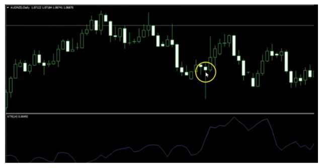
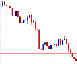
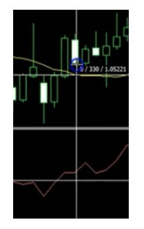
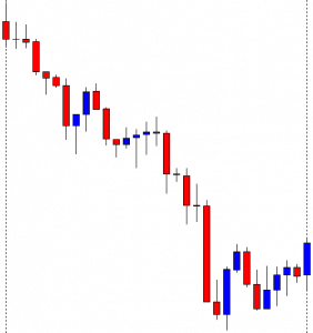
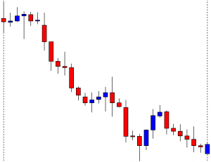
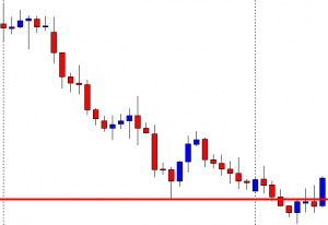
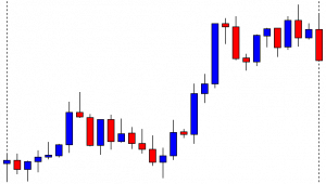
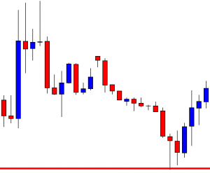
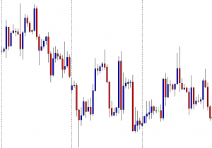
Here you can open short positions. The high volatility indicates that currencies have long alternating ups and downs. This means that in case of an erroneous prognosis of the price direction it is necessary to simply open an opposite position, and in the case of an already open, or close in loss, or be patient until the quotes are not reversed. The undulating nature of the quotes is well visible in the weekly chart LTC/USD (Litecoin vs US Dollar). In addition to frequent intraday zigzags, the intra-week wave is clearly visible.
The speed of opening and closing of a position is several milliseconds. The purchase and sale of cryptocurrencies through purses can last several hours.
Perfect deposit protection. Nobody hacks into the broker’s accounts. Firstly, there is no sense (trading is done by CFDs), secondly, it is controlled by the regulator (exchanges are not controlled by anyone).
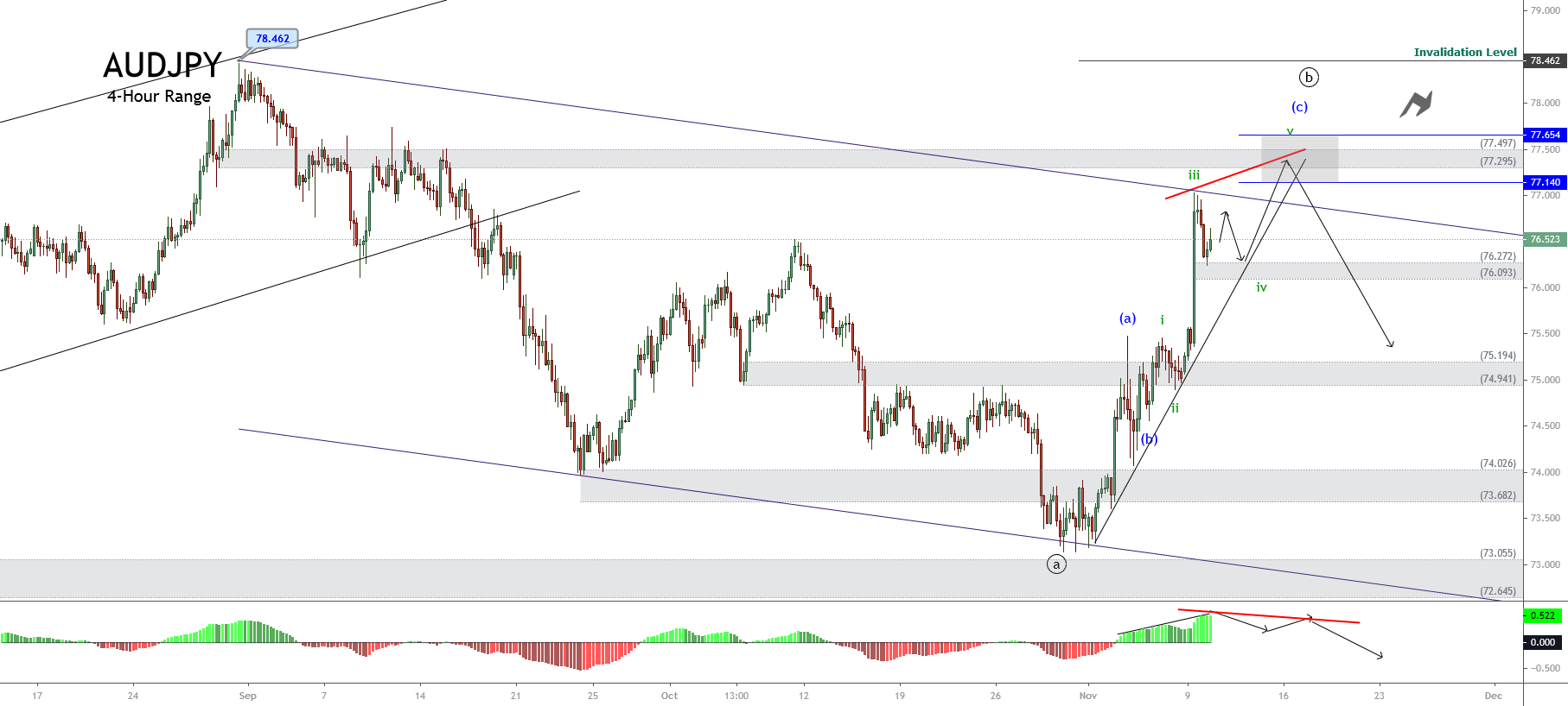
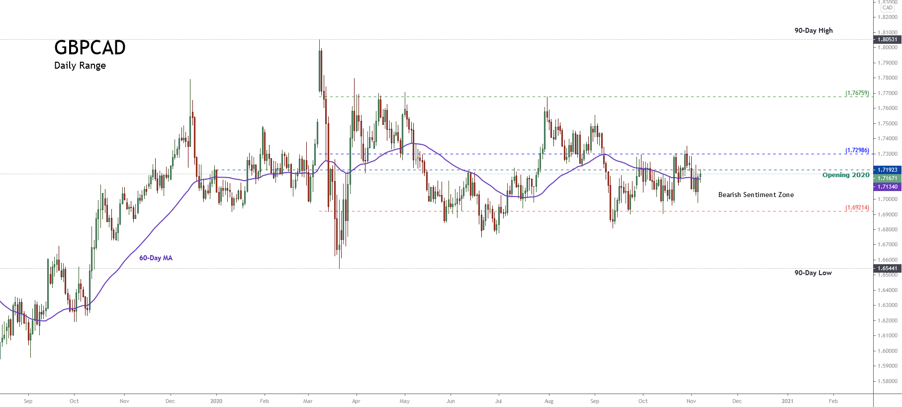
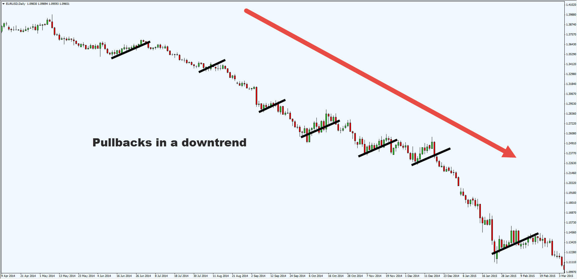
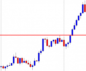
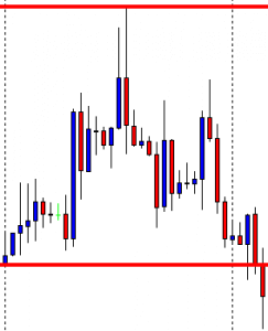
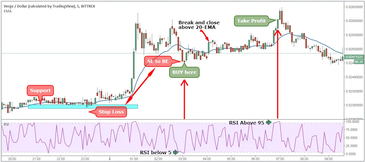
Trading According to Support and Resistance Levels
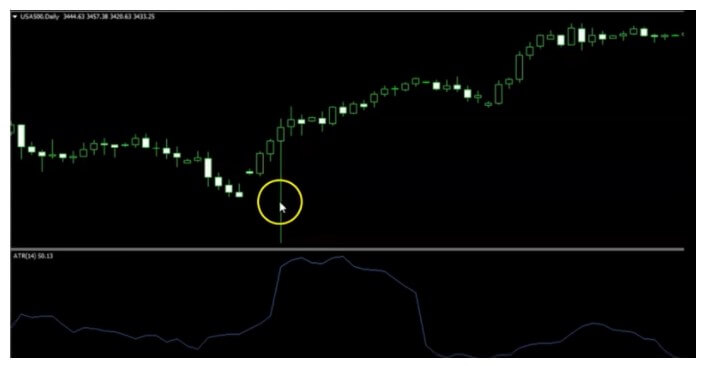
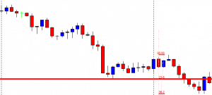
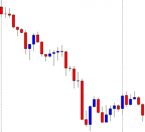
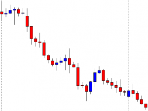
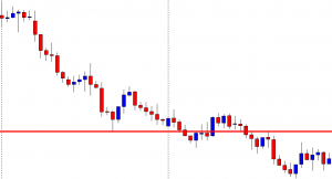
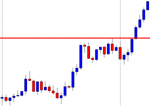
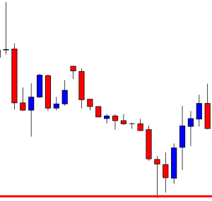
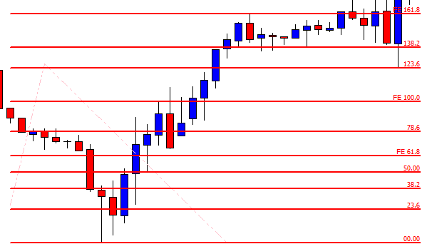
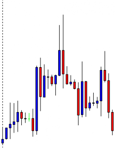
Graphical analysis in cryptocurrencies shows quite good results. Firstly, these are the psychological levels represented by the rounded figures. For example, for a ВТС is 6000, 7000, etc. coins often repel from rounded levels. It is easier for buyers to place a target sales level on a rounded number, in which a downward shift occurs. Below is the monthly graph of the pair DSH/USD (DASH vs US Dollar).
Also in the cryptocurrency market will be influenced by the general news: bankruptcy of cryptocurrency exchange houses, tightening of control over the trading of cryptocurrencies in China and South Korea, which represent the largest volume of sales, the loyalty of the legislation and the big corporations.
Trading According to Technical Analysis
As in currency trading, fundamental and technical analysis can be applied in the cryptocurrency market. Cryptocurrency is too young an instrument, in which there are a lot of speculative components. That’s why both options have advantages and disadvantages. Let’s look at the fundamentals of trading in technical and fundamental analysis.
Trading According to Fundamental Analysis
The cryptocurrencies presented are representatives of three types of projects. Payment systems (ВТС, LTC, XRP), decentralized networks for creation based on applications (ETH), anonymizer, payment systems with a high level of anonymity (XMR, DSH, ZEC). Consequently, they will influence the course of the news.
For example:
ETH/USD (Ethereum vs US Dollar). This pair will first be influenced by Vitalik Buterin’s statements regarding the effectiveness of the fork being performed, which includes the transition from the PoW algorithm to PoS. And although little information comes from him. However, ethereum is considered one of the most optimal currencies in the long run due to the potential interest of new projects on its platform.
XMR/USD (Monero vs US Dollar). Cryptocurrency encounters fierce resistance from legislation. Used for the gaming market and other online services, the currency is completely anonymous. This problem was one of the reasons the project lost its place in the Top 10 on the Coin Market Cap website. However, at the end of January, information appeared about the possible future merger of XMR and LTC. It is possible that developers are just filling in information. But if this happens, the hybrid will be able to turn the cryptocurrency market upside down.
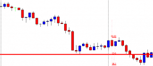
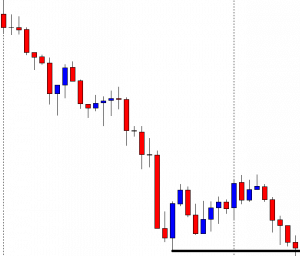
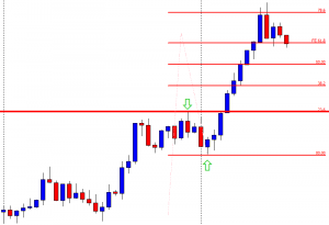
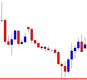
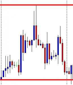
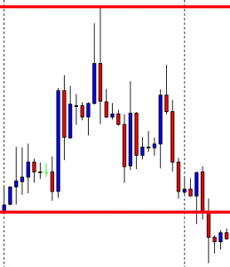
Knowing there’s a perfect touch of levels, you can see. The yellow circle highlights the characteristic sections of the corridor. The first section is quite extensive, limited by the levels of 600 and 1000 US dollars. The second section that already shows the flat offensive is marked with a red circle and is at the level of 800 US dollars. The third section shows how the price has rebounded from the level of 400 US dollars, approaching 600 US dollars, almost stopped.
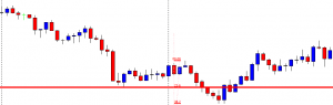
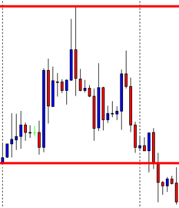
Rules for Building Support and Resistance Levels
-The level built by two points is not clear. Ideally, you should have at least three points. Let the price not reach the level or lose it slightly, it is not important for an overview.
-The ideal is the combination of the levels found in the short term and the long term, comparing how much they coincide.
-There are interesting indicators for MT4 that automatically draw levels. For example, PowerDynamiteAreas, ATR Levels.
Conclusion: In long term levels look pretty good due to the fact that traders basically don’t hold coins for long, winning on local raises. This is a psychological moment and must be taken into account in the development of the strategy. Some traders try to build strategies at Fibonacci levels, but for cryptocurrencies, this pattern is dubious, again due to psychology.

Trading According to Patterns
The psychology of traders is reflected in the cryptographic currency chart in the form of patterns, figures that indicate the possible reversion or origin of flat. Examples of the most common patterns in cryptocurrencies:
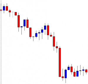
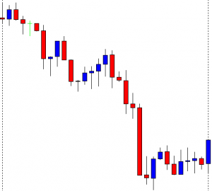
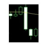
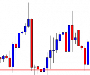
Pin bar. A candle with a very small body relative to the previous ones, a long shadow in the direction of the trend, and a short (or absent) reverse shadow. The model says that the price in the current term had a break forward, but at its end, it returned almost to the same positions. For a long position is a sign that the bulls stopped and a reversal is possible. The shade of a candle should be at least 2 times longer than the shade of the previous candle.
“Three soldiers on the move”. It is a model consisting of three consecutive sails (ascending or descending), each of which is larger than the previous one. The model shows that the trend has a pronounced direction. Generally, after them, there is a minor correction of 3-4 small candles. In the next sail of the main direction, one position can be opened.
For other more rare and less accurate patterns, but still useful, it is worth noting the following:
Double bottom (double vertex): Represents a double rebound of the support or resistance level. The first reverse can only be a correction before the level break. But if a second background (vertex) is formed and a rebound occurs, the trend will most likely develop.
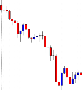
Head and shoulders: A reverse figure, which is often found after a strong trend. It represents three consecutive peaks, of which the average is the highest (head). The first shoulder is characterized by a peak and a slight correction, the lowest point of which is not lower than the current price line. The head is a strong price boost, followed by recoil to the shoulder correction level. Then the third shoulder is formed, which means the attenuation of the trend and then you can safely open a short position. The second shoulder looks very confusing, but in the end, the price continues to fall.
Triangles, Flags, and Banners: Figures of consolidation, after which, as a general rule, follow the break of the limit of the figure.
Another interesting technical analysis tool is fractals. As practice shows, graphical analysis in the cryptocurrency market works under the same principles as in currency pairs. It will only be necessary to have the capacity to recognize the models in time and combine them with fundamental analysis and support levels.
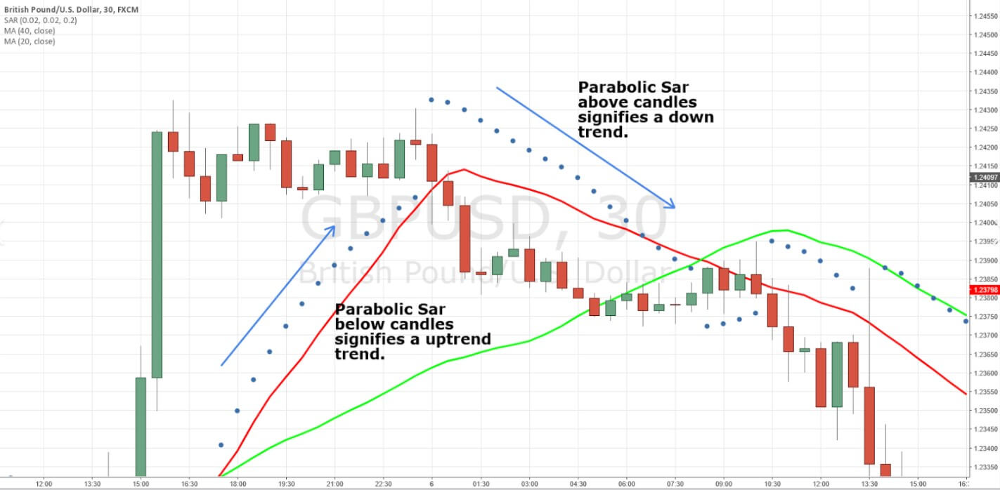
If we are talking about technical indicators, in cryptocurrencies the classical stochastics, MACD, RSI, Momentum, ZigZag, sliding, give quite precise signals. The recommended period for the analysis, which mitigates volatility, is no less than H4.

Trading with Correlative Cryptocurrency Pairs
Compared to pairs, where the second currency is the US dollar, correlative pairs are less volatile. The strength of the coin in a pair, as practice shows, is determined by the enthusiasm of the market and its confidence in the project. A clear example is the strong outbursts of the last month. At the time of cascading growth, the “dinosaurs” ВТС and ETH grew more slowly. But at the time of a recession, they fell less.
At the time of growth of the entire cryptocurrency market, Ripple grew relative to both currencies, i.e., Bitcoin versus the dollar grew slower, than Ripple. But at the time of the reduction, the green line fell below the yellow line. This means that Bitcoin depreciated slower than Ripple. This is confirmed by Bitcoin’s share in capitalization. On January 10-13, it was 32-32.5% with a total capitalization of 750 billion US dollars, now the share of BTC is 35% with a capitalization of 400 billion US dollars. Very similar graphics in the other cryptocurrencies. The pair LTC/BTC (Litecoin vs Bitcoin) depreciated in the same proportion.
A stronger reduction in relation to BTC is the pair DSH/BTC (DASH vs Bitcoin) and ZEC/BTC (ZCash vs Bitcoin).
Conclusion: At the time of the rapid growth of the market it makes sense to bet on the reduction of ВТС in relation to other more recent projects, but at the time of the market fall “overflows” in ВТС. This can be explained as follows: Bitcoin is a payment system too old with many problems of scale and transaction speed. At the time of general growth, investors prefer to rely on young BTC analogs (this explains the drop in BTC’s share in capitalization from 60% in December 2017 to 35% by the end of February 2018). But in the moment of panic, the confidence towards BTC is much more due to its status in the world economic community.
Technical analysis can also be used in these pairs. And finally, some tips on trading cryptocurrencies on Forex:
-Do not use leverage or use it very carefully. Remember that because of volatility positions can be closed by stop out.
-Give preference to intraday trading, save on swaps.
-Limit the use of business advisors and better operate manually. The market is more subject to psychological and fundamental factors.
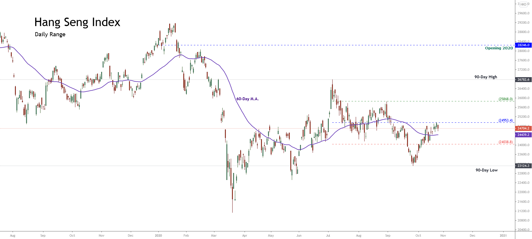
 (Source: tradingeconomics.com)
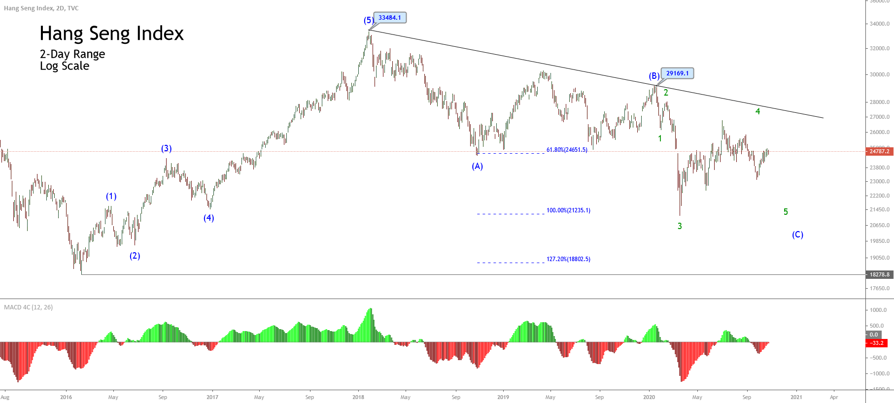