Categories
Chart Patterns Forex Daily Topic

Chart Patterns: Ascending Triangles

Of all the bullish continuation patterns that exist, few are as sought after as the ascending triangle. Like all triangle patterns, their development and construction are dependent on two trendlines that intersect and form an apex. The two primary identifying conditions of an ascending triangle I a flat, horizontal top and an upward sloping trendline.

Ascending Triangle
Ascending Triangle

In addition to the two trendlines, there is a specific kind of behavior that the candlesticks must perform. The upper trendline and the lower trendline must be touched at least twice. Ideally, and according to Bulkowski, there should not be much open space inside the triangle. The same volume behavior that occurs in other triangles occurs here in the ascending triangle: price often breaks out in the final 2/3rds of the triangle, and volume decreases before the breakout. The psychology behind the formation of the ascending triangle is essential to understand. The pattern represents an apparent battle between longs and shorts. Short traders are under the impression that because the resistance level has been tested and has held, it will remain stronger. Long traders are under the impression that prices will move higher because of the formation of higher lows and an upward sloping trendline. Ultimately, shorts cover very quickly, just before or immediately after the breakout of the upper resistance.

Bulkowski recorded that, in equity markets, the breakout direction of an ascending triangle is upwards 64% of the time. Dahlquist and Kirkpatrick recorded that upwards breakouts occur 77% of the time. Interestingly, the performance of this pattern is roughly average across all patterns – this is contrary to the belief of many traders who self-report a high positive expectancy of upwards breakouts. Dahlquist and Kirkpatrick did warn that there are many false breakouts and that failure rates are between 11% and 13%.

As with any pattern, it is essential to pay attention to price action first and then find tools to help you filter whether an entry at the breakout is appropriate. Additionally, be wary of throwbacks as they are frequent over 50% of the time – many conservative traders wait for a retest of the breakout to confirm a valid break from the ascending triangle.


Sources:

Kirkpatrick, C. D., & Dahlquist, J. R. (2016). Technical analysis: the complete resource for financial market technicians. Upper Saddle River: Financial Times/Prentice Hall.

Bulkowski, T. N. (2013). Visual guide to chart patterns. New York, NY: Bloomberg Press.

Bulkowski, T. N. (2008). Encyclopedia of candlestick charts. Hoboken, NJ: J. Wiley & Sons.

Bulkowski, T. N. (2002). Trading classic chart patterns. New York: Wiley.

Categories
Candlestick patterns Forex Candlesticks

Candlestick Reversal Patterns V – The Morning Star and the Evening Star

The Morning Star and the Evening Star

The morning Star and the Evening Star formations are patterns made of three candlesticks. The original candlestick patterns were made on the Japanese rice futures trading and were created for daily timeframes. Thus, they could depict gaps from the previous close to the next open. The Star was a small real body – white or black – that was gaping away from a previous large body. The only place where that could occur in the Forex markets is during weekends. Thus, what is required to form a star in Forex is a small body, the smaller, the better, at the end of a large body, preferably with large shadows.

The Morning Star

The Morning Star is a three-candle formation at the bottom of a descending trend. In astronomy, Mercury is the morning star that foretells the sunrise and the arrival of the day. That was the name the Japanese gave to the formation, as they consider it to be the precursor of a new uptrend.

As said, it is formed by three candlesticks. The first one is a large and black candlestick. The session day the price starts with a gap down (or just at the close in Forex) continues moving down for a while, then it recovers and closes near the open, creating a tiny body. The third day is a white candlestick that closes near the open of the first black candlestick. The important factor in the signal is the confirmation of buyers after the star candle is formed. The close of the third day should, at least, cross the halfway up to the black candle body, as in the case of a piercing pattern. 

Chart 1 – Morning Star on the DAX-30 Index (click on it to enlarge)

Criteria for a Morning Star 
  1. The downtrend was evident
  2. The body of the first candle continues with the trend (black)
  3. The second candle is a short body figure showing indecision
  4. The third day the candle closes at least above 50 percent the body of the black candle.
  5. The larger the black and white candles, the better.
  6. A gap is desirable but doesn’t count on it on 24H markets
  7. A high volume in the first and third candles would be good signs of a selloff and consequent reversal.
Market Psychology

As in most bullish reversals, the first day, the hopeless bulls capitulate with a significant drop and substantial volume. The next day the power of the sellers stops in a short-bodied candle. The third day began bullish, touching the stops of the late short-sellers, and also caused by the close of positions of profit-takers. That fuels the price to the upside, making more short sellers close their positions -buying- and pushing up further the price. At the end of the day, buyers take control of the market action closing with a significant white candle on strong volume.

The Evening Star

The Evening star is the reciprocal of the Morning star, and even more so, when trading pairs in the Forex market, or any pair, for that matter. In this case, the Japanese linked this formation with the Venus planet, as the precursor or the night. It is created when a long white candle is followed by a small body and a large black candle.

As the case of the Morning Star, a gap up on the second small-bodied candle followed by a gap down on the third black candle is further confirmation of a reversal, but that seldom happens in the Forex Market.  Also, the third candlestick is asked to close below 50 percent of the body of the first white candle.


Chart 2 – Evening Star on the EURUSD Pair (click on it to enlarge)

Criteria for an Evening Star
  1.  The upward trend has been showing for some time
  2. The body of the first candle is white and large.
  3. The second candlestick shows indecision in the market
  4. On the third day, it is evident that the sellers have stepped in and closes below 50 percent of the initial white candle.
  5. The longer the white and black candles, the better
  6. A gap before and after the second candle is desirable, although not attainable in Forex.
  7. A good volume in the first and third candles is also desirable.
Market Psychology

The uptrend has attracted the buyers, and the last white candle has seen an increasing volume. In the next session, the market gapped of continue moving up for a while, catching the last stops by short-sellers, but suddenly retraces and creates a small body, with the close next to the open. The next day there is a gap down makes the stops of the long positions to be hit, adding more selling pressure to the profit takers and short-sellers. The day ends with a close that wipes most of the gains of the first white candle, that shows that the control is in the hand of sellers.


Reference: Profitable Candlestick Patterns, Stephen Bigalow


Categories
Forex Course

51. Fundamentals Of Candlestick Patterns

Introduction

In the previous course lessons, we have discussed the basics of candlesticks along with the pros and cons of using them. From this lesson, we will learn the basic candlestick patterns and their usage. As discussed, the idea of candlesticks charts has started in Japan in the late 1870s. These charts were then introduced to the outside world by Steve Nison through his first book, ‘Japanese Candlestick Charting Technique.’

In this lesson, let’s discuss the primary advantage of using candlestick charts. Although a single candlestick gives us many details about the price movement of an asset, a sequential set of candlesticks is more powerful. These sets are also known as patterns in simple trading language, and using these patterns, traders across the world take trading decisions.

Expert traders have decoded many such patterns and rigorously backtested them to analyze what those patterns will eventually result in. They also examined how the market direction will change after the appearance of these patterns on the charts. Now, let’s see the different candlestick patterns one must know.

Different types of candlestick patterns

There are single, dual, and triple candlestick patterns depending on how many candlesticks are involved in them. For example, if there are the candlestick pattern is formed by three candlesticks, it is known as the triple candlestick pattern. Every single pattern has its own significance and can be found in most of the Forex charts.

The main intention of identifying any candlestick pattern is to understand the further price movement in the market. Hence these patterns are classified into two different types – Continuation Patterns & Reversal Patterns. When we identify a continuation candlestick pattern on the chart, it means that the market will continue in the same direction as the underlying trend. Contrarily, if we identify a reversal pattern on the charts, we can expect the price to change its direction. Also, these patterns are internally classified as bullish and bearish continuous/reversal patterns, which will be discussed in the upcoming lessons.

Examples of Continuation Candlestick Patterns

  • Deliberation Pattern
  • Concealing Baby Swallow Pattern
  • Rising Three Methods Pattern
  • Separating Lines Pattern
  • Doji Star Pattern

Examples of Reversal Candlestick Patterns  

Some of these are single candlestick patterns, while some are multiple candlestick patterns. We shall be discussing each of these patterns in detail in our future articles.

Psychological context of candlestick patterns

The candlestick patterns demonstrate the psychological trading that takes place during the period represented by a single or multiple candles. We need to start imagining the price movement as a battle between buyers and sellers. Typically, Buyers expect that prices will increase and drive the price up through their trades. Whereas sellers bet on falling prices and push the price down with their selling interest.

Also, the Japanese gave very visual names to these patterns so that it impacts the mentality of a trader. For instance, pattern names like Hanging Man and Dark Cloud Cover represent negativity, while the patterns like Three White Soldiers and Morning Star indicate positive market results. Hence, as soon as we hear the names of these patterns, our sub-conscious memory will know whether the forecast of the market is positive or negative.

Benefits of trading candlestick patterns

Although initially conceived for daily timeframes, Candlestick patterns can be used by swing traders, day traders, and even long term investors. Below are some of the significant advantages of these patterns.

  • They are very easy to identify and comprehend. They provide a detailed description of the occurrences and happenings in the markets.
  • Interaction between the buyers and sellers can easily be understood just by reading the pattern and without having to analyze the market entirely.
  • Candlestick patterns can be used in conjunction with other indicators for extra confirmation on the trading signals generated.
  • They display reversal patterns that cannot be seen in other charts like Line & Bar charts.

That’s about the introduction to Candlestick patterns. In our upcoming lessons, we will discuss different candlestick patterns and how to generate trading signals using these patterns. So, stay tuned.

[wp_quiz id=”60271″]
Categories
Forex Basic Strategies

Identify Reliable Trading Signals Using ‘Piercing Line’ Candlestick Pattern

Introduction

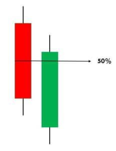
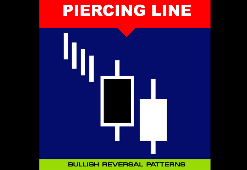
The Piercing Line is a simple and effective candlestick pattern, and it is used to trade the bullish reversals in the market. This pattern typically appears in a downtrend. Also, when it appears in a significant support area, we can consider it more reliable. Piercing Line is a two candlestick pattern where the sellers influence the first candle, and the second candle is responded by enthusiastic buyers. Piercing Line essentially indicates the bears losing control, and bulls taking over the market.

  1. First of all, in a downtrend, the first candle of the pattern should be bearish.
  2. The second candle should be bullish, and it should open lower than the closing of the previous candle, and it must close above the midpoint of the bearish candle.

This indicates that buyers now overwhelmed the sellers. In terms of supply-demand, this pattern shows that the supply is depleted somewhere, and the demand for buying has increased. Remember not to trade this pattern alone. Always use it in conjunction with some credible indicators or other trading tools to further enhance the probability of winning.

Piercing Line Pattern Trading Strategies

Piercing Line Pattern + Percentage Price Oscillator

In this strategy, we have paired the Piercing Line pattern with the Percentage Price Oscillator to generate credible trading signals. The Percentage Price Oscillator is a momentum indicator. It consists of a centerline, histogram, and the two moving averages. Just like the MACD indicator, the PPO also represents the convergence and divergence in price action. This indicator gives a crossover at the overbought and oversold market conditions.

When price action crosses the centerline, it means that the bullish or bearish momentum is super strong. We want to let you know that PPO is not that popular in the industry. Also, it is not available in the MT4 terminal. However, you can download this indicator from this link and add it to your MT4 terminal. If you are a Tradingview user, search the PPO indicator in the indicators tab, and you should be able to find it.

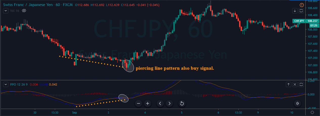
Step 1 – Find out the Piercing Line pattern in a downtrend.

Step 2 – Once you find the Piercing Line pattern, the next step is to wait for the reversal to happen on the PPO indicator at the oversold market conditions.

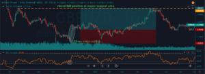
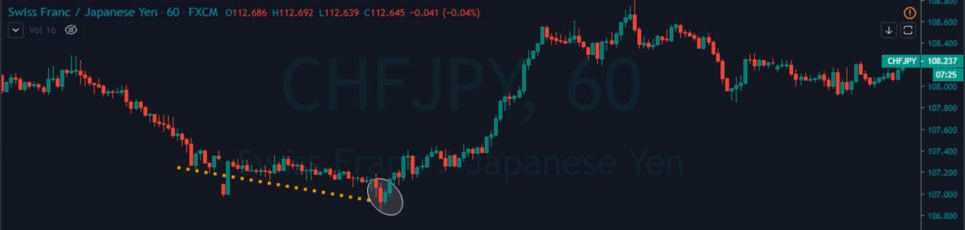
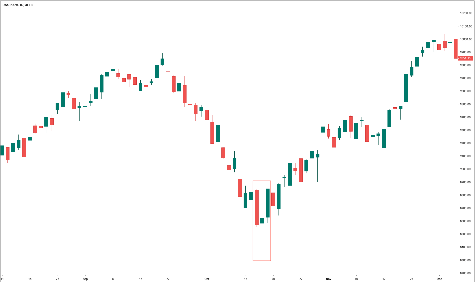
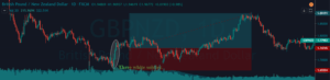
In the below CHFJPY chart, the market was in an overall downtrend. We can see the market printing Piercing Line pattern, and that is an indication of a trend reversal. We can also see the PPO indicator giving crossover in the overbought area at the same time. Both of these clues indicate a clear buy signal in this pair. We can also see the price action showing divergence, which is another clue to go long. If we are able to find all of these clues on a single price chart, we shouldn’t mind placing bigger trades.

Step 3 – Stop-loss and Take Profit

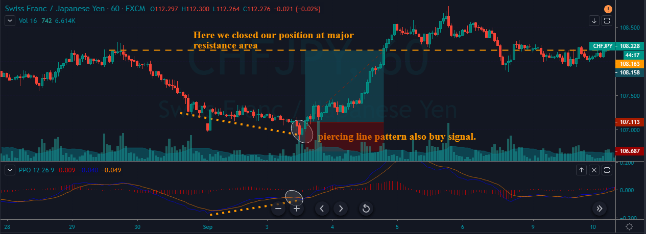
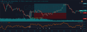
PPO indicator quite often gives high probability trading signals. So when we take trades of that kind, most of the time, we must place the stop loss just below the first candle of the Piercing Line indicator.

There are several ways to book profits. For this particular strategy, we can close our position when the PPO reversed at the overbought area or when the market starts printing the opposite pattern. If you plan to make more money in a single trade with extra risk, it is advisable to book the profit at the higher timeframe’s major resistance area.

In the below chart, we can see that we have closed our whole position at the major resistance area and the stop-loss order was just below the recent low.

Piercing Line Pattern + Double Moving Average

In this strategy, we have paired the Piercing Line pattern with the Double Moving Average. Moving Average is a very well-known indicator in the industry. Many average indicators are available in the market. If you are using the lower period average, expect more trading signals. Contrarily, if you are using the higher period average, expect fewer but accurate signals.

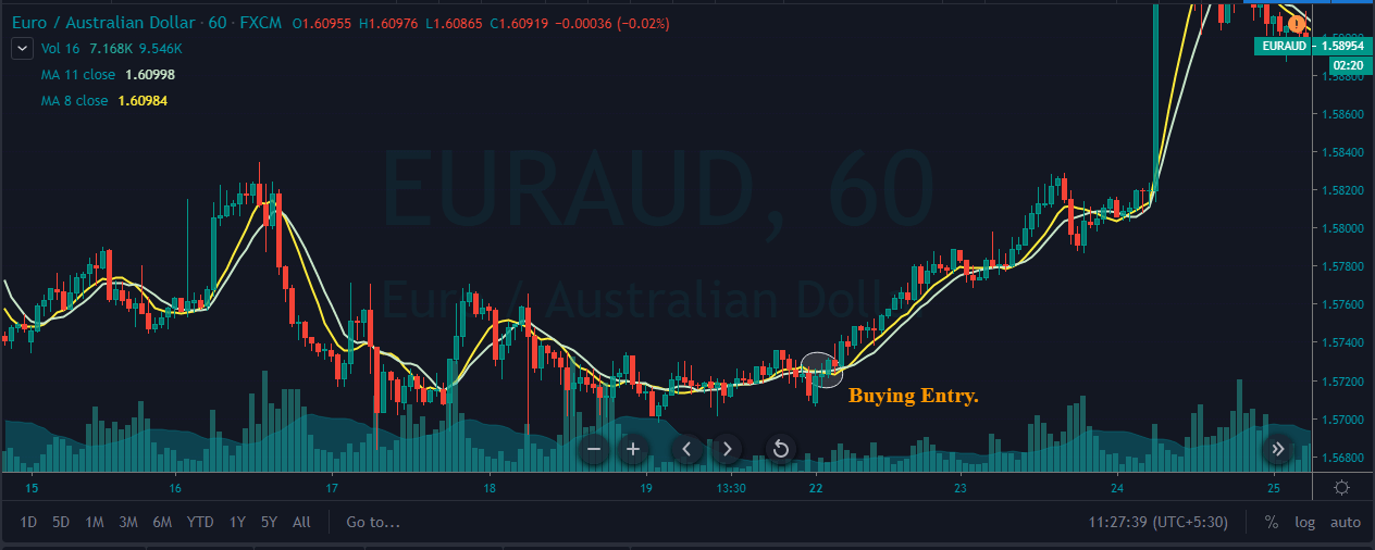
Step 1 – First of all, find out the Piercing Line pattern in a downtrend.

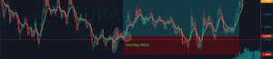
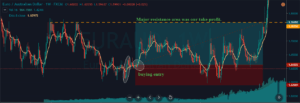
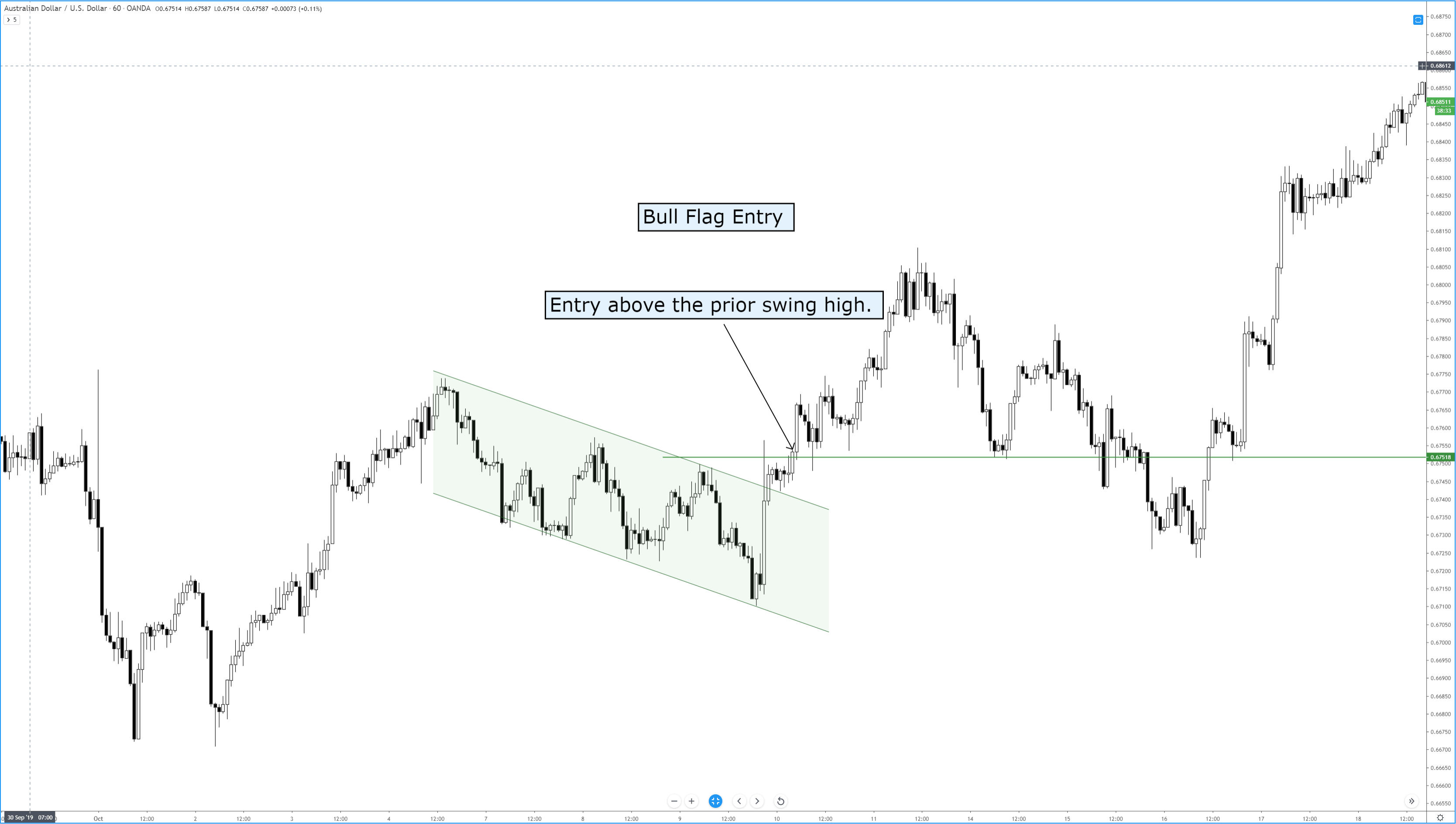
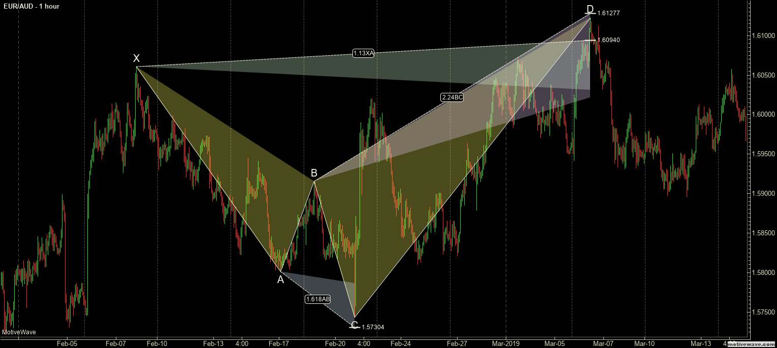
Step 2 – Activate the buy trade when the lower period MA crosses the higher period MA. In the below EURAUD Forex chart, the price action was in a downtrend, and around the 22nd of December, the market prints the Piercing Line pattern. This means that the sellers now have a hard time to go lower, and buyers took over the market. Furthermore, when a lower period moving average crosses the higher period moving average, it is a clear indication to go long. After our entry, price action immediately prints a brand new higher high.

Step3 – Stop-loss and Take Profit

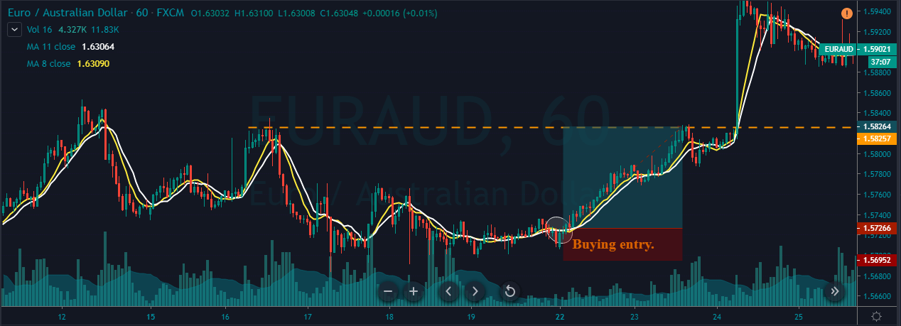
If you are an aggressive trader, use the recent low for stop loss. But if you are a conservative trader, make sure to place wider stop losses. If you plan to ride the longer moves, wait for the price action to hit the daily support area. But if you plan to go for intraday trades only, we suggest you exit your position when the double MA gives the opposite signal.

In the below chart, we can see that we have closed our full positions at the higher timeframe major resistance area, and stop-loss was just below the recent low. Overall, it was a 3R trade.

Bottom Line

Piercing Line pattern is a bottom reversal pattern, and it is one of the very well-known bullish reversal patterns. We can say that this pattern is exactly the opposite of the Dark Cloud Cover pattern. We won’t be able to see this pattern very frequently on the price chart, but when it appears, a trend reversal is guaranteed. Sometimes you will find this pattern in the consolidation phase, but it’s not worth your time to trade it in ranges. So it is always recommended to find this pattern in a clear trending market because that’s where we can generate more effective signals. The only limitation of this pattern is that it requires the use of other technical tools to confirm the signal and cannot be used stand-alone. But that’s the case of most of the candlestick patterns, so that’s not a major limitation.

That’s about the Piercing Line candlestick pattern. Let us know if you have any questions in the comments below. Cheers!

Categories
Chart Patterns

Chart Patterns: Broadening Patterns

Chart Patterns – Broadening Pattern & The Diamond Pattern

Broadening Top
Broadening Top

This pattern is also called a funnel or a megaphone pattern. It’s an inverse symmetrical triangle. This pattern is definitely not that common, and it’s a tricky pattern to trade. The behavior of price in a broadening pattern is to increase swing ranges where new higher highs and new lower lows are made. In my opinion, it is best to ignore this pattern. The breakout and retest of the upper or lower trendlines are the prevailing trade strategies utilized for this pattern. Of all the patterns, to trade, this is one of the least profitable. However, I’ve learned that the breakouts are often false, due to the nature of the final swing in the pattern being mostly overbought or oversold. It is not uncommon to see megaphone patterns turn into a triangle pattern – which results in a rare but profitable pattern known as a Diamond.


Chart Patterns – Diamond Pattern

Diamond Top
Diamond Top

The diamond pattern is rare. It is also difficult to even notice if it exists. In fact, Thomas Bulkowsi writes on his site, ‘Let me clear about this. I don’t like diamonds. They are as tough to spot as nightcrawlers in the grass on a summer night.’ I believe that is a pretty accurate description. But, while diamond patterns are challenging to spot, they are a very powerful pattern that often results in fast and violent moves in the opposite direction – higher for diamond bottoms and lower for diamond tops. It is ok for the patterns to have one side that seems more slanted than the other and, in fact, they often do not appear as symmetrical as the example above. We trade a diamond pattern the same way we would any other triangle pattern.


Sources:

Kirkpatrick, C. D., & Dahlquist, J. R. (2016). Technical analysis: the complete resource for financial market technicians. Upper Saddle River: Financial Times/Prentice Hall.

Bulkowski, T. N. (2013). Visual guide to chart patterns. New York, NY: Bloomberg Press.

Bulkowski, T. N. (2008). Encyclopedia of candlestick charts. Hoboken, NJ: J. Wiley & Sons.

Bulkowski, T. N. (2002). Trading classic chart patterns. New York: Wiley.

Categories
Forex Basic Strategies

Trading The ‘Three White Soldiers’ Candlestick Pattern (With RSI & EMA)

Introduction

The Three White Soldiers is a bullish candlestick pattern. This pattern is highly reliable and quite potent when it is found at a significant support area in a downtrend, which indicates sharp price reversals from a bear market to a bull market.

  1. Three White Soldiers pattern consists of three consecutive bullish candles; typically, this pattern should be traded when found at the end of a downtrend.
  2. Each candle should open and close higher than the previous candle.
  3. The candles must have small or no wicks. Because that indicates, the buyers managed to close the price of the currency pair at the high of a candle. If the third candle is smaller than the preceding two candles, it indicates that the buyers do not have much strength, and the market can easily print a new lower low.

Candles get printed on every trading chart in all the timeframe. But only the candlestick patterns in the right context of the market will be rewarded. The Three White Soldiers pattern that we are going to discuss is one of the most credible and reliable patterns we have come across. Trading legend Gregory L. Morris, in his book ‘Candlestick Charting Explained,’ said that the Three White Soldiers is extremely rewarding if traded correctly and it should never be ignored.

Trading Strategies

Three White Soldiers + RSI indicator

In this strategy, we have paired the Three White Soldiers pattern with the RSI indicator to identify good trading signals. RSI is a well-known oscillator, and it stands for the Relative Strength Index. The RSI indicator has a reading from 0 to 100. When the indicator line goes above the 70, it indicates the overbought conditions. When the indicator lines go below the 30 levels, it means the market is in an oversold condition.

Step 1 – First of all, find the Three White Soldiers pattern in a downtrend.

Step 2 – When market prints the Three White Soldiers, our next step is to check the RSI indicator. If the RSI indicator is at the oversold area and gives a sharp reversal, it means that both of the trading tools support the buying entry in any underlying currency pair.

In the example below, GBPNZD was in an overall downtrend. At first, market prints the Three White Soldiers pattern, and the RSI was at the oversold area. This condition indicates a potential trend reversal. We can see that the pattern candles are quite strong, and the RSI indicator also supported our strategy. This aspect creates an illusion for novice traders to take the trade immediately. However, it is not a good way to enter the trade. We suggest you always wait for 2-3 candles to confirm the stability of the pattern.

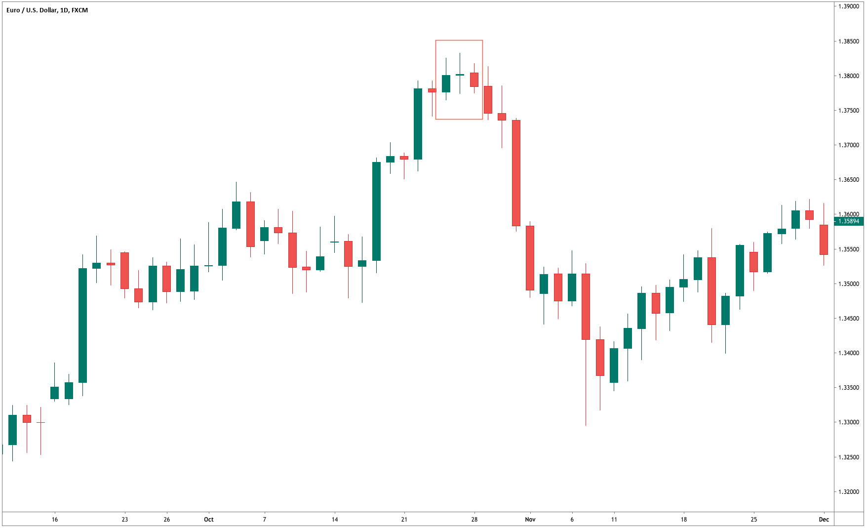
Step 3 – Step Loss & Take Profit

In this example, we have put the stop loss just below the low of the first candle of three green candles. When two leading trading tools indicate the same signal, always use smaller stops so that you can maximize your profits.

For this strategy, there are several ways to book the profit. We can close our position at a significant resistance area or when the RSI indicator reaches the overbought area. If your plan is to ride the longer moves, we suggest you closing your position when the market prints the Three Black Crows patterns. This pattern is the complete opposite of the Three White Soldiers pattern.

The example below belongs to the daily chart. Keep in mind that stronger the support/resistance area on the higher timeframe, more chances the market has to respect that area. In our example, the last time price respects the resistance line, so we decided to close our full position at a resistance area. Overall it was 1500+ pip move on the daily chart. These kinds of higher timeframe trades are suitable only for big investors.

Three White Soldiers + EMA

In this strategy, we have paired the Three White Soldiers pattern with the EMA to filter out the bad trading signals. EMA stands for Exponential Moving Average. The EMA is used to highlight the current trend and to spot the trend reversals. Trading signals can also be generated when the EMAs are read correctly. Generally, when the EMA goes above the price action, it indicates a sell signal, and when it goes below the price action, it indicates a buying signal.

Step 1 – Of course, the first step here is to identify the Three White Soldiers pattern on the charts.

Step 2 – When market prints, the Three White Soldiers, and EMA go below the price action, it indicates the buying signal.

In the below EURAUD weekly Forex chart, when the market prints the Three White Soldiers pattern, EMA was also below the price action. This indicates a potential price reversal of this currency pair. Even when both the pattern and EMA indicates the signal, we decided to wait for 3 to 4 candles to confirm the strength of the pattern. We can see that the market holds there for a couple of candles, which is a clear cut sign to go long on this pair.

Initially, the market goes higher for some candles, but it didn’t reach our major target. Our position goes into the loss a couple of times. Do not panic and lose trust in your strategy because the price didn’t hit the stop loss yet. Trading is a game of patience and only close your position when the market hit the stop loss or take profit. In this case, waiting patiently led to fruitful results as our trade hits the take profit.

Step 3 – Stop Loss & Take Profit

In the above chart, we have placed the stop loss above the exponential moving average because it works as a dynamic support/resistance to price action. We closed our full position when EMA goes above the price action.

Conclusion

Most of the times, Three White Soldiers pattern appears at the end of a downtrend. Sometimes it also prints after a lengthy consolidation phase. Although it is not a strong bullish sign if you want to trade the consolidation phase, always pair this pattern with other technical tools to filter out the negative signals. The volume is the most critical thing to enhance the reliability of the pattern when the market is in a consolidation phase.

Categories
Chart Patterns

Chart Patterns: The Head And Shoulders Pattern

The Head And Shoulders Pattern

Of all the patterns that exist in any market, the most well known is the Head And Shoulder Pattern. Kirkpatrick and Dahlquist’s book, Technical Analysis, detailed many studies on the performance of this pattern. The result of all the data is that the Head And Shoulder Pattern is the most profitable of all standard patterns. Interestingly, Dalquist and Kirkpatrick made no distinction between the performance of the head and shoulder pattern and the inverse head and shoulder pattern (sometimes called the bottom forming head and shoulder pattern). While this pattern is successful across many markets, it is also the pattern that causes the most losses to new traders. We’ll get into the specifics of why this pattern destroys a good number of traders. First, we need to understand what the pattern is.

Regular and Inverse Head & Shoulder Pattern

The image above shows two head and shoulder patterns, the regular pattern and the inverse pattern. It just so happened that the daily chart of the AUDUSD conveniently had both of the patterns right next to each other – not a common occurrence. Now, you can and will read a lot of rules and theories behind the head and shoulder pattern. I could go into the behavior of this pattern, the psychology behind the three triangles that make up the broader pattern, the symmetrical nature of the left and right shoulders, etc., etc., etc., but we don’t need to complicate a pattern that can be very easily understood.

There’s a great book by Larry Pesavento titled Trade What You See. While the book Trade What You See is focused primarily on Harmonic Patterns, the title always stuck with me. If you were to stand in front of a mirror, you would more than likely notice the symmetrical nature of your left and right shoulders (unless you’ve had some significant injury or disease. There’s a good number of people who believe that both the right and left shoulders need to be as exact as possible – but this isn’t necessary.

Here’s a simple rule to follow:

If it doesn’t look like a human head and shoulder, then it probably isn’t a head and shoulder pattern.

 Are you familiar with the poker game Texas Hold’em or any other form of poker? There are several maxims that poker players follow, one of them is ‘Don’t chase the straight or the flush.’ Why? Because when you get dealt a hand that is missing just one card for your straight or one more suite to complete your flush, the odds are overwhelmingly against you getting that final card to complete the straight/flush. Head and shoulder patterns are the same way. The head and shoulder pattern is only complete when the neckline has been broken. Let me repeat that three times for you:

A head and shoulders pattern is not complete until the neckline is broken.

A head and shoulders pattern is not complete until the neckline is broken.

A head and shoulders pattern is not complete until the neckline is broken.

Failed Head & Shoulder Pattern


Many a trading account has been the victim of trying to anticipate the completion of a head and shoulder pattern, only to have it be broken. In addition to being the most profitable basic pattern, the head and shoulder pattern is also one of the most rejected patterns. We don’t chase straights or flushes in poker, and we don’t chase patterns in trading. In addition to the information above, here are some other factors that can help you interpret the head and shoulder pattern:

  1. If the volume in the left shoulder is greater than the right shoulder, there is an increased likelihood of the head and shoulder pattern completing.
  2. If the volume in the right shoulder is greater than the left shoulder, failure rates are higher.
  3. Horizontal necklines increase the probability of a head and shoulder pattern completing.
  4. The more dramatic the slop of the neckline, the more likely the pattern will fail to develop.
  5. Aggressive entries can be taken immediately when the price breaks the neckline.
  6. Conservative entries can be taken after the neckline has been re-tested post-breakout.
  7. If price breaks the neckline, retracements occur almost 70% of the time.


Sources:

Kirkpatrick, C. D., & Dahlquist, J. R. (2016). Technical analysis: the complete resource for financial market technicians. Upper Saddle River: Financial Times/Prentice Hall.

Bulkowski, T. N. (2013). Visual guide to chart patterns. New York, NY: Bloomberg Press.

Bulkowski, T. N. (2008). Encyclopedia of candlestick charts. Hoboken, NJ: J. Wiley & Sons.

Bulkowski, T. N. (2002). Trading classic chart patterns. New York: Wiley.

Categories
Chart Patterns

Chart Patterns: Flags and Pennants

Flags and Pennants

If you’ve ever traded a chart and you’ve seen what looks like a reversal in the trend, but as soon as you enter the trend seems to continue, odds are you were trading against a continuation pattern. Flags and pennants are titles given to patterns that show up as small countertrend moves that ultimately trap participants and then use their momentum to keep the price moving in the direction of the trend. Flags are represented as rectangular channels, and pennants are represented as triangles.

Before a flag or pennant can be identified, we first need a flag pole. A flag pole is any clear trending price action that, well, looks like a pole. See below:

Flags and Pennants
Flags and Pennants


The images above show examples of bearish flags and bearish pennants, as well as bullish flags and bullish pennants. If you are unfamiliar with how to trade triangles or rectangles, refer to the articles that discuss the various triangle patterns. But we can review the basics of entering these great continuation patterns.

Bearish Pennant
Bearish Pennant
Bear Flag
Bear Flag
Bullish Pennant
Bullish Pennant
Bull Flag
Bull Flag


Learning how to trade flags and pennants is one of the most useful and enjoyable things that you can learn – especially as a new trader. Flags and pennants help train your brain to get used to buying dips during bull runs and shorting rallies during bear moves. If you get to a point where you can profitably trade flags and pennants, then you have transitioned into a trader who is very near outperforming the vast majority of your peers. It may seem like an easy thing to do – but it is an entirely different thing to execute. Analyzing and identifying a flag or pennant is easy; trading it is difficult.

I can not stress enough how profitable these patterns can be – and how easily you can miss them even in plain sight. The problem resides with your brain – that ‘lizard’ part that kicks in when you are are fearful of your account. When you begin to feel the fear of your account losing money, that triggers a powerful part of your brain known as the limbic system. The limbic system controls fear and pleasure. And when your fear sense is triggered, it hyper focuses the synapsis across your brain. Things that you would passively identify like flags and pennants are tertiary in their importance when the limbic system is acting in your defense. You need to find ways to ‘pause’ the process with things like alerts. On the images above, you saw horizontal lines above prior swing highs and below prior swing lows. Placing alerts at those points may be enough to interrupt your primary fear response and allow you to make money on your emotions.

Because if you are feeling it, so is everyone else.


Sources:

Kirkpatrick, C. D., & Dahlquist, J. R. (2016). Technical analysis: the complete resource for financial market technicians. Upper Saddle River: Financial Times/Prentice Hall.

Bulkowski, T. N. (2013). Visual guide to chart patterns. New York, NY: Bloomberg Press.

Bulkowski, T. N. (2008). Encyclopedia of candlestick charts. Hoboken, NJ: J. Wiley & Sons.

Bulkowski, T. N. (2002). Trading classic chart patterns. New York: Wiley.

Categories
Chart Patterns

Chart Patterns: Symmetrical Triangles

Symmetrical Triangles

Out of all the triangle patterns, symmetrical triangles are perhaps the most common and the most common and the most subjective. Symmetrical triangles have a standard neutral bias; however, symmetrical triangles most often form after a prior trend, because they most commonly form after a prior move. The preference of their trading direction is determined by the direction from the previous move. If the preceding move was bullish, then the symmetrical triangle is viewed as a bullish continuation pattern. Like all triangle patterns that form after a trending move, they are known as pennants.

The construction of a symmetrical triangle is like any other triangle: it requires to trendlines that intersect: one upward sloping angle and one downwards sloping angle. Price action should touch both the upper and lower trendlines at least twice – but ideally three times. A lack of open space within the triangle is ideal. Breakouts often occur in the final 1/3rd of the triangle. Volume typically falls before the breakout.

I believe that understanding the psychology of how this pattern forms is essential. The symmetrical triangle is the result of a condition that is very common in any traded market: consolidation. It’s not just common; it’s normal. Consolidation is representative of two things: equilibrium on the part of buyers and sellers and indecision by active speculators. The psychology of price action inside a symmetrical triangle is different than what occurs in an ascending or descending triangle, which both have a marked bias during the construction. Symmetrical triangles are the epitome of indecision, and traders can very quickly fall victim to whipsaws.

Symmetrical triangles, while the most common, are also the most confusing. Take the image below:

Symmetrical Triangle

The symmetrical triangle on the daily chart for the AUDJPY is a bearish pennant – a bearish continuation pattern. While any triangle that forms after an established trending move has a high probability of pushing the price in the direction of the trend, it doesn’t always happen that way. As I wrote above, symmetrical patterns are inherently neutral – so it is important to watch them. We can see that this symmetrical triangle did not cause a continuation move south – it reversed. Regardless of the direction of the breakout, some rules should be applied when entering a trade based on a breakout of a symmetrical triangle.

Symmetrical Triangle - Long Entry
Symmetrical Triangle – Long Entry

First, unlike the ascending and descending triangles, we don’t enter on the break. We want to enter when price breaks the prior high (or low). For the chart above, we would enter long above the previous swing high that touched the downtrend line.

Symmetrical Triangle - Short Entry
Symmetrical Triangle – Short Entry

The short entry from a breakout below a symmetrical triangle is the inverse of the bullish entry. On the chart above, the short entry is when price moves below the prior swing low that tagged the uptrend line – not on the initial breakout.

Pullbacks and throwbacks occur 59% of the time. Symmetrical triangles are notorious for many false breakouts, so look for frequent wicks/shadows to pierce the trendlines. Dahlquist and Kirkpatrick wrote that volume that increases on the breakout increases the performance of the pattern, but it is otherwise below average in its performance.


Sources:

Kirkpatrick, C. D., & Dahlquist, J. R. (2016). Technical analysis: the complete resource for financial market technicians. Upper Saddle River: Financial Times/Prentice Hall.

Bulkowski, T. N. (2013). Visual guide to chart patterns. New York, NY: Bloomberg Press.

Bulkowski, T. N. (2008). Encyclopedia of candlestick charts. Hoboken, NJ: J. Wiley & Sons.

Bulkowski, T. N. (2002). Trading classic chart patterns. New York: Wiley.

Categories
Chart Patterns

Chart Patterns: Descending Triangle

Descending Triangle
Descending Triangle

The descending triangle is another version of the many triangle patterns in technical analysis. It is the opposite of the ascending triangle. This pattern is overwhelmingly bearish and is one of the more common bearish continuation patterns. If you’ve read Dahlquist and Kirkpatrick’s Technical Analysis, you will find that this pattern is treated with some considerable positivity. It was one of the best-performing patterns. But there is a caveat to why this is.

Descending Triangle
Descending Triangle

The two trendlines required for the formation of a descending triangle are a flat, horizontal trendline that acts as support with a downward sloping trendline that acts as resistance. Ideally, price should touch both the upper and lower trendlines twice. Volume typically decreases as price gets closer to the apex. Breakouts occur within the final 1/3rd of the pattern. Dahlquist and Kirkpatrick report that increasing volume is actually more favorable for this pattern. The most common breakout is lower at 64% of the time.

I’ve written in prior articles about the dangers of putting to much stock into technical analysis books where the initial testing of patterns and results have been in traditional equity markets (stock markets). I believe that one of the reasons that Dahlquist and Kirkpatrick have reported such powerful and swift moves with a downward breakout is due to the nature of bear moves in equity markets. Because markets like the stock market are exceedingly long-biased, any dramatic drop below crucial support will have an exceedingly more dramatic move when compared to the forex markets – which are primarily range bound. Another factor that may attribute to the overperformance of this pattern in stock markets vs. forex markets is the ease of shorting in forex vs. the stock market.

Sources:

Kirkpatrick, C. D., & Dahlquist, J. R. (2016). Technical analysis: the complete resource for financial market technicians. Upper Saddle River: Financial Times/Prentice Hall.

Bulkowski, T. N. (2013). Visual guide to chart patterns. New York, NY: Bloomberg Press.

Bulkowski, T. N. (2008). Encyclopedia of candlestick charts. Hoboken, NJ: J. Wiley & Sons.

Bulkowski, T. N. (2002). Trading classic chart patterns. New York: Wiley.

Categories
Chart Patterns

Chart Patterns: Pullback and Throwbacks

The most common term people associate with retracements in price that retest prior areas of support or resistance is a pullback. There is another term that goes with pullback, and that is a throwback. Let’s review the differences between these two definitions.

Pullback

Pullback
Pullback

Pullbacks occur after the price has moved lower. Think of any pattern or support line that has price breaking out to the downside. When price pulls back up to the price level of the initial break, that is known as a pullback. Pullbacks occur during breakouts lower.


Throwback

Throwback
Throwback

Throwbacks occur after the price has moved higher. Think of any pattern or level of resistance that has price breaking out to the upside. When the price is thrown back down to the first level of the break, that is known as a throwback. Throwbacks occur during breakouts higher.

While there are different definitions for retests of breakout zones, know that people will often call throwbacks, pullbacks. In practice, the description itself does not matter as much as you see the behavior that price exhibits after breaking out of support or resistance. The table below identifies the average occurrence rate for a pullback or throwback from the following patterns.

Pattern

Pullback Rate (%)

Throwback Rate (%)

Ascending Triangle

56

60

Descending Triangle

55

50

Double bottom

—-

56

Inverse Head-And-Shoulder

—-

57

Head-And-Shoulder

59

—-

Symmetrical Triangle

58

58

Triple Bottom

—-

58

Triple Top

63


The table above comes from Thomas Bulkowski’s book, ‘Visual Guide to Chart Patterns.’ His book is part of the Bloomberg Financial Series. Bulkowski is, by far, the authority on the frequency of patterns experiencing pullback and throwbacks. His work focuses extensively on chart patterns. However, there is one problem, and it has nothing to do with his phenomenal work. This is a problem for anyone who focuses primarily on the Forex markets. Why? Because Bulkowski’s work and the broader technical analysis writer/education community focuses primarily on equity markets. This is a big deal because equity markets spend the vast majority of their time in one direction: up. This is especially true over the past decade. Again, this is not a dig towards the truly phenomenal authors and analysts who spend years creating their written work – it’s just a reality of the world we are in. It’s important to understand that the Forex markets, as we know them, are still a relatively new market – especially when compared to the stock market.

If you read Bulkowski’s work or any other work studying the frequency of throwbacks and pullbacks from patterns and support/resistance – I would recommend attributing the same rate of throwbacks to pullbacks in the forex market.


Sources:

Bulkowski, T. N. (2013). Visual guide to chart patterns. New York, NY: Bloomberg Press.

Bulkowski, T. N. (2008). Encyclopedia of candlestick charts. Hoboken, NJ: J. Wiley & Sons.

Bulkowski, T. N. (2002). Trading classic chart patterns. New York: Wiley.

Categories
Forex Course

45. Analyzing the Forex Market – Technical Analysis

A way to analyze the markets other than fundamental analysis is technical analysis. In this lesson, we shall exactly understand what technical analysis is, and also the different techniques to analyze the market using technical analysis.

What Is Technical Analysis?

In simple terms, technical analysis can be defined as the study of price movements.

Unlike fundamental analysis, where people study the factors which affect the supply and demand of the market, technical analysis involves the study of the historical price movements and the present market condition.

Why should Technical Analysis be used?

Let us answer this question by bringing up an analogy.

The first thing one must understand about the market is that the forex market business is no different from a real-life business.

For instance, let’s say there’s a car dealer and they have been selling one particular car for six months by varying the prices every month. And an illustration of the sales report is given below.

Now, from the above table, can you predict what could be priced in the near future? If yes, then you can consider yourself as a technical analyst, as this is what technical analysts do.

Consider the above table. We can see that initially, the car was priced at $20,000, and 9,000 units of the car were sold. Next month, the owner price reduced by $1,000, and the sales increased by 1,000 units. Seeing this demand in the car, the owner increases the price to $25,000. But, this time the sales drop down to 1,000 units. So, the car owner reduces the price back to $19,000. And he observes that the sales increase from 1,000 to 10,000. Later, he again raises the price to $26,000.

Now, by analyzing the past price movements, we can predict with a high probability that the price will reduce yet again, as the previous time the price came to $25,000, the price dropped drastically. Thus, looking at the price of the car in June, we can see that the price did fall to $15,000.

Therefore, the above example, in a nutshell, is referred to as Technical Analysis.

Switching back to the Forex market, the analysis is done similarly. The only difference being the Forex market involves the trading of currency pairs, and the real market consists of the buying and selling of products.

Hence, from this, we can conclude that a market moves as per the historical price movements. The above example is just to give you a gist of how technical analysis work. There are many more complex ways to accurately predict the market using technical analysis. Price Action traders do their technical analysis using different types of charts (like candlesticks, bars, lines, area, etc.), timeframes, and indicators.

Hence, this brings us to the end of this lesson. In the lessons coming forward, we shall be discussing tons of stuff related to technical analysis. So, stay tuned.

[wp_quiz id=”56618″]
Categories
Forex Harmonic Forex Trading Guides

Harmonic Pattern Guide – Walkthrough

 Harmonic Pattern – Walkthrough

Bearish Butterfly Pattern against 180-degree Square of 9 angle.

The chart above is the AUDJPY Forex pair on its 6-hour chart. If you are unable to identify this pattern without referencing notes or the prior articles, you are not ready to use this form of technical analysis. Regardless, the pattern above is a Bearish Butterfly Pattern.

Harmonic Patterns are by there very nature indicative of imminent price reversals. The PRZ (Potential Reversal Zone) is, in my opinion, the most critical level when determining whether to utilize a Harmonic Pattern in my trading. A Harmonic Pattern itself is not a sufficient enough form of analysis to decide whether or not to take a trade. Harmonic Patterns, in my opinion, should not be used as a primary form of analysis, but rather a complementary or confirmatory form of analysis. The chart above is an excellent example of this.

The horizontal levels on AUDJPY’s chart are derived from W.D. Gann’s Square of 9 – natural number values that represent angles. The methods and theories in Gann Analysis are an entirely different topic and require years of study and research – but for this article, one component of his work will help make my point. The red horizontal line at the top is a 180-degree Square of 9 angle. The 180-degree Square of 9 angle is already a strong and naturally powerful level of resistance. When I see price is near the 180-degree Square of 9 angle, I know one thing is for sure:

There is a high probability that the AUDJPY will have difficulty crossing this level and a high probability of price, at least initially, being rejected from moving higher.

So I would naturally look to be taking a short trade if the market shows rejection at that level. That is where the presence of a Harmonic Pattern is desirable. The Bearish Butterfly Pattern is one of the most reliable and most powerful reversal patterns in all Scott Carney’s work. I know that the Butterfly Pattern typically shows up at the end of a swing – not necessarily a trend, but the end of a swing. If I see a Bearish Butterfly Pattern, I know one thing is for sure:

The Bearish Butterfly Pattern is a reversal pattern. I also understand that the Bearish Butterfly Pattern appears at the top of a swing, indicating an extended and overdone market.

After seeing price approach, the naturally strong reversal level of the 180-degree Square of 9 angle, and then the completion of a Bearish Butterfly Pattern, I believe that there is a sufficient amount of analysis to risk taking a short trade. A short trade is further validated by the completion of a bearish engulfing candlestick, as well as some lengthily bearish divergence on the RSI.


Categories
Forex Harmonic Forex Trading Guides

Harmonic Patterns – Start Here

Harmonic Patterns – Start Here

Harmonic Patterns are an advanced form of analysis and require more than a basic understanding of the technical analysis of financial markets. For those of you who have familiarized yourself with the application of Fibonacci levels, Harmonic Pattern Analysis will, perhaps, be of use to you. The following is a list of the Harmonic Patterns available for learning here at Forex Academy. The suggested order of learning about these patterns is below.

Phase One – Basic Harmonic Patterns

AB = CD

The Gartley Pattern

Phase Two – Advanced Patterns

The Butterfly Pattern

The Bat Pattern

The Alternate Bat Pattern

The Crab Pattern

The Deep Crab Pattern

The Shark Pattern

The Cypher Pattern

The 5-0 Harmonic Pattern

Phase Three – Application

Harmonic Pattern Walkthrough

The article above provides an example of how to use Harmonic Patterns in your own analysis and trading.


Sources: Carney, S. M. (2010). Harmonic trading. Upper Saddle River, NJ: Financial Times/Prentice Hall Gartley, H. M. (2008). Profits in the stock market. Pomeroy, WA: Lambert-Gann Pesavento, L., & Jouflas, L. (2008). Trade what you see: how to profit from pattern recognition. Hoboken: Wiley

Categories
Forex Harmonic

The Deep Crab Pattern

Harmonic Pattern Example: Bearish Deep Crab

The Deep Crab Pattern    

The Deep Crab is a variant of the regular Crab pattern. It is still a 5-point extension, and it still has the endpoint (D) at the 161.8% extension of XA, but the AB=CD importance is a little different.

The most distinguishing component of this pattern is the importance of the specific 88.6% retracement point of B. Along with the Crab Pattern, the Deep Crab Pattern presents an especially extended and long move towards D.

Carney stressed that the Crab and Deep Crab represent significant overbought and oversold conditions, and reaction after completion is often sharp and quick. It is the opinion of many traders and analysts that the Crab Pattern and Deep Crab represent some of the fastest and profitable patterns out of all harmonic patterns.

Deep Crab differences from the Crab

  1. BC leg projection is not as extreme as the Crab.
  2. B must be at least an 88.6% retracement. Common to move more than 88.6% retracement level not above/below X (not above X in a Bearish Deep Crab and not below X in a Bullish Deep Crab).
  3. AB=CD pattern variations are more important in the Deep Crab Pattern.
  4. The BC leg is a minimum of 224% but can extend to 361.8%.

Sources: Carney, S. M. (2010). Harmonic trading. Upper Saddle River, NJ: Financial Times/Prentice Hall.  Gilmore, B. T. (2000). Geometry of markets. Greenville, SC: Traders Press.  Pesavento, L., & Jouflas, L. (2008). Trade what you see: how to profit from pattern recognition. Hoboken: Wiley.

Categories
Forex Harmonic

The Shark Pattern

Harmonic Pattern Example: Bearish Shark

The Shark Pattern

The Shark Pattern is the newest harmonic pattern from Carney’s work (2016). He revealed this pattern in his third book in his Harmonic Trading series, Harmonic Trading: Volume Three.

To gain a further understanding of the terminology used in this article, I would strongly encourage everyone to pick up all three of Carney’s books.

The Shark Pattern shares some of the more peculiar conditions that exist on some of the most extreme patterns. For example, both the 5-0 and the Shark Pattern are not typical M-shaped or W-shaped patterns. The Shark Pattern shows up before the 5-0 Pattern. It also shares a specific and precise Fibonacci level that the Deep Crab shares: The 88.6% retracement.

One behavior that might sound abnormal to all other harmonic patterns is that the reaction to the completion of this pattern is very short-lived. I think this is one of the most potent harmonic setups in Carney’s entire work because I am an intraday trader, and this pattern is very much for active traders.

Shark Pattern Elements

  1. AB extension of 0X must be at least 113% but not exceed 161.8%.
  2. BC extends beyond 0 by 113% of X0.
  3. BC extension of AX must be at least 161.8% but not exceed 224%.
  4. Because the Shark precedes the 5-0 Pattern, the profit target should be limited to the critical 5-0 Fibonacci level of 50%.


Sources: Carney, S. M. (2010). Harmonic trading. Upper Saddle River, NJ: Financial Times/Prentice Hall.  Gilmore, B. T. (2000). Geometry of markets. Greenville, SC: Traders Press.  Pesavento, L., & Jouflas, L. (2008). Trade what you see: how to profit from pattern recognition. Hoboken: Wiley.

Categories
Forex Harmonic

The Cypher Pattern

The Cypher Pattern

The Cypher Pattern is another type of Harmonic Pattern – except it isn’t – but it is. This is one of the few patterns not identified by Scott Carney. Darren Oglesbee discovered this particular pattern.

This pattern is very similar to the Butterfly in both it’s construction and where it typically will occur (near the end of trends). However, the Cypher Pattern is a rare pattern and not one that shows up with a high amount of frequency. Don’t confuse rarity with being more powerful or profitable. I do not know enough about this pattern, nor have I had the opportunity to trade it enough to gauge it’s ‘power’ versus its peers. All I do know is that in the times I have traded it, its positive expectancy rate is high, no different than a Bat or Alternative Bat in my experience. The same goes for the Crab and Deep Crab, for that matter. Just like all of the other Harmonic Patterns that you will have learned about, the Cypher has specific rules and conditions that must be met for it to be a specified Cypher pattern.

Cypher Confirmation Conditions

  1. B must retrace to an expansive range between 38.2% and 61.8% of XA. At least 38.2% but not exceeding 61.8%
  2. C is an extension leg and moves beyond A – but must move to at least 127.2%, but it is normal for it to go as far as the 113% – 141.4%. It is considered invalid if it moves beyond the 141.4%
  3. CD leg should break the 78.6% level of XC.
  4. The PRZ (Potential Reversal Zone) of D is a wide range where the price must get to. Price can move anywhere between 38.2% to 61.8%.

I’ve created a simplified approach to how to ‘see’ this pattern.

Simplified Approach (Bullish Cypher)

  1. C must be higher than A.
  2. D must be less than B but greater than X.
  3. We should see a higher high (C > A) and a higher low (D > X).

Simplified Approach (Bearish Cypher)

  1. C must be less than A.
  2. D must be more than B but less than X.
  3. The same approach as above, reverse: lower high (D < X) and a lower low (C < A).

This pattern can be confusing (all harmonic patterns can be complicated), but in a nutshell, what we see happening with the Cypher pattern is the first pullback/throwback of a trend (B). After B, the small pullback/throwback of B occurs with the C leg. From a bullish perspective, when we see prices making lower highs and lower lows, but there is no follow-through shorting pressure, we should be on the lookout for some powerful and influential moves to occur in a very short period of time. It is not uncommon to see a bullish candle engulf several days of consolidation with this pattern.


Sources: Carney, S. M. (2010). Harmonic trading. Upper Saddle River, NJ: Financial Times/Prentice Hall.  Gilmore, B. T. (2000). Geometry of markets. Greenville, SC: Traders Press.  Pesavento, L., & Jouflas, L. (2008). Trade what you see: how to profit from pattern recognition. Hoboken: Wiley.

Categories
Forex Harmonic

The Alternate Bat Pattern

Harmonic Pattern Example: Alternate Bat Bullish

The Alternate Bat Pattern

The Alternate Bat Pattern is another pattern by Scott M. Carney. This pattern comes from his second Volume Two in his Harmonic Trading series of books. He discovered this pattern roughly two years after (2003) his discovery of the Bat Pattern (2001). Carney wrote that ‘the origin of the alternate Bat pattern resulted from many frustrated and failed trades of the standard framework. The standard Bat pattern is defined by the B point that is less than a 0.618 retracement of the XA Leg.’ Essentially, with the Alternate Bat Pattern we observe an extension beyond the 88.6% level at D, where D moves slightly below X (in a bullish Bat) or above X (in a bearish Bat). I view Alternate Bats as classic and powerful bear traps and bull traps. And they are just plain nasty if you find yourself thinking that a new low means further downside movement and a continuation lower – but instead to you get whipsawed by a massive reversal.


Alternate Bat Elements

  • Whereas the 88.6% retracement is nearly singular to the Bat Pattern, the Alternate Bat Pattern utilizes the 113% retracement of XA to determine the endpoint.
  • B must be a 38.2% or less retracement of XA.
  • Minimum projection of 200%
  • The AB=CD pattern must be an extended AB=CD and often is a 161.8% level.
  • The pattern is potent when using a form of divergence detection, such as the Composite Index, to confirm the pattern.


Sources: Carney, S. M. (2010). Harmonic trading. Upper Saddle River, NJ: Financial Times/Prentice Hall.  Gilmore, B. T. (2000). Geometry of markets. Greenville, SC: Traders Press.  Pesavento, L., & Jouflas, L. (2008). Trade what you see: how to profit from pattern recognition. Hoboken: Wiley.

Categories
Forex Harmonic

The Butterfly Pattern

Butterfly Harmonic Pattern Example: Bearish Butterfly

The Butterfly

The Butterfly pattern is a harmonic pattern discovered by Bryce Gilmore. Gilmore is the author of Geometry or Markets (now in its 4th Edition, initially published in 1987)– a must-read for those interested in harmonics patterns. He is the creator of his proprietary software called WaveTrader. The Butterfly is one of the most potent harmonic patterns because of the nature of where it shows up. Both Carney and Pesavento stress that this pattern typically shows the significant highs and significant lows of a trend. In fact, in utilizing multiple time frame analysis, it is not uncommon to see several Butterfly patterns show up in various timeframes all at the end of a trend (example: the end of a bull trend can show a bearish butterfly on a daily chart with a 4-hour and 1-hour chart showing a bearish butterfly ending at the same time). This pattern is an example of an extension pattern and is generally formed when a Gartley pattern (the Gartley Harmonic pattern) is invalidated by the CD wave moving beyond X. From a price action perspective, this is the kind of move where one would ‘assume’ a new high or low should be established, but extreme fear or greed takes over and causes prices to accelerate in both volume and price to end a trend.

Failure, Symmetry, and Thrust

Pesavento identified three crucial characteristics of the Butterfly pattern.

Thrust – C should be observed as an indicator of whether a Gartley or Butterfly pattern will form. He indicated specific Fibonacci levels that are important for gaps – but that is important for equity markets that are rife with gaps. That is not important for us in Forex markets (gaps in Forex are rare intra-week and typically form only on the Chicago Sunday open, Forex also has an extremely high degree of gaps filling). He noted that thrusts out of the CD wave point to a high probability of new 161.8% extensions rather than a 127.2% extension.


Symmetry – The slope of the AB and CD wave in the AB=CD should be observed strictly. Depending on how steep the angle is on the CD wave, this could indicate a Butterfly pattern is going to be formed. Pesavento also noted that the number of bars should be equal (10 bars in AB should also be 10 bars in CD). Regarding the steepness of the CD wave, this is where Gann can become instrumental. In my trading, and depending on the instrument and market, I utilize Gann’s various Squares (Square of 144, Square of 90, Square of 52, etc.). If you use a chart that is properly squared in price and time, there is very little ambiguity involved in identifying the speed of the slope of a CD wave.


Failure Signs – Very merely put, Pesavento called for close attention to any move that extends beyond the 161.8% XA expansion. And this is an excellent point because one of the most dangerous things we can do as traders is an attempt to put to much weight on a specific style of analysis. It’s easy to think, ‘well, the Butterfly pattern is strong, so if it completes that must be the high or low.’ That is a very foolish and dangerous assumption to make. When markets, even Forex, make new highs or lows in their respective trends, that is generally a sign of strength. So while the Butterfly pattern does indicate the end of a trend – common sense confirmation is still required. The Butterfly pattern should help confirm the end of a trend, not define it.


The Five Negations

Continuing on with the great work of Pesavento and Jouflas, they identified five conditions that would invalidate a Butterfly pattern:

  1. No AB=CD in the AD wave.
  2. A move beyond the 261.8% extension.
  3. B above X (sell) or B below X (buy).
  4. C above A or C Below A, respectively.
  5. D must extend beyond X.


Ideal Butterfly Pattern Conditions

Carney identified six ideal conditions for a Butterfly pattern. You will note that the combination of Pesavento and Jouflas’s work greatly compliments Carney’s.

  1. Precise 78.6% retracement of B from the XA wave. The 78.6% B retracement is required.
  2. BC must be at least 161.8%.
  3. AB=CD is required – the Alternate 127% AB=CD is the most common.
  4. 127% projection is the most critical number in the PRZ (Potential Reversal Zone).
  5. No 161.8% projection.
  6. C should be within its 38.2% to 88.6% Fibonacci retracement.

Sources: Carney, S. M. (2010). Harmonic trading. Upper Saddle River, NJ: Financial Times/Prentice Hall.  Gilmore, B. T. (2000). Geometry of markets. Greenville, SC: Traders Press.  Pesavento, L., & Jouflas, L. (2008). Trade what you see: how to profit from pattern recognition. Hoboken: Wiley.

Categories
Forex Harmonic

The Gartley Pattern

Harmonic Pattern: Bearish Gartley

The Gartley is probably the most well-known pattern in Gartley Harmonics. Gartley himself said that this pattern represents one of the best trading opportunities. Its profitability remains exceptionally resilient. This is especially true when we consider how old the pattern is and how it has remained profitable in these contemporary trading environments. Pesavento reported (at least I think he was the one who wrote this statistic) that it is profitable seven out of ten times and has remained that way for over 80 years. It is important to remember that all harmonic patterns have stringent ruleset. There is no room for interpretation in the construction of any pattern, and the Gartley pattern is no different.

Rules

  1. D cannot exceed X.
  2. C cannot exceed A.
  3. B cannot exceed X.

Characteristics

  1. X is the high or low of a swing.
  2. It is impossible to project or determine A.
  3. Main Fibonacci levels are 38.2%, 50%, 61.8% and 78.6%.
  4. Precise 61.7% retracement XA for B.
  5. BC projections have two specific Fibs: 127% or 161.8%.
  6. The BC projection must not exceed 161.8%.
  7. Symmetrical AB=CD patterns are frequent.
  8. C retracement has a wide range between 38.2% and 88.6%.
  9. An exact D retracement is 78.6% of the XA move.

Sources: Carney, S. M. (2010). Harmonic trading. Upper Saddle River, NJ: Financial Times/Prentice Hall Gartley, H. M. (2008). Profits in the stock market. Pomeroy, WA: Lambert-Gann Pesavento, L., & Jouflas, L. (2008). Trade what you see: how to profit from pattern recognition. Hoboken: Wiley