Introduction
“If you wish to know the road, inquire of those who have traveled it” – old Japanese saying
(Quote from Steve Nison’s first book on Candlesticks)
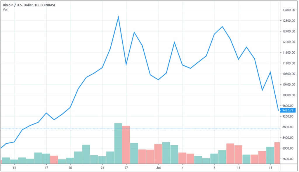
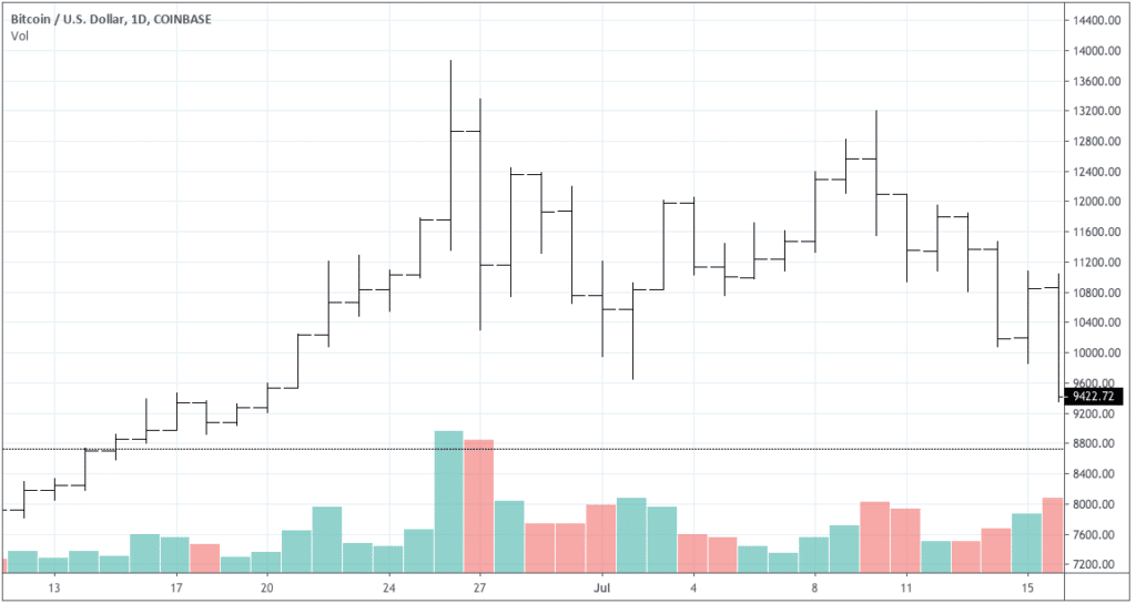
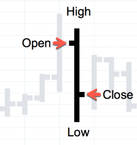
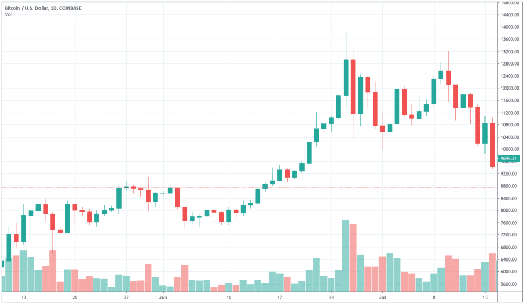
On the first part of this series, we introduced technical analysis and the basics of charting. In this section, we’ll study candlestick patterns and look at ways to profit from them.
Reversal patterns
One of the most determinant skills a professional trader should have has to do with the ability to identify trend reversals as quickly and accurately as possible. In fact, reversal patterns do provide for the profitable trading setups by most candlestick masters.
Although reversal patterns do not always result in deep trend corrections, or in clear changes in market sentiment, they usually become a warning that a given trend is running out of steam (due to several reasons). Thus we as traders should start considering to either close our existing positions, to deleverage them or to tighten up risk (i.e. stop loss). Perhaps the most appreciated feature of reversal patterns is that they spot price areas for efficient entries, i.e., with an optimised risk-reward ration. However, we should not lose insight by forgetting the most inherent probabilistic nature of trading; put in differently, reversal patterns do increase our chances of determining successful entries, but we must add other factors to the equation such as risk-reward ratio, market sentiment, seasonality adjustments, etc. Due to their relevance in nowadays trading literature, we shall carefully analyze trend reversal patterns.
We must be cautious to take positions against a prevailing trend if there is one. A rapid train isn’t going to reverse its direction easily. So, before strong trending markets, we should take only those signals matching the trend. Of course, on markets moving within a channel a pattern near the top or bottom of the channel is an ideal place for exit and reverse our position, provided the channel is broad enough to have a proper reward for our risk.
Before engaging in the study of the candlestick reversal patterns, let’s carry out a short discussion about a couple of indicators which may be used as confirmation of the main pattern.
Handy confirming indicators for its use together with candlestick patterns
I’ll be back… and back…and back…
Candlestick patterns are visually simple but sometimes variations of them appear in a lot of places, and not all of them should be taken into account as entry place. The accuracy of the candlestick patterns is highly enhanced when a confirmation signal is used with it. So in this section, we’ll present a couple of Indicators that may be useful as a companion because of its ability to show overbought or oversold places.

Stochastic Oscillator:
Two math for dummies, at $16.99 each: That’ll be $50.
The Stochastics Oscillator, developed by George Lane in 1950, came from the observation that closing prices tend to appear near the high of the range during uptrends and near the low of the range in downtrends.
This oscillator measures where the close is relative to the range of prices over a period of time. The %K line comes from a simple formula, which makes sure the signal is always between zero and 100:
There is a %D line, which is called slow stochastic and is computed by applying a three-day moving average to the %K line.
The usual way to be used when combined with a candlestick pattern is by taking action at %D and %K crossovers when this happens at an extreme.

Williams %R
Too much gear for this to be normal! Fuck that; we’re multitasking! (a Robin Williams liberal translation)
Williams Percent R is a momentum indicator developed by Larry Williams, which is very similar to the Stochastic indicator, but in this case, it shows the level of the Close in relation to the highest high of the period, instead of the lowest low, and it doesn’t depict a smoothed %D line.
Therefore, this oscillator moves from -100 to 0. Values below -80 are oversold levels while from -20 to 0 are overbought.
Some charting packages shift these values to positive 0 to 100 by adding 100 to the formula. In this case, oversold levels are between 0 and 20, and overbought condition happens from 80 to 100.
%R is noisier than Stochastic %D, but with less lag, so together with the confirming candle pattern, it allows for a better reward to risk ratio and tends to show more trade opportunities than Stochastic does.
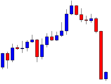
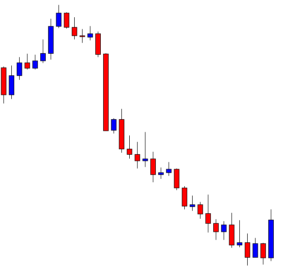
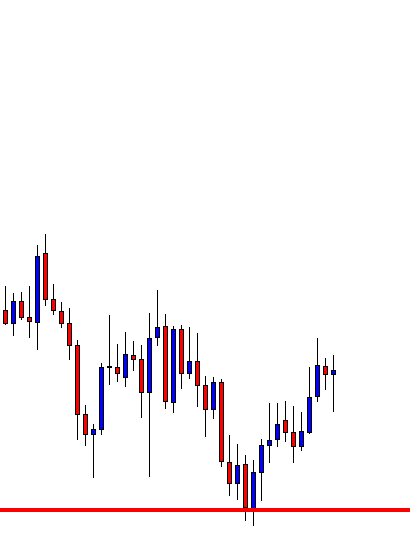
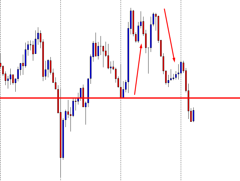
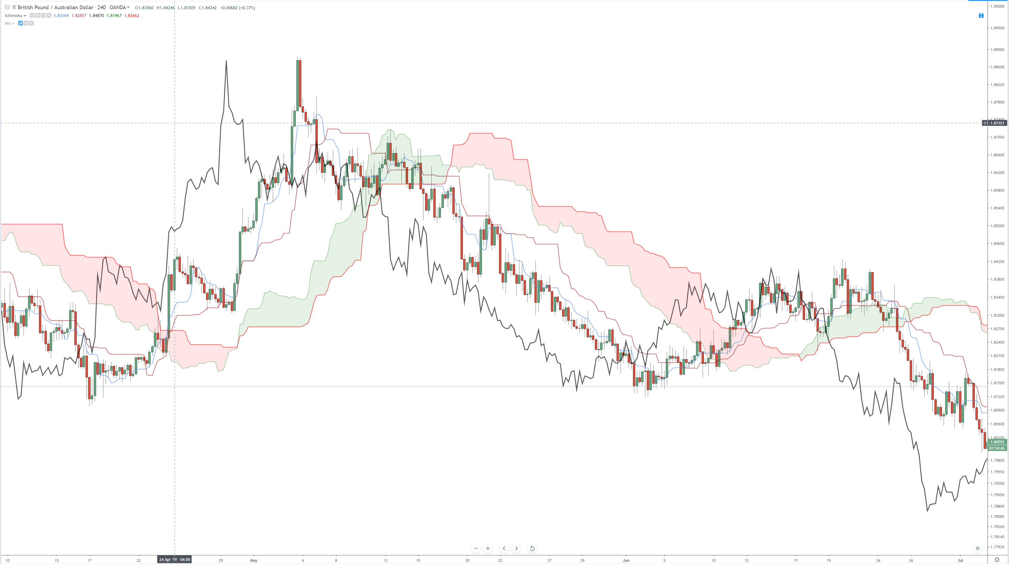
We observe the excellent accuracy in sync of candlestick top and bottom patterns with the overbought and oversold levels pictured by the %R; and, also, the high reward to risk ratios that might have been achieved. Just one of the patterns (the piercing pattern, fourth from left to right) doesn’t present a good opportunity (therefore we won’t take the trade).
This type of good synch happens in horizontal channels mostly. When the trend is strong, reliable signals only appear on pullbacks of the main trend.
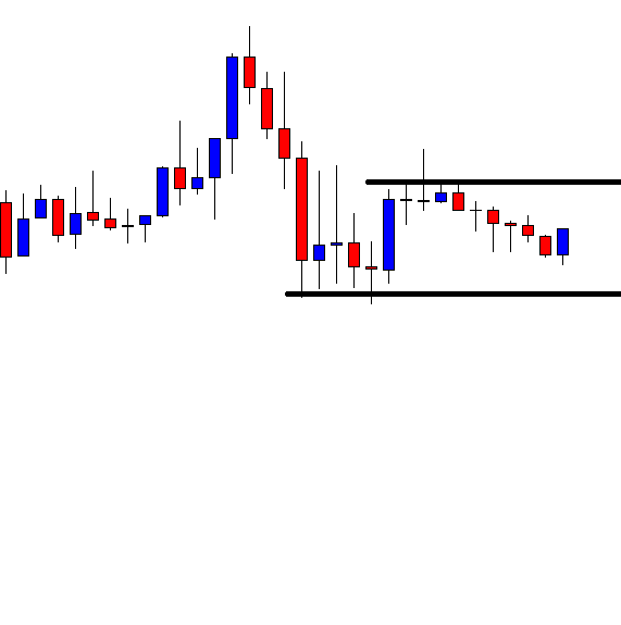
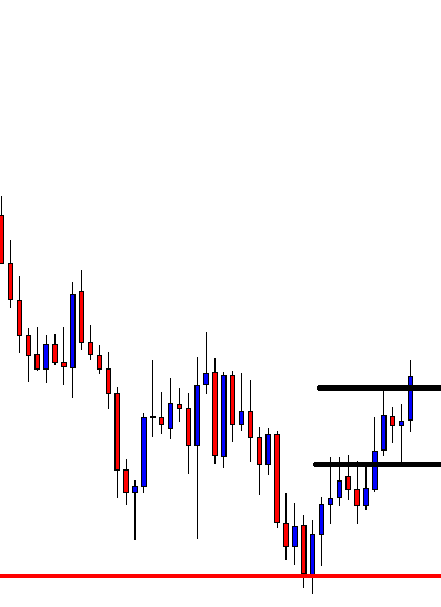
Finally, the right chart is the continuation of the last signal from the left one. On the left, we had a good hammer, followed by a white candle, with %R in an oversold condition and rising. The left image shows the fate of this imaginary trade, which closes, rightly at the previous high, for a reward/risk of about Two. Then, another entry might have been taken reversing 100% of the last move with yet another 2:1 Reward to risk ratio.
That concludes our small digression about oscillators. The rest of the article will deal with Candlestick signals together with %R as my choice for companion oscillator.
Major candlestick signals
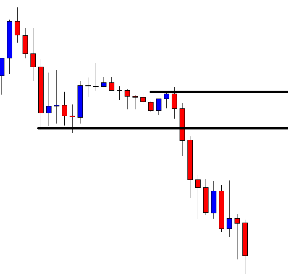
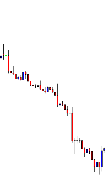
Japanese candlestick charts increase the level of information for the visually gifted trader. Each candle, in combination with its neighboring ones, reflects the psychological shifts in the investor’s sentiment.
- Umbrella lines; hammer and Hanging man
- The Doji Star
- Engulfing patterns
- Piercing patterns
- Dark Cloud
- Harami
- Stars: Morning and Evening Stars
- Kicker signal
- Shooting star
Umbrella Lines
Give it to me, she yelled, I’m so fucking wet! …!
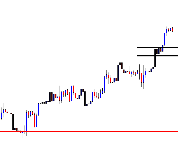
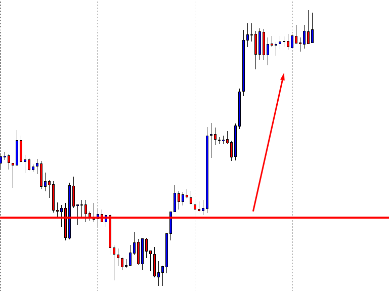
Umbrella lines are candles that show very long lower shadows and small bodies near the top of the trading range. This kind of candles is very interesting as it may be bullish or bearish, depending on price location. If it appears during a downtrend, it’s indicative of the end of it. In such places, the umbrella is tagged as a hammer. If it shows after a rally is called a hanging man.

There are three differences between a hammer and a hanging man.
- Trend: Hammers come after a downfall. A hanging man after a run-up.
- Magnitude of the move: Hammers are valid even after a small drop. For a hanging man, the move should last longer.
- Confirmation: A hanging man should be validated, while a hammer not.
A note to pairs and Forex Traders: Trading pairs makes umbrella candles kind of symmetrical. The stock asymmetry is tamed. A bull EUR/USD is a bear USD/EUR, so this confirmation stuff does not apply. We just need to realize that this kind signals work better when it goes with the prevailing trend, and need confirmation on the opposite direction.
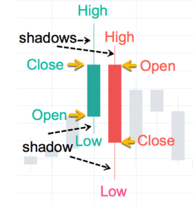
Besides these patterns, we should always pay attention to the shadows of the candles. Shadows show the result of the fight between bulls and bears: If we see several consecutive candles with long upper shadows, although the trend is still up, those shadows are a sign that bears are starting to win.
Besides these patterns, we should always pay attention to the shadows of the candles. Shadows show the result of the fight between bulls and bears: If we see several consecutive candles with long upper shadows, although the trend is still up, those shadows are a sign that bears are starting to win.
On the other side, if there’s a downtrend, but long lower shadows with relatively small bodies start appearing, the continuation of the downtrend is under suspicion.
 Usually, by just paying attention to where the most longer shadows are drawn, we get the information of who’s in command, although not always this translates into a trend change, it just adds volatility. If we follow, as if it were our polar star, the proper reward to risk ratio and use the oversold/overbought indications set by %R, or Stochastics. we may survive those siren chants…
Hammer:
Honey, I’d really like to nail you…
An umbrella-like formation that’s present at support levels, signaling the end of a downward leg.
Pattern sentiment:
After a long time in a downtrend, the last bulls give up and sell. The latest bears take the byte and price go down on a climax of selling pressure; but then, there’s almost no one who hasn’t sold. Therefore bulls are the majority and prices start to climb back to the opening level. It may happen that short positions are being closed by traders realizing they were wrong, adding steam to the bull side. The longer the shadow, the weaker the position for the short side.
Sometimes, two or three consecutive hammers are drawing a double or triple bottom. Those are excellent signals of a trend change.

Criteria for trading hammers:
- The reward to risk must be higher than 2
- %R shows an oversold condition
- The lower shadow must be at least twice as long as its body
- The real body should be at the top of the range of the candle, The color isn’t important, although a white body is more bullish.
- Almost no upper shadow.
- Large volume on the hammer bar.
- The entry on the next candle should be above the high of the hammer.
- A gap up is an enhancement, but not so much that spoils the reward to risk ratio below two.
Hanging Man:
Darling, suddenly, I feel quite vulnerable…
A hanging man has the same look as a hammer, but placed at the (hopefully) top of an ascending trend.
Criteria for trading Hanging Man:
- The reward be higher than 2x the risk
- % R is showing an overbought condition
- The lower shadow must be at least twice as long as its body
- The real body should be at the top of the range of the candle. The color isn’t important, although a black body is more bearish
- Almost no upper shadow.
- Large volume on the hammer bar.
- The entry point must be below the hanging man’s low.
- A gap up on that day and then a gap down is a strong signal
- Alternatively, a confirmation with a strong down day, or gap down, that goes below the hanging man’s low.
- Alternatively, wait for a failed test of the highs, forming a double top

Hanging Man Pattern sentiment:
After a long uptrend, that day the price opens higher, but the bulls are hesitating and some traders take profits pushing on the bear side, so the price declines below the opening level. At the end of the session, the buyers start to move the price up again, to the opening level, or even higher.
This seems to demonstrate that the bulls are still in control, but it also shows that traders start taking profits, and even, short sellers are entering with more than reasonable reward to risk scenarios.
When the next candle moves below the previous low, bulls start to unload their positions at sell stops, adding fire to the downward pressure.
The Doji Star
Stars can’t shine without darkness…
This pattern shows when the open and the close prices are the same, forming a horizontal line. That implies that bulls and bears are at an impasse. It’s an important alert when a trend has travelled
long.
Perfect dojis hardly happen, and on intraday time frames, much less. Most of the cases are tiny hammers or small bodied candles, but when it happens, we should pay attention, and close a position at the violation of the low (or the high when shorts) of the doji candle.
Two special kinds of dojis justify being mentioned:
Gravestone Doji (Tohba)
The Gravestone is formed when open and close prices are the at low of the day. According to Stephen Bigalow, the Japanese analogy “it represents those who have died in the battle. The victories of the day are lost by the end of the day.”
It works better, according to sources, showing bottom reversals than tops. But it’s a significant indecision, with plenty psychological weight.

Fig 8: Gravestone Doji
Dragonfly Doji (Tonbo)
Dragonfly dojis occur when the opening and closing prices happen, both, at the high of the day, and are hammers and hanging man variants.

Fig 9: Dragonfly Doji
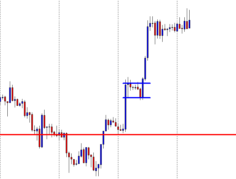
Engulfing patterns (Tsutsumi)
The issue isn’t penetration, but engulfing…(Amy Schumer)
The engulfing pattern is a major reversal pattern. Seen in a 2x timeframe
it may be pictured as an inverted hammer or doji.
The bullish engulfing candle opens lower than previous day’s close and closes higher than the previous open, engulfing the whole body of the previous one.
The bearish engulfing is a mirror image of the first one.
Fig 10a and 10.b: Engulfing patterns
Note: On intraday charts, the engulfing candle hardly opens lower/higher than the previous candle, but it must close higher/lower, engulfing the entire body of the previous candle.
Criteria to trade an engulfing formation:
- A reward two times the risk has been established
- The body of the bullish candle closes higher/lower than the open of the previous bear/bull candle.
- Prices have been in a trend and %R shows they are in oversold/overbought territory signal.
- The body of the engulfing candle is of opposite color, except when engulfing small bodied candles.
- A large body engulfing small bodies is a positive sign
- Large volume on the engulfing candle
- The body engulfs more than one body.
- An opening gap after the pattern (but not much of that 2:1 Reward is taken)
Pattern sentiment
After a decline of some proportion the price opens at or lower than the previous candle, but after testing or crossing the lows of the previous candle and taking all stops, the bulls take command and move the price up, and above last day’s open. That forces the bears to close positions, adding more fuel to the bull move. Now, the change in sentiment shifts and traders seek to test the highs of the previous bearish move.

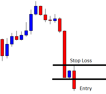
Piercing Patterns
Piercing is everything about holes… so you’re telling me you find them attractive!
Piercing pattern (bullish) and Dark cloud cover(bearish) are specular patterns between them, so for pairs trading, they are the same pattern, just on a reversed pair chart.
The piercing pattern is a two candle pattern. The first one is a bearish candle after a downtrend has traveled for some time. The second candle starts below the low of its neighbor, and it closes above the middle of it near or at the high of the range.
The condition that the open should be below the low of the previous bear candle hardly happens on intraday charts, therefore, with those, it’s enough that it starts at the previous open, closing above the middle of it, with a strong close.

Criteria to trade a Piercing Pattern
- A reward 2 times the risk has been evaluated
- %R shows oversold levels and moves up at the close of the white candle
- There had been a downward movement with a final long black candle
- the actual candle is white, crossed the middle of the black candle and closes at its highs
- A gap down on the white candle adds power to the signal
- The higher the close, the better
- A large volume is an enhancement.
Piercing Pattern sentiment:
After a continuous decline, the bearish sentiment is extreme. The last long candle shows a lot of selling activity. The next candle gaps down, continuing down for a while. Finally, everyone willing to sell has already sold and what’s left is traders thinking that this level might be a good price to buy. Short sellers start to close their positions, as well, so the price starts to go up. The end of the bar is strong, retracing half or more of the previous candle and closing at its highs. When the next candle continues the up-trend, late short positions losing money, start being closed and the move accelerates, therefore the downward move is questioned.
Criteria to trade a Dark Cloud Cover
Since Dark Cloud Cover is the specular image of a Piecing Pattern, just translate the piecing pattern criteria to its specular condition.
Harami
I’m never having babies. I hear they take nine months to download…(Liza Sabater 🇵🇷👸🏾 On Twitter: Retrieved from https://twitter.com/blogdiva/status/2753105115)
Steve Nison describes a Harami as a small real body that is contained within what the Japanese call “an unusual long black or white body”.
Harami is a Japanese word for “pregnant woman”. The large body, being the mother of the small one, the baby. It’s a sign of market lacking steam. As we see on the fig 14, haramis happen quite often during trends. Candles of profit taking, and testing. Short term trading has made this pattern almost unworthy.
Therefore a Harami, by itself, isn’t reason enough to take an opposite position to the main trend. More confirming evidence is required, such as a third candle taking the lows of the mother candle, depicting a kind of morning or evening star pattern.
Morning/evening Stars.
I’m not bad, I just have a lousy publicist (Lucifer)
The Morning star is a bottom reversal signal. Looking at it in a longer time frame may be seen as a hammer, or, even, a Dragonfly Doji. It’s composed of three elements. After a down leg, the last candle is a long, black, candle. Next candle is a gap down, and a small body is formed. The last day, there’s a gap up and a long white candle that closes near the open of the first long and black candle.
Note: Intraday charts do not show gaps. Therefore, the second body may be the baby of a Harami or a small black body below the first black candle. It also may appear two or three small bodies and then the white candle. That is an indication that a bottom may have been reached. This rounded bottom is a nice place to enter after the long white candle crosses above their highs.
Criteria to trade a Morning Star.
 There had been a downtrend easily visible on the chart
- The %R is in oversold condition
- After a bottoming black candle, and one or more small bodies with lower tails, the last white candle closes near the opening of the black candle and in its top range
- A reward 2X the risk is spotted from the entry point to the last major top or resistance
- If we see higher volume than usual in the black and white candles, the better.
- If there is a long down tail in the small body the signal is stronger.
Market sentiment in a Morning Star pattern:
A strong correction has happened and long positions acquired during the down move started to think that they went wrong and close their positions. A selloff begins forming a long black body. Next day (or candle) there is a gap, but at those levels, due to supports being hit and that most of the selling ended, the price doesn’t move much. The third candle starts moving up, pushed by the bulls, that realize there is a huge reward to risk guaranteed by the previous small body. This up move forces bear traders to close their short positions, adding strength to the upward momentum.
The Evening Star is an inverted Morning Star, so for forex, pairs traders, it’s exactly the same pattern on an inverted pair. For example, an evening star on the EUR/USD is a Morning Star on the fictitious USD/EUR.
Criteria to trade an Evening Star.
- There had been an uptrend easily visible on the chart
- The %R is in overbought condition
- After a long white candle and one or more small bodies with higher tails, the last black candle closes near the opening of the white candle and in its bottom range
- A reward 2X the risk is spotted from the entry point to the last major bottom or support
- If we see higher volume than usual in the black and white candles, the better.
- If there is a long upper tail in the small body the signal is stronger.
Market sentiment in an Evening Star pattern
The Evening Star is a signal that warns the top of an upward move has been reached. There is a first long white candle, showing buying exuberance, then a happy gap up that fails to go further; and, finally, a painful gap down and a long dark candle. You may imagine the feelings of the trader who bought at that island body on the top watching a gap down and a large down-candle. That’s exactly the feeling the trader had when he traded short at the small body of the Morning Star and watched the gap up and a long white candle. Thus, after that gap down, bulls give up their hope for the continuation of the trend and close their positions at a loss and increasing the selling pressure.

Kicker Signal (Keri Ashi)
I don’t need a kicker to win my super bowls… O God, please don’t kick me in the nuts!
Keri Ashi is a powerful signal, although it almost never appears on intraday charts, and when it does, its cause is a surprise news creating huge instantaneous volatility, whose Reward to risk ratio is too poor to trade at once. Likewise, due to the 24/7 nature of the currency trading, almost never shows on daily charts, as well; although it may appear in the futures market of that pair.
A bullish Kicker signal is made of a long black candle and a long white candle whose open is above the body of the previous black one. The bearish kicker is its reverse: A long white candle followed by a long black candle that opens below the open of the white one. It’s a radical shift in beliefs of traders about the value if one of the members of the pair that triggers an instantaneous thrust in price.
Besides its rarity in currencies trading, the reward to risk is quite poor, and almost always is a consequence from a news event, so its value is linked to the event’s value as trend changer. Therefore, Kickers are worth only to recognize a major trend shift.
Shooting stars (Nagare Boshi)
Hey, Arthur, check it out: A shooting star. That’s a sure sign of good luck, my friend! (Anonymous Dinosaur)
We already talked about the value of the shadows, wicks or tails to assess who’s controlling the candle: the bulls or the bears. Shooting stars are small bodied-candles with long  upper tails. The Japanese named that way by its similitude to a shooting star. It shows that the bears have controlled the candle. It may be produced by profit taking or fresh short position, but the bullish sentiment weakened. It’s body color isn’t important. As a reversal signal, it must come after a rally. At tops, it’s usually part of the Evening Star formation, so a shooting star is a very good warning signal to close our position if the next candle travels below the low of the star’s low.
When a shooting star happens at a bottom is called Inverted Hammer, and shows evidence that the bulls started to get in, although, finally bears won. Thus, the downtrend is in question. Under this circumstance, our stops should be tightened or profit must be taken.
A positive candle, after it will picture a kind of morning star signal and may be traded similarly. On fig 20 there’s one example of an inverted hammer at the bottom of the downward leg.
Summary:
Candlestick charts show information that’s hidden in bar charts. Candlestick patterns are visually more evident than in bar style, but, mainly, the information shown is very similar.
The main characteristic of a good reversal signal is that in one, two, three -or more- candles price undoes the road taken by a long initial candle of opposite color at the end of a trend of a certain length. Thus, a candlestick pattern looks similar to a small bodied-candle with long shadow or tail, if observed on a longer time frame.
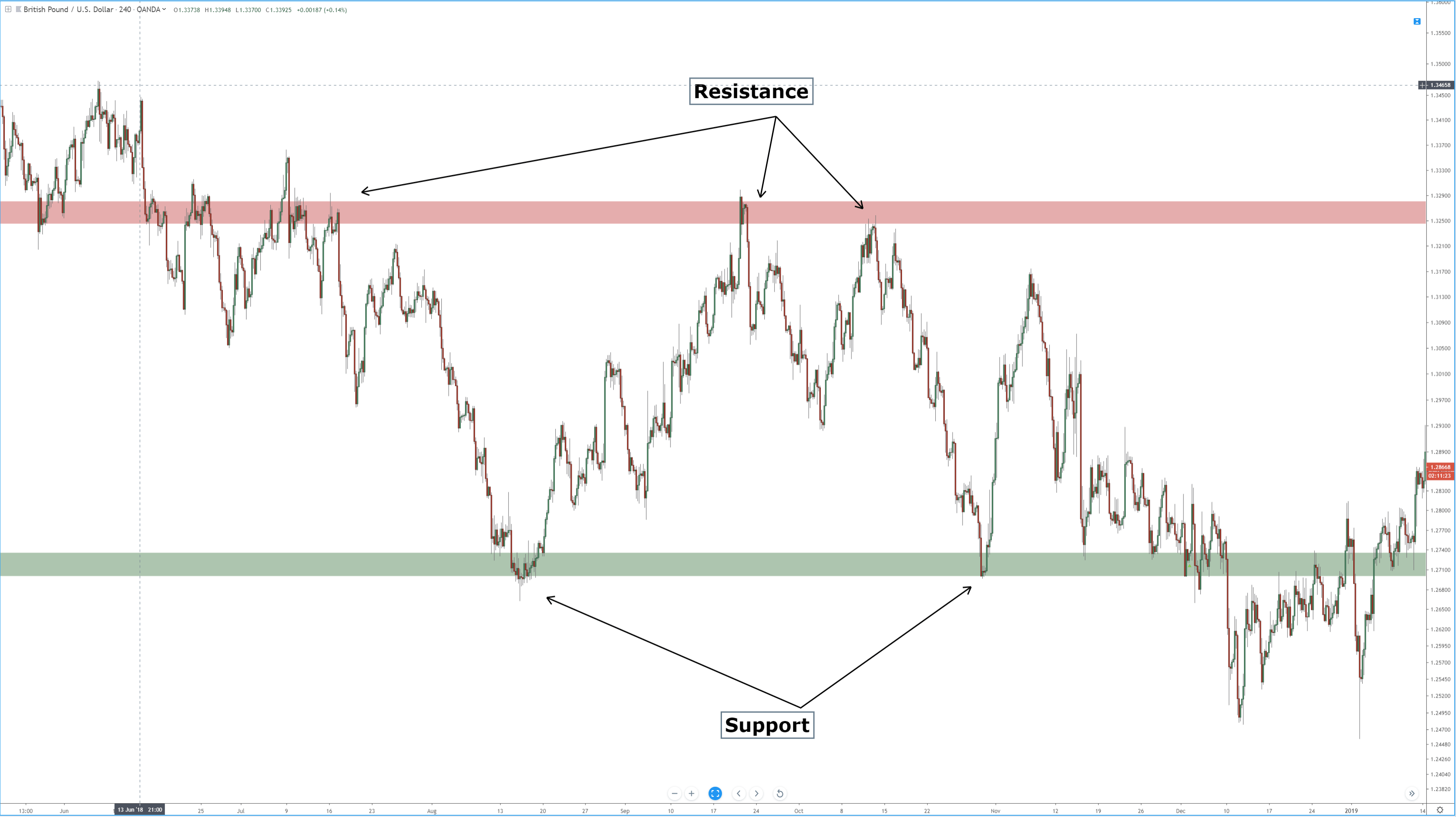
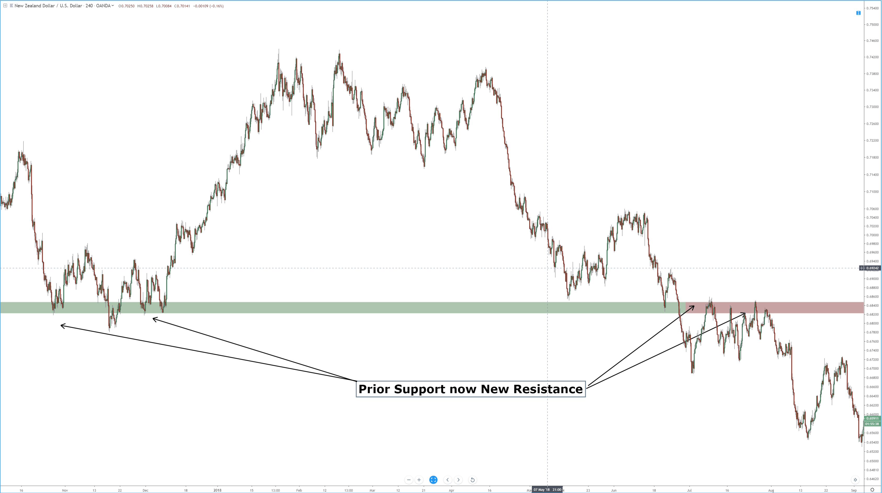
A long tail, then, is always worth paying attention to. It shows who won the battle in that particular candle and is an early warning of a reversal, especially near supports or resistance levels.
The use of Stochastics or Williams %R as companion indicator enhances the value of the pattern information and its probability as a winning trade.
As a trading philosophy, we should always weight the potential reward for the risk we take. Therefore, we should qualify the pattern by the reward it shows in comparison to its risk.
References:
- Profitable Candlestick Trading, Stephen Bigalow
- Japanese Candlestick Charting Techniques, Steve Nison
All Images were taken using Multicharts 11 trading platform, and MetaTrader 4
©Forex.Academy


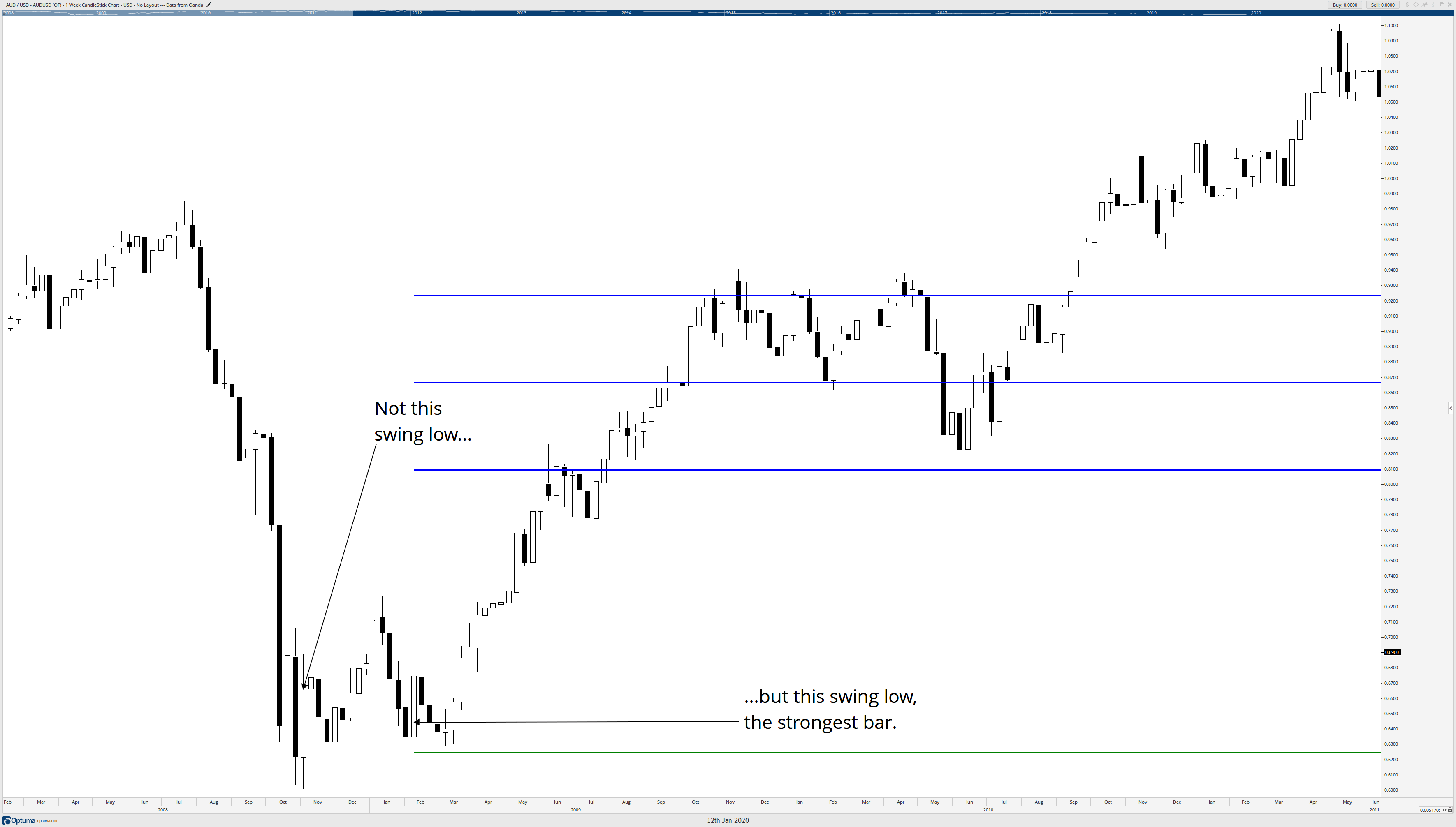


 A bullish reversal bar is a bar with its low making a new low but closing higher. A bearish reversal is a bar where there’s a new high but with the closing lower. Those reversals aren’t significant unless in context with highly oversold or overbought situations.


