Introduction
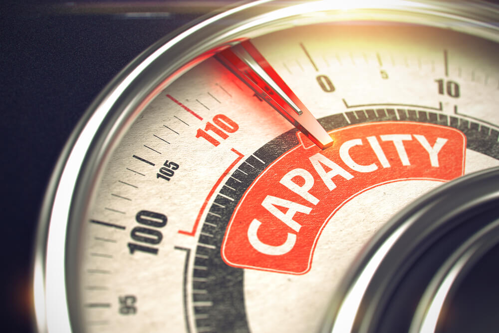
Capacity Utilization is a straightforward and crude way of finding out whether a business or an economy is operating at its peak potential. Investors would always prefer to direct their capital, where their returns are maximized to the optimal levels. In this sense, Capacity Utilization can tell us which sectors, or companies, or even economies would attract capital, which would further fuel growth and prosperity. Hence, understanding Capacity Utilization figures will prove advantageous for our fundamental analysis.
What is Capacity Utilization?
Capacity Utilization refers to the proportion of the real potential economic output that is realized at a given point in time. It tells us at what level of maximum capacity is an industry operating at. It is expressed in percentage and is given by the below equation:

For example, a firm that can produce 10,000 phones a day, if it is producing 6,000 phones only, then the company is said to have a Capacity Utilization of 60%.
In the simplest sense, Capacity Utilization is like a report card of an industry or an economy. It tells the current score (or marks) out of the maximum possible marks.
How can the Capacity Utilization numbers be used for analysis?
Capacity Utilization Rate is an essential operational parameter for businesses, especially those manufacturing physical goods, as it is easier to quantify the output.
A company operating at less than 100% implies that the firm can increase its production, and consequently, its profit margin without incurring additional costs of installing new equipment to increase production. Likewise, economies with scores of less than 100% can afford to increase production capacity when demanded.
For the companies, it serves as a metric for determining operating efficiency. Capacity Utilization is susceptible to the following factors:
- Business Cycles: Businesses are often seasonal, seeing an increase in business during specific periods of the years, although some companies may have consistent business activity throughout the year. It depends on the nature of business and the products being manufactured.
- Management: Lack of proper management can also lead to wastage of resources; therefore, undermining the efficiency of the company itself. It is not often the common cause but is also one factor that investors must look into to make sure proper management is there to handle the business to utilize the available resources in terms of workforce and equipment to optimize revenue for the firm.
- Economy’s Health: Economic conditions drive consumer sentiment and affect the spending patterns of people. During fluctuating inflation rates and unstable market economic conditions, people tend to save more and spend less, which can effectively reduce the demand for goods and services. In this case, the company may need to adjust their production to demand.
- Competition: In an open market environment, competition always takes away a portion of our business, as companies battle for a bigger portion of the market, the best companies with excellent quality goods, and reputation tend to take a higher proportion of market revenue. At the same time, the laggards end up with lower demands for their product.
In general, competition and management factors are a minor component that applies to novice companies that are in the early stages of development. In most cases, the industries are well established in their field and have consistent performance and are indeed susceptible to Economic health and business cycles.
Low Capacity Utilization figures are not desirable. Fiscal and Monetary Policymakers ( Government and Central Banks) monitor the Capacity Utilization figures and intervene using fiscal or monetary levers to stimulate business and economy. Governments can decrease the tax burden on specific sectors to encourage them to invest capital in their growth. At the same time, Central Banks can reduce interest rates to encourage business owners to borrow money and increase business activity through expansion or investment opportunities.
High Capacity Utilization figures are always preferable, as it indicates that the companies are running at their maximum capacity, and earning maximum achievable profit through their current business setup. When Capacity Utilization is close to 100%, the economy is performing at its peak, and it is ideal an ideal environment for investors to invest in industries. It implies that economic health is stable and growing.
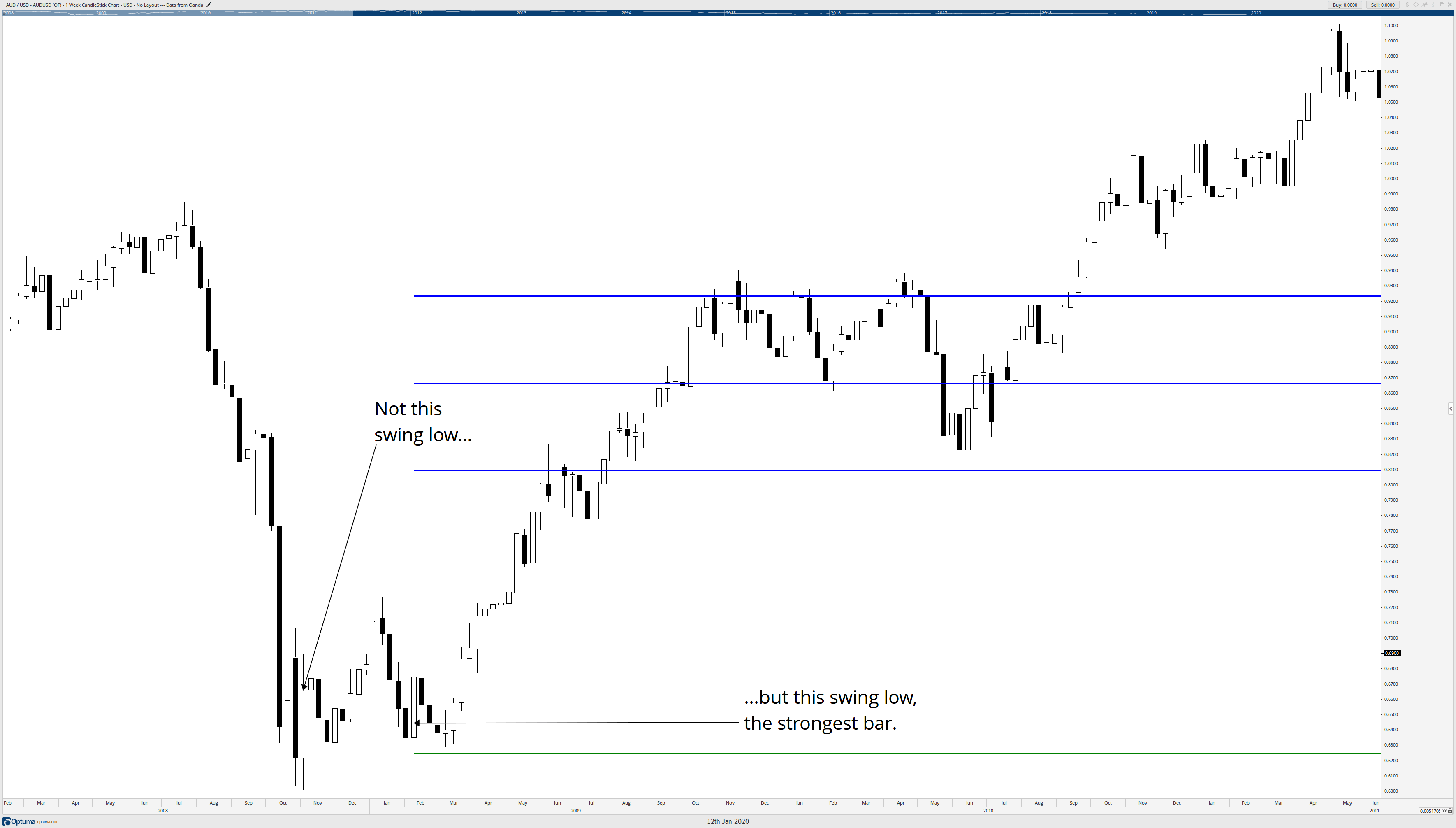
Sector-wise Capacity Utilization rates difference can tell us what amount of slacks each industry is carrying and can direct investment capital into the growing industries than the slowing sectors. By comparing historical highs and lows, we can get a reference, on an industry’s current performance with regards to its peak high and low performances, to understand how it is faring right now.
Impact on Currency
Capacity Utilization is a coincident indicator that is reflective of the market environment and the corresponding policy levers executed to counter the market conditions by the Fiscal and Monetary policymakers. Hence, it gives us a current economic picture as it is a function of the market environment and policy levers.
It is a proportional indicator, where high Capacity Utilization Rates indicate healthy revenue-generating activity, which is suitable for the economy, higher GDP prints, and currency appreciates accordingly. On the other hand, decreasing Capacity Utilization Rates indicate a stagnating or deteriorating business activity, which poses a deflationary threat to the economy, or extreme cases recession, which is depreciating for the currency.
It is a low impact indicator, as the corresponding impacts would have been already priced into the market. We are saying this because policy maker’s decisions come out in the form of interest rates, tax exemptions or reductions, and through survey indicators like business and consumer surveys.
Economic Reports
The “Industrial Production and Capacity Utilization – G17” reports are published every month by the Federal Reserve in the United States on its official website. The reports are published in the formats of estimates and revised estimates.
The first estimate is released around the 15th of every month at 9:15 A.M. for the previous month. It factors in about 75% of the data. The second estimate accounts for 85%, the third estimate 94%, the fourth estimate 95%, and 96% in the fifth and sixth estimates as more of the source data becomes available after each passing month.
Sources of Capacity Utilization
The monthly Capacity Utilization statistics are available on the official website of the Federal Reserve for the United States. The St. Louis FRED website provides a comprehensive list of Industry Production, and Capacity Utilization reports on its website with multiple graphical plots. We can also find global Manufacturing Production figures for various countries in statistical formats here.
Impact of the ‘Capacity Utilization’ news release on the price charts
In the previous section of the article, we understood the meaning and significance of Capacity Utilization, which essentially talks about the manufacturing and production capabilities that are being utilized by a nation at any given point of time. If demand increases, Capacity Utilization increases, but if demand decreases, the rate will fall. Policymakers use this data for fixing interest rates and while calculating inflation in the economy. Thus, investors give a reasonable amount of importance to the data and take a stance in the currency based on the Capacity Utilization rate.
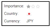
The below image shows the latest and previous Capacity Utilization rate of Japan. We see there was a decrease in Capacity Utilization in March, which means the country underutilized its resources. A higher than expected number should be taken as positive for the Japanese Yen, while a lower than expected number as negative. Let us discover the impact of the data on different currency pairs.

USD/JPY | Before the announcement:
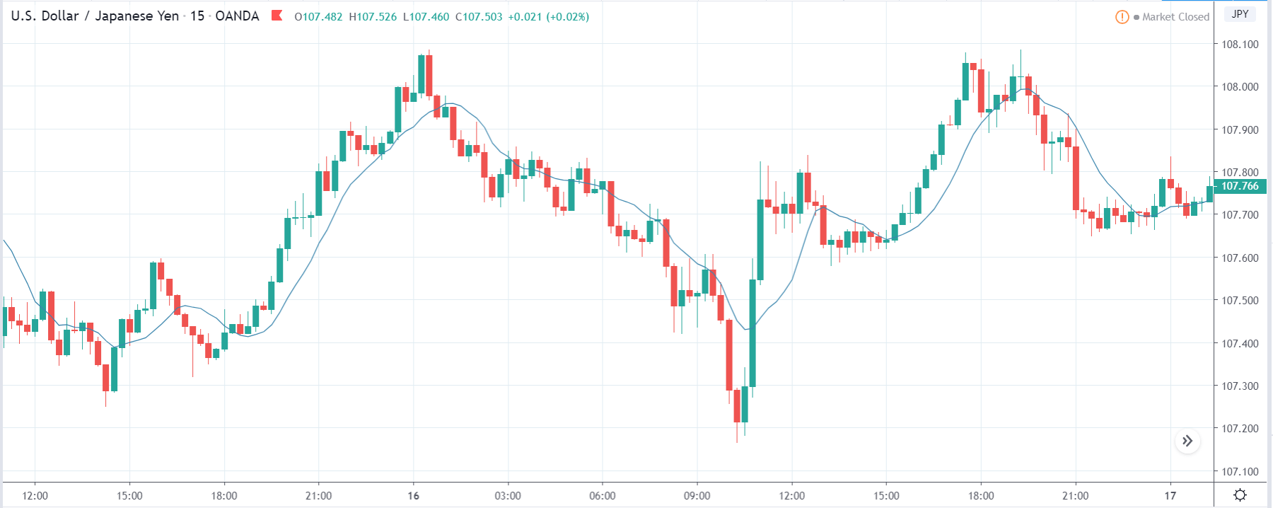
We shall begin with the USD/JPY currency pair to analyze the change in volatility before and after the news announcement. The above image shows the state of the currency pair before the news announcement, where the price moving within a range broadly and currently is in the middle of the range. As there is no clarity with respect to the direction of the market, we shall be trading based on the outcome of the news.
USD/JPY | After the announcement:
After the news announcement, the price falls below the moving average, and volatility increases to the downside. Even though the Capacity Utilization data was not very good for the economy, traders considered the data to be mildly positive for the economy in this case and bought the Japanese Yen. After the market has shown signs of weakness, we are now certain that the volatility will expand on the downside, and thus, we can take a ‘short’ position with a stop loss above the ‘resistance’ of the range.
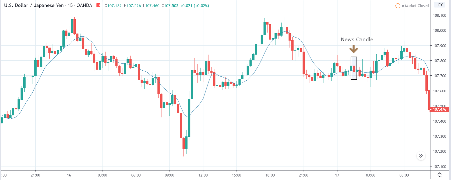
GBP/JPY | Before the announcement:
GBP/JPY | After the announcement:
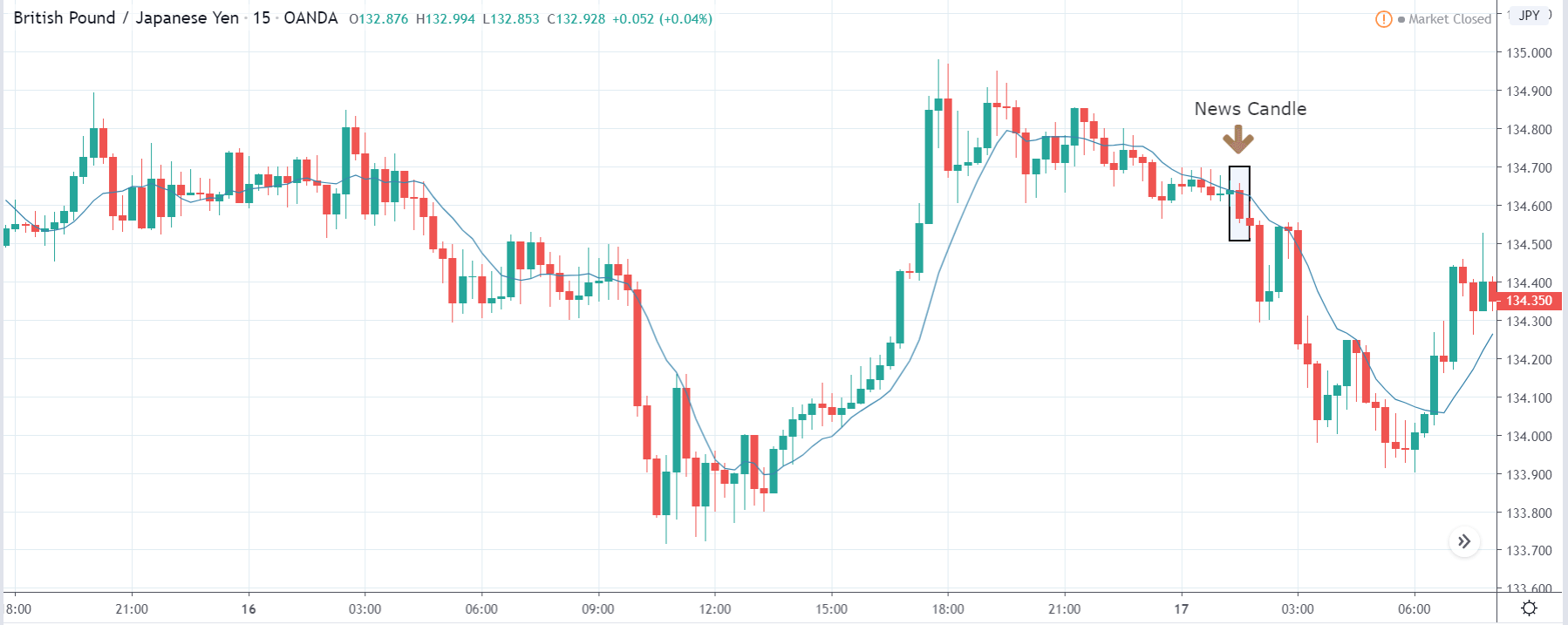
The above images represent the GBP/JPY currency pair, where we see that before the announcement, the price has started to move in a ‘range’ after a large move on the upside. This also a place from where the market had reversed earlier, thus we need to trade with caution, as we are not sure where the market will head now.
After the news announcement, the price crashes and sharply moves lower. The Capacity Utilization data proved to be positive for the Japanese Yen, and traders went ‘short’ in the currency pair, thereby strengthening the currency furthermore. This is our final confirmation for taking a ‘short’ trade and taking entry as the volatility increases to the downside.
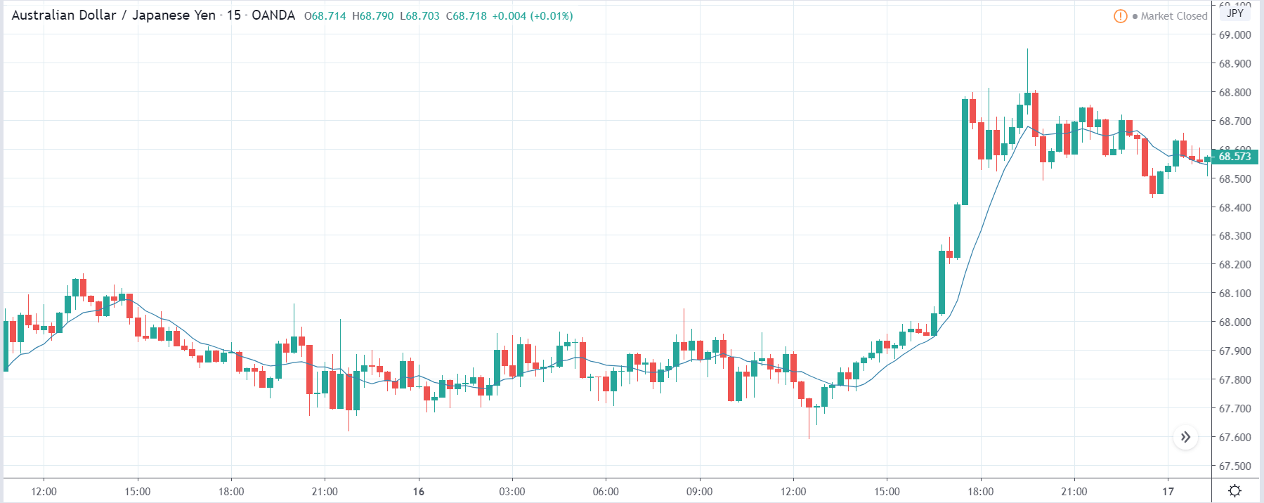
AUD/JPY | Before the announcement:
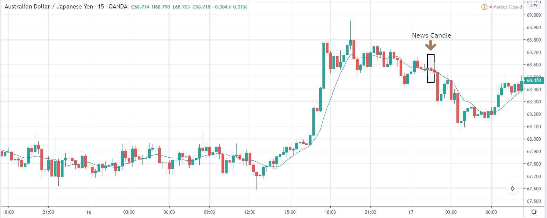
AUD/JPY | After the announcement:
The above images are that of the AUD/JPY currency pair, where in the first image, we see that the market is in a strong uptrend indicating a great amount of weakness in the Japanese Yen. Technically, we should be looking for buying the currency pair after a suitable price retracement to the ‘support’ area, but a news release can change the entire plan. Thus, we need to wait and see what the news outcome does to the currency pair.
After the news announcement, volatility slightly increases to the downside, and the ‘news candle’ barely closes in red. This means the impact of Capacity Utilization was least on this currency pair that did not result in huge volatility in the pair. As the overall trend is up, a ‘short’ trade can be very risky as the risk to reward ratio is not in our favor.
That’s about ‘Capacity Utilization’ and its impact on the Forex market after its news release. If you have any questions, please let us know in the comments below. Good luck!