The EURJPY cross advances in a long-term consolidation structure, which began in early December 2016. The short-term Elliott wave view predicts a limited decline in the following trading sessions.
The EURJPY cross advances in a long-term consolidation structure, which began in early December 2016. The short-term Elliott wave view predicts a limited decline in the following trading sessions.
The EURJPY cross advances in a long-term consolidation structure, which began in early December 2016. The short-term Elliott wave view predicts a limited decline in the following trading sessions.
Market Sentiment
The EURJPY cross closed the last trading week, cutting Monday’s session gains when the cross jumped from 122.835 until 125.136, mainly supported by the stock market’s post-election rally.
The following figure shows the EURJPY in its daily timeframe, revealing the mid-term big-market participants’ sentiment exposed by the 90-day high and low range. In this context, the cross is entering into the bearish sentiment zone. However, the 60-day weighted moving average still doesn’t confirm the short-term bearish bias.
After a rally that carried the cross to advance over 11% since May 07th (when the EURJPY bottomed on 114.397 and then soared, reaching the highest level of the year at 127.075 on September 01st), the cross began to retrace, turning its mid-term market sentiment from extremely bullish to bearish.
Nevertheless, the price action still doesn’t confirm the bearish sentiment. In this regard, the short-term sentiment remains neutral until the price confirms the bias.
Technical Overview
The big picture of EURJPY illustrated in the following daily chart exposes a long-tailed yearly candlestick mostly bullish. However, the upper shadow hints at a bearish pressure near the psychological barrier of 127. Moreover, the next resistance is placed at 127.502, which corresponds to the high of 2019.
The EUJPY long-term trend under the Dow Theory perspective and exposed in the next log scale weekly chart reveals the primary trend identified in blue that remains slightly bullish.
At the same time, the secondary trend exposes the sideways movement developing as a pennant pattern, which began in early December 2016 when the price found resistance at 149.787 and could break soon.
According to the classic chartist theory, the pennant pattern is a technical figure that calls for the continuation of the previous movement. In this case, the pennant could resume the rally developed since late July 2012 at 94.114 ended at 149.787 in early December 2014.
Short-term Technical Outlook
The short-term Elliott wave view for EURJPY shows in its 12-hour chart advancing in an incomplete corrective sequence that began on May 06th at 114.397, where it completed its wave A of Minor degree labeled in green.
Once the price found fresh sellers at the highest level of the year, the cross started to advance in its wave B, still in progress. In this context, the previous chart unveils the intraday upward sequence corresponding to the incomplete wave ((b)) of Minute degree identified in black.
The price action could boost the cross until the next supply zone, located between 125.285 and 126.123, where the EURJPY could start to decline in an internal five-wave sequence corresponding to wave ((c)), in black, that may drop to 120.271, though, the price could extend its drops until 117.124.
The short-term bearish scenario’s invalidation level locates above the end of wave A in green at 127.075.
The morning Star and the Evening Star formations are patterns made of three candlesticks. The original candlestick patterns were made on the Japanese rice futures trading and were created for daily timeframes. Thus, they could depict gaps from the previous close to the next open. The Star was a small real body – white or black – that was gaping away from a previous large body. The only place where that could occur in the Forex markets is during weekends. Thus, what is required to form a star in Forex is a small body, the smaller, the better, at the end of a large body, preferably with large shadows.
The Morning Star
The Morning Star is a three-candle formation at the bottom of a descending trend. In astronomy, Mercury is the morning star that foretells the sunrise and the arrival of the day. That was the name the Japanese gave to the formation, as they consider it to be the precursor of a new uptrend.
As said, it is formed by three candlesticks. The first one is a large and black candlestick. The session day the price starts with a gap down (or just at the close in Forex) continues moving down for a while, then it recovers and closes near the open, creating a tiny body. The third day is a white candlestick that closes near the open of the first black candlestick. The important factor in the signal is the confirmation of buyers after the star candle is formed. The close of the third day should, at least, cross the halfway up to the black candle body, as in the case of a piercing pattern.
Chart 1 – Morning Star on the DAX-30 Index (click on it to enlarge)
Criteria for a Morning Star
The downtrend was evident
The body of the first candle continues with the trend (black)
The second candle is a short body figure showing indecision
The third day the candle closes at least above 50 percent the body of the black candle.
The larger the black and white candles, the better.
A gap is desirable but doesn’t count on it on 24H markets
A high volume in the first and third candles would be good signs of a selloff and consequent reversal.
Market Psychology
As in most bullish reversals, the first day, the hopeless bulls capitulate with a significant drop and substantial volume. The next day the power of the sellers stops in a short-bodied candle. The third day began bullish, touching the stops of the late short-sellers, and also caused by the close of positions of profit-takers. That fuels the price to the upside, making more short sellers close their positions -buying- and pushing up further the price. At the end of the day, buyers take control of the market action closing with a significant white candle on strong volume.
The Evening Star
The Evening star is the reciprocal of the Morning star, and even more so, when trading pairs in the Forex market, or any pair, for that matter. In this case, the Japanese linked this formation with the Venus planet, as the precursor or the night. It is created when a long white candle is followed by a small body and a large black candle.
As the case of the Morning Star, a gap up on the second small-bodied candle followed by a gap down on the third black candle is further confirmation of a reversal, but that seldom happens in the Forex Market. Also, the third candlestick is asked to close below 50 percent of the body of the first white candle.
Chart 2 – Evening Star on the EURUSD Pair (click on it to enlarge)
Criteria for an Evening Star
The upward trend has been showing for some time
The body of the first candle is white and large.
The second candlestick shows indecision in the market
On the third day, it is evident that the sellers have stepped in and closes below 50 percent of the initial white candle.
The longer the white and black candles, the better
A gap before and after the second candle is desirable, although not attainable in Forex.
A good volume in the first and third candles is also desirable.
Market Psychology
The uptrend has attracted the buyers, and the last white candle has seen an increasing volume. In the next session, the market gapped of continue moving up for a while, catching the last stops by short-sellers, but suddenly retraces and creates a small body, with the close next to the open. The next day there is a gap down makes the stops of the long positions to be hit, adding more selling pressure to the profit takers and short-sellers. The day ends with a close that wipes most of the gains of the first white candle, that shows that the control is in the hand of sellers.
Reference: Profitable Candlestick Patterns, Stephen Bigalow
So far, the reversal formations we saw – the Piercing Pattern, the Dark Cloud Cover, and the Engulfing patterns, were strong reversal signals, showing that the bulls or bears had the control. The Harami is usually a less powerful signal.
So far, the reversal formations we saw – the Piercing Pattern, the Dark Cloud Cover, and the Engulfing patterns, were strong reversal signals, showing that the bulls or bears had the control. The Harami is usually a less powerful signal.
So far, the reversal formations we saw – the Piercing Pattern, the Dark Cloud Cover, and the Engulfing patterns, were strong reversal signals, showing that the bulls or bears had the control. The Harami is usually a less powerful signal.
The Harami is created when a short candle’s body is entirely contained inside the body of the preceding candle. The color of the second body of this pattern is unimportant, although the color of the first one follows the trend (black in downtrends and white in uptrends). The name “Harami” comes from the old Japanese word meaning “pregnant.” Japanese traders call the first candle, “the mother,” and the second one, “the baby.
The appearance of a Harami is indicative that the current trend has ended. According to Steve Nison, the Japanese say the presence of a Harami shows the market is losing its breath. They contend that, after a large healthy candle, the small inside candle shows uncertainty.
We have to say that if we look at the charts, harami-like formations appear often, but most of it was just pauses or pullbacks of the primary trend. Thus, although not good enough to call for a reversal of the trend, they could be potential signals to exit a trade or take partial profits.
Also, we have to remember that, since trading the Forex markets, and, also, intraday, there are no gaps available. This fact makes a harami quite similar to a Piercing pattern or a Dark cloud Cover if the body of the second candle surpasses half of the previous body.
Chart 1 – Several Haramis in the Cable.
As we see in chart 1, haramis and engulfing patterns are alike, with the exception of the second one. What we can see is that be it harami or engulfing, the pattern is worth to pay attention to since most of the time signals the end of the previous leg.
Criteria for a Bullish Harami
The body if the first candle is black (red) and the body of the second candle is white (green)
There is evidence of a downtrend.
The second candle opens higher or at the close of the first candle.
Just the body needs to be inside the body of the first candle. That is unlike the inside day.
A confirmation is needed for a reversal signal.
The longer the black and white candles, the more powerful the signal
The higher the white candle closes, the better.
Market Psychology of a Bullish Harami
After a selloff day, the next day, sellers don’t have the strength to push the prices further down. Concerned short-sellers start to take profits of just close the trade fuelling the purchases. The price finishes higher, and traders mark the double bottom as support. A strong day following the harami formation would convince the market participants that the trend has reversed.
Criteria for a Bearish Harami
The body if the first candle is white (green) and the body of the second candle is black (red)
There is evidence of an uptrend.
The second candle opens lower or at the close of the first white candle.
Just the body needs to be inside the body of the first candle. That is unlike the inside day.
A confirmation is needed for a reversal signal.
The longer the white and black candles, the more powerful the signal
The lower the black candle closes, the better.
Chart 2- Several Haramis in the GBPAUD pair. Not all are successfully signaling a reversion of a trend
Market Psychology of a Bearish Harami
After a strong bullish trend, a long white candle emerges. In the next session, the longs cannot force more upsides. The asset began to drop, as concerned bulls are closing their positions to pocket their profits, and the day finished lower. Also, short-term traders mark the top of the white candle as a resistance level. A third day showing weakness is what is needed to convince everybody that the uptrend is over and a new leg down is starting.
The engulfing pattern is a major reversal figure, and it is composed of two inverted candlesticks, as in the case of the Piercing pattern and the Dark Cloud Cover figure. Typically, this figure appears at the end of an upward or downward trend. It is common that the price pierces a significant resistance or support level, then making a gap up or down in the following session, to, suddenly, change its direction and end the day entirely covering the first candle.
The Bullish Engulfing
The bullish engulfing candle shows at the bottom of the trend. After several sessions with the price controlled by sellers, another black candle forms. The next session opens below the previous session close and closes above the last open, thus, completely covering the body of the black candle made on the previous session.
Criteria:
The body of the second candlestick covers completely that of the black candle.
There is evidence of a downward trend, even a short-term one.
The body of the second candle is white and of the opposite color of the first candlestick. The exception is when the first candlestick is a doji or a tiny body. In this case, the color of the first candle is unimportant.
The signal is enhanced if a large body engulfs a small body.
a Large volume on the engulfing day also improves the signal.
A body engulfing more than one previous candle shows the strength of the new direction.
Engulfing also the shadows of the previous candle is also good news.
In case of a gap, the larger the gap, the higher the likelihood of a significant reversal.
Market Sentiment:
After a downtrend, the next day, the price starts lower than the previous close but, after a short while, the buyers step in and move the price up. The late sellers start to worry, as they see their stops caught, adding more buying to the upward movement. As the price moves up, it finds a combination of profit-taking, stop-loss orders, and new buy orders. At the end of the day, this combination creates a strong rally that moves the price above the previous close.
Fig 1- Bearish and Bullish engulfing patterns in the Bitcoin 4H chart
The Bearish Engulfing
The Bearish engulfing pattern is the specular figure of a Bullish engulfing figure. And more so in the Forex market where assets are traded in pairs, making every move symmetrical.
The bearish engulfing forms after an upward trend. It is composed of two different-colored bodies, as in the above case. This time, though, the order is switched, and a bullish body is followed by a black candle. Also, the black body engulfs completely the body of the previous white candlestick. Sometimes that comes after the price piercing a key resistance, to then come back, creating a fake breakout.
Criteria:
The uptrend is evident, even short-term.
The body of the second day engulfs the body of the previous day.
The body of the second candle is black, and the previous candle is a white candlestick, except for tiny bodies or dojis. In that case, the color of the first candlestick is unimportant.
A large body engulfing a small body is an enhancement, as it confirms a change in the direction.
A large volume on the engulfing day is also good for the efficacy of the signal.
A body engulfing more than one previous candle shows the strength of the new direction.
Engulfing also the shadows of the previous candle is also good news.
In case of a gap, the larger the gap, the higher the likelihood of a substantial reversal.
Market sentiment:
After an uptrend, the price opens higher but, after a while, it reverses and moves below the previous open and below. Some stops trigger and add more fuel to the downside. The downward action accelerates on a combination of profit-taking, more stops hit, and new short orders. At the end of the day, the price closes below the open of the previous session, with the sellers in control.
In the previous article, we have discussed the history, introduction, advantages, and disadvantages of using candlestick charts. Now, in this lesson, we will discuss how to read a typical candlestick chart.
Every candlestick has a central portion which is referred to as the body of the candlestick. It shows the distance between the opening price and the closing price of the security that is being traded. The faint line between the top of the body and the high of the trading period is the upper shadow. Likewise, the thin line between the low of the body and the low of the trading period is known as the lower shadow.
The chart below is made up of lines going from top to bottom. These lines are known as candles. This vertical axis of this chart shows the price, whereas the horizontal axis shows the time.
Each of the candles in the above chart gives us four pieces of information.
Candlesticks always refer to the information for a specific unit of time. For example, in a daily chart, each candle represents one single trading day. Every single candle is comprised of the open, close, high, and low for that given trading period. The horizontal axis of the above chart can be used to know which day corresponds to which candlestick. Almost every candle has a wick (also known as shadow) that goes outside the body of the candle. They represent the highest and lowest price of a security during that period.
The color of the candle is the essential aspect of any candle. It determines if the opening price of a security was higher or lower than the closing price of a security. If the candle is Red, it is known as a bearish candle. Always remember that the opening price is higher than the closing price in a bearish candle. Contrarily, if the candle is Green in color, it is known as a bullish candle, and that means that the opening price is lower than the closing price.
Market Emotions & Candlesticks
The names given to candlestick patterns are a colorful way to describe the emotional sentiment of the market. When we hear words like ‘dark-cloud cover’ or ‘hanging-man,’ they easily indicate the unhealthy state of the market. We are not saying they provide proper trading signals, but they clearly indicate the negative market state.
Without even knowing the technicalities of these patterns, we get an idea of where the market is heading to just by hearing their names. For instance, consider the names like ‘morning star’ & ‘evening star’ candlestick patterns. The morning star essentially implies the bullish state of the market as the appearance of the morning star is just before the sunrise. Likewise, the evening star indicates a bearish signal because it comes out just before the sunset.
The other emotional price point that should be noted is the closing of any candle. If you recall the concept of Margin calls from brokers, they are based on the close of the candle alone. Thus we can expect emotional involvement when the market closes.
That’s about the anatomy of candlesticks. In the upcoming articles, we will be discussing many of such amazing candlestick patterns which are sure going to be very interesting.
Candlestick reversal figures are composed mainly of bu two or three candlesticks, which in combination harness the psychological power to shift the market sentiment.
Depending on the importance of the severity of reversal, their names vary. Japanese are very visual regarding the names they gave to them. Therefore, we can almost visualize them just by its name.
how to identify a Bullish Piercing pattern and its specular Dark Cloud Cover pattern
How important engulfing patterns are and how to recognize them
Experience how counterattack figures lead to swift trend reversals.
The predicting power of two candle figures is sometimes astonishing. For a sample to be statistically significant, scientists need more than 20 samples for normally distributed phenomena, sometimes more. A reversal figure only shows eight data points. 2x (OHLC), and besides that traders most of the time, the reversal figure warns about a trend reversal or at least the end of the current trend.
The typical reversal pattern is a two candle figure that begins with a topping or bottoming candle followed by an opposite candle that erases partially or totally, the price action of the first one.
Piercing pattern and Dark Cloud Cover
The Piercing Pattern and the Dark Cloud Cover are specular patterns. The Piercing Pattern warns of a reversal of the bearish trend, whereas the Dark Cloud Cover heralds the end of a bullish trend.
Candlesticks are not always good predictors, and the Piercing Pattern is a weak signal, especially if the trend has not moved too deep yet. Of course, the most oversold is the price, the better a Piercing Pattern predicts a reversal. The Dark Cloud Cover, though, is seen to show much more predicting power.
Timeframes
The Japanese used them mostly in daily and weekly timeframes. The use of these two patterns in intraday trading must be confirmed with other signals, as, for instance, the Piercing Pattern occurring after hitting a significant support or a Dark Cloud cover as a result of a strong resistance rejection. The use of short-term oscillators such as 10-period stochastics or Williams percent R in combination with these two signals will improve the likelihood of success while trading them.
Recognizing a Piercing Pattern
The bullish Piercing Pattern is composed of a large bearish body forming after a broad downtrend. The next candle begins below the low of the first black candle, and closes above the midway up, or even near the open if the preceding bearish candle.
Criteria:
The first candle shows a black body
The second candle shows a white body
The Downtrend is clear and for a long time
The second day opens below the range of the previous day
the second white candle closes beyond the 50% of the range of the last day.
The longer the candles, the better their predicting power.
If there is a gap down, the greater, the better
The higher the white candle closes, the stronger the signal
A large volume during these two candles is significant.
The Dark Cloud Cover
Apply the specular conditions to the Dark Cloud cover. We also should remember that trading forex pairs make both patterns fully symmetrical.
Criteria:
The first candle shows a white body
The second candle shows a black body
The upward trend is clear and for a long time
The second day opens above the range of the previous day
the second black candle closes below the 50% of the range of the last day.
The longer the candles, the better their predicting power.
If there is a gap up, the greater, the better
The lower the black candle closes, the stronger the signal
A large volume during these two candles is significant.
Final words
lease note that the Forex and crypto markets rarely have gaps. Therefore, the condition that the second open being below the range of the first candle is almost impossible to satisfy. In this case, we rely solely on the relative size of both candlesticks and the closing above 50 percent of the range of the black candle. Of course, it is almost impossible to get gaps in intraday charts except for spikes due to sudden unexpected events.
We have been learning the daily-H4 chart combination trading, where we flip over to the H4 chart once we get a daily reversal candle. In today’s lesson, we are going to demonstrate the strategy, which offers entry in a different way. This strategy is quite handy. We find out the reason in a minute. This […]
We have been learning the daily-H4 chart combination trading, where we flip over to the H4 chart once we get a daily reversal candle. In today’s lesson, we are going to demonstrate the strategy, which offers entry in a different way. This strategy is quite handy. We find out the reason in a minute. This […]
We have been learning the daily-H4 chart combination trading, where we flip over to the H4 chart once we get a daily reversal candle. In today’s lesson, we are going to demonstrate the strategy, which offers entry in a different way. This strategy is quite handy. We find out the reason in a minute.
This is a daily chart. The chart produces a bullish engulfing candle, with its the swing high far enough. This allows that daily-H4 chart combination traders enough space to hunt for pips. This is time for the traders to flip over to the H4 chart.
The H4 chart shows that the price heads towards the North with good bullish momentum. The last candle comes out as a bullish candle. However, it closes within the last H4 candle’s resistance. Traders are to wait for consolidation and bullish H4 reversal candle to go long on the pair.
The price consolidates and produces a bullish reversal candle. However, the price does not breach the consolidation resistance yet. Moreover, you may have noticed that there have been six H4 candles. It means the whole trading is passed, but the price does not make any breakout. Please note that if the H4 chart does not produce a reversal candle followed by a breakout at the highest high or lowest low within the next day, the daily-H4 chart trade setup is not valid anymore. This means we have wasted our time. It is a part of trading. We must take it professionally. However, we may have good news here. Let us flip over to the daily chart again.
The last daily candle comes out as an Inside bar. As far as the candlestick pattern is concerned, the price is bullish biased. If we get a bullish engulfing candle closing above the last two candles, the price may head towards the red marked level.
Here it comes. A bullish engulfing candle with a long lower shadow closes above the last two candles. This is a buy signal to go long for the daily traders (it is a daily chart). Daily traders may trigger a long entry right after the candle closes. Take Profit level is to be set at the red marked level, and Stop Loss is to be placed below the signal candle’s lower low. Make sure that it offers a 1:1 risk-reward ratio, at least. Let us find out how the trade goes.
It goes well. It may go towards the North further. Nevertheless, traders may either close the whole trade or take partial profit, at least. The bottom line is we may be eying on a pair to take an entry on a daily-H4 chart combination. The H4 timeframe may not offer an entry. However, the daily chart may do. This is how our effort, time never go in vain, but we make most of our invested time and effort.
A way to analyze the markets other than fundamental analysis is technical analysis. In this lesson, we shall exactly understand what technical analysis is, and also the different techniques to analyze the market using technical analysis.
A way to analyze the markets other than fundamental analysis is technical analysis. In this lesson, we shall exactly understand what technical analysis is, and also the different techniques to analyze the market using technical analysis.
A way to analyze the markets other than fundamental analysis is technical analysis. In this lesson, we shall exactly understand what technical analysis is, and also the different techniques to analyze the market using technical analysis.
What Is Technical Analysis?
In simple terms, technical analysis can be defined as the study of price movements.
Unlike fundamental analysis, where people study the factors which affect the supply and demand of the market, technical analysis involves the study of the historical price movements and the present market condition.
Why should Technical Analysis be used?
Let us answer this question by bringing up an analogy.
The first thing one must understand about the market is that the forex market business is no different from a real-life business.
For instance, let’s say there’s a car dealer and they have been selling one particular car for six months by varying the prices every month. And an illustration of the sales report is given below.
Now, from the above table, can you predict what could be priced in the near future? If yes, then you can consider yourself as a technical analyst, as this is what technical analysts do.
Consider the above table. We can see that initially, the car was priced at $20,000, and 9,000 units of the car were sold. Next month, the owner price reduced by $1,000, and the sales increased by 1,000 units. Seeing this demand in the car, the owner increases the price to $25,000. But, this time the sales drop down to 1,000 units. So, the car owner reduces the price back to $19,000. And he observes that the sales increase from 1,000 to 10,000. Later, he again raises the price to $26,000.
Now, by analyzing the past price movements, we can predict with a high probability that the price will reduce yet again, as the previous time the price came to $25,000, the price dropped drastically. Thus, looking at the price of the car in June, we can see that the price did fall to $15,000.
Therefore, the above example, in a nutshell, is referred to as Technical Analysis.
Switching back to the Forex market, the analysis is done similarly. The only difference being the Forex market involves the trading of currency pairs, and the real market consists of the buying and selling of products.
Hence, from this, we can conclude that a market moves as per the historical price movements. The above example is just to give you a gist of how technical analysis work. There are many more complex ways to accurately predict the market using technical analysis. Price Action traders do their technical analysis using different types of charts (like candlesticks, bars, lines, area, etc.), timeframes, and indicators.
Hence, this brings us to the end of this lesson. In the lessons coming forward, we shall be discussing tons of stuff related to technical analysis. So, stay tuned.
The Doji is a special candle, not only because of its striking appearance but also because it is one of the most vital signals in trading. This figure is so important that we need to understand it very well, as it is one of the safest trading signals when properly applied.
Fig 1 – A Doji on a chart
The Doji is characterized by having the open and close at the same level while standing out for its elongated upper and lower shadows. The figure of the Doji has a precise meaning. Buyers and sellers are in a state of mental indecision. The Doji is a powerful sign of trend change.The probability of a turn increases if in addition to the Doji:
The next candles confirm the Doji’s signal
The market is overextended
The chart does not have many Doji.
The perfect Doji has the same open and close values. Nevertheless, if both levels are separated a few pips, and the candle can still be seen as a single line, it can be considered as Doji.
The Doji is a powerful signal to detect market tops. Steve Nison says that a dog is a sign of indecision by buyers, and an upward trend cannot be sustained by undecided traders. Nison also points out that, from his experience, the Doji loses some reversal potential during downtrends. That observation may apply to the stock market but is useless in pairs trading, as they are symmetric. In this case, a bullish trend of a pair is a bearish pare on the inverse pair and vice-versa. So a Doji will always have a similar meaning: The trend is compromised. When trading commodities, indices, or stock ETFs the trader should take this into account, though.
In view that a Doji is such a powerful signal, it is better to act upon it. Better to attend a false signal than ignore a real one. Therefore, dojis are signals to close positions, since a Doji alone does not mean a price reversal.
The Northern Doji
The northern Doji is called a Doji that shows up during a rally. According to Mr. Nisson, ” The Japanese say that with a Doji after a tall white candle, or a Doji in an overbought environment, that the market is “tired.” Therefore, as said, a Doji does not mean immediate market reversal. It shows the trend is vulnerable.
FIg 2 – Down Jones Industrial Average showing northern Doji.
As we can see in the chart above, a Doji after a large candle, as in the first case, is followed by a gap and a drop to the base of a previous candle that surged after a gap. The next Doji we see was an inside bar that just acted as a retracement and continuation. In the third case, we can see two Dojis, the second being a kind of hanging man with no head. In this case, we notice that the third bearish candle is the right confirmation of the trend reversal. It is not uncommon to observe tops depicting several small bodies, one of which is a Doji.
The Long-legged Doji
Fig 3 – Long-legged Doji in a SPY Daily chart.
We already know that a small body and long upper and lower shadows is called a high wave candle. If the figure doesn’t have a body is called “long-legged Doji,” and also called “rickshaw man.” As it happens with high-wave candles, it reflects great confusion and indecision.
Gravestone Doji
The gravestone Doji is the Doji that begins and ends at the low of the day. According to Stephen Bigalow, the Japanese name is set to represent “those who died in the battle.” Gravestone Dojis are a rarity.
Fig 4 – Long-legged Doji in the UK-100 Daily chart.
Dragonfly Doji
The Dragonfly Doji occurs when the price moves down since the open, and then it comes back and closes at the open. When it happens after an uptrend is a variant of a hanging man.
Fig 5 – Long-legged Doji in the DAX-30 Daily chart.
Conclusions
Dojis are important figures that warn trend reversals, especially if it happens at support or resistance levels.
Dojis need confirmation for trend reversals. When that happens, they create morning star and evening star formations. They also are followed by other small bodies, creating a flat top or bottom.
A safe precaution when encountering these figures while a trade is active is to close or reduce the position or, alternatively, tight the stops.
Sources:
Japanese Candlestick Charting Techniques, Second Edition, Steve Nison
This article is to be dedicated to single candlestick key figures. The majority of patterns are created by more than one candle, but some particular candlestick shapes are key figures to gauge the market sentiment and spot reversals.
This article is to be dedicated to single candlestick key figures. The majority of patterns are created by more than one candle, but some particular candlestick shapes are key figures to gauge the market sentiment and spot reversals.
This article is to be dedicated to single candlestick key figures. The majority of patterns are created by more than one candle, but some particular candlestick shapes are key figures to gauge the market sentiment and spot reversals.
In every one of them we will deal with the following aspects:
Identification of the candlestick
Marker psychology interpretation
Criteria and use
Key Single Candlestick Figures:
Doji
Spinning top
High Wave Candlestick
Hammer
Hanging man
Shooting star
The Japanese traders call the real body “the essence of the price action.” A scientist might call it the Signal part of the message, while the shadows are the nose of the market. The relation between the body and the shadows delivers unique insights into the sentiment of the traders. Shadows show the fight between buyers and sellers to control the price. A large body and small shadows denote that one of the sides has won the battle during that interval. A short body with large shadows after an extended trend indicates the winning herd is losing steam.
Spinning tops and high wave candles
Fig 1 – Spinning tops and High Wave candles
A spinning top is a visual clue for a candle with a tiny body. The color of the body does not matter. A spinning top without a body is called Doji, such as the second one in the figure above. The fourth one is very close to it too.
Market sentiment in spinning tops
A the smaller the body, the larger the fight between bulls and bears. It shows that no one had control of the price during this period, as the sellers pressure the price down and buyers up, a small body means no one could outweigh the other party. The demand is counteracted by fresh supply, and vice-versa, so the market is unable to move.
High Wave Candles
Steve Nison also mentions a close relative to the spinning top, called High Wave Candle. High Wave candles also have very small bodies, but to qualify as High Wave, the formation must also have large shadows on both sides. Shadows need not be of the same size, but they must be large.
Market sentiment in a High Wave Candle
According to Mr. Nison, If indecision is the crucial sentiment on spinning tops, High Wave candles represent “downright confusion.” That is evident because, in the same period, the market goes from the euphory of an extended high to the fear of a large drop, and then to close very near to its opening value. That means total confusion.
Trends and spinning tops
A large white body is like a green light for bulls in an uptrend. A large red body is also a green light to sell. But finding a spinning top in an uptrend means that the buyers do not have the complete control of the price. Therefore, such tops are a warning sign that the trend might be ending. Spinning tops acquire more importance when the price is overextended or close to resistance levels.
Spinning tops during ranging markets do not have any power to warn a trend change, as these stages are too noisy, and filled with lots of small bodies, anyway. Therefore, spinning tops and high waves during horizontal channels have no trading value.
Hammers, Hanging Man, and Shooting stars
Three special cases of spinning tops are the Hammer, the Hanging Man, and the Shooting Star.
Hammer
Fig 2 – Hammer
The hammer has a small real body and a large lower shadow. It is the equivalent of a reversal bar. The price went from the open to the bottom, then it recovered and closed near or at the high of the session. The color of the body has less importance, although a close above the open has more upside implications. The signal is confirmed with a followthrough candle next to it.
Criteria:
The occurrence is after a lengthy downward movement, and the price is overextended.
The real body is at the upper top of the trading range
The shadow must be two times the length of the body. The longer, the better.
No upper or just a tiny shadow
Confirmation with a strong bullish candle, next
A large volume on the candle confirms a bottom.
Hanging Man
Fig 3 – Hanging Man
The hanging man has a similar shape of the hammer, but it shows up after an uptrend. The Japanese named that way because it is similar to the head and body of a man hanging by the neck.
Criteria:
The occurrence is after a significant upward move, and/or the price overextended.
The body is at the upper end of the trading range.
The lower shadow at least two times the height of the body. The color is not essential, but a bearish finish is preferred. the longer the shadow, the better
Tiny or no upper shadow.
Confirmation with a large bearish candle
High volume on the candlestick is indicative of a potential blowoff.
Shooting star
Fig 4 – Shooting Star
The shooting star is a top reversal candlestick and is the specular image to the hanging man. In the case of a shooting star, it began great for buyers, but after the euphory of new highs, it came to the deception of the selling pressure with no demand to hold the price. The close happens at the lower side of the trading range. A bear candle next confirms the trend change.
Criteria:
The upper shadow should be two times the height of the body. The larger, the better.
The real body is at the bottom of the trading range.
Color is less important, although a red candle implies more bearishness.
Almost no lower shadow.
A large volume would give more credibility to the signal.
A bear candle next is the confirmation of the change in the trend.
https://youtu.be/B7nrjaEV_Ws
Advanced Technical Analysis – Candlesticks part 2
This article is a continuation from part 1, where we learned that the Japanese candlestick is the most widely used technical
https://youtu.be/B7nrjaEV_Ws
Advanced Technical Analysis – Candlesticks part 2
This article is a continuation from part 1, where we learned that the Japanese candlestick is the most widely used technical
Advanced Technical Analysis – Candlesticks part 2
This article is a continuation from part 1, where we learned that the Japanese candlestick is the most widely used technical tool used by traders across the globe. Japanese candlesticks were invented in the early 15th century by the Japanese government of the time. They were used to record price movements on Japan’s rice exchange. At this time, rice was not only the primary dietary staple, but it was also a unit of exchange. Candlesticks are used in trading most of the asset classes. However, they are a particular favorite in the Forex community.
Example A
Example A is the Morning Star set up. We can see that this is a reversal pattern formation of the Evening Star from part one. This three candlestick formation, as seen as A, B, and C, features a descending candlestick at position A, followed by a spinning top, B, which usually denotes a possible change in direction, followed by an ascending candlestick C, and where this is the beginning of the upward move in this example. Keep an eye out for these three candlestick formation setups in the form of the Morning and Evening Star, which usually means that a change in trend is imminent.
Example B
In Example B we have a downward trend which ends with a spinning top, and then a triple formation of the A, B, C, ascending candles which is known as three white soldiers and typically shows the end of a bearish trend, and confirmation that a strong uptrend is underway.
For the three white soldiers to be confirmed the first candlestick at position A, must be a reversal candlestick, and candlestick be the second candlestick should be bigger than candlestick A. Also, candlestick C should be at least the same size as B, with small or no shadows.
Example C
Example C, is a bearish reversal, and helps traders to define a downward trend. The A, B, C, formation is known as Three Black Crows. For this formation to be confirmed, the first candlestick at position A needs to be a reversal, and candlestick B must be larger than candlestick A, with small or no shadows. And where candlestick C, should be at least the same size or bigger than candlestick B, with small or no shadows.
Example D
Example D shows some examples of spinning tops. These candlesticks will typically have long legs and short bodies and tell traders that there is a lack of volume and liquidity in the market. These types of candlesticks can often be found when the market is consolidating, through a lack of direction, and where traders are waiting for a new time zone to open, or perhaps the release of economic data, and therefore, this type of candlestick should be treated with caution.
The second type of candlesticks we can see are known as Doji. These are considered by traders as neutral. They show very thin trading conditions, with a lack of volatility, and offer no clues as to future directional trends.
Example E
Example E, is the bullish White Marubozu. This will always have a large ascending body with no shadows. It tells traders that a large amount of liquidity has gone into the market during this particular time frame and that it was a strong move and was possibly caused by a breakout, or due to an economic or fundamental news release. This type of candlestick would usually be found during an upward trend and would suggest that the buyers have control and that, therefore, a continuation to the upside is very much on the cards. On the flip side, the bearish, Black Marubozu candlestick is directly opposite to its white counterpart and tells traders that the sellers are currently in control and that a continuation to the downside may follow.
Example F
Example F, is of a standard bullish line candlestick, which tells traders that buyers are mostly in control during this time frame. There is a little bit of pullback from the top and the bottom, as defined by the shadows, but overall a good amount of liquidity has gone into the market during this time frame, and this is therefore considered to be a strong move to the upside. The standard, bearish line, just below, is a strong bearish candle and tells traders that a reasonable amount of liquidity is going into the market during this time frame and that the sellers are mostly in control. The standard bullish and bearish candlesticks are favored by traders because they confirm liquidity is present, and they typify a continuation in trend.
Example G
In example G, we can see umbrella shapes, the first of which is a hanging man, because it is formed at the top of a trend, and is the same shape as a hammer. The second shape is a hammer, but which is defined by it appearing at the bottom of a trend. These shapes often depict a change in direction
While candlestick shapes and formations give traders and wealth of information and are extremely useful in predicting trends, periods of consolidation, and showing the possible end of a trend, they are, at the end of the day, just technical indicators and are not 100% reliable. Therefore they should be used with caution and in conjunction with other technical tools in order to increase the odds in a trader’s favor. Always remember the smaller the real body, the weaker the trend, and that this will typically reflect consolidation in the market, when uncertainty exists, and perhaps where traders are squaring positions or looking for a potential reversal or a correction. Lengthening shadows usually show the existence of weakness in a trend and also tell traders that a possible reversal in trend is on the horizon.
A man named Hidenobu Sasaki brought Hosada’s Ichimoku system and the three principles to contemporary times. He worked for Citigroup in Japan when he published his 1996 book, Ichimoku Studies.
A man named Hidenobu Sasaki brought Hosada’s Ichimoku system and the three principles to contemporary times. He worked for Citigroup in Japan when he published his 1996 book, Ichimoku Studies.
A man named Hidenobu Sasaki brought Hosada’s Ichimoku system and the three principles to contemporary times. He worked for Citigroup in Japan when he published his 1996 book, Ichimoku Studies.
These three principles have shared characteristics of many various styles and theories in Western technical analysis. A couple of examples of those would be Elliot Wave Theory and Tom DeMark’s Sequential. I would encourage all readers to pick up Nicole Elliots 2nd edition of Ichimoku Charts – An introduction to Ichimoku Kinko Clouds. It is my opinion that her work is the most in-depth on these three principles – even though she reports she does not use them. I also do not use any of these three principles. Nonetheless, they are a component of the entire Ichimoku system.
Principle One – The Wave Principle
The Wave Principle is an enigma. It is both singular in its nature when compared to Western analysis but also very complimentary. Ichimoku is a very dynamic form of analysis with broad interpretation and flexibility available for the analyst/trader. Elliot Wave Theory is a very static form of analysis with strict rules that must be adhered too.
Much of these patterns are going to be very much the same patterns that new traders and analysts first discover when learning Western-style technical analysis. One of the more interesting elements of the Wave Principle is the naming of each pattern. I am not sure if it was Sasaki or Hosada who used English letters to identify the shapes of these patterns. Many of these patterns are self-explanatory and familiar.
One Wave – ‘I’ Wave
Wave One – ‘I’ Wave
Called the ‘I’ Wave, it is a simple (probably overly simple) single wave. I would call it a trendline more than a wave, but that is what Hosada calls it.
Two Wave – ‘V’ Wave
Two Wave – ‘V’ Wave
The ‘V’ wave is one of the most common patterns in technical analysis, it’s one of the first patterns we learn, but it’s not a specific pattern that we learn by itself. The ‘V’ wave is part of the M or W structure that makes up the majority pattern theory in technical analysis.
Three Wave – ‘N’ Wave
Three Wave – ‘N’ Wave
Again, this is a common pattern that most of you are already familiar with. The ‘N’ wave pattern in Nicole Elliot’s book shows symmetrical waves – which is important because the ‘N’ wave is essentially an AB=CD pattern, one of the building blocks of Harmonic Patterns. It is also a perfect description of what an A-B-C corrective wave in Elliot Wave Theory looks like.
Five Wave – ‘P’ Wave and ‘Y’ Wave
Five Wave – ‘P’ Wave
The ‘P’ wave is essentially another name for a popular and powerful continuation pattern known as a pennant. ‘P’ waves can also represent ascending or descending triangles. You will also see them in Ending Diagonals in Elliot Wave Theory. The pattern should also be called a ‘b’ pattern because the inverse of the ‘P’ pattern, a bullish pennant, is a ‘b’ shaped pattern – a bearish pennant.
Five Wave – ‘Y’ Wave
The ‘Y’ wave is probably more commonly referred to as a megaphone pattern, broadening top or broadening bottom.
Combined Patterns
Combined Waves
Although it may not need to be said, charts will show multiple patterns at any given time. And due to the fractalized nature of technical analysis, patterns within patterns are normal.
Wave Counts
Wave Counts
So this part is the one where it will either make little sense or no sense. If you are new to technical analysis and/or never learned Elliot Wave Theory, the wave count component of the wave principle will make little sense. If you know the Elliot Wave Theory, then the wave count component will make no sense. Waves in Ichimoku are measured by time – a very Gann based approach. Trends are either Long-term or Short-term with no delineation between whether it is a bull market or bear market. There is no limit to the number of waves that can exist in a Long-term trend, but Short-term trends must be in single, double, or triple waves. The Ichimoku wave count is similar and very different from how we measure wave counts in the Elliot Wave Theory. In Elliot Wave Theory, moves occur in either three (corrective) or five (impulse) waves.
Sources: Péloille, Karen. (2017). Trading with Ichimoku: a practical guide to low-risk Ichimoku strategies. Petersfield, Hampshire: Harriman House Ltd.
Patel, M. (2010). Trading with Ichimoku clouds: the essential guide to Ichimoku Kinko Hyo technical analysis. Hoboken, NJ: John Wiley & Sons.
Linton, D. (2010). Cloud charts: trading success with the Ichimoku Technique. London: Updata.
Elliot, N. (2012). Ichimoku charts: an introduction to Ichimoku Kinko Clouds. Petersfield, Hampshire: Harriman House Ltd.
Price action traders’ main job is to watch the price action and find out the message out of it. The message comes from candles, various charts, momentum, as well as
Price action traders’ main job is to watch the price action and find out the message out of it. The message comes from candles, various charts, momentum, as well as
Price action traders’ main job is to watch the price action and find out the message out of it. The message comes from candles, various charts, momentum, as well as the attributes of breakouts. In this lesson, we are going to demonstrate an example of a breakout, which occurs with more than one candle. Let us find out whether a breakout with multiple candles gives us any message or not.
The price finds its support at the marked level and heads towards the North with good buying pressure. Price action traders start eyeing on the pair to go long on the pair. The first thing they would want is consolidation. Let us proceed to the next chart.
It seems that the price may have started having a pullback. The price is to come about 38% of the trend’s length to attract the buyers to watch for an upside breakout. Let us see what happens next.
The last candle seems to have covered a good distance. The buyers are going to be keen to get a bullish reversal candle on the chart now. If a reversal candle makes a breakout itself, it attracts traders more. Eventually, it pushes the price towards the trend’s direction at a good pace. Let us find out what happens here.
Here it comes. The bullish reversal candle is here. It is a ‘Track Rail,’ which is the second strongest reversal candle after the Engulfing candle. Traders are to wait for an important event. You know what that is, right?
‘The Breakout’!
The breakout occurs here by a Marubozu candle. Price action trader shall trigger a long entry right after the candle closes. Before triggering the entry, a trader must know where to set his Stop Loss and Take Profit. Stop Loss level is obvious here, which is below the support of the consolidation zone. Where the Take Profit level is to be set? Ideally, a 1:1 risk-reward ratio is the first target in any entry. However, there seems to be enough space for the price to travel. We may go for 1:2 risk-reward here. Does a trader go for a 1:3 risk-reward ratio or even more here? We get the answer later. Meanwhile, let us continue watching the drama.
The plan seems to be working amazingly well. The price heads towards the North with good buying momentum. 1:1 risk and reward ratio is easily achieved within the next candle. 1:2 risk-reward is achieved as well. Some may start splitting the hair for not setting the target with a 1:3 risk-reward ratio. Let us proceed.
The price has produced an Evening Star. This surely is not a good sign for the buyers. Those who set their Take Profit with a 1:3 risk-reward ratio must be in a pensive mood.
The price does not hit the Stop Loss, but there is no profit left for the buyers that are holding the positions. Targeting a 1:3 risk-reward ratio does not bring more pips. It rather makes them lose some pips that they could have earned.
Price Action breakout attributes suggest that if a breakout occurs with multiple candles, the trend often loses its impetus early. Thus, it is best to target 1:1 (in most cases), 1:2 (if there is enough space) risk-reward ratio when a breakout occurs by more than one candle.
Hello and Welcome to this latest installment of on-demand courses by Forex.Academy. In this particular course, we’ll be unveiling the mysteries behind Candlestick Formations, outlining how they can
https://youtu.be/MIu9orTEOtc
Hello and Welcome to this latest installment of on-demand courses by Forex.Academy. In this particular course, we’ll be unveiling the mysteries behind Candlestick Formations, outlining how they can
Hello and Welcome to this latest installment of on-demand courses by Forex.Academy. In this particular course, we’ll be unveiling the mysteries behind Candlestick Formations, outlining how they can be used to supplement the training decisions of technical traders. Just before we begin, please do take a quick moment to read through the disclaimer and note the financial risks which are involved in trading the financial markets. Please do feel free to pause this recording so that you are familiar with our disclaimer, and we shall proceed to go through exactly what is involved in this particular course. Hopefully, you’ve had an opportunity to go through this.
Right, let’s look now at the course outline. What we do is we pride ourselves on blending theory with practice. What we look at is the display of price information in itself. We’ll introduce you to what’s called Japanese candlesticks. We’ll look at the history of those candlesticks and the origins. We don’t need to break down into quite considerable detail in terms of the anatomy of a Japanese candlestick, we’ll look at how different time frames can impact the information that we as traders use. We’ll look at the different types of Candlestick Formations. And there are many, many different types. They vary from bullish candlesticks to bearish and also neutral candlestick formations as well. Then we’ll look at the link to charting patterns. Obviously, technical trading is identifying patterns of price movement and the purpose of this particular course is to identify the use of Japanese candlesticks within their overall charting picture. It’s important we do link the two. Then we’ll look at some tools that can be used to assist with decision making on a MetaTrader 4 platform. And we’ll finish the theoretical side of this course by looking at the impact that an understanding of Japanese candlesticks can have on your ability to manage risk and therefore protect your capital. We’ll finish as we always do with a session on the practical application of candlestick formations. We do hope you will enjoy that at the end of this course.
Okay. Let’s begin with the display of price information. Price can be displayed in a variety of different ways. Now, some of those ways include originally more of a ticker-tape type of display of price information. For example, there we’ve got the gold. This happens to be the price information of the gold market, and you can see the price is quoted there on the left-hand side, $1333.72, in this case, because it’s backed by the US dollar. And what we can see for the duration of this is that we’re currently on a daily basis, we’re seeing an increase in the price of $15.32. This is an increase of 1.16% in this particular market. That’s just useful information that we, as traders, can look at that information and we can identify right well currently prices moving to the upside, and we can therefore potentially be able to make decisions off the back of that information. Now in addition to the ticker tape, there’s also things like bar charts which gives you very, very simplistic information. Just an example currently up on the screen now, which will, broadly speaking, give you a very basic understanding of entry prices, exit prices, highs, and lows, or should I say open and closed prices along with high and low prices, as well. It’s just a basic form of what we’ll go on to look at in more detail very shortly, which is candlestick formations. In addition to bar charts, we’ve also got line charts. A lot of these different displays of price action can actually effectively give you similar information. But it’s displayed in very, very different ways. And of course, Renko charts as well. There’s pros and cons associated with each of these forms of price information.
I guess the question you need to ask yourself it is which should you choose? In reality, it doesn’t really matter. It is often a personal decision in terms of how you like the information presented to yourself. Now, they all do have pluses and negatives. I won’t necessarily go into the positives and negatives of each particular type. But what is of vital importance is that you can clearly identify the price movements of a chart in line with your own trading strategy. That’s really the important part to take away from this. However, by far, the most commonly used display of price used by traders globally is, without doubt, the Japanese candlestick price chart. That’s the essence of this particular course.
To give you an introduction to Japanese candlestick formations, I’d like to draw your attention to this chart which we’re just going to put up on the screen. Within the nature of this chart, and I just want to just draw your attention to the fact that this is a dollar related daily timeframe as you can see up the top left-hand corner there, and along the x-axis you will find the relevant date associated with the price information currently up on the screen. And, along the y-axis you will find the price movement. What we’re looking at is the price movement over a particular period of time. Now that gives us some fantastic opportunities for technical traders. We can see that the price is, at this particular time frame, is effectively towards the top left of this particular chart. And, we can see what the price is currently at this particular time frame and we can see therefore what is happening to price between those two timeframes. And that this is why technical charting is really useful. Because we can use a number of techniques necessary to get a feeling and understanding for what’s happening to this market.
To just give you a very quick overview, what is clear to see is this market is moving to the downside. We’re in what’s called a bear market. However, this is where our understanding of Japanese candlestick formations can come into its own. Because at every stage within this particular price movement to the downside, the information that’s displayed through price, and as a result, Japanese candlestick formations, can give traders real significant edge in terms of making their trading ideas and executing their trading plan. And that’s really some of the profound benefits that an understanding of Japanese candlestick formations can have. I just want to draw your attention to a specific part of this particular chart. I’ll just bring that up on the screen. Just looking at this particular price action we can see what price action has occurred prior to this point. It’s just largely, I hope you would agree, it’s definitely on the bearish side. Meaning prices are moving to the downside. That’s effectively what we’re seeing. Now, even within this small sample of this price action, we can make certain assessments of what’s going on with this price. We clearly see that as the market moves lower, it then moves into a period of sideways moving consolidation. And we can actually physically see that play out because of our understanding of Japanese candlesticks, where this market really struggles to break above or to break below these levels. And that’s because we’ve got a comprehensive understanding of Japanese candlesticks. But then something really important and significant occurs. I just want to draw your attention to this particular candlestick here where we get a continuation to the downside. And we can see that with volume and momentum pushing prices lower. And it’s price action like that that can give us as traders a real advantage and a real edge in understanding firstly a broader understanding of price movements on a technical price chart. But it’s the use of Japanese candlestick formations that can really give you a significant edge in terms of making decisions when you’re trading these markets. So that’s just a very brief introduction to Japanese candlestick formations, just the basic principle about how they exist within technical charting.
Let’s now just take a couple of steps back and we’ll have a look at the history of Japanese candlesticks. Let’s start at the very beginning. In the early 15th century, the last feudal Japanese military government, which were referred to as the Shogun Tokugawa, unified Japan by pacifying and peacifiying the 60 different ruling Daimyo Feudal Lords. Now, this uniform unification was quite important. What it did was enabled more freedom to be able to trade between the provinces of Japan. To just sort of give you a bit of an image, you know, these this would be a typical image of a Shogun now. That led to some significant developments. What we then saw in the early 16th century was records actually showed that charts were used for the very first time in Japan. And the use of those charts was to record the price movements of the Japanese rice exchanges. Rice was not only the primary dietary staple of the Japanese people, but it was also essential to the Japanese economy because it was used as a unit of exchange also.
It all effectively started with rice. At that particular time, there was as many as 1,300 rice traders working in the Dojima Rice Exchange in Osaka, Japan. And as trade started to develop and volume started to increase, receipts from rice warehouses were accepted as a form of payment, at which particular point the first futures contracts were effectively traded. And that’s quite significant because from this particular era came a very brilliant rice merchant and his name was called Sokyu Honma, or Munehisa Homma for many in India in the West. Munehisa Homma was widely acknowledged as being, and is broadly known as being, the godfather of candlestick charting. Homma himself became such a successful trader that he developed a series of rules which were called the Sakata Constitution.
Now to just touch upon that. When trading the Sakata Constitution, which many, many traders followed, and its Five Methods, traders could now analyse price movements and be able to identify patterns which exist in the financial markets, or in the market of the rice exchange. This would then help them to identify very, very simple trends in the market and therefore increase the chances for increased profits. This is the beauty about technical charting and our understanding of Japanese candlesticks. That is effectively what it allows us to do. Just to conclude this particular session action, you know, the birth of Japanese candlesticks effectively gave traders the ability to extract some very, very useful information which they could then use to make more informed decisions when trading. And it all started with the beautiful rice, as you can see up on screen. That’s just hopefully giving you a comprehensive understanding of the origins of Japanese candlesticks.
Taking that on just a step, I think it’s useful that we do cover the anatomy of a Japanese candlestick. What I’m going to do is just start with what’s called bullish Japanese candlestick. And this simply means that when we see this on a price chart it means that what we’re experiencing is price moving higher, or, price moving to the upside. To isolate one of these Japanese candlesticks, just to show you what it looks like, it would look something similar to what you’re seeing up on-screen on the left-hand side. Now, it has some very, very important characteristics which I do want to elaborate on. The first one, if we just refer to this particular price point down here, and we’re just talking about the bottom edge of this quite large rectangle, the price that’s quoted when we look at Japanese candlesticks, if it’s green in color is actually the open price. And that is really, really significant. All of these candlesticks open and closes at various different times depending on the timeframe that you’re looking at. It’s important to note that each and every candlestick that’s green in color means that prices are moving higher. And it will effectively mean that the open price is at the bottom edge of the rectangle. Let’s just say for argument’s sake, the price at this level is $185. Now let’s also look at another very, very important part of the anatomy of a Japanese candlestick, and this is referred to as the closed price. What we’re talking about is the top edge of a particular Japanese candlestick, and the fact that it’s green in color means it’s bullish. And it’s very important to note that each and every candlestick has what’s called an open price, but also closing price. Whatever time frame you’re looking at, whatever time that particular market closes, it’ll print a particular price. That closing price is quite significant. Let’s just say for argument’s sake we’ve had an increase in price over the course of the day from $185 to $195. We’ve seen a nice explosive move to the upside.
1540
However, there’s two more aspects to a Japanese candlestick, each and every candlestick, that you need to be aware of. And that simply means the first one is that each candlestick will have a high price. Let’s say for example, over the course of this candlestick the price peaked at $200 before pulling back a little bit and then closing at the $195 level. So, it records the high price. And then the final piece of this jigsaw is that each and every candlestick, especially a bullish Japanese candlestick, will have a low price. This is the lowest price that this market will have achieved over the course of this time period. Let’s say the market opened at $185. We had a bit of a pullback initially where prices pulled back to $180 before a nice explosive move to the upside, making a high, and then pulling back to close. That’s effectively, the information that this can give traders is quite profound. It’s very, very useful if we see a candlestick that looks something similar to this, then we would expect a continuation to the upside. That’s the information that it can give us. And the size of this green body is quite significant, and it will determine how much momentum exists in a market at any particular time period, and point in time. So, the size of this does have an important role to play. Now, this is a bullish Japanese candlestick. In addition, we also have bearish Japanese candlesticks. And this effectively means that prices are moving lower. What we will see now very shortly is the same for price points, however in reverse. We’re going to start as we always do with an open price. This particular market, having broken to the upside, and closing at $195, now looks like it’s beginning to reverse. Because the open price is, once you get a close price on one particular candle, the next candlestick will open with that same price. However, what we’re seeing with this next candlestick is actually the opposite. We’re seeing the prices close much, much lower to the downside. In this case, we’re actually getting a complete reversal of price action. Where prices are opening at 195 and over the course of this candlestick it actually closes much, much lower at a $185. Now in the meantime, it does also print a high price in this market. Let’s say that’s the $200 level once more, before making a nice extended move lower, creating a low price in this market, $180, before we get that same pullback before this market actually closes. What we can clearly see with this price action is we’re seeing a really nice explosive move to the upside in a bullish candlestick pattern and a really nice explosive move to the downside on a bearish candlestick. These are the important things to note and just identify as well. On a bullish Japanese candlestick, you’ll see the open prices at the bottom edge. Whereas on a bearish candlestick you will see the open prices at the top edge of the rectangle. It’s just the opposite applies. And the same for the closing prices. The closing prices can be located on a bullish candlestick at the top edge. And the closing prices can be identified at the bottom edge of the rectangle if this is a bearish Japanese candlestick. Hopefully, that makes sense.
1950
What we will do now is we’ll have a look at the importance of the real body. As we’ve alluded to, the difference between the open price and the closing price of the corresponding markets, you know, is represented as the real body of any particular Japanese candlestick. Whether it’s a bullish candlestick where the open is at the bottom and the close is at the top, the difference between the open and the close and this bullish candlestick, is the real body. And the same for a price action to the downside. The open price is much higher, the lower price is lower, and the difference between those two is the real body in this situation. Okay, moving on then. The closing is often the most important piece of information. The close of a particular candlestick is very, very important for us. It concludes the trading session. Whatever that time period happens to be – whether the timeframe of the candlestick is an hour, whether it’s a 4-hour, whether it’s a daily, weekly, or monthly timeframe – the close gives traders some very, very useful information as it gives an insight into market sentiment.
It’s also worth noting that most technical indicators use the closing prices as the basis for their calculations. That’s very, very important to bear in mind as well, and you’ll see that when it comes to using technical indicators. They’re often based on the closing price. It is of significant importance not just to technical traders who read charts, but also to technical indicators as well. Now the size and the color of the real body can provide useful clues regarding potential price moves. If we’re seeing a series of green candlesticks it means we can expect continuation to the upside. If we get a green candlestick followed by a red candlestick it can mean that potentially we might experience a correction in this market. Or, perhaps even, a reversal depending on the information that we get. That is just touching upon the real body of a particular Japanese candlestick, or, in Japanese is referred to as Jittai. That is effectively the real body of any given candlestick.
In addition to the real body we also, as you can see, we can have a shadow. The reason why they’re called Japanese candlesticks is they can often look like candlesticks. However, we often can get a wick to the upside or to the downside, or, as it’s referred to, as an upper shadow. Which is, in Japanese, is Uwakage. And to the downside we would be looking for the lower shadow or wick, and excuse me if my pronunciation is a little bit off, but, Shitakage. It’s a word that I’ve always struggled with. However, there’s no need for you to actually know that at all. It’s just we emphasize the origins of these candlesticks which is Japanese in nature. What we need to do and identify as traders is, the information that we can glean from upper and lower shadows could be quite significant. They are important. The upper shadow represents the area above the real body, and the lower shadow represents the area below the real body. That’s really what you need to take away. It’s the length of the upper and/or the lower shadow which can give traders valuable information regarding potential price moves. For example, we can certainly see a small wick like this on a lovely green candlestick would signify continuation to the upside. Whereas if this closed, so we open at this price here, if the market pulled right back and we saw a close at this market, more around this level down here just for example. If this market closed at that level down there, then the wick would actually be excessive and that could potentially mean that what we’re likely to get next is a bit of a reversal in this market to the downside.
The information that can be gleaned from our knowledge and understanding of Japanese candlesticks can be really, really important. It can give you as a trader some real significant edge trading these markets. So that’s just a bit of an overview in terms of the anatomy of a Japanese candlestick. In terms of the four price points – the highs, the lows, the open, and the close prices. And also, the real body, and of course the shadow to the upside and the shadow to the downside as well.
Bearing that information in mind, we shall now look at some of the different types of candlestick formations. It’s important to note that Japanese candlestick formations come in all shapes and sizes, however each and every one of them can give a trader valuable information with regards to future price moves. There are three categories of candlestick formations for you to embrace.
The first one is Bullish Candlestick Formation. These can be broken down into three different categories we could have Single Bullish Candlestick Formations. We can also have Two Candle Bullish Candlestick Formations. And of course, Three Plus Candlestick Formations. And that just refers to the number of candlesticks that are involved in that piece of analysis. Without confusing you too much, we also have the same when it comes to Bearish Candlestick Formations. We’ve got Single, Two Candle, and Three Plus Candlestick Formations to consider if we’re looking for what would be regarded by traders, as being those that are proficient in technical analysis and understanding price charts, as being Bearish Candlestick Formations. In addition to price action moving to the upside and price action potentially moving to the downside, we also have neutral candlestick formations. Now these can be interpreted as giving neutral price information. But they can gain also significance when these form part of other candlestick formations. In their own right, they can remain somewhat neutral. However, when we start seeing that the price action, which has come before it, and after that particular neutral candlestick formation, then it can then give us some very, very useful information. Often when we see these, we as traders, we look to pause and to just consider what might occur next and allow the market to determine that decision-making process. All we need to do as traders is be prepared for all eventual outcomes and we can do that in a very consistent way.
We have bullish candlesticks, bearish, and neutral candlestick formations to consider. We’re actually going to go through each form one at a time. I thought that, we thought it’d be quite useful for you to see the variations of Single Candlestick Formations. And all of these have implications for bullish price action. Meaning, when we see these sorts of setups, we can look to stack the odds in our favor in terms of having an understanding, in terms of what might happen next, which is all what’s very, very important for us as traders.
We’ll start with the Hammer on the left-hand side and we’ll work across the screen. The candle that is of real interest to us, and don’t forget these are Single Candlestick Formations. Meaning we’re getting price action clearly moving to the downside one period at a time. And then lo and behold the candle gives us, it prints this particular candlestick. It means we see the low price. We can see the high price in this market. It just so happens to be the open as well. And we can see the close of this market. There’s quite an extended gap between the low and the close, and that gives us some real valuable information as a trader. When we see price action like this, traders consider this fairly bullish in a downtrend. Meaning, we’re very likely to get a little bit of price action as a result back to the upside in a market like this. That’s what we can expect from a hammer. You know, it is important to know the names of these different candlesticks. But there’s so many of them, and all we’re discussing in the next few slides is the major candlesticks. There’s many, many more, however. Probably there’s too many variations. Some, you know, a lot, of these major candlesticks can have real profound impacts on the markets. And there’s others which would just probably confuse traders to some degree as well. We’ve just highlighted some of them, the most commonly used candlestick formations, and we’ll explain the anatomy of the actual Single Candlestick Formation itself and what traders can glean from that information.
When we see a Hammer and it also there’s it’s commonly known that you know this sort of single candlestick formation can hammer out a bottom of a market. So, you’re getting that quite explosive move lower. The market puts in this candlestick and this gives fantastic opportunities for traders to start pushing this price higher. Therein lies the potential for us as traders to see this kind of price action and then act accordingly. If you decided to buy above the high of this, it has the potential to give you a significant risk reward potential to the upside if you see this kind of price action.
Moving along then to an Inverted Hammer. This time, as you can see, we’re going to focus very very carefully on the anatomy of this particular candlestick just in here. It’s just middle one that we’re really focusing on. What we’re seeing is that again that price move consistently, make new lows. We can clearly see that price action is moving lower and what we see then is an Inverted Hammer. It’s the same as the Hammer, it’s just the actual hammer end is at the bottom of the shadow rather than at the top. But for all intents and purposes when we see this price action it’s referred to as an Inverted Hammer. And what the signal that that sends to traders when they trade is that is potentially considered bullish in a particular downtrend. Again, we are prone to this kind of price action and there’s no guarantees that this market will behave like that. But you are stacking the odds in your favour if you can identify this price action and perhaps you… we’re going to look at the approach to risk management very shortly. But what you’ll often see is a reversal in prior action. And it’s not guaranteed every single time. It’s just you’re probably stacking the odds in your favor more by utilizing your understanding in this way.
Moving on to a Dragonfly Doji now, so what we’re seeing in this market again is this market continued to move to the downside and on this occasion, we make a low in this market. But as you can see, we get a bit of a reversal on price action and what this is telling us is the open and the close of this market is exactly the same however, and the high should I say. There’s a lot going on here with this candlestick. The market opens, it moves to the downside. There’s a complete reversal, and a rejection of these lows, and we get buying pressure coming into this market to such an extent that the open, the close, and the high of the market is exactly the same price, or very, very close to being the same price. Again, what you’re likely to experience is that the longer the lower shadow signals are, the more potential for upside movement. When this appears at the bottom it is considered to be a fairly strong reversal signal. Looking for Dragonfly Dojis can give traders a real advantage and as a trader you can make that decision to look to drive that price back to the upside. So that’s Dragonfly Doji Single count Candlestick Formations.
We’ll just finish the fourth one, which is bullish spinning top. This one I want to draw your attention to this middle candlestick just in there, and we’re getting some bullish price action now on this particular situation and we get to see a brand new high in this market. However, the market at some point sort of reverses to make a considerable low and it struggles to get back up to those previous highs. That effectively, is referred to as a Spinning Top and it’s a Bullish Spinning Top just because it’s got a significant bullish, it’s green in color, so it has a bullish connotation to when we see this on a price chart. So, the size of the shadows can vary and are probably less important unless they’re quite extreme. And if we see this kind of price action, and certainly if we get a break above the high price, then we’re very likely to see continuation and is viewed by traders as being quite bullish in an uptrend. It’s important that we do see the bullish price action prior to this candlestick and if we get a break above the high, we’re very likely to see a continuation to the upside. And this is how traders utilize these formations to understand exactly what’s going on with price, and what is the likeliest next in these markets. That’s just an overview of four of the main Single Candlestick Formations.
3550
What we also have is Two Candlestick Formations, as well. Again, we shall go through these one at a time. We’ll start on the left-hand side and we’ll look for Bullish Kicker Candlestick formations. Now we’re effectively looking for two candlesticks. It’s not a single candlestick that can give us the information, it’s actually what’s going on in the relationship between two different candlesticks. What we mean by that is we’re seeing in this example we’re seeing price move lower and then we see this candlestick printed. This is candlestick 1 for us, and we’re also looking at this one just above. And what information does this kind of price action give us? What I’ll do is I’ll just place this 2 just above this particular candlestick just so that you are comfortable in terms of which two candlesticks we’re referring to. We can see on this fourth bearish candlestick that price is closed lower it’s very, very bearish in this particular market. But on the very next period or the next day, if this is a daily timeframe, what we can see with the next candlestick is that we close down here, however we open significantly higher. In fact, we open above the previous candlestick. If this is the open of the previous day, we can see the open is just above it, however the closed price is quite significantly lower than that particular level. We see the close of this candlestick, we see the open. But we also, most importantly, see the open of the new candlestick. And in a situation like this it’s regarded as being very, very bullish indeed. It’s considered bullish when the next green candlestick gaps to the upside. So, there’s a gap in there and it just means that a lot of the sellers have been blown out of the water. Those that look to buy markets like this will look to aggressively push higher. Again, not every single case. But certainly, the odds would be stacked in your favour if that is the case more often than not.
Moving on then to a personal favourite of mine which would be Bullish Engulfing. Here what we can see is again we can see quite consistently a series of markets. These don’t necessarily have to move in a linear fashion, these could be a little bit erratic. But what’s important to take away of this is the previous candlestick. I’m looking at Candlestick 1, and also the very next Candlestick 2. And it’s these two candlesticks which interest us. What we can see is this market open lower and we can see that the close of this price is significantly higher. And what it does is it completely engulfs all of these candlesticks. They’re completely engulfed by one day of price action, if this happens to be daily timeframes. Whatever this period is, it doesn’t necessarily matter. When you see a print of a candlestick like this, it effectively blows all these candlesticks out of the water and we get to see some real dominance in this market. What this means is quite bullish if we see a bullish engulfing two candlestick formation which exists. We need to engulf the previous candlestick and if that occurs to multiple candlesticks, that’s even better, and it adds more credibility to the trader and certainly more confidence in that market. It’s considered a major bullish signal in a downtrend if this market is moving lower, we get a Bullish Engulfing, and we can often see some really nice explosive price action to the upside. And I’ll show you some practical examples of this very shortly.
Moving on then to Bullish Harami. In this situation we’re getting some quite considerable selling pressure. You can see its kind of an inverted Bullish Engulfing. But we’re seeing a complete dominance to the downside until we get this. Again, in this situation we’re looking at Candlestick 1 and we’re looking at the very next, Candlestick 2, and we can see that that price opens, closes, high and low is all contained within the price action of the previous candlestick. What this does, as far as sellers is concerned, is put a question mark in their mind. Would they expect to see further continuation to the downside once we get a bit of a Bullish Harami in this situation where we’re actually getting a close much lower and we’re getting the open much higher within that candlestick? That creates a bit of doubt in the minds of sellers. And it gives bullies a fantastic opportunity to look to capitalise on this price action, look to get into this market, and look to drive this price higher. This is stacking the odds in your favour again to the upside if you identify a Bullish Harami in this way. It’s considered a bullish signal in a downtrend.
That’s the Bullish Harami and we’ll just finish the Two Candlestick Formations by just reviewing what’s called a Piercing Line. What we’re seeing in this particular candlestick, and again, I would like to I would like you to draw your attention to these two candlesticks in here, one bearish, one bullish. I just put those numbers just above these candlesticks, and what we’re seeing is price action move consistently lower. And the fourth candlestick here is what is of interest to us. We’re actually seeing the next candlestick open much lower, and the price action actually pushes lower. We’re clearly operating in a price action that would be conducive to sellers until price starts to reverse, and we start getting this little bit of buying pressure coming in. And what’s often identified is 50% of the previous candlestick is really what’s quite important. What we’re seeing is we’re actually getting a close of this market above. We’re seeing before our very eyes a bit of a rejection of the previous price action having made new lows. A lot of this starts to stack up in the minds of a trader, certainly those that are looking to buy this market and they’re seeing the rejection to the downside. They’re seeing the market open lower, which is quite bearish, and we’re seeing a reversal of that bearish price action. And we’re actually seeing the market close above 50% of the previous candlestick.
44
With all this in mind, and what this has great potential for, is some nice explosive price action to the upside, and start printing new highs from these levels. So, it’s considered a bullish reversal signal when it opens lower but closes back above halfway of the preceding candlestick. These are just metrics, it’s roughly 50%, but you know you don’t have to be too precise with that. But you just got to be open to the fact that it’s a clearly defined reversal signal and we’re very likely to get some bullish price action off the back of a piercing line. Those really are your two candlestick formations to the upside where you’re likely to get some bullish price action off the back of them.
Let’s finish the Bullish Candlestick Formations and we’ll look at Three Plus Candlestick Formations. Now, you know we’ve identified four main Three Plus Candlestick Formations. there are more out there. But these will certainly give you a very comprehensive understanding in terms of what is going on in these markets if you’re able to identify these candlestick formations. We’ll start again on the left-hand side by looking at the Morning Star. What we’re seeing in this kind of price action is price consistently moving lower. The reason why we’re looking at a Three Plus is that it can contain three or more candlesticks, effectively. Now, we’re looking at this first candlestick, this second one just in here, and we’re also now looking at the third candlestick for us to get the information that we need to really act and to utilize this information. What we’re seeing is three days of bearish price action, if this was a daily timeframe. And the fourth candlestick actually gaps down lower. But it doesn’t continue lower. As you can see, we have a green body which is actually bullish in nature. What we’re seeing is effectively a reversal signal even though this market is gapped lower. We’re clearly seeing the close of this market and the open considerably lower. This is effectively the gap in this market. that is not to be ignored.
When we see these gaps, you know, what price action do we see next? And we see the fact that, in fact the open of this market is even lower than that. This is the gap which is quite considerable and what we see price action do next is make a new low, and then all of a sudden, it actually becomes quite bullish where we actually close higher. And then that extended that is extended in the third candlestick and then you’re very likely to see that for subsequent candlesticks. It’s just being a little bit patient, you’re seeing this price action. It might be more prudent for you to get into a Morning Star after the third candlestick which is actually closed. And that can give you the very important information to be able take this market higher. Now there’s all sorts of variations with this third candlestick. It can close much, much lower and that might mitigate the potential for such a strong reversal signal. So, we need to see some bullish price action off the back of the gap, lower. This price action is considered a major reversal signal in a downtrend. The market has to be moving to the downside and if we see this price action with two and three, we’re very likely to see continuation to the upside, in this example.
47
Moving on to Bullish Abandoned Baby. Again, just to identify that this market is moving lower and the three mark, the three candlesticks, we’re really interested in are these three, as you can see. When we go to the first candlestick we can see, we see a normal sort of consistent move lower. We are in a downtrend and what we see is an Abandoned Baby. All of these names are weird and wonderful. You know you don’t necessarily need to memorize all of these different types of candlestick formations. But what you do need to understand and comprehend is that you know when you see price action like this it can look and it can become very, very bullish. What we’re seeing is a considerable gap lower where this market again gaps down quite considerably. We’re seeing a really significant gap in this particular example; however, it doesn’t continue lower. We get a little bit of a reversal pushing to the upside and then the very next day, if this is a daily timeframe, the market actually gaps again to the upside. Without confusing you too much, we get two gaps in this market and this is very, very bullish indeed if we get this kind of price action. We’re getting two gaps in this market and then we need to literally wait and see what happens to the third candlestick. And if the conditions are right, then you’re very likely to experience a considerable reversal in this market. It’s considered a major bullish signal in a downtrend. That is a Bullish Abandoned Baby.
Moving on then to Three Soldiers. What we’re seeing now in this particular situation is continuation to the downside, as you can see. And the three candlesticks we’re looking at in particular would be… this market continued to move lower, and it’s these three candlesticks that get to offset a lot of the bearish price action in the action in the candlesticks which came before it. What we’re looking for here is three long green candle sticks with consecutively higher closes in a downtrend. And this is considered a very, very, not a significant, reversal signal in this market. We’re getting really quite significant price moves to the downside. But then this particular market fails to make a new low and we actually start printing three consecutively higher you know long green candlesticks. In this situation it’s the size of the candlestick which is quite important and as you can see these are three significant bullish candlesticks which means that if we can mitigate most of the previous price action then it’s looking considerably, significantly, bullish to the upside in this situation. So that’s Three Soldiers in a downtrend.
The the final Three Plus Candlestick Formation is Three Line Strike. This is, as you can see, sort of fairly similar to a Bullish Engulfing if you see this in a downtrend. What we’re needing to see is we’re kind of looking at, and this is why it’s Three Plus, we’re kind of looking at these three bearish candlesticks and then we’re seeing the fourth candlestick which completely blows these three previous candlesticks out of the water. It’s considered a major bullish reversal signal when in a downtrend. You can clearly see that opportunities to buy perhaps above the high would constitute continuation to the upside in price action like this.
Okay, so that concludes an overview of the different types of Bullish Candlestick Formations. I’ll take off those scribbles and we’ll move on with the presentation. We’ll look into this time Bearish Candlestick Formations. Again, as you can see, a lot of these names are very different, there’s aspects which are similar. A lot of these are very similar to the Bullish Candlestick Formations, just they’re actually more bearish than bullish. When you identify opportunities like this in the market, you should be looking for opportunities for these markets to be moving lower, in this case. And we’ll start again with the Hanging Man, and again this is a Single Candlestick Formation. Again, what we can see is a little bit of a reversal in this situation. It’s kind of the opposite of a Hammer. What we’re seeing now is price action squeeze higher and we’re seeing this one candlestick, just in here, which opens above and then starts to push much, much lower, create a low in this market, pullback, and is still looking a little bit on the bearish side. And if we get continuation the following day then what we’re likely to see is a nice a nice move lower. The lower shadow should be at least twice as big as the body. And that’s an important aspect of this market. If we’re saying the body of a Hanging Man, it would need to be at least one third of the overall range of this market. Meaning you want to see a long lower shadow, at least twice as long as the body, otherwise it means something slightly different.
It’s whether a market conforms to this type of price action which will determine what your steps are, what potential trade ideas you could look to execute. As you can see we’re getting a little bit of a reversal price action off the back of a Hanging Man. It’s just called a Hanging Man just because it gives the appearance on a chart, you know if this is a man’s head, then he it gives the appearance that it looks like he’s hanging there. Okay so it’s a bit morbid, but it is referred to as a Hanging Man.
So, in addition, moving on to a Shooting Star. We’re seeing quite bullish price action as you can see. We make a brand-new high which is obviously great at the time, however we start to reverse this price action and actually we open at this level and we close much lower. That is significantly bearish and what it means is, this is now a Shooting Star and it’s considered a significant bearish bit of price action in an uptrend. What we’re needing to see this time is market looking like it’s just about to roll and it could give you fantastic opportunities to take this market lower if you see price action like that.
55
Moving on then to Gravestone Doji. We’re seeing this market push higher on this occasion. And on this occasion, we’re looking at this candlestick in here. Again, this middle one just in there. That’s what we would be looking at. And again, the Gravestone Doji candlestick means that this market pushes higher. But as you can see it rejects the high, starts pushing to the downside, and this time it’s a very similar bit of price action to the Dragonfly Doji which is quite bullish. Now, the Gravestone Doji is actually quite bearish. I’m going to just remove this here, hide, so it doesn’t confuse you. We’re actually now seeing the low-priced the open and the close all at the same level and this is very, very bearish and can give traders fantastic opportunities to actually look to take this trade actually to the downside. When this bit of price action appears at market tops it is considered to be a reversal signal and quite a significant one at that.
So, moving on then to Bearish Spinning Top. We’re seeing this market continue. It’s the opposite of a Bullish Spinning Top where we get a bit of indecision in this market you know; this is the candlestick we’re looking at. We get a bit of indecision in this market; it has the potential to reverse. A break above these highs could potentially mean that we could be reversing to the upside. However, what we actually see is the market continued pushing lower. That is actually quite important where we can see continued sort of bearish price action. What should be taken note of is the previous price action which has been quite bearish, and also the size of the shadow itself to the upside or the downside can vary somewhat. And you’re really needing to see the continuation of prices pushing lower. And under the circumstances like this, this is quite a Bearish Spinning Top. You’re likely to see prices move to the downside.
Okay, those are the Bearish Single Candlestick Formations. Moving on then to the Two Candlestick Formations and we’ll start with the Bearish Kicker. Which is the opposite of a Bullish Kicker. We’ll start with this one first. We’re getting we’re seeing consistent price action to the upside. The candlestick we are looking at is this candlestick in here, and also this second candlestick here. And what we’re actually seeing is the market close so much higher, and it actually gaps lower. We actually open considerably lower than the close of the previous candle and it actually gaps lower. It actually opens beneath the open of the previous candlestick. That is quite significant and quite bearish in its own right. And off the back of that you’re very likely to see continuation of prices pushing lower. it’s considered bearish when the next red candlestick gaps to the downside. It’s the fact that we’re experiencing a gap and the nature of this second candlestick is red in color and quite bearish. Meaning we’re very likely to see price action squeezing lower.
Okay, moving on now to a Bearish Engulfing. This is considered a major bearish signal in an uptrend. Again, you know these are personal favorites. I do like to see price action squeeze higher. So, this is Candlestick 1, and this is Candlestick 2 that we are interested in. And actually, this engulfs this bearish candlestick. It engulfs the previous price action of all three candlesticks. But the previous one is a starting point, and if it engulfs more candlesticks than that, then it can just add more conviction to the trades that you’re looking to take. And as you can see, the open and the close blow these bullish candle sticks out of the water. And we’re going to we’re very likely to see continuation of prices moving to the downside. When you see a Bullish or a Bearish Engulfing Candlestick you should sit up and take note of that price action because you’re very likely to see some significant opportunities off the back of it. It is considered a major bear signal in an uptrend. You’re getting prices moving higher, you’re getting reversal signal, and you’re very likely to see prices push lower.
Okay, moving on to Bearish Harami now. These candlesticks, like we saw in the Bullish Harami, in this occasion is pushing higher and we see price action contained within the previous candlestick. This is kind of stick one that we’re looking at this is candlestick – we can see that the price action is contained comfortably within the range of the previous number one candlestick which is quite bullish, and the nature of the Harami is bearishness in this situation. And what you’re likely to see in a situation like that is continuation of price action actually to the downside. It’s considered a bearish signal in an uptrend. That’s something for you to consider. A Bearish Harami.
We’ll just finish the Two Candlestick Formations by looking at a Dark Cloud Cover. This is an interesting bit a bit of price action. What we’re seeing in a situation like this is that this is very much considered a bearish reversal signal when it opens higher but closes back below halfway of the preceding candlestick. That is significantly important. What we’re seeing is price action look quite bullish where we’re getting this this little move to the upside. It’s quite similar to the Piercing Line. But what we see is prices open higher, which is bullish at that particular point. And what we are looking at is Candlestick 1, and also Candlestick 2. What we need to see is prices push higher and then a bit of a reversal of that particular price action. However, it’s important that approximately the market reverses quite considerably so that we break below the roughly the 50% level on Candlestick 1. And that’s really structurally quite important because what you’re likely to see when you see setups like this is a continuation to the downside. It is considered a very bearish reversal signal when it opens higher but closes back below halfway of the preceding candlestick. And you’re very likely to be able to capitalize on a bit of a price move to the downside in this market if you’re trading a Dark Cloud Cover. Okay, so that covers some of the major Two Candlestick Formations.
We will finish the Bearish Candlestick Formation action with looking at Three Plus Candlestick formations. We’ll start as we always do on the left-hand side looking at an Evening Star Formation. What we’re looking at here is some bullish price action or what we should be looking for is some bullish price action. The three candlesticks we’re very interested in is one, this little candlestick up here, and then the third one in play there. And potentially subsequent candlesticks as well. But we work with these three for the time being where we get a close of the candlestick number one. We get a considerable gap higher in this market and that’s quite important because that’s referred to as an Evening Star. And what we’re seeing is in fact I’ve kind of done it again. But what we’ll do is we’ll work with the level at which this market opens, which is that high of the rectangle on a bearish candlestick. We’re getting a considerable gap in in this market. It’s important to consider that prices have gapped to the upside. But we’re getting a bit of a reversal price action. We’re looking like we’re going to close this particular gap. And potentially, if it breaks lower then we’re likely to get continuation to the downside. When we see an Evening Star it’s considered a major reversal signal in an uptrend. We’re very likely to see that bit of price action look to squeeze lower in a market like this.
Moving on this time to a Bearish Abandoned Baby rather than a Bullish Abandoned Baby. We’re seeing the market look quite bullish which is making new highs, the market gaps up. The gap is quite interesting. I’ll put G for gap. But the market fails to make considerable highs and actually starts to reverse. The close of Candlestick 2. I’ll put 2 in here, and then number 3 down at the bottom. The close of Candlestick 2 is quite significant because if we get a smaller gap it doesn’t matter the size of the gap necessarily. But in this example, we’re getting a smaller gap. But we’re getting continuation with Candlestick 3. And that’s the important part of a Bearish Abandoned Baby is that you’re seeing this abandoned baby here at the top. But now you’re getting some quite, these are quite good, bearish signals for us as traders to try and take advantage of. And it’s considered a major bearish signal in an uptrend. Okay, that’s the Bearish Abandoned Baby.
Moving along, let’s have a look at the Three Black Crows. This is similar to the Three Soldiers in a Bullish Candlestick Formation. What we’re getting this time is some initial bullish price action. What’s interesting for us to look at in this situation like this, is a bit of an unraveling of those of previous bullish price action with three very, very bearish candlesticks. What we’re looking for here is three long red candle sticks with consecutively lower closes in a downtrend. This is considered a significant reversal signal when you see price action like this. You’re very likely to see continuation to the downside if you see Three Black Crows. They mitigate against a lot of the work by the bulls in this market, where price action is pushing higher. Now, these three back-to-back Black Crows are very likely to give extended opportunities to the downside and become quite bearish.
And just the last one, an Evening Doji star. This is what we’re currently seeing up on screen now. Again, the three candlesticks that we’re looking at is Candlestick 1, Candlestick 2, and also Candlestick 3. And what we’re seeing is some bullish price action pushing prices higher. We can see that the close of candlestick number one is quite significant and certainly pushing higher and the open absolutely gaps to the upside on Candlestick 2. There is a bit of a gap to the upside, which you may think looks quite bullish, but what we see is we get actually a bit of indecision in this market. We can’t push higher; we can’t push lower. The open and the close price of Candlestick 2 is actually the same. What it, it puts it some indecision in the minds of those buyers because now they’re there, they’re looking at this price action, and they’re actually anticipating opportunities for sellers to enter this market and to drive prices lower. At which case, if we see Candlestick 3 start to move to the downside, then that, for all intents and purposes, signifies a significant reversal signal in what was an uptrend. It is considered a very very major bearish reversal signal. When we identify it in an uptrend prices have to be moving to the upside, we need to see the Evening Doji Star and then we need to see price action look to reverse. Then that can give us some fantastic opportunities to the downside. Okay, so that’s an overview of Bearish Candlestick Formations.
There’s one set of candlestick formations that we need to look at, and that is those candlestick formations which are Neutral in nature. These candlesticks are very much neutral by nature but can gain significance when they form part of other candlestick formations. It’s actually what often precedes it and then comes after these candlesticks is what can give us some very very useful information. We’ll start by a very popular candlestick which is called a Doji Candlestick. Now, for all intents and purposes, when we see these candlesticks on a price chart it creates some indecision. Meaning it’s largely neutral. We don’t know whether buyers or sellers are in control of this particular market. It’s very, very neutral in nature. But what we’re seeing technically is the market open. It doesn’t matter whether it’s moved higher or move lower. Let’s say for example it’s moved higher. We’ve made a new high in this market. We’ve also pushed lower and made a new low and price comes back to close at the same level as the open. This is the anatomy of a Doji Candlestick in this situation. These largely Neutral Candlesticks have long shadows but very smaller or non-existent bodies. The size of the shadow can vary greatly. We can have normal Dojis and we can have a long-legged Doji Candlesticks as well and that just sort of tends to give the impression of some considerable extended indecision in markets, depending on the size or the difference between the highs and the lows in markets like these. The size of the shadows can vary and can vary quite dramatically. But they really do gain importance when they form part of other formations. And what we mean by that is if the next candlestick starts to push to the upside, then that lends itself to some continuation in prices looking to push higher. The same to the downside if we start breaking the daily lows, then you’re very likely to see a price action move lower. That’s effectively what can happen with these price moves, you can have prices moving higher or you can also have potentially prices moving lower off the back of what is a Doji Candlestick. So that hopefully gives you a bit of an idea. But you know traders do understand these candlesticks as more like indecision candlesticks rather than neutral. I do bear that in mind as well.
Moving on then to Spinning Top Candlesticks. These are quite similar to Doji Candlesticks however the main difference is the real body, which you can see from a bullish perspective and also from a bearish specific perspective. These largely Neutral Candlesticks have long shadows. But very, very small bodies, as you can see. Now the size of the shadow can vary again quite considerably. These can be quite extended, or they can be quite short, and they gain as well importance as a part of other formations. The same thing applies. If we get price action breaking above the high, we’re likely to see continuation to the upside and a break beneath the low we’re likely to see price action move lower. And the same for a Spinning Top which has a bearish viewpoint to it we’re likely to see prices squeezed lower and we are also potentially likely to see prices move higher. It actually depends on what comes next. And we also want to take note of what comes before it you know if we’re seeing some bullish price action, we might get continuation, or we might get reversal. It’s really identifying what comes before and then making decisions in terms of what we’re likely to see next. Those are Spinning Top Candlesticks.
Moving on then to Marubozu Candlestick Formations. As you can see, as opposed to a Doji Candlestick, where the high and the low, and the open and the close, should I say are exactly the same, the opposite of that would be a Marubozu Candlestick. Where the open and the low price, the open and low, and the close and the high. That’s what we’re seeing in a bullish Marubozu and it’s the opposite way around. Now we’re seeing the open plus the high price and the close plus the low. That’s what we’d want to bear in mind when we’re talking about Marubozu close is that we’re getting the highs in the close and the opens and the lows which is virtually the same price. A normal or long candlestick with no shadow meaning the high price and the low price represent the opening and closing prices of the respective Japanese candlesticks. That’s just an explanation of what we’re seeing. We’re just seeing an accumulation of prices stacking up. And these are always quite interesting because again we’d be interested to see whether from the close whether this market starts to move lower or whether we start getting extension pushing higher. We can actually it can actually work both ways off a candlestick like this either to the upside we’re likely to see prices push higher off that level or also potentially push lower. That’s the situation regarding Marubozu Candlestick Formations. And again, in their nature, all of these three are relatively neutral or create indecision let’s say for technical traders. But it all can contribute to a coherent approach to trading these markets.
Let’s move on then and we’ll look at you know different time frames and the different information that can be gleaned from looking at different time frames. Now, it is very important to note that you can view candlestick formations in different time frames. The larger the time frame normally, the more important the signal can become. And to show you this I’d like to bring up a price chart. Let’s review a live chart to explain this in more detail, excuse me, let me take that back and let me get up the price chart here for you. What we’re currently seeing on chart right now and if we do our technical analysis, we can see there’s effectively a double bottom here. There’s potentially a little bit of the potential for this market to eventually maybe squeeze higher. We’d be looking at these levels in here to see if we get a bit of a push higher. Now we’ve just had a pullback off these levels. That’s quite interesting, so you know this market could very easily you know look to squeeze higher or could look to squeeze further lower as well. We want to bear that in mind. We can quite clearly see over the course of this time frame, and a this is an hourly candlestick, each one of these candlesticks that you’re currently seeing up on screen represents various different information on an hourly basis. We can see our Doji candlesticks and we can see the price action of this hour. We can see nice big extended continuation candlesticks. We can also see you know Bearish Engulfing and there’s a whole myriad of different types of candlestick formations that we can use.
Now to just sort of highlight and show you, and this is a live chart currently, we can do our analysis on this time frame. I want to go through the time frames and look at higher time frames and see how the picture starts to change. You can see that we’re kind of getting a bottoming out of this market. We’ve kind of created a double low on an hourly timeframe. Let’s look at it on a on a four-hourly chart. You can see this this convergence down here at the bottom of this price. We’re struggling to break beneath this level here above the 131 level. And this is the EURJPY. Now, each of these candlesticks represent four hours of price action. You can get your Marubozu Candlestick on a 4-hour chart which is the open and the high is exactly the same as the close and the low, which you would expect continuation, which we see we get a little bit of a pullback and then we get continuation to the downside. And you get your Bearish Engulfing in there as well and you get this sort of grinding price action, you know squeezing prices lower. We’re currently struggling to break beneath the 131 roughly down at this bottom right hand corner. We might see some continuation pushing higher. But generally, prices moving from top left to bottom right.
The timeframe that you look at is of significant importance to us as traders because our impression can change slightly depending on the timeframe that we look at. We take this information on to a daily timeframe and now we can actually see, we can conduct a little bit of technical analysis. We can see that this level is quite important. We can see our Bearish Spinning Top Candlestick and we can also see our Hanging Man which is not quite made the low. But you can see this Hanging Man which is actually today’s candlestick. Let’s see what happens what we’re seeing is a bit of bearish price action which precedes it. Really, we would be looking to see, what happens next would give us some really interesting information. We can give that some very, very interesting very easy and straightforward candlestick fashion candlestick analysis and technical analysis to this chart, to give us a little bit more information. But you can see we’re on the back end of a quite considerable move lower and we’re getting a bit of a rejection of prices moving lower in this situation. You can therefore make decisions based on different time frames. Based upon the different opportunities that may exist. You might find some buying opportunities on an hourly chart, whereas if you can move up the time frames, you can see sort of a little bit more clearly.
You can see that we’re actually now looking at a weekly time frame. We’re in a significant bull run basically since 2016. Prices are moving higher over this particular time frame and we’re seeing a bit of consolidation around these levels which just coincides with our very briefly drawn level of support around the 130-147 level and we’re getting just prices just gathering around this level. When you go through the different time frames, you can then see again we’ve got a Bearish Spinning Top, and it all depends on what happens next. And if what happens next puts a bit of indecision in a trader’s mind, then it can give opportunities for traders to actually look to take this price even higher. It can very much, when you go through the time frames and you look at Japanese candlesticks, it can very much give you a different impression in terms of the information that you need. Now again, you go even higher than that. And without the need to confuse you to any great extent, you can see that we’ve got a Bearish Engulfing. On a monthly timeframe if you if you happen to be trading really, really long timeframes, you would expect continuation to the downside. We’ve got highs, we’ve got lows, we’ve got swing highs again. This could be a high of this market on the top left-hand corner. We have a lower high, and now we have another lower high once more. And when you mix that with your understanding of Japanese candlesticks and perhaps Bearish Engulfing, and we’re seeing the same again, we’re just likely to get some continuation in this market pushing prices lower. That’s how you can use different timeframes and your understanding of Japanese candlesticks and if we get a break beneath the monthly low, then we would expect and anticipate, on a monthly timeframe, for this market to move lower.
Of course, your approach to risk may deviate somewhat and I shall explain that very, very shortly. But that’s hopefully just explained to you that how different timeframes can impact the decisions that we take as traders.
Okay, and just to link and I’ve kind of just alluded to it, but it’s also important to note that candlestick formations do not necessarily need to stand alone when it comes to decision making as a trader. They can form part of a much, much bigger picture. For example, you can often, you can often see a situation on a price chart where you identify a candlestick formation. But it forms part of a bigger charting pattern. As a result, the idea is for you to use the information a price chart can give you to formulate trade ideas. It’s effectively looking to put all these things together. I just want to share this chart with you, it’s a static chart. We’re getting some price action pushing higher, we can see that we get a bit of a pullback in this market, and then we push considerably higher withso.me considerable momentum. When we look at a price chart like this, we can see that we’ve had some rejections here to the upside and it’s a very, very poorly constructed Bearish Spinning Top which has the potential to see these prices move lower. However, it would certainly look to create a bit of indecision. We’re not necessarily suggesting that you need to trade all of these decisions or you can even make money on all of them you may do for a particular period of time.
But you need to take into account you know a lot more information perhaps previous price action and seeing how things develop and unfold. But you’re getting quite a number of very sort of bearish price action in markets like this. You’re getting a triple top which is important, and another sort of charting pattern that we can see would be a kind of a Head & Shoulders. You can see the symmetry moving across this price action. If I just draw sort of fairly simple lines you can see that we have our shoulders here and you could see that this could formulate a fairly easy to identify head, followed by another shoulder. And it’s the symmetry of price action like that which can give us really, really useful information. If we’re coming to the price action like this where we’re getting a bit of a Spinning Top, and a bit of price action which is looking kind of like a Shooting Star, slightly bigger Shooting Star, then you know all of these price actions don’t necessarily need to conform to any great extent. They need to be variations of candlestick formations that you identify followed by a Bearish Spinning Top. And then, that’s just very likely to see continuation of prices moving lower before you get your major Bearish Engulfing Candlestick which is quite bearish looking to take this market lower.
But from a from a technical perspective we can look to put information together in a very coherent manner to decide what we should do with these markets. We can have charting patterns, we can have our Head & Shoulders price action, and if we blend that nicely with our understanding of these candlesticks, we can look for really, really prime opportunities to get into this market with the view to look to sell it and look to capitalize. And then when other charting patterns start to materialize, you can formulate an extended trade plan on that basis. That’s just hopefully linking our understanding of Japanese candlesticks which can be standalone decisions that traders can make. And if you can blend them in with charting patterns, because the you know Head & Shoulders, in this example, is quite bearish in its own right. You can put your understanding of Japanese candlesticks, and your understanding of charting patterns as well, you can put those together and formulate a really useful approach to trading.
Let’s have a look at some technical tools now that can be used to assist with decision making. Let’s take a look at some of the technical tools that you can use on a live price chart. I’ll bring up our live price chart again and we will move this along a chart. We can see this price chart up on screen, and some of the tools that we can use, we can certainly label certain bits of price action in here. What I’m going to do first is just identify this price action on this chart. And I’m going to identify, or isolate should I say, these three bits of price action. When we identify, and what we’re looking for, is almost big-picture moves. We’re looking to see you know what occurs in these levels. Is there anything that I can identify from this that can give me useful information? The answer to that question is sometimes it might do, sometimes it might not, you know. This is where skill and experience starts to come in. We’re looking for these major highs and major lows, and identify, can any decisions be made off the back of this can we see rejection on numerous candlesticks and can we see potentially some bullish price action entering this market.
I’m going to look at these three in turn and then as this market sort of clearly breaks to the downside, can we see anything that we that we can suggest that might be significant to us when we trade. This is the principle and the approach that traders are going to take with regards to formulating trade ideas. And this is where our understanding of Japanese candlesticks can come in quite nicely. Just to identify, we’ll have Candlestick 1, Candlestick 2, and we should also look at Candlestick 3. What you can do when you identify these interesting situations on a chart, we can sort of utilize some of these tools up here. You can put a little text box in here and Candlestick 1 for us and would be a Shooting Star. Put that in there. What I’ll do as well, I’ll just change the format. You can change the color, you know, it’s a Shooting Star, it’s bearish in nature. And maybe just reduce the size down a little bit. We could put that in here. You can identify that particular chart, we’ll have a look at chart number two. We put another label onto that. This is a Bearish Spinning Top, if you can see that chart in there now. What we can do is we can slide this, sorry, I just move the chart ever so slightly. So there we go. So that can be charting pattern number two, and we can look at Candlestick 3 there and we can place that in there. And we can look and assess the characteristics of that particular candlestick, and it’s actually, what we see, there’s a couple of sort of bearish candlesticks in there. You have a Bearish Engulfing and also a Gravestone. All of these are as you can see, let me just move this across. Just these two candlesticks in here, Bearish Engulfing, I’ll just bring it down the bottom there you can see it. Candlestick 1 for us or Candlestick 3 is the Bearish Engulfing followed by the Gravestone Doji candlestick or it’s very, very close to it.
All of these three different candlestick formations intimate price movement to the downside. Now as you can see, we do get smaller moves before we get the actual bigger move in this market lower. You get your again, another Bearish Engulfing, and you’re just likely to get prices moving to the downside. Now we’ll discuss rich risk management very, very shortly.
But that’s just their an overview of different tools that can be used to just assist you with in this process what we can also use are what called genuine levels of support resistance. We can identify the highs, we can see the triple top, we can also now identify these lows and see the rejections here. Now we can begin to formulate a bit of a trade plan and identify that this is actually a Head & Shoulders, a bit of price action with some significant bearish candlestick formations. And what it just extends is to the potential trade idea for this market to move lower. Knowing what direction the market moves in is very important for technical traders and that’s some of these technical tools that can be used. There’s still there’s also arrows to the upside or arrows to the downside. You can post those accordingly if you’re identifying you know a nice confirmed break to the upside, you can place arrows into your charts. And this is obviously all on a MetaTrader 4 platform. You can you can identify little breakouts to the upside, you can place arrows. And do use these when you are starting out to just give you some you know awareness and understanding, and certainly you can retain some of these features as well so when you log back into your trading platform you can access all of that information accordingly.
Okay, so continuing with the presentation then, that will lead us nicely into our understanding or impact on risk management. A comprehensive understanding of Candlestick Formations can really assist with your approach to risk. It can help you to clearly identify a price point in the market where you will not want to commit any more capital if price moves against you. That should be just a general basic overview in terms of a trader’s approach. You know, we’re advocates of trading with stop losses and being aware of the risks involved in trade and financial markets at all times.
So again, let’s take a look at an example on a live trading platform. I’ll bring this back upstairs and back up on screen. I just want to draw your attention to this Bearish Spinning Top up here. What I’ll do is I’ll zoom in a little bit more for you. We’re just going to look at this particular, I’m going to just delete this one, until, and I shall also delete this one here. I just want you to draw your attention to this candlestick in here. What we’re actually seeing is in fact, this is actually a Shooting Star, this was your Bearish Spinning Top. I’ll just edit that briefly. This is our Shooting Star just in here. This is the candlestick that we’re interested in. When we trade these financial markets what you want to do is obviously be able to assess your approach to risk. What we could very, very easily do is identify the highs and the lows of this particular market, and identify the high of the 1.2092, and I’m just looking at the data window in the bottom left hand corner and looking at the high price of this market. If you know that this if we’re in an uptrend and we’re identifying a shooting star which is effectively what we’ve what we’ve identified, you need to see the uptrend, and we can see it consistently. We’re absolutely fine with the fact that this market is moving to the upside. This can become a significantly bearish bit of price action when we see a Shooting Star in an uptrend. For us as traders, if we’re trading this independently and we can certainly identify the lower of this market followed by the high, it would be a bit of a straight forward situation for you as a trader to basically place your stop-loss above the high of this market, with the expectation being a Shooting Star which has a bearish connotation to look to send this market lower to the downside. And as you can see, markets don’t move in a linear fashion so you get the inevitable pullback.
A trade like this which is quite simple to see and to identify can become very, very bearish very quickly. Therein lies your potential to see significant risk reward, positive risk rewards, on a trade like this. You could be looking at four or five to one on a positive risk reward nature to the downside. This is how sort of our understanding of Japanese candlesticks can actually assist you with regards to being precise and accurate, with regards to your risk management, and calculate that risk accordingly in line with your Japanese candlesticks, and look to mitigate risk as quickly as possible. To just come back to this, if we get a bit of a reversal and we get prices moving higher, then this is not a market that you would look to be selling. You can you continue you can make sure you draw a line in the sand, work with the highs or just above the highs, and if you get a reversal then this is a market that you no longer want to be selling. However, if you stack the odds in your favour and you can conduct some fairly basic support resistance and some other technical analysis to this market, you could identify a fantastic opportunity to take this market to the downside. Okay, so that’s just the impact that Japanese candlesticks can have on risk and our ability to protect our own capital at all times.
Okay so now we are just moving on to the Practical Application, and we have been looking at practical live charts on over an extended period. Let’s now put you to the test as a trader. Shortly I shall reveal a live price chart and will then give you approximately 60 seconds to see if you can identify as many major candlestick formations as possible within that 60 seconds. It is not necessarily necessary for you to know the name of the candlestick formations. But we would be interested to see if you can, it’s a useful skill for you to develop to be able to identify its locations and the potential price moves thereafter. We will put you to the test and afterwards we will review the main candlestick formations and we will see how many you get right. We wish you the best of luck. To just give you a tip, what we’ve done is, what you can look at when I show you this chart, you could look for swing highs and swing lows which are significant areas for us as technical traders to look at and to be able to identify and see what’s going on. Just so that you know, we’ve identified four major bullish and four major bearish candlestick patterns in this chart. What I’d like to do is to put this chart up on screen and just give you 60 seconds to see if you can identify as many as you possibly can. There’s eight in total. There is many more on this chart, but and we’re looking for the more significant or the more major candlestick formations on this chart.
I’ll put this chart up now. Your 60 seconds can begin. In the meantime, there is actually four Bearish Candlestick Formations and as I’ve alluded to four Bullish Candlestick Formations on this chart. And to just give you a tip you know do look for the swing highs and swing lows and see if you can identify the specific candlesticks within that. I’m just going to give you a few more seconds to see if you can identify them. And as we’ve alluded to, just identifying the locations is often of crucial importance. The name of the actual Japanese candlesticks is actually less important. But just see if you can identify the potential for price action to perform based on what is for many of you your first introduction perhaps to technical analysis and your understanding of Japanese candlestick formations. I’ll give you just a few more seconds to just see if you can identify any more.
We’ve identified eight major levels on this chart. Hopefully you’ve had an opportunity to at least identify a few of them. And these are areas on a chart that would allow us to formulate a particular, perhaps biased to a particular, market and of course it can then give you as a trader some potential opportunities to make some consistent returns. Let’s start with and we’ll look at some Bearish Candlestick Formations to begin with. This is the first one, and if you’ve guessed it correctly then very, very well done. This is a Shooting Star. As you can see, we’re getting that price action pushing higher, we get our Shooting Star and we get a little bit of a pullback in this market. That’s the first one. The second one is this this area up here. This happens to be an Evening Star. What we’re doing is we get a nice bullish candlestick, we’re getting a gap to the upside, and we’re getting a little bit of a rejection actually in price action, and we’re getting some price action squeezing lower in this particular market. That’s our second Bearish Candlestick Formation.
Moving on we shall share with you our third, and there is a few more that which exist. You know you could argue if you identify this Doji Candlestick up here, that could constitute an opportunity to sell this market. But, we’d like to focus on a little more bigger moves and swing moves as well in a market like this to just formulate an approach or a directional bias to this market and this is a Bearish Kicker. As you can see, we’re in a bull trend. This market in the previous bit of price action is pushing higher, we have sort of a large Spinning Top here, but with a bullish biasness. And we are seeing the market close at this price up here and you can see it open considerably lower. This is what’s called a Bearish Kicker and when you see that, you’re very likely to get continuation to the downside in a market like this. Just one more sort of major bit of price action, and I do agree there is a few others, you could have a little bit of a bearish engulfing going on here which would have given you a fantastic opportunity to take this market lower. But in this bit of price action here, and we’re talking about a bit of a swing high, this is referred to as a Doji Candlestick and a bit of a bullish a slightly bullish Spinning Top. But for all intents and purposes, all that does for us as traders is create a little bit of indecision. We’ve got quite a lot of bearish price action pushing prices lower. You’d be more likely to look for opportunities to sell beneath this low point and you might be able to capture an interesting trade to the downside.
Okay, very well done. If you’re able to get some of those correct, what we will do now is to just review a few Bullish Candlestick Formations. The first one is this one currently up on screen, and I’m sure you’ve probably guessed it, what we get is a clear-cut Doji Candlestick. The reason why that’s a Neutral Candlestick is that it creates a bit of indecision in our mind, and what happens next is all very, very important. Prices are pushing lower. We’ve created a low and the next bit of price action is pushing higher. It could give you an opportunity to look to buy above the daily high and you would have got a profitable trade in this instance. Now you don’t have to be profitable with all of these trades you know. Some of them are not profitable. We can clearly see there’s another major, and again, there’s other bits of price action in here, like your Bullish Engulfing, which is very, very bullish. There’s lots of additional levels. But what we get clearly here in a swing low is a Hammer. That just simply means that prices have opened, they’ve squeezed lower, as you would expect it looking at the price action which has come before it. But then reversed, and has closed very, very close to its open price. And again that extends itself to being quite bullish, and as you can see you do get a little bit of a bullish move and before we get the bearish kicker and prices actually start reversing to the downside.
Hopefully all of this information can start to come together. This is why not necessarily it’s not always possible for you to make consistent returns on each and every trade. You know, we can see a Bullish Engulfing in here at this level where the prices do push higher ever so briefly before they start rolling over to the downside. Now, we’re also seeing a Bullish Engulfing at these lows. You can do some additional technical analysis at these lows that suggest that there is potentially a Triple Top. you put this together with your charting patterns and your understanding of Japanese candlesticks and you can see that yes, this has the characteristics of a Bullish Engulfing which could give us a nice opportunity to start pushing prices higher off this what is effectively, a Triple Bottom, if you know your charting patterns.
That’s just an overview, just a bit of a session, on just practical application about what we’ve covered over the course of this webinar. To just give you a sort of a brief overview in terms of what we’ve covered – we’ve looked at different forms of displays of price action, we’ve given you an introduction to Japanese candlesticks, we looked at the history of those Japanese candlesticks, we looked at the anatomy all the various different types of candlestick formations, whether they’re bullish, bearish, or neutral. We also sort of built-in the link between candlestick formations and also broader charting patterns. We looked at a few sort of basic tools that you can apply to a MetaTrader 4 platform which can help you and assist you with decision making. We’ve looked at the impact that it can have on risk management in your approach to risk. And we just had a practical application session just then.
So that brings us to the end of this course. We do hope you’ve enjoyed it. We thank you very much for joining us and we do hope to see you next time. From everyone here, bye for now.
There are two important ways that people trade the currency markets: The first system is by way of fundamental analysis, such as trading based on macroeconomics, including interest
https://youtu.be/VgxXgLg9WzI
There are two important ways that people trade the currency markets: The first system is by way of fundamental analysis, such as trading based on macroeconomics, including interest
There are two important ways that people trade the currency markets: The first system is by way of fundamental analysis, such as trading based on macroeconomics, including interest and exchange rates and national productivity. The second method is by way of technical analysis. In this section, we will be looking at technical analysis. Traders look at charts with different time frames to show them a picture of how a particular financial asset is moving/trading over a particular time frame (up or down, or sideways). They will then use this information to decide the direction of their trade.
So let’s start with diagram A. In this chart, we can see the daily price action (movement) of the Euro Dollar against the US dollar (EUR:USD) pair and where the current exchange rate is quoted at 1.09837. This particular chart is the most basic with just a simple line graph which starts on the left hand side of the chart and where you can see that the line graph is going up and down in a random-looking fashion, while capturing the exchange rate on the chart on an hour-by-hour basis, and where the pair ends up to the right of the diagram, which shows the current exchange rate.
In the diagram we can see some peaks and troughs, and we can see some sideways moving price action, however, if you were expected to use this information only, to place a trade, you would find it very difficult indeed to gauge when to get into the trade and went to get out.
One of the most common features that traders like to use in technical analysis is Japanese candlesticks.
Here in diagram B, we have exchanged the line graph in diagram A for the candlesticks. For each daily time frame, a candlestick will open and close. In this example, the green candlesticks denote a movement to the upside during a one 24 hour period, and the red candlesticks show movement to the downside for a 24 hour period. The different types and shapes of the candlesticks are used to determine when a particular currency pair may be stalling in either direction. We will look at the shapes of candlesticks and how traders use them to interpret movement in more detail later on in this course.
In diagram C, we can see another tool that traders like to use in technical analysis to define direction of price action is the use of bar charts. Each bar consists of 3 lines, two small horizontal lines, one to the left and one to the right of the vertical. At the beginning of each time frame the exchange rate will open with the small horizontal line on the left-hand side of the vertical line and then price action will move upwards, or downwards (or it may not move at all along the vertical line at all) and then at the end of the time frame we can see the horizontal line on the right-hand side denoting where price action finished at the end of the period.
In diagram D, we have reverted back to the candlestick chart. However, now we have added tools which are widely regarded as the most commonly used in technical analysis. First of those tools is an orange line which goes through the candlesticks from left to right. This is a moving average. In this case, the line calculates the top and bottom of the previous nine candlesticks and denotes it as a continuous line on the chart. Traders can easily change the parameters of the moving average depending on their style of trading. However, the basic principle is that if price action is moving upwards above the moving average, it may continue to do so, and if price action comes below the moving average, it may show that a trend is developing to the downside.
At the bottom of the chart, we can see an independently placed tool on the chart, which is called the MACD (moving average convergence and divergence). This consists of 2 features: the first is a histogram which moves upwards and downwards around a zero axis, and it also has two moving averages, which also alternate above the zero-axis and which crossover each other.
If we now turn to diagram E, we have drawn in two vertical blue lines. The first blue line on the 1st of July shows a large red descending candlestick, which takes out the previous six days move and falls underneath the nine-period moving average.
If we now follow the blue line down to the MACD, we can see that the moving averages have crossed over and are moving in a downward direction, and the histogram is also moving in a downward direction towards the zero-axis. Technical traders will see this as an opportunity to go short or sell this particular pair, and in the subsequent candlesticks, we can indeed see that the price action moves in a downward direction. Conversely, on the 5th of August, where we have drawn the blue line, the opposite happens, and price begins to move in an upward direction.
There are many many technical tools to use in your trading. But I’m sure you will agree that the original line graph, while looking chaotic, can be exchanged for tools such as candlesticks, moving averages and the MACD, to more clearly define the direction of a particular currency pair and give you the edge in your trading.
In this article, we are going to demonstrate how a Morning Star offered us an entry. We know Morning Star is a strong bullish reversal candle, which is a combination
In this article, we are going to demonstrate how a Morning Star offered us an entry. We know Morning Star is a strong bullish reversal candle, which is a combination
In this article, we are going to demonstrate how a Morning Star offered us an entry. We know Morning Star is a strong bullish reversal candle, which is a combination of three candlesticks. There are two types of Morning Star.
Morning Star
Morning Doji Star
Here is how Morning Star looks like
And this is how Morning Doji Star looks like
The example we are going to demonstrate is a Morning Doji Star. Let us get started.
The price was down-trending and produced a Doji Candle on a support level where the last bearish candle closed within. Look at the very last candle. It came out as a Bullish Marubozu Candle closing above the 2nd last candle’s open. This is a typical example of Moring Star upon which buyers shall start integrating other equations to go long.
Let us have a look at those equations.
At first, we have to draw a level of resistance here. Let us draw it.
We draw the resistance line right where the candle closes. Since we do not have any down-trending Trend Line or a Double Bottom’s neckline here, thus we must wait for a trigger candle to close above the bullish candle on the trading chart. We now have to flip over to the trigger chart. This is an H4 chart, so let’s flip over to the H1 chart to get correction/consolidation and breakout.
This is how the H1 chart looks. The first H1 candle came out as a bearish corrective candle, and the very next one closed above the bullish H4 candle’s close. A perfect trigger candle, we shall wait for. We sometimes may not get the corrective candle here. The very next H1 candle may breach the resistance line and offer us the entry.
In our previous article, we demonstrated an example of how a Bearish Engulfing Candle offered us an entry. Have you spotted out the difference between a single candlestick pattern and a combination of candlesticks pattern’s entry?
On a single candlestick entry, we had to wait for a neckline breakout (it may be trend line breakout), consolidation (on the trading chart), bearish reversal candle (on the trading chart), then the breakout (trigger chart). With Morning Star, we did not have to wait for consolidation on the trading chart. Once the combination pattern (Morning Star) was evident, we flipped over to the trigger chart; waited for a candle to make a new higher high to take an entry.
It may sound so many things to be remembered and integrated with candlesticks trading. However, once we practice and try to understand the market psychology that goes with those patterns, things will get as easy as you may like.
In Part 2, we learned how important a breakout is for taking an entry. Even the strongest reversal candle itself is not enough to create a new trend. In this
In Part 2, we learned how important a breakout is for taking an entry. Even the strongest reversal candle itself is not enough to create a new trend. In this
In Part 2, we learned how important a breakout is for taking an entry. Even the strongest reversal candle itself is not enough to create a new trend. In this article, we are going to learn other steps that we need to maintain for taking an entry in case of engulfing candlestick.
First two equations have been met. Shall we take the entry right now? The answer is “NO”. We must wait for an upward correction/consolidation. A correction/consolidation gives us another level of support/resistance (in this case resistance). It offers a better risk and reward ratio as well as a better winning percentage. Thus, correction/consolidation is considered one of the most vital components of trading.
Let us have a look at how consolidation took place here.
Pay attention to those candles after the breakout. The pair produced one more bearish candle. Many traders may think an opportunity missed here. Look at the very next candle. That came as a Doji Candle followed by a bullish one. Be very careful. The market often keeps having a correction and changes the trend even by making new higher highs. Thus, a bearish reversal candle we must wait for.
We got one and luckily, it was a bearish engulfing candle. Candle Stick Pattern is being used here again to show us selling sign. What do we have to do now?
We have to wait for another breakout. This time we have to flip over to our Trigger Chart. This is an H4 chart. Thus, our trigger chart is H1 Chart. Let us flip over to the H1 Chart.
The price came out with the last candle from the consolidation zone. A Marubozu Bearish Candle made the breakout. A less low spike indicates that the sellers are very confident. Look, Candle Stick Pattern is being used here again. Here we go. This is the point where we trigger out short (sell) entry.
Let us have a look at the chart below how our trade would play.
Wow, it played well. Though it had consolidation on the minor time frames later, however, this should not be our concern. We followed our trading chart’s trend, breakout, consolidation (H4) and the H1 breakout. By setting our Stop Loss and Take Profit, we shall forget the entry. This is another thing of trading called “Set and Forget” that need to be integrated.
In this article, we learned these are the things to be integrated as well.
Consolidation/ Correction on the trading chart.
Reversal candle to be formed on the trading chart.
Flipping over to the trigger chart and waiting for a breakout.
In the next article, we are going to demonstrate an example of how a Morning Star offered us entry with the integration of consolidation, breakout, and breakout candle with a Morning Star. Stay tuned.
Candlestick Patterns are widely used by traders to take entries and making money out of trading. We have come to know from Part 1 that relying on a candlestick formation
Candlestick Patterns are widely used by traders to take entries and making money out of trading. We have come to know from Part 1 that relying on a candlestick formation
Candlestick Patterns are widely used by traders to take entries and making money out of trading. We have come to know from Part 1 that relying on a candlestick formation only is not enough for a reliable entry signal. Other things need to be integrated with candlestick formation so that traders can trade accordingly. In this article, we are going to demonstrate an example of how an entry should be taken depending mainly on an engulfing candle as well as other equations that need to be maintained by traders.
Let us have a look at the chart below.
The chart above shows that the market is up-trending. At first glance, we shall look for buying opportunities here. However, look at the last candle. This is an engulfing candle which indicates that the sellers may take over. An engulfing candle is a strong sign of a trend reversal. However, we must not get carried away, but wait for other indications. In this case, we may wait for a breakout at the last swing low. Have a look at the chart.
Pay attention to the red line. This is the last swing low where the price had a bounce and moved towards the North. Then, after finding a resistance, it produced a bearish engulfing candle; kept going down on the next candle and made a breakout with a huge bearish candle. This is now an ideal chart for the sellers to look for selling opportunities. The trend starts with an engulfing bearish candle. Candlestick pattern suggests that the sellers may take over. It has. It is pretty simple, right? Not really. Just go three candles back. Look at the same chart below.
Pay attention to the arrowed candle. This is a bearish engulfing candle as well. That could have changed the trend and the price could have headed towards the South. However, that did not happen. The price kept going towards the North for three more candles then came down. Do you spot out the difference? The price did not make any downside breakout. In this case, if it had made a breakout at the nearest swing low, it might have come down from right there. Look at the chart below to get a better idea of which level I am talking about.
The drawn red level was the last swing low. If the price continued to go down and made a breakout at that level, it would have been a different ball game.
In this lesson, we have learned that Candlestick Pattern is a sign. In fact, is the first sign of a trend reversal. However, we need at least two more things to integrate with Candle Stick Pattern for taking an entry. These are:
A Breakout at a significant level of support or resistance.
The breakout is to have good momentum meaning the breakout candle is to be a good-looking bullish or bearish candle.
Stay tuned to get to know more about candlestick and integration in Part-3.
Candlesticks are considered one of the strongest components to take an entry. However, this is not the only thing that a trader shall consider before taking an entry. An Engulfing
Candlesticks are considered one of the strongest components to take an entry. However, this is not the only thing that a trader shall consider before taking an entry. An Engulfing
Candlesticks are considered one of the strongest components to take an entry. However, this is not the only thing that a trader shall consider before taking an entry. An Engulfing Candle or a Pin Bar is a strong reversal candle. If the price is down-trending and we get a bullish engulfing candle, we may want to go long on the pair. No doubt, a bullish engulfing candle is a strong reversal candle, but there are other factors we must consider before taking an entry.
Let us find more about it from the charts below.
I have chosen a chart which was down-trending and produced a Bullish Pin Bar. The price then changed its direction and headed toward the North. Let us have a look at the chart.
The arrowed candle is one good-looking bullish Pin Bar. A Pin Bar like this attracts the buyers to go long. We see the consequence; the price headed towards the North with good buying pressure. Does this mean whenever we see a Bullish Pin Bar, we go long or vice versa? The answer is no. We must consider other factors such as Support/Resistance zone, Double Top/Bottom, Neckline Breakout, Trend Line breakout, Breakout Candle.
Let us have a look at the chart again.
See where the Pin Bar was formed. It was formed right at a zone where the price had several bounces. Ideally, this is a level where the sellers want to come out with their profit. Thus, a strong bullish reversal candle such as a Bullish Pin Bar shall attract the buyers to concentrate on the chart to go long. Now that we have found a strong support level what else to look for?
The price was down-trending by following a Trend Line. Can you spot that?
Have a look at this.
A down-trending Trend Line can be drawn. Buyers must wait for a breakout there. See the breakout candle. That was a strong bullish candle which was followed by another one. Moreover, the price came back and touched the Trend line after the breakout. Many buyers may have taken their entry there. This is not a bad idea. You may want to go long right after the second candle closes.
However, some buyers may want to go long at the neckline breakout. Have a look at the chart below.
To be very safe, some traders love to set a pending buy order and go long above the neckline level. It is a safer option for sure, but it has some disadvantages as well. We will talk about this later. Meanwhile, concentrate on what we have learned from this article.
Candlestick or Candlestick pattern is to be formed at a value area.
The Morning Star is a bullish reversal pattern that occurs at the bottom of a downtrend. A Morning Star is a combination of three candlesticks: The first candle shows the
The Morning Star is a bullish reversal pattern that occurs at the bottom of a downtrend. A Morning Star is a combination of three candlesticks: The first candle shows the
The Morning Star is a bullish reversal pattern that occurs at the bottom of a downtrend. A Morning Star is a combination of three candlesticks: The first candle shows the continuation of the downtrend. The second candle shows the weakness, and the third candle shows the strength of the bull.
There are two types of Morning Star:
Morning Star
Morning Doji Star
Morning Star
The Morning Star starts with a strong bearish candle followed by a gap down. The star candle may have a little bullish or bearish body. However, the third candle is to be a strong bullish candle closes at the above of the first candle’s open.
Have a look at this.
See the first candle, which is a strong bearish candle. The next candle starts with a gap closing as a little bearish candle. This one may have a small bullish body in some cases. The third candle starts with another upside gap. It is to be a strong bullish candle closing at the above of the first candles’ open. This states that the bull has taken control of the bear.
Morning Doji Star
Let us have a look at the Morning Doji Star
In this case, the star candle comes out as a Doji candlestick. The first candle comes as usual as a strong bearish candle. The third candle opens right at the support level and finishes above the first candle’s open. It states that buyers have started dominating the market.
In both cases, the first and third candles’ attributes are the same. The second candle varies. However, both types explain the psychology of the market, showing that the existent downtrend has come to an end, and an uptrend has been formed.
The Morning star is a visual pattern that is spotted out by the traders easily. It is the preferred pattern among all kinds of traders from price action traders to traders based on indicators.
How Traders Based on Indicators/Price Action Use the Morning Star
Traders based on indicators may use the Morning Star when it is produced at the Supply/Support zone. Moving Average, RSI, Bollinger Band, Parabolic SAR indicate Supply/ Support zone. If a Morning Star is produced at the zone that is a supply/support zone of those indicators, an entry may be triggered at the close of the third candle.
The price action traders may use horizontal, Trend Line, Fibonacci Support/Supply zone to take en entry on the Morning Star. If a Morning Star is produced at the supply/support zone of a horizontal/Trend Line/ Fibonacci levels, an entry may be triggered right after the close of the third candle.
People coming to the Forex markets usually learned new vocabulary. The first special words they learn maybe are, margin, profit, risk-reward, and candlestick. Perhaps, afterward, they learn new concepts such
People coming to the Forex markets usually learned new vocabulary. The first special words they learn maybe are, margin, profit, risk-reward, and candlestick. Perhaps, afterward, they learn new concepts such
People coming to the Forex markets usually learned new vocabulary. The first special words they learn maybe are, margin, profit, risk-reward, and candlestick. Perhaps, afterward, they learn new concepts such as Volatility. Also, along with other technical indicators, they get to know one study called Average True Range. However, later, they forget about it since they usually consider it unimportant.
The Average True Range (ATR) is one way to measure Volatility. Volatility is, as we know, a measure of risk. Therefore, ATR can be used as an estimate of our risk. This measurement is essential for us as traders, especially if we are trading on margin. And I’ll explain why.
What tells the Range?
A range is a measure of the price variation over a period of time. It is measured between the High and the Low of a bar or candlestick. For instance, the range of figure 1 below (a 4H chart) is 357.9 points. If each point/lot were worth $1, a short position started at the Low of the bar would have lost $357.9 in four hours on every lot traded. Conversely, a long position would get this amount of profit.
True Range
True range is similar to a normal Range, but it takes into consideration possible gaps between bars. That happens a lot in assets that do not trade all day. Not always the close of a session matches the open of the next one. A gap may form. A True range accounts for that by considering gaps as part of the range of the bar if the gap is not engulfed by the range.
Average True Range
As we can see, in the figure above, every bar’s range varies depending on the particular price action on the bar. Some bars are impulsive and move considerably. Other bars are corrective, and their range is short.
Therefore, to measure the average price range an average is taken, usually, the 14-period, although traders can change it. Below we show the 10-bar ATR of the Bitcoin.
On this figure, we see that the ATR gets quite high at some point on the left of the figure, and it slowly decreases in waves. That is normal. Assets move in a series of increasing and decreasing volatility waves, which describes the interests and power of buyers and sellers.
Average True Range and Risk.
Retail traders usually have small pockets. The first measure a retail trader should know is how much his account would endure in the event of an adverse excursion.
As an example, let’s examine the EURUSD daily chart. Observing the 10-ATR indicator in the chart below, we see that the maximum level on the chart is 0.01053 and the minimum value is 0.00664. Since we want to assess risk, we are only interested in the maximum value.
Let’s assume that we wanted to trade long one EURUSD contract at $1.1288 and that, on average, our trade takes one day to complete. How much can we assume the price would move in a single day?
If we take the 0.01053 as its daily range value and multiply it by the value of a lot ($100K) we see that the EURUSD price is expected to move about $1,053 per day. We don’t know if that will be in our favor or not, but from the risk perspective, we can see that to be on the safe side we would need at least $1,053 of available margin for every lot traded.
If the average trade, takes 4 or 8 hours instead, we should set the timframe to 4H or 8H and proceed as we did with the daily range.
For not standard durations, we could use the following rule: For each doubling in time, the average range grows by a factor of the square root of 2.
That is handy also to compute the right trade size. Maybe we do not have the required margin level, but just one fourth. Thus, if we still wanted to trade the asset, we should trim down our bet size to one-quarter of the lot.
How much time our stop-loss will endure?
Based on ATR figures, we could assess the validity of a stop-loss level. If the stop-loss size is too short compared to the ATR, it might be wrongly set.
What profits to expect?
We could assess that as well, on average, of course. If the dollar range of an asset is $1,000 in a 4-hour span, we can expect that amount on average in four hours, and $1.410 (√2 * $1,000) on an 8-hour lapse.
Deciding which asset to trade
We could use the True Range to assess which asset is best for trading. Let’s suppose, for instance, that you are undecided about trading Gold (XAU) and Platinum (XPT). So let’s examine them.
After these calculations, we can see that it is much wiser to trade Gold, since the costs slice only 2% of the daily range, while Platinum takes almost 5% of the range as costs before break even.
In this article, we are going to get acquainted with some of the Bullish Candlesticks that the financial markets produce. Let’s get started.
Bullish Trackrail
Bullish Trackrail candlestick indicates that the market has been dominated strongly by the buyers. It is a combination of two candlesticks. The second candle is to be bullish and the length is very similar to the first candle. Both candles are with a long and solid body having tiny spikes or no spike at all.
Image: Bullish Trackrail
Bullish Engulfing
Bullish Engulfing Candle is formed with a combination of two candles. The second candle is to engulf and close above the first candle to be considered as a Bullish Engulfing candle. Some analysts/traders do not want to take first candle’s wick into account. However, if the second candle closes above the first candle’s wick, that is one good Bullish Engulfing Candle. A Bullish Engulfing Candle is considered as the strongest bullish reversal candle.
Image: Bullish Engulfing
Bullish Hammer
Bullish Hammer Candle is created when a candle closes with a small body with a long lower shadow. The body has to be tiny and it can be bullish or bearish. However, a little bullish body instead of a bearish body is more preferable among the buyers.
Image: Bullish Hammer
Spinning Top
Spinning Top has a short body found in the middle with upper and lower wicks. The body can be bullish or bearish.
Image: Spinning Top
Bullish Pin Bar
Bullish Pin Bar is similar to Bullish Hammer. The only difference is a Bullish Pin Bar does not have any real body whereas a Bullish Hammer has a tiny body. Since a Pin Bar does not have a body, it has more rejection from the downside. Thus, Bullish Pin Bar is considered one of the most powerful bullish reversal candlesticks in the financial market.
Image: Bullish Pin Bar
Bullish Inside Bar
Bullish Inside Bar is produced with a combination of two candles. The second candle is to be bullish but shorter than the first candle. It is just the opposite of Bullish Engulfing Candlestick. A Bullish Inside Bar is considered the weakest bullish reversal candlestick.
Image: Bullish Inside Bar
Doji
A Doji Candle is formed where the price finishes very close to the same level. Thus, the candle has no body or a very tiny body. A Doji Candle itself is not a strong bullish reversal candle. However, if it is produced at a strong level of support, the market often reverses and goes towards the North.
Image: Doji
Bullish Spinning Top and Doji look very similar to the Bearish Spinning Top and Doji. The only difference between a Bullish Doji and Bearish Doji is a Bullish Doji is produced at a Support Level whereas a Bearish Doji is produced at a resistance level. The same goes for Spinning Top as well. All other bullish reversal candles’ are to be formed at a significant level of support as well. Their appearance is very different than the bearish reversal candles. Stay tuned with us to learn more about Candlestick.
With the advancement of technology, retail trading in the financial markets has become popular among investors. Since unnumbered traders from all over the world invest in the financial markets, they
With the advancement of technology, retail trading in the financial markets has become popular among investors. Since unnumbered traders from all over the world invest in the financial markets, they
With the advancement of technology, retail trading in the financial markets has become popular among investors. Since unnumbered traders from all over the world invest in the financial markets, they use so many of strategies, indicators, and EAs to make money out of trading. Also, many things with the financial markets have been changing as well. However, certain basic things have no, and they may never change. One of the things is the usage of Candlestick charts.
Before getting into this, lets us summarize the different types of charts available for traders. Typically, there are three types of charts that are mostly used in trading.
Line Chart
Bar Chart
Candle Stick Chart
Line Chart
Let us have a look at a line chart.
The line chart is generated by using the closing price of the bars. It does not represent the highest high, lowest low or the opening price. Thus, it gets tough for traders to find out the sentiment of other traders. The price may go towards the upside and has a strong rejection from a level of resistance. But the line chart does not show that rejection. Thus, a trader may think the market is bullish whereas the price has had a strong rejection and it may be time for the sellers to take over.
Let us flip over the same chart to a Bar Chart.
The Bar Chart is more informative than the Line Chart. It shows the opening price, closing price, highest high and lowest low of the period it has tracked. It certainly gives us a clearer picture than the Line chart. An experienced trader may not have any problem to find out the trend, rejections, market psychology by using the Bar Chart. However, we may have a better option. Do you know what that is? It is the Candle Stick Chart.
Here it comes.
A picture is worth a thousand words. Does not give us the clearest picture of market psychology? It does because it represents the market with color including closing price, opening price, the highest high and lowest low. Moreover, it shows us rejection or bounce (upper shadow/lower shadow) as well. Candlestick charting is one of the most important tools in modern days trading.
There are other things to be integrated with Candlestick Chart such as Support, Resistance, Fibonacci Levels, Pivot Points, Trend Line, and Channels, etc to be able to trade effectively. To be a long racehorse in trading, a trader must have a good understanding with all those. We will get more acquainted with Candlesticks, Candlestick Patterns and their usage, integration with other trading factors in our fore coming articles. Be with us. See you in our next article.
A candlestick is a type of price that financial markets’ charts use to display the high, low, opening, and closing prices for a particular period. It is the most commonly
A candlestick is a type of price that financial markets’ charts use to display the high, low, opening, and closing prices for a particular period. It is the most commonly
A candlestick is a type of price that financial markets’ charts use to display the high, low, opening, and closing prices for a particular period. It is the most commonly used price chart among financial traders nowadays. It does not only show the high, low, opening, and closing prices but also represents the true psychology of the traders. This is the main reason for the candlestick/candlestick chart being the most popular chart in the financial markets.
Let us demonstrate two typical types of candlesticks to find out how they look and how they are formed.
Let us start with a Bullish Candlestick.
In a Bullish Candlestick, the price opens at the downside; goes down and goes up again. This is what creates the lower shadow. The price continues to go upwards and goes all the way up to where the upper shadow ends. It comes down and closes at the Closing Price. This is what creates the Upper Shadow. Eventually, Opening Price and Closing Price creates Bullish Body. A Bullish Candlestick is usually represented by Green or White color.
Let’s have a look at a typical bullish market in Candlestick Chart.
The chart shows that the market is bullish. Most of the candles are bullish candlesticks. Thus the price heads towards the North. However, not all of them have Upper Shadow, Lower Shadow, or a thick Body that we have demonstrated in this lesson earlier. The market produces several types of Candlesticks, and they convey different messages to the traders.
A Bearish Candlestick is just the opposite. Let us have a look at that.
As we see here, that the price opens at the upside. Goes up and comes down to create the Upper Shadow. Comes all the way down and closes the price a bit further up. This is what creates the Lower Shadow. Difference between the Opening and Closing Price creates the Bearish Body.
Let us have a look at a bearish market in Candlestick Chart.
Same goes here. Not all the candlesticks are as typical as we have demonstrated in our lesson. However, the message is clear here. The price is bearish because of the dominance of Bearish Candles.
Not all the candles with a bearish body (or bullish body) declare the supremacy of the bearish market (or bullish market). By being able to read them well, traders can predict the market’s trend, trend continuation, and trend reversal.
In our fore coming articles, we will learn different types of candlesticks that the market produces; how they look like; what message they convey to the traders; how to read and make a profit out of them.
Introduction
“If you wish to know the road, inquire of those who have traveled it” – old Japanese saying
(Quote from Steve Nison’s first book on Candlesticks)
On the first
Introduction
“If you wish to know the road, inquire of those who have traveled it” – old Japanese saying
(Quote from Steve Nison’s first book on Candlesticks)
On the first
Introduction
“If you wish to know the road, inquire of those who have traveled it” – old Japanese saying
(Quote from Steve Nison’s first book on Candlesticks)
On the first part of this series, we introduced technical analysis and the basics of charting. In this section, we’ll study candlestick patterns and look at ways to profit from them.
Reversal patterns
One of the most determinant skills a professional trader should have has to do with the ability to identify trend reversals as quickly and accurately as possible. In fact, reversal patterns do provide for the profitable trading setups by most candlestick masters.
Although reversal patterns do not always result in deep trend corrections, or in clear changes in market sentiment, they usually become a warning that a given trend is running out of steam (due to several reasons). Thus we as traders should start considering to either close our existing positions, to deleverage them or to tighten up risk (i.e. stop loss). Perhaps the most appreciated feature of reversal patterns is that they spot price areas for efficient entries, i.e., with an optimised risk-reward ration. However, we should not lose insight by forgetting the most inherent probabilistic nature of trading; put in differently, reversal patterns do increase our chances of determining successful entries, but we must add other factors to the equation such as risk-reward ratio, market sentiment, seasonality adjustments, etc. Due to their relevance in nowadays trading literature, we shall carefully analyze trend reversal patterns.
We must be cautious to take positions against a prevailing trend if there is one. A rapid train isn’t going to reverse its direction easily. So, before strong trending markets, we should take only those signals matching the trend. Of course, on markets moving within a channel a pattern near the top or bottom of the channel is an ideal place for exit and reverse our position, provided the channel is broad enough to have a proper reward for our risk.
Before engaging in the study of the candlestick reversal patterns, let’s carry out a short discussion about a couple of indicators which may be used as confirmation of the main pattern.
Handy confirming indicators for its use together with candlestick patterns
I’ll be back… and back…and back…
Candlestick patterns are visually simple but sometimes variations of them appear in a lot of places, and not all of them should be taken into account as entry place. The accuracy of the candlestick patterns is highly enhanced when a confirmation signal is used with it. So in this section, we’ll present a couple of Indicators that may be useful as a companion because of its ability to show overbought or oversold places.
Stochastic Oscillator:
Two math for dummies, at $16.99 each: That’ll be $50.
The Stochastics Oscillator, developed by George Lane in 1950, came from the observation that closing prices tend to appear near the high of the range during uptrends and near the low of the range in downtrends.
This oscillator measures where the close is relative to the range of prices over a period of time. The %K line comes from a simple formula, which makes sure the signal is always between zero and 100:
There is a %D line, which is called slow stochastic and is computed by applying a three-day moving average to the %K line.
The usual way to be used when combined with a candlestick pattern is by taking action at %D and %K crossovers when this happens at an extreme.
Williams %R
Too much gear for this to be normal! Fuck that; we’re multitasking! (a Robin Williams liberal translation)
Williams Percent R is a momentum indicator developed by Larry Williams, which is very similar to the Stochastic indicator, but in this case, it shows the level of the Close in relation to the highest high of the period, instead of the lowest low, and it doesn’t depict a smoothed %D line.
Therefore, this oscillator moves from -100 to 0. Values below -80 are oversold levels while from -20 to 0 are overbought.
Some charting packages shift these values to positive 0 to 100 by adding 100 to the formula. In this case, oversold levels are between 0 and 20, and overbought condition happens from 80 to 100.
%R is noisier than Stochastic %D, but with less lag, so together with the confirming candle pattern, it allows for a better reward to risk ratio and tends to show more trade opportunities than Stochastic does.
We observe the excellent accuracy in sync of candlestick top and bottom patterns with the overbought and oversold levels pictured by the %R; and, also, the high reward to risk ratios that might have been achieved. Just one of the patterns (the piercing pattern, fourth from left to right) doesn’t present a good opportunity (therefore we won’t take the trade).
This type of good synch happens in horizontal channels mostly. When the trend is strong, reliable signals only appear on pullbacks of the main trend.
Finally, the right chart is the continuation of the last signal from the left one. On the left, we had a good hammer, followed by a white candle, with %R in an oversold condition and rising. The left image shows the fate of this imaginary trade, which closes, rightly at the previous high, for a reward/risk of about Two. Then, another entry might have been taken reversing 100% of the last move with yet another 2:1 Reward to risk ratio.
That concludes our small digression about oscillators. The rest of the article will deal with Candlestick signals together with %R as my choice for companion oscillator.
Major candlestick signals
Japanese candlestick charts increase the level of information for the visually gifted trader. Each candle, in combination with its neighboring ones, reflects the psychological shifts in the investor’s sentiment.
Umbrella lines; hammer and Hanging man
The Doji Star
Engulfing patterns
Piercing patterns
Dark Cloud
Harami
Stars: Morning and Evening Stars
Kicker signal
Shooting star
Umbrella Lines
Give it to me, she yelled, I’m so fucking wet! …!
Umbrella lines are candles that show very long lower shadows and small bodies near the top of the trading range. This kind of candles is very interesting as it may be bullish or bearish, depending on price location. If it appears during a downtrend, it’s indicative of the end of it. In such places, the umbrella is tagged as a hammer. If it shows after a rally is called a hanging man.
There are three differences between a hammer and a hanging man.
Trend: Hammers come after a downfall. A hanging man after a run-up.
Magnitude of the move: Hammers are valid even after a small drop. For a hanging man, the move should last longer.
Confirmation: A hanging man should be validated, while a hammer not.
A note to pairs and Forex Traders: Trading pairs makes umbrella candles kind of symmetrical. The stock asymmetry is tamed. A bull EUR/USD is a bear USD/EUR, so this confirmation stuff does not apply. We just need to realize that this kind signals work better when it goes with the prevailing trend, and need confirmation on the opposite direction.
Besides these patterns, we should always pay attention to the shadows of the candles. Shadows show the result of the fight between bulls and bears: If we see several consecutive candles with long upper shadows, although the trend is still up, those shadows are a sign that bears are starting to win.
Besides these patterns, we should always pay attention to the shadows of the candles. Shadows show the result of the fight between bulls and bears: If we see several consecutive candles with long upper shadows, although the trend is still up, those shadows are a sign that bears are starting to win.
On the other side, if there’s a downtrend, but long lower shadows with relatively small bodies start appearing, the continuation of the downtrend is under suspicion.
Usually, by just paying attention to where the most longer shadows are drawn, we get the information of who’s in command, although not always this translates into a trend change, it just adds volatility. If we follow, as if it were our polar star, the proper reward to risk ratio and use the oversold/overbought indications set by %R, or Stochastics. we may survive those siren chants…
Hammer:
Honey, I’d really like to nail you…
An umbrella-like formation that’s present at support levels, signaling the end of a downward leg.
Pattern sentiment:
After a long time in a downtrend, the last bulls give up and sell. The latest bears take the byte and price go down on a climax of selling pressure; but then, there’s almost no one who hasn’t sold. Therefore bulls are the majority and prices start to climb back to the opening level. It may happen that short positions are being closed by traders realizing they were wrong, adding steam to the bull side. The longer the shadow, the weaker the position for the short side.
Sometimes, two or three consecutive hammers are drawing a double or triple bottom. Those are excellent signals of a trend change.
Criteria for trading hammers:
The reward to risk must be higher than 2
%R shows an oversold condition
The lower shadow must be at least twice as long as its body
The real body should be at the top of the range of the candle, The color isn’t important, although a white body is more bullish.
Almost no upper shadow.
Large volume on the hammer bar.
The entry on the next candle should be above the high of the hammer.
A gap up is an enhancement, but not so much that spoils the reward to risk ratio below two.
Hanging Man:
Darling, suddenly, I feel quite vulnerable…
A hanging man has the same look as a hammer, but placed at the (hopefully) top of an ascending trend.
Criteria for trading Hanging Man:
The reward be higher than 2x the risk
% R is showing an overbought condition
The lower shadow must be at least twice as long as its body
The real body should be at the top of the range of the candle. The color isn’t important, although a black body is more bearish
Almost no upper shadow.
Large volume on the hammer bar.
The entry point must be below the hanging man’s low.
A gap up on that day and then a gap down is a strong signal
Alternatively, a confirmation with a strong down day, or gap down, that goes below the hanging man’s low.
Alternatively, wait for a failed test of the highs, forming a double top
Hanging Man Pattern sentiment:
After a long uptrend, that day the price opens higher, but the bulls are hesitating and some traders take profits pushing on the bear side, so the price declines below the opening level. At the end of the session, the buyers start to move the price up again, to the opening level, or even higher.
This seems to demonstrate that the bulls are still in control, but it also shows that traders start taking profits, and even, short sellers are entering with more than reasonable reward to risk scenarios.
When the next candle moves below the previous low, bulls start to unload their positions at sell stops, adding fire to the downward pressure.
The Doji Star
Stars can’t shine without darkness…
This pattern shows when the open and the close prices are the same, forming a horizontal line. That implies that bulls and bears are at an impasse. It’s an important alert when a trend has travelled
long.
Perfect dojis hardly happen, and on intraday time frames, much less. Most of the cases are tiny hammers or small bodied candles, but when it happens, we should pay attention, and close a position at the violation of the low (or the high when shorts) of the doji candle.
Two special kinds of dojis justify being mentioned:
Gravestone Doji (Tohba)
The Gravestone is formed when open and close prices are the at low of the day. According to Stephen Bigalow, the Japanese analogy “it represents those who have died in the battle. The victories of the day are lost by the end of the day.”
It works better, according to sources, showing bottom reversals than tops. But it’s a significant indecision, with plenty psychological weight.
Fig 8: Gravestone Doji
Dragonfly Doji (Tonbo)
Dragonfly dojis occur when the opening and closing prices happen, both, at the high of the day, and are hammers and hanging man variants.
Fig 9: Dragonfly Doji
Engulfing patterns (Tsutsumi)
The issue isn’t penetration, but engulfing…(Amy Schumer)
The engulfing pattern is a major reversal pattern. Seen in a 2x timeframe
it may be pictured as an inverted hammer or doji.
The bullish engulfing candle opens lower than previous day’s close and closes higher than the previous open, engulfing the whole body of the previous one.
The bearish engulfing is a mirror image of the first one.
Fig 10a and 10.b: Engulfing patterns
Note: On intraday charts, the engulfing candle hardly opens lower/higher than the previous candle, but it must close higher/lower, engulfing the entire body of the previous candle.
Criteria to trade an engulfing formation:
A reward two times the risk has been established
The body of the bullish candle closes higher/lower than the open of the previous bear/bull candle.
Prices have been in a trend and %R shows they are in oversold/overbought territory signal.
The body of the engulfing candle is of opposite color, except when engulfing small bodied candles.
A large body engulfing small bodies is a positive sign
Large volume on the engulfing candle
The body engulfs more than one body.
An opening gap after the pattern (but not much of that 2:1 Reward is taken)
Pattern sentiment
After a decline of some proportion the price opens at or lower than the previous candle, but after testing or crossing the lows of the previous candle and taking all stops, the bulls take command and move the price up, and above last day’s open. That forces the bears to close positions, adding more fuel to the bull move. Now, the change in sentiment shifts and traders seek to test the highs of the previous bearish move.
Piercing Patterns
Piercing is everything about holes… so you’re telling me you find them attractive! Piercing pattern (bullish) and Dark cloud cover(bearish) are specular patterns between them, so for pairs trading, they are the same pattern, just on a reversed pair chart.
The piercing pattern is a two candle pattern. The first one is a bearish candle after a downtrend has traveled for some time. The second candle starts below the low of its neighbor, and it closes above the middle of it near or at the high of the range.
The condition that the open should be below the low of the previous bear candle hardly happens on intraday charts, therefore, with those, it’s enough that it starts at the previous open, closing above the middle of it, with a strong close.
Criteria to trade a Piercing Pattern
A reward 2 times the risk has been evaluated
%R shows oversold levels and moves up at the close of the white candle
There had been a downward movement with a final long black candle
the actual candle is white, crossed the middle of the black candle and closes at its highs
A gap down on the white candle adds power to the signal
The higher the close, the better
A large volume is an enhancement.
Piercing Pattern sentiment:
After a continuous decline, the bearish sentiment is extreme. The last long candle shows a lot of selling activity. The next candle gaps down, continuing down for a while. Finally, everyone willing to sell has already sold and what’s left is traders thinking that this level might be a good price to buy. Short sellers start to close their positions, as well, so the price starts to go up. The end of the bar is strong, retracing half or more of the previous candle and closing at its highs. When the next candle continues the up-trend, late short positions losing money, start being closed and the move accelerates, therefore the downward move is questioned.
Criteria to trade a Dark Cloud Cover
Since Dark Cloud Cover is the specular image of a Piecing Pattern, just translate the piecing pattern criteria to its specular condition.
Harami
I’m never having babies. I hear they take nine months to download…(Liza Sabater 🇵🇷👸🏾 On Twitter: Retrieved from https://twitter.com/blogdiva/status/2753105115)
Steve Nison describes a Harami as a small real body that is contained within what the Japanese call “an unusual long black or white body”.
Harami is a Japanese word for “pregnant woman”. The large body, being the mother of the small one, the baby. It’s a sign of market lacking steam. As we see on the fig 14, haramis happen quite often during trends. Candles of profit taking, and testing. Short term trading has made this pattern almost unworthy.
Therefore a Harami, by itself, isn’t reason enough to take an opposite position to the main trend. More confirming evidence is required, such as a third candle taking the lows of the mother candle, depicting a kind of morning or evening star pattern.
Morning/evening Stars.
I’m not bad, I just have a lousy publicist (Lucifer)
The Morning star is a bottom reversal signal. Looking at it in a longer time frame may be seen as a hammer, or, even, a Dragonfly Doji. It’s composed of three elements. After a down leg, the last candle is a long, black, candle. Next candle is a gap down, and a small body is formed. The last day, there’s a gap up and a long white candle that closes near the open of the first long and black candle.
Note: Intraday charts do not show gaps. Therefore, the second body may be the baby of a Harami or a small black body below the first black candle. It also may appear two or three small bodies and then the white candle. That is an indication that a bottom may have been reached. This rounded bottom is a nice place to enter after the long white candle crosses above their highs.
Criteria to trade a Morning Star.
There had been a downtrend easily visible on the chart
The %R is in oversold condition
After a bottoming black candle, and one or more small bodies with lower tails, the last white candle closes near the opening of the black candle and in its top range
A reward 2X the risk is spotted from the entry point to the last major top or resistance
If we see higher volume than usual in the black and white candles, the better.
If there is a long down tail in the small body the signal is stronger.
Market sentiment in a Morning Star pattern:
A strong correction has happened and long positions acquired during the down move started to think that they went wrong and close their positions. A selloff begins forming a long black body. Next day (or candle) there is a gap, but at those levels, due to supports being hit and that most of the selling ended, the price doesn’t move much. The third candle starts moving up, pushed by the bulls, that realize there is a huge reward to risk guaranteed by the previous small body. This up move forces bear traders to close their short positions, adding strength to the upward momentum.
The Evening Star is an inverted Morning Star, so for forex, pairs traders, it’s exactly the same pattern on an inverted pair. For example, an evening star on the EUR/USD is a Morning Star on the fictitious USD/EUR.
Criteria to trade an Evening Star.
There had been an uptrend easily visible on the chart
The %R is in overbought condition
After a long white candle and one or more small bodies with higher tails, the last black candle closes near the opening of the white candle and in its bottom range
A reward 2X the risk is spotted from the entry point to the last major bottom or support
If we see higher volume than usual in the black and white candles, the better.
If there is a long upper tail in the small body the signal is stronger.
Market sentiment in an Evening Star pattern
The Evening Star is a signal that warns the top of an upward move has been reached. There is a first long white candle, showing buying exuberance, then a happy gap up that fails to go further; and, finally, a painful gap down and a long dark candle. You may imagine the feelings of the trader who bought at that island body on the top watching a gap down and a large down-candle. That’s exactly the feeling the trader had when he traded short at the small body of the Morning Star and watched the gap up and a long white candle. Thus, after that gap down, bulls give up their hope for the continuation of the trend and close their positions at a loss and increasing the selling pressure.
Kicker Signal (Keri Ashi)
I don’t need a kicker to win my super bowls… O God, please don’t kick me in the nuts!
Keri Ashi is a powerful signal, although it almost never appears on intraday charts, and when it does, its cause is a surprise news creating huge instantaneous volatility, whose Reward to risk ratio is too poor to trade at once. Likewise, due to the 24/7 nature of the currency trading, almost never shows on daily charts, as well; although it may appear in the futures market of that pair.
A bullish Kicker signal is made of a long black candle and a long white candle whose open is above the body of the previous black one. The bearish kicker is its reverse: A long white candle followed by a long black candle that opens below the open of the white one. It’s a radical shift in beliefs of traders about the value if one of the members of the pair that triggers an instantaneous thrust in price.
Besides its rarity in currencies trading, the reward to risk is quite poor, and almost always is a consequence from a news event, so its value is linked to the event’s value as trend changer. Therefore, Kickers are worth only to recognize a major trend shift.
Shooting stars (Nagare Boshi)
Hey, Arthur, check it out: A shooting star. That’s a sure sign of good luck, my friend! (Anonymous Dinosaur)
We already talked about the value of the shadows, wicks or tails to assess who’s controlling the candle: the bulls or the bears. Shooting stars are small bodied-candles with long upper tails. The Japanese named that way by its similitude to a shooting star. It shows that the bears have controlled the candle. It may be produced by profit taking or fresh short position, but the bullish sentiment weakened. It’s body color isn’t important. As a reversal signal, it must come after a rally. At tops, it’s usually part of the Evening Star formation, so a shooting star is a very good warning signal to close our position if the next candle travels below the low of the star’s low.
When a shooting star happens at a bottom is called Inverted Hammer, and shows evidence that the bulls started to get in, although, finally bears won. Thus, the downtrend is in question. Under this circumstance, our stops should be tightened or profit must be taken.
A positive candle, after it will picture a kind of morning star signal and may be traded similarly. On fig 20 there’s one example of an inverted hammer at the bottom of the downward leg.
Summary:
Candlestick charts show information that’s hidden in bar charts. Candlestick patterns are visually more evident than in bar style, but, mainly, the information shown is very similar.
The main characteristic of a good reversal signal is that in one, two, three -or more- candles price undoes the road taken by a long initial candle of opposite color at the end of a trend of a certain length. Thus, a candlestick pattern looks similar to a small bodied-candle with long shadow or tail, if observed on a longer time frame.
A long tail, then, is always worth paying attention to. It shows who won the battle in that particular candle and is an early warning of a reversal, especially near supports or resistance levels.
The use of Stochastics or Williams %R as companion indicator enhances the value of the pattern information and its probability as a winning trade.
As a trading philosophy, we should always weight the potential reward for the risk we take. Therefore, we should qualify the pattern by the reward it shows in comparison to its risk.
References:
Profitable Candlestick Trading, Stephen Bigalow
Japanese Candlestick Charting Techniques, Steve Nison
All Images were taken using Multicharts 11 trading platform, and MetaTrader 4

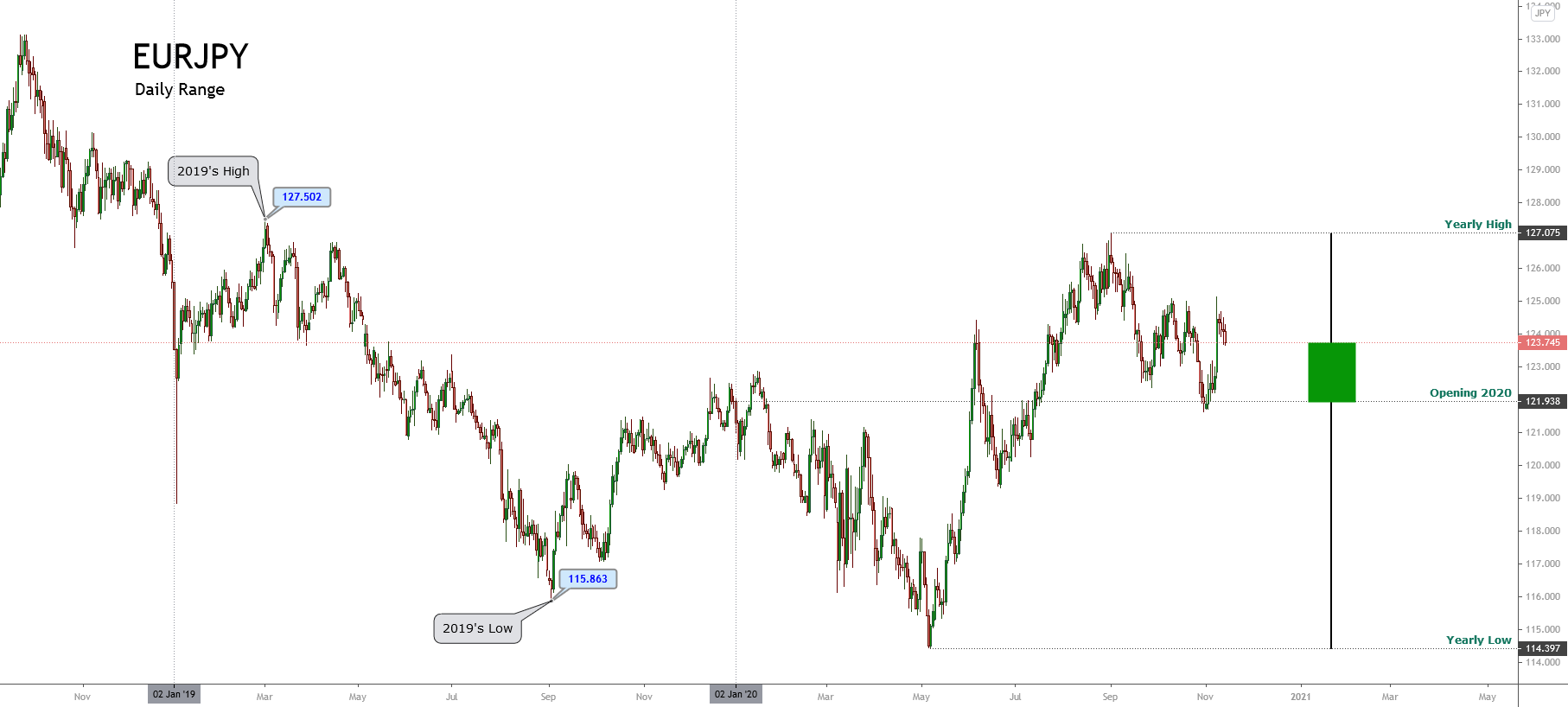
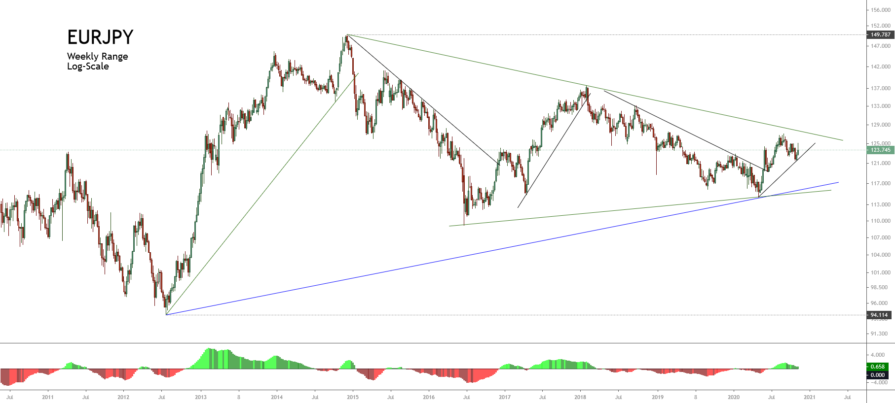
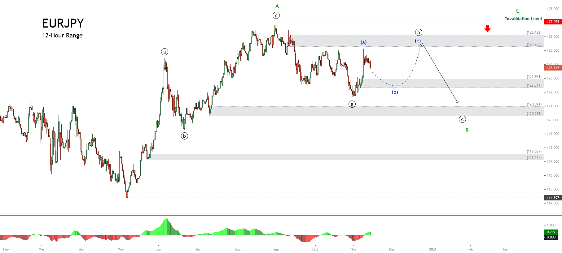
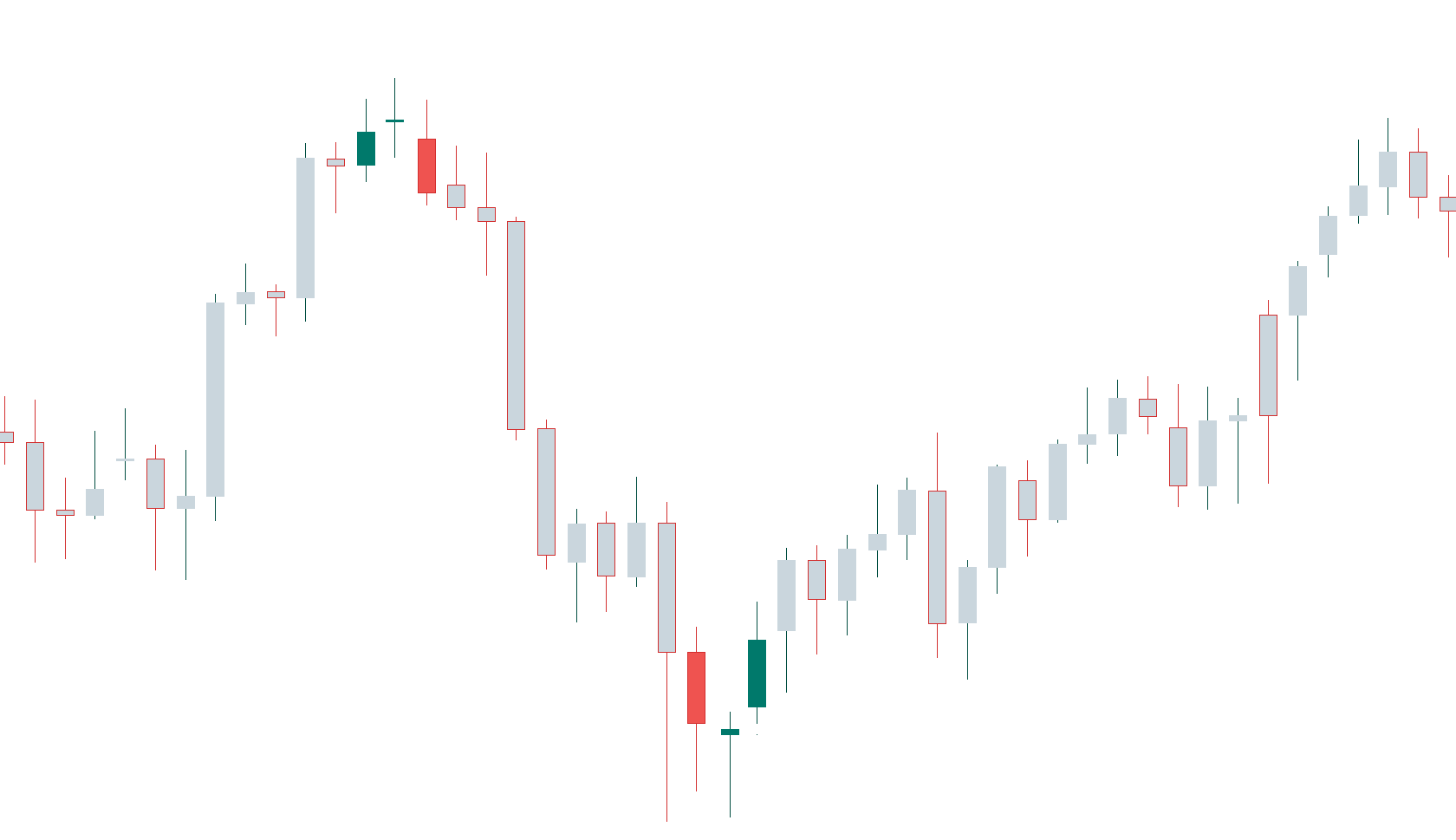
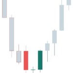
 As the case of the Morning Star, a gap up on the second small-bodied candle followed by a gap down on the third black candle is further confirmation of a reversal, but that seldom happens in the Forex Market. Also, the third candlestick is asked to close below 50 percent of the body of the first white candle.
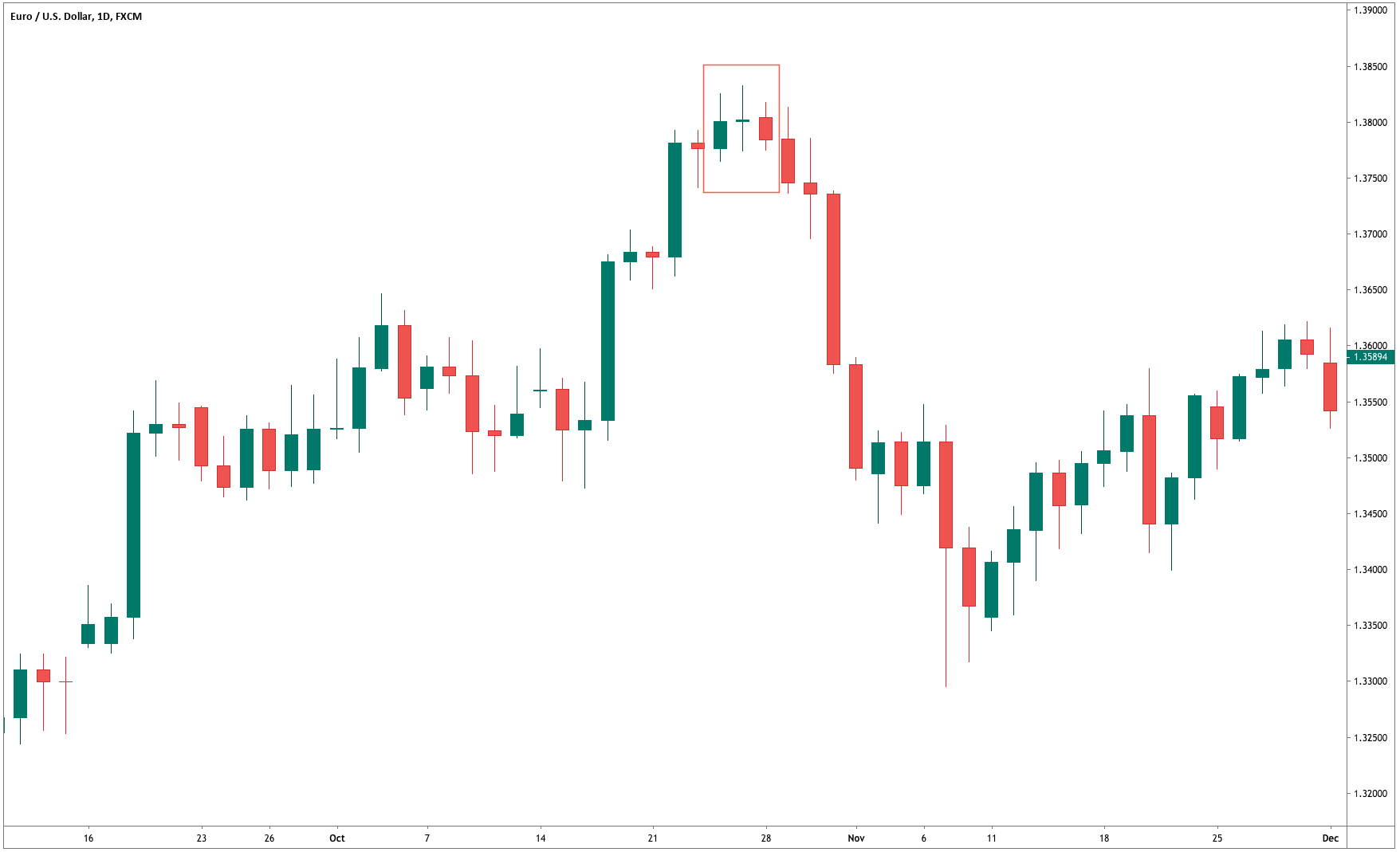
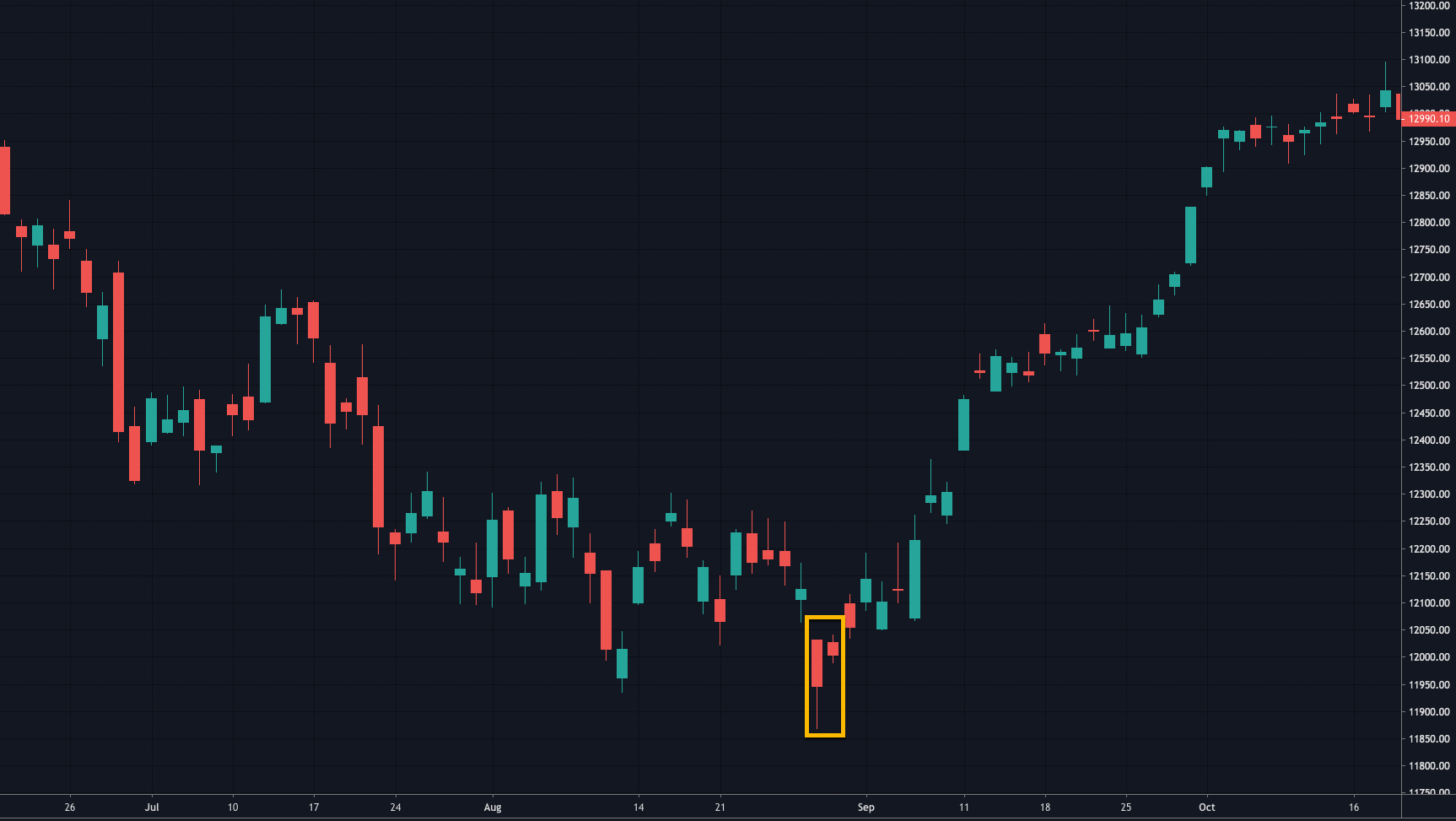
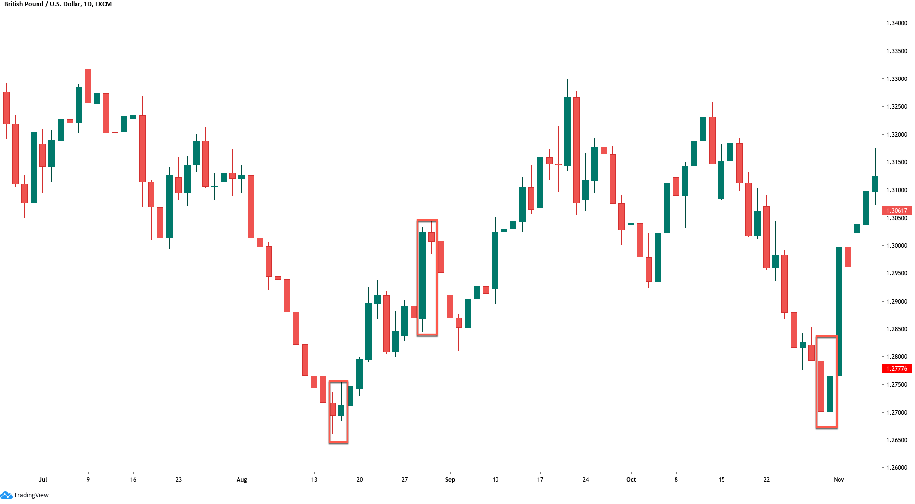
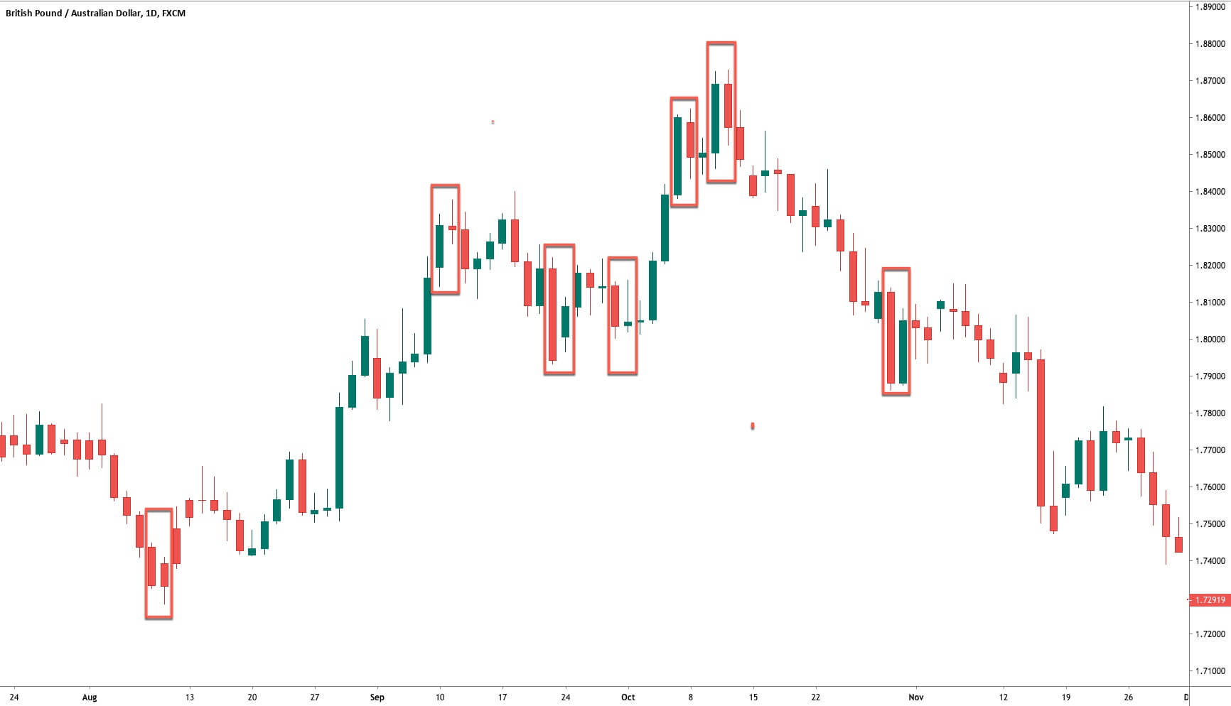


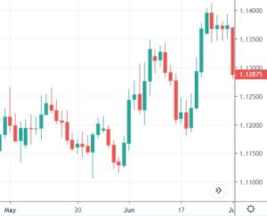
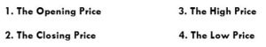
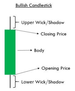
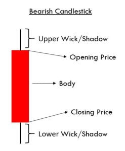
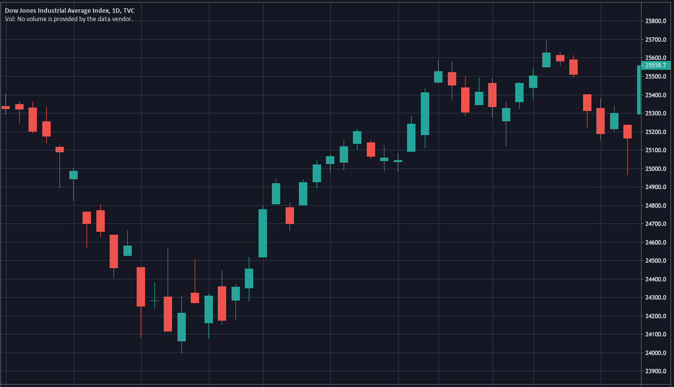
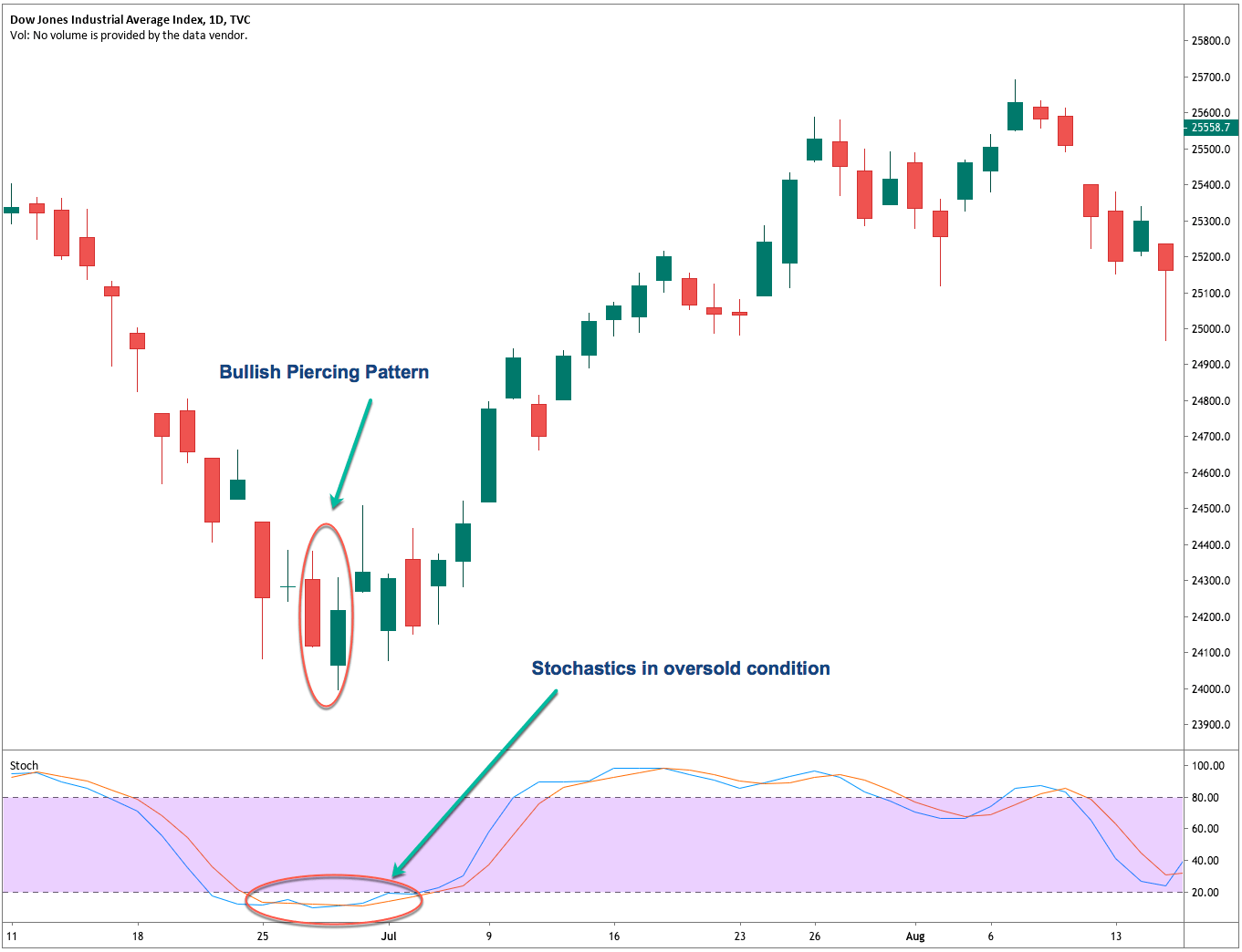

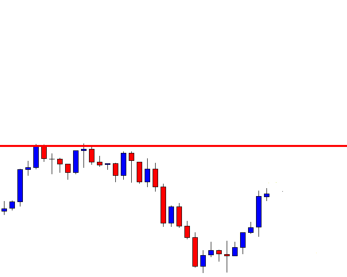

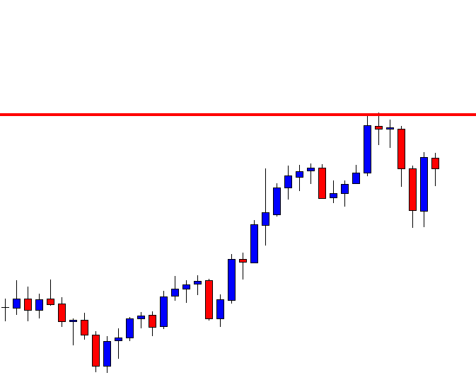

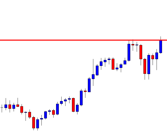

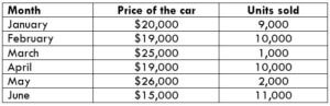

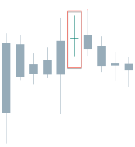
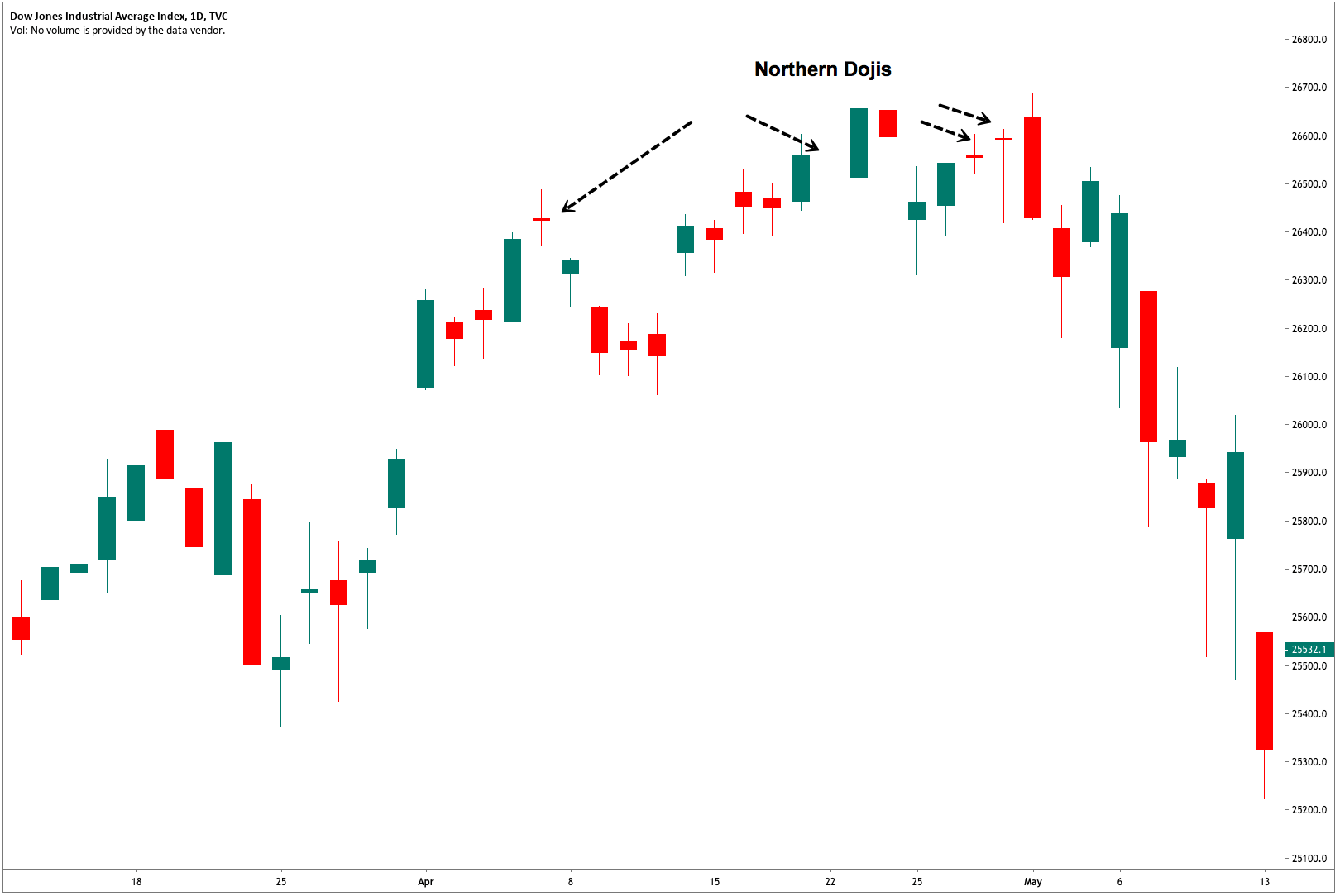
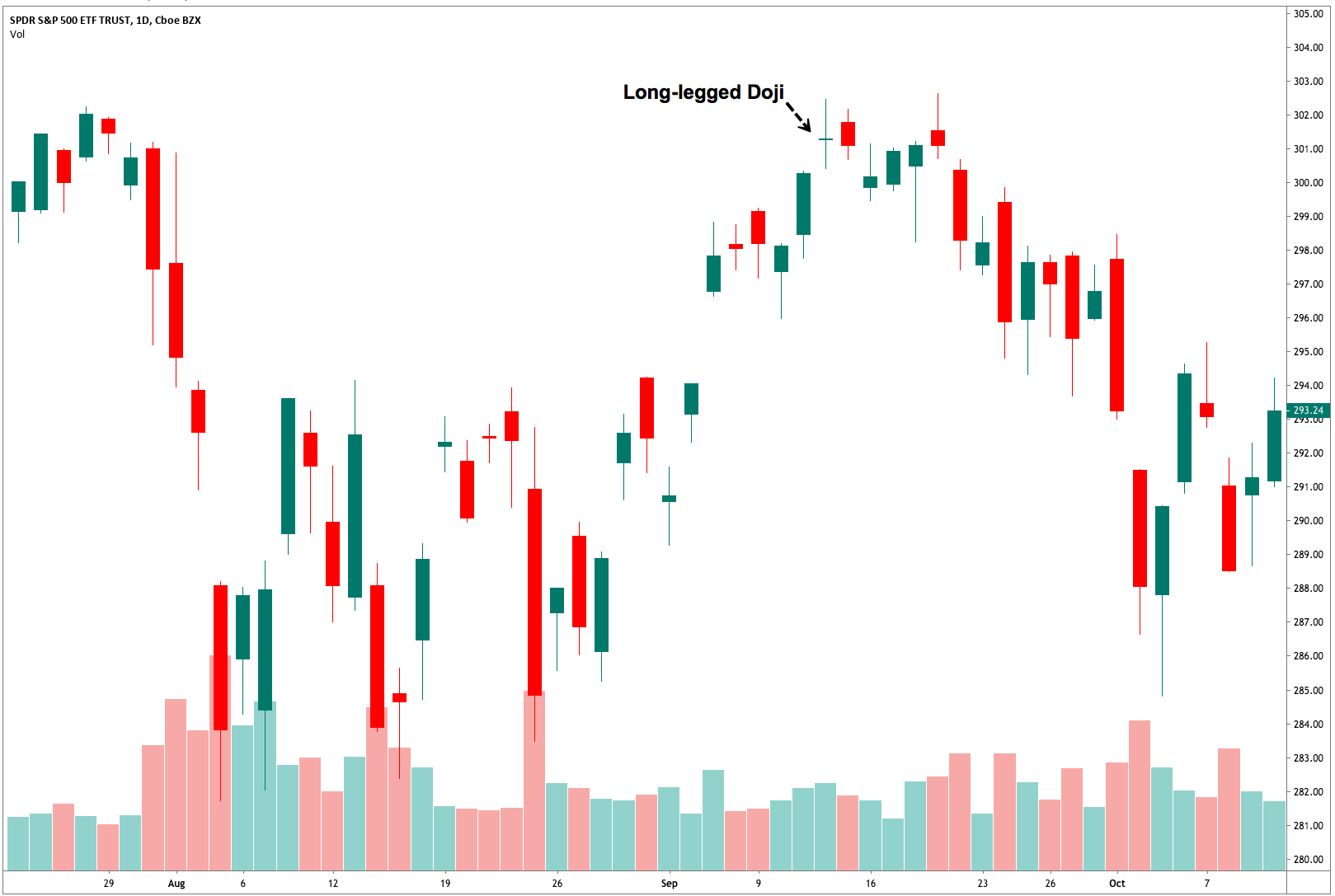
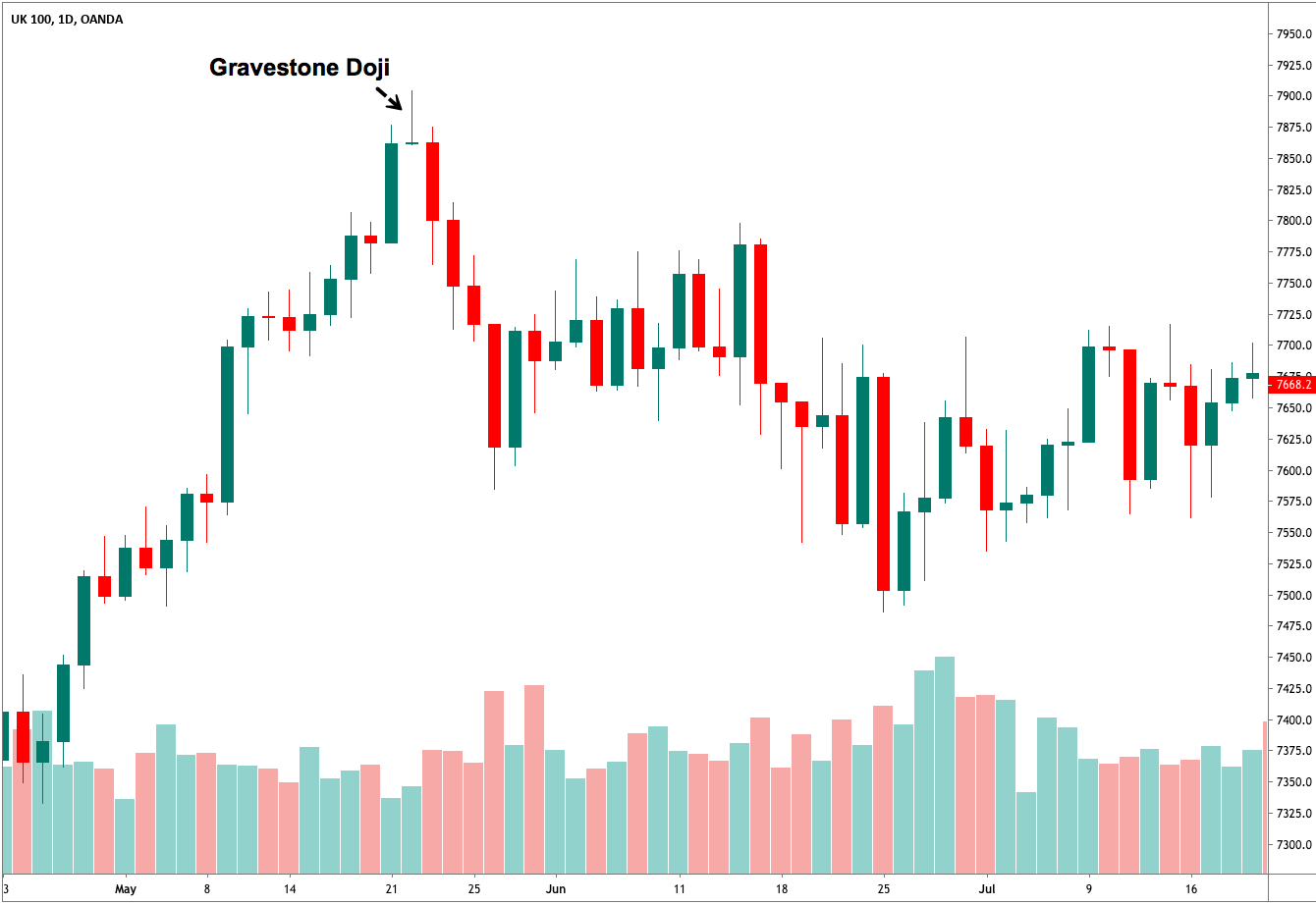
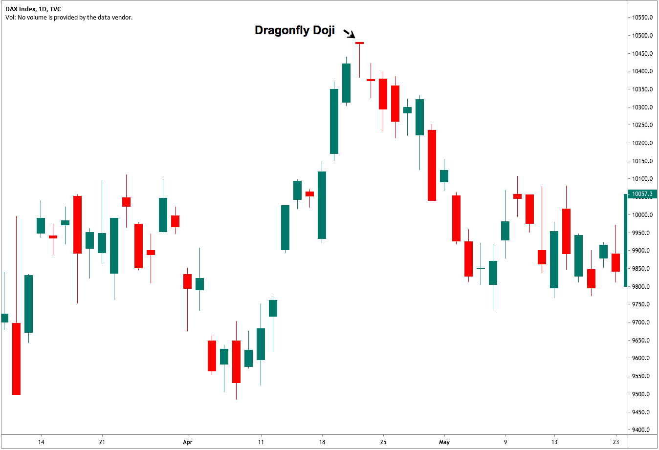


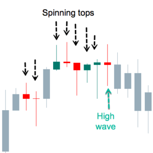
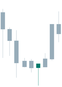
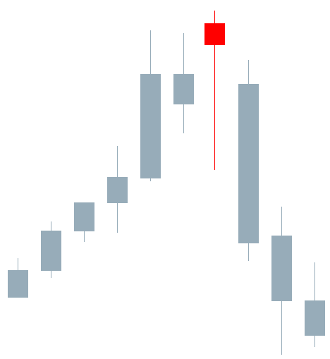
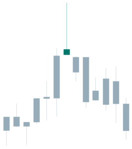
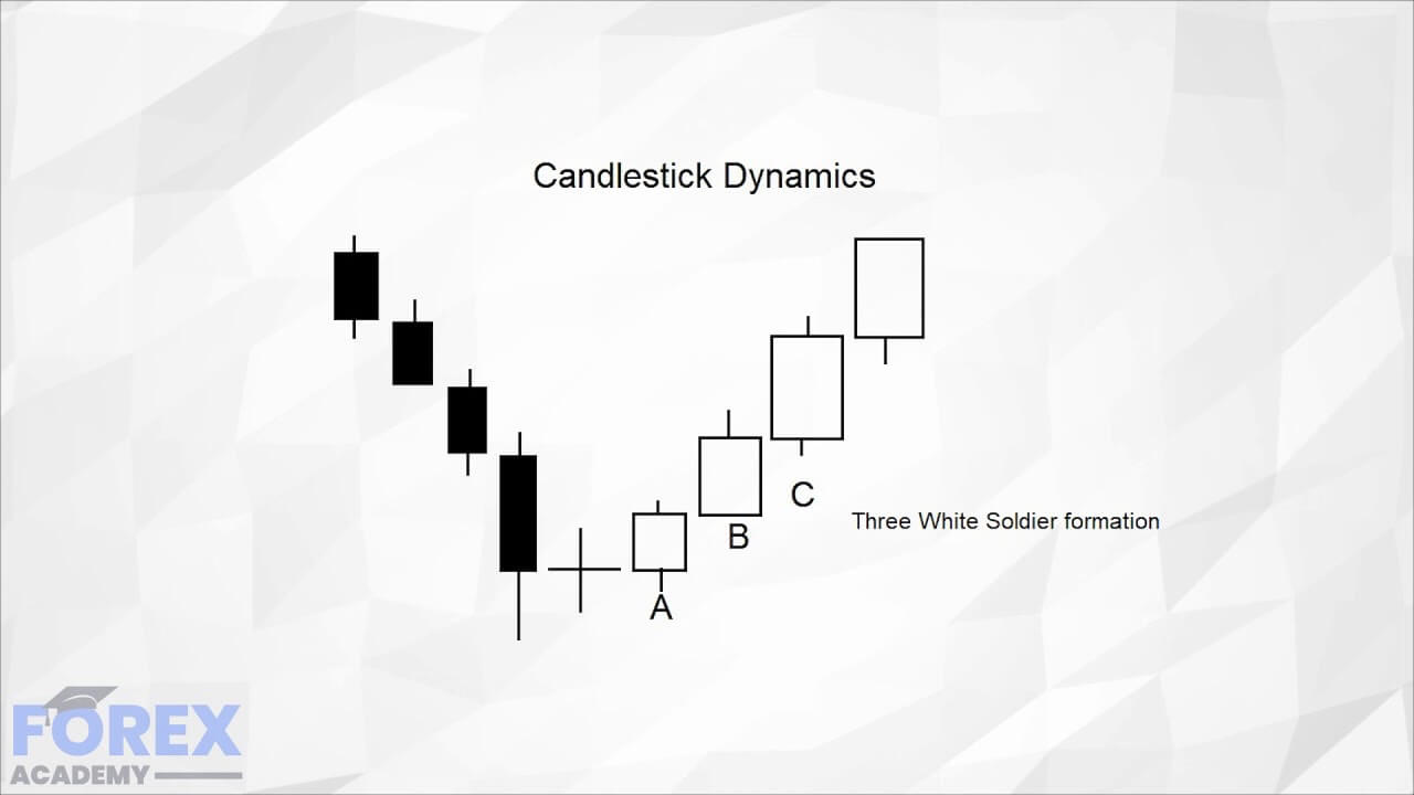
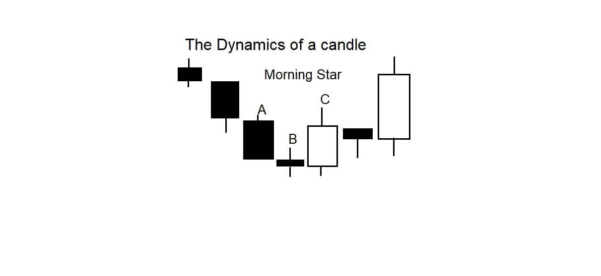
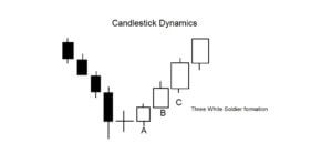
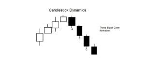
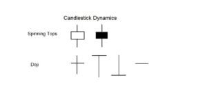
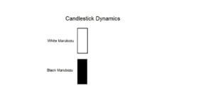
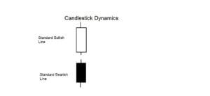
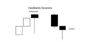
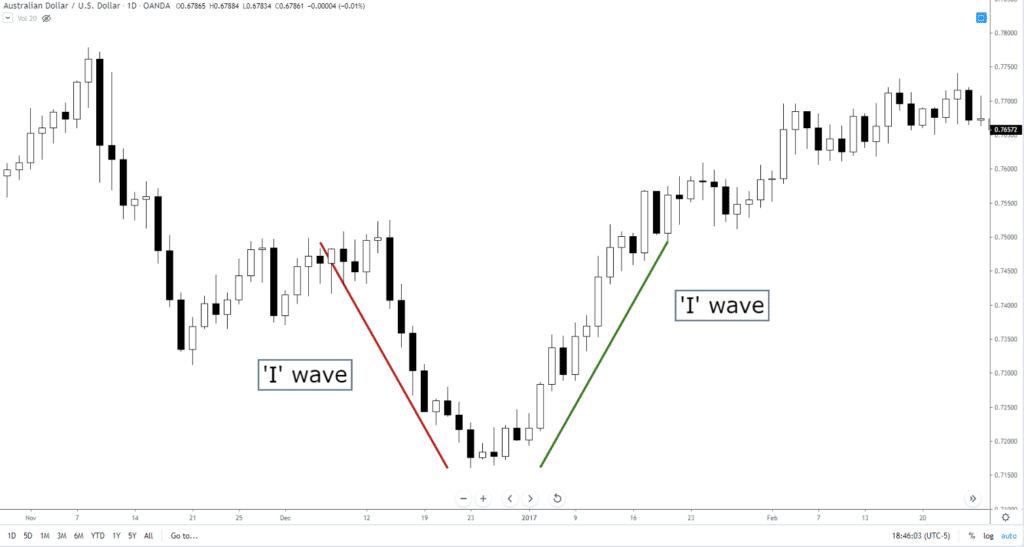
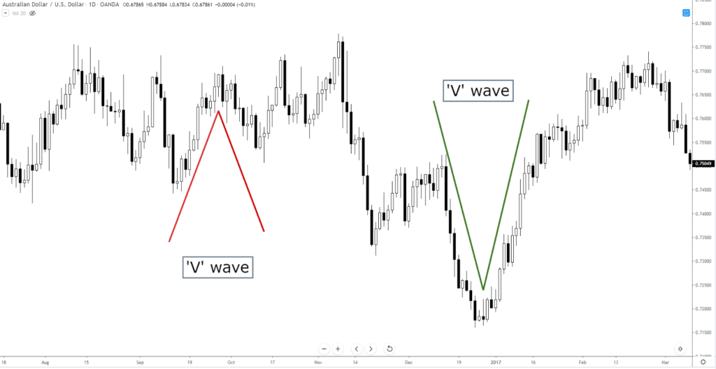
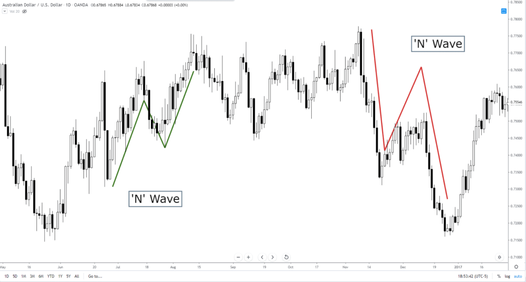
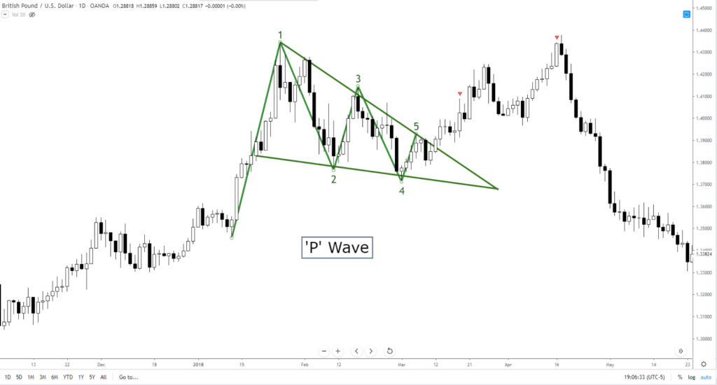
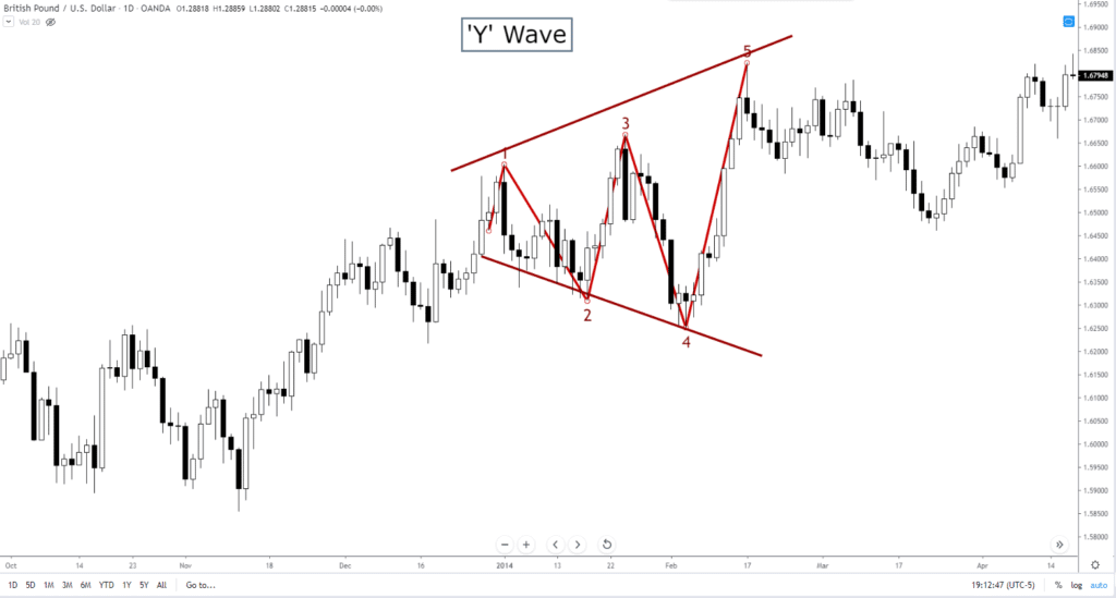

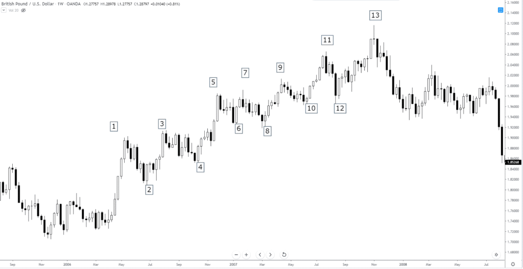


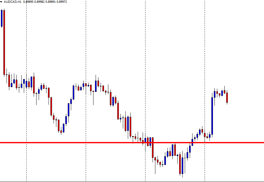
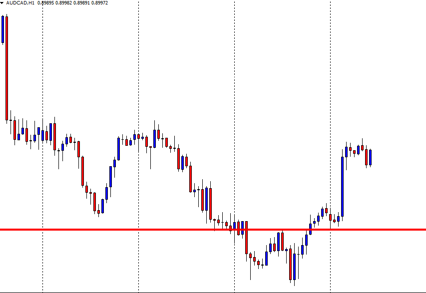
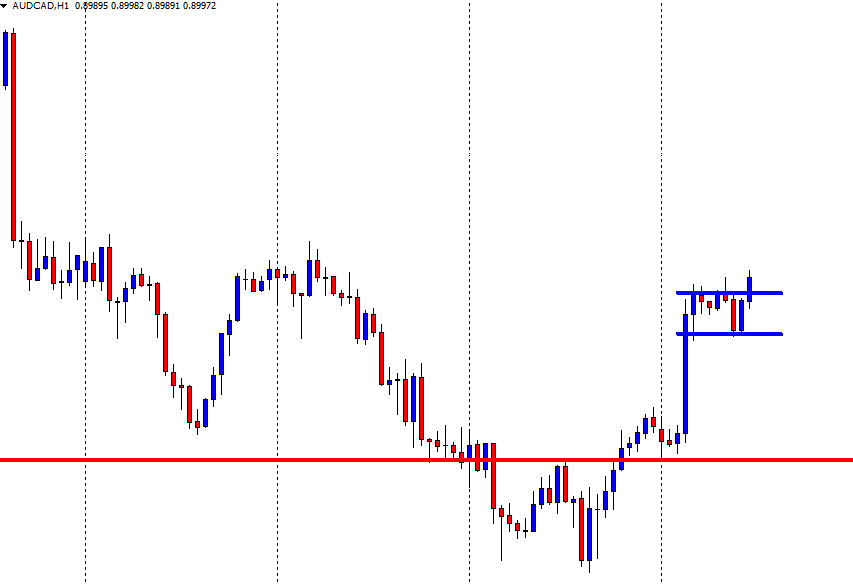
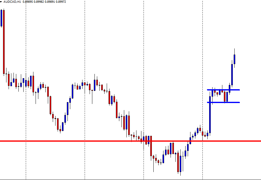

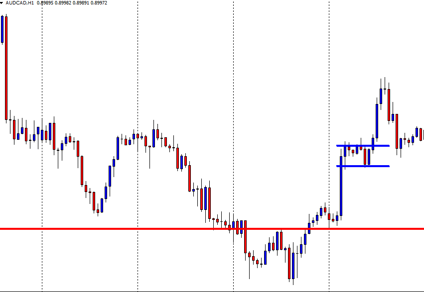

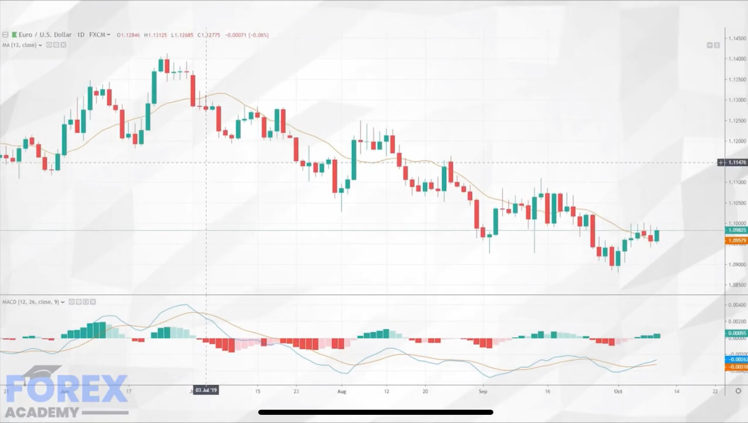
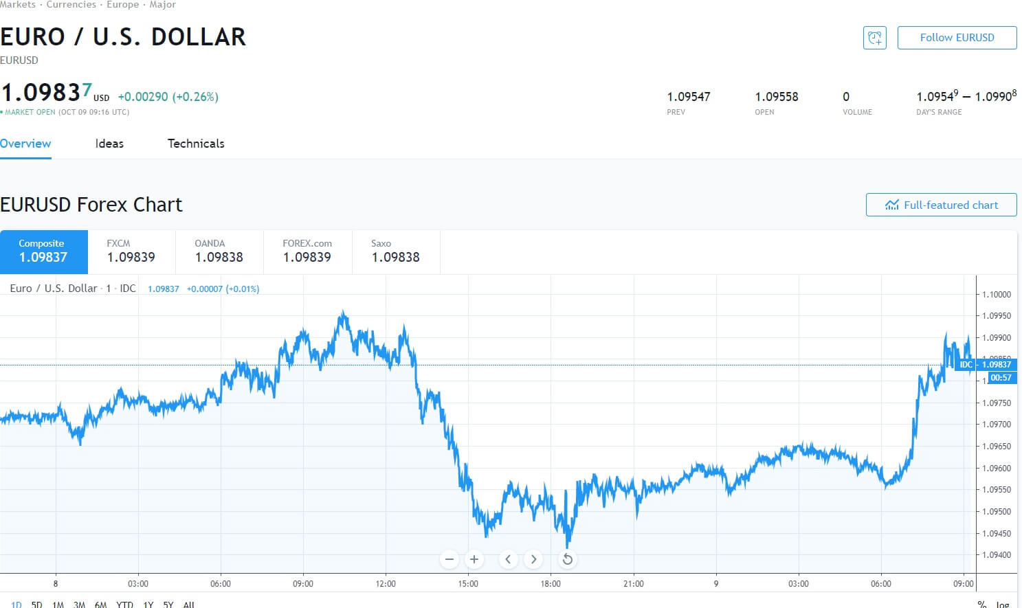
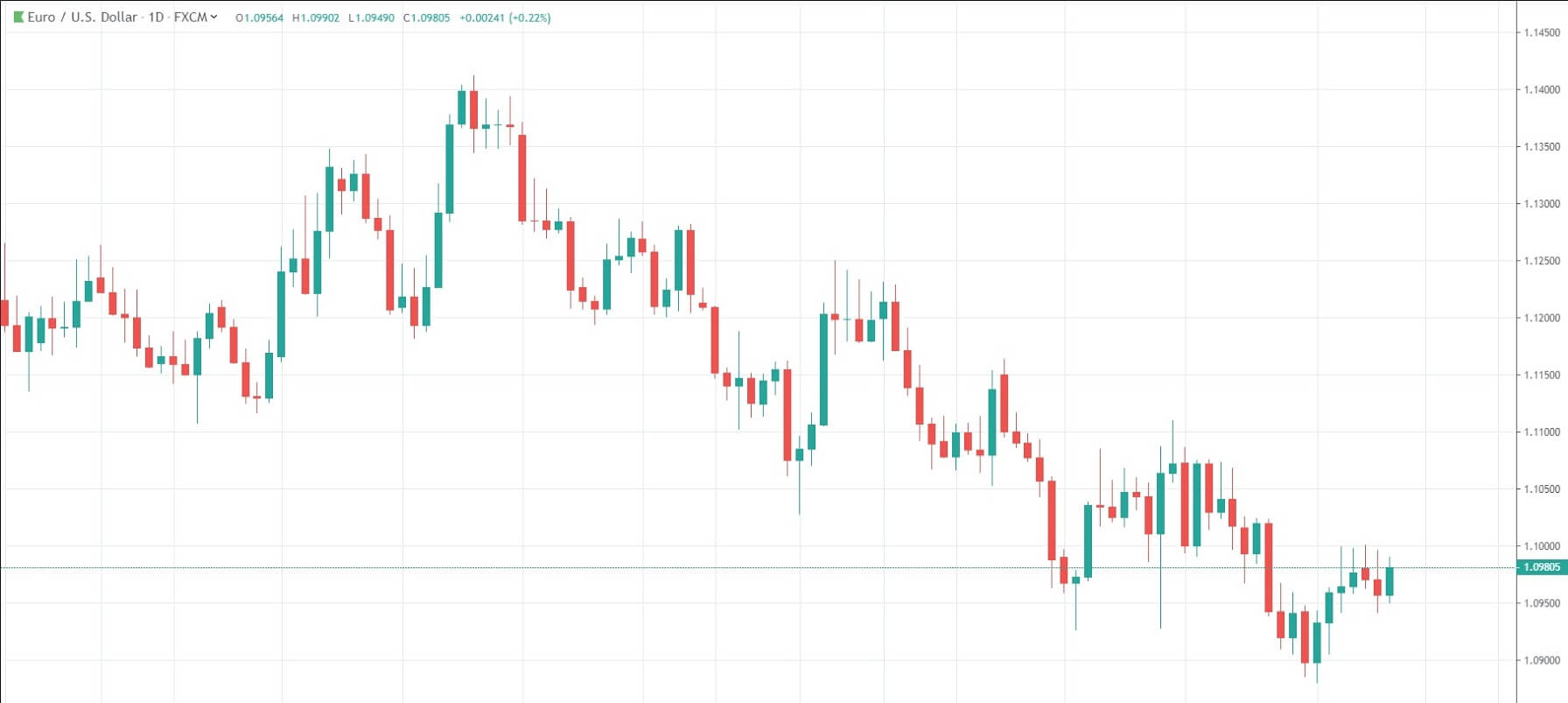

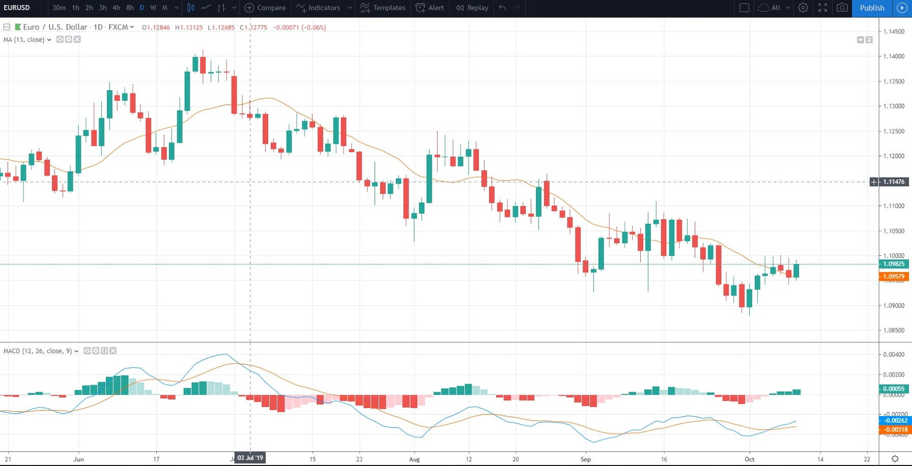
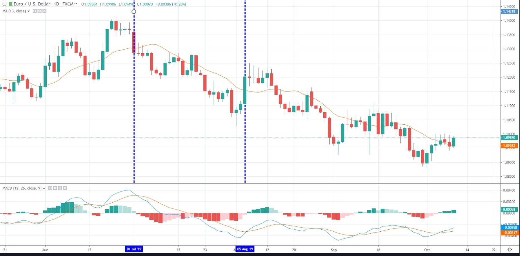


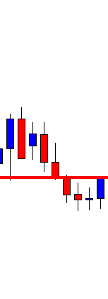
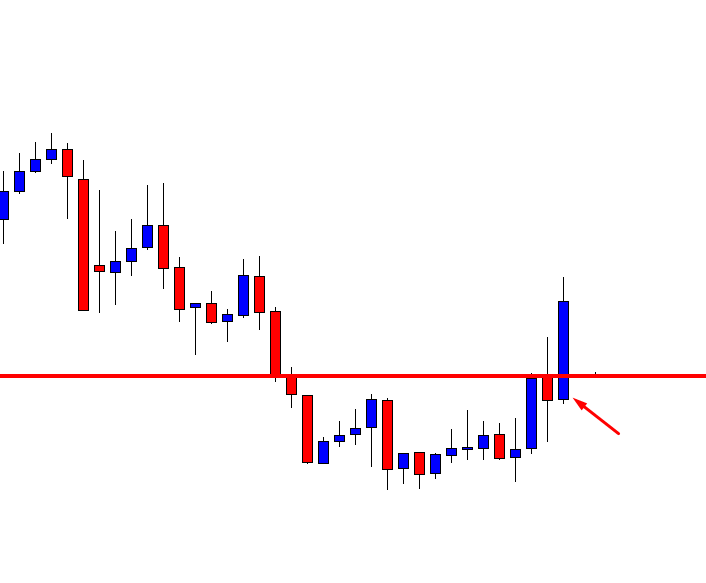

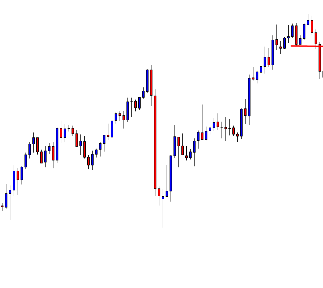
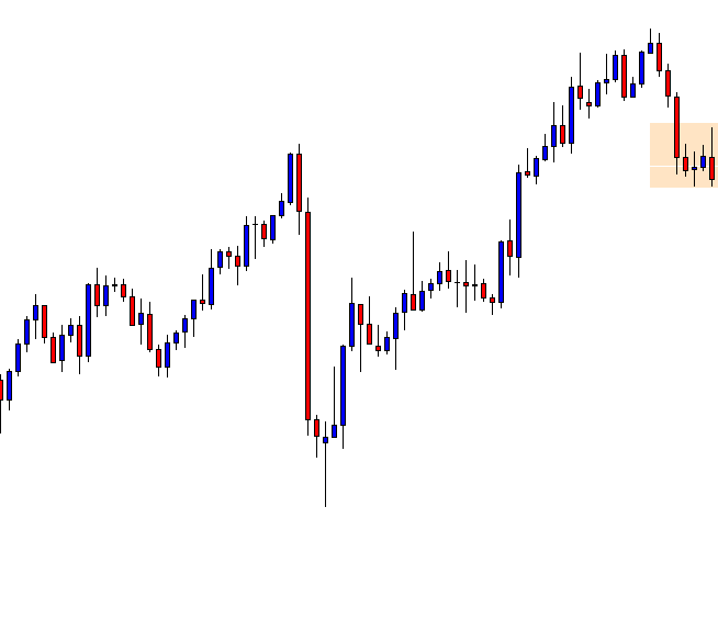
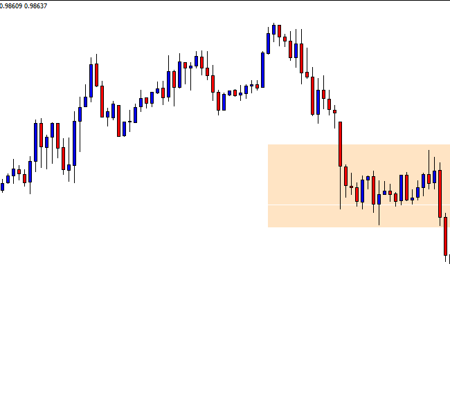
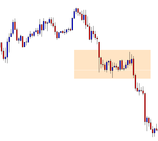

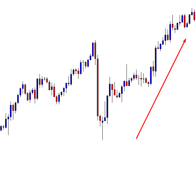

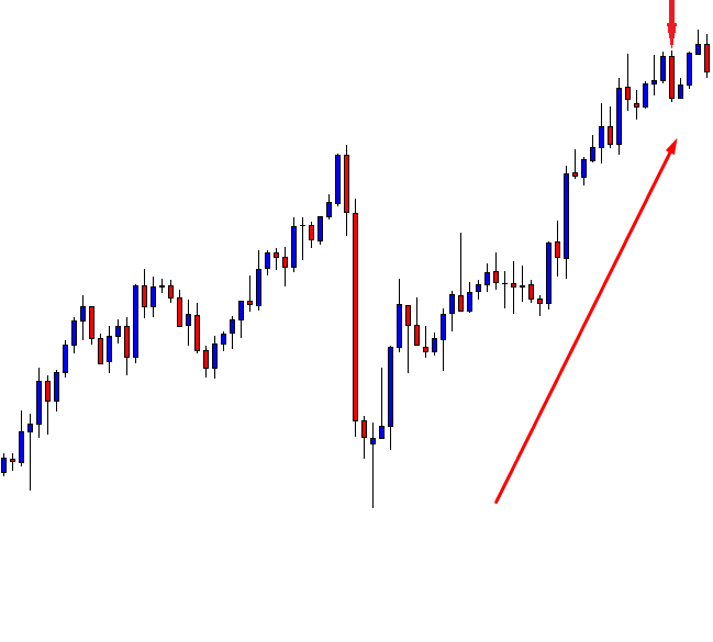
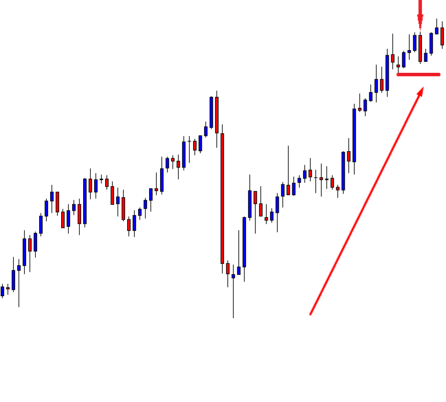

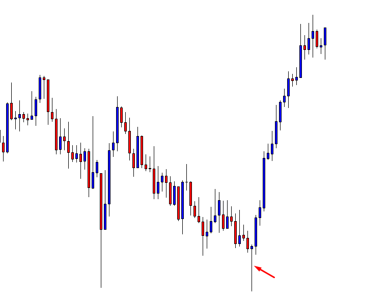
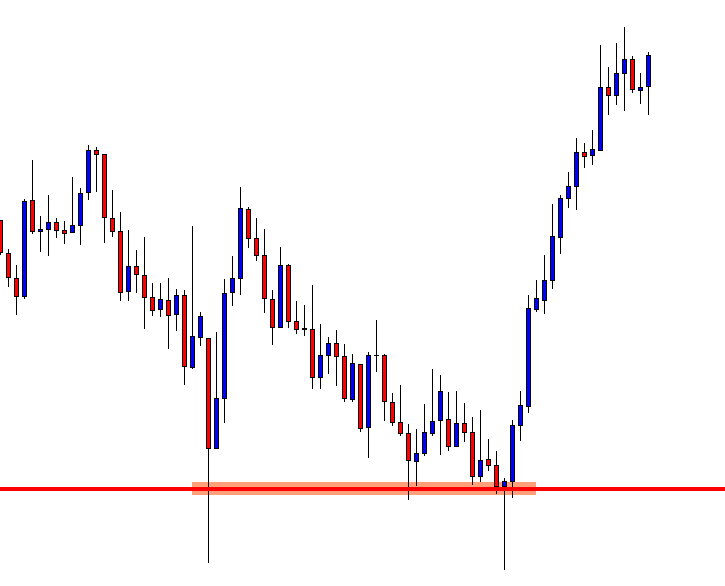
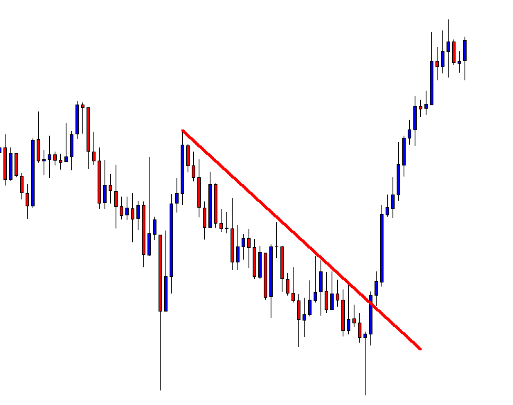
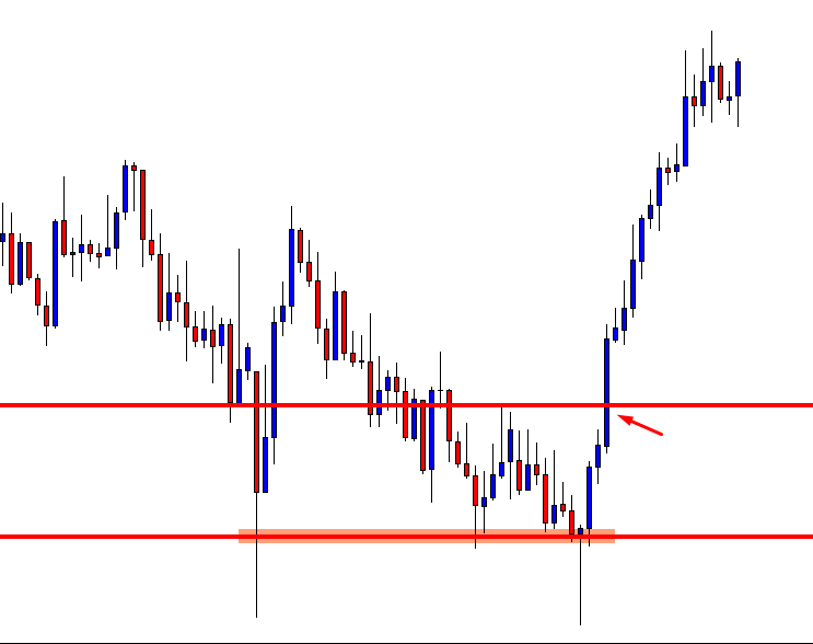

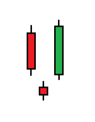
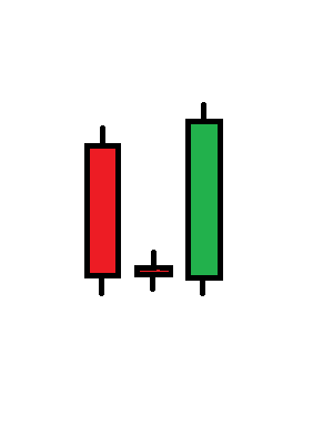

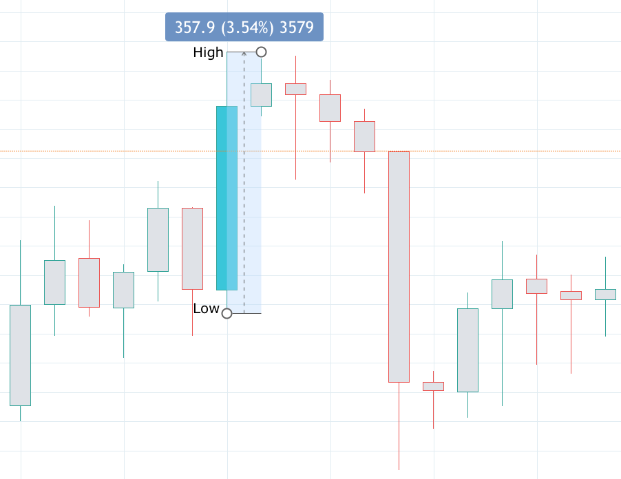
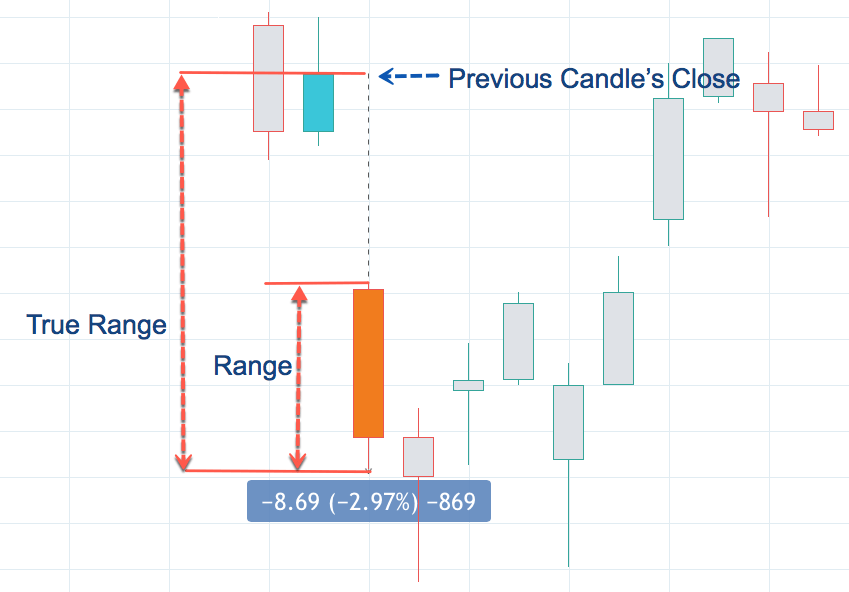
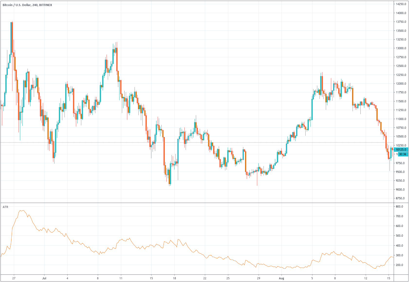
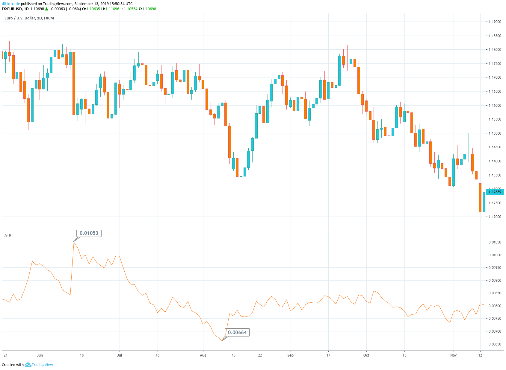
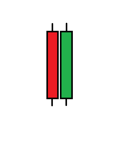
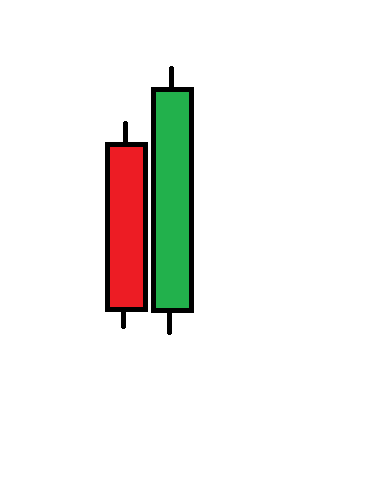
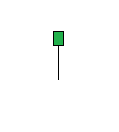
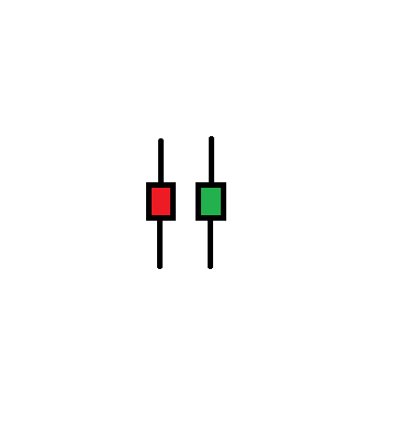
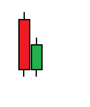
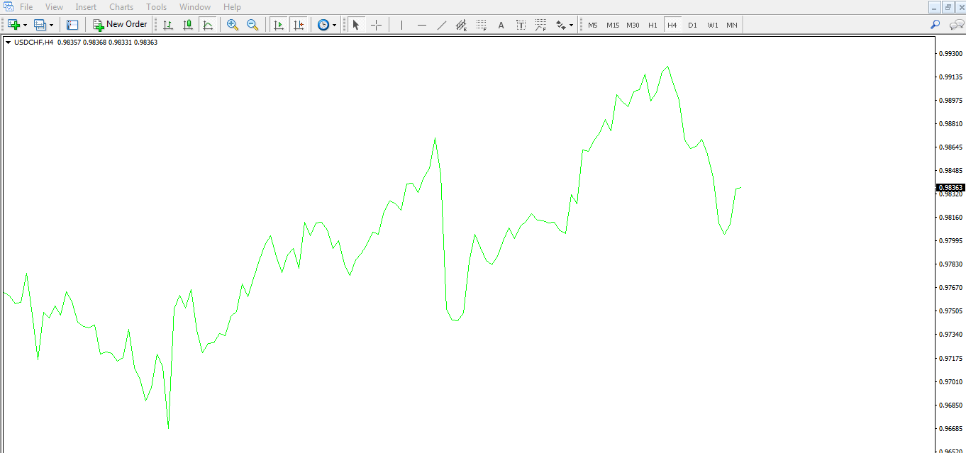

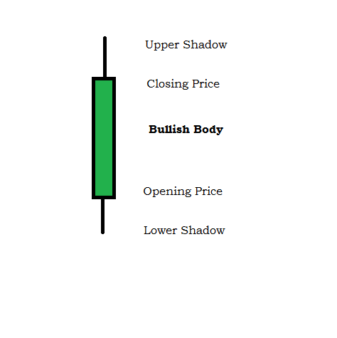
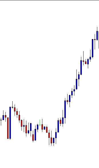
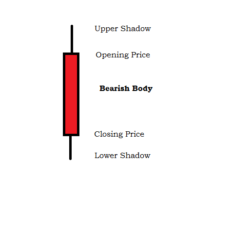
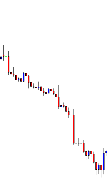


 Usually, by just paying attention to where the most longer shadows are drawn, we get the information of who’s in command, although not always this translates into a trend change, it just adds volatility. If we follow, as if it were our polar star, the proper reward to risk ratio and use the oversold/overbought indications set by %R, or Stochastics. we may survive those siren chants…


 There had been a downtrend easily visible on the chart


