
There are two important ways that people trade the currency markets: The first system is by way of fundamental analysis, such as trading based on macroeconomics, including interest and exchange rates and national productivity. The second method is by way of technical analysis. In this section, we will be looking at technical analysis. Traders look at charts with different time frames to show them a picture of how a particular financial asset is moving/trading over a particular time frame (up or down, or sideways). They will then use this information to decide the direction of their trade.
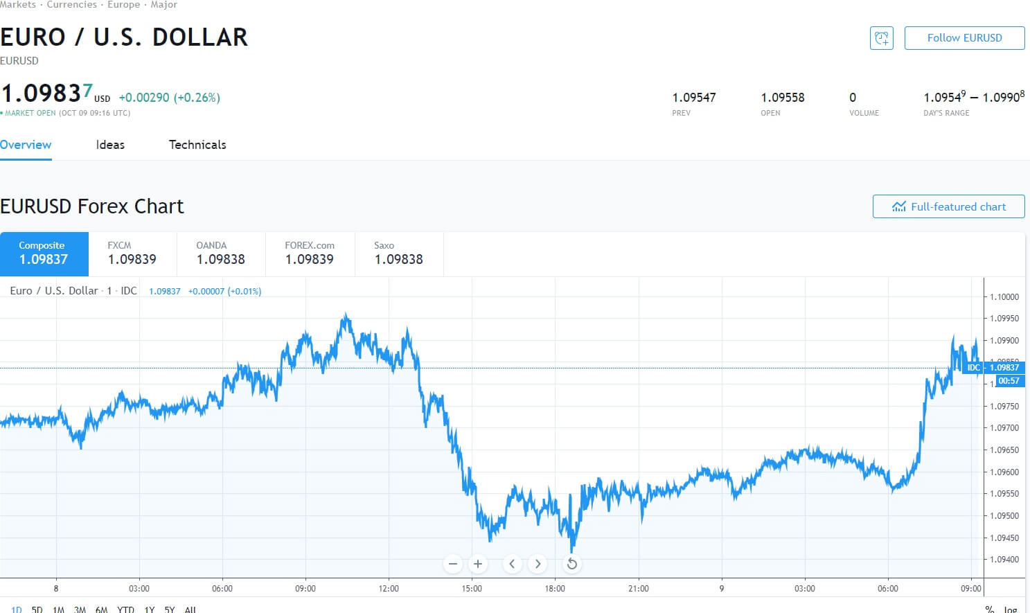
So let’s start with diagram A. In this chart, we can see the daily price action (movement) of the Euro Dollar against the US dollar (EUR:USD) pair and where the current exchange rate is quoted at 1.09837. This particular chart is the most basic with just a simple line graph which starts on the left hand side of the chart and where you can see that the line graph is going up and down in a random-looking fashion, while capturing the exchange rate on the chart on an hour-by-hour basis, and where the pair ends up to the right of the diagram, which shows the current exchange rate.
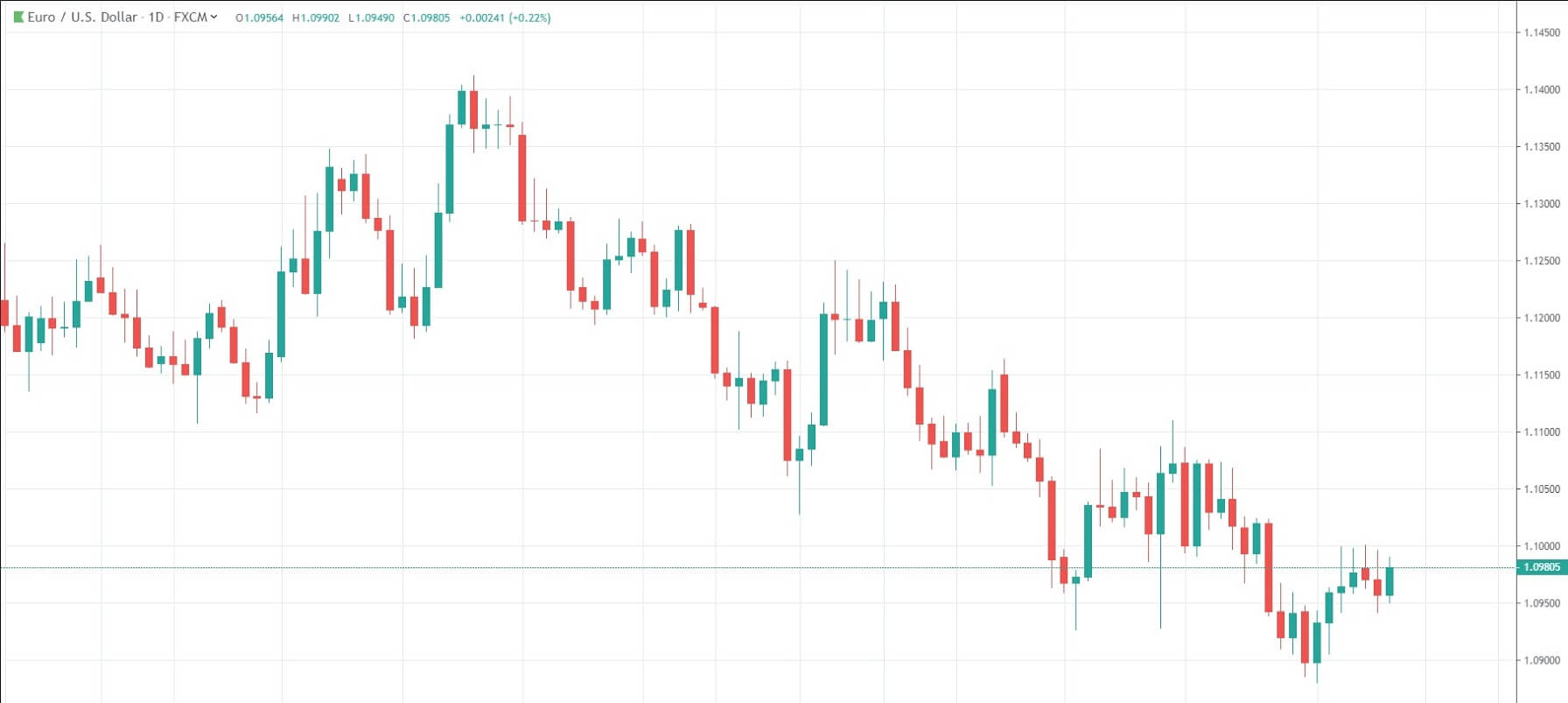
In the diagram we can see some peaks and troughs, and we can see some sideways moving price action, however, if you were expected to use this information only, to place a trade, you would find it very difficult indeed to gauge when to get into the trade and went to get out.
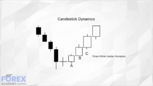
One of the most common features that traders like to use in technical analysis is Japanese candlesticks.
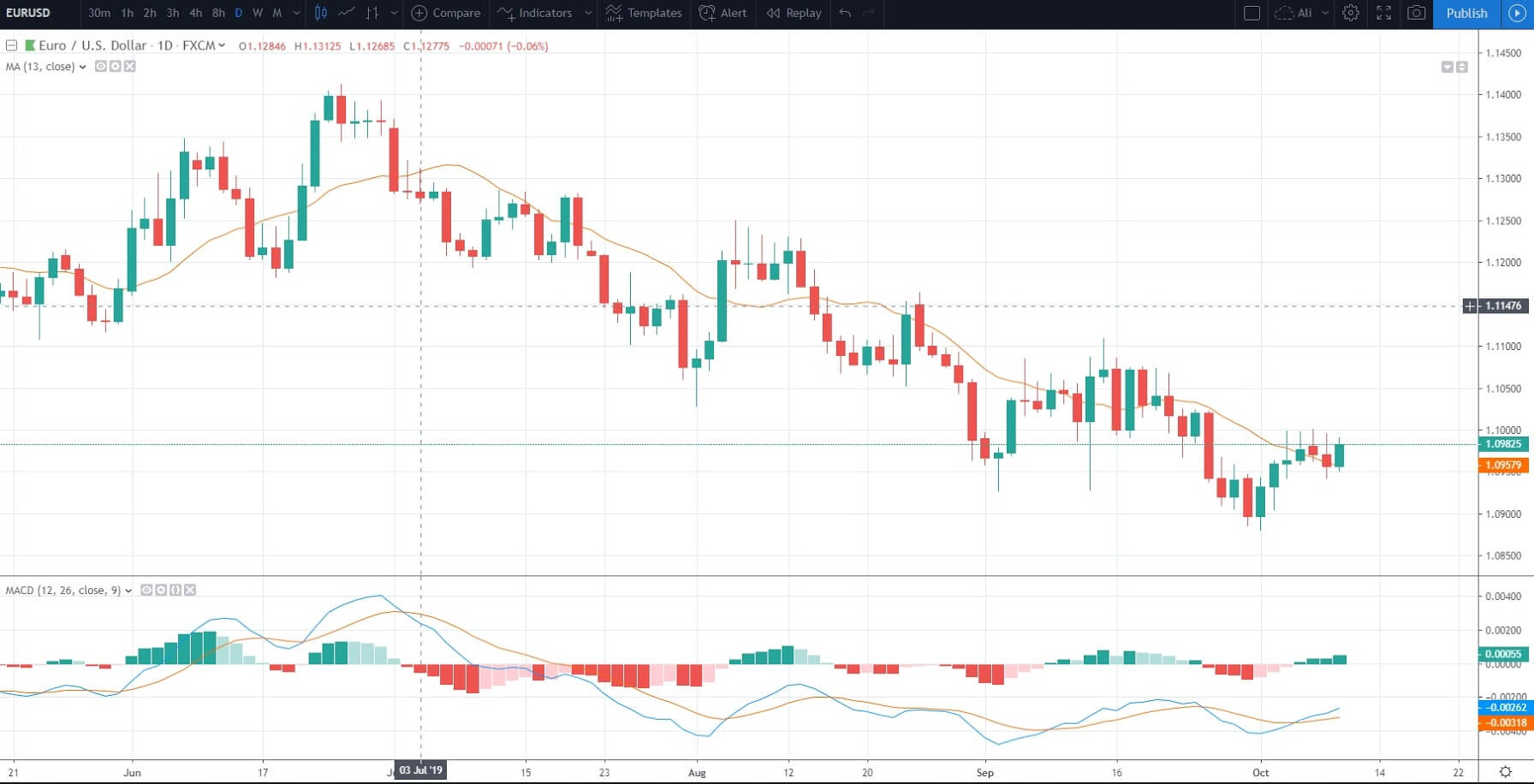
Here in diagram B, we have exchanged the line graph in diagram A for the candlesticks. For each daily time frame, a candlestick will open and close. In this example, the green candlesticks denote a movement to the upside during a one 24 hour period, and the red candlesticks show movement to the downside for a 24 hour period. The different types and shapes of the candlesticks are used to determine when a particular currency pair may be stalling in either direction. We will look at the shapes of candlesticks and how traders use them to interpret movement in more detail later on in this course.
In diagram C, we can see another tool that traders like to use in technical analysis to define direction of price action is the use of bar charts. Each bar consists of 3 lines, two small horizontal lines, one to the left and one to the right of the vertical. At the beginning of each time frame the exchange rate will open with the small horizontal line on the left-hand side of the vertical line and then price action will move upwards, or downwards (or it may not move at all along the vertical line at all) and then at the end of the time frame we can see the horizontal line on the right-hand side denoting where price action finished at the end of the period.

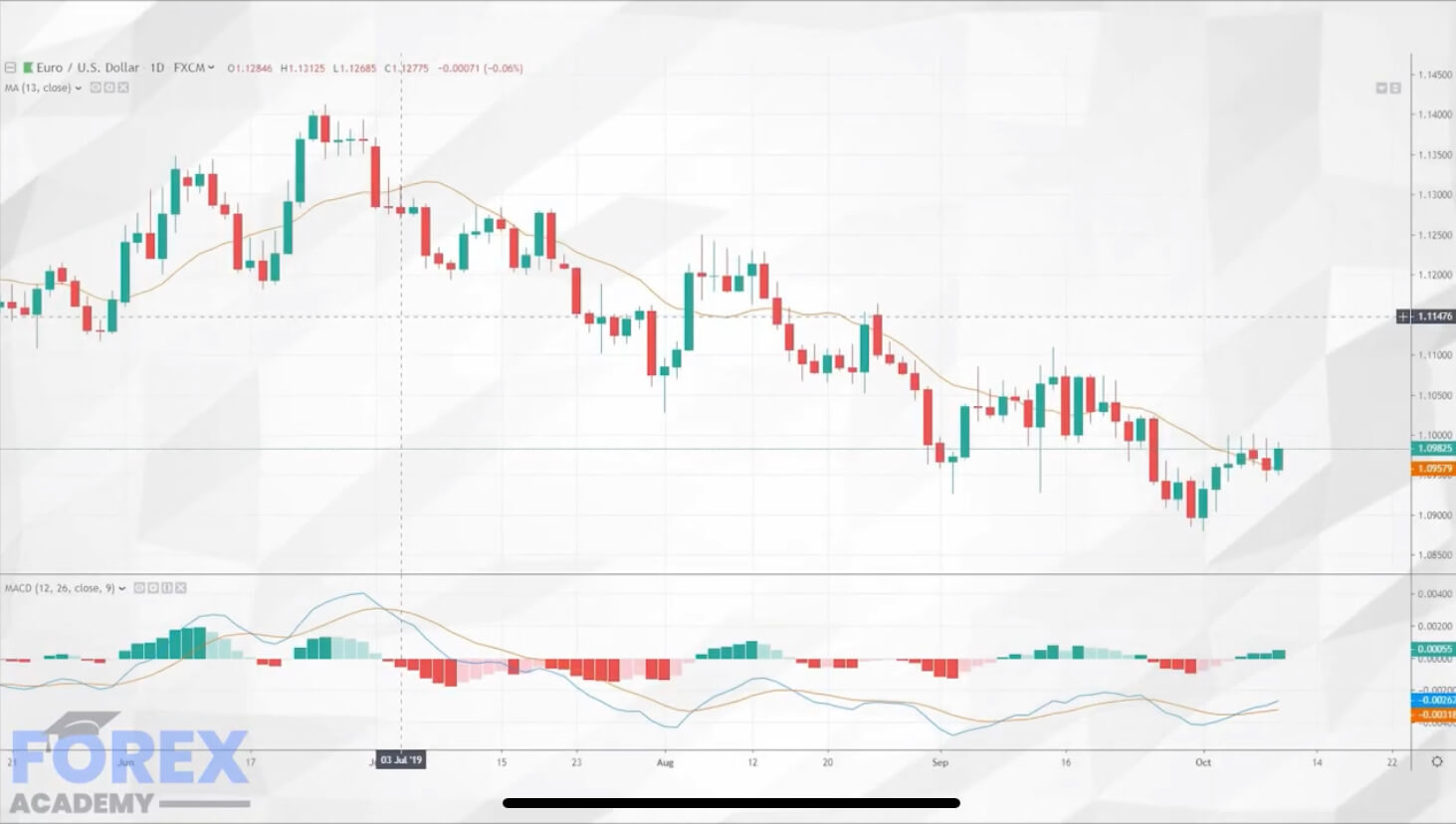
In diagram D, we have reverted back to the candlestick chart. However, now we have added tools which are widely regarded as the most commonly used in technical analysis. First of those tools is an orange line which goes through the candlesticks from left to right. This is a moving average. In this case, the line calculates the top and bottom of the previous nine candlesticks and denotes it as a continuous line on the chart. Traders can easily change the parameters of the moving average depending on their style of trading. However, the basic principle is that if price action is moving upwards above the moving average, it may continue to do so, and if price action comes below the moving average, it may show that a trend is developing to the downside.
At the bottom of the chart, we can see an independently placed tool on the chart, which is called the MACD (moving average convergence and divergence). This consists of 2 features: the first is a histogram which moves upwards and downwards around a zero axis, and it also has two moving averages, which also alternate above the zero-axis and which crossover each other.
If we now turn to diagram E, we have drawn in two vertical blue lines. The first blue line on the 1st of July shows a large red descending candlestick, which takes out the previous six days move and falls underneath the nine-period moving average.
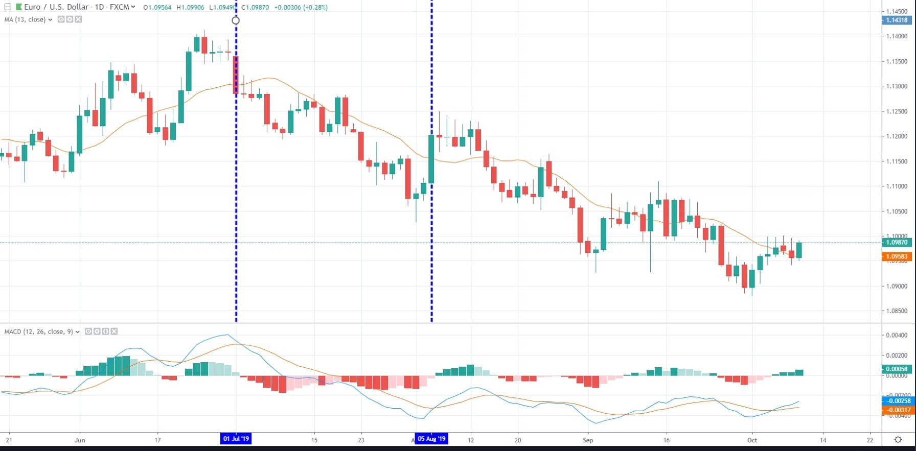
If we now follow the blue line down to the MACD, we can see that the moving averages have crossed over and are moving in a downward direction, and the histogram is also moving in a downward direction towards the zero-axis. Technical traders will see this as an opportunity to go short or sell this particular pair, and in the subsequent candlesticks, we can indeed see that the price action moves in a downward direction. Conversely, on the 5th of August, where we have drawn the blue line, the opposite happens, and price begins to move in an upward direction.
There are many many technical tools to use in your trading. But I’m sure you will agree that the original line graph, while looking chaotic, can be exchanged for tools such as candlesticks, moving averages and the MACD, to more clearly define the direction of a particular currency pair and give you the edge in your trading.