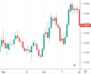
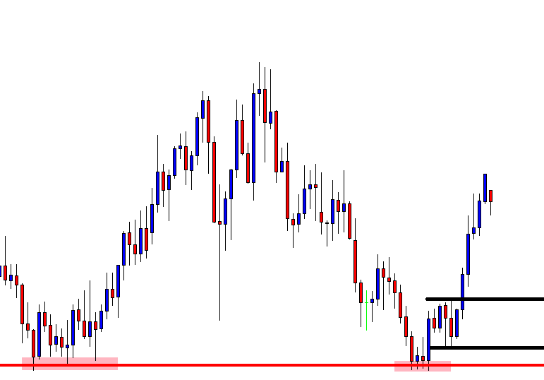
This article is to be dedicated to single candlestick key figures. The majority of patterns are created by more than one candle, but some particular candlestick shapes are key figures to gauge the market sentiment and spot reversals.
In every one of them we will deal with the following aspects:
- Identification of the candlestick
- Marker psychology interpretation
- Criteria and use
Key Single Candlestick Figures:
- Doji
- Spinning top
- High Wave Candlestick
- Hammer
- Hanging man
- Shooting star
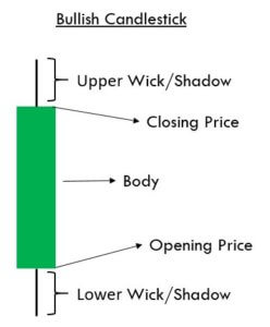
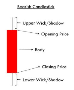
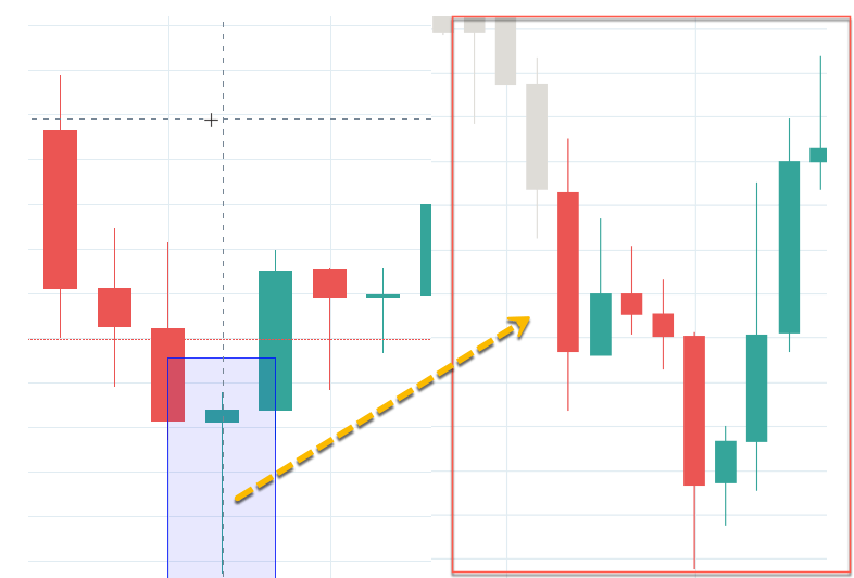
The Japanese traders call the real body “the essence of the price action.” A scientist might call it the Signal part of the message, while the shadows are the nose of the market. The relation between the body and the shadows delivers unique insights into the sentiment of the traders. Shadows show the fight between buyers and sellers to control the price. A large body and small shadows denote that one of the sides has won the battle during that interval. A short body with large shadows after an extended trend indicates the winning herd is losing steam.
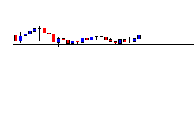
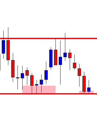
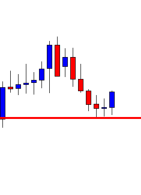
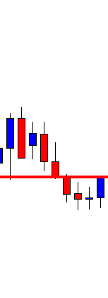
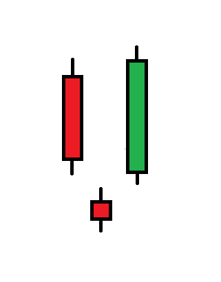
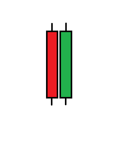
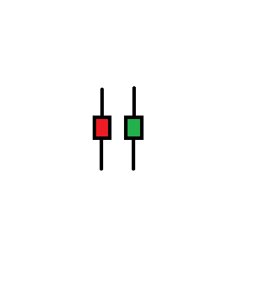
Spinning tops and high wave candles
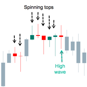
Fig 1 – Spinning tops and High Wave candles
A spinning top is a visual clue for a candle with a tiny body. The color of the body does not matter. A spinning top without a body is called Doji, such as the second one in the figure above. The fourth one is very close to it too.
Market sentiment in spinning tops
A the smaller the body, the larger the fight between bulls and bears. It shows that no one had control of the price during this period, as the sellers pressure the price down and buyers up, a small body means no one could outweigh the other party. The demand is counteracted by fresh supply, and vice-versa, so the market is unable to move.
High Wave Candles
Steve Nison also mentions a close relative to the spinning top, called High Wave Candle. High Wave candles also have very small bodies, but to qualify as High Wave, the formation must also have large shadows on both sides. Shadows need not be of the same size, but they must be large.
Market sentiment in a High Wave Candle
According to Mr. Nison, If indecision is the crucial sentiment on spinning tops, High Wave candles represent “downright confusion.” That is evident because, in the same period, the market goes from the euphory of an extended high to the fear of a large drop, and then to close very near to its opening value. That means total confusion.
Trends and spinning tops
A large white body is like a green light for bulls in an uptrend. A large red body is also a green light to sell. But finding a spinning top in an uptrend means that the buyers do not have the complete control of the price. Therefore, such tops are a warning sign that the trend might be ending. Spinning tops acquire more importance when the price is overextended or close to resistance levels.
Spinning tops during ranging markets do not have any power to warn a trend change, as these stages are too noisy, and filled with lots of small bodies, anyway. Therefore, spinning tops and high waves during horizontal channels have no trading value.
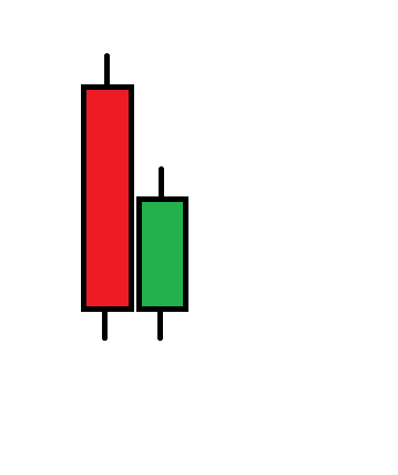
Hammers, Hanging Man, and Shooting stars
Three special cases of spinning tops are the Hammer, the Hanging Man, and the Shooting Star.
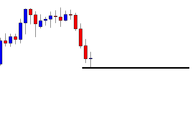
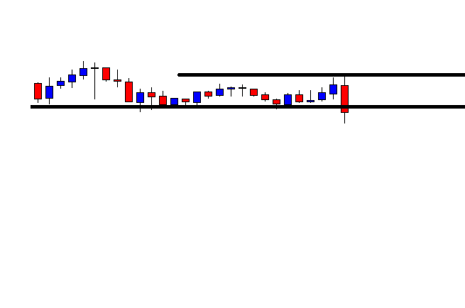
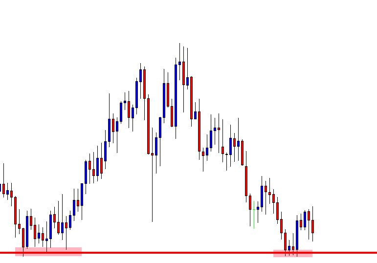
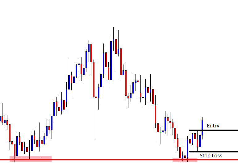
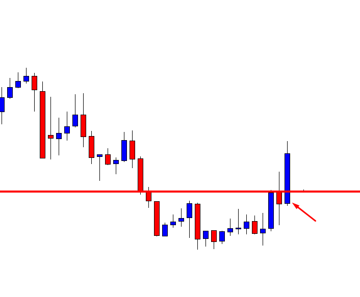
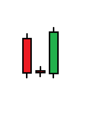
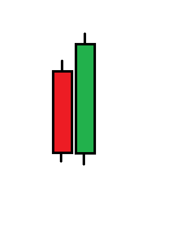
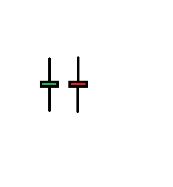
Hammer
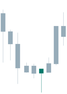
Fig 2 – Hammer
The hammer has a small real body and a large lower shadow. It is the equivalent of a reversal bar. The price went from the open to the bottom, then it recovered and closed near or at the high of the session. The color of the body has less importance, although a close above the open has more upside implications. The signal is confirmed with a followthrough candle next to it.
Criteria:
- The occurrence is after a lengthy downward movement, and the price is overextended.
- The real body is at the upper top of the trading range
- The shadow must be two times the length of the body. The longer, the better.
- No upper or just a tiny shadow
- Confirmation with a strong bullish candle, next
- A large volume on the candle confirms a bottom.
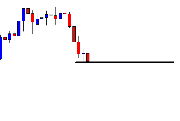
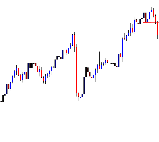
Hanging Man
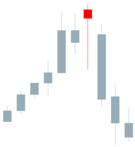
Fig 3 – Hanging Man
The hanging man has a similar shape of the hammer, but it shows up after an uptrend. The Japanese named that way because it is similar to the head and body of a man hanging by the neck.
Criteria:
- The occurrence is after a significant upward move, and/or the price overextended.
- The body is at the upper end of the trading range.
- The lower shadow at least two times the height of the body. The color is not essential, but a bearish finish is preferred. the longer the shadow, the better
- Tiny or no upper shadow.
- Confirmation with a large bearish candle
- High volume on the candlestick is indicative of a potential blowoff.
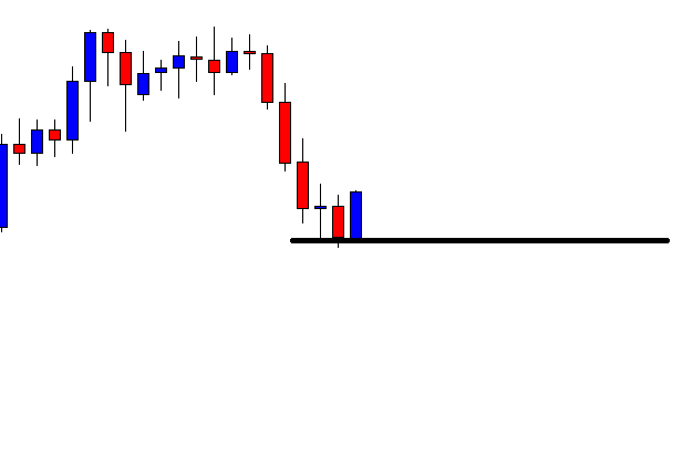
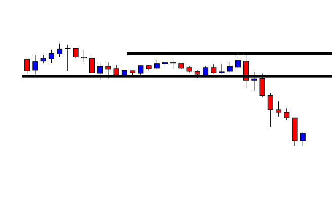
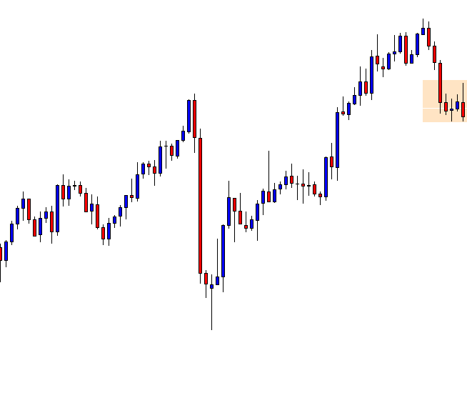
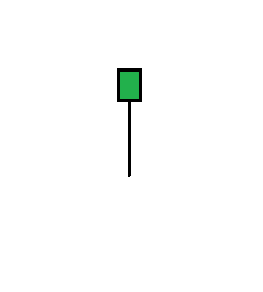
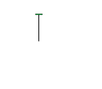
Shooting star
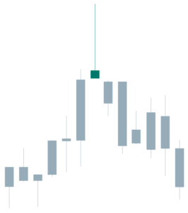
Fig 4 – Shooting Star
The shooting star is a top reversal candlestick and is the specular image to the hanging man. In the case of a shooting star, it began great for buyers, but after the euphory of new highs, it came to the deception of the selling pressure with no demand to hold the price. The close happens at the lower side of the trading range. A bear candle next confirms the trend change.
Criteria:
- The upper shadow should be two times the height of the body. The larger, the better.
- The real body is at the bottom of the trading range.
- Color is less important, although a red candle implies more bearishness.
- Almost no lower shadow.
- A large volume would give more credibility to the signal.
- A bear candle next is the confirmation of the change in the trend.
Reference: Steve Nison: The Candlestick Course
Profitable Candlestick Trading, Stephen Bigalow