Introduction
In their pursuit of a profitable system or strategy, traders look at past behaviors as a forward indicator of prices.
Indeed, if the price movement is an objective manifestation of the average trader sentiment, then wherever in the future the same sentiment arises, a pattern might take place with a shape similar to the one drawn in the past. From this belief, it follows that the study of patterns may be of help to find entry and exit points in our pursuit of profits.
There is a catch, though. The human brain is a natural pattern recognizing system. We see patterns everywhere. In ordinary life, that’s the way we recognize things: A round tire, a rectangular table, or a staircase shape. When random events enter into the equation, we continue seeing patterns, although not always, they may exist. Nowadays, Technical Analysis is evolving toward a more evidence-based framework, pushed by authors such as David Aronson, Robert Carver, and others.
I’ll deal with this framework in a future article series, but, throughout the following issues, we’ll deal with the standard TA framework as a foundation for the later. We will develop a base knowledge and the tools to trade the three different market types.
Please keep in mind that, here, we’re dealing with uncertain events, so nothing is 100% sure. Sometimes not even 50% sure. But our objective when trading isn’t being right, but profitable, so as long as our overall performance is positive, the technical signal is good.
Market classification
There are three basic market types:
- Bull markets: broad ascending trends with sporadic retracements or sideways moves or channels.
- Bear markets: broad, descending trends with sideways movements or strong and fast bear-trap retracements.
Of course, when trading currency pairs, a bearish market in one pair is a bullish market in its inverse pair, so the tools for bear and bull markets tend to be somewhat similar, and the situations encountered quite symmetric.
Sometimes, lateral markets aren’t perfectly horizontal. The main feature of a lateral market is its increased volatility and noise. The other trait is the seemingly cyclic nature of their movements.
Anatomy of a trend
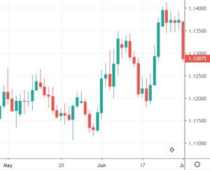
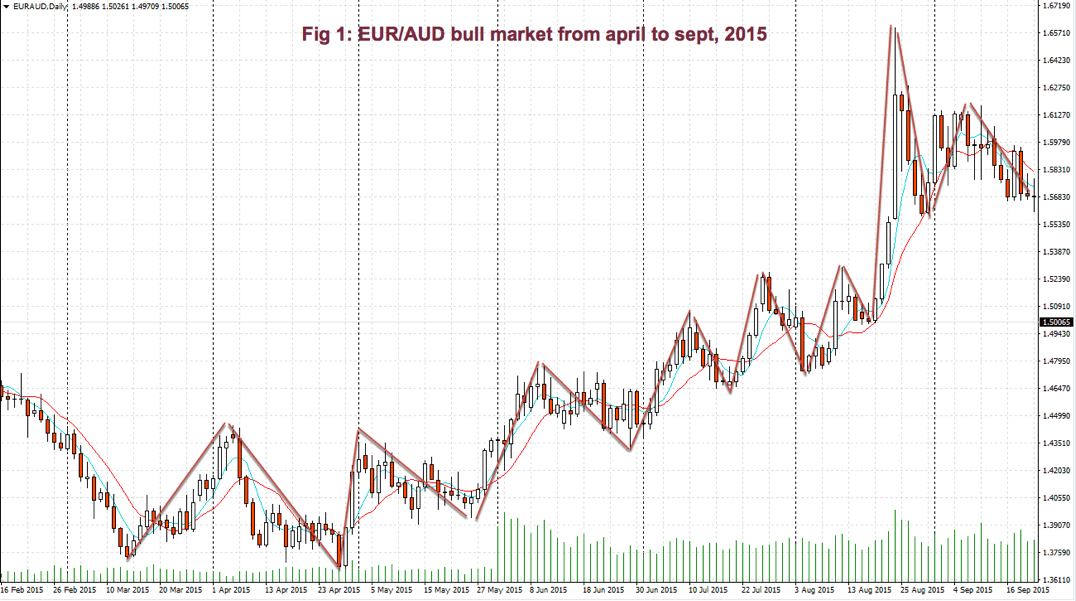
In Fig 1, we may observe a bullish trend on the EUR/AUD, back in 2015. We may see that prices move in waves. However, the crest of a new wave goes higher than its preceding one. Similarly, its valley is more elevated than preceding valleys, as well.
So, a practical definition of an uptrend is a price pattern with higher highs and higher lows. Consequently, a bearish trend, or downtrend, is, then, a price pattern with lower highs and lower lows.
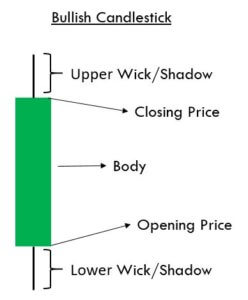
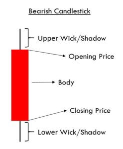
Trends happen on any time-frame. Even a single bar might be classified as a bull, bear, or lateral. A candlestick with a long white body and short shadows is, in fact, a bullish trend in its tiny time-frame while a long black candle with small shadows accounts as a bearish trend.
Lateral movements on a single bar happen when the candle presents a small body, or none at all, together with long upper and/or lower shadows.
Phases of a bullish trend:
The wavelike pattern, present in most trends, is the result of phases of accumulation, distribution, and sale that draw two different kinds of patterns: One impulsive and one corrective. Every one of these phases accounts as a trend (or lateral channel) in a shorter time frame, which might be composed, at the same time, by shorter trends with its own phases of accumulation, distribution, and selling.
Accumulation phase:
In the later stages of a wave valley, there is accumulation by smart traders who think there is an excellent opportunity with low risk, forming a support level. Sometimes, this support is briefly broken to the downside; stops are taken, and, then, the price back up, again, above support.
After this last trick to fool the weak hands, price starts to climb, slowly at first, faster as momentum grows. In the final moments of this phase, price moves quickly, with substantial price increases on higher volume.
Distribution phase:
In the final stage of an impulsive phase, selling begins by smart profit takers, while the price is still rising, then it reaches overbought levels. A kind of barrier seems to have been established: It’s called a resistance level.
At those levels, more traders are willing to sell than buyers can manage, so price stagnates. Latest bulls don’t have the strength to raise prices beyond that point, but this new leg high is higher than the one in the previous impulsive phase.
Selling phase:
Price moves in a declining channel. Traders that went long at its highs close at a loss. Thus, the price moves down. Then, price recovers as if a new leg up might happen, just to fade again a bit lower than before. Several push-pull phases take place, its pattern like a fading oscillation.
Price reached a new support, and a new accumulation phase begins. Usually, this support is at or near the high of the previous impulse high. This stage draws a corrective pattern.
Phases of a bearish trend
In stock and futures markets, there is a marked asymmetry between bull and bear markets. The former being orderly and, usually, less volatile, except at its beginning, while its ending depicts exuberance and extremely positive expectations. Conversely, bear markets depict much higher volatility, together with fast, bear-trap rallies.
Sell-offs drives prices down much faster than when they are rising. Bear markets tend to be short and fast, losing between 20 to 70% of its value. On stocks, it may lose up to 95% of its value, as it happened to some tech stocks back in 2000 or bank stocks in 2008.
Currency pairs, by its own nature -currency prices moving against each other- make bull and bear phases symmetrical. The discussion above may have been the same if we swap the pair. So A bearish trend in a currency pair has identical stages because it’s just a bullish trend looked from the short side.
What is essential to be aware of is that the impulsive pattern, be it up or down, is the one where we could make more profits with reasonable reward to risk ratios. And the corrective leg (2), the product of a selling phase, is harder to trade and presents more mediocre rewards for its risks.
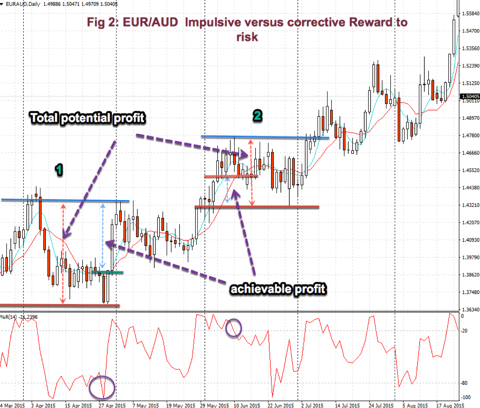
Fig 2 shows this behavior. We may discover that the Reward to risk channel on the impulsive phase (1) is much broader than on the reactive leg (2) when traded to the short side.
On the impulsive leg, the potential reward is more than 2x its risk, while to the short side, on a corrective phase, it’s less than one, even in the ideal case of taking profits at the lowest low of the channel.
This is a good example of why we should never fight the trend. Instead, we might use a corrective leg to add to a position or entering near support, that is, near the bottom of the channel.
Upside down, this example applies to a bear trend. Here, the impulsive leg, of course, is downward.
There are trends where the channel is more extensive, and both phases, impulsive and corrective, are equally profitable. But those cases are comparable to a sideways market, so the same kind of strategies applies there.
Sideways channels
A sideways channel happens when the price oscillates between two levels that seldom move or move up or down very slowly. If the channel is wide enough, it may offer trading opportunities, although, usually, volatility is higher, so it’s harder to trade.
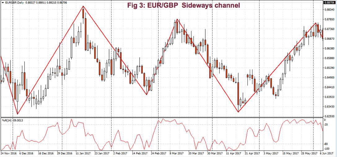
Fig 3 shows a sideways channel that took place in the EUR/GBP from Nov. 2016 until Jun. 2017. Here, we observe there’s a floor level and a ceiling level, where bounces occur. On this sideways channel, we could split every leg and consider each leg as a bull or bear trend, and go to a shorter time frame to trade it.
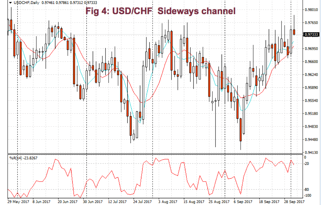
But not always, this may be possible. Fig 4 shows the price behavior on the USD/CHF pair for the last five months, from the end of May 2017, till the beginning of October. We may observe that the high volatility that takes place in the last two legs makes it difficult to differentiate impulsive from corrective. There we must switch to a shorter time frame in search of better behaved impulsive patterns.
A final word about time frames. We should use a higher-order time frame as our guide to decide which side to trade on the shorter frame, then mark support and resistance levels and potential entry points and stops to assess the reward and its risk.
Levels, breakouts, support, and resistance
I’ll tell you here my personal view about levels, support, resistance, and breakouts. People trade their beliefs about the markets. Price is continuously moving in a struggle of two sides, while a third side is watching.
The fight is between those who believe it’ll go up and those thinking it’s already too high and must go down. If the believers on one side are less than on the other hand, price moves against them until a new consensus is made where both parties have similar power.
At price levels where the power of bulls and bears is similar, the price cannot move up or down any longer, until one of the parties weaken or the other gets more strength. In the first case of a price going up and then stagnating, the level is called resistance. The case of a price falling and then stopping its downfall is called support.
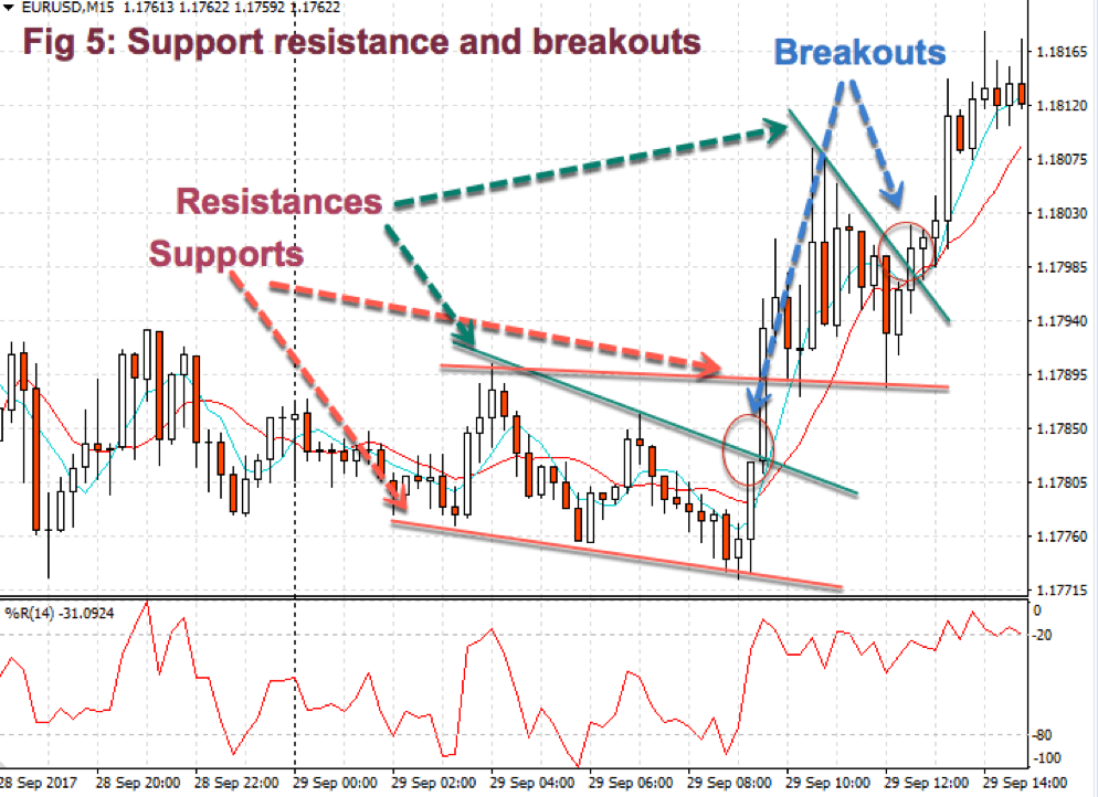
On the occasions when the price is pushed beyond resistance, it’s called a breakout. If the price crosses a support level to the downside, it’s called a breakdown. Sometimes the breakout or breakdown is of short duration, price resuming to its previous levels after a few bars. In such cases, it’s called a failed breakout or a failed breakdown. Thus, the passing of time confirms the breakout or breakdown. As time goes, the strength of a support or resistance level increases.
Fig 5 shows a couple of support and resistance channels with two breakouts. Please note that on the second channel, supports are located at the peaks of the sideways channel that preceded the first breakout. This is quite usual, and a persistent pattern in trading charts. Current support levels were, first, resistance levels crossed by a price breakout, becoming supports. Similarly, current resistance levels were support places that were pierced down.
Support and resistance patterns are extraordinarily useful because of their rather good predictive value. Buying at support and selling at resistance is one of the better strategies around, and not only by its success rate but also because they are locations with excellent reward to risk ratio.
Channel contractions
Channel contractions are patterns sometimes called flags and sometimes pennants, wedges, triangles, etc. Although many books about trading patterns make a differentiation between them, they are the same corrective phase, after an impulsive leg.
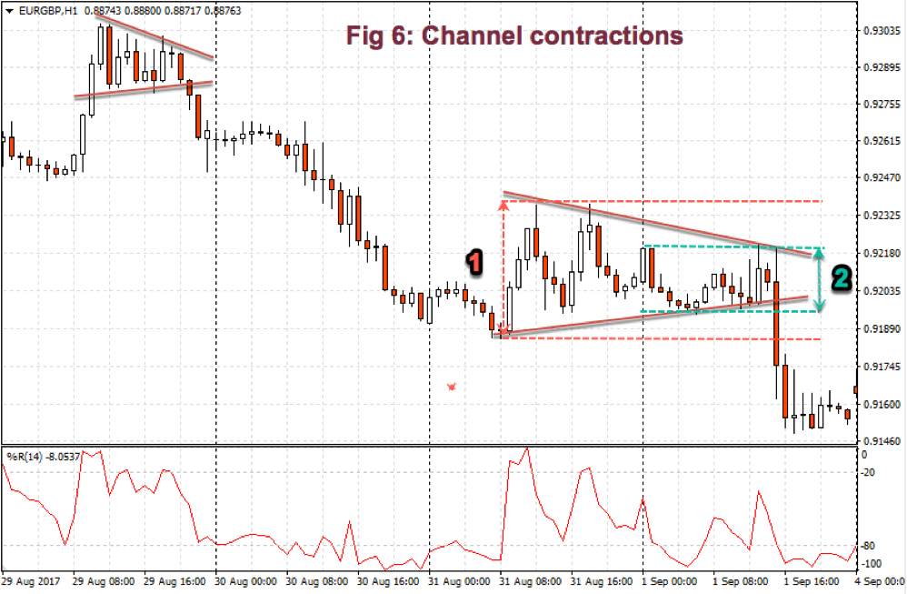
The critical point to remember about this type of formations is that they are excellent places to trade following the breaking direction. We don’t care which one is it. Usually, it’s a trend continuation, but that doesn’t matter much because the second most important feature of a range contraction is that at those spots, the reward to risk is increased almost double compared to its beginning point.
Fig 6 shows an example of a channel contraction, where we will be able to observe at 1 the risk at its beginning and at 2 the risk at its end. We, also, are able to see that this type of formations is a trend continuation most of the time.
In the next issue, we’ll talk about trendlines, moving averages, and channels.
That’s all for today.
©Forex.Academy
References:
I took some ideas from Essential Technical Analysis, Tools, and Techniques to Spot Market Trends by Leigh Stevens. The rest is mine.
All charts are taken from the MT4 trading platform.