Categories
Forex Course

53. Trading The Single Candlestick Patterns – Part 2

Introduction

In the previous lesson, we discussed some basic single candlestick patterns, which gave us trend continuation signals. In this lesson, we will look at reversal patterns that are formed by a single candlestick and how traders should perceive them.

These patterns are very important to learn as they indicate clear market reversals. So essentially, when we find these patterns on the charts, we should anticipate a reversal and take our trades accordingly.

The Hanging Man Candlestick Pattern

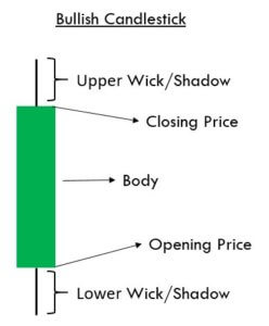
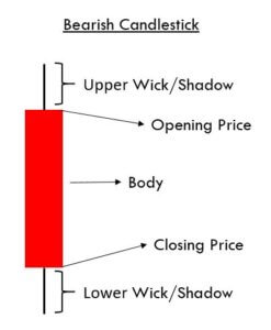
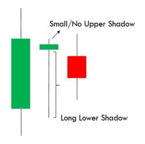
A Hanging Man is a single candlestick pattern that occurs during an uptrend. They give warning signals that markets are going to fall. This candlestick pattern is composed of a small body, a long lower shadow, and no upper shadow. Since it is a reversal pattern that reverses the current uptrend, The Hanging Man indicates the selling pressure that is starting to increase. Below is how the Hanging Man candlestick would look like.

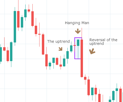
Below is a picture of how this pattern would like on the chart and how the trend reversal takes place.

Pattern Confirmation Criteria

  • Hanging Man is a single candlestick pattern that forms after a small rally in the price. The price rally can also be big, but it should at least be composed of few candles moving higher overall.
  • The candle must have a small body and a lower shadow at least twice the size of the real body.
  • This pattern is only a warning and a bearish candle after the formation of this pattern is highly desired. This is necessary for the Hanging Man pattern to prove to be a valid reversal. This is called confirmation.

The Hanging Man pattern is used by traders to exit long positions or enter into new short positions. After entering for a short position, stop loss can be placed above the high of the Hanging Man candle.

The Shooting Star Candlestick Pattern 

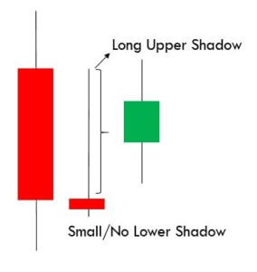
A Shooting Star is a bearish single candlestick pattern which also indicates a market reversal. It has a long upper shadow with little or no lower shadow and a small body.

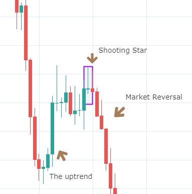
This pattern typically occurs after an uptrend and forms near the lowest price of the day. The Shooting Star pattern can be seen as the market creating potential resistance around the price range. It implies that the sellers stepped in, erasing all the gains, and pushed the price near the open. Basically, at the appearance of this pattern, buyers are losing control, and sellers are taking over.

Below is a picture of how the pattern would look like on a chart

Pattern Confirmation Criteria

  • The pattern must appear after an advance in price. The price must rally in at least alternate green and red candles if not in all green candles.
  • The distance between the highest price of the candle and the opening price must be twice the length of the body of the candle.
  • It is best if there is no shadow below the body of the candle.

Traders should not take immediate action after the formation of this pattern. They should wait to see what the next candle does following the Shooting Star. If they see a further price decline, they may sell or short that currency pair. However, if the price continues to rise, it means the uptrend is still intact. So traders must favor long positions over shorting.

The difference between the Hanging Man and the Shooting Star is in the length of upper and lower shadows along with the context. By now, we have understood how continuous and reversal single candlestick patterns work. In the upcoming lessons, we will be learning dual candlestick patterns and their implication. Cheers!

[wp_quiz id=”60770″]
Categories
Forex Course

50 – Basic Anatomy Of A Candlestick Chart

Introduction

In the previous article, we have discussed the history, introduction, advantages, and disadvantages of using candlestick charts. Now, in this lesson, we will discuss how to read a typical candlestick chart.

Every candlestick has a central portion which is referred to as the body of the candlestick. It shows the distance between the opening price and the closing price of the security that is being traded. The faint line between the top of the body and the high of the trading period is the upper shadow. Likewise, the thin line between the low of the body and the low of the trading period is known as the lower shadow.

The chart below is made up of lines going from top to bottom. These lines are known as candles. This vertical axis of this chart shows the price, whereas the horizontal axis shows the time.

(Chart Taken From Trading View)

Each of the candles in the above chart gives us four pieces of information.

Candlesticks always refer to the information for a specific unit of time. For example, in a daily chart, each candle represents one single trading day. Every single candle is comprised of the open, close, high, and low for that given trading period. The horizontal axis of the above chart can be used to know which day corresponds to which candlestick. Almost every candle has a wick (also known as shadow) that goes outside the body of the candle. They represent the highest and lowest price of a security during that period.


The color of the candle is the essential aspect of any candle. It determines if the opening price of a security was higher or lower than the closing price of a security. If the candle is Red, it is known as a bearish candle. Always remember that the opening price is higher than the closing price in a bearish candle. Contrarily, if the candle is Green in color, it is known as a bullish candle, and that means that the opening price is lower than the closing price.

Market Emotions & Candlesticks

The names given to candlestick patterns are a colorful way to describe the emotional sentiment of the market. When we hear words like ‘dark-cloud cover’ or ‘hanging-man,’ they easily indicate the unhealthy state of the market. We are not saying they provide proper trading signals, but they clearly indicate the negative market state.

Without even knowing the technicalities of these patterns, we get an idea of where the market is heading to just by hearing their names. For instance, consider the names like ‘morning star’ & ‘evening star’ candlestick patterns. The morning star essentially implies the bullish state of the market as the appearance of the morning star is just before the sunrise. Likewise, the evening star indicates a bearish signal because it comes out just before the sunset.

The other emotional price point that should be noted is the closing of any candle. If you recall the concept of Margin calls from brokers, they are based on the close of the candle alone. Thus we can expect emotional involvement when the market closes.

That’s about the anatomy of candlesticks. In the upcoming articles, we will be discussing many of such amazing candlestick patterns which are sure going to be very interesting.

[wp_quiz id=”59661″]
Categories
Forex Price Action

Support and Resistance

Support and Resistance

One of the fundamentals of Technical Analysis is the theory and methodology of support and resistance. In a odd turn of events, some of the most advanced methods of identifying support and resistance are not only relatively unknown, but they are some of the original Technical Analysis theories. Some of those methods include identifying support and resistance according to naturally squared numbers, numbers related to an angular nature in Gann’s tools, harmonic ratios, pivots, Fibonacci levels, and other more esoteric methods. For this article, though, the focus is on identifying support and resistance based on prior traded price levels and ranges**.


What are Support and Resistance?

When you hear the word’s support and resistance, the definitions of those words may be the first thing that comes to your mind. Support indicates that something will assist or strengthen while resistance indicates rejection. In Technical Analysis, support means a level that is below the price, and resistance is above price.

The image above shows resistance as a red band and support as a green band. It’s important to understand that support and resistance on a candlestick chart should never be viewed as a static and exact price level. With a chart style that has such dynamic time and price levels, like Japanese candlesticks, support and resistance are an area or range of value. Determining the support and resistance levels requires a ‘zoomed’ out view of the chart. When you get a broader view of the past price action, you can see price levels where price has moved lower and then reversed higher (support) as well as price levels where price move higher and then reversed lower (resistance). The most important levels are those that show past resistance becoming support and vice-a-versa.

Prior Support turned into Future Resistance


Use another chart style to find support and resistance

Renko Chart

While it may seem simple to find support and resistance on a candlestick chart, there are some alternatives. The length of the wicks and body of candlesticks can vary and can add to the confusion. Using a Renko (above) chart simplifies the process of finding support and resistance by reducing the noise on the chart and providing less ambiguity when looking for highs and lows. Take note of how these resistance and support levels are drawn on a price-action-only chart. With a price action only chart, I don’t draw a value area like I would on a candlestick chart. But if you are not comfortable using a price-action-only chart and want to stick to a candlestick chart, then another trick that might help is to remove the wicks from the candlesticks. Look at the side by side comparison below.

Wicks VS No Wicks

Both charts display a weekly chart of the CADCHF pair. On the left, we have a regular candlestick chart with wicks – wicks that are all over the place. The chart on the right is the same as on the left, but with no wicks displayed. You can see how much more clear the tops and bottoms are on the right. This can make it a little easier to spot support and resistance levels.


** It is the view of this author that past support and resistance levels are inefficient for today’s markets. However, the method discussed in this article is part of a foundation of learning that can be applied to future price level analysis.