Introduction
In the previous article, we have discussed the history, introduction, advantages, and disadvantages of using candlestick charts. Now, in this lesson, we will discuss how to read a typical candlestick chart.
Every candlestick has a central portion which is referred to as the body of the candlestick. It shows the distance between the opening price and the closing price of the security that is being traded. The faint line between the top of the body and the high of the trading period is the upper shadow. Likewise, the thin line between the low of the body and the low of the trading period is known as the lower shadow.
The chart below is made up of lines going from top to bottom. These lines are known as candles. This vertical axis of this chart shows the price, whereas the horizontal axis shows the time.
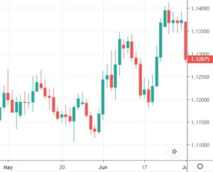
(Chart Taken From Trading View)
Each of the candles in the above chart gives us four pieces of information.
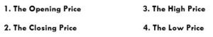
Candlesticks always refer to the information for a specific unit of time. For example, in a daily chart, each candle represents one single trading day. Every single candle is comprised of the open, close, high, and low for that given trading period. The horizontal axis of the above chart can be used to know which day corresponds to which candlestick. Almost every candle has a wick (also known as shadow) that goes outside the body of the candle. They represent the highest and lowest price of a security during that period.
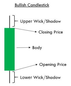
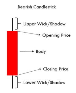
The color of the candle is the essential aspect of any candle. It determines if the opening price of a security was higher or lower than the closing price of a security. If the candle is Red, it is known as a bearish candle. Always remember that the opening price is higher than the closing price in a bearish candle. Contrarily, if the candle is Green in color, it is known as a bullish candle, and that means that the opening price is lower than the closing price.
Market Emotions & Candlesticks
The names given to candlestick patterns are a colorful way to describe the emotional sentiment of the market. When we hear words like ‘dark-cloud cover’ or ‘hanging-man,’ they easily indicate the unhealthy state of the market. We are not saying they provide proper trading signals, but they clearly indicate the negative market state.
Without even knowing the technicalities of these patterns, we get an idea of where the market is heading to just by hearing their names. For instance, consider the names like ‘morning star’ & ‘evening star’ candlestick patterns. The morning star essentially implies the bullish state of the market as the appearance of the morning star is just before the sunrise. Likewise, the evening star indicates a bearish signal because it comes out just before the sunset.
The other emotional price point that should be noted is the closing of any candle. If you recall the concept of Margin calls from brokers, they are based on the close of the candle alone. Thus we can expect emotional involvement when the market closes.
That’s about the anatomy of candlesticks. In the upcoming articles, we will be discussing many of such amazing candlestick patterns which are sure going to be very interesting.
[wp_quiz id=”59661″]