Support and Resistance
One of the fundamentals of Technical Analysis is the theory and methodology of support and resistance. In a odd turn of events, some of the most advanced methods of identifying support and resistance are not only relatively unknown, but they are some of the original Technical Analysis theories. Some of those methods include identifying support and resistance according to naturally squared numbers, numbers related to an angular nature in Gann’s tools, harmonic ratios, pivots, Fibonacci levels, and other more esoteric methods. For this article, though, the focus is on identifying support and resistance based on prior traded price levels and ranges**.
What are Support and Resistance?
When you hear the word’s support and resistance, the definitions of those words may be the first thing that comes to your mind. Support indicates that something will assist or strengthen while resistance indicates rejection. In Technical Analysis, support means a level that is below the price, and resistance is above price.
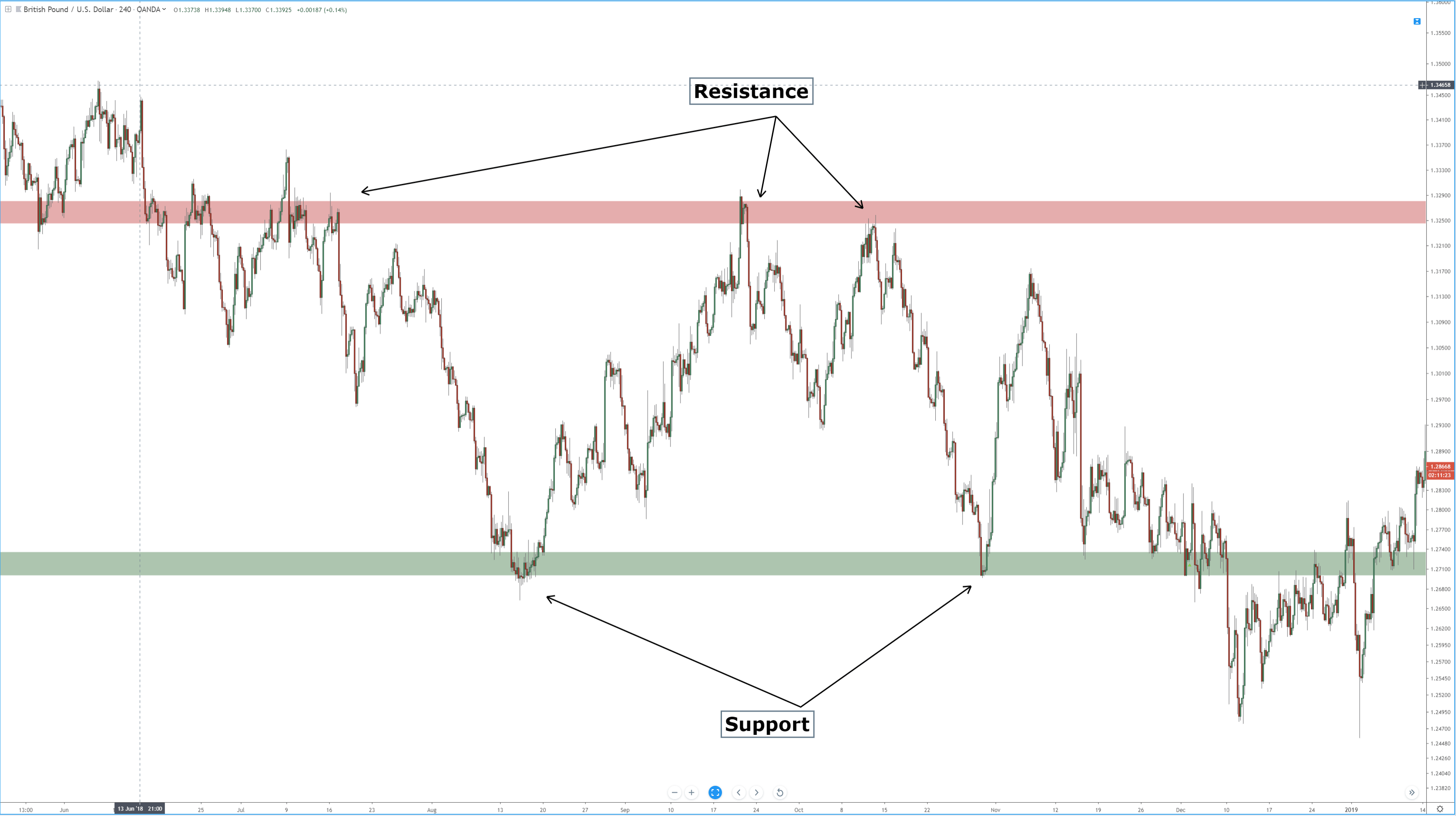
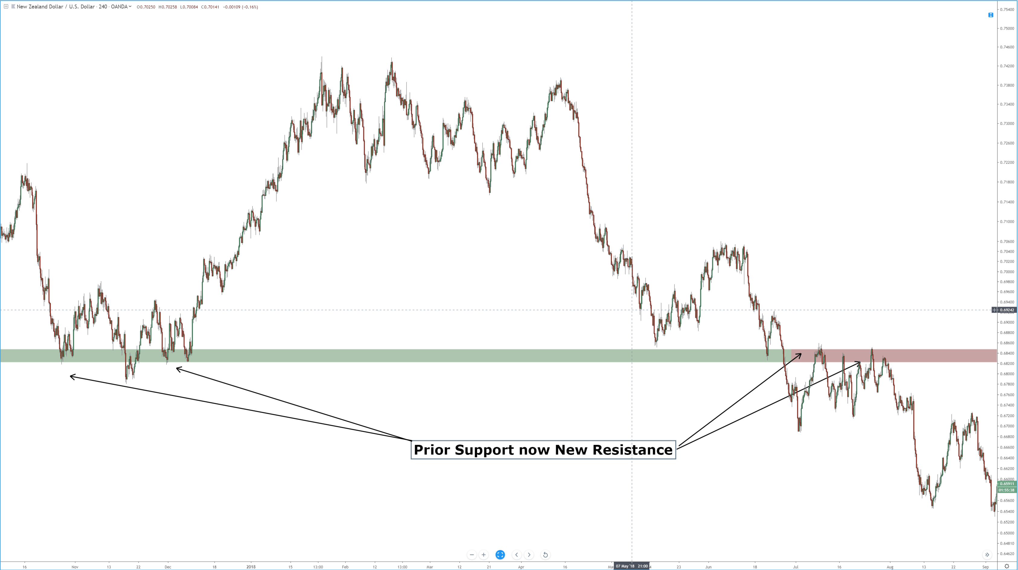
The image above shows resistance as a red band and support as a green band. It’s important to understand that support and resistance on a candlestick chart should never be viewed as a static and exact price level. With a chart style that has such dynamic time and price levels, like Japanese candlesticks, support and resistance are an area or range of value. Determining the support and resistance levels requires a ‘zoomed’ out view of the chart. When you get a broader view of the past price action, you can see price levels where price has moved lower and then reversed higher (support) as well as price levels where price move higher and then reversed lower (resistance). The most important levels are those that show past resistance becoming support and vice-a-versa.
Use another chart style to find support and resistance
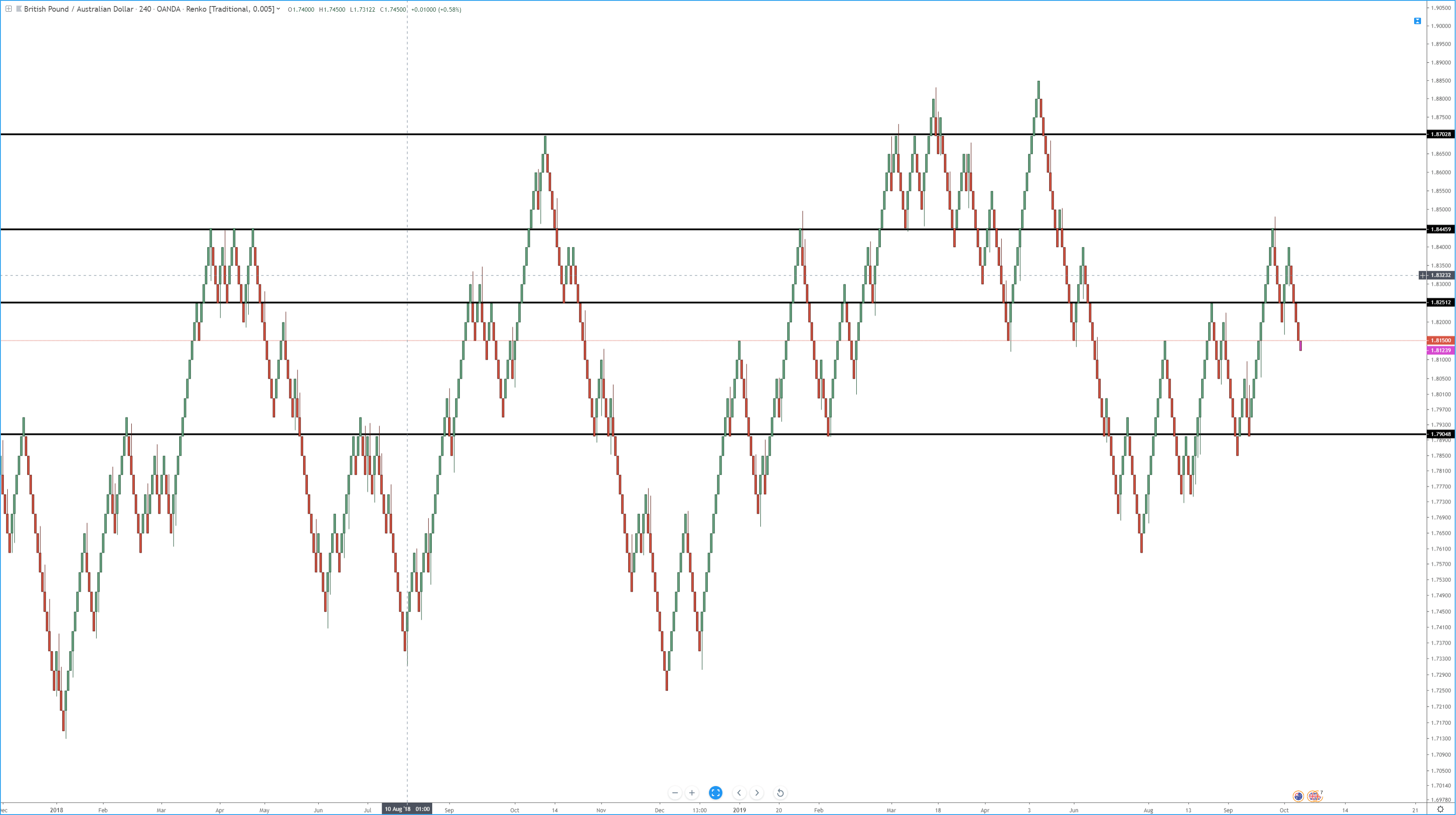
While it may seem simple to find support and resistance on a candlestick chart, there are some alternatives. The length of the wicks and body of candlesticks can vary and can add to the confusion. Using a Renko (above) chart simplifies the process of finding support and resistance by reducing the noise on the chart and providing less ambiguity when looking for highs and lows. Take note of how these resistance and support levels are drawn on a price-action-only chart. With a price action only chart, I don’t draw a value area like I would on a candlestick chart. But if you are not comfortable using a price-action-only chart and want to stick to a candlestick chart, then another trick that might help is to remove the wicks from the candlesticks. Look at the side by side comparison below.
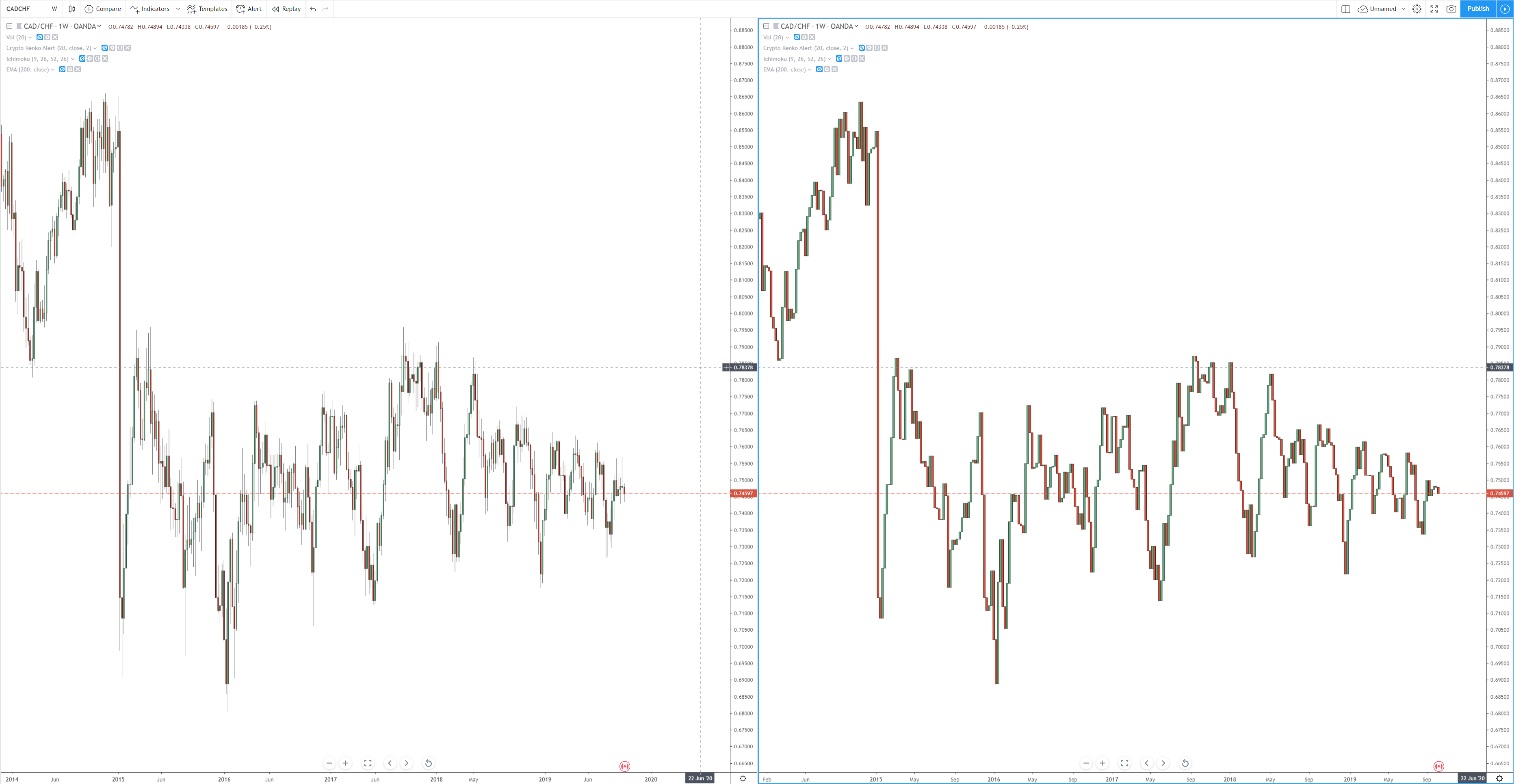
Both charts display a weekly chart of the CADCHF pair. On the left, we have a regular candlestick chart with wicks – wicks that are all over the place. The chart on the right is the same as on the left, but with no wicks displayed. You can see how much more clear the tops and bottoms are on the right. This can make it a little easier to spot support and resistance levels.
** It is the view of this author that past support and resistance levels are inefficient for today’s markets. However, the method discussed in this article is part of a foundation of learning that can be applied to future price level analysis.