Why Technical Analysis?
The expression “technical analysis” originated from the belief that price action is all that is required to make sound trading decisions. Fundamental analysts believe that fundamental or structural influences are already incorporated in the history of the price. The concept of price action analysis is credited to Charles Dow, the author of the Dow theory, around 1900.

Starting from there, TA began to rise in importance to traders. The idea that price movement discounts all new information seemed rational. Concepts such as price trending, price confirmation, support, resistance, divergence, and volume confirming price started to emerge.
TA practitioners believe that the current price represents the instantaneous consensus of value. It’s the cost at which someone is ready to buy and a different person to sell. That agreement depends on the different beliefs persons hold about the prevailing market situation. A potential seller believes that odds the price continuing moving up are minimal or that it will surely go down shortly. Opposing this view, a buyer, maybe trading in a different timeframe, might think it is the right place for the asset to start an uptrend. There’s a third category of people: Traders that are expecting to detect another price level to make a decision.
Charts
Traders using technical analysis record prices in charts. Since thousands of transactions happen every minute, chartists accumulate the market action in packets called timeframes. The x-axis registers the passing of time, while the Y-axis register the prices. Usually, volume bars are added at the bottom of the graph.
When traders and investors had to draw the charts on graphical paper, the usual was to use a daily timeframe and follow the daily closings. With the advent of personal computers and dedicated charting packages, we can find charts from sub-minute timeframes to hours, days, weeks, and months. Precisely, the MetaTrader 4 platform allows timeframes of 1 min, 5 min, 15 min, 30, min, 1 hour, 2, hours, 4 hours, one day, one week and one month.
Line charts
The most basic chart is the line chart. Line charts connect the ending price of every frame with a line.
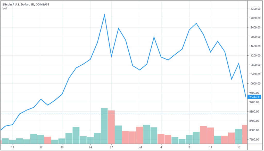
Fig 1 – Line chart of the Bitcoin in a daily timeframe.
Bar charts
Line charts are useful to see trends but lack the information about how volatile was the session. To record this kind of information, chartists decided to draw vertical bars in every time segment, showing four critical elements: The open (O), the high (H), the Low (L), and the Close(C) prices of every segment of trading activity. That’s why sometimes they are called OHLC charts.
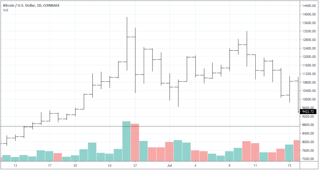
Fig 2 – The same Bitcoin segment of history in a daily bar chart.
As we already stated, every bar is composed of four prices. The Open price is shown as a horizontal mark on the left side of the bar. A close price is depicted as a horizontal mark on the right side of the bar. The high is the highest point of the bar, and the Low price is the lowest part of a bar. The Close is the most crucial level, followed in importance by the Open, and then the high and the low.
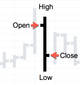
Fig 3 – Bar anatomy.
The most probable price path for the bar shown above is the price moving from Open to High, then descending to the Low and finally having the strength to close higher. But we don’t know for sure. It might have moved from open to low, from there to a high to descend to the closing level, finally. What we know for sure is that the sellers had the strength to drive down the price.
Candlestick charts
Candlesticks are a relatively new way to draw charts. They were introduced to the western world by the work of Steve Nison on the Japanse charting and trading methods.
They use the same four points, OHLC, but a body of the candle is formed between the Open and the Close. The rest of the price action, beyond that range, is left as a line called wick or shadow.
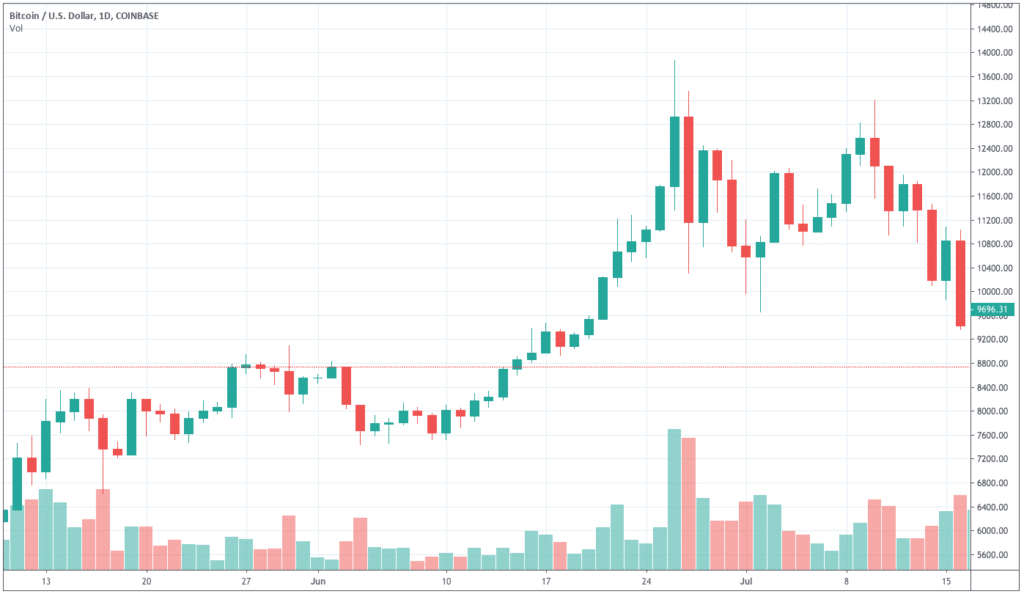
Fig 4 – The same Bitcoin segment of history in a daily candlestick chart
Traditionally a bullish candle was drawn hollow or white, while the bearish candle is drawn in black. Now we can assign any color to it. On figure 4, the upward candlesticks are depicted in turquoise, and the red candles denote descending prices.
Candlestick charts are much more graphical, and traders can see immediately if the trend is up or down. During the uptrend seen in fig 4, the turquoise color is prevalent, while the color shifted to red in the downtrend that followed.
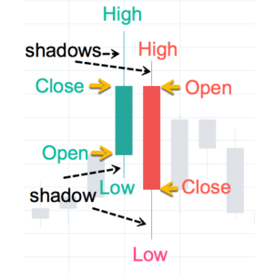
Fig 5 – The candlestick Anatomy
On candlestick charts, the Open and close prices are deducted by the context. The ascending candlestick moves from a lower open to a higher close, while the descending one moves from a higher open to a lower close.
The next article will be dedicated to introducing other forms of charting, such as Renko, three-line break, and point and figure.