Categories
Forex Basic Strategies

The Best Tools to Trade Pullbacks Effectively

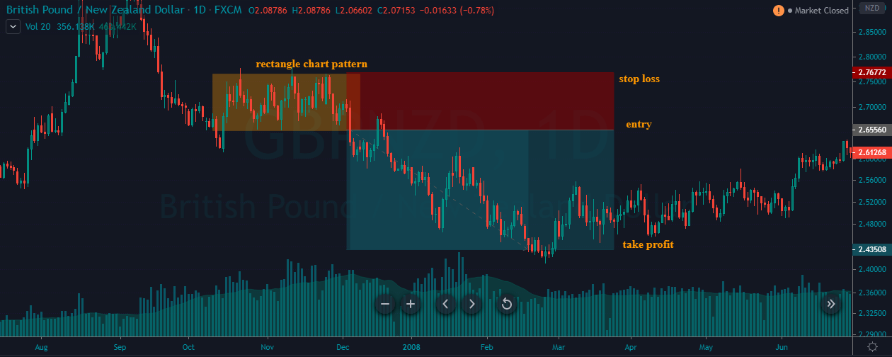
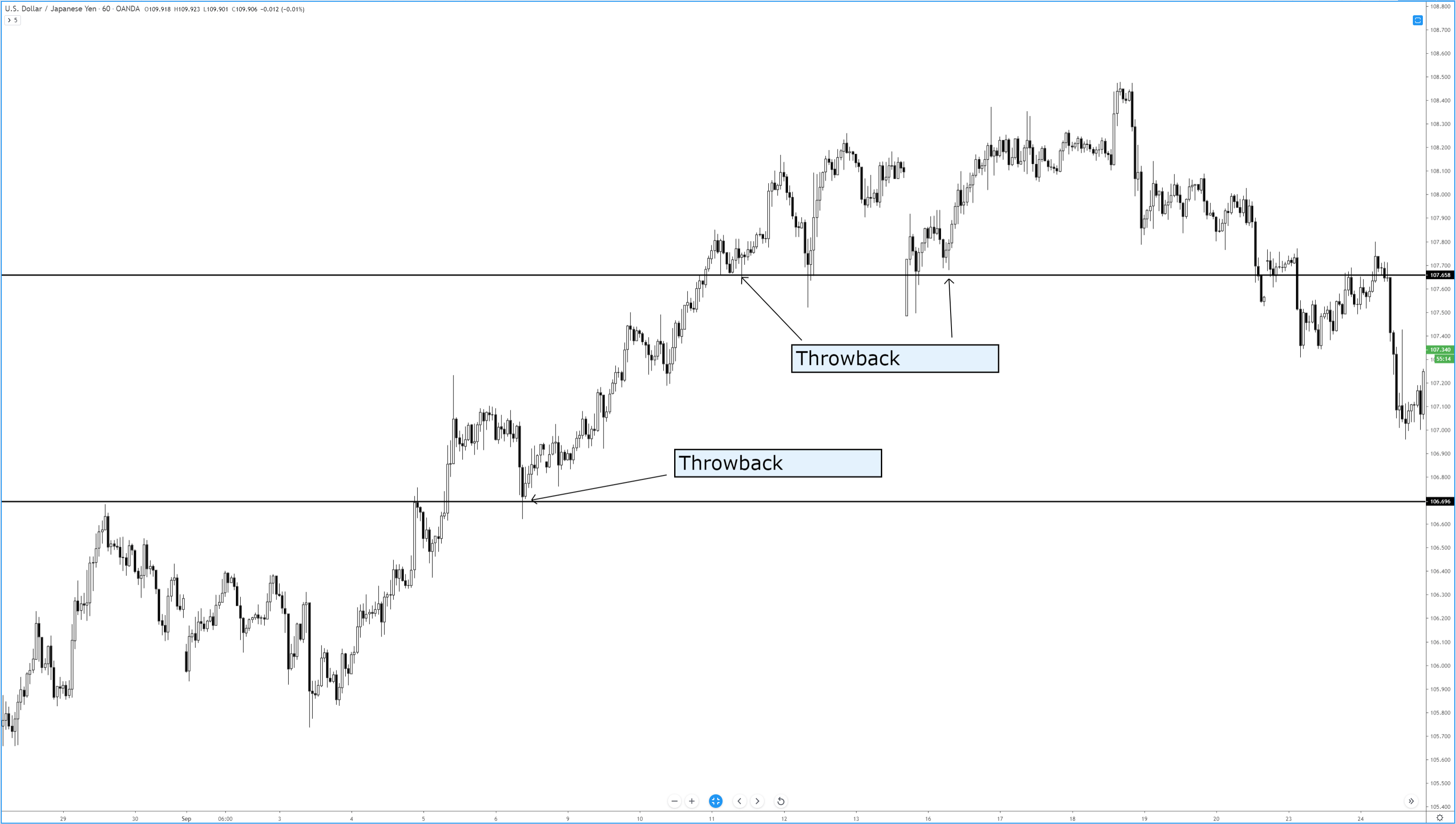
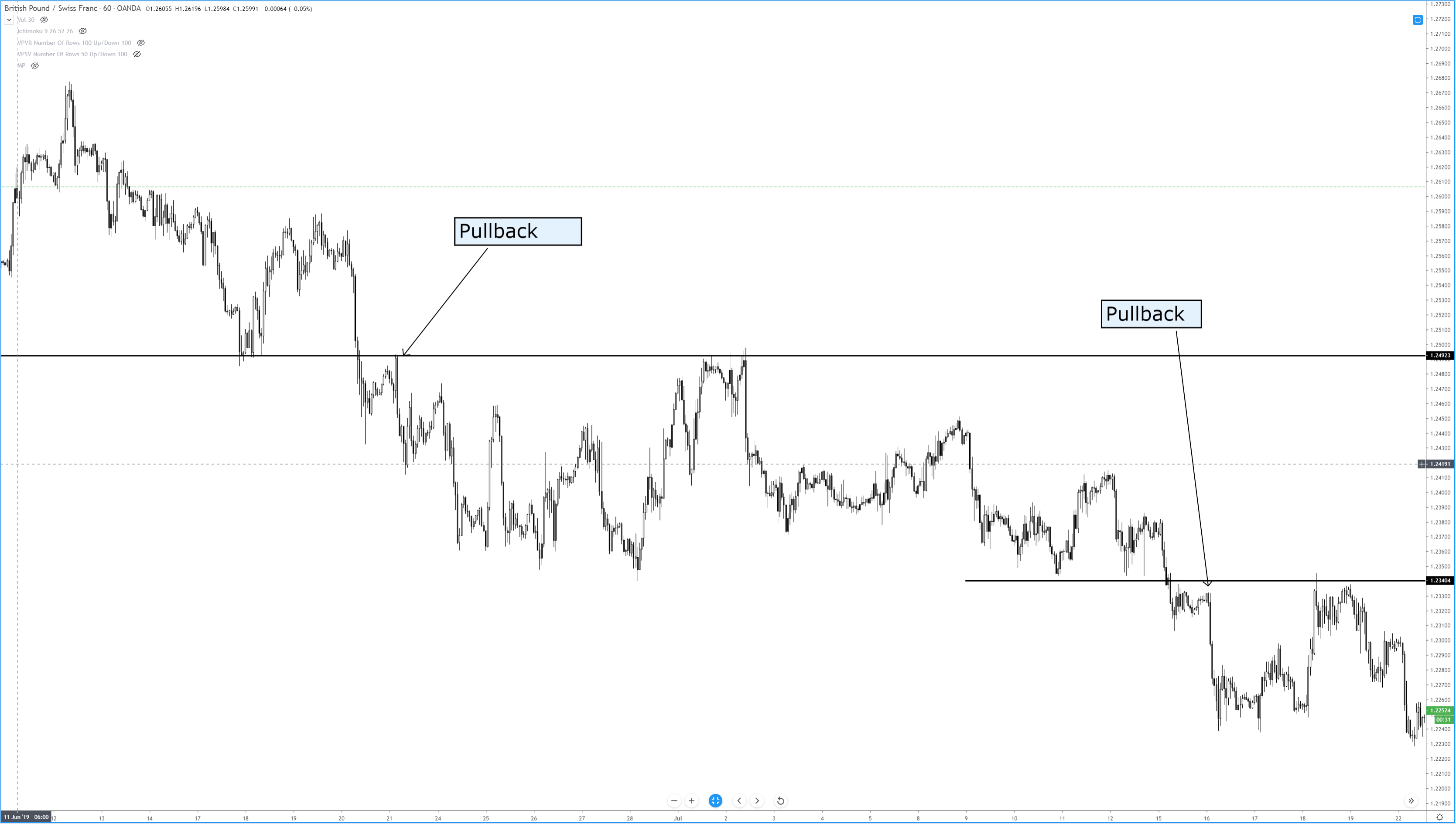
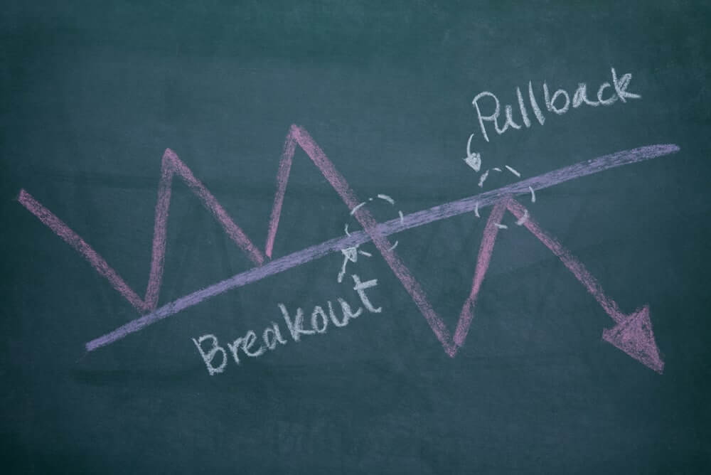
A Pullback is a pause, retracement, or consolidation of a price from the most recent peak during an ongoing trend. The pullback is widely seen as a trading opportunity after the underlying asset experienced a large upside or downside move. For example – Any forex pair is in a strong uptrend, and some healthy news came, and price action dropped back to the most recent support area that indicates the professional traders are booking the profits.

Pullbacks happen all the time, and if you learn how to trade them successfully, it can be a great skill as a trader. Trading the pullback is the easiest way to trade the market, sometimes you will recognize the high probability pullback trades and sometimes extreme volatile pullbacks, and you can enhance your repertoire and find many higher probability trades. If you are new in the market, then pullback trading is a fantastic and easy way to find superior risk-to-reward ratio trades. In this article, we will explore five trading strategies that provide excellent pullback trades.

Pullback Trading Strategies

Two-Legged Pullback To The MA 

Al Brooks popularized the concept of two legs pullback in his price action books. He explained most of the time, price action print two legs to reach the moving average. We backtested his strategy and found out that his techniques work very well in the trending market, but sometimes in the strong trending market, you will only witness one leg.

This is because most market operators are in a hurry to move the market; this may be because of any fundamental news. To filter out all the low probability trades, it is advisable to find a trending market and then wait for the price action to print the two legs towards the moving average, and when all the moves complete, take the buy entry.

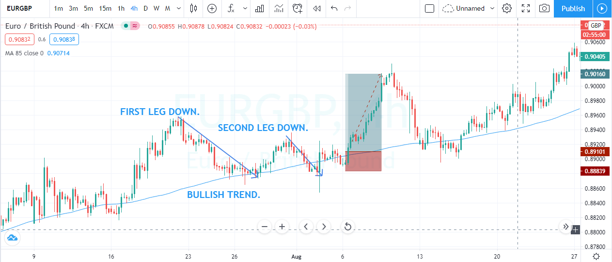
The image below represents the buying trade in the EURGBP forex pair. The moving average indicates the buying trend in the currency. Price action pulled back to the moving average, prices responded from the moving average and goes a bit higher and end up printing the second leg. The second leg goes down to the moving average, but the strong buyers smack back up and close above the moving average. Furthermore, the price slows down a bit, and we took buying entry with the stops below the entry, and for taking profit, we choose the brand new higher high.

Candlestick Pattern + MA

This method will use the bullish engulfing candlestick pattern with a moving average to successfully trade the market.

Here we need two ingredients.

  1. Price action pullback to the moving average.
  2. The market forms a bullish engulfing pattern.

First of all, look for the strong trending market and wait for price action to approach the moving average. At this stage, if the price action prints the engulfing pattern,  it’s the right time for you to go for a buy entry. Otherwise, no entries are allowed for you. An  Engulfing Pattern indicates the sellers try to print the brand new lower low, but because of dynamic support of moving average prices pulled back and buyers end up eating all the sellers. As a result, we witnessed the Bullish Engulfing pattern.

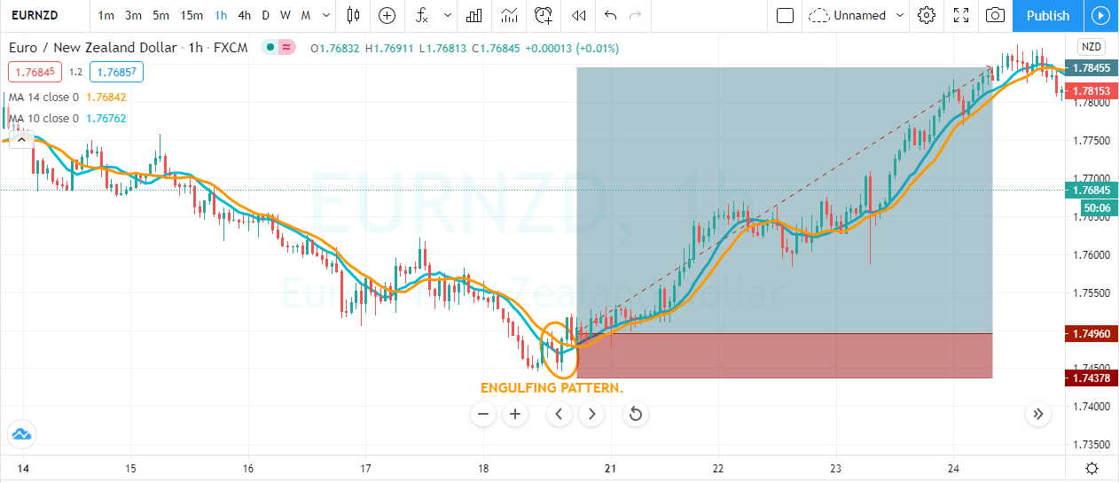
The image below represents the buying trade in the EURNZD forex pair. As you can see, at the end of the downtrend, price action goes above the moving average, and we witnessed the engulfing pattern. The trading pattern closed above the moving average, which was a confirmation of buyers came back to the show and were expecting the brand new higher high.

Trendlines + Channel Trading

This one is the simple trading approach, which is not much popular, but it often generates wonderful trading results. First of all, you must draw the trend line to the ongoing trend, and when the price action pulls back enough, then draw the price channel to identify the oversold and overbought area. When price action approaches the trend line as well as the lower line of the price channel, it is an indication to go long.

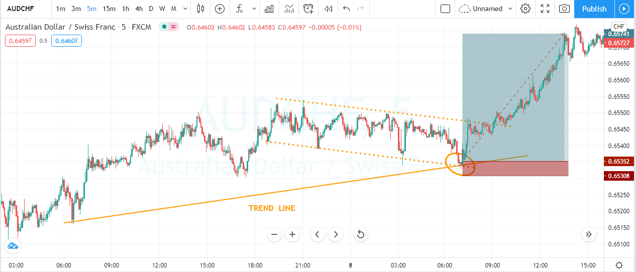
The image below represents the buying entry in the AUDCHF forex pair. The trend line was the indication that the buyers are leading the show. During the pullback phase, when enough sellers approach the trend line and the lower channel line, it gave the strong buying candle. The reason we got the strong candle is because for the support and resistance trader, the zone was a dynamic support area to go long.

RSI + Stochastic Indicator

In this approach, we are using the two oscillators to trade the pullbacks. Stochastic and RSI both are oscillators, and they both oscillate between the significant levels. In an uptrend, wait for the price action to pull back. When the stochastic and RSI gave the oversold signal, it is a perfect time to go for a brand new higher high.

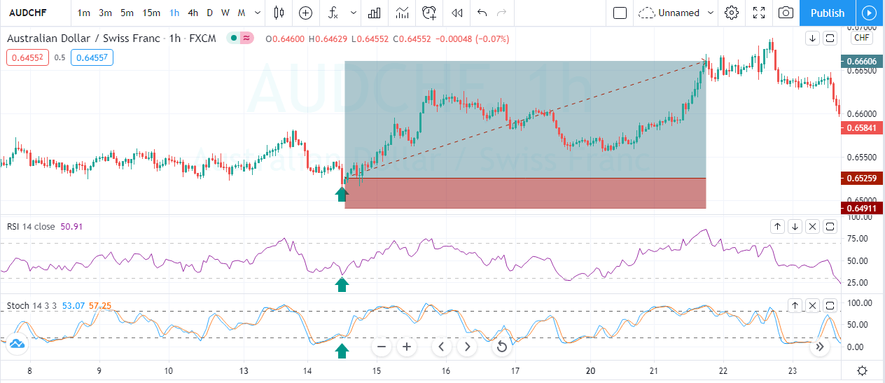
The image below indicates the buying trade in the AUDCHF forex pair. The pair was overall in an uptrend, and during the pullback, both of the indicators were showing the oversold signals, and the reversal at the oversold area was a great sign to go long. When both oscillators indicate the same sign, there is no point in going for more significant stops. When both oscillators gave the reversal signal at the significant resistance level, that’s a perfect time to close your trade.

Conclusion

All the pullback strategies share the same goal, which is to time the market. The better you master the skill of timing before the take-off, the more profits you will make. If you are a newbie trader, then master these strategies first on the demo and then apply to the live market because trying any of these strategies in the live market is dangerous without having any experience.

So never try anything on the live account. Instead, practice them on demo first and then make a profit on a live account. When you master these strategies, then you can very easily design a pullback strategy for yourself. Whichever strategy fits nicely into your trading approach, master it.

Categories
Forex Course

118. Using Rectangle Chart Patterns to Trade Breakouts

Introduction

The Rectangle is a technical chart pattern that is described by two horizontal lines acting like potential support and resistance levels on the price chart. Trading this pattern is similar to buying at the support and selling at the resistance level. Conventional traders can trade this pattern only after the appearance of the breakout.

The Rectangle represents a trading range, which indicates the fight between the two parties – buyers & sellers. As the price reaches the support level, buyers step in and push the price higher. And when the price reaches the resistance level, bears take over and force the price lower.

In this fight, one party will eventually get exhausted, and the winner will emerge when the price breaks out in any direction. So we can say that the Rectangle is a neutral pattern as either trend continuation or reversals may happen after the formation of this pattern.

Rectangle Chart Pattern – Trading Strategies

Buy Example

The below chart represents the formation of a Rectangle pattern in the GBP/CAD pair.

As we can see in the below chart, the market just started its uptrend, and during the pullback, it turned into the consolidation phase forming a range. This consolidation phase eventually forms the Rectangle pattern.

This pattern is very easy to spot and trade. We can wait for the pattern to break the range to enter the market. If you are an active trader, you can even take a couple of buy/sell trades in a lower timeframe. In the example shown below, we have decided to go long as soon as the price action broke the pattern from the upside. The stop-loss order is placed just below the Rectangle, and the take-profit is at the recent high.

Sell Example

The image below represents the formation of a Rectangle pattern in a downtrend.

The below chart represents the entry, exit, and the placement of stop-loss & take-profit orders in the GBP/NZD Forex pair. In an ongoing downtrend, when the prices reached the significant support zone, it started to hold. The sideways movement of the price shows that both the parties are super strong, and the breakout to any side will be a good trade.

After the battle, prices broke towards the downside, which is a clear indication for us to go short. The stop-loss order is placed just above the pattern. Because, in a downtrend, if the price breaks the Rectangle pattern’s resistance, it must be considered invalid. Hence there is no need to go for deeper stop-loss. We would always recommend placing the stops just above or at least at the same height as the pattern.

For booking profits, we didn’t choose any specific location. Instead, we were watching the price action keenly and chose to close our full positions when the sellers started to die. We can close our positions in different ways, depending on the market situation. For instance, we can exit the trade when prices approach the significant support area. We can even take the help of technical indicators to close our positions. Technical traders are also using price action techniques these days to exit their running positions.

That’s about the Rectangle chart pattern and how to trade it. If you have any queries, let us know in the comments below. Cheers.

[wp_quiz id=”73928″]
Categories
Forex Basic Strategies Forex Daily Topic

Significance of Breakout Confirmation or Reversal at Pullback

Breakout trading is one of the most widely used trading strategies in the Forex market. Breakout confirmation is equally important. Without breakout confirmation, a breakout may not work in favor of the traders in many cases. Thus, if we want to have a tremendous rate of winning, we may wait for breakout confirmation or reversal at pullback before taking entry. In today’s lesson, we are going to demonstrate an example of this.

The price after being rejected at a resistance level heads towards the South. It produces a bullish inside bar and heads towards the North again. The momentum suggests that the price may make a breakout at the level of resistance. Breakout traders are to keep an eye on the pair to get a breakout followed by breakout confirmation or reversal candle at the pullback to go long on the pair.

The last candle breaches through the level of resistance. Candle’s attributes suggest that this is an ideal breakout candle. The candle barley has the upper shadow. The breakout traders are to wait for either for the next candle to close above the breakout candle or the price to come back at the breakout level to consolidate and produce a bullish reversal candle to offer them a long entry.

The price does not head towards the North. It comes back at the breakout level closing within the breakout level. The breakout is still valid. However, the buyers must wait to get a bullish engulfing candle to close above consolidation resistance to trigger a long entry by setting stop loss below the breakout level. Let us proceed to the next chart to find out what happens next.

The price breaches the level of support and closes well below the breakout level. The sellers may take control soon in the pair. Traders taking a long entry right after the breakout candle closing are to have a loss here. If they set stop loss below the lowest low, the risk-reward would not be lucrative. When the price breaches a breakout level, it usually generates more momentum and changes its trend. Let us see what happens here.

The price goes back to the breakout level. This time it makes a bullish correction. The equation changes completely another way round. If the chart produces a bearish engulfing candle closing below consolidation support, the sellers may go short and drive the price towards the lowest low.

The chart produces a bearish engulfing candle followed by another strong bearish candle. It looks like a different ball game completely now. It is now the sellers’ territory.

In the bullish market, the chart does not produce a bullish reversal candle; thus, the price gets bearish. In the bearish market, it produces a bearish reversal candle (engulfing) and offers entry to the sellers. By taking entry upon breakout confirmation, we may not find as many entries as we would like, but it gets us more consistency in winning trades.

Categories
Chart Patterns

Chart Patterns: Pullback and Throwbacks

The most common term people associate with retracements in price that retest prior areas of support or resistance is a pullback. There is another term that goes with pullback, and that is a throwback. Let’s review the differences between these two definitions.

Pullback

Pullback
Pullback

Pullbacks occur after the price has moved lower. Think of any pattern or support line that has price breaking out to the downside. When price pulls back up to the price level of the initial break, that is known as a pullback. Pullbacks occur during breakouts lower.


Throwback

Throwback
Throwback

Throwbacks occur after the price has moved higher. Think of any pattern or level of resistance that has price breaking out to the upside. When the price is thrown back down to the first level of the break, that is known as a throwback. Throwbacks occur during breakouts higher.

While there are different definitions for retests of breakout zones, know that people will often call throwbacks, pullbacks. In practice, the description itself does not matter as much as you see the behavior that price exhibits after breaking out of support or resistance. The table below identifies the average occurrence rate for a pullback or throwback from the following patterns.

Pattern

Pullback Rate (%)

Throwback Rate (%)

Ascending Triangle

56

60

Descending Triangle

55

50

Double bottom

—-

56

Inverse Head-And-Shoulder

—-

57

Head-And-Shoulder

59

—-

Symmetrical Triangle

58

58

Triple Bottom

—-

58

Triple Top

63


The table above comes from Thomas Bulkowski’s book, ‘Visual Guide to Chart Patterns.’ His book is part of the Bloomberg Financial Series. Bulkowski is, by far, the authority on the frequency of patterns experiencing pullback and throwbacks. His work focuses extensively on chart patterns. However, there is one problem, and it has nothing to do with his phenomenal work. This is a problem for anyone who focuses primarily on the Forex markets. Why? Because Bulkowski’s work and the broader technical analysis writer/education community focuses primarily on equity markets. This is a big deal because equity markets spend the vast majority of their time in one direction: up. This is especially true over the past decade. Again, this is not a dig towards the truly phenomenal authors and analysts who spend years creating their written work – it’s just a reality of the world we are in. It’s important to understand that the Forex markets, as we know them, are still a relatively new market – especially when compared to the stock market.

If you read Bulkowski’s work or any other work studying the frequency of throwbacks and pullbacks from patterns and support/resistance – I would recommend attributing the same rate of throwbacks to pullbacks in the forex market.


Sources:

Bulkowski, T. N. (2013). Visual guide to chart patterns. New York, NY: Bloomberg Press.

Bulkowski, T. N. (2008). Encyclopedia of candlestick charts. Hoboken, NJ: J. Wiley & Sons.

Bulkowski, T. N. (2002). Trading classic chart patterns. New York: Wiley.