Categories
Forex Basic Strategies

Best Way To Trade The ‘Pin Bar’ Forex Chart Pattern – The Pin Bar Reversal Strategy!

Introduction

Price action or Candlestick analysis combined with some of the factors and confirmations is more reliable as they work out even without using too many indicators on the price chart. Using many indicators on the charts makes it difficult for traders to see the bigger picture (opportunities) in the market. We have numerous candlestick patterns in trading, but there are few on which many traders have their eyes on. One of those is the Pin bar candlestick pattern.

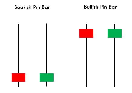
The pin bar candle is mostly used as a reversal pattern. A pin bar typically consists of a price bar with a long wick or shadow. The region between the open and close of the pin bar is called its real body, and a long tail is known as the wick. Pin bars generally have small real bodies in comparison to their long wick. The body of the pin bar is one-third of the total size of the candle. The long wicks of the candle show the area of the price that was rejected and signifies that the price will now move in the opposite direction of the wick.

The psychology behind trading a pin bar candle is that when a price is moving in one direction and reaches significant support or resistance level, it gets rejections. Rejection in a downtrend signifies that the seller pressure (supply) in the market is decreasing, and the buyer pressure (demand) has started increasing and vice versa. The pin bar, either bullish or bearish, signifies that the price does not want to go more down or up and want to reverse from that strong support or resistance level.

Understanding The Bullish & Bearish Pin Bars

Every time a pin bar candle occurring at a strong level does not always mean that the market is going to reverse from that level. To make this valuable, we must see that the overall picture and not just a single candle. In this trading strategy, we will see how we can analyze the overall market near that confluence level. Before that, let’s understand the two types of pin bar candlestick patterns.

Bullish Pin Bar Reversal Pattern

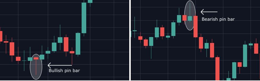
The bullish pin bar candle occurs when the price comes near a strong support level; this leads to the formation of a long wick of the pin bar and shows rejection from that level. This candle usually forms at the end of a downtrend and signifies that there can be either a short-term uptrend or a full reversal forming a strong uptrend.

Bearish Pin Bar Reversal Pattern

The bearish pin bar candle occurs when the price comes near a strong resistance level; this leads to the formation of a long wick of the pin bar and shows rejection from that level. This candle usually forms at the end of an uptrend and signifies that there can be either a short-term downtrend or a full reversal forming a strong downtrend.

Trading Strategies

Pairing The Pin Bar candles With Support & Resistance Levels

As already mentioned, just finding a pin bar candle at the support and resistance level is just not sufficient to trade. We have to figure out what the market is exactly trying to show us. When we see the candles approaching a strong support or resistance level, we have to analyze all the previous candles carefully. If the candles are very big and the momentum is very high, it is less likely to bounce back from that particular level. So, what we have to do is carefully track the candles with wicks. Candles with wicks show that the particular trend momentum is getting weak, and the pressure is reducing as the level is approaching.

After we see candles with wicks and some weaker candles, we will wait for our pin bar candle. As soon as we see the pin bar candle, we have to wait for the next candle to close above the pin bar’s high. We can then buy or sell in the market and place our stop loss 2-3 pips below the pin bar’s low.

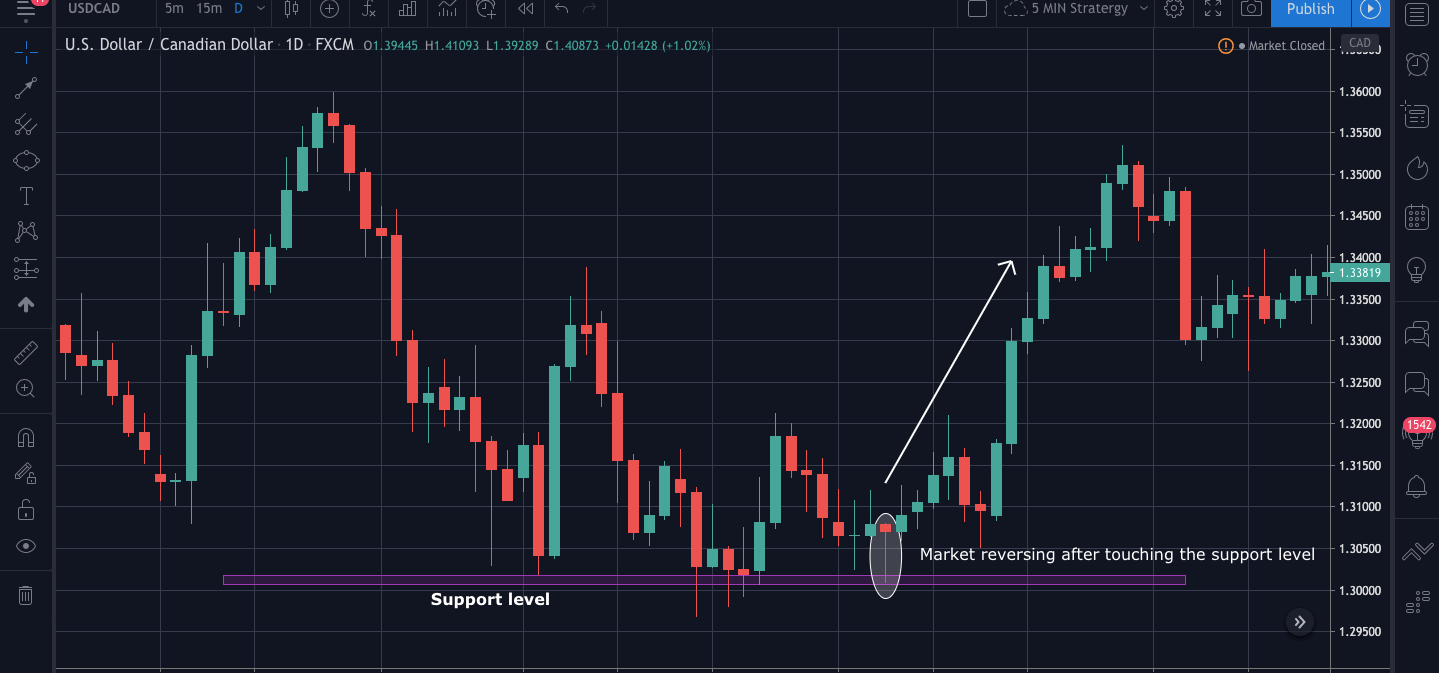
In the below USDCAD 1Hr chart, we can see that the market touches the support level 3 times, the first time the candle was a long and strong bearish candle, and so we must take trades as the picture is still not clear. The second time when the market reaches the support, we see the candles have small bodies and more wicks. This tells us that the seller pressure is decreasing. Finally, for the third time, the market started getting rejections even before touching the support level, and we can also see so many long wicks in the candles. Finally, we see a pin bar candle touching the support level and getting the rejection, and then we see so good bullish momentum.

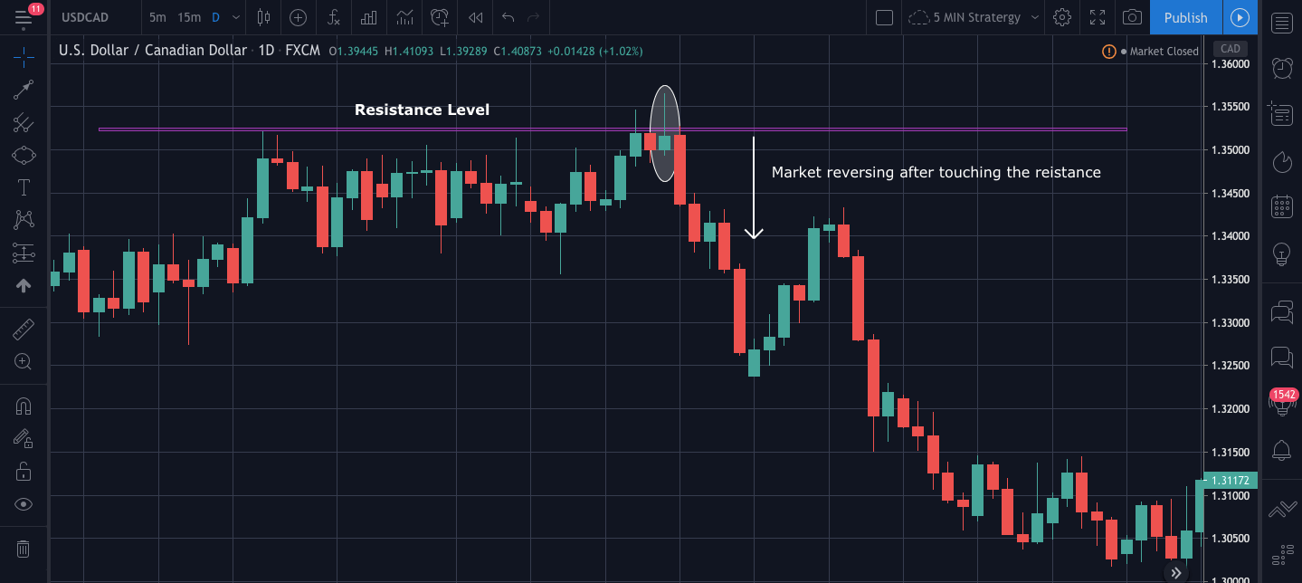
Below is the chart of USDCAD 1hr, market getting a rejection from the resistance level.

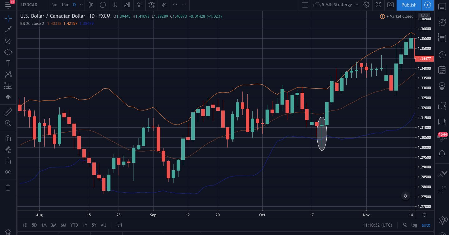
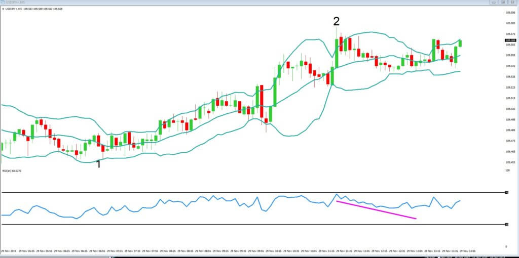
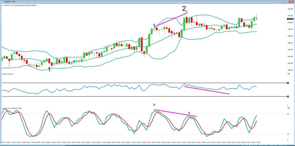
Pin Bar Pattern + Bollinger Bands

We are already familiar with one of the famous indicator called the Bollinger band that is used to measure the volatility of the market. We will now use a pin bar with the Bollinger band and understand how we can find some good trades opportunities.

The below chart is USDCAD 1Hr time frame over here. We can see that the market has not pierced the lower band since a long time as mostly the price is between the upper and the lower band. Moving forward, when the candles come close to the lower band, we see a pin bar occurring after the market gets rejection. After the formation of a pin bar candle, we can see the market getting the buying momentum, and it becomes bullish.

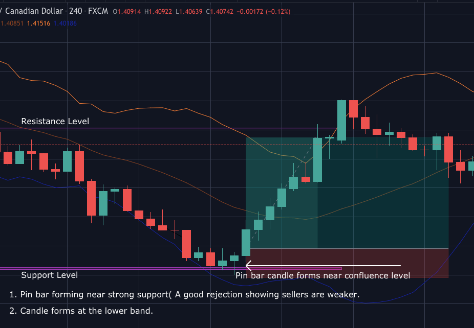
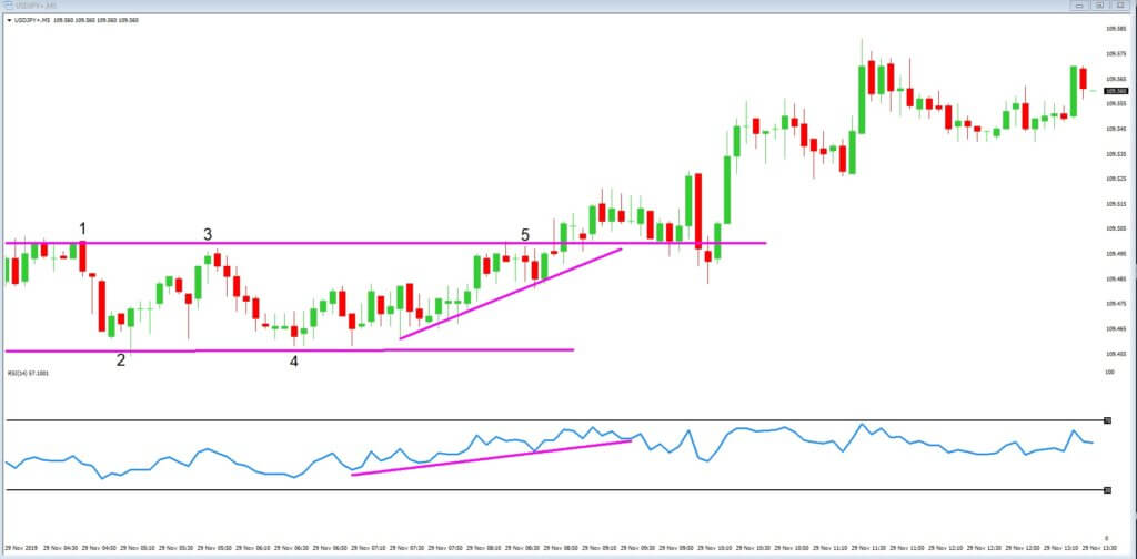
Trading With The Confluence Level

As from the above strategies, we are clear how the market behaves when a pin bar occurs at strong support and resistance level and the extreme level of Bollinger band. Now we will see what happens when a pin bar occurs at confluence level. A confluence level is an area that is on the radar of many traders, and many technical indicators generate the same signal. This trading concept is used by price action traders to filter their entry points and spot high probability signals in the market.

The below example is the pin bar forming at the extreme lower band and a strong support level. We can see that as the market reaches the support level, the bodies of the candles get weaker and smaller, forming longer wicks. Also, the pin bar pierces the lower band near that support level giving us a better signal for a buy.

Talking about the entry and exit points, our entry will be the point when the next candle crosses the high of the pin bar candle. As we see, it is a bullish pin bar; we can be sure that our entry is good if it crosses the high with good momentum. Our exit here will be the next strong resistance level. If you use a trailing stop loss, then we can move the stop loss to breakeven and be in the trade as long as you see the higher high higher low as, after a trend reversal, the candles move very fast and gives more profit and risk to reward ratio.

Conclusion

Trading with a pin bar candle has been proven to be one of the most effective trading strategies. As we saw, we must have a watch on all the candles when it approaches a confluence level because a single candlestick will not give us much information about what market is going to do next. The reliability of these candles is more with the higher time frame as it omits the noises on the chart, and we can have a clear picture. If you are a day trader, then you can 30min or 1hr time frame for executing the trade. Cheers!

Categories
Forex Fibonacci

Fibonacci Confluence Zones

Fibonacci Confluence Zones

If you have not first read my article, ‘You’re still misusing Fibonacci retracements,’ please do so before reading this article. This article will continue where we left off in discussing the new and improved way of drawing accurate and efficient Fibonacci retracements using the Brown Method. I am going to use the same Forex pair that we used in the first article. The purpose of this article is to show you how you can create Fibonacci Confluence Zones to create natural price levels that act as future support and resistance. First, I am going to start my first swing using the March 2001 low and then retracing back to the confirmation swing high in March 1997. See below.

Fibonacci Retracement from low to confirmation lower swing high.

First, I want to know if this retracement is appropriate given how much time has passed – we’re 23 years from the March 1997 high and 19 years from the March 2001 low. Do these Fibonacci retracement levels still work? Do they remain valid? The black vertical line is the start of the retracement, so anything before the retracement is not used, it’s the data afterward that matters. Let’s look.

Fibonacci Retracement - testing of 20 year old retracement range.
Fibonacci Retracement – testing of 20 year old retracement range.

Are these Fibonacci retracement levels we drew still relevant? I would say so. A quick look at A, B, C, and D prove it. Especially for the most recent data at D on the AUDUSD weekly chart – seven-year lows bounce off of the 61.8% Fibonacci retracement level from 20+ years ago! But let’s look at some more Fibonacci retracements made off of other significant swings. Fair warning: there’s going to be several images here.

Fibonacci Retracement 2011 to 2008

The Fibonacci retracement above is from the swing high in July 2018 to the confirmation swing low in October 2001. Like the previous Fibonacci image, we can see that prices have respected the retracement levels even a decade after the retracements were established. But we’re not done.

Fibonacci Confluence Zones

The above image is the first retracement we looked in this article (the same swing low in March 2001) using the same swing low; we draw more retracements to the next confirmation swing lower highs. I’ve drawn two additional Fibonacci retracements in Red and Orange. Notice how some of the Fibonacci retracements occur within proximity of one another. Letter A is shared retracement zones of the 50% and 61.8% of two different retracements. B has a confluence zone of three Fibonacci retracement levels, 50%, 61.8%, and 38.2%. And C has two overlapping retracements of 50% and 38.2%. Now let’s get to the fun part.

The previous image showed three Fibonacci retracement confluence zones at A, B, and C. Those confluence zones were just three of many that will appear on any chart on any time frame. What happens if we draw a series of retracements using major swings as the start point of the Fibonacci retracements and then retrace to the next confirmation swing highs and lows? We’ll get a chart that looks like the one below.

Full Confluence Zones

I’ve added some other letters to identify more confluence zones. I admit the chart does look like a mess. And it should. Not every Fibonacci retracement to a new confirmation swing high or low will coincide with shared Fibonacci levels, but they frequently do. Once we’ve drawn out a series of retracements, we should see a set of these confluence zones. Now begins the cleanup phase. We’re going to place horizontal lines where there are confluence zones of Fibonacci retracement levels.

Horizontal Lines replace confluence zones.

The letters A, B, C, D, and E show where the Fibonacci confluence zones have formed, and are represented by horizontal lines (black) on the chart. Now, you can either delete or hide all of the Fibonacci retracements so that we are left with only the horizontal lines at A, B, C, D, and E.

Just the horizontal lines

I know that the horizontal line at D represented the most confluence zones on the AUDUSD weekly chart, but it also represented some of the longest-lasting and respected Fibonacci retracement levels. Starting at the horizontal level at D, I draw a box from D down to the major low on the AUDUSD chart. Now, the width of this box doesn’t matter – just the range.

First Box
First Box

After I’ve established that box from D down to the major low, I can remove the horizontal lines. Then I start to copy the box all the way to the top of the range. All I’m doing here is copying and pasting the box so they ‘stack.’

Stacking Boxes
Stacking Boxes

Now comes the cool part. I’m going to treat each box like its own range and place Fibonacci retracements inside each box, moving from bottom to top.

Fibonacci Retracements drawn inside boxes

No matter how many times I’ve done this, it still blows my mind. But there is probably a lingering question. You’re probably looking at the chart and saying, ok, cool, but there are some massive gaps between these Fibonacci levels. You are correct if you are thinking about this. Now, Connie Brown never wrote about this next part; it’s something I discovered and developed on my own. The approach comes from the idea that markets are fractalized and proportional, so we should be able to break down like zones into smaller ranges. This is especially important and useful for traders who prefer to trade on faster time frames like four-hour or one-hour charts. Using price action that is more recent and relevant, I can draw a Fibonacci retracement from the 50% level at 0.71688 to the start/end of the box at 0.6368.

Intra Fibonacci level retracements

Letters a and b on the chart above identify the 50% Fibonacci level and start/end level described in the prior paragraph. The black horizontal lines represent the Fibonacci retracement drawn from a to b. I’ve also switched the chart from a weekly chart to a daily chart. When we see that daily chart, we get a real idea of how powerful the Brown Method of Fibonacci analysis is and how precise the study of these confluence zones can be.

In summary, to utilize the Brown Method, the followings steps are as follows:

  1. Create Fibonacci retracements by using a major swing high/low and drawing to the confirmation swing with a strong bar – not the next extreme high/low.
  2. After identifying Fibonacci confluence zones, place horizontal lines on the major price levels where multiple Fibonacci levels share the same price range.
  3. Delete or hide the Fibonacci levels so that only the horizontal lines are present – make sure you identify which horizontal line had the most powerful collection of Fibonacci levels.
  4. After identifying which horizontal line was the most potent and relevant, determine if it is closer to the all-time high or all-time low. Draw a box or a price range from that horizontal line to the all-time high or low – whichever is closest.
  5. Repeat the boxes by copying the same box and ‘stack’ it to the all-time high/low – the opposite of whichever was used to establish the box/price range.
  6. Draw Fibonacci retracements in the boxes.


Sources:

Brown, C. (2010). Fibonacci Analysis: Fibonacci Analysis. Hoboken: Wiley.

Brown, C. (2019). The Thirty-Second Jewell: Thirty Years Behind Market Charts From Price To W.D. Gann Time Cycles. Tyton, NC: Aerodynamic Investments Inc.


Categories
Forex Videos

Advanced Forex Education – Technical Analysis Trading With Confluence

Advanced learning on technical Analysis – trading with technical confluence

As a financial trader in the forex market, we are looking for evidence that underpins our trading decisions and ensures our decision making is correct and that, therefore, the tools we use are stacking the odds in our favour. When these technical tools are aligned, this is called technical confluence. This is where price action and technical indicators converge and help us to make informed decisions. The clearer the indication pointing to directional movements, the better idea we will have to trade-off of our technical analysis charts.

Technical confluence is when we have at least two technical elements on the same chart. And because we are not gamblers, traders look for confluence to strengthen the case before making trading decisions. However, different traders look at different technical signals over different time frames. And this is why trading is inherently risky. But the good news is that all traders are looking at the same price movement and assimilating the same economic data, and therefore, all that we can do is take this into consideration and look for the best high probability setup we can achieve.
Let’s look at some technical confluence trading opportunities.


Example A


Example A is a 5-minute time frame chart of the USDJPY pair, with price action as denoted by Japanese candlesticks. It looks like initially, the market was trading sideways and then took on a bullish momentum around the middle of our chart. Let’s try and identify if technical indicators foresaw the push higher.

Example B


In example B, we have drawn a line of resistance and a line of support which confirms consolidation or sideways trading, and this is confirmed by at least two attempts to push through these areas in both directions.

Example C


In example C, we have added a relative strength index (RSI) which is a technical indicator used in the analysis of the historical strength or weakness of a currency pair based on the opening and closing prices over a set amount of candlestick, in this case 14, and is defined as being weak when it hits the 30 line and strong when it reaches the 70 line. Price often reverses or pulls back from these key levels.
Our RSI initially touches the 30-line at the extreme left of our chart and then begins a slow ascent. At position 5 our RSI is showing most of its momentum to the upside, and price action is also maintaining its momentum to the upside and towards our area of resistance. Price action continues upwards and punches through the area of resistance, and this then becomes an area of support. Price action continues in a bullish tone from this point. This was a trade opportunity and was confirmed by price action and the RSI, plus our support and resistance lines. Therefore, this area of confluence presented a bullish trade signal to buy at position 5 with a stop loss just below our original support line.

Example D


In example D, we have now identified the low of the move at point 1 and the high of the move at point 2. The area at point 2 would suggest to our earlier buyers that price action might be topping out here and for two technical reasons: Firstly our RSI almost touches the 70-line, and also our candlesticks have pierced the Bollinger bands, which we just added, and where we know that if this happens there is a 90% chance that price action will revert back inside the bands. Price action does level off to a certain extent before pulling back lower, and this is highlighted by our descending RSI line.


Example E


We also identified that price action is fading to the upside on this chart by introducing the stochastic oscillator, as in example E. We can see that while price action momentum continues upwards from point A to point C, the stochastic is overbought at point B and at point D it fails to reflect the high of the price action at point C, and this shows divergence, and where divergence tells us the market is slowing.

Possibly traders began to sell the pair at point A, being seen as overbought and that the subsequent price action began to lose momentum as volume begins to dry up from the bulls.

This is another good example of confluence where at least two technical indicators are working together stack the odds in our favour. It also helps us to identify areas where other traders began to close down or exit their previous buying trades in fear of a reversal in price action. And so it is wise to consider where other traders may be bailing out of their trades and that therefore this presents options to close trades and look for reversal setups.
Topping out here and for two technical reasons: Firstly our RSI almost touches the 70-line, and also our candlesticks have pierced the Bollinger bands, which we just added, and where we know that if this happens, there is a 90% chance that price action will revert back inside the bands. Price action does level off to a certain extent before pulling back lower, and this is highlighted by our descending RSI line.

Categories
Forex Trading Strategies

STRATEGY 1: CONTEXT PLUS DOUBLE CONFLUENCES

Forewords

All these strategies are based on setups that have prior market reading knowledge, which is just as important as the pattern itself. We recommend you to learn using Forex Academy’s educational articles and videos to contextualize the market, so you are always aware of the present situation.

That said, let’s see what this strategy consists of and how we apply it to the market.

The Strategy

A confluence is nothing more than a price level where two or more key levels converge that act as support or resistance. If you are in a Bull market context, and you see that the price falls back to an area where two or more supports come together, you will have a pattern to enter the market long.

We are going to see some real examples in the graphs so that we can understand better what we are showing.


On this chart, we see the Dow Jones index in the 60-minute timeframe. A few days ago, the price had decreasing highs, which allowed us to draw a bearish trendline. That trendline was broken with an upward momentum, which turned the old resistance into a possible future support zone if the price were to pull back on it.

Looking at the short term, we also observe that the latest market lows were increasing, a situation that always calls for a bullish trendline. We see on the chart that there is an exact place where these two guidelines converge and that the price comes to a support level near this figure. This gives us a very good area to enter a long position, protected by two supports. Also, in the graph, we can see that the 200-period Moving Average is moving just below it, which provides even more value to the area.

Let’s see another example, but with resistance in this case.

In this image, we can see the 1-minute DAX index chart. We observe how the price is producing decreasing highs, which allows us to draw a bearish trendline.

In the first half of the current session, the price opened with a bearish gap and closed with bullish momentum. Then the market turned down to a bearish momentum that ended with a false dilation of the lows. If we draw the Fibonacci retracements on that bearish momentum, we can see how the Fibo-62 guideline converges in the same area, creating an important resistance where the price is likely to rebound. The red arrow would show the short-entry zone in this case.

In these two examples, there is no indication of whether we have a context for or against because that requires a much more in-depth analysis of various times frames. But as we have already mentioned, to learn how to assess the context, you will need to study on live markets with the help of experienced traders.

If you combine a favorable context, that is, a setting showing you the likely direction of the market, and a zone of confluences where the market can support and continue to favor the context, you would be able to build very powerful setups.


© Forex.Academy