Categories
Forex Market

Five Ways to Survive and Thrive in Extreme Volatility

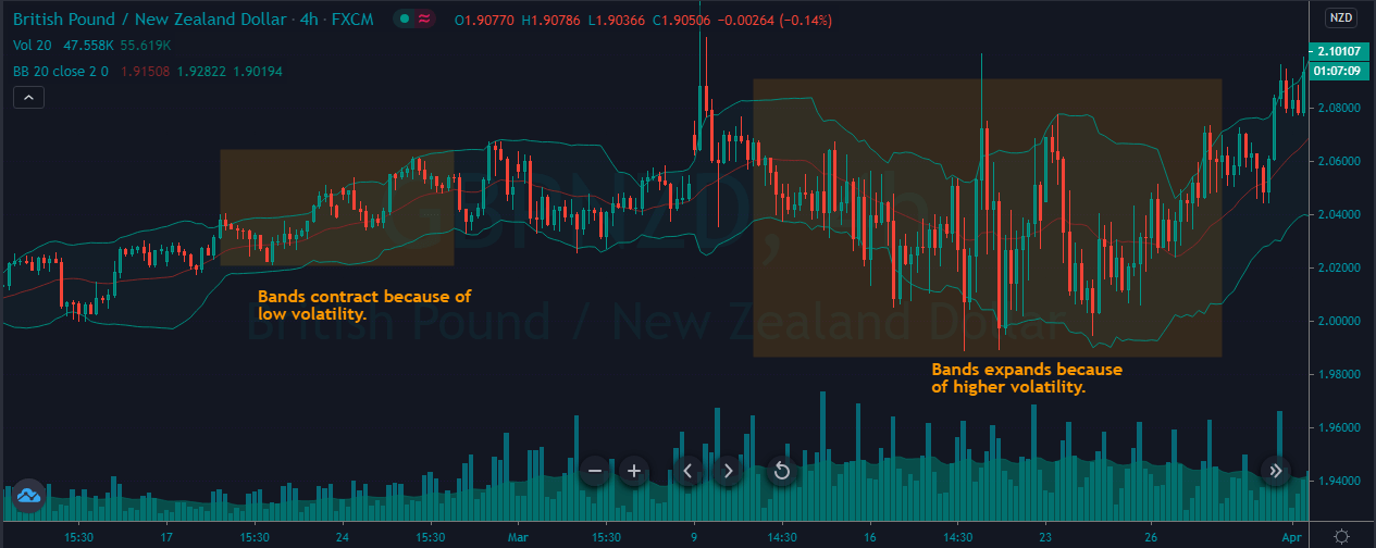
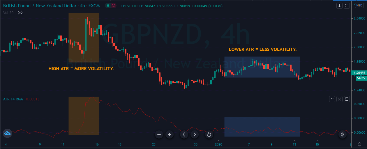
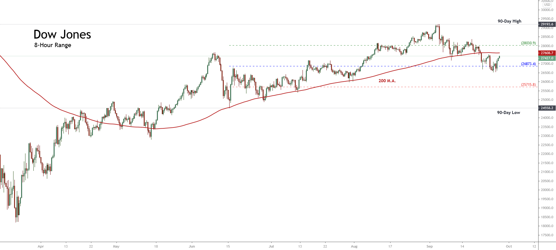
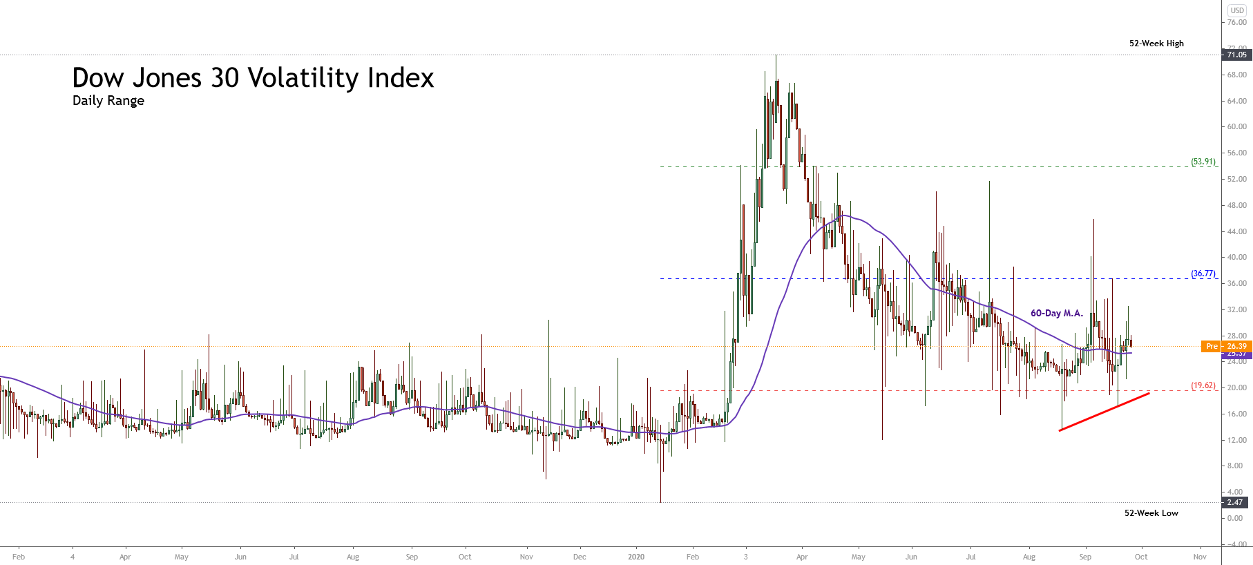
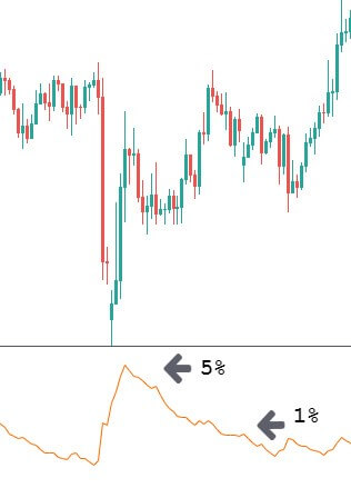
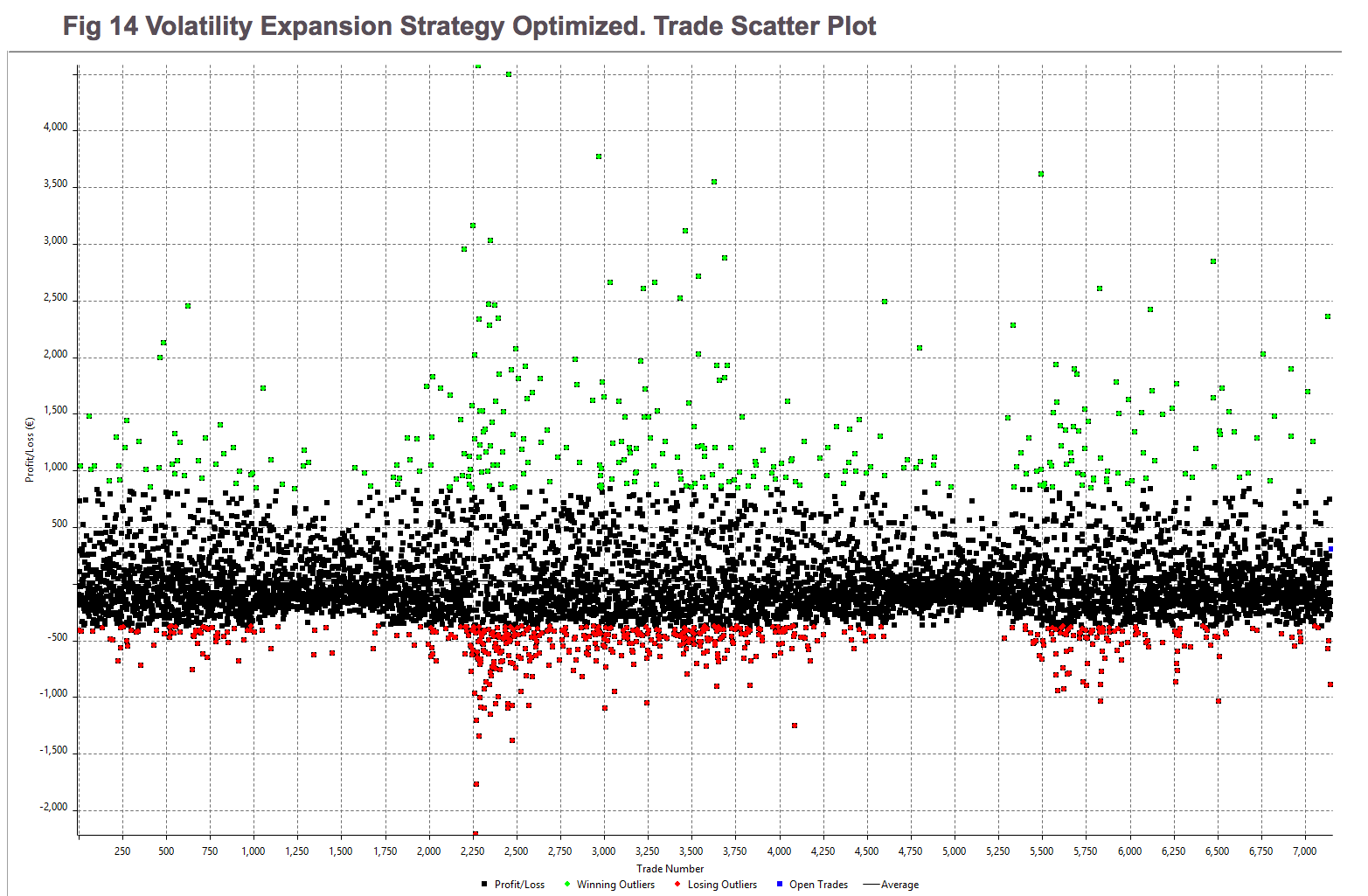
Market volatility can be both a blessing and a curse, Many traders out there trade only in the most volatile of conditions, while others get hit pretty hard when it takes them by surprise. The volatility of the markets at what give us our profits as well as our losses, so it is important that we have an understanding of how to control our trading during times of volatility and also how to potentially predict it to help us get through it with as little damage as possible. Volatility has caused a lot of accounts to blow in the past and it will cause a lot more to in the future to, so that is why we are going to look at different ways that you can help prevent it from happening to you.

Limiting Trade Sizes

The first thing that you can do to help protect yourself and your account during these volatile times is to limit your trade sizes. The larger your trades are the more danger you will be putting yourself in. During extreme volatility, the markets can jump up and down in pretty large chunks. This is something that can be pretty deadly when it comes to an account that is using larger trade sizes. So in order to combat this, we need to ensure that we are either using the appropriate trade sizes for our account or if we often use larger ones, to try and reduce them during these times. This will then prevent any larger losses should the markets jump in the opposite direction. It will, of course, reduce any profits should go the right way, but during these extreme times, it is important that you protect your account above all else.

Sit Back and Watch

Sometimes you just need to step back and watch. The markets can be a dangerous place to trade, and knowing when things might be a little too much can be a great trait to have as a trader. Not every situation will merit a trade. In fact, when times are really extreme, it can often be better to simply not trade at all. Why risk what you currently have in order to make a bit more when the conditions are so volatile? Protect what you currently have and sit out the markets this time. You will have plenty of time to make some more profits once things have settled down again. You also need to consider that your trading plan probably didn’t take these extreme conditions into consideration, so you will be kind of trading blind, which is an increased risk in and of itself.

Always Use Stop Losses

When it comes to managing risks, ensuring that you have stop losses in place is vital. You should be using stop losses anyway, as this is an integral part of trading. If you aren’t using them, then you are trading wrong and are putting your account at risk with every single trade. This risk is multiplied tenfold when it comes to volatile conditions. If you are going to be trading during these conditions then you have to have them in place and you have to have them with every single trade that you place. I know we are repeating things, but you should not be placing any trades without a stop loss being in place. Protect your account before you think about making any additional profits.

Monitor the News

Monitor the news. Often, during times of extreme volatility, there is a real-world event that is causing it. This could be something like an economic news release, or it could be a disaster such as an earthquake somewhere in the world. Whatever it is, there will be news about it, and being on top of this and understanding what is going on can give you a big advantage. Normally when there is a lot of volatility, people are jumping in trying to make a quick profit, not really knowing or understanding why the markets are behaving the way that they are. This can be used to your advantage. By understanding what is happening, you are also able to gauge when the sentiment may change, allowing you to trade in that direction and profiting from people trading the current movement. Of course, this comes with risks and you may be potentially trading against the trend. The markets do not always react the way that you would expect, but it can be an advantage to understand what is happening with the news nonetheless.

Diversify Your Portfolio

Something that you probably would have been told at some point is to diversify your portfolio. When it comes to trading forex, this would simply mean that you are trading more than one currency pair. This is a way of helping to protect your account as you are not putting all of your money on a single trade or currency pair. Volatility can of course affect all markets, but it can also be concentrated on certain currencies, meaning that while one pair may be going a little crazy, some of the others may be more stable. This could then mean that you are unable to trade the less volatile pairs while the volatile ones are doing their thing, or it could mean that you can counter some of the risks of the volatile pairs with trades on the more stable ones. Either way, it is good practice to ensure that you are diversifying your portfolio and expanding into more than just the single currency pair.

So those are five of the things that you can do to help you survive the markets when they are going a little crazy with volatility. There are other things that you can do, and your own style of trading will help you to get through it and to better understand what it is that you need to do in order to prevent the risks, but the five things we have mentioned are a good start and are generally relatable for everyone. We wish you the best of luck once the markets start picking up their volatility levels!

Categories
Forex Market Analysis

Dow Jones Turns Bearish As the US Presidential Election Approaches

Overview

The Dow Jones Industrial Average holds its bearish bias expecting the US presidential election scheduled next November 03rd. Throughout this year, the Industrial Average has declined over 6% (YTD). Although the latest decline looks like a short-term top, the US leading benchmark could resume its advances.

Market Sentiment Overview

The Dow Jones Industrial Average (DJIA) accelerated its declines on Wednesday’s trading session, backed by the market participants’ expectations before the US presidential election scheduled next November 03rd.

The following daily chart exposes the short-term market movements of the Industrial Average. The figure shows the penetration below the psychological level of 27,035.1 pts, which indicates the Dow Jones penetrating the bearish sentiment zone.

Simultaneously, the price action reveals its consolidation below the 60-day weighted moving average, which confirms the bearish bias. On the other hand, the re-test of the previous low located at 26,541 pts increases the likelihood of further declines.

The next daily chart unveils the 90-day high-low range of the Dow Jones Volatility Index (VXD). The figure shows the advance of VXD in the bullish sentiment zone, which confirms the bearish sentiment observed in the Industrial Average, as an increasing (bullish) volatility is mostly associated with declining prices.

Therefore, considering both the Industrial Average as the Dow Jones Volatility Index, the short-term market sentiment bias for the DJ-30 remains on the bearish side. The likelihood of extended declines would drive the DJIA toward the extreme bearish sentiment zone.

Technical Analysis Outlook

The big picture of the Industrial Average reveals that the retracement experienced during the last two weeks belongs to the bullish sequence that began on March 23rd when the Dow started its recovery, following the massive mid-February sell-off.

The DJIA’s technical outlook under the Elliott Wave Theory is unveiled in the following log-scale daily chart. We can see that the primary bullish trend that began with March 23rd’s low located at 18,213.5 pts, which is currently in progress.

In the figure, we see DJIA’s price consolidating in a sideways formation. This stage began once the Industrial Average topped at 29,193.6 pts on September 03rd.

On the other hand, we should consider that the sideways formation moves above the 25,570.2 level, or 33% of the bullish sequence of the primary trend. Therefore, the upward trend remains intact right now, and the current correction represents a pause and not a deeper correction for the US benchmark.

The below 4-hour chart shows the Industrial Average under the Elliott Wave perspective, developing an incomplete flat pattern (3-3-5) of Minute degree labeled in black that looks incomplete.

Currently, Dow Jones completed its wave (iii) of Minuette degree labeled in blue, which belongs to wave ((c)) of Minute degree. This structural series that remains in progress moves inside the wave B or 4 of Minor degree labeled in green.

Considering that the flat pattern looks incomplete, the Industrial Average should see a new lower low, which would reveal a bullish divergence on the MACD oscillator confirming the progress on the fifth wave of Minuette degree. After this move, the Dow Jones should develop a wave C or 5 of Minor degree with an internal five-wave sequence.

Therefore, short-term, we may expect a limited decline, likely toward the 26,050 pts, from where Dow Jones could start to develop a new rally in five waves.

Categories
Forex Course Forex Daily Topic

150. The Easiest Way To Measure Market Volatility

Introduction

Measuring volatility enables traders to accurately identifying the significant trading opportunities in the currency pairs. An increase in the volatility of a currency pair occurs due to any of the major changes in the economy of that country. Market volatility measures the overall price fluctuations over a specific period, and this information is used to identify the potential breakouts.

In the Forex market, the higher the volatility, the riskier is the currency pair to trade. A higher volatility means that the asset value can be spread out over a larger range of values. A lower volatility means that an asset does not fluctuate dramatically and tends to be more steady. A few indicators help us in measuring the volatility of the currency. Using these indicators will show us the accurate representation of the market’s volatility when looking for trading opportunities.

Bollinger Bands

We have discussed a lot about Bollinger Bands in our previous course lessons. This indicator is specially designed to measure the volatility of an asset. In this case, any currency pair in the Forex market. This indicator consists of two lines (bands) plotted above and below the middle line, a moving average. The volatility representation is based on the standard deviation, which changes as an asset’s volatility increases and decreases. Both these bands contract and expand according to market volatility. When the bands’ contract, it tells us that the volatility is low, and when the bands widen, it represents an increase in volatility.

Moving Average

Moving Average is the most common indicator used by traders across the globe. It measures the average amount of market movement over a specific period. If we set the moving average to 30 periods, it shows us the last 30 days’ average movement. In short, any Moving average tells us the average price movement over a specific period. If the MA line is above the actual price, that implies the market is in a downtrend and vice versa.

Average True Range (ATR)

The ATR (Average True Range) is another reliable indicator used to measure market volatility. This indicator takes the currency price range, which is the distance between the high and low in the time frame, and then plots that measurement as a moving average.

If we set the ATR to 40 range, it will tell us the average trading range of the last 40 days. The lower the ATR reading means, the volatility is falling, and we can expect fewer trades. On the other hand, the higher the volatility means the ATR reading is rising. It is an indication that the volatility is on the rise, and by using any directional indicator, we can gauge the potential trading opportunities.

These are the three best tools you need in your arsenal to measure the market’s volatility accurately. Make sure to take the below quiz before you go. Cheers!

[wp_quiz id=”92111″]
Categories
Forex Market Analysis

Dow Jones Moves Under Bearish Signals

Overview

The Dow Jones Industrial Average is developing a descending sequence that could drive the price to new lower lows. This bearish context occurs in the middle of the US presidential elections campaign, which will take place on November 03rd.

Market Sentiment Overview

The United States benchmark, led by the Dow Jones index, appears to be preparing for the presidential elections on November 3.

The short-term market sentiment exposed in the following 8-hour chart illustrates the price shift below the 200-day weighted moving average, which has turned from support to the next short-term resistance to struggle with.

On the other hand, we observe the 90-day high and low range, where the Industrial Average Index has found support in the neutral zone at over the 26,700 pts, where it bounced, being traded slightly bullish during the last Friday 25th session. This context, added to the shifting movement of the price and against its 200-day moving average, leads us to suspect that the Dow Jones Index could see a further drop within the next few sessions.

Concerning the volatility associated with the Industrial Average, expressed by the Dow Jones Volatility Index (VXD) on its daily chart, we distinguish that the action consolidates above the 60-day moving average. Likewise, VXD shows an increasing sequence of short-term lows, which provides a chance of a new bullish movement of the VXD in the short term.

In consequence, the market context leads us to expect a potential bearish movement for the Industrial Average. However, this scenario still needs to be confirmed by the price action.

Technical Analysis Outlook

From a technical analysis perspective, the Dow Jones Index in its 4-hour chart is showing a descending sequence that began once the price found resistance at 29,193.6 pts on September 03rd. Once the Industrial Average found fresh sellers, the downward pressure drove the price to a retracement till the 26,541 level, where the leading US benchmark found support and began to bounce back to the current trading levels.

On the other hand, in the previous figure, we distinguish the progress of a head and shoulders pattern, which has its neckline at the level of 27,457.5. The bearish breakdown developed during the September 21st trading session, and its subsequent pullback confirmed the bearish signal in the Industrial Average. In this regard, according to the head and shoulder pattern definition, this trend reversal formation has a pending bearish target located at 25,724 pts.

Similarly, if the price confirms a new lower high under the previous peak at 28,370.8 pts, it would confirm a bearish continuation pattern identified as three descending peaks, which would support the bearish scenario for Dow Jones.

In conclusion, our short-term perspective is mainly bearish as long as the price remains below 28,370.8 pts, with a bearish target established at 25,724 pts. The invalidation of our bearish scenario will occur if the Industrial Average consolidates above 28,370.8 pts.


Categories
Forex Market Analysis

Gold Still Under Bearish Pressure

Overview

Gold price eases over 4% during this week, dragged by the U.S. Dollar strength, which rallies nearly 1.5%. Considering the short-term structure observed on both the market sentiment and the Elliott wave outlook, the precious metal could experience further declines during the coming trading sessions.

Market Sentiment Overview

The price of Gold continues being dominated by selling pressure this week, driven by the U.S. Dollar strength, accumulating losses of over 4% in the week. However, during this year, the precious metal has advanced over 24% (YTD). 

The market sentiment shown in the weekly chart reveals a decrease in the bullish bias of market participants, who have shifted from extreme bullish sentiment until the past week to a bullish bias. Likewise, considering that the price action continues above the 26-week moving average, the mid-term trend continues being bullish.

Likewise, the wide-range weekly candle, still in progress, reveals the current control by the bearish-side participants. However, the rebound at $1,848.84 per ounce developed during the trading session on Thursday 24th, leads us to observe that the yellow metal could have found a short-term support level.

On the other hand, according to the latest reading unveiled in the Commitment of Traders Report, where the speculative net positioning reached 240,977 positions, reveals that the big participants still maintain their bias on the bullish side. Consequently, a massive sell-off could correspond mainly to the take-profit activity rather than to a reversal of the upward trend.

The volatility presented in the following daily chart corresponds to the Gold Volatility Index (GVZ) and shows the movement consolidating into a flag pattern. At the same time, the internal structure reveals an upward pressure, which is confirmed by its last close above the 60-day moving average. This the market context leads us to expect new increments in the precious metal volatility, and with it, further declines in the price of gold.

Under the market sentiment perspective, the big picture of the precious metal reveals that the long-term trend remains mostly bullish. However, the short-term bias suggests further declines.

Elliott Wave Outlook

The gold price on its 4-hour chart shows the progress of a corrective sequence, which began on August 06th when the price reached its all-time high at $2,075.14 per ounce. Once this record high was reached, the precious metal found sellers which currently are maintaining the price under pressure.

As said, after Gold was controlled by the sellers, the price began a corrective structure made by three waves of Minuette degree labeled in blue, which is currently developing its wave (c). In the figure, we distinguish that once the price closed below the base-line b-d of the triangle pattern, the yellow metal confirmed this wave (c) that remains in progress. The internal structure of the wave (c) unveils that Gold advances in its third wave of Subminuette degree identified in green.

According to the Elliott wave theory, the wave (c) follows an internal structure formed by five segments. In the previous chart, we see that the price moves in its wave iii labeled in green. Consequently, the precious metal should develop a consolidation sequence before dropping to a new lower low with a potential target zone between $1,802.56 and $1,744.76 per ounce.

Finally, the invalidation level of the current bearish scenario locates at $1,973.43 per ounce.

Categories
Forex Market Analysis

DAX Advances in an Ending Diagonal Pattern

Overview

The German benchmark index, DAX 30 advances in the extreme bullish sentiment zone accumulating gains over 60% after the German index gained support on the March’s low at 7,957.6 pts. In spite of the up-up-up market sentiment, the DAX develops an ending diagonal pattern that is still unfinished, suggesting the current upward trend’s exhaustion.

Market Sentiment Overview

DAX 30 continues its recovery following the German index drop to 7,957.6 pts, on March 23rd, which is the lowest level since late August 2013. From Mach’s low, DAX 30 advances over 60%.

The next DAX chart presents the German index in its daily timeframe illustrates the 52-week high and low range. The German index currently develops an upward movement in the extreme bullish sentiment zone. The short-term bullish sentiment is being confirmed by the 60-day moving average, which acts as support in the latest trading sessions.

The extreme bullish sentiment aided by the DAX surpassing the opening price of the year boosted the up-up-up sentiment in the news media added with the incomplete ascending wedge that remains in progress. These signals suggest the exhaustion of the current short-term bullish trend.

On the other hand, the daily chart of the DAX Volatility Index (VDAX) shows a mostly sideways movement in the extreme bearish zone. At the same time, the lateral consolidation pattern developed by VDAX, which remains unfinished, could experience a new decline raising the possibility of further upside in the German stock market.

Consequently, the German stock market sentiment is being dominated by extreme bullish bias. However, the incomplete ascending wedge pattern suggests the exhaustion of the upward movement.

Elliott Wave Outlook

The short-term outlook of the German stock market under the Elliott Wave perspective unveils the progress on an incomplete ending diagonal pattern, developing a new upward movement.

The DAX, in its 4-hour chart, exposes the progress of an upward corrective formation that follows an internal structure of a zigzag pattern of Minute degree labeled in back. The bullish move began in the March low when the German stock market plummeted until 7,957.6 pts. 

Currently, DAX advances in its fifth wave of Minuette degree labeled in blue, which, in turn, develops an ending diagonal pattern in its internal structure. This terminal formation, subdivided in a 3-3-3-3-3 sequence of Subminuette degree, identified in green, is seen advancing in its fifth wave. This pending upward movement agrees with the likely decline in the DAX Volatility Index.

Consequently, according to the Elliott wave perspective, our short-term outlook anticipates further upsides as long as the price stays above 12,737.5 pts. This potential upside could strike the 13,544.3 pts completing the wave ((c)) of Minute degree identified in black.

Categories
Forex Elliott Wave Forex Market Analysis

Dow Jones: Still no New Record High Confirmation

Overview

The Dow Jones Industrial Average continues its advances toward the green side. During this year, it is still easing 1.08% (YTD). The DJIA index, which groups to the 30 largest capitalized U.S. companies, move in the extreme bullish sentiment zone unveiling the probability of new record highs in the U.S. stock market. Likely, it could find resistance at the 30,000 pts as a psychological barrier confirming the all-time highs observed both S&P 500 and NASDAQ 100.

Market Sentiment Overview

During this year, the Dow Jones Industrial Average eases 1.08% (YTD), returning from the bear market to bull market side. The recovery experienced by the Industrial Average, carried it to jump from the lowest level of the year at 18,213.5 pts to 28,287 pts gaining over 55%. 

The following figure compares the advance of Dow Jones and the S&P 500 in its weekly timeframe. In these two charts, we observe that both indexes move in the extreme bullish sentiment zone. However, although surprising, the recovery observed in the U.S. stock market, the Industrial Average still doesn’t confirm the all-time high of the S&P 500, reached on the latest trading sessions

If we look at the Dow Jones’ volatility (VXD), it is running below the 60-day moving average, which confirms that the market sentiment continues being in favor of fresh upsides on the Industrial Average.

Finally, considering that both NASDAQ 100 and S&P 500 reached fresh all-time highs in the latest sessions, the Dow Jones should follow the same path in the coming trading sessions.

Elliott Wave Outlook

The mid-term outlook for the Industrial Average provided by the Elliott Wave Analysis reveals the bullish continuation of the incomplete wave B of Minor degree labeled in green, which could push it toward new all-time highs.

The next 4-hour chart illustrates the price running in an uptrend that began on March 23rd when the U.S. Blue Chip index found fresh buyers at 18,213.5 pts, developing a corrective structural sequence that remains incomplete.

Once the Industrial Average broke upward the (b)-(d) upper-line of the triangle drawn by the wave ((b)) of Minor degree, the price activated its progression as wave ((c)), which is characterized by the inclusion of five internal waves. 

Currently, Dow Jones continues its development in an incomplete wave (iii) of the Minuette degree labeled in blue. Simultaneously, the bullish trendline looks intact, which leads us to conclude that the uptrend remains sound, calling for more upsides in the following trading sessions.

Finally, considering that both the S&P 500 and NASDAQ 100 reached new record highs, we expect further upsides and record highs on Dow Jones. A potential target could be at 30,000 pts as this psychological barrier will be a natural profit-taking level.

Categories
Forex Assets

Asset Analysis – Comprehending The NZD/NOK Exotic Forex Pair

Introduction

NZD/NOK is the abbreviation for the currency pair New Zealand dollar versus the Norwegian Krone. It is referred to as an exotic cross-currency pair. In this case, NZD is the base currency, and NOK is the quote currency. In this article, we shall learn about everything you need to know about this currency.

Comprehending NZD/NOK

Understanding the value of a currency pair is simple. The value of NZD/NOK verifies the Norwegian Krone that must be paid to buy one New Zealand dollar. It quoted as 1 NZD per X NOK. For instance, if the current value of NZD/NOK is 6.0549, then 6.0549 NOK is required to buy one NZD.

Spread

Spread is the keyway through which stockbrokers make income. The selling price and buying price are different; the distinction between these prices is termed as the spread. It ranges from broker to broker and their implementation type. Below are the spreads for NZD/NOK currency pairs in both ECN & STP account models:

ECN: 20 pips | STP: 25 pips

Fees

For every execution, there is a cost levied by the broker. This cost is also indicated as the commission/fee on a trade. This fee/commission does not apply to STP accounts; however, a few additional pips are charged.

Slippage

Slippage is the difference in the price executed by you and the price you indeed received. It occurs on market orders. Slippage varies on two factors:

  • Market’s volatility
  • Broker’s execution speed

Trading Range in NZD/NOK

The trading range is a tabular description of the pip movement in a currency pair in a variety of timeframes. These values help in evaluating the risk-on trade as it defines the minimum, average, and maximum profit that can be made on a trade.

Procedure to assess Pip Ranges

  1. Add the ATR indicator to your chart
  2. Set the period to 1
  3. Add a 200-period SMA to this indicator
  4. Shrink the chart so you can assess a large time period
  5. Select your desired timeframe
  6. Measure the floor level and set this value as the min
  7. Measure the level of the 200-period SMA and set this as the average
  8. Measure the peak levels and set this as Max.

NZD/NOK Cost as a Percent of the Trading Range

The total cost of the trade shifts/changes based on the volatility of the market; hence we must figure out the instances when the costs are less to place ourselves in the market. The table below exhibits the variation in the costs based on the change in the market’s volatility.

Note: The ratio signifies the relative scale of costs and not the stable costs on the trade.

ECN Model Account

Spread = 20 | Slippage = 5 |Trading fee = 8

Total cost = Slippage + Spread + Trading Fee = 5 + 20 + 8 = 33 

STP Model Account

Spread = 25 | Slippage = 5 | Trading fee = 0

Total cost = Slippage + Spread + Trading Fee = 5 + 25 + 0 = 30

The Ideal way to trade the NZD/NOK

NZD/NOK is an exotic currency pair, and hence we can see, the average pip movement in 1hr timeframe is 120, which indicates higher volatility. The greater the volatility, the higher is the risk, and smaller is the cost of the trade and the other way around. Taking an instance, we can see from the trading range that when the pip movement is smaller, the charge is elevated, and when the pip movement is higher, the charge is lower.

To further decrease our costs of trade, we may place trades using limit orders as an alternative to the market orders. In the below table, we will see the interpretation of the cost percentages when limit orders are applied. As we can see, the slippage is zero. In doing so, the slippage will be excluded from the calculation from the total costs. And this will help us in lowering the trading cost by a sizeable margin. An example of the same is given below.

STP Model Account (Using Limit Orders)

Spread = 25 | Slippage = 0 | Trading fee = 0

Total cost = Slippage + Spread + Trading Fee = 0 + 25 + 0 = 25

Categories
Forex Assets

‘BNB/USD’ – Analyzing The Trading Costs Involved

Introduction

BNB/USD is the abbreviation for the cryptocurrency pair Binance coin against the US dollar. This pair is quite volatile to trade compared to coins like Bitcoin, Ether, Ripple, and Litecoin. It has a market capitalization of 2.76B. Because of its volatile nature, this pair is usually traded in cryptocurrency exchanges than forex brokers.

Understanding BNB/USD

The market price of BNB/USD represents the value of the US Dollar equivalent to one Binance coin. It is quoted as 1 BNB per X USD. For example, if the value of BNB/USD is 17.541, then we can say that each Binance coin is worth 17.541 US dollars.

BNB/USD specifications

Spread

Spread is the difference between the bid and the ask price that is set the exchanges. Below are the spread values of the BNB/USD currency pair in both ECN & STP accounts.

ECN: 45 pips | STP: 53 pips

Fee

For every position a trader opens, the broker charges some fee for it. Traders must know that this fee is applicable only on ECN accounts and not on STP accounts.

Slippage

Slippage is the difference between the price required by the trader for execution and the price at which the broker executed the price. There is this difference due to the high market volatility and slower execution speed.

Trading Range in BNB/USD

A trading range is the representation of the volatility in BNB/USD in different timeframes. The values are extracted from the Average True Range indicator. One may use the table as a risk management tool as it determines the profit/loss that a trader is possessed towards.

Procedure to assess Pip Ranges

  1. Add the ATR indicator to your chart
  2. Set the period to 1
  3. Add a 200-period SMA to this indicator
  4. Shrink the chart so you can assess a large time period
  5. Select your desired timeframe
  6. Measure the floor level and set this value as the min
  7. Measure the level of the 200-period SMA and set this as the average
  8. Measure the peak levels and set this as Max.

BNB/USD Cost as a Percent of the Trading Range

The total cost of the trade varies based on the volatility of the market. So, we must figure out the times when the costs are less to position ourselves in the market. Below is a table representing the variation in the costs based on the change in the volatility of the market.

Note: The percentage values only depict the relative magnitude of costs and not the actual costs on the trade.

ECN Model Account

Spread = 45 | Slippage = 10 |Trading fee = 10

Total cost = Slippage + Spread + Trading Fee = 10 + 45 + 10 = 65

STP Model Account

Spread = 53 | Slippage = 10 | Trading fee = 0

Total cost = Slippage + Spread + Trading Fee = 10 + 53 + 0 = 63

Trading the BNB/USD

Volatility and Cost are the two factors traders take into account for trading any security in the market. With the assistance of the above tables, let’s analyze these two factors to ideally trade the BNB/USD.

Volatility

In every timeframe, we can see that the pip difference is significantly high between the minimum volatility and the average volatility. As a day trader, our aim is to make money from the movement of the market. But, if there is hardly any movement in the price, then it becomes challenging to extract some money out from the market. Hence, it is ideal to trade when the volatility is at least at the average value.

Cost

The cost increases as the volatility decrease. They are inverse to each other. In other terms, highly volatile markets have the least costs. However, it is quite risky to trade markets with extreme volatility though the costs are low. Hence, to maintain a balance between the cost and volatility, traders may find trading opportunities when the volatility is around the average values or a little above it.

Bonus

Traders can also bring down their total costs by placing orders as ‘limit’ instead of ‘market.’ This will entirely cut the slippage on the trade and therefore reduce the total cost. In the above example, the total cost would decrease by ten pips, which quite a decent reduction for just changing the type of order execution.

Categories
Forex Market Forex Risk Management

These Are Some Of The Best Position Sizing Techniques You Should Know!

Introduction

In our previous article, we addressed the concept of position sizing, drawdown, and techniques. Now we extend this discussion and look at other crucial aspects of position sizing, which are very important. In this article, let’s determine how one can position themselves in the forex market based on three different models. Each of these has its own merits that impose some sort of position sizing discipline in traders.

The three core position sizing techniques in terms of risk are:

  • Fixed lot per amount
  • Percentage margin
  • Degree of volatility

These models can be applied to all the asset classes and are time frame independent.

We suggest you stick to one model to estimate the position size or at most two position sizing techniques. Following every given method will increase complexity, and that is not good for a trader.

Fixed Lot Per Amount

This is a fairly simple model. It requires a trader to simply state how many lots he is willing to trade for a given amount of capital. For example, let us assume a trader is having $2000 in his trading account, and he trades only the major currency pairs like  EUR/USD, GBP/USD, GBP/JPY, USD/JPY, etc.

The trader simply needs to make a thumb rule that he/she will not trade more than one standard lot of futures (of major currency pairs) per $2000 at any given point.

The lot size can also be determined based on their risk appetite and money management principles. This technique of ‘fixed risk’ is based more on the discipline than strategy.

Percentage Margin

This position sizing technique is more structured than the ‘Fixed lot per amount’ technique, especially for intraday traders. It requires a trader to position themself based on the margin. Here, a trader essentially fixes an ‘X’ percentage of their capital as margin amount to any particular trade. Let’s see how this works with the help of an example.

Assume a trader named Tim has a trading capital of $5000; with this, he decides not to expose more than 20% as margin amount on a particular trade. This translates to a capital of $1000 per trade.

Now, if Tim gets an opportunity in another currency pair, he would be forced to let go of this margin as it would double to 40% (20% + 20%). This new opportunity will be out of his trading universe until and unless he increases his trading capital. Hence, one should not randomly increase the margin to accommodate opportunities.

The percentage margin ensures a trader pays roughly the same margin to all positions irrespective of the forex pair and volatility. Otherwise, they would end up in risky bets and therefore altering the entire risk profile of their account.

Degree Of Volatility

The degree of volatility accounts for the volatility of the underlying asset. To measure volatility, we make use of the ATR indicator, as suggested by Van Tharp. This position sizing technique defines the maximum amount of volatility exposure one can assume for the given trading capital.

Below we have plotted the ATR indicator on to the USD/JPY forex chart.

The 14-day ATR has a peak and then a decline, which shows a decrease in volatility. As you know that high volatility conditions are the best times to trade (less slippage, high liquidity, etc.), you can risk up to 5% of your trading capital on the trade while one should not risk more than 1% when the ATR is at the lowest point. Do not forget the risks involved while trading highly volatile markets. Only use this position sizing technique when you completely trust your trading strategy.

Conclusion

A trader should not risk too much on any trade, especially if their trading capital is small. Remember, your odds of making a profit are high when you manage your position size and risk the right amount on each of the trade you take.

Beginners should trade thin to get experience with open positions, so they can assess the stress of a loss and gradually increase the position size as he is comfortable with the strategy results and performance. As a matter of fact, this is also the right way to proceed when trading live a new strategy, be it a beginner or an experienced trader.

Cheers!

Categories
Forex Indicators

Bollinger Bands

Bollinger Bands

Bollinger Bands are a type of volatility oscillator created by the great technical analyst John Bollinger. If this is your first time seeing this indicator, it probably looks both daunting, confusing, and somewhat silly. But it is a powerful tool for trading and identifying when prices are contracting and then when they finally breakout. There are some critical components of Bollinger Bands.

  1. The middle line is just a moving average, by default, a 20 SMA.
  2. The lines above and below the middle line are the volatility bands, observe how the ‘bubble’ gets expands as price moves up or down in a significant fashion.
  3. Most important is what is called the ‘Squeeze’ or a ‘Bollinger Squeeze.’ The Squeeze signifies decreased volatility and is evident when the bubble gets smaller, and the lines become very close. Squeezes are extremely important to watch.

Let’s look at a chart and see these concepts.

  1. Notice the bands contracting, ‘squeezing’ into each other.
  2. Notice the release, price is continuously pushing higher against the bands, and the bubble is expanding.
  3. Again, notice how price begins to consolidate and form another squeeze.
  4. The release after the squeeze.


Top touches do not mean “sell”, and bottom touches do not mean “buy”

Too often, new traders view indicators and oscillators with certain upper and lower boundaries as conditions to trade to the contrary. Bollinger Bands are no exception. People often assume, incorrectly, that when prices touch the upper band, then the price is somehow ‘oversold,’ and then a short trade should be taken. The inverse is true with bottom band touches.

In reality, prices will often ‘walk’ the bands. You should look at any instrument and see how often prices will trend higher by piercing and riding the bands higher or lower. This frequently occurs after both the upper and lower bands converge closer together, and the space between them constricts. This pattern is known as ‘The Squeeze.’


The Squeeze

Mr. Bollinger himself wrote that The Squeeze was a condition that created more questions than any other component in his Bollinger Band system. At the beginning of this article, I mentioned that Bollinger Bands are a volatility indicator – that is precisely what the upper and lower bands represent. When volatility increases, the bands expand and move farther away from one another. When volatility decreases, that is when we see the bands constrict, forming The Squeeze. Squeezes always precede increased volatility, and squeezes always occur after a period of significant volatility – a classic chicken or the egg problem. Regardless of which happens first, The Squeeze should be recognized as an opportunity to identify when a future explosive move may occur.

One should observe the direction of the breakout almost with suspicion. You will often find many false breakouts occur where price begins to trade in one direction at the beginning of a squeeze, only to reverse and start trending in the opposite direction. There are many ways to filter and interpret which breakouts are genuine and which are false – but that is for a lesson for another time.

Key Points

  1. Bollinger Bands are a measure of volatility.
  2. Price touching the upper or lower bands does not mean an automatic inverse trading move.
  3. Price will often ride the bands in a trend.
  4. Squeezes present opportunities.
Categories
Forex Course

2 – Preface To The Forex Market

Introduction

Forex AKA Foreign exchange is the largest market in the world where all the global currencies are traded. It can also be considered as a place where individuals, companies, and banks convert one currency into another. The entire Forex market is decentralized and is maintained by the banks across the globe. On average, the daily trading volume of the whole Forex market is more than $5 trillion. This explains the sheer size and liquidity of this market. Forex market is an essential part of the global economy and is active 24/5 (From Monday to Friday)

The Purpose

Typically, the exchange of goods and services happens for money, and this money is nothing but currency. The respective country’s governments determine the value of that currency. Hence the value of one country’s currency is never equal to that of another. This is the reason why we need foreign exchange to exchange one country’s currency to others. Forex market is essential for any of the global imports/exports to happen, for any employer who needs to pay salaries to their overseas employees, for a tourist who is traveling abroad, etc.

Forex trading

It refers to the buying and selling of currencies that belong to different countries. In Forex trading, the buying and selling of currencies happen at the same time. That is, if a trader is trading EURUSD pair, he/she is essentially selling the USD he has in order to buy Euros. Traders make a profit when they sell a currency at a higher price than the cost they paid to buy that particular currency. This entire process was complicated even a decade ago. But now, with the advent of technology, anyone can start trading by using a lot of online trading systems.

Currency Pairs

As discussed above, the buying and selling of currencies happen in pairs. There are three types of Forex currency pairs. They are Majors, Minors, and Exotics.

Major currency pairs are those where the USD is involved. These are the most frequently traded pairs in the market, and they make up to ~85% of the Forex transactions that happen in a day.

Examples: EUR/USD, USD/JPY, GBP/USD etc.

Minor currency pairs are those that don’t contain USD. They are also known as cross pairs. Euro, Pound, and Yen are the most popular currencies that make up the minor currency pairs.

Examples: EUR/CHF, AUD/JPY, GBP/CAD etc.

Exotic pairs are the ones where one is a major currency, and the other is a small or emerging currency.

Examples: USD/PLN, GBP/MXN, EUR/CZK etc.

Types of Forex markets

Spot market – The physical exchange of the currency pair takes place at the point of trade, i.e., as soon as the price is fixed between buyer and seller. The transaction is settled on the spot or at least within a short period of time.

Forward market – Here, a contract is made between the buyer and seller, where they agree upon a price to exchange the currency pair. This contract will be settled at a date in the future or within a range of future dates.

Futures market – Even in this type of market, a contract is fixed between the buyer and seller. A price is set on a future date delivery. The difference between Forward and Futures market is that in the latter, the contract is legally bonded between the parties.

That’s about the introduction to the Forex market. We hope you had a good read. In the next article, we will talk about some important Forex terms and phrases. Now, let’s see if you can get the below questions right.

[wp_quiz id=”41271″]
Categories
Forex Market Analysis

U.S. Core PPI (YoY) reaching its highest level since 2012

Hot Topics:

  • S. Core PPI (YoY) reaches the highest level since 2012.
  • Volatility moves towards Europe.
  • The pound rally continues due to the weakness of the dollar.
  • Jinping reduces risks of a Trade War.
  • Oil Brent reaches the highest level since 2014.

U.S. Core PPI (YoY) reaches its highest level since 2012.

Signs of strength in the United States economic growth continue showing up. The Underlying Producer Price Index (YoY) reached 2.7% growth in March, the highest level since June 2012. The Core PPI (MoM) index, on the other hand, went up 0.3% fulfilling analysts expectations who projected 0.2%. According to the Bureau of Labor Statistics, 70% of the increase in final demand is attributed to a rise of 0.3% in the prices of final demand services, in the same way, transport and storage services for final demand increased by 0.6 %. The producers’ inflation rise is expected to have an impact on the Consumer Price Index, which will be published this Thursday.

Despite these positive macroeconomic data, the greenback index continues its strong depreciation, losing 2.83% for the year. Today the greenback is closing with a loss of -0.25%. We are paying attention to the zone between 89.15% and 61.8%  Fibonacci retracements, where the Index has found support.

Volatility moves towards Europe.

The risks of a Trade War between the United States and China are disappearing more and more, with the bilateral attempts to resolve the conflict in a friendly way. However, in Europe, the scenario that seemed full of geopolitical stability is changing. This Sunday 08th, Viktor Orban won the elections in Hungary for the fourth time in a row. With an utterly autocratic speech, the nationalist Prime Minister proposes an anti-immigrant policy and open attacks towards the European Union. Hungary refuses to comply with the agreed European migration policy, that is, to accept Syrian refugees quotas in the same way the United Kingdom did as one of its arguments for Brexit. It should be added that Mr. Orban is not alone in this political tendency; he has found allies in power in Poland, the Czech Republic, Slovakia, and Italy. All of them are willing to reject the obligation to accept refugees and respect the right of free movement.

The euro has closed with gains for the third consecutive session with an advance of 0.29%. The pair shows a bullish move in the middle of a sideways formation. In the last trading session, the price has found resistance at 61.8% of Fibonacci retracement.

The pound rally continues due to the weakness of the dollar.

The pound continues for its third consecutive session in a bullish rally advancing 0.64% for the week and gaining 0.35% in the last trading session. All this occurs in a context of a weakness of the dollar, despite the excellent macroeconomic data of the United States. The level of support to be checked is 1.4145; the key resistance level is 1.42 as a psychological level.

Jinping reduces risks of a Trade War.

Chinese President Xi Jinping has promised to reduce import tariffs by alleviating the fear generated by the escalation of bilateral tensions between the United States and China. In a speech held at the Boao Forum, President Jinping promised to open further the Chinese economy and protect the intellectual property of foreign companies. These words filled the market with optimism, leading the indexes to move positively, the Dow Jones Index advanced 1.48%, while the yen reduced its attractiveness as a refuge, leading the USD-JPY to close with 0.41% of earnings.

The USD-JPY pair is forming an ascending diagonal pattern, which still has space to rally. Its closest resistance levels are 107.49 and 108, and the main support level to watch out is 106.64.


The Dow Jones index moves within a descending channel, its price looks to control a support level at 24,037.3 and is developing a possible upward diagonal formation whose closest resistance is at 24,630, a level that coincides with the Upper part of the bearish channel. Bullish positions are valued as long as price does not break the 23,749.3 level.


Oil Brent reaches the highest level since 2014.

The euphoria produced by the reduction of the economic tensions between the United States and China due to Jinping’s latest public speeches, not only has motivated a good mood on the indices but also on oils. The Brent Crude has reached its highest level since 2014: $ 71.03. Wes Texas Crude Oil, on the other hand, approached its two-week highs at $ 65.76. The oil rally and the Dollar weakness also benefited the USD-CAD pair (by inverse correlation), which closed at its lowest levels since February, and testing the psychological level 1.26,  approaching the 61.8% Fibonacci retracement level at 1.2583.


Our central view for this highly correlated group has been bullish; but we currently prefer to maintain a neutral position considering that once oils reach specific long-term levels on their structures, they should make a significant corrective movement that will allow us to join the trend. As long as Brent does not reach the area between $ 71.26 and $ 72.91, and Crude Oil does not come close to $ 69 and $ 70, we do not expect a significative correction to begin.

In the case of the USD-CAD pair, once it reaches the base of the channel,   we expect the beginning of a bullish move.


Categories
Forex Trading Strategies

Volatility Expansion Strategy

Overview


There are two main measures we use routinely: The center of our observations and the variability of the points in our data set from that mean.

There’s one main way to compute the center of a set: the mean.

Mean: It’s the average of a set of data. It’s computed adding all the elements of a set and divide by the number of elements.

The variability of a data set may be calculated using different methods. One of the most popular in trading is the range.

Range:  The range is the difference between the highest and lowest points in a data set. On financial data, usually, a variant of the range is calculated: Average true range, which gives the average range over a time interval of the movement of prices.

The Strategy

The Volatility Expansion Strategy rationale is that a sudden thrust in the volatility in the opposite direction of the current momentum predicts further moves in the same direction.

For this strategy, we are going to use the Range as a measure of volatility. Specifically, we are going to use the Average True Range indicator to spot volatility sudden changes.

The rules of the strategy are:

Long Entries:

Set a buy stop order at Open + Average( Range, Length ) * NumRanges  next bar

Short Entries:

Set a stop sell short order at Open – Average( Range, Length ) * NumRanges next bar

The parameters are the Length of the average and the NumRanges for longs and shorts.

Manage your trade using a trailing stop.

Let’s see how an un-optimized system performs under 14 years of EUR_USD hourly data:

The standard parameters are:

 Length: 4

NumRanges: 1.5

As we can observe, the actual raw curve is rather good, showing a continuously growing equity balance. ( click on the image to enlarge)
The Total Trade Analysis for single-contract trades shows a nice 2:1 Reward to risk ratio (Ratio Avg Win/Avg Loss) and a 35% winners.

Analyzing the Parameter map:

As we observe in fig 5, there are two areas A and B where to locate the best parameters for this strategy. The surface is smooth, thus, guarantying that a shift in market conditions won’t harm too much the strategy. For the sake of symmetry we will choose the A region, thus, the Long ATR length will be 10 and the short ATR length is left at 13.

Fig 6 shows the map for the NumRanges That weights the ATR value and sets the distance of the stop order from the current open. The surface is, also, very smooth. Therefore we can be relatively sure that setting the NumRages value to 1.3 in both cases we will get good results.

The new equity curve has improved a lot, especially in the drawdown aspect, and in the overall results, as well, although we know this isn’t a key aspect because this equity result was achieved with just a single-contract trade.

This kind of strategy incorporates its stops because it’s a reversal system. Therefore there is no need for further stops or targets.

In fig 8 we observe that the percent winners are close to 39% while the risk to reward ratio represented by the ratio Avg win/ Avg loss is 1.9. Also, we see that the average trade us 28.5 euros which is the money expected to gain on every trade. That shows robustness and edge.

Main metrics of the Volatility Expansion System, on the EUR-USD

(click on the images to enlarge)

As a final note, one way to perform semi-automated trading using a volatility  expansion is the free indicator Volatility Ratio, from MQL5.com

When you click on the Download button, a pop-up window appears:

When you click on the Yes,  this indicator is installed automatically in your MT4 platform. To use it on a chart you just go to Insert -> Indicators -> Custom-> Volatility Ratio, as shown below:


The Options window for this indicator allows you to toy with the parameter values, but I advise you to keep the default values and paper trade them, so you get the idea about how it works and how parameter changes may affect its effectiveness and the number of trade opportunities.

Finally, this is the type of chart annotations of this indicator:

(click on the image to enlarge)